THE MIDDLE OF WHATWHERE
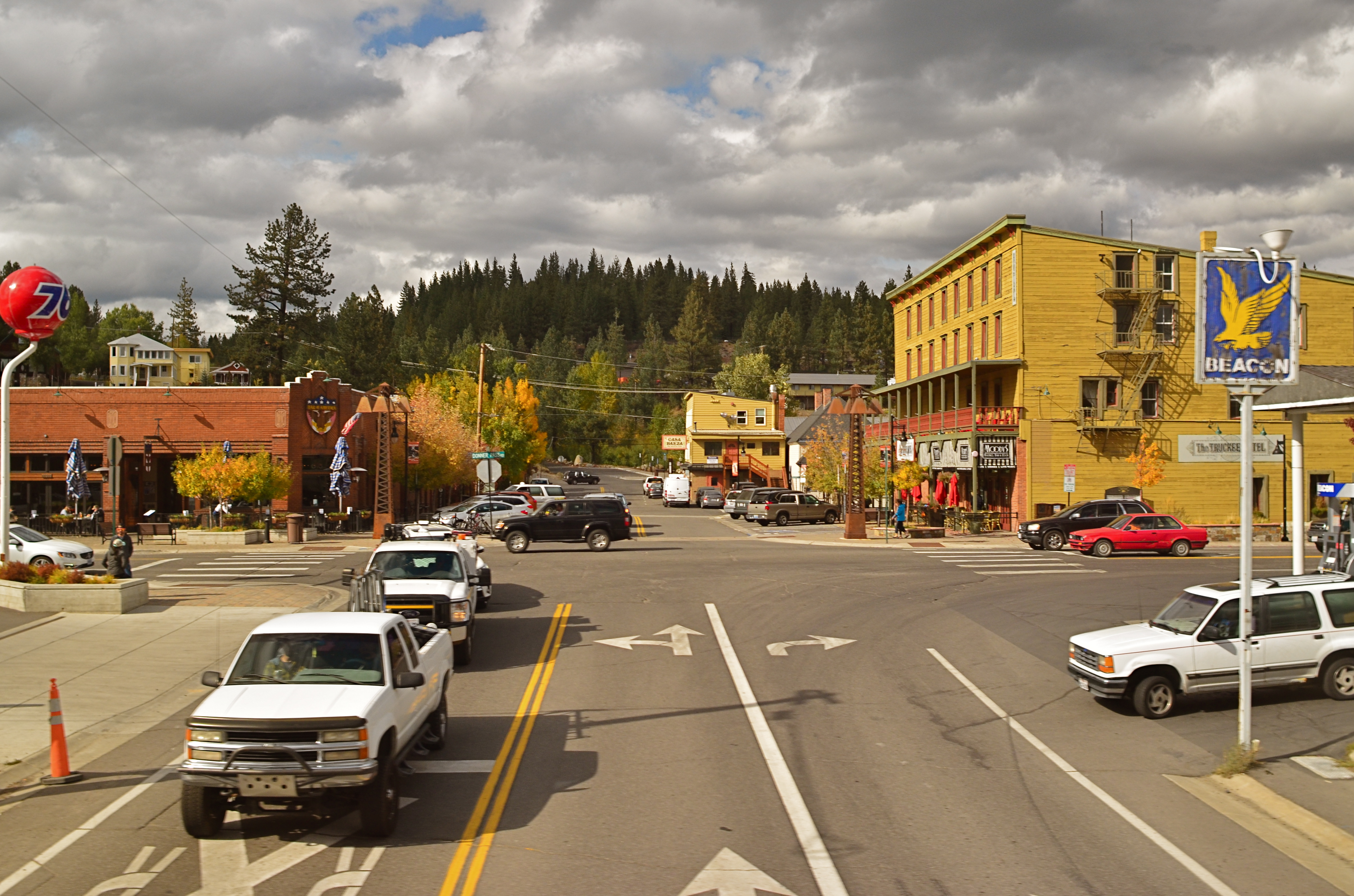
Rush Hour (2017). I don’t need to tell you what town this is. You already kind of know.
By MICHAEL PERKINS
EVEN THOSE AREAS OF THE WORLD WE ‘VE NEVER SET FOOT IN have, at least in our mind’s eye, a sense of place. Hearing about far-flung cities and towns in remembrances, histories, or novels, we tend to assign some kind of visual structure to their streets and sites. Our brains choreograph where the town hall is, what the schoolhouse looks like, maybe even the look of the setting sun on the sides of buildings. We see the unseen with very clear eyes.
For that reason, I love making images of towns that offer no clear clue as to their location or even era. I feel that the images made by a camera pair up, somehow, with the millions of mentally constructed towns we’ve held inside our minds, those many places to which we never journey but yet know by heart.
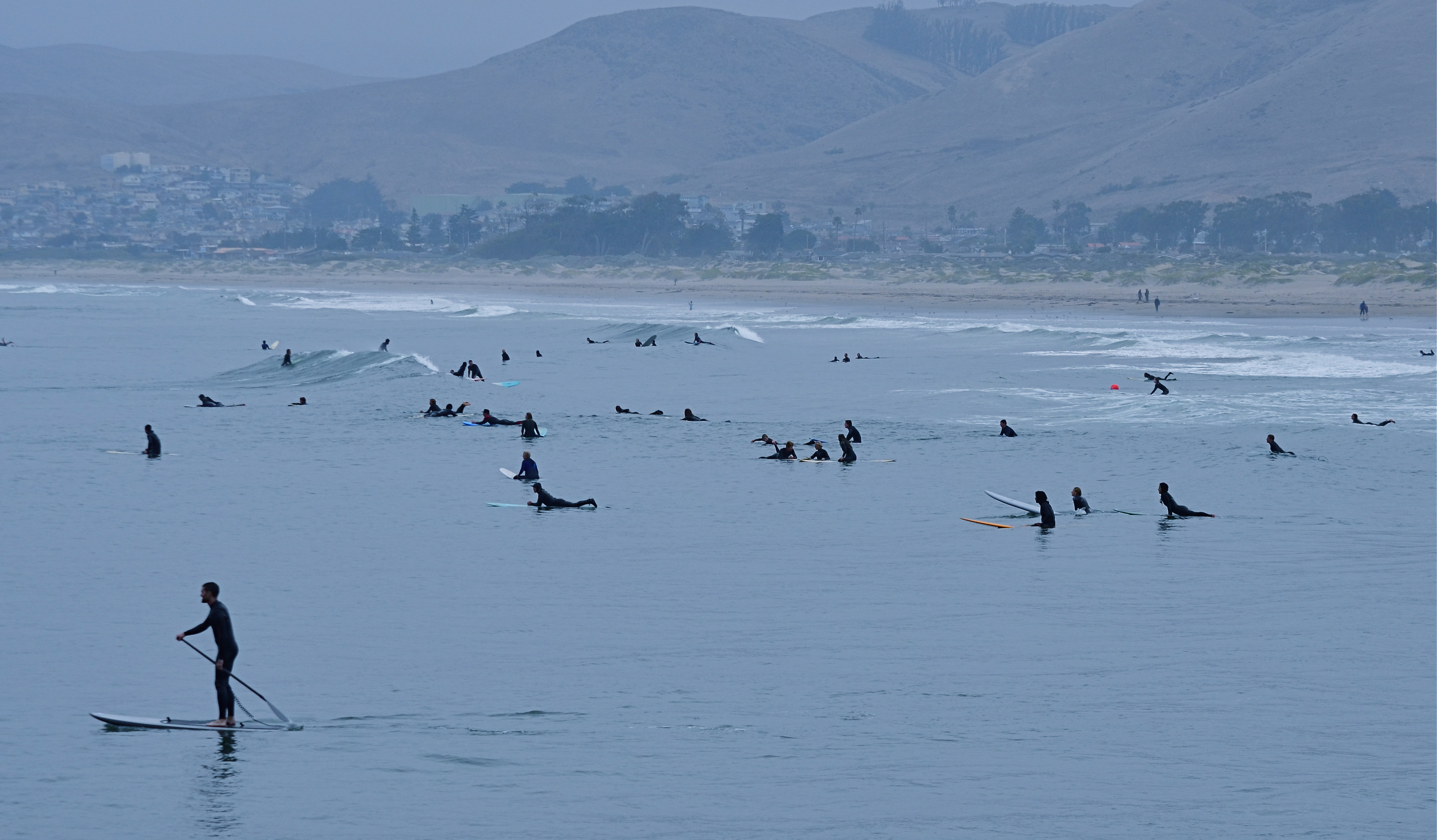
Train travel offers a great chance to deal with these places that have no context, sometimes no name. The view from a train window is ever-shifting, strangely framed. You have visual information it gives you and nothing else. Things swing into and out of view in an instant. You are always going somewhere and always leaving somewhere behind. Focusing and composing with a camera is largely a nightmare, and sharp results are rare. It’s a great way to view reality, and also a terrible arena for photographing it.
Occasionally, a slow crawl through a town or a scheduled stop offers enough stability to make a usable photo, and, when that happens, the sensation is still one of dislocation, since you often are seeing only pieces of cities, the outskirts of districts, or the all-too-real “wrong side of the tracks”. Recently traveling from Sacramento, California to Reno, Nevada through the Sierras, my train slowed almost to stopping as it made its way past a small town’s crossing gate. The city was both everywhere and nowhere. The activity in the intersection could be taking place in a thousand places, each of them interchangeable with the others. I left my seat and walked from the second level of the car halfway down to the lower, where a larger window was mounted, placing me as close to the street as if I were crossing it on foot. The train slowed long enough for me to snap off three stable frames, one of which you see here. For a moment, I’m in the town, nearly of it. I don’t know where I am. Still, I feel right at home.
Years from now, as I turn the pages of a magazine or listen to someone’s dreamy tales, this place might act as a visual stand-in for the dimensions and details of things I can’t directly view. I don’t know why or how the mind makes that work. Maybe, in a way, we’re always making pictures, with or without a camera.
PALLBEARING FOR HDR
HDR processing, initially touted as a more “real” look, is actually anything but.
By MICHAEL PERKINS
MANY OF THE TECHNOLOGICAL ADVANCES IN PHOTOGRAPHY, over the centuries, have been made as specific remedies to the limits of either cameras or recording media. Lenses and films were made faster, sharper, or more accurate because photographers were thwarted by the cramped parameters of the media. Such a cycle of malady-and-cure creates temporary and manic convulsions, fads if you like, along with solid, permanent improvements. Sometimes, as in the case of the now declining technique known as High Dynamic Range, or HDR, it’s easy to confuse a quick fix for a permanent one.
To review, HDR was an attempt to compensate for the limited range of light recorded by first-generation digital sensors, which effectively “read” extreme highlights or shadows, but were spotty in the mid-ranges, delivering only a portion of what the eye could detect. The solution was to take a bracket of anywhere from three to seven frames over a wide exposure range (grab your tripod, kids), then blend them, via software, to more consistently even out all values for a “balanced” or “natural” view. The other side-benefit of the process was a drastic amplification in detail.
HDR was immediately praised as having helped the photographer hurdle the last remaining barrier between the camera and real life. It quickly muscled its way into everything from amateur landscapes to commercial real estate, conferring prophet (profit?) status on authors like Trey Radcliffe, who soared to best-selling fame with books brimming with hyperbolic color and iridescent textures, every hobnail and brick in his goth HDR cathedrals registering the same, loud detail.
And that sameness, eventually, became the problem. Every part of every picture was now shouting. In the hands of many, HDR did not make images evenly modest: it made them uniformly garish. Too many HDR pictures were overripe, overcooked, as if the world were awash in day-glo gravy. Worse, the technique couldn’t work with live subjects or hand-held shots. Worse yet, in-camera HDR simulators in DSLRs and phone apps were virtually useless. Finally, if you actually liked photographing, you know, actual people, HDR made human flesh look like wet liver inside a tanning booth.
In the end, the problem HDR was created to address actually resolved itself, with second-gen camera sensors finally performing better along a wider range of light, delivering more even exposures right out of the camera. More importantly, photographers fell back in love with shadow, understatement, and mystery, satisfied that you don’t have to show everything to see everything. So, rest in peace, HDR. There now are better ways to keep it real.
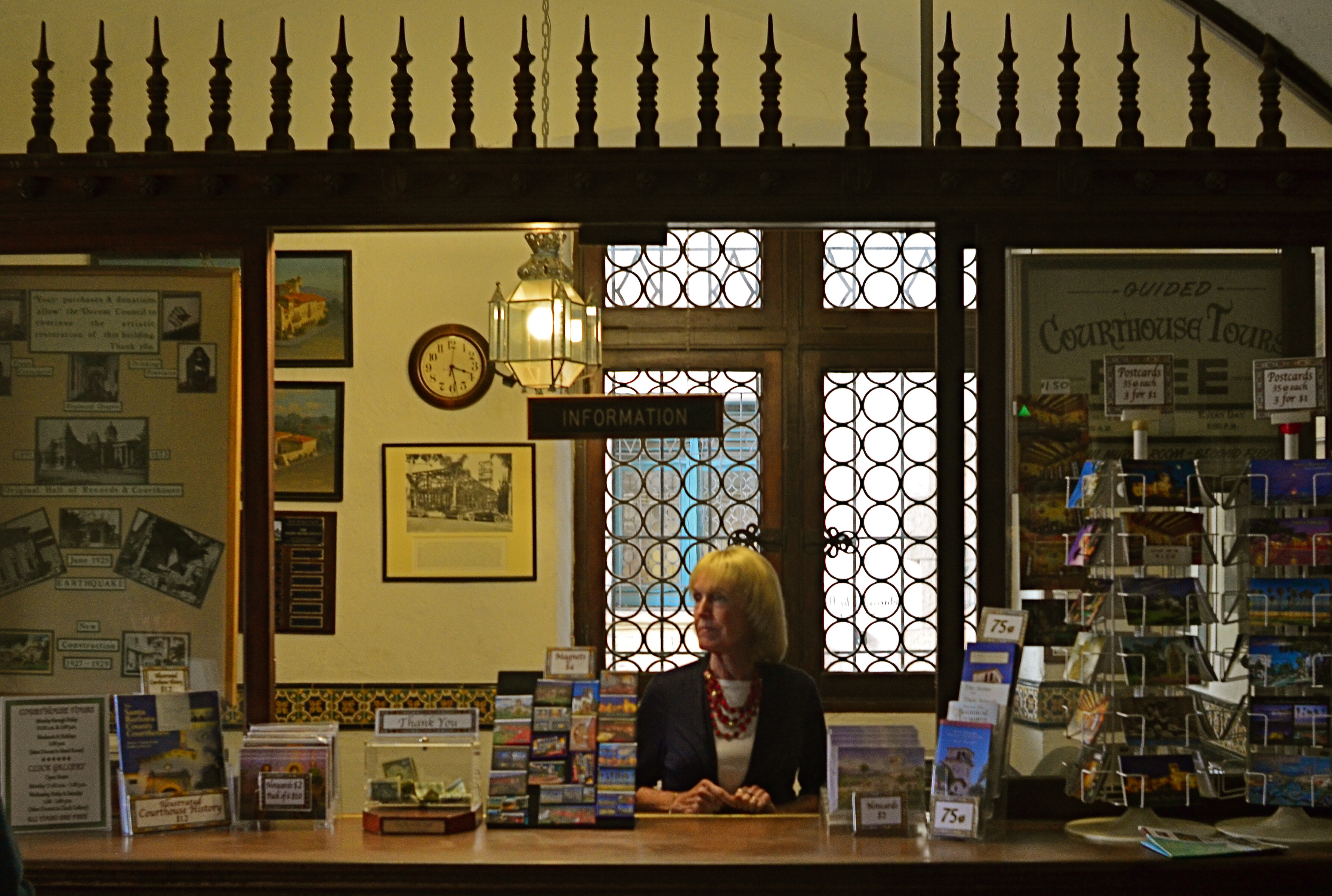
THE MAN IN THE ROUND CUBE
 By MICHAEL PERKINS
NOTHING IS SO TIMELESS as something whose time has come and gone.
Once a thing… a style, a design element, a fashion, an idea…has outlasted its original context, becoming truly out of sync with the world, it can become visually fascinating to the photographer. Instead of forward-looking, it’s dubbed “retro”. Rather than radical, it becomes something no one can ever remember having been excited about, like looking at Carol Brady’s shag haircut 25 years on.m
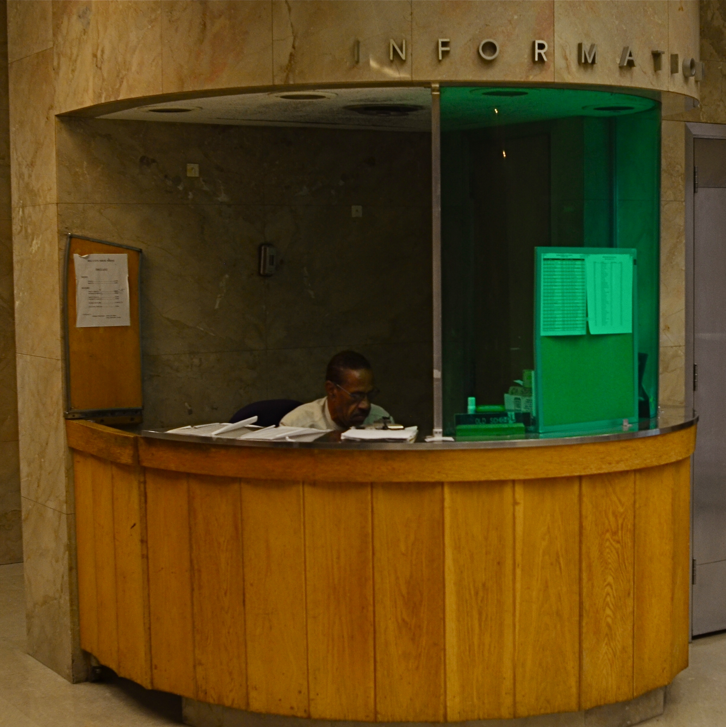
The information booth in the frame shown here is one such anomaly, so odd a fit in the building that it’s part of (the California state capitol annex) that it wrenched my attention away from a pretty good tour. The wing the booth is part of, built from 1949 to 1952, is, generously speaking, as dull as dishwater, indistinguishable from most generic government buildings, a box of sugar cubes.
But the booths are something else again.
Far from the typical marble-block, cage-and-window, bank teller enclosure many public servants call home, the booth is curved wood and glass, sounding a faint echo of Art Deco which extends even to the aluminum letters that spell out INFORMATION. And yet, at present, the modernity of the original design is now itself antique, its lonely occupant looking as if he were banished to his post rather than assigned.
The lighting within the booth is so minimal that the poor man’s features are nearly swallowed in deepening shadow: he looks like a recreation in some museum diorama about What Offices Will Look Like In The Future!!!, as strange to view as “modern” renderings of someday space rockets as seen from 1950. And then there’s the insect-repellant visor green on half of the glass, which is there, I assume, to protect Mr. Info from harsh gamma rays(??). The entire effect is one of loneliness, of, again, the evidence of a time (or a man) whose time has come and gone. And that calls, in my world, for a picture.
PLANDIDS
By MICHAEL PERKINS
NOWHERE ELSE IN PHOTOGRAPHY does the conflict between mere recording and deliberate interpretation manifest itself more than in the portrait. We love the spontaneity of the unposed snap, with its potential for capturing the innocent, unguarded moment. However, snaps are a random thing, and by nature undisciplined, raw. The control of the studio, with its calculated exposure and modulated light, has its allure as well. It’s not like we want it both ways: no, we definitely want it both ways.
Hence the emergence of the Plandid.
Recent trends on social media have given rise to a new portrait hybrid called the planned candid, or “plandid”, formalized shots that are designed to create the illusion of a spontaneous snap. In fact, people have been faking “happy accidents” like these for as long as there’ve been cameras. What distinguishes plandids from earlier versions of faked reality, however, is that most of them are self-portraits and the majority of them are created primarily on mobiles.
In some ways this was inevitable. Everyone, but everyone has already done the trombone-arm, face-only selfie, the wide-screen lenses on our phone cameras distorting our heads into ovoids and ballooning our noses into sausages. Enter the plandid, which feeds into two dearly held articles of human faith; one, nothing is more worth pointing a camera at than us; and two, the only person who gets us well enough to turn us into something even more fascinating is….wait for it……us.
“Plandids” are a kind of Selfie 2.0.
And thus arrives the age of Selfie 2.0, in which we employ tripods and timers and pull the typical headshot back, to reveal entire bodies, props, and atmosphere. However, doing that much advance prep is way too much like conventional photography, and thus anathema to the hipster within, so the trick becomes faking the look of having “just stumbled upon” a great picture. Huh?
Of course, I’m exactly like the school dietitian who guiltily sneaks fries on the side, because of course I have absolutely hopped into this narcissistic playpen, doing my own plandids with a DSLR for that extra degree of control. Add my own patented, wistful away-from-the-camera look and you get the perfect moment in which I’m caught by some discerning, lucky amateur (me) in a stolen moment of quiet (fake) contemplation.
Diane Arbus once called a photograph a lie that tells you the truth. But there’s something to be said about just flat-out lying, just for fun.
ON THE JOB
Information, Please (2017)
By MICHAEL PERKINS
ONE OF THE MOST EXHAUSTIVE portrait projects in the history of photography was August Sander’s Face Of Our Time, a collection from the 1920’s of sixty formal portraits of German tradesmen of every class and social station, each shown with the tools or uniforms unique to his chosen profession. Sanders photographed his subjects as documents, without any hint of commentary or irony. The story in their pictures was, simply, the visual record of their place in society and, eventually, as cultural bookmarks.
Since Sander’s eloquent, if clinical work, similar photo essays have taken on the same subject with a little more warmth, notably Irving Penn’s Small Trades portrait series from the early 1950’s. Like Sander, however, Penn also shot his images in the controlled environment of the studio. In my own work, I truly feel that it’s important to capture ordinary workers in their native working environment, framed by everything that defines a typical day for them, not merely a few symbolic tools, such as a bricklayer’s trowel or a butcher’s cleaver. I also think such portraits should be unposed candids, with the photographer posing as little distraction as possible.
I really like the formal look of a studio portrait, but it doesn’t lend itself to reportage, as it’s really an artificial construct….a version of reality. So called “worker” portraits need room to breathe, to be un-self-conscious. And, at least for me, that means getting them back on the street.
LEADING THE WITNESS
 By MICHAEL PERKINS
“MEN ARE NOT INTERESTED“, said Jerry Seinfeld, “in what’s on tv. Men are interested in what else is on tv.”
The joke conjures up an image of some remote-happy goof in a man-cave endlessly clicking through channels in search of something ever better than what he already has. And it’s true, which makes it all the funnier. It also speaks to how all humans, both men and “not men”, view photographs, and how shooters can play to that propensity.
All photos, sliced as they are out of the continual flow of time, come with an implied sense of what went before the click and what’s to come after it. Trying to use the information from a stilled moment of time to mentally supply those two temporal bookends is an ever-fascinating game between photographer and viewer. What happened just before this? What will happen next?
In composing a frame, the photographer uses all the tools at his command to influence his audience’s assessment, including the simple device of leading lines, which can be used to direct the viewer’s eye wherever the artist wants it to go. LLs are usually effective in drawing you deeper “into” a picture that obviously only has two dimensions. Think train tracks at the front of the picture, receding toward the horizon. These lines tell you that you are being asked to go somewhere, and that you should be curious about what’s waiting for you there.
Leading lines can also go from what is shown in the picture to what is implied, asking you to speculate, as in the case of the above frame, what’s around the next bend, or, in Seinfeldian terms, “what else is on tv”. It’s a strange fact that, no wonder what may be shown within a photo, the most fascinating thing to the viewer’s mind, at least, may be the stuff that was left out of it. We all want what we can’t have, and knowing that very human thing can empower a photographer to much more effectively control the frame.
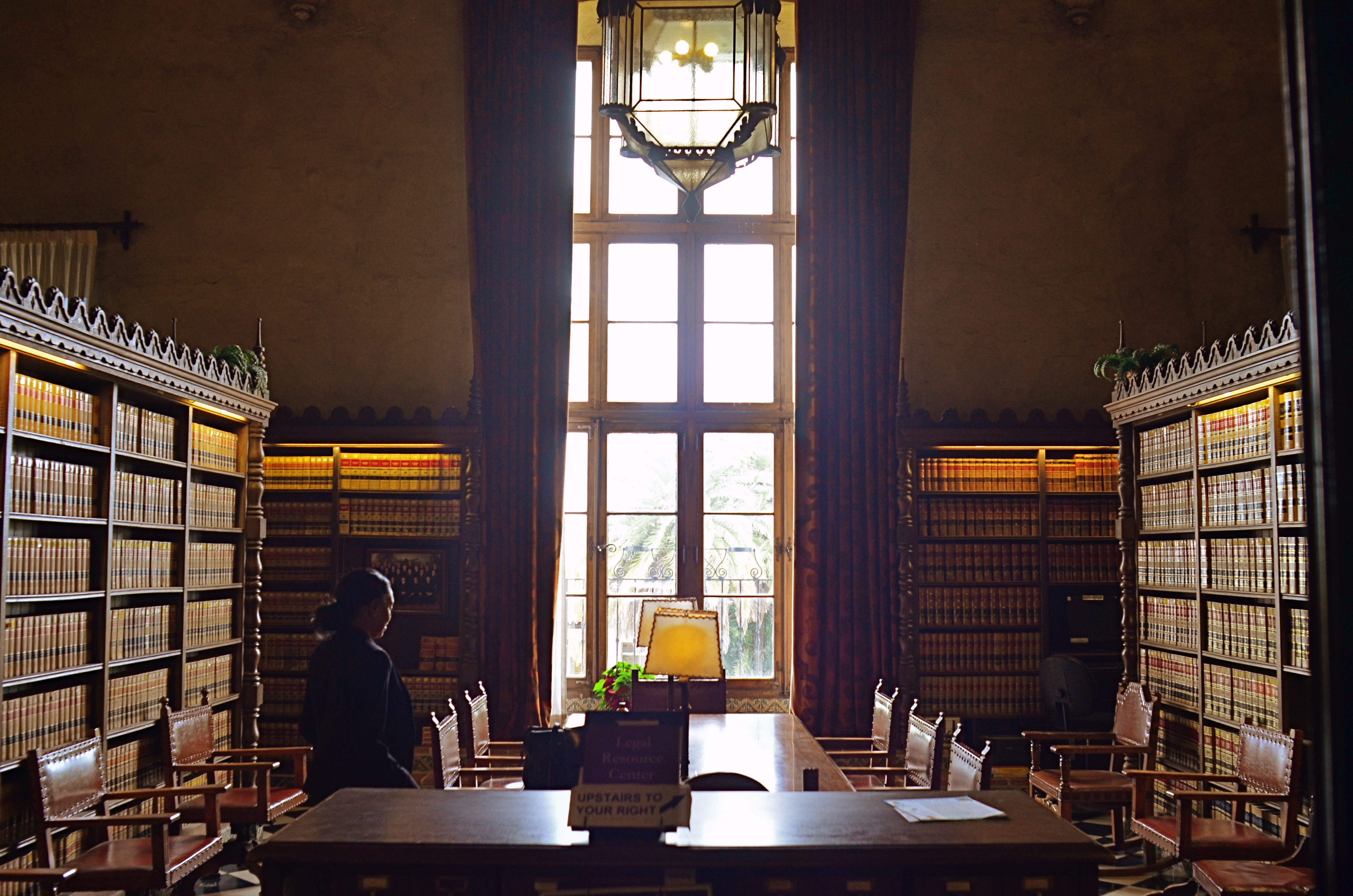
ON DISPLAY
By MICHAEL PERKINS
ALTHOUGH MUSEUMS ARE DESIGNED as repositories of history’s greatest stories, I often find that the most compelling narratives within those elegant walls, for the photographer in me, are provided by the visitors rather than the exhibits.
We’ve seen this effect at zoos: sometimes the guy outside the ape house bears a closer resemblance to a gorilla then the occupant within. With the museum experience, making controlled, serene exposures of the artifacts is never as interesting as turning your reporter’s eye on the folks who came in the door. The juxtaposition of all the museum’s starched, arbitrary order with humanity’s marvelously random energy creates a beautifully strange staging site for social interaction….great hunting for street shooters.
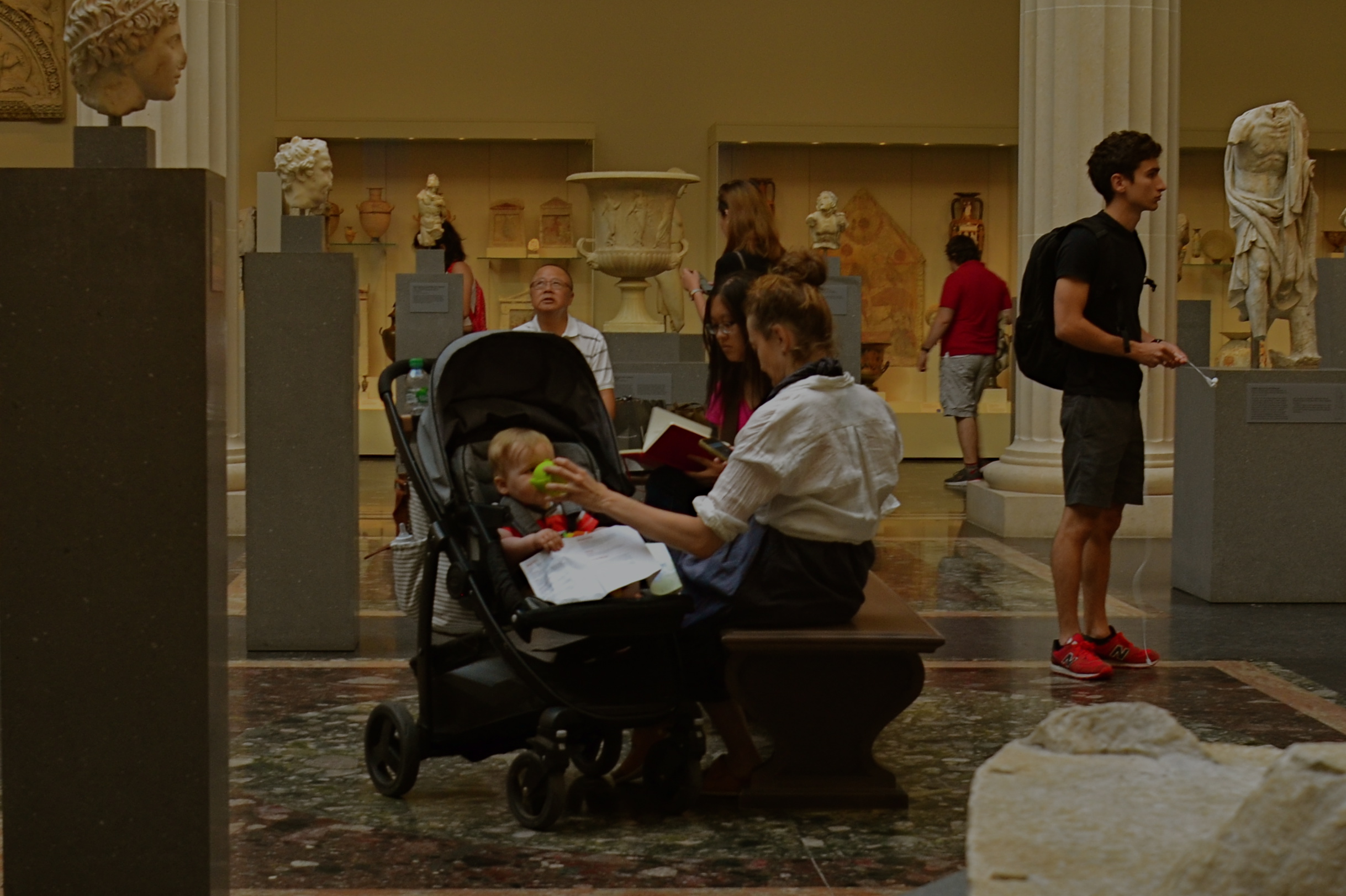
The sculpture gallery shown here, one of the most beautiful rooms in Manhattan’s Metropolitan Museum of Art, is certainly “picturesque”enough all by itself. However when the room is used to frame the chessboard-like weaving of live humans into the pattern of sculpted figures, it can create its own unique visual choreography, including the mother who would love to bottle-bribe her baby long enough to finish just one more chapter.
Anyone who’s visited The Normal Eye over the years recognizes this museum-as-social-laboratory angle is a consistent theme for me. I just love to mash-up big art boxes with the people who visit them. Sometimes all you get is statues. Other times, one kind of “exhibit” feeds off the other, and magic happens.
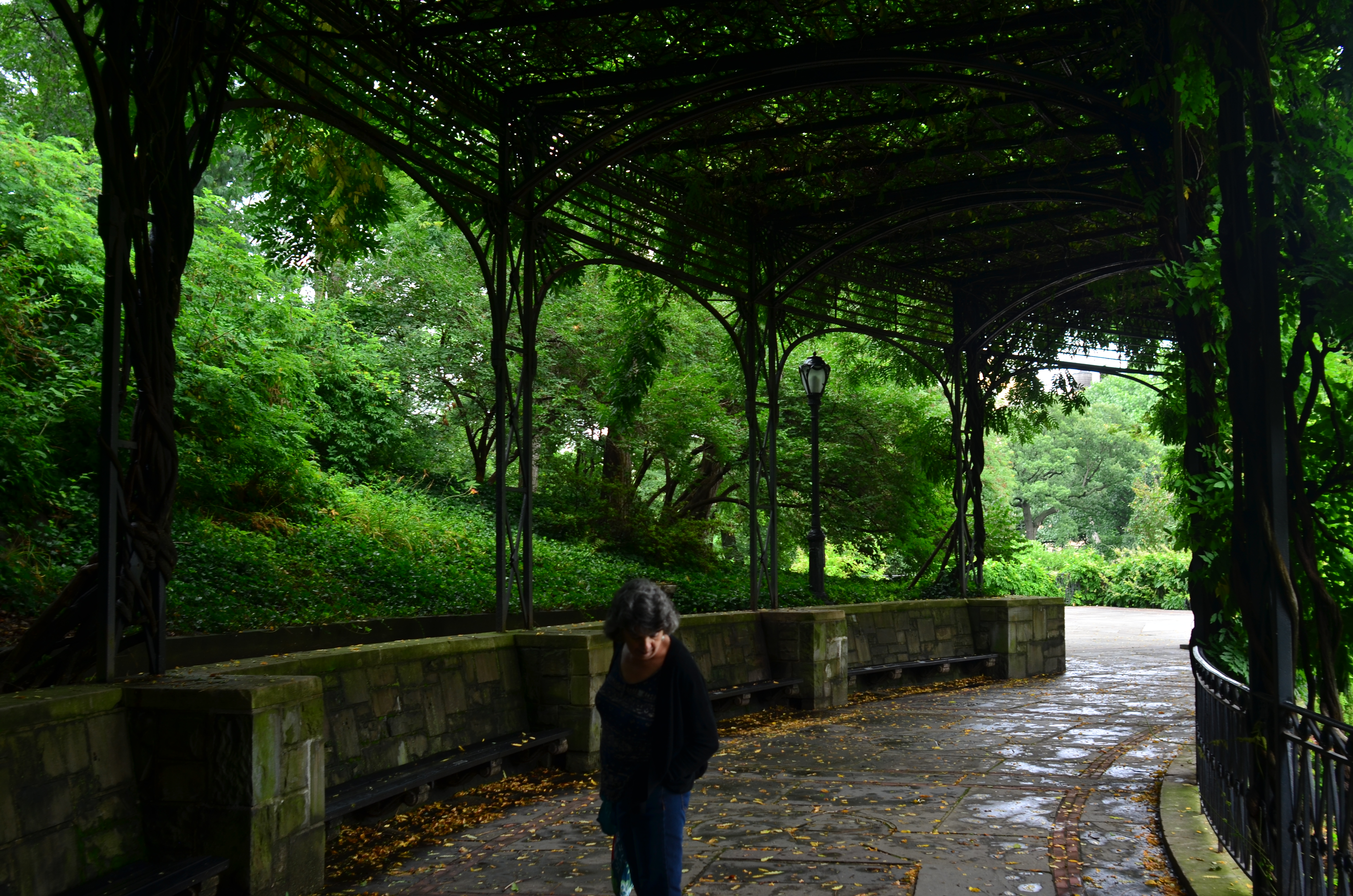
RIDING THE SLIDER
By MICHAEL PERKINS
ONE OF THE MUST–HAVES during the golden age of component stereo was the graphic equalizer, a panel on the front of many hi-fi receivers that divvied up the audible spectrum into five zones, allowing the discriminating audiophile to create a custom low-midrange-hi mix of frequencies by adjusting each zone’s vertical slider switch. It gave a clear representation of the desired fidelity curve. It was visual. It was visceral. Most importantly, it was cool, man.
The “slider” is also, for me, a frame of reference for my photography, since it gives me a mental picture of where I’m at along the track from work that’s left-brained (precision-driven, analytical) and right-brained (instinctual, reactive, emotional). The slider almost never travels to either extreme in the making of pictures, but veers closer to one or the other in a custom e.q.’d mix between rational control and total abandon. This is becoming more common with photographers in general than at any time in the past. When it came to crafting an image, we almost always asked about the how of things. Now many more of us also ask about the why.
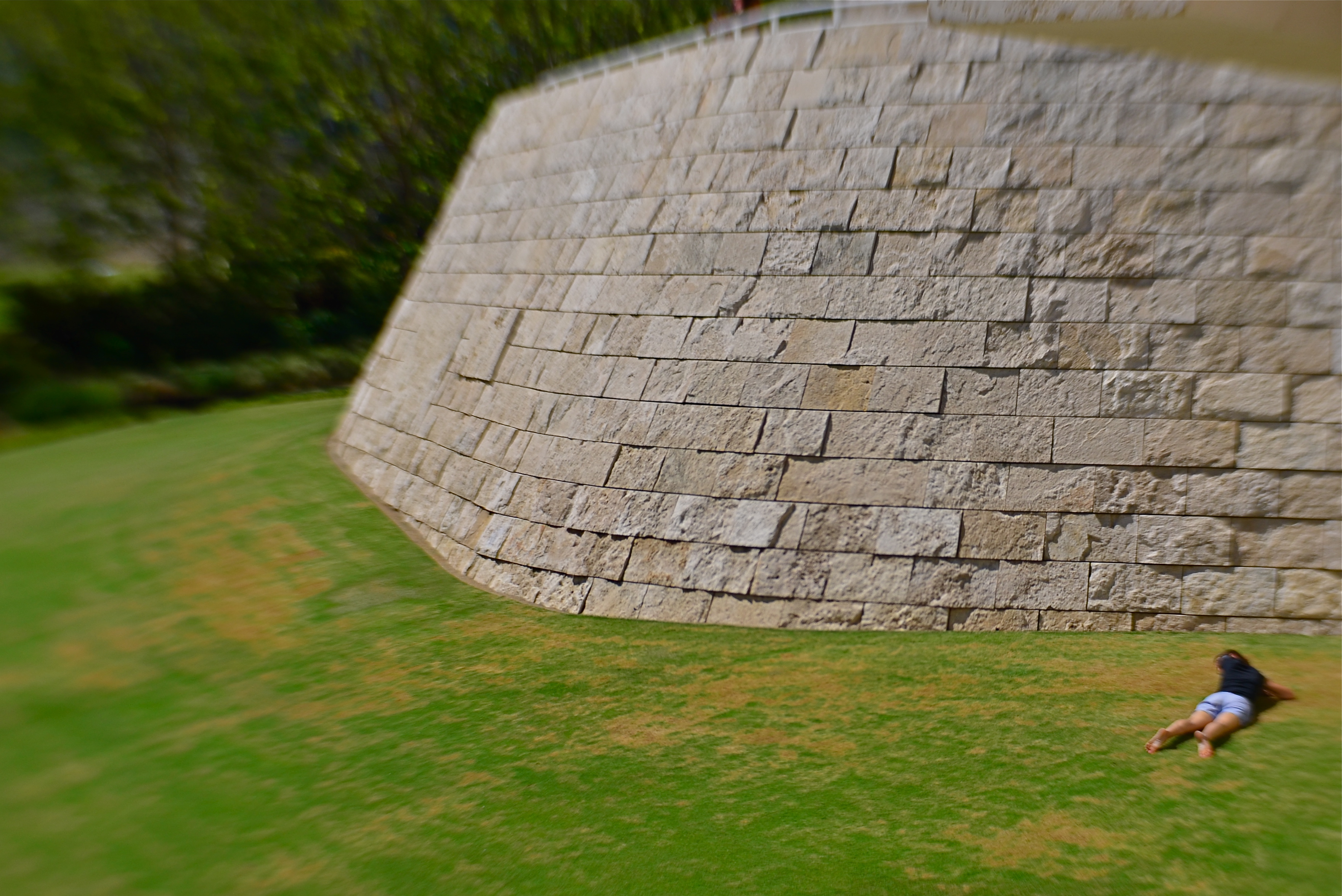
The above image is illustrative of this balancing act. In walking behind the two women emerging from a forest at the end of their dog walk, I was never going to have a lot of time to formally set up any one shot…..not unless I was willing to interrupt the ladies’ together time, which seemed counter-intuitive at best. Optically, I was shooting with a selective-focus lens, designed to be sharp at the center, then progressively softer at the edges. Additionally, I decided to under-expose both women, eliminating all detail and reducing them to silhouettes. This meant that I had to wait until they were fairly centered in the clearing at the edge of the woods, one of the only reference points I would have for sharp focus, the backlighting of their forms, and any suggestion of depth.
And so you have a shot which is neither all-rational nor all-instinctual but a mixture of the two, the slider’s mid-point between preparation and improvisation. Total adherence to the left brain can produce shots which are technically precise but emotionally sterile. Working too much on the right side can yield pictures that are chaotic or random. Learning to jockey the slider is at least as important a skill as either composition or conception.
GET YOUR MIND RITE
By MICHAEL PERKINS
“REALITY”, THOUGHT TO BE the normal end product of the process of pointing a camera at something, is actually rather limiting. Sure, our little boxes were originally created as an accurate, even scientific means for recording our world.. a method more reliable, somehow, than the imprecision of the painter. Soon afterward, however, the camera longed for a soul of its own, or at least the painter’s freedom to make a subjective choice as to what “real” should look like.
Bottom line: for photographers, mere reality turned out to be, well, kind of a yawner.
To go even further, it seems to me that certain subjects actually call for a kind of unworldly, almost hallucinatory quality, an attempt to make things look not like what they are but how they feel. Of course, we can’t actually show emotions or states of mind, but various photographic techniques can, and should suggest them.
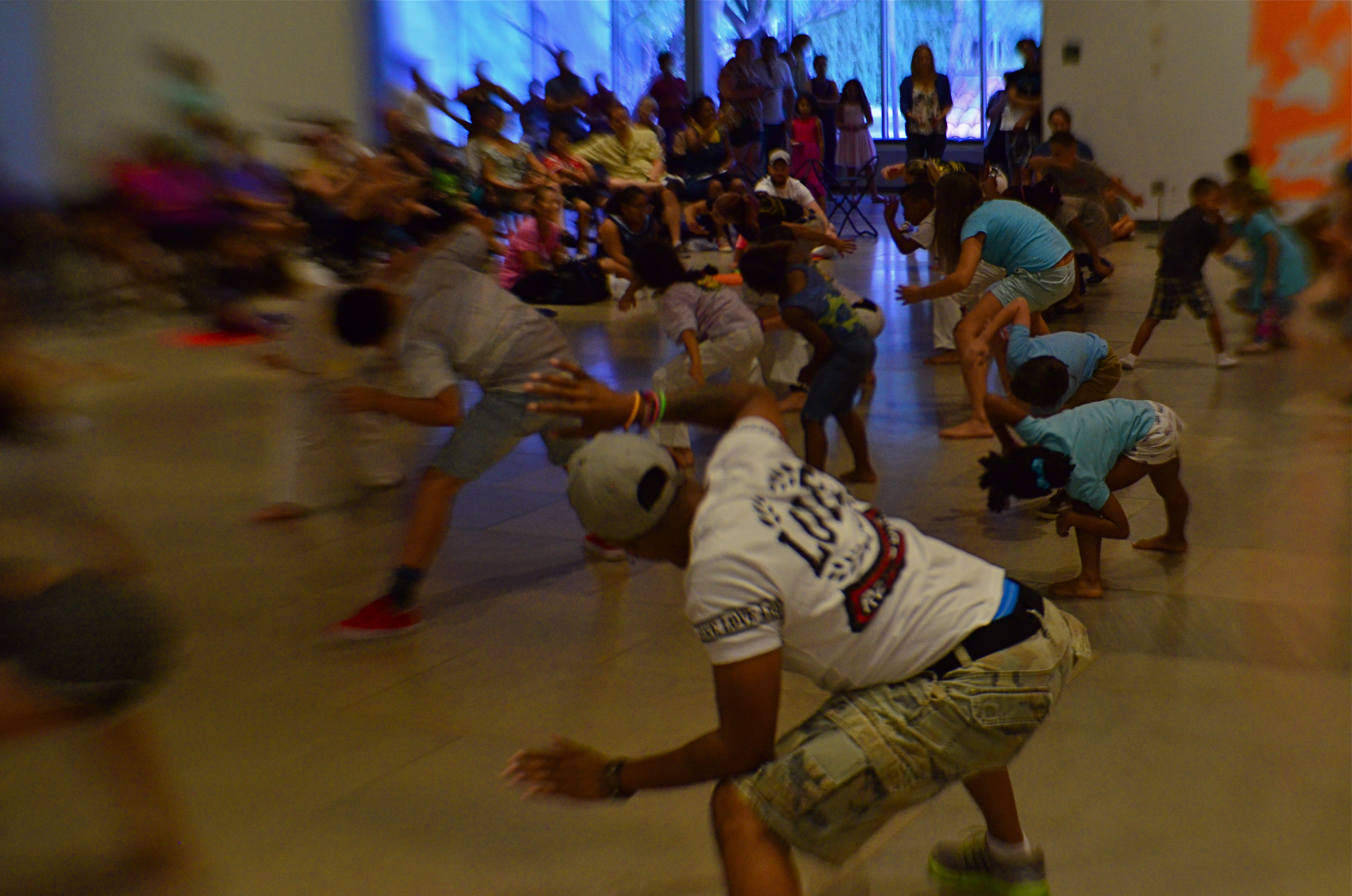
In visualizing ritual, ceremony, sacrament, or tradition, for example, you’re not merely chronicling activity. You’re also photographing mystery, or an extra dimension of consciousness. The above image, in terms of mere reality, is of a class for museum visitors curious to learn bout the Brazilian ritual of capoeira, a traditional fake-fighting martial arts performance that is performed during carnival and other national festivals. Now, you can shoot such a subject “realistically” (evenly lit, uniform focus, sharp detail), or aesthetically (dark, selectively blurred, even a little confusing), depending on what kind of feel you’re going for. This goes to the heart of interpretation. You’re not merely presenting reality: you are representing it.
Photographs originate in the mind, not in the camera, and so it must follow that there are as many “realities” as there are photographers.
ALONE OR LONELY?
By MICHAEL PERKINS
NO TWO ARTISTS view the human condition of solitude in quite the same way. In photography, there are scores of shades between alone and lonely, between the peace of private reflection and the terror of banishment, shades which define their images as everything from comforting to terrifying. Thoreau hangs out solo in the woods and finds fulfillment. Hansel and Gretel, stranded in the forest, feel only dread.
Alone again…..naturally?
The argument might be made that modern society at large fears solitude, that there is nothing more horrific than being alone left with one’s self. And, if that is your viewpoint, then that will eventually be reflected in how you depict people in isolation. Conversely, if you see “being apart” as an opportunity for self-discovery, then your photographs will show that, as well. You can’t “sit out” commenting on a fundamental part of the human condition. Some part of your own outlook will be stamped onto your photography.
That’s not to say that you can’t shade your “alone” work with layers of mystery, even some playfulness. Is the young woman shown here glad to be away from the crowd, or does she feel banished? Is her physical attitude one of relaxation or despair? The photographer need not spell everything out in bold strokes, and can even conspire to trick or confound the viewer as to his true feelings.
To make things even trickier, images can also convey the feeling of being alone in a crowd, lonely in a crushing multitude. That’s when the pictures get really complicated. With any luck, that is.
LOW INFO AND HIGH NARRATIVE
By MICHAEL PERKINS
YOU DON’T HAVE TO KNOW all the elements of a story to tell it visually. Yes, photography certainly has the technical means to tell a detailed tale, but that narrative need not be spelled out in every particular by the camera.
Indeed, it might be the very information that’s “missing” that may be the most compelling element of a visual story. That is to say, if you don’t know all the facts, make the picture. And if you do have all the facts, maybe leave out a few…. and make the picture anyway.
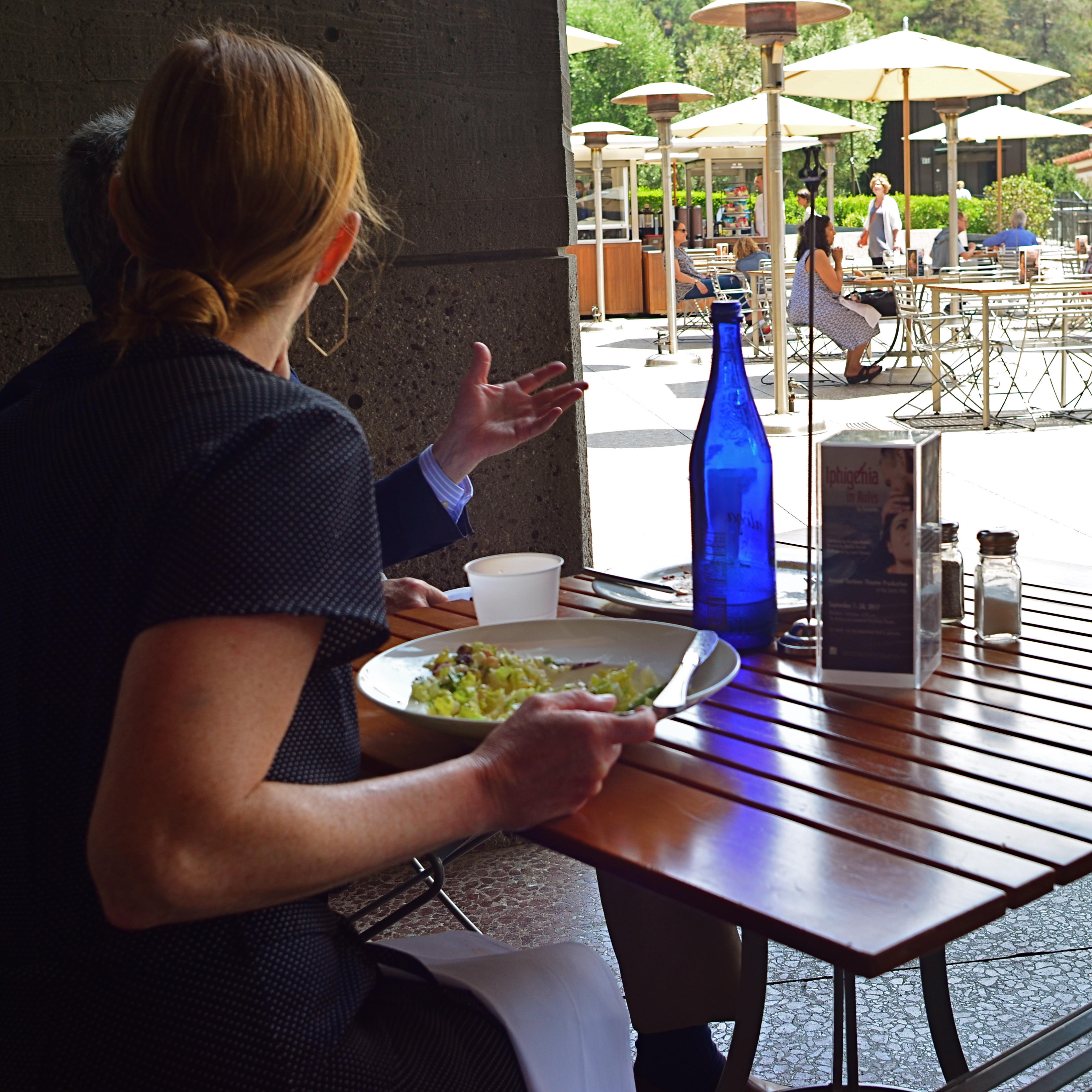
The above image illustrates this strange mis-match between storytelling and story material. As a shooter, I’m tantalizingly close to the couple at the table next door to me at a plaza restaurant. I mean, I can practically count the salt grains on the lady’s salad. I can also tell, by her male companion’s hand gestures, that a lively conversation is underway. But that is the sum total of what I know. I can’t characterize the discussion. A business planner? A lover’s quarrel? Closing the sale? Sharing some gossip? Completely unknown. Sure, I could strain to pick up a word here or there, but that alone may not be enough to provide any additional context, and, in fact, I don’t need that information to make a picture.
This is what I call “low info, high narrative”, because I don’t require all the facts of this scene to sell the message of the picture, which is conversation. As a matter of fact, my having to leave out part of the image’s backstory might actually broaden the appeal of the final product, since the viewer is now partnering with me to provide his/her version of what that story might be. It’s like my suggesting the face of a witch. By merely using words like ugly or horrible, I’ve placed you in charge of the “look” of the witch. You’ve provided a vital part of the picture.
You won’t always have the luxury of knowing everything about what you’re photographing. And, thankfully, it doesn’t really matter a damn. That’s why we call this process making a picture. We aren’t merely passive recorders, but active, interpretive storytellers. High narrative beats low info every time.
GROUND ZERO FOR VALOR
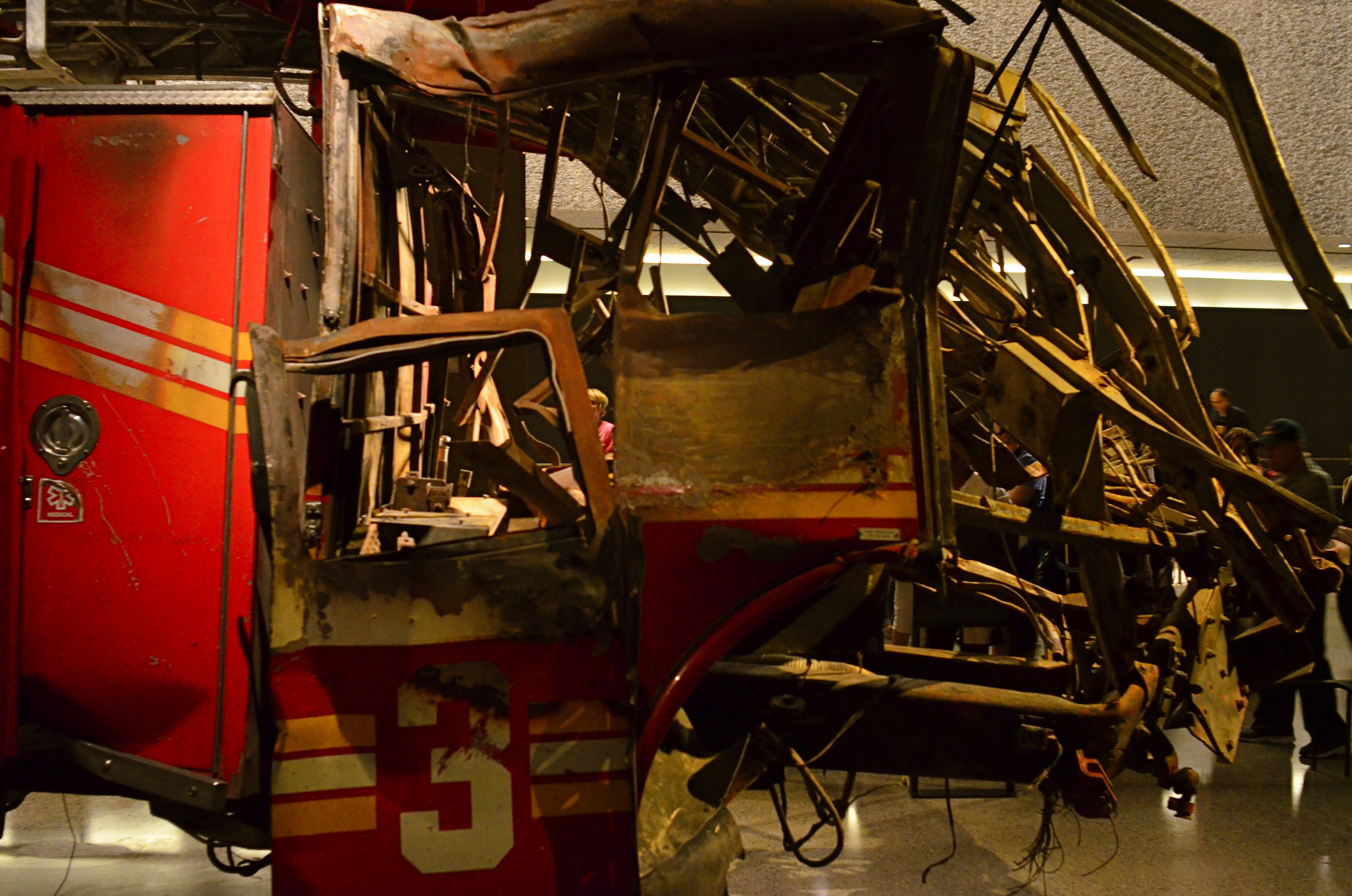
Sheared in half under the collapsed WTC’s North Tower, Ladder Company 3’s apparatus truck stands guard in the 9/11 Memorial Museum’s underground exhibit space.
By MICHAEL PERKINS
BEFORE THE ELEVENTH OF SEPTEMBER WAS DEFINED, for the New York Fire Department’s Ladder Company Number 3, by grief, the date had long stood as a milestone of devotion. Dedicated on September 11, 1865, Ladder 3 as one of Manhattan’s first fire companies, “the 3” was well on target toward its sesquicentennial on the morning that eleven of its finest perished while trying to evacuate the 40th floor of the doomed North Tower at the World Trade Center.* Death above was mirrored by destruction below: parked along West Street, the 3’s apparatus (ladder) truck was sheared in half, corkscrewed into a clawed snarl by the astonishing force of the building’s collapse.
And so it happened that one of the most poignant symbols of American valor was entombed, literally, at the epicenter of the nation’s most raw, most anguished loss, the geographic coordinates that quickly came to be called Ground Zero. However, the 3’s truck would not immediately serve as an official visual headstone, a graphic barometer of our loss. That day would have to wait.
First would be the accounting, the sorting out. As ashes were sifted and rebirth begun in this most vigorously contested patch of Lower Manhattan, the twisted remains of Ladder 3 were removed, the truck warehoused at JFK airport, silently sequestered against the day it would be re-purposed as a red-and-rust jewel in the reverent setting of the 9/11 memorial museum.
That resurrection and re-internment, a mixture of sacred fervor and steely defiance, would come on July 20, 2011, when the returned Ladder 3 apparatus truck, swaddled in U.S. and FDNY flags, would be lowered 70 feet down into the subterranean display space that serves as the nerve center of the museum. Now, before daily batteries of Nikons, Canons, and iPhones, its silent testimony can follow millions back home, the countless new images illustrating, as no words could, the full impact of history. Standing in as a grave marker for the thousands of human remains housed invisibly nearby, Ladder 3’s gnarled visage would pose as a surrogate, a way of marking valor’s Ground Zero.
* * * * *
*Ladder 3, in firefighter parlance, was “running heavy” on the morning of 9/11. The attack occurred almost precisely at the company’s change of shift, with both first and second shift crews remaining on duty to combat the catastrophe. This horrific quirk of fate doubled the 3’s losses at the site, claiming the lives of Captain Patrick “Paddy” Brown, Lt. Kevin W. Donnelly, Michael Carroll, James Raymond Coyle, Gerard Dewan, Jeffrey John Giordano, Joseph Maloney, John Kevin McAvoy, Timothy Patrick McSweeney, Joseph J. Ogden, and John Olson.
SILHOUETTE SHORTHAND
1/250 sec., f/8, ISO 100, 300mm.
By MICHAEL PERKINS
AS AN OBSESSIVE CHILD, I became crazed with the drawing of short animations on pads of paper known as “flip books.” You know the drill. Draw a picture on the top sheet, turn the page, draw another picture with a small change in position, and repeat several dozen times until you produce a brief cartoon by flipping the entire pad from the front to the back. I actually got pretty good at it, if, by “good” you mean manically addicted to perfection and insanely fixated on detail. I could make three seconds of cinematic grandeur. I just couldn’t do it fast.
Meanwhile, on the other side of the playroom, my sister and her partner, my cousin Mark, had so such problem. While I would spend the better part of a week sweating over the laws of locomotion for such classics as The Mummy Goes Mad or Spider–Man vs The Vulture, Liz and Mark cranked out ten titles a day, crude stick-figure blackouts created in ten-minute surges of creative hysteria, all ending with the unfortunate (and unnamed) hero exploding, then emitting a dialogue balloon with the single, sad existential word “WHY??” While I was doing DeMille parting the Red Sea, they were doing Mack Sennett one-reel wonders, heavy on the pie fights. Fact is, I found their stuff gut-achingly hilarious. There was no disputing which of the two “studios” better understood the entertainment biz.
Lizzie and Mark’s stick figures moved every bit as well as my fully-rendered players, but their impact was more immediate. Their drawings didn’t have even a single line that wasn’t absolutely essential to their narratives. I thought of all this recently when working with some distant crowds which were reduced to mere silhouettes in a deep telephoto of the coastline at California’s Morro Bay. As components in a larger composition, they were just markers, measures of linear space. Shooting even closer might have revealed their hair color, lines on their faces or the shine of water on their wet suits, but to what benefit for the overall effectiveness of the picture?
There are many forms of visual shorthand in the making of a photograph, and they can be effective in speeding the journey from the viewer’s eye to his heart. We might think of photography as the complete recording of detail, a piece-for-piece re-play of reality, just as I thought I had to draw every single web line on Spider-Man’s head. However, the most eloquent images often speak louder by using fewer words.
Sometimes, a stick figure is exactly what you need, and no more.
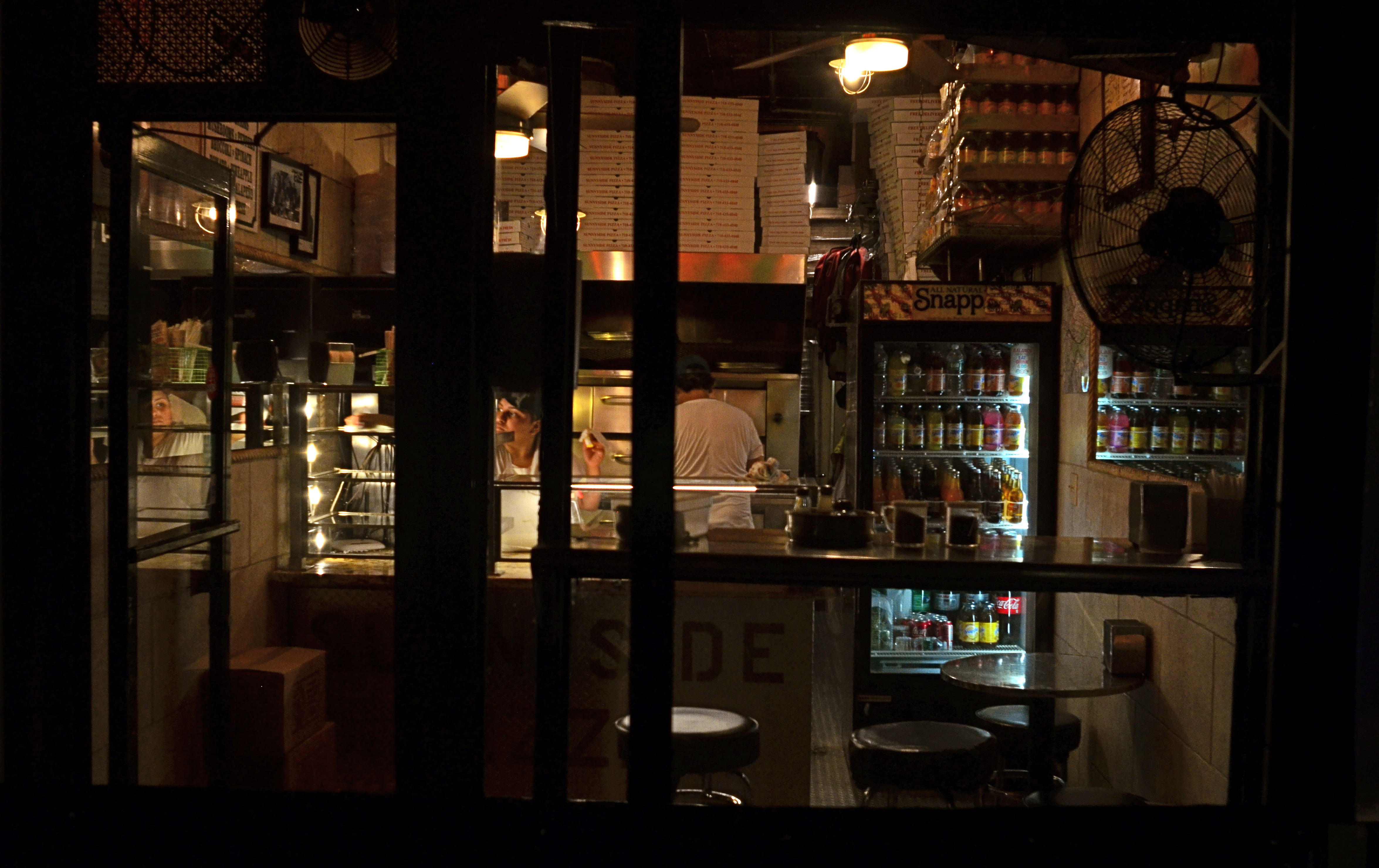
TILES
Carry Out (2017). 1/50 sec., f/4, ISO 640, 24mm.
By MICHAEL PERKINS
EVERY TIME I SEE SOMEONE working on a jigsaw puzzle, I can’t help but think that they’re missing all the fun. The idea of the project is, of course, to assemble enough pieces of a scene that it becomes recognizable. 200 pieces in: some kind of structure. 400 pieces in: looks like it’s made of iron, triangular maybe. 600 pieces in: oh, yeah, the Eiffel Tower!
But, whereas a picture puzzle is solved when the image looks complete enough, my favorite kind of photography centers on how few pieces of the puzzle can be supplied and still have the image communicate to the viewer. Formalists might call this minimalism: art curators might label it cubism: holy men in flowing robes might use the term zen. I just think of it as reducing pictures to the smallest number of components needed to convey ideas.
In fact, many photographic subjects actually present themselves in a kind of broken pattern right out of the gate, challenging us to create images from the spotty data they let through. For example, views through partially blocked windows, such as the one at the top of this page, in which what remains readable behind the darkened door and window framings, is more than enough to sell the message pizza shoppe.
For me, having everything spelled out to the Nth degree in a photograph is beyond boring. It’s much more interesting to engage the viewer in a kind of partnership in which he is looking on purpose and I am trying to maximize the power of my pitch, going as far beyond the obvious as I can while not letting the picture fly apart. The first minute I’ve snapped enough pieces into the puzzle to suggest the Eiffel Tower, I’m ready to leave the last 300 pieces in the box.
ONE GLIMPSE OF WAS
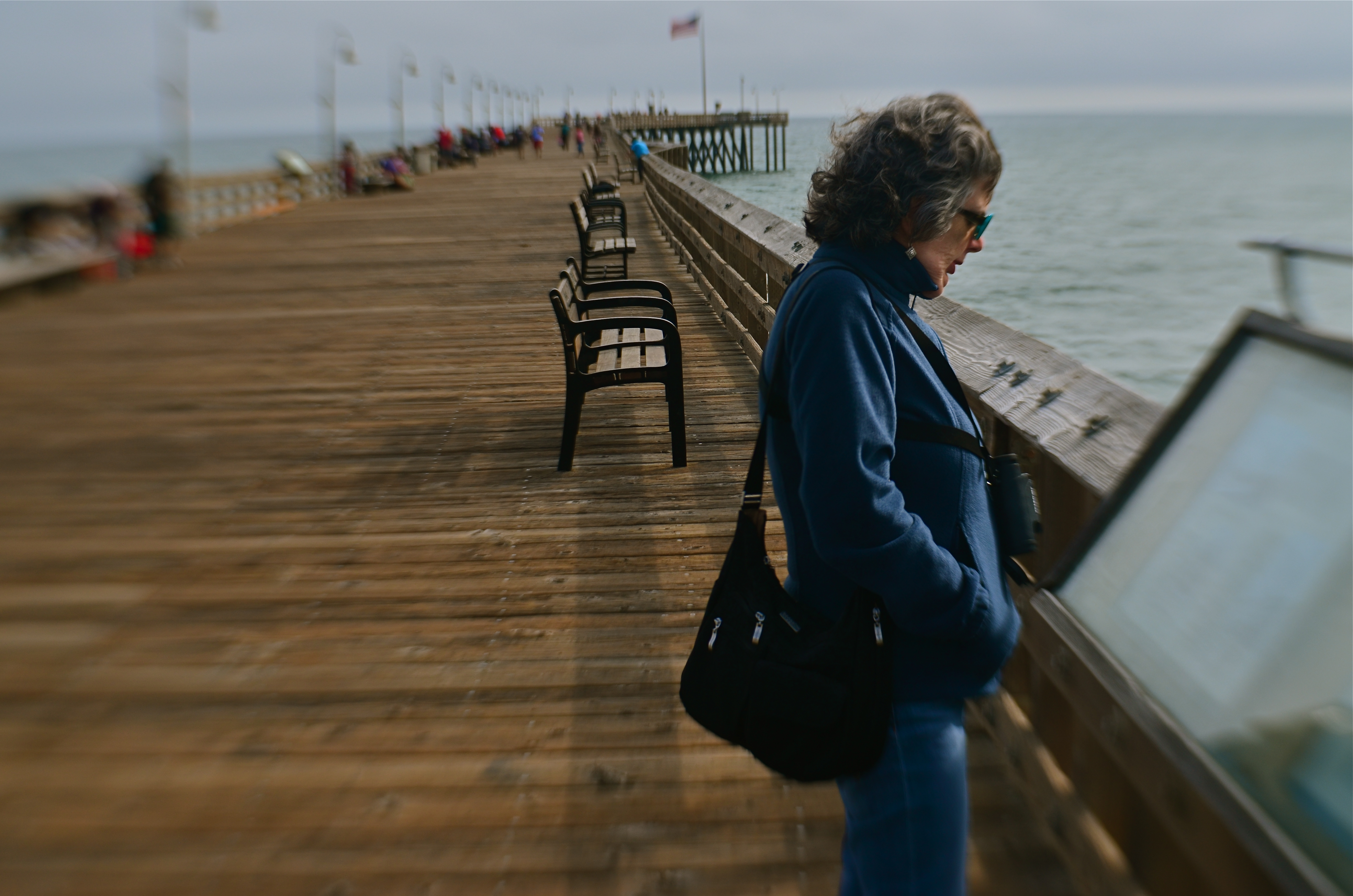
1/320 sec., f/5.6, ISO 100, 35mm.
By MICHAEL PERKINS
ONE OF THE EXQUISITE PLEASURES usually denied to even the best portrait photographers is the ability to turn back the clock, to use the camera to x-ray one’s way past a subject’s accumulated life layers, peering into the “them” that was. It’s not really that it’s impossible to retrieve part of a person’s yester-faces. It’s that it’s maddingly elusive, like getting a brief glimpse of a lighthouse beacon amidst billows of pea-soup fog. We have to take faces, for the most part, at, well, face value.
Case in point: meeting my wife, as I did, long after we both had lived fairly complete first lives, I can only know the early visual version of her through other people’s pictures. It allows me to look for parts of those earlier faces whenever I make new images of her, but I can never know when any of them will flash up to the surface. It does happen, but there’s no way to summon it at will.
Marian grew up in a beach town, with the seasons and rhythms of shore life defining her own to a degree. As a consequence, I always welcome the chance to shoot her near the sea….along beaches, atop windswept piers, weaving her way through the sights and sounds of boardwalks and harbors.
Of course, restoring Marian to her original context, by itself, is no guarantee that I’ll harvest any greater photographic truth about her face’s formative years than I do on any other day. Still, I find the idea romantic and brimming with tantalizing potential. Will I be given an audience with the ghosts of Marian past today? Will they even show up? The mystery of faces leads photographers on a blind chase, with only the occasional find to convince us to continue the hunt.
“LEVON”
By MICHAEL PERKINS
MANY PHOTOGRAPHERS ARRIVE AT WHAT I CALL a minimalist reset, evolving in their technique to the point at which they can do more varied work with fewer tools. This process leads many to designate a personal “go-to” lens, the chunk of glass that solves nearly every problem on a given shooting day by itself. I’ve tried to take this a step further, going from ” what one lens do I most need today?” to “what one lens can I probably use for everything, nearly every day?”, a lens so flexible that I’d actually have to have a very good reason not to use it on any given day. To express it another way, instead of thinking of a “go-to” lens, I’ve tended to work toward finding a “leave-on” lens.
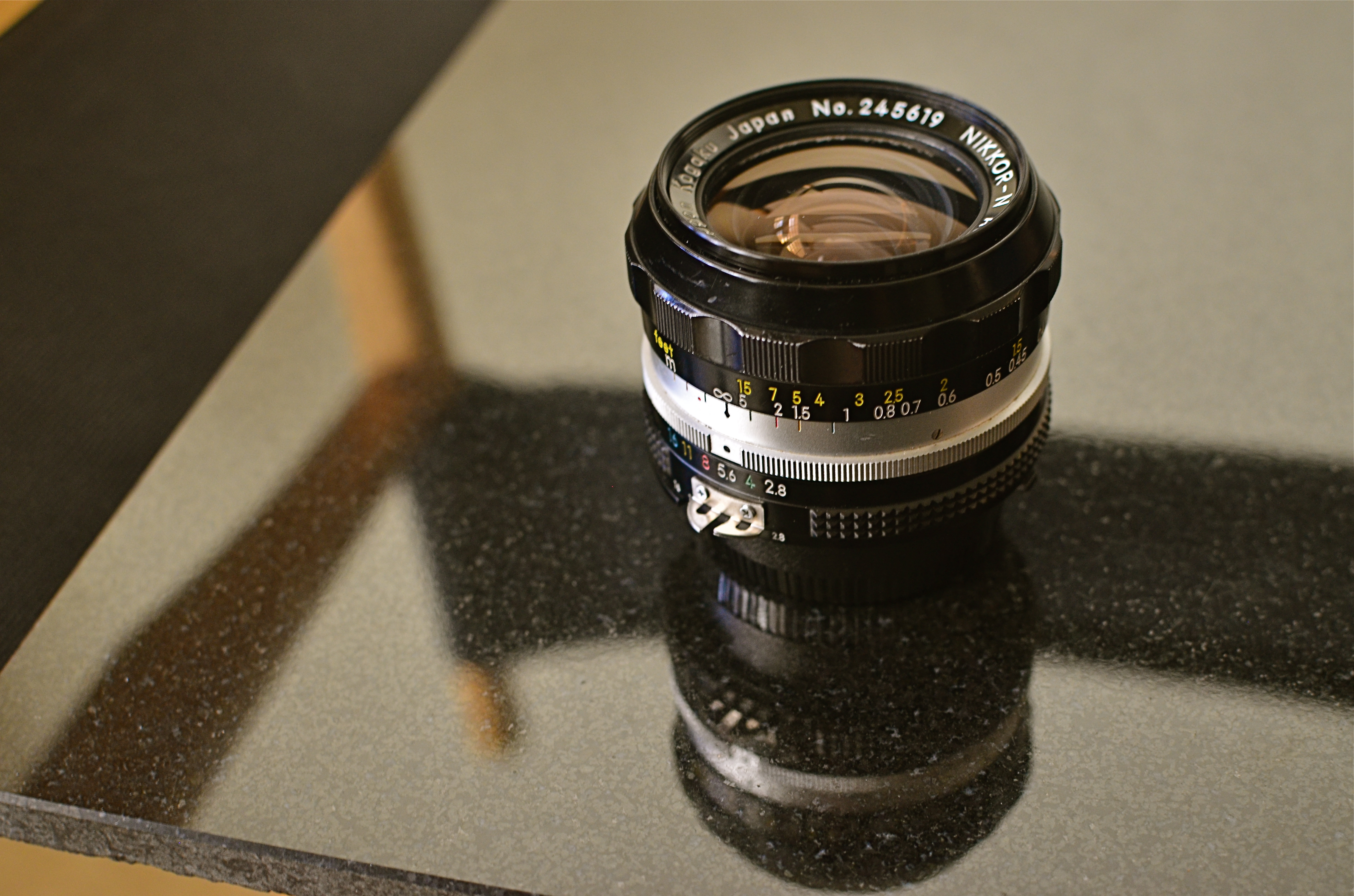
My “Levon” is the venerable Nikon 24mm f/2.8, in production continuously from 1967 (about when mine was made) to the present as a metal-barreled, fully manual lens. There is a cheaper, plastic autofocus version also available, but optics are generally the same. That is to say, damned sharp and damned fast. Both lenses are extremely compact and thus easy to lug about.
24mm is correctly called an “ultra-wide angle”, but I originally switched to it from something even wider, the ubiquitous 18-55mm “kit lens” most Nikons ship with these days. Doing a lot of shooting in big cities with crowded streets, I originally thrilled to just how much the 18 could cram into a frame. Eventually, however, I came to hate the severely in-bent slant on tall structures, and the fact that the 18, wide open, is pretty slow, at a max aperture of f/3.5. With the 24, I still get plenty of more natural-looking width and another fat half-stop of light in the bargain.
Handheld night scenes make up about a third of my urban shooting, and, here again, the 24 is Mikey’s Best Friend. Its manual focusing means my camera never spazzes in search of a focus lock in the dark, allowing me to actually shoot faster. And city scenes can be sharp even wide open at f/2.8, giving me crisp results from 12 feet all the way to just under 50, and from 17 feet pretty much to infinity. Combine that with a fairly low ISO like 800, and I can even keep the grain down.
Being a prime lens, the 24mm can’t zoom, but outside of occasional nature work, I seldom need a telephoto, so you don’t miss what you don’t use: another reason to leave the 18-55 home. Besides, primes, being optically simpler, are usually sharper, meaning it looks better than the kit lens dialed to 24mm. Finally, Levon is not a macro, but focuses at just one foot out, so some modest close-up work is feasible.
Standard disclaimer: this analysis is offered not to claim that any one lens is perfect for any one person. It’s just an exercise to show how, for the way I shoot, I have been able to do over 75% of my typical work without swapping out glass. I gain speed, ease, and flexibility in the process, and, if you conduct your own experiments, chances are you too can progressively spend less time fiddling and more time shooting.
“….and it shall be Leave-On…”
OTHER KINDS OF FACES
By MICHAEL PERKINS
AS A SON, I am extremely aware that my parents are in the final innings of their particular ballgame, a journey they began nearly sixty-seven years ago and a pairing that has defined their lives along with those of countless others. And, as a photographer, I have come to realize that every phase of Mother and Dad’s time together has produced its own unique visual treasures and challenges.
The images that are made of them these days….congratulatory parties, miraculous birthdays, mythic anniversaries….are repeats of similar occasions spanning decades, even as they are also emotional re-castings of old roles. Such pictures are both records of what has been and chronicles of what remains. For both Mother and Dad, steps do indeed come slower these days, but memories still move at light speed. Physical age and emotional wisdom conduct an ongoing tug-of-war across all their days. Making photographs of this process is tricky.
I know that, when my camera is too visibly present, it creates discomfort for them. For a variety of reasons that may include merely being over it all, they are not keen on the idea of “sitting for portraits”. I can best respect this by seizing other kinds of moments, in other kinds of ways.
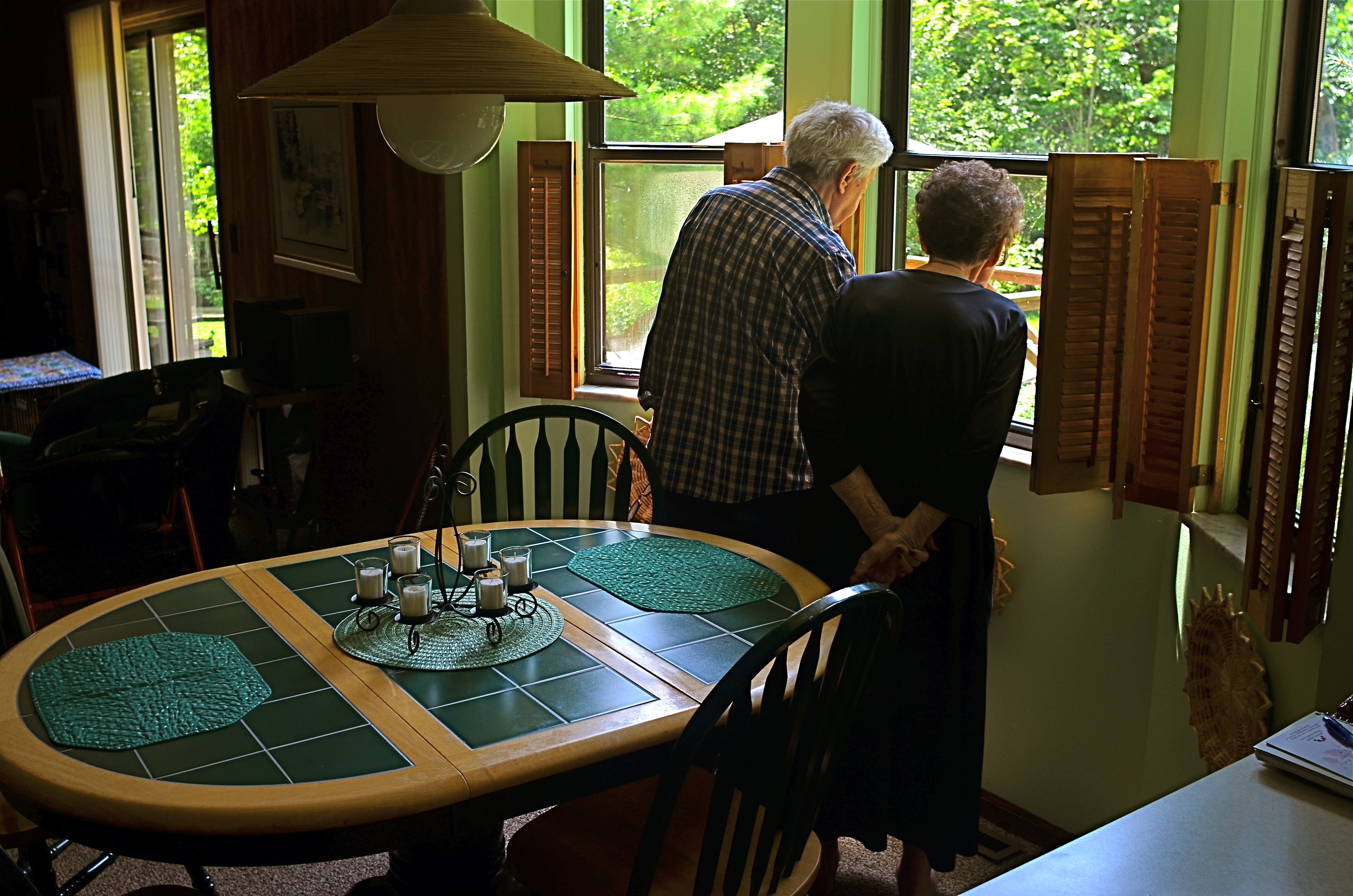
The long–distance newlyweds: Ralph and Jean Perkins, August 2017.
Recently, I caught a very lucky break, when they both went to their kitchen window to look over their beloved back yard, the acre lot resplendent with the tree plantings, deck buildings, and family events they’ve staged in it over more than a third of a century. Certainly, I don’t always instantly comprehend the value of a shot in the moment, but this one was obvious enough for even me.
There, in the moment, was the entire marriage in miniature: two people seeking, dreaming, discovering in tandem. No shy faces or self-conscious “say cheese” moments were needed to photograph their twinned hopes, their linked optimism. You can’t see their features, but these two people are unmistakably my parents.
Faces are remarkable documents, but they aren’t the only ones available to a photographer. That’s because there are a million tiny ways for humans to visually register emotional truth, a universe full of little grace moves that, singly or collectively, convey identity. My parents, like everyone’s, are eloquent, even when they do not stare into the camera to make their testimony.
POST STARTS NOW
By MICHAEL PERKINS
THE POST–PROCESSING REVOLUTION wrought by the introduction of Photoshop in 1988 has so profoundly influenced the act of picture-making that many shooters think of the program as half of a complete two-step process of photography. In Step One, you shoot the image. In Step Two, you fix it.
However, being conversant with more of the menu options built in to nearly every level of camera in use today can mean solving most “post” dilemmas without resorting to Photoshop’s full suite of solutions. Just as you change lenses less the more you understand what lenses can be stretched to achieve, you can avoid the extra step of computer-based tweaking the more you understand what’s already available while your subject, your shooting conditions and your mental presence are all in play. Some would argue that such adjustments would be more finely attenuated working with a RAW file in Photoshop than by fixing flaws in-camera with a JPEG, and you have to decide where you come down in that debate.

The original shot suffers from the “blues“.
Let’s take color as one example. A great many photographs with off-kilter values are corrected in Photoshoppish apps, yet can be quite satisfactorily fixed in-camera. White balance settings allow you to pre-program a number of light temperature pre-sets that make your camera “see” colors as if they are occurring in sunshine, shade, or a variety of artificial light sources. But even if you shoot everything on the “auto” white balance setting and get the wrong colors occasionally, there is still a way to repair the damage without resorting to Photoshop. What Nikon and Canon both call color balance allows fairly fine-tuned adjustments to get the hues to look either (a) more like you saw it, or (b) the way you wish it had looked.
The shot at top, adjusted with Nikon’s color balance option, produced the warmer look in the bookshelves that would have resulted if the light coming through the window had been warmer. In the original image, taken with an auto white balance setting, the camera, far from “guessing wrong”, actually recorded the room light as it appeared in reality, since the sky was severely cloudy and was a little blue in cast. However, with the in-camera color balance tweak, no Photoshop intervention was required. Moreover, I could check my work while in the moment, a handy thing, since tours were moving in and out of the room all day, meaning that, if I wanted to shoot the room (nearly) empty, I had to work fast.
Digital photography’s original bragging point over film was the ability to shoot, fix, and shoot again rather than rely on the darkroom to rescue tragically few of our miscalculations. Working our in-camera menus for all they’re worth helps deliver on that promise.
BOOKENDING
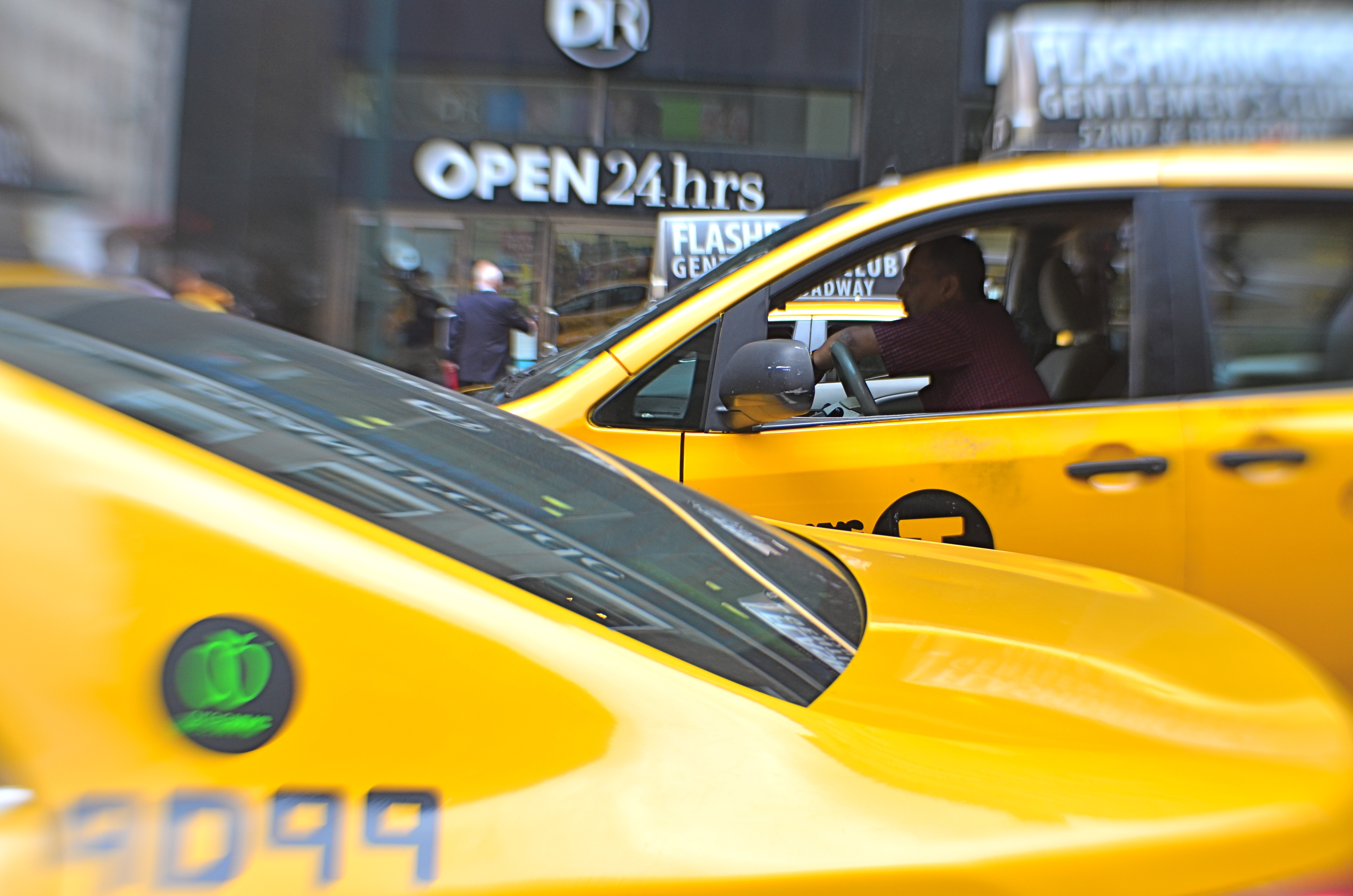
By MICHAEL PERKINS
THE HUMAN EYE HAS A SOFT SPOT FOR SYMMETRY, for countervailing energies that face off against each other in a composition. Design elements that pit left against right, top against bottom, even corner vs. corner appeal to a certain Math-Bach sense of balance in the universe. And, as does every other kind of visual art, photography builds strong images by “book-ending” elements in opposition, eye cues both tug toward the center and pull toward the edges.
Pictures benefit from this tension, this dynamic argument over what’s more dominant, or, more correctly, what’s dominant in this moment. Book-ending between extremes or contrasting forces is a visual kind of debate, a photographic arm-wrestling match. Sometimes shapes or things occupy opposing spaces in the frame are not, literally, fighting with each other, as in the two overlapping taxicabs seen above. Even so, the two yellow wedges at bottom left and top right in the frame are in a kind of balancing act with each other: call it a conversation.
In your own work, you’ve no doubt observed this visual tension occurring organically or even deliberately built it into a composition. An old building next to a new one: a tragic mask alongside a comic one: a kumquat facing off against a tomato. It doesn’t have to be dramatic to be effective. The bookends can be ornate Greek warriors or abstract slabs: it’s the opposition in the frame that starts the process of yin/yang, and lends a photograph extra heft.

BINGE / PURGE
I AM STILL IN PAIN, several days after the most aggressive photographic housecleaning I’ve endured in years, the ruthless removal of years of deadwood from a photo-sharing site on which I’ve parked way, way too many wayward pictures. This was, finally, the week to toss away the old moose head in the attic, the day to tearfully admit that you no longer fit into your varsity jersey. Hail and farewell, parting is such sweet sorrow. Goodbye and good riddance.
OVERHEARD DURING MY EDITING/DELETING PROCESS
Oh, My Gawd…
What even is that?
Well, that certainly didn’t work…..
Nothing wrong with this one…..except the lighting, aperture, and composition…
Seriously, what the hell is that?
Lots of this concentrated cringing over pix of yesteryear speaks to my old acronym SLAGIATT, or Seemed Like A Good Idea At The Time, the simple truth that what you believe is profound at the time of the shutter click will strike you as reeking fish wrap several miles down the pike. We do outgrow, update, and disown old ideas, hopefully replacing them with better ones.
To take it a bit further, if a significant number of your old images don’t make you want to reach for the bilge bucket, one of two things is true. (1) You are already God’s messenger, the one true Messiah of photography (unlikely), or (2) you are so mired in habit and false comfort that the way you shoot is the way you always shot and the way you will always shoot. Given those choices, it may be preferable to regard at least some of one’s work the way Jack Nicholson’s Joker riffed through Vicki Vale’s portfolio, i.e, “crap…..crap….crap…” It hurts, but it’s healthy.
Every binge must have a purge, and the gluttonous output of the digital age guarantees one sure truth: they can’t all be gems. I hate having to disown my kids as much as the next shooter, but part of learning is learning to fail, admitting that at least some of those kids will never Get Into A Good School, Settle Down With Someone Nice, and Start Giving Us Some Grandchildren. If for no other reason than to help us know excellence when we see it, we need to be able to fearlessly label all the loves we have lost.
Share this:
October 14, 2017 | Categories: Commentary, Criticism, editing | Tags: editorial, Technique | 2 Comments