I’M LOOKING THROUGH YOU
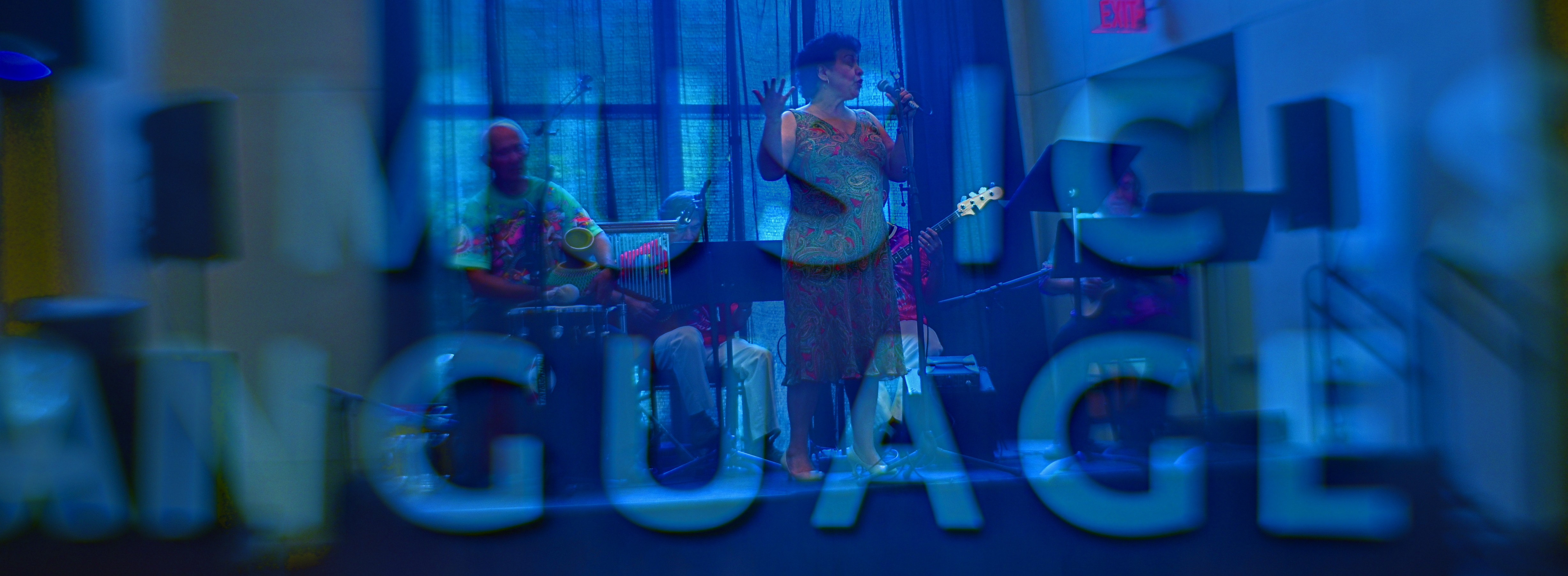
A double–exposure generated in Photomatix‘ “exposure fusion” mode, usually used to blend multiple exposures of the same subject, like the blending done in HDR programs.
By MICHAEL PERKINS
THERE IS A GROWING DEBATE OVER THE RECENT EMERGENCE of a process called exposure fusion, which has been touted as an alternative , if not a replacement for, High Dynamic Range or HDR processing. Which camp you fall into depends greatly upon what look you want in your final image, and both processes can be generated within a popular program call Photomatix.
So, first, a bit of review: HDR blends multiple frames of the same subject, shot at differing degrees of exposure, basically deepening the lighter values and rescuing detail in the darker ones. This means that you can potentially create a composite photo which “sees” the entire range of values in the same intensity, somewhat like your own eye (the ultimate camera) sees them.
Photomatix’ other main flavor, exposure fusion, takes the same multiple exposures and weighs every pixel in each of them for its value, letting some pixels from all exposures ” show through” in the final composite. The range of tones from light to dark is far less dramatic than in HDR, producing an image that strikes some as more natural. It’s worth noting that exposure fusion processes faster and easier than HDR and produces none of its annoying “halo” around the periphery of objects.
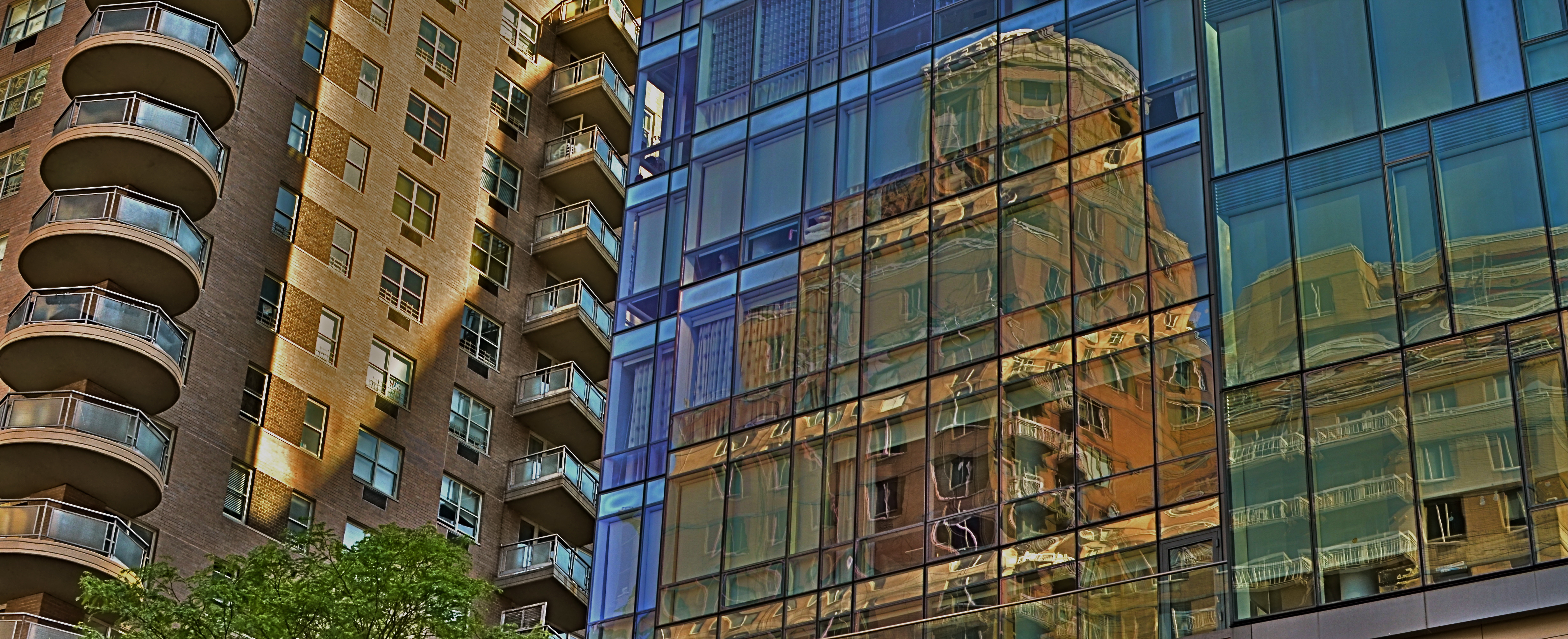
One additional fun aspect of exposure fusion, for me, is in its ease of use in creating montage, or controlled double-exposures, as well as same-subject composites. In the above shot, you’ll see a particularly clean amount of transparency between the musicians at a museum and a shot of part of a sign advertising its theme statement. Moreover, exposure fusion operates with several supple contrast and compression slider switches that make very minute adjustments in a snap.
The current HDR / Exposure Fusion “face-off” can only be resolved by actual users’ results, the only thing that matters in photography. Hey, if you made a piece of cowhide light-sensitive with a mix of lemonade and Lestoil and found a way to make a print with it, then mazel tov and God bless.
It’s always, and only, about the pictures.
TWILIGHT TIME
By MICHAEL PERKINS
I HAVE STRUGGLED OVER A LIFETIME to tell photographic stories with as few elements as possible. It’s not unlike confining your culinary craft to four-ingredient recipes, assuming you can actually generate something edible from such basic tools. The idea, after all, is whether they’ll eat what you’ve cooked.
With images, I’ve had to learn (and re-learn) just how easy it is to lard extra slop onto a picture, how effortlessly you can complicate it with surplus distractions, props, people, and general clutter. Streamlining the visual language of a picture takes a lot of practice. More masterpieces are cropped to perfection than conceived that way.
The super-salesman Bruce Barton once said that the most important things in life can be reduced to a single word: hope, love, heart, home, family, etc. And so it is with photographs: images gain narrative power when you learn to stop sending audiences scampering around inside the frame, chasing competing story lines. Some of my favorite pictures are not really stories at all, but single-topic expressions of feeling. You can merely relate a sensation to viewers, at which point they themselves will supply the story.
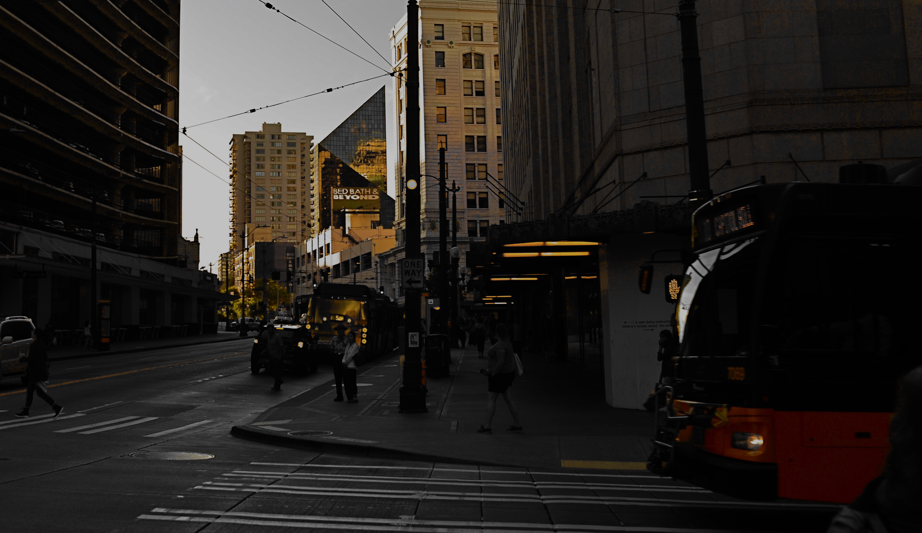
As an example, the above image supplies no storyline, nor was it meant to. The only reason for the photo is the golden light of a Seattle sunset threading its way through the darkening city streets, and I have decided that, for this particular picture, that’s enough. I have even darkened the frame to amp up the golds and minimize building detail, which can tend to “un-sell” the effect. And yet, as simple as this picture is, I’m pretty sure I could not have taken it (or perhaps might not even have attempted it) as a younger man. I hope I live long enough to teach myself the potential openness that can evolve in a picture if the shooter will Just. Stop. Talking.
YOU AND YOUR BRIGHT IDEAS
A simple manipulation of single–source light produces a wide range of effects.
By MICHAEL PERKINS
THE SELF–EDUCATION PROCESS INHERENT in photography is perpetual: that is, the lesson-learning doesn’t “clock out” merely because a given task is completed, but flows equally during the in-between moments, the spaces outside of,or adjacent to, the big ideas and big projects. Down time need not be wasted time.
Often it’s because the pressure of delivering on a deadline is absent that we relax into a more open frame of mind as regards experimentation. You find something because you’re not looking for it.
One such area for me is lighting. I seldom use flash or formal studio lights, so I obsess over cheap, mobile, and flexible means of either maximizing natural light or adding artificial illumination in some simple fashion. This isn’t just about making an object seem plausibly lit, or, if you like, “real: it’s also about choosing or sculpting lighting schemes, making something look like I want it to.
Small, powerful LEDs have really given me the chance to fill spare moments cranking out a wide array of experimental shots in a limited space with little or no prep, producing shaping light from every conceivable angle. I just lock the camera down on a tripod, make some simple arrangement on a table top, and shoot dozens of frames with different directional sweeps of the light, usually over the space of a time exposure of around a half a minute. I can move the light in any pattern, either by holding it static or tracking high/low, left/right, etc.
Frequently this activity does not result in a so-called “keeper” image. Such spare-time experiments are about process, not product. The real pay-off comes somewhere further down the road, when you have need of a skill that you developed over several days when you had.. nothing to do.
A FUNERAL AND A BIRTHDAY
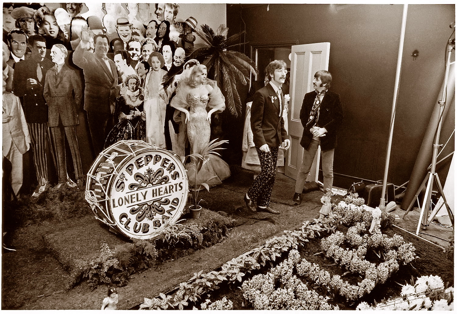
John Lennon and Ringo Starr inspect the assembly of the celebrity diorama that would be the main set piece for the Sgt. Pepper album cover, 1967.
By MICHAEL PERKINS
ANY COMPLETE DISCUSSION OF THE LEGACY OF THE BEATLES‘ Sgt. Pepper’s Lonely Hearts Club Band, marking its fiftieth anniversary in 2017, will include voluminous analyses of its ground-breaking production technique and breakthrough approach to musical composition, and rightfully so. But this most fundamental of pop culture events of the 1960’s must also be thought of in purely visual terms, since many of us first encountered it as an amazing, challenging image.
In truth, the collaboration between Pop Art designer Peter Blake and studio photographer Michael Cooper, with its ad-hoc gathering of cardboard celebrities grouped around a gravesite with the word BEATLES spelled out in blossoms, is the first act of a two-act play. The cover set the same audacious terms of engagement that the record inside the sleeve would abide by: Art and Music are what we say they are: We, the Beatles, are in complete charge of our music, our image, and our connection with the audience: we will not have “a” style, but will hybridize whatever schools of thought come to hand, from modes of composition to instruments to shifting patterns of Past, Present, and Future to coloring outside the lines of even our own culture. I read the news, today, oh, boy, and it said there are no more rules: there are no more walls. The stage can no longer hold us. Only the studio itself is vast enough to contain what we have to say.
The cover of Sgt. Pepper made a stunning break with the accepted practices used by record labels to market their goods. Quite simply, the suits in the front office were no longer in charge of the pictures. And what of that picture, or, more accurately, that picture of pictures? Is it a tribute? A put-on? A serving of notice that the Beatles are dead, long live the Beatles? Yes, yes, and hell, yes. Pepper made it plain, once and for all, that album covers, which had begun in the 1930’s as basic advertising sleeves for the goods within, could be venerated, influential, and, yeah, framed on some freak’s wall. Like, you know, man, art.
And, if Cooper and Blake were drawing a line between eras for the record world, they were doing so to an even greater degree for photography, which, in 1967, was still considered by some as more craft than art. Within a few years after A Day In The Life‘s long, ringing super-chord, museums were mounting shows by Diane Arbus, Lee Friedlander, and Robert Frank, right alongside the painters, and directly adjacent to people like Warhol who constituted categories all their own.
Just as Alice In Wonderland is somehow legless without John Tenniel’s illustrations, Sgt. Pepper’s’ outside will always be wedded to its inside, and vice versa. As the most popular multimedia product in commercial history, it owes much of its titanic impact to the image of four oddly costumed men with four strangely new mustaches and one big message: there is more to us than meets the eye. Like the best of photography, the picture issues a challenge. Nothing is real.
And nothing to get hung about…….
WHEN AND HOW
By MICHAEL PERKINS
I photograph late in the day, the time Rembrandt favored for painting, so that the subtlest tones surface. ———Marie Cosindas
ONE OF THE GREATEST SIDE EFFECTS OF MY HAVING LIVED IN THE AMERICAN SOUTHWEST over the past eighteen years has been its impact on how I harness light in my photography. The word harness conjures the act of getting a bit and bridle on a wild stallion, and so is extremely apt in reference to how you have to manage and predict illumination here in the land of So Much Damn Sun. It’s not enough here to decide what or how to shoot. You must factor in the When as well.
To see this idea in stark terms, study the work of photogs who have shot all day long from a stationary position along the rim of the Grand Canyon. The hourly, and sometimes minute-to-minute shift of shadows and tones illustrates what variety you can achieve in the outcome of a picture, if you consciously factor in the time of day. After a while, you can glance at a subject or site and predict pretty accurately how light will paint it at different times, meaning that many a session can produce a wild variance in results.

I scouted this location when sunlight was coming from the front of the court, then returned in the late afternoon to shoot it with the sun entering from the back to snag the shadow pattern I preferred.
The late photographer Marie Cosindas, whose miraculous early-1960’s work with the then-new Polacolor film helped change the world’s attitude toward color imaging, didn’t just load her film into a standard Polaroid instant camera. She shot it in her large format Linhof, experimenting with exposure times, filters and development techniques, and, above all, with the careful selection of natural light. She didn’t just wait for her subject; she waited on the exact light that would make it, and all its colors, sing. As a result, the art world began to rethink its opinion about color just being for advertising, or as somehow less “real” than black & white.
In my own work, I take the time, whenever feasible, to “case” locations a while before I shoot them, taking note over days, even weeks, to see what light does to them at specific times of day. As I mentioned, the West suffers from an overabundance of light, mostly the harsh, tone-bleaching kind that is the enemy of warm tone. In the above image, I scouted the location in the early morning, when the eastern sun was drenching the front end of the court, but waited about eight hours to return and get the precise projection of shadow grids that only occurred once the sun was in its western descent, about two hours before dusk. My test shots from the morning told me that the picture I wanted would simply not exist until ’round about suppertime. And that’s when I stole my moment.
There are three legs to the basic photographic tripod: What, How, and When. Over the years, paying greatest attention to that third leg has often given me one to stand on.
SAVING FACE

Faces are selves served up in slices.
By MICHAEL PERKINS
YOU WOULD SUPPOSE that sustained, intimate contact with a photographic subject would inevitably lead to a superior, if not perfect rendering of that subject in an image. And supposing further that said subject is a person, you’d assume that one’s close bond with the subject couldn’t fail to produce the ultimate visual depiction of that person….a glimpse into their very essence.
Or so you’d suppose.
There is a reason why so many shooters pursue the same faces, many belonging to dear friends or loved ones, over a lifetime of picture-making….never quite able to reduce a face to its essence or its definitive “version”. It’s not that they don’t yet know enough about that particular arrangement of shapes and features. It’s that they know too much to settle for any single interpretation of them.
No sooner does the face of the Dear One display a given mood or aspect than it shifts like an active weather front to a completely different mix of elements. Faces are selves arrested in mid-flight, and, being in constant motion, rob us of the picture we originally set out to capture, only to bestow a fresh one on us. The “new” person we now see is, certainly, the same individual, but changed enough that we are off on a completely different mission, visually speaking. That is both frustrating and fulfilling.
The slices of persona that we freeze in the camera are just that: shifting glimpses. That means that, unlike pictures of monuments or mountains, they can’t be “done” in any permanent way. Add to this the change in how we all relate to each other over time, and it makes perfect sense to refresh our view of the most familiar faces an infinite number of times.
FACTS NOT IN EVIDENCE
The more you study a picture like this, the more you can find wrong with it. Let me help you….
By MICHAEL PERKINS
IF A STREET PHOTOGRAPHER IS GOING TO ASK HIS AUDIENCE TO EXTRACT A STORY FROM AN IMAGE, then he must ensure that he is putting that same story into his pictures. Just suggesting a narrative, especially in a photograph, is not the same as conveying one. In legal terms, you are asking your viewers to “assume facts not in evidence.”
Do you have to spell everything out, like an S.O.S. in a bowl of alphabet soup? No, but just pointing your camera at just anything happening “on the street” doesn’t guarantee emotional impact, either. Nor does it imbue your pix with profundity, irony, or anything else that wasn’t happening through your eyes before it went through the lens. No street shot is guaranteed “authenticity” just because you were on the street when you pressed the shutter.
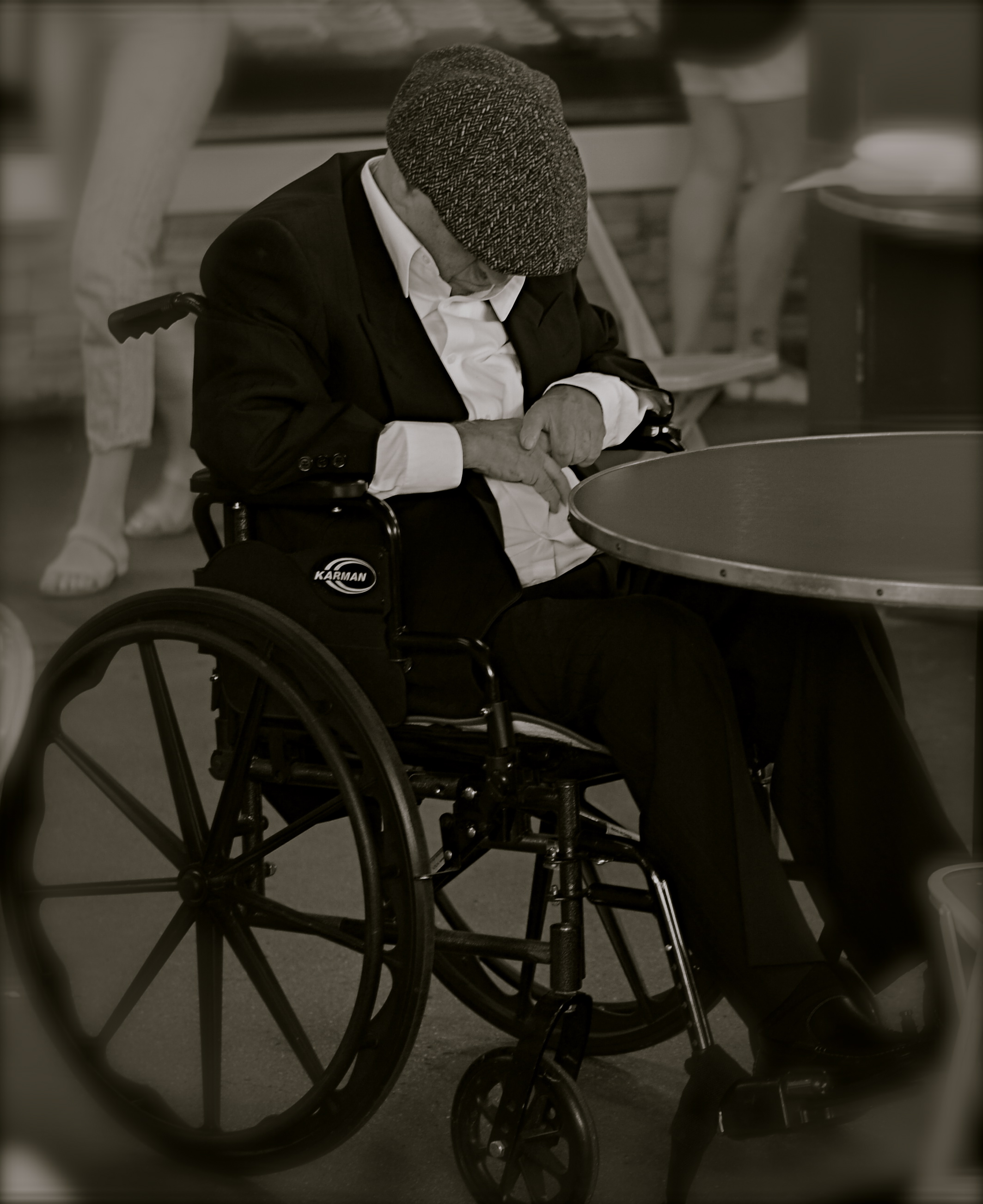
Look at the image at left, which I snapped rather accidentally while taking a lot of images of a crowded food market. I did not mean for the gentleman in the wheelchair to be the main appeal of this frame, but even though he’s been cropped to now be central to the shot, there is no clear narrative that “saves” this photo, or makes it compelling on its own terms.
Let’s dissect the picture to see why it fails. What it is, in raw terms, is a man in a wheelchair, sitting alone, wearing dark clothing, his face hidden.That is all that’s absolutely proven in the picture. Now, let’s assume that I was going for something poignant, a human “moment” if you will. Such moments are the heart and soul of great street shots, but this one is missing far too much vital information. If the man is “sad”, is it because he’s in a wheelchair? Why, and who am I to say so? After all, maybe he just had some restorative surgery which, after a month in the chair, will restore him to star-athlete status. Or maybe he is in the wheelchair for life and yet enjoys a richer existence than I do.
Let’s go farther. His face is hidden, but what story can I make the viewer believe is true about that? Is he catching a cat nap while his pile scores him a slice of pizza? Is he doing special exercises? Praying? Does his hat fit badly? Is he depressed, or actually a master of meditation who’s more connected to the cosmos than I can even dream of? And then there’s the monochrome. This picture began as a color shot, but I certainly didn’t increase its impact merely by sucking out the hues. That is, there isn’t some clear message that was being muffled by color which now speaks in a clear voice in mono. Finally, the cropping makes him the prominent feature in the photo without making him the dominant one. The background of the original was distracting, to be sure, but, as with the color, taking it away didn’t add to the picture’s force. If anything, it made it weaker. The man can’t be ironic or poignant since I’ve now cut him off from everything that provides context to his role in the picture.
You get the idea of the exercise. This shot, color or mono, cropped or wide, had nothing clear to say about the human condition. It was taken on the street but it ain’t “street” in effect. Try the same ruthless analysis with your own “near-miss” shots. It’s a humbling but educational process.
MR. KITE HAS LEFT THE BUILDING

They’re Off And Running (2012) Ponies performing in the round at the Santa Monica Pier.
By MICHAEL PERKINS
PHOTOGRAPHY’S PRINCIPLE BENEFIT IS THE STEALING AND PRESERVATION OF THE FLEETING. That was the miracle that originally astonished the world, the ability to arrest time, to selectively snatch away droplets of the infinitely flowing river of moments and keep them in a jar. And as the young art flourished and began to flex, it proved capable of not only grabbing individual instants, but chronicling the passing of entire modes of life.
As the prairie was settled, as the great distances of the planet were traversed and tamed, as the horse gave way to the car, and as the country mouse became the city mouse, photography laid down mile markers, clearly labeled “this is”, “this is going away” and “this was”. As a consequence, we now have a visual record of worlds and ways of living that have already long since gone extinct. We rifle through shared and inherited images that mark the passing of empires, fashions, movements.
This is all, of course, beyond obvious, but there are times when photographers are more keenly mindful that something big is in the process of winking out. I experienced such a moment a few days ago with the news that Ringling Brothers’ circus was shuttering its operations after more than 150 years, ringing down the curtain on a mixed record of extravaganza and exploitation, depending on where you stand on the issue. Whether circuses were a wonder or an abomination or both, they represented a distinctly analog kind of entertainment, a direct tie between sensations and senses that is one of the last traces of 19th-century culture.
Along with world’s fairs, carnivals, vaudeville, even rodeo, the circus serves as a strange relic of a time when the arrival of the Wells Fargo wagon or the pitching of the Chautauqua tent could be the height of the social season in many a town. The visually rich pageant of having dozens of clowns, acrobats, and performing beasts parade right down your main street was, in the days before mass media, pretty heady stuff, and, even at its twilight, it still has a powerful, if quaint, pull on the imagination. All of this is fertile ground for the photographer/chronicler.
It’s now fifty years since John Lennon transcribed the text from an old circus poster to evoke a vanished era with the song Being For The Benefit Of Mr. Kite, overdubbing the music track with a montage of calliopes and hurdy-gurdys to paint a very visual piece of audio. To this day, I can’t hear the tune without concocting my own mental photo of prancing ponies and carnival barkers. Mr. Kite may already be retiring to his dressing room, as are so many analog forms of entertainment. But we have the pictures. Or we need to start making them.
EYES ON THE PRIZE FOR THE EYES
By MICHAEL PERKINS
THE INTERNET SCREECHED ITSELF HOARSE in 2016 when the Nobel Prize committee announced its intention to award one of its coveted awards for Literature to Bob Dylan, the first popular songwriter so honored. There were acrimonious screeds on both sides of the issue, as hands were wrung and garments were rent over whether Mr. D. was a poet or just a scribbler of post-beat pap. My initial reactions ranged from “really?” to, well, “really???“. But then I figured that, far from stretching the idea of “literature” too far, the Nobel gang hadn’t taken it far enough.
That is to say, it’s way past time for photographers to be invited onto the Nobel podium. As creators of visual literature.
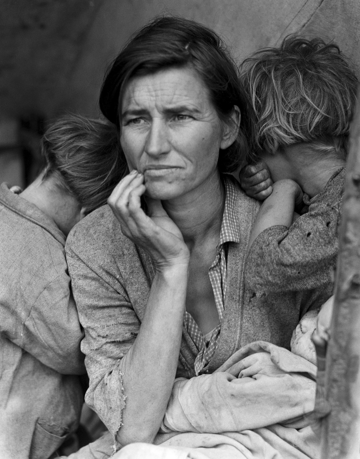
Dorothea Lange’s Dustbowl image Migrant Mother is the Library of Congress’ most requested image.
Founded as an attempt by Alfred Nobel to expiate his guilt for having invented dynamite, the awards were designed to reward those whose work enriched or enlivened the human condition in the areas of chemistry, economics, physics, physiology/medicine, peace, and, yes, literature. As compared to the Pulitzer prize, which confers news value on both the printed word and photographic images, and is awarded for a singular piece of work within a single year, the Nobels are awarded for a body of work. With that standard in mind, it would actually be easier to judge the value of a photographer over a lifetime, versus the potential for a lucky or instinctual snap to be taken in the recording of a brief moment. But photography is a visual art, and a young one at that, and, even though no one still argues against its importance or impact, it is a sticky wicket to compel the powers that be to confer the “L-word” upon it.
Considering that the slight jump from literary poetry (Seamus Haney) to commercial song lyrics (Dylan) nearly caused Nobel critics to hemorrhage, proposing that photographs could also meet the definition of literature must sound, to some, like reciting dirty limericks during High Mass. Further, word “originalists” will point to the fact that literature is strictly defined as a written work of permanence. And yet it’s the permanence part that matters. Pictures have, in fact, changed arguments, minds and history, just as paintings have. And, if literature is that art which endures, something which defines the human experience, then a photograph is certainly as big an influence upon culture as a play or novel. A document is a document.
In accepting his Nobel prize, author John Steinbeck declared, “the writer is delegated to declare and celebrate man’s proven capacity for greatness of heart and spirit..for gallantry in defeat…for courage, compassion, and love.” Now go from the general to the specific, considering Steinbeck’s amazing chronicle of the Oakie odyssey of the 1930’s, The Grapes Of Wrath. As a contrast, how does Dorathea Lange’s picture Migrant Mother, with its graphic depiction of the dust bowl era’s desperation and despair, have any less impact than Steinbeck’s glowing account of the Joad family’s trek to California? In my estimation, both works magnify and certify what it means to stand tall in the blowing gale of ill fortune. And that is a literary idea.
Migrant Mother, like Grapes, is no mere “one-off”, but a small part of an enormous oeuvre, a vast portfolio filled with eloquent testimonies that delineate humanity. The Nobel has slowly begun to mature with the awarding of Bob Dylan’s literature award. Now it’s time to regard the visual arts as part of that larger, and widening discussion.
ART ON THE CHEAP(ER)
Conventional focus with a standard optical zoom lens.
By MICHAEL PERKINS
ONE OF THE GREATEST BONUSES OF THE APPS ERA IN PHOTOGRAPHY is how fast certain effects and processes in picture-making have moved from proprietary functions to discretionary ones. Certain “looks” which were the sole domain of well-funded professionals in the film era have been democratized to an insane degree, allowing many more of us to make images that required expensive gear or exhaustive training (or both) just a heartbeat ago.
Selective focus is but one such area. Manipulating sharpness within sections of an image used to be the stuff of cunning calculation and infinite patience…in both shooting and post-processing. Now it’s yours for the flick of a button. The app installs, you click the picture, and you massage the results. Minutes from start to finish. And manufacturers of conventional cameras have had to react to the immediacy of effects available in the mobile market, re-introducing art lenses and specialized optics (think Lomo and Lensbaby) that allow shooters to add “artifacts” or “classic film looks” to their work as they are shooting. At this rate, it’s only a matter of time before these proprietary (think expensive) art lenses become more discretionary (easier to use and cheaper).
Same subject, five minutes later, with a selective-focus “art lens”.
When focus or any other main element in picture-making becomes more flexible, people experiment more and more. That, in turn, increases the number of average shooters who produce more sophisticated work. It’s part convenience, part economics: once the ability to do something on an occasional whim is granted to more people through innovation or pricing, the exotic becomes the normal, and the entire art advances. Photography began as a tinkerer’s hobby, costly and clunky in its execution. However, once it solved those problems, it went viral (or whatever one went in the 1800’s). And now digital apps are leading the entire market toward another level of ease and affordability.
The two pictures you see here were both, in fact, taken with camera-based lenses….but, those lenses are both infinitely more affordable to me today than they might have been a generation ago…something driven in part by the digital apps revolution. That means I had the option of trying two vastly different focal approaches on the same subject with little more effort than it took to swap one lens out for another. I used standard optics for this exercise because, frankly, the acuity and control in most mobiles is still less than I’d prefer. But that will change, and quickly. In just a few evolutionary clicks from now, I will be able to do this exact same study within my phone….cheaper, faster, and with less baggage to lug around. Will I abandon my traditional lenses at that point? I honestly can’t say. But if I don’t, I hope I have a better reason than “that’s not the way we used to do it.”
A NEW TAKE ON OPAQUE
Canyon Echoes (2015). A circular polarizing filter helps the building across the street to be more vividly captured in the glass grids.
By MICHAEL PERKINS
THE TWENTIETH CENTURY’S REVOLUTION IN URBAN ARCHITECTURE produced a radical re-imagining of the physical science of erecting buildings, along with a remarkable shift in what those buildings should look like. An extreme shift in outward design can be tracked from the ornate Greco-Roman and Gothic textures of the Woolworth Building at century’s start to the stark, spare rectilinear boxes of the ’40’s and 50’s, as we jetted from doric columns, oak clusters and gargoyles to the completely un-ornamented glass boxes that we associate with, say, the Pan Am or United Nations buildings at the other end. That changed the way we live, and likewise transformed the way we photo-document our cities.
And, whatever your opinion of what came to be called the “International Style”, the boxes today co-exist with their more decorous ancestors, a contrasting mix which creates amazing opportunities for abstraction. The collision of the two periods creates an endless shuffling of visual cues, with all that glass and terra cotta dueling for dominance in our compositions. And therein lies a tip: one tool which you may find of enduring value in shooting in these situations is a circular polarizing filter, which can help you create a wide variety of effects…quickly, and on the cheap.
People in sun-soaked sectors of the world mostly use the CPL to deepen the blue in overly-bright skies, but the filter’s ability to cut glare on reflective surfaces like water and glass can also be dramatic, and that’s how I use it in urban settings. I’ve come to love the idea of a sheer wall of glass in one building being stamped with all the details of the building directly across the street (over my shoulder). Twisting the upper ring of the CPL dials in the degree of glare you want in your image, allowing you to see none, some, or all of your neighboring structure in the glass in front of you. One caution: the filter also deepens color and can rob you of up to a stop of light, so you want to plan your exposures more carefully, something that’s done easier shooting on full manual.
The dominant idea of design in the International Style was to eschew detail and ornament to as great a degree as possible. That resulted in a lot of very boring exteriors as a vast crop of largely faceless boxes shot off the assembly line. However, using their sheer screens of glass as a vibrant kind of video display for the neighborhoods around them actually breathes a little life into them, and the circular polarizing filter gives you a remarkable amount of control over that process.
JUMPING OFF THE TOUR
By MICHAEL PERKINS
VISITOR ATTRACTIONS CREATE THEIR OWN KIND OF PECULIAR GRAVITY, in that many of them develop an “official” way to take in their delights, pulling you toward what they believe to be the center of things. From the creation of tourist maps to the arrangement of signs on paths, many famous “places to see” evolve systems for how to “do” parks, recreation areas, even ancient ruins. Some hot spots have even been so obvious as to mount signage right next to the “Kodak moment” view that, of course, you will want to to snap, since everybody does. And from here, folks, you can clearly see the royal castle, the original temple, the stunning mountain vista, etc., etc.
But predictability, or an approved way of seeing a particular thing, is the death of spontaneity, and certainly a danger signal for any kind of creativity. Photography is the visual measure of our subjective experience. It’s supposed to be biased toward our individual way of taking a thing in. Grading our reactions to visual stimuli on the curve, taking us all down the same path of recommended enjoyment, actually obviates the need for a camera. Just freeze the “correct” view on the gift store’s postcard assortment, and, presto, we can all have the same level of enjoyment. Or the same low point of banality.
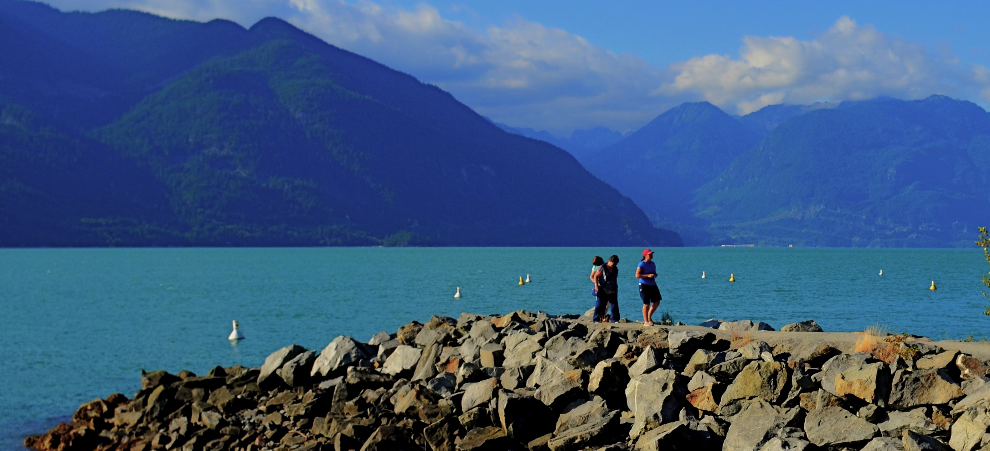
About To Be (2016) 1/200 sec., F/5.6, ISO 100, 24mm.
Recently I visited the amazing Butchart Gardens, a botanical bonanza on the island of Victoria in British Columbia. If ever there was a place where you’d be tempted to tick off “the sights” on a mental checklist, this cornucopia of topiary choreography is it, and you will find it truly tempting not to attempt your “take” on its most photographed features. But an experience is not a triptych, and I found my favorite moments were near the fringes or niches of the property, many of which are as stunning as the most traveled wonders along the approved paths.
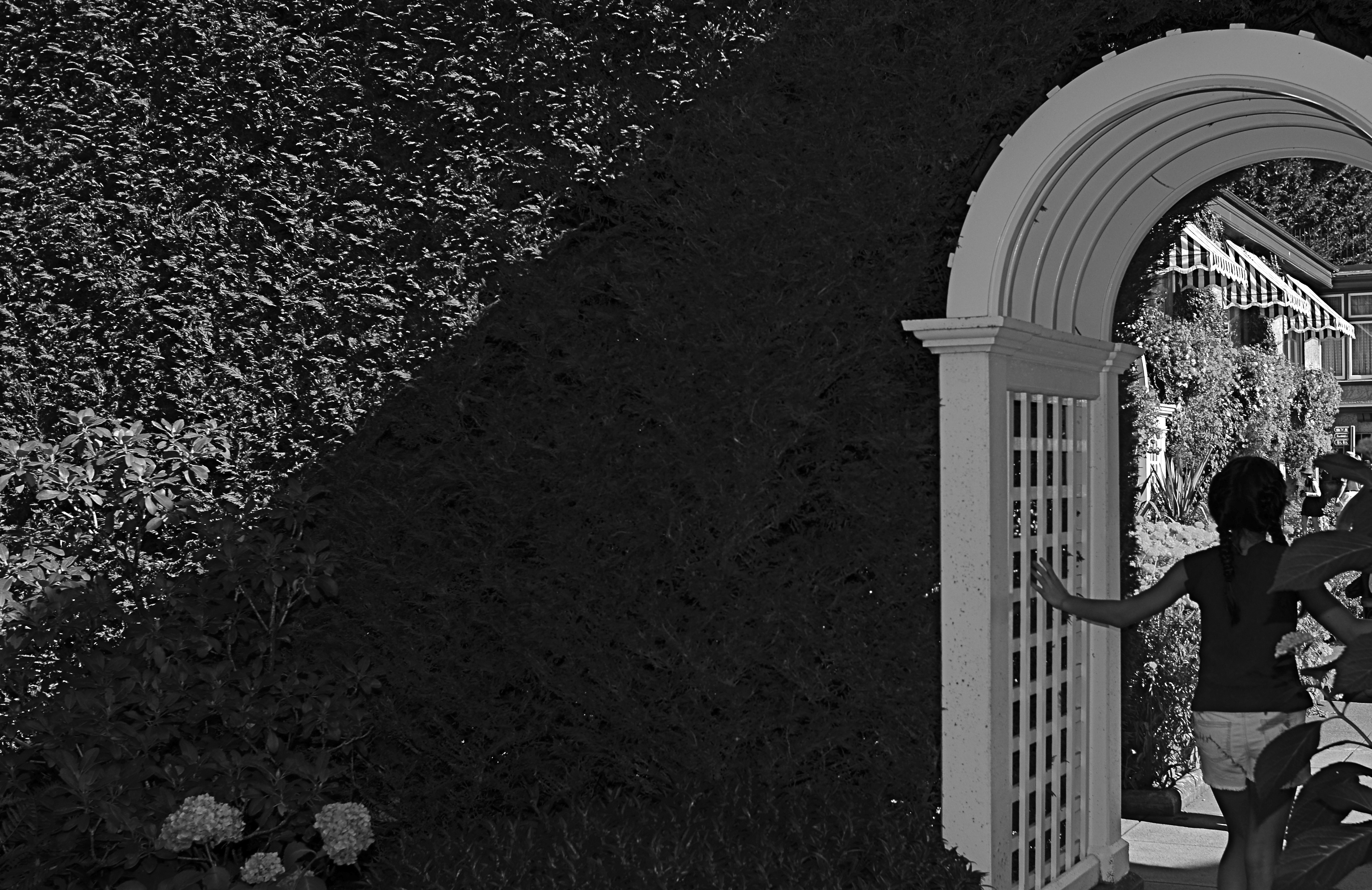
To my great surprise, my favorite shot from the tour wasn’t one of the major sites or even a color image, but a quick glimpse of a young girl hesitating in the narrow, arched portal that separated one side of an enormous hedge from the other. She only hesitated for a few seconds before walking into the more traveled courtyard just adjacent, which is, itself, recorded thousands of times a day. But that brief pause was enough. She had become, to me, Alice, dawdling on the edge of a new Wonderland. The arch became all mystery to me, but the picture needed to be simplified to amplify that feeling, relegating the bright hues to secondary status. And while it indeed seems counterintuitive to take a black and white image in the midst of one of the world’s great explosions of color, I gladly chose the mono version once I had the chance to compare it to the original. Some things just work.
One thing that never works is trying to make your personal photographs conform with what the designer of a public place has recommended as the essential features of that place. Your camera is just that….your camera. Shoot with someone else’s eye, and you might as well just frame the brochure.
GRAVEYARD SHIFT
By MICHAEL PERKINS
THERE IS, ALMOST CERTAINLY, A STORY BEHIND THE PHOTOGRAPH BELOW. Unfortunately, I don’t know what it is. And probably never will.
Images often state or at least imply a narrative, allowing the photographer to relate a dimensional story within the confines of a flat, static frame. It’s kind of a miracle when that happens, but there are also those pictures in which, although part of a story has been captured in mid-flight, the whole of the tale will never be revealed. Sometimes it’s because I flat-out don’t possess the skill to tell it properly. Sometimes it’s because, although I set out to tell something in a coherent fashion, I mucked it up in execution. And, in the most interesting/frustrating of cases, it’s because the photo simply contains too little content or context to make a story emerge.
Yet, these are the images that, perversely, I find myself returning to, as if staring at them multiple times will somehow solve the puzzle. It usually doesn’t, but that’s okay, since these “quandary” pictures also become some of my favorites. Maybe it’s because they’re orphans. Maybe I actually like that they defy explanation. It’s like reading Ulysses. I don’t get it, But then again, nobody else does, either.
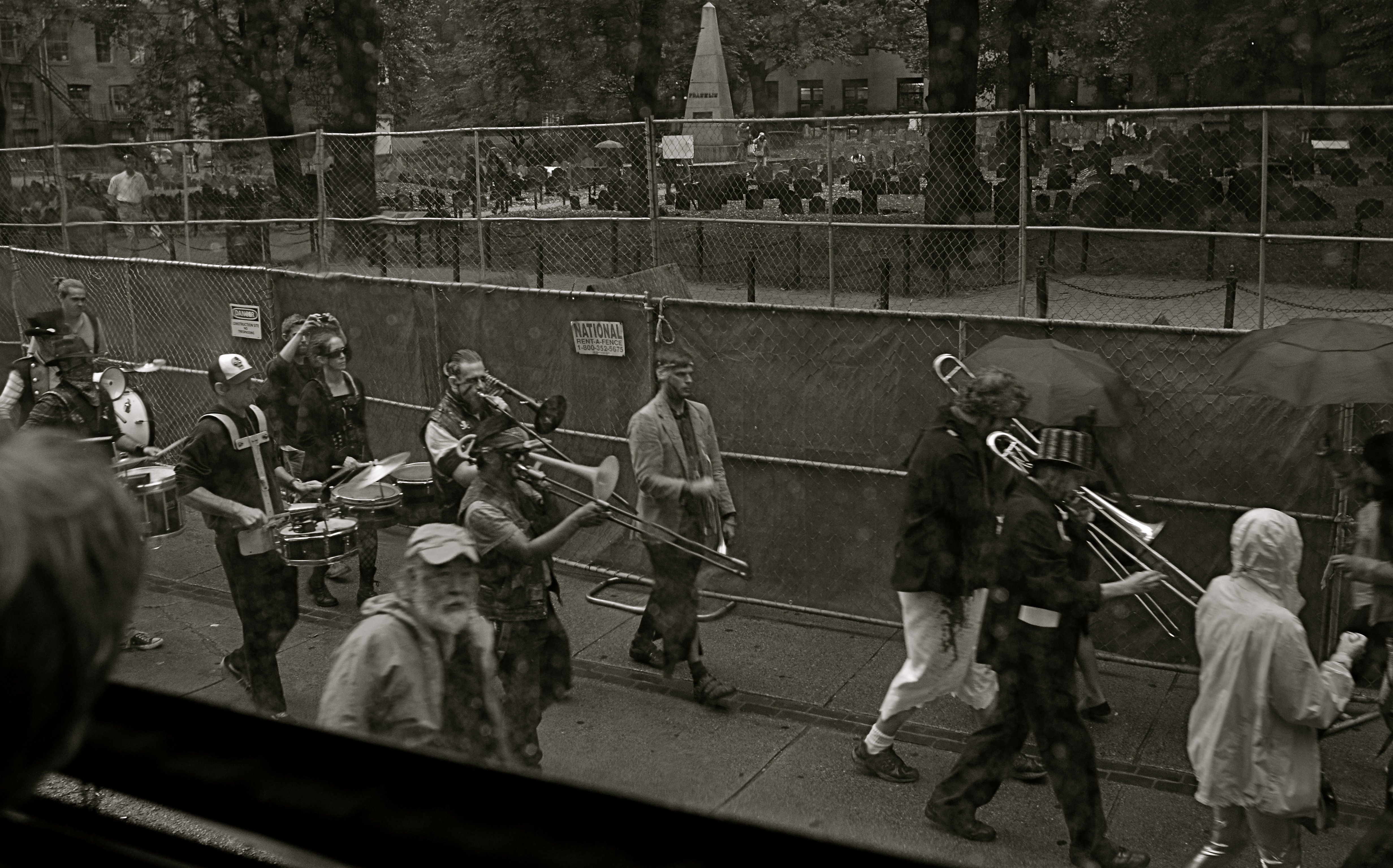
All Together, Now, With Gusto.
This particular question mark of a picture was snapped in Boston on a day soaked in enough rain to chase my wife and myself off a local walking tour around the Commons, trading squishy sneakers for butt lumps on a bus that spent 10% of its voyage hipping us to the local scene and 90% gridlocked in Beantown traffic, which is about average, as I understand it. There was, as a consequence, plenty of time to snap things out of the windows, even though the rain played serious hell with both focus and resolution. After a while, however,even the doomed task of trying to shoot anything usable became a kind of pastime all its own, especially after the driver was forced to retrace the same circle of traffic hell for a second or third go-round.
The scene you see here is in front of a historic graveyard right in the heart of the commons, a “who’s who” of honored dead, where, so say the locals, you can sit in a bar drinking a cold Sam Adams, and gaze out the window at (say it with me) a cold Sam Adams. What inspired the ragtag orchestra you see marching in front of the illustrious headstones, sans any insignia, uniforms, or sense of self-preservation is, and will remain, beyond me. What they were marching for, who their intended audience or cause might be….all of it is forever a befuddled “huh?”. Bonus round: what with the light being so meager amidst the downpour, I had dialed down to a pretty slow shutter speed, so even basic sharpness was DOA for this particular frame.
Somehow, however, I love this picture, even more than if it made any actual sense. Unmoored from reality, I can make up a dozen might-be scenarios that explain it, and so it actually has more entertainment value than many of my so-called “successful” photographs. Or maybe I just like sitting in a pew at the Church of Weird every once in a while. And, on particularly dreamy days, I can stare at this band of gypsies and wish I could take up a tuba and head their direction for a bit.
After all, they know where they’re going…
THE GOLDEN HALF-RULE
By MICHAEL PERKINS
THE STREET-HARDENED CRIME PHOTOGRAPHER ARTHUR FELLIG (1899-1968), who adopted the pseudonym “Weegee” was often asked the secret of his success as the journalist who best captured the stark essence of mobster arrests, gruesome murders, and various other manifestations of mayhem and tragedy. He had answered the “how do you do it” question so many times that he developed a uniform shorthand response which passed into photographic lore and stamped itself onto the brains of all future street shooters. The secret: “f/8 and be there.”
The “f/8” part spoke to the fact that Weegee, who seldom shot at any other aperture, was more interested in bringing back a usable picture than in creating great art. In the days before autofocus, shots taken on the fly at medium distance would almost always be reasonably sharp at that depth of field, no matter how sloppy the shooter’s finer focusing technique. Besides, since he was capturing sensation, not romance, why bother with subtle nuance? Weegee’s pictures were harsh, brutal, and grimy, just like the nether worlds they depicted. They were known for their high contrast and for the atomic blast of hard flashgun light he blew into the faces of society mavens and thugs alike. We’re talking blunt force trauma.
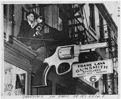
Familiar with action on both ends of guns, Arthur “Weegee” Fellig was the ultimate chronicler of America’s dark side.
The second half of Weegee’s golden rule was far more telling for any photographer purporting to be an effective narrator. When Fellig spoke of “being there” he was not only referring to arriving on a crime scene ahead of any competition (which he guaranteed by grabbing early bulletins from the police-band radio in his car and having a mobile darkroom in his trunk), but in being mentally present enough to know when and what to shoot, with very little advance prep. The bulkiness of the old Graphlex and Speed Graphic press cameras (the size of small typewriters) meant that shooting twenty frames in as many seconds, as is now a given with reporters, was technically impossible. Time was precious, deadlines loomed, and knowing when the narrative peak of a story was approaching was an invaluable instinct, one which distinguished Weegee from his contemporaries. Opportunities were measured in seconds, and photogs learned to nail a shot with very little notice that history was about to be on the wing.
There will always be arguments about the finer points of focus and exposure, with most debates centering on the first half of Weegee’s prime directive. However, for my money, the urgency of being ably to identify immediacy and grab it in a box far outweighs the niceties of art. Many a Pulitzer Prize-winning image is under-exposed or blurs, while many a technically perfect picture actually manages to drain a scene of any human emotion. Make it f/8, f/4, hell, take the damned thing with a pinhole if need be. But be there.
YOU’RE IN THE PICTURE
By MICHAEL PERKINS
THE BEST PHOTOGRAPHS ARE NOT STAND-ALONE WORKS OF ART, BUT CONVERSATIONS BETWEEN ARTIST AND AUDIENCE. You don’t just stride up to that framed image on the wall and let its wonderfulness wash over you; you bring what you have been, over a lifetime, to it, comparing those two entities side by side, and even assigning your own truth to the photo, “deciding” what it means. The pictures don’t speak to you: you debate with each other.
Think about the images that, over a lifetime, have reached you in the deepest way. Did those photographs bring you something that you didn’t already have, or was it echoed, defined, re-purposed, based on who you’ve been thus far, or how you see? How else to explain why a picture moves one person to tears, while it leaves another completely nonplussed? Of course, some photographs almost accidentally produce a similar result to a wide variety of viewers, but there are far more of them where the messaging is muddled, imprecise.
And that’s a good thing.
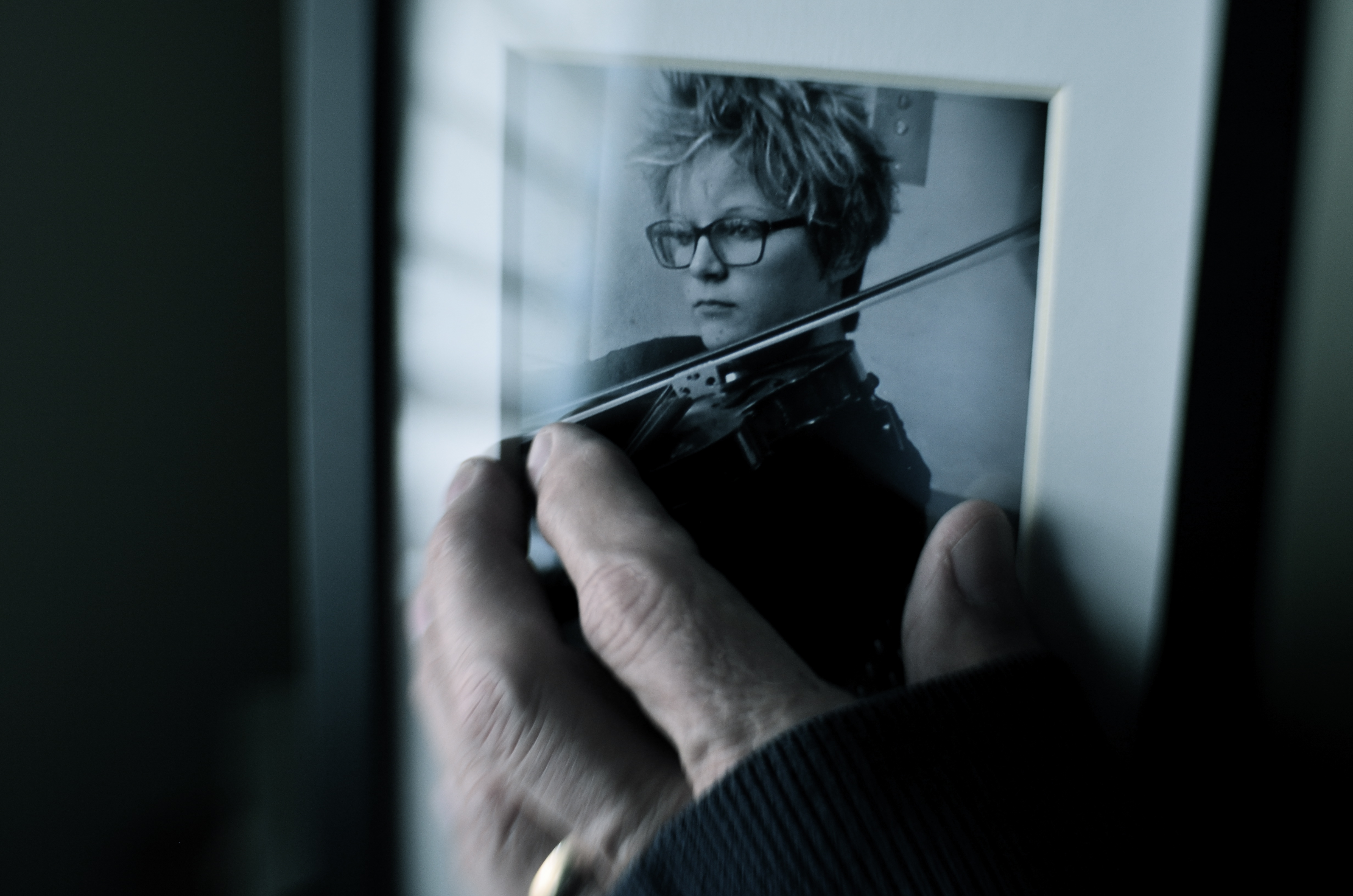
One way to repurpose a photograph is to make it part of another photograph. Or not.
I made the above image several days ago purely as an experiment, using an earlier one of my pictures as a prop within what’s obviously a staged shot. The completed “new” photograph was part of an assignment by an image sharing group I belong to, which laid down several elements that had to be in the final picture: a hand covered by something, that same hand touching something, and a de-saturated color palette. Beyond that, I had complete control of how those elements would be combined or interpreted.
The reason I began to play with some older pictures was chiefly to see if I could take a photo made with one specific mood in mind and re-purpose it within a new context, making the image elicit something completely different. So, without further background or explanation, the challenge to you: what does this particular image (which has an older image within it) convey to you, if anything? What is the dominant mood or the implied backstory? And even if what you’re seeing is not the same as what I set out to “say”, does the picture have any relevance for you personally? Does it have any narrative value, or is it merely an exercise in technique?
Context isn’t everything in a photograph, but neither is any image is absorbed in a vacuum. We color our approach to it in some way, becoming, in essence, its co-creator. You may not be in the frame, but you’re definitely in the picture.
MORE FROM LESS, LESS FROM MORE
That Day At The Jetty (2016). A cropped edit of an originally larger 24mm wide-angle shot.
By MICHAEL PERKINS
EVERY PHOTOGRAPHIC LENS EVER MADE CREATES ARTIFACTS, distinct biases in the ways it renders the world it sees. When you shoot with a particular piece of glass, you’re also inviting in whatever flaws or limits are baked into that optic’s design and science. If you are the kind of shooter that constantly switches out lenses, this present less of a problem, since you’re used to snapping on the exact glass you need for every kind of shooting situation.
If, however, you try, like myself, to go nearly a day at a space with a minimum of gear, then you start to look for lenses that do most of what you want in most settings. Occasionally, this means compromising on, or even missing, a shot; but, by and large, it makes you more mindful of the image-making process from minute to minute. You plan better and react faster.
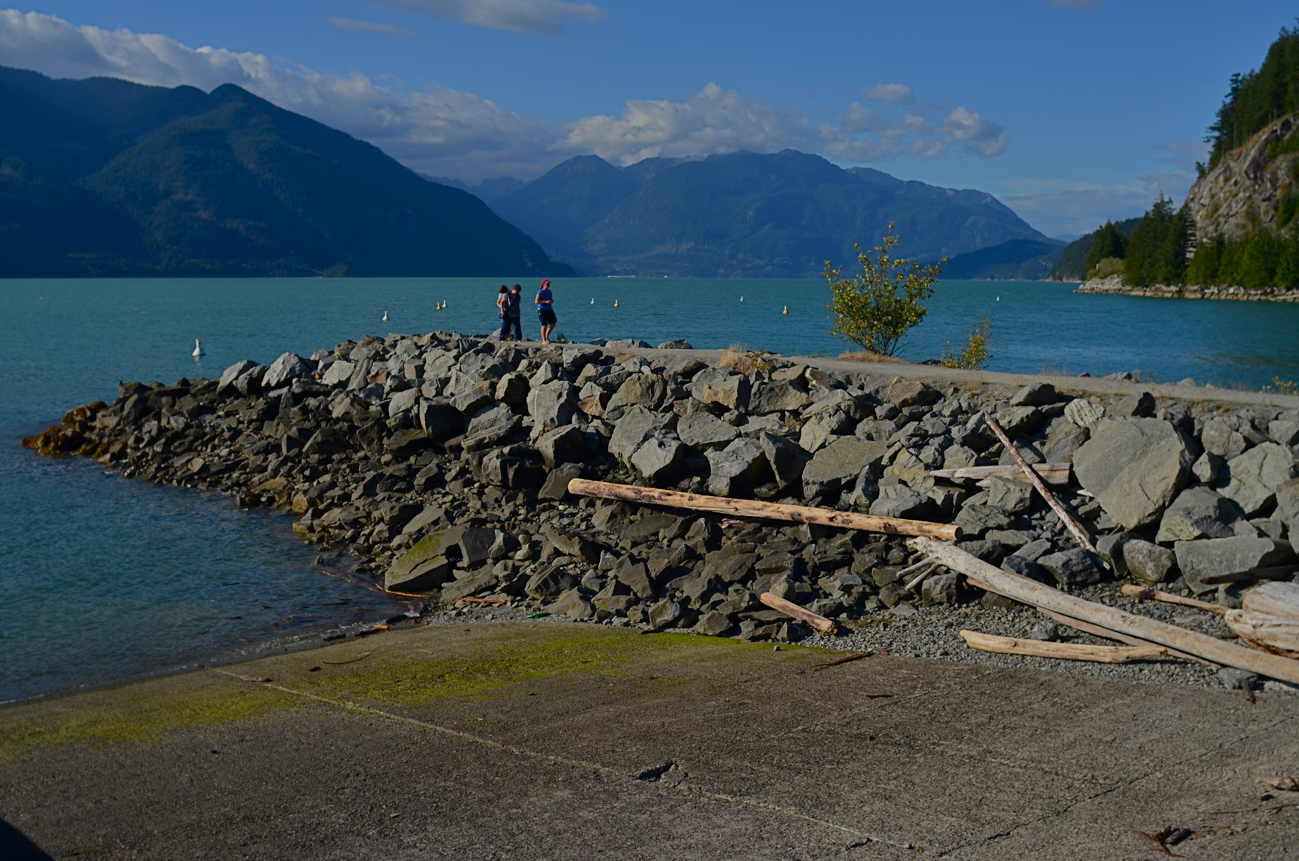
The original 24mm master shot, which is either fuller or too crowded, depending on one’s viewpoint.
In the case of one of photography’s most popular categories, that of landscape work, there seem to be two main types of lenses that do most of the heavy lifting: the ultra-wide angle, which convey “openness” and scope, and zooms, which help isolate specific parts of vast vistas. There are certainly situations in which both are ideal, but, on average, were I to be traveling very light for the day, I would probably take most of the day’s images with the ultra-wide, even if there was a particular area inside a larger scene that was more “important” than its surroundings, a situation in which most of us might utilize the zoom.
This goes to my belief that the composing process almost never stops with the click of the shutter. Rather, the click is just phase one, and a master shot that allows for many post-shot “re-thinks” is the best one to have. Let’s say, for the sake of argument, that the center of an immense mountain range is where the light or the subject story is strongest in a given image. If my master shot is a taken with a zoom, I’ve lost the ability to later discover additional approaches that remain possible if I have a wider shot’s worth of information from which to select. Starting with the larger shot, I can shift the cropping to any aspect ratio I want, change the balance of the composition, re-orient the linearity (to create a faux panorama, as in the top shot here) or even realize that there was an even stronger story to be told outside of the frame I originally envisioned with the zoomed master shot. Here’s the core point: it’s easier to have more picture than you need and pare some stuff away than to narrow your options beforehand and trust that you’ve nailed it, meanwhile ruling out any potential re-takes or second thoughts.
I do, of course use zooms at times, but, like my external flashes and tripods, I find fewer uses for them with each passing year. It’s odd how you can come to feel greater freedom with fewer tools. But sometimes it’s like the time Itzhak Perlman busted a string just before a concert, then performed the program on just three strings, to the utter amazement of the critical world. Photography proves time and again that there are times when the image’s “melody” magically comes forward. In spite of.
DATING YOUR EX
Sometimes your new favorite gear is actually your old favorite gear.
By MICHAEL PERKINS
SOME PHOTOGRAPHERS’ EQUIPMENT CASES ARE LIKE MARY POPPINS’ CARPET BAG: once they’re opened, you are just certain someone’s going to haul a floor lamp out of the thing. I myself hate being laden with a punishing load of gear when on a shoot, so I spend as much time as possible mentally rehearsing before heading out, trying to take just one lens which will do 90% of what I’ll need and leaving the rest of the toys at home. I developed this habit mainly because most of my work is done in a field orientation. Were I more consistently a studio homebody, then I could have everything I own just inches away from me at all times. So it goes.
What happens with my kind of shooting is that you fall in and out of love with certain gear, with different optics temporarily serving as your “go to” lens. I personally think it’s good to “go steady” with a lens for extended periods of time, simply because you learn to make pictures in any setting, regardless of any arbitrary limits imposed by that lens. This eventually makes you more open to experimentation, simply because you either shoot what you brung or you don’t shoot at all.
This work habit means that I may have half a dozen lenses that go unused for extended periods of time. It’s the bachelor’s dilemma: while I was going steady with one, I wasn’t returning phone calls and texts from the others. And over time, I may actually become estranged from a particular lens that at one time was my old reliable. I may have found a better way to do what it did with other equipment, or I may have ceased to make images that it was particularly designed for….or maybe I just got sick to death of it and needed to see other people.
But just as I think you should spend a protracted and exclusive period with a new lens, a dedicated time during which you use it for nearly everything, I also believe that you should occasionally re-bond with a lens you hardly use anymore, making that optic, once again, your go-to, at least for a while. Again, there is a benefit to having to use what you have on hand to make things happen. Those of us who began with cheap fixed-focus toy cameras learned early how to work around the limits of our gear to get the results we wanted, and the same idea applies to a lens that may not do everything, but also may do a hell of a lot more than we first gave it credit for.
Re-establishing a bond with an old piece of gear is like dating your ex. It may just be a one-off lunch, or you could decide that you both were really made for each other all along.
SERVING UP SOME NUTS

The Haves And The Have-Nots (2017)
By MICHAEL PERKINS
COMPOSITION IN PHOTOGRAPHY WOULD BE A SNAP (sorry) if the camera actually possessed not just an eye, but also a brain. But that’s where you come in.
When the human eye takes in a scene, the brain automatically ranks all the information within it, basically making a composition of priority. We “see” some things and “don’t see” others, based on how our grey matter ranks the importance of everything in our field of vision. A camera cannot make these fine decisions: it merely makes a light record of what it’s pointed at. That accounts for the fact that our “perfect” landscape, the one we ourselves recalled from the first day of vacation, comes back, in a mere photo, complete with electrical wires, distracting signs, junk near the beach, and any other number of things our brains filtered out of the original viewing experience.

Last Man Standing (2017)
Composition is thus a matter of our deliberately arranging things by priority, making an argument for our audience to Look Here First, Only Look Here, Give Greater Weight To This Over That, or any other messaging we desire. In sales terms, it’s what pitchmen call Asking For The Order. Simply, composing a photograph means setting the terms of engagement for the viewer’s eye.
With still-life photographs, the shooter has the greatest degree of control and responsibility. After all, our subject is stationary, easily moved and arranged to our whim. You pretty much are lord of your domain. That being said, it’s wise to use this luxury of time and control to envision as many ways as possible to convey your message. The image at the top of this page, for example, is crowded, but the nut shells and the unshelled nuts are a study in textural contrast. There’s lots of color and detail, with one side being somewhat blanched while the other is rough and complex. That’s one way of making the image.
For comparison, in the second frame, the terms of engagement are completely different. The pile of shells at left is more sharply contrasted with the single nut at right. The nut carries the only vivid color in the image; it’s an outlier, a misfit…maybe the last man/nut standing? The simplification of the composition lets it breathe a little, allowing the viewer to speculate, invent. Are the shells symbolic of a mound of nuts that have already been polished off in some grand snacking orgy? Why was one lone nut left to tell the tale? And so on.
Change the arrangement of subjects in a scene and you’ve changed the terms of narration, or even insisted that there is no narration, just patterns, light, or abstraction. Whichever path you choose, no composition comes to the camera “ready to eat”, as it were. You have to tell your camera’s mechanical eye what to see, and how to see it.
COME TO THE DUMB SIDE
By MICHAEL PERKINS
“I dream with my eyes open.”—-Jules Verne
THE MAKING OF A GOOD PHOTOGRAPH IS A CHALLENGING ENOUGH ENTERPRISE that it’s understandable that many a photographer loses either his emotional balance or his sense of humor or both in the process. As artistes, we are so very, very earnest in our pursuit of the image that we can become a little, well tedious. All work and no play makes Jack take four hours to take a picture.
I always believe that, when you are mired in a problem, the bravest thing you can do is to, well, run away. Call it play, call it goofing off, call it cleaning out the pipes, or call it late to supper: the idea is to change the conversation. Of course, if you’re physically stuck in a rain-soaked duck blind awaiting the annual return of the pied-billed grebe, it’s a little tough to break camp (or your concentration) for the salvation of play. Besides, if the pied-billed grebe is your idea of a good time, then godspeed, John Glenn, and please don’t expect us to sit through your slides upon your return. Not without beer, anyway.
Suddenly, Flash Held The Upper Hand (2017). Heavy on the nonsense. Because sometimes you need it.
No, I’m talking about the value, the actual soul-salvaging power of stupid. The palate-cleansing function of creating the visual equivalent of a stuck-out tongue. In taking the time to solve the problems involved in the creation of a “dumb picture”, you are also exercising the muscles of your mind that have been cramped up in your more serious work.
I’m reminded of the process used at the little building on the weird end of the Warner Brothers lot where Looney Tunes shorts were created. It was a working method which startled messengers and delivery boys alike, who often entered the office to see Chuck Jones, Friz Freleng, and other animators capering about in animal costumes or funny hats as other Tuners recorded their gyrations with 16mm home-movie cameras, the better to animate you with, Grandma. Now some of you troublemakers might be tempted to remark, “but they were making cartoons. How is that serious work?”, to which I reply that perhaps you and I had better take this outside and settle the matter like gentlemen.
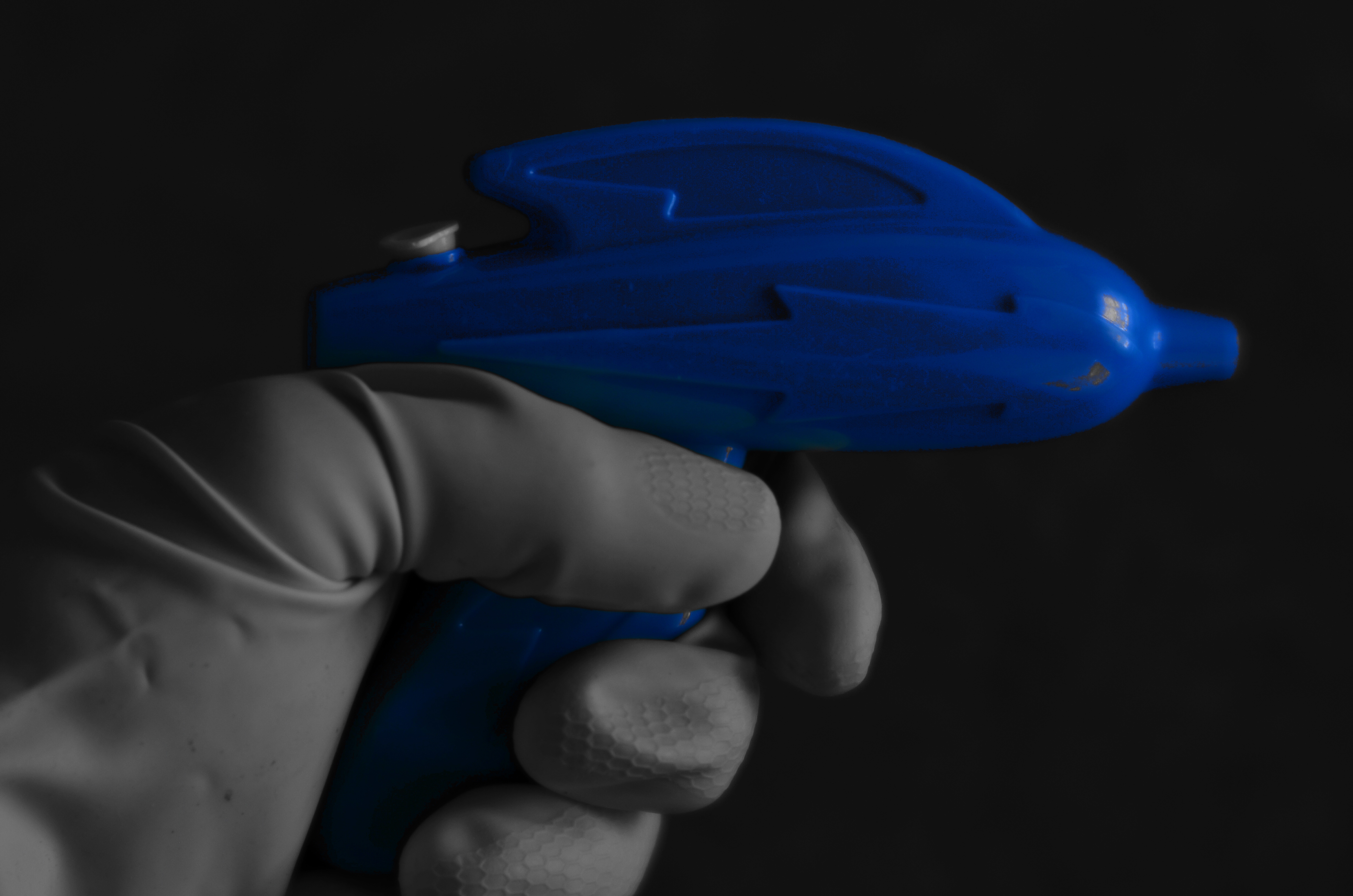
The above shot is the result of one dollar in investment (the weird squirt gun, complete with cosmic lighting bolt), a little rooting around under the sink (for the work glove), and ten minutes of fanciful fun. Not being fortunate enough to have Buster Crabbe here to model my fantasy (he’s in Actor Hell learning how to better deliver his lines), I managed to use my own left hand to wield my weapon while shooting with my right. And if you think you can do that without looking stupid….well, I’m just as glad the wife didn’t walk in on me, especially since I had been tasked, on this particular day, with kitchen duty.
Which is all to say, as if it needed repeating (or even peating) that fun is essential to the process of photography. When the well runs dry, you’d better re-fill it quick…with water, Mr. Bubble, Cherry Kool-Aid, or a nice, refreshing bucket of stupid.
Ahhhhh.

PERFECT VS RIGHT
By MICHAEL PERKINS
OUR VERY HUMAN DESIRE TO MAKE OUR PHOTOGRAPHY TECHNICALLY FLAWLESS can be observed in the results you can glean from a simple Google search of the words “perfect” and “photos”. Hundreds of tutorials and how-tos pop up on how to get “the perfect portrait”, “the perfect family picture”, “the perfect sunset”, and of course, “the perfect wedding shot”. The message is all too clear; when it comes to making pictures, we desperately want to get it right. But how to get it right…that’s a completely different discussion.
One of my favorite selfies, even though I can’t justify it by any technical standard.
Because if, by “perfect”, we means a seamless blend of accurate exposure, the ideal aperture, and the dream composition, then I think we are barking up a whole forest of wrong trees. Mere technical prowess in photography can certainly be taught, but does obeying all these rules result in a “perfect” picture?
If you stipulate that you can produce a shot that is both precise in technique and soulless and empty, then we should probably find a more reasonable understanding of perfection. Perfect is, to me, a word that should describe the emotional impact of the result, not the capital “S” science that went into its execution. That is, some images are so powerful that we forget to notice their technical shortcomings. And that brings us to the second part of this exercise.
Can a flawed image move us, rouse us to anger, turn us on, help us see and feel? Absolutely, and they do all the time. We may talk perfection, but we are deeply impressed with honesty. Of course, in two hundred years, we still haven’t shaken the mistaken notion that a photograph is “reality”. It is not, and never was, even though it has an optical resemblance to it. It became apparent pretty early in the game that photographs could not only record, but persuade, and, yes, lie. So whatever you shoot, no matter how great you are at setting your settings, is an abstraction. That means it’s already less than perfect, even before you add your own flaws and faults. So the game is already lost. Or, depending on our viewpoint, a lot more interesting.
Go for impact over perfect every time. You can control how much emotional wallop is packed into your pictures just as surely as you can master the technical stuff, and pictures that truly connect on a deep level will kick the keester of a flawless picture every single time. The perfect picture is the one that brings back what you sent it to do. The camera can’t breathe life into a static image. Only a photographer can do that.
Share this:
May 28, 2017 | Categories: Aperture, Focus, P.O.V., Technique | Tags: Commentary, Composition, exposure, process | Leave a comment