PARADOX
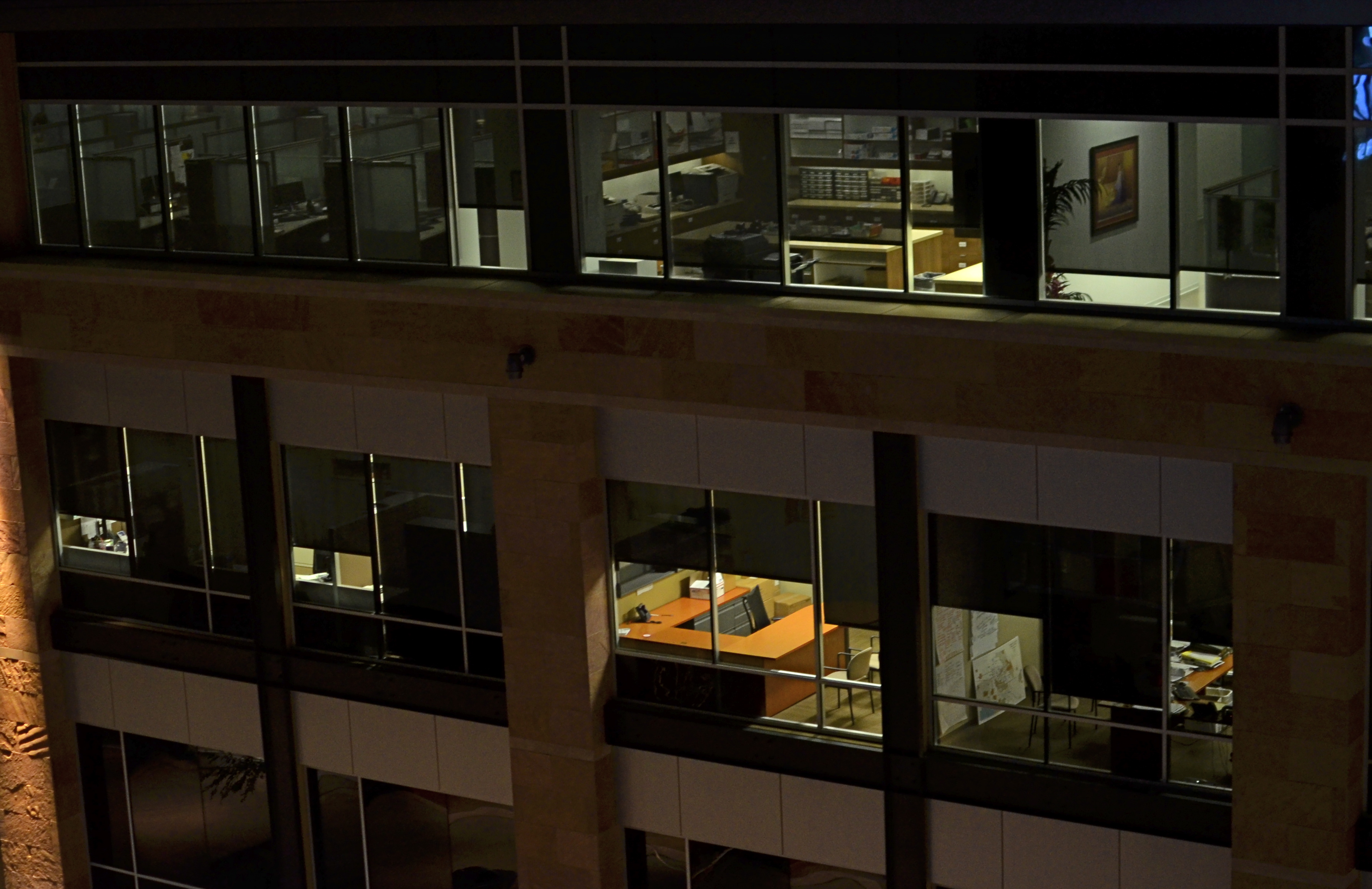
Where is the main story here? Far away, or up close? 1/60 sec., f/1.8, ISO 400, 35mm.
By MICHAEL PERKINS
EVERY SET OF VISUAL ELEMENTS, CAPTURED AT OPPOSITE EXTREMES, DELIVERS A COMPLETELY DIFFERENT SET OF STORY RESULTS. For photographers, the everlasting tug-of-war, involving “what to shoot?” is usually between “how close” and “how far away”? Even the lenses we buy, along with their unique properties, reflect this struggle between the intimate tale, told by a close-up, versus the saga, drawn from a vast panorama. There is a season, turn turn turn, for all kinds of image-making, and it’s no great revelation that many shooters can look at the same grouping of components and get remarkably different results.
Had I come upon the cluster of office cubicles seen in the image above on, say, day “A”, I might have been inclined to move in close, for a personal story, a detailed look at Life In The Office In This Modern World, or how worker #3456 left behind his umbrella and half a tuna sandwich. As it turned out, however, it was day “B”, and instead I saw the entire block of spaces as part of an overall pattern, as a series of lives linked together but separate, resulting in the more general composition shown here. I was shooting wide open at f/1.8 to retrieve as much light, handheld, as quickly as possible, to use the surrounding darkness to frame all the visual parts of the scene as boxes-within-boxes, rather than a single cube that warranted special attention.
Next time I’m up to bat with a similar scene, I could make the completely opposite decision, which is not a problem, because there never is a wrong decision, only (usually) wrong execution. And, yes, I realize that, by shooting empty offices, I dodged the whole ethical bullet of “should I be spying on all these people?”, otherwise known as Street Photographers’ Conundrum # 36.
I love wrestling with the paradox of how close, how far. There can be no decisive solution.
Only the fun of the struggle.
Welcome to our newest followers. Check their work out at :
http://www.en.gravatar.com/glennfolkes85
NO CLEAR “BLACK AND WHITE” ANSWER
Hey, He’s just not that into you: In-camera monochrome, on a Nikon d5100: 1/200 sec., f/5.6, ISO 100, 35mm. Street photography sometimes benefits from a limited tonal range.
By MICHAEL PERKINS
SHOOTING IN BLACK AND WHITE, BEFORE THE DIGITAL ERA, WAS AN ACTIVE, RATHER THAN A PASSIVE CHOICE. You had to decide, before loading your camera, what an entire roll of film would be able to capture in terms of color/no color. There was no way to change your mind until that roll was completed and replaced. As you pre-chose film speed, light sensitivity, or special processing considerations, you also committed, before Frame One, to a single tonal option.
If you are really getting long in the tooth, you can remember when monochrome was the default choice for most of your film shoots. Economy was one factor, and, for certain shooters, including many of the pros, there was a lack of confidence that color films could render nature reliably. Giants like Adams, Edward Weston and others eschewed color throughout most of their careers, since they feared that either garish emulsions or the limits of extant printing processes would betray them in a way that black and white would not. And of course, in a world in which post-processing meant the skillful manipulation of a negative and the mastery of print-making, monochrome was simply an easier beast to tame.
Wow, are we ever in a different place.
Today, we can change our “film speed”, light sensitivity, and every kind of color emphasis frame-by-frame, and for many of us, color is our first choice, with many monochrome images post-processed from shots that were originally multi-hued. Photoshop and countless other programs allow us to have it all, with endless nuanced permutations from a single capture. Black and white is now often an “effect”, an after-thought derived later rather than sooner in our thought process. Oh, look what happens when I push this button. Cool.

Shot in color, de-saturated in post. A boring shot in color becomes super-bland when rendered in monochrome. Blame the shooter, not the mode.
Most users’ manuals for today’s cameras, especially DSLRs, actually advise converting color images to b&w in “post” rather than enabling the camera’s picture controls to shoot monochrome in the first place. The prevailing opinion seems to be that results will be better this way, since processing offers finer-tuned controls and choices, but I take issue with that, since I believe that color/no color as a choice is best made ahead of the shutter click, no less than choices about aperture or DOF. You need to be thinking about what black & white can bring to your shot (if anything) as part of your pre-shoot visualization. The tonal story in a picture is simply too important for you not to be planning it beforehand.
The quality of in-camera monochrome modes for both Nikon and Canon are both perfectly adequate to give you a workable image versus converting the shot later with software, and that’s good, because getting the shot right in the moment is better for the result than infinite knob-twiddling after the fact. Monochrome is a tool for telling a story or setting a mood. It makes sense that its use be tied to what you are trying to achieve as you are planning it….not slathering it on later as an oh-this’ll-be-keen novelty. That’s Instagram technique, not photographic technique.
One great habit to retain from the days of film: anticipate your need, and shoot according to that need. Plan ahead. “Fix it in the lab” only works for shots with slight imperfections, frames in which the concept was sound enough to warrant painting away a few flaws. Going to black and white to save an iffy shot is a Hail Mary pass at best.
As as we all know, you don’t always get what you pray for.
That’s the truth. In black and white.
Follow Michael Perkins on Twitter @MPnormaleye.
Related articles
- Capturing Texture in Black & White Photography (jdgilchristphotography.wordpress.com)
- Black and White used like Color (atmtxphoto.com)
THE WOMAN IN THE TIME MACHINE
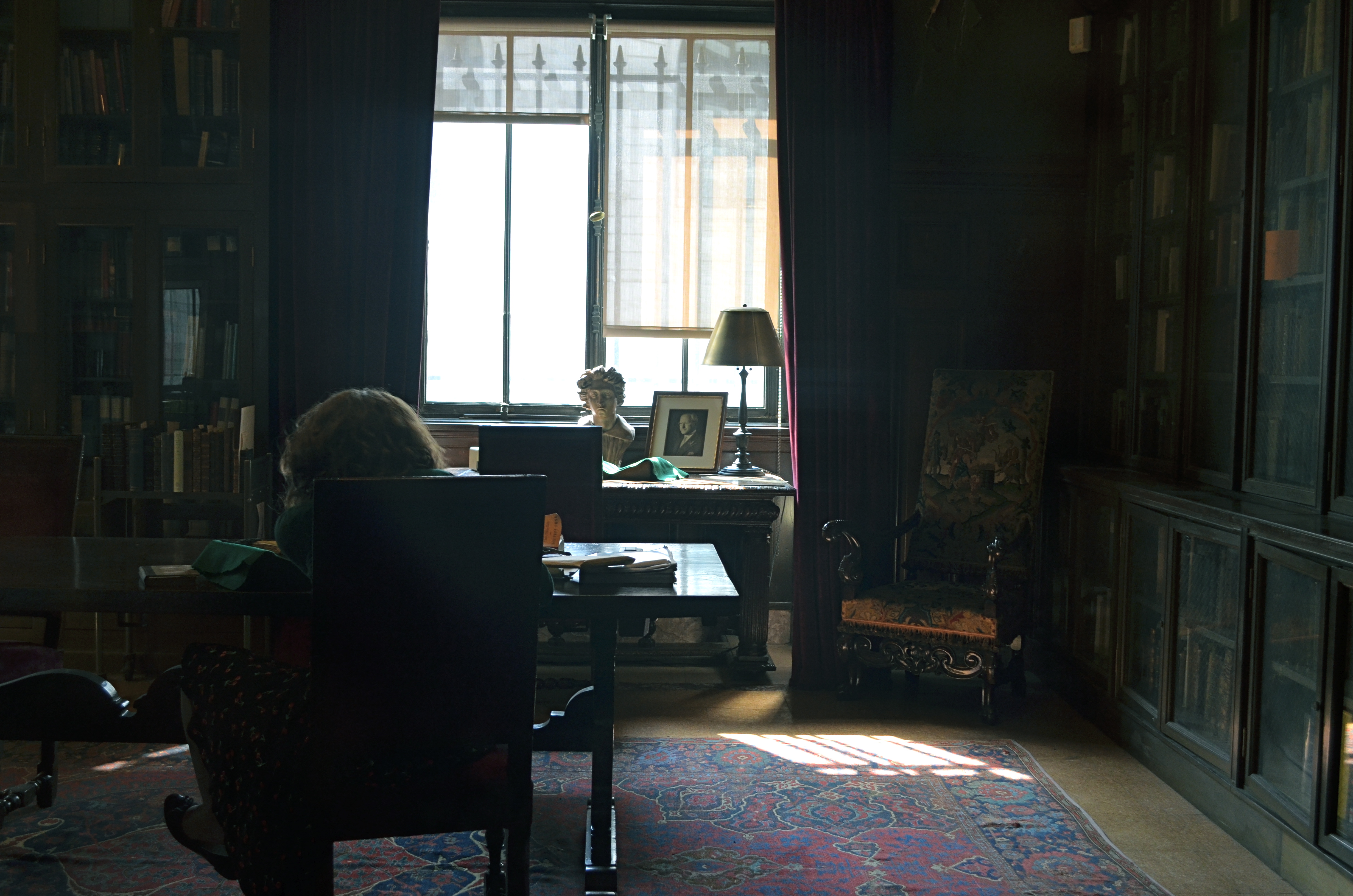
Where is this place? And how is it here, now? 1/40 sec., f/5.6, ISO 320, 24mm.
by MICHAEL PERKINS
THERE ARE TIMES WHEN A CAMERA’S CHIEF FUNCTION IS TO BEAR WITNESS, TO ASSERT THAT SOMETHING FANTASTIC REALLY DID EXIST IN THE WORLD. Of course, most photography is a recording function, but, awash in a sea of infinite options, it is what we choose to see and celebrate that makes an image either mundane or majestic.
And then sometimes, you just have the great good luck to wander past something wonderful. With a camera in your hand.
The New York Public Library’s main mid-town Manhattan branch is beyond magnificent, as even a casual visit will attest. However, its beauty always seems to me like just “the front of the store”, a controlled-access barrier between its visually stunning common areas and “the good stuff” lurking in untold chambers, locked vaults and invisible enclaves in the other 2/3 of the building. I expect these two worlds to be forever separate and distinct, much as I don’t expect to ever see the control room for electrical power at Disneyland. But the unseen fascinates, and recently, I was given a marvelous glimpse into the other side at the NYPL.
A recent exhibit of Mary Surratt art prints, wall-mounted along the library’s second-floor hall, was somehow failing to mesmerize me when, through a glass office window, I peeked into a space that bore no resemblance whatever to a contemporary office. The whole interior of the room seemed to hang suspended in time. It consisted of a solitary woman, her back turned to the outside world, seated at a dark, simple desk, intently poring over a volume, surrounded by dark, loamy, ceiling-to-floor glass-paneled book shelves along the side and back walls of the room. The whole scene was lit by harsh white light from a single window, illuminating only selective details of another desk nearer the window, upon which sat a bust of the head of Michelangelo’s David, an ancient framed portrait, a brass lamp . I felt like I had been thrown backwards into a dutch-lit painting from the 1800’s, a scene rich in shadows, bathed in gold and brown, a souvenir of a bygone world.
I felt a little guilty stealing a few frames, since I am usually quite respectful of people’s privacy. In fact, had the woman been aware of me, I would not have shot anything, as my mere perceived presence, however admiring, would have felt like an invasion, a disturbance. However, since she was oblivious to not only me, but, it seemed, to all of Planet Earth 2013, I almost felt like I was photographing an image that had already been frozen for me by an another photographer or painter. I increased my Nikon’s sensitivity just enough to get an image, letting the light in the room fall where it may, allowing it to either bless or neglect whatever it chose to. In short, the image didn’t need to be a faithful rendering of objects, but a dutiful recording of feeling.
How came this room, this computer-less, electricity-less relic of another age preserved in amber, so tantalizingly near to the bustle of the current day, so intact, if out of joint with time? What are those books along the walls, and how did they come to be there? Why was this woman chosen to sit at her sacred, private desk, given lone audience with these treasures? The best pictures pose more questions than they answer, and only sparingly tell us what they are “about”. This one, simply, is “about” seeing a woman in a time machine. Alice through the looking-glass.
A peek inside the rest of the store.
Follow Michael Perkins on Twitter @mpnormaleye.
Thanks to THE NORMAL EYE’s latest follower! View NAFWAL’s profile and blog at :
A BRIEF AUDIENCE WITH THE QUEEN
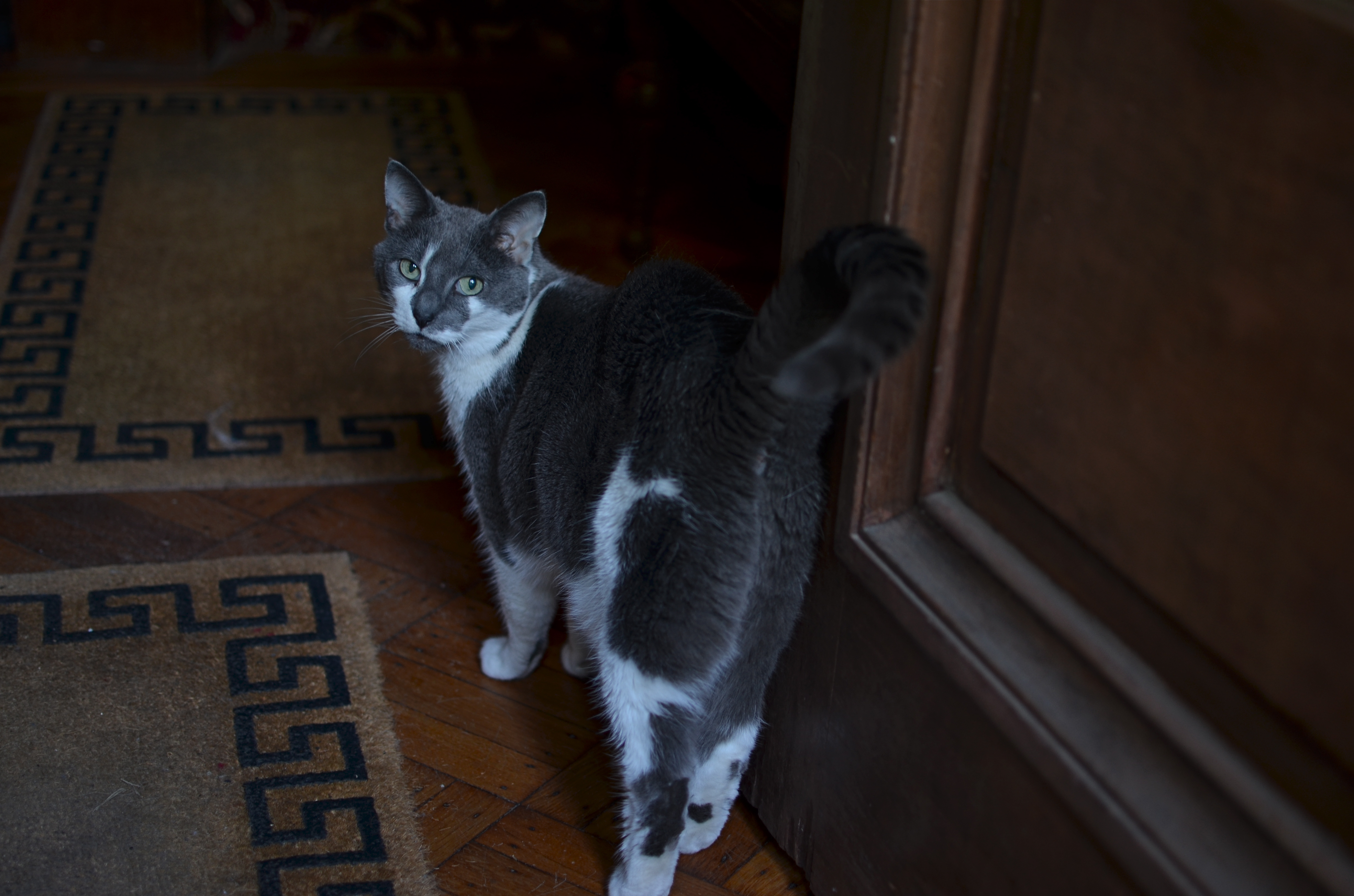
What, are YOU still here? 1/40 sec., f/1.8, ISO 100, 35mm.
By MICHAEL PERKINS
THERE IS ONLY ONE KIND OF PICTURE YOU WILL EVER TAKE OF A CAT, and that is the one she allows you to take. Try stealing an image from these spiritual creatures against their will, and you will reign over a bitter kingdom of blur, smear, and near misses.
It’s trickier to take photos of the ectoplasmic projections of departed relatives. But not by much.
I recently encountered this particular lady in a Brooklyn brownstone, a gorgeous building, but not one that is exactly flooded with light, even on a bright day. There are a million romantically wonderful places for darkness to hide inside such wonderful old residences, and any self-respecting feline will know how to take the concept of “stealth” down a whole other road. The cat in the above photo is, believe me, better at instant vaporization and re-manifestation than Batman at midnight in Gotham. She also has been the proud unofficial patrol animal for the place since Gawd knows when, so you can’t pull any cute little “chase-the-yarn-get-your-head-stuck-in-a-blanket” twaddle that litters far too much of YouTube.
You’re dealing with a pro here.
Her, not me.
Plus she’s from Brooklyn, so you should factor some extra ‘tude into the equation.
The only lens that gives me any luck inside this house is a f/1.8 35mm prime, since it’s ridiculously thirsty for light when wide open and lets you avoid the noticeable pixel noise that you’d get jacking up the ISO in a dark space. Thing is, at that aperture, the prime also has a razor-thin depth of field, so, as you follow the cat, you have to do a lot of trial framings of the autofocus on her face, since getting sharp detail on her entire body will be tricky to the point of nutso. And of course, if you move too far into shadow, the autofocus may not take a reading at all, and then there’s another separate complication to deal with.
The best (spelled “o-n-l-y”) solution on this particular day was to squat just inside the front foyer of the house, which receives more ambient light than any other single place in the house. For a second, I thought that her curiosity as to what I was doing would bring her into range and I could get what I needed. Yeah, well guess again. She did, in fact, approach, but got quickly bored with my activity and turned to walk away. It was only a desperate cluck of my tongue that tricked her into turning her head back around as she prepared to split. Take your stupid picture, she seemed to say, and then stop bothering me.
Hey, I ain’t proud.
My brief audience with the queen had been concluded.
I’ll just show myself out……
Follow Michael Perkins on Twitter @mpnormaleye.
STILL GRAND, STILL CENTRAL
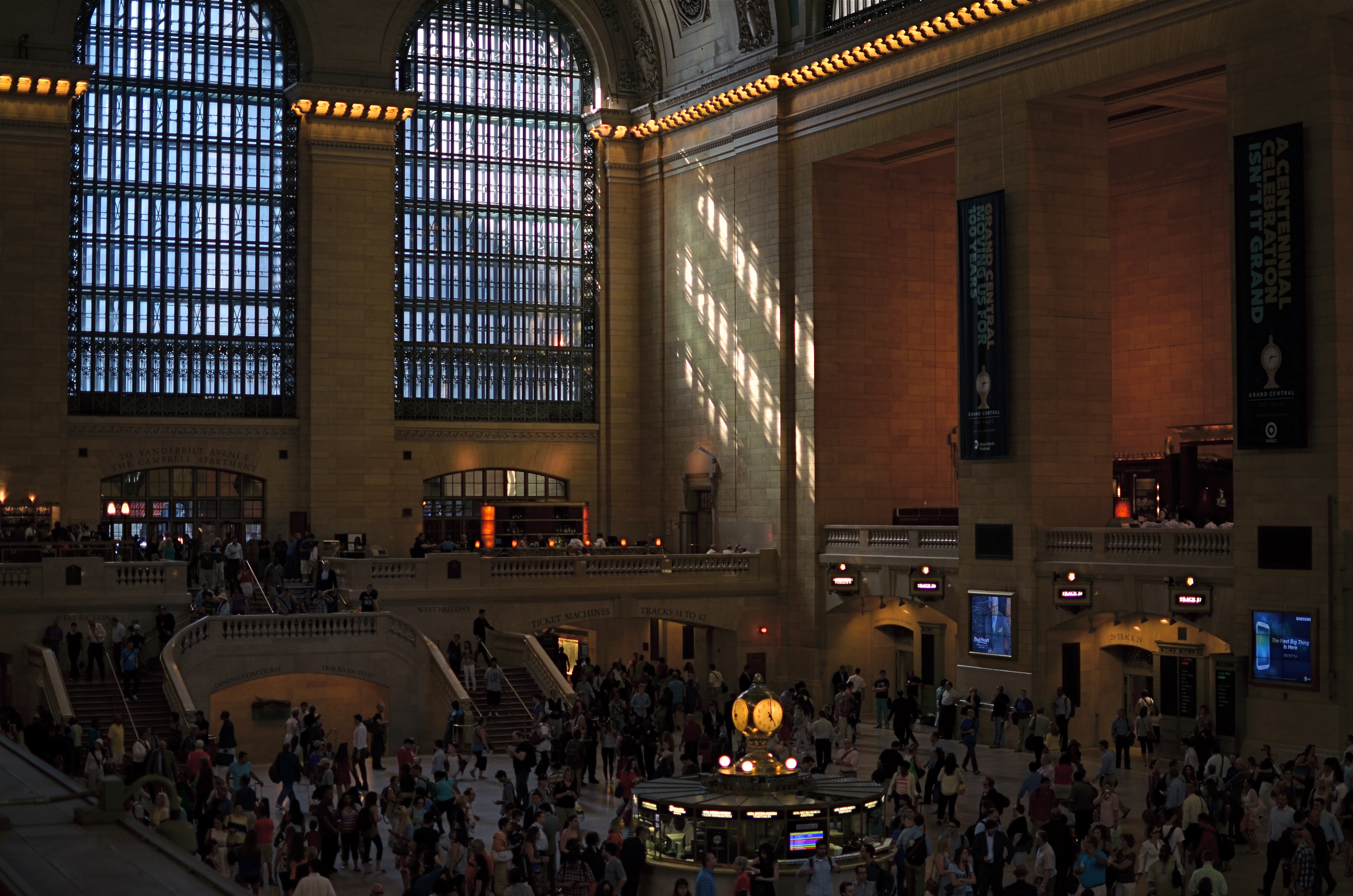
Grand Central Terminal, New York City. 2:11PM, June 21, 2013.
By MICHAEL PERKINS
AMERICA’S ROMANCE WITH RAIL TRAVEL MAY NOW JUST BE A SORT OF CASUAL ACQUAINTANCE (hey, we can still be friends), but the temple which sparked much of the old love between man and train still throbs with life. At 100, Grand Central Terminal (don’t, they beg, call it a station) still delights the eye of even a jaded New Yorker with the sheer scale of its vision. Over 750,000 people per day file through its platforms, shops and restaurants, and, of course, its commuter connections.
As to the era when the terminal truly connected the entire nation, the inevitability of the building as a final destination was never better captured than in the opening for the old network radio series named for it:
As a bullet seeks its target, shining rails in every part of our great country are aimed at GRAND CENTRAL STATION, heart of the nation’s greatest city.
Drawn by the magnetic forces of the fantastic metropolis, day and night, great trains rush toward the Hudson River…..sweep down its eastern bank for one hundred and forty-three miles…..flash briefly by the long, red row of tenement houses south of 125th street…..dive with a roar in to the two and one-half mile tunnel that burrows beneath the glittering swank of Park Avenue…and then…..GRAND CENTRAL STATION!!!!
Details, details.
Shooting the terminal is a bit of an alluring trap, since we all want the wider-than-wide, one-shot glama-panorama that takes in every window, skylight, side stall, commuter, ceiling detail and kiosk. The trap is in becoming so wedded to that shot that we forget about all the smaller dramas and details that would be lost within those gigantic, where’s-waldo mega-frames. On my latest trip there, I had been avoiding the usual wide-angle mania that is all too easy to surrender to, in shooting New York, traveling with only a 35mm prime lens and forcing myself to shoot smaller, more intimate subjects. Primes have normal, human-eye proportions, rather than the distorted stretch of a wide-angle, and cannot zoom. Therefore, shooting inside Grand Central meant:
I couldn’t even dream of getting everything in a single shot, meaning a select part of the story had to be chosen over a “master shot”.
I would have a lens that’s incredibly fast and sharp, so I could take advantage of the terminal’s vast interior (275 ft. long, 120 ft. wide, 125 ft. high) a space that is still largely illuminated by east-west natural light.
When I arrived, the golden glow of mid-afternoon was gently warming its way through the 75-ft-high arched windows on the terminal’s west side. I avoided shooting toward the east, since it currently features large “1-0-0” anniversary numerals in the three windows, plus the new Apple store, both of which I regard as barriers to visual enjoyment of the building. Go time: I settled on 1/200 second, ISO 160, wide open at f/1.8 (sharp to infinity since I was shooting from the diagonal opposite of my subject…we’re talking looong distance) and I kept one of about twenty frames.
Lenses, no less than subjects, are about decisions. You choose one thing and un-choose all other options.
And let the sun shine through.
For more history on the terminal, check out this article, courtesy of Gotham magazine:
http://gotham-magazine.com/living/articles/centennial-secrets-of-grand-central-terminal
A TALE OF TWO KINGS

A determined Martin Luther King, Jr. stares forward into the future at the newly dedicated MLK Memorial on Washington’s National Mall. Fusion of three exposures, all with an aperture of f/5.6, all ISO 100, all 48mm. The shutter speeds, due to the high tones in the white statue, are 1/200, 1/320, and 1/500 sec.
By MICHAEL PERKINS
DEATH PERMANENTLY RENDERS REAL HUMAN BEINGS INTO ABSTRACTIONS. With every photo, formerly every painting, drawing, or statue of a renowned person, some select elements of an actual face are rearranged into an approximation, a rendering of that person. Not the entire man or woman, but an effect, a simulation. The old chestnut that a certain image doesn’t do somebody “justice”, or the mourner’s statement that the body in the casket doesn’t “look like” Uncle Fred are examples of this strange phenomenon.
Nothing amplifies that abstraction like having your image “officially” interpreted or commemorated after death, and, in the case of the very public Dr. Martin Luther King Jr., Washington’s National Mall offers two decidedly contrasting ways of “seeing” the civil rights pioneer. One is more or less a tourist destination, while the other is muted, nearly invisible amongst the splendors of the U.S. Capitol. Both offer a distinct point of view, and both are, in a way, incomplete without the other.
The official MLK memorial, opened in 2011 as one of the newest additions to the Mall, stands at the edge of the Tidal Basin, directly across a brief expanse of water from the Jefferson Memorial. Its main feature shows a determined, visionary King, a titanic figure seeming to sprout from a huge slab of solid stone, as if, in the words of the monument, “detaching a stone of hope from a mountain of despair”. Arms folded, eyes fixed on a point some distance hence, he is calm, confident, and resolute. This gleaming white sculpture’s full details can best be captured with several bracketed exposures (fast shutter speeds) blended to highlight the grain and texture of the stone, but such a process abstract’s King even further into something out of history, majestic but idealized, removed.
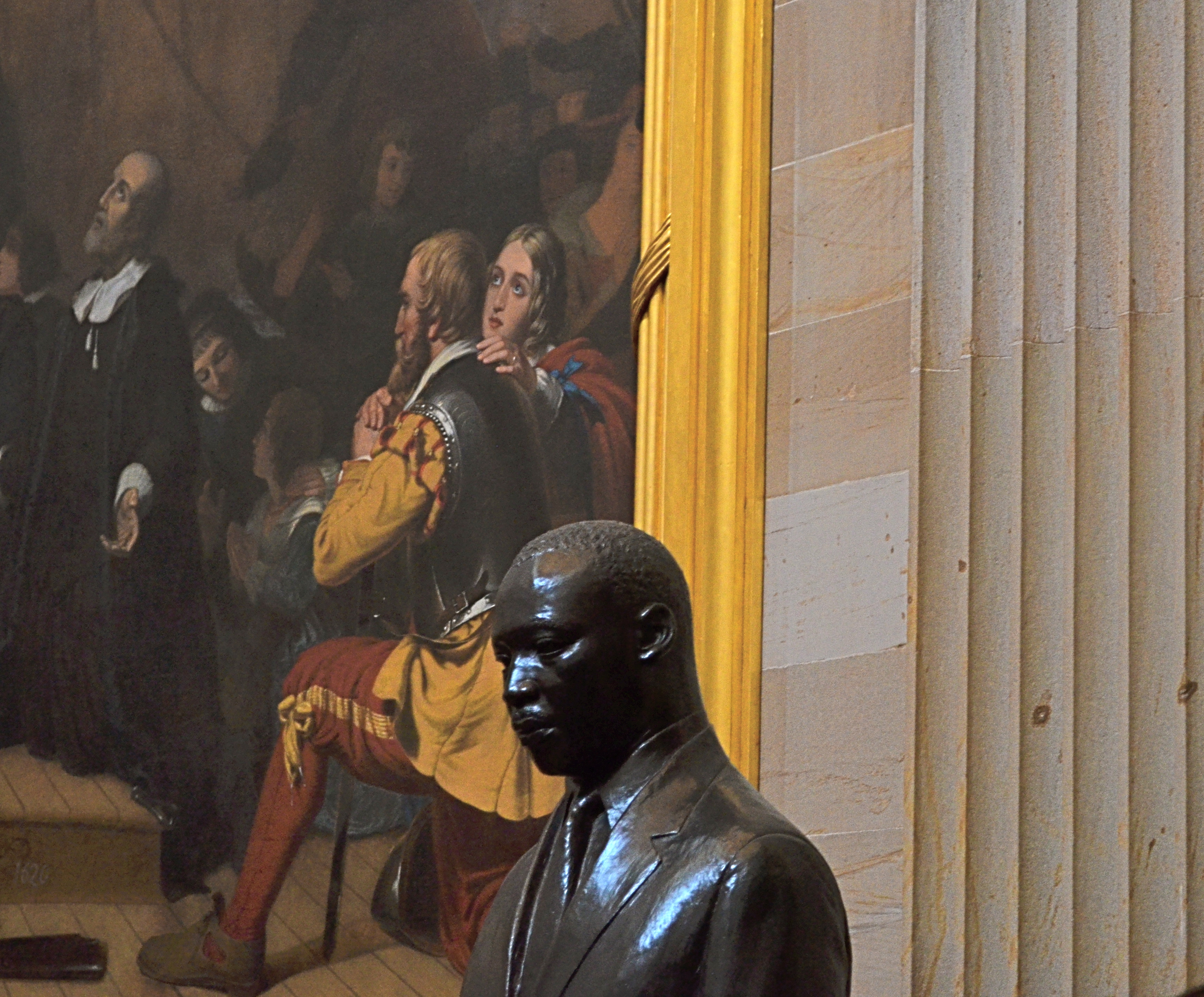
Another view: a somber bronze bust of Dr. King in the U.S. Capitol rotunda, flanked by the painting The Embarkation Of The Pilgrims. 1/30 sec., f/5.6, ISO 640, 55mm.
The contrast could not be greater between this view and the bronze bust of King installed in 1988 in the rotunda of the Capitol building. This King is worried, subdued, straining under the weight of history, burdened by destiny. The bust gains some additional spiritual context when framed against its near neighbor, Robert Weir’s painting The Embarkation Of The Pilgrims, which shows the weary wayfarers of the Mayflower, bound for America, on bended knee, praying for freedom, for justice. Used as background to the bust, they resemble a kind of support group, a congregation eager to be led. Context mine? Certainly, but you shoot what you see. Inside the capitol, light from the dome’s lofty skylights falls off sharply as it reaches the floor, so underexposure is pretty much a given unless you jack up your ISO. Colors will run rich, and some post-lightening is needed. However, the dark palette of tones seems to fit this somber King, just as the triumphant glow of the MLK Memorial’s King seems suited to its particular setting.
Death and fame are twin transfigurations, and what comes through in any single image is more highly subjective than any photo taking of a living person.
But that’s where the magic comes in, and where mere recording can aspire to become something else.
Follow Michael Perkins on Twitter @mpnormaleye.
COMMANDER-IN-GRIEF

Mr. Lincoln’s vigil continues. See below for details on the making of this image.
By MICHAEL PERKINS
MANY OF THOSE WHO TRAVEL TO WASHINGTON, D.C.’s VARIOUS MONUMENTS each year generally strike me as visitors, while those who throng to the memorial honoring Abraham Lincoln seem more like pilgrims. Scanning the faces of the children and adults who ascend the slow steps to the simple rectangular chamber that contains Daniel Chester French‘s statue of the 16th president, I see that this part of the trip is somehow more important to many, more fraught with a sense of moment, than the other places one may have occasion to view along the National Mall. This is, of course, simply my subjective opinion. However, it seems that this ought to be true, that, even more than Jefferson, Washington or any other single person attendant to the creation of the republic, Lincoln, and the extraordinary nature of his service, should require an extra few seconds of silent awe, and, if you’re a person of faith, maybe a prayer.
This week, one hundred and fifty years ago, the gruesome and horrific savagery of the Civil War filled three whole days with blood, blunder, sacrifice, tragedy, and finally, a glimmer of hope, as the battle of Gettysburg incised a scar across every heart in America. Lincoln’s remarks at the subsequent dedication of the battlefield placed him in the position of official pallbearer for all our sorrows, truly our Commander-In-Grief. Perhaps it’s our awareness of the weight, the loneliness, the dark desolation of that role that makes visitors to the Lincoln Memorial a little more humble, a little quieter and deeper of spirit. Moreover, for photographers, you want more of that statue than a quick snap of visiting school children. You want to get something as right as you can. You want to capture that quiet, that isolation, Lincoln’s ability to act as a national blotter of sadness. And then there is the quiet resolve, the emergence from grief, the way he led us up out of the grave and toward the re-purposing of America.
The statue is a simple object, and making something more eloquent than it is by itself is daunting.
The interior of the monument is actually lit better at night than in the daytime, when there is a sharp fall-off of light from the statue to the pillars and colored glass skylights to its right and left. You can crank up the ISO to retrieve additional detail in these darker areas, but you risk the addition of grainy noise. In turn, you can smooth out the noise later, but, in so doing, you’ll also smear away the beautiful grain in the statue itself.
In my own case, I decided to take three bracketed exposures, all f/5.6, , nice and wide at 20mm, low noise at ISO 100, with shutter speeds of 1/50, 1/100, and 1/200. In blending the three later in Photomatix’ Detail Enhancement mode, I found that the 1/200 exposure had too little information in it, so a composite of the three shots would have rendered the darkest areas as a kind of black mayonnaise, so I did the blend with only two exposures. Stone being the main materials in the subject, I could jack up the HDR intensity fairly high to accentuate textures, and, for a more uniform look across the frame, I gently nudged the color temperature toward the brown/amber end, although the statue itself is typically a gleaming white. The overall look is somewhat more subdued than “reality”, but a little warmer and quieter.
Abraham Lincoln was charged with maintaining a grim and faithful vigil at America’s bedside, in a way that no president before or since has had to do. Given events of the time, it was in no way certain that the patient would pull through. That we are here to celebrate his victory is a modern miracle, and the space his spirit occupies at the Lincoln Memorial is something photographers hunger to snatch away for their own.
What we try to capture is as elusive as a shadow, but we need to own something of it. The commander-in-grief’s legacy demands it.
Follow Michael Perkins on Twitter @mpnormaleye.
Related articles
- Other Proposed Designs for the Lincoln Memorial (ghostsofdc.org)
- Lincoln Memorial Under Construction (ghostsofdc.org)
“C” NOTES (THOUGHTS ON POST #100)
Hey, we’re all just trying to catch light in a box. Use any box you have, just grab something, like, say, the Empire State Building. 1/320 sec., f/5.6, ISO 100, 35mm.
By MICHAEL PERKINS
SOMETHING THAT LIVES IN THE NETHER WORLD BETWEEN A DIARY AND A PHILOSOPHIC SCREED, at the intersection of passion and obsession. That’s the no-man’s-land I aimed this blog at 100 posts ago, today. From Day One, The Normal Eye was, and remains, an attempt to get beyond the mere technical doing of a photograph and scratch away at the ticket of techtalk to reveal why I was trying to capture a given idea inside a box.
There are, and have ever been, far better teachers on a purely technical level than I can ever hope to be. And, let’s face it, knowing just the metadata on a shot is no guarantee that something magical will happen, just as high-end cameras don’t guarantee high-concept images. No, the only thing I’m expert at, in any way, is judging my own intentions, in hungering after a visualization of what I feel in my bones.
All of you patient ones out there already know me, because your dad or your corny uncle or your nerdly, bookish kid is just like me. I am “that guy”. I have always been that guy. The guy who pipes up, in completely unrelated conversations, with the observation that “it’s so cool what the light is doing right now”. The guy who comes back from a family gathering with, strangely, no pictures of the family whatever, but a killer shot of what everyone concurs is a colorful shmear of…something. The guy who is so busy looking for “the moment” that he forgets to be in the moment.
Guilty, guilty, guilty, and, ouch, guilty.
Funny thing is (and this is the mainspring that drives The Normal Eye), I’m almost as excited about where I’ll fail next than where I’ll succeed. If less than half of the pictures out of a new batch doesn’t make me groan, what the hell was I thinking?, then I’m not working hard enough, and certainly not reaching far enough. Nothing artistically good comes from a place of safety, and repeating your past choices doesn’t repeat your past successes.
Those of you who have done me the great honor of reading and following this mess have my undying gratitude. And as for those who have taken the extra time to comment as well, thanks for becoming the most vital link in the chain. Bloggers may be doomed to forever shout off the edge of a cliff, but it’s a real Robinson Crusoe moment when some man (or woman) Friday actually shouts back. Thank you, one and all.
As far as there are clearly stated goals for any enterprise such as this (except to keep on going), I can faithfully pledge to keep the process as honest as possible, and to let my inner child, the brat who first picked up a camera, to shout down the rational adult, who unlike the kid, occasionally forgets that this is all supposed to be about discovery, and wonder. If I lose track of that, the whole game is up. I also hope to act as a better conduit to the best work going on in photography today, in these pages and through my Twitter feed @mpnormaleye. The great news: the golden age of photography is happening here, now. Everything that has gone before, while amazing, is mere prologue to what is on the way.
That is pretty damned exciting.
So thanks for where this has taken us so far, and please sign up for another hitch. I can’t promise I’ll dazzle you. But I do promise I’ll be dazzled.
After all, it’s so cool what the light is doing, right now.
Where’s my box?
follow Michael Perkins on Twitter @mpnormaleye.
IN THE LINE OF FIRE

On patrol: The Korean War Memorial on Washington’s National Mall. 1/250 sec., f/5.6, ISO 100, 32mm.
By MICHAEL PERKINS
THERE IS NO GREATER ART THAN THAT WHICH DEMANDS THAT THE VIEWER BECOME A PARTICIPANT, an active co-creator of a bond between creator and user. That is the ineffable power that pervades all great art; the ability to draw you into a world not your own, a world which, in an instant, becomes your own. This elusive quality moves art from mere depiction to a kind of partnership arrangement. It’s so uncommon, so rare, that, when we see an instance of it, the very nature of the effect is radiant, unforgettable.
There are many attempts along Washington, D.C.‘s National Mall to name the nameless, to five utterance to the wordless qualities that define greatness, vision, loss, courage, passion, and pain. America‘s noisy, erratic journey through its young life have left trails of triumph and tragedy, paths that artists have illuminated with the various memorials and monuments which ring the mall from east to west. Some elevate presidents to the level of demigods; some mark the passage of noble laws; others, like the Vietnam War memorial, evoke deep feeling with a reverent stillness, and my favorite, the more recent Korean War Memorial, captures the quiet terror of setting out upon the grim errand of battle in a way that is eerie, and yet elegant.
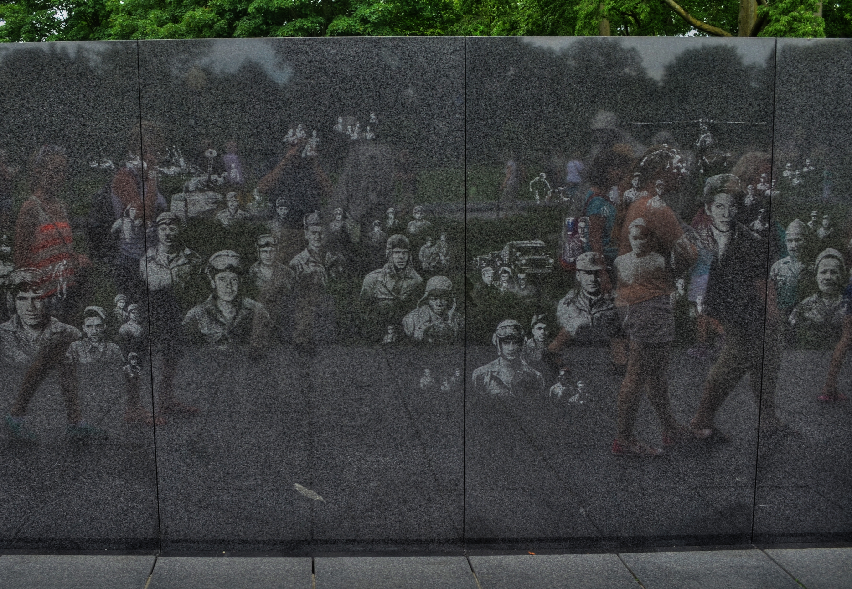
Visitors to the Korean War Memorial pass a wall etched with candid photos of G.I.s who served in the conflict.
There are two major elements to the memorial, dedicated in 1995 just southeast of the Lincoln Memorial. The first is reminiscent of the wall of names that comprise the solemn Vietnam memorial, but is slightly different in that it is a wall of faces, the effigies of nameless veterans of the conflict, scanned from candid photographs and etched into a stone slab that lines one side of the site. The other, and far more haunting feature is that of a silent patrol of soldiers, its members drawn from each branch of service in the Korean conflict, setting out in a cautious recon march across an open field. The statuary figures are impressive, averaging about seven feet in height. All of the soldiers cast their nervous gaze about the area as they seem to emerge from the relative safety of a copse of trees that border the monument site. The men are exhausted, grim. There is no call to duty in their poses, no grand gestures of heroism, no “follow me, boys!” rallying cry. Sculptor Frank Gaylord has created a squad of the Spirits Of Thankless Jobs Past, laden with gear, shrouded in ponchos, their steps weary and woeful. Get close enough to them and you can almost fall into step among them. Unlike the church-like quiet of the Vietnam memorial or the majestic marble of the WWII memorial, the Korean shows real men who have been sent to an unhappy, uncertain task, then consigned to the shadows, in what history has since labeled “the forgotten war.”
No majestic slogans mark the monument; only the cautionary sentence “Freedom Is Not Free” serves to warn the visitor that every act undertaken by politicians and kings has a real cost for real men. That cost is also recorded on the monument, with the dead, wounded, captured and missing totaling 172,847 Americans, not to mention the losses of the other twenty-two United Nations members whose soldiers comprised the total war effort.
To stand at many of the National Mall’s war memorials is to deal in abstractions…..patriotism, truth, sacrifice…noble words, noble ideals. To stand at the Korean War Memorial is to feel the blood and bone of war, its terror and tension, its risk and reality. It is the greatest kind of public art, because the public are destined, always, to become a vital part of it.
In the line of fire.
Follow Michael Perkins on Twitter @mpnormaleye.
LIPSTICK ON A PIG

Bad day at the office: having failed at making this house charming, I then went on to also fail at making it sinister and forbidding. I did, however, succeed in making it an unholy mess.
By MICHAEL PERKINS
IT’S TV-DOCTOR SHOW CLICHE NUMBER ONE. The frantic ER crew valiantly works upon a patient who is coding, pulling out every tool in a desperate search for a discernible pulse. Then the close-up on the earnest nurse: “He’s gone.” and the final pronouncement by the exhausted resident: “Okay, anyone have the time? I’m calling it….”
That’s pretty much what it’s like to try to rescue a lousy photograph by extraordinary means…tweaking, sweetening, processing, whatever you call the ultimately futile emergency measures. Sometime the unthinkable is obvious: the picture’s a goner…no pulse, no soul, no life.
Cue Bones McCoy: It’s dead, Jim.
I have made my share of ill-advised interventions in the name of “saving” photos that I was unwilling to admit were lifeless, pointless, just a plain waste of time. You’ve done it too, I’m sure. Trying to give some kind of artistic mouth-to-mouth to an image that just wasn’t a contender to begin with. It was a bunch of recorded light patterns, okay, but it damn sure wasn’t a photograph. Smear as much lipstick on a pig as you want….it’s still a pig.

The unremarkable original image.
The above image shows the worst of this pathology. I wanted to show the charm of an old bed-and-breakfast in the gloriously beautiful little town of Pacific Grove, located just up the peninsula from Monterey in California (see image at left). But everything that could have made the image memorable, or even usable, was absent. The color, a cool buttercup yellow, is common to many town dwellings. In the warm glow of dawn or the late waning, dappled light of late afternoon, it can be charming, even warm. In the mid-day light, weak, withered. Then there was the total lack of a composition. The picture was taken in a second, and looked it.
So, angry at having failed at the “charming” look I had gone for, and unable to make the backlighting on the house work for me, I went into Photomatix (usually a very solid HDR tool) and started, almost angrily, to take revenge on the damned thing. If I can’t make you pretty, I’ll make you magnificently ugly, hahaha…. Seriously, I was pretty far into the journey from “happy little house” to “creepy little twilight creep castle” before realizing there was nothing to be extracted from this picture. No amount of over-glop, taffy-pulling or prayer would magically compensate for a central core concept that just wasn’t there. Like it or not, the pig was always going to show through the lipstick.
Sometimes you just gotta declare the unlucky patient in front of you dead, and try to save the kid on the next gurney over.
This blog was always supposed to be about choices, both good and bad, and how we learn from each. I have shared my failures before, and firmly believe that the only honest conversation comes from admitting that sometimes we make colossal errors in judgement, and that a fair examination of even our “misses” is more important than an endless parade of our “hits”.
Photography is not about consistent genius. It’s about extracting something vital from something flawed.
Being able to identify when we have fallen short is the most important skill, the most essential tool.
CAUGHT IN THE CROSSFIRE
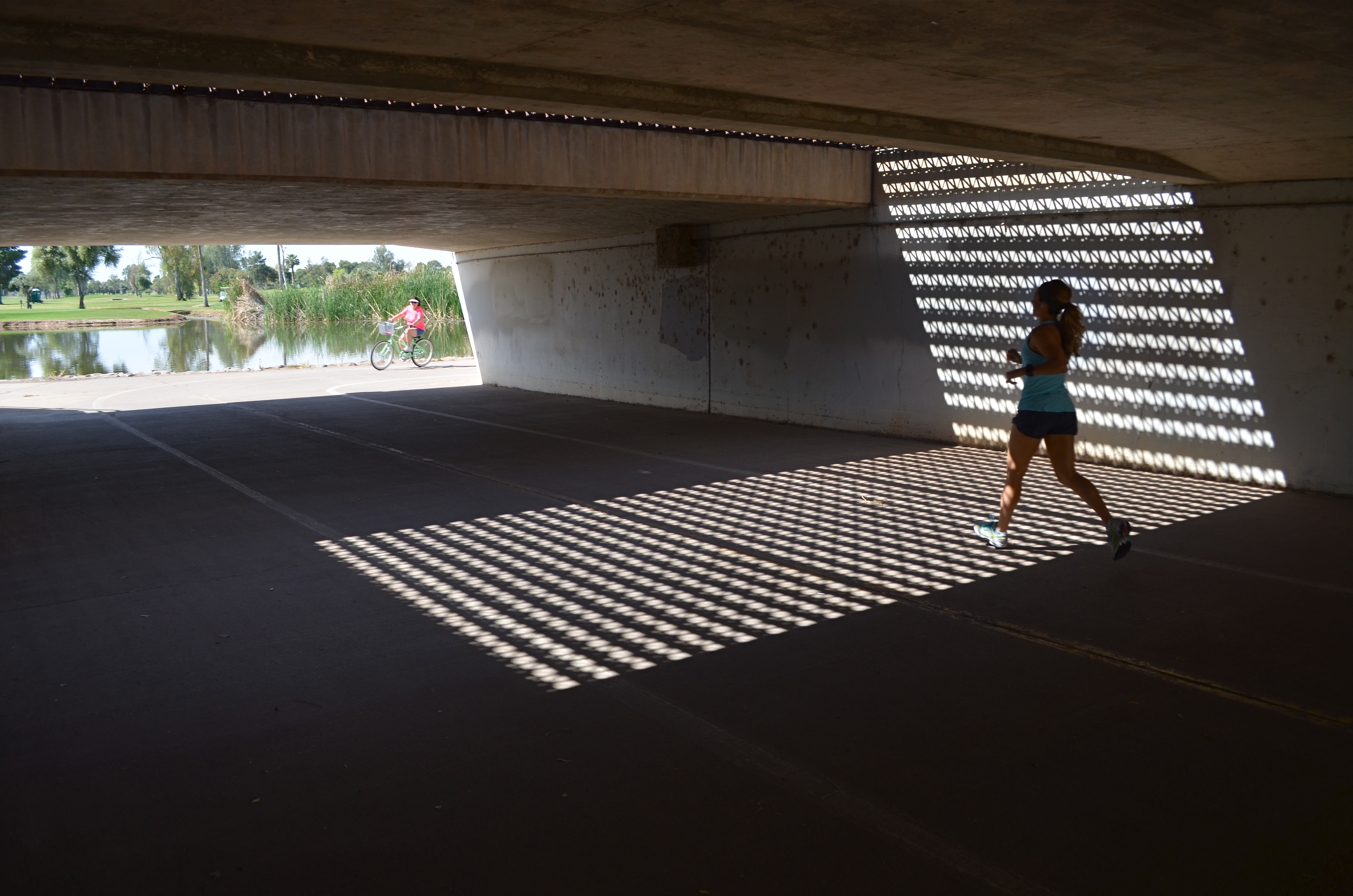
The jogger that saved my shot, albeit unwittingly. 1/250 sec., f/5.6, ISO 100, 18mm.
By MICHAEL PERKINS
THERE HAS BEEN A LOT OF MENTION, OF LATE, OF THE PHENOMENON KNOWN AS “PHOTOBOMBING“, the accidental or intentioned spoiling of our perfect Kodak moments by persons inserted into the frame at a crucial instant. Whether they block the bride’s face, eclipse Grandma’s beloved puppy, or merely pop up annoyingly behind the cute couple, they, and the images they ruin, are one of the hottest posting sources along the photo-internet galaxy right about now.
But fate photobombs us every day, and often drops a gift out of the sky, and into our pictures. The two-fold trick is to (a) be ready to improvise and (b) be grateful for the chance for something altogether different from what we originally conceived.
Happened to me several weeks ago. Total accident, since the thing I shot in the moment was not what I had started out for at all. Real simple situation:an underground walkway from one low-lying section of a city park to another, the sidewalk taking a short cut under a bridge. Overhead, six lanes of unheeding street-level traffic. Below, a concrete tunnel of sorts, with sunlight from the park illuminating either open end.
Oh, and the grate. Should mention that a section of the street overhead was, instead of solid roadbed, an open-pattern, structural steel grid, with dappled geometrics of light throwing a three-sided pattern of latticed shadows onto the side walls and floor of the tunnel below. Nice geometry. Now, I wasn’t looking to shoot anything down here at all. Like the chicken, I just wanted to get to the other side. But I had my wide-angle on, and a free light pattern is a free light pattern. One frame. A second, and then the bomb: a jogger, much more acquainted with this under-the-road shortcut than me, crossing from over my right shoulder and into my shot. Almost instinctively, I got her in frame, and relatively sharp as well.
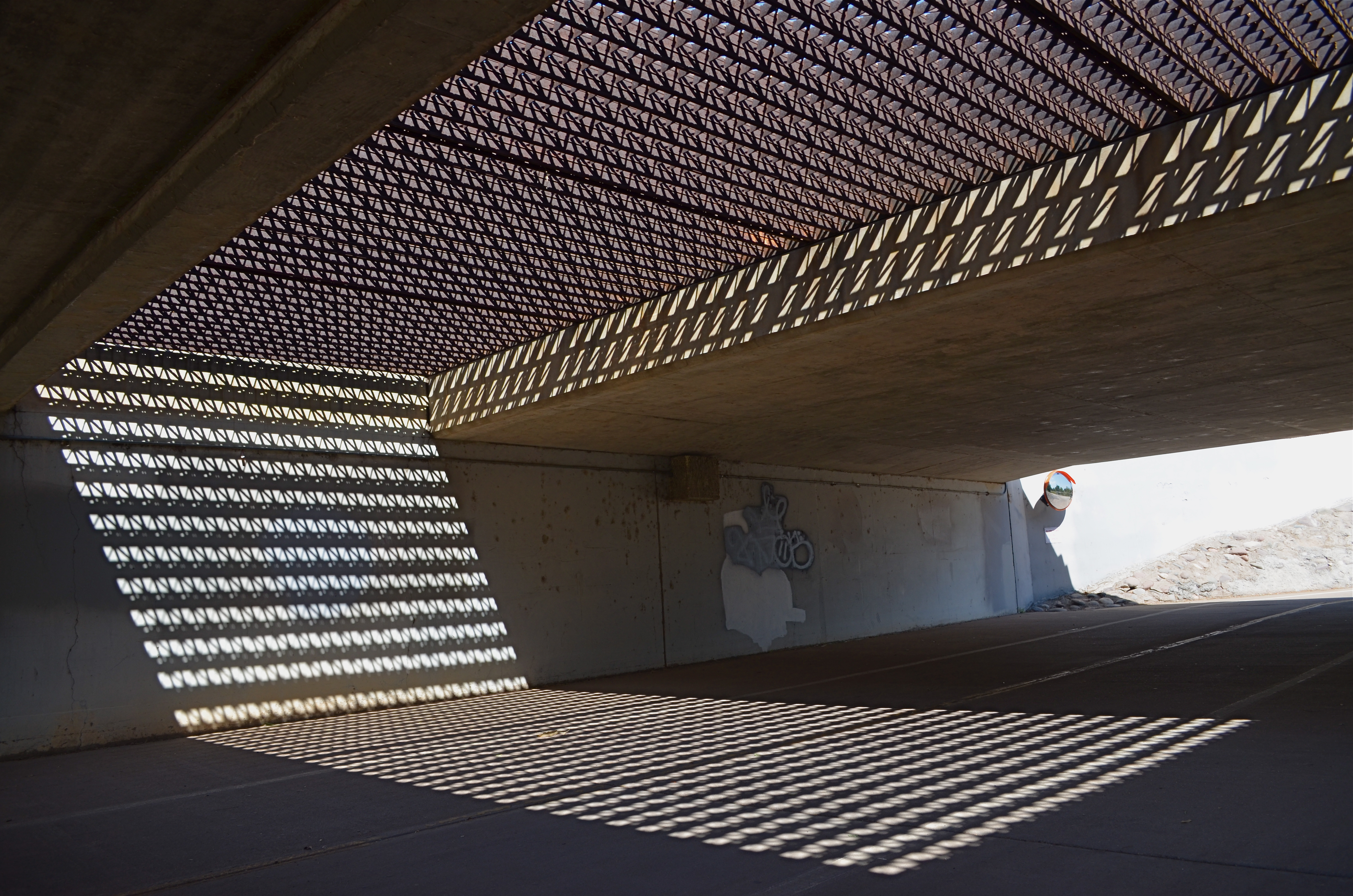
Same settings as in the “jogger” frame, but a little colder minus the human element. A matter of taste.
Not content to have caught the big fish of the day, I took the opposite angle and tried again to recoup my “ideal shot”, minus the human element. But something had changed. Even so, I still needed a gentle nudge from Fate to accept that I had already done as well as I was going to do.
My battery died.
I limped home, then, during my upload, found that what I had been willing to reject had become essential. I wish it was the first time I’ve had to be taught this lesson.
But I’d be lying.
Photobombed by circumstance.
And grateful for it.
follow Michael Perkins on Twitter @MPnormaleye.
POP’S MAGIC PICTURE BOX (Father’s Day 2013)
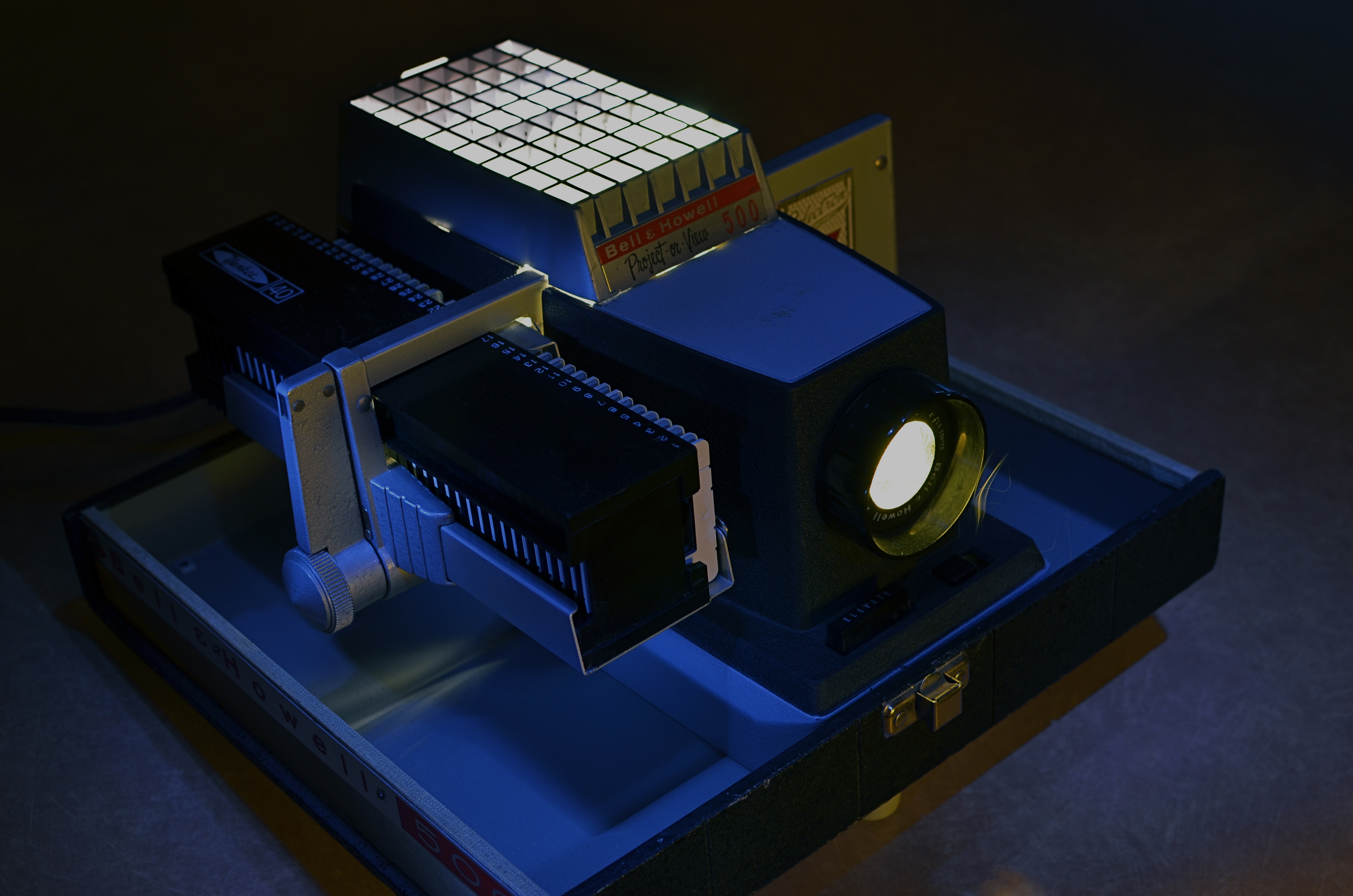
Magic in the darkness: my father’s Bell & Howell 500 projector, circa 1963. Image time-exposed and selectively light-painted in absolute dark. 10 sec., f/5.6, ISO 100, 35mm.
By MICHAEL PERKINS
YEARS AFTER, AS A YOUNG BOY, I FIRST SAW KODACHROME SLIDES PROJECTED ONTO OUR LIVING ROOM WALL, I learned that the first popular projectors had actually been called “magic lanterns” How right they were, and what an incredible spell these flashes of color and light wove for a little boy breathless in the familiar, yet miraculous dark.
It wasn’t that, as a family, we didn’t have dozens of albums crammed with traditionally processed prints of our most treasured moments. It’s just that, in the shadows, those clear, color-soaked images, half a wall in size, took on a life of their own. Bigger. More immediate. And as communal as a trip to the theatre. Only this was our theatre….our lore, our legend, writ large, compelling somehow in its size and scale.
Father’s Day is always a poignant time for me, since my life is insanely blessed. For me to be in the last third of my own life, and to still have the author of so many of my dreams still on the scene, still available to teach and direct my visions, as he did so ably then….well, it’s everything, that’s all.
As a father myself, I learned that it’s not always possible to transmit your passions to your children. Sometimes they don’t want to follow dear old Dad into whatever passionate pursuits he’s chosen for his own life. The fact that, sometimes, your kids “get” what even a part of you is really about is amazing, and, in the case of my father, I was lucky enough to be struck by the same lightning that hit him when it came to the graphic image….drawn or painted, realized in solid space in sculpture, or frozen on film. Photographs to him were another way of teaching himself to select, to edit, to choose something magical to depict or interpret, and he let me be the sorcerer’s apprentice.
Early into the Christmases of my adolescence, the power of our family albums was left in the dust as our memories began to shine and glow in our living room with the arrival of Dad’s new Bell & Howell 500 slide projector. It was Cinemascope, Cinerama, and the video wall from The Jetsons all in one, and I was mesmerized. The arrival of every yellow, flat box of new Kodak slides, all the way from the regional processing plant in Findley, Ohio, was like the reveal of a stage magician. I had caught the fever. I wanted to make pictures, too.
I wanted to make pictures like his.
The best statement I can make, all these years later, about the wonder of projected images was expressed several years ago on the Mad Men TV series, when adman Don Draper has the chance to make a fictional pitch to Eastman Kodak on how to market and name its new series of home slide projectors. And, even though our home projector used a “cube” tray instead of the wheel on Kodak’s “Carousel”, the magic was the same. Draper’s pitch began with the very essence of family memory:
“In Greek, ‘nostalgia’ literally means ‘the pain from an old wound’.
It’s a twinge in your heart, far more powerful than memory alone.
This device isn’t a spaceship, it’s a time machine. It goes backward and forwards, and it takes us to a place where we ache to go again.
It’s not called ‘The Wheel’. It’s called ‘The Carousel’ It lets us travel the way a child travels…around and around and back home again.
A place where we know we are loved. “
On this Father’s Day, as on every other, my heart is filled with memories and gratitude for the love that created them, but also a special thanks for a father who taught me the adventure, the patience, the joy of making an image. Armed with his trusty Kodak Pony 828, he taught me how to celebrate the triumphs and live with the failures, and, most importantly, to always go back to the well for another try. As both a photographer and graphic artist, he showed me that the concept is all, that it’s worth fighting for, worth worrying about, worth loving as your own special treasure.
Thanks, Dad. I love you.
Follow Michael Perkins on Twitter at MPnormaleye.
Related articles
- The best product placement in the TV shows (brandsandfilms.com)
- It’s a Magic Lantern (wordwenches.typepad.com)
WHAT’S YOUR TREE?

Detail of a restuarant that I’ve shot dozens of frames of, over the past five years. However, ask me if I could shoot it everyday for a solid year. I’m thinking not.
By MICHAEL PERKINS
ONE MAN’S DEDICATION IS ANOTHER MAN’S OBSESSION. Whether we view a person as passionately committed or someone who should just be, well, committed is largely a matter of perception. Nowhere is this truer than in the artistic world. Walk into any gallery, anywhere, and you will engage with at least one fixation on excellence that you believe is proof that grant money is dispensed far too freely. If this were not so, there would only be the need for one artist. The rest of us would be manning xerox machines. That’s why some people believe Thomas Kincade was a prophet, while other believe he was just, well, a profit.
Usually these debates are accompanied by too many beers, more than a few elevations in volume, and at least one person who gets his feelings hurt. Such is life, such is expression. We just guarantee your right to try it. We don’t guarantee anyone’s obligation to buy it.
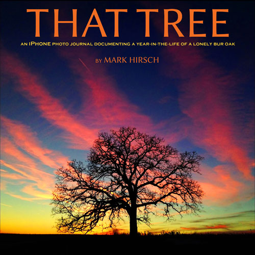 Discussion of the new book That Tree by Mark Hirsch (due in August) will fuel many such lager-lubricated chats, and some of them will be heated, I’m sure. The book actually demonstrates two separate obsessions, er, passions. First, Hirsch, a professional photographer, wished to create a substantial project for which he would set aside his Top Gun-level camera gear and shoot exclusively with his new iPhone. Second, early on in the project, he took the dare/suggestion from a friend to limit his subject matter to a single tree, an unremarkable bur oak that he had passed, without noticing, daily for almost nineteen years.
Think about this, now.
Looking back over the subjects that I personally have been drawn to revisit time and again, I’m damned if I can find even one with enough visual gold to warrant mining it for 365 images. the closest two subjects would be a small restaurant in Scottsdale, Arizona called Zinc Bistro, and the campus of cliffside art galleries at the Getty Center above Los Angeles. And I have cranked out a ton of frames of both subjects, looking for a truth that may or may not be there to see…but not a year’s worth. I personally believe that I might conceivably be able to find that much mystery and beauty in my wife’s face….in fact, I shoot her as often as I can. However, long before a project of this scope could be completed, she would have taken out a contract on my life. True love will only take you so far.
I have got to see this book.
Mark Hirsch will either become my new synonym for Latest Photo God Almighty or another amusing asterisk in the broad sweep of imaging history.He will also provide strong talking points for those who champion the iPhone as a serious photographic instrument. For that alone, the book has value.
Either way, it ain’t gonna be boring.
Follow Michael Perkins on Twitter @MPnormaleye.
Related articles
- Photographer documents a year in the life of a tree on his iPhone (guardian.co.uk)
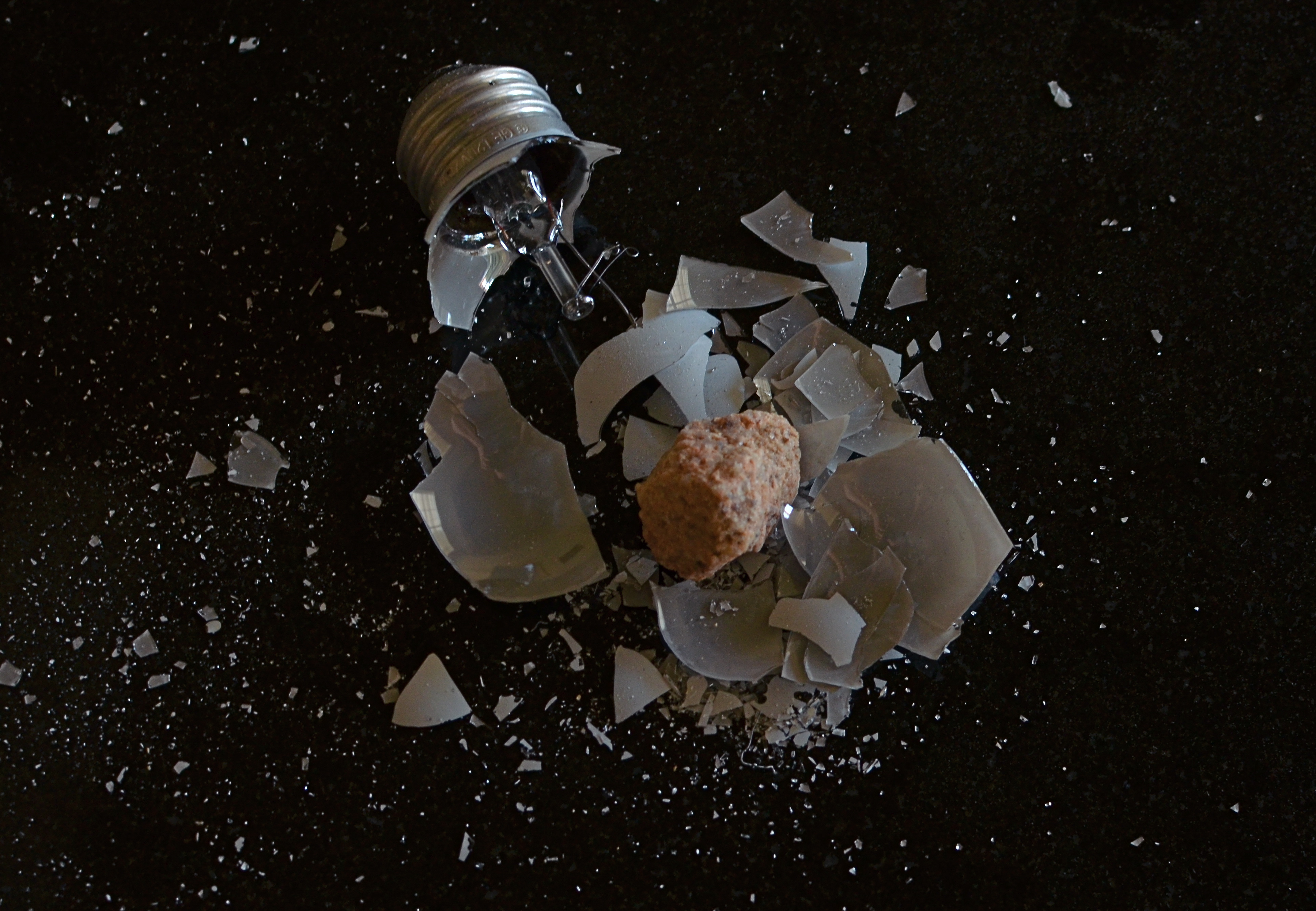
THE GRADUAL REVEAL
A cosmic disaster on a tabletop far, far away. 1/40 sec., f/5.6, ISO 400, 35mm.
by MICHAEL PERKINS
CREATING FANTASY IMAGES ON A TABLETOP IS A LITTLE LIKE WATCHING YOUR GRANDMA IN THE KITCHEN, if your grandma (like mine) was the “I-don’t need-no-recipe”,a dash here, a pinch there kind of cook. Sometimes I think she just kept chucking ingredients into the pot until it was either the right color or the correct thickness. All I know is, when she was done, it “ate pretty good”.
I use the same approach when I am building compositions from scratch. You’re not sure what the proportions are, but you kind of know when you’re done.
One of the photo sharing sites that I recommend most enthusiastically is called UTATA, a site which promotes itself as “tribal photography” since it require a certain level of communal kick-in from all its members, posing workshop assignments and themes that take you beyond merely posting your faves. Operating in tandem with its self-named Flickr group, UTATA is about taking chances and forcing yourself, often on a deadline, to see in new ways. If it sounds like homework, it’s not, and even if you have no time to work the various challenges, you’ll still reap a vast wealth of knowledge just riffing through other people’s work. Give it a look at http://www.utata.org.
One of the site’s recent so-called “weekend projects” was to photograph anything that in any way depicted broken glass. No special terms beyond that. Cheap glass, wine glass, churchy stained glass, pick your texture, pick your context. I decided to so something with a shattered light bulb, but with a few twists. Instead of just breaking the bulb and shooting a frame, I opted to place the bulb in a food storage bag, then hammer it until it burst. Due to the sudden release of pressure when light bulbs are breached, they don’t just crack, they sort of explode, and, given the chemical treatment of the glass, there is a lot of pure white dust that accompanies the very fine glass particles. Breaking the bulb inside the bag allowed me to retain all that sediment, then make it more visible by pouring the bits out onto a black, non-reflective surface…in this case, a granite tile that I use to model product shots on.
I already liked the look of all the atomized white dust across that dull blackness, rather like a “star field”, or a cluster of debris, scattered across a vast void in space. The effect was taking shape, but the “garbage cook” inside my head was still looking for one more ingredient. The great thing about building a fantasy visual is that it doesn’t have to make “sense”….it just needs visual impact sufficient to register with the gut. If the micro-fine bits of the bulb represented some kind of space catastrophe, where was the cause? Inner stresses, like volcanoes, rupturing the Mother Bulb asunder like the planet Krypton? No, wait, what if something collided with it, some asteroid-like something that spelled doom for Planet G.E.? A quick trip out to the back yard gave me my cosmic cataclysm….I mean chunk of quartz, and the rest was just arrangement and experiment.
What does it all mean? Heck, what does beef stew mean? Making a picture can be like gradually adding random veggies and spices until something tells you it’s “soup”. And with tabletop fantasies, you get to play God with all the little worlds you’ve created.
Hey, over a lifetime, plenty of other people will take turns blowing up your work.
Why not you?
follow Michael Perkins on Twitter @MPnormaleye.
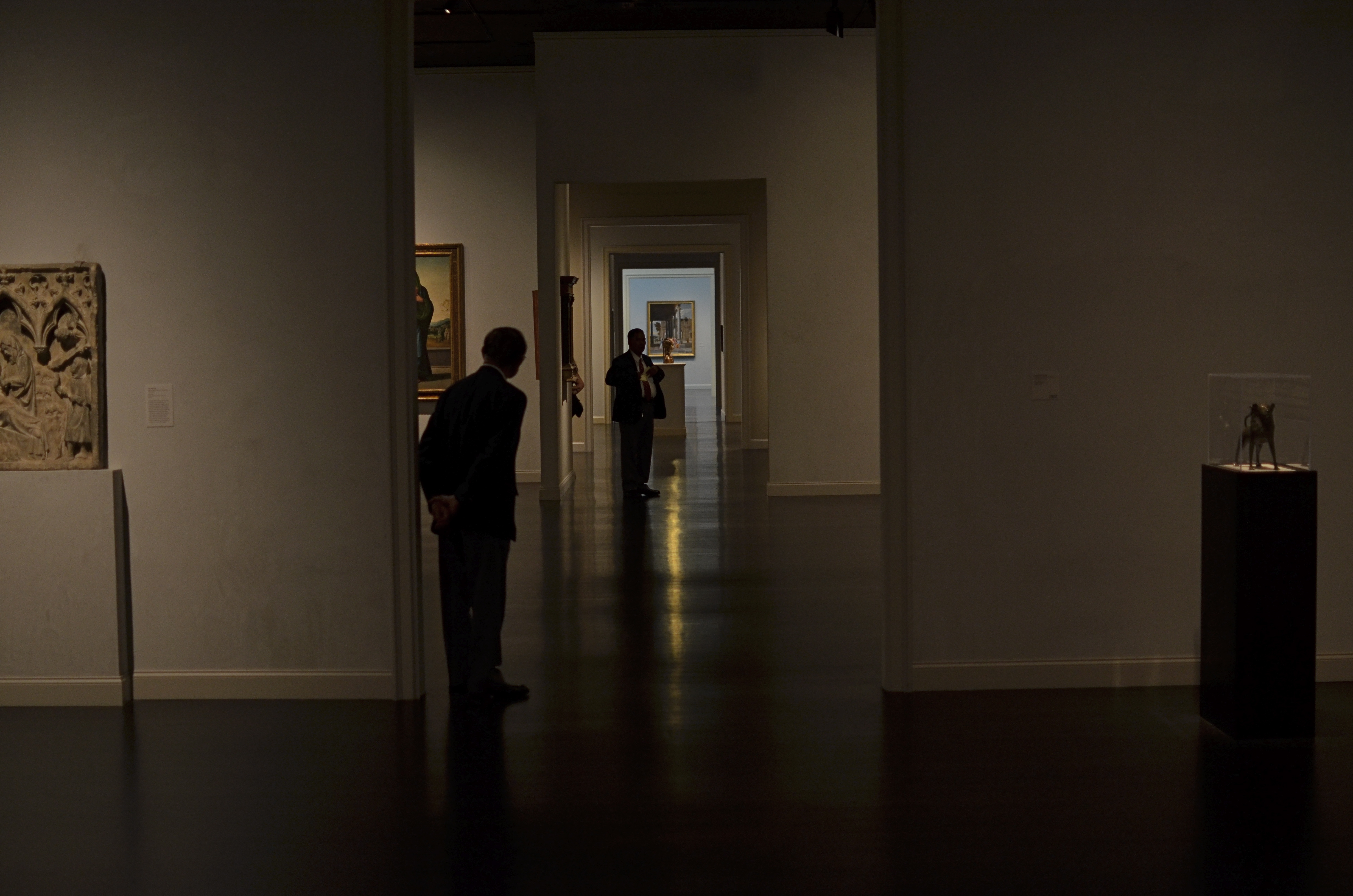
INNER SPACE, OUTER MIND
There really was a nice exhibit on display the day I took this at LACMA in Los Angeles. But this arrangement of space was arguing louder for my attention. 1/160 sec., f/1.8, ISO 320, 35mm.
By MICHAEL PERKINS
IF YOU VISIT ENOUGH MUSEUMS IN YOUR LIFETIME, you may decide that at least half of them, seen as arranged space, are more interesting than their contents. It may be country-cousin to that time in your childhood when your parents gave you a big box with a riding toy inside it, and, after a few minutes of excitement, you began sitting in the box. The object inside was, after all, only a fire engine, but a box could be a mine shaft, a Fortress of Solitude, the dining car on the Orient Express, and so on.
Spaces, divided, bisected, hidden, revealed. Art in itself.
And so with museums.
I truly do try to give lip service to the curated exhibits and loaned shows that cram the floors and line the walls of the various museums I visit. After all, I am, harumph and ahem, a Patron Of The Arts, especially if said museums are hosting cocktail parties and trays of giant prawns in their hallowed halls…I mean, what’s not to like? However, there are times when the endless variations on just a room, a hall, a mode of lighting, or the anticipatory feeling that something wonderful is right around the next corner is, well, a more powerful spell than the stuff they actually booked into the joint.
Spaces are landscapes. Spaces are still lifes. Spaces are color studies. Spaces are stages where people are dynamic props.
Recently spinning back through my travel images of the last few years, I was really surprised how many times I took shots inside museums that are nothing more than attempts to render the atmosphere of the museum, to capture the oxygen and light in the room, to dramatize the distances and spaces between things. It’s very slippery stuff. Great thing you find, also, is that the increased light sensitivity and white balance controls on present-day cameras allow for a really wide range of effects, allowing you to “interpret” the space in different ways, making this somewhat vaporous pursuit even more …vaporous-y.
In the end, you shoot what speaks to you, and these “art containers” sometimes are more eloquent by far than the treasures they present. That is not a dig on contemporary art (or any other kind). It means that an image is where you find it. Staying open to that simple idea provides surprise.
And delight.
follow Michael Perkins on Twitter @mpnormaleye.
YOU ARE THE CAMERA
Dark Days for the printed page. 1/80 sec., f/1.8, ISO 100, 35mm.
By MICHAEL PERKINS
THE MOST ANNOYING COMMERCIAL ON TELEVISION AT PRESENT is the one from Apple reminding you that more people take pictures with the iPhone5 than with any other camera in the world. Now, I understand that The Men Who Would Be Steve at Apple need to assert their dominance in a rapidly accelerating race between smartphone camera brands. It’s just good business, and all that. Granting that, let’s agree that their statement is essentially meaningless for photography.
Apple can claim that their photo gadget is in more hands than anyone else’s? Ho-hum. The Kodak Brownie was able to make the same claim over 100 years ago, and successfully defend it for almost another fifty. We’re number one, sis-boom-bah, and what does that have to do with the kind of pictures that are being taken? The iPhone5 is a technical marvel on many levels, and it contains, among many other toys, a reasonably reliable, limited point-and-shoot-camera. You will always be able to get some kind of image on it under nearly any circumstances.
However, the Apple TV ad, while factually accurate, is artistically false, since it leads one to the spurious conclusion that more iPhone5 pictures means more excellent pictures. And there isn’t a camera, cheap or cherry, that can make that statement. I get just as agitated when trendo camera mags try to imply that if your gear costs thousands, your pictures will look like a million.
We’ve had almost two hundred years to shake off this childish notion. Equipment does not equal excellence. Convenience, speed, affordability, flexibility…cameras can make all these claims. But they do not confer the title of photographer on anyone.
Only you can do that.
There used to be more of these than any other camera in the world, and so what?
And you can do it with a cheap piece of garbage, or a technical wonder, or any equipment stage in between. The idea is all. Everything else is just tinkering.
Here’s another piece of lunatic logic coming from another direction:
The idiotic recent decision of the Chicago Sun-Times to lay off all of its staff photographers, replacing them with freelancers (whom they will train on iPhones!), is not a lousy idea because there aren’t enough low-cost cameras out there to afford them some kind of coverage on their stories. It’s a lousy idea because it’s based on a flawed concept: the belief that photography is a universal skill, and that bystanders with smartphones are the equal of seasoned visual journalists, imbedded in their communities and schooled in its sources. They are not, and can never be.
Sadly,you can bet that editors across the nation are watching to see if the Sun-Times gets away with it. And they just might. Of course the quality of image reporting will take a hit, but since people are leaving the traditional newspaper as if it has leprosy anyway, will the customers know the difference? Look for this horrible move to be duplicated at a newspaper near you, since it’s (a) cheap, (b) easy to explain failure some other way, and (c) oh, yeah did I mention it’s cheap? Ironic sidebar: this is, officially the first time a newspaper has opted for less technology to become more competitive.
Expensive cameras and decent salaries are certainly no guarantee of good news coverage, but a staff loaded with veterans of wars, uprisings, elections, disasters and human interest is. The fact that several of them are Pulitzer Prize winners isn’t exactly a disqualifier, either.
You are the camera. You make the picture, regardless of the technology at hand. Forget that, and you might as well be holding a canned ham.
follow Michael Perkins on Twitter @MPnormaleye.com
Related articles
MUTATION

Okay, this has a LOT of processing. Love me or hate me based on whether it worked. 1/500 sec., f/1.8, ISO 100, 35mm.
BY MICHAEL PERKINS
NOT CONTENT TO BE AN ART ON ITS OWN TERMS, PHOTOGRAPHY IS ALSO CONSTANTLY RE-INTERPRETING ALL THE OTHER ARTS AS WELL. Ever since imaging fell out of the cradle in the early 1800’s, several of us have always been looking at the works of others and saying, “eh, I can probably do something with that.”
Yeah, not too presumptuous, right? And the trend has continued (some say worsened) to the present day. Half the time we are creating something. The other half of the time we are tweaking, mocking, honoring, loving, hating, shredding, re-combining, or ragging on somebody else’s work. Are these mashups also art? Are we co-creators or just cheesy thieves?
And does it matter?
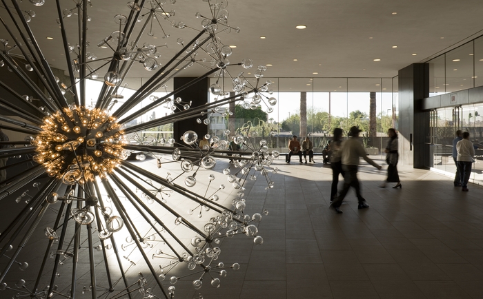
The Last Scattering Surface as it appears in the lobby of the Phoenix Art Museum.
The Phoenix Art Museum greets customers with a stunning original sculpture in glass and plexi right at the entrance to its ticket lobby. A huge installation of light bulbs, mirrored surfaces and reflective discs, Josiah McIlheny’s The Last Scattering Surface resembles a brightly burning orb (planet? asteroid? dwarf star?) surrounded by jutting rods that carry the central sphere’s light along “rays” to a series of circular satellites (moons? craft? debris?) Like many examples of pure design it is both everything and nothing, that is, it is mutative based on your observation. So, in a way, as in the manner of a photographer, you are already a participant in the co-creation of this object just by looking at it. Does this mean that it’s less theif-ish to go ahead and mutate the man’s work?
Well, there’s probably a lively back-and-forth on that.
For my own “take”, I wanted to remove the background walls, visitors, ambient blurry light from other junk, to isolate this nova-like work in “space”. I only had one frame that I liked from my short blast of shots, so I duped it, slammed the contrast real light/real dark on the pair, and did an exposure fusion in Photomatix. Adding a little edge blur and a re-tinting to the composite gave me the look of an interstellar explosion.
I freely advertise that I am making a semi-original re-mix on a completely original work. It’s not much more radical than shooting with a filter on the lens, or choosing black and white for a color subject, and yet, it always feels funny to try and make something beautiful that was beautiful in the first place.
But art is supposed to be about starting conversation, so consider this mine.
I just did my talking with a box instead of a mouth.
follow Michael Perkins on Twitter @ mpnormaleye.com
SEVEN MORE WONDERS OF THE WORLD
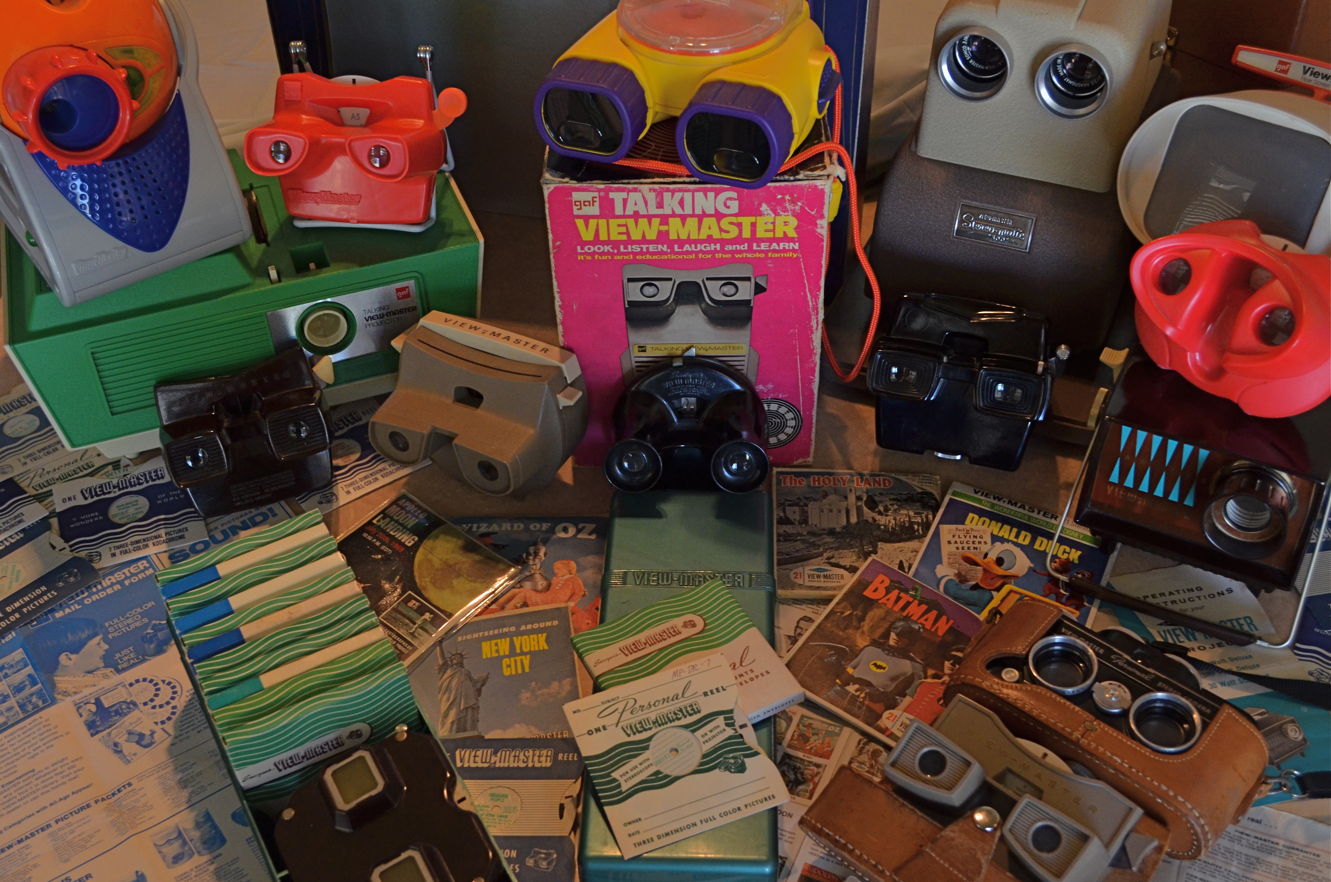
Class Picture: A small sampling of the massive product line from over sixty-four years of View-Master. 1/80 sec., f/5.6, ISO 640, 24mm.
By MICHAEL PERKINS
I’LL NEVER KNOW THE NAMES OF MANY OF THE PHOTOGRAPHERS THAT HAD THE GREATEST ROLES IN SHAPING MY EARLY WAY OF SEEING. The most important primary influences on my visual style in childhood weren’t the guys who received billing in the very public credits of Life, Look, or National Geographic, but the nameless freelancers whose work popped out of the small 3-d Kodachrome squares mounted in white cardboard View-Master reels. To this day, I can directly link the way I visualize images to VM’s crew of uncredited shooters, with their full-color highlight tours of everything from Yosemite to Notre Dame. Truly, from the first brown bakelite Model “D” viewer I received as a boy, through endless model variations over the next fifty years, I framed my own method for telling a picture story after the scenes in those little blue envelopes which bore the portentous legend, Seven More Wonders Of The World.
If you’ve been out of short pants for a while, you might not know that these little middle-tech stereoscopic beauties are still around, although just barely. View-Master has provided diversion and delight for three generations of devotees the world over, but the ride, billions of reels and zillions of memories later, might finally be crawling to a halt. More on that in a moment.
The co-invention of a photographer/tinker and a postcard salesman, View-Master cranked out its first rudimentary viewers and travel titles in 1939, more or less growing out of its appearance at the New York World’s Fair, where its souvenir views of “The World Of Tomorrow” made their debut. One of the earliest VM subjects was the then-new Boulder (later Hoover) Dam, setting the tone for the format’s explanatory “texts”, image descriptions short enough to make Tweets look encyclopedic, all crammed to fit inside the tiny caption window resting between your eyes. View-Master was largely an adult amusement for its first decade, catering to the armchair traveler with an endless catalogue of national parks, castles, cathedrals, and natural wonders, selling through a network of dealerships at camera shops and the souvenir stands at various travel attractions. Many of the format’s contributing scenic photographers also made some side money as VM sales agents, criss-crossing the country by car, shooting a little here, selling a little there.
By the early 50’s, View-Master grew from single-subject reels to three-reel packets and from travel images to its first children’s titles. Entering into a contract with Walt Disney studios, the VM format made a seismic shift toward youth fare with cartoon and TV shows, movies, even their own original fairy tale and nursery titles, shot with tiny clay figures arranged in their own miniature tabletop dioramas. And of course “the scenics”, as they were called, rolled on to chronicle many more World’s Fairs, canyons, mountains, parks, even NASA flights.
Depending on when you first encountered the format, View-Master was made either by Sawyers, GAF, Tyco, Fisher-Price, or Mattel, and the classic viewer was joined by projectors (2-D and 3-d), stereo cameras for making your own reels, “talking” viewers with internal phonographs to announce the captions, home “theatre” sets, storage cases and a slew of other short-and-long-term products.Now for the inevitable “passage of time” part: by the start of the 21st century, View-Master’s ancestral factory in Portland, Oregon closed its doors and production was moved to Mexico. And in 2013, there is, after sixty-four years, the clear possibility that the View-Master division of Mattel will be leased to a separate company, spun off like a despised stepchild, if not discontinued altogether.
Why the nostalgia? Because my whole orientation toward trying to tell a compelling, simple story in pictures, nurtured later by more famous photographers, cut its baby teeth on View-Master images: the composition, the angle, the way of leading the viewer’s eye into a frame and nailing it there….that’s all part of the “reel” world of my early, baby-sized eyes. There is no wasted space, no cute artiness in a View-Master image. It is all practical information, all shorthand communication. And even though the kiddie titles have long dominated the format’s output, there are, amazingly, still artists who create everything from complete tours of the Lewis & Clark expedition to edgy art exhibits with View-Master. And in a world that still embraces lo-tech imaging artifacts like plastic toy cameras and artificial “retro” platforms like Instagram, it seems that VM could still be an instrument for at least some kinds of photo expression.
Or, as with our tearful farewell to Kodachrome a few years back, we might, at least, cast a fond backward glance at the little box that gave us the world.
Seven wonders at a time.
JOINTS
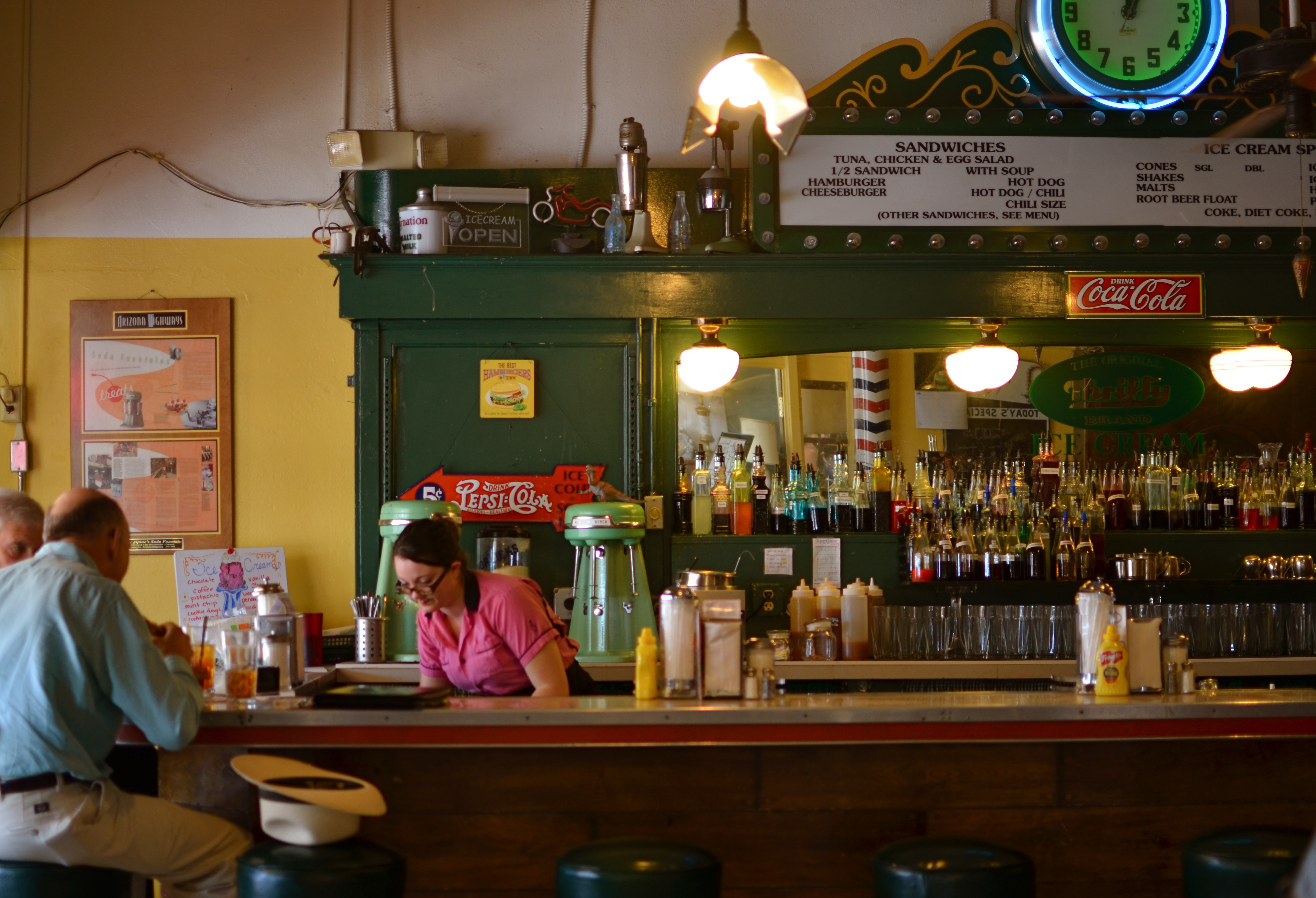
Try the special. Heck, it’s all special at the lunch counter at McAlpine’s Soda Fountain in Phoenix. 1/100 sec., f/1.8, ISO 100 35mm.
By MICHAEL PERKINS
BETTER MINDS THAN MINE HAVE LAMENTED THE HOMOGENIZING OF URBAN LIFE, that process by which uniqueness is gradually engineered out of human experience in buildings, businesses and products, to be replaced by the standardized, the research-proven, the chain-generated.
We all say we hate it. And we all put the lie to that statement by making the super-brands, all those golden arches and whole food superstores, more and more fabulously wealthy.
As a photographer, I feel a particular pang for the ongoing vanishing act that occurs in our cities. Who wants to aspire to take more and more pictures of less and less? Is a Starbucks in Kansas City really going to give me a profoundly different experience than a Starbucks in Jackson Mississippi? How, through creative location of the mug racks? And here, in the name of honesty, I have to catch myself in my own trap, since I also often default to something “safe” over something “unproven”. That is, I am as full of it as everyone else, and every day that I don’t choose to patronize someplace special is a day that such places come closer to the edge of the drain.
So.
It’s a delight to go someplace where fashion, and relevance, and context have all been rendered moot by time. Where, finally, just the fact that you have lasted this long means you can probably do so indefinitely. Such a place is McAlpine’s Soda Fountain Restaurant in central Phoenix. Birthed in 1926, the place was itself a part of America’s first huge surge of chain stores, originally housing a Rexall Pharmacy but centered around its fountain counter. The fare was, and remains, simple. No pondering over trans fats, no obsessing over sugar, no hair-raising tales of gluten reactions. Gourmet means you take your burger with both ketchup and mustard. “Soda” implies not mere fizzy water but something with a huge glob of ice cream in it. Thus your “drink” may also be your dessert, or you can just skip the meal pretense altogether and head right for the maraschino cherries.
McAlpine’s is a place where the woods of the booths are dark, and the materials of general choice are chrome, marble, neon, glass. Plastic comes later, unless you’re talking about soda straws. The place is both museum and active business, stacking odd period collectibles chock-a-block into every nook as if the joint itself weren’t atmosphere enough. But hey, when you’re a grand old lady, you can wear a red hat and white gloves and waist-length pearls, and if you don’t like it, take a hike, thankyouverymuch.
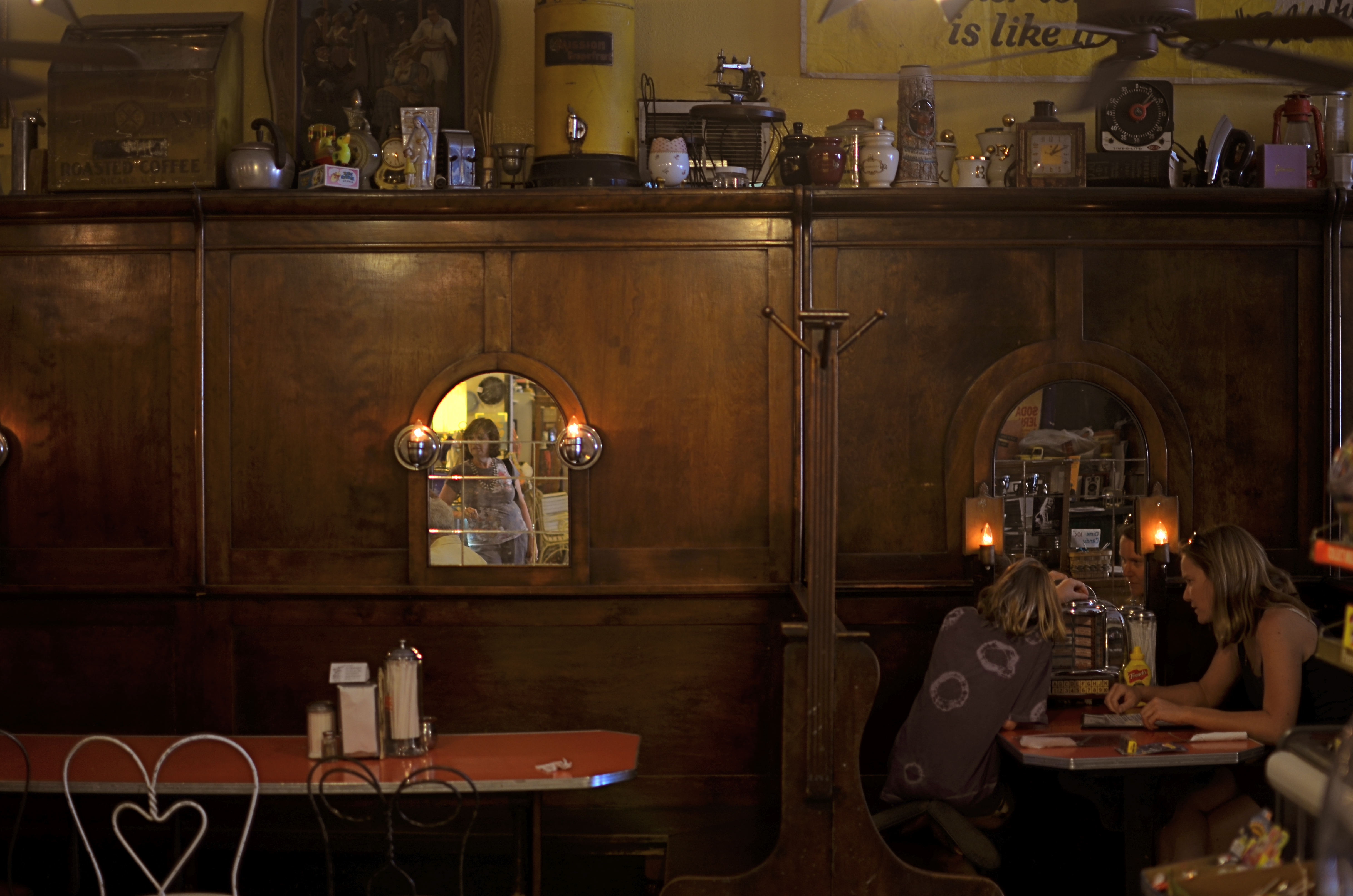
Three plays for a quarter, so you can eat “Tutti Fruiti” and listen to it, too. 1/40 sec., f/1.8, ISO 100, 35mm.
Graced with a 35mm prime lens opened all the way to f/1.8 and great soft midday light from the store’s front window, I could preserve the warm tones of the counter area pretty much as they are. For the booths, a little slower shutter speed was needed, almost too long for a handheld shot, but delivering a more velvety feel overall. Both shots are mere recordings, in that I was not trying to “sculpt” or”render” anything. McAlpine’s is enough just as she comes. It was only a question of light management and largely leaving the place to tell its own story.
What a treat when a subject comes to you in such a complete state that the picture nearly takes itself.
Even better when the subject offers 75 flavors of ice cream.
Especially when every other joint on the block is plain vanilla.
follow Michael Perkins on Twitter @mpnormaleye.
“SNAPSHOT” MOMENT, “SESSION” MINDSET

The light on the tree’s blossoms will be gone in three minutes. Best decision in the moment: slight underexposure to combat the mid-morning sun. 1/640 sec., f/5.6, ISO 100, 35mm.
By MICHAEL PERKINS
THE GREATEST ENEMY OF THE AMATEUR PHOTOGRAPHER IS TIME. Not the time spent perfecting our “eye”, nor the years invested in learning how to realize what we visualize. Sadly, the most tyrannical toll that time takes on us is in the meager number of moments in which we have to create most of our shots. Time…enough of it to work, to feel, and to act, is the only unbridgeable gap between ourselves and most of the pros.
I say “most” because some of the best photographers live absolutely in the moment, as in the case of imbedded journalists or sports shooters. No, what I’m talking about is the appointment that pros get to set for sessions, shoots that require set-up, tests, the issuance of permits, the re-routing of traffic. It’s not hard to see that a shooter for National Geo is at greater leisure planning his shot of a majestic waterfall than you are when your tour group is taking the tram from one Breathlessly Beautiful Natural Wonder to the next, all in time to rendezvous back at the terminal for a box lunch and precisely fifteen minutes in the gift shop. It’s not remarkable that millions of images are taken in Yellowstone each year. What’s amazing is that any of them work out.
Just saying.
Fact is, amateurs often can’t get the luxurious arrangements for creativity that are a given for the pros. And yet, since we don’t want our stuff to look like it was shot out the window at 55mph, we have to strive to combine the brief windows of our snapshot moments with the trained eye of a session mindset.
- Taken on pure impulse from a car as I was just about to drive off the property of this unique library. No planning except a fast exposure to give some depth to the stone textures. 1/640 sec., f/5.6, ISO 100, 35mm.
This is why it’s so important to always be shooting. Everyday. Good subject or bad. Great weather or lousy. Always. Because only the repetitive exercise of framing up and clicking off thousands of shots burns ways of seeing, ways of evaluating, into your brain, letting you make ever more complex calculations in increasingly shorter time. Shooting all the time speeds the arrival of the day when you can, in most cases, set and shoot and know that most of it will look intentional, done with some purpose in mind.
Repetition really is the best teacher, and the more direct control you take over your shooting, the more the universal laws emerge. At this focal length, certain things always happen. Under these lighting conditions, some things are always true. You’ll have your own truths, but, over time, they will be self-evident, because you will have faced these situations so many times that the essence of what you need for a shot will start to be as obvious as a glowing coal.
Time, or the lack of it, can rob us of the smart spontaneity we need in snapshot settings. However, the time we have invested learning how to shoot can give us a session mindset, and that affords us more control.
Are my snapshots better than anyone else’s? I doubt it. But over time, they are definitely better than my snapshots used to be.
Hey, I’ll take it.
follow Michael Perkins on Twitter @mpnormaleye
Related articles
- Snapshot (photography) (itscitrarizqinow.wordpress.com)
