SLAGIATT
Lighting A, Concept D…
By MICHAEL PERKINS
I CALL IT NO–FUNDAY, the painful exercise of poring over photographs that I once considered “keepers” and now must reluctantly re-classify as “obviously, I’m an idiot.” For any photographer, self-editing one’s output is just the kind of humiliation one needs to keep on shooting, if only to put greater distance between one’s self and one’s yester-duds.
To make the shame of disowning my photographic spawn even worse, I find that, more often than not, technical failure is usually not the reason I’m lunging for the delete button: it’s the weakness of the conception, a basic lifelessness or lack of impact that far outweighs any errors in exposure, lighting, even composition. In other words, my worst pictures are, by and large, bad because they are well-executed renditions of measly ideas.
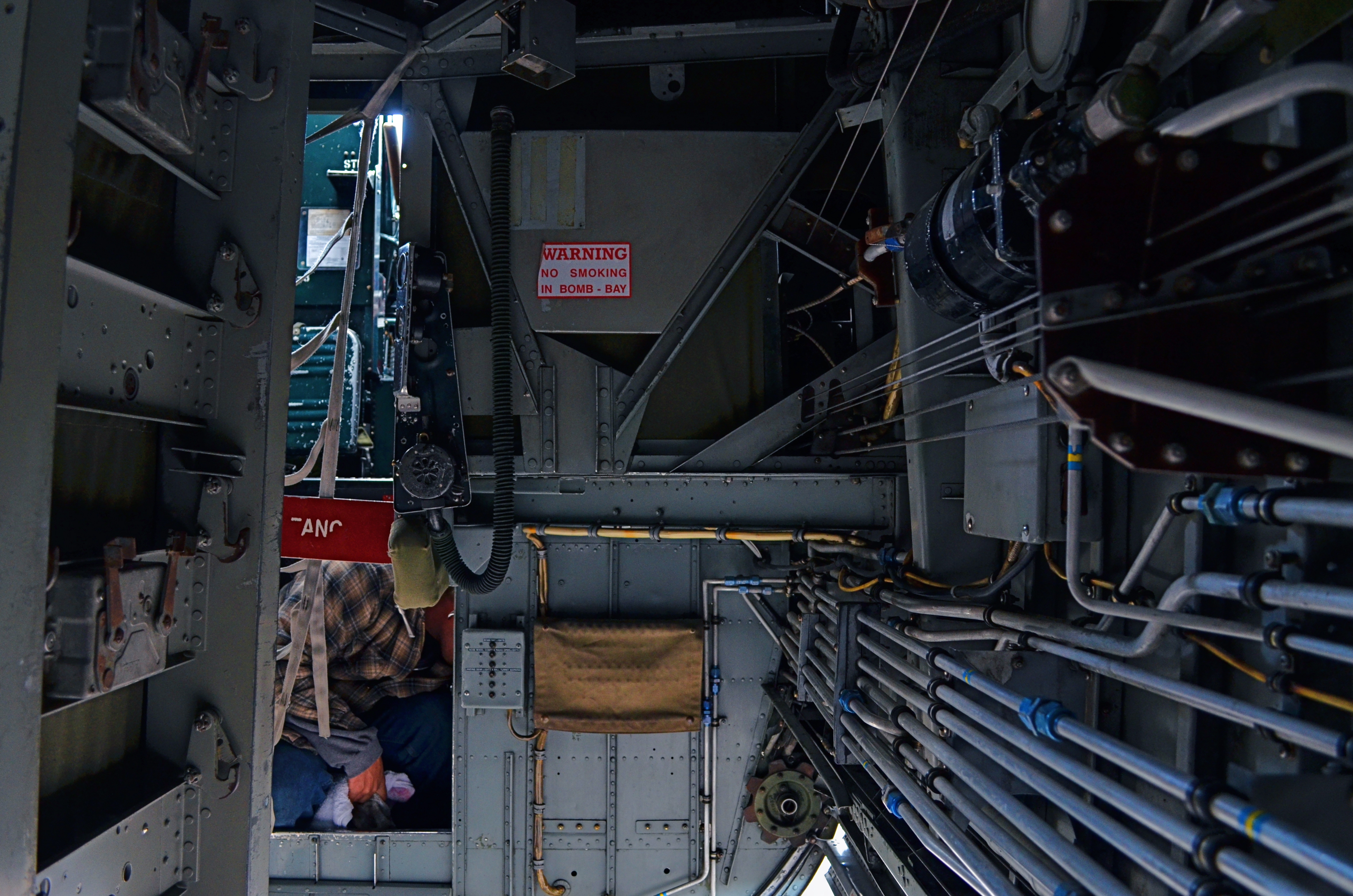
In my mental filing cabinet, I refer to these images under the acronym SLIGIATT, or Seemed Like A Good Idea At The Time. The image above is a perfect example. This shot, taken inside the underbelly of a WWII bomber, presented a ton of lighting challenges, but I spent so much time tweaking this aspect of it that I neglected to notice that there just isn’t a picture here. It tells no story. It explains nothing. It’s just an incomprehensible jumble of old equipment which lets the eye wander all over the frame, only to land on…..well, what exactly? But, boy howdy, it is well-lit.
SLIGIATT photos are, of course, necessary. You have to take all the wrong pictures to teach yourself how to create the good ones. And mere technical prowess can, for a time, resemble quality of a sort. But technique is merely craft, and can be had rather easily. The art part comes in when you’re lucky enough to also build a soul into a machine. As Frankenstein figured out, that’s the difference between being God and playing God.
THE WHATS OF WHOS
Portraits introduce and re–re–re–introduce us to people, in a process that never really ends.
By MICHAEL PERKINS
RENDERING THE HUMAN IN THE FULL CONTEXT OF THE WORLD is, for me, the one true way to produce a photographic portrait. Sitting someone in a nice room with flattering light and a serene atmosphere might be a formalized way to record a person’s features……but….
Yeah, that’s always the problem with pictures, innit? That insistent but. The part left unspoken. The case left unmade. The squirmy essence of personhood that stubbornly resists imprisonment in our little boxes. It’s quite revealing that, in trying to compliment someone on a portrait, we used to actually say, “I really think you’ve captured him”, as if “he” were a lightning bug in a jar. But such statements miss the very point of portraiture, even photography itself.
Photographs of people can’t be “one and done”, or “official”, or, God help us, “the last word”, any more than sunsets can. We aren’t making a document of a static thing, only serving up a time-slice of something that, by virtue of being in the world, is in constant flux.
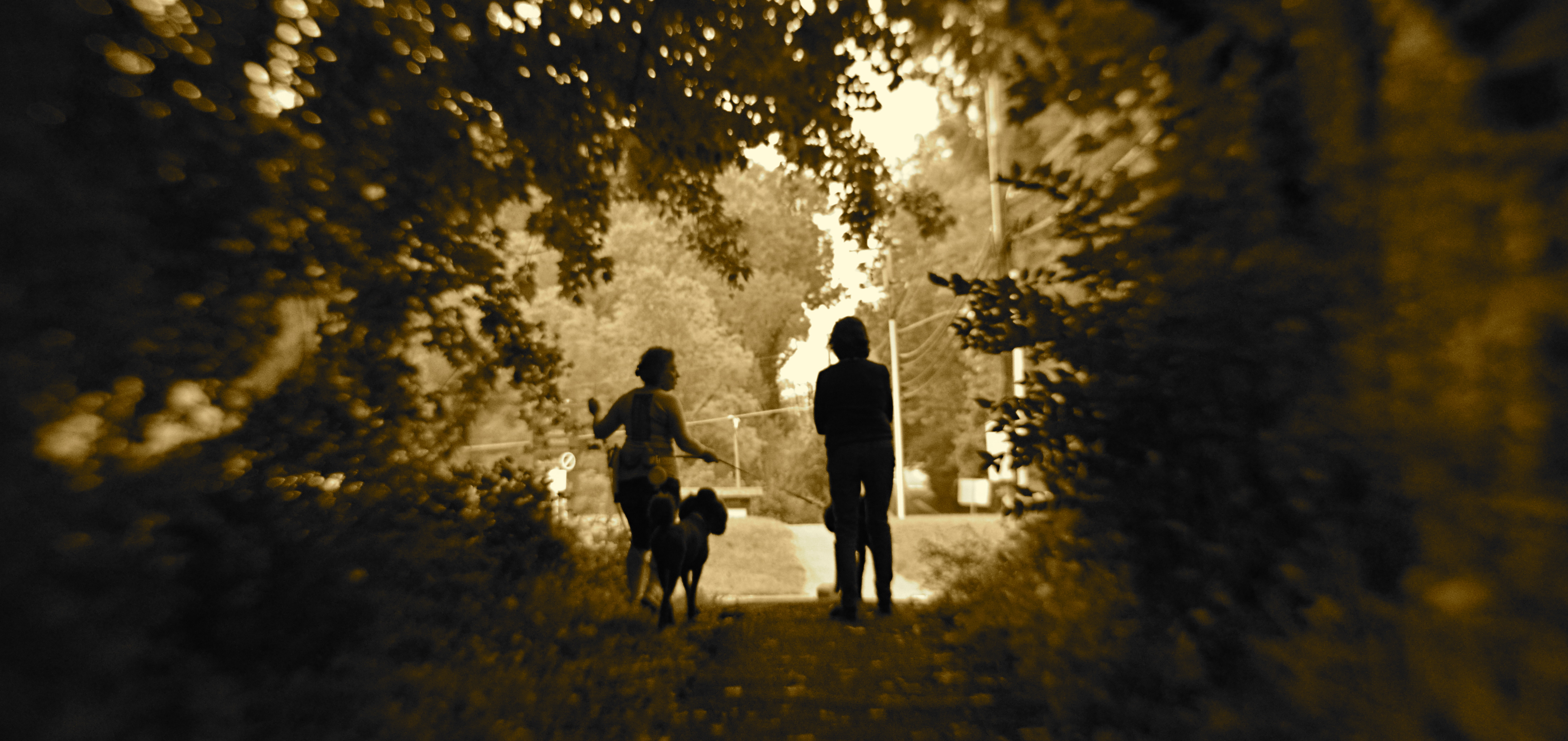
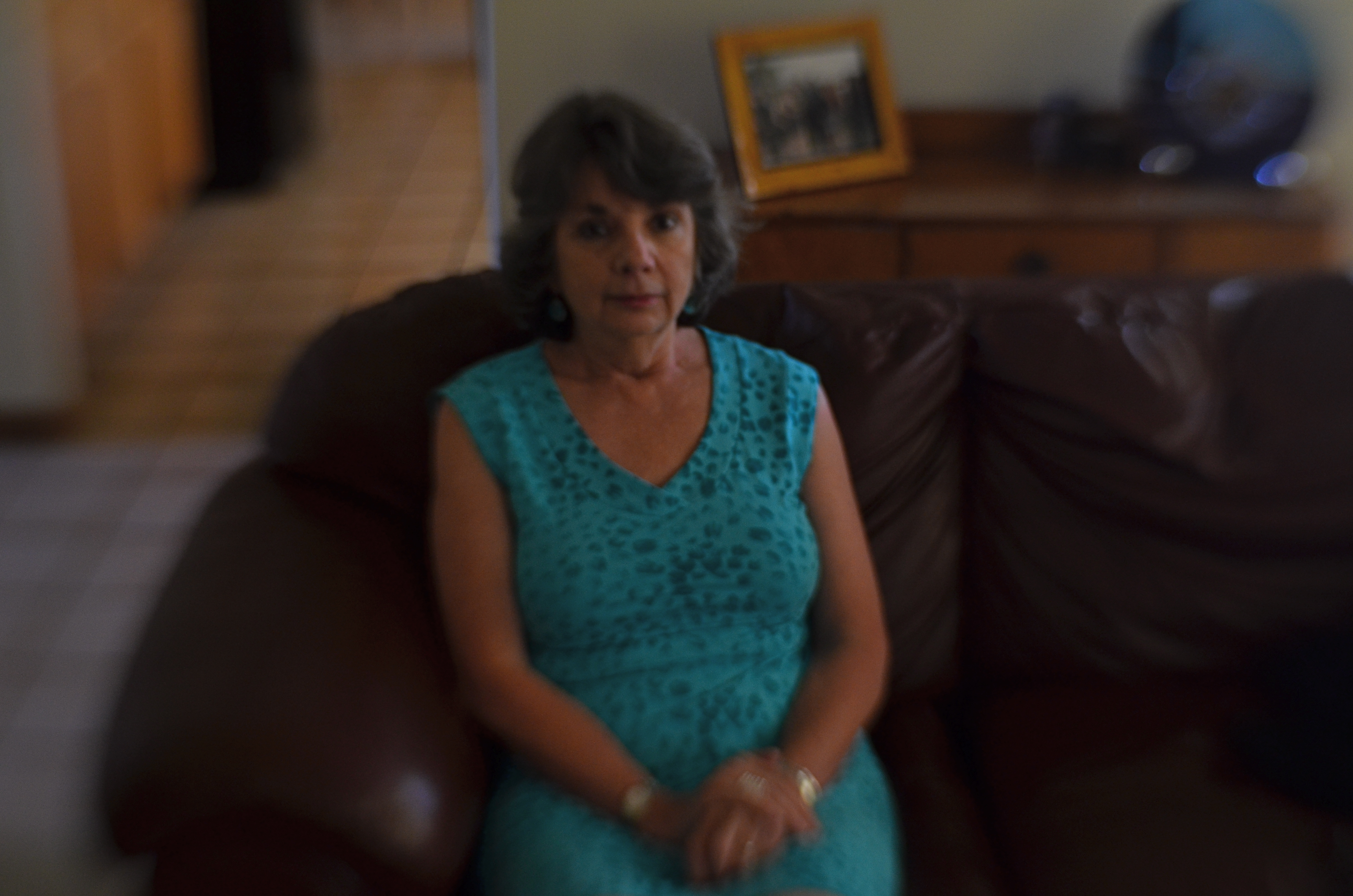
To illustrate, the shot you see above is, for me, every bit as much a “portrait” of my wife (the one on the right) as any organized or traditional rendering of her face, because it shows her in the context of a world she inhabits: a world defined by nature, friendships, and animals. I don’t need her face to tell a story about her.
What people do is as telling as what they look like, and so it has to enter into any image-making about who they are.
AND NOW WE PAUSE FOR…
Patterns can gain impact when they are suddenly interrupted.
By MICHAEL PERKINS
A BREAK IN THE ACTION: a word from our sponsor: a coda before the chorus. Intrusions into the predictable rhythms of things can be either annoying or refreshing, depending on how we perceive them.
The right intervals between dots and dashes can drastically change the meaning of a telegram. A well-placed silence between musical notes can generate just the tension required to transform a composition into a masterpiece. And a sudden interruption in visual patterns can add impact to a photograph.
Once the eye detects, as they say on Sesame Street, that one of the things in a picture is not like the others, it pauses, re-evaluating every element in the scene, weighing it for relative value. Breaking an image’s pattern is either an unwelcome invasion or a kind of visual punctuation….again, varying as to the effect. The object violating the uniformity says pause, wait, re–consider, and begins a new conversation about what we’re seeing and what we think about it.
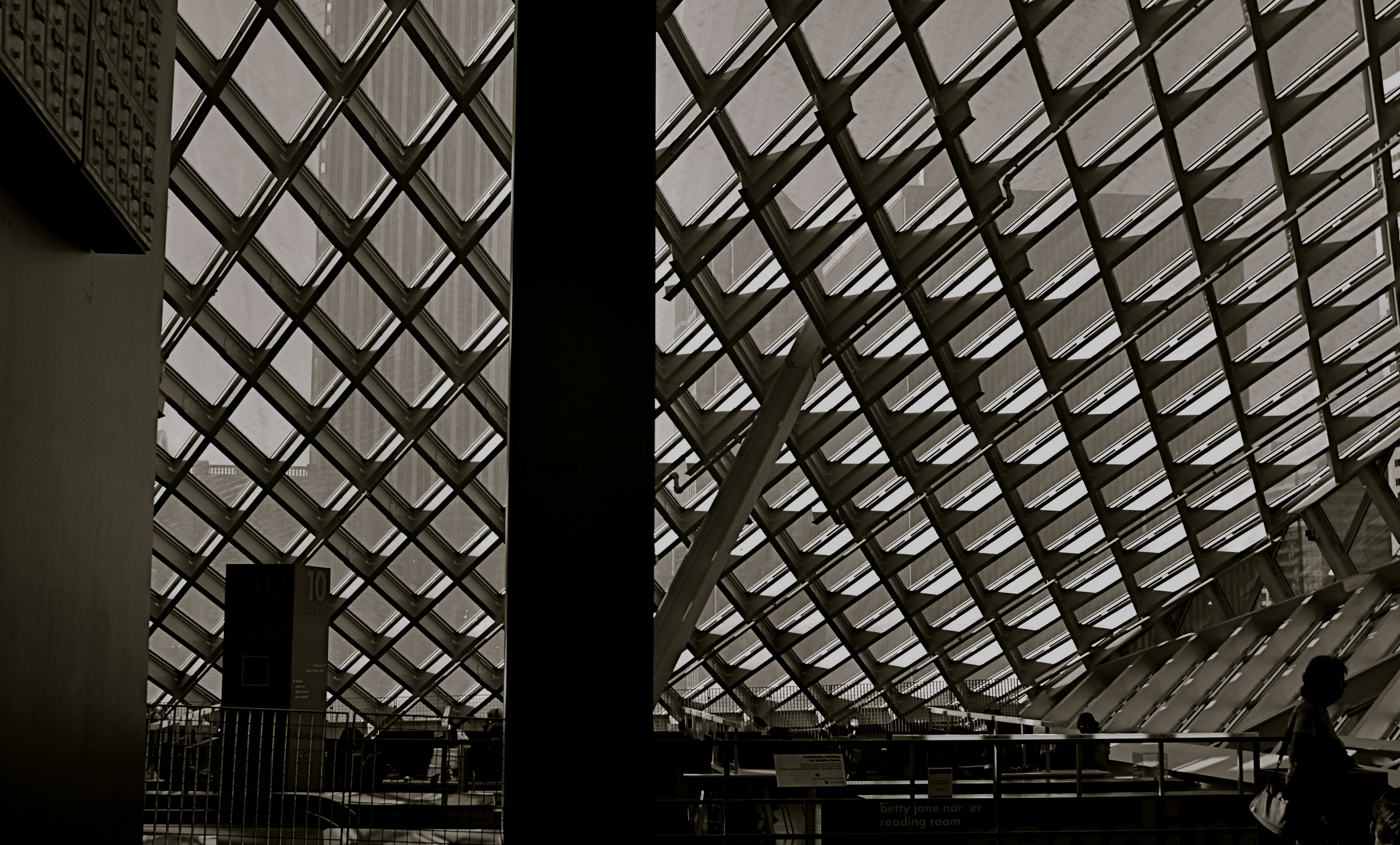
In the above picture, a human silhouette against the massive ceiling grid provides the basic context of scale, and defines the locale (a library) as a space where human activity takes place. The figure thus says how big the place is and what it is for, along with any other ancillary associations touched off in the viewer’s mind. Would the picture “work” without the figure? Certainly. The terms of engagement would just be different, that’s all.
Photographs are not merely pictures of things. They are also sets of instructions (suggestions?) on what to do with all that information. Think of them like roadside signs. It’s indeed helpful to be told, for example, that Sacramento is just another 100 miles away. But it’s just as important to have a big bright arrow telling you to head that–away.
TLI
Is a self-portrait just a face crammed into an iPhone screen, or should it be more?
By MICHAEL PERKINS
THERE MAY BE NO PART OF PRESENT–DAY PHOTOGRAPHY that is more practiced and less understood than the humble self-portrait. This has not always been the case. Turning the lens on oneself was a much less common act until the arrival of mobile phones, at which time the somewhat awkward old technique of setting a timer and jumping into the picture was supplanted by an act that was at once instantaneous and effortless. Ironically, at that point, the sheer numerical proliferation of the selfie overwhelmed the artistic fact that many of us weren’t doing them very well.
The modern selfie has been degraded largely because any variance from the same banal fill-the-entire-frame-with-your-face approach is so rare. We get plenty of features and not much context, a condition that could be called TLI, or Too Little Information. Worse, selfies in the iPhone era are limited mostly to what framing is permitted by the length of the shooter’s arm, causing any surrounding people, places or events to be eclipsed from the shot, rendering an image of “me at the canyon” maddeningly identical to one of “me in front of the cathedral.” Add the distortion of near objects inherent in the wide-angle lenses of many mobiles, and too many selfies conceal or mutate more than they reveal. And don’t get me started on the effects of on-board flash. In short, who are these bloated ghosts?
A portrait is more than a mere record of one’s features. The self is also defined by its surroundings, with the accompanying props of one’s life anchoring that person in an era and providing scale, the staging needed for a complete narrative. Can the face alone sufficiently “sell” one’s story? In the hands of the right shooter, absolutely.But riff through a few hundred online selfies and see how often you behold such gems.
In all too many self-portraits, we mostly settle for mere volume, for blurred and puffy smears of ourselves instead of insights. And, as is often the case when taking pictures is so incredibly easy, we fail to plan. This isn’t vanity, but self-sabotage. The self-portrait needs to slow down, to once more become something of a special occasion.
More information, please..
SETTING THINGS STRAIGHT
By MICHAEL PERKINS
ONE OF THE MOST ELUSIVE EFFECTS IN ARCHITECTURAL PHOTOGRAPHY would seem to be the one most easily achieved: the look of a straight line, the foundation upon which an orderly image is built. However, the human eye is often more unreliable than assumed when it comes to reading and identifying that which is supposed to be “straight.”
We’ve all been confounded by optical illusions that present lines that are not, objectively, straight at all, even though our brains, based on our interpretation of the visual data, say they must be. However, we tend to dismiss this sensation as trickery, something we don’t have to sweat about in making a “real” picture. And that is probably a mistake.
Based on what kind of architectural design you’re shooting, what lens you choose, even where you stand, a straight line, either horizontal or vertical, can seem to bend or lean, making our “factual” images less than trustworthy.

Even setting up a shot on a carefully calibrated tripod and a bubble level can produce a result that looks as if it was manipulated. Of course, based on what look you desire, you may regard geometric reality as irrelevant, and deliberately engineer ” unreality” into a photograph. That’s why we make a distinction between taking a picture and making one.
As an example, the picture seen above was taken super-wide, at 18mm, to intentionally exaggerate the size of the room, making some verticals bow in while others register normally, and playing stretchy with the ceiling arches and floor horizon. The idea here was to distort the already extreme Art Deco accents and give them an extra funhouse quality. Shooting with a more conventional focal length like 35 or 50 mm would have made for straighter lines, but would also have sacrificed every other effect achieved at 18mm.
Bottom (straight or crooked) line: dimensions and angles are suggestions, not commandments. But it’s a lot easier to break rules creatively once you understand how they work.
TWILIGHT TIME
By MICHAEL PERKINS
I HAVE STRUGGLED OVER A LIFETIME to tell photographic stories with as few elements as possible. It’s not unlike confining your culinary craft to four-ingredient recipes, assuming you can actually generate something edible from such basic tools. The idea, after all, is whether they’ll eat what you’ve cooked.
With images, I’ve had to learn (and re-learn) just how easy it is to lard extra slop onto a picture, how effortlessly you can complicate it with surplus distractions, props, people, and general clutter. Streamlining the visual language of a picture takes a lot of practice. More masterpieces are cropped to perfection than conceived that way.
The super-salesman Bruce Barton once said that the most important things in life can be reduced to a single word: hope, love, heart, home, family, etc. And so it is with photographs: images gain narrative power when you learn to stop sending audiences scampering around inside the frame, chasing competing story lines. Some of my favorite pictures are not really stories at all, but single-topic expressions of feeling. You can merely relate a sensation to viewers, at which point they themselves will supply the story.
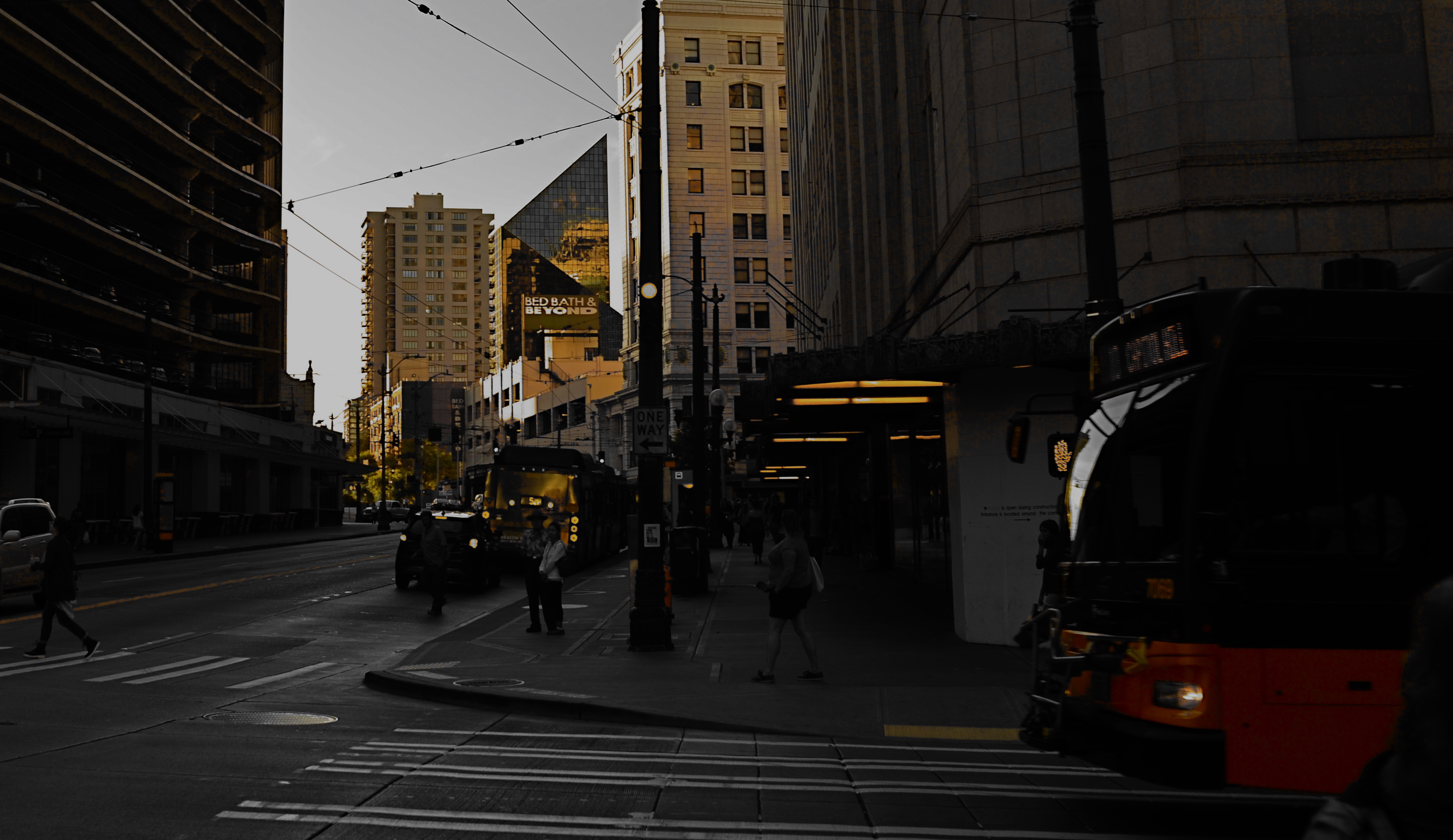
As an example, the above image supplies no storyline, nor was it meant to. The only reason for the photo is the golden light of a Seattle sunset threading its way through the darkening city streets, and I have decided that, for this particular picture, that’s enough. I have even darkened the frame to amp up the golds and minimize building detail, which can tend to “un-sell” the effect. And yet, as simple as this picture is, I’m pretty sure I could not have taken it (or perhaps might not even have attempted it) as a younger man. I hope I live long enough to teach myself the potential openness that can evolve in a picture if the shooter will Just. Stop. Talking.
SAVING FACE
Faces are selves served up in slices.
By MICHAEL PERKINS
YOU WOULD SUPPOSE that sustained, intimate contact with a photographic subject would inevitably lead to a superior, if not perfect rendering of that subject in an image. And supposing further that said subject is a person, you’d assume that one’s close bond with the subject couldn’t fail to produce the ultimate visual depiction of that person….a glimpse into their very essence.
Or so you’d suppose.
There is a reason why so many shooters pursue the same faces, many belonging to dear friends or loved ones, over a lifetime of picture-making….never quite able to reduce a face to its essence or its definitive “version”. It’s not that they don’t yet know enough about that particular arrangement of shapes and features. It’s that they know too much to settle for any single interpretation of them.
No sooner does the face of the Dear One display a given mood or aspect than it shifts like an active weather front to a completely different mix of elements. Faces are selves arrested in mid-flight, and, being in constant motion, rob us of the picture we originally set out to capture, only to bestow a fresh one on us. The “new” person we now see is, certainly, the same individual, but changed enough that we are off on a completely different mission, visually speaking. That is both frustrating and fulfilling.
The slices of persona that we freeze in the camera are just that: shifting glimpses. That means that, unlike pictures of monuments or mountains, they can’t be “done” in any permanent way. Add to this the change in how we all relate to each other over time, and it makes perfect sense to refresh our view of the most familiar faces an infinite number of times.
FACTS NOT IN EVIDENCE
The more you study a picture like this, the more you can find wrong with it. Let me help you….
By MICHAEL PERKINS
IF A STREET PHOTOGRAPHER IS GOING TO ASK HIS AUDIENCE TO EXTRACT A STORY FROM AN IMAGE, then he must ensure that he is putting that same story into his pictures. Just suggesting a narrative, especially in a photograph, is not the same as conveying one. In legal terms, you are asking your viewers to “assume facts not in evidence.”
Do you have to spell everything out, like an S.O.S. in a bowl of alphabet soup? No, but just pointing your camera at just anything happening “on the street” doesn’t guarantee emotional impact, either. Nor does it imbue your pix with profundity, irony, or anything else that wasn’t happening through your eyes before it went through the lens. No street shot is guaranteed “authenticity” just because you were on the street when you pressed the shutter.
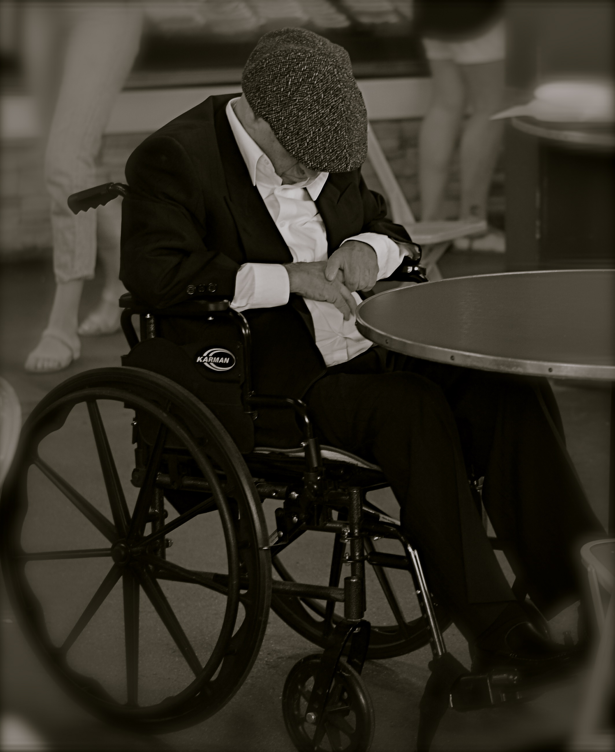
Look at the image at left, which I snapped rather accidentally while taking a lot of images of a crowded food market. I did not mean for the gentleman in the wheelchair to be the main appeal of this frame, but even though he’s been cropped to now be central to the shot, there is no clear narrative that “saves” this photo, or makes it compelling on its own terms.
Let’s dissect the picture to see why it fails. What it is, in raw terms, is a man in a wheelchair, sitting alone, wearing dark clothing, his face hidden.That is all that’s absolutely proven in the picture. Now, let’s assume that I was going for something poignant, a human “moment” if you will. Such moments are the heart and soul of great street shots, but this one is missing far too much vital information. If the man is “sad”, is it because he’s in a wheelchair? Why, and who am I to say so? After all, maybe he just had some restorative surgery which, after a month in the chair, will restore him to star-athlete status. Or maybe he is in the wheelchair for life and yet enjoys a richer existence than I do.
Let’s go farther. His face is hidden, but what story can I make the viewer believe is true about that? Is he catching a cat nap while his pile scores him a slice of pizza? Is he doing special exercises? Praying? Does his hat fit badly? Is he depressed, or actually a master of meditation who’s more connected to the cosmos than I can even dream of? And then there’s the monochrome. This picture began as a color shot, but I certainly didn’t increase its impact merely by sucking out the hues. That is, there isn’t some clear message that was being muffled by color which now speaks in a clear voice in mono. Finally, the cropping makes him the prominent feature in the photo without making him the dominant one. The background of the original was distracting, to be sure, but, as with the color, taking it away didn’t add to the picture’s force. If anything, it made it weaker. The man can’t be ironic or poignant since I’ve now cut him off from everything that provides context to his role in the picture.
You get the idea of the exercise. This shot, color or mono, cropped or wide, had nothing clear to say about the human condition. It was taken on the street but it ain’t “street” in effect. Try the same ruthless analysis with your own “near-miss” shots. It’s a humbling but educational process.
A NEW TAKE ON OPAQUE
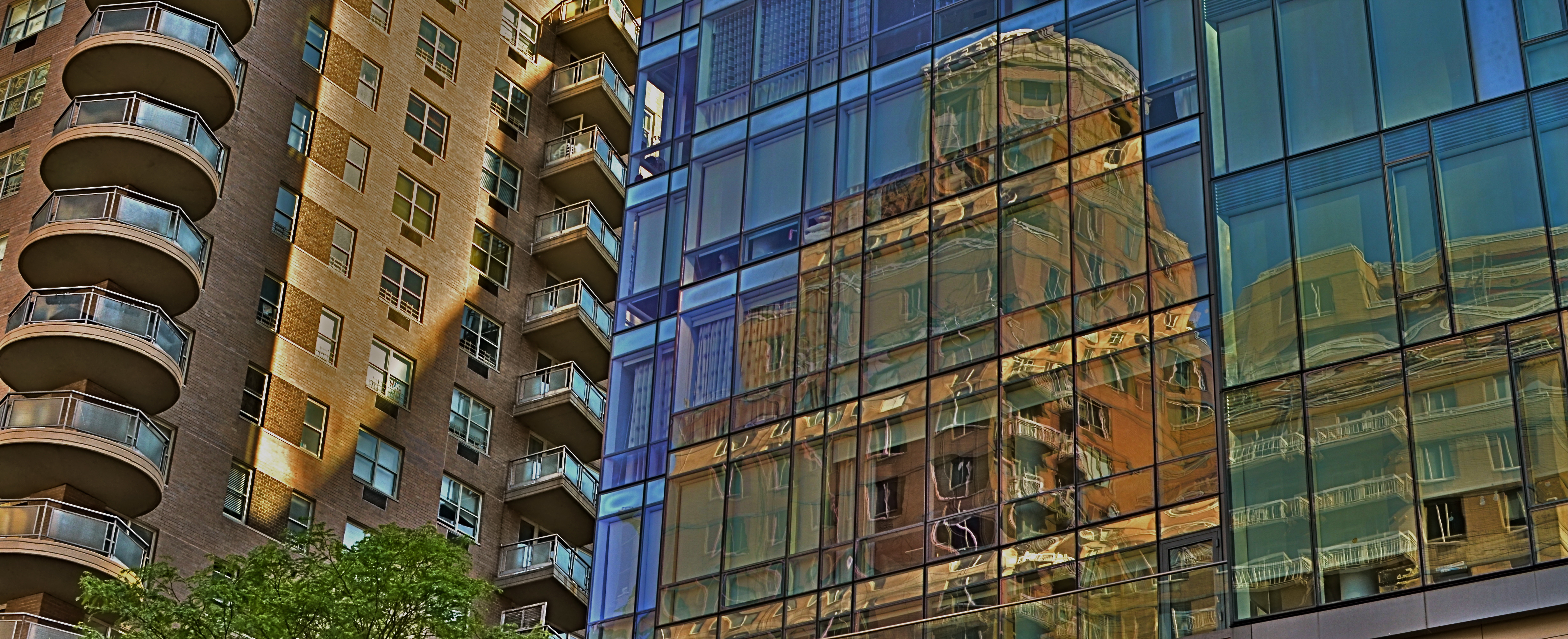
Canyon Echoes (2015). A circular polarizing filter helps the building across the street to be more vividly captured in the glass grids.
By MICHAEL PERKINS
THE TWENTIETH CENTURY’S REVOLUTION IN URBAN ARCHITECTURE produced a radical re-imagining of the physical science of erecting buildings, along with a remarkable shift in what those buildings should look like. An extreme shift in outward design can be tracked from the ornate Greco-Roman and Gothic textures of the Woolworth Building at century’s start to the stark, spare rectilinear boxes of the ’40’s and 50’s, as we jetted from doric columns, oak clusters and gargoyles to the completely un-ornamented glass boxes that we associate with, say, the Pan Am or United Nations buildings at the other end. That changed the way we live, and likewise transformed the way we photo-document our cities.
And, whatever your opinion of what came to be called the “International Style”, the boxes today co-exist with their more decorous ancestors, a contrasting mix which creates amazing opportunities for abstraction. The collision of the two periods creates an endless shuffling of visual cues, with all that glass and terra cotta dueling for dominance in our compositions. And therein lies a tip: one tool which you may find of enduring value in shooting in these situations is a circular polarizing filter, which can help you create a wide variety of effects…quickly, and on the cheap.
People in sun-soaked sectors of the world mostly use the CPL to deepen the blue in overly-bright skies, but the filter’s ability to cut glare on reflective surfaces like water and glass can also be dramatic, and that’s how I use it in urban settings. I’ve come to love the idea of a sheer wall of glass in one building being stamped with all the details of the building directly across the street (over my shoulder). Twisting the upper ring of the CPL dials in the degree of glare you want in your image, allowing you to see none, some, or all of your neighboring structure in the glass in front of you. One caution: the filter also deepens color and can rob you of up to a stop of light, so you want to plan your exposures more carefully, something that’s done easier shooting on full manual.
The dominant idea of design in the International Style was to eschew detail and ornament to as great a degree as possible. That resulted in a lot of very boring exteriors as a vast crop of largely faceless boxes shot off the assembly line. However, using their sheer screens of glass as a vibrant kind of video display for the neighborhoods around them actually breathes a little life into them, and the circular polarizing filter gives you a remarkable amount of control over that process.
JUMPING OFF THE TOUR
By MICHAEL PERKINS
VISITOR ATTRACTIONS CREATE THEIR OWN KIND OF PECULIAR GRAVITY, in that many of them develop an “official” way to take in their delights, pulling you toward what they believe to be the center of things. From the creation of tourist maps to the arrangement of signs on paths, many famous “places to see” evolve systems for how to “do” parks, recreation areas, even ancient ruins. Some hot spots have even been so obvious as to mount signage right next to the “Kodak moment” view that, of course, you will want to to snap, since everybody does. And from here, folks, you can clearly see the royal castle, the original temple, the stunning mountain vista, etc., etc.
But predictability, or an approved way of seeing a particular thing, is the death of spontaneity, and certainly a danger signal for any kind of creativity. Photography is the visual measure of our subjective experience. It’s supposed to be biased toward our individual way of taking a thing in. Grading our reactions to visual stimuli on the curve, taking us all down the same path of recommended enjoyment, actually obviates the need for a camera. Just freeze the “correct” view on the gift store’s postcard assortment, and, presto, we can all have the same level of enjoyment. Or the same low point of banality.
About To Be (2016) 1/200 sec., F/5.6, ISO 100, 24mm.
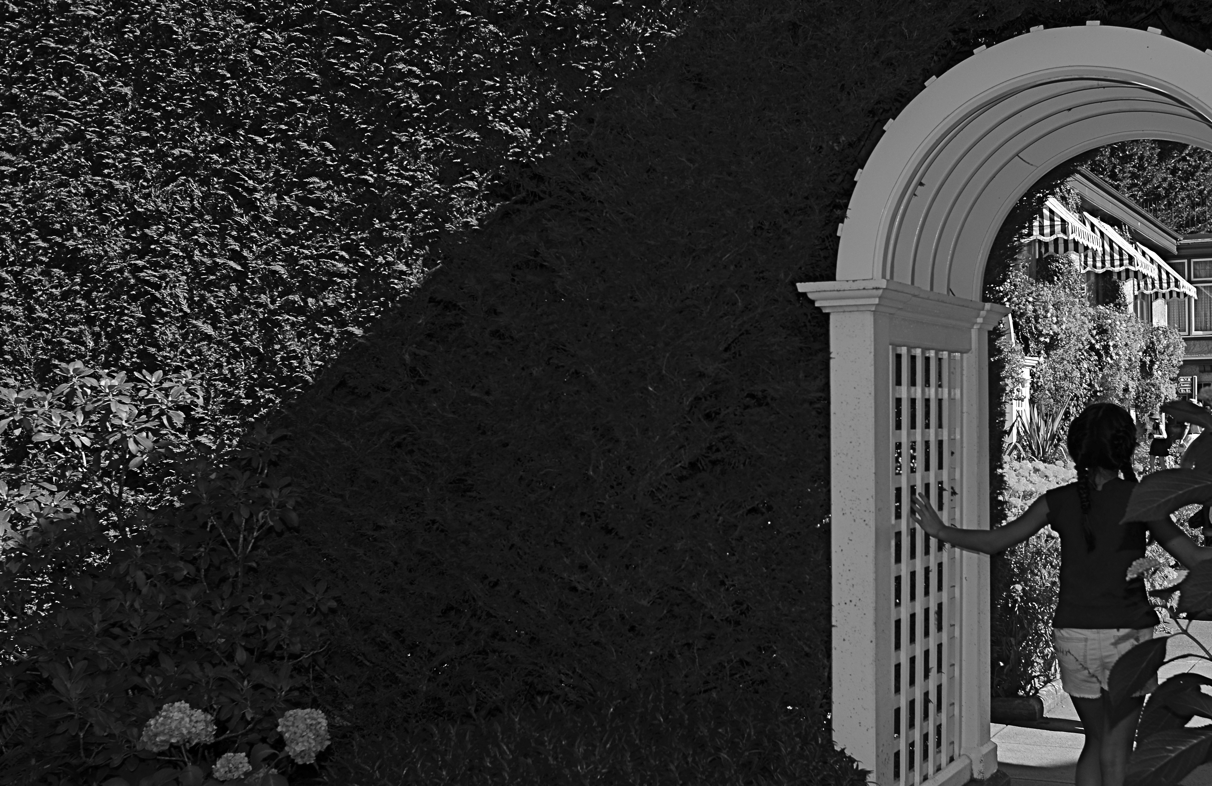
Recently I visited the amazing Butchart Gardens, a botanical bonanza on the island of Victoria in British Columbia. If ever there was a place where you’d be tempted to tick off “the sights” on a mental checklist, this cornucopia of topiary choreography is it, and you will find it truly tempting not to attempt your “take” on its most photographed features. But an experience is not a triptych, and I found my favorite moments were near the fringes or niches of the property, many of which are as stunning as the most traveled wonders along the approved paths.
To my great surprise, my favorite shot from the tour wasn’t one of the major sites or even a color image, but a quick glimpse of a young girl hesitating in the narrow, arched portal that separated one side of an enormous hedge from the other. She only hesitated for a few seconds before walking into the more traveled courtyard just adjacent, which is, itself, recorded thousands of times a day. But that brief pause was enough. She had become, to me, Alice, dawdling on the edge of a new Wonderland. The arch became all mystery to me, but the picture needed to be simplified to amplify that feeling, relegating the bright hues to secondary status. And while it indeed seems counterintuitive to take a black and white image in the midst of one of the world’s great explosions of color, I gladly chose the mono version once I had the chance to compare it to the original. Some things just work.
One thing that never works is trying to make your personal photographs conform with what the designer of a public place has recommended as the essential features of that place. Your camera is just that….your camera. Shoot with someone else’s eye, and you might as well just frame the brochure.
YOU’RE IN THE PICTURE
By MICHAEL PERKINS
THE BEST PHOTOGRAPHS ARE NOT STAND-ALONE WORKS OF ART, BUT CONVERSATIONS BETWEEN ARTIST AND AUDIENCE. You don’t just stride up to that framed image on the wall and let its wonderfulness wash over you; you bring what you have been, over a lifetime, to it, comparing those two entities side by side, and even assigning your own truth to the photo, “deciding” what it means. The pictures don’t speak to you: you debate with each other.
Think about the images that, over a lifetime, have reached you in the deepest way. Did those photographs bring you something that you didn’t already have, or was it echoed, defined, re-purposed, based on who you’ve been thus far, or how you see? How else to explain why a picture moves one person to tears, while it leaves another completely nonplussed? Of course, some photographs almost accidentally produce a similar result to a wide variety of viewers, but there are far more of them where the messaging is muddled, imprecise.
And that’s a good thing.
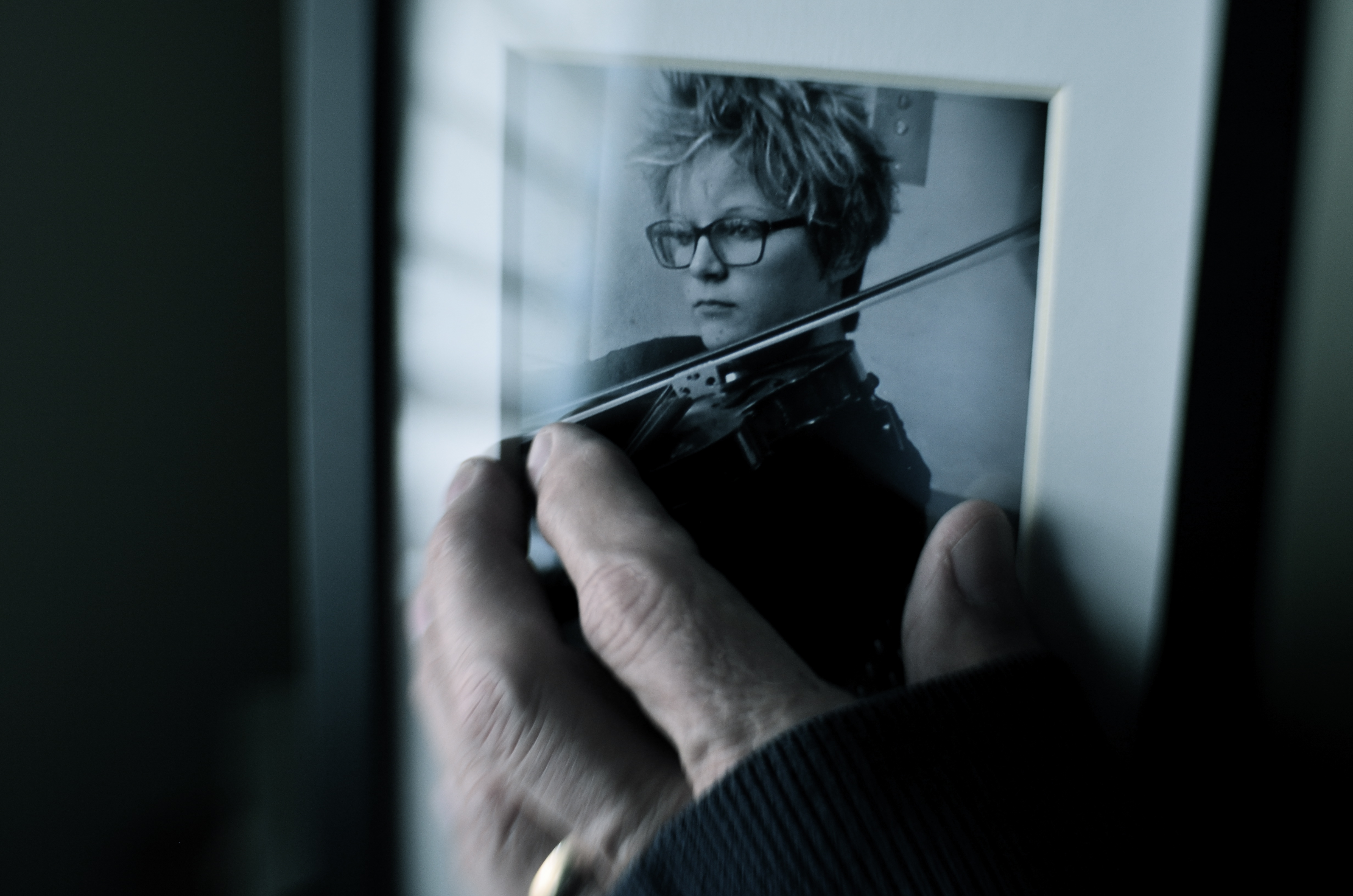
One way to repurpose a photograph is to make it part of another photograph. Or not.
I made the above image several days ago purely as an experiment, using an earlier one of my pictures as a prop within what’s obviously a staged shot. The completed “new” photograph was part of an assignment by an image sharing group I belong to, which laid down several elements that had to be in the final picture: a hand covered by something, that same hand touching something, and a de-saturated color palette. Beyond that, I had complete control of how those elements would be combined or interpreted.
The reason I began to play with some older pictures was chiefly to see if I could take a photo made with one specific mood in mind and re-purpose it within a new context, making the image elicit something completely different. So, without further background or explanation, the challenge to you: what does this particular image (which has an older image within it) convey to you, if anything? What is the dominant mood or the implied backstory? And even if what you’re seeing is not the same as what I set out to “say”, does the picture have any relevance for you personally? Does it have any narrative value, or is it merely an exercise in technique?
Context isn’t everything in a photograph, but neither is any image is absorbed in a vacuum. We color our approach to it in some way, becoming, in essence, its co-creator. You may not be in the frame, but you’re definitely in the picture.
SERVING UP SOME NUTS

The Haves And The Have-Nots (2017)
By MICHAEL PERKINS
COMPOSITION IN PHOTOGRAPHY WOULD BE A SNAP (sorry) if the camera actually possessed not just an eye, but also a brain. But that’s where you come in.
When the human eye takes in a scene, the brain automatically ranks all the information within it, basically making a composition of priority. We “see” some things and “don’t see” others, based on how our grey matter ranks the importance of everything in our field of vision. A camera cannot make these fine decisions: it merely makes a light record of what it’s pointed at. That accounts for the fact that our “perfect” landscape, the one we ourselves recalled from the first day of vacation, comes back, in a mere photo, complete with electrical wires, distracting signs, junk near the beach, and any other number of things our brains filtered out of the original viewing experience.

Last Man Standing (2017)
Composition is thus a matter of our deliberately arranging things by priority, making an argument for our audience to Look Here First, Only Look Here, Give Greater Weight To This Over That, or any other messaging we desire. In sales terms, it’s what pitchmen call Asking For The Order. Simply, composing a photograph means setting the terms of engagement for the viewer’s eye.
With still-life photographs, the shooter has the greatest degree of control and responsibility. After all, our subject is stationary, easily moved and arranged to our whim. You pretty much are lord of your domain. That being said, it’s wise to use this luxury of time and control to envision as many ways as possible to convey your message. The image at the top of this page, for example, is crowded, but the nut shells and the unshelled nuts are a study in textural contrast. There’s lots of color and detail, with one side being somewhat blanched while the other is rough and complex. That’s one way of making the image.
For comparison, in the second frame, the terms of engagement are completely different. The pile of shells at left is more sharply contrasted with the single nut at right. The nut carries the only vivid color in the image; it’s an outlier, a misfit…maybe the last man/nut standing? The simplification of the composition lets it breathe a little, allowing the viewer to speculate, invent. Are the shells symbolic of a mound of nuts that have already been polished off in some grand snacking orgy? Why was one lone nut left to tell the tale? And so on.
Change the arrangement of subjects in a scene and you’ve changed the terms of narration, or even insisted that there is no narration, just patterns, light, or abstraction. Whichever path you choose, no composition comes to the camera “ready to eat”, as it were. You have to tell your camera’s mechanical eye what to see, and how to see it.
COME TO THE DUMB SIDE
By MICHAEL PERKINS
“I dream with my eyes open.”—-Jules Verne
THE MAKING OF A GOOD PHOTOGRAPH IS A CHALLENGING ENOUGH ENTERPRISE that it’s understandable that many a photographer loses either his emotional balance or his sense of humor or both in the process. As artistes, we are so very, very earnest in our pursuit of the image that we can become a little, well tedious. All work and no play makes Jack take four hours to take a picture.
I always believe that, when you are mired in a problem, the bravest thing you can do is to, well, run away. Call it play, call it goofing off, call it cleaning out the pipes, or call it late to supper: the idea is to change the conversation. Of course, if you’re physically stuck in a rain-soaked duck blind awaiting the annual return of the pied-billed grebe, it’s a little tough to break camp (or your concentration) for the salvation of play. Besides, if the pied-billed grebe is your idea of a good time, then godspeed, John Glenn, and please don’t expect us to sit through your slides upon your return. Not without beer, anyway.
Suddenly, Flash Held The Upper Hand (2017). Heavy on the nonsense. Because sometimes you need it.
No, I’m talking about the value, the actual soul-salvaging power of stupid. The palate-cleansing function of creating the visual equivalent of a stuck-out tongue. In taking the time to solve the problems involved in the creation of a “dumb picture”, you are also exercising the muscles of your mind that have been cramped up in your more serious work.
I’m reminded of the process used at the little building on the weird end of the Warner Brothers lot where Looney Tunes shorts were created. It was a working method which startled messengers and delivery boys alike, who often entered the office to see Chuck Jones, Friz Freleng, and other animators capering about in animal costumes or funny hats as other Tuners recorded their gyrations with 16mm home-movie cameras, the better to animate you with, Grandma. Now some of you troublemakers might be tempted to remark, “but they were making cartoons. How is that serious work?”, to which I reply that perhaps you and I had better take this outside and settle the matter like gentlemen.
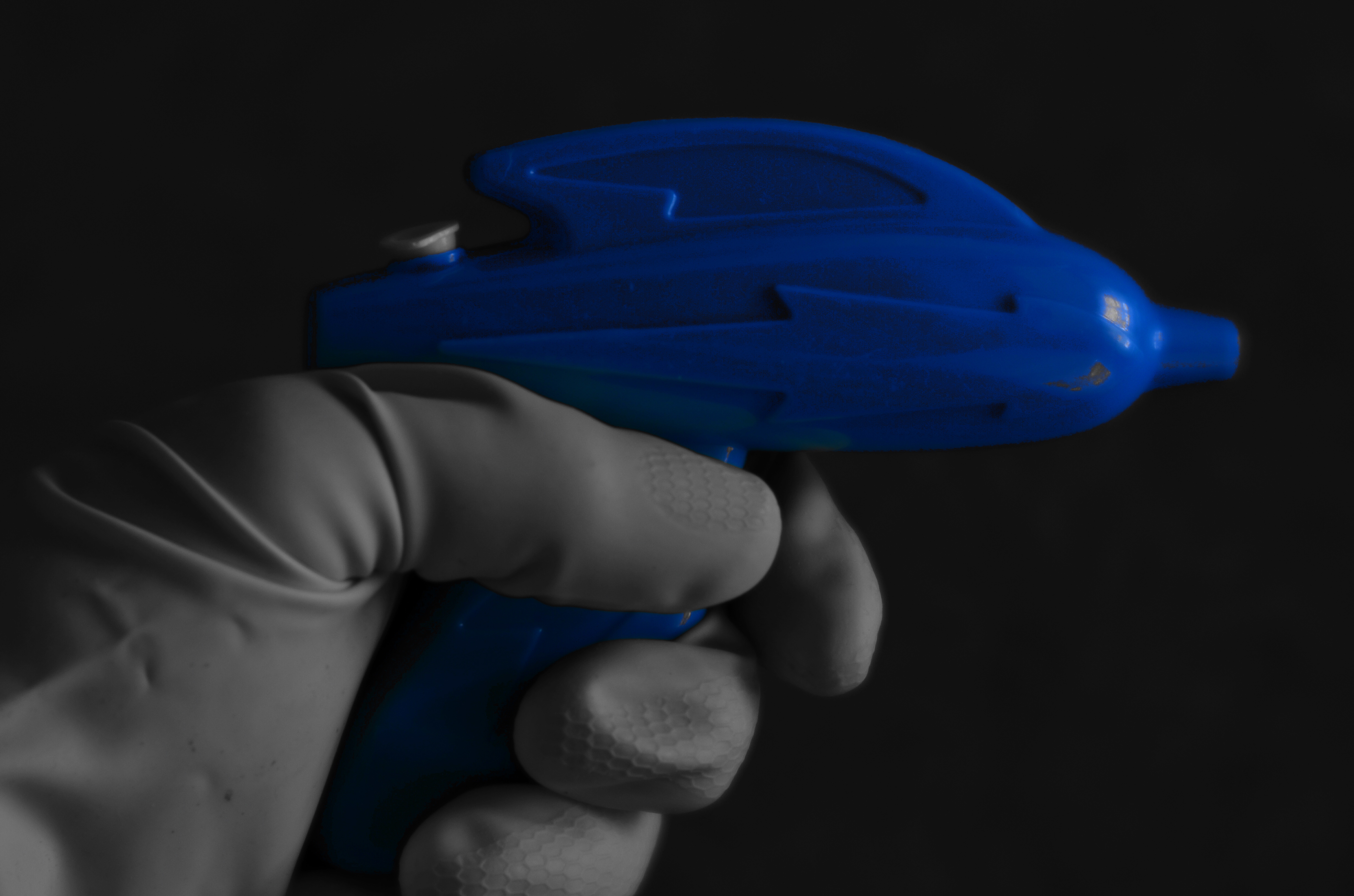
The above shot is the result of one dollar in investment (the weird squirt gun, complete with cosmic lighting bolt), a little rooting around under the sink (for the work glove), and ten minutes of fanciful fun. Not being fortunate enough to have Buster Crabbe here to model my fantasy (he’s in Actor Hell learning how to better deliver his lines), I managed to use my own left hand to wield my weapon while shooting with my right. And if you think you can do that without looking stupid….well, I’m just as glad the wife didn’t walk in on me, especially since I had been tasked, on this particular day, with kitchen duty.
Which is all to say, as if it needed repeating (or even peating) that fun is essential to the process of photography. When the well runs dry, you’d better re-fill it quick…with water, Mr. Bubble, Cherry Kool-Aid, or a nice, refreshing bucket of stupid.
Ahhhhh.
HOLDING HANDS IN THE DARK
By MICHAEL PERKINS
ONE THING OF WHICH THE PHOTOGRAPHIC COSMOS IS NOT IN SHORT SUPPLY IS THE SELF-PORTRAIT. What might have been a specialized kind of image-making just a few scant years ago is now, in the mobile era, a flat-out obsession. We snap ourselves being happy, being moody, eating a cheeseburger, or giving that cheeseburger a thumbs up with friends, etc, etc. We make more photographs than ever of our faces, and, it could be argued, say less and less in the process.
I think that a good self-portrait, if it is to say or imply anything true about the life behind the face, requires a little prep time, or at least a pre-conceived notion of what one is trying to reveal about that person. That said, I think our concept of a selfie is, at the very same time that it’s overdone, is also far too narrow. Simply speaking, there are other parts of our physical envelope that convey information about who we are and what we’ve been in the world. The hands, for example.
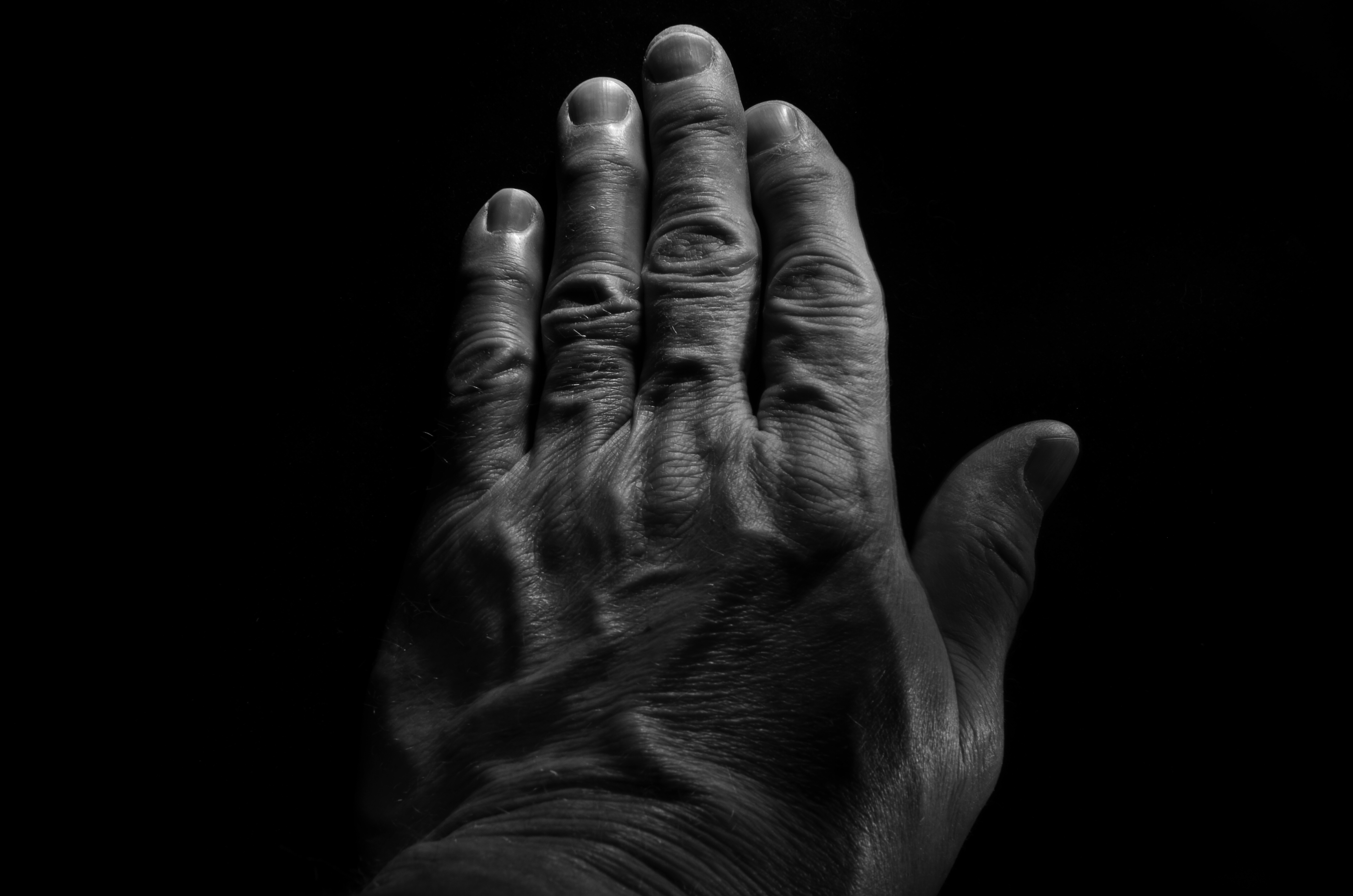
Pax Humana (2017). Hand-held LEDs used to “light-paint” in the dark can create interesting textures in human skin. 18 sec., f/16, ISO 100, 35mm.
If the eyes are the window to the soul, the fingers are the foot-soldiers who carry out the orders that the soul dreams up. The mind behind the face can certainly shine through a good facial portrait, but consider that the hands are the real agents of change in a person’s life. They lift: they move: they put plans into action. Moreover, hands bear the traceable time-stamps of all that agency. Each wrinkle and scar is a document of both deliberate action and unforeseen consequence. Hands belong in any serious study of a person’s life, no less than the face. The trick, as with photographing every other subject, is in getting the image you want.
I find, for example, that normal room light keeps a lot of fine detail from registering in an image, since human skin is highly reflective, causing the grain of the skin to wash out. One way to get around that is to use light painting, a technique we’ve discussed here before. Set up your composition and focus with the camera on a tripod in normal light, then leave everything in place until nightfall and make the image in a completely darkened room while experimenting with a range of exposure times. Your only illumination will be a small hand-held LED, such as a miniature key chain flashlight….nothing wide-beam or super-powered. Use a wireless remote to trigger your shutter, then “write” light paths over the hand, slowly tracking the LED over small areas until all have been “hit” before the trigger snaps back shut.
In the above example, I wanted greater contrast between the hills and valleys of my knuckles, veins, etc., and I wanted to minimize the shine-making effect of the light, so I lit from an angle, sideways from the tips of the fingers. That bumped up the pores and hairs into starker relief as well. Two things to remember: using short stabs of light, that is, turning the LED rapidly on and off, is better than a continuous beam, since you can pinpoint the effect more precisely. Also, using a very small aperture (f/16 here) provides maximum depth of field and enhanced detail. Other than that, it’s truly trial-and-error. This frame, as an example, is one of forty attempts, so it’s not a project you do on the fly. But this, I feel, is my hand, my real hand, its labors and history in full view. And it’s as much a portrait as any face can ever provide.
THE NEW ERA OF TESTIMONY
By MICHAEL PERKINS
WHETHER THERE IS CONSENSUS ABOUT THE PRESENT OR FUTURE STATE OF THE NATURAL WORLD, we are certainly in the midst of the most muscular conversation about its fate than many of us have ever known. That means that we are changing and challenging our relationship to the globe almost daily…and, along with that relationship, the way that we see, and visually report upon it. That generates a new emphasis on bearing witness to what the planet is/can be/ might be.
I call it the new era of testimony.
The birth of photography coincided with the first great surge of cross-continental expansion in America, as well as an explosion in invention and mechanization. The new system for making a physical record of the world was immediately placed into service to help quantify the scope of the nation…to measure its mountains, track its rivers, count its standing armies. Photographers like Timothy Sullivan and William Henry Jackson lugged their cameras east-to-west alongside geological surveys, railroad agents, and the emerging naturalist movement. While some shooters chose to capture the creation of new trestle bridges, others helped poets illustrate their Walden-esque reveries. In all cases, photography was tasked with the job of showing the natural world and our interaction with it. Most importantly, the images that survive those times are a visual seismograph on both the grand and grotesque choices we made. They are testimony.

Brittle Bush In Bloom (2017)
And now is a time of radical re-evaluation of what that interaction should look like. That means that there is a visual story to tell, one of the most compelling and vital that photography has ever told. Regardless of your personal stances or stats, man’s place on the planet will be in a state of fundamental shift over the coming decades. And the images that this change generates will define both photography as an art and ourselves as stewards of an increasingly fragile ecology.
Ansel Adams, for all his gorgeously orchestrated vistas, was, I believe, mistaken in almost deliberately subtracting people from his grand scenes, as if they were irrelevant smudges on nature’s work. It doesn’t have to be that way. We need not make war on our native world. But whatever we do, we need to use the camera to mark the roads down which we have chosen to walk. Whether chronicling wise or foolish decisions, the photograph must be used to testify, to either glorify or condemn our choices going forward.
FROM A DARK PLACE

A fifteen-second “light painting” exposure with the product illuminated in a dark room with a hand-held LED.
By MICHAEL PERKINS
THE STANDARD RECIPE FOR A PHOTOGRAPHIC “PRODUCT SHOT” is rooted in the formal studio lighting set-up. Regardless of whether you’re trying to create an idealized picture of a bottle of soda or a grand piano, the traditional approach is to set up a careful balance of artificial lights, then measure and meter until the object is lit wonderfully from every angle. It’s a system honored by time and tradition, with millions of magazine ads and commercials to attest to its appeal.
Which is fine, except I just happen to find it boring.
Instead of starting with a fully lit room and tweaking towards the ideal, I prefer, with the technique known as light writing, to start at the opposite end of the equation…with a totally dark room, the object in question, and a small, handheld LED, using each shot to light various contours of the object and comparing the results over several dozen frames. Instead of instantaneous exposures, I hold my lens open for as long as it takes for me to move my little torch into place, click on for several seconds at a time, then click off, re-position, and apply lighting to another surface on the object, repeating until I use a remote to close the shutter for good. Results vary wildly from frame to frame, and there is a lot of experimentation to get the look I want, simply because, well, I have no idea what that is when I start.

Slightly different tracking with the LED produces a completely different lighting effect.
I may begin by imagining the object as being lit from the side, then try a few takes where the light source comes from above, or even behind. Unlike a traditional studio lighting scheme, light painting allows me to break the rules of nature completely, creating light patterns that could never be achieved in nature. I can spend several seconds arching the LED from one side to another, like a rapidly crossing sun, with the final image bearing every trace of where I’ve tracked over a long exposure.
If I change my mind about what to illuminate in the first ten seconds, for example, I can just adjust it in the next ten. I just re-position the lamp and either augment or erase what’s been stored in the camera in the moments prior. Most importantly, it gives me an infinite number of choices for showcasing the object, settling for a fairly realistic depiction or an utter fantasy or something in between. Comparing the two examples shown here of a series on a whiskey bottle shows how even minute variations in the application of the light give the object a distinctly different identity. And with light painting, the shooter exercises much finer control than is possible with even the best studio set-up….and at a fraction of the cost.
Whether you’re molding an image from a room full of lights or building illumination beam by beam in a darkened room, the whole idea is control. Light painting generates a lot of randomness, and requires a patient eye, but the sheer variety of interpretations it gives you can teach you a lot about the infinitesimal things that can mold a picture, bring more of them under your command.
VISUAL SHORTHAND

On The Barrelhead (2017). Given your mind’s files on what, visually, a “dollar” is, not much literal detail is needed to convey said object in a photo.
By MICHAEL PERKINS
ONLY A SMALL PERCENTAGE OF OUR MIND’S INNER LIBRARY OF ACCUMULATED DATA is at the top of our consciousness. Staying aware of everything we’ve learned in our lives, every minute of the day, would obviously lead to a mental train wreck, as the vital and the trivial created an endless series of collisions between what we need to know and what we need to know right now. The brain, acting as a wonderful prioritizing network, moves information to the foreground or tucks it toward the back, as needed.
The visual patterns we’ve developed over a lifetime are also at work in how we create and interpret photographs. We know in an instant when we’ve seen something before, and so we process known objects in a kind of short-hand rather than as something we’re viewing for the first time. This allows us to make camera images that are abbreviated versions of things we first encountered long ago, images that merely suggest things, rather than delineate them in full detail. Call it abstraction, call it minimalism, heck, call it a ham sandwich if that helps. It merely means that we can use our brain vaults to show parts of things, and count on our memories to recognize those things solely from the parts.
Focus is but one such way of supplying visual information to the brain, and its selective use allows the photographer to convey the idea of an object without “spelling it out”, or showing it in absolutely documentarian terms. In the image above, our collective memory of the contours and details of a dollar bill are so deeply ingrained that we don’t actually need to see all of its numbers, letters, and images in full definition. Focus thus becomes an accent, a way of highlighting some features of a subject while downplaying others.
It may be that, in photographing selective aspects of objects rather than showing their every detail, we are teaching the camera to act like the flashing fragments of memory that our mind uses to transmit information….that is, teaching a machine to see in the code that we instinctively recognize. Is all interpretation just an attempt to ape the brain’s native visual language? Who knows? All that we really have to judge an image by is the final result, and its impact upon other viewers like ourselves.
COUNTRY MOUSE, CITY MOUSE

I love landscapes, but cityscapes send me off the launch pad.
By MICHAEL PERKINS
EVERY ARTIST MUST KNOW WHICH CANVAS (or platform) is best for his particular work. And while photography is so rangy and wide, trying to find an area of speciality is no great challenge, so long as you are honest with yourself as to what your eye can effectively deliver. Do portraits alone help your vision pour forth? Then move in that direction, certainly. Drawn to minimalism as a way of expression? Then simplify, my son, simplify, and go in peace.
In fact, my own visual bias, if that’s the word, runs counter to my earliest influences. The first photographs that made me gasp in awe were, in fact, landscapes, since, as a boy, I collected many travel slides and magazines which emphasized life in the natural world. However, my second great influence was that of the great urban photographers, both journalists and poets, whose medium was the man-made, and not the organic, type of mountain. And even though I continued to marvel at the stunning statements made by naturalist shooters, I came to know that I did not have anything particularly wise or wonderful to contribute in that area.
I love nature. It is restorative, contemplative, and any other “ive” you choose. However, I cannot, personally, produce anything poetic or glorious in depicting it. I envy ecumenical writers like Walt Whitman, who reveled in both mountain and city street alike, describing both with incredible passion and power. As a photographer, however, I decided long ago to shoot where my eye is most organically excited…and that’s the city. I can never completely abandon scenic subjects, since I continue to hold out hope that one or another of them will make my heart leap to my throat, and, in turn, make a great vision leap into my camera.
Of course, the longer you make photographs, the more universal your purely technical competence becomes, in that you can deliver a serviceable picture regardless of the assignment. But a photograph is never merely a recording, and simply making an adequately composed, reasonably exposed frame is no greater an achievement than waiting the requisite number of minutes to soak a tea bag. It’s not so much knowing how to make the picture as wanting to, since that desire is the principal difference between acceptable and exceptional. Of course, passion is also not enough, any more than technical acumen is. But when the two meet, they will produce your best work.
As in the author’s mantra “write what you know about”, “shoot what you feel” must surely be a kind of aspirational prayer for better pictures. Can anyone say if a tree is less beautiful than a skyscraper? Not with any true authority. Point that camera where your heart points, and it’s hard to go far wrong.
THE LOVE OBJECT
By MICHAEL PERKINS
IN EARLIER OUTINGS, WE HAVE DISCUSSED THE VALUE of knowing how sunlight enters your house at all times of the day. Knowing where bright spots and slatted beams hit the interior of your home in different hours gives you a complete map of “sweet spots” where natural light will temporarily isolate and flatter certain objects, giving you at least several optimized minutes for prime shooting each day.
Keeping this little time-table in your head allows you to move your subjects to those places in the house where, say, the daily 10 a.m. sun shaft through the family room window will give you a predictably golden glow. For me, that location is my living room window, across which the southwestern sun tracks east/west, and the object is my white baby grand piano.
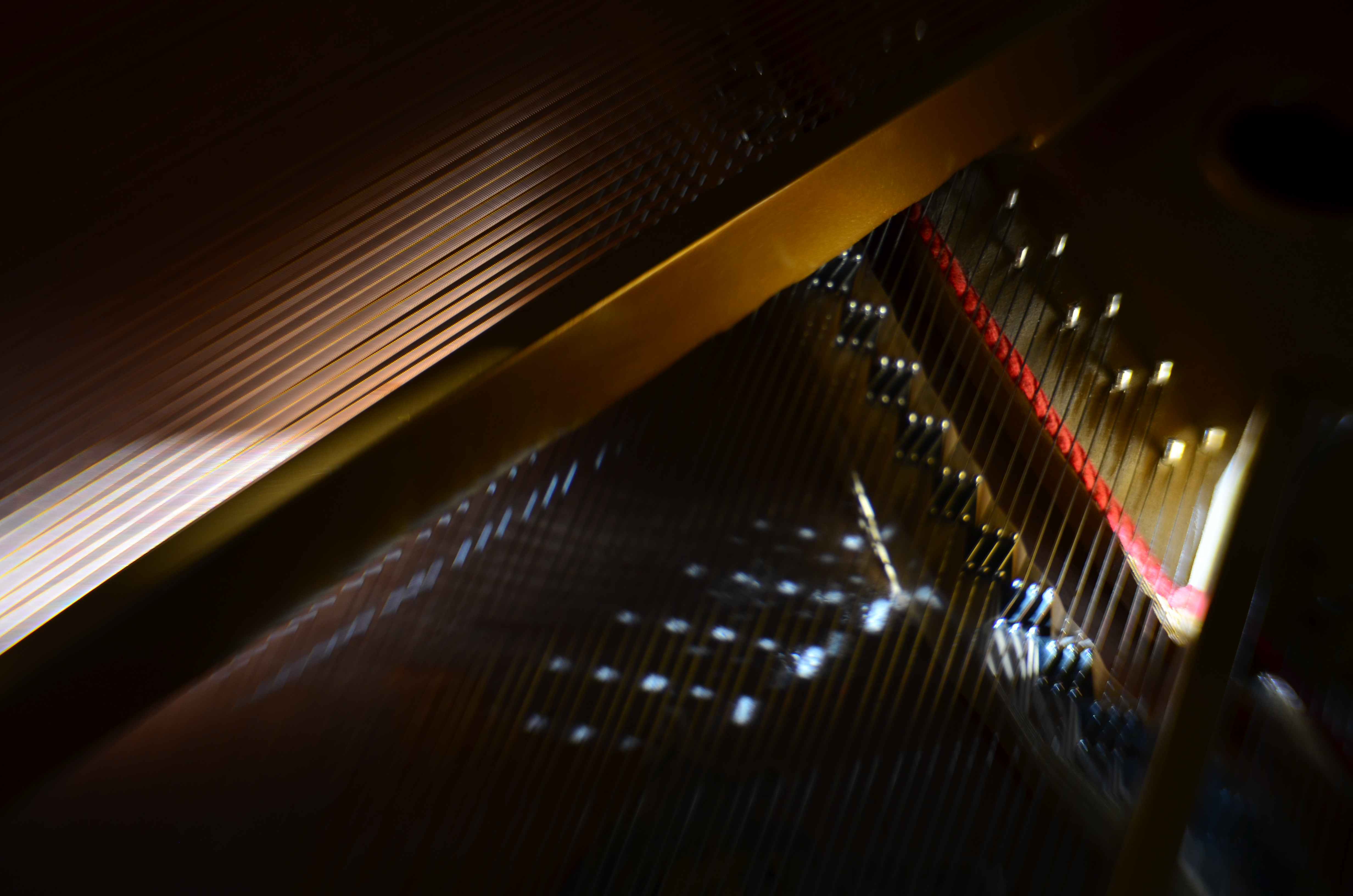
Cordophone Chroma (2017).
Pianos, to me, are divinely complex gadgets, creations of the first great industrial age, their impossibly intricate mechanics offering thousands of possibilities for macro shots, fisheye explosions, abstract compositions, shadow studies, and delicate ballets of reflections as the morning sun dances across harp, strings, and hammers in an endless kaleidoscope of radiance. I have long since tracked how the sun showcases different parts of the piano as the day progresses, and how that corresponds to the instrument’s various sections and subsections.
Hard-wiring that schedule into my skull over the years means I know when a shot will work and when it won’t, making the object more than just something to shoot. It becomes, in effect, an active kind of photo laboratory, a way of teaching and re-teaching myself about the limits of both light and my own abilities. Better still, the innate intricacy of the piano as an object guarantees that I can never really get “done” with the project, or that something that was a mystery in January will become a revelation by June.
What gives this process a special lure to me is my endless effort to exploit natural light to the full, believing, as I do, that nearly every other less organic form of illumination is measurably poorer and less satisfactory than that which comes plentifully, and for free. The house I live in has thus become, over the years, a kind of greenhouse for the management of light, an active farm for harvesting the sun.

I’VE JUST SEEN A FACE
Am I this person? Do I know this guy? Am I getting him “right”?
By MICHAEL PERKINS
…..through his nightmare vision, he sees nothing…..blind with the beggar’s mind, he is but a stranger to himself –Winwood/Capaldi
GRINNING, FRIENDLY LIARS: that’s what most of us are when offering up a socially amenable mask for public conception as a photographic portrait. It’s the facial equivalent of “putting your best foot forward”, an official version of someone who possesses our features but is as different from our selves as, to quote Twain, lighting is from the lightning bug. So who should know that genuine person better, or can capture its reality more accurately than we ourselves? Right?
Or not.
We (the ultimate authority on us), are usually among the least trustworthy of narrators on our favorite subject. Many a memoir is merely a selective reconstruction of one’s past, leaking credibility at every seam. So why should our photographic self-portraits be any more reliable? We believe that we can reveal things outsiders can’t see, that our “real” face can only be shown by our own hand….that the others don’t really “get” us. But what actually happens with the insane new flood of selfies washing over the digital shores is that we merely substitute one “correct” face…the one we give to other photographers…for another, no less crafted, no less artificial. We are still trying to concoct an image that we feel is fit for public consumption. And we invariably fail.
This is hardly a new trap. Photographers have been trying to tell their own facial stories for over two centuries, sure that their interpretation of their secret selves will succeed where other chroniclers fall short. But the best self-portraits are still abstractions, momentary samples of our personality, never the personality in full. Ironically, we might make pictures of our selves that we prefer over those others make of us. Perhaps they are technically better, more deliberate, more flattering, and so forth. And maybe we like the selves we shoot better because they actually conceal what we want to remain hidden, whereas the stranger’s eye is, in fact, too penetrating for our comfort.
Contemporary solutions to this legendary conundrum know no limit. Every shooter has his or her own approach to a statement of self in an image, with some choosing to deliberately camouflage or hide themselves, and other concocting very formalized creations that mock the idea of recognition while seeming to be “real”. In Jackie Higgins’ wonderful book on alternative techniques Why It Does Not Have To Be In Focus, she argues that “faces rarely reflect the inner workings of minds”, suggesting that “there is no such thing as the unified self.” The take-home: you can’t get it right, this business of knowing and showing your own face. Does that mean the quest is unattainable? Sure.
Or not.
Share this:
February 13, 2017 | Categories: Conception, Portraits, Self-Portrait | Tags: Abstract, Commentary, Interpretation | Leave a comment