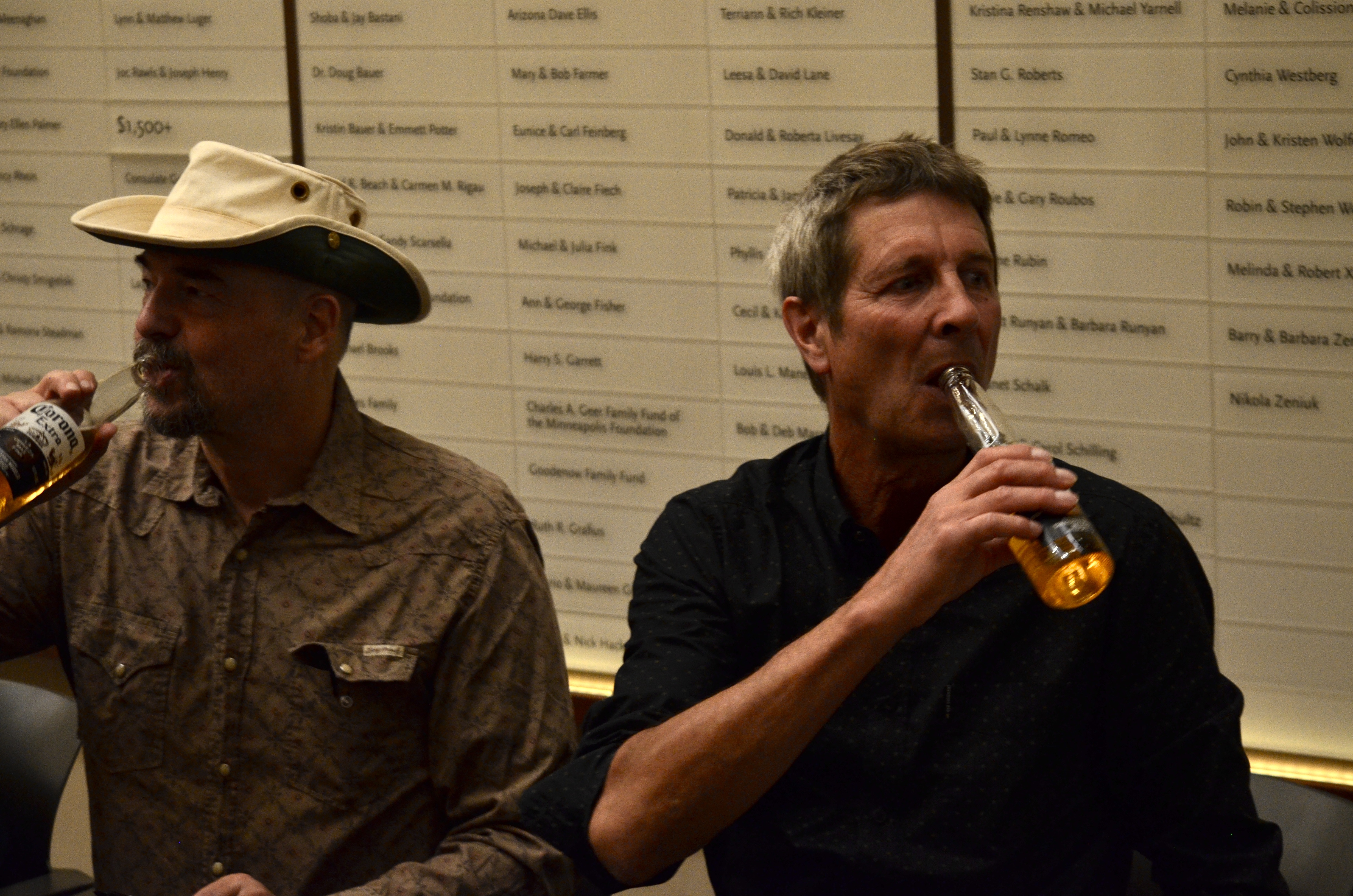
By MICHAEL PERKINS
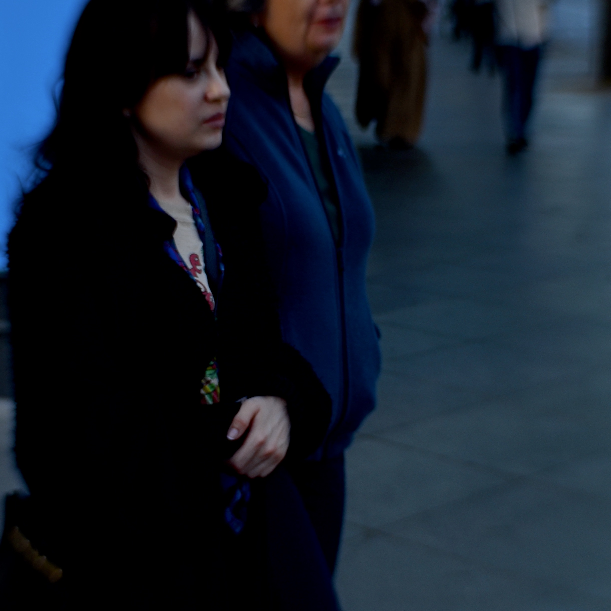
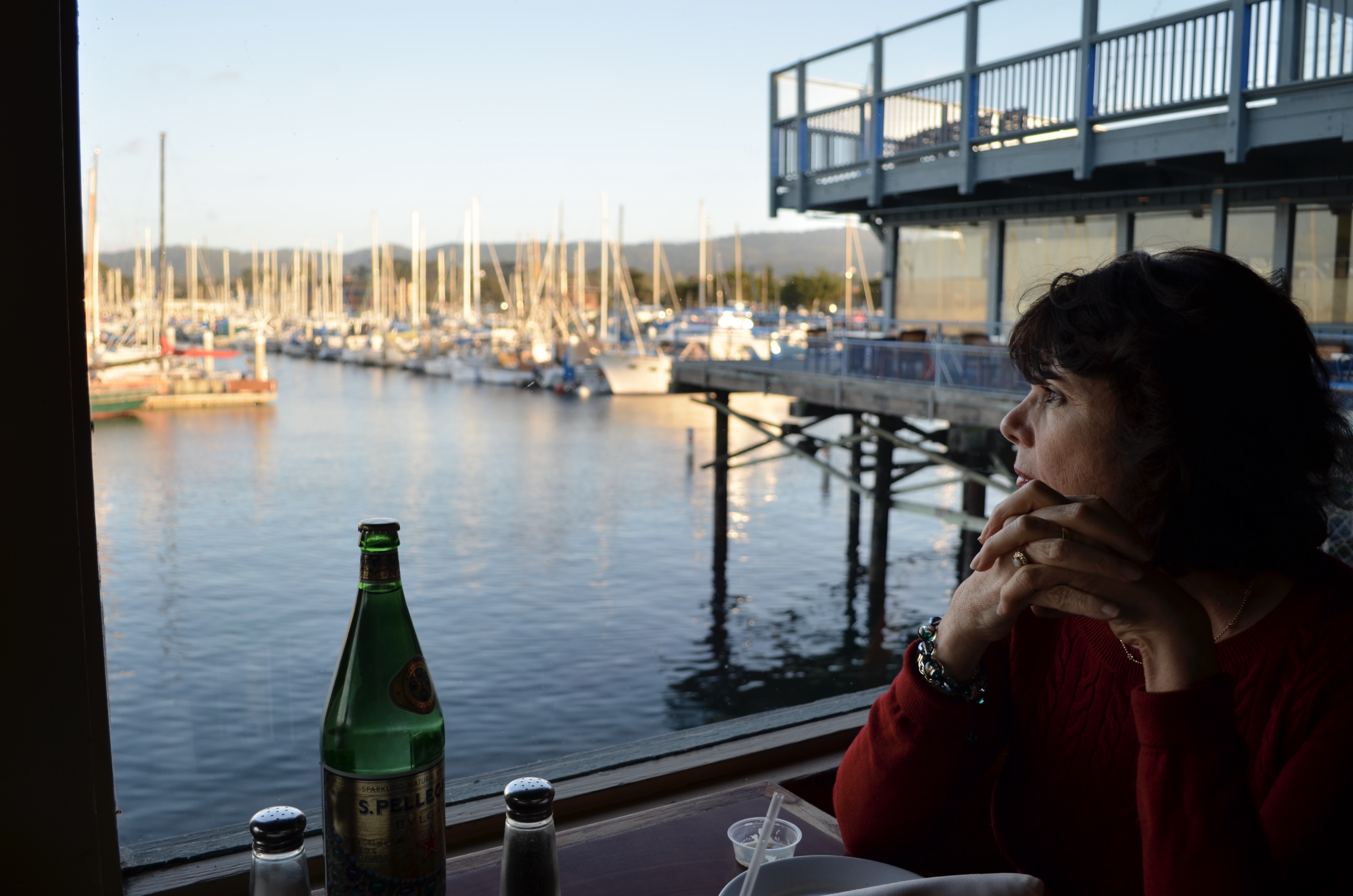
MOST OF THE FORMAL TRAINING IN PHOTOGRAPHIC PORTRAITURE rightly emphasizes the eyes, those so-called “windows of the soul”, and it’s hard to argue with their weight as indicators of the inner mind. But, in reality, every facial feature can be eloquent in conveying that which comprises the individual: love, fear, hate, happiness…whatever mix of outward cues that connote personality in a photograph. And it’s also true that, generally speaking, one’s face is a more reliable identifier of traits than, say, an arm or an ankle. However, portraits are loaded with information that occurs from the neck down as well, and a good deal of it can be mined for solid indicators of just who it is we’re looking at. And while we concede that most of us would never deliberately cut the top off a subject in everyday practice, (as seen here) doing so, at least for this exercise, illustrates just how much data can be left to work with when we, in a sense, lose our head.
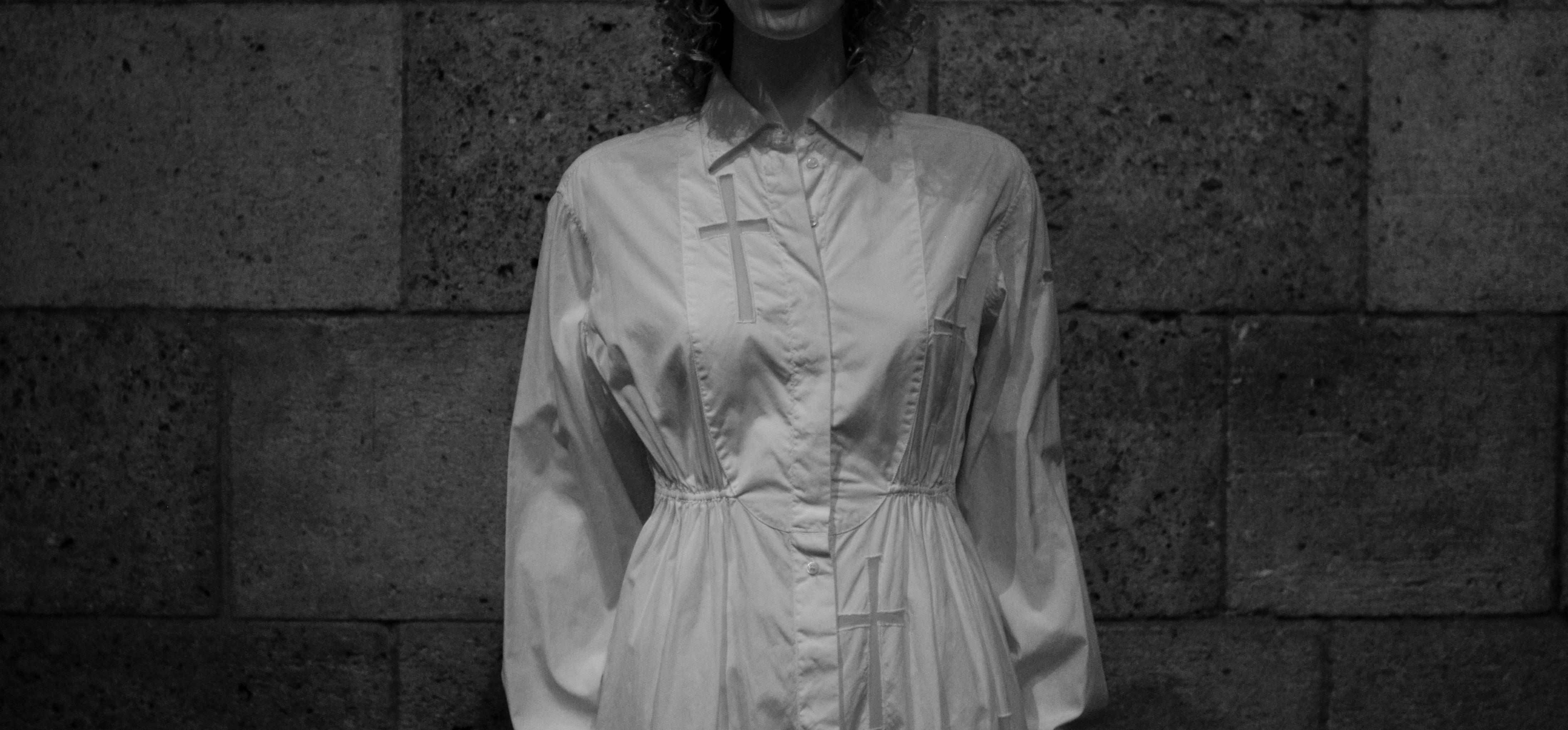
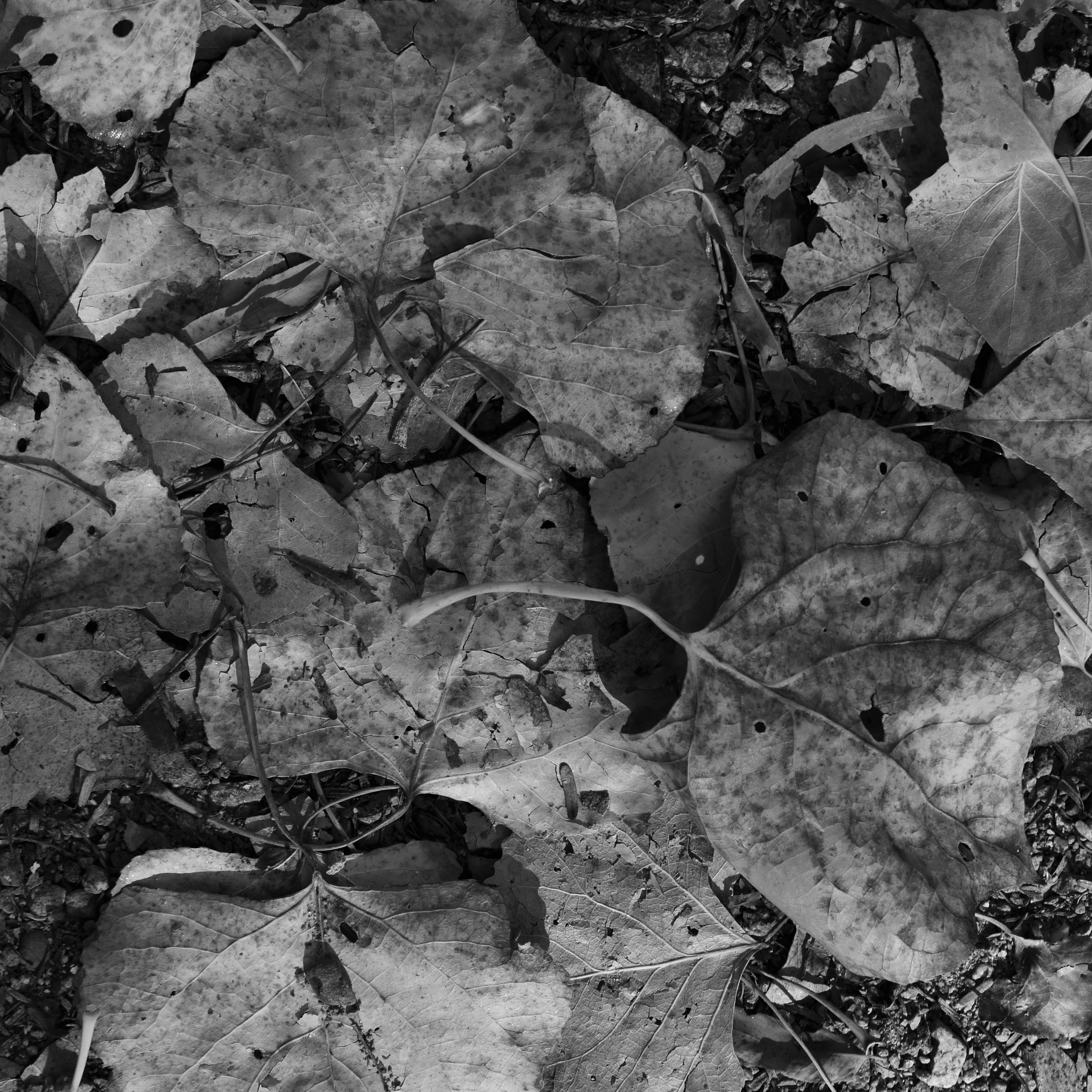
Habit, 2019
Clothing, regalia, body language, even something as basic as color…all these come ripe with codes about the life of the individual under consideration, and can be as valuable in portraiture as the face itself. Now, the idea of recommending that you re-examine your favorite portraits without considering their facial information is not to convince you to choose someone’s suit or hand over their face, but to increase our consciousness of what besides the face can amplify and deepen our sense of the people we photograph. I have seen many images where the depth of field was so narrow that, from the eyes outward, most of the face is largely softened, with everything else outside that narrow radius so blurred as to yield virtually no information. And, yes, that approach works wonderfully in many instances. Still, I am the very last person to propose any ironclad rule that always works or never works, since I believe that absolutes have no place in art. Every case must be considered separately.
So long as people are much more than merely their faces, I believe that everyone who works in portraiture should cultivate the habit of looking at every subject as a unique mix of elements, resulting in a range of pictures where sometimes the face is everything, or is sometimes just a thing among others, and occasionally is of no importance at all. The eyes may be a vary reliable window to the soul, but there are always other kinds of eyes, other kinds of windows.


LOOKING AT THE LOOKERS
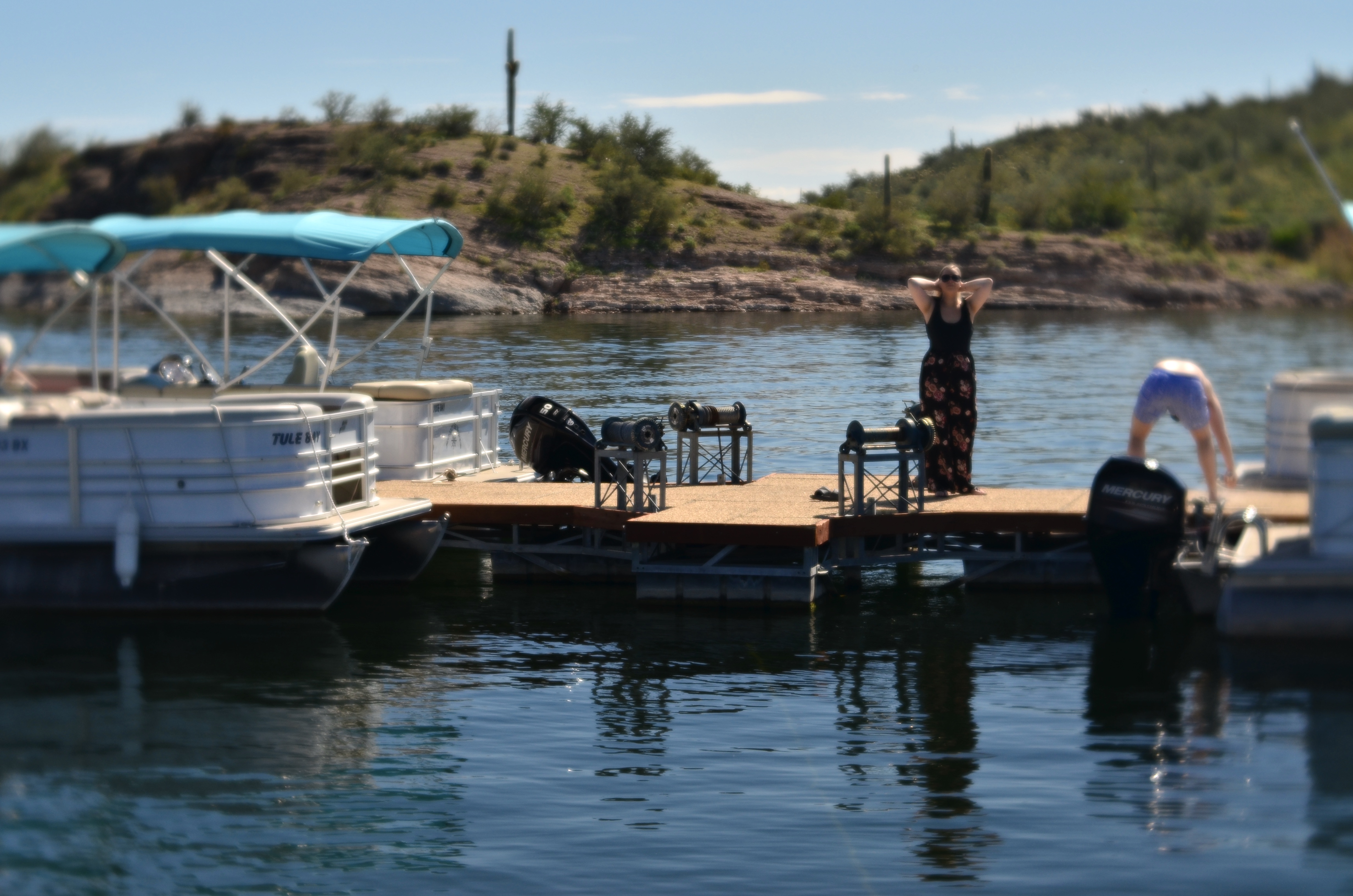
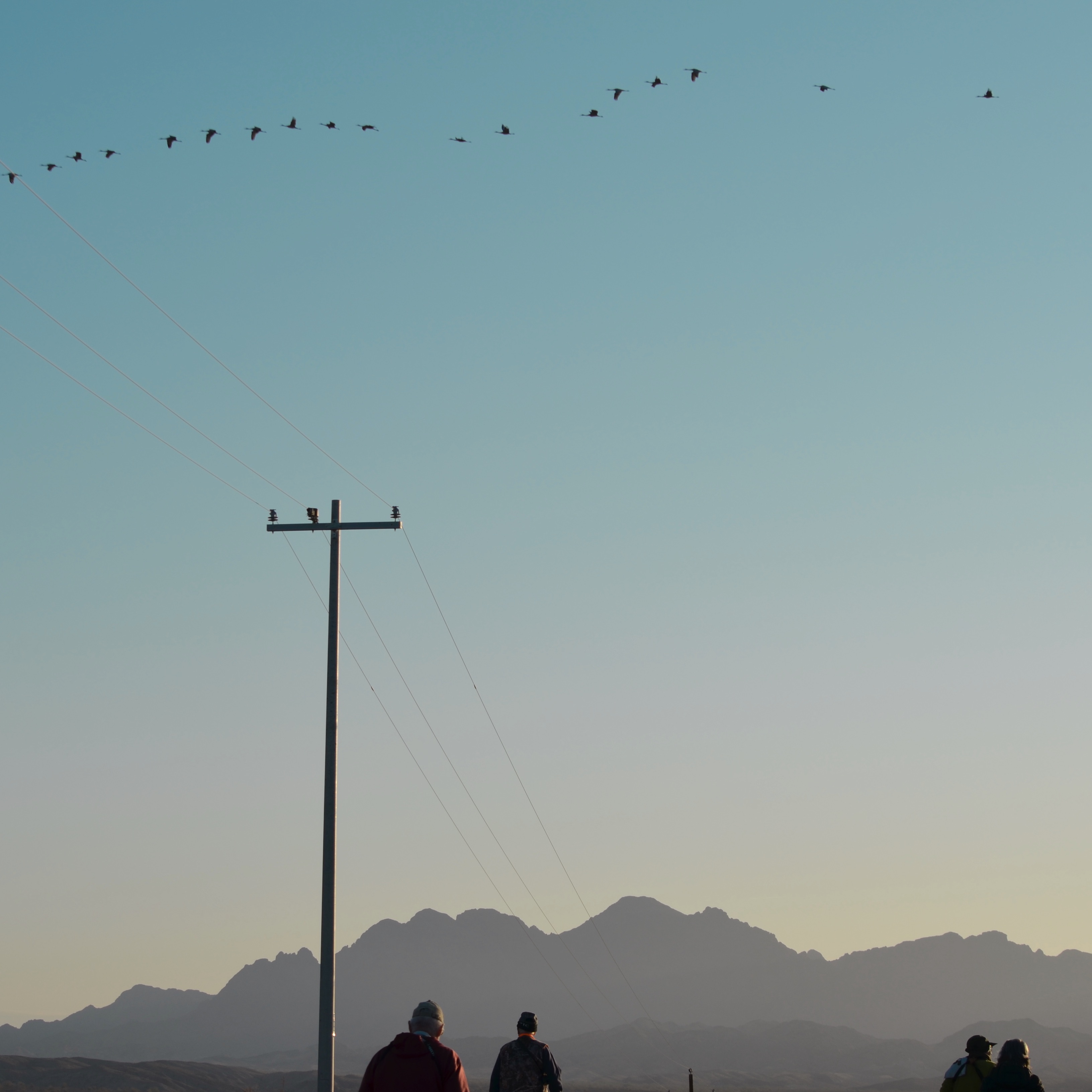
Scanning The Skies, 2020
By MICHAEL PERKINS
THE RISE OF PHOTOGRAPHY IN THE NINETEENTH CENTURY empowered artists to chronicle events in documentary fashion for the first time in human history. And as miraculous a change as that worked (and is still working) on the world, one can still have fun pondering what that power might have allowed us to show, had it been granted us years earlier. Imagine being able to map the daily progress of the great pyramids, or to report on Hannibal’s crossing of the Alps. I have my personal “what if” list of what I’d love to have seen through a camera, and you no doubt could compile one of your own, if you haven’t already.
Since the craft of making pictures centers so much on human quests, it also lends itself readily to the study of human motivation. We can picture what we are looking for, but we can also trace the emotions that play over our faces as we set out on our explorations. And that’s, of course, how photojournalism has developed over the years. We don’t merely snap the planting of the flag, so to speak, but also the anxiety and near-misses that preceded that triumph, as mapped on the faces of those who embark on the journey. Photo essayists have documented great achievements that, as a sidebar, are also triptychs through the human mind, giving us the procedural steps of the first heart transplants and the terse emotions on the faces of the surgical crew. The two parts of the story each suffer if they are not paired in the narrative.
I don’t typically find myself in the company of globe-trotting explorers, but, when I am with people who are working toward any goal, such as the patient birdwatchers at left, I try to spend just as much time studying their process as what they actually produce. Sure, the main objective is to snap the Vermillion Flycatcher, but, to me, the other part of the job is looking at the lookers, telling the story of the search. The quarry may actually escape, but the quester’s journey is a tale in itself, maybe even a better one.
So, in my retelling of the history of photography, a history in which we are actually present with a Leica when Caesar first rides into Gaul, the preferred part of the assignment for me would be to get a look at the great man himself in the act of conquering not only the foe but, perhaps, himself. We like to think that we use our cameras to tell the truth, but without examining why people choose to do great things, and capturing those desires as well as their deeds, we can miss a vital part of the story.
Share this:
Posted by Michael Perkins | March 8, 2020 | Categories: Candid, Unposed | Tags: Commentary, photojournalism | Leave a comment