TLI
Is a self-portrait just a face crammed into an iPhone screen, or should it be more?
By MICHAEL PERKINS
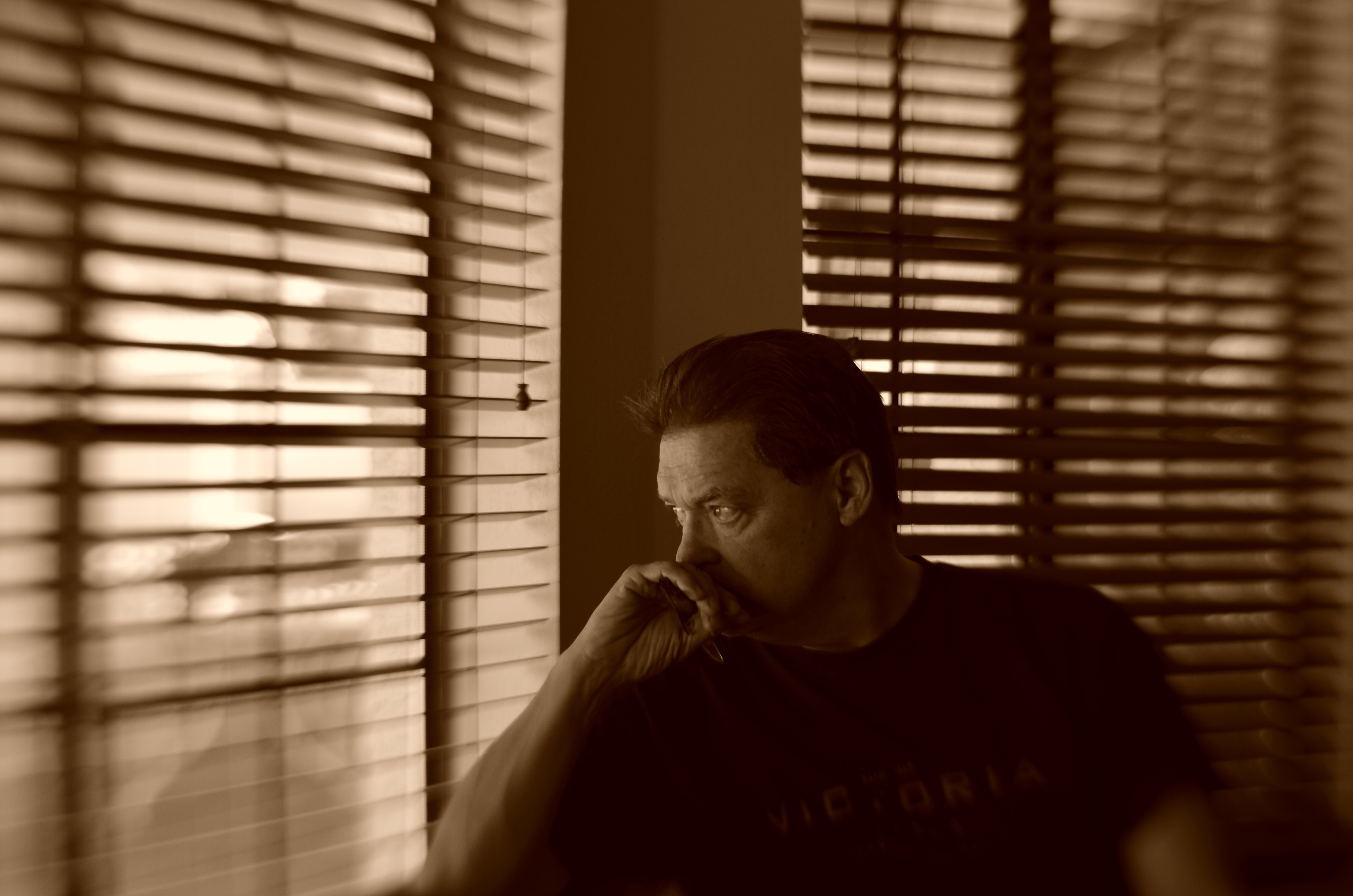
THERE MAY BE NO PART OF PRESENT–DAY PHOTOGRAPHY that is more practiced and less understood than the humble self-portrait. This has not always been the case. Turning the lens on oneself was a much less common act until the arrival of mobile phones, at which time the somewhat awkward old technique of setting a timer and jumping into the picture was supplanted by an act that was at once instantaneous and effortless. Ironically, at that point, the sheer numerical proliferation of the selfie overwhelmed the artistic fact that many of us weren’t doing them very well.
The modern selfie has been degraded largely because any variance from the same banal fill-the-entire-frame-with-your-face approach is so rare. We get plenty of features and not much context, a condition that could be called TLI, or Too Little Information. Worse, selfies in the iPhone era are limited mostly to what framing is permitted by the length of the shooter’s arm, causing any surrounding people, places or events to be eclipsed from the shot, rendering an image of “me at the canyon” maddeningly identical to one of “me in front of the cathedral.” Add the distortion of near objects inherent in the wide-angle lenses of many mobiles, and too many selfies conceal or mutate more than they reveal. And don’t get me started on the effects of on-board flash. In short, who are these bloated ghosts?
A portrait is more than a mere record of one’s features. The self is also defined by its surroundings, with the accompanying props of one’s life anchoring that person in an era and providing scale, the staging needed for a complete narrative. Can the face alone sufficiently “sell” one’s story? In the hands of the right shooter, absolutely.But riff through a few hundred online selfies and see how often you behold such gems.
In all too many self-portraits, we mostly settle for mere volume, for blurred and puffy smears of ourselves instead of insights. And, as is often the case when taking pictures is so incredibly easy, we fail to plan. This isn’t vanity, but self-sabotage. The self-portrait needs to slow down, to once more become something of a special occasion.
More information, please..
SETTING THINGS STRAIGHT
By MICHAEL PERKINS
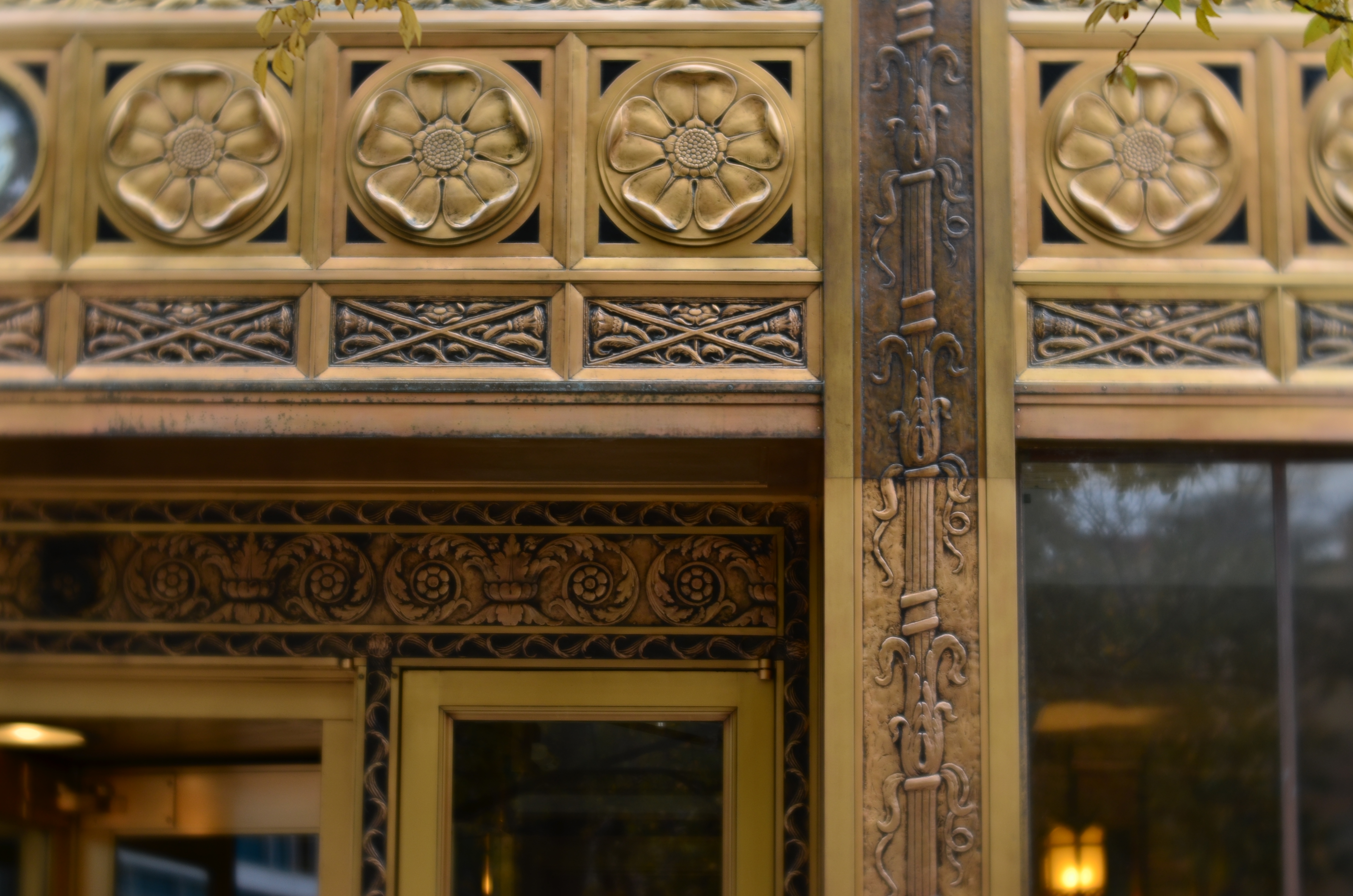
ONE OF THE MOST ELUSIVE EFFECTS IN ARCHITECTURAL PHOTOGRAPHY would seem to be the one most easily achieved: the look of a straight line, the foundation upon which an orderly image is built. However, the human eye is often more unreliable than assumed when it comes to reading and identifying that which is supposed to be “straight.”
We’ve all been confounded by optical illusions that present lines that are not, objectively, straight at all, even though our brains, based on our interpretation of the visual data, say they must be. However, we tend to dismiss this sensation as trickery, something we don’t have to sweat about in making a “real” picture. And that is probably a mistake.
Based on what kind of architectural design you’re shooting, what lens you choose, even where you stand, a straight line, either horizontal or vertical, can seem to bend or lean, making our “factual” images less than trustworthy.
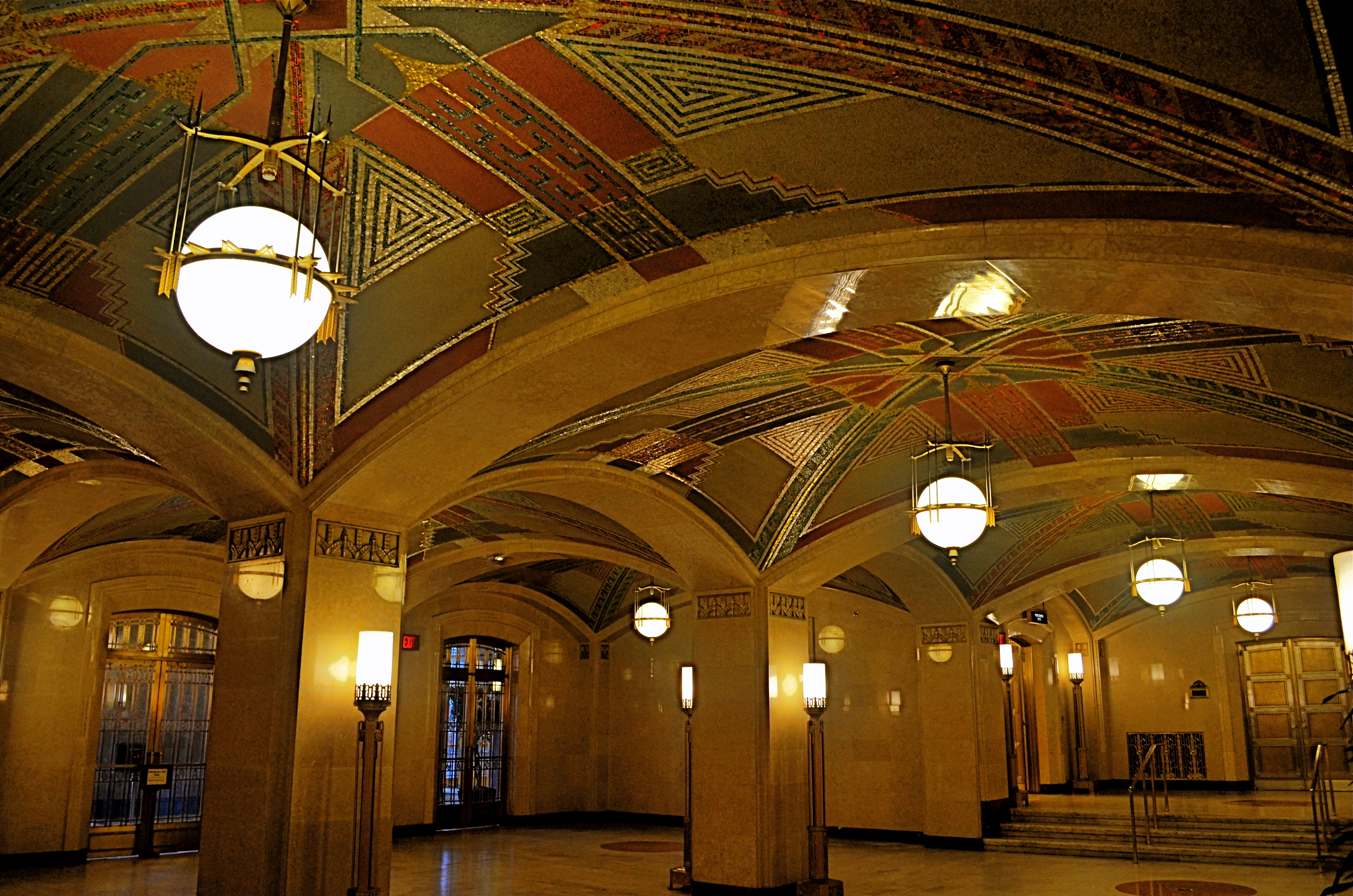
Even setting up a shot on a carefully calibrated tripod and a bubble level can produce a result that looks as if it was manipulated. Of course, based on what look you desire, you may regard geometric reality as irrelevant, and deliberately engineer ” unreality” into a photograph. That’s why we make a distinction between taking a picture and making one.
As an example, the picture seen above was taken super-wide, at 18mm, to intentionally exaggerate the size of the room, making some verticals bow in while others register normally, and playing stretchy with the ceiling arches and floor horizon. The idea here was to distort the already extreme Art Deco accents and give them an extra funhouse quality. Shooting with a more conventional focal length like 35 or 50 mm would have made for straighter lines, but would also have sacrificed every other effect achieved at 18mm.
Bottom (straight or crooked) line: dimensions and angles are suggestions, not commandments. But it’s a lot easier to break rules creatively once you understand how they work.
TWILIGHT TIME
By MICHAEL PERKINS
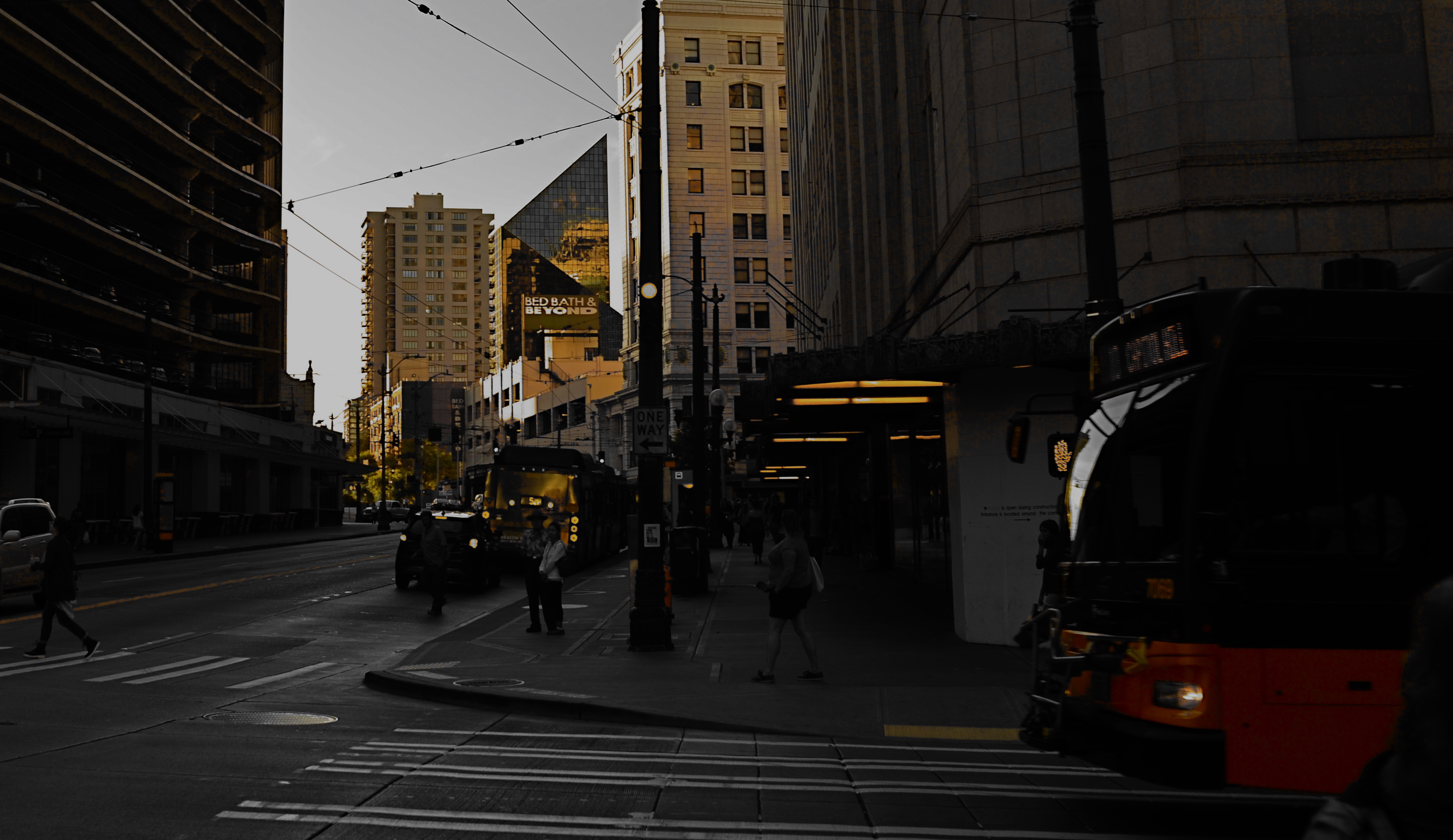
I HAVE STRUGGLED OVER A LIFETIME to tell photographic stories with as few elements as possible. It’s not unlike confining your culinary craft to four-ingredient recipes, assuming you can actually generate something edible from such basic tools. The idea, after all, is whether they’ll eat what you’ve cooked.
With images, I’ve had to learn (and re-learn) just how easy it is to lard extra slop onto a picture, how effortlessly you can complicate it with surplus distractions, props, people, and general clutter. Streamlining the visual language of a picture takes a lot of practice. More masterpieces are cropped to perfection than conceived that way.
The super-salesman Bruce Barton once said that the most important things in life can be reduced to a single word: hope, love, heart, home, family, etc. And so it is with photographs: images gain narrative power when you learn to stop sending audiences scampering around inside the frame, chasing competing story lines. Some of my favorite pictures are not really stories at all, but single-topic expressions of feeling. You can merely relate a sensation to viewers, at which point they themselves will supply the story.
As an example, the above image supplies no storyline, nor was it meant to. The only reason for the photo is the golden light of a Seattle sunset threading its way through the darkening city streets, and I have decided that, for this particular picture, that’s enough. I have even darkened the frame to amp up the golds and minimize building detail, which can tend to “un-sell” the effect. And yet, as simple as this picture is, I’m pretty sure I could not have taken it (or perhaps might not even have attempted it) as a younger man. I hope I live long enough to teach myself the potential openness that can evolve in a picture if the shooter will Just. Stop. Talking.
FACTS NOT IN EVIDENCE
The more you study a picture like this, the more you can find wrong with it. Let me help you….
By MICHAEL PERKINS
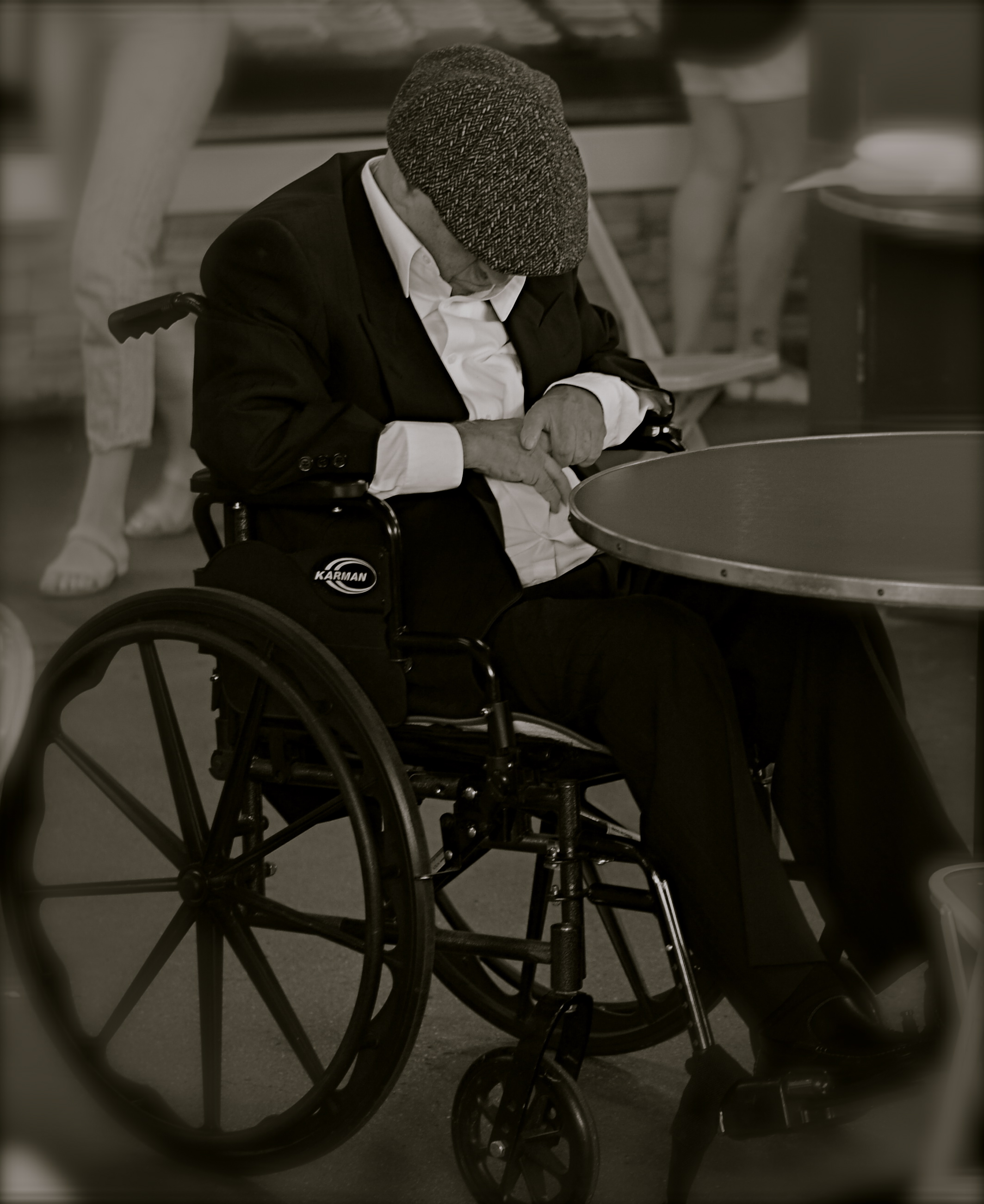
IF A STREET PHOTOGRAPHER IS GOING TO ASK HIS AUDIENCE TO EXTRACT A STORY FROM AN IMAGE, then he must ensure that he is putting that same story into his pictures. Just suggesting a narrative, especially in a photograph, is not the same as conveying one. In legal terms, you are asking your viewers to “assume facts not in evidence.”
Do you have to spell everything out, like an S.O.S. in a bowl of alphabet soup? No, but just pointing your camera at just anything happening “on the street” doesn’t guarantee emotional impact, either. Nor does it imbue your pix with profundity, irony, or anything else that wasn’t happening through your eyes before it went through the lens. No street shot is guaranteed “authenticity” just because you were on the street when you pressed the shutter.
Look at the image at left, which I snapped rather accidentally while taking a lot of images of a crowded food market. I did not mean for the gentleman in the wheelchair to be the main appeal of this frame, but even though he’s been cropped to now be central to the shot, there is no clear narrative that “saves” this photo, or makes it compelling on its own terms.
Let’s dissect the picture to see why it fails. What it is, in raw terms, is a man in a wheelchair, sitting alone, wearing dark clothing, his face hidden.That is all that’s absolutely proven in the picture. Now, let’s assume that I was going for something poignant, a human “moment” if you will. Such moments are the heart and soul of great street shots, but this one is missing far too much vital information. If the man is “sad”, is it because he’s in a wheelchair? Why, and who am I to say so? After all, maybe he just had some restorative surgery which, after a month in the chair, will restore him to star-athlete status. Or maybe he is in the wheelchair for life and yet enjoys a richer existence than I do.
Let’s go farther. His face is hidden, but what story can I make the viewer believe is true about that? Is he catching a cat nap while his pile scores him a slice of pizza? Is he doing special exercises? Praying? Does his hat fit badly? Is he depressed, or actually a master of meditation who’s more connected to the cosmos than I can even dream of? And then there’s the monochrome. This picture began as a color shot, but I certainly didn’t increase its impact merely by sucking out the hues. That is, there isn’t some clear message that was being muffled by color which now speaks in a clear voice in mono. Finally, the cropping makes him the prominent feature in the photo without making him the dominant one. The background of the original was distracting, to be sure, but, as with the color, taking it away didn’t add to the picture’s force. If anything, it made it weaker. The man can’t be ironic or poignant since I’ve now cut him off from everything that provides context to his role in the picture.
You get the idea of the exercise. This shot, color or mono, cropped or wide, had nothing clear to say about the human condition. It was taken on the street but it ain’t “street” in effect. Try the same ruthless analysis with your own “near-miss” shots. It’s a humbling but educational process.
MORE FROM LESS, LESS FROM MORE
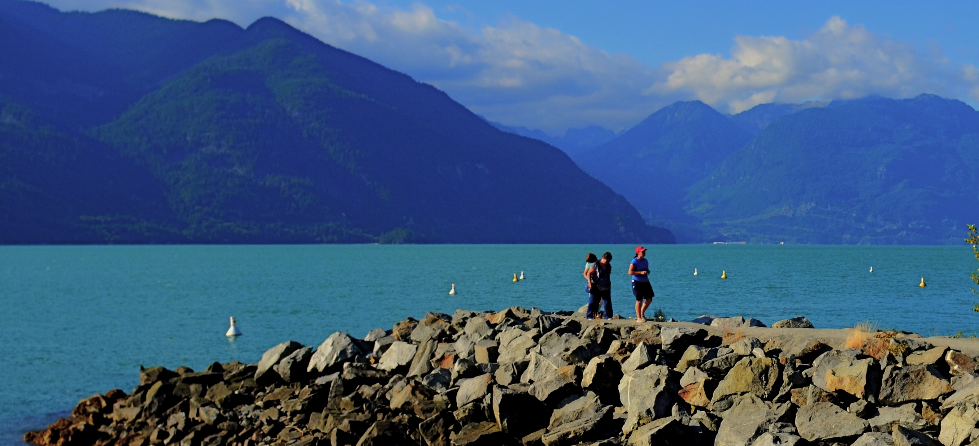
That Day At The Jetty (2016). A cropped edit of an originally larger 24mm wide-angle shot.
By MICHAEL PERKINS
EVERY PHOTOGRAPHIC LENS EVER MADE CREATES ARTIFACTS, distinct biases in the ways it renders the world it sees. When you shoot with a particular piece of glass, you’re also inviting in whatever flaws or limits are baked into that optic’s design and science. If you are the kind of shooter that constantly switches out lenses, this present less of a problem, since you’re used to snapping on the exact glass you need for every kind of shooting situation.
If, however, you try, like myself, to go nearly a day at a space with a minimum of gear, then you start to look for lenses that do most of what you want in most settings. Occasionally, this means compromising on, or even missing, a shot; but, by and large, it makes you more mindful of the image-making process from minute to minute. You plan better and react faster.
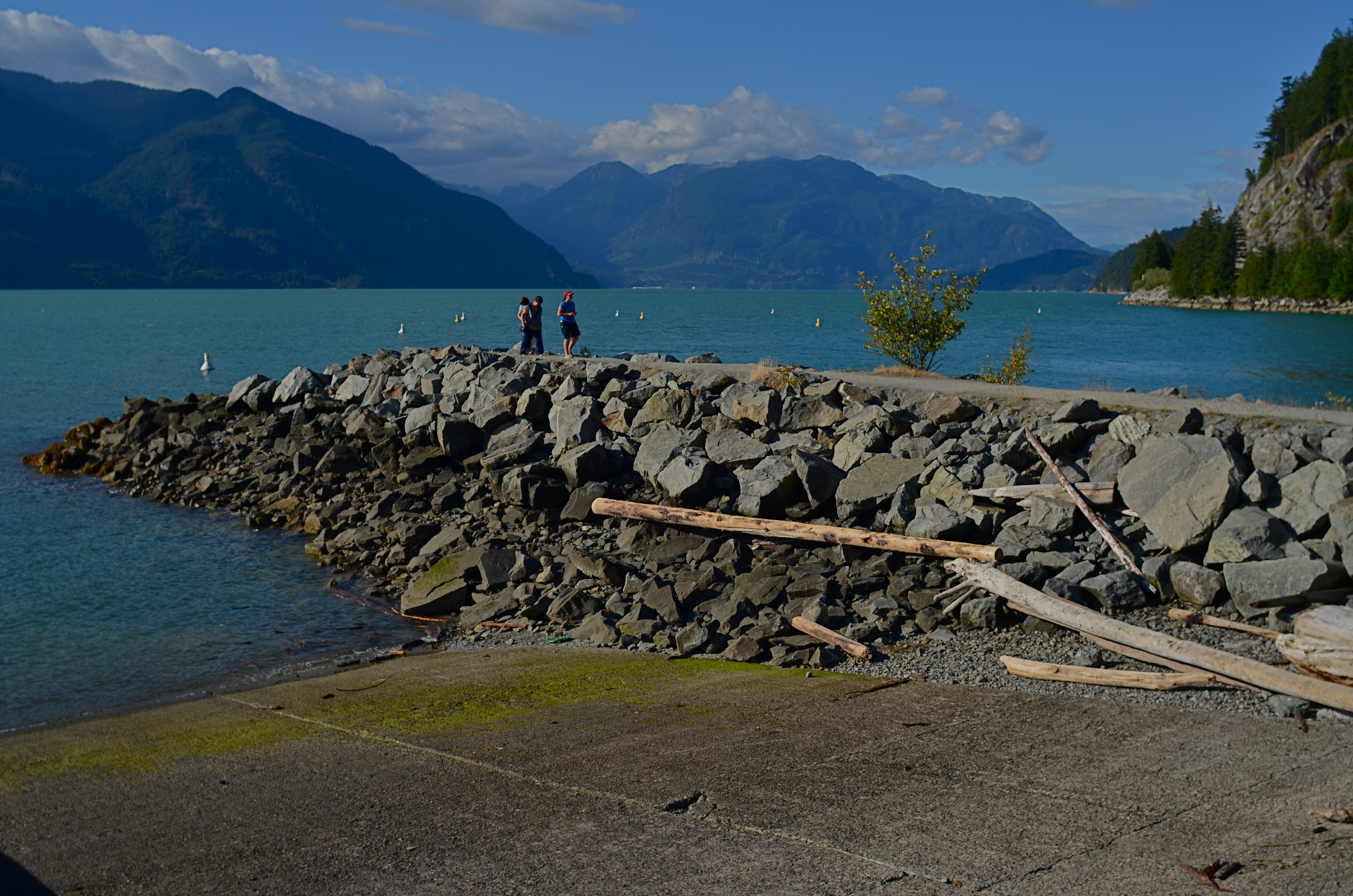
The original 24mm master shot, which is either fuller or too crowded, depending on one’s viewpoint.
In the case of one of photography’s most popular categories, that of landscape work, there seem to be two main types of lenses that do most of the heavy lifting: the ultra-wide angle, which convey “openness” and scope, and zooms, which help isolate specific parts of vast vistas. There are certainly situations in which both are ideal, but, on average, were I to be traveling very light for the day, I would probably take most of the day’s images with the ultra-wide, even if there was a particular area inside a larger scene that was more “important” than its surroundings, a situation in which most of us might utilize the zoom.
This goes to my belief that the composing process almost never stops with the click of the shutter. Rather, the click is just phase one, and a master shot that allows for many post-shot “re-thinks” is the best one to have. Let’s say, for the sake of argument, that the center of an immense mountain range is where the light or the subject story is strongest in a given image. If my master shot is a taken with a zoom, I’ve lost the ability to later discover additional approaches that remain possible if I have a wider shot’s worth of information from which to select. Starting with the larger shot, I can shift the cropping to any aspect ratio I want, change the balance of the composition, re-orient the linearity (to create a faux panorama, as in the top shot here) or even realize that there was an even stronger story to be told outside of the frame I originally envisioned with the zoomed master shot. Here’s the core point: it’s easier to have more picture than you need and pare some stuff away than to narrow your options beforehand and trust that you’ve nailed it, meanwhile ruling out any potential re-takes or second thoughts.
I do, of course use zooms at times, but, like my external flashes and tripods, I find fewer uses for them with each passing year. It’s odd how you can come to feel greater freedom with fewer tools. But sometimes it’s like the time Itzhak Perlman busted a string just before a concert, then performed the program on just three strings, to the utter amazement of the critical world. Photography proves time and again that there are times when the image’s “melody” magically comes forward. In spite of.
SERVING UP SOME NUTS
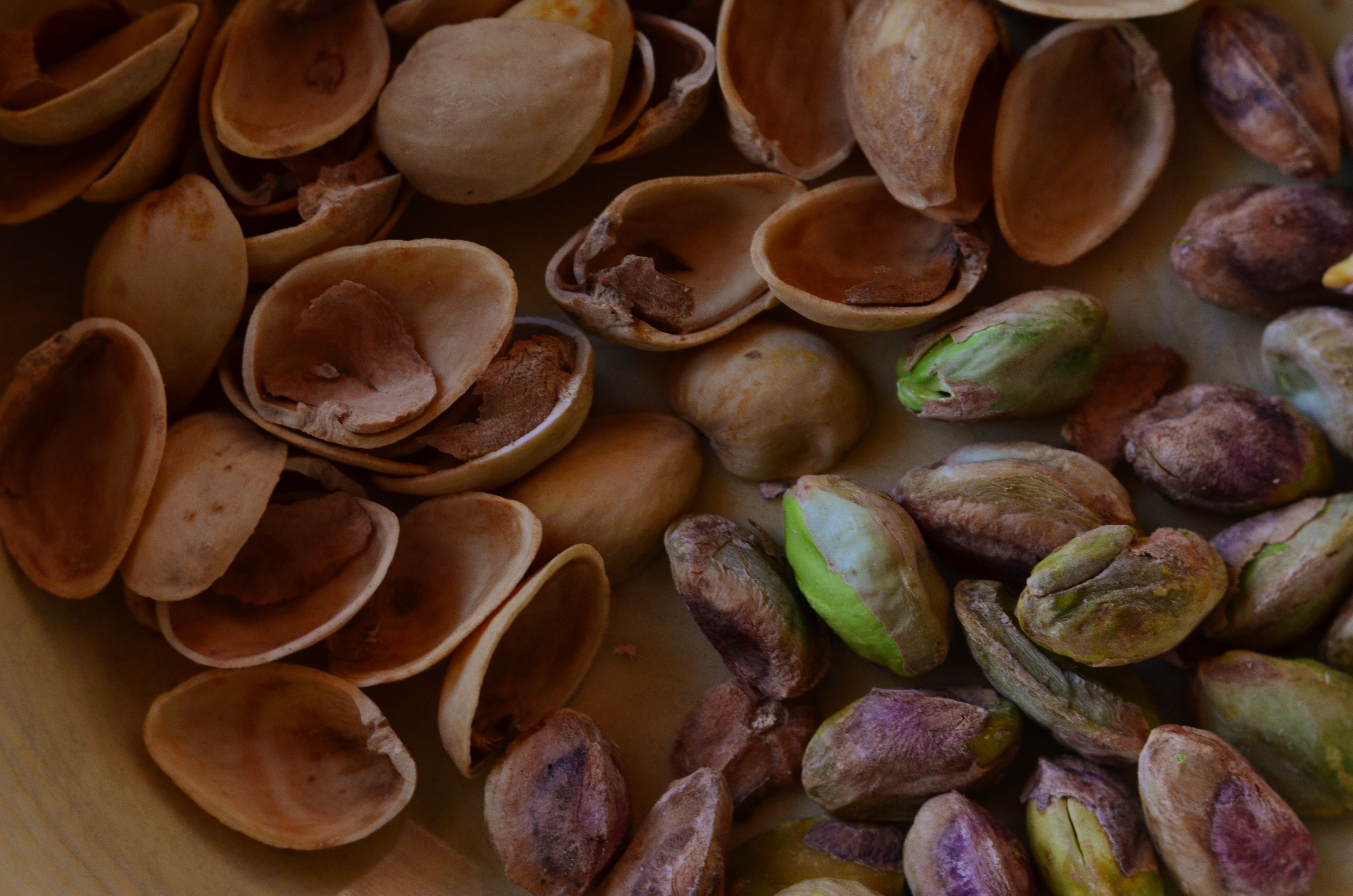
The Haves And The Have-Nots (2017)
By MICHAEL PERKINS
COMPOSITION IN PHOTOGRAPHY WOULD BE A SNAP (sorry) if the camera actually possessed not just an eye, but also a brain. But that’s where you come in.
When the human eye takes in a scene, the brain automatically ranks all the information within it, basically making a composition of priority. We “see” some things and “don’t see” others, based on how our grey matter ranks the importance of everything in our field of vision. A camera cannot make these fine decisions: it merely makes a light record of what it’s pointed at. That accounts for the fact that our “perfect” landscape, the one we ourselves recalled from the first day of vacation, comes back, in a mere photo, complete with electrical wires, distracting signs, junk near the beach, and any other number of things our brains filtered out of the original viewing experience.
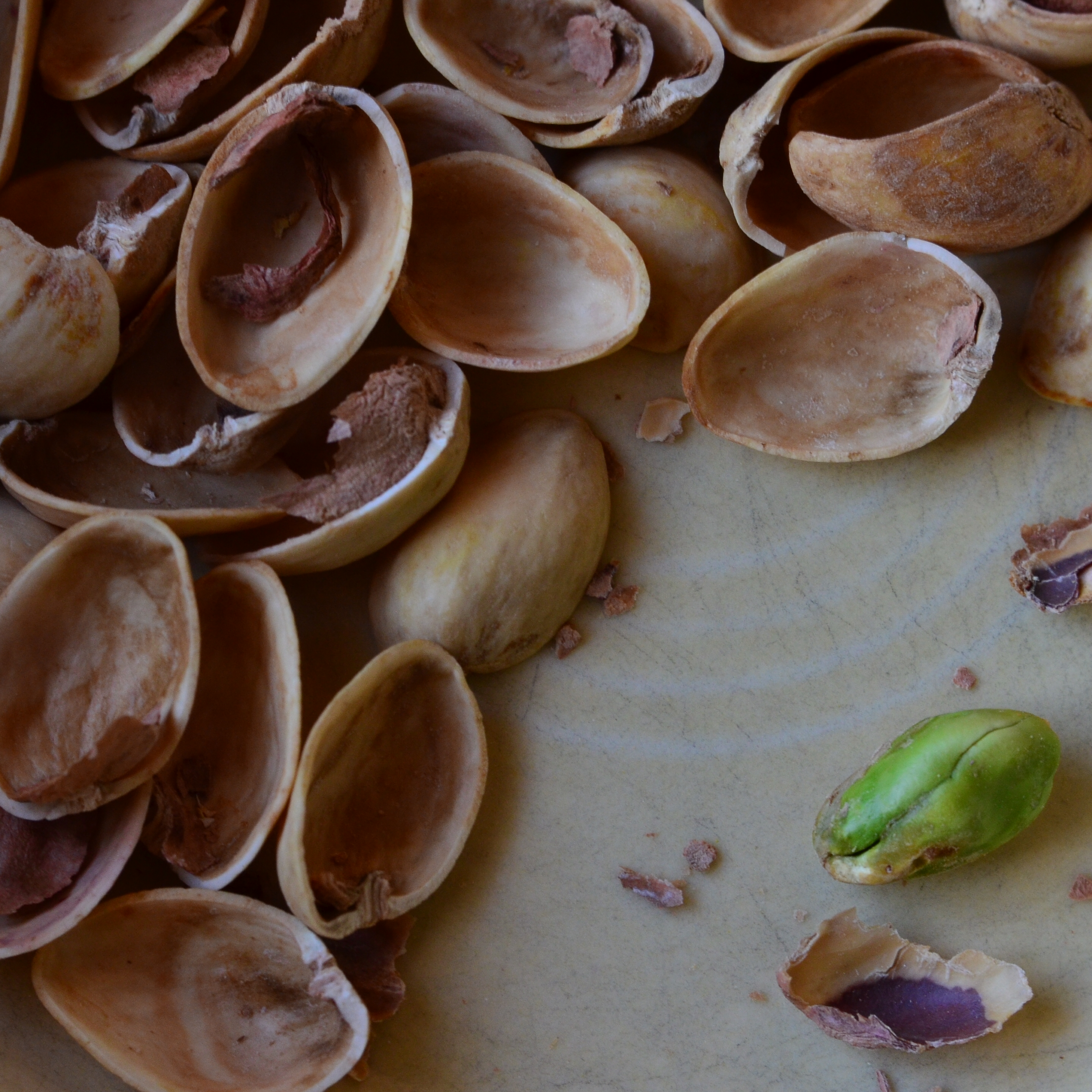
Last Man Standing (2017)
Composition is thus a matter of our deliberately arranging things by priority, making an argument for our audience to Look Here First, Only Look Here, Give Greater Weight To This Over That, or any other messaging we desire. In sales terms, it’s what pitchmen call Asking For The Order. Simply, composing a photograph means setting the terms of engagement for the viewer’s eye.
With still-life photographs, the shooter has the greatest degree of control and responsibility. After all, our subject is stationary, easily moved and arranged to our whim. You pretty much are lord of your domain. That being said, it’s wise to use this luxury of time and control to envision as many ways as possible to convey your message. The image at the top of this page, for example, is crowded, but the nut shells and the unshelled nuts are a study in textural contrast. There’s lots of color and detail, with one side being somewhat blanched while the other is rough and complex. That’s one way of making the image.
For comparison, in the second frame, the terms of engagement are completely different. The pile of shells at left is more sharply contrasted with the single nut at right. The nut carries the only vivid color in the image; it’s an outlier, a misfit…maybe the last man/nut standing? The simplification of the composition lets it breathe a little, allowing the viewer to speculate, invent. Are the shells symbolic of a mound of nuts that have already been polished off in some grand snacking orgy? Why was one lone nut left to tell the tale? And so on.
Change the arrangement of subjects in a scene and you’ve changed the terms of narration, or even insisted that there is no narration, just patterns, light, or abstraction. Whichever path you choose, no composition comes to the camera “ready to eat”, as it were. You have to tell your camera’s mechanical eye what to see, and how to see it.
COME TO THE DUMB SIDE
By MICHAEL PERKINS
“I dream with my eyes open.”—-Jules Verne
THE MAKING OF A GOOD PHOTOGRAPH IS A CHALLENGING ENOUGH ENTERPRISE that it’s understandable that many a photographer loses either his emotional balance or his sense of humor or both in the process. As artistes, we are so very, very earnest in our pursuit of the image that we can become a little, well tedious. All work and no play makes Jack take four hours to take a picture.
I always believe that, when you are mired in a problem, the bravest thing you can do is to, well, run away. Call it play, call it goofing off, call it cleaning out the pipes, or call it late to supper: the idea is to change the conversation. Of course, if you’re physically stuck in a rain-soaked duck blind awaiting the annual return of the pied-billed grebe, it’s a little tough to break camp (or your concentration) for the salvation of play. Besides, if the pied-billed grebe is your idea of a good time, then godspeed, John Glenn, and please don’t expect us to sit through your slides upon your return. Not without beer, anyway.
Suddenly, Flash Held The Upper Hand (2017). Heavy on the nonsense. Because sometimes you need it.
No, I’m talking about the value, the actual soul-salvaging power of stupid. The palate-cleansing function of creating the visual equivalent of a stuck-out tongue. In taking the time to solve the problems involved in the creation of a “dumb picture”, you are also exercising the muscles of your mind that have been cramped up in your more serious work.
I’m reminded of the process used at the little building on the weird end of the Warner Brothers lot where Looney Tunes shorts were created. It was a working method which startled messengers and delivery boys alike, who often entered the office to see Chuck Jones, Friz Freleng, and other animators capering about in animal costumes or funny hats as other Tuners recorded their gyrations with 16mm home-movie cameras, the better to animate you with, Grandma. Now some of you troublemakers might be tempted to remark, “but they were making cartoons. How is that serious work?”, to which I reply that perhaps you and I had better take this outside and settle the matter like gentlemen.
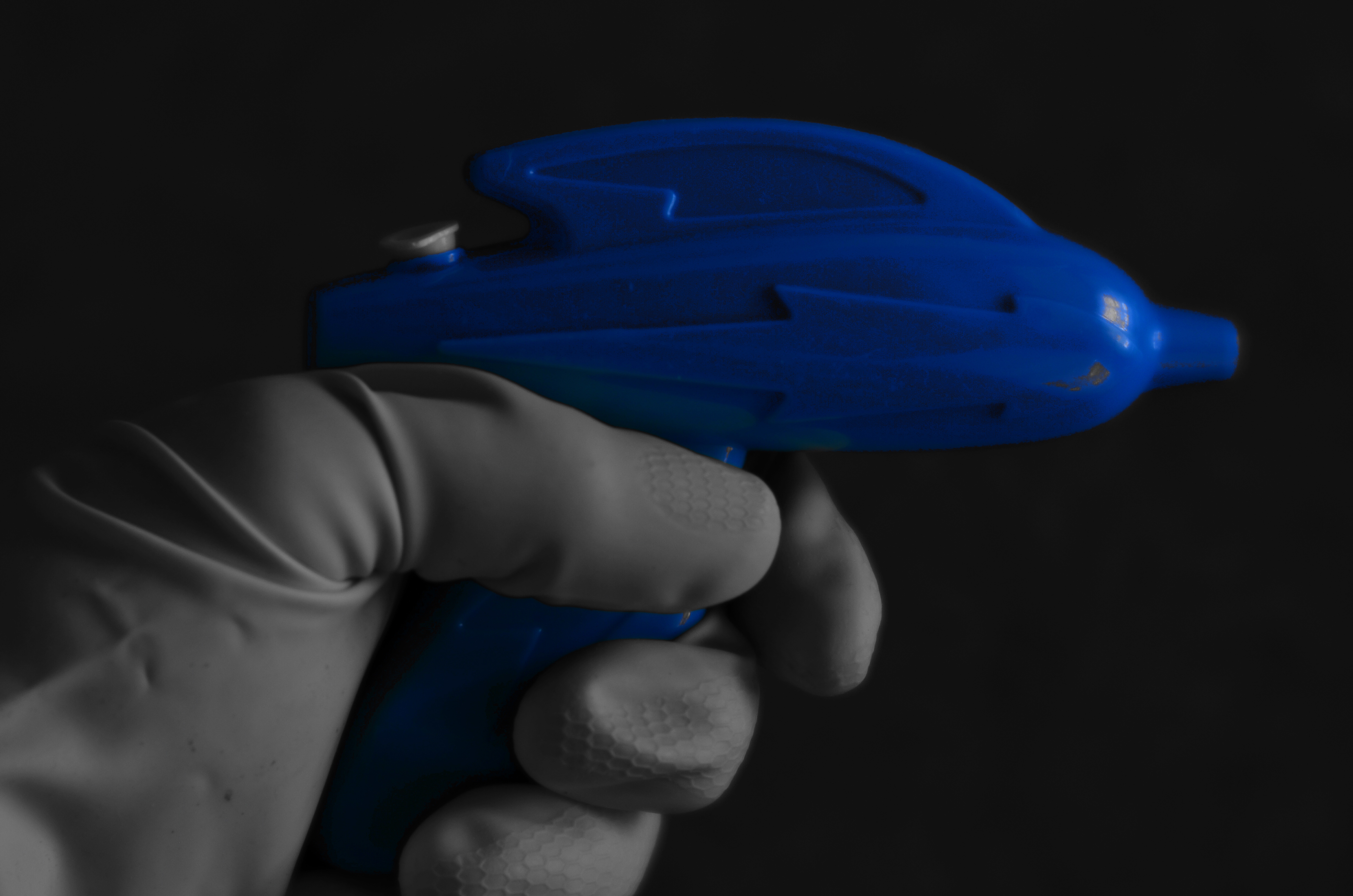
The above shot is the result of one dollar in investment (the weird squirt gun, complete with cosmic lighting bolt), a little rooting around under the sink (for the work glove), and ten minutes of fanciful fun. Not being fortunate enough to have Buster Crabbe here to model my fantasy (he’s in Actor Hell learning how to better deliver his lines), I managed to use my own left hand to wield my weapon while shooting with my right. And if you think you can do that without looking stupid….well, I’m just as glad the wife didn’t walk in on me, especially since I had been tasked, on this particular day, with kitchen duty.
Which is all to say, as if it needed repeating (or even peating) that fun is essential to the process of photography. When the well runs dry, you’d better re-fill it quick…with water, Mr. Bubble, Cherry Kool-Aid, or a nice, refreshing bucket of stupid.
Ahhhhh.
THE NEW ERA OF TESTIMONY
By MICHAEL PERKINS
WHETHER THERE IS CONSENSUS ABOUT THE PRESENT OR FUTURE STATE OF THE NATURAL WORLD, we are certainly in the midst of the most muscular conversation about its fate than many of us have ever known. That means that we are changing and challenging our relationship to the globe almost daily…and, along with that relationship, the way that we see, and visually report upon it. That generates a new emphasis on bearing witness to what the planet is/can be/ might be.
I call it the new era of testimony.
The birth of photography coincided with the first great surge of cross-continental expansion in America, as well as an explosion in invention and mechanization. The new system for making a physical record of the world was immediately placed into service to help quantify the scope of the nation…to measure its mountains, track its rivers, count its standing armies. Photographers like Timothy Sullivan and William Henry Jackson lugged their cameras east-to-west alongside geological surveys, railroad agents, and the emerging naturalist movement. While some shooters chose to capture the creation of new trestle bridges, others helped poets illustrate their Walden-esque reveries. In all cases, photography was tasked with the job of showing the natural world and our interaction with it. Most importantly, the images that survive those times are a visual seismograph on both the grand and grotesque choices we made. They are testimony.
Brittle Bush In Bloom (2017)
And now is a time of radical re-evaluation of what that interaction should look like. That means that there is a visual story to tell, one of the most compelling and vital that photography has ever told. Regardless of your personal stances or stats, man’s place on the planet will be in a state of fundamental shift over the coming decades. And the images that this change generates will define both photography as an art and ourselves as stewards of an increasingly fragile ecology.
Ansel Adams, for all his gorgeously orchestrated vistas, was, I believe, mistaken in almost deliberately subtracting people from his grand scenes, as if they were irrelevant smudges on nature’s work. It doesn’t have to be that way. We need not make war on our native world. But whatever we do, we need to use the camera to mark the roads down which we have chosen to walk. Whether chronicling wise or foolish decisions, the photograph must be used to testify, to either glorify or condemn our choices going forward.
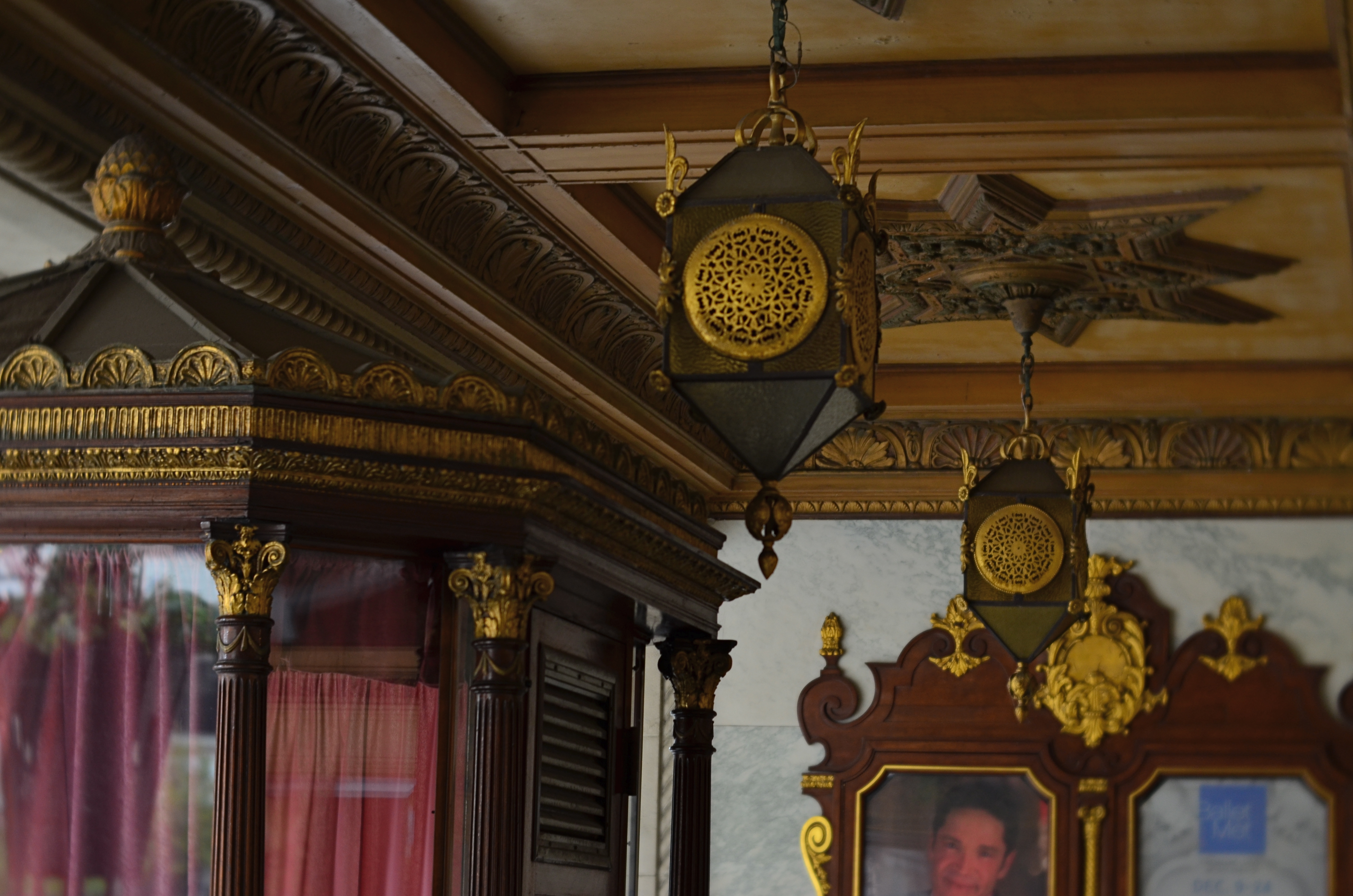
A SMALLER PIECE OF CAKE

Molder plaster designs line the underside of the marquee of Los Angeles’ Deco masterpiece, The Wiltern Theatre.
By MICHAEL PERKINS
IN A HOUSE CRAMMED WITH LUXURIANT COFFEE TABLE BOOKS ON PHOTOGRAPHY, my most lovingly thumbed volumes seem to center on studies of Art Deco architecture, a subject which provides me with endless enjoyment. Some books touch on overall moderne design, but most are specific reference works on the zigzags, chevrons, whorls and curves of buildings, clad in this seductive, streamlined celebration of style. Similarly, my travel plans over the years involve sticking pins in the globe to indicate the fattest troves of these buildings, mapping my strategies for someday capturing them inside a box. It’s a bucket list, if buckets had been designed by Walter Dorwin Teague or Norman bel Geddes.
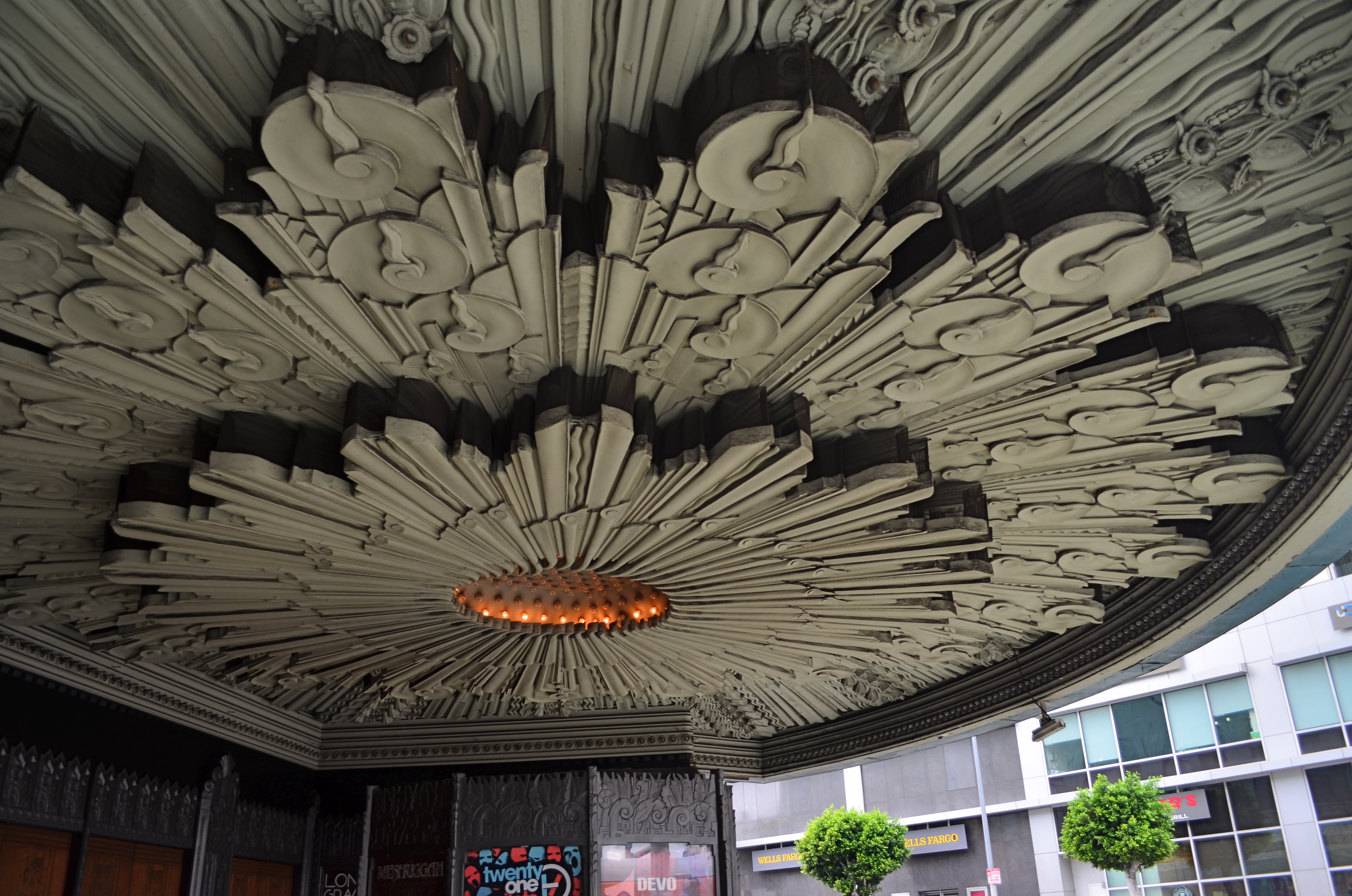
The original framing of the above shot, complete with other distracting details.
Shooting Deco buildings can humble one, since the sheer volume of decorative accents in a single skyscraper could consume a coffee table book all its own. Deco may use fewer details or lines to suggest an idea compared to earlier eras, but it is still undeniably busy. Some truly extreme edifices, such as Los Angeles’ Pantages Theatre, can nearly give you claustrophobia. These places were certainly meant to be looked at, but, to our contemporary eye, trying to take them “all in” is a little like sending your eye on a three-day bender. This also means that, for photographers, trying to tell a complete story in a single image is pert nigh impossible.
To that thought, I have spent several years going over shoots of Deco buildings that originally involved, say, thirty to forty images, only to find that, even when I was trying to break these giant birthday cakes into smaller slices, there was still enough going on, even in the edited shots, to warrant a second, third, or even fourth “sub-cropping”. One such place, also in L.A., is the giant faux-jade tower known as the Wiltern Theatre, so named because it occupies a corner at the intersection of WILshire Boulevard and WesTERN Avenue. The place was originally the Hollywood capstone of the Warner Brothers theatre chain, and survives today as a live performance space (think alt-rock meets emo). Point a camera anywhere, and you’ll harvest a click-ton of exuberant, exploding ornamentation.
The large shot seen at the top of the page is but one section of the glorious molded plaster overhang beneath the Wiltern’s marquee. The inset image at left is the larger master shot, in which I originally thought I was keeping it simple by limiting the frame to the lower part of the front right corner of the building. Turns out that even this “tighter” composition was too busy, hence the more radical crop to a smaller part of the pattern. On the way to the final edit, I also flipped the design upside down to make it splay out more dramatically and converted the dull gun-metal green to blue for a little extra romance.
All of which seems to be yet another re-hash of the old “less is more” argument. Simplify, simplify, grab the stone from my hand, grasshopper, etc., etc. Art Deco is a style in which the devil (the delight?) is most definitely in the details. Some are so incredible that it seems a sin to have them vanish into large, comprehensive uber-shots of big buildings, rather than being given the loving attention they deserve. And certainly, for photographers, there are other such visual birthday cakes that are more appetizing if you simply cut yourself a smaller slice.
DO MESS WITH MR. IN-BETWEEN
Slot Canyon (2016)
By MICHAEL PERKINS
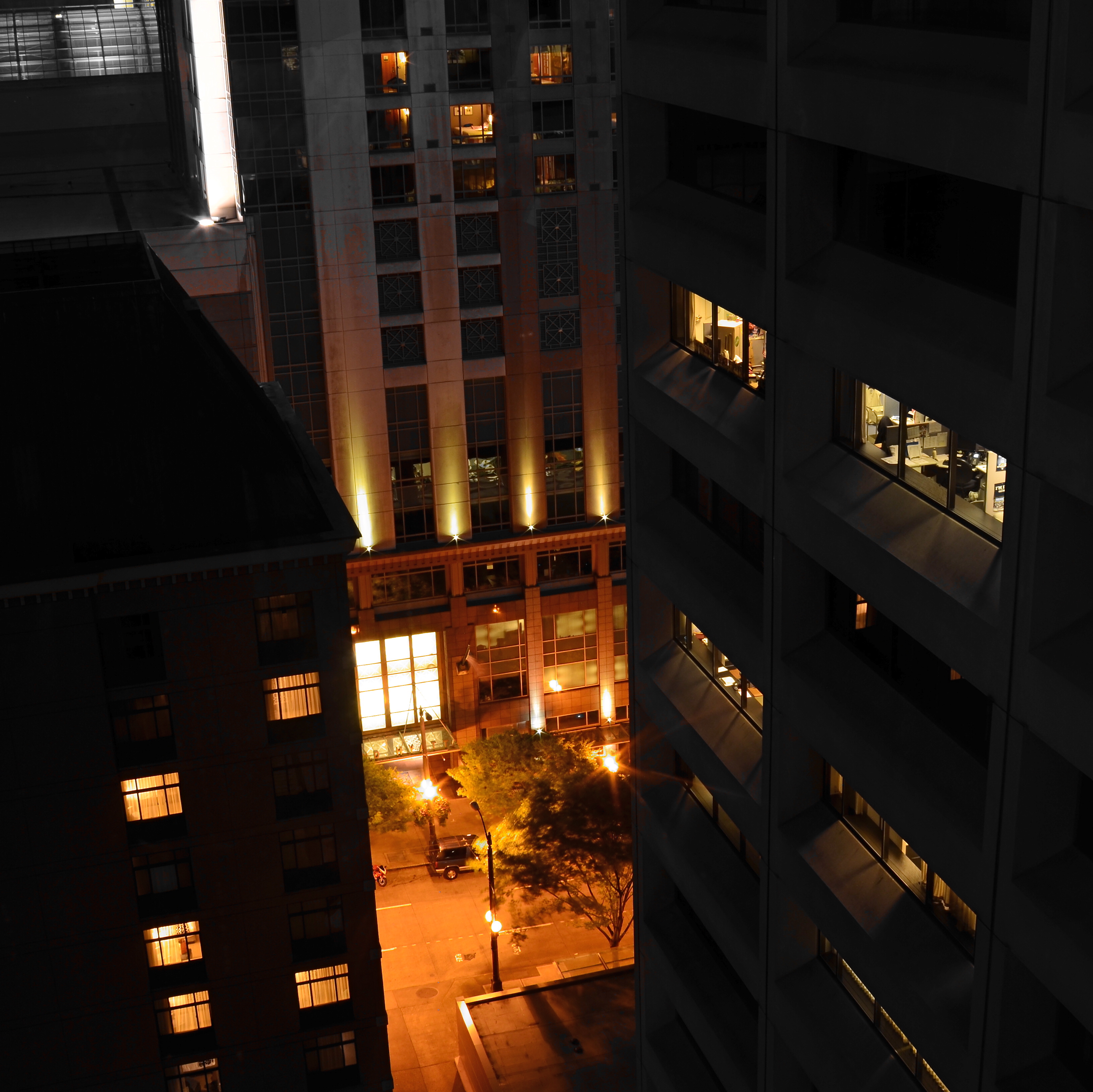
JOHANNES GUTTENBURG, THE MAN WHO DEVELOPED THE FIRST PRACTICAL SYSTEM FOR MOVABLE TYPE, is also said to have invented a kind of periscope, the better to peer over the teeming throngs at the local virgintennial festival. And while there is no record of what he was trying to see (or, more importantly, if he actually did see it), the longing to extend one’s vision around blind corners is one of the tantalizing mysteries of photography. The fact that we can’t make that 45-degree turn infuses many an image with a delicious kind of suspense.
Often when we compose a photo we imply the existence of a certain hidden something that the still image will forever shield from our detection. We photograph shadows that have no progenitors, streets that are halfway concealed by our shooting angle, and, always, the continuation of patterns and dramas that continue outside the boundaries of the frame. That frame has to be drawn somewhere, after all, and no matter how complete we attempt to make our stories within it, the imagination wants to stray toward whatever was “composed out” of the final product.
And therein lies one of the superb teases of our art. We can select scenes that deliberately torture the eye by denying access to What’s Over That Way or Where Does That Lead. We can abruptly rob the eye of the visual payoff for a conundrum that we ourselves have created. We can lie, cheat and steal. That is, I mean, who says you have to play fair with your viewer? Oh, you want me to tell you everything about this picture? Nuts. Figure it out yourself. Was it Colonel Mustard with a candlestick in the study, or….?
The master shot of the above image was a fairly typical out-the-window view from a hotel room, and originally ran a lot wider. Then it occurred to me that I could almost see something between the two buildings, and I re-cropped to make that “almost” the main part of the picture. Remaking the landscape view into a square introduced a little claustrophobia into the process, forcing the view exactly where I wanted it to hit. And finally, I desaturated all the colors in the shot except the orange of the sodium street lamps to amp up the glow in the aperture between the buildings.
I’m not suggesting that you intentionally make pictures with the sole purpose of messing with people’s minds. But, hee hee, you totally can. What’s around the corner? What’s up the street, beyond the curtain, just out of frame? Your picture, your game, your intentions. Take your audience’s eyes where you want them, and leave them there….between one choice and another.
COMPOSING ON THE RUN
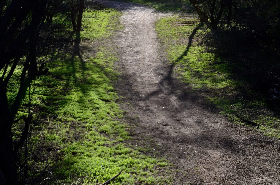
An instinctual snap: sunset light on a forest path. And that’s that….or is it?
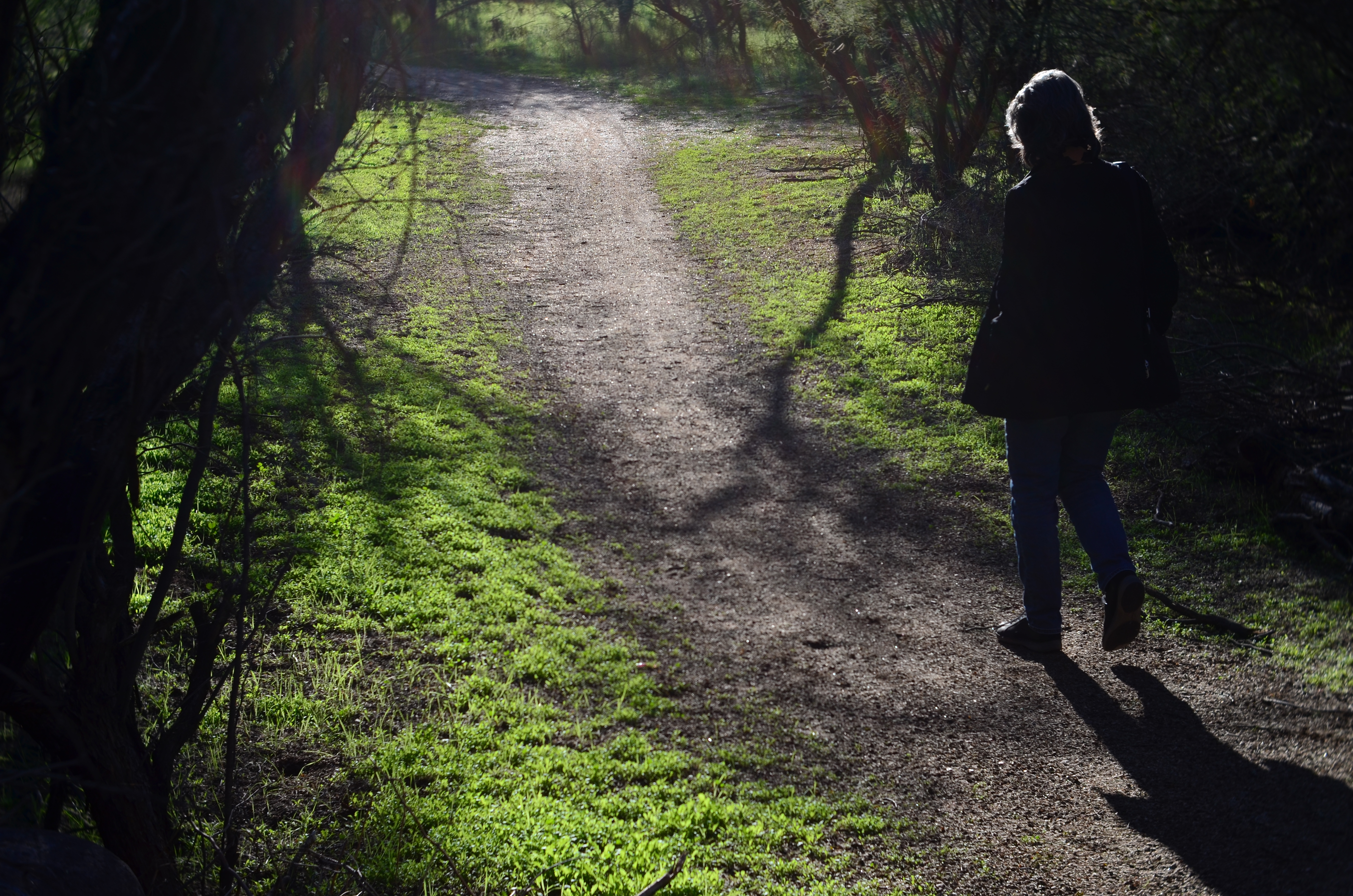
My wife enters the frame a second later.
By MICHAEL PERKINS
LOTS OF OUR BEST PHOTOGRAPHS ARE, EXCUSE THE EXPRESSION, snap judgements. Sometimes a composition simply seems to come fully formed, ready to jump intact into the camera, with no reasonable way to improve on a shot that is 99% pure impulse. Some of these gift moments are so seductive that we may not think to keep shooting beyond what we’ve perceived as the ideal moment. But more shooting may be just what we need.
She walks to the upper center of the image..
Images that involve very fast-moving events may only have one key instant where the real storytelling power of the shot comes to a climax, with everything after seen as progressively less dramatic. The second after a baseball is hit: the relaxed smile after the birthday candles are blown out. Think, if you will, of a straight news or journalism image. Every second after the Hindenburg explodes is less and less intense.
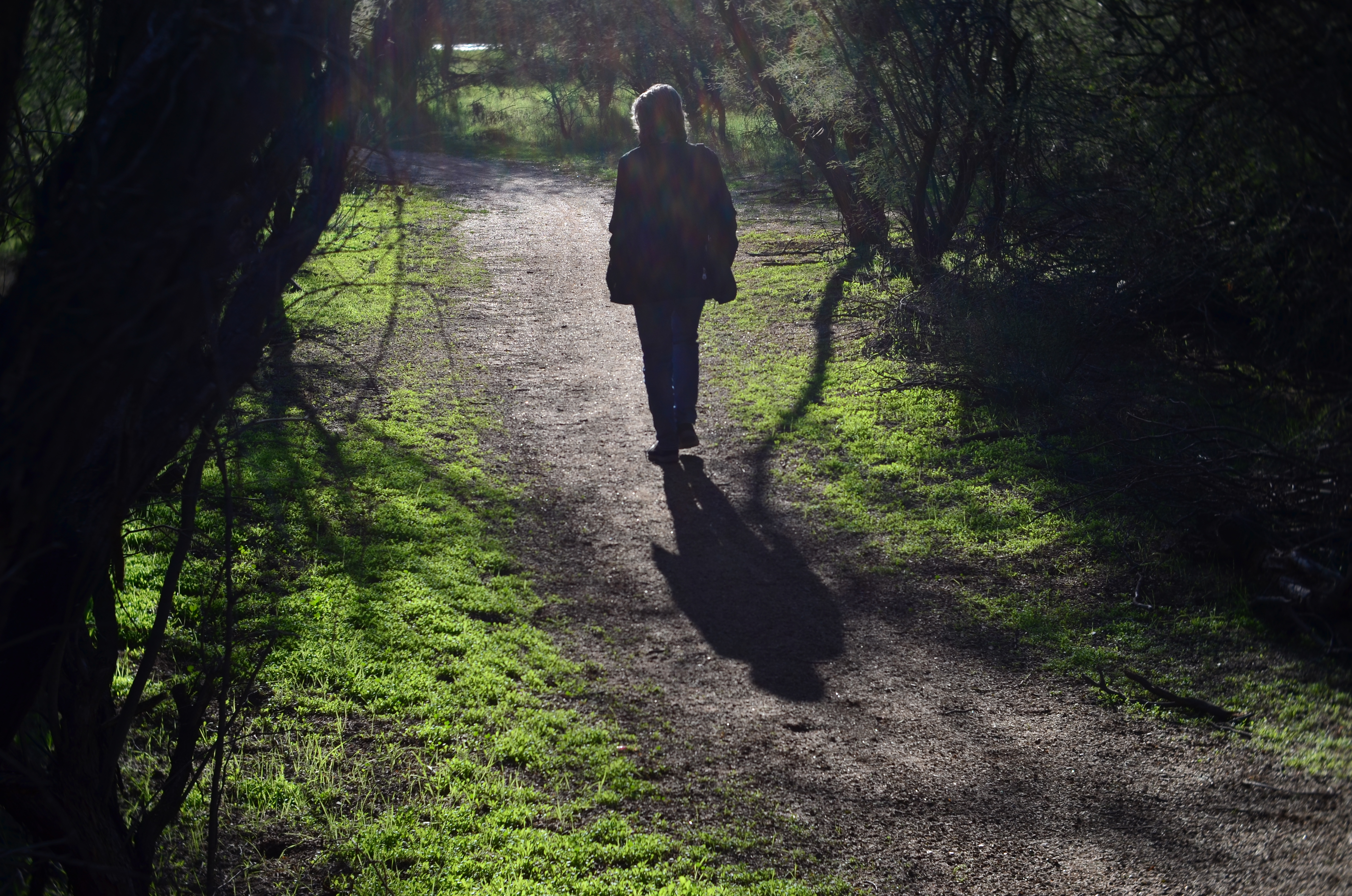
But many images can be re-imagined second-by-second, with additional takes offering the photographer vastly different outcomes and choices. In the series shown here, I originally fell in love with the look of sunset on a wooded trail. My first instinct was that the receding path was everything I needed, and I shot the first frame not thinking there would even be a second. My wife, however, decided to walk into the space unexpectedly, and I decided to click additional frames every few seconds as she walked toward the shot’s horizon. She starts off in the lower right corner and walks gently left as she climbs the slight rise in the path, causing her hair to catch a sun flare in the second shot, and placing her in central importance in the composition. By the last shot, however, she is a complete silhouette at the top of the frame, taking her far enough “up” to restore the path to its original prominence with her as a mere accent.
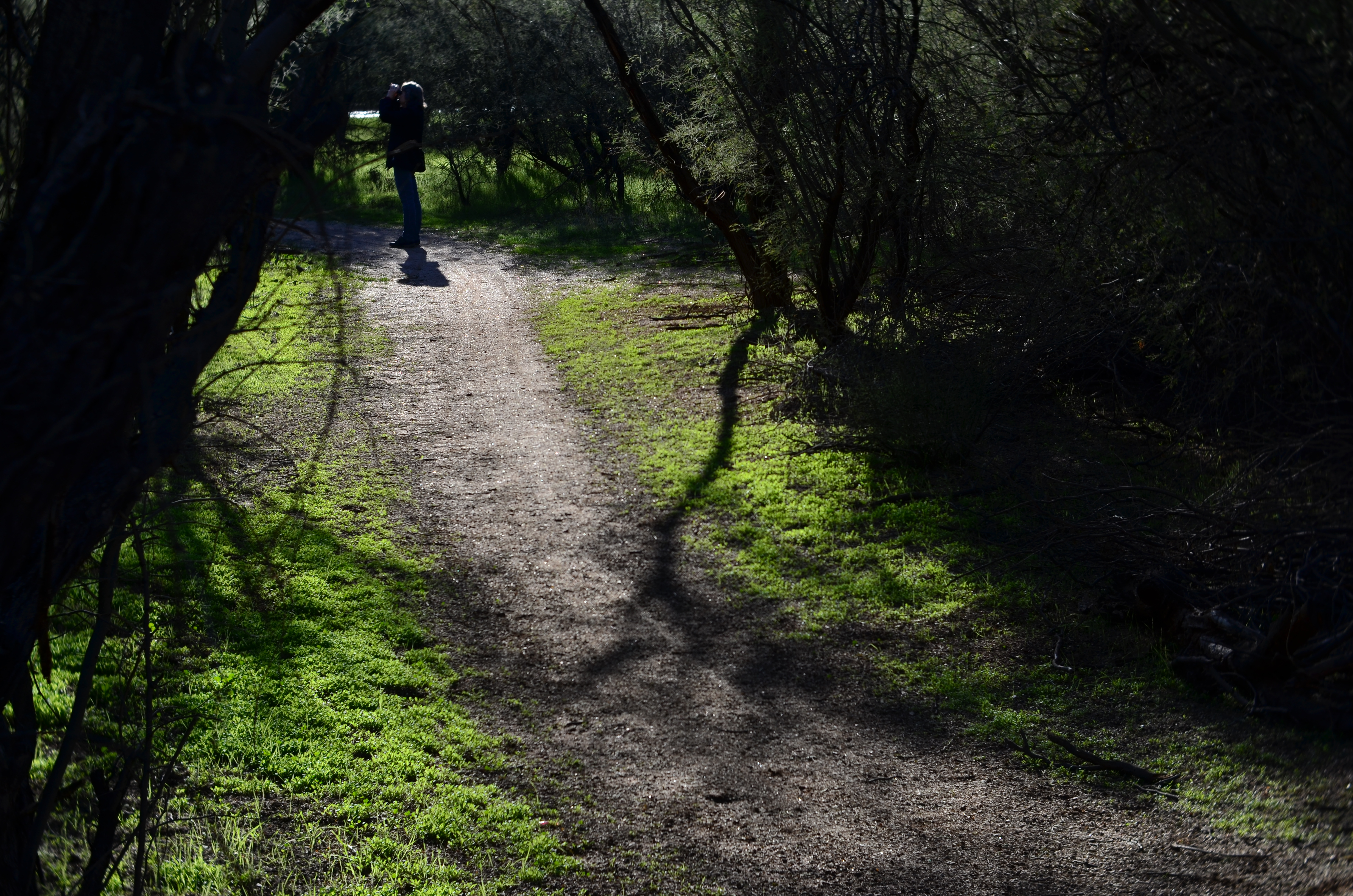
and finally comes to rest as a mere decorative accent/ The trail is now nearly empty once again.
Which shot to take? Anyone’s call, but the point here is that, by continuing to shoot, I had four images to choose from, all with very individualized dynamics, none of which would have been available to me if I’d just decided that my first shot was my best and settled. There will be times when the fullest storytelling power of a photograph is all present right there in your first instinctive snap. When you have time, however, learning to compose on the run can force you to keep re-visualizing your way to lots of other possibilities.
EYEWITNESSED AND UNDERLINED

Does the use of selective focus in this image disqualify it as a “news” photo?
By MICHAEL PERKINS
IT WASN’T LONG AFTER THE INTRODUCTION OF PHOTOGRAPHY that one of the biggest and most durable myths about the new art was launched to generally unquestioning acceptance. The line “the camera doesn’t lie” attached itself to the popular imagination with what seemed the purest of industrial-age logic. Photographs were, to the 19th-century mind, a flawless record of reality, a scientifically reliable registration of light and shadow. And yet the only thing that moved as quickly as photography itself was the race to use the camera to deliberately create illusion, and, eventually, to serve the twin fibbing mills of propaganda and advertising. The camera, it turned out, not only could lie, but did do so, frequently and indetectably.
Later, as photojournalism came into its own, the “doesn’t lie” myth seemed to drape news coverage in some holy mantle of trustworthiness, as if every cameraman were somehow magically neutral in the way he shot an event. This, in spite of the obvious fact that, merely by changing composition, exposure, or processing, the photographer could alter his image’s impact…..its ability to, in effect, transmit “truth”. Certainly, outright fakery got better and better, but, even without deliberately trying to falsify facts, the news photographer still had his own personal eye, an eye which could easily add bias to a seemingly straightforward picture. Did this proclivity make his pictures “lies”?
As a point of discussion, consider the above photo, which is, fundamentally, a document of part of an actual event. But what can really be learned from what’s in the frame? Are there thousands at this rally, or do the attendees shown here constitute the entire turnout? Are all those on hand peaceful and calm, or have I merely turned my lens away from others, immediately adjacent, who may be screaming or gesturing in anger? And how about my use of selective focus with the girl in pink? Am I simply calling attention to her face, the colors in her outfit, her sign, her physical posture… or am I trying to make her argument for her by using blur to make everyone else seem less important? Am I an artist, a reporter, a liar, or all three?
Here’s the thing: since I don’t make my living as a journalist, I can choose any or all of those three job titles without fear of conflict. I work only for myself, so I make no claim for the neutrality of my coverage of anything, including landscapes, still lifes and portraits. I likewise make no guarantees of objectivity in what I regard as an art. Only the observer can decide whether the camera, or I, have “lied”. We repeat this mantra frequently, but it bears clear emphasis: photographs are not (mere) reality. Never were, never can be.
Good thing or bad? You literally take that determination into your own hands.
WORKS IN PROGRESS
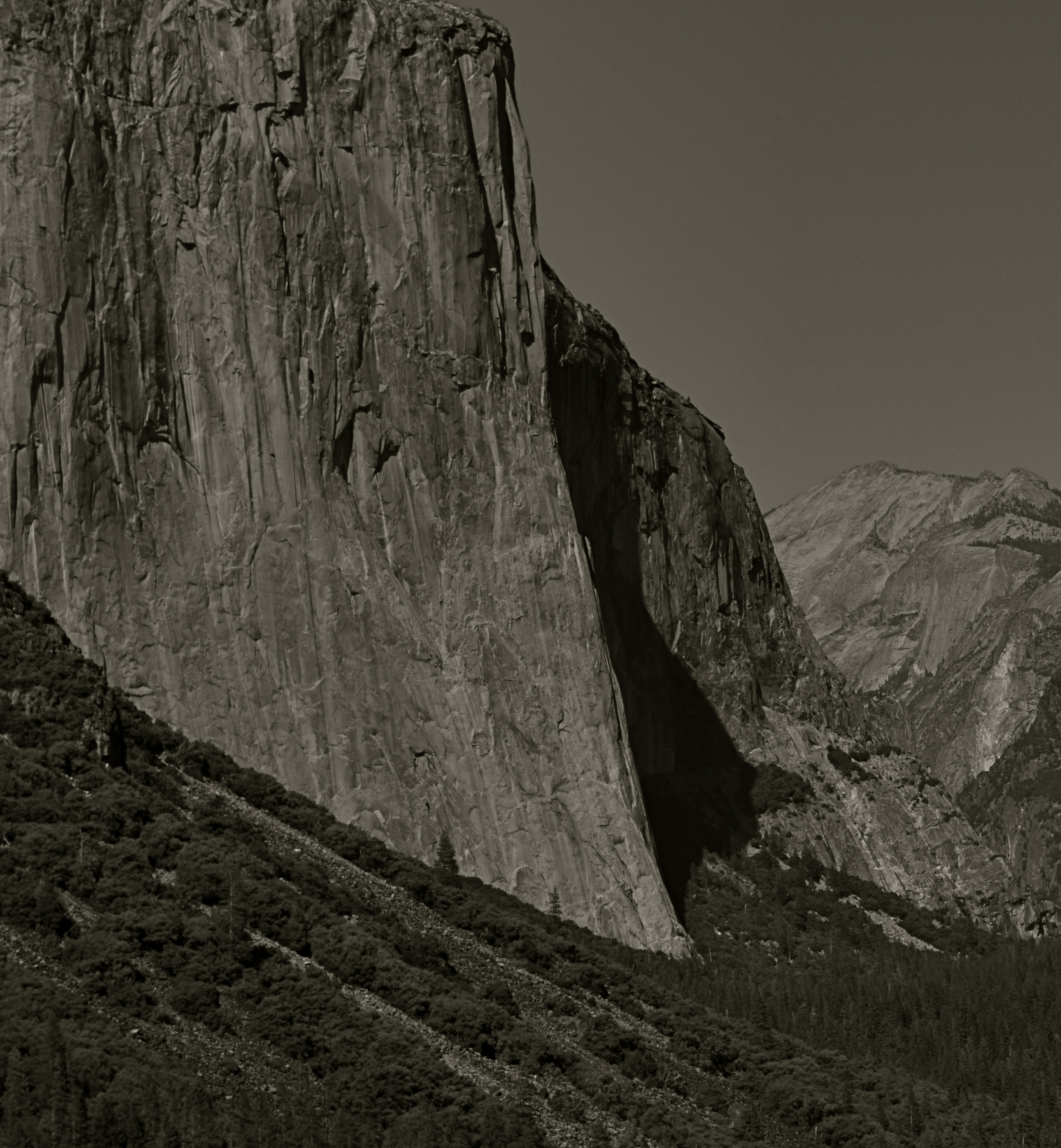
This view of El Capitan in the Yosemite Valley has been annually tweaked with various editing tools since being taken in 2012.
By MICHAEL PERKINS
IN REVIEWING YOUR PAST PHOTOGRAPHIC WORK, you are bound to find shots that you have, for lack of a better term, outgrown. Unpack that word, and what you’re really seeing is the passage of time since you originally visualized a picture, along with the immense distance your eye and mind have traveled en route to the present day. Thus you are both benefitting and suffering from the luxury you enjoyed in being allowed to freeze time. You have not only immobilized a moment, but you have also preserved a record of what your “best practices” were at the time.
This painful but necessary re-assessment applies not only to the techniques used to create the initial image, but, in the incredibly speedy evolution of post-processing, all editing systems as well. Quite simply, if a picture is worth taking, it is worth fighting for…first by being as mindful and deliberate as possible in the taking, and then in a constant re-evaluation of how best to enhance its impact through editing. Therefore, if the first commandment of photography is Always Be Shooting, the second should probably be Never Stop Processing.
The above image is an example of this continuing dialogue. it was originally taken in 2012 and I have revisited it at least annually since then. At the time I first shot it, it was part of a three-shot bracket of exposures that were originally blended in an HDR program to try to get about the same degree of detail in both highlights and shadows….a look which can look great if done with a maximum of understatement, but which often winds up looking like an old Yes album cover under black light. From HDR, I moved on to a series of detail-enhancing programs which were more natural-looking, but still failed to deliver the punch I got from viewing the scene on-site. In one iteration, I added enhancement to a single shot alone, rather than a combination of all three bracketed images. And in 2016, I went back to the trio, mixed this time in an Exposure Fusion blender. And there’s no end in sight.
Ansel Adams, of course, famously re-visited his master negatives with up to a dozen re-mixed versions of the same scenes over decades, re-thinking his own revolutionary “zone system” for measuring exposure for every single particle of a subject, then mastering its application in the lab via burning, dodging and other means of print manipulation. I don’t work with those particular (and essentially film-based) techniques for several reasons, most of them economic. However, that still leaves me plenty of editing choices, with more gimcracks coming online every day.
Point is, pictures that are truly worth working for are also worth re-thinking, and a growing array of tools can give photographers endless ways to re-mix the hits. Of course, you will eventually come to a point where enough is enough. Historically, it’s a good thing that the Pope gave Michelangelo a deadline, or else he’d still be up on that ceiling.
POUNDING NAILS WITH A SCREWDRIVER
Ten feet out with a 56mm that shoots like an 85mm. Little cramped.
By MICHAEL PERKINS
IF YOU HAD ONE OF THOSE DADS WHO PURCHASED A SET OF “DO IT YOURSELF” ENCYCLOPEDIAS in the 1950’s, hoping to become some kind of amalgam of Edison and St. Joseph The Carpenter, you no doubt encountered some sort of Page One admonition to always get “the right tool for the job”. In other words, don’t use a screwdriver to pound nails. I successfully resisted the seductive gospel of Being Handy Around The House, but then found, in photography, that the same rule applies, at least as regards lenses. Right glass, right results, right?
Of course, unless you habitually lug the accumulated wisdom of 200 years of shutterbugging and its attendant gear along with you on a daily basis, you’re likely to get into situations where the lens you have readily at hand won’t allow you to do the thing you just decided to try. It’s back at the hotel, back in the parking lot, back at Alpha Centauri, wherever. Thing is, the thing you want is here, right in front of you, leaving one simple chance. Shoot or don’t.
Nearly the same front to back distance, but at a slight diagonal.
I recently wandered, on a weeklong practice run for a new Lensbaby Velvet 56, a manual prime lens that equates, on a full sized DSLR sensor, to about 85mm or so. Perfect for portraits, but very, very cramped for general street work. The Velvet, as its name implies, imparts a soft, gauzy layer over top of a sharp image at apertures wider than about f/5,6. From there to the upper stops, it behaves like a regular prime without the softer effect. The temptation is strong to limit its use to flattering portraits. But that vanishes, however, when you see what marvelous cushiness it confers on the hard textures you find in buildings. It creates a romantic, dreamy look for concrete, plaster, and stone, and so, since I had no other lens at the ready on this particular walkout, I decided to try a few street shots with it.
First problem: this thing can make a tight composition look absolutely claustrophobic. One cure is to walk way back to open up the shot; another is to try a diagonal or oblique angle to widen things out. Of course, since 85mm is treading close upon telephoto territory, the front-to-back information will be somewhat compressed; the distances which seem natural to your eye from 35 to 50 mm seem smashed in at 85. However, since we are shooting for the velvety effect with this lens, compromise is already the name of the game, so angle of composition becomes a partial fix. The feel from ten feet away, seen in the head-on top shot, seems pretty confined, whereas in the second shot, taken about twelve feet at a slight diagonal, the shot is snug but not uncomfortable.
The Velvet 56 is actually remarkably versatile, since, in addition to serving as a great portait lens and a nice landscape glass, it also macro-focuses to about 5 inches, allowing you to work more and switch out less. As always, it’s not so much what a given lens was primarily designed for but what you choose, perhaps out of desperation, to do with it.
Turns out some screwdrivers make pretty fair hammers, after all….
BREAKING THE GEOMETRY
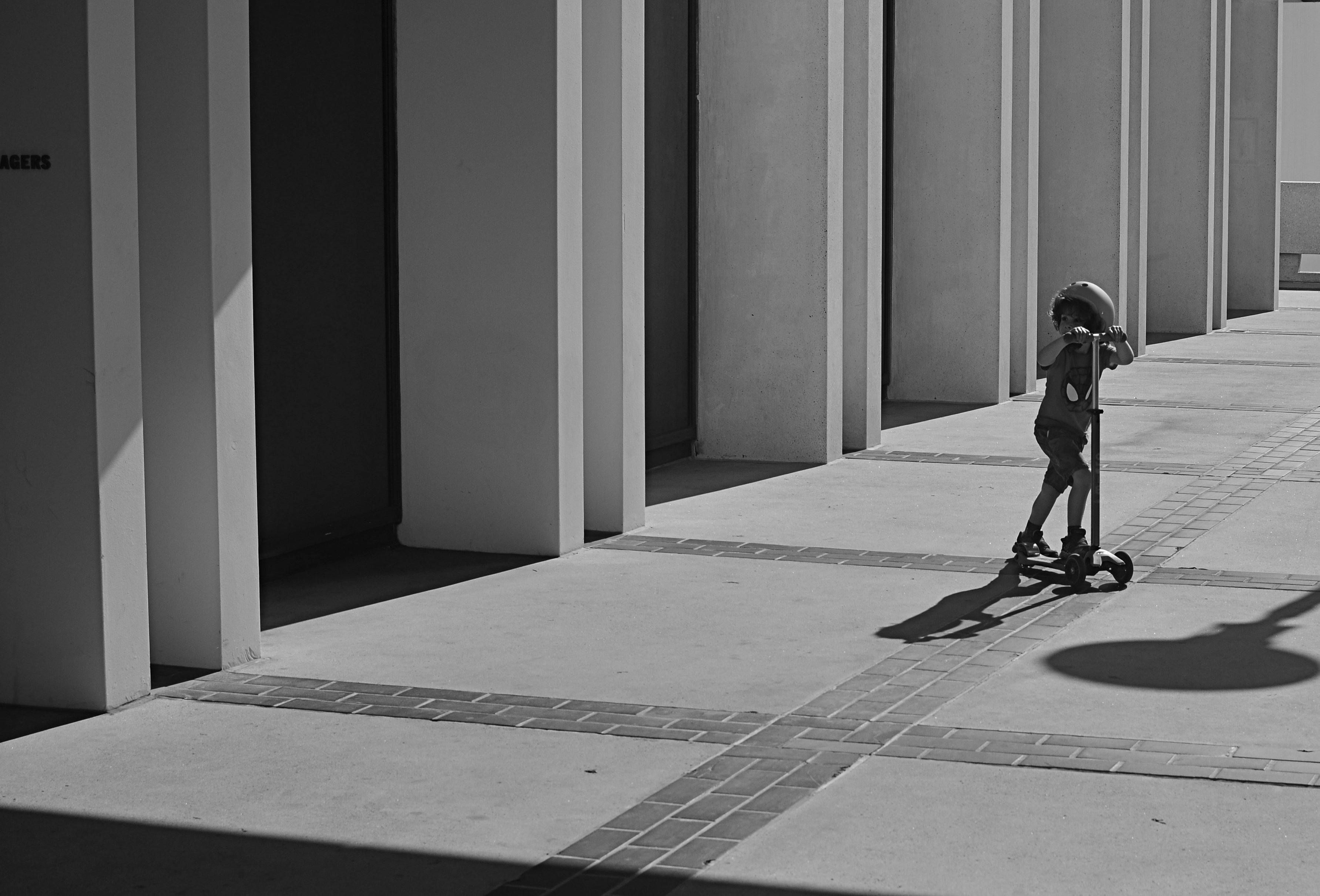
Zoom (2016)
By MICHAEL PERKINS
CONTRAST IN PHOTOGRAPHY IS NOT JUST ABOUT A COMPARISON BETWEEN DARK AND LIGHT VALUES. The word contrast also applies to things placed next to each other in a composition that fight for dominance. Happy faces next to sad. Images of wealth and opulence juxtaposed with poverty and misery. Some of it can be a kind of forced irony, and, as such, can produce pictures that get a little preachy, or appear deliberately staged.
I love urban architecture because many of its design elements are enough to create a compelling image all by themselves….that is, without the larger context of what’s around them. They don’t have to be about anything; they just are. Contrast isn’t needed in many cases, because I’m not trying to show mankind’s place versus the space of a building…..I’m just seeking absolute patterns. No comment, no message.
Occasionally, however, it’s great to invade all those clinical lines and angles with a bit of humanity, to break the geometry and inject something warm or whimsical. It doesn’t have to be deliberate and it doesn’t have to be amped up with busy staging. The best contrast shots between disparate elements are the ones that you simply witness.
In the above image, the boy on the scooter is neither a “bad” nor “good” subject, but he gains a little amplitude because of his odd placement amongst the more antiseptic surrounding textures. The shot also worked a little better in monochrome because, in the original shot, the boy’s shirt was so vivid that it drew too much attention to that part of the picture.
Photographers benefit from a million tiny collisions between seemingly opposed subjects every single day. Learning which ones to isolate and massage into pictures can be an enjoyable detective game.
BOATS AGAINST THE CURRENT
Act Of Faith #265 (2016)
By MICHAEL PERKINS
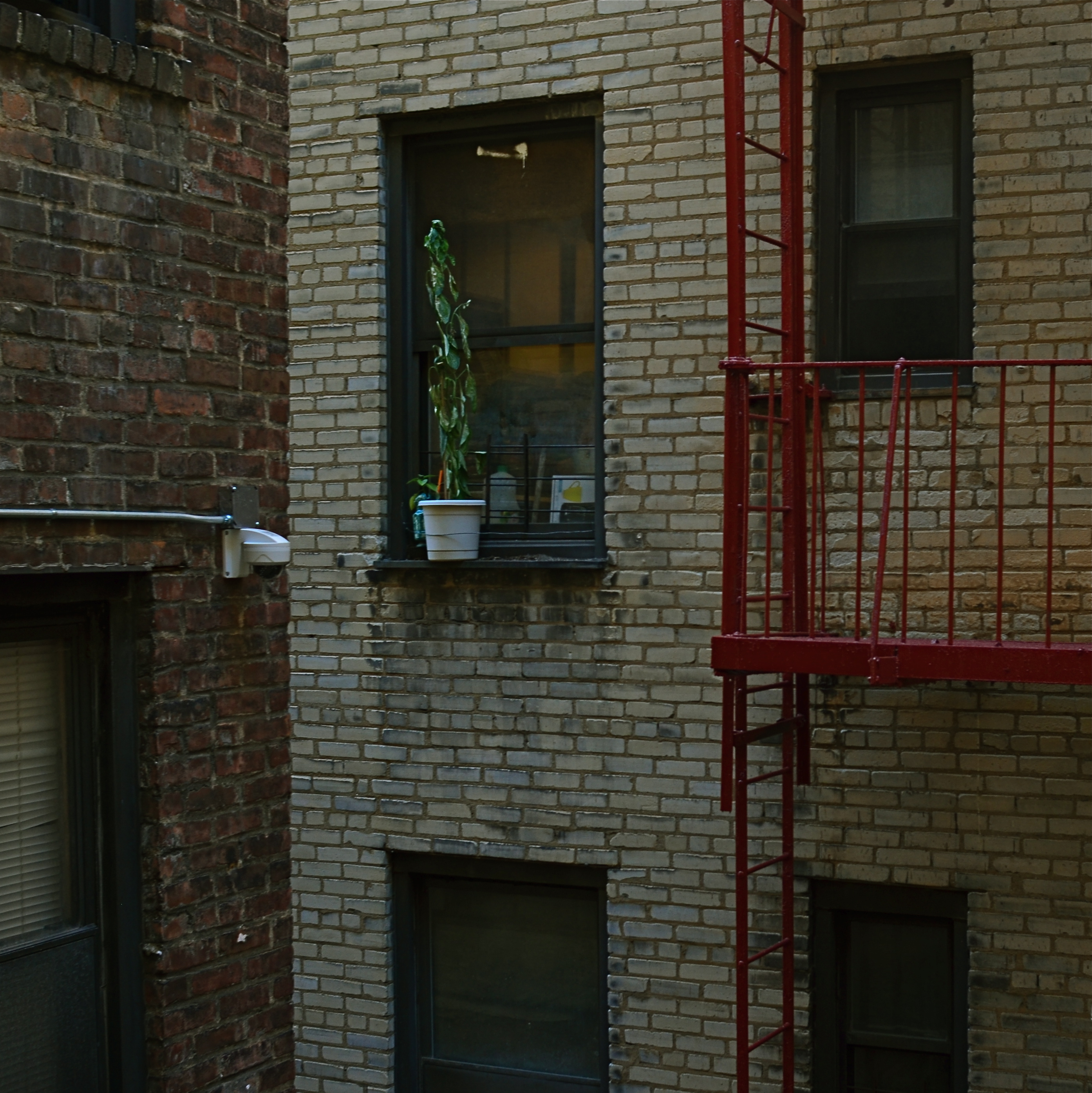
THE LATE STUDS TERKEL’S BOOKS created almost a category of their own, collecting memoirs from across the length and breadth of American experience and class in essential essays like Working, The Good War, and Hard Times. Traveling the length and breadth of the nation for over forty years, Terkel interviewed the big and the small, the meek, the marginal and the mighty, as they recalled their individual experiences in the wake of massive historical events, from wars to depressions. For one of his final social montages, he spoke to people in their twilight years about their efforts to remain positive and engaged despite lives that had often proven challenging, even tragic.
Its title: Hope Dies Last.
Upon first seeing the book, I had to read it, partly because it was Studs, and partly because that title spoke to my own minor acts of faith in what I look for in photographs. Pictures are often testimony about people who cannot be seen, measured in the objects they care about, or in which they invest their hope. We have all seen the tenacity of wildflowers thrusting up between the fissures of cracked concrete, and appreciated, in the abstract, what that image says about the faith of the human animal. We capture pictures of places bombed to ruin, then testify with our cameras as they begin, once more, to lay a stone upon a stone. Building. Dreaming. Launching our boats against the current.
Hope dies last.
When I see a picture of something that, to me, symbolizes our collective refusal to knuckle under, I want to take it home with me. Because we need it. Now, yesterday, ever. We draw strength from that escapist wildflower, or a battered face upturned toward the light, or, as above, a potted plant defying the odds in a dark apartment air shaft. Someone decided to give that plant a chance…or, at least, to remind the grey walls and grimy brick that color and life are still around, still fighting for their shot.
Studs made his best case for the persistence of hope with the words of his interviewees. I find comfort in trying to find visual evidence of their actions. Either way, photographers can serve as conservators of hope.
If there’s a better gig to be had in this life, please let me know.
TIED FOR FIRST PLACE
By MICHAEL PERKINS
EVERY PHOTOGRAPH IS DISCUSSED LONG BEFORE IT IS VIEWED, with an inner dialogue between shooter and subject that is held, however briefly, ahead of the shutter click. Sometimes, at a fortuitous intersection of talent and luck, that is the end of the discussion; other times, there will be additional chats between the first version of an image and its maker, a talk that can be endlessly debated in the processing and editing phases. And, of course, based on those results, photographs finally make their arguments to the world at large.
The bulk of those discussions focus on what the center, or the essence of a picture should be. Were all elements in balance right out of the camera…in which case, frame it and hang it, case closed? Or (and what is far more likely), did we find that essence at all? Was it compromised, watered down, by faulty composition? Did we make a weak lighting choice here or there? Did execution weaken the effect?
Usually, there is a clear component within a photograph that cries here I am a little louder than all the other parts of it. But sometimes, there are two or more pieces which feed on each other, boost each other’s effectiveness. In such cases, instead of one primary piece and a lot of secondary or extra pieces, you find two things in the photo that are basically tied for first place. When one thing in a picture feels diminished without interacting with another, both elements deserve to stay.
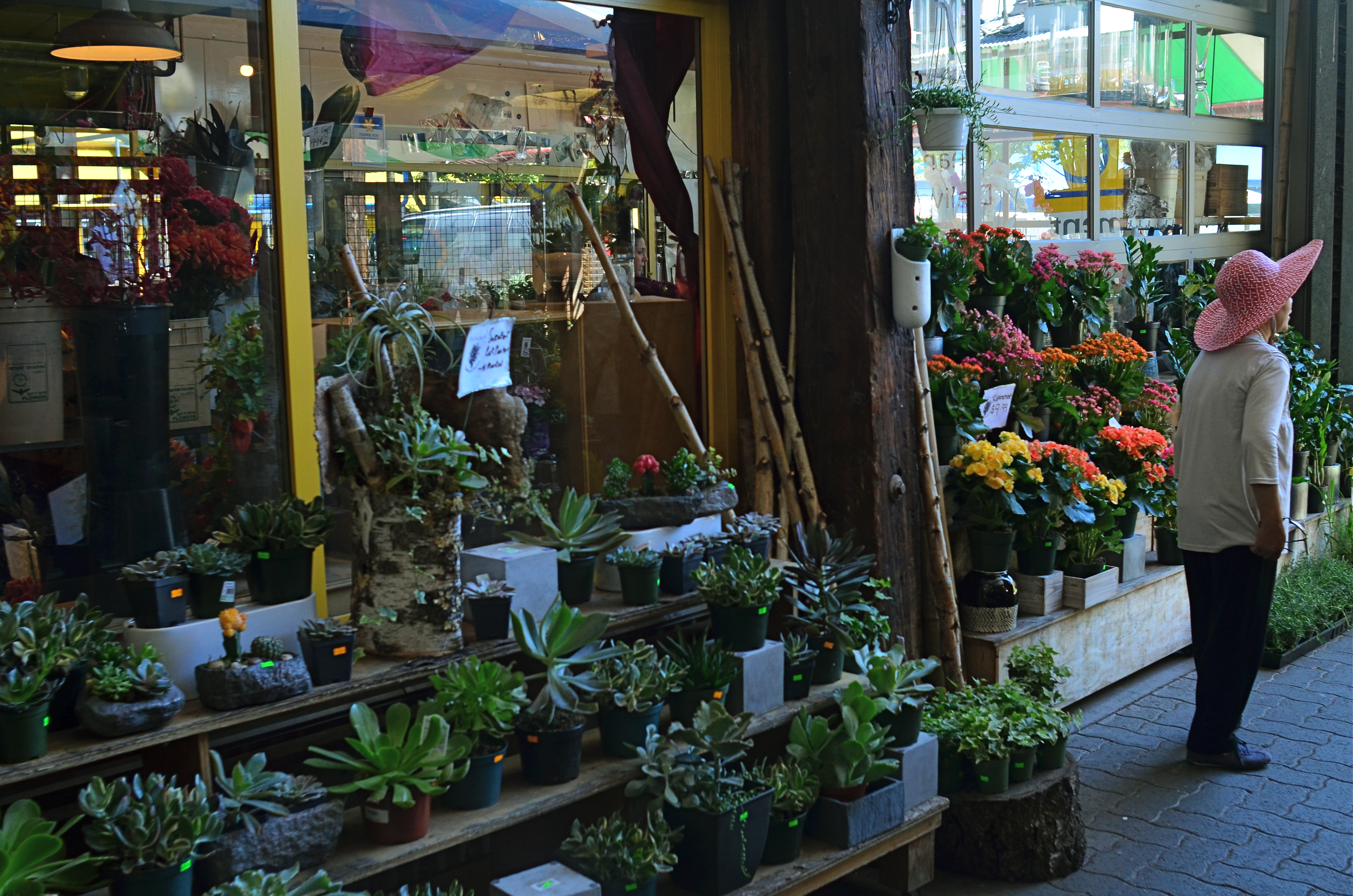
Mrs. Lin’s Summer Bonnet (2016)
The picture at the top seems, to me, to be just such a case. The floral shop and its faceless proprietor seem somehow married to each other, two halves of a whole. And, while I can conceive of making two separate pictures from the master shot in which either the shop’s inventory or the saleslady are in solo starring roles, they truly do seem interdependent, so I declare a tie, and they both go to the finals.
Thus the discussion on what to include in the picture has gone on for at least two layers, with layer one being the planning of the photo, and layer two being the editorial decision to keep both flowers and florist on equal footing in the final image. Look over your own pictures and you will no doubt find several of these “tied for first place” compositions. It can seem counter-intuitive to have more than one main point in an image. But the image itself will tell you, unmistakably, when that actually make the most sense.
MAKE IT SO
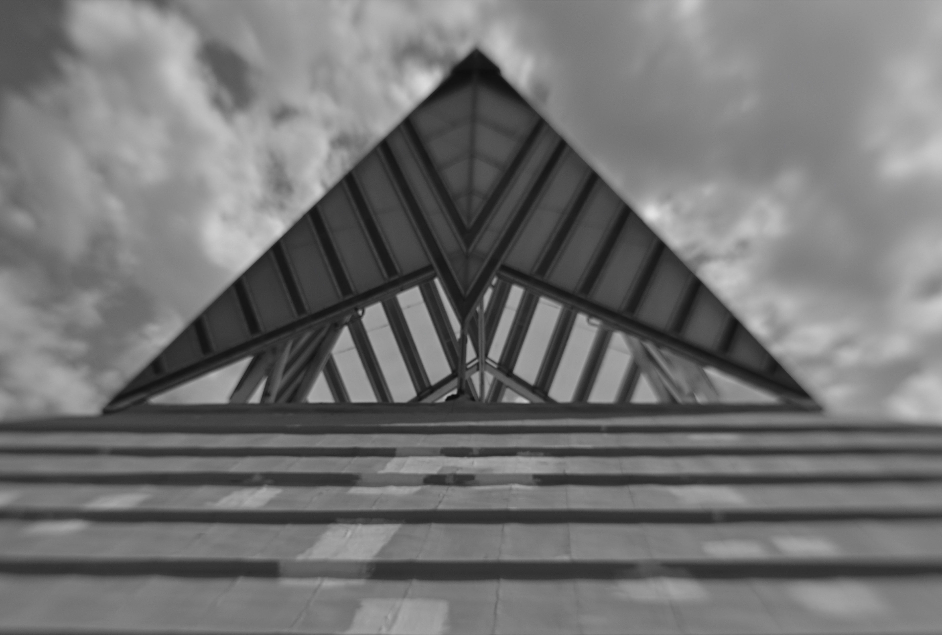
I’ve been photographing this for years, and I still don’t know what I think about it. Needs more work….
By MICHAEL PERKINS
WHEN PHOTOGRAPHY IS PURELY REPORTORIAL, as it is in journalism or documentation, it sticks pretty close to the accepted state of the world. It tries to depict things plainly and without comment; it delineates and defines; it shows us the true dimensions of events.
But when the same technology is used interpretively, there is no absolute “real”, no pure authenticity, other than what we choose to show. It is in re-purposing the world visually, shaping and framing it as we choose, that we can confer meaning on it pretty much at our whim. That’s where the “art” part comes into what would otherwise be a merely technical measurement of light. We not only choose our subject….we set the conversation about it. Simply stated, what you shoot is about whatever you decide it’s about.
Even with hyper-familiar objects, things seen and re-seen to the point that they are iconic (think Empire State Building) images can re-set the way we take those objects in. And, in the case of what I like to call “found objects”, such as the image seen at the top, the photographer is completely unfettered. If your viewer’s eye has no prior mental association with something, you’re writing on a blank sheet of paper. You can completely dictate the terms of engagement, imbuing it with either clarity or mystery, simplicity or symbolism.
I have always been flat-out floored by photographs that take me on a journey. Those who can conjure such adventures are the true magicians of the craft. And that’s what I chose to play in this arena over a lifetime. Because, when photography liberates itself from mere reality, it soars like no other art.
THE UNREAL REAL
No, this isn’t a picture of the “real world”. And might that not be freeing, in a way?
By MICHAEL PERKINS
I’M A PHOTOGRAPHER, AND YET I CANNOT TELL YOU WHAT “REALITY” IS.
I point machines at the world and I get some kind of recording of light and shadow. Is what I get a literal translation of the way something, at least for an instant, really was? How did my composition, which necessarily had to leave out some things in order to include others, alter the complete truth of a scene? How did my selection of a lens, a time of day, the place where I stand, my own mood effect the outcome? And, if this machine, this recorder does not actually show “reality”, does that make me more of an artist, or less of a technician?
The world as we see it is never mere visual “evidence”. It comes to us filtered through every personal trait that shapes our ability to observe in the first place. Then we, in turn, filter that subjective experience into an even greater abstraction, shoving it through a lens that adds its own biases, limits, or flaws. So what comes out the other end? Should we even be worried that a photograph can’t be real? Might we not, in fact, be relieved to be freed from the constraints of the actual, just as painters and sculptors always have been?
The above image was taken by a person who stood in a particular place at a particular time with a specific piece of optical equipment and decided that the resulting balance of visual elements constituted a “picture”. That selection of a single part of a single moment will either convey a similar feeling to someone else, or it won’t. That’s what we uncertainly refer to as “art”, and, whether we like the terms of engagement, those “really” are the terms. Reality is beyond our reach.
But a commentary on it isn’t.

STREETER THAN THOU
When people are mere compositional components in a scene, is that still “street photography”?
By MICHAEL PERKINS
ONE OF MY FAVORITE JOKES ABOUT HOW HUMANS END TO OVER-THINK THINGS involves a farmer standing by the side of the road with a herd of cattle, who is greeted by a passing urban tourist. “Excuse me”, says the visitor, “are those Herefords or Guernseys?” “Gee”, replies the farmer, “I just call ’em ‘moo-cows’!”
Similarily, I sometimes think that the weighted term street photography is more distinction than difference. City, country, street, pasture…hey, it’s all just pictures, right? Yes, I know….”street” is supposed to denote some kind of commentary, an interpretive statement on the state of humanity, an analysis on How We Got Here. Social sciences stuff. Street work is by nature a kind of preachment, born as it was out of journalism and artists like Jacob Riis and Lewis Hine, who used images to chronicle the city’s ills and point toward solutions. For these geniuses and so many that followed, those street scenes rested fundamentally on people.
And by people, we mean discernible faces, unposed portraits that seared our souls and pricked our consciences. Street photography came to focus almost solely on the stories within those faces: their joy, their agony, their buoyant or busted dreams. In my own work, however, I am also drawn to street scenes where people are not front and center, but blended into the overall mix of elements, props, if you like, in an overall composition, like streetlamps, cars or buildings. There can be strong commentary in images that don’t “star” people but rather “feature” them. Walker Evans, one of the premiere shooters working for the New Deal’s Farm Security Administration, and creator of many classic depictions of the Great Depression, remarked that folks, as such, were not his aim when it came to street shots. “I’m not interested in people in the portrait sense, in the individual sense”, he said in 1971. “I’m interested in people as part of the pictures….as themselves, but anonymous.”
There is always a strong strain of competition among photographers, and street photography can become a wrestling match about who is telling the most truth, drilling down to the greatest revelation….a kind of “streeter than thou” mentality. However, just because something is raw and real doesn’t make it interesting, or else we could all just shoot the inside of garbage cans all day and be done with it. Compelling is compelling and boring is boring and if you know how to make a picture that grabs the eye better than the next guy, then subject matter, even motivation, doesn’t matter a damn. The picture is all. The picture will always be all. Everything else is noise.
Share this:
January 7, 2017 | Categories: Americana, Commentary, Composition, Conception | Tags: Candids, documentary photography, Street Photography, Unposed | 3 Comments