DO MESS WITH MR. IN-BETWEEN
Slot Canyon (2016)
By MICHAEL PERKINS
JOHANNES GUTTENBURG, THE MAN WHO DEVELOPED THE FIRST PRACTICAL SYSTEM FOR MOVABLE TYPE, is also said to have invented a kind of periscope, the better to peer over the teeming throngs at the local virgintennial festival. And while there is no record of what he was trying to see (or, more importantly, if he actually did see it), the longing to extend one’s vision around blind corners is one of the tantalizing mysteries of photography. The fact that we can’t make that 45-degree turn infuses many an image with a delicious kind of suspense.
Often when we compose a photo we imply the existence of a certain hidden something that the still image will forever shield from our detection. We photograph shadows that have no progenitors, streets that are halfway concealed by our shooting angle, and, always, the continuation of patterns and dramas that continue outside the boundaries of the frame. That frame has to be drawn somewhere, after all, and no matter how complete we attempt to make our stories within it, the imagination wants to stray toward whatever was “composed out” of the final product.
And therein lies one of the superb teases of our art. We can select scenes that deliberately torture the eye by denying access to What’s Over That Way or Where Does That Lead. We can abruptly rob the eye of the visual payoff for a conundrum that we ourselves have created. We can lie, cheat and steal. That is, I mean, who says you have to play fair with your viewer? Oh, you want me to tell you everything about this picture? Nuts. Figure it out yourself. Was it Colonel Mustard with a candlestick in the study, or….?
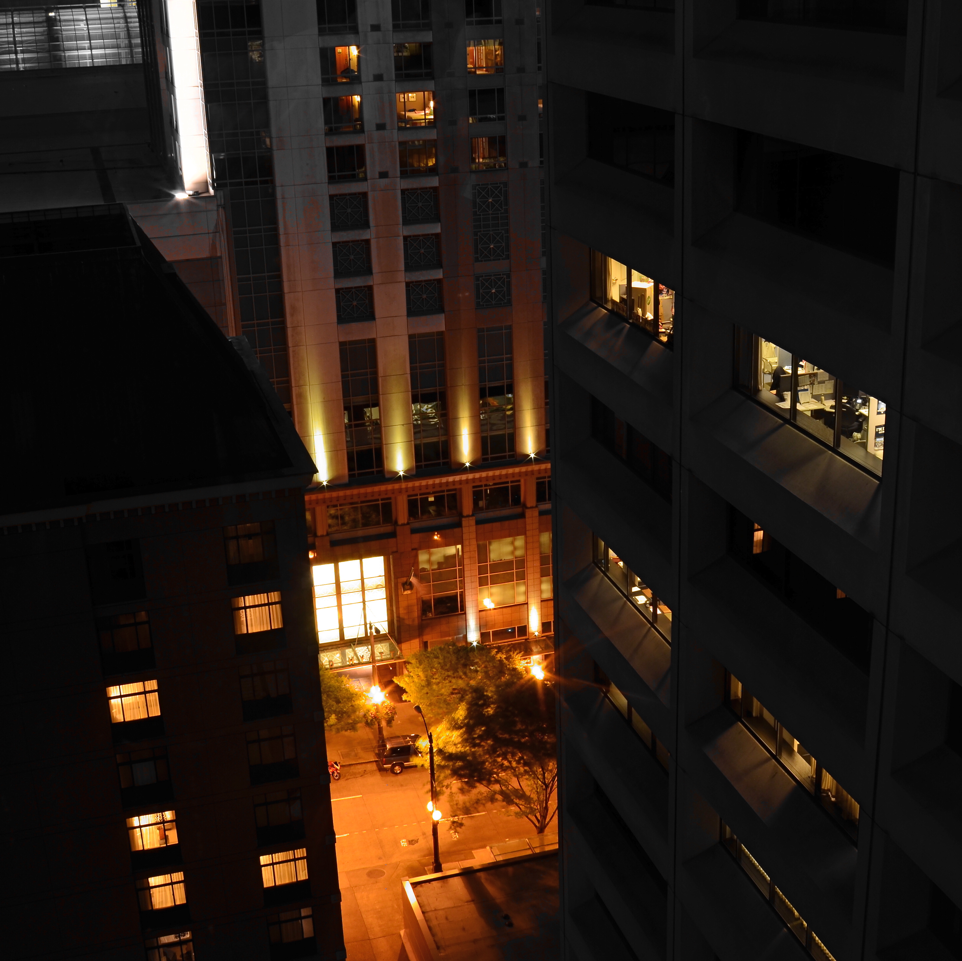
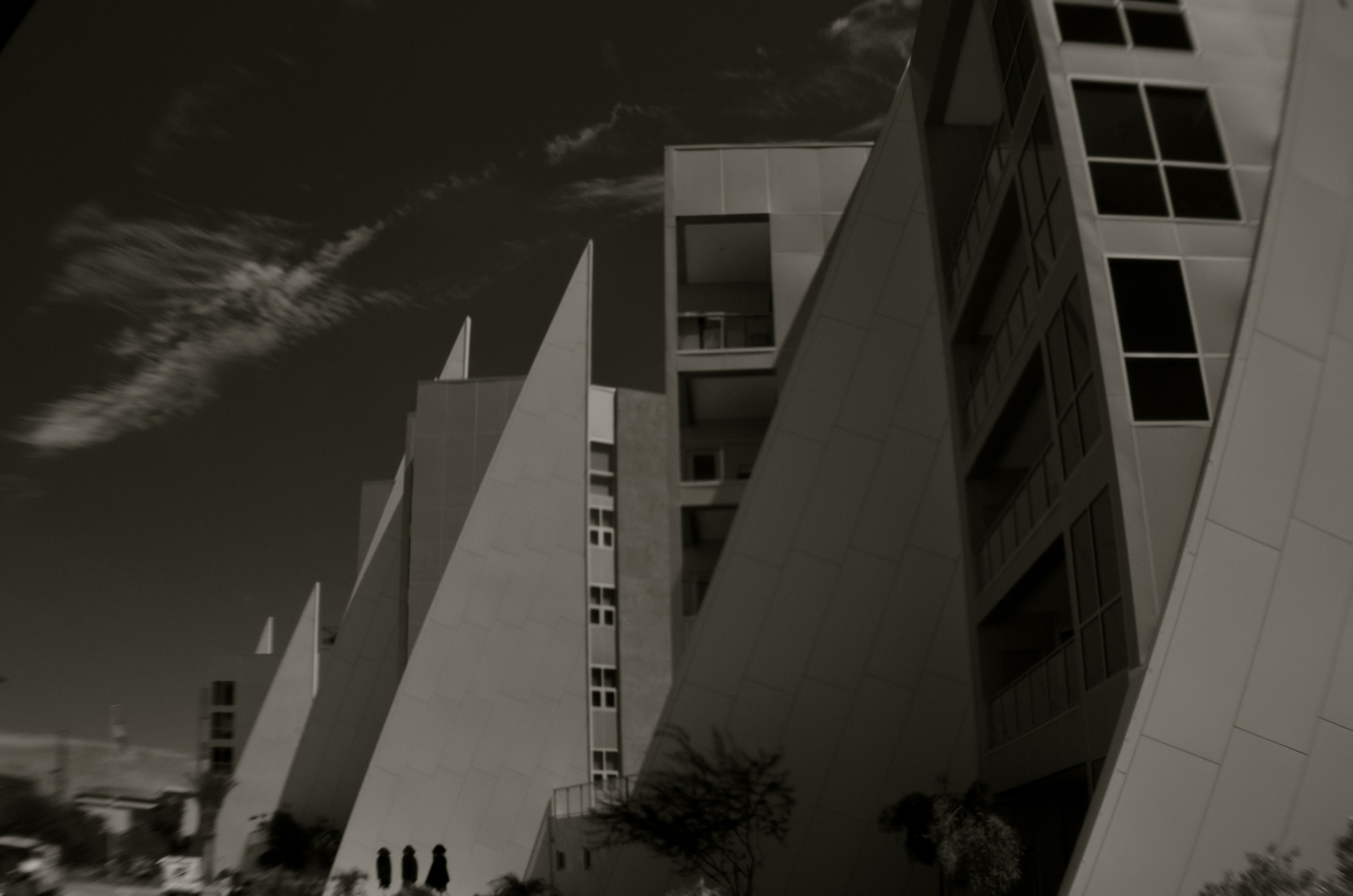
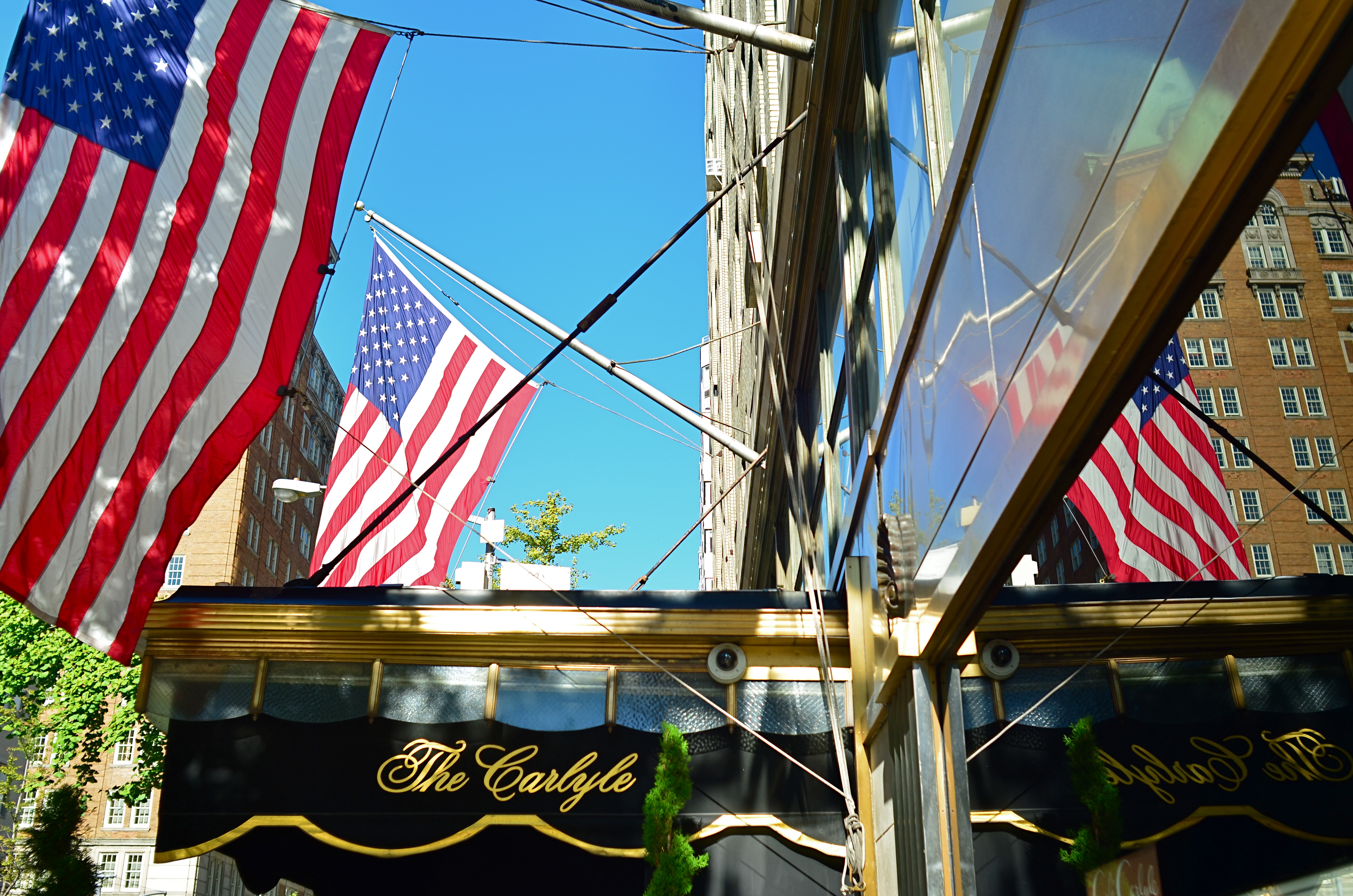
The master shot of the above image was a fairly typical out-the-window view from a hotel room, and originally ran a lot wider. Then it occurred to me that I could almost see something between the two buildings, and I re-cropped to make that “almost” the main part of the picture. Remaking the landscape view into a square introduced a little claustrophobia into the process, forcing the view exactly where I wanted it to hit. And finally, I desaturated all the colors in the shot except the orange of the sodium street lamps to amp up the glow in the aperture between the buildings.
I’m not suggesting that you intentionally make pictures with the sole purpose of messing with people’s minds. But, hee hee, you totally can. What’s around the corner? What’s up the street, beyond the curtain, just out of frame? Your picture, your game, your intentions. Take your audience’s eyes where you want them, and leave them there….between one choice and another.
COMPOSING ON THE RUN
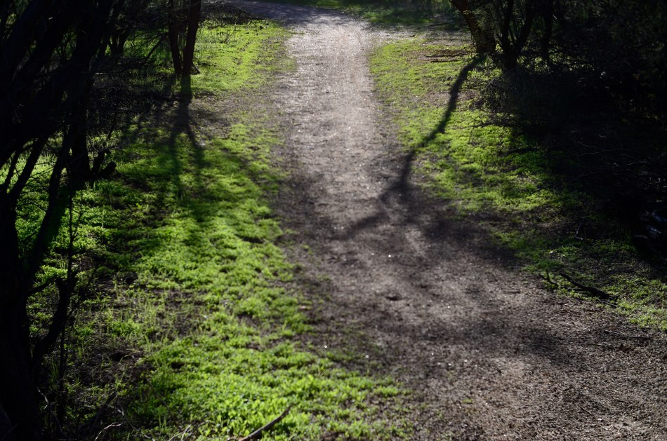
An instinctual snap: sunset light on a forest path. And that’s that….or is it?
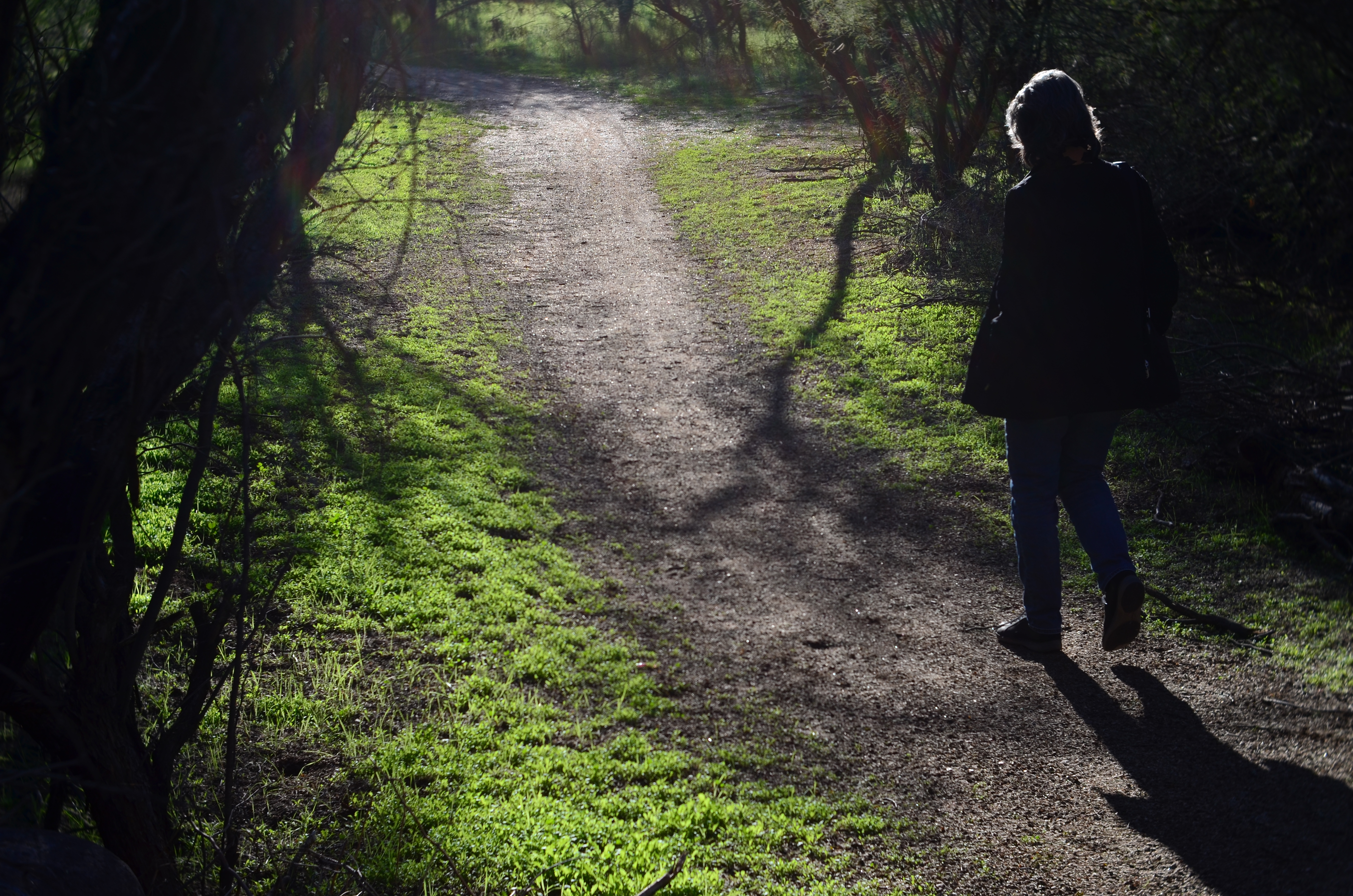
My wife enters the frame a second later.
By MICHAEL PERKINS
LOTS OF OUR BEST PHOTOGRAPHS ARE, EXCUSE THE EXPRESSION, snap judgements. Sometimes a composition simply seems to come fully formed, ready to jump intact into the camera, with no reasonable way to improve on a shot that is 99% pure impulse. Some of these gift moments are so seductive that we may not think to keep shooting beyond what we’ve perceived as the ideal moment. But more shooting may be just what we need.
She walks to the upper center of the image..
Images that involve very fast-moving events may only have one key instant where the real storytelling power of the shot comes to a climax, with everything after seen as progressively less dramatic. The second after a baseball is hit: the relaxed smile after the birthday candles are blown out. Think, if you will, of a straight news or journalism image. Every second after the Hindenburg explodes is less and less intense.
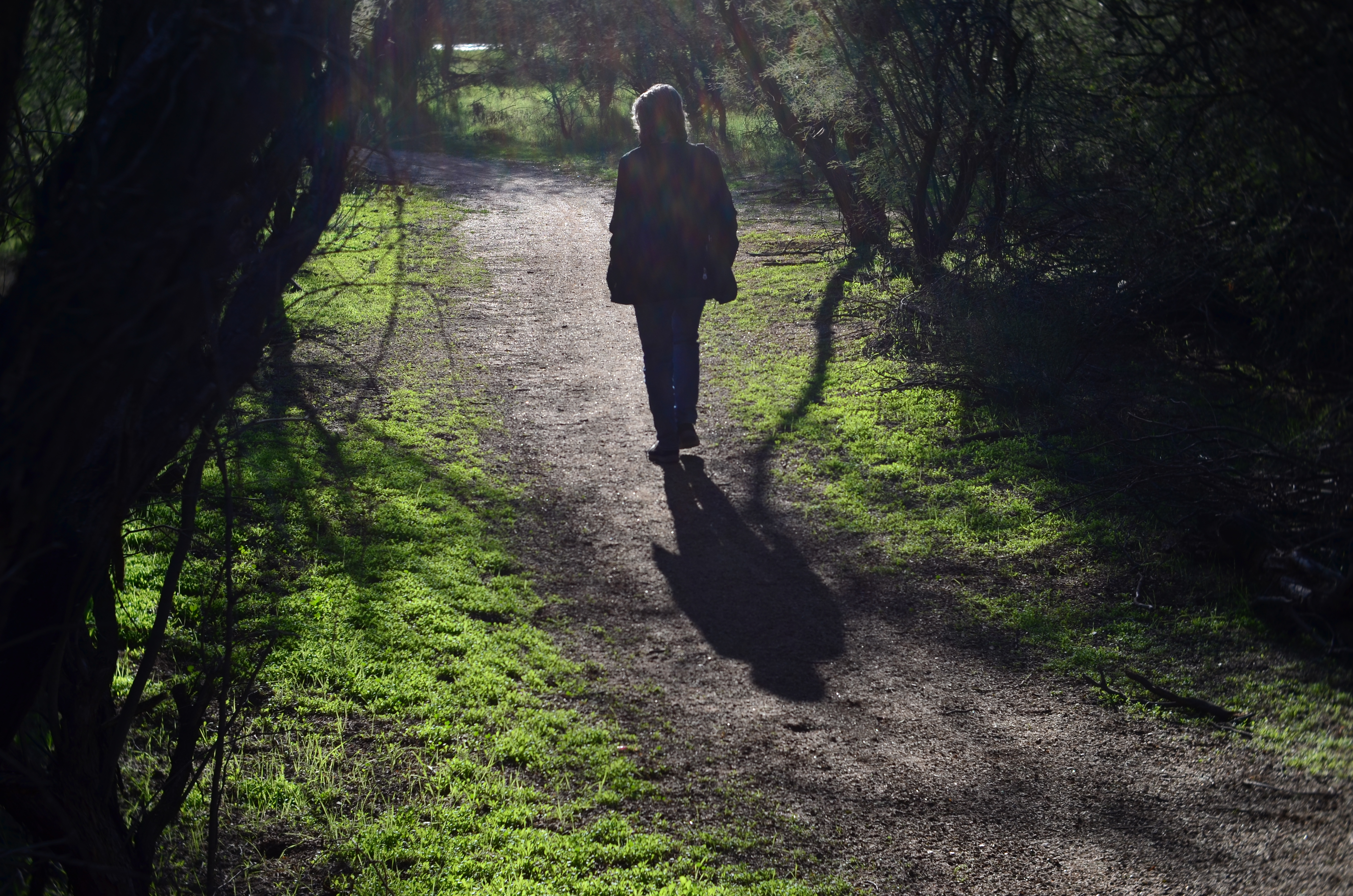
But many images can be re-imagined second-by-second, with additional takes offering the photographer vastly different outcomes and choices. In the series shown here, I originally fell in love with the look of sunset on a wooded trail. My first instinct was that the receding path was everything I needed, and I shot the first frame not thinking there would even be a second. My wife, however, decided to walk into the space unexpectedly, and I decided to click additional frames every few seconds as she walked toward the shot’s horizon. She starts off in the lower right corner and walks gently left as she climbs the slight rise in the path, causing her hair to catch a sun flare in the second shot, and placing her in central importance in the composition. By the last shot, however, she is a complete silhouette at the top of the frame, taking her far enough “up” to restore the path to its original prominence with her as a mere accent.
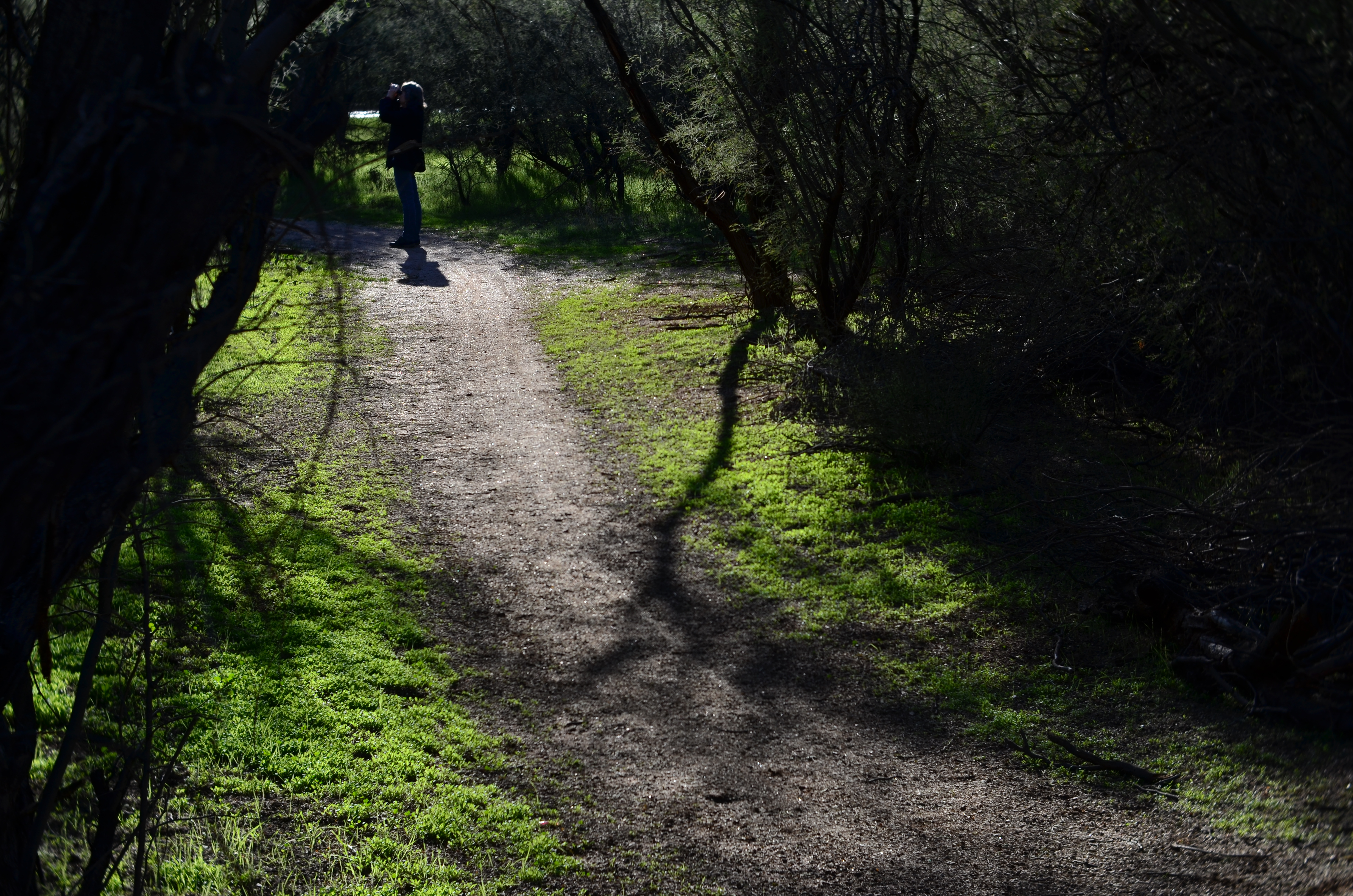
and finally comes to rest as a mere decorative accent/ The trail is now nearly empty once again.
Which shot to take? Anyone’s call, but the point here is that, by continuing to shoot, I had four images to choose from, all with very individualized dynamics, none of which would have been available to me if I’d just decided that my first shot was my best and settled. There will be times when the fullest storytelling power of a photograph is all present right there in your first instinctive snap. When you have time, however, learning to compose on the run can force you to keep re-visualizing your way to lots of other possibilities.
EYEWITNESSED AND UNDERLINED

Does the use of selective focus in this image disqualify it as a “news” photo?
By MICHAEL PERKINS
IT WASN’T LONG AFTER THE INTRODUCTION OF PHOTOGRAPHY that one of the biggest and most durable myths about the new art was launched to generally unquestioning acceptance. The line “the camera doesn’t lie” attached itself to the popular imagination with what seemed the purest of industrial-age logic. Photographs were, to the 19th-century mind, a flawless record of reality, a scientifically reliable registration of light and shadow. And yet the only thing that moved as quickly as photography itself was the race to use the camera to deliberately create illusion, and, eventually, to serve the twin fibbing mills of propaganda and advertising. The camera, it turned out, not only could lie, but did do so, frequently and indetectably.
Later, as photojournalism came into its own, the “doesn’t lie” myth seemed to drape news coverage in some holy mantle of trustworthiness, as if every cameraman were somehow magically neutral in the way he shot an event. This, in spite of the obvious fact that, merely by changing composition, exposure, or processing, the photographer could alter his image’s impact…..its ability to, in effect, transmit “truth”. Certainly, outright fakery got better and better, but, even without deliberately trying to falsify facts, the news photographer still had his own personal eye, an eye which could easily add bias to a seemingly straightforward picture. Did this proclivity make his pictures “lies”?
As a point of discussion, consider the above photo, which is, fundamentally, a document of part of an actual event. But what can really be learned from what’s in the frame? Are there thousands at this rally, or do the attendees shown here constitute the entire turnout? Are all those on hand peaceful and calm, or have I merely turned my lens away from others, immediately adjacent, who may be screaming or gesturing in anger? And how about my use of selective focus with the girl in pink? Am I simply calling attention to her face, the colors in her outfit, her sign, her physical posture… or am I trying to make her argument for her by using blur to make everyone else seem less important? Am I an artist, a reporter, a liar, or all three?
Here’s the thing: since I don’t make my living as a journalist, I can choose any or all of those three job titles without fear of conflict. I work only for myself, so I make no claim for the neutrality of my coverage of anything, including landscapes, still lifes and portraits. I likewise make no guarantees of objectivity in what I regard as an art. Only the observer can decide whether the camera, or I, have “lied”. We repeat this mantra frequently, but it bears clear emphasis: photographs are not (mere) reality. Never were, never can be.
Good thing or bad? You literally take that determination into your own hands.
WORKS IN PROGRESS
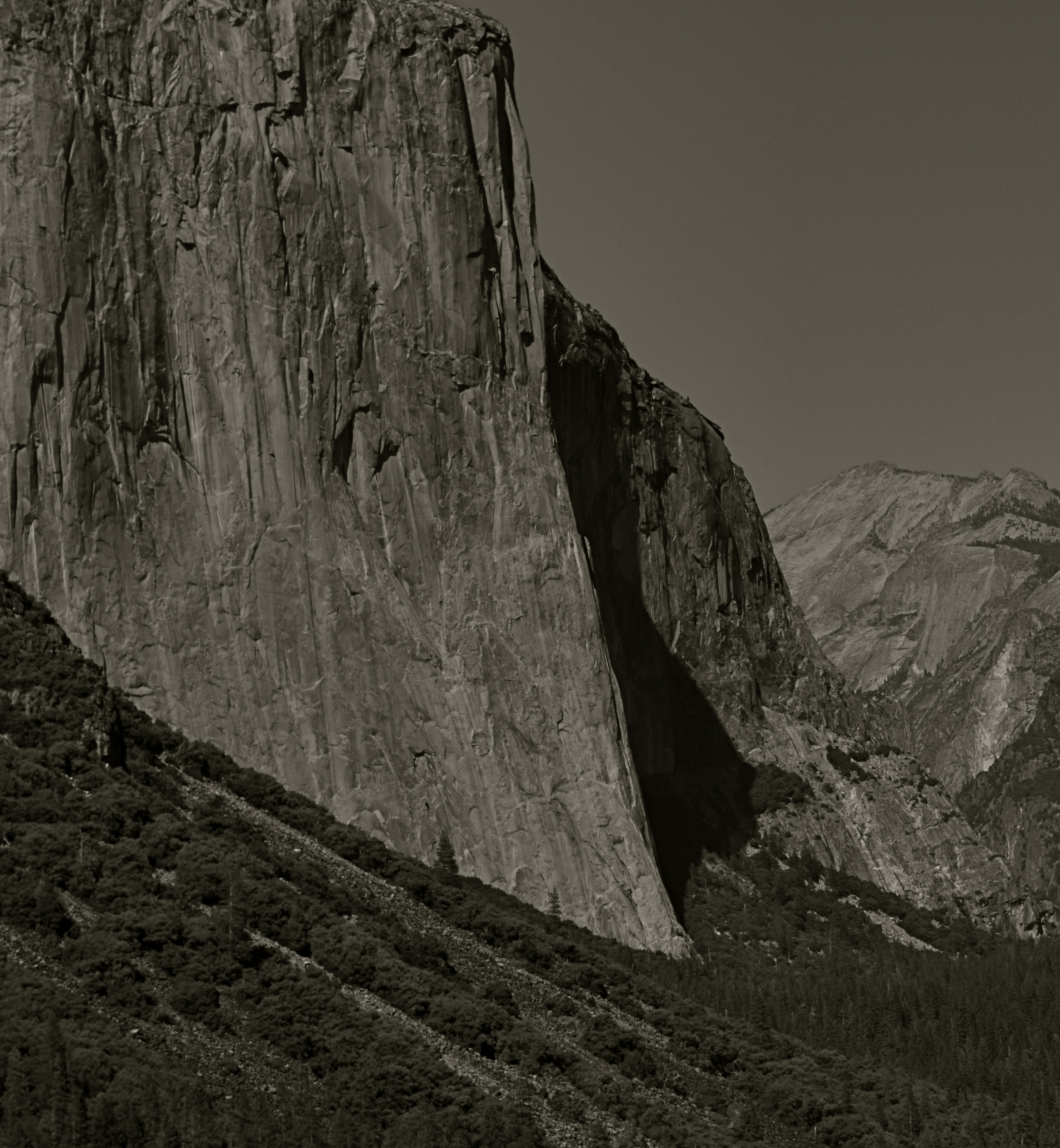
This view of El Capitan in the Yosemite Valley has been annually tweaked with various editing tools since being taken in 2012.
By MICHAEL PERKINS
IN REVIEWING YOUR PAST PHOTOGRAPHIC WORK, you are bound to find shots that you have, for lack of a better term, outgrown. Unpack that word, and what you’re really seeing is the passage of time since you originally visualized a picture, along with the immense distance your eye and mind have traveled en route to the present day. Thus you are both benefitting and suffering from the luxury you enjoyed in being allowed to freeze time. You have not only immobilized a moment, but you have also preserved a record of what your “best practices” were at the time.
This painful but necessary re-assessment applies not only to the techniques used to create the initial image, but, in the incredibly speedy evolution of post-processing, all editing systems as well. Quite simply, if a picture is worth taking, it is worth fighting for…first by being as mindful and deliberate as possible in the taking, and then in a constant re-evaluation of how best to enhance its impact through editing. Therefore, if the first commandment of photography is Always Be Shooting, the second should probably be Never Stop Processing.
The above image is an example of this continuing dialogue. it was originally taken in 2012 and I have revisited it at least annually since then. At the time I first shot it, it was part of a three-shot bracket of exposures that were originally blended in an HDR program to try to get about the same degree of detail in both highlights and shadows….a look which can look great if done with a maximum of understatement, but which often winds up looking like an old Yes album cover under black light. From HDR, I moved on to a series of detail-enhancing programs which were more natural-looking, but still failed to deliver the punch I got from viewing the scene on-site. In one iteration, I added enhancement to a single shot alone, rather than a combination of all three bracketed images. And in 2016, I went back to the trio, mixed this time in an Exposure Fusion blender. And there’s no end in sight.
Ansel Adams, of course, famously re-visited his master negatives with up to a dozen re-mixed versions of the same scenes over decades, re-thinking his own revolutionary “zone system” for measuring exposure for every single particle of a subject, then mastering its application in the lab via burning, dodging and other means of print manipulation. I don’t work with those particular (and essentially film-based) techniques for several reasons, most of them economic. However, that still leaves me plenty of editing choices, with more gimcracks coming online every day.
Point is, pictures that are truly worth working for are also worth re-thinking, and a growing array of tools can give photographers endless ways to re-mix the hits. Of course, you will eventually come to a point where enough is enough. Historically, it’s a good thing that the Pope gave Michelangelo a deadline, or else he’d still be up on that ceiling.
EXQUISITE CORPSES
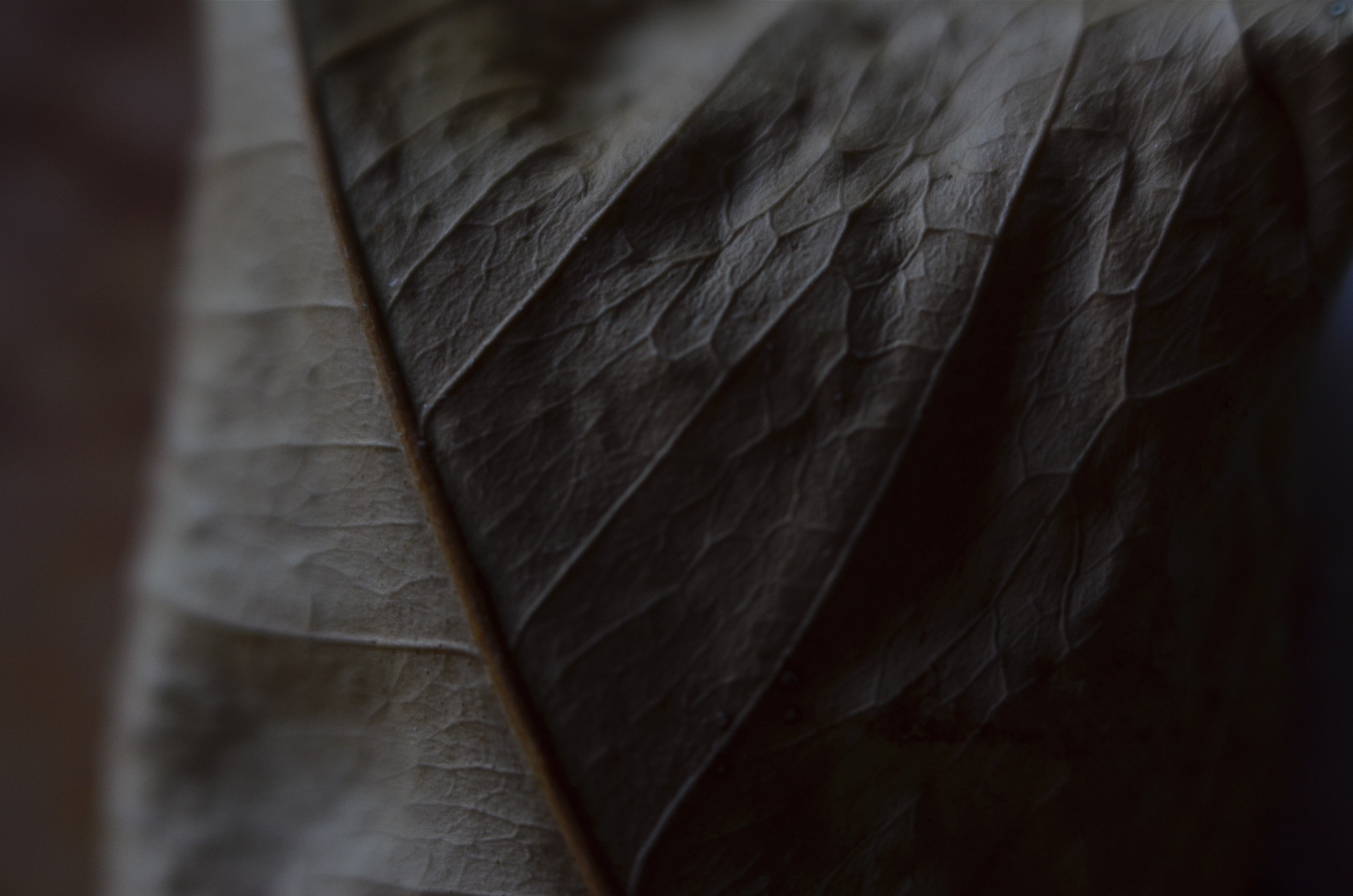
Phytomorphology 2 (2017). Macrophotography helps alter the memory context of familiar objects.
By MICHAEL PERKINS
AS A BOY, THEODORE ROOSEVELT TAUGHT HIMSELF THE ANATOMY OF BIRDS that same way James Audubon did, by studying birds he himself had killed. Although this coldly clinical approach may strike us as cruel today, it was accepted practice for a young naturalist in the late 1800’s, a time when even eminent surgeons, faced with a shortfall of cadavers for academic study, occasionally hired freelancers to raid graves in search of, er, manpower. And so it goes.
At decidedly less risk, photographers have also made still-life studies of dead things, from game kills to seed pods, trying to appreciate structure, design, and function in a controlled environment. But there is more to their pokings than the grand advancement of science, given that death changes things in a way that transforms their aspect, altering their usefulness as visual subjects. Objects that have gone from living to non-living reflect light differently; textures and patterns are re-shaped; in short, the thing becomes an abstraction of itself.
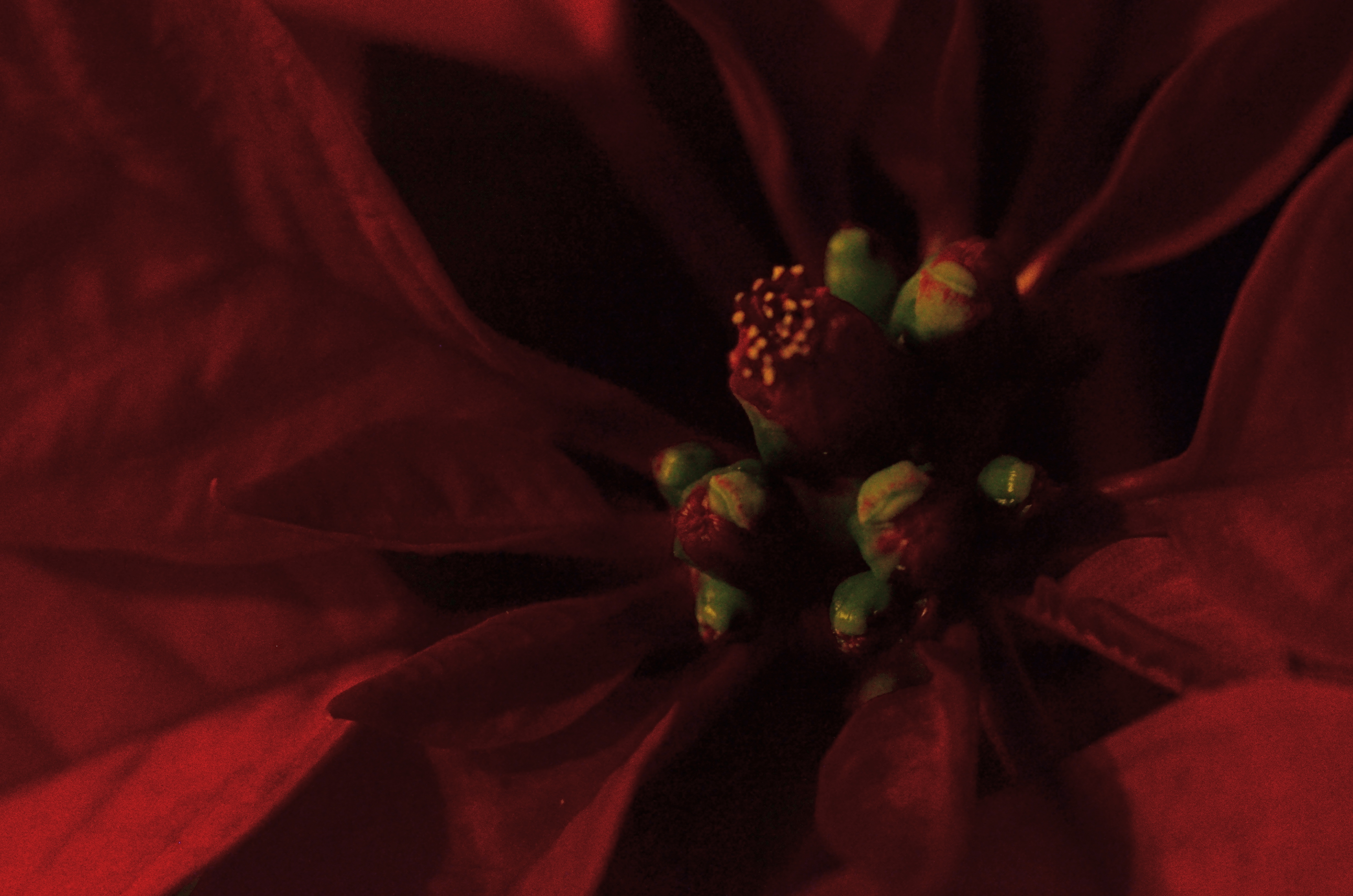
Add magnification to the mix, and a thing becomes completely untethered from our usual conception of it, since, among other things, we are used to viewing it from a distance of feet or inches rather than millimeters. Just as where you stand affects the impact of a landscape, the place where you park a macro lens on an object dictates a completely different story with just the smallest variation.
There is a renewed fascination in the photographic world with minimalist abstraction, in which an object is changed so much in magnification and composition as to become a completely new thing, or…if the photographer so desires, a whole new nothing, a subject with which the viewer has no prior associations, functioning as pure pattern or design. For me, that’s the appeal of macro work…..to take the familiar and render it neutral in meaning, allowing me to re-assign it visually, to ask the viewer to, in effect, regard it as a foreign object, one that can take on whatever significance he sees fit.
Photography is primarily about what to see but it often provides cues as to how to see as well. Viewpoint is verification, and things impart different truths to our eyes, depending on how we approach them.
ARRIVALS
By MICHAEL PERKINS
PHOTOGRAPHERS PROBABLY HAVE TO HAVE AT LEAST SOME IDEA OF WHERE THEY’RE HEADED in pursuit of an image, or else basic issues like, Where To Point The Car or Which Path To Take can’t be settled. And there is, even for the instinctual process of creation, something to be said for a basic plan. However, every photographer has experienced the wonder of finding oneself arrived at a great picture-making opportunity when, in fact, you were headed someplace completely different. It’s in such moments, places where Plan A becomes Plan B, C, or D, that the excitement happens.
After you capture an image that essentially works, your mind naturally comes to take ownership of it, just as if that picture were your original intention. But this seldom occurs. Pictures aren’t like Grab-And-Go sandwiches, and very few are just waiting there, fully formed, until you wander by and imprison them in your box. Our final choices for photographs are often the destination in a ride with many stops along the way. We might have come to do this, but we wound up modifying, even abandoning our first instinct to get this instead.
Ocotillo Outpost (2016) 1/640 sec., F/4, ISO 100, 56mm.
The above image is a textbook example of this process. The gorgeous sunset clouds seen here were originally to be the entire composition. The general rule is that skies, by themselves, are usually not sufficiently interesting to be the solo star in a photo, but the light and texture of this particular dusk had convinced me that a minimalist shot might just be possible. However, one of my first framings caught an octotillo shrub in its lower right corner, and that new information sent the picture off in a different direction.
Re-framing to bring the shrub into the entire lower half of the shot and silhouetting it against the sky gave the framing both a sense of scale and depth, and I began to convince myself (moving on to Plan B) that this now two-element picture would be The One. Then a single starling made a landing at the upper right corner of the ocotillo, creating a more obvious initial point of contact for the eye. The viewer would engage the most familiar part of the picture, the bird’s body, then travel leftward to the ocotillo’s jagged tangles, and backwards to the textured sky. Final Plan: C….a three-element image in which the individual parts seemed, at least, to talking with one another.
In the pages of The Normal Eye I keep coming back to this idea of “planned accidents”, or shots that start in one direction and end in another, because the process, once you allow yourself to go with it, can lead to images which, eventually, seem inevitable, as if they never could have been any other way. And those are the ones you keep.
2016: THE YEAR OF SEEING DIFFERENTLY
Isoceles’ Greatest Hits (2016). Our idea of what a photograph “is” must be constantly in play.
By MICHAEL PERKINS
IF YOU SPEND ENOUGH YEARS MAKING PICTURES, you will see, looking back over your shoulder, several visible mile markers indicating when something fundamental changed in how you went about the pursuit of the capture. It can be a simple time line from one camera or lens to the next, or a sequence of shifts in style or emphasis.
For some, it’s the leap from film to digital. For others, the moment when it seemed important to commit anew to monochrome, or the day when one’s work flow took on decidedly new features. For me, it’s always been those events or people who have allowed me to dramatically re-evaluate the process of seeing.
Poring over various things I attempted to do in 2016, I seem to be standing in a niche between how I have traditionally visualized subjects and how I’m aspiring to, marking a more dramatic evolution than I’ve experienced for a while. This change can be simply expressed as a different view of what’s “real” in a picture, brought on by my work with lenses that allowed focus to be more selectively manipulated within an image.
Some of this can be seen in images seen in the new page 20 for 16, clickable at the top of this one. Like other year-end summaries, it tries to cite examples of every type of photograph I attempted over the space of a year, from portraits to still lifes and everything in between. However, unlike most other years, the images have what I might call an evolving view of the role of sharpness; how it features in a composition, how much of it is essential, whether it is even needed at all, given the right conditions.
Some of these explorations in variable sharpness involved embracing a new crop of specialized lenses which either evoke the softer look of vintage glass or allow the shooter to place focus anywhere in the frame, and to any degree desired. However, at least one picture is the product of post-production apps applied to smart phone images, showing, if nothing else, that it’s probably the destination that matters more than the journey. Or not.
As an essential component in all photography, focus is a major determinant in that we think of as a “photograph”, and, in turn, what makes that photograph “real”. However, photography is not merely the recording of the actual but a visualization of the possible. It bridges the gap between tangible and potential. Merely unchaining sharpness, by itself, guarantees nothing in the way of order, and might merely produce chaos. Still, the moment when a particular choice can either enhance or enchant…. that’s we live for; that’s what we reach for.
Thank you again for your kind attention, your advice, and your enthusiasm….and Happy New Year.
CHRISTMAS ON THE QUIET
By MICHAEL PERKINS
THE HOLIDAYS PROVIDE A REMARKABLE VARIETY OF VISUAL RESPONSES IN PHOTOGRAPHERS, so subjective are each person’s memories and experiences. This ensures that the subject is well nigh inexhaustible, although I seem to see images falling into one of two broad categories.
One class includes the snapshot-oriented, direct-experience images, which record one’s treasured good times……such as the family tree, the winner of the neighborhood’s exterior lights extravaganza, Bobby’s first moments with his new bike, etc. The other main class seems to center on a kind of abstract interpretation of pattern, color, and shape, and may be more subtle or understated in approach. Of these two basic groupings, one is specific, rooted in personal impressions, while the other is design or concept based. Both produce great photographs, but the aim, for each, is very distinct.
As my own Christmases have become more abbreviated and less populated (family and friends far away), my observance of the holidays is, accordingly, much more muted, less decorous than in years past. The merry little Christmas referred to in the song becomes the dominant theme, and I find my seasonal photos try to say more and more with less and less. The images are simpler, quieter. Whether I have chosen this or it’s chosen me is hard to say for sure. I only know that, as the million elements that define a busy family Christmas fade into memory, I create pictures that suggest the essence, rather than the exhaustive detail, of the holiday’s themes.
Of course, whether this time of year means anything at all to you is a matter of taste, especially as you age up. One of the most interesting places to spend the holidays, for example, is Las Vegas, simply because the town does not sport any decorations of any kind. In deference to many who want to flee rather than celebrate the hustle, the entire city becomes a strange sort of haven, filtering out both the profane and the holy. So, if I snap a picture at Caesar’s Palace on December 25, does that fact alone make the result a “Christmas” photo?
You get the idea: even in less extreme cases, the holidays are in the eye of the beholder. Eventually, what makes a day special is what makes it special for you. Whatever your own circumstances, enjoy the world as you would prefer to compose it. Make the season your personal treasure, whether loud, soft, lush or laid back. No image is a bridge too fa (la la la).
THE YIELD
By MICHAEL PERKINS
THE ABILITY OF EVERY PHOTOGRAPHER, EVERYWHERE, TO INSTANTLY SHARE any part of his or her output with the world is both a blessing and curse. The “blessing” part’s easy to understand. Breaking down the barriers to publication of ideas that have separated us all from each other throughout time…well, that’s a very heady thing. Pictures can now transmit commentary at nearly the speed of thought, establishing linkages and narratives that have the potential to shape history.
Then there’s the “curse” part, in which this very same technology carries with it the potential for unlimited treachery and mischief. Who says what pictures can be seen…when, and by whom? Without supervisory curation or any kind of global uber-editor, photography can just be a visual torrent of garbage, or banality, or worse. Obviously, we have had to navigate some very tricky waters as both the blessing and curse elements of modern photography wrestle for supremacy.
 What has happened for, good or ill, is that we are all, suddenly, tasked with being our own editors, asked to perform a skill that is very difficult to bring off with any honesty. You’d think that, after years of taking thousands of pictures, most of us would have a higher yield of excellence from all that work, but I have found that, at least for myself, the opposite is proving true. The more I shoot, the fewer of all those shots strike me as extraordinary. I thought that practice would indeed make perfect, or that, at least, I’d come closer to the mark more often, the more images I cranked off. But that hasn’t happened.
Your skills accelerate over time, certainly; but so do your standards. In fact, any really honest self-editing journey will mean you are less and less satisfied with the same pictures, today, that, just yesterday, you would have thought your best work. You start to refuse to cut certain marginal pictures a break; you stop grading yourself on the curve.
Most importantly, you have been doing this just long enough to realize how very long the journey to mastery will be. Not just control of the mechanics of a camera, although that certainly takes time. No, we’re talking about learning to tame the wild horse of one’s own undisciplined vision, something that, over a lifetime, is hardly begun. Our moon landings come to look to us like baby steps.
Becoming one’s own editor means that, through the years, you’re liable to view one of your “greatest hits” from yesteryear and be able, sadly, to see the huge gulf between what you were trying to do and what you actually accomplished. I was horrified, a few years ago, to learn that my father, at some point, had destroyed the paintings he had made when he was in college. I had grown up with those images and thought them powerful, but he only saw their shortcomings, and, at some time or other, it was just too much to bear. I often think of those paintings now, whenever I view an older picture that I once thought of as “my truth”. In some cases, I can’t see anything in them but the attempt. A few of them do survive the years with something genuine to say…but, ask me again tomorrow, and I may reluctantly transfer many of them over to the “nice try” pile. It’s an imperfect process, but it’s only one I trust.
BREAKING THE GEOMETRY
Zoom (2016)
By MICHAEL PERKINS
CONTRAST IN PHOTOGRAPHY IS NOT JUST ABOUT A COMPARISON BETWEEN DARK AND LIGHT VALUES. The word contrast also applies to things placed next to each other in a composition that fight for dominance. Happy faces next to sad. Images of wealth and opulence juxtaposed with poverty and misery. Some of it can be a kind of forced irony, and, as such, can produce pictures that get a little preachy, or appear deliberately staged.
I love urban architecture because many of its design elements are enough to create a compelling image all by themselves….that is, without the larger context of what’s around them. They don’t have to be about anything; they just are. Contrast isn’t needed in many cases, because I’m not trying to show mankind’s place versus the space of a building…..I’m just seeking absolute patterns. No comment, no message.
Occasionally, however, it’s great to invade all those clinical lines and angles with a bit of humanity, to break the geometry and inject something warm or whimsical. It doesn’t have to be deliberate and it doesn’t have to be amped up with busy staging. The best contrast shots between disparate elements are the ones that you simply witness.
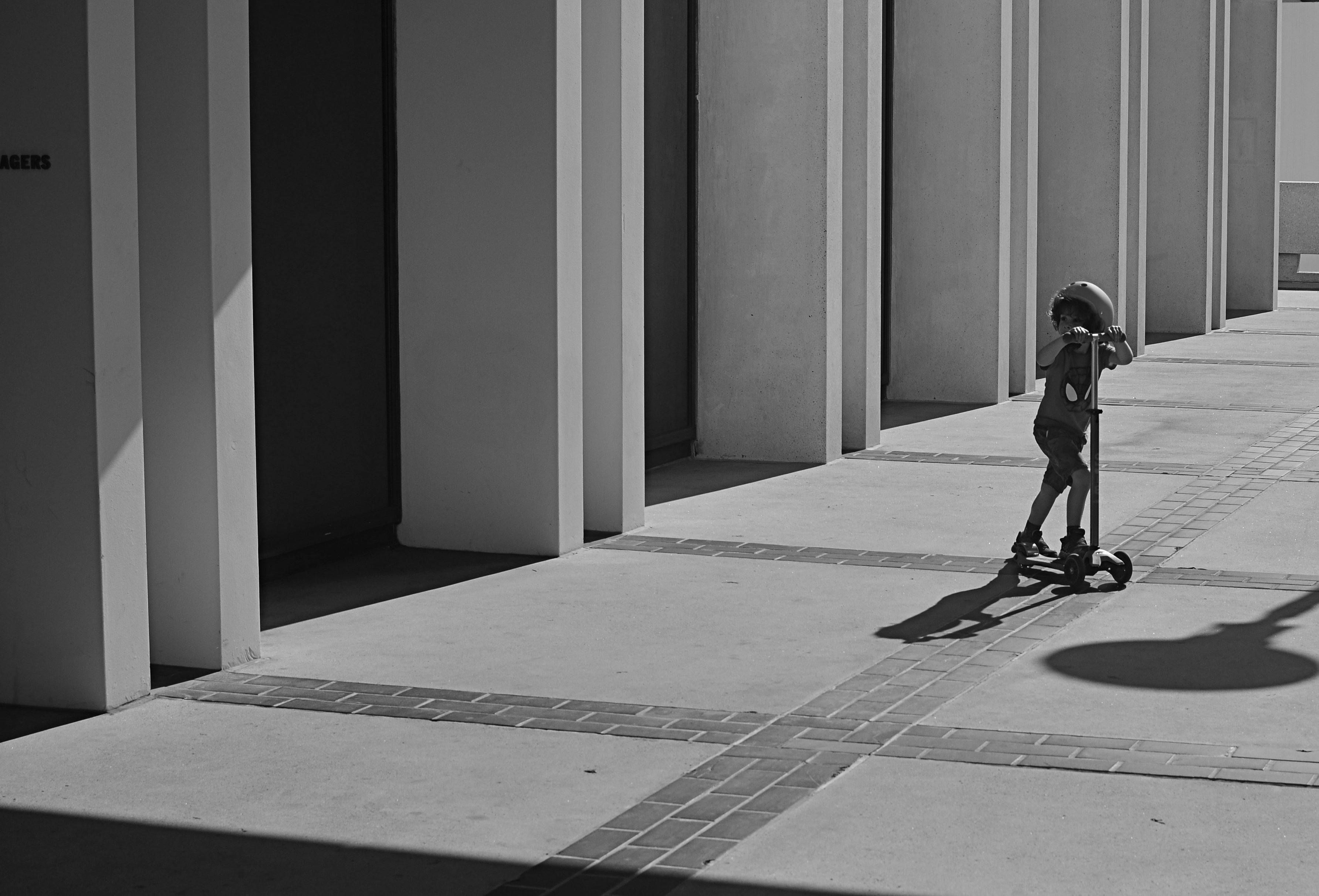
In the above image, the boy on the scooter is neither a “bad” nor “good” subject, but he gains a little amplitude because of his odd placement amongst the more antiseptic surrounding textures. The shot also worked a little better in monochrome because, in the original shot, the boy’s shirt was so vivid that it drew too much attention to that part of the picture.
Photographers benefit from a million tiny collisions between seemingly opposed subjects every single day. Learning which ones to isolate and massage into pictures can be an enjoyable detective game.
BOATS AGAINST THE CURRENT
Act Of Faith #265 (2016)
By MICHAEL PERKINS
THE LATE STUDS TERKEL’S BOOKS created almost a category of their own, collecting memoirs from across the length and breadth of American experience and class in essential essays like Working, The Good War, and Hard Times. Traveling the length and breadth of the nation for over forty years, Terkel interviewed the big and the small, the meek, the marginal and the mighty, as they recalled their individual experiences in the wake of massive historical events, from wars to depressions. For one of his final social montages, he spoke to people in their twilight years about their efforts to remain positive and engaged despite lives that had often proven challenging, even tragic.
Its title: Hope Dies Last.
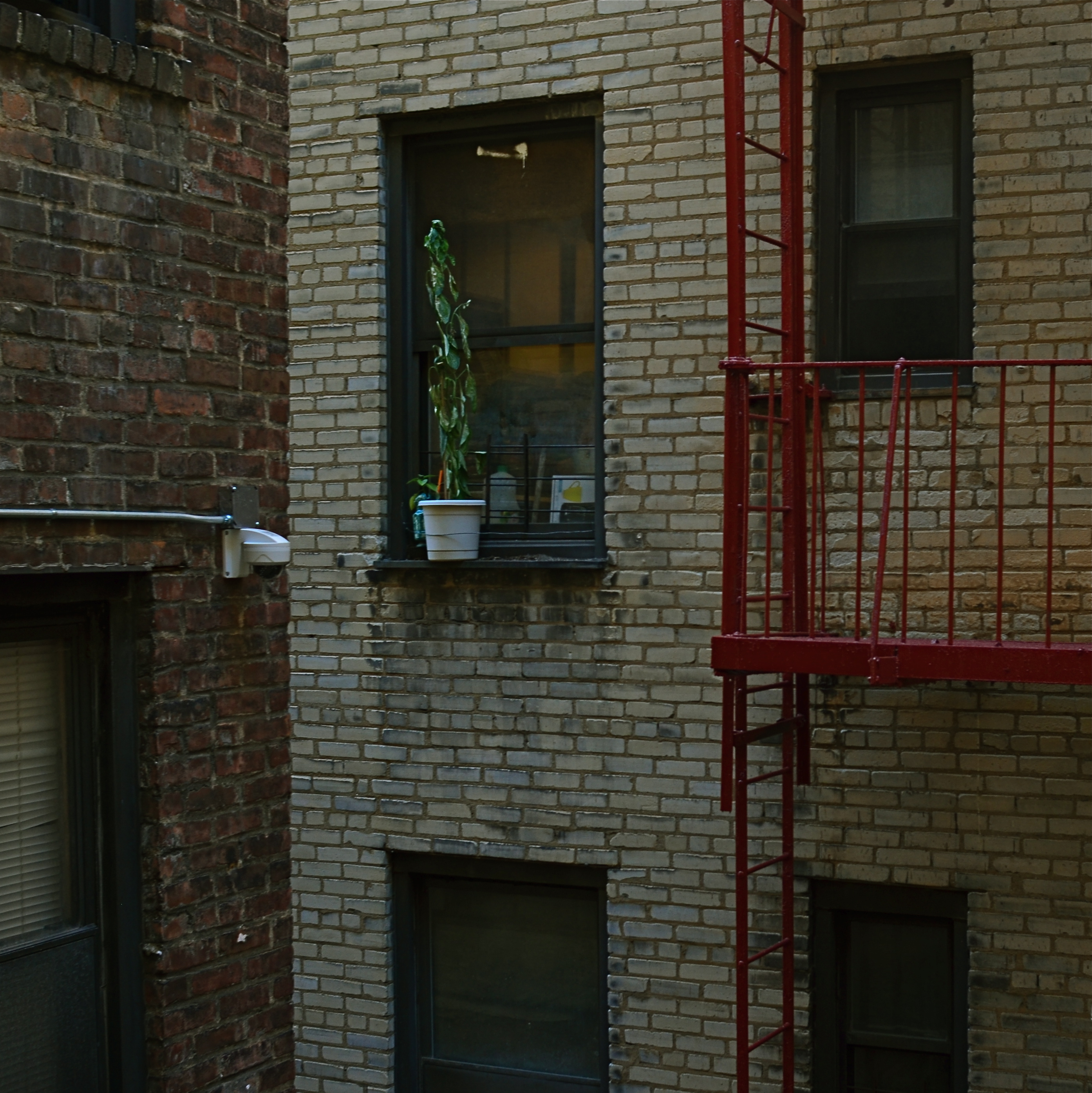
Upon first seeing the book, I had to read it, partly because it was Studs, and partly because that title spoke to my own minor acts of faith in what I look for in photographs. Pictures are often testimony about people who cannot be seen, measured in the objects they care about, or in which they invest their hope. We have all seen the tenacity of wildflowers thrusting up between the fissures of cracked concrete, and appreciated, in the abstract, what that image says about the faith of the human animal. We capture pictures of places bombed to ruin, then testify with our cameras as they begin, once more, to lay a stone upon a stone. Building. Dreaming. Launching our boats against the current.
Hope dies last.
When I see a picture of something that, to me, symbolizes our collective refusal to knuckle under, I want to take it home with me. Because we need it. Now, yesterday, ever. We draw strength from that escapist wildflower, or a battered face upturned toward the light, or, as above, a potted plant defying the odds in a dark apartment air shaft. Someone decided to give that plant a chance…or, at least, to remind the grey walls and grimy brick that color and life are still around, still fighting for their shot.
Studs made his best case for the persistence of hope with the words of his interviewees. I find comfort in trying to find visual evidence of their actions. Either way, photographers can serve as conservators of hope.
If there’s a better gig to be had in this life, please let me know.
TIED FOR FIRST PLACE
By MICHAEL PERKINS
EVERY PHOTOGRAPH IS DISCUSSED LONG BEFORE IT IS VIEWED, with an inner dialogue between shooter and subject that is held, however briefly, ahead of the shutter click. Sometimes, at a fortuitous intersection of talent and luck, that is the end of the discussion; other times, there will be additional chats between the first version of an image and its maker, a talk that can be endlessly debated in the processing and editing phases. And, of course, based on those results, photographs finally make their arguments to the world at large.
The bulk of those discussions focus on what the center, or the essence of a picture should be. Were all elements in balance right out of the camera…in which case, frame it and hang it, case closed? Or (and what is far more likely), did we find that essence at all? Was it compromised, watered down, by faulty composition? Did we make a weak lighting choice here or there? Did execution weaken the effect?
Usually, there is a clear component within a photograph that cries here I am a little louder than all the other parts of it. But sometimes, there are two or more pieces which feed on each other, boost each other’s effectiveness. In such cases, instead of one primary piece and a lot of secondary or extra pieces, you find two things in the photo that are basically tied for first place. When one thing in a picture feels diminished without interacting with another, both elements deserve to stay.
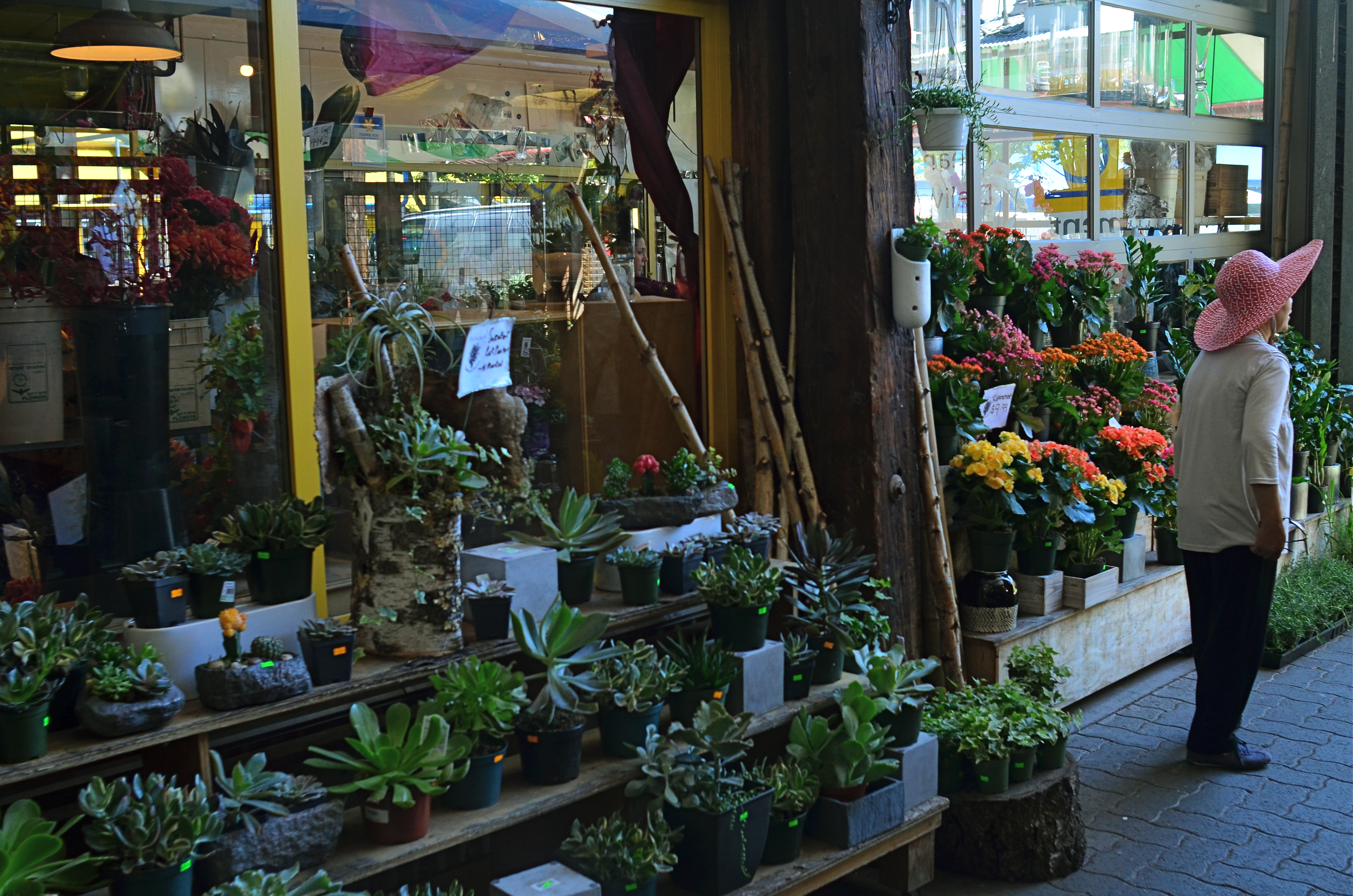
Mrs. Lin’s Summer Bonnet (2016)
The picture at the top seems, to me, to be just such a case. The floral shop and its faceless proprietor seem somehow married to each other, two halves of a whole. And, while I can conceive of making two separate pictures from the master shot in which either the shop’s inventory or the saleslady are in solo starring roles, they truly do seem interdependent, so I declare a tie, and they both go to the finals.
Thus the discussion on what to include in the picture has gone on for at least two layers, with layer one being the planning of the photo, and layer two being the editorial decision to keep both flowers and florist on equal footing in the final image. Look over your own pictures and you will no doubt find several of these “tied for first place” compositions. It can seem counter-intuitive to have more than one main point in an image. But the image itself will tell you, unmistakably, when that actually make the most sense.
MAKE IT SO
I’ve been photographing this for years, and I still don’t know what I think about it. Needs more work….
By MICHAEL PERKINS
WHEN PHOTOGRAPHY IS PURELY REPORTORIAL, as it is in journalism or documentation, it sticks pretty close to the accepted state of the world. It tries to depict things plainly and without comment; it delineates and defines; it shows us the true dimensions of events.
But when the same technology is used interpretively, there is no absolute “real”, no pure authenticity, other than what we choose to show. It is in re-purposing the world visually, shaping and framing it as we choose, that we can confer meaning on it pretty much at our whim. That’s where the “art” part comes into what would otherwise be a merely technical measurement of light. We not only choose our subject….we set the conversation about it. Simply stated, what you shoot is about whatever you decide it’s about.
Even with hyper-familiar objects, things seen and re-seen to the point that they are iconic (think Empire State Building) images can re-set the way we take those objects in. And, in the case of what I like to call “found objects”, such as the image seen at the top, the photographer is completely unfettered. If your viewer’s eye has no prior mental association with something, you’re writing on a blank sheet of paper. You can completely dictate the terms of engagement, imbuing it with either clarity or mystery, simplicity or symbolism.
I have always been flat-out floored by photographs that take me on a journey. Those who can conjure such adventures are the true magicians of the craft. And that’s what I chose to play in this arena over a lifetime. Because, when photography liberates itself from mere reality, it soars like no other art.
APPEARS TO BE…..
Stylistically, I can say, without fear of refutation, that this is, um…a photograph. Ain’t it?
By MICHAEL PERKINS
I RECALL, MANY YEARS AGO, WHEN THE JUICIEST COMPLIMENT I COULD IMAGINE SNAGGING for a photograph was that “it looks just like a postcard”. That is to say, “the picture you’ve made looks like another picture someone else made while trying to make something look like…. a picture”.
Or something like that.
Seems that an incredible amount of photography’s time on earth has been spent trying to make images not so much be something as to be like something else. The number of effects we go for when making an image, in the twenty-first century, is a list of the inherited techniques and processes that have waxed and waned, and waxed again, over the entire timeline of the art’s history. We are now so marinated in all the things that photographs have been that we find ourselves folding the old tricks into new pictures, without self-consciousness or irony. Consider this partial roster of the things we have tried, over time, to make images look like:
Paintings Etchings Drawings Daguerreotypes Tintypes Cyanotypes Expired film Cross-Processed Film Kodachrome Sepiatone Toy Cameras Macro Lenses Badly-focused, Damaged and Flawed Lenses Obsolete Film Stock Daytime Night-Time Negatives Postcards Antique Printing Processes Dreams, Hallucinations, and Fantasies “Reality”
We not only manipulate photographs to make them more reflective of reality but to mock or distort it as well. We make pictures that pretend that we still have primitive equipment, or that we have much better equipment than we can afford. We utilize tools that make pictures look tampered with, that accentuate how much they’ve been tweaked. We make good pictures look bad and bad pictures look passable.
This post is turning out to be the evil twin of a recent article in which I emphasized how little we know about making “realistic” images. The more I turn it over in my mind, however, the more I realize that, in many cases, we are trying to make new photographs look like photographs that someone else took, in a different time, with different limits, with different motives. We steal not only from others but also from what they themselves were stealing.
All of a sudden my head hurts.
THE UNREAL REAL
No, this isn’t a picture of the “real world”. And might that not be freeing, in a way?
By MICHAEL PERKINS
I’M A PHOTOGRAPHER, AND YET I CANNOT TELL YOU WHAT “REALITY” IS.
I point machines at the world and I get some kind of recording of light and shadow. Is what I get a literal translation of the way something, at least for an instant, really was? How did my composition, which necessarily had to leave out some things in order to include others, alter the complete truth of a scene? How did my selection of a lens, a time of day, the place where I stand, my own mood effect the outcome? And, if this machine, this recorder does not actually show “reality”, does that make me more of an artist, or less of a technician?
The world as we see it is never mere visual “evidence”. It comes to us filtered through every personal trait that shapes our ability to observe in the first place. Then we, in turn, filter that subjective experience into an even greater abstraction, shoving it through a lens that adds its own biases, limits, or flaws. So what comes out the other end? Should we even be worried that a photograph can’t be real? Might we not, in fact, be relieved to be freed from the constraints of the actual, just as painters and sculptors always have been?
The above image was taken by a person who stood in a particular place at a particular time with a specific piece of optical equipment and decided that the resulting balance of visual elements constituted a “picture”. That selection of a single part of a single moment will either convey a similar feeling to someone else, or it won’t. That’s what we uncertainly refer to as “art”, and, whether we like the terms of engagement, those “really” are the terms. Reality is beyond our reach.
But a commentary on it isn’t.
FACES WITHOUT FEATURES
The Tube Hangar (2016)
By MICHAEL PERKINS
SOME OF MY URBAN PHOTOGRAPHY COULD POTENTIALLY STRIKE THE AVERAGE VIEWER as somewhat remote, even a bit cold. It flies in the face of some of the universally held “truths” about so-called street photography. Sometimes it doesn’t even have a face. Or faces.
If the best street shooters are thought to reveal truth in the features of the denizens of all those boulevards, then I might really be at a disadvantage, since many of my images are not about faces.
They are, however, about people.
I tend to use passersby, in city pictures, to several ends. beyond the regular kind of unposed portraiture that is standard “street” orthodoxy. One is scale, that is, how they dominate or are diminished by the sheer size or scope of their surroundings. Some cities seem to swallow people, reducing them to anti-sized props in an architect’s tabletop diorama. I try to show that effect, since, as a city dweller, it affects me visually. Other times, I show people completely silhouetted or swaddled in shadow. This is not because their faces aren’t important, but because I’m trying to accurately show their roles as components in an overall choreography of light, as I would a mailbox or a car. Again, the idea is not to avoid or conceal the stories that may reside in their faces, but to also accentuate their body language, how they occupy a space, and, yes, as abstract design elements in a large still life (okay, that sounds a bit clinical).
I certainly bow to the masters whose controlled ambushes of strangers have captured, in candid facial shots, harrowing, inspiring, or amusing emotions that deepen our understanding of each other. You could rattle off their names as easily as I. But using people in pictures isn’t only a miniature invasion into their features, and certainly isn’t the only way to depict their intentions or dreams.
And then there is the other problem for the street portraitist, in that some faces will remain ciphers, resisting the photographer’s probe, explaining or revealing nothing. In those cases, a face poses more questions than it answers. As usual, the argument is made by the individual picture.
ON ITS OWN TERMS
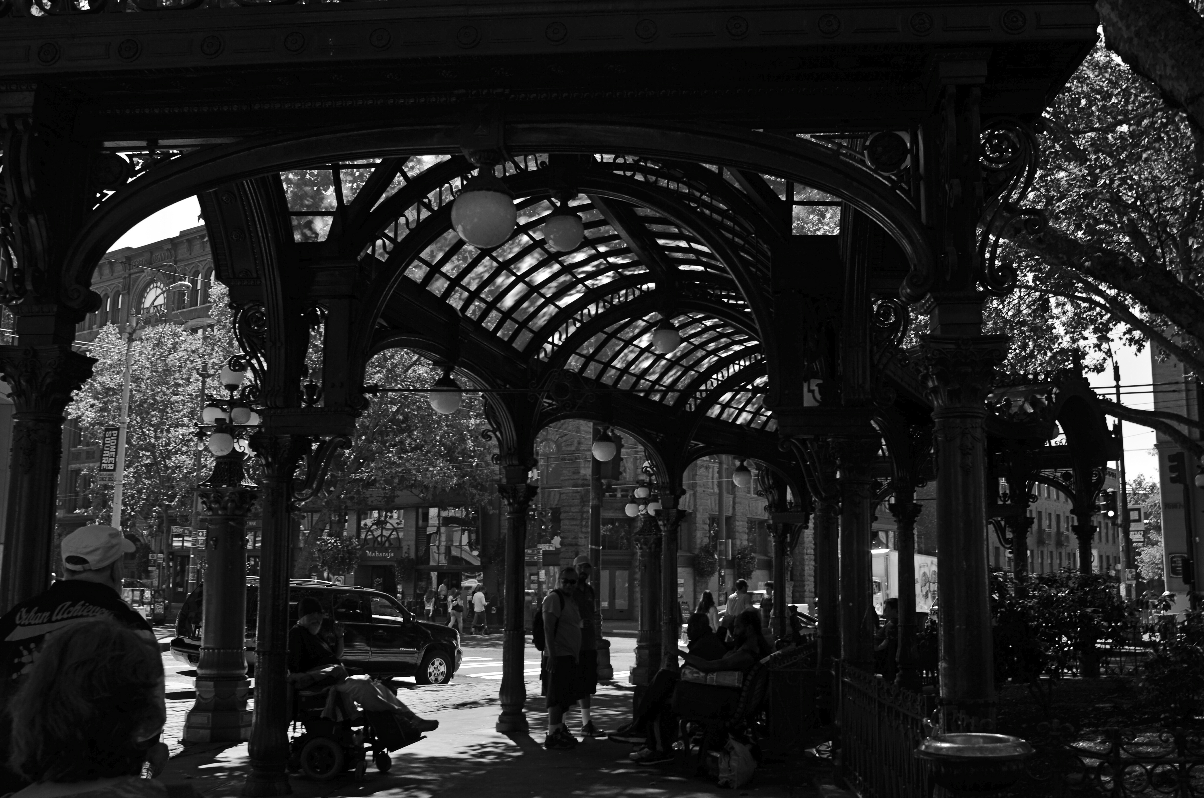
Gaslight Reverie (2016). Local characters convene under an aging arch in downtown Seattle.
By MICHAEL PERKINS
ONE OF THE FIRST EDITORIAL TRUTHS THAT PHOTOGRAPHERS LEARN is that just pointing and recording is not photography. The marvelous device which was designed to arrest time in its flight and imprison it for future reference is truly effective for setting down the facts of a scene….details, textures, dimensions, etc. But, once the shooter is bent upon making any kind of statement…amplifying, clarifying, commenting….then the unadorned data of reality may prove to be a set of chains holding him earthbound. Every picture has it own terms, its own rules of engagement. And sometimes that means moving mere reality to the second chair.
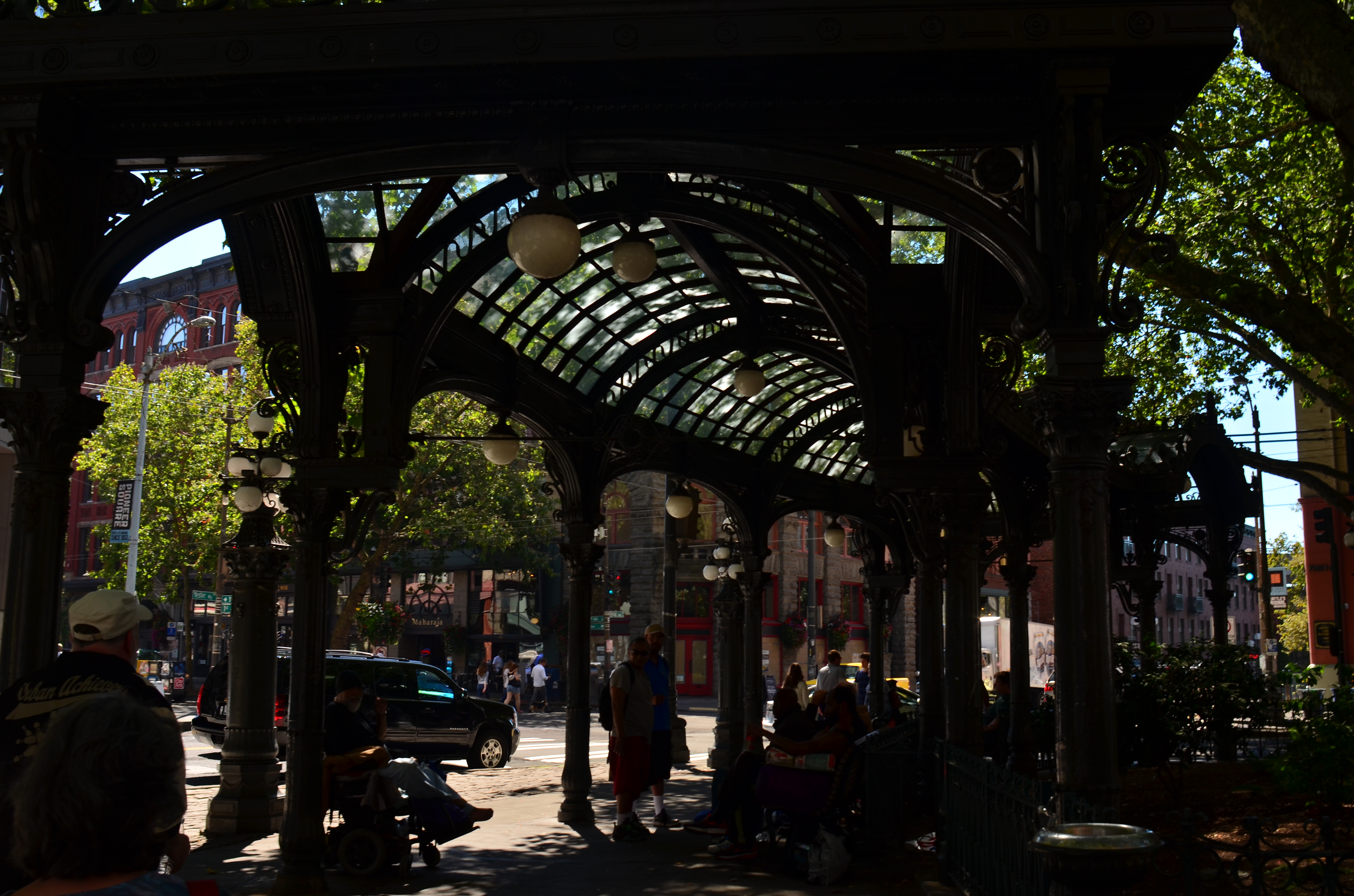
The same shot in color is a bit too charming.
Things that are only recorded are, to a degree, raw, in that they contain important information and extraneous data that might keep an image from being, well, a photograph. A deliberate act. Consider the purest form of “factual” photography, a reconnaissance flyover photo. Seen in its basic “real” state, the colllection of shapes, shades, and wiggles makes little sense to the observer. It needs the help of an interpreter to ferret out the pertinent narrative. Yes, this squiggle is a river. This grey smear is the warehouse. These scratchy cross-hatches are railroad lines. Photographs need to shaped so they can be interpreted. Sometimes this means, for lack of a more grammatical phrase, “including something out.”
There are many ways to achieve this, but, in the interest of brevity, I often find that a simple switch from color to monochrome goes a long way toward streamlining an image. Hues can be distractions, slowing the eye in its pursuit of a picture’s best impact. It prettifies. It luxuriates in tonal shifts, details, textures. Black and white can cut the busier parts of an image in half and convey a starkness (at least in some settings) that color can find problematic. Amping up the contrasts in black & white, eliminating many middle tones, can purify the image even further.
In the above comparison, a neighborhood in Seattle which is, in effect, its local Skid Row, is far more charming, far less gritty in the color rendering than in the mono version. Of course, the choice between the two approaches is made based on what you want to achieve. The same evaluation in a different situation dictates a different choice. Maybe.
Photography is not reality, and, if it were, it would never have flowered into an art, because reality is essentially dull. To make a picture, you have to determine the specific terms for that picture….what weight it wants to carry. Then it starts to become a photograph.
EDITING WITH LIGHT
By MICHAEL PERKINS
THE ETERNAL TUG OF WAR IN PHOTOGRAPHY SEEMS TO BE the pull between extremes of revelation and concealment. Toggling between the strategies of showing almost everything and showing nearly nothing, most shooters arrive at some negotiated mid-point which describes their own voice as a visual narrator. Shuttling between the two extremes, shooters have to decide how much information is appropriate not only for their overall style, but in each specific shooting situation.
Managing light in the moment, rather than trying to re-balance values after the picture is made, affords the most crucial control you will ever exercise over your subject. We tend, as beginners, to shoot things where there is “enough light”, growing ever more discriminating about the kind of light we prefer as we mature in our approach.
Down Into (2016). 1/40 sec., f/5.6, ISO 500, 24mm.
One of the most fruitful exercises for me has been those rare occasions in which I have had the luxury to remain in one area over a span of several hours, discovering the nuanced variations that prevail from minute to minute in a single setting. Many times, I have begun this process with an initial concept of the “ideal” lighting for a shot, then, through comparison, rejected that in favor of a completely different strategy. It’s strangely thrilling to come home completely satisfied with an image, even though it’s the dead opposite of the way you originally conceived it.
Waiting for the right light may be more time-consuming, but it is the cheapest, easiest, and surest way to control composition. If one particular lighting situation reveals too much in the shot, diluting the impact of your visual message, waiting for shadows to deepen and for bright spots to shift can make your photograph urge the eye more effectively toward the center of your “argument”. In the image seen above, I could not have sold the idea of a gradual walk from high left to lower right without the light actually working as a kind of directional arrow. A fully lit forest might have been lovely, and was, in fact, available to me just an hour earlier. But by the late afternoon, however, the partial dark helped me edit excess information out of the shot, and, in comparing the two approaches, I like the “less” version better.
Part of getting the shot you want is often learning to see, and edit out, the parts you don’t want, a process which is better when you wait for the “best”, rather than the “correct” light for right here, right now.
INCONVENIENT CONVENIENCE
Every photograph has its own best avenue or route. It takes time to pick the best one.
By MICHAEL PERKINS
I HAVE LONG SINCE ABANDONED THE TASK OF CALCULATING HOW MANY DIGITAL IMAGES ARE CREATED every second of every day. The numbers are so huge as to be meaningless by this time, as the post-film revolution has removed most of the barriers that once kept people from (a) taking acceptable images or (b) doing so quickly. The global glut of photographs can never again be held in check by the higher failure rate, longer turnaround time, or technical intimidation of film.
Now we have to figure out if that’s always a good thing.
Back in the 1800’s. Photography was 95% technical sweat and 5% artistry. Two-minute exposures, primitive lenses and chancey processing techniques made image-making a chore, a task only suited to the dedicated tinkerer. The creation of cheap, reliable cameras around the turn of the 20th century tilted the sweat/artistry ratio a lot closer to, say, 60/40, amping up the number of users by millions, but still making it pretty easy to muck up a shot and rack up a ton of cost.
You know the rest. Making basic photographs is now basically instantaneous, making for shorter and shorter prep times before clicking the shutter. After all, the camera is good enough to compensate for most of our errors, and, more importantly, able to replicate professional results for people who are not professionals in any sense of the word. That translates to billions of pictures taken very, very quickly, with none of the stop-and-think deliberation that was baked into the film era.
We took longer to make a picture back in the day because we were hemmed in by the mechanics of the process. But, in that forced slowing, we automatically paid more active attention to the planning of a greater proportion of our shots. Of course, even in the old days, we cranked out millions of lousy pictures, but, if we were intent on making great ones, the process required us to slow down and think. We didn’t take 300 pictures over a weekend, 150 of them completely dispensable, nor did we record thirty “takes” of Junior blowing out his birthday candles. Worse, the age’s compulsive urge to share, rather than to edit, has also contributed to the flood tide of photo-litter that is our present reality.
If we are to regard photography as an art, then we have to judge it by more than just its convenience or speed. Both are great perks but both can actually erode the deliberation process needed to make something great. There are no short cuts to elegance or eloquence. Slow yourself up. Reject some ideas, and keep others to execute and refine. Learn to tell yourself “no”.
There is an old joke about an airpline pilot getting on the intercom and telling the passengers that he’s “hopelessly lost, but making great time”. Let’s not make pictures like that.

STREETER THAN THOU
When people are mere compositional components in a scene, is that still “street photography”?
By MICHAEL PERKINS
ONE OF MY FAVORITE JOKES ABOUT HOW HUMANS END TO OVER-THINK THINGS involves a farmer standing by the side of the road with a herd of cattle, who is greeted by a passing urban tourist. “Excuse me”, says the visitor, “are those Herefords or Guernseys?” “Gee”, replies the farmer, “I just call ’em ‘moo-cows’!”
Similarily, I sometimes think that the weighted term street photography is more distinction than difference. City, country, street, pasture…hey, it’s all just pictures, right? Yes, I know….”street” is supposed to denote some kind of commentary, an interpretive statement on the state of humanity, an analysis on How We Got Here. Social sciences stuff. Street work is by nature a kind of preachment, born as it was out of journalism and artists like Jacob Riis and Lewis Hine, who used images to chronicle the city’s ills and point toward solutions. For these geniuses and so many that followed, those street scenes rested fundamentally on people.
And by people, we mean discernible faces, unposed portraits that seared our souls and pricked our consciences. Street photography came to focus almost solely on the stories within those faces: their joy, their agony, their buoyant or busted dreams. In my own work, however, I am also drawn to street scenes where people are not front and center, but blended into the overall mix of elements, props, if you like, in an overall composition, like streetlamps, cars or buildings. There can be strong commentary in images that don’t “star” people but rather “feature” them. Walker Evans, one of the premiere shooters working for the New Deal’s Farm Security Administration, and creator of many classic depictions of the Great Depression, remarked that folks, as such, were not his aim when it came to street shots. “I’m not interested in people in the portrait sense, in the individual sense”, he said in 1971. “I’m interested in people as part of the pictures….as themselves, but anonymous.”
There is always a strong strain of competition among photographers, and street photography can become a wrestling match about who is telling the most truth, drilling down to the greatest revelation….a kind of “streeter than thou” mentality. However, just because something is raw and real doesn’t make it interesting, or else we could all just shoot the inside of garbage cans all day and be done with it. Compelling is compelling and boring is boring and if you know how to make a picture that grabs the eye better than the next guy, then subject matter, even motivation, doesn’t matter a damn. The picture is all. The picture will always be all. Everything else is noise.
Share this:
January 7, 2017 | Categories: Americana, Commentary, Composition, Conception | Tags: Candids, documentary photography, Street Photography, Unposed | 3 Comments