WITNESS IT, DON’T WORK IT
Don’t draw portrait subjects into your energy. Eavesdrop on theirs.
By MICHAEL PERKINS
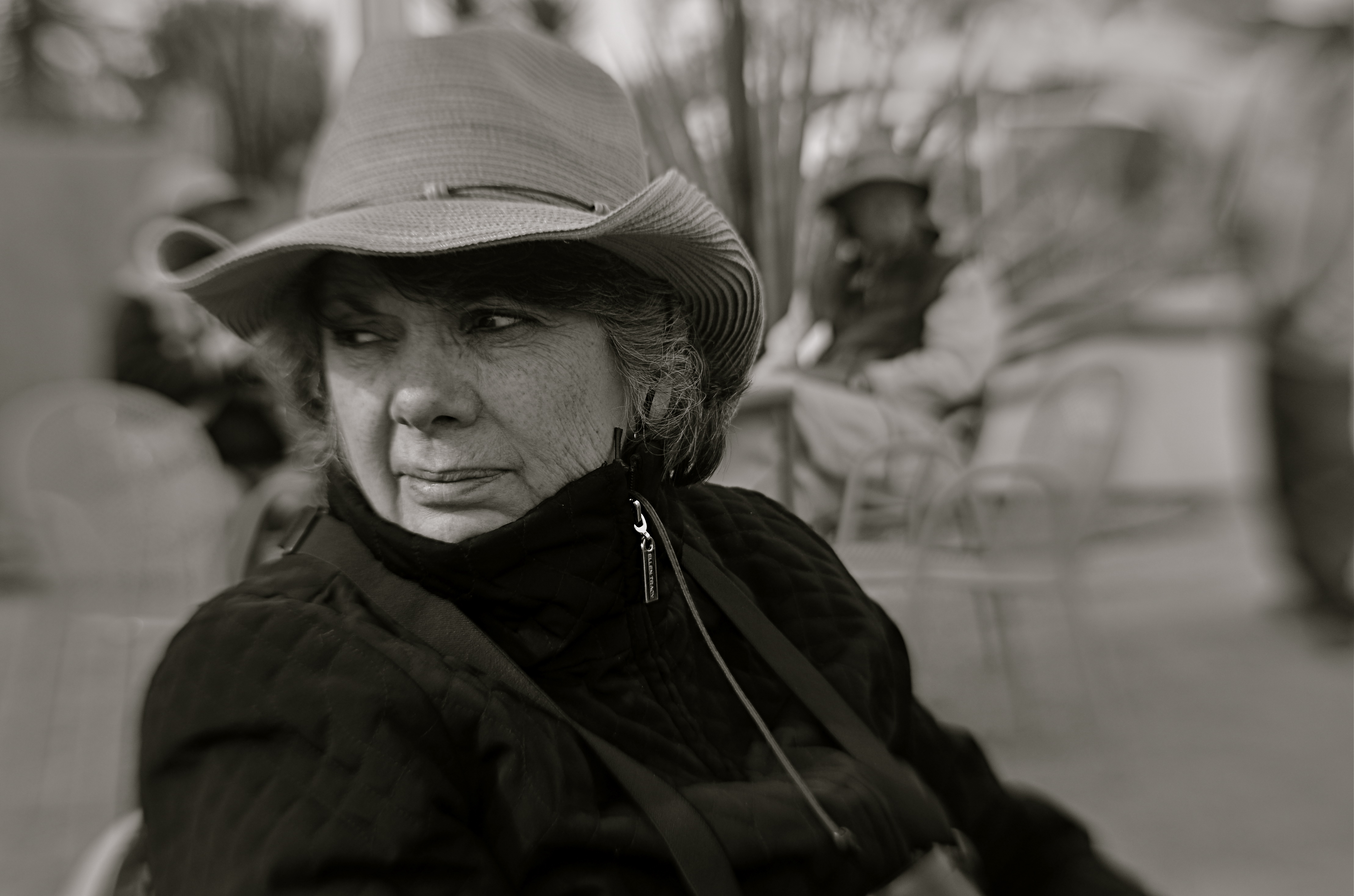
CHILDREN AND ANIMALS OPERATE IN WORLDS DIFFERENT ENOUGH FROM OUR OWN that they merit a special viewpoint when being photographed. Composing an image designed to enter into their special realities should facilitate that process, giving the viewer the idea that he has gained entry to their realms. The camera’s eye needs to seem to inhabit their actual living space.
I’ve felt for a long time that the formal K-Mart studio method of making a child’s portrait is stiflingly inadequate for plumbing that young person’s real animating spirit. And as for pets, the sheer daily deluge of animal snaps posted globally are served just as badly from over-formalizing or staging. Intimate insight into the self can’t be achieved by generic backdrops, tired props or balanced flash alone. If anything, such systems push the real child further away from view, leaving only a neutral facade in place of the true human. Personality locks eyes with the lens in unguarded, not choreographed, moments.
I’m not saying that no preparation should go into animal or child pictures. I am suggesting that a “snapshot mentality”, backed by lots of shooting experience, can yield results that are more organic, natural and spontaneous. Shoot in a moment but apply what you have learned over a lifetime.
Even the simple practice of shooting on your subject’s level, rather than shooting like a grownup, i.e., downhill toward your subject, can create a connection between your line of sight and theirs. If your kids and kitties are on the floor, go there. Another simple way to create an intimate feel is to have the child or pet dominate the frame. If there is some other feature of the room, from furniture to other people, that does not rivet your audience’s attention to the main subject, cut it out. Many, many portraits fail by simply being too busy.
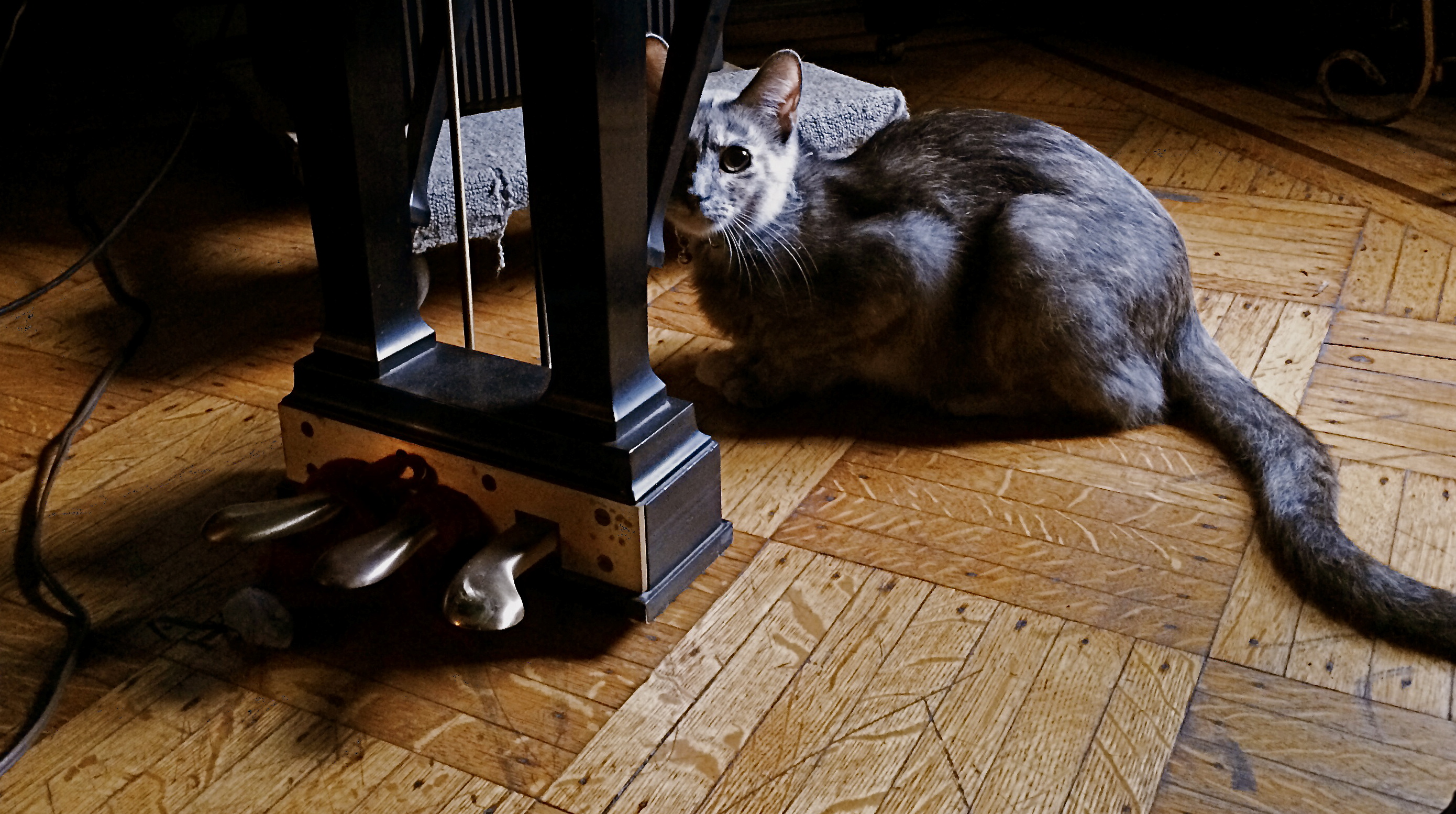
And, finally, catch your dog, cat, boy or girl doing something he’s chosen to do. Don’t assign him to play with a toy, or ask him to stand here, here, or here. Wait like a professional, then shoot fast like a snapshotter. The more invisible you become, the less distraction you provide. Looking at a child or pet enthralled by something is a lot more interesting than watching him watch you. If you do happen to lock eyes during the process, as in the case of the rather suspicious house cat seen above, steal that moment gladly, but don’t try to direct it.
Don’t draw your portrait subjects into your energy. Eavesdrop on theirs. The pictures will flow a lot more naturally, and you won’t have to work half as hard.
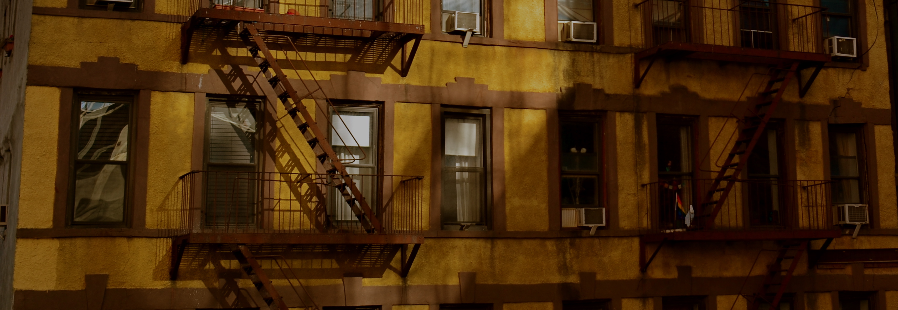
A TRICK OF THE LIGHT
By MICHAEL PERKINS
PHOTOGRAPHERS WHO TRACK THE SUN AS IT TRAVELS EAST TO WEST over the vast expanse of the Grand Canyon have made amazing images of the way light changes contours, shadows, even the sensation of depth and scale over the course of a single day. Such hour-by-hour portfolios present pictures which are less about the subject matter and more about how light shapes that subject. And the same tracking exercise is possible in canyons of another sort, the vertical jungles we call cities.
Buildings in urban settings reveal more in pictures than their own particular physical shapes and designs: they also have visual artifacts tattooed onto them from their neighbors, which block, warp and reflect light patterns in their direction. Thus the most architecturally drab tower can become hypnotic when bathed in patterns of shadows shaped by the tower next door. And that means that those seeking abstract images may find that ordinary parts of the city can be rendered extraordinary by light’s odd bounces. Additionally, the fact that many of these light effects are fleeting, visible, in some cases, only for minutes each day, presents both a challenge and an adventure for the photographer.
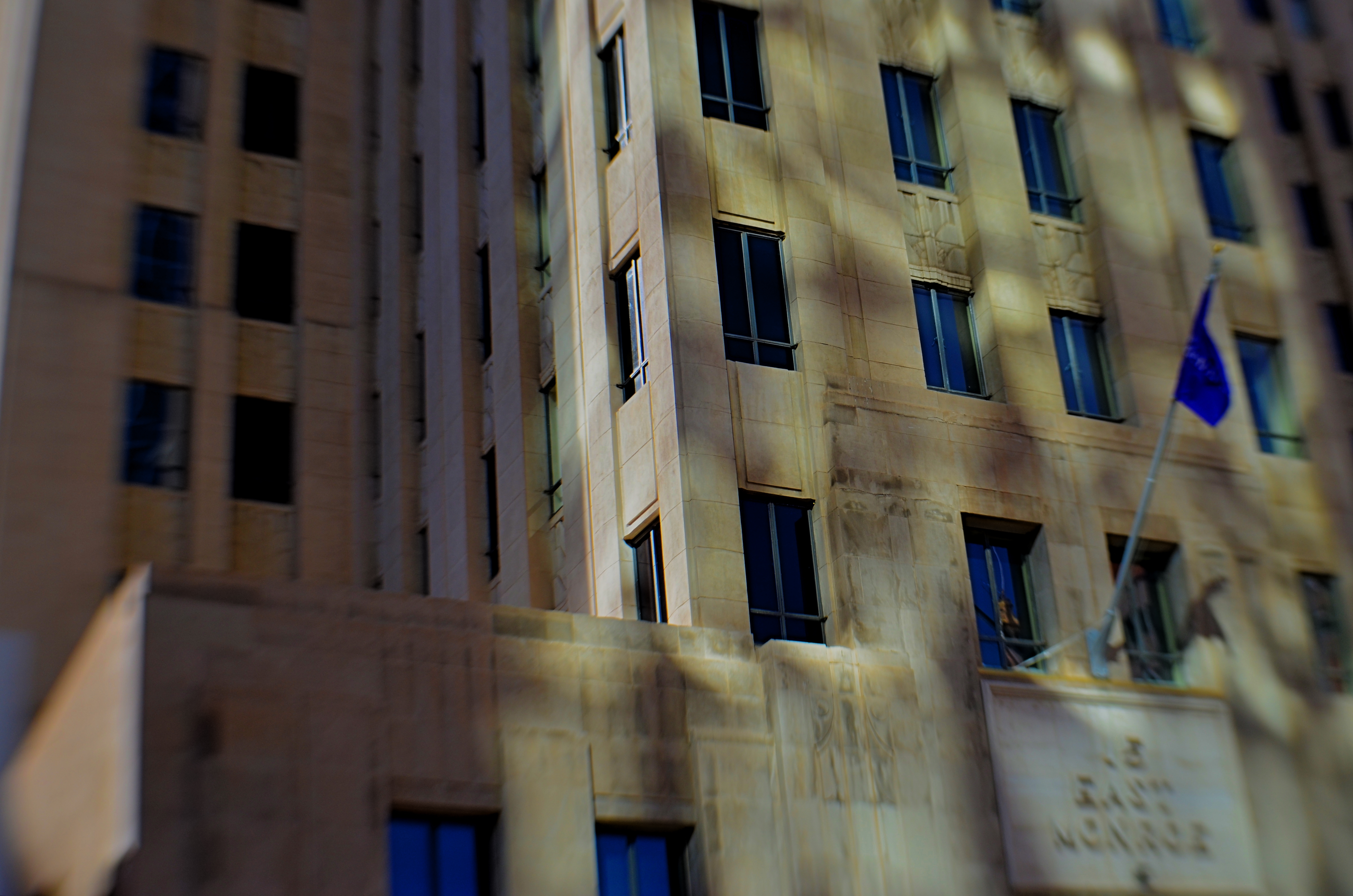
Fifteen East Monroe, 2016.
In the shot above, a gorgeous Art Deco building in downtown Phoenix, Arizona benefits from a light effect that has only been possible for the last forty years of its existence. Erected in the late 1930’s, the northern face of 15 East Monroe Street would not, at its opening, have been dappled with the shadow patterns seen here. No, it took a soul-less glass box from the ’70’s, located across the street, to bounce patterns of reflected light onto the building as you see it here, and only for about two hours a day between late morning and noon.
During that window, 15 East Monroe displays a wonderfully checkered mix of reflected illumination on its golden terra-cotta exterior. I first observed the patterns ten years ago, and have been going back for occasional looks ever since. The trick, in this image, was to keep the texture of the building from looking too sharp, since the effect itself is somewhat dreamy, and works better if the overall photo of the building is also a little soft. I used a selective focus lens (sharp at the middle, softer toward the edges) to give the overall building a gauzy look, and let the picture really be about the light effect, rather than any specific part of the building. Even at this point, I am imagining about a half-dozen other ways to accomplish this, but this image can at least serve as an initial study, a guideline for what may, eventually, be my final word on the subject.
Photography, clinically defined, is the art of writing with light. Sometimes, regardless of the object in our viewfinder, what light does to things is, by itself, enough for an interesting picture. It takes some restraint to let the light be the subject, and to let the picture, in its most basic form, breathe.
LEFT, RIGHT, LEFT
Both of the images in this improvised double-exposure were taken within a space of five minutes. Final processing was finished in ten.
By MICHAEL PERKINS
IN HER BRILLIANT 1979 BEST SELLER DRAWING ON THE RIGHT SIDE OF THE BRAIN, art teacher Betty Edwards, while obviously addressing the creative process chiefly as it regards graphics, also contributed to a better understanding of the same visualization regimen used by photographers. In its clear explanation of the complementary roles of the brain’s hemispheres in making an image, Ms. Edwards demonstrates that photographs can never be just a matter of chiefly left-brained technique or merely the by-product of unfettered, right-brained fancy.
And that’s important to understand as we grow our approach to our craft over time. It’s ridiculous to imagine that we can make compelling images without a certain degree of left-brained mastery, just as you can’t drive a nail if you don’t know how to hold a hammer. But it’s equally crazy to try to take pictures without the right-brained inspiration that sees the potential in a composition or subject even before the left knows how, technically, it can be achieved. One side problem-solves while the other dreams. One hemisphere is an anchor, a foundation: the other is a helium balloon.
When you develop a plan for your next shoot, selecting the lenses and tools you’ll need, scoping out the best locations, it’s all left brain. But, comes the day of the shoot, your right brain might just fall in love with something that wasn’t in the blueprint, something that just must be dealt with now. Fact is, neither side can hold absolute sway. When you are laboring a long time to get a particular picture, you can almost feel the two hemispheres arguing for control. But all that left-right-left toggling isn’t a bad thing, nor should you expect there to be one clear “winner” in the struggle. The pictures that emerge have to be an agreement, or at least a truce between “how do we do this?” and “why should we do this?”.
I have pictures, such as the one up top here, that I call five-minute wonders, so named because they go very quickly from conception to completion. They are like impulse items in the grocery checkout line. I’ll take some of this, a few of these, and one of those, toss them together in a bowl, and see what happens. Sounds very right-brained, right? However, none of these quickie projects would work if I simply don’t know how to make the camera give me what I want. That’s all left brain. The point is, the two factions must at least have a grudging conversation with each other. Right-brained creativity gets all the chicks and the cool clothes: it’s the flashy rock star of the photo universe, a sexy bad boy who just won’t listen to reason. However, Lefty has to take the wheel occasionally or Righty will crash the sports car and we’ll all die horribly.
It’s romantic to believe that all our great photographs come from blindingly brilliant flashes of pure inspiration. That’s where the lomography movement with its cheap plastic cameras and its “don’t think, shoot” mantra comes from. And impulse certainly plays its part. However, anyone who tells you that amazing images come solely from some bottomless wellspring of the soul is only telling you half the truth. Sometimes you can spend the day playing hooky, and some days you gotta stay inside and do your homework.
Left, right, left….
ADVENTURES IN INNER SPACE
By MICHAEL PERKINS
PHOTOGRAPHERS CHOOSE LENSES BASED ON LOTS OF CRITERIA, depending on what kind of “reality” they seek to visualize. In recent years, there has been a solid return to so-called “normal” or prime lenses, glass with focal lengths of 35-85mm which produce a perspective most like human vision, fairly free of the spatial distortion seen in ulta-wide lenses. At the same time, the use of ultra-wides in television and film, even for scenes in which a dramatic viewing angle is not particularly appropriate, is on the rise as well, and the widest consumer-level wides, including various types of fisheye lenses, are becoming sharper and cheaper than ever before.
I mention cinema here because it’s only after the emergence of 1950’s-era wide-screen processes like Panavision and Cinemascope that such lenses began to sell in larger numbers to amateur photographers, becoming an active part of the hobby. By the ’60’s, ultra-wides created stunning mutations of space in films like Stanley Kubrick’s Dr. Strangelove and Orson Welles’ The Trial, but, in such cases, the idea was still to deliberately distort reality for dramatic effect. Today, the most common “kit lens” accompanying a new DSLR is the 18-55mm, which at its widest, can make vertical lines bend inward in a way that is dramatic, but not a true measure of natural distance relationships. And, yes, they allow you to stand closer to your subject and “get it all in frame”, but, at that point, you’re also making a decision about whether your image is to be interpretive of reality, or reflective of it.
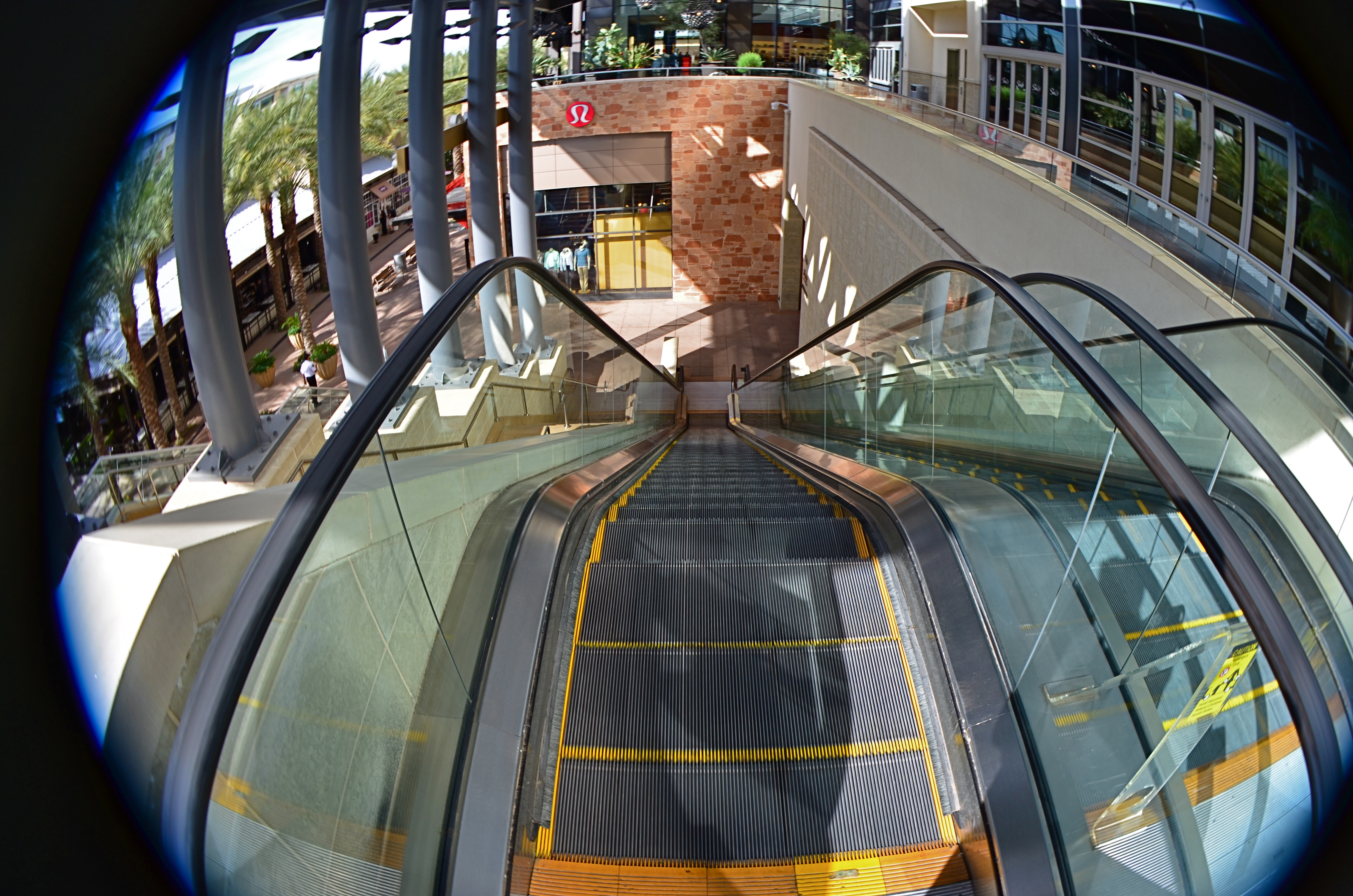
This mall escalator is nowhere near as high as a 13mm fisheye lens makes it appear.
Extreme wides, including fisheyes, can widen to 8 or 9mm, making the bending of lines so severe that the image elements seem to form a circle, with all lines arching sharply toward the center. And depending on what your image’s particular “reality” is to be, the distances of objects from front to back within the frame are also intensely exaggerated. Things which, in a “prime” lens image, appear just ten feet apart, can, in a fisheye shot, seem half a football field from each other. TV and film shooters exploit this big-time. If you’re shooting within a cramped interior and need to balloon its scope to suggest a larger scale, an ultra-wide really opens the place up. Medium-sized studios used in political debates now appear cavernous: ordinary city buildings shot wide for a crime drama take on intimidating height and depth, appearing to occupy entire blocks.
In the above image, if I want to make the viewer a little dizzy and daunted at the top of this rather modest escalator, I must use an ultra-wide to cheat, to trick the eye into concluding that it’s actually standing at the top of a sky-high ski jump. The tricky thing about ultra-wides, however, is that they mutate everything in the frame. And if part of that “everything” includes humans, your subjects can be taffy-twisted into some very alarming dimensions. Anything wider than about 24mm is downright uglifying for portraiture, unless a stylized effect is part of your interpretation. Lenses are not mere recording equipment. Their limits, biases, and faults can be exploited based on whatever kind of world you’re trying to conjure.
A TRIAL SEPARATION
Yeah, well, you see, the thing is, uh, what was the question?
By MICHAEL PERKINS
A PERSON’S RELATIONSHIP WITH PHOTOGRAPHY, MEASURED OVER A LIFETIME, can come to resemble a marriage, with all the occasional rifts, rumbles and repellents of living with anyone (or anything) nonstop ’til death. Just as any good golfer has thrown the odd club into the 7th hole lake, any shooter worth his emulsions/pixels will, at least once, consider pitching his gear into the nearest abyss, then setting a cheery bonfire of his accumulated work alight in the home driveway (after securing all necessary permits, of course). I dare you to deny it. We hate intensely because we have loved intensely, and fallen intensely short.
The fury eventually abates, however, and we resume the “on” portion of the on again/off again love of photography, not knowing when it next will toggle to “off”, or if switching back to “on” even has any prospect of success. The fact is, creative passion can generate emotional surges, microbursts of feeling so intense they could pop the top off a seismograph. This means answering “the questions” as they ring inside your skull:
Why did I ever start doing this?
What made me thing I’d ever be any good at it?
And where is that damned lens?????
In the interest of my own sanity, I never contemplate a total divorce from photography, but I avidly support the need for a trial separation from time to time. Every relief valve has to be opened and flushed out occasionally, and when the ideas, or the patience to execute them, seem to have gone south for the winter, you have to furlough the workers and shut down the plant. For a while. Hammering away at a problem with an image may eventually loosen what’s stuck, but it’s just as valuable to know when to lay down your tools and quit the scene. For a while. Once your brain is running on high-octane rage, all things beautiful and visionary will just be drowned out by all the screaming, so, really, I’m not kidding: accept the fact that occasionally you’ll announce to all your friends and family that you’re “over the whole photography thing”. And you will absolutely mean it.
For a while.
Here’s another thought: fake-quitting photography will provide the most severe test of how much you were into it in the first place. A trial separation is just that: a test to see if there was anything worth saving in the relationship. Scary process, but, if you come back, whether to a partner or a Nikon, you come back renewed and freshly committed to Make This Thing Work. All of a sudden, you’re bringing your Canon chocolates and roses, and arranging for a romantic candlelight dinner. And the work grows again.
For a while.
IT’S ALL WRONG BUT IT’S ALL RIGHT
I decided in the moment to go soft with this nature scene. Maybe I overdid it. Maybe it’s okay. Or not.
By MICHAEL PERKINS
ONE OF THE ONLY CONSTANTS OVER THE HISTORY OF PHOTOGRAPHY has been the flood tide of tutorial materials covering every aspect of exposure, composition, and light. The development of the early science of capturing images in the 19th century was accompanied, from the first, by a staggering load of “how to” literature, as the practice moved quickly from the tinkering of rich hobbyists to one of the most democratic of all the art forms. In little more than a generation, photography went from a wizard’s trick to a series of simple steps that nearly anyone could be taught.
In calling these pages the “photoshooter’s journey from taking to making”, we have made, with The Normal Eye, a deliberate choice not to add to the mountainous load of technical instruction that continues to be available in a variety of classroom settings, but to emphasize why we make photographs. This is not to say that we don’t refer to the so-called “rules” that govern the basics of creating an image, but that we believe the motives, the visions behind our attempts are even more important than just checking items off a list of techniques in the name of doing something “right”. There are many technically adept pictures which fail to engage on an emotional or aesthetic level, so the mission of The Normal Eye, then, is to start discussions on the “other stuff”, those indefinable things that make a picture “work” for our hearts and minds.
The idea of what a “good picture” is, has, over time, drifted far and wide, from photographs that mimic reality, to those that distort and fracture it, to images that are both a comment and a comment on a comment. It’s like any other long-term relationship: complicated. Like everyone else, I occasionally produce what I call a “fence-sitter” photo like the one above, which I can both excuse and condemn at the same time.
In raw technical terms, I have obviously violated a key rule with the abject softness of the image…..unless……unless it can be said to work within the context of the other things I was seeking in this subject. I was trying to stretch the envelope on how soft I could make the mix of dark foliage and hazy water in the scene, and, while I may have gone a bit too far, I still like some of what that near-blur contributes to the saturated color and lower exposure, the overall quiet tone I was trying for. Still, as of this moment, I’m still not sure whether this one is a hit or a miss. It might be on the way to something, but I just can’t say.
But that’s what the journey is about. It can’t be confined to mere technical criteria. You have to make the picture speak in your own language.
THE EVENTUALITY OF ABOUT
“Something’s going to happen. Something….wonderful!” —Astronaut David Bowman, “2010: The Year We Make Contact”
By MICHAEL PERKINS
PHOTOGRAPHY’S FIRST FUNCTION WAS AS A RECORDING MEDIUM, as a way to arrest time in its flight, to freeze select seconds of it. As evidence. As reference points. We were here. This happened. Soon, however, the natural expansion that art demands generated images of the things that happened before our direct experience. Ruins. Monuments. Cathedrals. Finally, the photograph began to speculate forwards. To anticipate, even guess, about what might be about to happen. That is the photography of the potential, the imminent. It’s rather ghostly. Indefinite. And all in the eyes of the creator and the beholder.
Is something about to happen? Does this place, this kind of light, truly portend something? Can a picture said to be ripe with the possibility of emerging events? I think they can, but these bits of pre-history are harder to sense than those we capture in the mere recording or retrieval functions of photography. In this case, we are not just witnesses or detectives, but seers. Of course, we may be wrong. Something may not happen as we seem to see it at present. History may not be made here. Perhaps no one will ever say or do anything extraordinary on this spot. The image of the possibility, then, becomes a kind of creative fiction, a pictorial what-if. And that places photos in the same arena as sci-fi, mysticism, poetry. If other arts can paint worlds that might be, why can’t a picture?

The Boardroom, 2016.
I don’t know why the meeting room shown here, which was being prepared for a conference later in the day, struck me. It might have been the somber color scheme, or the subdued light. It may have been the grand emptiness of it all; a room designed to be packed with people, sitting there, waiting for them to animate it. I just know that it was enough to slow my trek through a resort hotel long enough to try to show that potential. For what? A moment of high corporate drama? The end of someone’s career, the launch pad for a bold new idea? The meeting that might redraw the map of human destiny? Or nothing?
Ah, but what actually happens after the photo is taken is mere reality, and never to be matched or compared with the strong sense of eventuality that can linger in an atmosphere before something occurs. These kind of images are not, after all, witnesses to anything, but visions of the possible. And that is the essence of photography, where even a medium invented to record reality can ofttimes transcend it.
MANY FACES, ONE FAMILY
By MICHAEL PERKINS
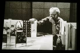
Edward Steichen looks over a scale model of the 1955 Family Of Man show, the most famous photographic exhibit of all time.
I FEEL THAT THERE SHOULD ALWAYS HAVE BEEN A NOBEL PRIZE FOR PHOTOGRAPHY, just as there always has been for literature. Why one of the lively arts should be deemed more capable of uplift or inspiration than another is beyond me. I even think that a photo Nobel might be more inspiring, overall, than the majority of images that cop the journalistic Pulitzer prize each year, since so many of the winning entries focus on horror, loss, war, and suffering….you know, the stuff that sells newspapers.
If there ever had been a Nobel for photography, I can think of no more obvious winner than the legendary Family Of Man exhibit, mounted by Edward Steichen, which just observed its sixtieth anniversary with a marvelously updated edition of its original catalogue book. Steichen, who in 1955 was the director of photography for the Museum of Modern Art, was himself a grand master of still-lifes, portraits, fashion, architectural, and even floral studies, whose own output towered over the world for over seven decades. However, he used the Family show not to showcase his own work but to show the universality of the human experience across every culture on the planet, as interpreted by over 273 photographers in 69 countries. Mounted in cooperation with the United States Information Agency as a diplomatic tool, The Family Of Man celebrates those things that unite us, not the petty divisions amplified by journalists and other mischief makers. It is an inventory of births, deaths, weddings, rituals, weddings, wars, discoveries, and delights. It is a miraculous catalogue on the phenomenon of being human.
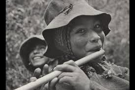
The Peruvian flute player whose portrait became the official visual logo of the Family Of Man project.
Over the years, the optimistic message of Family Of Man fell victim to the ironic detachment and busted ideals of several generations of hipper-than-thou cynics, some criticizing it as a Pollyanna-ish vision of mankind, others saying that it rendered many individual photographers faceless by jumbling all their work together. In fact, all photos in the exhibit are captioned with their creator’s name as well as his/her nation of origin. And as for hope being the antithesis of honest art…well, if you hold that belief, you’re wasting your time here.
Over sixty years later, The Family Of Man remains one of the towering achievements of art and journalist photography, reassembled now in its original presentation format at Clervaux Castle in Steichen’s home country of Luxembourg. Art must be about raising us up, even as we use it to remain mindful of how far we have to come as a race. But I will always, always vote on the side of hope, as Edward Steichen did. The Family Of Man is neither sugar-coated nor bleak. It is both imperfect and filled with potential, as we ourselves are. And its credo, as stated in 1955, remains a lesson for anyone trying to use a camera to chronicle the human condition:
“There is only one man in the world and his name is All Men.There is only one women in the world and her name is All Women.There is only one child in the world and the child’s name is All Children.”
LAYERS OF LEARNING
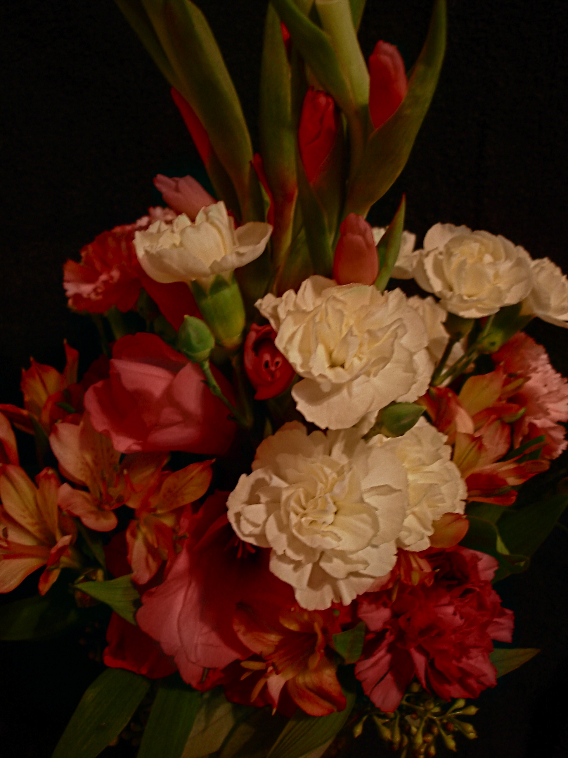
I have had to change my approach to flowers over a lifetime, and I still don’t “get” them in a real way.
By MICHAEL PERKINS
AS A YOUNG PIANO STUDENT, I NOTICED THAT MANY OF MY FAVORITE SHORT WORKS all bore the elegant, mysterious name of etude. It was somewhat later that I realized that this was merely the French word for a “study”, and that some of what I regarded as highly developed, final compositions were, essentially, first versions, practice runs by the masters in search of some eventual greatness. And, since I was an illustrator as well as a musician, the idea of an etude as a prototype, a first version of something dovetailed nicely with the idea of a sketch, or as my father called it, a “rough”. An etude was a work in progress.
Then came photography and, with it, the giddy short-term gratification of just snapping a picture, of crossing a visual item off one’s to-do list. We are, as humans naturally attracted to the process of completion, of turning out a finished product. Click. Done. Moving on….However, despite what the auction houses and gallery curators of the world might try to tell you, art is not a product, and just like those melodiously wondrous etudes, the best images are always in the process of being created. You can always take a picture to another level, but you can’t finish it.
Walk across to the painters’ side of the Art building every once in a while and look at how many preliminary studies Leonardo or Michelangelo made of their greatest works, or the number of “early” and “late” versions there are of these same masterpieces. Now, travel back to the photography wing and witness Ansel Adams taking one crack after another at the same stony face of El Capitan, often merely reworking the same master negative up to a half dozen times over decades. You simply have to make different pictures of the same subjects across a lifetime, just because your idea of what’s important to show keeps evolving.
Finally, look objectively at your own output and discover how many of your older images are “good pictures” and how many are good ideas for pictures. You’ll no doubt find your own personal “etudes”, the studies that can still become something better. In my own case, I have to walk away from floral subjects from time to time, then return to approach them with a different mindset, since I’m equally fascinated and clueless as to how to imbue them with anything approaching soulfulness. My eye struggles to make something magical emerge from buds and bouquets as others have done. But I’ll stay at it.
Digital processes make it possible to crank through a wide variety of approaches to the same subject in a very short span of time compared to film-based techniques. Think easy-fast-cheap. Or think good-better-best if you like. Either way, the layers of learning are stacked ever higher and deeper, allowing us to regard photography as process instead of product. So do your scales every day, keep your fingers high and curved, and stay curious.
GLASS DISTINCTIONS
It went “zip” when it moved and “bop” when it stopped,
And “whirr” when it stood still.
I never knew just what it was and I guess I never will.
Tom Paxton, The Marvelous Toy
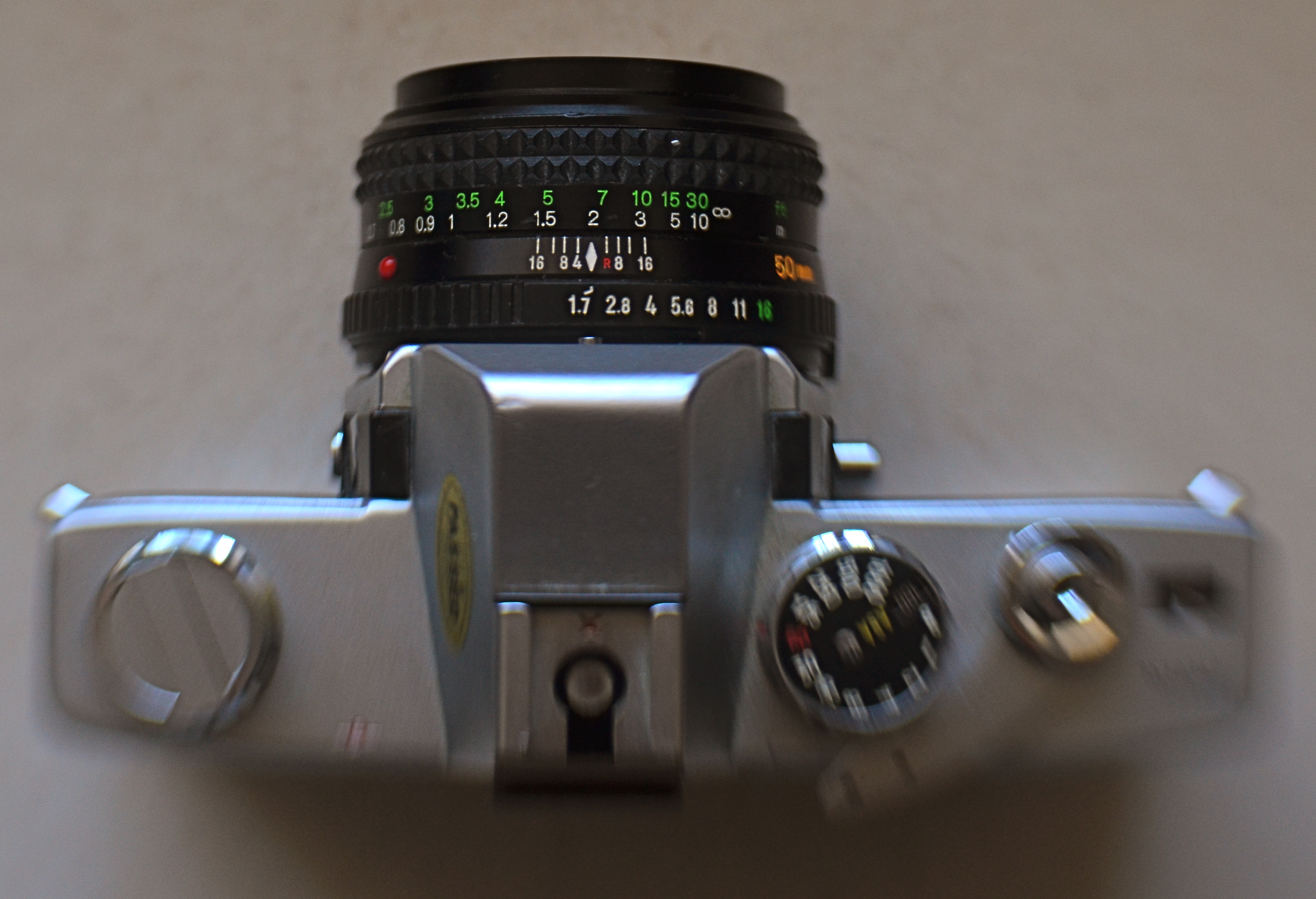
My antedeluvian Minolta SRT-500 camera body, crowned by its original f/1.7 50mm prime kit lens. Guess which part is worth its weight in gold?
By MICHAEL PERKINS
THERE ARE MORE OLD LENSES THAN THERE ARE OLD CAMERAS. There’s a reason for this. Bodies come and go like spring and fall dress collections. Lenses are the solid, reliable blue jeans that never go out of style. Lenses hold their value for decades, often selling for (or even above) their original asking prices. Bodies become landfill.
Many times, when people believe they have outgrown their cameras, they are actually just in need of glass that performs better. The importance of selecting a lens is as important in the digital age as it was in the film era. The eye through which you visualize your dreams has to be clear and precise, and so does the thinking that goes into its selection. That process, for me, breaks down into three main phases.
First, before you buy anything, raise a prayer of thanks for the Holy Internet. There is, now, not only no need, but also no excuse to buy the wrong lens. Read the manufacturer’s press releases. The reviews from both pros and amateurs nearest your own skill level. And be ecumenical about it. Read articles by people who hate the lens you think you love. Hey, better to ID a problem child before he’s living under your roof. Watch the Youtube videos on basics, like how to unpack the thing, how many parts it has, how to rotate the geetus located to the left of the whatsit to turn it on. Find out how light efficient it is, because the freer you are of flash units and tripods, the better for your photography. And, at this early shopping stage, as with all other stages, keep asking yourself the tough questions. Do I really need another lens, or do I just need to be better with what I already own (which is cheaper)? Will it allow me to make pictures that I can’t currently make? Most importantly, in six months, will it be my “go-to”, or another wondrous toy sleeping in my sock drawer?
Assuming that you actually do buy a new lens after all that due diligence, nail it onto your camera and force yourself to use it exclusively for a concentrated period. Take it on every kind of shoot and force it to make every kind of picture, especially the ones that seem counter-intuitive. Is it a great zoom? Well, hey, it might make an acceptable macro lens as well. But you’ll never know unless you try. You can’t even say what the limits of a given piece of glass are until you attempt to exceed them. Find out how well it performs at every aperture, every distance, every f/stop. Each lens has a sweet spot of optimum focus, and while that may be the standard two stops above wide open, don’t assume that. Take lots of bad pictures with the lens (this part is really easy, especially at the beginning). They will teach you more than the luck-outs.
Final phase: boot camp for you personally. Now that you have this bright shiny new plaything, rise to the level of what it offers. Prove that you needed it by making the best pictures of your life with it. Change how you see, plan, execute, edit, process, and story-tell. See if the lens can be stretched to do the work of several of your other lenses, the better to slim down your profile, reduce the junk hanging around your neck, and speed up your reaction time to changing conditions.
Work it until you can’t imagine how you ever got along without it.
BOTH ENDS OF FREEDOM
Every camera ever manufactured can make this image, if the right person is behind it. It’s your eye that matters, not your toys.
A camera is a tool for learning how to see without a camera. —Dorothea Lange
By MICHAEL PERKINS
THERE IS A REAL DISCONNECT BETWEEN THE “FIRST CAMERAS” OF A GENERATION AGO and those of people just entering the art of photography today. Of course, individual experiences vary, but, in general, people born between 1950 and 1980 first snapped with devices that were decidedly limited as compared to the nearly limitless abilities of even basic gear today. And that creates a similar gap, across the eras, between what skills are native to one group versus the other.
To take one example, if your first camera, decades ago, was a simple box Brownie, the making of your pictures was pretty hamstrung. You had to purposefully labor to compensate for what your gear wouldn’t do. A deliberate plan had to be followed for every shot, since you couldn’t count on the camera to allow for, or correct, your mistakes. With a device that came hardwired with a single aperture, a shutter button, and not much else, you had to be mindful of a whole array of factors that could result in absolute failure. The idea of artistic “freedom” was sought first in knowledge, then, much later, in better equipment.
But if, on the other hand, you begin your photographic development with a camera that, in the present era, is almost miraculously flexible and responsive, freedom is a given. In a sense, it’s also a restraint of a different kind. That is, with bad gear, you’re a hero if you can wring any little bit of magic out of the process. But with equipment that can almost obey your every command, the old “I left the lens cap on”-type excuses are gone, along with any other reason you may offer for not getting at least average results. Thus the under-equipped and the over-equipped have two different missions: one must deliver despite his camera, while the other strives to deliver despite himself.
The entire gist of The Normal Eye is that I believe that even remarkable cameras (and the world is flooded with them) will betray the unseeing eye that mans them. Likewise, the trained eye will create miracles with anything handy. Our thrust here at TNE is toward teaching yourself the complete basics of photography as if you were actually constrained by limited equipment. At the point at which you’ve fully mastered the art of being better than your camera, then, and only then, is it time to get a new camera. Then learn to out-run that one, and so on.
The promise made by cameras today is the same promise that’s always been made by ever-advancing technology, that of wonderful results with minimum effort. It’s the photo equivalent of “eat whatever you want and still lose weight”. But it’s a false promise; photography only becomes art when we ask things of ourselves that our cameras cannot provide by themselves. Anything else is learning to accommodate mediocrity, a world of “pretty good”.
Which, inevitably, is never really good enough.
CONJURING GHOSTS
I know all the songs that the cowboys know
‘Bout the big corral where the doggies go
‘Cause I learned them all on the radio
Yippie yi yo kai yay
“I’m An Old Cowhand”, music and lyrics by Johnny Mercer
By MICHAEL PERKINS
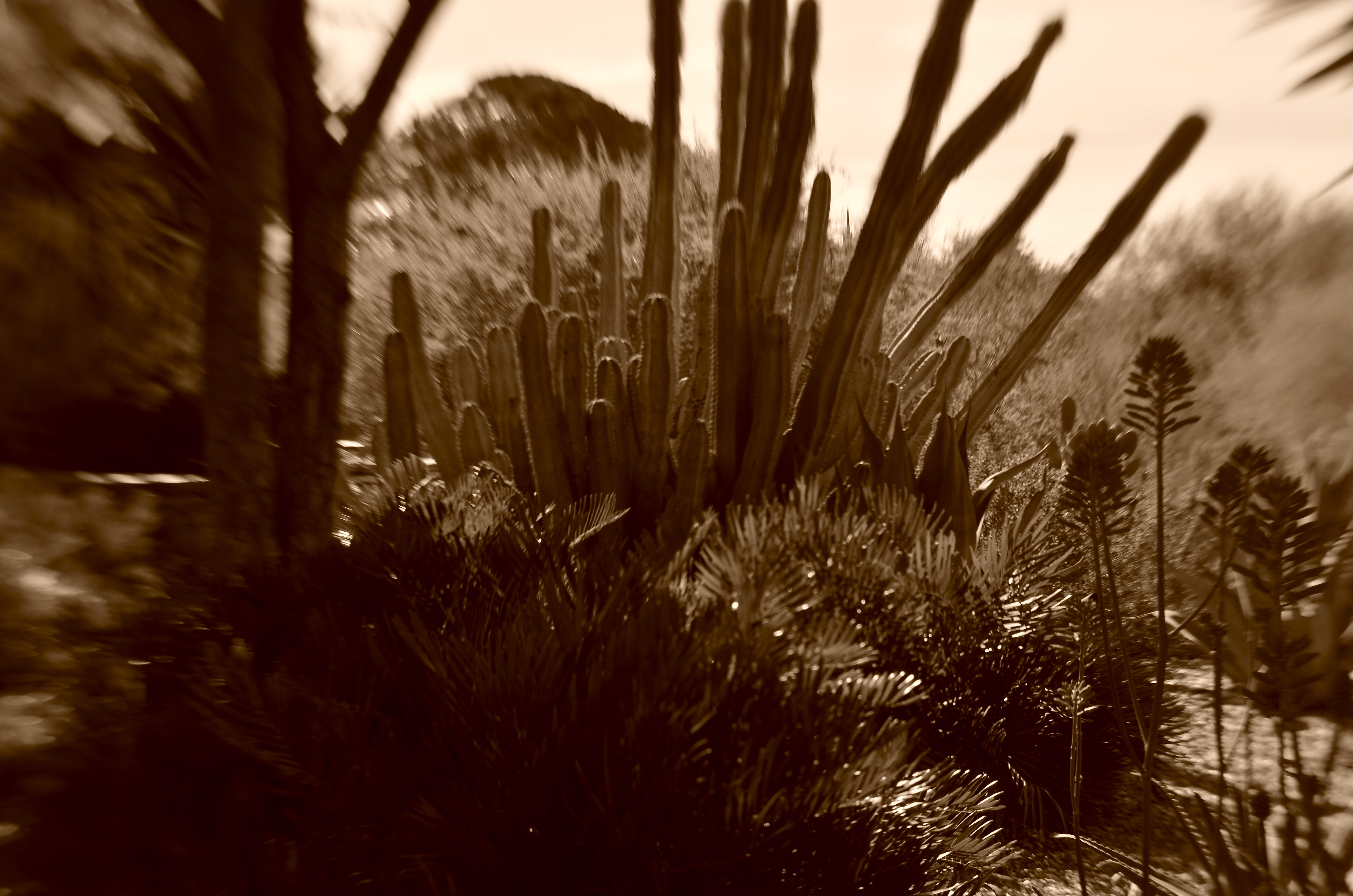
SOMETIMES IT SEEMS THAT WE ARE NEVER REALLY FINISHED with photography’s past, using today’s technology to summon forth the look and spirit of what we see as the early innocence of the art. Photographers are always trying to wrench free of yesteryear, and yet, in our images, we love to romance the echoes of the shooters that we were, as well as the world that what there to shoot.
We like to conjure ghosts.
We’ve reached a place where, through one process or another, it’s easy to evoke almost any phase of photography we desire, a strange nostalgia that has artificially extended the use of film by a good many years into the digital era. We like the feel, the habits, even the defects of film as a storage medium. We build brand-new pinhole box cameras: we revive and repair old tool dies so we can manufacture factory-fresh editions of defective old gizmos. We write computer code that allows our smartphones to imitate the grain and texture of archaic celluloid emulsions.
Of course, there has to be subject matter to feed all this retro-tech, and, in the American west, the medium matches the message as we drench memories of the frontier in our own brew of reflective processes. Sepia tone, soft focus, high contrast, long exposures, all of them are used to summon the bygone glories of cactus and canyon. The settling of the west will always create a kind of poignant ache for photographers. The surveyors, the settlers, even the Hollywood myth-makers all stole a march on us. We bring our cameras to try to spook up a smidgen of the Big Pictures that we missed.
It’s a kind of harmless fakery that we paint upon mesa and mountain, a re-interpretation of a truth none of us really knows for sure. It’s dressing up to play cowboys and indians, with the camera’s eye to help make the best, most authentic forgeries we can muster. Living in the west in the 21st century, I find that conjuring ghosts, like indulging in any other kind of fantasy photography, is like building a doll house. I control the furniture, the wall paper, the layout of the rooms. We all arrived to late to ask the Riders of the Purple Sage to smile for the birdie. But there are still smiles of a sort, even an occasional tear, to be drawn in the dust.
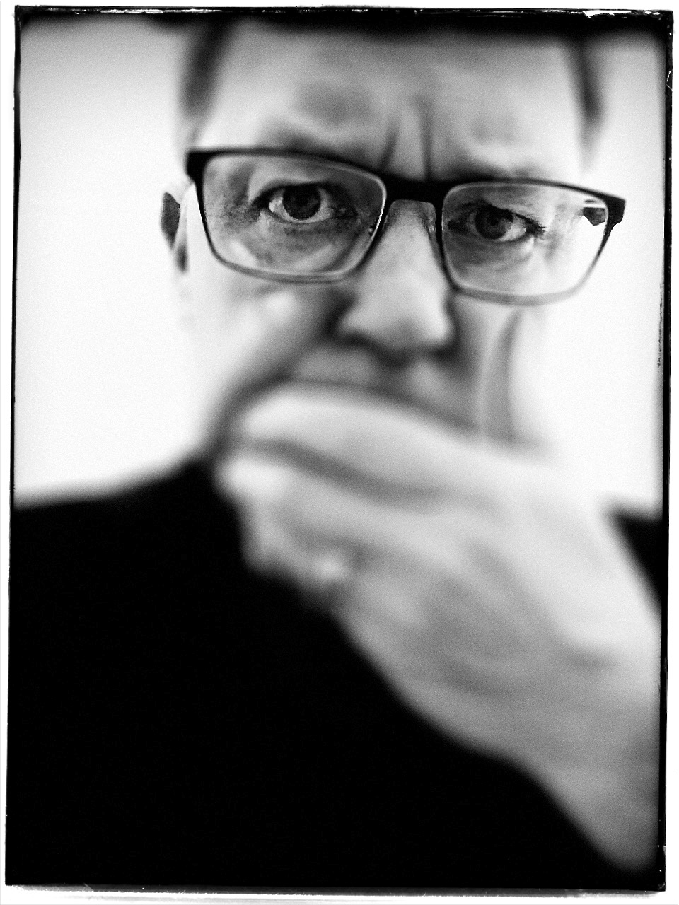
SAVING FACE
Looking West, 2016. A portrait shot with a Lensbaby Composer Pro, an effects lens with a moveable “sweet spot” of selective focus.
By MICHAEL PERKINS
THE CREATIVE USE OF SHARPNESS is one of the key techniques in photography. From the beginning of the medium, it’s been more or less conceded that not everything in an image needs to register at the same level of focus, that it can be manipulated to direct attention to the essence of a photograph. It’s always about telling the viewer to look here, ignore this, regard this as important.
This selective use of focus applies to the human face no less than to any other element in a composition. It’s strange that photography drew so strongly on painting in its early years without following the painter’s approach to portraits…..that is, that individual parts of a face can register in different degrees of sharpness, just like anything else in the frame. From the earliest days of photo-portraiture, there seems to have been an effort to show the entire face in very tight focus, de-emphasizing backgrounds by hazing them into a soft blur. It took a while before photography saw itself as a separate art, and thus this “always” rule only became a “sometimes” rule over a protracted period of time.
The Pictorialism fetish of the early 20th century, which avidly imitated the look of paintings, went completely the other direction, generating portraits that were almost uniformly soft, as if shot through gauze, or, you guessed it, painted on canvas. In recent years, shooters have begun a new turn toward a kind of middle stance, with the selective use of sharpness in specific parts of a face, say an eye or a mouth. It’s more subtle than the uniform crispness of olden days, and affords shooters a wider range of expression in portraits.
Some of this has been driven by technology, as in the case of the Lensbaby lenses, which often have a tack-sharp “sweet spot” at their center, with everything else in the frame fanning outward to a feathery blur. Additionally, certain Lensbabies, like the Composer Pro, are mounted on a kind of ball turret, allowing the user to rotate the center of the lens to place the sweet spot wherever in the image he/she wants. This makes it possible, as in the above shot, for parts of objects that are all in the same focal plane to be captured at varying degrees of sharpness. Note that, while all of the woman’s face is the same distance from the camera, only her eyes and the right side of her face are truly sharp. This dreamlike quality has become popular with a new breed of portraitists, and, indeed, there are already wedding photographers who advertise that they do entire events exclusively with these kinds of lenses.
The face is a composition element, and, as such, benefits from a flexible approach to focus. One man’s blur is another man’s beautification.
ALONE AGAIN, UNNATURALLY

Lunch For One, 2011. Your choices as a photographer will determine if the woman in the cafeteria is alone…or lonely.
By MICHAEL PERKINS
PEOPLE ARE ONE OF THE MOST COMPLICATED ELEMENTS in a photographic composition. Unlike furniture, foliage or flotsam, humans are the one “prop” in an image which convey associations and meanings that render a photo complex, troubling, intriguing. Put a person in your picture and you have changed the terms upon which you engage the audience.
At the very least, you have posed a series of questions which color the viewer’s reaction to your work. What is that person doing there? What does he wish for, or intend? What are his dreams, his goals? Is she merely in the picture, or in some way a commentary on her context within it? You can move things around in the name of composition alone, but move a person and you have started a conversation.

The original framing for the above shot.
The placement of people in a frame creates speculation about the motives and origins of those people before they were in the frame. A man shown standing at the platform at a train station could be eagerly awaiting an arrival, sneaking out of town, or merely wandering around. The mind starts to supply his backstory, if you like, his actions before appearing in the finite world of the frame. Put two people side by side, and you have, according to your viewer’s whim, a rendezvous, a goodbye, a conspiracy, a reunion, a chance meeting. People change the perceived intention of a photograph as a storyboard, either in the original framing or in the cropping afterwards.
The above image is the final crop of what was, originally, a scenic overview, taken at a large campus of museum buildings on a hillside. The image, as first conceived, was an overall “postcard” with the restaurant in only the lower right quarter of the frame. Later, I became aware that a single woman was visible in the cafe. Now, it’s not that she was actually the only person inside, but the photograph could be cropped to make her seem like it, meanwhile accentuating the emptiness in her immediate area.
As a consequence, instead of a lady who is merely alone, the image can make her seem “lonely”. Or perhaps you disagree. The point is that, by changing the human information in the frame (note that, in the original of the cropped shot, there is also a man standing outside the restaurant), we’ve re-drawn its narrative.
What gets left out of a picture, then, sparks speculation by the viewer, based on what has been left in.
LOOKS LIKE IT WORKS
Ghost Writer In Disguise, 2016
By MICHAEL PERKINS
PHOTOGRAPHY OFTEN RE-DEFINES OUR PERCEPTION OF THE FAMILIAR, re-contextualizing everyday objects in ways that force us to see them differently. Nowhere is this more effective than in close-up and macro photography, where we deliberately isolate or magnify details of things so that they lose their typical associations. Indeed, using the camera to cast subjects in unfamiliar ways is one of the most delightful challenges of the art.
Product developers are comfortable with the idea that “form follows function”, that how we use a thing will usually dictate how it must be designed. The shapes and contours of the objects in our world are arrived at only as we tailor the look of a thing to what it does. That’s why we don’t have square wheels. The problem with familiar objects is that, as long as they do what they were designed to do, we think less and less about the elegance of their physical design. Photographers can take things out of this chain of the mundane, and, in showcasing them, force us to see them in purely visual terms. They stop playing the piano, and instead look under the lid at the elegant machine within. They strip off the service panel of the printer and show us the ballet of circuitry underneath.
It’s even easier to do this, and yields more dramatic results, as we begin to re-investigate those things that have almost completely passed from daily use. To our 21st-century eyes, a 1910 stock ticker might as well be an alien spaceship, so far removed is it from typical experience. I recently viewed a permanent wave machine from a beauty parlor of the 1930’s, sitting on a forgotten table at a flea market. It took me two full minutes to figure out what I was even looking at. Did I snap it? You betcha.
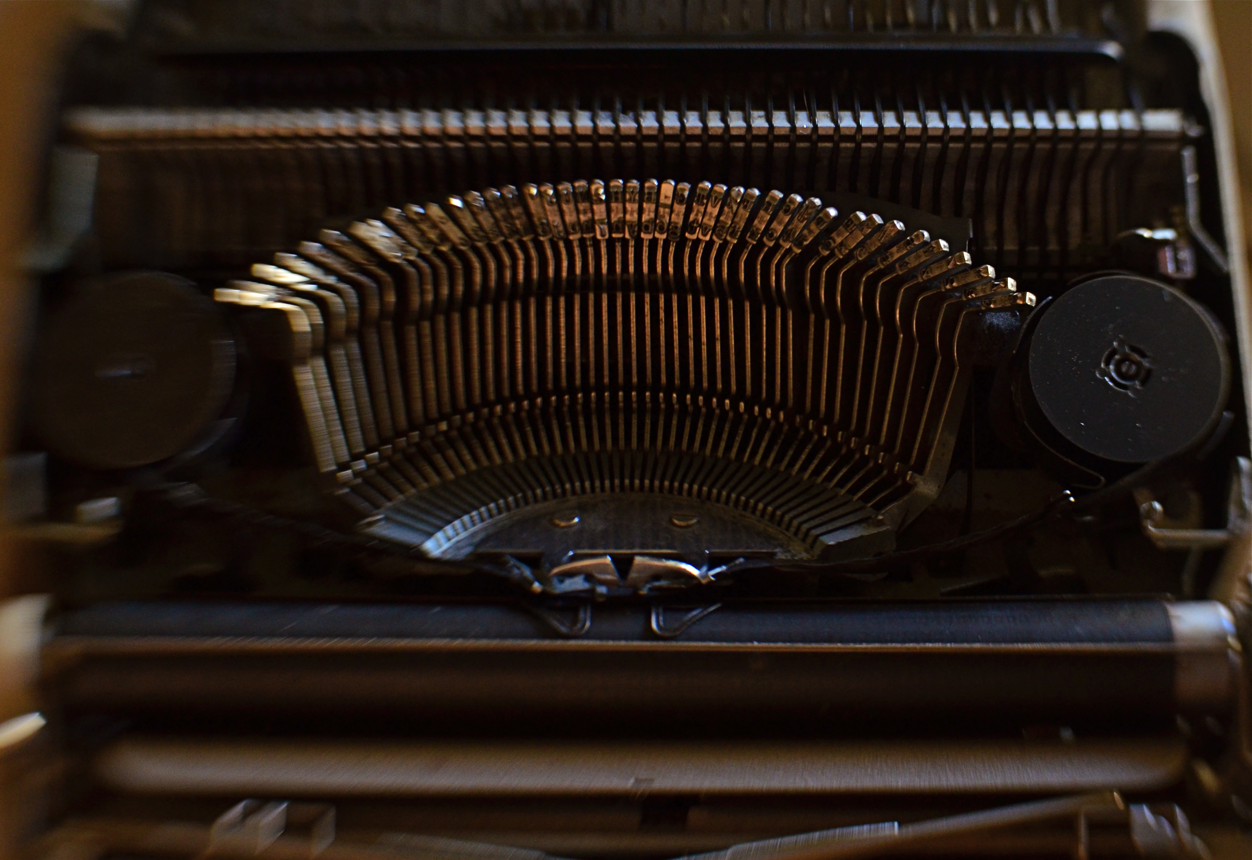
The study of bygone function is also a magical mystery tour of design innovation. You start to suss out why the Edisons of the world needed this shape, these materials, arranged in precisely this way, to make these things work. Zooming in for a tighter look, as in the case of the typewriter in the above image, forces a certain viewpoint, creating compositions of absolute shapes, free to be whatever we need them to be. Form becomes our function.
The same transformation can happen when you have seemingly exhausted a familiar subject, or shot away at it until your brain freezes and no new truth seems to be coming forth. Walking away from the project for a while, even a few hours, often reboots your attitude towards it, and the image begins to emerge. As Yogi Berra said, you can observe a lot just by watching.
TERMS OF ENGAGEMENT
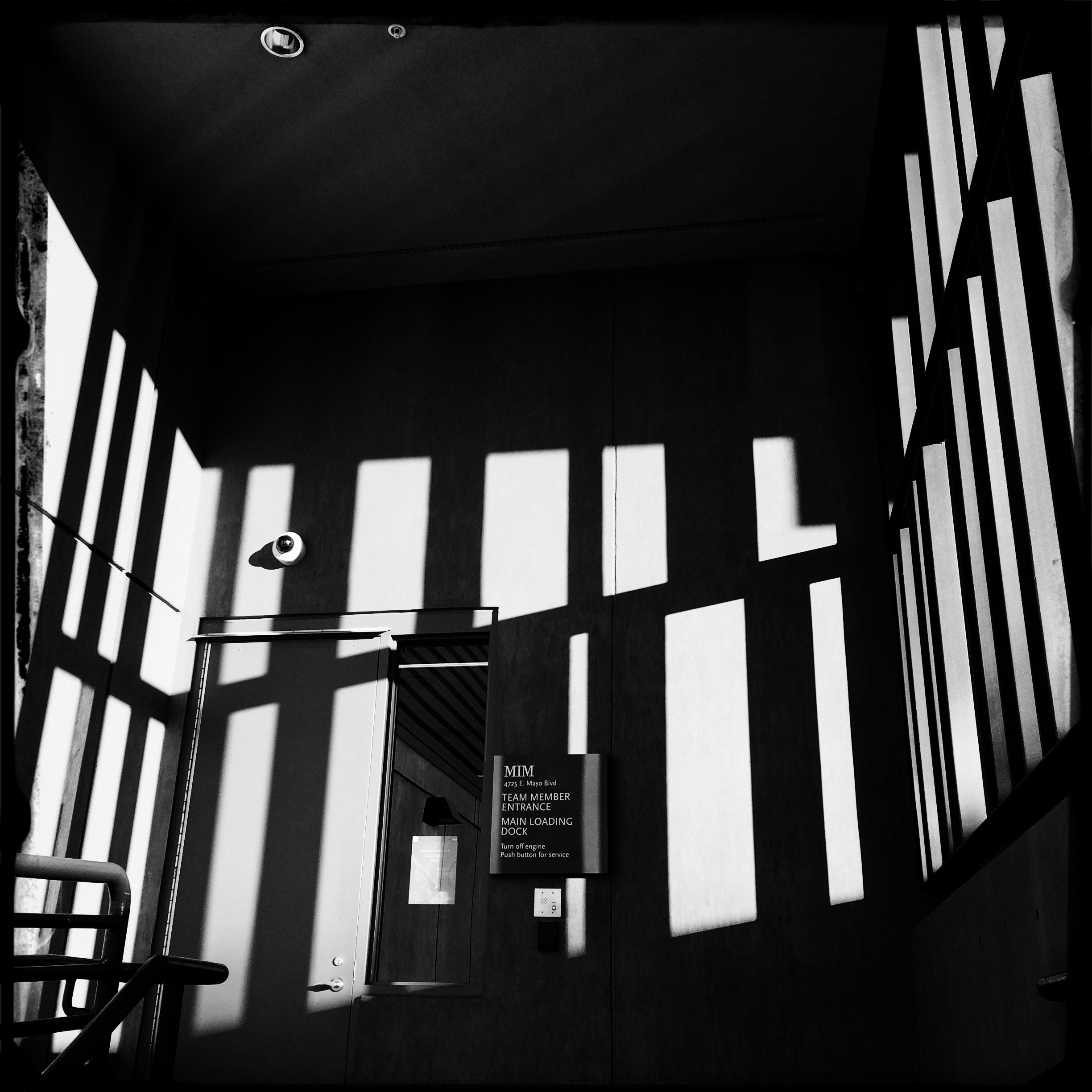
A very soft color cel phone original becomes a stark “box”, suggested solely by a pattern of black and white bands.
By MICHAEL PERKINS
ABSTRACT COMPOSITIONS AREN’T MERELY A DIFFERENT WAY OF PHOTOGRAPHING A SUBJECT: they are, in many cases, the subject itself. Arrangements of shape, shadow and contrast can be powerful enough to carry the weight of a picture all by themselves, or at least be an abbreviated, less-is-more way of suggesting objects or people. And in terms of pure impact, it’s no surprise that photographers who, just a generation ago, might have worked exclusively in color, are making a bold return to black and white. For abstract compositions, it’s often the difference between a whisper and a shout.
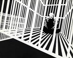
Cartoonist Frank Miller sculpts solid space out of a mix of black and white rays.
I find it interesting that the medium of comics, which has long been defined by its bold, even brutal use of color, is also experiencing a black & white resurgence in recent years, with such masters as Frank Miller (Batman: The Dark Knight Returns) rendering amazing stuff in the most starkly monochromatic terms. Likewise, the army of apps in mobile photography has reminded young shooters of the immediacy, the power of monochrome, allowing them to simulate the grain and grit of classic b&w films from Tri-X to Kodalith, even as a post-production tweak of a color original.
You know in the moment whether you’ve captured a conventional subject that sells the image, or whether some arrangement of forms suggestive of that subject is enough. In the above shot, reducing the mild color tonal patterns of a color original to bare-boned, hard blacks and loud whites creates the feel of a shaded door frame..a solid, dimensional space. The box-like enclosure that envelops the door is all there, but implied, rather than shown. As a color shot, the image is too quiet, too…gentle. In monochrome, it’s harder, but it also communicates faster, without being slowed down by the prettiness of the browns and golds that dominated the initial shot.
There are two ways to perfect a composition; building it up in layers from nothing into a “just-enough” something, or stripping out excess in a crowded mash-up of elements until you arrive at a place where you can’t trim any further without losing the essence of the picture. Black and white isn’t just the absence of color: it’s a deliberate choice, the selection of a specific tool for a specific impact.
THE BLUE LION
The “natural” colors in the original of this shot were the “wrong” colors for what I wanted to say. So I changed them.
By MICHAEL PERKINS
I CONDUCT TOURS FOR KINDERGARTEN STUDENTS AT PHOENIX’ MUSICAL INSTRUMENT MUSEUM, the world’s largest collection of its kind on the planet. Frequently, I ask my young guests, who are viewing various animal-inspired music exhibits in the Asia gallery, why the sculpted lions seen on South Korean chimes are blue. Now, in fact, there are no lions in Korea, so in summoning the big cat’s strength and courage as a protective symbol for their music, the locals probably had to try to imagine one, including its features and hues. But pose this question to a five-year-old and the answers are far more instinctual:
“They wanted to”.
“Cause it looks cool that way”.
“It’s their lion…they can do what they want.”
Never do these children suggest that the lion is blue because the Koreans don’t know the “correct” color, nor do they think that there’s anything about its color that renders it “inaccurate”. And when I ask if they’ve ever used a “different” crayon to color something just the way they want it, every hand shoots up. Of course. Why wouldn’t I?
It’s my coloring book. I can do what I want.
Early color photography was about reproducing nature faithfully, accurately recording and reproducing reality. That makes sense, since you must have a standard before you can wander away from that standard. And at a time when color imaging was a novelty, science understandably put the emphasis on “getting it right”, which for publication and printing purposes, was a big enough mountain to climb, at first.
However, we have long since entered a phase in which the colors which nature or our eyes have assigned to an object is only one way, not “the” way to creatively depict it. We can use color counter-intuitively, emotionally. We can cast an image in every aspect of the rainbow, not merely within the narrow channel of “reality”. Color interpretation is surely as important as exposure or any other aspect of making a picture. In the above photo, my mind needed this old row house to be drenched in the burned gold of sunset. Since I was shooting at one in the afternoon, that wasn’t going to happen, so….
And if we forget to think with a child’s suppleness as we age into old habits, the next generation is always there to prod us back into the same state of wonder that makes a five-year-old perfectly okay with creatively colored animals. Recent retro movements among shooters, for example, include the simulation of improperly processed film, which is an optional filter on many of today’s phone apps. It’s a deliberate choice to take the quirky color caused by a lab error and turn it into an interpretive tool.
The over-arching rule here is: try it and see what happens. You don’t need to defend your choice to a committee or write a lengthy treatise (like this one) on why it’s justified.
You just have to wonder what a blue lion might look like.
THE THIRD CHANNEL

In a square framing, this warehouse district seems self-contained, isolated from the greater city around it.
By MICHAEL PERKINS
OVER THE HISTORY OF PHOTOGRAPHY, OUR CHOICES OF HOW TO PRESENT A PICTURE has changed as well as the means by which we shoot it. Certainly in the film era, sizes and formats shifted from square to landscape to portrait, and those shapes were reflected in the dimensions of the final prints or slides. You know, shoot it wide, print it wide. Somewhere between the waning days of prints and the first waves of pixels, however, the square nearly winked out for a while, and, with it, a particular way of composing a shot. Luckily, it’s back in full force.
In the portrait-oriented original, extra buildings and street space dilute the impact of the cropped square.
It’s had help. Instagram and some retro-film cameras forced the square upon a new generation of shooters, and nearly all phones and phone apps readily offer it as a framing or editing choice. Strangely, manufacturers of DSLRs and other high-end cameras offer no option for shooting in square format, although they all include square cropping in their in-camera re-touch menus. This means that many photographers have to dream square but shoot otherwise, mentally composing the eventual square framing of their subjects in the moment, or even discovering, in edit sessions, that there is a decent square image inside their larger ones just waiting to be let out.
I have recently looked to deliberately edit in favor of the square, since I think that the format forces a kind of compact, centralized story-telling that might be diluted or weakened by wider or longer compositions. Looking at my initial landscape or portrait images, I ask myself if the entire force of the picture could be amped by squaring it off. Sometimes you think a shot calls for one orientation or the other, when the third channel of the square is actually a better tool. Hey, you can’t know everything at the moment of snap.
I do wish that DSLRs would routinely offer the chance to initially shoot in square, just as cheap hipster film cameras and phones already do. Not having every possible tool at your disposal seems wrong, somehow, and, with all the other gimmicks that are offered in higher-end cameras, from fake star twinkles to faux pencil-sketch effects, the inclusion of a third framing orientation just makes sense.
FACE TIME
The resurrected World Trade Center, as seen at eye (rather than “craning neck”) level. 1/125 sec., f/5.6, ISO 100, 24mm.
By MICHAEL PERKINS
I AM OFTEN ASKED WHY ARCHITECTURE FIGURES SO STRONGLY in my photography, and I can only really put part of my answer into words. That’s what the pictures are for. I imagine that the question itself is an expression of a kind of disappointment that my work doesn’t focus as much on faces, as if the best kind of pictures are “people pictures”, with every other imaging category trailing far behind. But I reject that notion, and contend that, in studying buildings, I am also studying the people who make them.
Buildings can be read just as easily as a smile or a frown. Some of them are grimaces. Some of them are grins. Some of them show weary resignation, despair, joy. Architecture is, after all, the work of the human hand and heart, a creative interpretation of space. To make a statement? To answer a need? The furrowed brows of older towers gives way to the sunny snicker of newborn skyscrapers. And all of it is readable.
In photography, we are revealing a story, a viewpoint, or an origin in everything we point at. Some buildings, as in the case of the first newly rebuilt World Trade Center (seen above), are so famous that it’s a struggle to see any new stories in them, as the most familiar narratives blot the others out of view. Others spend their entire lives in obscurity, so any image of them is a surprise. And always, there are the background issues. Who made it? What was meant for it, or by it? What world gave birth to this idea, these designs, those aims?
Photography is about both revelation and concealment. Buildings, as one of the only things we leave behind to mark our having passed this way, are testaments. Read their faces. No less than a birthday snapshot, theirs is a human interest story.
S.O.O.C….and S.O.W.H.A.T.
By MICHAEL PERKINS
IF YOU REGULARLY POST IMAGES TO PHOTO SHARING SITES, you will no doubt have come upon groups or albums labeled S.O.O.C., or Straight Out Of The Camera, pictures that purport to have transitioned seamlessly from shutter click to social post without being further touched by human hands. The fact that such a designation even exists says something about how we see the creative process, or what we deem as “pure” about it.
The raw math of photography dictates that only a micro-percentage of your total work will actually come fully formed from your camera, emerging, as Athena did, intact from the forehead of Zeus. Rather, the majority of what we shoot is re-shot, re-thought, shaped, edited, and re-combined before we put a gold frame around it, which only makes sense. Photography is a process, not just a recording product. We grow into a better understanding of our best shots no less than our worst ones. That means that clinging to “straight out of the camera” as some kind of badge of excellence or ideal is counter-intuitive to the idea of photography as an organic art.

Yes, this shot delivered almost everything I was aiming at, but that don’t mean it’s “Straight Out Of The Camera.” Read on….
More simply, any so-called “perfect” pictures we create in the moment are a mixture of luck as well as talent, of chance as well as design. To slap a collective S.O.O.C. label on all such fortunate convergences of cosmic fortune is to think of that “flawlessness” as an end unto itself. Does the fact that you didn’t further mold an image after shooting it render it better, more authentic somehow, than one which was later manipulated or massaged? What gets the gold star, the best complete realization of a picture, regardless of the number of intermediate steps, or the bragging rights associated with blind luck? Case in point: in the above image, I did, indeed, get nearly everything I wanted out of the picture, but it was also the 15th frame I shot of the subject before I was even partly satisfied, so how “straight out” is that??
And what of the photographs that are less than “perfect” (according to whom?) from a technical standpoint? Can’t an underexposed or ill-focused shot contain real impact? Aren’t there a number of “balanced” exposures that are also as dull as dishwater? Moreover, can’t a shot be improved in its power after being re-interpreted in processing? The straight-out-of-the-camera designation is either meaningless, or sends completely the wrong message. Creativity seldom moves in a straight line, and almost never comes fully realized in its first form. Photography’s aim should never be to aim for an easy lay-up from mid-court, and labels that suggest that lucky is the same as eloquent do the art a disservice.
