I’M LOOKING THROUGH YOU
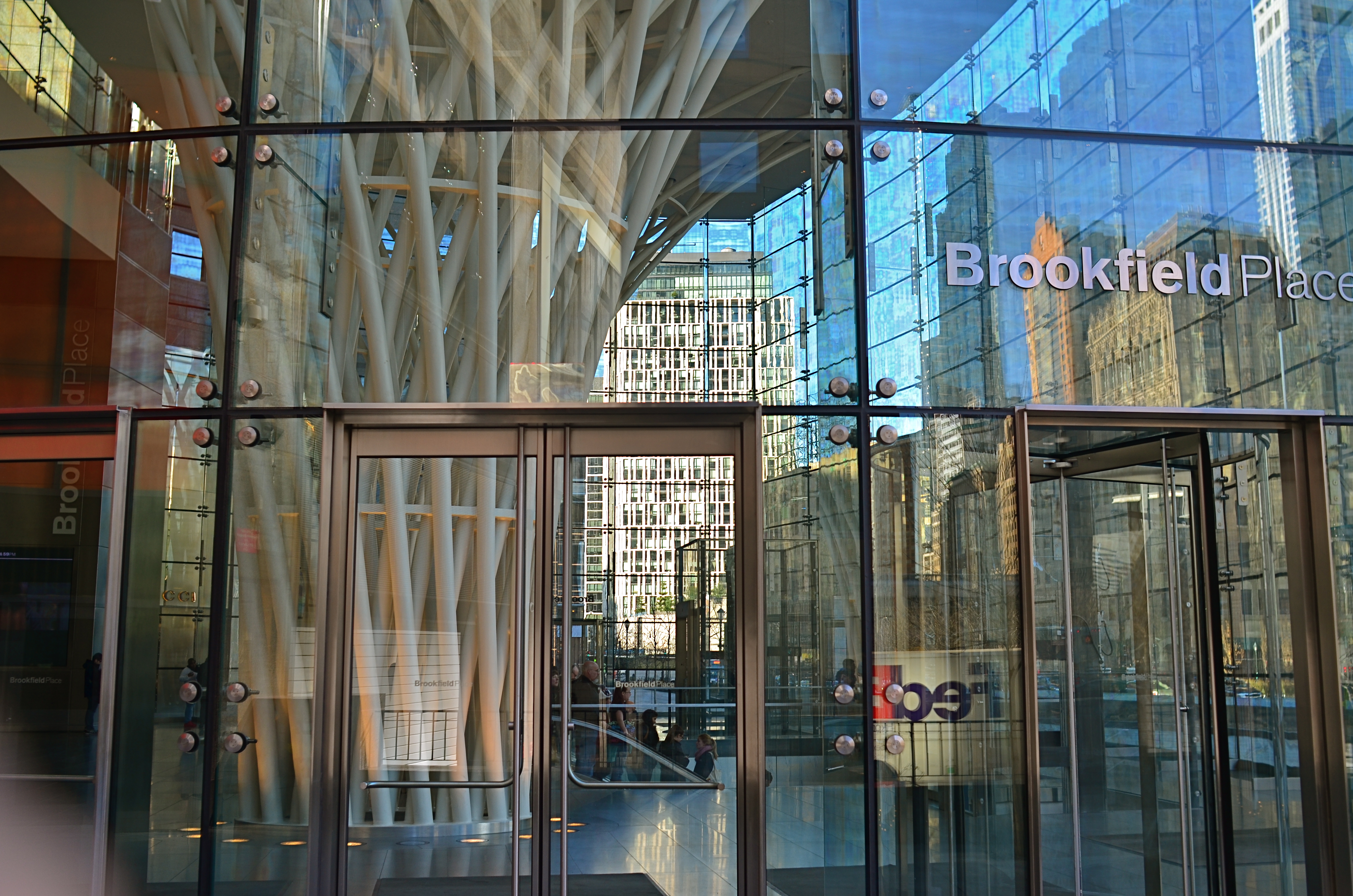
Brookfield Breaklight, 2016.
By MICHAEL PERKINS
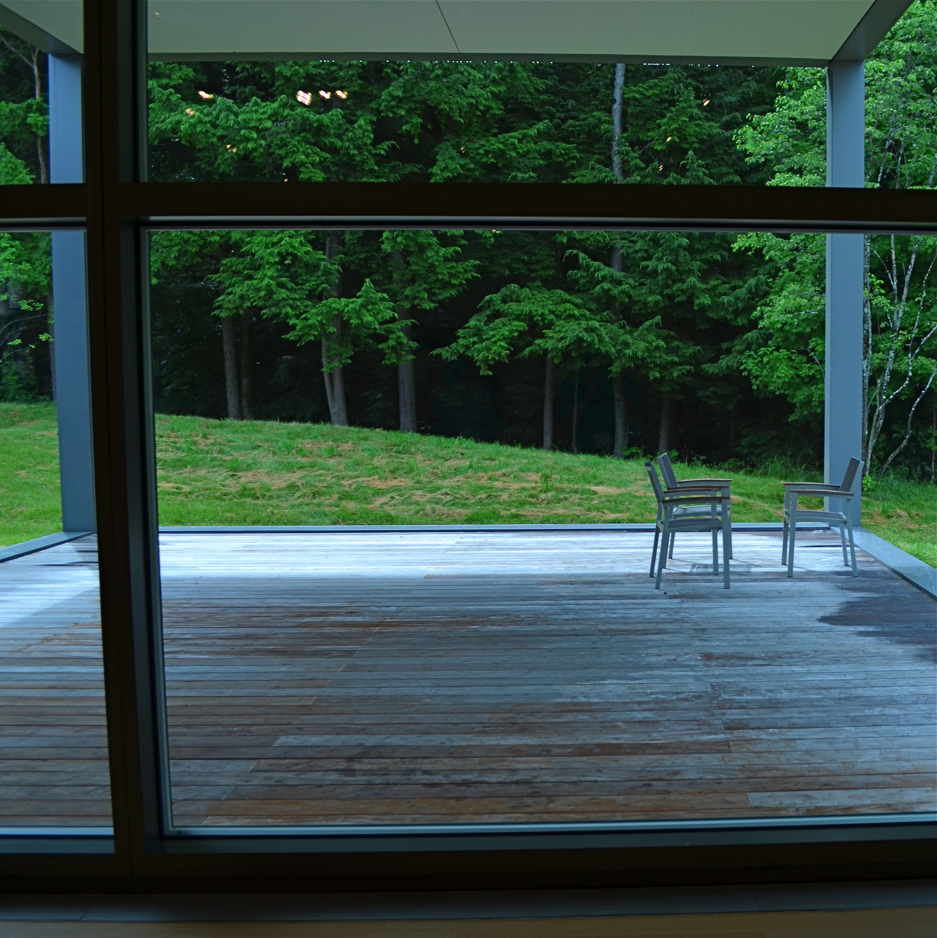
ANYONE WHO REGULARLY PHOTOGRAPHS GLASS SURFACES realizes that the process is a kind of shot-to-shot negotiation, depending on how you want the material to react and shape your subject. There is really no absolute “look” for glass, as it has the ability to both aid and block the view of anything it’s around, in front of, or near. Viewed in different conditions and angles, it can speed the impact of an image, or foil it outright.
I love shooting in urban environments, where the use of glass has shifted dramatically in recent decades. Buildings that were 90% brick or masonry just fifty years ago might be predominantly wrapped in glass today, demonstrably tilting the ratios of available light and also changing what I call the “see-through” factor…the amount of atmosphere outside a building can be observed from inside it. This presents opportunities galore of not only what can be shown but also how abstracted glass’ treatment of reflection can serve a composition.
Against the advice of many an online pundit, I keep circular polarizing filters permanently attached to the front of all my lenses so that I can modify reflections and enhance color richness at my whim. These same pundits claim that leaving the filter attached when it’s not “needed” will cost you up to two stops of light and degrade the overall image quality. I reject both these arguments based on my own experience. The filters only produce a true polarizing effect if they are either at the right viewing angle vis-a-vis the overhead sun, or if they are rotated to maximize the filtering effect. If they don’t meet either of these conditions, the filters produce no change whatever.
Even assuming that the filter might be costing you some light, if you’ve been shooting completely on manual for any amount of time, you can quickly compute any adjustments you’ll need without seriously cramping your style. Get yourself a nice fast lens capable of opening to f/1.8 or wider and you can even avoid jacking up your ISO and taking on more image noise. Buy prime lenses (only one focal length), like a 35mm, and you’ll also get better sharpness than a variable focal length lens like an 18-55mm, which are optically more complex and thus generally less crisp.
In the above image, which is a view through a glass vestibule in lower Manhattan, I wanted to incorporate the reflections of buildings behind me, see from side-to-side in the lobby to highlight selected internal features, and see details of the structures across the street from the front of the box, with all color values registering at just about the same degree of strength. A polarizer does this like nothing else. You just rotate the filter until the blend of tones works.
Some pictures are “about” the subject matter, while others are “about” what light does to that subject, according to the photographer’s vision. Polarizers are cheap and effective ways to tell your camera how much light to allow on a particular surface, giving you final say over what version of “reality” you prefer. And that’s where the fun begins.
TERMS OF ENGAGEMENT
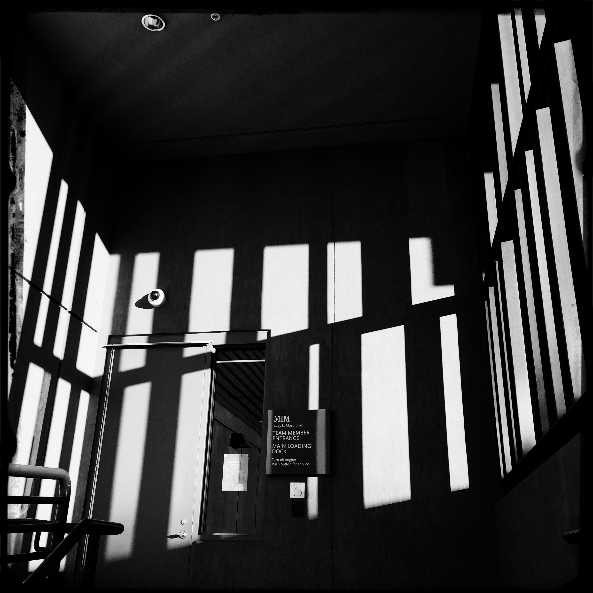
A very soft color cel phone original becomes a stark “box”, suggested solely by a pattern of black and white bands.
By MICHAEL PERKINS
ABSTRACT COMPOSITIONS AREN’T MERELY A DIFFERENT WAY OF PHOTOGRAPHING A SUBJECT: they are, in many cases, the subject itself. Arrangements of shape, shadow and contrast can be powerful enough to carry the weight of a picture all by themselves, or at least be an abbreviated, less-is-more way of suggesting objects or people. And in terms of pure impact, it’s no surprise that photographers who, just a generation ago, might have worked exclusively in color, are making a bold return to black and white. For abstract compositions, it’s often the difference between a whisper and a shout.
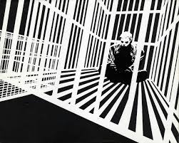
Cartoonist Frank Miller sculpts solid space out of a mix of black and white rays.
I find it interesting that the medium of comics, which has long been defined by its bold, even brutal use of color, is also experiencing a black & white resurgence in recent years, with such masters as Frank Miller (Batman: The Dark Knight Returns) rendering amazing stuff in the most starkly monochromatic terms. Likewise, the army of apps in mobile photography has reminded young shooters of the immediacy, the power of monochrome, allowing them to simulate the grain and grit of classic b&w films from Tri-X to Kodalith, even as a post-production tweak of a color original.
You know in the moment whether you’ve captured a conventional subject that sells the image, or whether some arrangement of forms suggestive of that subject is enough. In the above shot, reducing the mild color tonal patterns of a color original to bare-boned, hard blacks and loud whites creates the feel of a shaded door frame..a solid, dimensional space. The box-like enclosure that envelops the door is all there, but implied, rather than shown. As a color shot, the image is too quiet, too…gentle. In monochrome, it’s harder, but it also communicates faster, without being slowed down by the prettiness of the browns and golds that dominated the initial shot.
There are two ways to perfect a composition; building it up in layers from nothing into a “just-enough” something, or stripping out excess in a crowded mash-up of elements until you arrive at a place where you can’t trim any further without losing the essence of the picture. Black and white isn’t just the absence of color: it’s a deliberate choice, the selection of a specific tool for a specific impact.
PUT ‘ER IN REVERSE
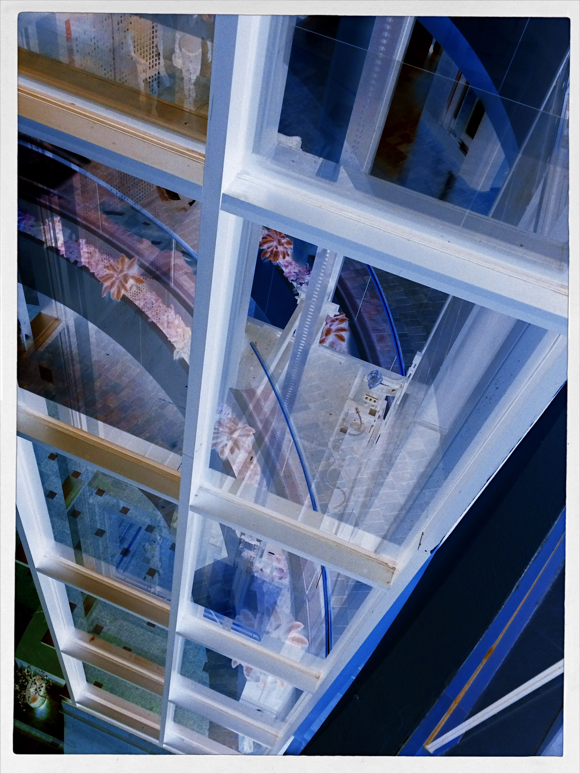
A glass elevator at a shopping mall, converted to a negative, then a fake Technicolor filter in a matters of seconds, via the phone app Negative Me.
By MICHAEL PERKINS
THERE ARE MANY WAYS TO FORCE YOUR AUDIENCE TO SEE THINGS ANEW, to strip away their familiar contexts as everyday objects and create a completely different visual effect. The first, and most obvious form of abstraction we all learned in our cradle, that of rendering a subject in black and white. Some early photographers spent so many years in monochrome, in fact, that they actually regarded early color with suspicion, as is it was somehow less real. The moral of the story is: the photograph demonstrates the world that you dictate, shown strictly on your own terms.
Abstraction also comes about with the use of lenses that distort distances or dimensions, with re-assignment of color (green radishes, anyone?), and by compositions that extract subjects from their natural surroundings. Isolate one gear from a machine and it becomes a different object. Magnify it, light it differently, or show just a small portion of it, and you are taking it beyond its original purpose, and into abstraction. Your viewer is then free to re-interpret how he sees, or thinks, about that thing.
One swift gift of the post-digital world that I find interesting is the ability, through apps, to render a negative of any image with a click or swipe, then modifying it with the same color filters that you might apply to a positive photo. This affords an incredible amount of trial-and-error in a remarkably short space of time, and better yet, you’re out in the world rather than in the lab. Of course, negatives have always been manipulated, often to spectacular effect, but always after it was too late to re-take the original picture. Adjustments could be made, certainly, but the subject matter, by that time, was long gone, and that is half the game.
The eerie look of a an aerial reconnaissance photo, here applied to a city model at Legoland.
Reversing the color values in a photograph is no mere novelty. Sometimes a shadow value can create a stunning design when “promoted” to a lead value with a strong color. Sometimes the original range of contrast in the negative can be made more dramatic. And, occasionally, the reversal process renders some translucent or shiny surfaces with an x-ray or ghostly quality. And, of course, as with any effect, it can just register as a stupid novelty. Hey, it’s a gimmick, not a guarantee.
“Going negative”, as they say in the political world, is now an instantaneous process, allowing you the most flexibility for re-takes and multiple “mixes” as you combine the neg with everything from toy camera effects to simulated Technicolor. And while purists might rage that we are draining the medium of its mystery, I respectfully submit that photographers have always opted for fixes that they can make while they are in the field. And now, if you don’t like the direction you’re driving, you can put ‘er in reverse, and go down a different road.
ABSOLUTES
This image isn’t “about” anything except what it suggests as pure light and shape. But that’s enough. 1/250 sec., f/5.6, ISO 100, 35mm.
By MICHAEL PERKINS
THE POPULARLY-HELD VIEW OF THE HISTORY OF PHOTOGRAPHY makes the claim that, just as video killed the radio star, camera killed the canvas. This creaky old story generally floats the idea that painters, unable to compete with the impeccable recording machinery of the shutter, collectively abandoned realistic treatment of subjects and plunged the world into abstraction. It’s a great fairy tale, but a fairy tale nonetheless.
There just is no way that artists can be regimented into uniformly making the same sharp left turn at the same tick of the clock, and the idea of every dauber on the planet getting the same memo that read, alright guys, time to cede all realism to those camera jerks, after which they all started painting women with both eyes on the same side of their nose. As Theo Kojak used to say, “nevva happennnned…”
History is a little more, er, complex. Photography did indeed diddle about for decades trying to get its literal basics right, from better lenses to faster film to various schemes for lighting and effects. But it wasn’t really that long before shooters realized that their medium could both record and interpret reality, that there was, in fact, no such simple thing as “real” in the first place. Once we got hip to the fact that the camera was both truth teller and fantasy machine, photographers entered just as many quirky doors as did our painterly brothers, from dadaism to abstraction, surrealism to minimalism. And we evolved from amateurs gathering the family on the front lawn to dreamers without limit.
I love literal storytelling when a situation dictates that approach, but I also love pure, absolute arrangements of shape and light that have no story whatever to tell. As wonderful as a literal capture of subjects can be, I never shy away from making an image just because I can’t readily verbalize what it’s “about”. All of us have photos that say something to us, and, sometimes, that has to be enough. We aren’t always one thing or the other. Art can show absolutes, but it can’t be one.
There is always one more question to ask, one more stone to turn.
SPREADING OUT THE SPRAWL
By MICHAEL PERKINS
PANORAMIC PHOTOGRAPHY IS REGARDED BY MANY AS A BIT OF A GIMMICK, an effect confined to the same realm as 3-d, fisheye lenses and faked pictures of cats driving sports cars. As a result, it’s rare that a pano is used for anything serious beyond landscape views, and, although apps have allowed even modest phone cameras to produce a modified panoramic effect, the majority of shots are still of ultra-wide, scenic vistas….the view from the beach to the resort hotel two blocks inland, and so forth.
But panos can be used to convey both scope and scale on subjects that have nothing to do with mountains or shorelines, and it’s encouraging to see more new photographers using the recently evolved technology to take advantage of that storytelling option. To use one example, the whole concept of sprawl–congested cities, vast arrays of clutter, the aftermath of the industrial age—seems custom-made for the panoramic’s less limited space requirements. It can actually open up editorial angles on a whole new range of subject matter.
The Ponderous Pile, 2015. Some subjects benefit from this obvious distortion of perspective.
Panos are great for showing overabundance, the sensory overload of contemporary life. In the above photo, it’s used to show the bulging, burgeoning, out-of-control volume of stuff in a congested antiquarian bookstore. The composition is dictated by the ultra-wide format to a degree, but when it’s married to the right subject matter, the shots can have a singular impact.
As with any other effect, there has to be a bottom-line benefit to the tale you’re trying to tell. It’s not enough to elicit a reaction of “wow, that looks weird”. That just relegates what you’ve shot to mere novelty. The upfront question should be: why are you deciding to distort visual reality or amp up the drama on this particular occasion? The effect has to seem inevitable in the result, with your audience admitting that, certainly, that was the best way to approach the shot and get the story across.
Sometimes photographs are about both process and subject. Panoramics have their place in serious photography, but only in serious hands.
YOU’RE GREAT, NOW MOVE, WILLYA?

Marquee Marks, 2015. Do I need people in this to suggest urban life?
By MICHAEL PERKINS
ONE OF MY FAVORITE SONGS FROM THE ’40’s, especially when it emanates from the ruby lips of a smoking blonde in a Jessica Rabbit-type evening gown, conveys its entire message in its title: Told Ya I Love Ya, Now Get Out! The hilarious lyrics speak of a woman who acknowledges that, yeah, you’re an okay guy, but don’t get needy. No strings on me, baby. I’ll call you when I want you, doll. Until then, be a pal and take a powder.
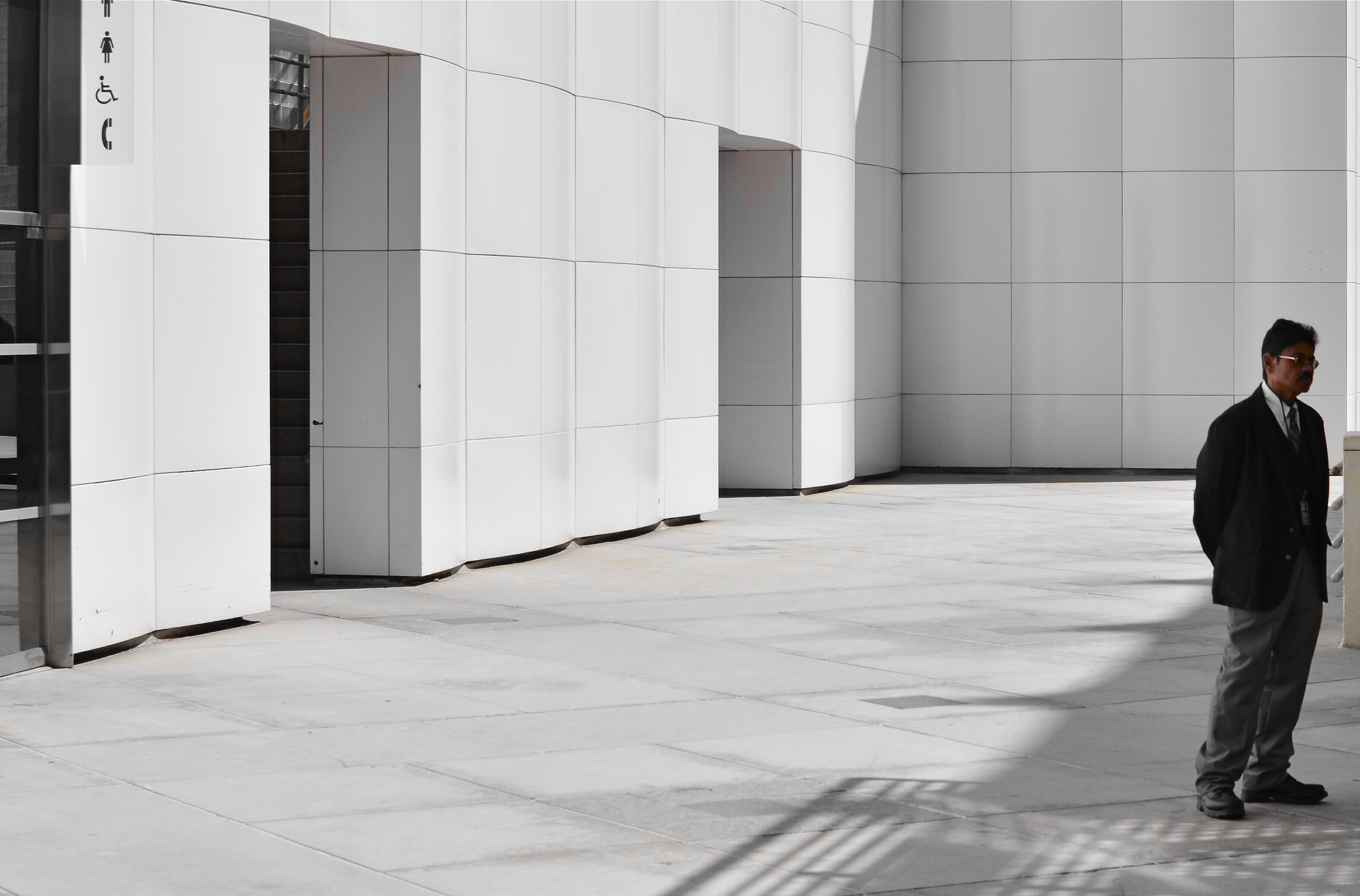
I sometimes think of that song when looking for street images. Yes, I’m aware that the entire sweep of human drama is out there, just ripe for the picking. The highs. The lows. Thrill of victory and agony of de feet. But. I always feel as if I’m cheating the world out of all that emotional sturm und drang if I want to make images without, you know, all them people. It’s not that I’m anti-social. It’s just that compelling stuff is happening out there that occasionally only gets compromised or cluttered with humans in the frame.
Scott Kelby, the world’s biggest-selling author of photographic tutorials, spends about a dozen pages in his recent book Photo Recipes showing how to optimize travel photos by either composing around visitors or just waiting until they go away. I don’t know Scott, but his author pic always looks sunny and welcoming, as if he really loves his fellow man. And if he feels it’s cool to occasionally go far from the madding crowd, who am I to argue? There are also dozens of web how-to’s on how to, well, clean up the streets in your favorite neighborhood. All of these people are also, I am sure, decent and loving individuals.
There is some rationality to all this, apart from my basic Scrooginess. Photographically, some absolutes of abstraction or pure design just achieve their objective without using people as props. Another thing to consider is that people establish the scale of things. If you don’t want that scale, or if showing it limits the power of the image, then why have a guy strolling past the main point of interest just to make the picture “human” or, God help us, “approachable”?
Faces can create amazing stories, imparting the marvelous process of being human to complete scenes in unforgettable ways. And, sometimes, a guy walking through your shot is just a guy walking through your shot. Appreciate him. Accommodate him. And always greet him warmly:
Told ya I love ya. Now get out.
NO ORIGIN
 By MICHAEL PERKINS
WE ALL REMEMBER ONE OF OUR FIRST VIEWS OF THE MICROSCOPIC WORLD, the intricate latticework of an enlarged snowflake crystal, in all its startling elegance. My own initial glimpse came during the projection of a well-worn 16mm film on a cinder-block wall in a small elementary-school science classroom. From that point forward, I could never hear certain words…design, order, mathematics, or, later on, Bach, without also seeing that snowflake in my mind. Funnily enough, the only thing that didn’t conjure up that delicate crystal were the words snow, snowfall, or snowflake. In some way, the enlarged pattern had become something apart unto itself, a separate thing with no origin, no pre-assigned purpose or definition. It was just a pure visual experience, devoid of context, complete and distinct.
I still experience that thrill when using a camera to remove the context from everyday objects, forcing them to be considered free of “backstory” or familiarity. I love it when people react to a photograph of light patterns that just “are”, without bringing to it the need to have the thing explained or placed in any particular setting. The easiest way to do this is through magnification, since many things we consider commonplace are, when isolated and amplified, ripe with details and patterns, that, at normal size, are essentially invisible to us. Another way to do it is to take away the things that the subject is normally seen as part of, or adjacent to. Again, magnification does much of this for us, allowing us to frame a single gear inside a machine or zone in on one connection in larger universes of function.
However this viewpoint is obtained, it can be very freeing because you are suddenly working with little more than the effect of light itself. You arrive at a place where a photographic image needn’t be about anything, where you’re working in simple absolutes of shape and composition. At the same time, you’re also conferring that freedom on your viewers, since they are also released from the prison of literalism. They can admire, even love, a pure composition for no relatable reason, just as we all did with our old stencil kits and Spirographs.
This all takes us full circle to our earliest days, and one of the first experiences any of us had as designers. Remember being told to fold a piece of construction paper in half, then half again, then half again? Recall being invited to randomly cut away chunks from the perimeter of that square, any way we wanted? Remember the wonder of unfolding it to see our cuts mirrored, doubled, cubed into a stunning design?
Remember what the teacher said when we unveiled our masterpieces?
Oh, look, class, she said, you’ve made a snowflake.
BREAKING THE BOX
The picture shown here was spoiled by tilting the camera sidewise. The whole scene seems to be “running downhill”. Unless you are trying for an unusual effect, hold the camera level. – How To Make Good Pictures, c) 1943 The Eastman Kodak Company
By MICHAEL PERKINS
ONE OF THE CARDINAL RULES OF PHOTOGRAPHIC COMPOSITION IS THE MAINTENANCE OF A PAINTER’S VIEW OF THE WORLD, and it needs to be abandoned as irrelevant to picture-making in the current era. I’m talking about one of the Photography 101 rules we all inherited from the medium’s 19th-century beginnings, which is the unyielding reverence for “the box” as a framing device.
You know the admonition, and can recite it out of a million amateur guides: the parameters of your photo must be a dead parallel line top and bottom and two perfectly perpendicular verticals for the left and right sides. Call it the “out the window” orientation or the painter’s frame, or perhaps the “God’s in his heaven, all’s right with the world” concept of a perfect clockwork universe. Whatever the term, this unbending admonition became common to every amateur book on photographic instruction since forever. Tilting was bad. Bending the frame or composing within an abstracted version of it was really bad. Calling attention to the frame instead of letting it remain invisible was amateurish.
I’ll tell you what’s bad: doing everything the same way, forever, and expecting to grow as a photographer, or as an anything.
Framing in photography sets the visual grammar of an image. It lays out the rules of engagement as much as anything that’s contained within it. It can be an artistic statement all in itself, and needs to be thought of as a deliberate choice, no less than camera settings or subject matter. The square or rectangle is not a mathematical commandment. Like every other element of making images, it needs to justify itself for the picture at hand. What is right for this instance?
Would this image have worked better inside a completely standardized framing?
The image seen here is a very calm and unchallenging composition. I liked the small number of elements presented by the stark little porch and the rich but mysterious patch of forest. But in both the shooting and the cropping, I decided to subtly re-jigger the frame to include structural parts of the porch and the window through which I shot the scene, throwing off the perfect geometry of vertical and horizontal, resulting in a look that is a little off-kilter. I tried looking at the shot without any of these parts, and the picture looked too pat, too passive, whereas creating an imperfect square with them gave the photograph just a little edge. Not a slam-you-over-the- head effect, just a slight bit of visual punctuation.
Call it the difference between a colon and semi-colon.
As for the Eastman Kodak Company’s caution that you should maintain the standard frame unless you “are trying for an unusual effect”, well, aren’t you doing that every time you step up to bat?
If not, what’s the point?
REDUCTION OF TERMS
1/320 sec., f/5.6, ISO 100, 35mm.
By MICHAEL PERKINS
To me, photography is an art of observation. It’s about finding something interesting in an ordinary place. I’ve found it has little to do with the things you see, and everything to do with the way you see them. —Elliott Erwitt
ISOLATION IS A TRULY IRONIC CONDITION OF THE HUMAN ANIMAL. The strange thought that, for most of our lives, we are both awash in a sea of other people and totally alone is one of nature’s most profound paradoxes. Photography shows people in both of these conditions, and shooters must choose what illuminates a person’s story best—-his place among others or his seeming banishment from them. Sometimes both truths are in the same frame, and then you must, as Elliott Erwitt says, alter the way you see in favor of one or the other.
In the case of both of the images posted here, the person who “solely” occupies the frames was originally a stray element within a larger context, with the pictures framed, at first, to include nearby persons or crowds. On further examination, however, one or two compositional elements in each of the pictures convinced me, in both the case of the museum guard and the hurried gallery guest, that they could “hold” the pictures they were in without any other human presence in view, and so I created their isolation, something that was not their natural condition at the time.
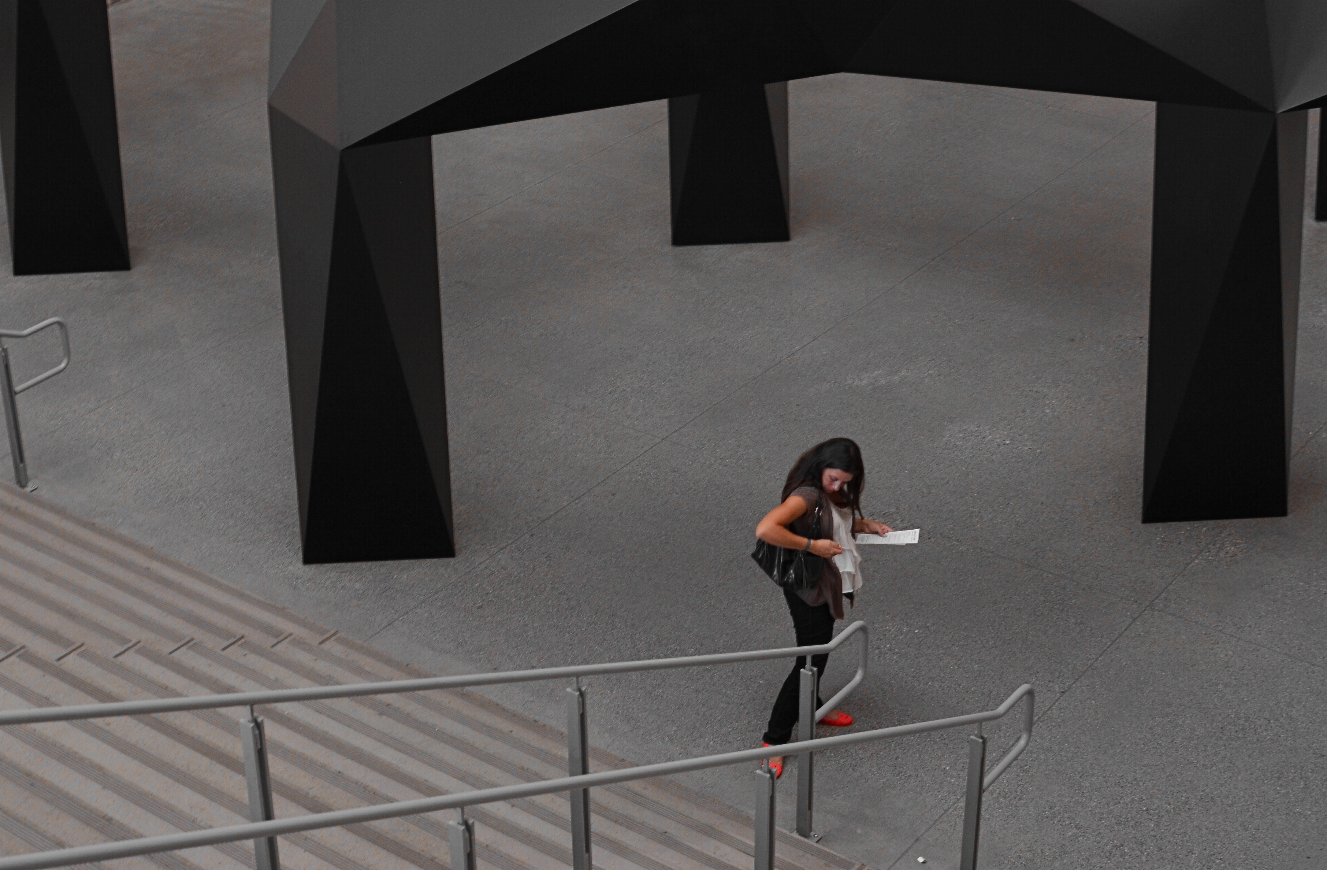
I further “isolated” these two subjects by desaturating everything in the frame except their flesh tones. 1/10 sec., f/5.6, ISO 320, 35mm.
Part of this process is my ongoing curiosity in how far I can go in paring away extra visual information before the story impact of a photograph is amplified to its highest power. I’m sure you have all worked with many original images that are just too balky and talky, that are really “made” in the cropping process. To be sure, sometimes you’re just peeling away the rotten outer parts of an apple to reveal…..a rotten core! Other times, however, you are privileged to peel away just enough petals to render the rose at its best, and, with images of people, that can mean getting rid of almost all the people in the picture you began with.
In both these cases, I liked these people to be shown as if they were in command of small little universes of their own. Does that make the photographs sad? Lonely? Dignified? Tranquil? Yes to all these and anything else you can bring to it, because if cropping is the second part of the picture-making process, then seeing if your instinct “proofs out” with viewers is the final and most crucial part. I’m using every process I can to convey to you what I saw, or what I believe is worth seeing. It’s a collaborative process, and sometimes, I’m sure, I don’t hold up my part of the bargain. And still we press on.
Isolation is more than a human condition or a symptom of our times: it’s a compositional tool, a reduction of the equation of scene-making to its simplest, and hopefully truest, terms.
ELEMENTARY, MY DEAR NIKON
Let the light decide what makes a photograph. Modem, 2014. 1/30 sec., f/1.8, ISO 800, 35mm.
By MICHAEL PERKINS
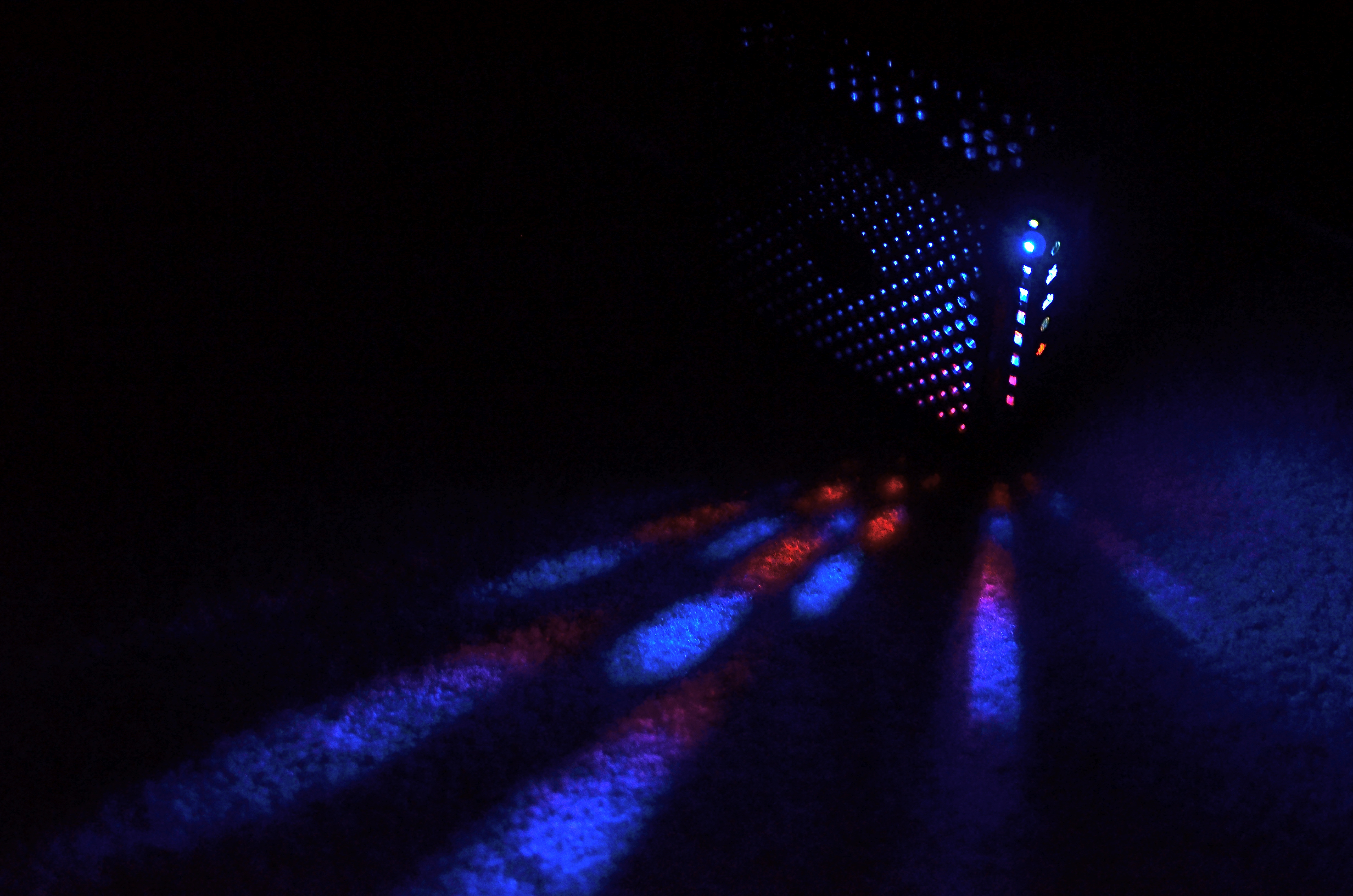
PHOTOGRAPHY IS OFTEN DEFINED CLASSICALLY AS “WRITING WITH LIGHT“, but I often wonder if a better definition might be “capitalizing on light opportunities”, since it’s not really what subject matter we shoot but light’s role in shaping it that makes for strong images. We have all seen humble objects transformed, even rendered iconic, based on how a shooter perceives the value of light, then shapes it to his ends. That’s why even simple patterns that consist of little more than light itself can sometimes be enough for a solid photograph.
If you track the history of our art from, say, from the American Civil War through today’s digital domain, you really see a progression from recording to interpreting. If the first generally distributed photographs seen by a mass audience involve, say, the aftermath of Antietam or Gettysburg, and recent images are often composed of simple shapes, then the progression is very easy to track. The essence is this: we began with photography as technology, the answer to a scientific conundrum. How do we stop and fix time in a physical storage device? Once that very basic aim was achieved, photographers went from trying to just get some image (hey, it worked!) to having a greater say in what kind of image they wanted. It was at this point that photography took on the same creative freedom as painting. Brushes, cameras, it doesn’t matter. They are just mediums through which the imagination is channeled.
In interpreting patterns of elementary shapes which appeal on their own merit, photographers are released from the stricture of having to endlessly search for “something to shoot”. Some days there is no magnificent sunrise or eloquent tree readily at hand, but there is always light and its power to refract, scatter, and recombine for effect. It’s often said that photography forced painting into abstraction because it didn’t want to compete with the technically perfect way that the camera could record the world. However, photography also evolved beyond the point where just rendering reality was enough. We moved from being reporters to commentators, if you like. Making that journey in your own work (and at your own pace) is one of the most important step an art, or an artist, can take.
BREAKING THE BIG RULE
I can’t see this girl’s face. Does it matter? 1/160 sec., f/5.6, ISO 100, 55mm.
By MICHAEL PERKINS
FACES ARE THE PRIMARY REASON THAT PHOTOGRAPHY FIRST “HAPPENED” FOR MOST OF US. Landscapes, the chronicling of history, the measurements of science, the abstract rearrangement of light, no other single subject impacts us on the same visceral level as the human countenance. Its celebrations and tragedies. Its discoveries and secrets. Its timeline of age.
It is in witnessing to faces that we first learn how photography works as an interpretive art. They provide us with the clearest stories, the most direct connection with our emotions and memories. And the standard way to do this is to show the entire face. Both eyes. Nose. Mouth. The works. Right?
But can’t we add both interpretation and a bit of mystery by showing less than a complete face? Would Mona Lisa be more or less intriguing if her eyes were absent from her famous portrait? Would her smile alone convey her mystic quality? Or are her eyes the sole irreplaceable element, and, if so, is her smile superfluous?
Instead of faces as mere remembrances of people, can’t we create something unique in the suggestion of people, of a faint ghost of their total presence” Can’t images convey something beyond a mere record of their features on a certain day and date? Something universal? Something timeless?
It seems that, as soon as we maintain rigidity on a rule….any rule…we are likewise putting a fence around how far we can see. The face is no more sacred than any other visual element we hope to shape.
Let’s not build a cage around it.
IF YOU SEE IT, IT MATTERS
1/320 sec., f/5.6, ISO 100, 35mm.
By MICHAEL PERKINS
TOO MUCH OF THE TIME, WE ARE SHOOTING PHOTOGRAPHS TO NOT ONLY BE SEEN BUT “APPRECIATED“. This can become an emotional and artistic trap, since art is not designed to be juried. We’d all like the world to “get” what we do, but it’s all too easy to bend the arc of what we create until it matches the trajectory of what the world will approve.
Think for a moment about how such a tactic can cripple you as a photographer. I mean, stop you in your tracks.
Consider: many photographers will logically move, over time, from showing the world fairly literally to suggesting a special viewpoint, seeing it in a more abstract fashion. They learn to tell more by showing less, by being selective. This is a perfectly logical part of their development, but as a consequence, some of their pictures will inevitably leave some viewers behind. Suddenly, their images are “arty”, or “intellectual”, or whatever other word can be hurled at them to dismiss what they are doing.
But that’s okay. I’m not saying that you should live your life eating worms and striving to be a tortured genius. I just mean to suggest that your vision belongs to you. It’s validity cannot be diminished, unless you do it yourself. Here’s one of my favorite quotes from Life and Look magazine photographer Elliot Erwitt on this :
To me, photography is an art of observation. It’s about finding something interesting in an ordinary place… I’ve found it has little to do with the things you see and everything to do with the way you see them.
What a great concept. The thing you are shooting is not content. The way you shoot it is. That means viewpoint and personal interpretation must be more important that objects or subjects. If they are not, there’s no way in hell to make photography be about anything but recording. If they are, thought, ah, then, anything’s possible.
Bottom line, if you aren’t true to your vision, it’s a cinch that no one else ever will be, either.
So there.
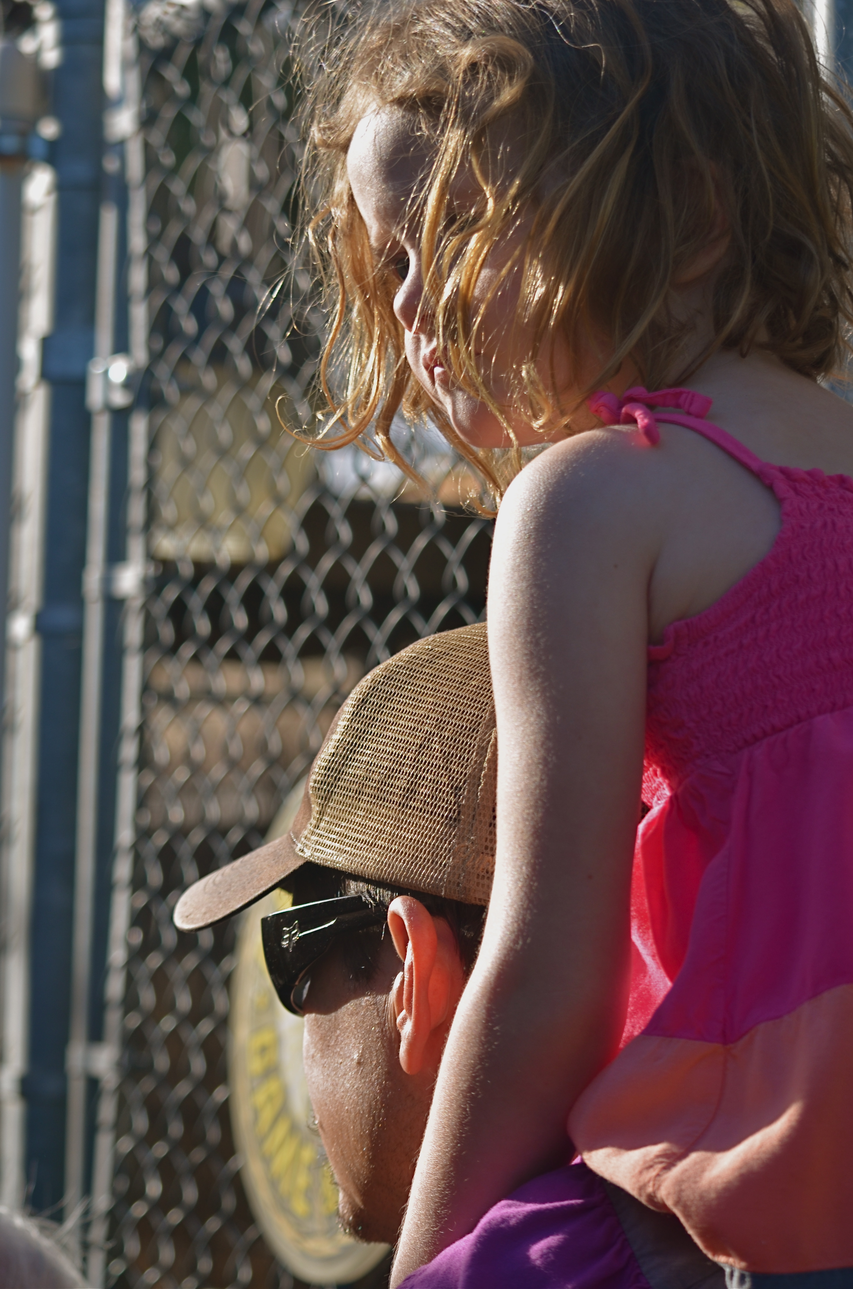
SHARED JOURNEYS
By MICHAEL PERKINS
THERE CAN’T BE A SINGLE PHOTOGRAPHIC ARTIFACT ELOQUENT ENOUGH to speak to all the human experiences of a mass migration, so any attempt of mine or others to sum up the journey of the Irish in even a series of images will be doomed to, if not failure, the absence of many voices. Those who prayed and went unheard. Those who leaped only to vanish into the air. Those who had their souls and stomachs starved to make freedom more than an abstraction. Those who kept faith and those who lost their way.
Rooted: 1/50 sec., f/5, ISO 200, 35mm.
America continues, on this St. Patrick’s Day, to struggle with the issue of who is welcome and who is “the other”, so the trek of the Irish from despised newcomers to an interwoven thread in the national fabric should be seen as a template. See, we should be saying to the newcomers, it can be done. You can arrive to jeers, survive through your tears, thrive in your cheers. Wait and work for justice. Take your place in line, or better yet, insist on a place in line, a voice in the conversation. The country will come around. It always has.
For the Irish, arrival in America begins in a time of gauzy memory and oral histories, then blends into the first era of the photograph and its miraculous power to freeze time. And when all the emerald Budweiser flowing on this day has long since washed away, the Irish diaspora will still echo in the collective images of those who first crossed, those who said an impossible, final farewell to everything in the hope of everything else, and those who stepped before a camera.
In some families the histories are blurred, fragmented. In some attics and scrapbooks, the faces are missing. The recent American love affair with geneology has triggered a search for the phantoms within families, the notes absent from the song, and this has coaxed some of the images out of the shadows. So that’s what she looked like, we say. Oh, you have his eyes. We still have that hat up in the attic. I never knew. I never dreamed.
One thing that can help, in all families, whatever their journeys to this place, is to bear witness with cameras. To save the faces, to fix them in time. To research and uncover. Another is to recall what it felt like to be “the other”, and to extend a hand to those who presently bear that painful label.
So, today, my thanks to the O’Neills, Doodys, McCourts, Sweeneys and others who got me here. Due to the ravages of time, I may not have the luxury of holding your faces in my hand.
But nothing can erase your voices from my heart.
I MAY HAVE TO WORK LATE
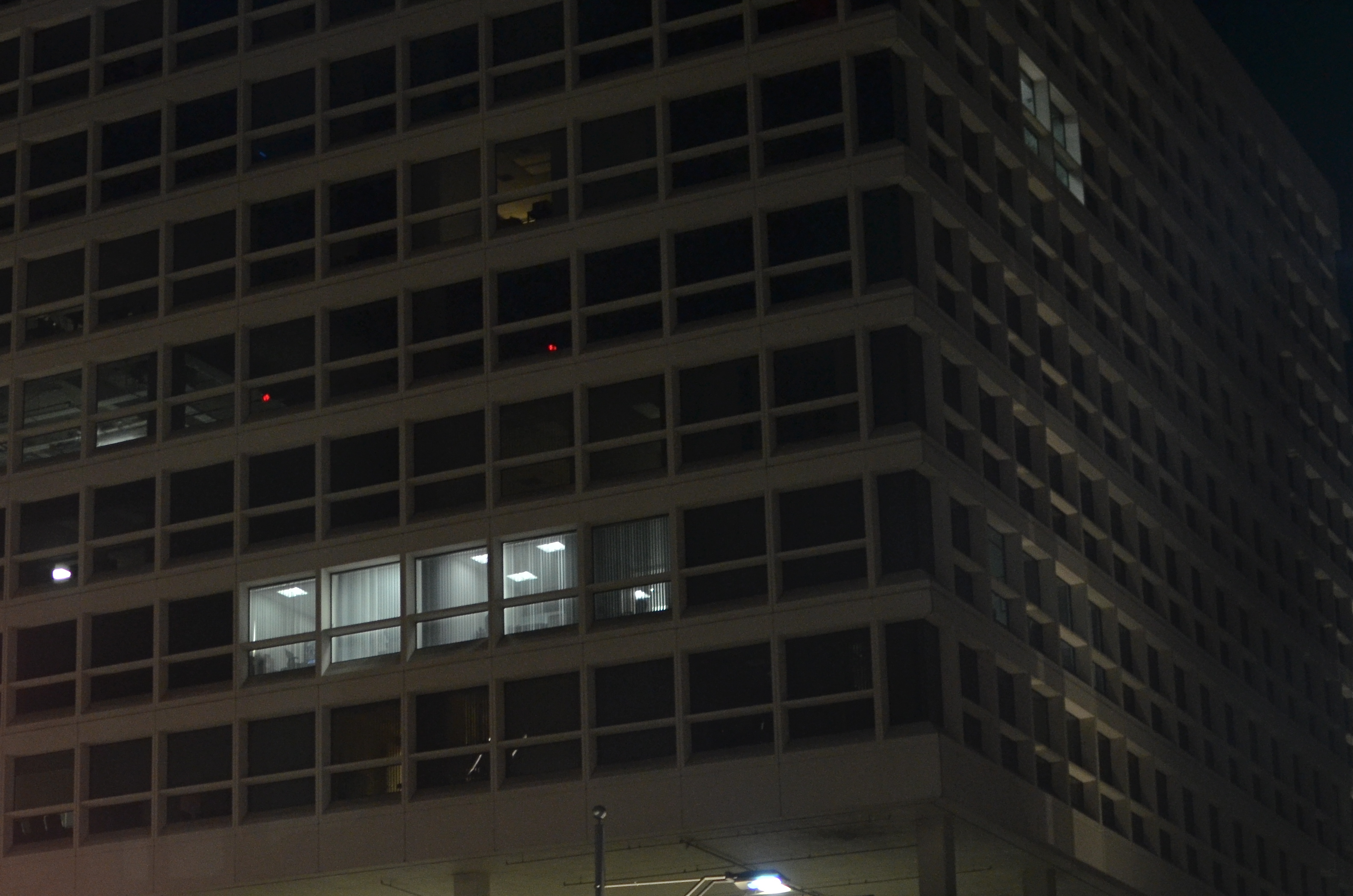
Say Hi To The Cleaning Crew: 1/50 sec., f/1.8, ISO 640, 35mm.
By MICHAEL PERKINS
SOME OF THE BEST HUMAN INTEREST STORIES, EVEN WITH A CAMERA, CAN ONLY BE VIEWED INDIRECTLY. There are many cases in which even the best of us have to merely hint or suggest something about people that we clearly cannot show (or cannot show clearly). Maybe that intractable bit of visual mystery actually bonds us to our audiences, united as we are in speculation about what is beyond that wall or behind that door. The visual tease such photos provide are part of the art of making pictures, in that we are challenged to do more with less, and “show” something beyond the visible.
One of the simplest such stories to capture is very urban in nature: the last remaining nighttime lights in largely dormant buildings. Many of us have been the “last man standing” at the end of an extended work day. Others flee to engagements, family, dinner, but there we sit, chained to our desks until the report/project/research/budget is ready to be put to bed. There’s a readily identifiable feeling of loneliness, plus a little bit of martyr complex, that we can share in the plight of these unknown soldiers of the night.
Whenever I am driving through a city at night, I deliberately seek out those bluish, tube-lit warrens within the cubes and grids of otherwise featureless glass boxes. Who is there? What private eureka or oh, no moments are they experiencing? Which of a million potential dramas are being acted out, and with whom? The uncertainty, even from a photograph with little detail, sparks the imagination, and suddenly our viewers are completing the picture we were forced to deliver unfinished.
It’s the ongoing paradox of photography: what you don’t show is as vital as what you do show.
SUBDIVISIONS
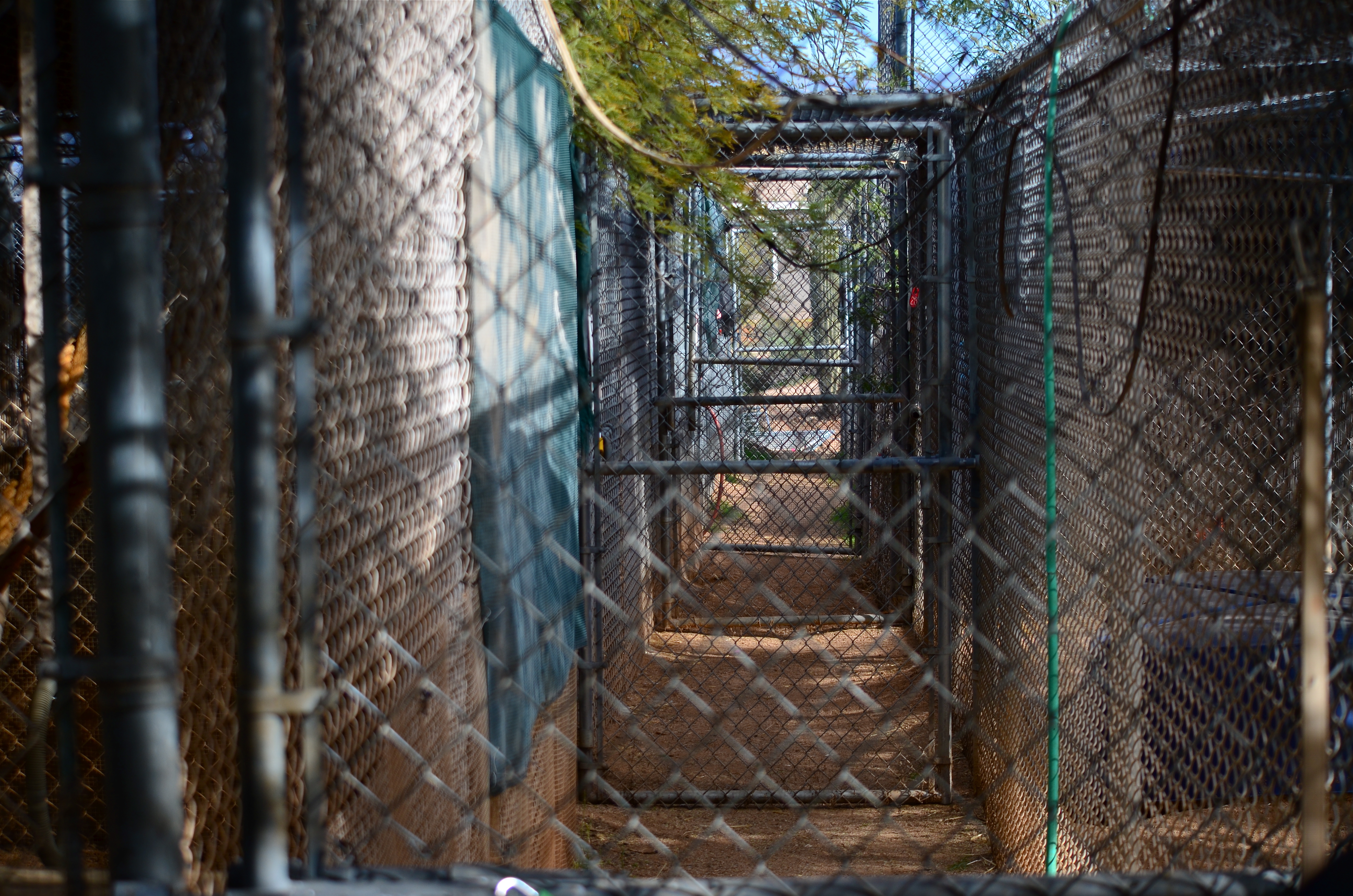
Compartments, 2014.
By MICHAEL PERKINS
SPACE, BY ITSELF, DOESN’T SUGGEST ITSELF AS A PHOTOGRAPHIC SUBJECT, that is, unless it is measured against something else. Walls. Windows. Gates and Fences. Demarcations of any kind that allow you to work space compelling into compositions. Arrangements.
Patterns.
I don’t know why I personally find interesting images in the carving up of the spaces of our modern life, or why these subdivisions are sometimes even more interesting than what is contained inside them. For example, the floor layouts of museums, or their interior design frequently trumps the appeal of the exhibits displayed on its walls. Think about any show you may have seen within Frank Lloyd Wright’s Guggenheim museum, and you will a dramatic contrast between the building itself and nearly anything that has been hung in its galleries.
What I’m arguing for is the arrangement of space as a subject in itself. Certainly, when we photograph the houses of long-departed people, we sense something in the empty rooms they once occupied. There is fullness there inside the emptiness. Likewise, we shoot endless images of ancient ruins like the Roman Coliseum, places where there aren’t even four walls and a roof still standing. And yet the space is arresting.
In a more conventional sense, we often re-organize the space taken up by familiar objects, in our efforts to re-frame or re-contextualize the Empire State, The Eiffel, or the Grand Canyon. We re-order the space priorities to make compositions that are more personal, less popular post card.
And yet all this abstract thinking can make us twitch. We worry, still, that our pictures should be about something, should depict something in the documentary sense. But as painters concluded long ago, there is more to dealing with the world than merely recording its events. And, as photographers, we owe our audiences a chance to share in all the ways we see.
Subdivisions and all.
DRIVING THE IMAGE
 By MICHAEL PERKINS
YOU CAN FILL A LIBRARY SHELF WITH OPPOSING ARGUMENTS ON LIGHT’S ROLE IN PHOTOGRAPHY, not necessarily a debate on how to capture or measure it, but more a philosophical tussle on whether light is a mere component in a photograph or enough reason, all by itself, for the image to be made, regardless of the subject matter.
The answer, for me, is different every time, although more often than not I make pictures purely because the light is here right now, and it will not wait. I actually seem to hear a clock beginning to tick from the moment I discover certain conditions, and, from that moment forward, I feel as if I am in a kind of desperate countdown to do something with this finite gift before it drifts, shifts, or otherwise mutates out of my reach. Light is running the conversation, driving the image.
“In the right light, at the right time, everything is extraordinary”, the photographer Aaron Rose famously said, and I live for the chance to ennoble or, if you will, sanctify something by how it models or is embraced by light. Certainly I usually go out looking for things to shoot, but time and time again something shifts in my priorities, forcing me to look for ways to shoot.
The practical world will look at a photograph and ask, understandably,  “what is that supposed to be?”, or, more pointedly, “why did you take a picture of that?” This makes for quizzical expressions, awkward conversations and sharp disagreements within gallery walls, since our pragmatic natures demand that there be a point, an objective in all art that is as easily identifiable as going to the hardware for a particular screw. Only life, and the parts of life that inspire, can’t ever function that way.
We often decide to make an important picture of something rather than make a picture of something important. That’s not just artsy double-talk. It’s truly the decision that is placed before us.
Alfred Steiglitz remarked that “wherever there is light, photography is possible”. That’s an unlimited, boundless license to hunt for image-makers. Just give me light, the photographer asks, and I will make something of it.
CROP YOUR WAY TO SUCCESS
By MICHAEL PERKINS
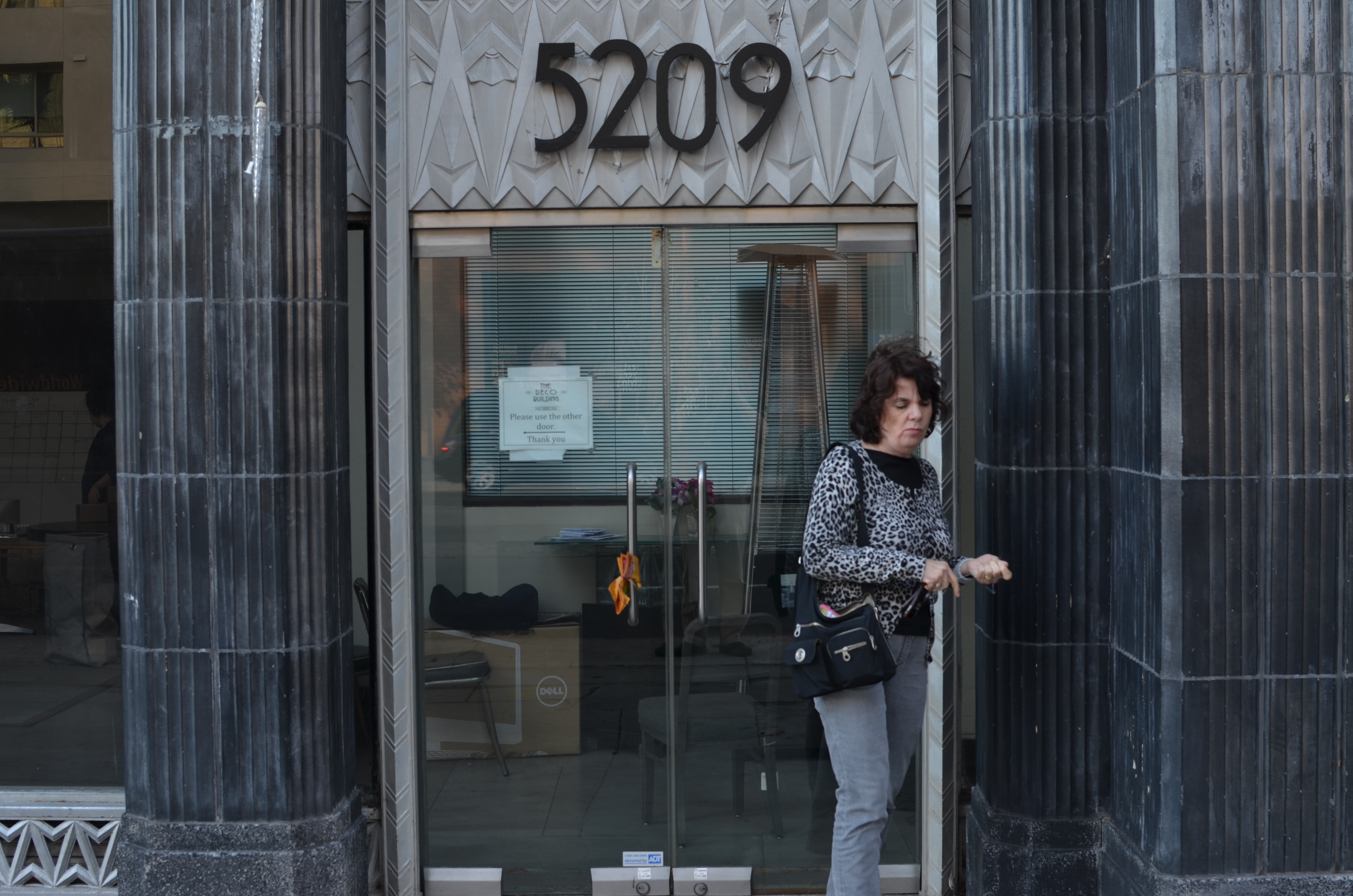
Whoops, I wasn’t ready. 1/100 sec., f/5.6, ISO 100, 35mm.
THOSE OF US WHO HAVE LOGGED SOME TIME IN THE WAITING ROOMS OF PEDIATRICIANS can recall struggling through the “Hidden Pictures” page of Highlights For Children magazine. I would love to tell you that I always found 100% of cartoonist John Gee’s camoflaged squiggles by the time the receptionist invited me into the examining room. But I would be lying.
That said, there are many times when, as photographers, we play the same game with our images, especially the ones in the “doesn’t work” pile. Loving at least the idea behind what we were originally after, we pore over every pixel in the frame, repeating the vain mantra there must be a picture in here somewhere. Often, the photo simply returns to the Hall of Shame despite our best efforts to redeem it. Sometimes, the crop tool is your unexpected best friend.
I recently looked at a failed candid of my wife outside one of my favorite buildings in Los Angeles, the “Deco” Building (real name) at the corner of La Brea and Wilshire near the museum district. A combination of wind and facial expression had spoiled the quickie portrait, but the address panel over Marian’s head contained something I could use if I re-purposed the picture.
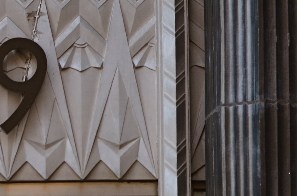
I gave the above shot a severe haircut and wound up with this. Hmm, maybe this was all the picture I needed in the first place.
In the space of a few inches of the building’s entrance was a miniature representation of the best features of the entire building; its wild pattern of chevrons and zigzags. I had already done a master shot of about 90% of the front of the place, but a study of its details started to sound appealing. Cropping away more than 2/3rds of the original shot reduced the sharpness a little, but since I always shoot at the highest file size possible, I just squeaked by.
For a moment, I found that I had redeemed all those failed sessions with Highlights.
Watch out, New York Times crossword. You’re next.
DO SOMETHING MEANINGLESS

The subject matter doesn’t make the photograph. You do. A pure visual arrangement of nothing in particular can at least teach you composition. 1/400 sec., f/5.6, ISO 100, 35mm.
By MICHAEL PERKINS
SHOOT WHAT YOU KNOW. SHOOT WHAT YOU LOVE. Those sentences seem like the inevitable “Column A” and “Column B” of photography. And it makes a certain kind of sense. I mean, you’ll make a stronger artistic connection to subject matter that’s near and dear, be it loved ones or beloved hobbies, right? What you know and what you love will always make great pictures, right?
Well….okay, sorta. And sorta not.
I hate to use the phrase “familiarity breeds contempt”, but your photography could actually take a step backwards if it is always based in your comfort zone. Your intimate knowledge of the people or things you are shooting could actually retard or paralyze your forward development, your ability to step back and see these very familiar things in unfamiliar ways.
Might it not be a good thing, from time to time, to photograph something that is meaningless to you, to seek out images that don’t have any emotional or historical context for you? To see a thing, a condition, a trick of the light just for itself, devoid of any previous context is to force yourself to regard it cleanly, without preconception or bias.
Looking for things to shoot that are “meaningless” actually might force you to solve technique problems just for the sake of solving, since the results don’t matter to you personally, other than as creative problems to be solved. I call this process “pureformance” and I believe it is the key to breathing new life into one’s tired old eyes. Shooting pure forms guarantees that your vision is unhampered by habit, unchained from the familiarity that will eventually stifle your imagination.
This way of approaching subjects on their own terms is close to what photojournalists do all the time. They have little say in what they will be assigned to show next. Their subjects will often be something outside their prior experience, and could be something they personally find uninteresting, even repellent. But the idea is to find a story in whatever they approach, and they hone that habit to perfection, as all of us can.
Just by doing something meaningless in a meaningful way.
SPLIT INFINITIVES
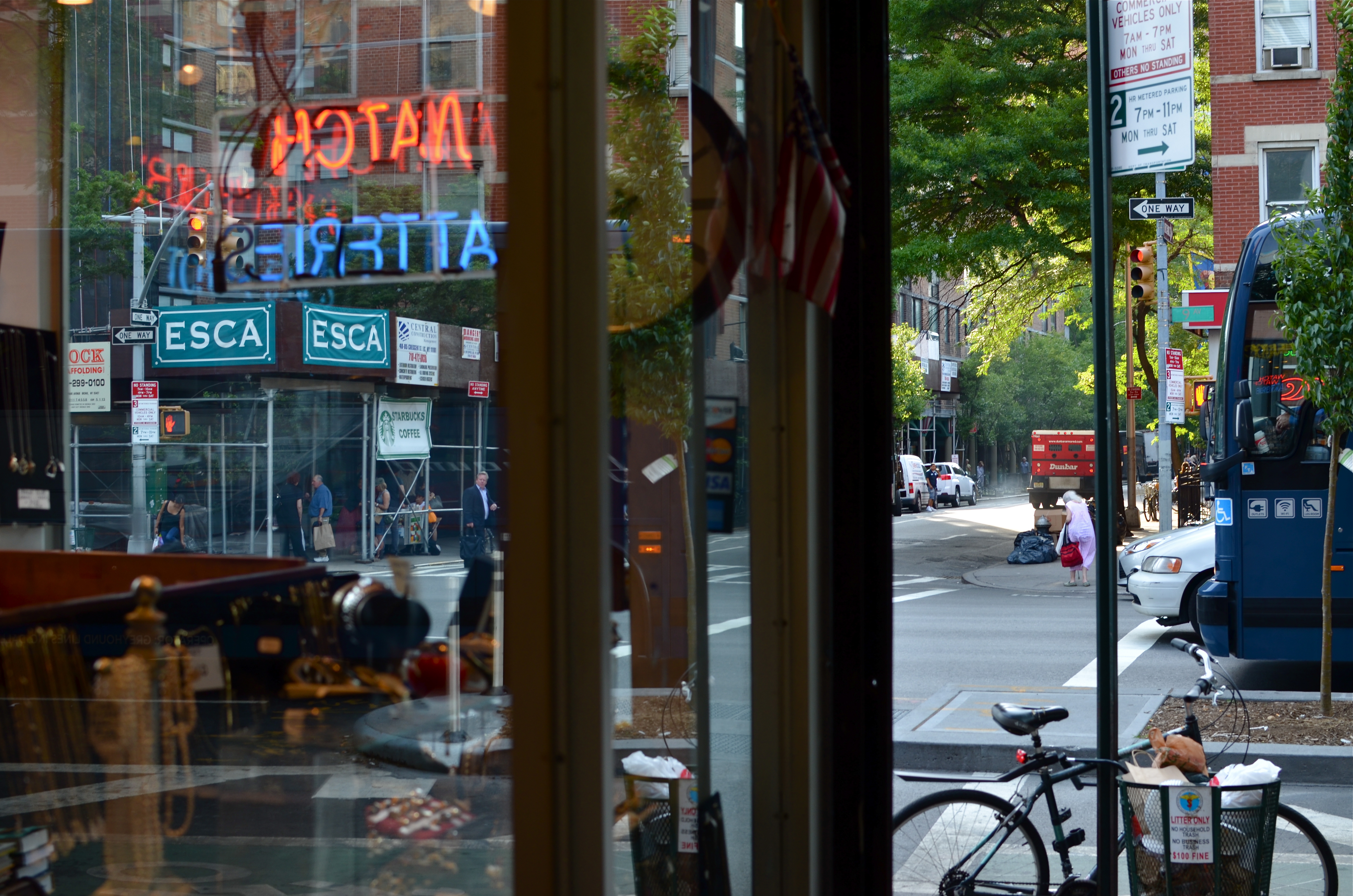
Consignment Shop, Manhattan. 1/80 sec., f/5.6, ISO 100, 35mm.
By MICHAEL PERKINS
IF YOU’RE OLD ENOUGH TO REMEMBER WHEN USE OF THE WORD “AIN’T” LABELED YOU AS A GRAMMATICAL LOWBROW, you may also recall the snooty disdain reserved for a verbal construction called the split infinitive. A simple infinitive involved following the preposition “to” with an action verb, such as “go”. To split the infinitive, the writer or speaker inserts an adverb between the two words for an extra boost of emphasis. Thus, in the most famous split infinitive ever, Gene Roddenberry invited Star Trek viewers
to boldly go where no man has gone before.
Nice, right? A little extra drama. A slight bending of the rules that delivers the goods.
Photography has a formal “grammar” about composition that also begs for a kind of “split infinitive”. Strictly speaking, compositions are supposed to be simple, clean, uncluttered. A perfect line of visual data from top to bottom, left to right. A picture frame, if you will, an organized way of seeing.
Attractive yes, even desirable, but a must? Nope. Life itself, as we observe it everyday, is far from a series of perfect frames. Lines of sight get broken, fragmented, blocked. Nature and light conspire to take that flawless composition and crash it, refract it, photobomb it until it resembles, well, life. And yet we often try to take pictures that show the very opposite of the sloppy, imprecise nature of things.
We try for “perfection” instead of perfect concepts.
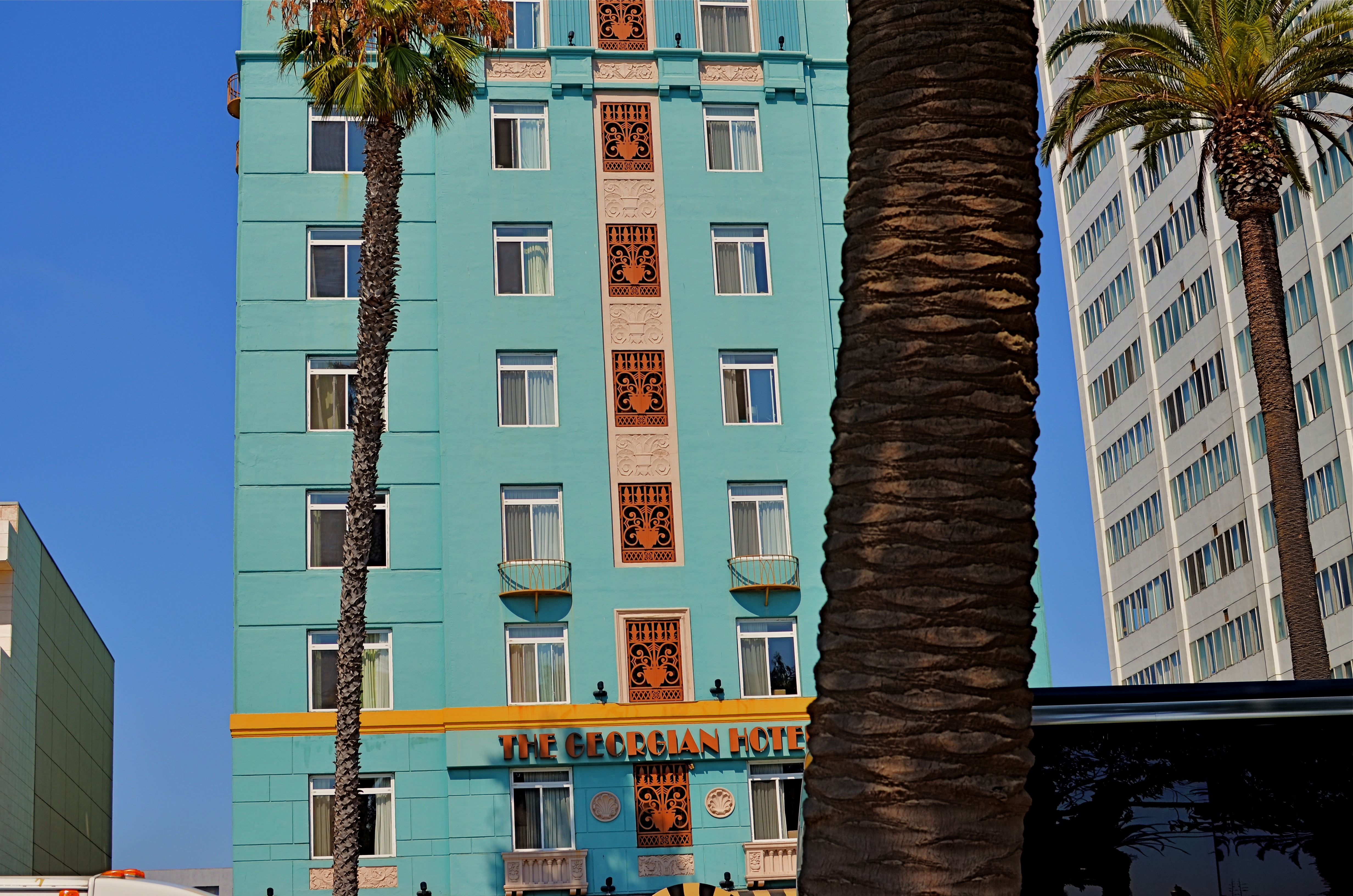
Georgian Hotel, Santa Monica, CA. 1/60 sec., f/5.6, ISO 100, 35mm.
Reviewing images for the last several years, I find that I am taking more compositions on their own terms, with light poles, weird reflections, broken planes of view and shadows all becoming more welcome in my final photos. I still labor to get a clean look when I can. But I also make peace with elements that used to doom a photo to the dustbin.
Street scenes especially can better reflect the visual chaos of busy cities if everything isn’t “just right”. It’s really hard (at least in my case) to tear out the mental hardwiring of a lifetime and take a picture that may be more abstract or cubist than I ever thought I could allow myself to be. Maybe it’s a function of aging, but things seem to be relaxing in my approach. Don’t get me wrong. I’m still Alpha Male enough to want to bring everything in a frame under my unswerving control. I just don’t get blood pressure when circumstances force me to unclench my iron fist once in a while.
It’s a process.
To see, yes, but, in allowing my visual infinitives to be occasionally split, it means learning to differently see.
Follow Michael Perkins on Twitter @mpnormaleye.
Welcome to our newest followers. Check out their mad genius at:

UNKNOWN KNOWNS
Everyone is visible, yet no one is known. Faceless crowds serve as shapes and props in a composition.
By MICHAEL PERKINS
WE OFTEN WRITE IN THESE PAGES ABOUT PHOTOGRAPHY’S UNIQUE ABILITY to either reveal or conceal, and how we toggle between these two approaches, given the task at hand. Photographic images were originally recorded by using science to harness light, to increase its ability to illuminate life’s enveloping darkness, just as Edison did with the incandescent bulb. And in their attempt to master a completely new artistic medium, early photographers were constantly pushing that dark/light barrier, devising faster films and flash technology to show detail in the darkest, dimmest corners of life.
And when that battle was won, an amazing thing happened.
Photographers realized that completely escaping the dark also meant running away from mystery, from the subtlety of suggestion, from the unanswered questions residing within their pictures’ shadows. And from the earliest days of the 20th century, they began to selectively take away visual information, just as painters always had, teasing the imagination with what could not be seen.
Friendly chats or shadowy conspiracies? Your choice.
City scenes which feature individual faces in crowds opt for the drama (or boredom) written in the face of the everyday man. Their scowls at the noonday rush. Their worry at the train station. Their motives. But for an urban photographer, sometimes using shadow to swallow up facial details means being free to arrange people as objects, revealing no more about their inner dreams and drives than any other prop in an overall composition. This can be fun to play with, as some of the most unknowable people can reside in images taken in bright, public spaces. We see them, but we can’t know them.
Experimenting with the show it/hide it balance between people and their surroundings takes our photography beyond mere documentation, which is the first part of the journey from taking pictures to making them. Once we move from simple recording into interpretation, all the chains are off, and our images can really begin to breathe.
Share this:
April 16, 2016 | Categories: Available Light, Cities, Commentary, Composition, Conception | Tags: Abstraction, Composition, crowds, Shadows, silhouettes, Street Photography | 2 Comments