ARRIVALS
By MICHAEL PERKINS
PHOTOGRAPHERS PROBABLY HAVE TO HAVE AT LEAST SOME IDEA OF WHERE THEY’RE HEADED in pursuit of an image, or else basic issues like, Where To Point The Car or Which Path To Take can’t be settled. And there is, even for the instinctual process of creation, something to be said for a basic plan. However, every photographer has experienced the wonder of finding oneself arrived at a great picture-making opportunity when, in fact, you were headed someplace completely different. It’s in such moments, places where Plan A becomes Plan B, C, or D, that the excitement happens.
After you capture an image that essentially works, your mind naturally comes to take ownership of it, just as if that picture were your original intention. But this seldom occurs. Pictures aren’t like Grab-And-Go sandwiches, and very few are just waiting there, fully formed, until you wander by and imprison them in your box. Our final choices for photographs are often the destination in a ride with many stops along the way. We might have come to do this, but we wound up modifying, even abandoning our first instinct to get this instead.
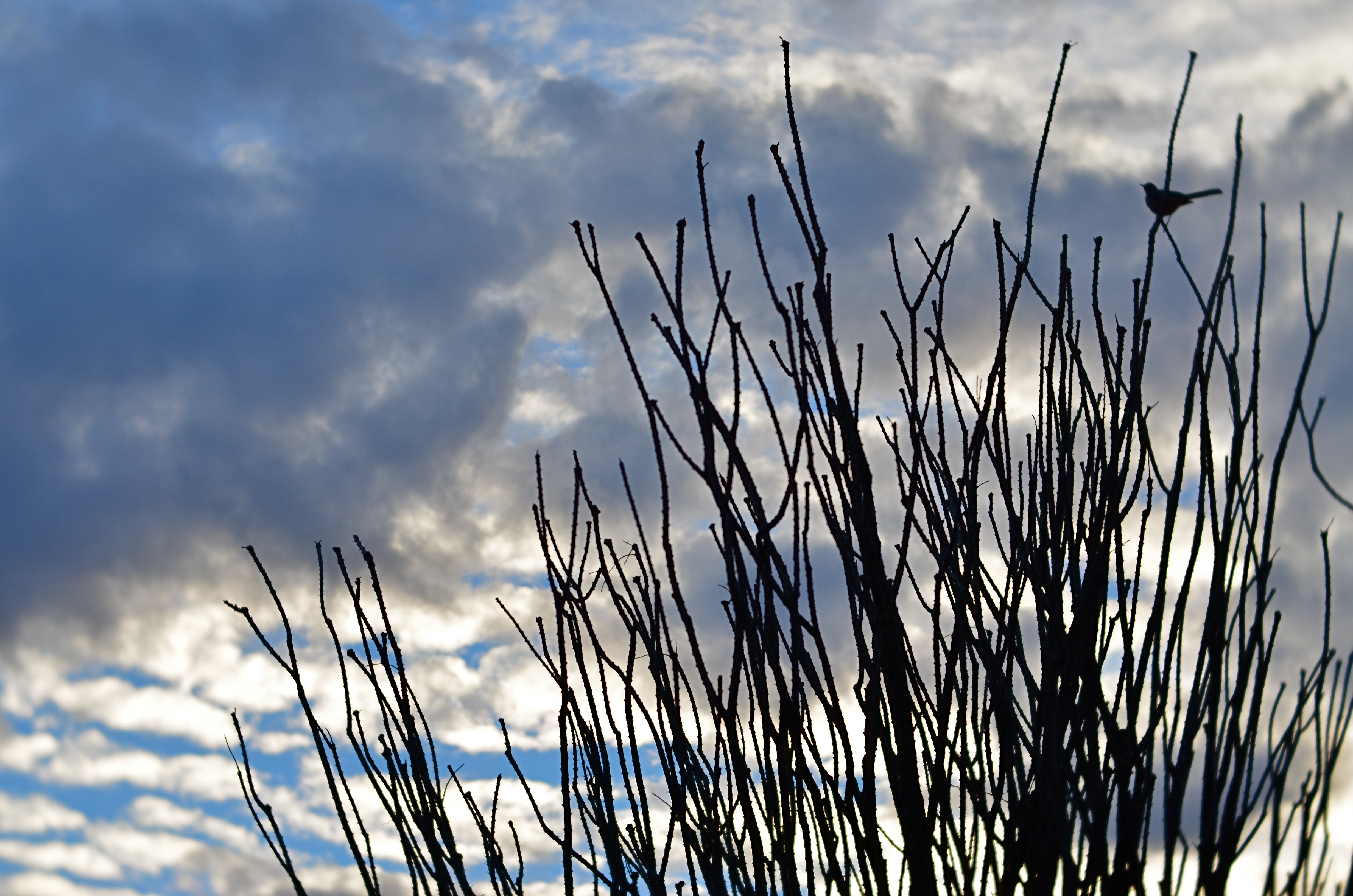
Ocotillo Outpost (2016) 1/640 sec., F/4, ISO 100, 56mm.
The above image is a textbook example of this process. The gorgeous sunset clouds seen here were originally to be the entire composition. The general rule is that skies, by themselves, are usually not sufficiently interesting to be the solo star in a photo, but the light and texture of this particular dusk had convinced me that a minimalist shot might just be possible. However, one of my first framings caught an octotillo shrub in its lower right corner, and that new information sent the picture off in a different direction.
Re-framing to bring the shrub into the entire lower half of the shot and silhouetting it against the sky gave the framing both a sense of scale and depth, and I began to convince myself (moving on to Plan B) that this now two-element picture would be The One. Then a single starling made a landing at the upper right corner of the ocotillo, creating a more obvious initial point of contact for the eye. The viewer would engage the most familiar part of the picture, the bird’s body, then travel leftward to the ocotillo’s jagged tangles, and backwards to the textured sky. Final Plan: C….a three-element image in which the individual parts seemed, at least, to talking with one another.
In the pages of The Normal Eye I keep coming back to this idea of “planned accidents”, or shots that start in one direction and end in another, because the process, once you allow yourself to go with it, can lead to images which, eventually, seem inevitable, as if they never could have been any other way. And those are the ones you keep.
2016: THE YEAR OF SEEING DIFFERENTLY

Isoceles’ Greatest Hits (2016). Our idea of what a photograph “is” must be constantly in play.
By MICHAEL PERKINS
IF YOU SPEND ENOUGH YEARS MAKING PICTURES, you will see, looking back over your shoulder, several visible mile markers indicating when something fundamental changed in how you went about the pursuit of the capture. It can be a simple time line from one camera or lens to the next, or a sequence of shifts in style or emphasis.
For some, it’s the leap from film to digital. For others, the moment when it seemed important to commit anew to monochrome, or the day when one’s work flow took on decidedly new features. For me, it’s always been those events or people who have allowed me to dramatically re-evaluate the process of seeing.
Poring over various things I attempted to do in 2016, I seem to be standing in a niche between how I have traditionally visualized subjects and how I’m aspiring to, marking a more dramatic evolution than I’ve experienced for a while. This change can be simply expressed as a different view of what’s “real” in a picture, brought on by my work with lenses that allowed focus to be more selectively manipulated within an image.
Some of this can be seen in images seen in the new page 20 for 16, clickable at the top of this one. Like other year-end summaries, it tries to cite examples of every type of photograph I attempted over the space of a year, from portraits to still lifes and everything in between. However, unlike most other years, the images have what I might call an evolving view of the role of sharpness; how it features in a composition, how much of it is essential, whether it is even needed at all, given the right conditions.
Some of these explorations in variable sharpness involved embracing a new crop of specialized lenses which either evoke the softer look of vintage glass or allow the shooter to place focus anywhere in the frame, and to any degree desired. However, at least one picture is the product of post-production apps applied to smart phone images, showing, if nothing else, that it’s probably the destination that matters more than the journey. Or not.
As an essential component in all photography, focus is a major determinant in that we think of as a “photograph”, and, in turn, what makes that photograph “real”. However, photography is not merely the recording of the actual but a visualization of the possible. It bridges the gap between tangible and potential. Merely unchaining sharpness, by itself, guarantees nothing in the way of order, and might merely produce chaos. Still, the moment when a particular choice can either enhance or enchant…. that’s we live for; that’s what we reach for.
Thank you again for your kind attention, your advice, and your enthusiasm….and Happy New Year.
CHRISTMAS ON THE QUIET
By MICHAEL PERKINS
THE HOLIDAYS PROVIDE A REMARKABLE VARIETY OF VISUAL RESPONSES IN PHOTOGRAPHERS, so subjective are each person’s memories and experiences. This ensures that the subject is well nigh inexhaustible, although I seem to see images falling into one of two broad categories.
One class includes the snapshot-oriented, direct-experience images, which record one’s treasured good times……such as the family tree, the winner of the neighborhood’s exterior lights extravaganza, Bobby’s first moments with his new bike, etc. The other main class seems to center on a kind of abstract interpretation of pattern, color, and shape, and may be more subtle or understated in approach. Of these two basic groupings, one is specific, rooted in personal impressions, while the other is design or concept based. Both produce great photographs, but the aim, for each, is very distinct.
As my own Christmases have become more abbreviated and less populated (family and friends far away), my observance of the holidays is, accordingly, much more muted, less decorous than in years past. The merry little Christmas referred to in the song becomes the dominant theme, and I find my seasonal photos try to say more and more with less and less. The images are simpler, quieter. Whether I have chosen this or it’s chosen me is hard to say for sure. I only know that, as the million elements that define a busy family Christmas fade into memory, I create pictures that suggest the essence, rather than the exhaustive detail, of the holiday’s themes.
Of course, whether this time of year means anything at all to you is a matter of taste, especially as you age up. One of the most interesting places to spend the holidays, for example, is Las Vegas, simply because the town does not sport any decorations of any kind. In deference to many who want to flee rather than celebrate the hustle, the entire city becomes a strange sort of haven, filtering out both the profane and the holy. So, if I snap a picture at Caesar’s Palace on December 25, does that fact alone make the result a “Christmas” photo?
You get the idea: even in less extreme cases, the holidays are in the eye of the beholder. Eventually, what makes a day special is what makes it special for you. Whatever your own circumstances, enjoy the world as you would prefer to compose it. Make the season your personal treasure, whether loud, soft, lush or laid back. No image is a bridge too fa (la la la).
THE BOND

This 1900 magazine ad introduced the concept of the Kodak camera as the ideal gift.
By MICHAEL PERKINS
FOR THE TWENTIETH-CENTURY CONSUMER, Apple, Inc. seems to stand alone in its ability to define a market for a product, fill that market before anyone else can, and engineer the very need for that product in its customers. Apple has not only wrought great things, it has convinced us that, even though we couldn’t have imagined them ourselves, we can no longer imagine life without them. That bond between provider and user seems unique in the history of the world.
But it’s been done before.
In the 1880’s, when George Eastman perfected the world’s first practical photographic roll film, the idea of owning one’s own camera was quaint at best. Early photo images were created by talented, rich tinkerers and the first few professionals, making photographers a small, select brotherhood. Even so, Eastman’s boldest idea was not his film but the affordable means to make a film user out of the average man. The new Eastman Kodak company, like Apple, conceived of a market, filled it almost exclusively with their own products, and closed the deal by proceeding to teach people not only how to use their Kodaks but how to link photography with a full and happy life.
Over the last few Decembers, I have dedicated pages of The Normal Eye to the decades-long love affair between Kodak and the world that it trained to treasure photographs. Its marketing reached its creative zenith with the “Open Me First” Christmas campaigns of the 1950’s and ’60’s, which posited the idea that nothing wonderful could happen in the life of your family, especially on The Big Day, if you failed to record even a moment of it on Kodak film.
Kodak used the most popular children’s book chracters of the 1800’s, the “Brownies” to sell kids’ cameras.
However, Kodak’s mastery of emotional messaging was in full flower generations before the “Open Me First” pitches for Instamatic cameras and Carousel projectors. Long before television and radio, the company’s persuasive use of print carried much the same appeal: if it’s important, it’s worth preserving, and we have the tools and talent you need to do it. Kodak cameras quickly became positioned as The Ideal Christmas Present, as the company targeted newlyweds and young parents with their upscale models and cultivated the youth market with their $1 line of children’s cameras. In an early example of inspired branding, the kids’ models were marketed with the names and images of illustrator Palmer Cox’ runaway juvenile book characters, the Brownies, playful elves who were featured on Kodak packaging and ads for more than a decade, helping launch the world’s most successful lines of cameras, in continuous production from 1900 to 1980.
Not even Apple in all its marketing glory has managed to align itself so solidly with the emotional core of its customers in the same way that Kodak, for nearly a century, forged a bond between its users and the most emotionally charged time of the year. In so doing, they almost singlehandedly invented the amateur photographer, fueling a hunger for images in the average Joe that continues unabated.
THE YIELD
By MICHAEL PERKINS
THE ABILITY OF EVERY PHOTOGRAPHER, EVERYWHERE, TO INSTANTLY SHARE any part of his or her output with the world is both a blessing and curse. The “blessing” part’s easy to understand. Breaking down the barriers to publication of ideas that have separated us all from each other throughout time…well, that’s a very heady thing. Pictures can now transmit commentary at nearly the speed of thought, establishing linkages and narratives that have the potential to shape history.
Then there’s the “curse” part, in which this very same technology carries with it the potential for unlimited treachery and mischief. Who says what pictures can be seen…when, and by whom? Without supervisory curation or any kind of global uber-editor, photography can just be a visual torrent of garbage, or banality, or worse. Obviously, we have had to navigate some very tricky waters as both the blessing and curse elements of modern photography wrestle for supremacy.
 What has happened for, good or ill, is that we are all, suddenly, tasked with being our own editors, asked to perform a skill that is very difficult to bring off with any honesty. You’d think that, after years of taking thousands of pictures, most of us would have a higher yield of excellence from all that work, but I have found that, at least for myself, the opposite is proving true. The more I shoot, the fewer of all those shots strike me as extraordinary. I thought that practice would indeed make perfect, or that, at least, I’d come closer to the mark more often, the more images I cranked off. But that hasn’t happened.
Your skills accelerate over time, certainly; but so do your standards. In fact, any really honest self-editing journey will mean you are less and less satisfied with the same pictures, today, that, just yesterday, you would have thought your best work. You start to refuse to cut certain marginal pictures a break; you stop grading yourself on the curve.
Most importantly, you have been doing this just long enough to realize how very long the journey to mastery will be. Not just control of the mechanics of a camera, although that certainly takes time. No, we’re talking about learning to tame the wild horse of one’s own undisciplined vision, something that, over a lifetime, is hardly begun. Our moon landings come to look to us like baby steps.
Becoming one’s own editor means that, through the years, you’re liable to view one of your “greatest hits” from yesteryear and be able, sadly, to see the huge gulf between what you were trying to do and what you actually accomplished. I was horrified, a few years ago, to learn that my father, at some point, had destroyed the paintings he had made when he was in college. I had grown up with those images and thought them powerful, but he only saw their shortcomings, and, at some time or other, it was just too much to bear. I often think of those paintings now, whenever I view an older picture that I once thought of as “my truth”. In some cases, I can’t see anything in them but the attempt. A few of them do survive the years with something genuine to say…but, ask me again tomorrow, and I may reluctantly transfer many of them over to the “nice try” pile. It’s an imperfect process, but it’s only one I trust.
POUNDING NAILS WITH A SCREWDRIVER

Ten feet out with a 56mm that shoots like an 85mm. Little cramped.
By MICHAEL PERKINS
IF YOU HAD ONE OF THOSE DADS WHO PURCHASED A SET OF “DO IT YOURSELF” ENCYCLOPEDIAS in the 1950’s, hoping to become some kind of amalgam of Edison and St. Joseph The Carpenter, you no doubt encountered some sort of Page One admonition to always get “the right tool for the job”. In other words, don’t use a screwdriver to pound nails. I successfully resisted the seductive gospel of Being Handy Around The House, but then found, in photography, that the same rule applies, at least as regards lenses. Right glass, right results, right?
Of course, unless you habitually lug the accumulated wisdom of 200 years of shutterbugging and its attendant gear along with you on a daily basis, you’re likely to get into situations where the lens you have readily at hand won’t allow you to do the thing you just decided to try. It’s back at the hotel, back in the parking lot, back at Alpha Centauri, wherever. Thing is, the thing you want is here, right in front of you, leaving one simple chance. Shoot or don’t.

Nearly the same front to back distance, but at a slight diagonal.
I recently wandered, on a weeklong practice run for a new Lensbaby Velvet 56, a manual prime lens that equates, on a full sized DSLR sensor, to about 85mm or so. Perfect for portraits, but very, very cramped for general street work. The Velvet, as its name implies, imparts a soft, gauzy layer over top of a sharp image at apertures wider than about f/5,6. From there to the upper stops, it behaves like a regular prime without the softer effect. The temptation is strong to limit its use to flattering portraits. But that vanishes, however, when you see what marvelous cushiness it confers on the hard textures you find in buildings. It creates a romantic, dreamy look for concrete, plaster, and stone, and so, since I had no other lens at the ready on this particular walkout, I decided to try a few street shots with it.
First problem: this thing can make a tight composition look absolutely claustrophobic. One cure is to walk way back to open up the shot; another is to try a diagonal or oblique angle to widen things out. Of course, since 85mm is treading close upon telephoto territory, the front-to-back information will be somewhat compressed; the distances which seem natural to your eye from 35 to 50 mm seem smashed in at 85. However, since we are shooting for the velvety effect with this lens, compromise is already the name of the game, so angle of composition becomes a partial fix. The feel from ten feet away, seen in the head-on top shot, seems pretty confined, whereas in the second shot, taken about twelve feet at a slight diagonal, the shot is snug but not uncomfortable.
The Velvet 56 is actually remarkably versatile, since, in addition to serving as a great portait lens and a nice landscape glass, it also macro-focuses to about 5 inches, allowing you to work more and switch out less. As always, it’s not so much what a given lens was primarily designed for but what you choose, perhaps out of desperation, to do with it.
Turns out some screwdrivers make pretty fair hammers, after all….
SPLIT DECISION
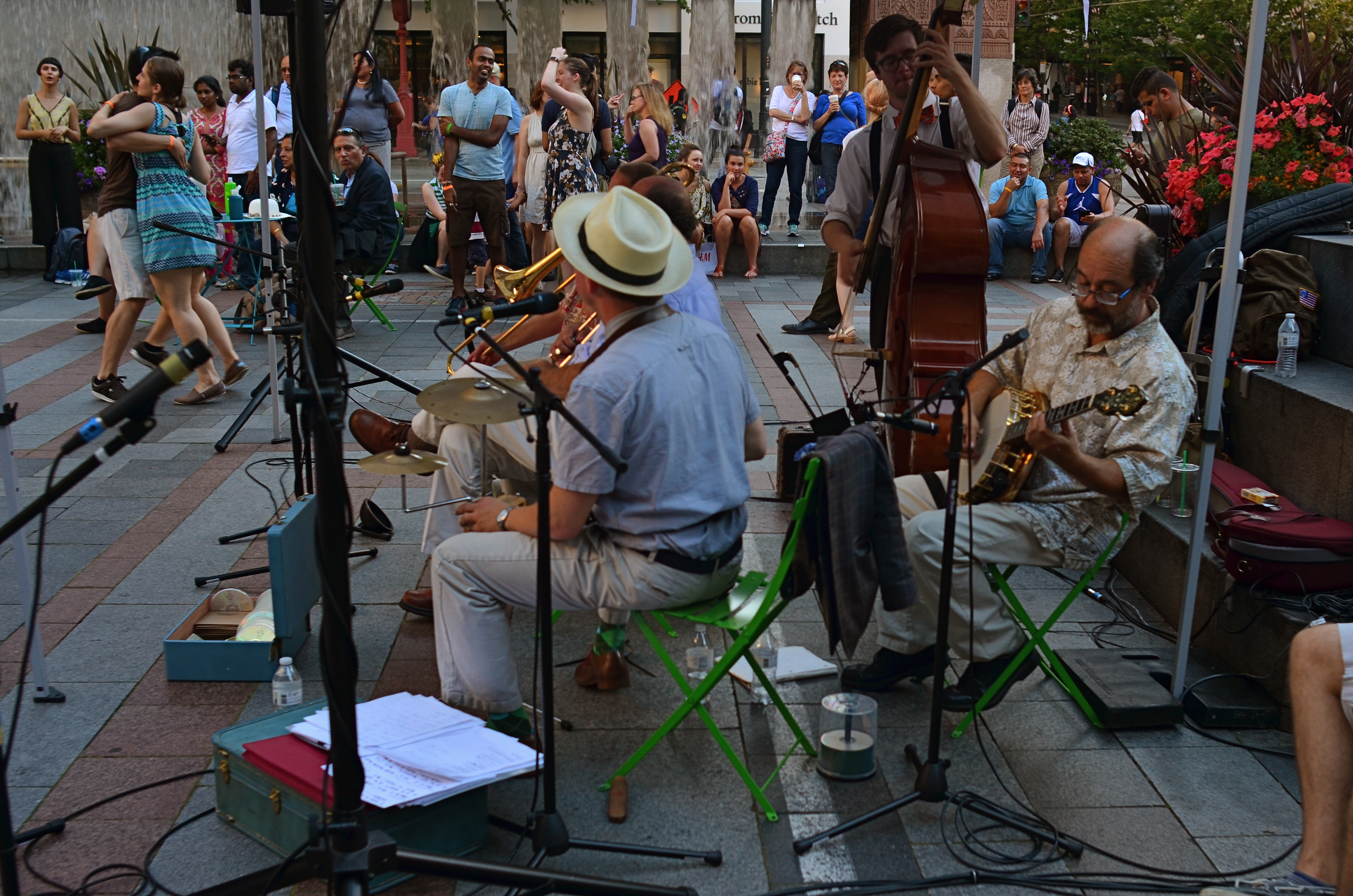
Which version of this street shot carries the most impact…the color master shot….?
By MICHAEL PERKINS
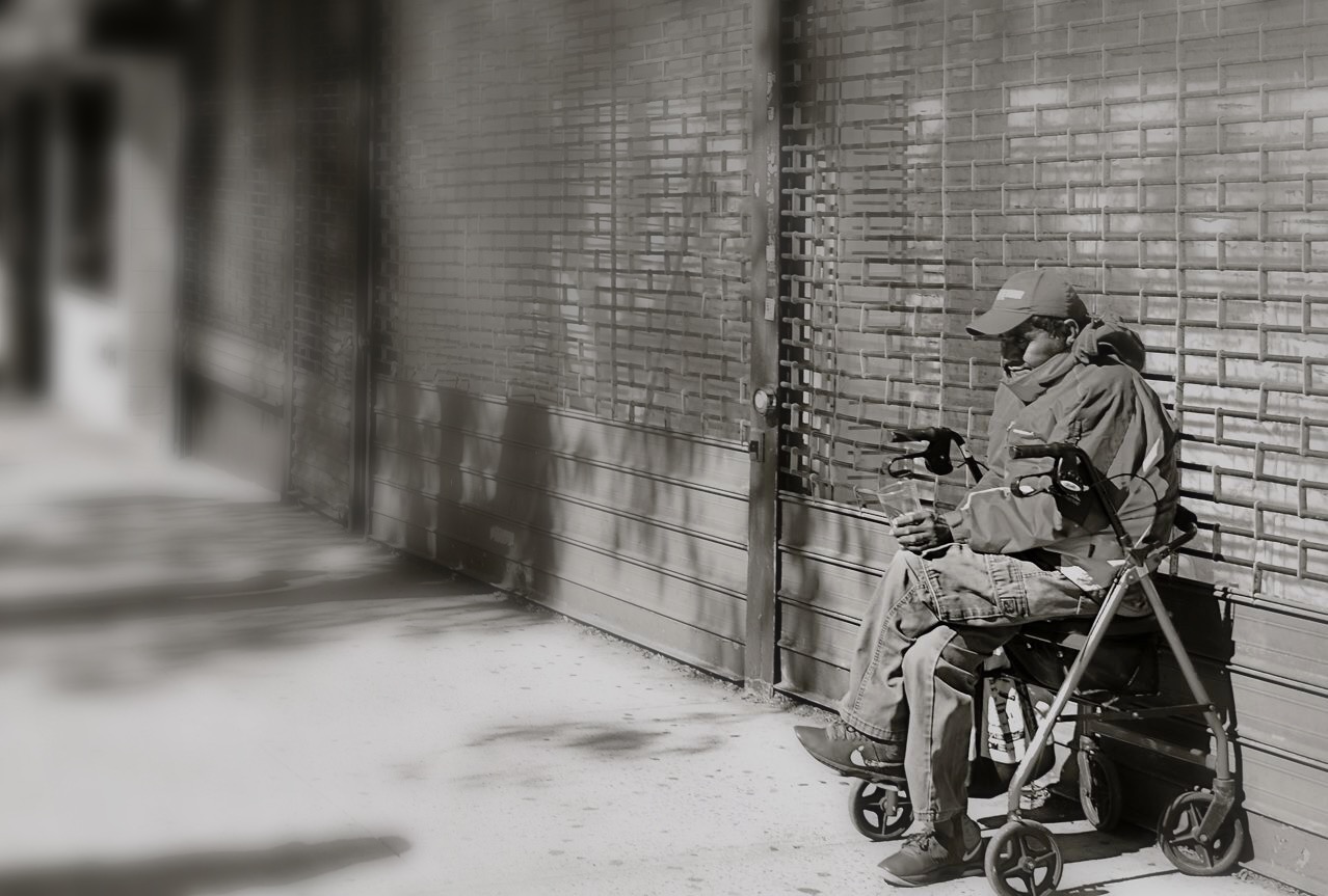
THERE SEEMS TO BE A BIAS IN WHAT WE CALL STREET PHOTOGRAPHY that leans toward monochrome images, as if black and white were somehow more emotionally honest, maybe even more reportorially accurate as regards social commentary. I suppose this preference borrows a bit from the fact that journalism and photographic critique sort of grew up alongside each other, with black-and-white news coverage pre-dating the popular use of color by several decades. However, since color has become the primary, rather than the secondary choice for most photographers over the past forty or so years, there may be no leader or “winner” between bright and subdued hues, no real rule of thumb over what’s more “real.” Street, and the tones used to convey it, are in the eyes of the beholder.
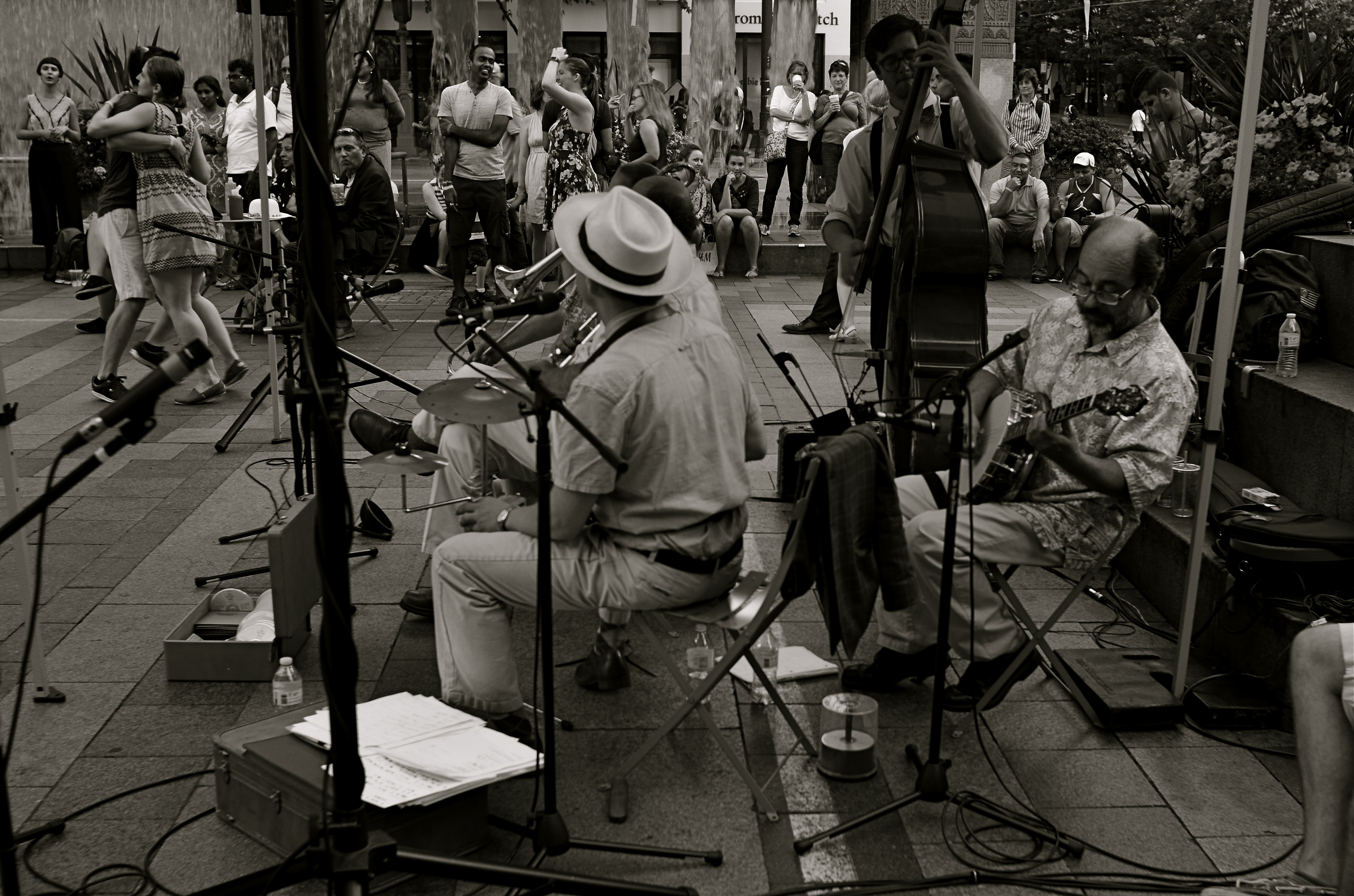
…or the re-mastered mono version?
There must be dozens of images that I myself take in color each year, that, upon later reflection, I re-imagine in mono. Of course, with digital imaging, it’s not only possible but probably smart to make one’s “master shots” in color, since modern editing programs can render more in the way of black and white than mere desaturation. Just sucking the color out of a shot is no guarantee that it will be more direct in its impact, and may actually drain it of a certain energy. Other times, taking out color can streamline the “reading” of a photograph, removing the distraction that can occur with a full range of tones. The only set answer is that there is no set answer.
In the film era, if you loaded black & white, you shot black & white. There was no in-camera re-think of the process, and few monochrome shots were artificially tinted after the fact. Conversely, if you loaded color, you shot color, and conversion to mono was only possible if you, yourself were expert in lab processing or knew someone who was. By contrast, in the digital age, there are a dozen different ways to reconfigure from one tone choice to another in seconds, offering the chance for anyone to produce almost limitless variations on an image while the subject is there is front of them, ripe for re-takes or re-thinks.
None of these new processes solve the ultimate problem of what tonal system works best for a given picture, or when you exercise that choice. However, the present age does place more decision-making power than ever before in the hands of the average photographer. And that makes street photography a dynamic, ever-changing state of mind, not merely an automatic bow to black-and-white tradition.
BREAKING THE GEOMETRY
Zoom (2016)
By MICHAEL PERKINS
CONTRAST IN PHOTOGRAPHY IS NOT JUST ABOUT A COMPARISON BETWEEN DARK AND LIGHT VALUES. The word contrast also applies to things placed next to each other in a composition that fight for dominance. Happy faces next to sad. Images of wealth and opulence juxtaposed with poverty and misery. Some of it can be a kind of forced irony, and, as such, can produce pictures that get a little preachy, or appear deliberately staged.
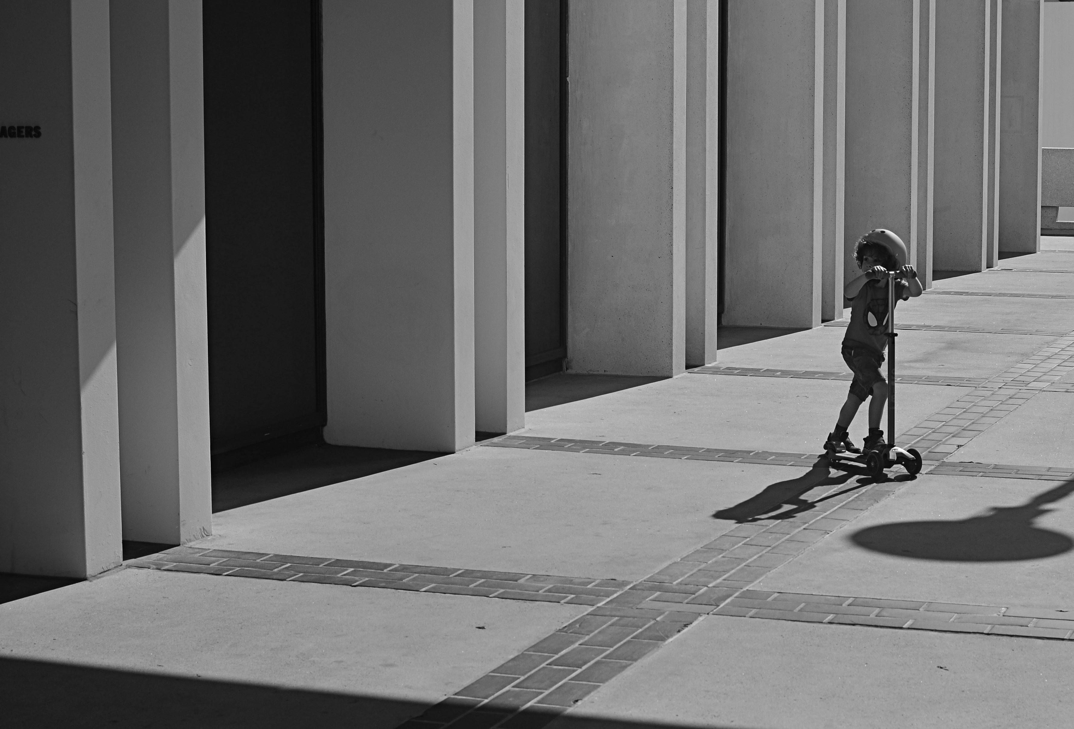
I love urban architecture because many of its design elements are enough to create a compelling image all by themselves….that is, without the larger context of what’s around them. They don’t have to be about anything; they just are. Contrast isn’t needed in many cases, because I’m not trying to show mankind’s place versus the space of a building…..I’m just seeking absolute patterns. No comment, no message.
Occasionally, however, it’s great to invade all those clinical lines and angles with a bit of humanity, to break the geometry and inject something warm or whimsical. It doesn’t have to be deliberate and it doesn’t have to be amped up with busy staging. The best contrast shots between disparate elements are the ones that you simply witness.
In the above image, the boy on the scooter is neither a “bad” nor “good” subject, but he gains a little amplitude because of his odd placement amongst the more antiseptic surrounding textures. The shot also worked a little better in monochrome because, in the original shot, the boy’s shirt was so vivid that it drew too much attention to that part of the picture.
Photographers benefit from a million tiny collisions between seemingly opposed subjects every single day. Learning which ones to isolate and massage into pictures can be an enjoyable detective game.
TWO SKIES, ONE GOAL

sds
By MICHAEL PERKINS
EVERY TIME I HAVE TO MAKE PHOTOGRAPHS ON AN OVERCAST DAY, I actually pray that the weather will deteriorate even further, since a dramatically lousy sky can create better results than an indifferent overcast. Murky weather mutes colors to the texture of bland dishwater, whereas rapidly shifting, strongly contrasty conditions can actually boost colors or create a dimensional effect in which foreground objects “pop” a bit. Keep your rainy days. Give me stormy ones.
Some days an uneven, rolling overcast contains dread darkness on one side and unbroken sun on the other, simulating the effect of a studio in which the subject is floodlit from front but staged against a somber background. This strange combination of natural lighting conditions confers an additional power on even the most mundane objects, and the photographer need do nothing except monitor the changing weather from minute to minute and pick his moment.
I love the architectural features of the Los Angeles County Museum of Art, such as the section of one of the exhibit hall rooves, seen above. However, in fair or even grey weather, it has less impact than when it’s front-lit against a threatening cloud bank, so, on a rotten day, it’s worth checking and re-checking to see if it’s been amped up by “jumping away” from the background clouds. Likewise these palm trees:
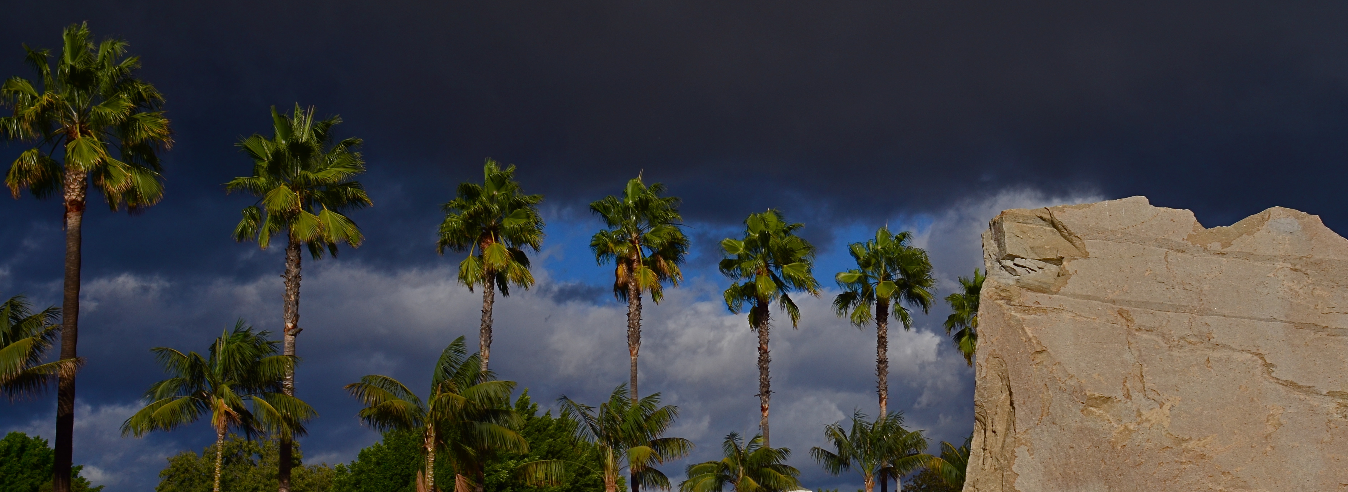
Simply capitalizing on changes in lighting conditions can create more opportunities than all the lenses and gear in the world. Cheap point-and-shoot or luxuriant Leica, it’s all about the light….plentiful, free, and ever-changing. The ability to sculpt strong images from this most basic commodity is the closest thing to a level playing field for every kind of photographer.
FIXES ON THE FLY
Original DSLR shot with too much color, too much information, and no effective way to isolate the seated man within the frame.
By MICHAEL PERKINS
ONE UNDENIABLE ADVANTAGE MOBILE OR PHONE CAMERAS HAVE OVER THEIR DSLR FOREBEARS is the ability to combine easy shooting and easy editing in the same small package. This adds convenience on top of convenience, allowing mobile pictures to be captured and refined in the field, with DSLR’s more generally tethered to PCs for their post-production editing.
Even more frustrating is that many basic phone cameras have a wider variety of processing options, even without the use of after-market apps, than come in a DSLR’s “retouch” menu, creating a greater disconnect between the “deliberate” editing of the late-film/early digital camera and the “instinctual” editing of phono-photography.
Recently, DSLRs have made it easier to wirelessly send their images to phones’ email inboxes, but, across several manufacturers, the process is far from sleek. But when you can send images taken with the superior lenses and larger file sizes of a DSLR to your phone, you can easily send those emailed items on to your favorite in-phone app for tweaks that can be done on the fly, with more tricks than your “real” camera allows. It also permits you to do radical re-mixes of yesteryear’s shots with today’s tech. Old photos can get a facelift with a lot less bother than if they go through a Photoshop-type workflow.
To illustrate: the top shot, a DSLR original, was way too busy. Jutting walls, extra people, over-bright colors…plenty to remove if the seated man at the front was to draw any central interest. Cropping and de-saturating in my Mac’s editing program was easy enough, but I wanted to further isolate him from the monotonous textured wall behind him.
The same DSLR image with selective focus added via a phone-based app.
The lens I used in the original wasn’t equipped to render different levels of sharpness within the same focal plane, but my phone had a handy app that did precisely that, and that’s where we went next.
Emailing the image to my phone was fast, as was forwarding the picture in the email to be saved as a camera roll image. From there, I sent the picture to an app called Analog Cam, which included a partial diffuser tool, allowing me to gradually blur everything in the focal plane except the man, as you see in the lower frame. Finally came a transfer from the app to a posting on Flickr. Thus with a few extra steps, I gained the flexibility I didn’t have when I shot the original, allowing me to save, salvage and send from one location.
The emphasis for mobile cameras is much more on post-shutter fixing than is the case with a standard camera. That said, there’s no reason why you can’t shoot on one and use the convenience of the other to get the result you want.
SIMPLE GIFTS
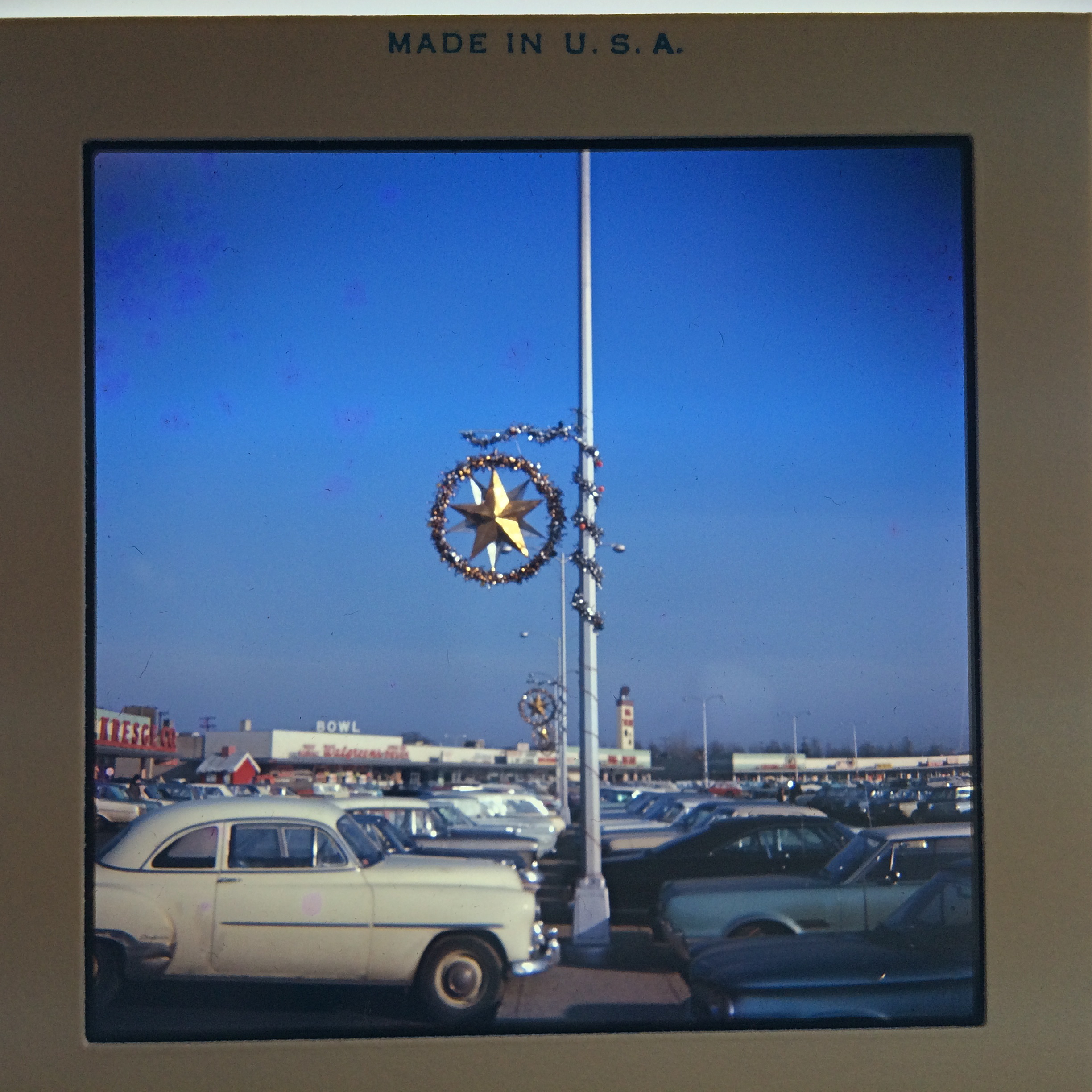
All dolled up for the holidays: Northern Lights Shopping Center, Columbus, Ohio, 1966. And, yes, there is WAY too much sky in this shot.
By MICHAEL PERKINS
THANKSGIVING WEEK USUALLY DEPUTIZES WRITERS OF EVERY VARIETY to generate lists of things the author is thankful for, everything from baby puppies to the designated-hitter rule, all enveloped in the gold glow of gratitude. Photographers are usually not enlisted for these rosters of wonderfulness, but, if you make pictures long enough, you will, no doubt, have a list of very specific items that warm your heart.
Over a lifetime, I have generally been grateful for photography’s consistent ability to excite my senses, challenge my thinking, and create the addictive sensation known as surprise. I’m grateful that George Eastman introduced the first practical roll film, taking photography from the hands of the few and giving it to the world at large. I’m glad that images have found languages with which to speak to people, languages that surpass the power of speech. I’m glad that photographs stitch together links across every gulf of human experience. And I’m thankful for the pictures that enraged me to action, that gladdened me to tears, that encouraged me to make more pictures of my own.
I’m grateful for the men and women who have created the greatest visual art form the world has ever known. You can sub your own gallery of gods, but mine includes Ansel Adams, Berenice Abbott, Garry Winogrand, Alfred Stieglitz, Henri Cartier-Bresson, Gordon Parks, Margaret Bourke-White, Edward Weston, Robert Frank, Edward Steichen, Robert Capa, Diane Arbus, Weegee, Walker Evans, Julia Margaret Cameron, W.Eugene Smith, Dorothea Lange, Richard Avedon, Annie Liebowitz, and, most importantly, the millions of invisible eyes and hands out there cranking, out there living by one unshakable credo: Always be shooting.
I thank the photo gods for images of my parents, first as sweethearts in the aftermath of World War II, then as newlyweds in the ’50’s, then as Mommy and Daddy in the Space Age, and presently as the great long-distance runners of romance, still mad for each other at 66 years and counting. I thank fortune for the bunny ears and hamming and mugging and bright toothy giggles of my own children, frozen now in their newness and their hunger for life. And I incidentally thank luck for Kodachrome, quick-charging batteries, fast lenses and a few moments in which I swung around, just in time, and got the shot.
The camera is many things…charmer, chronicler, narrator, witness, liar, magic wand. It gains all these special powers in the hands of people. Photographs are measures of who we are, what we care about, and what we want time to say about us after we’re gone.
Lots to do, lots left to attempt.
Lots to be thankful for.
CAUSE VS. EFFECT
By MICHAEL PERKINS
“WHETHER THE STONE HITS THE PITCHER OR THE PITCHER HITS THE STONE“, Sancho Panza explains in Man Of La Mancha, “it’s going to be bad for the pitcher”. I love that sentiment, since it explains how blurred, in life, the line really is between cause and effect. Start with the stone or start with the pitcher; the result seems the same, right? In photography, we make a lot of choices about, well, where to stand and point the camera. We also make decisions about whether to focus on cause or effect, and how that changes the kinds of pictures we wish to make.
There are times when amazing stories can be told on both sides of that equation. I often wish that baseball games could be shown in perpetual split-screen mode, since I love both the triumphant look of the batter who’s just connected and the outfielder who knows, in a second, that a rocket is coming his way. In terms of our visual legacy, both cause and effect have produced some of the world’s favorite images, so it’s inevitable that any shooter, pro or amateur, will eventually investigate both ways of recording experience.
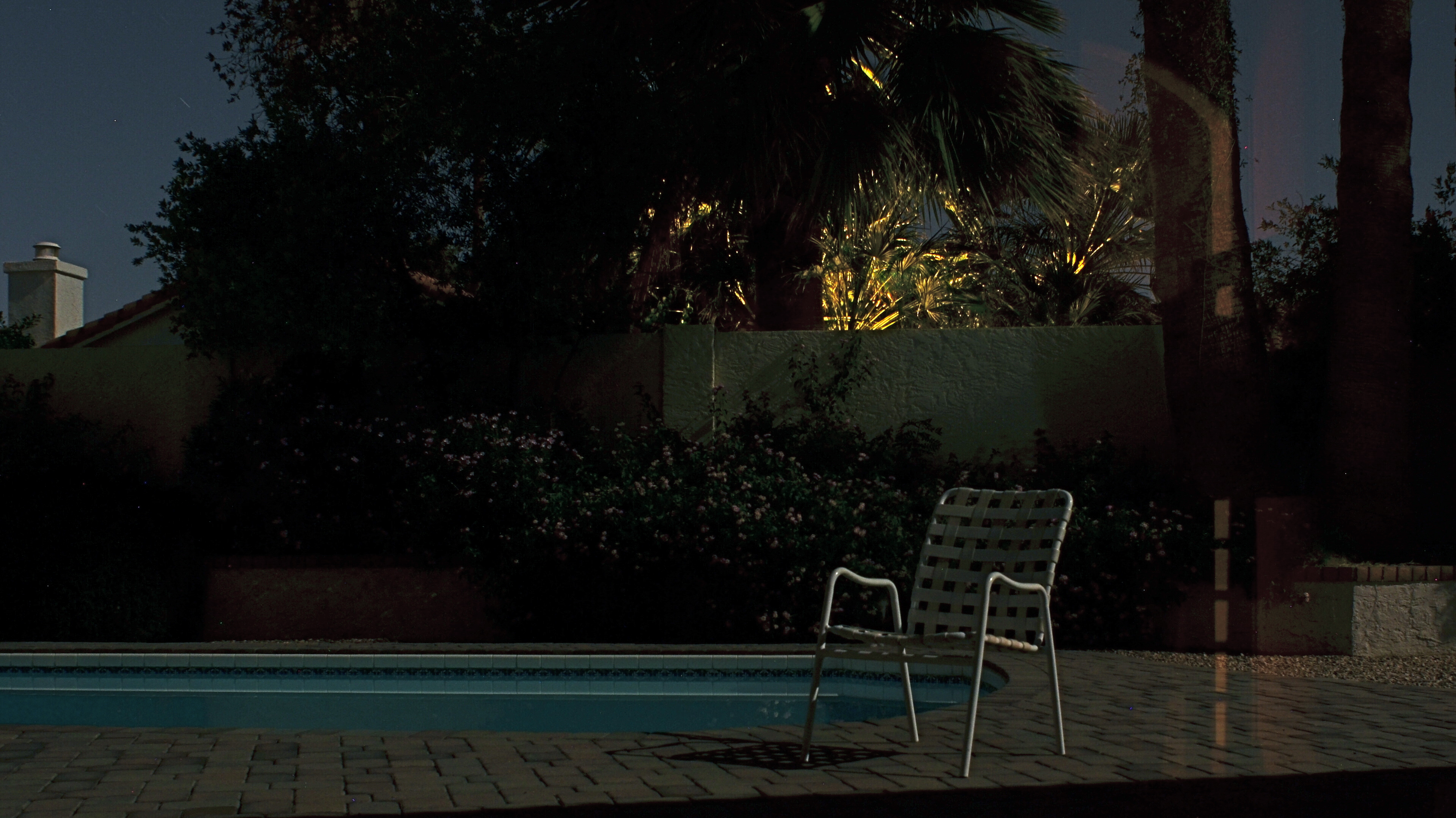
By The Light Of The Supermoon (2016): 2:46 exposure time, f/8, ISO 100, 24mm.
This year’s highly-touted “Supermoon” phenomenon seemed like a good opportunity for me to make just such a choice. The global hype machine went into overdrive on the appearance of this brighter/bigger-than-normal orb in the November skies, with the result being a flood tide of photos of, uh, the moon. More precisely, millions of the same exact picture of the moon, with a few outliers framing it behind a palm tree, silhouetting a city skyline, or some other such filigree.
For me, then, the cause of all this hubbub seemed anticlimactic at best, and yet I still felt compelled to do something to mark the occasion. Then I realized that the effect, not the cause, held the possibility of making a picture that interested me. I recalled that I had never had the chance to make a photograph with only moonlight for illumination. My backyard was readable in every fine detail with my naked eye as the moon, which was over my shoulder, lit up the pool, the shrubbery, and our brick patio and walls. I also knew that what looked glowingly bright to me would be rendered as absolute darkness for a handheld camera shot, so out came the tripod.
With time exposures, you can shoot at low ISO, reducing noise to an absolute minimum. You can also shoot at a small aperture for maximum depth-of-field; you just lengthen the exposure time to compensate. That meant that, during the moon’s brightest hour, I would, at f/8, need an exposure of just under three minutes, enough to rescue a lot of detail and even catch some of the remaining deep blue in the sky, which your eye wants to see as simple black.
Fifteen or so tries later, I got what you see here. Not a sign of the moon itself (cause) but plenty of evidence of its presence (effect). The subject matter wasn’t mesmerizing, but the mood registered pretty much the way my eye saw it, which, when you’re working with a limited servo-mechanism like a camera, is pretty much a win.
BOATS AGAINST THE CURRENT
Act Of Faith #265 (2016)
By MICHAEL PERKINS
THE LATE STUDS TERKEL’S BOOKS created almost a category of their own, collecting memoirs from across the length and breadth of American experience and class in essential essays like Working, The Good War, and Hard Times. Traveling the length and breadth of the nation for over forty years, Terkel interviewed the big and the small, the meek, the marginal and the mighty, as they recalled their individual experiences in the wake of massive historical events, from wars to depressions. For one of his final social montages, he spoke to people in their twilight years about their efforts to remain positive and engaged despite lives that had often proven challenging, even tragic.
Its title: Hope Dies Last.
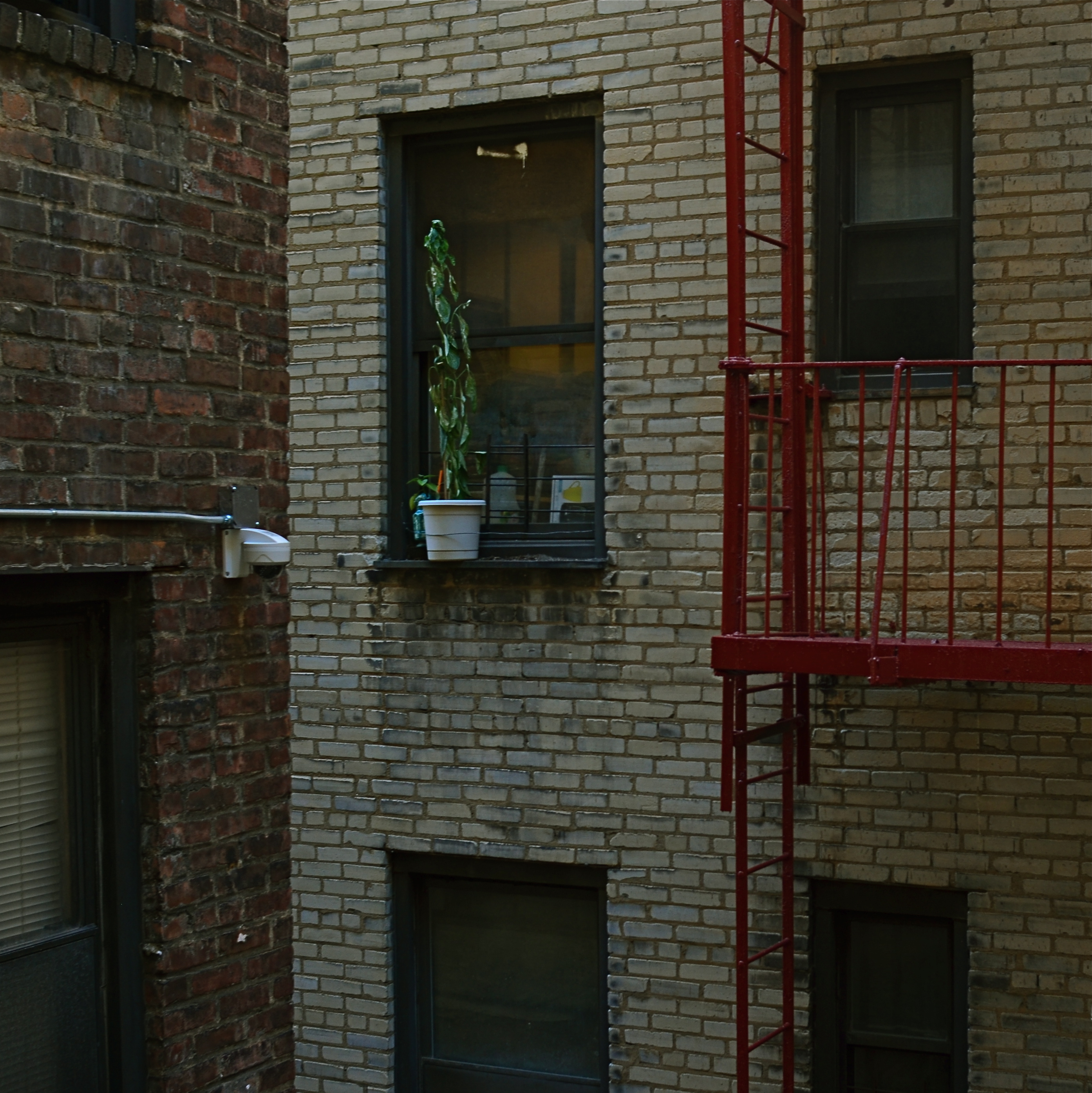
Upon first seeing the book, I had to read it, partly because it was Studs, and partly because that title spoke to my own minor acts of faith in what I look for in photographs. Pictures are often testimony about people who cannot be seen, measured in the objects they care about, or in which they invest their hope. We have all seen the tenacity of wildflowers thrusting up between the fissures of cracked concrete, and appreciated, in the abstract, what that image says about the faith of the human animal. We capture pictures of places bombed to ruin, then testify with our cameras as they begin, once more, to lay a stone upon a stone. Building. Dreaming. Launching our boats against the current.
Hope dies last.
When I see a picture of something that, to me, symbolizes our collective refusal to knuckle under, I want to take it home with me. Because we need it. Now, yesterday, ever. We draw strength from that escapist wildflower, or a battered face upturned toward the light, or, as above, a potted plant defying the odds in a dark apartment air shaft. Someone decided to give that plant a chance…or, at least, to remind the grey walls and grimy brick that color and life are still around, still fighting for their shot.
Studs made his best case for the persistence of hope with the words of his interviewees. I find comfort in trying to find visual evidence of their actions. Either way, photographers can serve as conservators of hope.
If there’s a better gig to be had in this life, please let me know.
EMERGING
By MICHAEL PERKINS
PHOTOGRAPHY CONSISTS OF SELECTED SLICES OF TIME, thin shavings of moments forever taken out of their original contest and preserved as separate, miniature realities. This thing, these people, this time, the camera says, once were. Our mechanical act has yanked them out of the full flow of life and turned them into mere symbols of it.
Time, in photographs is shown in three main ways: just before something happens, as it happens, and just after it has happened. Amazingly, our mind easily keeps these categories distinct. When we read images we immediately know if an action was pending, ongoing, or complete at the time of its taking. To put it another way, think of these three phases as images of, say, the last chop taken at a standing tree, the tree toppling over, and the tree on the ground. But here’s a question; is our photographic style a preference for one of these three very specific time-states?
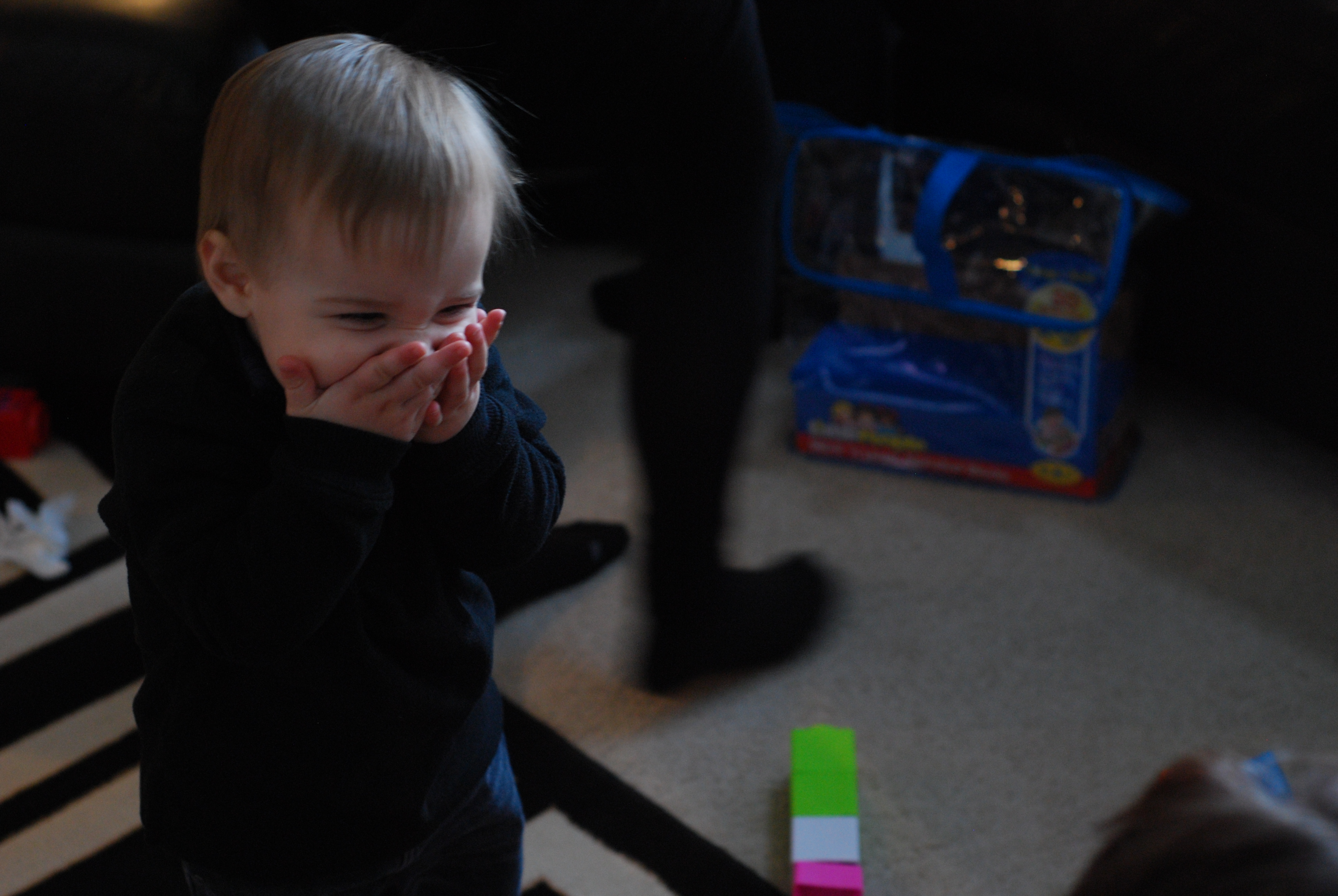
Henry, Delighted (2011)
On a conscious level, probably not. But if we start to edit our output purposefully into three piles…..marked about to be, is, and was, we may see that the bulk of our personal work falls into one of these categories. Again, this happens below our waking mind most of the time. Still, when I am deliberately looking at the process, I find that the moments before something emerges, be that something a sunrise or a gunshot, pack the most impact for me as a viewer.
As an example, in studying an important event (a news story, let’s say) as it’s shown in a photograph, I’m more interested in what the Hindenburg looked like the second before it exploded than I am in the disaster that followed. I’m keener on the sunlight that is about to burst into a dark room than I am in the fully lit space. The second before everyone jumps out and yells “surprise” can possess as much drama (even more, I feel) than the shocked look on the birthday boy’s face a moment later. Or take the case of the above image from several years ago. I no longer actually remember what it was that had tickled this young man so. But that little moment in which he was about to discover something wonderful is a miracle to me forever.
The reason I mention this lies in the fact that, whenever I try to show something that is actively occurring, right now, I frequently find another thing, elsewhere in the picture, that is about to occur, and often that emerging event holds more interest. At least for me. We traditionally think of photographs as preserving the past, and so they generally do. But they are also testimony to something that may, or may not be, about to become something unique. That uncertainty, that mystery, is another element of what makes photographic art so rich, so endlessly tantalizing.
TIED FOR FIRST PLACE
By MICHAEL PERKINS
EVERY PHOTOGRAPH IS DISCUSSED LONG BEFORE IT IS VIEWED, with an inner dialogue between shooter and subject that is held, however briefly, ahead of the shutter click. Sometimes, at a fortuitous intersection of talent and luck, that is the end of the discussion; other times, there will be additional chats between the first version of an image and its maker, a talk that can be endlessly debated in the processing and editing phases. And, of course, based on those results, photographs finally make their arguments to the world at large.
The bulk of those discussions focus on what the center, or the essence of a picture should be. Were all elements in balance right out of the camera…in which case, frame it and hang it, case closed? Or (and what is far more likely), did we find that essence at all? Was it compromised, watered down, by faulty composition? Did we make a weak lighting choice here or there? Did execution weaken the effect?
Usually, there is a clear component within a photograph that cries here I am a little louder than all the other parts of it. But sometimes, there are two or more pieces which feed on each other, boost each other’s effectiveness. In such cases, instead of one primary piece and a lot of secondary or extra pieces, you find two things in the photo that are basically tied for first place. When one thing in a picture feels diminished without interacting with another, both elements deserve to stay.
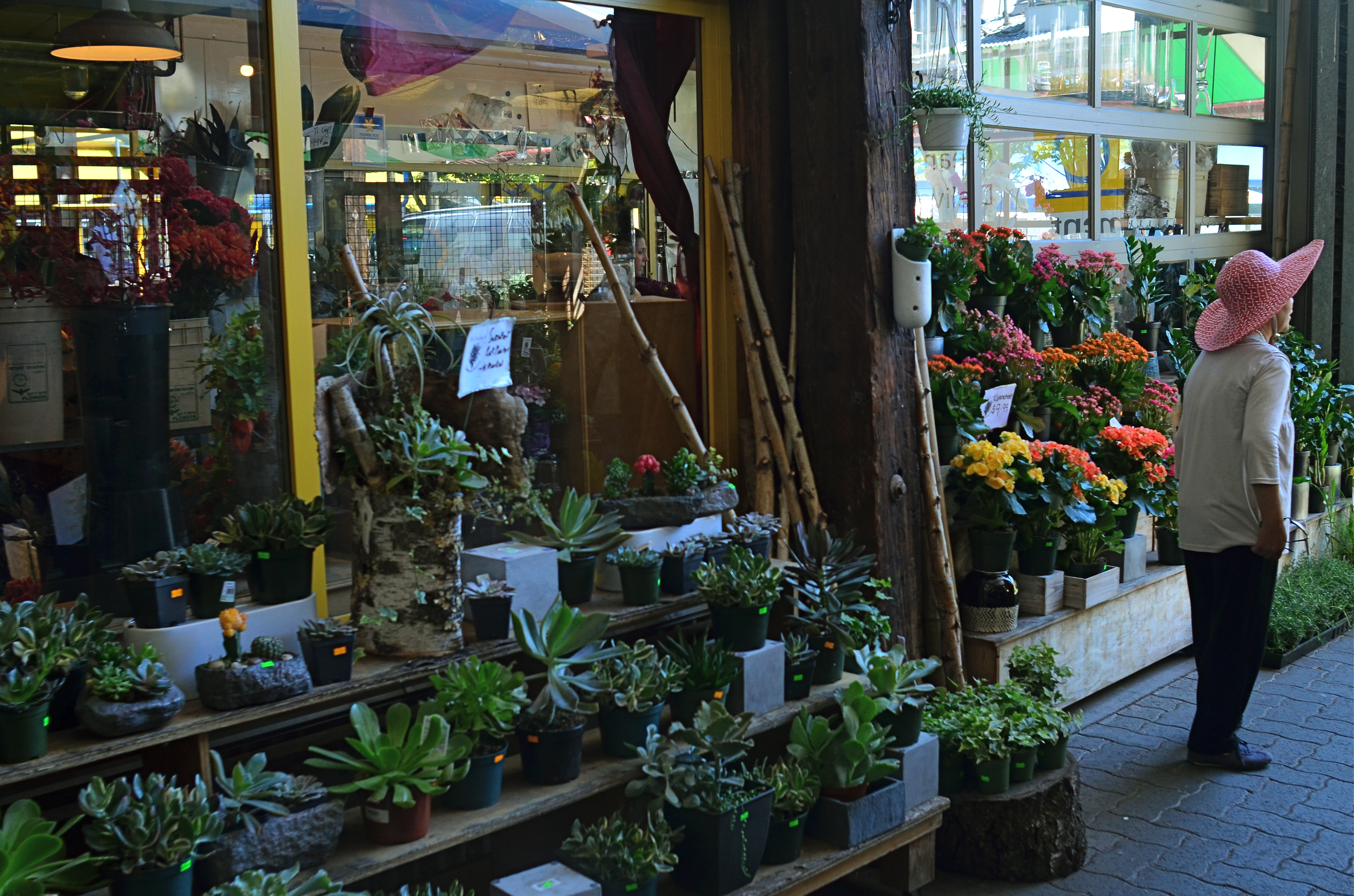
Mrs. Lin’s Summer Bonnet (2016)
The picture at the top seems, to me, to be just such a case. The floral shop and its faceless proprietor seem somehow married to each other, two halves of a whole. And, while I can conceive of making two separate pictures from the master shot in which either the shop’s inventory or the saleslady are in solo starring roles, they truly do seem interdependent, so I declare a tie, and they both go to the finals.
Thus the discussion on what to include in the picture has gone on for at least two layers, with layer one being the planning of the photo, and layer two being the editorial decision to keep both flowers and florist on equal footing in the final image. Look over your own pictures and you will no doubt find several of these “tied for first place” compositions. It can seem counter-intuitive to have more than one main point in an image. But the image itself will tell you, unmistakably, when that actually make the most sense.
MAKE IT SO

I’ve been photographing this for years, and I still don’t know what I think about it. Needs more work….
By MICHAEL PERKINS
WHEN PHOTOGRAPHY IS PURELY REPORTORIAL, as it is in journalism or documentation, it sticks pretty close to the accepted state of the world. It tries to depict things plainly and without comment; it delineates and defines; it shows us the true dimensions of events.
But when the same technology is used interpretively, there is no absolute “real”, no pure authenticity, other than what we choose to show. It is in re-purposing the world visually, shaping and framing it as we choose, that we can confer meaning on it pretty much at our whim. That’s where the “art” part comes into what would otherwise be a merely technical measurement of light. We not only choose our subject….we set the conversation about it. Simply stated, what you shoot is about whatever you decide it’s about.
Even with hyper-familiar objects, things seen and re-seen to the point that they are iconic (think Empire State Building) images can re-set the way we take those objects in. And, in the case of what I like to call “found objects”, such as the image seen at the top, the photographer is completely unfettered. If your viewer’s eye has no prior mental association with something, you’re writing on a blank sheet of paper. You can completely dictate the terms of engagement, imbuing it with either clarity or mystery, simplicity or symbolism.
I have always been flat-out floored by photographs that take me on a journey. Those who can conjure such adventures are the true magicians of the craft. And that’s what I chose to play in this arena over a lifetime. Because, when photography liberates itself from mere reality, it soars like no other art.
SHOOTING WITH AN IMHO MODEL 1
 By MICHAEL PERKINS
” OH SURE, I USE MY PHONE SOMETIMES“, you still hear hide-bound photographers grudgingly admit, “but when it’s important, I use my real camera.” This snotty, down-the-nose belief that only the cameras of one’s early experience can be regarded with any degree of respect or deference persists, runs against the grain of all reason. It’s a ridiculous statement, born of equal parts arrogance and ignorance, an insane notion that only some kinds of cameras can produce important images. Yeah, yeah, and only a Cadillac can drive you to the drugstore.
As the global dominance of the once-mighty DSLR recedes further into the twilight, it’s not even necessary to take sides on which piece of equipment is better, more relevant, more “real”. That’s falling into the same mental pothole of those who refuse to accept the mobile camera as a true instrument. Once and for all: shoot what you want with what you want. But please don’t pretend that the revolution isn’t happening. The very definition of what a camera “is” has been raging for nearly twenty years at this writing, and the weight of the evidence falls predominantly on the side of change, not tradition.
Big-time disclaimer department: I usually don’t cite current consumer stats in any of these posts, since blog archives are forever and ever-twisting trends quickly make liars out of all prophets. But in this case, I’ll just front-load the figures that follow with a few hefty qualifiers. The rankings below, listing the top camera brands and models for a very specific market, are extracted from user numbers for contributing photographers on Flickr, one of the biggest photo sharing sites on the planet as of the first week of November, 2016, which is when I compiled these abstracts. The list presented here lists the top ten most camera makes and models from that time. In order of popularity, then, the ten most used cameras by Flickr members this week are/were:
Apple iPhone 6
Samsung Galaxy S6
Canon EOS fD Mark II*
Nikon D7100*
Sony Xperia Z3
Motorola Moto X
HTC One
LG G4
Panasonic DMC-FZ200*
Fujifilm XTI*
The asterisks denote the DSLR cameras on the list. The other remaining models are cellular-phone based. All ten of these manufacturers have multiple models that were ranked among Flickr members’ most-used cameras, but what you see here are the top-ranked models within each brand. There were several venerable DSLR manufacturers that made the top 20, such as Pentax (#11), Leica (#16) and Ricoh (#17). As another point of comparison, the highest ranked mobile, Apple’s iPhone 6 accounted for over 518 million items on Flickr with over 19,000 daily users, with the highest ranked DSLR, Canon’s EOS FD Mark II accounting for 138 million+ items and over 3,200 daily users.
The number one selling camera, as I like to say, is the IMHO (In My Humble Opinion) Model 1. Brand loyalty for its own sake is beyond over with. So is format loyalty or lens loyalty. There is only what works. You can drive that Cadillac to the drugstore, but the Prius gets better mileage and may even boast superior crash specs. With cars as with cameras, drive what turns you on.
Just get where you’re going.
APPEARS TO BE…..
Stylistically, I can say, without fear of refutation, that this is, um…a photograph. Ain’t it?
By MICHAEL PERKINS
I RECALL, MANY YEARS AGO, WHEN THE JUICIEST COMPLIMENT I COULD IMAGINE SNAGGING for a photograph was that “it looks just like a postcard”. That is to say, “the picture you’ve made looks like another picture someone else made while trying to make something look like…. a picture”.
Or something like that.
Seems that an incredible amount of photography’s time on earth has been spent trying to make images not so much be something as to be like something else. The number of effects we go for when making an image, in the twenty-first century, is a list of the inherited techniques and processes that have waxed and waned, and waxed again, over the entire timeline of the art’s history. We are now so marinated in all the things that photographs have been that we find ourselves folding the old tricks into new pictures, without self-consciousness or irony. Consider this partial roster of the things we have tried, over time, to make images look like:
Paintings Etchings Drawings Daguerreotypes Tintypes Cyanotypes Expired film Cross-Processed Film Kodachrome Sepiatone Toy Cameras Macro Lenses Badly-focused, Damaged and Flawed Lenses Obsolete Film Stock Daytime Night-Time Negatives Postcards Antique Printing Processes Dreams, Hallucinations, and Fantasies “Reality”
We not only manipulate photographs to make them more reflective of reality but to mock or distort it as well. We make pictures that pretend that we still have primitive equipment, or that we have much better equipment than we can afford. We utilize tools that make pictures look tampered with, that accentuate how much they’ve been tweaked. We make good pictures look bad and bad pictures look passable.
This post is turning out to be the evil twin of a recent article in which I emphasized how little we know about making “realistic” images. The more I turn it over in my mind, however, the more I realize that, in many cases, we are trying to make new photographs look like photographs that someone else took, in a different time, with different limits, with different motives. We steal not only from others but also from what they themselves were stealing.
All of a sudden my head hurts.
THE UNREAL REAL
No, this isn’t a picture of the “real world”. And might that not be freeing, in a way?
By MICHAEL PERKINS
I’M A PHOTOGRAPHER, AND YET I CANNOT TELL YOU WHAT “REALITY” IS.
I point machines at the world and I get some kind of recording of light and shadow. Is what I get a literal translation of the way something, at least for an instant, really was? How did my composition, which necessarily had to leave out some things in order to include others, alter the complete truth of a scene? How did my selection of a lens, a time of day, the place where I stand, my own mood effect the outcome? And, if this machine, this recorder does not actually show “reality”, does that make me more of an artist, or less of a technician?
The world as we see it is never mere visual “evidence”. It comes to us filtered through every personal trait that shapes our ability to observe in the first place. Then we, in turn, filter that subjective experience into an even greater abstraction, shoving it through a lens that adds its own biases, limits, or flaws. So what comes out the other end? Should we even be worried that a photograph can’t be real? Might we not, in fact, be relieved to be freed from the constraints of the actual, just as painters and sculptors always have been?
The above image was taken by a person who stood in a particular place at a particular time with a specific piece of optical equipment and decided that the resulting balance of visual elements constituted a “picture”. That selection of a single part of a single moment will either convey a similar feeling to someone else, or it won’t. That’s what we uncertainly refer to as “art”, and, whether we like the terms of engagement, those “really” are the terms. Reality is beyond our reach.
But a commentary on it isn’t.

THE PICK-UP GAME
Oasis (2016)
By MICHAEL PERKINS
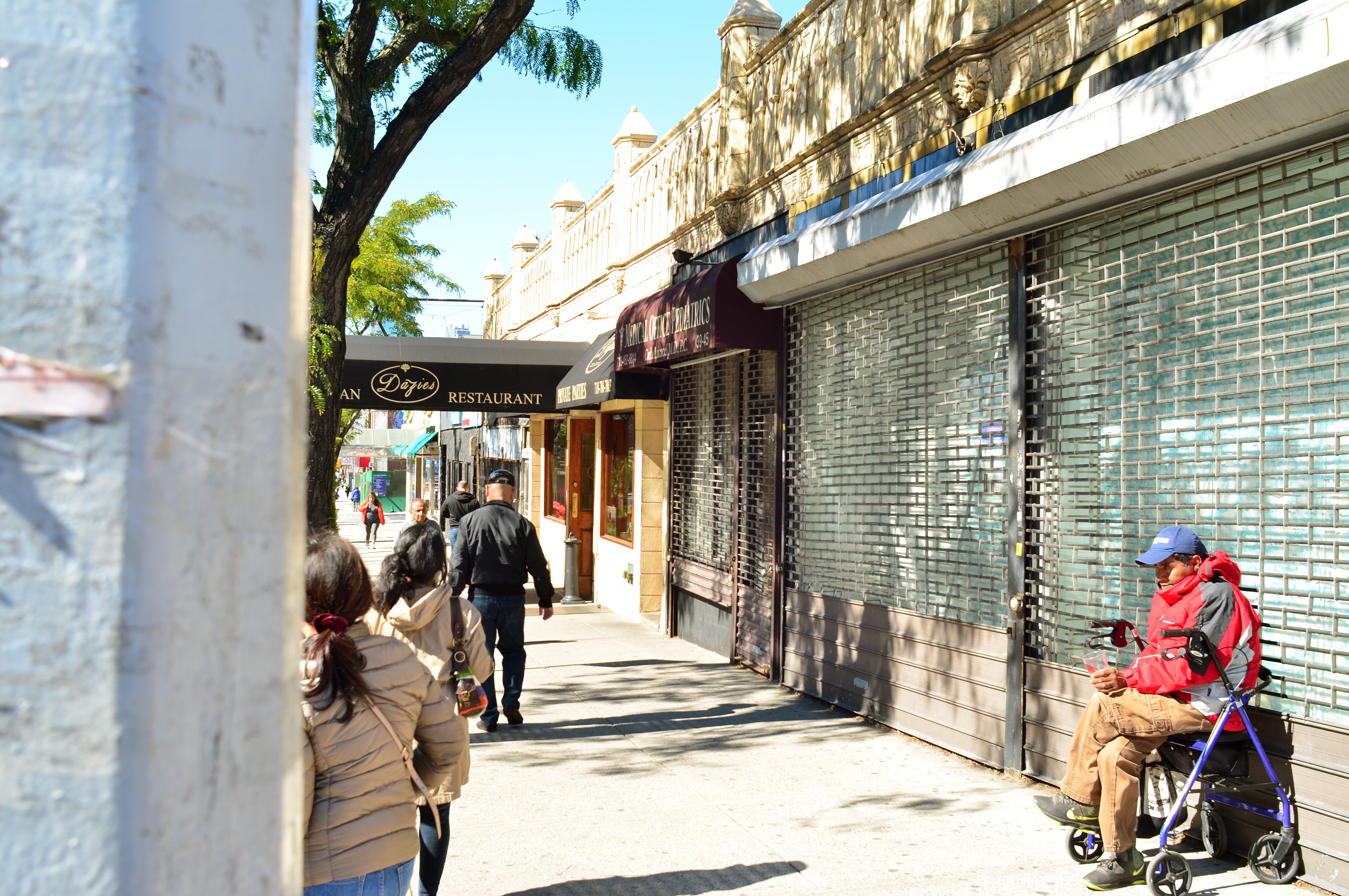
STREET PHOTOGRAPHY, FOR ME, INVOLVES AN OCCASIONAL BOUT OF LONGING, in that I am frequently on hand to record lives that, at least in part, I’d like to visit for longer than the length of a shutter snap. Not all street scenes are inviting, of course. Often we chronicle things that we are profoundly grateful are not part of our own lives. Other times, we accidentally preserve something that is so shrouded in mystery that the resulting images provide endless wellsprings of speculation…just what was it that we thought we saw, both at the moment of taking, and later? And then there’s what the taking of these images says about us personally. Some of our eavesdropping makes us feel privileged. Some makes us feel stained by the ugliness of our invasions.
And then there are the blessed accidents, the pictures we didn’t set out to take at all, such as the photo you see here. I was actually not in active shooting mode when I passed this pickup game of handball in a neighborhood in Queens over the past summer. To tell the truth, since I was trying to find an address at the time, I might very likely have passed these players completely by, had one of their tosses not jumped the fence of their tiny parcel of blacktop and literally rolled to my feet.
The ball re-directed my attention, as did several clear, high calls of “hey mister!” and “sir, would you mind..?” Pitching it back, I saw the boys’ playspace as the tiny oasis it was, crammed in on all sides by the neighborhood’s skyward crush. Next, I noticed the wonderful warmth of the mid-morning sun, and took a few seconds to allow the combatants to resume play, and, more importantly, forget about the Nice Old Guy Who Gave Them Back Their Ball. I took only two frames, fearful that one of the players would remember having seen the Nikon around my neck. Fortunately, the game was a much better claim on their attention, and I liked one of the tries I had made.
Street work is, more often than not, a matter of being there when someone else’s life happens. Seldom does that life reach out and ask to be noticed, to make a request on your time. In such moments, all of life becomes, for an instant, a universal pick-up game, something in which we’ve actually been invited to participate.
Share this:
December 25, 2016 | Categories: Americana, Cities, New York, Street Photography | Tags: documentary photography, social commentary | Leave a comment