TWO-WAY GLASS
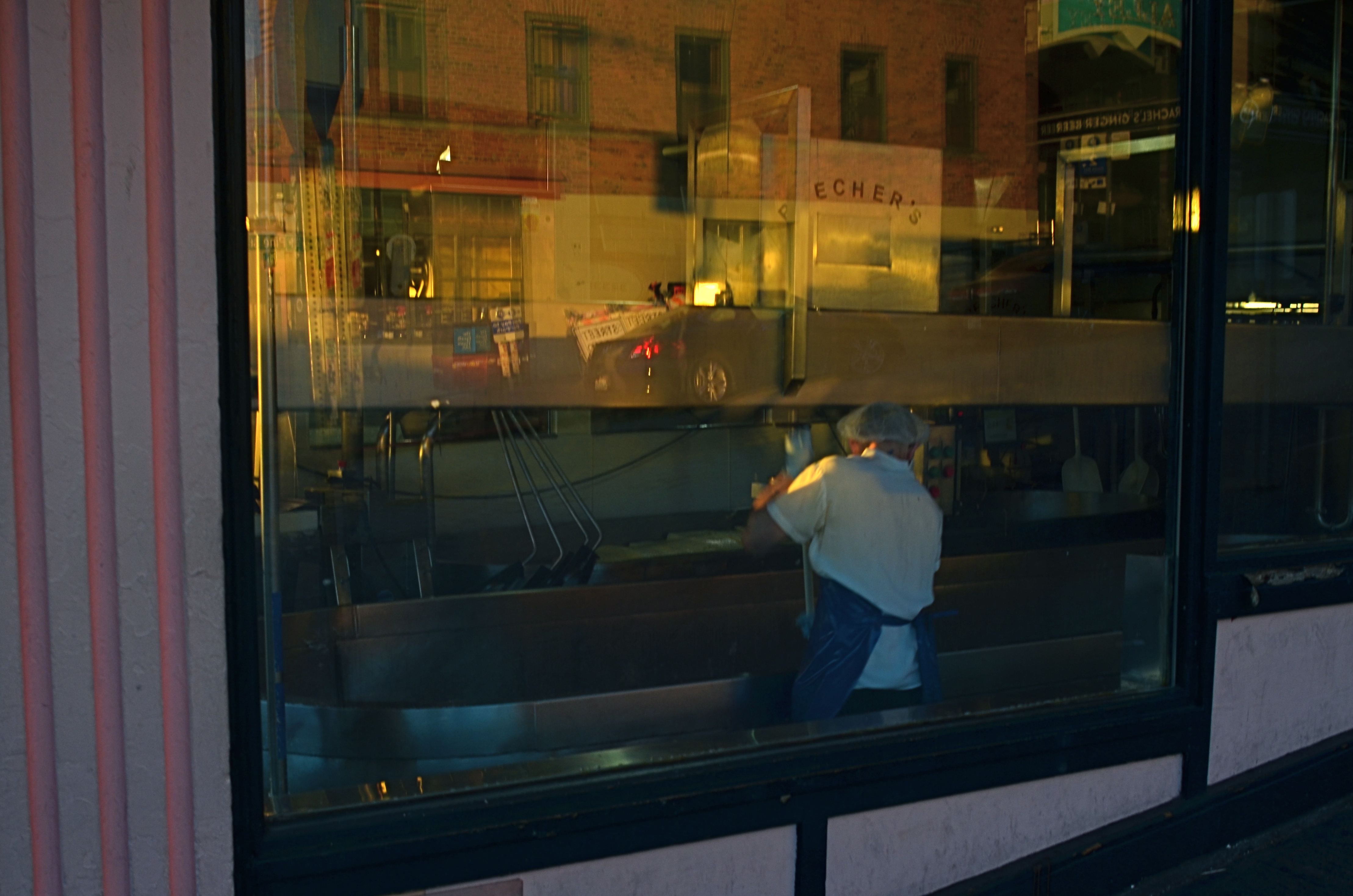
Closing Time (2016)
By MICHAEL PERKINS
IF THE EYES ARE THE WINDOW TO THE SOUL, then certain windows are an eye into contrasting worlds.
Photographers have devised a wide number of approaches when it comes to using windows as visual elements. Many choose to shoot through them with a minimum of glare, as if the glass were not there at all. Others use them as a kind of surreal jigsaw puzzle of reflected info-fragments.
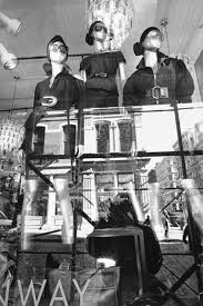
Lee Friedlander’s New York CIty (2011)
To show these two approaches through the eyes of two great photographers, examine first Eugene Atget’s shots of 19th-century Paris storefronts, which mostly concentrated on shopkeeper’s wares and how they were arranged in display windows. Straightforward, simple. Then contrast Lee Friedlander’s 21st-century layered blendings of forward view and backward reflection (seen at left), which suspends the eye between two worlds, leaving the importance of all that mixed data to the viewer’s interpretation.
Much of my own window work falls into the latter category, as I enjoy seeing what’s inside, what’s outside, and what’s over my shoulder, all in the same shot. What’s happening behind the glass can be a bit voyeuristic, almost forbidden, as if we are not fully entitled to enter the reality on the other side of the window. But it’s interesting as well to use the glass surface as a mirror that places the shop in a full neighborhood context, that reminds you that life is flowing past that window, that the area is a living thing.
Thus, in an urban setting, every window is potentially two-way glass. Now, just because this technique serves some people as a narrative or commentary doesn’t make it a commandment. You have to use the language that speaks for you and to your viewer. Whatever kind of engagement serves that relationship best dictates how you should be shooting. I just personally find layered windows a fun sandbox to play in, as it takes the static quality away from a still photo to some degree, as if the image were imbued with at least the illusion of motion.
Sometimes it’s good to conceal more than reveal, and vice versa. The only “must”, for this or any other technique in photography, is to be totally mindful as you’re creating. Choose what you mean to do, and do it with your eyes fully open.
ANTICIPATION
By MICHAEL PERKINS
SPORTS PHOTOGRAPHY IS FLAT-OUT REPORTORIAL IN MOST CASES, placing its crucial emphasis on the capture of “the decisive moment”. The play that saved the day, or, at least, earned the headline. Hail Mary passes. Impossible catches. Long, nothin’-but-net buzzer-beaters hurled hopefully from Downtown. These are the essence of sports coverage; images that freeze such moments, photos which often outlive the text that they were designed to accompany. Sports photography is, for the most part, about moments of record, moments of now.
Take it out of its pro-level context, however, and sports, as played by most of the rest of us, can simply be about someday….or more precisely, any moment now. Sports reports are often viewed as strongly edited segments that stitch together one now moment after another in breathless digests of daily “greatest hits”. For many of us regular slobs, however, life isn’t played out that way. Real time, on our playing fields, consists of an infinite number of long, eventless stretches. Sadly, most of us don’t move seamlessly from career high to career high. Instead, there are many stops along the way…to smell the roses, count down the clock, and praaaaaaay for the final bell.
Photographically, kid sports often strike me as more fun than adult games, principally because the terms of engagement are so very different from the grown-up stuff. Children’s games are free of the deadly seriousness that seems to have tainted sports in recent years, robbing them of much of their playful escape. Young Dick and Young Jane aren’t doing this for a living. There is seldom anything of consequence on the line, except maybe the vanity of their parents. And when it comes to providing great images, the mix of true technique and awkward innocence makes for a charming combination, as the young combatants ape their mentors, even as they betray their innate kid-ness.
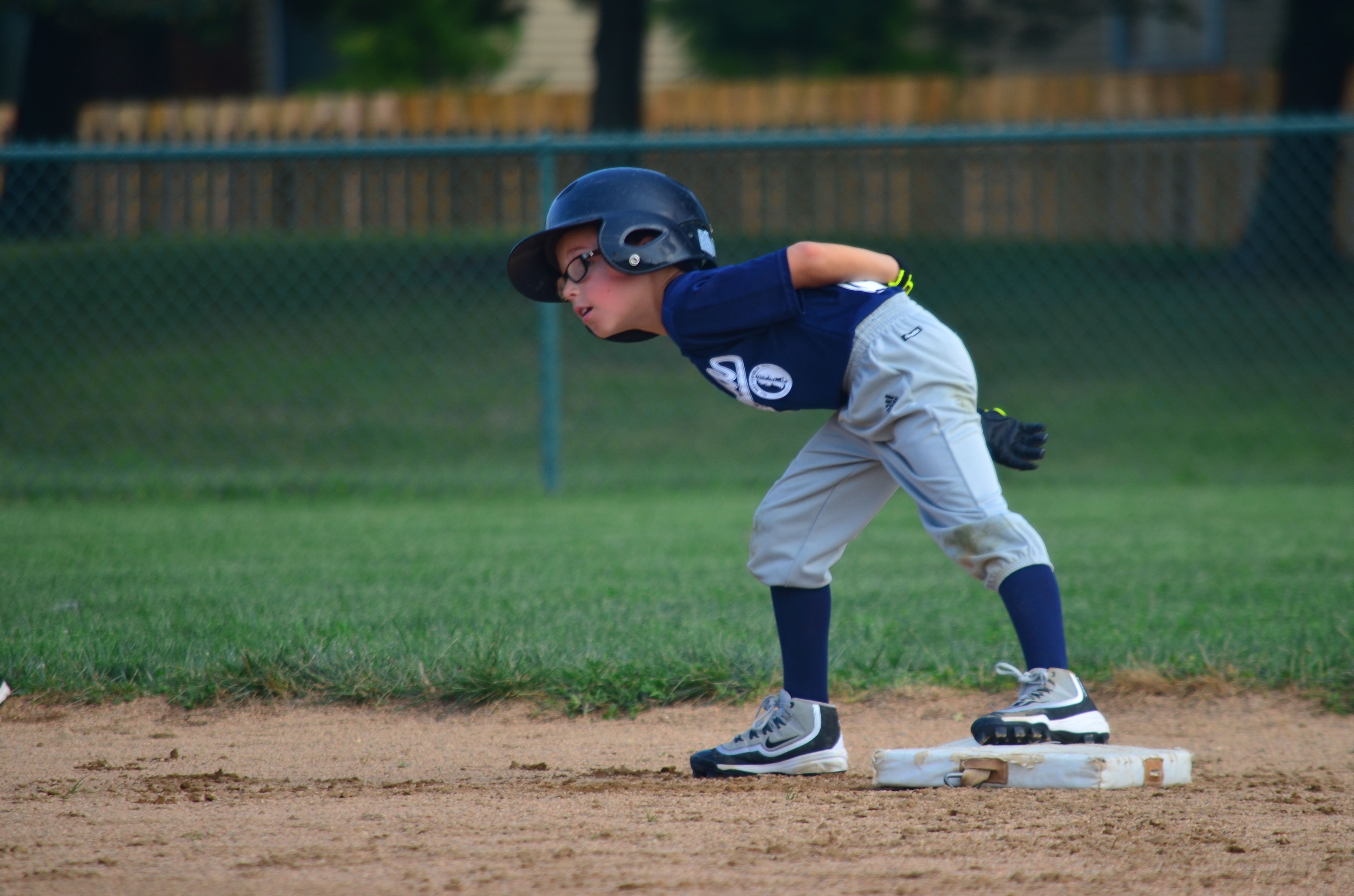
Opportunity..? (2016)
The young man captured here is, above all else, having fun. He’s enjoying the sweet anticipation of the unexpected. He already has the mechanics of a young pro, but his curious exploration of the option of stealing third is all little boy. Lots of story here, and in many moments which never approach the drama of a national championship or a three-peat. Images are narratives, and, in photographing more than just a player’s once-in-a-lifetime Grand Slam, we learn about striving. And waiting. And dreaming.
Theirs and ours.
A GENTLER EDGE
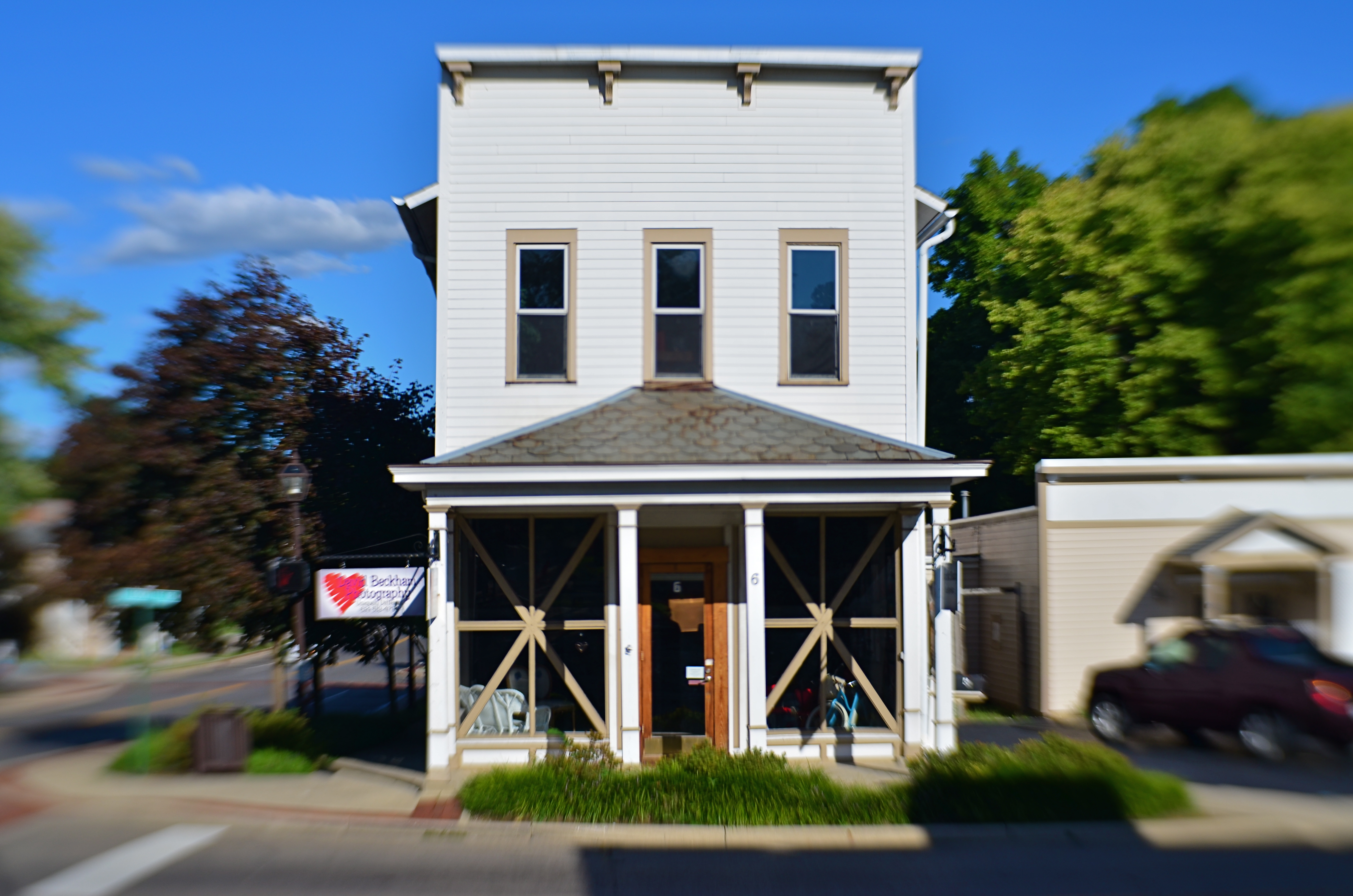
Storefront (2016). Details are used sparingly in the central building, even less crucial in the rest of the frame.
By MICHAEL PERKINS
CHOICES ABOUT FOCUS MIGHT JUST BE AMONG THE MOST IMPORTANT DECISIONS that a photographer will face. Clarity, sharpness, precision, call it what you might, focal crispness is a crucial determinant in the creation of an image, no less than light and subject matter. And it’s one of the easiest factors to manage, available to any one from the humblest point-and-shooter to master technicians on the Hubbell telescope.
This urban shot seems to call for a sharp look overall.
There is a tendency for us to mentally default to an idea of “sharpness” when we hear the word focus, as if the only way to faithfully reproduce reality is strict adherence to that standard. But photography has never really been about reality, any more than painting or prose. We can’t help but add some small interpretive something to the process of making a picture, even if we believe a machine is largely in charge of the process. Amazingly, with very little effort, we can change the perception of an image by tiny adjustments in what is clear and what remains hazy or soft, straying selectively from the arbitrary sharpness standard.
Some subjects are rendered too coldly, too clinically, when subjected to razor focus, so that what you may gain in documentary detail you lose in intimacy, or in that undefinable feeling of being close. Applying this line of reasoning to my personal affection for architecture, there are buildings where the hard look of precision is perfectly suited to the subject; jutting skyscrapers, massive bridges, towering monuments, and the like. But put me in a small town, where the entire space feels sealed off from time itself, and the look, at least for me, becomes softer. Details take a back seat to feelings, and the harsh light of midday gives way to a soft, dreamy haze at late afternoon. The secrets of side lots, alleys and back yards become scavenger hunts. In both the big and small cities, focus is the key element in the creation of the image. And, also, in both cases, an advance visualization of the final result dictates exactly the degree of focus required.
Lenses and cameras possess wonderful technical properties that can deliver a slew of exotic effects. Still, with virtually no expense or fuss, a smarter mastery of focus is a decisive, even dramatic factor in helping a photograph develop its most effective language.
EYE FOOD
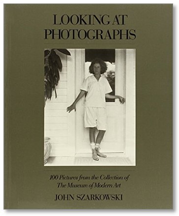
Even the smallest library on photography needs this book.
By MICHAEL PERKINS
A VIDEO BIOGRAPHY OF JOHN SZARKOWSKI, FORMER DIRECTOR OF PHOTOGRAPHY for the New York Museum Of Modern Art, makes the salient point that most great photographers begin by being great fans of photography, almost to the point of studying the work of others as much as they work to perfect their own craft. This makes perfect sense. Before you can teach others to see, you have to learn to see yourself. And that begins with watching how other people see.
Learning from the masters doesn’t necessarily mean stealing from them, or even being stylistically influenced by them. What you see most importantly in other photographers is how closely their selves are married to how they personally take the measure of the world in visual terms. You learn how few real accidents there are, how few miraculous pictures merely pop out of the camera fully formed. You see the deliberate agency of art, the conscious decision to choose this in order to achieve that.
Szarkowski, who oversaw MOMA’s photographic collections and exhibitions from 1962 to 1991, bore witness as well to the first true acceptance of photography as an art unto itself, with a vocabulary, a power, a poetry separate and distinct from painting. Under Szarkowski’s tutelage, the great new personal photographers, from Garry Winogrand to Diane Arbus to Lee Friedlander, moved from the periphery to the center of popular culture.
Not content to merely designate work worth seeing, or providing it with a prominent platform, Szarkowski also edited and published two of the most important general-use guides to what all of us should look for in a photograph. His seminal books The Photographer’s Eye and Looking At Photographs, both comprised of works from within MOMA’s collections, examined more than just subject matter or technical data, looking at the motives, biases, objectives and visions involved in the making of pictures. Most importantly, both books placed known and unknown shooters on an equal par, making the study of the art about what is achieved, not just how, or by whom.
I cannot imagine having sustained a lifelong interest in making images if I had not first encountered the works of, among others, Pete Turner, Alfred Eisenstaedt, Walker Evans, Robert Frank, Larry Burrows, Richard Avedon, Berenice Abbott, Alfred Stieglitz, Art Kane, Weegee, Sam Abell, or Francis Wolff. Many of these people thrilled and inspired me. Sometimes they infuriated or shocked me. And sometimes they did all of that in the same moment. All have knocked me upside of the head and repeated, over a lifetime: Look here. Look closer. Look again.
Don’t ever let anyone tell you that photography is about technique, gear, luck or natural ability. You can work around all that stuff. But if you can’t see, you can’t show.
Study. Read. Admire.
Feed your eye.
DECONSTRUCTING THE CARD
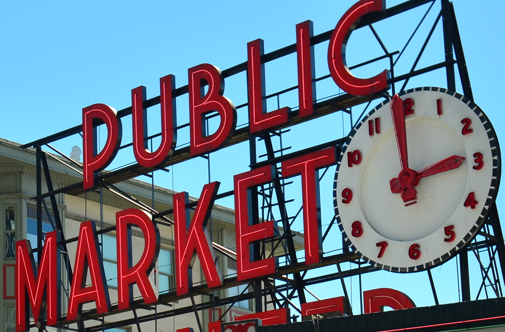
The standard view of Seattle’s Public Market
By MICHAEL PERKINS
WE HAVE ALL PLAYED THE CHILDREN’S GAME OF REPEATING A WORD UNTIL IT BEGINS TO SOUND FOREIGN, OR SILLY, to be drained, in fact, of all real meaning. Context being everything, no less in photography than in any other form of expression, we can often make images that, because they have been so endlessly replicated over the years, become drained of their power, and beg for a re-imagining.
In brief, some things have been photographed so many times that they need to be taken far out of context to rebirth them as vital subject matter.
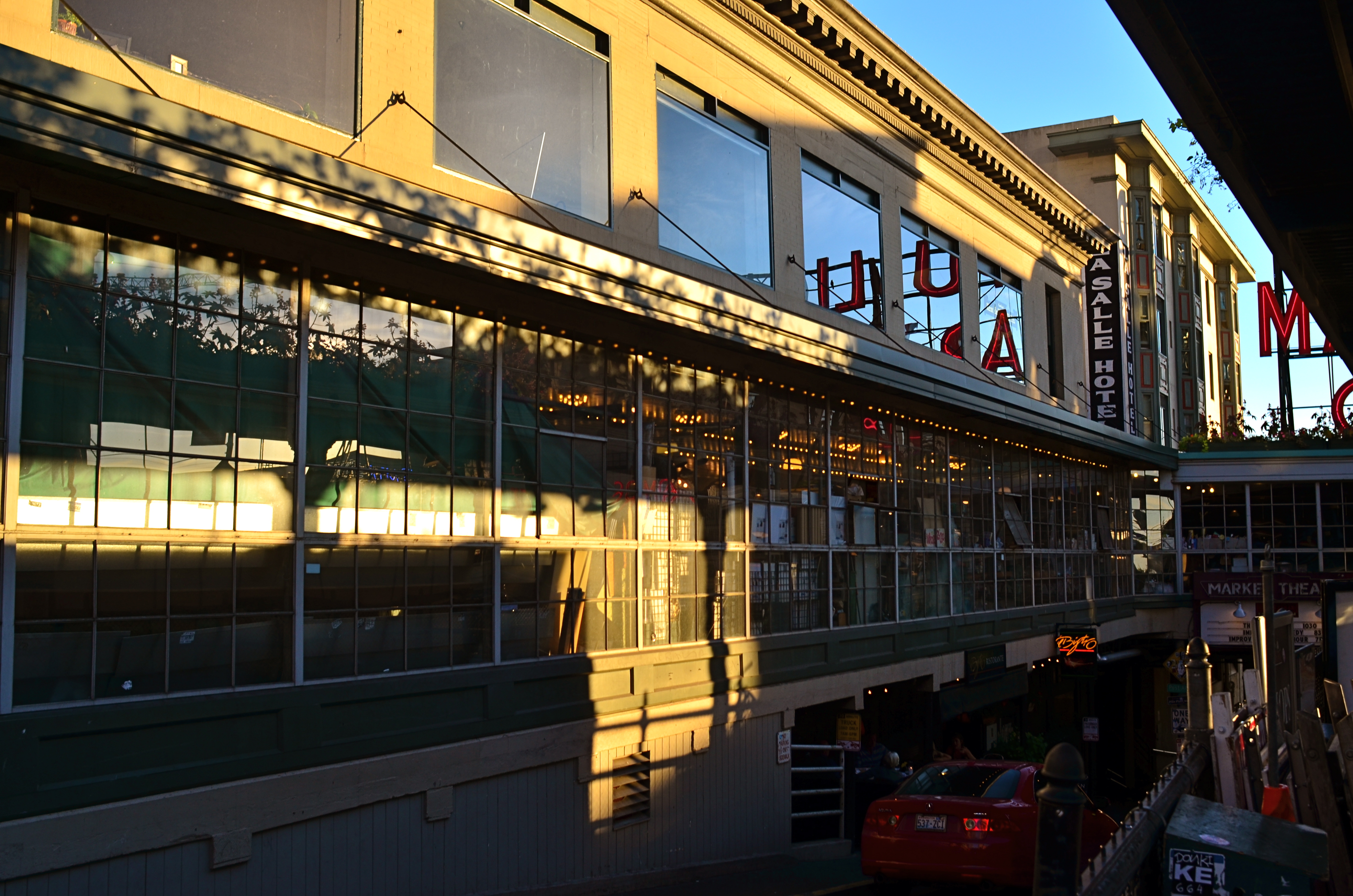
Look around the next airport souvenir shop you encounter. Look at the paperweights, the tee-shirts, the memorial shot glasses. There, in a moment, you see the symbols of the town you’re visiting (or leaving), reduced to the most hideous kitsch ever created. Lady Liberty. The Space Needle. San Francisco trolleys. You can’t “do” the towns in which these icons hold court unless you visit them and crank off a few snaps. They’re “to do” items, but not “must do”‘s. And every depiction of them is post-card standard, seen from a certain angle and in a certain orientation.
Sadly, many of these sights still could hold the symbolic power they once had, except that few of us are demanding that said power be brought forth. Ironically, we approach totally unknown subjects, things we blithely stumble onto, with the freshest eyes, not knowing the “correct” way to visualize them. We produce instinctual reactions based on how and where we first saw a thing, without the accumulated cultural baggage about how it’s “supposed” to look. We visualize it personally, rather than measuring it against the standard of thousands of other images taken of it.
The market sign is still “there” in a sense that is known to the average viewer, but now it really is part of a market “place”.
So how to photograph the over-documented icon? Well, for one thing, the “postcard” view, the one in the travel brochures, must be abandoned completely. Instead of making it a homework assignment to visit a well-known place, why not assume you’ll get one random, fleeting glance at it….through a dirty window, a picket fence, a reflection in a window….and have that be your only chance to photograph it. Instead of trying to get the image “right”, pretend that you have never seen this thing, whether it be a temple or a tower. And imagine, further, that you didn’t even know the thing existed, but that, upon rounding a blind corner, you were suddenly forced to react to it.
As seen at the top of the page, the sign for Seattle’s famed Public Market is often photographed as if it were the market itself, filling the frame of many photos with just its giant red neon letters. In reality, it is a small component in a vital, bustling neighborhood filled with rich visuals. Why not merely suggest the sign as part of a larger tapestry? More importantly, what is your vision?
One great advantage in making new images of old icons is that you know so much of the standard view of the thing that, in abstracting it, you know the viewer will still follow you on the journey….that is, they can make the leap from the literal to the symbolic. It’s like improvising a jazz solo on a well-known melody.
Visualization is the photographer’s most important skill, but occasionally, re-visualization is even more vital…and revitalizing.
THE SECOND PASS
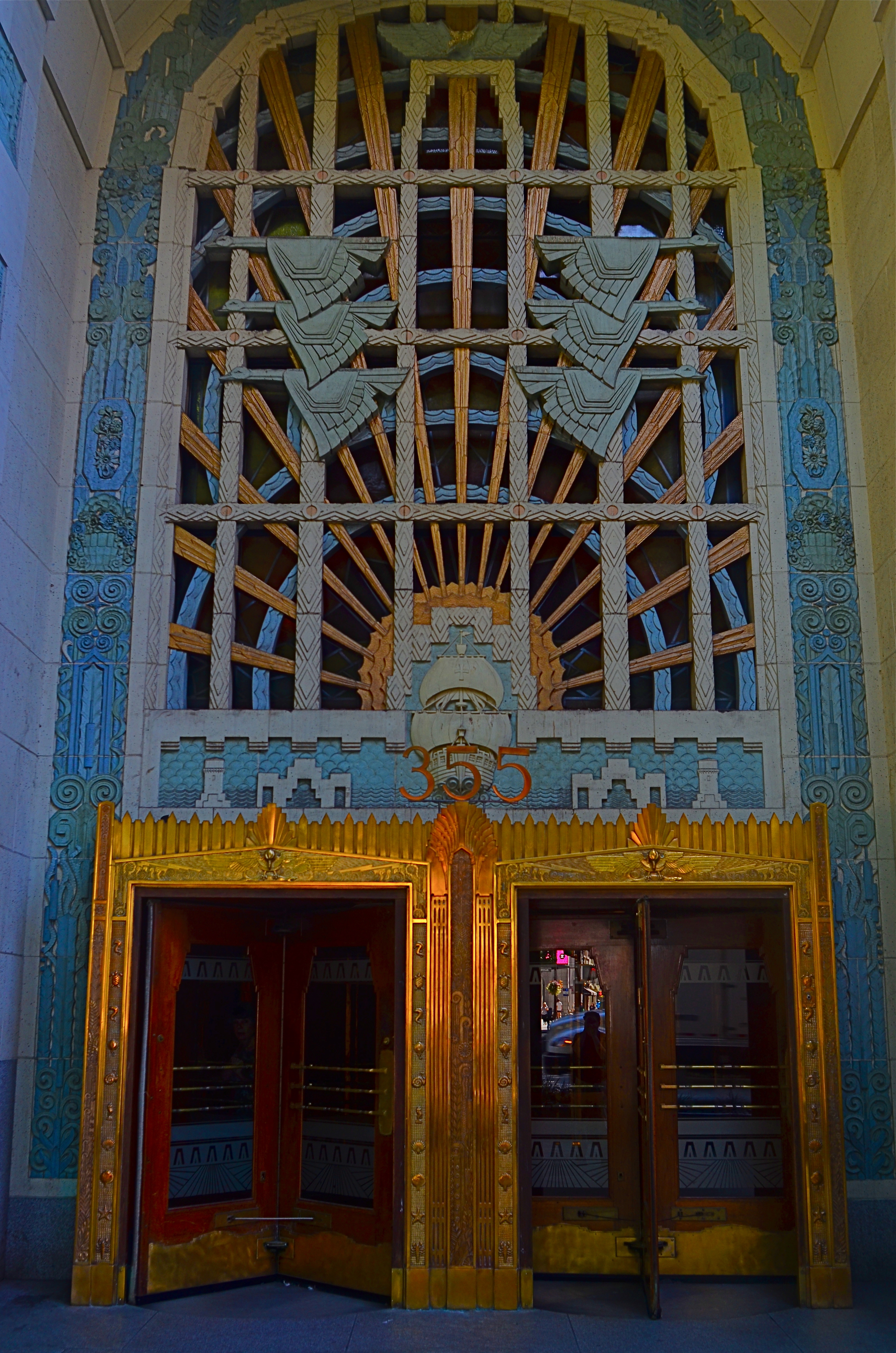
Vancouver’s amazing Marine Building, a Deco freak’s feast, in early morning (flat) light.
By MICHAEL PERKINS
SOME VISUAL SUBJECTS ARE SO RICH IN POTENTIAL that they evolve from a few essential shots to what, for lack of a better term, passes for a photo “essay”. Such extended coverage of buildings, countries and people used to be common in the heyday of the picture magazine, with up to a dozen pages of images strung together with narrative links in the pages of Life, Look and their many imitators. It’s a great format to work in once you discover a worthy candidate. But, in practical terms, it can be a little like working a checklist.
I document a lot of Art Deco architecture, since it embodies history, abstraction, illustration, design, and fantasy, all in one big fat buffet. That means I spend a lot of time dodging passersby on sidewalks and lingering in lobbies long enough to make the security personnel twitchy. Deco is all about the splendor of detail, some of which can only be revealed by patiently moving from door to grille, elevator to stairway, entrance to entrance, and looking for light that will bring that detail into bold relief.
I used the word checklist a while back because you are often working one in your mind, ticking off the various items as you wander around the site. Gotta do the mezzanine. Need a shot of the ceiling. Did I catch those wall sconces? Thing is, we tend to think of those little check marks as meaning, I’m done here. Moving on….when, in terms of what changing light does to these buildings within a short span of time, we should be actually be thinking, okay, I’ve done the preliminary work. Should go back and check this again in a while. Deco, especially, is rife with reliefs and murals made from a wide variety of materials, many of which will register color and shadows very differently at different times of day. You have to think in terms of “Take One, Take Two”, rather than in the snapshot mentality of “nailed it.”
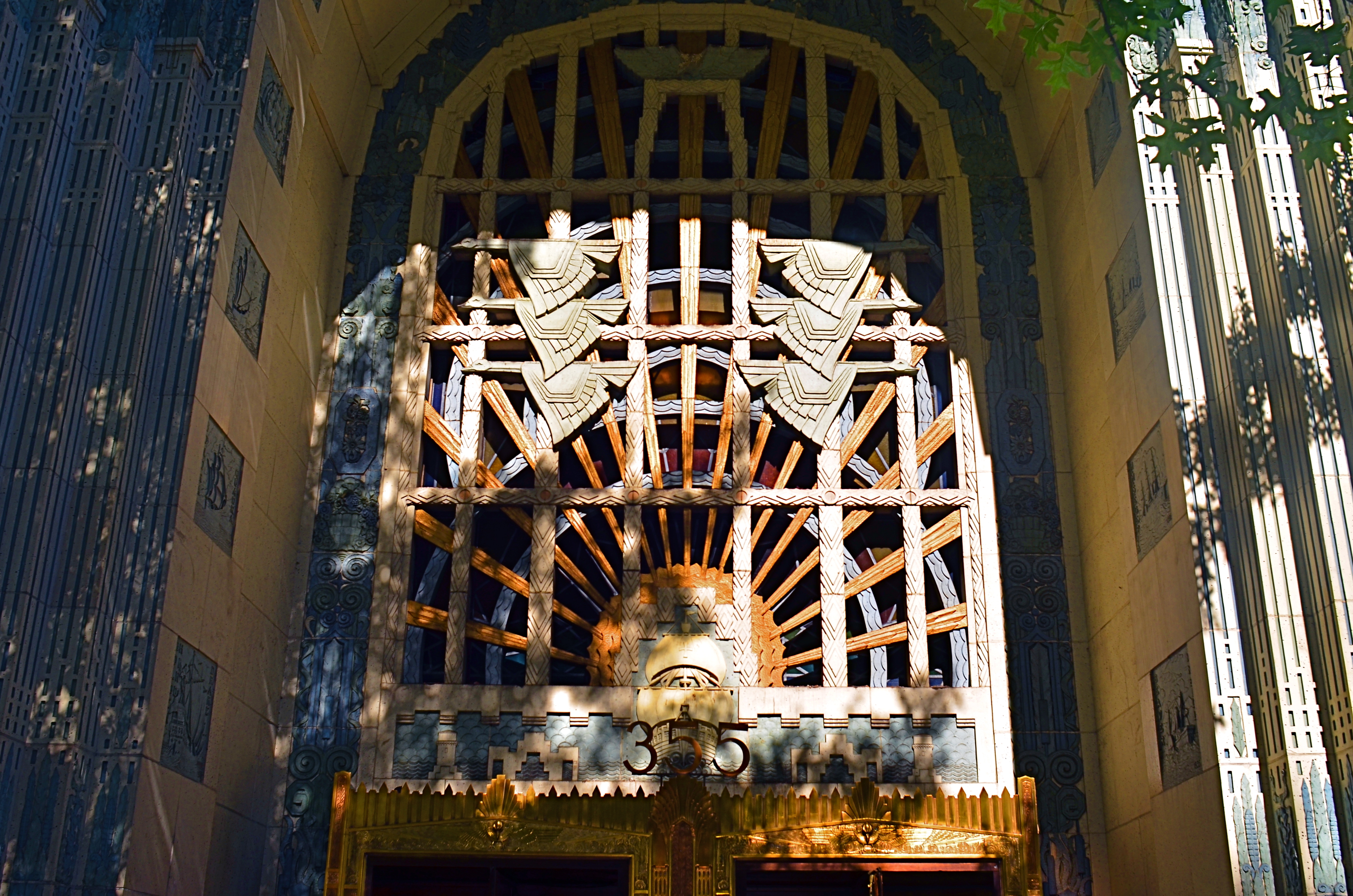
The same entrance just a few minutes later. The sun has climbed in the sky and created dramatic contrasts in all surfaces.
The images you see here, of the entrance to Vancouver’s magnificent Marine Building (read all about it here) were shot just twenty minutes apart. The top shot shows light landing on the door and its surrounding niche fairly flatly, almost sideways. However, within minutes, as seen in the second shot, the sun has climbed high enough in the sky to blast away at the center of the space, throwing the overhang of the arch into deep shadow. This change intensifies the contrast between raised and flat surfaces and makes the exterior terra-cotta (a material in which the colors are baked right in) more vivid. It also is projecting shadows like crazy. Which version is better? Not the point. It’s about editing choices and being reluctant to think that there is one “official” way to shoot something.
I could show similar changes to the lobby, with light softly entering the stained glass over the door, then crashing through it like a golden ray just minutes later. The point is, exposure is time plus light, and, when tackling a large essay-type project, it’s important to do more than one visualization on key elements. It’s the difference between grabbing a souvenir and creating a keepsake.
BURDEN OF PROOF
Reverse Shadows (2015) Originally conceived in color, later converted to black and white. Luckily, it worked out, but, shooting this image anew, I would execute it in monochrome from start to finish. Every story has its own tonal rules.
By MICHAEL PERKINS
THE WORLD OF PHOTOGRAPHY’S EMBRACE OF COLOR, which now seems instinctual and absolute, is actually a very recent thing. The arrival of color film stock targeted to the amateur market barely reaches back to the 1920’s, and its use in periodicals and advertising didn’t truly begin to outdistance color illustration until well after World War II. Color in so-called “serious” or “art” photography existed on the margins until half-way through the 1960’s, when hues, like every other element of the contemporary scene, gloriously exploded, creating a demand for color from everyone, amateur to pro. The ’60’s was also the first decade in which color film sales among snapshooters surpassed those of black and white.
Today, color indeed seems the default choice for the vast majority of shooters, with the “re-emergence” or “comeback” of black and white listed among each year’s top photo trend predictions. The ability to instantly retro-fit color images as monochrome (either in-camera or in-computer), has allowed nearly anyone to at least dabble in black & white, and the tidal wave of phone apps has made converting a picture to b&w an easy impulse to indulge.
And yet we seem to be constantly surprised that black & white has a purpose beyond momentary nostalgia or a “classic look”. We act as if monochrome is simply the absence of color, even though we see evidence every day that b/w has its own visual vocabulary, its own unique way of helping us convey or dramatize information. Long gone are the days when photographers regarded mono as authentic and color as a garish or vulgar over-statement. And maybe that means that we have to re-acquaint ourselves with b&w as a deliberate choice.
Certainly there has been amazing work created when a color shot was successfully edited as a mono shot, but I think it’s worth teaching one’s self to conceptualize b&w shots from the shot, intentionally as black and white, learning about its tonal relationships and how they add dimension or impact in a way separate from, but not better than, color. Rather than consistently shooting a master in color and then, later, making a mono copy, I think we need to evaluate, and plan, every shot based on what that shot needs.
Sometimes that will mean shooting black and white, period, with no color equivalent. Every photograph carries its own burden of proof. Only by choosing all the elements a picture requires, from color scheme to exposure basics, can we say we are intentionally making our images.
BITE-SIZE BEAUTY
By MICHAEL PERKINS
IN PHOTOGRAPHY, WE OFTEN HAVE THE OPPORTUNITY TO ADMIRE THINGS THAT ARE, STRICTLY SPEAKING, beyond our capabilities. The world is rife with people who master exposure, composition, editing and conceptualization in ways which make us gasp in a mixture of awe and envy. Sometimes, we are so amazed by artists outside our own area of expertise that we emulate their passion and, in doing so, completely remake our own art. Other times, we just glimpse their greatness like a kid peeking inside the tent flap at the circus. We know that something marvelous is going on in there. We also sense that we are not a part of it.
That’s pretty much been my attitude toward landscape work.
Much of it leaves me impressed. Some of it leaves me breathless. All of it leaves me puzzled, since I know that I am missing a part of whatever mystical “something” it is that allows others to capture majesty and wonder in the natural world, their images looking “created” my own looking merely “snapped”.
Sometimes the sheer size of nature’s canvas panics my little puppy brain, and I retire to smaller stories.
It’s not the same with urban settings, or with anything that bears the mark of human creativity. I can instinctually find a story or a sweet point of focus in a building, a public square, a cathedral. I can sense the throb of humanity in these places and I can suggest it in pictures. But put me in front of a broad canvas of scenery and I struggle to carve out a coherent composition. What to include? What to cut? What light is best? And what makes this tree more pictorially essential than the other 3,000 I will encounter today?
The masters of the landscape world are magicians to me, crafty wizards who can charm the dense forest into some evocative choreography, summoning shadows and light into delicate interplay in a way that is direct, dramatic. I occasionally score out in the woods, but my failure rate is much higher, and the distance between what I see and what I can deliver much greater. Oddly, it was the work of scenic photographers, not street shooters or journalists, that originally conveyed the excitement of being a photographer to me, although I quickly devolved to portraits, abstractions, 3D, hell, anything to get me back to town, away from all that scary flora and fauna.
Medium or bite-sized natural subjects do better for me than vast vistas, and macro work, with its study of the very structures and patterns of organic things works even better. But I forever harbor a dream of freezing a forest in time in a way that stuns with its serene stillness and simple dignity. I have to keep putting myself out there, hoping that I can bridge the gap between envy and awareness.
Maybe I’ll start at the city park. I hear they have trees there….
IT’S ALL YOURS
This is not “the” Chrysler Building, but it is “a” Chrysler Building.
By MICHAEL PERKINS
MANY OF THE MOST VALUED ARTIFACTS OF ANCIENT TIMES might not be considered so magnificent if they were not also so rare. The shards of pots found within the burial chambers of the Pharoahs seem remarkable because they are some of the only things that survive the age of their owners. However, were there hundreds, thousands of such sites around the world, these broken bits of pottery might be of less value than the discarded cigarette butts that litter the world’s highways.
Hey, isn’t this blog supposed to be about photography? Well, yeah, give me a little room here.
Photographs are thought to be documents, that is, a literal recording of reality. In fact, almost all of them are interpretations of reality, one person’s individual take on what’s “real”. In the beginning of the medium, pictures were more purely documentary, in that very few people took very few pictures of things unlikely to be photographed by anyone else before they vanished. It would be great to see dozens of different shooters’ interpretation of the battlefield of the Civil War, but, since the medium was not generally in use in the 1860’s, the work of Matthew Brady and his team of field photographers serves as our only record….in fact, as a document.
In the modern day, it is virtually impossible for your photograph of, say, the Empire State Building to be a “document”, since it will never, ever serve as the official or historical record of that structure. Once everyone’s picture is a document, then nobody’s is. You can interpret the building to endless variation, but you have to avoid thinking of the resulting images as “real”, since your own sense of that state defines how you make the picture. The edifice may be public property, but the vision is all yours.
Which brings us back to the Egyptians. Show a chamber filled with burial booty to a 21st-century archaeologist and he’ll exclaim, “let us carefully preserve this living record!”. Show the same room to the average Tut-era housewife and she might say, “get me a broom so I can clear all this junk out of here.” Photographs are your view of “reality”. Only when yours is the only eye on something vanished can it be documentary. Saying that a picture is great because it “looks realistic” is our way of admiring the photographer’s interpretation. That is, we agree with it. But images are more “istic” than they are “real”.
SEPARATE WORLDS
Only As A Last Resort (2016).
By MICHAEL PERKINS
MAYBE IT’S THE TERM ITSELF. MAYBE IT’S HOW WE DEFINE IT. Either way, for photographers, concept of the “still life” is, let’s just say, fluid.
I believe that these static compositions were originally popular for shooters for the same reason that they were preferred by painters. That is, they stayed in one place long enough for both processes to take place. Making photographs was never as time-consuming as picking up a brush, but in the age of the daguerreotype the practice was anything but instantaneous, with low-efficiency media and optical limitations combining to make for looooong exposure times. Thus, the trusty fruit-bowl-and-water-jug arrangement was pretty serviceable. It didn’t get tired or require a bathroom break.
But what, now, is a “still life”? Just a random arrangement of objects slung together to see how light and texture plays off their surfaces? More importantly, what is fair game for a still life beyond the bowl and jug? I tend to think of arrangements of objects as a process that takes place anywhere, with any collection of things, but I personally seek to use them to tell a story of people, albeit without the people present. If you think about museum collections that re-create the world of Lincoln or Roosevelt, for example, the “main subject” is obviously not present. However, the correct juxtaposition of eyeglasses, personal papers, clothing, etc. can begin to conjure them in a subtle way. And that conjuring, to me, is the only appeal of a still life.
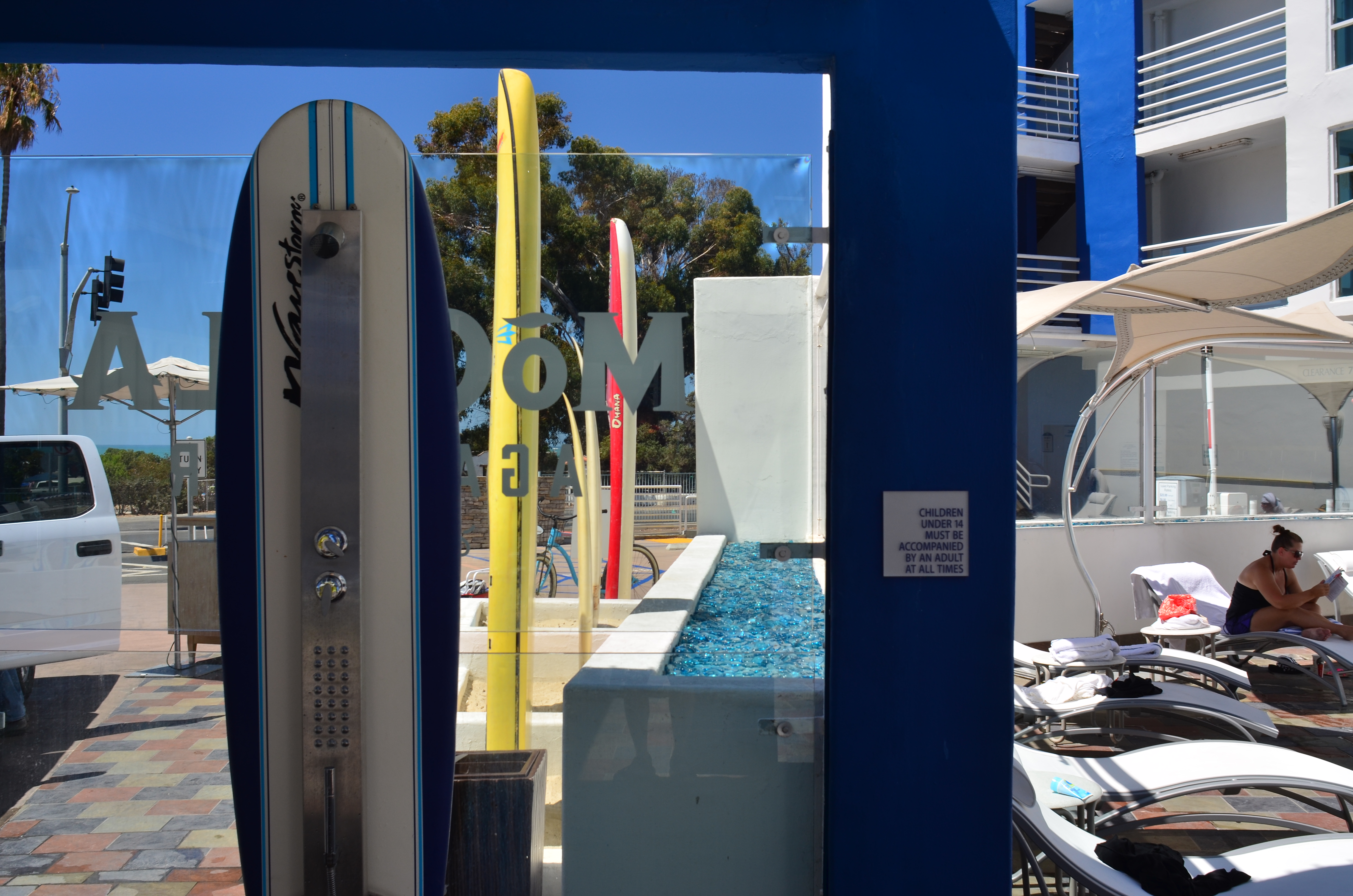
I like to find a natural grouping of things that, without my manipulation or collection, suggest separate worlds, completely contained universes that have their own tools, toys, architecture, and visual vocabulary. In the above montage of angles and things found at a beach resort, I had fun trying to find a way to frame the “experience” of the place, in abstract, showing all its elements without showing actual activities or people (beyond the sunbather at right). The real challenge, for me, is to create associations in the mind of the viewer that supply all the missing detail beyond the surfboards, showers, and sundecks. That, to me, is the real attraction of a still life….or, more accurately, taking a life and rendering it, fairly intact, in a still image.
Hey, it’s not that I don’t like a good bowl of fruit now and then. However, I think that one of photography’s best tricks is the ability to mentally conjure the thing that you don’t show, as if the bowl were to contain just apple cores and banana peels. Sometimes a picture of what has been can be as powerful as freezing an event in progress. But that’s your choice.
Which is another of photography’s best tricks.
BEST OF TIMES, WORST OF TIMES
Every breakthrough in our cameras or ourselves, eventually becomes limiting.
By MICHAEL PERKINS
I OFTEN FANTASIZE ABOUT STANDING UP AND OFFERING A TOAST at a banquet hall crammed with photographers, just because it’s fun to play with what it might sound like….to see if I could strike some verbal chord that would resonate equally with everyone in the room, from the noobies to pro’s. I constantly change the exact wording, but the sentiment in my head is always something like:
May the best picture you took today be your worst picture ever, ten years from now.
What did he say? Does he hope the masterpiece I captured today will someday be regarded by me as garbage?
Well, yes, of course I do. At least I hope that for my stuff. If I still love today’s work ten years from now, it will mean that I stopped growing and learning, like, well, today. Consider: I can’t ever know everything about my craft, and can’t hope to “top out” or reach perfection within my lifetime. And why would I want to? If today is the best I’ll ever do, why not save time and money, smash my cameras, and consider myself done?
The entire point of artistic expression is that it is an evolutionary process. If I still took pictures the way I did at twelve, that would be like having been on a Ford assembly line for half a century, with one indistinguishable cog after another coming down the belt, and me adding the same screw to it, every day, for eternity. Photography appeals to us because, like any other measure of our mind, it will be in flux forever. It’s divinely uncertain.
And I want that uncertainty. I want the good shots that come on lousy days. I need the images that I made when I had no idea what I was doing. I crave the betrayals that camera bodies, lenses, changing weather conditions or cranky kids will hurl at me. Edward Steichen often referred to the act of refreshing one’s work as “kicking the tripod”, and, like that seismic shock, your own morphing ideas of how to do all this will benefit from an occasional earthquake.
Do great pictures always come from adversity? Of course not, or else my morbidly depressed friends would be the greatest photographers on earth. However, the sheer careening instability of life pretty much guarantees that the things that thrill you about today’s shots will make you shake your head ten years down the line, and devise different ways of solving all the eternal problems.
And so, a toast…to the great pictures you made today, and to the day that you can barely stand to look at them.
WHEN AND WHERE FOR WHAT AND WHY
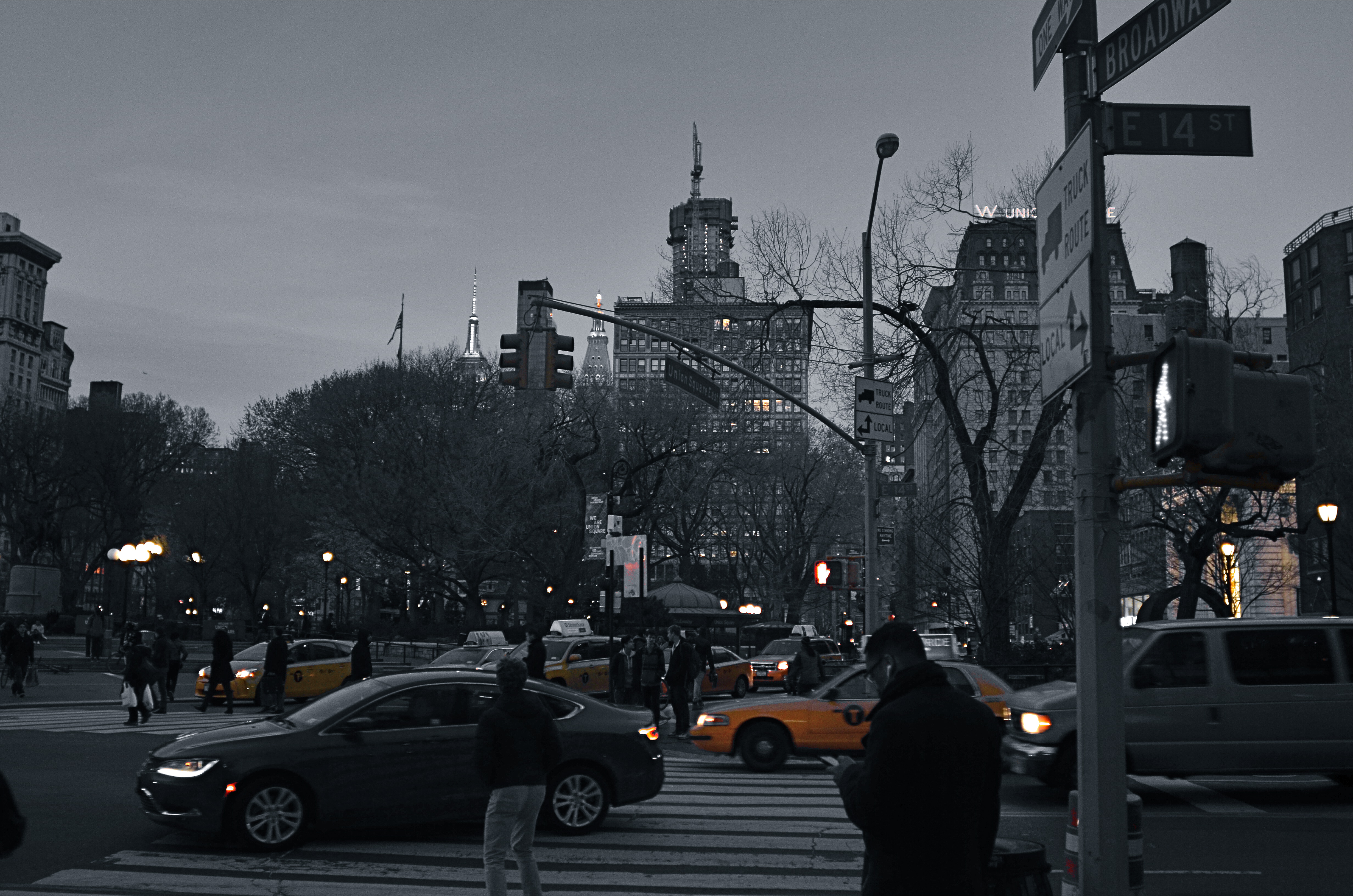
Manhattan yellow cabs in a grey street scene. A classic selective desaturation effect.
By MICHAEL PERKINS
THE SHEER NUMBER OF PHOTOGRAPHERS IN THE WORLD pretty much insures that not too many of us are artistically, um, unique. If there was ever a time in the history of the medium when it was nearly impossible to develop a style free of influence (good or bad), it’s now.
That doesn’t make originality impossible. But it does mean that, when one of us evolves a new way of doing things, the speed of adoption means there’s about a half a global second before innovation becomes cliche. And the worldwide online community likewise switches its evaluation of an idea from “brilliant!!” to “hackneyed” within an ever shorter cycle.
One of the tricks that only really came to the fore in the early days of digital editing is the look of selective de-saturation of color. The technique was originally met with great enthusiasm, but to hear the wags that whine and howl around the web, you should now sooner be caught dead rather than use it.
Same scene as above, in natural color. Which version sells the story the best?
Only, it’s not a given technique, per se, that becomes a drag, only its over-use or abuse. Think of canvas art for a moment. No one ever complains that “everybody uses oils to paint!” because it ain’t the pigment that separates the greats from the grunts. It’s what you do once you pick up that brush.
I steer away from partially desaturated shots because, while they can be real attention -getters, I myself don’t encounter many instances where I feel that they will actually help one of my pictures work better. The choice between monochrome and full color is, itself, fraught with a lot of mental measurement, meaning that you have a 50/50 chance in the making of an image to choose the wrong way to make it. Then there are color to b&w conversions, some of which really destroy the power of a photo. All this is before we get into the rather exotic decision of whether to make a picture “part” color.
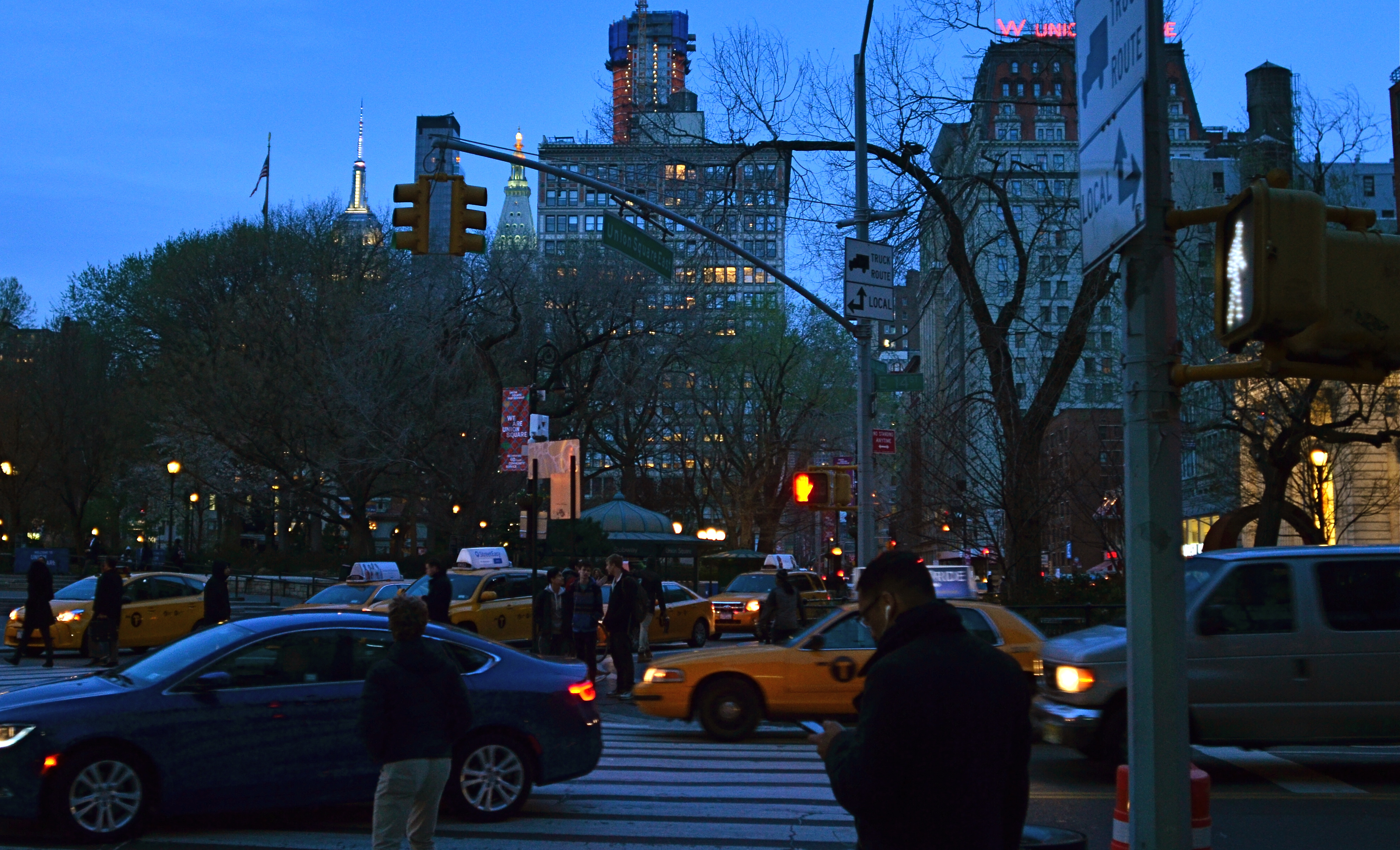
Let’s say that there’s something to be gained by killing off all but the signature Manhattan cab yellow, as seen in the top image of NYC’s Union Square. Okay. It’s certainly technically easy to bring that off, but first you have to get beyond the initial “hey, that’s cool” sensation and ask, very critically, “what else am I giving away to nearly eliminate all the color in this image? Is the color of the dusky sky worth anything? How about the red glow of neon, the amber of lit windows, the darkening skin and fabric tones of passersby?
Lots of techniques fall or rise on whether they add or subtract from the image’s overall selling power. You have to learn when and where to do what…and to know why.
A THING OF THE MOMENT
By MICHAEL PERKINS
CAN YOU TRAIN YOUR EYE TO SEE FASTER? Now, by “seeing”, I mean a process which effectively goes beyond the mere reception of light or visual information, something unique to the process of photography. I’m asking if you can, in effect, train the eye to, if not actually see faster, to more efficiently communicate with the brain and the hand in selecting what is important, so more rapidly apprehend the fleeting moment when a picture must be made.
I’m talking about the gradually learned trick of deciding quicker what you want and when it might be near at hand.
Much has been written about Henri Cartier-Bresson’s idea of “the decisive moment”, the golden instant in which viewpoint, conditions, and subject converge to be especially eloquent….to be, in effect, the only true artistic moment at which a photograph can be taken. Many reject this idea out of hand, saying that there are many potential great opportunities in the space of even a few seconds, and that the lucky among us grab at least one now and then. For those people, it’s not so much “the” moment as “a” moment.
Whatever the nature of the near-perfect shot is, sensing when one is imminent isn’t magic, and it isn’t accidental. It’s also not guaranteed by talent or luck. It has to be the result of experience, more specifically, lots of unsatisfying experience. Because I feel that the pictures you didn’t get are far more instructive than the ones you did, simply because you burn more brain cells on the mysteries of what went wrong than you do on the miracle of getting things right.
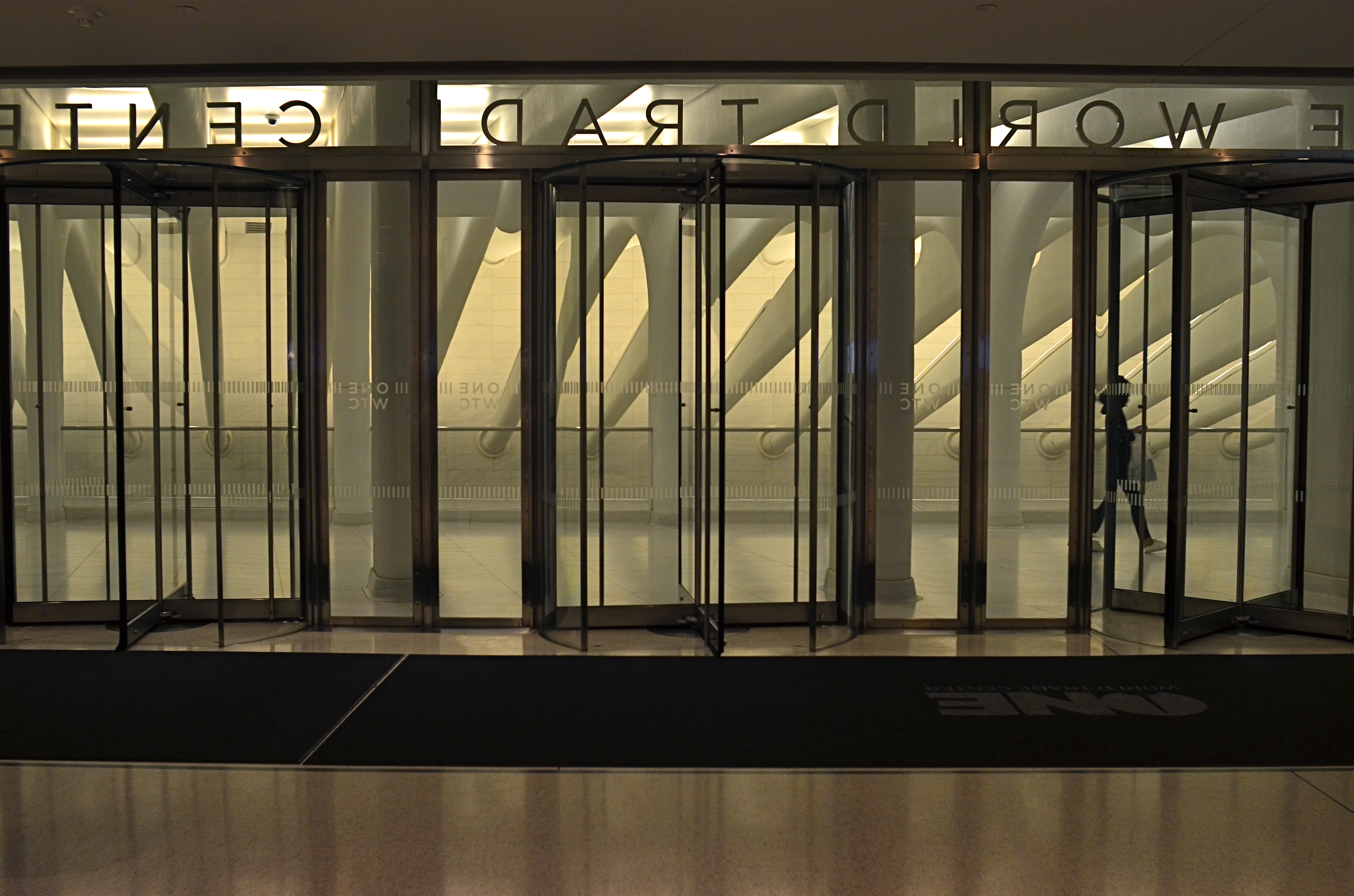
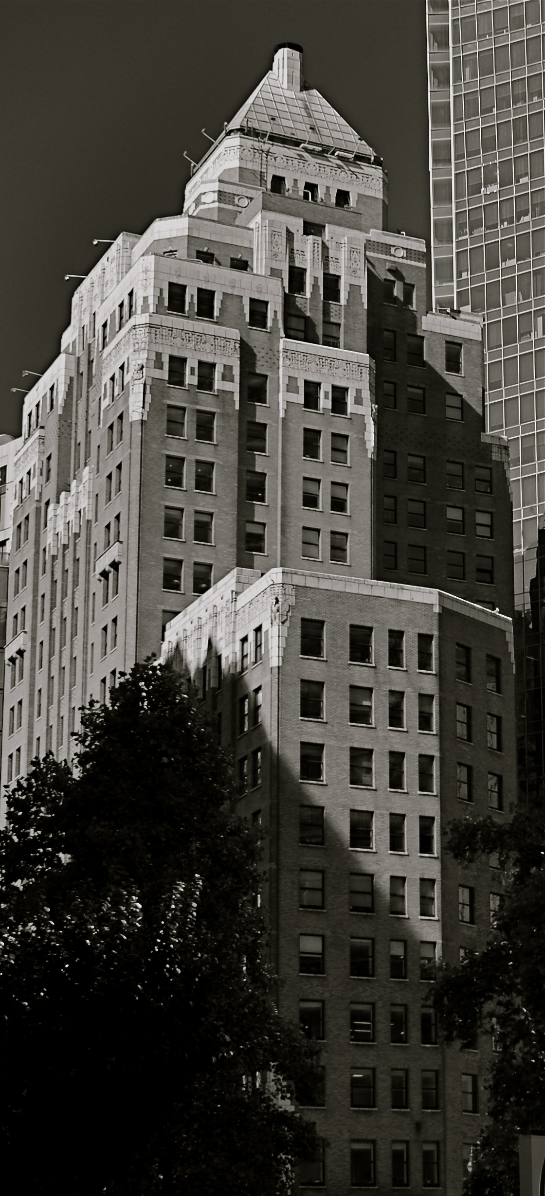
Center Trade World (2016)
This image is neither the result of great advance planning nor of great fortune: it’s somewhere in the middle, but it does record an instant when everything that can work is working. The light, the contrasting tones of white and gray, the framing, the incidental element of the passing tourist….they were all registering in my mind at the precise instant before I snapped the frame.
This does not mean I was totally in charge of the process: far from it. But I knew that something was arriving, something that would be gone in less than a second. Also, the elements that were converging to make the image were also in flux, and, having moved on, would result in something very different if I were to take a second or third crack at the same material.
For a photographer, it’s a little like surfing. You take lots of waves, with the idea that any of them can deliver the ride of your life. But, on any given day, all of them could be duds. However (and this is the part about a trained eye), you can learn to spot the best waves faster and faster, converting more of them to great rides. And making pictures is much the same process. You can’t absolutely analyze what will make a picture work, but you can learn to spot potential quicker, on some level between intentional and accidental.
THE SHIFTING VEIL
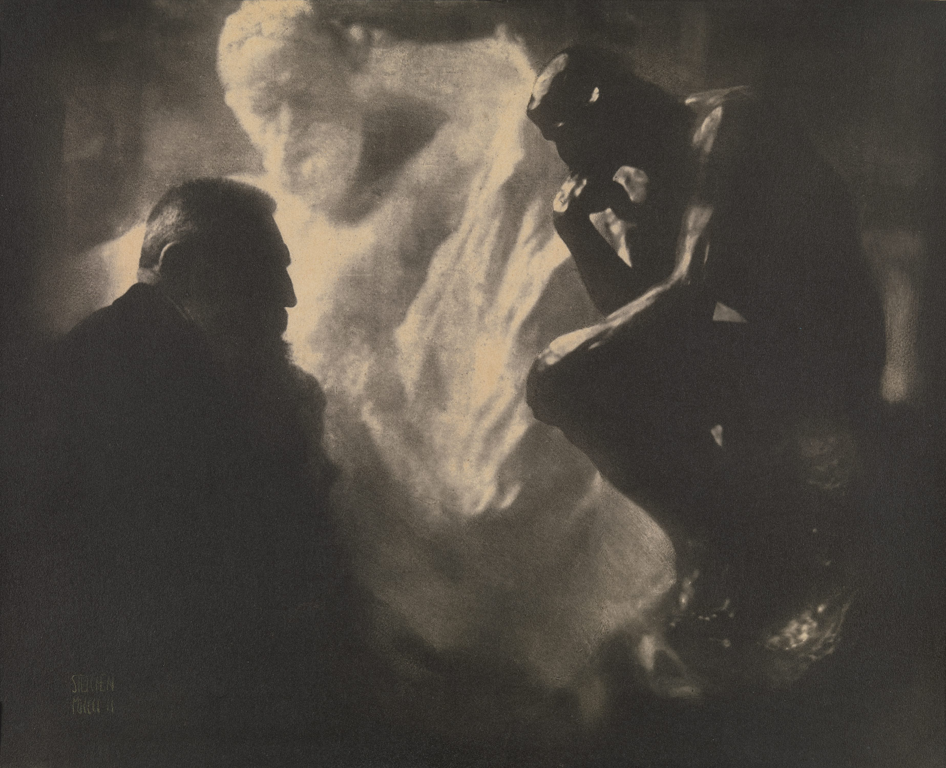
One of Edward Steichen’s amazing portrait studies of the sculptor Auguste Rodin.
By MICHAEL PERKINS
PHOTOGRAPHERS AND MAGICIANS SHARE A COMMON POWER, in that both of them selectively practice the art of concealment. Now you see it, now you don’t. Both the shooter and the shaman, in their own ways, know the importance of the slow reveal, the smooth manipulation of the viewer’s concept of reality. Best of all, they know how to choreograph and stage visual information. Here, they insist. Look here.
In a lifetime of studying portrait photographers, I have been fascinated by the nearly endless variety of approaches used to convey the human personality/soul in a static image. There are the formal studio sittings. There are the street ambushes of the paparazzo. And there are the shadowy, soft, gently suggestive pictures in which the classic representation of a “face” may not occur at all. This is the blending of revelation and mystery, and it is where portraits, at least for me, genuinely aspire to art.
He Decided To Wait (2016). A “self-portrait” in name only. Do we have to be the center of attention?
Some of my favorite images in this area were Edward Steichen’s studies with the sculpture Auguste Rodin, dark, smeary pieces of pure mood in which the great man was reduced to a near silhouette, as if he and his sculptures were forged out of the same raw material. I learn next to nothing of Rodin’s face from these pictures, and yet I learn worlds about his spirit. Steichen reveals as he conceals.
Which gives me an idea.
As I skim through the daily global tsunami of selfies, many of them simple grinning headshots, I see an incredible opportunity to start a completely new dialogue on what constitutes a portrait….or even a face. That opportunity will be squandered if 99% of selfies only look like slightly happier passport photos, rather than a real growth medium for investigating the self, for using the face as a compositional accent, an arranged object within a larger design.
Why selfies? Because the subject is always available. Because the technology of both mobile phones and conventional cameras allows for faster and more far-reaching experimentation. And because re-framing a subject you think you know intimately, merely by shifting where the veil lifts or falls, can be the difference between conceal and reveal.
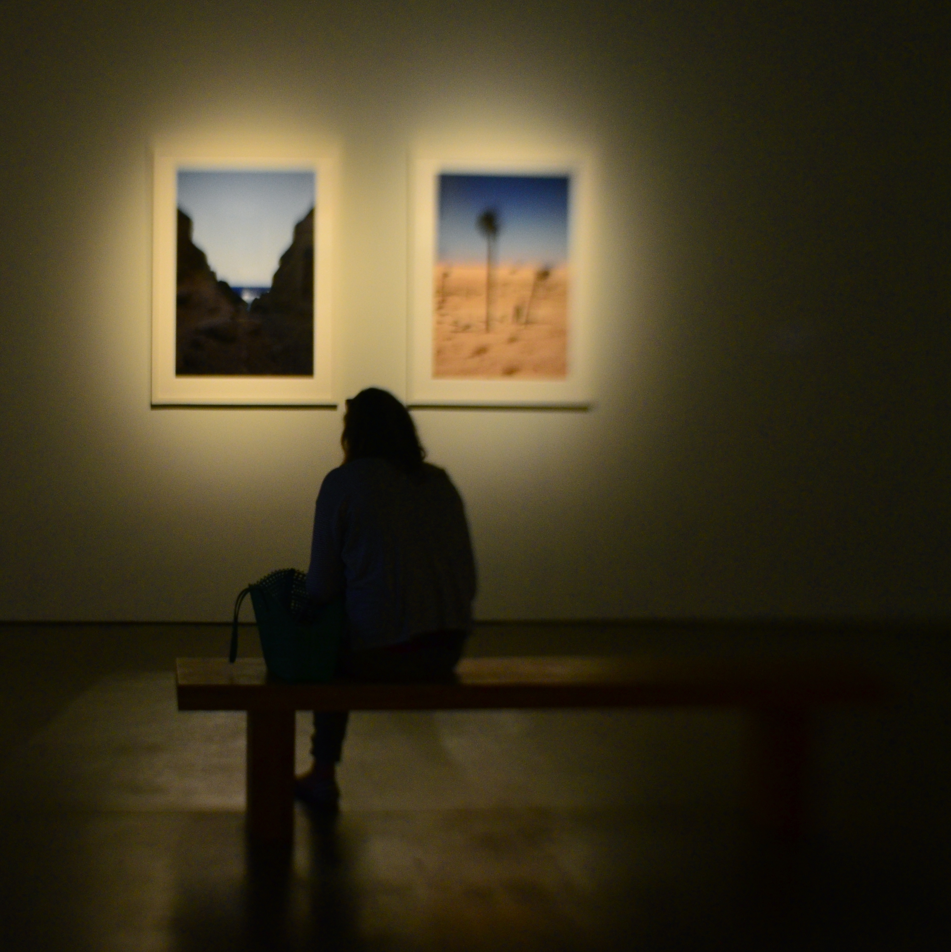
GALLERYLABS
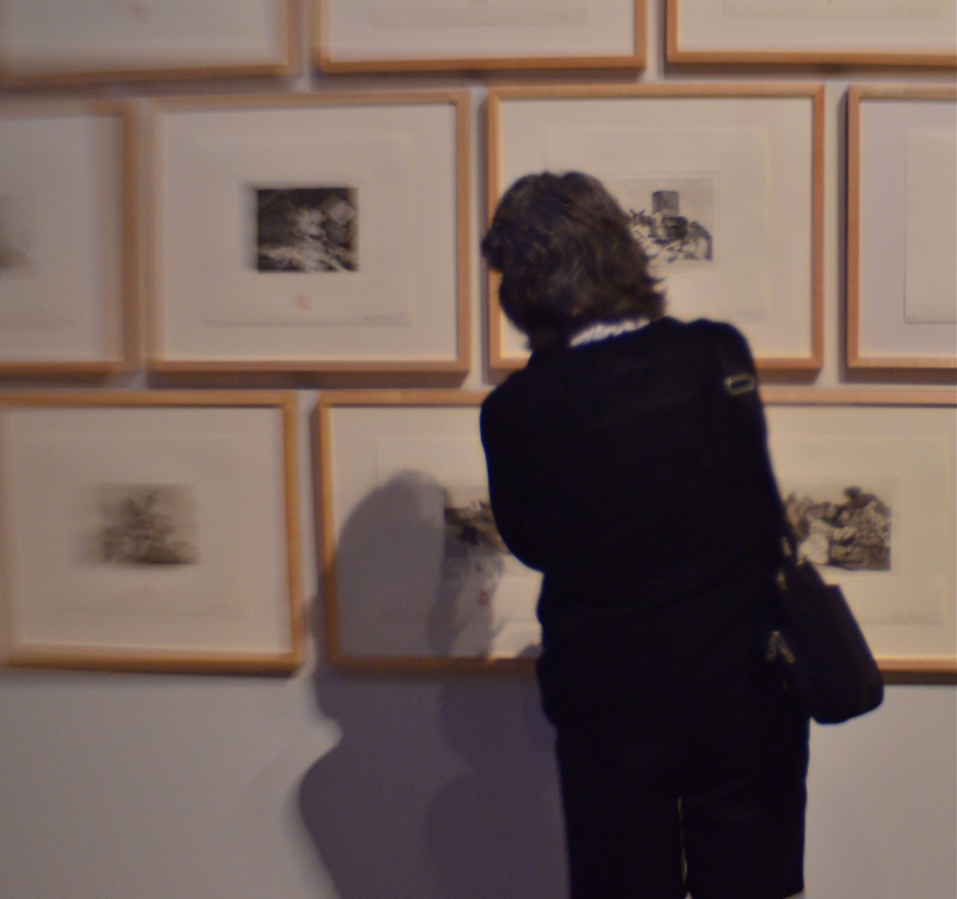
Watching those who watch.
By MICHAEL PERKINS
MUSEUMS AND GALLERIES COMPRISE SOME OF THE MOST INTERESTING WORKOUT SPACES for photographers, but for none of the reasons you might suppose. On the most obvious level, certainly,they are repositories of human endeavor, acting basically as big warehouses for things we deem important. But, beyond that, they are also laboratories for every kind of lighting situation, a big ‘ol practice pad for the mastery of lenses and exposure strategies. Sometimes the arrangement of color and shadow in some art houses is so drastically different from room to room that, even if there is nothing of note hanging on the walls, the walls themselves can frame amazing compositional challenges.
There is also a secondary, and fairly endless, source of photographic sketch work to be had in the people who visit public art spaces. The body language of their contemplative study of the artwork is a kind of mute ballet all its own, and no two patterns are alike. Watching the people who watch the art thus becomes a spectator sport of sorts, one which works to the advantage of the candid shooter, since people are more immersed in the paintings and thus a little less aware of themselves as regards the photographer. That leads to what I call “bodily candor”, a more relaxed quality in how they occupy their personal space.
Which is the subject?
Sometimes, as seen in the images in this article, your subject’s physical footprint is enough to express a full sense of the person without a trace of facial detail. In fact, I actually prefer this “no-face” approach, since it forces the viewer to supply some information of his own, making the photographs more interactive.
Try some gallerylab shots the next time you are hostage to a museum tour that was someone else’s idea of a good time. The exhibits themselves may disappoint, but the museum space and the people in it offer pretty consistent material.
EXTRACTION
Grape Cooler (2016)
By MICHAEL PERKINS
FOR SOME, UTTERING THE WORD ABSTRACTION ALOUD is like saying bringing up politics at a family get-together, in that it forces people to take sides, or to account for their taste in front of others. And when you tie that scary word to art, specifically photography, people start to forget about making pictures, and begin wondering “what it all means”, or, worse, what an image is “supposed to be about”. We start making photos like regimented school children, all of us coloring the sun the same yellow and always drawing people with eyes in the same part of their face.
Color assignments, as well as light and dark relationships, are all subject to interpretation.
Instead of using the term abstraction to describe the idea of seeing something differently, I prefer the word extraction, as if we are pulling something different out of a subject. And it’s really not that academic. When we abstract/extract something, we are changing the relationship between the object and how we typically view it. Can showing just part of its shape register in our brains differently than viewing the entire thing? If I interpret it in monochrome versus color, can I re-shape the way you look at its positive (light) or negative (dark) space?
In abstracting/extracting, aren’t we really acting like designers, taking the familiar and rendering it unfamiliar to look at how it’s made and how we interact with it? Just as a designer might decide to create a different kind of teapot, can’t we take an existing teapot and change the way it impacts the eye? That’s all extraction is; one more way to shuffle the deck.
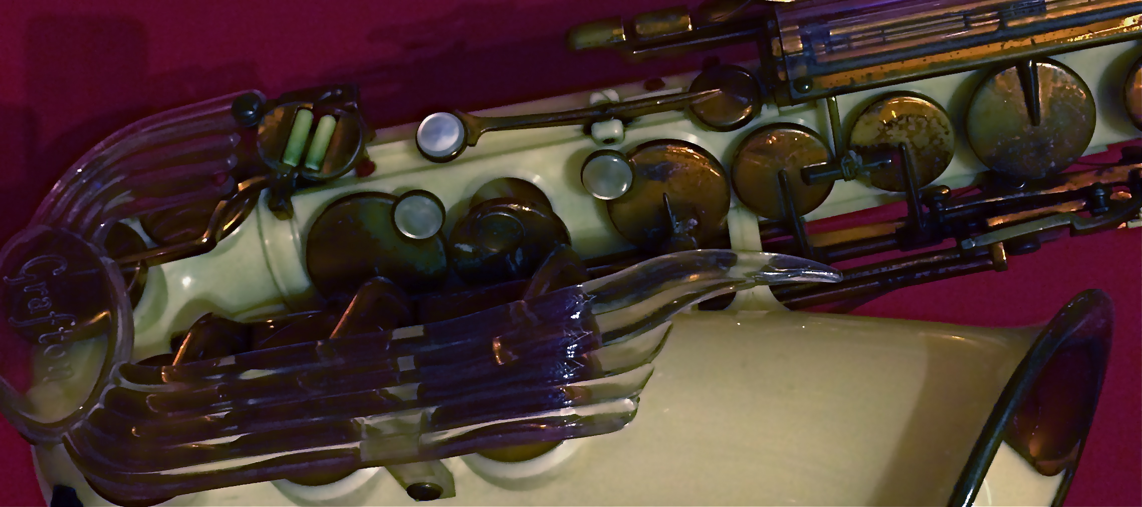
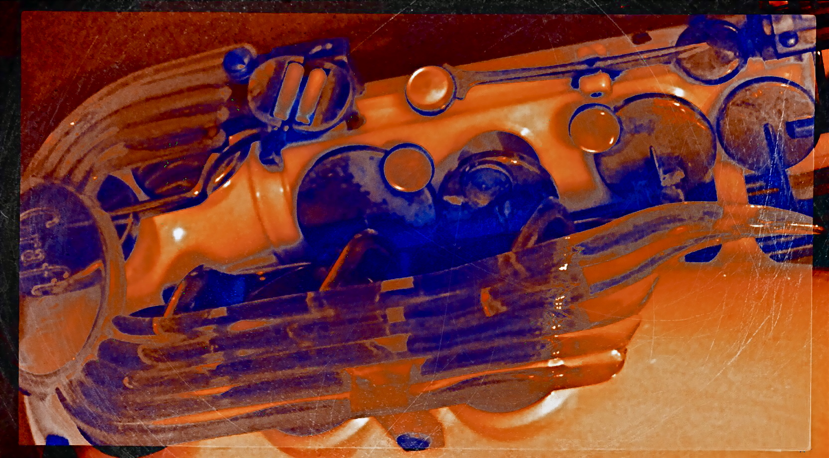
The object at the top of the page, a rare injection-molded plastic saxophone from the 1940’s, had already been “abstracted” by its designer, since we all have a traditional way of visually “knowing” that instrument. That is, it’s supposed to be brass-colored metal, curve in such-and-such a fashion, and feature ornamentation of a set type. Prominently, the designer re-ordered the sax’s features… in plastic, with browns and purples arranged in a fluid, stylized flow of elements. That means, that, as a photographer, I begin with my own set of expectations for the object already substantially challenged. Further, in photographing it, I can rotate the sax, compose it in the frame in an alternate fashion, reassign or intensify its colors, or, as in the small insert(which is a composite of a color negative, a monochrome negative, and a color positive), even change the relationship between surface and shadow.
There is a reason why even the police “abstract” a face into two interpretations, using both head-on and profile views in mug shots. Fact is, when you choose the viewpoint on an object, you change the interpretation of how the eye “learns” it. You extract something fresh from it . That’s the nature of photography, and scary words like “abstract” shouldn’t halt the ongoing conversation about what a picture is…or isn’t.
ALL THAT REMAINS
By MICHAEL PERKINS
THE HISTORY OF PHOTOGRAPHY IS ALSO THE HISTORY OF A STRANGELY INTIMATE DANCE WITH DEATH, a fascination with its look, its effects, its ability to transform both man and materials, mood and matter. From the first images of combat in the mid-nineteenth century to today’s Instagram chronicles of turmoil and trauma, we have tried to testify about how the world changes when we, or others like us, pass out of existence. The process is a constant rug-of-war between intimacy and publicity, between the glare of public destruction and the privacy of inner oblivion. And the pictures that result are arguments, quarrels with ourselves, which can never truly be settled.
There seems to have been a shift over the past few decades in how we grieve, or at least in the visual vocabulary of that grief that we choose to put on display. The quiet graveside memorials of eras past seems to have been supplanted by increasingly public vigils. We cry our tears in front of each other now, and the creation of instantaneous, group-generated shrines has become a bizarre kind of performance art, as visible as graffiti, and as personal as each man’s ending. Whether it takes the form of mountains of teddy bears stacked around an accident site or candle-lit collages of mementos offering mute testimony from well-meaning strangers, mourning is now something we experience globally, tribally. John Donne’s 1624 sentiment that “every man’s death diminishes me” seems, in the present day, eerily prescient.
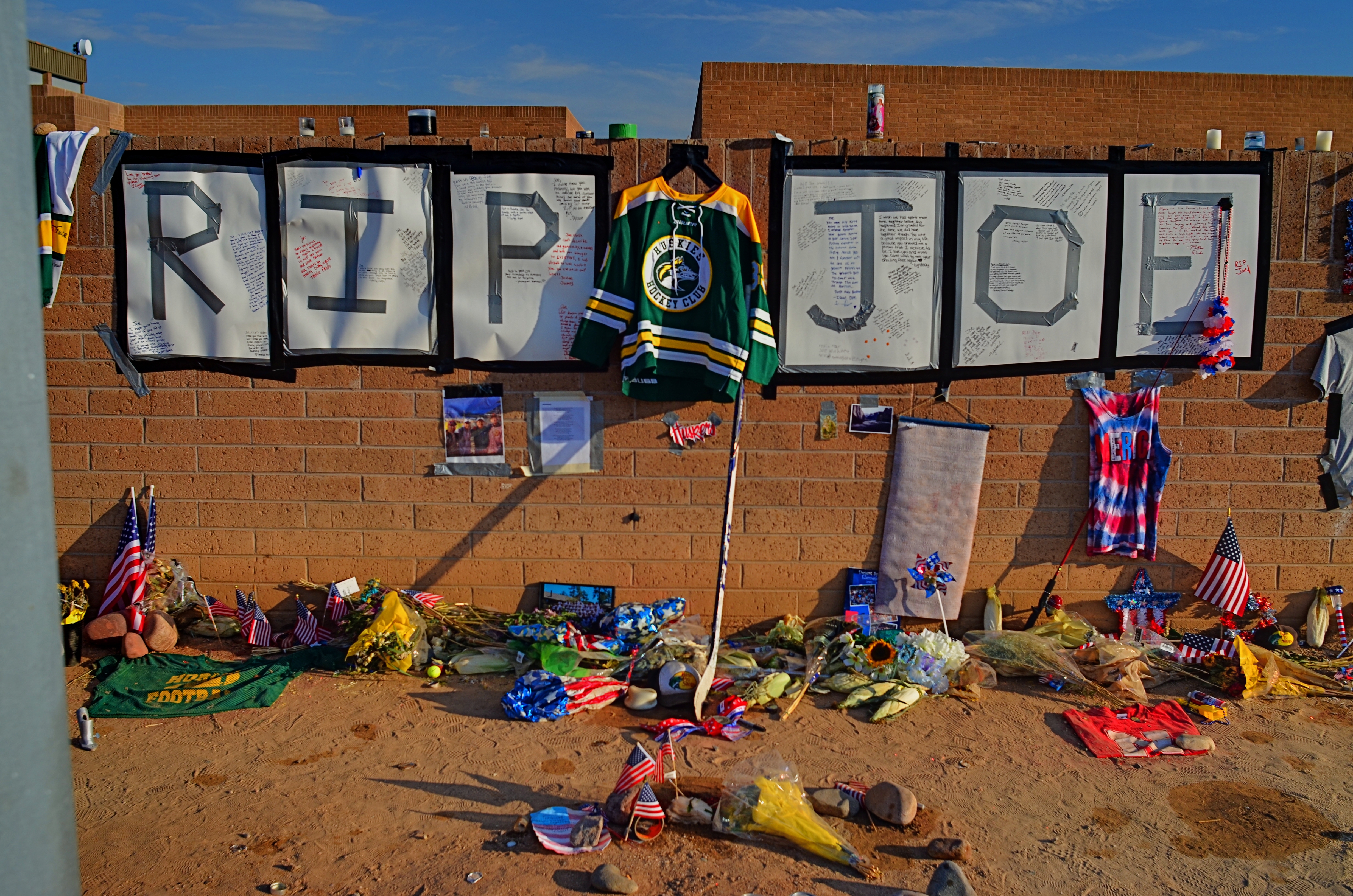
Flags, plaques, praise, prizes. Does all this add up to a life?
I recently drove past an improvised memorial for a deceased high school student. I knew nothing of his life beyond what his friends decided to collect to mark its passing. And so, visually, I was presented with a puzzle. What specific articles can be used to symbolize a life? Conversely, what should be excluded? How does an object that says something for one person presume to speak for he who has been silenced?
I made the shot you see here in as plain and reportorial a fashion as I could, shooting it head-on, in the manner of Walker Evan’s iconic images of signs and posters from the 1930’s. The only interpretive factor here, really, is the light in which I chose to shoot, deciding that sunset would help boost texture in the shot, and, incidentally, serve as a kind of metaphor. Make of that what you will.
Some pictures don’t need people in them to speak loudly for them. Today’s collectively assembled registries of loss are, in themselves, interpretive statements, not unlike paintings, editorials, or eulogies. Acknowledging them in pictures seems less like invasion and more like reportage, since they are clearly designed to be seen, to bear witness. The fact that they are anonymous makes them intriguing. The fact that they are so intensely personal makes them photographically essential.
OH, BABY, BABY, IT’S A WIDE WORLD
By MICHAEL PERKINS
WHEN USING WIDE-ANGLE LENSES, we believe that we are revealing more “reality”. That is, we began to think that a narrower aspect ratio is somehow “hiding” or clipping off visual information, whereas a wide allows us to “see everything”. But once you’ve shot with a wide-angle for a while, you realize that it’s, at best, a trade-off. The lens giveth and the lens taketh away.
Wide-angles do, certainly, increase the view from left to right, but, in so doing, they add their own little quirks, such as softer resolution along the edges, chromatic aberration, barrel distortion (that feeling that straight lines are bending outward at the sides of the frame), and an exaggeration of the distance between the front and back of the shot.
Bearing all this in mind, I feel that, since a pretty wide lens, the 18-55mm, is now included with nearly every DSLR camera kit, it’s important to see wides as both an aid to showing reality and an effective tool for interpreting or altering it. Think of your wides as art glass, as effects lenses, and you open up your mind to how it can not only record, but comment on your subject matter.
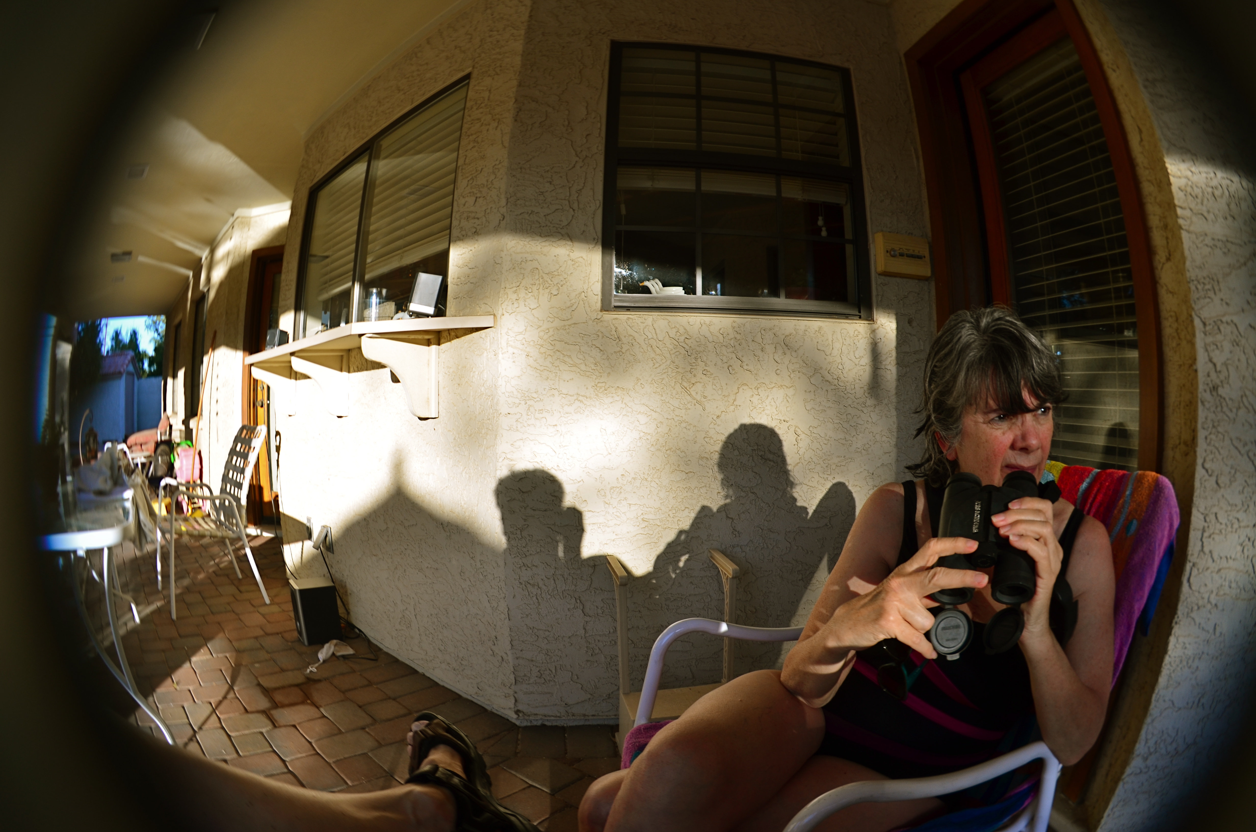
Fisheye lenses demonstrate what all wide-angles do: create an unreal look that can be managed and massaged to fit your ends.
And, let’s take it a step further, as in when wides become ultra-wides, as in the 8 to 12mm range, where the lens becomes a true fisheye. Now we’re consciously aware that we’re using an effects lens, something that is designed specifically for a freakish or distorted look. And now we have to challenge ourselves in a different way.
The standard fisheye shot is a self-contained orb, a separate universe, within which everything radiates distortion outward from the center concentrically, like a kaleidoscope or a paper snowflake. But a fisheye frame can also be composed to combine all the left-right, back-front information of a standard wide-angle (more narrative space) while also playing to the surreal look of something designed to challenge our visual biases of what’s “real”. The effect can also, as in the above image, forcefully direct the viewer’s eye to see along very precise channels. In this picture, the action of the shot begins at the right front, and tracks diagonally backwards to the left year, with the focus softening as you look from “important” to less “important”. The drama in the woman’s face is also abetted by the unnatural dimensions of the image, like one part of a nightmare serving to stage another part.
Wide-angle lenses can conceal and interpret, not just reveal. They allow us to see more from left to right, but there is a lot of wiggle room in how we show it. You have to accept the idea that all optics are distortions of reality to some degree, and make the bias of your particular glass serve your narrative goals.
A QUESTION OF BALANCE

Reporting that beauty exists is also a kind of “journalism”.
By MICHAEL PERKINS
WITH PAINTING AS ITS INITIAL INFLUENCE, THE YOUNG ART OF PHOTOGRAPHY spent its first years trying to record transcendent scenes of the world, from landscapes to portraits, in much the same elegant, poetic way that such subjects were translated to the canvas. Partly due to the limits of early exposure media, the task of making a picture was slower in those first years, almost a contemplative act. And so, in pace and mood, the strange new machine seemed intent on imitating its painterly elder, at least in part to make the argument that even a machine could be imbued with an artist’s eye.
Then came faster film and faster events. The images of war and the advancing grind of city life coincided with the introduction of more responsive films. The snapshot, the ability to catch an accelerating world on the fly, became commonplace. Photography took on a new role as reporter’s tool, a way to visually testify to human problems and their impacts. Photojournalism, in turn, gave way to commerce, which created an image bias in news coverage that persists to the present day. Photos take their tone from the needs of the marketplace. Tragedy outsells beauty. If it bleeds, it leads. Pulitzer prizes aren’t awarded to people who make pictures of daffodils.
And yet, there is a greater need for pictorial beauty than ever before, simply so that our visual diet doesn’t consist solely of red meat and blood. Certainly, the sensational holds tremendous sway over what gets published, re-printed, re-tweeted. The images that stamp themselves on our brains hold many traumas and dramas. Admittedly, some have sparked outrage, which in turn spurs action, and that can be a good thing. But photography can make us hard and jaded as well, and we dare not squeeze beauty into the margins of our consumption. Pictures shape feelings, and they can also condition us to feel less and less about more and more.
From Lewis Hine’s harrowing pictures of children in cotton mills to present-day iPhone dispatches from the latest repressions or riots, photographs are the seismograph of our collective consciences. But just as man cannot live on bread alone, he cannot subsist solely on nightmares. Beauty, harmony, aspiration, hope….we need to capture all these as well, lest, under the barrage of the shell and the bullet, the butterfly is blasted into extinction.
It’s a question of balance.

THE WORKER’S SIGNATURE
Shop (2016)
By MICHAEL PERKINS
THE GERMAN PHOTOGRAPHER AUGUST SANDER (1876-1964) created one of the most amazing projects in the history of portraiture with his seminal book The Face of Our Time. Born into a world that defined people much more by class division and by the literal work of their hands, Sander created a document of a vanishing world in a very simple way, surrounding bricklayers, cooks, soldiers, and dozens of other professionals with the literal tools of their trades. His work influenced street photography and portraiture throughout the 20th century, acting as both document and commentary.
The manual trades that Sanders celebrated are rapidly vanishing as automation and changing tastes take away the tv repairmen, cobblers, and pillow makers of yesteryear, taking with them the physical look of their workplaces. It’s feels like I’ve happened upon an archaeological dig when I run across a place where handcrafted work takes place, and to photograph the shops where the old magic still happens. The encroachment into urban neighborhoods of chain stores and the crush of ever-higher rents are chasing out the last generations of tinkerers and makers. Storefronts and the stories that reside within them are winking out across the urban landscape.
August Sander’s challenge to present-day photographers is to bear witness to the worker’s signature, the mark he makes on the world and the echo he leaves behind when he departs. The world is always in the act of going partly instinct. The camera measures what we lose in the process. In Sander’s elegant, simple pictures of working people, there is a peaceful quality, as everyone seems fitted to their place and role in the world. As we photograph the final days of such a world, we are commenting on the uncertainty that follows it into our present age.
Share this:
September 5, 2016 | Categories: Commentary, Conception, Street Photography | Tags: documentary, history, Urban Photography | Leave a comment