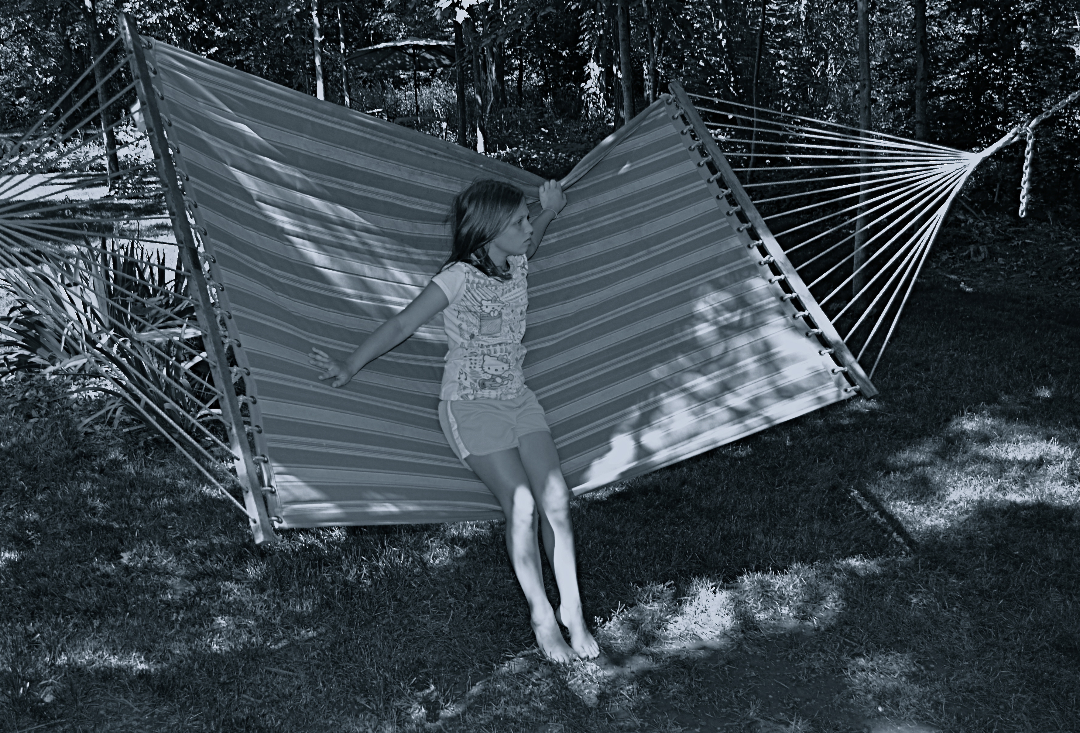
THE CENTER HOLDS

Do you need either the entire tree or the entire hammock to sell the idea in this picture?
By MICHAEL PERKINS
ONE OF THE MOST FASCINATING PARTS OF THE LEGEND of Henri Cartier-Bresson, the artist who is the world’s model for street photography, is the oft-repeated story that he never cropped a shot over the many decades of his remarkable career. Thus the man who originated the phrase “the decisive moment” to indicate that there was but one ideal instant to capture something perfectly in the camera is also credited with creating flawless on-the-spot compositions, image after image, year after year. Yeah, well….
I love HCB, and I personally can’t find a single one of his images that I could improve upon, no matter where I was to wield my magic scissors. But just as the writer in me believes that great novels aren’t written, but re-written, I believe that many great photo compositions emerge after much additional consideration, long after the shutter snaps. It’s not that one shouldn’t strive to get things as perfect as possible in the moment. In fact, there is overwhelming evidence that many photographers do exactly that, nearly all the time.
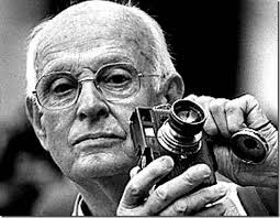
The Maestro.
It’s that “nearly”, however, that describes most photos, something which might be converted to “definitely” in the cropping process. In fact, I am starting to feel that the very first thing to be done with a picture in post-production is to just start paring away, only stopping when the center of the idea has been reached. It’s gut-wrenching, since we usually fall in love with our pictures at first sight (and in their first versions). But even if God decided to make one of us, say Cartier-Bresson, the messenger of his divine eye, he certainly didn’t make that trait as common as, say, green eyes or freckles. For most of us, most of the time, we need to eliminate everything that diverts the eye anywhere but where the main message is. As an example, the hammock image above is the result of cutting away nearly 2/3 of the original photograph.
There are a few times when an image comes full-born out of the camera, all muscle and no fat. However, in the digital age, re-thinking one’s realization of a concept is easier than it’s ever been, and there is no downside to doing so. If there is a narrative ground-zero to your photo, don’t worry. The center will hold.
THE REVISION DRAFT
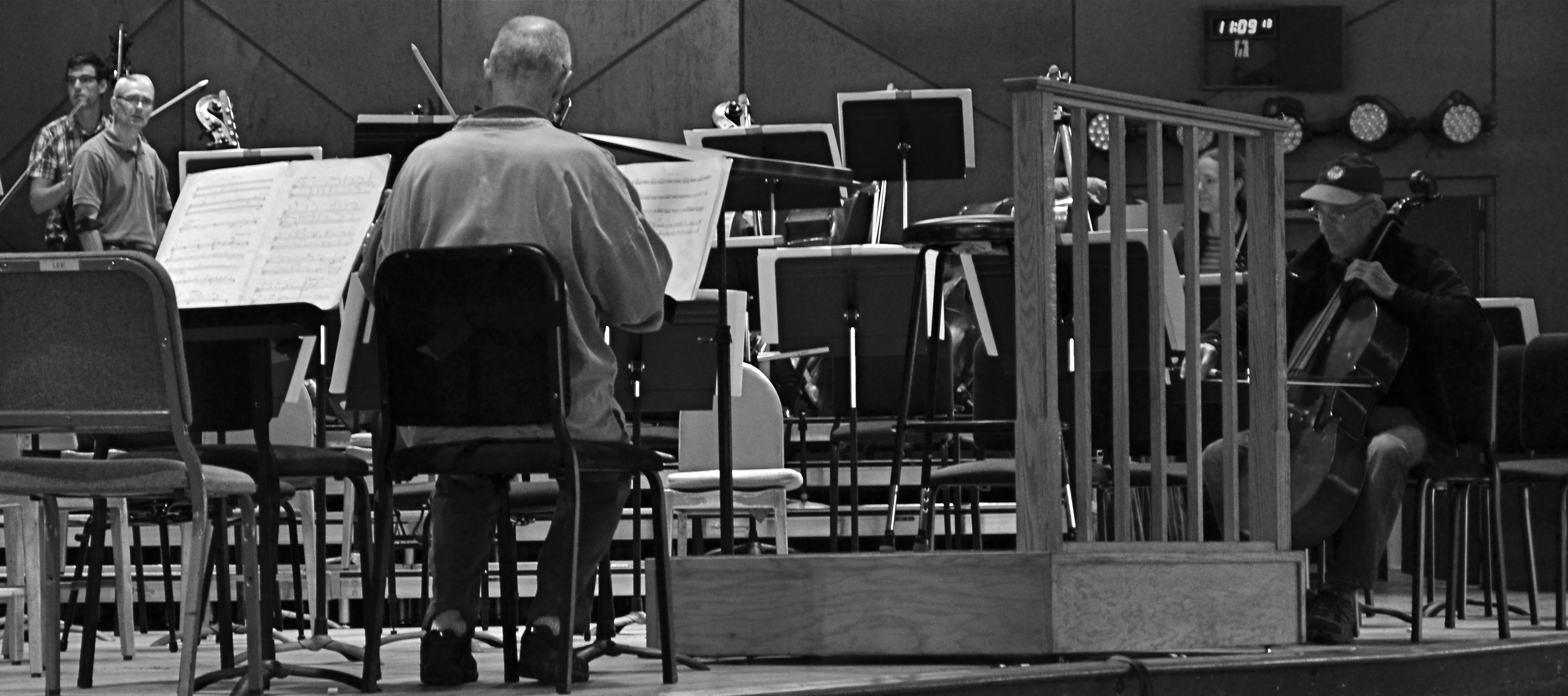
Reducing is remixing: this Tanglewood rehearsal photo was at least 2/3rds bigger in the original, but a severe crop highlights a relationship between these players that the bigger image buried.
By MICHAEL PERKINS
HERE’S A SENTENCE YOU’RE NOT GOING TO HEAR ANYWHERE ELSE THIS WEEK: Being a club DJ can actually give you a fresh viewpoint on your photography.
I’ll let that sink in.
I know what you you’re thinkin’: did he drink six shots or only five? But I’m kind of sober, and rather serious. In a club setting, the mix is often more important than the song, or, more correctly, it allows the song to have an infinite number of alternative lives, depending on what you do with the turntables. Record companies recognized this in the heyday of disco, remixing hit tracks for more thump and bump, longer edits, brass overdubs, etc. As time went on, DJs interspersed their own random elements in the moment to create their own signature blends.
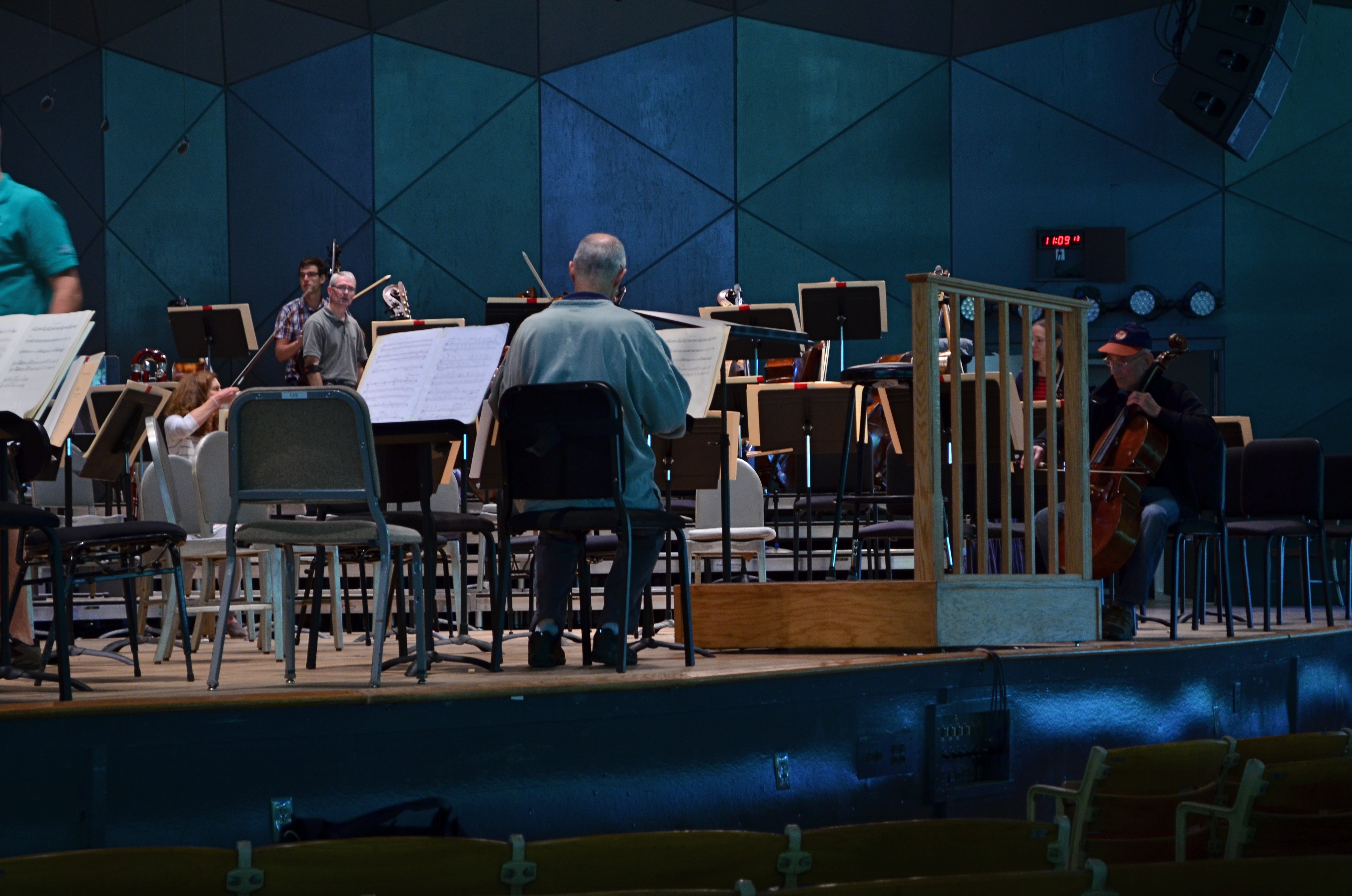
The original.
So what does this have to do with photography? Pretty much everything. In the digital era, post-production software is nearly half of some shooters’ workflow. So much emphasis is placed on what you can fix after the shutter is clicked that, for many, actually planning and taking the picture is the least important part of the process. Let’s lay aside the fact that I personally believe that this can get out of hand…..the point is, by allowing yourself the flexibility to revisit and remix a photo many times over its lifetime means you are not limiting yourself to one interpretation of what you originally created.
However, don’t keep merely to a reprocessing of the exposure or tone elements in the picture, that is, boosting color, adding filters, converting to monochrome. Think of compositional space as a remix element as well. Did you need all the real estate taken up in the original picture? Would that landscape shot work more effectively in portrait or square format? Did you originally include information in the frame that just adds clutter, sending your viewer’s eye wandering around aimlessly? In short, does your first reading of the “idea” of the picture still seem valid?
See the “after” picture at the top of the page and its “before” equivalent to the left. Did the picture gain or lose from the changes?
Another musical musing: George Gershwin personally played Rhapsody In Blue like a snappy jazz piece, not the stately symphonic standard that’s re-created by most modern performers. Does one rendition sound better or worse? Who knows? Who cares? What matters is that the process reveals different traits within the core music with every new mix. Your photographs will benefit in the same way. Just trust yourself to tinker.
EXTENDING THE INVITATION

Sinuous, 2013. The river’s journey takes it, and your eyes, back “into” the picture.
By MICHAEL PERKINS
PHOTOGRAPHY AND PAINTING, DESPITE ENGAGING THEIR AUDIENCES IN VERY DIFFERENT WAYS, have retained one common aim over the centuries, at least when it comes to pictorial or scenic subjects. Both the photo and the canvas arrange their visual information on a two-dimensional surface, and both seek to draw the viewer’s eye into a depth that is largely illusionary. The cameraman and the painter both contrive to create the illusion that the distance from front to back in their works is as real as the distance from side to side.
In terms of simulating depth, some photographs benefit from both shadow and light, which alternatively “model” the information in an image, making it seem to “pop” in some faux-dimensional sense. But the best and simplest trick of composition is what we popularly term the “leading line”, information that trails from the front of the picture and pulls the viewer’s attention to an inevitable destination somewhere deeper back in the scene.
Putting a picture together this way ought to be the most automatic of instincts in the composition of a photograph, but it still is formally taught, as if it were less than obvious. In fact, it just means extending an invitation to someone to join you “in” the photograph.

Minutes Away, 2012. The girders give you a stick-straight diagonal from journey to destination.
Trails, paths, railroad tracks, lines of trees or phone poles….these are all examples of information that can start at one side of a photo and track diagonally to the “back” of the image, making the eye experience a kind of gravity, tugging it toward the place you want their gaze to end up. It is also the easiest way to force attention to a central subject of interest, sort of like inserting a big neon arrow into the frame, glowing with the words over here.
Leading lines are a landscape’s best friend, as well, since the best landscapes are arranged so that the focal point of the story is streamlined and obvious. Anyone who has ever shown too much in a landscape will tell you that what fails in the composition is that it allows the viewer to wander around the place wondering what the point of the picture is. The use of a powerful leading line gives the illusion of depth and corrals the eyes of your audience to the exact spot you need them to be for full effect.
Composition is the most democratic of photographic skills. It’s easy, it’s free, and anyone from a point-and-shooter to a Leica addict can use it effectively. Bottom line: there are great things happening in your pictures. Invite the people inside.
WHEN TEXTURE IS THE TALE
By MICHAEL PERKINS
THOSE WHO BELIEVE THAT SUBJECT MATTER IS KING IN PHOTOGRAPHY ARE FACED OFF in an endless tennis match with those who believe that only impressions, not subjects, are the heart of the art. Go away for fifty or sixty years and they are still volleying: WAP! a photograph without an objective is a waste of time! WAP! who needs an object to tell a story? Emotional impact is everything! And so on. Pick your side, pick your battle, the argument isn’t going anywhere.
Thing is, my assertion is that you don’t actually have to choose a side. Just let the assignment at hand dictate whether subject or interpretation is your objective. There are times when the object itself provides the story, from a venerable cathedral to an eloquently silent forest. And there are times when mere color, light patterns, or texture are more than enough to tell your tale.

Set Your Face Like Flint, 2014. Shot wide at 18mm, cropped to square format. 1/100 sec., f/5.6, ISO 100.
I find, for example, that texture is one of my best friends when it comes to conveying a number of important things. The passage and impact of time. The feel and contour of materials, as well as the endless combinations and patterns they achieve through aging and weathering. A way to completely redefine an object by getting close enough to value its component parts instead of viewing it as a whole. This is especially true as I try to refine my approach to images of buildings. I find that breaking the overall structure into smaller, more manageable sections helps to amplify texture, to make it louder and prouder than it might be if a larger scene just included the entire building among other visual elements. Change the distance from your story and you change the story itself.
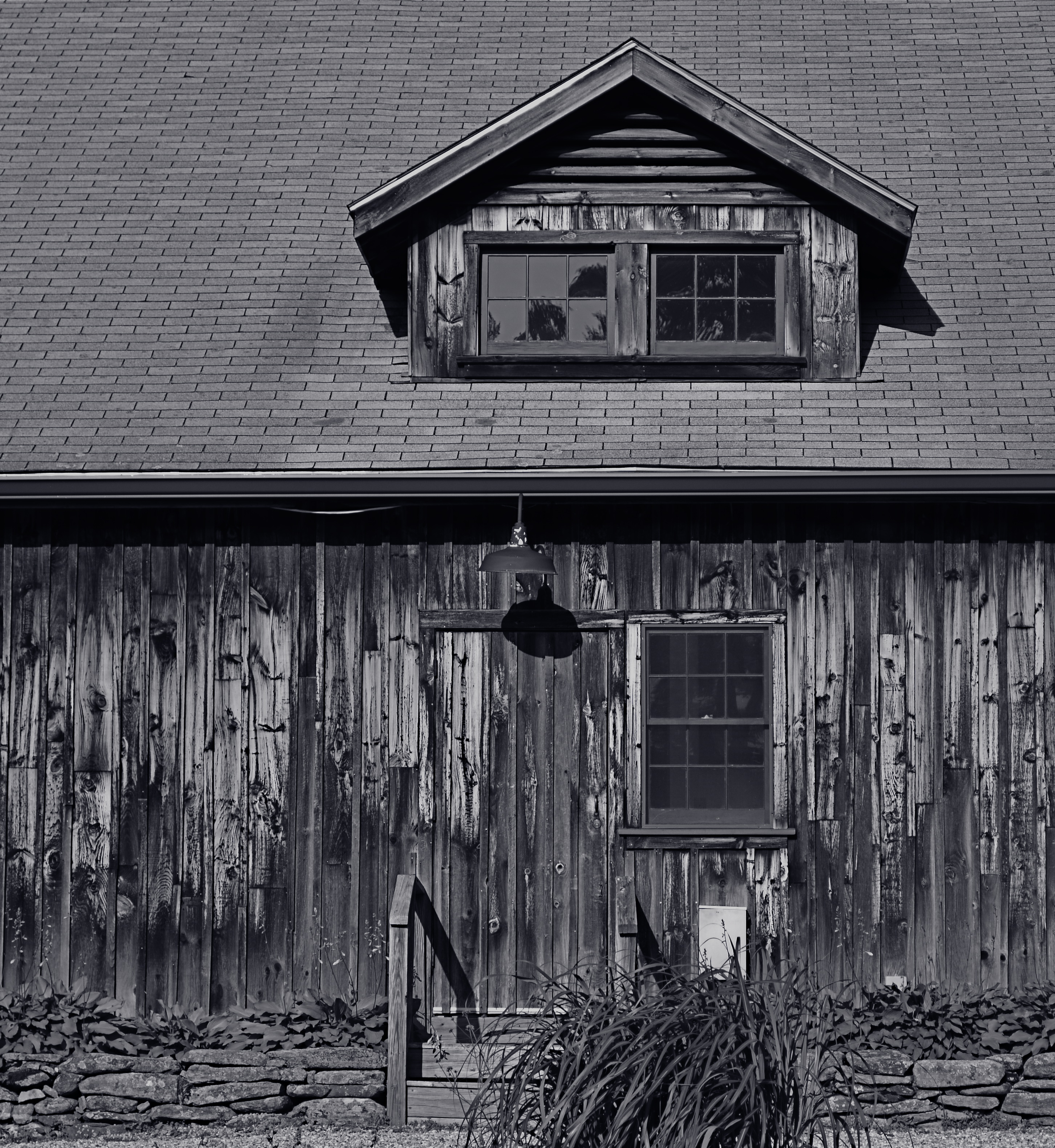
This Massachusetts barn has tons of character whether seen near or far, but if I frame it to eliminate anything but the raw feel of the wood, it demands attention in a completely different way. It asks for re-evaluation.Contrast the rough-sawn wood with the hard red of the windows,and, again, you’ve boosted the effect of the coarser texture. Opposing textures create a kind of rudimentary tug-of-war in a picture, and the more stark the contrasts, the more dramatic the impact.
Traditional, subject-driven story telling will dictate that you show the entire barn, maybe with surrounding trees and a rolling hill or two. Abstracting it a little in terms of color, distance and texture just tell the story in a distinct way. Your camera, your choice.
DON’T TAKE THAT TONE WITH ME
By MICHAEL PERKINS
I BELIEVE THAT THE SINGLE BIGGEST REASON FOR THE FAILURE OF A PHOTOGRAPHIC COMPOSITION may all boil down to the same problem. I call it “over-sampling”, or, more simply, the presence of too much visual information in a frame. It can be as simple as including too many trees in a landscape or framing to include crowded sky clutter in an urban scene, but it’s not always how many objects are crowded into an image. It can be something as basic as asking the eye to figure out where to look. And sometimes, the very fact that a picture is in color can diminish its ability to clearly say, here: look here.
Color would have added nothing to this image. In fact, it would have detracted from its impact. 1/400 sec., f/5.6. ISO 100, 55mm.
Great photographs have their own gravitational pull and center. They draw people in and direct their gaze to specific places. This tends to be a single focus, because, the more there is to see in an image, the greater the tendency is in the viewer to wander around in it, to blunt the impact of the picture as the eye looks for a central nexus of interest. In my own experience, I find that the use of color in a photograph is justified by whether it helps keep things simple, creates readable signposts that lead the eye to the principal message of the image. Color, just like the objects in a frame, can explode with a ton of separate messages that defeat the main message, sending the viewer all over the place, trying to decode all that vivid information. Color itself can become clutter.
Sometimes the focus of an image is not an object, i.e., a building or a face, but an overall feel that is more emotionally immediate within a narrow range of blacks and greys. The kind of black and white makes a huge difference as well, and anyone who has spent a lot of time processing monochrome images knows that there is no one true black, no pure, simple white. As to actual shooting procedure, I will be so certain that only B&W will work for a given subject that I make the master shot itself in mono, but, more frequently, I shoot in color first and make a dupe file for comparison. This is another amazing advantage of digital imaging; you simply have more choices.
One of the by-products of color photography‘s adoption into mass culture through magazines and faster films in the mid-20th century was, for many people, a near-total abandonment of monochrome as somehow “limited” compared to those glorious, saturated Kodachromian hues. Thing is, both color and black and white have to be vetted before being used in a photograph. There can’t be a general rule about one being more “lifelike” or “natural”, as if that has anything to do with photography. Tools either justify their use or they don’t. You don’t drive a screw with a hammer.
CAUSE AND EFFECT

Sun Pennants, 2014. 1/400 sec., f/5.6. ISO 100, 35mm.
By MICHAEL PERKINS
THERE’S NOTHING WORSE THAN COMING HOME FROM A SHOOT realizing that you only went halfway on things. Maybe there was another way to light her face. Did I take a wide enough bracket of exposures on that sunset? Maybe I should have framed the doorway two different ways, with and without the shadow.
And so on. Frequently, after cranking off a few lucky frames, we’re like kids walking home from confession, feeling fine and pure at first, and then remembering, “D’OH! I forgot to tell Father about the time I sassed my teacher!”
Gridlight, 2014. 1/200 sec., f/5.6, ISO 100, 35mm.
Too Catholic? (And downright boring on the sins, by the way..but, hey) Point is, there is always one more way to visualize nearly everything you care enough about to make a picture of. For one thing, we are always shooting either the cause or the effect of things. The great facial reaction and the surprise that induces it. The deep pool of rain and the portentous sky that sent it. The force that’s released in an explosion and the origin of that force. When we’re there, when the magic of whatever we came to see is happening, right here, right now, we need to think up, down, sideways for pictures of all of it, or as many as we can capture within our power….’cause once you’re home, safe and dry, it’s all different. The story perishes like a soap bubble. Shoot while you’re there. Shoot for all the story is worth.
It can be simple things. I saw the above image at one of the lesser outbuildings at Taliesin West, Frank Lloyd Wright’s legendary teaching compound in Scottsdale, Arizona. An abstract pattern made from over-hanging strips of canvas,used as makeshift shade on a path. But when I reversed my angle and shot the sidewalk instead of the sky, I saw the effect of that cause, and it appealed to me too (see left). One composition favored color, while the other seemed to dictate black & white, but they both could serve my purpose in different ways. Click and click.
It bears remembering that the only picture that is guaranteed to be a failure is the one you didn’t take. Flip things around. Re-imagine the order, the role of things. Go for one more version of what’s “important”.
Hey, you’re there anyway.…..
THE EYES (DON’T NECESSARILY) HAVE IT
Reverie, 2014.
By MICHAEL PERKINS
A QUICK GOOGLING OF THE PHOTOGRAPHIC UNIVERSE THESE DAYS will turn up a number of sites dedicated to “faceless portraits”, if there can, strictly speaking, be such a thing (and I believe there can). In a recent post entitled Private, Not Impersonal, I explored the phenomenon in which photographers, absent the features that most easily chronicle their subjects’ personalities, imply them, merely through body language, composition, or lighting. At the time I wrote the post, I was unaware how widespread the practice of faceless portraits had become. In fact, it’s something of a rage. Hmm. The very thought that, even by accident, I could be aligned with something hip, is, by turns, both terrifying and hilarious.
Thing is, photographs, as the famous curator John Szarkowki remarked, both conceal and reveal, and there is nothing about the full depiction of a human face that guarantees that you’re learning or knowing anything about the subject in frame. We are all to practiced at maintaining our respective masks for many portraits to be taken, ha ha, at face value. Cast your eye back through history and you will find dozens of compelling portraits, from Edward Steichen’s silhouettes of Rodin to Annie Leibovitz’ blurred dance photos of Diane Keaton, that preserve some precious element of humanity that a formal, face-on sitting cannot deliver. Call it mystery, for lack of a more precise word.
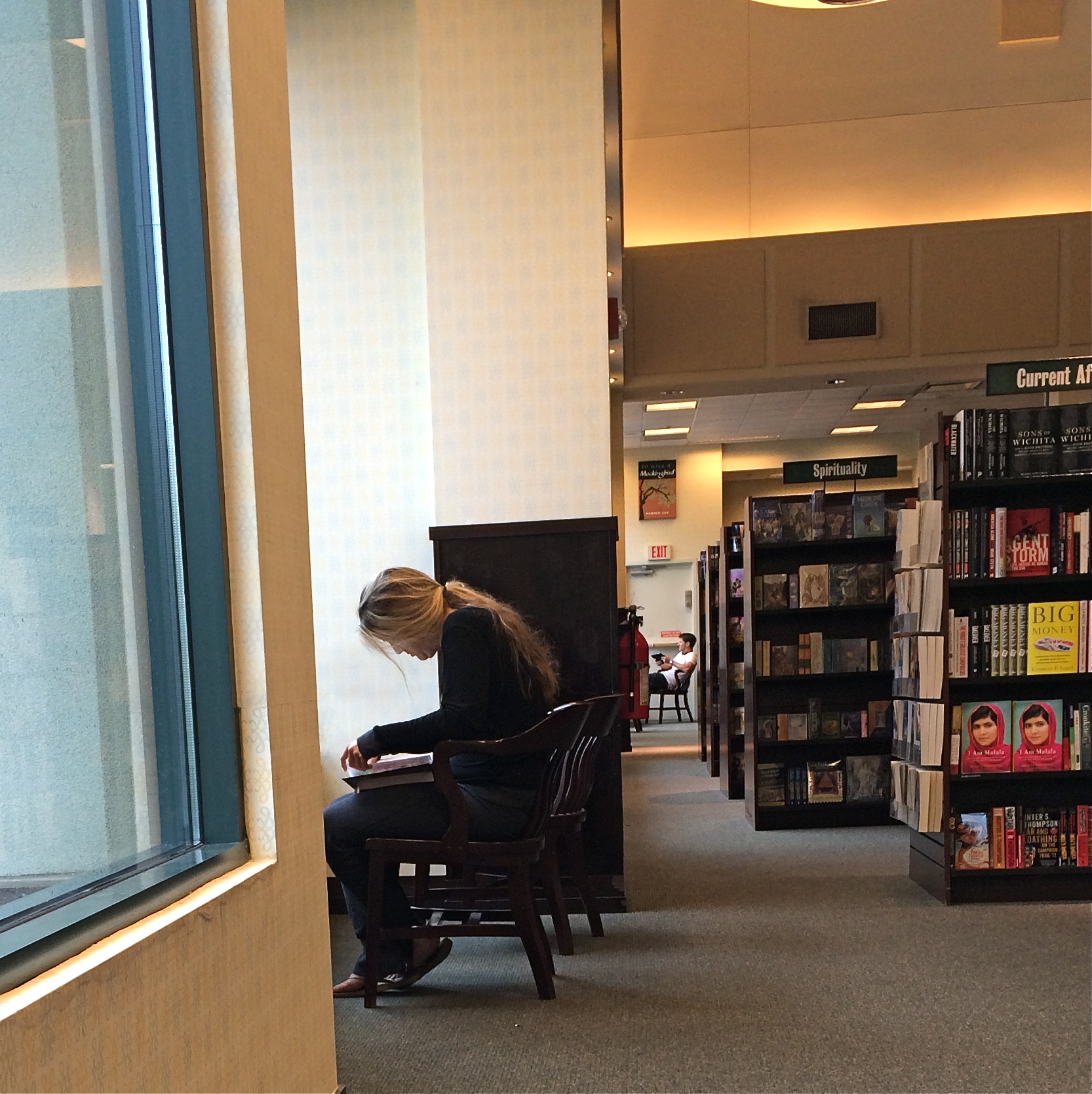
In the above frame, the subject whose face I myself never even saw gave me something wonderfully human, about reading in particular, but about enchantment in general. She is furiously busy discovering another world, a world the rest of us can only guess at, seeping up from her book. Her entire body is an inventory of emotional textures…of relaxation, attentiveness, of both being in the present and so completely someplace else. Framing her to include the negative spaces of the window, the carpet and the wider bookstore isolate her further from us, but not in a negative way. She wants to be apart; she is on a journey.
My “girl with the flaxen hair” was unaware of me, and I shot furtively and quickly to make sure I didn’t break the spell she was under. It was the least I could do in gratitude for a chance to witness her adventure. Looking back, I think she provided more than enough magic without revealing a single fragment of her face. Seeing is selecting, and I had been given all I needed to do both.
Click and be gone.
PENCIL LINE, INK LINE
True Stereophonic Reproduction, 2014. Shot on the fly with an iPhone at my favorite junk store.
By MICHAEL PERKINS
MY FATHER, AS A GRAPHIC ARTIST, USED TO WARN ME ABOUT COMMITTING MYSELF TOO EARLY. Not in terms of personal relationships, but as it applied to the act of drawing. “Always lay down all your potential pencil lines first”, he advised, “and then decide which ones you want to ink.” The message was that flexibility was as valuable a drafting tool as your 2H pencil or your Rapidograph pen, that delaying your final vision often helped you eliminate the earlier drafts and their respective weaknesses. I still value that advice, as it has a current corollary in the making of my photographs, largely as a consequence of the smartphone revolution.
Once phones began packing cameras that could actually deliver an image better than a Crayola shmear on a wet cocktail napkin, photographers who still chiefly relied on their traditional cameras suddenly had the luxury of a kind of optical “sketch pad”; that is, an easy way to pre-visualize a composition with a basic machine that you could use for a study, a dress rehearsal for a more precise re-imagining with a more advanced device. For many of us, the larger display area of a phone can often “make the sale” for a shot in a more compelling way than the smaller monitor on our grown-up camera, and, at the very least, we can judge how a photo will “play” less conspicuously than by lugging about more visually obvious hardware. It’s a fast way to gather a lot of preliminary ideas, especially in locales where you’re free to come back later for the serious shoot.
I especially like trolling through vintage stores, trying to find antique items that, in themselves, make for impromptu still-life subjects. Sometimes, to be honest, I go home with a pocket full of puckey. Sometimes, I decide to go back and do a more thorough shoot of the same subject. And sometimes, as in the above image, I decide that I can live with an original “sketch” with just a little post-tweaking. The exercise does one important thing, in that it reminds you to always be shooting, or at least always thinking about shooting.
I know people who have completely stopped even carrying DSLRs and other, more substantial gear in their everyday shooting, and, while I can’t quite get there yet, I get the idea on many levels. Hey, use a fine stylus, a sharp crayon, or a charred stick, dealer’s choice. Just get the sketch.
GO OUT AND COME BACK IN AGAIN
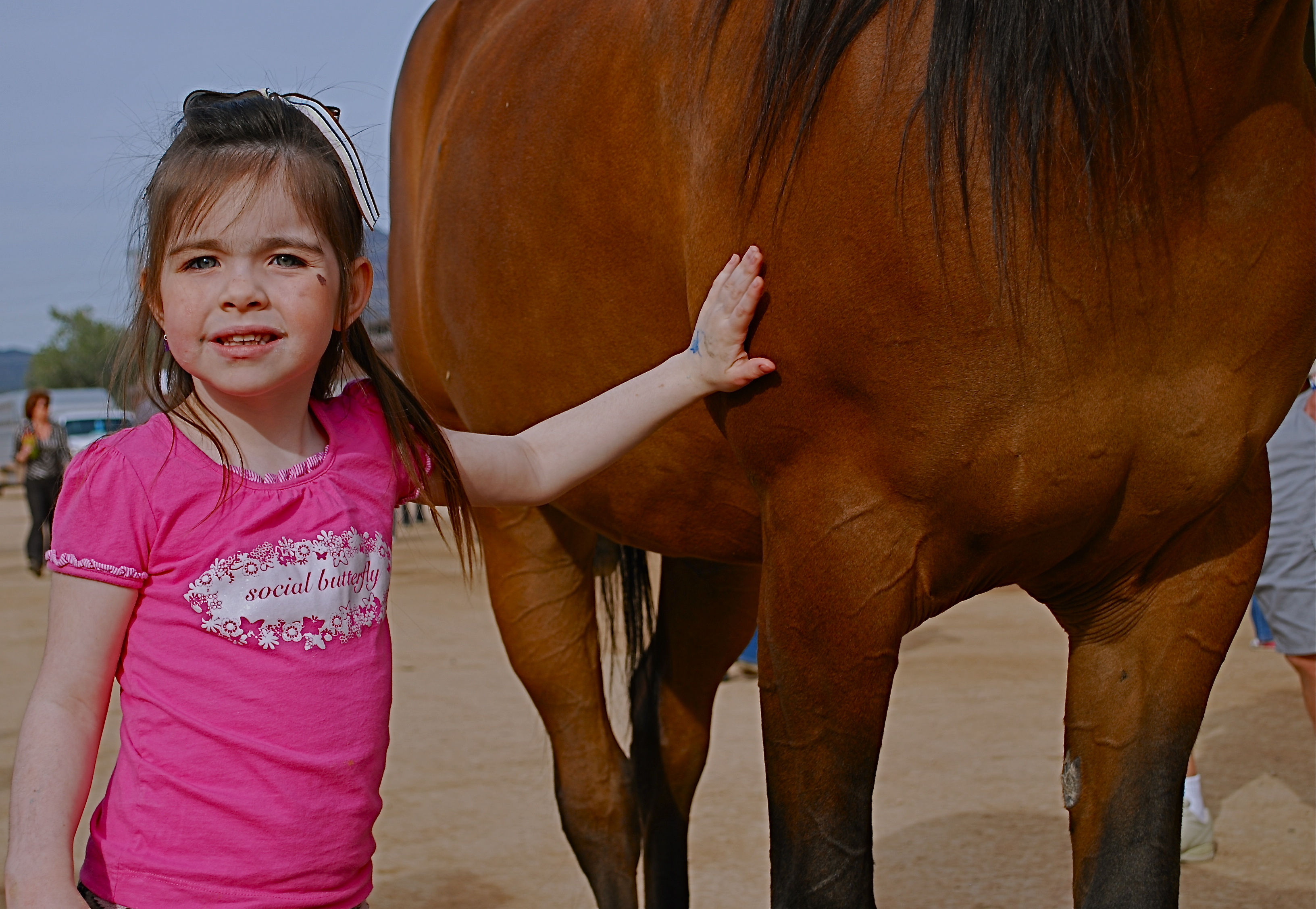
Thought the cute kid would be what this picture was “about”. Guess I was wrong.
By MICHAEL PERKINS
SEPARATING ONE’S IMAGES INTO “HIT” AND “MISS” PILES is always painful, since it’s kind of like telling some of your kids that they will be power hitters in Little League while their siblings should take up…well, macrame. But self-editing, over time, is nearly as important as shooting, and the mindfulness of asking “what was I thinking” is the useful corollary to “what do I want to do next?” That don’t make it smart any less, but at least you understand the pain.
Usually I hurl photos into the “miss” box for purely technical reasons, which means that I should have known what to do and just blew it upon execution. I’m more exacting nowadays, because present-era camera make it tougher to absolutely boot a shot, although I have striven to stay ahead of the curve and make lousy pictures even in the face of rapidly advancing technology. People who think they’ve idiot-proofed their gear have never met this idiot, I boast. It’s a point of pride.
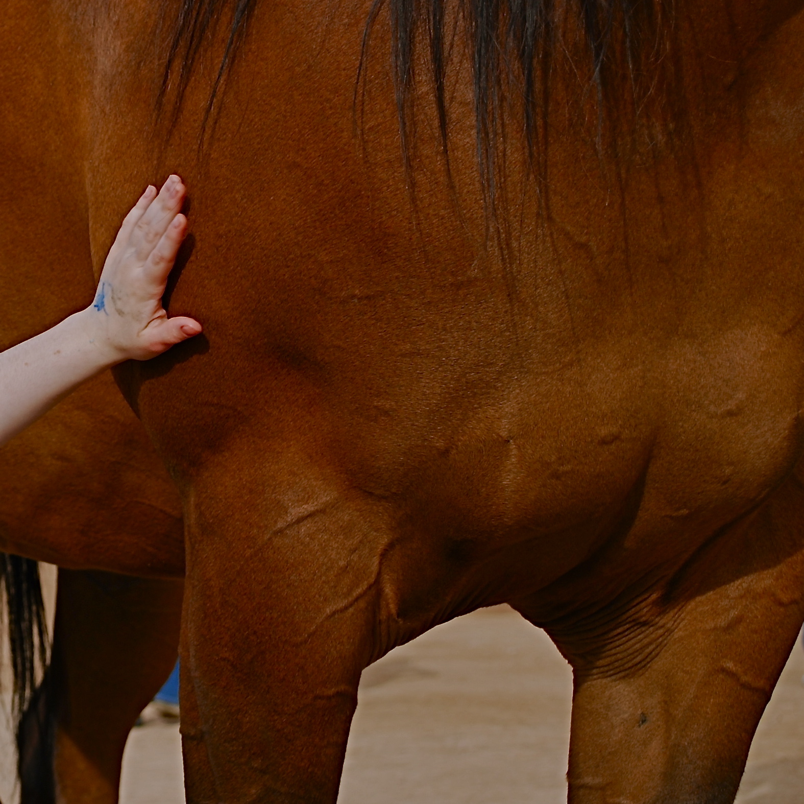
Cropping the image got to the main impact point lurking within.
Occasionally, though, you review a shot that was okay exposure-wise, but completely got the narrative wrong. Sometimes you can recompose the shot and redress this problem, and sometimes you’re just sealed out of the airlock with no oxygen. That’s the breaks. In the original image at the top of this page is a candid of a little girl next to a horse that I thought would be charming. Cute kid, nice horsie, you get the picture. Problem is, I never really captured her essence in any of the photos I shot (trust me) and I framed so tight that I was only showing the horse’s body. First verdict on this one: thanks for playing our game, sorry to see you go, here are some lovely parting gifts.
However, as a rainy day project, the photo suddenly presented a different way for me to go. It wasn’t that I had shown too little of the horse; it was that I had shown too much of both the horse and the child. The central part of the image, taken by itself, had a narrative power that the larger frame lacked. To crop so that just a part of the girl’s small arm connected with the strong, muscular torso of the horse magnified his power by contrasting it with her fragility. I wasn’t losing the horse’s face, since it hadn’t been in the original, and losing the girl’s face actually improved the impact of the image by reducing her to an abstraction, to a symbol of innocence, gentleness, but above all, contact. We could deduce that the horse and the girl were friends. We didn’t need to see it reflected in their features.
Sometimes an image we are ready to reject is hiding a more concentrated fragment that saves the entire thing, if we are unafraid to pare away what we once saw as “essential”. It’s the go-out-and-come-back-in-again school of thought. It’s at least a seeing exercise, and you gotta flex them eye and brain muscles at every opportunity.
BREAKING THE BOX
The picture shown here was spoiled by tilting the camera sidewise. The whole scene seems to be “running downhill”. Unless you are trying for an unusual effect, hold the camera level. – How To Make Good Pictures, c) 1943 The Eastman Kodak Company
By MICHAEL PERKINS
ONE OF THE CARDINAL RULES OF PHOTOGRAPHIC COMPOSITION IS THE MAINTENANCE OF A PAINTER’S VIEW OF THE WORLD, and it needs to be abandoned as irrelevant to picture-making in the current era. I’m talking about one of the Photography 101 rules we all inherited from the medium’s 19th-century beginnings, which is the unyielding reverence for “the box” as a framing device.
You know the admonition, and can recite it out of a million amateur guides: the parameters of your photo must be a dead parallel line top and bottom and two perfectly perpendicular verticals for the left and right sides. Call it the “out the window” orientation or the painter’s frame, or perhaps the “God’s in his heaven, all’s right with the world” concept of a perfect clockwork universe. Whatever the term, this unbending admonition became common to every amateur book on photographic instruction since forever. Tilting was bad. Bending the frame or composing within an abstracted version of it was really bad. Calling attention to the frame instead of letting it remain invisible was amateurish.
I’ll tell you what’s bad: doing everything the same way, forever, and expecting to grow as a photographer, or as an anything.
Framing in photography sets the visual grammar of an image. It lays out the rules of engagement as much as anything that’s contained within it. It can be an artistic statement all in itself, and needs to be thought of as a deliberate choice, no less than camera settings or subject matter. The square or rectangle is not a mathematical commandment. Like every other element of making images, it needs to justify itself for the picture at hand. What is right for this instance?
Would this image have worked better inside a completely standardized framing?
The image seen here is a very calm and unchallenging composition. I liked the small number of elements presented by the stark little porch and the rich but mysterious patch of forest. But in both the shooting and the cropping, I decided to subtly re-jigger the frame to include structural parts of the porch and the window through which I shot the scene, throwing off the perfect geometry of vertical and horizontal, resulting in a look that is a little off-kilter. I tried looking at the shot without any of these parts, and the picture looked too pat, too passive, whereas creating an imperfect square with them gave the photograph just a little edge. Not a slam-you-over-the- head effect, just a slight bit of visual punctuation.
Call it the difference between a colon and semi-colon.
As for the Eastman Kodak Company’s caution that you should maintain the standard frame unless you “are trying for an unusual effect”, well, aren’t you doing that every time you step up to bat?
If not, what’s the point?
REDUCTION OF TERMS
1/320 sec., f/5.6, ISO 100, 35mm.
By MICHAEL PERKINS
To me, photography is an art of observation. It’s about finding something interesting in an ordinary place. I’ve found it has little to do with the things you see, and everything to do with the way you see them. —Elliott Erwitt
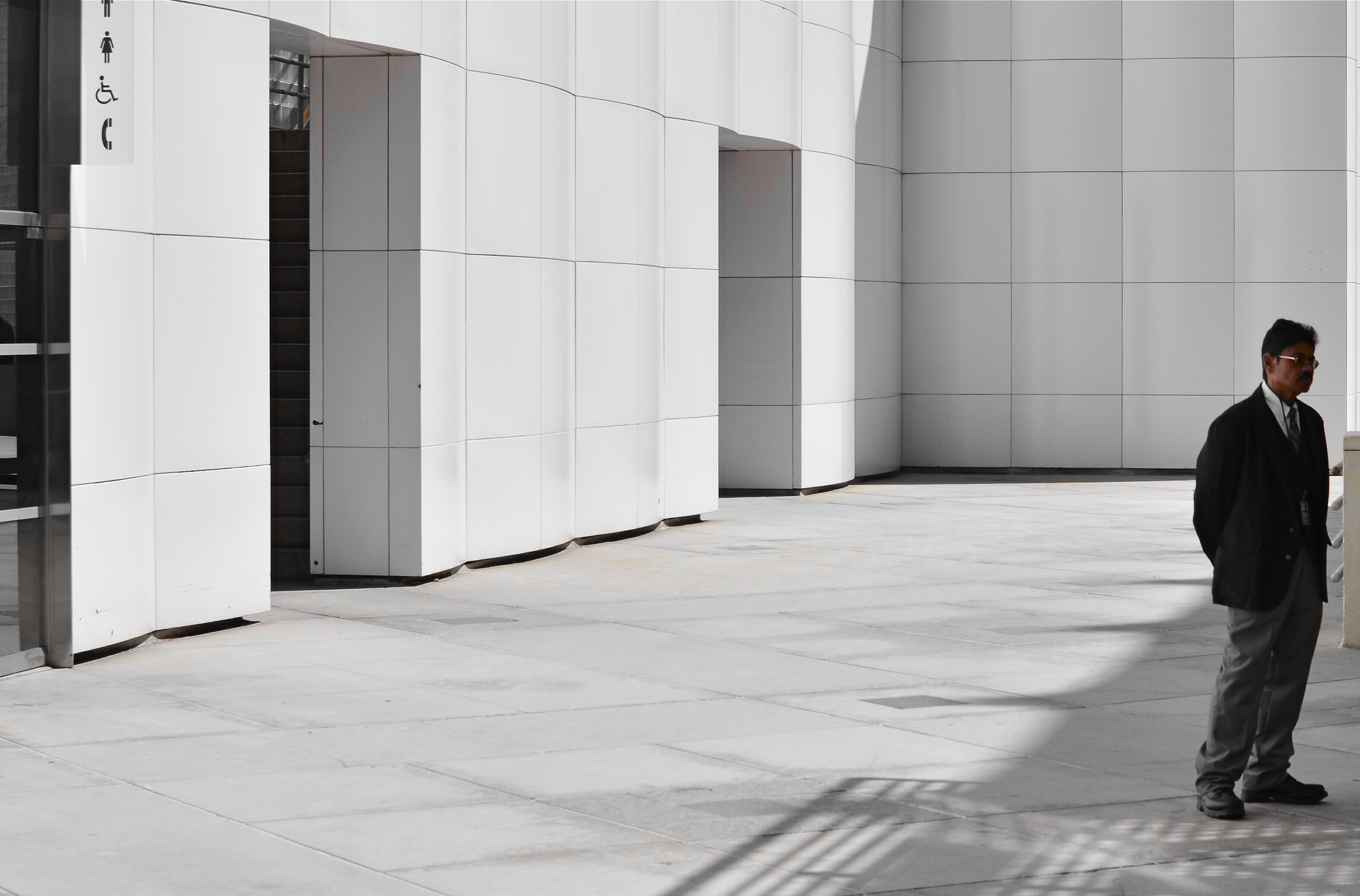
ISOLATION IS A TRULY IRONIC CONDITION OF THE HUMAN ANIMAL. The strange thought that, for most of our lives, we are both awash in a sea of other people and totally alone is one of nature’s most profound paradoxes. Photography shows people in both of these conditions, and shooters must choose what illuminates a person’s story best—-his place among others or his seeming banishment from them. Sometimes both truths are in the same frame, and then you must, as Elliott Erwitt says, alter the way you see in favor of one or the other.
In the case of both of the images posted here, the person who “solely” occupies the frames was originally a stray element within a larger context, with the pictures framed, at first, to include nearby persons or crowds. On further examination, however, one or two compositional elements in each of the pictures convinced me, in both the case of the museum guard and the hurried gallery guest, that they could “hold” the pictures they were in without any other human presence in view, and so I created their isolation, something that was not their natural condition at the time.
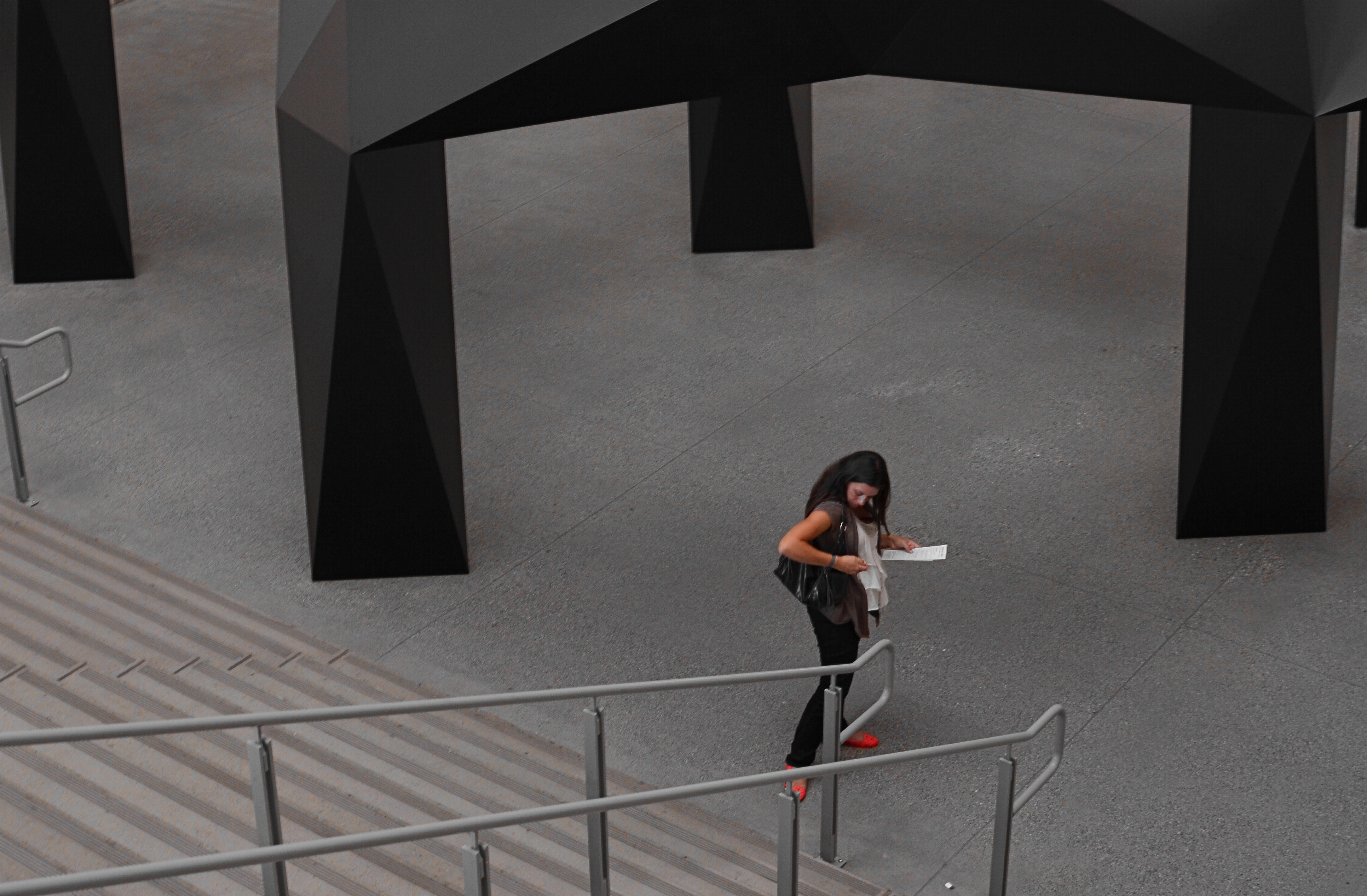
I further “isolated” these two subjects by desaturating everything in the frame except their flesh tones. 1/10 sec., f/5.6, ISO 320, 35mm.
Part of this process is my ongoing curiosity in how far I can go in paring away extra visual information before the story impact of a photograph is amplified to its highest power. I’m sure you have all worked with many original images that are just too balky and talky, that are really “made” in the cropping process. To be sure, sometimes you’re just peeling away the rotten outer parts of an apple to reveal…..a rotten core! Other times, however, you are privileged to peel away just enough petals to render the rose at its best, and, with images of people, that can mean getting rid of almost all the people in the picture you began with.
In both these cases, I liked these people to be shown as if they were in command of small little universes of their own. Does that make the photographs sad? Lonely? Dignified? Tranquil? Yes to all these and anything else you can bring to it, because if cropping is the second part of the picture-making process, then seeing if your instinct “proofs out” with viewers is the final and most crucial part. I’m using every process I can to convey to you what I saw, or what I believe is worth seeing. It’s a collaborative process, and sometimes, I’m sure, I don’t hold up my part of the bargain. And still we press on.
Isolation is more than a human condition or a symptom of our times: it’s a compositional tool, a reduction of the equation of scene-making to its simplest, and hopefully truest, terms.
MINIMUM SHOW, MAXIMUM SEE

There are only two design elements in this image. Does it really need any more? 1/160 sec., f/4, ISO 100, 24mm.
By MICHAEL PERKINS
LOOK AT THE EARLIEST PHOTOGRAPHIC WORK OF NEARLY ANYONE and you will see a general attempt to frame up a scene and attempt to show, well, everything within range of the camera. It’s a time when we produce our most inclusive panoramas, our most crowded city scenes, our most enormous circus midways. Our pictures may be stories, but, at first, our stories have a bit of a problem getting to the point. We are so inclusive of raw data that every snap of life at the beach becomes a page out of Where’s Waldo? Thus, the very first real talent young photographers show is the ability to trim all that visual fat and get the maximum see for the minimum show.
Of course, when we are mere puppies, it seems counter-intuitive to say that showing less will actually make us see more. Minimalism doesn’t come easily to us, since we are afraid, at first, that we’re leaving something “important” out. Everyone comes to terms with this eventually if they shoot long enough, but we all arrive at the wisdom of it via various journeys. For me, it was my first attempts at still life compositions, which really are the most edited exercises we do. For these kinds of photos, it’s really about knowing what to leave out, or at least when to stop adding. And when a picture works, there is the nagging curiosity as to why….an inquiry which often leads to the conclusion that we used just what we needed, and then stopped.
Sometimes I get a sense of how little I need in a picture while I’m shooting. Many times, though, it comes to me in the editing or cropping process. If I snip something off of a picture and it doesn’t fall apart, I start wondering how much more I can pare away and still say what I’m trying to say. Learning, in recent years, how to compose again for a square frame has really been helpful, too, since it forces you into a pre-determined space limit. You can’t paint any wider than the canvas, if you will. You yourself might find other ways to get to the core balance your story needs. There is no true or single path.
I started the above image in a wide graveyard, then several graves and a tree, then one grave marker and a tree, then just the marker, and finally a portion of the marker. But in what I wound up with, aren’t all the elements I cut away really present for the viewer mentally anyway?
It’s often said, as a generalization, that painters start with nothing and add until they get the picture, while photographers start with everything and strip information away until they see just what they need. I really see a lot of photography that way. Tell the story with as few elements as you can and walk away. Minimum show for maximum see.
Not nearly so counter-intuitive, after all.
NOT WHAT I CAME FOR, BUT…
By MICHAEL PERKINS
ANYONE WHO’S MADE A ROAD TRIP CAN TELL YOU THAT THE DESTINATION IS OFTEN FAR LESS ENJOYABLE THAN THE JOURNEY, a truth that also applies to photography. The best things result from the little surprises at the side of the highway. You’re fixated on your oh-so-holy “plan” and all the wonderful things you’ll see and do in executing it. But photography is an art of opportunity, and to the degree that you embrace that fact, your work will be broader, richer, looser.
This is now a real source of excitement for me. I still go to the trouble of sketching out what I think I’m going to do, but, I’m at least quietly excited to know that, in many cases, the images that will make the keepers pile will happen when I went completely off message. Yes, we are “officially” here today to shoot that big mountain over yonder. But, since the two people I met on the approach path to said mountain are in themselves interesting, the story has now become about them. I may or may not get back to the mountain, and, if I do, I may discover that I really did not have a strong concept in my bagga trix for making anything special out of it, and so it’s nice not to have to write the entire day off to a good walk spoiled.
Specific example: I have written before that I get more usable stuff in the empty spaces and non-exhibit areas of museums than I do from the events within them. This is a great consolation prize these days, especially since an increasingly ardent police state among curators means that no photos can be taken in some pretty key areas. Staying open means that I can at least extract something from the areas no one is supposed to care about.

An average day at the museum, at the end of which this dropped into my lap.
The above image is one such case, since it was literally the final frame I shot on my way out of a museum show. It was irresistible as a pattern piece, caused by a very fleeting moment of sunset light. It would have appealed to me whether I was in a museum or not, but it was the fact that I was willing to go off-script that I got it, no special technical talent or “eye”. Nabbing this shot completely hinged on whether I was willing to go after something I didn’t originally come for. It’s like going to the grocery store for milk, finding they’re out, but discovering that there is also a sale on Bud Light. Things immediately look rosier.
Or at least they will by the third can.
A PLACE APART
By MICHAEL PERKINS
PHOTOGRAPHERS USUALLY USE FACES AS THE SOLE BAROMETER OF EMOTION. It’s really easy to use a person’s features as the most obvious cues to one’s inner mind. Scowls, smiles, smirks, downcast eyes, sidelong glances,cries of anguish….these are standard tools in depicting someone as either assimilated into the mass of humanity or cast away, separate and alone.
But faces are only one way of showing people as living in a place apart. Symbolically, there is an equally dramatic effect to be achieved by the simple re-contextualizing of that person in space. The arrangement of space near your subject forces the viewer to conclude that he or she is either in harmony with their surroundings or lonely, solitary, sad even, and you do it without showing so much as a raised eyebrow. This is where composition isn’t just a part of the story, but the story itself.
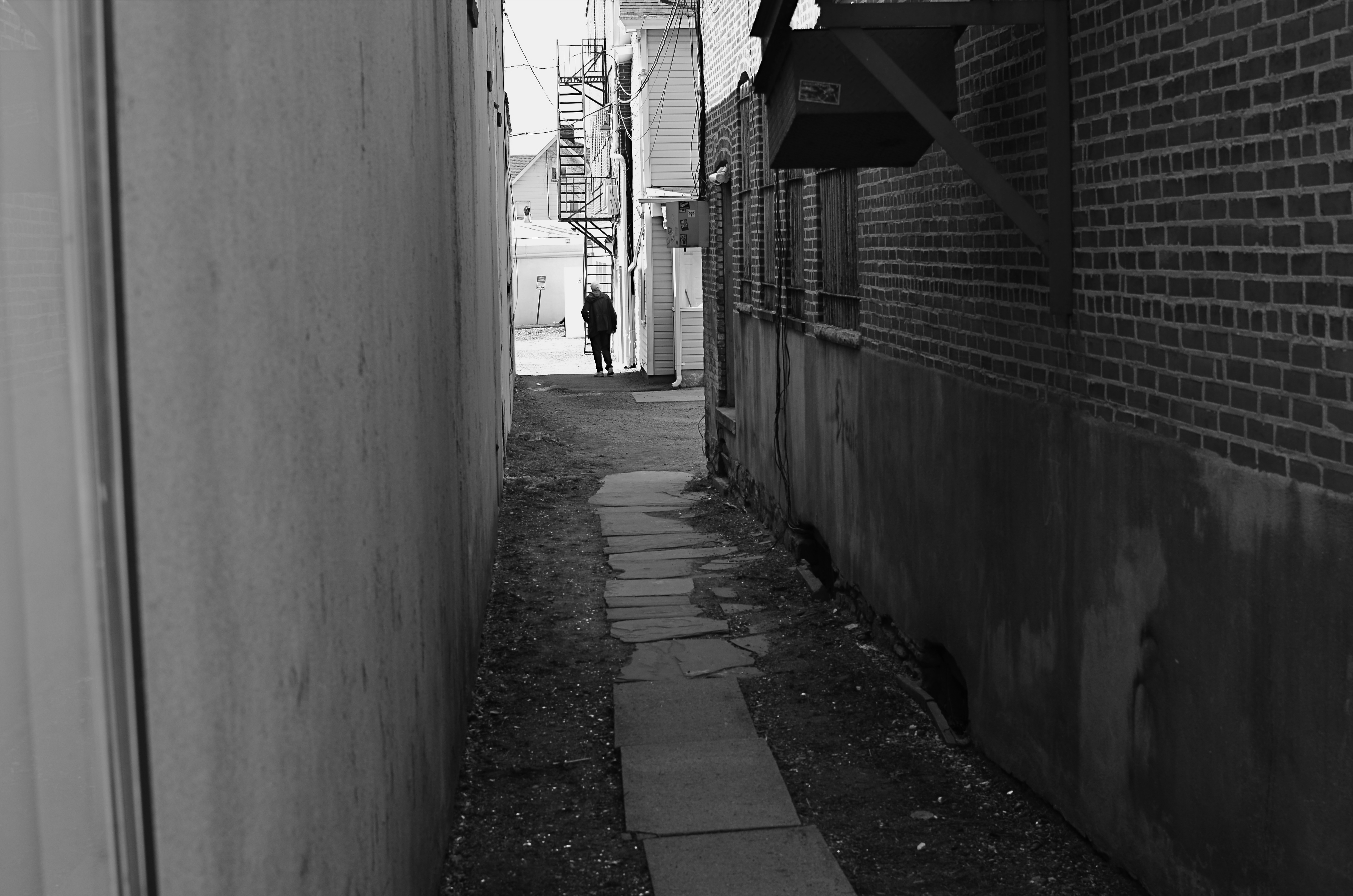
Context is all.
The woman shown here is most likely just walking from point A to point B, with no undercurrent of real tragedy. But once she takes a short cut down an alley, she can be part of a completely different, even imaginary story. Here the two walls isolate her, herding her into a context where she could be lonely, sad, afraid, furtive. She is walking away from us, and that implies a secret. She is “withdrawing” and that implies defeat. She is without a companion, which can symbolize punishment, banishment, exile. From us? From herself? From the world? Once you start to think openly about it, you realize that placing the subject in space lays the foundation for storytelling, a technique that is easy to create, recalibrate, manipulate.
The space around people is a key player in the drama an image can generate. It can mean, well, whatever you need it to mean. People who exist in a place apart become the centerpieces in strong photographs, and the variability of that strength is in your hands.
HOW MUCH IS TOO MUCH?
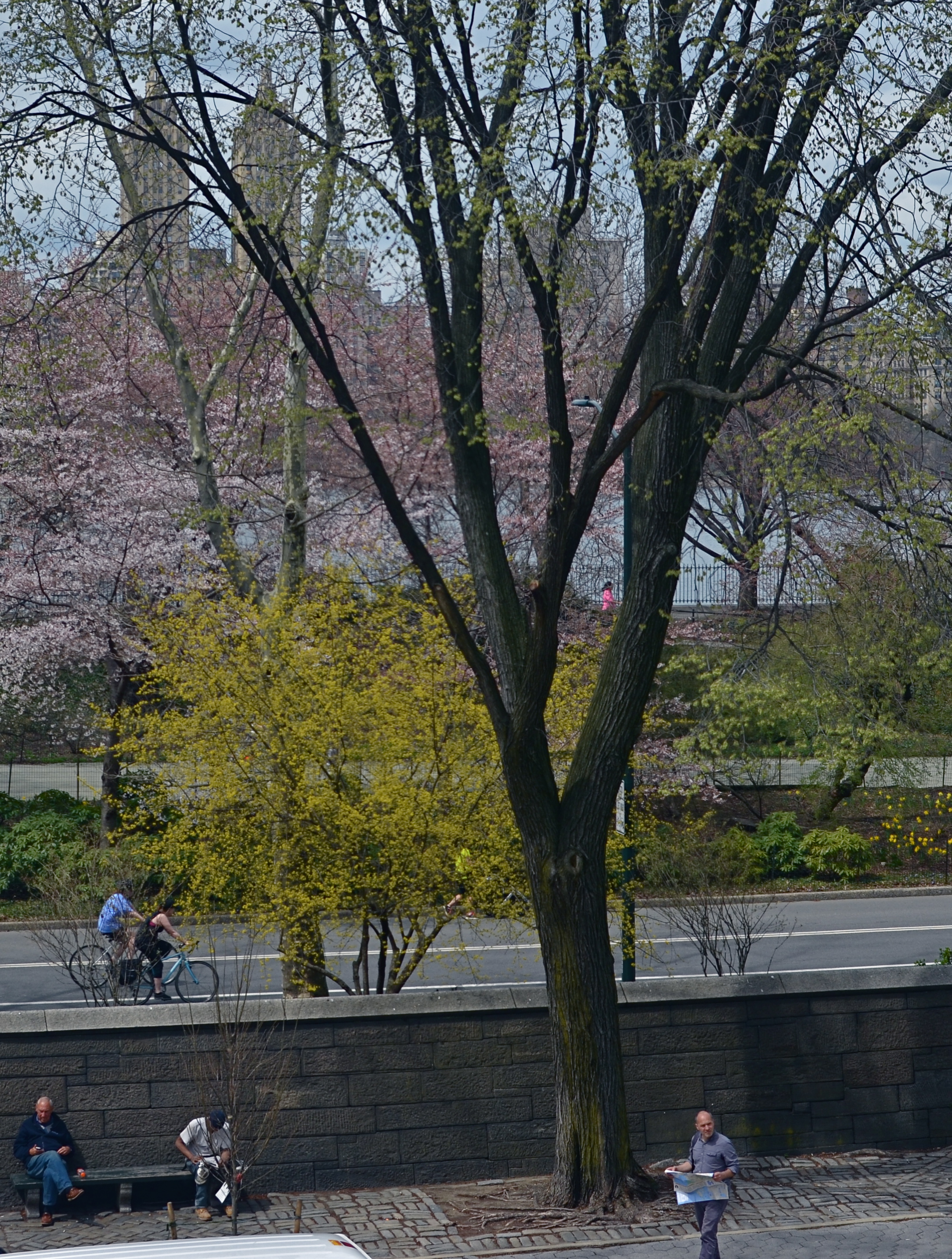
Lots going on here. Too much?
By MICHAEL PERKINS
THESE DAYS IT SEEMS TO TAKE LESS TIME TO SNAP A PHOTOGRAPH THAN IT DOES TO DECIDE WHETHER IT HAS ANY MERIT. Photography is still largely about momentary judgements, and so it stands to reason that some are more well-conceived than others. There’s a strong temptation to boast that “I meant to do that, of course” when the result is a good one, and to mount an elaborate alibi when the thing crashes and burns, but, even given that very human tendency, some pictures stubbornly linger between keeper and krap, inhabiting a nether region in which you can’t absolutely pronounce them either success or failure.
The image at left is one such. It was part of a day spent in New York’s Central Park, and for most of the shots taken on that session, I can safely determine which ones “worked”. This one, however, continues to defy a clear call either way. Depending on which day I view it, it’s either a slice-of-life capture that shows the density of urban life or a visual mess with about four layers too much glop going on. I wish there were an empirical standard for things like photographs, but…..wait, I really don’t wish that at all. I like the fact that none of us is truly certain what makes a picture resonate. If there were such a standard for excellence, photography could be reduced to a craft, like batik or knitting. But it can never be. The only “mission” for a photographer, however fuzzy, is to convey a feeling. Some viewers will feel like a circuit has been completed between themselves and the artist. But even if they don’t, the quest is worthwhile, and goes ever on.
I have played with this photo endlessly, converting it to monochrome, trying to enhance detail in selective parts of it, faking a tilt-shift focus, and I finally present it here exactly as I shot it. I am gently closer to liking it than at first, but I feel like this one will be a problem child for years to come. Maybe I’m full of farm compost and it is simply a train wreck. Maybe it’s “sincere but just misunderstood”. I’m okay either way. I can accept it for a near miss, since it becomes a reference point for trying the same thing with better success somewhere down the road.
And, if it’s actually good, well, of course, I meant to do that.
THE MOST FROM THE LEAST
Reaching a comfort zone with your equipment means fewer barriers between you and the picture you want to get. 1/80 sec., f/4.5, ISO 100, 18mm.
By MICHAEL PERKINS
PHOTOGRAPHY IS ONLY PARTLY ABOUT TAKING AND VIEWING IMAGES. Truly, one of the most instructive (and humbling) elements of becoming a photographer is listening to the recitation of other photographers’ sins, something for which the internet era is particularly well suited. The web will deliver as many confessions, sermons, warnings and Monday-morning quarterbacks as you can gobble at a sitting, and, for some reason, these tales of creative woe resonate more strongly with me than tales of success. I like to read a good “how I did it” tutorial on a great picture, but I love, love, love to read a lurid “how I totally blew it” post-mortem. Gives me hope that I’m not the only lame-o lumbering around in the darkness.
One of the richest gold fields of confession for shooters are entries about how they got seduced into buying mounds of photographic toys in the hope that the next bit of gear would be the decisive moment that insured greatness. We have all (sing it with me, brothers and sisters!) succumbed to the lure of the lens, the attachment, the bracket, the golden Willy Wonka ticket that would transform us overnight from hack to hero. It might have been the shiny logo on the Nikon. It might have been the seductive curve on the flash unit. Whatever the particular Apple to our private Eden was, we believed it belonged in our kit bags, no less than plasma in a medic’s satchel. And, all too often, it turned out to be about as valuable as water wings on a whale. He who dies with the most toys probably has perished from exhaustion from having to haul them all around from shot to shot, feeding the aftermarket’s bottom line instead of nourishing his art.
My favorite photographers have always been those who have delivered the most from the least: street poet Henri Cartier-Bresson with his simple Leica, news hound Weegee with his Speed Graphic perpetually locked to f/16 and a shutter speed of 1/200. Of course, shooters who use only essential equipment are going to appeal to my working-class bias, since peeling off the green for a treasure house of toys was never in the cards for me, anyway. If I had been the youthful ward of Bruce Wayne, perhaps I would have viewed the whole thing differently, but we are who we are.
I truly believe that the more equipment you have to master, the less possible true mastery of any one part of that mound of gizmos becomes. And as I grow gray, I seem to be trying to do even more and more with less and less. I’m not quite to the point of out-and-out minimalism, but I do proceed under the principle that the feel of the shot outranks every other technical consideration, and some dark patches or soft edges can be sacrificed if my eye’s heart was in the right place.
Of course, I haven’t checked the mail today. The new B&H catalogue might be in there, in which case, cancel my appointments for the rest of the week.
Sigh.
EYES WITHOUT A FACE
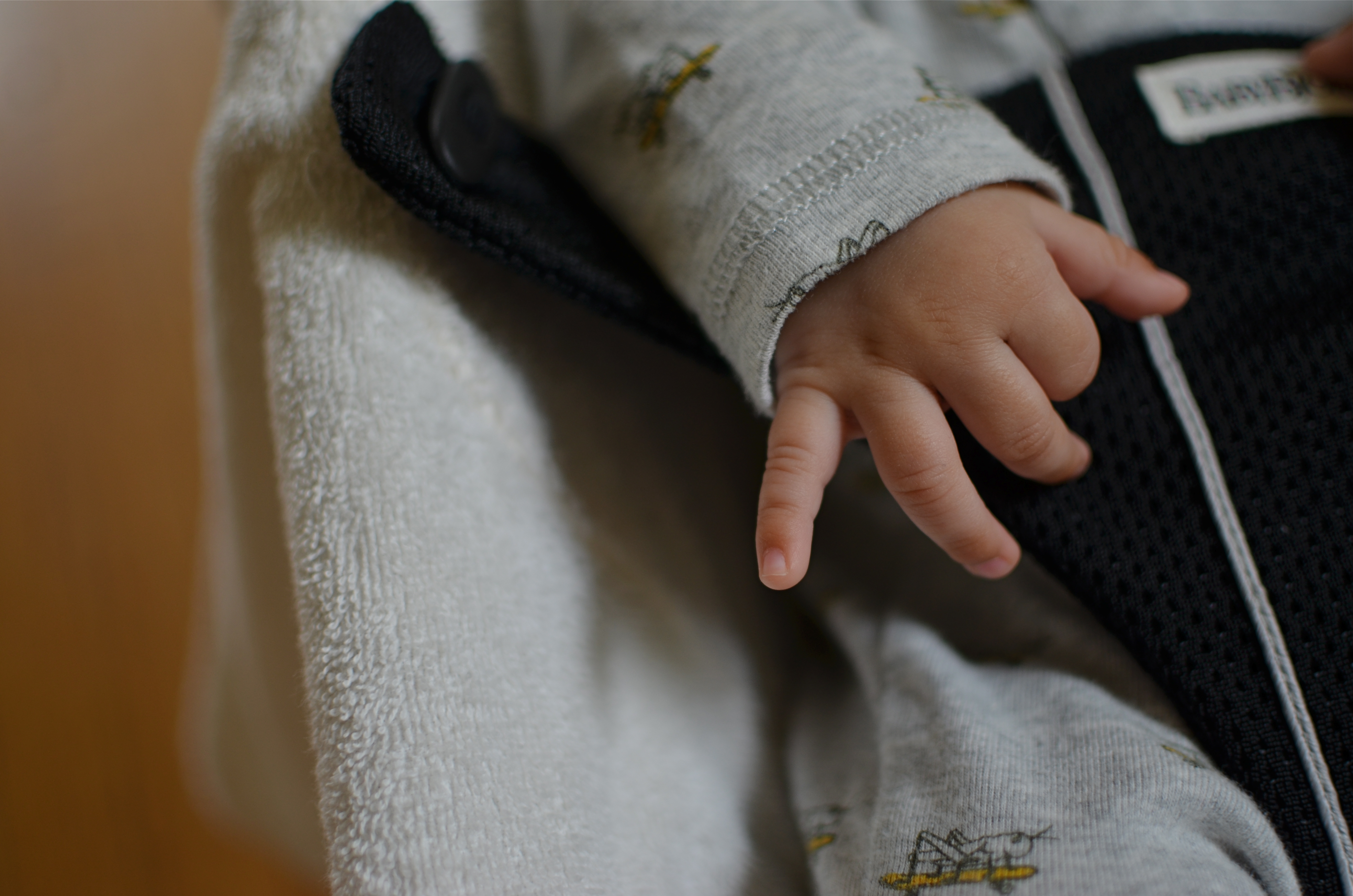
The hand that rocks (in) the cradle rules the world: 1/100 sec., f/1.8, ISO 100, 35mm.
By MICHAEL PERKINS
CHILDREN ARE THE GREATEST DISPLAY SPACES FOR HUMAN EMOTION, if only because they have neither the art nor the inclination to conceal. It isn’t that they are more “honest” than adults are: it’s more like they simply have no experience hiding behind the masks that their elders use with such skill. Since photographs have to be composed within a fixed space or frame, our images are alternatively about revelation and concealment. We choose how much to show, whether to discover or hoard. That means that sometimes we tell stories like adults, and sometimes we tell them like children.
The big temptation with pictures of children is to concentrate solely on their faces, but this default actually narrows our array of storytelling tools. Yes, the eyes are the window to the soul and so forth….but a child is eloquent with everything in his physical makeup. His face is certainly the big, obvious, electric glowing billboard of his feelings, but he speaks in anything he touches, anywhere he runs toward, even the shadows he casts upon the wall. Making pictures of these fragments can produce telling statements about the state of being a child, highlighting the most poignant, and, for us, the most forgotten bits.
Children are all about unrealized potential. Since nothing’s happened yet, everything is possible. Potential and possibility are twin mysteries, and are the common language of kids. Tapping into either one can provide the best element in all of photography, and that is the element of surprise.
THINGS ARE LOOKING DOWN

Central Park, April 2014. 1/320 sec., f/5.6, ISO 100, 35mm.
By MICHAEL PERKINS
PHOTOGRAPHY, AND THE HABITS WE FORM IN ITS PRACTICE, BECOME A HUGE MORGUE FILE OF FOLDERS marked “sometimes this works” or “occasionally try this”, tricks or approaches that aren’t good for everything but which have their place, given what we have to work with in the moment.
Compositionally, I find that just changing my vantage point is a kind of mental refresher. Simply standing someplace different forces me to re-consider my subject, especially if it’s a place I can’t normally get to. That means, whenever I can do something easy, like just standing or climbing ten feet higher than ground level, I include it in my shooting scheme, since it always surprises me.
Walk Or Ride, 2014. 1/30 sec., f/2.2, ISO 50, 4.11mm
For one thing, looking straight down on objects changes their depth relationship, since you’re not looking across a horizon but at a perpendicular angle to it. That flattens things and abstracts them as shapes in a frame, at the same time that it’s exposing aspects of them not typically seen. You’ve done a very basic thing, and yet created a really different “face” for the objects. You’re actually forced to visualize them in a different way.
Everyone has been startled by the city shots taken from forty stories above the pavement, but you can really re-orient yourself to subjects at much more modest distances….a footbridge, a step-ladder, a short rooftop, anything to remove yourself from your customary perspective. It’s a little thing, but then we’re in the business of little things, since they sometimes make big pictures.
A SQUARE DEAL
By MICHAEL PERKINS
Symmetry is key with square compositions.
I WAS AT THE MORGAN LIBRARY IN NEW YORK earlier this week, combining a museum tour with a photo shoot, when I came upon an exhibit which featured one of the earliest Kodak consumer prints, with the image contained inside a circle, rather than the rectangular frames most of us remember. It reminded me that the very formatics of picture-making were, for a long time, dictated by the physical dimensions of either camera or film, and that, suddenly, we are free to make photographs of any proportions we choose, anytime, everytime.
It’s really an amazing liberation, and, as an ironic consequence, some photographers are choosing to return to the framing formats that they used to decry as too limiting, subjecting themselves to the extra discipline of staying within a boundary and adjusting their compositional priorities thusly. This has made for a kind of revival of the square image, and there seem to be some distinct advantages to the trend.
Shooting on the square means calling attention to the center of an image, to using symmetry to your advantage, and to paring your composition to its bare essentials. The negative space used in landscape or portrait modes can still work within a square image, but the subject, and your use of it, must be just right. Squaring off means calling immediate attention to your message, and making it all the stronger, since there’s nowhere else for the eye to go.
Andrew Gibson, writing for the website Digital Photography School, explains the visual appeal of the square:
Using the square format encourages the eye to move around the frame in a circle. This is different from the rectangular frame, where the eye is encouraged to move from side to side (landscape format) or up and down (portrait format). The shape of the frame is a major factor.
It’s odd to think of freeing up your photography by voluntarily working within a more restrictive format. And, unlike the old days of square-only shooting, the effect is largely created “after the click”, by re-composing through creative cropping. But the additional mindfulness can really boost the power of your images.
BREAKING THE BIG RULE
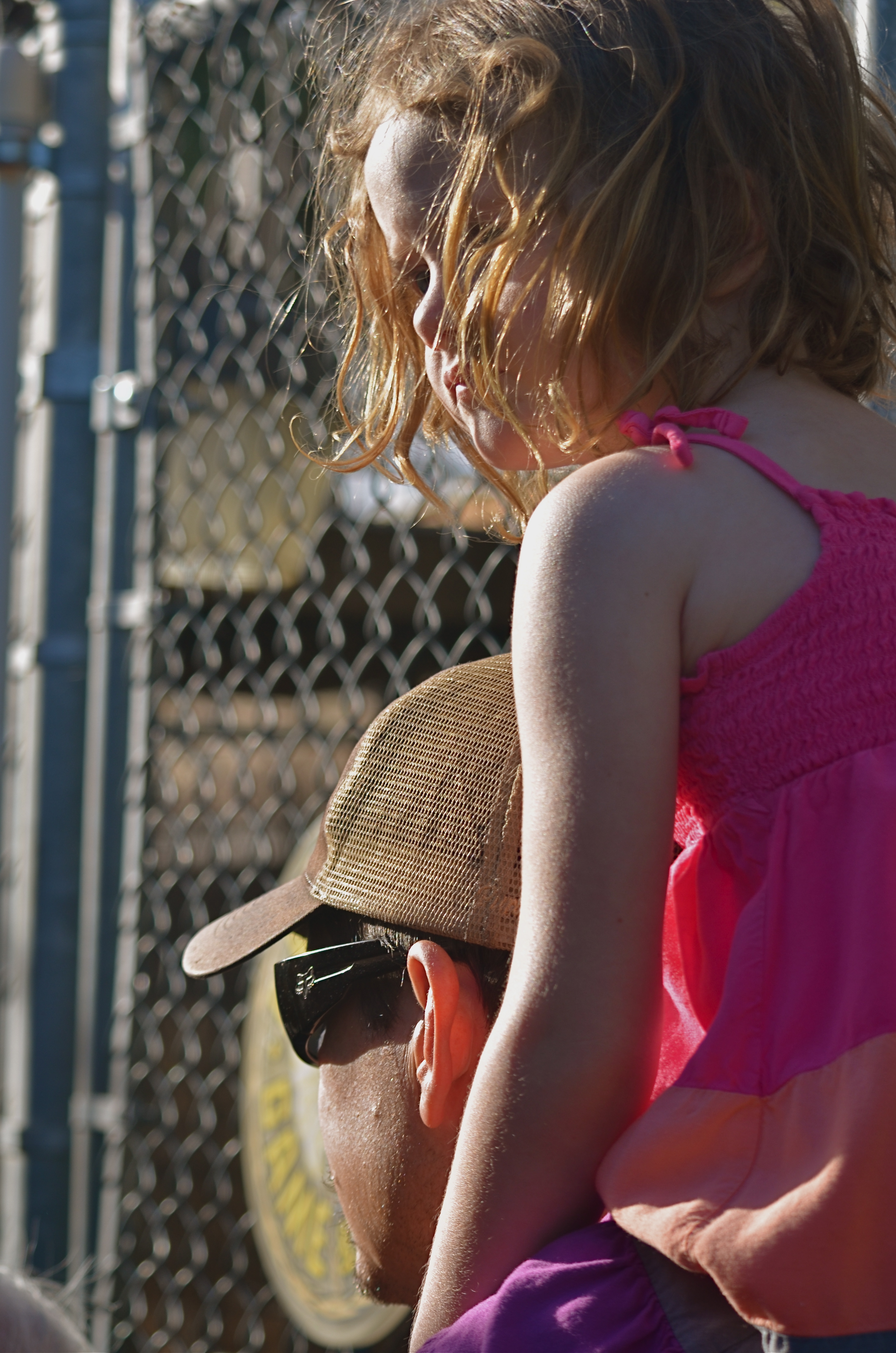
I can’t see this girl’s face. Does it matter? 1/160 sec., f/5.6, ISO 100, 55mm.
By MICHAEL PERKINS
FACES ARE THE PRIMARY REASON THAT PHOTOGRAPHY FIRST “HAPPENED” FOR MOST OF US. Landscapes, the chronicling of history, the measurements of science, the abstract rearrangement of light, no other single subject impacts us on the same visceral level as the human countenance. Its celebrations and tragedies. Its discoveries and secrets. Its timeline of age.
It is in witnessing to faces that we first learn how photography works as an interpretive art. They provide us with the clearest stories, the most direct connection with our emotions and memories. And the standard way to do this is to show the entire face. Both eyes. Nose. Mouth. The works. Right?
But can’t we add both interpretation and a bit of mystery by showing less than a complete face? Would Mona Lisa be more or less intriguing if her eyes were absent from her famous portrait? Would her smile alone convey her mystic quality? Or are her eyes the sole irreplaceable element, and, if so, is her smile superfluous?
Instead of faces as mere remembrances of people, can’t we create something unique in the suggestion of people, of a faint ghost of their total presence” Can’t images convey something beyond a mere record of their features on a certain day and date? Something universal? Something timeless?
It seems that, as soon as we maintain rigidity on a rule….any rule…we are likewise putting a fence around how far we can see. The face is no more sacred than any other visual element we hope to shape.
Let’s not build a cage around it.
