THE EYE OF MEMORY
By MICHAEL PERKINS
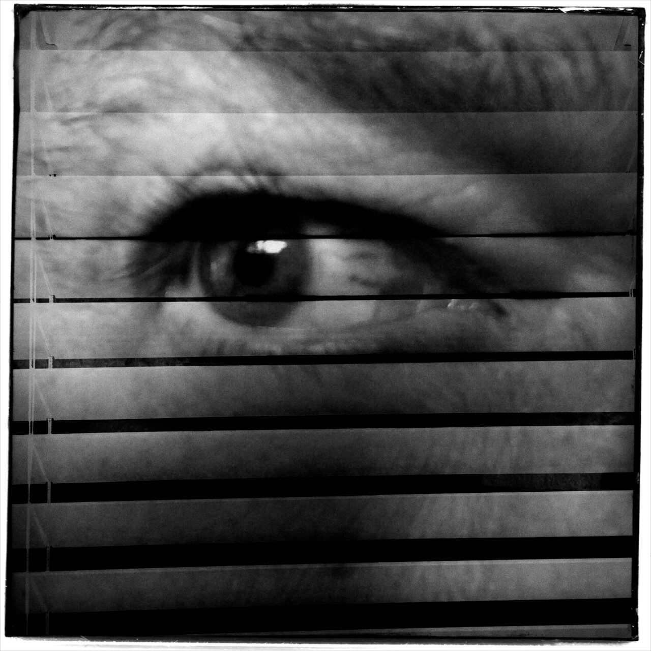
PHOTOGRAPHY DEALS IN FEELINGS, those inexact sensations of the heart that we try to capture or evoke in our visual messaging. Some subjects, such as war or celebration, convey emotions with such immediacy that we are really only acting as recorders, with the associative power of our minds providing much of the detail. Pictures of loss or celebration, such as the aftermath of a disaster or the birth of a new life, can be fairly simple to convey. What you see is what the thing is. For subtler regions of the brain, however, photos must use, if you will, a different vocabulary.
Newbie photographers are trained, to a a great degree, to seek the sharp image, to master focus as a technical “must”, but, as we vary the kinds of messages we want to convey, we change our attitudes about not only sharpness but most of the other “musts” on the beginner’s list. We learn that we should always do a certain thing….except when we shouldn’t. It’s worth remembering that some of the most compelling photos ever published were, according to someone’s standard, “flawed” in some way.
De-saturated color, soft focus. Items dealing with feelings, especially memory. are better served with less “realism”.
News shooters have long since learned that the emotional immediacy of a picture, along with its raw “news value”, outweighs mere technical precision by a country mile. The rules get bent or broken because, in their most perfect application, they may actually dull the impact of a given image. Thus, many a journalist has a Pulitzer on his wall for a picture that a beginner might regard as “wrong”. And the same goes for any picture we may want to make where an emotion simply must be conjured. Mere visual accuracy can and will be sacrificed to make the picture ring true.
Asa personal example, I find that images that plumb the mysteries of memory often must stray from the arbitrary standards of so-called “realism”. When you work in the realms of recall, nostalgia, regret, or simply fond remembrance, a certain fluid attitude toward the niceties of sharpness and exposure may actually sell the idea better. Memory is day-dreaming, after all, and, in a dream, as Alice found in Wonderland, things look a bit…off. Dimension, delineation, depth…all these properties, and more, morph with the needs of the desired image. “Real” sells some things superbly. Emotion, however, as earlier stated, demands a language of its own.
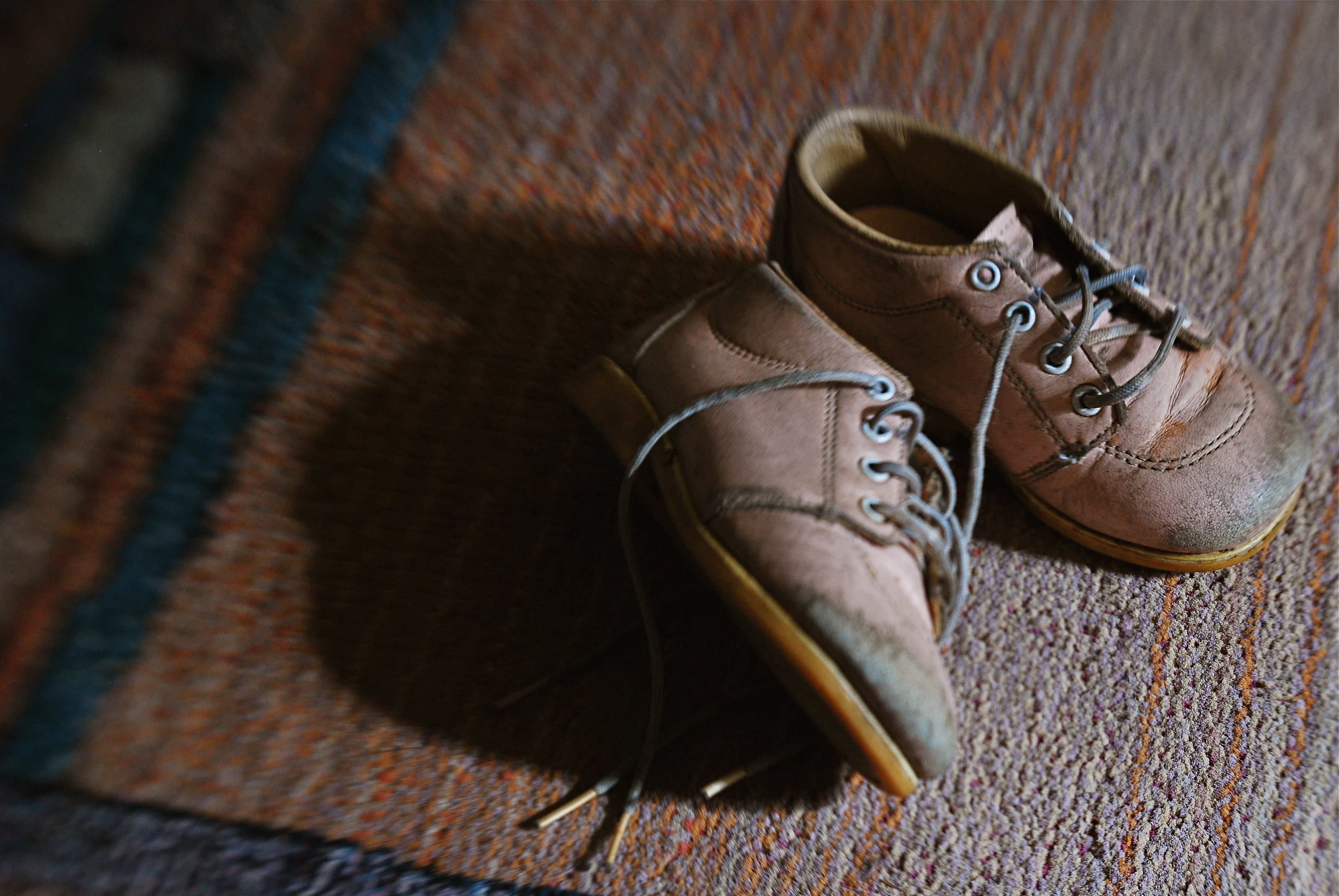
The baby shoes shown in the image above are shot in uneven sharpness to suggest the gauzy nature of the memories they may evoke. Likewise the color is a bit washed-out, almost pastel, since a full, vibrant range of hues may seem less dreamy, more rooted in reportorial reality…which we don’t want for a picture like this. Rule-breaking ensues simply because nothing, no rule, no standard, is as important as making the picture work. If it doesn’t speak to the viewer, then the fact that it’s technically superb means nothing.
As Mr. Ellington sez, it don’t mean a thing if it ain’t got that swing.
PIECEWORK

When visiting craft studios, make sure you peruse the backstage areas as well.
By MICHAEL PERKINS
NO SELF-RESPECTING TOURIST SPOT IS COMPLETE WITHOUT A STROLL THROUGH the local craft shops, those kitschy little warrens of handmade goods from pottery to stone trinkets. Whether they are called “studios”, “boutiques” or “trading posts” these collections of gypsy creativity are on the main and minor drags of every destination town, and they are occasionally real feasts for the eye…and, in turn, the camera.
The stuff on the tables and counters is usually a riot of color and texture, and thus somewhat low-hanging fruit for photogs. But you can miss out if you limit your framings merely to the finished product, especially if the backstage or work areas, where the magic truly happens, are open or, even better, an active part of the customer experience. Lots of small craft factories, art sites, galleries and festivals incorporate the actual making of their goods into the overall tourist trip, and I often find these staging areas far more interesting than what eventually makes it to the sales floor.
Everyone recalls the corner pizzerias that oriented their kitchens so that the guy flipping the dough was in a display window near the street. It was great passive show biz and the same “backstage” allure still works for handmade jewelry and other crafts. And, while witnessing the literal creation of objects is one kind of storytelling opportunity, a quieter one can occur when you cruise past vacant desks whose tops are cluttered with tools and decorative components. These kind of still-life subjects are ripe with potential, since they show what is about to happen. They’re also displays of someone’s personal work area, their most individual arrangement of space.
Sometimes the best part of a shopping experience is the unpolished part. Pictures are where you find them, and opportunities reveal themselves when you start looking beyond the obvious locations.
SIMPLEST TERMS

Two colors, and only two colors. Is anything else needed to sell this image?
By MICHAEL PERKINS
ENTIRE BOOKSHELVES OF MATERIAL HAVE BEEN WRITTEN on the mysterious art of composition at it applies to photography. The variations are endless: what to shoot, how much to shoot, how to determine how little to shoot, theories on addition, subtraction, choice of subject, and so on. The only constant is that every compositional inclusion also embodies an exclusion. When you choose one thing, you un-choose everything else.
One such choice is that of color over monochrome, an argument which raged over a large part of the early 20th century, since, for many years, photographers thought they could rely upon black and white, even though an abstraction of reality, to convey a consistent feel, whereas early color films often produced uneven results. Some photographers decided to ban color altogether, to embrace the predictable un-reality of b&w rather than gamble on hues that might not be reproduced or printed with true fidelity, or worse, register as too brassy or garish. Today we seldom choose monochrome over color for the same reasons, but compositions still rise and fall on whether we use color, as well as what kind of color we use.
Sometimes, just as a photograph that’s poorly cropped or loosely composed can be too busy, a color scheme that has too much variety can prove distracting, actually diluting a picture’s impact. Occasionally, I like to see how few distinct colors I can use in an image and still consider it complete, as in the case of the tomatoes above, which makes it case with only red and green values. In this instance, adding extra space around the box holding the tomatoes, or expanding the frame to include other shapes, objects or hues, will do nothing to improve the strength of my composition, so why include them? This is an easy editing choice that occurs in real time in the framing of the shot, and, with the instant feedback afforded by digital, you know immediately if the picture is lacking anything.
The problem with a lot of photography is that we tend to go no further than framing up an “acceptable” picture, one that doesn’t overtly fail. However, the more we practice a mindful approach to composition, the more adept we get at putting just enough, from subject to hue, into the image, and not one item more. This gives our photographs a streamlined communicative power that directs the eye and conveys the story.
WITNESS IT, DON’T WORK IT
Don’t draw portrait subjects into your energy. Eavesdrop on theirs.
By MICHAEL PERKINS
CHILDREN AND ANIMALS OPERATE IN WORLDS DIFFERENT ENOUGH FROM OUR OWN that they merit a special viewpoint when being photographed. Composing an image designed to enter into their special realities should facilitate that process, giving the viewer the idea that he has gained entry to their realms. The camera’s eye needs to seem to inhabit their actual living space.
I’ve felt for a long time that the formal K-Mart studio method of making a child’s portrait is stiflingly inadequate for plumbing that young person’s real animating spirit. And as for pets, the sheer daily deluge of animal snaps posted globally are served just as badly from over-formalizing or staging. Intimate insight into the self can’t be achieved by generic backdrops, tired props or balanced flash alone. If anything, such systems push the real child further away from view, leaving only a neutral facade in place of the true human. Personality locks eyes with the lens in unguarded, not choreographed, moments.
I’m not saying that no preparation should go into animal or child pictures. I am suggesting that a “snapshot mentality”, backed by lots of shooting experience, can yield results that are more organic, natural and spontaneous. Shoot in a moment but apply what you have learned over a lifetime.
Even the simple practice of shooting on your subject’s level, rather than shooting like a grownup, i.e., downhill toward your subject, can create a connection between your line of sight and theirs. If your kids and kitties are on the floor, go there. Another simple way to create an intimate feel is to have the child or pet dominate the frame. If there is some other feature of the room, from furniture to other people, that does not rivet your audience’s attention to the main subject, cut it out. Many, many portraits fail by simply being too busy.
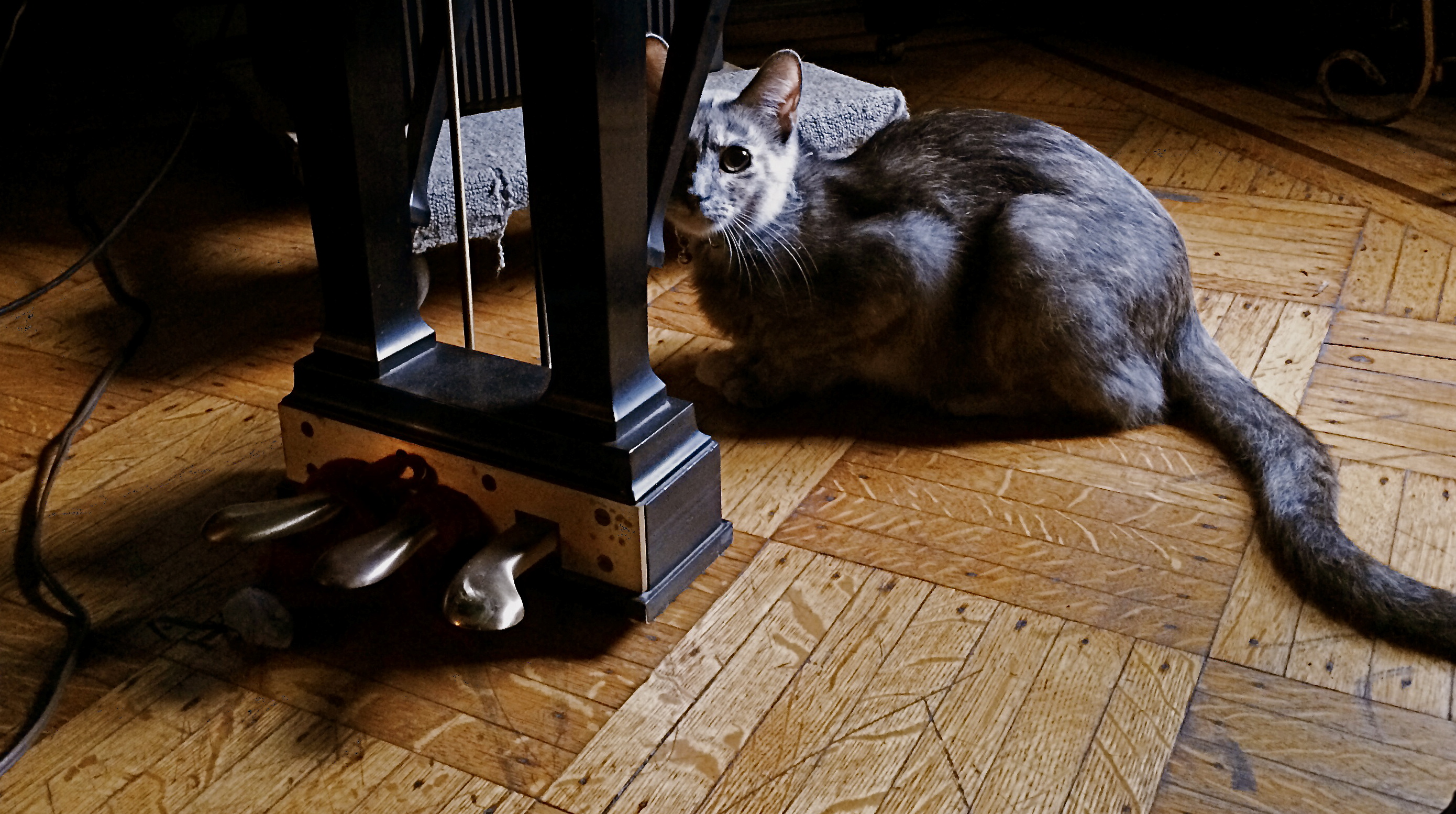
And, finally, catch your dog, cat, boy or girl doing something he’s chosen to do. Don’t assign him to play with a toy, or ask him to stand here, here, or here. Wait like a professional, then shoot fast like a snapshotter. The more invisible you become, the less distraction you provide. Looking at a child or pet enthralled by something is a lot more interesting than watching him watch you. If you do happen to lock eyes during the process, as in the case of the rather suspicious house cat seen above, steal that moment gladly, but don’t try to direct it.
Don’t draw your portrait subjects into your energy. Eavesdrop on theirs. The pictures will flow a lot more naturally, and you won’t have to work half as hard.
DESIGN FOR LIVING
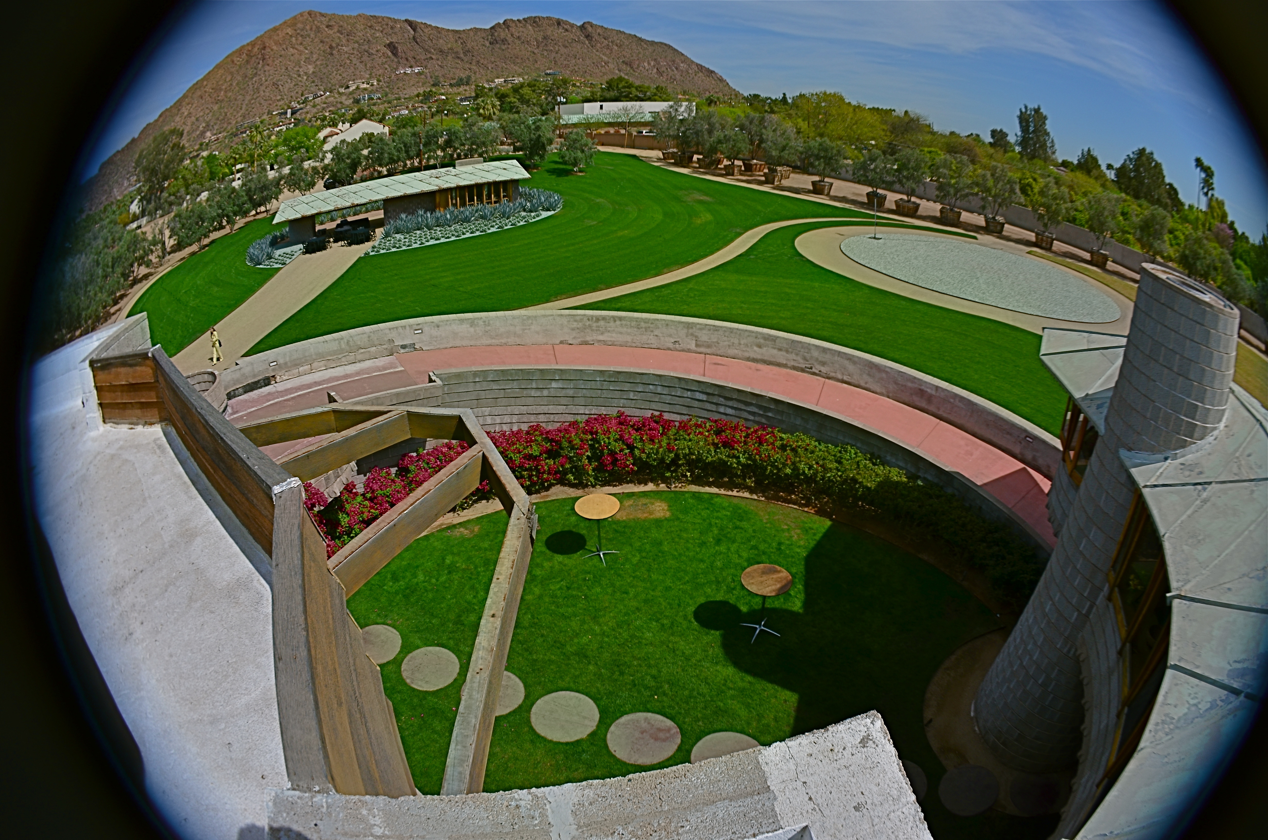
A view into the courtyard of the David Wright House, Frank Lloyd Wright’s gift to his son, built in Phoenix, Arizona in 1950 and now being prepped for complete restoration. The detached guest house and Camelback Mountain are in the distance.
By MICHAEL PERKINS
HIDDEN IN PLAIN SIGHT IT WAS, the final residential design completed by the late Frank Lloyd Wright, mysteriously unsung in every major study of his late work and absent from nearly every retrospective on the cantankerous colossus of twentieth-century architecture. The house, designed for his son David in the Arcadia neighborhood of central Phoenix, Arizona, rose from the desert in 1950 and almost immediately faded from popular view, staying under the radar less than a mile from Camelback Mountain, the sight of which dictated the site of the home, in one of Wright’s most dramatic examples of organic architecture.
And now, just a few years after since daughter-in-law Gladys Wright’s death at the age of 104 and a blink of time since an interim owner first threatened the place with demolition, it is, in 2016, about to sink back from view once more, as the benevolent millionaire who saved it confers with various local factions on the best route to its complete restoration. Tours, which, for the past year have allowed visitors from around the world to walk through what Wright called a solar hemicycle design, his recipe for “how to live in the southwest”, will be suspended. 3-D laser scans will be studied to see where the house’s sixty-five year old foundations need to be fortified and repaired. And, for a time, this remarkably unique dwelling will again be beyond the reach of the camera.
Since The Normal Eye began, we have occasionally mounted photo essay pages featuring singular places, sites too special to be addressed in one or two images. The most recent of these was a tour of author Edith Wharton’s home, The Mount, in Massachusetts. And today, we’ve added a new tab at the top of the blog titled Wright Thinking, with select photos of the David Wright home and its detached guest house, in an attempt to remind people that this hidden treasure does, indeed, survive in the American West.
The essay format seem appropriate because the Wright home is difficult house to convey in just a single photograph, rising from the desert floor in a continuous circular ramp that climbs to the house proper, a 2000 square-foot crescent of rooms mounted on concrete piers and looking north to Camelback Mountain with a window array that presents a view arc of over 200 degrees. Within and without are Wright’s signature components: dramatic furniture design; innovative use of humble materials, from linoleum to concrete; a visionary use of solar energy; and the most Wright of Wright ideas, the organic credo that the site comes first, the house second, and never the other way around.
So thumb through our impromptu Wright family album and visit the house’s wonderful website at www.davidwrighthouse.org to keep apprised of the next sighting of one of the master’s final bows.
A TRICK OF THE LIGHT
By MICHAEL PERKINS
PHOTOGRAPHERS WHO TRACK THE SUN AS IT TRAVELS EAST TO WEST over the vast expanse of the Grand Canyon have made amazing images of the way light changes contours, shadows, even the sensation of depth and scale over the course of a single day. Such hour-by-hour portfolios present pictures which are less about the subject matter and more about how light shapes that subject. And the same tracking exercise is possible in canyons of another sort, the vertical jungles we call cities.
Buildings in urban settings reveal more in pictures than their own particular physical shapes and designs: they also have visual artifacts tattooed onto them from their neighbors, which block, warp and reflect light patterns in their direction. Thus the most architecturally drab tower can become hypnotic when bathed in patterns of shadows shaped by the tower next door. And that means that those seeking abstract images may find that ordinary parts of the city can be rendered extraordinary by light’s odd bounces. Additionally, the fact that many of these light effects are fleeting, visible, in some cases, only for minutes each day, presents both a challenge and an adventure for the photographer.
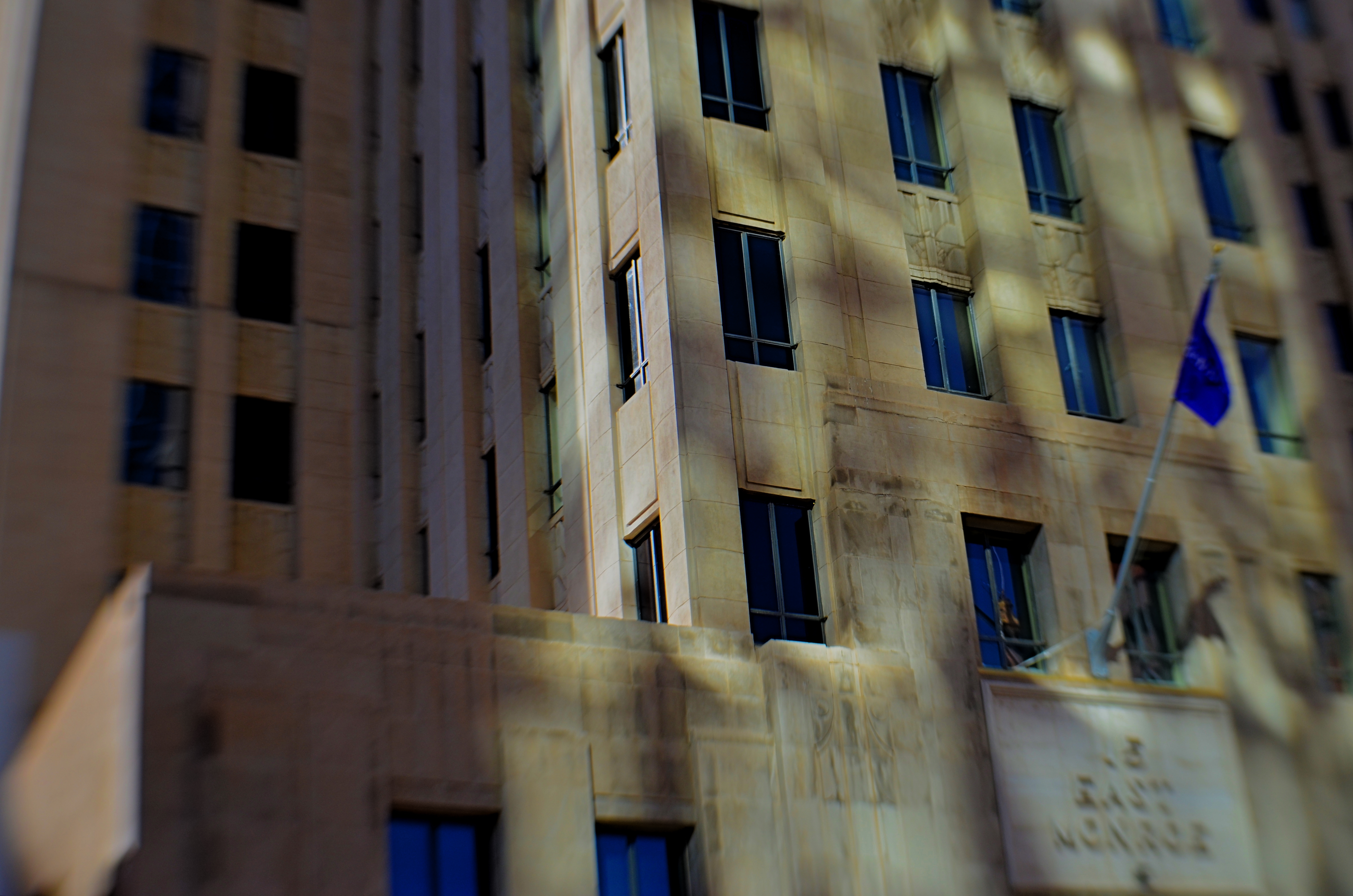
Fifteen East Monroe, 2016.
In the shot above, a gorgeous Art Deco building in downtown Phoenix, Arizona benefits from a light effect that has only been possible for the last forty years of its existence. Erected in the late 1930’s, the northern face of 15 East Monroe Street would not, at its opening, have been dappled with the shadow patterns seen here. No, it took a soul-less glass box from the ’70’s, located across the street, to bounce patterns of reflected light onto the building as you see it here, and only for about two hours a day between late morning and noon.
During that window, 15 East Monroe displays a wonderfully checkered mix of reflected illumination on its golden terra-cotta exterior. I first observed the patterns ten years ago, and have been going back for occasional looks ever since. The trick, in this image, was to keep the texture of the building from looking too sharp, since the effect itself is somewhat dreamy, and works better if the overall photo of the building is also a little soft. I used a selective focus lens (sharp at the middle, softer toward the edges) to give the overall building a gauzy look, and let the picture really be about the light effect, rather than any specific part of the building. Even at this point, I am imagining about a half-dozen other ways to accomplish this, but this image can at least serve as an initial study, a guideline for what may, eventually, be my final word on the subject.
Photography, clinically defined, is the art of writing with light. Sometimes, regardless of the object in our viewfinder, what light does to things is, by itself, enough for an interesting picture. It takes some restraint to let the light be the subject, and to let the picture, in its most basic form, breathe.
MORE TOOLS IN MORE HANDS

Shot one inch away with Lensbaby macro converters, accessories for the company’s 35mm lens, amazingly priced at about $49.95.
By MICHAEL PERKINS
THE CELL PHONE CAMERA’S IMPACT ON PHOTOGRAPHY HAS BEEN SO SUDDEN AND FAR-REACHING that its full impact has yet to be fully measured. Within a decade, the act of making a picture has been democratized to a greater degree than at any other time in the history of the medium. It’s as if, overnight, everyone was given the ability to leap tall buildings in a single bound. Goodbye, Superman, hello, Everyman. The Kodak Brownie’s introduction prior to 1900 gave the average human his first camera. The cell phone is like the Brownie on steroids and four shots of Red Bull.
It’s more than just giving millions of people the ability to take a photo. That part had been done before, dozens of times. However, no other camera before the cell has also obliterated the number one obstacle to picture-making on this scale: cost. The cost of film. The cost of marketing and sharing one’s work quickly, and with uniform quality. The cost of artistry, with support apps allowing people to directly translate their vision into a finished product without investing in gear that, just a few years ago, priced most people out of the creative end of the market.
Most significantly, there is the cost saved in time. Time learning a technique. Time speeding past the birth pains of your creative energy. you know, those darn first 10,000 hours of bad pictures that used to take years of endurance and patience. The learning curve for photography, once a gradually arching line, is now a dramatic, vertical jump into the stratosphere.

A cell-app simulation of the film-based platinum printing process.
These insane leaps in convenience and, for the most part, real technical improvement occur across all digital media, but, in the cel phone, their impact is spread across billions, not mere millions, of users. Simulate a particular film’s appearance? Done. Do high-quality macro or fisheye without a dedicated lens running into the hundreds? Yeah, we can do that. Double-exposures, selective focus, miniature effects, pinhole exposures, even remote auxiliary lighting? Go fish. It’s all there.
And when cells raise the ante, traditional cameras have to up their game just to survive. The shot at the top of this page comes from a pair of Lensbaby macro converters up front of the company’s Sweet 35 optic, a shot that would only have come, a few years ago, from a dedicated macro lens costing upwards of $500. Lensbaby’s version? $49.95. And now, with less than a decade in the effects lens biz for DSLRs, Lensbaby makes macro, fisheye and other effect lenses for cells. A rising tide raises all boats.
I could make a list of the areas where the optics and outputs of cell phones are still behind conventional camera optics, but if this post is ever read more than a year past its publication, the future will make a liar out of me. Besides, that would put me on the same side as the carpers who still claim that film is better, more human, or “warm”, as the vinyl LP hipsters like to say. Your horse is nice, but it can’t outrun my Model T.
Part of photography’s appeal since day one has been the knowledge that, whatever era you live in, it’s a sure bet that some geek is slaving away in a lab somewhere, trying to make your sleek, easy, “latest thing” seem slow, clunky and over with. We’re never done. Which means that we’re always just beginning.
Cool.
LEFT, RIGHT, LEFT
Both of the images in this improvised double-exposure were taken within a space of five minutes. Final processing was finished in ten.
By MICHAEL PERKINS
IN HER BRILLIANT 1979 BEST SELLER DRAWING ON THE RIGHT SIDE OF THE BRAIN, art teacher Betty Edwards, while obviously addressing the creative process chiefly as it regards graphics, also contributed to a better understanding of the same visualization regimen used by photographers. In its clear explanation of the complementary roles of the brain’s hemispheres in making an image, Ms. Edwards demonstrates that photographs can never be just a matter of chiefly left-brained technique or merely the by-product of unfettered, right-brained fancy.
And that’s important to understand as we grow our approach to our craft over time. It’s ridiculous to imagine that we can make compelling images without a certain degree of left-brained mastery, just as you can’t drive a nail if you don’t know how to hold a hammer. But it’s equally crazy to try to take pictures without the right-brained inspiration that sees the potential in a composition or subject even before the left knows how, technically, it can be achieved. One side problem-solves while the other dreams. One hemisphere is an anchor, a foundation: the other is a helium balloon.
When you develop a plan for your next shoot, selecting the lenses and tools you’ll need, scoping out the best locations, it’s all left brain. But, comes the day of the shoot, your right brain might just fall in love with something that wasn’t in the blueprint, something that just must be dealt with now. Fact is, neither side can hold absolute sway. When you are laboring a long time to get a particular picture, you can almost feel the two hemispheres arguing for control. But all that left-right-left toggling isn’t a bad thing, nor should you expect there to be one clear “winner” in the struggle. The pictures that emerge have to be an agreement, or at least a truce between “how do we do this?” and “why should we do this?”.
I have pictures, such as the one up top here, that I call five-minute wonders, so named because they go very quickly from conception to completion. They are like impulse items in the grocery checkout line. I’ll take some of this, a few of these, and one of those, toss them together in a bowl, and see what happens. Sounds very right-brained, right? However, none of these quickie projects would work if I simply don’t know how to make the camera give me what I want. That’s all left brain. The point is, the two factions must at least have a grudging conversation with each other. Right-brained creativity gets all the chicks and the cool clothes: it’s the flashy rock star of the photo universe, a sexy bad boy who just won’t listen to reason. However, Lefty has to take the wheel occasionally or Righty will crash the sports car and we’ll all die horribly.
It’s romantic to believe that all our great photographs come from blindingly brilliant flashes of pure inspiration. That’s where the lomography movement with its cheap plastic cameras and its “don’t think, shoot” mantra comes from. And impulse certainly plays its part. However, anyone who tells you that amazing images come solely from some bottomless wellspring of the soul is only telling you half the truth. Sometimes you can spend the day playing hooky, and some days you gotta stay inside and do your homework.
Left, right, left….
ADVENTURES IN INNER SPACE
By MICHAEL PERKINS
PHOTOGRAPHERS CHOOSE LENSES BASED ON LOTS OF CRITERIA, depending on what kind of “reality” they seek to visualize. In recent years, there has been a solid return to so-called “normal” or prime lenses, glass with focal lengths of 35-85mm which produce a perspective most like human vision, fairly free of the spatial distortion seen in ulta-wide lenses. At the same time, the use of ultra-wides in television and film, even for scenes in which a dramatic viewing angle is not particularly appropriate, is on the rise as well, and the widest consumer-level wides, including various types of fisheye lenses, are becoming sharper and cheaper than ever before.
I mention cinema here because it’s only after the emergence of 1950’s-era wide-screen processes like Panavision and Cinemascope that such lenses began to sell in larger numbers to amateur photographers, becoming an active part of the hobby. By the ’60’s, ultra-wides created stunning mutations of space in films like Stanley Kubrick’s Dr. Strangelove and Orson Welles’ The Trial, but, in such cases, the idea was still to deliberately distort reality for dramatic effect. Today, the most common “kit lens” accompanying a new DSLR is the 18-55mm, which at its widest, can make vertical lines bend inward in a way that is dramatic, but not a true measure of natural distance relationships. And, yes, they allow you to stand closer to your subject and “get it all in frame”, but, at that point, you’re also making a decision about whether your image is to be interpretive of reality, or reflective of it.
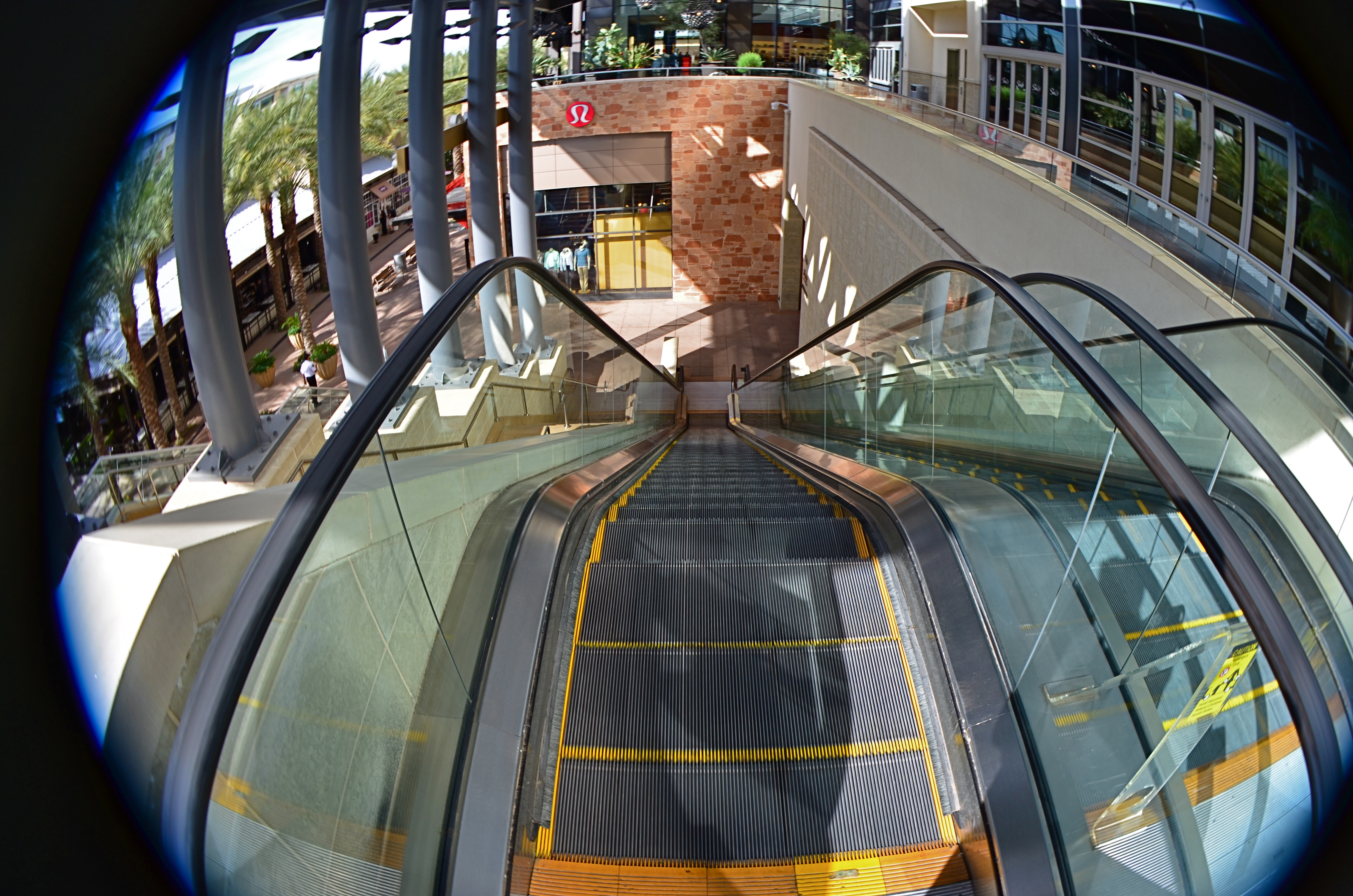
This mall escalator is nowhere near as high as a 13mm fisheye lens makes it appear.
Extreme wides, including fisheyes, can widen to 8 or 9mm, making the bending of lines so severe that the image elements seem to form a circle, with all lines arching sharply toward the center. And depending on what your image’s particular “reality” is to be, the distances of objects from front to back within the frame are also intensely exaggerated. Things which, in a “prime” lens image, appear just ten feet apart, can, in a fisheye shot, seem half a football field from each other. TV and film shooters exploit this big-time. If you’re shooting within a cramped interior and need to balloon its scope to suggest a larger scale, an ultra-wide really opens the place up. Medium-sized studios used in political debates now appear cavernous: ordinary city buildings shot wide for a crime drama take on intimidating height and depth, appearing to occupy entire blocks.
In the above image, if I want to make the viewer a little dizzy and daunted at the top of this rather modest escalator, I must use an ultra-wide to cheat, to trick the eye into concluding that it’s actually standing at the top of a sky-high ski jump. The tricky thing about ultra-wides, however, is that they mutate everything in the frame. And if part of that “everything” includes humans, your subjects can be taffy-twisted into some very alarming dimensions. Anything wider than about 24mm is downright uglifying for portraiture, unless a stylized effect is part of your interpretation. Lenses are not mere recording equipment. Their limits, biases, and faults can be exploited based on whatever kind of world you’re trying to conjure.
A TRIAL SEPARATION
Yeah, well, you see, the thing is, uh, what was the question?
By MICHAEL PERKINS
A PERSON’S RELATIONSHIP WITH PHOTOGRAPHY, MEASURED OVER A LIFETIME, can come to resemble a marriage, with all the occasional rifts, rumbles and repellents of living with anyone (or anything) nonstop ’til death. Just as any good golfer has thrown the odd club into the 7th hole lake, any shooter worth his emulsions/pixels will, at least once, consider pitching his gear into the nearest abyss, then setting a cheery bonfire of his accumulated work alight in the home driveway (after securing all necessary permits, of course). I dare you to deny it. We hate intensely because we have loved intensely, and fallen intensely short.
The fury eventually abates, however, and we resume the “on” portion of the on again/off again love of photography, not knowing when it next will toggle to “off”, or if switching back to “on” even has any prospect of success. The fact is, creative passion can generate emotional surges, microbursts of feeling so intense they could pop the top off a seismograph. This means answering “the questions” as they ring inside your skull:
Why did I ever start doing this?
What made me thing I’d ever be any good at it?
And where is that damned lens?????
In the interest of my own sanity, I never contemplate a total divorce from photography, but I avidly support the need for a trial separation from time to time. Every relief valve has to be opened and flushed out occasionally, and when the ideas, or the patience to execute them, seem to have gone south for the winter, you have to furlough the workers and shut down the plant. For a while. Hammering away at a problem with an image may eventually loosen what’s stuck, but it’s just as valuable to know when to lay down your tools and quit the scene. For a while. Once your brain is running on high-octane rage, all things beautiful and visionary will just be drowned out by all the screaming, so, really, I’m not kidding: accept the fact that occasionally you’ll announce to all your friends and family that you’re “over the whole photography thing”. And you will absolutely mean it.
For a while.
Here’s another thought: fake-quitting photography will provide the most severe test of how much you were into it in the first place. A trial separation is just that: a test to see if there was anything worth saving in the relationship. Scary process, but, if you come back, whether to a partner or a Nikon, you come back renewed and freshly committed to Make This Thing Work. All of a sudden, you’re bringing your Canon chocolates and roses, and arranging for a romantic candlelight dinner. And the work grows again.
For a while.
LATE-BURNING CANDLES
Night Bloom, 2016. 8 sec., f/8, ISO 100, 35mm.
By MICHAEL PERKINS
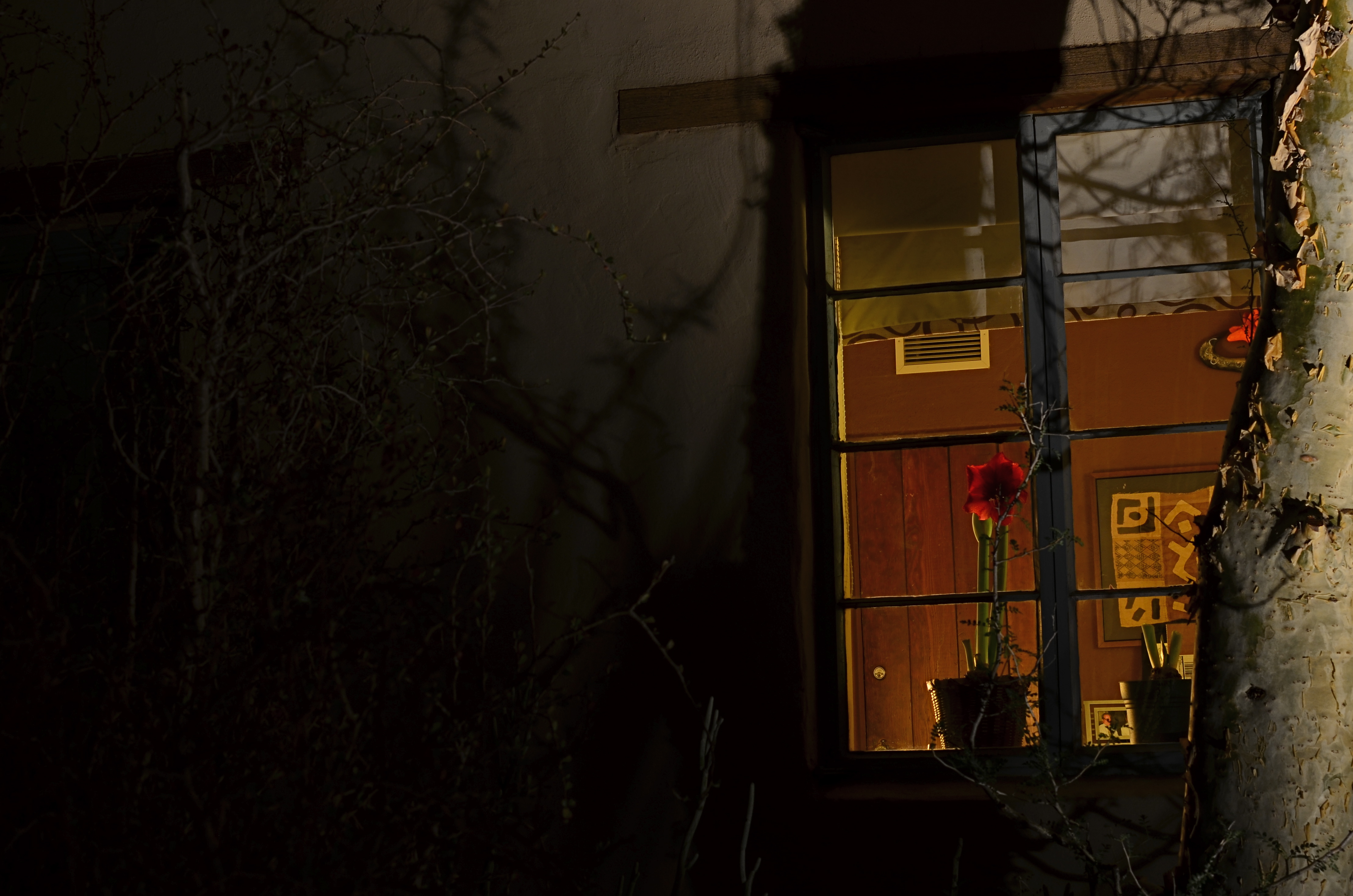
DAYTIME PHOTOGRAPHS OF BUILDING EXTERIORS present the interior contents of apartments, stores and offices in a very muted fashion. Glare, sunlight, and plain old dirty glass, along with the limited scope of some camera sensors, render inside space in a somewhat flattened manner. Fortunately, night shots of the same spaces reveal something completely different, hints of the lives of the people who have locked up and headed home for the evening.
Like a picture framed in a black matte or displayed on a bed of velvet, night images of building interiors, taken from outside those buildings, benefit from that contrasty “punching up” between dark and light. More to the point is how people decide to stage their work space when they clock out. Do they leave a single lamp on to illuminate their desk? Is the room largely dark, but partially painted with ambient light from the cleaning person down the hall? Are certain displays, logos, personal effects altered by the overall reduction in illumination? And, for the photographer, does something different emerge in the feel of the room that seems invisible by day?
I recently walked around a large museum campus, taking medium-distance time exposures of several buildings whose exterior lighting scheme seemed altered at night, when I saw the office window you see above. The overall scheme of light in the room was warm. The gorgeous amaryllis plant arching over someone’s desk not only worked that slightly orange room light, but was made especially seductive with the deepening of its own colors. Here was a workspace where someone drew rest, beauty, and solace from the inclusion of just one extra humanizing item. And, after dark, it glowed like a coal to passersby. I had to have it, at least inside my camera.
I’m not saying that all peeks through all windows yield treasures to the photographer’s eye. But the sheer volume of visual information on a city street during the day is cut by half after sundown, and occasionally, you find a late-burning candle that has spent the daylight hours hiding in plain sight.
A NEW PATH
A dream of life comes to me. Come on up for the rising tonight—-Bruce Springsteen
By MICHAEL PERKINS
THE POST 9/11 RESURRECTION OF LOWER MANHATTAN might have begun as a kind of act of defiance, a refusal to knuckle under to fear in the aftermath of the largest attack in history on American soil. Somewhere amidst the tears and rage, however, the project to re-establish this crucial corner of New York City moved onto a higher plane, transitioning from anger to elegance, mourning to…morning. And now, for both casual travelers and astounded visitors, the master plan for the area is an ever-blooming monument to faith. To excellence.
Photographers from around the world have known, from the days of the first cleanups, that an amazing opportunity for historic documentation was unfolding on this hallowed ground, and their images have provided an invaluable service in tracking the city’s transition between two distinct eras. The first two mile-markers in this transformation, the openings of World Trade Center One and the 9/11 Memorial Museum, have been interpreted in a global cascade of visual impressions, occurring, as they have, in the first explosion of social media and digital imaging. And now, the third piece of the puzzle, the stunning new Oculus PATH terminal, is nearly ready to serve as the proof that the city, along with all its millions of comings and goings, is still very much open for business.
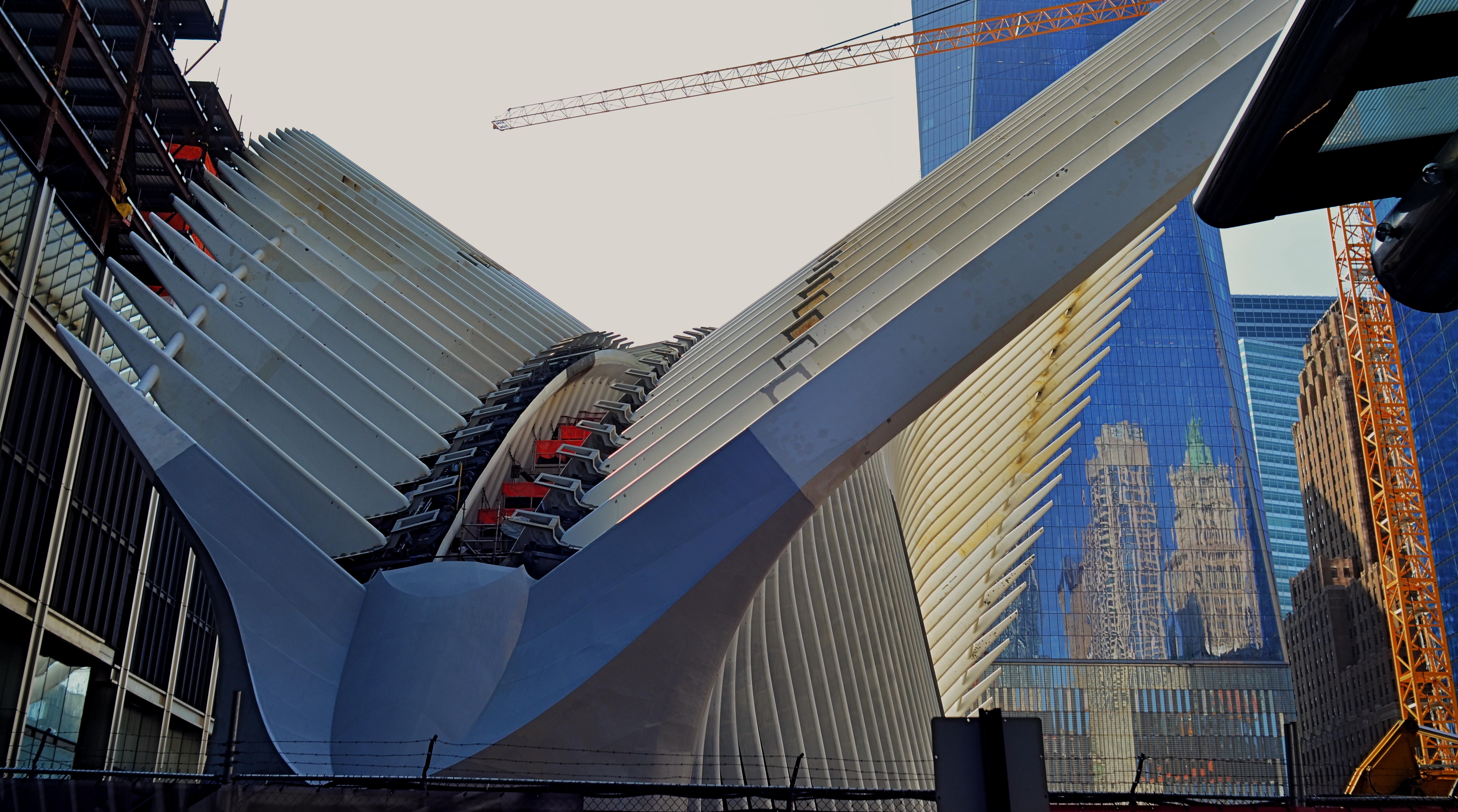
Oculus Aloft: the steel wings of the new PATH terminal for New York’s World Trade Center, nearing completion in 2015.
Photographers have already made a visit to Oculus something of a pilgrimage, and, looking over the first few photos to emerge from their visits, it might be closer, architecturally, to a religious experience. Designed by Santiago Calatrava, the structure, presenting its ribbed wings to the skies like an abstract bird of prey, resembles, within, a kind of sci-fi cathedral of kaleidoscopic light effects, serving as both monument and utility. An inventory of its features and a gallery of interior images can be seen here.
And, of course, this is New York, so opinion on the Oculus’ value, from poetic prayers to crass carping, will go through the usual grappling match. But, whatever one’s eventual take on the project, its power as a statement….of survival, of power, of hope, and, yes, of defiance, cannot be denied. To date, I’ve only been able to photograph limited parts of the construction phase (see above), but I will be back after the baby’s born. And my dreams will collide with Oculus’ own, and something magical will happen inside a box.
Make your way to Manhattan, and let your own camera weigh in on the new arrival.
Come On Up For The Rising.
PICTURES WITH A LEG (OR LEGS) TO STAND ON
By MICHAEL PERKINS
YOU HAVE SEEN THEM A MILLION TIMES. Those brave souls who, despite multiple trips to Failed Fotoland, optimistically point their cel cameras at distant and dark objects, hoping their puny on-board flashes will illuminate cavernous concert halls, banish shadows from vast cathedrals, or, God bless them, turn the night sky into a luminous planetarium. They have faith, these people. But they don’t often take home the prize.
Immense, dark masses of subject matter, from mountain sides to moody urban streets, simply cannot be uniformly exposed with a sudden lucky burst of on-camera flash. The only way to gather enough light to get a usable exposure of such things is to leave your shutter open long enough to let more light soak in. Think dribble instead of flood. Time exposures are remarkably effective in “burning in” an image slowly, but they have their own science and technique, and they must be patiently practiced. They are the dead opposite of a quick fix, but they are worth the trouble.
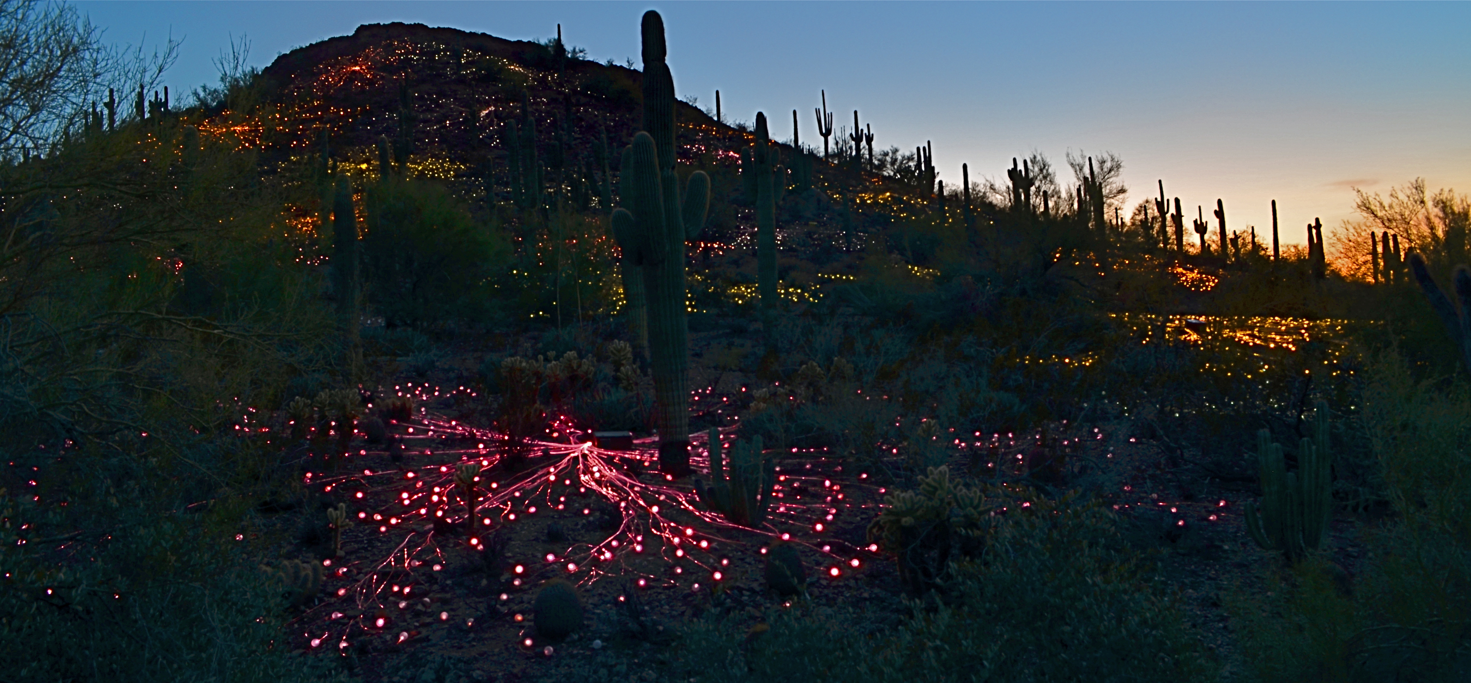
Ember Mountain, 2016. Two separate time exposures nearly a half-hour apart, blended in Photomatix’ “Exposure Fusion” mode.
With today’s editing software, it’s easier than ever to customize even your best time exposures, combining several shots taken over a given time sequence to arrive at a satisfying balance of elements. In the above picture, I wanted to show the colorful “Field Of Light” installation created by artist Bruce Munro for Phoenix’ Desert Botanical Garden, which blankets a desert hillside with over 30,000 globes of color-shifting light. I set up my tripod about a half-hour before local sunset and took exposures five minutes apart until about forty minutes into the onset of evening.
From that broad sequence, I selected two frames; one taken before dark, in which the underlying detail of the hill (desert plants, rocks, etc.) could still be seen, and one taken just after the sky had gone dark to the naked eye, but blue to the camera. I then composited the shots in Photomatix’ “exposure fusion” mode, which is a bit like stacking two backlit slides and gradually changing how much of each can bleed into the other. My object was to get both a blue, but not black, twilight sky and at least some detail from the natural terrain. Neither individual shot could achieve all of this alone, however, given the ease of doing an exposure fusion in nearly any kind of photo software these days, it was a snap to grab the best elements of both frames.
Epilogue: during the fairly long stretch of time I was standing behind my tripod, I counted over two dozen separate visitors who boldly stepped up, aimed their cellphones, cranked off a quick flash, and loped away, muttering something like, “well, that didn’t work.” Some shots are like low-lying fruit, and some have to be coaxed out of the camera. Knowing which is which, ahead of time, makes for happier results.
TONAL RECALL

Desert still-life, take one. High contrast, simple color scheme.
By MICHAEL PERKINS
IF YOU WANT TO GET ALL MYSTICAL AND OOKY-SPOOKY ABOUT PHOTOGRAPHY, you can almost talk yourself into the idea that pictures kind of force their way past you on the way to their eventual best form. And, yes, I can hear your eyes rolling back in your head at the notion that an image is somehow destined to be created, that it emerges from your process almost despite you, like a rock that is pushed up through the earth by shifting tectonic plates. However, I have taken a handful of such pictures over a lifetime, as, no doubt, have you yourself, pictures that seemed to keep coming forth even beyond your first false steps until they reached their fullest expression.
Gee, is that incense I smell? Ommmmmm….
What I’m fumbling for here is a shared experience, and I do think that every photographer has had a semi-magical instance in which a photo almost taunts you to figure out how to make it work. Even in the best shots, there are moments of aching regret, maybe years down the path, that, had one or more things gone differently in the picture, it might have been eloquent or consequential. I truly believe that this very “so near, yet so far” quality is what keeps us in the hunt. After all, for the hunter, it’s the tiger he hasn’t been able to bag that calls louder than the ones already mounted over the mantel. So with photos. We are always singing the blues about the one that got away.

A monochrome re-mix from months after the original was snapped.
That’s why I’m a big believer in thinking of images as never really finished. They are, at best, preliminary studies for something else, picture that we still need to grow in order to complete. We lay them down, dissect them, re-shoot, re-imagine, and re-edit them. If you bend your thinking around, you can become comfortable with the fact that everything is a dress rehearsal for something that hasn’t arrived yet.
One of the starkest demonstrations of this fact is shots that were originally conceived as color images but which were later re-thought in monochrome. Nothing accentuates or streamlines your choices like shaving your tonal palette to the bare minimum. And, in the same vein, nothing makes you surer (or more unsure) about an image than reducing it to its simplest terms.
I think that, even as we are constantly expanding our arsenal of visual techniques, seeing them as growing, living things, so too we must think of our images as points on an evolutionary line, rather than final product.
ALONE IN A CROWD
Everyone knows a “don’t take my picture” person. You might, in fact, be married to one.
By MICHAEL PERKINS
THE CHOICE OF TIME, PLACE AND APPROACH IN THE MAKING OF A PORTRAIT is as individual as the human face itself. No two photographers have quite the same process for trying to capture the essence of personality with a camera. Moreover, having chosen a preferred path to making these most personal of images, we often are tempted to stray off of it. As with anything else in the art of creating photos, nothing, from formal studio settings to street candids, works all the time.
Just as one example, the key to portraits, for me, is to always be as fully mindful, in the moment, of the changes that a face can display within the space of a few seconds. You seem to be presented, from start to finish, with a different person altogether…..some other person that showed up, uninvited, to the shoot you’re doing for..someone else. Thus, it’s never a surprise to me when a subject views his/her image from a session, and immediately remarks, “that doesn’t even look like me”, which is, for them, quite correct. It’s as if their face showed something, just for a second, that they don’t recognize as their “official” face. And the photographer sees all these strangers blur by, like the shuffle of a deck of cards.
In photographing my wife Marian, I battle against her native resistance to having her face recorded, well, at all. It’s a rather invasive procedure for her, and, since the finest qualities of her face are revealed when she’s least self-conscious. That rules out studio settings, since all her “danger, Will Robinson” triggers will go off simultaneously the more formalized the situation becomes. I have to use that momentary mindfulness to sense when her face is ready….that is, when she is least aware of having her picture taken. That may mean that many other people are around her, since interaction is relaxing and distracting for her. In the above image, I got particularly lucky, since several factors converged in a moment that I could not have anticipated.
Listening to a history guide on the streets of Boston, Marian’s face set into a wonderful mix of serenity, focus, studiousness. Her finest qualities seem all to have coalesced in a single moment. Even better, although she is in a crowd, the arrangement of people surrounding her kept all other faces either out of focal register or partially hidden, rendering them less readable as full people. That gave the composition a center, as hers was the only complete face in view. Click and done.
Portraits are certainly about anticipation and preparation. But they also have to be about the reactivity of the photographer. And with something as mutative, and mysterious, as the human face, flexibility is a far more valuable tool than any lens or light in your kit bag.
IT’S ALL WRONG BUT IT’S ALL RIGHT
I decided in the moment to go soft with this nature scene. Maybe I overdid it. Maybe it’s okay. Or not.
By MICHAEL PERKINS
ONE OF THE ONLY CONSTANTS OVER THE HISTORY OF PHOTOGRAPHY has been the flood tide of tutorial materials covering every aspect of exposure, composition, and light. The development of the early science of capturing images in the 19th century was accompanied, from the first, by a staggering load of “how to” literature, as the practice moved quickly from the tinkering of rich hobbyists to one of the most democratic of all the art forms. In little more than a generation, photography went from a wizard’s trick to a series of simple steps that nearly anyone could be taught.
In calling these pages the “photoshooter’s journey from taking to making”, we have made, with The Normal Eye, a deliberate choice not to add to the mountainous load of technical instruction that continues to be available in a variety of classroom settings, but to emphasize why we make photographs. This is not to say that we don’t refer to the so-called “rules” that govern the basics of creating an image, but that we believe the motives, the visions behind our attempts are even more important than just checking items off a list of techniques in the name of doing something “right”. There are many technically adept pictures which fail to engage on an emotional or aesthetic level, so the mission of The Normal Eye, then, is to start discussions on the “other stuff”, those indefinable things that make a picture “work” for our hearts and minds.
The idea of what a “good picture” is, has, over time, drifted far and wide, from photographs that mimic reality, to those that distort and fracture it, to images that are both a comment and a comment on a comment. It’s like any other long-term relationship: complicated. Like everyone else, I occasionally produce what I call a “fence-sitter” photo like the one above, which I can both excuse and condemn at the same time.
In raw technical terms, I have obviously violated a key rule with the abject softness of the image…..unless……unless it can be said to work within the context of the other things I was seeking in this subject. I was trying to stretch the envelope on how soft I could make the mix of dark foliage and hazy water in the scene, and, while I may have gone a bit too far, I still like some of what that near-blur contributes to the saturated color and lower exposure, the overall quiet tone I was trying for. Still, as of this moment, I’m still not sure whether this one is a hit or a miss. It might be on the way to something, but I just can’t say.
But that’s what the journey is about. It can’t be confined to mere technical criteria. You have to make the picture speak in your own language.
THE EVENTUALITY OF ABOUT
“Something’s going to happen. Something….wonderful!” —Astronaut David Bowman, “2010: The Year We Make Contact”
By MICHAEL PERKINS
PHOTOGRAPHY’S FIRST FUNCTION WAS AS A RECORDING MEDIUM, as a way to arrest time in its flight, to freeze select seconds of it. As evidence. As reference points. We were here. This happened. Soon, however, the natural expansion that art demands generated images of the things that happened before our direct experience. Ruins. Monuments. Cathedrals. Finally, the photograph began to speculate forwards. To anticipate, even guess, about what might be about to happen. That is the photography of the potential, the imminent. It’s rather ghostly. Indefinite. And all in the eyes of the creator and the beholder.
Is something about to happen? Does this place, this kind of light, truly portend something? Can a picture said to be ripe with the possibility of emerging events? I think they can, but these bits of pre-history are harder to sense than those we capture in the mere recording or retrieval functions of photography. In this case, we are not just witnesses or detectives, but seers. Of course, we may be wrong. Something may not happen as we seem to see it at present. History may not be made here. Perhaps no one will ever say or do anything extraordinary on this spot. The image of the possibility, then, becomes a kind of creative fiction, a pictorial what-if. And that places photos in the same arena as sci-fi, mysticism, poetry. If other arts can paint worlds that might be, why can’t a picture?

The Boardroom, 2016.
I don’t know why the meeting room shown here, which was being prepared for a conference later in the day, struck me. It might have been the somber color scheme, or the subdued light. It may have been the grand emptiness of it all; a room designed to be packed with people, sitting there, waiting for them to animate it. I just know that it was enough to slow my trek through a resort hotel long enough to try to show that potential. For what? A moment of high corporate drama? The end of someone’s career, the launch pad for a bold new idea? The meeting that might redraw the map of human destiny? Or nothing?
Ah, but what actually happens after the photo is taken is mere reality, and never to be matched or compared with the strong sense of eventuality that can linger in an atmosphere before something occurs. These kind of images are not, after all, witnesses to anything, but visions of the possible. And that is the essence of photography, where even a medium invented to record reality can ofttimes transcend it.
TINY TOWNS AND BIG DREAMS
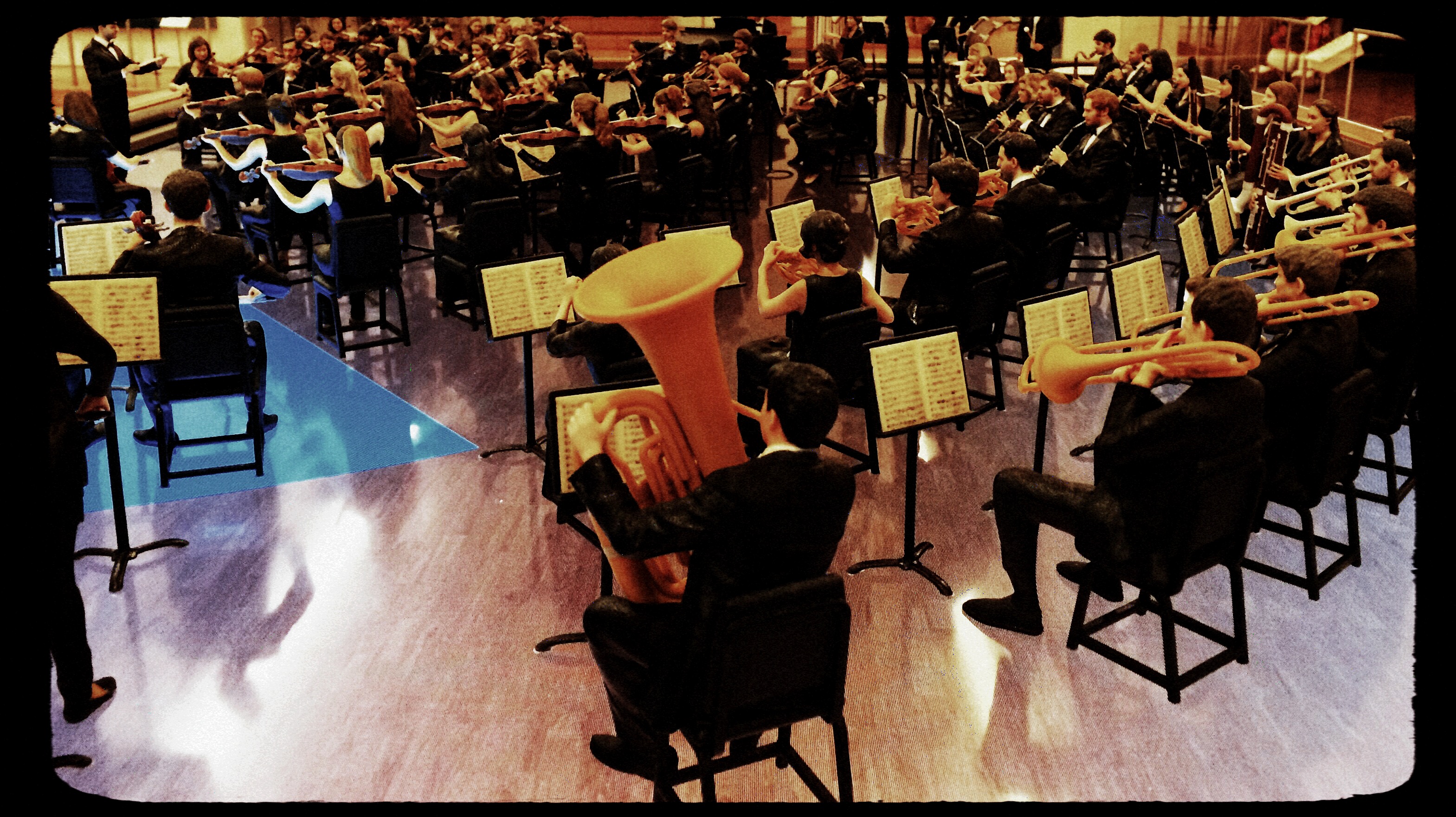
Eclectic Light Orchestra: Shooting the Musical Instrument Museum’s amazing orchestral diorama to scale.
By MICHAEL PERKINS
THE ART OF MESSING ABOUT WITH THE MIND’S CONCEPT OF SIZE, making the small look large, has been part of photography since the beginning, whether it’s been crafting the starship Enterprise at 1/25 scale for primitive special effects or making Lilliputian mockups of Roman warships for a sea battle in Ben-Hur. Making miniatures a convincing stand-in for full-size has been a constant source for amazing images.
Oddly, there has also been a growing fascination, in recent years, with using new processes to make full-sized reality appear toy-like, as if Grand Central Station were just a saltine box full of HO-scale boxcars. Seems no one thinks things are as they should be.
This turnabout trend fascinates me, as people use tilt-shift and selective-focus lenses, along with other optics, to selectively blur and over-saturate real objects taken at medium or long distances to specifically create the illusion that you’re viewing a tabletop model. Entire optical product lines, such as the Lensbaby family of effects lenses, have been built around this idea, as have endless phone apps and Photoshop variants. We like the big to look small just as much as we like the teeny to look mighty. Go figure.
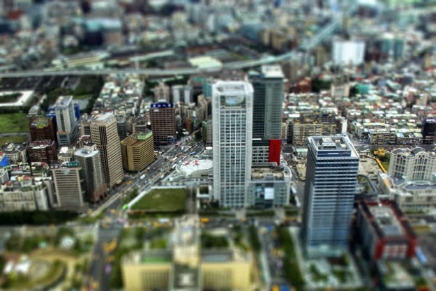
Lefz Lim brings it on down to Tiny Town, converting a real city scene to a mock miniature.
And who can resist playing on both sides of the street?
The image at the top is the usual fun fakery, with my tiny-is-full-size take on the marvelous diorama made for the Musical Instrument Museum (the crown jewel of Phoenix, Arizona), which reproduces a complete symphony orchestra in miniature. This amazing illusion was created using a spectacular photo system that creates a 360-degree scan of each full-sized player, maps every item of his features, costume, and instrument, then converts that scan to a 3-d printed, doll-sized version of every member of the symphony. To read about this awesome process, go here.
As for making regular reality look like Tiny Towns, we offer the image at the left, taken by photographer Jefz Lim as part of his online tutorial on the creation of the “model” effect. We are in the age of ultimate irony when we deliberately try to palm off the real as the fake. The “how” of this kind of image-making is basic focus-pocus. The “why” is a little harder to put your finger on.
Size does matter. Ah, but what size matters the most…..that’s your call.
MANY FACES, ONE FAMILY
By MICHAEL PERKINS
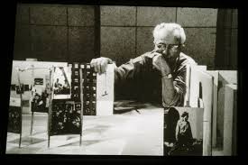
Edward Steichen looks over a scale model of the 1955 Family Of Man show, the most famous photographic exhibit of all time.
I FEEL THAT THERE SHOULD ALWAYS HAVE BEEN A NOBEL PRIZE FOR PHOTOGRAPHY, just as there always has been for literature. Why one of the lively arts should be deemed more capable of uplift or inspiration than another is beyond me. I even think that a photo Nobel might be more inspiring, overall, than the majority of images that cop the journalistic Pulitzer prize each year, since so many of the winning entries focus on horror, loss, war, and suffering….you know, the stuff that sells newspapers.
If there ever had been a Nobel for photography, I can think of no more obvious winner than the legendary Family Of Man exhibit, mounted by Edward Steichen, which just observed its sixtieth anniversary with a marvelously updated edition of its original catalogue book. Steichen, who in 1955 was the director of photography for the Museum of Modern Art, was himself a grand master of still-lifes, portraits, fashion, architectural, and even floral studies, whose own output towered over the world for over seven decades. However, he used the Family show not to showcase his own work but to show the universality of the human experience across every culture on the planet, as interpreted by over 273 photographers in 69 countries. Mounted in cooperation with the United States Information Agency as a diplomatic tool, The Family Of Man celebrates those things that unite us, not the petty divisions amplified by journalists and other mischief makers. It is an inventory of births, deaths, weddings, rituals, weddings, wars, discoveries, and delights. It is a miraculous catalogue on the phenomenon of being human.
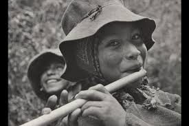
The Peruvian flute player whose portrait became the official visual logo of the Family Of Man project.
Over the years, the optimistic message of Family Of Man fell victim to the ironic detachment and busted ideals of several generations of hipper-than-thou cynics, some criticizing it as a Pollyanna-ish vision of mankind, others saying that it rendered many individual photographers faceless by jumbling all their work together. In fact, all photos in the exhibit are captioned with their creator’s name as well as his/her nation of origin. And as for hope being the antithesis of honest art…well, if you hold that belief, you’re wasting your time here.
Over sixty years later, The Family Of Man remains one of the towering achievements of art and journalist photography, reassembled now in its original presentation format at Clervaux Castle in Steichen’s home country of Luxembourg. Art must be about raising us up, even as we use it to remain mindful of how far we have to come as a race. But I will always, always vote on the side of hope, as Edward Steichen did. The Family Of Man is neither sugar-coated nor bleak. It is both imperfect and filled with potential, as we ourselves are. And its credo, as stated in 1955, remains a lesson for anyone trying to use a camera to chronicle the human condition:
“There is only one man in the world and his name is All Men.There is only one women in the world and her name is All Women.There is only one child in the world and the child’s name is All Children.”
A CUT BY ANY OTHER NAME….
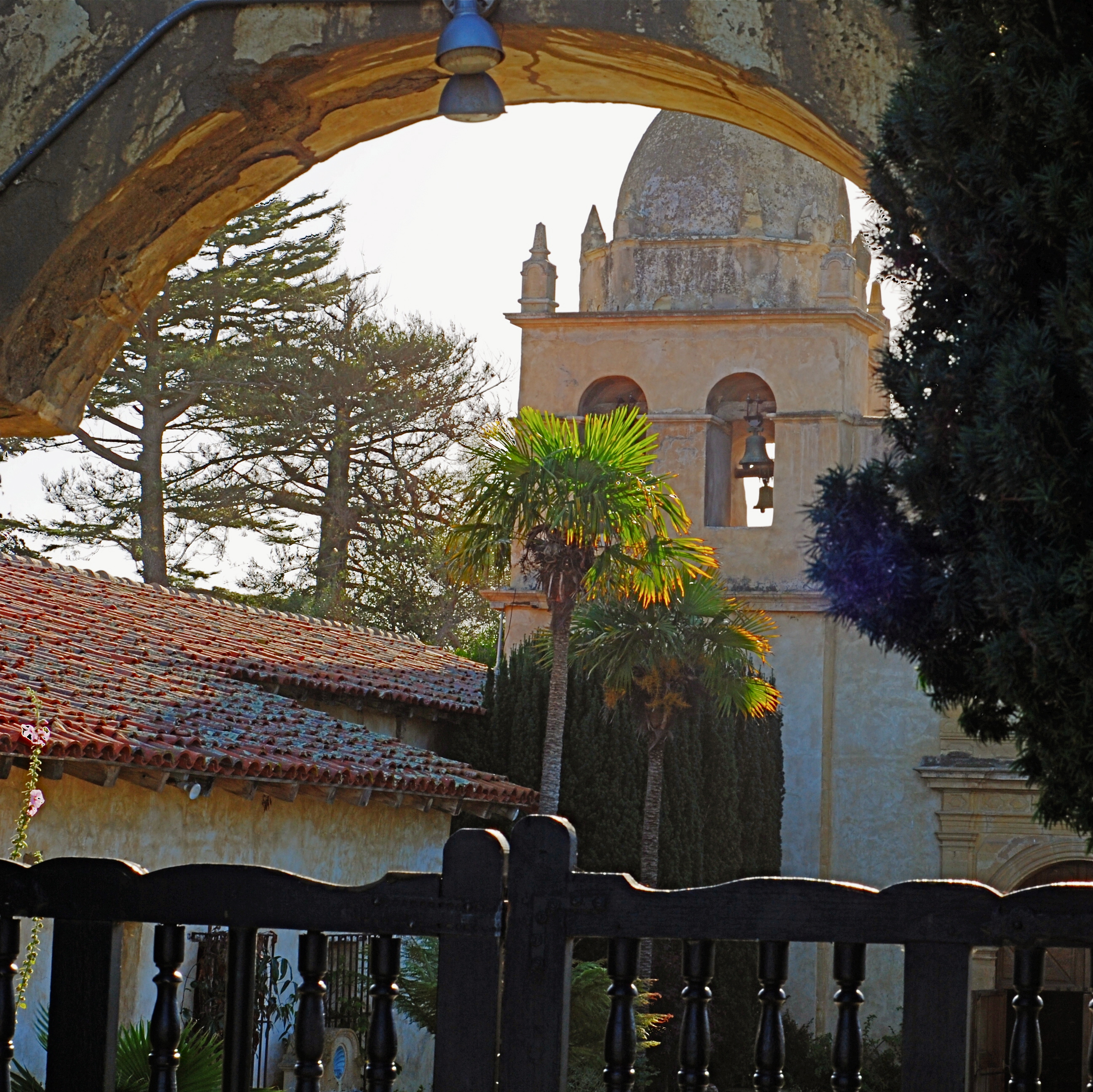
The first framing of this image included too much greenery on the right side, so it was cropped, then repositioned to make a “second” framing from the arched opening in the outer wall.
By MICHAEL PERKINS
THE WONDERFUL THING ABOUT COMPOSITION IN PHOTOGRAPHY is that you always, always, have a backup plan. What you don’t frame correctly in the actual shooting of an image can be corrected in post-editing cropping, the use of “framing” within the composition itself, or even how you finally matte the picture before hanging it on the wall. This is as it should be since many pictures are not so much born as re-imagined.
Once you frame a photo, you’re giving the viewer the first visual cue as to what to regard as important. If I included it, you should notice it. If I excluded it, it’s either to set loose your imagination on why I defined this world within these parameters, or because I, as the narrator, am telling you it just don’t matter. You can even further enhance the effectiveness of the frame by its shape. A rectangle might enforce the reading of information left-to-right, for example, while a square might force the eye toward dead center. The original framing is your own best call to action in a photograph.
And even after you’ve defined the frame, you can still add a second directive within it to hyper-focus attention in a very specific space. The use of arches, building overhangs, edges of windows, cliffs, shadows or other secondary “frames” provides even greater cues to the eye, and also adds an illusion of dimension and depth.
In the above shot, the old stone basilica is obviously the main feature of the image, and so was cropped from a wider original to eliminate distracting foreground shrubbery on the right. However, the arch through which the building is viewed was retained, to act as a “secondary frame” and as a way to illustrate scale. The first frame says what information is important, while the second frame makes sure we get to the heart of the image more efficiently.
Using all framing devices available in an image is like using caps, lower case and italicised letters in the same sentence. Composition is about yelling to get people over to your picture, then whispering, as you gently guide them toward its heart.
