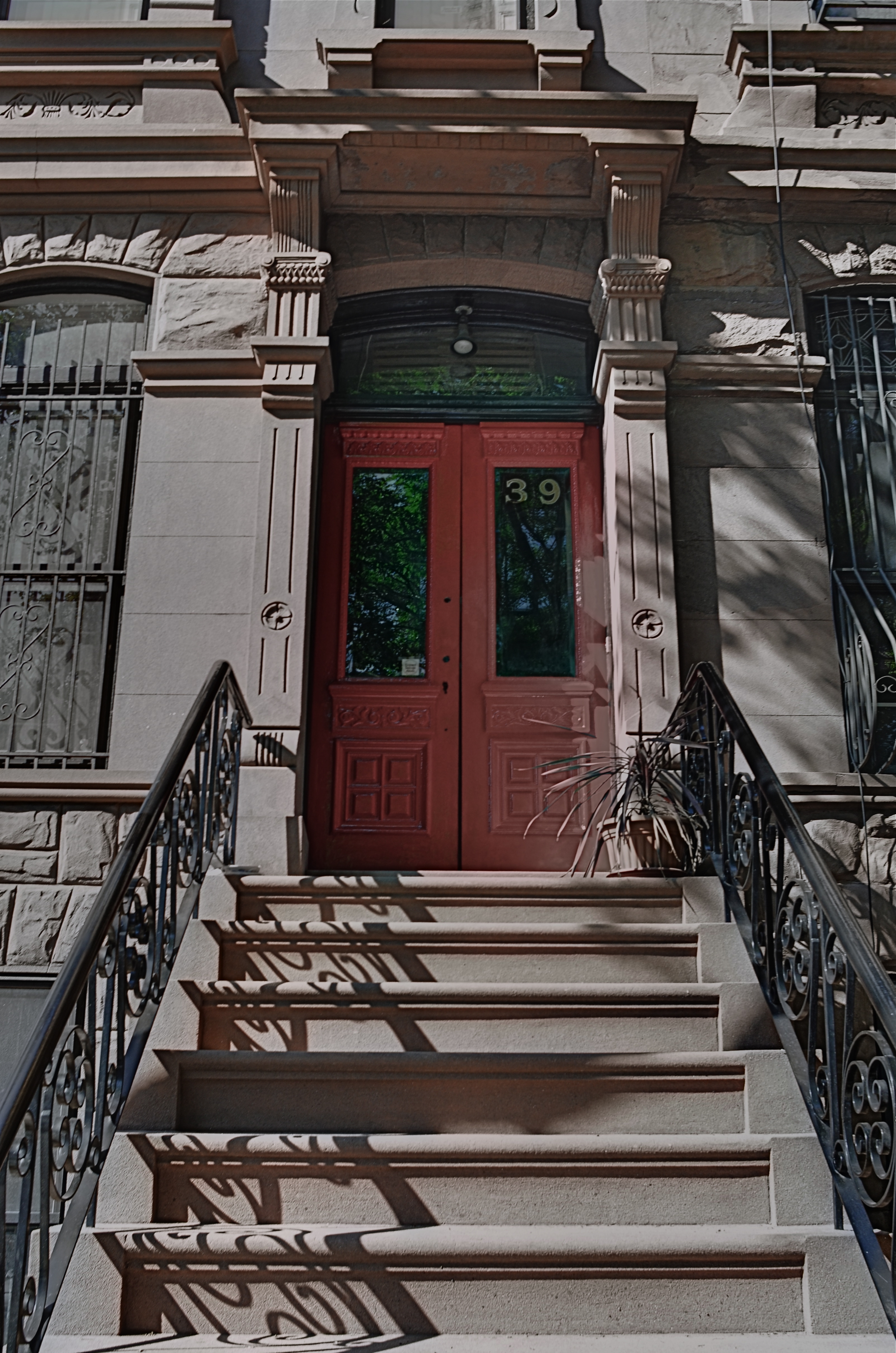
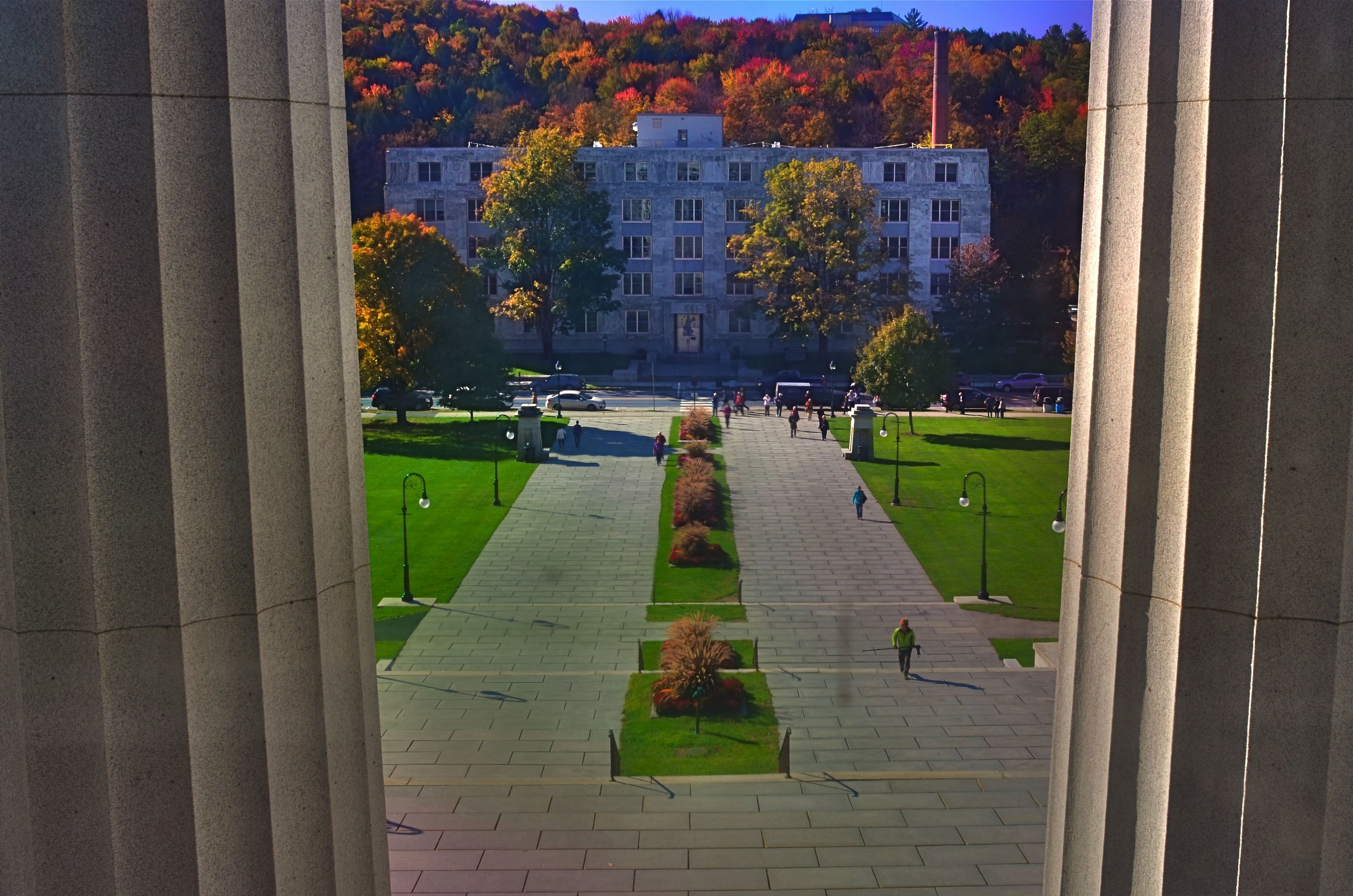
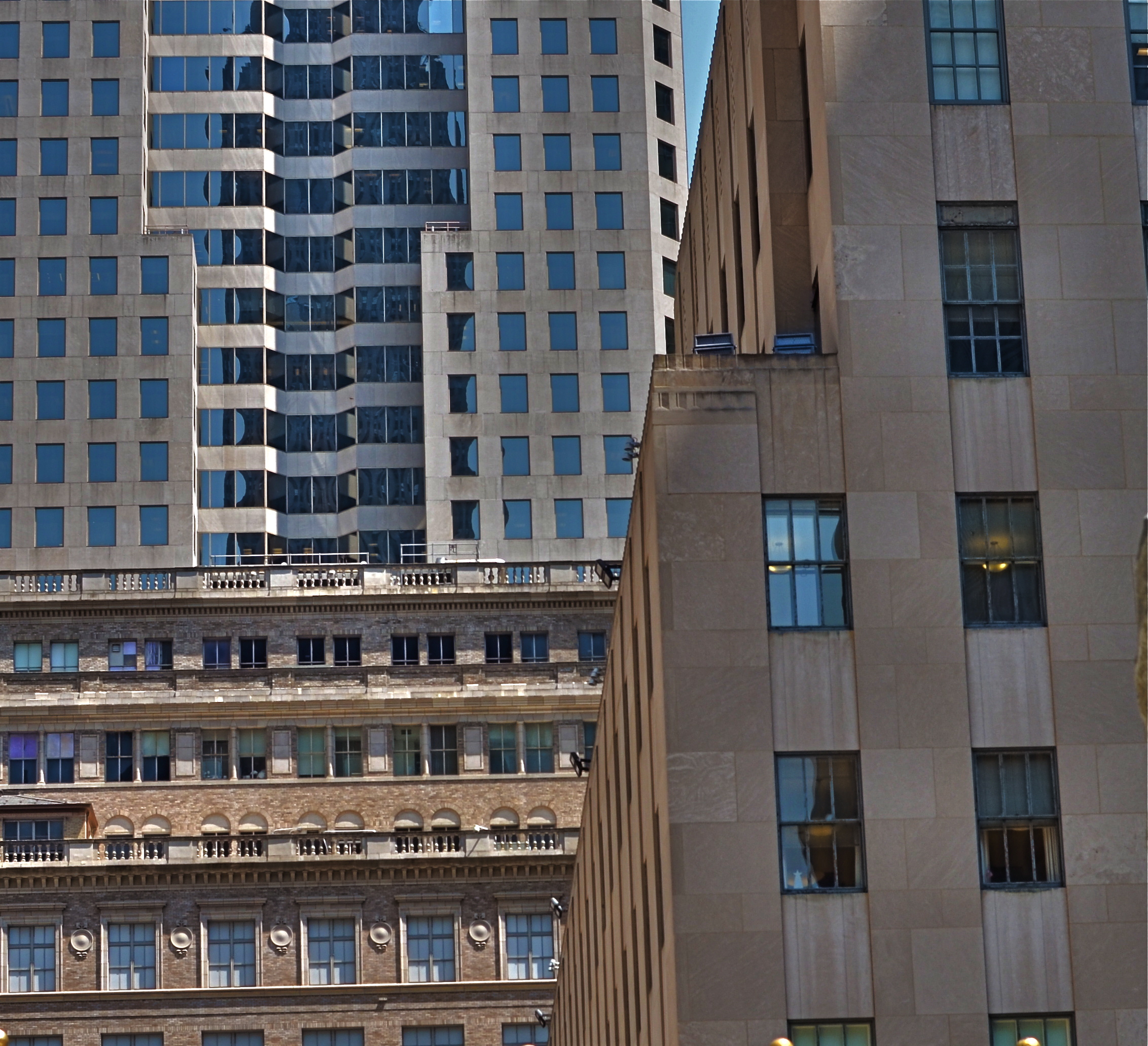
A CUT BY ANY OTHER NAME….
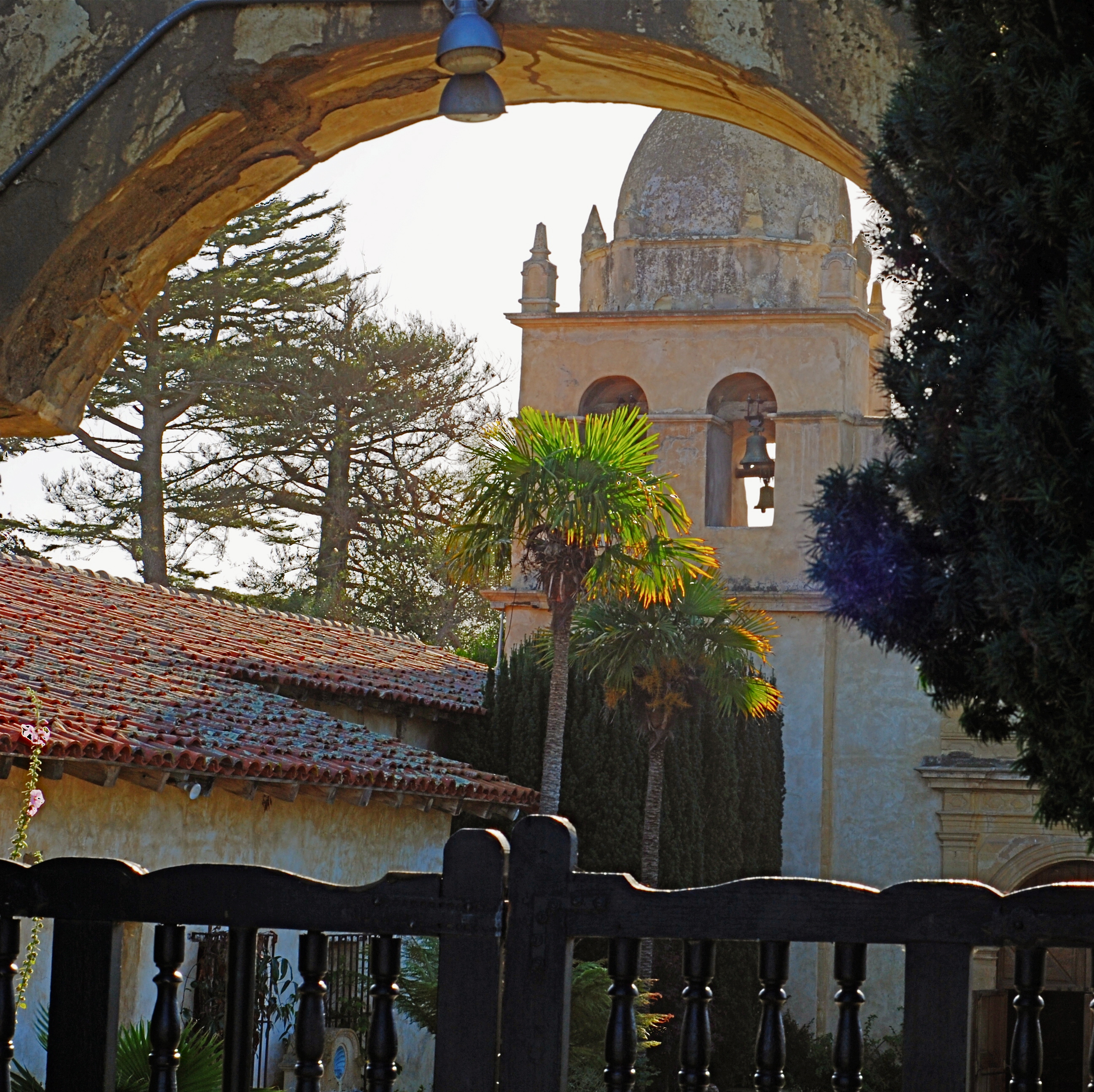
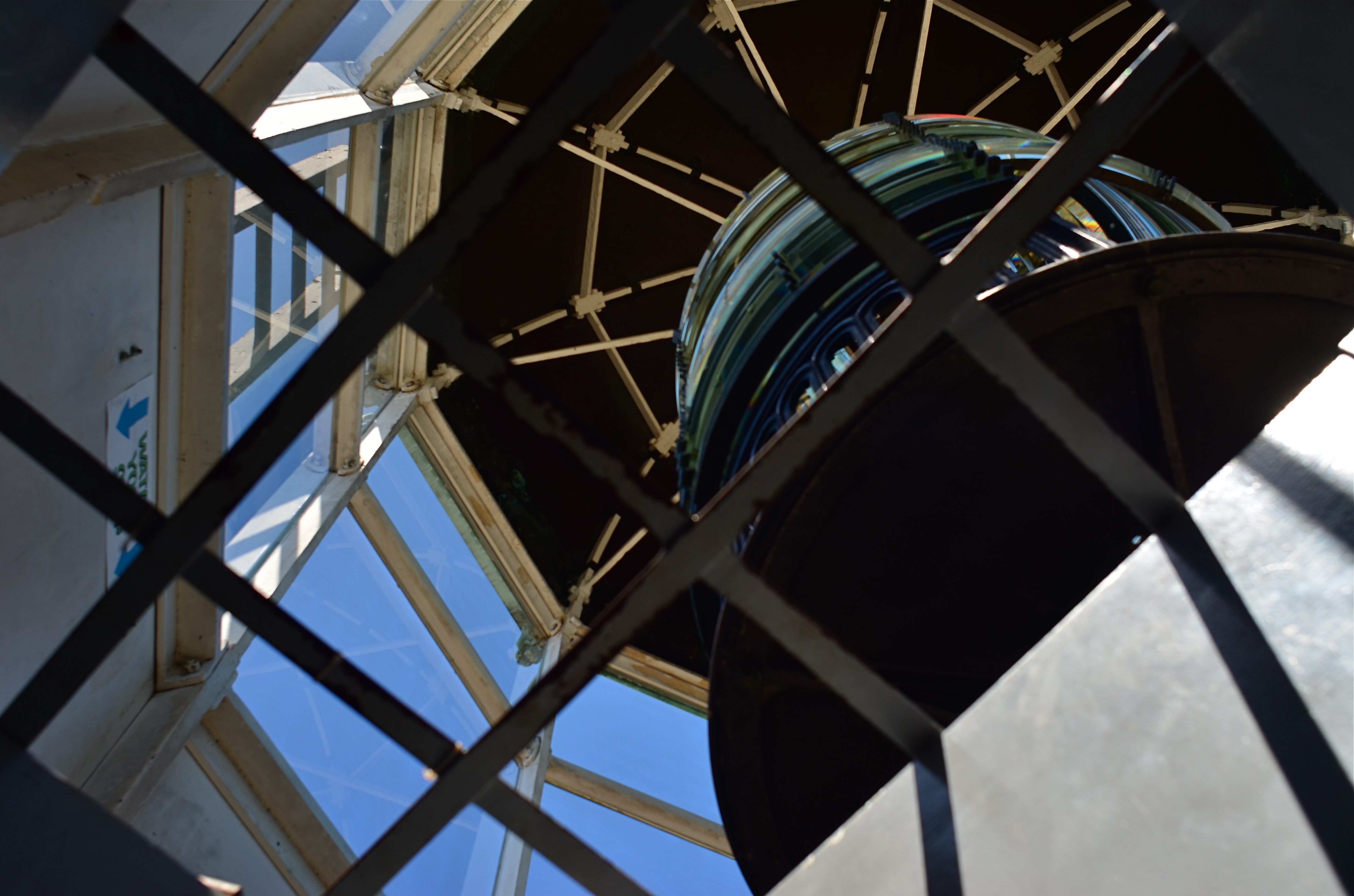
The first framing of this image included too much greenery on the right side, so it was cropped, then repositioned to make a “second” framing from the arched opening in the outer wall.
By MICHAEL PERKINS
THE WONDERFUL THING ABOUT COMPOSITION IN PHOTOGRAPHY is that you always, always, have a backup plan. What you don’t frame correctly in the actual shooting of an image can be corrected in post-editing cropping, the use of “framing” within the composition itself, or even how you finally matte the picture before hanging it on the wall. This is as it should be since many pictures are not so much born as re-imagined.
Once you frame a photo, you’re giving the viewer the first visual cue as to what to regard as important. If I included it, you should notice it. If I excluded it, it’s either to set loose your imagination on why I defined this world within these parameters, or because I, as the narrator, am telling you it just don’t matter. You can even further enhance the effectiveness of the frame by its shape. A rectangle might enforce the reading of information left-to-right, for example, while a square might force the eye toward dead center. The original framing is your own best call to action in a photograph.
And even after you’ve defined the frame, you can still add a second directive within it to hyper-focus attention in a very specific space. The use of arches, building overhangs, edges of windows, cliffs, shadows or other secondary “frames” provides even greater cues to the eye, and also adds an illusion of dimension and depth.
In the above shot, the old stone basilica is obviously the main feature of the image, and so was cropped from a wider original to eliminate distracting foreground shrubbery on the right. However, the arch through which the building is viewed was retained, to act as a “secondary frame” and as a way to illustrate scale. The first frame says what information is important, while the second frame makes sure we get to the heart of the image more efficiently.
Using all framing devices available in an image is like using caps, lower case and italicised letters in the same sentence. Composition is about yelling to get people over to your picture, then whispering, as you gently guide them toward its heart.
ALONE AGAIN, UNNATURALLY

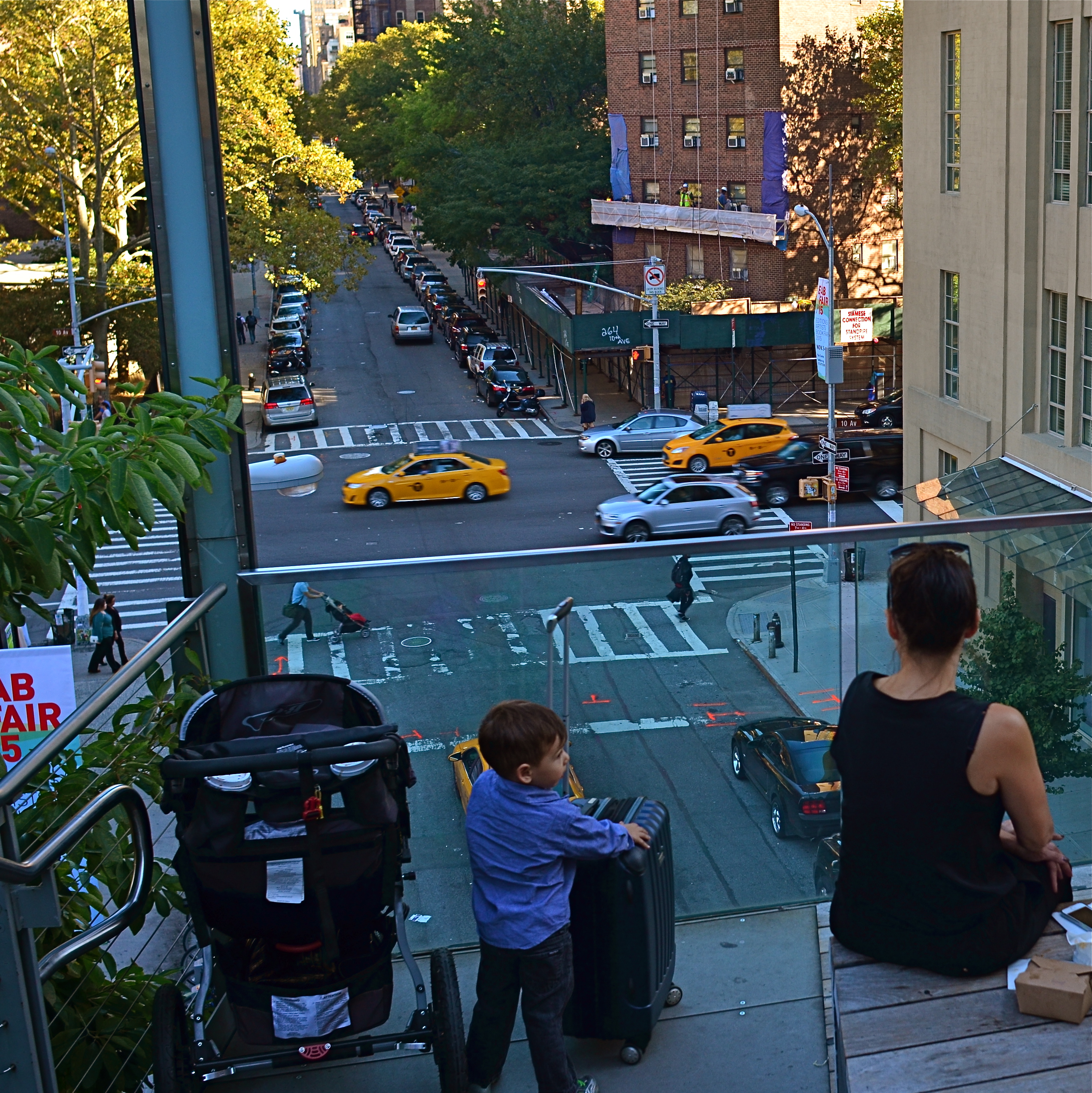
Lunch For One, 2011. Your choices as a photographer will determine if the woman in the cafeteria is alone…or lonely.
By MICHAEL PERKINS
PEOPLE ARE ONE OF THE MOST COMPLICATED ELEMENTS in a photographic composition. Unlike furniture, foliage or flotsam, humans are the one “prop” in an image which convey associations and meanings that render a photo complex, troubling, intriguing. Put a person in your picture and you have changed the terms upon which you engage the audience.
At the very least, you have posed a series of questions which color the viewer’s reaction to your work. What is that person doing there? What does he wish for, or intend? What are his dreams, his goals? Is she merely in the picture, or in some way a commentary on her context within it? You can move things around in the name of composition alone, but move a person and you have started a conversation.
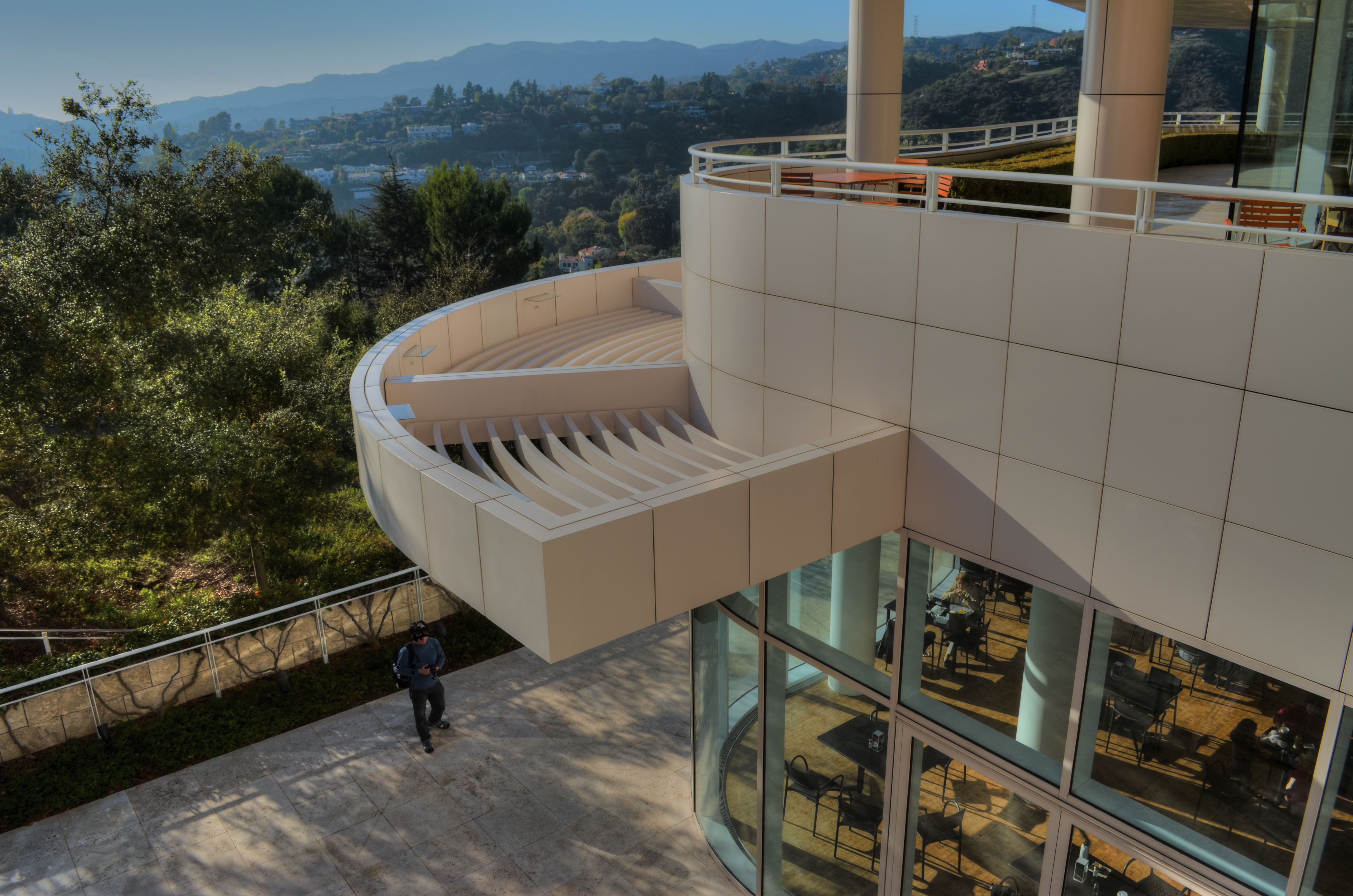
The original framing for the above shot.
The placement of people in a frame creates speculation about the motives and origins of those people before they were in the frame. A man shown standing at the platform at a train station could be eagerly awaiting an arrival, sneaking out of town, or merely wandering around. The mind starts to supply his backstory, if you like, his actions before appearing in the finite world of the frame. Put two people side by side, and you have, according to your viewer’s whim, a rendezvous, a goodbye, a conspiracy, a reunion, a chance meeting. People change the perceived intention of a photograph as a storyboard, either in the original framing or in the cropping afterwards.
The above image is the final crop of what was, originally, a scenic overview, taken at a large campus of museum buildings on a hillside. The image, as first conceived, was an overall “postcard” with the restaurant in only the lower right quarter of the frame. Later, I became aware that a single woman was visible in the cafe. Now, it’s not that she was actually the only person inside, but the photograph could be cropped to make her seem like it, meanwhile accentuating the emptiness in her immediate area.
As a consequence, instead of a lady who is merely alone, the image can make her seem “lonely”. Or perhaps you disagree. The point is that, by changing the human information in the frame (note that, in the original of the cropped shot, there is also a man standing outside the restaurant), we’ve re-drawn its narrative.
What gets left out of a picture, then, sparks speculation by the viewer, based on what has been left in.
LOOKS LIKE IT WORKS
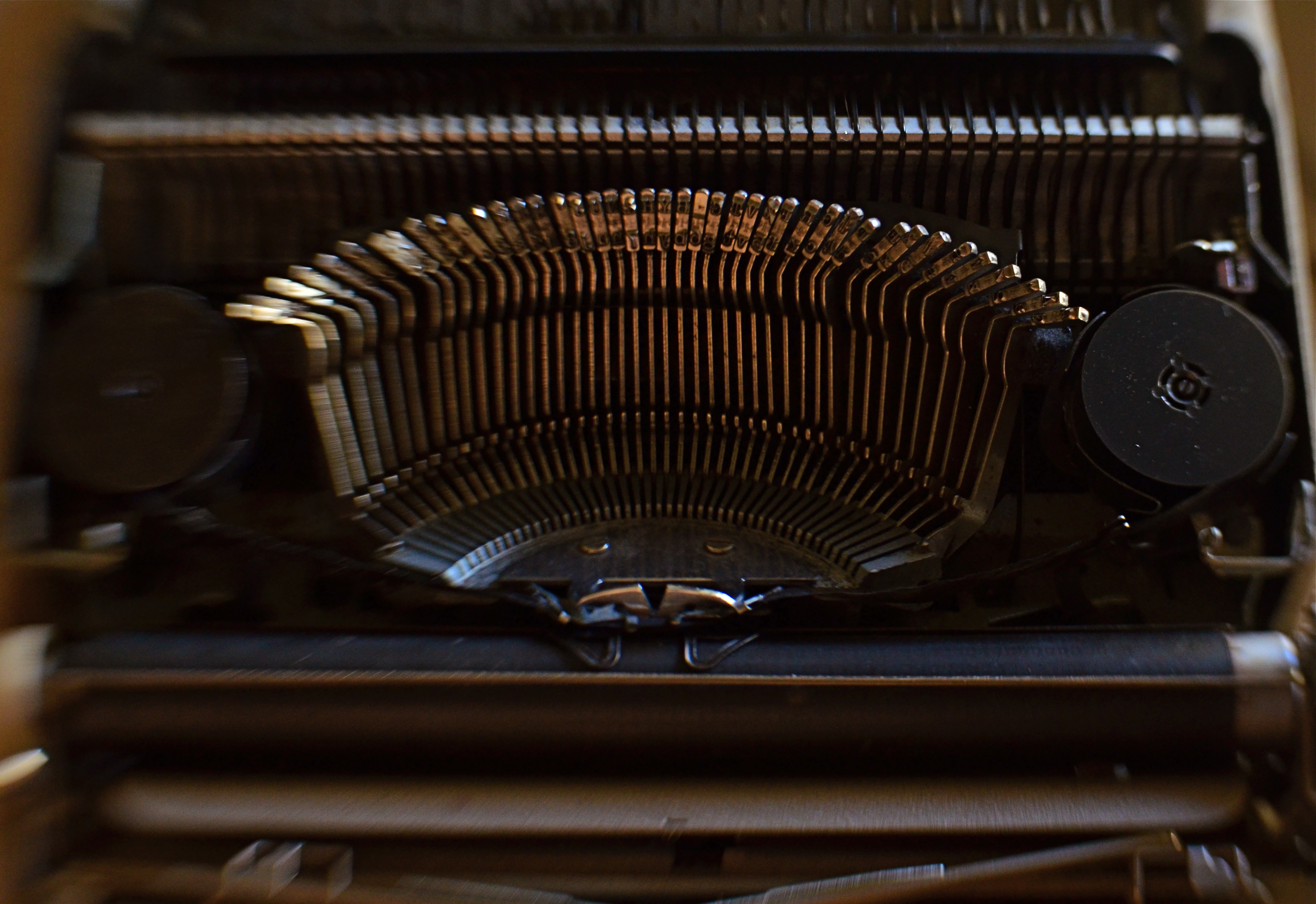
Ghost Writer In Disguise, 2016
By MICHAEL PERKINS
PHOTOGRAPHY OFTEN RE-DEFINES OUR PERCEPTION OF THE FAMILIAR, re-contextualizing everyday objects in ways that force us to see them differently. Nowhere is this more effective than in close-up and macro photography, where we deliberately isolate or magnify details of things so that they lose their typical associations. Indeed, using the camera to cast subjects in unfamiliar ways is one of the most delightful challenges of the art.
Product developers are comfortable with the idea that “form follows function”, that how we use a thing will usually dictate how it must be designed. The shapes and contours of the objects in our world are arrived at only as we tailor the look of a thing to what it does. That’s why we don’t have square wheels. The problem with familiar objects is that, as long as they do what they were designed to do, we think less and less about the elegance of their physical design. Photographers can take things out of this chain of the mundane, and, in showcasing them, force us to see them in purely visual terms. They stop playing the piano, and instead look under the lid at the elegant machine within. They strip off the service panel of the printer and show us the ballet of circuitry underneath.
It’s even easier to do this, and yields more dramatic results, as we begin to re-investigate those things that have almost completely passed from daily use. To our 21st-century eyes, a 1910 stock ticker might as well be an alien spaceship, so far removed is it from typical experience. I recently viewed a permanent wave machine from a beauty parlor of the 1930’s, sitting on a forgotten table at a flea market. It took me two full minutes to figure out what I was even looking at. Did I snap it? You betcha.
The study of bygone function is also a magical mystery tour of design innovation. You start to suss out why the Edisons of the world needed this shape, these materials, arranged in precisely this way, to make these things work. Zooming in for a tighter look, as in the case of the typewriter in the above image, forces a certain viewpoint, creating compositions of absolute shapes, free to be whatever we need them to be. Form becomes our function.
The same transformation can happen when you have seemingly exhausted a familiar subject, or shot away at it until your brain freezes and no new truth seems to be coming forth. Walking away from the project for a while, even a few hours, often reboots your attitude towards it, and the image begins to emerge. As Yogi Berra said, you can observe a lot just by watching.
THE THIRD CHANNEL
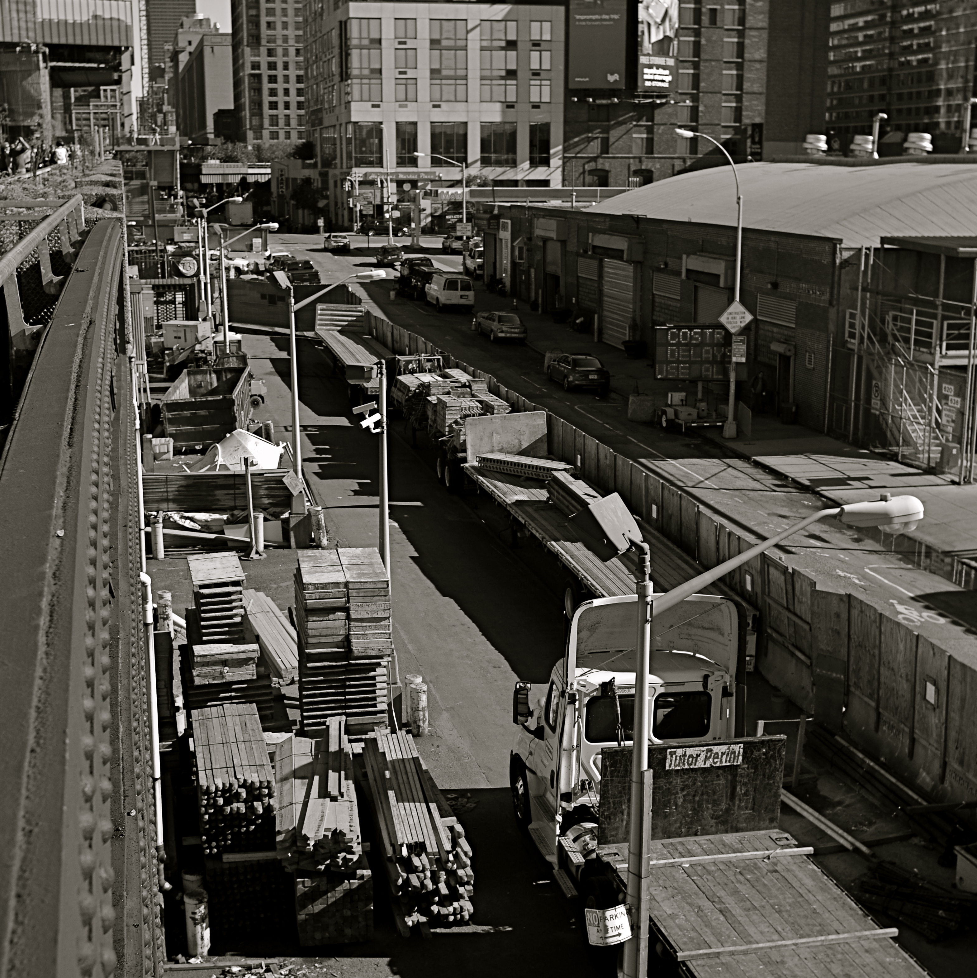
In a square framing, this warehouse district seems self-contained, isolated from the greater city around it.
By MICHAEL PERKINS
OVER THE HISTORY OF PHOTOGRAPHY, OUR CHOICES OF HOW TO PRESENT A PICTURE has changed as well as the means by which we shoot it. Certainly in the film era, sizes and formats shifted from square to landscape to portrait, and those shapes were reflected in the dimensions of the final prints or slides. You know, shoot it wide, print it wide. Somewhere between the waning days of prints and the first waves of pixels, however, the square nearly winked out for a while, and, with it, a particular way of composing a shot. Luckily, it’s back in full force.
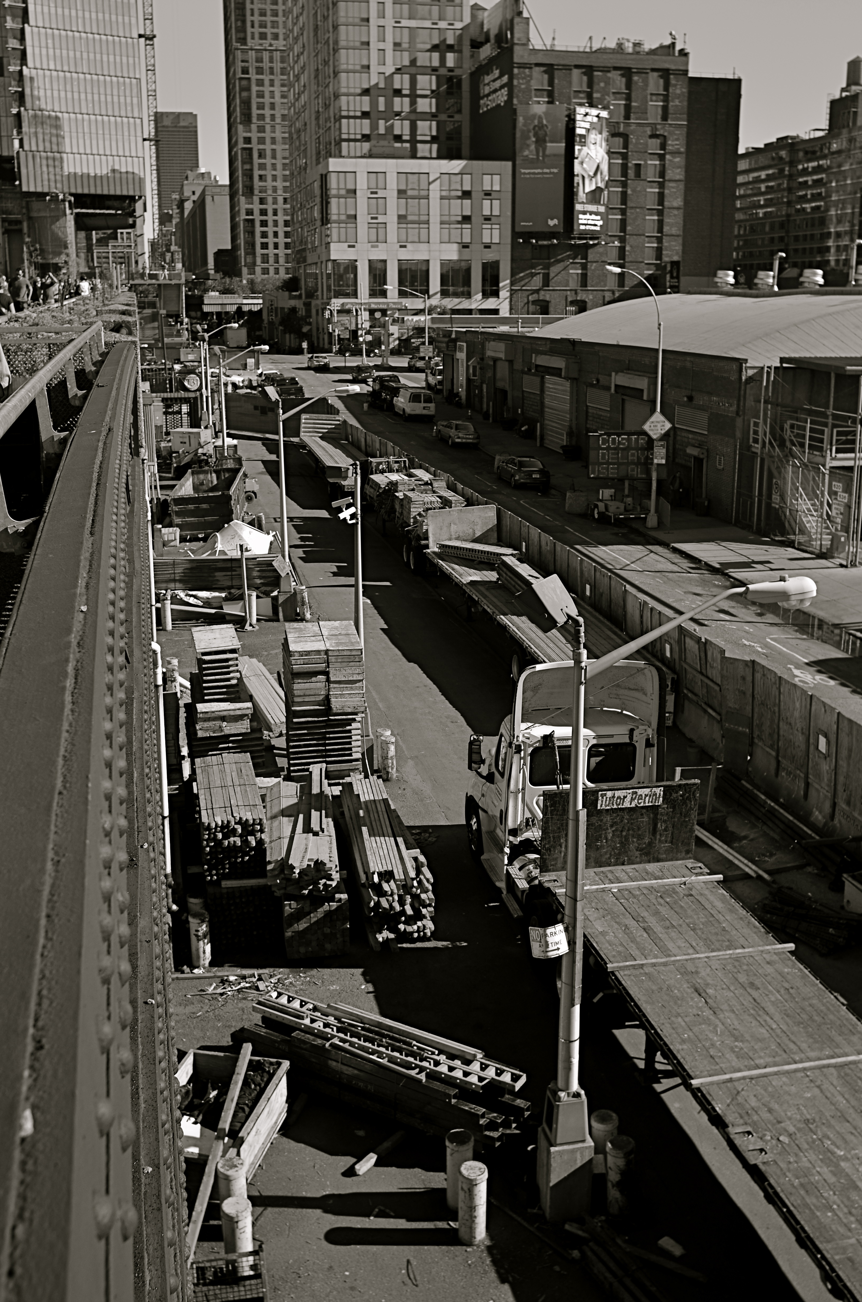
In the portrait-oriented original, extra buildings and street space dilute the impact of the cropped square.
It’s had help. Instagram and some retro-film cameras forced the square upon a new generation of shooters, and nearly all phones and phone apps readily offer it as a framing or editing choice. Strangely, manufacturers of DSLRs and other high-end cameras offer no option for shooting in square format, although they all include square cropping in their in-camera re-touch menus. This means that many photographers have to dream square but shoot otherwise, mentally composing the eventual square framing of their subjects in the moment, or even discovering, in edit sessions, that there is a decent square image inside their larger ones just waiting to be let out.
I have recently looked to deliberately edit in favor of the square, since I think that the format forces a kind of compact, centralized story-telling that might be diluted or weakened by wider or longer compositions. Looking at my initial landscape or portrait images, I ask myself if the entire force of the picture could be amped by squaring it off. Sometimes you think a shot calls for one orientation or the other, when the third channel of the square is actually a better tool. Hey, you can’t know everything at the moment of snap.
I do wish that DSLRs would routinely offer the chance to initially shoot in square, just as cheap hipster film cameras and phones already do. Not having every possible tool at your disposal seems wrong, somehow, and, with all the other gimmicks that are offered in higher-end cameras, from fake star twinkles to faux pencil-sketch effects, the inclusion of a third framing orientation just makes sense.
RUN WHAT YA BRUNG
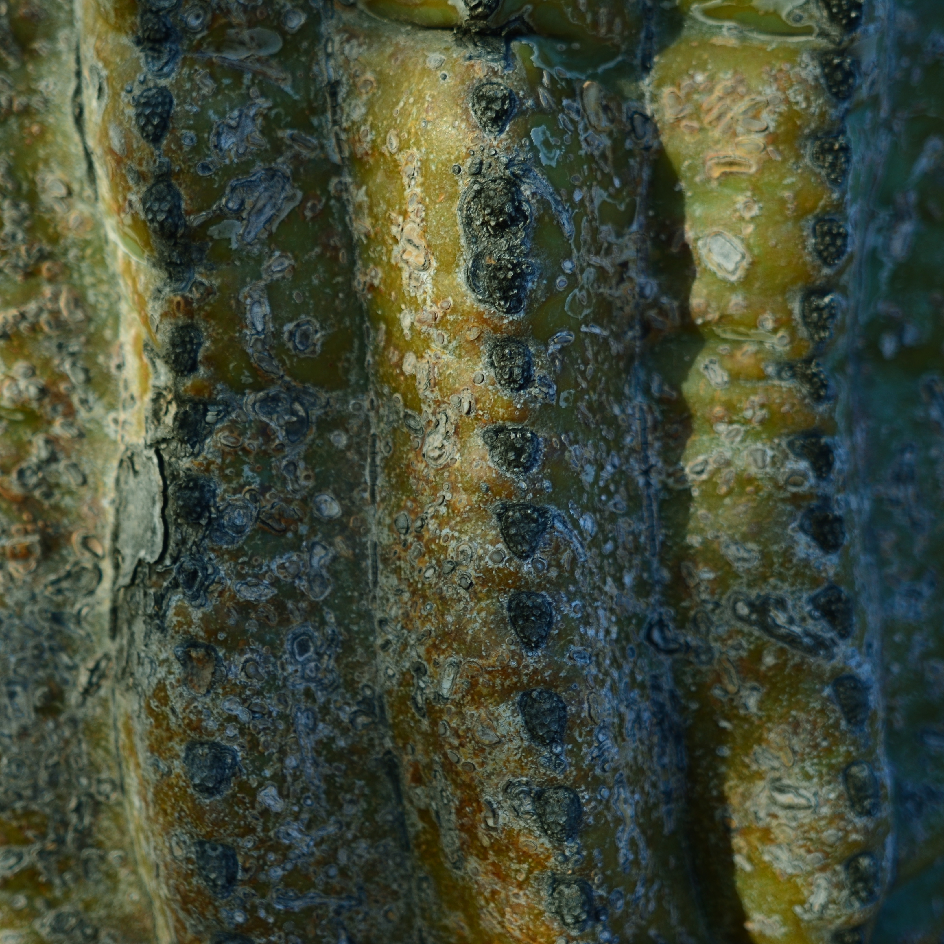
Didn’t bring a close-up or macro lens on this shoot, so had to ask my 24mm wide-angle to do double duty. And it could.
By MICHAEL PERKINS
NORMALEYE PHOTOGRAPHIC PARADOX No.346: You have to think hard about your equipment when you’re not shooting so that you don’t have to give much thought when you are.
Reacting “in the moment” to a photographic situation is often lauded as the highest state of human existence, and, indeed, the ability to see, and do, on the spot, can yield amazing results. But, in that marvelous inspirational instant, the smallest item on your checklist should be dithering about your gear. What it will do. What it can’t do. What you don’t know how to make it do. These are ruminations you run through when there’s no picture making going on.
Simply, the more you know about what you’ve taken to a shoot, the less creative energy will be drained off worrying about how to use it once you get there. You will get to the point where, for a given day’s subject matter, you take the wide lens, of course, or the macro lens, of course, or the portrait lens, of course. You’ll anticipate the majority of situations you’ll be in, and, unless you like driving yourself crazy, you’ll likely select one lens that will just about do it all. But whatever lens you select, you will want to know how much farther you can push it, as well. You know what you generally need it to do, but can it, in a tight spot, do a decent job outside its specialty? The answer is, probably yes.
One of my favorite lenses for landscape work is my ancient Nikkor 24mm f/2.8 prime. Nice and wide for most outdoors subjects, pretty fast for the close and dark stuff, and sharp as cheddar cheese in my most used apertures, especially the middle range, like around f/5.6. Can it do macro work, when I swing my attention from distant mountains to detail on a nearby cactus? Well, yes, within reason.
The minimum near-focus distance for this lens is about ten inches, more than close enough to fill a frame with the trunk of the saguaro with a little spare space to the right and left. I shoot in big files, so even with a post-op crop I preserve lots of resolution, and bang, the wide-angle does a respectable job as a faux macro.
I grew up around amateur race arenas which invited people to haul any old hunk of automotive junk to the track, to be run in so-called “run what ya brung” events. I personally hate to haul my entire optical array out on a project, swapping out glass for every new situation. I’d much rather save my neck and shoulder by calculating ahead of time which lens will do most of what I want, but be able to stand-in for some other lens in special situations. There are usually work-arounds and hidden tricks in even the most limited lenses. You just have to seek them out.
Run what ya brung.
LOOKING FOR AN OPENING
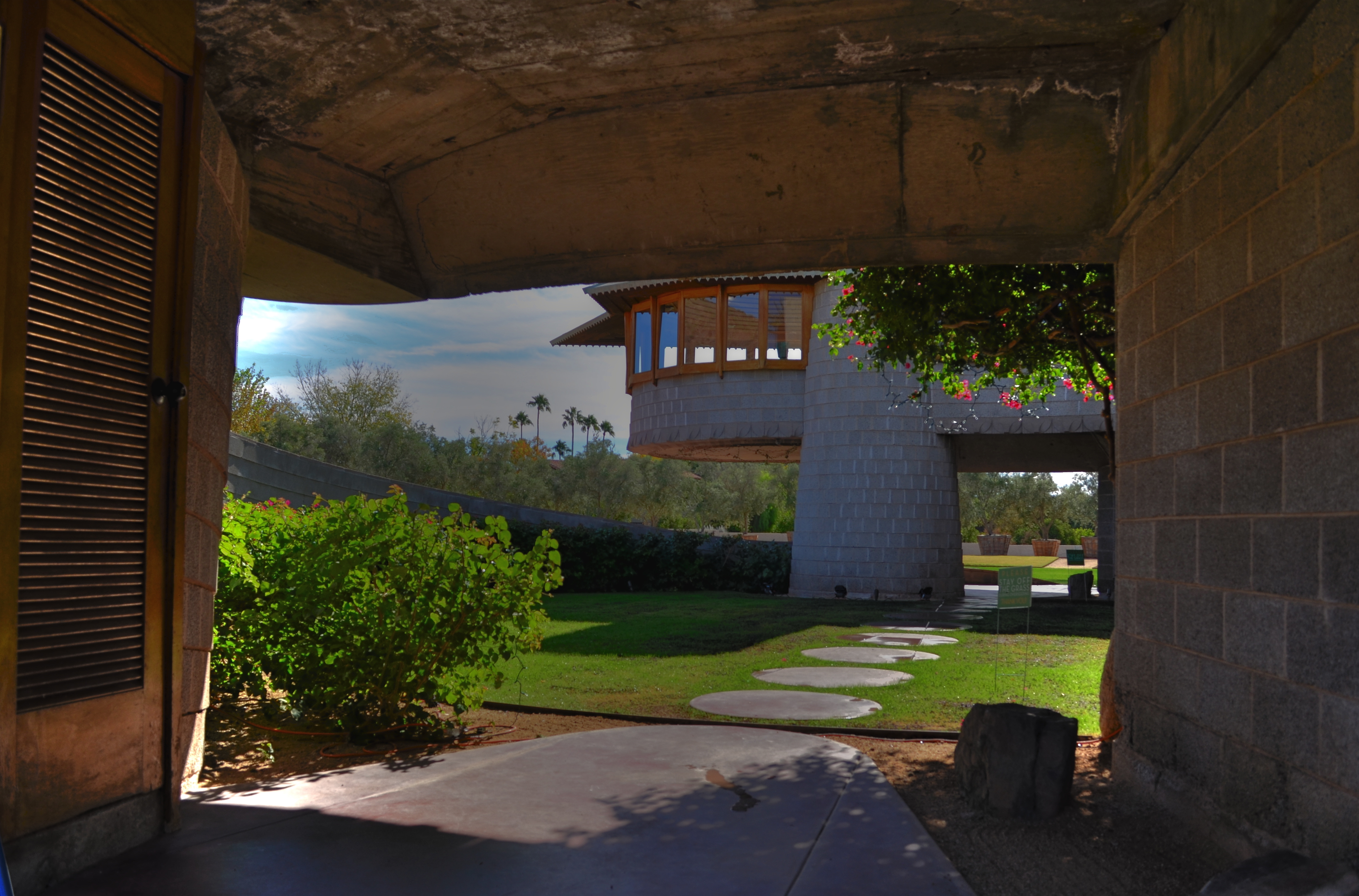
Entering a Frank Lloyd Wright home is like unwrapping a birthday present. The concrete walk ends in a circular ramp that rises to the left and around the David Wright house to create this wonderful open space.
By MICHAEL PERKINS
IF A HOME CAN BE SAID TO BE AN EVENT, then a door is the engraved invitation that bids you to witness that event. When you think about it, a door is the most crucial part of a house’s design, certainly its most deliberately provocative. It advertises and defines what lies within. It’s a grand tease to a mystery, the last barrier before you invade someone’s most personal space. It’s no wonder that entrances to places are among the most photographed objects on the planet. The subject is as inexhaustibly varied as the people who construct these lovely masks.
Doors are the first story tellers in a house.
Frank Lloyd Wright did more than create drama as you entered one of his houses; he actually enlisted you in generating your own wonder. Often the great man made you a little squirmy as you prepared to come inside, compressing door heights and widths to slightly uncomfortable dimensions. Pausing for a moment, you could almost feel like Alice after she ate the wrong cake, as if you might never be able to wriggle through the door frame.
Shortly after this ordeal, however, Wright would let the full dimensions of the inner house open suddenly and dramatically, as he does in the image above, taken at the home that he designed for his son David in Phoenix, Arizona. After ducking your head, you step into a court that has…no ceiling…since it ends in a ramp that both climbs around and supports a house that encircles you, creating an intimate courtyard that is both confined and limitless.
Doors make statements, almost boasts, about the wonder that lies just inches beyond them, and, like all generators of mystery, they are often most interesting when the question is never answered. Doors we never see beyond are often the most intriguing, like a woman behind a veil. When I invade a new neighborhood, my camera’s eye goes to doors before anything else. Sometimes the spaces they conceal don’t live up to the hype, but doors, these stage productions at the front of grand and humble abodes alike, offer something tantalizing to the eye.
CASTING
Do the woman and the child constitute a “family” in the narrative of this image?
By MICHAEL PERKINS
MORE COMPOSITIONS IN PHOTOGRAPHY ARE CRAFTED AFTER THE SNAP than naturally spring forward, fully formed, out of the camera. Frame as carefully as you may, you often find that something needs to change to help your image’s story fully emerge. This usually means taking something away, cleaning things up…and that means cropping. I think it’s fair to say that, more often than not, we start with pictures that contain too much and carve out the core picture that deserves to survive, to be pushed to the front.
Sometimes a proportionate tightening is all that a picture needs, so that a large, busy rectangle becomes a streamlined, smaller rectangle. This can clear away extraneous objects like phone poles, wires, extra buildings, any distracting junk that pulls the eye away from the important stuff. But it isn’t always things: it can also be people, surplus bodies which, like extraneous elements of any kind, change the narrative, or keep it from connecting. Think of the picture as a theatrical production and yourself as the casting director. Anyone on the set who doesn’t move the story forward is not playing a part that we need. See the girl at the office for your check, so long.
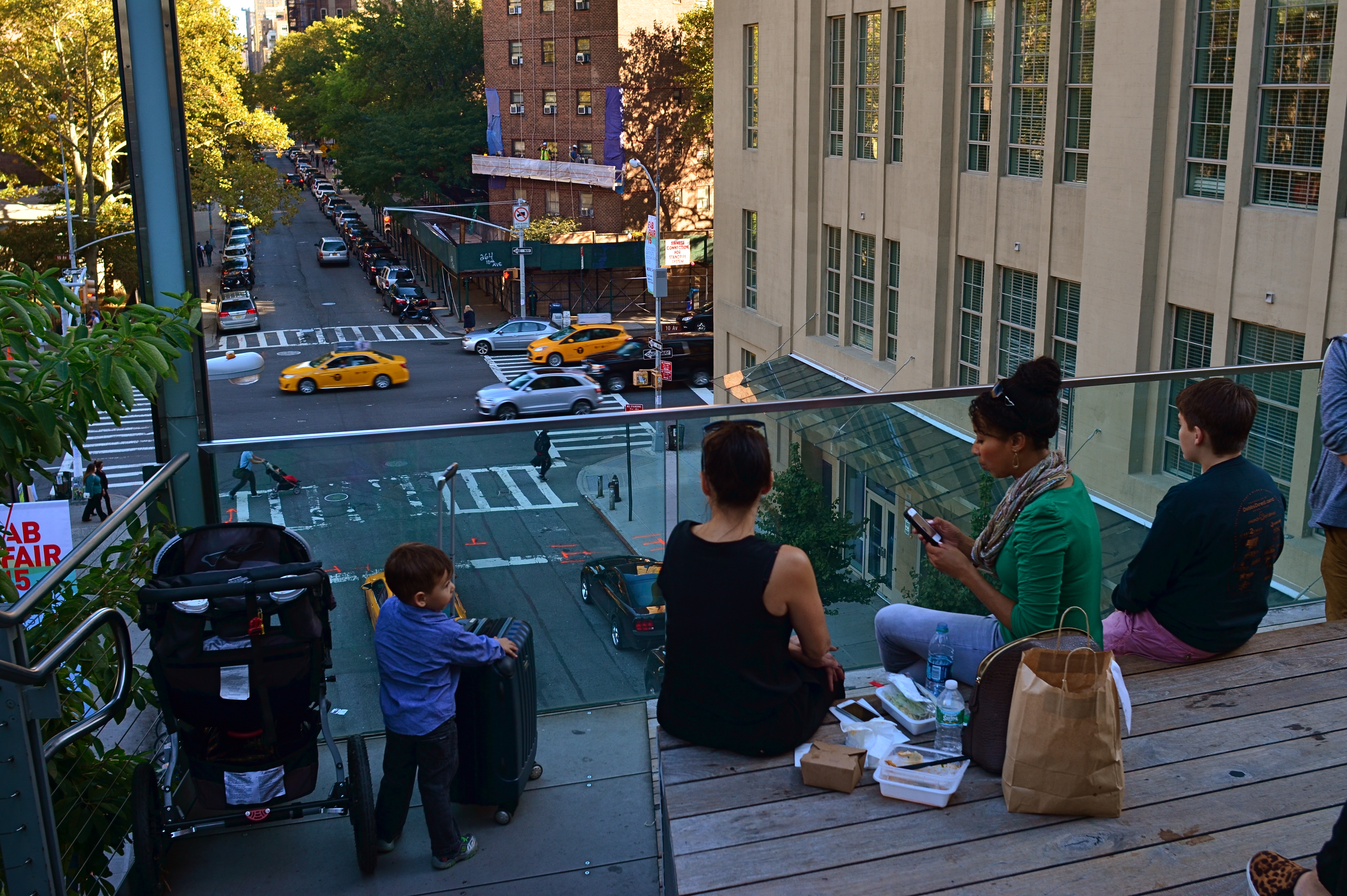
Does the removal of the extra people compromise or complete the photo’s story?
In the picture above, the cropping seems to create the story of a mother and her children taking in the view from New York’s Highline Park onto a city street below. In the original shot, seen at left, she seems less like a mother and more like just another bystander. The crop has suggested a relationship or a role for her. The woman to her right (in the original), unlike the “mother” figure, is not acting as our surrogate, seemingly looking with us at the scene. She is on her cel phone, and therefore registers as more detached than her neighbor, whose face, since it’s invisible to us, could contain anything we want it to. To the right of the cel user, we see additional people who don’t subtract from the picture, but also don’t add anything. They are extras that we, the director, have decided we don’t need to cast.
Also, structurally speaking, the “mother” is arranged so that the diagonal line from the foreground building to her right seems to proceed into the picture from around the area of her right shoulder, so that she sort of anchors the leading line and sends your eye along it to the street below. None of this, mind you, was obvious in the shooting of the original shot, which is not terrible as a composition, only compromised by the inclusion of information that simply doesn’t advance the logic of the picture. I only use it as an example of how I was able to question the “casting” of the original frame and make a conscious decision to cut away things that slowed everything down.
If you can tell a story with two people better than you can with four or five, ask yourself if you really need them. Cropping isn’t an admission that you made a bad photograph. It’s confirmation that your first draft is worth taking to a second one.
ON THE LEVEL
With the amount of repair time it took to straighten and resharpen this shot, I could have made ten pictures that were done correctly in-camera.
By MICHAEL PERKINS
IT’S NOW QUITE EASY TO HAVE YOUR CAMERA OR EDITING SOFTWARE correct for things you should have done before the image was made. Most of the times, these fixes cure more than curse, some of them genuinely helping a shooter extend his skills or fine-tune his control. However, in the case of one of the most common post-pic fixes, the “straighten” slider, you’re potentially messing with picture quality, to fix a problem that, quite honestly, shouldn’t have existed in the first place.
Consult every, and I mean every basic camera tutorial going back a hundred years or more. Many timely tips in such books have vanished or evolved over time, but the simple admonition to keep your shot level has remained unchanged since the dawn of photo time. So why do cameras and software even offer straightening as an option?
If you take the cynical view, the existence of this fix suggests that camera manufacturers assume that enough people will routinely take crooked pictures that, of course, they need something to tilt their images back to normal. Because, if that’s not true, then why does the fix even exist?
Here’s the critical point about straightening: it does not maintain sharpness like simply cropping a photo to a smaller size does. To restore your image to a rectangular shape after you’ve rotated it left or right to level it, your camera (or software; both do it the same way) must trim part of the picture and resize it, producing a lower total number of pixels in the “corrected” photo but within the same space as the original one. And there’s just no way to do that without degrading the sharpness.
Some straightenings, if conservative, may not fuzz up your photo as much as some more extreme adjustments. The above image was shot literally on the run during a tour, but it needed just slight adjustment, and so retained most of its sharpness after I ran it though a second editing program. However, you really have to love a shot to go to those extremes to save it.
Thing is, you can bypass this entire problem simply by shooting a level picture. Now, I won’t bore you with a list of just how many really easy ways there are to ensure this. But since sharpness makes at least the top five list of things that most people want from a picture, why not take a pass on all the post-mortem fixes by doing one of the simplest possible things in photography more often?
STAKES IN THE GROUND
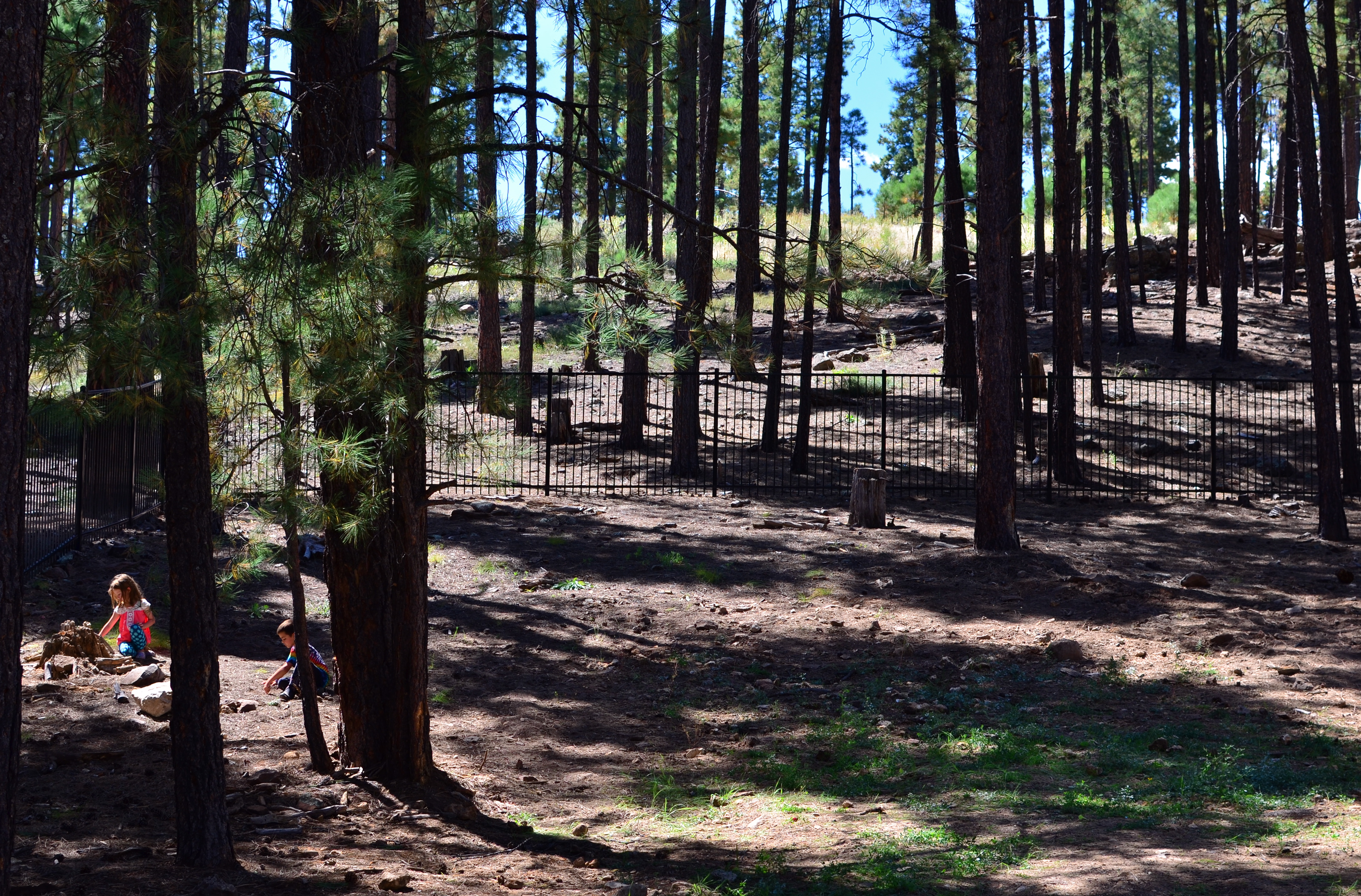
We Seemed To Be The Entire World, 2015. 1/60 sec., f/5.6, ISO 100, 35mm.
By MICHAEL PERKINS
NO DOUBT YOU KNOW WHAT IT FEELS LIKE TO SEE A PICTURE IN YOUR MIND that, for some reason, doesn’t make it into the camera.
It’s maddening. That fumbling few inches between success and failure that cannot always even be sensed during the taking of an image, but which, somehow, is as wide as a river gorge once the picture comes out. Dammit, you saw it. More importantly, you felt it. But something in perhaps a technically perfect photograph fails to engage, and the thing just can’t close the sale.
Going further with the metaphor of salesmanship for a moment, there are pictures which, in a manner of speaking, don’t “ask for the order”. They don’t effectively say, here is the main point of interest. Look here, then there. The best photos are triptychs in that they have a sense of inevitable direction. Your eye senses where to travel with the frame.
In the above forest scene, I nearly failed to provide that impetus because, in my first few shots, I was overly centered on getting the contrasty elements of the picture from fighting each other. Some trees came out like silhouettes. Some parts of the forest floor were way too bright. Somewhere along the line, I had decided that the picture was about solving those purely technical problems. Check those items off, I thought, and you’d have a real nice nature scene, or so it seemed at the time. Only one lucky thing intervened to change my mind and save the picture.
This comes under my general belief that most of the things you need to fix a composition are mere inches away from where you’re already standing. In this case, I moved a bit to the left of several trees and two small children swung into view, both of them representing a dynamic dollop of color in an overly bland palette of shades. Suddenly the picture was about these kids stealing away, inhabiting a quiet, separate world, their size dwarfed by the pines while giving measurable scale to the entire woods. They had found a complete reality away from everyone, and it would be easy to show that. Cropping to have them enter the frame at the bottom left corner helped direct the eye where I needed it to go first. Start here, and then look beyond.
It’s helpful to regularly dissect the pictures that almost had enough story to sell themselves. What stakes could I have pounded into the ground to mark the outline of the idea? Where did I fail to lay out the territory of the story?
It’s all about getting that image from your mind into the camera. That’s everything. That is, ever and always, the problem to be solved.
THE PLACES THEY LIVED
“I want to marry a lighthouse keeper…” 1/125 sec., f/3.5, ISO 100, 24mm.
By MICHAEL PERKINS
PHOTOGRAPHERS INSTINCTIVELY SEEK OUT VARIATION. We spend so much time looking at so much of the world that a lot of it starts to sort itself into file folders of things, patterns, or places, pre-sorting our pictures into this or that category. Sunsets: see Nature. Famous Buildings: a sub-set of Travel. And so on, until we are fairly starved for some visual novelty to shock us out of our slumber and spur us on to new ways of seeing.
One of the things that settles most readily into sameness is the human dwelling. Most of us live in some kind of basic four-walls, bedroom-kitchen-bath sequence, making our living spaces fairly predictable as subject matter. By way of awe and admiration, the real geniuses of, magazine illustration, to me, have always been the “house beautiful” photographers, since they must spend year after year making Mr.& Mrs. J.D. Gotmore’s McMansions seem unique and bold. That said, there is something about nearly everyone’s castle that might be distinctive, even revelatory, about the people who live within. It’s all in your approach.
I love to explore the places where people are forced to improvise living spaces either near or as part of their work, places that usually exist in stark isolation as compared to the crush of crowded urban centers. In the above image, I was allowed to climb to a small viewing angle of the beacon room atop a coastal lighthouse in San Diego, and, perhaps because I was limited to a shooting stance below the surface of the room’s floor, the resulting photo further exaggerated the confined, angular working space, which sits above living areas further down the house’s twisty central staircase.
These areas pose more questions than they answer. What is it like to have this building be your entire world for long stretches of time? What kind of person can do this work? What is the center of this unusual story? The blurring of boundaries between working and living areas is among the most novel material a photographer can tackle, since it contains one of the things he craves most….mystery.
WHERE THE RUBBER MEETS THE ROAD
Convergences, 2015. A through-the-window iPhone quickie. Grainy, noisy, fun.
By MICHAEL PERKINS
MY WIFE AND I HAVE REACHED A REASONABLE DIVISION OF LABOR as regards road trips, with her taking on the nation’s freeways like an original cast member of The Road Warrior and me decoding various navigational vectors, from AAA maps to iPhones, as well as uber-producing the in-car tune mix. Everybody to their strengths and all that. This arrangement also frees me up to pursue the mythical goal of Immortal Photograph I Shot Out A Car Window, which will also be the title of my Pulitzer Prize acceptance speech.
Any day now.
Most of these potential world-beater images have been attempted through the front windshield, where it is at least a little easier to control blur, even glass reflection. Additionally, the majority of them, more and more, are done on mobile phones, which is not the greatest for resolution, but gives you that nice exaggeration on dimensions and depth that comes with a default wide-angle lens, which, in some cases, shoots broader vistas than even the kit lens on your “real” camera.
If you find yourself doing the same thing, you have no doubt noticed that you must get really, really close to your subject before even mountains look like molehills, as the lens dramatically stretches the front-to-back distances. You might also practice a bit to avoid having 10,000 shots that feature your dashboard and that somewhat embarassing Deadhead sticker you slapped on the windshield in 1985.
So, to recap: Shoot looking forward. Use a mobile for that nice cheap arty widescreen look. Frame so your dash-mounted hula girl is not included in your vistas (okay, she does set off that volcano nicely..). And wait until you’re almost on top of (or directly underneath) the object of your affection.
And keep an ear out for important travel inquries from your partner, such as: “are you gonna play this entire Smiths CD?”
Sorry, my dear. Joan Baez coming right up.
TESTIMONY
by MICHAEL PERKINS
I SEE MANY, MANY HOMELESS PEOPLE THESE DAYS. Sometimes on
People are not merely props.
the streets of my home city. More occasionally on the streets of other towns. And every single day, without fail, on every photo upload site in the world. Many of the uploaders think this is “street photography”.
Many of the uploaders need to think again. Hard.
The mere freezing in a frame of someone whose lousy luck or bad choices have placed him on the street is not, of and by itself, some kind of visual eloquence. Not that it can’t be, if some kind of story, or context, or statement accompanies the image of a person driven to desperation. But not the careless and heedless snaps that are, I will say, stolen, at people’s expense, every day, then touted as art of some kind. The difference, as always, is in the eye of the photographer.
Many millions of people have been “captured” in photographs with no more revelatory power than a fire hydrant or a tree, and just catching a person unawares with your camera is no guarantee that we will understand him, learn what landed him here, care about his outcome. That’s on you as a photographer.
If all you did was wait until someone was fittingly juxaposed with a row of garbage cans, a grimy brick wall, or an abandoned slum, then lazily clicked, you have contributed nothing to the discussion. Your life, your empathy, your sense of loss or justice….all must interact with your shutter finger, or you have merely committed an act of exploitation. Oh, look at the poor man. Aren’t I a discerning and sensitive artist for alerting humanity to this dire issue?
Well, maybe. But maybe not. Photographs are conversations. If you don’t hold up your end of it, don’t expect the world to pick up the slack. If you care, then make sure we care. After all, you’ve appropriated a human being’s image for your own glory. Make sure he gave that up for something.
REVERSAL OF FORTUNE
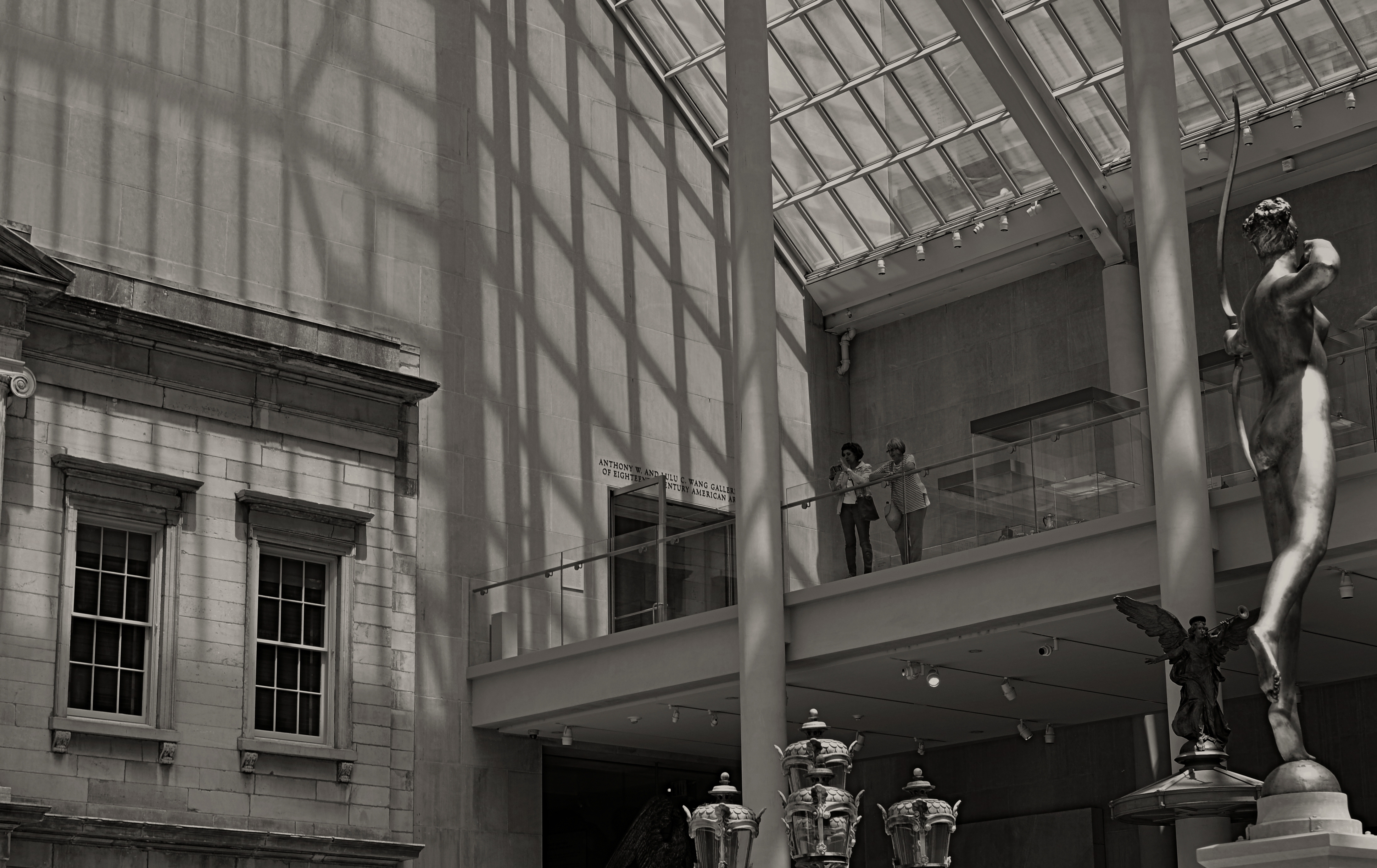
Spaces like this vast sculpture gallery beg to be visualized from as many angles of view as possible, Diana hunts from the right edge of the frame.
By MICHAEL PERKINS
ANYONE WHO HAS EITHER STUDIED OR DABBLED IN CANDID PHOTOGRAPHY has heard Henri-Cartier-Bresson’s term “the decisive moment”, which refers to that heat-lightning instant when the best possible photograph of a situation or sensation can be made. Of course, you don’t have to really believe that there is a single such moment, and many do not. There may be any one of thirty possible frames to be extracted from even the simplest human subjects, but we seem to always be looking for that salient, isolated image that defines it for all time.
Cartier-Bresson’s pursuit of the decisive moment is usually thought of with regard to photographing human activity, but there is also a mindset about photographing places that there can be a “superior” or “best” angle to view them from. That is why landmarks and monuments yield so many pictures that are so much the same. We all shoot the Eiffel Tower the way that everyone else before us has shot it…..because? Well, there’s a great question.
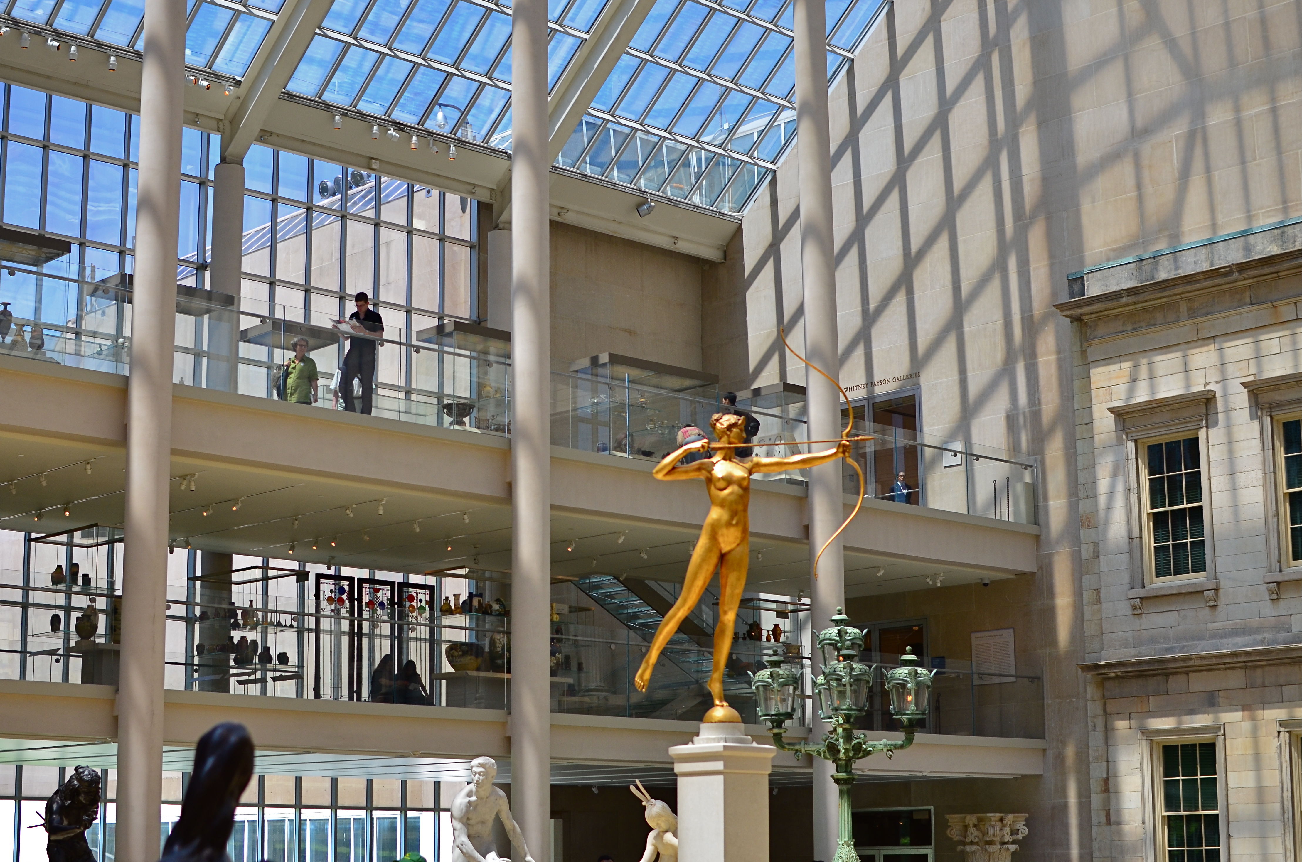
My original, “official” angle on the exact atrium. Diana holds center stage.
Do we think of earlier images of the tower as a standard of some kind that we only certify by imitation? Is our mind eager to catalogue things in their “proper” orientation? Are we only interesting in what things are “supposed” to look like? Ideally, we should be making pictures to authenticate our own visions, not to rubber-stamp those generated before us. And yet, with famous places, it’s often a case of human see, human ape.
We have to teach ourselves to photograph places as if we were the first to ever point a camera at them. It’s not that hard a habit to cultivate, really. Crank yourself around 180 degrees and take the reverse angle. Move six inches to the left and frame the most obvious part of the cathedral, ruins, or palace out of your composition. It might yield nothing, and then again, it might add enough freshness to the image to overcome what I refer to as “tourist fatigue”.
The above image from the sculpture plaza at the Museum of Modern Art in New York is a near reverse of the more conventional view in the smaller color shot at left, which I first featured in the post Put Yourself Out There a while back. In one shot, the Diana statue is center stage. In the other, she is relegated to the edge of the frame, acting as a pointer toward the rest of the photograph’s information. Extra cost in terms of time to get this very different composition? Ten seconds.
It’s not that re-imagining a subject is that hard. It’s that we so seldom question our first imagining of things, often settling for the first, technically successful image we get. And that first image, as we often learn, might only be a dress rehearsal for the real show.
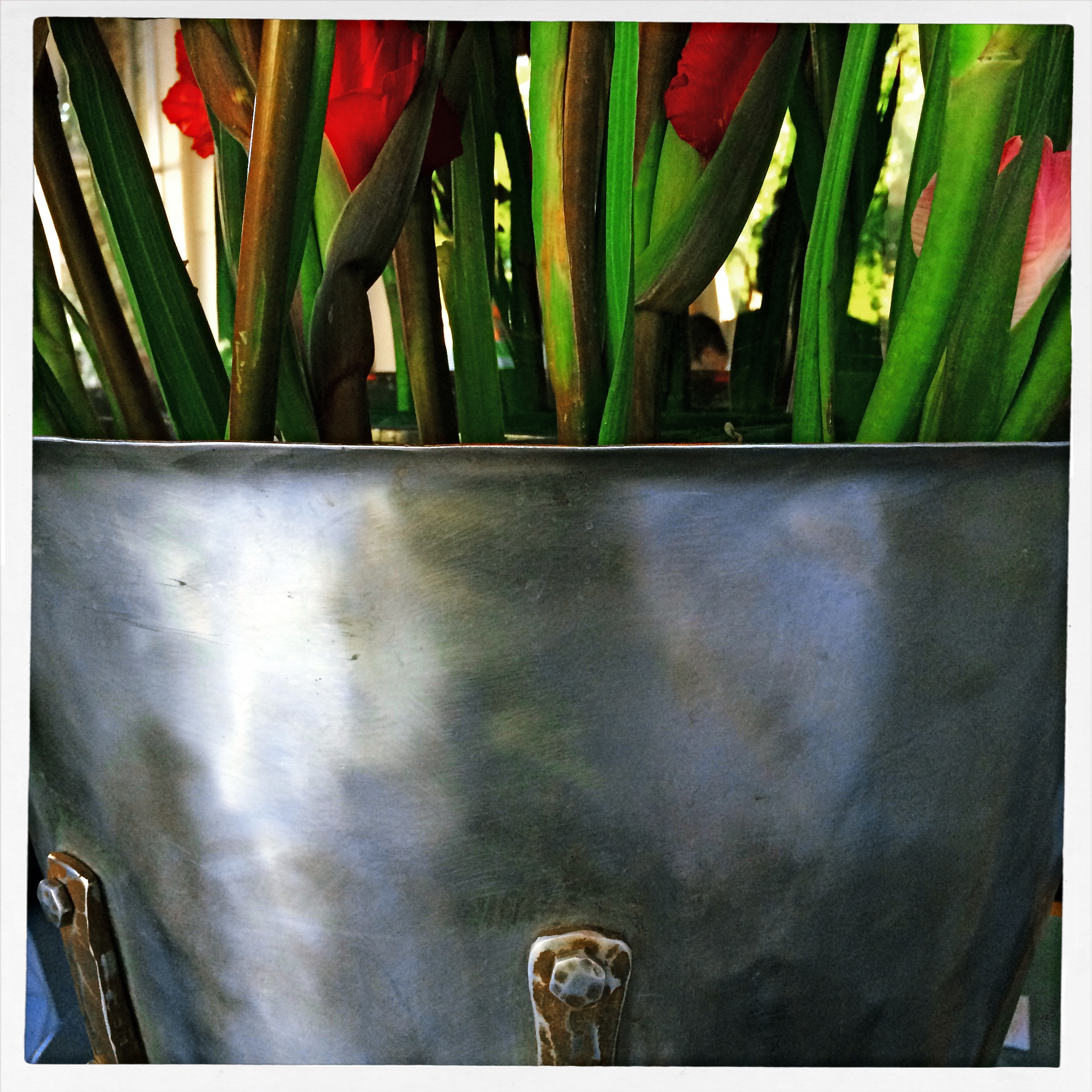
PARAMETERS
By MICHAEL PERKINS
A PHOTOGRAPHER’S IMPACT IS ONLY PARTIALLY CREATED BY WHAT HE CHOOSES TO RECORD. That is, whatever his subject, be it banal or magnificent, his choice of what to shoot is only, at best, half of what makes or breaks his picture.
The other half of the miracle comes not from mastery of light, aperture, gear or conditions. It is in the frame, and what he includes or excludes from it. Landscape mode, portrait mode, big crop or little crop, the frame is the final determinant of how well the image argues for itself. The legendary director of photography for the New York Museum Of Modern Art, John Szarkowksi, expresses this idea for all time in his wonderful book The Photographer’s Eye:
To quote out of context is the essence of the photographer’s craft. The photograph’s edge defines content. The photographer edits the meanings and patterns of the world through an imaginary frame. This frame is the beginning of his picture’s geometry.
Consider, for a moment, the most vital, most inspiring images you’ve ever seen. Now imagine them cropped two inches wider, four inches to the left, five inches higher. The visual terms of engagement would be completely re-ordered. And what would be the result? Would you draw different conclusions, make different assumptions, experience a diminished ( or enhanced) sense of mystery?
The frame, and the choices the photographer makes in its design, is more decisive in the success of a picture than any other single factor. Technically imperfect photos become world-beaters every day simply because the frame is eloquent. And it also follows that a well-crafted bit of exposure can be dulled or blunted by a frame that is carelessly drawn.
The above image represents a choice, the drawing of a visual boundary. The top of the flowers and the objects surrounding the bucket aren’t missing because I shot too close, they’re deliberately excised because I made a deliberate decision that they didn’t add anything to the story I was trying to tell. You can disagree about whether I made the correct choice, but the making of that choice was as important (actually more important) than the subject itself.
Photographs have visual parameters, since we can’t make images big enough to include all of our experience. There are limits on the dimensions of what we show, and intelligent use of those boundaries can transform our work in marvelous ways.
SHOOT (AND THINK) BIG
The Nexus Of Resurrection, 2015. Image cropped from 4928 x 3264 pixels to 3550 x 1477, leaving enough density for a printable enlargement.
By MICHAEL PERKINS
BY NOW MOST OF US PROBABLY REALIZE THAT THERE IS NO REAL ADVANTAGE to “budgeting” shots in digital media the way we used to do in film. Harking back to the time of 24-exposure limits on one’s photographic fun, shooters maintained a running total in their heads of shots taken versus shots remaining, a cautious way of allocating frames on the fly, the idea being to finish the film roll and your tour stops at about the same time. Some kept notebooks; some doled out shots on a priority basis (one image of the waterfall, three of the ruins, four of the kids on the rides), and some, I suppose, were tempted to count on their fingers and/or toes. You had to be careful not to run out of frames.
Jump to the digital now, where we realize that, in all but the rarest cases, our shutter finger will crack and fall off before we “run out” of shots on even the most meager memory card. However, I still run into people who believe they are being prudent and providential by taking images at lower resolutions to “save space”, a false economy that is not only needless, but actually limits your options in the later process of editing.
Big files mean image density (lots o’ pixels) and therefore higher resolution. High resolution, in turn, means that you can crop substantial parts of a photo as needed and still have enough density for the image to hang together, even when printed out. Now, if you look at your work solely on a computer screen, protecting the integrity of a cropped image is less crucial, but if you’re lucky enough to create something you want to enlarge and frame, then you should begin with the fattest file you can get.
Review a few of your images that were, let’s say, less than compositionally sublime coming right out of the camera. Look at the pixel count on the same images after they were cropped to your liking. You’ll arrive at your own preference on what minimum resolution you’ll accept from the cropped versions. Thing is, the bigger you start, the more wiggle room you’ll have in editing.
As I say, most people already shoot at the largest file size possible. I merely send along this note to remind us all that we do it because it makes sense, and affords us real flexibility. It’s one of the amazing by-products of digital; we can, generally, shoot as much as we want for as long as we want.
TELL YOU WHAT’S BETTER….
Photo processing should be a surgically precise tool, not a blunt instrument.
By MICHAEL PERKINS
THE AIM OF PHOTOGRAPHIC PROCESSING has shifted drastically in the post-digital age, and not necessarily in a good direction. Those of us old enough to remember mastadons, horse-drawn carriages and analog film were certainly aware that images could be edited or enhanced after the fact, conjuring up, say, memories of airbrush artists smoothing away chicken-pox scars from the shoulders of Miss January. We knew some of the magic happened in the lab.
Likewise, we knew that even the top masters did lots of tweaking in the darkroom prior to publication. The emphasis, however, was largely on perfecting an essentially strong picture, to make a good thing better/great. However, that emphasis is now placed, far too often, on trying to “save” images that were executed poorly in the first place, bringing marginal work up to some kind of baseline par of acceptability. That’s like the difference between polishing a Steinway and repainting a toy piano.
So, here’s my plea to those laboring to rescue their misbegotten babies in editing programs: Don’t repair. Re-shoot.
A good deal of the quick-fix buttons on editing programs should be marked with glowing red asterisks, with the following disclaimer at the bottom of the screen: WARNING: By using this change, you will fix your first proplem and create a different one somewhere else within your photograph. Let’s face it, no corrective action in editing happens in isolation. It must create a ripple effect, major or minor, in the final look of the image.
Use the “straighten” button for your misaligned shots, and they will lose sharpness. Suck out the darker shadows and your picture could lose dynamic range. Oversharpen your pictures and they will look harsh, with an unnatural transition between light and dark values. Reduce the noise in the image and it may appear flat, like pastel paint slathered on blotting paper.
Or here’s a radical notion: do all your thinking and planning before the shutter snaps. Yes, I know, I sound like some old schoolmarm scold, but please, can we at least consider the idea that there are no true shortcuts, that there can be no magical substitute for knowing your gear, developing an eye, and putting in the practice time required to make a photograph?
We once believed that patience was a virtue, that skill and mastery were more important than instant gratification. Know what? All of the greatest photographers still believe those things. And their work shows it.
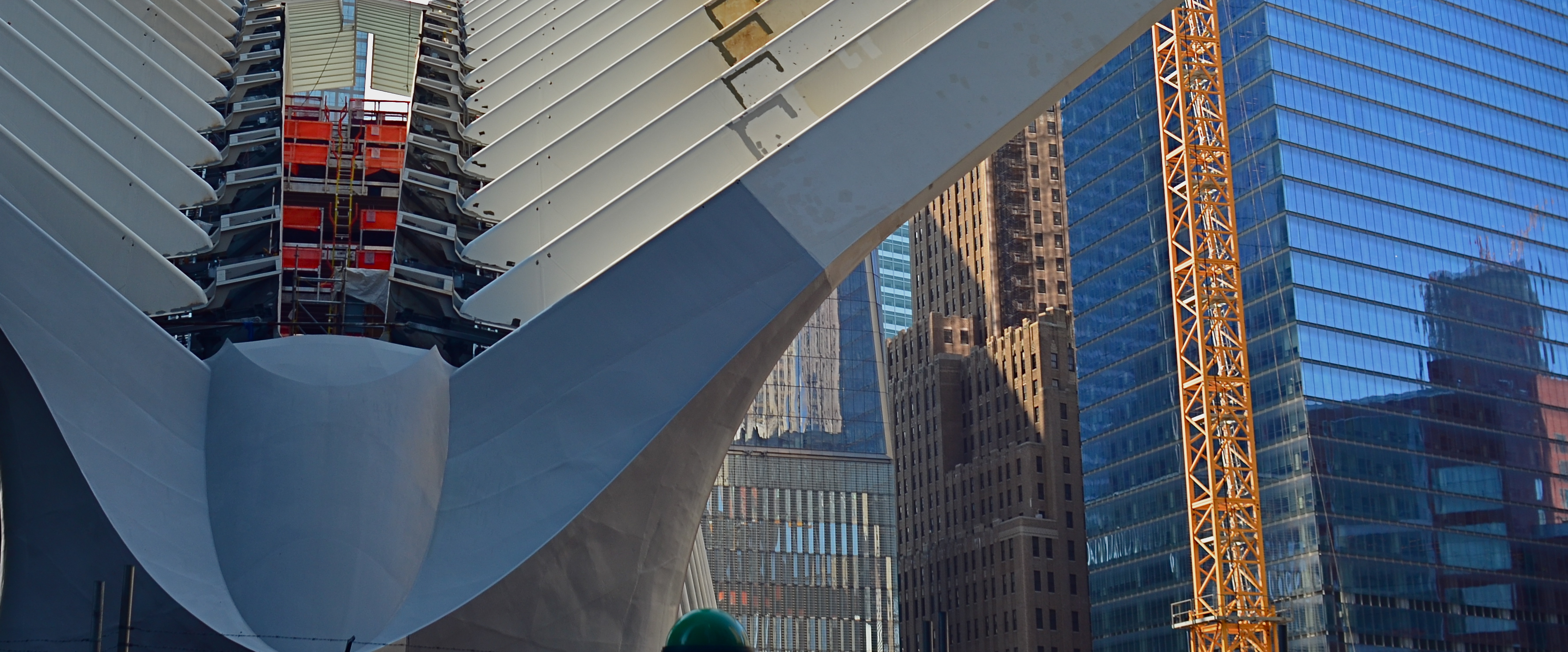
URBAN MIX
Competing architectural styles establish a natural rhythm of conflict in major cities.
By MICHAEL PERKINS
EACH MAJOR URBAN CENTER HAS ITS PHOTOGRAPHIC SUPERSTARS, those destination attractions that are documented to death by shooters great and small. Name the city and you can rattle off the names of the usual suspects. The landmarks. The legends. The here’s-proof-that-I-was-there vacation pictures. Meanwhile, the rest of the buildings within our super-cities, that is the majority of the remaining structures on most streets everywhere, remain under-photographed and, largely, unknown.
Part of the problem is our photographic viewpoint, which apes our human viewpoint. As drivers or pedestrians, we necessarily focus most our attention at events topping out at just about two stories above street level. This means we will almost certainly n0t see the mashup of architectural styles just outside our peripheral range. We don’t follow the visual line of buildings all the way up, either because we are walking, or because we don’t want to look like some out-of-town rube. But there is real drama in the collision of all those unseen details, and, if you’re interested in showing the city as an abstract design, some real opportunities.
I find that shooting toward the intersection of parts of three or more buildings amplifies the contrast between design eras, with doric columns and oak clusters crashing into International style glass boxes, overlayed with Art Deco zigzags. I shoot them with standard lenses instead of zooms to preserve the intensity of color and contrast, then create the final frame I want in the cropping. Zooms also tend to flatten things out, making buildings that are actually hundreds of feet from each other appear to be in single flat plane. Regular lenses keep the size and distance relationships relatively intact.
Importantly, I don’t shoot entrances, emblems, signage, anything that would specifically identify any one building, and I steer away from places that are recognizable in a touristy way. I’m not really interested in these buildings in their familiar context, but as part of a larger pattern, so I don’t want to “name” things in the image since it will draw away interest from other elements.
The city is a concrete (sorry) thing, but it is also a rich puzzle of design that offers almost infinite variety for the photographer. Best thing is, these compositions are just inches away from where you were bored to death, just a second ago.
OF FOOLS AND TOOLS
There are many roads to a final image, but only one destination.
By MICHAEL PERKINS
PHOTOGRAPHERS LOVE TO BICKER ENDLESSLY ABOUT WHICH IS THE BEST ROAD TO TRAVEL en route to the making of a picture. I mean they flat-out love it. Here we are entering the third century of a global art that has amply demonstrated that vision, not hardware, is the determinant of excellence, and we are still splitting into warring factions on which camera does this, or which lens or process does that. It’s discouraging because it is wasteful. Put in another context, it’s like arguing whether your marinara won first prize because you stirred it with a spoon instead of a fork.
This ongoing us/them battle over which is the “purer” approach to photography is presently centered on traditional cameras versus mobile devices. Each side calls its star witnesses to testify on a variety of qualifying or disqualifying factors, as if anything matters but the pictures. Can I play that game? Sure, and I’d be lying through my teeth if I said that I had never hurled a bomb or two toward both sides in the skirmish. But when I do that, I’m only serving my own ego….not photography.
I make a distinction between cel phone and conventional cameras based simply on what I want to do in the moment, but such distinctions are never recommended as a universal yardstick. Very generally speaking, if I want the widest number of creative choices before the picture is made, I prefer a DSLR. If I can safely trust my instinct for the greatest part of the picture, adding creative tweaks after the shutter clicks, I am comfortable with a cel. Simple as that. I have made very satisfying images with both kinds of cameras, but my results are purely my own. And that’s really as much as any of us can swear to.
The manufacturers of both kinds of cameras know that different people approach picture-making with priorities, and that’s why they make cameras that have different approaches. Why should this be surprising? Is a Cadillac a better car than a Fiat? Who says so and why? Don’t both accomplish the same baseline task of propelling you from point A to point B? Then they’re, um, cars.
Many pro photographers worship gear the way high priests dig incense and robes, so it’s no wonder that newbies catch the same fever. Looking at their worst pictures, they hate on their gear instead of questioning how they see. You’ve heard the if-only mantras. Maybe you’re mumbled them yourself. If only I had the Big Mama 3000 lens. If only I had a Lightning Bolt BX3 body with a Zeiss diamond cutter attachment! Boy, howdy, then you’d see some pictures. Yeah, well, bull hockey. Develop your eye and your pictures will come out better, whatever kind of camera they come out of. Choose to put yourself on an eternally accelerating learning curve. You’re the real camera, anyway.
Anything else is just a spoon or fork. Stir the pot with what’s at hand and start cooking.
ONE STORY AT A TIME
Capital Capitol, 2015. A re-cropped and post-processed remix of a casual 2007 snapshot.
By MICHAEL PERKINS
BEING A MULTI-TASKER IS NO LONGER A MATTER OF CHOICE. We love to pretend that we’re adept at turning off selective parts of the hurricane of sensory input that comprises the whole of our daily life, but, fact is, we cannnot. You might be able to do as few as three things at a time in this world, but only if you struggle against a constant cacophony of sensations.
Unfortunately, creating art sometimes requires quiet, clarity, the ability to edit out unwanted sights and sounds in order to find a clear path toward a coherent vision. And this impacts photography as well as any other creative enterprise.
The 2007 original, taken from a NYC Circle Line tour boat.
Urban life presents an especially big challenge to this urge to “get clear”, to untangle conflicting stories and draw out clean, direct messages for our images. Major cities are like 24-hour whistle factories, with thousands of things screaming for our attention. Thing is, there just isn’t enough attention to go around. Often, in poring over old projects, we find that a fourth, a third, even half of the information in a picture can be extracted in the editing process and still leave more than enough data to get our point across. And herein lies a problem.
If it’s getting harder and harder to edit in the moment to boil a photograph down to its essence, the editing phase becomes more crucial than ever before. You either get the best picture in the taking or in the remaking. It can be argued that practice helps the photographer learn to quickly ferret out simple stories within a mass of visual noise, and, of course, the more you shoot, the more you learn what not to shoot. But it seems inevitable that editing, and re-editing, will become a bigger part of the overall task of making pictures.
If the weakest of your photographic skills is post-processing, you might strongly consider upping that particular part of your game. The world isn’t slowing down anytime soon. It’s great to know, in an instant, how to make a strong image. But, as my dad always said, that’s why God put erasers on pencils. Editing can be where acceptable pictures buff up into contenders.
THE ABCs OF TMI
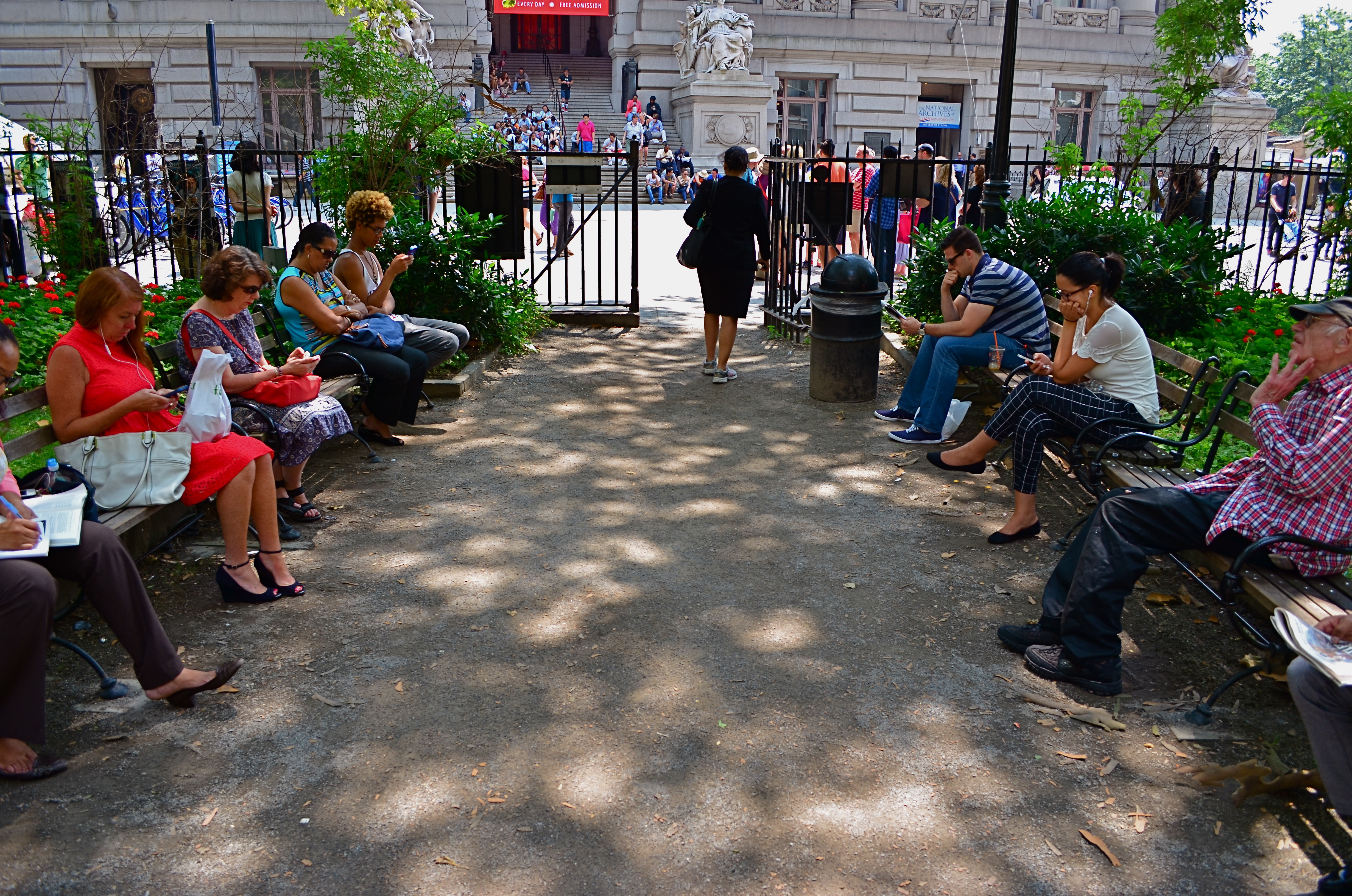
This street shot from a park in lower Manhattan is not ready for prime time, but it might get there with creative cropping.
By MICHAEL PERKINS
FOR ME, ONE OF THE GREATEST ANCILLARY BENEFITS of doing historical research has been the privilege of poring over old files of newspaper and magazine photographs, in many cases viewing original, pre-publication master shots. It’s truly an exercise in reading between the “lines”, those hurried slashes of white grease pencil applied by editors as cropping instructions on shots that were too big, too busy, too slow in getting to the point. In many cases, you realize that, while the photographer may have taken the picture, it was the editor who found the picture.
Of course, no amount of cutting can improve a shot if there is not already a core story hiding within it. You can pare away the skin and seed of an apple, but some apples prove themselves rotten through and through. It’s the same with a photograph. However, if you teach yourself how to spot what, within a frame, is fighting with the central strength of a photo, it becomes obvious where to wield your scissors.
In the master shot image at top, the symmetry of the left and right groups of park visitors is blunted in its effect by the unneeded information along the top and bottom thirds of the frame. The shot is not really about the museum in the distance nor the ground in front of the benches. They just don’t help the flow of the picture, so losing them seems like the easiest way to boost the overall composition.
Now the shot is essentially a wide-angle, and, absent the earlier distractions, a kind of horseshoe curve emerges, tying the two benches together. You might even think of it as an arch shape, with the walking woman at the top acting as a keystone. She now draws attention first to the center, then around the curve, so that getting people to see what I am seeing becomes a lot easier. Finally, there is still a very loud distraction from the color in the shot, so a black-and-white remix keeps the reds and louder colors from “showing off” and lessening the impact of the story. The final result is still no masterpiece, but it does demonstrate that there was a very different picture hiding within the master shot, one that was certainly worth going after.
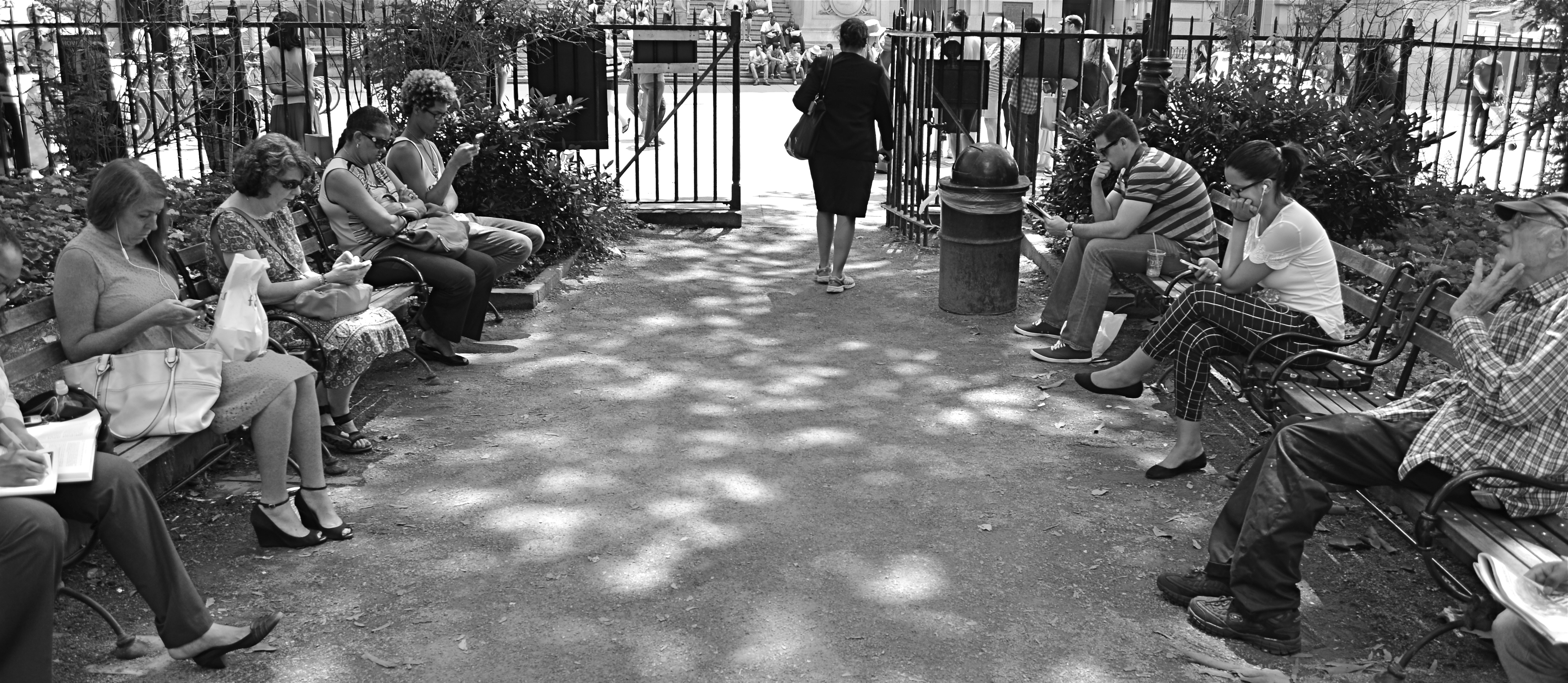
The “after” version, minus the color and some high-and-low-end visual distractions.
One of the downsides of being an amateur shooter is not reaping the benefit of a ruthless photo editor. However, learning to spot the weaknesses in potentially effective shots can be learned, most importantly the “ruthless” part. If you believe in an image, you won’t shy away from trimming its fingernails a bit to give it a chance to shine.
