TERRA INCOGNITA
By MICHAEL PERKINS RANDOMNESS HAS STUBBORNLY ASSERTED ITSELF AS ONE OF THE MOST DECISIVE FORCES IN ALL OF PHOTOGRAPHY.One of the eternal struggles in our craft has been between our intense attempts to reduce the recording of light to a predictable science, and nature’s insistent pushback, allowing things that just happen to shape our results. I think most of our work as individuals is a constant wrestling between these two forces. One moment we fancy ourselves mastering all the variables that create images, and in the next we celebrate the wilding potential of just letting go, and actually celebrating the random effect. I find myself careening between the comfort of all the techniques I have accumulated over a lifetime, the so-called “guarantees” that I’ll capture what I’m looking for, and the giddy discovery that accidentals, or artifacts, somehow found themselves in my pictures despite my best efforts. The problem, for me, is learning to celebrate something wonderful that happened without my consciously causing it.
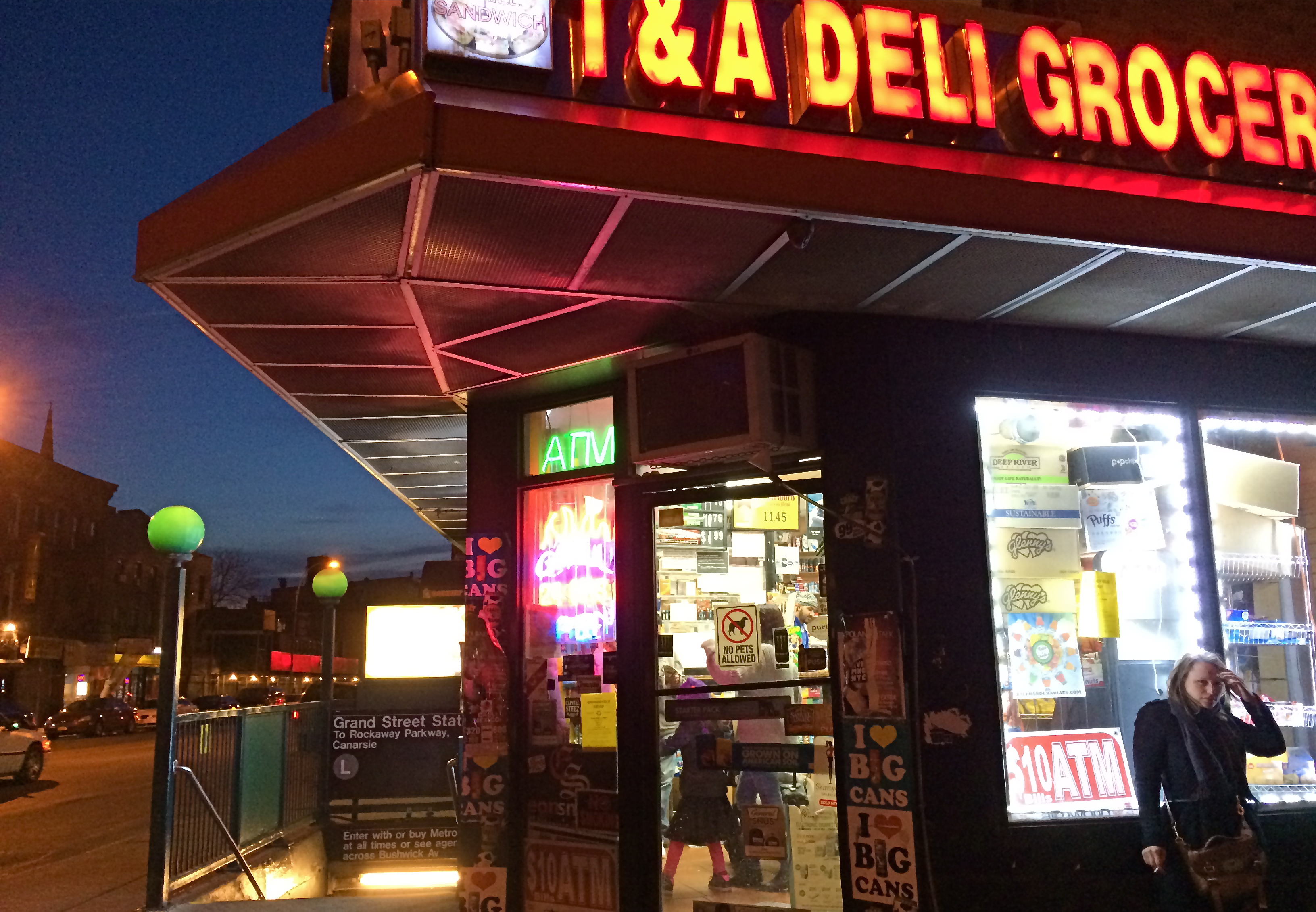
Brooklyn Bodega, 2014.
Phone cameras are forcing me to accept a little less control, since, even at their best, they can’t be managed in the way that standard DSLRs can. That leaves a certain number of results to chance, or, more exactly, to a display of the camera’s limits. One one hand, I’m grateful for the shots that I can “save” by using a mobile, since there will always be times that other types camera will be blocked, forbidden, or inconvenient. On the other hand, the results always make me wonder what else might have been possible if I had been completely at the helm in the making of the images. Some of the things I get “on the fly” with a phone camera are actually a bit magical, so that I actually love the things that are “wrong” with the picture. I’m sure this is part of the enjoyment that the lomography crowd derive from working with plastic toy cameras which create totally unpredictable results purely as a result of the camera’s shortcomings. In the above image, the garish register of nearly every color by my iPhone works well with the bizarre collision of dusk, neon, urban textures, even the overblown mystery of what’s going on inside the crazed little bodega shown here. The extreme wide-angle bias of the iPhone also has stretched things into exotic exaggerations of perspective, and the camera’s auto-boosted ISO produces a high level of noise. Does it all work? Yeah, pretty much. I don’t surrender control easily, but I’ve seen enough of the fortunate accidents of photographers from all over the world not to welcome nature’s interventions. I mean, after all, the idea that we’re actually in control is, at best, a pleasant illusion. We don’t really understand lightning, and yet, somehow, we’ve been given the ability to capture it in a box. Strange.
TURN THE PAGE
By MICHAEL PERKINS
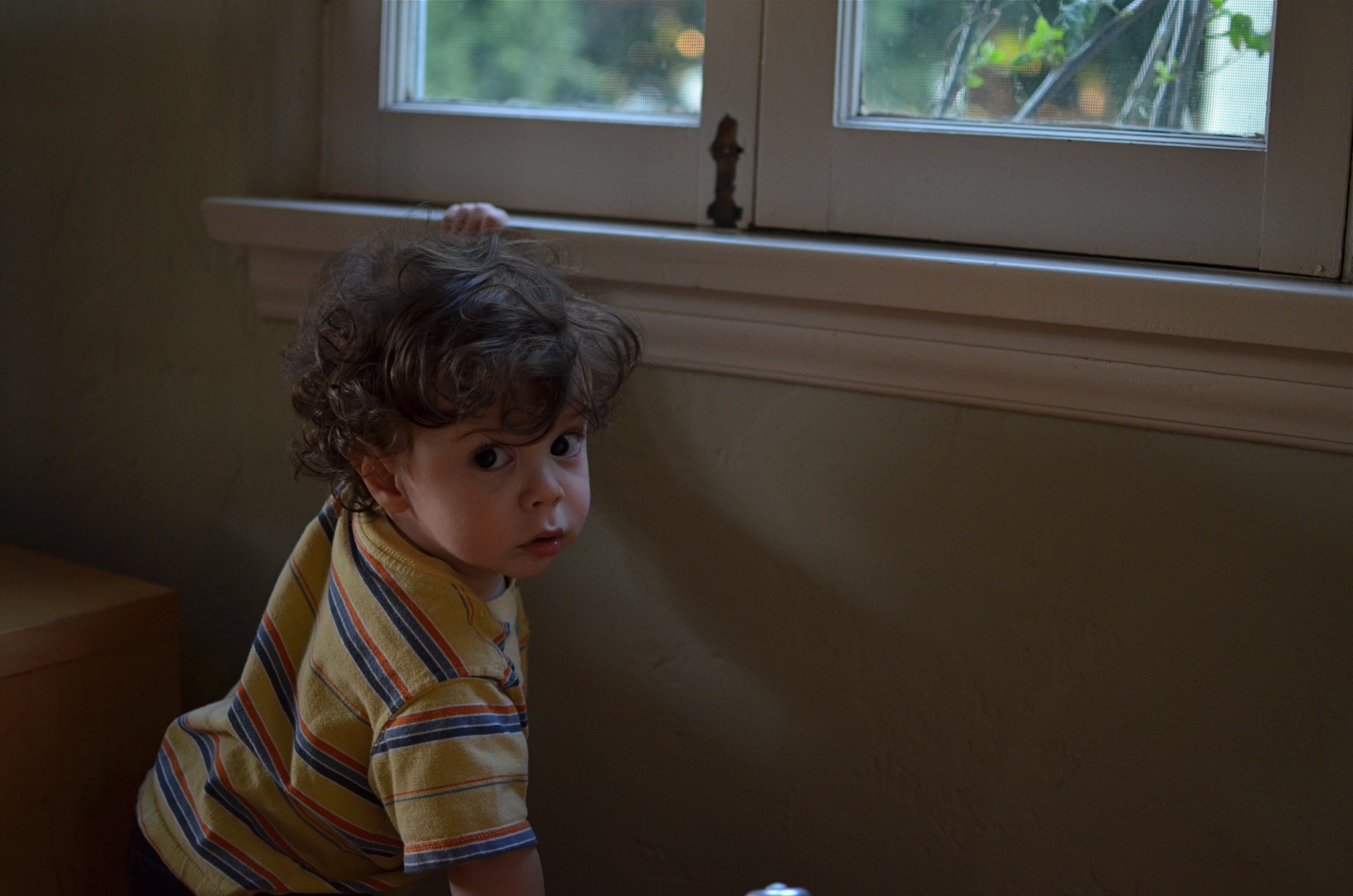
I’M VERY ACCUSTOMED TO BEING STOPPED IN MY TRACKS AT A PHOTOGRAPH THAT EVOKES A BYGONE ERA: we’ve all rifled through archives and been astounded by a vintage image that, all by itself, recovers a lost time.
It’s a little more unsettling when you experience that sense of time travel in a photo that you just snapped. That’s what I felt several weeks ago inside the main book trove at the Morgan Library in New York. The library itself is a tumble through the time barrier, recalling a period when robber barons spent millions praising themselves for having made millions. A time of extravagant, even vulgar displays of success, the visual chest-thumping of the Self-Made Man.
The private castles of Morgan, Carnegie, Hearst and other larger-than-life industrialists and bankers now stand as frozen evidence of their energy, ingenuity, and avarice. Most of them have passed into public hands. Many are intact mementos of their creators, available for view by anyone, anywhere. So being able to photograph them is not, in itself, remarkable.
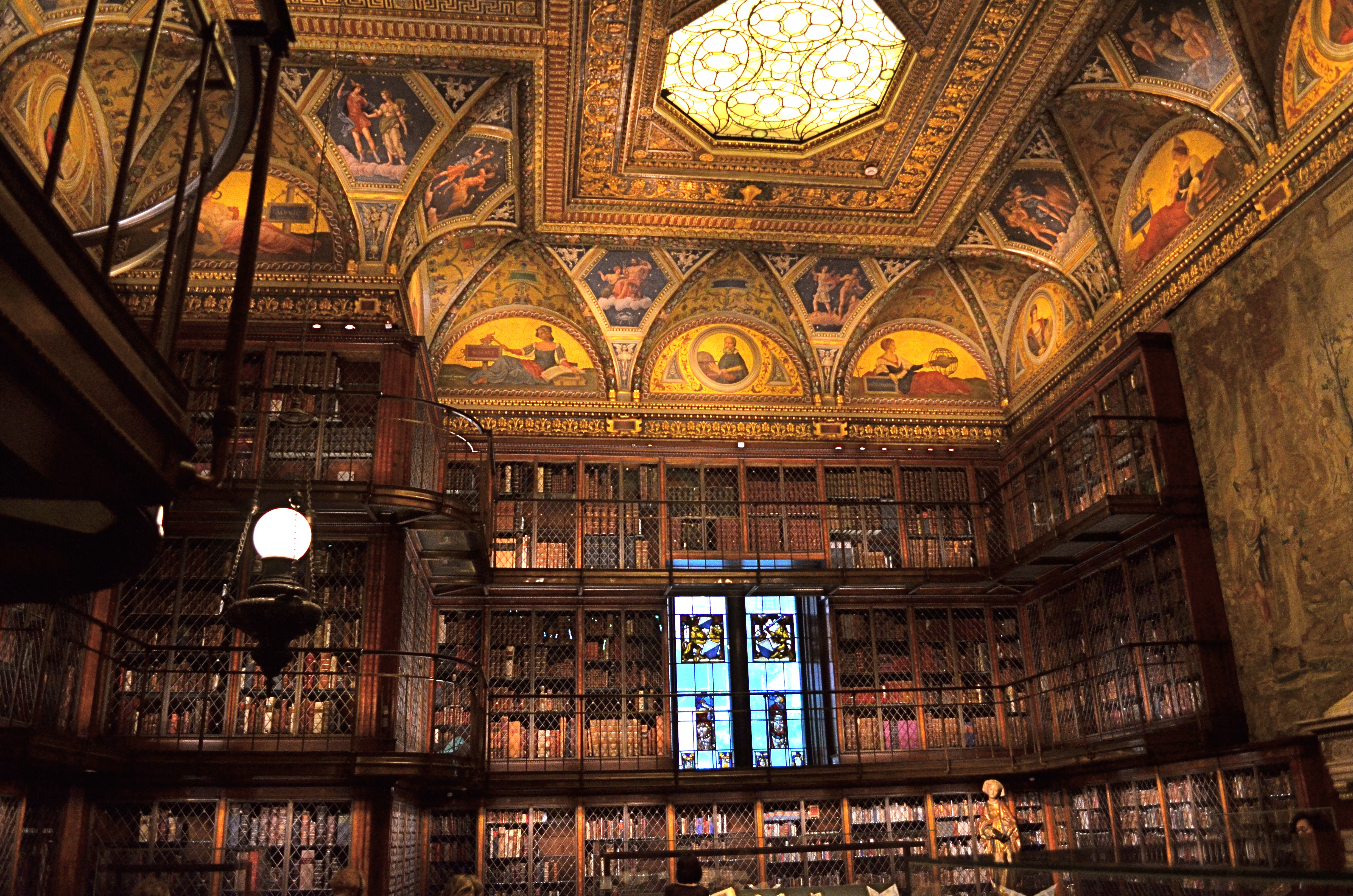
A little light reading for your friendly neighborhood billionaire. Inside the Morgan Library in NYC.
No, it’s my appreciation of the fact that, today,unlike any previous era in photography, it’s possible to take an incredibly detailed, low-light subject like this and accurately render it in a hand-held, non-flash image. This, to a person whose life has spanned several generations of failed attempts at these kinds of subjects, many of them due to technical limits of either cameras, film, or me, is simply amazing. A shot that previously would have required a tripod, long exposures, and a ton of technical tinkering in the darkroom is just there, now, ready for nearly anyone to step up and capture it. Believe me, I don’t dispense a lot of “wows” at my age, over anything. But this kind of freedom, this kind of access, qualifies for one.
This was taken with my basic 18-55mm kit lens, as wide as possible to at least allow me to shoot at f/3.5. I can actually hand-hold fairly steady at even 1/15 sec., but decided to play it safe at 1/40 and boost the ISO to 1000. The skylight and vertical stained-glass panels near the rear are WINOS (“windows in name only”), but that actually might have helped me avoid a blowout and a tougher overall exposure. So, really, thanks for nothing.
On of my favorite Twilight Zone episodes, the one about Burgess Meredith inheriting all the books in the world after a nuclear war, with sufficient leisure to read his life away, was entitled “Time Enough At Last”. For the amazing blessings of the digital age in photography, I would amend that title by one word:
Light Enough…At Last.
STOP AT “YES”
By MICHAEL PERKINS
THERE SEEMS TO BE A PROPENSITY, WITHIN THE DNA OF EVERY PHOTOGRAPHER, to “show it all”, to flood the frame with as much visual information as humanly possible in an attempt to faithfully render a story. Some of this may track back to the first days of the art, when the world was a vast, unexplored panorama, a wilderness to be mapped and recorded. Early shutterbugs risked their fortunes and their lives to document immense vistas, mountain ranges, raging cataracts, daunting cliffs. There was a continent to conquer, an immense openness to capture. The objectives were big, and the resultant pictures were epic in scale.
Seemingly, intimacy, the ability to select things, to zero in on small stories, came later. And for some of us, it never comes. Accordingly, the world is flooded with pictures that talk too loudly and too much, including, strangely, subjects shot at fairly close range. The urge is strong to gather, rather than edit, to include rather than to pare away. But there are times when you’re just trying to get the picture to “yes”, the point at which nothing else is required to get the image right, which is also the point at which, if something extra is added, the impact of the image is actually diminished. I, especially, have had to labor long and hard to just get to “yes”….and stop.
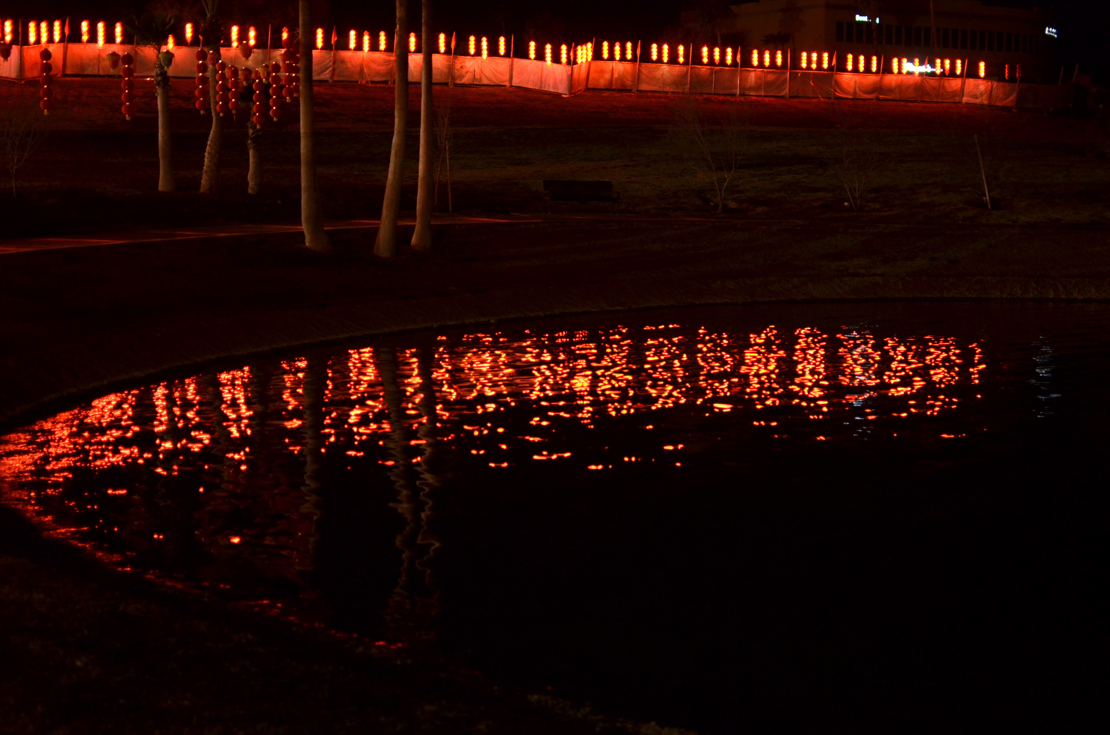
“Don’t overthink this”, say the Photo Phates. 1/25 sec., f/1.8, ISO 640, 35mm.
In the above image, there are only two elements that matter: the border of brightly lit paper lanterns at the edge of a Chinese New Year festival and the small pond that reflects back that light. If I were to exhaust myself trying to also extract more detail from the surrounding grounds or the fence, I would accomplish nothing further in the making of the picture. As a matter of fact, adding even one more piece of information can only lessen the force of the composition. I mention this because I can definitely recall occasions when I would whack away at the problem, perhaps with a longer exposure, to show everything in more or less equal illumination. And I would have been wrong.
Even with this picture, I had to make myself accept that a picture I like this much required so little sweat. Less can actually be more, but we have to learn to get out of our own way….to stop at “yes”.
NEAR MISS/NEAR SAVES
By MICHAEL PERKINS
THE PICTORIAL POTENTIAL OF SOME EVENTS, PHOTOGRAPHICALLY, TURNS OUT SOMEWHAT LESS MIRACULOUS THAN ADVERTISED. That is to say, a few of the things that you assume will certainly yield stunning image opportunities come off, in reality, with the majesty of, well, a flea circus. Sometimes, you think you’ll come home with the Seven Wonders Of The World inside your camera. Other times, you have to fight a strong urge to give up all this “pitcher-takin'” nonsense and take up honest work, like bank robbing, where you can at least set your own hours.
We’ve all been there.
Fairs, festivals, commemorations, parades…..these are all happenings which are ripe with potential, for which we have all camped out on the perimeter of what we hope and pray will be the Next Big Thing, only to come home with crumbs. Leavings. And the best thing to do when an event becomes a near-miss is to seek out what I call the “near saves”. That is, when the story at a given event is disappointingly small, go smaller….toward the intimate detail, the human component, the pertinent bit of texture or atmosphere. The overall panorama may fail, but a single face, a structural element, a series of shadows may deliver where the overall scene fails.

“Went To See The Gypsy…” 1/40 sec., f/1.8, ISO 100, 35mm.
The above image happened almost by accident. Around early sunset, I rushed into an over-hyped cultural festival which failed to achieve full wonderfullness (trust me), and, hours after sunset, I was leaving in defeat, when, near the exit, I spotted a genuine, weirdo-beardo-freak-yourself-out gypsy fortune-telling machine, right out of Tom Hanks’ Big, wonderfully lit by ambient neon on the midway and the device’s own built-in “spook light”. The deepening dark of night was suddenly my best friend, boosting the mystery with oodles of deep shadow. With a 35mm prime lens, I could open clear up to f/1.8, keeping my ISO low at 100 and allowing me to get plenty of light at 1/40 of a second. I was amazed that I had walked right past this treasure when I entered the festival, but I was grateful for a second chance. Snap and done.
Thus,my best shots from the night were of anything but the main “attractions” of the event. Going small meant going beyond the obvious, the difference between a near miss and a near save.
The difference.
MORE BOUNCE TO THE OUNCE

Fish ‘n’Books, 2013. 1/200 sec., f/3.5, ISO 100, 35mm.
By MICHAEL PERKINS
FOR THE MOST PART, THE USE OF ON-CAMERA FLASH SHOULD BE CONSIDERED A CRIME AGAINST HUMANITY. Scott Kelby, the world’s best-selling author of digital photography tutorials, famously remarked that “if you have a grudge against someone, shoot them with your pop-up flash, and it will even the score.” But, to be fair, let’s look at the pros and cons of using on-board illumination:
PROS : Cheap, handy
CONS: Harsh, Weak, Unflattering, Progenitor of Red-eye. Also, Satan kills a puppy every time you use it. Just sayin’.
There are, however, those very occasional situations where supplying a little bit of extra light might give you just the fill you need on a shot that is getting 90% of its light naturally. Even so, you have to employ trickery to harness this cruel blast of ouch-white, and simple bounces are the best way to get at least some of what you want.
In the above situation, I was shooting in a hall fairly flooded with bright mid-morning light, which was extremely hot on the objects it hit squarely but contrasty as an abandoned cave on anything out of its direct path. The fish sculpture in my proposed shot was getting its nose torched pretty good, but in black and white, the remainder of its body fell off sharply, almost to invisibility. I wanted the fish’s entire body in the shot, the better to give a sense of depth to the finished picture, but I obviously couldn’t flash directly into the shelf that overhung it without drenching the rest of the scene in superfluous blow-out. I needed a tiny, attenuated, and cheap fix.
Bending a simple white stationery envelope into a “L”, I popped up my camera’s flash and covered the unit with the corner of the envelope where the two planes intersected. The flash was scooped up by the envelope, then channeled over my shoulder, blowing onto the wall at my back, then bouncing back toward the fish in softened condition near the underside of the shelf, allowing just enough light to allow the figure’s bright nose to taper back gradually into shadow, revealing additional texture, but not over-illuminating the area. It took about five tries to get the thing to look as if the light could have broken that way naturally. Fast, cheap, effective.
The same principle can be done, with some twisting about, to give you a side or ceiling bounce, although, if high reflectivity is not crucial, I frankly recommend using your hand instead of the envelope, since you can twist it around with greater control and achieve a variety of effects.
Of course, the goal with rerouting light is to look as if you did nothing at all, so if you do save a picture with any of these moves, keep it to yourself. Oh, yes, you say modestly, that’s just the look I was going for.
Even as you’re thinking, whew, fooled ’em again.
HERE COMES THE NIGHT
Letting the shadows be the shadows.1/100 sec., f/1.8, ISO 250, 35mm.
By MICHAEL PERKINS
FOR SOME PHOTOGRAPHERS, THE END OF A CALENDAR YEAR MEANS BUSTING OUT THE “BEST OF” LISTS, and, certainly,for people with a certain level of skill, that’s a normal instinct. I am always far too horrified by how many losing horses I put in a given year’s race to try to find the few who didn’t go lame, wander off the track, or finish last, so I confine my year’s-end computations to lists of what I tried, and whether I got close to learning anything. For 2013, one bulletin emerges:
I like the dark. A lot.
That is, a simple head count of shots taken this year reveal that I was outside, after supper, at nearly every opportunity. And yes, with mixed results. Always and forever will them results be mixed, amen. If my results were in a Waring blender, going at full “puree” speed, they could not be more mixed, okay?
But for some reason, the quest took me back into a renewed appreciation of shadows, shades, a lack of light. I probably embraced the missing information and detail that the dark represents more joyfully than I have in many years. And that’s something of a journey, since, if I had any kind of post-processing crack habit recently, it was the mania to rescue more and more of that detail, whether in High Dynamic Range photos, Exposure Fusion photos or Tone Compression photos. For a while, I was acting like your Grandpa the first week he owned his new Magnavox (“…hmm, needs a little more green….no, now the horses look purple….let’s add some red…”).
What’s left out is as vital as what’s shown. 1/50 sec., f/1.8, ISO 640, 35mm.
Maybe 2013 was the year I pulled back a bit and just let darkness be, let it express the unknown and the unknowable. Photography is always at least partly about what you don’t show, not depicting the world as a giant Where’s Waldo overdose of texture and detail. In ’13, I spent a lot more time shooting night shots at the technical limit of my camera, but did not fiddle about much further afterwards. I was interested in “getting as much picture into the click” as possible, but what couldn’t be achieved with faster lenses or mildly enhanced ISO just got left out of the pictures. I feel like it was a year of correction, with me playing the part of a new teen driver has to learn to correct for over-steer.
The whole thing is about remembering that technique is not style. What you have to say is style. The mechanical means you use to get it said is technique. Learning to execute a technique is like mastering the workings of a camera. It does not guarantee that your results will be revelatory or eloquent. That means that falling in love with the consistent polishing of processing is a danger, since you can begin to love it for its own sake. Technique says “Look what I can do!”. Style says, “but, is this what I should be doing?”
Anyway, whatever I presently think is essential for my growth will, eventually, become just one more thing that I do, and will be supplanted by something else. That said, a good year in photography should not end with the collection of a pile of hits, but an unafraid assessment of the misses.
That’s where the next batch of good pictures will come from, anyway.
KEEPING SPIRITS BRIGHT

1/16 sec., f/4, ISO 100, 20mm.
By MICHAEL PERKINS
IT IS A SEASON OF LIGHT AND COLOR, perhaps one of the key times of the year for all things illuminated, burning, blazing and glowing. It is a time when opportunities for vivid and brilliant images explode from every corner.
And one way to unleash all that light is to manage darkness.
One example: your family Christmas tree involves more delicate detail, tradition and miniature charm than any other part of your home’s holiday decor, but it often loses impact in many snapshots, either blown out in on-camera flash or underlit with a few colored twinkles surrounded by a blob of piny silhouette.
How about a third approach: go ahead and turn off all the lights in the room except those on the tree, but set up a tripod and take a short time exposure.
It’s amazing how easy this simple trick will enhance the overall atmosphere. With the slightly slow exposure, the powerful tree LEDs have more than enough oomph to add a soft glow to the entire room, while acting as a multitude of tiny fill lights for the shaded crannies within the texture of the tree. Ornaments will be softly and partially lit, highlighting their design details and giving them a slightly dimensional pop.
In fact, the LED’s emit such strong light that you only want to make the exposure slow enough to register them. The above image was taken at 1/16 of a second, no longer, so the lights don’t have time to “burn in” and smear. And yes, some of you highly developed humanoids can hand-hold a shot steadily at that exposure, so see what works for you. You could also, of course, shoot wide open to f/1.8 if you have a prime lens, making things even easier, but you might run into focus problems at close range. You could also just jack up your ISO and shoot at a more manageable shutter speed, but in a darkened room you’re trading off for a lot of noise in the areas beyond the tree. Dealer’s choice.
Lights are a big part of the holidays, and mastery of light is the magic that delivers the mystery. Have fun.
JUST SAY THANK YOU
The All-Nighter: 1/60 sec., f/1.8, ISO 800, 35mm.
By MICHAEL PERKINS
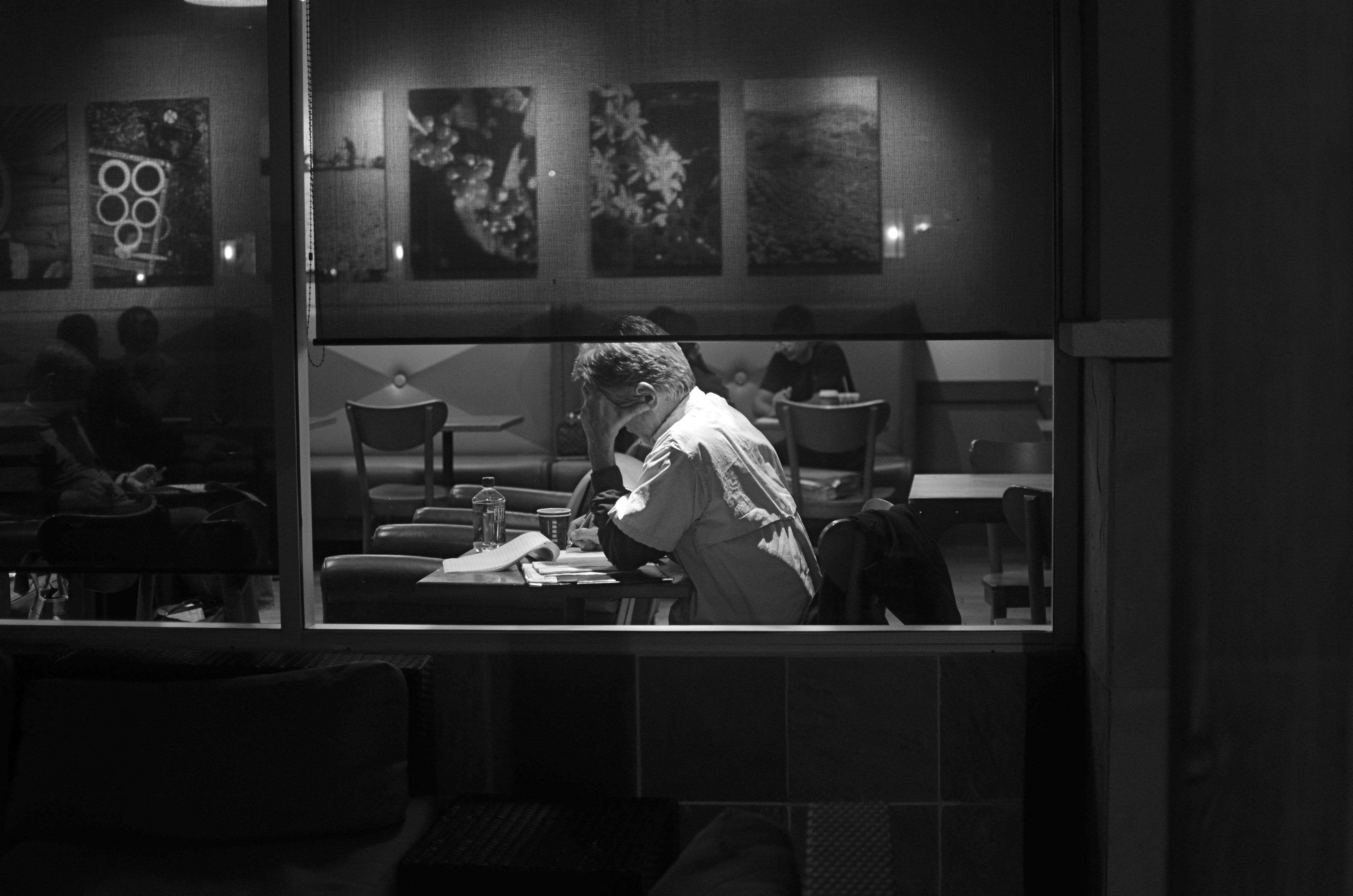
PICTURES HAPPEN WHEN YOU’RE OUT TRYING TO TAKE “OTHER” PICTURES. Pictures happen when you didn’t feel like taking any pictures at all. And, occasionally, the planets align perfectly and you hold something in your hand, that, if you are honest, you know you had nothing to with.
Those are the pictures that delight and haunt. They happen on off-days, against the grain of whatever you’d planned. They crop up when it’s not convenient to take them, demanding your attention like a small insistent child tugging at your pants leg with an urgent or annoying issue. And when they call, however obtrusively, however bothersome, you’d better listen.
Don’t over-think the gift. Just say thank you….and stay open.
This is an overly mystical way of saying that pictures are sometimes taken because it’s their time to be taken. You are not the person who made them ready. You were the person who wandered by, with a camera if you’re lucky.
I got lucky this week, but not with any shot I had set out on a walkabout to capture. By the time I spotted the scene you see at the top of this post, I was beyond empty, having harvested exactly zip out of a series of locations I thought would give up some gold. I couldn’t get the exposures right: the framing was off: the subjects, which I hoped would reveal great human drama, were as exciting as a bus schedule.
I had just switched from color to monochrome when I saw him: a young nighthawk nursing some eleventh-hour coffee while poring over an intense project. Homework? A heartfelt journal? A grocery list? Who could tell? All I could see, in a moment, was that the selective opening and closing of shades all around him had given me a perfect frame, with every other element in the room diffused to soft focus. It was as if the picture was hanging in the air with a big neon rectangle around it, flashing shoot here, dummy.
My subject’s face was hidden. His true emotion or state of mind would never be known. The picture would always hide as much as it revealed.
Works for me. Click.
Just like the flicker of a firefly, the picture immediately went away. My target shifted in his chair, people began to walk across the room, the universe changed. I had a lucky souvenir of something that truly was no longer.
I said thank you to someone, packed up my gear, and drove home.
I hadn’t gotten what I originally came for.
Lucky me.
related articles:
- Crop and turn a bad picture into a good one (weliveinaflat.wordpress.com)
CHOOSE NOT TO CHOOSE
By MICHAEL PERKINS
FOR MOST PHOTOGRAPHERS, THE ACT OF MAKING A PICTURE HAS TRADITIONALLY MEANT CHOOSING ONE THING OVER ANOTHER; exposing some things within a frame nearly perfectly, while, by default, settling for under-or-over-exposure of other objects within that same picture. We find ourself making priorities within the image, sorting things into piles marked “important” and “not important”. Get the color right on the surf and let the sky go white. Tamp down the snowy mountain and leave the surrounding forest black. Get this part right: leave this part wrong.
At least that’s what our earlier habits led us to accept. You can’t have it all, we tell ourselves. Decide what you really need to show and leave the rest. However, there’s a big difference between deciding to de-emphasize something in an image and feeling powerless to do anything else. Happily, ongoing developments in camera technology work to progressively minimize the number of scenarios in which you have to make these unholy choices, and one of the things that can save many such pictures is (a) readily at hand, (b) cheap, and (c) easy to work with; your on-board flash.
Now before I go further, know that I hate, hate, hate on-board flash 99.9999999% of the time. It’s only slightly less harsh than a blowtorch, lousy beyond a short distance, and generally hard to focus and direct. That said, I am occasionally an oh, hell yeah believer in fill flash, for which these rude little beacons can be useful.

May not look like a job for your on-camera flash, but it really can help. 1/200 sec., f/5.6, ISO 100, 35mm.
In the above image, shooting the traditional way, you can choose a balanced exposure for either the front yard beyond this rustic homes’ porch or the detail on the porch itself, but not both. However, if you pop up the flash, expose for the yard, and then back off just beyond the flash’s outer range, a gentle bit of light illuminates the porch’s wood grain and reduces the shadow nooks without bleaching them out (Note that, with the flash up, you can’t shoot any faster than 1/200, so you may have to control the exposure of the yard by going for a smaller f-stop. I used 5.6 here). The result is an illusion, since you’ve tricked the camera into recording an even range of light that your eye and brain seem to see naturally, but the trick looks as if it ought to be “real”.
Of course, if the yard is so magnificent in its own right, you may choose to show the porch in silhouette just to call attention to all that floral glory, but the thing is, you’re not locked in to that choice alone. The horrible, harsh on-board flash can give you more options, and thus (barely) justify its existence.
And did I mention it’s cheap and easy?
Follow Michael Perkins on Twitter @MPnormaleye.
TAKE WHAT YOU NEED AND LEAVE THE REST
By MICHAEL PERKINS
LOOKING OVER MY LIFETIME “FAIL” PHOTOGRAPHS, FROM EARLIEST TO LATEST, it’s pretty easy to make a short list of the three main problems with nearly all of them, to wit:
Too Busy.
Too Much Stuff Going On.
I Don’t Know Where I’m Supposed To Be Looking.
Okay, you got me. It’s the same problem re-worded three ways. And that’s the point, not only with my snafus but with nearly other picture that fails to connect with anybody, anywhere. As salesmen do, photographers are always “asking for the order”, or, in this case, the attention of the viewer. Often we can’t be there when our most earnest work is seen by others. If the images don’t effectively say, this is the point of the picture, then we haven’t closed the deal.
It’s not simple, but, yeah, it is that simple.
If we don’t properly direct people to the main focus of our story, then we leave our audiences wandering in the woods, looking for a way out. Is it this path? Or this one?
In our present era, where it’s possible to properly expose nearly everything in the frame, we sometimes lose a connection to the darkness, as a way to cloak the unimportant, to minimize distraction, to force the view into a succinct part of the image. Nothing says don’t look here like a big patch of black, and if we spend too much time trying to show everything in full illumination, we could be throwing away our simplest and best prop.
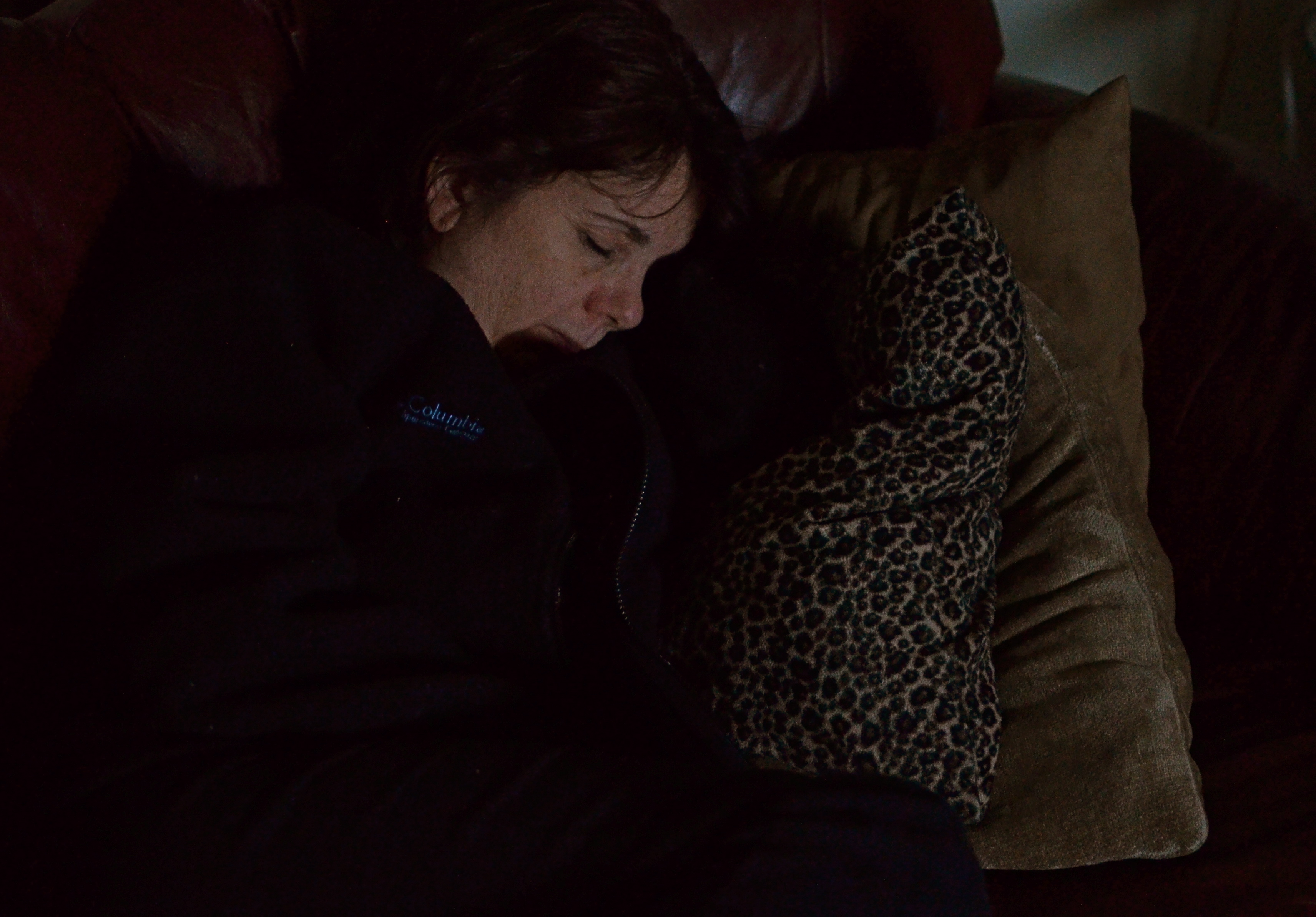
Let sleeping wives lie. Work the darkness like any other tool. 1/40 sec., f/1.8, ISO 1250 (the edge of pain), 35mm.
In the above picture of my beautiful Marian, I had one simple mission, really. Show that soft sleeping face. A little texture from the nearby pillows works all right, but I’m just going to waste time and spontaneity rigging up a tripod to expose long enough to show extra detail in the chair she’s on, her sweatshirt, or any other surrounding stuff, and for what? Main point to consider: she’s sleeping, and (trust me) sleeping lightly, so one extra click might be just enough to end her catnap (hint: reject this option). Other point: taking extra trial-and-error shots just to show other elements in the room will give nothing to the picture. Make it a snapshot, jack up the ISO enough to get her face, and live with the extra digital noise. Click and done.
For better or worse.
Composition-wise, that’s often the choice. If you can’t make it better, for #%$&!’s sake don’t make it worse.
Follow Michael Perkins on Twitter @MPnormaleye.
MAKING THE MIRACLES MUNDANE

Connection outranks context.
By MICHAEL PERKINS
GIVEN OUR USUAL HUMAN PROPENSITY FOR USING PHOTOGRAPHY AS A LITERAL RECORDING MEDIUM, most of our pictures will require no explanation. They will be “about” something. They will look like an object or a person we have learned to expect. They will not be ambiguous.
The rest, however, will be mysteries…..big, uncertain, ill-defined, maddening, miraculous mysteries. Stemming either from their conception or their execution, they may not immediately tell anyone anything. They may ring no familiar bells. They may fail to resemble most of what has gone before. These shots are both our successes and failures, since they present a struggle for both our audiences and for ourselves. We desperately want to be understood, and so it follows that we also want our brainchildren to be understood as well. Understood…and embraced.
It cannot always be, and it should not always be.
No amount of explanatory captioning, “backstory” or rationalization can make clear what our images don’t. It sounds very ooky-spooky and pyramid- power to say it, but, chances are, if a picture worked for you, it will also work for someone else. Art is not science, and we can’t just replicate a set of coordinates and techniques and get a uniform result.
There is risk in making something wonderful….the risk of not managing to hit your mark. It isn’t fatal and it should not be feared. Artistic failure is the easiest of all failures to survive, albeit a painful kick in the ego. I’m not saying that there should never be captions or contextual remarks attached to any image. I’m saying that all the verbal gymnastics and alibis in the world won’t make a space ship out of a train wreck.
The above image is an example. If this picture does anything for you at all, believe me, my explanation of how it was created will not, repeat, not enhance your enjoyment of it one particle. Conversely, if what I tried is a swing and a miss, in your estimation, I will not be able to spin you a big enough tale to see magic where there is none. I like what I attempted in this picture, and I am surprisingly fond of what it almost became along the way. That said, I am perfectly fine with you shrugging your shoulders and moving on to the next item on the program.
Everything is not for everybody. So when someone sniffs around one of your photographs and asks (brace for it), “What’s that supposed to be?”, just smile.
And keep taking pictures.
Follow Michael Perkins on Twitter @MPnormaleye.
Related articles
- Weakness as Potential Strength (munchow.wordpress.com)
- Hidden Surprises in the Mundane (piconomy.wordpress.com)
NOT A LEG TO STAND ON
No tripod, no problem. Minimal noise even at 3200 ISO. Handheld in NYC’s theatre district at 1/50 sec., f/3.5, 18mm.
By MICHAEL PERKINS
ADVANCES IN PHOTOGRAPHY, WHETHER IN THE SCIENCES OF LENSES, FILMS, SENSORS OR TECHNIQUE, ALL HAVE, AS THEIR AIM, THE SAME RESULT: to make it easier to take more pictures…more often, and with fewer barriers between what you see and what you can catch in the box. Taking more pictures means increasing the yield of wonderful pictures, even if 95% of what you shoot is doody, and getting to the decisive moment of the “click” beats any other imperative. Any gimmicks or toys that don’t increase your readiness to shoot are wasteful detours.
This means that we are constantly weeding out dead growth, trimming away systems or ideas that have outgrown their usefulness. Rusty ways of doing things that cost us time, require extra steps, and eventually rob us of shots.
And that’s why it’s the age of the tripod is nearly over.
Getting past our artistic bias toward the ‘pod as a vital tool in the successful creation of images is tough; we still associate it with the “serious” photographer, even though today’s cameras solve nearly all of the problems tripods were once reliable in offsetting. What we’re left with, regarding the tripod’s real value, then, is old brain wiring and, let’s face it, sentiment.
More importantly, to my first point, the tripod is not about, “Okay, I’m ready!”. It’s about, “Hold on, I’ll be ready in a minute.” Worse yet, to the petty dictators who act as the camera police in churches, monuments, retail establishments and museums, they scream, “you can’t be here”. Call me crazy, but I still think of lack of access (spelled “getting kicked out”) as, well, sort of a hindrance to photography.
Just sayin’.
Tripods were, once upon a time, wonderful protection again several key problems, among them: slow film/sensor speed, vibration risk, and sharpness at wider apertures, all of which have long since been solved. Moreover, tripods may tempt people to shoot at smaller apertures, which could lead to softer overall images.
Had I stopped to set up a tripod here, my light, and my chance, would have melted away. 1/15 sec,. handheld, with a 35mm prime, wide-open, at f/1.8, ISO 640.
I readily concede that tripods are absolutely vital for extended night exposures, light painting, miniature work, and some other very selective professional settings. But for more than a century, ‘pods have mostly been used to compensate where our cameras were either flawed or limited. So, if those limits and flaws have faded sufficiently to allow you to take a nighttime snap, handheld at f/1.8, with a 1/15 shutter speed and the virtual guarantee of a well-lit shot, with negligible noise, why would you carry around twice the gear, pretty much ensuring that you would lose time, flexibility, and opportunities as a result?
The tripod has served us well, as was once true of flash powder, glass plates, even the torturous neck braces used to hold people’s heads in position during long exposures. But it no longer has a leg to stand on.
Follow Michael Perkins on Twitter @MPnormaleye.
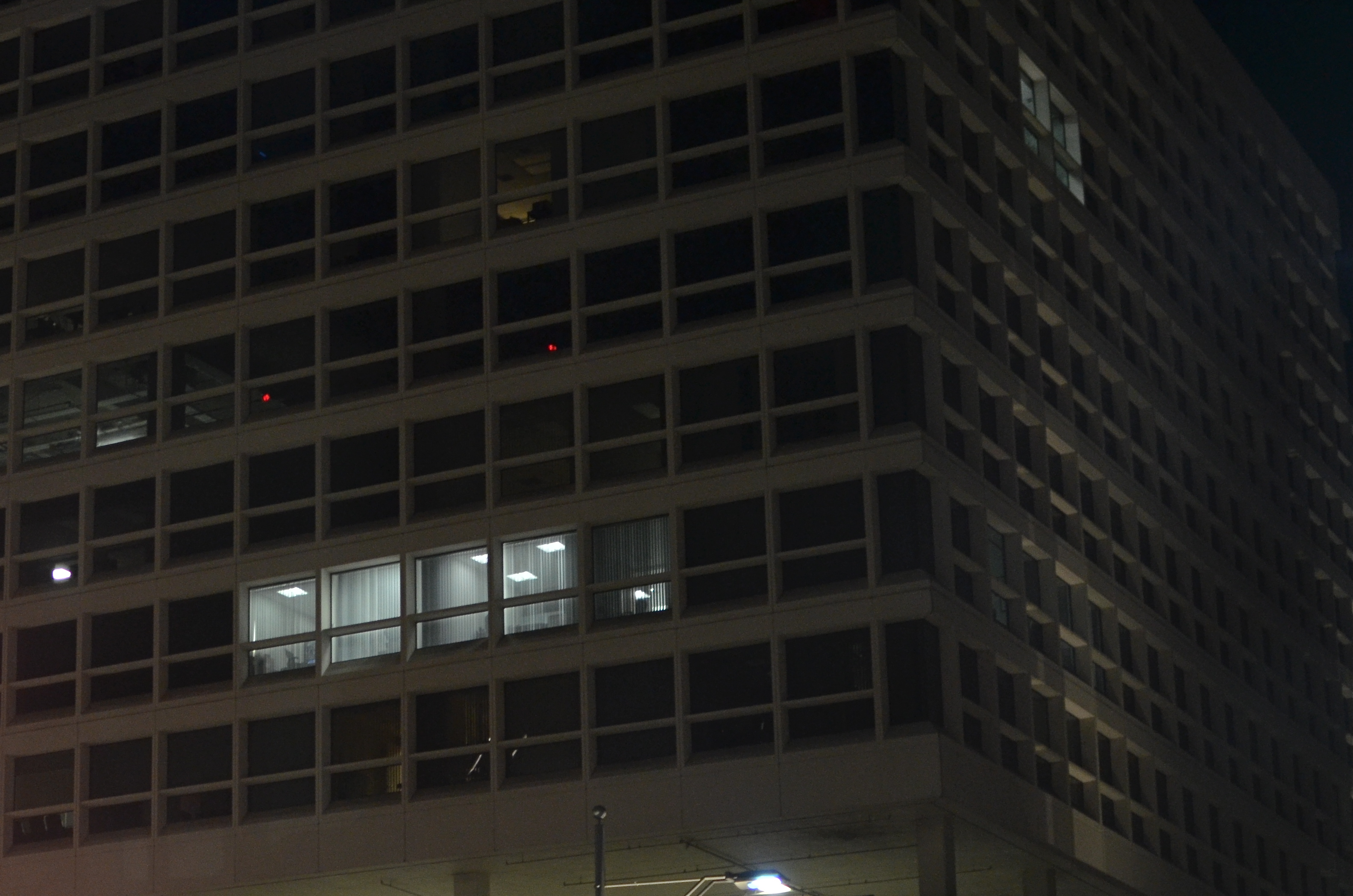
PARADOX
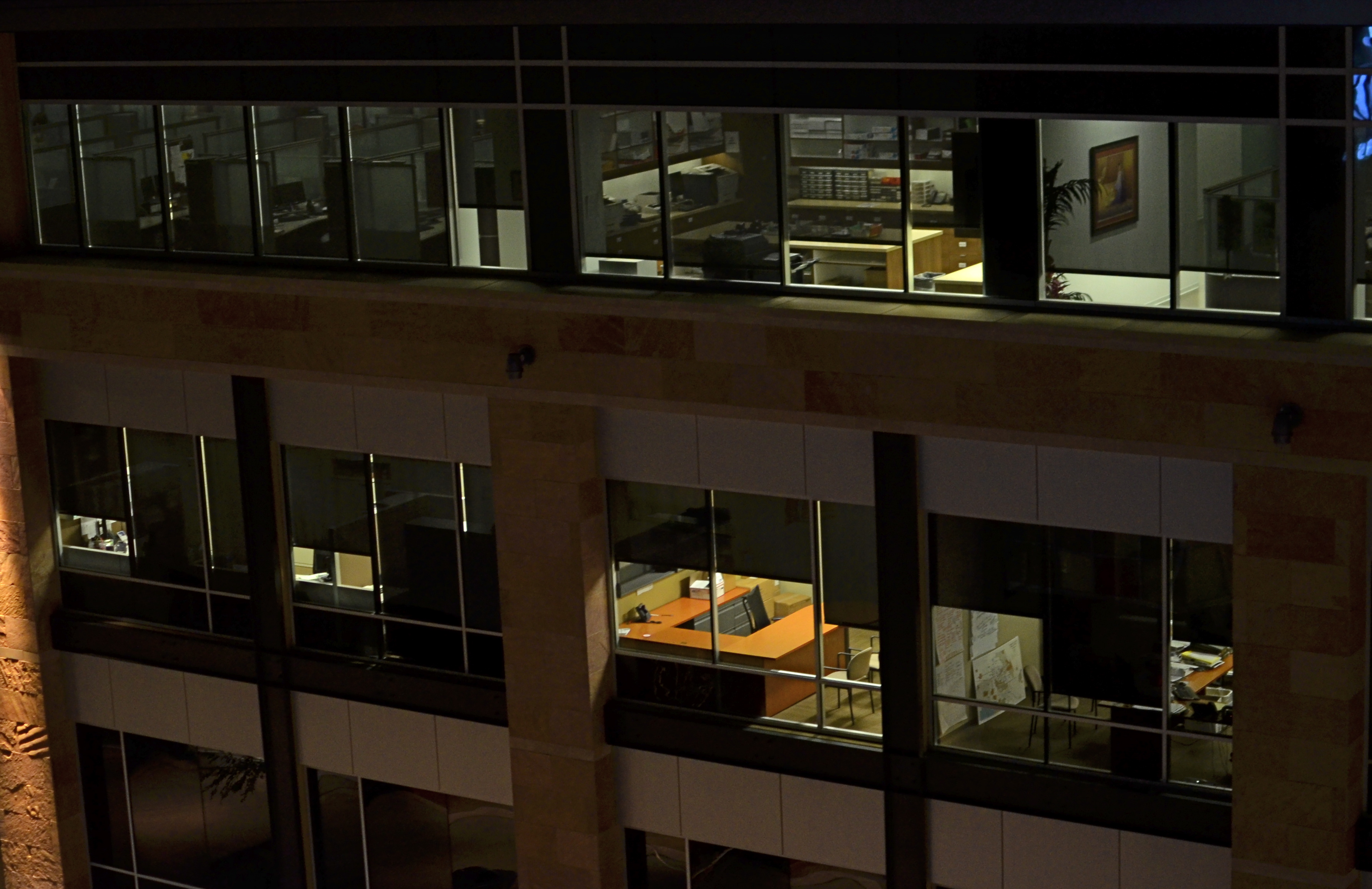
Where is the main story here? Far away, or up close? 1/60 sec., f/1.8, ISO 400, 35mm.
By MICHAEL PERKINS
EVERY SET OF VISUAL ELEMENTS, CAPTURED AT OPPOSITE EXTREMES, DELIVERS A COMPLETELY DIFFERENT SET OF STORY RESULTS. For photographers, the everlasting tug-of-war, involving “what to shoot?” is usually between “how close” and “how far away”? Even the lenses we buy, along with their unique properties, reflect this struggle between the intimate tale, told by a close-up, versus the saga, drawn from a vast panorama. There is a season, turn turn turn, for all kinds of image-making, and it’s no great revelation that many shooters can look at the same grouping of components and get remarkably different results.
Had I come upon the cluster of office cubicles seen in the image above on, say, day “A”, I might have been inclined to move in close, for a personal story, a detailed look at Life In The Office In This Modern World, or how worker #3456 left behind his umbrella and half a tuna sandwich. As it turned out, however, it was day “B”, and instead I saw the entire block of spaces as part of an overall pattern, as a series of lives linked together but separate, resulting in the more general composition shown here. I was shooting wide open at f/1.8 to retrieve as much light, handheld, as quickly as possible, to use the surrounding darkness to frame all the visual parts of the scene as boxes-within-boxes, rather than a single cube that warranted special attention.
Next time I’m up to bat with a similar scene, I could make the completely opposite decision, which is not a problem, because there never is a wrong decision, only (usually) wrong execution. And, yes, I realize that, by shooting empty offices, I dodged the whole ethical bullet of “should I be spying on all these people?”, otherwise known as Street Photographers’ Conundrum # 36.
I love wrestling with the paradox of how close, how far. There can be no decisive solution.
Only the fun of the struggle.
Welcome to our newest followers. Check their work out at :
http://www.en.gravatar.com/glennfolkes85
A BRIEF AUDIENCE WITH THE QUEEN
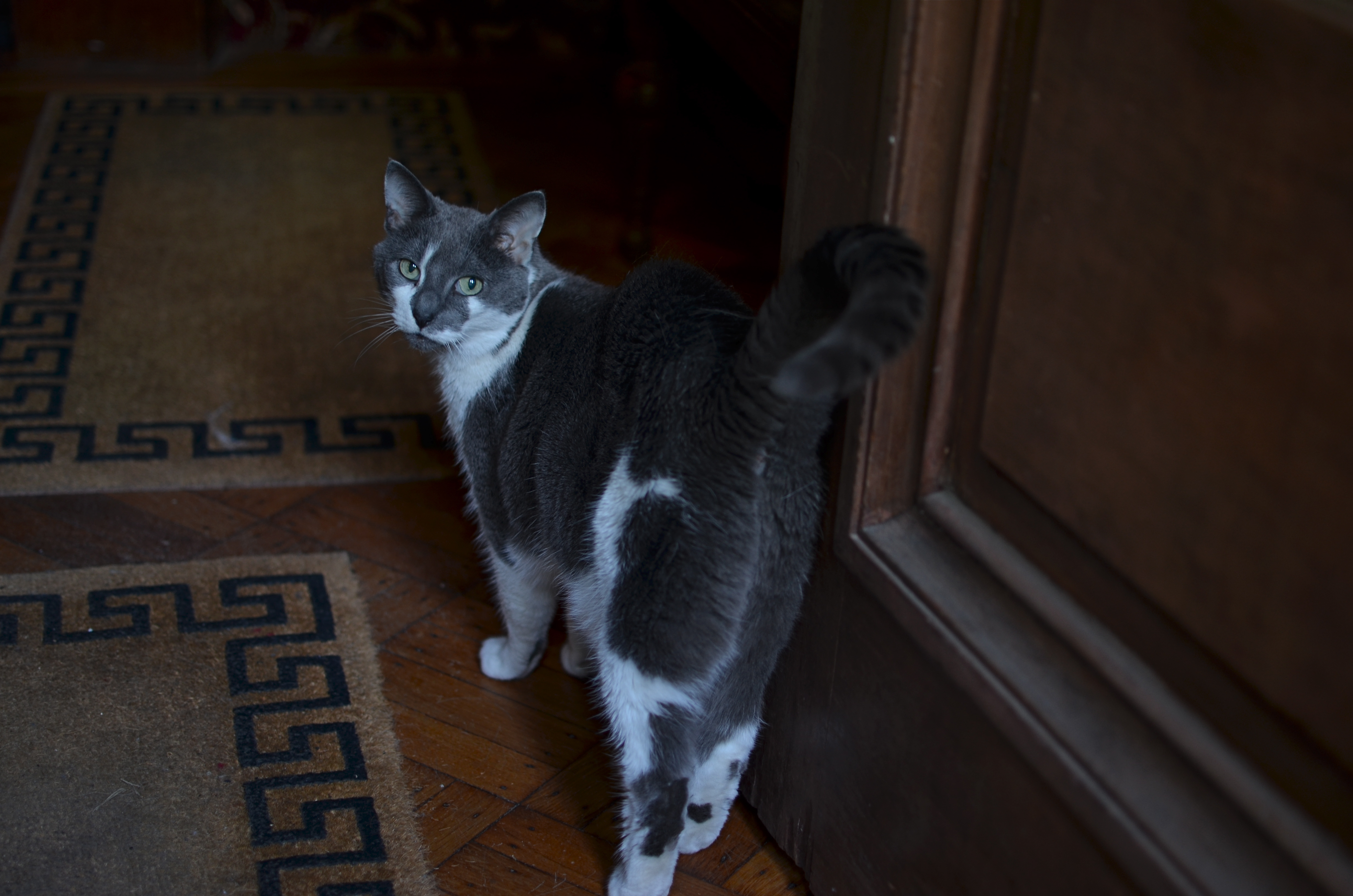
What, are YOU still here? 1/40 sec., f/1.8, ISO 100, 35mm.
By MICHAEL PERKINS
THERE IS ONLY ONE KIND OF PICTURE YOU WILL EVER TAKE OF A CAT, and that is the one she allows you to take. Try stealing an image from these spiritual creatures against their will, and you will reign over a bitter kingdom of blur, smear, and near misses.
It’s trickier to take photos of the ectoplasmic projections of departed relatives. But not by much.
I recently encountered this particular lady in a Brooklyn brownstone, a gorgeous building, but not one that is exactly flooded with light, even on a bright day. There are a million romantically wonderful places for darkness to hide inside such wonderful old residences, and any self-respecting feline will know how to take the concept of “stealth” down a whole other road. The cat in the above photo is, believe me, better at instant vaporization and re-manifestation than Batman at midnight in Gotham. She also has been the proud unofficial patrol animal for the place since Gawd knows when, so you can’t pull any cute little “chase-the-yarn-get-your-head-stuck-in-a-blanket” twaddle that litters far too much of YouTube.
You’re dealing with a pro here.
Her, not me.
Plus she’s from Brooklyn, so you should factor some extra ‘tude into the equation.
The only lens that gives me any luck inside this house is a f/1.8 35mm prime, since it’s ridiculously thirsty for light when wide open and lets you avoid the noticeable pixel noise that you’d get jacking up the ISO in a dark space. Thing is, at that aperture, the prime also has a razor-thin depth of field, so, as you follow the cat, you have to do a lot of trial framings of the autofocus on her face, since getting sharp detail on her entire body will be tricky to the point of nutso. And of course, if you move too far into shadow, the autofocus may not take a reading at all, and then there’s another separate complication to deal with.
The best (spelled “o-n-l-y”) solution on this particular day was to squat just inside the front foyer of the house, which receives more ambient light than any other single place in the house. For a second, I thought that her curiosity as to what I was doing would bring her into range and I could get what I needed. Yeah, well guess again. She did, in fact, approach, but got quickly bored with my activity and turned to walk away. It was only a desperate cluck of my tongue that tricked her into turning her head back around as she prepared to split. Take your stupid picture, she seemed to say, and then stop bothering me.
Hey, I ain’t proud.
My brief audience with the queen had been concluded.
I’ll just show myself out……
Follow Michael Perkins on Twitter @mpnormaleye.
COMMANDER-IN-GRIEF

Mr. Lincoln’s vigil continues. See below for details on the making of this image.
By MICHAEL PERKINS
MANY OF THOSE WHO TRAVEL TO WASHINGTON, D.C.’s VARIOUS MONUMENTS each year generally strike me as visitors, while those who throng to the memorial honoring Abraham Lincoln seem more like pilgrims. Scanning the faces of the children and adults who ascend the slow steps to the simple rectangular chamber that contains Daniel Chester French‘s statue of the 16th president, I see that this part of the trip is somehow more important to many, more fraught with a sense of moment, than the other places one may have occasion to view along the National Mall. This is, of course, simply my subjective opinion. However, it seems that this ought to be true, that, even more than Jefferson, Washington or any other single person attendant to the creation of the republic, Lincoln, and the extraordinary nature of his service, should require an extra few seconds of silent awe, and, if you’re a person of faith, maybe a prayer.
This week, one hundred and fifty years ago, the gruesome and horrific savagery of the Civil War filled three whole days with blood, blunder, sacrifice, tragedy, and finally, a glimmer of hope, as the battle of Gettysburg incised a scar across every heart in America. Lincoln’s remarks at the subsequent dedication of the battlefield placed him in the position of official pallbearer for all our sorrows, truly our Commander-In-Grief. Perhaps it’s our awareness of the weight, the loneliness, the dark desolation of that role that makes visitors to the Lincoln Memorial a little more humble, a little quieter and deeper of spirit. Moreover, for photographers, you want more of that statue than a quick snap of visiting school children. You want to get something as right as you can. You want to capture that quiet, that isolation, Lincoln’s ability to act as a national blotter of sadness. And then there is the quiet resolve, the emergence from grief, the way he led us up out of the grave and toward the re-purposing of America.
The statue is a simple object, and making something more eloquent than it is by itself is daunting.
The interior of the monument is actually lit better at night than in the daytime, when there is a sharp fall-off of light from the statue to the pillars and colored glass skylights to its right and left. You can crank up the ISO to retrieve additional detail in these darker areas, but you risk the addition of grainy noise. In turn, you can smooth out the noise later, but, in so doing, you’ll also smear away the beautiful grain in the statue itself.
In my own case, I decided to take three bracketed exposures, all f/5.6, , nice and wide at 20mm, low noise at ISO 100, with shutter speeds of 1/50, 1/100, and 1/200. In blending the three later in Photomatix’ Detail Enhancement mode, I found that the 1/200 exposure had too little information in it, so a composite of the three shots would have rendered the darkest areas as a kind of black mayonnaise, so I did the blend with only two exposures. Stone being the main materials in the subject, I could jack up the HDR intensity fairly high to accentuate textures, and, for a more uniform look across the frame, I gently nudged the color temperature toward the brown/amber end, although the statue itself is typically a gleaming white. The overall look is somewhat more subdued than “reality”, but a little warmer and quieter.
Abraham Lincoln was charged with maintaining a grim and faithful vigil at America’s bedside, in a way that no president before or since has had to do. Given events of the time, it was in no way certain that the patient would pull through. That we are here to celebrate his victory is a modern miracle, and the space his spirit occupies at the Lincoln Memorial is something photographers hunger to snatch away for their own.
What we try to capture is as elusive as a shadow, but we need to own something of it. The commander-in-grief’s legacy demands it.
Follow Michael Perkins on Twitter @mpnormaleye.
Related articles
- Other Proposed Designs for the Lincoln Memorial (ghostsofdc.org)
- Lincoln Memorial Under Construction (ghostsofdc.org)
JOINTS

Try the special. Heck, it’s all special at the lunch counter at McAlpine’s Soda Fountain in Phoenix. 1/100 sec., f/1.8, ISO 100 35mm.
By MICHAEL PERKINS
BETTER MINDS THAN MINE HAVE LAMENTED THE HOMOGENIZING OF URBAN LIFE, that process by which uniqueness is gradually engineered out of human experience in buildings, businesses and products, to be replaced by the standardized, the research-proven, the chain-generated.
We all say we hate it. And we all put the lie to that statement by making the super-brands, all those golden arches and whole food superstores, more and more fabulously wealthy.
As a photographer, I feel a particular pang for the ongoing vanishing act that occurs in our cities. Who wants to aspire to take more and more pictures of less and less? Is a Starbucks in Kansas City really going to give me a profoundly different experience than a Starbucks in Jackson Mississippi? How, through creative location of the mug racks? And here, in the name of honesty, I have to catch myself in my own trap, since I also often default to something “safe” over something “unproven”. That is, I am as full of it as everyone else, and every day that I don’t choose to patronize someplace special is a day that such places come closer to the edge of the drain.
So.
It’s a delight to go someplace where fashion, and relevance, and context have all been rendered moot by time. Where, finally, just the fact that you have lasted this long means you can probably do so indefinitely. Such a place is McAlpine’s Soda Fountain Restaurant in central Phoenix. Birthed in 1926, the place was itself a part of America’s first huge surge of chain stores, originally housing a Rexall Pharmacy but centered around its fountain counter. The fare was, and remains, simple. No pondering over trans fats, no obsessing over sugar, no hair-raising tales of gluten reactions. Gourmet means you take your burger with both ketchup and mustard. “Soda” implies not mere fizzy water but something with a huge glob of ice cream in it. Thus your “drink” may also be your dessert, or you can just skip the meal pretense altogether and head right for the maraschino cherries.
McAlpine’s is a place where the woods of the booths are dark, and the materials of general choice are chrome, marble, neon, glass. Plastic comes later, unless you’re talking about soda straws. The place is both museum and active business, stacking odd period collectibles chock-a-block into every nook as if the joint itself weren’t atmosphere enough. But hey, when you’re a grand old lady, you can wear a red hat and white gloves and waist-length pearls, and if you don’t like it, take a hike, thankyouverymuch.
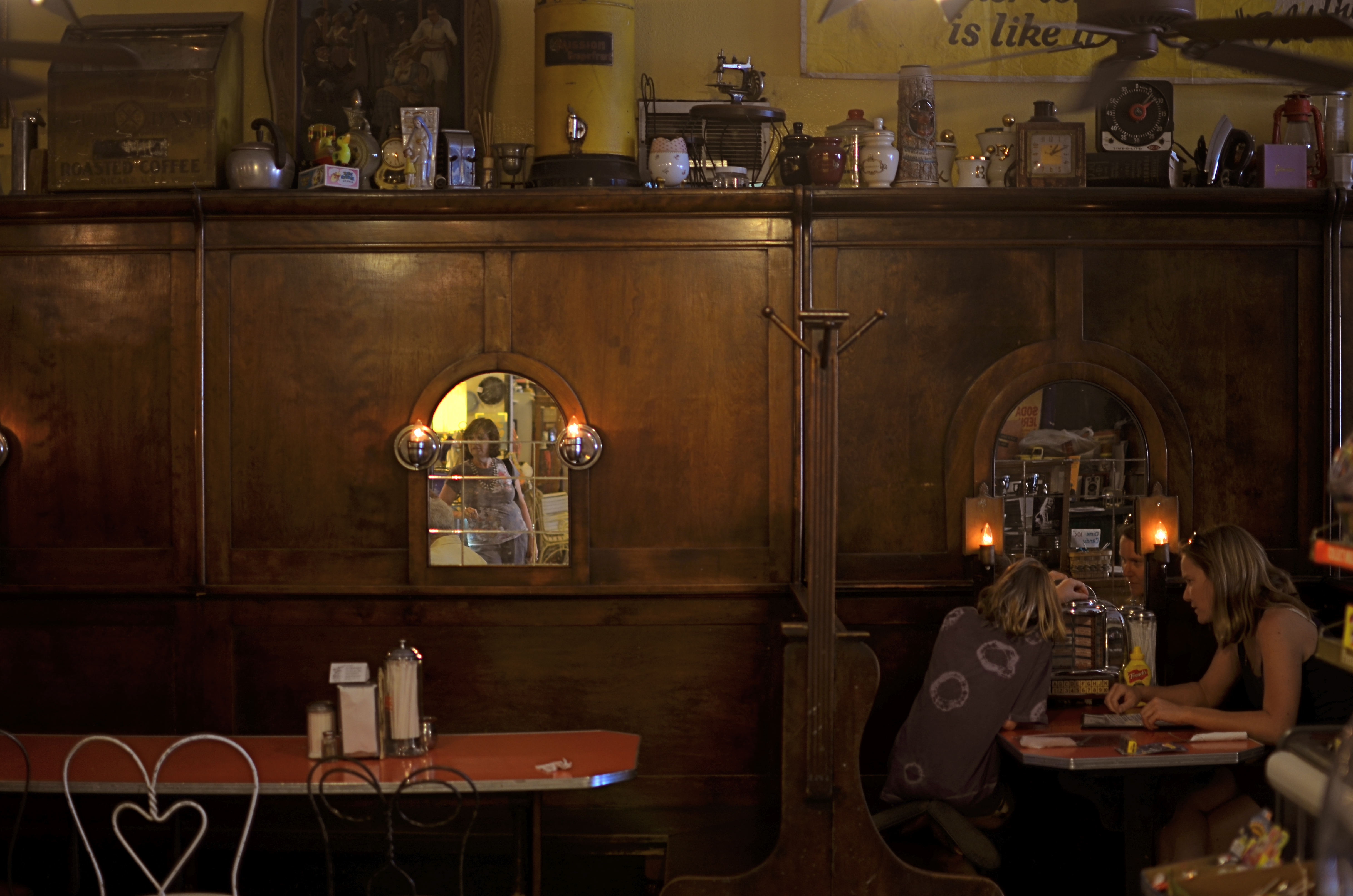
Three plays for a quarter, so you can eat “Tutti Fruiti” and listen to it, too. 1/40 sec., f/1.8, ISO 100, 35mm.
Graced with a 35mm prime lens opened all the way to f/1.8 and great soft midday light from the store’s front window, I could preserve the warm tones of the counter area pretty much as they are. For the booths, a little slower shutter speed was needed, almost too long for a handheld shot, but delivering a more velvety feel overall. Both shots are mere recordings, in that I was not trying to “sculpt” or”render” anything. McAlpine’s is enough just as she comes. It was only a question of light management and largely leaving the place to tell its own story.
What a treat when a subject comes to you in such a complete state that the picture nearly takes itself.
Even better when the subject offers 75 flavors of ice cream.
Especially when every other joint on the block is plain vanilla.
follow Michael Perkins on Twitter @mpnormaleye.
LESS SHOWS MORE
You don’t have to reveal every stray pebble or every dark area in perfect definition to get a sense of texture in this shot. 1/160 sec., f/5.6, ISO 100, 35mm.
by MICHAEL PERKINS
THERE IS A WRONG-HEADED IDEA OUT THERE THAT ALL VISUAL OUTCOMES IN PHOTOGRAPHY SHOULD BE EQUAL. That’s a gob of words, so here’s what I’m getting at: higher ISO sensitivity, post-processing and faster lenses have all conspired, of late, to convince some of us that we can, and should, rescue all detail in even the most constrasty images. No blow-outs in the sky, no mushiness in the midrange, no lost information in the darkest darks. Everything in balance, every iota of grain and pattern revealed.
Of course, that is very seductive. Look at a well-processed HDR composite made from multiple bracketed images, in which the view out the window is deep and colorful, and the shadowy interiors are rich with texture. We’ve seen people achieve real beauty in creating what is a compelling illusion. But, like every other technique, it can come to define your entire output.
It’s not hard to see shooters whose “style” is actually the same effect applied to damn near all they shoot, like a guy who dumps ketchup on everything his wife brings to the table. When you start to bend everything you’re depicting to the same “look”, then you are denying yourself a complete range of solutions. No one could tell you that you always have to shoot in flourescent light, or that deep red is the only color that conveys passion, so why let yourself feel trapped in the habit of using HDR or other processes to always “average out” the tonal ranges in your pictures? Aren’t there times when it makes sense to leave what I will call “mystery” in the undiscovered patches of shadow or the occasional areas of over-exposure?
Letting some areas of a frame remain in shadow actually tamps down the clutter in a busy image like this. 1/60 sec., f/3.2, ISO 100, 35mm.
I am having fun lately leaving the “unknowns” in mostly darker images, letting the eye explore images in which it can NOT clearly make out ultimate detail in every part of the frame. In the mind’s eye, less can actually “show” more, since the imagination is a more eloquent illustrator than any of our wonderful machines. Photography began, way back when, rendering its subjects as painters did, letting light fall where it naturally landed and leaving the surrounding blacks as deep pools of under-defined space. Far from being “bad” images, many of these subtle captures became the most hypnotic images of their era. It all comes down to breaking rules, then knowing when to break even the broken rule as well.
Within this post are two of the latest cases where I decided not to “show it all”. Call it the photo equivalent of a strip-tease. Once you reveal everything, some people think the allure is over. The point I’m making is that the subject should dictate the effect, never the other way around. Someone else can do their own takes on both of these posted pictures, take the opposite approach to everything that I tried, and get amazing results.
There never should be a single way to approach a creative problem. How can there be?
Follow Michael Perkins on Twitter @thenormaleye.
Related articles
- HDR Under Control is a Thing of Beauty (thewayeyeseesit.com)
IT’S NOT EASY BEIN’ GREEN
This is the desert? A Phoenix area public park at midday. There is a way around the intense glare. 1/500 sec., f/5.6, ISO 100, 35mm, straight out of the camera.
By MICHAEL PERKINS
FOR YEARS I HAVE BEEN SHOOTING SUBJECTS IN THE URBAN AREAS OF PHOENIX, ARIZONA, trying to convey the twin truths that, yes, there are greenspaces here, and yes, it is possible for a full range of color to be captured, despite the paint-peeling, hard white light that overfills most of our days. Geez, wish I had been shooting here in the days of Kodachrome 25. Slow as that film was, the desert would have provided more than enough illumination to blow it out, given the wrong settings. Now if you folks is new around here, lemme tell you about the brilliant hues of the Valley of the Sun. Yessir, if’n you like beige, dun, brown, sepia or bone, we’ve got it in spades. Green is a little harder to come by, since the light registers it in a kind of sickly, sagebrush flavor….kind of like Crayola’s “green-yellow” (or is it “yellow-green”?) rather than a deep, verdant, top-o-the-mornin’ Galway green.
But you can do workar0unds.
In nearby Scottsdale, hardly renowned for its dazzling urban parks (as opposed to the resort properties, which are jewels), Indian School Park at Hayden and Indian School Roads is a very inviting oasis, built around a curvy, quiet little pond, dozens of mature shade trees that lean out over the water in a lazy fashion, and, on occasion, some decorator white herons. Thing is, it’s also as bright as a steel skillet by about 9am, and surrounded by two of the busiest traffic arteries in town. That means lots of cars in your line of sight for any standard framing. You can defeat that by turning 180 degrees and aiming your shots out over the middle of the pond, but then there is nothing really to look at, so you’re better off shooting along the water’s edge. Luckily, the park is below street level a bit, so if you frame slightly under the horizon line you can crop out the cars, but, with them, the upper third of the trees. Give and take.
There is still a ton of light coming down between the shade trees, however, so if you want any detail in the water or trees at all, you must shoot into shade where you can, and go for a much faster shutter speed….1/500 up to 1/1000 or faster. It’s either that or shoot the whole thing at a small f-stop like f/11 or more. In desert settings you’ve got so much light that you can truly dance near the edge of what would normally be underexposure, and all it will do is boost and deepen the colors that are there. There will still be a few hot spots on projecting roots and such where the light hits, but the beauty of digital is that you can click away and adjust as you go.
It’s not quite like creating greenspace out of nothing, but there are ways to make things plausibly seem to be a representation of real life, and, since this is an interpretive medium, there’s no right or wrong. And the darker-than-normal shadows in this kind of approach add a little warmth and mystery, so there’s that.
It was “yellow-green”, wasn’t it?
Hope that’s not on the final.
(follow Michael Perkins on Twitter @mpnormaleye)
PULL DOWN THE NOISE
by MICHAEL PERKINS
PHOTOGRAPHY OFTEN SPEAKS LOUDER IN A SOFTER VOICE. Think about it. If you accept the idea of visual information as a sort of “sound”, then it’s easy to see why some images don’t make a direct connection with viewers. They are busy, overloaded with information, or, in this metaphor, noisy, loud. Cachophonous. Chaotic. Too many “sounds” competing for attention. In a visual image, “noise” can be anything that keeps anyone from hearing the “voice” of your image. To be seen more clearly, pictures need to go soft, in order to be heard louder.
That usually means simplifying the image. Shaping its tone, its framing, its central message. In photography, we all make the mistake of trying to show everything, and, in the process, creating an overdose of data that sends the viewer’s eye wandering all around the picture, trying to find something, anything, to focus on. We present a three-ring circus where just one would be more than adequate.

A “perfect” exposure would have inhibited the drama inherent in this situation. So we made it more imperfect.
On a recent trip to an art studio in Paradise Valley, Arizona, I was lucky enough to be present when artisans were pouring molten bronze into decorative molds for all us green “touristas”. Capturing the scene “as is” was easy, as I had plenty of time to calculate exposure and lighting. As a result, I got a lot of “acceptable” pictures good enough for the average postcard, but their storytelling quality was only so-so, since they were almost too full of color, detail and people/props. In the moment, I merely recorded a group of people in a crowded shop doing a job. The tonal balance was “perfect” according to the how-to books, as if I had shot the images on full auto. In fact, though, I had shot on manual, as I always do, so where was my imprint or influence on the subject? The pictures weren’t done.
Back home, when my brain had time to go into editor mode, I realized that the glowing cup of metal was the only essential element in the pictures, and that muting the colors, darkening the detail and removing extra visual clutter was the only way that the center of the shot could really shine.
With that in mind, I deepened the shadowy areas, removed several extraneous onlookers and amped up the orange in the cup. Seems absurdly simple, but as a result, the image was now a unique event instead of a generic “men at work” photo. The picture had to use a softer voice to speak louder.
Great picture? Not yet.
But, hey, I’m still young.
Best thing about the creative process, unlike banking, building or brain surgery, is the luxury of do-overs. And doing over the do-overs, over.
Related articles
- On the Nature + Purpose of Photography (statenislandstories.wordpress.com)
ESCAPE FROM PLANET PORTRAIT

Does this child look happy to you? Does she look like she even has a pulse? Surely we do better kid portraits today, er, don’t we?
By MICHAEL PERKINS
TO HEAR US TELL IT, WE ALL REALLY LOVE OUR KIDS. Assuming that to be true, why do we still subject them to the greatest act of photographic cruelty since Tod Browning’s Freaks? I speak of course, of the creatively bankrupt ritual of studio portraits, many of them cranked out at department stores or discount mills, too many of them making our beloved progeny look like waxworks escaped from a casting call for Beetlejuice.
We can surely do better.
I’m on record as believing that children are the noblest work of nature, coming into the world bearing only joy and untainted by the cynical clown olympics that comprise our “adult” way of thinking. And since we all probably feel the same way, why do so many of us park the little dears in front of hideous backdrops, surround them with absurd props, and gussy them up as everything from fairy princesses to ersatz puppies to fake cherubs?
Part of this ridiculous tradition owes its origins to the early days of photography, when a portrait sitting was the one means by which people who might never leave behind any other visual record of their lives were placed in formalized settings for an “official” rendering of their features. Slow film speeds and primitive lighting dictated that parents “leave it to the pros”, giving these modestly gifted artists decades of practice in weaving imaginary dream framings for our precious kids. (Full disclosure: Yes, I know that the image at left is a leftover from the Victorian age. I didn’t post any contemporary images because (a) many of them are almost this bad and you already get the idea, and (b) I wasn’t eager to be beaten to a pulp by any proud parents.)
Get out of your comfort zone and into your child’s.
Could it be more obvious, billions of Instamatics and Instagrams later, that this sad ritual hasn’t had any fresh air pumped into it since the golden age of Olan Mills class pictures? Even the most elementary “how-to” books on candid photography have been telling us the same thing for nearly a century: don’t formalize the setting, formalize your thinking. Let your child show you what he is, in his own environment. That means that you need to shoot constantly and invisibly, getting out of the kid’s way. No 3-2-1 “Cheese!” commands, no “sit up straight and don’t slouch” advice, no arbitrary situation.
Sure, you can basically plan how you will shoot your child, but allow him to unfold before your ready camera and gain the confidence to react in the moment. Stop trying to herd him into a structure or a setting. If at all possible, allow him to forget that you’re even in the room. Witness something wonderful instead of trying to construct it. Be a fly on the wall. The child is pitching great stuff every time he’s on the mound. Just make sure you’re behind the plate to to catch it.
Dirty little secret: there is nothing “magical” about most studio portraits. In fact, many of the results from the photo mills are just about the most un-magical pictures ever taken, although there are signs that things are changing. It simply isn’t enough to ensure a perfectly diffused background and an electronically exact flash. Even today’s most humble personal cameras have amazing flexibility to capture flattering light and isolate your subject from distracting backgrounds. And going from standard “kit” lenses (say, an 18-55mm) to an affordable prime lens (35mm, 50mm) gives us insane additional gobs of light to work with, all without using the dreaded pop-up flash, the photographic equivalent of child abuse.
It don’t gotta be perfect. It does gotta be honest.
Doing it yourself with kid portraits is work, make no mistake. You have to be flexible. You have to be fearless. And you have to know when something magical’s about to happen. But it’s your child, and there is no outside contractor who has a better sense of what delight he has inside him.
Besides, isn’t it likelier that he will show you the magic in his own back yard than in a back room at K-Mart? Give him something that he loves to do, the better to forget you’re there, and crank away. I mean shoot a lot. And don’t stop.
You’re the expert here.
Don’t outsource your joy.
