CAUSE AND EFFECT

Sun Pennants, 2014. 1/400 sec., f/5.6. ISO 100, 35mm.
By MICHAEL PERKINS
THERE’S NOTHING WORSE THAN COMING HOME FROM A SHOOT realizing that you only went halfway on things. Maybe there was another way to light her face. Did I take a wide enough bracket of exposures on that sunset? Maybe I should have framed the doorway two different ways, with and without the shadow.
And so on. Frequently, after cranking off a few lucky frames, we’re like kids walking home from confession, feeling fine and pure at first, and then remembering, “D’OH! I forgot to tell Father about the time I sassed my teacher!”
Gridlight, 2014. 1/200 sec., f/5.6, ISO 100, 35mm.
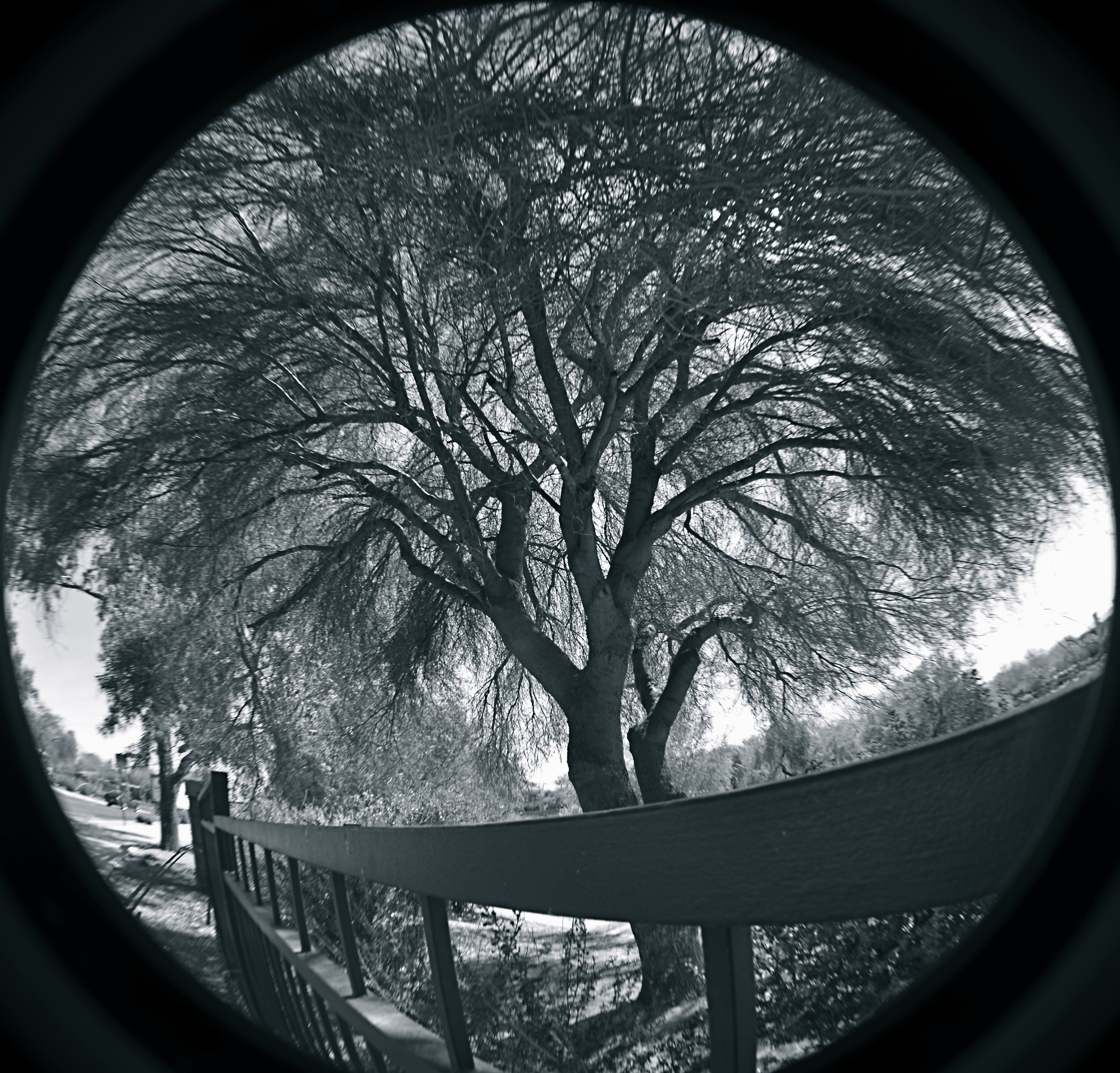
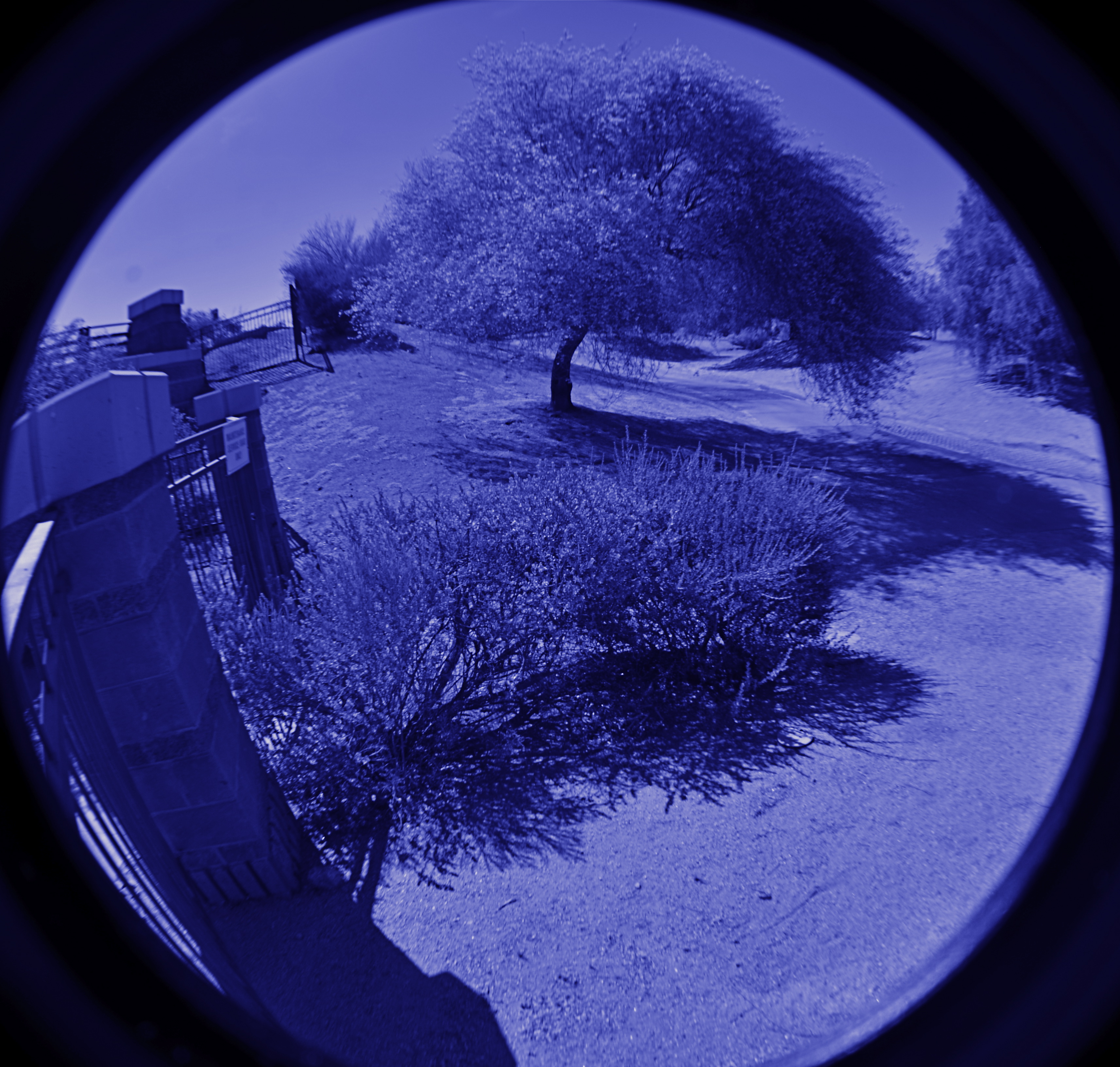
Too Catholic? (And downright boring on the sins, by the way..but, hey) Point is, there is always one more way to visualize nearly everything you care enough about to make a picture of. For one thing, we are always shooting either the cause or the effect of things. The great facial reaction and the surprise that induces it. The deep pool of rain and the portentous sky that sent it. The force that’s released in an explosion and the origin of that force. When we’re there, when the magic of whatever we came to see is happening, right here, right now, we need to think up, down, sideways for pictures of all of it, or as many as we can capture within our power….’cause once you’re home, safe and dry, it’s all different. The story perishes like a soap bubble. Shoot while you’re there. Shoot for all the story is worth.
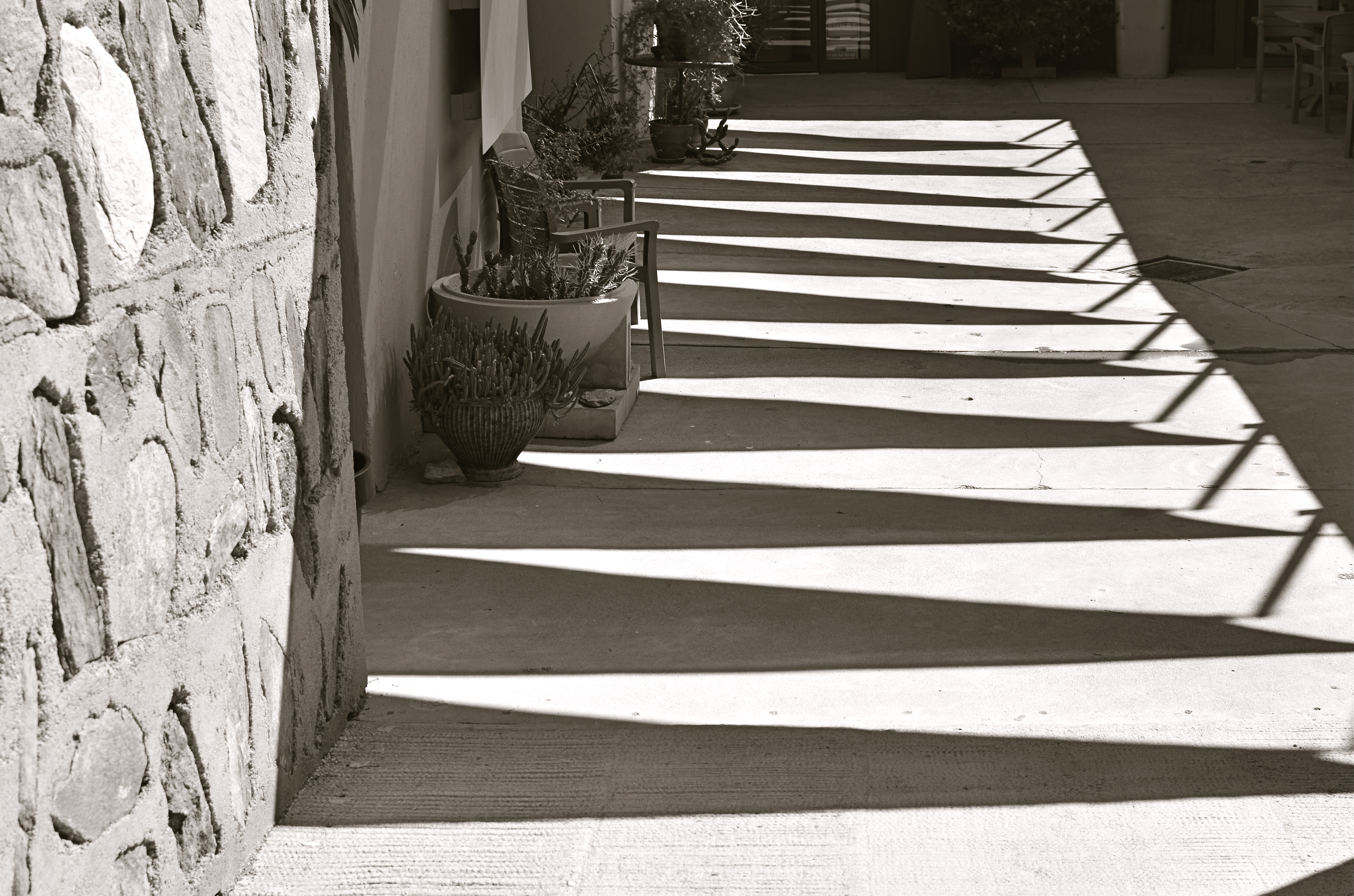
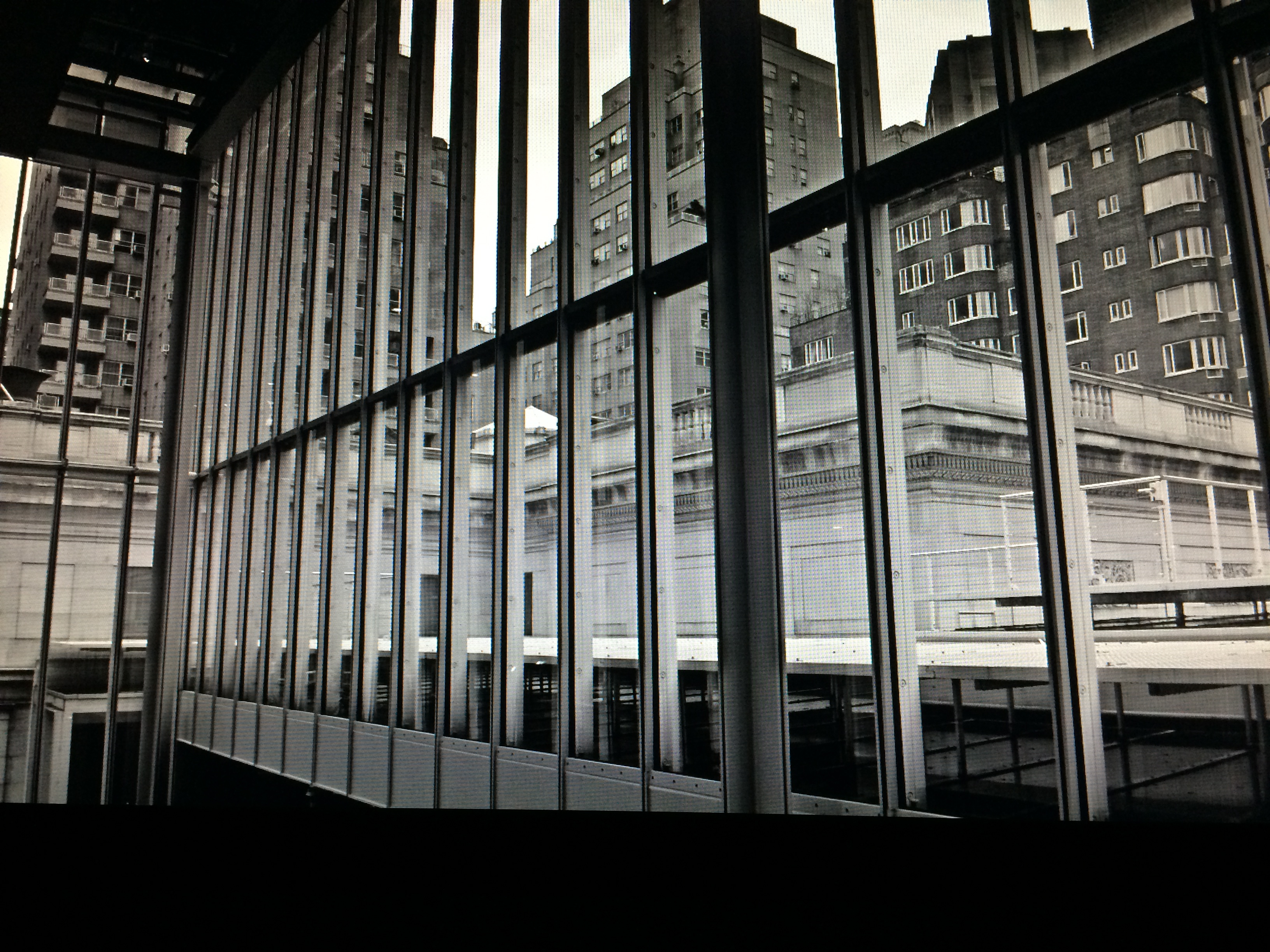
It can be simple things. I saw the above image at one of the lesser outbuildings at Taliesin West, Frank Lloyd Wright’s legendary teaching compound in Scottsdale, Arizona. An abstract pattern made from over-hanging strips of canvas,used as makeshift shade on a path. But when I reversed my angle and shot the sidewalk instead of the sky, I saw the effect of that cause, and it appealed to me too (see left). One composition favored color, while the other seemed to dictate black & white, but they both could serve my purpose in different ways. Click and click.
It bears remembering that the only picture that is guaranteed to be a failure is the one you didn’t take. Flip things around. Re-imagine the order, the role of things. Go for one more version of what’s “important”.
Hey, you’re there anyway.…..
DESTINATION VS. JOURNEY
By MICHAEL PERKINS
I HAVE A WANDERING EYE. Not due to muscular weakness or marital infidelity, but to a malady particular to long-time photographers. After decades of shoots big and little, I find that I am looking for pictures nearly everywhere, so much so that, what appears to many normal people to be formless space or unappealing detail might be shaping up in my mind as My Next Project. The non-obvious sings out ever louder to me as I age, and may find its way into my pictures more often than the Celebrated Scenic Wonder, the Historically Important Site or the Big Lights In The Sky that attract 99% of the photo traffic in any given locality. Part of this has to do with having been disappointed in the past by the Giant Whatsis or whatever the key area attraction is, while being delightfully surprised by little things that, for me, deserve to be seen, re-seen, or testified to.
This makes me a lousy traveling companion at times, since I may be fixated on something merely “on the way” to what everyone else wants to see. Let’s say we’re headed to the Great Falls. Now who wants to photograph the small gravel path that leads to the road that leads to the Great Falls? Well, me. As a consequence, the sentences I hear most often, in these cases, are variations on “are you coming?“, “what are you looking at?” or, “Oh my God, are you stopping again????”.
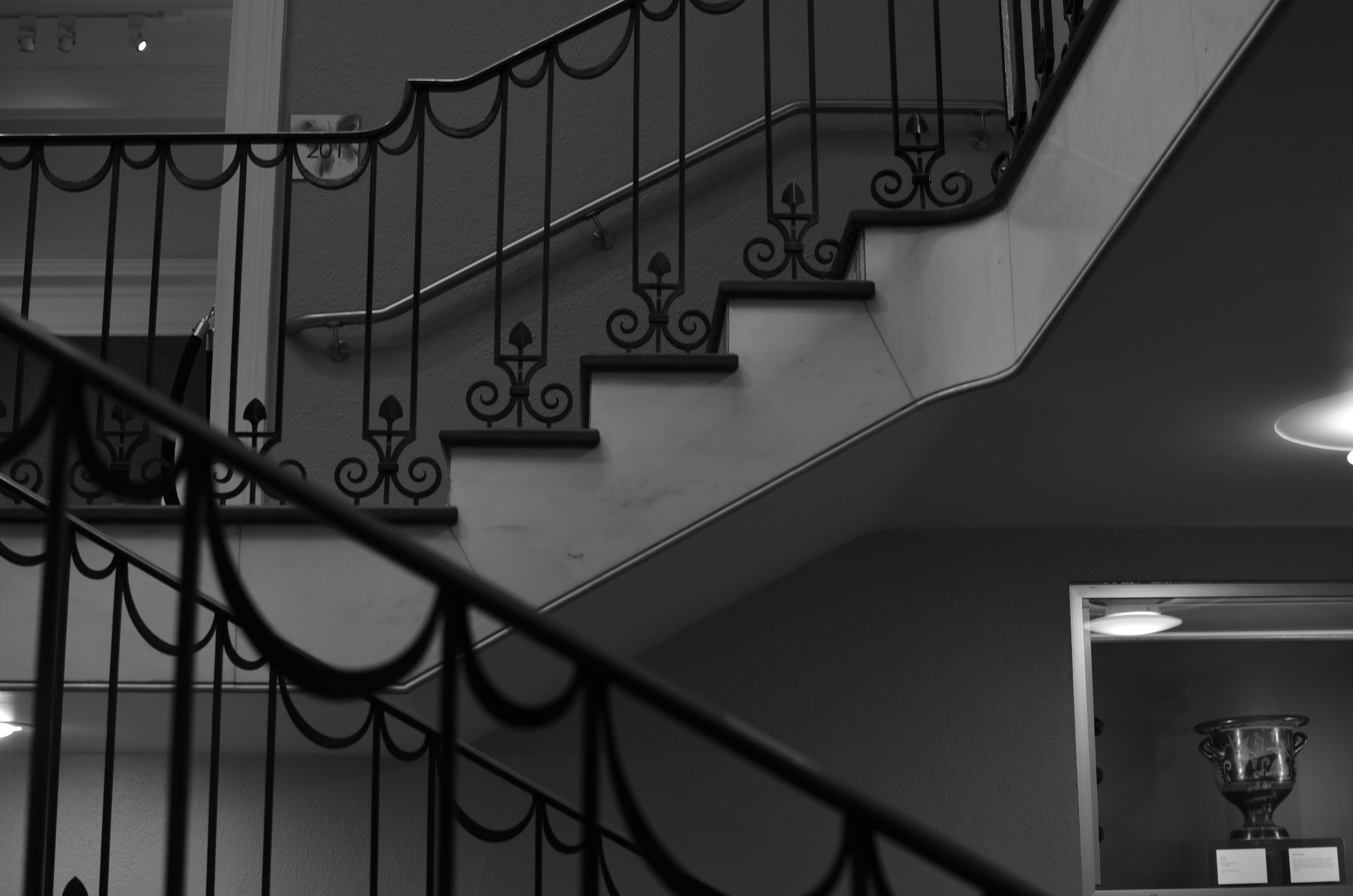
The Landing, 2014. 1/40 sec., f/3.5, ISO 320, 35mm.
Thing is, some of my favorite shots are on staircases, in hallways, around a blind corner, or the Part Of The Building Where No One Ever Goes. Photography is sometimes about destination but more often about journey. That’s what accounts for the staircase above image. It’s a little-traveled part of a museum that I had never been in, but was my escape the from gift shop that held my wife mesmerized. I began to wonder and wander, and before long I was in the land of Sir, We Don’t Allow The Public Back Here. Oddly, it’s easier to plead ignorance of anything at my age, plus no one wants to pick on an old man, so I mutter a few distracted “Oh, ‘scuse me”s and, occasionally, walk away with something I care about. Bonus: I never have any problem shooting as much as I want of such subjects, because, you know, they’re not “important”, so it’s not like queueing up to be the 7,000th person of the day doing their take on the Eiffel Tower.
Now, this is not a foolproof process. Believe me, I can take these lesser subjects and make them twice as boring as a tourist snap of a major attraction, but sometimes….
And when you hit that “sometimes”, dear friends, that’s what makes us raise a glass in the lobby bar later in the day.
I’M INTO METAL, MAN
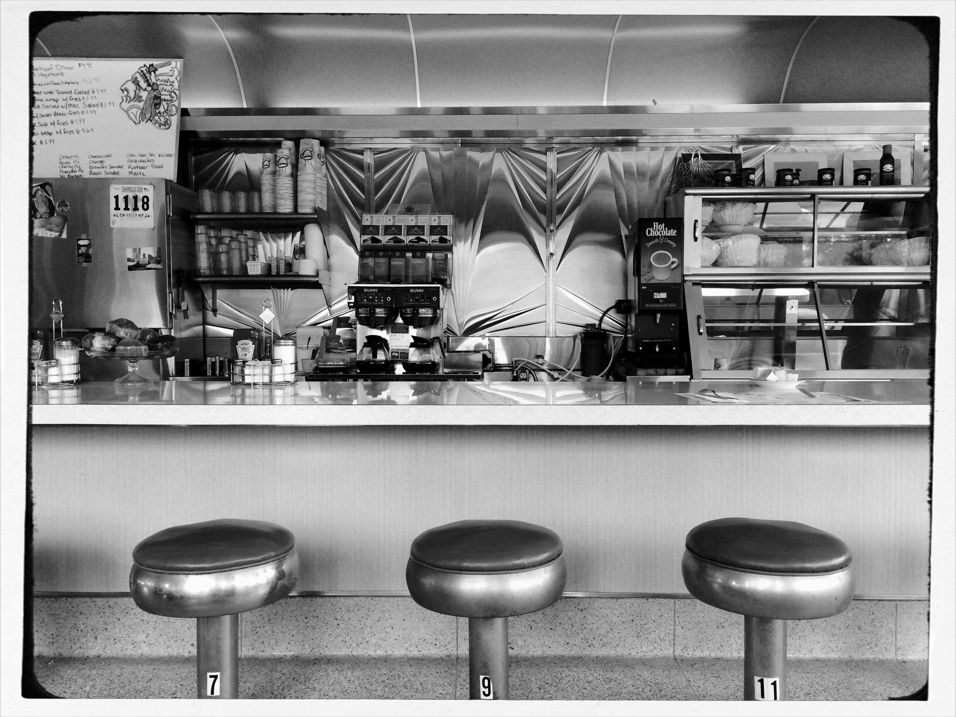
A cel image processed through an app designed to simulate Pantatonic-X black & white film.
By MICHAEL PERKINS
WHEN I SAY THAT CURRENT DAY SHOOTERS ARE NOT HALF THE PHOTOGRAPHERS THAT THE OLD MASTERS WERE, that is not intended as an insult, but a simple bit of math. Given the fact that pioneers in the imaging game had to be equal parts artist and chemist, we only apply 50% of the effort these valiant visionaries did in negotiating the interactions of salts, albumens, bromides and other lab ingredients in an effort to even bring an image forth, much less do so with control. The technology that we employ today, and the speed and convenience with which we sling it around, should give us pause. The artistic mission of photography remains the same. It’s just that we don’t have to suffer as much for said art.
One of the marvelous processes from those years that still dazzles even the contemporary eye is the platinum print, so called because a platinum coating actually sits as a layer atop the developing papers, creating a print that contains a greater tonal range than any other monochrome process, including hints of gold, brown and red.Even better, what Kodachrome turned out to be for the archival permanence of color photography, platinum is for monochromatic images. It looks like a million bucks and will never degrade within the average person’s lifetime, or their great-grand kids’, neither. If you are over fifty and ever sat for a “serious” studio portrait, chances are you were immortalized in platinum. Literally speaking, you’re into metal, man.
Never for the timid (or the impecunious), platinum printing has largely faded (sorry) from the photographic scene along with the filmic science that birthed it, but, as with so many other “looks” in the digital era, things that were once merely processing are now content as well.
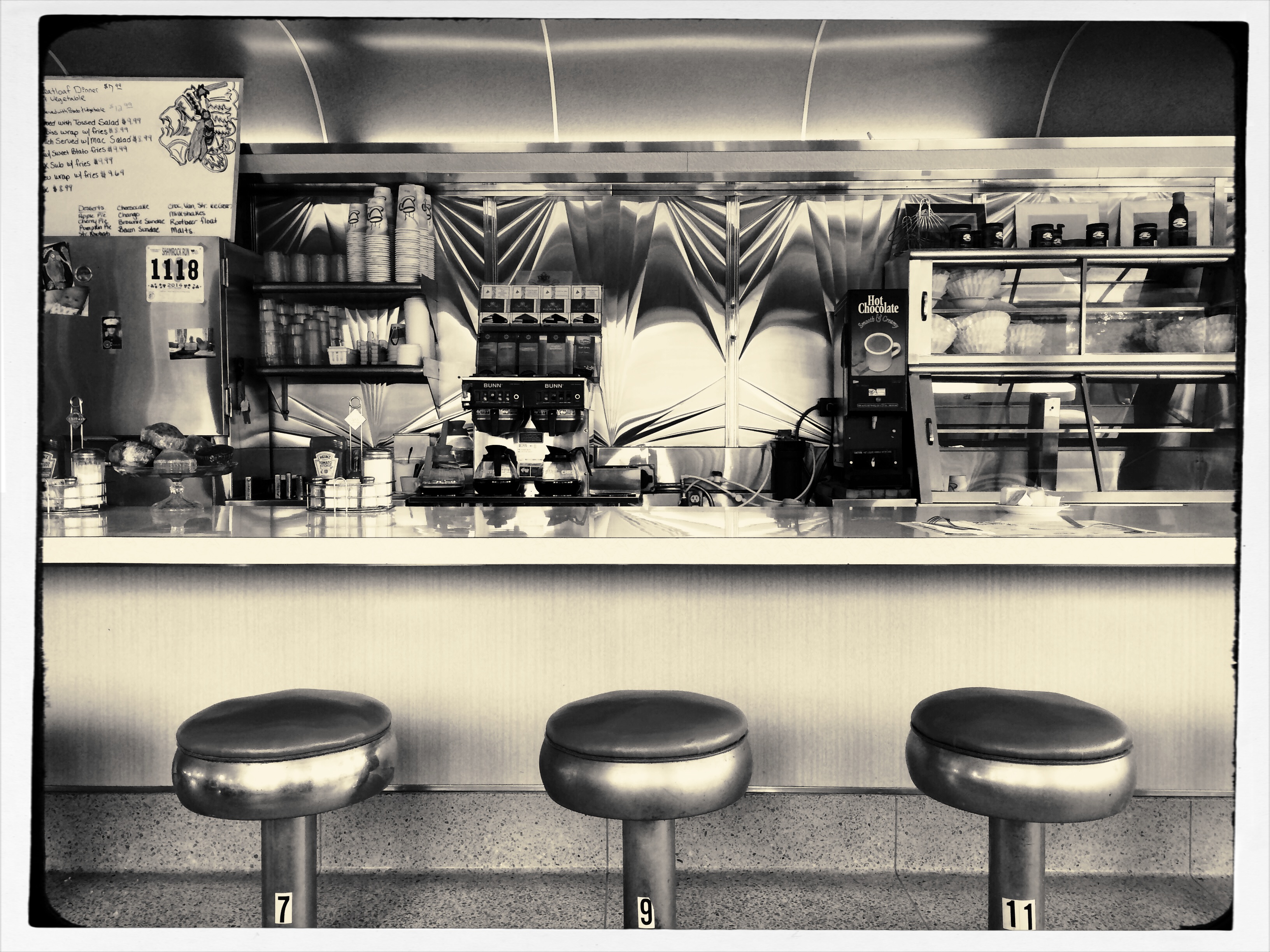
Same image as above, but processed through AltPhoto’s faux-platinum filter.
From where we stand, we can rifle through 200 years of processes and selectively decide to evoke an era or a mood a single picture at a time, just because we want to evoke a different time or place in our common cultural consciousness. We do this at our whim, unlike the people who actually devised the processes, who were stuck with them until they had (a) better knowledge of how to do things, (b) more money (c) both.
The digital apps that simulate the platinum print are gaining some popularity, as people apply instant alternate “mixes” of their cel phone shots, including up to a dozen different ways to envision a shot in monochrome. Those who appreciate the fine science in the original lab smarts required to create these looks in the film era claim that too little control resides in the user for a true one-to-one, film-t0-digital equivalency in any of these apps, but I have found that platinum creates a distinct, extra tool for monochrome fans, even if I experience guilt at not accruing the years of schooling it would have taken to do the process the “real way”. Anyway, above you will find a comparison between a basic mono rendering of an iPhone shot and a simulated platinum look, both cooked up in an app called AltPhoto. You may have a pref and you may not. That’s what makes horse races.
CLEAN-UP ON AISLE FIVE
A post-processed “color compromise” of the image below. 1/320 sec., f/5.6, ISO 100, 35mm.
By MICHAEL PERKINS
TAKE ENOUGH PHOTOGRAPHS AND YOU WILL DEVELOP YOUR OWN SENSE OF “SIMPLICITY”. That is, you will arrive at your own judgement about how basic or complex a composition you need in a given situation. Some photographers are remarkable in their ability to create images that contain a mad amount of visual information. Some busy city scenes or intricate landscapes benefit wonderfully from an explosion of detail. Other shooters render their best stories by reducing elements to a bare minimum. And of course, most of us make pictures somewhere in the vast valley between those approaches.
Before the fiddling ensued.
I’m pretty accustomed to thinking of overly-busy pictures as consisting of a specific kind of “clutter”, usually defined as cramming too many objects or people into a composition. But I occasionally find that color can be a cluttering element, and that some very visually dense photos can be rendered less so by simply turning down hues, rather than rooting them out completely. Recently I’ve been taking some of the pictures that seem a little too “overpopulated” with info and taking them through what a two-step process I call a color compromise (patent not applied for).
First step involves desaturating the picture completely, while also turning the contrast way down, amping up the exposure and damn near banishing any shadows. This almost results in a bleached-out pencil drawing effect and emphasizes detail like crazy. Step two involves the slow re-introduction of color until only selected parts of the image render any hues at all, and making sure that the color that is visible barely, barely registers.
The final image can actually be a clearer “read” for your eyes than either the garish colored original or a complete b&w. Objects will stand out from each other a little more distinctly, and there will be an enhanced sensation of depth. It also suggests a time-travel feel, as if age has baked out the color. A little of this washed-out jeans look goes a long way, however, and this whole exercise is just to see if you can make the picture communicate a little better by allowing it to speak more quietly.
Compare the processed photo at the top, taken in the heart of the visually noisy Broadway district, with its fairly busy color original and see if any of this works for you. I completely stipulate that I may just be bending over backwards to try to salvage a negligible photo. But I do think that color should be a part of the discussion when we fault an image for being cluttered.
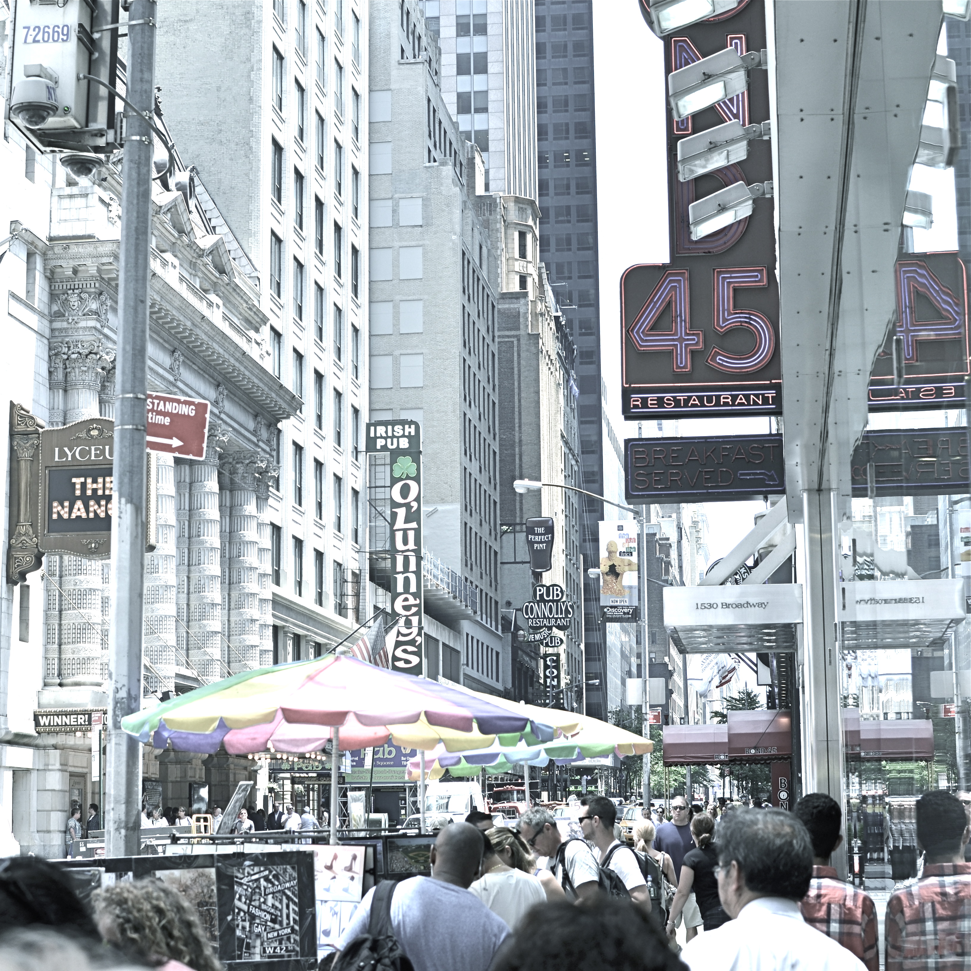
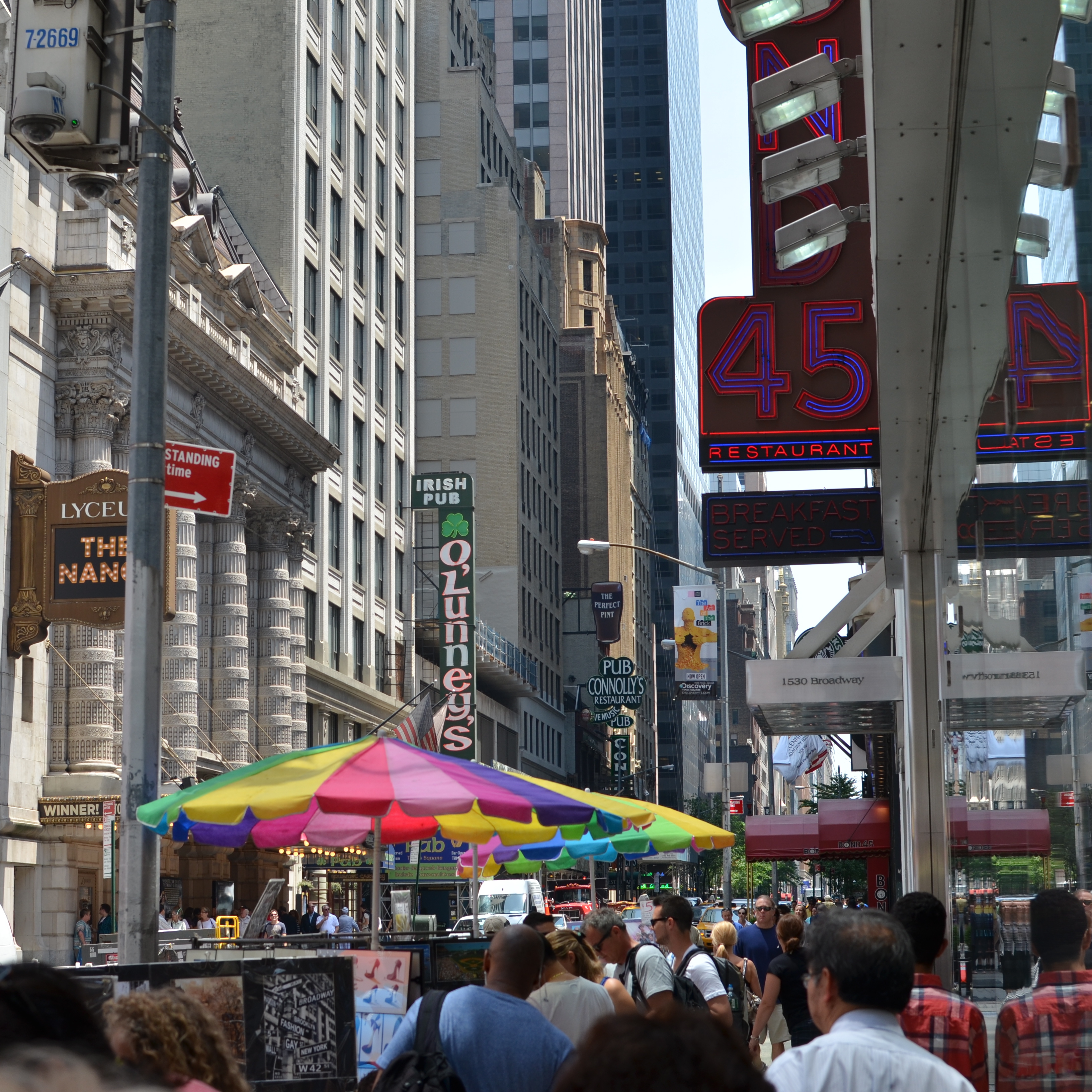
ON THE STRAIGHT AND NARROW
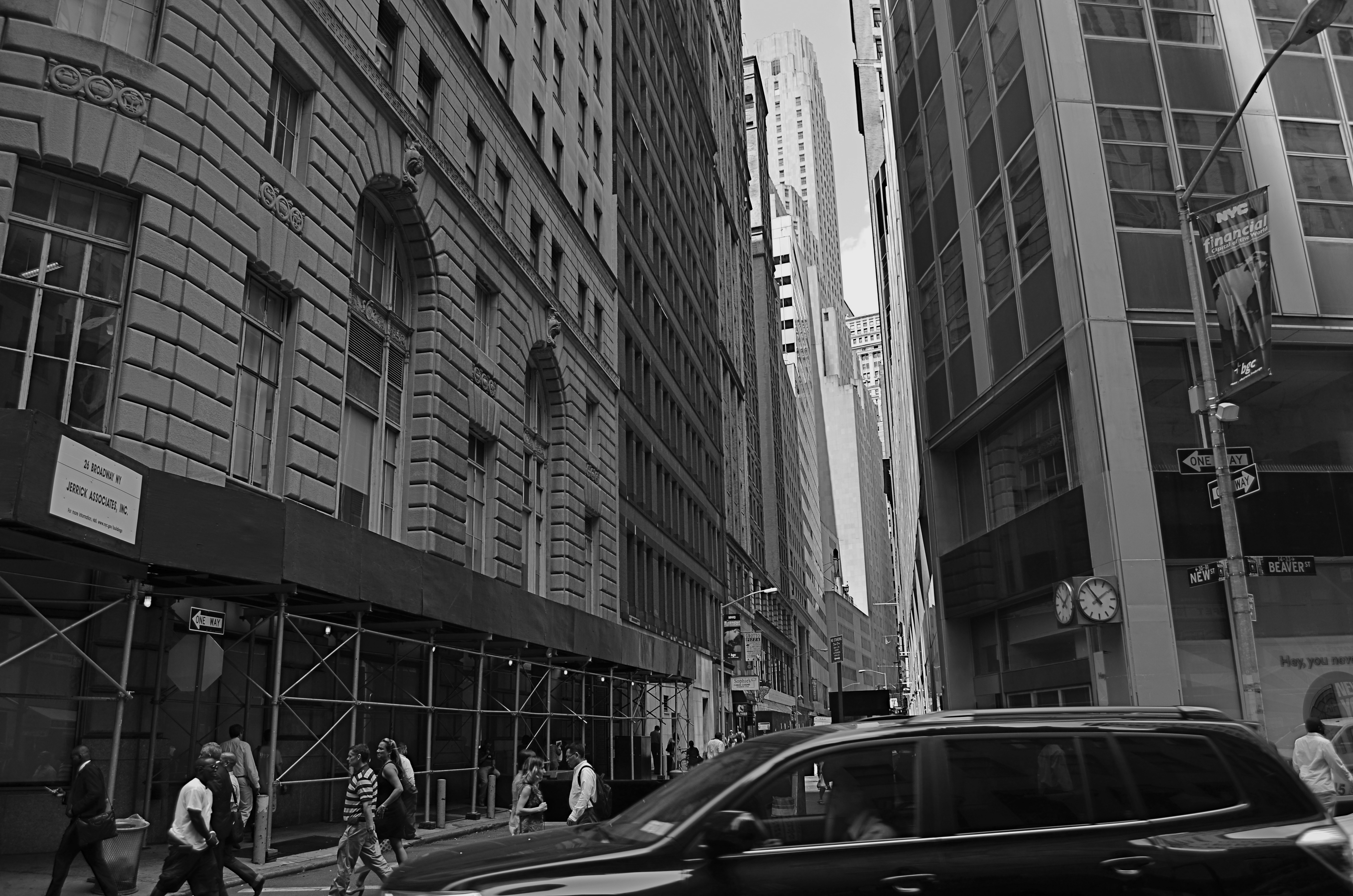
New & Beaver, 2014. 1/200 sec., f/5.6, ISO 100, 18mm.
By MICHAEL PERKINS
THE NARROW STREETS OF LOWER MANHATTAN WERE NEVER DESIGNED TO ACCOMMODATE the claustrophobic jam of commerce, foot traffic and skyscrapers that have characterized the neighborhood since the early 20th century. I should back that up and acknowledge that, for some locals, the streets of lower Manhattan were never designed,period. New York’s growth has always come in rangy spurts and jolts, much like a gangly adolescent that shoots upward and outward overnight without any apparent plan, and yet, those unruly explosions are also what delight the photographer’s eye and make the city an inexhaustible laboratory for technique.
Shooting down the slits that pass for side streets and alleys in lower Manhattan is enough to make even the most seasoned native feel like he or she is being shut up in a tomb, but I am drawn to going even further, and over-emphasizing the extreme dimensions peculiar to the area. That, for me, means shooting with as wide a lens as I have handy, distortion be damned. Actually, it’s distortion be welcomed, since I think that the horizontal lines of the buildings create a much more dramatic lead-in for the eye as they race far away from the foreground. And since ultra-wide magnify front-to-back distances, the bigness and closeness of the city is jacked into a real exaggeration, but one that serves my purpose.
It helps to crouch down and tilt up when composing the shot, and to make sure that you don’t crop passersby out of the shot, since they will add to the drama even more as indications of scale. I have certainly gone too far more than once and rendered rectangular buildings into futuristic trapezoids, but the aim of each image will dictate what you’re going for. Also, in many of these shots, I decide, after much dithering, to choose monochrome over color, but I always shoot the originals in color, since they respond better to re-contrasting once they’re desaturated.
The magic about Manhattan is that no camera can ever tame her or show all her beauty and/or ugliness. It’s somthing of a fool’s errand to try to take the picture of NYC. Better to take a picture you like and add it to the ongoing story.
A PLACE APART
By MICHAEL PERKINS
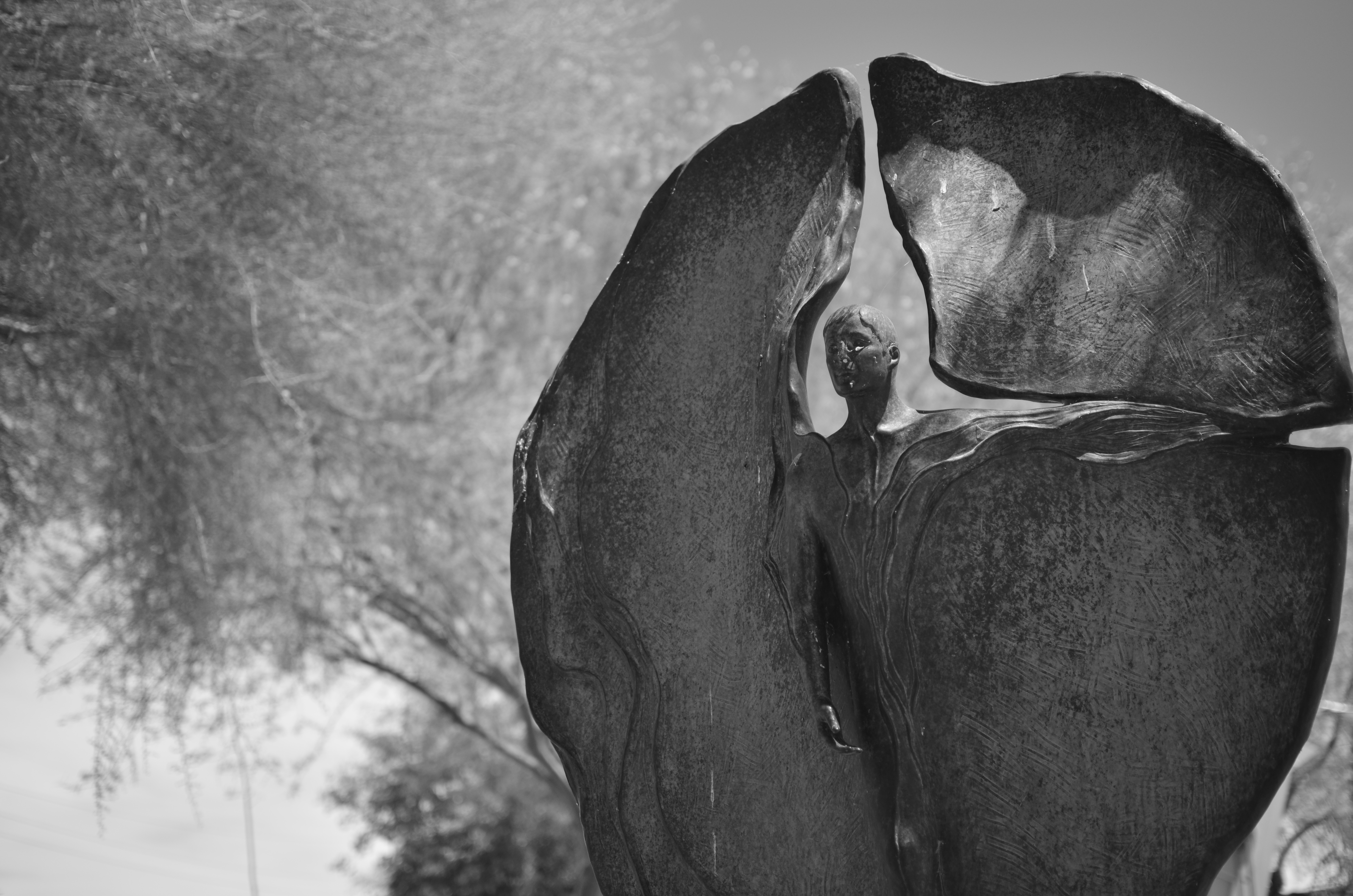
PHOTOGRAPHERS USUALLY USE FACES AS THE SOLE BAROMETER OF EMOTION. It’s really easy to use a person’s features as the most obvious cues to one’s inner mind. Scowls, smiles, smirks, downcast eyes, sidelong glances,cries of anguish….these are standard tools in depicting someone as either assimilated into the mass of humanity or cast away, separate and alone.
But faces are only one way of showing people as living in a place apart. Symbolically, there is an equally dramatic effect to be achieved by the simple re-contextualizing of that person in space. The arrangement of space near your subject forces the viewer to conclude that he or she is either in harmony with their surroundings or lonely, solitary, sad even, and you do it without showing so much as a raised eyebrow. This is where composition isn’t just a part of the story, but the story itself.
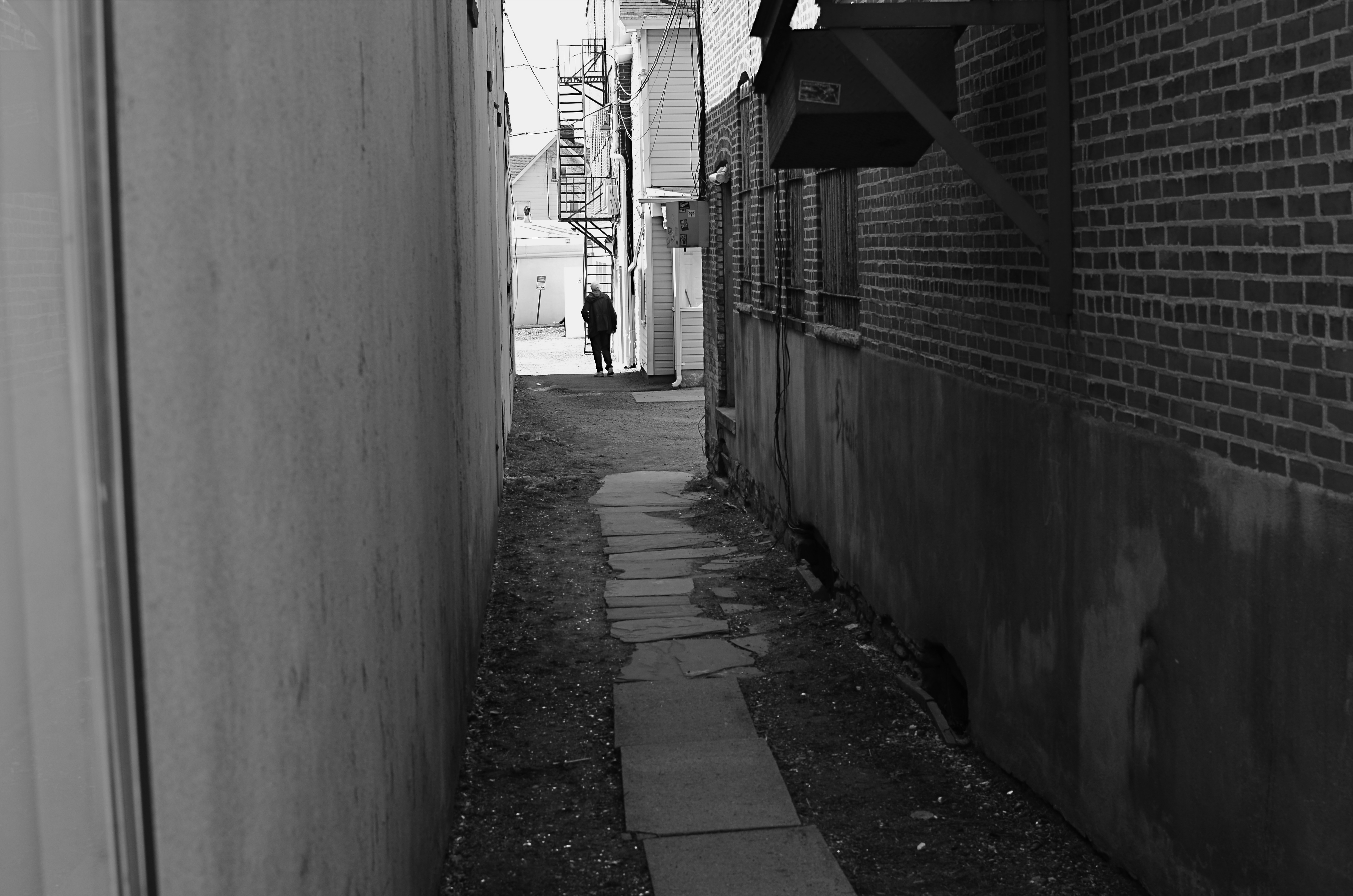
Context is all.
The woman shown here is most likely just walking from point A to point B, with no undercurrent of real tragedy. But once she takes a short cut down an alley, she can be part of a completely different, even imaginary story. Here the two walls isolate her, herding her into a context where she could be lonely, sad, afraid, furtive. She is walking away from us, and that implies a secret. She is “withdrawing” and that implies defeat. She is without a companion, which can symbolize punishment, banishment, exile. From us? From herself? From the world? Once you start to think openly about it, you realize that placing the subject in space lays the foundation for storytelling, a technique that is easy to create, recalibrate, manipulate.
The space around people is a key player in the drama an image can generate. It can mean, well, whatever you need it to mean. People who exist in a place apart become the centerpieces in strong photographs, and the variability of that strength is in your hands.
THE ENVELOPE
By MICHAEL PERKINS
HAVING LIVED IN THE AMERICAN SOUTHWEST FOR OVER FIFTEEN YEARS, I HAVE NEGOTIATED MY OWN TERMS WITH THE BLAZING OVERKILL OF MIDDAY SUNLIGHT, and its resulting impact on photography. If you move to Arizona or New Mexico from calmer climates, you will find yourself quickly constricting into a severe squint from late breakfast to early evening, with your camera likewise shrinking from the sheer overabundance of harsh, white light. If you’re determined to shoot in midday, you will adjust your approach to just about everything in your exposure regimen.
Good news, however: if you prefer to shoot in the so-called “golden hour” just ahead of sunset, you will be rewarded with some of the most picturesque tones you’ve ever had the good luck to work with. As has been exhaustively explained by better minds than mine, sunlight lingers longer in the atmosphere during the pre-sunset period, which, in the southwest, can really last closer to two hours or more. Hues are saturated, warm: shadows are powerful and sharp. And, if that dramatic contrast works to your advantage in color, it really packs a punch in monochrome.
This time of day is what I call “the envelope”, which is to say that objects look completely different in this special light from how they register in any other part of the day, if you can make up your mind as to what to do in a hurry. Changes from minute to minute are fast and stark in their variance. Miss your moment, and you must wait another 24 hours for a re-do.
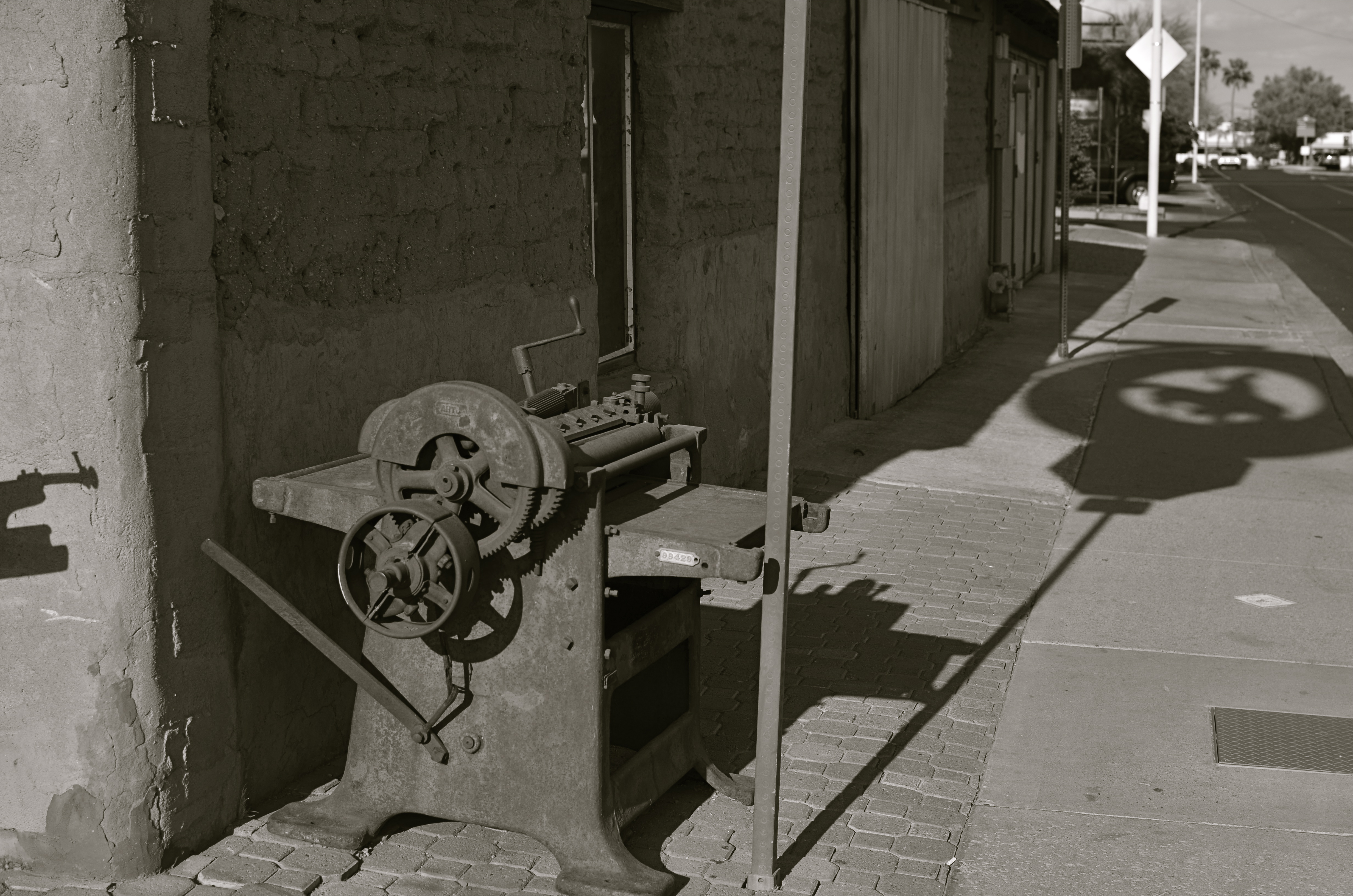
In the west, the best action actually happens after High Noon. Just before sunset in Scottsdale, AZ: 1/500 sec., f/4.5, ISO 100, 35mm.
The long shadow of an unseen sign visible in the above frame lasted about fifteen minutes on the day of the shoot. The sign itself is a metal cutout of a cowboy astride a bucking bronco, the symbol of Scottsdale, Arizona, “the most western town in the USA”. The shadow started as a short patch of black directly in front of the rusted bit of machine gear in the foreground, then elongated to an exaggerated duplicate of the sign, extending halfway down the block and becoming a sharper and more detailed silhouette.
A few minutes later, it grew softer and eventually dissolved as the sun crept closer to the western horizon. There would still be blazing illumination and harsh shadows for some objects, if you went about two stories high or higher, but, generally, sunset was well under way. Caught in time, the shadow became an active design element in the shot, an element strong enough to come through even in black and white.
If you are ever on holiday in the southwest, peek inside “the envelope”. There’s good stuff inside.
SYMBIOSIS OF HORROR
In war, is this an angel of mercy or a wraith of wrath?
By MICHAEL PERKINS
SHARPER MINDS THAN MINE WILL SPEND AN INFINITE AMOUNT OF EFFORT THIS WEEK CATALOGUING THE COSTS OF THE “GREAT WAR“, the world’s first truly global conflict, sparked by the trigger finger of a Serbian nationalist precisely one hundred years ago. These great doctors of thinkology will stack statistics like cordwood (or corpses) in an effort to quantify the losses in men, horses, nations and empires in the wake of the most horrific episode of the early 20th century.
Those figures will be, by turns, staggering/appalling/saddening/maddening. But in the tables of numbers that measure these losses and impacts, one tabulation can never be made: the immeasurable loss to the world of art, and, by extension, photography.
There can be no quantification of art’s impact in our lives, no number that expresses our loss at its winking out. Photography, not even a century old when Archduke Franz Ferdinand was dispatched to history, was pressed into service to document and measure the war and all its hellish impacts. But no one can know how many war photographers might have turned their lenses to beauty, had worldwide horror not arrested their attention. Likewise, no one can know how many Steichens, Adamses, or Bourke-Whites, clothed in doughboy uniforms, were heaped on the pyre as tribute to Mars and all his minions. Most importantly, we cannot know what their potential art, now forever amputated by tragedy, might have meant to millions seeking the solace of vision or the gasp of discovery.
Photography as an art was shaped by the Great War, as were its tools and techniques, from spy cameras to faster films. The war set up a symbiosis of horror between the irresistible message of that inferno and the unblinking eye of our art. We forever charged certain objects as emblems of that conflict, such that an angel now is either a winged Victory, an agent of vengeance, or a mourner for the dead, depending on the photographer’s aims. That giant step in the medium’s evolution matters, no less than the math that shows how many sheaves of wheat were burned on their way to hungry mouths.
Our sense of what constitutes tragedy as a visual message was fired in the damnable forge of the Great War, along with our ideals and beliefs. Nothing proves that art is a life force like an event which threatens to extinguish that life. One hundred years later, we seem not to have learned too much more about how to avoid tumbling into the abyss than we knew in 1914, but, perhaps, as photographers, we have trained our eye to bear better witness to the dice roll that is humanity.
THE UNSEEN GEOMETRY
Overhead and out of sight. 1/400 sec., f/5.6, ISO 100, 35mm.
By MICHAEL PERKINS
THERE ARE MANY PHOTO SITES THAT SUGGEST SHOOTS CALLED “WALKABOUTS“, informal outings intended to force photographers to shoot whatever comes to hand with as fresh an eye as possible. Some walkabouts are severe, in that they are confined to the hyper-familiar surroundings of your own local neighborhood; others are about dropping yourself into a completely random location and making images out of either the nothing of the area or the something of what you can train yourself to see.
Walks can startle you or bore you to tears (both on some days), but they will sharpen your approach to picture-making, since what you do is far more important than what you’re pointing to. And the discipline is sound: you can’t hardly miss taking shots of cute cats or July 4 fireworks, but neither will you learn very much that is new. Forcing yourself to abandon flashier or more obvious subjects teaches you to imbue anything with meaning or impact, a skill which is, over a lifetime, beyond price.
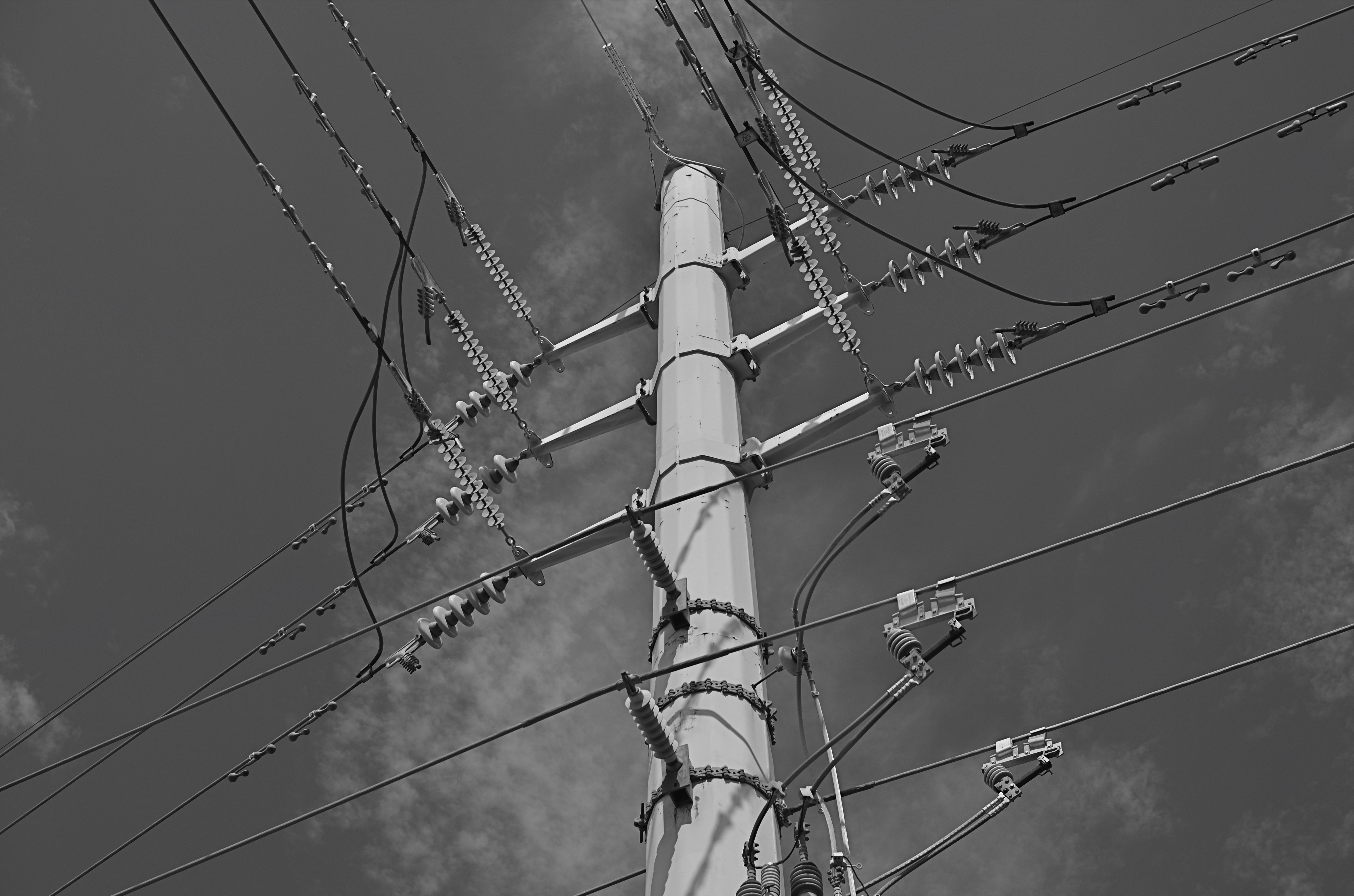
One of the things I try to keep in mind is how much of our everyday environment is designed to be “invisible”, or at least harder to see. Urban infrastructure is all around us, but its fixtures and connections tend to be what I call the unseen geometry, networks of service and connectivity to which we simply pay no attention, thus rendering them unseeable even to our photographer’s eye. And yet infrastructure has its own visual grammar, giving up patterns, even poetry when placed into a context of pure design.
The above power tower, located in a neighborhood which, trust me, is not brimming with beauty, gave me the look of an aerial superhighway, given the sheer intricacy of its connective grid. The daylight on the day I was shooting softened and prettied the rig to too great a degree, so I shot it in monochrome and applied a polarizing filter to make the tower pop a little bit from the sky behind it. A little contrast adjustment and a few experimental framing to increase the drama of the capture angle, and I was just about where I wanted to be.
I had to look up beyond eye (and street) level to recognize that something strong, even eloquent was just inches away from me. But that’s what a walkabout is for. Unseen geometry, untold stories.
RELATIONSHIPS
By MICHAEL PERKINS
DIGITAL PHOTOGRAPHY DOESN’T TRULY MAKE ARTISTIC CHOICES “POSSIBLE”. Those decisions were always available in the medium, albeit at some cost of materials, time and work. You could always get nearly any effect from film, providing you were willing to invest the sweat in wringing it out of the tools at hand. Instead, digital processes make choices easier to act upon, and, for people who have made the transition from a lifetime of film-based analog shooting to digital, the leap to light speed on the trip from desire to result is especially mind-ripping.
This speed of implementation makes real-time differences when considering whether a shot will have its best impact in color or b&w. Even standard DSLRs and compacts have in-camera modes that allow you to immediately shoot and compare alternate versions of a subject, and, with the expanding universe of apps available to the smartphone shooter, you can instantly crank out half a dozen or more readings of the kind of color or the type of monochrome you’re looking for. This is especially important in black & white, where the range of tones and contrast values can make or break a picture.
Black and white was the right choice here, but a decision about the kind of black and white was also crucial.
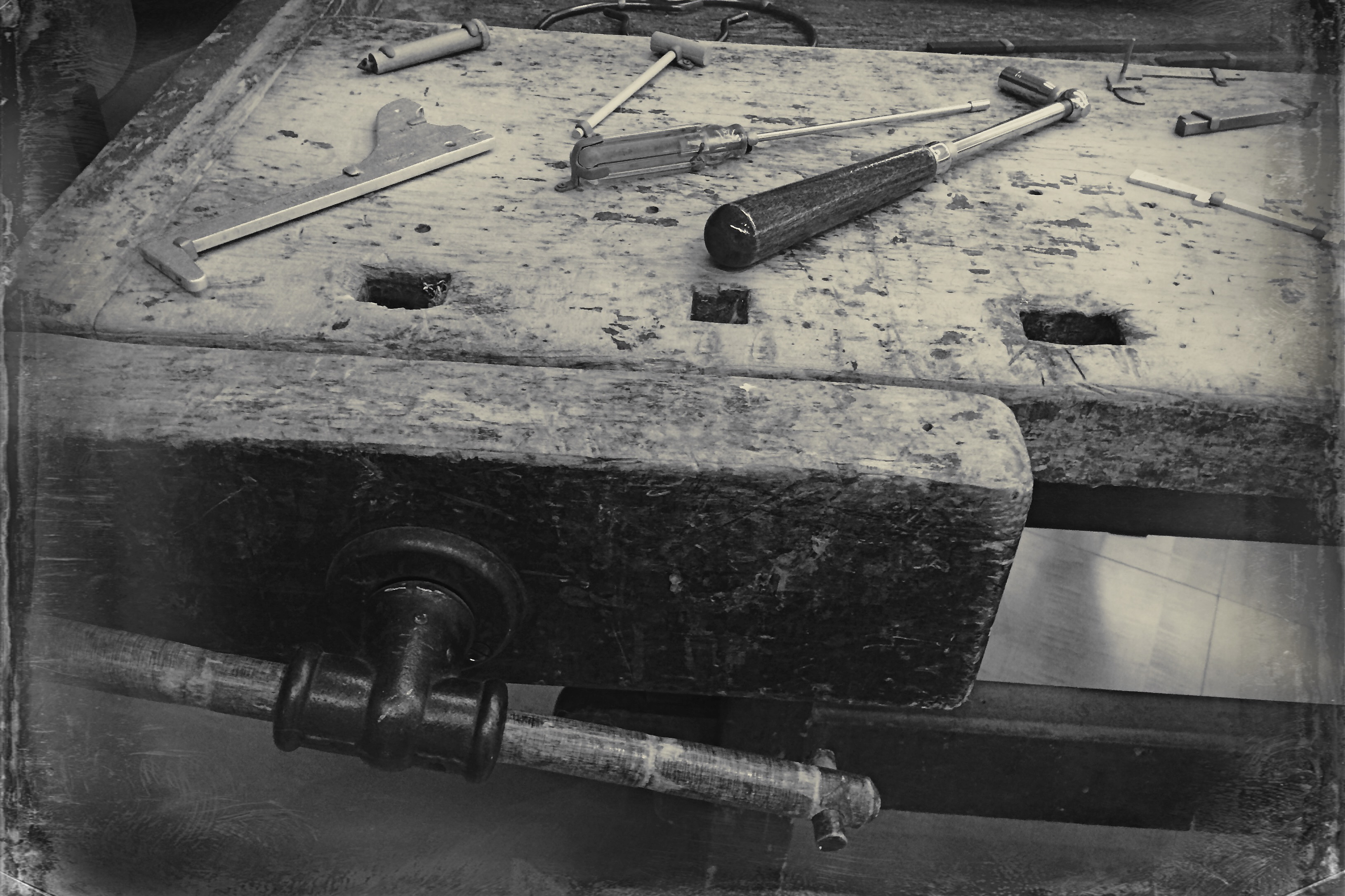
By basically simulating the subtle changes that a film processor could have made in the gradations between the various intensities of either black or white, apps allow you to make incremental judgments of how the values in the image work or don’t work to produce the “statement” you’re looking for. Best thing about this is the best overall thing about digital: how quickly you can act on your impulse, then check, adjust, and act again. The above image lacked impact in the color original. The old workbench simply came off too warm and charming. I was looking for something that matched the grit and wear of the weathered wood, and I was able to shop for about three different grades of monochrome before settling on what you see here. Most days, this is a game of inches.
The sheer number of images that you will be able to salvage while the scene is still in front of you, and the light is still how you want it…. that’s an amazing freedom, and no generation of photographers before ours has enjoyed anything like it before.
The take-home of all this is that you should not only shoot a lot but shoot a lot of variations on what you choose to shoot. And remember, every shot that you “blow” is one shot closer to the higher average of excellent work that will only come after thousands of failures. Best to speed up the clock and get past them while you’re still young.
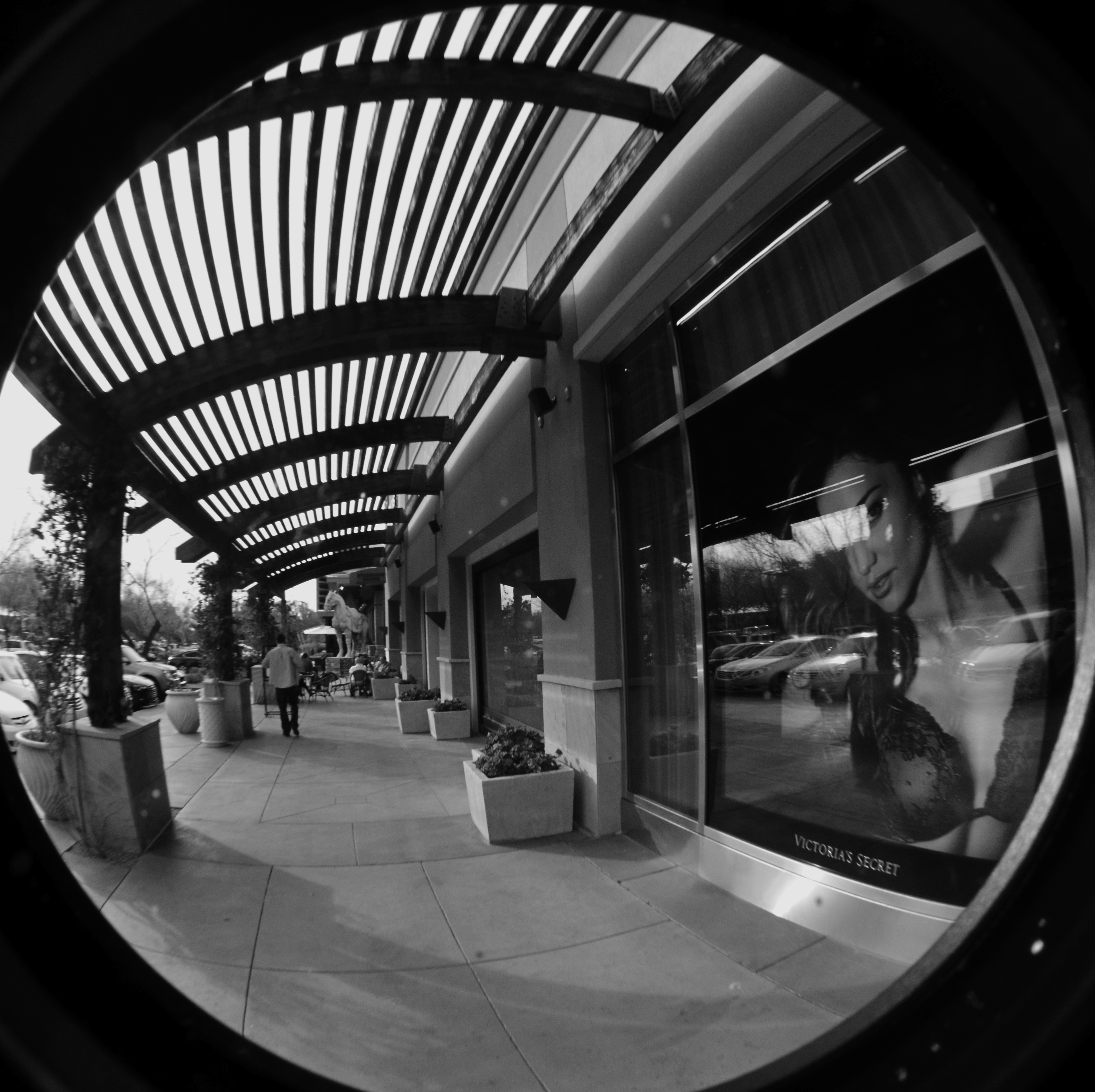
THE RIGHT WAGON
Cheap fisheye adaptors are a mixed bag optically, but they can convey a mood. 1/40 sec., f/11, ISO 100, 18mm.
By MICHAEL PERKINS
I ONCE HEARD AN OLD PHOTOGRAPHER SPEAK OF CREATIVE CHOICES AS “picking the right wagon to haul your goods to market”. By that, he meant that format, film, frame size, lens type or aperture were all just means to an end. If one wouldn’t take your wagon all the way to a finished picture, use another. He had no special sentiment or ironclad loyalty to any one tool, since there was, and is, only one real goal in any of photography: get the image you came to get.
It’s often hard to remember that simple rule, since we tend to associate the success of certain pictures with our pet camera, our sweet spot aperture, our favorite hunk of glass. But there’s also a knack to knowing when a particular tool that is wrong, wrong, wrong for almost anything might, for the project at hand, be just perfect.
I have one such tool, and, on rare occasions, the very properties that make me generally curse it as a cheap chunk of junk can make me praise it as just what the doctor ordered. It’s an Opteka 0.35, a screw-on lens adapter that simulates (to put it kindly) at least the dimensions of a true fisheye, without the enormous layout of dough, or, sadly, the optical precision of a true dedicated lens. It’s fuzzy at the edges, regardless of your aperture. It sprays chromatic shmears all over those edges, and so you can’t even dream of sharpness beyond the third of the image that’s in the dead center of the lens. It was, let’s be honest, a cheap toy bought by a cheap photographer (me) as a shortcut. For 99% of any ulta-wide imaging, it’s akin to taking a picture through a jellyfish bladder.
But.
Mood over reality. 1/125 sec., f/11, ISO 100, 18mm.
Since the very essence of fisheye photography is as a distortion of reality, the Opteka can be a helping hand toward a fantasy look. Overall sharpness in a fisheye shot can certainly be a desired effect, but, given your subject matter, it need not be a deal breaker.
In the case of some recent monochrome studies of trees I’ve been undertaking, for example, the slightly supernatural effect I’m after isn’t dependent on a “real” look, and running the Opteka in black and white with a little detail boost on the back end gives me the unreal appearance that is right for what I want to convey about the elusive, even magical elements of trees. The attachment is all kinds of wrong for most other kinds of images, but, again, the idea is to get the feel you’re looking for…in that composition, on that day, under those circumstances.
I’ve love to get to the day when one lens will do everything in all instances, but I won’t live that long, and, chances are, neither will you. Meanwhile, I gotta get my goods to market, and for the slightly daft look of magickal trees, the Opteka is my Leica.
For now.
ON SECOND THOUGHT…OR THIRD
I really preferred this as the color shot it originally was. Until I didn’t. Changing my mind took seconds.
By MICHAEL PERKINS
ONE OF THE MOST AMAZING BY-PRODUCTS OF DIGITAL PHOTOGRAPHY, a trend still evolving across both amateur and professional ranks, is a kind of tidal return to black-and-white imaging. The sheer volume of processing choices, both in-and-out-of-camera, have made at least dabbling in monochrome all but inevitable for nearly everyone, reversing a global trend toward near exclusive use of color that was decades in the making. At one point, to be sure, we chose black and white out of necessity. Then we embraced color and relegated B&W to the dustbin of history. Now, we elect to use it again, and increasing numbers, simply because everything technical is within our reach, cheaply and easily.
Looking back, it’s amazing how long it took for color to take hold on a mass scale. Following decades of wildly uneven experimentation and dozens of processes from Victorian hand-tinting to the Autochromes of the early 1900’s, stable and affordable color film came to most of us by the end of the 1930’s. However, there was a reluctance, bearing on tantrum, among “serious” photographers to embrace it for several more decades. This article from the Life magazine Library of Photography, a history-tutorial series from the 1970’s, discusses what can only be called photography’s original anti-color bias:
Although publishers and advertisers enhanced their messages with pictures in color during the first few decades of the color era, most influential critics and museum curators persisted in regarding color photographs as “calendar art”. Color, they felt, was, at best, merely decorative, suitable, perhaps, for exotic or picturesque subjects, but a gaudy distraction in any work with “serious” artistic goals.
Of course, for years, color printing and processing was also unwieldy and expensive, scaring away even those few artists who wanted to take it on. Still, can you imagine, today, anyone holding the belief that any kind of processing was a “gaudy distraction” rather than just one more way to envision an image? Color was once seen by serious photographers as an element of the commercial world, therefore somehow..suspect. Fashion and celebrity photography had not yet been seen as legitimate members of the photo family, and their explosive use of color was almost thought of as a carnival effect. Cheap and vulgar.
Of course, once color became truly ubiquitous, sales of monochromatic film plummeted, and, for a time, black-and-white found itself on the bottom bunk, minimized as somehow less than color. In other words, we took the same blinkered blindness and just turned it on its head. Dumb times two.
Jump to today, where you can shoot, process and show images in nearly one continuous flow of energy. There are no daunting learning curves, no prohibitive expenses, no chemically charred fingertips to slow us down, or segregate one kind of photography from all others. What an amazing time to be jumping into this vast ocean of possibilities, when images get a second life, upon second thought.
Or third.
OH, IT’S HIDEOUS. I LOVE IT.
By MICHAEL PERKINS
THERE MAY BE NO RULES LEFT TO BREAK IN PHOTOGRAPHY, in that everybody is comfortable doing absolutely anything….compositionally, conceptually, technologically…to get the picture they want. Maybe that’s always the way it’s been, seeing as the art of image-making, like the science of breeding apple trees, has always grown faster and stronger through cloning and grafting. Hacks. Improvisations. “Gee-What-If”s.
Shots in the dark.
Not a bad starting point, but either too pretty, or not ugly enough…or something.
Recently I walked out into the gigantic atrium that connects all of the original buildings of the Morgan Library complex in NYC to get a good look at the surrounding neighborhood of big-shouldered buildings. I was fascinated by the way my wide-angle lens seemed to line up the horizontal grid lines of the atrium with the receding lines of the towers and boxes down the block. Only one thing bothered me about the result: the color, or rather, the measly quality of it.
A rainy day in Manhattan is perhaps the final word on rainy days. Some colors, like the patented screaming yellow of a New York cab, or the loud neon reds of bodegas, are intensified into a romantic wash when the drops start. This view, however, was just a bland mash of near-color. If the neighborhood was going to look dour anyway, I wanted it to be dour-plus-one. Thing is, I made this, ahem, “artistic” decision after I had already traveled 3,000 miles back home. In the words of Rick Perry, whoops.
Time to hack my way to freedom. I remembered liking the look of old Agfa AP-X film in a filter on my iPhone, so I filled the screen of my Mac with the bland-o image, shot the screen with the phone, applied the filter, uploaded the result back into the Mac again, and twisted the knobs on the new cheese-grater texture I had gained along the way. At least now it looked like an ugly day….but ugly on my terms. Now I had the kind of rain-soaked grayscale newspaper tones I wanted, and the overall effect helped to better meld the geometry of the atrium and the skyline.
No rules? Sure, there’s still at least one.
Get the shot.
HOW DARE HUE
Terminus, 2014. 1/250 sec., f/5.6, ISO 100, 35mm. Desaturated copy.
By MICHAEL PERKINS
IT’S TRULY AMAZING TO CONSIDER THAT, AS RECENTLY AS THE LATE 1940’s, many serious photographers were, at best, indifferent to color, and at worst, antagonistic toward its use in their work. And we’re talking Edward Weston, Ansel Adams and many other big-shoulders guys, who regarded color with the same anxiety that movie producer experienced when silent segued to sound. We’re talking substantial blood pressure issues here.
Part of the problem was that black and white, since it was not a technical representation of the full range of hues in nature, was already assumed to be an interpretation, not a recording, of life. The terms between the artist and the audience were clear: what you are seeing is not real: it is our artistic comment on real. Color was thought, by contrast, to be “merely” real, that is to say limiting, since an apple must always be red and a blueberry must always be blue. In other words, for certain shooters, the party was over.
The color original. A little too Peter Max-y.
There were also technical arguments against color, or at least the look of color as seen in the printing processes of the early 20th century. Mass-appeal magazines like Look, Life, and National Geographic had made, in the view of their readers, massive strides in the fidelity of the color they put on newsstands. For Adams, these advances were baby steps, and pathetic ones at that, leading him and others to keep their color assignments to a bare minimum. In Adams’ case in particular, color jobs paid the bills that financed the black and white work he thought to be more important, so, if Kodak came calling, he reluctantly returned their calls. He then castigated his own color work as “aesthetically inconsequential but technically remarkable.”
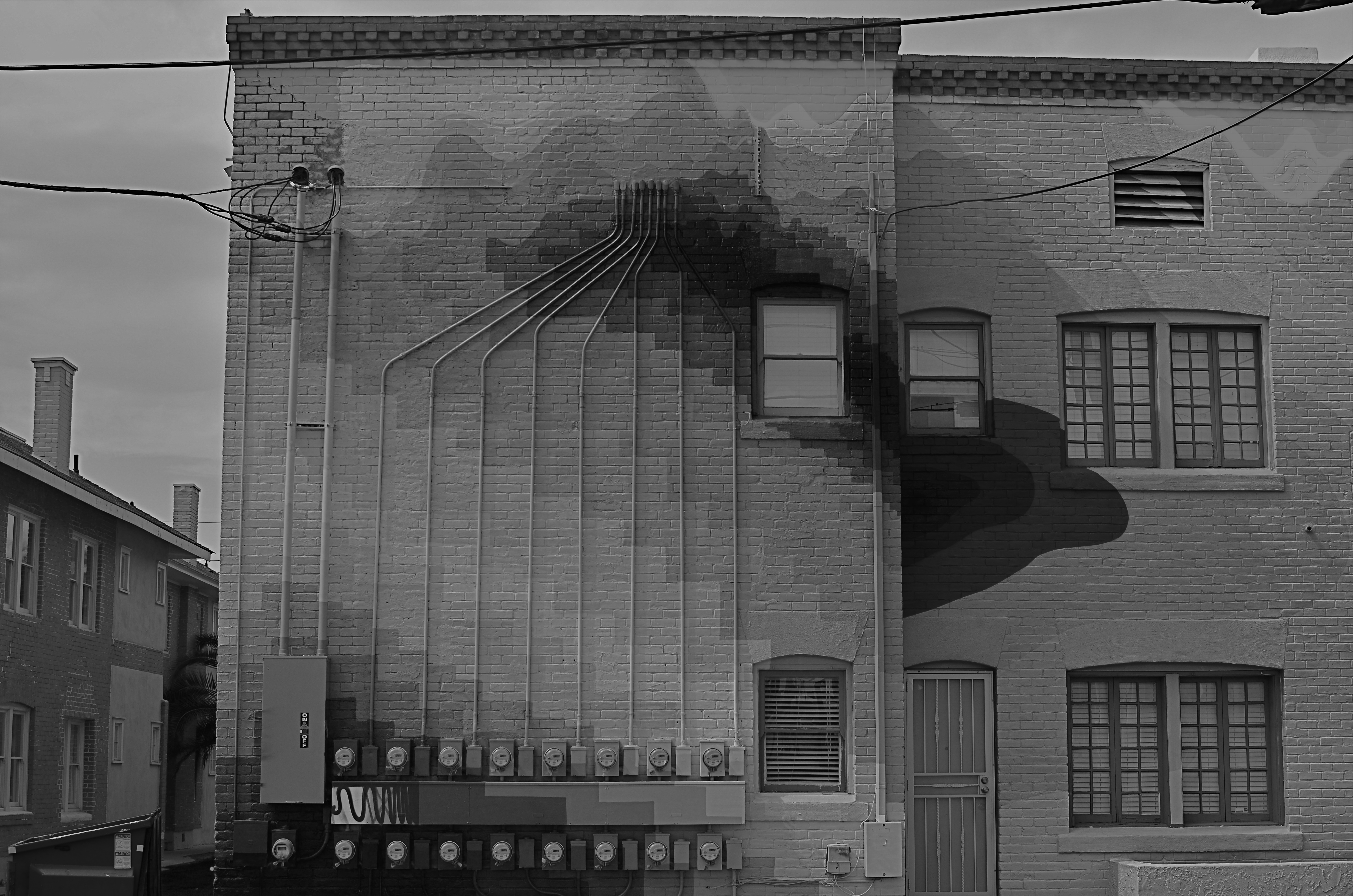
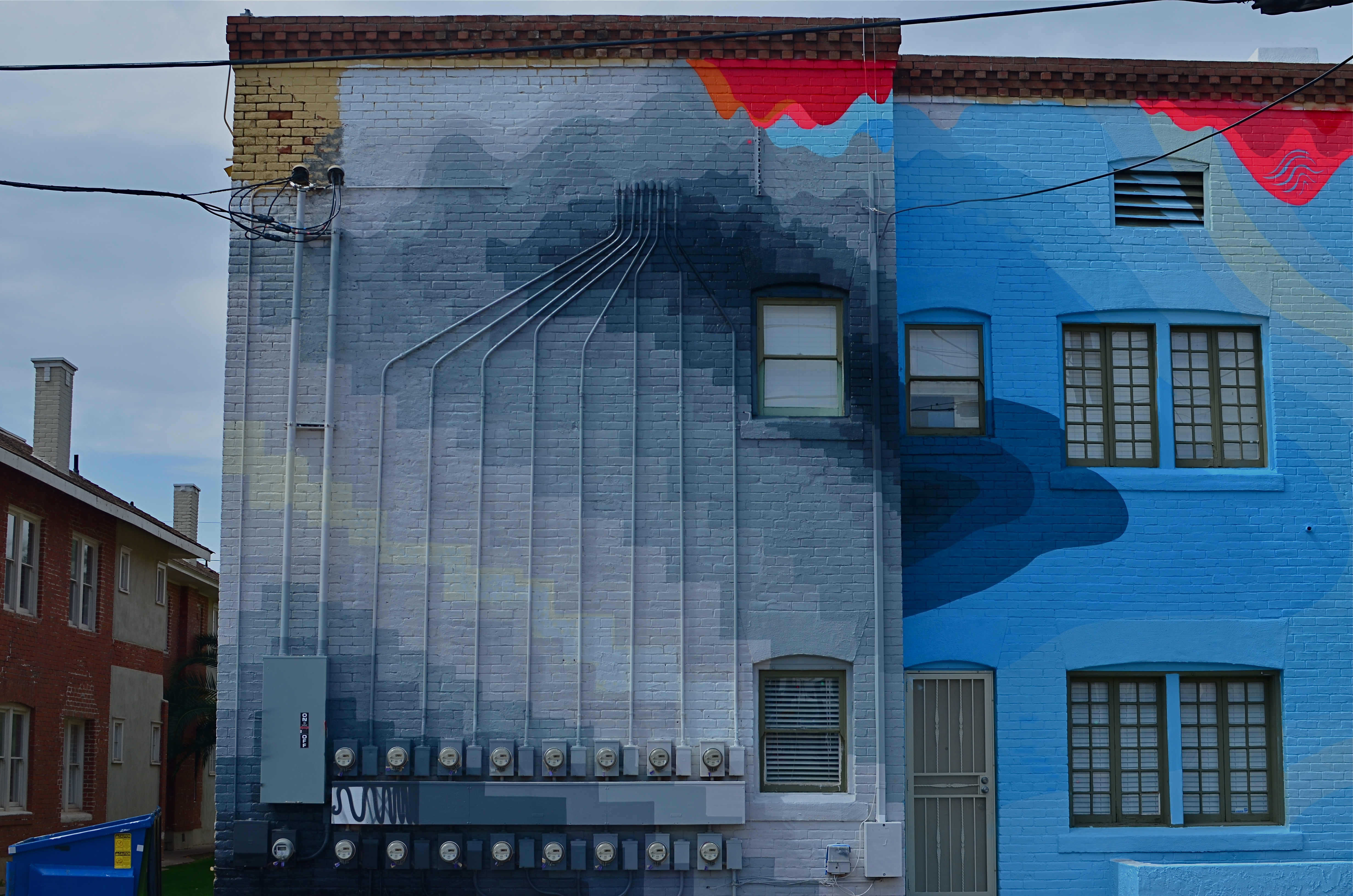
Look where we are today, making color/not color choices in the moment, without changing films in mid-stream, deciding to convert or de-saturate shots in camera, in post processing, or even further down the road, based on our evolving view of our own work.
There are times when I still prefer monochrome as more “trustworthy” to convey a story with a bit more grit or to focus attention on textures instead of hues. In the above shot, I decided that the spare old building and its spidery network of power meters simply had more impact without the pretty colors from its creative makeover. However, one of my color frames was stronger compositionally than the black and white, so I desaturated it after the fact. Fortunately, I had shot with a polarizing filter, so at least the tonal range survived the transition.
The miracle of now is that we can make such microscopic tweaks in our original intention right on the spot. And that’s good, since, when it comes to color, nothing is ever black and white (sorry).
PASS GO, COLLECT $200
The Birthday Boy, February, 2014. 1/10 sec., f/5.6, ISO 200, 18mm.
By MICHAEL PERKINS
BIRTHDAYS HAVE BECOME SOMETHING OF A CONUNDRUM AT MY AGE. The annual ritual of looking yourself over, and thereby taking some kind of critical inventory of personality debits and credits, has become a little like finding an old favorite shirt in a drawer. On one hand, it’s horribly out of fashion, and may not fit so well anymore. On the other hand, you had some great times in it, and it was really well made….I mean look at the quality in the fabric…….
And so, after a few loving looks, back in the drawer it goes.
There are so many yardsticks to apply to a life, so many ways to mark distance run. You can produce either smiles or sighs with any of them. Of course, I’d like to weigh less. Of course, I’d like to know more. And when it comes to photography, of course I’d like to be able to invoke a thirty-year mortality extension clause, in the hope that maybe, just maybe, I’d eventually learn to see as I should, before shuffling off to The Undiscovered Country.
In recent years, I’ve used self-portraits as some kind of mile marker on myself, either as an index of technique, or maybe just a detailed document of wear and tear. It’s somewhat related to the annual torture that used to be School Picture Day, except that there’s no creepy guy to give me a lame nickname and hand me a plastic pocket comb. Another key difference is that I can keep shooting until my eyes are open and my cowlick behaves.
So, anyway, tomorrow, I’ll waddle my way past “GO” and collect my $200. Someone will once again stick something with a lit candle in front of me, and, once again, I will experience that all too human mix between gratitude and regret that makes humanity the ultimate sweet-and-sour entrée. I’ve been around from Brownies to Instamatics to Polaroids to iPhones, and it’s been a privilege to behold it all. And, if I’ve produced even one visual document to suggest to anyone else how marvelously grand the world is, then it’s been a pretty good run. It’s nice to be around.
Hey, did they take taxes out of this $200????
BLACK IS THE NEW QUIET
By MICHAEL PERKINS
PERHAPS IT’S MY FATHER’S LOVE OF THOREAU AND EMERSON. Maybe it’s a late-in-life turn toward the meditational. It most certainly is due, in part, to a life-long adoration of all things bookish. Whatever the exact mix, I regard library space as far more sacred than the confines of any church or chapel. Many find their faith flanked by stained glass; I get centered in the midst of bookshelves.
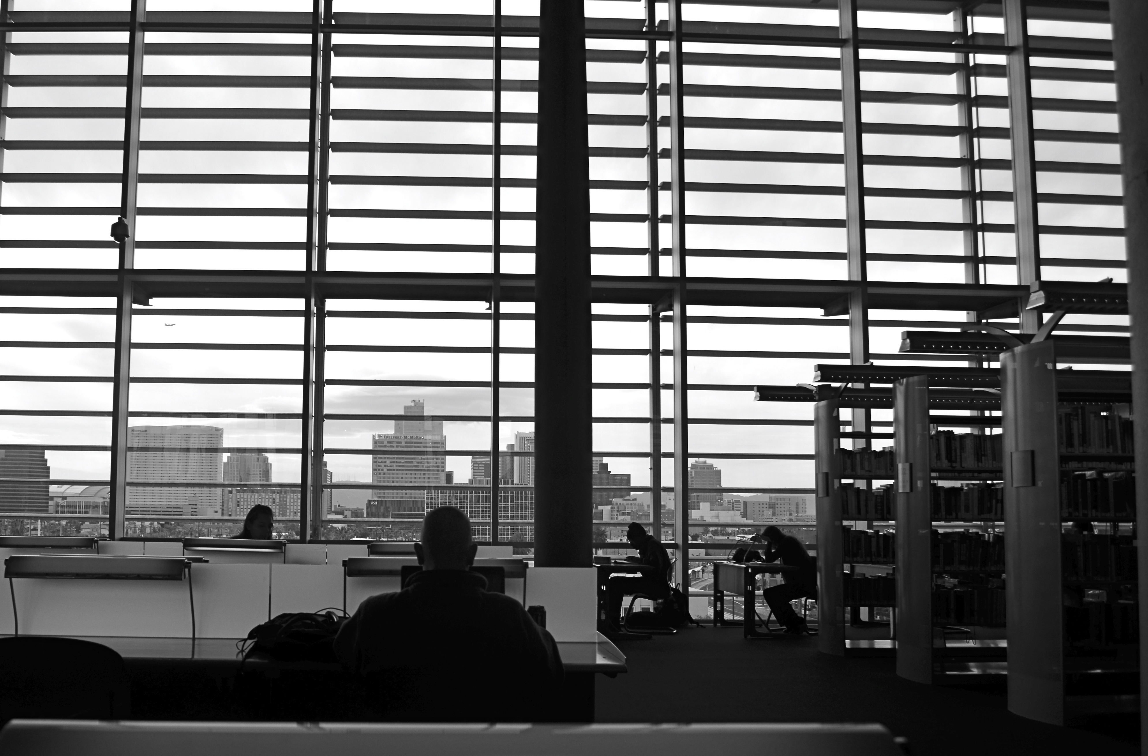
Solitude: An in-camera monochrome at 1/250 sec.,f/5.6, ISO 100, 18mm.
And if libraries are my churches, reading rooms are the sanctuaries, the places within which the mind can be channeled into infinite streams, and where, incidentally, perfect mental quiet can translate into visual quiet. And that, for me, means black and white images. Color can be too loud, proud, and garish, wherein monochrome is the language of privacy, intimacy, and a perfect kind of silence. You might say black is the new quiet.
Inside reading rooms, the faces and clothing of the patrons seems, well, irrelevant to the mood. They have all come seeking the same thing, so compositionally, they are, themselves, all alike, and seeing them in silhouette against the larger details of the room seems to enhance the feeling of reverent quiet. As for composing, letting the room’s massive window take up 3/4 of the frame kept the readers as a small understatement along the bottom baseline of the shot. And, since I was reluctant to ruin the atmosphere of the room, or risk my “invisibility” with more than one audible click to betray me, I chose to go for broke with a single black & white image. I exposed for the cityscape beyond the window, to guarantee that the readers would be rendered as shapes, and that was it.
Having successfully purloined a treasure from within the Church Of The Holy Book, I proceeded to beat it.
Quietly.
RE-FIXING THE FIX
Think this picture’s bad now? Hey, wait til I start messing with it. 1/40 sec., f/8, ISO 320, 55mm.
By MICHAEL PERKINS
I CAN HEAR MY MOTHER NOW: “Don’t pick at it, you’ll get it infected”.
Okay, she usually was referring to a scab on a skinned knee. But often, when I can’t stop interfering needlessly with an image, I could swear she’s talking about photographs.
You know the ones I mean. The near misses that you would swear could be transformed into masterpieces with just one….more…tweak. Or maybe two. Or thirty. They are often the pictures we love most, like bad kids, simply because they had such potential, at least until we snapped the shutter. Then we stick them, flaws and all, on life support and start playing with things. Contrast. Color. Exotic filters. A spoonful of sugar. A pound and a half of good intentions.
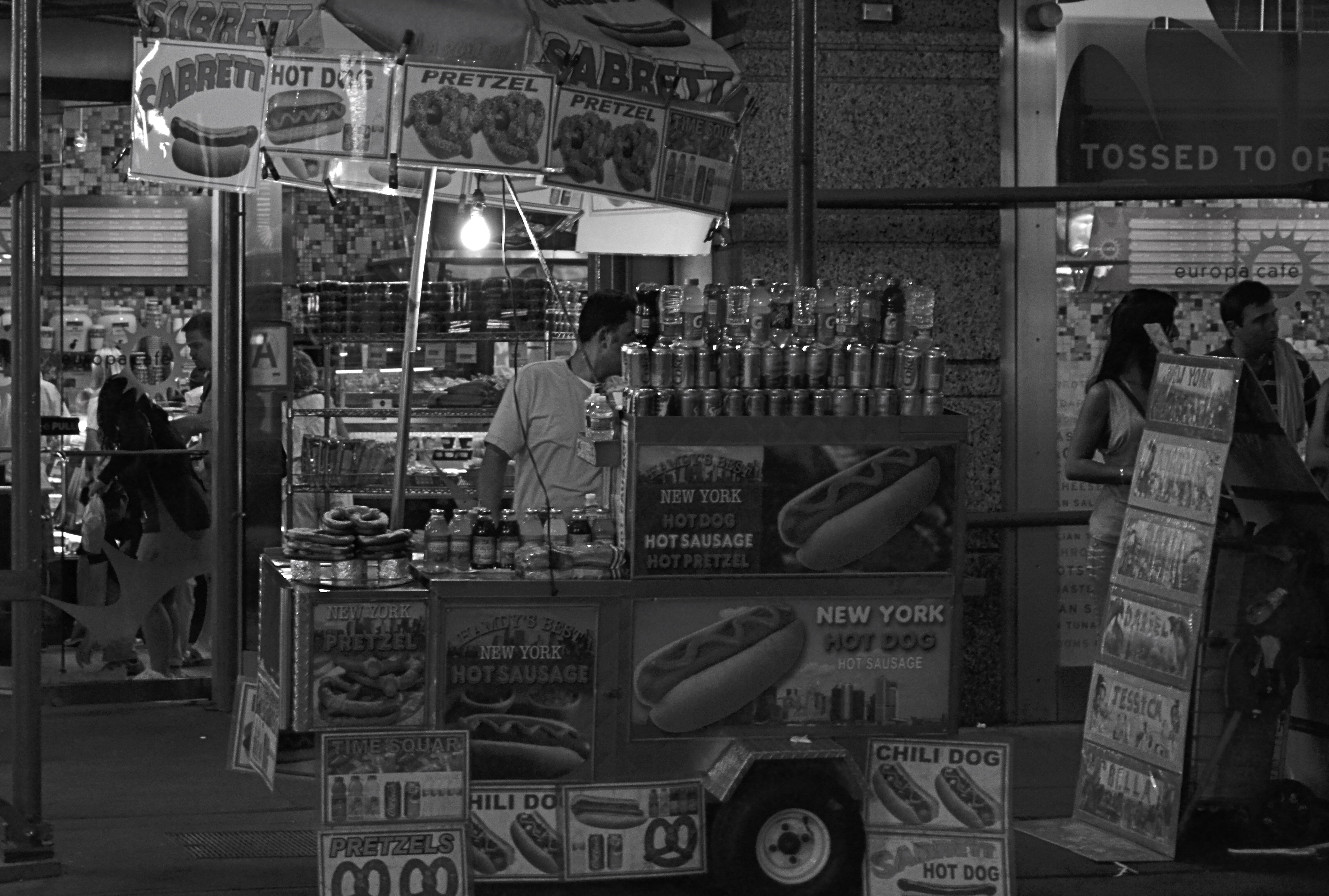
The same shot in monochrome. Yeah, less is sometimes just less.
And, sometimes, by getting our tweak on in a heavy-handed fashion, we make things worse. We render them garish, or glowing, or gooey, and still not what we intended. It’s like tutoring a kid that will never ever make the honor roll. It seems like we ought to be able to do something.
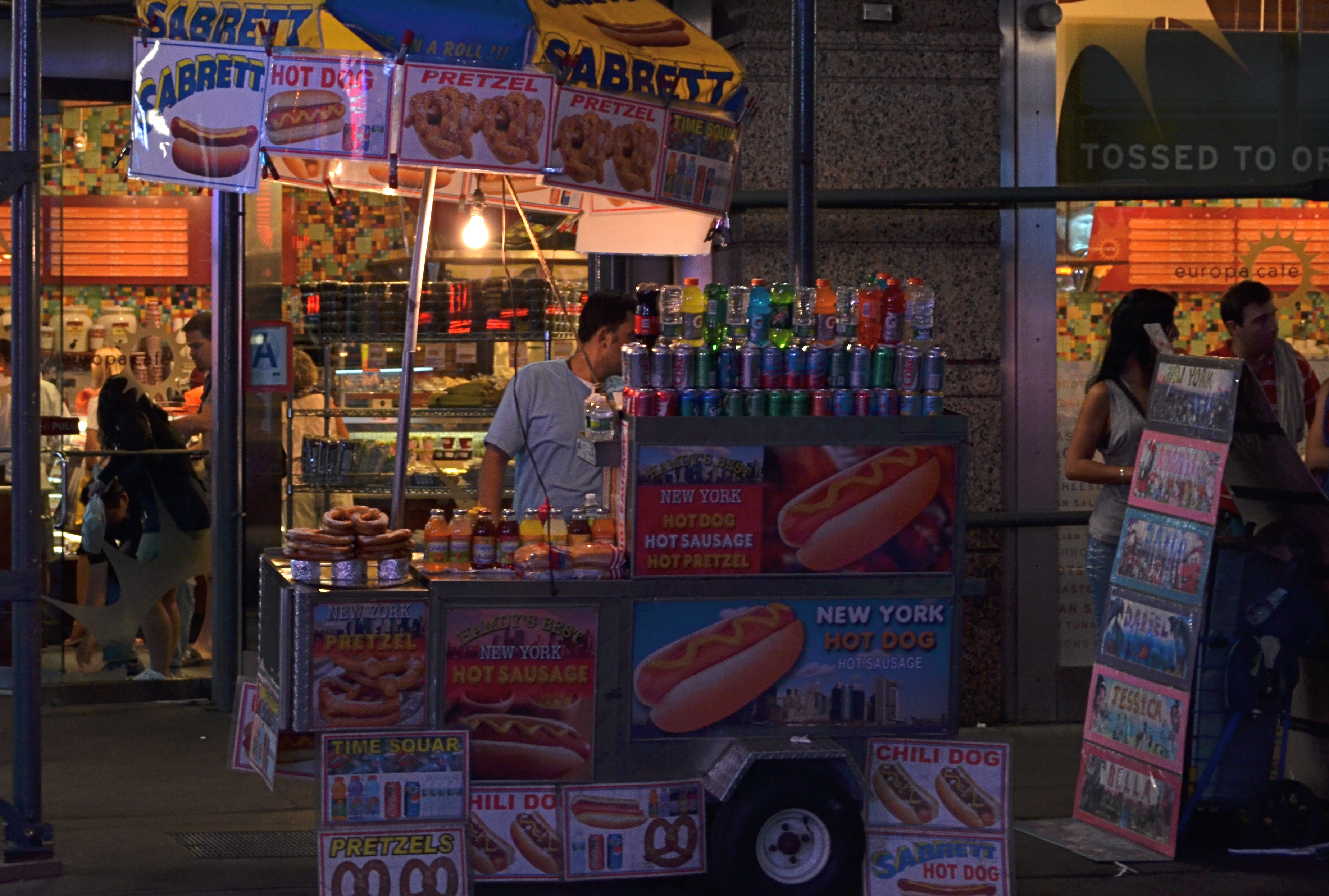
That’s the story of the above color street shot, taken just after sundown in Times Square. All the elements of a good picture are there, but the thing is just all right, nothing more, nothing less. At some point before I first posted it on Flickr, I got the brilliant notion that it would look more “authentic” if desaturated to black and white. Re-examining it more than a year later, I realized “authentic” was code for maybe I can distract people from the fact that I didn’t really bring it home in this shot. Once it was monochromed, the image was actually robbed of whatever minimal punch it might have originally had. All the zippy color of the signage and soda cans was banished, to replaced by….a really dull and narrow range of half-tones. All the depth and presence went out the same exit door as the color, but I went ahead and posted it anyway, trying to convince myself that I had made it much more “street”, when all I had really done was strip out the carnival hues that really said “Broadway”. I had worked against myself, and, worse, I had wasted time on a shot which should have gone in the reject pile from day one.
It’s not a miserable photo, and maybe that’s what really hard to accept. It might have been something. What I should have done, while I was there, was keep trying about ten more frames of this guy and maybe saving the concept. You know, try to get the photo right in the first place. Yeah, I know, how quaint. Thing is, once it was a mediocre picture inside the camera, all I could do was pick the scab.
And then it got infected.
Sorry, Mom.
DISTORTION AS DESIGN
Overhead parallels bent with a fisheye to yank the eye for forcefully into the frame, maybe impose a little claustrophobia. 1/80 sec., f/22. ISO 640, 8mm
By MICHAEL PERKINS
BORN INTO A PAINTER’S WORLD, PHOTOGRAPHY NATURALLY INHERITED THAT DISCIPLINE’S BIAS TOWARD SHOWING THE WORLD “AS IT IS“, and, in fact, the first fifty years of photographic images seem to be in a neck-and-neck race with painting for the best rendering of the world at large. Then the 20th century kind of dope-slapped humanity’s collective sense of “reality”, as a world war, the onrush of science, and the rise of secular thought combined to question what the hell we needed with reality, anyway. The arts were shaken to their foundations, and photography and painting spiraled off onto wild new side roads. All bets for what defined a “picture” were off.
That’s not to say that photography has remained visually unbound through the decades. It almost acts like the flow and ebb of the surf. Photos surge toward pure documentation, then pull back into pure effect. They roll forward into an absolute deconstruction of the real world, then clamber back into the safety of literal pictorialism. One day we’re trying to recreate a wilderness landscape with perfect fidelity; the next day we’re reducing all “subjects” moot, reducing everything to shape and light.
I have had to spend many years getting comfortable with abstractions in my photography. It’s not like I don’t have ideas that wander far from the visual mainstream. If anything, I’ve had to learn to trust those visions, to stop worrying about whether they have “value” versus some rigid, if invisible,standard. While some shooters started with an absolutely open attitude toward the camera, pointing, framing and living completely by whim or instinct (the Instagram and Lomo kids of my Stone Age), I was absolutely, unwaveringly serious about arranging or capturing things as I literally saw them. It was a very clenched approach, even if it did teach me the physics of the medium. I had to learn to hold things very tightly before learning to let anything go.
And it took a very long time.
The great gift of the digital era is that many “accounting” issues (how much film do I have left? where can I go to get these processed? do they sell my kind of film in this end of town?) are just plain gone, and, with them, a little of the constipated approach that they imposed on me. At my age, it no longer matters a damn how long I shoot, how many times I “fail”, or who does or does not choose to anoint the results. There are no teachers or parents left to show off for, no competition with anyone except myself. I am free to use surfaces as straight lines or use distortion as a design element.
The truth speaks with forked tongue: in some ways I am glad that I am no longer young, since I have finally lived long enough to “age” into my photographic niche. And it also makes me sad that I am no longer young, because I really want to run with this ball, and I realize that Time might knock my legs out from underneath me before I make it all the way down the field. Still, we are here, and here is where we have to concentrate our energy. It’s the only control we have. Or, in the words of Edna St.Vincent Millay:
My candle burns at both ends; It will not last the night;
But ah, my foes, and oh, my friends— It gives a lovely light.
MORE BOUNCE TO THE OUNCE

Fish ‘n’Books, 2013. 1/200 sec., f/3.5, ISO 100, 35mm.
By MICHAEL PERKINS
FOR THE MOST PART, THE USE OF ON-CAMERA FLASH SHOULD BE CONSIDERED A CRIME AGAINST HUMANITY. Scott Kelby, the world’s best-selling author of digital photography tutorials, famously remarked that “if you have a grudge against someone, shoot them with your pop-up flash, and it will even the score.” But, to be fair, let’s look at the pros and cons of using on-board illumination:
PROS : Cheap, handy
CONS: Harsh, Weak, Unflattering, Progenitor of Red-eye. Also, Satan kills a puppy every time you use it. Just sayin’.
There are, however, those very occasional situations where supplying a little bit of extra light might give you just the fill you need on a shot that is getting 90% of its light naturally. Even so, you have to employ trickery to harness this cruel blast of ouch-white, and simple bounces are the best way to get at least some of what you want.
In the above situation, I was shooting in a hall fairly flooded with bright mid-morning light, which was extremely hot on the objects it hit squarely but contrasty as an abandoned cave on anything out of its direct path. The fish sculpture in my proposed shot was getting its nose torched pretty good, but in black and white, the remainder of its body fell off sharply, almost to invisibility. I wanted the fish’s entire body in the shot, the better to give a sense of depth to the finished picture, but I obviously couldn’t flash directly into the shelf that overhung it without drenching the rest of the scene in superfluous blow-out. I needed a tiny, attenuated, and cheap fix.
Bending a simple white stationery envelope into a “L”, I popped up my camera’s flash and covered the unit with the corner of the envelope where the two planes intersected. The flash was scooped up by the envelope, then channeled over my shoulder, blowing onto the wall at my back, then bouncing back toward the fish in softened condition near the underside of the shelf, allowing just enough light to allow the figure’s bright nose to taper back gradually into shadow, revealing additional texture, but not over-illuminating the area. It took about five tries to get the thing to look as if the light could have broken that way naturally. Fast, cheap, effective.
The same principle can be done, with some twisting about, to give you a side or ceiling bounce, although, if high reflectivity is not crucial, I frankly recommend using your hand instead of the envelope, since you can twist it around with greater control and achieve a variety of effects.
Of course, the goal with rerouting light is to look as if you did nothing at all, so if you do save a picture with any of these moves, keep it to yourself. Oh, yes, you say modestly, that’s just the look I was going for.
Even as you’re thinking, whew, fooled ’em again.
THE RELENTLESS MELT
By MICHAEL PERKINS
THERE ARE PEOPLE YOU PHOTOGRAPH BECAUSE THEY ARE IMPORTANT. Others are chosen because they are elements in a composition. Or because they are interesting. Or horrific. Or dear in some way. Sometimes, however, you just have to photograph people because you like them, and what they represent about the human condition.
That was my simple, solid reaction upon seeing these two gentlemen engaged in conversation at a party. I like them. Their humanity reinforces and redeems mine.
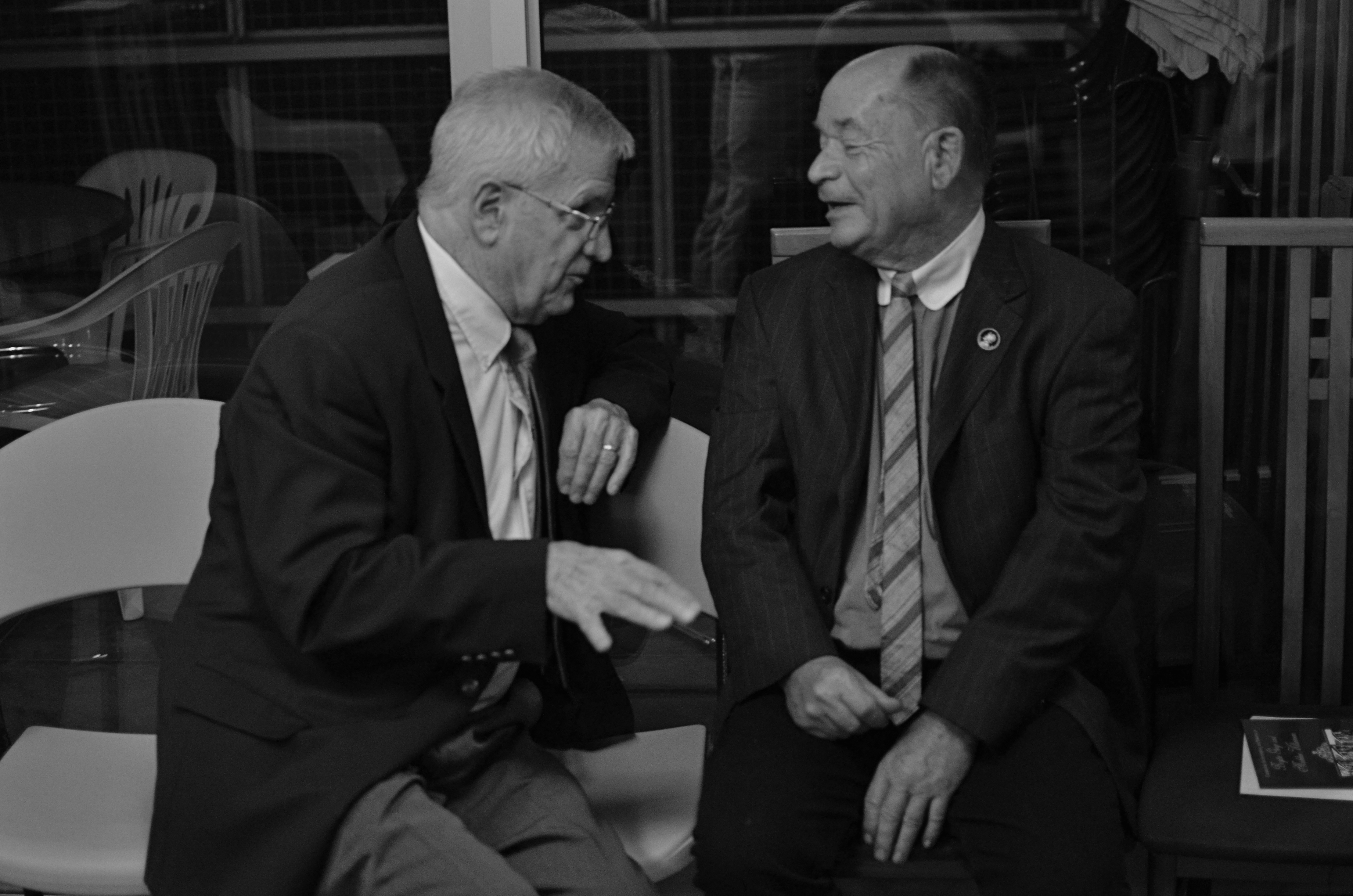
“Old friends sat on a park bench like bookends”: 1/80 sec., f/1.8, ISO 1000, 35mm.
This image is merely one of dozens I cranked out as I wandered through the guests at a recent reception for two of my very dearest friends. Given the distances many of us in the room traveled to be there, it’s unlikely I will ever see most of these people again, nor will I have the honor of knowing them in any other context except the convivial evening that herded us together for a time. Because I was largely eavesdropping on conversations between small groups of people who have known each other for a considerable time, I enjoyed the privilege often denied a photographer, the luxury of being invisible. No one was asked to pose or smile. No attempt was made to “mark the occasion” or make a record of any kind. And it proved to me, once more, that the best thing to relax a portrait subject is……another portrait subject.
I assume from the body language of these two men that they are friends, that is, that they weren’t just introduced on the spot by the hostess. There is history here. Shared somethings. I don’t need to know what specific links they have, or had. I just need to see the echoes of them on their faces. I had to frame and shoot them quickly, mostly to evade discovery, so in squeezing off several fast exposures I sacrificed a little softness, partly due to me, partly due to the animated nature of their conversation. It doesn’t bother me, nor does the little bit of noise suffered by shooting in a dim room at ISO 1000. I might have made a more technically perfect image if I’d had total control. Instead, I had a story in front of me and I wanted to possess it, so….
Susan Sontag, the social essayist whose final life partner was the photographer Annie Liebovitz, spoke wonderfully about the special theft, or what she called the “soft murder” of the photographic portrait when she noted that “to take a photograph is to participate in another person’s mortality, vulnerability, mutability. Precisely by slicing out this moment and freezing it, all photographs testify to time’s relentless melt.”
Melt though it might, time also leaves a mark.
Caught in a box.
Treasured in the heart.
Related articles
- Susan Sontag Musings Where You Least Expect Them (hintmag.com)
