A TRIAL SEPARATION
Yeah, well, you see, the thing is, uh, what was the question?
By MICHAEL PERKINS
A PERSON’S RELATIONSHIP WITH PHOTOGRAPHY, MEASURED OVER A LIFETIME, can come to resemble a marriage, with all the occasional rifts, rumbles and repellents of living with anyone (or anything) nonstop ’til death. Just as any good golfer has thrown the odd club into the 7th hole lake, any shooter worth his emulsions/pixels will, at least once, consider pitching his gear into the nearest abyss, then setting a cheery bonfire of his accumulated work alight in the home driveway (after securing all necessary permits, of course). I dare you to deny it. We hate intensely because we have loved intensely, and fallen intensely short.
The fury eventually abates, however, and we resume the “on” portion of the on again/off again love of photography, not knowing when it next will toggle to “off”, or if switching back to “on” even has any prospect of success. The fact is, creative passion can generate emotional surges, microbursts of feeling so intense they could pop the top off a seismograph. This means answering “the questions” as they ring inside your skull:
Why did I ever start doing this?
What made me thing I’d ever be any good at it?
And where is that damned lens?????
In the interest of my own sanity, I never contemplate a total divorce from photography, but I avidly support the need for a trial separation from time to time. Every relief valve has to be opened and flushed out occasionally, and when the ideas, or the patience to execute them, seem to have gone south for the winter, you have to furlough the workers and shut down the plant. For a while. Hammering away at a problem with an image may eventually loosen what’s stuck, but it’s just as valuable to know when to lay down your tools and quit the scene. For a while. Once your brain is running on high-octane rage, all things beautiful and visionary will just be drowned out by all the screaming, so, really, I’m not kidding: accept the fact that occasionally you’ll announce to all your friends and family that you’re “over the whole photography thing”. And you will absolutely mean it.
For a while.
Here’s another thought: fake-quitting photography will provide the most severe test of how much you were into it in the first place. A trial separation is just that: a test to see if there was anything worth saving in the relationship. Scary process, but, if you come back, whether to a partner or a Nikon, you come back renewed and freshly committed to Make This Thing Work. All of a sudden, you’re bringing your Canon chocolates and roses, and arranging for a romantic candlelight dinner. And the work grows again.
For a while.
LATE-BURNING CANDLES
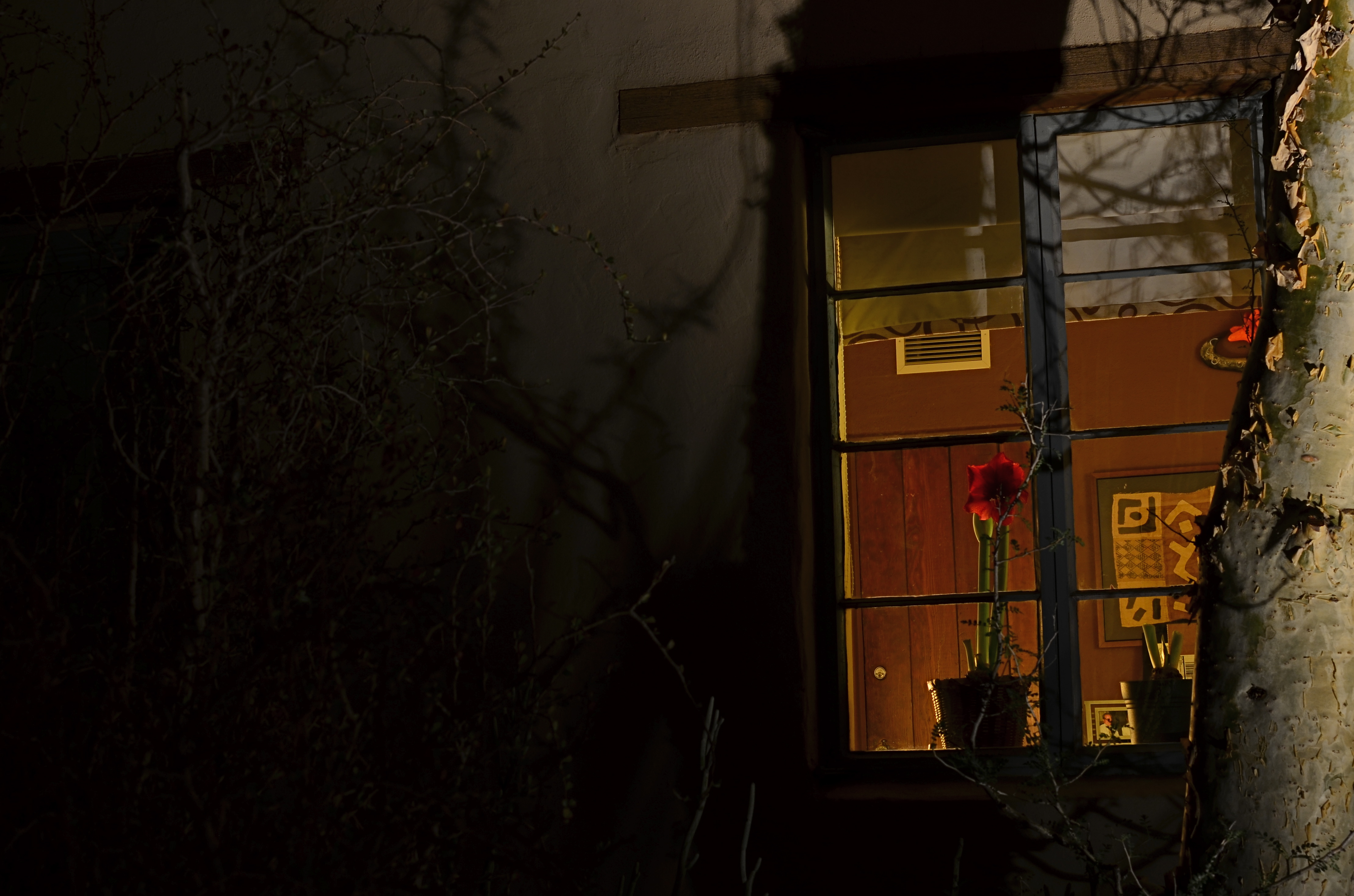
Night Bloom, 2016. 8 sec., f/8, ISO 100, 35mm.
By MICHAEL PERKINS
DAYTIME PHOTOGRAPHS OF BUILDING EXTERIORS present the interior contents of apartments, stores and offices in a very muted fashion. Glare, sunlight, and plain old dirty glass, along with the limited scope of some camera sensors, render inside space in a somewhat flattened manner. Fortunately, night shots of the same spaces reveal something completely different, hints of the lives of the people who have locked up and headed home for the evening.
Like a picture framed in a black matte or displayed on a bed of velvet, night images of building interiors, taken from outside those buildings, benefit from that contrasty “punching up” between dark and light. More to the point is how people decide to stage their work space when they clock out. Do they leave a single lamp on to illuminate their desk? Is the room largely dark, but partially painted with ambient light from the cleaning person down the hall? Are certain displays, logos, personal effects altered by the overall reduction in illumination? And, for the photographer, does something different emerge in the feel of the room that seems invisible by day?
I recently walked around a large museum campus, taking medium-distance time exposures of several buildings whose exterior lighting scheme seemed altered at night, when I saw the office window you see above. The overall scheme of light in the room was warm. The gorgeous amaryllis plant arching over someone’s desk not only worked that slightly orange room light, but was made especially seductive with the deepening of its own colors. Here was a workspace where someone drew rest, beauty, and solace from the inclusion of just one extra humanizing item. And, after dark, it glowed like a coal to passersby. I had to have it, at least inside my camera.
I’m not saying that all peeks through all windows yield treasures to the photographer’s eye. But the sheer volume of visual information on a city street during the day is cut by half after sundown, and occasionally, you find a late-burning candle that has spent the daylight hours hiding in plain sight.
A NEW PATH
A dream of life comes to me. Come on up for the rising tonight—-Bruce Springsteen
By MICHAEL PERKINS
THE POST 9/11 RESURRECTION OF LOWER MANHATTAN might have begun as a kind of act of defiance, a refusal to knuckle under to fear in the aftermath of the largest attack in history on American soil. Somewhere amidst the tears and rage, however, the project to re-establish this crucial corner of New York City moved onto a higher plane, transitioning from anger to elegance, mourning to…morning. And now, for both casual travelers and astounded visitors, the master plan for the area is an ever-blooming monument to faith. To excellence.
Photographers from around the world have known, from the days of the first cleanups, that an amazing opportunity for historic documentation was unfolding on this hallowed ground, and their images have provided an invaluable service in tracking the city’s transition between two distinct eras. The first two mile-markers in this transformation, the openings of World Trade Center One and the 9/11 Memorial Museum, have been interpreted in a global cascade of visual impressions, occurring, as they have, in the first explosion of social media and digital imaging. And now, the third piece of the puzzle, the stunning new Oculus PATH terminal, is nearly ready to serve as the proof that the city, along with all its millions of comings and goings, is still very much open for business.
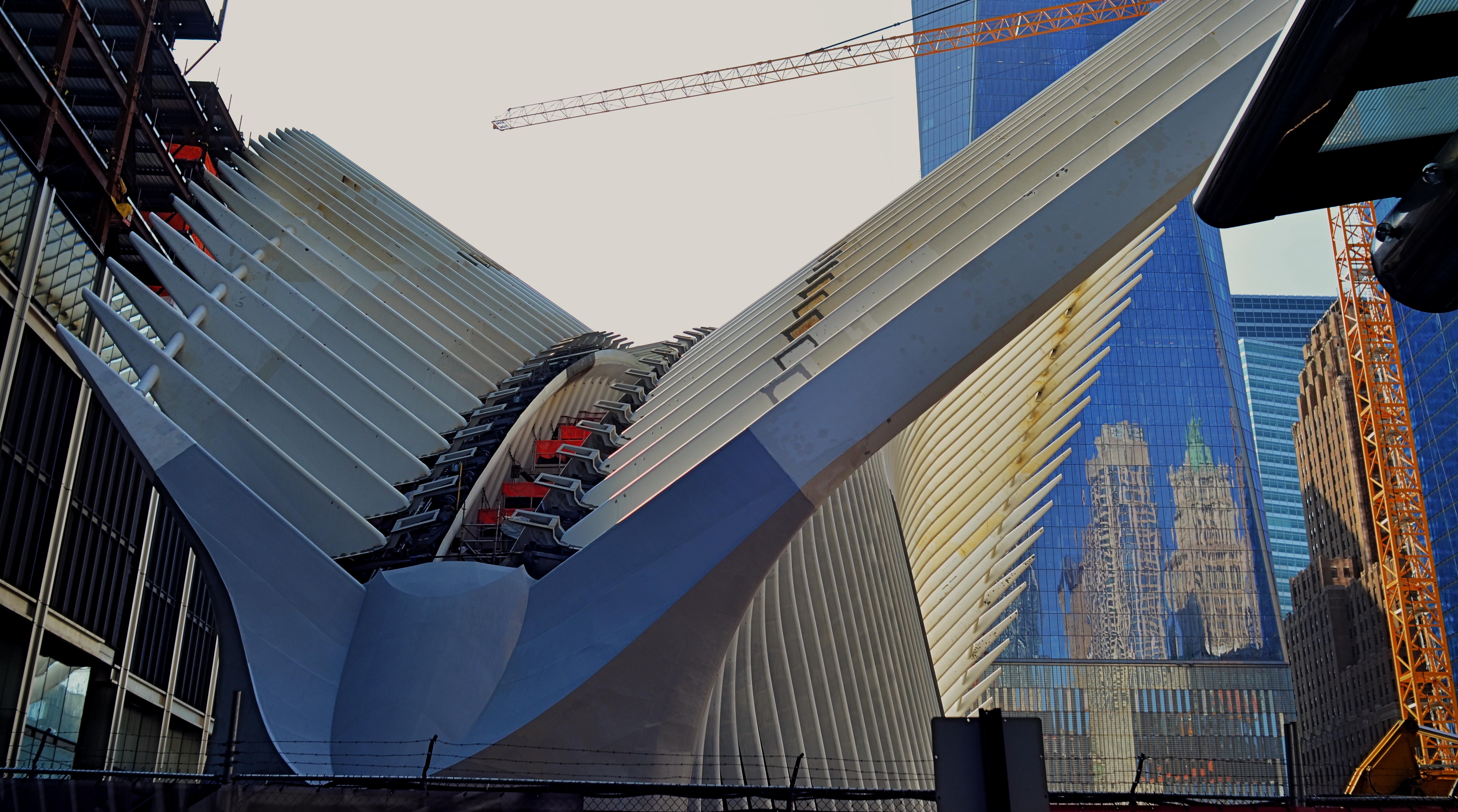
Oculus Aloft: the steel wings of the new PATH terminal for New York’s World Trade Center, nearing completion in 2015.
Photographers have already made a visit to Oculus something of a pilgrimage, and, looking over the first few photos to emerge from their visits, it might be closer, architecturally, to a religious experience. Designed by Santiago Calatrava, the structure, presenting its ribbed wings to the skies like an abstract bird of prey, resembles, within, a kind of sci-fi cathedral of kaleidoscopic light effects, serving as both monument and utility. An inventory of its features and a gallery of interior images can be seen here.
And, of course, this is New York, so opinion on the Oculus’ value, from poetic prayers to crass carping, will go through the usual grappling match. But, whatever one’s eventual take on the project, its power as a statement….of survival, of power, of hope, and, yes, of defiance, cannot be denied. To date, I’ve only been able to photograph limited parts of the construction phase (see above), but I will be back after the baby’s born. And my dreams will collide with Oculus’ own, and something magical will happen inside a box.
Make your way to Manhattan, and let your own camera weigh in on the new arrival.
Come On Up For The Rising.
PICTURES WITH A LEG (OR LEGS) TO STAND ON
By MICHAEL PERKINS
YOU HAVE SEEN THEM A MILLION TIMES. Those brave souls who, despite multiple trips to Failed Fotoland, optimistically point their cel cameras at distant and dark objects, hoping their puny on-board flashes will illuminate cavernous concert halls, banish shadows from vast cathedrals, or, God bless them, turn the night sky into a luminous planetarium. They have faith, these people. But they don’t often take home the prize.
Immense, dark masses of subject matter, from mountain sides to moody urban streets, simply cannot be uniformly exposed with a sudden lucky burst of on-camera flash. The only way to gather enough light to get a usable exposure of such things is to leave your shutter open long enough to let more light soak in. Think dribble instead of flood. Time exposures are remarkably effective in “burning in” an image slowly, but they have their own science and technique, and they must be patiently practiced. They are the dead opposite of a quick fix, but they are worth the trouble.
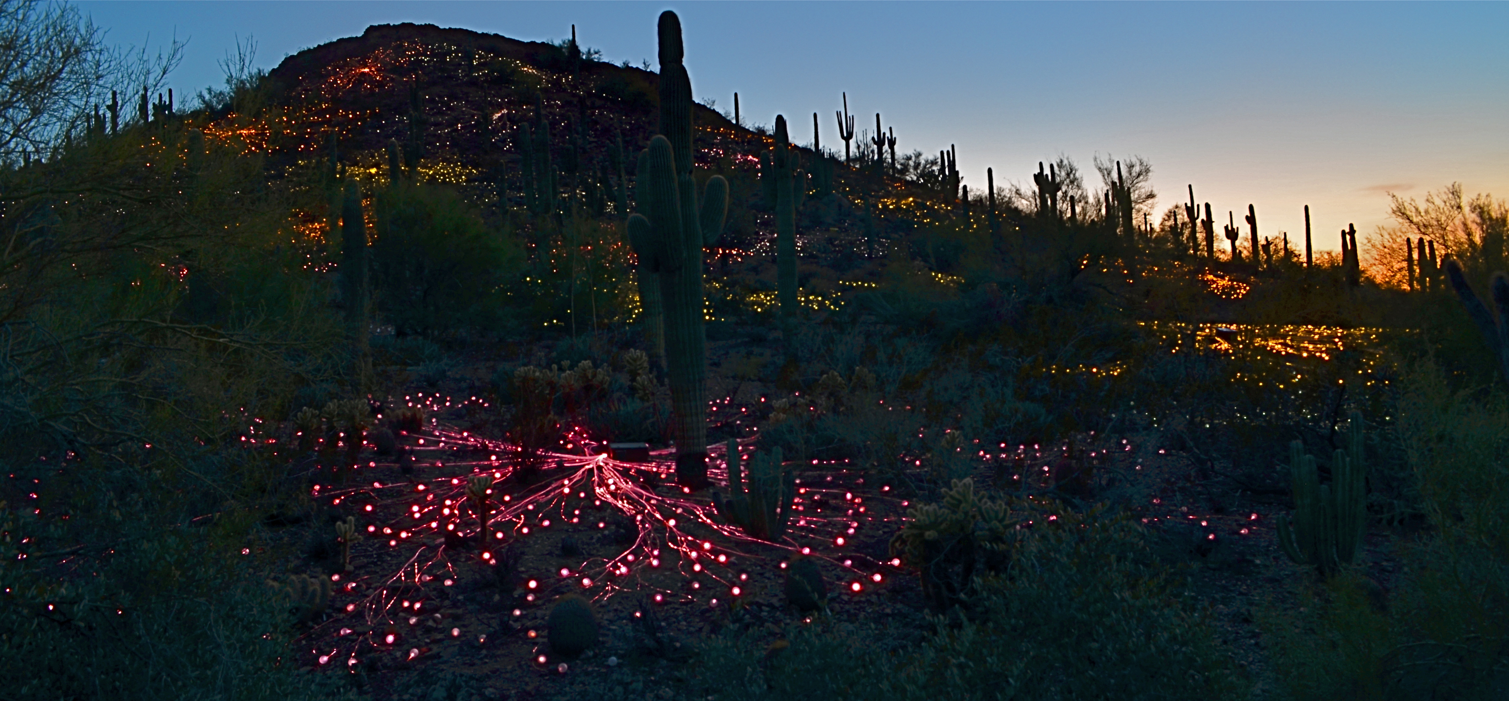
Ember Mountain, 2016. Two separate time exposures nearly a half-hour apart, blended in Photomatix’ “Exposure Fusion” mode.
With today’s editing software, it’s easier than ever to customize even your best time exposures, combining several shots taken over a given time sequence to arrive at a satisfying balance of elements. In the above picture, I wanted to show the colorful “Field Of Light” installation created by artist Bruce Munro for Phoenix’ Desert Botanical Garden, which blankets a desert hillside with over 30,000 globes of color-shifting light. I set up my tripod about a half-hour before local sunset and took exposures five minutes apart until about forty minutes into the onset of evening.
From that broad sequence, I selected two frames; one taken before dark, in which the underlying detail of the hill (desert plants, rocks, etc.) could still be seen, and one taken just after the sky had gone dark to the naked eye, but blue to the camera. I then composited the shots in Photomatix’ “exposure fusion” mode, which is a bit like stacking two backlit slides and gradually changing how much of each can bleed into the other. My object was to get both a blue, but not black, twilight sky and at least some detail from the natural terrain. Neither individual shot could achieve all of this alone, however, given the ease of doing an exposure fusion in nearly any kind of photo software these days, it was a snap to grab the best elements of both frames.
Epilogue: during the fairly long stretch of time I was standing behind my tripod, I counted over two dozen separate visitors who boldly stepped up, aimed their cellphones, cranked off a quick flash, and loped away, muttering something like, “well, that didn’t work.” Some shots are like low-lying fruit, and some have to be coaxed out of the camera. Knowing which is which, ahead of time, makes for happier results.
TONAL RECALL

Desert still-life, take one. High contrast, simple color scheme.
By MICHAEL PERKINS
IF YOU WANT TO GET ALL MYSTICAL AND OOKY-SPOOKY ABOUT PHOTOGRAPHY, you can almost talk yourself into the idea that pictures kind of force their way past you on the way to their eventual best form. And, yes, I can hear your eyes rolling back in your head at the notion that an image is somehow destined to be created, that it emerges from your process almost despite you, like a rock that is pushed up through the earth by shifting tectonic plates. However, I have taken a handful of such pictures over a lifetime, as, no doubt, have you yourself, pictures that seemed to keep coming forth even beyond your first false steps until they reached their fullest expression.
Gee, is that incense I smell? Ommmmmm….
What I’m fumbling for here is a shared experience, and I do think that every photographer has had a semi-magical instance in which a photo almost taunts you to figure out how to make it work. Even in the best shots, there are moments of aching regret, maybe years down the path, that, had one or more things gone differently in the picture, it might have been eloquent or consequential. I truly believe that this very “so near, yet so far” quality is what keeps us in the hunt. After all, for the hunter, it’s the tiger he hasn’t been able to bag that calls louder than the ones already mounted over the mantel. So with photos. We are always singing the blues about the one that got away.

A monochrome re-mix from months after the original was snapped.
That’s why I’m a big believer in thinking of images as never really finished. They are, at best, preliminary studies for something else, picture that we still need to grow in order to complete. We lay them down, dissect them, re-shoot, re-imagine, and re-edit them. If you bend your thinking around, you can become comfortable with the fact that everything is a dress rehearsal for something that hasn’t arrived yet.
One of the starkest demonstrations of this fact is shots that were originally conceived as color images but which were later re-thought in monochrome. Nothing accentuates or streamlines your choices like shaving your tonal palette to the bare minimum. And, in the same vein, nothing makes you surer (or more unsure) about an image than reducing it to its simplest terms.
I think that, even as we are constantly expanding our arsenal of visual techniques, seeing them as growing, living things, so too we must think of our images as points on an evolutionary line, rather than final product.
ALONE IN A CROWD
Everyone knows a “don’t take my picture” person. You might, in fact, be married to one.
By MICHAEL PERKINS
THE CHOICE OF TIME, PLACE AND APPROACH IN THE MAKING OF A PORTRAIT is as individual as the human face itself. No two photographers have quite the same process for trying to capture the essence of personality with a camera. Moreover, having chosen a preferred path to making these most personal of images, we often are tempted to stray off of it. As with anything else in the art of creating photos, nothing, from formal studio settings to street candids, works all the time.
Just as one example, the key to portraits, for me, is to always be as fully mindful, in the moment, of the changes that a face can display within the space of a few seconds. You seem to be presented, from start to finish, with a different person altogether…..some other person that showed up, uninvited, to the shoot you’re doing for..someone else. Thus, it’s never a surprise to me when a subject views his/her image from a session, and immediately remarks, “that doesn’t even look like me”, which is, for them, quite correct. It’s as if their face showed something, just for a second, that they don’t recognize as their “official” face. And the photographer sees all these strangers blur by, like the shuffle of a deck of cards.
In photographing my wife Marian, I battle against her native resistance to having her face recorded, well, at all. It’s a rather invasive procedure for her, and, since the finest qualities of her face are revealed when she’s least self-conscious. That rules out studio settings, since all her “danger, Will Robinson” triggers will go off simultaneously the more formalized the situation becomes. I have to use that momentary mindfulness to sense when her face is ready….that is, when she is least aware of having her picture taken. That may mean that many other people are around her, since interaction is relaxing and distracting for her. In the above image, I got particularly lucky, since several factors converged in a moment that I could not have anticipated.
Listening to a history guide on the streets of Boston, Marian’s face set into a wonderful mix of serenity, focus, studiousness. Her finest qualities seem all to have coalesced in a single moment. Even better, although she is in a crowd, the arrangement of people surrounding her kept all other faces either out of focal register or partially hidden, rendering them less readable as full people. That gave the composition a center, as hers was the only complete face in view. Click and done.
Portraits are certainly about anticipation and preparation. But they also have to be about the reactivity of the photographer. And with something as mutative, and mysterious, as the human face, flexibility is a far more valuable tool than any lens or light in your kit bag.
IT’S ALL WRONG BUT IT’S ALL RIGHT
I decided in the moment to go soft with this nature scene. Maybe I overdid it. Maybe it’s okay. Or not.
By MICHAEL PERKINS
ONE OF THE ONLY CONSTANTS OVER THE HISTORY OF PHOTOGRAPHY has been the flood tide of tutorial materials covering every aspect of exposure, composition, and light. The development of the early science of capturing images in the 19th century was accompanied, from the first, by a staggering load of “how to” literature, as the practice moved quickly from the tinkering of rich hobbyists to one of the most democratic of all the art forms. In little more than a generation, photography went from a wizard’s trick to a series of simple steps that nearly anyone could be taught.
In calling these pages the “photoshooter’s journey from taking to making”, we have made, with The Normal Eye, a deliberate choice not to add to the mountainous load of technical instruction that continues to be available in a variety of classroom settings, but to emphasize why we make photographs. This is not to say that we don’t refer to the so-called “rules” that govern the basics of creating an image, but that we believe the motives, the visions behind our attempts are even more important than just checking items off a list of techniques in the name of doing something “right”. There are many technically adept pictures which fail to engage on an emotional or aesthetic level, so the mission of The Normal Eye, then, is to start discussions on the “other stuff”, those indefinable things that make a picture “work” for our hearts and minds.
The idea of what a “good picture” is, has, over time, drifted far and wide, from photographs that mimic reality, to those that distort and fracture it, to images that are both a comment and a comment on a comment. It’s like any other long-term relationship: complicated. Like everyone else, I occasionally produce what I call a “fence-sitter” photo like the one above, which I can both excuse and condemn at the same time.
In raw technical terms, I have obviously violated a key rule with the abject softness of the image…..unless……unless it can be said to work within the context of the other things I was seeking in this subject. I was trying to stretch the envelope on how soft I could make the mix of dark foliage and hazy water in the scene, and, while I may have gone a bit too far, I still like some of what that near-blur contributes to the saturated color and lower exposure, the overall quiet tone I was trying for. Still, as of this moment, I’m still not sure whether this one is a hit or a miss. It might be on the way to something, but I just can’t say.
But that’s what the journey is about. It can’t be confined to mere technical criteria. You have to make the picture speak in your own language.
THE EVENTUALITY OF ABOUT
“Something’s going to happen. Something….wonderful!” —Astronaut David Bowman, “2010: The Year We Make Contact”
By MICHAEL PERKINS
PHOTOGRAPHY’S FIRST FUNCTION WAS AS A RECORDING MEDIUM, as a way to arrest time in its flight, to freeze select seconds of it. As evidence. As reference points. We were here. This happened. Soon, however, the natural expansion that art demands generated images of the things that happened before our direct experience. Ruins. Monuments. Cathedrals. Finally, the photograph began to speculate forwards. To anticipate, even guess, about what might be about to happen. That is the photography of the potential, the imminent. It’s rather ghostly. Indefinite. And all in the eyes of the creator and the beholder.
Is something about to happen? Does this place, this kind of light, truly portend something? Can a picture said to be ripe with the possibility of emerging events? I think they can, but these bits of pre-history are harder to sense than those we capture in the mere recording or retrieval functions of photography. In this case, we are not just witnesses or detectives, but seers. Of course, we may be wrong. Something may not happen as we seem to see it at present. History may not be made here. Perhaps no one will ever say or do anything extraordinary on this spot. The image of the possibility, then, becomes a kind of creative fiction, a pictorial what-if. And that places photos in the same arena as sci-fi, mysticism, poetry. If other arts can paint worlds that might be, why can’t a picture?

The Boardroom, 2016.
I don’t know why the meeting room shown here, which was being prepared for a conference later in the day, struck me. It might have been the somber color scheme, or the subdued light. It may have been the grand emptiness of it all; a room designed to be packed with people, sitting there, waiting for them to animate it. I just know that it was enough to slow my trek through a resort hotel long enough to try to show that potential. For what? A moment of high corporate drama? The end of someone’s career, the launch pad for a bold new idea? The meeting that might redraw the map of human destiny? Or nothing?
Ah, but what actually happens after the photo is taken is mere reality, and never to be matched or compared with the strong sense of eventuality that can linger in an atmosphere before something occurs. These kind of images are not, after all, witnesses to anything, but visions of the possible. And that is the essence of photography, where even a medium invented to record reality can ofttimes transcend it.
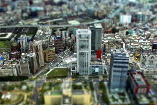
TINY TOWNS AND BIG DREAMS
Eclectic Light Orchestra: Shooting the Musical Instrument Museum’s amazing orchestral diorama to scale.
By MICHAEL PERKINS
THE ART OF MESSING ABOUT WITH THE MIND’S CONCEPT OF SIZE, making the small look large, has been part of photography since the beginning, whether it’s been crafting the starship Enterprise at 1/25 scale for primitive special effects or making Lilliputian mockups of Roman warships for a sea battle in Ben-Hur. Making miniatures a convincing stand-in for full-size has been a constant source for amazing images.
Oddly, there has also been a growing fascination, in recent years, with using new processes to make full-sized reality appear toy-like, as if Grand Central Station were just a saltine box full of HO-scale boxcars. Seems no one thinks things are as they should be.
This turnabout trend fascinates me, as people use tilt-shift and selective-focus lenses, along with other optics, to selectively blur and over-saturate real objects taken at medium or long distances to specifically create the illusion that you’re viewing a tabletop model. Entire optical product lines, such as the Lensbaby family of effects lenses, have been built around this idea, as have endless phone apps and Photoshop variants. We like the big to look small just as much as we like the teeny to look mighty. Go figure.
Lefz Lim brings it on down to Tiny Town, converting a real city scene to a mock miniature.
And who can resist playing on both sides of the street?
The image at the top is the usual fun fakery, with my tiny-is-full-size take on the marvelous diorama made for the Musical Instrument Museum (the crown jewel of Phoenix, Arizona), which reproduces a complete symphony orchestra in miniature. This amazing illusion was created using a spectacular photo system that creates a 360-degree scan of each full-sized player, maps every item of his features, costume, and instrument, then converts that scan to a 3-d printed, doll-sized version of every member of the symphony. To read about this awesome process, go here.
As for making regular reality look like Tiny Towns, we offer the image at the left, taken by photographer Jefz Lim as part of his online tutorial on the creation of the “model” effect. We are in the age of ultimate irony when we deliberately try to palm off the real as the fake. The “how” of this kind of image-making is basic focus-pocus. The “why” is a little harder to put your finger on.
Size does matter. Ah, but what size matters the most…..that’s your call.
MANY FACES, ONE FAMILY
By MICHAEL PERKINS
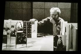
Edward Steichen looks over a scale model of the 1955 Family Of Man show, the most famous photographic exhibit of all time.
I FEEL THAT THERE SHOULD ALWAYS HAVE BEEN A NOBEL PRIZE FOR PHOTOGRAPHY, just as there always has been for literature. Why one of the lively arts should be deemed more capable of uplift or inspiration than another is beyond me. I even think that a photo Nobel might be more inspiring, overall, than the majority of images that cop the journalistic Pulitzer prize each year, since so many of the winning entries focus on horror, loss, war, and suffering….you know, the stuff that sells newspapers.
If there ever had been a Nobel for photography, I can think of no more obvious winner than the legendary Family Of Man exhibit, mounted by Edward Steichen, which just observed its sixtieth anniversary with a marvelously updated edition of its original catalogue book. Steichen, who in 1955 was the director of photography for the Museum of Modern Art, was himself a grand master of still-lifes, portraits, fashion, architectural, and even floral studies, whose own output towered over the world for over seven decades. However, he used the Family show not to showcase his own work but to show the universality of the human experience across every culture on the planet, as interpreted by over 273 photographers in 69 countries. Mounted in cooperation with the United States Information Agency as a diplomatic tool, The Family Of Man celebrates those things that unite us, not the petty divisions amplified by journalists and other mischief makers. It is an inventory of births, deaths, weddings, rituals, weddings, wars, discoveries, and delights. It is a miraculous catalogue on the phenomenon of being human.
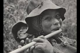
The Peruvian flute player whose portrait became the official visual logo of the Family Of Man project.
Over the years, the optimistic message of Family Of Man fell victim to the ironic detachment and busted ideals of several generations of hipper-than-thou cynics, some criticizing it as a Pollyanna-ish vision of mankind, others saying that it rendered many individual photographers faceless by jumbling all their work together. In fact, all photos in the exhibit are captioned with their creator’s name as well as his/her nation of origin. And as for hope being the antithesis of honest art…well, if you hold that belief, you’re wasting your time here.
Over sixty years later, The Family Of Man remains one of the towering achievements of art and journalist photography, reassembled now in its original presentation format at Clervaux Castle in Steichen’s home country of Luxembourg. Art must be about raising us up, even as we use it to remain mindful of how far we have to come as a race. But I will always, always vote on the side of hope, as Edward Steichen did. The Family Of Man is neither sugar-coated nor bleak. It is both imperfect and filled with potential, as we ourselves are. And its credo, as stated in 1955, remains a lesson for anyone trying to use a camera to chronicle the human condition:
“There is only one man in the world and his name is All Men.There is only one women in the world and her name is All Women.There is only one child in the world and the child’s name is All Children.”
A CUT BY ANY OTHER NAME….

The first framing of this image included too much greenery on the right side, so it was cropped, then repositioned to make a “second” framing from the arched opening in the outer wall.
By MICHAEL PERKINS
THE WONDERFUL THING ABOUT COMPOSITION IN PHOTOGRAPHY is that you always, always, have a backup plan. What you don’t frame correctly in the actual shooting of an image can be corrected in post-editing cropping, the use of “framing” within the composition itself, or even how you finally matte the picture before hanging it on the wall. This is as it should be since many pictures are not so much born as re-imagined.
Once you frame a photo, you’re giving the viewer the first visual cue as to what to regard as important. If I included it, you should notice it. If I excluded it, it’s either to set loose your imagination on why I defined this world within these parameters, or because I, as the narrator, am telling you it just don’t matter. You can even further enhance the effectiveness of the frame by its shape. A rectangle might enforce the reading of information left-to-right, for example, while a square might force the eye toward dead center. The original framing is your own best call to action in a photograph.
And even after you’ve defined the frame, you can still add a second directive within it to hyper-focus attention in a very specific space. The use of arches, building overhangs, edges of windows, cliffs, shadows or other secondary “frames” provides even greater cues to the eye, and also adds an illusion of dimension and depth.
In the above shot, the old stone basilica is obviously the main feature of the image, and so was cropped from a wider original to eliminate distracting foreground shrubbery on the right. However, the arch through which the building is viewed was retained, to act as a “secondary frame” and as a way to illustrate scale. The first frame says what information is important, while the second frame makes sure we get to the heart of the image more efficiently.
Using all framing devices available in an image is like using caps, lower case and italicised letters in the same sentence. Composition is about yelling to get people over to your picture, then whispering, as you gently guide them toward its heart.
LAYERS OF LEARNING
I have had to change my approach to flowers over a lifetime, and I still don’t “get” them in a real way.
By MICHAEL PERKINS
AS A YOUNG PIANO STUDENT, I NOTICED THAT MANY OF MY FAVORITE SHORT WORKS all bore the elegant, mysterious name of etude. It was somewhat later that I realized that this was merely the French word for a “study”, and that some of what I regarded as highly developed, final compositions were, essentially, first versions, practice runs by the masters in search of some eventual greatness. And, since I was an illustrator as well as a musician, the idea of an etude as a prototype, a first version of something dovetailed nicely with the idea of a sketch, or as my father called it, a “rough”. An etude was a work in progress.
Then came photography and, with it, the giddy short-term gratification of just snapping a picture, of crossing a visual item off one’s to-do list. We are, as humans naturally attracted to the process of completion, of turning out a finished product. Click. Done. Moving on….However, despite what the auction houses and gallery curators of the world might try to tell you, art is not a product, and just like those melodiously wondrous etudes, the best images are always in the process of being created. You can always take a picture to another level, but you can’t finish it.
Walk across to the painters’ side of the Art building every once in a while and look at how many preliminary studies Leonardo or Michelangelo made of their greatest works, or the number of “early” and “late” versions there are of these same masterpieces. Now, travel back to the photography wing and witness Ansel Adams taking one crack after another at the same stony face of El Capitan, often merely reworking the same master negative up to a half dozen times over decades. You simply have to make different pictures of the same subjects across a lifetime, just because your idea of what’s important to show keeps evolving.
Finally, look objectively at your own output and discover how many of your older images are “good pictures” and how many are good ideas for pictures. You’ll no doubt find your own personal “etudes”, the studies that can still become something better. In my own case, I have to walk away from floral subjects from time to time, then return to approach them with a different mindset, since I’m equally fascinated and clueless as to how to imbue them with anything approaching soulfulness. My eye struggles to make something magical emerge from buds and bouquets as others have done. But I’ll stay at it.
Digital processes make it possible to crank through a wide variety of approaches to the same subject in a very short span of time compared to film-based techniques. Think easy-fast-cheap. Or think good-better-best if you like. Either way, the layers of learning are stacked ever higher and deeper, allowing us to regard photography as process instead of product. So do your scales every day, keep your fingers high and curved, and stay curious.
GLASS DISTINCTIONS
It went “zip” when it moved and “bop” when it stopped,
And “whirr” when it stood still.
I never knew just what it was and I guess I never will.
Tom Paxton, The Marvelous Toy
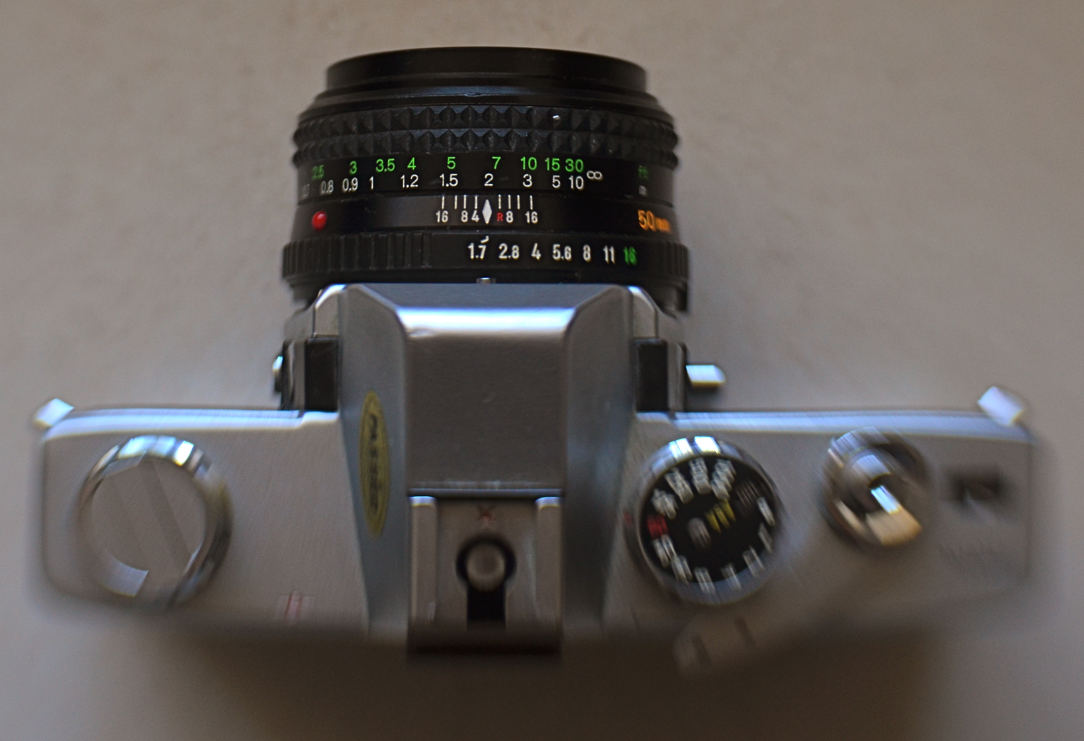
My antedeluvian Minolta SRT-500 camera body, crowned by its original f/1.7 50mm prime kit lens. Guess which part is worth its weight in gold?
By MICHAEL PERKINS
THERE ARE MORE OLD LENSES THAN THERE ARE OLD CAMERAS. There’s a reason for this. Bodies come and go like spring and fall dress collections. Lenses are the solid, reliable blue jeans that never go out of style. Lenses hold their value for decades, often selling for (or even above) their original asking prices. Bodies become landfill.
Many times, when people believe they have outgrown their cameras, they are actually just in need of glass that performs better. The importance of selecting a lens is as important in the digital age as it was in the film era. The eye through which you visualize your dreams has to be clear and precise, and so does the thinking that goes into its selection. That process, for me, breaks down into three main phases.
First, before you buy anything, raise a prayer of thanks for the Holy Internet. There is, now, not only no need, but also no excuse to buy the wrong lens. Read the manufacturer’s press releases. The reviews from both pros and amateurs nearest your own skill level. And be ecumenical about it. Read articles by people who hate the lens you think you love. Hey, better to ID a problem child before he’s living under your roof. Watch the Youtube videos on basics, like how to unpack the thing, how many parts it has, how to rotate the geetus located to the left of the whatsit to turn it on. Find out how light efficient it is, because the freer you are of flash units and tripods, the better for your photography. And, at this early shopping stage, as with all other stages, keep asking yourself the tough questions. Do I really need another lens, or do I just need to be better with what I already own (which is cheaper)? Will it allow me to make pictures that I can’t currently make? Most importantly, in six months, will it be my “go-to”, or another wondrous toy sleeping in my sock drawer?
Assuming that you actually do buy a new lens after all that due diligence, nail it onto your camera and force yourself to use it exclusively for a concentrated period. Take it on every kind of shoot and force it to make every kind of picture, especially the ones that seem counter-intuitive. Is it a great zoom? Well, hey, it might make an acceptable macro lens as well. But you’ll never know unless you try. You can’t even say what the limits of a given piece of glass are until you attempt to exceed them. Find out how well it performs at every aperture, every distance, every f/stop. Each lens has a sweet spot of optimum focus, and while that may be the standard two stops above wide open, don’t assume that. Take lots of bad pictures with the lens (this part is really easy, especially at the beginning). They will teach you more than the luck-outs.
Final phase: boot camp for you personally. Now that you have this bright shiny new plaything, rise to the level of what it offers. Prove that you needed it by making the best pictures of your life with it. Change how you see, plan, execute, edit, process, and story-tell. See if the lens can be stretched to do the work of several of your other lenses, the better to slim down your profile, reduce the junk hanging around your neck, and speed up your reaction time to changing conditions.
Work it until you can’t imagine how you ever got along without it.
BOTH ENDS OF FREEDOM
Every camera ever manufactured can make this image, if the right person is behind it. It’s your eye that matters, not your toys.
A camera is a tool for learning how to see without a camera. —Dorothea Lange
By MICHAEL PERKINS
THERE IS A REAL DISCONNECT BETWEEN THE “FIRST CAMERAS” OF A GENERATION AGO and those of people just entering the art of photography today. Of course, individual experiences vary, but, in general, people born between 1950 and 1980 first snapped with devices that were decidedly limited as compared to the nearly limitless abilities of even basic gear today. And that creates a similar gap, across the eras, between what skills are native to one group versus the other.
To take one example, if your first camera, decades ago, was a simple box Brownie, the making of your pictures was pretty hamstrung. You had to purposefully labor to compensate for what your gear wouldn’t do. A deliberate plan had to be followed for every shot, since you couldn’t count on the camera to allow for, or correct, your mistakes. With a device that came hardwired with a single aperture, a shutter button, and not much else, you had to be mindful of a whole array of factors that could result in absolute failure. The idea of artistic “freedom” was sought first in knowledge, then, much later, in better equipment.
But if, on the other hand, you begin your photographic development with a camera that, in the present era, is almost miraculously flexible and responsive, freedom is a given. In a sense, it’s also a restraint of a different kind. That is, with bad gear, you’re a hero if you can wring any little bit of magic out of the process. But with equipment that can almost obey your every command, the old “I left the lens cap on”-type excuses are gone, along with any other reason you may offer for not getting at least average results. Thus the under-equipped and the over-equipped have two different missions: one must deliver despite his camera, while the other strives to deliver despite himself.
The entire gist of The Normal Eye is that I believe that even remarkable cameras (and the world is flooded with them) will betray the unseeing eye that mans them. Likewise, the trained eye will create miracles with anything handy. Our thrust here at TNE is toward teaching yourself the complete basics of photography as if you were actually constrained by limited equipment. At the point at which you’ve fully mastered the art of being better than your camera, then, and only then, is it time to get a new camera. Then learn to out-run that one, and so on.
The promise made by cameras today is the same promise that’s always been made by ever-advancing technology, that of wonderful results with minimum effort. It’s the photo equivalent of “eat whatever you want and still lose weight”. But it’s a false promise; photography only becomes art when we ask things of ourselves that our cameras cannot provide by themselves. Anything else is learning to accommodate mediocrity, a world of “pretty good”.
Which, inevitably, is never really good enough.
CONJURING GHOSTS
I know all the songs that the cowboys know
‘Bout the big corral where the doggies go
‘Cause I learned them all on the radio
Yippie yi yo kai yay
“I’m An Old Cowhand”, music and lyrics by Johnny Mercer
By MICHAEL PERKINS
SOMETIMES IT SEEMS THAT WE ARE NEVER REALLY FINISHED with photography’s past, using today’s technology to summon forth the look and spirit of what we see as the early innocence of the art. Photographers are always trying to wrench free of yesteryear, and yet, in our images, we love to romance the echoes of the shooters that we were, as well as the world that what there to shoot.
We like to conjure ghosts.
We’ve reached a place where, through one process or another, it’s easy to evoke almost any phase of photography we desire, a strange nostalgia that has artificially extended the use of film by a good many years into the digital era. We like the feel, the habits, even the defects of film as a storage medium. We build brand-new pinhole box cameras: we revive and repair old tool dies so we can manufacture factory-fresh editions of defective old gizmos. We write computer code that allows our smartphones to imitate the grain and texture of archaic celluloid emulsions.
Of course, there has to be subject matter to feed all this retro-tech, and, in the American west, the medium matches the message as we drench memories of the frontier in our own brew of reflective processes. Sepia tone, soft focus, high contrast, long exposures, all of them are used to summon the bygone glories of cactus and canyon. The settling of the west will always create a kind of poignant ache for photographers. The surveyors, the settlers, even the Hollywood myth-makers all stole a march on us. We bring our cameras to try to spook up a smidgen of the Big Pictures that we missed.
It’s a kind of harmless fakery that we paint upon mesa and mountain, a re-interpretation of a truth none of us really knows for sure. It’s dressing up to play cowboys and indians, with the camera’s eye to help make the best, most authentic forgeries we can muster. Living in the west in the 21st century, I find that conjuring ghosts, like indulging in any other kind of fantasy photography, is like building a doll house. I control the furniture, the wall paper, the layout of the rooms. We all arrived to late to ask the Riders of the Purple Sage to smile for the birdie. But there are still smiles of a sort, even an occasional tear, to be drawn in the dust.
SAVING FACE
Looking West, 2016. A portrait shot with a Lensbaby Composer Pro, an effects lens with a moveable “sweet spot” of selective focus.
By MICHAEL PERKINS
THE CREATIVE USE OF SHARPNESS is one of the key techniques in photography. From the beginning of the medium, it’s been more or less conceded that not everything in an image needs to register at the same level of focus, that it can be manipulated to direct attention to the essence of a photograph. It’s always about telling the viewer to look here, ignore this, regard this as important.
This selective use of focus applies to the human face no less than to any other element in a composition. It’s strange that photography drew so strongly on painting in its early years without following the painter’s approach to portraits…..that is, that individual parts of a face can register in different degrees of sharpness, just like anything else in the frame. From the earliest days of photo-portraiture, there seems to have been an effort to show the entire face in very tight focus, de-emphasizing backgrounds by hazing them into a soft blur. It took a while before photography saw itself as a separate art, and thus this “always” rule only became a “sometimes” rule over a protracted period of time.
The Pictorialism fetish of the early 20th century, which avidly imitated the look of paintings, went completely the other direction, generating portraits that were almost uniformly soft, as if shot through gauze, or, you guessed it, painted on canvas. In recent years, shooters have begun a new turn toward a kind of middle stance, with the selective use of sharpness in specific parts of a face, say an eye or a mouth. It’s more subtle than the uniform crispness of olden days, and affords shooters a wider range of expression in portraits.
Some of this has been driven by technology, as in the case of the Lensbaby lenses, which often have a tack-sharp “sweet spot” at their center, with everything else in the frame fanning outward to a feathery blur. Additionally, certain Lensbabies, like the Composer Pro, are mounted on a kind of ball turret, allowing the user to rotate the center of the lens to place the sweet spot wherever in the image he/she wants. This makes it possible, as in the above shot, for parts of objects that are all in the same focal plane to be captured at varying degrees of sharpness. Note that, while all of the woman’s face is the same distance from the camera, only her eyes and the right side of her face are truly sharp. This dreamlike quality has become popular with a new breed of portraitists, and, indeed, there are already wedding photographers who advertise that they do entire events exclusively with these kinds of lenses.
The face is a composition element, and, as such, benefits from a flexible approach to focus. One man’s blur is another man’s beautification.
ALONE AGAIN, UNNATURALLY

Lunch For One, 2011. Your choices as a photographer will determine if the woman in the cafeteria is alone…or lonely.
By MICHAEL PERKINS
PEOPLE ARE ONE OF THE MOST COMPLICATED ELEMENTS in a photographic composition. Unlike furniture, foliage or flotsam, humans are the one “prop” in an image which convey associations and meanings that render a photo complex, troubling, intriguing. Put a person in your picture and you have changed the terms upon which you engage the audience.
At the very least, you have posed a series of questions which color the viewer’s reaction to your work. What is that person doing there? What does he wish for, or intend? What are his dreams, his goals? Is she merely in the picture, or in some way a commentary on her context within it? You can move things around in the name of composition alone, but move a person and you have started a conversation.

The original framing for the above shot.
The placement of people in a frame creates speculation about the motives and origins of those people before they were in the frame. A man shown standing at the platform at a train station could be eagerly awaiting an arrival, sneaking out of town, or merely wandering around. The mind starts to supply his backstory, if you like, his actions before appearing in the finite world of the frame. Put two people side by side, and you have, according to your viewer’s whim, a rendezvous, a goodbye, a conspiracy, a reunion, a chance meeting. People change the perceived intention of a photograph as a storyboard, either in the original framing or in the cropping afterwards.
The above image is the final crop of what was, originally, a scenic overview, taken at a large campus of museum buildings on a hillside. The image, as first conceived, was an overall “postcard” with the restaurant in only the lower right quarter of the frame. Later, I became aware that a single woman was visible in the cafe. Now, it’s not that she was actually the only person inside, but the photograph could be cropped to make her seem like it, meanwhile accentuating the emptiness in her immediate area.
As a consequence, instead of a lady who is merely alone, the image can make her seem “lonely”. Or perhaps you disagree. The point is that, by changing the human information in the frame (note that, in the original of the cropped shot, there is also a man standing outside the restaurant), we’ve re-drawn its narrative.
What gets left out of a picture, then, sparks speculation by the viewer, based on what has been left in.
LOOKS LIKE IT WORKS
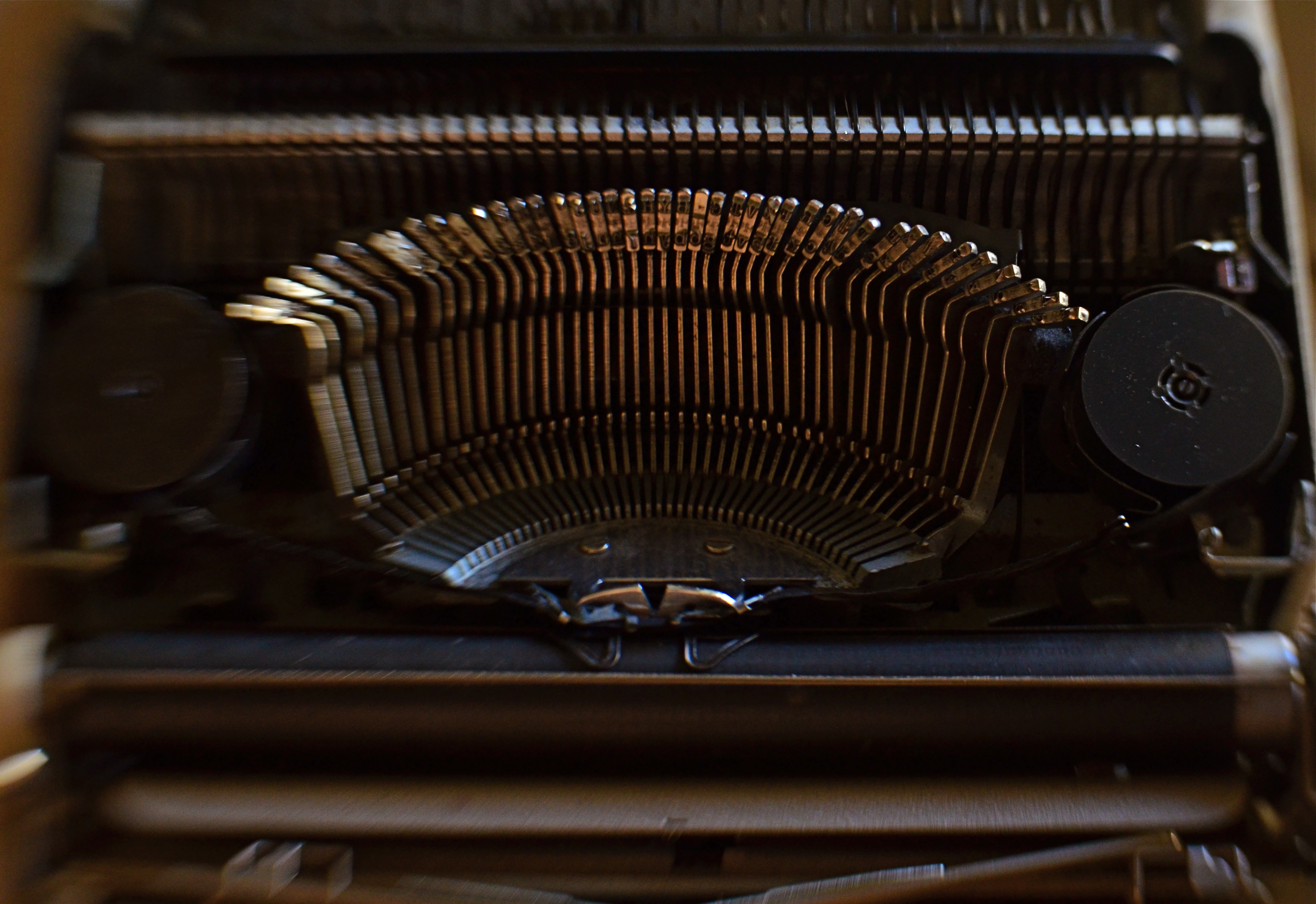
Ghost Writer In Disguise, 2016
By MICHAEL PERKINS
PHOTOGRAPHY OFTEN RE-DEFINES OUR PERCEPTION OF THE FAMILIAR, re-contextualizing everyday objects in ways that force us to see them differently. Nowhere is this more effective than in close-up and macro photography, where we deliberately isolate or magnify details of things so that they lose their typical associations. Indeed, using the camera to cast subjects in unfamiliar ways is one of the most delightful challenges of the art.
Product developers are comfortable with the idea that “form follows function”, that how we use a thing will usually dictate how it must be designed. The shapes and contours of the objects in our world are arrived at only as we tailor the look of a thing to what it does. That’s why we don’t have square wheels. The problem with familiar objects is that, as long as they do what they were designed to do, we think less and less about the elegance of their physical design. Photographers can take things out of this chain of the mundane, and, in showcasing them, force us to see them in purely visual terms. They stop playing the piano, and instead look under the lid at the elegant machine within. They strip off the service panel of the printer and show us the ballet of circuitry underneath.
It’s even easier to do this, and yields more dramatic results, as we begin to re-investigate those things that have almost completely passed from daily use. To our 21st-century eyes, a 1910 stock ticker might as well be an alien spaceship, so far removed is it from typical experience. I recently viewed a permanent wave machine from a beauty parlor of the 1930’s, sitting on a forgotten table at a flea market. It took me two full minutes to figure out what I was even looking at. Did I snap it? You betcha.
The study of bygone function is also a magical mystery tour of design innovation. You start to suss out why the Edisons of the world needed this shape, these materials, arranged in precisely this way, to make these things work. Zooming in for a tighter look, as in the case of the typewriter in the above image, forces a certain viewpoint, creating compositions of absolute shapes, free to be whatever we need them to be. Form becomes our function.
The same transformation can happen when you have seemingly exhausted a familiar subject, or shot away at it until your brain freezes and no new truth seems to be coming forth. Walking away from the project for a while, even a few hours, often reboots your attitude towards it, and the image begins to emerge. As Yogi Berra said, you can observe a lot just by watching.
TERMS OF ENGAGEMENT
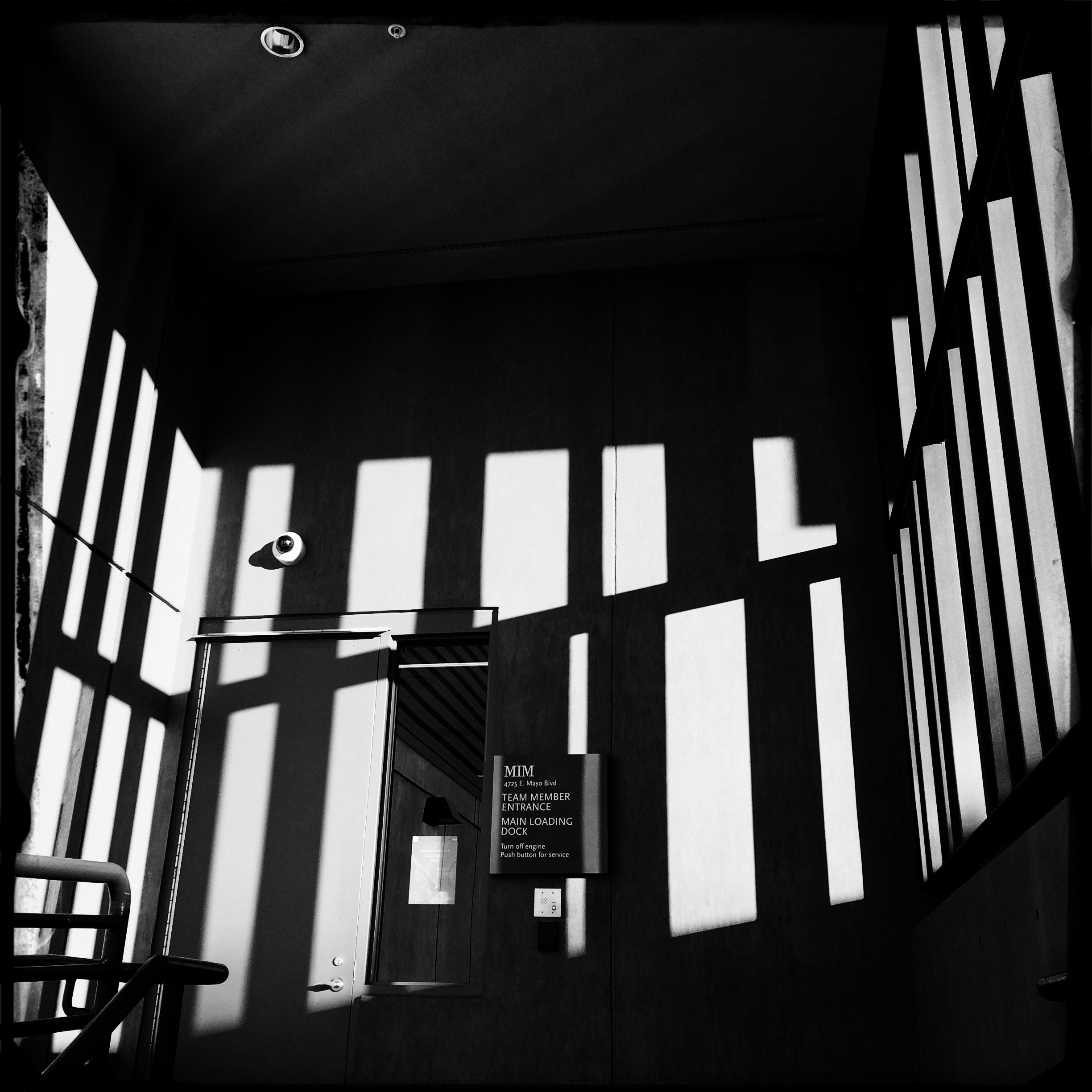
A very soft color cel phone original becomes a stark “box”, suggested solely by a pattern of black and white bands.
By MICHAEL PERKINS
ABSTRACT COMPOSITIONS AREN’T MERELY A DIFFERENT WAY OF PHOTOGRAPHING A SUBJECT: they are, in many cases, the subject itself. Arrangements of shape, shadow and contrast can be powerful enough to carry the weight of a picture all by themselves, or at least be an abbreviated, less-is-more way of suggesting objects or people. And in terms of pure impact, it’s no surprise that photographers who, just a generation ago, might have worked exclusively in color, are making a bold return to black and white. For abstract compositions, it’s often the difference between a whisper and a shout.
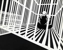
Cartoonist Frank Miller sculpts solid space out of a mix of black and white rays.
I find it interesting that the medium of comics, which has long been defined by its bold, even brutal use of color, is also experiencing a black & white resurgence in recent years, with such masters as Frank Miller (Batman: The Dark Knight Returns) rendering amazing stuff in the most starkly monochromatic terms. Likewise, the army of apps in mobile photography has reminded young shooters of the immediacy, the power of monochrome, allowing them to simulate the grain and grit of classic b&w films from Tri-X to Kodalith, even as a post-production tweak of a color original.
You know in the moment whether you’ve captured a conventional subject that sells the image, or whether some arrangement of forms suggestive of that subject is enough. In the above shot, reducing the mild color tonal patterns of a color original to bare-boned, hard blacks and loud whites creates the feel of a shaded door frame..a solid, dimensional space. The box-like enclosure that envelops the door is all there, but implied, rather than shown. As a color shot, the image is too quiet, too…gentle. In monochrome, it’s harder, but it also communicates faster, without being slowed down by the prettiness of the browns and golds that dominated the initial shot.
There are two ways to perfect a composition; building it up in layers from nothing into a “just-enough” something, or stripping out excess in a crowded mash-up of elements until you arrive at a place where you can’t trim any further without losing the essence of the picture. Black and white isn’t just the absence of color: it’s a deliberate choice, the selection of a specific tool for a specific impact.
THE BLUE LION
The “natural” colors in the original of this shot were the “wrong” colors for what I wanted to say. So I changed them.
By MICHAEL PERKINS
I CONDUCT TOURS FOR KINDERGARTEN STUDENTS AT PHOENIX’ MUSICAL INSTRUMENT MUSEUM, the world’s largest collection of its kind on the planet. Frequently, I ask my young guests, who are viewing various animal-inspired music exhibits in the Asia gallery, why the sculpted lions seen on South Korean chimes are blue. Now, in fact, there are no lions in Korea, so in summoning the big cat’s strength and courage as a protective symbol for their music, the locals probably had to try to imagine one, including its features and hues. But pose this question to a five-year-old and the answers are far more instinctual:
“They wanted to”.
“Cause it looks cool that way”.
“It’s their lion…they can do what they want.”
Never do these children suggest that the lion is blue because the Koreans don’t know the “correct” color, nor do they think that there’s anything about its color that renders it “inaccurate”. And when I ask if they’ve ever used a “different” crayon to color something just the way they want it, every hand shoots up. Of course. Why wouldn’t I?
It’s my coloring book. I can do what I want.
Early color photography was about reproducing nature faithfully, accurately recording and reproducing reality. That makes sense, since you must have a standard before you can wander away from that standard. And at a time when color imaging was a novelty, science understandably put the emphasis on “getting it right”, which for publication and printing purposes, was a big enough mountain to climb, at first.
However, we have long since entered a phase in which the colors which nature or our eyes have assigned to an object is only one way, not “the” way to creatively depict it. We can use color counter-intuitively, emotionally. We can cast an image in every aspect of the rainbow, not merely within the narrow channel of “reality”. Color interpretation is surely as important as exposure or any other aspect of making a picture. In the above photo, my mind needed this old row house to be drenched in the burned gold of sunset. Since I was shooting at one in the afternoon, that wasn’t going to happen, so….
And if we forget to think with a child’s suppleness as we age into old habits, the next generation is always there to prod us back into the same state of wonder that makes a five-year-old perfectly okay with creatively colored animals. Recent retro movements among shooters, for example, include the simulation of improperly processed film, which is an optional filter on many of today’s phone apps. It’s a deliberate choice to take the quirky color caused by a lab error and turn it into an interpretive tool.
The over-arching rule here is: try it and see what happens. You don’t need to defend your choice to a committee or write a lengthy treatise (like this one) on why it’s justified.
You just have to wonder what a blue lion might look like.
