SCULPTING WITH SHADOWS
By MICHAEL PERKINS
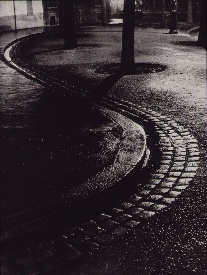
Brassai‘s world came to light at night.
ONE OF THE MIRACLES OF CONTEMPORARY PHOTOGRAPHY is how wonderfully oblivious we can afford to be to many of the mechanics of taking a picture. Whereas, in an earlier era, technical steps 1, 2, 3, 4 ,5, and 6 had to be completed before we could even hit the shutter button, we now routinely hop from “1” to “snap” with no thought of the process in between.
In short, we don’t have to sweat the small stuff, a truth that I was reminded of this week when imitating one of photographer’s earliest masters of night photography, Gyula Halasz, or “Brassai”, a nickname which refers to his hometown in Romania. Starting around 1924, Brassai visually made love to the streets of Paris after dark with the primitive cameras of the early 20th century, sculpting shape from shadow with a patiently laborious process of time exposures and creating ghostly, wonderful chronicles of a vanished world. He evolved over decades into one of the most strikingly romantic street artists of all time, and was one of the first photographers to have a show of his work mounted at New York’s MOMA.
Recently, the amazing photo website UTATA (www.utata.org), a workshop exchange for what it calls “tribal photography”, gave its visitors a chance to take their shot at an homage to half a dozen legendary visual stylists. The assignment asked Utata members to take images in the style of their favorite on the list, Brassai being mine.
In an age of limited lenses and horrifically slow films, Brassai’s exposure times were long and hard to calculate. One of his best tricks was lighting up a cigarette as he opened his lens, then timing the exposure by how long it took for the cig to burn down. He even used butts of different lengths and widths to vary his effect. Denizens of the city’s nightlife, walking through his long shots, often registered as ghosts or blurs, adding to the eerie result in photos of fogbound, rain-soaked cobblestone streets. I set out on my “homage” with a tripod in tow, ready to likewise go for a long exposure. Had my subject been less well-lit, I would have needed to do just that, but, as it turned out, a prime 35mm lens open to f/1.8 and set to an ISO of 500 allowed me to shoot handheld in 1/60 of a second, cranking off ten frames in a fraction of the time Brassai would have needed to make one. I felt grateful and guilty at the same time, until I realized that a purely technical advantage was all I had on the old wizard.
“Faux Brassai”, 2013. Far easier technically, far harder artistically. 1/60 sec., f/1.8, ISO 500, 35mm.
Brassai has shot so many of the iconic images that we have all inherited over the gulf of time that one small list from one small writer cannot contain half of them. I ask you instead to click the video link at the end of this post, and learn of, and from, this man.
Many technical land mines have been removed from our paths over photography’s lifetime, but the principal obstacle remains…the distance between head, hand, and heart. We still need to feel more than record, to interpret, more than just capture.
All other refinements are just tools toward that end.
THANKS TO OUR NEW FOLLOWERS! LOOK FOR THEM AT:
http://www.en.gravatar.com/icetlanture
http://www.en.gravatar.com/aperendu
Related articles
- Wonderful Photos of New York in 1957 by Brassaï (vintag.es)
LEARNING TO LIVE WITH “THE NUMBER”
Will I have any regard for this image in five years? Ten? How about in six months? And why? 1/40 sec., f/9, ISO 100, 50mm.
By MICHAEL PERKINS
IT’S GUARANTEED. OVER OUR LIFETIMES, YOU AND I WILL TAKE REMARKABLE PHOTOGRAPHS.
There just won’t be a lot of them.
And that’s very good news.
Ansel Adams once remarked that “twelve significant photographs in any one year is a good crop”.
That’s right. Twelve.
Now, given the percentage of the massive Adams output that actually turned out to be flat-out amazing, the reverse math for how many “close, but no cigar” frames he shot would be staggering. And humbling. This after all, is a man who “experimented” with color for over thirty years, only to lament, near the end of his life that “I have yet to see–much less produce–a color photograph that fulfills my concepts of the objectives of art.” Bear in mind, also, that this lament is not coming from a hipster Instram-ing artsy close-ups of what he had for lunch.
What does this mean for us? It means that there is a number out there, the figure that enumerates how many flops we will have to be content with in order to get our own, small yield of golden eggs.
Learning to live with that number is the best hope have of getting closer to what we can be.
I can’t measure my work against anyone else’s, since “that way lies madness”. I can only mark how far I am along my journey by the distance between what made me smile today and the stuff I used to be able to look at without suppressing a strong gag reflex. Guess what: the same work that makes me want to gouge out my eyes with soup spoons, in the present, is often the exact same work that made my chest swell with pride, just the day before yesterday.
And that’s the way it should be. If your style is so wonderfully complete that it can’t be further improved on, then smash your camera on the street below and move on to something else that has the potential to either spank your ego or kick your creative butt. We’re not in this to get comfortable.
Ansel Adams one more time:
There is nothing worse than a sharp image of a fuzzy concept.
Yes, huzzah, what he said. Here’s to staying sharp.
And hungry.
And hard to please.
follow Michael Perkins on Twitter @mpnormaleye and on Flickr at

SPLIT INFINITIVES
Consignment Shop, Manhattan. 1/80 sec., f/5.6, ISO 100, 35mm.
By MICHAEL PERKINS
IF YOU’RE OLD ENOUGH TO REMEMBER WHEN USE OF THE WORD “AIN’T” LABELED YOU AS A GRAMMATICAL LOWBROW, you may also recall the snooty disdain reserved for a verbal construction called the split infinitive. A simple infinitive involved following the preposition “to” with an action verb, such as “go”. To split the infinitive, the writer or speaker inserts an adverb between the two words for an extra boost of emphasis. Thus, in the most famous split infinitive ever, Gene Roddenberry invited Star Trek viewers
to boldly go where no man has gone before.
Nice, right? A little extra drama. A slight bending of the rules that delivers the goods.
Photography has a formal “grammar” about composition that also begs for a kind of “split infinitive”. Strictly speaking, compositions are supposed to be simple, clean, uncluttered. A perfect line of visual data from top to bottom, left to right. A picture frame, if you will, an organized way of seeing.
Attractive yes, even desirable, but a must? Nope. Life itself, as we observe it everyday, is far from a series of perfect frames. Lines of sight get broken, fragmented, blocked. Nature and light conspire to take that flawless composition and crash it, refract it, photobomb it until it resembles, well, life. And yet we often try to take pictures that show the very opposite of the sloppy, imprecise nature of things.
We try for “perfection” instead of perfect concepts.
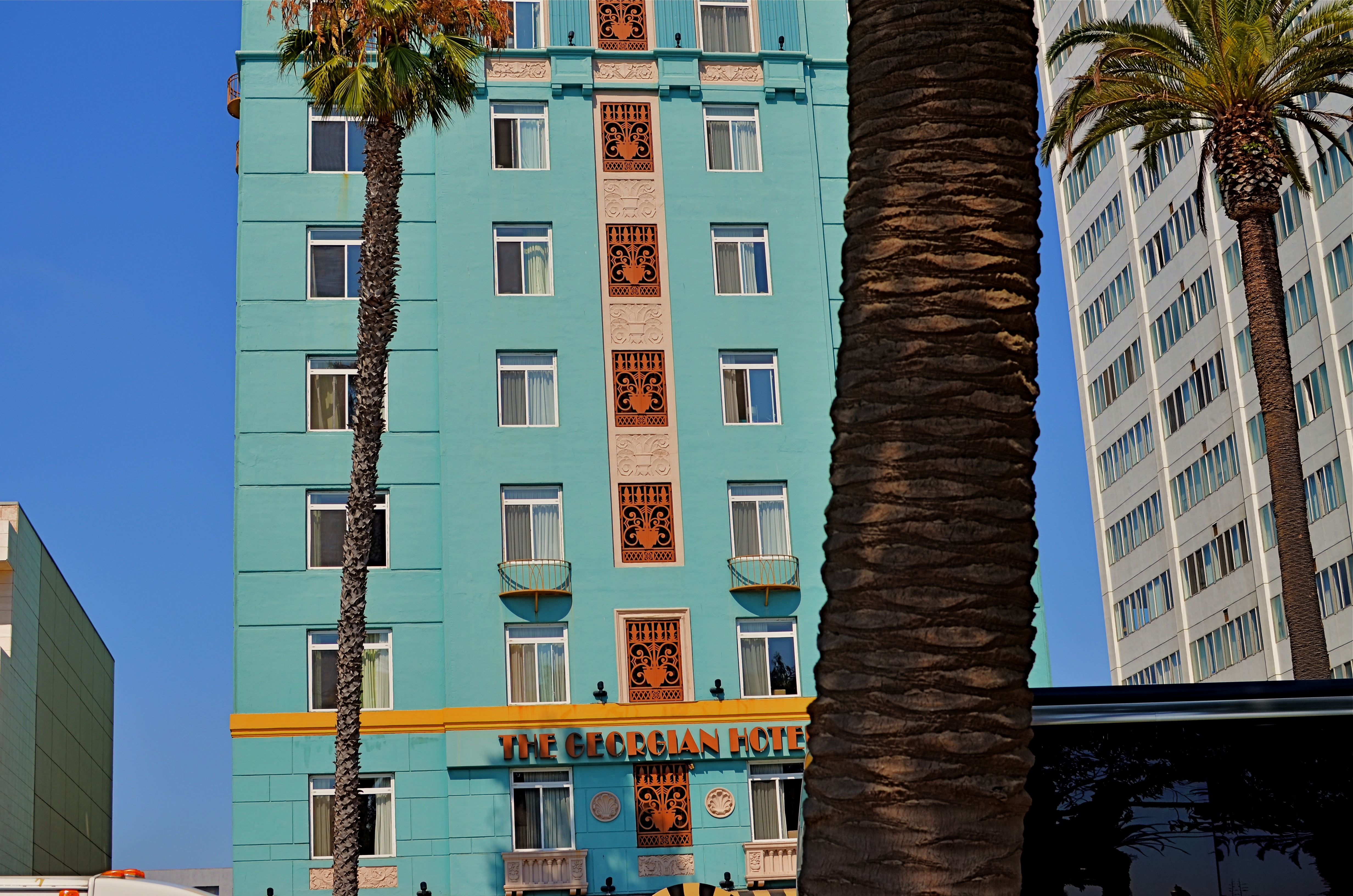
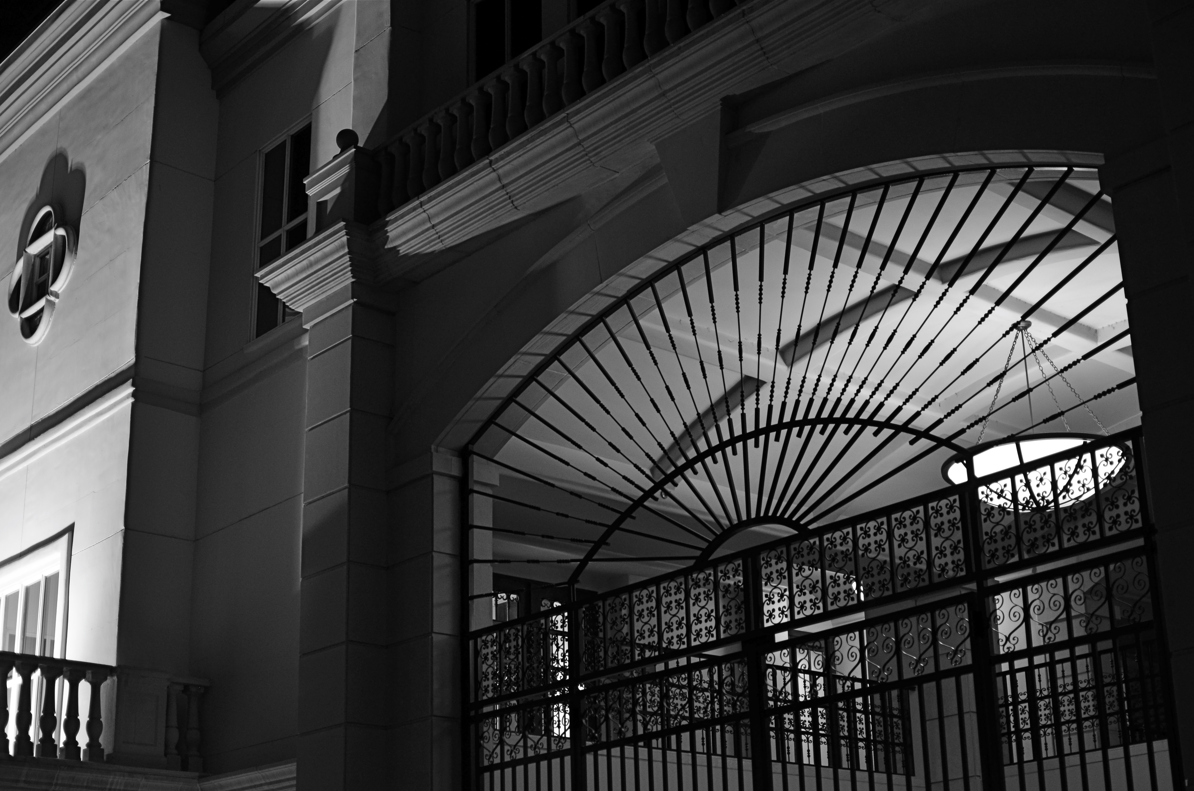
Georgian Hotel, Santa Monica, CA. 1/60 sec., f/5.6, ISO 100, 35mm.
Reviewing images for the last several years, I find that I am taking more compositions on their own terms, with light poles, weird reflections, broken planes of view and shadows all becoming more welcome in my final photos. I still labor to get a clean look when I can. But I also make peace with elements that used to doom a photo to the dustbin.
Street scenes especially can better reflect the visual chaos of busy cities if everything isn’t “just right”. It’s really hard (at least in my case) to tear out the mental hardwiring of a lifetime and take a picture that may be more abstract or cubist than I ever thought I could allow myself to be. Maybe it’s a function of aging, but things seem to be relaxing in my approach. Don’t get me wrong. I’m still Alpha Male enough to want to bring everything in a frame under my unswerving control. I just don’t get blood pressure when circumstances force me to unclench my iron fist once in a while.
It’s a process.
To see, yes, but, in allowing my visual infinitives to be occasionally split, it means learning to differently see.
Follow Michael Perkins on Twitter @mpnormaleye.
Welcome to our newest followers. Check out their mad genius at:
OF BIRDS AND BARRIERS
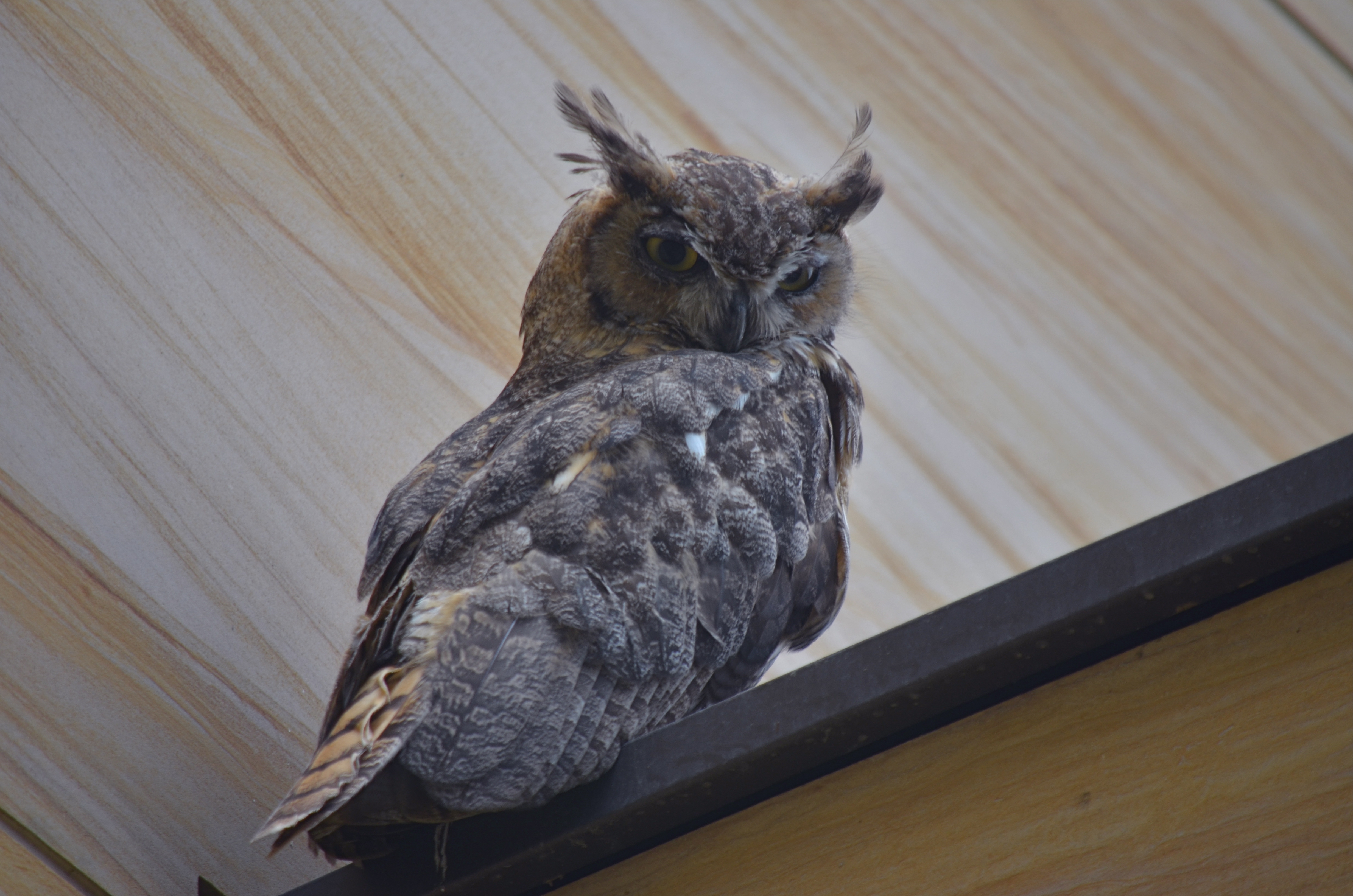
Zoom lenses, while great, price many shooters out of the market for making shots like this. 1/160, f/5.6, ISO 100, 300mm.
By MICHAEL PERKINS
PHOTOGRAPHY IS ART’S GREATEST “DEMOCRATIZER“, a medium that levels the playing field for creative minds as no other medium can. “Everyone gets a shot”, goes the old saying, and, today, more than ever, the generation of images is so available, so cost-effective that almost anyone can play.
Yes, I said almost. Because even as cameras become so integrated into our devices and lives as to be nearly invisible, there is at least one big stump in the road, one major barrier to truly universal access to image-making. That barrier is defined by distance and science.
For those longing to bring the entire world ever closer, zoom lenses and the optics they require still slam a huge NO ADMITTANCE door in front of many shooters, simply because their cost remains beyond the reach of too many photographers. Lenses going beyond around 300mm simply price users out of the market, and so keep their work confined in a way that the work of the rich isn’t.
Look at the metadata listed in the average “year’s best” or “blue ribbon” competitions in National Geographic, Audubon, Black & White, or a score of other photo magazines. Look specifically at the zoom ranges for the best photos of birds, insects and general wildlife. The greatest praise is heaped on images taken with 400, 600, 800mm glass, and rightfully so, as they are often stunning. But the fiscal wall between these superb optics and users of limited funds means that many of those users cannot take those images, and thus cannot compete or contribute in the same way as those who can afford them. For an art that purports to welcome all comers, this is wrong.
The owl image at the top of this post fell into my lap recently, and I was able to take advantage of this handsome fellow’s atypical appearance at a public place with the help of a 300mm lens. But that’s only because (A) he was still only about forty feet away from me, and (B) he is as big as a holiday ham. If he and I had truly been “out in the wild”, he would have been able to effectively enforce his own no pictures today policy, as I would have been optically outflanked. Two options would thus emerge: drop thousands for the next biggest hunk of glass, or take pictures of something else.
I am for anyone being able to take any kind of picture, anywhere, with nothing to limit them except their vision and imagination. Unfortunately, we will need a revolution on the high end of photography, such as that which has happened on the entry level, to make the democracy of the medium universal and complete. We need an “everyman” solution in the spirit of the Kodak, the Polaroid, and the iPhone.
The world of imaging should never be subdivided into haves and have-nots.
follow Michael Perkins on Twitter @mpnormaleye.
SECOND SIGHT, SECOND LIFE
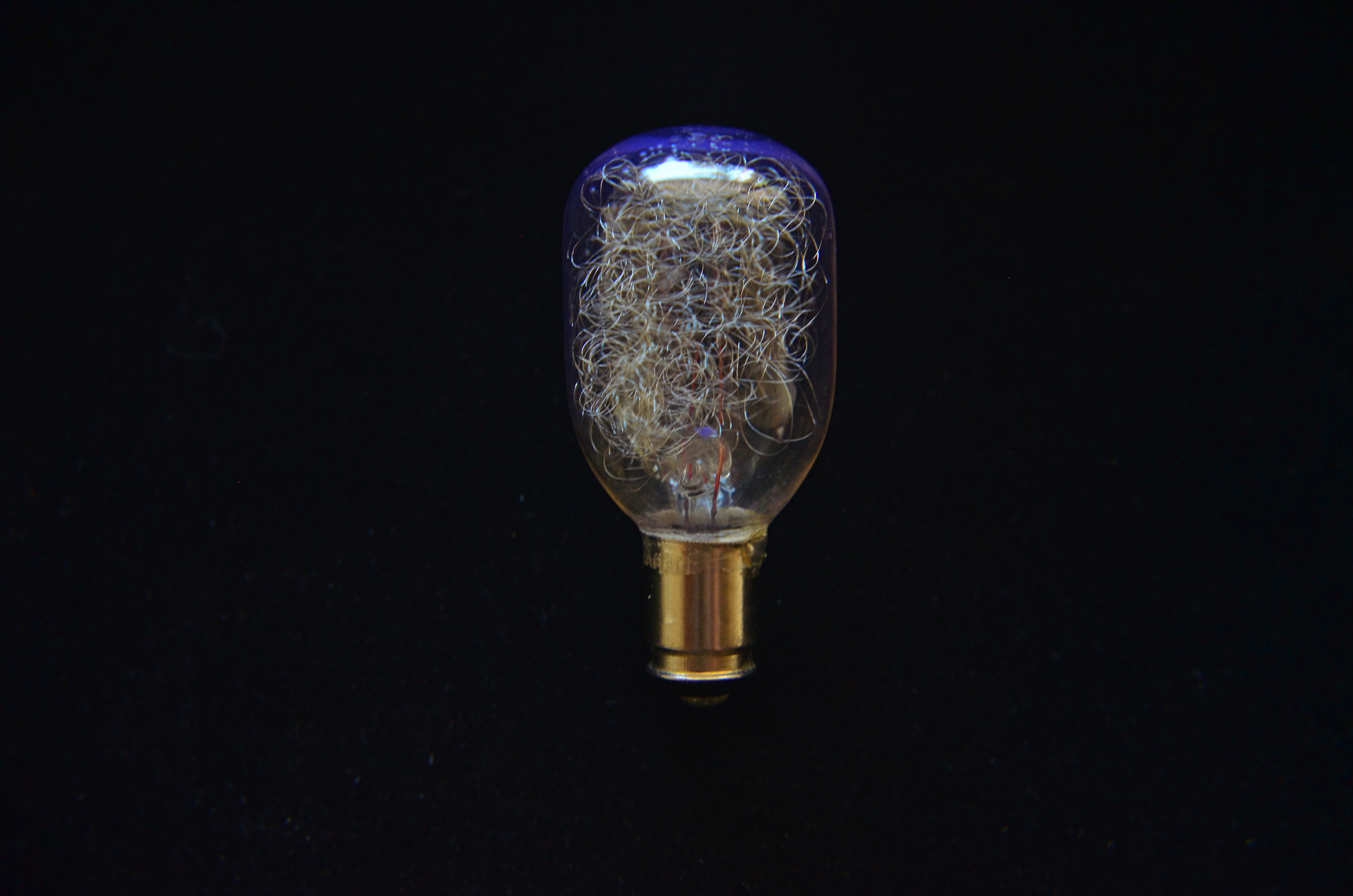
Pragmatically “useless” but visually rich: an obsolete flashbulb glows with window light. 1/80 sec., f/5.6, ISO 640, 35mm.
By MICHAEL PERKINS
A DECADE-AND-A-HALF INTO THE TWENTY-FIRST CENTURY, we are still struggling to visually comprehend the marvels of the twentieth. As consumers, we race from innovation to innovation so amazingly fast that we scarcely apprehend the general use of the things we create, much less the underlying aesthetic of their physical forms. We are awash in the ingenuity of vanishing things, but usually don’t think about them beyond what we expect them to supply to our lives. We “see” what things do rather than seeing their essential design.
As photographers, we need not only engage the world as recorders of “reality” but as deliberate re-visualizers of the familiar. By selecting, magnifying, lighting and composing the ordinary with a fresh eye, we literally re-discover it. Second sight gives second life, especially to objects that have outlasted their original purpose. No longer needed on an everyday basis, they can be enjoyed as pure design.
And that’s exciting for anyone creating an image.
The above shot is ridiculously simple in concept. Who can’t recognize the subject, even though it has fallen out of daily use? But change the context, and it’s a discovery. Its inner snarl of silvery filaments, designed to scatter and diffuse light during a photoflash, can also refract light, break it up into component colors, imparting blue, gold, or red glows to the surrounding bulb structure. Doubling its size through use of “the poor man’s macro”, simple screw-on magnifying diopters ahead of a 35mm lens, allows its delicate inner detail to be seen in a way that its “everyday” use never did. Shooting near a window, backed by a non-reflective texture, allows simple sculpting of the indirect light: move a quarter of an inch this way or that, and you’ve dramatically altered the impact.
The object itself, due to the race of time, is now “useless”, but, for this little tabletop scene, it’s a thing made beautiful, apart from its original purpose. It has become something you can make an image from.
Talk about a “lightbulb moment”….
Follow Michael Perkins on Twitter @mpnormaleye.
Related articles
- “A Sight Into My Photographic Mind” (Perspective) (mrphotosmash.wordpress.com)
CORNERING

Tackle a big subject in parts, and thus re-frame its context. A blend of two bracketed exposures with varied shutter speeds, both f/5.6, ISO 100, 55mm.
By MICHAEL PERKINS
PHOTOGRAPHERS ALL HATE THE TASK OF SHOOTING OVERLY FAMILIAR SUBJECTS. The famous. The iconic. The must-stop, we’ll-be-getting-off-the-bus-for-ten-minutes “sights” that decorate every postcard rack, every gift store shelf, in their respective cities. The Tower, the Ruins, the Once-Mighty Palace, the Legendary Cathedral. Things that have more pictures taken of them by breakfast than you’ll have taken of you in three lifetimes. Scadrillions of snaps, many of them composed for the “classic” orientation, an automatic attempt to live up to the “postcard” shot. It’s dull, but not because there is no fresh drama or grandeur left in a particular locale. It’s dull because we deliberately frame up the subject in almost the same way that is expected of us.
There must be a reason we all fall for this.
Maybe we want everyone back home to like our pictures, to recognize and connect with something that is easy, a pre-sold concept. No tricky exposures, no “arty” approaches. Here’s the Eiffel Tower, Uncle Herb, just like you expected to see it.
Yeah, well…
On a recent walking shoot around D.C.’s National Mall, snapping monument upon monument, I was starting to go snowblind with all the gleaming white marble and bleached alabaster, the perfection of our love affair with our own history. After a few miles of continuous hurrahs for us and everything we stand for, I perversely looked for something flawed….a crack in the sidewalk, a chipped tooth on a presidential bust, something to bring forth at least a little story.
Then I defaulted to an old strategy, and one which at least shakes up the senses. Photograph parts of buildings instead of the full-on official portrait of them. Pick a fragment, a set of light values, a selection of details that render the thing new, if only slightly. Take the revered and venerated thing out of its display case and remove its normal context.
The Lincoln Memorial proved a good choice. The basic shot of the front looked like just a box with pillars. A very, very white box. But shooting a bracket of three exposures of just the upper right corner of the roof , then blending them in an exposure fusion program, revealed two things: the irregular aging and texture of the stone, and the very human bit of history inscribed along the crown: the names of the states, with the years they came into the union below them. All at once something seemed unified, poetic about Abraham Lincoln sitting inside not a temple to himself, but a collection of the states and passions he stitched back together, repaired and restored into a Union.
The building had come back alive for me.
And I didn’t even have to shoot the entire thing.
follow Michael Perkins on Twitter @mpnormaleye.
FEWER TOYS, MORE TOOLS
This is Nikon’s “High-Key” effects mode. It’s a cheap gimmick, and you paid for it, even though (a) it is not High Key and (b) you can easily make this shot yourself. 1/30 sec., f/2.8, ISO 1250, 35mm.
By MICHAEL PERKINS
MANY OF THE “ENHANCEMENTS” OFFERED BY TODAY’S MAJOR PHOTO GEAR MANUFACTURERS ARE, IN FACT, OBSTACLES to learning how to take responsibility for making pictures. The automatic bells and whistles that are being engineered into today’s cameras seems to send the message: you don’t have to think too hard. Push the button and we will provide (and predict) the results.
It may be fabulous for convenience, but it’s lousy news for the experimentation and personal risk which are required for great photography to occur.
We live in a time of short cuts, of single-button solutions for every creative problem. We have modes for that. Low light, too much light, a day at the beach, a day in the snow, a closeup, a landscape? Guaranteed results at the dial-up of an automode. Hey, you’re an artist. No need to obsess about all that techno-whatsis. Your camera will determine the results. Just dial up what you want: it’s all automatic. You need hardly be there.
Does anyone really believe that anything of artistic value can evolve from machines being in charge? When’s the last time a computer created a novel of staggering impact? Who is taking the picture here…..you or your camera?
Fully automatic, aperture priority and shutter priority are all good basic tools, and wonderful work is done in all three modes as well as full manual. But there is a huge leap between these settings and the gaudy, gimmicky “effects” modes that are increasingly larding up cameras with novelty and diversion.
Let’s take a look at some of the prime offenders. Are these toys necessary?
NIGHT VISION: If you want a picture to look like you took it while on combat recon in a forward area of Afghanistan, go for this option. Boosts your ISO up to 25,600 so you can get some image on the sensor, even in utter blackness, loaded with grain and visual muck. And why? Useless.
COLOR SKETCH: Concerts your original image into an “arty” rendering, minus the shadows, attenuating tones, or subtlety. Looks just like a classy artist knocked out a masterpiece with his box of charcoals! Fools no one except perhaps extremely learning-challenged chimps. If you want to be a painter, fine, then do it, but let’s stop calling this an enhancement.
MINIATURE EFFECT. Okay, so you can’t afford a real tilt-shift lens to create the illusion that your aerial shot of Paris is really a toy-sized tabletop model, so let’s take your photo and throw selective parts of it out of focus. That should be good enough. We’ll now allow a five-minute pause here for the exactly two times you’ll ever care about making a picture like this.
SELECTIVE COLOR. De-saturate portions of your original for dramatic effect. This is the opposite of the images of a century ago, when people, before color film, added selective hues to monochrome images…for dramatic effect. Only thing is, drama should already be in the picture before you apply this gimmick, hmm? Like many effects modes, this one tempts you to use it to fix a photo that didn’t tell its story properly in the first place. And yes, I have sinned in this area, sadly.
SILHOUETTE. The camera makes sure your foreground subjects are dark and have no detail. In other words, it takes pictures exactly the way your Aunt Sadie did with her Instamatic in 1963. Oh, but it’s so artistic! Yes, cameras always make great art. All by themselves.
HIGH KEY or LOW KEY. This used to mean lightening or darkening of selected items done by meticulous lighting. Now, in Camera Toyland, it means deliberately under-or-overexposing everything in the frame. See earlier reference to your Aunt Sadie.
As far as what should be built into cameras, I’m sure that you could compose your own wish list of helpful tools that could be available as quick-dial aids. My own list would, for example, include the moving of white balance choices from the screen menus to the mode dial. Point is, for every ready-made effect that you delegate to the camera, you are further delaying the education that can only come from doing things yourself. If you want a happy picture, make one, rather than taking a middling one and then dialing up the insertion of a magical birthday cake in the middle of the shot after the fact.
As point-and-shoots are eventually replaced by smartphones and DSLRs position themselves to remain competitive as least on the high-end portion of the market, there seems to be a real opportunity for a revolution in camera design….away from toys and in favor of tools.
follow Michael Perkins on Twitter @mpnormaleye.
HOLDING BACK
Rainy day dream away: 1/160 sec., f/4.5, ISO 100, 35mm.
By MICHAEL PERKINS
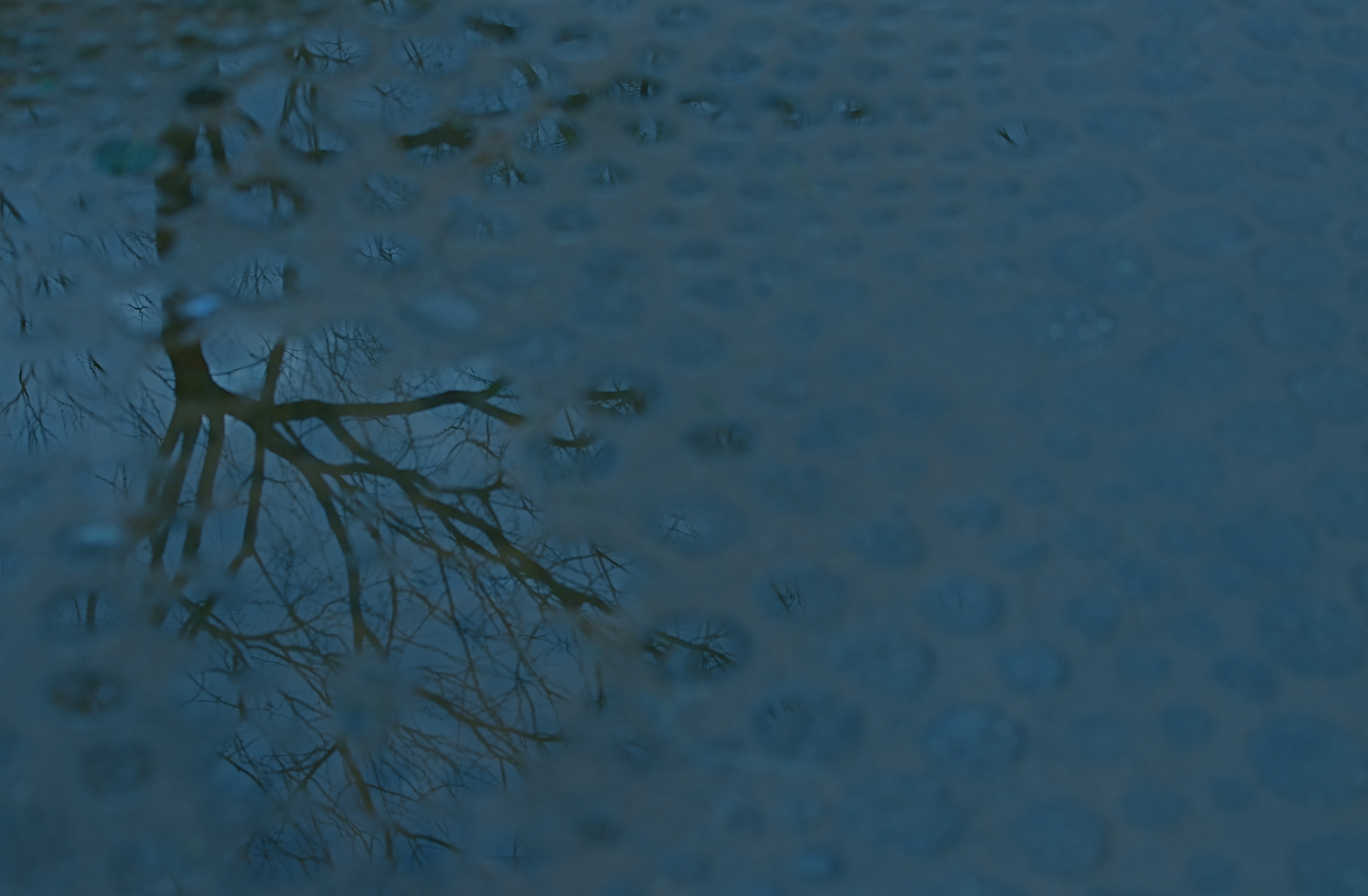
THE MIND WANTS TO PAINT ITS OWN PICTURES, and often responds better to art that veils at least part of its message in mystery. The old vaudeville adage, “always leave them wanting something” is especially applicable in the visual arts, where, often as not, the less you show, the better it connects with the viewing public. It’s precisely because you didn’t show everything that your work may reach deeper into people’s imaginations, which are then invited to “partner” in providing what you merely suggested.
This is why radio created more personal “pictures” than television, why an abstract suggestion of on-screen romance is more erotic than full-on depiction of every physical mechanic of an encounter, and why, occasionally, deciding to hold back, to withhold “full disclosure” can create an image that is more compelling because its audience must help build it.
Given the choice between direct depiction of an object and referential representation of it in a reflection or pool of water, I am tempted to go with the latter, since (as is the stated goal of this blog) it allows me to move from taking a picture to making one. Rendering a picture of a tree is basically a recording function. Framing a small part of it is abstraction, thus an interpretive choice. And, as you see above, showing fragments of the tree in a mosaic of scattered puddles gives the viewer a chance to supply the remainder of the image, or accept the pattern completely on its own merits. Everyone can wade in at a level they find comfortable.
I don’t always get what I’m going for with these kind of images, but I find that making the attempt is one of the only ways I can flex my muscles, and ask more of the viewer.
It’s the kind of partnership that makes everything worthwhile.
(follow Michael Perkins on Twitter @mpnormaleye)
Check out the excellent minds of our newest followers:
http://www.en.gravatar.com/insideoutbacktofront
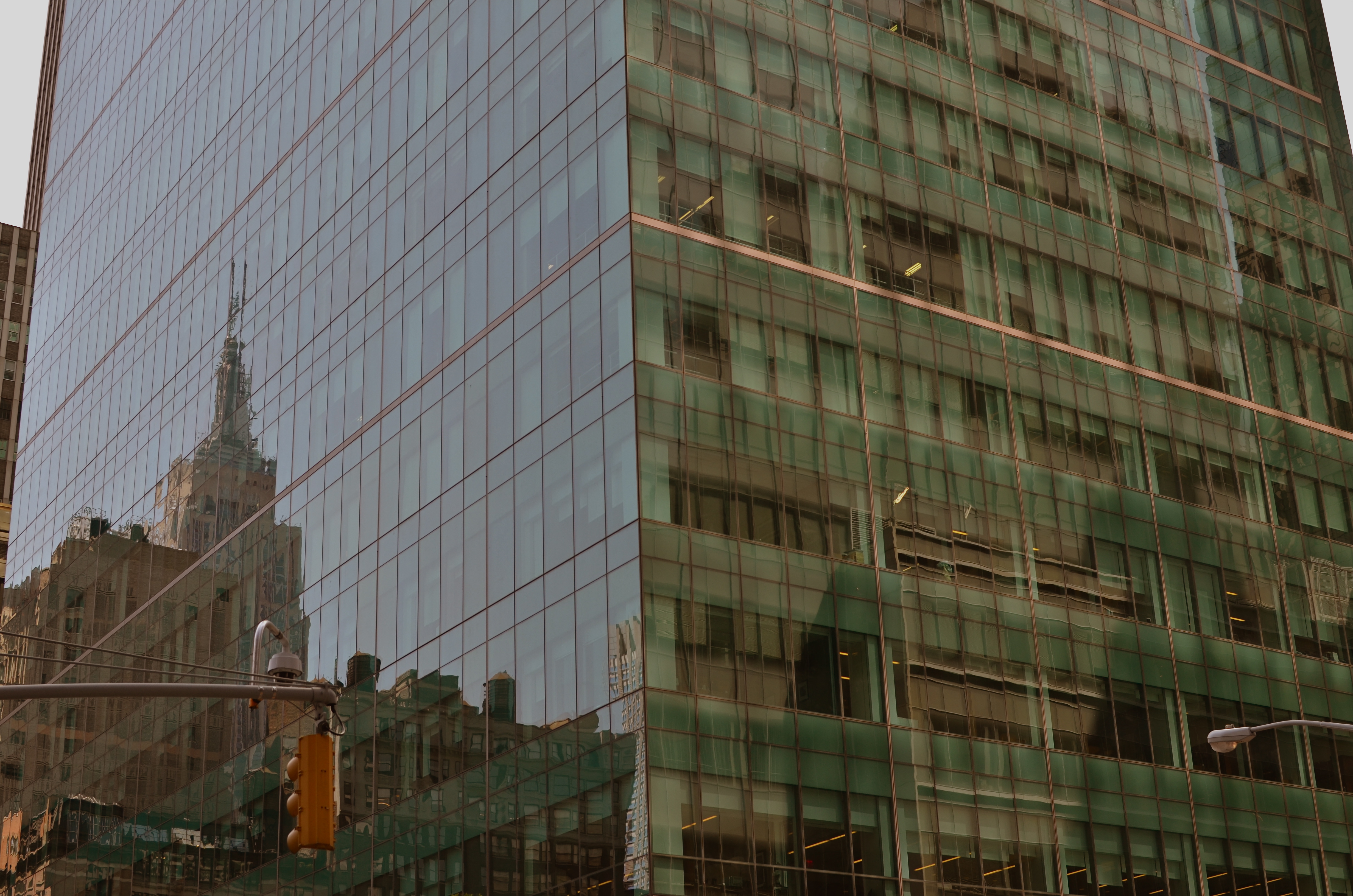
REVELATION OR RUT?
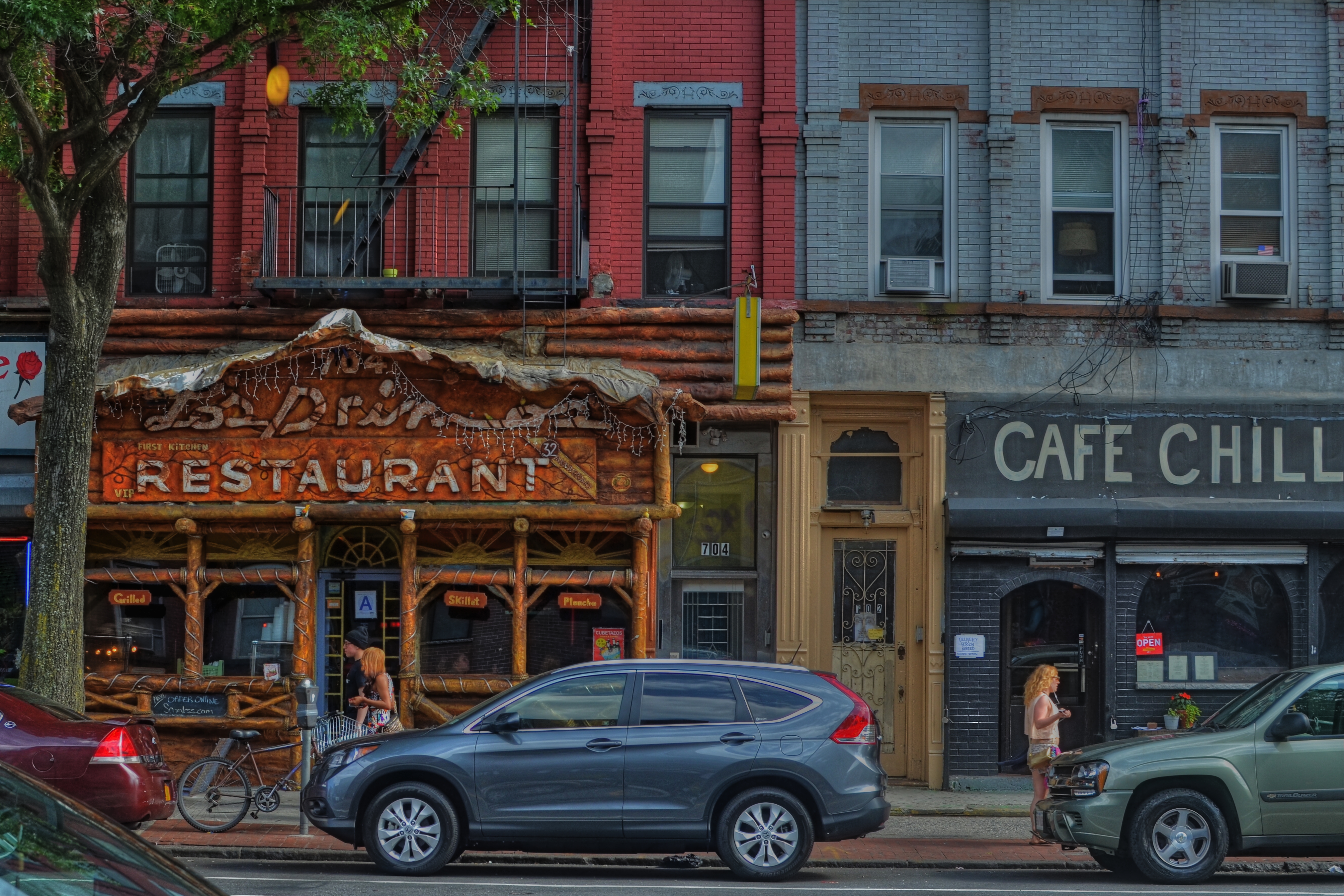
Cafe Chill, Brooklyn, 2013. 1/200 sec., f/5.6, ISO 100, 35mm.
By MICHAEL PERKINS
IT’S OFTEN DIFFICULT FOR PHOTOGRAPHERS, UNDER THE SPELL OF A CONCEPT, TO KNOW WHETHER THEY ARE MARCHING TOWARD SOME LOFTY QUEST or merely walking in circles, their foot (or their brain) nailed to the floor. Fall too deeply in love with a given idea, and you could cling to it, for comfort or habit, long after it has yielded anything remotely creative.
You might be mistaking a rut for revelation.
We’ll all seen it happen. Hell, it’s happened to many of us. You begin to explore a particular story-telling technique. It shows some promise. And so you hang with it a little longer, then a little longer still. One more interpretation of the shot that made you smile. One more variation on the theme.
Maybe it’s abstract grid details on glass towers, taken in monochrome at an odd angle. Maybe it’s time exposures of light trails on a midnight highway. And maybe, as in my own case, it’s a lingering romance with dense, busy neighborhood textures, shot at a respectfully reportorial distance. Straight-on, left to right tapestries of doors, places of business, upstairs/downstairs tenant life, comings and goings. I love them, but I also worry about how long I can contribute something different to them as a means of telling a story.
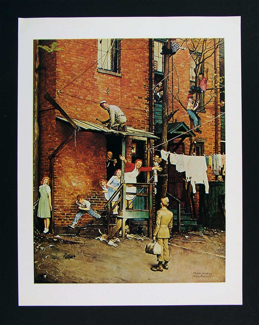
As staged as a Broadway show, Norman Rockwell’s idealized neighborhoods are still alluring in their appeal.
- The bustling tenement neighborhoods of early Norman Rockwell paintings appealed to me, as a child, because the frames were teeming with life: people leaning out of windows, sitting on porches, perching on fire escapes, delivering the morning milk…they were a divine, almost musical chaos. But they were paintings, with all the intentional orchestration of sentiment and nostalgia that comes with that medium. Those images were wonderful, but they were not documents…merely dreams.
That, of course, doesn’t make them any less powerful as an influence on photography.
When I look at a section of an urban block, I try to frame a section of it that tells, in miniature, the life that can be felt all day long as the area’s natural rhythm. There are re-gentrified restaurants, neglected second-floor apartments, new coats of paint on old brick, overgrown trees, stalwart standbys that have been part of the street for ages, young lovers and old duffers. Toss all the ingredients together and you might get an image salad that captures something close to “real”. And then there is the trial-and-error of how much to include, how busy or sparse to portray the subject.
That said, I have explored this theme many times over the years, and worry that I am trying to harvest crops from a fallow field. Have I stayed too long at this particular fair? Are there even any compelling stories left to tell in this approach, or have I just romanticized the idea of the whole thing beyond any artistic merit?
Hopefully, I will know when to strike this kind of image off my “to do” list, as I fear that repetition, even repetition of a valid concept, can lead to laziness….the place where you call “habit” a “style”.
And I don’t want to dwell in that place.
PARADOX
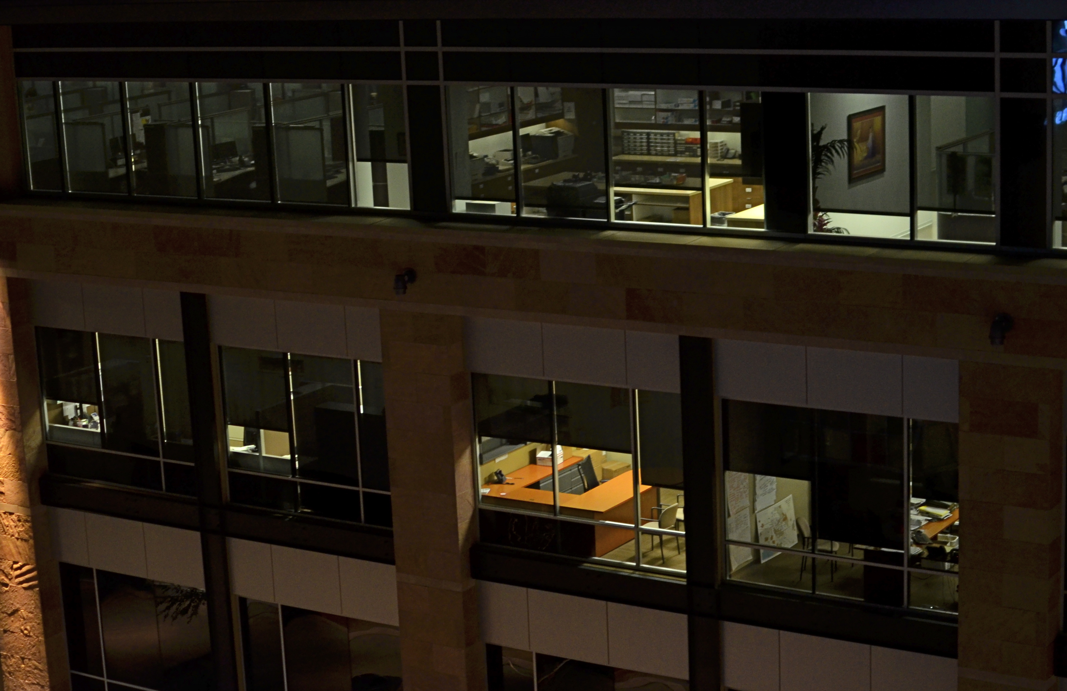
Where is the main story here? Far away, or up close? 1/60 sec., f/1.8, ISO 400, 35mm.
By MICHAEL PERKINS
EVERY SET OF VISUAL ELEMENTS, CAPTURED AT OPPOSITE EXTREMES, DELIVERS A COMPLETELY DIFFERENT SET OF STORY RESULTS. For photographers, the everlasting tug-of-war, involving “what to shoot?” is usually between “how close” and “how far away”? Even the lenses we buy, along with their unique properties, reflect this struggle between the intimate tale, told by a close-up, versus the saga, drawn from a vast panorama. There is a season, turn turn turn, for all kinds of image-making, and it’s no great revelation that many shooters can look at the same grouping of components and get remarkably different results.
Had I come upon the cluster of office cubicles seen in the image above on, say, day “A”, I might have been inclined to move in close, for a personal story, a detailed look at Life In The Office In This Modern World, or how worker #3456 left behind his umbrella and half a tuna sandwich. As it turned out, however, it was day “B”, and instead I saw the entire block of spaces as part of an overall pattern, as a series of lives linked together but separate, resulting in the more general composition shown here. I was shooting wide open at f/1.8 to retrieve as much light, handheld, as quickly as possible, to use the surrounding darkness to frame all the visual parts of the scene as boxes-within-boxes, rather than a single cube that warranted special attention.
Next time I’m up to bat with a similar scene, I could make the completely opposite decision, which is not a problem, because there never is a wrong decision, only (usually) wrong execution. And, yes, I realize that, by shooting empty offices, I dodged the whole ethical bullet of “should I be spying on all these people?”, otherwise known as Street Photographers’ Conundrum # 36.
I love wrestling with the paradox of how close, how far. There can be no decisive solution.
Only the fun of the struggle.
Welcome to our newest followers. Check their work out at :
http://www.en.gravatar.com/glennfolkes85
THE WOMAN IN THE TIME MACHINE
Where is this place? And how is it here, now? 1/40 sec., f/5.6, ISO 320, 24mm.
by MICHAEL PERKINS
THERE ARE TIMES WHEN A CAMERA’S CHIEF FUNCTION IS TO BEAR WITNESS, TO ASSERT THAT SOMETHING FANTASTIC REALLY DID EXIST IN THE WORLD. Of course, most photography is a recording function, but, awash in a sea of infinite options, it is what we choose to see and celebrate that makes an image either mundane or majestic.
And then sometimes, you just have the great good luck to wander past something wonderful. With a camera in your hand.
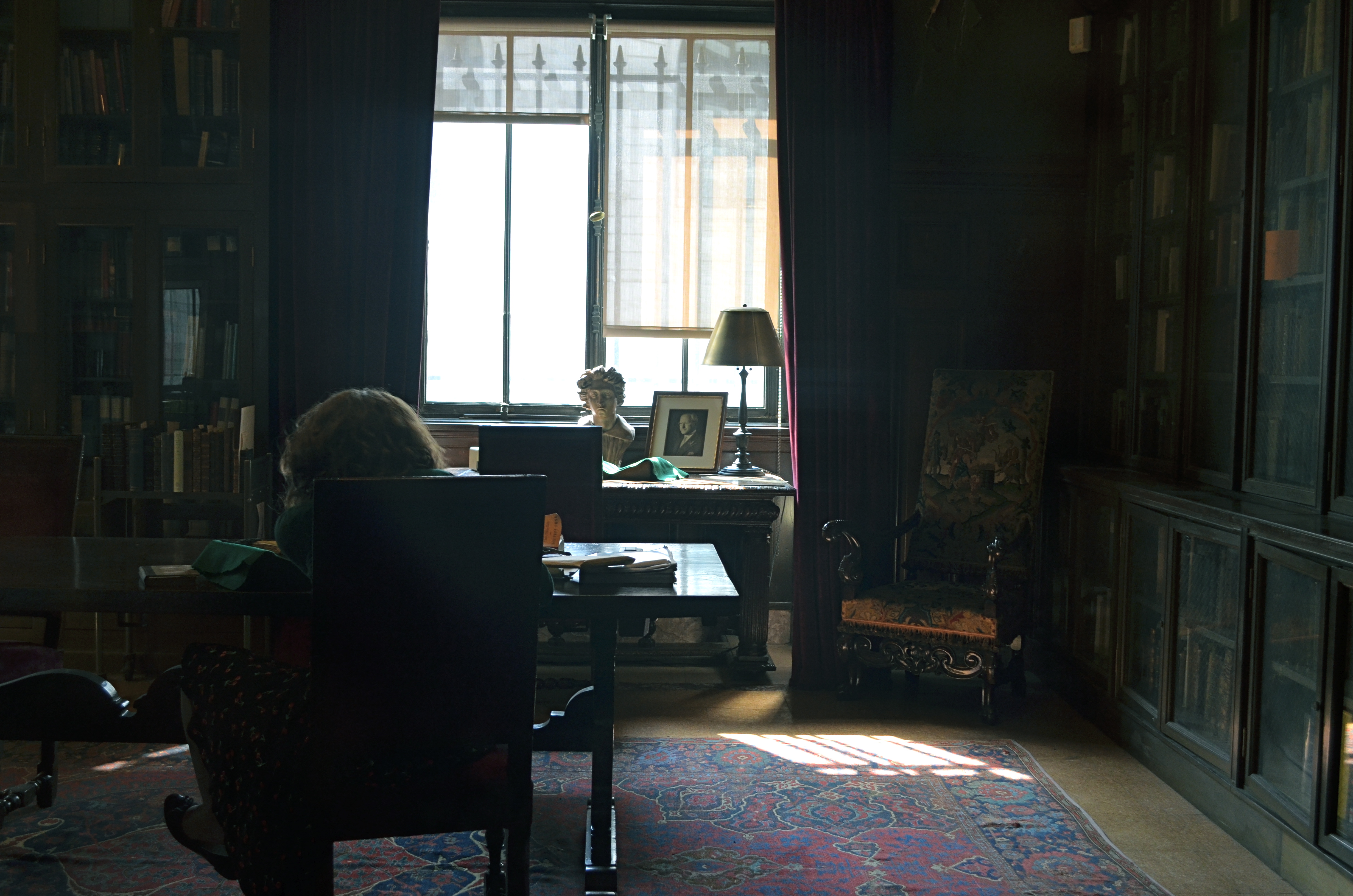
The New York Public Library’s main mid-town Manhattan branch is beyond magnificent, as even a casual visit will attest. However, its beauty always seems to me like just “the front of the store”, a controlled-access barrier between its visually stunning common areas and “the good stuff” lurking in untold chambers, locked vaults and invisible enclaves in the other 2/3 of the building. I expect these two worlds to be forever separate and distinct, much as I don’t expect to ever see the control room for electrical power at Disneyland. But the unseen fascinates, and recently, I was given a marvelous glimpse into the other side at the NYPL.
A recent exhibit of Mary Surratt art prints, wall-mounted along the library’s second-floor hall, was somehow failing to mesmerize me when, through a glass office window, I peeked into a space that bore no resemblance whatever to a contemporary office. The whole interior of the room seemed to hang suspended in time. It consisted of a solitary woman, her back turned to the outside world, seated at a dark, simple desk, intently poring over a volume, surrounded by dark, loamy, ceiling-to-floor glass-paneled book shelves along the side and back walls of the room. The whole scene was lit by harsh white light from a single window, illuminating only selective details of another desk nearer the window, upon which sat a bust of the head of Michelangelo’s David, an ancient framed portrait, a brass lamp . I felt like I had been thrown backwards into a dutch-lit painting from the 1800’s, a scene rich in shadows, bathed in gold and brown, a souvenir of a bygone world.
I felt a little guilty stealing a few frames, since I am usually quite respectful of people’s privacy. In fact, had the woman been aware of me, I would not have shot anything, as my mere perceived presence, however admiring, would have felt like an invasion, a disturbance. However, since she was oblivious to not only me, but, it seemed, to all of Planet Earth 2013, I almost felt like I was photographing an image that had already been frozen for me by an another photographer or painter. I increased my Nikon’s sensitivity just enough to get an image, letting the light in the room fall where it may, allowing it to either bless or neglect whatever it chose to. In short, the image didn’t need to be a faithful rendering of objects, but a dutiful recording of feeling.
How came this room, this computer-less, electricity-less relic of another age preserved in amber, so tantalizingly near to the bustle of the current day, so intact, if out of joint with time? What are those books along the walls, and how did they come to be there? Why was this woman chosen to sit at her sacred, private desk, given lone audience with these treasures? The best pictures pose more questions than they answer, and only sparingly tell us what they are “about”. This one, simply, is “about” seeing a woman in a time machine. Alice through the looking-glass.
A peek inside the rest of the store.
Follow Michael Perkins on Twitter @mpnormaleye.
Thanks to THE NORMAL EYE’s latest follower! View NAFWAL’s profile and blog at :
STILL GRAND, STILL CENTRAL
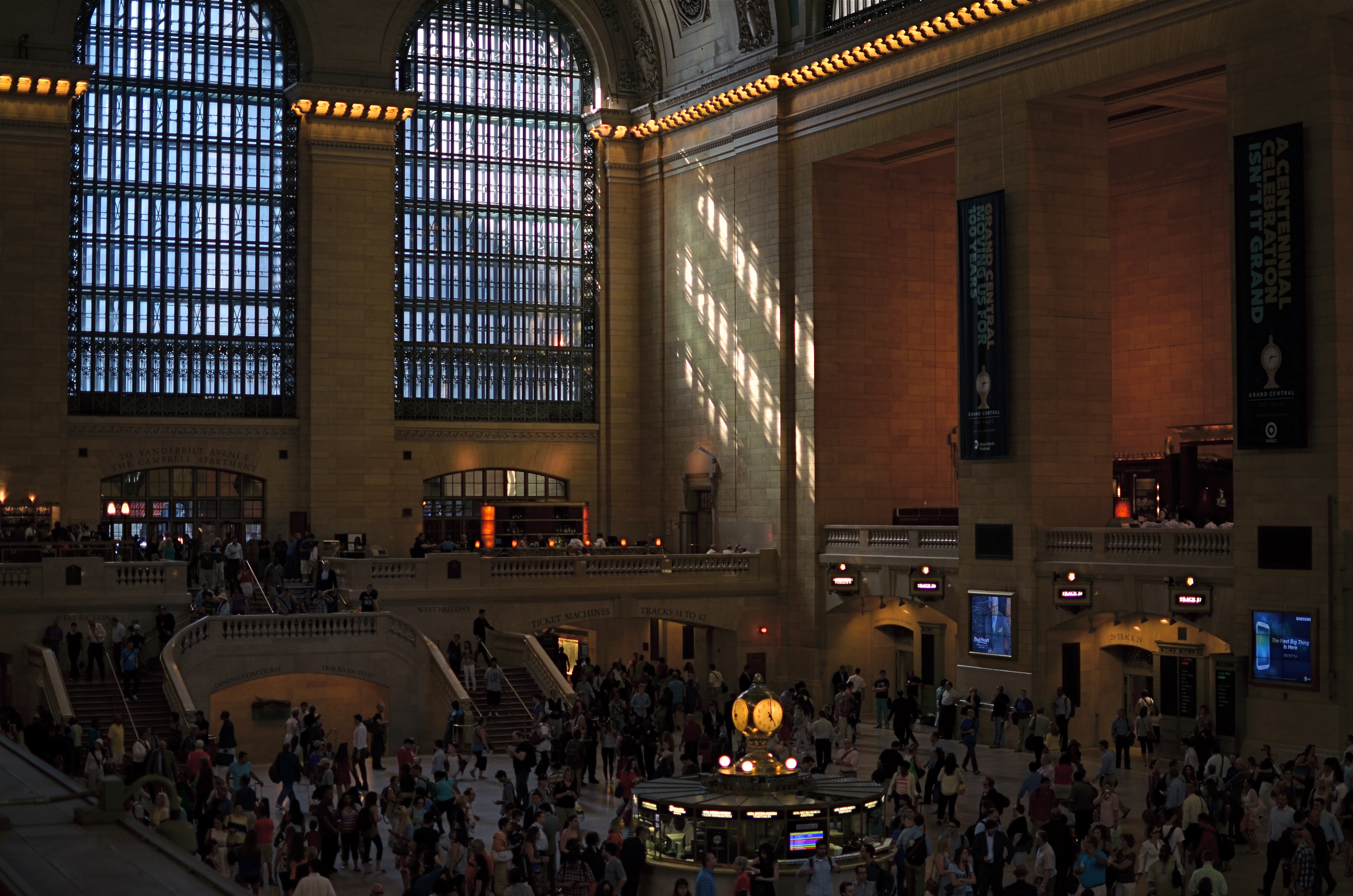
Grand Central Terminal, New York City. 2:11PM, June 21, 2013.
By MICHAEL PERKINS
AMERICA’S ROMANCE WITH RAIL TRAVEL MAY NOW JUST BE A SORT OF CASUAL ACQUAINTANCE (hey, we can still be friends), but the temple which sparked much of the old love between man and train still throbs with life. At 100, Grand Central Terminal (don’t, they beg, call it a station) still delights the eye of even a jaded New Yorker with the sheer scale of its vision. Over 750,000 people per day file through its platforms, shops and restaurants, and, of course, its commuter connections.
As to the era when the terminal truly connected the entire nation, the inevitability of the building as a final destination was never better captured than in the opening for the old network radio series named for it:
As a bullet seeks its target, shining rails in every part of our great country are aimed at GRAND CENTRAL STATION, heart of the nation’s greatest city.
Drawn by the magnetic forces of the fantastic metropolis, day and night, great trains rush toward the Hudson River…..sweep down its eastern bank for one hundred and forty-three miles…..flash briefly by the long, red row of tenement houses south of 125th street…..dive with a roar in to the two and one-half mile tunnel that burrows beneath the glittering swank of Park Avenue…and then…..GRAND CENTRAL STATION!!!!
Details, details.
Shooting the terminal is a bit of an alluring trap, since we all want the wider-than-wide, one-shot glama-panorama that takes in every window, skylight, side stall, commuter, ceiling detail and kiosk. The trap is in becoming so wedded to that shot that we forget about all the smaller dramas and details that would be lost within those gigantic, where’s-waldo mega-frames. On my latest trip there, I had been avoiding the usual wide-angle mania that is all too easy to surrender to, in shooting New York, traveling with only a 35mm prime lens and forcing myself to shoot smaller, more intimate subjects. Primes have normal, human-eye proportions, rather than the distorted stretch of a wide-angle, and cannot zoom. Therefore, shooting inside Grand Central meant:
I couldn’t even dream of getting everything in a single shot, meaning a select part of the story had to be chosen over a “master shot”.
I would have a lens that’s incredibly fast and sharp, so I could take advantage of the terminal’s vast interior (275 ft. long, 120 ft. wide, 125 ft. high) a space that is still largely illuminated by east-west natural light.
When I arrived, the golden glow of mid-afternoon was gently warming its way through the 75-ft-high arched windows on the terminal’s west side. I avoided shooting toward the east, since it currently features large “1-0-0” anniversary numerals in the three windows, plus the new Apple store, both of which I regard as barriers to visual enjoyment of the building. Go time: I settled on 1/200 second, ISO 160, wide open at f/1.8 (sharp to infinity since I was shooting from the diagonal opposite of my subject…we’re talking looong distance) and I kept one of about twenty frames.
Lenses, no less than subjects, are about decisions. You choose one thing and un-choose all other options.
And let the sun shine through.
For more history on the terminal, check out this article, courtesy of Gotham magazine:
http://gotham-magazine.com/living/articles/centennial-secrets-of-grand-central-terminal
A TALE OF TWO KINGS

A determined Martin Luther King, Jr. stares forward into the future at the newly dedicated MLK Memorial on Washington’s National Mall. Fusion of three exposures, all with an aperture of f/5.6, all ISO 100, all 48mm. The shutter speeds, due to the high tones in the white statue, are 1/200, 1/320, and 1/500 sec.
By MICHAEL PERKINS
DEATH PERMANENTLY RENDERS REAL HUMAN BEINGS INTO ABSTRACTIONS. With every photo, formerly every painting, drawing, or statue of a renowned person, some select elements of an actual face are rearranged into an approximation, a rendering of that person. Not the entire man or woman, but an effect, a simulation. The old chestnut that a certain image doesn’t do somebody “justice”, or the mourner’s statement that the body in the casket doesn’t “look like” Uncle Fred are examples of this strange phenomenon.
Nothing amplifies that abstraction like having your image “officially” interpreted or commemorated after death, and, in the case of the very public Dr. Martin Luther King Jr., Washington’s National Mall offers two decidedly contrasting ways of “seeing” the civil rights pioneer. One is more or less a tourist destination, while the other is muted, nearly invisible amongst the splendors of the U.S. Capitol. Both offer a distinct point of view, and both are, in a way, incomplete without the other.
The official MLK memorial, opened in 2011 as one of the newest additions to the Mall, stands at the edge of the Tidal Basin, directly across a brief expanse of water from the Jefferson Memorial. Its main feature shows a determined, visionary King, a titanic figure seeming to sprout from a huge slab of solid stone, as if, in the words of the monument, “detaching a stone of hope from a mountain of despair”. Arms folded, eyes fixed on a point some distance hence, he is calm, confident, and resolute. This gleaming white sculpture’s full details can best be captured with several bracketed exposures (fast shutter speeds) blended to highlight the grain and texture of the stone, but such a process abstract’s King even further into something out of history, majestic but idealized, removed.
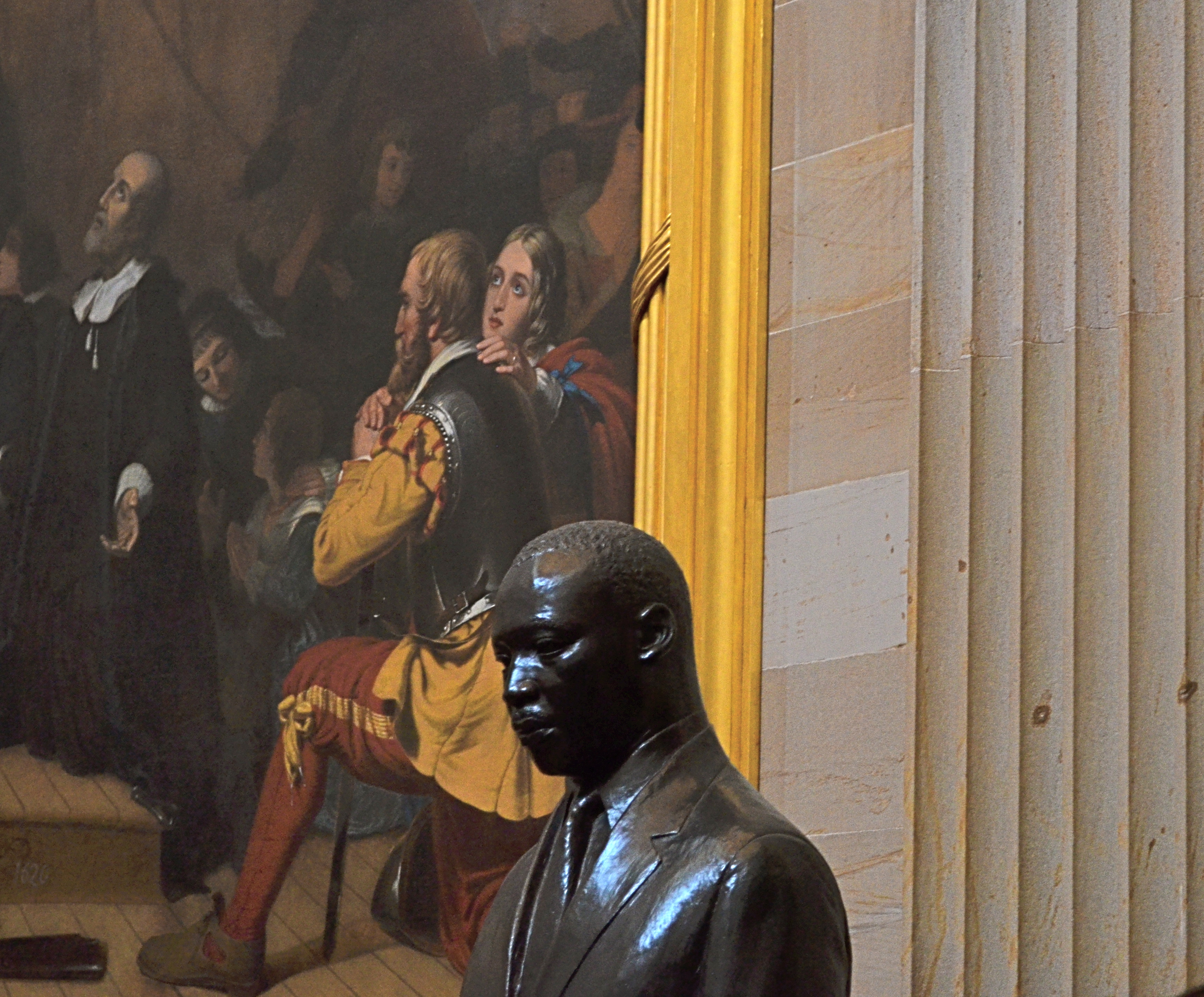
Another view: a somber bronze bust of Dr. King in the U.S. Capitol rotunda, flanked by the painting The Embarkation Of The Pilgrims. 1/30 sec., f/5.6, ISO 640, 55mm.
The contrast could not be greater between this view and the bronze bust of King installed in 1988 in the rotunda of the Capitol building. This King is worried, subdued, straining under the weight of history, burdened by destiny. The bust gains some additional spiritual context when framed against its near neighbor, Robert Weir’s painting The Embarkation Of The Pilgrims, which shows the weary wayfarers of the Mayflower, bound for America, on bended knee, praying for freedom, for justice. Used as background to the bust, they resemble a kind of support group, a congregation eager to be led. Context mine? Certainly, but you shoot what you see. Inside the capitol, light from the dome’s lofty skylights falls off sharply as it reaches the floor, so underexposure is pretty much a given unless you jack up your ISO. Colors will run rich, and some post-lightening is needed. However, the dark palette of tones seems to fit this somber King, just as the triumphant glow of the MLK Memorial’s King seems suited to its particular setting.
Death and fame are twin transfigurations, and what comes through in any single image is more highly subjective than any photo taking of a living person.
But that’s where the magic comes in, and where mere recording can aspire to become something else.
Follow Michael Perkins on Twitter @mpnormaleye.
COMMANDER-IN-GRIEF

Mr. Lincoln’s vigil continues. See below for details on the making of this image.
By MICHAEL PERKINS
MANY OF THOSE WHO TRAVEL TO WASHINGTON, D.C.’s VARIOUS MONUMENTS each year generally strike me as visitors, while those who throng to the memorial honoring Abraham Lincoln seem more like pilgrims. Scanning the faces of the children and adults who ascend the slow steps to the simple rectangular chamber that contains Daniel Chester French‘s statue of the 16th president, I see that this part of the trip is somehow more important to many, more fraught with a sense of moment, than the other places one may have occasion to view along the National Mall. This is, of course, simply my subjective opinion. However, it seems that this ought to be true, that, even more than Jefferson, Washington or any other single person attendant to the creation of the republic, Lincoln, and the extraordinary nature of his service, should require an extra few seconds of silent awe, and, if you’re a person of faith, maybe a prayer.
This week, one hundred and fifty years ago, the gruesome and horrific savagery of the Civil War filled three whole days with blood, blunder, sacrifice, tragedy, and finally, a glimmer of hope, as the battle of Gettysburg incised a scar across every heart in America. Lincoln’s remarks at the subsequent dedication of the battlefield placed him in the position of official pallbearer for all our sorrows, truly our Commander-In-Grief. Perhaps it’s our awareness of the weight, the loneliness, the dark desolation of that role that makes visitors to the Lincoln Memorial a little more humble, a little quieter and deeper of spirit. Moreover, for photographers, you want more of that statue than a quick snap of visiting school children. You want to get something as right as you can. You want to capture that quiet, that isolation, Lincoln’s ability to act as a national blotter of sadness. And then there is the quiet resolve, the emergence from grief, the way he led us up out of the grave and toward the re-purposing of America.
The statue is a simple object, and making something more eloquent than it is by itself is daunting.
The interior of the monument is actually lit better at night than in the daytime, when there is a sharp fall-off of light from the statue to the pillars and colored glass skylights to its right and left. You can crank up the ISO to retrieve additional detail in these darker areas, but you risk the addition of grainy noise. In turn, you can smooth out the noise later, but, in so doing, you’ll also smear away the beautiful grain in the statue itself.
In my own case, I decided to take three bracketed exposures, all f/5.6, , nice and wide at 20mm, low noise at ISO 100, with shutter speeds of 1/50, 1/100, and 1/200. In blending the three later in Photomatix’ Detail Enhancement mode, I found that the 1/200 exposure had too little information in it, so a composite of the three shots would have rendered the darkest areas as a kind of black mayonnaise, so I did the blend with only two exposures. Stone being the main materials in the subject, I could jack up the HDR intensity fairly high to accentuate textures, and, for a more uniform look across the frame, I gently nudged the color temperature toward the brown/amber end, although the statue itself is typically a gleaming white. The overall look is somewhat more subdued than “reality”, but a little warmer and quieter.
Abraham Lincoln was charged with maintaining a grim and faithful vigil at America’s bedside, in a way that no president before or since has had to do. Given events of the time, it was in no way certain that the patient would pull through. That we are here to celebrate his victory is a modern miracle, and the space his spirit occupies at the Lincoln Memorial is something photographers hunger to snatch away for their own.
What we try to capture is as elusive as a shadow, but we need to own something of it. The commander-in-grief’s legacy demands it.
Follow Michael Perkins on Twitter @mpnormaleye.
Related articles
- Other Proposed Designs for the Lincoln Memorial (ghostsofdc.org)
- Lincoln Memorial Under Construction (ghostsofdc.org)
“C” NOTES (THOUGHTS ON POST #100)
Hey, we’re all just trying to catch light in a box. Use any box you have, just grab something, like, say, the Empire State Building. 1/320 sec., f/5.6, ISO 100, 35mm.
By MICHAEL PERKINS
SOMETHING THAT LIVES IN THE NETHER WORLD BETWEEN A DIARY AND A PHILOSOPHIC SCREED, at the intersection of passion and obsession. That’s the no-man’s-land I aimed this blog at 100 posts ago, today. From Day One, The Normal Eye was, and remains, an attempt to get beyond the mere technical doing of a photograph and scratch away at the ticket of techtalk to reveal why I was trying to capture a given idea inside a box.
There are, and have ever been, far better teachers on a purely technical level than I can ever hope to be. And, let’s face it, knowing just the metadata on a shot is no guarantee that something magical will happen, just as high-end cameras don’t guarantee high-concept images. No, the only thing I’m expert at, in any way, is judging my own intentions, in hungering after a visualization of what I feel in my bones.
All of you patient ones out there already know me, because your dad or your corny uncle or your nerdly, bookish kid is just like me. I am “that guy”. I have always been that guy. The guy who pipes up, in completely unrelated conversations, with the observation that “it’s so cool what the light is doing right now”. The guy who comes back from a family gathering with, strangely, no pictures of the family whatever, but a killer shot of what everyone concurs is a colorful shmear of…something. The guy who is so busy looking for “the moment” that he forgets to be in the moment.
Guilty, guilty, guilty, and, ouch, guilty.
Funny thing is (and this is the mainspring that drives The Normal Eye), I’m almost as excited about where I’ll fail next than where I’ll succeed. If less than half of the pictures out of a new batch doesn’t make me groan, what the hell was I thinking?, then I’m not working hard enough, and certainly not reaching far enough. Nothing artistically good comes from a place of safety, and repeating your past choices doesn’t repeat your past successes.
Those of you who have done me the great honor of reading and following this mess have my undying gratitude. And as for those who have taken the extra time to comment as well, thanks for becoming the most vital link in the chain. Bloggers may be doomed to forever shout off the edge of a cliff, but it’s a real Robinson Crusoe moment when some man (or woman) Friday actually shouts back. Thank you, one and all.
As far as there are clearly stated goals for any enterprise such as this (except to keep on going), I can faithfully pledge to keep the process as honest as possible, and to let my inner child, the brat who first picked up a camera, to shout down the rational adult, who unlike the kid, occasionally forgets that this is all supposed to be about discovery, and wonder. If I lose track of that, the whole game is up. I also hope to act as a better conduit to the best work going on in photography today, in these pages and through my Twitter feed @mpnormaleye. The great news: the golden age of photography is happening here, now. Everything that has gone before, while amazing, is mere prologue to what is on the way.
That is pretty damned exciting.
So thanks for where this has taken us so far, and please sign up for another hitch. I can’t promise I’ll dazzle you. But I do promise I’ll be dazzled.
After all, it’s so cool what the light is doing, right now.
Where’s my box?
follow Michael Perkins on Twitter @mpnormaleye.
IN THE LINE OF FIRE
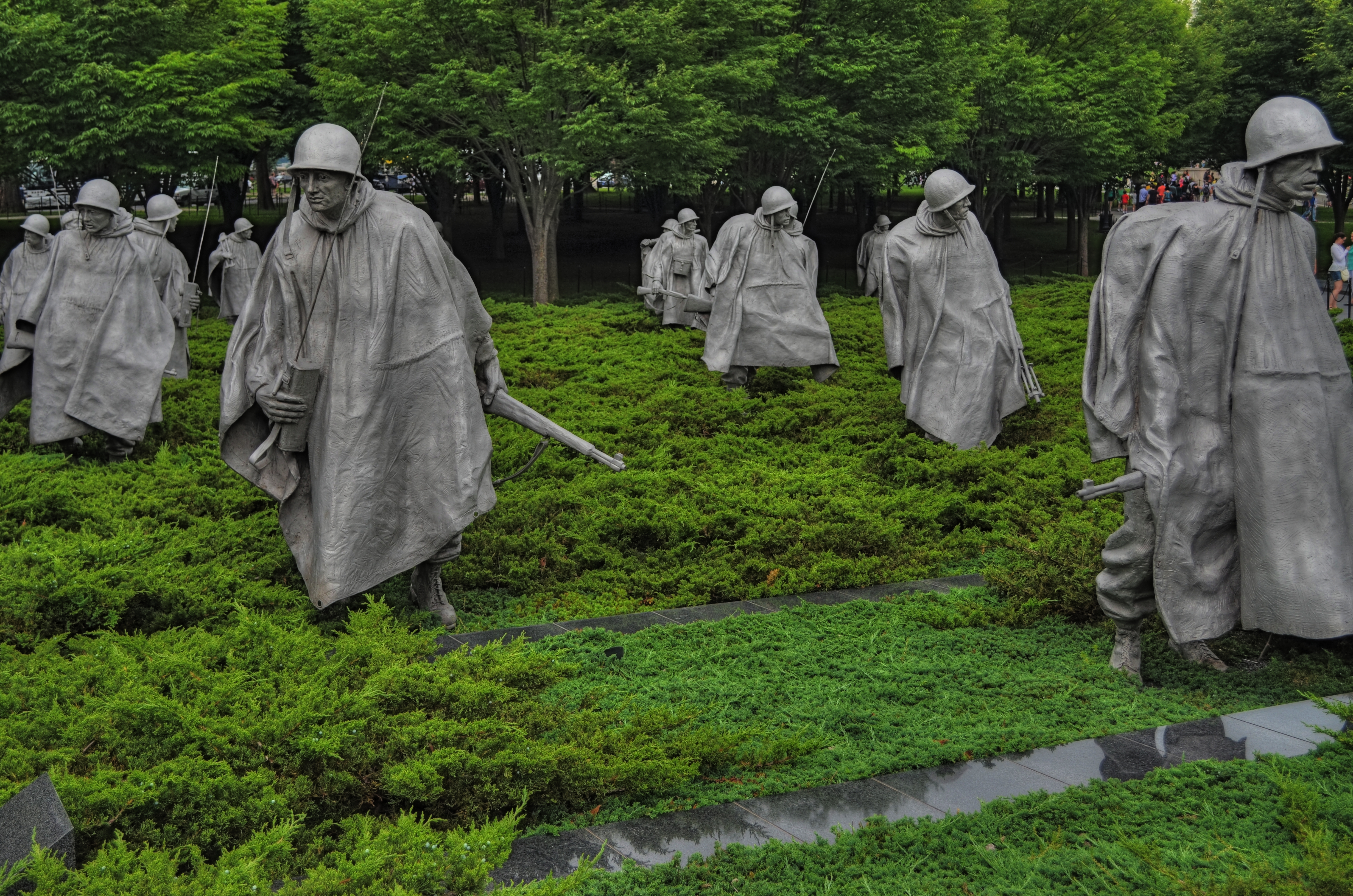
On patrol: The Korean War Memorial on Washington’s National Mall. 1/250 sec., f/5.6, ISO 100, 32mm.
By MICHAEL PERKINS
THERE IS NO GREATER ART THAN THAT WHICH DEMANDS THAT THE VIEWER BECOME A PARTICIPANT, an active co-creator of a bond between creator and user. That is the ineffable power that pervades all great art; the ability to draw you into a world not your own, a world which, in an instant, becomes your own. This elusive quality moves art from mere depiction to a kind of partnership arrangement. It’s so uncommon, so rare, that, when we see an instance of it, the very nature of the effect is radiant, unforgettable.
There are many attempts along Washington, D.C.‘s National Mall to name the nameless, to five utterance to the wordless qualities that define greatness, vision, loss, courage, passion, and pain. America‘s noisy, erratic journey through its young life have left trails of triumph and tragedy, paths that artists have illuminated with the various memorials and monuments which ring the mall from east to west. Some elevate presidents to the level of demigods; some mark the passage of noble laws; others, like the Vietnam War memorial, evoke deep feeling with a reverent stillness, and my favorite, the more recent Korean War Memorial, captures the quiet terror of setting out upon the grim errand of battle in a way that is eerie, and yet elegant.
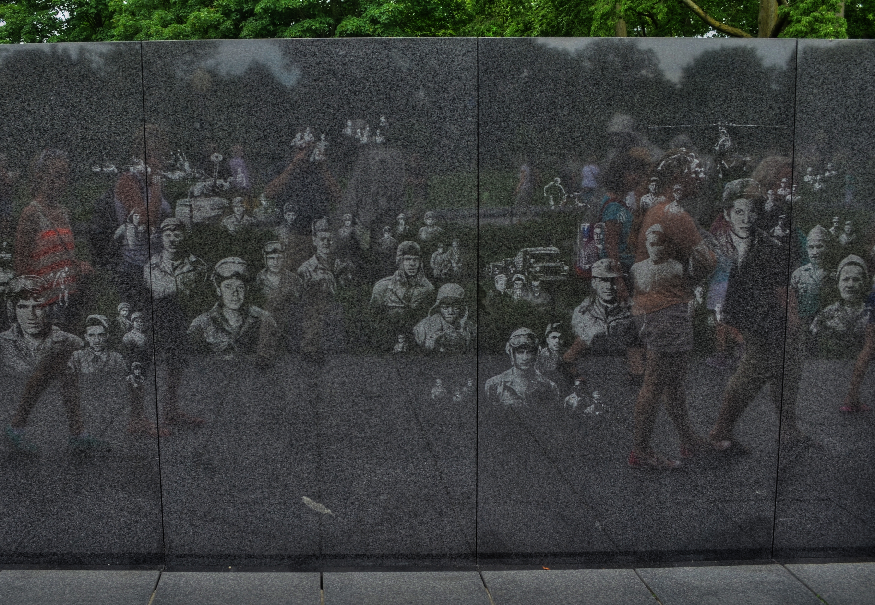
Visitors to the Korean War Memorial pass a wall etched with candid photos of G.I.s who served in the conflict.
There are two major elements to the memorial, dedicated in 1995 just southeast of the Lincoln Memorial. The first is reminiscent of the wall of names that comprise the solemn Vietnam memorial, but is slightly different in that it is a wall of faces, the effigies of nameless veterans of the conflict, scanned from candid photographs and etched into a stone slab that lines one side of the site. The other, and far more haunting feature is that of a silent patrol of soldiers, its members drawn from each branch of service in the Korean conflict, setting out in a cautious recon march across an open field. The statuary figures are impressive, averaging about seven feet in height. All of the soldiers cast their nervous gaze about the area as they seem to emerge from the relative safety of a copse of trees that border the monument site. The men are exhausted, grim. There is no call to duty in their poses, no grand gestures of heroism, no “follow me, boys!” rallying cry. Sculptor Frank Gaylord has created a squad of the Spirits Of Thankless Jobs Past, laden with gear, shrouded in ponchos, their steps weary and woeful. Get close enough to them and you can almost fall into step among them. Unlike the church-like quiet of the Vietnam memorial or the majestic marble of the WWII memorial, the Korean shows real men who have been sent to an unhappy, uncertain task, then consigned to the shadows, in what history has since labeled “the forgotten war.”
No majestic slogans mark the monument; only the cautionary sentence “Freedom Is Not Free” serves to warn the visitor that every act undertaken by politicians and kings has a real cost for real men. That cost is also recorded on the monument, with the dead, wounded, captured and missing totaling 172,847 Americans, not to mention the losses of the other twenty-two United Nations members whose soldiers comprised the total war effort.
To stand at many of the National Mall’s war memorials is to deal in abstractions…..patriotism, truth, sacrifice…noble words, noble ideals. To stand at the Korean War Memorial is to feel the blood and bone of war, its terror and tension, its risk and reality. It is the greatest kind of public art, because the public are destined, always, to become a vital part of it.
In the line of fire.
Follow Michael Perkins on Twitter @mpnormaleye.
LIPSTICK ON A PIG

Bad day at the office: having failed at making this house charming, I then went on to also fail at making it sinister and forbidding. I did, however, succeed in making it an unholy mess.
By MICHAEL PERKINS
IT’S TV-DOCTOR SHOW CLICHE NUMBER ONE. The frantic ER crew valiantly works upon a patient who is coding, pulling out every tool in a desperate search for a discernible pulse. Then the close-up on the earnest nurse: “He’s gone.” and the final pronouncement by the exhausted resident: “Okay, anyone have the time? I’m calling it….”
That’s pretty much what it’s like to try to rescue a lousy photograph by extraordinary means…tweaking, sweetening, processing, whatever you call the ultimately futile emergency measures. Sometime the unthinkable is obvious: the picture’s a goner…no pulse, no soul, no life.
Cue Bones McCoy: It’s dead, Jim.
I have made my share of ill-advised interventions in the name of “saving” photos that I was unwilling to admit were lifeless, pointless, just a plain waste of time. You’ve done it too, I’m sure. Trying to give some kind of artistic mouth-to-mouth to an image that just wasn’t a contender to begin with. It was a bunch of recorded light patterns, okay, but it damn sure wasn’t a photograph. Smear as much lipstick on a pig as you want….it’s still a pig.

The unremarkable original image.
The above image shows the worst of this pathology. I wanted to show the charm of an old bed-and-breakfast in the gloriously beautiful little town of Pacific Grove, located just up the peninsula from Monterey in California (see image at left). But everything that could have made the image memorable, or even usable, was absent. The color, a cool buttercup yellow, is common to many town dwellings. In the warm glow of dawn or the late waning, dappled light of late afternoon, it can be charming, even warm. In the mid-day light, weak, withered. Then there was the total lack of a composition. The picture was taken in a second, and looked it.
So, angry at having failed at the “charming” look I had gone for, and unable to make the backlighting on the house work for me, I went into Photomatix (usually a very solid HDR tool) and started, almost angrily, to take revenge on the damned thing. If I can’t make you pretty, I’ll make you magnificently ugly, hahaha…. Seriously, I was pretty far into the journey from “happy little house” to “creepy little twilight creep castle” before realizing there was nothing to be extracted from this picture. No amount of over-glop, taffy-pulling or prayer would magically compensate for a central core concept that just wasn’t there. Like it or not, the pig was always going to show through the lipstick.
Sometimes you just gotta declare the unlucky patient in front of you dead, and try to save the kid on the next gurney over.
This blog was always supposed to be about choices, both good and bad, and how we learn from each. I have shared my failures before, and firmly believe that the only honest conversation comes from admitting that sometimes we make colossal errors in judgement, and that a fair examination of even our “misses” is more important than an endless parade of our “hits”.
Photography is not about consistent genius. It’s about extracting something vital from something flawed.
Being able to identify when we have fallen short is the most important skill, the most essential tool.
CAUGHT IN THE CROSSFIRE
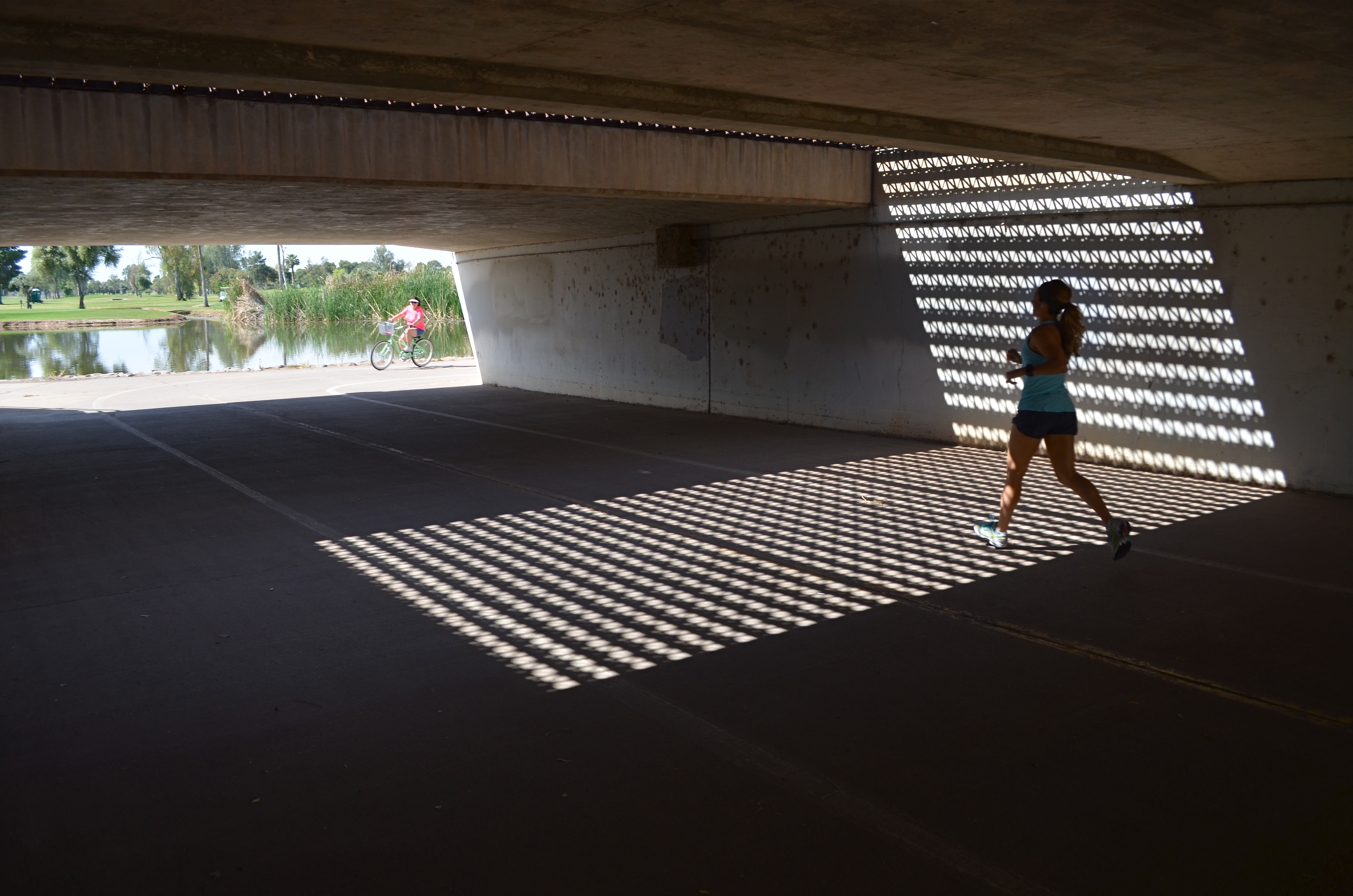
The jogger that saved my shot, albeit unwittingly. 1/250 sec., f/5.6, ISO 100, 18mm.
By MICHAEL PERKINS
THERE HAS BEEN A LOT OF MENTION, OF LATE, OF THE PHENOMENON KNOWN AS “PHOTOBOMBING“, the accidental or intentioned spoiling of our perfect Kodak moments by persons inserted into the frame at a crucial instant. Whether they block the bride’s face, eclipse Grandma’s beloved puppy, or merely pop up annoyingly behind the cute couple, they, and the images they ruin, are one of the hottest posting sources along the photo-internet galaxy right about now.
But fate photobombs us every day, and often drops a gift out of the sky, and into our pictures. The two-fold trick is to (a) be ready to improvise and (b) be grateful for the chance for something altogether different from what we originally conceived.
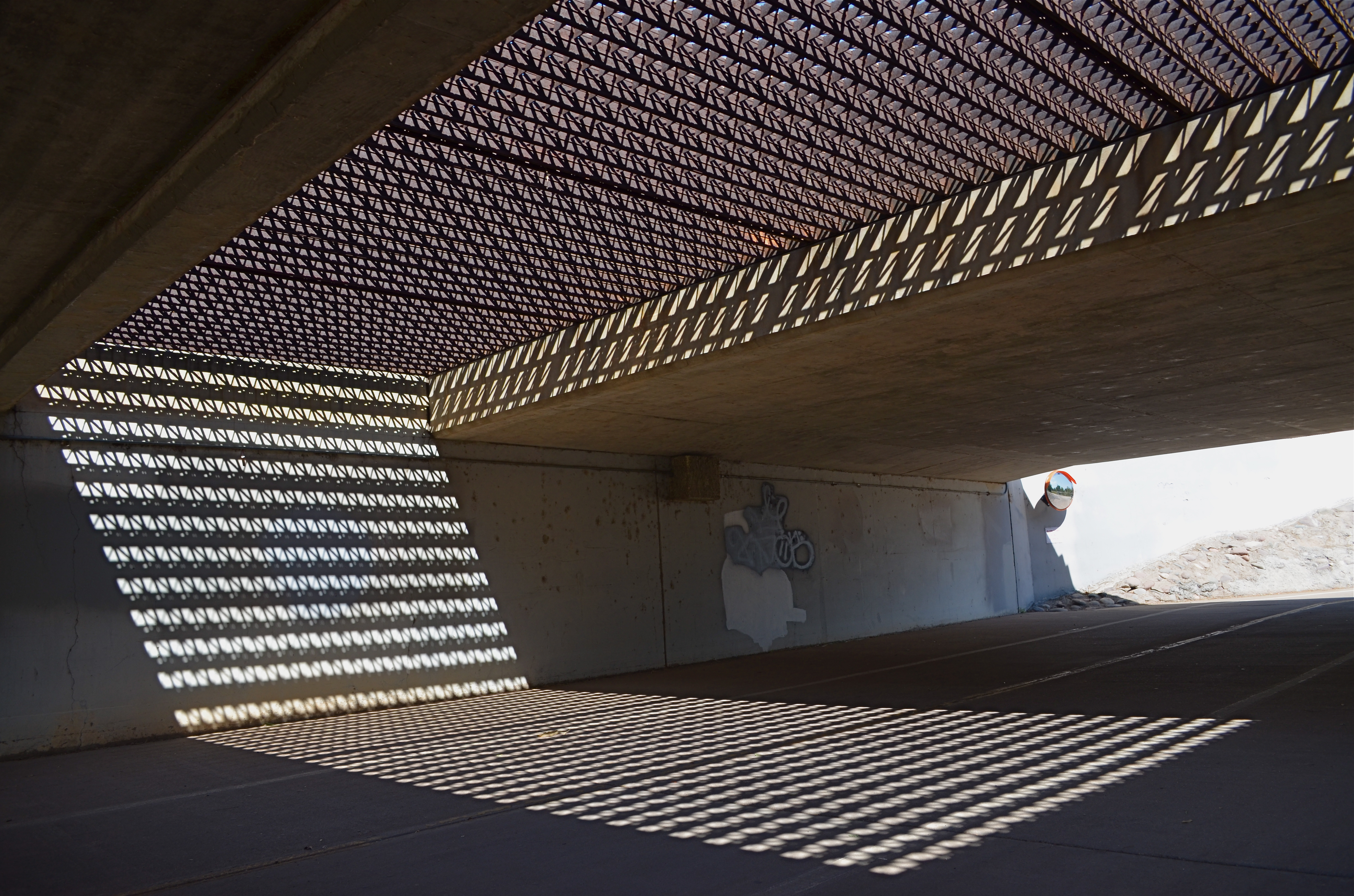
Happened to me several weeks ago. Total accident, since the thing I shot in the moment was not what I had started out for at all. Real simple situation:an underground walkway from one low-lying section of a city park to another, the sidewalk taking a short cut under a bridge. Overhead, six lanes of unheeding street-level traffic. Below, a concrete tunnel of sorts, with sunlight from the park illuminating either open end.
Oh, and the grate. Should mention that a section of the street overhead was, instead of solid roadbed, an open-pattern, structural steel grid, with dappled geometrics of light throwing a three-sided pattern of latticed shadows onto the side walls and floor of the tunnel below. Nice geometry. Now, I wasn’t looking to shoot anything down here at all. Like the chicken, I just wanted to get to the other side. But I had my wide-angle on, and a free light pattern is a free light pattern. One frame. A second, and then the bomb: a jogger, much more acquainted with this under-the-road shortcut than me, crossing from over my right shoulder and into my shot. Almost instinctively, I got her in frame, and relatively sharp as well.
Same settings as in the “jogger” frame, but a little colder minus the human element. A matter of taste.
Not content to have caught the big fish of the day, I took the opposite angle and tried again to recoup my “ideal shot”, minus the human element. But something had changed. Even so, I still needed a gentle nudge from Fate to accept that I had already done as well as I was going to do.
My battery died.
I limped home, then, during my upload, found that what I had been willing to reject had become essential. I wish it was the first time I’ve had to be taught this lesson.
But I’d be lying.
Photobombed by circumstance.
And grateful for it.
follow Michael Perkins on Twitter @MPnormaleye.
POP’S MAGIC PICTURE BOX (Father’s Day 2013)
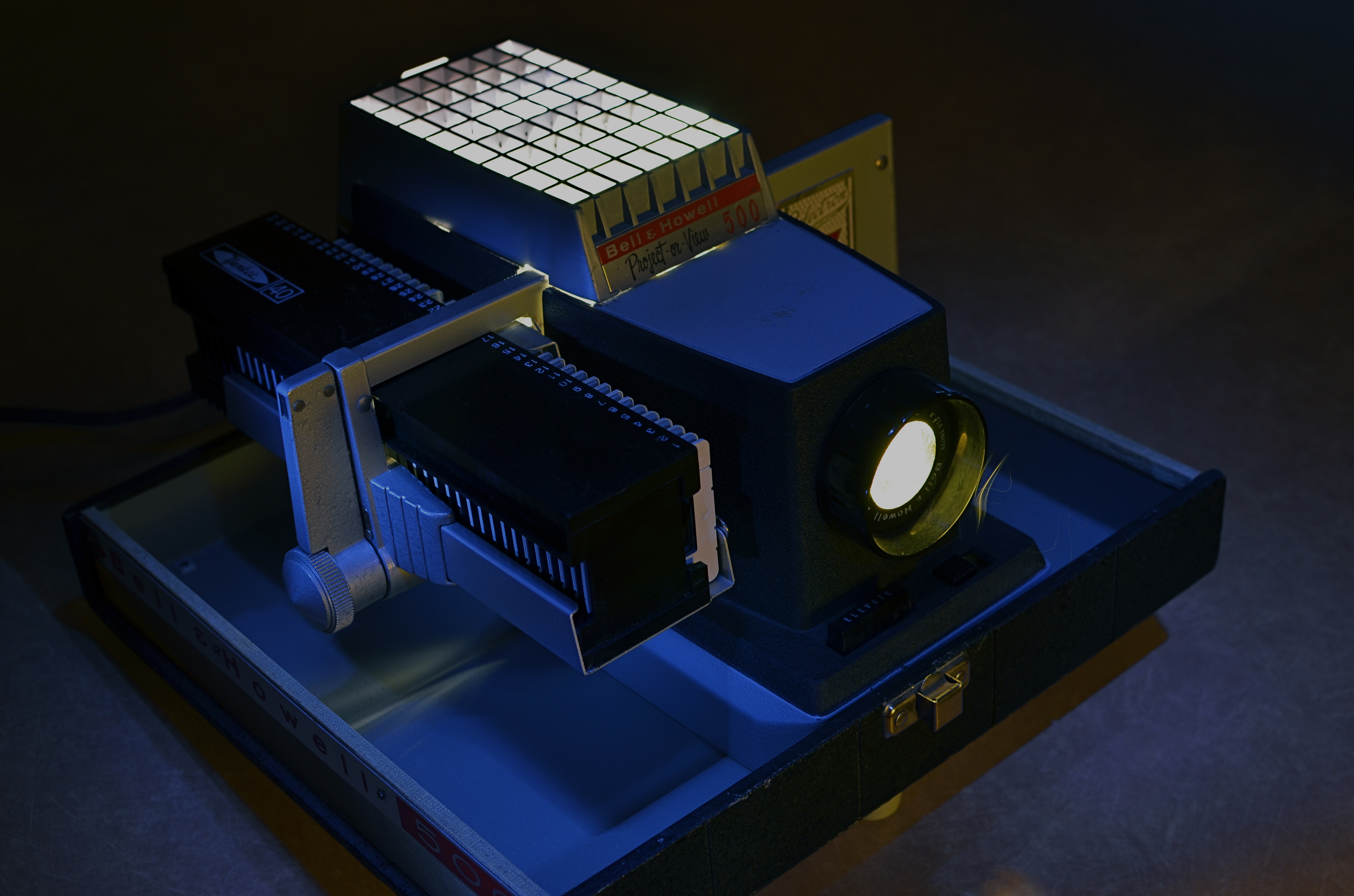
Magic in the darkness: my father’s Bell & Howell 500 projector, circa 1963. Image time-exposed and selectively light-painted in absolute dark. 10 sec., f/5.6, ISO 100, 35mm.
By MICHAEL PERKINS
YEARS AFTER, AS A YOUNG BOY, I FIRST SAW KODACHROME SLIDES PROJECTED ONTO OUR LIVING ROOM WALL, I learned that the first popular projectors had actually been called “magic lanterns” How right they were, and what an incredible spell these flashes of color and light wove for a little boy breathless in the familiar, yet miraculous dark.
It wasn’t that, as a family, we didn’t have dozens of albums crammed with traditionally processed prints of our most treasured moments. It’s just that, in the shadows, those clear, color-soaked images, half a wall in size, took on a life of their own. Bigger. More immediate. And as communal as a trip to the theatre. Only this was our theatre….our lore, our legend, writ large, compelling somehow in its size and scale.
Father’s Day is always a poignant time for me, since my life is insanely blessed. For me to be in the last third of my own life, and to still have the author of so many of my dreams still on the scene, still available to teach and direct my visions, as he did so ably then….well, it’s everything, that’s all.
As a father myself, I learned that it’s not always possible to transmit your passions to your children. Sometimes they don’t want to follow dear old Dad into whatever passionate pursuits he’s chosen for his own life. The fact that, sometimes, your kids “get” what even a part of you is really about is amazing, and, in the case of my father, I was lucky enough to be struck by the same lightning that hit him when it came to the graphic image….drawn or painted, realized in solid space in sculpture, or frozen on film. Photographs to him were another way of teaching himself to select, to edit, to choose something magical to depict or interpret, and he let me be the sorcerer’s apprentice.
Early into the Christmases of my adolescence, the power of our family albums was left in the dust as our memories began to shine and glow in our living room with the arrival of Dad’s new Bell & Howell 500 slide projector. It was Cinemascope, Cinerama, and the video wall from The Jetsons all in one, and I was mesmerized. The arrival of every yellow, flat box of new Kodak slides, all the way from the regional processing plant in Findley, Ohio, was like the reveal of a stage magician. I had caught the fever. I wanted to make pictures, too.
I wanted to make pictures like his.
The best statement I can make, all these years later, about the wonder of projected images was expressed several years ago on the Mad Men TV series, when adman Don Draper has the chance to make a fictional pitch to Eastman Kodak on how to market and name its new series of home slide projectors. And, even though our home projector used a “cube” tray instead of the wheel on Kodak’s “Carousel”, the magic was the same. Draper’s pitch began with the very essence of family memory:
“In Greek, ‘nostalgia’ literally means ‘the pain from an old wound’.
It’s a twinge in your heart, far more powerful than memory alone.
This device isn’t a spaceship, it’s a time machine. It goes backward and forwards, and it takes us to a place where we ache to go again.
It’s not called ‘The Wheel’. It’s called ‘The Carousel’ It lets us travel the way a child travels…around and around and back home again.
A place where we know we are loved. “
On this Father’s Day, as on every other, my heart is filled with memories and gratitude for the love that created them, but also a special thanks for a father who taught me the adventure, the patience, the joy of making an image. Armed with his trusty Kodak Pony 828, he taught me how to celebrate the triumphs and live with the failures, and, most importantly, to always go back to the well for another try. As both a photographer and graphic artist, he showed me that the concept is all, that it’s worth fighting for, worth worrying about, worth loving as your own special treasure.
Thanks, Dad. I love you.
Follow Michael Perkins on Twitter at MPnormaleye.
Related articles
- The best product placement in the TV shows (brandsandfilms.com)
- It’s a Magic Lantern (wordwenches.typepad.com)
WHAT’S YOUR TREE?
Detail of a restuarant that I’ve shot dozens of frames of, over the past five years. However, ask me if I could shoot it everyday for a solid year. I’m thinking not.
By MICHAEL PERKINS
ONE MAN’S DEDICATION IS ANOTHER MAN’S OBSESSION. Whether we view a person as passionately committed or someone who should just be, well, committed is largely a matter of perception. Nowhere is this truer than in the artistic world. Walk into any gallery, anywhere, and you will engage with at least one fixation on excellence that you believe is proof that grant money is dispensed far too freely. If this were not so, there would only be the need for one artist. The rest of us would be manning xerox machines. That’s why some people believe Thomas Kincade was a prophet, while other believe he was just, well, a profit.
Usually these debates are accompanied by too many beers, more than a few elevations in volume, and at least one person who gets his feelings hurt. Such is life, such is expression. We just guarantee your right to try it. We don’t guarantee anyone’s obligation to buy it.
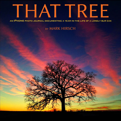 Discussion of the new book That Tree by Mark Hirsch (due in August) will fuel many such lager-lubricated chats, and some of them will be heated, I’m sure. The book actually demonstrates two separate obsessions, er, passions. First, Hirsch, a professional photographer, wished to create a substantial project for which he would set aside his Top Gun-level camera gear and shoot exclusively with his new iPhone. Second, early on in the project, he took the dare/suggestion from a friend to limit his subject matter to a single tree, an unremarkable bur oak that he had passed, without noticing, daily for almost nineteen years.
Think about this, now.
Looking back over the subjects that I personally have been drawn to revisit time and again, I’m damned if I can find even one with enough visual gold to warrant mining it for 365 images. the closest two subjects would be a small restaurant in Scottsdale, Arizona called Zinc Bistro, and the campus of cliffside art galleries at the Getty Center above Los Angeles. And I have cranked out a ton of frames of both subjects, looking for a truth that may or may not be there to see…but not a year’s worth. I personally believe that I might conceivably be able to find that much mystery and beauty in my wife’s face….in fact, I shoot her as often as I can. However, long before a project of this scope could be completed, she would have taken out a contract on my life. True love will only take you so far.
I have got to see this book.
Mark Hirsch will either become my new synonym for Latest Photo God Almighty or another amusing asterisk in the broad sweep of imaging history.He will also provide strong talking points for those who champion the iPhone as a serious photographic instrument. For that alone, the book has value.
Either way, it ain’t gonna be boring.
Follow Michael Perkins on Twitter @MPnormaleye.
Related articles
- Photographer documents a year in the life of a tree on his iPhone (guardian.co.uk)
