STREET PHOTOGRAPHY (LITERALLY)
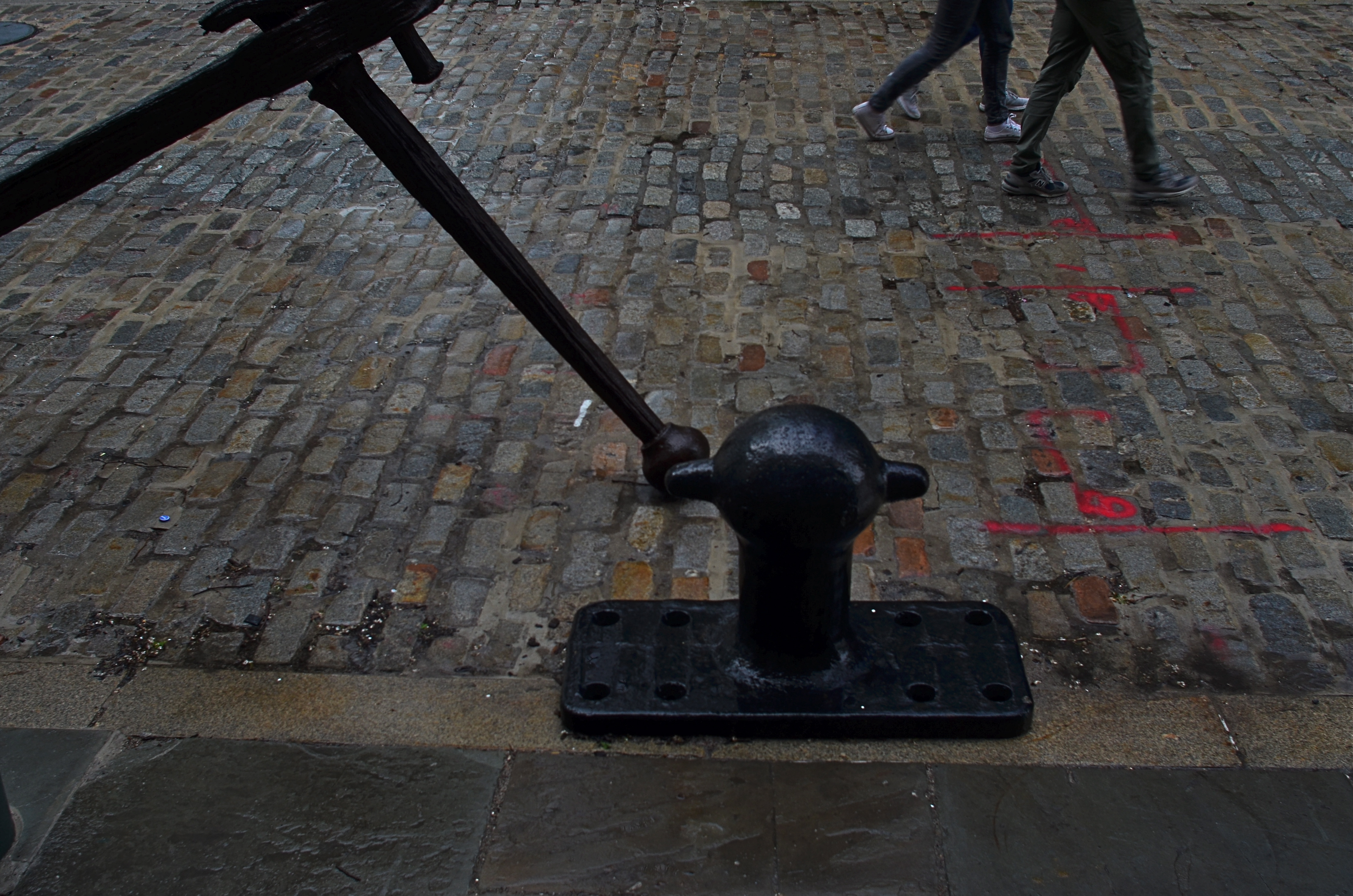
South Street Cobbles, 2016. 1/80 sec., f/5.6, ISO 100, 24mm.
By MICHAEL PERKINS
NEIGHBORHOODS HAVE THEIR OWN VISUAL SIGNATURES, and photographers looking to tap into the energy of streets do well to give their locales a bit of advance study, the better to try to read an area’s particular identity. Sometimes the storytelling potential lies in a single building, even a part of a building. Other times it’s the mix of foot traffic. And, every once in a while, the saga of a street lies in the pavement itself.
New York City’s South Street Seaport district is drenched in local lore, tracing the contours of its alleys and warehouses to the beginnings of Manhattan’s first days as an international shipping destination. From the times of the Dutch’s tall-masted sailing vessels to the present mix of museum and modern retail, the port, on a typical day, offers color, texture, and a feeling of deeply rooted history that is a goldmine for photographers.
Of course, every neighborhood has its off days, and, on my recent trek to the area, a persistent, wind-driven rain had chased all but the hardiest locals off the streets and into the oaky timbers of the port’s quaint shops. Life on the street slowed to a crawl as iron-grey skies robbed the scene of its bolder hues. It was a day to huddle indoors with a good read and a hot cuppa anything. My camera, usually an unfelt burden around my beltline, began to drag like an anchor, stuffed into my woolen jacket to ward off the pelting drizzle, giving me the appearance of someone in sore need of a hip replacement.
Despairing of finding any vital activity along the street, I turned in desperation to the pavement itself, realizing that, in this eastward edge of Manhattan, the texture of the roads abandons the even concrete of most of the island and reverts to the cobbled brick textures of Melville’s time, with many old waterfront fixtures installed at curbside for extra atmosphere. Suddenly I had a little story to tell. The varied mix of firings in the brick, along with the steady rain, delivered the vivid color that was lacking in the area’s shops, allowing me to create an entire frame from just the street itself. Finding that some scale was needed, I sought out an old iron fixture for the left edge of the photo with just the legs and feet of two passing girls to balance out the right side. Suddenly there was enough, just enough of something to make a picture.
Obviously, if the street had been mere wet concrete or blacktop, the impact would have been different, and, were I in a different neighborhood, the street itself might have been unable to compete with the businesses for color or interest. On that morning, however, simple worked best, and my camera, at least for a moment, felt less like an anchor and more like a sailing ship.
A CUT BY ANY OTHER NAME….

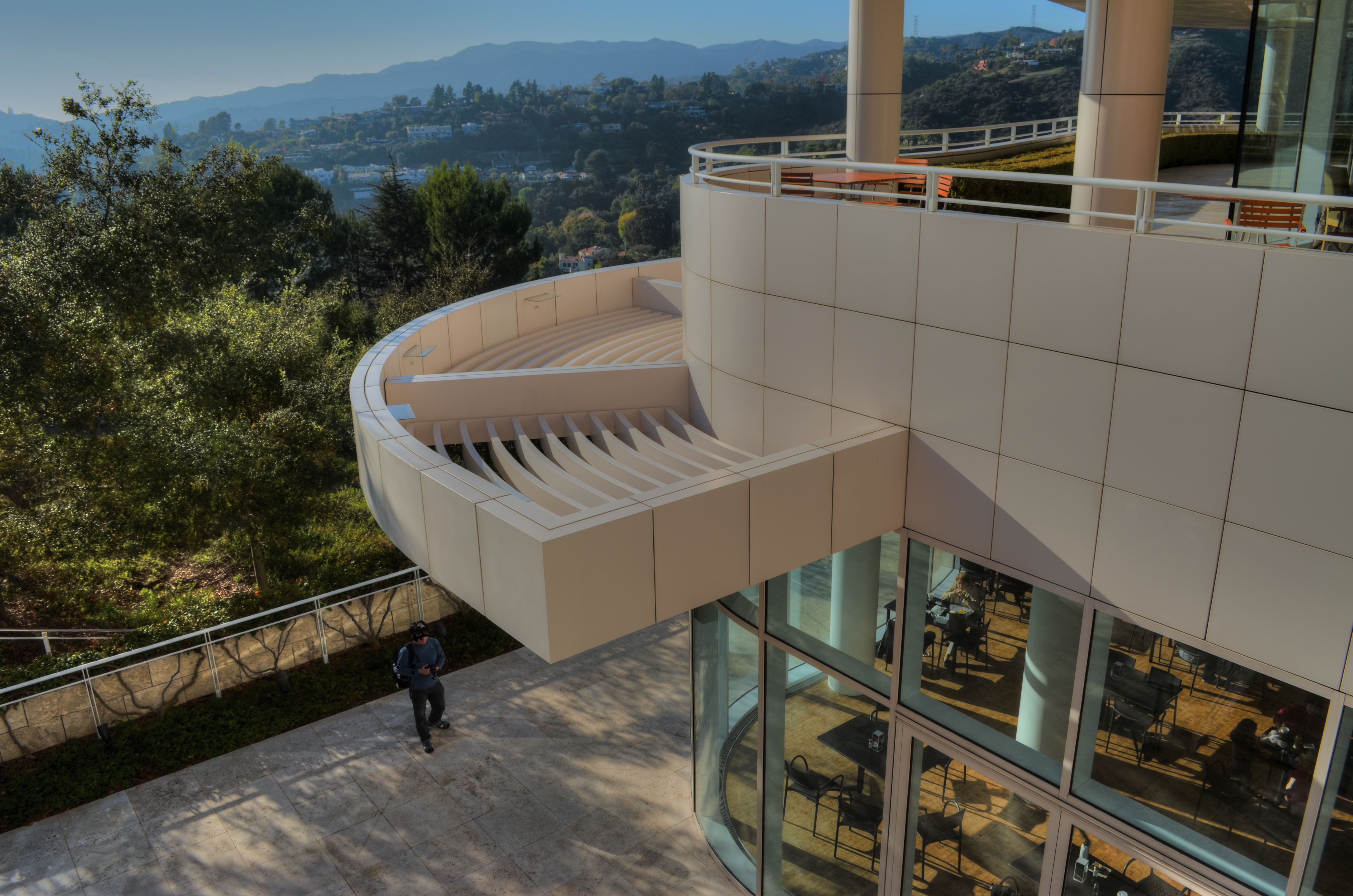
The first framing of this image included too much greenery on the right side, so it was cropped, then repositioned to make a “second” framing from the arched opening in the outer wall.
By MICHAEL PERKINS
THE WONDERFUL THING ABOUT COMPOSITION IN PHOTOGRAPHY is that you always, always, have a backup plan. What you don’t frame correctly in the actual shooting of an image can be corrected in post-editing cropping, the use of “framing” within the composition itself, or even how you finally matte the picture before hanging it on the wall. This is as it should be since many pictures are not so much born as re-imagined.
Once you frame a photo, you’re giving the viewer the first visual cue as to what to regard as important. If I included it, you should notice it. If I excluded it, it’s either to set loose your imagination on why I defined this world within these parameters, or because I, as the narrator, am telling you it just don’t matter. You can even further enhance the effectiveness of the frame by its shape. A rectangle might enforce the reading of information left-to-right, for example, while a square might force the eye toward dead center. The original framing is your own best call to action in a photograph.
And even after you’ve defined the frame, you can still add a second directive within it to hyper-focus attention in a very specific space. The use of arches, building overhangs, edges of windows, cliffs, shadows or other secondary “frames” provides even greater cues to the eye, and also adds an illusion of dimension and depth.
In the above shot, the old stone basilica is obviously the main feature of the image, and so was cropped from a wider original to eliminate distracting foreground shrubbery on the right. However, the arch through which the building is viewed was retained, to act as a “secondary frame” and as a way to illustrate scale. The first frame says what information is important, while the second frame makes sure we get to the heart of the image more efficiently.
Using all framing devices available in an image is like using caps, lower case and italicised letters in the same sentence. Composition is about yelling to get people over to your picture, then whispering, as you gently guide them toward its heart.
ALONE AGAIN, UNNATURALLY

Lunch For One, 2011. Your choices as a photographer will determine if the woman in the cafeteria is alone…or lonely.
By MICHAEL PERKINS
PEOPLE ARE ONE OF THE MOST COMPLICATED ELEMENTS in a photographic composition. Unlike furniture, foliage or flotsam, humans are the one “prop” in an image which convey associations and meanings that render a photo complex, troubling, intriguing. Put a person in your picture and you have changed the terms upon which you engage the audience.
At the very least, you have posed a series of questions which color the viewer’s reaction to your work. What is that person doing there? What does he wish for, or intend? What are his dreams, his goals? Is she merely in the picture, or in some way a commentary on her context within it? You can move things around in the name of composition alone, but move a person and you have started a conversation.
The original framing for the above shot.
The placement of people in a frame creates speculation about the motives and origins of those people before they were in the frame. A man shown standing at the platform at a train station could be eagerly awaiting an arrival, sneaking out of town, or merely wandering around. The mind starts to supply his backstory, if you like, his actions before appearing in the finite world of the frame. Put two people side by side, and you have, according to your viewer’s whim, a rendezvous, a goodbye, a conspiracy, a reunion, a chance meeting. People change the perceived intention of a photograph as a storyboard, either in the original framing or in the cropping afterwards.
The above image is the final crop of what was, originally, a scenic overview, taken at a large campus of museum buildings on a hillside. The image, as first conceived, was an overall “postcard” with the restaurant in only the lower right quarter of the frame. Later, I became aware that a single woman was visible in the cafe. Now, it’s not that she was actually the only person inside, but the photograph could be cropped to make her seem like it, meanwhile accentuating the emptiness in her immediate area.
As a consequence, instead of a lady who is merely alone, the image can make her seem “lonely”. Or perhaps you disagree. The point is that, by changing the human information in the frame (note that, in the original of the cropped shot, there is also a man standing outside the restaurant), we’ve re-drawn its narrative.
What gets left out of a picture, then, sparks speculation by the viewer, based on what has been left in.
A WONDROUS MESS

Too busy? Well, when it comes to seasonal shots, it’s a lot harder to say.
By MICHAEL PERKINS
Consulting the rules of composition before taking a photograph is like consulting the laws of gravity before going for a walk.
Edward Weston
PHOTOGRAPHERS LOVE TO COMPILE LISTS OF LAWS that must be obeyed to ensure the capture of great images. Bookshelves are jammed to fracturing with the collected works of wizards large and small who contend that all of this art stuff is really about craft, or adherence to techniques that are the equivalent of Einstein’s law. And, of course, with every fresh generation, a new slew of shooters come sneering along to deride this starched and stuffy discipline. All that matters, these young turks snigger, is my grand vision.
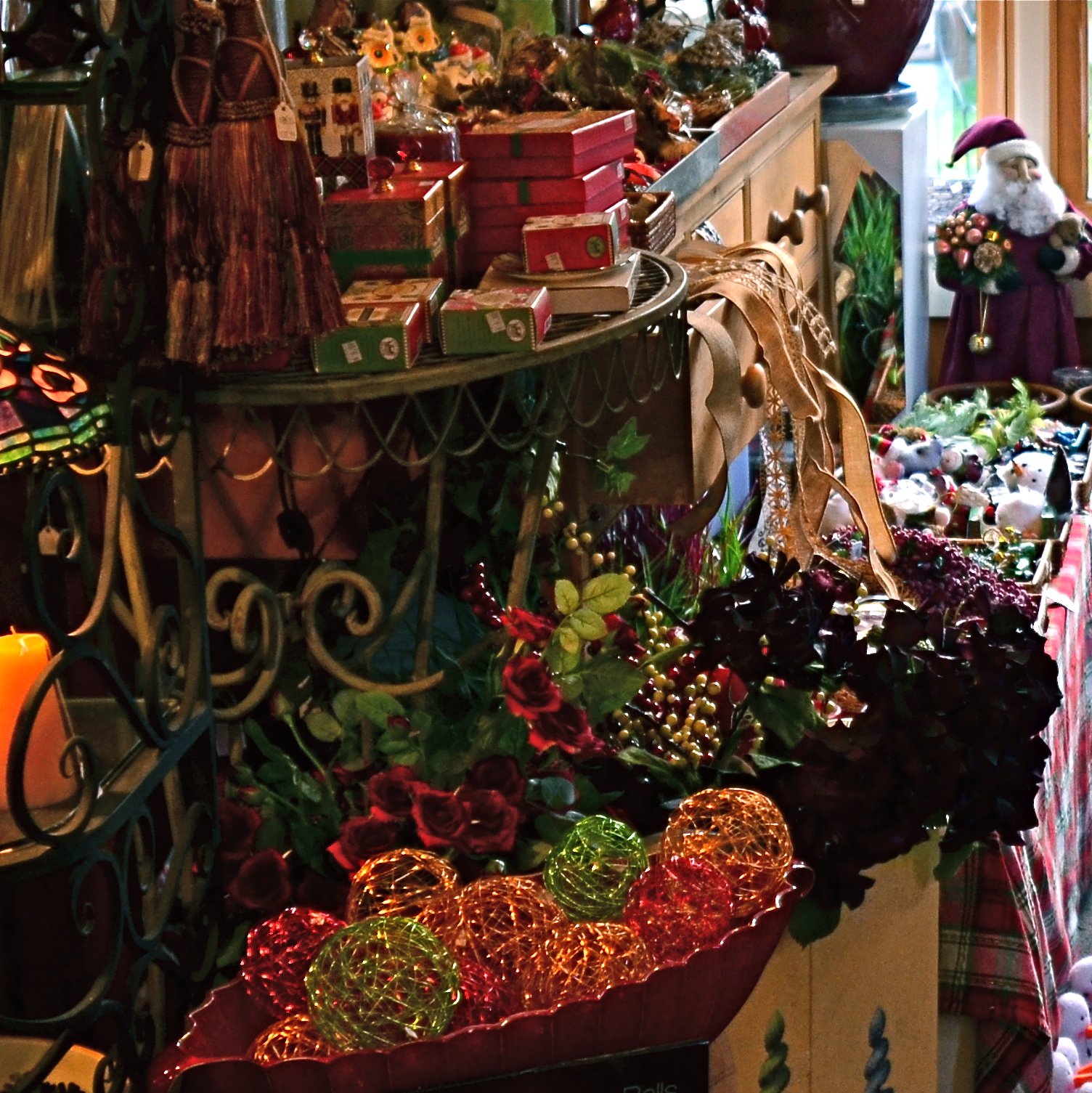
Worlds within worlds: many vast holiday scenes can be “subdivided with cropping.
Let me again re-state the obvious, which is that both viewpoints are correct and/or totally wrong. And since Mr. Weston has introduced the subject of composition, let us consider the special task of seasonal photos, specifically, arrangements of yuletide objects. The classic rule on still-life shots is that less is more, that it’s better to perfectly light and expose three pieces of fruit than whole baskets of the stuff. Meanwhile the festive, instinctual artist concedes that many holiday scenes are mad with detail and crammed with more, more, more…..and that’s okay.
The unique thing about Christmas decor is that in many cases, you not creating the compositions, but merely reacting to someone else’s creations…in nativity scenes, churches, and especially in retail environments. Obviously your local department store doesn’t adhere to the admonition “keep it simple”; quite the opposite. Seasonal trim in most stores is served up not by the spoonful but by the truckload. Anything less than overkill seems skimpy to many yuletide decorators, and so, if you favor basic subject matter, you’re either going to have to mount your own arrangements or selectively zoom and crop the more congested scenes. If, however, you already subscribe to the idea that more is better, then life gets easy fast.
Holidays come layered in much that is intensely personal, and that makes clean compositional judgements about “how much” or “how little” tricky at best. Just get the feelings right and let your regular rules relax into guidelines.
CASTING
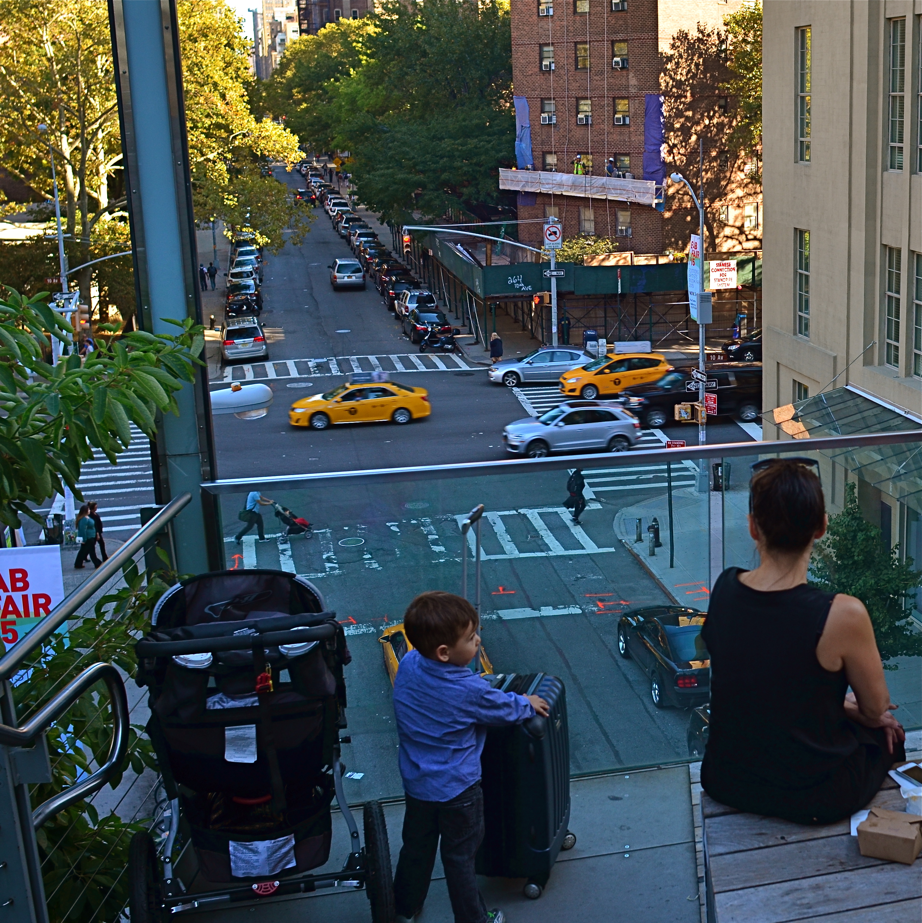
Do the woman and the child constitute a “family” in the narrative of this image?
By MICHAEL PERKINS
MORE COMPOSITIONS IN PHOTOGRAPHY ARE CRAFTED AFTER THE SNAP than naturally spring forward, fully formed, out of the camera. Frame as carefully as you may, you often find that something needs to change to help your image’s story fully emerge. This usually means taking something away, cleaning things up…and that means cropping. I think it’s fair to say that, more often than not, we start with pictures that contain too much and carve out the core picture that deserves to survive, to be pushed to the front.
Sometimes a proportionate tightening is all that a picture needs, so that a large, busy rectangle becomes a streamlined, smaller rectangle. This can clear away extraneous objects like phone poles, wires, extra buildings, any distracting junk that pulls the eye away from the important stuff. But it isn’t always things: it can also be people, surplus bodies which, like extraneous elements of any kind, change the narrative, or keep it from connecting. Think of the picture as a theatrical production and yourself as the casting director. Anyone on the set who doesn’t move the story forward is not playing a part that we need. See the girl at the office for your check, so long.
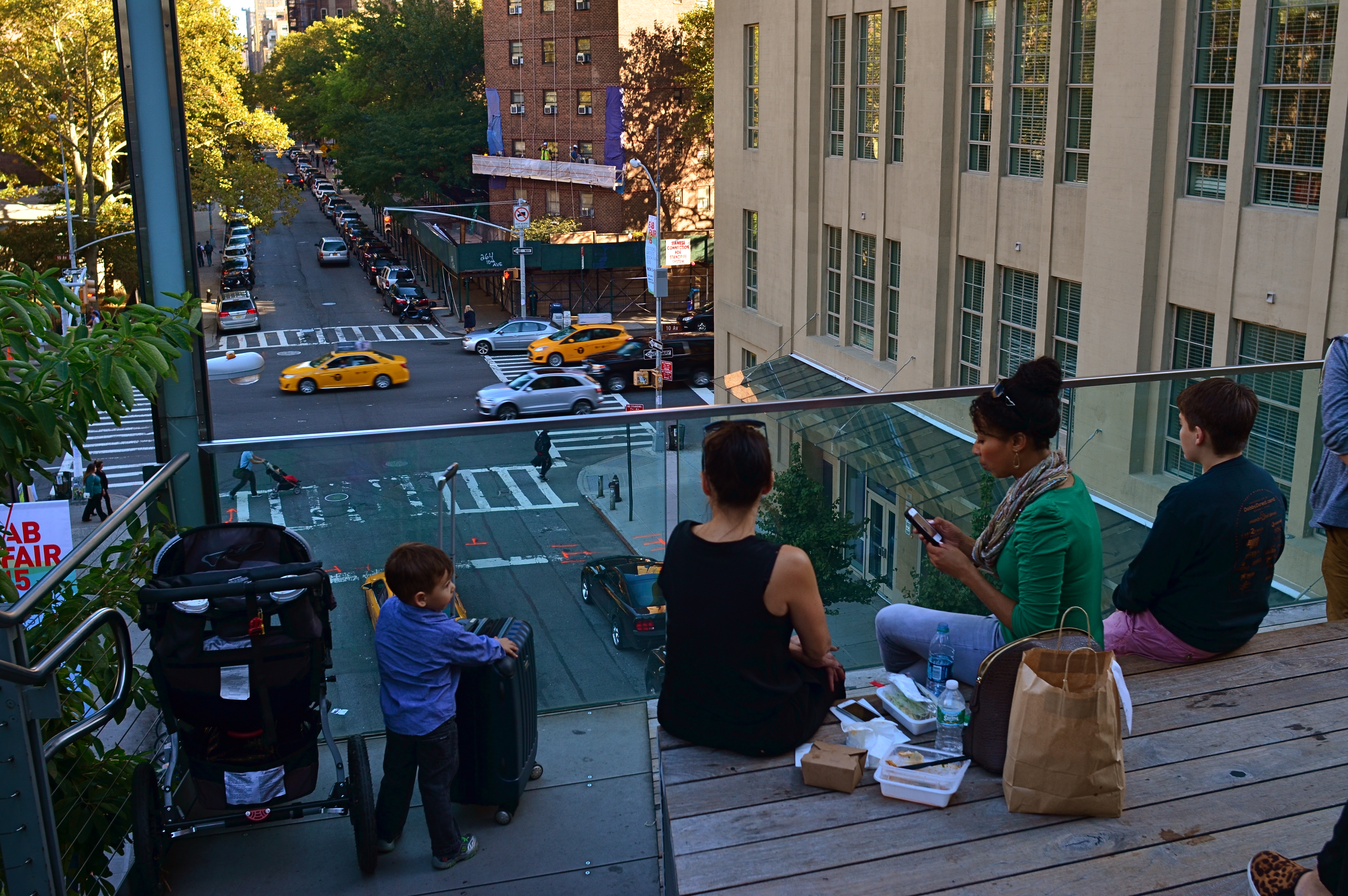
Does the removal of the extra people compromise or complete the photo’s story?
In the picture above, the cropping seems to create the story of a mother and her children taking in the view from New York’s Highline Park onto a city street below. In the original shot, seen at left, she seems less like a mother and more like just another bystander. The crop has suggested a relationship or a role for her. The woman to her right (in the original), unlike the “mother” figure, is not acting as our surrogate, seemingly looking with us at the scene. She is on her cel phone, and therefore registers as more detached than her neighbor, whose face, since it’s invisible to us, could contain anything we want it to. To the right of the cel user, we see additional people who don’t subtract from the picture, but also don’t add anything. They are extras that we, the director, have decided we don’t need to cast.
Also, structurally speaking, the “mother” is arranged so that the diagonal line from the foreground building to her right seems to proceed into the picture from around the area of her right shoulder, so that she sort of anchors the leading line and sends your eye along it to the street below. None of this, mind you, was obvious in the shooting of the original shot, which is not terrible as a composition, only compromised by the inclusion of information that simply doesn’t advance the logic of the picture. I only use it as an example of how I was able to question the “casting” of the original frame and make a conscious decision to cut away things that slowed everything down.
If you can tell a story with two people better than you can with four or five, ask yourself if you really need them. Cropping isn’t an admission that you made a bad photograph. It’s confirmation that your first draft is worth taking to a second one.
STAKES IN THE GROUND
We Seemed To Be The Entire World, 2015. 1/60 sec., f/5.6, ISO 100, 35mm.
By MICHAEL PERKINS
NO DOUBT YOU KNOW WHAT IT FEELS LIKE TO SEE A PICTURE IN YOUR MIND that, for some reason, doesn’t make it into the camera.
It’s maddening. That fumbling few inches between success and failure that cannot always even be sensed during the taking of an image, but which, somehow, is as wide as a river gorge once the picture comes out. Dammit, you saw it. More importantly, you felt it. But something in perhaps a technically perfect photograph fails to engage, and the thing just can’t close the sale.
Going further with the metaphor of salesmanship for a moment, there are pictures which, in a manner of speaking, don’t “ask for the order”. They don’t effectively say, here is the main point of interest. Look here, then there. The best photos are triptychs in that they have a sense of inevitable direction. Your eye senses where to travel with the frame.
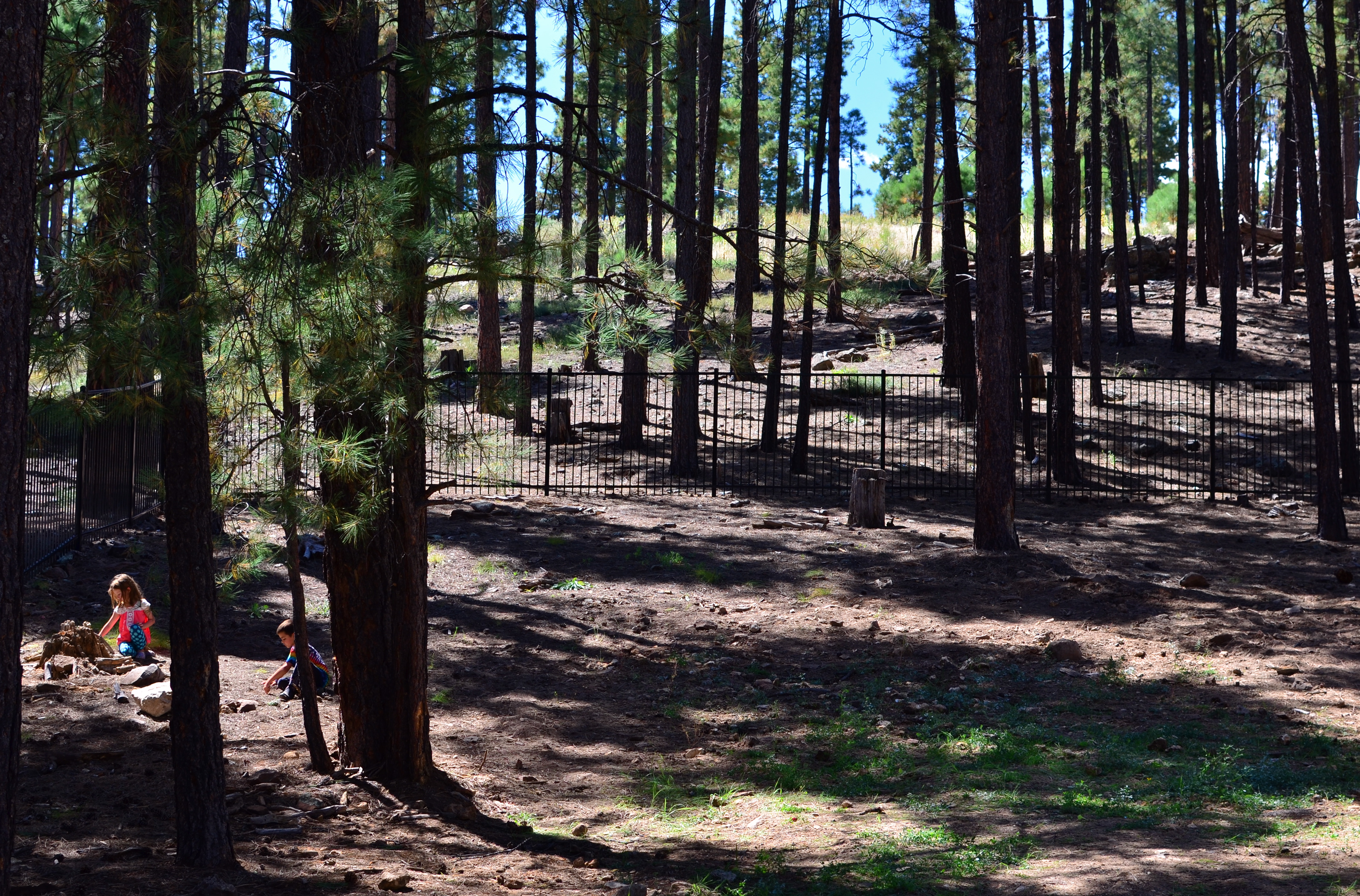
In the above forest scene, I nearly failed to provide that impetus because, in my first few shots, I was overly centered on getting the contrasty elements of the picture from fighting each other. Some trees came out like silhouettes. Some parts of the forest floor were way too bright. Somewhere along the line, I had decided that the picture was about solving those purely technical problems. Check those items off, I thought, and you’d have a real nice nature scene, or so it seemed at the time. Only one lucky thing intervened to change my mind and save the picture.
This comes under my general belief that most of the things you need to fix a composition are mere inches away from where you’re already standing. In this case, I moved a bit to the left of several trees and two small children swung into view, both of them representing a dynamic dollop of color in an overly bland palette of shades. Suddenly the picture was about these kids stealing away, inhabiting a quiet, separate world, their size dwarfed by the pines while giving measurable scale to the entire woods. They had found a complete reality away from everyone, and it would be easy to show that. Cropping to have them enter the frame at the bottom left corner helped direct the eye where I needed it to go first. Start here, and then look beyond.
It’s helpful to regularly dissect the pictures that almost had enough story to sell themselves. What stakes could I have pounded into the ground to mark the outline of the idea? Where did I fail to lay out the territory of the story?
It’s all about getting that image from your mind into the camera. That’s everything. That is, ever and always, the problem to be solved.
ONE STORY AT A TIME
Capital Capitol, 2015. A re-cropped and post-processed remix of a casual 2007 snapshot.
By MICHAEL PERKINS
BEING A MULTI-TASKER IS NO LONGER A MATTER OF CHOICE. We love to pretend that we’re adept at turning off selective parts of the hurricane of sensory input that comprises the whole of our daily life, but, fact is, we cannnot. You might be able to do as few as three things at a time in this world, but only if you struggle against a constant cacophony of sensations.
Unfortunately, creating art sometimes requires quiet, clarity, the ability to edit out unwanted sights and sounds in order to find a clear path toward a coherent vision. And this impacts photography as well as any other creative enterprise.
The 2007 original, taken from a NYC Circle Line tour boat.
Urban life presents an especially big challenge to this urge to “get clear”, to untangle conflicting stories and draw out clean, direct messages for our images. Major cities are like 24-hour whistle factories, with thousands of things screaming for our attention. Thing is, there just isn’t enough attention to go around. Often, in poring over old projects, we find that a fourth, a third, even half of the information in a picture can be extracted in the editing process and still leave more than enough data to get our point across. And herein lies a problem.
If it’s getting harder and harder to edit in the moment to boil a photograph down to its essence, the editing phase becomes more crucial than ever before. You either get the best picture in the taking or in the remaking. It can be argued that practice helps the photographer learn to quickly ferret out simple stories within a mass of visual noise, and, of course, the more you shoot, the more you learn what not to shoot. But it seems inevitable that editing, and re-editing, will become a bigger part of the overall task of making pictures.
If the weakest of your photographic skills is post-processing, you might strongly consider upping that particular part of your game. The world isn’t slowing down anytime soon. It’s great to know, in an instant, how to make a strong image. But, as my dad always said, that’s why God put erasers on pencils. Editing can be where acceptable pictures buff up into contenders.
THE ABCs OF TMI
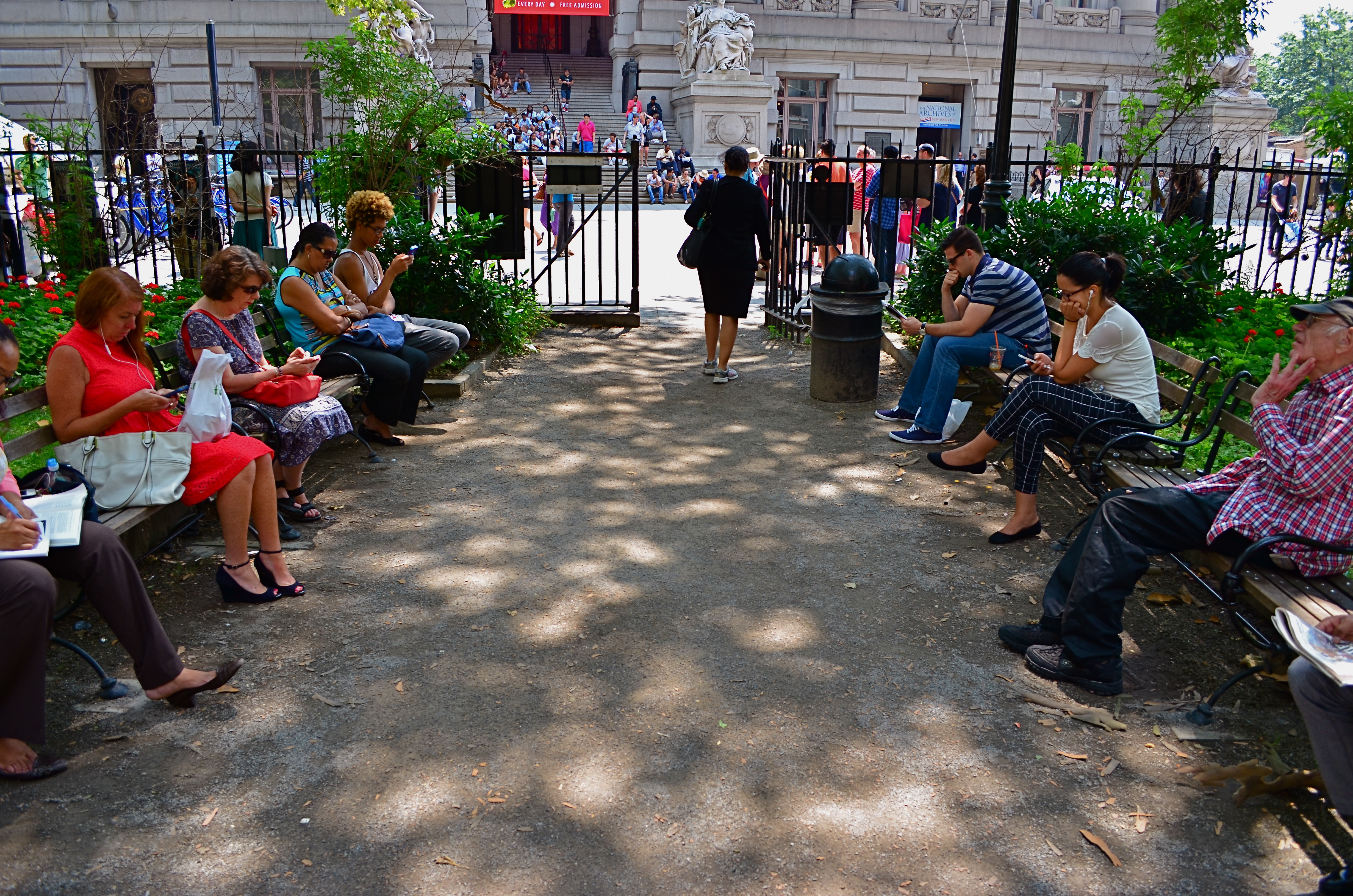
This street shot from a park in lower Manhattan is not ready for prime time, but it might get there with creative cropping.
By MICHAEL PERKINS
FOR ME, ONE OF THE GREATEST ANCILLARY BENEFITS of doing historical research has been the privilege of poring over old files of newspaper and magazine photographs, in many cases viewing original, pre-publication master shots. It’s truly an exercise in reading between the “lines”, those hurried slashes of white grease pencil applied by editors as cropping instructions on shots that were too big, too busy, too slow in getting to the point. In many cases, you realize that, while the photographer may have taken the picture, it was the editor who found the picture.
Of course, no amount of cutting can improve a shot if there is not already a core story hiding within it. You can pare away the skin and seed of an apple, but some apples prove themselves rotten through and through. It’s the same with a photograph. However, if you teach yourself how to spot what, within a frame, is fighting with the central strength of a photo, it becomes obvious where to wield your scissors.
In the master shot image at top, the symmetry of the left and right groups of park visitors is blunted in its effect by the unneeded information along the top and bottom thirds of the frame. The shot is not really about the museum in the distance nor the ground in front of the benches. They just don’t help the flow of the picture, so losing them seems like the easiest way to boost the overall composition.
Now the shot is essentially a wide-angle, and, absent the earlier distractions, a kind of horseshoe curve emerges, tying the two benches together. You might even think of it as an arch shape, with the walking woman at the top acting as a keystone. She now draws attention first to the center, then around the curve, so that getting people to see what I am seeing becomes a lot easier. Finally, there is still a very loud distraction from the color in the shot, so a black-and-white remix keeps the reds and louder colors from “showing off” and lessening the impact of the story. The final result is still no masterpiece, but it does demonstrate that there was a very different picture hiding within the master shot, one that was certainly worth going after.
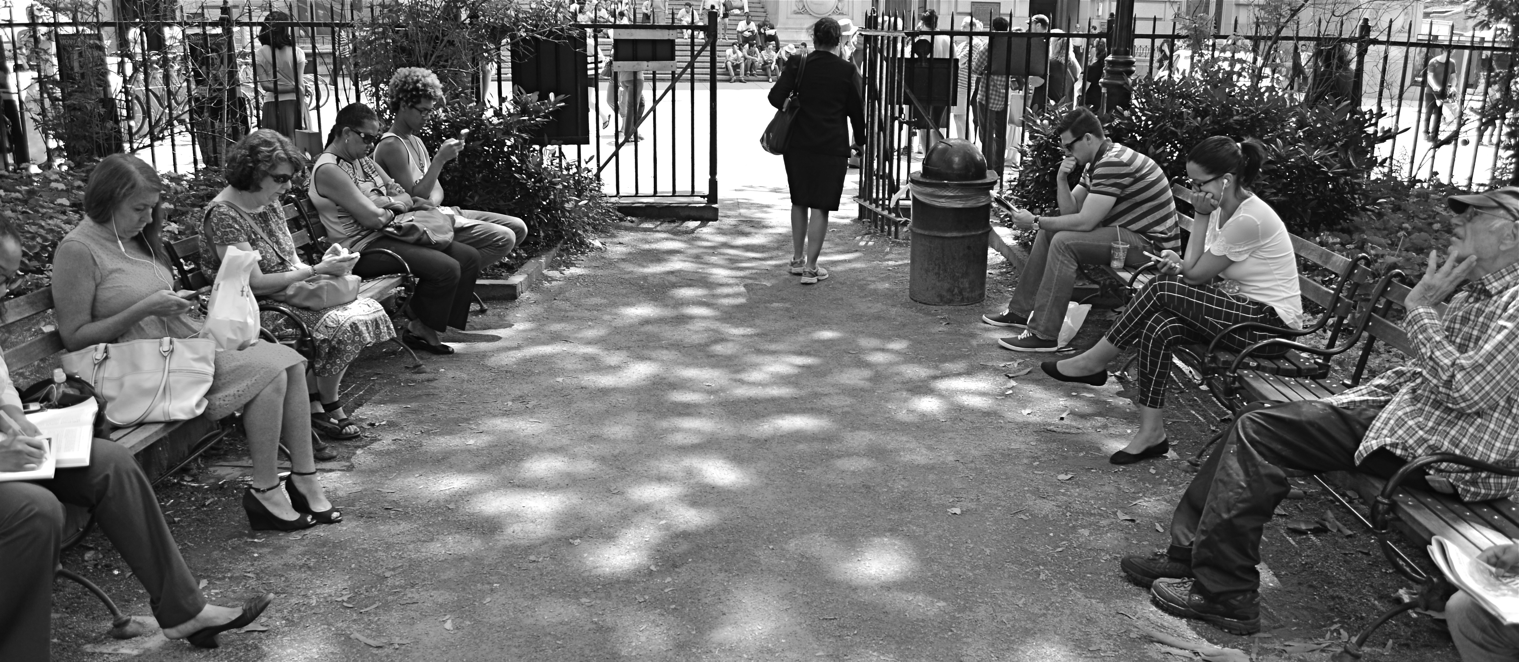
The “after” version, minus the color and some high-and-low-end visual distractions.
One of the downsides of being an amateur shooter is not reaping the benefit of a ruthless photo editor. However, learning to spot the weaknesses in potentially effective shots can be learned, most importantly the “ruthless” part. If you believe in an image, you won’t shy away from trimming its fingernails a bit to give it a chance to shine.
THE TAKEAWAY
The girl bathed in ceiling light is a nice start, but this picture needs some help to get where it’s going.
By MICHAEL PERKINS
IT IS SAID THAT THE GODDESS ATHENA WAS BORN, FULLY GROWN AND ARMORED, out of the forehead of Zeus. Other than being the only case where a man experienced anything that approached labor pain, the story always reminds me that ideas rarely arrive in their final form, especially in photography. If Athena had a Leica, she probably could have taken perfect shots without needing to compose or plan. We mere mortals are forced to either (a) report to hate-crazed photo editors, or (b) learn how to crop.
Many shots are created in stages, and there’s no shame in the game, since our original conception undergoes many phases from the first spark to something we’d actually hang on a wall. Creation itself is a process, which is why photographers should actually embrace the stages their work will pass through. The more thought that is applied to making an image, the better chance that the best way of doing something will reveal itself. Of course, it can also reveal the fact that there is nothing really to work with, in which case, hey, the bar should be open now, let’s go lick our wounds.
The original shot shown above is not yet a good photograph, but a good beginning for a  photograph. The lady bathed in light seems certainly to have been pre-selected to be the focal point of the picture, but there are way too many competing elements around her, robbing her of the prominence she deserves in the final frame. So let’s get after it.
First, none of the information on the left side of the frame makes it any clearer that she’s alone or that she’s on the second floor of the building. We can make that plain with half the acreage, so snip. Similarly, the guys in shadow to her right aren’t part of the story we are crafting for her. If she’s isolated, let’s make her isolated and be unmistakable about it. She’s “apart” already from the sea of people below her. She’s geographically and physically separated from them, but the extra guys make the argument weaker, so, snip, away they go.
Finally, the entire upper-floor/lower-floor line of sight will be accentuated if we crop for a portrait orientation and move the frame so she is on the upper-right-hand corner of it. It forces the eye to discover the story of the picture vertically, so snip and we’re done.
So, at the end, we did not make any changes via processing, only the old scissors. Taking things away, not adding them on, actually made the picture work better. Fate gave me the girl and the wonderful light she was bathed in, but there was work to do. She didn’t arrive, ready to party, like Athena, but she’s a little closer to goddess status after some adjustment.
THE FLOATING 50
From Lobby To Terrace, 2015. A near 50% crop from the original, seen below at left.
By MICHAEL PERKINS
YOU CANNOT BECOME A GREAT PHOTOGRAPHER WITHOUT BEING YOUR OWN BEST EDITOR, no matter how brilliant or instinctual your shooter’s eye may be. Art is both addition and subtraction, and the image frame is about both inclusion and exclusion. You get your viewers’ attention by knowing what to show. You hold that attention, and burn your images into their minds, by learning what to pare away.
I’ve written several variations on this theme, so the best way to restate it is in the voice of the truly visionary godfather of street photography, Henri Cartier-Bresson. Ironically, this master of in-camera composition (he is reputed never to have cropped a single shot after it was taken) was nonetheless remarkably aware of what most of us must do to improve an image through post-editing:
This recognition, in real life, of a rhythm of surfaces, lines, and values is for me the essence of photography; composition should be a constant of preoccupation, being a simultaneous coalition – an organic coordination of visual elements. We must avoid snapping away, shooting quickly and without thought, overloading ourselves with unnecessary images that clutter our memory and diminish the clarity of the whole.
Insert whatever is French for “Amen” here.

The original. It’s easy to see what needs to be cut out of this one.
I often find that up to 50% of some of my original shots can later be excised without doing any harm to the core of the photograph, and that, in many cases, actually improving them. Does that mean that my original concept was wrong? Not so much, although there are times when that’s absolutely true. The daunting thing is that the 50% floats around. Sometimes you need to cut the fat in the edges: other times the dead center of the shot is flabby. Sometimes the 50 is aggregate, with 25% trimmed from two different areas of the overall composition.
On occasion, as with the above picture (see the original off to the left), the entire bottom half of the shot drags down the top. In the cropped shot, the long lateral line between indoors and outdoors is much more unbroken, making for a more “readable” shot from left to right. The disappearance of the dark furniture at the bottom of the master shot creates no problems, and actually solves a few. Do a disciplined search of the nobler near-misses in your own work and see how many floating 50’s you discover. Freeing your shots of the things that “clutter our memory and diminish the clarity of the whole” is humbling, but it’s also a revelation.
WHEN TEXTURE IS THE TALE
By MICHAEL PERKINS
THOSE WHO BELIEVE THAT SUBJECT MATTER IS KING IN PHOTOGRAPHY ARE FACED OFF in an endless tennis match with those who believe that only impressions, not subjects, are the heart of the art. Go away for fifty or sixty years and they are still volleying: WAP! a photograph without an objective is a waste of time! WAP! who needs an object to tell a story? Emotional impact is everything! And so on. Pick your side, pick your battle, the argument isn’t going anywhere.
Thing is, my assertion is that you don’t actually have to choose a side. Just let the assignment at hand dictate whether subject or interpretation is your objective. There are times when the object itself provides the story, from a venerable cathedral to an eloquently silent forest. And there are times when mere color, light patterns, or texture are more than enough to tell your tale.

Set Your Face Like Flint, 2014. Shot wide at 18mm, cropped to square format. 1/100 sec., f/5.6, ISO 100.
I find, for example, that texture is one of my best friends when it comes to conveying a number of important things. The passage and impact of time. The feel and contour of materials, as well as the endless combinations and patterns they achieve through aging and weathering. A way to completely redefine an object by getting close enough to value its component parts instead of viewing it as a whole. This is especially true as I try to refine my approach to images of buildings. I find that breaking the overall structure into smaller, more manageable sections helps to amplify texture, to make it louder and prouder than it might be if a larger scene just included the entire building among other visual elements. Change the distance from your story and you change the story itself.
This Massachusetts barn has tons of character whether seen near or far, but if I frame it to eliminate anything but the raw feel of the wood, it demands attention in a completely different way. It asks for re-evaluation.Contrast the rough-sawn wood with the hard red of the windows,and, again, you’ve boosted the effect of the coarser texture. Opposing textures create a kind of rudimentary tug-of-war in a picture, and the more stark the contrasts, the more dramatic the impact.
Traditional, subject-driven story telling will dictate that you show the entire barn, maybe with surrounding trees and a rolling hill or two. Abstracting it a little in terms of color, distance and texture just tell the story in a distinct way. Your camera, your choice.
GO OUT AND COME BACK IN AGAIN
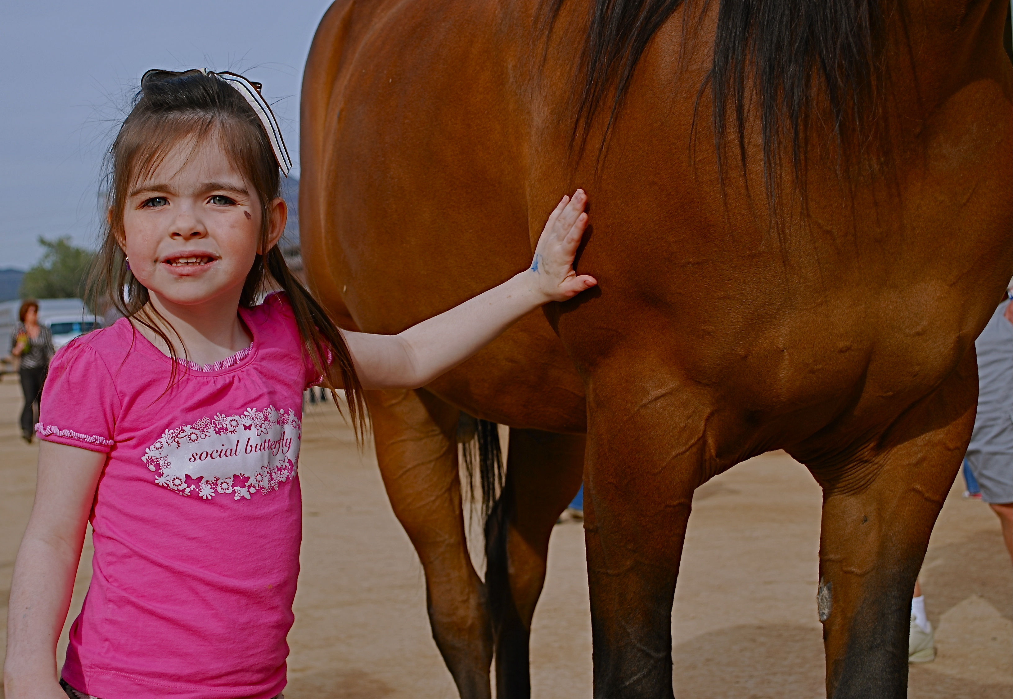
Thought the cute kid would be what this picture was “about”. Guess I was wrong.
By MICHAEL PERKINS
SEPARATING ONE’S IMAGES INTO “HIT” AND “MISS” PILES is always painful, since it’s kind of like telling some of your kids that they will be power hitters in Little League while their siblings should take up…well, macrame. But self-editing, over time, is nearly as important as shooting, and the mindfulness of asking “what was I thinking” is the useful corollary to “what do I want to do next?” That don’t make it smart any less, but at least you understand the pain.
Usually I hurl photos into the “miss” box for purely technical reasons, which means that I should have known what to do and just blew it upon execution. I’m more exacting nowadays, because present-era camera make it tougher to absolutely boot a shot, although I have striven to stay ahead of the curve and make lousy pictures even in the face of rapidly advancing technology. People who think they’ve idiot-proofed their gear have never met this idiot, I boast. It’s a point of pride.
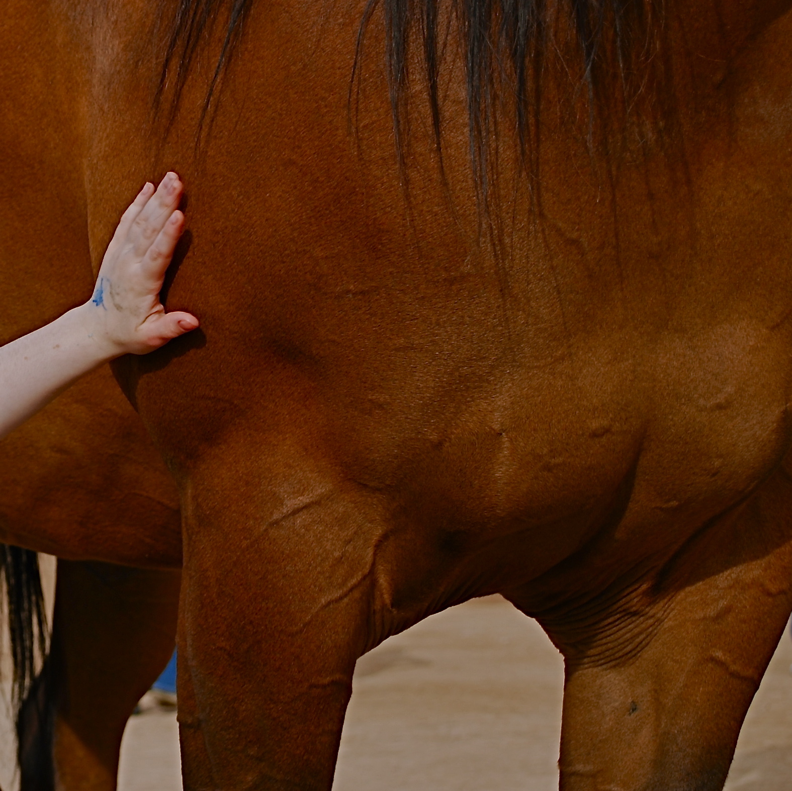
Cropping the image got to the main impact point lurking within.
Occasionally, though, you review a shot that was okay exposure-wise, but completely got the narrative wrong. Sometimes you can recompose the shot and redress this problem, and sometimes you’re just sealed out of the airlock with no oxygen. That’s the breaks. In the original image at the top of this page is a candid of a little girl next to a horse that I thought would be charming. Cute kid, nice horsie, you get the picture. Problem is, I never really captured her essence in any of the photos I shot (trust me) and I framed so tight that I was only showing the horse’s body. First verdict on this one: thanks for playing our game, sorry to see you go, here are some lovely parting gifts.
However, as a rainy day project, the photo suddenly presented a different way for me to go. It wasn’t that I had shown too little of the horse; it was that I had shown too much of both the horse and the child. The central part of the image, taken by itself, had a narrative power that the larger frame lacked. To crop so that just a part of the girl’s small arm connected with the strong, muscular torso of the horse magnified his power by contrasting it with her fragility. I wasn’t losing the horse’s face, since it hadn’t been in the original, and losing the girl’s face actually improved the impact of the image by reducing her to an abstraction, to a symbol of innocence, gentleness, but above all, contact. We could deduce that the horse and the girl were friends. We didn’t need to see it reflected in their features.
Sometimes an image we are ready to reject is hiding a more concentrated fragment that saves the entire thing, if we are unafraid to pare away what we once saw as “essential”. It’s the go-out-and-come-back-in-again school of thought. It’s at least a seeing exercise, and you gotta flex them eye and brain muscles at every opportunity.
BREAKING THE BOX
The picture shown here was spoiled by tilting the camera sidewise. The whole scene seems to be “running downhill”. Unless you are trying for an unusual effect, hold the camera level. – How To Make Good Pictures, c) 1943 The Eastman Kodak Company
By MICHAEL PERKINS
ONE OF THE CARDINAL RULES OF PHOTOGRAPHIC COMPOSITION IS THE MAINTENANCE OF A PAINTER’S VIEW OF THE WORLD, and it needs to be abandoned as irrelevant to picture-making in the current era. I’m talking about one of the Photography 101 rules we all inherited from the medium’s 19th-century beginnings, which is the unyielding reverence for “the box” as a framing device.
You know the admonition, and can recite it out of a million amateur guides: the parameters of your photo must be a dead parallel line top and bottom and two perfectly perpendicular verticals for the left and right sides. Call it the “out the window” orientation or the painter’s frame, or perhaps the “God’s in his heaven, all’s right with the world” concept of a perfect clockwork universe. Whatever the term, this unbending admonition became common to every amateur book on photographic instruction since forever. Tilting was bad. Bending the frame or composing within an abstracted version of it was really bad. Calling attention to the frame instead of letting it remain invisible was amateurish.
I’ll tell you what’s bad: doing everything the same way, forever, and expecting to grow as a photographer, or as an anything.
Framing in photography sets the visual grammar of an image. It lays out the rules of engagement as much as anything that’s contained within it. It can be an artistic statement all in itself, and needs to be thought of as a deliberate choice, no less than camera settings or subject matter. The square or rectangle is not a mathematical commandment. Like every other element of making images, it needs to justify itself for the picture at hand. What is right for this instance?
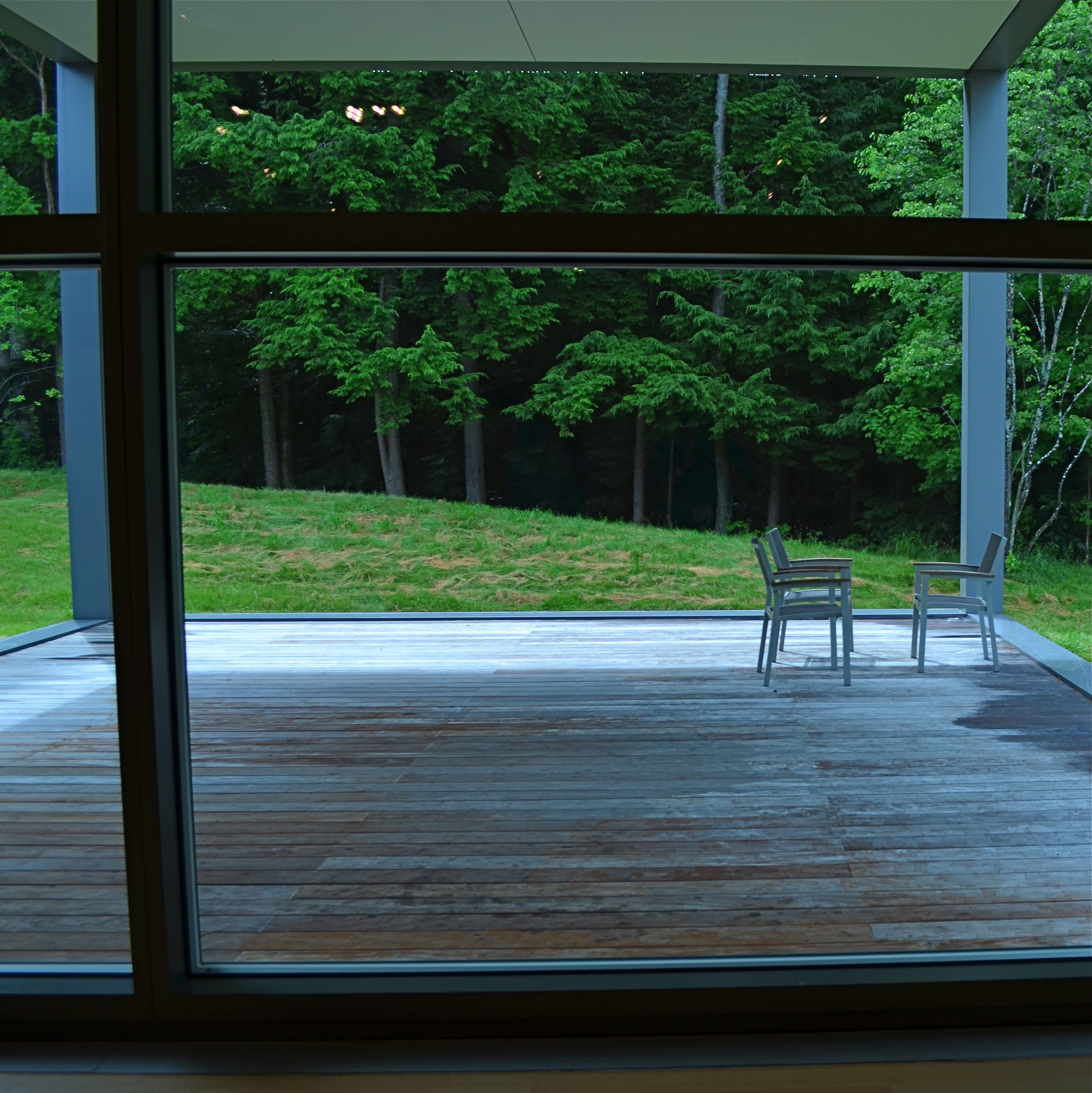
Would this image have worked better inside a completely standardized framing?
The image seen here is a very calm and unchallenging composition. I liked the small number of elements presented by the stark little porch and the rich but mysterious patch of forest. But in both the shooting and the cropping, I decided to subtly re-jigger the frame to include structural parts of the porch and the window through which I shot the scene, throwing off the perfect geometry of vertical and horizontal, resulting in a look that is a little off-kilter. I tried looking at the shot without any of these parts, and the picture looked too pat, too passive, whereas creating an imperfect square with them gave the photograph just a little edge. Not a slam-you-over-the- head effect, just a slight bit of visual punctuation.
Call it the difference between a colon and semi-colon.
As for the Eastman Kodak Company’s caution that you should maintain the standard frame unless you “are trying for an unusual effect”, well, aren’t you doing that every time you step up to bat?
If not, what’s the point?
REDUCTION OF TERMS
1/320 sec., f/5.6, ISO 100, 35mm.
By MICHAEL PERKINS
To me, photography is an art of observation. It’s about finding something interesting in an ordinary place. I’ve found it has little to do with the things you see, and everything to do with the way you see them. —Elliott Erwitt
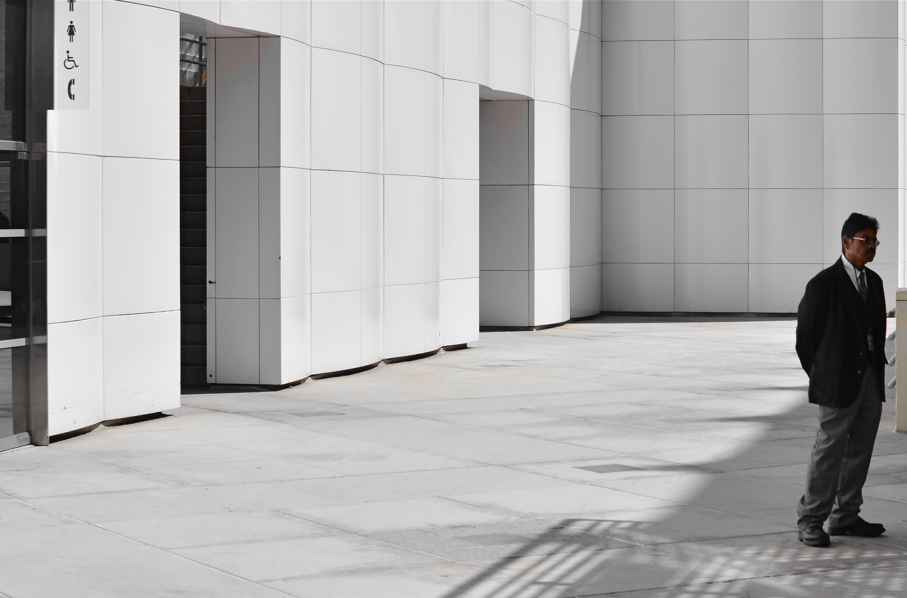
ISOLATION IS A TRULY IRONIC CONDITION OF THE HUMAN ANIMAL. The strange thought that, for most of our lives, we are both awash in a sea of other people and totally alone is one of nature’s most profound paradoxes. Photography shows people in both of these conditions, and shooters must choose what illuminates a person’s story best—-his place among others or his seeming banishment from them. Sometimes both truths are in the same frame, and then you must, as Elliott Erwitt says, alter the way you see in favor of one or the other.
In the case of both of the images posted here, the person who “solely” occupies the frames was originally a stray element within a larger context, with the pictures framed, at first, to include nearby persons or crowds. On further examination, however, one or two compositional elements in each of the pictures convinced me, in both the case of the museum guard and the hurried gallery guest, that they could “hold” the pictures they were in without any other human presence in view, and so I created their isolation, something that was not their natural condition at the time.
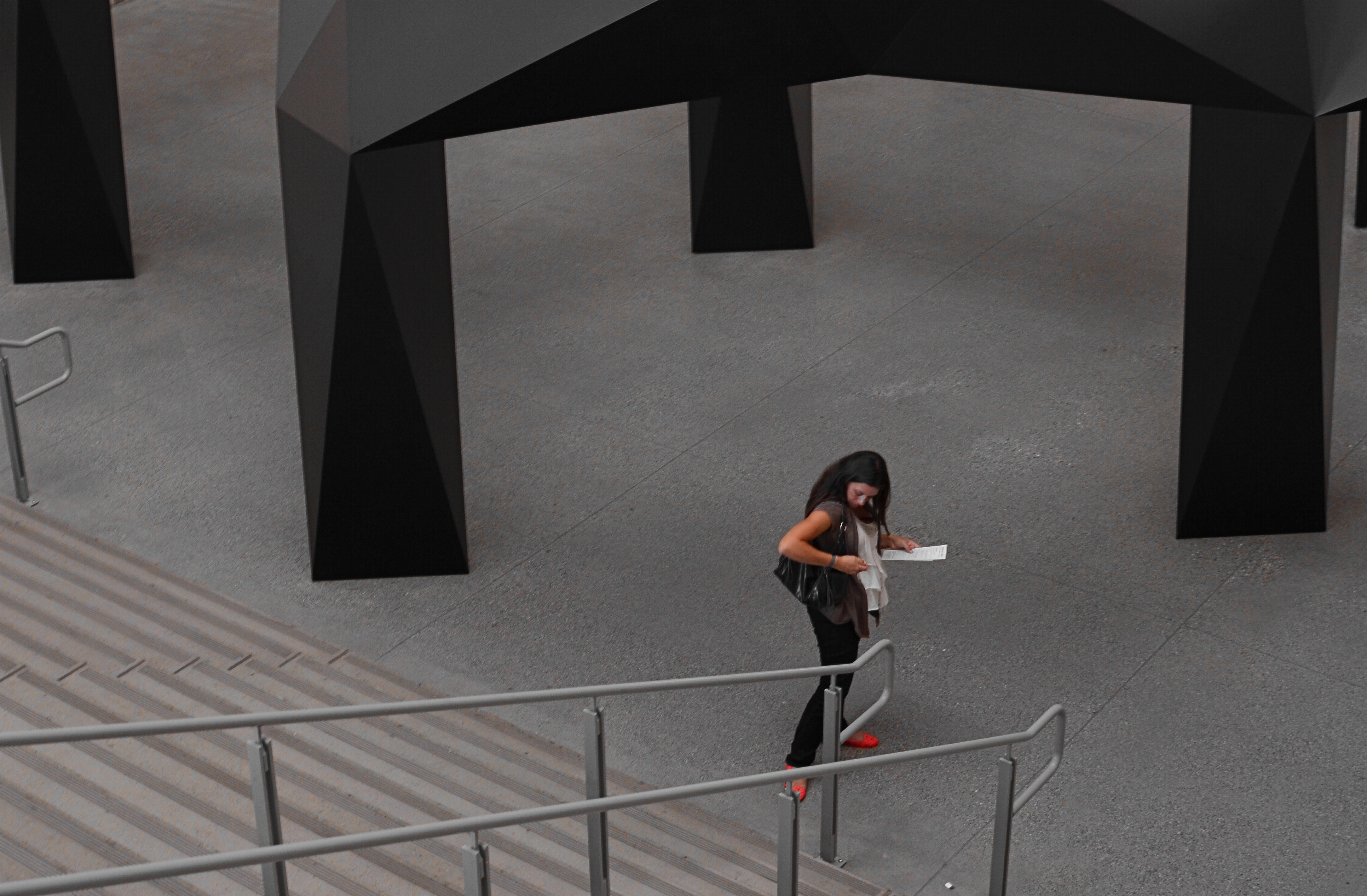
I further “isolated” these two subjects by desaturating everything in the frame except their flesh tones. 1/10 sec., f/5.6, ISO 320, 35mm.
Part of this process is my ongoing curiosity in how far I can go in paring away extra visual information before the story impact of a photograph is amplified to its highest power. I’m sure you have all worked with many original images that are just too balky and talky, that are really “made” in the cropping process. To be sure, sometimes you’re just peeling away the rotten outer parts of an apple to reveal…..a rotten core! Other times, however, you are privileged to peel away just enough petals to render the rose at its best, and, with images of people, that can mean getting rid of almost all the people in the picture you began with.
In both these cases, I liked these people to be shown as if they were in command of small little universes of their own. Does that make the photographs sad? Lonely? Dignified? Tranquil? Yes to all these and anything else you can bring to it, because if cropping is the second part of the picture-making process, then seeing if your instinct “proofs out” with viewers is the final and most crucial part. I’m using every process I can to convey to you what I saw, or what I believe is worth seeing. It’s a collaborative process, and sometimes, I’m sure, I don’t hold up my part of the bargain. And still we press on.
Isolation is more than a human condition or a symptom of our times: it’s a compositional tool, a reduction of the equation of scene-making to its simplest, and hopefully truest, terms.
A BIG BOX OF LONELY
Think inside the box. 1/80 sec., f/2.2, ISO 800, 35mm.
By MICHAEL PERKINS
PHOTOGRAPHY CAN GO TWO WAYS ON CONTEXT. It can either seek out surroundings which comment organically on subjects (a lone customer at a largely empty bar, for example) or it can, through composition or editing, artificially create that context (five people in an elevator becomes just two of those people, their locked hands taking up the entire frame). Sometimes, images aren’t about what we see but what we can make someone else seem to see.
Creating your own context isn’t really “cheating” (are we really still using that word?), because you’re not creating a new fact in the photograph, so much as you are slapping a big neon arrow onto said fact and saying, “hey look over here.” Of course, re-contextualizing a shot can lead to deliberate mis-representation of reality in the wrong hands (see propaganda, use of), but, assuming we’re re-directing a viewer’s attention for purely aesthetic reasons (using our powers for good), it can make a single photo speak in vastly different ways depending on where you snip or pare.
In the above situation, I was shooting through the storefront window of a combined art studio and wine bar (yes, I hang with those kind of people), and, given that the neighborhood I was in regularly packed folks in on “gallery hop” nights, the place was pretty jammed. The original full frame showed everything you see here, but also the connecting corridor between the studio and the wine bar which was, although still crowded, a lot less claustrophobic than this edited frame suggests.
And that’s really the point. Urban “hangs” that are so over-attended can give me the feeling of being jammed into a phone booth, like I’m part of some kind of desperately lonely lemming family reunion, so I decided to make that crushed sensation the context of the picture. Cropping down to a square frame improved the balance of the photograph but it also made these people look a little trapped, although oddly indifferent to their condition. The street reflections from the front plane of glass also add to the “boxed in” sensation. It’s a quick way to transform a snap into some kind of commentary, and you can either accept my choice or pass it by. That’s why doing this is fun.
Urban life presents a challenging series of social arrangements, and context in photographs can force a conversation on how that affects us.
ORPHANS
Grand Central, 2013. 1/160 sec., f/1.8, ISO 250, 35mm.
By MICHAEL PERKINS
IF YOU SHOOT ALL THE TIME, NEARLY EVERY DAY, THE SHEER TONNAGE of what you bring home guarantees that you will inevitably lose track of a large portion of your total output. Being that your alloted daily attention span is a finite number, you will literally run out of time before you can lavish affection on everything you’ve captured, on any occasion. Some shots will jump into your car like eager puppies, panting “take me home”, while others will be orphaned, tossed into the vast digital shoebox marked “someday”, many never seeing the light of day again.
The cure for this, oddly, lies in the days when no ideas emerge and no pictures are taken…the dreaded “drys”, those horrible, slow periods when you can’t buy an inspiration to save your life. In those null times, the intellectual equivalent of a snow day, you may find it useful to revisit the shoebox, to rescue at least a shot or two formerly consigned to the shadows.
Using your paralysis periods for reflection may get you off the creative dime (and it may not), but it will, at least, allow you to approach old experiments with a fresh eye, one seasoned by time and experience. Maybe you overlooked a jewel in your haste. You almost certainly left free lessons on either technique or humility by the wayside, wisdom that can be harvested now, since you’re currently watching your camera mock you from across the room (okay, mock is harsh).
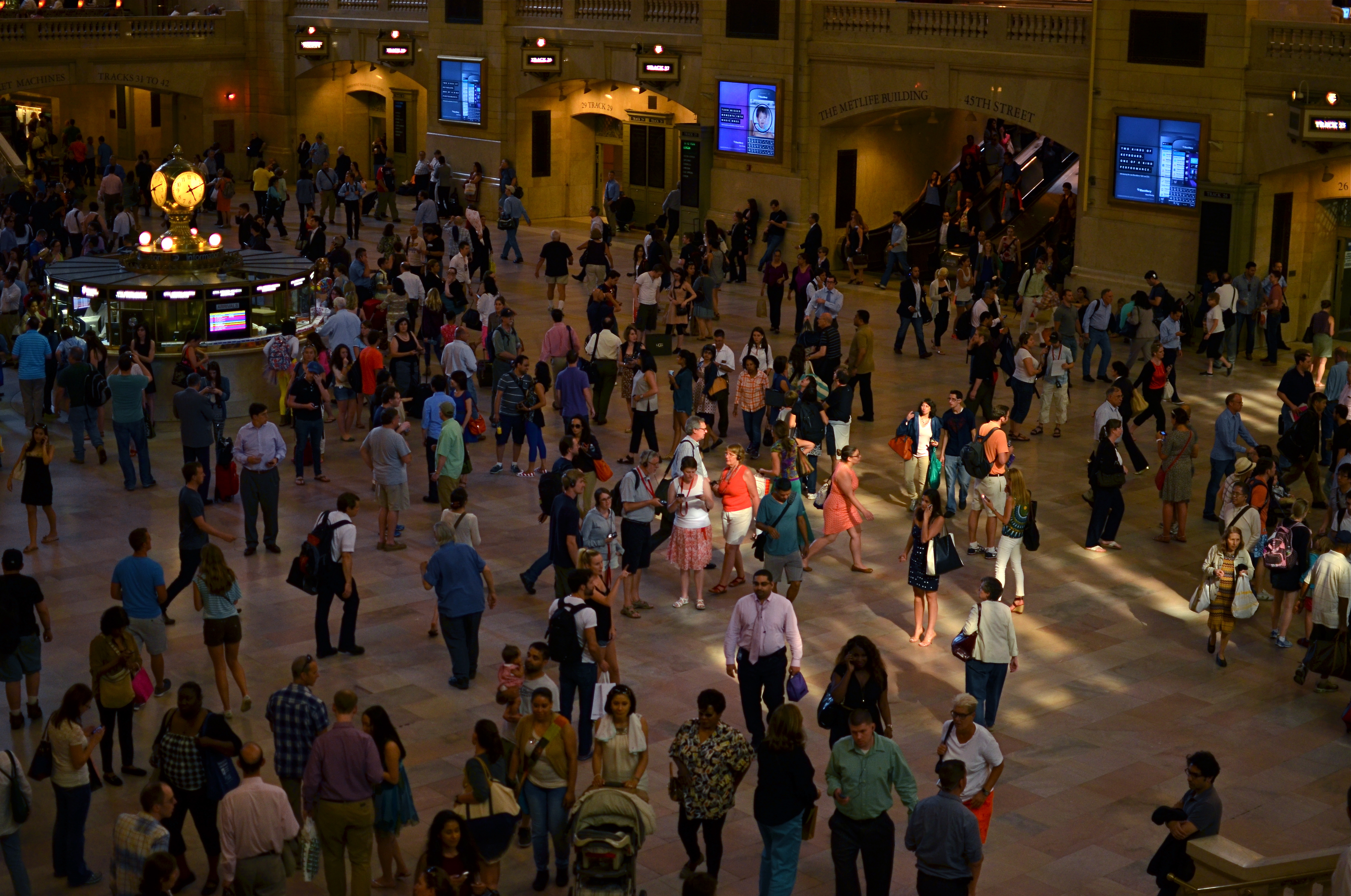
The master shot, before cropping.
During my last visit to Manhattan, I was determined to explore the limits of natural light streaming from the gigantic windows of the main terminal floor at Grand Central, and, for the most part, I framed the place’s architectural features in such a way as to dwarf the scurrying humanity heading to their various destinations. I did shoot a few floor shots as “crowd pieces”, but, upon editing, I failed to look within those big groupings for any kind of individual story or drama. I chose the gigundo-windows master shot I wanted, and left all the other frames in the dust.
Recently hitting a dead spot of several days’ duration, I decided to wander through The Ghosts Of Photo Attempts Past, and I saw a mix of bodies and light within the smallest 1/3 of a larger crowd shot that seemed worth re-framing, with a little softening effect to help the story along. Still not a masterpiece, but, since I was lucky enough to isolate it within a “Where’s Waldo” frame crammed with detail, it was something of a gift to salvage a chunk of it that I could actually care about.
Another orphan finds a home.
JUST ENOUGH
1/250 sec., f/5.6, ISO 100, 35mm.
By MICHAEL PERKINS
I’VE PROBABLY SCRIBBLED MORE WORDS, IN THESE PAGES, ABOUT OVERCROWDED SHOTS than about any other single photographic topic, so if I sound like I’m testifyin’ in the Church-Of-I-Have-Seen-The-Light, bear with me. If any single thing has been a common theme in the last five years of my photography (or a factor in my negligible growth), it’s been the quest to take pictures that tell just enough, then back off before they become cluttered with excess visual junk.
Composing a photograph, when we start out as young budding photogs, seems to be about getting everything possible into the frame. All your friends. All the mountains and trees. Oh, and that cute dog that walked by. And, hey, those clouds, aren’t they something? Then, as we grow grayer of beard and thinner of scalp, the dead opposite seems to be true. We begin looking for things to throw away in the picture. Extra visual detours and distractions that we can pare away and, not only still have a picture, but, ironically, have more of a picture, the less we include. It’s very Zen. Or Buddhist. Or Zen Buddhist. Or something. Hey, I ain’t Depak Chopra. I just get a smidge better, as I age, at not making every image into a Where’s Waldo tapestry.
Especially in an age of visual overload, it’s too easy to make photographs that make your eye wander like a nomad all over the frame, unsure of where to land, of what to fix upon. Unable to detect the central story of the shot. Professionals learn this before any of the rest of us, since they often have to submit their work to editors or other unfeeling strangers outside their family who will tell them where their photos track on the Suck-O-Meter. There’s nothing like having someone that you have to listen to crumple up about 90% of your “masterpieces” and bounce them off your nose. Humility the hard way, and then some. But, even without a cruel dictator screaming in your ear that you ought to abandon photography and take up sewer repair, you can train yourself to take the scissors to a lot of your photos, and thereby improve them.
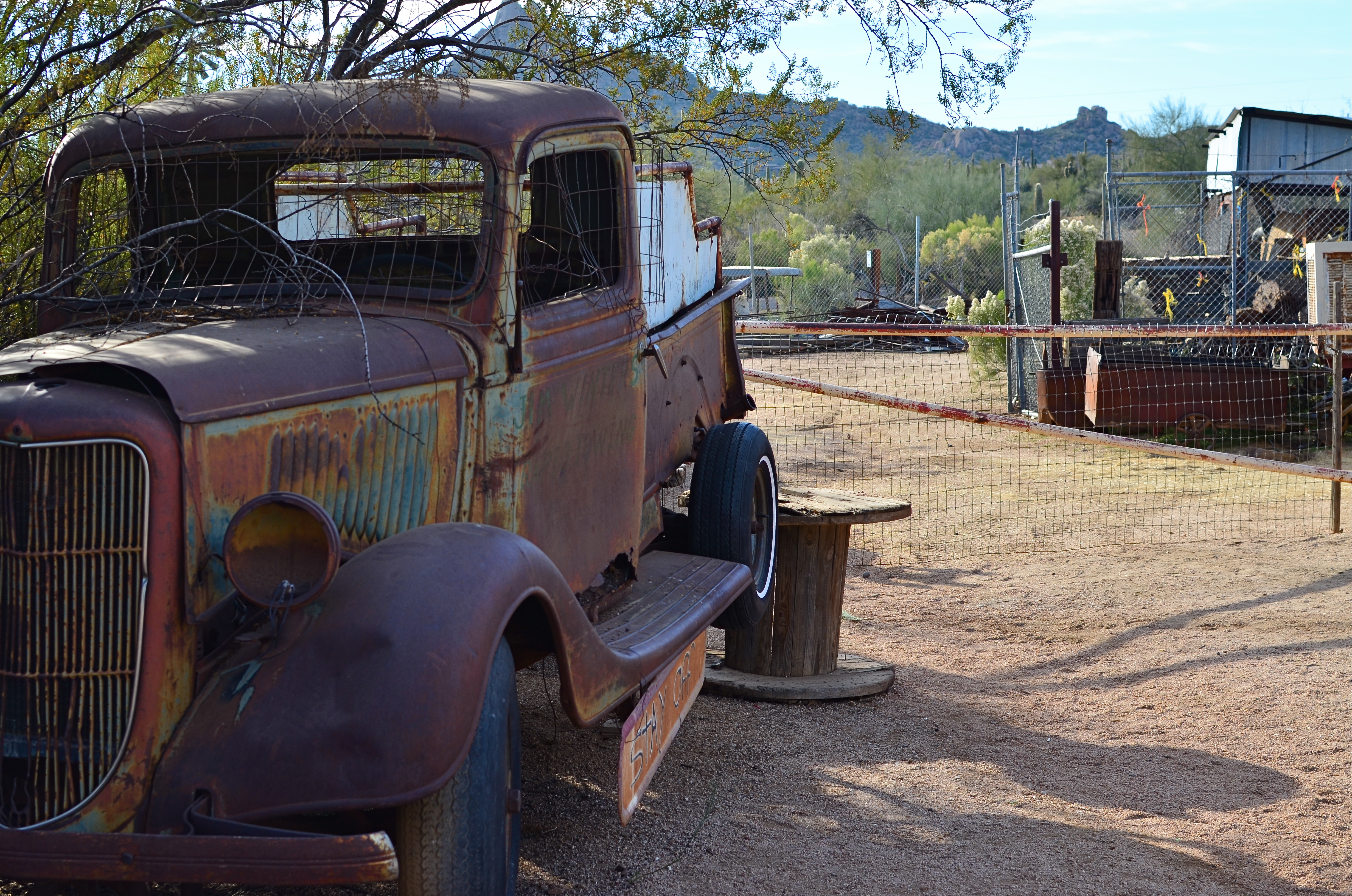
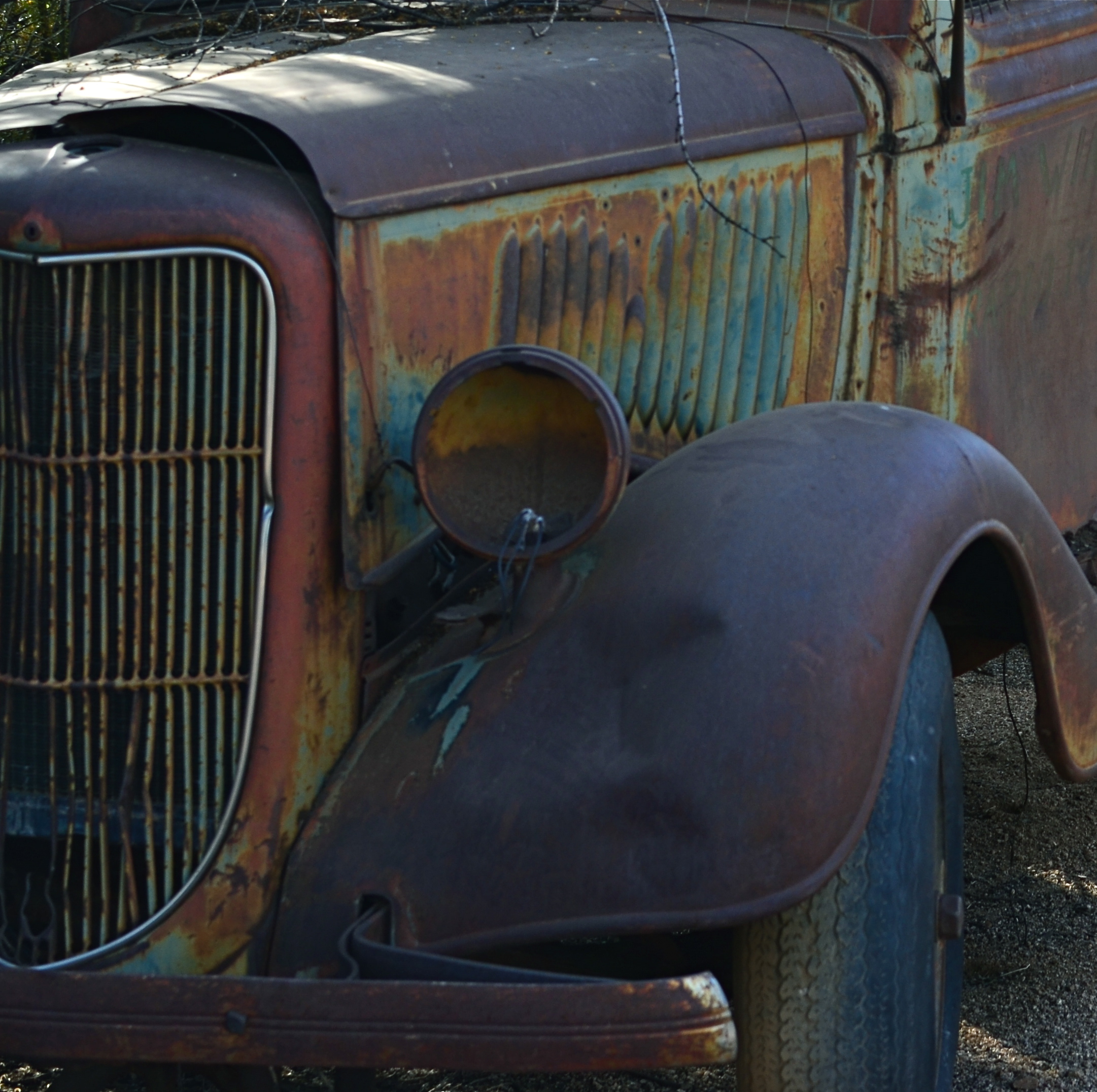
The original shot. Cool truck, but what’s all that lame junk off to the side?
The image up top began with the truck occupying just part of what I hoped would be a balanced composition, showing it in the context of a western desert scene. Only the truck is far more interesting a subject than anything else in the image, so I cropped until the it filled the entire frame. Even then, the grille of the truck was worthy of more attention than the complete vehicle, so I cut the image in half a second time, squaring off the final result and shoving the best part of the subject right up front.
The picture uses its space better now, and, strong subject or weak, at least there is no ambiguity on where you’re supposed to look. Sometimes that’s enough. That’s Zen, too.
I think.
CROP YOUR WAY TO SUCCESS
By MICHAEL PERKINS
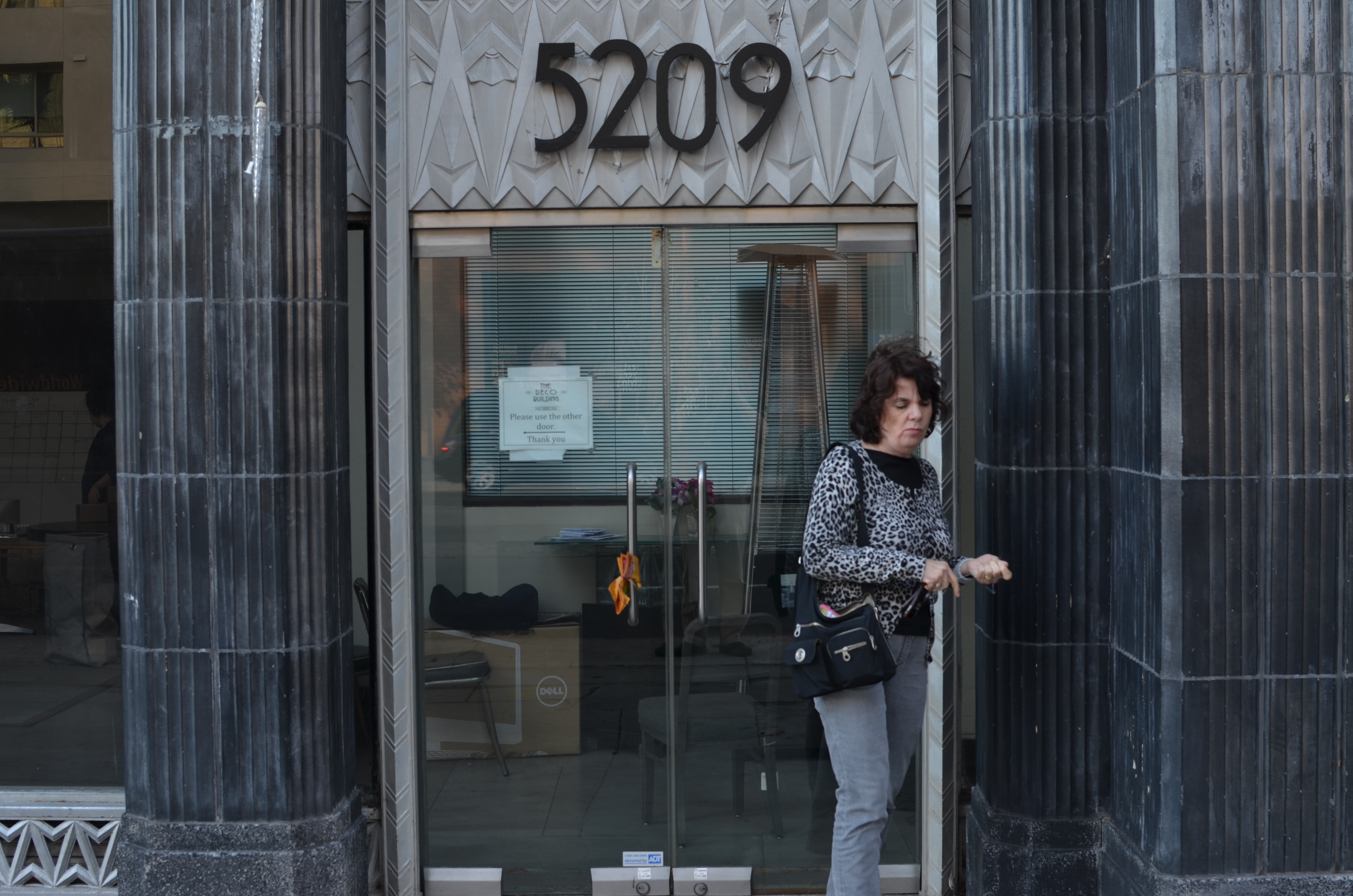
Whoops, I wasn’t ready. 1/100 sec., f/5.6, ISO 100, 35mm.
THOSE OF US WHO HAVE LOGGED SOME TIME IN THE WAITING ROOMS OF PEDIATRICIANS can recall struggling through the “Hidden Pictures” page of Highlights For Children magazine. I would love to tell you that I always found 100% of cartoonist John Gee’s camoflaged squiggles by the time the receptionist invited me into the examining room. But I would be lying.
That said, there are many times when, as photographers, we play the same game with our images, especially the ones in the “doesn’t work” pile. Loving at least the idea behind what we were originally after, we pore over every pixel in the frame, repeating the vain mantra there must be a picture in here somewhere. Often, the photo simply returns to the Hall of Shame despite our best efforts to redeem it. Sometimes, the crop tool is your unexpected best friend.
I recently looked at a failed candid of my wife outside one of my favorite buildings in Los Angeles, the “Deco” Building (real name) at the corner of La Brea and Wilshire near the museum district. A combination of wind and facial expression had spoiled the quickie portrait, but the address panel over Marian’s head contained something I could use if I re-purposed the picture.
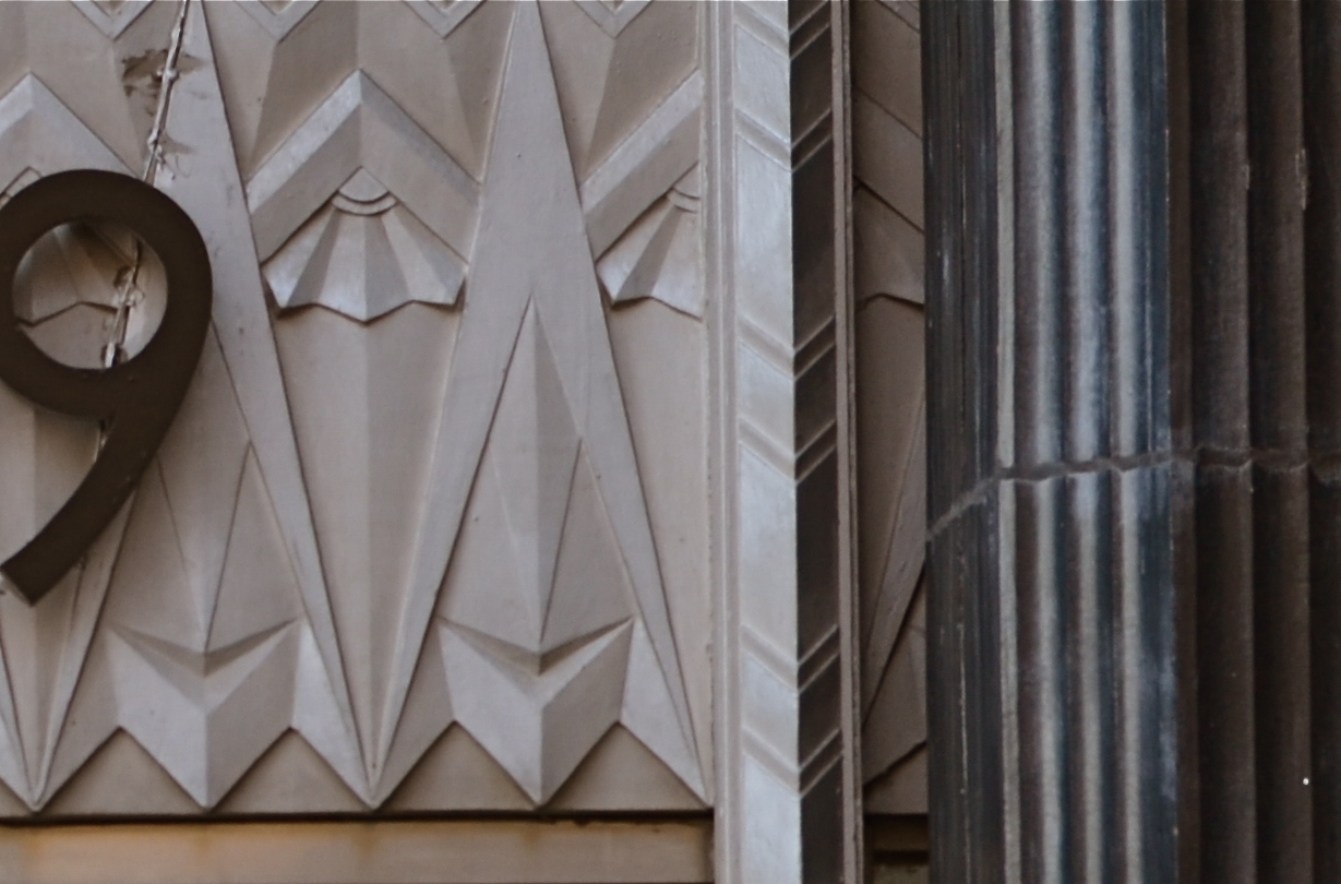
I gave the above shot a severe haircut and wound up with this. Hmm, maybe this was all the picture I needed in the first place.
In the space of a few inches of the building’s entrance was a miniature representation of the best features of the entire building; its wild pattern of chevrons and zigzags. I had already done a master shot of about 90% of the front of the place, but a study of its details started to sound appealing. Cropping away more than 2/3rds of the original shot reduced the sharpness a little, but since I always shoot at the highest file size possible, I just squeaked by.
For a moment, I found that I had redeemed all those failed sessions with Highlights.
Watch out, New York Times crossword. You’re next.
