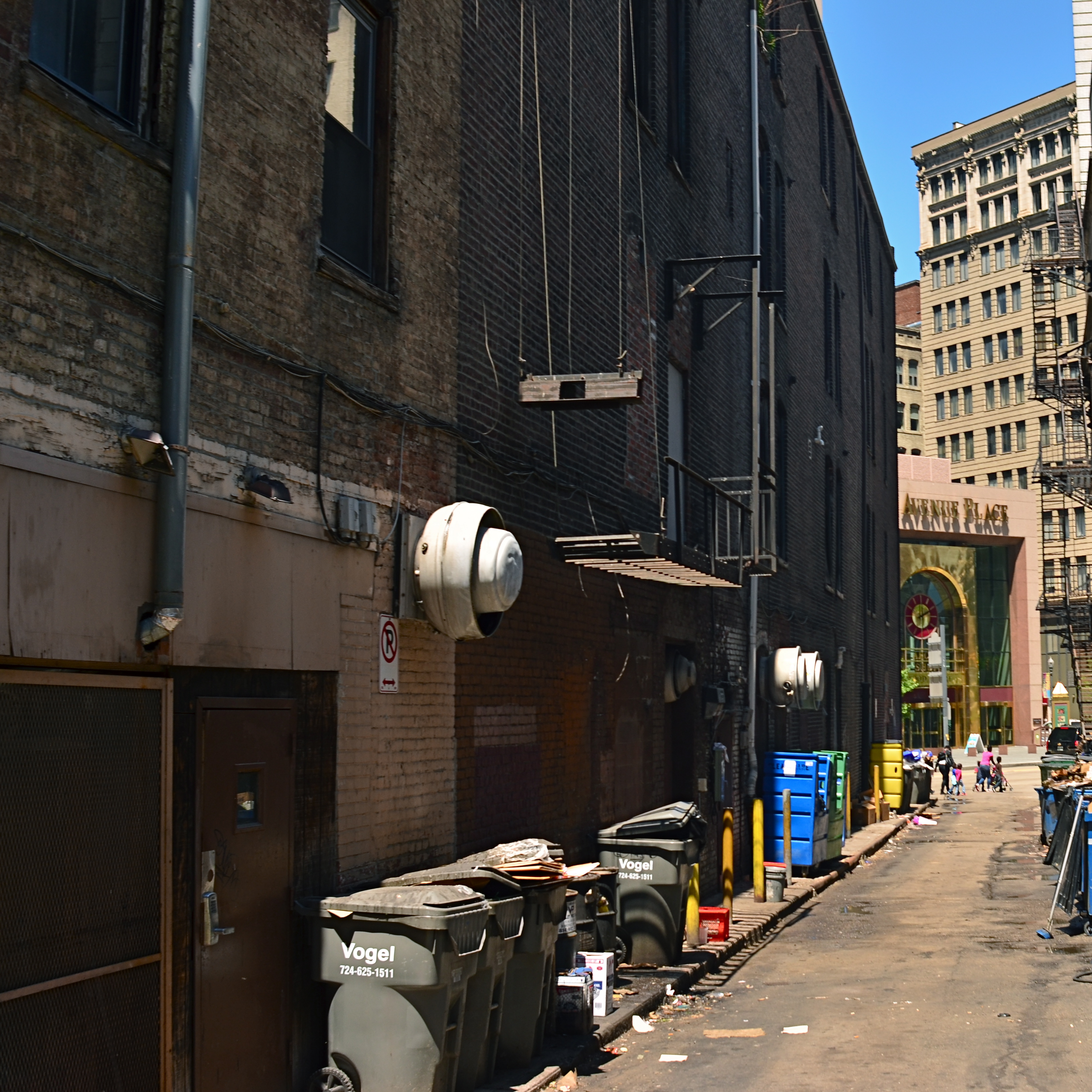
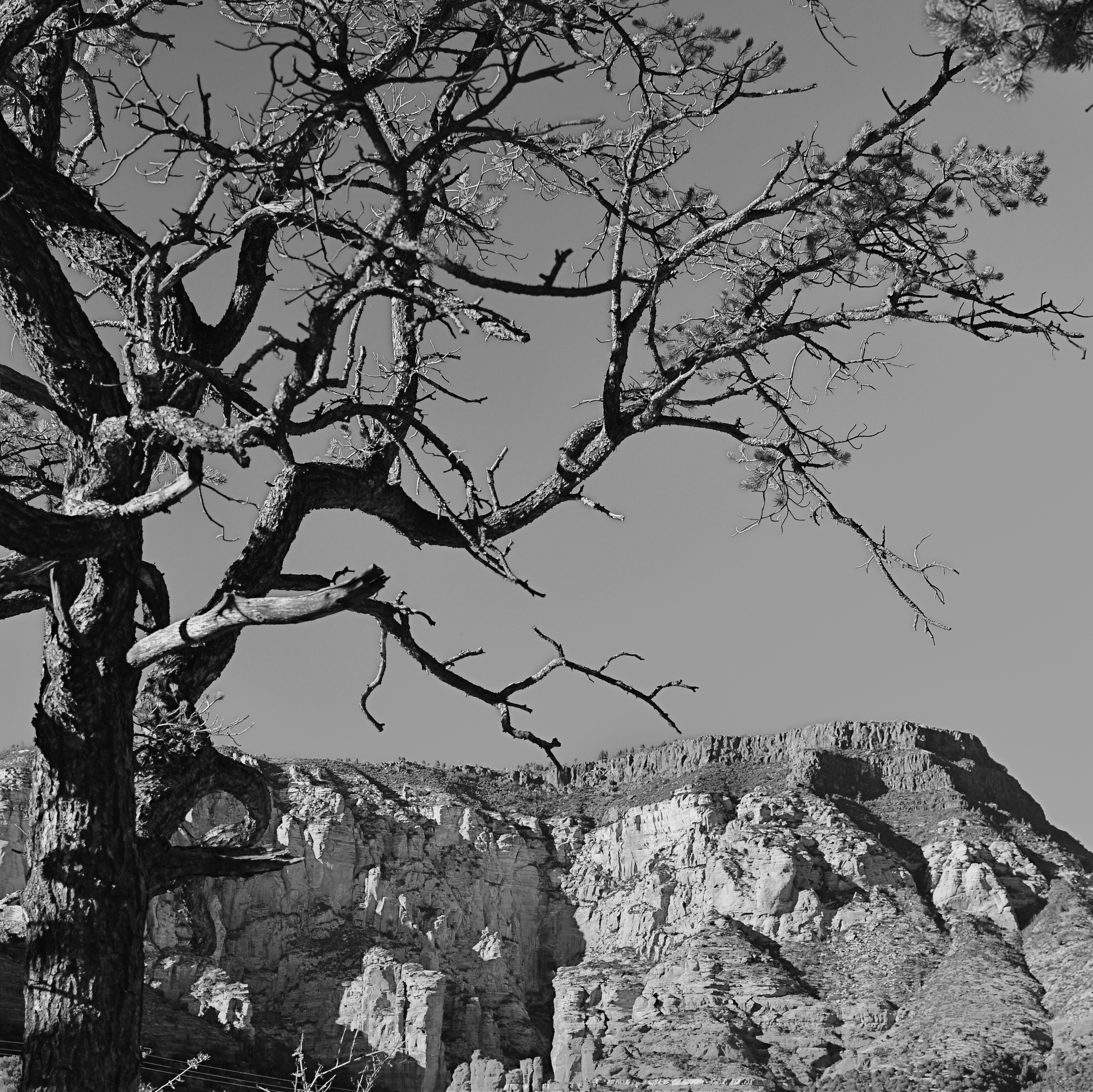
INSIDE THE IRIS
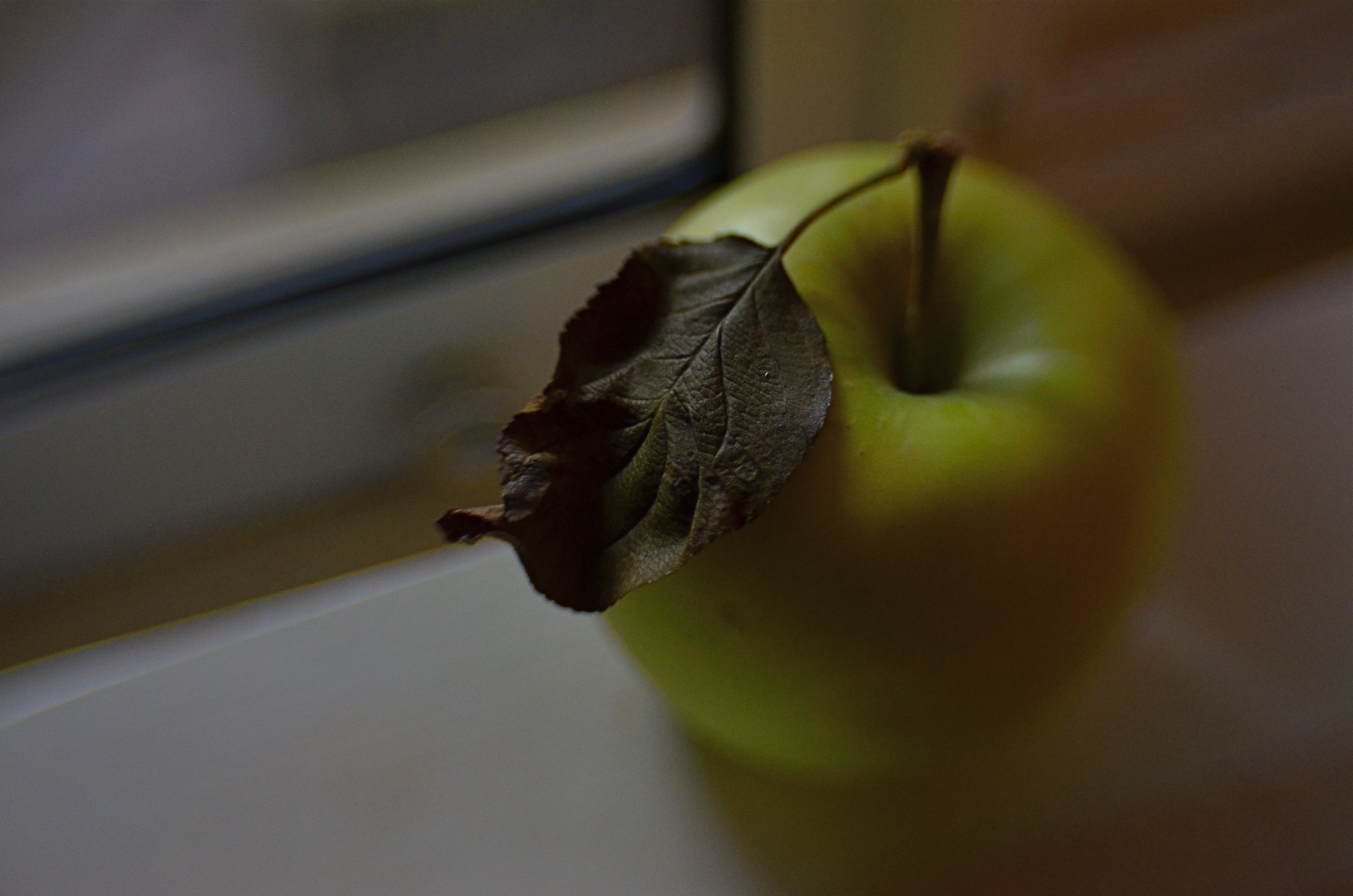
Just an apple. Or is it?
By MICHAEL PERKINS
IN ONE OF HIS EARLIEST SILENT FILMS, legendary director D.W. Griffith, one of the first cinematic pioneers to use tight shots to highlight vital narrative details, drew fire from theatre exhibitors, who objected to his new-fangled “close-up” or “iris” technique. “We have paid for the entire actor”, one wrote, apparently of the opinion that showing only a player’s hand or face, even in the interest of a good story, was somehow short-changing the audience. Griffith knew better, however. He was using his compositional frame to tell his viewers, in no uncertain terms, what was important. Outside the frame was all the other stuff that mattered less. If I show it, you should pay attention.
Photography is not so much about whether a subject is intrinsically important (think of the apple in a still-life) but whether an artist, armed with a camera and an idea, can make it important. At the dawn of the medium, painters pretty much dominated the choices about which images were immortalized as emblematic of the culture. The subject matter often ran to big targets; war, portraits of the elite, historical and religious events. And, indeed, the earliest photographs were “about something”, the “somethings” often being documents of the world’s wonders (pyramids, cathedrals) fads (politicians, authors) and foibles (crime, the occasional disaster). Subjects were selected for their importance as events, as leaves of history worthy of preservation.
In the 20th century the same abstract movements that engulfed painting allowed photography to cast a wider net. Suddenly that apple in the bowl was a worthy, even a vital subject. Light, composition, angle and mood began to weigh as heavily as the thing pictured. We made images not because the objects looked right, but because they looked right when made into a photograph. Pictures went from being about what “is” to being about what could be….evoking, like poetry, music or literature the magics of memory, dream, potentiality, emotion.
This is really the ultimate freedom of not only photography, but of any true art; the ability to confer special status on anything, anywhere. That doesn’t mean that all photographs are now of equal value; far from it. The burden of proof, the making of the argument for a particular subject’s preservation in an image, still rests squarely on the shooter’s shoulders. It’s just not necessary to wait for a natural disaster, a ribbon cutting, or a breathless landscape to make an amazing photograph. The eye is enough. In fact, it’s everything.
EDITING WITH LIGHT
By MICHAEL PERKINS
THE ETERNAL TUG OF WAR IN PHOTOGRAPHY SEEMS TO BE the pull between extremes of revelation and concealment. Toggling between the strategies of showing almost everything and showing nearly nothing, most shooters arrive at some negotiated mid-point which describes their own voice as a visual narrator. Shuttling between the two extremes, shooters have to decide how much information is appropriate not only for their overall style, but in each specific shooting situation.
Managing light in the moment, rather than trying to re-balance values after the picture is made, affords the most crucial control you will ever exercise over your subject. We tend, as beginners, to shoot things where there is “enough light”, growing ever more discriminating about the kind of light we prefer as we mature in our approach.
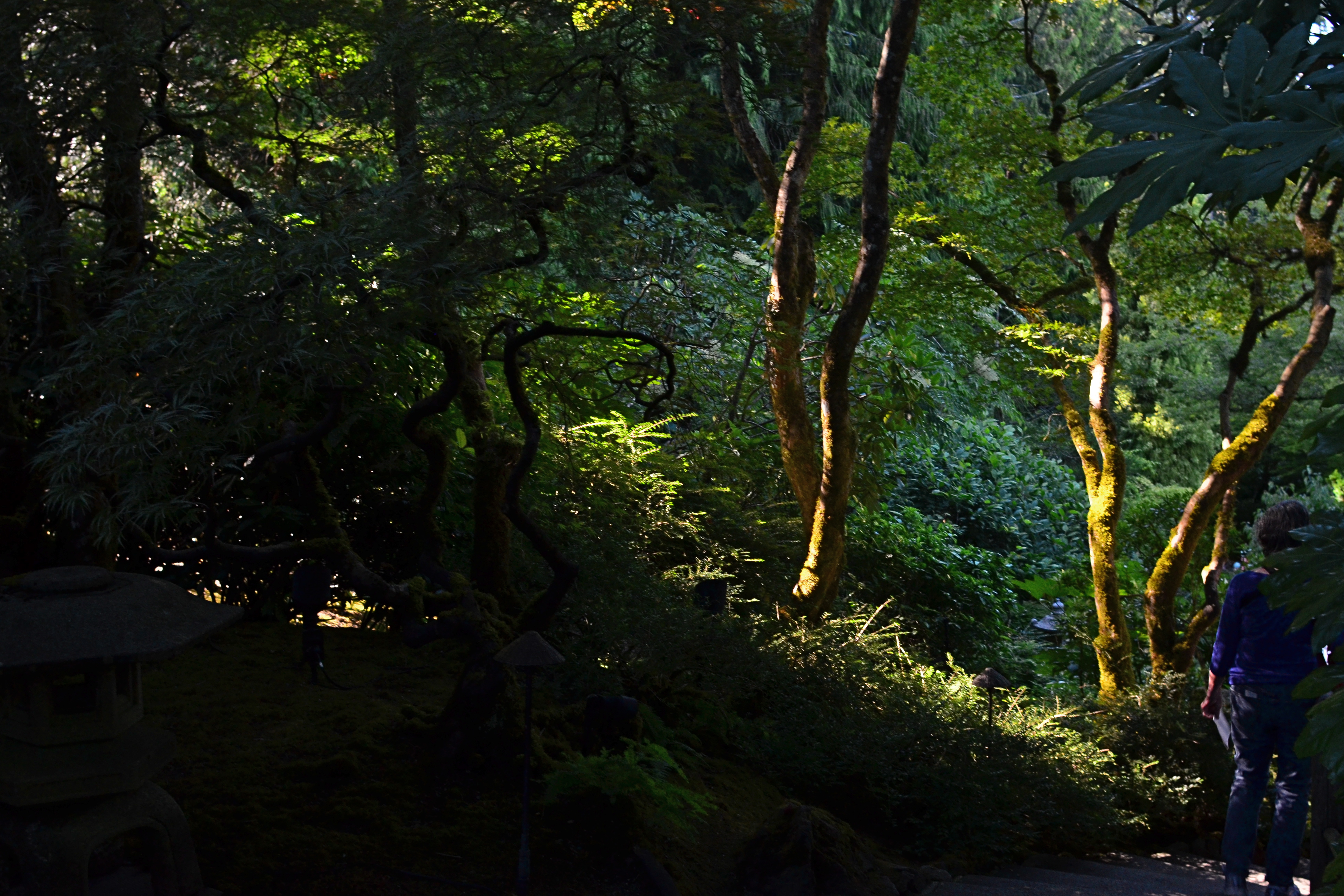
Down Into (2016). 1/40 sec., f/5.6, ISO 500, 24mm.
One of the most fruitful exercises for me has been those rare occasions in which I have had the luxury to remain in one area over a span of several hours, discovering the nuanced variations that prevail from minute to minute in a single setting. Many times, I have begun this process with an initial concept of the “ideal” lighting for a shot, then, through comparison, rejected that in favor of a completely different strategy. It’s strangely thrilling to come home completely satisfied with an image, even though it’s the dead opposite of the way you originally conceived it.
Waiting for the right light may be more time-consuming, but it is the cheapest, easiest, and surest way to control composition. If one particular lighting situation reveals too much in the shot, diluting the impact of your visual message, waiting for shadows to deepen and for bright spots to shift can make your photograph urge the eye more effectively toward the center of your “argument”. In the image seen above, I could not have sold the idea of a gradual walk from high left to lower right without the light actually working as a kind of directional arrow. A fully lit forest might have been lovely, and was, in fact, available to me just an hour earlier. But by the late afternoon, however, the partial dark helped me edit excess information out of the shot, and, in comparing the two approaches, I like the “less” version better.
Part of getting the shot you want is often learning to see, and edit out, the parts you don’t want, a process which is better when you wait for the “best”, rather than the “correct” light for right here, right now.
(LESS THAN) PRIME OPPORTUNITY
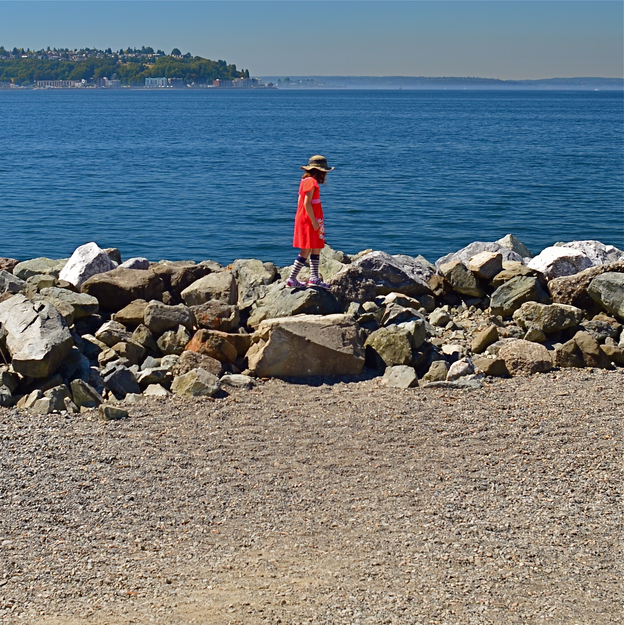
To Susan On The West Coast Waiting (2016). Shot from over 50 feet away with a 24mm wide-angle prime, then cropped nearly 70% from the original frame.
By MICHAEL PERKINS
EVERY DAY-LONG SESSION OF TRAVEL PHOTOGRAPHY dictates its own distinct rules of engagement. You can predict, to some degree, the general trend of the weather of the place where you’ll be staying/playing. You can pre-study the local attractions and map out at least a start-up list of things you might like to shoot. And you can choose, based on all your other prep, the equipment that will work best in the majority of situations, which keeps you from carting around every scrap of gear you own, saving reaction time, and, possibly, your marriage.
All well and good. However, even assuming that you make tremendously efficient choices about what lens you’ll most likely need on walkabout, there will be the occasional shot that is outside the comfort zone of said lens, something that it won’t do readily or easily. In such cases, the lens that would be perfect for that shot is likely forty miles away, back at your hotel. And here’s the place where you can pretty much predict what I advise.
Take the shot anyway.
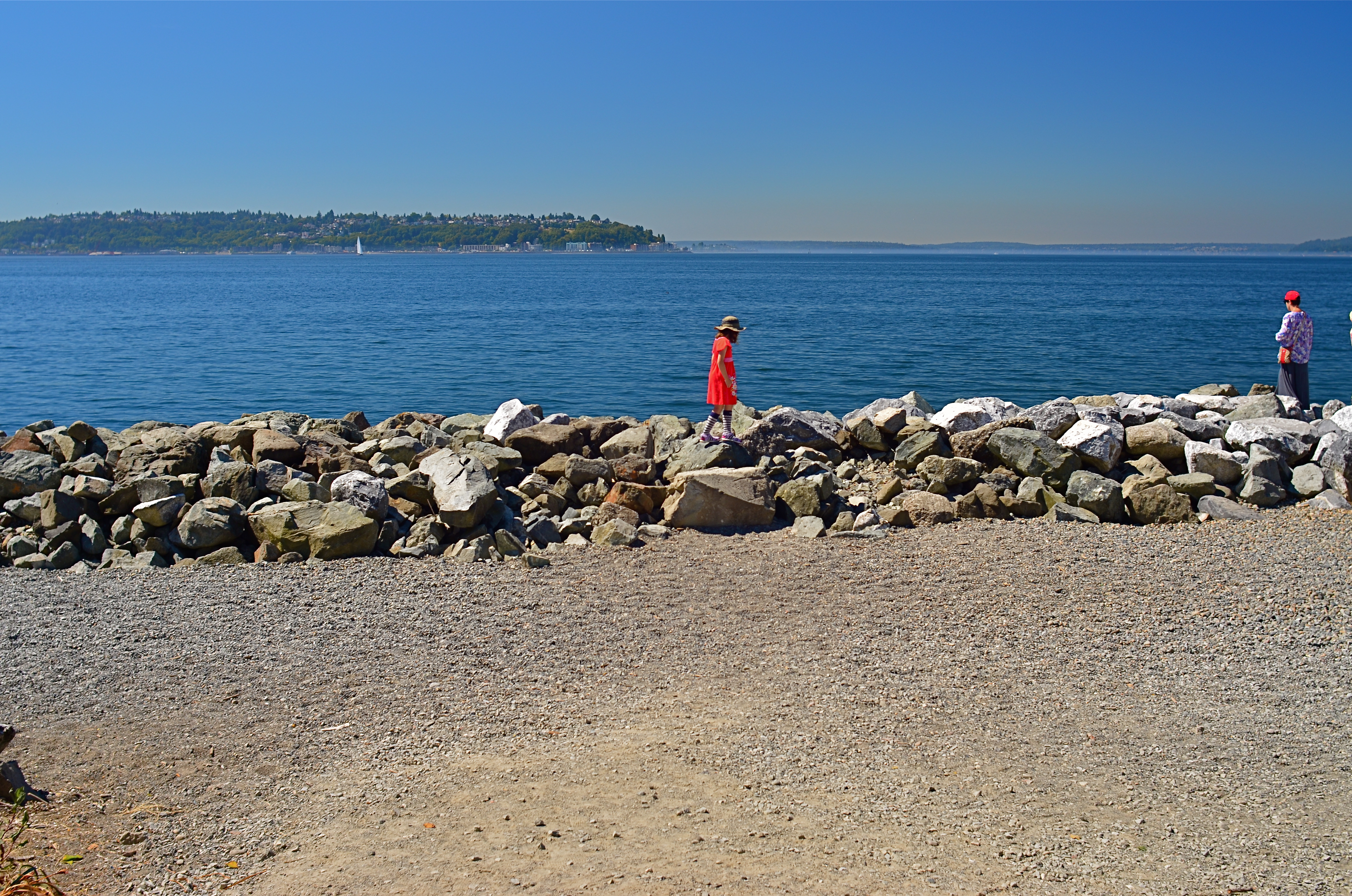
The original composition.
I tend to work with a 24mm prime f/2.8 lens when walking through urban areas. It just captures a wider field within crowded streets, allowing me to grab most vistas without standing in the path of onrushing traffic (a plus) or spending a ton of time re-framing before each shot (a pain). This particular 24 was made in the ’70’s and is both lightning fast and spectacularly sharp, which, being a manual lens, also saves time and prevents mishaps.
24mm, to me, produces a more natural image than the wide end of the more popular 18-55 kit lenses being sold today, since there is less perspective distortion (straight lines remain straight lines). However, since it is a wide-angle, front-to-back distances will appear greater than they are in reality, so that things that are already in the distance seem even more so. And, since it is also a prime, there is no zooming. In the case at left, I wanted the girl’s bonnet, dress and presence on those rocks, but, if I was going to get any picture at all, plenty of other junk that I didn’t need would have to come along for the ride.
You deal with the terms in front of you at the time. Without a zoom, I either had to take the shot, with the idea of later cropping away the excess, or lose it altogether. There are times when you just have to visualize the final composition in your mind and extract it when it’s more convenient. Simply capture what you truly need within a bigger frame of stuff you don’t need, and fix it later. It’s a cornball cliché, but the only shot you are guaranteed not to get is the one you don’t go for. And this is also a good time to remember that it’s always smart to shoot at the biggest file size you can, allowing for plenty of pixel density even in the aftermath of a severe crop.
You can’t pre-plan all the potential pitfalls out of a photo vacation. Can’t be done. Come as close as you can, and trust your eye to help you rescue the outliers down the road.
But take the shot.
TWO FOR LUNCH
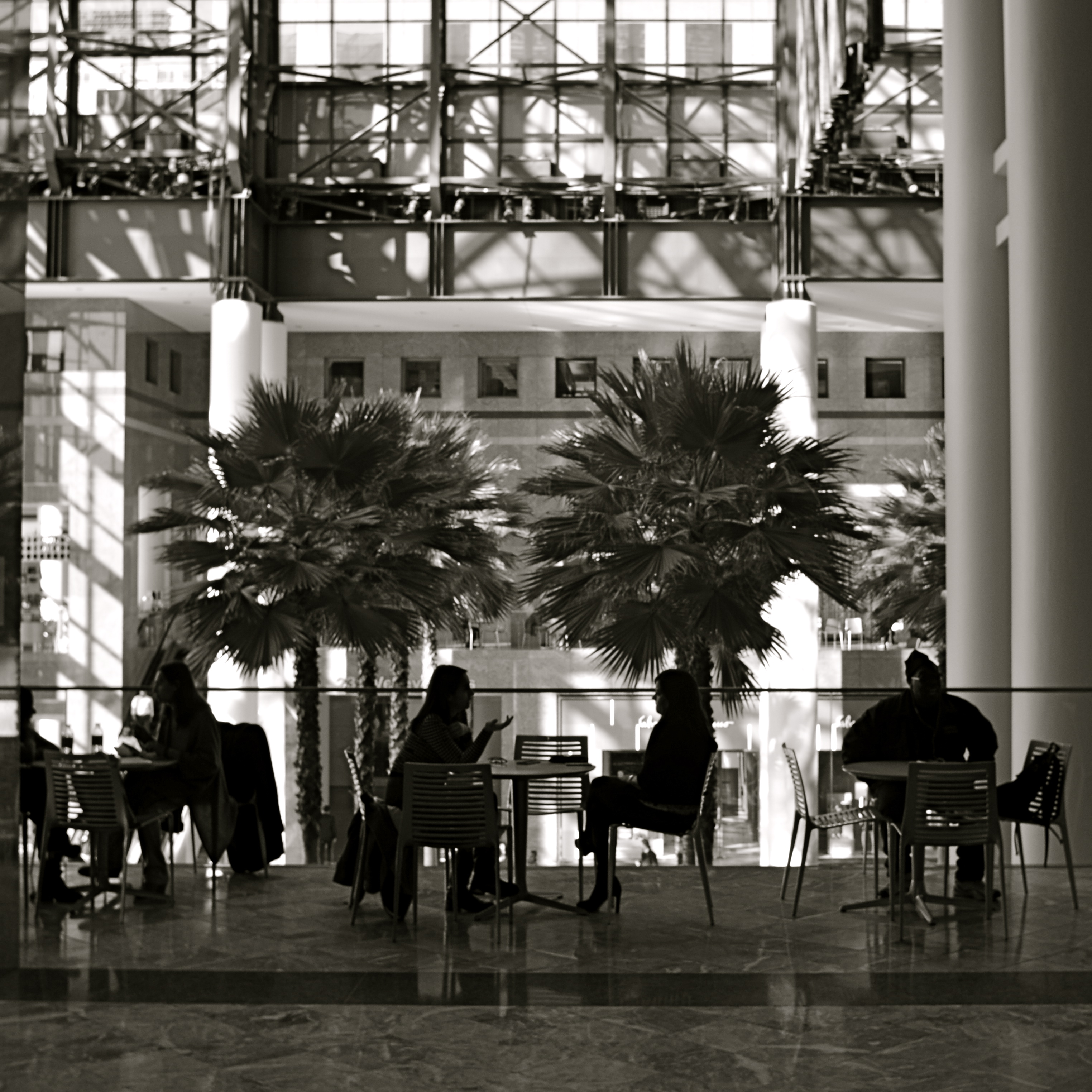
And Then I Told Her… (2016) 1/40 sec., F/5.6, ISO 100, 24mm.
By MICHAEL PERKINS
PHOTOGRAPHS DON’T HAVE TO BE ORGANIZED AROUND SYMMETRY, or even have a discernible “center” to them. However, the eye seems to find comfort in quickly settling on a “starting point” in an image, a place from which to proceed, or to be led to deeper discoveries.Designers for everything from magazine articles to websites toss around terms like visual weight and bottom-up processing to float various theories about how to direct the eye, with each system boasting top efficiency. A balanced pattern near the middle of the picture is thus not necessarily a “must-have”, just a fairly reliable “feels-right”.
By way of demonstration, a photographic center that consists of two people facing each other, talking, is a fairly easy anchor around which to build a straight narrative in an image. As the two heads arc left and right, a rough set of parentheses establish a very basic symmetry, and can help ensure that the middle of the picture engages the eye first. Based on architecture and surroundings, other things in the frame can either enhance or contrast with the symmetry in the middle, and that’s all a matter of taste for the photographer.
Many times a lunch counter or a restaurant gives me the talkers I need, so I tend to be on heightened alert when I enter such places. However, many of the photos I’ve made like this did not originally begin with the two people as the central emphasis: that happened in the cropping process.
In the above image, there actually was enough supportive symmetry from the background so centering the talkers and resizing the photo as a square seemed to be a good overall strategy. Of course, there is no hard and fast rule for these kinds of choices. All than can be said is that, for this picture, in this case, with these elements to work with, centering the conversationalists and placing them at the center of a square made sense. There is an entirely separate case to be made for selective use of the square as a compositional boost, and we’ll deal with than at another time.
Meanwhile, dropping in on two folks for lunch can act as a springboard for a certain kind of picture.
SEPARATE WORLDS
Only As A Last Resort (2016).
By MICHAEL PERKINS
MAYBE IT’S THE TERM ITSELF. MAYBE IT’S HOW WE DEFINE IT. Either way, for photographers, concept of the “still life” is, let’s just say, fluid.
I believe that these static compositions were originally popular for shooters for the same reason that they were preferred by painters. That is, they stayed in one place long enough for both processes to take place. Making photographs was never as time-consuming as picking up a brush, but in the age of the daguerreotype the practice was anything but instantaneous, with low-efficiency media and optical limitations combining to make for looooong exposure times. Thus, the trusty fruit-bowl-and-water-jug arrangement was pretty serviceable. It didn’t get tired or require a bathroom break.
But what, now, is a “still life”? Just a random arrangement of objects slung together to see how light and texture plays off their surfaces? More importantly, what is fair game for a still life beyond the bowl and jug? I tend to think of arrangements of objects as a process that takes place anywhere, with any collection of things, but I personally seek to use them to tell a story of people, albeit without the people present. If you think about museum collections that re-create the world of Lincoln or Roosevelt, for example, the “main subject” is obviously not present. However, the correct juxtaposition of eyeglasses, personal papers, clothing, etc. can begin to conjure them in a subtle way. And that conjuring, to me, is the only appeal of a still life.
I like to find a natural grouping of things that, without my manipulation or collection, suggest separate worlds, completely contained universes that have their own tools, toys, architecture, and visual vocabulary. In the above montage of angles and things found at a beach resort, I had fun trying to find a way to frame the “experience” of the place, in abstract, showing all its elements without showing actual activities or people (beyond the sunbather at right). The real challenge, for me, is to create associations in the mind of the viewer that supply all the missing detail beyond the surfboards, showers, and sundecks. That, to me, is the real attraction of a still life….or, more accurately, taking a life and rendering it, fairly intact, in a still image.
Hey, it’s not that I don’t like a good bowl of fruit now and then. However, I think that one of photography’s best tricks is the ability to mentally conjure the thing that you don’t show, as if the bowl were to contain just apple cores and banana peels. Sometimes a picture of what has been can be as powerful as freezing an event in progress. But that’s your choice.
Which is another of photography’s best tricks.
ADDITION BY SUBTRACTION
By MICHAEL PERKINS
PHOTOGRAPHIC COMPOSITION IS A CONSCIOUS PRIORITIZING OF EVERYTHING WITHIN A PICTURE’S FRAME, a ruthless process of demanding that everything inside that square justify its presence there. When we refer to the power of an image, we are really talking about the sumtotal of all the decisions that were made, beforehand, of what to include or lose in that image. Without that deliberate act of selection, the camera merely records everything it’s pointed at. It cannot distinguish between something essential and something extraneous. Only the human eye, synched to the human mind, can provide the camera with that context.
Many of our earliest photographs certainly contain the things we deem important to the picture, but they also tend to include much too much additional information that actually dilutes the impact of what we’re trying to show. In one of my own first photos, taken when I was about twelve, you can see my best friend standing on his porch…absolutely…..along with the entire right side of his house, the yard next door, and a smeary car driving by. Of course, my brain, viewing the result, knew to head right for his bright and smiling face, ignoring everything else that wasn’t important: however, I unfairly expected everyone else, looking at all the auxiliary junk in the frame, to guess at what I wanted them to zero in on.
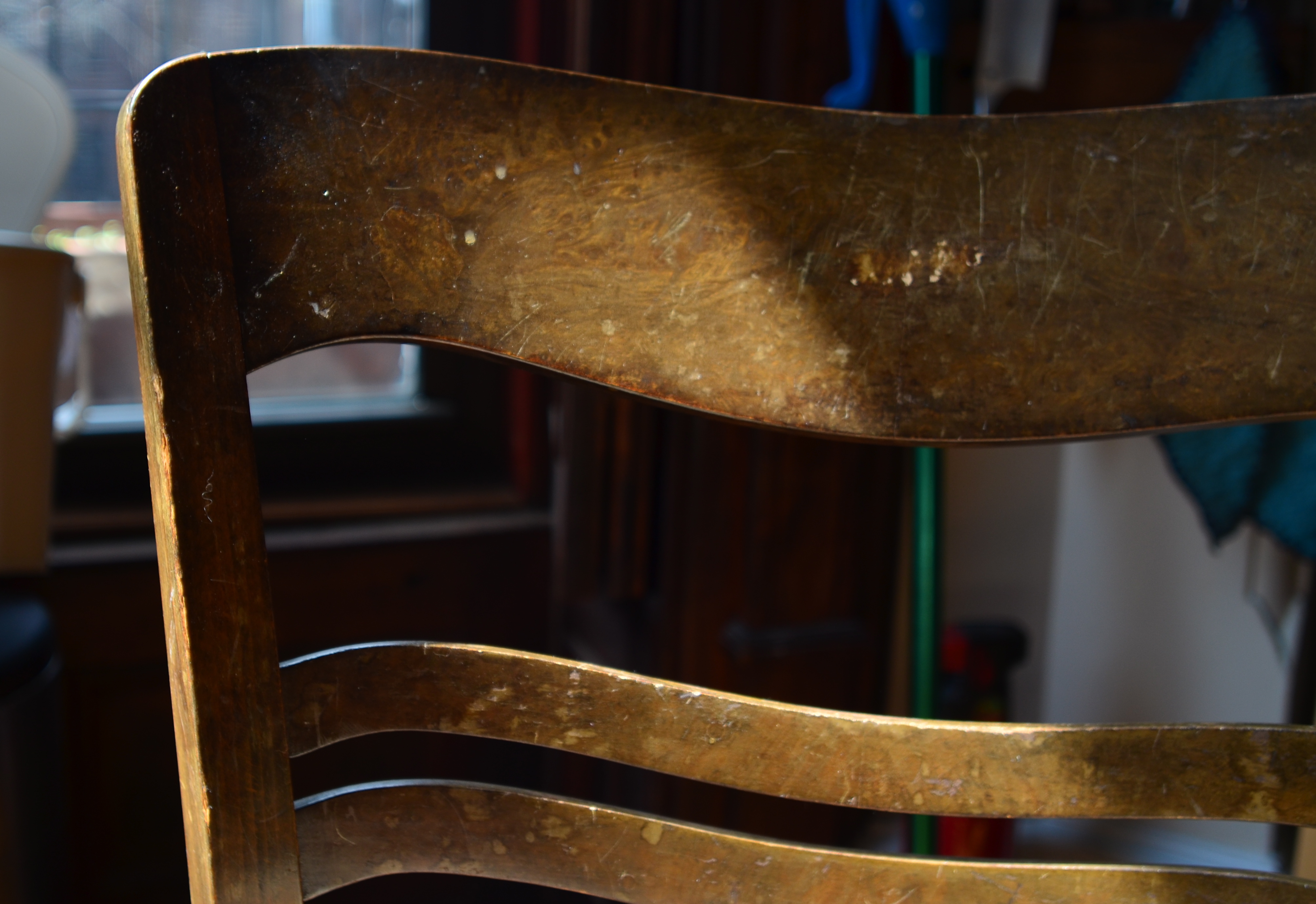
Heritage, 2016.
Jump forward fifty years or so, to my present reality. I actively edit and re-edit shots before they’re snapped, trying to pare away as much as I can in pictures until only the basic storytelling components remain….that is, until there is nothing to distract the eye from the tale I’m attempting to tell. The above image represents the steps of this process. It began as a picture of a worn kitchen chair in a kitchen, then the upper half of the chair near part of a window in the kitchen, and then, as you see above, only part of the upper slats of the chair with almost no identifiable space around them. That’s because my priorities changed.
At first, I thought the entire kitchen could sell the idea of the worn, battered chair. Then I found myself looking at the sink, the floor, the window, and…oh, yeah, the chair. Less than riveting. So I re-framed for just the top half of the chair, but my eye was still wandering out the window, and there still wasn’t enough visible testimony to the 30,000 meals that the chair had presided over. So I came in tighter, tight enough to read the scratches and discolorations on just a part of the chair’s back rest. They were eloquent enough, all by themselves, to convey what I wanted, without the rest of the chair or anything else in the room to serve as competition. So, in this example, it took me about five trial frames to teach myself where the picture was.
And that’s the point, although I still muff the landing more often than I stick it (and probably always will). To get stronger compositions, you have to ask every element in the picture, “so what do you think you’re doing here?” And anyone who doesn’t have a good answer….off to the principal’s office.
A CUT BY ANY OTHER NAME….
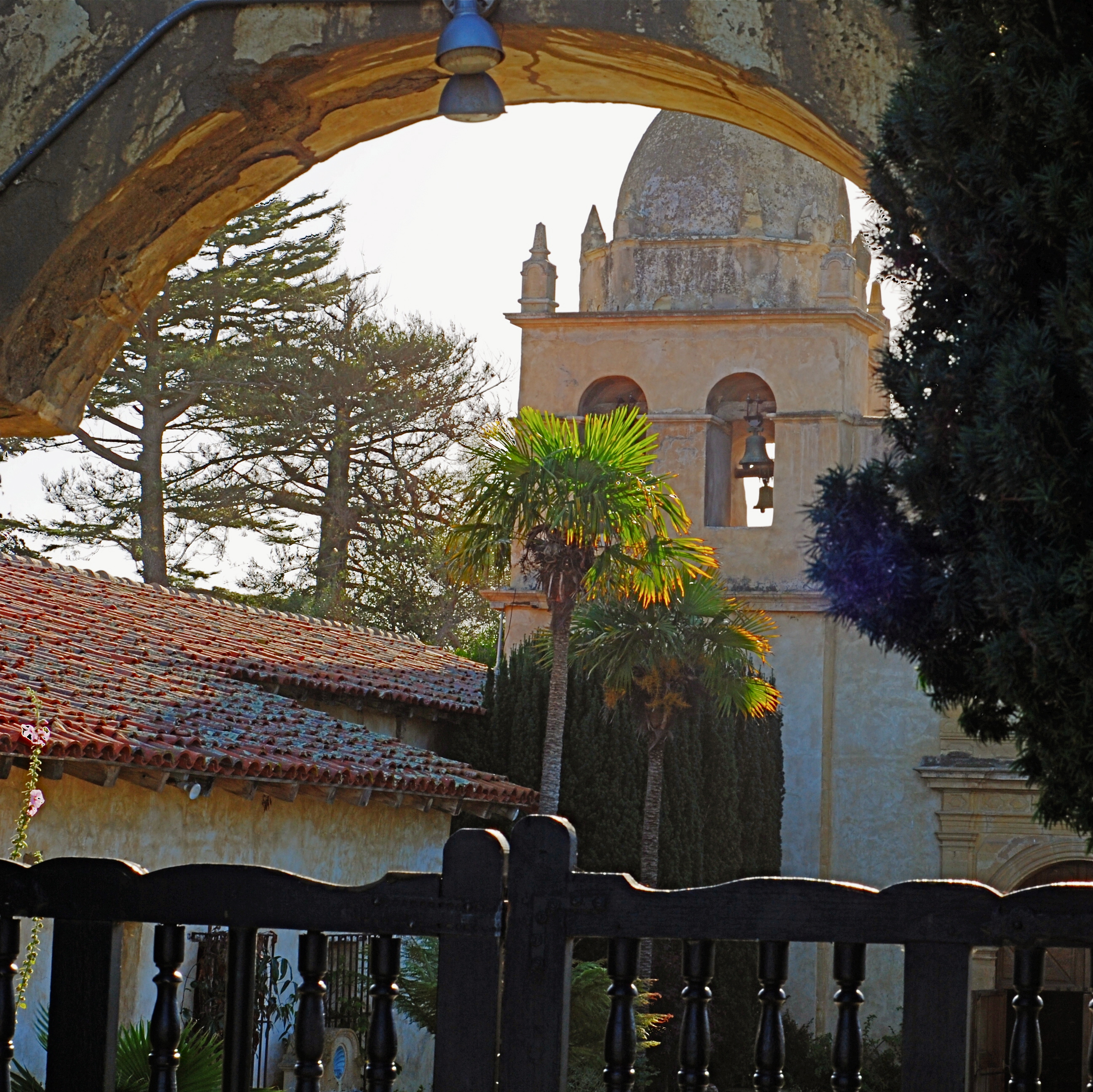
The first framing of this image included too much greenery on the right side, so it was cropped, then repositioned to make a “second” framing from the arched opening in the outer wall.
By MICHAEL PERKINS
THE WONDERFUL THING ABOUT COMPOSITION IN PHOTOGRAPHY is that you always, always, have a backup plan. What you don’t frame correctly in the actual shooting of an image can be corrected in post-editing cropping, the use of “framing” within the composition itself, or even how you finally matte the picture before hanging it on the wall. This is as it should be since many pictures are not so much born as re-imagined.
Once you frame a photo, you’re giving the viewer the first visual cue as to what to regard as important. If I included it, you should notice it. If I excluded it, it’s either to set loose your imagination on why I defined this world within these parameters, or because I, as the narrator, am telling you it just don’t matter. You can even further enhance the effectiveness of the frame by its shape. A rectangle might enforce the reading of information left-to-right, for example, while a square might force the eye toward dead center. The original framing is your own best call to action in a photograph.
And even after you’ve defined the frame, you can still add a second directive within it to hyper-focus attention in a very specific space. The use of arches, building overhangs, edges of windows, cliffs, shadows or other secondary “frames” provides even greater cues to the eye, and also adds an illusion of dimension and depth.
In the above shot, the old stone basilica is obviously the main feature of the image, and so was cropped from a wider original to eliminate distracting foreground shrubbery on the right. However, the arch through which the building is viewed was retained, to act as a “secondary frame” and as a way to illustrate scale. The first frame says what information is important, while the second frame makes sure we get to the heart of the image more efficiently.
Using all framing devices available in an image is like using caps, lower case and italicised letters in the same sentence. Composition is about yelling to get people over to your picture, then whispering, as you gently guide them toward its heart.
WIDE, WIDE WORLD(S)
Shooting from a low crouch with a 24mm ultra-wide jacked up the natural drama of this shot to a greater, almost excessive degree.
By MICHAEL PERKINS
ULTRA-WIDE LENSES HAVE ALMOST BECOME AN UNAVOIDABLE CLICHE for people shooting in the streets of large cities, both for the great things they allow and the uber-excesses that they enable. There is, of course, a real practical benefit in being able to create an amped-up sensation of front-to-back space or side-to-side expanse while you yourself are limited in where you can stand or move. For example, if your back is crimped against a building, so that you can’t dolly backward, having the lens provide the extra width you need is great. If you’re pointing up for emphasis, the lens’ distortion of straight lines can be dramatically abstract, depending on the look you’re going for. All to the good.
Of course, depending on your selection of angle, you can get things so bendy and bizarre that you can induce motion sickness in your viewing audience, with towers and spires inclining sideways as if they about to topple to the street. Again, you have to decide what look you want: it’s not just about tilting the frame until you can “get everything in”. That’s shoveling, not shooting.
Just inches away from the framing of the earlier shot, same 24mm lens. What’s different is the shooting angle.
The thing to remember about ultra-wides in the city is how little re-framing it takes to get both the drama you want and at least a semblance of normal proportions and angles. As with almost every other situation, the salvation is in shooting a lot of coverage of a subject. Attack it from all angles and sides. You can’t know in the moment exactly what will work best…you’re working too quickly in a crowded, active environment. So walk around, attack it from all sides, and sort out the keepers later.
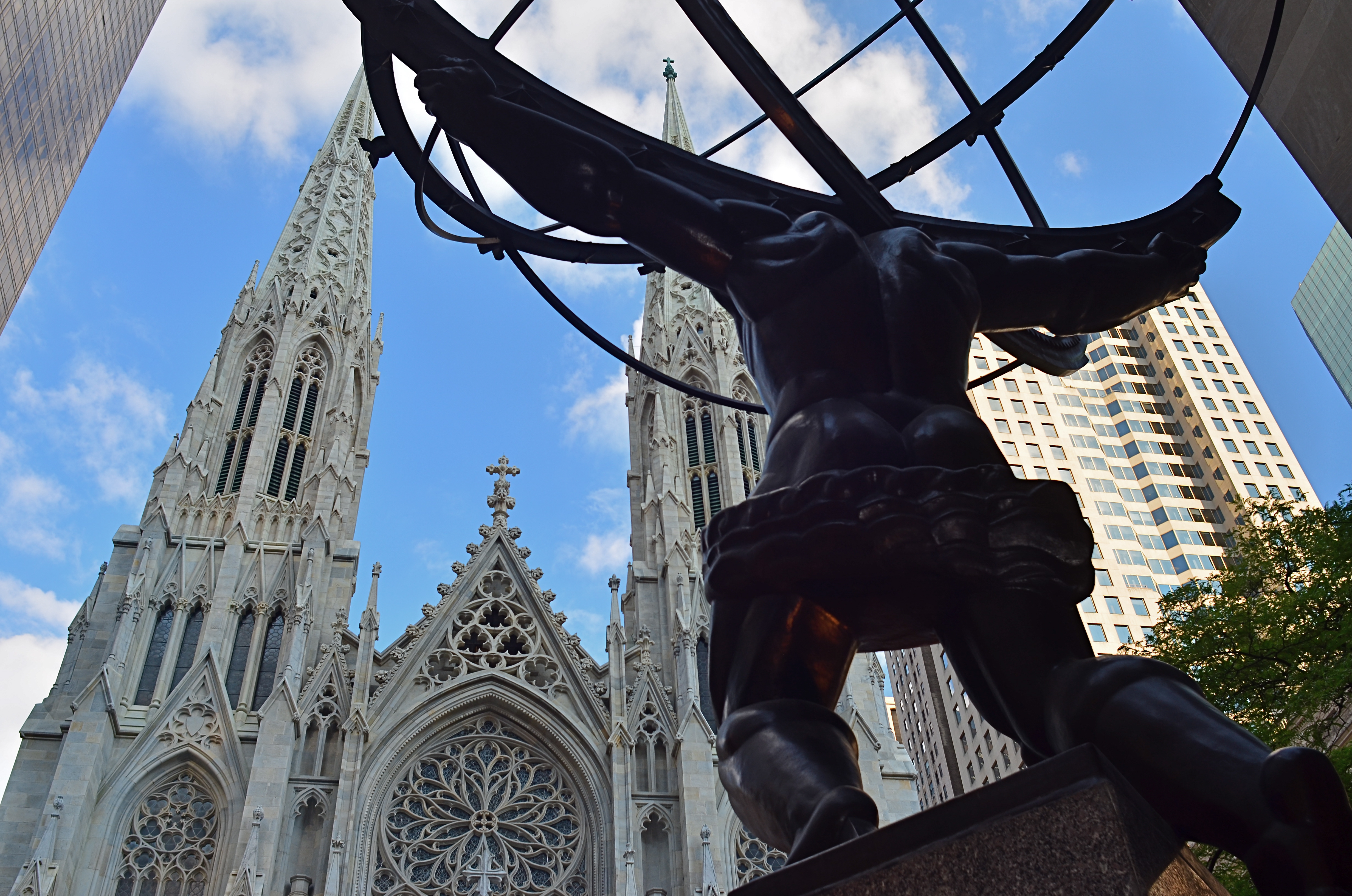
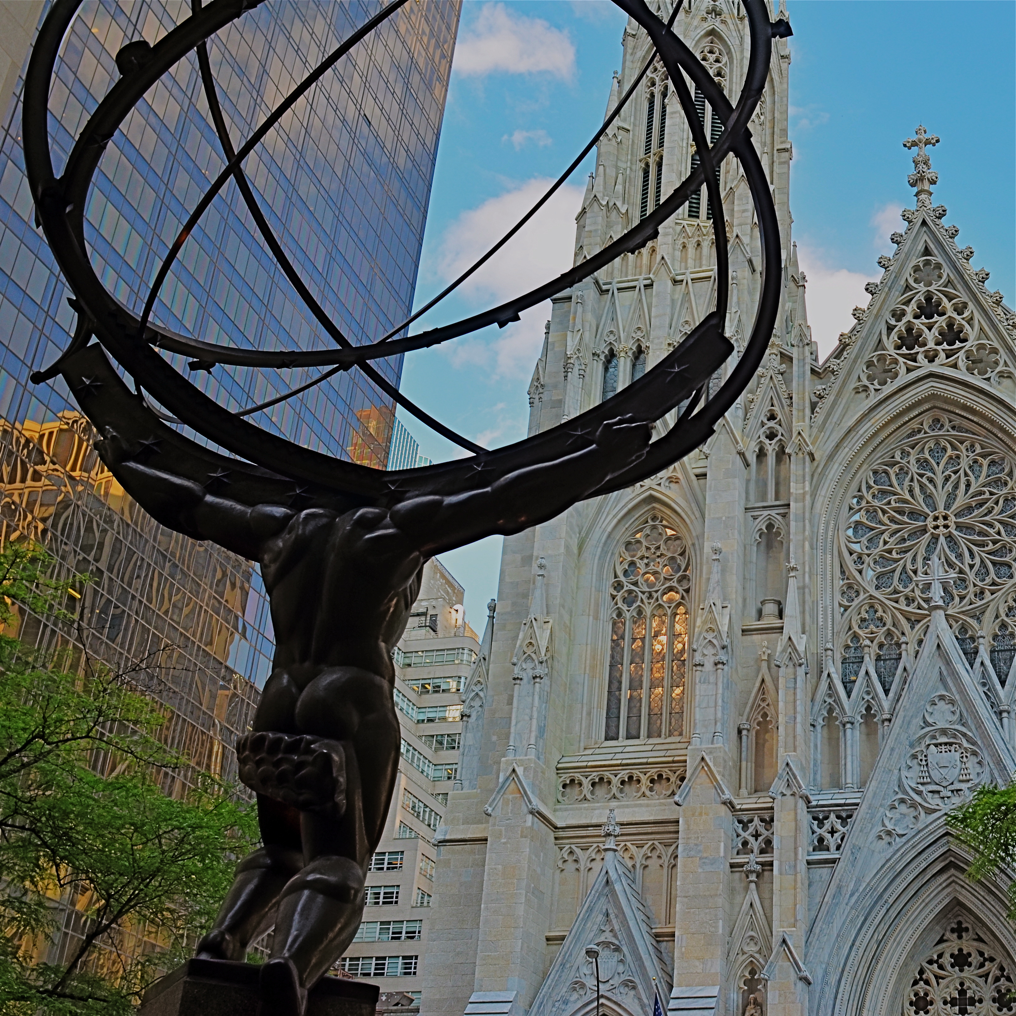
In the shot at the top of the page, I was interested in shooting Paul Manship’s magnificent “Atlas” sculpture, located along the Fifth Avenue edge of Rockefeller Center, from the rear, to accentuate the amazing musculature of the figure and get him in the same frame as the front of St. Patrick’s Cathedral. Now, there’s already plenty of drama in the statue’s pose as is, but in the first photo, I angled the lens further upward to get an even bigger arc of action. In the lower image, I simply changed the up-down angle of the same 24mm lens I was using to get angles that were a bit more normal. Two different effects, just inches away from each other in approach and angle, but markedly different in result. Which one’s the keeper? Not my argument and not my problem. However, if I don’t shoot both images, I don’t get to make the choice.
Once more, the advantage of digital is pronounced. You can now shoot everything you think you might need. We’re not counting “roll” exposures in our heads any more. We can’t “run out of film”, so click away. Shoot it all while you’ve got it in front of you and throw everything you know how to try at the problem at hand. The bad pictures will speed the arrival of the good ones.
IMPRECISE BUT TRUE
What makes an image work for you? Could it be explained in words? Or isn’t that what the image is for? 1/60 sec., f/4, ISO 400, 35mm.
By MICHAEL PERKINS
AN ELOQUENTLY DETAILED ANALYSIS OF A POWERFUL PHOTOGRAPH, which I read in a recent edition of the New York Times, convinced me anew that, apart from a few compositional basics, no one really knows what makes an image “work”. Beginners love to sing the praises of the Rule Of Thirds as a guideline for composition, and, likewise, critics rhapsodize about Golden Ratios as a way to dissect how powerful elements occupy space in great photos. But the dirty little secret about composition is that there is no dirty little secret, no Laws of Gravity or Relativity that, if consistently obeyed, will yield consistent excellence.
This doesn’t mean that we can’t emotionally identify which pictures have power, as well as those that merely lie there. It merely means that there may never be adequate verbal artillery to reduce those feelings to a law, a handbook, or a credo. We arrive with our cameras at places where there may, or may not be, a picture. Our eye tells us that something important can be extracted, isolated, amplified, re-contextualized. Beyond that, it’s a matter of fate and luck.
Of course, the more we experience what works, the better we are at seeing it in the raw and extracting better and better examples of it. However, every ride of the bucking bronco is distinctly different from all the others. Photography has certain mechanical techniques that can be mastered, certainly, but we can’t learn emotional impact in a class. We can only pour something out into the camera from what is already inside us.
Try to imagine walking up to a chalkboard and reducing your favorite photograph to a series of shorthand symbols reminiscent of a mathematician’s equation. Could anything be more bloodless, more clinical? Critics and analysts sometimes come from the ranks of doers, but many of the very best doers resist the temptation to dissect their art as if it were a lab frog. Henri Cartier-Bresson, the acknowledged Moses of street photography, once recalled that it was seeing another shooter’s best work that made him say, “Damn It!”, grab his camera, and head outside, obsessed with making something of his own that could incite such a reaction.
Photographers seize instinct and emotion in the raw and forge them into a kind of sense-fired steel. Frame a picture with that steel and it will speak a thousand times louder than any mere dissertation.
POINTERS
A traditional wide-angle approach to the suggestion of depth.
By MICHAEL PERKINS
WE ALL WENT THROUGH THAT OLD PERSPECTIVE EXERCISE IN ART 101. You know, the one where we draw the train tracks trailing away to an imaginary horizon, compressing the distance between the tracks as they “recede” to suggest depth, or a simulation of the way our eyes perceive it. It’s a lesson that dances somewhere back in our lizard brain whenever we compose a shot to suggest three dimensions on a flat plane (film or sensor) that only possesses two. Ongoing challenge, etc., etc.
In composing a photograph, it’s pretty easy to decide which factors in the picture actually aid that illusion, creating a big fat neon arrow to the thing we’re want to draw attention to. And some ways are better than others at selling that idea. One of the strong myths about these kinds of shots is that you need a wide-angle to make the argument for depth. Of course, that’s like a lot of “rules” in photography. It’s always true, except in those cases when it’s kinda…not.
In the top image, shot with a 24mm lens, the building at the back of the shot is lit better than the two alley walls that lead to it….a basic no-brainer of a composition. Moving left or right a bit can put the major emphasis on one wall or the other to be the arrow pointing to that object, or you can make the shot even more compact, although no less effective, in the cropping process.
Instead of two leading lines heading for the building at the back, let’s try just one.
Of the two walls, the rows of trash cans and receding lines of windows on the left seem, at least to me, to lead more powerfully to the back building than the right, where detail is darker and objects that could act as a leading line are a little more angled and compressed. Just for kicks, I cropped the shot to a square you see just above, reframing the back building as the end of a straight, single diagonal along the left wall, making the instruction to the eye a lot more streamlined.
It’s not that the fuller frame is “wrong” per se, but I always believe that inside many shots just might be a better shot waiting to get out. Some photographs are full-born in-camera, while others emerge during what I call the “on second thought” phase.
Now to try this idea out at a railroad crossing….
THE LONG AND SHORT OF IT
This original frame was just, um, all right, and I kept wanting to go back and find something more effective within it.
By MICHAEL PERKINS
THE INTRODUCTION OF THE FIRST PANORAMIC CAMERAS in the 1840’s can be seen as a freeing-up of the camera frame, a way to more accurately depict the entire field of view open to the human eye. And, of course that’s true. However, the first panos were also an early attempt by photographers to deliberately direct and orchestrate not only what you see, but how they want you to see it. Let’s concede that the western mind tends to absorb information in linear fashion. We read from left to right, we scan the horizon, and so forth. So making a photograph that instructs you to interpret horizontally is fairly natural.
So the first panos seem like a fairly modest extension of our visual bias. But think about the fundamental change that represented. Suddenly, photographers were saying, there are no rules except the rules I dictate. I decide what a frame is. I arrange not only the information inside the frame, but the frame itself. By re-shaping the box, I re-shape what you are to think about what’s in the box. That’s revolutionary, and today’s shooters would be wise to be mindful of that wonderful power.
I am fond of making what I will generously call “carved” panoramics, shots that began as standard framings but which I have cropped to force a feel of left-to-right linearity. Unlike standard panoramics, the shots were conceived and made with a very different compositional strategy, not necessarily trying to tell a horizontal story. However, on review, some stories-within-stories contain enough strong information to allow them to stand as new, tighter compositions in which the new instruction to the viewer’s eye is quite different from that in the original.
Change the frame, change the message.
The full shot seen at the top of this page may or may not succeed as a typical “urban jungle” snap, in part because it contains both horizontal and vertical indices that can pull the eye all over the place. Since I wasn’t amazed by the shot itself, I decided to select a horizontal framing from its middle real estate that purposely directed the eye to laterally compare the facades of several different buildings stacked tightly down the street. Full disclosure: I also re-contrasted the shot to make the varying colors pop away from each other.
The result still may not be a world-beater, but the very act of cutting has re-directed the sight lines of the picture. For better or worse, I’ve changed the rules of engagement for the photograph. When such surgeries work, you at least fix the problem of extraneous clutter in your pictures, making them easier to read. Then it’s down to whether it was a good read or a beach read.
Hey, the box can’t fix everything.
REVERSAL OF FORTUNE
Spaces like this vast sculpture gallery beg to be visualized from as many angles of view as possible, Diana hunts from the right edge of the frame.
By MICHAEL PERKINS
ANYONE WHO HAS EITHER STUDIED OR DABBLED IN CANDID PHOTOGRAPHY has heard Henri-Cartier-Bresson’s term “the decisive moment”, which refers to that heat-lightning instant when the best possible photograph of a situation or sensation can be made. Of course, you don’t have to really believe that there is a single such moment, and many do not. There may be any one of thirty possible frames to be extracted from even the simplest human subjects, but we seem to always be looking for that salient, isolated image that defines it for all time.
Cartier-Bresson’s pursuit of the decisive moment is usually thought of with regard to photographing human activity, but there is also a mindset about photographing places that there can be a “superior” or “best” angle to view them from. That is why landmarks and monuments yield so many pictures that are so much the same. We all shoot the Eiffel Tower the way that everyone else before us has shot it…..because? Well, there’s a great question.
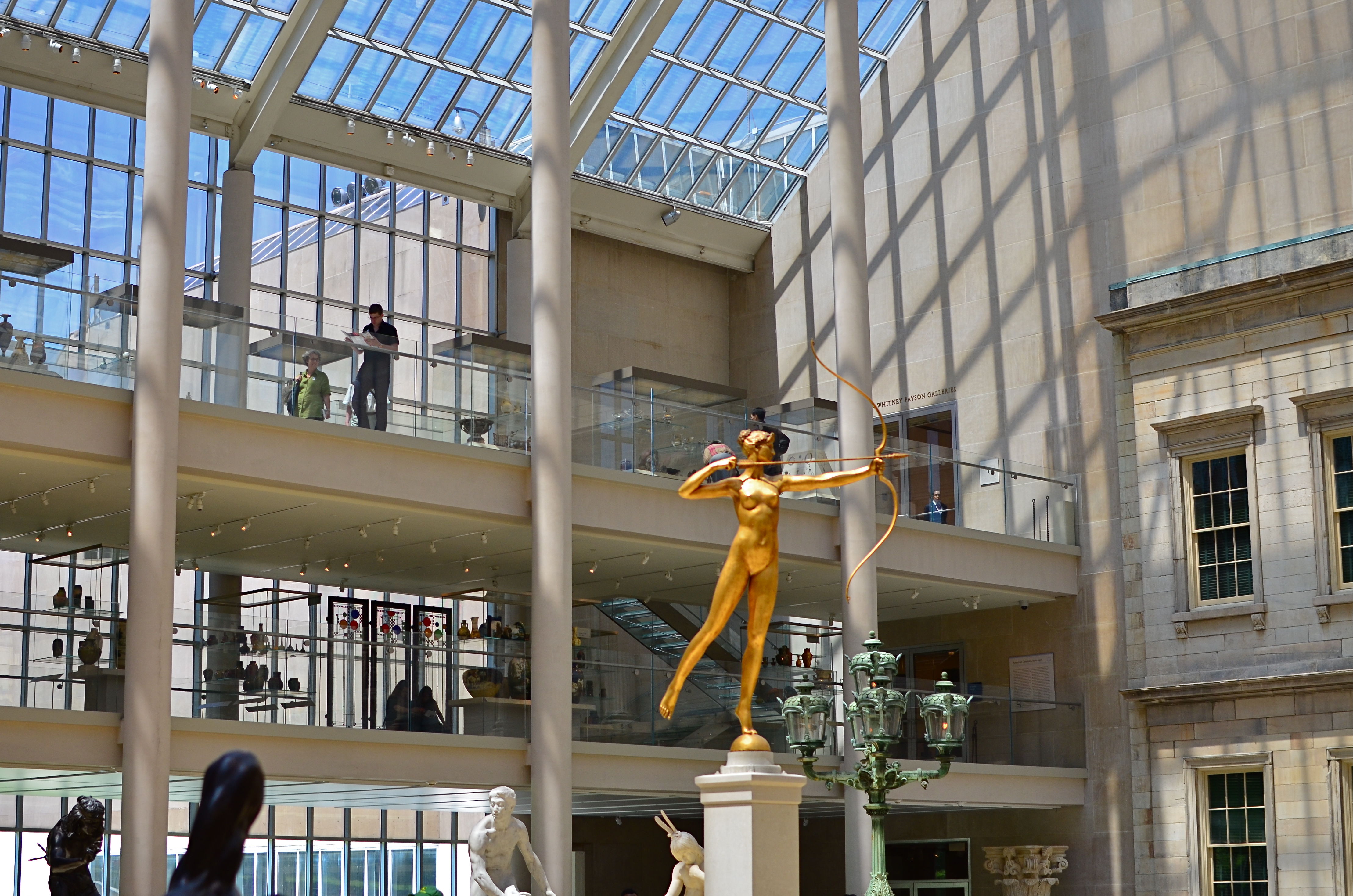
My original, “official” angle on the exact atrium. Diana holds center stage.
Do we think of earlier images of the tower as a standard of some kind that we only certify by imitation? Is our mind eager to catalogue things in their “proper” orientation? Are we only interesting in what things are “supposed” to look like? Ideally, we should be making pictures to authenticate our own visions, not to rubber-stamp those generated before us. And yet, with famous places, it’s often a case of human see, human ape.
We have to teach ourselves to photograph places as if we were the first to ever point a camera at them. It’s not that hard a habit to cultivate, really. Crank yourself around 180 degrees and take the reverse angle. Move six inches to the left and frame the most obvious part of the cathedral, ruins, or palace out of your composition. It might yield nothing, and then again, it might add enough freshness to the image to overcome what I refer to as “tourist fatigue”.
The above image from the sculpture plaza at the Museum of Modern Art in New York is a near reverse of the more conventional view in the smaller color shot at left, which I first featured in the post Put Yourself Out There a while back. In one shot, the Diana statue is center stage. In the other, she is relegated to the edge of the frame, acting as a pointer toward the rest of the photograph’s information. Extra cost in terms of time to get this very different composition? Ten seconds.
It’s not that re-imagining a subject is that hard. It’s that we so seldom question our first imagining of things, often settling for the first, technically successful image we get. And that first image, as we often learn, might only be a dress rehearsal for the real show.
PARAMETERS
By MICHAEL PERKINS
A PHOTOGRAPHER’S IMPACT IS ONLY PARTIALLY CREATED BY WHAT HE CHOOSES TO RECORD. That is, whatever his subject, be it banal or magnificent, his choice of what to shoot is only, at best, half of what makes or breaks his picture.
The other half of the miracle comes not from mastery of light, aperture, gear or conditions. It is in the frame, and what he includes or excludes from it. Landscape mode, portrait mode, big crop or little crop, the frame is the final determinant of how well the image argues for itself. The legendary director of photography for the New York Museum Of Modern Art, John Szarkowksi, expresses this idea for all time in his wonderful book The Photographer’s Eye:
To quote out of context is the essence of the photographer’s craft. The photograph’s edge defines content. The photographer edits the meanings and patterns of the world through an imaginary frame. This frame is the beginning of his picture’s geometry.
Consider, for a moment, the most vital, most inspiring images you’ve ever seen. Now imagine them cropped two inches wider, four inches to the left, five inches higher. The visual terms of engagement would be completely re-ordered. And what would be the result? Would you draw different conclusions, make different assumptions, experience a diminished ( or enhanced) sense of mystery?
The frame, and the choices the photographer makes in its design, is more decisive in the success of a picture than any other single factor. Technically imperfect photos become world-beaters every day simply because the frame is eloquent. And it also follows that a well-crafted bit of exposure can be dulled or blunted by a frame that is carelessly drawn.
The above image represents a choice, the drawing of a visual boundary. The top of the flowers and the objects surrounding the bucket aren’t missing because I shot too close, they’re deliberately excised because I made a deliberate decision that they didn’t add anything to the story I was trying to tell. You can disagree about whether I made the correct choice, but the making of that choice was as important (actually more important) than the subject itself.
Photographs have visual parameters, since we can’t make images big enough to include all of our experience. There are limits on the dimensions of what we show, and intelligent use of those boundaries can transform our work in marvelous ways.
INSIDE OUT
Almost among them: views that selectively depict the life of the street can present unique contexts.
By MICHAEL PERKINS
CITIES ARE A CONTINUOUS POST-GRADUATE COURSE IN THE MILLIONS OF DIFFERENT WAYS TO SEE. They not only afford an endless array of things to visualize, but offer up just as many vantage points or angles to frame, select, show, or conceal them. It’s just as much about how you shoot something as what you selected to shoot.
My favorite images in urban environments are essentially stolen glances. Brief shards of light arrowing past a subway car window. Slanted slashes of sun crawling up an alley wall. And, more recently, views of the street that hide as much as they reveal, teasing winks of the city in all its rhythm as viewed from the inside out.
It might be the tension, or the anticipation of a scene that is not, but is just about to be, cracked fully open. People pass by framed by windows, distorted by warps and reflections, amputated and edited by panels, shadows, partially eclipsed by walls. It’s a visual striptease. Now you see life, now you don’t, now, here it comes again. Sometimes standing just inside the entrance of a building can feel like viewing life at a distance, as anonymously as you might watch surveillance video on a giant screen or a movie in a dark theater.
Photography is one part content and one part context. We have all been surprised when someone standing right next to us points a camera in the same general direction that we do and comes away with a completely different kind of image. That surprise is the shock-reminder of our very individual way of framing and selecting information, and cities offer a remarkable laboratory for sampling all of those variances.
Inside looking out or outside looking in, the view is the thing.
THAT’S YOUR QUEUE
By MICHAEL PERKINS
AS CONVENIENT AND SIMPLE AS MANY PANORAMIC APPS AND TECHNIQUES HAVE BECOME OF LATE, there are many ways to accent a wide linear line of photo information within a standard camera frame. With images shot in very large file sizes these days, (even without shooting in RAW), plenty can be cropped from a photograph to produce the illusion of a wide composition with no loss in quality. It’s the pano look without the pano gear, and it’s a pretty interesting way to do exposition on crowds.
I first started noodling with this in an effort to save images that were crammed with too much non-essential information, most of them random streets shots that were a little busy or just lacking a central “point”. One such image was an across-the-street view of the area around the Chinese Theatre in Hollywood. Lots of building detail, lots of wandering tourists, and too much for a coherent story. Lopping off the top two-thirds of the frame gave me just the passing crowd, an ultra-wide illusion which forced the viewer to review the shot the way you’d “read” a panel in a comic strip, from left to right.
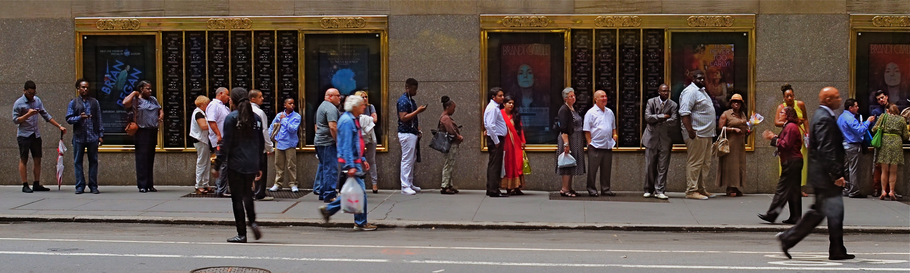
Tickets, Please, New York City, 2015.
Lately, I’ve been looking for a purer version of that crowd, with more space between each person, allowing for a more distinct comparison between individuals. That is, short guy followed by tall woman followed by little kid followed by….you get the idea. Then, last week, I happened upon the ideal situation while shooting randomly through a window that looked out on the 51st street side of New York’s Radio City Music Hall: a long line of folks waiting to pre-purchase event tickets. The space between them and the street rhythm shown by a few out-of-focus passersby was all the composition I needed, so in the editing process I once again aced the top two-thirds of the picture, which had been taken without zoom. A bit of light was lost in shooting through the window, so I added a little color boost and texturizing in Photomatix (not HDR but Tone Compression settings) and there was my pseudo-pano.
It’s a small bit of cropping choreography, but worth trying with your own street shots. As as is the case with many images, you might gain actually strength for your pictures the more ruthlessly you wield the scissors. Some crowd shots benefit by extra context, while others do fine without it. You’ll know what balance you’ll need.
THE ABCs OF TMI
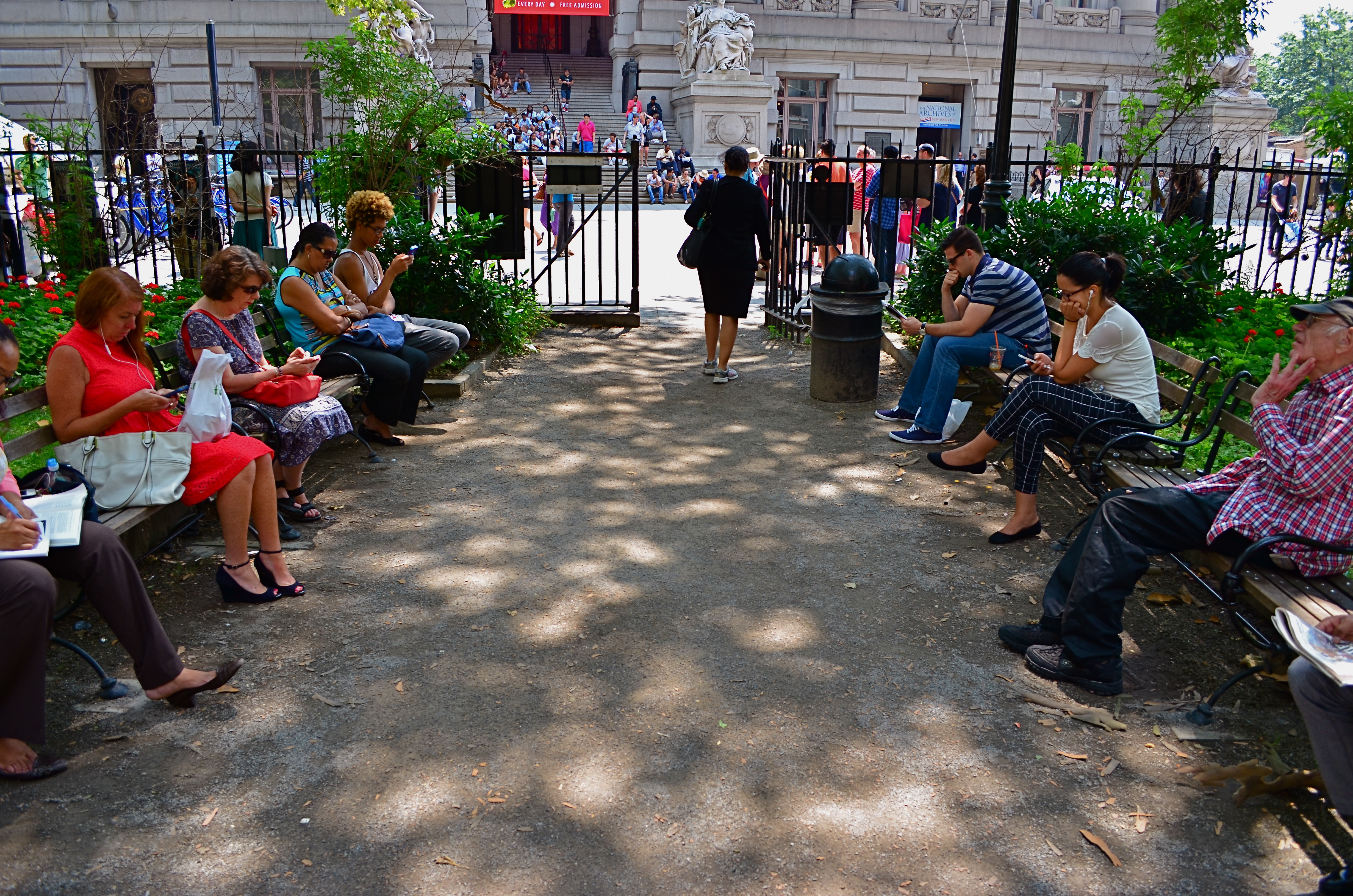
This street shot from a park in lower Manhattan is not ready for prime time, but it might get there with creative cropping.
By MICHAEL PERKINS
FOR ME, ONE OF THE GREATEST ANCILLARY BENEFITS of doing historical research has been the privilege of poring over old files of newspaper and magazine photographs, in many cases viewing original, pre-publication master shots. It’s truly an exercise in reading between the “lines”, those hurried slashes of white grease pencil applied by editors as cropping instructions on shots that were too big, too busy, too slow in getting to the point. In many cases, you realize that, while the photographer may have taken the picture, it was the editor who found the picture.
Of course, no amount of cutting can improve a shot if there is not already a core story hiding within it. You can pare away the skin and seed of an apple, but some apples prove themselves rotten through and through. It’s the same with a photograph. However, if you teach yourself how to spot what, within a frame, is fighting with the central strength of a photo, it becomes obvious where to wield your scissors.
In the master shot image at top, the symmetry of the left and right groups of park visitors is blunted in its effect by the unneeded information along the top and bottom thirds of the frame. The shot is not really about the museum in the distance nor the ground in front of the benches. They just don’t help the flow of the picture, so losing them seems like the easiest way to boost the overall composition.
Now the shot is essentially a wide-angle, and, absent the earlier distractions, a kind of horseshoe curve emerges, tying the two benches together. You might even think of it as an arch shape, with the walking woman at the top acting as a keystone. She now draws attention first to the center, then around the curve, so that getting people to see what I am seeing becomes a lot easier. Finally, there is still a very loud distraction from the color in the shot, so a black-and-white remix keeps the reds and louder colors from “showing off” and lessening the impact of the story. The final result is still no masterpiece, but it does demonstrate that there was a very different picture hiding within the master shot, one that was certainly worth going after.
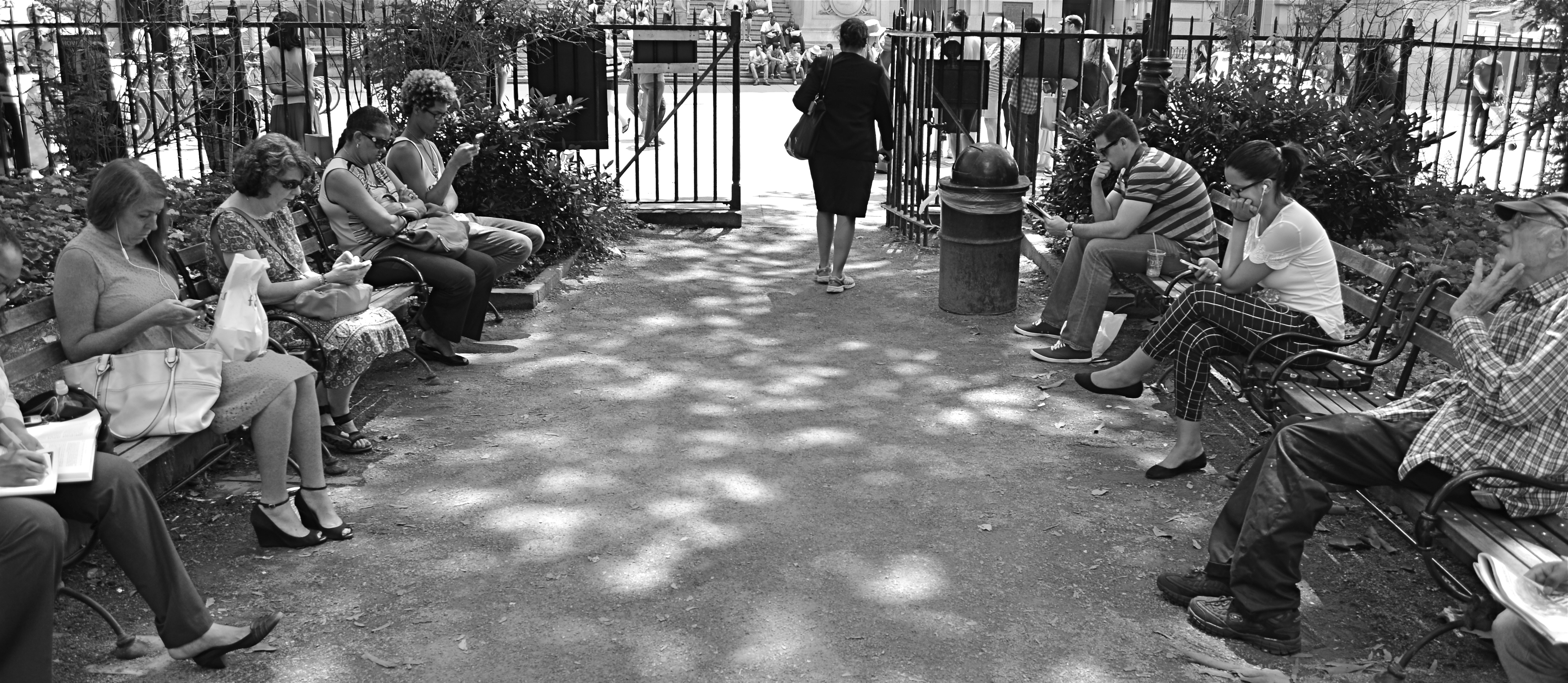
The “after” version, minus the color and some high-and-low-end visual distractions.
One of the downsides of being an amateur shooter is not reaping the benefit of a ruthless photo editor. However, learning to spot the weaknesses in potentially effective shots can be learned, most importantly the “ruthless” part. If you believe in an image, you won’t shy away from trimming its fingernails a bit to give it a chance to shine.
GOING NEGATIVE
Negative space is your best friend when trying to establish scale.
By MICHAEL PERKINS
I got plenty of nothin’, and nothin’s plenty for me. —Ira Gershwin, Porgy and Bess
I BELIEVE THAT MANY PHOTOGRAPHS ARE IMPROVED BY THE SIMPLEST OF MATH OPERATIONS: addition and subtraction. Look at nearly any image you’ve created that “worked” and you can see that there is not one more thing in the image than there needs to be. Something told you to either supply or eliminate elements in the composition until the impact of the picture was maximized. Realizing the reverse effect is pretty easy as well, although not as much fun. If there is one tree too many or one object too few in the frame, you can sense the imbalance in your near-miss pictures. And man, does that hurt.
 We used to refer to open areas of a picture as “blank” space, and were often talked out of using it at all by various A-B-C composition tutorials that told us that large expanses of sky could kill a good landscape. Today, we refer to this unused real estate as “negative” space, but we are now more inclined to see it as well, a positive thing. The take-home from this is, simply, that no technique should be universally ruled out, or ruled in, for every image. Truth is, there are times when not filling the frame with stuff, or selectively making use of negative space boosts the wattage of what you’re trying to say.
Instead of “negative” space, I prefer the term “secondary space”, since what you’re really doing is mapping your pictures into zones of the things that should be of primary interest and those that should complement those things without competing with them. Landscapes are the easiest way to demonstrate this. In the image at left, I wanted to accentuate the distance between the foreground tree and the background mountain. Framing the two elements to merely overlap gave no sense of space, and, in color, actually made the photo busy and hard to read. There seemed to be no primary object in the frame. Composing so that some sky intervened to the right of the tree and the top of the mountain re-established the sense of distance and kept the textures of both objects from fighting with each other.
Secondary space need not be empty. It can take the form of a texture, be it a body of water, cloud formations, a flooring pattern, or a stone wall. The idea is to use the space to support, but never upstage the primary space. Sometimes what you need to complete an image is nothing. You just have to stick the nothing in the right place.
THE FLOATING 50
From Lobby To Terrace, 2015. A near 50% crop from the original, seen below at left.
By MICHAEL PERKINS
YOU CANNOT BECOME A GREAT PHOTOGRAPHER WITHOUT BEING YOUR OWN BEST EDITOR, no matter how brilliant or instinctual your shooter’s eye may be. Art is both addition and subtraction, and the image frame is about both inclusion and exclusion. You get your viewers’ attention by knowing what to show. You hold that attention, and burn your images into their minds, by learning what to pare away.
I’ve written several variations on this theme, so the best way to restate it is in the voice of the truly visionary godfather of street photography, Henri Cartier-Bresson. Ironically, this master of in-camera composition (he is reputed never to have cropped a single shot after it was taken) was nonetheless remarkably aware of what most of us must do to improve an image through post-editing:
This recognition, in real life, of a rhythm of surfaces, lines, and values is for me the essence of photography; composition should be a constant of preoccupation, being a simultaneous coalition – an organic coordination of visual elements. We must avoid snapping away, shooting quickly and without thought, overloading ourselves with unnecessary images that clutter our memory and diminish the clarity of the whole.
Insert whatever is French for “Amen” here.
The original. It’s easy to see what needs to be cut out of this one.
I often find that up to 50% of some of my original shots can later be excised without doing any harm to the core of the photograph, and that, in many cases, actually improving them. Does that mean that my original concept was wrong? Not so much, although there are times when that’s absolutely true. The daunting thing is that the 50% floats around. Sometimes you need to cut the fat in the edges: other times the dead center of the shot is flabby. Sometimes the 50 is aggregate, with 25% trimmed from two different areas of the overall composition.
On occasion, as with the above picture (see the original off to the left), the entire bottom half of the shot drags down the top. In the cropped shot, the long lateral line between indoors and outdoors is much more unbroken, making for a more “readable” shot from left to right. The disappearance of the dark furniture at the bottom of the master shot creates no problems, and actually solves a few. Do a disciplined search of the nobler near-misses in your own work and see how many floating 50’s you discover. Freeing your shots of the things that “clutter our memory and diminish the clarity of the whole” is humbling, but it’s also a revelation.
SQUARE STORIES
Overhang, 2015.
By MICHAEL PERKINS
BETTER PHOTO HISTORIANS THAN ME WOULD BE ABLE to pinpoint the precise moment in time when the landscape-sized image first eclipsed the square image for most photo shooters. I’d tackle the search myself, but it’s late, and I’m about a martini and a half too far into relax mode, so there it is. But, regardless of the exact instant it first began to wane, the square is back, and bigger than ever, its refreshed use as a distinct mode of composition greeted like a revelation, rather than a return. Cool beans.
The unilateral quadrangle (I get wordy when I drink) managed to barely survive on the periphery of photography, even as the square-centric Polaroid print nearly wobbled out of existence, then came back, as hipsters in the lo-fi movement revived the use of instant print cameras. Then cel phones began offering a pre-selectable square setting for their cameras, and that became a thing. But the biggest boost for the square’s comeback came with a thing called Instagram. You may have heard about this quaint little app. I understand the developers made a few bucks on it.
Still, we are pretty universally conditioned to envision pictures in either “landscape” or (flip this up on its side) “portrait” modes, so much so that director Wes Anderson garnered as much press for his use of the old anamorphic aspect ratio in The Grand Budapest Hotel as he did for the movie’s content. Strangely, the square-format photograph is, upon its return, a bit of a retro novelty.
Composing a shot in roughly 1/3 less space than a landscape frame is a challenge, simply because we have fallen out of the habit for a few decades, but it does have a certain elegance. Lately, I have tried to use the square to effectively tell stories that I traditionally saw in vast or wide scenarios. Construction projects are one such case, in that they seem to call for wide angles and far reaching vistas, what we might call scope. The above image is my attempt to express most of what goes into a building project in what some would call cramped quarters. The main story elements, that is, the action, the range of tone, the compositional depth, are all present, but confined within the quadrangle. Of course, with a DSLR, I can’t start with a square, but I can envision where in the shot the best square is, and crop to it in post-processing.
Composing for a given dimension is a discipline, and, as such, it is valuable as a practice tool, since photographers should always be visualizing every possible way to get their story told. The square may be a prison. But it also may be an answer. The end result is what matters most.
SHADOWS AS STAGERS
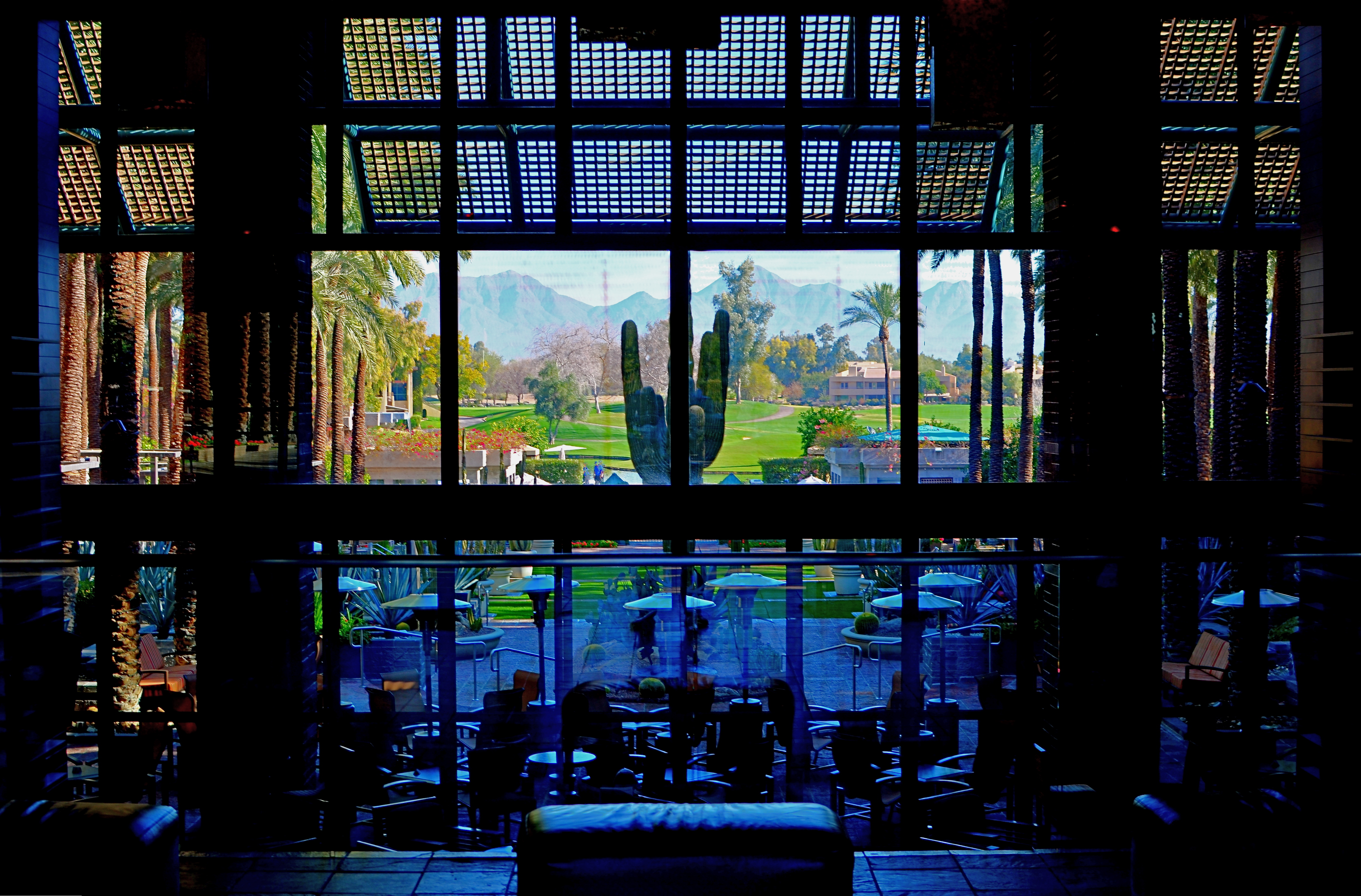
The idea of this image is to highlight what lies beyond the window framing, not the objects in front of it. Lighting should serve that end.
By MICHAEL PERKINS
THOSE WHO ADHERE TO THE CLASSIC “RULE OF THIRDS” system of composition often suggest that you imagine your frame with a nine-space grid super-imposed over it, the better to help you place your subject in the greatest place of visual interest. This place is usually at the intersection of several of these grid lines, and, whether or not you strictly adhere to the “thirds” system, it’s useful to compose your shots purposefully, and the grid does give you a kind of subliminal habit of doing just that.
Sometimes, however, I find that the invisible grid can be rendered briefly visible to become a real part of your composition. That is to say, framing through silhouetted patterns can add a little dimension to an otherwise flat image. Leaving some foreground elements deliberately underlit is kind of a double win, in that it eliminates detail that might read as clutter, and helps hem in the parts of the background items you want to most highlight.
These days, with HDR and other facile post-production fixes multiplying like rabbits on Viagra, the trend has been to recover as much detail from darker elements as possible. However, this effect of everything being magically “lit” at one even level can be a little jarring since it clearly runs counter to the way we truly see. It’s great for novel or fantasy shots, but the good old-fashioned silhouette is the most elemental way to add the perception of depth to a scene as well as steering attention wherever you need it. Shadows can set the stage for certain images in a dramatic fashion.
Cheap. Fast. Easy. Repeat.
