SHOTS AREN’T SEEDS
By MICHAEL PERKINS
I AM TRULY THANKFUL FOR MY PHOTOGRAPHIC FAILURES. And it’s right that I have a benevolent attitude toward the pictures I’ve muffed, since there are so many of them. As a photographer, you pray for the kind of analytical ruthlessness that you need to separate wheat from chaff and label your duds as duds….no excuses, no explanations, no magical thinking that, left in a drawer long enough, these rotten seeds will someday bloom into roses. Once you can call your own stuff worthless, you’re truly on the road toward making something….well, less so.
I have just spent a week giving the (overdue) pink slip to my last and largest remaining archive of really, really bad pictures from the twilight of the film era, about 400 35mm slides that I have been hauling around the globe since the late ’90’s, and none of which, surprisingly, have blossomed into masterpieces since the last three times I pulled them out, shrieked, and sealed them back behind brick walls. Funny how that happens.
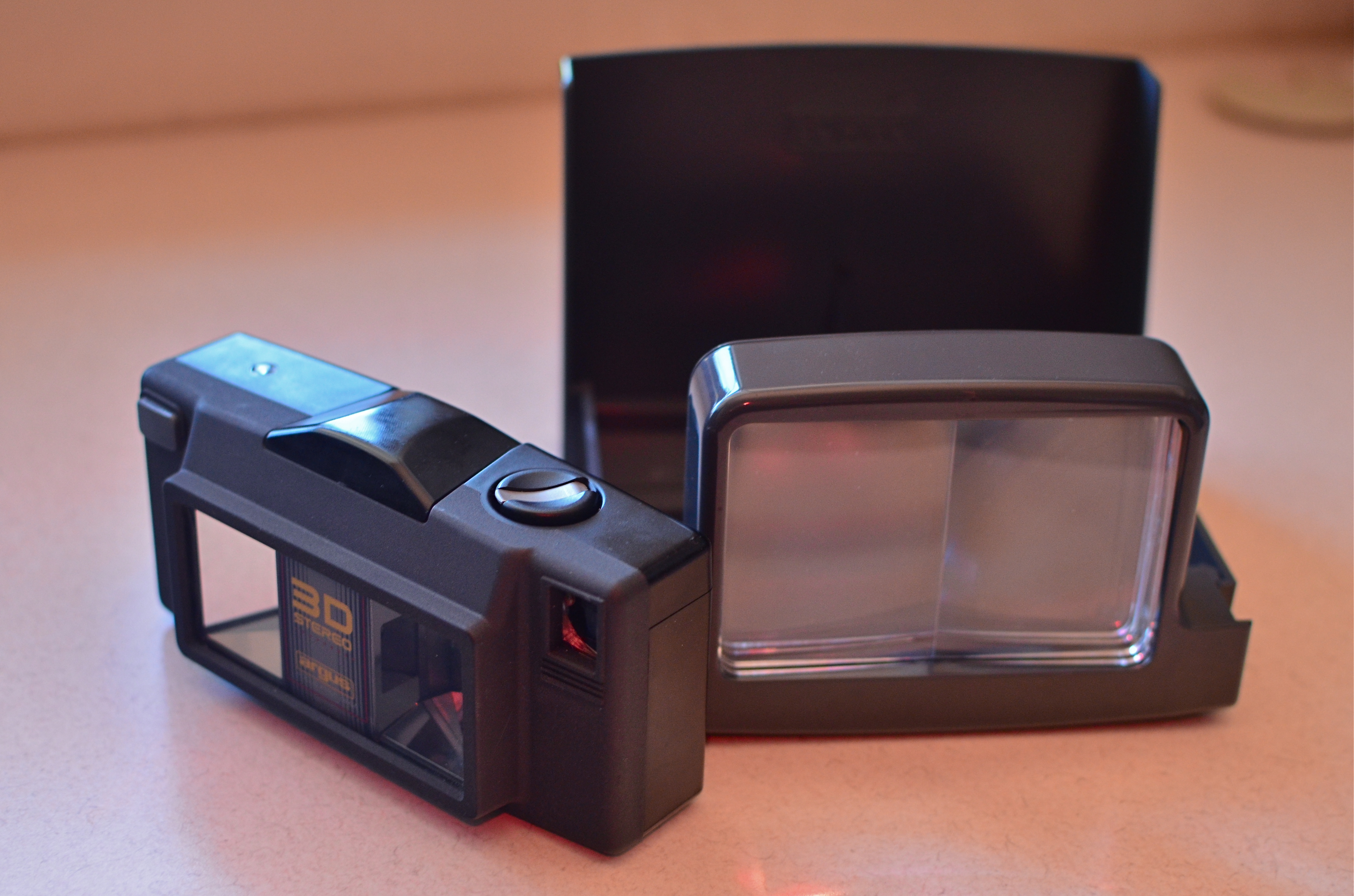
The (somewhat less than) Mighty Argus 3D film camera of the late ’90’s. shown here with its print viewer. Jealous?
This errant tonnage represents my first attempts with 3D photography, which involves a huge learning curve, not to mention a pound and a half of heavy-duty study. At the time I began this journey, very few stereoscopic cameras were available for sale, and the ones that produced the effect the best were also the most technically limited. The Argus/Loreo 3D, my toy of choice, was, in fact, a point-and-shoot 35mm with only two apertures, since the additional depth of field at f/11 and f/18 produced the best stereo illusion. The Argus was produced to create 4 x 6 prints (which you actually had to pay to have printed, remember), each featuring two side-by-side images viewed through a prism holder. It was not intended for high-end art use, since the lenses were frozen at 1/100, there were no additional optics available, and a usable result could only be achieved outdoors, in full daylight.
Worse, I stubbornly decided to shoot slide film in the thing, thus creating a whole separate set of problems for myself. First, were processors supposed to produce both images in the same slide? Well, sure, yeah, they could do that, but how was I going to view them? No worries! Turns out that other fools like me had also shot so-called “half-frame” stereo slides over the decades, and some of the viewers made to serve them were still on Ebay. Of course, I was shooting daylight slide film at 100 ASA in all conditions, and I didn’t yet know enough (or have enough money) to instruct processors on how to “push” the slide film an extra stop or two just to make them a trice lighter, so most of my shots were murky mysteries even Sherlock Holmes couldn’t decipher.
Worse, anyone shooting stereo must learn to compose for the depth effect, something you can only master by taking lots of lousy pictures (I did) or agreeing to take pictures of boring garbage just to attain said effect (did that, too). Add to this that you only had half of a 35mm frame in which to compose and you start to see what a raging success the whole enterprise was destined to be. At one point, I even went so far as to slice the twin images apart, re-jigger them in super-wide slide mounts, find an antediluvian projector that projected those kinds of slides ($$$), then search the globe again for viewing glasses that would allow me to see the projected slides in 3-d. Getting tired yet?
So, farewell to scads of badly composed, boring and unviewable slides, a grim reminder of how expensive and unwieldy large projects were in the film era. Post-script: I eventually thrived by learning to make my own View-Master reels (still expensive and work-intensive, but there’s a reason the format has been around nearly seventy years). At least the entire fiasco finally made a real editor out of me, teaching me a most valuable mantra: bad is bad is bad is bad. Some seeds will never become roses.
DO MESS WITH MR. IN-BETWEEN
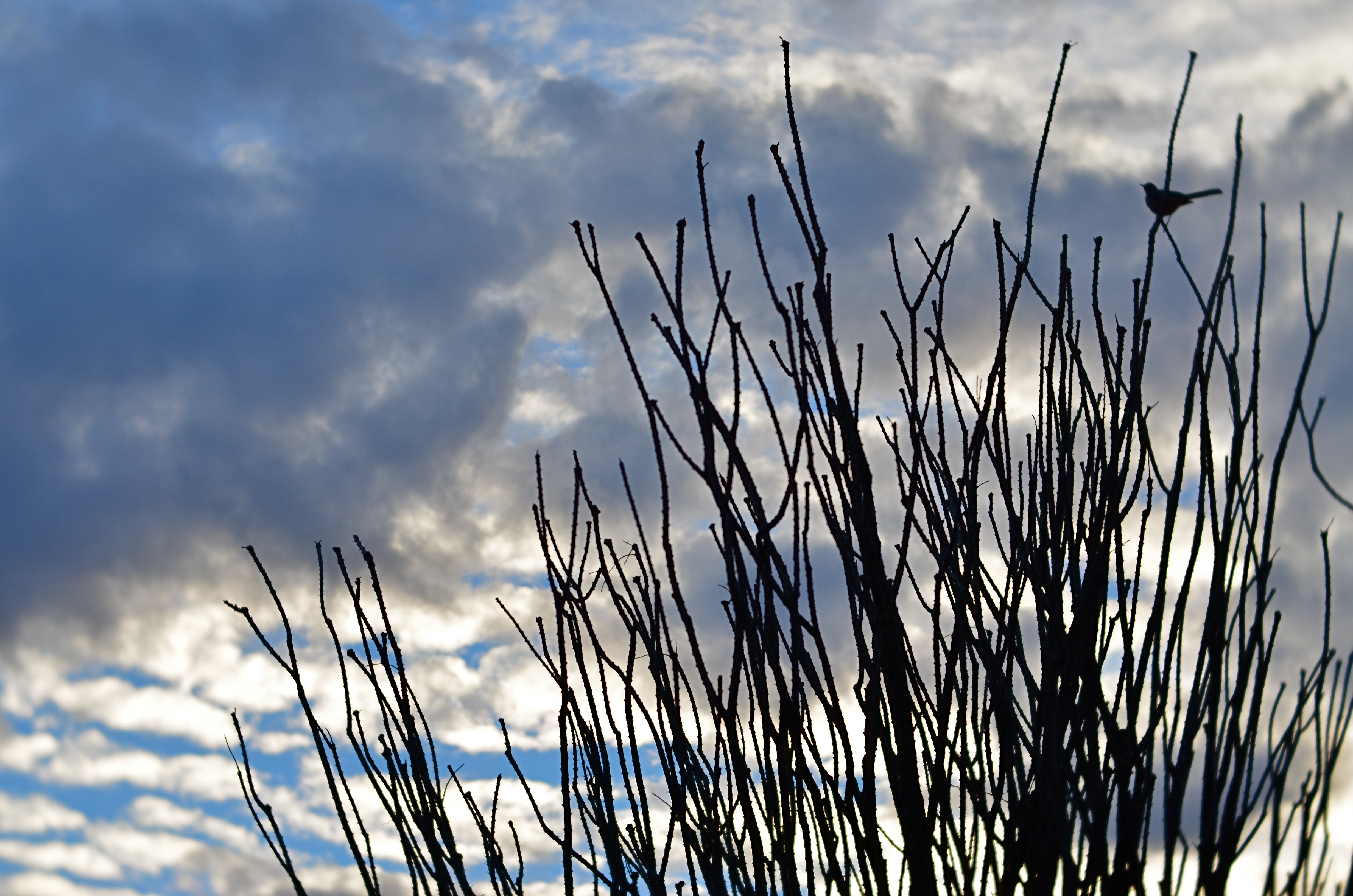
Slot Canyon (2016)
By MICHAEL PERKINS
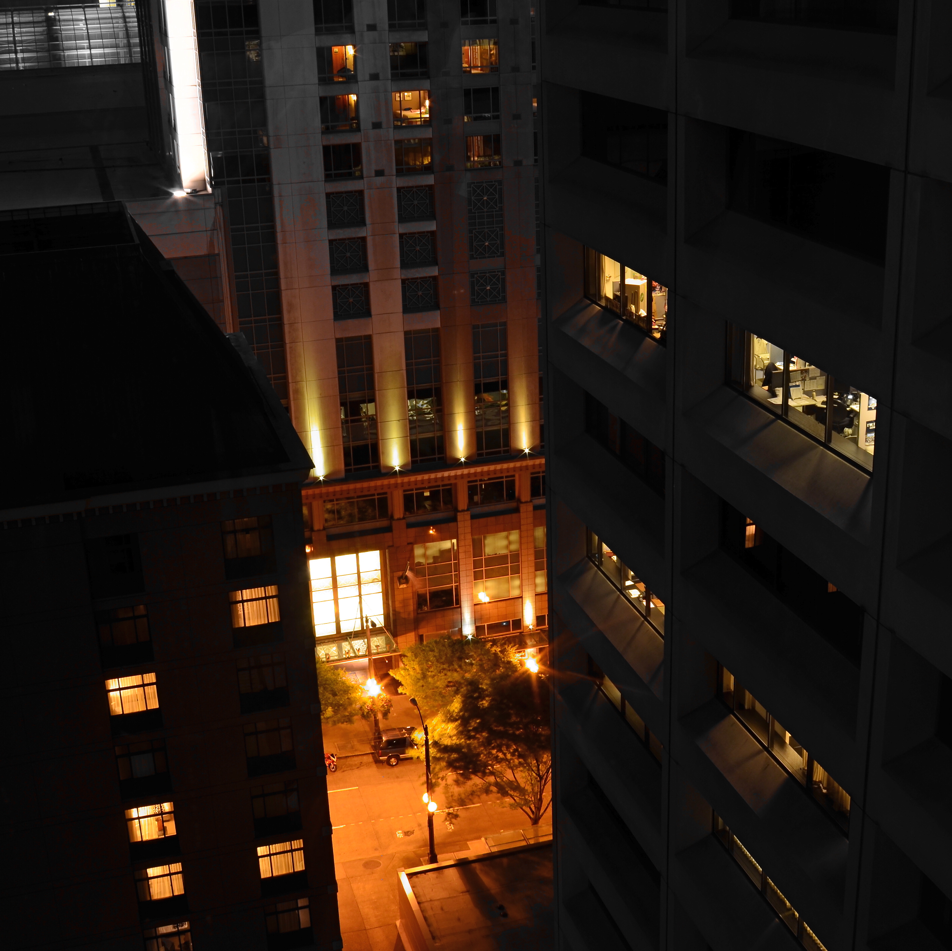
JOHANNES GUTTENBURG, THE MAN WHO DEVELOPED THE FIRST PRACTICAL SYSTEM FOR MOVABLE TYPE, is also said to have invented a kind of periscope, the better to peer over the teeming throngs at the local virgintennial festival. And while there is no record of what he was trying to see (or, more importantly, if he actually did see it), the longing to extend one’s vision around blind corners is one of the tantalizing mysteries of photography. The fact that we can’t make that 45-degree turn infuses many an image with a delicious kind of suspense.
Often when we compose a photo we imply the existence of a certain hidden something that the still image will forever shield from our detection. We photograph shadows that have no progenitors, streets that are halfway concealed by our shooting angle, and, always, the continuation of patterns and dramas that continue outside the boundaries of the frame. That frame has to be drawn somewhere, after all, and no matter how complete we attempt to make our stories within it, the imagination wants to stray toward whatever was “composed out” of the final product.
And therein lies one of the superb teases of our art. We can select scenes that deliberately torture the eye by denying access to What’s Over That Way or Where Does That Lead. We can abruptly rob the eye of the visual payoff for a conundrum that we ourselves have created. We can lie, cheat and steal. That is, I mean, who says you have to play fair with your viewer? Oh, you want me to tell you everything about this picture? Nuts. Figure it out yourself. Was it Colonel Mustard with a candlestick in the study, or….?
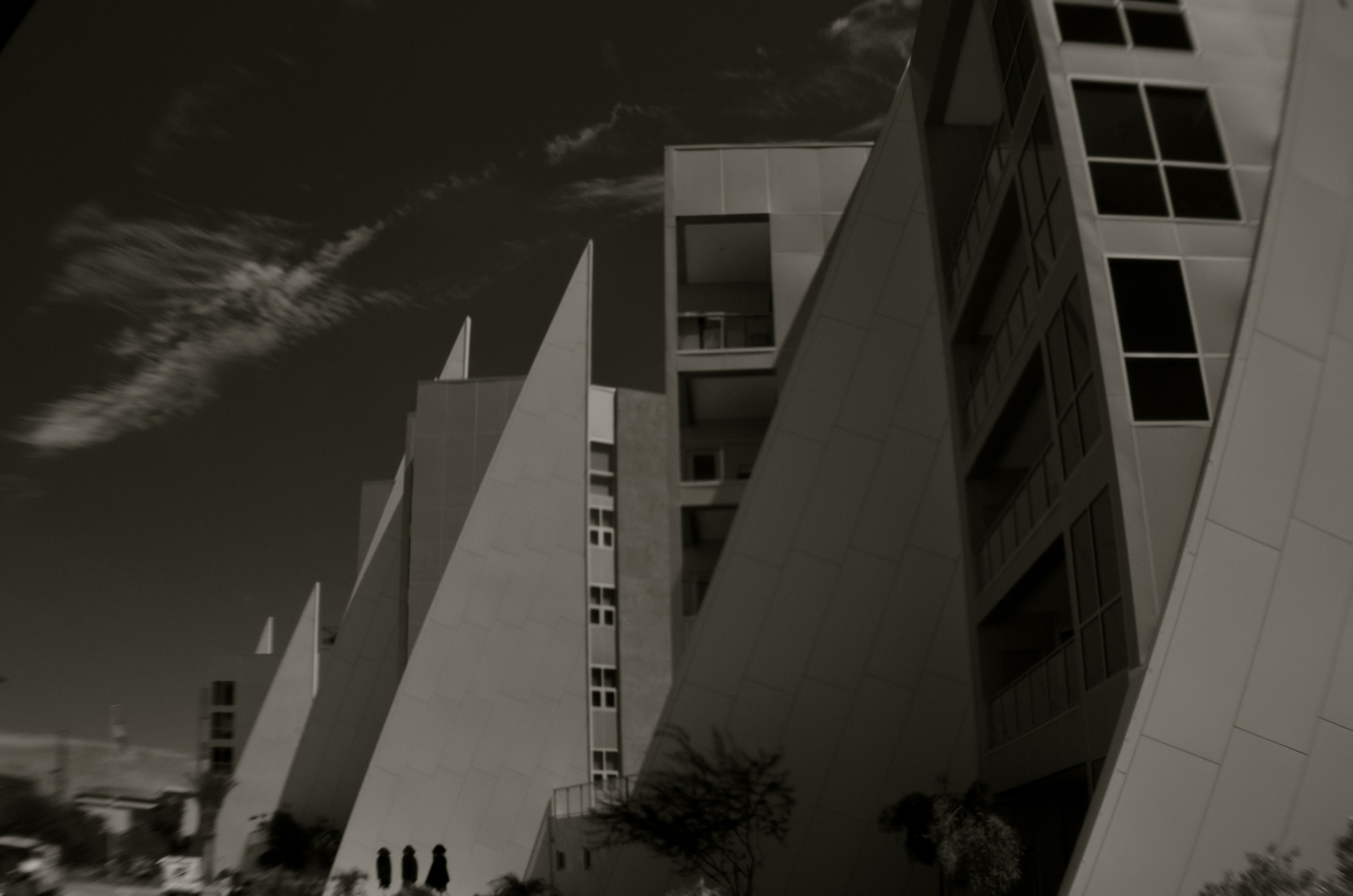
The master shot of the above image was a fairly typical out-the-window view from a hotel room, and originally ran a lot wider. Then it occurred to me that I could almost see something between the two buildings, and I re-cropped to make that “almost” the main part of the picture. Remaking the landscape view into a square introduced a little claustrophobia into the process, forcing the view exactly where I wanted it to hit. And finally, I desaturated all the colors in the shot except the orange of the sodium street lamps to amp up the glow in the aperture between the buildings.
I’m not suggesting that you intentionally make pictures with the sole purpose of messing with people’s minds. But, hee hee, you totally can. What’s around the corner? What’s up the street, beyond the curtain, just out of frame? Your picture, your game, your intentions. Take your audience’s eyes where you want them, and leave them there….between one choice and another.
COMPOSING ON THE RUN
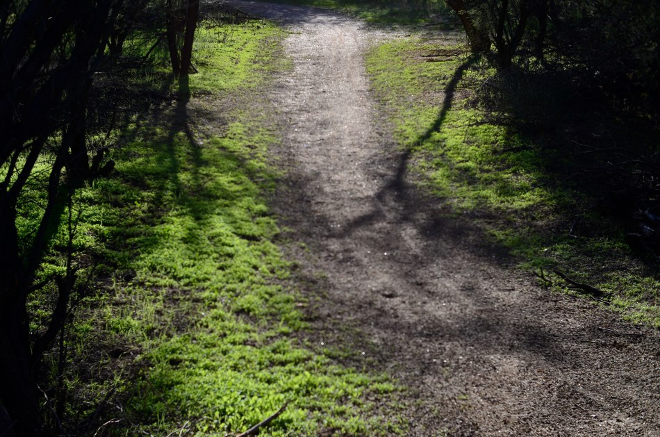
An instinctual snap: sunset light on a forest path. And that’s that….or is it?
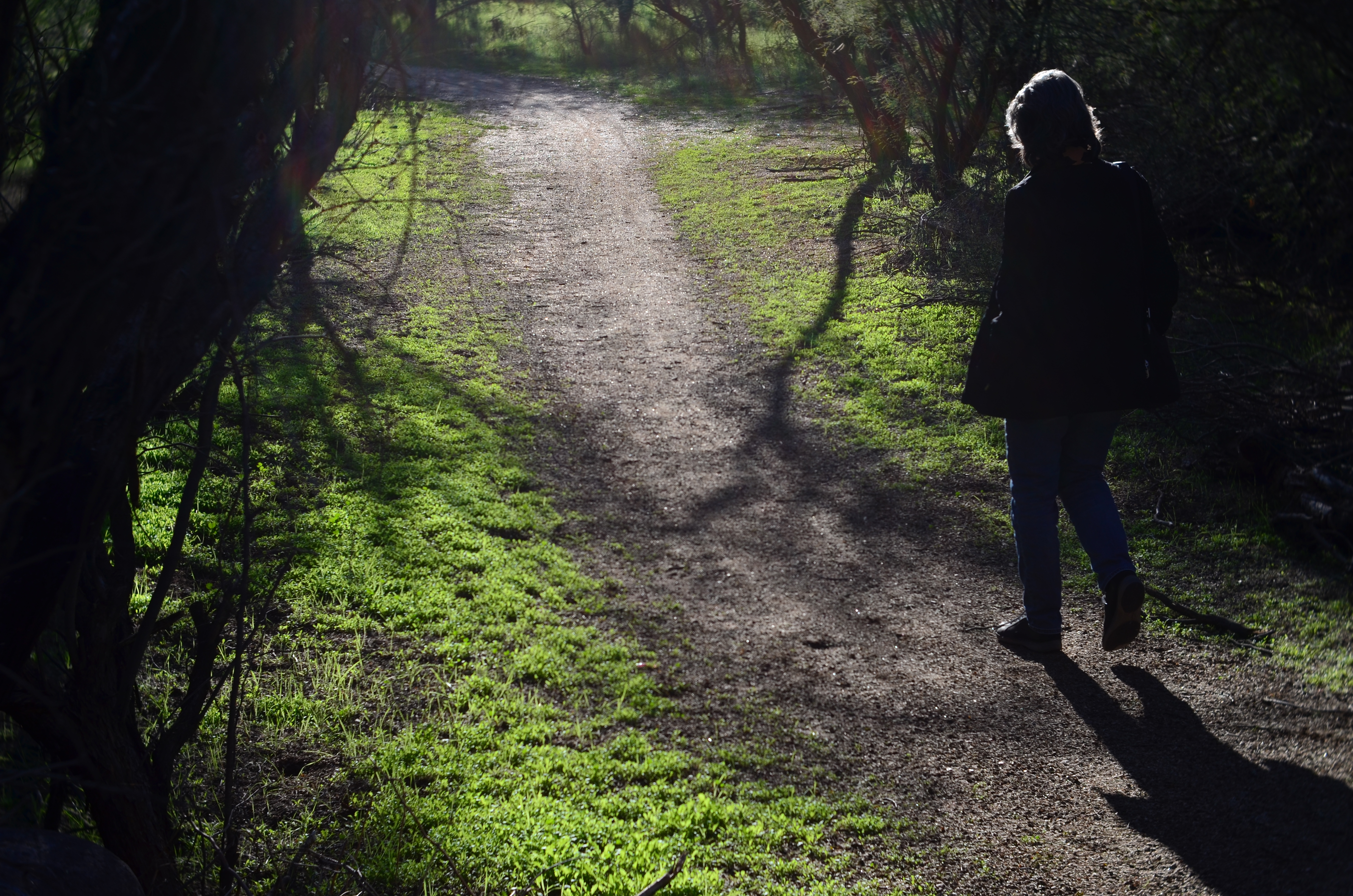
My wife enters the frame a second later.
By MICHAEL PERKINS
LOTS OF OUR BEST PHOTOGRAPHS ARE, EXCUSE THE EXPRESSION, snap judgements. Sometimes a composition simply seems to come fully formed, ready to jump intact into the camera, with no reasonable way to improve on a shot that is 99% pure impulse. Some of these gift moments are so seductive that we may not think to keep shooting beyond what we’ve perceived as the ideal moment. But more shooting may be just what we need.
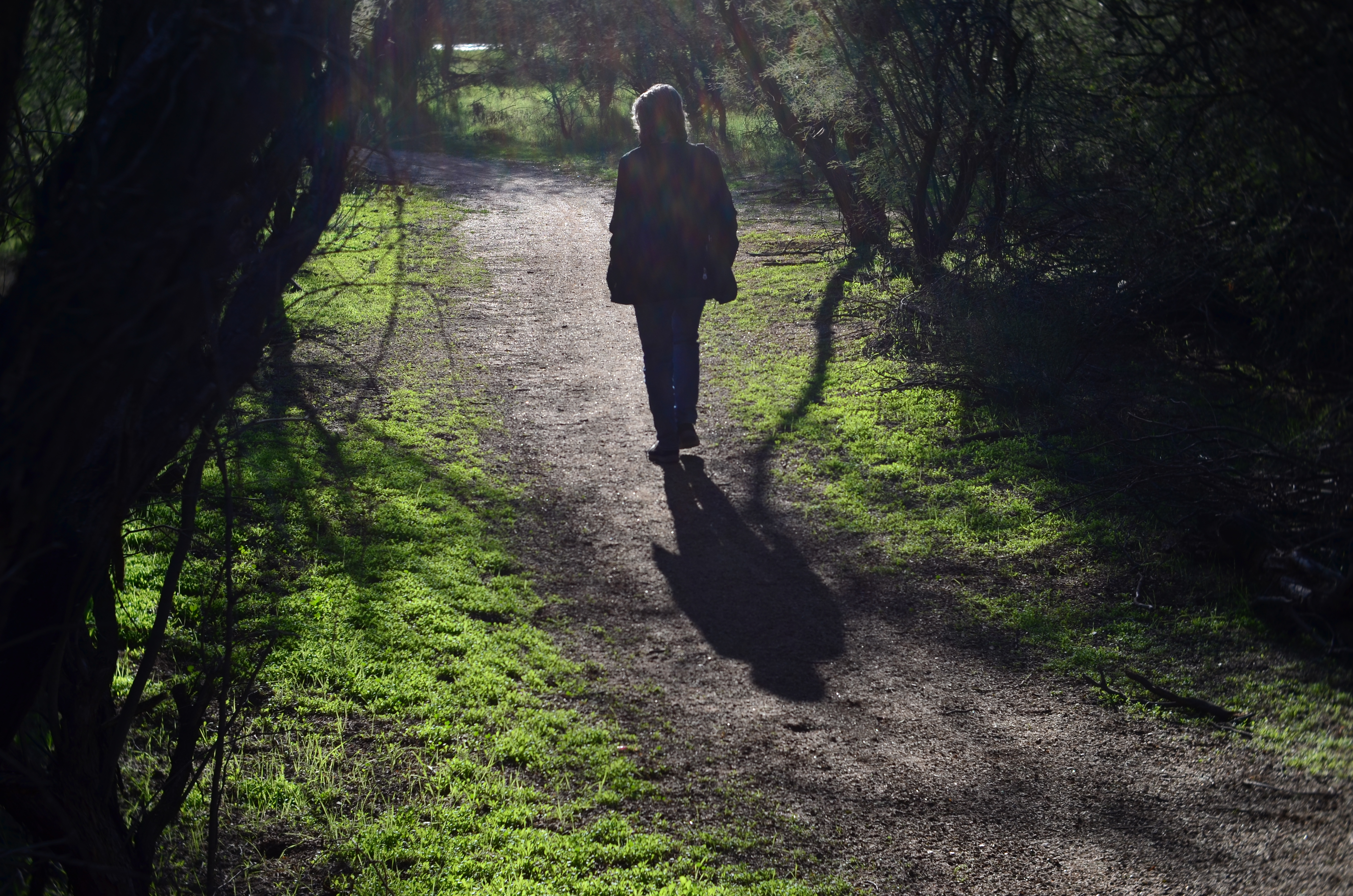
She walks to the upper center of the image..
Images that involve very fast-moving events may only have one key instant where the real storytelling power of the shot comes to a climax, with everything after seen as progressively less dramatic. The second after a baseball is hit: the relaxed smile after the birthday candles are blown out. Think, if you will, of a straight news or journalism image. Every second after the Hindenburg explodes is less and less intense.
But many images can be re-imagined second-by-second, with additional takes offering the photographer vastly different outcomes and choices. In the series shown here, I originally fell in love with the look of sunset on a wooded trail. My first instinct was that the receding path was everything I needed, and I shot the first frame not thinking there would even be a second. My wife, however, decided to walk into the space unexpectedly, and I decided to click additional frames every few seconds as she walked toward the shot’s horizon. She starts off in the lower right corner and walks gently left as she climbs the slight rise in the path, causing her hair to catch a sun flare in the second shot, and placing her in central importance in the composition. By the last shot, however, she is a complete silhouette at the top of the frame, taking her far enough “up” to restore the path to its original prominence with her as a mere accent.
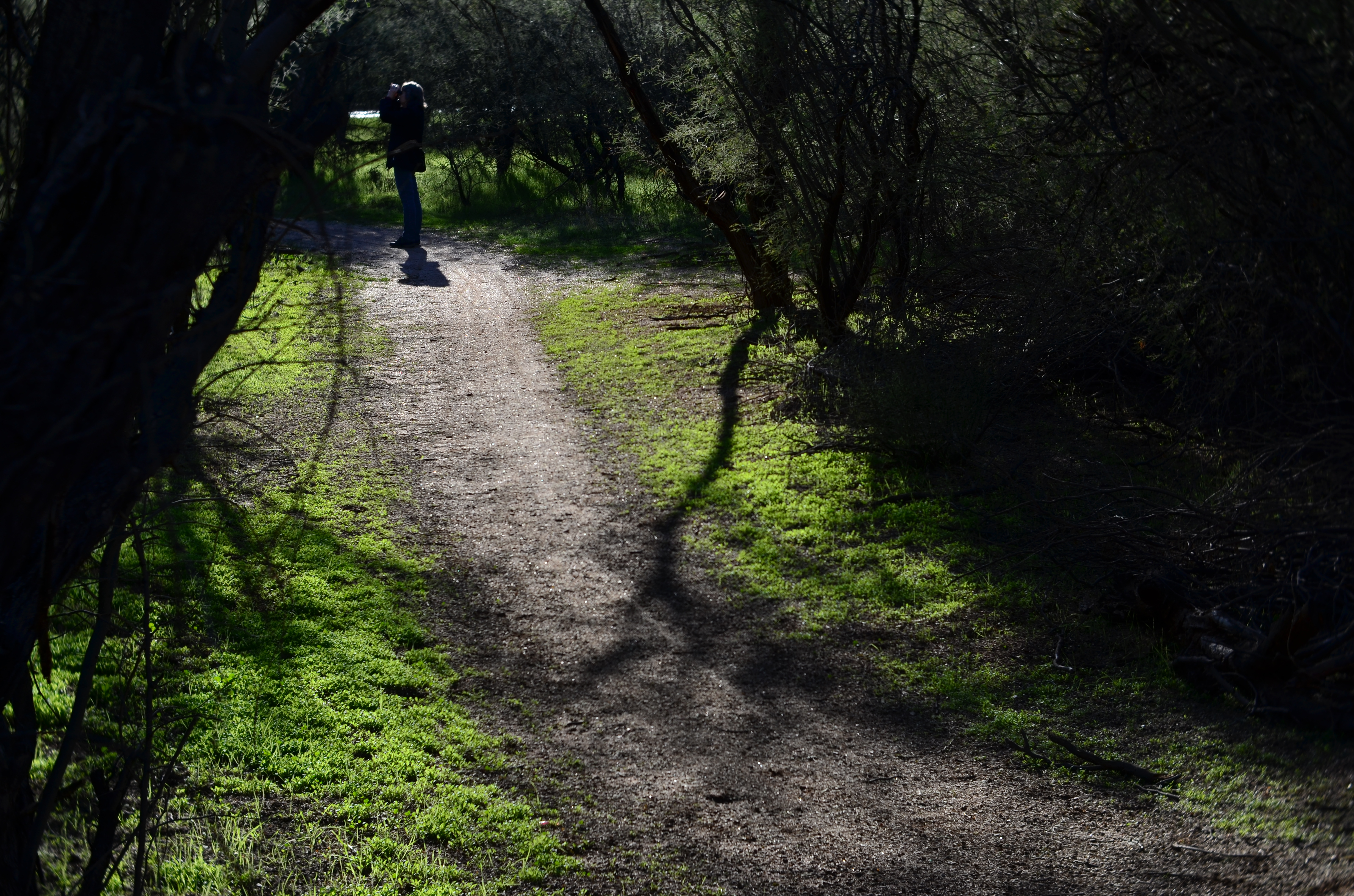
and finally comes to rest as a mere decorative accent/ The trail is now nearly empty once again.
Which shot to take? Anyone’s call, but the point here is that, by continuing to shoot, I had four images to choose from, all with very individualized dynamics, none of which would have been available to me if I’d just decided that my first shot was my best and settled. There will be times when the fullest storytelling power of a photograph is all present right there in your first instinctive snap. When you have time, however, learning to compose on the run can force you to keep re-visualizing your way to lots of other possibilities.
EYEWITNESSED AND UNDERLINED

Does the use of selective focus in this image disqualify it as a “news” photo?
By MICHAEL PERKINS
IT WASN’T LONG AFTER THE INTRODUCTION OF PHOTOGRAPHY that one of the biggest and most durable myths about the new art was launched to generally unquestioning acceptance. The line “the camera doesn’t lie” attached itself to the popular imagination with what seemed the purest of industrial-age logic. Photographs were, to the 19th-century mind, a flawless record of reality, a scientifically reliable registration of light and shadow. And yet the only thing that moved as quickly as photography itself was the race to use the camera to deliberately create illusion, and, eventually, to serve the twin fibbing mills of propaganda and advertising. The camera, it turned out, not only could lie, but did do so, frequently and indetectably.
Later, as photojournalism came into its own, the “doesn’t lie” myth seemed to drape news coverage in some holy mantle of trustworthiness, as if every cameraman were somehow magically neutral in the way he shot an event. This, in spite of the obvious fact that, merely by changing composition, exposure, or processing, the photographer could alter his image’s impact…..its ability to, in effect, transmit “truth”. Certainly, outright fakery got better and better, but, even without deliberately trying to falsify facts, the news photographer still had his own personal eye, an eye which could easily add bias to a seemingly straightforward picture. Did this proclivity make his pictures “lies”?
As a point of discussion, consider the above photo, which is, fundamentally, a document of part of an actual event. But what can really be learned from what’s in the frame? Are there thousands at this rally, or do the attendees shown here constitute the entire turnout? Are all those on hand peaceful and calm, or have I merely turned my lens away from others, immediately adjacent, who may be screaming or gesturing in anger? And how about my use of selective focus with the girl in pink? Am I simply calling attention to her face, the colors in her outfit, her sign, her physical posture… or am I trying to make her argument for her by using blur to make everyone else seem less important? Am I an artist, a reporter, a liar, or all three?
Here’s the thing: since I don’t make my living as a journalist, I can choose any or all of those three job titles without fear of conflict. I work only for myself, so I make no claim for the neutrality of my coverage of anything, including landscapes, still lifes and portraits. I likewise make no guarantees of objectivity in what I regard as an art. Only the observer can decide whether the camera, or I, have “lied”. We repeat this mantra frequently, but it bears clear emphasis: photographs are not (mere) reality. Never were, never can be.
Good thing or bad? You literally take that determination into your own hands.
WORKS IN PROGRESS
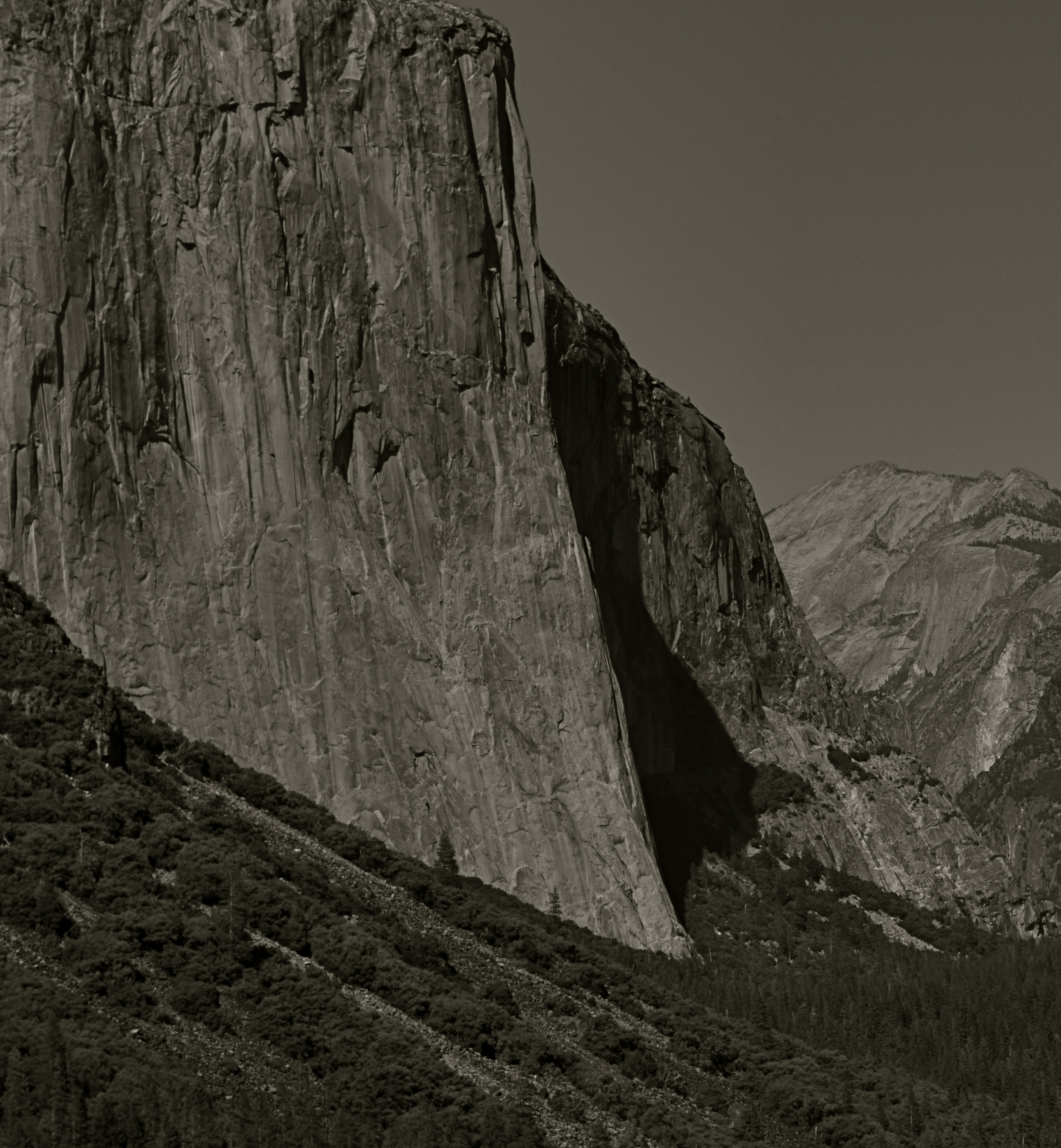
This view of El Capitan in the Yosemite Valley has been annually tweaked with various editing tools since being taken in 2012.
By MICHAEL PERKINS
IN REVIEWING YOUR PAST PHOTOGRAPHIC WORK, you are bound to find shots that you have, for lack of a better term, outgrown. Unpack that word, and what you’re really seeing is the passage of time since you originally visualized a picture, along with the immense distance your eye and mind have traveled en route to the present day. Thus you are both benefitting and suffering from the luxury you enjoyed in being allowed to freeze time. You have not only immobilized a moment, but you have also preserved a record of what your “best practices” were at the time.
This painful but necessary re-assessment applies not only to the techniques used to create the initial image, but, in the incredibly speedy evolution of post-processing, all editing systems as well. Quite simply, if a picture is worth taking, it is worth fighting for…first by being as mindful and deliberate as possible in the taking, and then in a constant re-evaluation of how best to enhance its impact through editing. Therefore, if the first commandment of photography is Always Be Shooting, the second should probably be Never Stop Processing.
The above image is an example of this continuing dialogue. it was originally taken in 2012 and I have revisited it at least annually since then. At the time I first shot it, it was part of a three-shot bracket of exposures that were originally blended in an HDR program to try to get about the same degree of detail in both highlights and shadows….a look which can look great if done with a maximum of understatement, but which often winds up looking like an old Yes album cover under black light. From HDR, I moved on to a series of detail-enhancing programs which were more natural-looking, but still failed to deliver the punch I got from viewing the scene on-site. In one iteration, I added enhancement to a single shot alone, rather than a combination of all three bracketed images. And in 2016, I went back to the trio, mixed this time in an Exposure Fusion blender. And there’s no end in sight.
Ansel Adams, of course, famously re-visited his master negatives with up to a dozen re-mixed versions of the same scenes over decades, re-thinking his own revolutionary “zone system” for measuring exposure for every single particle of a subject, then mastering its application in the lab via burning, dodging and other means of print manipulation. I don’t work with those particular (and essentially film-based) techniques for several reasons, most of them economic. However, that still leaves me plenty of editing choices, with more gimcracks coming online every day.
Point is, pictures that are truly worth working for are also worth re-thinking, and a growing array of tools can give photographers endless ways to re-mix the hits. Of course, you will eventually come to a point where enough is enough. Historically, it’s a good thing that the Pope gave Michelangelo a deadline, or else he’d still be up on that ceiling.
EXQUISITE CORPSES
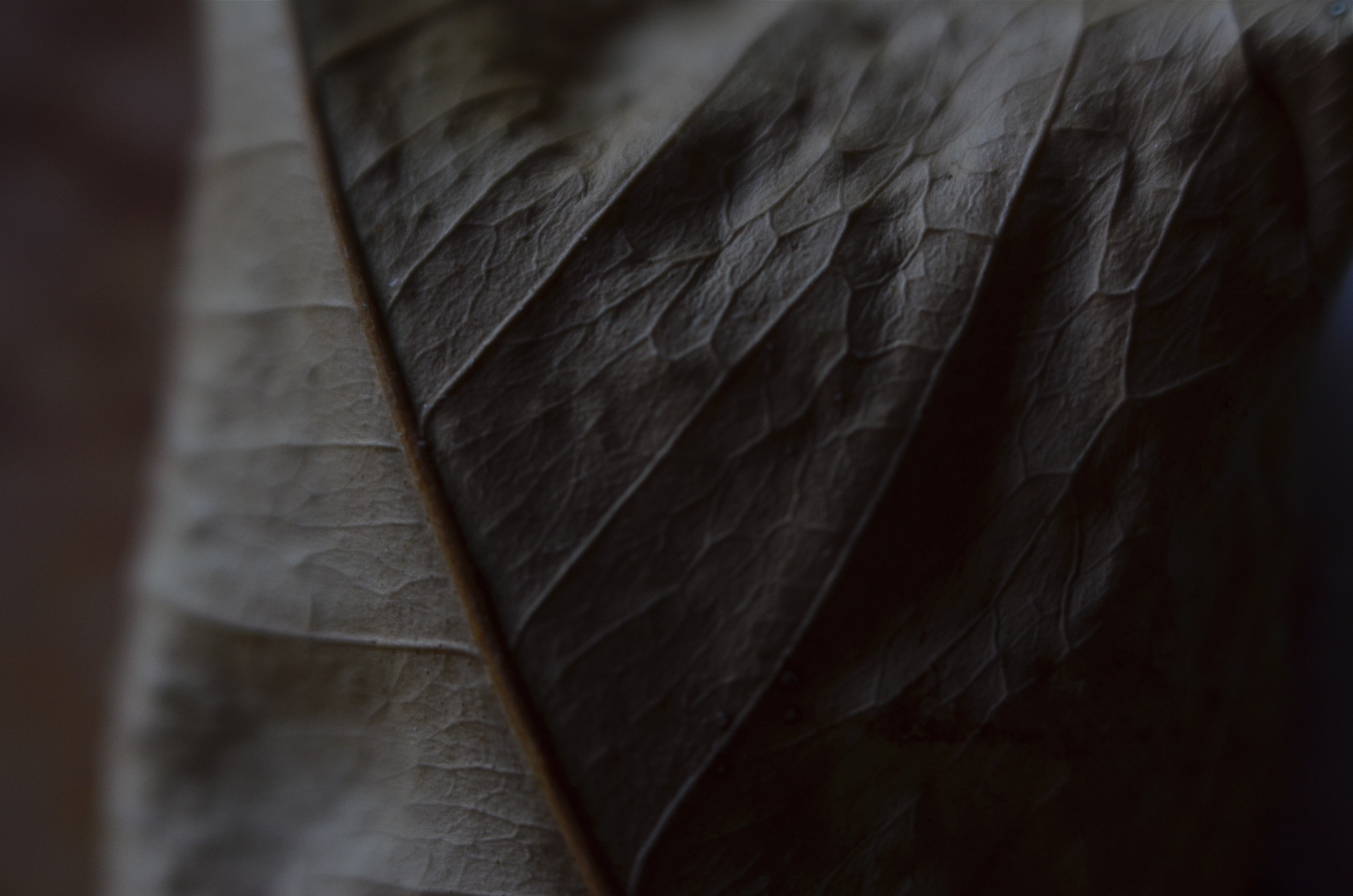
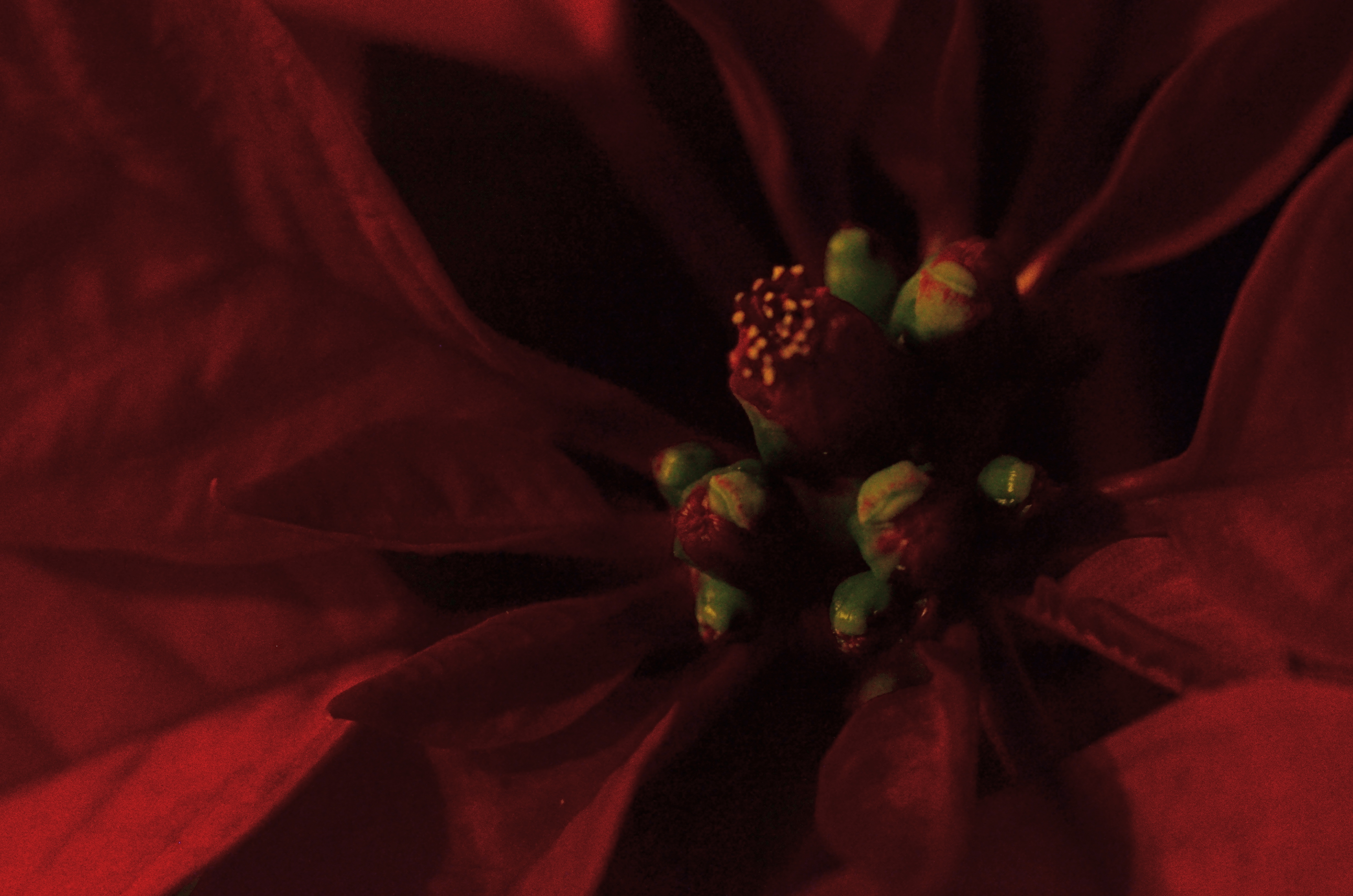
Phytomorphology 2 (2017). Macrophotography helps alter the memory context of familiar objects.
By MICHAEL PERKINS
AS A BOY, THEODORE ROOSEVELT TAUGHT HIMSELF THE ANATOMY OF BIRDS that same way James Audubon did, by studying birds he himself had killed. Although this coldly clinical approach may strike us as cruel today, it was accepted practice for a young naturalist in the late 1800’s, a time when even eminent surgeons, faced with a shortfall of cadavers for academic study, occasionally hired freelancers to raid graves in search of, er, manpower. And so it goes.
At decidedly less risk, photographers have also made still-life studies of dead things, from game kills to seed pods, trying to appreciate structure, design, and function in a controlled environment. But there is more to their pokings than the grand advancement of science, given that death changes things in a way that transforms their aspect, altering their usefulness as visual subjects. Objects that have gone from living to non-living reflect light differently; textures and patterns are re-shaped; in short, the thing becomes an abstraction of itself.
Add magnification to the mix, and a thing becomes completely untethered from our usual conception of it, since, among other things, we are used to viewing it from a distance of feet or inches rather than millimeters. Just as where you stand affects the impact of a landscape, the place where you park a macro lens on an object dictates a completely different story with just the smallest variation.
There is a renewed fascination in the photographic world with minimalist abstraction, in which an object is changed so much in magnification and composition as to become a completely new thing, or…if the photographer so desires, a whole new nothing, a subject with which the viewer has no prior associations, functioning as pure pattern or design. For me, that’s the appeal of macro work…..to take the familiar and render it neutral in meaning, allowing me to re-assign it visually, to ask the viewer to, in effect, regard it as a foreign object, one that can take on whatever significance he sees fit.
Photography is primarily about what to see but it often provides cues as to how to see as well. Viewpoint is verification, and things impart different truths to our eyes, depending on how we approach them.
DEFINING SPACE
The use of an extreme wide-angle lens, like this fisheye, need not generate the bendy look of “barrel distortion”. It’s all in the composition.
By MICHAEL PERKINS
VISIT ENOUGH TOURIST SITES and you will eventually encounter the challenge of capturing very large objects, trying to squeeze the whole of a cathedral or a canyon into a single frame. Using a wide-angle lens is the first instinct, of course, but since even a 35mm is considered a wide-angle of sorts, there are any number of choices that all have their own pluses and minuses.
The lower the millimeter number, of course, the wider the lens. Simple enough on the surface, but you still have to decide what kind of wide you prefer. Each lens has slightly different coverage and properties, with the “super-wides” adding their own distinctive traits to the space you’re trying to capture. The two main properties you’ll notice most are barrel distortion and dimensional exaggeration, both of which will affect your lens choice for a given shooting situation.
Let’s look at barrel distortion. Lenses wider than about 24mm can make straight walls appear to bend outwards like the sides of a barrel, creating an unreal, and, for some, somewhat claustrophobic appearance most associated with the ultimate width of a fisheye (something around 8mm). The effect is that of a world cramped into the inside of a snow globe, and, depending on what look you’re going for, it can either be marvelous or miserable. It’s marvelous, for example, if you want to suggest tremendous depth in a shot.
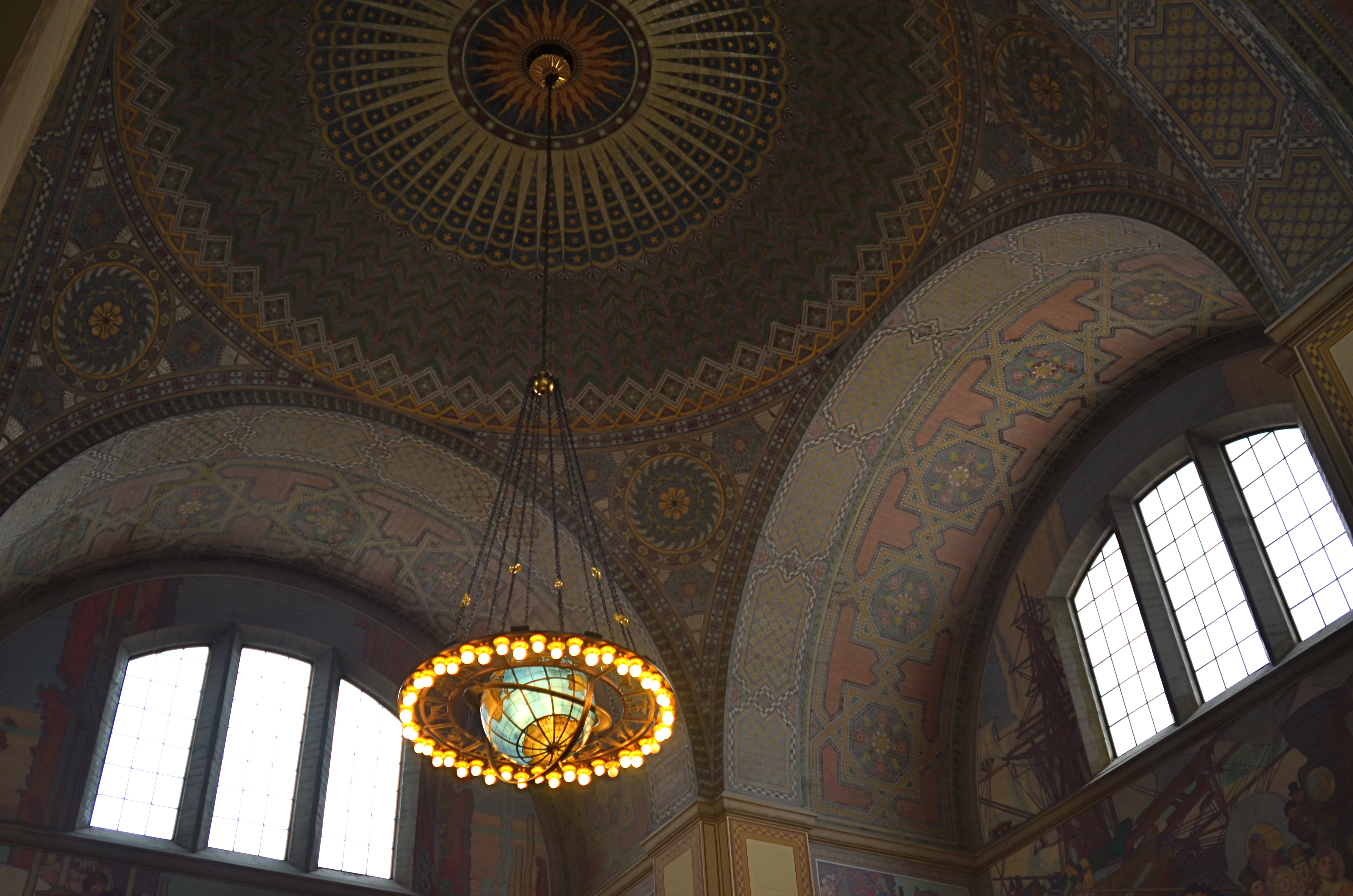
A more modest wide-angle, like this 24mm delivers more conventional dimensions, but not as much coverage.
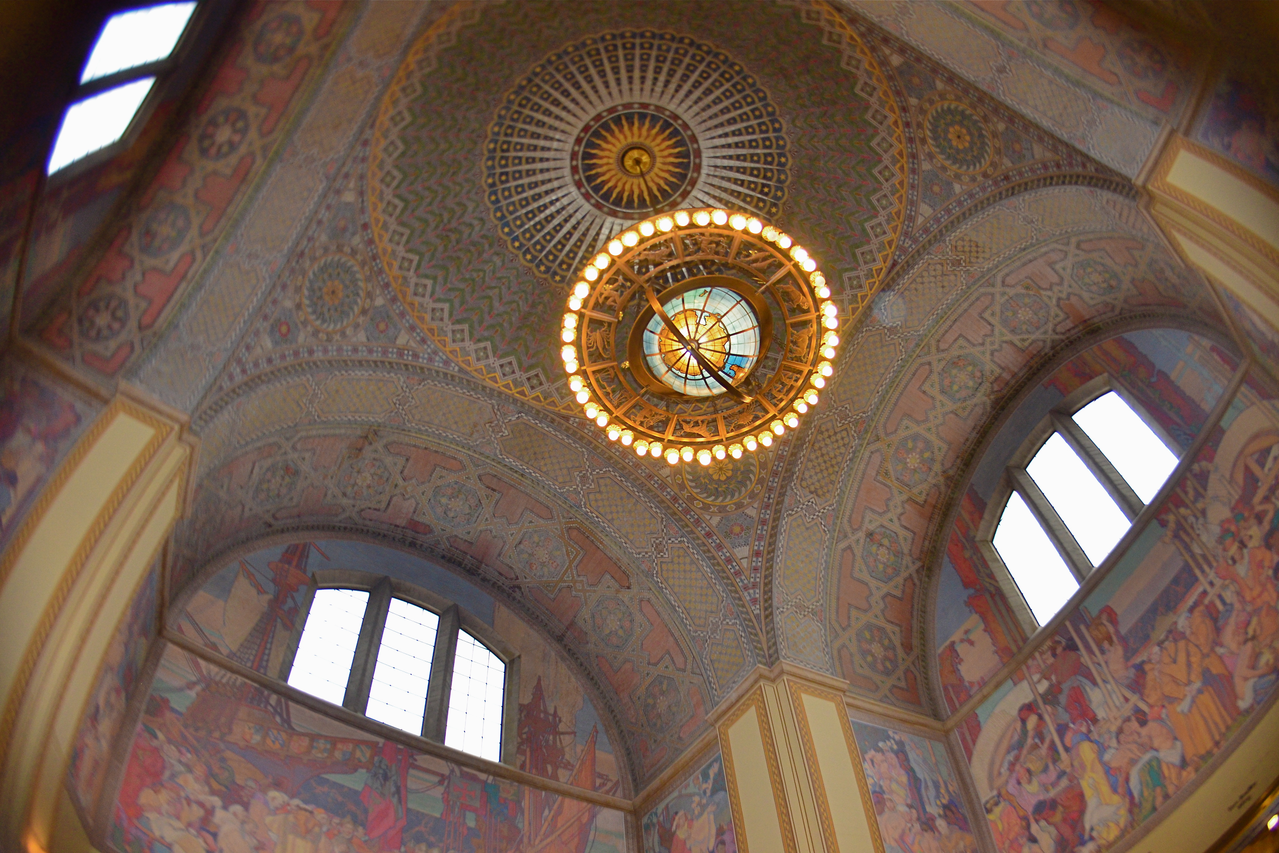
And that’s dimensional exaggeration, the other key trait of a super-wide, in which the perception of distance from front to back is greatly hyped, making a deep space look even deeper. Shooting a cavernous area like the inside of the rotunda at the Los Angeles Central Library, as seen in the frame at top, you may want to suggest vastness, and a fisheye, such as was used here, does that superbly. All I’ve done to defeat the accompanying barrel distortion is to crop away the original frame edges. Of course, using a more conventional focal length like a 24mm, as seen directly above, shows all dimensions in a much more natural way, but they sacrifice coverage area, revealing less of the ceiling and sides and creating the sensation that the shot is not inclusive of enough information. In the case of both lenses, how you frame and where you stand will produce significant variations on how you render the space.
Photography is about what to fill the frame with, of course, but it also involves some planning as to how technology does that best, based on the tools at hand and what they’re equipped to do.
RICH, TALENTED BOY MAKES GOOD
Jacques Henri Lartigue chronicled the gauzy, gay world of upper-class France in the early 1900’s.
By MICHAEL PERKINS
THE MOST APPEALING FEATURE OF EVERY NEW ART is that, for a while, everyone participating in it is an amateur. Because a new art has no history, it has no history-makers….no professionals, no celebrated artistes, no one who is doing it better. Everyone is, briefly, in the same “how-do-you-work-this-thing?” boat.
Of course, eventually, some ornery cuss or another begins to figure out how to progress from stumblebum to star, and then everyone’s off to the races. Photography, like other infant arts, began as a tinkerer’s toy, sprouting an occasional outlier genius here and there, until the pool was fairly crowded with People Trying To Make Their Mark. And one of those first mark-makers was not yet out of short pants when his pictures began to be the embodiment of the phrase “and a little child shall lead them.”
His name was Jacques Henri Lartigue, and, whatever else formed his strong visual sense, it certainly wasn’t the nobility of poverty, born, as he was, in 1894 in France to upper-class wealth and the privilege that went with it. His photographic muse thus contained none of those inspiring Lean, Hungry Years or Hard-won Real World Experiences that we associate with mature art; the kid was just born with an instinctually strong knack for composition, and what he chose to compose just happened to be the activities of the Rich and Famous….in other words, everyone he hung out with.
Lartigue’s social set were the racers and aviators of the sleek new century.
Lartigue’s social set was the class every other social set in France aspired to; the people who seasoned at the Rive Gauche, the people who competed in lawn tennis tournaments, the country’s first race car drivers and aviators. Armed with a simple gift camera, and taught processing by his father, Jacques began snapping the world around him at age seven, maintaining journals that contextualized the images, bookmarking his family’s gilded role in the newborn twentieth century.
Gifted with an eye for photographic narrative, Lartigue nevertheless segued into painting, where he spent virtually his entire adult life. In fact, it was not until a friend showed some of Jacques’ photos to John Szarkowski, director of photography at the New York Museum of Modern Art, that Lartigue had his first formal photographic exhibition, in 1963, when he was sixty-nine.The show led to international recognition of his untutored yet undeniable talent, as well as a few prize portrait commissions and a second social career with the same elite one-percenters with whom he had rubbed elbows as a boy. One of his final collections, Diary Of A Century, was published in cooperation with Richard Avedon in 1978. He died a late-blooming “overnight success” at ninety-two.
What began for Jacques Henri Lartigue as family snapshots became one of the most important chronicles of a vanished world, and thus the best kind of photojournalism (or sociology, depending on your college major). For shooters, this boy of privilege remains the romantic ideal of the talented amateur.
ARRIVALS
By MICHAEL PERKINS
PHOTOGRAPHERS PROBABLY HAVE TO HAVE AT LEAST SOME IDEA OF WHERE THEY’RE HEADED in pursuit of an image, or else basic issues like, Where To Point The Car or Which Path To Take can’t be settled. And there is, even for the instinctual process of creation, something to be said for a basic plan. However, every photographer has experienced the wonder of finding oneself arrived at a great picture-making opportunity when, in fact, you were headed someplace completely different. It’s in such moments, places where Plan A becomes Plan B, C, or D, that the excitement happens.
After you capture an image that essentially works, your mind naturally comes to take ownership of it, just as if that picture were your original intention. But this seldom occurs. Pictures aren’t like Grab-And-Go sandwiches, and very few are just waiting there, fully formed, until you wander by and imprison them in your box. Our final choices for photographs are often the destination in a ride with many stops along the way. We might have come to do this, but we wound up modifying, even abandoning our first instinct to get this instead.
Ocotillo Outpost (2016) 1/640 sec., F/4, ISO 100, 56mm.
The above image is a textbook example of this process. The gorgeous sunset clouds seen here were originally to be the entire composition. The general rule is that skies, by themselves, are usually not sufficiently interesting to be the solo star in a photo, but the light and texture of this particular dusk had convinced me that a minimalist shot might just be possible. However, one of my first framings caught an octotillo shrub in its lower right corner, and that new information sent the picture off in a different direction.
Re-framing to bring the shrub into the entire lower half of the shot and silhouetting it against the sky gave the framing both a sense of scale and depth, and I began to convince myself (moving on to Plan B) that this now two-element picture would be The One. Then a single starling made a landing at the upper right corner of the ocotillo, creating a more obvious initial point of contact for the eye. The viewer would engage the most familiar part of the picture, the bird’s body, then travel leftward to the ocotillo’s jagged tangles, and backwards to the textured sky. Final Plan: C….a three-element image in which the individual parts seemed, at least, to talking with one another.
In the pages of The Normal Eye I keep coming back to this idea of “planned accidents”, or shots that start in one direction and end in another, because the process, once you allow yourself to go with it, can lead to images which, eventually, seem inevitable, as if they never could have been any other way. And those are the ones you keep.
2016: THE YEAR OF SEEING DIFFERENTLY
Isoceles’ Greatest Hits (2016). Our idea of what a photograph “is” must be constantly in play.
By MICHAEL PERKINS
IF YOU SPEND ENOUGH YEARS MAKING PICTURES, you will see, looking back over your shoulder, several visible mile markers indicating when something fundamental changed in how you went about the pursuit of the capture. It can be a simple time line from one camera or lens to the next, or a sequence of shifts in style or emphasis.
For some, it’s the leap from film to digital. For others, the moment when it seemed important to commit anew to monochrome, or the day when one’s work flow took on decidedly new features. For me, it’s always been those events or people who have allowed me to dramatically re-evaluate the process of seeing.
Poring over various things I attempted to do in 2016, I seem to be standing in a niche between how I have traditionally visualized subjects and how I’m aspiring to, marking a more dramatic evolution than I’ve experienced for a while. This change can be simply expressed as a different view of what’s “real” in a picture, brought on by my work with lenses that allowed focus to be more selectively manipulated within an image.
Some of this can be seen in images seen in the new page 20 for 16, clickable at the top of this one. Like other year-end summaries, it tries to cite examples of every type of photograph I attempted over the space of a year, from portraits to still lifes and everything in between. However, unlike most other years, the images have what I might call an evolving view of the role of sharpness; how it features in a composition, how much of it is essential, whether it is even needed at all, given the right conditions.
Some of these explorations in variable sharpness involved embracing a new crop of specialized lenses which either evoke the softer look of vintage glass or allow the shooter to place focus anywhere in the frame, and to any degree desired. However, at least one picture is the product of post-production apps applied to smart phone images, showing, if nothing else, that it’s probably the destination that matters more than the journey. Or not.
As an essential component in all photography, focus is a major determinant in that we think of as a “photograph”, and, in turn, what makes that photograph “real”. However, photography is not merely the recording of the actual but a visualization of the possible. It bridges the gap between tangible and potential. Merely unchaining sharpness, by itself, guarantees nothing in the way of order, and might merely produce chaos. Still, the moment when a particular choice can either enhance or enchant…. that’s we live for; that’s what we reach for.
Thank you again for your kind attention, your advice, and your enthusiasm….and Happy New Year.
THE PICK-UP GAME
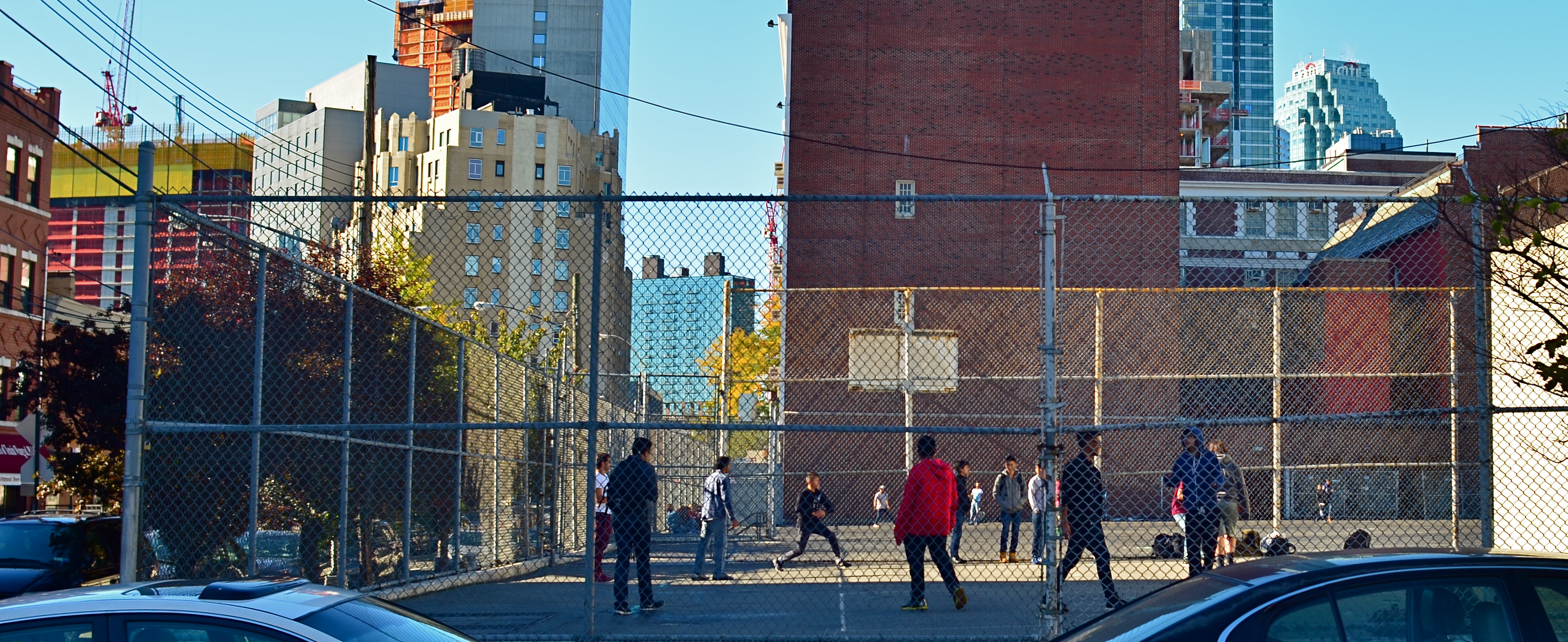
Oasis (2016)
By MICHAEL PERKINS
STREET PHOTOGRAPHY, FOR ME, INVOLVES AN OCCASIONAL BOUT OF LONGING, in that I am frequently on hand to record lives that, at least in part, I’d like to visit for longer than the length of a shutter snap. Not all street scenes are inviting, of course. Often we chronicle things that we are profoundly grateful are not part of our own lives. Other times, we accidentally preserve something that is so shrouded in mystery that the resulting images provide endless wellsprings of speculation…just what was it that we thought we saw, both at the moment of taking, and later? And then there’s what the taking of these images says about us personally. Some of our eavesdropping makes us feel privileged. Some makes us feel stained by the ugliness of our invasions.
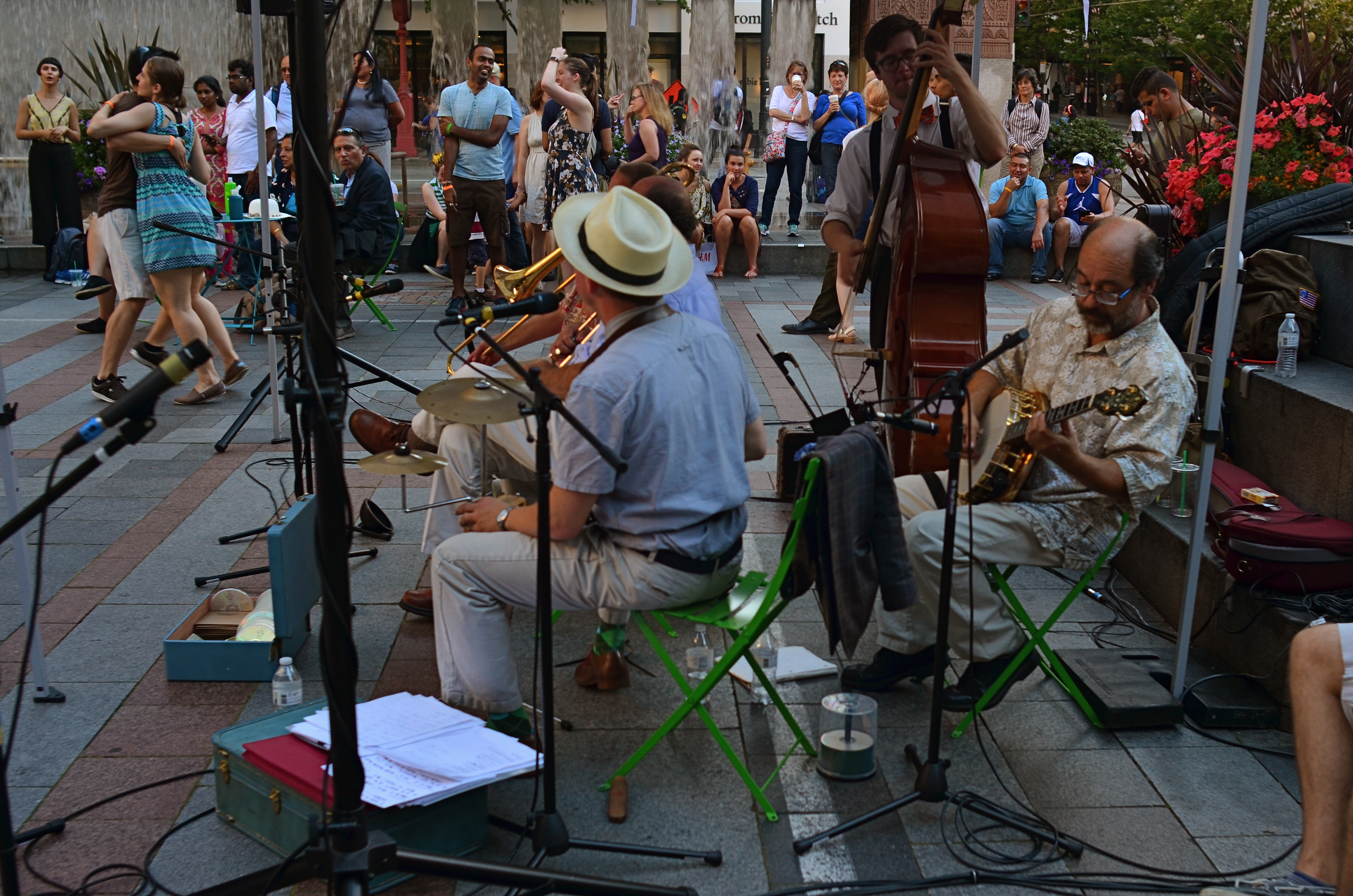
And then there are the blessed accidents, the pictures we didn’t set out to take at all, such as the photo you see here. I was actually not in active shooting mode when I passed this pickup game of handball in a neighborhood in Queens over the past summer. To tell the truth, since I was trying to find an address at the time, I might very likely have passed these players completely by, had one of their tosses not jumped the fence of their tiny parcel of blacktop and literally rolled to my feet.
The ball re-directed my attention, as did several clear, high calls of “hey mister!” and “sir, would you mind..?” Pitching it back, I saw the boys’ playspace as the tiny oasis it was, crammed in on all sides by the neighborhood’s skyward crush. Next, I noticed the wonderful warmth of the mid-morning sun, and took a few seconds to allow the combatants to resume play, and, more importantly, forget about the Nice Old Guy Who Gave Them Back Their Ball. I took only two frames, fearful that one of the players would remember having seen the Nikon around my neck. Fortunately, the game was a much better claim on their attention, and I liked one of the tries I had made.
Street work is, more often than not, a matter of being there when someone else’s life happens. Seldom does that life reach out and ask to be noticed, to make a request on your time. In such moments, all of life becomes, for an instant, a universal pick-up game, something in which we’ve actually been invited to participate.
CHRISTMAS ON THE QUIET
By MICHAEL PERKINS
THE HOLIDAYS PROVIDE A REMARKABLE VARIETY OF VISUAL RESPONSES IN PHOTOGRAPHERS, so subjective are each person’s memories and experiences. This ensures that the subject is well nigh inexhaustible, although I seem to see images falling into one of two broad categories.
One class includes the snapshot-oriented, direct-experience images, which record one’s treasured good times……such as the family tree, the winner of the neighborhood’s exterior lights extravaganza, Bobby’s first moments with his new bike, etc. The other main class seems to center on a kind of abstract interpretation of pattern, color, and shape, and may be more subtle or understated in approach. Of these two basic groupings, one is specific, rooted in personal impressions, while the other is design or concept based. Both produce great photographs, but the aim, for each, is very distinct.
As my own Christmases have become more abbreviated and less populated (family and friends far away), my observance of the holidays is, accordingly, much more muted, less decorous than in years past. The merry little Christmas referred to in the song becomes the dominant theme, and I find my seasonal photos try to say more and more with less and less. The images are simpler, quieter. Whether I have chosen this or it’s chosen me is hard to say for sure. I only know that, as the million elements that define a busy family Christmas fade into memory, I create pictures that suggest the essence, rather than the exhaustive detail, of the holiday’s themes.
Of course, whether this time of year means anything at all to you is a matter of taste, especially as you age up. One of the most interesting places to spend the holidays, for example, is Las Vegas, simply because the town does not sport any decorations of any kind. In deference to many who want to flee rather than celebrate the hustle, the entire city becomes a strange sort of haven, filtering out both the profane and the holy. So, if I snap a picture at Caesar’s Palace on December 25, does that fact alone make the result a “Christmas” photo?
You get the idea: even in less extreme cases, the holidays are in the eye of the beholder. Eventually, what makes a day special is what makes it special for you. Whatever your own circumstances, enjoy the world as you would prefer to compose it. Make the season your personal treasure, whether loud, soft, lush or laid back. No image is a bridge too fa (la la la).
THE BOND

This 1900 magazine ad introduced the concept of the Kodak camera as the ideal gift.
By MICHAEL PERKINS
FOR THE TWENTIETH-CENTURY CONSUMER, Apple, Inc. seems to stand alone in its ability to define a market for a product, fill that market before anyone else can, and engineer the very need for that product in its customers. Apple has not only wrought great things, it has convinced us that, even though we couldn’t have imagined them ourselves, we can no longer imagine life without them. That bond between provider and user seems unique in the history of the world.
But it’s been done before.
In the 1880’s, when George Eastman perfected the world’s first practical photographic roll film, the idea of owning one’s own camera was quaint at best. Early photo images were created by talented, rich tinkerers and the first few professionals, making photographers a small, select brotherhood. Even so, Eastman’s boldest idea was not his film but the affordable means to make a film user out of the average man. The new Eastman Kodak company, like Apple, conceived of a market, filled it almost exclusively with their own products, and closed the deal by proceeding to teach people not only how to use their Kodaks but how to link photography with a full and happy life.
Over the last few Decembers, I have dedicated pages of The Normal Eye to the decades-long love affair between Kodak and the world that it trained to treasure photographs. Its marketing reached its creative zenith with the “Open Me First” Christmas campaigns of the 1950’s and ’60’s, which posited the idea that nothing wonderful could happen in the life of your family, especially on The Big Day, if you failed to record even a moment of it on Kodak film.
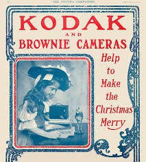
Kodak used the most popular children’s book chracters of the 1800’s, the “Brownies” to sell kids’ cameras.
However, Kodak’s mastery of emotional messaging was in full flower generations before the “Open Me First” pitches for Instamatic cameras and Carousel projectors. Long before television and radio, the company’s persuasive use of print carried much the same appeal: if it’s important, it’s worth preserving, and we have the tools and talent you need to do it. Kodak cameras quickly became positioned as The Ideal Christmas Present, as the company targeted newlyweds and young parents with their upscale models and cultivated the youth market with their $1 line of children’s cameras. In an early example of inspired branding, the kids’ models were marketed with the names and images of illustrator Palmer Cox’ runaway juvenile book characters, the Brownies, playful elves who were featured on Kodak packaging and ads for more than a decade, helping launch the world’s most successful lines of cameras, in continuous production from 1900 to 1980.
Not even Apple in all its marketing glory has managed to align itself so solidly with the emotional core of its customers in the same way that Kodak, for nearly a century, forged a bond between its users and the most emotionally charged time of the year. In so doing, they almost singlehandedly invented the amateur photographer, fueling a hunger for images in the average Joe that continues unabated.
THE YIELD
By MICHAEL PERKINS
THE ABILITY OF EVERY PHOTOGRAPHER, EVERYWHERE, TO INSTANTLY SHARE any part of his or her output with the world is both a blessing and curse. The “blessing” part’s easy to understand. Breaking down the barriers to publication of ideas that have separated us all from each other throughout time…well, that’s a very heady thing. Pictures can now transmit commentary at nearly the speed of thought, establishing linkages and narratives that have the potential to shape history.
Then there’s the “curse” part, in which this very same technology carries with it the potential for unlimited treachery and mischief. Who says what pictures can be seen…when, and by whom? Without supervisory curation or any kind of global uber-editor, photography can just be a visual torrent of garbage, or banality, or worse. Obviously, we have had to navigate some very tricky waters as both the blessing and curse elements of modern photography wrestle for supremacy.
 What has happened for, good or ill, is that we are all, suddenly, tasked with being our own editors, asked to perform a skill that is very difficult to bring off with any honesty. You’d think that, after years of taking thousands of pictures, most of us would have a higher yield of excellence from all that work, but I have found that, at least for myself, the opposite is proving true. The more I shoot, the fewer of all those shots strike me as extraordinary. I thought that practice would indeed make perfect, or that, at least, I’d come closer to the mark more often, the more images I cranked off. But that hasn’t happened.
Your skills accelerate over time, certainly; but so do your standards. In fact, any really honest self-editing journey will mean you are less and less satisfied with the same pictures, today, that, just yesterday, you would have thought your best work. You start to refuse to cut certain marginal pictures a break; you stop grading yourself on the curve.
Most importantly, you have been doing this just long enough to realize how very long the journey to mastery will be. Not just control of the mechanics of a camera, although that certainly takes time. No, we’re talking about learning to tame the wild horse of one’s own undisciplined vision, something that, over a lifetime, is hardly begun. Our moon landings come to look to us like baby steps.
Becoming one’s own editor means that, through the years, you’re liable to view one of your “greatest hits” from yesteryear and be able, sadly, to see the huge gulf between what you were trying to do and what you actually accomplished. I was horrified, a few years ago, to learn that my father, at some point, had destroyed the paintings he had made when he was in college. I had grown up with those images and thought them powerful, but he only saw their shortcomings, and, at some time or other, it was just too much to bear. I often think of those paintings now, whenever I view an older picture that I once thought of as “my truth”. In some cases, I can’t see anything in them but the attempt. A few of them do survive the years with something genuine to say…but, ask me again tomorrow, and I may reluctantly transfer many of them over to the “nice try” pile. It’s an imperfect process, but it’s only one I trust.
POUNDING NAILS WITH A SCREWDRIVER
Ten feet out with a 56mm that shoots like an 85mm. Little cramped.
By MICHAEL PERKINS
IF YOU HAD ONE OF THOSE DADS WHO PURCHASED A SET OF “DO IT YOURSELF” ENCYCLOPEDIAS in the 1950’s, hoping to become some kind of amalgam of Edison and St. Joseph The Carpenter, you no doubt encountered some sort of Page One admonition to always get “the right tool for the job”. In other words, don’t use a screwdriver to pound nails. I successfully resisted the seductive gospel of Being Handy Around The House, but then found, in photography, that the same rule applies, at least as regards lenses. Right glass, right results, right?
Of course, unless you habitually lug the accumulated wisdom of 200 years of shutterbugging and its attendant gear along with you on a daily basis, you’re likely to get into situations where the lens you have readily at hand won’t allow you to do the thing you just decided to try. It’s back at the hotel, back in the parking lot, back at Alpha Centauri, wherever. Thing is, the thing you want is here, right in front of you, leaving one simple chance. Shoot or don’t.
Nearly the same front to back distance, but at a slight diagonal.
I recently wandered, on a weeklong practice run for a new Lensbaby Velvet 56, a manual prime lens that equates, on a full sized DSLR sensor, to about 85mm or so. Perfect for portraits, but very, very cramped for general street work. The Velvet, as its name implies, imparts a soft, gauzy layer over top of a sharp image at apertures wider than about f/5,6. From there to the upper stops, it behaves like a regular prime without the softer effect. The temptation is strong to limit its use to flattering portraits. But that vanishes, however, when you see what marvelous cushiness it confers on the hard textures you find in buildings. It creates a romantic, dreamy look for concrete, plaster, and stone, and so, since I had no other lens at the ready on this particular walkout, I decided to try a few street shots with it.
First problem: this thing can make a tight composition look absolutely claustrophobic. One cure is to walk way back to open up the shot; another is to try a diagonal or oblique angle to widen things out. Of course, since 85mm is treading close upon telephoto territory, the front-to-back information will be somewhat compressed; the distances which seem natural to your eye from 35 to 50 mm seem smashed in at 85. However, since we are shooting for the velvety effect with this lens, compromise is already the name of the game, so angle of composition becomes a partial fix. The feel from ten feet away, seen in the head-on top shot, seems pretty confined, whereas in the second shot, taken about twelve feet at a slight diagonal, the shot is snug but not uncomfortable.
The Velvet 56 is actually remarkably versatile, since, in addition to serving as a great portait lens and a nice landscape glass, it also macro-focuses to about 5 inches, allowing you to work more and switch out less. As always, it’s not so much what a given lens was primarily designed for but what you choose, perhaps out of desperation, to do with it.
Turns out some screwdrivers make pretty fair hammers, after all….
SPLIT DECISION
Which version of this street shot carries the most impact…the color master shot….?
By MICHAEL PERKINS
THERE SEEMS TO BE A BIAS IN WHAT WE CALL STREET PHOTOGRAPHY that leans toward monochrome images, as if black and white were somehow more emotionally honest, maybe even more reportorially accurate as regards social commentary. I suppose this preference borrows a bit from the fact that journalism and photographic critique sort of grew up alongside each other, with black-and-white news coverage pre-dating the popular use of color by several decades. However, since color has become the primary, rather than the secondary choice for most photographers over the past forty or so years, there may be no leader or “winner” between bright and subdued hues, no real rule of thumb over what’s more “real.” Street, and the tones used to convey it, are in the eyes of the beholder.
…or the re-mastered mono version?
There must be dozens of images that I myself take in color each year, that, upon later reflection, I re-imagine in mono. Of course, with digital imaging, it’s not only possible but probably smart to make one’s “master shots” in color, since modern editing programs can render more in the way of black and white than mere desaturation. Just sucking the color out of a shot is no guarantee that it will be more direct in its impact, and may actually drain it of a certain energy. Other times, taking out color can streamline the “reading” of a photograph, removing the distraction that can occur with a full range of tones. The only set answer is that there is no set answer.
In the film era, if you loaded black & white, you shot black & white. There was no in-camera re-think of the process, and few monochrome shots were artificially tinted after the fact. Conversely, if you loaded color, you shot color, and conversion to mono was only possible if you, yourself were expert in lab processing or knew someone who was. By contrast, in the digital age, there are a dozen different ways to reconfigure from one tone choice to another in seconds, offering the chance for anyone to produce almost limitless variations on an image while the subject is there is front of them, ripe for re-takes or re-thinks.
None of these new processes solve the ultimate problem of what tonal system works best for a given picture, or when you exercise that choice. However, the present age does place more decision-making power than ever before in the hands of the average photographer. And that makes street photography a dynamic, ever-changing state of mind, not merely an automatic bow to black-and-white tradition.
BREAKING THE GEOMETRY
Zoom (2016)
By MICHAEL PERKINS
CONTRAST IN PHOTOGRAPHY IS NOT JUST ABOUT A COMPARISON BETWEEN DARK AND LIGHT VALUES. The word contrast also applies to things placed next to each other in a composition that fight for dominance. Happy faces next to sad. Images of wealth and opulence juxtaposed with poverty and misery. Some of it can be a kind of forced irony, and, as such, can produce pictures that get a little preachy, or appear deliberately staged.
I love urban architecture because many of its design elements are enough to create a compelling image all by themselves….that is, without the larger context of what’s around them. They don’t have to be about anything; they just are. Contrast isn’t needed in many cases, because I’m not trying to show mankind’s place versus the space of a building…..I’m just seeking absolute patterns. No comment, no message.
Occasionally, however, it’s great to invade all those clinical lines and angles with a bit of humanity, to break the geometry and inject something warm or whimsical. It doesn’t have to be deliberate and it doesn’t have to be amped up with busy staging. The best contrast shots between disparate elements are the ones that you simply witness.
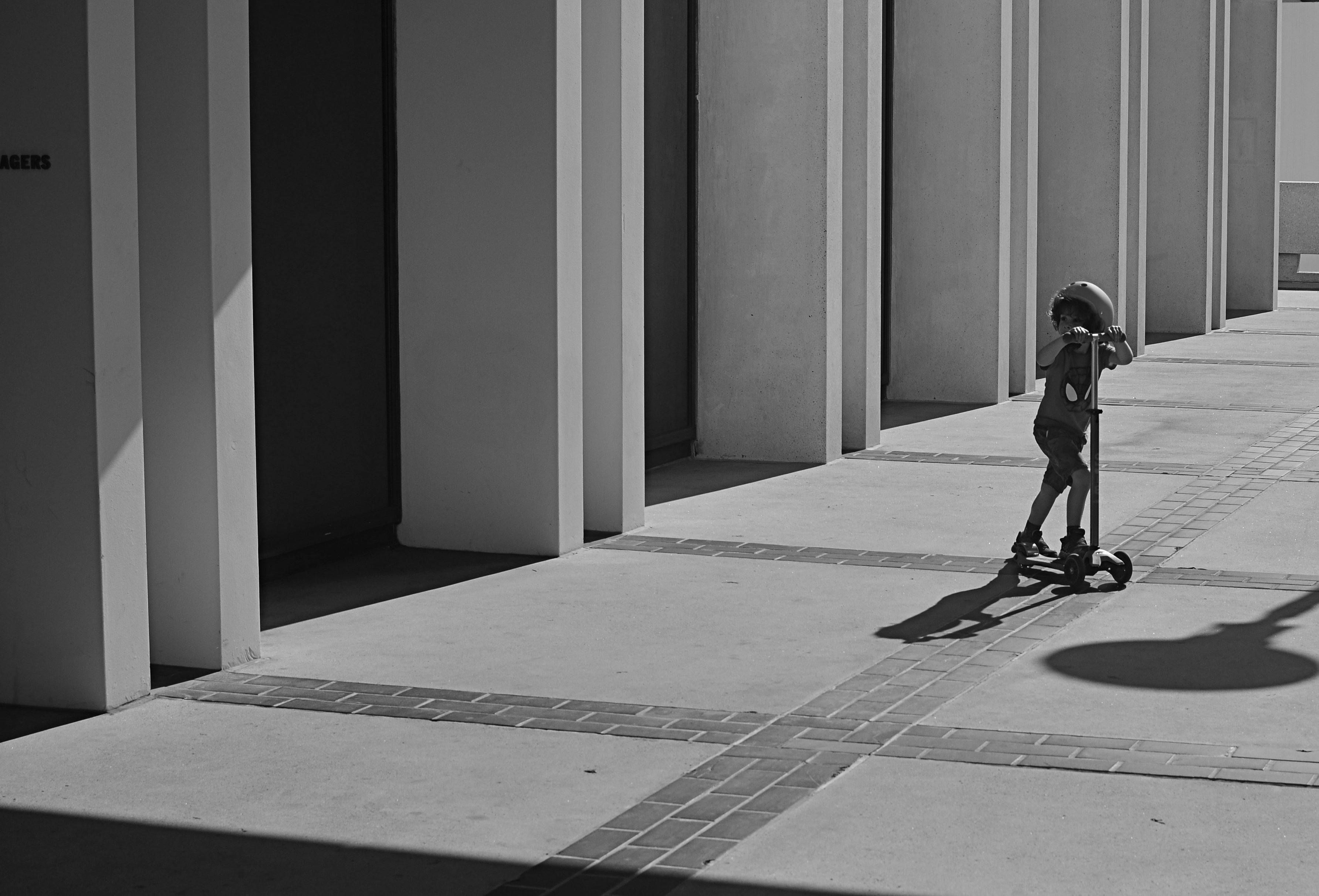
In the above image, the boy on the scooter is neither a “bad” nor “good” subject, but he gains a little amplitude because of his odd placement amongst the more antiseptic surrounding textures. The shot also worked a little better in monochrome because, in the original shot, the boy’s shirt was so vivid that it drew too much attention to that part of the picture.
Photographers benefit from a million tiny collisions between seemingly opposed subjects every single day. Learning which ones to isolate and massage into pictures can be an enjoyable detective game.
TWO SKIES, ONE GOAL

sds
By MICHAEL PERKINS
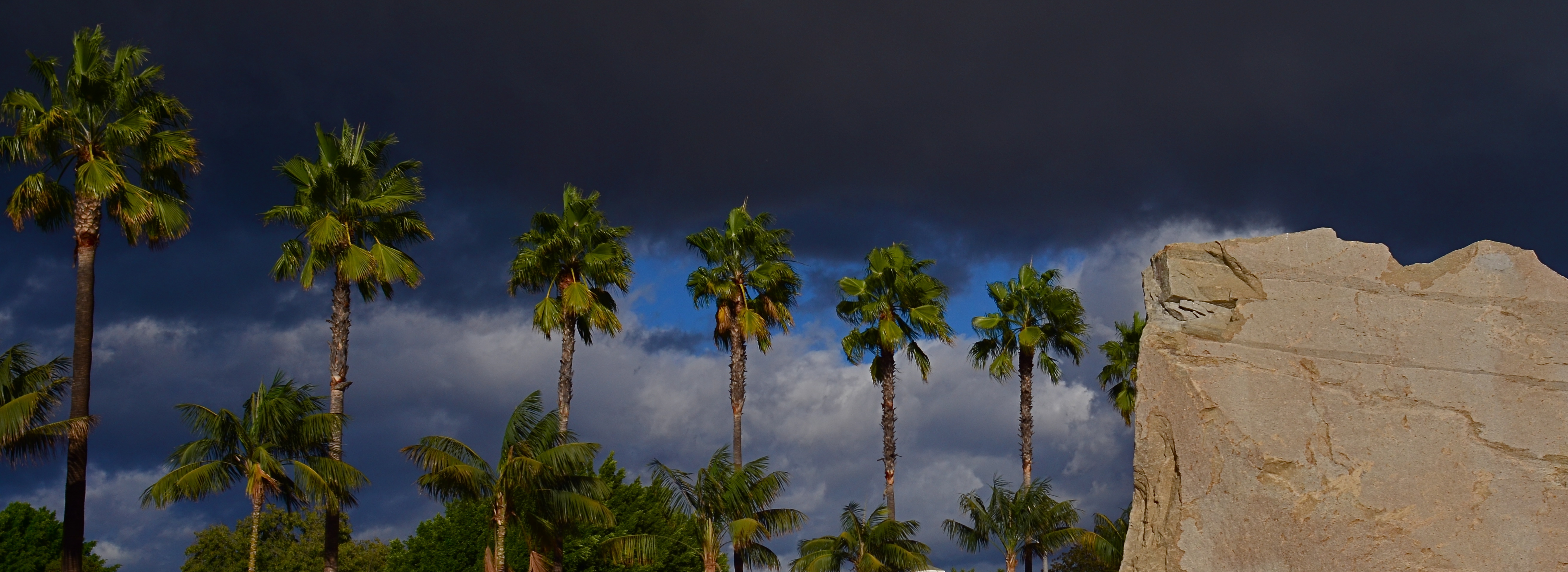
EVERY TIME I HAVE TO MAKE PHOTOGRAPHS ON AN OVERCAST DAY, I actually pray that the weather will deteriorate even further, since a dramatically lousy sky can create better results than an indifferent overcast. Murky weather mutes colors to the texture of bland dishwater, whereas rapidly shifting, strongly contrasty conditions can actually boost colors or create a dimensional effect in which foreground objects “pop” a bit. Keep your rainy days. Give me stormy ones.
Some days an uneven, rolling overcast contains dread darkness on one side and unbroken sun on the other, simulating the effect of a studio in which the subject is floodlit from front but staged against a somber background. This strange combination of natural lighting conditions confers an additional power on even the most mundane objects, and the photographer need do nothing except monitor the changing weather from minute to minute and pick his moment.
I love the architectural features of the Los Angeles County Museum of Art, such as the section of one of the exhibit hall rooves, seen above. However, in fair or even grey weather, it has less impact than when it’s front-lit against a threatening cloud bank, so, on a rotten day, it’s worth checking and re-checking to see if it’s been amped up by “jumping away” from the background clouds. Likewise these palm trees:
Simply capitalizing on changes in lighting conditions can create more opportunities than all the lenses and gear in the world. Cheap point-and-shoot or luxuriant Leica, it’s all about the light….plentiful, free, and ever-changing. The ability to sculpt strong images from this most basic commodity is the closest thing to a level playing field for every kind of photographer.
FIXES ON THE FLY
Original DSLR shot with too much color, too much information, and no effective way to isolate the seated man within the frame.
By MICHAEL PERKINS
ONE UNDENIABLE ADVANTAGE MOBILE OR PHONE CAMERAS HAVE OVER THEIR DSLR FOREBEARS is the ability to combine easy shooting and easy editing in the same small package. This adds convenience on top of convenience, allowing mobile pictures to be captured and refined in the field, with DSLR’s more generally tethered to PCs for their post-production editing.
Even more frustrating is that many basic phone cameras have a wider variety of processing options, even without the use of after-market apps, than come in a DSLR’s “retouch” menu, creating a greater disconnect between the “deliberate” editing of the late-film/early digital camera and the “instinctual” editing of phono-photography.
Recently, DSLRs have made it easier to wirelessly send their images to phones’ email inboxes, but, across several manufacturers, the process is far from sleek. But when you can send images taken with the superior lenses and larger file sizes of a DSLR to your phone, you can easily send those emailed items on to your favorite in-phone app for tweaks that can be done on the fly, with more tricks than your “real” camera allows. It also permits you to do radical re-mixes of yesteryear’s shots with today’s tech. Old photos can get a facelift with a lot less bother than if they go through a Photoshop-type workflow.
To illustrate: the top shot, a DSLR original, was way too busy. Jutting walls, extra people, over-bright colors…plenty to remove if the seated man at the front was to draw any central interest. Cropping and de-saturating in my Mac’s editing program was easy enough, but I wanted to further isolate him from the monotonous textured wall behind him.
The same DSLR image with selective focus added via a phone-based app.
The lens I used in the original wasn’t equipped to render different levels of sharpness within the same focal plane, but my phone had a handy app that did precisely that, and that’s where we went next.
Emailing the image to my phone was fast, as was forwarding the picture in the email to be saved as a camera roll image. From there, I sent the picture to an app called Analog Cam, which included a partial diffuser tool, allowing me to gradually blur everything in the focal plane except the man, as you see in the lower frame. Finally came a transfer from the app to a posting on Flickr. Thus with a few extra steps, I gained the flexibility I didn’t have when I shot the original, allowing me to save, salvage and send from one location.
The emphasis for mobile cameras is much more on post-shutter fixing than is the case with a standard camera. That said, there’s no reason why you can’t shoot on one and use the convenience of the other to get the result you want.

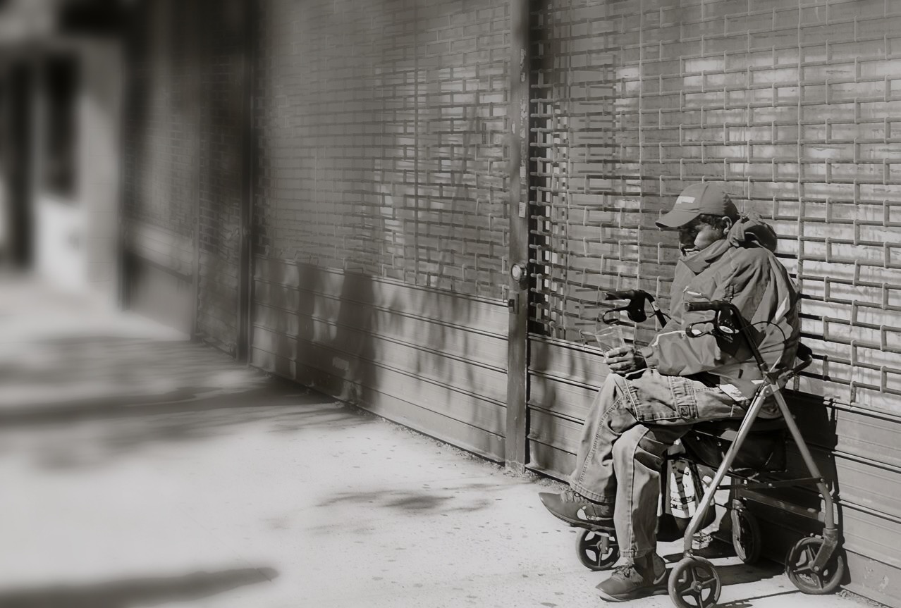
STREETER THAN THOU
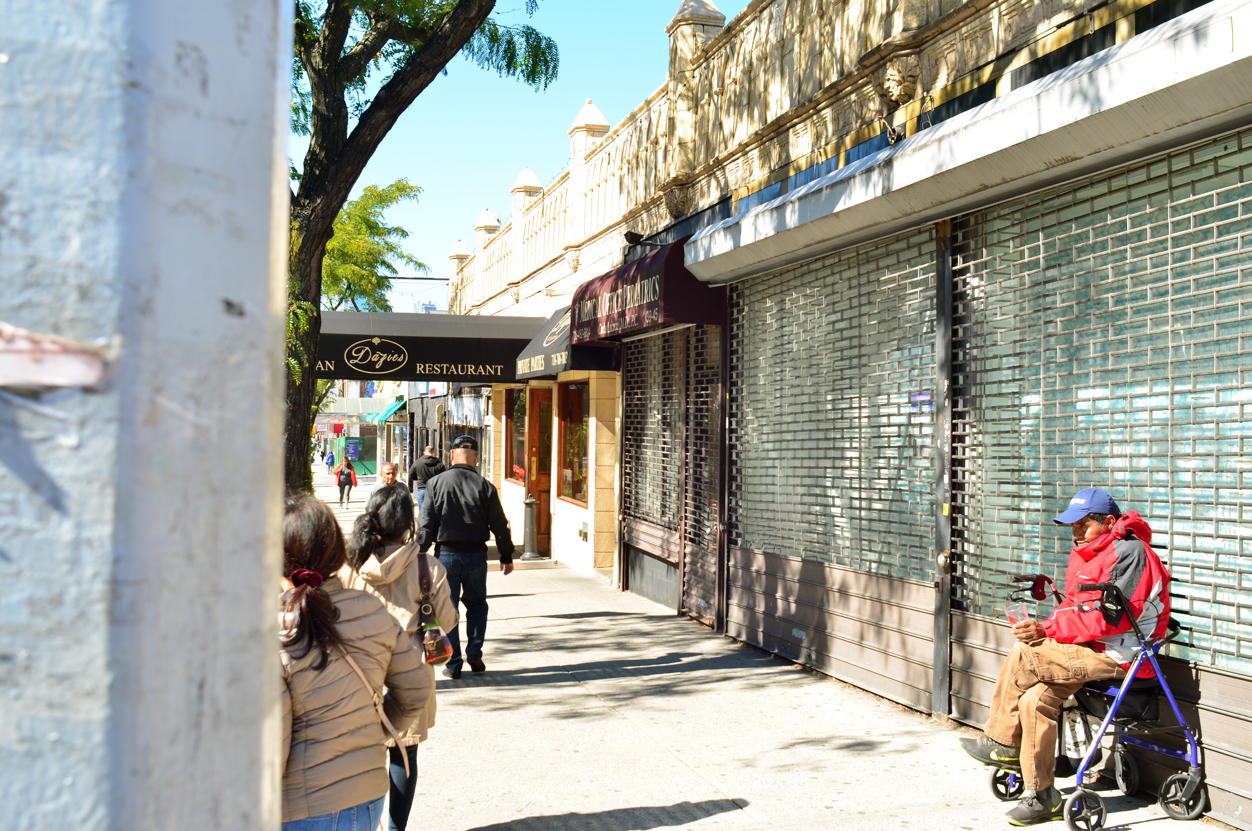
When people are mere compositional components in a scene, is that still “street photography”?
By MICHAEL PERKINS
ONE OF MY FAVORITE JOKES ABOUT HOW HUMANS END TO OVER-THINK THINGS involves a farmer standing by the side of the road with a herd of cattle, who is greeted by a passing urban tourist. “Excuse me”, says the visitor, “are those Herefords or Guernseys?” “Gee”, replies the farmer, “I just call ’em ‘moo-cows’!”
Similarily, I sometimes think that the weighted term street photography is more distinction than difference. City, country, street, pasture…hey, it’s all just pictures, right? Yes, I know….”street” is supposed to denote some kind of commentary, an interpretive statement on the state of humanity, an analysis on How We Got Here. Social sciences stuff. Street work is by nature a kind of preachment, born as it was out of journalism and artists like Jacob Riis and Lewis Hine, who used images to chronicle the city’s ills and point toward solutions. For these geniuses and so many that followed, those street scenes rested fundamentally on people.
And by people, we mean discernible faces, unposed portraits that seared our souls and pricked our consciences. Street photography came to focus almost solely on the stories within those faces: their joy, their agony, their buoyant or busted dreams. In my own work, however, I am also drawn to street scenes where people are not front and center, but blended into the overall mix of elements, props, if you like, in an overall composition, like streetlamps, cars or buildings. There can be strong commentary in images that don’t “star” people but rather “feature” them. Walker Evans, one of the premiere shooters working for the New Deal’s Farm Security Administration, and creator of many classic depictions of the Great Depression, remarked that folks, as such, were not his aim when it came to street shots. “I’m not interested in people in the portrait sense, in the individual sense”, he said in 1971. “I’m interested in people as part of the pictures….as themselves, but anonymous.”
There is always a strong strain of competition among photographers, and street photography can become a wrestling match about who is telling the most truth, drilling down to the greatest revelation….a kind of “streeter than thou” mentality. However, just because something is raw and real doesn’t make it interesting, or else we could all just shoot the inside of garbage cans all day and be done with it. Compelling is compelling and boring is boring and if you know how to make a picture that grabs the eye better than the next guy, then subject matter, even motivation, doesn’t matter a damn. The picture is all. The picture will always be all. Everything else is noise.
Share this:
January 7, 2017 | Categories: Americana, Commentary, Composition, Conception | Tags: Candids, documentary photography, Street Photography, Unposed | 3 Comments