THE UNREAL REAL
By MICHAEL PERKINS
I’M A PHOTOGRAPHER, AND YET I CANNOT TELL YOU WHAT “REALITY” IS.
I point machines at the world and I get some kind of recording of light and shadow. Is what I get a literal translation of the way something, at least for an instant, really was? How did my composition, which necessarily had to leave out some things in order to include others, alter the complete truth of a scene? How did my selection of a lens, a time of day, the place where I stand, my own mood effect the outcome? And, if this machine, this recorder does not actually show “reality”, does that make me more of an artist, or less of a technician?
The world as we see it is never mere visual “evidence”. It comes to us filtered through every personal trait that shapes our ability to observe in the first place. Then we, in turn, filter that subjective experience into an even greater abstraction, shoving it through a lens that adds its own biases, limits, or flaws. So what comes out the other end? Should we even be worried that a photograph can’t be real? Might we not, in fact, be relieved to be freed from the constraints of the actual, just as painters and sculptors always have been?
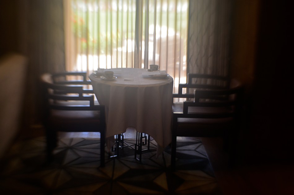
The above image was taken by a person who stood in a particular place at a particular time with a specific piece of optical equipment and decided that the resulting balance of visual elements constituted a “picture”. That selection of a single part of a single moment will either convey a similar feeling to someone else, or it won’t. That’s what we uncertainly refer to as “art”, and, whether we like the terms of engagement, those “really” are the terms. Reality is beyond our reach.
But a commentary on it isn’t.
INSIDE THE IRIS
By MICHAEL PERKINS
IN ONE OF HIS EARLIEST SILENT FILMS, legendary director D.W. Griffith, one of the first cinematic pioneers to use tight shots to highlight vital narrative details, drew fire from theatre exhibitors, who objected to his new-fangled “close-up” or “iris” technique. “We have paid for the entire actor”, one wrote, apparently of the opinion that showing only a player’s hand or face, even in the interest of a good story, was somehow short-changing the audience. Griffith knew better, however. He was using his compositional frame to tell his viewers, in no uncertain terms, what was important. Outside the frame was all the other stuff that mattered less. If I show it, you should pay attention.
Photography is not so much about whether a subject is intrinsically important (think of the apple in a still-life) but whether an artist, armed with a camera and an idea, can make it important. At the dawn of the medium, painters pretty much dominated the choices about which images were immortalized as emblematic of the culture. The subject matter often ran to big targets; war, portraits of the elite, historical and religious events. And, indeed, the earliest photographs were “about something”, the “somethings” often being documents of the world’s wonders (pyramids, cathedrals) fads (politicians, authors) and foibles (crime, the occasional disaster). Subjects were selected for their importance as events, as leaves of history worthy of preservation.
In the 20th century the same abstract movements that engulfed painting allowed photography to cast a wider net. Suddenly that apple in the bowl was a worthy, even a vital subject. Light, composition, angle and mood began to weigh as heavily as the thing pictured. We made images not because the objects looked right, but because they looked right when made into a photograph. Pictures went from being about what “is” to being about what could be….evoking, like poetry, music or literature the magics of memory, dream, potentiality, emotion.
This is really the ultimate freedom of not only photography, but of any true art; the ability to confer special status on anything, anywhere. That doesn’t mean that all photographs are now of equal value; far from it. The burden of proof, the making of the argument for a particular subject’s preservation in an image, still rests squarely on the shooter’s shoulders. It’s just not necessary to wait for a natural disaster, a ribbon cutting, or a breathless landscape to make an amazing photograph. The eye is enough. In fact, it’s everything.
OF TATTOOS AND STENCILS
By MICHAEL PERKINS
IN CITIES, ONLY A SMALL PORTION OF THE DAY’S NATURAL LIGHT actually makes it all the way to the street unbroken. You can almost think about it like rain, in that it drips, slithers, drains, and channels its way downward through a dense maze of structures and barriers. Along the way, that light is bisected, sliced, stenciled and tattooed by the surfaces it interacts with, stretching shadow patterns, glinting, ricocheting, stretching.
Glass, especially, constantly reshapes light, filtering it into delicate lattice-works and spectral spiderwebs, sifting it through windows, transoms, doors, windshields, storefronts. It reveals and conceals, crawling across buildings like an ever-changing sundial of shapes and schemes. Photographing the same hunk of glass on the hour can be like visiting a dozen different worlds, spread out like fanned playing cards over the course of a single day.
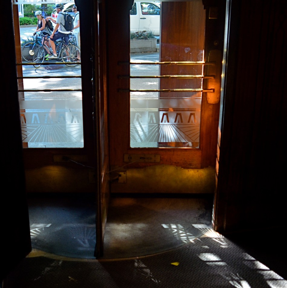
Light illuminates, making it a force that acts upon other objects, but it is almost more marvelous when it, itself, is acted upon, creating an endless choreography and echo of its colors and contours. It’s part of the great interactive ballet of cities, this push and pull between light and darkness. Sometimes you get a nearly kaleidoscopic effect from something very simple, like the etched glass in the revolving door seen above, which stamped a different snowflake of shapes onto the pavement at every turn and swivel.
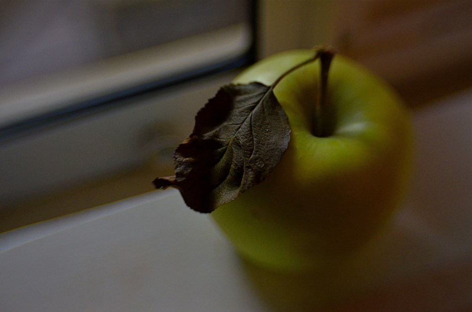
If you’re given to experiment (or daydreaming), your own tabletop can become a tremendously valuable laboratory on the effect of light. Just grab the simplest object handy, be it an apple or a book, and arc a source of light from one side of it to the other. Imagine yourself a self-propelled sun and watch how easily you can create change in your private solar system. The actual design of such an exercise isn’t crucial, but making yourself mentally slow down, becoming aware of the tiny effects perpetually swimming about you, is invaluable. Photographs rise at the hands of some pretty small phenomena. Magnifying your gaze puts more images within your reach.
OF DISTANCES AND DOMAINS
By MICHAEL PERKINS
PHOTOGRAPHY IS AN EFFECTIVE WAY TO MEASURE MAN’S RELATIONSHIP to his physical environment, giving us the distance we need to see these arrangements from a more objective distance. People design places in which other people are to live and work, but once these plans get off the drawing board, it can become unclear what people’s place in the whole puzzle was intended to be.
More to the point, there is real picture-making potential in the occasional mis-match between what we design and how we fit into it. Some things that seem terrific to the people on the planning board seem cold or intimidating to regular users once they’re actually built. Seeing us try to find our place in things that are really inhospitable can be visually interesting because it makes us look and feel somewhat alien. We can become oddly placed props in our own projects, as the places made to house our dreams look more like warehouses for our nightmares.
Of course, one man’s horror is another man’s heaven, a rule that has certainly been constant over the history of innovation. That means, artistically, that we can wind up, inevitably, making images that start arguments, which is, I believe, the perfect function for art anyway. It’s one thing to smear a daub of paint on a canvas and lacerate someone’s vision with it. After all, you can abandon the painting, leave the gallery, etc. But if the building that was meant to be the gallery seems like a bad fit for you as a human being, that’s something else entirely.
The right compositions with the right lenses deliver stark visual messages about how we slot ourselves into the world we’ve created. Sometimes we make a statement for the ages. Sometimes we erect mouse mazes. Either way, there’s a picture in the process.
IT’S ALL YOURS
By MICHAEL PERKINS
MANY OF THE MOST VALUED ARTIFACTS OF ANCIENT TIMES might not be considered so magnificent if they were not also so rare. The shards of pots found within the burial chambers of the Pharoahs seem remarkable because they are some of the only things that survive the age of their owners. However, were there hundreds, thousands of such sites around the world, these broken bits of pottery might be of less value than the discarded cigarette butts that litter the world’s highways.
Hey, isn’t this blog supposed to be about photography? Well, yeah, give me a little room here.
Photographs are thought to be documents, that is, a literal recording of reality. In fact, almost all of them are interpretations of reality, one person’s individual take on what’s “real”. In the beginning of the medium, pictures were more purely documentary, in that very few people took very few pictures of things unlikely to be photographed by anyone else before they vanished. It would be great to see dozens of different shooters’ interpretation of the battlefield of the Civil War, but, since the medium was not generally in use in the 1860’s, the work of Matthew Brady and his team of field photographers serves as our only record….in fact, as a document.
In the modern day, it is virtually impossible for your photograph of, say, the Empire State Building to be a “document”, since it will never, ever serve as the official or historical record of that structure. Once everyone’s picture is a document, then nobody’s is. You can interpret the building to endless variation, but you have to avoid thinking of the resulting images as “real”, since your own sense of that state defines how you make the picture. The edifice may be public property, but the vision is all yours.
Which brings us back to the Egyptians. Show a chamber filled with burial booty to a 21st-century archaeologist and he’ll exclaim, “let us carefully preserve this living record!”. Show the same room to the average Tut-era housewife and she might say, “get me a broom so I can clear all this junk out of here.” Photographs are your view of “reality”. Only when yours is the only eye on something vanished can it be documentary. Saying that a picture is great because it “looks realistic” is our way of admiring the photographer’s interpretation. That is, we agree with it. But images are more “istic” than they are “real”.
SEPARATE WORLDS
By MICHAEL PERKINS
MAYBE IT’S THE TERM ITSELF. MAYBE IT’S HOW WE DEFINE IT. Either way, for photographers, concept of the “still life” is, let’s just say, fluid.
I believe that these static compositions were originally popular for shooters for the same reason that they were preferred by painters. That is, they stayed in one place long enough for both processes to take place. Making photographs was never as time-consuming as picking up a brush, but in the age of the daguerreotype the practice was anything but instantaneous, with low-efficiency media and optical limitations combining to make for looooong exposure times. Thus, the trusty fruit-bowl-and-water-jug arrangement was pretty serviceable. It didn’t get tired or require a bathroom break.
But what, now, is a “still life”? Just a random arrangement of objects slung together to see how light and texture plays off their surfaces? More importantly, what is fair game for a still life beyond the bowl and jug? I tend to think of arrangements of objects as a process that takes place anywhere, with any collection of things, but I personally seek to use them to tell a story of people, albeit without the people present. If you think about museum collections that re-create the world of Lincoln or Roosevelt, for example, the “main subject” is obviously not present. However, the correct juxtaposition of eyeglasses, personal papers, clothing, etc. can begin to conjure them in a subtle way. And that conjuring, to me, is the only appeal of a still life.
I like to find a natural grouping of things that, without my manipulation or collection, suggest separate worlds, completely contained universes that have their own tools, toys, architecture, and visual vocabulary. In the above montage of angles and things found at a beach resort, I had fun trying to find a way to frame the “experience” of the place, in abstract, showing all its elements without showing actual activities or people (beyond the sunbather at right). The real challenge, for me, is to create associations in the mind of the viewer that supply all the missing detail beyond the surfboards, showers, and sundecks. That, to me, is the real attraction of a still life….or, more accurately, taking a life and rendering it, fairly intact, in a still image.
Hey, it’s not that I don’t like a good bowl of fruit now and then. However, I think that one of photography’s best tricks is the ability to mentally conjure the thing that you don’t show, as if the bowl were to contain just apple cores and banana peels. Sometimes a picture of what has been can be as powerful as freezing an event in progress. But that’s your choice.
Which is another of photography’s best tricks.
COST ANALYSIS
By MICHAEL PERKINS
IT’S SAFE TO SAY THAT, TO DATE, MOST OF THE WRITINGS THAT COMPARE FILM PHOTOGRAPHY TO DIGITAL center on visual or aesthetic criteria. The grain of film, the value range of pixels, the differences in the two types of workflow, the comparative sizes of sensors, and so forth. However, in certain shooting situations, what strikes me as the main advantage of digital is crassly…..monetary.
It’s simply cheaper.
Now, that’s no small thing. Consider that, with film, a very real cost comes attached to every single frame, both masterpiece and miss. Now, try to compute how much film you must consume in order to travel from one end of a learning curve to the other in trying to master a new lens or technique. Simply, every shot on the way to “that’s it!” is a “damn, that’s not it”, and both cost money. Now recall those shoots where the conditions are so strange or variable that the only way to get the right shot is to take lots of wrong ones, and remember as well, that, after clicking off all those frames, you had to wait (with the meter running), until either the processor or your own darkroom skill even told you that you were on the wrong track.
Assume further that you screwed up several rolls of premium Kodachrome before stumbling on the right approach, and that all of those rolls are now firmly in the “loss” column. You re-invest, re-load, and hope you learned your lesson. Ca-ching.
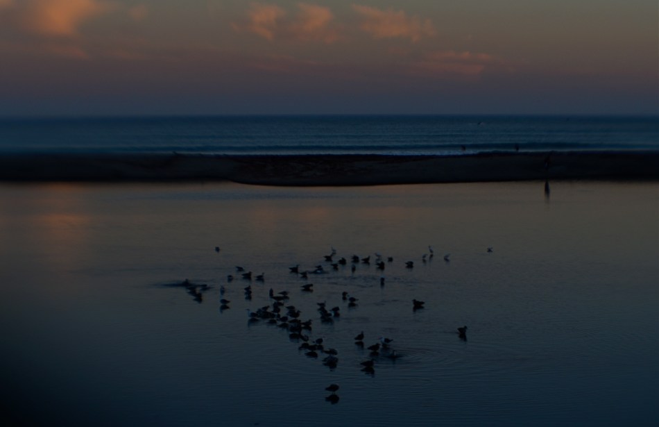
The shot that you see above demonstrates why shooting in digital speeds up your practice time, at a fraction of the cost of film, while giving you feedback that allows you to adjust, shoot, and adjust again before the conditions in front of you are lost. What you see is a late dusk on a dark lagoon just inland of a stretch of ocean in Point Dana, California, strewn with waves of bathing birds and shifting pools of ripples. The pink of the clouds on the horizon will be gone in a matter of minutes. Also, I’m shooting through a narrow-gauge opening in a chain-link fence, causing dark vignettes on every other shot. Moreover, I’m using a plastic lens, making everything soft even softer, especially at the edges.
So add all these factor together and the emotional curve of the shoot is click-damn-click-whoops-click-click-damn. But, since it’s digital, the bad guesses come back fast, and so does the ability to adjust. Bottom line: I know I will likely walk away with something generally usable.
More importantly, photography no longer has the power to price so many of us out of the practice. That means that more images make it to completion, and, of course, that can also mean a global gallery flooded with mediocrity. Hey, I get that. But I also get a fighting chance at grabbing pictures that used to belong only to the guy who could afford to stand and burn twelve rolls of film.
And hope like hell.
THE SHIFTING VEIL
By MICHAEL PERKINS
PHOTOGRAPHERS AND MAGICIANS SHARE A COMMON POWER, in that both of them selectively practice the art of concealment. Now you see it, now you don’t. Both the shooter and the shaman, in their own ways, know the importance of the slow reveal, the smooth manipulation of the viewer’s concept of reality. Best of all, they know how to choreograph and stage visual information. Here, they insist. Look here.
In a lifetime of studying portrait photographers, I have been fascinated by the nearly endless variety of approaches used to convey the human personality/soul in a static image. There are the formal studio sittings. There are the street ambushes of the paparazzo. And there are the shadowy, soft, gently suggestive pictures in which the classic representation of a “face” may not occur at all. This is the blending of revelation and mystery, and it is where portraits, at least for me, genuinely aspire to art.
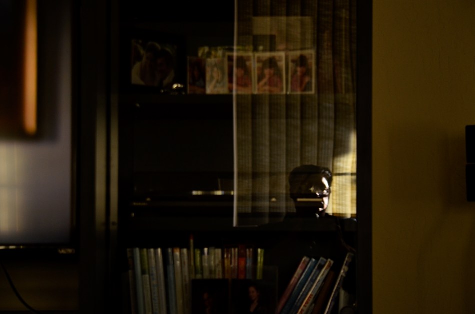
He Decided To Wait (2016). A “self-portrait” in name only. Do we have to be the center of attention?
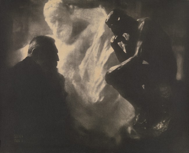
Some of my favorite images in this area were Edward Steichen’s studies with the sculpture Auguste Rodin, dark, smeary pieces of pure mood in which the great man was reduced to a near silhouette, as if he and his sculptures were forged out of the same raw material. I learn next to nothing of Rodin’s face from these pictures, and yet I learn worlds about his spirit. Steichen reveals as he conceals.
Which gives me an idea.
As I skim through the daily global tsunami of selfies, many of them simple grinning headshots, I see an incredible opportunity to start a completely new dialogue on what constitutes a portrait….or even a face. That opportunity will be squandered if 99% of selfies only look like slightly happier passport photos, rather than a real growth medium for investigating the self, for using the face as a compositional accent, an arranged object within a larger design.
Why selfies? Because the subject is always available. Because the technology of both mobile phones and conventional cameras allows for faster and more far-reaching experimentation. And because re-framing a subject you think you know intimately, merely by shifting where the veil lifts or falls, can be the difference between conceal and reveal.
EXTRACTION
By MICHAEL PERKINS
FOR SOME, UTTERING THE WORD ABSTRACTION ALOUD is like saying bringing up politics at a family get-together, in that it forces people to take sides, or to account for their taste in front of others. And when you tie that scary word to art, specifically photography, people start to forget about making pictures, and begin wondering “what it all means”, or, worse, what an image is “supposed to be about”. We start making photos like regimented school children, all of us coloring the sun the same yellow and always drawing people with eyes in the same part of their face.
Instead of using the term abstraction to describe the idea of seeing something differently, I prefer the word extraction, as if we are pulling something different out of a subject. And it’s really not that academic. When we abstract/extract something, we are changing the relationship between the object and how we typically view it. Can showing just part of its shape register in our brains differently than viewing the entire thing? If I interpret it in monochrome versus color, can I re-shape the way you look at its positive (light) or negative (dark) space?
In abstracting/extracting, aren’t we really acting like designers, taking the familiar and rendering it unfamiliar to look at how it’s made and how we interact with it? Just as a designer might decide to create a different kind of teapot, can’t we take an existing teapot and change the way it impacts the eye? That’s all extraction is; one more way to shuffle the deck.
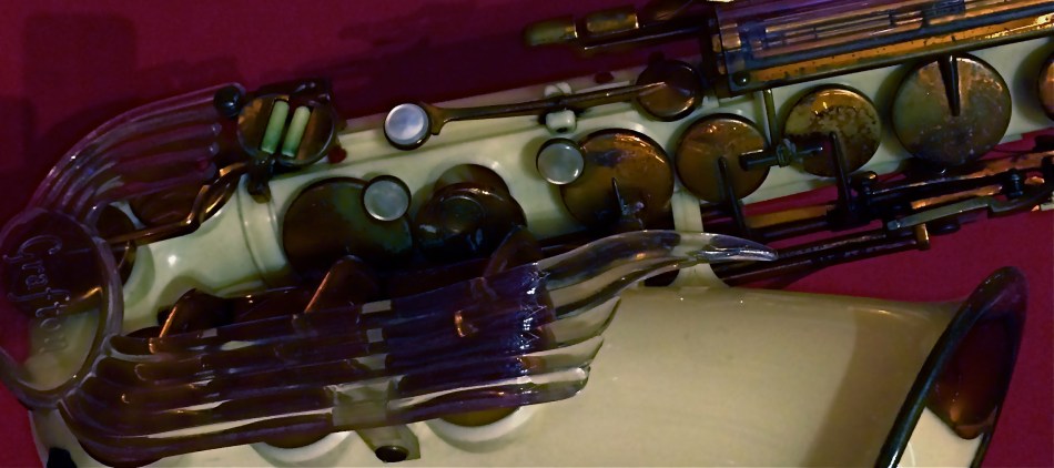
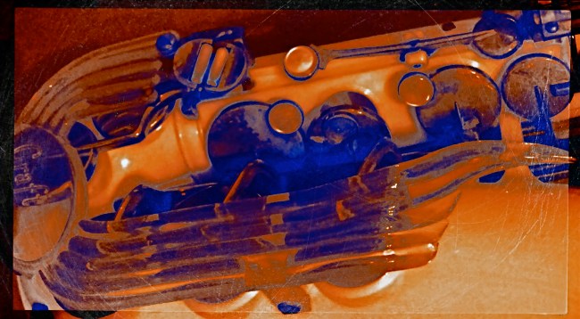
The object at the top of the page, a rare injection-molded plastic saxophone from the 1940’s, had already been “abstracted” by its designer, since we all have a traditional way of visually “knowing” that instrument. That is, it’s supposed to be brass-colored metal, curve in such-and-such a fashion, and feature ornamentation of a set type. Prominently, the designer re-ordered the sax’s features… in plastic, with browns and purples arranged in a fluid, stylized flow of elements. That means, that, as a photographer, I begin with my own set of expectations for the object already substantially challenged. Further, in photographing it, I can rotate the sax, compose it in the frame in an alternate fashion, reassign or intensify its colors, or, as in the small insert(which is a composite of a color negative, a monochrome negative, and a color positive), even change the relationship between surface and shadow.
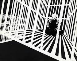
There is a reason why even the police “abstract” a face into two interpretations, using both head-on and profile views in mug shots. Fact is, when you choose the viewpoint on an object, you change the interpretation of how the eye “learns” it. You extract something fresh from it . That’s the nature of photography, and scary words like “abstract” shouldn’t halt the ongoing conversation about what a picture is…or isn’t.
CUES AND CLUES
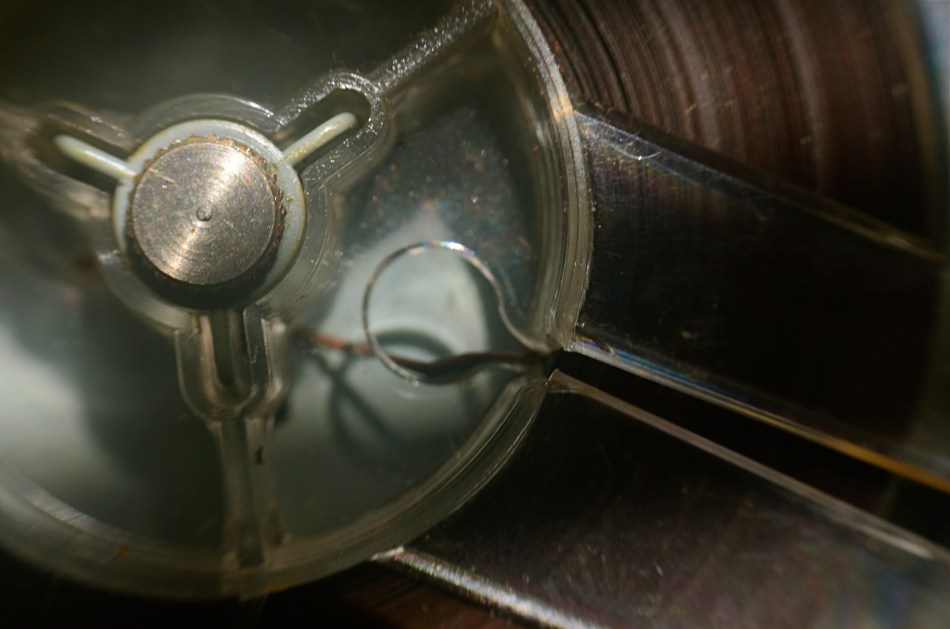
Good Morning, Mr. Phelps (2016). How little of a tape recorder need be shown to convey a sense of that object?
By MICHAEL PERKINS
SAY THE WORD “MINIMALISM” TO SOME PHOTOGRAPHERS, and you conjure visions of stark and spare compositions: random arrangements of light blobs, stray streaks of shadow, or scattered slivers of light, each conveying mood more than content. For some, these images are a kind of “pure” photography, while, for others, they are, to use a nice word, incoherent. Part of us always wants a picture to be, in some way, about something, and the word minimalism is charged, positively or negatively, depending on whether that “narrative thing” happens.
I actually associate minimalism with the formal storytelling process, but doing so with the fewest elements possible. It seems like a natural evolution to me, as I age, to make pictures talk louder with fewer parts. Simple cropping shows you how much more you can bring to an image by taking more of it away, and, with closeups and macro work, the message seems even clearer. Why show an entire machine when a cog carries the same impact? Why show everything when suggesting things, even leaving them out entirely, actually amps up the narrative power of a photograph?
Of course there are times when mere shape and shadow can be beautiful in themselves, and it doesn’t require a lot of windy theorizing to justify or rationalize that. Some things just are visually strong, even if they are non-objective. But minimalism based on our impressions or memory of very real objects, from a pocket watch to a piece of fruit, can allow us to tell a story with suggestions or highlights alone. If something is understood well enough, just showing a selectively framed slice of it, rather than the thing in its entirety, can be subtly effective and is worth exploring.
In the above image, you certainly understand the concept of a tape recorder well enough for me to excise the device’s chassis, controls, even half of its reel mechanism and still leave it “readable” as a tape recorder. You may find, upon looking at the picture, that I could have gone even farther in simplifying the story, and in your own work, you can almost certainly suggest vast ideas while using very small bits of visual information. Knowing the cultural cues and clues that we bring with us to the viewing process tells you how far you can stretch the concept.
PHOTOGRAPHING FEELINGS
By MICHAEL PERKINS
I REALIZE, MORE THAN EVER, THAT THE BULK OF MY OWN PHOTOGRAPHIC WORK has been an attempt to tell human stories while using remarkably few humans to convey them. I always seem not to have a true style at all, just a string of endless experiments that either add or detract from my overall skill set. And yet, if there is any “signature” in my work, it seems to be in using objects, or atmospheres, to illustrate what makes (or made) people feel. The everyday “sets” on which the actors of life play their parts. The oddest thing about my photographs is how many times, over a lifetime, the sets are allowed to speak for the actors, without the actors present.
I shoot empty rooms, but rooms where I feel the weight of years of bustling, traffic, conversations, meetings. I shoot solitary objects on tables, but objects that I imagined were touched, treasured, and otherwise served to measure daily life. I’m not adept at staging people as models or actors in images, but I try to react to settings, see people in them, and show their absence as a kind of presence through these things, these places.
It doesn’t always work. And, as you all have, I’m sure, I often worry about whether I’m off on the wrong track, lost, kidding myself. When a photograph connects with someone, I’m still surprised, even shocked. Street photography, which I greatly admire, is, for most, the act of seeing important bits of drama or tension between people. I take the visual measure of what they build, what they use, even what they abandon, and try to draw their portraits that way. The actual participants may, or may not, be part of those drawings.
Like I say, it doesn’t always work. What I may see as a moment of contemplation or a quiet narrative may strike others as cold, remote. I never mean it that way, since that’s not how I see the world. To my mind, you can either show a child opening a Christmas present, measuring his first flash of joy, or you can photograph the box and wrapping paper a moment later, after the toy has been removed and only the potential of the thing is left behind, like a latent fragrance.
I like trying to detect those fragrances, those lingering essences, the vapors of vanishing potential. Like Chief Dan George observes in Little Big Man, sometimes the magic works and sometimes it doesn’t.
But, oh, man, when it does……
THIS MUST BE / MIGHT BE THE PLACE
By MICHAEL PERKINS
URBAN PHOTOGRAPHERS ACT IN MUCH THE SAME WAY AS ARCHAEOLOGISTS in that they must try to supply context for objects, backstories that have been either altered or erased. Cities are collections of things created by humans for specific motives, be it profit, shelter, play, or worship. Often, the visual headstones of these dreams, that is, the buildings, survive beyond the people that called them into being. Photographers have to imply the part of the story that’s crumbled to dust. Like the archaeologist, we try to look at shards and imagine vases, or see an entire temple in a chunk of wall.
During the dreaded “urban renewal” period in the mid-twentieth century, my home town of Columbus, Ohio duplicated the destruction seen in cities across the country in the wanton devastation of neighborhoods, landmarks and linkages in the name of Progress. Today’s urban planners thumb sadly through vast volumes of ill-considered “improvements” wrought upon history from that period, with New York’s Penn Station, Pittsburgh’s Forbes Field, and Columbus’ Union Station surviving today only as misty symbols of fashion gone amok.
In the case of Columbus’ grand old railroad station, there is at least a fragment of the original structure, its beaux-arts entry arch, left standing, serving as either stately souvenir or cautionary tale, depending on your viewpoint. The arch has been moved several times since the demolition of its matching complex, and presently graces the city’s humming new hockey and entertainment district, itself a wondrous blend of new and repurposed architecture. Better late than never.
Thus, the Union arch has, by default, become one of the most photographed objects in town, giving new generations of artists permission to widely interpret it, freed, as it is, of its original context. Amateur archaeologists all, they show it as not only what it is, but also what it was and might have been. It has become abstracted to the point where anyone can project anything onto it, adding their own spin to something whose original purpose has been obliterated by time.
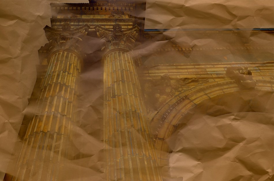
I have taken a few runs at the subject myself over the years, and find that partial views work better than views of the entire arch, which is crowded in with plenty of apartment buildings, parklands and foot traffic, making a straight-on photo of the structure busy and mundane. For the above image, I imagined that I had recovered just an old image of the arch….on a piece of ancient parchment, a map, perhaps an original artist’s rendering. I shot straight up on a cloudy day, rendering the sky empty and white. Then I provided a faux texture to it by taking separate a sepia-toned photo of a crumpled piece of copier paper and fusing the two exposures (the HDR software Photomatix’ “exposure fusion” feature does this easily). Letting the detail of the arch image bleed randomly through the crumpled paper picture created a reasonable illusion of a lost document, and I could easily tweak the blend back and forth until I liked the overall effect.
Cities are treasure hunts for photographers, but not everything we find has to be photographed at, let’s say, face value. Reality, like fantasy, sometimes benefits from a little push.
THE EYE OF MEMORY
By MICHAEL PERKINS
PHOTOGRAPHY DEALS IN FEELINGS, those inexact sensations of the heart that we try to capture or evoke in our visual messaging. Some subjects, such as war or celebration, convey emotions with such immediacy that we are really only acting as recorders, with the associative power of our minds providing much of the detail. Pictures of loss or celebration, such as the aftermath of a disaster or the birth of a new life, can be fairly simple to convey. What you see is what the thing is. For subtler regions of the brain, however, photos must use, if you will, a different vocabulary.
Newbie photographers are trained, to a a great degree, to seek the sharp image, to master focus as a technical “must”, but, as we vary the kinds of messages we want to convey, we change our attitudes about not only sharpness but most of the other “musts” on the beginner’s list. We learn that we should always do a certain thing….except when we shouldn’t. It’s worth remembering that some of the most compelling photos ever published were, according to someone’s standard, “flawed” in some way.

De-saturated color, soft focus. Items dealing with feelings, especially memory. are better served with less “realism”.
News shooters have long since learned that the emotional immediacy of a picture, along with its raw “news value”, outweighs mere technical precision by a country mile. The rules get bent or broken because, in their most perfect application, they may actually dull the impact of a given image. Thus, many a journalist has a Pulitzer on his wall for a picture that a beginner might regard as “wrong”. And the same goes for any picture we may want to make where an emotion simply must be conjured. Mere visual accuracy can and will be sacrificed to make the picture ring true.
Asa personal example, I find that images that plumb the mysteries of memory often must stray from the arbitrary standards of so-called “realism”. When you work in the realms of recall, nostalgia, regret, or simply fond remembrance, a certain fluid attitude toward the niceties of sharpness and exposure may actually sell the idea better. Memory is day-dreaming, after all, and, in a dream, as Alice found in Wonderland, things look a bit…off. Dimension, delineation, depth…all these properties, and more, morph with the needs of the desired image. “Real” sells some things superbly. Emotion, however, as earlier stated, demands a language of its own.
The baby shoes shown in the image above are shot in uneven sharpness to suggest the gauzy nature of the memories they may evoke. Likewise the color is a bit washed-out, almost pastel, since a full, vibrant range of hues may seem less dreamy, more rooted in reportorial reality…which we don’t want for a picture like this. Rule-breaking ensues simply because nothing, no rule, no standard, is as important as making the picture work. If it doesn’t speak to the viewer, then the fact that it’s technically superb means nothing.
As Mr. Ellington sez, it don’t mean a thing if it ain’t got that swing.
LEFT, RIGHT, LEFT
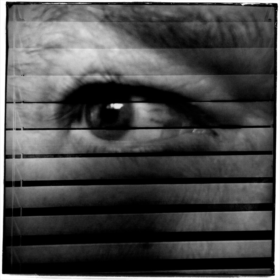
Both of the images in this improvised double-exposure were taken within a space of five minutes. Final processing was finished in ten.
By MICHAEL PERKINS
IN HER BRILLIANT 1979 BEST SELLER DRAWING ON THE RIGHT SIDE OF THE BRAIN, art teacher Betty Edwards, while obviously addressing the creative process chiefly as it regards graphics, also contributed to a better understanding of the same visualization regimen used by photographers. In its clear explanation of the complementary roles of the brain’s hemispheres in making an image, Ms. Edwards demonstrates that photographs can never be just a matter of chiefly left-brained technique or merely the by-product of unfettered, right-brained fancy.
And that’s important to understand as we grow our approach to our craft over time. It’s ridiculous to imagine that we can make compelling images without a certain degree of left-brained mastery, just as you can’t drive a nail if you don’t know how to hold a hammer. But it’s equally crazy to try to take pictures without the right-brained inspiration that sees the potential in a composition or subject even before the left knows how, technically, it can be achieved. One side problem-solves while the other dreams. One hemisphere is an anchor, a foundation: the other is a helium balloon.
When you develop a plan for your next shoot, selecting the lenses and tools you’ll need, scoping out the best locations, it’s all left brain. But, comes the day of the shoot, your right brain might just fall in love with something that wasn’t in the blueprint, something that just must be dealt with now. Fact is, neither side can hold absolute sway. When you are laboring a long time to get a particular picture, you can almost feel the two hemispheres arguing for control. But all that left-right-left toggling isn’t a bad thing, nor should you expect there to be one clear “winner” in the struggle. The pictures that emerge have to be an agreement, or at least a truce between “how do we do this?” and “why should we do this?”.
I have pictures, such as the one up top here, that I call five-minute wonders, so named because they go very quickly from conception to completion. They are like impulse items in the grocery checkout line. I’ll take some of this, a few of these, and one of those, toss them together in a bowl, and see what happens. Sounds very right-brained, right? However, none of these quickie projects would work if I simply don’t know how to make the camera give me what I want. That’s all left brain. The point is, the two factions must at least have a grudging conversation with each other. Right-brained creativity gets all the chicks and the cool clothes: it’s the flashy rock star of the photo universe, a sexy bad boy who just won’t listen to reason. However, Lefty has to take the wheel occasionally or Righty will crash the sports car and we’ll all die horribly.
It’s romantic to believe that all our great photographs come from blindingly brilliant flashes of pure inspiration. That’s where the lomography movement with its cheap plastic cameras and its “don’t think, shoot” mantra comes from. And impulse certainly plays its part. However, anyone who tells you that amazing images come solely from some bottomless wellspring of the soul is only telling you half the truth. Sometimes you can spend the day playing hooky, and some days you gotta stay inside and do your homework.
Left, right, left….
A NEW PATH
A dream of life comes to me. Come on up for the rising tonight—-Bruce Springsteen
By MICHAEL PERKINS
THE POST 9/11 RESURRECTION OF LOWER MANHATTAN might have begun as a kind of act of defiance, a refusal to knuckle under to fear in the aftermath of the largest attack in history on American soil. Somewhere amidst the tears and rage, however, the project to re-establish this crucial corner of New York City moved onto a higher plane, transitioning from anger to elegance, mourning to…morning. And now, for both casual travelers and astounded visitors, the master plan for the area is an ever-blooming monument to faith. To excellence.
Photographers from around the world have known, from the days of the first cleanups, that an amazing opportunity for historic documentation was unfolding on this hallowed ground, and their images have provided an invaluable service in tracking the city’s transition between two distinct eras. The first two mile-markers in this transformation, the openings of World Trade Center One and the 9/11 Memorial Museum, have been interpreted in a global cascade of visual impressions, occurring, as they have, in the first explosion of social media and digital imaging. And now, the third piece of the puzzle, the stunning new Oculus PATH terminal, is nearly ready to serve as the proof that the city, along with all its millions of comings and goings, is still very much open for business.
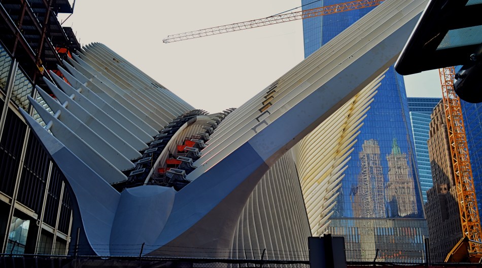
Oculus Aloft: the steel wings of the new PATH terminal for New York’s World Trade Center, nearing completion in 2015.
Photographers have already made a visit to Oculus something of a pilgrimage, and, looking over the first few photos to emerge from their visits, it might be closer, architecturally, to a religious experience. Designed by Santiago Calatrava, the structure, presenting its ribbed wings to the skies like an abstract bird of prey, resembles, within, a kind of sci-fi cathedral of kaleidoscopic light effects, serving as both monument and utility. An inventory of its features and a gallery of interior images can be seen here.
And, of course, this is New York, so opinion on the Oculus’ value, from poetic prayers to crass carping, will go through the usual grappling match. But, whatever one’s eventual take on the project, its power as a statement….of survival, of power, of hope, and, yes, of defiance, cannot be denied. To date, I’ve only been able to photograph limited parts of the construction phase (see above), but I will be back after the baby’s born. And my dreams will collide with Oculus’ own, and something magical will happen inside a box.
Make your way to Manhattan, and let your own camera weigh in on the new arrival.
Come On Up For The Rising.
LOOKS LIKE IT WORKS
By MICHAEL PERKINS
PHOTOGRAPHY OFTEN RE-DEFINES OUR PERCEPTION OF THE FAMILIAR, re-contextualizing everyday objects in ways that force us to see them differently. Nowhere is this more effective than in close-up and macro photography, where we deliberately isolate or magnify details of things so that they lose their typical associations. Indeed, using the camera to cast subjects in unfamiliar ways is one of the most delightful challenges of the art.
Product developers are comfortable with the idea that “form follows function”, that how we use a thing will usually dictate how it must be designed. The shapes and contours of the objects in our world are arrived at only as we tailor the look of a thing to what it does. That’s why we don’t have square wheels. The problem with familiar objects is that, as long as they do what they were designed to do, we think less and less about the elegance of their physical design. Photographers can take things out of this chain of the mundane, and, in showcasing them, force us to see them in purely visual terms. They stop playing the piano, and instead look under the lid at the elegant machine within. They strip off the service panel of the printer and show us the ballet of circuitry underneath.
It’s even easier to do this, and yields more dramatic results, as we begin to re-investigate those things that have almost completely passed from daily use. To our 21st-century eyes, a 1910 stock ticker might as well be an alien spaceship, so far removed is it from typical experience. I recently viewed a permanent wave machine from a beauty parlor of the 1930’s, sitting on a forgotten table at a flea market. It took me two full minutes to figure out what I was even looking at. Did I snap it? You betcha.
The study of bygone function is also a magical mystery tour of design innovation. You start to suss out why the Edisons of the world needed this shape, these materials, arranged in precisely this way, to make these things work. Zooming in for a tighter look, as in the case of the typewriter in the above image, forces a certain viewpoint, creating compositions of absolute shapes, free to be whatever we need them to be. Form becomes our function.
The same transformation can happen when you have seemingly exhausted a familiar subject, or shot away at it until your brain freezes and no new truth seems to be coming forth. Walking away from the project for a while, even a few hours, often reboots your attitude towards it, and the image begins to emerge. As Yogi Berra said, you can observe a lot just by watching.
TERMS OF ENGAGEMENT
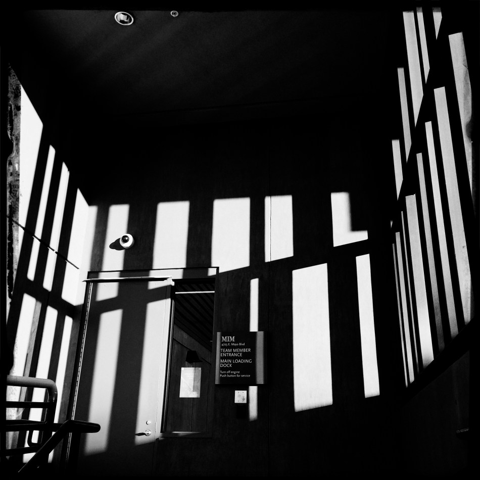
A very soft color cel phone original becomes a stark “box”, suggested solely by a pattern of black and white bands.
By MICHAEL PERKINS
ABSTRACT COMPOSITIONS AREN’T MERELY A DIFFERENT WAY OF PHOTOGRAPHING A SUBJECT: they are, in many cases, the subject itself. Arrangements of shape, shadow and contrast can be powerful enough to carry the weight of a picture all by themselves, or at least be an abbreviated, less-is-more way of suggesting objects or people. And in terms of pure impact, it’s no surprise that photographers who, just a generation ago, might have worked exclusively in color, are making a bold return to black and white. For abstract compositions, it’s often the difference between a whisper and a shout.
I find it interesting that the medium of comics, which has long been defined by its bold, even brutal use of color, is also experiencing a black & white resurgence in recent years, with such masters as Frank Miller (Batman: The Dark Knight Returns) rendering amazing stuff in the most starkly monochromatic terms. Likewise, the army of apps in mobile photography has reminded young shooters of the immediacy, the power of monochrome, allowing them to simulate the grain and grit of classic b&w films from Tri-X to Kodalith, even as a post-production tweak of a color original.
You know in the moment whether you’ve captured a conventional subject that sells the image, or whether some arrangement of forms suggestive of that subject is enough. In the above shot, reducing the mild color tonal patterns of a color original to bare-boned, hard blacks and loud whites creates the feel of a shaded door frame..a solid, dimensional space. The box-like enclosure that envelops the door is all there, but implied, rather than shown. As a color shot, the image is too quiet, too…gentle. In monochrome, it’s harder, but it also communicates faster, without being slowed down by the prettiness of the browns and golds that dominated the initial shot.
There are two ways to perfect a composition; building it up in layers from nothing into a “just-enough” something, or stripping out excess in a crowded mash-up of elements until you arrive at a place where you can’t trim any further without losing the essence of the picture. Black and white isn’t just the absence of color: it’s a deliberate choice, the selection of a specific tool for a specific impact.
FACE TIME

The resurrected World Trade Center, as seen at eye (rather than “craning neck”) level. 1/125 sec., f/5.6, ISO 100, 24mm.
By MICHAEL PERKINS
I AM OFTEN ASKED WHY ARCHITECTURE FIGURES SO STRONGLY in my photography, and I can only really put part of my answer into words. That’s what the pictures are for. I imagine that the question itself is an expression of a kind of disappointment that my work doesn’t focus as much on faces, as if the best kind of pictures are “people pictures”, with every other imaging category trailing far behind. But I reject that notion, and contend that, in studying buildings, I am also studying the people who make them.
Buildings can be read just as easily as a smile or a frown. Some of them are grimaces. Some of them are grins. Some of them show weary resignation, despair, joy. Architecture is, after all, the work of the human hand and heart, a creative interpretation of space. To make a statement? To answer a need? The furrowed brows of older towers gives way to the sunny snicker of newborn skyscrapers. And all of it is readable.
In photography, we are revealing a story, a viewpoint, or an origin in everything we point at. Some buildings, as in the case of the first newly rebuilt World Trade Center (seen above), are so famous that it’s a struggle to see any new stories in them, as the most familiar narratives blot the others out of view. Others spend their entire lives in obscurity, so any image of them is a surprise. And always, there are the background issues. Who made it? What was meant for it, or by it? What world gave birth to this idea, these designs, those aims?
Photography is about both revelation and concealment. Buildings, as one of the only things we leave behind to mark our having passed this way, are testaments. Read their faces. No less than a birthday snapshot, theirs is a human interest story.
CHOCK-A-BLOCK
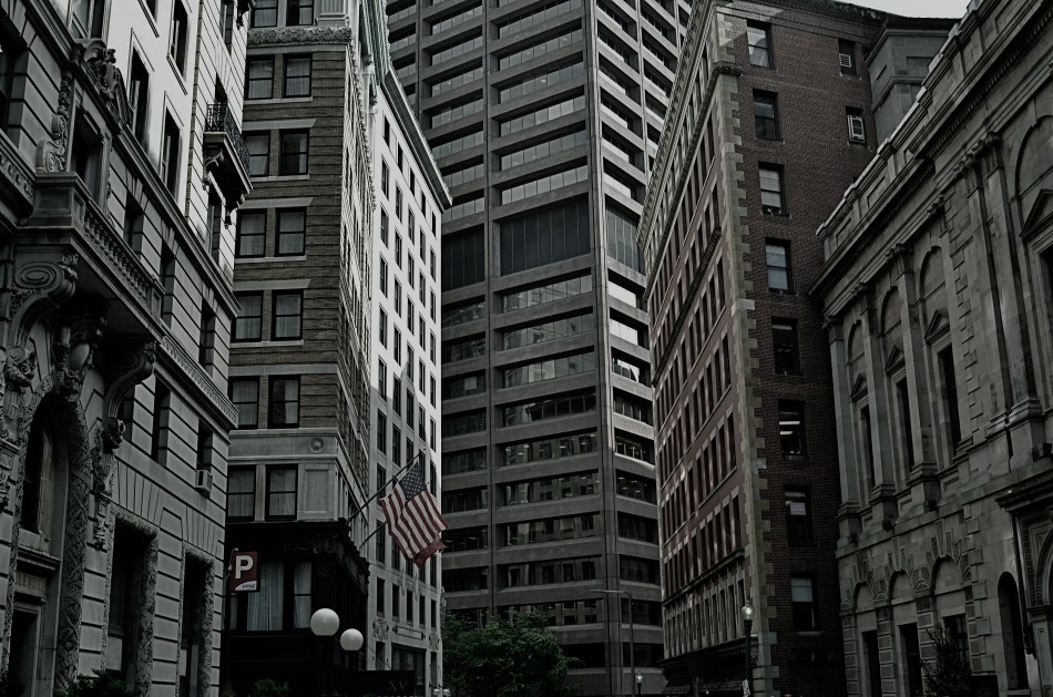
Yes, you could find a more frustrating job than making city maps for Boston streets. But you’d have to look hard….
By MICHAEL PERKINS
WHEN WE THINK OF URBAN BLOCKS, IT’S NATURAL TO THINK of those blocks as regular rectangles, well-regulated, even streets that run at direct parallels or hard right angles to each other. And while there certainly are cities with such mathematically uniform grids, some of the most interesting cities in the world don’t conform to this dreamy ideal in any way. And that means opportunities for photographers.
We’ve all seen street scenes in which the left and right sides of the road vanish directly toward the horizons, like staring down the middle of a railroad bed. But for the sake of dramatic urban images, it’s more fun to seek out the twisty mutants of city design; the s-and-z curves, the sudden zigzags, the trapezoids and triangles which signify confusion to cabbies and pedestrians but which mean good times for photogs. Let’s face it; snapping pictures of orderly things gets old fast. The very nature that makes us idealize “rightness” also makes us want to photograph “wrongness.”
That’s why I love to shoot in towns where the city was laid out with all the logic of the Mad Hatter on speed, those streets that seem barely coherent enough to admit the successful conduct of trade. Cities where locals and visitors alike curse the names of the urban planners, if there ever had been planners, if there ever had been a plan. A grand collision of avenues and alleys that looks like a kid whose teeth are crowding together in a greedy orthodontist’s dream fantasy. In such cities, including Manhattan, Pittsburgh, San Francisco, Boston and many others, “order” is a relative term. There are precious few neat streets vanishing back to infinity, politely lined by cooperative structures queueing up parallel to the curb. And that’s my kind of living, breathing… chaos.
As a mild example, consider the Boston street shown above, on which nearly every building seems slightly askew from every other building, sitting on foundations that jut out at every conceivable angle and plane. It’s a grand, glorious mess, and a much more interesting way to show the contrasting styles that have sprouted in the neighborhood over the centuries. It’s reality that looks like an optical illusion, and I can’t get enough of it.
A straight line may be the shortest distance between two points, but it’s also the least interesting. Go find cities that make no sense, God bless ’em.
THE PLACES THEY LIVED
By MICHAEL PERKINS
PHOTOGRAPHERS INSTINCTIVELY SEEK OUT VARIATION. We spend so much time looking at so much of the world that a lot of it starts to sort itself into file folders of things, patterns, or places, pre-sorting our pictures into this or that category. Sunsets: see Nature. Famous Buildings: a sub-set of Travel. And so on, until we are fairly starved for some visual novelty to shock us out of our slumber and spur us on to new ways of seeing.
One of the things that settles most readily into sameness is the human dwelling. Most of us live in some kind of basic four-walls, bedroom-kitchen-bath sequence, making our living spaces fairly predictable as subject matter. By way of awe and admiration, the real geniuses of, magazine illustration, to me, have always been the “house beautiful” photographers, since they must spend year after year making Mr.& Mrs. J.D. Gotmore’s McMansions seem unique and bold. That said, there is something about nearly everyone’s castle that might be distinctive, even revelatory, about the people who live within. It’s all in your approach.
I love to explore the places where people are forced to improvise living spaces either near or as part of their work, places that usually exist in stark isolation as compared to the crush of crowded urban centers. In the above image, I was allowed to climb to a small viewing angle of the beacon room atop a coastal lighthouse in San Diego, and, perhaps because I was limited to a shooting stance below the surface of the room’s floor, the resulting photo further exaggerated the confined, angular working space, which sits above living areas further down the house’s twisty central staircase.
These areas pose more questions than they answer. What is it like to have this building be your entire world for long stretches of time? What kind of person can do this work? What is the center of this unusual story? The blurring of boundaries between working and living areas is among the most novel material a photographer can tackle, since it contains one of the things he craves most….mystery.
