SEEING THROUGH THE STORM
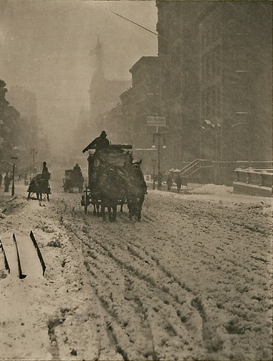
At the time of its initial publication in 1893, this image by Alfred Stieglitz was deemed a failure.
By MICHAEL PERKINS
LOOK CAREFULLY AT THE PHOTOGRAPH TO YOUR LEFT. It was, at one time, judged by contemporary critics as a grand failure. Alfred Stieglitz, the father of modern photography, and the first to advocate for its status as a legitimate art form, made this image after standing for three hours in the miserable blizzard that had buried the New York of 1893 in mounds of cottony snow.
The coachman and his horses are rendered in a soft haze due to the density of the wind-driven snow, and by the primitive slowness of the photographic plates in use at the time. There was, for photographers, no real option for “freezing the action” (unwitting pun) or rendering the kind of razor sharpness that is now child’s play for the simplest cameras, and so a certain amount of blur was kind of baked into Stieglitz’ project. But look at the dark, moody power of this image! This is a photograph that must live outside the bounds of what we consider “correct”.
More importantly, a technically flawless rendering of this scene would have drained it of half its impact.
Of course, at the time it was created, Stieglitz’ friends encouraged him to throw the “blizzard picture” away. Their simple verdict was that the lack of sharpness had “spoiled” the image. Being imperfect, it was regarded as unworthy. Stieglitz, who would soon edit Camera Work, the world’s first great photographic magazine, and organize the Photo-Secession, America’s first collective of artists for promotion of the photo medium, had already decided that photographs must be more than the mere technical recording of events. They could emphasize drama, create mood, evoke passions, and force the imagination every bit as effectively as did the best paintings.
Within a few years of the making of this image, the members of the Photo-Secession began to tweak and mold their images to actually emulate painting. The movement, called Pictorialism, did not last long, as the young turks of the early 20th century would soon demand an approach to picture-making that matched the modern age. The important thing, however, is that Stieglitz fought for his vision, insisted that there be more than one way to make a picture. That example needs to be followed today more than ever. When you make an image, you must become its champion. This doesn’t mean over-explaining or asking for understanding. It means shooting what you must, honing your craft, and fighting for your vision in the way you bring it to life.
THE DAY THE UNIVERSE CHANGED
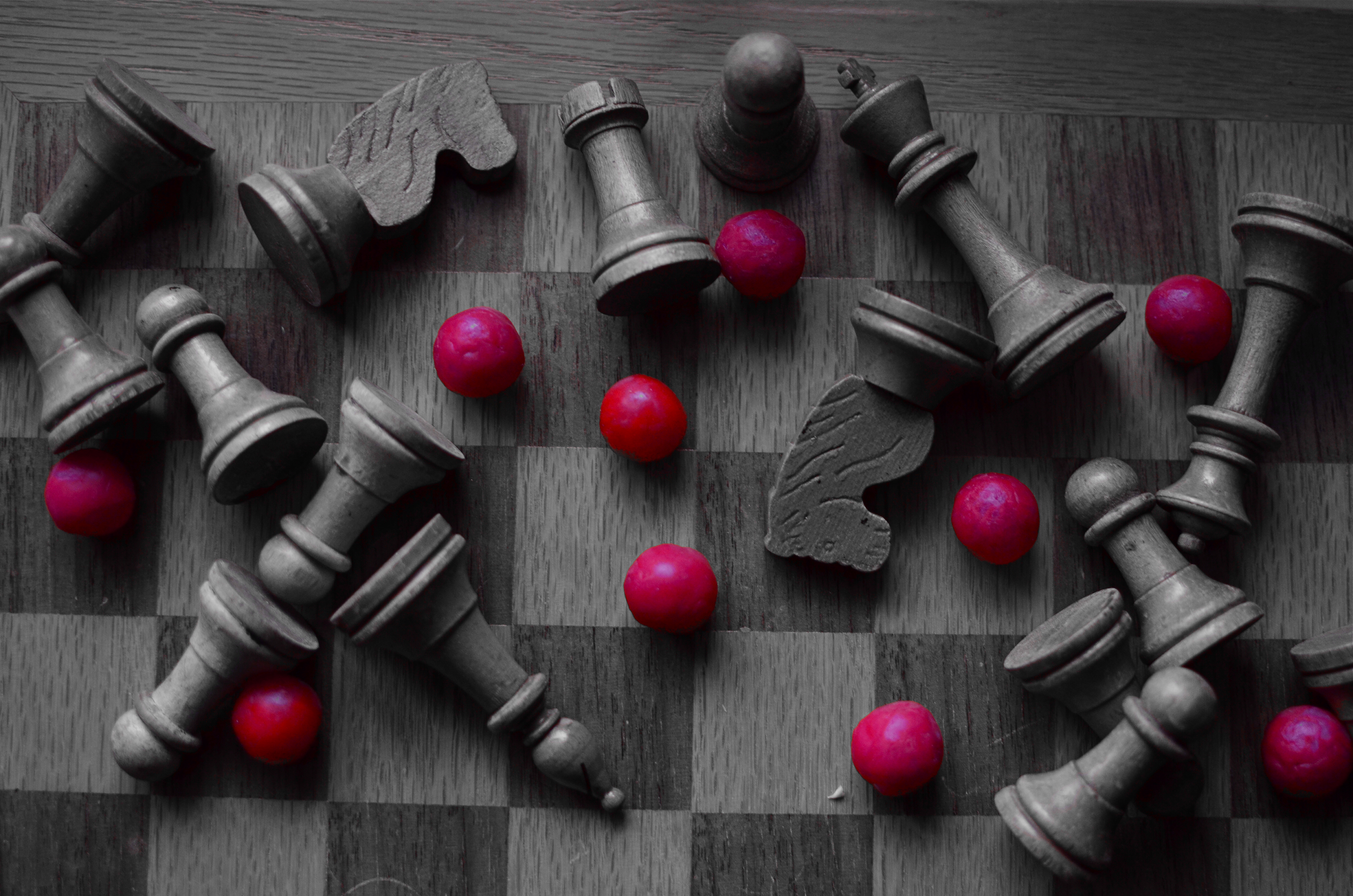
Outgunned, 2015. 1/30 sec., f/2.8, ISO 400, 35mm. Copy of color original desaturated with Nikon’s “selective color” in-camera touch-up option.
By MICHAEL PERKINS
IT WAS NEARLY A GENERATION AGO that Professor James Burke was the most admired media “explainer” of history and culture on both sides of the Atlantic, largely as a result of video adaptations of his hit books Connections and The Day The Universe Changed. Burke, trained at Jesus College in Oxford, was spectacularly talented at showing the interlocking linkages of events and human development, demonstrating the way they meshed together to act endlessly upon history, like gears locked in one large rotation. The result for viewers on PBS and the BBC was better than an ah, ha moment. It was more like an of course moment. Oh, yes, I see now. Of course.
In Universe especially, he examined the specific moments when everything we “knew” was altered forever. For example, we all “knew” the earth was flat, until we knew the exact opposite. We all “knew” that the sun rotated around the Earth, right up until that belief was turned on its ear. Our ideas of truth have always been like Phoenix birds, flaming out of existence only to rise, reconfigured, out of their own ashes. Burke sifted the ashes and set our imaginations ablaze.
As photographers, we have amazing opportunities to depict these transformative moments. In the 1800’s, the nation’s industrial sprawl across the continent was frozen in time with photo essays on the dams, highways, railroads and settlements that were rendering one reality moot while promising another. In the early 1900’s we made images of the shift between eras as the horrors of World War One rendered the Victorian world, along with our innocence, obsolete.
I love exploring these instants of transformation by way of still-life compositions that represent change, the juncture of was and will be. Like the above arrangement, in which some kind of abstract artillery seems to have un-horsed the quaint army of a chess set, I am interested in staging worlds that are about to go out of fashion. Sometimes it takes the form of a loving portrait of bygone technology, such as a preciously irrelevant old camera. Other times you have to create a miniature of the universe you are about to warp out of shape. Either way, it makes for an amazing exercise in re-visualizing the familiar, and reminds us, as Professor Burke did so well, that truth is both more, and less, than we know.
HAPPY OLD YEAR

2014. Another year spent chasing the light.
By MICHAEL PERKINS
The White Rabbit put on his spectacles. ‘Where shall I begin, please your Majesty?’ he asked. ‘Begin at the beginning,’ the King said gravely, ‘and go on till you come to the end: then stop.’
IN A SIMPLER WORLD, THE KING OF HEARTS, quoted above in Lewis Carroll’s Alice’s Adventures in Wonderland, would be perfectly correct. All things being equal, the beginning would be the best place to begin. But, in photography, as in all of life, we are always coming upon a series of beginnings. Learning an art is like making a lap in Monopoly. Just when we think we are approaching our destination, we pass “Go” again, and find that one man’s finish line is another man’s starting gate. Photography is all about re-defining where we are and where we need to be. We always begin, and we never finish.
As 2014 comes to an intersection (I can’t really say ‘a close’ after all that, can I?), it’s normal to review what might be either constant, or changed, about one’s approach to making pictures. That, after all, is the stated aim of this blog, making The Normal Eye more about journey than destination. And so, all I can do in reviewing the last twelve months of opportunities or accidents is to try to identify the areas of photography that most define me at this particular juncture, and to reflect on the work that best represents those areas. This is not to say I’ve gained mastery, but rather that I’m gaining on it. If my legs hold out, I may get there yet. But don’t count on it.
The number twelve has become, then, the structure for the blog page we launch today, called (how does he think of these things?) 12 for 14. You’ll notice it as the newest gallery tab at the top of the screen. There is nothing magical about the number by itself, but I think forcing myself to edit, then edit again, until the thousands of images taken this year are winnowed down to some kind of essence is a useful, if ego-bruising, exercise. I just wanted to have one picture for each facet of photography that I find essentially important, at least in my own work, so twelve it is.
Light painting, landscape, HDR, mobile, natural light, mixed focus, portraiture, abstract composition, all these and others show up as repeating motifs in what I love in others’ images, and what I seek in my own. They are products of both random opportunity and obsessive design, divine accident and carefully executed planning. Some are narrative, others are “absolute” in that they have no formalized storytelling function. In other words, they are a year in the life of just another person who hopes to harness light, perfect his vision, and occasionally snag something magical.
So here we are at the finish line, er, the starting gate, or….well, on to the next picture. Happy New Year.
TELLING THE TRUTH

Three Brothers by Joni Gauthier, 2014. The joy jumps out at you.
By MICHAEL PERKINS
PICK ANY PHOTOGRAPHIC ERA YOU LIKE, and most of the available wisdom (or literature) will concentrate on honoring some arbitrary list of rules for “successful” pictures. On balance, however, relatively few tutorials mention the needful option of breaking said rules, of making a picture without strict adherence to whatever commandments the photo gods have handed down from the mountain. It’s my contention that an art form defined narrowly by mere obedience is bucking for obsolescence.
It’d be one thing if minding your manners and coloring inside the lines guaranteed amazing images. But it doesn’t, any more than the flawless use of grammar guarantees that you’ll churn out the great American novel. Photography was created by rebels and outlaws, not academics and accountants. Hew too close to the golden rules of focus, exposure, composition or subject, and you may inadvertently gut the medium of its real power, the power to capture and communicate some kind of visual verity.
A photograph is a story, and when it’s told honestly, all the technical niceties of technique take a back seat to that story’s raw impact. The above shot is a great example of this, although the masters of pure form could take points off of it for one technical reason or another. My niece snapped this marvelous image of her three young sons, and it knocked me over to the point that I asked her permission to make it the centerpiece of this article. Here, in an instant, she has managed to seize what we all chase: joy, love, simplicity, and yes, truth. Her boys’ faces retain all the explosive energy of youth as they share something only the three of them understand, but which they also share with anyone who has ever been a boy. This image happens at the speed of life.
I’ve seen many a marvelous camera produce mundane pictures, and I’ve seen five-dollar cardboard FunSavers bring home shots that remind us all of why we love to do this. Some images are great because we obeyed all the laws. Some are great because we threw the rule book out the window for a moment and just concentrated on telling the truth.
You couldn’t make this picture more real with a thousand Leicas. And what else are we really trying to do?
FADE TO (ALMOST) BLACK

Sometimes a change in the technical approach to a shot is the only way to freshen an old subject. 1/40 sec., f/1.8, ISO 250, 35mm.
By MICHAEL PERKINS
I KNOW MANY PHOTOGRAPHERS WHO SUBJECT THEMSELVES TO THE DELICIOUS TORTURE, known to authors everywhere,as “publish or perish”, or, in visual terms, the tyranny of shooting something every single day of their lives. There are lots of theories afloat as to whether this artificially imposed discipline speeds one’s development, or somehow pumps their imagination into the bulky heft of an overworked bicep. You must decide, o seekers of truth, what merit any of this has. I myself have tried to maintain this kind of terrifying homework assignment, and during some periods I actually manage it, for a while at least. But there are roadblocks, and one of the chief barriers to doing shot-a-day photography is subject matter, or rather the lack of it.
I’ve shot in this space for years, and therein lies the challenge. 1/40 sec., f/2.2, ISO 250, 35mm.
Let’s face it: even if you live one canyon away from the most breathtaking view on earth or walk the streets of the mightiest metropolis, you will occasionally look upon your immediate environs as a bad rerun of Gilligan’s Island, something you just can’t bear to look at without having a wastebasket handy. Familiarity breeds contempt for some subjects that you’ve visited and re-visited, and so, for me, the only way to re-mix old material is to re-imagine my technical approach to it. This is still a poor substitute for a truly fresh challenge, but it can teach you a lot about interpretation, which has transformed more than a few mundane subjects for me over a lifetime of shuttering (and shuddering).
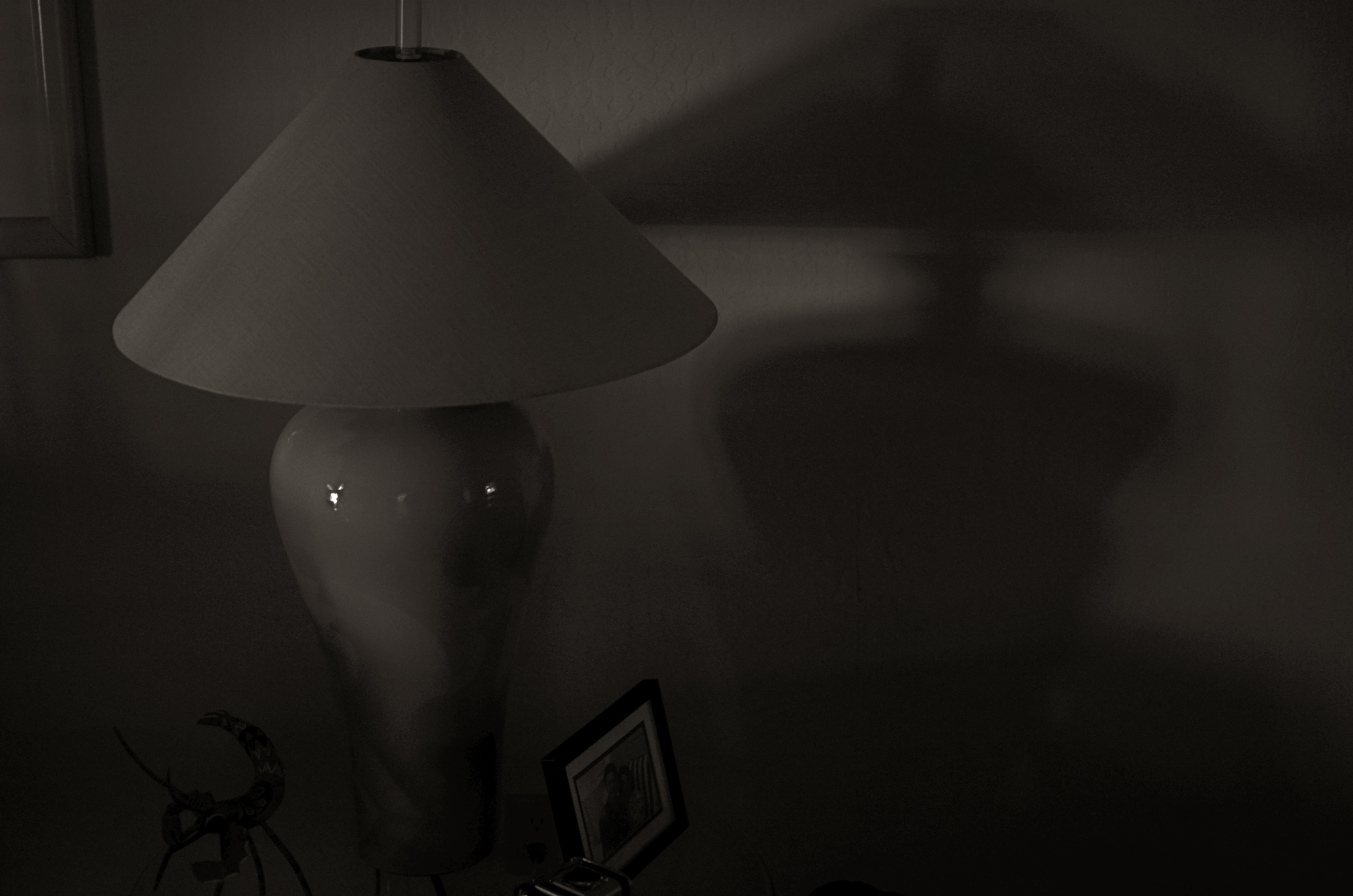
As an example, a corner of my living room has been one of the most trampled-over crime scenes of my photographic life. The louvered shades which flank my piano can create, over the course of a day, almost any kind of light, allowing me to use the space for quick table-top macros, abstract arrangements of shadows, or still lifes of furnishings. And yet, on rainy /boring days, I still turn to this corner of the house to try something new with the admittedly over-worked material. Lately I have under-exposed compositions in black and white, coming as near a total blackout as I can to try to reduce any objects to fundamental arrangements of light and shadow. In fact, damn near the entire frame is shadow, something which works better in monochrome. Color simply prettifies things too much, inviting the wrong kind of distracted eye wandering in areas of the shot that I don’t think of as essential.
I crank the aperture wide open (or nearly) to keep a narrow depth of field, which renders most of the image pretty soft. I pinch down the window light until there is almost no illumination on anything, and allow the ISO to float around at least 250. I get a filmic, grainy, gauzy look which is really just shapes and light. It’s very minimalistic, but it allows me to milk something fresh out of objects that I’ve really over-photographed. If you believe that context is everything, then taking a new technical approach to an old subject can, in fact, create new context. Fading almost to black is one thing to try when you’re stuck in the house on a rainy day.
Especially if there’s nothing on TV except Gilligan.
YOU ARE PHOTOSHOP
By MICHAEL PERKINS
EVER SINCE THE ARRIVAL OF THE DIGITAL DARKROOM and its attendant legion of post-production fixes, the world of photography has been pretty evenly divided into “befores” and “afters”, those who prefer to do most of their picture making in-camera and those who prefer to “fix” things after the shutter clicks. Most amateur photography, in the film era, was heavily weighted in favor of the “befores”, since a lot of traditional touch-up technology was economically beyond the reach of many. In the Photoshop era, however, the economic barrier to post-production was shattered, resulting in a more even balance between the two philosophies.

Shoot your black and white images as black and white images, not color shots drained of hue after the fact.
I really see this quarrel as very sharply defined when it comes to black and white photography, with many shooters making most, if not all of their monochromes from shots that were originally color, then desaturated or otherwise manipulated as an afterthought. I prefer to shoot b&ws in-camera, however, for the very simple reason that it gets you thinking in black and white terms, from lighting to composition. It also allows you to benefit from digital’s immediate feedback/playback strengths to shape your shot in the moment. If you’ve worked in mono for a while, and especially if you’ve ever shot on b&w film stock, you are used to seeing the 50 shades of gray that subtly shape the power of an image. More importantly, you realize that black and white is much more than color with the hues sucked out. It’s not a novelty or a gimmick, but a distinct way of seeing.
When you conceive a shot in color, you are shooting according to what serves color well. That means that not all color shots will translate well into grayscale. Fans of the old Superman tv show will recall that, during the series’ early b&w days, George Reeves’ uniform had to be made in various shades of brown so it would “read” correctly in monochrome to viewers who “knew” the suit was red and blue. Cameramen had to plan what would happen when one set of values was used to suggest another. Tones that give a certain punch to an image may look absolutely dead flat if you simply desaturate for mock-mono from a color shot. And, anyway, there are plenty of ways to pre-program many cameras to adjust the contrast and intensity of a b&w master image, as well as the use of filters (polarizers for instance) that do 90% of the tasks you’d typically try to achieve in Photoshop anyway.
The mid-point compromise would seem to be to take both color and black and white shots of your subjects in-camera, allowing you the option of custom processing at least one image afterward. However, knowing what tonal impact you want before you click the shutter is just easier, and usually more productive. Do your shooting with purpose, on purpose. Making a b&w “version” of a color shot after the fact will likely bake up as half a loaf.
DON’T TAKE THAT TONE WITH ME
By MICHAEL PERKINS
I BELIEVE THAT THE SINGLE BIGGEST REASON FOR THE FAILURE OF A PHOTOGRAPHIC COMPOSITION may all boil down to the same problem. I call it “over-sampling”, or, more simply, the presence of too much visual information in a frame. It can be as simple as including too many trees in a landscape or framing to include crowded sky clutter in an urban scene, but it’s not always how many objects are crowded into an image. It can be something as basic as asking the eye to figure out where to look. And sometimes, the very fact that a picture is in color can diminish its ability to clearly say, here: look here.
Color would have added nothing to this image. In fact, it would have detracted from its impact. 1/400 sec., f/5.6. ISO 100, 55mm.
Great photographs have their own gravitational pull and center. They draw people in and direct their gaze to specific places. This tends to be a single focus, because, the more there is to see in an image, the greater the tendency is in the viewer to wander around in it, to blunt the impact of the picture as the eye looks for a central nexus of interest. In my own experience, I find that the use of color in a photograph is justified by whether it helps keep things simple, creates readable signposts that lead the eye to the principal message of the image. Color, just like the objects in a frame, can explode with a ton of separate messages that defeat the main message, sending the viewer all over the place, trying to decode all that vivid information. Color itself can become clutter.
Sometimes the focus of an image is not an object, i.e., a building or a face, but an overall feel that is more emotionally immediate within a narrow range of blacks and greys. The kind of black and white makes a huge difference as well, and anyone who has spent a lot of time processing monochrome images knows that there is no one true black, no pure, simple white. As to actual shooting procedure, I will be so certain that only B&W will work for a given subject that I make the master shot itself in mono, but, more frequently, I shoot in color first and make a dupe file for comparison. This is another amazing advantage of digital imaging; you simply have more choices.
One of the by-products of color photography‘s adoption into mass culture through magazines and faster films in the mid-20th century was, for many people, a near-total abandonment of monochrome as somehow “limited” compared to those glorious, saturated Kodachromian hues. Thing is, both color and black and white have to be vetted before being used in a photograph. There can’t be a general rule about one being more “lifelike” or “natural”, as if that has anything to do with photography. Tools either justify their use or they don’t. You don’t drive a screw with a hammer.
DESTINATION VS. JOURNEY
By MICHAEL PERKINS
I HAVE A WANDERING EYE. Not due to muscular weakness or marital infidelity, but to a malady particular to long-time photographers. After decades of shoots big and little, I find that I am looking for pictures nearly everywhere, so much so that, what appears to many normal people to be formless space or unappealing detail might be shaping up in my mind as My Next Project. The non-obvious sings out ever louder to me as I age, and may find its way into my pictures more often than the Celebrated Scenic Wonder, the Historically Important Site or the Big Lights In The Sky that attract 99% of the photo traffic in any given locality. Part of this has to do with having been disappointed in the past by the Giant Whatsis or whatever the key area attraction is, while being delightfully surprised by little things that, for me, deserve to be seen, re-seen, or testified to.
This makes me a lousy traveling companion at times, since I may be fixated on something merely “on the way” to what everyone else wants to see. Let’s say we’re headed to the Great Falls. Now who wants to photograph the small gravel path that leads to the road that leads to the Great Falls? Well, me. As a consequence, the sentences I hear most often, in these cases, are variations on “are you coming?“, “what are you looking at?” or, “Oh my God, are you stopping again????”.
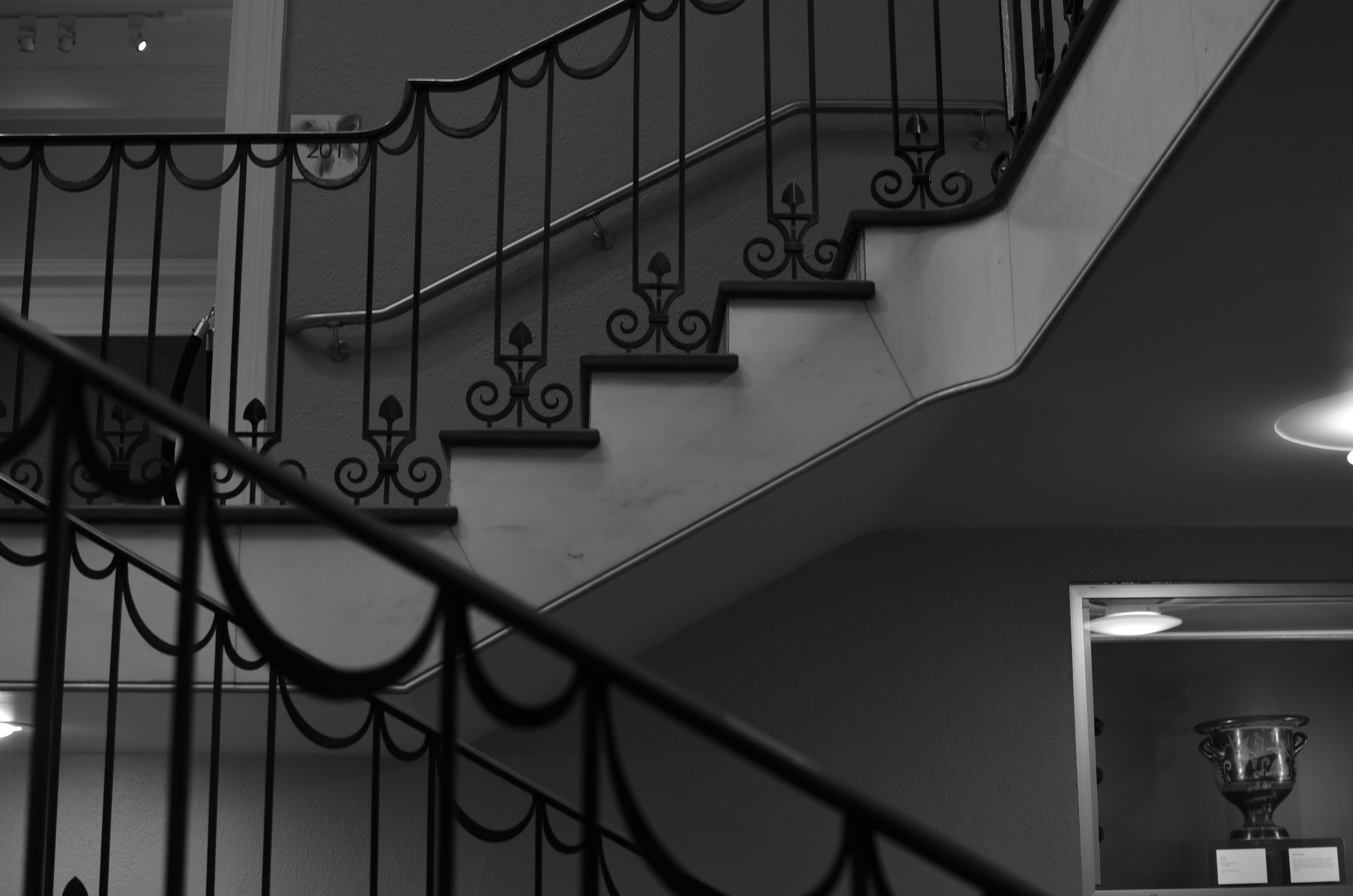
The Landing, 2014. 1/40 sec., f/3.5, ISO 320, 35mm.
Thing is, some of my favorite shots are on staircases, in hallways, around a blind corner, or the Part Of The Building Where No One Ever Goes. Photography is sometimes about destination but more often about journey. That’s what accounts for the staircase above image. It’s a little-traveled part of a museum that I had never been in, but was my escape the from gift shop that held my wife mesmerized. I began to wonder and wander, and before long I was in the land of Sir, We Don’t Allow The Public Back Here. Oddly, it’s easier to plead ignorance of anything at my age, plus no one wants to pick on an old man, so I mutter a few distracted “Oh, ‘scuse me”s and, occasionally, walk away with something I care about. Bonus: I never have any problem shooting as much as I want of such subjects, because, you know, they’re not “important”, so it’s not like queueing up to be the 7,000th person of the day doing their take on the Eiffel Tower.
Now, this is not a foolproof process. Believe me, I can take these lesser subjects and make them twice as boring as a tourist snap of a major attraction, but sometimes….
And when you hit that “sometimes”, dear friends, that’s what makes us raise a glass in the lobby bar later in the day.
ON THE STRAIGHT AND NARROW
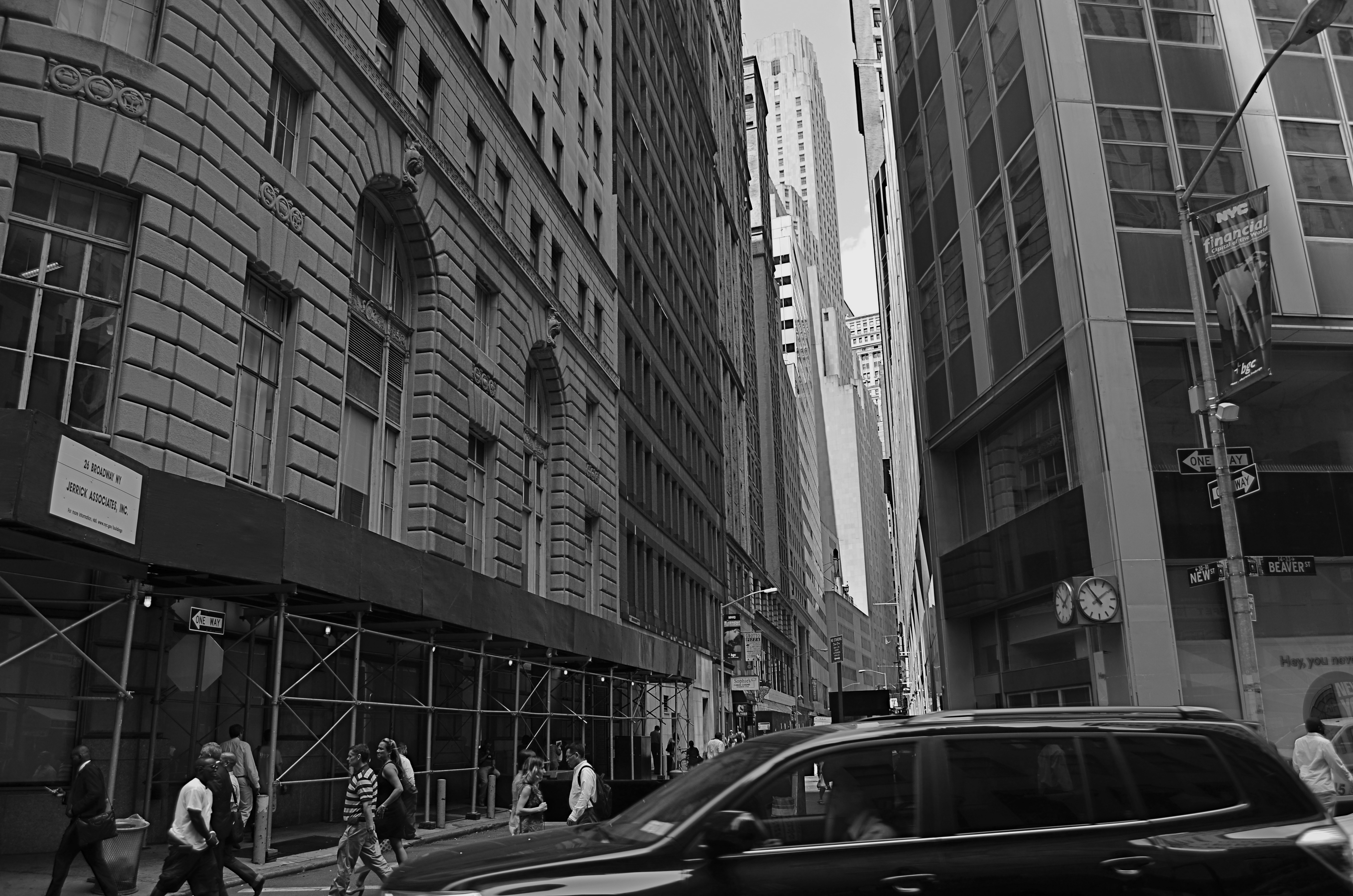
New & Beaver, 2014. 1/200 sec., f/5.6, ISO 100, 18mm.
By MICHAEL PERKINS
THE NARROW STREETS OF LOWER MANHATTAN WERE NEVER DESIGNED TO ACCOMMODATE the claustrophobic jam of commerce, foot traffic and skyscrapers that have characterized the neighborhood since the early 20th century. I should back that up and acknowledge that, for some locals, the streets of lower Manhattan were never designed,period. New York’s growth has always come in rangy spurts and jolts, much like a gangly adolescent that shoots upward and outward overnight without any apparent plan, and yet, those unruly explosions are also what delight the photographer’s eye and make the city an inexhaustible laboratory for technique.
Shooting down the slits that pass for side streets and alleys in lower Manhattan is enough to make even the most seasoned native feel like he or she is being shut up in a tomb, but I am drawn to going even further, and over-emphasizing the extreme dimensions peculiar to the area. That, for me, means shooting with as wide a lens as I have handy, distortion be damned. Actually, it’s distortion be welcomed, since I think that the horizontal lines of the buildings create a much more dramatic lead-in for the eye as they race far away from the foreground. And since ultra-wide magnify front-to-back distances, the bigness and closeness of the city is jacked into a real exaggeration, but one that serves my purpose.
It helps to crouch down and tilt up when composing the shot, and to make sure that you don’t crop passersby out of the shot, since they will add to the drama even more as indications of scale. I have certainly gone too far more than once and rendered rectangular buildings into futuristic trapezoids, but the aim of each image will dictate what you’re going for. Also, in many of these shots, I decide, after much dithering, to choose monochrome over color, but I always shoot the originals in color, since they respond better to re-contrasting once they’re desaturated.
The magic about Manhattan is that no camera can ever tame her or show all her beauty and/or ugliness. It’s somthing of a fool’s errand to try to take the picture of NYC. Better to take a picture you like and add it to the ongoing story.
GREAT DAY IN BROOKLYN
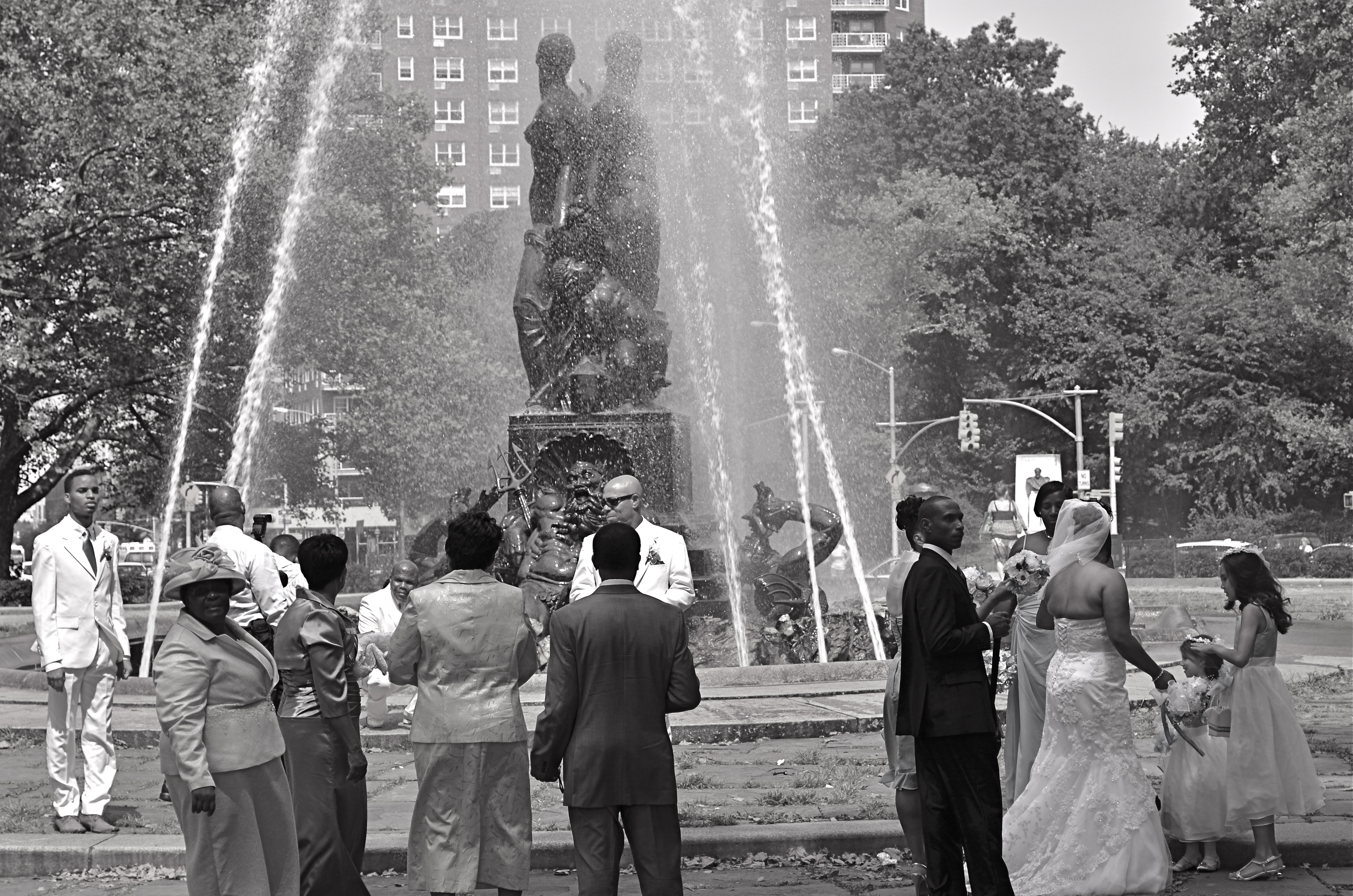
Wedding Party, 2012.
By MICHAEL PERKINS
IT STARTED OFF AS WHAT IS CURRENTLY REFERRED TO AS A FAIL: I was clicking away throughout the park areas in Brooklyn’s Grand Army Plaza, trying to make some kind of epic composition out of the beautiful Bailey Foundation near the war memorial arch. It features several heroic figures standing on the prow of a ship, under which can be seen several mythical denizens of the deep including Neptune himself. It’s a strong piece of sculpture, crowning a plaza that was designed by the great Frederick Law Olmstead, the mastermind behind Manhattan’s Central Park, and I should have been able to do something with it. Something.
Problem with the fountain is the water itself, which, instead of a wonderfully flowing cascade is something between a Jacuzzi shower head and a resort sprinkler system. Its renders the statuary nearly impossible to get in focus, and sends refracted rainbows and hotspots dancing gaily into your lens. Suddenly the impulse of a moment is a day’s work, and, just as I was beginning to check this particular world wonder off my to-do list, in moved the people you see here.
I don’t shoot weddings but the group you see here was, in fact, a shoot of a wedding, something else altogether, since there is a more relaxed dynamic than will ever be present during an actual ceremony. Photographically, rehearsals are more fruitful than actual play performances, and, in that vein, wedding prep holds more pictorial potential, for me, than weddings with a capital W. There is a looser feel, an air of celebration that somehow gets starched out of the final product. Do I stand here? You want me holding the flowers? Shouldn’t the tall people be at the back? Best thing of all, these folks were already taking direction from their “official” photog, so I was the last thing on their mind. There’s no better role at a wedding than that of The Invisible Man.
My glorious fountain had been reduced to a prop, which means the wedding party saw its potential, as I had. The difference is, they gave me what I hadn’t been able to find for myself.
A picture.
A PLACE APART
By MICHAEL PERKINS
PHOTOGRAPHERS USUALLY USE FACES AS THE SOLE BAROMETER OF EMOTION. It’s really easy to use a person’s features as the most obvious cues to one’s inner mind. Scowls, smiles, smirks, downcast eyes, sidelong glances,cries of anguish….these are standard tools in depicting someone as either assimilated into the mass of humanity or cast away, separate and alone.
But faces are only one way of showing people as living in a place apart. Symbolically, there is an equally dramatic effect to be achieved by the simple re-contextualizing of that person in space. The arrangement of space near your subject forces the viewer to conclude that he or she is either in harmony with their surroundings or lonely, solitary, sad even, and you do it without showing so much as a raised eyebrow. This is where composition isn’t just a part of the story, but the story itself.
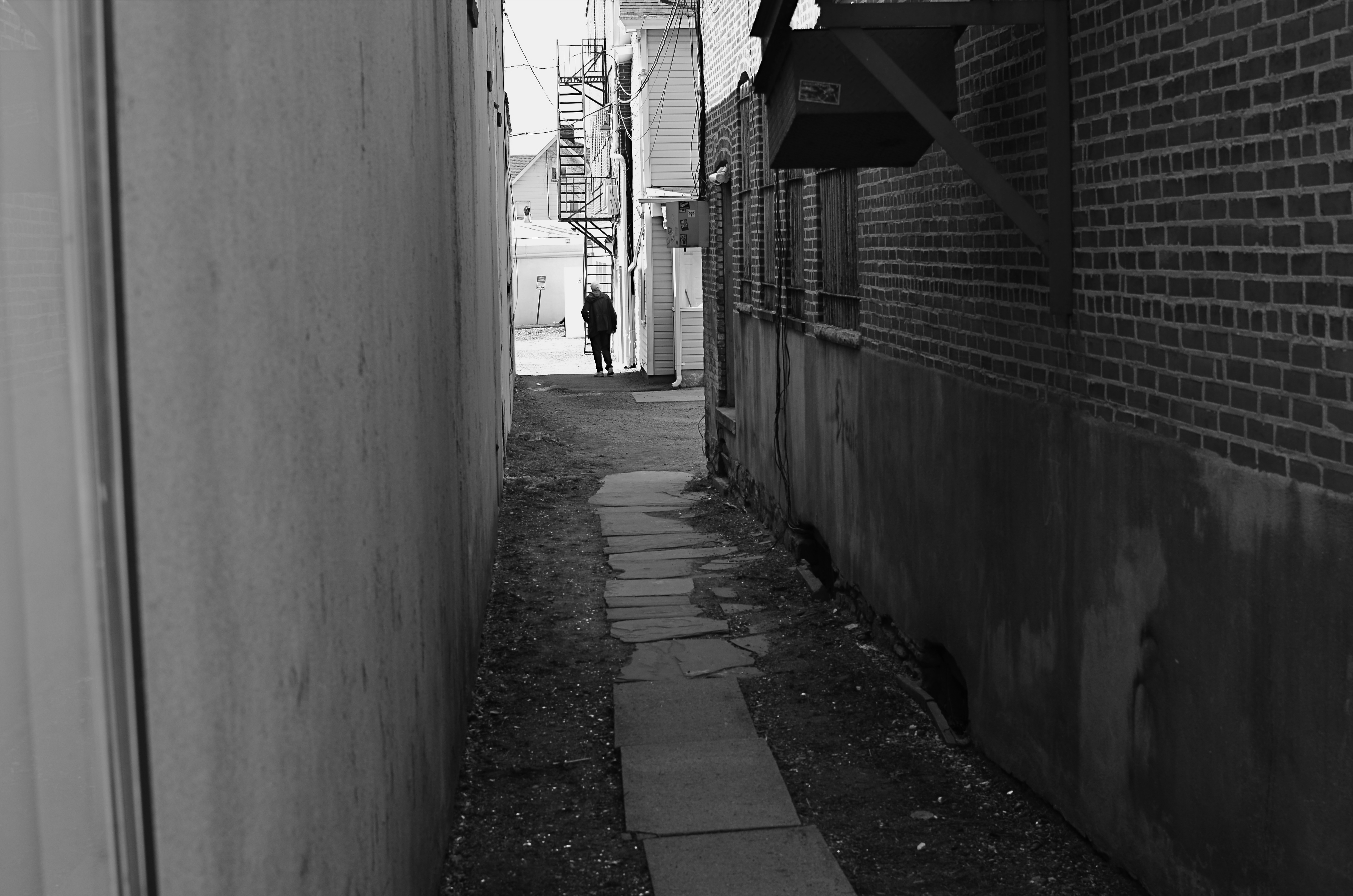
Context is all.
The woman shown here is most likely just walking from point A to point B, with no undercurrent of real tragedy. But once she takes a short cut down an alley, she can be part of a completely different, even imaginary story. Here the two walls isolate her, herding her into a context where she could be lonely, sad, afraid, furtive. She is walking away from us, and that implies a secret. She is “withdrawing” and that implies defeat. She is without a companion, which can symbolize punishment, banishment, exile. From us? From herself? From the world? Once you start to think openly about it, you realize that placing the subject in space lays the foundation for storytelling, a technique that is easy to create, recalibrate, manipulate.
The space around people is a key player in the drama an image can generate. It can mean, well, whatever you need it to mean. People who exist in a place apart become the centerpieces in strong photographs, and the variability of that strength is in your hands.
THE ENVELOPE
By MICHAEL PERKINS
HAVING LIVED IN THE AMERICAN SOUTHWEST FOR OVER FIFTEEN YEARS, I HAVE NEGOTIATED MY OWN TERMS WITH THE BLAZING OVERKILL OF MIDDAY SUNLIGHT, and its resulting impact on photography. If you move to Arizona or New Mexico from calmer climates, you will find yourself quickly constricting into a severe squint from late breakfast to early evening, with your camera likewise shrinking from the sheer overabundance of harsh, white light. If you’re determined to shoot in midday, you will adjust your approach to just about everything in your exposure regimen.
Good news, however: if you prefer to shoot in the so-called “golden hour” just ahead of sunset, you will be rewarded with some of the most picturesque tones you’ve ever had the good luck to work with. As has been exhaustively explained by better minds than mine, sunlight lingers longer in the atmosphere during the pre-sunset period, which, in the southwest, can really last closer to two hours or more. Hues are saturated, warm: shadows are powerful and sharp. And, if that dramatic contrast works to your advantage in color, it really packs a punch in monochrome.
This time of day is what I call “the envelope”, which is to say that objects look completely different in this special light from how they register in any other part of the day, if you can make up your mind as to what to do in a hurry. Changes from minute to minute are fast and stark in their variance. Miss your moment, and you must wait another 24 hours for a re-do.
In the west, the best action actually happens after High Noon. Just before sunset in Scottsdale, AZ: 1/500 sec., f/4.5, ISO 100, 35mm.
The long shadow of an unseen sign visible in the above frame lasted about fifteen minutes on the day of the shoot. The sign itself is a metal cutout of a cowboy astride a bucking bronco, the symbol of Scottsdale, Arizona, “the most western town in the USA”. The shadow started as a short patch of black directly in front of the rusted bit of machine gear in the foreground, then elongated to an exaggerated duplicate of the sign, extending halfway down the block and becoming a sharper and more detailed silhouette.
A few minutes later, it grew softer and eventually dissolved as the sun crept closer to the western horizon. There would still be blazing illumination and harsh shadows for some objects, if you went about two stories high or higher, but, generally, sunset was well under way. Caught in time, the shadow became an active design element in the shot, an element strong enough to come through even in black and white.
If you are ever on holiday in the southwest, peek inside “the envelope”. There’s good stuff inside.
THE UNSEEN GEOMETRY
Overhead and out of sight. 1/400 sec., f/5.6, ISO 100, 35mm.
By MICHAEL PERKINS
THERE ARE MANY PHOTO SITES THAT SUGGEST SHOOTS CALLED “WALKABOUTS“, informal outings intended to force photographers to shoot whatever comes to hand with as fresh an eye as possible. Some walkabouts are severe, in that they are confined to the hyper-familiar surroundings of your own local neighborhood; others are about dropping yourself into a completely random location and making images out of either the nothing of the area or the something of what you can train yourself to see.
Walks can startle you or bore you to tears (both on some days), but they will sharpen your approach to picture-making, since what you do is far more important than what you’re pointing to. And the discipline is sound: you can’t hardly miss taking shots of cute cats or July 4 fireworks, but neither will you learn very much that is new. Forcing yourself to abandon flashier or more obvious subjects teaches you to imbue anything with meaning or impact, a skill which is, over a lifetime, beyond price.
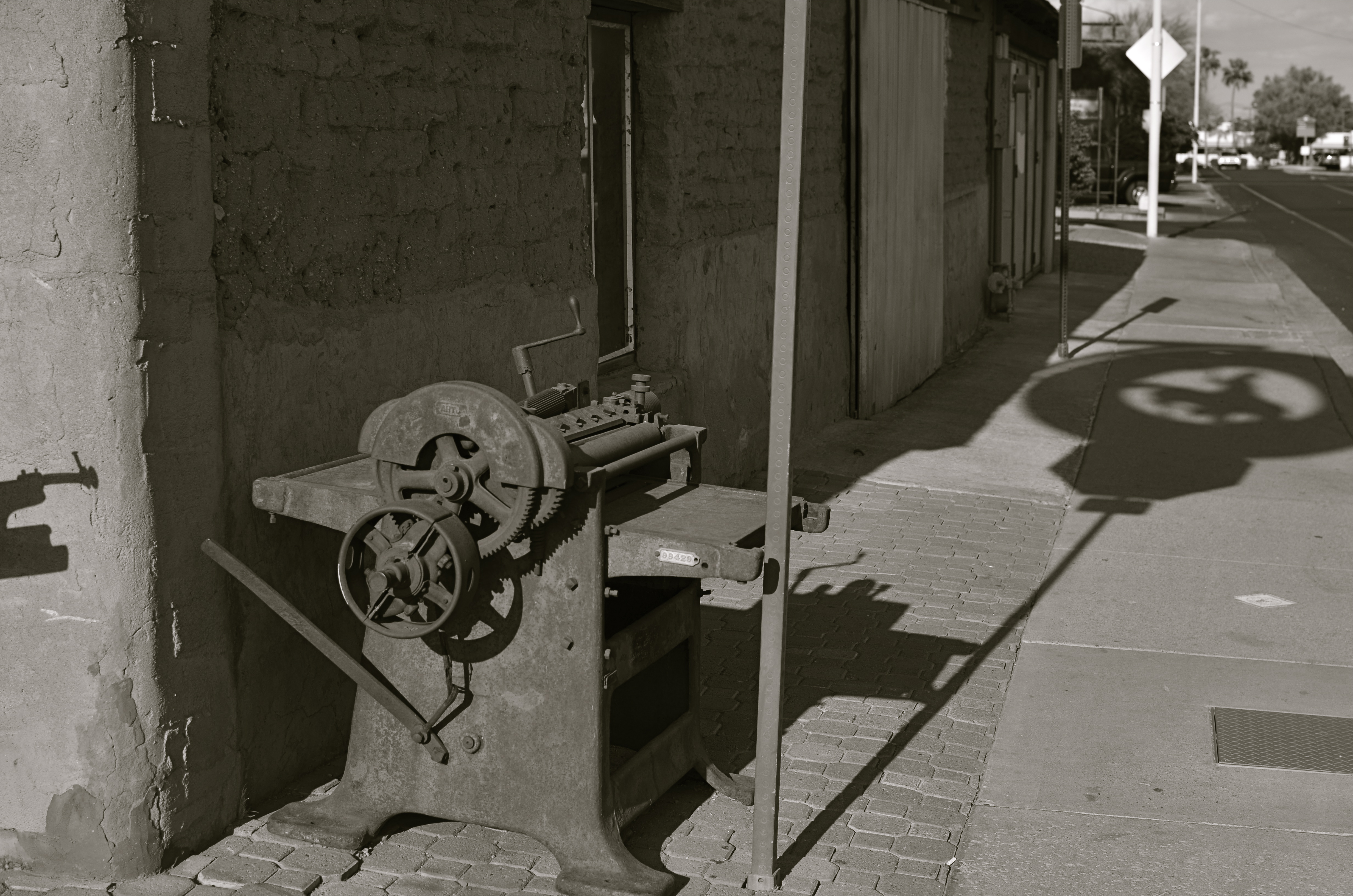
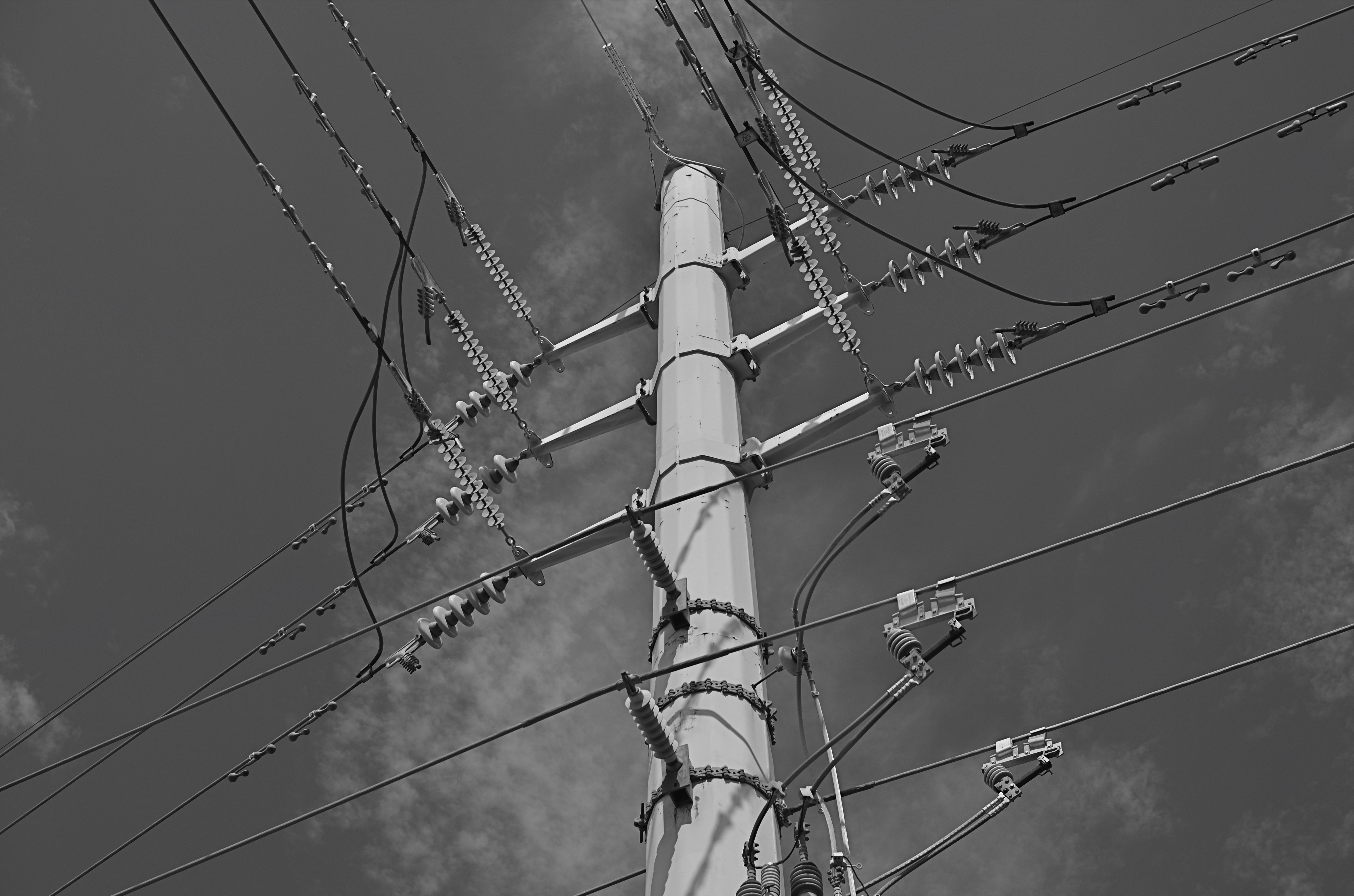
One of the things I try to keep in mind is how much of our everyday environment is designed to be “invisible”, or at least harder to see. Urban infrastructure is all around us, but its fixtures and connections tend to be what I call the unseen geometry, networks of service and connectivity to which we simply pay no attention, thus rendering them unseeable even to our photographer’s eye. And yet infrastructure has its own visual grammar, giving up patterns, even poetry when placed into a context of pure design.
The above power tower, located in a neighborhood which, trust me, is not brimming with beauty, gave me the look of an aerial superhighway, given the sheer intricacy of its connective grid. The daylight on the day I was shooting softened and prettied the rig to too great a degree, so I shot it in monochrome and applied a polarizing filter to make the tower pop a little bit from the sky behind it. A little contrast adjustment and a few experimental framing to increase the drama of the capture angle, and I was just about where I wanted to be.
I had to look up beyond eye (and street) level to recognize that something strong, even eloquent was just inches away from me. But that’s what a walkabout is for. Unseen geometry, untold stories.
THE MOST FROM THE LEAST
Reaching a comfort zone with your equipment means fewer barriers between you and the picture you want to get. 1/80 sec., f/4.5, ISO 100, 18mm.
By MICHAEL PERKINS
PHOTOGRAPHY IS ONLY PARTLY ABOUT TAKING AND VIEWING IMAGES. Truly, one of the most instructive (and humbling) elements of becoming a photographer is listening to the recitation of other photographers’ sins, something for which the internet era is particularly well suited. The web will deliver as many confessions, sermons, warnings and Monday-morning quarterbacks as you can gobble at a sitting, and, for some reason, these tales of creative woe resonate more strongly with me than tales of success. I like to read a good “how I did it” tutorial on a great picture, but I love, love, love to read a lurid “how I totally blew it” post-mortem. Gives me hope that I’m not the only lame-o lumbering around in the darkness.
One of the richest gold fields of confession for shooters are entries about how they got seduced into buying mounds of photographic toys in the hope that the next bit of gear would be the decisive moment that insured greatness. We have all (sing it with me, brothers and sisters!) succumbed to the lure of the lens, the attachment, the bracket, the golden Willy Wonka ticket that would transform us overnight from hack to hero. It might have been the shiny logo on the Nikon. It might have been the seductive curve on the flash unit. Whatever the particular Apple to our private Eden was, we believed it belonged in our kit bags, no less than plasma in a medic’s satchel. And, all too often, it turned out to be about as valuable as water wings on a whale. He who dies with the most toys probably has perished from exhaustion from having to haul them all around from shot to shot, feeding the aftermarket’s bottom line instead of nourishing his art.
My favorite photographers have always been those who have delivered the most from the least: street poet Henri Cartier-Bresson with his simple Leica, news hound Weegee with his Speed Graphic perpetually locked to f/16 and a shutter speed of 1/200. Of course, shooters who use only essential equipment are going to appeal to my working-class bias, since peeling off the green for a treasure house of toys was never in the cards for me, anyway. If I had been the youthful ward of Bruce Wayne, perhaps I would have viewed the whole thing differently, but we are who we are.
I truly believe that the more equipment you have to master, the less possible true mastery of any one part of that mound of gizmos becomes. And as I grow gray, I seem to be trying to do even more and more with less and less. I’m not quite to the point of out-and-out minimalism, but I do proceed under the principle that the feel of the shot outranks every other technical consideration, and some dark patches or soft edges can be sacrificed if my eye’s heart was in the right place.
Of course, I haven’t checked the mail today. The new B&H catalogue might be in there, in which case, cancel my appointments for the rest of the week.
Sigh.
RELATIONSHIPS
By MICHAEL PERKINS
DIGITAL PHOTOGRAPHY DOESN’T TRULY MAKE ARTISTIC CHOICES “POSSIBLE”. Those decisions were always available in the medium, albeit at some cost of materials, time and work. You could always get nearly any effect from film, providing you were willing to invest the sweat in wringing it out of the tools at hand. Instead, digital processes make choices easier to act upon, and, for people who have made the transition from a lifetime of film-based analog shooting to digital, the leap to light speed on the trip from desire to result is especially mind-ripping.
This speed of implementation makes real-time differences when considering whether a shot will have its best impact in color or b&w. Even standard DSLRs and compacts have in-camera modes that allow you to immediately shoot and compare alternate versions of a subject, and, with the expanding universe of apps available to the smartphone shooter, you can instantly crank out half a dozen or more readings of the kind of color or the type of monochrome you’re looking for. This is especially important in black & white, where the range of tones and contrast values can make or break a picture.
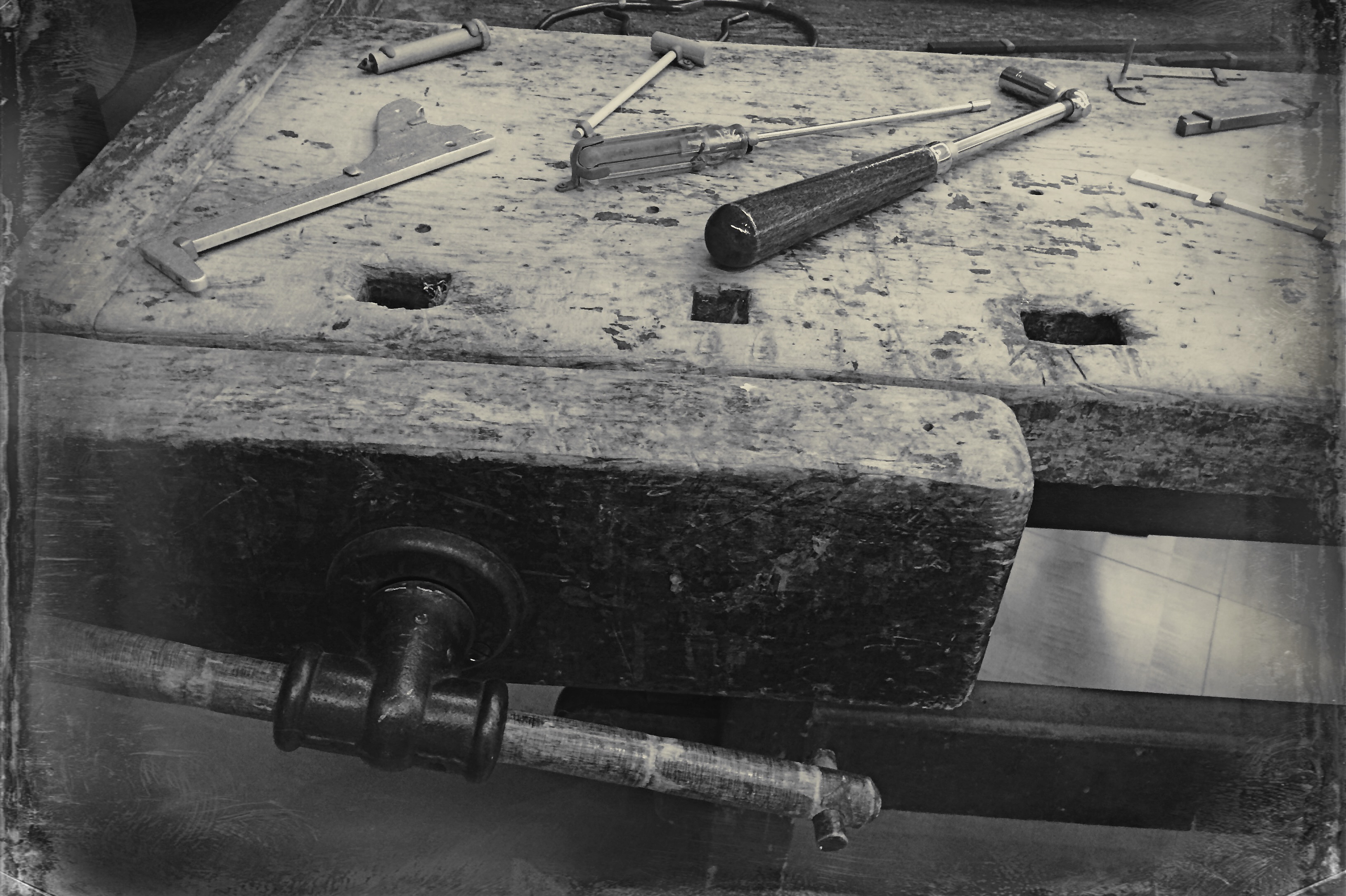
Black and white was the right choice here, but a decision about the kind of black and white was also crucial.
By basically simulating the subtle changes that a film processor could have made in the gradations between the various intensities of either black or white, apps allow you to make incremental judgments of how the values in the image work or don’t work to produce the “statement” you’re looking for. Best thing about this is the best overall thing about digital: how quickly you can act on your impulse, then check, adjust, and act again. The above image lacked impact in the color original. The old workbench simply came off too warm and charming. I was looking for something that matched the grit and wear of the weathered wood, and I was able to shop for about three different grades of monochrome before settling on what you see here. Most days, this is a game of inches.
The sheer number of images that you will be able to salvage while the scene is still in front of you, and the light is still how you want it…. that’s an amazing freedom, and no generation of photographers before ours has enjoyed anything like it before.
The take-home of all this is that you should not only shoot a lot but shoot a lot of variations on what you choose to shoot. And remember, every shot that you “blow” is one shot closer to the higher average of excellent work that will only come after thousands of failures. Best to speed up the clock and get past them while you’re still young.
SUBMERGED IN BEING
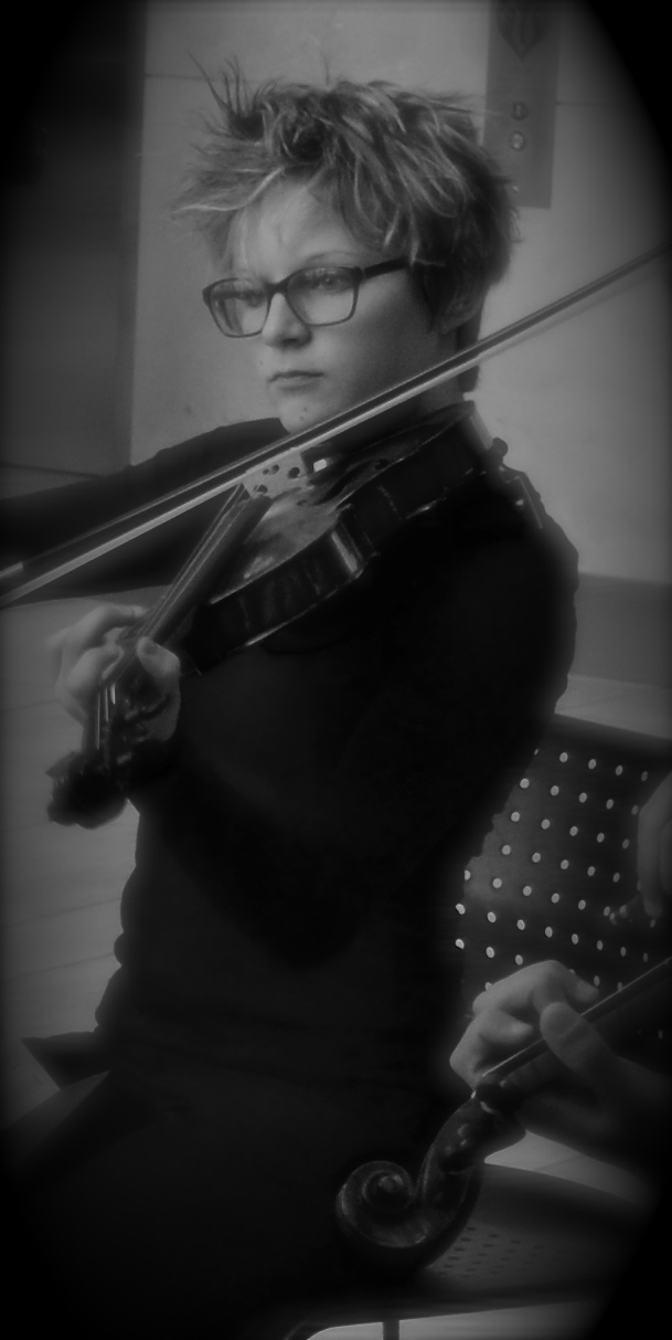
Cropped and enhanced from a group shot. I could sit this young woman in a studio for a thousand years and not get this expression.
By MICHAEL PERKINS
CANDID PORTRAITURE IS VOLATILE, THE DEAD OPPOSITE OF A FORMAL SITTING, and therefore a little scarier for some photographers. We tell ourselves that we gain more control over the results of a staged portrait, since we are dictating so many terms within it…the setting, the light, the choice of props, etc. However, can’t all that control also drain the life out of our subjects by injecting self-consciousness ? Why do you think there are so many tutorials written about how to put your subjects at ease, encourage them to be themselves, persuade them to unclench their teeth? Getting someone to sit where we tell them, do what we tell them, and yet “act naturally” involves a skill set that many photographers must learn over time, since they have to act as life-coach, father-confessor, camp counselor, and seducer, all at once. Also helps if you hand out lollipops.
Then again, shooting on the fly with the hope of capturing something essential about a person who is paying you zero attention is also fraught with risk, since you could crank off fifty frames and still go home without that person revealing anything real within the given time-frame. As with most issues photographic, there is no solution that works all of the time. I do find that one particular class of person affords you a slight edge in candid work, and that is performers. Catch a piece of them in the act of playing, singing, dancing, becoming, and you get as close to the heart of their essence that you, as an outsider, are ever going to get. If they are submerged in being, you might be lucky enough to witness something supernatural.
The more people lose themselves in a quest for the perfect sonata, the ultimate tap step, or the big money note, the less they are trying to give you a “version” of themselves, or worse yet, the rendition of themselves that they think plays well for the camera. As for you, candids work like any other kind of street photography. It’s on you to sense the moment as it arrives and grab it. It’s anything but easy, but better, when it works, then sitting someone amidst props and hoping they won’t freeze up on you.
There are two ways to catch magic in a box when it comes to portraits. One is to have a tremendous relationship with the person who is sitting for you, and the other is to be the best spy in the world when plucking an instant from a real life that is playing out in front of you. You have to know which tack to take, and where the best image can be extracted.
ON SECOND THOUGHT…OR THIRD
I really preferred this as the color shot it originally was. Until I didn’t. Changing my mind took seconds.
By MICHAEL PERKINS
ONE OF THE MOST AMAZING BY-PRODUCTS OF DIGITAL PHOTOGRAPHY, a trend still evolving across both amateur and professional ranks, is a kind of tidal return to black-and-white imaging. The sheer volume of processing choices, both in-and-out-of-camera, have made at least dabbling in monochrome all but inevitable for nearly everyone, reversing a global trend toward near exclusive use of color that was decades in the making. At one point, to be sure, we chose black and white out of necessity. Then we embraced color and relegated B&W to the dustbin of history. Now, we elect to use it again, and increasing numbers, simply because everything technical is within our reach, cheaply and easily.
Looking back, it’s amazing how long it took for color to take hold on a mass scale. Following decades of wildly uneven experimentation and dozens of processes from Victorian hand-tinting to the Autochromes of the early 1900’s, stable and affordable color film came to most of us by the end of the 1930’s. However, there was a reluctance, bearing on tantrum, among “serious” photographers to embrace it for several more decades. This article from the Life magazine Library of Photography, a history-tutorial series from the 1970’s, discusses what can only be called photography’s original anti-color bias:
Although publishers and advertisers enhanced their messages with pictures in color during the first few decades of the color era, most influential critics and museum curators persisted in regarding color photographs as “calendar art”. Color, they felt, was, at best, merely decorative, suitable, perhaps, for exotic or picturesque subjects, but a gaudy distraction in any work with “serious” artistic goals.
Of course, for years, color printing and processing was also unwieldy and expensive, scaring away even those few artists who wanted to take it on. Still, can you imagine, today, anyone holding the belief that any kind of processing was a “gaudy distraction” rather than just one more way to envision an image? Color was once seen by serious photographers as an element of the commercial world, therefore somehow..suspect. Fashion and celebrity photography had not yet been seen as legitimate members of the photo family, and their explosive use of color was almost thought of as a carnival effect. Cheap and vulgar.
Of course, once color became truly ubiquitous, sales of monochromatic film plummeted, and, for a time, black-and-white found itself on the bottom bunk, minimized as somehow less than color. In other words, we took the same blinkered blindness and just turned it on its head. Dumb times two.
Jump to today, where you can shoot, process and show images in nearly one continuous flow of energy. There are no daunting learning curves, no prohibitive expenses, no chemically charred fingertips to slow us down, or segregate one kind of photography from all others. What an amazing time to be jumping into this vast ocean of possibilities, when images get a second life, upon second thought.
Or third.
IN STEICHEN’S SHADOW
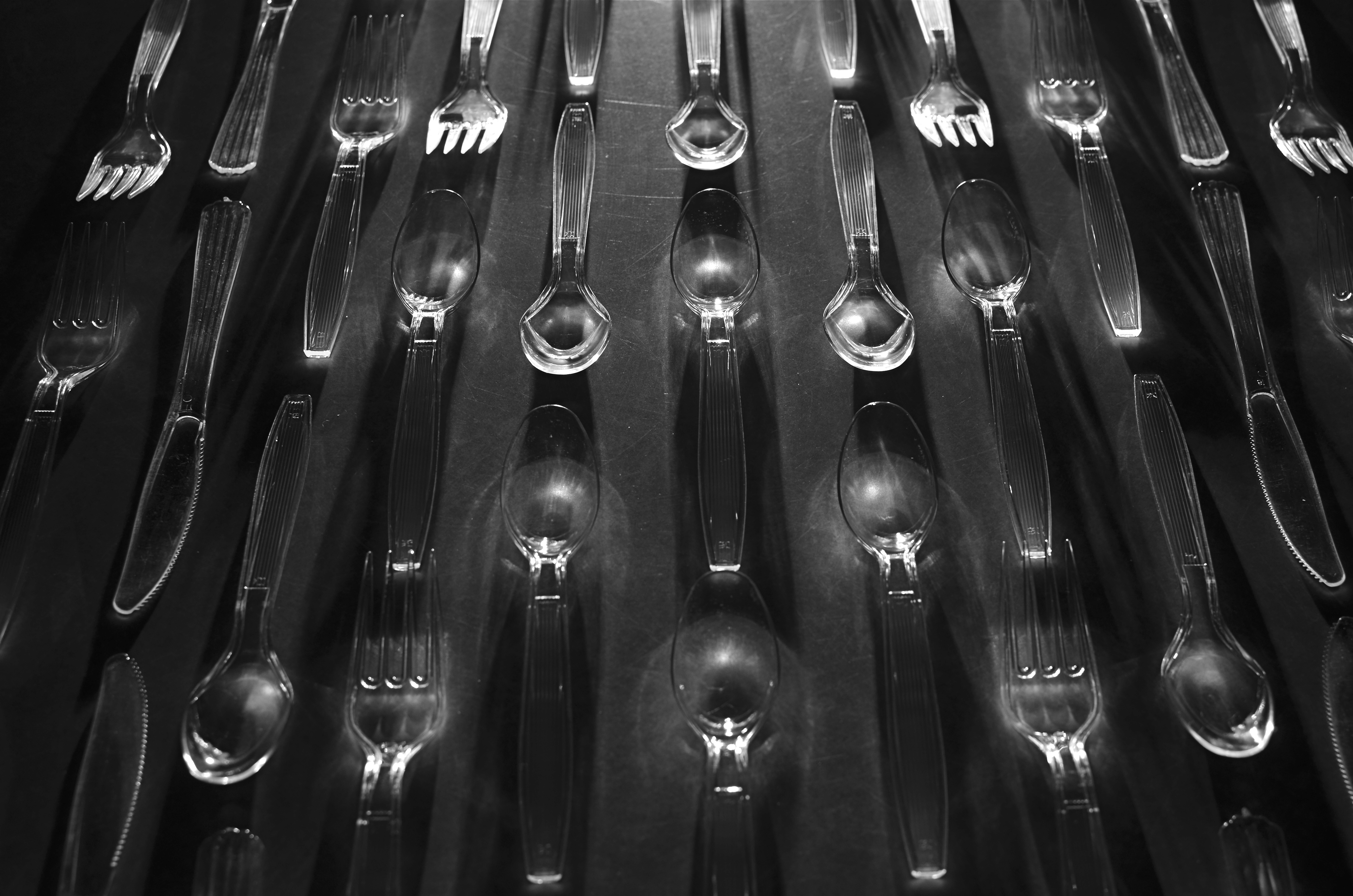
“Le Regiment Plastique”. Shot in a dark room and light-painted from the top edge of the composition. 5 seconds, f/5.6, ISO 100, 35mm.
By MICHAEL PERKINS
I’VE POSTED SEVERAL PIECES HERE ON “LIGHT-PAINTING”, or the practice of manually applying light to selective areas of objects during long exposures in the dark. The ability to “paint” additional colors, highlights and shadows “onto” even the most mundane materials can transform the whole light-to-dark ratio of the familiar and render it in new, if unpredictable ways. It’s kind of random and a lot of hands-on fun.
Some of the greatest transformations of ordinary objects ever seen in photography were obtained by Edward Steichen, arguably the greatest shooter in any style over the entire 20th century. Working for advertising agency J.Walter Thompson in the 1930’s, Steichen managed to romanticize everything from perfume bottles to kitchen matches to cutlery by arranging visually original ballets not only of these everyday items, but, through multiple source lighting, creating geometrically intricate patterns of shadows. His success in morphing the most common elements of our lives into fascinating abstractions remains the final word on this kind of lighting, and it’s fun to use light painting to pay tribute to it.
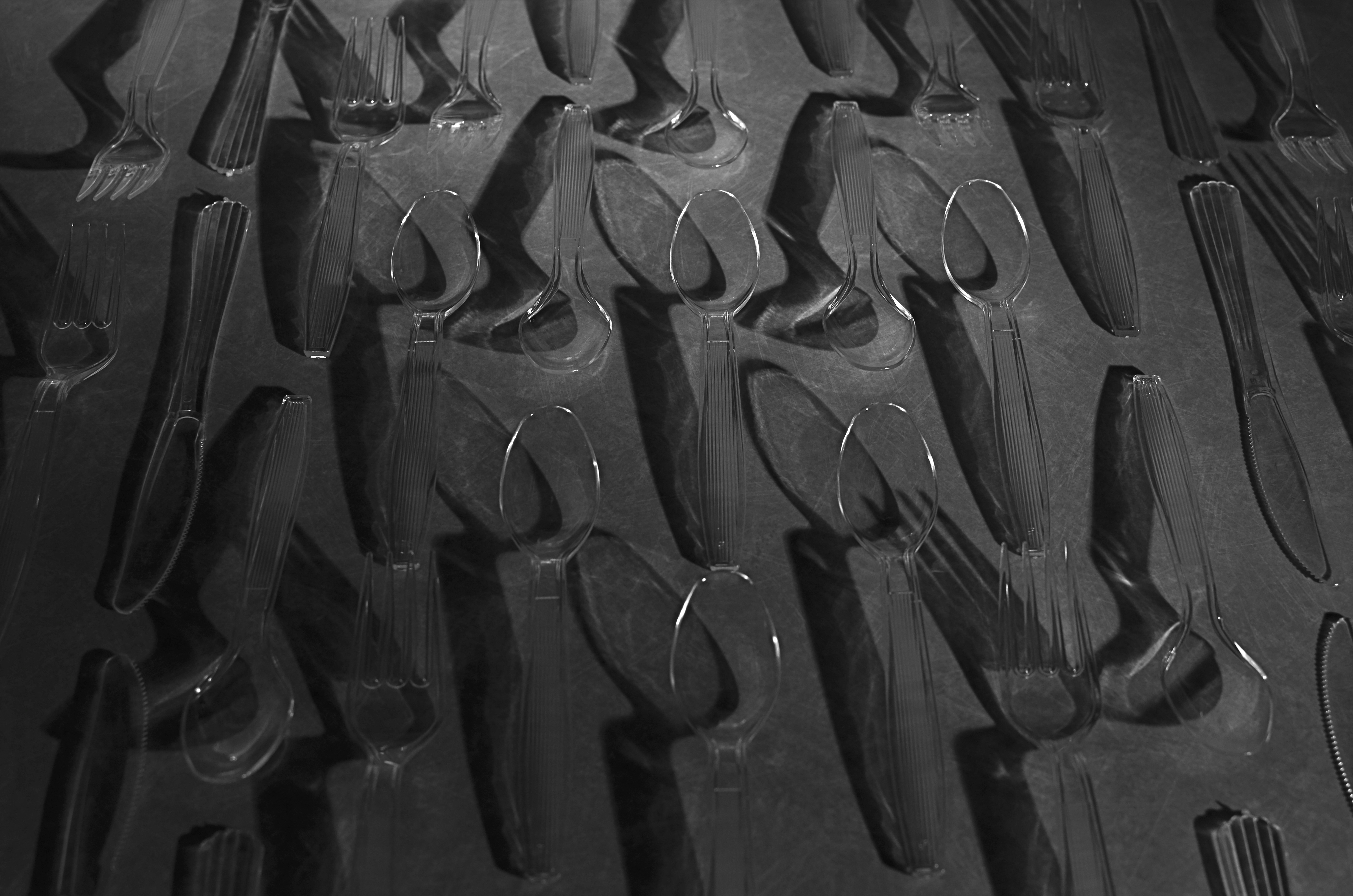
Same composition, but lit diagonally from right bottom. 5 seconds, f/5.6, ISO 100, 35mm.
For my own tabletop arrangement of spoons, knives and forks, seen here, I am using clear plastic cutlery instead of silver (fashions change, alas), but that actually allows any light I paint into the scene to make the utensils fairly glow with clear definition. You can’t really paint onto or across the items, since they will pick up too much hot glare after even a few seconds, but you can light from the edge of the table underneath them, giving them plenty of shadow-casting power without whiting out. I took over 25 frames of this arrangement from various angles, since light painting is all about the randomness of effect achieved with just a few inches’ deviation in approach, and, as with all photography, the more editing choices at the end, the better.
The whole thing is really just an exercise in forced re-imagining, in making yourself consider the objects as visually new. Think of it as a puff of fresh air blowing the cobwebs out of your perception of what you “know”. Emulating even a small part of Steichen’s vast output is like me flapping my wings and trying to become a bald eagle, so let’s call it a tribute.
Or envy embodied in action.
Or both.
OH, IT’S HIDEOUS. I LOVE IT.
By MICHAEL PERKINS
THERE MAY BE NO RULES LEFT TO BREAK IN PHOTOGRAPHY, in that everybody is comfortable doing absolutely anything….compositionally, conceptually, technologically…to get the picture they want. Maybe that’s always the way it’s been, seeing as the art of image-making, like the science of breeding apple trees, has always grown faster and stronger through cloning and grafting. Hacks. Improvisations. “Gee-What-If”s.
Shots in the dark.
Not a bad starting point, but either too pretty, or not ugly enough…or something.
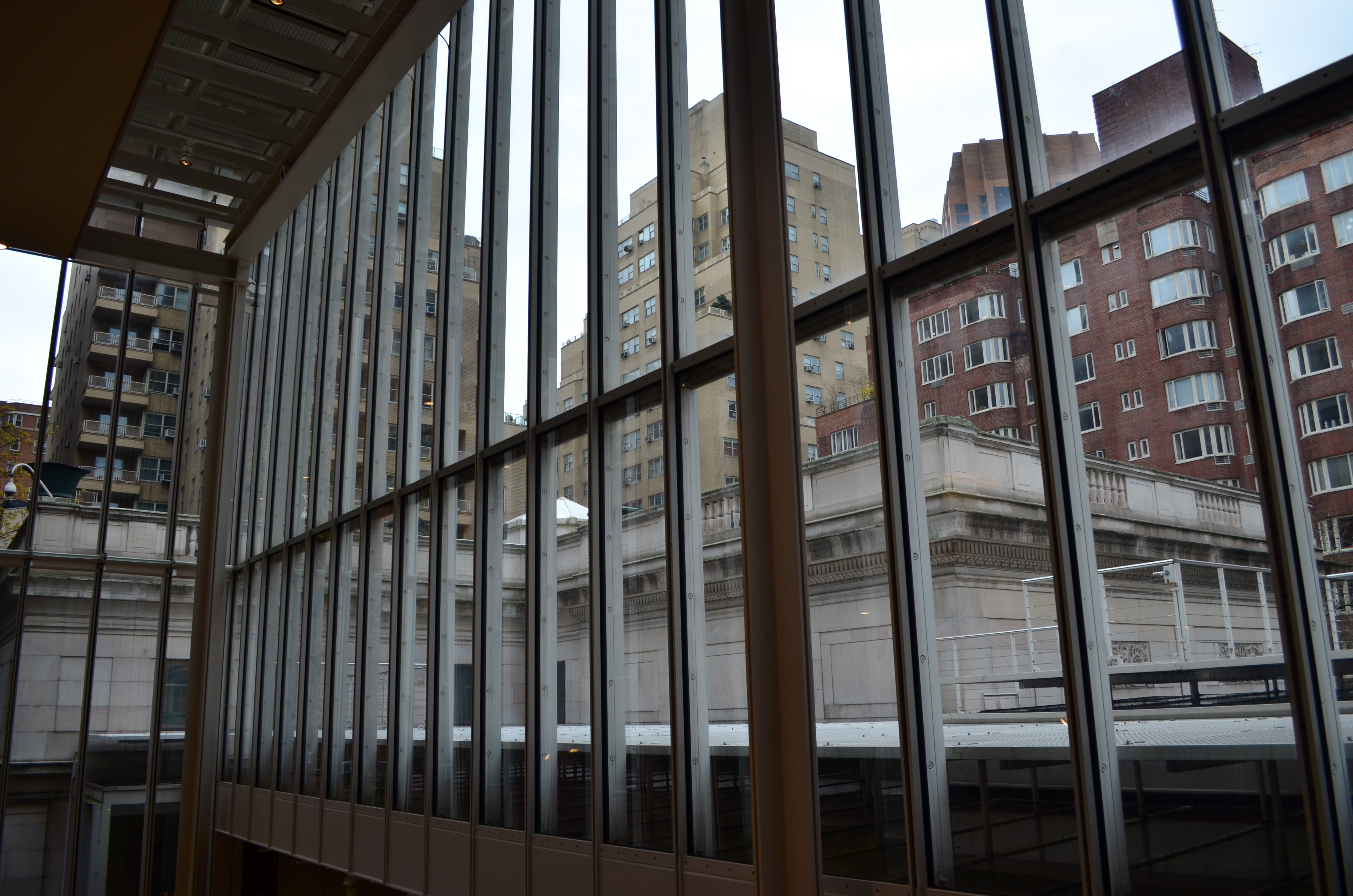
Recently I walked out into the gigantic atrium that connects all of the original buildings of the Morgan Library complex in NYC to get a good look at the surrounding neighborhood of big-shouldered buildings. I was fascinated by the way my wide-angle lens seemed to line up the horizontal grid lines of the atrium with the receding lines of the towers and boxes down the block. Only one thing bothered me about the result: the color, or rather, the measly quality of it.
A rainy day in Manhattan is perhaps the final word on rainy days. Some colors, like the patented screaming yellow of a New York cab, or the loud neon reds of bodegas, are intensified into a romantic wash when the drops start. This view, however, was just a bland mash of near-color. If the neighborhood was going to look dour anyway, I wanted it to be dour-plus-one. Thing is, I made this, ahem, “artistic” decision after I had already traveled 3,000 miles back home. In the words of Rick Perry, whoops.
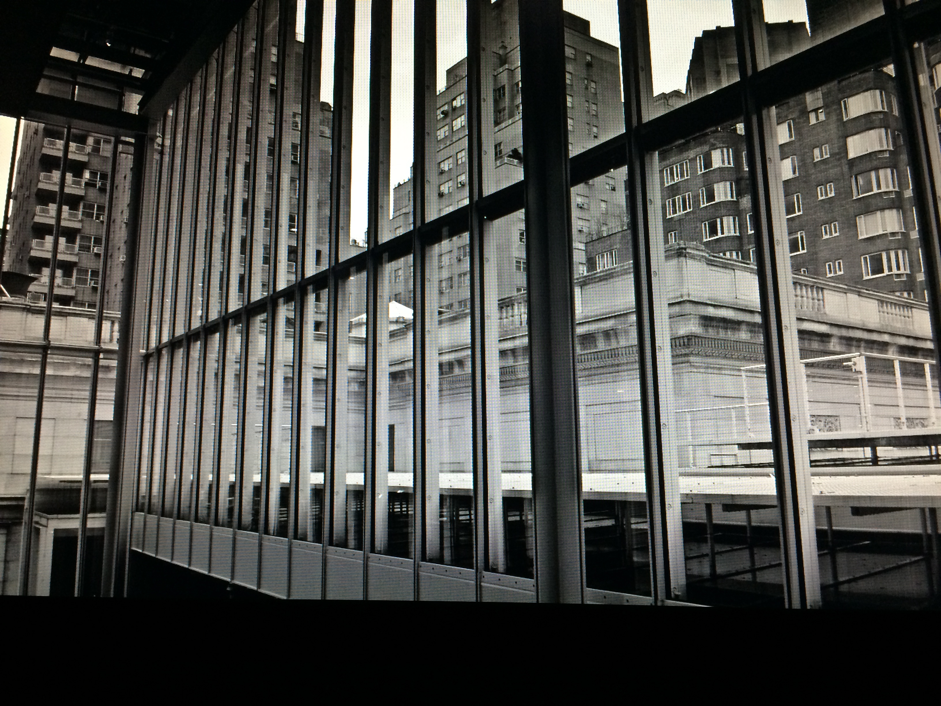
Time to hack my way to freedom. I remembered liking the look of old Agfa AP-X film in a filter on my iPhone, so I filled the screen of my Mac with the bland-o image, shot the screen with the phone, applied the filter, uploaded the result back into the Mac again, and twisted the knobs on the new cheese-grater texture I had gained along the way. At least now it looked like an ugly day….but ugly on my terms. Now I had the kind of rain-soaked grayscale newspaper tones I wanted, and the overall effect helped to better meld the geometry of the atrium and the skyline.
No rules? Sure, there’s still at least one.
Get the shot.
HOW DARE HUE
Terminus, 2014. 1/250 sec., f/5.6, ISO 100, 35mm. Desaturated copy.
By MICHAEL PERKINS
IT’S TRULY AMAZING TO CONSIDER THAT, AS RECENTLY AS THE LATE 1940’s, many serious photographers were, at best, indifferent to color, and at worst, antagonistic toward its use in their work. And we’re talking Edward Weston, Ansel Adams and many other big-shoulders guys, who regarded color with the same anxiety that movie producer experienced when silent segued to sound. We’re talking substantial blood pressure issues here.
Part of the problem was that black and white, since it was not a technical representation of the full range of hues in nature, was already assumed to be an interpretation, not a recording, of life. The terms between the artist and the audience were clear: what you are seeing is not real: it is our artistic comment on real. Color was thought, by contrast, to be “merely” real, that is to say limiting, since an apple must always be red and a blueberry must always be blue. In other words, for certain shooters, the party was over.
The color original. A little too Peter Max-y.
There were also technical arguments against color, or at least the look of color as seen in the printing processes of the early 20th century. Mass-appeal magazines like Look, Life, and National Geographic had made, in the view of their readers, massive strides in the fidelity of the color they put on newsstands. For Adams, these advances were baby steps, and pathetic ones at that, leading him and others to keep their color assignments to a bare minimum. In Adams’ case in particular, color jobs paid the bills that financed the black and white work he thought to be more important, so, if Kodak came calling, he reluctantly returned their calls. He then castigated his own color work as “aesthetically inconsequential but technically remarkable.”
Look where we are today, making color/not color choices in the moment, without changing films in mid-stream, deciding to convert or de-saturate shots in camera, in post processing, or even further down the road, based on our evolving view of our own work.
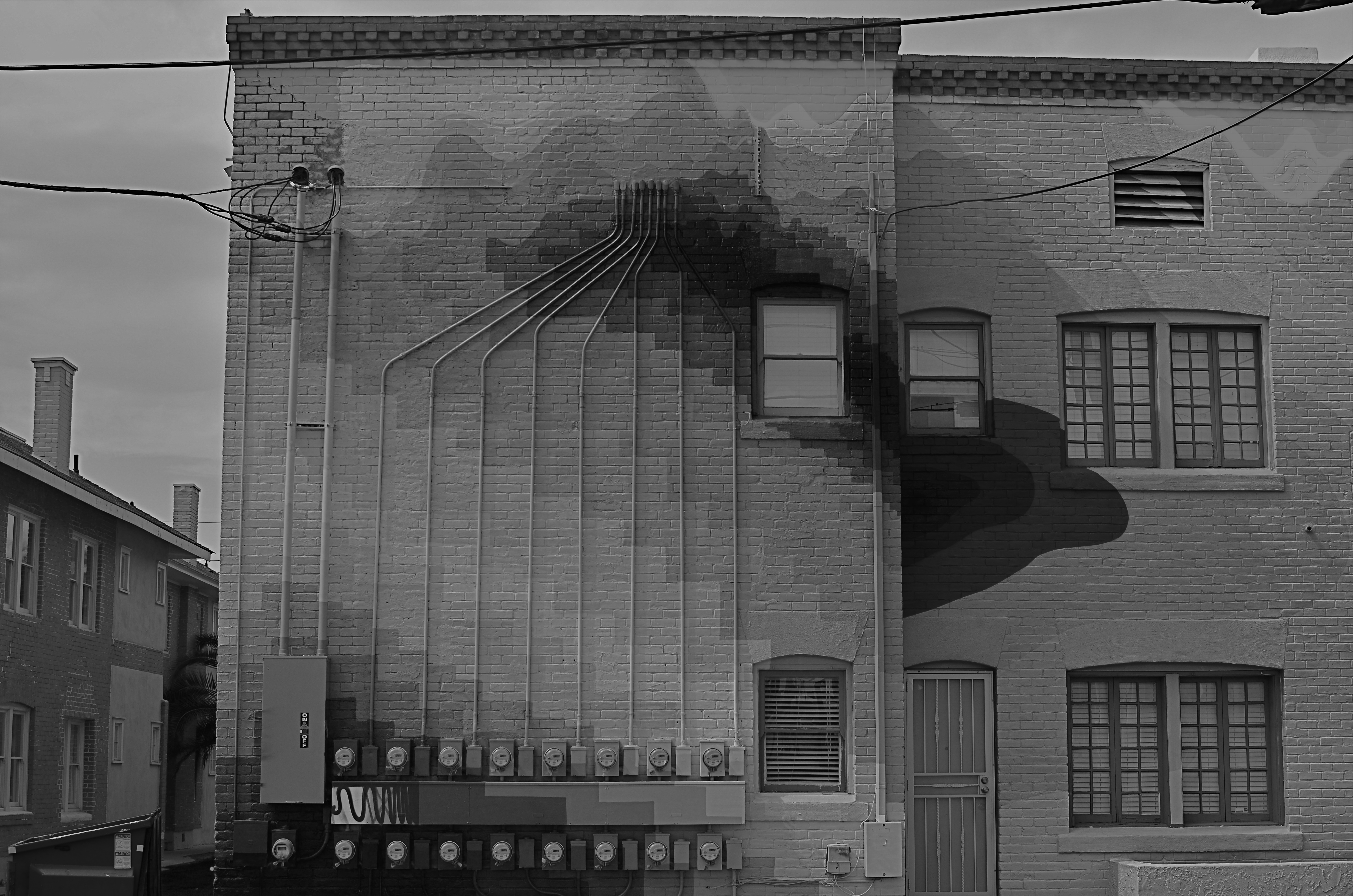
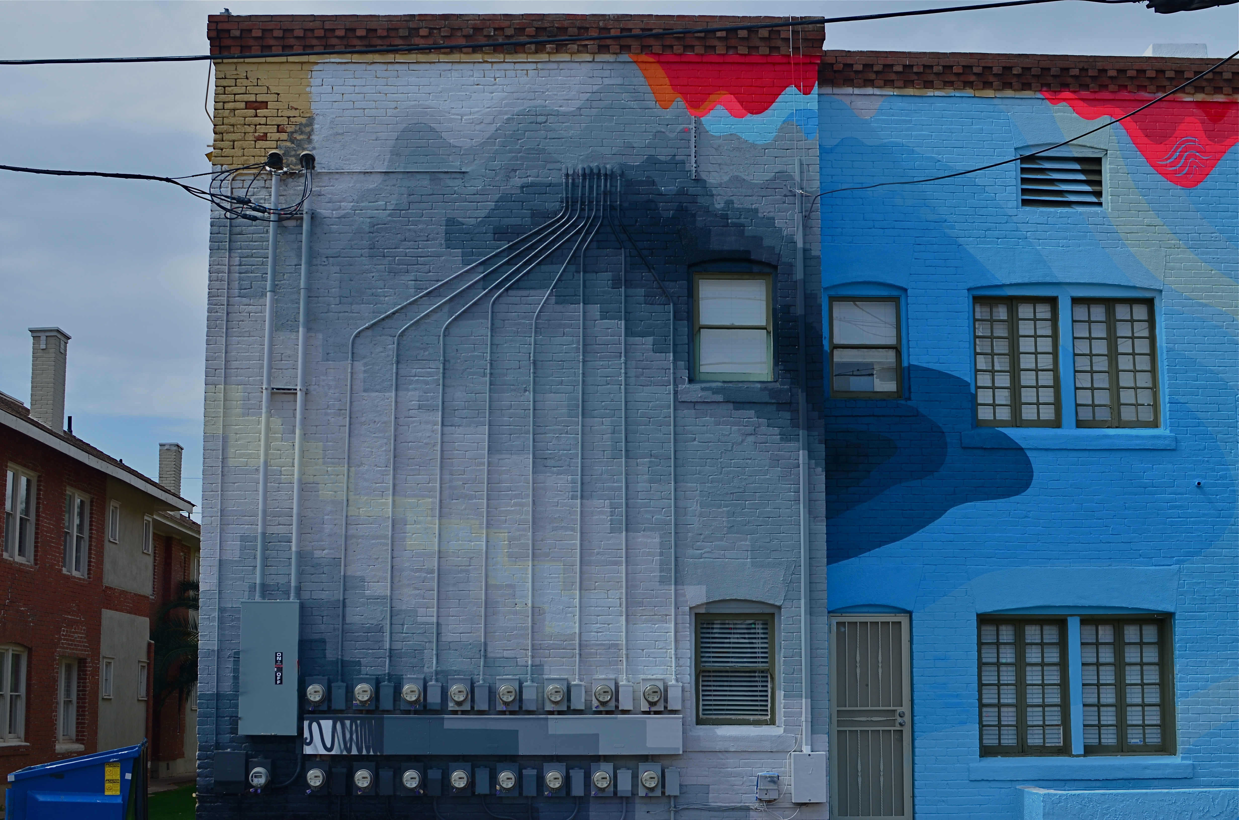
There are times when I still prefer monochrome as more “trustworthy” to convey a story with a bit more grit or to focus attention on textures instead of hues. In the above shot, I decided that the spare old building and its spidery network of power meters simply had more impact without the pretty colors from its creative makeover. However, one of my color frames was stronger compositionally than the black and white, so I desaturated it after the fact. Fortunately, I had shot with a polarizing filter, so at least the tonal range survived the transition.
The miracle of now is that we can make such microscopic tweaks in our original intention right on the spot. And that’s good, since, when it comes to color, nothing is ever black and white (sorry).
