CUES AND CLUES
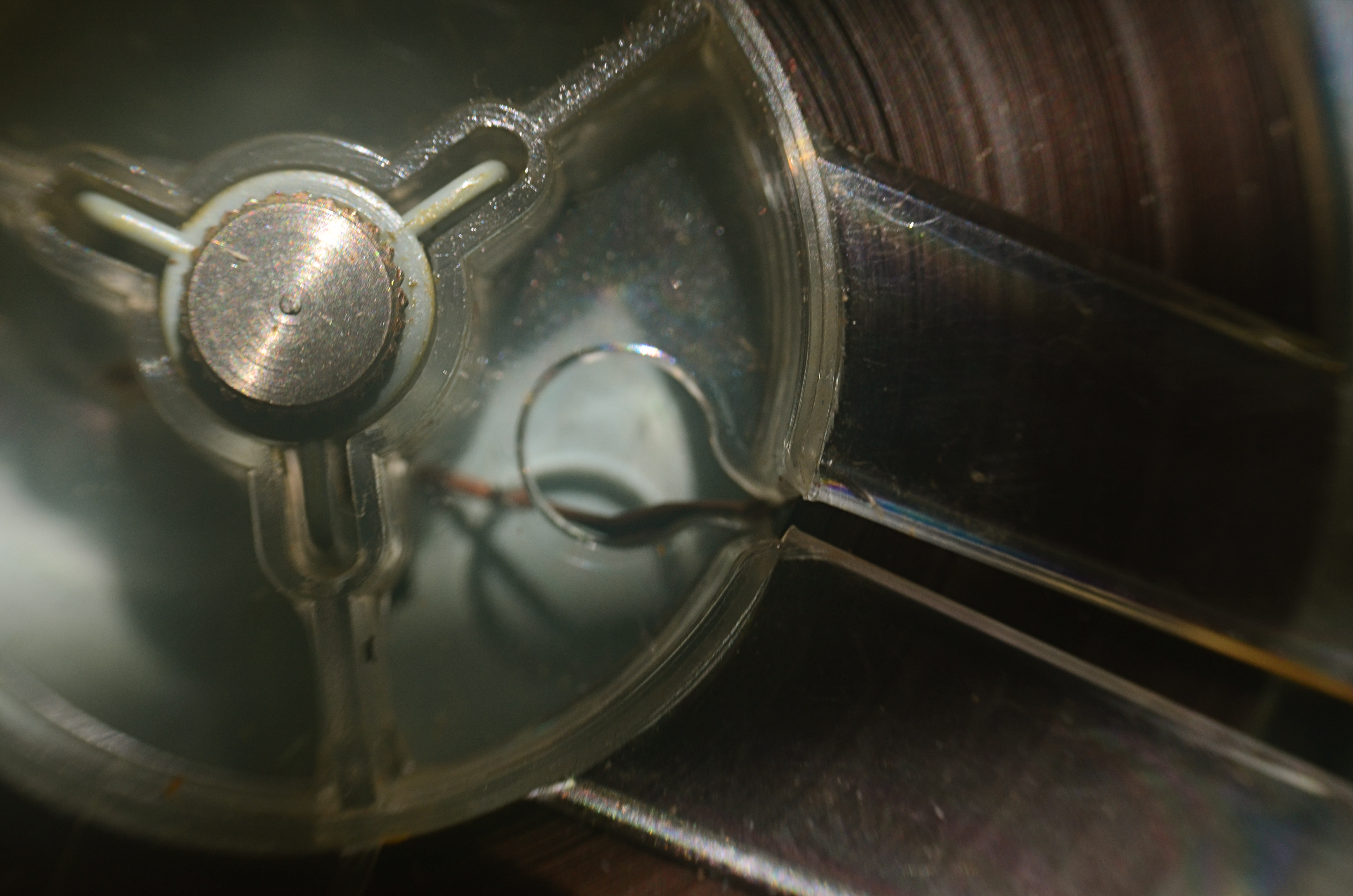
Good Morning, Mr. Phelps (2016). How little of a tape recorder need be shown to convey a sense of that object?
By MICHAEL PERKINS
SAY THE WORD “MINIMALISM” TO SOME PHOTOGRAPHERS, and you conjure visions of stark and spare compositions: random arrangements of light blobs, stray streaks of shadow, or scattered slivers of light, each conveying mood more than content. For some, these images are a kind of “pure” photography, while, for others, they are, to use a nice word, incoherent. Part of us always wants a picture to be, in some way, about something, and the word minimalism is charged, positively or negatively, depending on whether that “narrative thing” happens.
I actually associate minimalism with the formal storytelling process, but doing so with the fewest elements possible. It seems like a natural evolution to me, as I age, to make pictures talk louder with fewer parts. Simple cropping shows you how much more you can bring to an image by taking more of it away, and, with closeups and macro work, the message seems even clearer. Why show an entire machine when a cog carries the same impact? Why show everything when suggesting things, even leaving them out entirely, actually amps up the narrative power of a photograph?
Of course there are times when mere shape and shadow can be beautiful in themselves, and it doesn’t require a lot of windy theorizing to justify or rationalize that. Some things just are visually strong, even if they are non-objective. But minimalism based on our impressions or memory of very real objects, from a pocket watch to a piece of fruit, can allow us to tell a story with suggestions or highlights alone. If something is understood well enough, just showing a selectively framed slice of it, rather than the thing in its entirety, can be subtly effective and is worth exploring.
In the above image, you certainly understand the concept of a tape recorder well enough for me to excise the device’s chassis, controls, even half of its reel mechanism and still leave it “readable” as a tape recorder. You may find, upon looking at the picture, that I could have gone even farther in simplifying the story, and in your own work, you can almost certainly suggest vast ideas while using very small bits of visual information. Knowing the cultural cues and clues that we bring with us to the viewing process tells you how far you can stretch the concept.
FAILING TO SEE THE BIG PICTURE
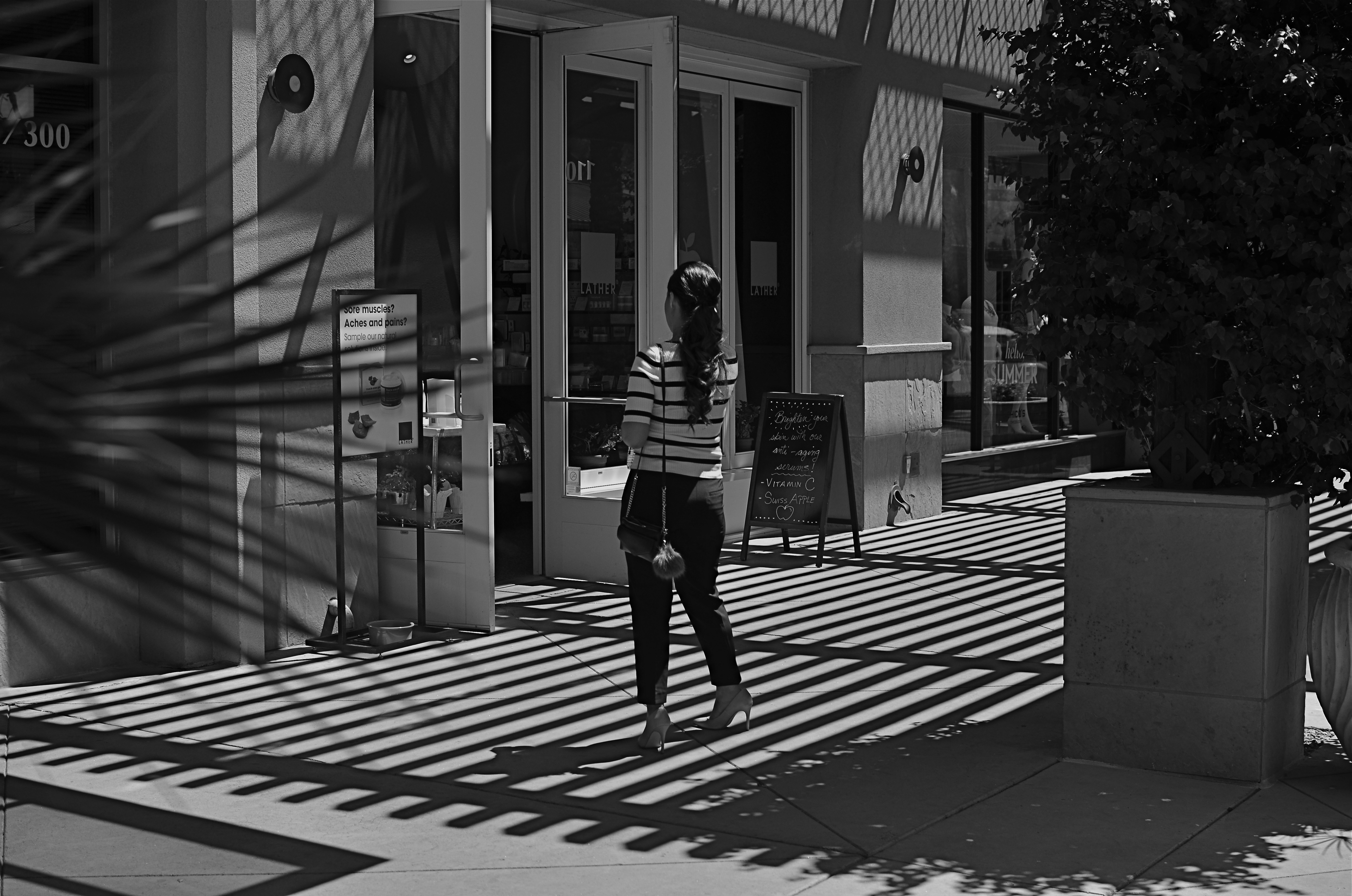
This image lingered in the “maybe” pile for a while. Then I started to see how much of it was expendable (see below).
By MICHAEL PERKINS
IT’S ENTIRELY POSSIBLE THAT MANY A WORKABLE PHOTOGRAPH HAS ONLY BEEN RENDERED SO BECAUSE OF SHEER BOREDOM. Face it: there are bound to be days when nothing fresh is flowing from one’s fingers, when, through lack of anything else to do, you find yourself revisiting shots that you 1) originally ignored, 2) originally rejected, or 3) were totally confounded by. Poring over yester-images can occasionally reveal something salvageable, either through processing or cropping, just as they can more often lead one to want to seal them up behind a wall. Even so, editing is a kind of retro-fitted variation on composition, and sometimes coming back around to a picture that was in conceptual limbo can yield a surprise or two.
I’m not suggesting that, if you stare long enough at an image, a little golden easter egg will routinely emerge from it. No, this is where luck, accident, and willpower usually converge to sometimes produce…..a hot mess, and nothing more. But leaving a picture for a while and returning to it makes you see with the eye of the outsider, and that can potentially prove valuable.
In the above shot, taken a few months go, I had all this wonderful gridded shadow texture presenting itself, shading what was otherwise a very ordinary stretch of sidewalk. A thought emerged that the stripes in the woman’s short might make an interesting contrast with the pattern of the shadows, but, after cranking off a frame or two, I abandoned the idea, just as I abandoned the shot, upon first review.
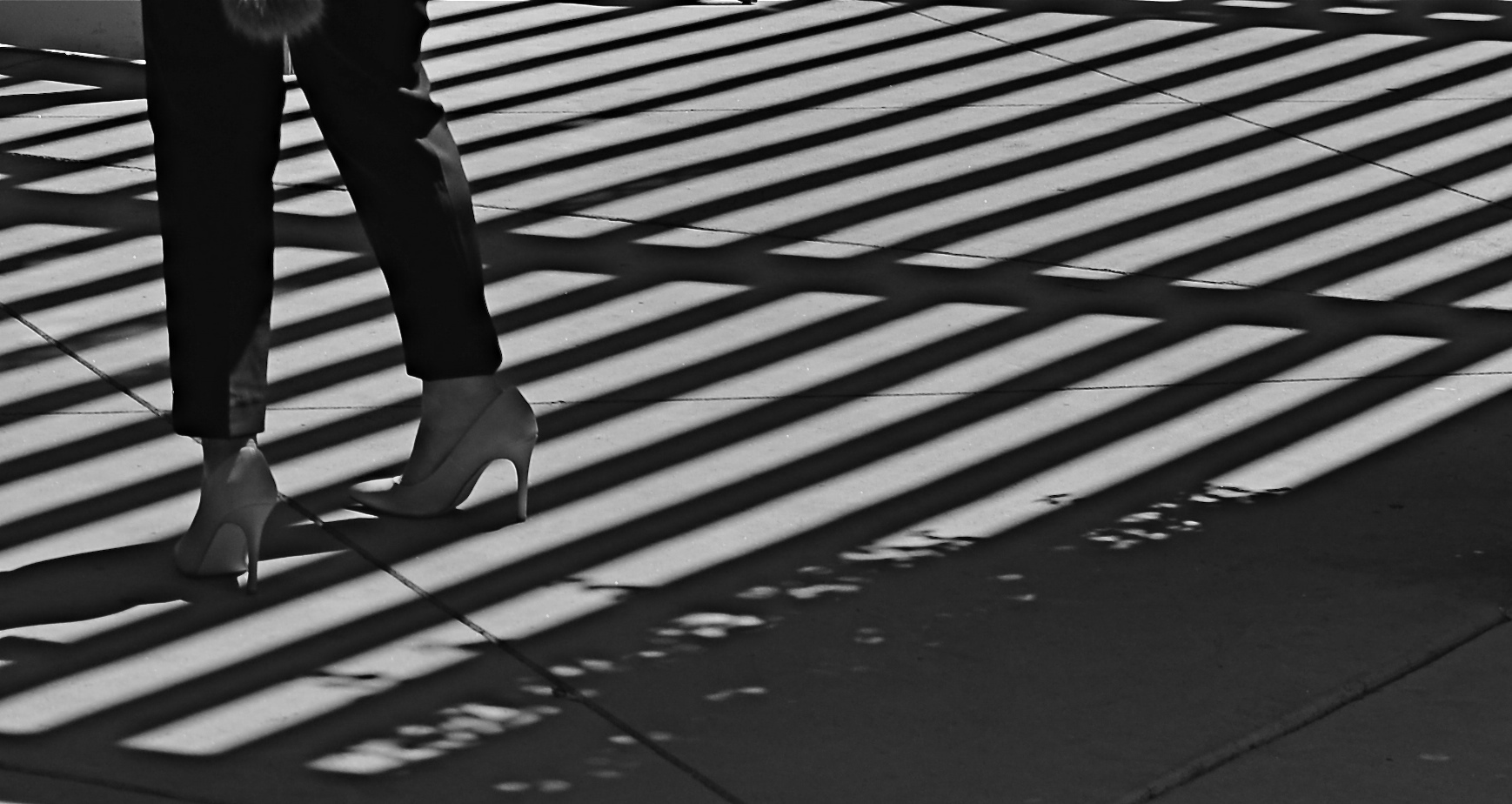
Several big bites of the scissors later…
Months later, I decided to try to re-frame the shot to create a composition of one force against another…..in this case, the verticality of the lady’s legs against the diagonal slant of the shadows. That meant paring about two-thirds of the image away. Originally I had cropped it to a square with her lower torso at dead center, but there seemed to be no directional flow, so I cropped again, this time to a shorter, wider frame with the woman’s form reduced to the lower half of her legs and re-positioned to the leftward edge of the picture. Creating this imbalance in the composition, which plays to the human habit of reading from left to right along horizontal lines, seemed to give her a sense of leaving the shadows behind her, kind of in her wake if you will. At least a little sense of movement had been introduced.
I felt that now, I had the tug of forces I had been seeking in contrasting her blouse to the opposing grid in the master shot. I’m still not sure whether this image qualifies as having been “rescued”, but it’s a lot less busy, and actually directs the eye in a specific way. It will never be a masterpiece, but with the second sight of latter-day editing, you can at least have a second swipe at making something happen.
SALVAGING THE FEEL
By MICHAEL PERKINS
EVEN IF YOU ARE IN THE HABIT OF PACKING A CAMERA ALONG WHEREVER YOU GO, you can only predict some of the conditions you might encounter in a given shooting situation. If you’ve guessed well, you can be ready (depending on how much gear you have with you) for about 75% of the shots you may want to take. What’s left, make no mistake, is a mixture of guesswork and luck, the kinds of shots where you adapt on the fly.
Night shots employ a completely different set of skills from daylight shots. What looks mysterious and romantic to your eye may be a mushy muddle to your camera, and that forces a lot of sudden sorting-out of your choices. On the night of the above shot, taken along the shoreline in Ventura, California, I had not planned on shooting anything at all after nightfall. I loved the deeper blues of the sky as they played just before sundown, and I was especially enjoying watching local kids playing against the darkening surf. Following a few dozen clicks up and down the beach, I walked back inland a block or so to join my wife and some friends at a nearby restaurant, considering myself done for the day.
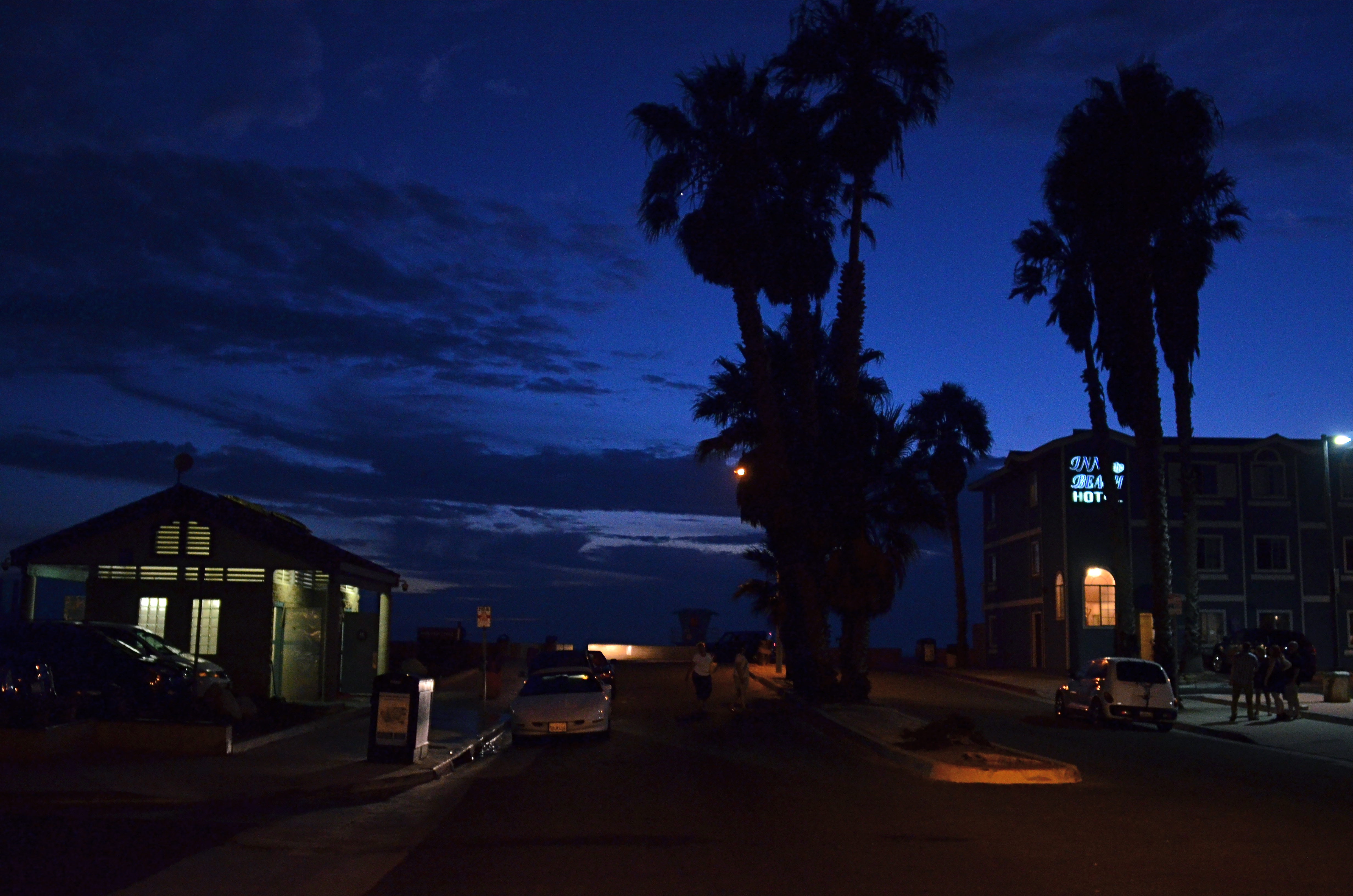
Here Comes The Night (2015). 1/40 sec., f/2.8, ISO 1600, 24mm.
That all changed after dessert, when we walked back onto the street that led down to the shore. I had a 24mm prime lens with me, which had been perfect for the wide-angle coastline stuff, but could also shoot wide open to f/2.8….fairly fast. As the night colors were already deepening, however, I realized that 2.8 was still going to mean shooting as slow a shutter speed as I could hand-hold and jacking the ISO up to a level that I normally tend to avoid. Those were the basic facts on the ground: now it was time to weigh the trade-offs.
Local traffic was swift enough for me to know that, even though I could hand-hold a shutter as slow as 1/15, there would be more than enough soft detail in a shot taken at f/2.8 without risking even more blurring from cars and walkers, so I settled at 1/40 and allowed the ISO to go to 1600 rather than lose the shot entirely.
Obviously, a tripod-mounted time exposure would have delivered a much crisper, more detailed shot, especially at f/11 or above, but I had what I had. And if you’re stuck with the somewhat mushier texture of a wide aperture, you have to determine where you envision the real impact of the image you’re planning. Is it in the fine-tuned detail or the overall atmosphere? There will be times when just salvaging the feel outweighs sharpness as a consideration, and, for me, this was one of those times.
TAKING OFF THE TRAINING WHEELS
By MICHAEL PERKINS
IT’S HARD TO BE ANGRY WITH ANY TREND THAT MAKES PHOTOGRAPHY MORE DEMOCRATIC, or puts cameras into more hands. Getting more voices in the global conversation of image-making is generally a great things. However, it comes with a price, one which may make many people actually give up or stagnate in their growth as photographers.
We may be killing ourselves, or at least our art, with convenience.
Cameras, especially in mobile devices, have exponentially grown in ease (and acuity) of use over the last fifty years, but they are actually teaching people less and less about what, technically, is happening in the making of an image. The nearly intuitive logic of smaller and easier cameras means that many people, while busily snapping away and producing billions of pictures, are being more and more estranged from any real knowledge of how it’s all being done.
This is a vicious circle, since it guarantees that a greater number of us will be more and more dependent upon our cameras to make the bulk of the creative decisions for us, more obliged to accept what the camera decides to give us. In some very real way, we are being shortchanged by never having had to work with a garbage camera. Let me explain that.
Being forced to do creative work with an unyielding or primitive tool puts the responsibility for (and control of) the art back on the artist. Those who began their shooting careers with limited box cameras understand this already. If you start making pictures with a device that is too limited or “dumb” to do your bidding, then you have to devise work-arounds to get results. That means you learn more about what light does. You learn what ideal or adverse conditions look like. You see what failure is, and begin to dissect what didn’t work for a stronger understanding of what may work next time. You learn to ride a bike without training wheels, and thus never need them.
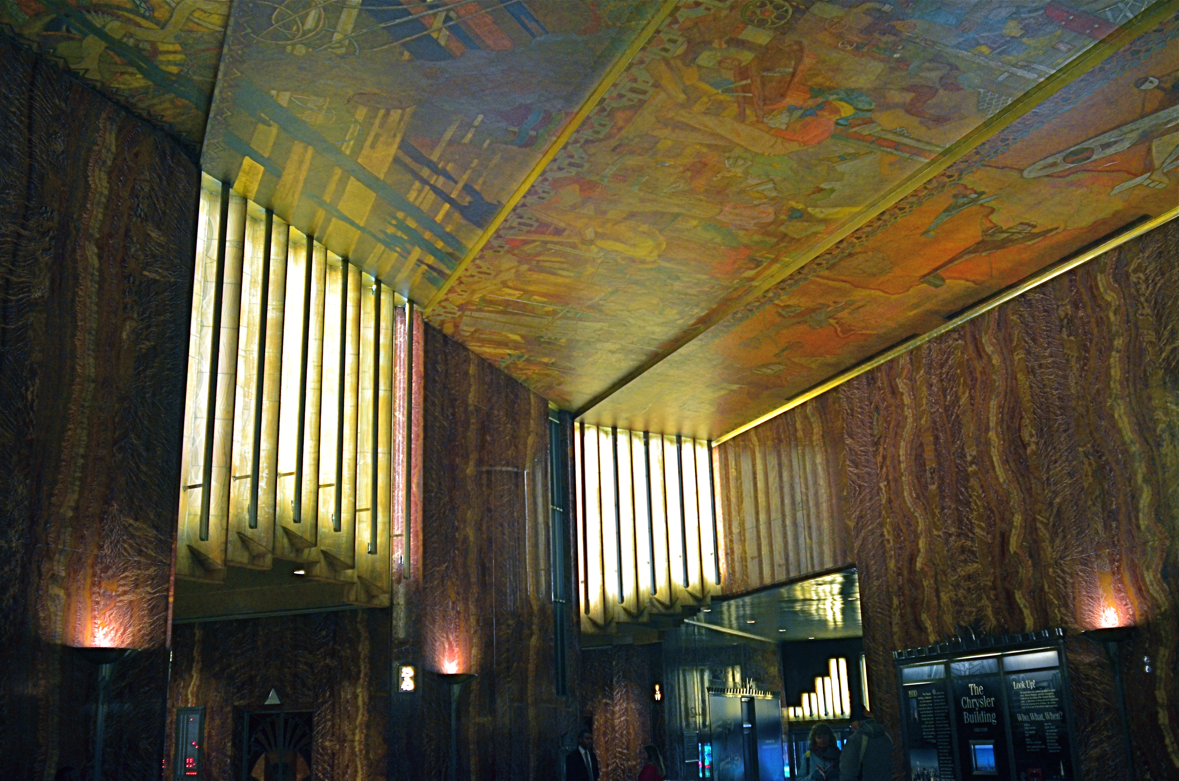
The dark lobby of New York’s Chrysler building: An extremely challenging setting for low-light photography. I screwed this up on a cosmic scale, but I learned a ton. Shooting on automodes, I would have learned precisely…nothing. And the picture still would have stunk.
The above image, taken on manual settings in a less-than-ideal setting, has about a dozen things wrong with it, but the mistakes are all my mistakes, so they retain their instructive power. If something was blown, I know how it can be corrected, since I’m the one who blew it. There is a clear linear learning process that benefits from making bad pictures. And if my camera had done everything itself and the picture still reeked, then I’d be stuck with both failure and ignorance.
Cameras that remove the risk of failure also remove the chance of accidental discovery. If you always get acceptable images, you’re less likely to ask what lies beyond….what, in effect, could be better. You accept mediocrity as a baseline of quality. And editing tools that consist mostly of corrective solutions, from straightening to sharpening, keep you from addressing those errors in the camera, and that, too, robs you of valuable experience.
Convenience, in any art medium, can either abet or prevent excellence. The amount of curiosity and hunger in the individual is the decisive factor in moving from taking to making pictures. For my money, if you’re going to grind out the process of becoming an artist, you can’t rely on equipment that is designed to protect you from yourself.
THE WANDERING
By MICHAEL PERKINS
IN ONE OF LIFE’S GREAT IRONIES, YOU TRULY BECOME A PHOTOGRAPHER the first time you consider chucking all your gear off a cliff and never taking a picture again. Just as you can’t understand faith until you nearly lose it, you can’t really become an excellent maker of pictures unless you’ve been paralyzed, even a little frightened, in considering the distance between what you know and what you need to know.
All visual arts, all arts in general, really, are pursuits. We are chasing something, either in our work or in ourselves. Maybe both. We don’t always know what it is, but we sure as hell know what it’s not. Calling forth an image from a mix of instinct, experience and light seems like an easy thing, since there are so many cameras that deliver acceptable pictures with a minimum of effort. Unlike the early days of the medium, it’s no longer an uphill struggle technically getting “a” picture.
Ah, but getting “the” picture…that’s the work of a lifetime.
Sometimes, that challenge seems glorious. A crusade. Other times, it’s a slog. And, occasionally, the wandering between what you see in your head and what you can deliver in a given picture is exhausting, and you will sometimes want to stop. For good. Many do, and many more ache to.
The technical part of photography can certainly be taught, just as there is not that much to the mere mechanics of hitting a baseball or driving a car. Getting to the excellence, however, is daunting. And if you’re hung up on destinations, on “getting there”, realizing that it’s actually about the journey can be heartbreaking. You want to arrive at perfection, and you realize that you never can.
You have to learn to live on little glimpses of the prize, those flickers of wow when an image starts to take on its own life. That’s the payoff. Not praise, or publication, or a million “likes” on Instagram. Because it really doesn’t matter a damn what others think of your work. If you don’t love it, all the applause in the world just becomes noise. The pictures have to be there. For you. The wandering has to amount to something.
Once you learn to find fault in even your favorite brainchildren, you can father better ones going forward. Even better, once you know what your work looks like when you’re lost, the closer you are to being found. Eventually, photography is like anything else you can care passionately about. The fire carries you through when the progress won’t.
So hang on. There’s light up ahead.
Go catch it.
OKAY, THAT’S NOT A COMPLIMENT….
Me: What camera did he use? Other Me’s: Who cares? Why didn’t he shoot our good side?
By MICHAEL PERKINS
PHOTOGRAPHERS, LIKE ALL OTHER UPRIGHT BIPEDS, LOVE PRAISE. None of us are so jaded that we don’t like to get a gold star for an image or an idea; after all, that’s why we do this. However, as borne out by the simplest Google research, there is one sentence, which, although intended as a compliment, will send the average photographer into a seething simmer. You’ve heard it. Maybe you’ve even said it.
Repeat it with me:
Gee, your pictures are so good. You must have a really great camera.
Sadly, this sentence is intended as a thumbs-up, a certification that “ya done good”. However, it unfortunately lands on the ear sounding like, “Lucky you. Despite your basic, hapless ineptitude, the magical machine in your fist created art that was so wonderful, not even a clod like you could prevent it from happening.Congrats!”
When I am told that my pictures are good because I have “a really good camera”, part of me wants to extend the idea of tools=talent to other fields of endeavor, as in:
“Thanks. I can hardly wait to buy a $3,000 oven so I can become a master chef.”
“Thanks, I’m eager to get some $200 brushes so I can paint a masterpiece.”
“Thanks. I’m planning to tie a blanket around my neck and recite ‘I’m Batman’ several thousand times so I can be a crimefighter….”
Photography isn’t about tools. It’s about patience, perseverance, vision, flexibility, humility, objectivity, subjectivity, and, most importantly, putting in more hours than the next guy. It’s about exercising your eye as you would any muscle that you’ve like to tone and strengthen. It’s about sitting 24 hours in a duck blind, hanging by your heels from a helicopter, avoiding incoming gunfire, charming grumpy children, and learning to hate things in your own work that, just yesterday, you believed was your “A” stuff.
If equipment were all, then everyone with a Steinway would be Glenn Gould and everyone with a Les Paul Gibson would be, well, Les Paul. But we know that there is no success guarantee that comes with a purchase warranty. Many cameras are great, but they won’t wake you up at 4am to flush out a green-tailed towhee or climb a mountain to help you snag a breathtaking sunrise. Tools are not talent. And the sooner we learn that, the less we’ll start thinking our work will start to shine with the next new shiny thing we buy, and teach ourselves to make better pictures with what we own and shoot right here, right now.
THE FLAWED CHILD or the fine art of self-photobombing
By MICHAEL PERKINS
WORKING WITH TIME EXPOSURES IS A LITTLE LIKE THE EXPERIENCE PILOT TRAINEES GET the first time they are aboard a weightlessness simulator. You know that you’re outside the general rules of “reality”, and yet some kind of natural law is still in force. That is, as much fun as it is floating like a feather around the cabin, it still hurts if you slam your head into the ceiling. It’s just that, under normal circumstances, you wouldn’t be close enough to the ceiling to have to think about smacking into it.
Yeah, time exposures are like that.
Most of what we intuitively “know” about photo-making is based on a concept of exposure time that is pretty close to “instantaneous”, so we tend not to plan for what can occur when the shutter is stuck open for extended periods. Even a few seconds can introduce a very different relationship between light and dark, as well as the various non-stationary factors like wind, people, traffic, etc., that can create artifacts as they walk through our work area.
A kind of weird calculus, borne of trial and error, comes into play. For example, we know that cars rolling through a time exposure may be moving too quickly to be seen in the final picture, while their headlights will leave a glowing trail. We know that people walking into the shot at the correct speed can vanish to complete invisibility or register as smeary ghosts. It all has to be measured against how long you need for your camera to be sponging up light, and how standard, onwardly moving reality interacts with that process.
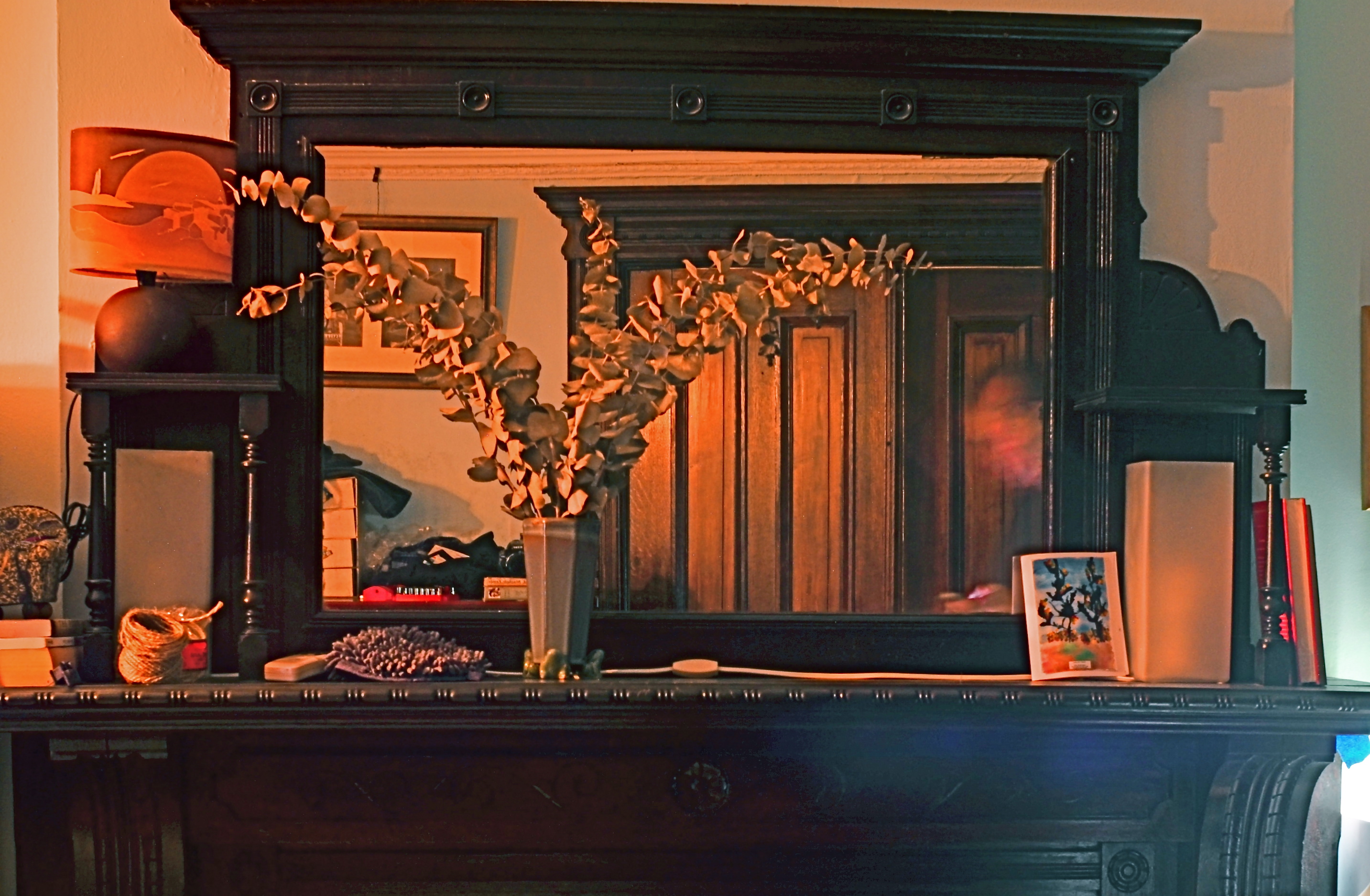
Monu-mantel (2016): A 36-second time exposure with an unscheduled guest appearance (inside the mirror’s right lower frame) by your humble author.
Recently I tried a layered still-life in the darkest room since, well, since darkness, and I knew that I would have to open for a long time. In trying to take a frame that included both a crowded, mirrored mantel in front of me, and the bureau and pictures from behind me that were reflected in the mirror, I balanced my camera on said bureau (you can see it to the left of the vase) and started experimenting with exposure times. Half a dozen or so tries later, I thought I’d nailed the magic number, but, in counting out the time in my head, I got distracted and walked partway into the shot, lingering just long enough to be recorded as the lighter sheen on the right front of the mantle and the facial smear in the right side of the mirror.
Again, we’re back in the weightlessness simulator. Different rules apply here in Oz, Dorothy. So, this picture is forever in the category of How To Get Out Of Your Own Way…..one of those flawed photographic children, that, while not quite flawed enough to merit being sent to military school, will also never be the favored kid, either. Joys of parenthood and all that.
PHOTOGRAPHING FEELINGS

Meet Me At The Biltmore At 2 ( 2016)
By MICHAEL PERKINS
I REALIZE, MORE THAN EVER, THAT THE BULK OF MY OWN PHOTOGRAPHIC WORK has been an attempt to tell human stories while using remarkably few humans to convey them. I always seem not to have a true style at all, just a string of endless experiments that either add or detract from my overall skill set. And yet, if there is any “signature” in my work, it seems to be in using objects, or atmospheres, to illustrate what makes (or made) people feel. The everyday “sets” on which the actors of life play their parts. The oddest thing about my photographs is how many times, over a lifetime, the sets are allowed to speak for the actors, without the actors present.
I shoot empty rooms, but rooms where I feel the weight of years of bustling, traffic, conversations, meetings. I shoot solitary objects on tables, but objects that I imagined were touched, treasured, and otherwise served to measure daily life. I’m not adept at staging people as models or actors in images, but I try to react to settings, see people in them, and show their absence as a kind of presence through these things, these places.
It doesn’t always work. And, as you all have, I’m sure, I often worry about whether I’m off on the wrong track, lost, kidding myself. When a photograph connects with someone, I’m still surprised, even shocked. Street photography, which I greatly admire, is, for most, the act of seeing important bits of drama or tension between people. I take the visual measure of what they build, what they use, even what they abandon, and try to draw their portraits that way. The actual participants may, or may not, be part of those drawings.
Like I say, it doesn’t always work. What I may see as a moment of contemplation or a quiet narrative may strike others as cold, remote. I never mean it that way, since that’s not how I see the world. To my mind, you can either show a child opening a Christmas present, measuring his first flash of joy, or you can photograph the box and wrapping paper a moment later, after the toy has been removed and only the potential of the thing is left behind, like a latent fragrance.
I like trying to detect those fragrances, those lingering essences, the vapors of vanishing potential. Like Chief Dan George observes in Little Big Man, sometimes the magic works and sometimes it doesn’t.
But, oh, man, when it does……
STREET PHOTOGRAPHY (LITERALLY)
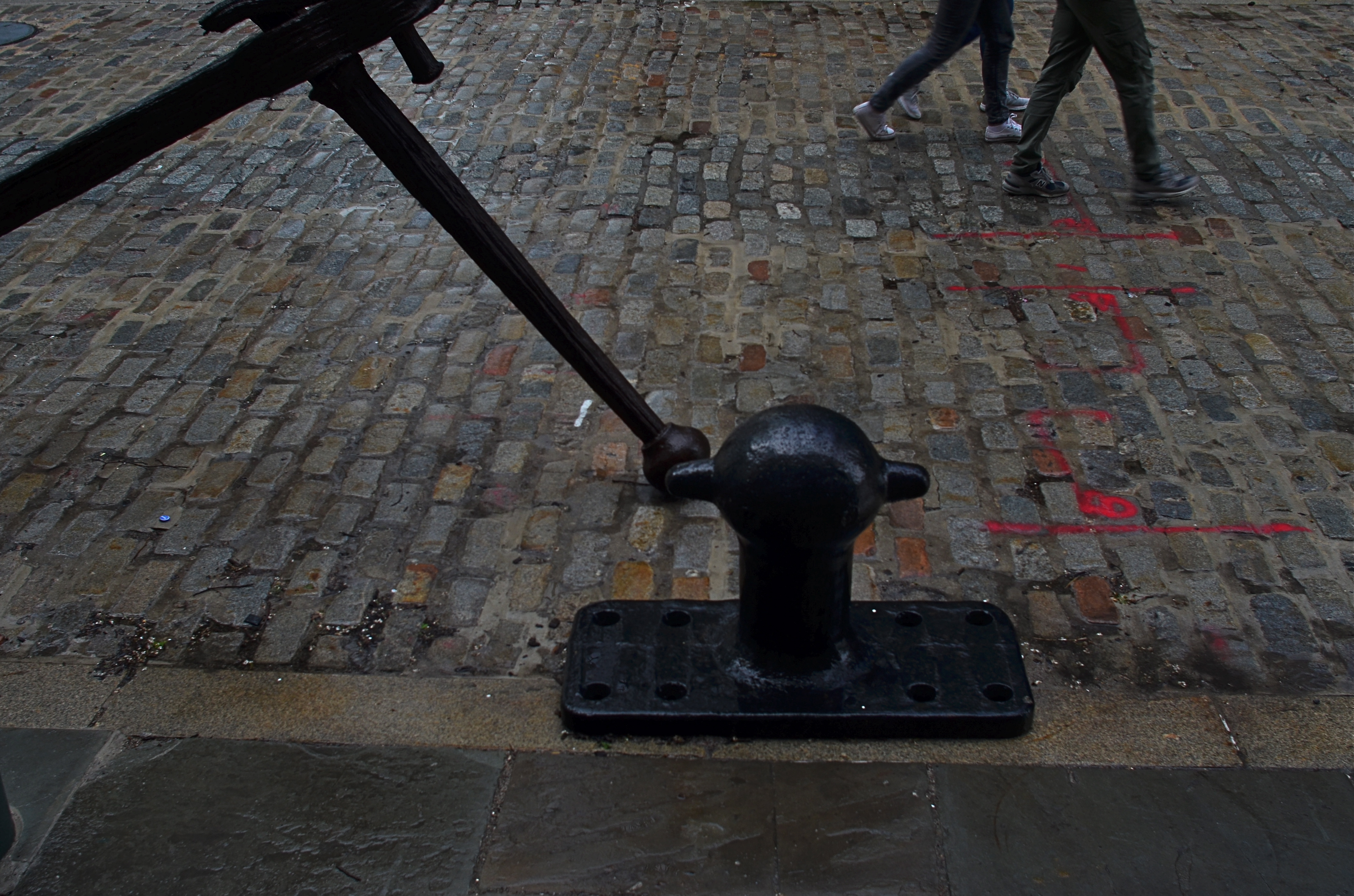
South Street Cobbles, 2016. 1/80 sec., f/5.6, ISO 100, 24mm.
By MICHAEL PERKINS
NEIGHBORHOODS HAVE THEIR OWN VISUAL SIGNATURES, and photographers looking to tap into the energy of streets do well to give their locales a bit of advance study, the better to try to read an area’s particular identity. Sometimes the storytelling potential lies in a single building, even a part of a building. Other times it’s the mix of foot traffic. And, every once in a while, the saga of a street lies in the pavement itself.
New York City’s South Street Seaport district is drenched in local lore, tracing the contours of its alleys and warehouses to the beginnings of Manhattan’s first days as an international shipping destination. From the times of the Dutch’s tall-masted sailing vessels to the present mix of museum and modern retail, the port, on a typical day, offers color, texture, and a feeling of deeply rooted history that is a goldmine for photographers.
Of course, every neighborhood has its off days, and, on my recent trek to the area, a persistent, wind-driven rain had chased all but the hardiest locals off the streets and into the oaky timbers of the port’s quaint shops. Life on the street slowed to a crawl as iron-grey skies robbed the scene of its bolder hues. It was a day to huddle indoors with a good read and a hot cuppa anything. My camera, usually an unfelt burden around my beltline, began to drag like an anchor, stuffed into my woolen jacket to ward off the pelting drizzle, giving me the appearance of someone in sore need of a hip replacement.
Despairing of finding any vital activity along the street, I turned in desperation to the pavement itself, realizing that, in this eastward edge of Manhattan, the texture of the roads abandons the even concrete of most of the island and reverts to the cobbled brick textures of Melville’s time, with many old waterfront fixtures installed at curbside for extra atmosphere. Suddenly I had a little story to tell. The varied mix of firings in the brick, along with the steady rain, delivered the vivid color that was lacking in the area’s shops, allowing me to create an entire frame from just the street itself. Finding that some scale was needed, I sought out an old iron fixture for the left edge of the photo with just the legs and feet of two passing girls to balance out the right side. Suddenly there was enough, just enough of something to make a picture.
Obviously, if the street had been mere wet concrete or blacktop, the impact would have been different, and, were I in a different neighborhood, the street itself might have been unable to compete with the businesses for color or interest. On that morning, however, simple worked best, and my camera, at least for a moment, felt less like an anchor and more like a sailing ship.
THE FLEXIBLE FREEZE
By MICHAEL PERKINS
PHOTOGRAPHERS ACROSS THE LAST TWO CENTURIES HAVE CAPITALIZED ON ONE OF THEIR MEDIUM’S BEST TRICKS, the ability to freeze time, the sensation of carving out micro-seconds of reality and preserving them, like ancient scarabs trapped in amber. The thing known as “now”, with the aid of the camera, became something called “forever”, as things which were, by nature, fleeting were granted a kind of immortality. Events became exhibits, things to be studied or re-lived at our whim.
And yet, even as we extract these frozen moments, we mess around the edge of the illusion a bit, making still pictures also convey a sense of motion. Focus is a prime example of this retro-fitting of technique. No sooner had photography evolved the technical means to render sharp images than shooters began to put a little soft imprecision back into their pictures, by a variety of means: slow shutter speeds, time exposures, manual shaking, delayed flashes, and selective focus. Of all these techniques, at least for me, selective focus has proven to be the hardest to master.

….and two more lattes, 2016, shots on a Lensbaby Composer Pro, which allows a sweet spot of sharp focus to be moved anywhere in the frame the shooter desires.
Changing the messaging of a photographic story by using focus to isolate some elements and downplay others has always called for real practical knowledge of the workings of lenses and how they create focus as an effect. Recently, digital manipulation has allowed shooters to re-order the focal priorities of a shot after it’s taken, and in just the past few years, commercially available specialty lenses have allowed photographers to pre-select where and when focus will occur in an image, using it as interpretively as color or exposure.
I like to use the Lensbaby family of variable-focus lenses for what I call “flexible freeze” situations, times when focus can be massaged to create the illusion of speed. In the above shot, taken in a high-volume cafe, the small center of tight focus fans out to a near streaky quality at the outer edges of the picture. No one person is rendered sharp enough for features to register, or matter. What’s important here is the sensation of a busy lunch rush, which actually would be diminished if everything was in uniform focus.
Sharpness is certainly desirable in most cases for a strict re-creation of literal reality, but photography has never merely been a recording process. Focus can produce useful abstractions or atmospheres in a shot, so long as the effect serves the story. If it doesn’t help the image speak better, even a flexible freeze can quickly become a tiresome gimmick. Matching tools to goals is what good photography does best.
A MATTER OF DEGREE
By MICHAEL PERKINS
NIGHT CREATES SUCH A DRASTICALLY DIFFERENT FLAVOR in anyone’s photography that some shooters, romantically attracted to its unique look, have made night-time their exclusive domain. Night is also the toughest time of day to render properly, and a zone wherein one’s interpretation of “reality” varies wildly. From the earliest days of the photographic medium, the hours after sunset were, first and foremost, a technical minefield, filled with pitfalls and perils.
Today, fast lenses and the higher ISO that can be dialed up pretty much at will mean fewer tripod shots, more hand-held shots, and thus a much bigger yield of often stunning night-time images. Even modest cameras are evolving so quickly that it’s getting hard to remember a time when we couldn’t shoot pretty much whatever we desired.
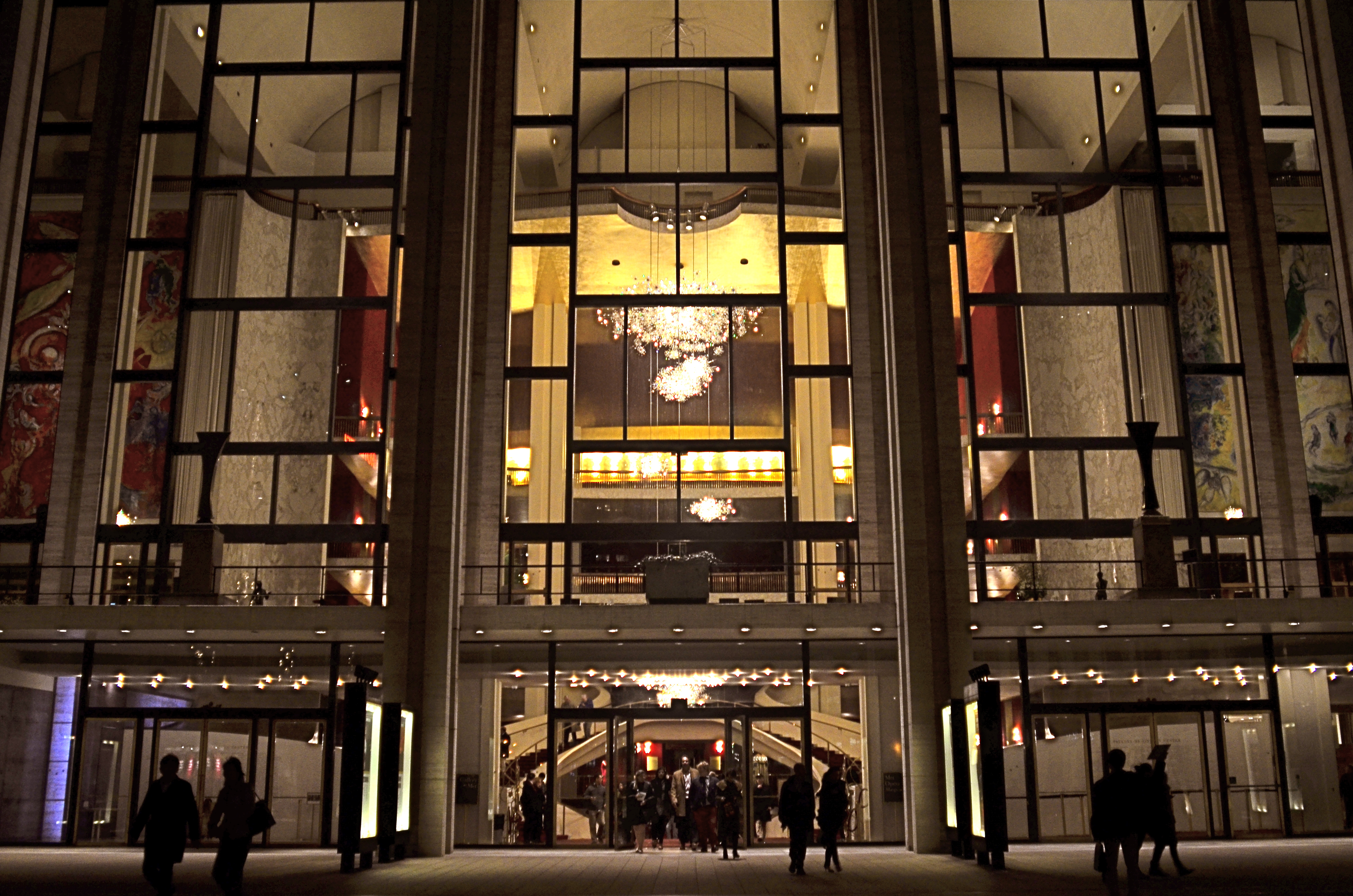
Lincoln Center, 2016
In many night settings, the contrast between bright and dark objects is dramatically multiplied. That means that getting proper exposure still has to be calculated based on widely varying elements within the frame. The night I took this image at New York’s Lincoln Center, I shot the various performance buildings on the “campus” in every compositional combination and setting possible, using a Nikon f/2.8 24mm prime lens. I framed the theatres at right angles to each other, by themselves, juxtaposed with neighboring skyscrapers, with and without the center’s fountain plaza, from medium distances to the lobby, tight distances to the lobby, and so on. In one “almost” calculation, I shot at f/8 and about 1/80 sec. at 1500 ISO, didn’t like how grungy it looked, then cranked the lens wide open to f/2.8, used as slow an exposure as I could execute hand-held (about 1/20 sec.), and backed off the ISO to about 400. That’s the combo you see above.
Normally, an aperture like f/2.8 produces a very shallow depth of field, which is generally bad for distant subjects. However, if you are focused to infinity, and your subject is, say, forty feet away, the image starts to get a little sharper at about twenty feet out, and is pretty sharp by forty. One sharpness caveat: if you use a slow exposure, as I chose to, and you’re also boosting your ISO, the electrical lights in your image will begin to go soft and globby fairly quickly…to “burn in” to some degree. You can see this in my image in the lobby chandelier, which registers as a velvety glow instead of a sharp grouping of individual bulbs. As an alternative, if you have time to experiment, you can amp up the up the ISO a little more, speed up your shutter, and perhaps render the lights a little sharper. This depends greatly on how many wives you have standing nearby, asking, “can we please just walk to the subway now?” It’s also not the only solution possible. Fiddle with it and see what works for you.
Also, if you are lucky enough to be shooting on a tripod, then you can shoot at minimal ISO, an aperture of f/11 or narrower, and as long an exposure as you desire. But the above guidelines are offered for someone shooting hand-held, and in a moderate hurry. I use very fast prime lenses to give me the sharpest focus and the most light latitude possible in the greatest number of situations, assuming that I won’t be allowed to mount a pod, even if I wanted to take one to the theatre (I don’t). So, as always, you have to decide a little ahead of time what you might be shooting, what the reality on the ground will be, and what you’ll need in the way of toys to bring home a goodie. Night is a very different animal, but trying to tame it is surprising and fun.
UNKNOWN KNOWNS

Everyone is visible, yet no one is known. Faceless crowds serve as shapes and props in a composition.
By MICHAEL PERKINS
WE OFTEN WRITE IN THESE PAGES ABOUT PHOTOGRAPHY’S UNIQUE ABILITY to either reveal or conceal, and how we toggle between these two approaches, given the task at hand. Photographic images were originally recorded by using science to harness light, to increase its ability to illuminate life’s enveloping darkness, just as Edison did with the incandescent bulb. And in their attempt to master a completely new artistic medium, early photographers were constantly pushing that dark/light barrier, devising faster films and flash technology to show detail in the darkest, dimmest corners of life.
And when that battle was won, an amazing thing happened.
Photographers realized that completely escaping the dark also meant running away from mystery, from the subtlety of suggestion, from the unanswered questions residing within their pictures’ shadows. And from the earliest days of the 20th century, they began to selectively take away visual information, just as painters always had, teasing the imagination with what could not be seen.
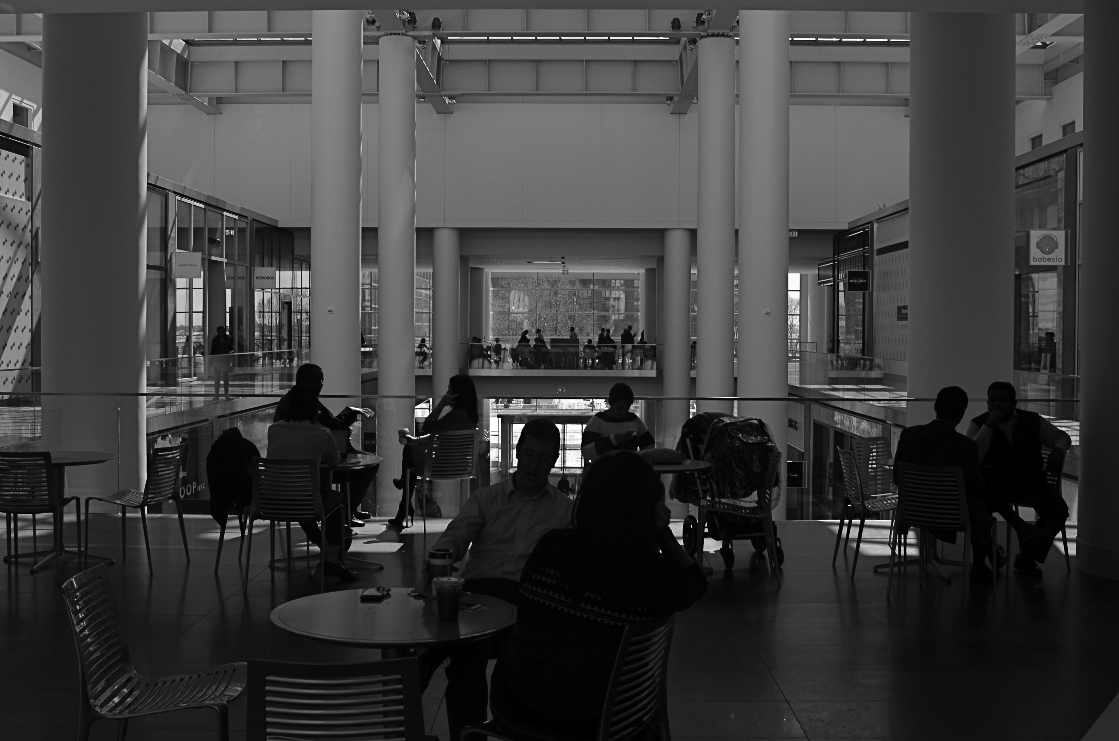
Friendly chats or shadowy conspiracies? Your choice.
City scenes which feature individual faces in crowds opt for the drama (or boredom) written in the face of the everyday man. Their scowls at the noonday rush. Their worry at the train station. Their motives. But for an urban photographer, sometimes using shadow to swallow up facial details means being free to arrange people as objects, revealing no more about their inner dreams and drives than any other prop in an overall composition. This can be fun to play with, as some of the most unknowable people can reside in images taken in bright, public spaces. We see them, but we can’t know them.
Experimenting with the show it/hide it balance between people and their surroundings takes our photography beyond mere documentation, which is the first part of the journey from taking pictures to making them. Once we move from simple recording into interpretation, all the chains are off, and our images can really begin to breathe.
THE WHEN OF WHIMSY
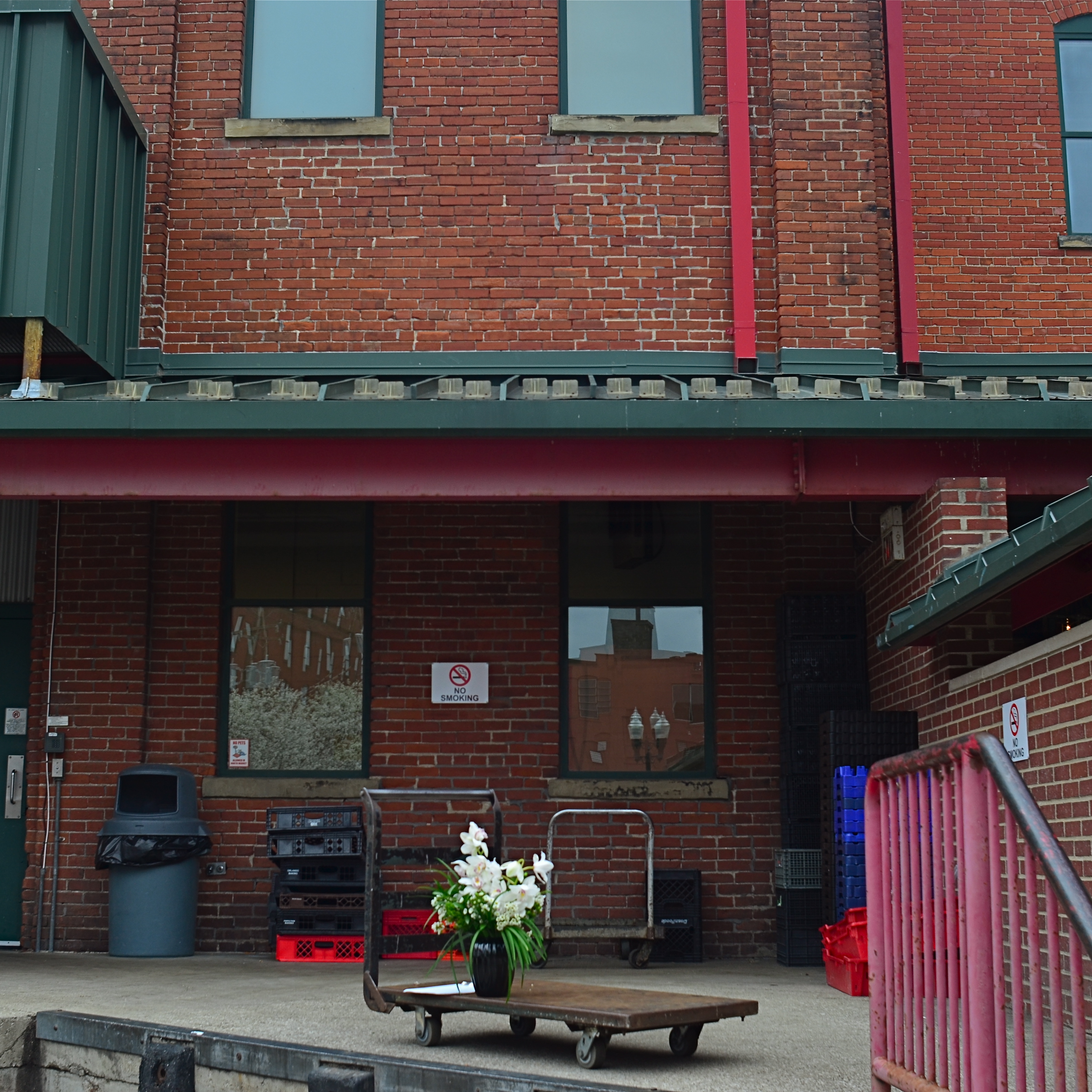
Yes, We Deliver, 2016. Who ordered the blooms?
By MICHAEL PERKINS
For decades, the legendary Life magazine provided richly illustrated summaries of the week’s events, competing with other photo-laden national weeklies from Look to Fortune, Collier’s to Liberty for the eyeballs of generations of subscribers. The weekly giants perfected the photo-essay, laying out stories on elections, wars, fashions and the arts in serial narrative form from opening headline to closing paragraph. Life has even had a second “life” of sorts, ceasing weekly publication clear back in 1972, but still visible on newsstands to the present day in re-mixed, themed reissues of its iconic image archives.
One of my favorite features in Life over the years was the Miscellany page, tucked just inside the magazine’s back cover, and reserved almost exclusively for whimsy or fun. Freed from the journalistic constraints of the rest of Life, the Miscellany images ended the week on an up note with novelty and warmth providing relief from starker, sterner material. Nearly all of the photos were “human interest” in nature, featuring amusing interactions between people. Lovers. Kids. Day laborers. There was a true “caught in the act” flavor to the shots, and most looked like lucky candids rather than staged or manipulated images.
The feature informed my own brand of street photography, the snap that makes the mind speculate on the story that takes place both before and after the click. Sometimes people figure in my own moments of whimsy. Other times, as in the case of the image up top, an unusual arrangement of elements captures my imagination, making me wonder how these particular things got to this particular place. The idea of a single blooming flowerpot on a cart standing outside a very industrial loading dock caught my eye, as the two things don’t seem, at first glance, to belong to the same world. I almost spent too long thinking about it, too, since, several seconds after I snapped the picture, a worker came into frame and removed the vase, vaporizing my little tableau forever. Snooze you lose.
Miscellany appealed to my child’s sense of how to tell a story in pictures, not by what was shown but by what else is going on. There is a limited “when” for all whimsy, and, as the editors of Life realized so well, a time when one picture on the page is worth a thousand more in the mind.
DEM DARN DONT’S
By MICHAEL PERKINS
THE GLIB REMARK THAT YOU HAVE TO LEARN ALL THE RULES IN LIFE BEFORE YOU CAN BREAK THEM is maddeningly true, at least for me. Early on in my foto-fiddling, I was eager to commit all the world’s accumulated photographic do’s and don’ts to memory, like a biblical scholar nailing scripture passages, and shooting as if to enshrine those stone-written truths in art. I used words like always and never to describe how to make pictures in a given situation. I kept the faith.
And then, when I suddenly didn’t, my stuff stopped being pictures and started being photographs. Absolutes of technique are good starting places but they usually aren’t the best places to stick and stay for life. And at this point in my personal trek (seventh-inning stretch), I feel the shadow of all those do’s and don’ts swirling about like little guardian angels, but I worry first and foremost about what makes a given image work.
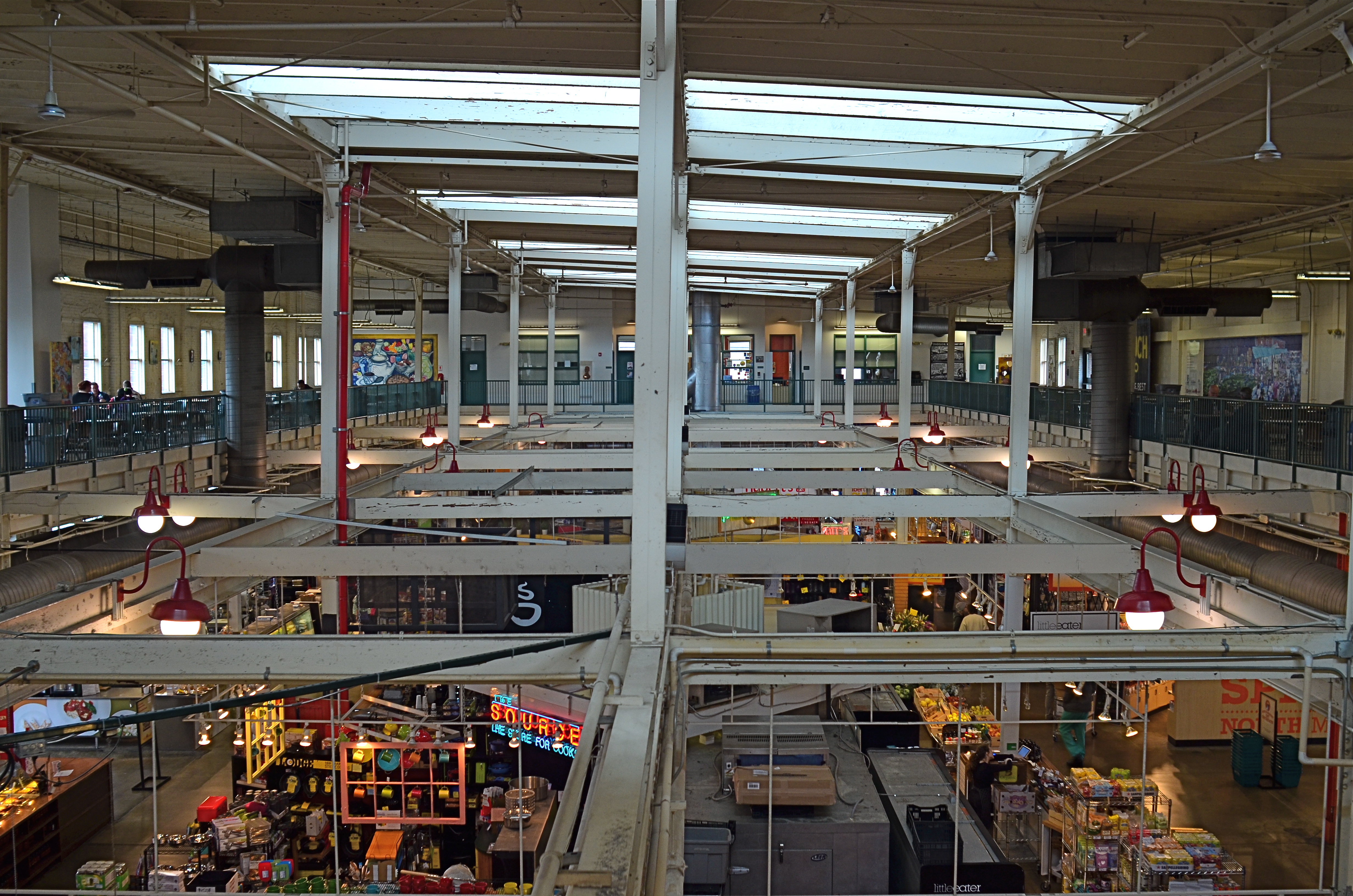
North Market, 2016. Straight out of the camera at 1/40 sec., f/5.6, ISO 200, 24mm.
You no doubt have many pictures you’ve made which you simply like, despite the fact that they flaut, or even fracture, the rules. The above image, shot earlier this week at a multi-floor urban marketplace/eatery, struck me for two reasons. First, because of how many basic rules of “proper” composition it clearly violates; and secondly, just how much I don’t care, because I like what it does. To illustrate my point, I’ve provided citations from an article titled Principles Of Composition to cite specific ways that the photo is, well, wrong.
Have A Strong point of interest. Well, there isn’t any particular one, is there? Lots of conflicting stuff going on, but that’s the natural rhythm of this place. It’s a beehive. One man’s clutter is another man’s full “pulse of life”, and all that.
Don’t place the horizon line, or any strong vertical or horizontal lines, right in the middle of a picture. And make sure the lines aren’t tilted. Okay, well, since there is a distinct difference between the “level-ness” of the crossbeams over the lower floor and the slanted lines of the skylight above, there really isn’t a way to make the entire picture adhere to the same horizontal plane. However, the off-kilter sagginess of the old building actually lends it a little charm , unless I’m just drunk.
Keep compositions simple, avoiding busy backgrounds that distract from your subject. Granted, there are about five different sub-pictures I could have made into separate framings within this larger one, but that would defeat the object of overall bustle and sprawl that I experienced looking out over the entire scene. Sure, some compositions get so busy that they look like a page out of Where’s Waldo?, but certain chaotic scenes, from Grand Central Terminal to Picadilly, actually reward longer, deeper viewing.
Place a subject slightly off-center rather than in the middle of a photo. Yeah, well, that’s where that “strong point of interest” rule might have helped. Sorry.
Do these deviations mean the image was wrong, or wrong for certain circumstances? Every viewer has to call that one as he sees it. Me, I am glad I decided to shoot this scene largely as I found it. It needed to work with natural light, it needed to be shot wide and deep, and it needed to show a lot of dispirate activity. Done done and done. I heard all the rules in my head and chose the road not taken.
Or taken. I forget which.
THIS MUST BE / MIGHT BE THE PLACE
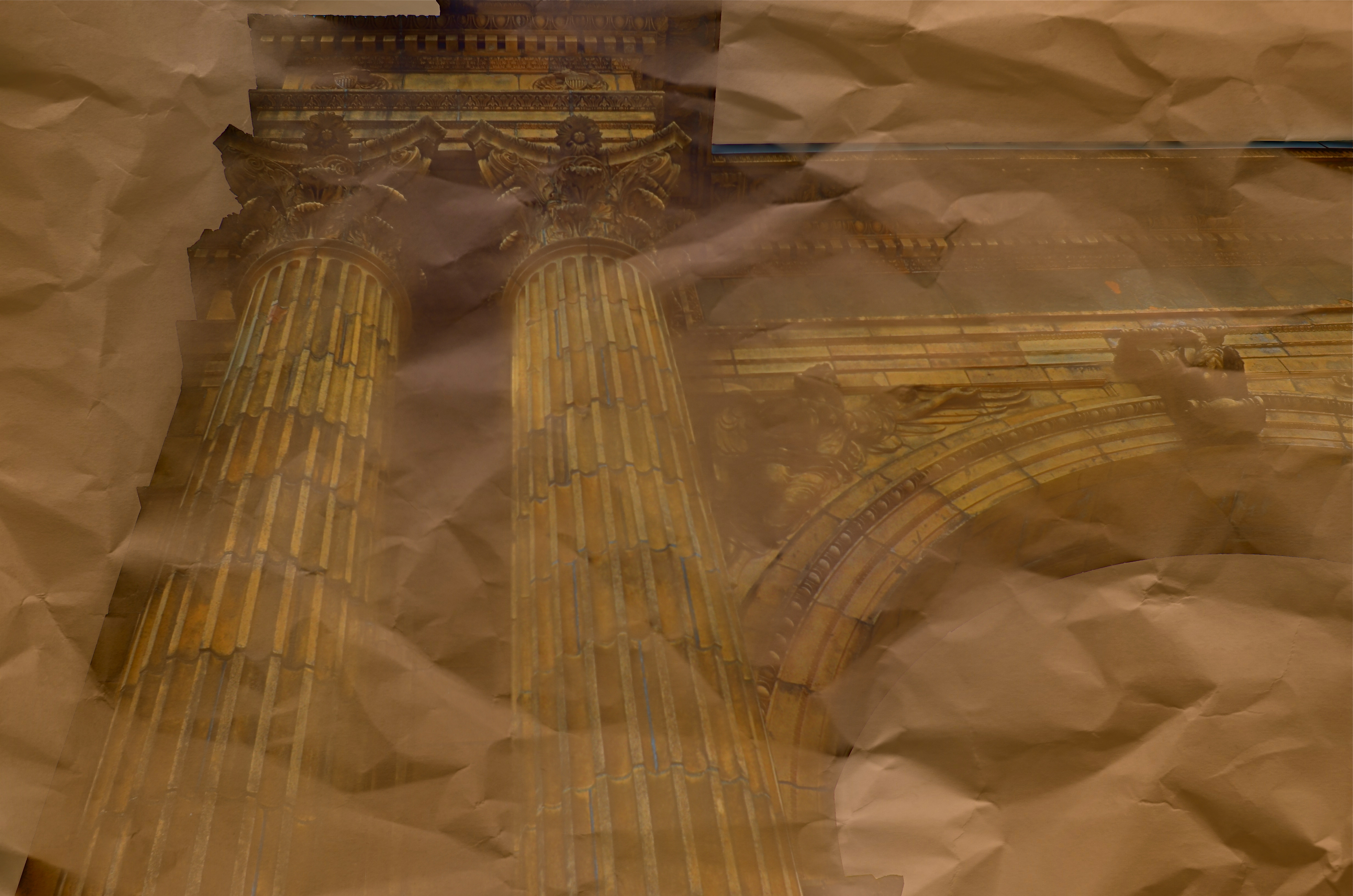
Dream Parchment, 2016.
By MICHAEL PERKINS
URBAN PHOTOGRAPHERS ACT IN MUCH THE SAME WAY AS ARCHAEOLOGISTS in that they must try to supply context for objects, backstories that have been either altered or erased. Cities are collections of things created by humans for specific motives, be it profit, shelter, play, or worship. Often, the visual headstones of these dreams, that is, the buildings, survive beyond the people that called them into being. Photographers have to imply the part of the story that’s crumbled to dust. Like the archaeologist, we try to look at shards and imagine vases, or see an entire temple in a chunk of wall.
During the dreaded “urban renewal” period in the mid-twentieth century, my home town of Columbus, Ohio duplicated the destruction seen in cities across the country in the wanton devastation of neighborhoods, landmarks and linkages in the name of Progress. Today’s urban planners thumb sadly through vast volumes of ill-considered “improvements” wrought upon history from that period, with New York’s Penn Station, Pittsburgh’s Forbes Field, and Columbus’ Union Station surviving today only as misty symbols of fashion gone amok.
In the case of Columbus’ grand old railroad station, there is at least a fragment of the original structure, its beaux-arts entry arch, left standing, serving as either stately souvenir or cautionary tale, depending on your viewpoint. The arch has been moved several times since the demolition of its matching complex, and presently graces the city’s humming new hockey and entertainment district, itself a wondrous blend of new and repurposed architecture. Better late than never.
Thus, the Union arch has, by default, become one of the most photographed objects in town, giving new generations of artists permission to widely interpret it, freed, as it is, of its original context. Amateur archaeologists all, they show it as not only what it is, but also what it was and might have been. It has become abstracted to the point where anyone can project anything onto it, adding their own spin to something whose original purpose has been obliterated by time.
I have taken a few runs at the subject myself over the years, and find that partial views work better than views of the entire arch, which is crowded in with plenty of apartment buildings, parklands and foot traffic, making a straight-on photo of the structure busy and mundane. For the above image, I imagined that I had recovered just an old image of the arch….on a piece of ancient parchment, a map, perhaps an original artist’s rendering. I shot straight up on a cloudy day, rendering the sky empty and white. Then I provided a faux texture to it by taking separate a sepia-toned photo of a crumpled piece of copier paper and fusing the two exposures (the HDR software Photomatix’ “exposure fusion” feature does this easily). Letting the detail of the arch image bleed randomly through the crumpled paper picture created a reasonable illusion of a lost document, and I could easily tweak the blend back and forth until I liked the overall effect.
Cities are treasure hunts for photographers, but not everything we find has to be photographed at, let’s say, face value. Reality, like fantasy, sometimes benefits from a little push.
RUIN AND RESURRECTION
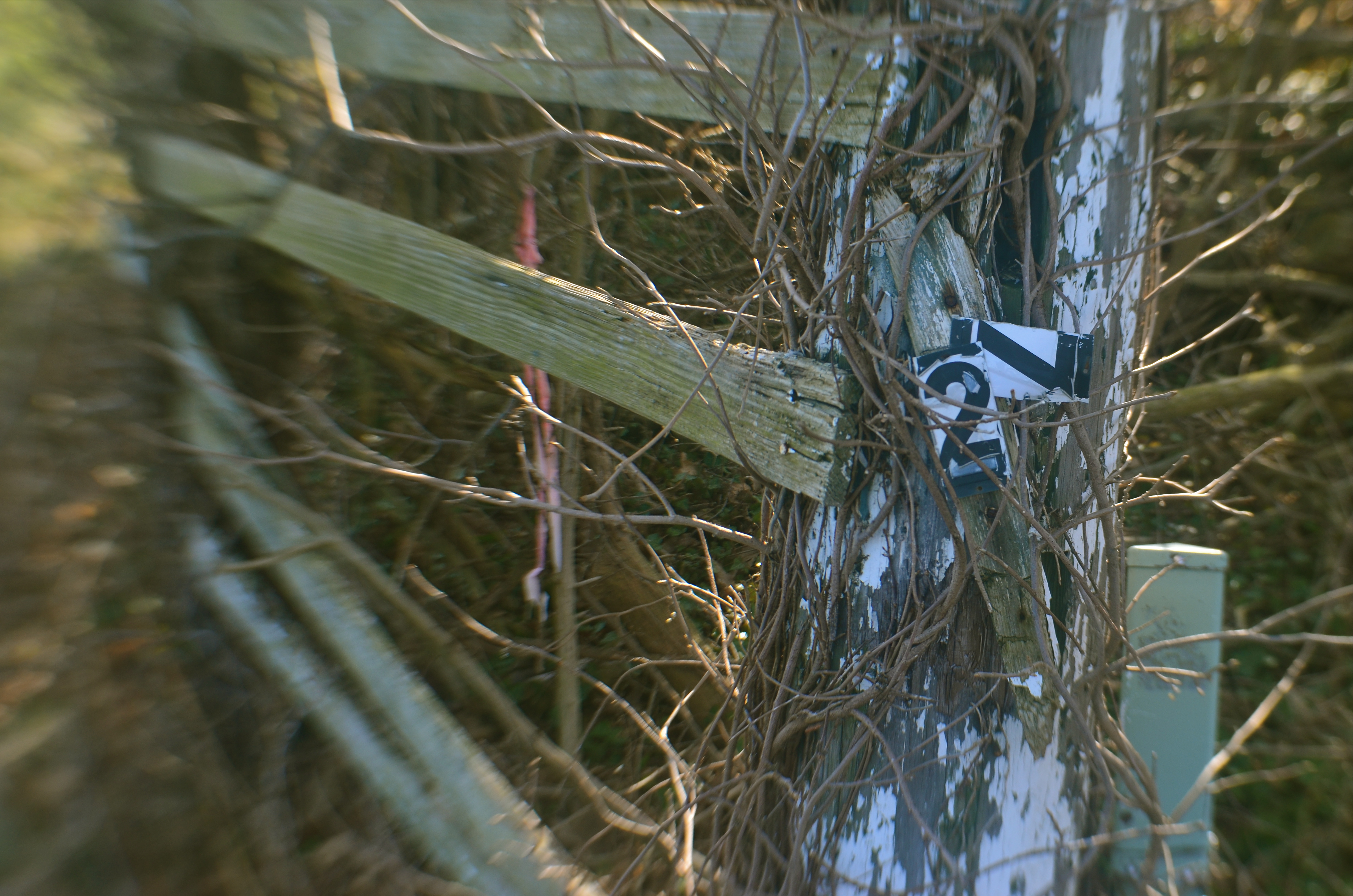
Down The County Line Road, 2016. A fairly obvious study in “ruin” photography. Or is it?
By MICHAEL PERKINS
IN THE BEGINNING, PHOTOGRAPHY WAS MOSTLY ABOUT RECORDING, arresting time in its flight in order to preserve scenes for posterity. And, for its earliest practitioners, that purely technical feat of stopping the clock was enough. We still use the word capture to describe this harvesting of moments. Soon, however, photographs became truly interpretive. That is, they set out to be about something beyond a mere logging of the physical world. In so doing, they passed from documents to statements, with shooters choosing which world view they wanted to present.
I find that, even in the most complex documentary photos, those views seem to collect into two main camps of thought. One kind of image, which may be called the “ruin” category, depicts what we have lost. Abandoned buildings, wrecked cities, damaged lives. “Ruin” campers show the deterioration of things and ask us to assess the loss of dreams. The second general kind of interpretive category, which I’ll call the “resurrection” camp, shows the things that might have experienced ruin but are rebounding, on their way back up. Rez campers show the resiliency of the human spirit, the belief that there will, indeed, be a tomorrow.
Human beings being partisan by instinct, curators, editors, and audiences can, and do, glorify the pictures of one camp while decrying the worthlessness of images from the other camp, in what is really a false choice. Life is never cleanly divided between heaven and hell, and neither should your pictures be.
Photographs that show what we have wasted are no more “authentic” than those that show us recovering from loss. And truly great photographers actually straddle both camps in their best work. But your purpose in a picture must be clear: the image at the top of this page seems to mourn the devastation of an old family farm. However, if I were to pull back to a larger frame, the camera would also show the freshly furrowed fields of a property that is in the process of being re-developed. Ruin or Resurrection? It’s down to approach, and context.
Some days it seems like the best story you can tell is a tragic one, but, at other times, there is nothing more courageously honest than depicting hope. It all depends on what comes to hand. The best plan is not to plan, to be open to whatever the best testimony is, right here, in this picture.
Right now.
THE EYE OF MEMORY
By MICHAEL PERKINS
PHOTOGRAPHY DEALS IN FEELINGS, those inexact sensations of the heart that we try to capture or evoke in our visual messaging. Some subjects, such as war or celebration, convey emotions with such immediacy that we are really only acting as recorders, with the associative power of our minds providing much of the detail. Pictures of loss or celebration, such as the aftermath of a disaster or the birth of a new life, can be fairly simple to convey. What you see is what the thing is. For subtler regions of the brain, however, photos must use, if you will, a different vocabulary.
Newbie photographers are trained, to a a great degree, to seek the sharp image, to master focus as a technical “must”, but, as we vary the kinds of messages we want to convey, we change our attitudes about not only sharpness but most of the other “musts” on the beginner’s list. We learn that we should always do a certain thing….except when we shouldn’t. It’s worth remembering that some of the most compelling photos ever published were, according to someone’s standard, “flawed” in some way.
De-saturated color, soft focus. Items dealing with feelings, especially memory. are better served with less “realism”.
News shooters have long since learned that the emotional immediacy of a picture, along with its raw “news value”, outweighs mere technical precision by a country mile. The rules get bent or broken because, in their most perfect application, they may actually dull the impact of a given image. Thus, many a journalist has a Pulitzer on his wall for a picture that a beginner might regard as “wrong”. And the same goes for any picture we may want to make where an emotion simply must be conjured. Mere visual accuracy can and will be sacrificed to make the picture ring true.
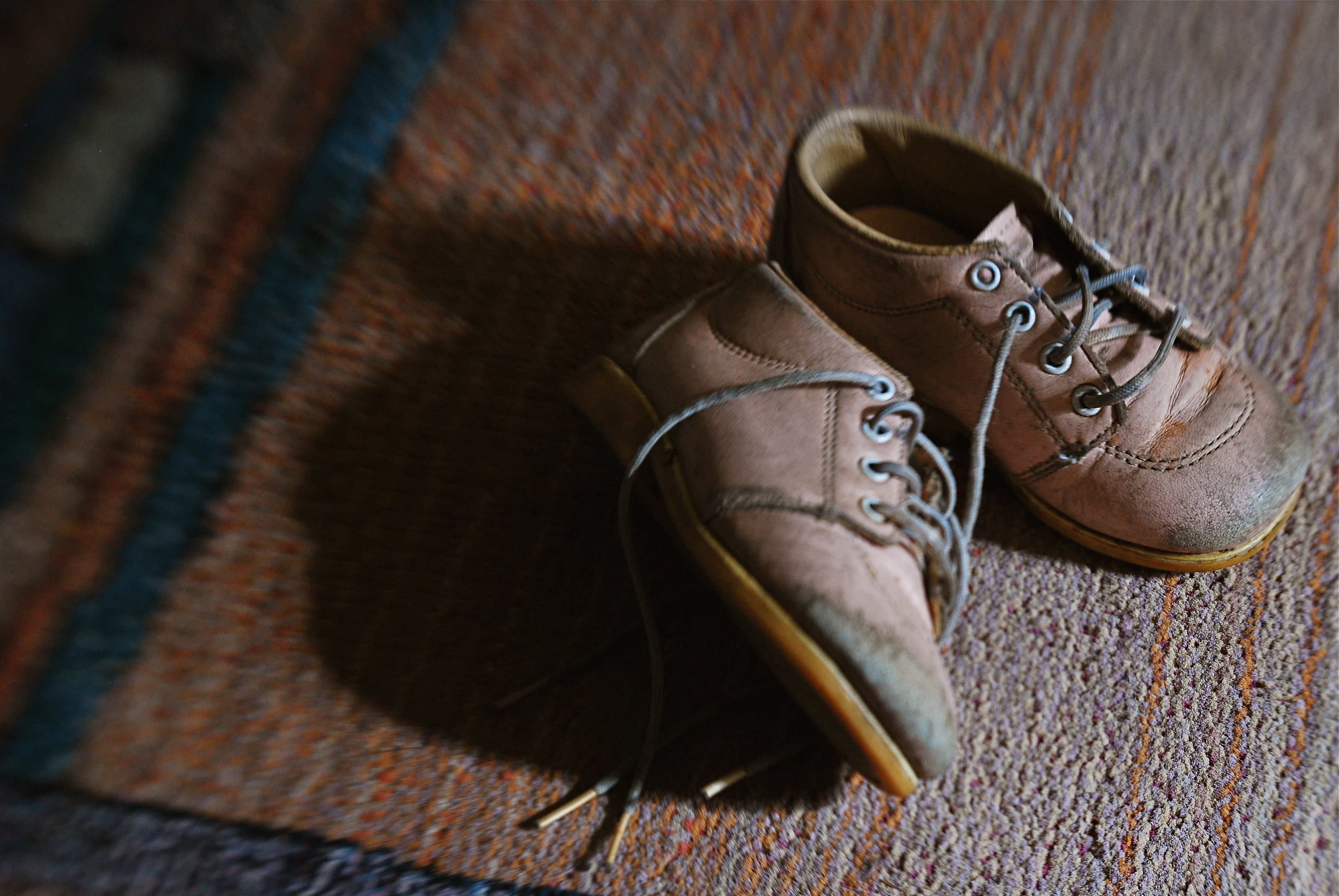
Asa personal example, I find that images that plumb the mysteries of memory often must stray from the arbitrary standards of so-called “realism”. When you work in the realms of recall, nostalgia, regret, or simply fond remembrance, a certain fluid attitude toward the niceties of sharpness and exposure may actually sell the idea better. Memory is day-dreaming, after all, and, in a dream, as Alice found in Wonderland, things look a bit…off. Dimension, delineation, depth…all these properties, and more, morph with the needs of the desired image. “Real” sells some things superbly. Emotion, however, as earlier stated, demands a language of its own.
The baby shoes shown in the image above are shot in uneven sharpness to suggest the gauzy nature of the memories they may evoke. Likewise the color is a bit washed-out, almost pastel, since a full, vibrant range of hues may seem less dreamy, more rooted in reportorial reality…which we don’t want for a picture like this. Rule-breaking ensues simply because nothing, no rule, no standard, is as important as making the picture work. If it doesn’t speak to the viewer, then the fact that it’s technically superb means nothing.
As Mr. Ellington sez, it don’t mean a thing if it ain’t got that swing.
PIECEWORK

When visiting craft studios, make sure you peruse the backstage areas as well.
By MICHAEL PERKINS
NO SELF-RESPECTING TOURIST SPOT IS COMPLETE WITHOUT A STROLL THROUGH the local craft shops, those kitschy little warrens of handmade goods from pottery to stone trinkets. Whether they are called “studios”, “boutiques” or “trading posts” these collections of gypsy creativity are on the main and minor drags of every destination town, and they are occasionally real feasts for the eye…and, in turn, the camera.
The stuff on the tables and counters is usually a riot of color and texture, and thus somewhat low-hanging fruit for photogs. But you can miss out if you limit your framings merely to the finished product, especially if the backstage or work areas, where the magic truly happens, are open or, even better, an active part of the customer experience. Lots of small craft factories, art sites, galleries and festivals incorporate the actual making of their goods into the overall tourist trip, and I often find these staging areas far more interesting than what eventually makes it to the sales floor.
Everyone recalls the corner pizzerias that oriented their kitchens so that the guy flipping the dough was in a display window near the street. It was great passive show biz and the same “backstage” allure still works for handmade jewelry and other crafts. And, while witnessing the literal creation of objects is one kind of storytelling opportunity, a quieter one can occur when you cruise past vacant desks whose tops are cluttered with tools and decorative components. These kind of still-life subjects are ripe with potential, since they show what is about to happen. They’re also displays of someone’s personal work area, their most individual arrangement of space.
Sometimes the best part of a shopping experience is the unpolished part. Pictures are where you find them, and opportunities reveal themselves when you start looking beyond the obvious locations.
SIMPLEST TERMS

Two colors, and only two colors. Is anything else needed to sell this image?
By MICHAEL PERKINS
ENTIRE BOOKSHELVES OF MATERIAL HAVE BEEN WRITTEN on the mysterious art of composition at it applies to photography. The variations are endless: what to shoot, how much to shoot, how to determine how little to shoot, theories on addition, subtraction, choice of subject, and so on. The only constant is that every compositional inclusion also embodies an exclusion. When you choose one thing, you un-choose everything else.
One such choice is that of color over monochrome, an argument which raged over a large part of the early 20th century, since, for many years, photographers thought they could rely upon black and white, even though an abstraction of reality, to convey a consistent feel, whereas early color films often produced uneven results. Some photographers decided to ban color altogether, to embrace the predictable un-reality of b&w rather than gamble on hues that might not be reproduced or printed with true fidelity, or worse, register as too brassy or garish. Today we seldom choose monochrome over color for the same reasons, but compositions still rise and fall on whether we use color, as well as what kind of color we use.
Sometimes, just as a photograph that’s poorly cropped or loosely composed can be too busy, a color scheme that has too much variety can prove distracting, actually diluting a picture’s impact. Occasionally, I like to see how few distinct colors I can use in an image and still consider it complete, as in the case of the tomatoes above, which makes it case with only red and green values. In this instance, adding extra space around the box holding the tomatoes, or expanding the frame to include other shapes, objects or hues, will do nothing to improve the strength of my composition, so why include them? This is an easy editing choice that occurs in real time in the framing of the shot, and, with the instant feedback afforded by digital, you know immediately if the picture is lacking anything.
The problem with a lot of photography is that we tend to go no further than framing up an “acceptable” picture, one that doesn’t overtly fail. However, the more we practice a mindful approach to composition, the more adept we get at putting just enough, from subject to hue, into the image, and not one item more. This gives our photographs a streamlined communicative power that directs the eye and conveys the story.

LOST LESSONS
Photography can’t grow as part of an assembly line with social media “likes” as its only measure of quality.
By MICHAEL PERKINS
THE IMMEDIATE GRATIFICATION OF MODERN PHOTOGRAPHY IS A DOUBLE-EDGED SWORD. On one side of the blade, we have effectively eliminated the time-consuming trial-and-error that frustrated generations of shooters. Pictures come practically at our whim, and the instantaneous ability to correct images in the moment results in a learning curve shortened by years. We can potentially get better and know more faster and faster.
That’s the good part.
On the rustier side of the sword, there is the potential for us to crank out photos so quickly that we take less and less time to evaluate them individually. The subtle changes in quality that are contained in a burst of twenty quick shots are lost to us, along with whatever lessons they may impart. We make a general, slapdash call as to what the so-called “keepers” in a batch are, and rush them into the public arena for instantaneous approval. This sprint toward the highest count of “likes” and “views” usually means that we are putting many pictures out there that are not ready for prime time, simply because, technically, we can.
We have to be our own best photo editors.
Social media offers very little in the way of qualitative feedback on what we’ve done right or wrong with a picture. Only our own objective editorial judgement can truly provide that. But we are abdicating that role in our all too human desire for approval, even though online clicks are not so much “approval” as reflexive twitching. Most of us won’t have the luxury of working for hate-crazed photo editors or presenting our work in truly competitive environments, and that puts the responsibility squarely on us. If we don’t act as our own best critics, taking the time and deliberation necessary to evaluate where we’re growing and where we’re stunted, then who is to blame for our failure as artists? Our pals on Facebook?
One great thing about the film era: it forced us to proceed at a more deliberative pace. We were producing photographs slow enough to allow us to make real judgements about them as they emerged. Now we are more like Lucy and Ethel in the chocolate factory. We strive to stay ahead of the merciless assembly line, rather than see if chocolate 5,556 is actually better, or worse, than 5,557.
If you believe, as I do, that more lessons are learned from the pictures that fail, then you must slow down long enough to make sure those lessons are not lost in a meaningless blur.
Share this:
June 11, 2016 | Categories: Conception, editing, Editorial, Viewpoint | Tags: Commentary, Editing, Social Media | Leave a comment