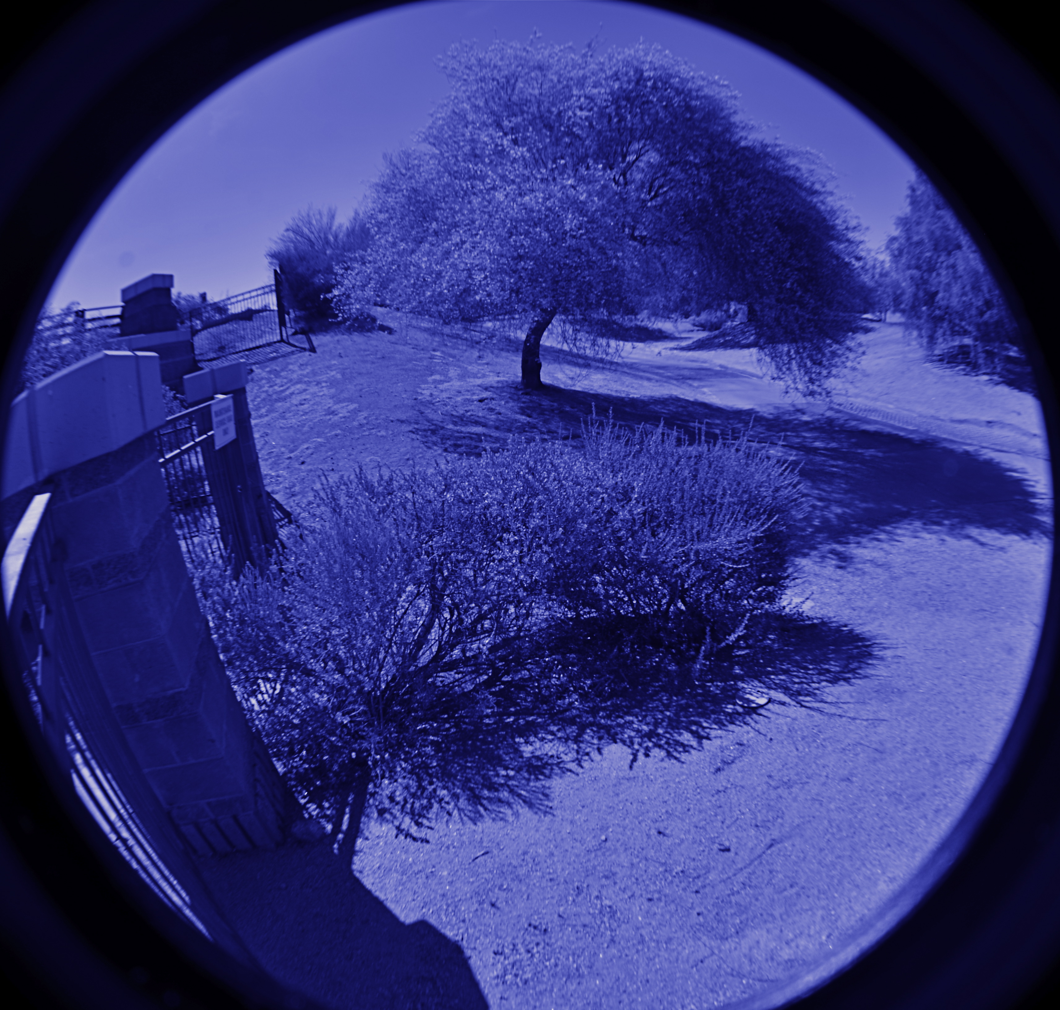
NAIL YOUR FOOT TO THE FLOOR
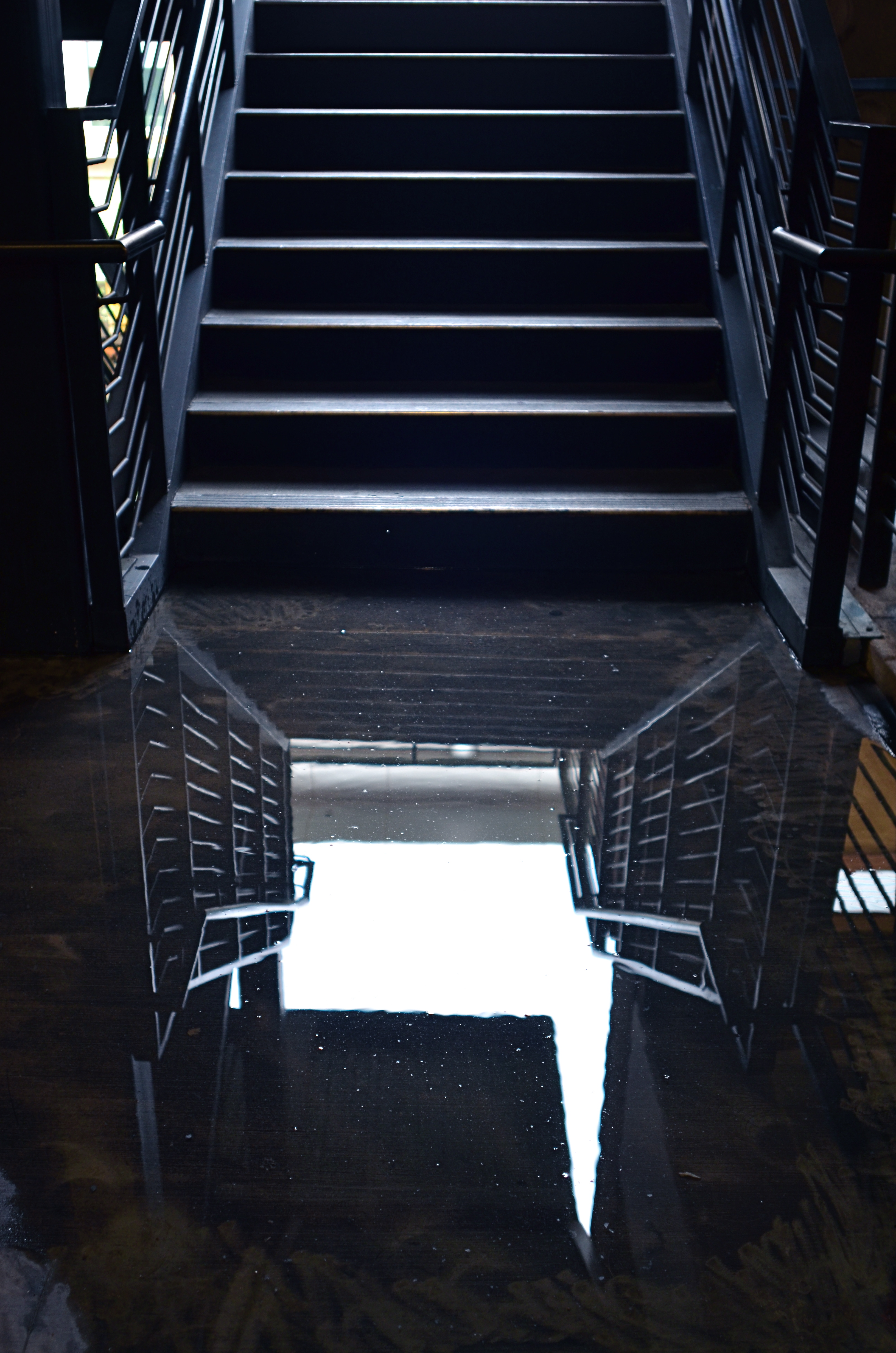
I shot this on a day when I was forcing myself to master a manual f/2.8 lens wide open, and thus shoot all day in only that aperture. That made depth-of-field tricky.
By MICHAEL PERKINS
PHOTOGRAPHY PLACES YOU IN PLENTY OF SITUATIONS WHERE YOU ARE, TO SOME DEGREE, OUT OF CONTROL. From light conditions to the technical limits of your gear to erratic weather, we have all experienced that sinking feeling that accompanies the realization that, to a great extent, we are not in the driver’s seat. Gotta wait til the sun’s up. Gotta wait for the flash to recycle. Gotta cool my heels til these people get out of the frame. Gotta getta bigger bottle of Tums.
So why, given the frequent cases in which we naturally run off the rails, would I recommend that you deliberately hobble yourself, in effect putting barriers in your own way when shooting images? Because, quite simply, failure is a better teacher than success, and you never forget the lessons gained by having to work around a disadvantage. Not only am I encouraging you to flirt with failure, I’m suggesting that there are even perfect days on which to do it…that is, the many days when there is “nothing to shoot”.
It’s really practical, when you think of it. Go out shooting on a day when the subject matter is boring, a day on which you could hardly be expected to bring back a great picture. Then nail your foot to the floor in some way, and bring back a great picture anyway. Pick an aperture and shoot everything with it, without fail (as in the picture at left). Select a shutter speed and make it work for you in every kind of light. Act as if you only have one lens and make every shot for a day with that one hunk of glass. Confine your snaps to the use of a feature or effect you don’t use or understand. Compose every shot from the same distance. The exercise matters less than the discipline. Don’t give yourself a break. Don’t cheat.
In short, shoot stuff you hate and make pictures that don’t matter, except in one respect: you utilized all of your ingenuity in making them. This redeems days that would otherwise be lost, since your shoot-or-die practice sessions make you readier when the shots really do count.
It’s not a lot different from when you were a newbie a primitive camera on which all the settings were fixed and you had zero input beyond framing and clicking. With “doesn’t matter” shooting, you’re just providing the strictures yourself, and maneuvering around all the shortcomings you’ve created. You are, in fact, involving yourself deeper in the creative process. And that’s great. Because someday there will be something to shoot, and when there is, a greater number of your blown photos are already behind you.
SHADOWS AS STAGERS
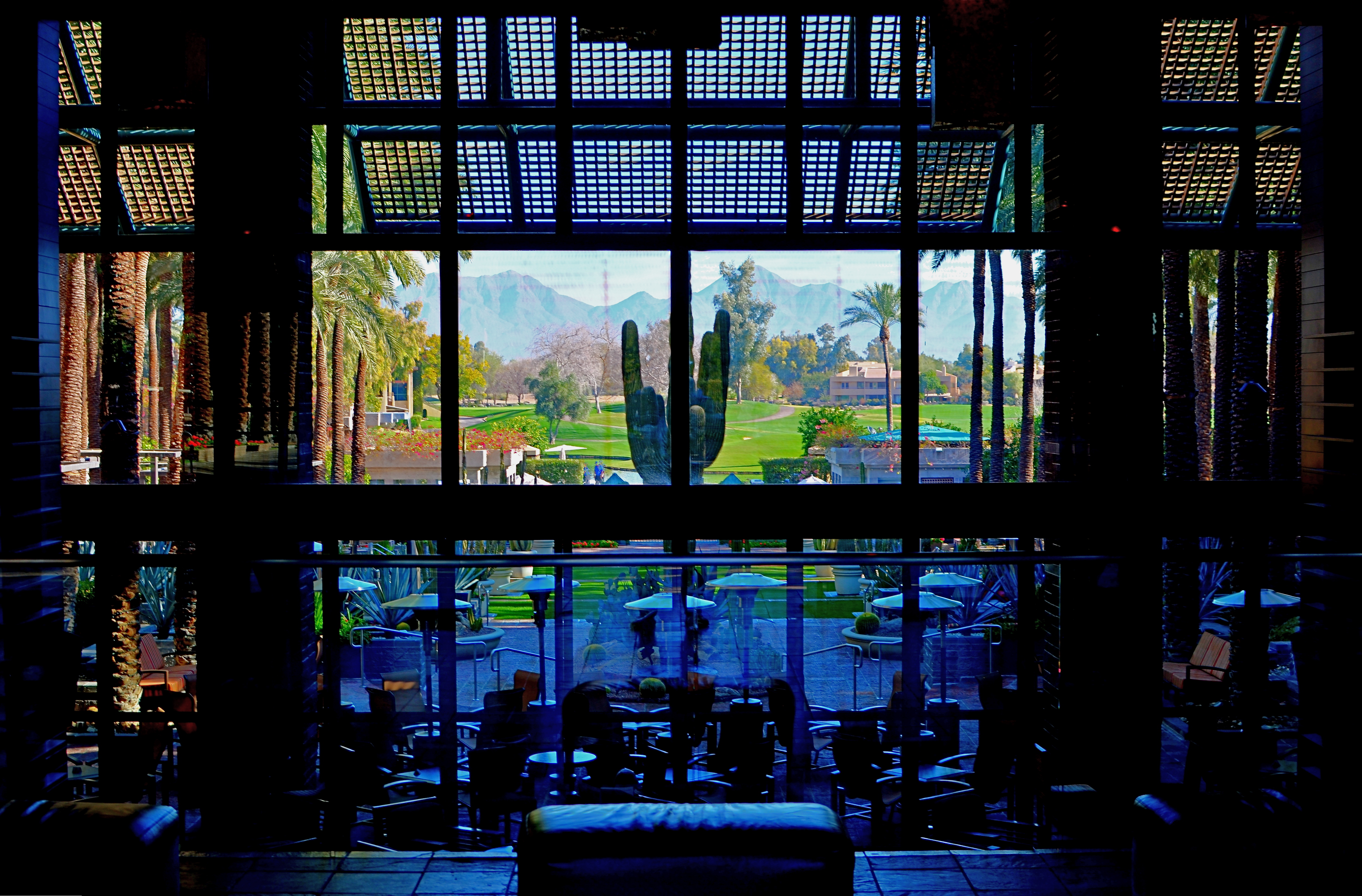
The idea of this image is to highlight what lies beyond the window framing, not the objects in front of it. Lighting should serve that end.
By MICHAEL PERKINS
THOSE WHO ADHERE TO THE CLASSIC “RULE OF THIRDS” system of composition often suggest that you imagine your frame with a nine-space grid super-imposed over it, the better to help you place your subject in the greatest place of visual interest. This place is usually at the intersection of several of these grid lines, and, whether or not you strictly adhere to the “thirds” system, it’s useful to compose your shots purposefully, and the grid does give you a kind of subliminal habit of doing just that.
Sometimes, however, I find that the invisible grid can be rendered briefly visible to become a real part of your composition. That is to say, framing through silhouetted patterns can add a little dimension to an otherwise flat image. Leaving some foreground elements deliberately underlit is kind of a double win, in that it eliminates detail that might read as clutter, and helps hem in the parts of the background items you want to most highlight.
These days, with HDR and other facile post-production fixes multiplying like rabbits on Viagra, the trend has been to recover as much detail from darker elements as possible. However, this effect of everything being magically “lit” at one even level can be a little jarring since it clearly runs counter to the way we truly see. It’s great for novel or fantasy shots, but the good old-fashioned silhouette is the most elemental way to add the perception of depth to a scene as well as steering attention wherever you need it. Shadows can set the stage for certain images in a dramatic fashion.
Cheap. Fast. Easy. Repeat.
FRAGMENTS AND SHARDS
By MICHAEL PERKINS
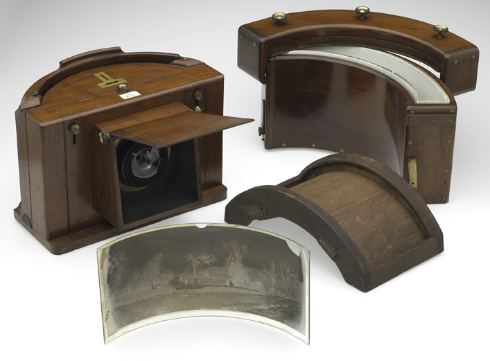
GLASS SURFACES REPRESENT A SERIES OF CHOICES FOR PHOTOGRAPHERS, an endless variety of effects based on the fact that they are both windows and mirrors, bouncing, amplifying or channeling light no less than any other subject in your frame. No two shooters approach the use (or avoidance) of glass as a compositional component in quite the same way. To some, it’s a barrier that they have to get past to present a clear view of their subject. To others, its fragments and shards of angle and light are part of the picture, adding their own commentary or irony.

That’s The Way The Light Benz, 2015. 1/50 sec., f/5.6, ISO 100, 35mm.
I usually judge glass’ value in a photograph by two basic qualifiers: context and structure. First, context: suppose you are focused on something that lies just beyond a storefront window. What visual information is outside the scope of the viewer, say something over your shoulder or across the street, that might provide additional impact or context if reflected in the glass that is in direct view? It goes without saying that all reflections are not equal, so automatically factoring them into your photo may add dimension, or merely clutter things up.
The other qualifier is the structure of the glass itself. How does the glass break up, distort, or re-color light within an enclosure? In the above image, for example, I was fascinated by the complex patterns of glass in an auto showroom, especially in the way it reassigned hues once the sun began to set. I had a lot of golden light fighting for dominance with the darker colors of the lit surfaces within the building, making for a kind of cubist effect. No color was trustworthy or natural , and yet everything could be rendered “as is” and regarded by the eye as “real”. The glass was part of the composition, in this instance, and at this precise moment. Midday or morning light would render a completely different effect, perhaps an unwelcome one.
Great artists from Eugene Atget to Robert Frank have created compelling images using glass as a kind character actor in their shots. It’s an easy way to deepen the impact of your shots. Let the shards and fragments act like tiles to assemble your own mosaics.
LOOK DEEP INTO MY EYES
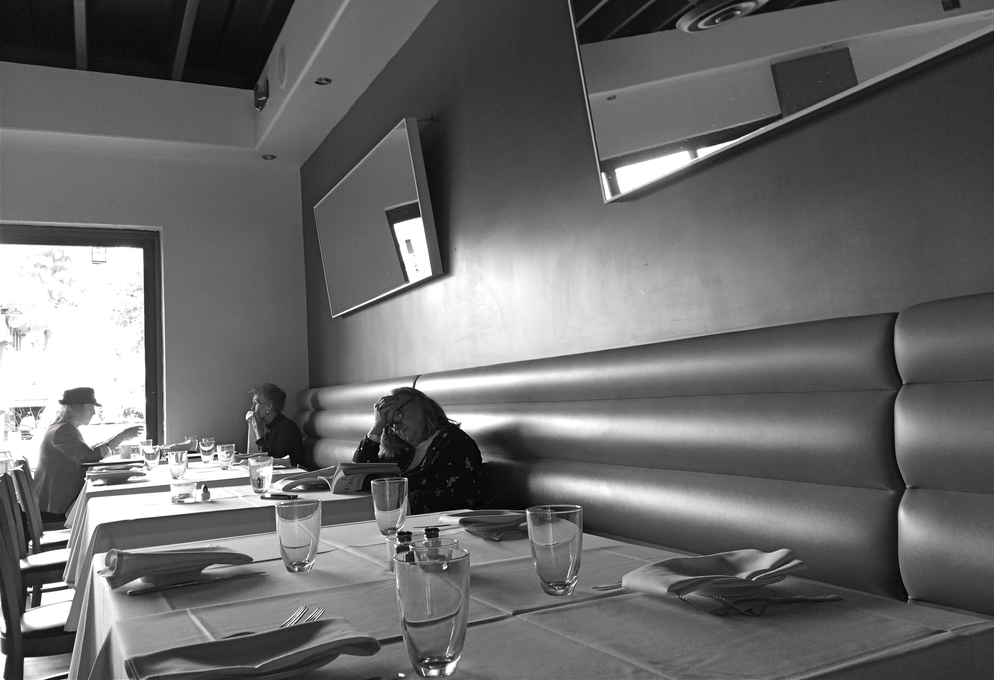
Literature For Lunch, 2016
By MICHAEL PERKINS
3-D PHOTOGRAPHY SEEMS DOOMED TO FOREVER RESIDE ON THE PERIPHERY OF THE MEDIUM AT LARGE, a part of the art that is regarded with mild derision, a card trick, a circus illusion. My own experience in it, from simple stereoscopic point-and-shoots to high-end pro-sumer devices like the Realist or View-Master cameras, has met with a lot of frustration at the unavoidable technical barriers that keep it from being a truly sharable kind of photography. It’s rife with specialized viewers, odd goggles, and cumbrous projection systems. It calls attention to effect to the detriment of content. It is the performing seal of photography.
That said, the learning curve needed to compose for stereo effect is equally valuable for overall “flat” composition, since you must always be mindful of building layers of information from front to back, the better to draw your viewer’s eye deep into your subject. Some will meet this challenge with a simple selective depth of field, as if to say: only pay attention to the stuff that is sharp. The front/back/sides don’t matter…I’ll tell you where to look. Others decide to arrange the front-to-back space all in the same focus, forcing the eye to travel in a straight line. Depends on what you need to say.
DSLRs allow you to elect for the former strategy, while iPhone photography, at least at this point in history, pretty much forces you to adopt the latter. You just don’t have the fine control needed for selective focus in a smartphone, any more than you have a choice shutter speed or how wide you shoot. With few exceptions, the iPhone and its cousins are marvelously adroit point-and-shoots, so your composition options lie chiefly in how you frame things up. Quickly.
This “think fast” mentality works to your benefit in the stealthier parts of street photography. The quicker you click, the harder it is to be detected, which means fewer “hey, what are you doing” issues with reluctant subjects. Even so, you have to be composing consciously if you want to establish a strong line to maximize the illusion of depth. It means deciding where the main drama in a shot resides and composing in reference to it. In the above shot, the woman lost in her John Updike novel is the main interest, but the steep diagonal of the wall leads you to her, then, as a second stage, to the lighter pair of friends in back. Framed in this manner, depth can be accentuated.
There are happy accidents and there are random luck-outs in photography, to be sure, but to create a particular sensation in your pictures, you must craft them. In advance. On purpose.
UNBOUND BY REALITY
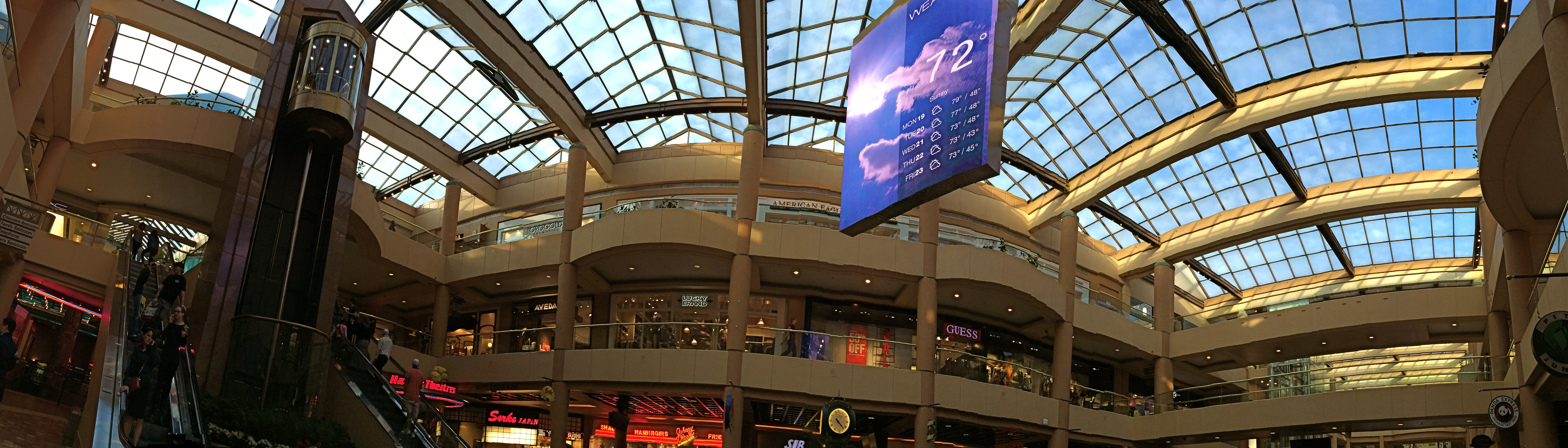
It’s A Mall World, After All: iPhone panoramics make good design tools, but they ain’t about realism.
By MICHAEL PERKINS
PANORAMAS WERE DEVELOPED IN PAINTING, AND LATER IN PHOTOGRAPHY, to alter, not capture, reality. This is one of those man-over-nature struggles that thrilled 19th-century brainiacs. Consider: both mediums are hemmed in by physical limits. The frame can only be so big. The wall can only go so wide. Sadder still, there are limits to the width of human vision, which is why our neck swivels from side to side, giving us the ability to tilt our head attentively when our wives whisper something pertinent to us during the third act of The Barber Of Seville.
So, panos were a fascinating fakery from the start, an attempt to compensate for our limited senses and the cramped confines of the frame, providing no less a warp of reality than a kaleidoscope or 3-d. They were great for showing the broad sweep of the Battle of Gettyburg or the entire breadth of the Coney Island Boardwalk, but the emphasis, historically, was always on closely simulating reality, in that objects were photographed in their natural proportions from left to right and focus was always pinsharp from near objects to the horizon. In other words, “real” phoniness instead of exaggerated phoniness (huh?).
Old school: a panoramic plate camera from the 1800’s.
Now, however, with self-stitching panoramic software in phone cameras, we have a process that actually accentuates unreality, and that can be interesting. Ideally, to take a pano, you must sweep the camera slowly from left to right during the exposure. Now, this would result in a “realistic” perspective, if you could maintain constantly smooth motion and a uniform distance from your subject all the way across, which is impossible unless you’re seated on a dolly and being pushed along a track by four of your friends. So much for reality.
So, what you’re forced to do instead is to twist your body left, remain standing in one place, and be the central pivot point while you pan across yourself until you get all the way to the right. Imagine your body to be a hinge and your arms to be a swinging gate.This creates a crazy amount of spatial distortion not unlike a fisheye effect, and that is my point. Play to that weakness and make it a strength. Leave reality behind and look for patterns, your own abstract designs, in other words, improvements on reality. Panoramas aren’t tools for map-makers. You’re not going to hang your images like tapestries across the east wall of the capitol rotunda. So have some fun doing what reality won’t allow.
EXTENDING THE INVITATION
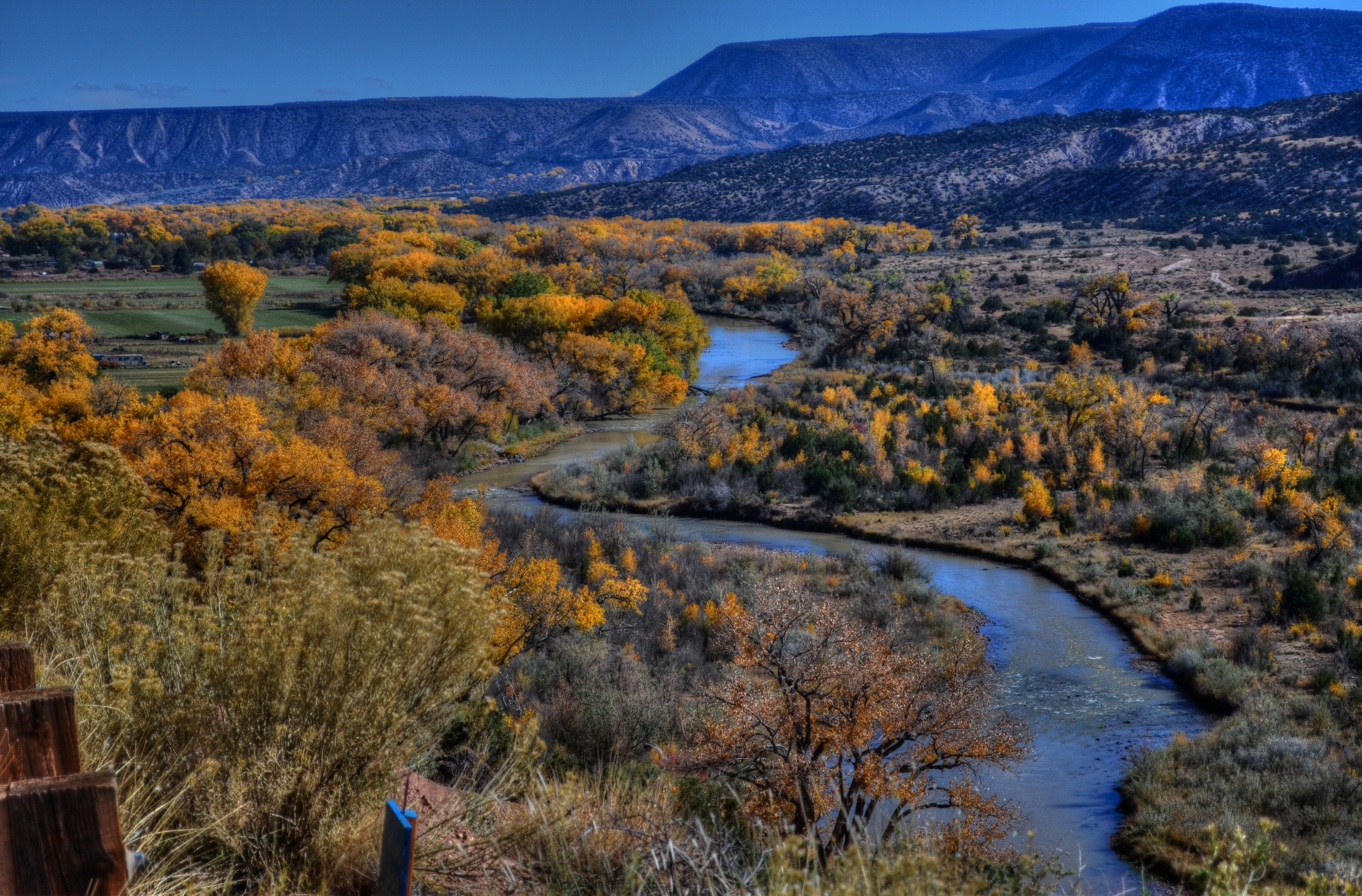
Sinuous, 2013. The river’s journey takes it, and your eyes, back “into” the picture.
By MICHAEL PERKINS
PHOTOGRAPHY AND PAINTING, DESPITE ENGAGING THEIR AUDIENCES IN VERY DIFFERENT WAYS, have retained one common aim over the centuries, at least when it comes to pictorial or scenic subjects. Both the photo and the canvas arrange their visual information on a two-dimensional surface, and both seek to draw the viewer’s eye into a depth that is largely illusionary. The cameraman and the painter both contrive to create the illusion that the distance from front to back in their works is as real as the distance from side to side.
In terms of simulating depth, some photographs benefit from both shadow and light, which alternatively “model” the information in an image, making it seem to “pop” in some faux-dimensional sense. But the best and simplest trick of composition is what we popularly term the “leading line”, information that trails from the front of the picture and pulls the viewer’s attention to an inevitable destination somewhere deeper back in the scene.
Putting a picture together this way ought to be the most automatic of instincts in the composition of a photograph, but it still is formally taught, as if it were less than obvious. In fact, it just means extending an invitation to someone to join you “in” the photograph.

Minutes Away, 2012. The girders give you a stick-straight diagonal from journey to destination.
Trails, paths, railroad tracks, lines of trees or phone poles….these are all examples of information that can start at one side of a photo and track diagonally to the “back” of the image, making the eye experience a kind of gravity, tugging it toward the place you want their gaze to end up. It is also the easiest way to force attention to a central subject of interest, sort of like inserting a big neon arrow into the frame, glowing with the words over here.
Leading lines are a landscape’s best friend, as well, since the best landscapes are arranged so that the focal point of the story is streamlined and obvious. Anyone who has ever shown too much in a landscape will tell you that what fails in the composition is that it allows the viewer to wander around the place wondering what the point of the picture is. The use of a powerful leading line gives the illusion of depth and corrals the eyes of your audience to the exact spot you need them to be for full effect.
Composition is the most democratic of photographic skills. It’s easy, it’s free, and anyone from a point-and-shooter to a Leica addict can use it effectively. Bottom line: there are great things happening in your pictures. Invite the people inside.
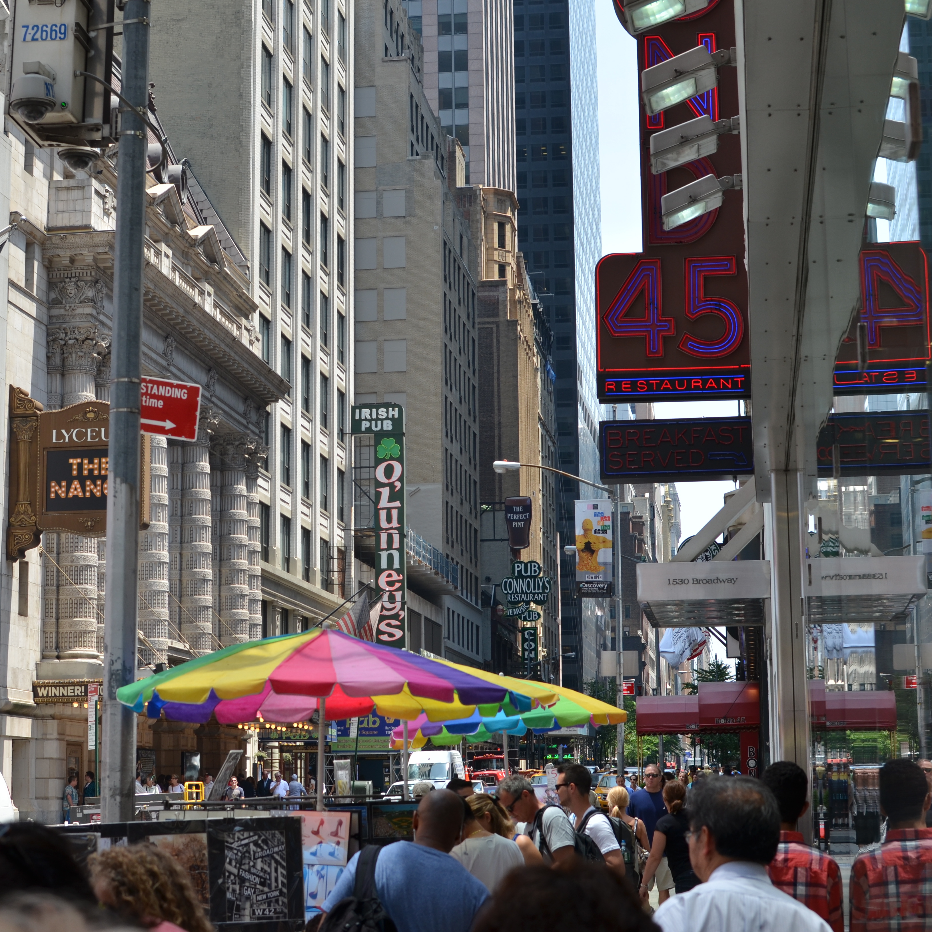
CLEAN-UP ON AISLE FIVE
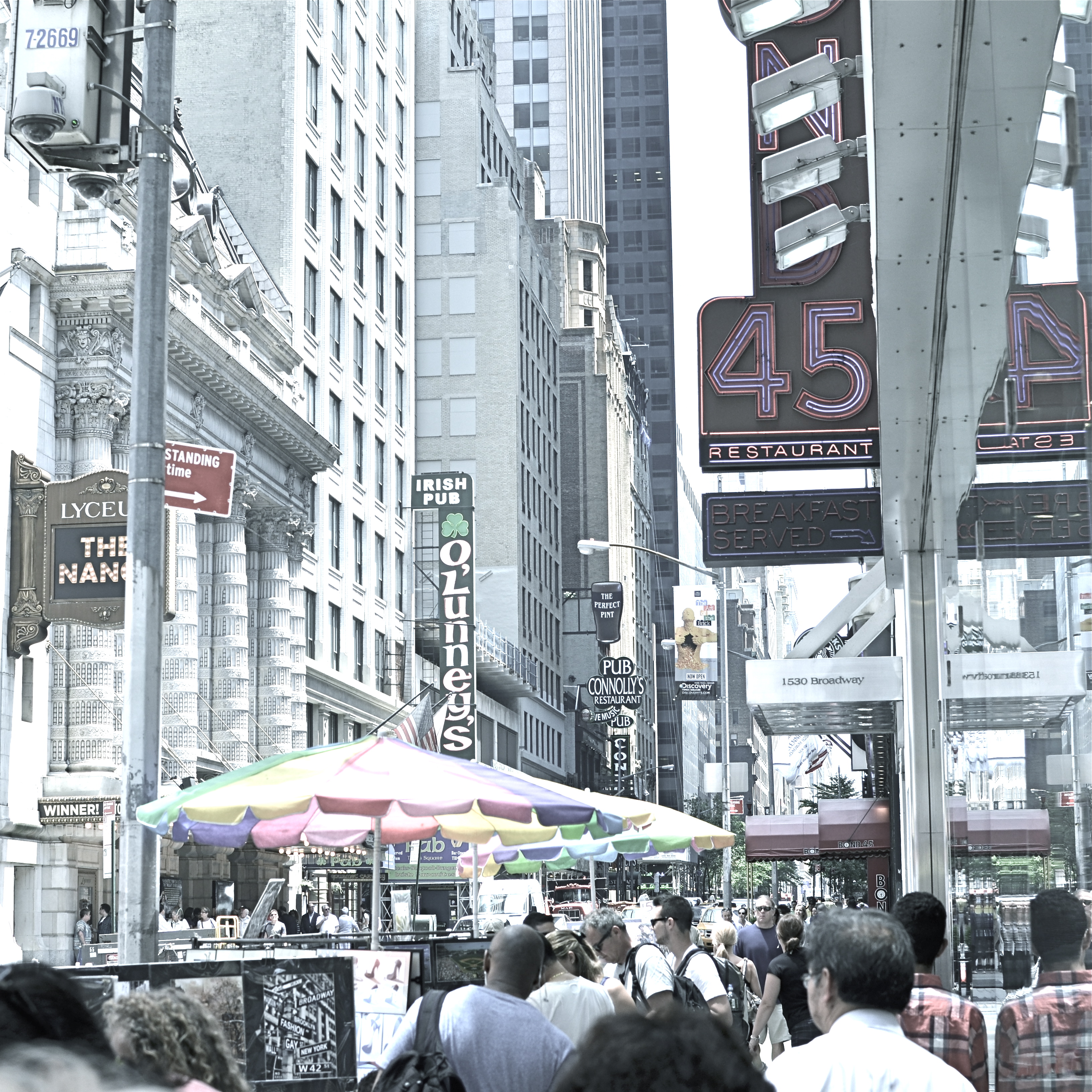
A post-processed “color compromise” of the image below. 1/320 sec., f/5.6, ISO 100, 35mm.
By MICHAEL PERKINS
TAKE ENOUGH PHOTOGRAPHS AND YOU WILL DEVELOP YOUR OWN SENSE OF “SIMPLICITY”. That is, you will arrive at your own judgement about how basic or complex a composition you need in a given situation. Some photographers are remarkable in their ability to create images that contain a mad amount of visual information. Some busy city scenes or intricate landscapes benefit wonderfully from an explosion of detail. Other shooters render their best stories by reducing elements to a bare minimum. And of course, most of us make pictures somewhere in the vast valley between those approaches.
Before the fiddling ensued.
I’m pretty accustomed to thinking of overly-busy pictures as consisting of a specific kind of “clutter”, usually defined as cramming too many objects or people into a composition. But I occasionally find that color can be a cluttering element, and that some very visually dense photos can be rendered less so by simply turning down hues, rather than rooting them out completely. Recently I’ve been taking some of the pictures that seem a little too “overpopulated” with info and taking them through what a two-step process I call a color compromise (patent not applied for).
First step involves desaturating the picture completely, while also turning the contrast way down, amping up the exposure and damn near banishing any shadows. This almost results in a bleached-out pencil drawing effect and emphasizes detail like crazy. Step two involves the slow re-introduction of color until only selected parts of the image render any hues at all, and making sure that the color that is visible barely, barely registers.
The final image can actually be a clearer “read” for your eyes than either the garish colored original or a complete b&w. Objects will stand out from each other a little more distinctly, and there will be an enhanced sensation of depth. It also suggests a time-travel feel, as if age has baked out the color. A little of this washed-out jeans look goes a long way, however, and this whole exercise is just to see if you can make the picture communicate a little better by allowing it to speak more quietly.
Compare the processed photo at the top, taken in the heart of the visually noisy Broadway district, with its fairly busy color original and see if any of this works for you. I completely stipulate that I may just be bending over backwards to try to salvage a negligible photo. But I do think that color should be a part of the discussion when we fault an image for being cluttered.
MIDDLEHUES

Surety And Security, 2014. Image made using Nikon’s in-camera “selective color” effect, programmed to highlight blue and gold hues only. Note the bluish undertones that show up in the “white” building.
By MICHAEL PERKINS
I FIND IT AMUSING THAT THERE IS SO MUCH PRISSY FRETTING, in the present photographic age, about the manipulation of images, as if there is, or has ever been, a “pure” photography that comes full-born from the camera like Athena sprang from Zeus’ forehead. This is, of course, nonsense.
There never was a time when photographers simply pressed the button and settled for whatever dropped into their laps by chance. The history of the medium is a clearly traceable timeline of the very interpretive technique and, yes, manipulation that tracks, like this blog, the journey from taking a picture to making one.
It’s not what you apply to an image, it’s whether the application is the entire point of the picture. Does your conception have solid, original value, over which you then impose a supplementary effect or a boost in emphasis? Or are you merely popping apps and pushing buttons in order to disguise the lack of essence in picture, to whitewash a rotten fence if you will?

The original full-color image.
The reason I raise all this again is that an in-camera effect usually called “selective color”, now available on many DSLRs, has reminded me of the first days of color photography, which of course was no color at all, except that which was applied through tinting and painting after a monochrome image had been made. Depending on the individual artisan, the hues in these pictures tended to be either a soft wash of faint pastel or a raging rouge of rosy reds, but, most frequently, only selected parts of the image were colored at all, perhaps an attempt to dramatize particular elements of the composition. It was anything but natural, but, in advance of the development of actual color film, it produced some interesting results.
Jump to today’s cameras and the selective color option. You shoot your original image, select it, then zoom in on parts of it to both locate and choose up to three colors that will be featured in a copy of the image. All other tones will be desaturated, leaving you with a part monochrome, part color version of your original, which remains unchanged in a separate file. The effect, as in the past, can dramatize and isolate key parts of your picture, even giving a strange dimensional feel to the photo, but it can take some practice to get the result that you want.
For example, selecting the red of a single car on a crowded street will also catch the same red in other cars’ tail lights, the corner traffic signal, and a neon sign in a building at the end of the block, so be sure you can live with all of that. Also, in some seemingly “white” buildings, shadows or reflected light (as well as aging impurities in some materials) will show some faint shades of color in this process, so that the blue that you said okay to for the corner mailbox will also pick up slight bluish casts in the marble of the bank next door. In the above image, I also made a second, darker copy of the altered image, then blended the two copies in a tone compressing program, to further accentuate the building textures and contrasts.
Bottom line: there is black and white, there is full color, and there is the uber-cool playland in what you could call the middlehues. It’s not cheating to enhance a good picture. It’s only cheating when you use effects to mask the fact that you didn’t take the picture right in the first place.
A LITTLE R/R
By MICHAEL PERKINS
I CAME ACROSS SOME MENTAL BAGGAGE THE OTHER DAY DURING A SHOOT BENEATH AN OLD TRESTLE. The following song by the late Harry Nilsson churned back into my forebrain from a land far away. It wasn’t one of his bigger hits, but it has always struck a chord with me, at least the part of me that likes to make pictures:
When we got married back in 1944
We’d board that Silverliner below Baltimore
Trip to Virginia on a sunny honeymoon
Nobody cares about the railroads anymore
We’d tip the porter for a place of our own
Then send a postcard to your mom and dad back home
Woo-ee, woo-oo-oo-ee, woo-ee
Woo-ee, woo-oo-oo-ee, woo-ee
We had a daughter and you oughtta see her now
She has a boyfriend who looks just like my gal Sal
And when they’re married they won’t need us anymore
They’ll board an aeroplane and fly away from Baltimore
Woo-ee, woo-oo-oo-ee, woo-ee
Nobody cares about the railroads anymore
(lyrics copyright Warner-Chappell Music)
The ghosts are out there. So are the pictures.
All aboard.
THE MAIN POINT
By MICHAEL PERKINS
MAKING PICTURES, FOR ME, IS LIKE MAKING TAFFY. The only good results I get are from stretching and twisting between two extremes. Push and pull. Yank and compress. Stray and stay. Say everything or speak one single word.
This is all about composition, the editing function of what to put in or leave out. In my head, it’s a constant and perpetually churning debate over what finally resides within the frame. No, that needs something more. No, that’s way too much. Cut it. Add it. I love it, it’s complete chaos. I love it, it’s stark and lonely.
Can’t settle the matter, and maybe that’s the point. How can your eye always do the same kind of seeing? How can your heart or mind ever be satisfied with one type of poem or story? Just can’t, that’s all.
But I do have a kind of mental default setting I return to, to keep my tiny little squirrel brain from exploding.
Cat’s Eye Vortex, 2014.1/50 sec., f/2.2, ISO 800, 35mm.
When I need to clean out the pipes, I tend to gravitate to the simplest compositions imaginable, a back-to-basics approach that forces me to see things with the fewest possible elements, then to begin layering little extras back in, hoping I’ll know when to stop. In the case of the above image, I was shooting inside a darkened room with only an old 1939 World’s Fair paperweight for a subject, and holding an ordinary cheap flashlight overhead with one hand as I framed and focused, handheld, with the other hand. I didn’t know what I wanted. It was a fishing expedition, plain and simple. What I soon decided, however, was that, instead of one element, I was actually working with two.
Basic flashlights have no diffusers, and so they project harsh concentric circles as a pattern. Shifting the position of the flashlight seemed to make the paperweight appear to be ringed by eddying waves, orbit trails if you will. Suddenly the mission had changed. I now had something I could use as the center of a little solar system, so, now,for a third element, I needed “satellites” for that realm. Back to the junk drawer for a few cat’s eye marbles. What, you don’t have a bag of marbles in the same drawer with your shaving razor and toothpaste? What kinda weirdo are you?
Shifting the position of the marbles to suggest eccentric orbits, and tilting the light to create the most dramatic shadow ellipses possible gave me what I was looking for….a strange, dreamlike little tabletop galaxy. Snap and done.
Sometimes going back to a place where there are no destinations and no rules help me refocus my eye. Or provides me with the delusion that I’m in charge of some kind of process.
THE RIGHT WAGON
Cheap fisheye adaptors are a mixed bag optically, but they can convey a mood. 1/40 sec., f/11, ISO 100, 18mm.
By MICHAEL PERKINS
I ONCE HEARD AN OLD PHOTOGRAPHER SPEAK OF CREATIVE CHOICES AS “picking the right wagon to haul your goods to market”. By that, he meant that format, film, frame size, lens type or aperture were all just means to an end. If one wouldn’t take your wagon all the way to a finished picture, use another. He had no special sentiment or ironclad loyalty to any one tool, since there was, and is, only one real goal in any of photography: get the image you came to get.
It’s often hard to remember that simple rule, since we tend to associate the success of certain pictures with our pet camera, our sweet spot aperture, our favorite hunk of glass. But there’s also a knack to knowing when a particular tool that is wrong, wrong, wrong for almost anything might, for the project at hand, be just perfect.
I have one such tool, and, on rare occasions, the very properties that make me generally curse it as a cheap chunk of junk can make me praise it as just what the doctor ordered. It’s an Opteka 0.35, a screw-on lens adapter that simulates (to put it kindly) at least the dimensions of a true fisheye, without the enormous layout of dough, or, sadly, the optical precision of a true dedicated lens. It’s fuzzy at the edges, regardless of your aperture. It sprays chromatic shmears all over those edges, and so you can’t even dream of sharpness beyond the third of the image that’s in the dead center of the lens. It was, let’s be honest, a cheap toy bought by a cheap photographer (me) as a shortcut. For 99% of any ulta-wide imaging, it’s akin to taking a picture through a jellyfish bladder.
But.
Mood over reality. 1/125 sec., f/11, ISO 100, 18mm.
Since the very essence of fisheye photography is as a distortion of reality, the Opteka can be a helping hand toward a fantasy look. Overall sharpness in a fisheye shot can certainly be a desired effect, but, given your subject matter, it need not be a deal breaker.
In the case of some recent monochrome studies of trees I’ve been undertaking, for example, the slightly supernatural effect I’m after isn’t dependent on a “real” look, and running the Opteka in black and white with a little detail boost on the back end gives me the unreal appearance that is right for what I want to convey about the elusive, even magical elements of trees. The attachment is all kinds of wrong for most other kinds of images, but, again, the idea is to get the feel you’re looking for…in that composition, on that day, under those circumstances.
I’ve love to get to the day when one lens will do everything in all instances, but I won’t live that long, and, chances are, neither will you. Meanwhile, I gotta get my goods to market, and for the slightly daft look of magickal trees, the Opteka is my Leica.
For now.
THE (LATENT) BLUES
A dawn exposure takes on the look of early evening.
By MICHAEL PERKINS
WE HAVE CONTROL OVER NEARLY EVERY PART OF THE PHOTOGRAPHIC PROCESS BUT… ACCESS. We can learn to master aperture, exposure, composition, and many other basics of picture making, but we can’t help the fact that we are typically at our shooting location for one time of day only.
Whatever “right now” may be….morning, afternoon, evening….it usually includes one distinct period in the day: the pier at sunset, the garden at break of dawn. Unless we have arranged to spend an extended stretch of time on a shoot, say, chasing the sun and shadows across a daylong period from one location at the Grand Canyon or some such, we don’t tend to spend all day in one place. That means we get but one aspect of a place…however it’s lit, whoever is standing about, whatever temporal events are native to that time of day.
The original morning exposure.
Many locations that are easily shot by day are either unavailable or technically more complex after sundown. That’s why the so-called “day for night” effect appeals to me. As I had written sometime back, the name comes from the practice Hollywood has used for over a hundred years to save time and ensure even exposure by shooting in daylight and either processing or compensating in the camera to make the scene approximate early night.
In the case of the image you see up top, I have created an illusion of night through the re-contrasting and color re-assignment of a shot that I originally made as a simple daylight exposure. In such cases, the mood of the image is completely changed, since the light cues which tell us whether something is bright or mysterious are deliberately subverted. Light is the single largest determinant of mood, and, when you twist it around, it reconfigures the way you read an image. I call these faux-night remakes “latent blues”, as they generally look the way the sky photographs just after sunset.
This effect is certainly not designed to help me avoid doing true night-time exposures, but it can amplify the effect of images that were essentially solid but in need of a little atmospheric boost. Just because you can’t hang around ’til midnight, you shouldn’t have to do without a little midnight mood.
DON’T SETTLE FOR REALITY
By MICHAEL PERKINS
IN PHOTOGRAPHY, WE FIRST LEARN HOW TO CONTROL LIGHT WHEN THERE IS A PRETTY GOOD SUPPLY OF IT. Our baby-step pictures are usually taken in the middle of the day, where it’s easier to over-expose than under-expose the shot. The sun is out and it’s a constant resource. We may step in and out of a shadow or need to fill a few gaps with flash, but mostly the issue of light is about managing something you have a big bunch of.
Once we venture into night shots, light becomes a precious commodity, like water in the desert. The equation is flipped. Now we’re struggling to get enough illumination to shape a shot, or sometimes just save it. We can shoot in the reduced light that’s on hand, but it takes a little more orchestration. Move into time exposures and the terms of engagement change again, with the ability to play God with the physics of things.
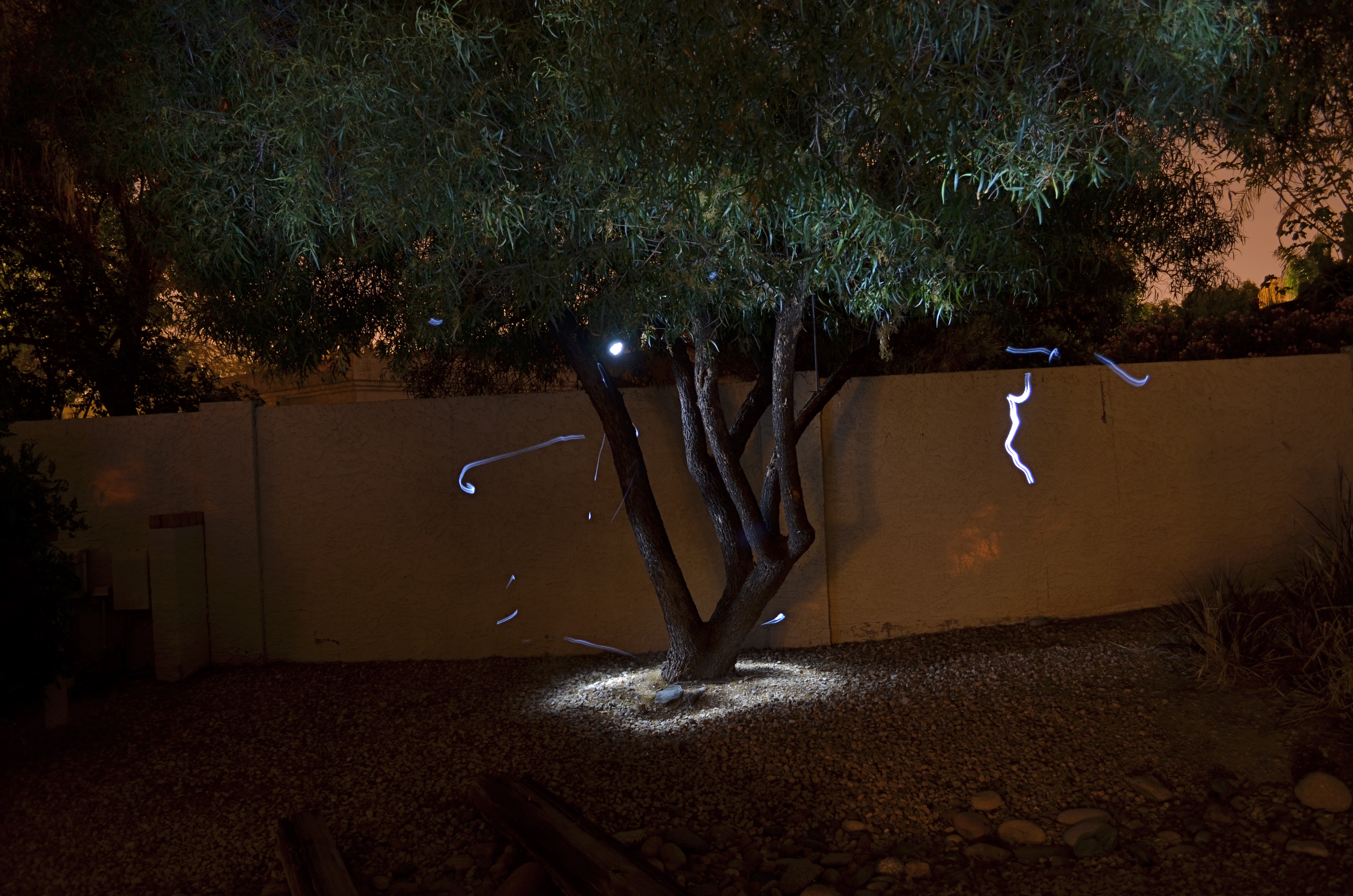
Shot in complete darkness and selectively light-painted with a handheld LED. Exposed for 73 seconds at f/4.5, ISO 100, 18mm. The light streaks are “wrong turns” with my flashlight. Oops.
And then there’s light painting, selective hand illumination during long exposures, where the aim is suddenly beyond the merely real. In fact, light painting is about deliberately manipulating mood and atmosphere, of bringing a magical quality where none exists. It also is the kind of low-light photography with the least predictable results, and the highest possible failure rate. You are constantly in uncharted waters, since no two exposures come out even remotely alike. You’re flying blind with your eyes open.
I have recently begun to head outdoors to re-imagine trees in these artificial, fantasy-flavored “light compositions”, in an effort to lend heft to subjects that, in daylight, would register pretty low on the wow meter. Over the years, I have honed my technique with tabletop light painting in controlled interiors, but if I get one exterior shot in thirty that I can live with, that’s an amazing day, er, night.
I don’t have any wisdom to impart on these shots, since their value is so crazy subjective. You do it until you like it, that’s all. But do yourself a favor sometime and do wade in. You might catch the fever, or you may experience the urge to hurl your tripod over the neighbor’s wall like a javelin of rage.When you don’t have enough light, you’re kind of in free fall.
But even if you don’t stick the landing, it ain’t fatal.
ART VS. ARTIFACT
By MICHAEL PERKINS
PHOTOGRAPHY HAS NOW ARRIVED AT A TRULY STRANGE PLACE. It’s no big bulletin that modern processing and phone apps now allow us to simulate the various visual defects and flaws we used to summarily reject from our images, deliberately including them in our pictures as design elements. Things to be desired.
Features to make the picture better.
????? Let’s take this out of the realm of photography for a moment to see how truly insane it is.
One of the more ridiculous gimmicks of the digital age in audio (which is, let’s face it, free of the scratch and hiss of analog recordings) was to put both these sources of annoyance and noise back into CDs. Hip-hop has been particularly egregious in the inclusion of crackle and scratches into tracks, as if these effects conferred some kind of authenticity on the results. It’s like a guy who gets a chin scar in a woodshop accident, then tells women at bars that he got it in a knife fight. Fake life, fake cred.
Back to photos, where downloadable apps let you slather on filters that simulate photos which appear damaged, ravaged by time, poorly exposed, marred by light leaks, or ruined as the result of faulty film processing. Now, think about this: we have become the first generation of photographers who think it is creative/profound/cute to make our pictures look bad on purpose, to make images that our predecessors would have (rightly) rejected as marred, imperfect, wrong.
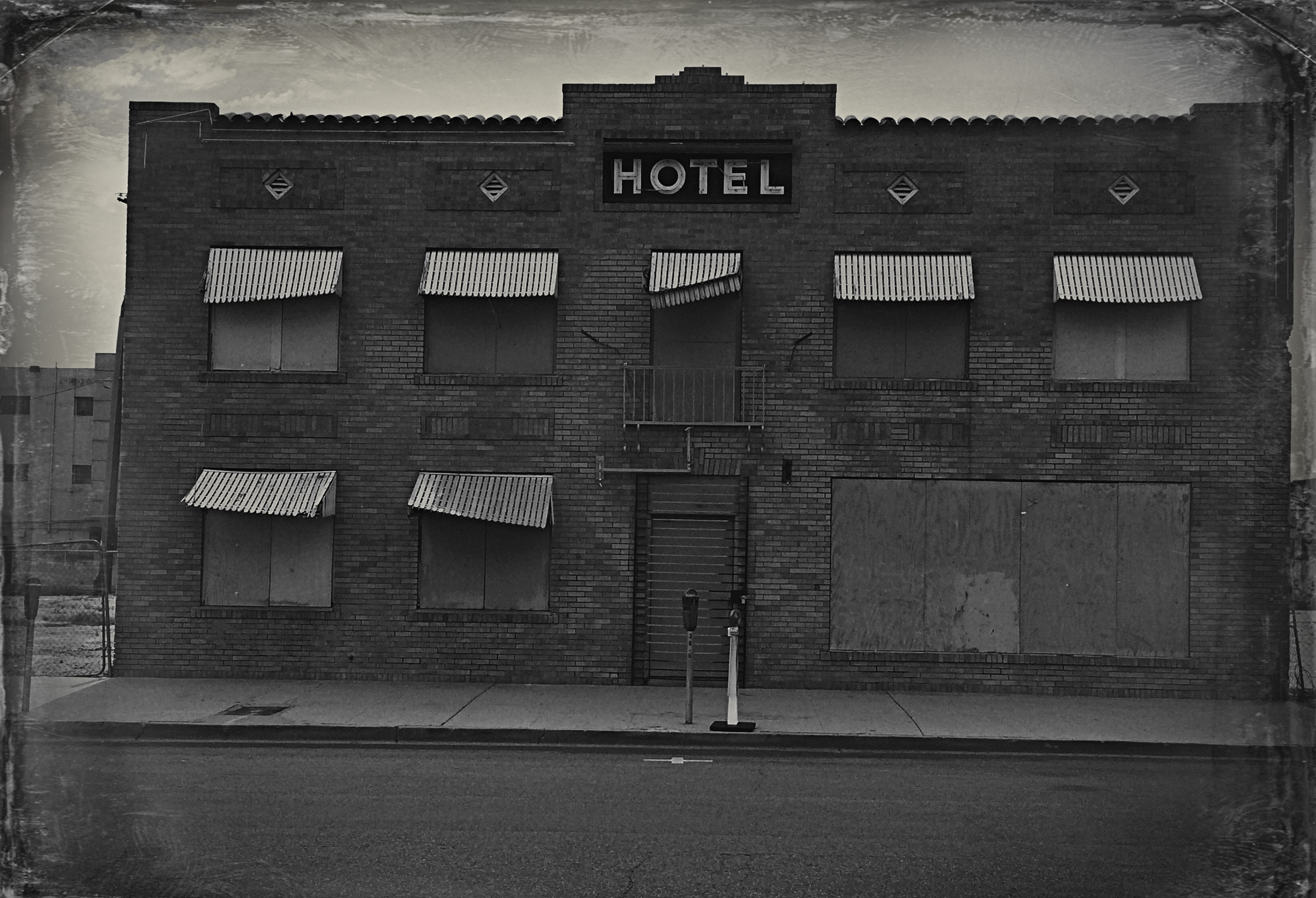
Is this photo anything, or did I just keep dress it up in a funny party hat?
I took this image on a cel phone, then processed it through the app Alt Photo to simulate a daguerreotype. I did it mostly as an experiment, but then, in a moment of weakness, I posted it on image sharing sites where, so far, it has garnered over 5,000+ hits. Here is the problem: I can no longer determine whether my essential image has any merit, or whether its popularity is solely due to the effect. That bothers me. I feel that any attention or approval this photo has achieved has happened, well, dishonestly. I get the fun aspect: I enjoyed it, as a novelty, a lark, but the thought of anyone taking it seriously disturbs me. And I am angry at myself for giving into the temptation to put it out there.
Gimmicks aside, photography means something. Making a picture means something. And technical crutches that draw attention from that process are just cheap card tricks. Distractions. What an interesting problem: as a consequence of our technical cleverness, we are now locked in an eternal struggle between art and artifact.
