WITH THE GREATEST OF EASE
You, too, can convert your cell phone to a, well, I don’t really know what this is…
By MICHAEL PERKINS
THERE IS A NATURAL INCLINATION IN THE MINDS OF MANY PHOTOGRAPHERS to fall in love with systems…widgets, intricate calculations, work-arounds, gimmicks, diagrams, gadgets, toys. We like to tinker, to play Workshop Edison. Let’s see what happens if I do this, connect these, try it without that. We love convenience and simplicity, but a Dark Gearhead lurks within us all as well, trying to reduce photography to a series of technical solutions, intricate puzzles. And so we see-saw. We selectively want our cameras to seamlessly carry out our wishes without a lot of bother and to make things as complicated, as hands-on, as feasible. It’s a strange balancing act.
Almost immediately after the mad global crush we all experienced at the virtually effortless ease of cell phone cameras, there was a countervailing energy to add on to the things, to make them do more, be better. First was the tidal wave of apps for the post-processing of all those quick snaps. Then followed the tsunami of toys and add-ons that were designed to compensate for the device’s technical limits. This ever-expanding array of screw-ons, extenders, mini-tripods and effects lenses make the simple iBricks in our pockets look like pocket weapons given to Bond by a nervous Q. Do try to bring the ordinance back in one piece this time, 007.
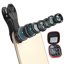
The rig seen at left is by no means the most complex set-up I’ve found in recent years for enhancing cell camera proficiency. In fact, on the fussiness scale, I’d say it scores roughly in the middle, although I think it’s off the charts for excessive intricacy (too many parts), annoyance in operation (wait a second till I get this out of its cool carrying case and assemble it!) and plain damned silliness (no example required). I’d also stipulate that I haven’t seen a lot of such contrivance actually being used in the field, that is, nowhere near the “market penetration” of the dreaded (and soon, Dear God, to be become obsolete) selfie-stick. Still, this kind of iPhone-based arms race for additional macros, fisheyes, and other optional optics begs a few questions. For starters, is the convenience/portability feature that made millions love and use these cameras now on the wane(doubtful)? And as a follow-up, if you require this level of accuity in your picture-taking experience, why not simply buy a conventional (notice I did not say “real”) camera and be done with it?
The twin impulses of make-it-easy and make-it-complicated will continue their ages-long tug-of-war for the photographer’s soul, and perhaps that’s part of the fun. Both paths can lead to both excellent and execrable images, so, as we frequently conclude, the results, and not the toys, are what truly matter.
ONE BRICK AT A TIME
The devil…. or the delight…is in the details in urban architecture.
By MICHAEL PERKINS
MANY URBAN BUILDINGS FROM THE EARLY 20th CENTURY CAN BE OPEN SECRETS, objects that we walk or drive past with such frequency (and speed) that their most telling elements are often underseen. Certainly, we visually record their larger contours…the block or the spear or the obelisk or the faux cathedral or the Romanesque monument, those general features that figure prominently in long-distance skylines and postcard views. But what remains virtually invisible are what musicians might call the grace notes, the smaller accents and textures that, upon closer inspection, reveal as much, or even more, about the intentions of their makers. And seeking close encounters with these elements can yield great subjects for photography.
More so than with the taciturn minimalism of the post-WWII years, buildings from the 20’s, 30’s, and 40’s were often personal headstones for men who piled up great fortunes, captains of industry who wanted to invest every inch of their towers and spires with references to their beliefs as well as their bank accounts. Lintels, door frames, spandrels, arches, vestibules and cornerstones all bore testimony to company mottoes, symbols of both the modern and ancient worlds, and the idealization of public service. Some lobby mailboxes were invested with more design than a forest-ful of the icy glass boxes of the International period that followed. Often, the founders of a building had a small army of independent artists, from muralists to sculptors, working various sections of the the interiors and exteriors, each with their own unique contribution. Thus, a quick drive-by of a tower in one’s city “that’s been there forever” may not reveal the myriad messages imbedded in areas no bigger than a few square inches, while a dedicated trip for slow-walking and scout work may reward the photographer with a generous dose of time travel. Wonderfully, this can happen in layers, with repeated trips to a building that you thought you’d already “done” yielding additional treasures.
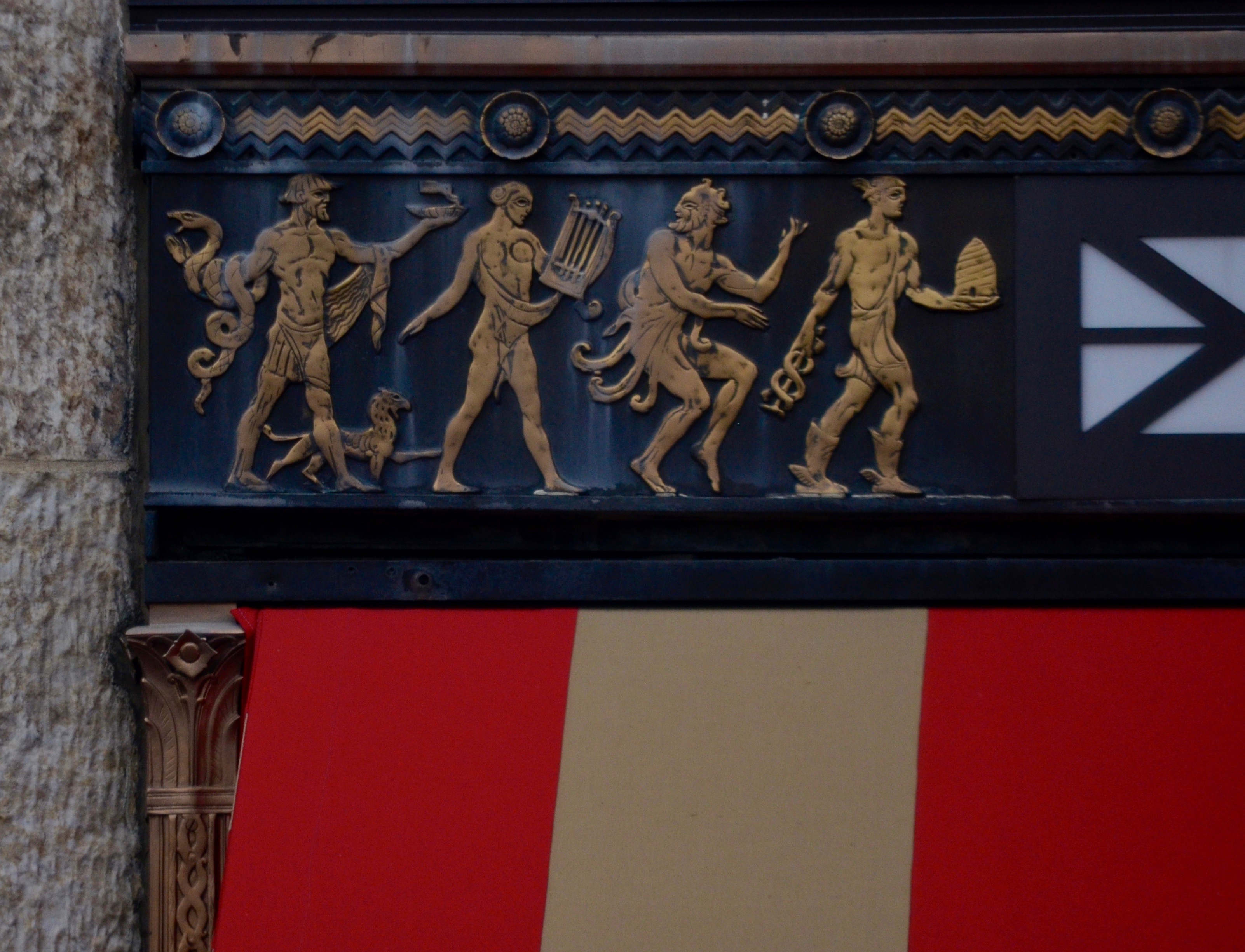
The relief you see in the image at top is repeated over every minor first-floor frame and street entrance of Columbus’ Ohio’s Leveque Tower, which, upon its completion in 1927, briefly enjoyed the distinction of being the fifth tallest building in the world. The property has been generally “preserved” in the current era, but that doesn’t mean it’s come into its second century unscathed, many important exterior and interior features having been removed or lost by owners with a somewhat less than curatorial bent. Ironically, it is the smaller touches on the tower which have remained most intact over the years, including this window frame and its depiction of various virtues of the ideal citizen, including, left to right, healing, the arts, storytelling, and industry. My point is that 99% of every photograph taken of this icon of midwestern design are shot from hundreds, even thousands of feet away, while a stroll past the entrance conjures something far deeper for even the most casual shooter.
Photographing great places is an enormous delight, but also a tremendous responsibility, since our recent history have shown us that nothing made by man will stand forever. That puts us back in the role of chroniclers and archivists, and if we make our pictures carefully, at least the essence of the stories we once told a brick at a time may outlast the dust.
LET’S SEE WHAT SHE’LL DO…
The Kodak Bantam Special.
By MICHAEL PERKINS
COMBINE THE ANTICIPATION OF CHRISTMAS with a severe lesson in humility and you’ve described the process involved in exposing a roll of film in an old camera that may or may not operate properly. The “Christmas” part, that deliciously torturous anticipation that came, in analog days, from sending one’s film away to a lab, for up to a week before reviewing your results, is something that everyone of a certain, ahem, age can relate to. The humility (humiliation?) part comes when the package of finished prints arrives in the mail and your dreams crash up against the Great Wall Of Reality…delineating that ugly gap between what you saw and what you managed to capture.
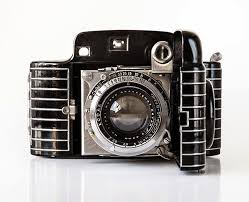
I always collect older cameras that are at least technically “operational”. They click and clack the way they’re supposed to. Frequently, they spend their time as lovely museum pieces, but, on occasion, I will invest a little money to see if they are truly functional and if I can make them make pictures of any degree of quality. It’s a fairly costly operation, since older film sizes can be expensive (if they can be found at all) , and the list of qualified practitioners of the filmic lab arts is shorter with every passing year. As to how I evaluate the results, that can depend on the camera. If it’s an old Brownie and the images aren’t too good, I can’t really fault myself, since there wasn’t a lot of control I could bring to the process of a one-button box. In the most recent case, however, I was testing a Kodak Bantam Special, a fairly deluxe device that cost nearly $90 dollars in 1936 and featured a rangefinder, widely variable shutter speeds and a fairly fast f/2 lens. So in shoving a roll of extremely scarce 828 film (a bygone size with a negative slightly larger than 35mm) through the works, there were two things to determine: whether I could master the camera with a test base of only eight exposures and whether the camera was still able to perform.
A frame from a Bantam test roll, adjusted, let us say, liberally.
One of the dozens of designs created by Walter Dorwin Teague during his time with Eastman Kodak, the Bantam Special has been called by many the most beautiful camera ever made. Now, while that may be aesthetically true, it’s an ergonomic nightmare, with controls jammed very, very close together, making it easy for ham-fisted users like me to fumble, lose their grip, even adjust one control when they think they’re working on another. In the case of this particular Bantam, most of the test roll revealed that the collapsible bellows on the camera leaks light like a sieve, producing wispy streaks across most of the frames. In other good news, the color rendition was very low contrast, with most hues having a decidedly bluish cast. Underexposure was also extremely easy, even with 400 speed film and wider apertures. And while that’s probably a mixture of old mechanics and my own poor calculation, the only way I could make the frame at left (one of the “keepers”) passable was to artificially tweak the contrast and convert it to monochrome after the fact. And that, again, is the “humility” part of our program, innit?
Moral of the story: If you ever find yourself getting cocky with the utterly cheap comfort of the digital age, take a time trip to the era when even the best laid-plans of mice and men often resulted in “what the hell?” pictures. Maybe the most enjoyable thing about shooting film, at this stage of the game, is knowing you can stop shooting film any time you want to.
WHO’S ZOOMIN’ WHO
By MICHAEL PERKINS
THE LONGER YOU’RE INVOLVED IN PHOTOGRAPHY, the greater chance there is that, at some point, you’ll at least wonder if a telephoto lens should be in your arsenal of gear. As with any other lens, I believe that, over time, the need for a zoom will become fairly obvious….either obviously needed or obviously superfluous. That is, your shooting will drive your technical needs and dictate what you deem as essential equipment.
That means not buying any lens, especially a zoom, before you find yourself in repeated situations where it might have made the difference in your work. The reason I deliberately state what should be a “duh”-type truth is that there are still some photographers who gear up with everything under the sun before they demonstrate their strengths or desires by the kind of images they pursue. This means that you don’t buy lenses and then try to find a use for them. Working that way all but guarantees that the things you never evolved a genuine need for wind up consigned to the top of the hall closet or on a yard sale table.
So let’s go back to the example of telephotos. It’s completely possible that your particular work will never indicate that you need one. I can cite many amazing photographers that seldom, if ever, use them. I myself have only one modest 55-300mm zoom, which I can safely is in use once, maybe twice a year. And that’s a net increase in its use, due to the fact that I now spend increasingly more time accompanying my wife on her birdwatching expeditions. Even at that, I seldom use the things for actually photographing birds. My eye is far too untrained to locate them in most cases, and I am just as content to use the 300mm for landscapes, macros and other wildlife. Were I bitten as hard by birding bug (bug?) as Marian, I may already have ponied up the dough for a more powerful version of what I use. But bitten I am not, and so I am stuck with my original biases against zooms…..that is, that they are generally too slow, too dark, too poor at color rendition, and supremely aggravating to focus on the fly. Am I grossly over-generalizing? Of course. But you judge these things on your own results (indifferent) and your own limits (considerable).

The Lord Of Little Things, 2019. 1/250 sec., f/10, ISO 500, 300mm.
In the view you see here, I am almost at the extreme limit of my 300’s usefulness, with my bullfrog quarry about thirty yards away, making him a medium-large speck in the viewfinder even when I’m fully zoomed out. This means that locking auto-focus on him will be strictly hit-or-miss, necessitating a shoot-check-shoot-check cycle in an effort to catch the toad before he can get bored and blow the scene. And that’s assuming that I can get auto-focus to lock at all. In many cases, going manual will keep me from issuing a verbal blast of mostly blasphemous bile in getting the shot, but even that is no guarantee when working hand-held. Are we having fun yet? My point is that, at least for me (notice the italics), zooms trade access for precision and speed. Sometimes, as in the marginally lucky result you see here, the trade-off is worthwhile. Other times….
So, to my earlier point. I could trade up to a more powerful zoom, if I were to demonstrate a need for one by the typical work I produce….. and if I decide to give up food and shelter to finance the thing. Again, the idea is….let what and how you shoot dictate what you’ll buy to shoot with. From where I stand, one frog a year still doesn’t scream ‘buy more glass”. As always, what makes some of us grin makes others of us grimace. And vice versa.
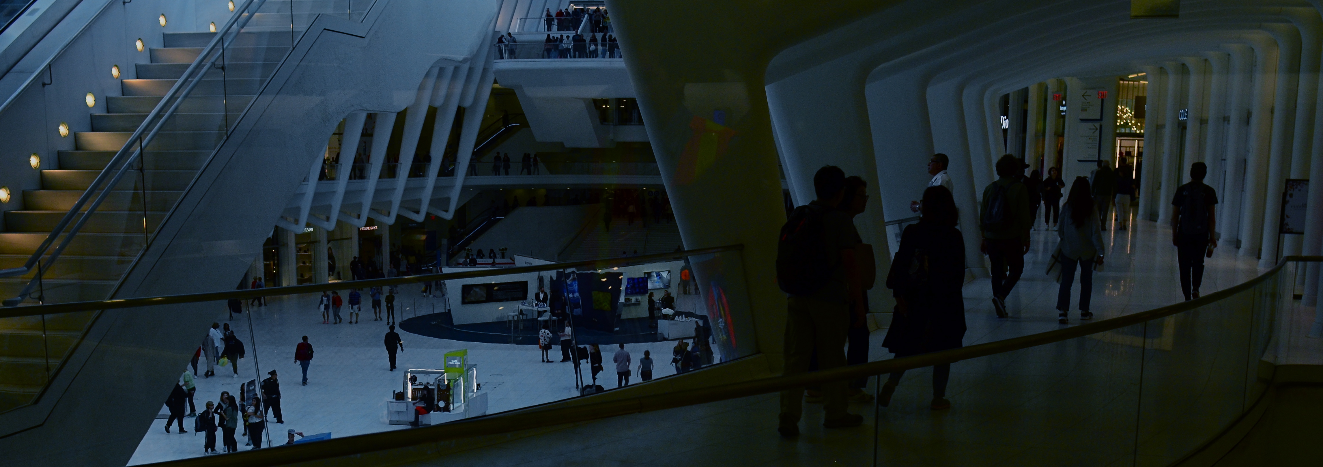
THE LOVELY BONES
Oversized marble columns support the high lobby ceiling at 195 Broadway, former New York home of AT&T.
By MICHAEL PERKINS
195 BROADWAY IN LOWER MANHATTAN is one of hundreds of buildings that might escape your notice upon your first walk through the city’s financial district. Less garish than its gothic neighbor, the Woolworth Building and a lot shorter than its big-shouldered brethren, the 29-floor landmark doesn’t shout for attention. Its true beauty emerges when you walk inside the somewhat restricted lobby, take the measure of the “bones” of its regal inner structure, and breathe in its storied history. Completed in 1916 after AT&T moved its American headquarters from Boston to New York, 195 was the strong, silent type of skyscraper….functional, neo-classic, but restrained, understated. As a largely urban photographer, I try to keep track of structures that have outlasted several uses and landlords, carrying their essence forward through decades of shifting styles and fashions. It’s the totality of what has made them last that makes them interesting to me, more than any single fillip or ornament.
But ornament, as a visual metaphor for the new (20th) century of American technological dominance, was built into 195 Broadway from the start, both inside and out. Paul Manship, the sculptor whose public works, like the golden Prometheus statue at Rockefeller Plaza, still dot the Manhattan map, created one of his first major works, The Four Elements, as bronze relief’s on 195’s lower facades, his love of Greek and Roman mythology weaving itself into the Moderne movement (later re-dubbed as Art Deco). Architect William Bosworth took the Doric columns which usually adorned the outside approaches of other buildings and brought them into 195’s lobby, all 43 of them, their wondrous marble reflecting a variety of colors from the teeming parade of streetside traffic. And sculptor Chester Beach used the same lobby to commemorate the building’s role as one half of the first transcontinental phone line in 1915 with Service To The Nation In Peace And War, a bronze relief of a headphone-wearing hero standing under a marble globe of the Earth, bookended by classic figures and flanked by lightning bolts.
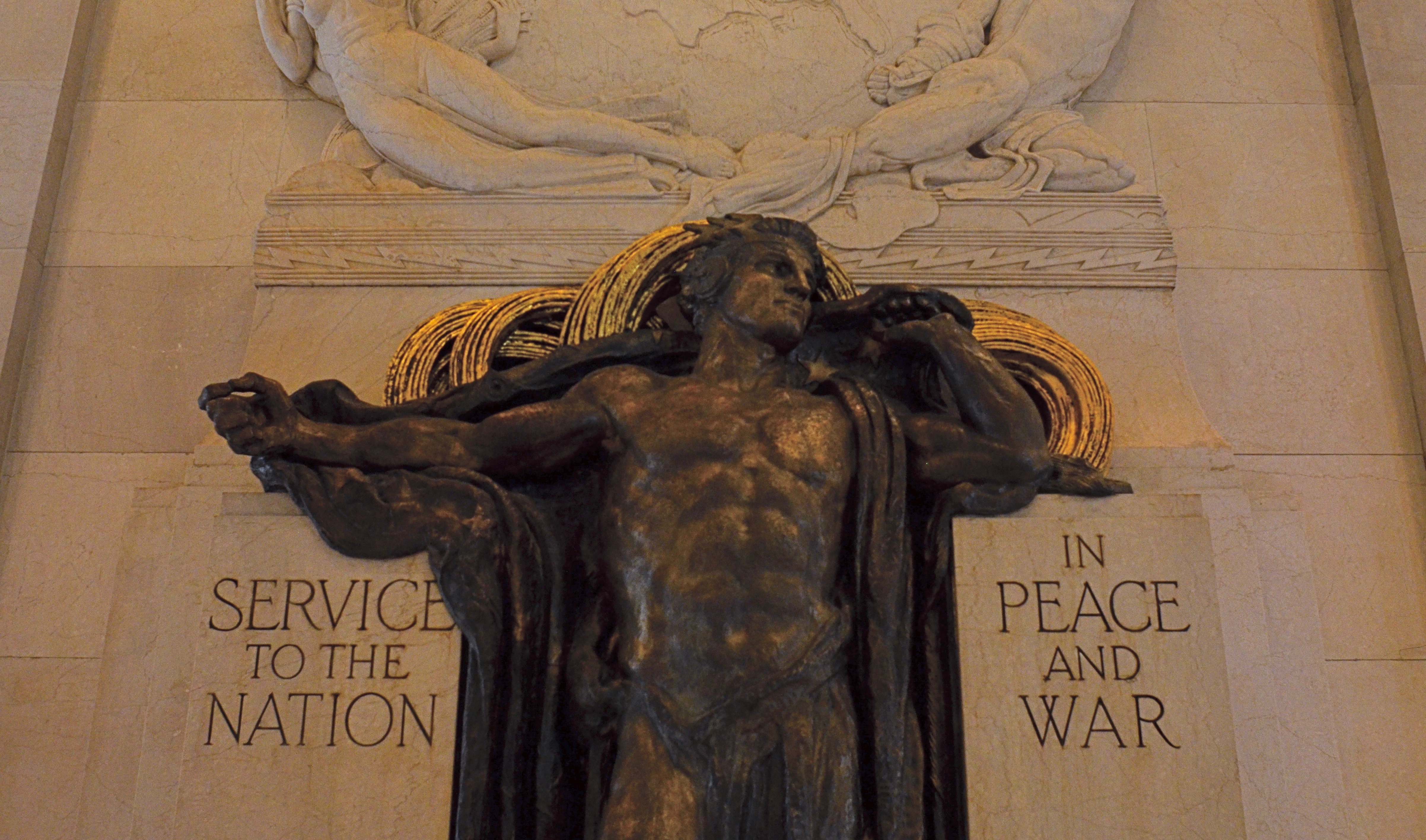
195’s lobby marks the origination point of the first transcontinental telephone line.
195’s long run includes the titles like the Telephone Building, the Telegraph Building, the Western Union Building, as well as appearances in popular culture, like its portrayal of Charlie Sheen’s office building in Wall Street. Sadly, a few of its most salient features have moved on, like the gilded 24-foot tall winged male figure originally known as Genius Of Telegraphy, which topped the pyramidal roof of the tower on the west side of the building until 1980, when it followed AT&T’s relocation to Dallas, Texas. However, the remaining treasures of 195 Broadway are still a delight for both human and camera eyes. Good buildings often present their quietest faces to the street. But look beyond the skin of the survivors, and marvel at the solid bones beneath.
I’M NOT WHAT I USED TO BE (AND I FEEL FINE)
 By MICHAEL PERKINS
I OFTEN FEEL THAT HABIT IS THE GREATEST POTENTIAL THREAT to the creative process. Once an artist approaches a new project through the comfort of his accumulated routines, he’s well on the road to mediocrity. If you find yourself saying things like “I always do” or “I typically use”…. you’re saying, in effect, that you’ve learned everything you need to learn in terms of your art. You already have all the ingredients for success. The ideal exposure. The perfect lens. The optimum technique. The Lost Ark…
Dangerous business.
And, if a kind of self-satisfied inertia is death-on-toast for artistic growth, then the most valuable tool in a photographer’s goodie bag is the ability to archive and curate his own work…..to keep a solid, traceable time line that clearly shows the evolution of his approach…..including the degree to which that approach has either moved along or stood still. That means not only hanging on to many of your worst pictures but also re-evaluating your best ones…..since your first judgement calls on both kinds of images will often be subject to change. Certainly there are photographs that are so clearly wonderful or wretched that your opinion of them won’t change over time. But they constitute the minority of your work. Everything in that vast middle ground between agony and ecstasy is a rich source of self-re-evaluation.
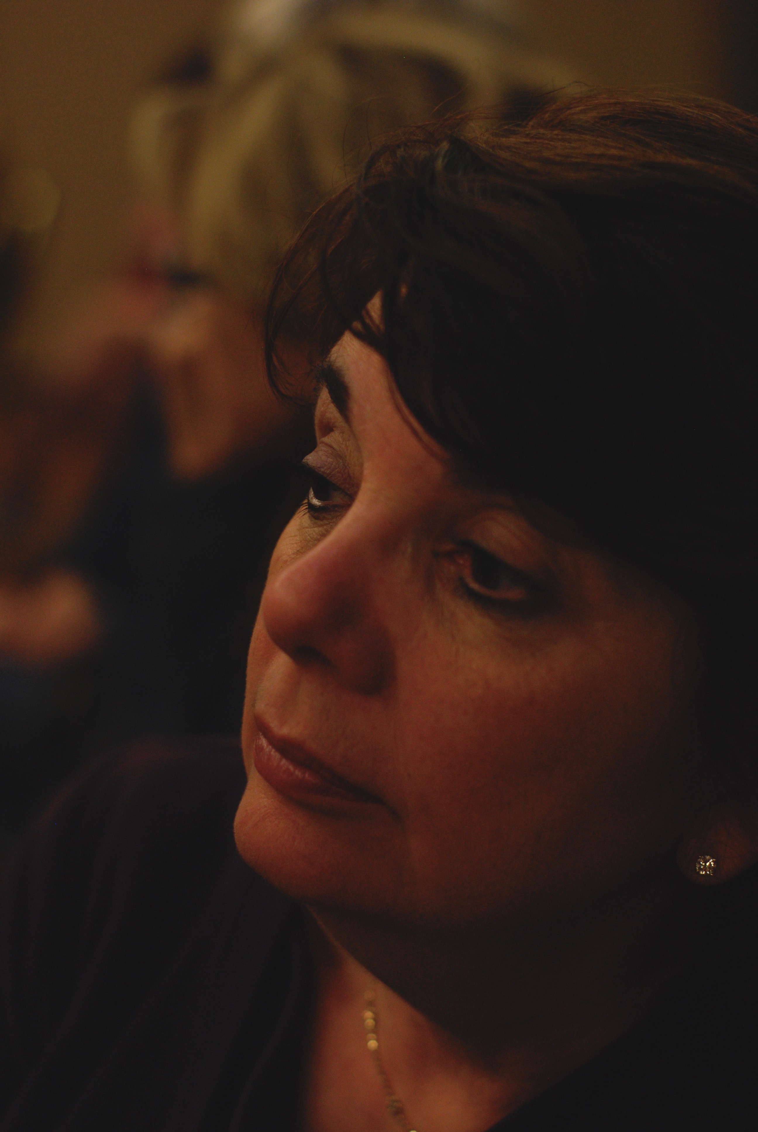
Revisiting old shoots doesn’t always yield hidden treasures. Sometimes the shot you thought was best from a certain day was best. But there may be only a hair’s-breadth of difference between the winners and the also-rans, and, at least in my own experience, the also-rans are where all the education is. For example, in the image seen here of my wife taken almost ten years ago and re-examined recently, I know two new things: first, I now know precisely why, at the time, I thought it was the worst of a ten-frame burst. Second, at this stage, I realize that it’s actually a lot closer to what I currently find essential about Marian’s face than the shot I formerly regarded as the “keeper”. I’m just that different in under a decade.
As you grow as a photographer, you will revise nearly every “must” or “never” in your belief system, from composition to focus and beyond. As life molds you, it will likewise mold the ways you see and comment on that life. An archive of your work, warts and all, is the most valuable resource you can consult to trace that journey, and it will nourish and inform every picture you make from here on.
FEARFUL URGENCIES
By MICHAEL PERKINS
PHOTOGRAPHS STOP BEING “REALITY” mere seconds after their creation, in that the truths they record have, in every sense, moved on, on their way to becoming a million other versions of themselves. We treasure our fragile little time thefts, those frozen testimonies to what some thing in the world looked like at some time. In this way, every photograph is a souvenir, an after-image of something lost.

Bee The Flower, 2019
It’s small wonder that photographers often experience a sense of fearful urgency, a hurry-up-and-preserve-it fever bent on chronicling a world that is borning and dying at the same time. It’s hard sometimes not to think of everything as precious or picture-worthy. The beginnings of things are essential, because they cannot last. Vanishings are important because they are so final. Even an image of a person who is still living bears a poignancy…..because it was taken Before The War, When Mamma Was Alive, When We Still Lived Across Town.
And when it comes to the natural world, photographers and non-photographers alike are ever more aware that they may be capturing, for whatever reason, the lasts of things. Species. Coastlines. Remnants of a world whose regular timeline of goodbyes has been accelerated. Photographers always have a mission to immortalize the comings and goings most central to their own lives, and that’s understandably their primary emphasis. But the natural world will also press us to be reporters in a more general sense. As one reality passes away and others begin, our sense of what is real may come down to the images we make as life careens ever on.
TO BE CONTINUED
By MICHAEL PERKINS
AFTER YEARS OF STALLING AND DREAD, I just this week consigned my old desktop to the dustbin, and, at this writing, am taking a few days to reflect before its bright, shiny successor takes its place in my cluttered workspace. Normally, I wouldn’t even register the time blip between one computer and another, because, really, they’re just things, right?
But this seems different, only because this particular gizmo became the extension of almost everything I endeavored to do as a photographer over the last ten years. When I first inboxed the old girl, I was still teetering between film-dominant and digital-dominant work. Photoshop was a series of way-expensive DVDs that you bought at “the computer store”, a term which, then, still meant Gateway and Radio Shack. Cel phones were equipped with cameras that produced images that looked like bad xeroxes viewed through a mosquito net. “Mirrorless” meant a bathroom with no place to check your hair and makeup. “Raw” was how your guru liked his vegetables.
When my now-euthanized kerputer was new, the average shooter was only passingly familiar with online post-processing, the “digital darkroom” that was quickly revolutionizing how images were shot, tweaked, transmitted, and published. The art of photo editing, in some quarters, became more about fixing a photo than taking it, with many editorial decisions about the picture on Page One being made by young Turks who had never held a camera in their hands. In my case, my computer took me into new areas of control and refinement, even as I strove to create most of my magic in-camera. I traveled through new lands with names like HDR, Lomography, and There’s An App For That. Most importantly, the blog you’re now reading was born on that now-obsolete device, as well as the means for illustrating and editing my personal journey from taking pictures to making them.
And so, yeah, I’m just moving from one tool to a newer version of that tool, just as I once moved on from my childhood piano to the one I play now. But, even though you may own many bikes during your lifetime, you hold a special place in your heart for the one you learned to ride on.
But it is, finally, about the ride, not the vehicle, just as photography is about normalizing the eye, not mastering a particular camera.
So let’s get pedaling, and see where this road goes.
CHOOSING YOUR CHOICES
By MICHAEL PERKINS
TO CONSIDER A PHOTOGRAPH “FINISHED“, I have to be at peace with the choices made in creating it. I can take either an active or passive role in making an image, each role with its own set of choices. At the most active end of the scale, I might be shooting completely on manual, micromanaging every step of the process, making what I call shaping choices. At my most passive, I might be snapping in full automode, which means, after the camera makes its own arbitrary decisions, my choices are merely editorial, with me choosing my favorites from among a group of photos essentially taken by “someone else”.
“Live” performances can be a challenge for me whether I’m shooting actively or passively. The stakes are as follows:
Shooting on manual (actively) means making lots of adjustments in the moment, with action progressing so quickly that, even at my fastest, I may miscalculate or simply miss a key opportunity. In short, I could work really hard and still go home with nothing. Or I could follow my instinct and bag a beauty.
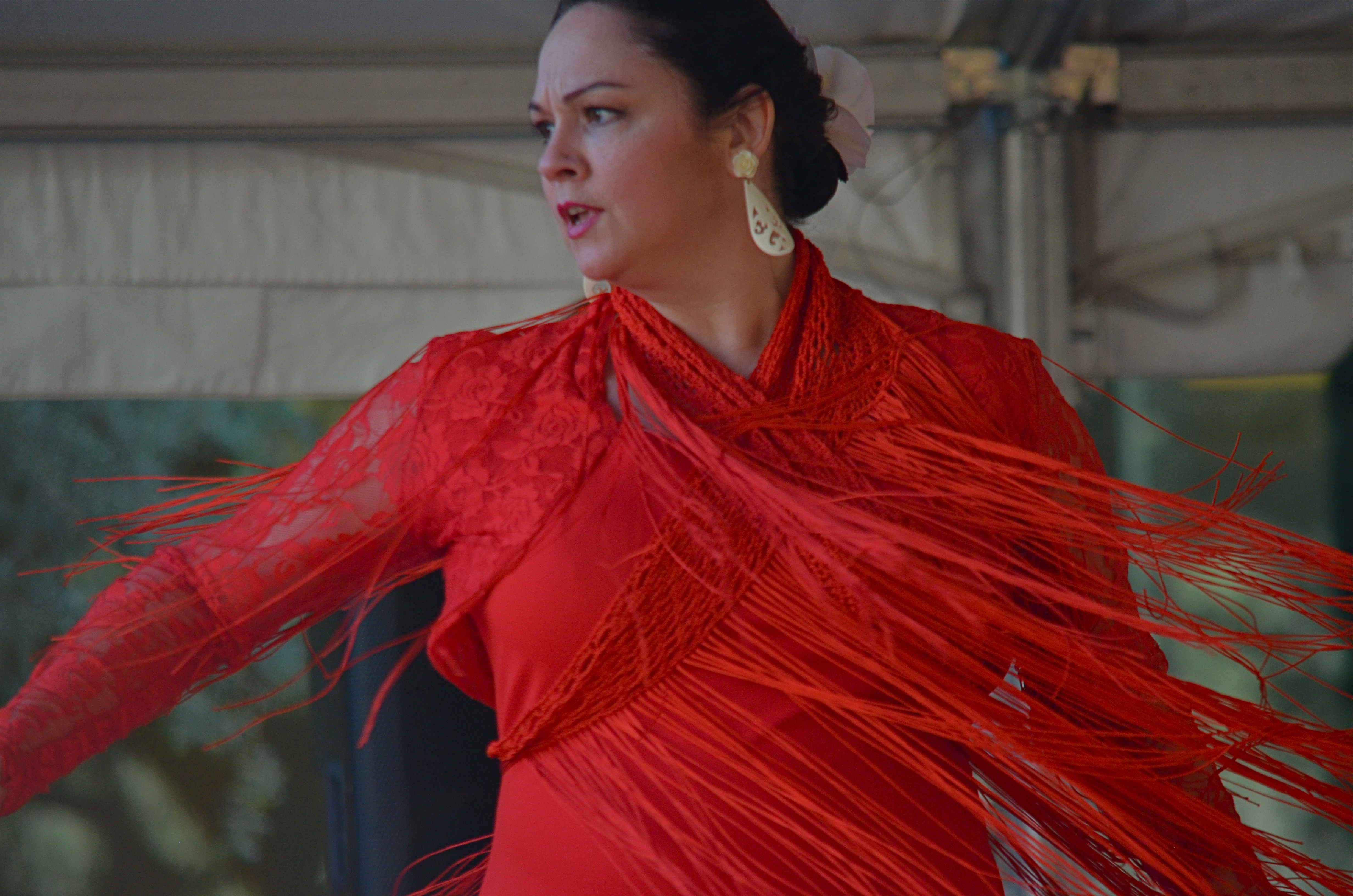
Now let’s say I shoot passively, using a mode designed for such situations. Some cameras call this mode “continuous”, while others refer to it as “sports” or “burst”, but it simply refers to the camera’s ability to crank off several frames per second, making all necessary adjustments to aperture, shutter speed, autofocus and ISO on the fly with just one touch from the shooter. Since the camera can make these shifts much faster than any human, you’ll have scads of shots to choose from, nearly all of which will be technically acceptable. You lose control over everything except choice of subject and composition, but you do get the final say over what constitutes a “keeper”, such as the image of a flamenco dancer you see here, which was caught on burst automode. Your choices are less creative and more editorial, and, if you disagree with all of the “other photographer’s” choices, you’re just as out of luck as if you had shot everything manually but hated it all. Wotta world, am I right?
As photographers, we choose subject matter, and then choose the best way to approach capturing it, based on whether you rate assistance from your camera as a bane or a blessing or something in between. Methods are a personal matter, but making a choice of some kind is key to comprehending what is happening in the picture-making process, and what role you want to play in it.
THE HOP-ON POINT
By MICHAEL PERKINS
PHOTOGRAPHY AT ITS MOST EFFECTIVE, is a pure and wordless kind of storytelling, virtually limitless and astoundingly efficient. Using a visual shorthand, that is, the static image stolen in an instant, we can suggest any narrative, past, present or future. Our tales not only feed off the storyteller’s intent but also off of what the viewer interprets. We can make anything mean anything. If stories are a constantly moving parade, we determine where the “hop on” and “hop off” points in it will be.
We do this by controlling the frame.
We make very intentional choices in a photographic frame. What is included is vital, but so is what is deliberately excluded, since both choices spark the imagination. We are, in effect, having a conversation, a debate over those choices with our audiences. Why did we show this and not that? Is this thing important because it naturally occurred in the picture, or am I making it important because I placed it there? And what do I think about what the photographer decided to leave out?
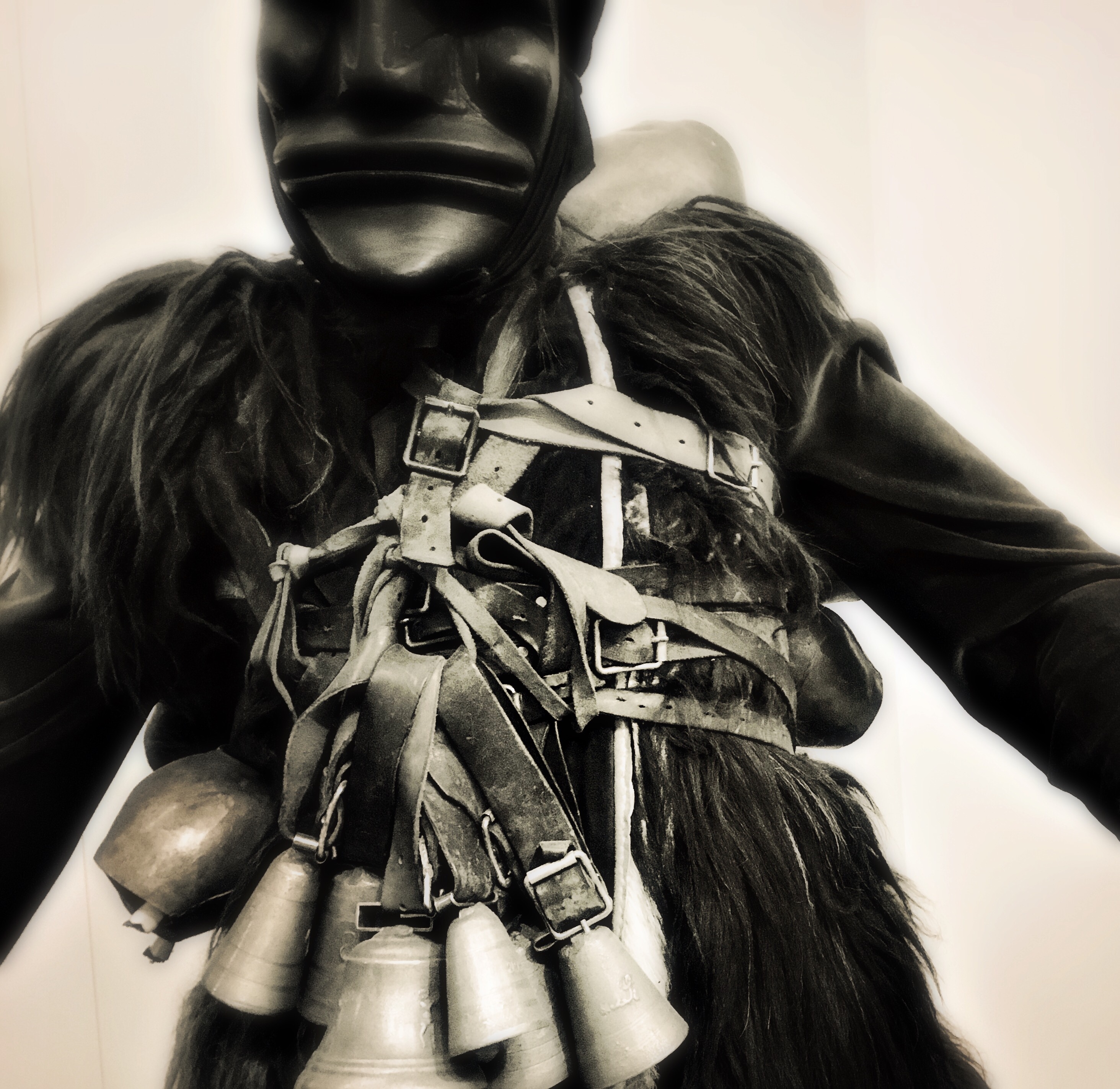
As the aforementioned parade of existence passes, the photographer’s hop-on point for the eye can supply context, showing connection between one thing and another…..or it can editorially destroy context, forcing us to see a thing in isolation, on its own terms. Consider, for a moment, the….. thing in the above image. Where did I get it? What was its purpose versus other things in its “world”? Can you, the viewer, assign it a new association that, for you, works just as well as the original?
All this discussion, all this interpretation, all these individual conceptions of what a thing “is”…all abetted by assembling the frame and than adding and subtracting within it. We talk a lot in these pages about the various sciences of photographic measurement…..exposure, light, apertures…. but I think composition outranks them all. Sure, know how to harness the tools that will help you record your message. But first, figure out what the hell you’re talking about.
And where you want your passengers to hop on.
A WORLD BOTH WIDE AND DEEP
By MICHAEL PERKINS
PHOTOGRAPHIC TECHNIQUES CAN BE THOUGHT OF as both active and passive. Some of the tools used to tell a visual story silently move narratives along without loudness or fuss, while others deliberately call attention as much to themselves as to the tales they tell. You can make pictures that betray very little of “how’d they do that?” or you can trumpet your tricks very loudly.
Or, of course, you can do both.
As a case study, consider one of 2018’s Oscar contenders, The Favourite, which tells a surreal tale of eighteenth-century castle intrigue with camera work that fairly screams to be noticed, mixing standard widescreen shots with ultra-wide and even fisheye compositions, shuffled together in jarring transitions, as if the director needs to remind us how twisted and nightmarish the story it by keeping us visually off-kilter for the entire length of the movie. Contrast this with most films that try to render their photographic tricks invisibly, in keeping with established Hollywood tradition. Is it a case of The Favorite’s director merely showing off his technical cleverness?
Creative lenses such as fisheyes dictate a photograph’s terms of engagement.
Well, yes and no. Various lenses convey vastly different concepts of space, of the width and depth of rooms, of the relationships between man and nature. Using an extreme tool like, say, a fisheye, changes the rules of engagement for the viewer, even when applied to a conventional subject. The photographer is, in effect, saying “composition is what I say it is, not what you’ve been led to expect.” Of course, when you drastically distort how a scene or object is presented, you risk your picture being “about” the visual effect, eclipsing your message instead of amplifying it.
The characters in The Favourite are in a constant state of moral disequilibrium, with everyone jostling for position or advantage, so an unsettling shift between various lenses reflects their uncertainty, the unreality of their situation, actually enhancing the nightmare quality for the audience. Does your picture call for a technique that, in turn, calls attention to itself? Flamboyant or not, the answer must, occasionally be yes.
Just because you’re showing off doesn’t mean you’re wrong.
OPEN AND SHUT CASE
By MICHAEL PERKINS
ANYTIME I HEAR A PHOTOGRAPHER EXPLAIN HIS TECHNIQUE in sentences that start with “I always”, my hackles raise…just a little.
You’ve heard people point to stylistic routines that they never break, as if that rigidity were itself a guarantee of consistent excellence. I always shoot in natural light. I always shoot RAW. I always use a red filter…. you get the idea. Let’s agree that there is no gear or procedure which works wonderfully all the time. Every choice we make as photographers means, well, unchoosing other choices. Sometimes that’s a winning strategy. Sometimes it just bespeaks our insecurity or inflexibility.
One of the “always” boasts that’s prominent among users of very fast lenses is, “I always shoot wide open” (at the largest possible aperture), as if that’s some miracle prescription. In terms of exposure range, If you’re shooting at around f/2 (or wider, if you’ve laid out a small fortune), you’ve certainly elected to suck in as much light as your lens will allow, and often, that can give you a tremendous advantage over slower lenses. But it comes at a cost.

Distant subjects shot at the widest apertures will be decidedly softer.
At widest apertures, your depth of field, the area of sharpest focus, will be extremely shallow. Now, if you are shooting a portrait at close range and are okay with your background registering as a blur, this can be great, but if the mountain in the background is as important as the girl in the foreground, f/2 will not get that done. Another thing to factor into a shallow DOF shot is manual focusing (in case your autofocus throws a hissy fit). That will require even more time and patience to nail the shot…..which is okay in a casual setting but impractical in fast-moving situations, like street work or sports.
But let’s talk upside. Like mountain ranges? Wide open at F/2, our theoretical lens will, at around 250 feet from the nearest part of a landscape subject, be effectively sharp to infinity. However the result will be measurably softer than, for example, a telephoto shooting at f/8 or slower. One last caveat: using f/2 for everything could also generate additional chromatic aberration or color fringing, in case either of those are deal breakers for you.
The point here is that no setting, no lens, no trick can cover every situation with equal results. If that were true, someone would have already devised a universal high-end point-and-shoot that we could all buy, and the golden age of Gear Wars would end. Till that day, all we have is judgement….creative decisions weighed against all available options.
It means making pictures on purpose, an intention that is the dead opposite of “I always…..”
APP(T) PUPIL
By MICHAEL PERKINS
IT WAS PRETTY COMMON, just a few years ago, to find a county fair or amusement park that boasted its own “old-timey” photo booth, a space where families could don historic costumes and pose for a simulated sepia daguerreotype. It was the start of a trend that continues to the digital age, in which the bulky, balky technology of Photography Eras Past becomes romanticized as an effect to be applied to contemporary images. Or, to put it in practical terms, everything old is new again….in an app.
Faking the past via digital doctoring can provide a unique aspect to a newly-taken snap, or it can just produce what I call the “that’s cool” effect, which masks the general purpose of the original and drowns it in gimmicky goop. But the temptation to tweak is strong: apps are cheap (or free) and it takes mere minutes to determine if a given one will add anything to your work beyond mere novelty. One such example is the wide selection of faux tintype emulators available at a click.
The tintype (which was actually exposed on iron plates coated with dried collodion) was never as sharp as its predecessor, the glass-plate daguerreotype, but it was so simple to take and process by comparison that it effectively liberated the camera from the studio, sending field photographers in tented wagons out across the country to shoot every aspect of American life, including, notably, the battles of the Civil War. Eventually paper positives and celluloid film spelled the technology’s doom, but it’s uneven textures and tones continue to evoke a vanished world.
Allowing a tintype app to use your mobile’s camera increases your creative control.
I very seldom use tintype apps after I’ve taken a shot. It seems as if I’m admitting that the image somehow wasn’t enough, that it needed “help” of some kind. I prefer to take pictures from within the app itself, allowing it to use my phone’s camera. The idea is to conceive of the picture beforehand as benefitting from the tintype effect, to pair its “look” with its intention. The tonal range and uneven detail of the tintype can be thought of as another kind of abstraction, and your choice of narrative need not be limited to picturing Uncle Fred as Buffalo Bill. As with so many apps, actual practice can make the difference between a tool and a toy.
SETTLING FOR LESS
By MICHAEL PERKINS
AT THIS WRITING, or January of 2019, your humble author is anticipating a little side trip back into film technology, as I await delivery of a roll of the re-introduced Kodak Ektachrome 35mm reversal film. The stock will be fairly slowly rated at 100 speed, so, along with the generally unforgiving nature of slide film, there will be more than enough potential for the final product to come in on the underexposed side. Which is fine with me.
Years ago, I fell in love with the hyper-saturation I got when I accidentally under-exposed original Ektachrome and its even slower cousin, the lost and lamented Kodachrome. So once I load the E-roll into my old Minolta SRT-200, I might even try to deliberately push the bottom end of the stuff to see just how minimal I can make the shots……which got me thinking about recent instances in which I tried to get that Dutch-lit effect digitally. Turns out that there were more than a few of them in the year just gone by, and so I preceded to gather up a short stack for a new page called When Lights Are Low, joining the other tabs at the top of this page as of this posting.
There are no coordinating themes in this grouping, just the common experiment of undercranking the exposure to see just how much you can do with how little. A few of the images were the subject of earlier essays in these pages: most haven’t been seen before. Of course, shooting film again is, for me, returning to the high risk and low reward of the medium, which can be, let’s face it, a chance to avenge old sins. Maybe this time I’ll get it right.
When it comes right down to it, film is very aspirational: you have to invest a lot of hope in it at the front end, and be happier with a much slimmer harvest of usable goodies than in the digital world. But it’s occasionally fun to take a filmic effect that you’ve learned to emulate in digital and try to achieve it, you know, on film. Whatever that proves is to be decided by those of you out there in the darkness who are sporting degrees in psychoanalysis. Meanwhile, the whole thing makes my head hurt, so I’m going to go lie down. Cheers.
TERRAIN WITHOUT MAPS
By MICHAEL PERKINS
ANY PHOTOGRAPHER WORTH THE NAME is supposed to embrace landscapes, right? I mean, scenes of sea coasts and mountain ranges were among the first “official” subject categories photography inherited from the world of painting. The earliest pictures created with a “machine” pretended to legitimacy by capturing the same tableaux as those captured with a brush. I get that. But, as I have confessed many times in these pages, I often feel cast adrift in approaching “scenery” shots. I have more difficulty in shaping their narrative, whereas walking around a city, I feel like stories are literally laying all over the ground. I may have a general sense of what a landscape should look like, whereas I don’t always know what they are about. I have plenty of terrain, but no maps.

Think in terms of whatever kind of photograph you yourself feel most challenged. Do you shy away from your shorter suit because the task is too technically daunting, or because you feel unsure of what to say? It seems that landscapes often come to me without any clearly stated rules of engagement. What is a good composition? How crowded, how “busy” with visual elements can it be? Is the answer simply to render more detail than the next guy, that is, set for f/64 and show everything in tack sharpness, as if recording a scene “faithfully” were all? Or, as in the shot shown here (which I actually like), can a picture be dreamily soft and tremendously crowded with stuff, and still “work”?
The really maddening thing is that I just don’t have these inner dialogues when I’m shooting street scenes, abstracts, portraits. I don’t worry about whether a thing should be done, I just do it. Moreover, I trust myself to do it without a lot of dithering. But landscapes make me stop and worry. Maybe that pausing will lead to more deliberate thinking, and, in turn, to better pictures. The jury’s still out.
MY WHITE WHALE

By MICHAEL PERKINS
PERHAPS THE GREATEST SINGLE MOTIVATOR, FOR PHOTOGRAPHERS, is the eternal attempt to narrow the gap between what is seen and what can be shown, a permanent sense of one’s pictures coming up short, doomed to mere actuality versus the grand visions dancing in our heads. We shoot, we lament having “missed it”, and we shoot again. Lather, rinse, repeat.
I’ve written before, here, on the most frustrating, if tantalizing, subjects within that overall challenge….scenes or objects that we are free to repeatedly, endlessly re-shoot in hopes of “getting it right”, chasing the same things year after year, camera after camera, lens after lens, like Ahab chasing the White Whale round the world’s oceans.
These inexhaustible things are usually a staple of our immediate environment, part of our daily drives or walks, our standard routines. The maddening thing is that such hyper-familiar things should, eventually, submit to our art, should finally be captured in some final, completed fashion. But, in many cases, they remain studies, rehearsals, sketches. Unfinished business.
The tree you see here is one of my personal White Whales. I must drive past it at least five times a week, mostly in a quick glimpse out the window of my car. I have seen it in every season, every type of light, every mood filter within my own head. I have thrilled as it billowed to its fullest flower and mourned when groundskeepers judged it too wild and rangy, pruning it in ways that threaten, for a time, to obliterate the tree’s identity. I have parked and stepped over to pay it closer tribute with this lens or that, shooting full-on, in macro mode along trunk grain or branch lines, in fisheye, sharp detail, selective focus, monochrome and color. Each rendition gives me something; no one image delivers all.
Your particular tree (or house, or face, or river, or..) can both energize and enervate your photography. Even your failures can be seen as a prelude to inevitable success, as rehearsals toward a final, finessed performance. That feeling of being on a conveyor belt to Paradise is the essence of art, with the journey teasing us that there is, actually, a destination. If you have no White Whale of your own, I recommend heading out to sea, and scanning the horizon until you see one spout. Then grab a camera and try to tell someone about it.
UP FROM DARKNESS
By MICHAEL PERKINS
(AS YOU READ THIS, I, along with most inwardly inclined photographers, am spending the final days of the present calendar year trying to make some sense of whatever images I’ve attempted over the past twelve months. But I’m only partly interested in compiling so-called “best of” lists, since it’s really up to other eyes to decide whether any one group of my pictures can collectively be called successful. Simply, I can’t really judge how well I’ve done. Not alone, anyway.)
What I try to do instead is to determine if pictures from a given year arced or tended in a particular direction. One thing I have noticed about my work is that it seems to fall, generally, into subject years and light years……groups of shots that are either centered on what I shoot or the conditions under which I do so. 2018 seemed far and away to be about making compositions of light rather than capturing locales.
Going For The One, 2018
In more than a few photographs over the past year, I almost seemed to be dragging brighter surfaces out of solid darkness…..but only just enough to make a few details register, leaving significant portions of the finished image lingering in shadow….deliberately under-defined. I have always liked this chiaroscuro, or “Rembrandt” light effect, but this year, I seemed to be aggressively embracing it.
The shot seen here, then, is not meant to explain the building I was shooting, but to reduce it to a pure instance of color, light and design. In a different situation, the picture might have been more reportorial, but in this case, the arrangement of line and pattern was the entire goal of the photo. So, at the end of 2018, no photographic “greatest hits” list for me, just a trend line showing that my curiosity is tracking in a certain measurable direction. Photography is just as much about attempts as it is about achievements. At different junctures, we value one over the other.
FRAMING MEMORY
By MICHAEL PERKINS
THE IDEA OF AMATEUR PHOTOGRAPHY, the once-revolutionary notion that anyone could own a camera and produce good results with it, came about at the exact point in history as the birth of mass-market advertising. Inventors made it possible for the average man to operate the magic machine; marketing made him want to own one, and, by owning, adopt a lifetime habit of documenting more and more moments of his life with it. Some companies in the early days of photography excelled in the technical innovations that ushered in the amateur era. Some others specialized in engineering desire for the amazing new toy. But no company on earth combined both these arts as effectively as the Eastman Kodak Company.
Every December since 2014, The Normal Eye has resurrected advertisements from Kodak’s legendary seasonal campaigns, promotional efforts that portrayed their cameras and films as essential to a happy Christmas. From the beginning of the 20th century, the company’s print ads used key words like “capture”, “keep”, “treasure”, “preserve”, and, most importantly, “remember”, teaching generations that memories were somehow insufficient for recalling good times, less “real” without photographs to document them. The ads didn’t just depict ideal seasonal tableaux: they made sure the scene included someone recording it all with a Kodak. Technically, as is the case with today’s cel phones, the company’s aim was to make it progressively easier to take pictures; unlike today, the long-term goal was to make the lifelong purchasing of film irresistible.
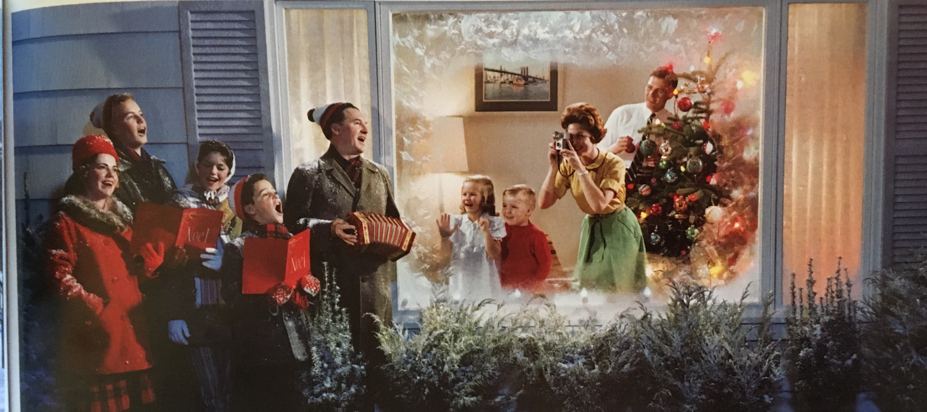
“Christmas Carolers”, a 1961 Kodak Colorama mural by Neil Montanus.
Kodak’s greatest pitch for traveling the world (and clicking off tons of film while doing so) came from 1950 to 1990, with the creation of its massive Colorama transparencies, the biggest and most technically advanced enlargements of their time. Imagine a backlit 18 foot high, 60 foot wide color slide mounted along the east balcony of Grand Central Terminal. Talk about “exposure”(sorry).
Coloramas, sporting the earliest and often best color work by Ansel Adams and other world-class pros, were hardly “candids”: they were, in fact, masterfully staged idealizations of the lives of the new, post-war American middle class. The giant images showed groups of friends, young couples and family members trekking through (and photographing) dream destinations from the American West to snow-sculpted ski resorts in Vermont, creating perfectly exposed panoramas of boat rides, county fairs, beach parties, and, without fail, Christmas traditions that were so rich in wholesome warmth that they made Hallmark seem jaded and cynical. It was a kind of emotional propaganda, a suggestion that, if you only took more pictures, you’d have memories like these, too.
Half a century on, consumers no longer need to be nudged to make them crank out endless snaps of every life event. But when photography was a novelty, they did indeed need to be taught the habit, and advertisers where happy to create one dreamy demonstration after another on how we were to capture, preserve, and remember. The company that put a Brownie in everyone’s hand has largely passed from the world stage, but the concept of that elusive, perfect photo, once coined “the Kodak Moment”, yet persists.
IT’S BEGINNING TO LOOK a little LIKE CHRISTMAS
By MICHAEL PERKINS
THE VERY PUBLIC, WONDERFULLY ELEGANT expressions of holiday spirit we all share in common, dripping in lights and bursting with sentiment, are measures of how we might observe an “ideal” season, perfect in execution, it’s every detail wonderfully balanced between love, memory and mystery. But the Christmases that we craft with what’s on hand, either emotionally or financially……well, that’s another thing entirely.
The holidays we piece together one lonely candle, one sad string of lights at a time, are worth seeking with your camera, no less than the forty-story firs in the public square. Stationed wherever we happen to wind up, cadging together makeshift moments from inside a barracks, in the last dark apartment down the hall, we “make do”, but we also re-make ourselves. We drill down to what’s essential. And pictures of those tiny acts of enchantment are worth discovering.
One of the most poignant moments, among many, in Dickens’ Christmas Carol describes the humble holiday preparations of the family of Scrooge’s impoverished clerk, Bob Cratchit, modest rituals that, over time, have rung truer than all the grand and glorious galas trotted out each season by the more fortunate. Bob’s wife is described as “dressed out but poorly in a twice-turned (re-re-hemmed) gown, but brave in ribbons, which are cheap and make a goodly show for sixpence…”, This sentence has remained burned into my brain since I first read it more than half a century ago. Brave in ribbons. The quiet, persistent dignity of that woman has, for me, symbolized the season more than all the lights and garlands on the earth.
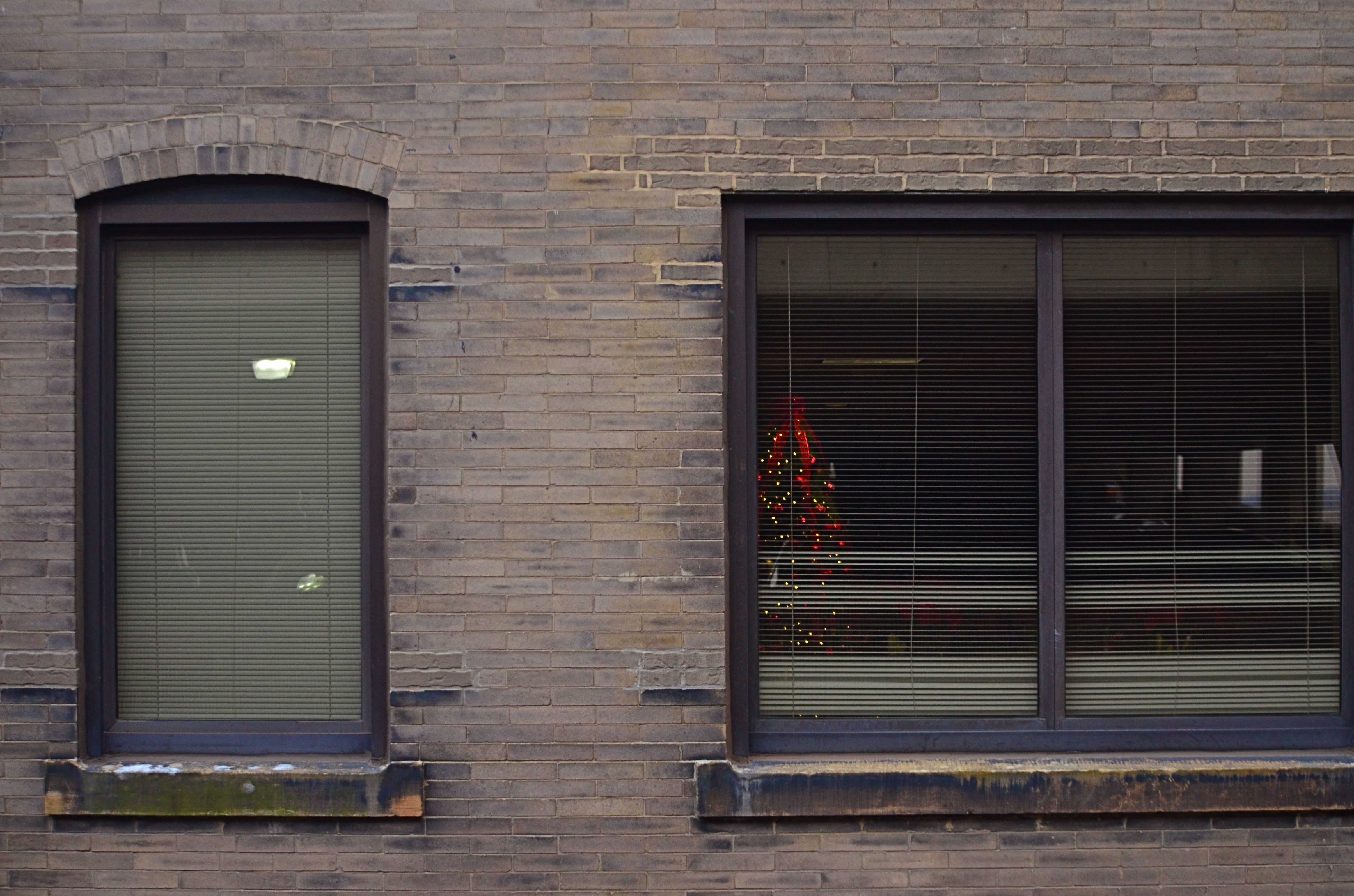
When What To My Wondering Eyes Should Appear, 2018
In the years since that first reading, I have tried to train my photographer’s eye to look beyond the big and loud of Christmas to find the small and soft iterations of the holiday, those places where its spirit must inch its way skyward like a wildflower struggling through a crack in the sidewalk. I see some amazing testaments to human survival in the modest windows and tiny yards where many a loving remembrance resides.
Some, as in the case of the picture seen here, are observed at the backsides of alleys, eight stories up in a parking garage, overlooked, unsung. But sing them we should, and picture them we must. Oversized dreams in department store windows are seductive, to be sure, a visual ode to If Only. But down here on the ground, where most Christmases are crafted, a lot more must be supplied by dint of imagination and dreams. Here, closer to the human heart, we learn to ignore our tattered hems, and to be brave in ribbons.

ALL THERE IN BLACK AND WHITE(?)
By MICHAEL PERKINS
YOUR CONCEPT OF “STREET” PHOTOGRAPHY, assuming it interests you at all, is shaped by a variety of influences, including your idea of appropriate subject matter, biases in style or equipment, even your technical limits. But from my own particular perch, I think that the era into which I was born may be one of the strongest determinants of my preferences in street work, at least when it comes to the choice between black and white and color. To me, this kind of reportorial photography is vastly different either side of a key time line, with one side, say the world up to about 1955, weighted toward monochrome, and the other, the years that follow that mark and track forward up to the present day, being the more “color” era.
Before the mid-50’s, nearly all “important” photography was still being rendered in monochrome, much of it of a journalistic or editorial nature. From the crash of the Hindenburg to the New Deal’s chronicling of the impact of the Great Depression through endless newsreel and magazine essays, the pictures of record, of the stuff that mattered, was black and white. Consumer photography generally followed suit. Early color films were available from the 1930’s on, but the overarching curve of Everyman hobbyist work did not immediately flip to general use. Color was largely for commercial work, for selling things in a hyper-saturated advertising spread or brochure. Seminal black and white essays like Robert Frank’s The Americans or Henri Cartier-Bresson’s The Decisive Moment seemed to reinforce the idea of monochrome as the messenger of realism, authenticity, grit. Ugly, sad, tragic, important things happened in black and white. Color was for kids’ parties.
What “color” is your reality?
By the 1960’s, faster consumer color films changed candid photography virtually overnight as amateurs opted for more “lifelike” images. Color print, slide and movie film sales soared, and, while magazine and newspaper “documentarians” continued to emphasize mono as the “official” tonal language of street work, younger photographers began to reframe the argument as to what constituted a fit format for commentary. In the present day, both approaches live comfortably side by side, and many shooters are not exclusively in the ‘either” or “or” camp, deciding one frame at a time whether a narrow or wide palette is right for a given image. Even the shooters who embraced color as young photographers may, today, toggle back to monochrome for a singular impact or even a nostalgic evocation of the past. Fashion historians can easily lose count: we’ve zoomed past ironic, post-ironic, post-post-ironic, and back to innocence again, spinning through both unconscious and super-self-conscious styles like the blades of a pinwheel. Beneficiaries of technologies that abett and invite multiple ways to rendering the same subject, we shoot in all eras and influences at once. Everything about photography is a la carte.
For me, black and white isn’t a signature, but then again, neither is color. I find them both adequate for the candid work that encompasses “street”, and I reserve the right to make the choice between the two at a moment’s notice. Tonal properties, after all, should be as improvisational as the decision to make a given picture. We are freer than ever to worry less about the how of a photograph, and focus on the why.
Share this:
February 10, 2019 | Categories: Americana, Black & White, Color, Commentary, Documentary | Tags: history, Street Photography | Leave a comment