BLUR IS THE NEW SHADOW

Modern art lenses allow different parts of objects that are all in one focal plane to be selectively blurred.
By MICHAEL PERKINS
I’M INCREASINGLY FASCINATED BY PHOTOGRAPHS THAT SUPPRESS INFORMATION, choosing to selectively conceal details rather than merely delineate everything in the frame in the same exhaustively sharp detail. At the same time, I hate it when this technique is referred to as being “painterly”, as if, after all this time, photos are still striving for the same pedigree that daubers automatically inherit merely by picking up a brush. Photographs are not, and should not try to be, paintings, just as a shoe should not try to pass as a glove. Love the function of the art you have, and leave the mimicry to the mockingbirds.
The “painterly” tag used to be tied mainly to anyone shrouding their images in shadow, as if we were all bucking to be the next Rembrandt or Reubens. And certainly the use of darkness in photography creates a kind of mysterious minimalism, telling more by showing less. We linger over what’s left out of a photo, and the deliberate subtraction of detail simplifies a composition to its barest terms. When there is less to see, you eye goes like a laser to what remains. It’s a big, bright “this way, dummy” arrow pointing toward the heart of the picture.
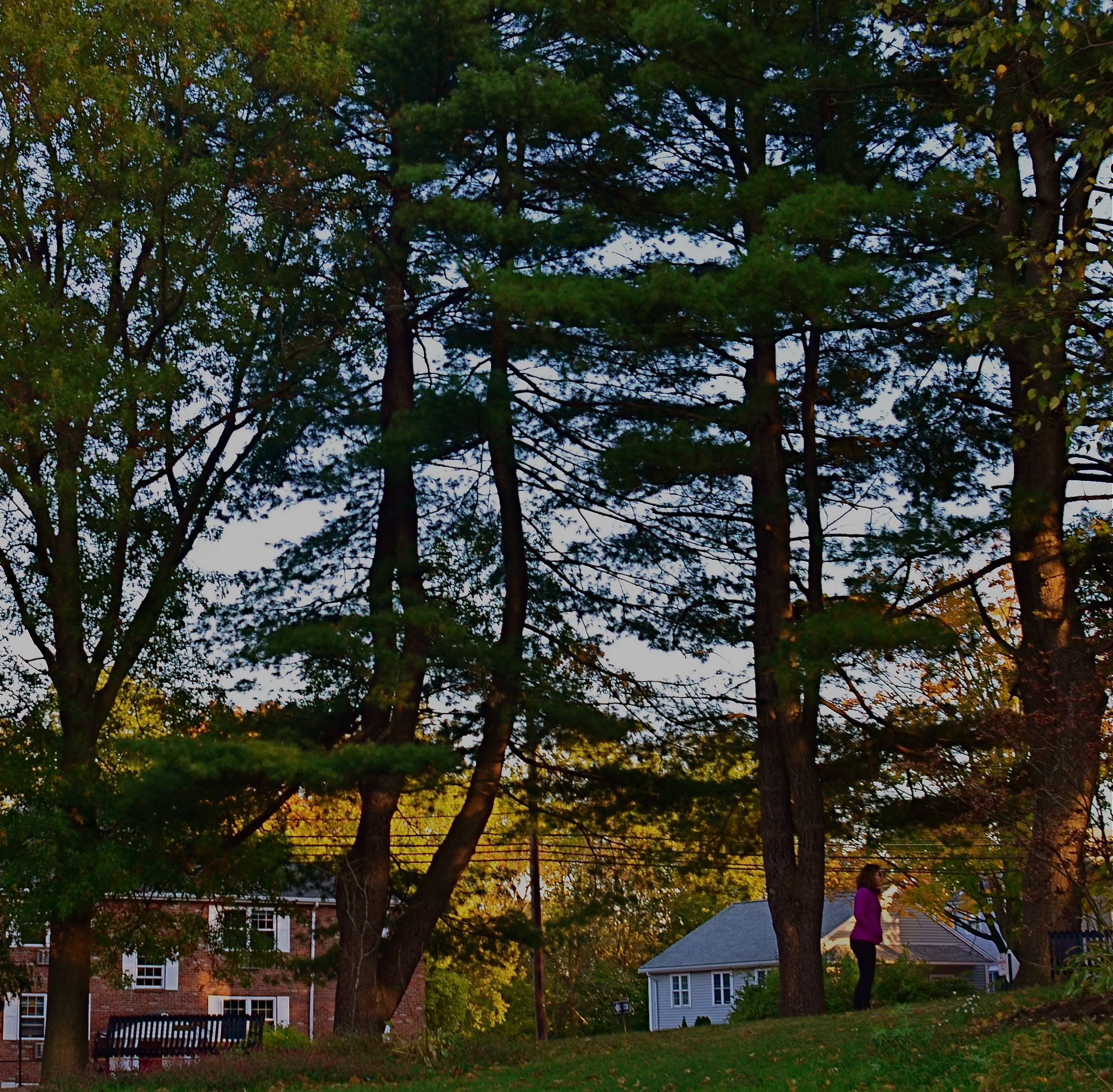
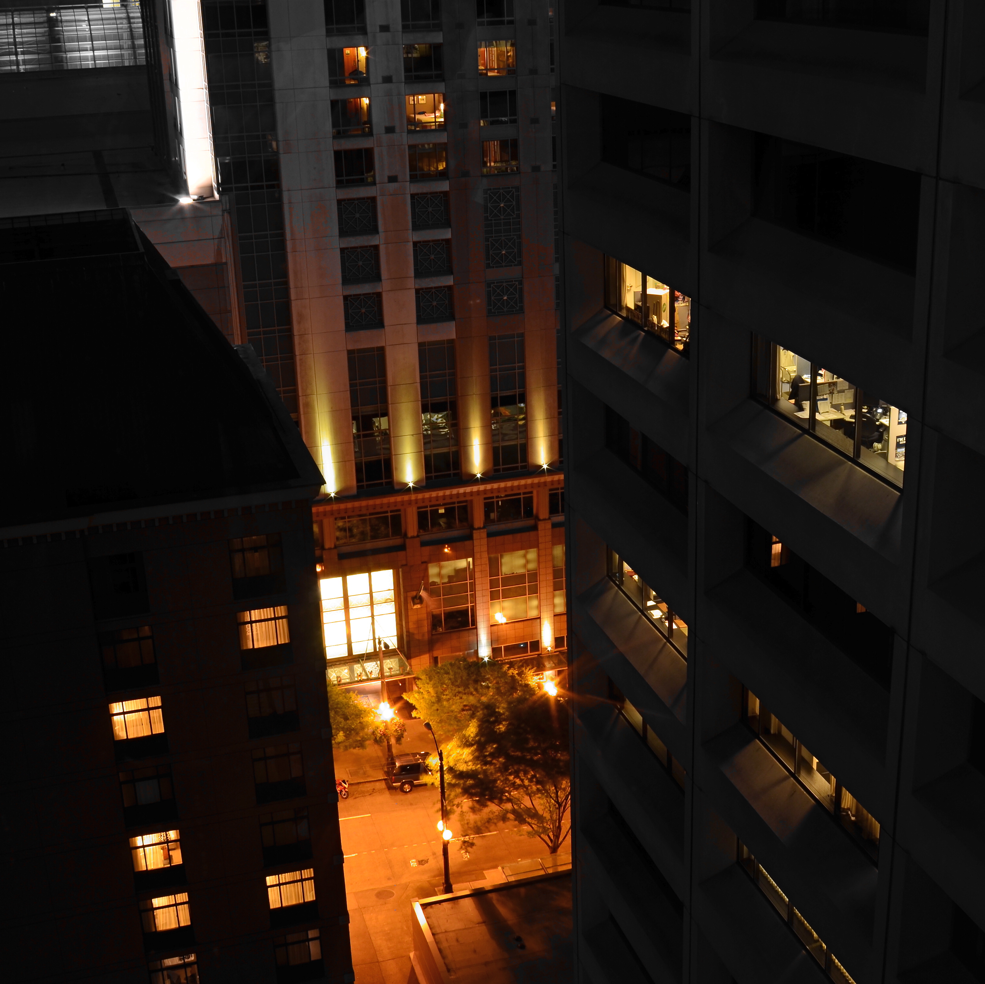
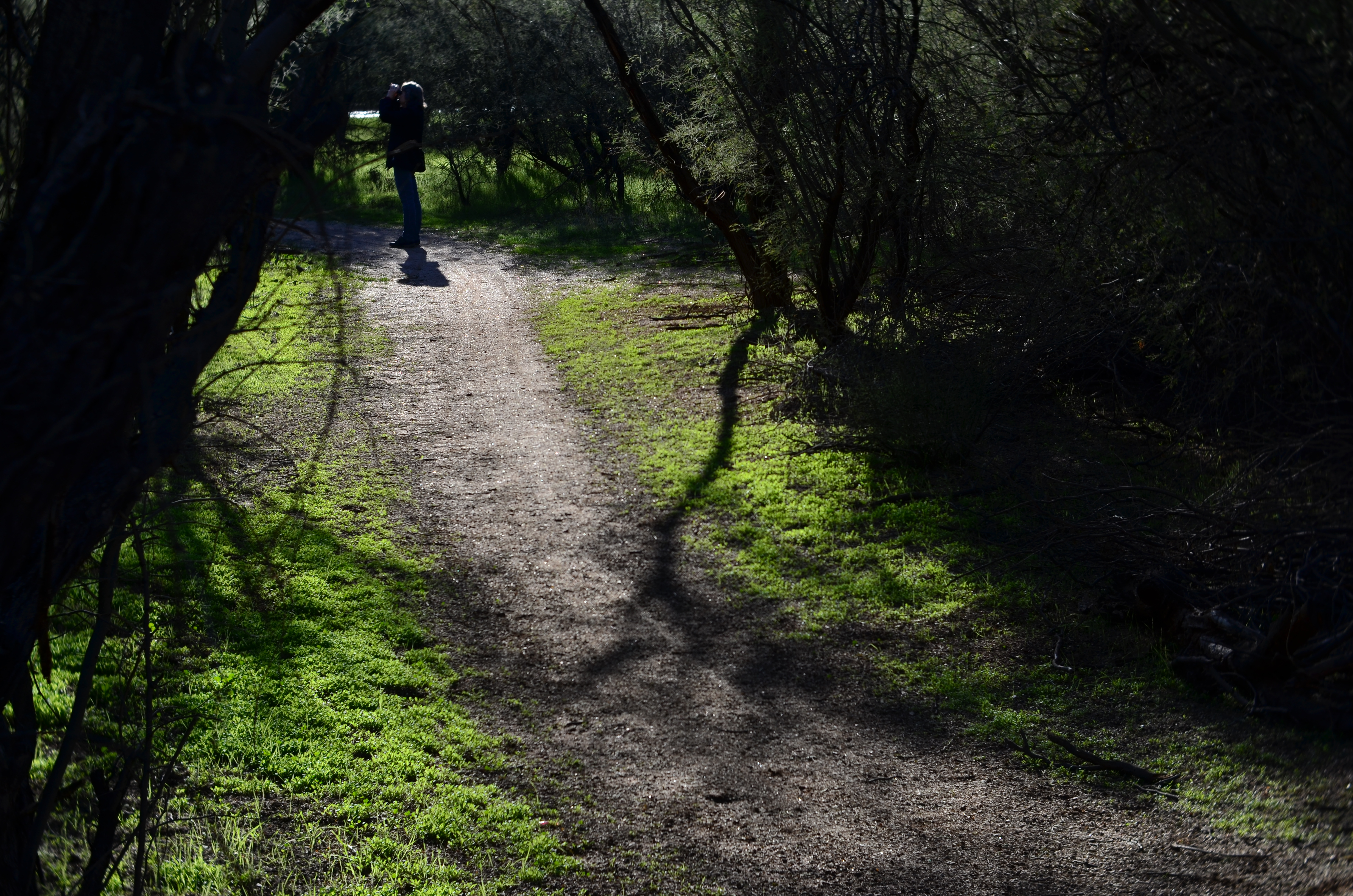
In the same way, the current wave of photographers are using blur to punch up the impact of images. Any Google search of the phrase “blur my photos” unearths a wellspring of apps that allow any part of any frame to be selectively de-focused, in most cases (as happens with apps) after the picture is taken. Long regarded as the stuff of artifact or accident, blur is now being arranged, managed, and chosen as a tool to remove distracting detail from compositions, or to render them softer and more intimate. In the above image, separate elements of the structure, all of which lie generally in the same focal plane, can be selectively softened so that one can become dominant, while the other is abstracted. This particular shot is done with a Lensbaby Sweet 35 lens, which allows the “sweet spot” of focus to be rotated to any location the shooter desires, although there are many paths to similar results.
Both apps and lenses, which include newly reworked versions of old optics, offer a return to the randomness from which early photographers longed to escape. Lomography, the revival of flawed and cheap cameras from the film era, actually touts blur as a strength, an arty accent much to be desired. To be totally counter-intuitive about it, blur is edgy. Of course, some blur is just another kind of visual noise, and if it’s applied too carelessly or too much, it actually pulls the eye away from the main message of a picture. However, it’s thrilling just to see the sheer breadth of approaches that are suddenly available everywhere, most of them cheap, fast and easy. Blur can “sharpen” a picture just like darkness can “illuminate” one. It’s the new shadow.
TEN NO’s AND A YES
By MICHAEL PERKINS
THERE ARE CERTAINLY MANY MORE PICTURES BEING TAKEN than there are great pictures taken. That’s as it should be. Anything at which you wish to be excellent only comes about once you’ve learned what not to do, and that means lots of errors, lots of images that you feel compelled to destroy almost as quickly as you’ve created them. You must, must, must, take all the bad pictures right alongside the good ones. At first, the garbage will outnumber the groceries.
And then, some day, it doesn’t.
We all have pictures that worked out that we almost didn’t take in the first place.
I am an A.B.S. (Always Be Shooting) shooter. I mean, I make myself at least try to make a picture every….single…day. No excuses, no regrets, no exceptions. Reason? I simply don’t know (and neither do you) where the good pictures are going to come from. For me to give myself permission not to try on a given day means I am risking that one of those potentially golden pictures will never be born. Period period period.
In a way, I often think photo technique guides from years gone by had things backwards. That is, they often made suggestions of great opportunities to take great pictures. You know the list: at a party: on a vacation: to capture special moments with loved ones, etc., etc. However, none of these traditional “how-to” books included a category called “just for the hell of it”, “why not?”, or, in the digital era, “whattya got to lose? You’re shooting for free!” These days, there are virtually no barriers to making as many pictures as you want, quickly, and with more options for control and creativity, both before and after the shutter click. So that old “ideas” list needs to be re-thought.
To my thinking, here’s the one (yes, I said ONE) suggestion for making pictures, the only one that matters:
TAKE THE SHOT ANYWAY.
And to purify your thinking, here’s my larger list, that of the most commonly used excuses not to shoot. You know ’em. You’ve used ’em. And by doing so, you’ve likely blown the chance at a great picture. Or not. You won’t know, because you didn’t TAKE THE SHOT ANYWAY. Here are the excuses, in all their shameful glory:
I haven’t got the right lens/camera/gear. There’s not enough light. I don’t do these kinds of pictures well. I don’t have my “real” camera. There’s nothing to take a picture “of”. Everyone takes a picture of this. I’ll do it later. It probably won’t be any good. There are too many people in the picture. There isn’t enough time.
Train yourself to repeat take the shot anyway, like a mantra, whenever any of these alibis spring into your head. Speed up your learning curve. Court the uncertain. Roll the dice. Harvest order from chaos. Stop waiting for your shot, your perfect day, your ideal opportunity.
Take the shot. Anyway.
LYING WITH A STRAIGHT(ER) FACE
Most of us discovered the effects of fisheye lenses as part of the visual signature of rock’n’roll.
By MICHAEL PERKINS
THE NAME OF THIS BLOG, THE NORMAL EYE, IS A REFERENCE to the old nickname for fixed-focus “prime” lenses, non-zoomable glass like 35 and 50mm, that were once dubbed “normal” since they delivered the sense of space and proportion most closely resembling that of human vision. I’ll leave other combatants to decide whether this renders prime lenses “truer” in any way (those of you who think you know what “truth” is, advance to the fine arts class), but one things seems clear (that is, not cloudy): wide angle lenses, say 24mm or wider, tell a somewhat different truth, and thus create a distinct photographic effect.
Ultra-wides can generate the sensation that both proportion and distances (mostly front-to-back) have been stretched or distorted. They are thus great for shots where you want to “get everything in”, be it vast landscapes or city streets crowded with tall buildings packed into close quarters. They don’t really photograph things as they are, but do serve as great lenses for the deliberate effect of drama. I don’t use super-wides for too many situations, but, when I do, I make up for lost time by going overboard…again, largely as an interpretative effect.
Duets (2017). Rather than “reality”, this is more like a fisheye version of “hallucination-lite”.
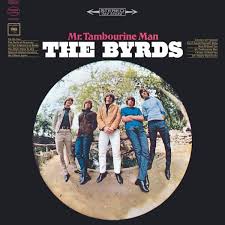
Nothing shoots wider than the fabulous fisheye lens, introduced in the 1920’s as a meteorological research tool, and shooting as wide as 8mm with a viewing arc of anywhere from 100 to 180 degrees. Starting in the 1960’s, the fisheye’s unique optics crept into wider commercial use as a kind of funhouse look, the circular image in which all extremes of the rounded frame bend inward, creating the feel of a separate world isolated inside a soap bubble. Some of our most iconic cultural images used this look to suggest a sense of disorientation or dreamlike unreality, with classic album covers like the Byrds’ Mr. Tambourine Man, the Beatles Rubber Soul and Jimi Hendrix’ Are You Experienced? using fishes to simulate the psychedelic experience. Far out, man.
However, used sparingly as simply a more extreme wideangle, the fisheye can create a drama that conforms more to a rectangular composition, especially when the inner core of the image is cropped into a kind of “mailbox” aspect, resulting in an image that is normal-ish but still clearly not “real”. Tilting the lens, along with careful framing, can keep the more extreme artifacts to a minimum, adding just enough exaggeration to generate impact without the overkill of the soap bubble. As with any other effects lens, it’s all a matter of control, of attenuation. A little of the effect goes a long way. I call it lying with a straighter face.
Fisheyes are a specialized tool, and, for most of photography, the optical quality in all but the most expensive ones have kept most of us from tinkering with the look to any significant degree. However, cheaper and optically acceptable substitutes have entered the market in the digital era, along with fisheye-“look” phone apps, allowing the common shooter to at least dip a toe into the pool. Whether that toe will look more like a digit or a fleshy fish hook is, as it always was, a matter of choice.
LET’S TALK ABOUT YOU

We don’t need no stinking rules….
By MICHAEL PERKINS
SINCE ITS LAUNCH IN APRIL OF 2012, The Normal Eye has tried to convey the infinite joy I’ve derived from a life behind the camera, that ever-present sense of anticipation and wonder each time the shutter clicks. And judging from the wonderful stories you have shared with TNE over the years, that wonder is infectious, feeding off each fresh discovery in technique and approach. The magic kicks in every time you turn a new corner and Learn. Just. One. More. Thing.
This forum has been an attempt to capture what happens when we first take our cameras off “automatic”, making those stumbling, uncertain first steps toward full responsibility for our shots. At first, it may be something as simple as a different aperture. Then it’s a slight departure from our comfort zone on composition. After that, perhaps a counter-intuitive approach to focus, or exposure. Eventually, our eyes and hands hunger for more and more independence, and a completely different kind of picture-making begins. We evolve from those who merely hit the button (and hope) to those who hunger to learn about all the other buttons, on our cameras and in our heads, that are dying to be engaged.
I’ve seen this engagement in your remarks, for which I truly thank you. I’ve learned from your websites and portfolios. I’ve marveled at how you’ve seized control of your art, step by step, resulting in a complete rubbishing of the rules and conventional wisdom. And I’ve delighted at the order you’ve harvested from chaos, the eloquence of those who have taught themselves to see anew.
This page, and my own work, have been nurtured by your boldness. You have, in fact, emboldened me. Together, we have all established a broad, bright line between (as our masthead says) taking pictures and making them, regardless of whether we wield a light-leaking Holga or a wallet-killing Leica, a cardboard pinhole or a DSLR. The Normal Eye continues to be dedicated, then, to teaching all of us to trust ourselves, and those stubborn little voices inside that insist that you really, no really, should just shoot the picture.
And see what happens.
A TAIL OF TWO DUCKS
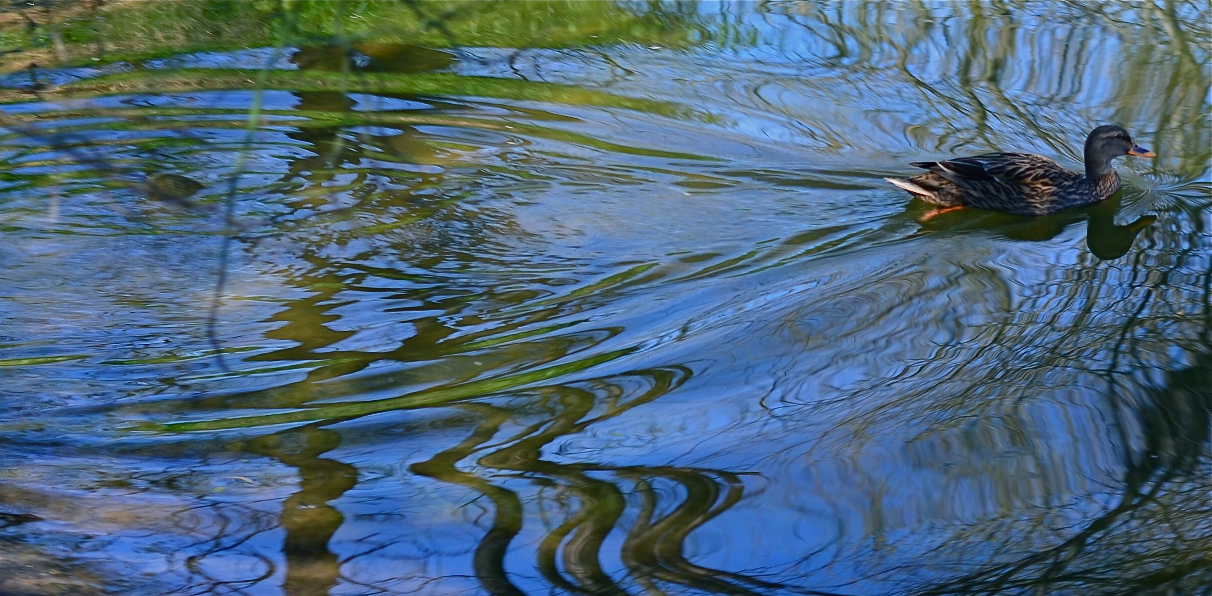
A circular polarizing filter allows you to determine how much reflective glare will be seen on water surfaces.
By MICHAEL PERKINS
PHOTOGRAPHING WATER IS A CONSTANTLY NEW CHALLENGE, since it is either an active surface, a static mirror or a revealing microscope, depending on how light on it is read by your camera. As active surface, its waves, surges and ripples break light up into endless shards. As mirror, it reflects clouds or other features that may or may not even be seen in frame, producing a reverse-angle version of reality. And as revealing microscope, it invites you to peer into its depths, providing a glimpse into a hidden world.
One of the cheapest and most effective toys available to deliver all of these renditions of water is the humble circulating polarizing filter, a quick screw-on available for virtually every kind of lens. Just match up the width of the lens threads with a filter that meets those dimensions and you’re all set. Polarizers serve two main purposes for photographers. The first is the ability to render overly bright skies a deep rich blue, helping all color pop with a little deeper impact. The second is to control the amount of glare you want in photographing water. Both functions are dialed up simply by rotating the filter’s movable outer ring, which is how you control the range of the effects you desire.
Polarizers work best when the sun is nearly directly overhead, or at a 90-degree angle with the front of your lens. In fact, though, even if this algebra is a little off, it will still produce a measurable effect, and having the time to shoot and adjust at the same pool or stream will give you an idea of how much you’ll want to apply to control the transparency of the water’s surface.
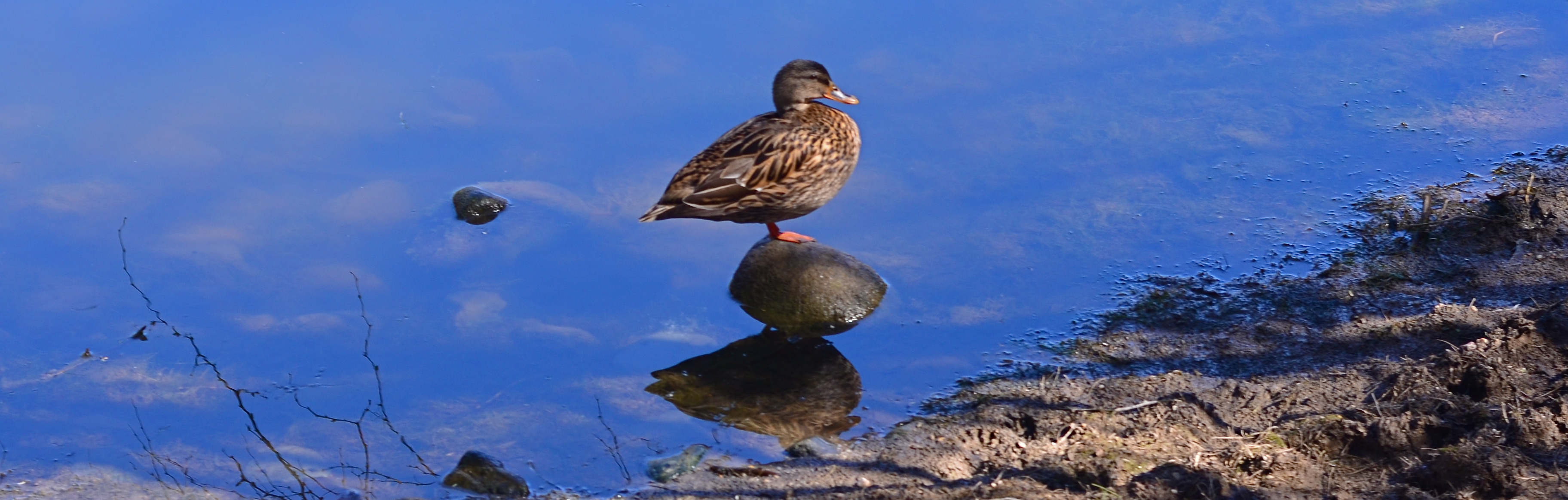
Dialing the glare back just a bit allows some features from below the water’s surface to become faintly visible.
In the image at the very top of this page the mallard’s wake creates glorious grooves in a forest pond. The polarizer has been rotated for maximum reflective effect of the sky and the tree growth overhead. Earlier in the same shoot, the squatting duck in the lower photo was shot to give a little mirror effect, but with a slight hint of transparency to allow both clouds and shore rocks to be seen in the same shot. That’s the beauty of polarized light; it can be calibrated in real time, so that you know, ahead of the shutter click, just how much you’ve opted for. As is the case with a lot of traditional photo techniques, the use of filters, decidedly old-school in nature, allows more control than trying to manipulate the same shot in post-production.
One caution: although there are dozens of manufacturers for circular polarizing filters, many of them very reasonable in price, there is some variance in the effectiveness of certain brands. Read a lot of user reviews and get the one that delivers the goods in full. Other than that, the true nature of water in your photos can have as much poetry, or mystery, as your fingers can dial up. Neat.
EMBRACING THE DARK, AND OTHER FLAVORS
By MICHAEL PERKINS
THERE IS A WHOLE SEPARATE WING OF THE PHOTOGRAPHIC ESTATE that values dark almost more than light. It’s a photography of near-night, work that suggests only the merest intrusion of illumination into a palette of black. An almost-nothing. A bleary, evanescent glimpse, a suggestion. Minimalism taken to the maximum.
Or, in other words, the dead opposite of the mindset of the majority of photographs made over time.
Phytomorphology 3 (2016). I could labor to make this image 100% accurate as to biologic detail, but do I need to?
For most of us, the camera was expected to get better and better at registering accurate detail in less and less light, giving us a reasonably balanced record of color and depth, a kind of realism, or at least documentation. This is the photography of the consumer, who was taught to want pictures in which everything is spelled out, obvious, apparent. Sunny Days, Natural Flesh Tones, Life As We Know It. The advance of the science of recording things with cameras seemed to suggest that well-lit meant well-realized, that we would eliminate murk and shadow in the name of clarity. We decided that those things which dealt in the dark basement of tones were “bad” pictures, defective in some basic way.
The development of art photography has often taken the opposite approach, with some artists going so far as to revive “dead” technologies like daguerrotyping, serigraphing, deliberate under-exposure, even purposeful degrading of the image (dragging negatives over ground glass, dancing on them, soaking them in bodily fluids) to get the look they desire, actually eliminating information from their pictures. Even the recent fad of lomography, which worships faulty cameras and errant processing, is indicative of the “dark” school. It doesn’t have to be in focus. It doesn’t have to be a picture “of” anything. And who made up these rules for composition, anyway?
Photography, as always, will not be reduced to a set of standards. Consumer products still try to steer customers toward predictable images, with most “how tos” listing simple steps for uniform results, or pictures that “look like photographs”. The dark worshippers, by contrast, are asking us to train our eyes to see what is not presented, as well as what is. Alright, they concede, we didn’t show everything. But you can supply the rest.
Finally, the camera remains essentially a mere servant, subject to the whims of its user. We cannot truly mechanize and regulate what comes from the eye or the soul. True art can never remain static, and any kind of creativity that doesn’t frequently threaten to break down into chaos may not be worth the effort.
TRUTH VS. REALITY
By MICHAEL PERKINS
ASKED IN 1974 BY AN INTERVIEWER ABOUT THE LEGACY OF THE ACTOR JAMES CAGNEY, director Orson Welles replied that while Jimmy “broke every rule”, “there’s not a fake moment” in any of his movies. He further explained that the star of Public Enemy, White Heat and Yankee Doodle Dandy worked counter to all the conventions of what was supposed to be “realism”, and yet created roles which were absolutely authentic. Cagney, in effect, bypassed the real and told the truth.
As do many photographers, it turns out.
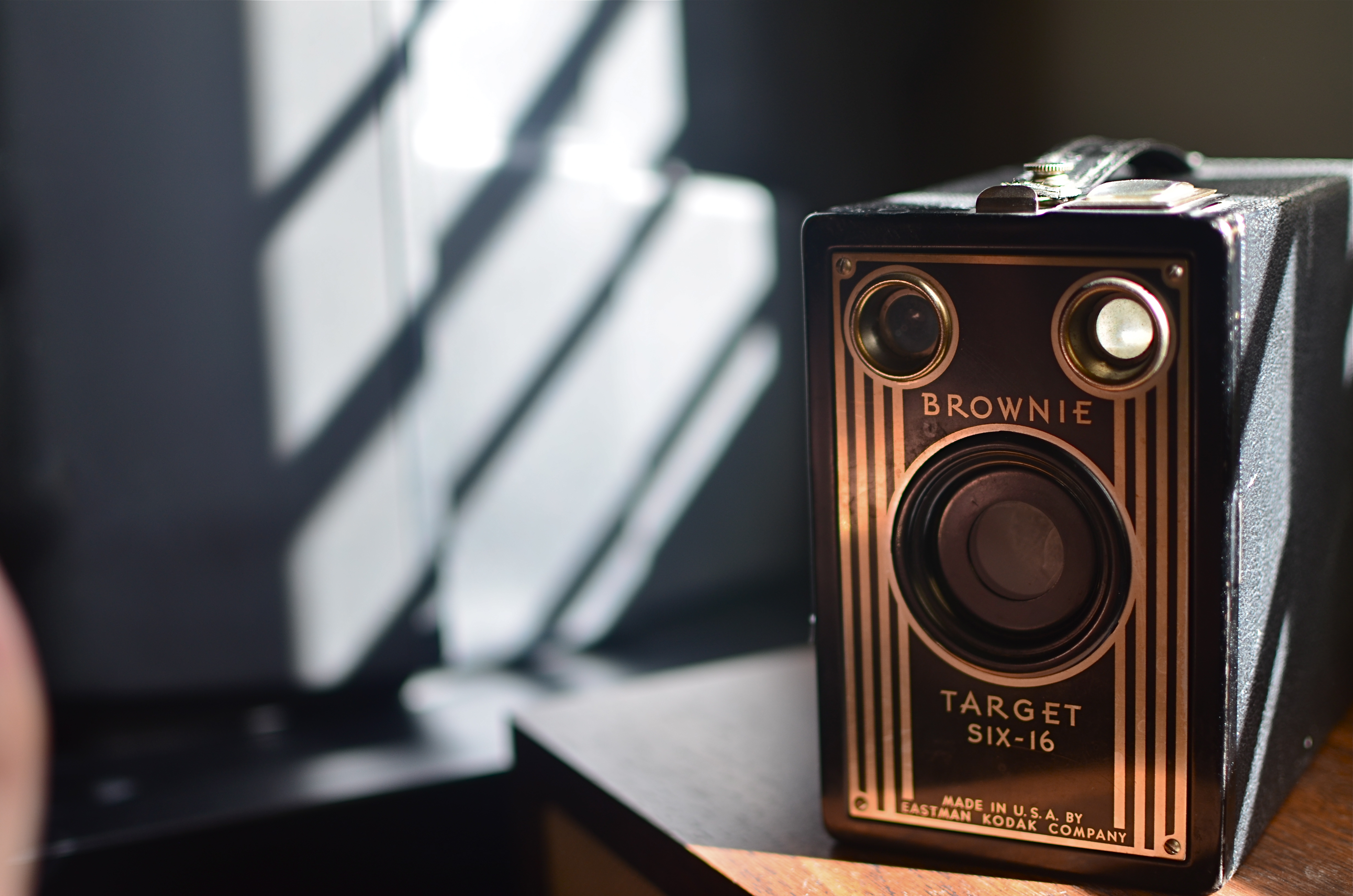
Fake sunlight on the front of this camera courtesy of sunlight bouncing off my hand.
We all have inherited a series of technical skills which were evolved in an attempt to capture the real world faithfully inside a box, and we still fail, at times, to realize that what makes in image genuine to the viewer must often be achieved by ignoring what is “real”. Like Cagney, we break the rules, and, if we are lucky, we make the argument that what we’ve presented ought to be considered the truth, even though the viewer must ignore what he knows in order to believe that. Even when we are not trying to create a so-called special effect, that is, a deliberate trick designed to conspicuously wow the audience, we are pulling off little cheats to make it seem that we played absolutely fair.
The first time we experiment with lighting, we dabble in this trickery, since the idea of lighting an object is to make a good-looking picture, rather than to mimic what happens in natural light. If we are crafty about it, the lie we have put forth seems like it ought to be the truth, and we are praised for how “realistic” a shot appears. The eye likes the look we created, whether it bears any resemblance to the real world or not, just as we applaud a young actor made up to look like an old man, even though we “know” he isn’t typically bald, wrinkled, and bent over a cane.
In the image above, you see a simple example of this. The antique Kodak really does have its back to a sunlit window, and the shadows etched along its body really do come from the slatted shutters upon that window. However, the decorative front of the camera, which would be fun to see, is facing away from the light source. That means that, in reality, it would not glow gold as seen in the final image. And, since reality alone will not give us that radiance, a second light source has to be added from the front.
In this case, it’s the most primitive source available: my left hand, which is ever so slightly visible at the lower left edge of the shot. It’s acting as a crude reflector of the sunlight at right, but is also adding some warmer color as the flesh tones of my skin tint the light with a little gold on its way back to the front of the camera. Result: an unrealistic, yet realistic-seeming shot.
There’s a number of names for this kind of technique: fakery, jiggery-pokery, flimflam, manipulation, etc., etc.
And some simply call it photography.
A SMALLER PIECE OF CAKE

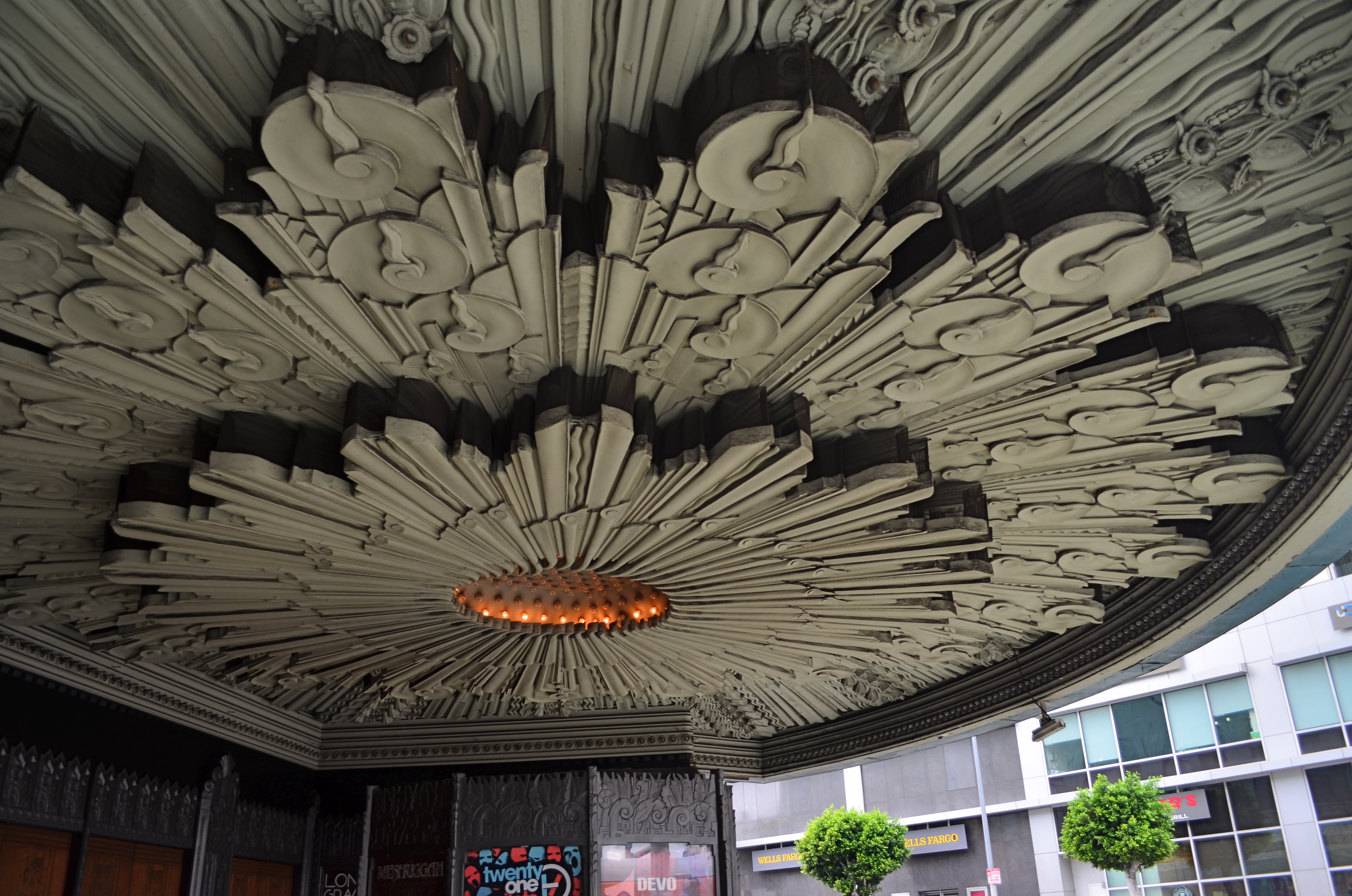
Molder plaster designs line the underside of the marquee of Los Angeles’ Deco masterpiece, The Wiltern Theatre.
By MICHAEL PERKINS
IN A HOUSE CRAMMED WITH LUXURIANT COFFEE TABLE BOOKS ON PHOTOGRAPHY, my most lovingly thumbed volumes seem to center on studies of Art Deco architecture, a subject which provides me with endless enjoyment. Some books touch on overall moderne design, but most are specific reference works on the zigzags, chevrons, whorls and curves of buildings, clad in this seductive, streamlined celebration of style. Similarly, my travel plans over the years involve sticking pins in the globe to indicate the fattest troves of these buildings, mapping my strategies for someday capturing them inside a box. It’s a bucket list, if buckets had been designed by Walter Dorwin Teague or Norman bel Geddes.
The original framing of the above shot, complete with other distracting details.
Shooting Deco buildings can humble one, since the sheer volume of decorative accents in a single skyscraper could consume a coffee table book all its own. Deco may use fewer details or lines to suggest an idea compared to earlier eras, but it is still undeniably busy. Some truly extreme edifices, such as Los Angeles’ Pantages Theatre, can nearly give you claustrophobia. These places were certainly meant to be looked at, but, to our contemporary eye, trying to take them “all in” is a little like sending your eye on a three-day bender. This also means that, for photographers, trying to tell a complete story in a single image is pert nigh impossible.
To that thought, I have spent several years going over shoots of Deco buildings that originally involved, say, thirty to forty images, only to find that, even when I was trying to break these giant birthday cakes into smaller slices, there was still enough going on, even in the edited shots, to warrant a second, third, or even fourth “sub-cropping”. One such place, also in L.A., is the giant faux-jade tower known as the Wiltern Theatre, so named because it occupies a corner at the intersection of WILshire Boulevard and WesTERN Avenue. The place was originally the Hollywood capstone of the Warner Brothers theatre chain, and survives today as a live performance space (think alt-rock meets emo). Point a camera anywhere, and you’ll harvest a click-ton of exuberant, exploding ornamentation.
The large shot seen at the top of the page is but one section of the glorious molded plaster overhang beneath the Wiltern’s marquee. The inset image at left is the larger master shot, in which I originally thought I was keeping it simple by limiting the frame to the lower part of the front right corner of the building. Turns out that even this “tighter” composition was too busy, hence the more radical crop to a smaller part of the pattern. On the way to the final edit, I also flipped the design upside down to make it splay out more dramatically and converted the dull gun-metal green to blue for a little extra romance.
All of which seems to be yet another re-hash of the old “less is more” argument. Simplify, simplify, grab the stone from my hand, grasshopper, etc., etc. Art Deco is a style in which the devil (the delight?) is most definitely in the details. Some are so incredible that it seems a sin to have them vanish into large, comprehensive uber-shots of big buildings, rather than being given the loving attention they deserve. And certainly, for photographers, there are other such visual birthday cakes that are more appetizing if you simply cut yourself a smaller slice.
ISLANDS IN THE SHADOWS
By MICHAEL PERKINS
FIFTY-PLUS YEARS INTO MY LOVE AFFAIR WITH PHOTOGRAPHY, I now regard my earliest concept of a “good picture” as I regard other ideas of my youth….that is, seeing how I viewed the world given the limited scope of my own experience. When I first started making my own pictures, my models were drawn from the pages of the then-dominant photo magazines, like Life, Look, and National Geographic. Thus, for me, “good” photographs served either the reportorial functions of a news assignment or the color-saturated visions of landscape lovers. And that, for me, back then, was more than enough.
Both these kinds of images favored a fairly literal translation from the actual into the photographed: interpretation and abstraction was not anything I gave serious thought to, since I wanted my simple box-camera creations to look like “real photographs”. Art photography certainly existed, but very much at the edges of the culture. Most museums, by the early 1960’s, had still not mounted their own photographic exhibitions. Most popular photography, shaped by a large middle-class consumer culture (think Kodak Instamatic), was candid and personal in nature. Most people wanted Grandma to look like Grandma, unfiltered through any Warholian irony, commentary or experimentation. It was still a compliment for someone to say of your pictures that they “looked like a photograph”.
Would more light, more detail, convey the story any better in this image? 1/10 sec., f/2.8, ISO 2000, 24mm.
Strangely, one of the things that revised my thinking on what was “good” was an increased awareness of the works of some of the first photographers, pioneers who sweated mightily to wrangle the infant media into something like reliable performance. In their work with ever-changing combinations of plates, media, lenses and emulsions, the first photogs’ breakthrough photographs often failed from a purely technical viewpoint, producing irregular patches of light appearing randomly like islands in a sea of shadows.
But what these wizards’ first attempts often achieved, almost by accident, was the first real abstraction in photography: pieces of reality, rather than its totality: hints of the truth which invited speculation, examination. New questions were posed: what was missing, and did it matter if it wasn’t there? Could a photographer, in fact, deliberately extract parts of the “whole” picture, letting the minimum speak for everything that was left out? I gradually began to wander in search of answers to these questions.
There are times when a picture speaks louder the less it says. My original orientation to “good” images, seeing them as the most faithful translation of the literal onto film, expanded gradually to include whatever visual language communicates best in a given picture. Sometimes, in some very key instances, it helps to think like the first practitioners, who discovered, however haphazardly, that mere reality sometimes comes up short.
I HOLD HERE IN MY HAND…..
One Flight Up (2013) Handheld night shot, 1/100 sec., f/1.8, ISO 320, 35mm.
By MICHAEL PERKINS
NIGHT SHOTS IN CITIES SEEM TO BE A SIMPLE CHOICE BETWEEN HAND-HELD OR TRIPOD, but those are only the most basic decisions to be made, depending on the texture and mood you’re trying to build into your images. Of those two main choices, many more are opting for hand-held because of convenience and speed, bypassing interference from security people, passers-by, weird weather,etc. And, let’s face it: it’s easier than ever to deliver a readable night photo without the long exposures that used to absolutely necessitate a tripod, especially if you are not worried by the need to either use a wide aperture (thus shallow depth of field) or increased ISO (inviting more digital noise and a decidedly “smudgy” look in the deeper shadows. If you are in the hand-held camp, you’ve got plenty of company.
Tripod people are dedicated, patient, and doomed to travel less lightly, composing longer exposures in darkened conditions and sweating the unwanted artifacts, from wild pixels to smears of people and lights, that will be baked into shots lasting a few seconds or longer. But to rescue a ton of texture and detail from darkened buildings with a minimum of noise, there is no look like a well-modulated time exposure.
The Old Post Office (2013) 1/100 sec., f/1.8, ISO 230, 35mm.
Beyond these two big choices, however, lie the deeper, more subtle reasons we like to shoot cities at night. Some towns flood nearly every important building with light, much of it of the sodium-vapor variety, which is long on orange. And that can mean that a mysterious, brooding quality might be totally unattainable, either three-legged or hand-held, with no way to underexpose or suggest something not absolutely spelled out in neon, in even short exposures.
I personally love to to look for the more neglected sectors of cities, those “London after midnight” kinds of streets where dark means dark. I love to underexpose them a bit as well, ensuring that all the details of the structure are not revealed, all the better to let your mind wander. If my subject has prominently lit windows, I have to tweak and tease to render them in a kind of incandescent amber, but I decide in the moment whether the exterior should be pure black, blue-black, or even amber-black, as if the window light has spilled onto the surrounding textures. And, yes, I might decide that the more ashen, grainy look of high ISO is just what I’m looking for in that moment.
Tripods used to be a do-or-die proposition for night images, but the freedom of hand-held shots carries with it a whole distinct set of decisions, since there is no typical camera, no typical subject, and no typical result. The only thing that truly matters is what you want to see coming out of the camera, be it long shot or short snap.
SHOTS AREN’T SEEDS
By MICHAEL PERKINS
I AM TRULY THANKFUL FOR MY PHOTOGRAPHIC FAILURES. And it’s right that I have a benevolent attitude toward the pictures I’ve muffed, since there are so many of them. As a photographer, you pray for the kind of analytical ruthlessness that you need to separate wheat from chaff and label your duds as duds….no excuses, no explanations, no magical thinking that, left in a drawer long enough, these rotten seeds will someday bloom into roses. Once you can call your own stuff worthless, you’re truly on the road toward making something….well, less so.
I have just spent a week giving the (overdue) pink slip to my last and largest remaining archive of really, really bad pictures from the twilight of the film era, about 400 35mm slides that I have been hauling around the globe since the late ’90’s, and none of which, surprisingly, have blossomed into masterpieces since the last three times I pulled them out, shrieked, and sealed them back behind brick walls. Funny how that happens.
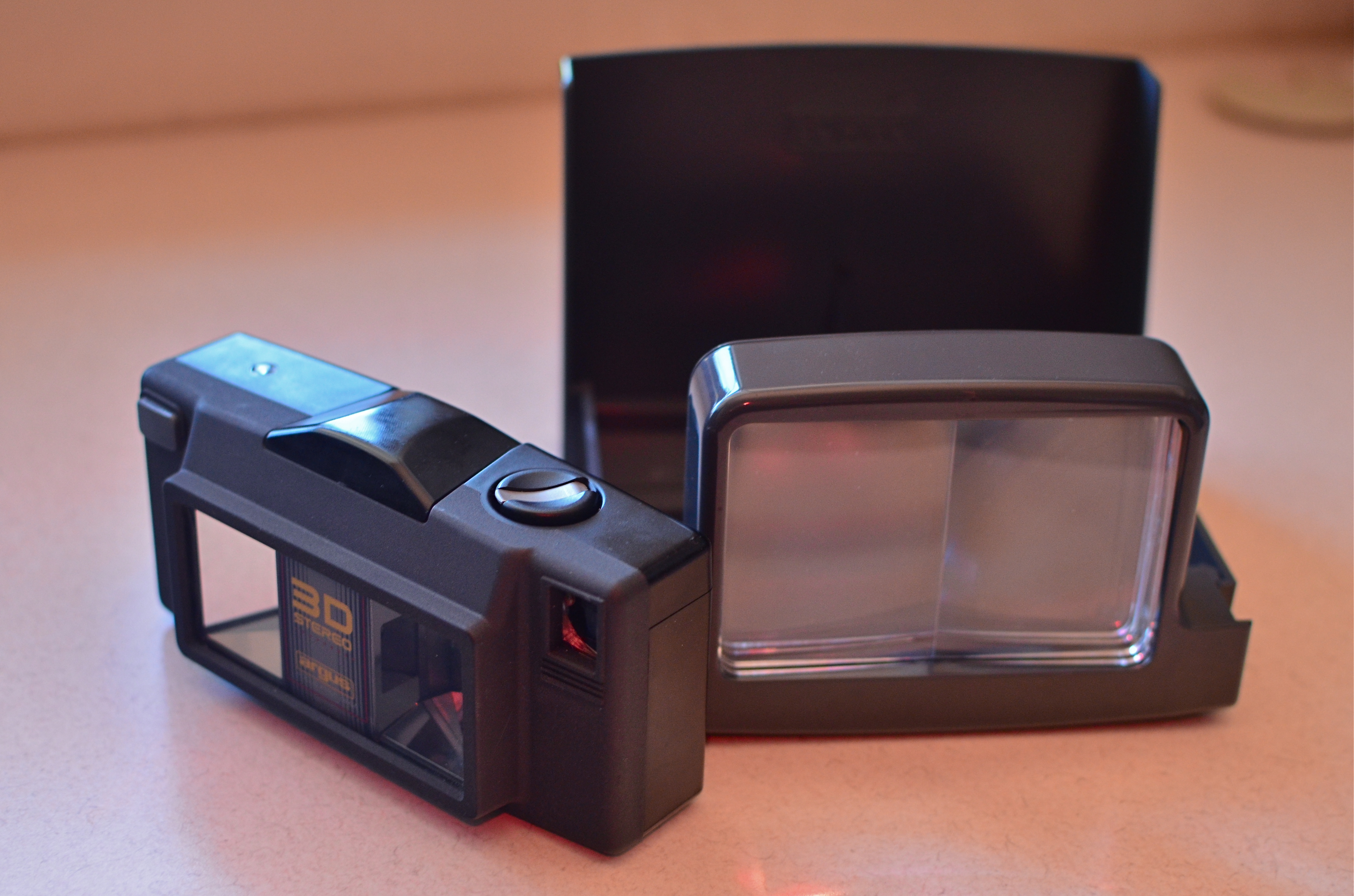
The (somewhat less than) Mighty Argus 3D film camera of the late ’90’s. shown here with its print viewer. Jealous?
This errant tonnage represents my first attempts with 3D photography, which involves a huge learning curve, not to mention a pound and a half of heavy-duty study. At the time I began this journey, very few stereoscopic cameras were available for sale, and the ones that produced the effect the best were also the most technically limited. The Argus/Loreo 3D, my toy of choice, was, in fact, a point-and-shoot 35mm with only two apertures, since the additional depth of field at f/11 and f/18 produced the best stereo illusion. The Argus was produced to create 4 x 6 prints (which you actually had to pay to have printed, remember), each featuring two side-by-side images viewed through a prism holder. It was not intended for high-end art use, since the lenses were frozen at 1/100, there were no additional optics available, and a usable result could only be achieved outdoors, in full daylight.
Worse, I stubbornly decided to shoot slide film in the thing, thus creating a whole separate set of problems for myself. First, were processors supposed to produce both images in the same slide? Well, sure, yeah, they could do that, but how was I going to view them? No worries! Turns out that other fools like me had also shot so-called “half-frame” stereo slides over the decades, and some of the viewers made to serve them were still on Ebay. Of course, I was shooting daylight slide film at 100 ASA in all conditions, and I didn’t yet know enough (or have enough money) to instruct processors on how to “push” the slide film an extra stop or two just to make them a trice lighter, so most of my shots were murky mysteries even Sherlock Holmes couldn’t decipher.
Worse, anyone shooting stereo must learn to compose for the depth effect, something you can only master by taking lots of lousy pictures (I did) or agreeing to take pictures of boring garbage just to attain said effect (did that, too). Add to this that you only had half of a 35mm frame in which to compose and you start to see what a raging success the whole enterprise was destined to be. At one point, I even went so far as to slice the twin images apart, re-jigger them in super-wide slide mounts, find an antediluvian projector that projected those kinds of slides ($$$), then search the globe again for viewing glasses that would allow me to see the projected slides in 3-d. Getting tired yet?
So, farewell to scads of badly composed, boring and unviewable slides, a grim reminder of how expensive and unwieldy large projects were in the film era. Post-script: I eventually thrived by learning to make my own View-Master reels (still expensive and work-intensive, but there’s a reason the format has been around nearly seventy years). At least the entire fiasco finally made a real editor out of me, teaching me a most valuable mantra: bad is bad is bad is bad. Some seeds will never become roses.
DO MESS WITH MR. IN-BETWEEN
Slot Canyon (2016)
By MICHAEL PERKINS
JOHANNES GUTTENBURG, THE MAN WHO DEVELOPED THE FIRST PRACTICAL SYSTEM FOR MOVABLE TYPE, is also said to have invented a kind of periscope, the better to peer over the teeming throngs at the local virgintennial festival. And while there is no record of what he was trying to see (or, more importantly, if he actually did see it), the longing to extend one’s vision around blind corners is one of the tantalizing mysteries of photography. The fact that we can’t make that 45-degree turn infuses many an image with a delicious kind of suspense.
Often when we compose a photo we imply the existence of a certain hidden something that the still image will forever shield from our detection. We photograph shadows that have no progenitors, streets that are halfway concealed by our shooting angle, and, always, the continuation of patterns and dramas that continue outside the boundaries of the frame. That frame has to be drawn somewhere, after all, and no matter how complete we attempt to make our stories within it, the imagination wants to stray toward whatever was “composed out” of the final product.
And therein lies one of the superb teases of our art. We can select scenes that deliberately torture the eye by denying access to What’s Over That Way or Where Does That Lead. We can abruptly rob the eye of the visual payoff for a conundrum that we ourselves have created. We can lie, cheat and steal. That is, I mean, who says you have to play fair with your viewer? Oh, you want me to tell you everything about this picture? Nuts. Figure it out yourself. Was it Colonel Mustard with a candlestick in the study, or….?
The master shot of the above image was a fairly typical out-the-window view from a hotel room, and originally ran a lot wider. Then it occurred to me that I could almost see something between the two buildings, and I re-cropped to make that “almost” the main part of the picture. Remaking the landscape view into a square introduced a little claustrophobia into the process, forcing the view exactly where I wanted it to hit. And finally, I desaturated all the colors in the shot except the orange of the sodium street lamps to amp up the glow in the aperture between the buildings.
I’m not suggesting that you intentionally make pictures with the sole purpose of messing with people’s minds. But, hee hee, you totally can. What’s around the corner? What’s up the street, beyond the curtain, just out of frame? Your picture, your game, your intentions. Take your audience’s eyes where you want them, and leave them there….between one choice and another.
COMPOSING ON THE RUN
An instinctual snap: sunset light on a forest path. And that’s that….or is it?
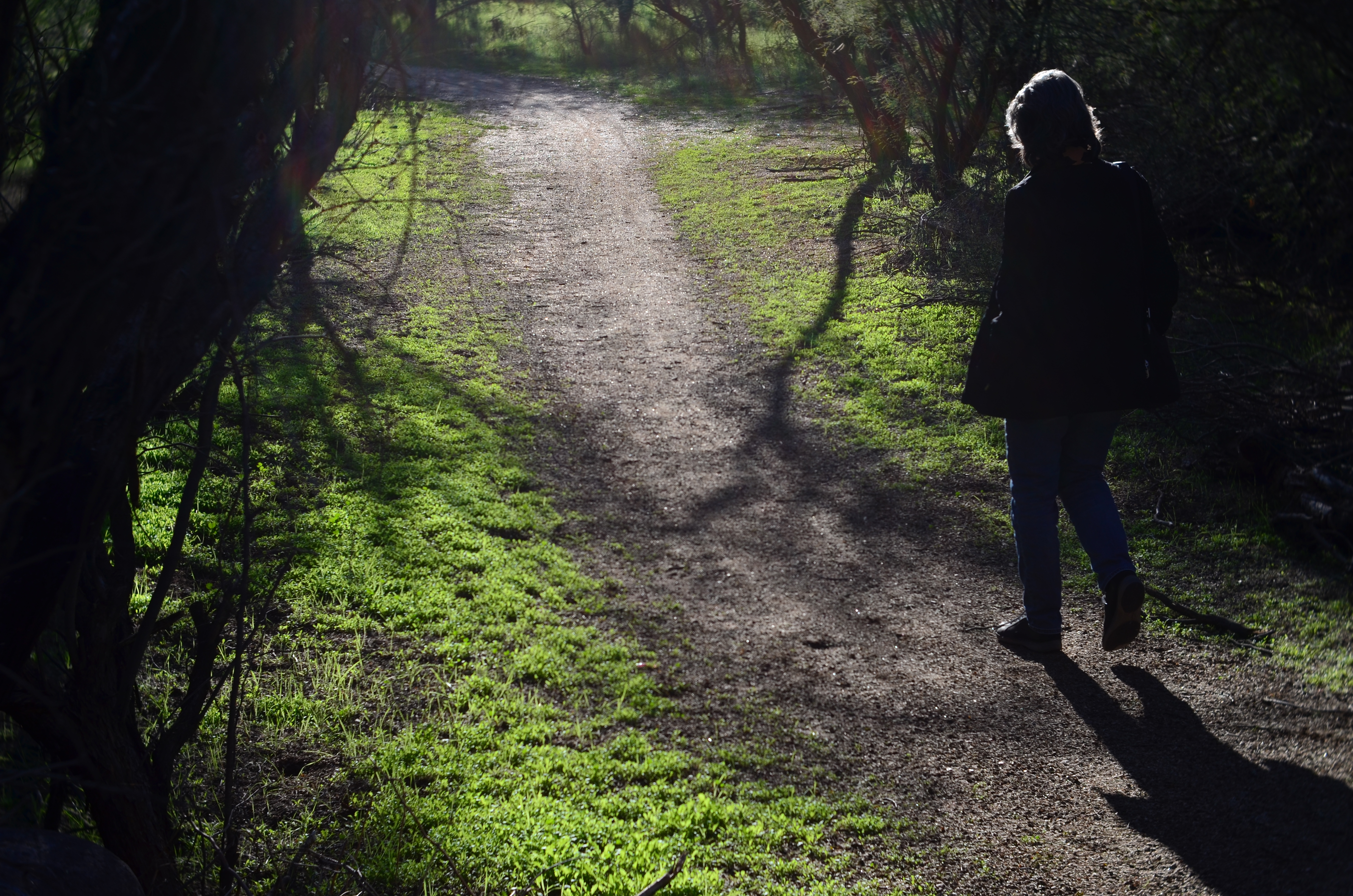
My wife enters the frame a second later.
By MICHAEL PERKINS
LOTS OF OUR BEST PHOTOGRAPHS ARE, EXCUSE THE EXPRESSION, snap judgements. Sometimes a composition simply seems to come fully formed, ready to jump intact into the camera, with no reasonable way to improve on a shot that is 99% pure impulse. Some of these gift moments are so seductive that we may not think to keep shooting beyond what we’ve perceived as the ideal moment. But more shooting may be just what we need.
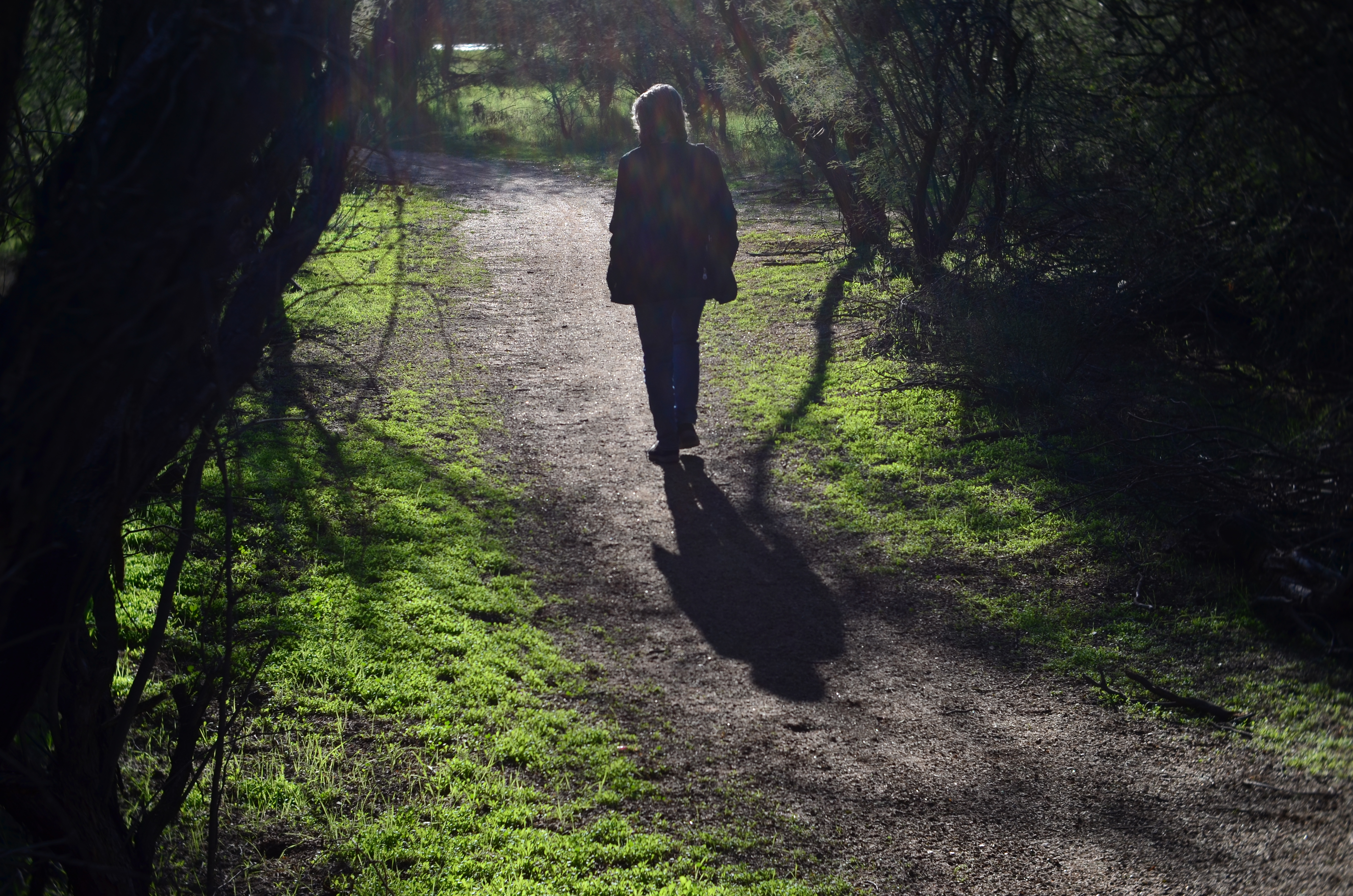
She walks to the upper center of the image..
Images that involve very fast-moving events may only have one key instant where the real storytelling power of the shot comes to a climax, with everything after seen as progressively less dramatic. The second after a baseball is hit: the relaxed smile after the birthday candles are blown out. Think, if you will, of a straight news or journalism image. Every second after the Hindenburg explodes is less and less intense.
But many images can be re-imagined second-by-second, with additional takes offering the photographer vastly different outcomes and choices. In the series shown here, I originally fell in love with the look of sunset on a wooded trail. My first instinct was that the receding path was everything I needed, and I shot the first frame not thinking there would even be a second. My wife, however, decided to walk into the space unexpectedly, and I decided to click additional frames every few seconds as she walked toward the shot’s horizon. She starts off in the lower right corner and walks gently left as she climbs the slight rise in the path, causing her hair to catch a sun flare in the second shot, and placing her in central importance in the composition. By the last shot, however, she is a complete silhouette at the top of the frame, taking her far enough “up” to restore the path to its original prominence with her as a mere accent.
and finally comes to rest as a mere decorative accent/ The trail is now nearly empty once again.
Which shot to take? Anyone’s call, but the point here is that, by continuing to shoot, I had four images to choose from, all with very individualized dynamics, none of which would have been available to me if I’d just decided that my first shot was my best and settled. There will be times when the fullest storytelling power of a photograph is all present right there in your first instinctive snap. When you have time, however, learning to compose on the run can force you to keep re-visualizing your way to lots of other possibilities.
EYEWITNESSED AND UNDERLINED

Does the use of selective focus in this image disqualify it as a “news” photo?
By MICHAEL PERKINS
IT WASN’T LONG AFTER THE INTRODUCTION OF PHOTOGRAPHY that one of the biggest and most durable myths about the new art was launched to generally unquestioning acceptance. The line “the camera doesn’t lie” attached itself to the popular imagination with what seemed the purest of industrial-age logic. Photographs were, to the 19th-century mind, a flawless record of reality, a scientifically reliable registration of light and shadow. And yet the only thing that moved as quickly as photography itself was the race to use the camera to deliberately create illusion, and, eventually, to serve the twin fibbing mills of propaganda and advertising. The camera, it turned out, not only could lie, but did do so, frequently and indetectably.
Later, as photojournalism came into its own, the “doesn’t lie” myth seemed to drape news coverage in some holy mantle of trustworthiness, as if every cameraman were somehow magically neutral in the way he shot an event. This, in spite of the obvious fact that, merely by changing composition, exposure, or processing, the photographer could alter his image’s impact…..its ability to, in effect, transmit “truth”. Certainly, outright fakery got better and better, but, even without deliberately trying to falsify facts, the news photographer still had his own personal eye, an eye which could easily add bias to a seemingly straightforward picture. Did this proclivity make his pictures “lies”?
As a point of discussion, consider the above photo, which is, fundamentally, a document of part of an actual event. But what can really be learned from what’s in the frame? Are there thousands at this rally, or do the attendees shown here constitute the entire turnout? Are all those on hand peaceful and calm, or have I merely turned my lens away from others, immediately adjacent, who may be screaming or gesturing in anger? And how about my use of selective focus with the girl in pink? Am I simply calling attention to her face, the colors in her outfit, her sign, her physical posture… or am I trying to make her argument for her by using blur to make everyone else seem less important? Am I an artist, a reporter, a liar, or all three?
Here’s the thing: since I don’t make my living as a journalist, I can choose any or all of those three job titles without fear of conflict. I work only for myself, so I make no claim for the neutrality of my coverage of anything, including landscapes, still lifes and portraits. I likewise make no guarantees of objectivity in what I regard as an art. Only the observer can decide whether the camera, or I, have “lied”. We repeat this mantra frequently, but it bears clear emphasis: photographs are not (mere) reality. Never were, never can be.
Good thing or bad? You literally take that determination into your own hands.
WORKS IN PROGRESS
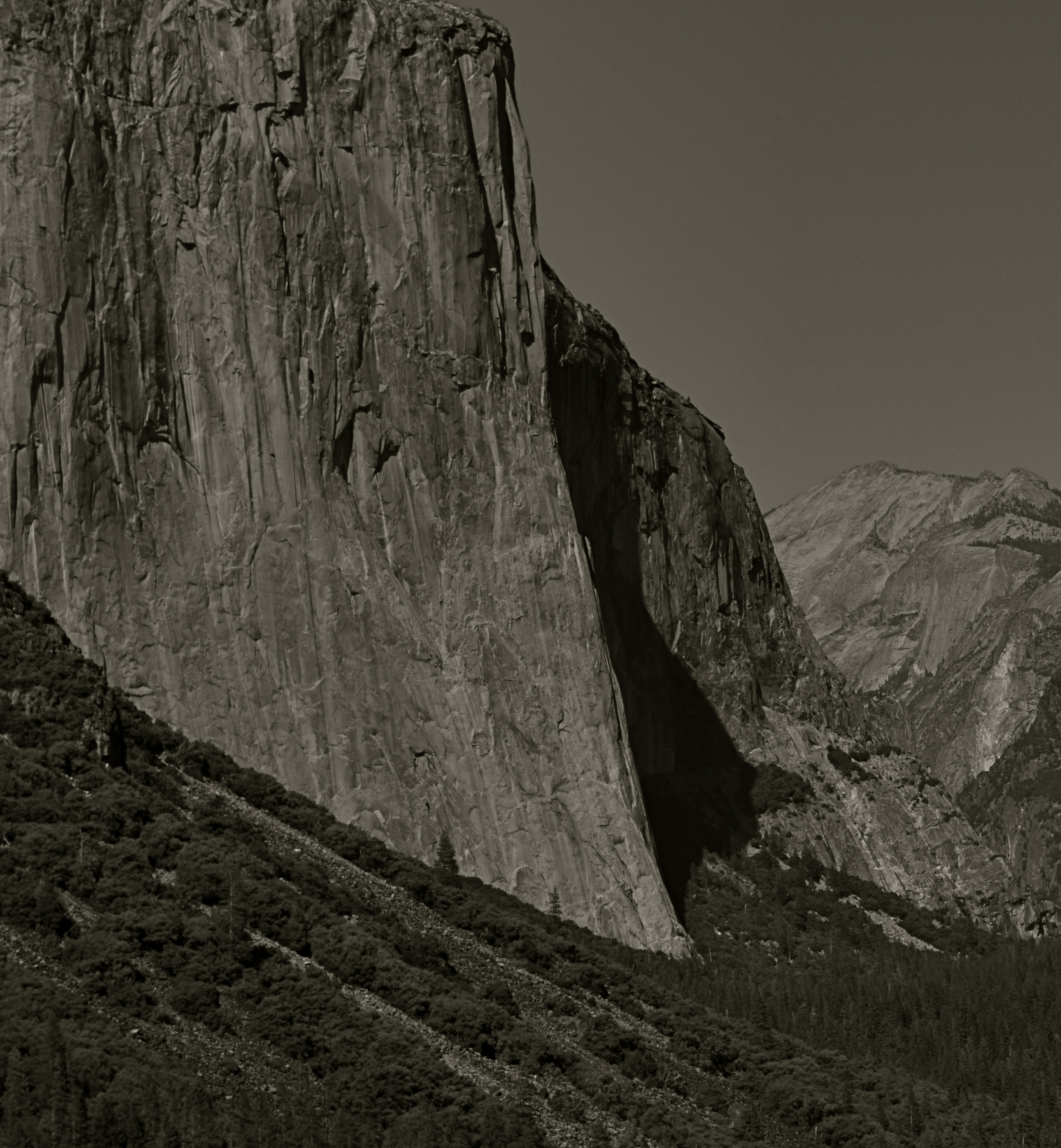
This view of El Capitan in the Yosemite Valley has been annually tweaked with various editing tools since being taken in 2012.
By MICHAEL PERKINS
IN REVIEWING YOUR PAST PHOTOGRAPHIC WORK, you are bound to find shots that you have, for lack of a better term, outgrown. Unpack that word, and what you’re really seeing is the passage of time since you originally visualized a picture, along with the immense distance your eye and mind have traveled en route to the present day. Thus you are both benefitting and suffering from the luxury you enjoyed in being allowed to freeze time. You have not only immobilized a moment, but you have also preserved a record of what your “best practices” were at the time.
This painful but necessary re-assessment applies not only to the techniques used to create the initial image, but, in the incredibly speedy evolution of post-processing, all editing systems as well. Quite simply, if a picture is worth taking, it is worth fighting for…first by being as mindful and deliberate as possible in the taking, and then in a constant re-evaluation of how best to enhance its impact through editing. Therefore, if the first commandment of photography is Always Be Shooting, the second should probably be Never Stop Processing.
The above image is an example of this continuing dialogue. it was originally taken in 2012 and I have revisited it at least annually since then. At the time I first shot it, it was part of a three-shot bracket of exposures that were originally blended in an HDR program to try to get about the same degree of detail in both highlights and shadows….a look which can look great if done with a maximum of understatement, but which often winds up looking like an old Yes album cover under black light. From HDR, I moved on to a series of detail-enhancing programs which were more natural-looking, but still failed to deliver the punch I got from viewing the scene on-site. In one iteration, I added enhancement to a single shot alone, rather than a combination of all three bracketed images. And in 2016, I went back to the trio, mixed this time in an Exposure Fusion blender. And there’s no end in sight.
Ansel Adams, of course, famously re-visited his master negatives with up to a dozen re-mixed versions of the same scenes over decades, re-thinking his own revolutionary “zone system” for measuring exposure for every single particle of a subject, then mastering its application in the lab via burning, dodging and other means of print manipulation. I don’t work with those particular (and essentially film-based) techniques for several reasons, most of them economic. However, that still leaves me plenty of editing choices, with more gimcracks coming online every day.
Point is, pictures that are truly worth working for are also worth re-thinking, and a growing array of tools can give photographers endless ways to re-mix the hits. Of course, you will eventually come to a point where enough is enough. Historically, it’s a good thing that the Pope gave Michelangelo a deadline, or else he’d still be up on that ceiling.
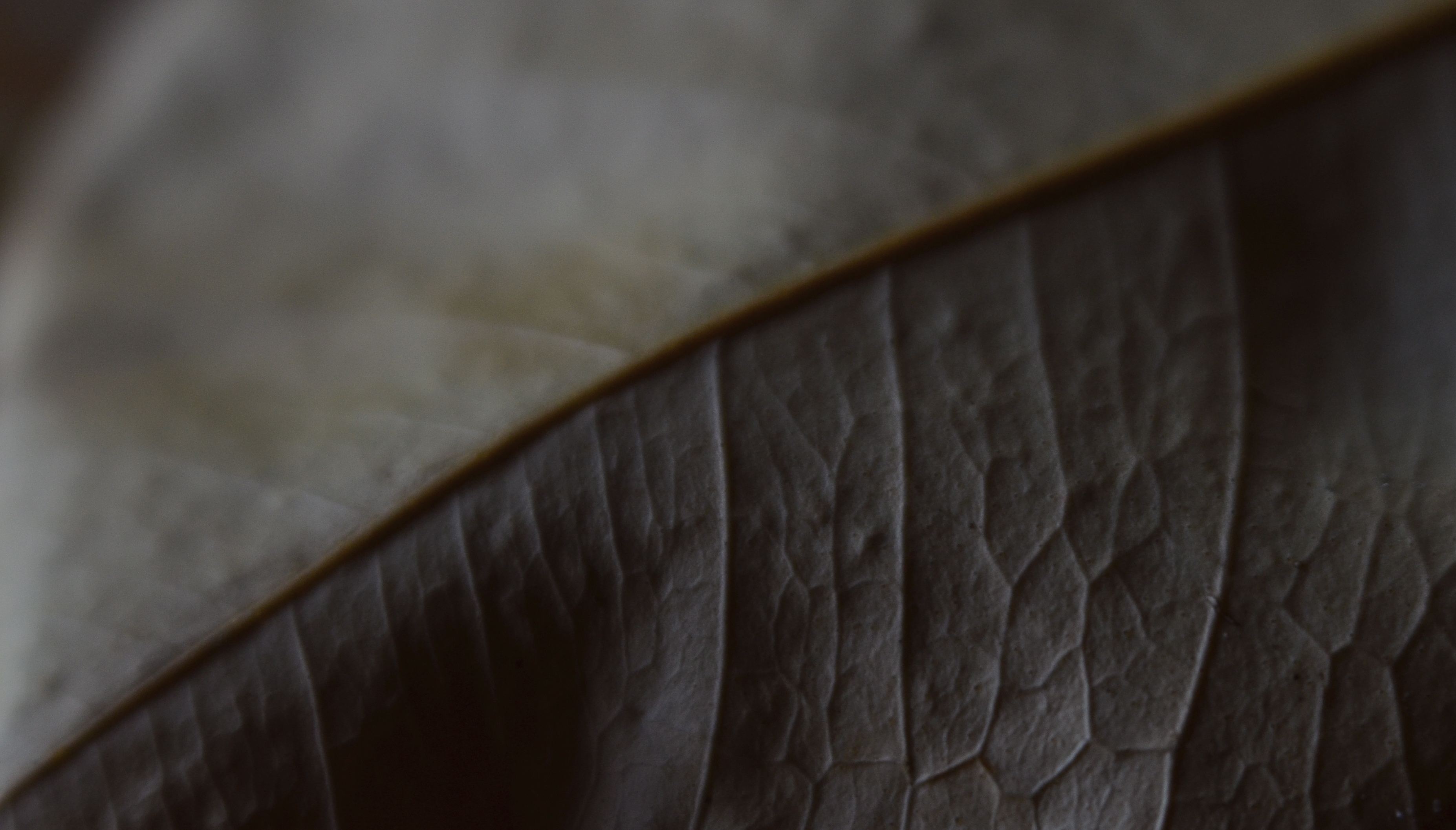
EXQUISITE CORPSES
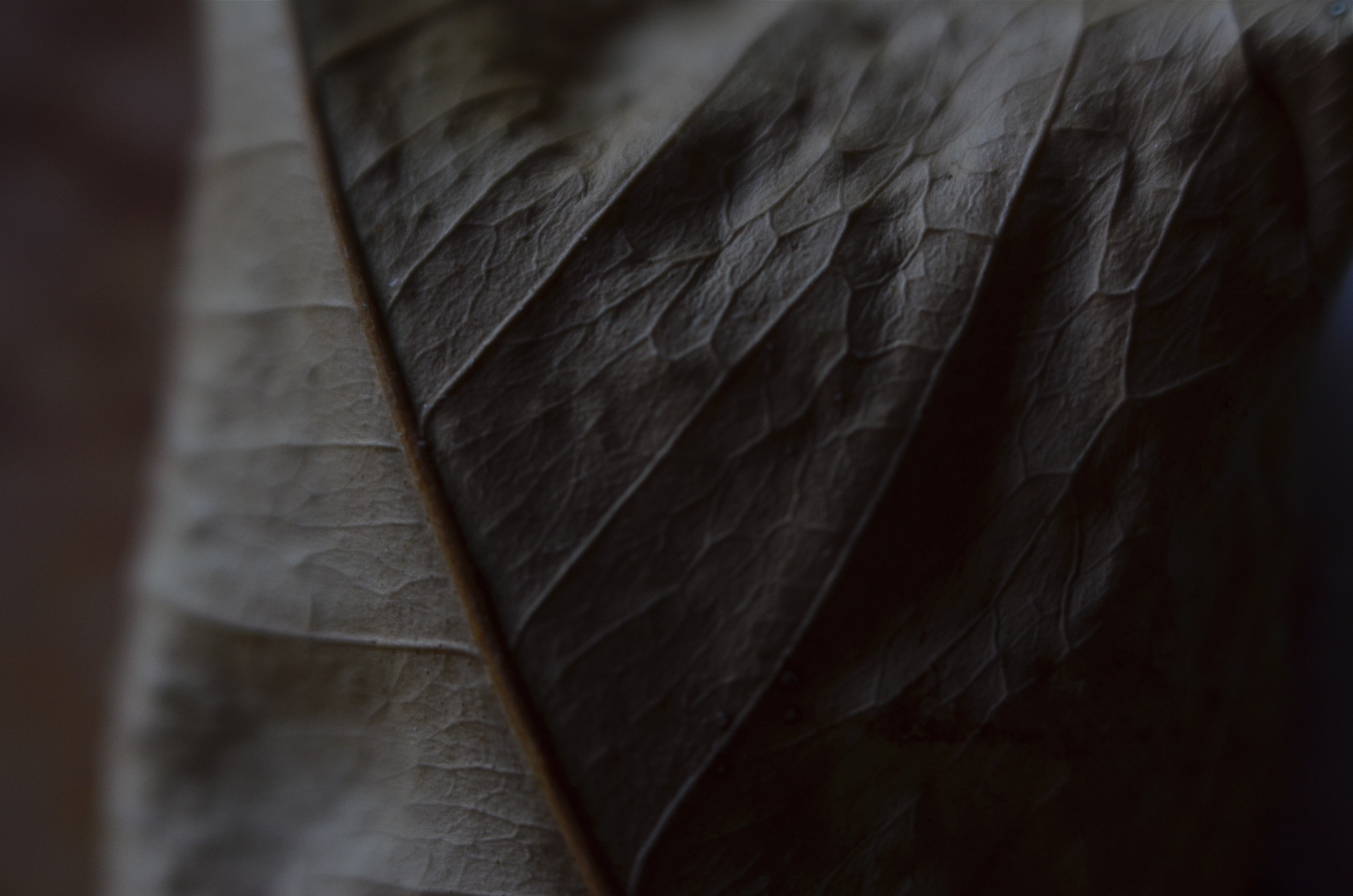
Phytomorphology 2 (2017). Macrophotography helps alter the memory context of familiar objects.
By MICHAEL PERKINS
AS A BOY, THEODORE ROOSEVELT TAUGHT HIMSELF THE ANATOMY OF BIRDS that same way James Audubon did, by studying birds he himself had killed. Although this coldly clinical approach may strike us as cruel today, it was accepted practice for a young naturalist in the late 1800’s, a time when even eminent surgeons, faced with a shortfall of cadavers for academic study, occasionally hired freelancers to raid graves in search of, er, manpower. And so it goes.
At decidedly less risk, photographers have also made still-life studies of dead things, from game kills to seed pods, trying to appreciate structure, design, and function in a controlled environment. But there is more to their pokings than the grand advancement of science, given that death changes things in a way that transforms their aspect, altering their usefulness as visual subjects. Objects that have gone from living to non-living reflect light differently; textures and patterns are re-shaped; in short, the thing becomes an abstraction of itself.
Add magnification to the mix, and a thing becomes completely untethered from our usual conception of it, since, among other things, we are used to viewing it from a distance of feet or inches rather than millimeters. Just as where you stand affects the impact of a landscape, the place where you park a macro lens on an object dictates a completely different story with just the smallest variation.
There is a renewed fascination in the photographic world with minimalist abstraction, in which an object is changed so much in magnification and composition as to become a completely new thing, or…if the photographer so desires, a whole new nothing, a subject with which the viewer has no prior associations, functioning as pure pattern or design. For me, that’s the appeal of macro work…..to take the familiar and render it neutral in meaning, allowing me to re-assign it visually, to ask the viewer to, in effect, regard it as a foreign object, one that can take on whatever significance he sees fit.
Photography is primarily about what to see but it often provides cues as to how to see as well. Viewpoint is verification, and things impart different truths to our eyes, depending on how we approach them.
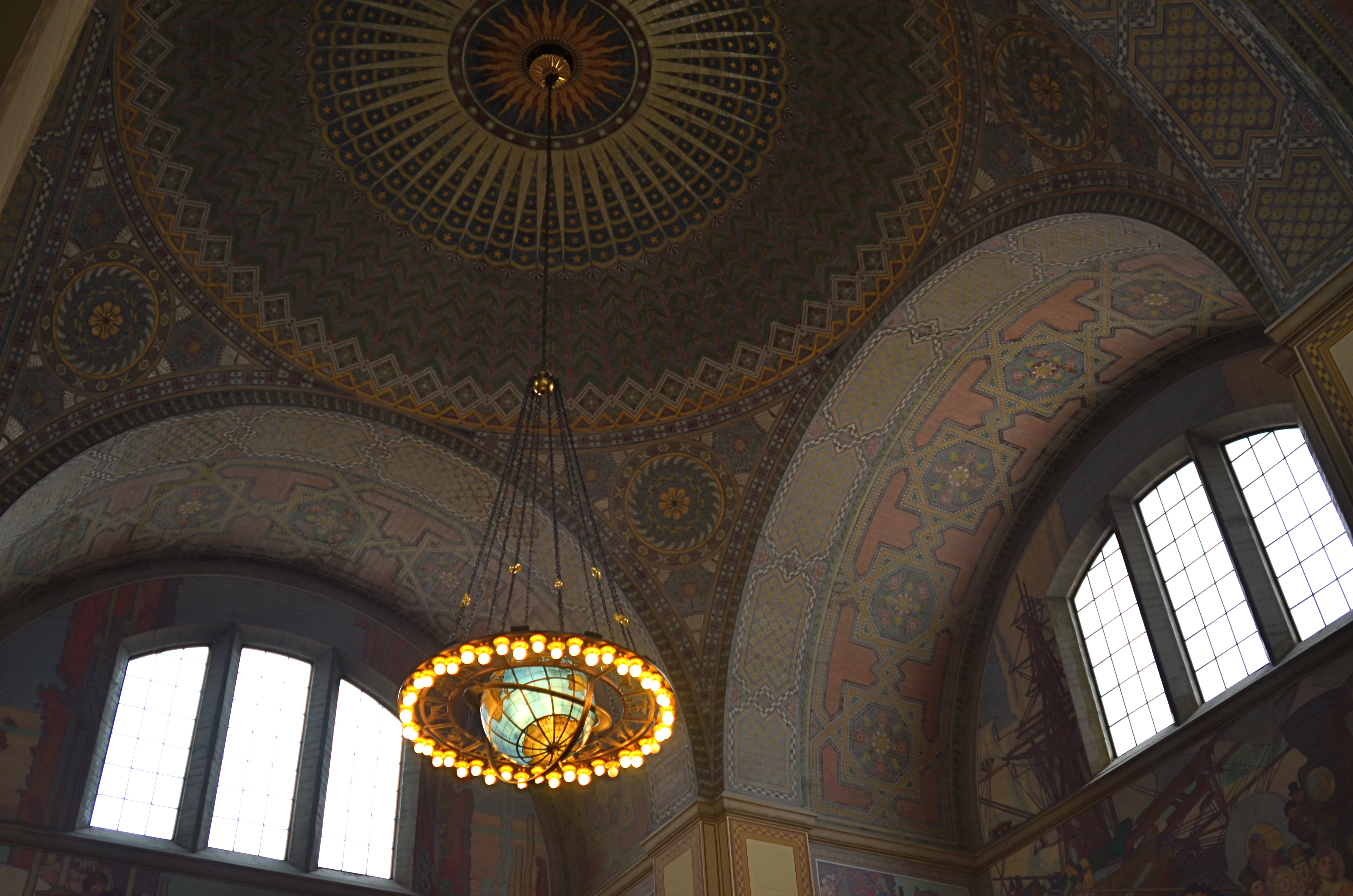
DEFINING SPACE
The use of an extreme wide-angle lens, like this fisheye, need not generate the bendy look of “barrel distortion”. It’s all in the composition.
By MICHAEL PERKINS
VISIT ENOUGH TOURIST SITES and you will eventually encounter the challenge of capturing very large objects, trying to squeeze the whole of a cathedral or a canyon into a single frame. Using a wide-angle lens is the first instinct, of course, but since even a 35mm is considered a wide-angle of sorts, there are any number of choices that all have their own pluses and minuses.
The lower the millimeter number, of course, the wider the lens. Simple enough on the surface, but you still have to decide what kind of wide you prefer. Each lens has slightly different coverage and properties, with the “super-wides” adding their own distinctive traits to the space you’re trying to capture. The two main properties you’ll notice most are barrel distortion and dimensional exaggeration, both of which will affect your lens choice for a given shooting situation.
Let’s look at barrel distortion. Lenses wider than about 24mm can make straight walls appear to bend outwards like the sides of a barrel, creating an unreal, and, for some, somewhat claustrophobic appearance most associated with the ultimate width of a fisheye (something around 8mm). The effect is that of a world cramped into the inside of a snow globe, and, depending on what look you’re going for, it can either be marvelous or miserable. It’s marvelous, for example, if you want to suggest tremendous depth in a shot.
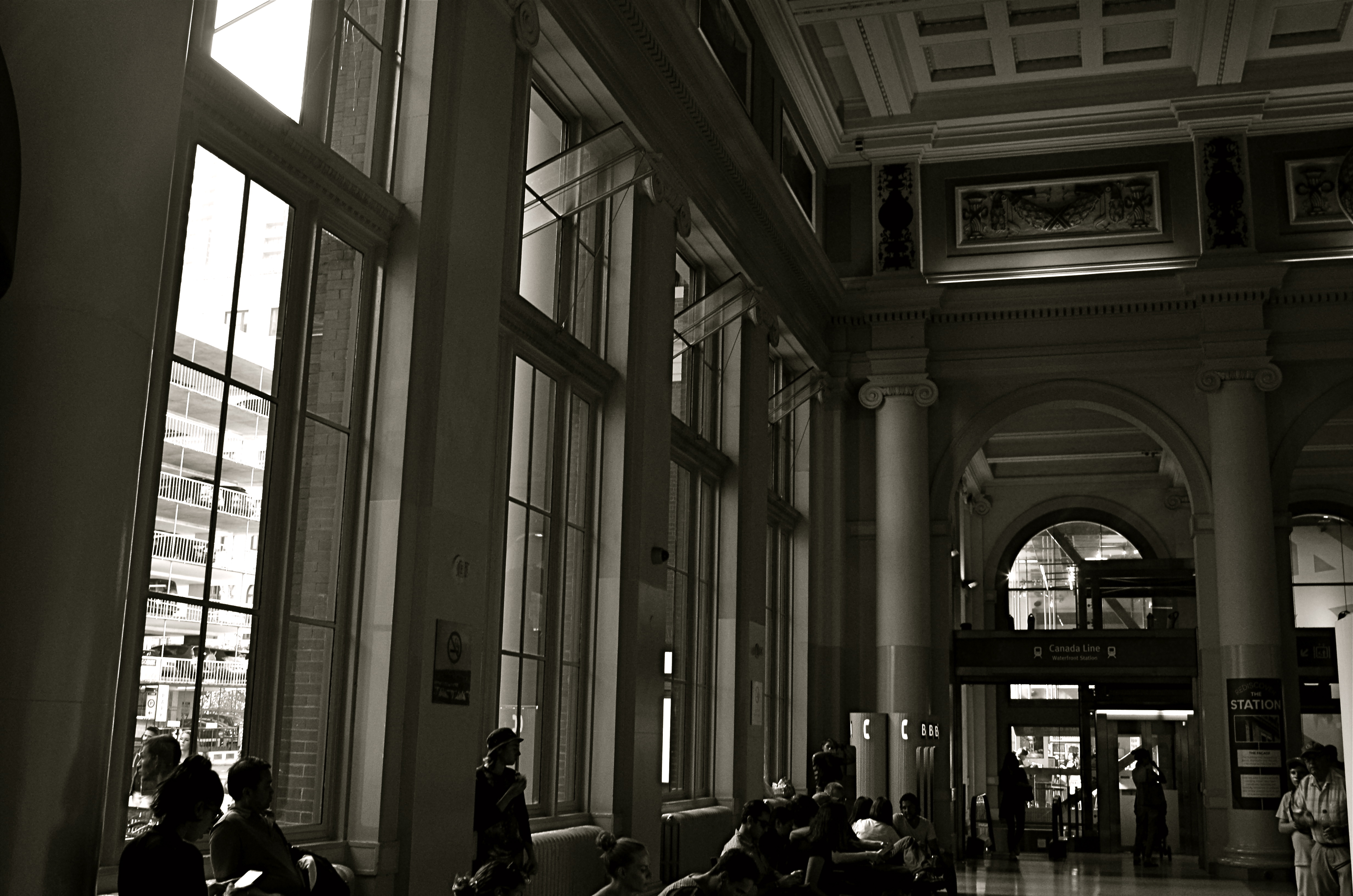
A more modest wide-angle, like this 24mm delivers more conventional dimensions, but not as much coverage.
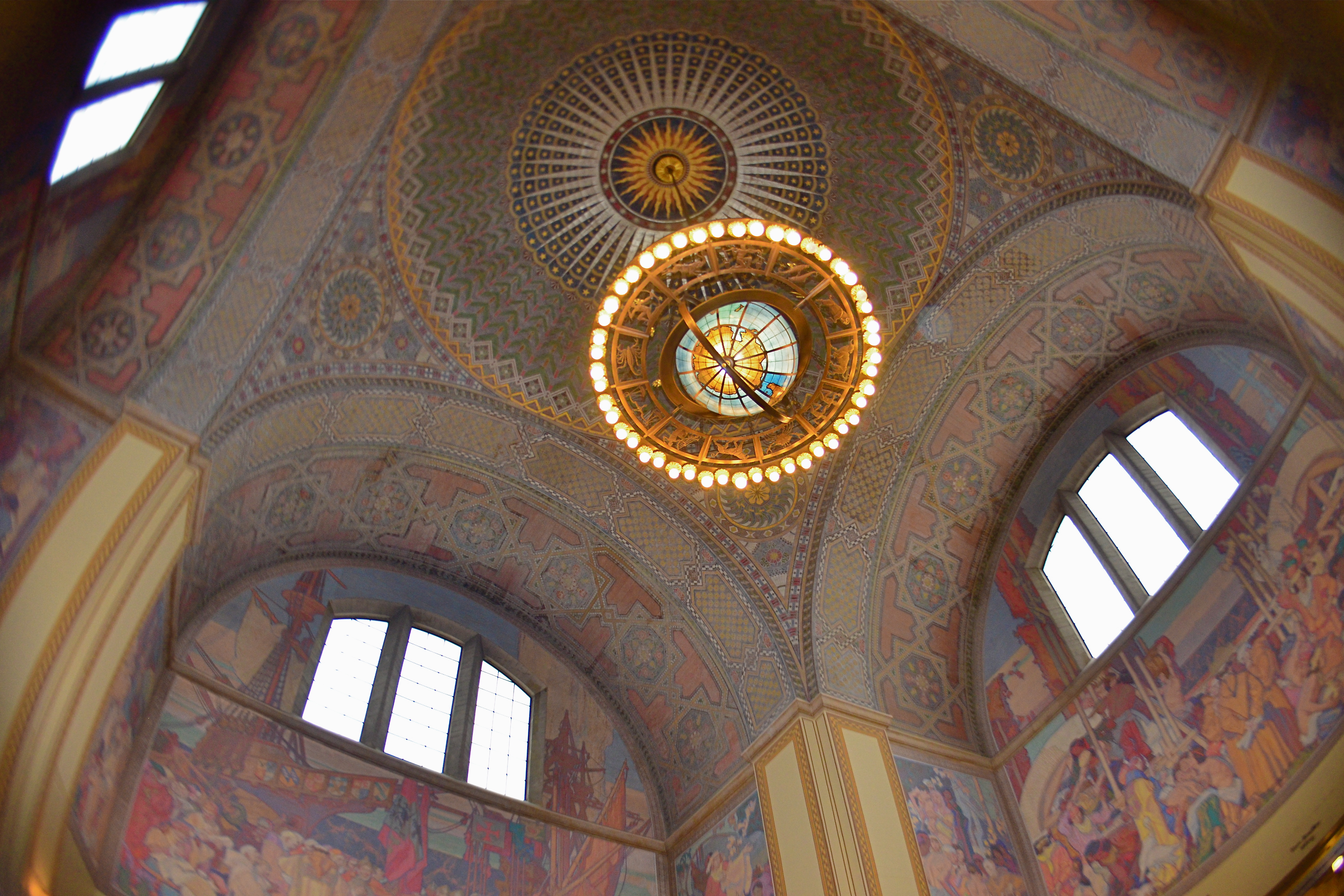
And that’s dimensional exaggeration, the other key trait of a super-wide, in which the perception of distance from front to back is greatly hyped, making a deep space look even deeper. Shooting a cavernous area like the inside of the rotunda at the Los Angeles Central Library, as seen in the frame at top, you may want to suggest vastness, and a fisheye, such as was used here, does that superbly. All I’ve done to defeat the accompanying barrel distortion is to crop away the original frame edges. Of course, using a more conventional focal length like a 24mm, as seen directly above, shows all dimensions in a much more natural way, but they sacrifice coverage area, revealing less of the ceiling and sides and creating the sensation that the shot is not inclusive of enough information. In the case of both lenses, how you frame and where you stand will produce significant variations on how you render the space.
Photography is about what to fill the frame with, of course, but it also involves some planning as to how technology does that best, based on the tools at hand and what they’re equipped to do.
STREETER THAN THOU
When people are mere compositional components in a scene, is that still “street photography”?
By MICHAEL PERKINS
ONE OF MY FAVORITE JOKES ABOUT HOW HUMANS END TO OVER-THINK THINGS involves a farmer standing by the side of the road with a herd of cattle, who is greeted by a passing urban tourist. “Excuse me”, says the visitor, “are those Herefords or Guernseys?” “Gee”, replies the farmer, “I just call ’em ‘moo-cows’!”
Similarily, I sometimes think that the weighted term street photography is more distinction than difference. City, country, street, pasture…hey, it’s all just pictures, right? Yes, I know….”street” is supposed to denote some kind of commentary, an interpretive statement on the state of humanity, an analysis on How We Got Here. Social sciences stuff. Street work is by nature a kind of preachment, born as it was out of journalism and artists like Jacob Riis and Lewis Hine, who used images to chronicle the city’s ills and point toward solutions. For these geniuses and so many that followed, those street scenes rested fundamentally on people.
And by people, we mean discernible faces, unposed portraits that seared our souls and pricked our consciences. Street photography came to focus almost solely on the stories within those faces: their joy, their agony, their buoyant or busted dreams. In my own work, however, I am also drawn to street scenes where people are not front and center, but blended into the overall mix of elements, props, if you like, in an overall composition, like streetlamps, cars or buildings. There can be strong commentary in images that don’t “star” people but rather “feature” them. Walker Evans, one of the premiere shooters working for the New Deal’s Farm Security Administration, and creator of many classic depictions of the Great Depression, remarked that folks, as such, were not his aim when it came to street shots. “I’m not interested in people in the portrait sense, in the individual sense”, he said in 1971. “I’m interested in people as part of the pictures….as themselves, but anonymous.”
There is always a strong strain of competition among photographers, and street photography can become a wrestling match about who is telling the most truth, drilling down to the greatest revelation….a kind of “streeter than thou” mentality. However, just because something is raw and real doesn’t make it interesting, or else we could all just shoot the inside of garbage cans all day and be done with it. Compelling is compelling and boring is boring and if you know how to make a picture that grabs the eye better than the next guy, then subject matter, even motivation, doesn’t matter a damn. The picture is all. The picture will always be all. Everything else is noise.
RICH, TALENTED BOY MAKES GOOD
Jacques Henri Lartigue chronicled the gauzy, gay world of upper-class France in the early 1900’s.
By MICHAEL PERKINS
THE MOST APPEALING FEATURE OF EVERY NEW ART is that, for a while, everyone participating in it is an amateur. Because a new art has no history, it has no history-makers….no professionals, no celebrated artistes, no one who is doing it better. Everyone is, briefly, in the same “how-do-you-work-this-thing?” boat.
Of course, eventually, some ornery cuss or another begins to figure out how to progress from stumblebum to star, and then everyone’s off to the races. Photography, like other infant arts, began as a tinkerer’s toy, sprouting an occasional outlier genius here and there, until the pool was fairly crowded with People Trying To Make Their Mark. And one of those first mark-makers was not yet out of short pants when his pictures began to be the embodiment of the phrase “and a little child shall lead them.”
His name was Jacques Henri Lartigue, and, whatever else formed his strong visual sense, it certainly wasn’t the nobility of poverty, born, as he was, in 1894 in France to upper-class wealth and the privilege that went with it. His photographic muse thus contained none of those inspiring Lean, Hungry Years or Hard-won Real World Experiences that we associate with mature art; the kid was just born with an instinctually strong knack for composition, and what he chose to compose just happened to be the activities of the Rich and Famous….in other words, everyone he hung out with.
Lartigue’s social set were the racers and aviators of the sleek new century.
Lartigue’s social set was the class every other social set in France aspired to; the people who seasoned at the Rive Gauche, the people who competed in lawn tennis tournaments, the country’s first race car drivers and aviators. Armed with a simple gift camera, and taught processing by his father, Jacques began snapping the world around him at age seven, maintaining journals that contextualized the images, bookmarking his family’s gilded role in the newborn twentieth century.
Gifted with an eye for photographic narrative, Lartigue nevertheless segued into painting, where he spent virtually his entire adult life. In fact, it was not until a friend showed some of Jacques’ photos to John Szarkowski, director of photography at the New York Museum of Modern Art, that Lartigue had his first formal photographic exhibition, in 1963, when he was sixty-nine.The show led to international recognition of his untutored yet undeniable talent, as well as a few prize portrait commissions and a second social career with the same elite one-percenters with whom he had rubbed elbows as a boy. One of his final collections, Diary Of A Century, was published in cooperation with Richard Avedon in 1978. He died a late-blooming “overnight success” at ninety-two.
What began for Jacques Henri Lartigue as family snapshots became one of the most important chronicles of a vanished world, and thus the best kind of photojournalism (or sociology, depending on your college major). For shooters, this boy of privilege remains the romantic ideal of the talented amateur.

I’VE JUST SEEN A FACE
Am I this person? Do I know this guy? Am I getting him “right”?
By MICHAEL PERKINS
…..through his nightmare vision, he sees nothing…..blind with the beggar’s mind, he is but a stranger to himself –Winwood/Capaldi
GRINNING, FRIENDLY LIARS: that’s what most of us are when offering up a socially amenable mask for public conception as a photographic portrait. It’s the facial equivalent of “putting your best foot forward”, an official version of someone who possesses our features but is as different from our selves as, to quote Twain, lighting is from the lightning bug. So who should know that genuine person better, or can capture its reality more accurately than we ourselves? Right?
Or not.
We (the ultimate authority on us), are usually among the least trustworthy of narrators on our favorite subject. Many a memoir is merely a selective reconstruction of one’s past, leaking credibility at every seam. So why should our photographic self-portraits be any more reliable? We believe that we can reveal things outsiders can’t see, that our “real” face can only be shown by our own hand….that the others don’t really “get” us. But what actually happens with the insane new flood of selfies washing over the digital shores is that we merely substitute one “correct” face…the one we give to other photographers…for another, no less crafted, no less artificial. We are still trying to concoct an image that we feel is fit for public consumption. And we invariably fail.
This is hardly a new trap. Photographers have been trying to tell their own facial stories for over two centuries, sure that their interpretation of their secret selves will succeed where other chroniclers fall short. But the best self-portraits are still abstractions, momentary samples of our personality, never the personality in full. Ironically, we might make pictures of our selves that we prefer over those others make of us. Perhaps they are technically better, more deliberate, more flattering, and so forth. And maybe we like the selves we shoot better because they actually conceal what we want to remain hidden, whereas the stranger’s eye is, in fact, too penetrating for our comfort.
Contemporary solutions to this legendary conundrum know no limit. Every shooter has his or her own approach to a statement of self in an image, with some choosing to deliberately camouflage or hide themselves, and other concocting very formalized creations that mock the idea of recognition while seeming to be “real”. In Jackie Higgins’ wonderful book on alternative techniques Why It Does Not Have To Be In Focus, she argues that “faces rarely reflect the inner workings of minds”, suggesting that “there is no such thing as the unified self.” The take-home: you can’t get it right, this business of knowing and showing your own face. Does that mean the quest is unattainable? Sure.
Or not.
Share this:
February 13, 2017 | Categories: Conception, Portraits, Self-Portrait | Tags: Abstract, Commentary, Interpretation | Leave a comment