(LESS THAN) PRIME OPPORTUNITY
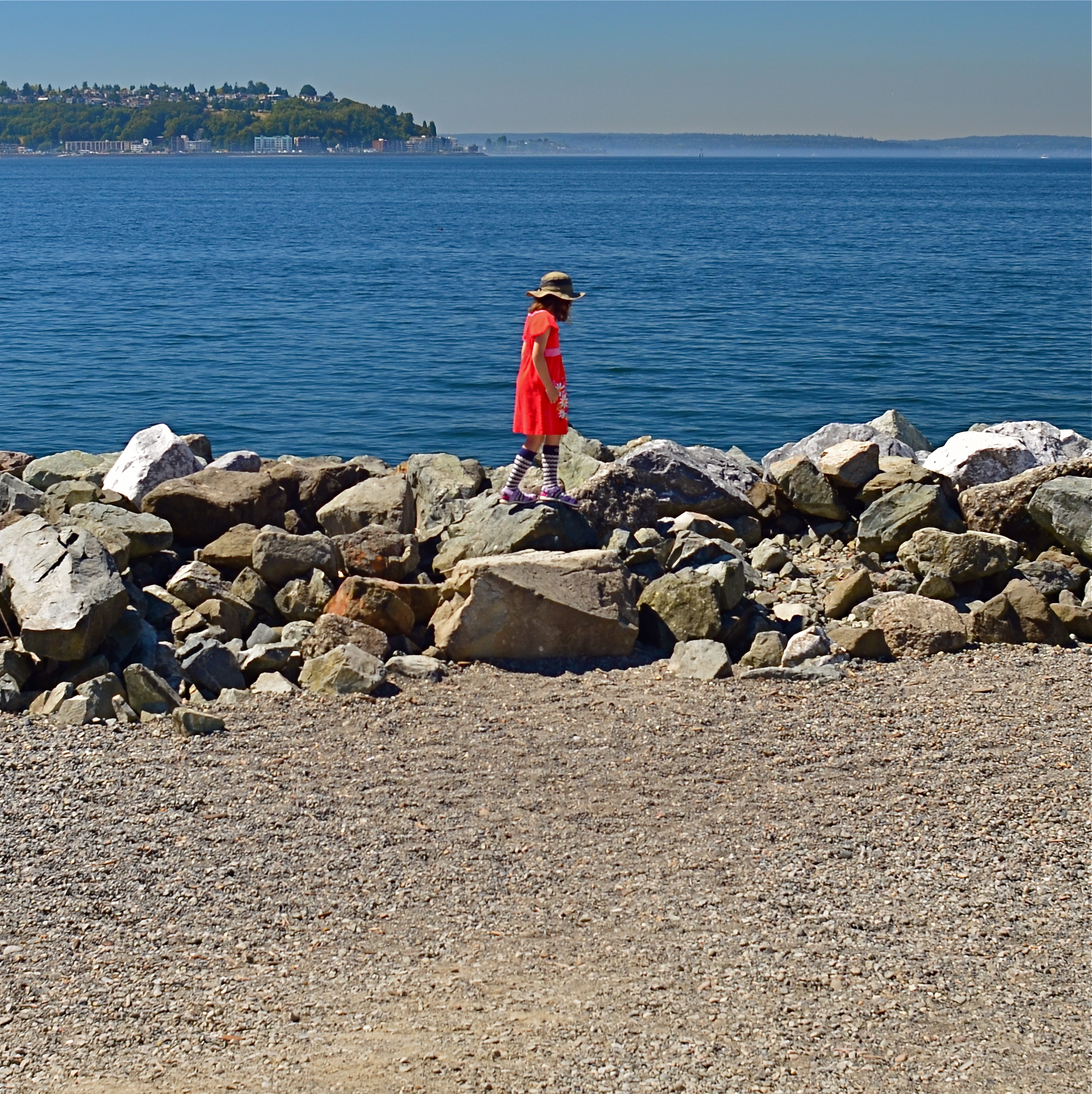
To Susan On The West Coast Waiting (2016). Shot from over 50 feet away with a 24mm wide-angle prime, then cropped nearly 70% from the original frame.
By MICHAEL PERKINS
EVERY DAY-LONG SESSION OF TRAVEL PHOTOGRAPHY dictates its own distinct rules of engagement. You can predict, to some degree, the general trend of the weather of the place where you’ll be staying/playing. You can pre-study the local attractions and map out at least a start-up list of things you might like to shoot. And you can choose, based on all your other prep, the equipment that will work best in the majority of situations, which keeps you from carting around every scrap of gear you own, saving reaction time, and, possibly, your marriage.
All well and good. However, even assuming that you make tremendously efficient choices about what lens you’ll most likely need on walkabout, there will be the occasional shot that is outside the comfort zone of said lens, something that it won’t do readily or easily. In such cases, the lens that would be perfect for that shot is likely forty miles away, back at your hotel. And here’s the place where you can pretty much predict what I advise.
Take the shot anyway.
The original composition.
I tend to work with a 24mm prime f/2.8 lens when walking through urban areas. It just captures a wider field within crowded streets, allowing me to grab most vistas without standing in the path of onrushing traffic (a plus) or spending a ton of time re-framing before each shot (a pain). This particular 24 was made in the ’70’s and is both lightning fast and spectacularly sharp, which, being a manual lens, also saves time and prevents mishaps.
24mm, to me, produces a more natural image than the wide end of the more popular 18-55 kit lenses being sold today, since there is less perspective distortion (straight lines remain straight lines). However, since it is a wide-angle, front-to-back distances will appear greater than they are in reality, so that things that are already in the distance seem even more so. And, since it is also a prime, there is no zooming. In the case at left, I wanted the girl’s bonnet, dress and presence on those rocks, but, if I was going to get any picture at all, plenty of other junk that I didn’t need would have to come along for the ride.
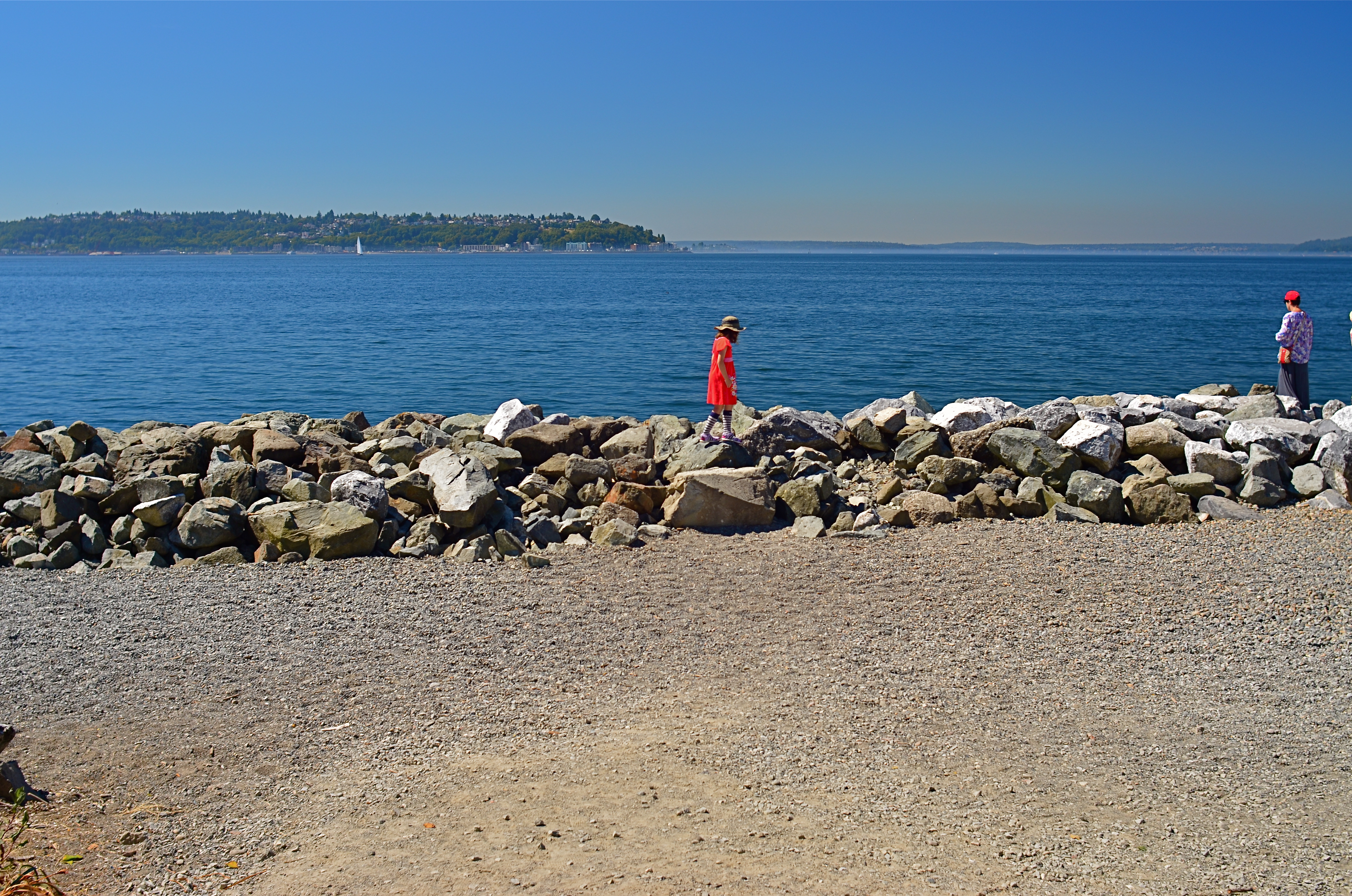
You deal with the terms in front of you at the time. Without a zoom, I either had to take the shot, with the idea of later cropping away the excess, or lose it altogether. There are times when you just have to visualize the final composition in your mind and extract it when it’s more convenient. Simply capture what you truly need within a bigger frame of stuff you don’t need, and fix it later. It’s a cornball cliché, but the only shot you are guaranteed not to get is the one you don’t go for. And this is also a good time to remember that it’s always smart to shoot at the biggest file size you can, allowing for plenty of pixel density even in the aftermath of a severe crop.
You can’t pre-plan all the potential pitfalls out of a photo vacation. Can’t be done. Come as close as you can, and trust your eye to help you rescue the outliers down the road.
But take the shot.
ANTICIPATION
By MICHAEL PERKINS
SPORTS PHOTOGRAPHY IS FLAT-OUT REPORTORIAL IN MOST CASES, placing its crucial emphasis on the capture of “the decisive moment”. The play that saved the day, or, at least, earned the headline. Hail Mary passes. Impossible catches. Long, nothin’-but-net buzzer-beaters hurled hopefully from Downtown. These are the essence of sports coverage; images that freeze such moments, photos which often outlive the text that they were designed to accompany. Sports photography is, for the most part, about moments of record, moments of now.
Take it out of its pro-level context, however, and sports, as played by most of the rest of us, can simply be about someday….or more precisely, any moment now. Sports reports are often viewed as strongly edited segments that stitch together one now moment after another in breathless digests of daily “greatest hits”. For many of us regular slobs, however, life isn’t played out that way. Real time, on our playing fields, consists of an infinite number of long, eventless stretches. Sadly, most of us don’t move seamlessly from career high to career high. Instead, there are many stops along the way…to smell the roses, count down the clock, and praaaaaaay for the final bell.
Photographically, kid sports often strike me as more fun than adult games, principally because the terms of engagement are so very different from the grown-up stuff. Children’s games are free of the deadly seriousness that seems to have tainted sports in recent years, robbing them of much of their playful escape. Young Dick and Young Jane aren’t doing this for a living. There is seldom anything of consequence on the line, except maybe the vanity of their parents. And when it comes to providing great images, the mix of true technique and awkward innocence makes for a charming combination, as the young combatants ape their mentors, even as they betray their innate kid-ness.
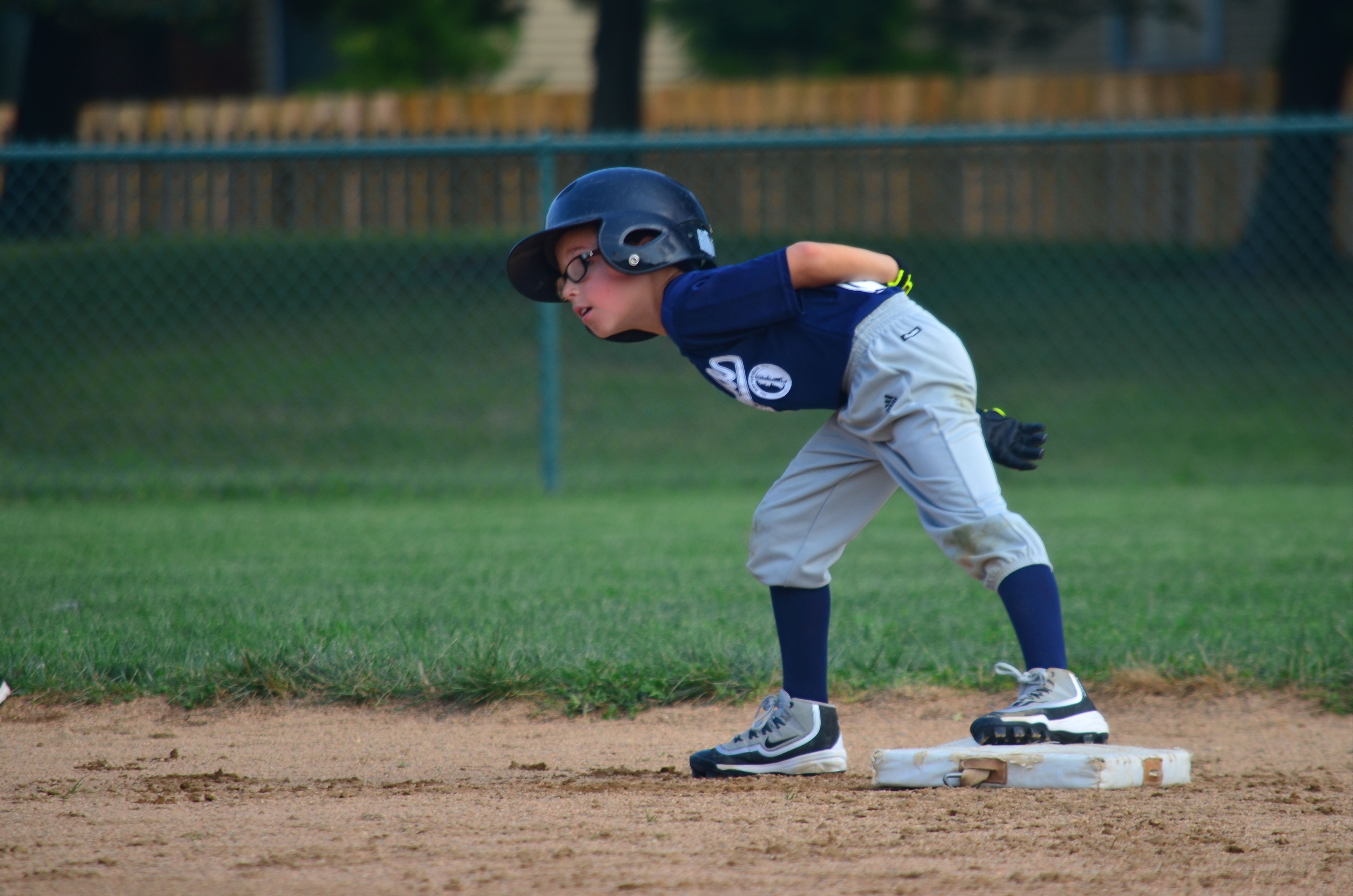
Opportunity..? (2016)
The young man captured here is, above all else, having fun. He’s enjoying the sweet anticipation of the unexpected. He already has the mechanics of a young pro, but his curious exploration of the option of stealing third is all little boy. Lots of story here, and in many moments which never approach the drama of a national championship or a three-peat. Images are narratives, and, in photographing more than just a player’s once-in-a-lifetime Grand Slam, we learn about striving. And waiting. And dreaming.
Theirs and ours.
OF TATTOOS AND STENCILS
By MICHAEL PERKINS
IN CITIES, ONLY A SMALL PORTION OF THE DAY’S NATURAL LIGHT actually makes it all the way to the street unbroken. You can almost think about it like rain, in that it drips, slithers, drains, and channels its way downward through a dense maze of structures and barriers. Along the way, that light is bisected, sliced, stenciled and tattooed by the surfaces it interacts with, stretching shadow patterns, glinting, ricocheting, stretching.
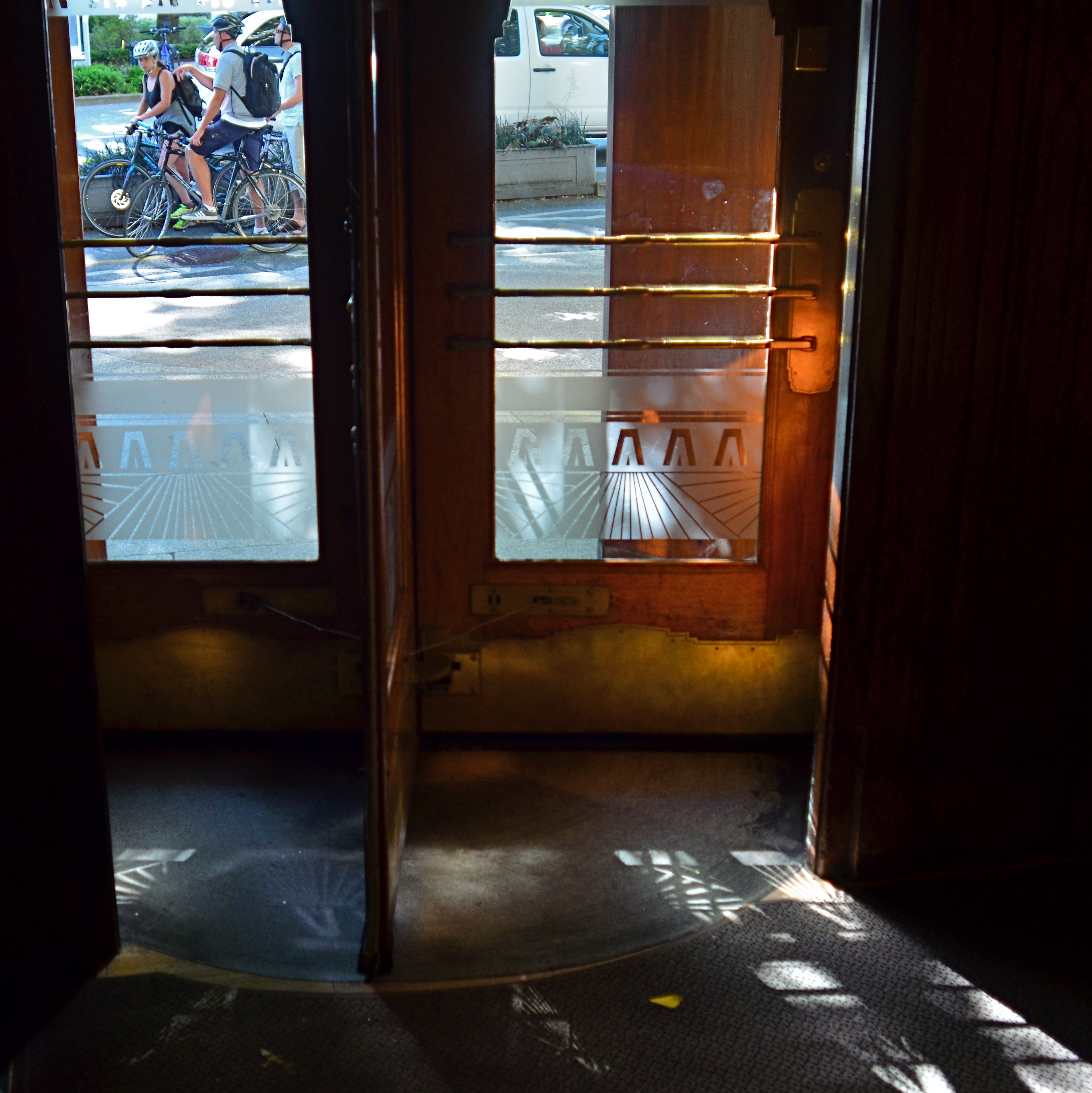
Glass, especially, constantly reshapes light, filtering it into delicate lattice-works and spectral spiderwebs, sifting it through windows, transoms, doors, windshields, storefronts. It reveals and conceals, crawling across buildings like an ever-changing sundial of shapes and schemes. Photographing the same hunk of glass on the hour can be like visiting a dozen different worlds, spread out like fanned playing cards over the course of a single day.
Light illuminates, making it a force that acts upon other objects, but it is almost more marvelous when it, itself, is acted upon, creating an endless choreography and echo of its colors and contours. It’s part of the great interactive ballet of cities, this push and pull between light and darkness. Sometimes you get a nearly kaleidoscopic effect from something very simple, like the etched glass in the revolving door seen above, which stamped a different snowflake of shapes onto the pavement at every turn and swivel.
If you’re given to experiment (or daydreaming), your own tabletop can become a tremendously valuable laboratory on the effect of light. Just grab the simplest object handy, be it an apple or a book, and arc a source of light from one side of it to the other. Imagine yourself a self-propelled sun and watch how easily you can create change in your private solar system. The actual design of such an exercise isn’t crucial, but making yourself mentally slow down, becoming aware of the tiny effects perpetually swimming about you, is invaluable. Photographs rise at the hands of some pretty small phenomena. Magnifying your gaze puts more images within your reach.
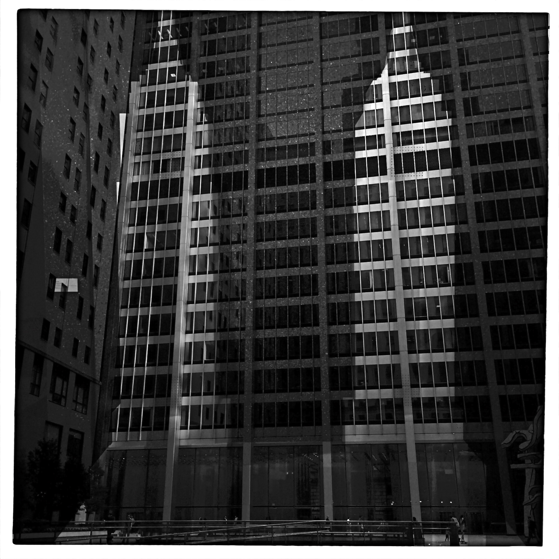
A GENTLER EDGE
Storefront (2016). Details are used sparingly in the central building, even less crucial in the rest of the frame.
By MICHAEL PERKINS
CHOICES ABOUT FOCUS MIGHT JUST BE AMONG THE MOST IMPORTANT DECISIONS that a photographer will face. Clarity, sharpness, precision, call it what you might, focal crispness is a crucial determinant in the creation of an image, no less than light and subject matter. And it’s one of the easiest factors to manage, available to any one from the humblest point-and-shooter to master technicians on the Hubbell telescope.
This urban shot seems to call for a sharp look overall.
There is a tendency for us to mentally default to an idea of “sharpness” when we hear the word focus, as if the only way to faithfully reproduce reality is strict adherence to that standard. But photography has never really been about reality, any more than painting or prose. We can’t help but add some small interpretive something to the process of making a picture, even if we believe a machine is largely in charge of the process. Amazingly, with very little effort, we can change the perception of an image by tiny adjustments in what is clear and what remains hazy or soft, straying selectively from the arbitrary sharpness standard.
Some subjects are rendered too coldly, too clinically, when subjected to razor focus, so that what you may gain in documentary detail you lose in intimacy, or in that undefinable feeling of being close. Applying this line of reasoning to my personal affection for architecture, there are buildings where the hard look of precision is perfectly suited to the subject; jutting skyscrapers, massive bridges, towering monuments, and the like. But put me in a small town, where the entire space feels sealed off from time itself, and the look, at least for me, becomes softer. Details take a back seat to feelings, and the harsh light of midday gives way to a soft, dreamy haze at late afternoon. The secrets of side lots, alleys and back yards become scavenger hunts. In both the big and small cities, focus is the key element in the creation of the image. And, also, in both cases, an advance visualization of the final result dictates exactly the degree of focus required.
Lenses and cameras possess wonderful technical properties that can deliver a slew of exotic effects. Still, with virtually no expense or fuss, a smarter mastery of focus is a decisive, even dramatic factor in helping a photograph develop its most effective language.
OFF-WHITES AND NEAR COLORS

Warmer than reality: A sunset processed through Nikon’s in-camera “shade” white balance setting.
By MICHAEL PERKINS
ONE OF THE MOST GRAPHIC DEMONSTRATIONS OF THE DIFFERENCE BETWEEN YOUR EYE AND A CAMERA’S occurs by accident for most photographers, with variations in the reading of white balance that make the colors in an image look “wrong”. While our own vision looks at everything in the world from light blues to medium greys and instantly converts them all to “white”, the camera makes looks at all those variants and makes what can be called its best guess.
All light has a temperature, not a measure of heat but an index of which colors combine to deliver hues of a certain intensity and range, and white balance helps photographers manage color more effectively. Film shooters, especially those using sophisticated flash technology, eventually develop an instinct as to which kind of light will deliver the hues they seek, but, as the digital era tracks onward, many more of us simply rely on our camera’s auto settings to deliver a white that strikes us as “correct”. And when auto white balance fails to deliver the goods, we can override it and select other settings that compensate for incandescent light, shade, cloudy skies, and so forth. We can also create a completely custom white balance with little fuss. Think Dad looks better with a green face, like the true extra-terrestrial that he is? It’s at your fingertips.

Same scene using Nikon’s fluourescent white balance setting.
The fun starts when you use white balance to depart from what is “real” in the name of interpretation. WB settings are a fast and easy way to create dramatic or surreal effects, and, when you have enough time in a shoot to experiment, you may find that reality can be improved upon, depending on what look you want. In the top image, taken during a long, lingering sunset at sea, I had plenty of time to see what my camera’s custom WB settings might create, so I bypassed standard auto WB, then amped up the reds in the sky by clicking over to a shade setting, resulting in a deep and warm look.
For the second shot of the same scene, I wanted to simulate the look of a sky just after sunset, when the blues of early evening might take over for the vanished sunlight, even providing a little radiance from a pale moon. One click to the setting and you see the result. Now, of course, I’ve just switched from one simulation of reality to another, but playing with WB in a variety of lighting situations can help you tweak your way to fantasy land with no muss or fuss.
Tweaking white balance is basically lying to your camera, telling it that it is not seeing what it think’s it’s seeing but what you want it to think it sees. You’re the grown-up, you’re in charge. “White” is what you say it is. Or isn’t.
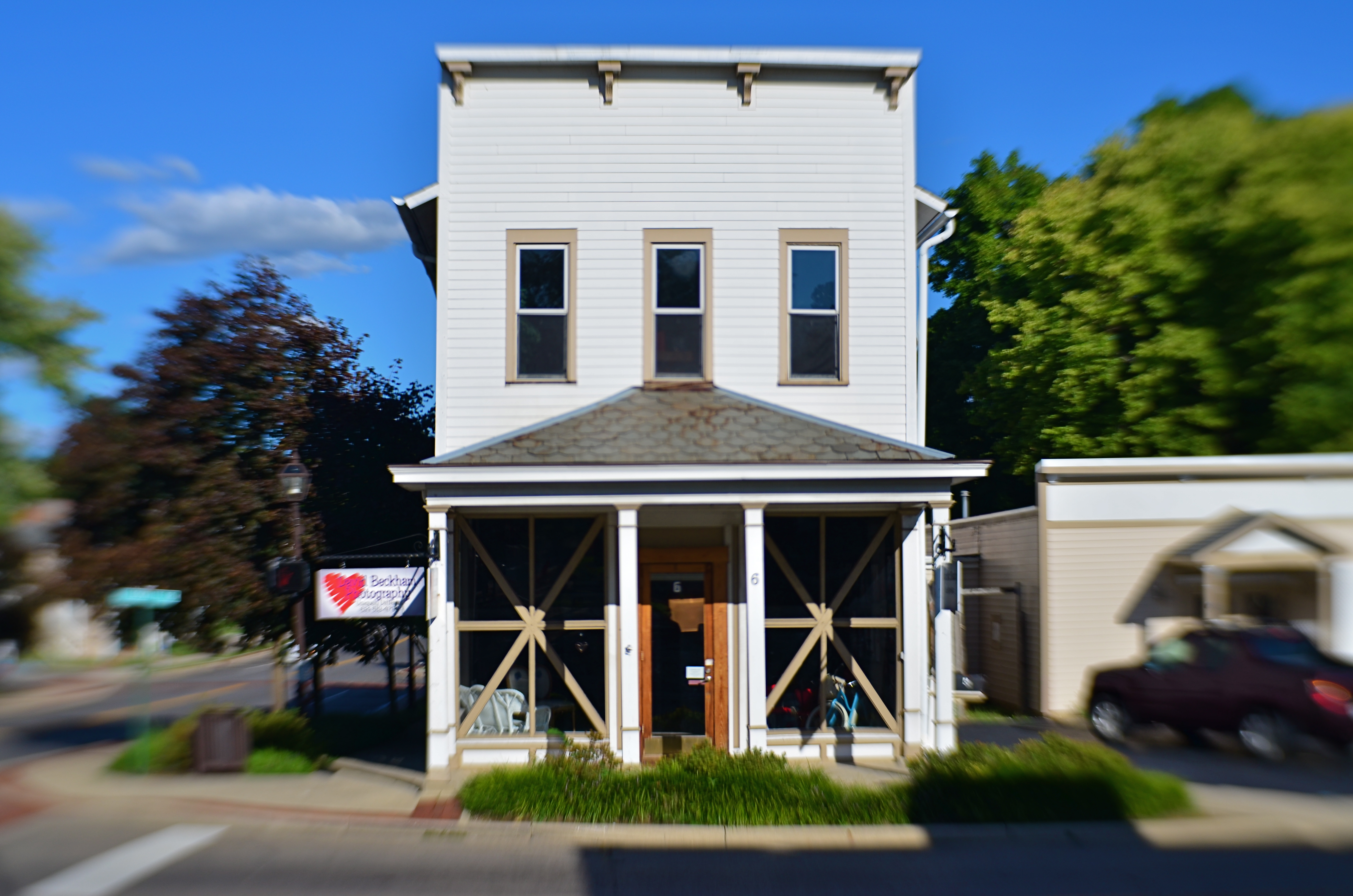
OF DISTANCES AND DOMAINS
Designed by humans? Certainly. Designed for humans? Well….?
By MICHAEL PERKINS
PHOTOGRAPHY IS AN EFFECTIVE WAY TO MEASURE MAN’S RELATIONSHIP to his physical environment, giving us the distance we need to see these arrangements from a more objective distance. People design places in which other people are to live and work, but once these plans get off the drawing board, it can become unclear what people’s place in the whole puzzle was intended to be.
More to the point, there is real picture-making potential in the occasional mis-match between what we design and how we fit into it. Some things that seem terrific to the people on the planning board seem cold or intimidating to regular users once they’re actually built. Seeing us try to find our place in things that are really inhospitable can be visually interesting because it makes us look and feel somewhat alien. We can become oddly placed props in our own projects, as the places made to house our dreams look more like warehouses for our nightmares.
Of course, one man’s horror is another man’s heaven, a rule that has certainly been constant over the history of innovation. That means, artistically, that we can wind up, inevitably, making images that start arguments, which is, I believe, the perfect function for art anyway. It’s one thing to smear a daub of paint on a canvas and lacerate someone’s vision with it. After all, you can abandon the painting, leave the gallery, etc. But if the building that was meant to be the gallery seems like a bad fit for you as a human being, that’s something else entirely.
The right compositions with the right lenses deliver stark visual messages about how we slot ourselves into the world we’ve created. Sometimes we make a statement for the ages. Sometimes we erect mouse mazes. Either way, there’s a picture in the process.
EYE FOOD
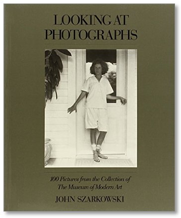
Even the smallest library on photography needs this book.
By MICHAEL PERKINS
A VIDEO BIOGRAPHY OF JOHN SZARKOWSKI, FORMER DIRECTOR OF PHOTOGRAPHY for the New York Museum Of Modern Art, makes the salient point that most great photographers begin by being great fans of photography, almost to the point of studying the work of others as much as they work to perfect their own craft. This makes perfect sense. Before you can teach others to see, you have to learn to see yourself. And that begins with watching how other people see.
Learning from the masters doesn’t necessarily mean stealing from them, or even being stylistically influenced by them. What you see most importantly in other photographers is how closely their selves are married to how they personally take the measure of the world in visual terms. You learn how few real accidents there are, how few miraculous pictures merely pop out of the camera fully formed. You see the deliberate agency of art, the conscious decision to choose this in order to achieve that.
Szarkowski, who oversaw MOMA’s photographic collections and exhibitions from 1962 to 1991, bore witness as well to the first true acceptance of photography as an art unto itself, with a vocabulary, a power, a poetry separate and distinct from painting. Under Szarkowski’s tutelage, the great new personal photographers, from Garry Winogrand to Diane Arbus to Lee Friedlander, moved from the periphery to the center of popular culture.
Not content to merely designate work worth seeing, or providing it with a prominent platform, Szarkowski also edited and published two of the most important general-use guides to what all of us should look for in a photograph. His seminal books The Photographer’s Eye and Looking At Photographs, both comprised of works from within MOMA’s collections, examined more than just subject matter or technical data, looking at the motives, biases, objectives and visions involved in the making of pictures. Most importantly, both books placed known and unknown shooters on an equal par, making the study of the art about what is achieved, not just how, or by whom.
I cannot imagine having sustained a lifelong interest in making images if I had not first encountered the works of, among others, Pete Turner, Alfred Eisenstaedt, Walker Evans, Robert Frank, Larry Burrows, Richard Avedon, Berenice Abbott, Alfred Stieglitz, Art Kane, Weegee, Sam Abell, or Francis Wolff. Many of these people thrilled and inspired me. Sometimes they infuriated or shocked me. And sometimes they did all of that in the same moment. All have knocked me upside of the head and repeated, over a lifetime: Look here. Look closer. Look again.
Don’t ever let anyone tell you that photography is about technique, gear, luck or natural ability. You can work around all that stuff. But if you can’t see, you can’t show.
Study. Read. Admire.
Feed your eye.
DECONSTRUCTING THE CARD
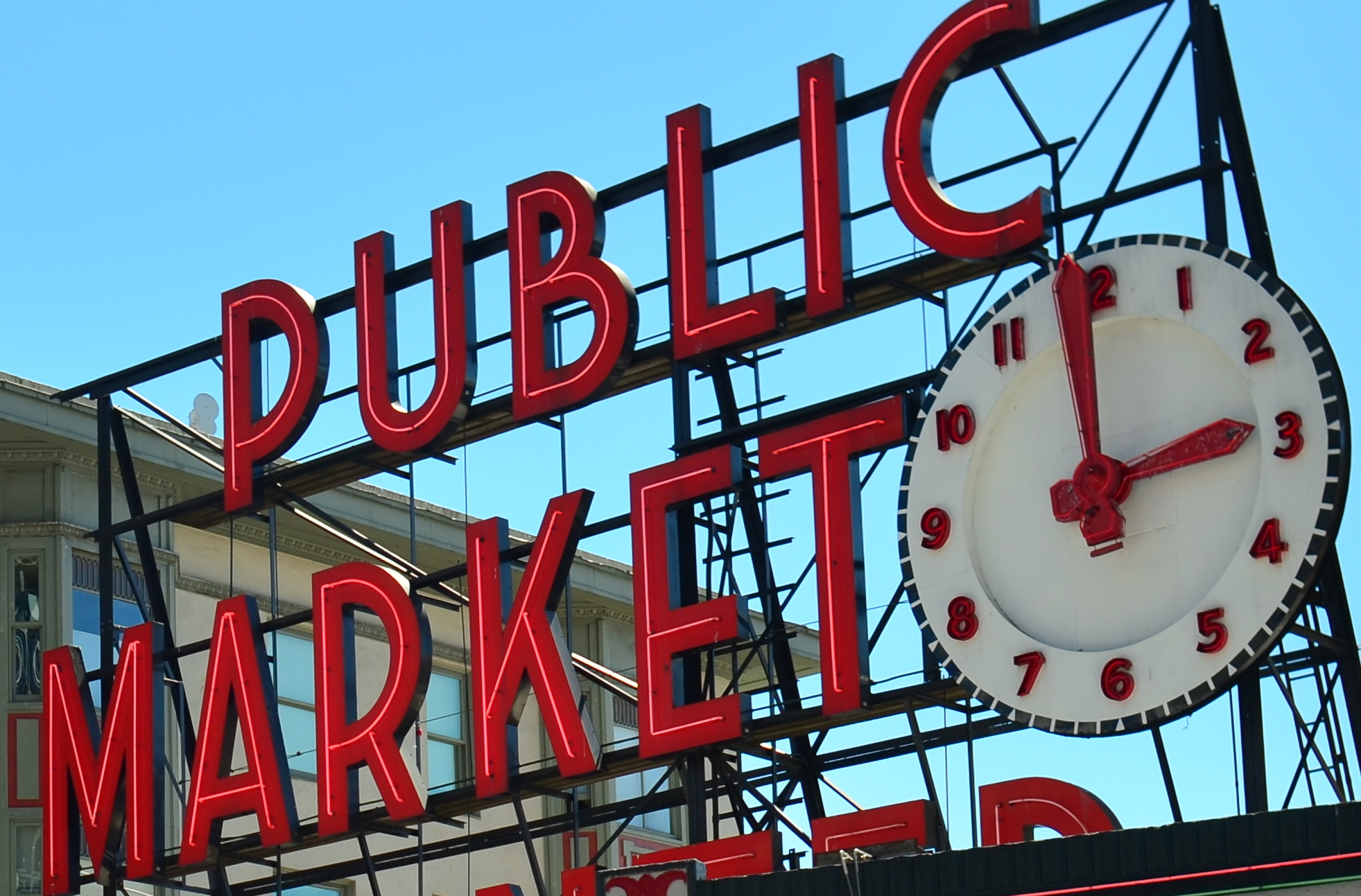
The standard view of Seattle’s Public Market
By MICHAEL PERKINS
WE HAVE ALL PLAYED THE CHILDREN’S GAME OF REPEATING A WORD UNTIL IT BEGINS TO SOUND FOREIGN, OR SILLY, to be drained, in fact, of all real meaning. Context being everything, no less in photography than in any other form of expression, we can often make images that, because they have been so endlessly replicated over the years, become drained of their power, and beg for a re-imagining.
In brief, some things have been photographed so many times that they need to be taken far out of context to rebirth them as vital subject matter.
Look around the next airport souvenir shop you encounter. Look at the paperweights, the tee-shirts, the memorial shot glasses. There, in a moment, you see the symbols of the town you’re visiting (or leaving), reduced to the most hideous kitsch ever created. Lady Liberty. The Space Needle. San Francisco trolleys. You can’t “do” the towns in which these icons hold court unless you visit them and crank off a few snaps. They’re “to do” items, but not “must do”‘s. And every depiction of them is post-card standard, seen from a certain angle and in a certain orientation.
Sadly, many of these sights still could hold the symbolic power they once had, except that few of us are demanding that said power be brought forth. Ironically, we approach totally unknown subjects, things we blithely stumble onto, with the freshest eyes, not knowing the “correct” way to visualize them. We produce instinctual reactions based on how and where we first saw a thing, without the accumulated cultural baggage about how it’s “supposed” to look. We visualize it personally, rather than measuring it against the standard of thousands of other images taken of it.
The market sign is still “there” in a sense that is known to the average viewer, but now it really is part of a market “place”.
So how to photograph the over-documented icon? Well, for one thing, the “postcard” view, the one in the travel brochures, must be abandoned completely. Instead of making it a homework assignment to visit a well-known place, why not assume you’ll get one random, fleeting glance at it….through a dirty window, a picket fence, a reflection in a window….and have that be your only chance to photograph it. Instead of trying to get the image “right”, pretend that you have never seen this thing, whether it be a temple or a tower. And imagine, further, that you didn’t even know the thing existed, but that, upon rounding a blind corner, you were suddenly forced to react to it.
As seen at the top of the page, the sign for Seattle’s famed Public Market is often photographed as if it were the market itself, filling the frame of many photos with just its giant red neon letters. In reality, it is a small component in a vital, bustling neighborhood filled with rich visuals. Why not merely suggest the sign as part of a larger tapestry? More importantly, what is your vision?
One great advantage in making new images of old icons is that you know so much of the standard view of the thing that, in abstracting it, you know the viewer will still follow you on the journey….that is, they can make the leap from the literal to the symbolic. It’s like improvising a jazz solo on a well-known melody.
Visualization is the photographer’s most important skill, but occasionally, re-visualization is even more vital…and revitalizing.
THE SECOND PASS
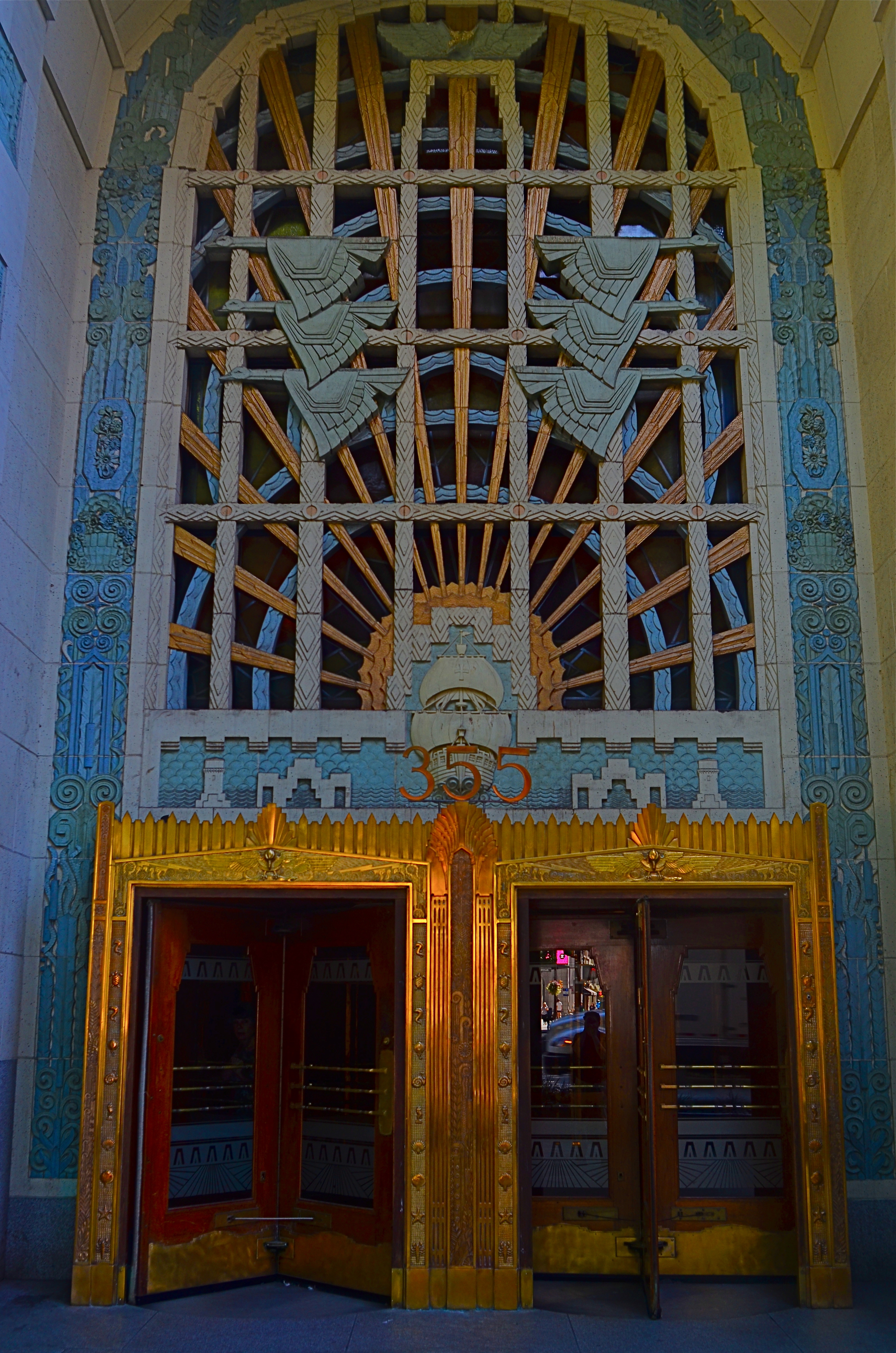
Vancouver’s amazing Marine Building, a Deco freak’s feast, in early morning (flat) light.
By MICHAEL PERKINS
SOME VISUAL SUBJECTS ARE SO RICH IN POTENTIAL that they evolve from a few essential shots to what, for lack of a better term, passes for a photo “essay”. Such extended coverage of buildings, countries and people used to be common in the heyday of the picture magazine, with up to a dozen pages of images strung together with narrative links in the pages of Life, Look and their many imitators. It’s a great format to work in once you discover a worthy candidate. But, in practical terms, it can be a little like working a checklist.
I document a lot of Art Deco architecture, since it embodies history, abstraction, illustration, design, and fantasy, all in one big fat buffet. That means I spend a lot of time dodging passersby on sidewalks and lingering in lobbies long enough to make the security personnel twitchy. Deco is all about the splendor of detail, some of which can only be revealed by patiently moving from door to grille, elevator to stairway, entrance to entrance, and looking for light that will bring that detail into bold relief.
I used the word checklist a while back because you are often working one in your mind, ticking off the various items as you wander around the site. Gotta do the mezzanine. Need a shot of the ceiling. Did I catch those wall sconces? Thing is, we tend to think of those little check marks as meaning, I’m done here. Moving on….when, in terms of what changing light does to these buildings within a short span of time, we should be actually be thinking, okay, I’ve done the preliminary work. Should go back and check this again in a while. Deco, especially, is rife with reliefs and murals made from a wide variety of materials, many of which will register color and shadows very differently at different times of day. You have to think in terms of “Take One, Take Two”, rather than in the snapshot mentality of “nailed it.”
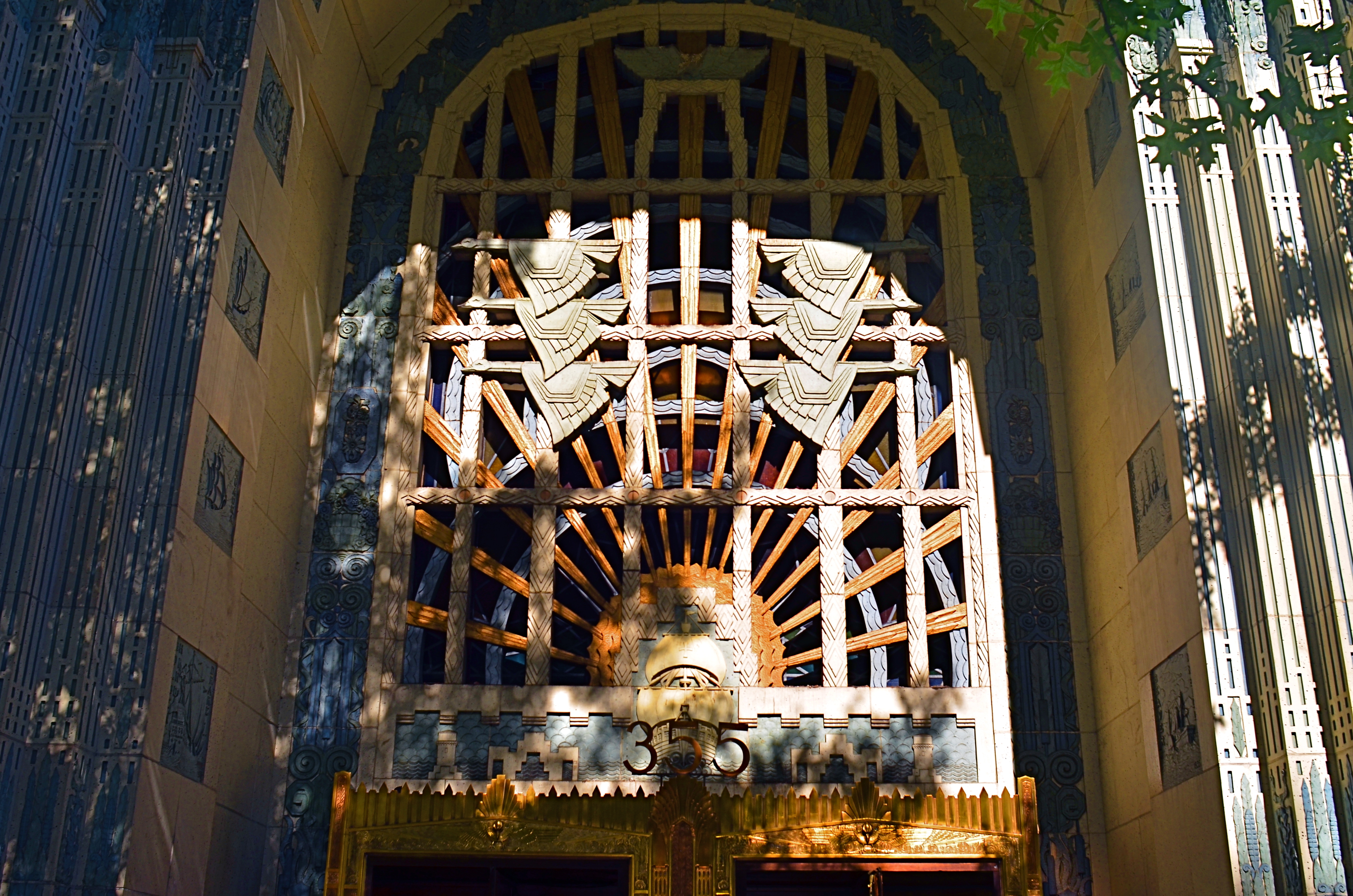
The same entrance just a few minutes later. The sun has climbed in the sky and created dramatic contrasts in all surfaces.
The images you see here, of the entrance to Vancouver’s magnificent Marine Building (read all about it here) were shot just twenty minutes apart. The top shot shows light landing on the door and its surrounding niche fairly flatly, almost sideways. However, within minutes, as seen in the second shot, the sun has climbed high enough in the sky to blast away at the center of the space, throwing the overhang of the arch into deep shadow. This change intensifies the contrast between raised and flat surfaces and makes the exterior terra-cotta (a material in which the colors are baked right in) more vivid. It also is projecting shadows like crazy. Which version is better? Not the point. It’s about editing choices and being reluctant to think that there is one “official” way to shoot something.
I could show similar changes to the lobby, with light softly entering the stained glass over the door, then crashing through it like a golden ray just minutes later. The point is, exposure is time plus light, and, when tackling a large essay-type project, it’s important to do more than one visualization on key elements. It’s the difference between grabbing a souvenir and creating a keepsake.
ASKING FOR YOUR VOTE
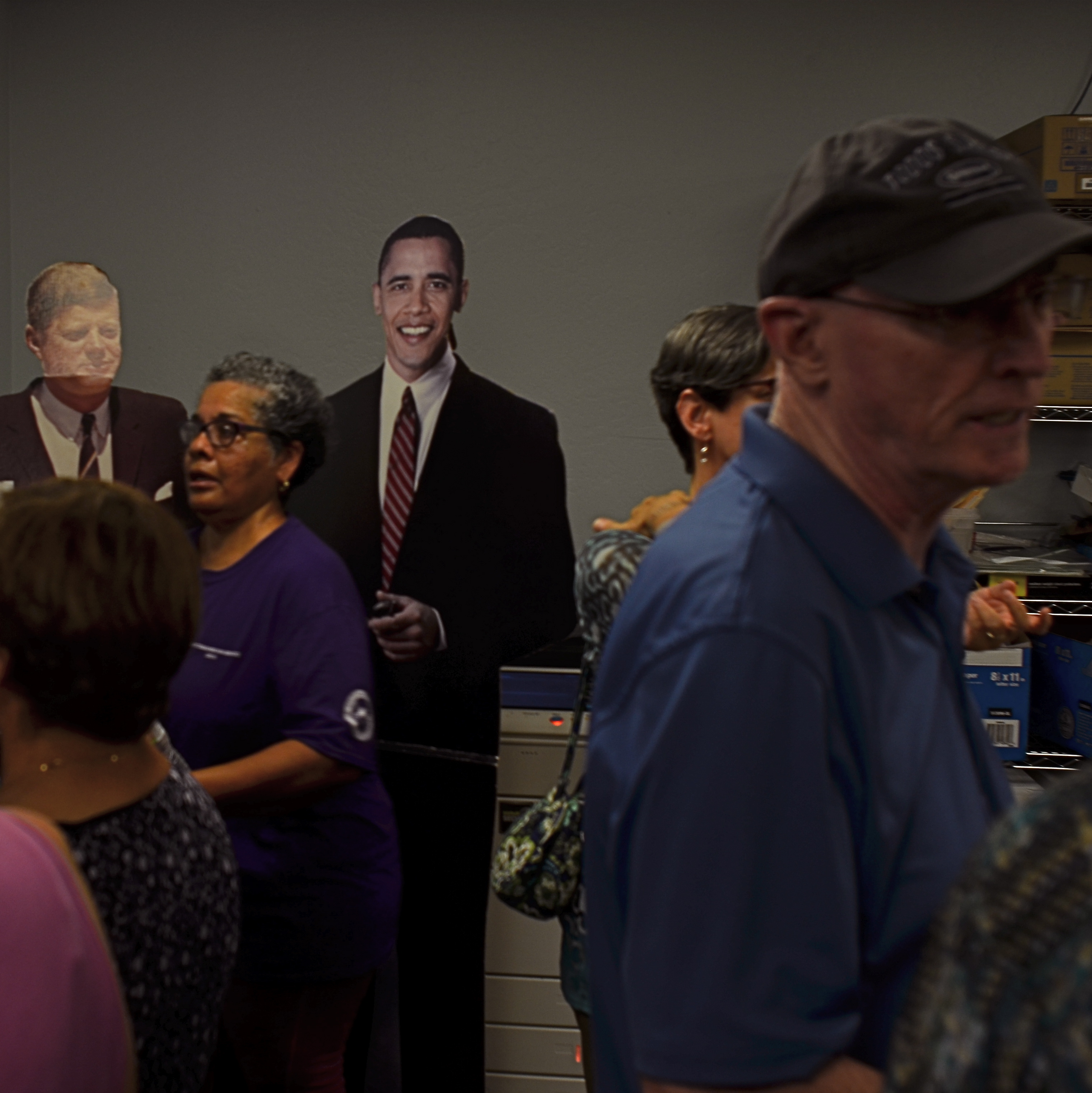
Hey, look who decided to drop in…
By MICHAEL PERKINS
ANY CAMPAIGN YEAR COMES WITH ITS OWN QUOTIENT OF BAKED-IN CIRCUS FLAVOR. The way nations choose their leaders may be fair, unfair, inefficient, brilliant, or banal, but they never fail to offer up their own brand of home-grown crazy. There is no hat too undignified, no button too provocative, no face-paint too garish. Maybe camp-followers in an election are spiritual cousins of the fanboys who walk the halls of ComicCon, arrayed like Wonder Woman or Wolverine. Whatever the motivation, photographers paying any attention whatsoever in an election year can always find plenty of low-hanging fruit, anywhere voters gather.
The shot at left just had to be snapped, since it speaks to the kind of stuff that passes for entertainment on a day when the outside temperature at a Democratic rally in Arizona tops a balmy 108 and a campaign office built for several dozen volunteers attempts to host a horde of nearly 800. It makes cramming twenty clowns into a Volkswagen look like a card trick. And, apparently, on this particular day, the staff thought the best thing to facilitate the flow of foot traffic was to park a pair of life-size cutouts of JFK and President Obama right at the entrance, where people could slow down even further in search of a souvenir photograph, not by their next choice for Chief Executive, but a living president on his way out and a dead president more than half the crowd only knows through newsreel footage.
Not that anyone was going to get close enough to either Jack or Barry for a memorable snap, as the room was crammed tighter than the cab of the last elevator out of town, so, in the few seconds that I could stand in one place without being nudged inexorably toward the life-saving cartons of bottled water, I decided to pretend that the two prezzes were just as inconvenienced by the crush as the rest of us. Sadly, Jack’s head bent back a bit, revealing more glare than was truly presidential, but at least O seemed to be into the process. Hi, good to see ya….
Sometime politics is a proud procession, and sometimes it’s a clown parade. And yet, somehow, it’s always good for an occasional smile.
FRINGE ELEMENT
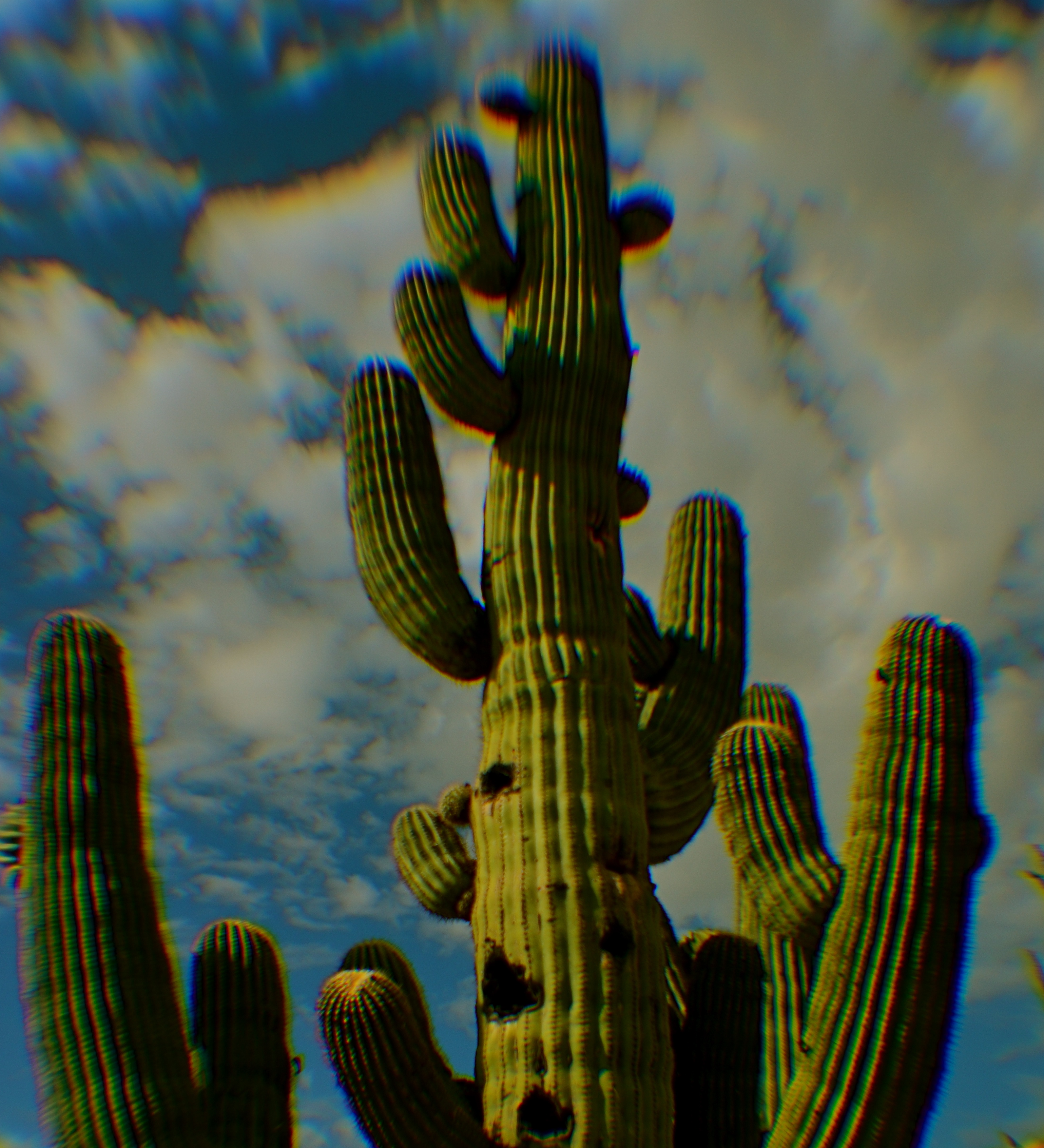
Extreme chromatic aberration (color fringeing) along the exterior line of the cactus.
By MICHAEL PERKINS
THE RESURRECTION, ABOUT TWENTY-FIVE YEARS AGO, of several low-end, cold-war-era plastic cameras as refurbished instruments of a kind of instinctual “art” photography has influenced even the digital and high-end photo markets, with light-leaking, optically sloppy toys like the Holga, the Diana and other “lomographic” devices shaking up the way many photographers see the world. Thus have these technically challenged little cameras, designed as children’s playthings, changed the conversation about what kind of formerly dreaded optical flaws we now elect to put back in to our work. Lomo shooters’ devotion to their craft has also meant a reprieve of sorts for film, since theirs in an analog realm.
But even digital shooters who don’t think of themselves as part of the “lomography” trip can dip a toe into the pool if they like, with filters on phone apps labelled “toy camera” which simulate light leaks, film-era “cross-processing” and the color variations caused by cheap plastic lenses. There are also companies like Lensbaby that manufacture all-new plastic optics designed to lend an element of creative control to what, in lomo cameras is largely random. The good news: you can, in effect, put defects into your pictures….on purpose.
Plastic lenses are generally much softer than glass lenses, giving a kind of gauzy appearance to your shots, so if you’re a fan of razor sharpness, they may not be your dish. More importantly, they produce a much higher amount of what is called “chromatic aberration”, which is more understandable under its nickname “color fringing”, since that more accurately describes how it looks. If you want a reasonably clear science-guy breakdown of CA, here’s a link to keep you busy this semester. The main take-home for most of us, though, is that the effect takes what would largely be a smoothly blended rendering of colors and makes them appear fractured, with the “fringe” look most noticeable along the peripheral edge of objects, where the colors seem to be separating like the ragged edge of an old scarf.
Why should you care? Well, mostly, you don’t have to. All lenses have a degree of CA, but in the better-built ones it is nearly undetectable to the naked eye, and can be easily processed away in Lightroom or a host of other editing suites. But people who are choosing to use plastic lenses will see it quite clearly, since such optics cause different wavelengths of light to “land” in the focal plane at slightly different speeds, meaning that, in essence, they fail to smoothly blend, hence the “fringing” effect.
Of course, chromatic aberration may be exactly the look you’re going for, if you want to create a kind of lo-fi, primitive look to your shots. In the cactus photo seen here, for example, taken with an all new plastic “art” lens, I found that the effect resembled old color printing processes associated with early postcards, and, for that particular image, I can live with it. Other times I would avoid it like the plague.
Plastic lenses, like any other add-ons or toys, come with their own pluses and minuses. Hey, if you’re a ketchup person, then soak your plate with the stuff. But if you believe that it just louses up a good steak, then push the bottle away. Just that simple.
BURDEN OF PROOF
Reverse Shadows (2015) Originally conceived in color, later converted to black and white. Luckily, it worked out, but, shooting this image anew, I would execute it in monochrome from start to finish. Every story has its own tonal rules.
By MICHAEL PERKINS
THE WORLD OF PHOTOGRAPHY’S EMBRACE OF COLOR, which now seems instinctual and absolute, is actually a very recent thing. The arrival of color film stock targeted to the amateur market barely reaches back to the 1920’s, and its use in periodicals and advertising didn’t truly begin to outdistance color illustration until well after World War II. Color in so-called “serious” or “art” photography existed on the margins until half-way through the 1960’s, when hues, like every other element of the contemporary scene, gloriously exploded, creating a demand for color from everyone, amateur to pro. The ’60’s was also the first decade in which color film sales among snapshooters surpassed those of black and white.
Today, color indeed seems the default choice for the vast majority of shooters, with the “re-emergence” or “comeback” of black and white listed among each year’s top photo trend predictions. The ability to instantly retro-fit color images as monochrome (either in-camera or in-computer), has allowed nearly anyone to at least dabble in black & white, and the tidal wave of phone apps has made converting a picture to b&w an easy impulse to indulge.
And yet we seem to be constantly surprised that black & white has a purpose beyond momentary nostalgia or a “classic look”. We act as if monochrome is simply the absence of color, even though we see evidence every day that b/w has its own visual vocabulary, its own unique way of helping us convey or dramatize information. Long gone are the days when photographers regarded mono as authentic and color as a garish or vulgar over-statement. And maybe that means that we have to re-acquaint ourselves with b&w as a deliberate choice.
Certainly there has been amazing work created when a color shot was successfully edited as a mono shot, but I think it’s worth teaching one’s self to conceptualize b&w shots from the shot, intentionally as black and white, learning about its tonal relationships and how they add dimension or impact in a way separate from, but not better than, color. Rather than consistently shooting a master in color and then, later, making a mono copy, I think we need to evaluate, and plan, every shot based on what that shot needs.
Sometimes that will mean shooting black and white, period, with no color equivalent. Every photograph carries its own burden of proof. Only by choosing all the elements a picture requires, from color scheme to exposure basics, can we say we are intentionally making our images.
SOFTER AND QUIETER
By MICHAEL PERKINS
THE MEANING OF THE WORD NOISE HAS, IN RECENT YEARS, been expanded beyond its familiar role as an audio term, extending its usage into our visual vocabulary as well. A key shift in photo terminology, as film converted to digital, has been the re-purposing of the word to denote a degradation in quality, with noise replacing grain as the way to describe a less-than-pristine image. Same idea, different wording.
And now, in recent years, I have heard the word used even more widely to denote weaknesses in a composition, describing a picture with too much information or distraction as “noisy”. In a recent post on the blog PhotographyMad.com, you find the following citation:
Often a photo will lack impact because the main subject is so small it becomes lost among the clutter of its surroundings. By cropping tight around the subject you eliminate the background “noise”, ensuring the subject gets the viewer’s undivided attention.
I personally would extend this metaphor to include not only the subject matter within a frame but its color range as well. That means, simply, that too many colors in an image might dilute the effect of a shot as much as the density of its elements, and extends the idea of noise to encompass anything that lessens the communicative power it has for the viewer.

Deflowered (2016). 1/50 sec., f/4, ISO 100, 35mm.
In the above shot, the idea of the composition was to convey the bits of orange peel as some kind of spent or withered flower. I didn’t decide, in advance, to eat an orange in a yellow bowl, but I believe that the same peels in a red bowl might have hardened the look of the shot by calling attention to contrast instead of content. Keeping the entire composition to a two-tone color range (along with a decidedly shallow depth-of-field to reduce the texture detail) rendered it nice and soft. Of course there are a million ways to conceive this image; I just chose this way.
Noise is not merely a technical registration of visual or audio distortion. I think the word has real value if you’re looking to streamline your images. Just think noise=clutter.
Then turn down the volume.
BITE-SIZE BEAUTY
By MICHAEL PERKINS
IN PHOTOGRAPHY, WE OFTEN HAVE THE OPPORTUNITY TO ADMIRE THINGS THAT ARE, STRICTLY SPEAKING, beyond our capabilities. The world is rife with people who master exposure, composition, editing and conceptualization in ways which make us gasp in a mixture of awe and envy. Sometimes, we are so amazed by artists outside our own area of expertise that we emulate their passion and, in doing so, completely remake our own art. Other times, we just glimpse their greatness like a kid peeking inside the tent flap at the circus. We know that something marvelous is going on in there. We also sense that we are not a part of it.
That’s pretty much been my attitude toward landscape work.
Much of it leaves me impressed. Some of it leaves me breathless. All of it leaves me puzzled, since I know that I am missing a part of whatever mystical “something” it is that allows others to capture majesty and wonder in the natural world, their images looking “created” my own looking merely “snapped”.
Sometimes the sheer size of nature’s canvas panics my little puppy brain, and I retire to smaller stories.
It’s not the same with urban settings, or with anything that bears the mark of human creativity. I can instinctually find a story or a sweet point of focus in a building, a public square, a cathedral. I can sense the throb of humanity in these places and I can suggest it in pictures. But put me in front of a broad canvas of scenery and I struggle to carve out a coherent composition. What to include? What to cut? What light is best? And what makes this tree more pictorially essential than the other 3,000 I will encounter today?
The masters of the landscape world are magicians to me, crafty wizards who can charm the dense forest into some evocative choreography, summoning shadows and light into delicate interplay in a way that is direct, dramatic. I occasionally score out in the woods, but my failure rate is much higher, and the distance between what I see and what I can deliver much greater. Oddly, it was the work of scenic photographers, not street shooters or journalists, that originally conveyed the excitement of being a photographer to me, although I quickly devolved to portraits, abstractions, 3D, hell, anything to get me back to town, away from all that scary flora and fauna.
Medium or bite-sized natural subjects do better for me than vast vistas, and macro work, with its study of the very structures and patterns of organic things works even better. But I forever harbor a dream of freezing a forest in time in a way that stuns with its serene stillness and simple dignity. I have to keep putting myself out there, hoping that I can bridge the gap between envy and awareness.
Maybe I’ll start at the city park. I hear they have trees there….
ROOM WITH A VIEW
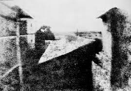
This 1820’s view from the upper floor of Nicéphore Niépce’s house is generally acknowledged as the first true photograph, revealing rough details of a distant pear tree, a slanted barn roof, and the secondary wing of the estate (at right).
By MICHAEL PERKINS
MANY OF THE MOST IMPORTANT SCIENTIFIC DISCOVERIES ARE ACTUALLY DETOURS, things unearthed by accident in search of something completely different. Marconi was not looking to create the entertainment medium known as radio, but merely a wireless way to send telegraphs. The tough resin known as Bakelite was originally supposed to be a substitute for shellac, since getting the real thing from insects was slow and pricey. Instead, it became the first superstar of the plastics era, used to making everything from light plugs to toy View-Masters.
And the man who, for all practical purposes, invented photography was merely seeking a shortcut for the tracing of drawings.
Nicéphore Niépce, born in France in 1765, plied his trade in the new techniques of lithography, but fell short in his basic abilities as an artist, and searched for a way to get around that shortcoming by technical means. He became proficient in the creation of images with a camera obscura, a light-tight box with a pinhole on one side which projected an inverted picture of whatever it was pointed at on the opposite inside wall of the container, the pinhole acting as a glassless, small-aperture lens. Larger versions of the gadget were used by artists to project a subject onto an area from which tracings of the image could be done, then finished into drawings. Niépce grew impatient with the long lag time involved in the tracing work and began to experiment with various compounds that might chemically react to light, causing the camera’s image to be permanently etched onto a surface, making for a quicker and more accurate reference study.
Niépce tried a combination of fixing chemicals like silver chloride and asphalt, burning faint images onto surfaces ranging from glass to paper to lithographic stone. Some of his earliest attempts registered as negatives, which faded to complete black when observed in sunlight. Others resulted in images which could be used as a master from which to print other images, effectively a primitive kind of photocopy. Finally, having upgraded the quality of his camera obscura and coating a slab of pewter with bitumin, Niépce, around 1827 successfully exposed a permanent, if cloudy image from the window of his country house in La Gras. His account recalled that the exposure took eight hours, but later scientific recreations of the experiment believe it could actually have taken several days. Even at that, Niépce might have recorded a good deal more detail in the image had he waited even longer. In an ironic lesson to all impatient future shooters, the world’s first photograph had, in fact, been under-exposed.
Rather than merely create a short-cut for sketch artists, Nicéphore Niépce’s discovery, which he called heliography (“sun writing”), resulted in a new, distinctly different art that would compete with traditional graphics, forever changing the way painters and non-painters viewed the world. Centuries later, harnessing light in a box is still the task at hand, and the eternally novel miracle of photography.
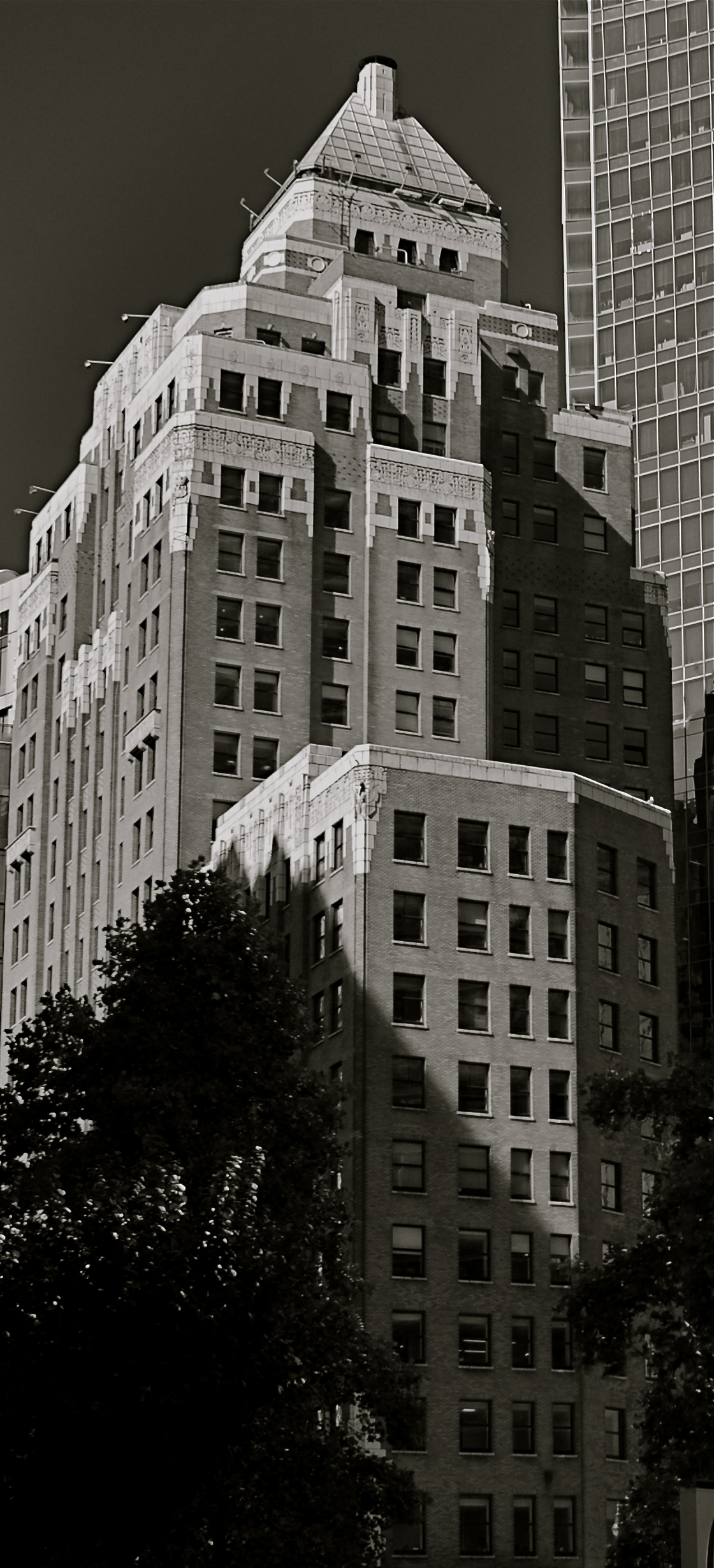
IT’S ALL YOURS
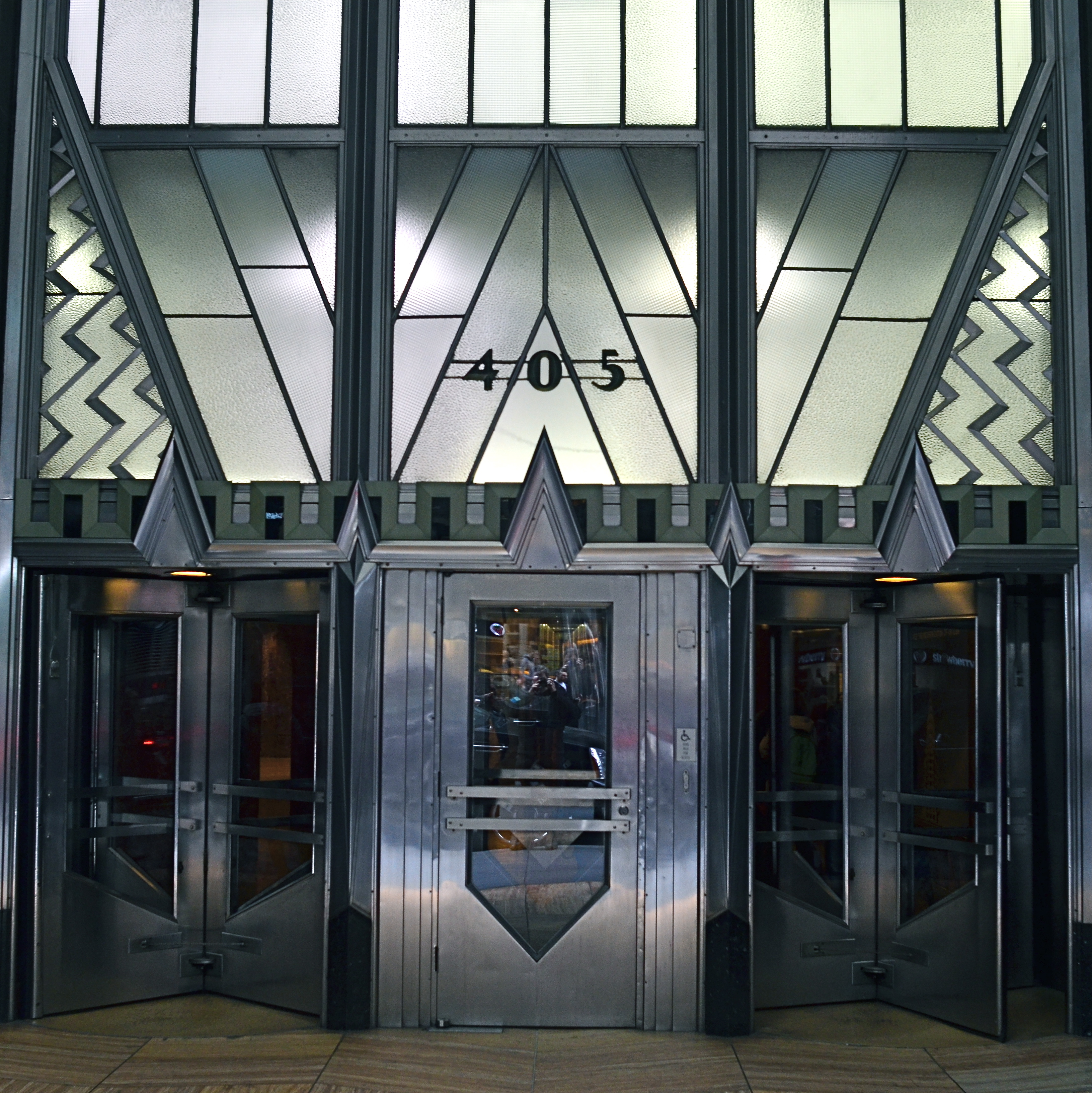
This is not “the” Chrysler Building, but it is “a” Chrysler Building.
By MICHAEL PERKINS
MANY OF THE MOST VALUED ARTIFACTS OF ANCIENT TIMES might not be considered so magnificent if they were not also so rare. The shards of pots found within the burial chambers of the Pharoahs seem remarkable because they are some of the only things that survive the age of their owners. However, were there hundreds, thousands of such sites around the world, these broken bits of pottery might be of less value than the discarded cigarette butts that litter the world’s highways.
Hey, isn’t this blog supposed to be about photography? Well, yeah, give me a little room here.
Photographs are thought to be documents, that is, a literal recording of reality. In fact, almost all of them are interpretations of reality, one person’s individual take on what’s “real”. In the beginning of the medium, pictures were more purely documentary, in that very few people took very few pictures of things unlikely to be photographed by anyone else before they vanished. It would be great to see dozens of different shooters’ interpretation of the battlefield of the Civil War, but, since the medium was not generally in use in the 1860’s, the work of Matthew Brady and his team of field photographers serves as our only record….in fact, as a document.
In the modern day, it is virtually impossible for your photograph of, say, the Empire State Building to be a “document”, since it will never, ever serve as the official or historical record of that structure. Once everyone’s picture is a document, then nobody’s is. You can interpret the building to endless variation, but you have to avoid thinking of the resulting images as “real”, since your own sense of that state defines how you make the picture. The edifice may be public property, but the vision is all yours.
Which brings us back to the Egyptians. Show a chamber filled with burial booty to a 21st-century archaeologist and he’ll exclaim, “let us carefully preserve this living record!”. Show the same room to the average Tut-era housewife and she might say, “get me a broom so I can clear all this junk out of here.” Photographs are your view of “reality”. Only when yours is the only eye on something vanished can it be documentary. Saying that a picture is great because it “looks realistic” is our way of admiring the photographer’s interpretation. That is, we agree with it. But images are more “istic” than they are “real”.
TWO FOR LUNCH
And Then I Told Her… (2016) 1/40 sec., F/5.6, ISO 100, 24mm.
By MICHAEL PERKINS
PHOTOGRAPHS DON’T HAVE TO BE ORGANIZED AROUND SYMMETRY, or even have a discernible “center” to them. However, the eye seems to find comfort in quickly settling on a “starting point” in an image, a place from which to proceed, or to be led to deeper discoveries.Designers for everything from magazine articles to websites toss around terms like visual weight and bottom-up processing to float various theories about how to direct the eye, with each system boasting top efficiency. A balanced pattern near the middle of the picture is thus not necessarily a “must-have”, just a fairly reliable “feels-right”.
By way of demonstration, a photographic center that consists of two people facing each other, talking, is a fairly easy anchor around which to build a straight narrative in an image. As the two heads arc left and right, a rough set of parentheses establish a very basic symmetry, and can help ensure that the middle of the picture engages the eye first. Based on architecture and surroundings, other things in the frame can either enhance or contrast with the symmetry in the middle, and that’s all a matter of taste for the photographer.
Many times a lunch counter or a restaurant gives me the talkers I need, so I tend to be on heightened alert when I enter such places. However, many of the photos I’ve made like this did not originally begin with the two people as the central emphasis: that happened in the cropping process.
In the above image, there actually was enough supportive symmetry from the background so centering the talkers and resizing the photo as a square seemed to be a good overall strategy. Of course, there is no hard and fast rule for these kinds of choices. All than can be said is that, for this picture, in this case, with these elements to work with, centering the conversationalists and placing them at the center of a square made sense. There is an entirely separate case to be made for selective use of the square as a compositional boost, and we’ll deal with than at another time.
Meanwhile, dropping in on two folks for lunch can act as a springboard for a certain kind of picture.
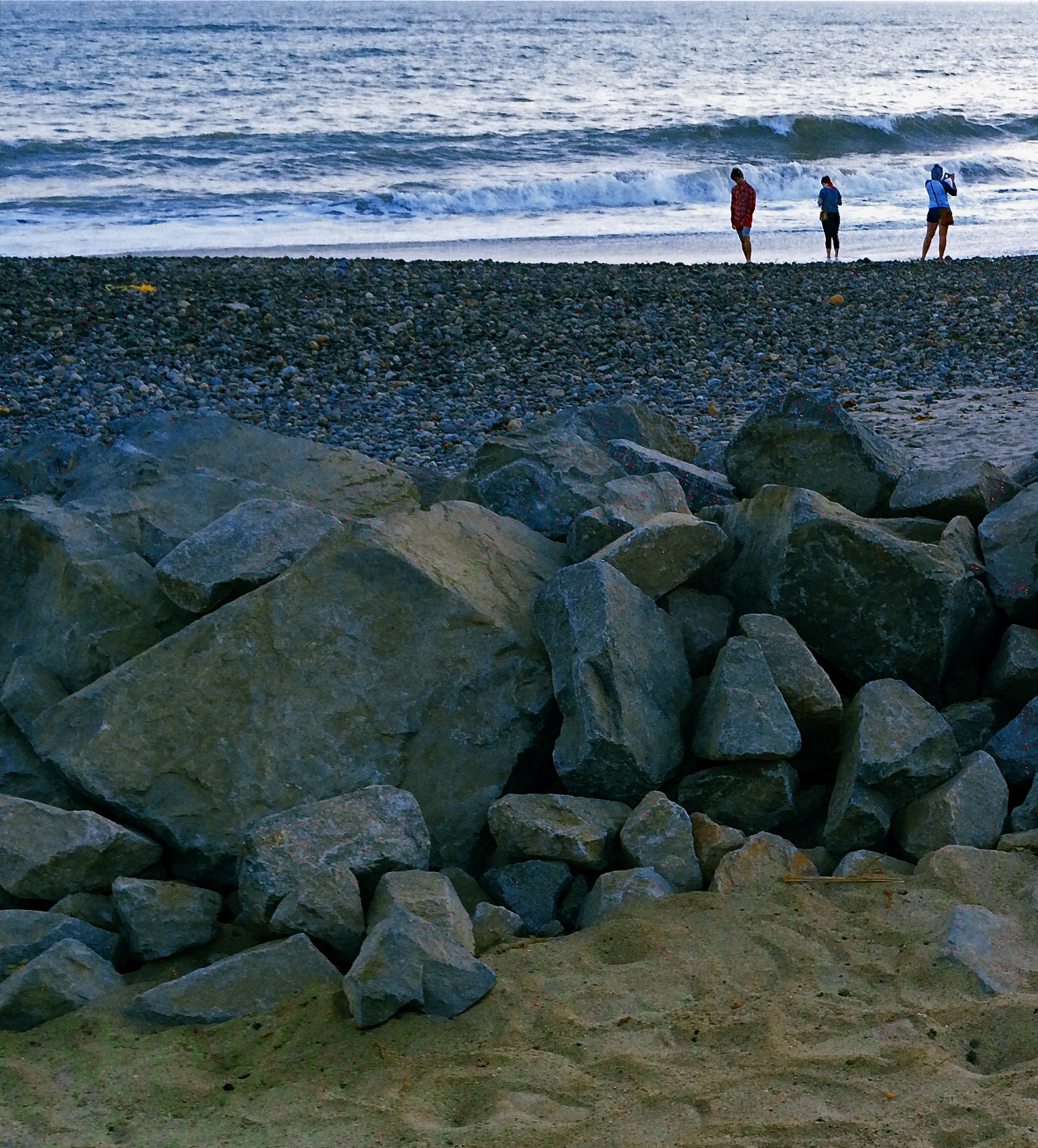
SEPARATE WORLDS
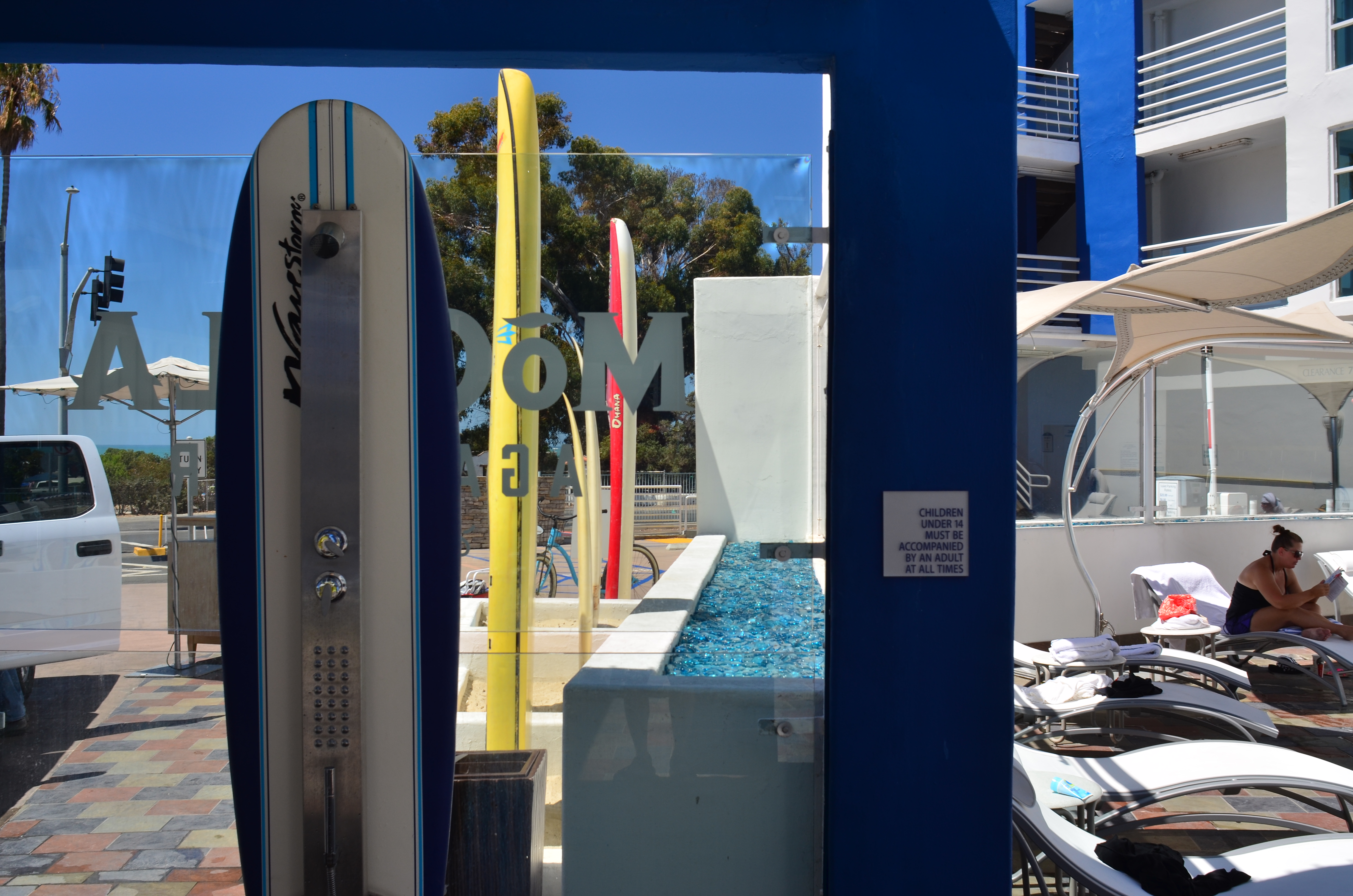
Only As A Last Resort (2016).
By MICHAEL PERKINS
MAYBE IT’S THE TERM ITSELF. MAYBE IT’S HOW WE DEFINE IT. Either way, for photographers, concept of the “still life” is, let’s just say, fluid.
I believe that these static compositions were originally popular for shooters for the same reason that they were preferred by painters. That is, they stayed in one place long enough for both processes to take place. Making photographs was never as time-consuming as picking up a brush, but in the age of the daguerreotype the practice was anything but instantaneous, with low-efficiency media and optical limitations combining to make for looooong exposure times. Thus, the trusty fruit-bowl-and-water-jug arrangement was pretty serviceable. It didn’t get tired or require a bathroom break.
But what, now, is a “still life”? Just a random arrangement of objects slung together to see how light and texture plays off their surfaces? More importantly, what is fair game for a still life beyond the bowl and jug? I tend to think of arrangements of objects as a process that takes place anywhere, with any collection of things, but I personally seek to use them to tell a story of people, albeit without the people present. If you think about museum collections that re-create the world of Lincoln or Roosevelt, for example, the “main subject” is obviously not present. However, the correct juxtaposition of eyeglasses, personal papers, clothing, etc. can begin to conjure them in a subtle way. And that conjuring, to me, is the only appeal of a still life.
I like to find a natural grouping of things that, without my manipulation or collection, suggest separate worlds, completely contained universes that have their own tools, toys, architecture, and visual vocabulary. In the above montage of angles and things found at a beach resort, I had fun trying to find a way to frame the “experience” of the place, in abstract, showing all its elements without showing actual activities or people (beyond the sunbather at right). The real challenge, for me, is to create associations in the mind of the viewer that supply all the missing detail beyond the surfboards, showers, and sundecks. That, to me, is the real attraction of a still life….or, more accurately, taking a life and rendering it, fairly intact, in a still image.
Hey, it’s not that I don’t like a good bowl of fruit now and then. However, I think that one of photography’s best tricks is the ability to mentally conjure the thing that you don’t show, as if the bowl were to contain just apple cores and banana peels. Sometimes a picture of what has been can be as powerful as freezing an event in progress. But that’s your choice.
Which is another of photography’s best tricks.
COST ANALYSIS
By MICHAEL PERKINS
IT’S SAFE TO SAY THAT, TO DATE, MOST OF THE WRITINGS THAT COMPARE FILM PHOTOGRAPHY TO DIGITAL center on visual or aesthetic criteria. The grain of film, the value range of pixels, the differences in the two types of workflow, the comparative sizes of sensors, and so forth. However, in certain shooting situations, what strikes me as the main advantage of digital is crassly…..monetary.
It’s simply cheaper.
Now, that’s no small thing. Consider that, with film, a very real cost comes attached to every single frame, both masterpiece and miss. Now, try to compute how much film you must consume in order to travel from one end of a learning curve to the other in trying to master a new lens or technique. Simply, every shot on the way to “that’s it!” is a “damn, that’s not it”, and both cost money. Now recall those shoots where the conditions are so strange or variable that the only way to get the right shot is to take lots of wrong ones, and remember as well, that, after clicking off all those frames, you had to wait (with the meter running), until either the processor or your own darkroom skill even told you that you were on the wrong track.
Assume further that you screwed up several rolls of premium Kodachrome before stumbling on the right approach, and that all of those rolls are now firmly in the “loss” column. You re-invest, re-load, and hope you learned your lesson. Ca-ching.
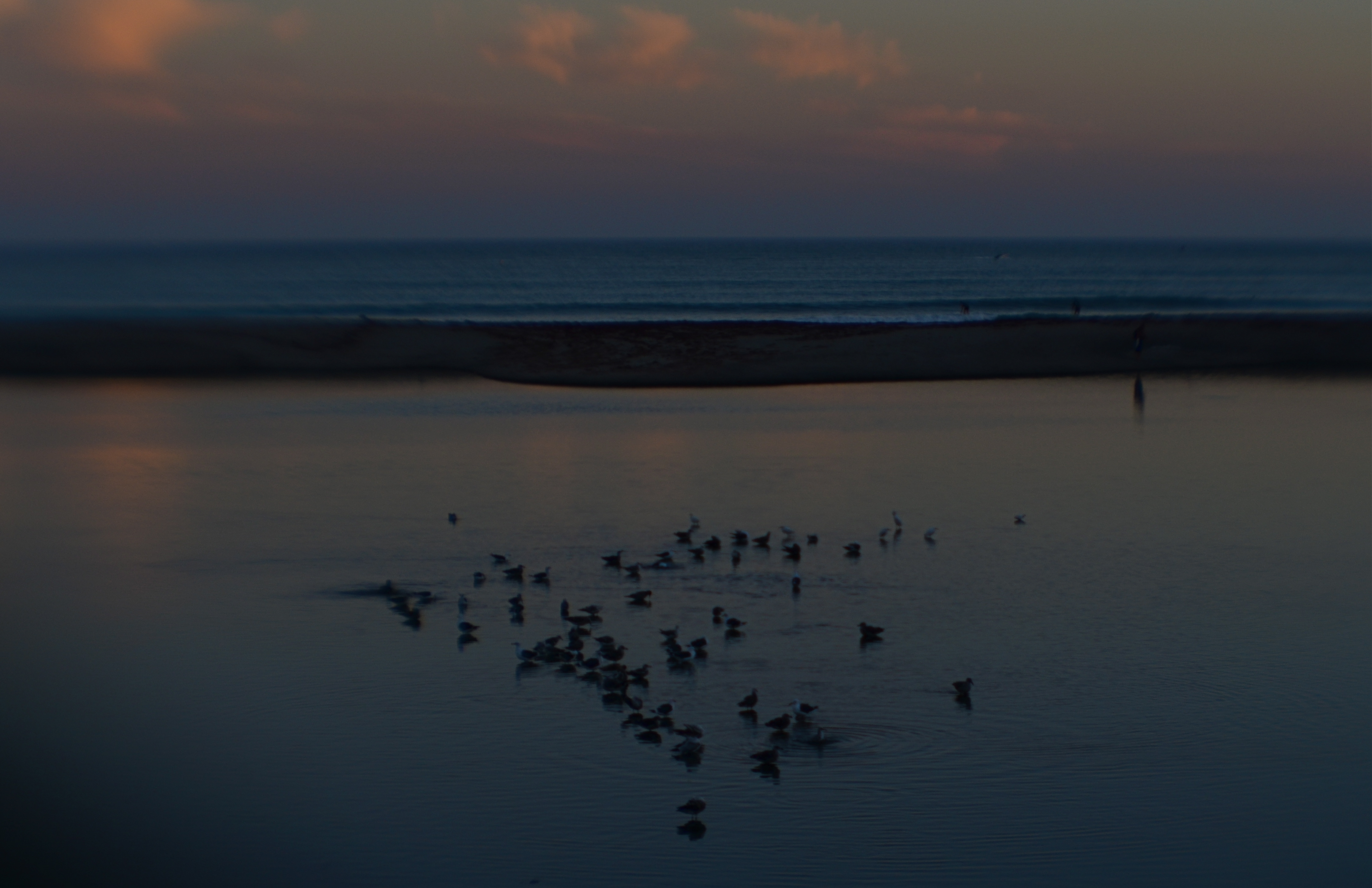
Doheny State Park Beach (2016). Shot at 1/125 sec., f/8, ISO 100, through a plastic 35mm lens.
The shot that you see above demonstrates why shooting in digital speeds up your practice time, at a fraction of the cost of film, while giving you feedback that allows you to adjust, shoot, and adjust again before the conditions in front of you are lost. What you see is a late dusk on a dark lagoon just inland of a stretch of ocean in Point Dana, California, strewn with waves of bathing birds and shifting pools of ripples. The pink of the clouds on the horizon will be gone in a matter of minutes. Also, I’m shooting through a narrow-gauge opening in a chain-link fence, causing dark vignettes on every other shot. Moreover, I’m using a plastic lens, making everything soft even softer, especially at the edges.
So add all these factor together and the emotional curve of the shoot is click-damn-click-whoops-click-click-damn. But, since it’s digital, the bad guesses come back fast, and so does the ability to adjust. Bottom line: I know I will likely walk away with something generally usable.
More importantly, photography no longer has the power to price so many of us out of the practice. That means that more images make it to completion, and, of course, that can also mean a global gallery flooded with mediocrity. Hey, I get that. But I also get a fighting chance at grabbing pictures that used to belong only to the guy who could afford to stand and burn twelve rolls of film.
And hope like hell.

THE WORKER’S SIGNATURE
Shop (2016)
By MICHAEL PERKINS
THE GERMAN PHOTOGRAPHER AUGUST SANDER (1876-1964) created one of the most amazing projects in the history of portraiture with his seminal book The Face of Our Time. Born into a world that defined people much more by class division and by the literal work of their hands, Sander created a document of a vanishing world in a very simple way, surrounding bricklayers, cooks, soldiers, and dozens of other professionals with the literal tools of their trades. His work influenced street photography and portraiture throughout the 20th century, acting as both document and commentary.
The manual trades that Sanders celebrated are rapidly vanishing as automation and changing tastes take away the tv repairmen, cobblers, and pillow makers of yesteryear, taking with them the physical look of their workplaces. It’s feels like I’ve happened upon an archaeological dig when I run across a place where handcrafted work takes place, and to photograph the shops where the old magic still happens. The encroachment into urban neighborhoods of chain stores and the crush of ever-higher rents are chasing out the last generations of tinkerers and makers. Storefronts and the stories that reside within them are winking out across the urban landscape.
August Sander’s challenge to present-day photographers is to bear witness to the worker’s signature, the mark he makes on the world and the echo he leaves behind when he departs. The world is always in the act of going partly instinct. The camera measures what we lose in the process. In Sander’s elegant, simple pictures of working people, there is a peaceful quality, as everyone seems fitted to their place and role in the world. As we photograph the final days of such a world, we are commenting on the uncertainty that follows it into our present age.
Share this:
September 5, 2016 | Categories: Commentary, Conception, Street Photography | Tags: documentary, history, Urban Photography | Leave a comment