AND FEATURING LINDA ON LENS
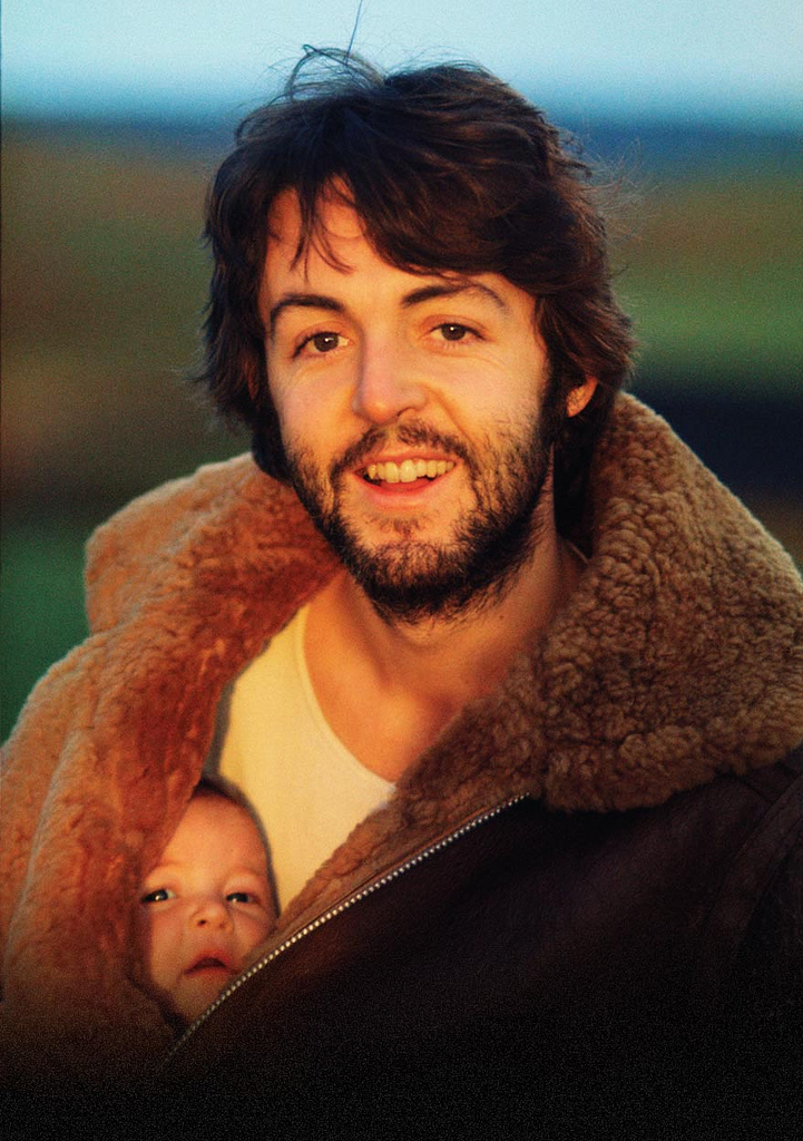
Even if you don’t know her work, you know her work. Linda McCartney’s classic portrait of her husband and a friend made album art history in 1970.
By MICHAEL PERKINS
ONCE LINDA EASTMAN BECAME LINDA McCARTNEY, the world ignorantly chose to define her as rock’n’roll arm candy basking in the reflected sun of her globally famous husband. In fact, however, by the time she chose to rock a family, she had already created a self that would outlast her role as a reluctant musician and perennial target of every wise-ass disk jockey from London to New York. She did it with a remarkable, natural eye for composition and the untrained instinct to know where to click, and when. While her bandmates wielded electric axes to give voice to their muses, Linda wailed with a Hasselblad.
By the time she became a Mrs. Beatle, Linda had already become the first great photographer in rock history, pioneering an intimate, direct style that humanized its bright lights and consigned the formal portraits of the record label’s in-house shooters to the dustbin. It is work that, finally, in recent years, has been allowed to glow as the star trove that it is, eclipsing her much-derided designations as Yoko With A Tambourine, A Pig With Wings, or whatever other lame tag the hacks in the rock press felt like hanging on her. Recent showings of her work in America, Europe, even South Korea continue to celebrate her instinctual knack for showing the human inside the star. And none of it was by the book.
She didn’t ignore the rules; she simply didn’t know they existed. She never had a formal studio, shopping for backgrounds and locales on the fly. She never used flash, ever, believing that it was bulky and off-putting. She attended exactly one class on photography, was told she had talent, and never went back for lesson two. She gave away original negatives of her top shots to friends, finding herself with nothing to sell to publishers except the “shoves”, lesser takes which, somehow, were still better than what everyone else was doing with this crazy longhair music.
What kind of photographer was this? Linda never posed people, forgot to re-calculate the ASA (ISO) settings when switching from color to black and white, sent the magazines blurred concert shots. And despite her never joining the ranks of the camera-ly cultured, the true souls of the Rolling Stones, The Doors, The Yardbirds, Jimi, Janis, Dylan, and, most notably, the Beatles shone forth in her grainy frames. Linda Eastman McCartney captured the dawning genius in them all, before the crank-up of the hype machines, before the twilight of the vultures, before rock careened from the summer of love to the winter of our discontent.
After Paul, the images were family candids, and yet the vision shone forth, most famously in her shot of baby Mary peeking out of her Beatle daddy’s jacket on a morning stroll, the rear-cover photo for the McCartney album in 1970. From that point on, the farm and the fam were everything, the road and the tour bus, not so much. She chose to settle for being Mrs. Paul, the girl who couldn’t sing but who hitched a ride on one of the biggest pop rockets of the ’70s. Decades later, what her eye saw way back then seems inevitable, her work the official chronicle of so many moments that mattered. Linda left us in 1998, but she left us that eye. It is a smiling eye, an innocent one, and one which was magnificently focused on the stuff of dreams.
DISTINCTION WITHOUT A DIFFERENCE
Professional standing doesn’t deliver great photos any more than gadgets and gizmos do.
By MICHAEL PERKINS
PHOTOGRAPHY IS ONLY PARTLY ABOUT A STRING OF TECHNICAL DEVELOPMENTS AND BREAKTHROUGHS. It is also the chronicle of what those advances have done to democratize the art, moving it from the domain of rich tinkerers and elites to an arena in which nearly anyone can participate and compete. From the first box camera to Instagram, it is about breaking down barriers. This is not something that is open to debate. It just is.
That’s why it’s time to re-think the words professional and amateur as they apply to the making of images. This is the kind of topic where everybody tends to throw down passionately on one side or the other, with few straddlers or fence-sitters.
Those shooters whose toil is literally their bread and butter are, understandably, a little resentful of the newbie whose low-fi snap of a trending topic tops a million likes on Twitter, all without said snapper’s having mastered the technical ten commandments of exposure or composition. And those whose work is honest, earnest and sincere, yet formally uncertified, hate being thought of as less Authentic, Genuine, or Real simply because no one has printed their output in the approved channels of accepted craft, be it magazines like Nat Geo or the cover of the New York Times.
Okay, I get it. From your personal perspective, you don’t get no respect. But you know what? Get over yourself.
Do we really need to trot out the names of those who never got paid a penny for their work, mostly because their entire output consisted of inane selfies or dramatic lo-fi still lifes of their latest latte? Is it helpful to point out the people within the “official” photographic brotherhood whose work is lazy or derivative? Nope. It is beyond pointless for the two sides to get into an endless loop of So’s Your Mom.
So let’s go another way.
The words professional and amateur are, increasingly, distinctions without difference, at least as ways to attest to the quality of the end product: the photograph. When you pick up a magazine featuring a compelling image, do you ever, ever ask yourself whether it was taken by someone who got paid for it, or do you, in fact, either react to it or ignore it based on its power, its emotional impact, the curiosity and daring of the shooter? The fact is, photography has, from day one, been moved forward by both hobbyist and expert, and, in today’s world, the only thing that makes a shot “professional” is the talent and passion with which it’s been rendered. Anything else is just jaw music.
IF HUE GO AWAY
By MICHAEL PERKINS
IT SEEMS UNGRACIOUS FOR A PHOTOGRAPHER TO COMPLAIN ABOUT AN OVER-ABUNDANCE OF LIGHT, since that’s basically the currency we trade in. More typically we gripe about not being able to bring enough of the stuff into a shot. I mean, the entire history of the medium is one big let-there-be-more-light prayer. But that’s not to say that light can’t create annoyance when you’re in a place where there is glorious, radiant illumination of….acres of nothing.
I’m not talking about sunlight on endless expanses of starched plain. I refer here to subject matter that is so uninteresting that, even though a bumptious bounty of light is drenching everything in sight, there is nothing to make a photograph of. Nothing that compels, inspires, jars or even registers. I recently made my annual return to a festival that, due to my frequent farming of it over the years, has now bottomed out visually. There is nothing left to say about it, although all that “nothing” is stunningly lit at this time of year.
The light patterns seen here were warm and inviting in color. That’s not what I wanted.
In fact, it’s only by shooting just abstracted shapes, shades and rays, rather than recognizable subjects, that I was able to create any composition even worth staying awake for, and then only by using extremely sharp contrast and eliminating color completely. To me, the only thing more pointless than lousy subject matter is beautiful looking lousy subject matter, saturated in golden hues, but signifying nothing. Kinda the George Hamilton of photos.
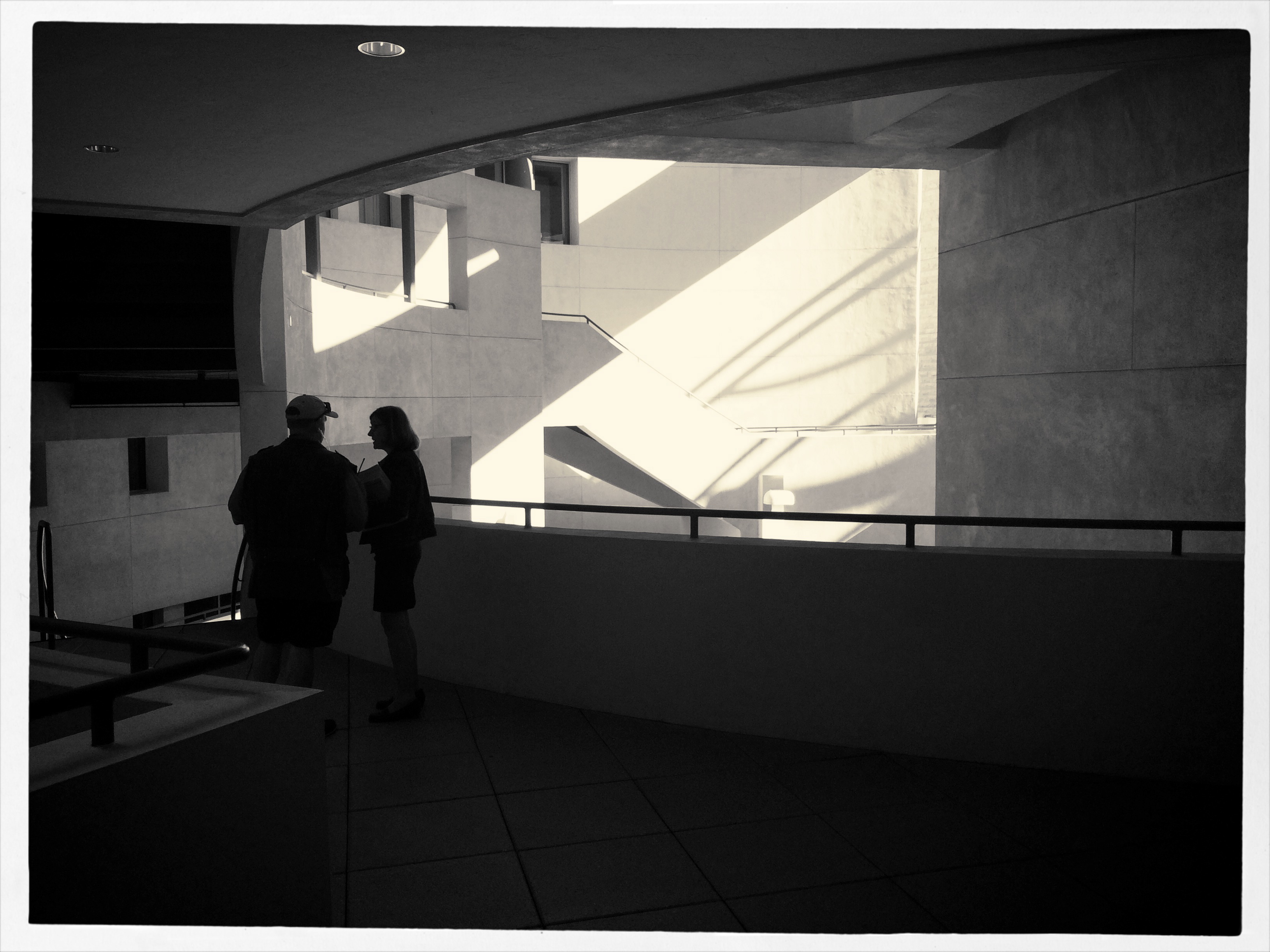
So the plan became, simply, to turn my back on the bright balloons, food booths, passing parade of people and spring scenery that, in earlier years, I would have been happy to capture, and instead render arrangements without any narrative meaning, just whatever impact could be seen using light as nearly the lone element. In the above picture, I did relent in keeping the silhouetted couple in the final picture, so that it’s not as “cold” as originally conceived, but otherwise it’s a pretty stark image. Photography without light is impossible, but we also have to refuse to take light “as is” from time to time, to do our best to orchestrate it, much as we would vary shadings with pencil or crayon. We know that the camera loves light, but it’s still our job to tell it where, and how, to look.
SQUARE STORIES
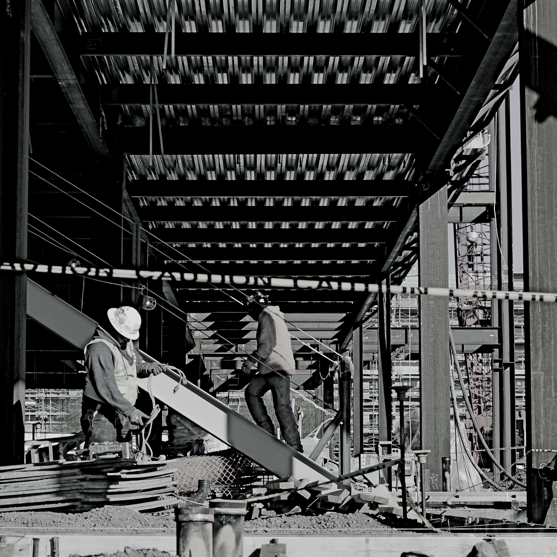
Overhang, 2015.
By MICHAEL PERKINS
BETTER PHOTO HISTORIANS THAN ME WOULD BE ABLE to pinpoint the precise moment in time when the landscape-sized image first eclipsed the square image for most photo shooters. I’d tackle the search myself, but it’s late, and I’m about a martini and a half too far into relax mode, so there it is. But, regardless of the exact instant it first began to wane, the square is back, and bigger than ever, its refreshed use as a distinct mode of composition greeted like a revelation, rather than a return. Cool beans.
The unilateral quadrangle (I get wordy when I drink) managed to barely survive on the periphery of photography, even as the square-centric Polaroid print nearly wobbled out of existence, then came back, as hipsters in the lo-fi movement revived the use of instant print cameras. Then cel phones began offering a pre-selectable square setting for their cameras, and that became a thing. But the biggest boost for the square’s comeback came with a thing called Instagram. You may have heard about this quaint little app. I understand the developers made a few bucks on it.
Still, we are pretty universally conditioned to envision pictures in either “landscape” or (flip this up on its side) “portrait” modes, so much so that director Wes Anderson garnered as much press for his use of the old anamorphic aspect ratio in The Grand Budapest Hotel as he did for the movie’s content. Strangely, the square-format photograph is, upon its return, a bit of a retro novelty.
Composing a shot in roughly 1/3 less space than a landscape frame is a challenge, simply because we have fallen out of the habit for a few decades, but it does have a certain elegance. Lately, I have tried to use the square to effectively tell stories that I traditionally saw in vast or wide scenarios. Construction projects are one such case, in that they seem to call for wide angles and far reaching vistas, what we might call scope. The above image is my attempt to express most of what goes into a building project in what some would call cramped quarters. The main story elements, that is, the action, the range of tone, the compositional depth, are all present, but confined within the quadrangle. Of course, with a DSLR, I can’t start with a square, but I can envision where in the shot the best square is, and crop to it in post-processing.
Composing for a given dimension is a discipline, and, as such, it is valuable as a practice tool, since photographers should always be visualizing every possible way to get their story told. The square may be a prison. But it also may be an answer. The end result is what matters most.
NEW WINE FROM OLD BOTTLES

Wide-angle on a budget, and in a time warp: a mid-70’s manual 24mm Nikkor prime up front of my Nikon D5100.
By MICHAEL PERKINS
MANY OF US WHO BEGAN THEIR LOVE FOR PHOTOGRAPHY IN THE DAYS OF FILM have never really made a total switch to digital. It just never was necessary to make that drastic a “clean break” with the past. Far from it: through the tools and techniques that we utilized in the analog world, we still carry forth viewpoints and habits that act as foundations for the work we produce in pixels. Photography was not “re-invented” by digital in the way that transportation was when we moved from horse to car. It was refined, adding a new chapter, not an entire book.
Digital is merely the latest in a historical line of ever-evolving recording media, from daguerreotypes to salted paper to glass plates to roll film. The principles of what makes a good picture, plus or minus some philosophical fashion from time to time, have not changed. That means that tons of toys from the analog world still have years of life left in them, especially lenses.
Call it a “reverse hack” mentality, call it sentiment, but some shooters are reluctant to send all their various hunks of aged camera glass to the ashcan simply because they were originally paired with analog bodies. Photography is expensive enough without having to start from scratch with all-new components every time a hot new product hits the market, and many of us look for workarounds that involve giving a second life to old lenses. New wine from old bottles.
Some product lines actually engineer backwards-compatibility into their lenses. Nikon was the first and best company to spearhead this particular brain flash, making lenses for over forty years that can be pressed into service with the latest Nikon body off the production line. In my own case, I have finally landed a Nikon 24mm f/2.8 prime, not from current catalogues, but from the happy land of Refurbia. It’s a 1970’s-era gem that is sharp, simple, and mine-all-mine, for a fifth of the cost of the latest version of the same optic.
My new/old 24 gives me a wide-angle that’s a full stop more light-thirsty than the most current kit lenses in that focal length, and is also small, light, and quick, even as a manual focus lens. And it can be argued that the build quality is better as well. Photography is about results, not hardware, so how you get to the finish line is your business. And yet, sometimes, I must admit that shooting new pictures with legendary lenses feels like photography, as an art, is building on, and not erasing, history.
PHOTOSHOP THE MOMENT
By MICHAEL PERKINS
IT’S BEYOND POINTLESS TO PREACH OF “PURITY” when it comes to photographic technique, although the argument springs up whenever the idea of manipulation comes up. It’s not even a new squabble. No sooner had science given the world a way to record reality with a machine than artists began tweaking, twisting, and torturing effects out of the camera that could only be done by deliberate intervention. So much for reality. In fact, photography’s first half-century boasts a rainbow of spectacular effects, undertaken precisely to undermine or improve upon the real world.
No, it’s about a century and a half too late to worry about whether people will alter their photographs and high time we explored what kind of manipulations are best for the overall impact of an image. I personally prefer to “photoshop the moment”, or to calculate what I need in a picture during the taking of it. I truly feel that, in most post-shutter tweaking, you lose an intangible something that might have made real magic if factored into the same-time making of the picture. The best thing about planning is, it gets easier to get better effects from simpler things, things that seem to work better for the picture if you design them into the shot rather than adding them later.
Fill flash helped rescue the tones in this lush arched gate.
Take the ridiculously obvious tweak done in the above picture. 90% of the final photo here is in the composition of the shot, framing the entrance of this wonderful old house in the arch of its outer gate. The sunlight is perfect for the back two-thirds of the picture, but, given the position of the sun in late afternoon on that particular street, my first shot tended to render the arched topiary very dark, nearly a silhouette. Thing is, I really wanted the entire image to have a kind of fairy tale quality. I needed an intervention.
Easy fix. I walked back a few steps to make sure that my flash was just powerful enough to pop a hot green into the arch, yet too faint to illuminate anything else. As a result, the color you see here is not goosed up after the fact. I exposed for the house in the background and the fill flash made the foreground hues as bright as the stuff in back. Again, as planning goes, thus wasn’t the D-Day invasion. I just needed to make one simple change to solve my problem, and the fact that I did it during the original making of the picture made me feel like I was in charge of the project to a greater degree.
DON’T LIKE, LOOK
Looking at photographs is no less a skill than producing them.
By MICHAEL PERKINS
I RECENTLY OVERHEARD A CONVERSATION BETWEEN TWO YOUNG WOMEN which involved the viewing of one woman’s phone images, which she was sharing with her friend. Perhaps “sharing” is too generous a term, as the review of pictures, rendered with a cross-telephone swipe between each one, took approximately ten seconds, punctuated by the following remarks:
“That’s cool..”
“THAT‘s cool…”
“That one’s REALLY cool…send it to me, willya?”
“Love it…”
“Oh, too cute…”
“Totally cool…”
The present age’s crushing overload of sensory information, including the billions of photographs snapped each day, has turned us into a nation of glimpsers. We sense images only fleetingly as they zoom past our window, each new one obliterating the one which preceded it, each one awaiting its own turn to be eclipsed by something newer, cooler, cuter. While the operative word for those viewing the world’s first photographs might have been: look. Now that word is simply: next.
Whatever, dude. We don’t even care whether someone has examined, considered, or absorbed our photographs, as long as they issue a perfunctory, agreeable grunt of some sort between each one or reflexively (and meaninglessly) twitch a “like” click in the appropriate box. The sheer volume of things to be reviewed, and, God spare us, ruled on in some way has turned us into a race of card shufflers. There, we promise. We’ve processed your output and pronounced most of it passable.
Gee, thanks a lot. Thanks for nothing.
The ability to churn out photographs like potato chips certainly provides more opportunities for more people to produce something great. However, if our view of those scads of potential masterpieces is akin to watching bicycle spokes whiz by, then we cannot meet the photographer’s vision with any appreciative seeing of our own. Certainly, some photographs are not worthy of large audiences, but we also have become lousy audiences for the pictures that do deserve to be lingered over, thought about, treasured.
Do a favor for the people in your lives that take photographs. “Like” them a lot less. Look at them a lot more. There is no rush, except the one in your head. Appreciating beauty, or wonder, or art is not a homework assignment, to be tossed off on the way to the next, new thing. Give the pictures time to talk to you. Give yourself back the ear to hear.
Slow the bloody hell down.
MAGICAL ORPHANS
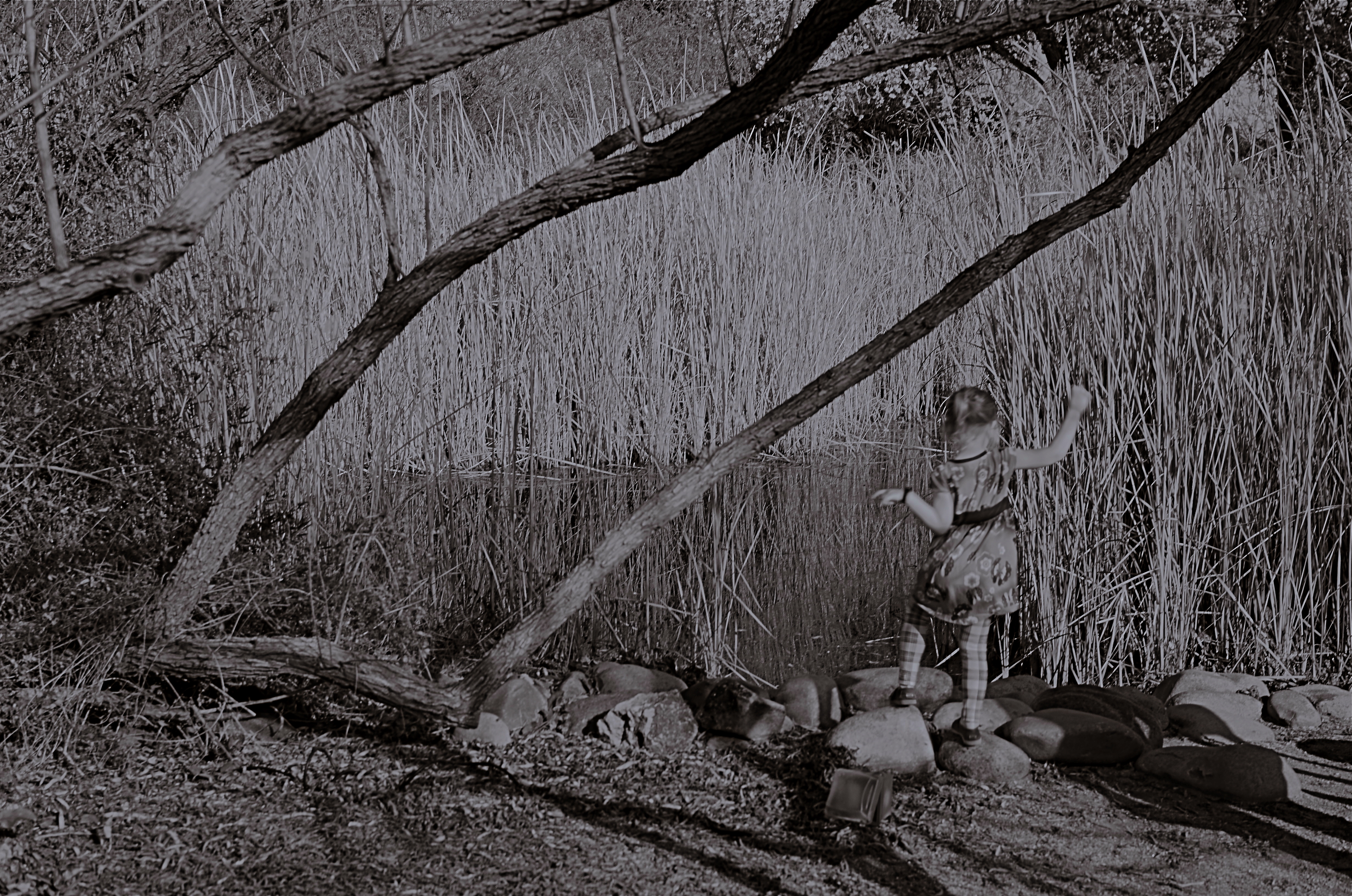
She Of The Reedy River, 2015.
By MICHAEL PERKINS
WE HAVE ALL EXPERIENCED THE SHOCK OF SEEING OURSELVES IN A CERTAIN KIND OF PHOTOGRAPH, a strange combination of framing, light or even history that makes us actually ask, “who is that?? before realizing the truth. Of course we always know, intellectually, that a photo is not an actual visual record of events but an abstraction, and still we find ourselves emotionally shocked when it’s capable of rendering very familiar things as mysteries. That odd gulf between what we know, and what we can get an image to show, is always exciting, and, occasionally, confounding.
Every once in a while, what comes out in a picture is so jarringly distant from what I envisioned that I want to doubt that I was even involved in capturing it. Such photographs are magical orphans, in that they are neither successes nor failures, neither correct or wrong, just…..some other thing. My first reaction to many of these kinds of shots is to toss them into the “reject” pile, as every photo editor before 1960 might have, but there are times when they will not be silenced, and I find myself giving them several additional looks, sometimes unable to make any final decision about them at all.
The above shot was taken on a day when I was really shooting for effect, as I was using both a polarizing filter to cut glare and a red 25 filter to render severe contrast in black and white. The scene was a reedy brook that I had shot plenty of times at Phoenix’ Desert Botanical Garden, but the shot was not planned in any way. As a matter of fact, I made the image in about a moment and a half, trying to snap just the shoreline before a boisterous little girl could get away from her parents and run into the frame. That’s all the forethought that went into it.
With all the extreme filtration up front of the lens, I was shooting slow, at about 1/30 of a second, and, eager to get to the pond, the child was just too fast for me. Not fast enough to be a total blur, but fast enough for my lens to render her softly, strangely. And since every element in a picture talks to every other element, the rendering of the reeds, which was rather murky, added even more strangeness to the little girl, her face forever turned away, her intent or presence destined to remain a secret.
I might like this picture, but I worry that wanting to like it is making me see something in it that isn’t there. Am I trying to wish some special quality into a simple botched shot, acting as a sort of self-indulgent curator in search of “art”?
Can’t tell. Too soon.
Check with me in another five years or so.
(DON’T) WATCH THIS SPACE
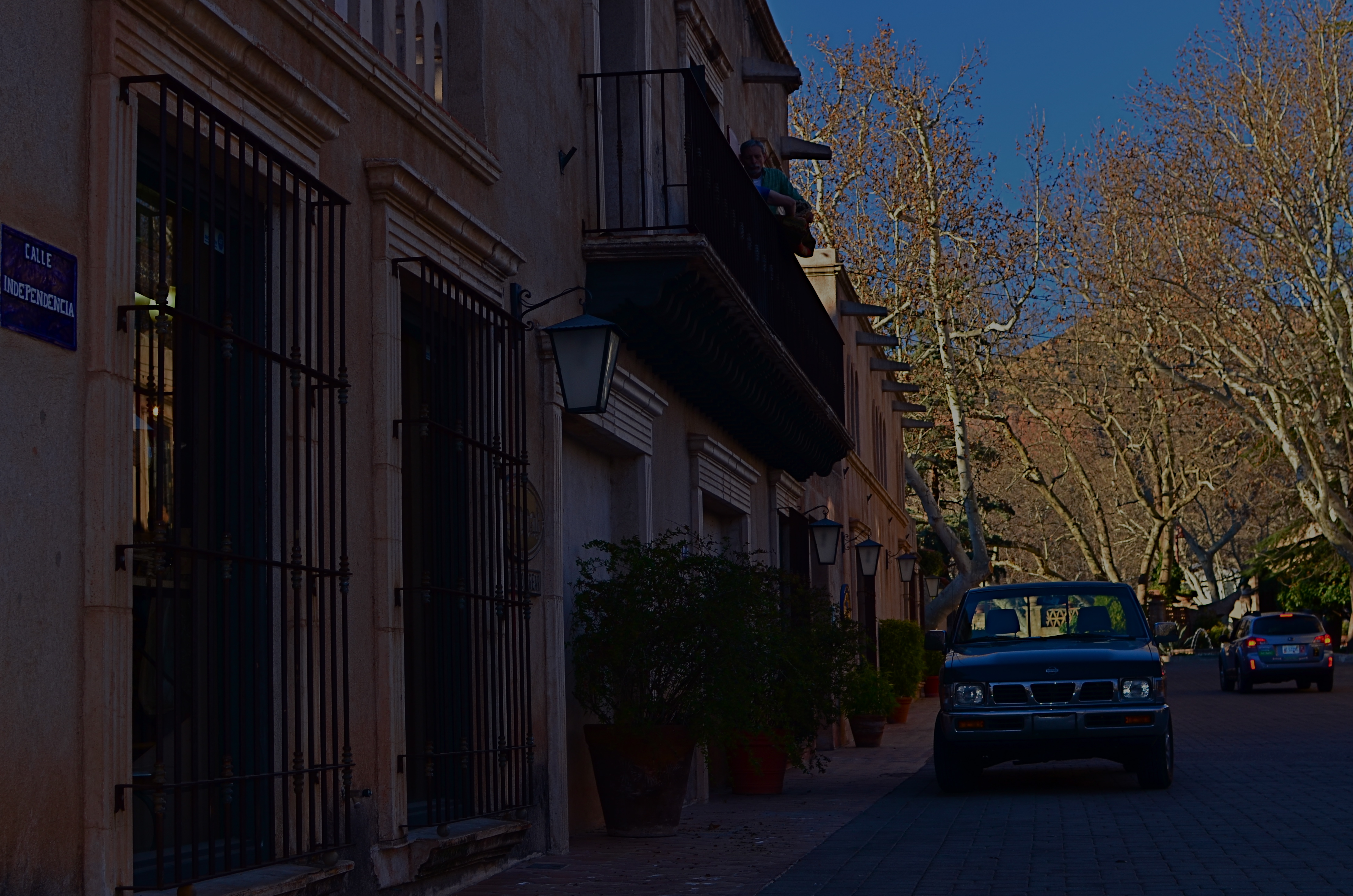
Calle Independencia, 2015.
By MICHAEL PERKINS
CALL IT “EYE-HERDING”, if you will, the art of channeling the viewer’s attention to specific parts of the photographic frame. It’s the first thing we learn about composition, and we address it with a variety of techniques, from depth-of-field to color manipulation to one of my favorites, the prioritizing of light. Light values in any image do have a hierarchy, from loud to soft, prominent to subordinate. Very few photos with uniform tone across the frame achieve maximum impact. You need to orchestrate and capitalize on contrast, telling your viewers, in effect, don’t watch this space. Watch this other space instead.
In many cases, the best natural ebb and flow of light will be there already, in which case you simply go click, thank the photo gods, and head home for a cold one. In fact, it may be that “ready to eat” quality that lured you to stop and shoot the thing in the first place. In many other cases, you must take the light values you have and make the case for your picture by tweaking them about a bit.
I have written before of the Hollywood fakery known as “day for night”, in which cinematographers played around with either exposure or processing on shots made in daylight to simulate night…a budgetary shortcut which is still used today. It can be done fairly easily with still images as well with a variety of approaches, and sometimes it can help you accentuate a light value that adds better balance to your shots.
The image at the top of this page was made in late afternoon, with pretty full sun hitting nearly everything in the frame. There was some slightly darker tone to the walls in the street, but nothing as deep as you see here. Thing is, I wanted a sunset “feel” without actually waiting around for sunset, so I deepened the overall color and simulated a lower exposure. As a result, the sky, cliffs and dogwood trees at the far end of the shot got an extra richness, and the shop walls receded into deeper values, thus calling extra attention to the “opening” at the horizon line. The shot also benefits from a strong front-to-back diagonal leading line. I liked the original shot, but with just a small change, I was asking the viewer to look here a little more effectively.
Light is a compositional element no less important than what it illuminates. Change light and you change where people’s eyes enter the picture, as well as where they eventually land.
FREEZING GOODBYE
1/125 sec., f/5.6, ISO 100, 35mm.
By MICHAEL PERKINS
PHOTOGRAPHERS HAVE A CERTAIN LOVE FOR LIVING AT THE EXTREMES, in seeing how far we can stretch the limits of light, or at least our ability to harness it. It’s strange: we have plenty of the stuff available to us during the meat of the day, but it’s where night and day perform a kind of “changing of the guard” where we really like to go stealing those renegade rays of near-dark and almost-bright. We love to go trapping along the seams of light, chronicling the nether territory where night and day get spliced together.
Lately I seem to have been lucky enough to do what I call “chasing” light, standing in deep shadow as the last rays of gold fade just ahead of me. There’s an expectant quality to it, a preciousness. Suddenly it’s undeniable that something unique is dying, that another measure of our mortality is about to be checked off the list, to be irretrievably gone. It’s only the promise of another day that makes this bearable…that, and our small attempts to, if you will, freeze the goodbye.
1/125 sec., f/5.6, ISO 100, 35mm.
The contrast between light and shadow at this time of day is profound, and it’s easy to either blow out the highlights or lose a ton of narrative detail in the darkness, or both. There is also incredible minute-to-minute change in the balance between dark and light, making every frame you take a kind of all-or-nothing proposition. Seconds after you’ve tried a picture, you’re actually now after a completely different picture, and so the wonderful shoot-adjust-reshoot cycle made possible by digital is an even more amazing tool.
There are amazing opportunities for image-making in both pure day and pure night. But treat yourself to the nether world between the two, and freeze a goodbye or two, if you can.
It’s wondrous out here on the borderline.
SWEETER, SHARPER
By MICHAEL PERKINS
AS SOME PHOTOGRAPHERS AGE, THERE IS A STRONG TEMPTATION to do more and more with less and less. For many, this manifests itself as a kind of divestiture, a relinquishing of toys. Maybe it’s just muscle fatigue, but, at some point in a shooter’s life, he or she makes a conscious decision to carry fewer hunks of gear into battle. Your approach to the work gets more complex, and, paradoxically, the mechanical doing of it gets more streamlined.
This is where the idea of a “go to” lens comes from, with photogs deciding that, yes, they can do nearly everything with the same hunk of glass. It becomes a bragging point: I shoot everything with a 24mm prime. I always use a 35. I don’t carry a big bag of stuff around anymore. But here’s the great thing: even a single lens is actually several lenses at once, since its optical properties change dramatically depending on aperture. That’s why, if you’re trying to take more kinds of pictures with fewer lenses, it’s important to do some homework on all the different ways they see.

Everyone has an “go-to” aperture that they use more than any other. For me, it’s f/5.6.
One of the things it’s best to know about your lens is where its “sweet spot”, or optimum sharpness occurs across the aperture range. Turn on your trusty Google machine and you will find more opinions on how to determine this than there are recipes for apple pie, and that’s the tricky part. Optics are a science, to be sure, but they are also somewhat subjective. Translation: if it looks good to you, it’s good. So publishing a table that proves your argument on what “sharp” is to your satisfaction just picks a scab for someone else. You have to get away from the charts and do the field work. Shoot. Look. Compare.
The chart people believe, for example, that the sweet spot for a lens is always two f-stops less light than your maximum wide-open aperture, meaning that, say an f/1.8 prime would hit its sweet spot somewhere around f/3.5. However, on my own 35mm f/1.8, I get the most uniform sharpness, from center to corners, another stop beyond that, so my “go to” aperture on my “go to” lens is more like f/5.6. I know this is true, because I have set up a tripod and shot the same subject from the same distance through the entire range of apertures and visually compared them. You know, the real-world, old-fashioned way….observation.
The better you know every property of your lens, the closer you will get to one that does most of what you want, most of the time. More pictures with fewer toys, with time and labor saved as well.
PRECISION C, FEELING A
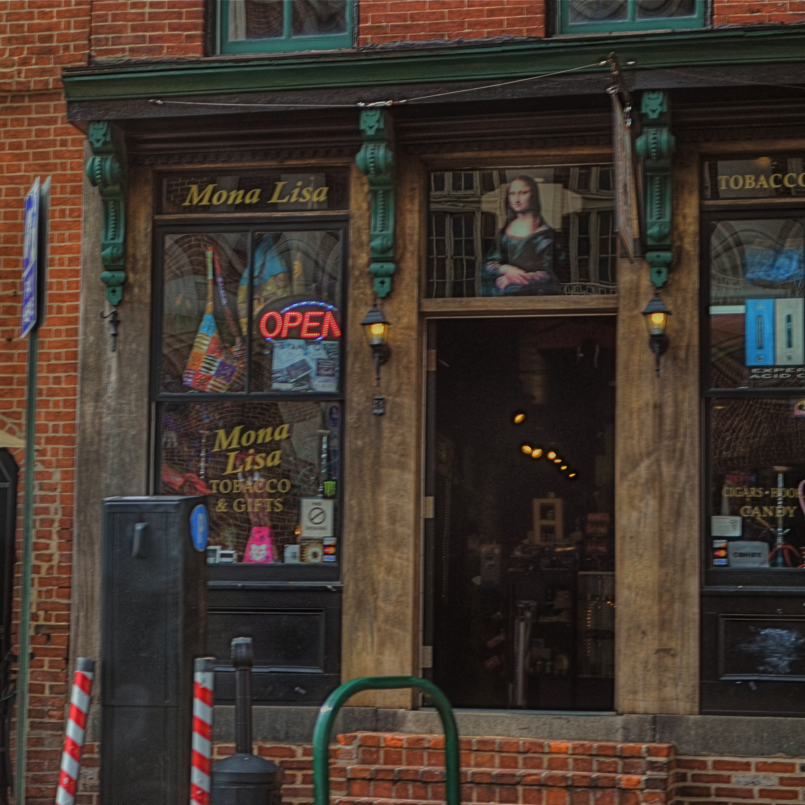
Mona Lisa Smoke Shop, Washington D.C., 2013.
By MICHAEL PERKINS
IF YOU TRAVEL ENOUGH, YOU’LL DISCOVER THAT, OF ALL THE TIMES YOU WANT to take a photograph, there are only a few times in which acceptable picture-making conditions are actually present. For all too many subjects that you experience on the fly, only a small percentage of them allow you the time, light, information or opportunity to do your best. And yet…you do what you must, and trust to instinct and chance for the rest.
Immediately upon arrival in a new town, my mind goes to one task, and one task only: sticking anyone else with the driving, so I can take potshots out the car window as I see fit. I have no need to head the posse or lead the expedition. You be in charge, big man. Get me to the hotel and leave me to make as many attempts as possible to put something worthwhile inside my camera.
Of course, this means that I have to pay at least some attention to how insanely you drive…shortcuts, rapid swerves, jolts and all. And, hey, couldn’t you have lingered a millisecond longer after the light went green, since I was just about to create an immortal piece of street art, instead of the muscular spasm I now have frozen forever on my memory card?
When shooting from a car, there are lots of things that go out the window (sorry), among them composition, exposure, stability, and, most generally, focus. En route to L’Enfant Plaza in Washington D.C. a few years ago, I fell in love with the funky little tobacco shop you see here. The colors, the woodwork, the look of yesteryear, it all spoke to me, and I had to have it. So I shot it at 1/250 sec, more than fast enough to freeze nearly anything in focus, unless by “nearly anything” you mean something that you’re not careening past at the pace of the average Tijuana taxicab. Result? Well, I didn’t wind up with unspeakable blur, but it’s certainly softer than I wanted. Of course, I could have offered an acceptable alibi for the shot, something based on some variant like, “of course, I meant to do that”, that is, until I outed myself in this post, just now.
But we try. Sometimes it’s the fleeting nature of things seen from car windows that make the attempt even more appealing than the potential result. In that instant, it seems like nothing’s more important than trying to take a picture. That picture. I won’t get ’em all. But as long as I live, I hope I never lose that mad, what-the-hell urge to just go for it.
So okay, seeing as this is a photo of a tobacco shop, this is where one of you cashes in the “close, but no cigar” gag line.
Go ahead, I’ll give you that one.
JOY GENERATORS
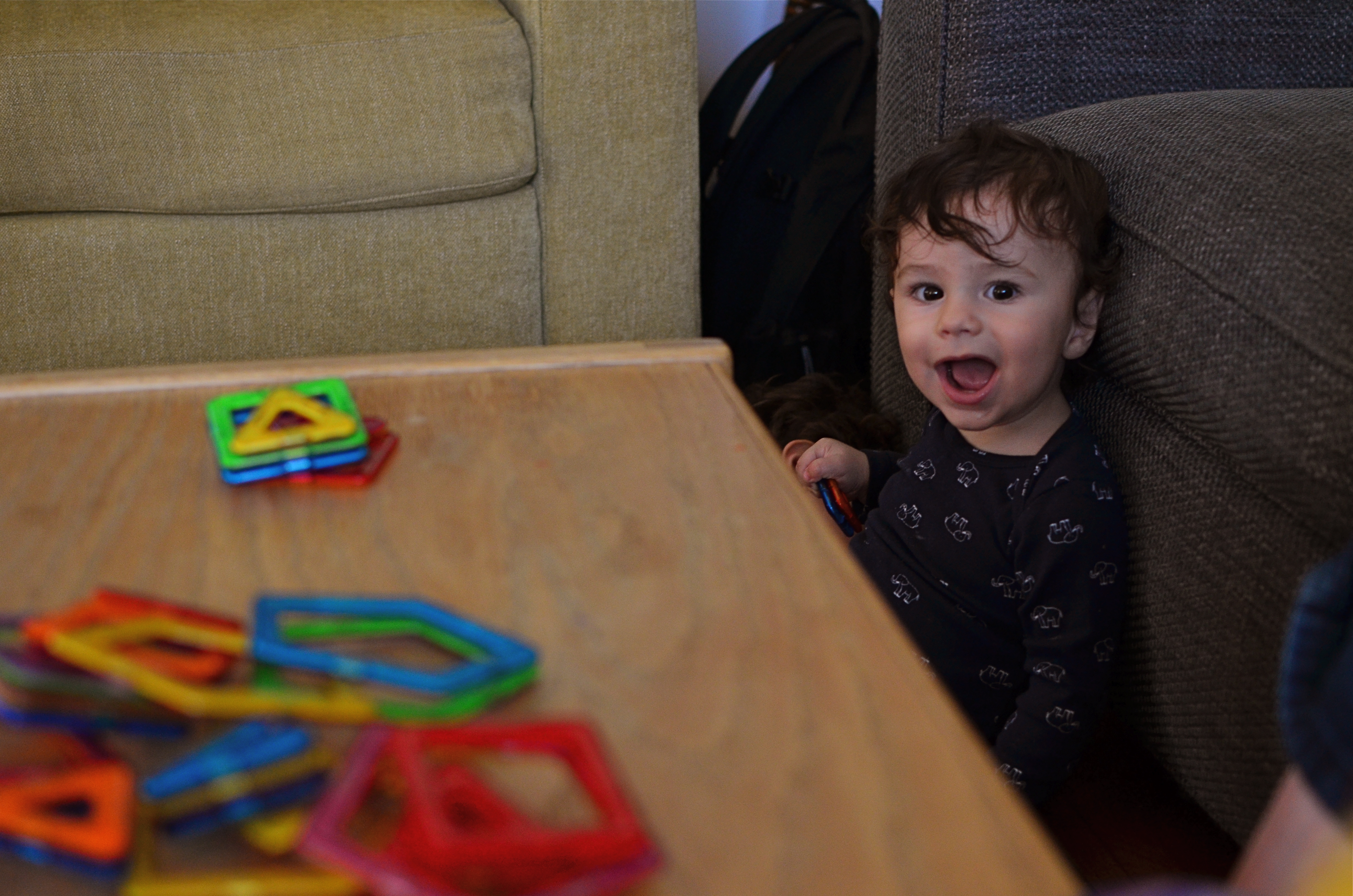
I could pose this rascal all day long, but I can’t create what he can freely give me. 1/40 sec., f/3.2, ISO 500, 35mm.
By MICHAEL PERKINS
IT’S A TITANIC CLICHE, BUT RESOUNDINGLY TRUE: if you want a child to reveal himself to you photographically, get out of his way.
The highly profitable field of child portrait photography is being turned on its head, or more precisely, turned out of the traditional portrait studio, by the democratization of image making. As technical and monetary barriers that once separated the masses from the elite few are vanishing from photography, every aspect of formal studio sittings is being re-examined. And that means that the $7.99 quickie K-Mart kiddie package is going the way of the dodo. And it’s about bloody time.
Making the subject fit the setting, that is, molding someone to the props, lighting or poses that are most convenient to the portraitist seems increasingly ridiculous. Thing is, the “pros” who do portrait work at the highest levels of the photo industry have long since abandoned these polite prisons, with Edward Steichen posing authors, politicians and film stars in real-life settings (including their own homes) as early as the 1920’s, and Richard Avedon pulling models out of the studio and into the street by the late 1940’s. So it’s not the best photographers who insist on perpetuating the restrictive environment of the studio shoot.
No, it’s the mills, the department and discount stores who still wrangle the kiddies into pre-fab backdrops and watch-the-birdie toys, cranking out one bland, safe image after another, and veering the photograph further and further from any genuine document of the child’s true personality. This is what has to change, and what will eventually result in something altogether different when it comes to kid portraiture.
Children cannot convey anything real about themselves if they are taken out of their comfort zones, the real places that they play and explore. I have seen stunning stuff done with kids in their native environment that dwarfs anything the mills can produce, but the old ways die hard, especially since we still think in terms of “official” portraits, as if it’s 1850 and we have a single opportunity to record our existence for posterity. There really need be no “official” portrait of your child. He isn’t U.S. Grant posing for Matthew Brady. He is a living, pulsating creature bent on joy, and guess what? You know more about who and what he is than the hourly clown at Sears.
I believe that, just as adult portraiture has long since moved out of the studio, children need also to be released from the land of balloons and plush toys. You have the ability to work almost endlessly on getting the shots of your children that you want, and better equipment for even basic candids than have existed at any other period in history. Trust yourself, and experiment. Stop saying “cheese”, and get rid of that damned birdie. Don’t pose, place, or position your kids. Witness these little joy generators in the act of living. They’ll give you everything else you need.
MORE THAN FOOD
Pre-open, 2015.
By MICHAEL PERKINS
YOU COULD ARGUE ALL DAY ABOUT WHETHER PUBLIC SPACES POSSESS MORE VISUAL POTENTIAL when they are full or when they are dead empty, and, depending on your photographic approach, both arguments would be correct. In other words, instead of a hard-and-fast truth, you have multiple truths, depending on which space is shot by which photographer under such-and-such circumstances. Hey, if ya want a vague premise, I’m your boy.

Plaza Cafe, 2015.
Plazas, train platforms, museums, places of worship, restaurants, sports arenas…..all the places where people convene in big mobs have all produced stunning images taken when said places contain no people at all. After hours, before opening, last call, snow days…there are endless reasons why people don’t go to places, and the unfilled space created by their absence is a separate kind of compositional challenge.
I have stated in previous posts on this forum that, for me, museums are tremendous sources of negative space, and yet positive possibilities,when devoid of crowds. Maybe it’s when people are about to be somewhere, when something is nearly ready to happen, that public places possess a certain, well, suspense. Whatever the phenomenon, I feel it, and will always squeeze off a few shots while the moment lasts.
Similarly, eateries are both potentially joyful and potentially lonely, and that kind of uncertainty excites me as a photographer. But you may be on the opposite side of the discussion. I can certainly understand that some would see a bunch of empty tables and chairs as depressing, unmistakably desolate. But I think it depends on the photograph, and I think it always will. There are many images of two people seated together at a cafe who are, sadly, miles apart due to their estrangement, and there are an equal number of pics of a hall just before celebrants from a wedding stream in. As with so much in photography, feeling comes both from what you did and didn’t show.
DOCUMENTARY OR DRAMA?
Creative use of contrast and texture can amp up interest in a shot that is overly pretty.
By MICHAEL PERKINS
I RECENTLY HEARD AN INTERESTING CRITIQUE OF A DRAMATIC CONTENDER for Best Film in the 2015 Oscar race. The critic in question complained that the film in question (Boyhood) was too realistic, too inclusive of banal, everyday events, and thus devoid of the dynamics that storytellers use to create entertainment. His bottom line: give us reality, sure, but, as the Brits say, with the boring bits left out.
If you’re a photographer, this argument rings resoundingly true. Shooters regularly choose between the factual documentation of a scene and a deliberate abstraction of it for dramatic effect. We all know that, beyond the technical achievement of exposure, some things that are real are also crashingly dull. Either they are subjects that have been photographed into meaninglessness (your Eiffel Towers, your Niagara Fallses) or they possess no storytelling magic when reproduced faithfully. That’s what processing is for, and, in the hands of a reliable narrator, photographs that remix reality can become so compelling that the results transcend reality, giving it additional emotive power.
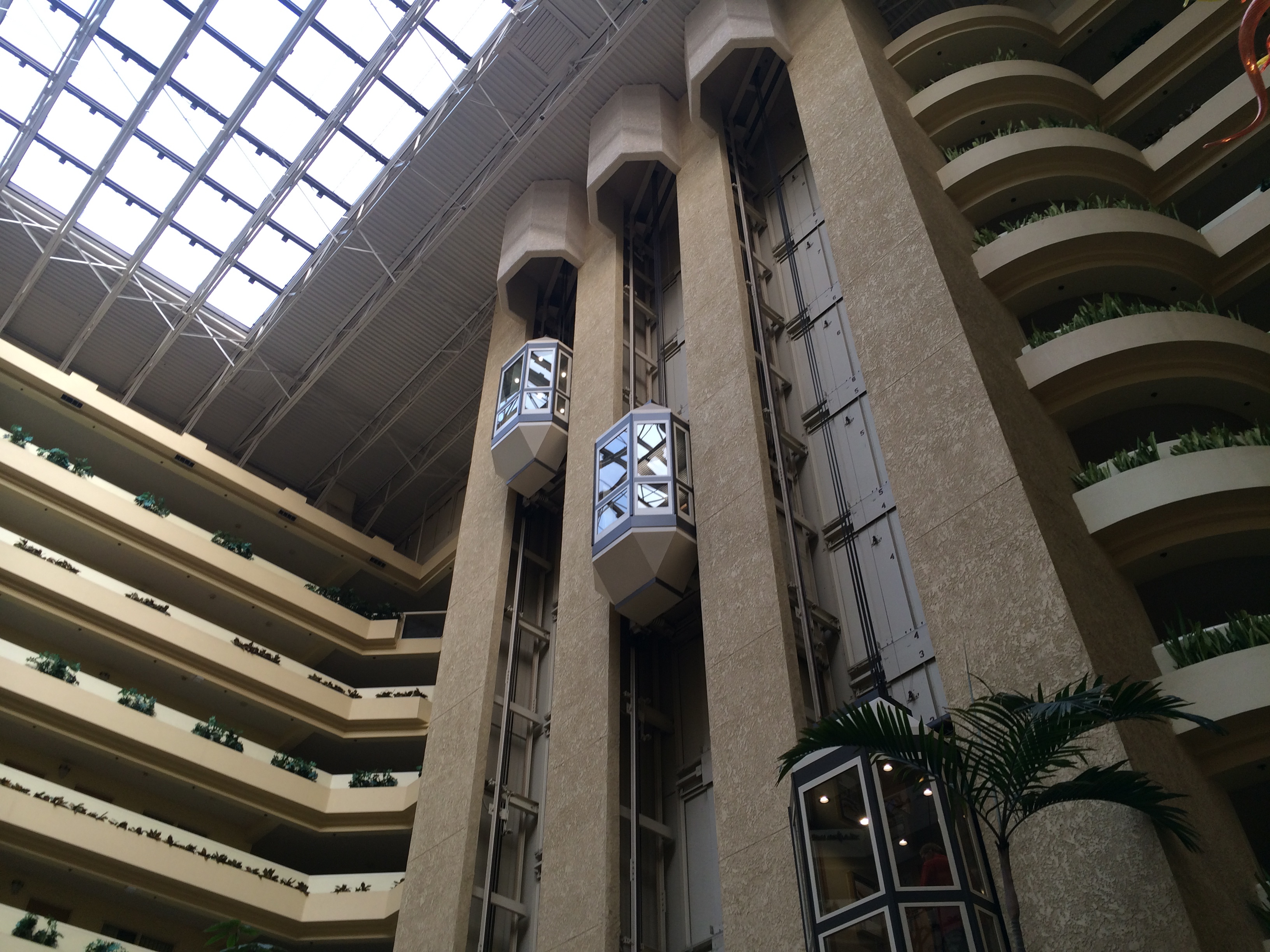
The original. Workable composition, but hampered by its realism.
This is why colors are garish in The Wizard Of Oz, why blurred shots can convey action better than “frozen” shots, and why cropping often delivers a bigger punch and more visual focus than can be seen in busier compositions. Drama is subject matter plus the invented contexts of color, contrast, and texture. It is the reassignment of values. Most importantly, it is a booster shot for subjects whose natural values under-deliver. It is not “cheating”, it is “realizing”, and digital technology offers a photographer more choices, more avenues for interpretation than at any other time in photo history.
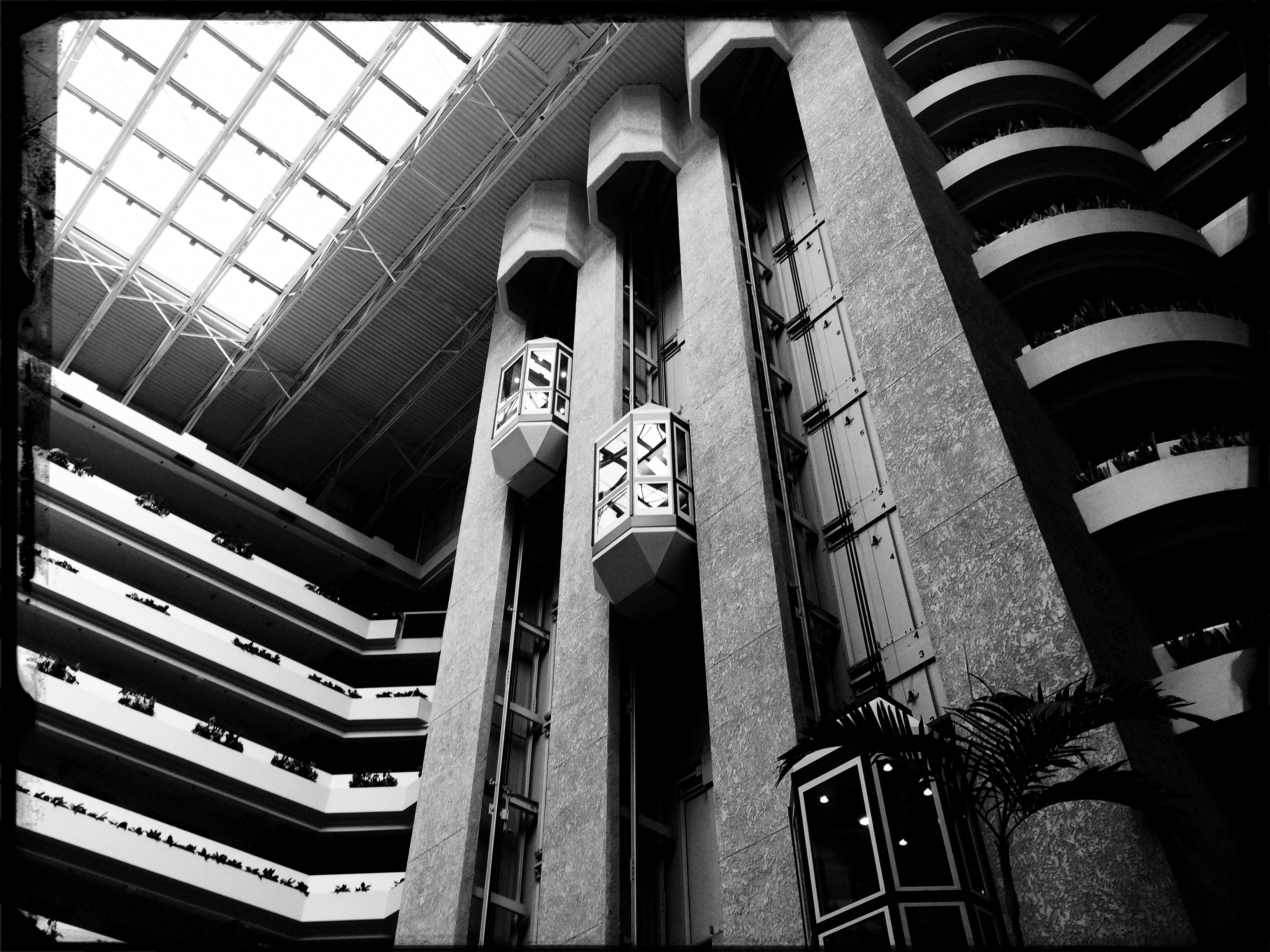
The photo at left was taken in a vast hotel atrium which has a lot going for it in terms of scope and sweep, but which loses some punch in its natural colors. There is also a bit too much visible detail in the shot for a really dramatic effect. Processing the color with some additional grain and grit, losing some detail in shadow, and amping the overall contrast help to boost the potential in the architecture to produce the shot you see at the top of this post. Mere documentation of some subjects can produce pretty but flaccid photos. Selectively re-prioritizing some tones and textures can create drama, and additional opportunity for engagement, in your images.
25, 50, T, B
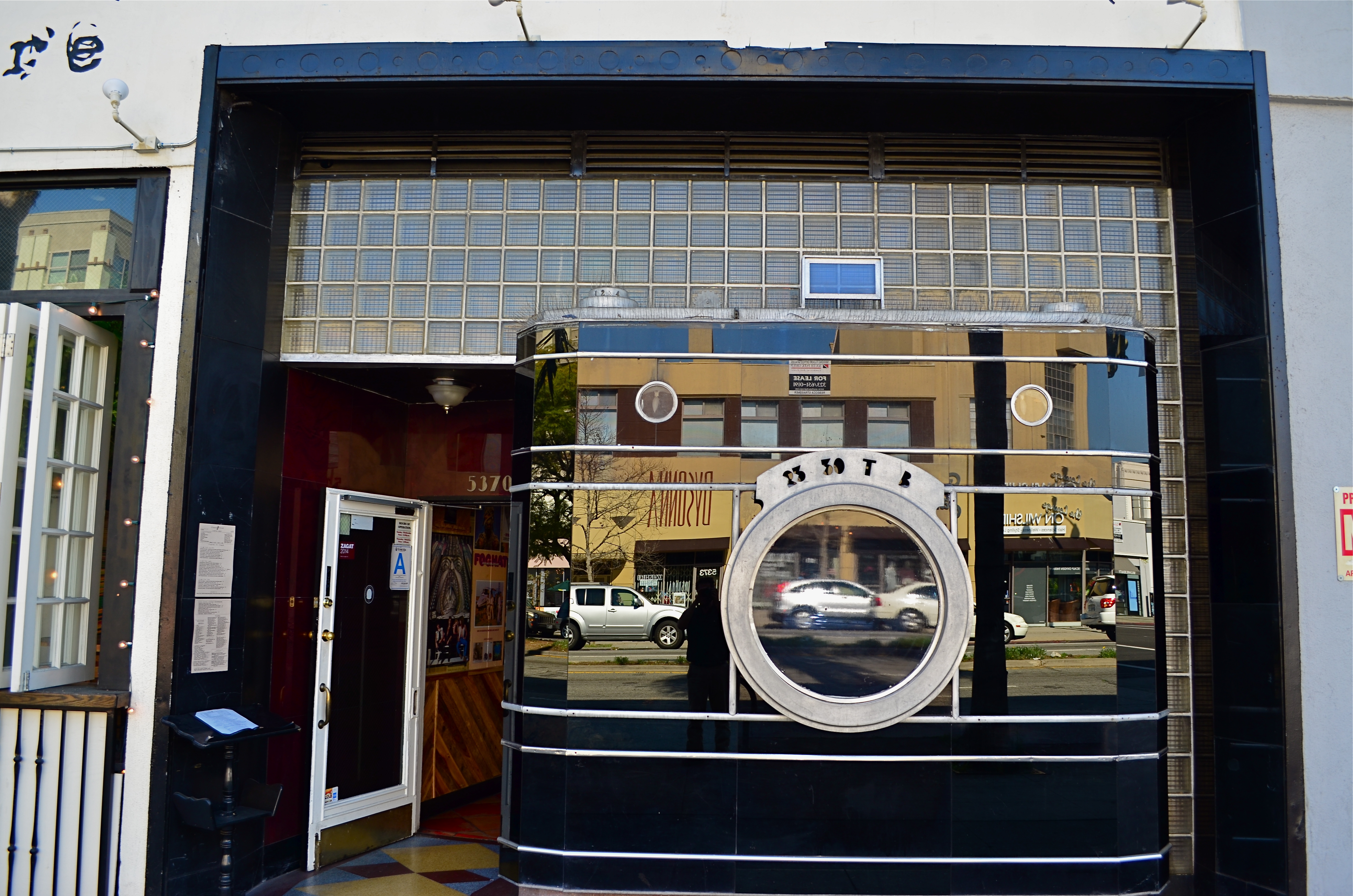
The remaining facade from Los Angeles’ historic Darkroom camera shop at 5370 Wilshire Boulevard.
By MICHAEL PERKINS
THERE IS A PART OF WILSHIRE BOULEVARD IN LOS ANGELES that I have been using for a photographic hunting ground for over ten years, mostly on foot, and always in search of the numerous Art Deco remnants that remain in the details of doors, window framings, neighborhood theatres and public art. Over the years, I have made what I consider to be a pretty thorough search of the stretch between Fairfax and LaBrea for the pieces of that streamlined era between the world wars, and so it was pretty stunning to realize that I had been repeatedly walking within mere feet of one of the grand icons of that time, busily looking to photograph….well, almost anything else.
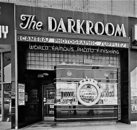
The Darkroom in its Kodachrome days.
A few days ago, I was sizing up a couple framed in the open window of a street cafe when my composition caught just a glimpse of black glass, ribbed by horizontal chrome bands. It took me several ??!?!-type minutes to realize that what I had accidentally included in the frame was the left edge of the most celebrated camera in all of Los Angeles.
Opened in the 1930’s, the Darkroom camera shop stood for decades at 5370 Wilshire as one of the greatest examples of “programmatic architecture”, that cartoony movement that created businesses that incorporated their main product into the very structure of their shops, from the Brown Derby restaurant to the Donut Hole to, well, a camera store with a nine-foot tall recreation of an Argus camera as its front facade.
The surface of the camera is made of the bygone process known as Vitrolite, a shiny, black, opaque mix of vitreous marble and glass, which reflects the myriad colors of Los Angeles street life just as vividly today as it did during the New Deal. The shop’s central window is still the lens of the camera, marked for the shutter speeds of 1/25th and 1/50th of a second, as well as T (time exposure) and B (bulb). A “picture frame” viewfinder and two film transit knobs adorn the top of the camera, which is lodged in a wall of glass block. Over the years, the store’s original sign was removed, and now resides at the Museum of Neon Art in Glendale, California, while the innards of the shop became a series of restaurants with exotic names like Sher-e-Punjab Cuisine and La Boca del Conga Room. Life goes on.
True to the ethos of L.A. fakes, fakes of fakes, and recreations of fake fakes, the faux camera of The Darkroom has been reproduced in Disney theme parks in Paris and Orlando, serving as…what else?….a camera shop for visiting tourists, while the remnants of the original storefront enjoy protection as a Los Angeles historic cultural monument. And, while my finding this little treasure was not quite the discovery of the Holy Grail, it certainly was like finding the production assistant to the stunt double for the stand-in for the Holy Grail.
Hooray for Hollywood.
SHADOWS AS STAGERS
The idea of this image is to highlight what lies beyond the window framing, not the objects in front of it. Lighting should serve that end.
By MICHAEL PERKINS
THOSE WHO ADHERE TO THE CLASSIC “RULE OF THIRDS” system of composition often suggest that you imagine your frame with a nine-space grid super-imposed over it, the better to help you place your subject in the greatest place of visual interest. This place is usually at the intersection of several of these grid lines, and, whether or not you strictly adhere to the “thirds” system, it’s useful to compose your shots purposefully, and the grid does give you a kind of subliminal habit of doing just that.
Sometimes, however, I find that the invisible grid can be rendered briefly visible to become a real part of your composition. That is to say, framing through silhouetted patterns can add a little dimension to an otherwise flat image. Leaving some foreground elements deliberately underlit is kind of a double win, in that it eliminates detail that might read as clutter, and helps hem in the parts of the background items you want to most highlight.
These days, with HDR and other facile post-production fixes multiplying like rabbits on Viagra, the trend has been to recover as much detail from darker elements as possible. However, this effect of everything being magically “lit” at one even level can be a little jarring since it clearly runs counter to the way we truly see. It’s great for novel or fantasy shots, but the good old-fashioned silhouette is the most elemental way to add the perception of depth to a scene as well as steering attention wherever you need it. Shadows can set the stage for certain images in a dramatic fashion.
Cheap. Fast. Easy. Repeat.
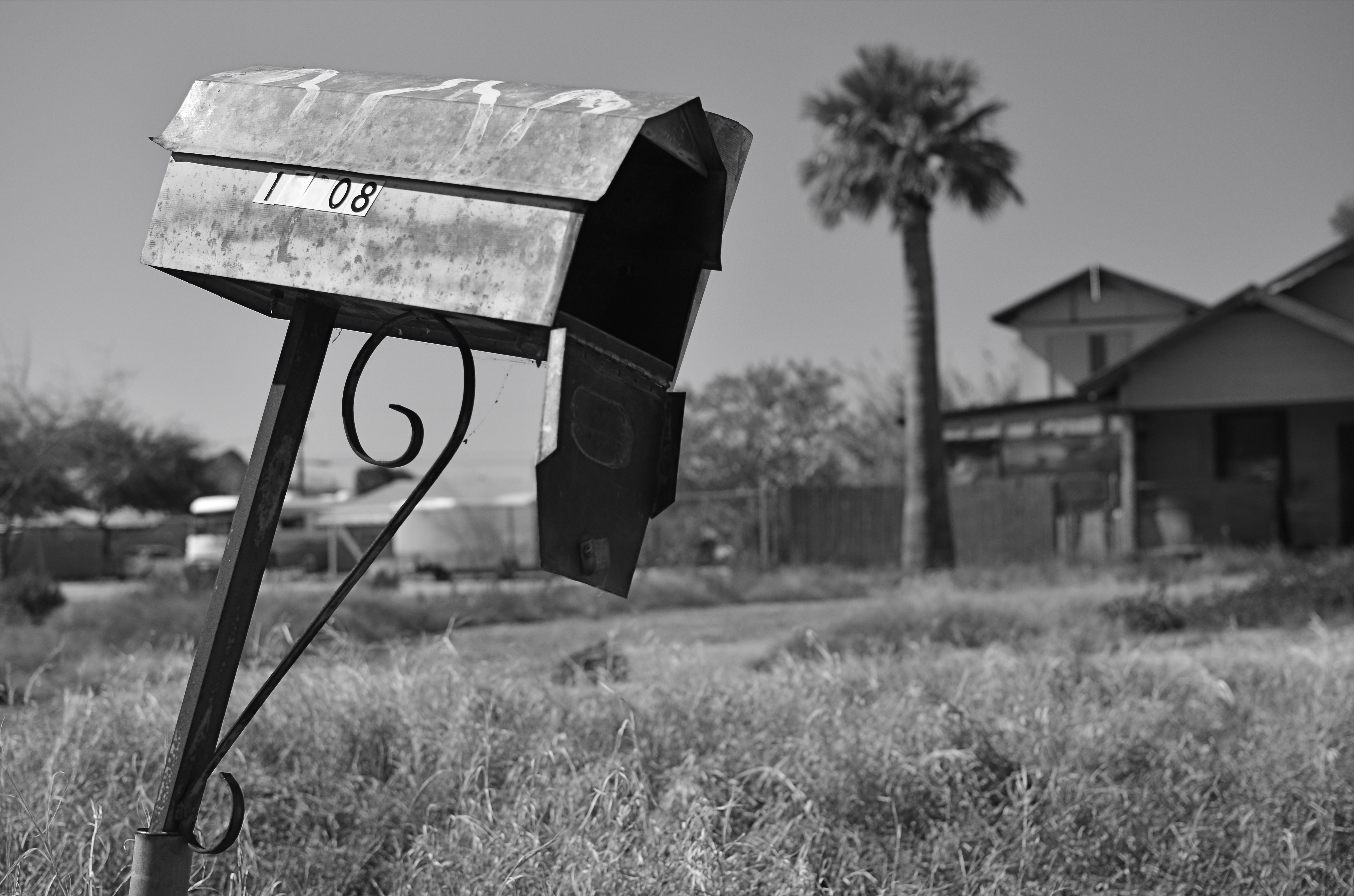
THE ROMANCE OF RUIN
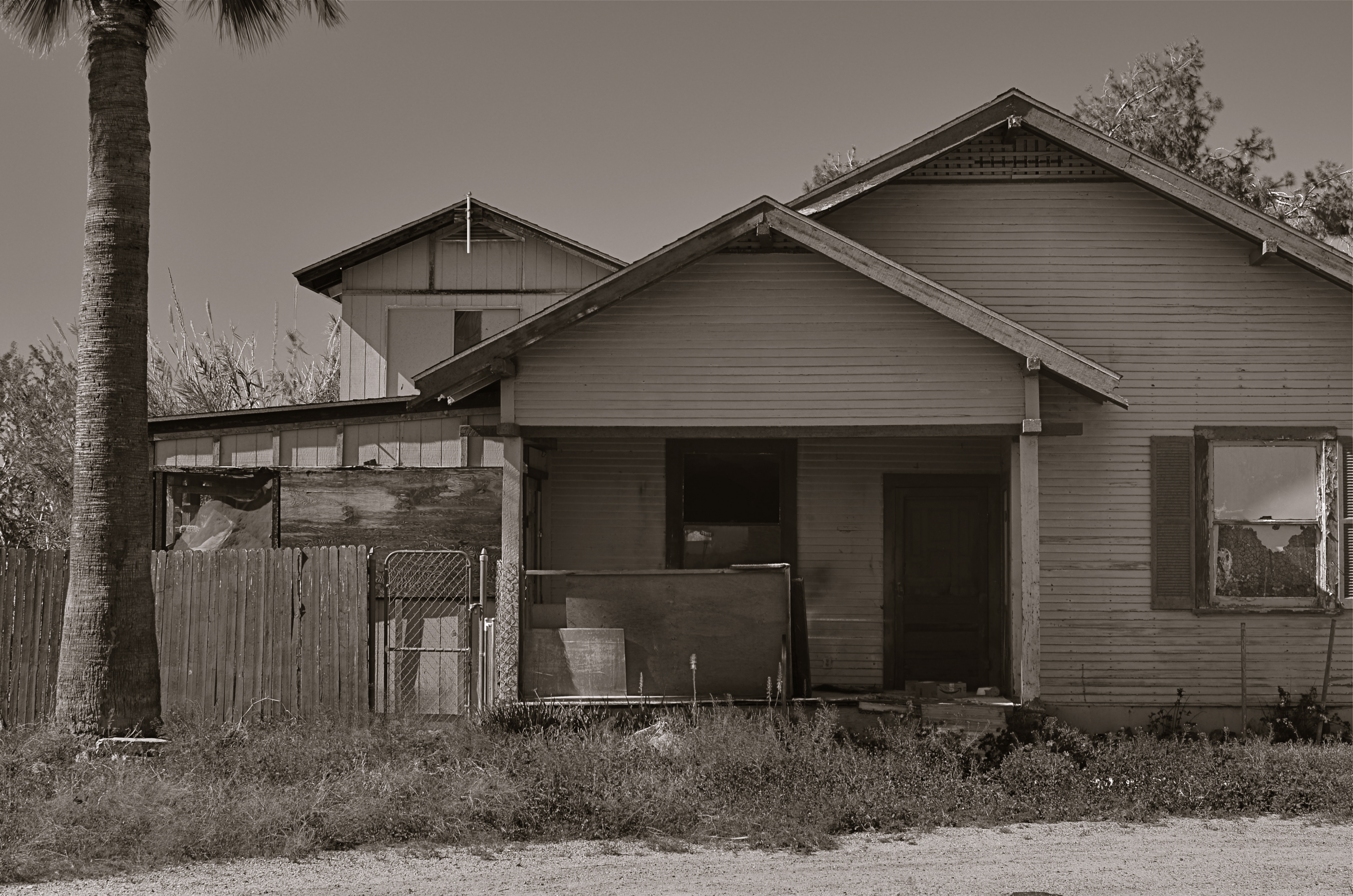
The honeymoon is, indeed, over.
By MICHAEL PERKINS
I TYPICALLY SHY AWAY FROM USING OR CREATING PHOTOGRAPHS as illustrations of work in another medium. Writers don’t try to caption my images, and I don’t presume, for the most part, to imagine visuals for their works. As both photographer and writer, I am sympathetic to the needs and limits of both graphic and written mediums. And still, there are rare times when a combination of events seem to imply a collaboration of sorts between the two means of storytelling. I made such an attempt a while back in these pages, in the grip of nostalgia for railroads, and so here goes with another similar experiment.
 Last week, during a blue mood, I sought out, as I often do, songs by Sinatra, since only Frank does lonely as if he invented the concept, conveying loss with an actor’s gift for universality. I stumbled across a particularly poignant track entitled A Cottage For Sale, which I sometimes can’t listen to, even when I need its quiet, desolate description of a dream gone wrong. So, that song was the first seed in my head.
Seed two came a few days later, when I was shortcutting through one of those strange Phoenix streets where suburban and rural neighborhoods collide with each other, blurring the track of time and making the everyday unreal. I saw the house you see here, a place so soaked in despair that it seemed to cry out for the lyrics of Frank’s song. Again, I’m not trying to provide the illustration for the song, just one man’s variation. So, for what it’s worth:
Is lonely and silent, the shades are all drawn,
And my heart is heavy as I gaze upon
A cottage for sale
Where you planted roses,the weeds seem to say,
“A cottage for sale”.
But when I reach a window, there’s empty space.
But no one is waiting for me any more,
The end of the story is told on the door.
A cottage for sale.
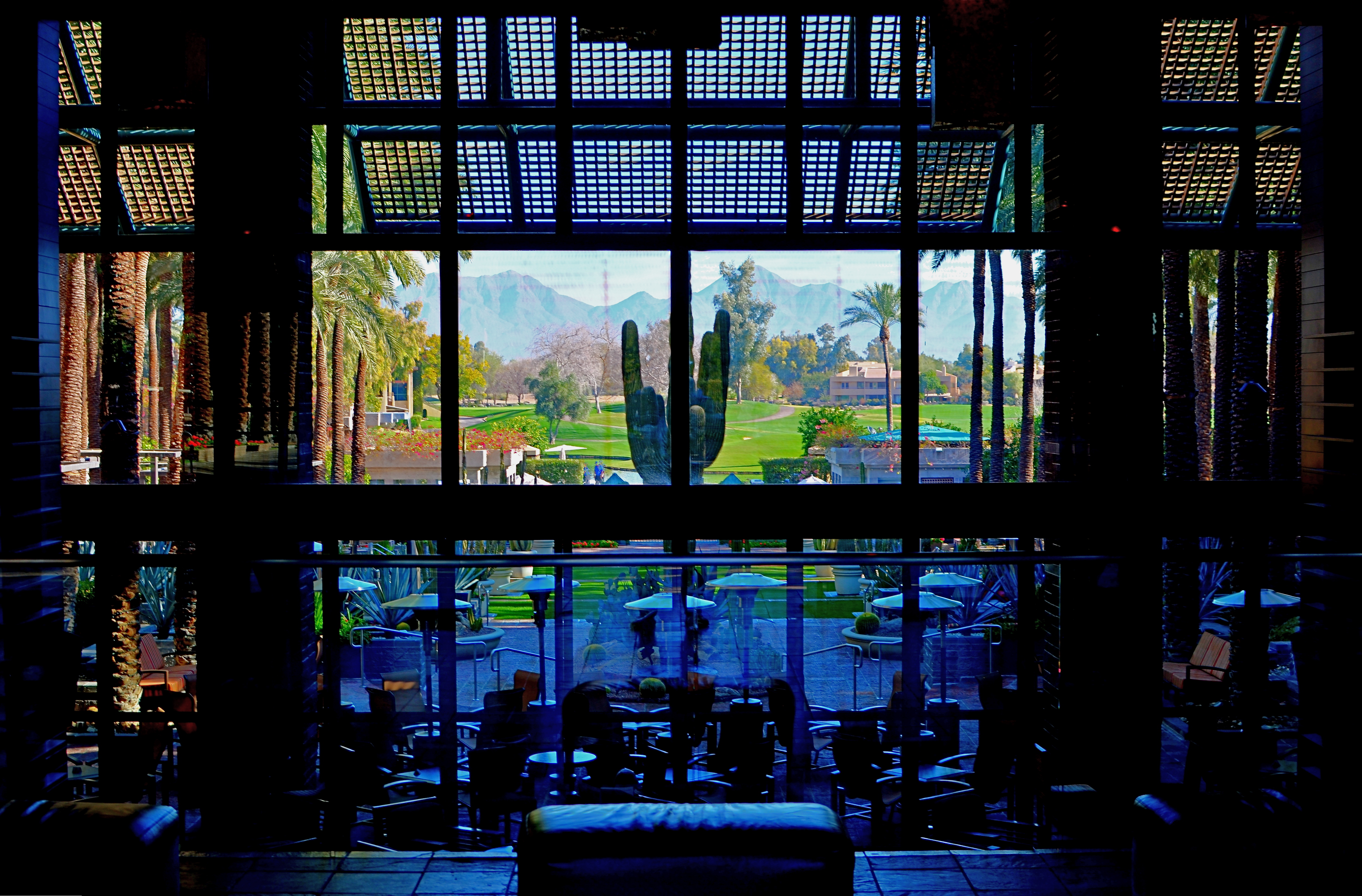
COME EARLY / STAY LATE

Gainey Ranch, Phoenix, 2015. 1/320 sec., f/5.6, ISO 100, 35mm.
By MICHAEL PERKINS
PUBLIC SPACES OFTEN LOSE THEIR POWER AS GRAND DESIGNS once they actually are occupied by the public. If you have ever leafed through books of architectural renderings, the original drawings for squares, plazas, office buildings or other mass gathering places, the elegance of their patterns is apparent in a way that they cease to be, once they are teeming with commuters or customers.
This doesn’t mean that humans “spoil” the art of architecture, however, the overlay of drama and tension created by the presence of huge hordes of people definitely distracts from an appreciation of the beauty that is so clean and clear in a place’s sketch phase. Photographically, people as design objects tend to steal the scene, if you will, making public settings less dramatic in some ways. That’s why I like to make images of such locales when they are essentially empty, since it forces the eye to see design as the dominant story in the picture. I suppose that I’m channeling the great designers and illustrators that influenced me as a young would-be comic book artist. It’s a matter of emphasis. While other kids worked on rendering their superheroes’ muscles and capes correctly, I wanted to draw Metropolis right.
I recently began driving to various mega-resorts in the Phoenix, Arizona area to capture scenes in either early morning or late afternoon. Some are grand in their ambition, and more than a few are plain over-the-top vulgar, but sometimes I find that just working with the buildings and landscaping as a designer might have originally imagined them can be surprising. Taking places which were meant to accommodate large gatherings of people, then extracting said people, forces the eye to align itself with the original designer’s idea without compromise. Try it, and you may also find that coming early or staying late at a public area gives you a different photographic perspective on a site. At any rate, it’s another exercise in re-seeing, or forcing yourself to visualize a familiar thing eccentrically.
THE EYE BACK OF THE LENS
To view your earliest work is to encounter yourself as you would a stranger.
By MICHAEL PERKINS
EVERY YEAR AT THIS TIME, AS I HIT THE RESET BUTTON ON MY LIFE VIA SOME KIND OF BIRTHDAY RITUAL, I pause to wonder, again, whether I’ve really learned anything at all in over fifty years of photography. Surely, by this late date, the habit of shooting constantly should have assured me that I had “arrived” at some place in terms of viewpoint or style, right? And yet, I still feel as if I am just barely inches off the starting line in terms of what there is left to learn, and how much more I need to know about seeing. It’s a great feeling in that it keeps things perpetually fresh, but I often wonder if I’ll ever make it to that mirage I see ever ahead of me.
The aging process, and how that continually remaps your perception, is one of the least pondered areas of criticism as it pertains to photography. And that’s very strange. We track the evolution of technical acuity over a lifetime. We date ourselves in reference to a piece of equipment we acquired, an influential person who crossed our path, or a body of work, but we don’t thoroughly examine how much our photography is being changed completely because the person making the picture is in constant flux. How can we ignore what seems to be the biggest shaper of our vision over time? We don’t even want the same things in an image from one year to the next, so how can we take photos in our maturity anything like those we shot in our youth?
Style is a constantly shifting timeline of approach.
Looking back to my first images, it’s clear that I thought the mere opportunity for a picture plus the act of clicking a shutter would result in a good picture, a kind of “cool view+camera=art” equation. This is to say that, instead of thinking, “I could make a good picture from this”, I was actually thinking, “this would be a good picture.” I know that sounds like hair-splitting of the first order, but the two statements are, in fact, different. The first implies that the camera plus the subject will automatically result in something solid; it’s a snapshot philosophy. The second statement is made by someone who has been frustrated by so many snapshots that he knows he has to step into the process as an active player. That realization can only come with age.
As always, my father’s admonition that art is a process rather than a product emerges as my prime directive. When I look at the pictures made by a twelve-year old me, I can at least see what the little punk was going for, and I can measure whether I’ve gotten any closer to that ideal than he did. The trick is for old me to want it as badly as young me did, and when that happens, I forget how many candles are on the cake, and am just grateful that their light still burns brightly.
