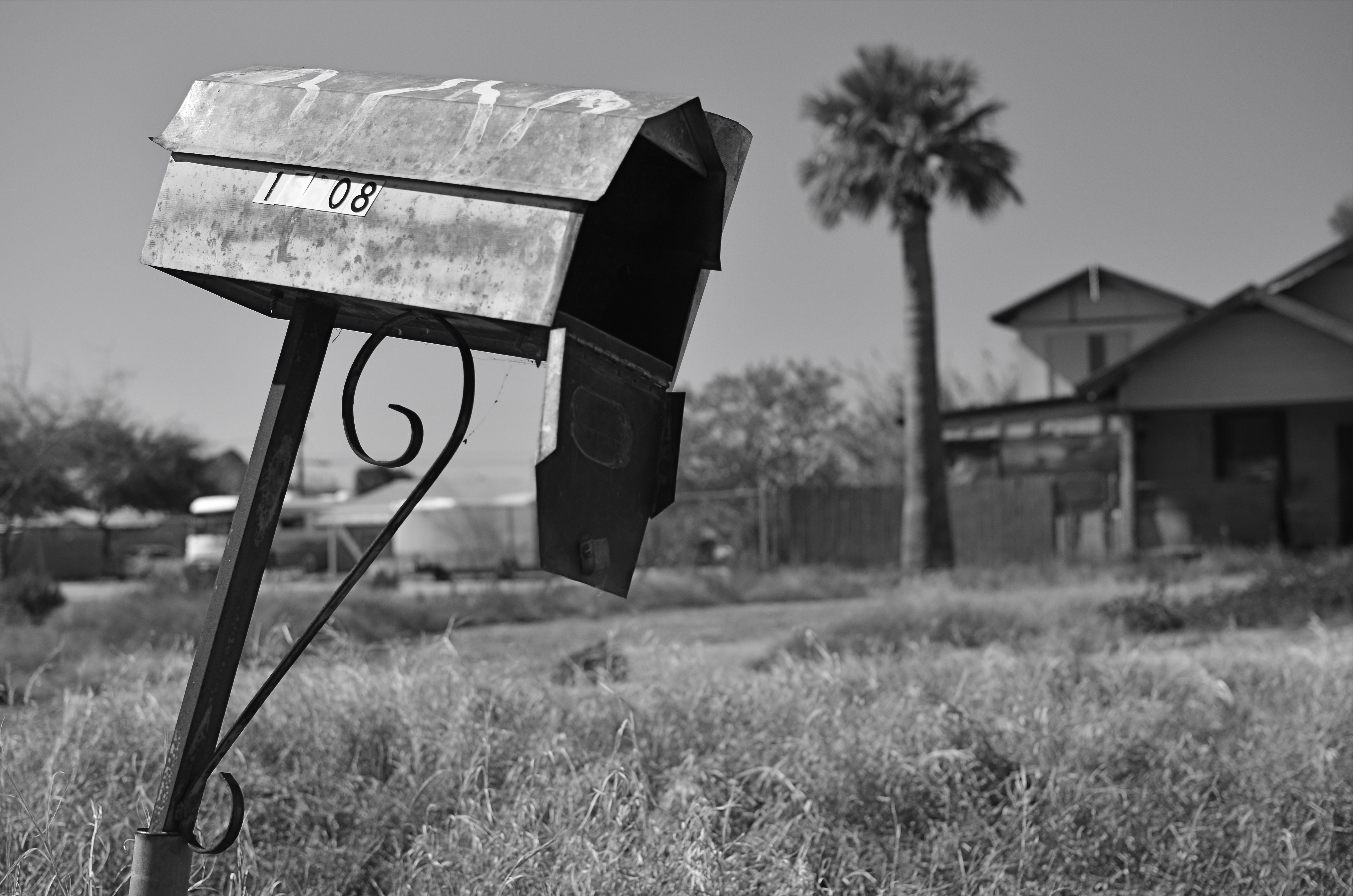
SWEETER, SHARPER
By MICHAEL PERKINS
AS SOME PHOTOGRAPHERS AGE, THERE IS A STRONG TEMPTATION to do more and more with less and less. For many, this manifests itself as a kind of divestiture, a relinquishing of toys. Maybe it’s just muscle fatigue, but, at some point in a shooter’s life, he or she makes a conscious decision to carry fewer hunks of gear into battle. Your approach to the work gets more complex, and, paradoxically, the mechanical doing of it gets more streamlined.
This is where the idea of a “go to” lens comes from, with photogs deciding that, yes, they can do nearly everything with the same hunk of glass. It becomes a bragging point: I shoot everything with a 24mm prime. I always use a 35. I don’t carry a big bag of stuff around anymore. But here’s the great thing: even a single lens is actually several lenses at once, since its optical properties change dramatically depending on aperture. That’s why, if you’re trying to take more kinds of pictures with fewer lenses, it’s important to do some homework on all the different ways they see.

Everyone has an “go-to” aperture that they use more than any other. For me, it’s f/5.6.
One of the things it’s best to know about your lens is where its “sweet spot”, or optimum sharpness occurs across the aperture range. Turn on your trusty Google machine and you will find more opinions on how to determine this than there are recipes for apple pie, and that’s the tricky part. Optics are a science, to be sure, but they are also somewhat subjective. Translation: if it looks good to you, it’s good. So publishing a table that proves your argument on what “sharp” is to your satisfaction just picks a scab for someone else. You have to get away from the charts and do the field work. Shoot. Look. Compare.
The chart people believe, for example, that the sweet spot for a lens is always two f-stops less light than your maximum wide-open aperture, meaning that, say an f/1.8 prime would hit its sweet spot somewhere around f/3.5. However, on my own 35mm f/1.8, I get the most uniform sharpness, from center to corners, another stop beyond that, so my “go to” aperture on my “go to” lens is more like f/5.6. I know this is true, because I have set up a tripod and shot the same subject from the same distance through the entire range of apertures and visually compared them. You know, the real-world, old-fashioned way….observation.
The better you know every property of your lens, the closer you will get to one that does most of what you want, most of the time. More pictures with fewer toys, with time and labor saved as well.
PRECISION C, FEELING A
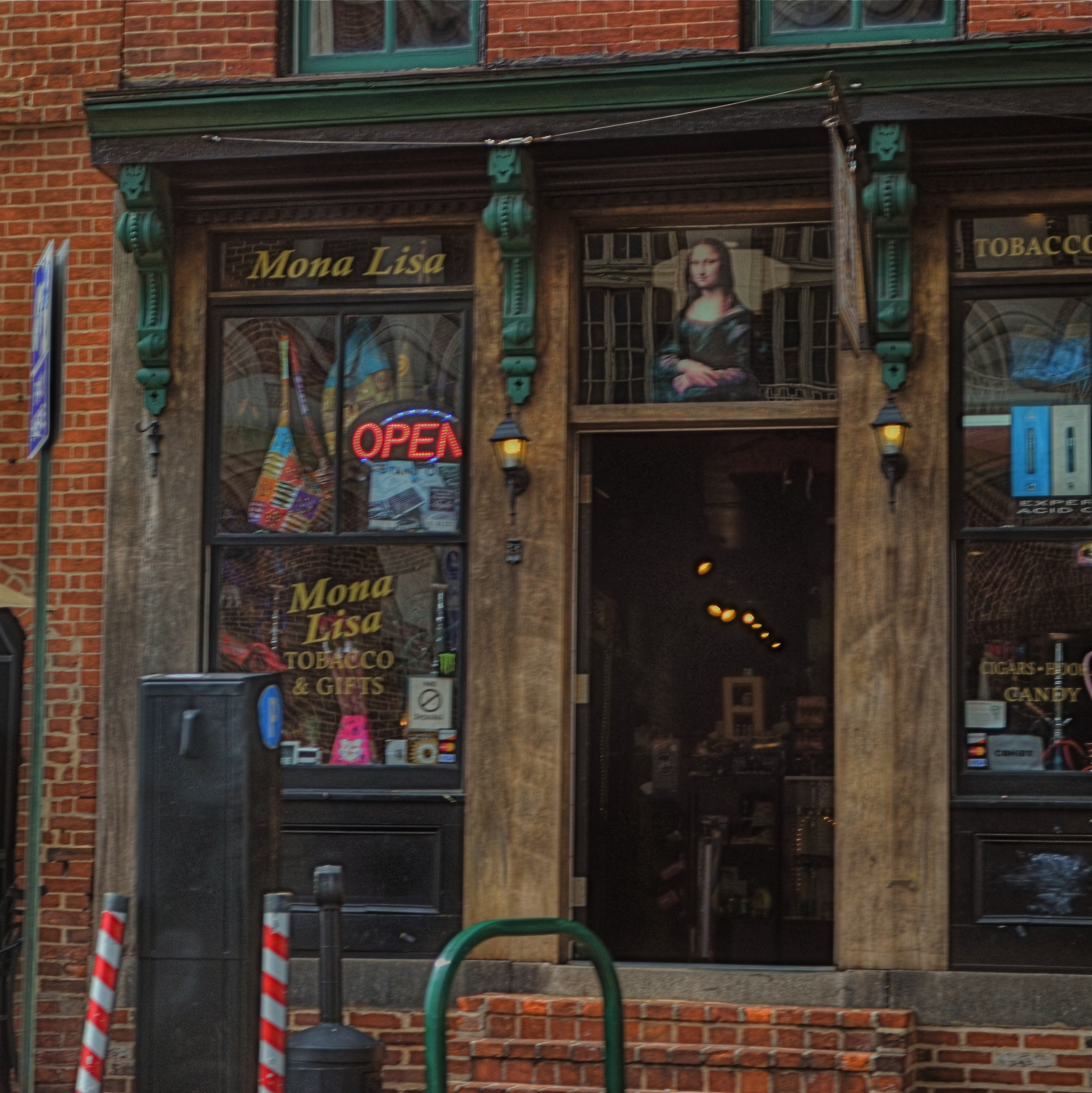
Mona Lisa Smoke Shop, Washington D.C., 2013.
By MICHAEL PERKINS
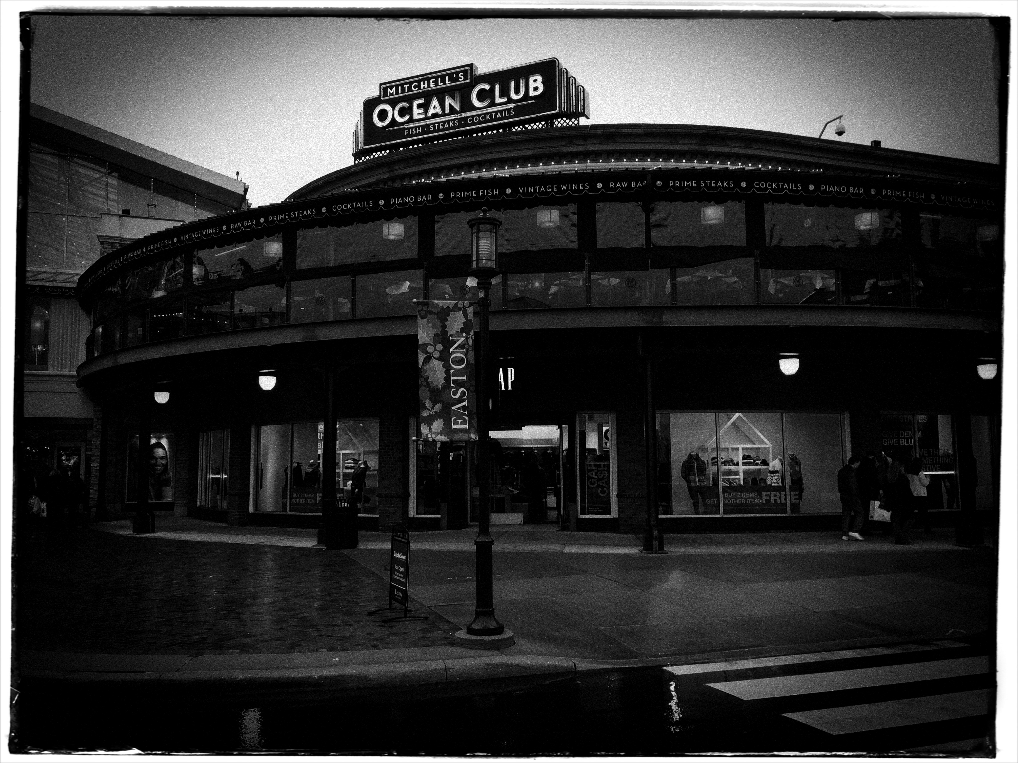
IF YOU TRAVEL ENOUGH, YOU’LL DISCOVER THAT, OF ALL THE TIMES YOU WANT to take a photograph, there are only a few times in which acceptable picture-making conditions are actually present. For all too many subjects that you experience on the fly, only a small percentage of them allow you the time, light, information or opportunity to do your best. And yet…you do what you must, and trust to instinct and chance for the rest.
Immediately upon arrival in a new town, my mind goes to one task, and one task only: sticking anyone else with the driving, so I can take potshots out the car window as I see fit. I have no need to head the posse or lead the expedition. You be in charge, big man. Get me to the hotel and leave me to make as many attempts as possible to put something worthwhile inside my camera.
Of course, this means that I have to pay at least some attention to how insanely you drive…shortcuts, rapid swerves, jolts and all. And, hey, couldn’t you have lingered a millisecond longer after the light went green, since I was just about to create an immortal piece of street art, instead of the muscular spasm I now have frozen forever on my memory card?
When shooting from a car, there are lots of things that go out the window (sorry), among them composition, exposure, stability, and, most generally, focus. En route to L’Enfant Plaza in Washington D.C. a few years ago, I fell in love with the funky little tobacco shop you see here. The colors, the woodwork, the look of yesteryear, it all spoke to me, and I had to have it. So I shot it at 1/250 sec, more than fast enough to freeze nearly anything in focus, unless by “nearly anything” you mean something that you’re not careening past at the pace of the average Tijuana taxicab. Result? Well, I didn’t wind up with unspeakable blur, but it’s certainly softer than I wanted. Of course, I could have offered an acceptable alibi for the shot, something based on some variant like, “of course, I meant to do that”, that is, until I outed myself in this post, just now.
But we try. Sometimes it’s the fleeting nature of things seen from car windows that make the attempt even more appealing than the potential result. In that instant, it seems like nothing’s more important than trying to take a picture. That picture. I won’t get ’em all. But as long as I live, I hope I never lose that mad, what-the-hell urge to just go for it.
So okay, seeing as this is a photo of a tobacco shop, this is where one of you cashes in the “close, but no cigar” gag line.
Go ahead, I’ll give you that one.
JOY GENERATORS
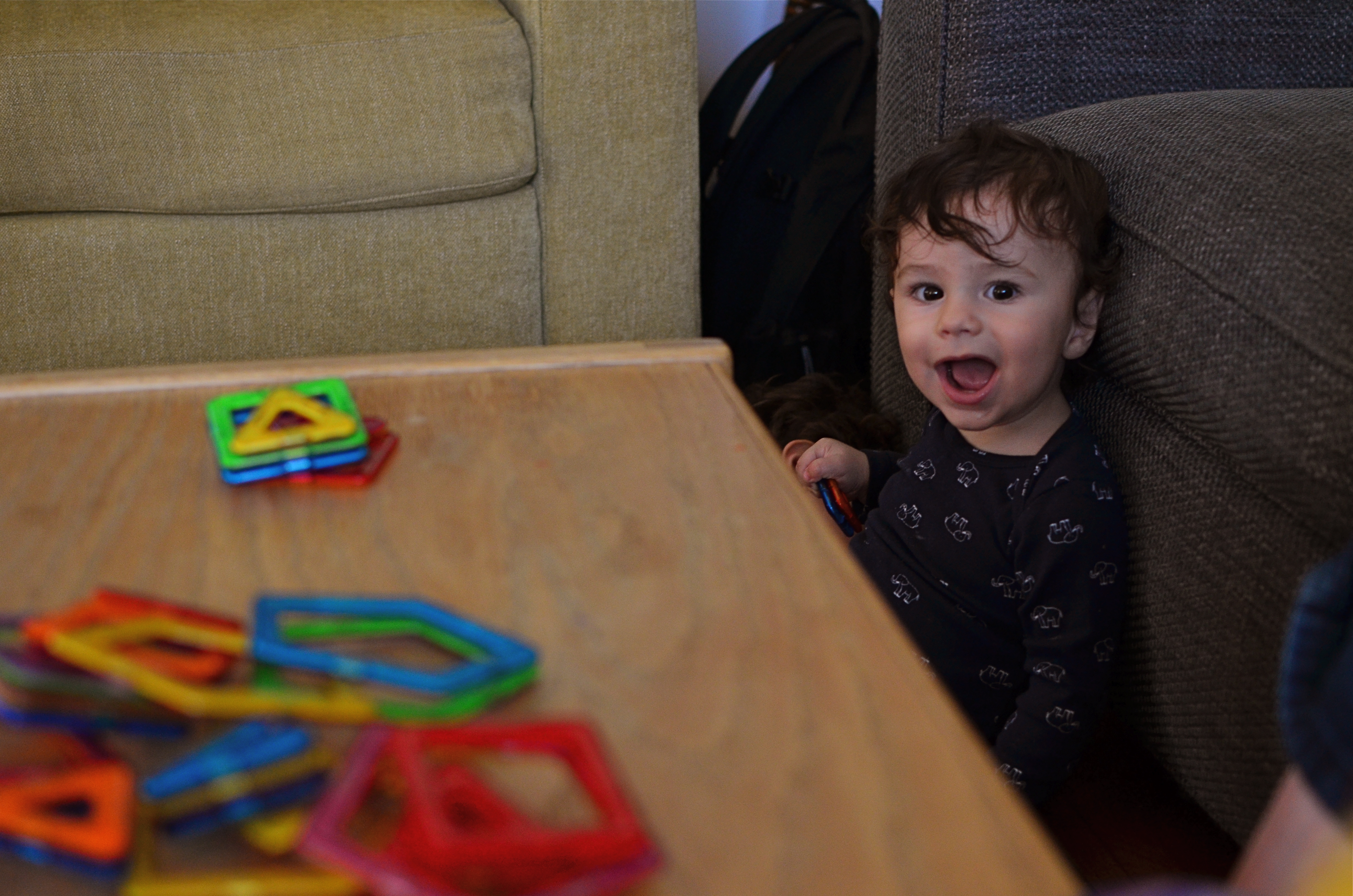
I could pose this rascal all day long, but I can’t create what he can freely give me. 1/40 sec., f/3.2, ISO 500, 35mm.
By MICHAEL PERKINS
IT’S A TITANIC CLICHE, BUT RESOUNDINGLY TRUE: if you want a child to reveal himself to you photographically, get out of his way.
The highly profitable field of child portrait photography is being turned on its head, or more precisely, turned out of the traditional portrait studio, by the democratization of image making. As technical and monetary barriers that once separated the masses from the elite few are vanishing from photography, every aspect of formal studio sittings is being re-examined. And that means that the $7.99 quickie K-Mart kiddie package is going the way of the dodo. And it’s about bloody time.
Making the subject fit the setting, that is, molding someone to the props, lighting or poses that are most convenient to the portraitist seems increasingly ridiculous. Thing is, the “pros” who do portrait work at the highest levels of the photo industry have long since abandoned these polite prisons, with Edward Steichen posing authors, politicians and film stars in real-life settings (including their own homes) as early as the 1920’s, and Richard Avedon pulling models out of the studio and into the street by the late 1940’s. So it’s not the best photographers who insist on perpetuating the restrictive environment of the studio shoot.
No, it’s the mills, the department and discount stores who still wrangle the kiddies into pre-fab backdrops and watch-the-birdie toys, cranking out one bland, safe image after another, and veering the photograph further and further from any genuine document of the child’s true personality. This is what has to change, and what will eventually result in something altogether different when it comes to kid portraiture.
Children cannot convey anything real about themselves if they are taken out of their comfort zones, the real places that they play and explore. I have seen stunning stuff done with kids in their native environment that dwarfs anything the mills can produce, but the old ways die hard, especially since we still think in terms of “official” portraits, as if it’s 1850 and we have a single opportunity to record our existence for posterity. There really need be no “official” portrait of your child. He isn’t U.S. Grant posing for Matthew Brady. He is a living, pulsating creature bent on joy, and guess what? You know more about who and what he is than the hourly clown at Sears.
I believe that, just as adult portraiture has long since moved out of the studio, children need also to be released from the land of balloons and plush toys. You have the ability to work almost endlessly on getting the shots of your children that you want, and better equipment for even basic candids than have existed at any other period in history. Trust yourself, and experiment. Stop saying “cheese”, and get rid of that damned birdie. Don’t pose, place, or position your kids. Witness these little joy generators in the act of living. They’ll give you everything else you need.
MORE THAN FOOD
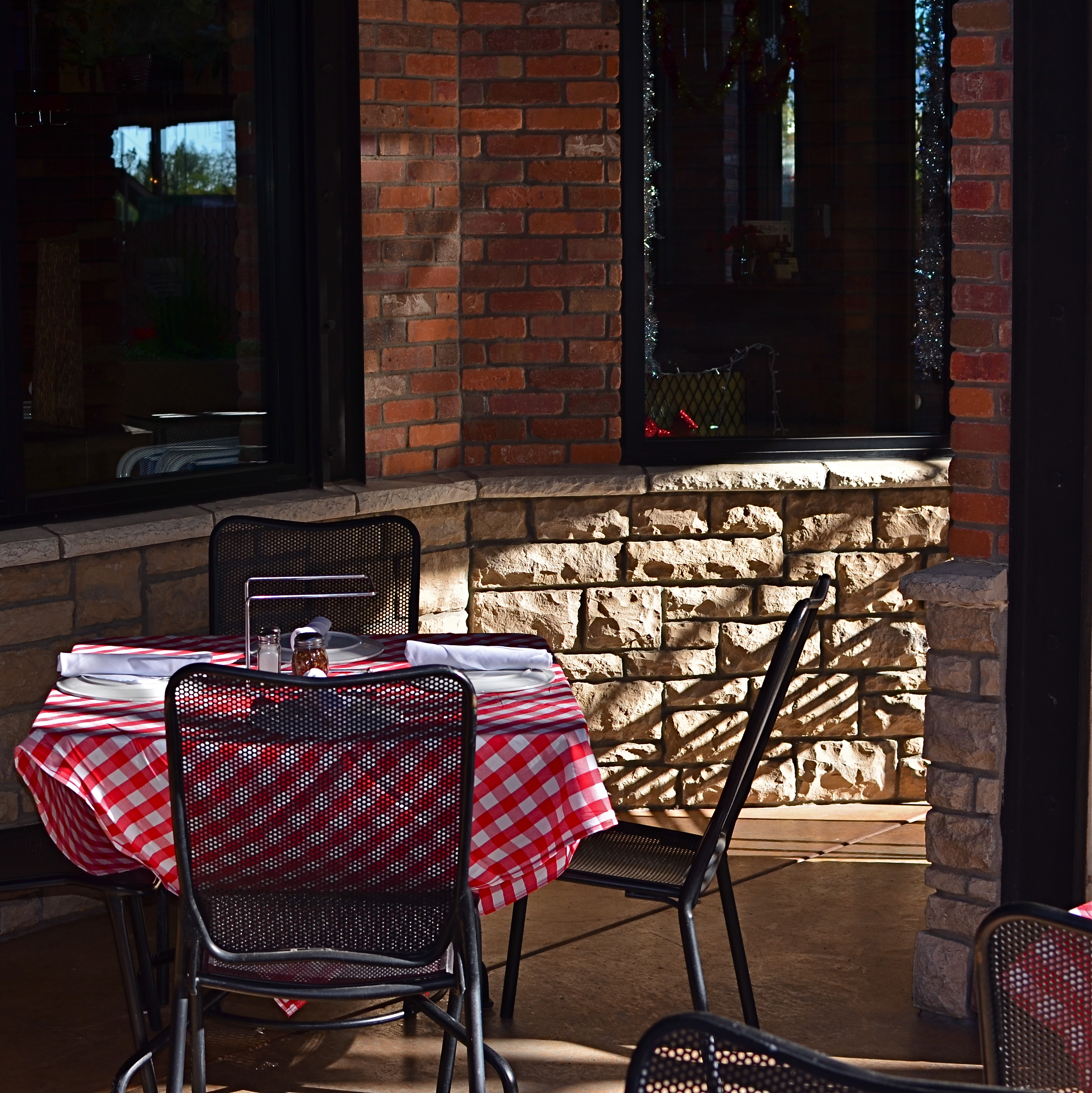
Pre-open, 2015.
By MICHAEL PERKINS
YOU COULD ARGUE ALL DAY ABOUT WHETHER PUBLIC SPACES POSSESS MORE VISUAL POTENTIAL when they are full or when they are dead empty, and, depending on your photographic approach, both arguments would be correct. In other words, instead of a hard-and-fast truth, you have multiple truths, depending on which space is shot by which photographer under such-and-such circumstances. Hey, if ya want a vague premise, I’m your boy.

Plaza Cafe, 2015.
Plazas, train platforms, museums, places of worship, restaurants, sports arenas…..all the places where people convene in big mobs have all produced stunning images taken when said places contain no people at all. After hours, before opening, last call, snow days…there are endless reasons why people don’t go to places, and the unfilled space created by their absence is a separate kind of compositional challenge.
I have stated in previous posts on this forum that, for me, museums are tremendous sources of negative space, and yet positive possibilities,when devoid of crowds. Maybe it’s when people are about to be somewhere, when something is nearly ready to happen, that public places possess a certain, well, suspense. Whatever the phenomenon, I feel it, and will always squeeze off a few shots while the moment lasts.
Similarly, eateries are both potentially joyful and potentially lonely, and that kind of uncertainty excites me as a photographer. But you may be on the opposite side of the discussion. I can certainly understand that some would see a bunch of empty tables and chairs as depressing, unmistakably desolate. But I think it depends on the photograph, and I think it always will. There are many images of two people seated together at a cafe who are, sadly, miles apart due to their estrangement, and there are an equal number of pics of a hall just before celebrants from a wedding stream in. As with so much in photography, feeling comes both from what you did and didn’t show.
DOCUMENTARY OR DRAMA?
Creative use of contrast and texture can amp up interest in a shot that is overly pretty.
By MICHAEL PERKINS
I RECENTLY HEARD AN INTERESTING CRITIQUE OF A DRAMATIC CONTENDER for Best Film in the 2015 Oscar race. The critic in question complained that the film in question (Boyhood) was too realistic, too inclusive of banal, everyday events, and thus devoid of the dynamics that storytellers use to create entertainment. His bottom line: give us reality, sure, but, as the Brits say, with the boring bits left out.
If you’re a photographer, this argument rings resoundingly true. Shooters regularly choose between the factual documentation of a scene and a deliberate abstraction of it for dramatic effect. We all know that, beyond the technical achievement of exposure, some things that are real are also crashingly dull. Either they are subjects that have been photographed into meaninglessness (your Eiffel Towers, your Niagara Fallses) or they possess no storytelling magic when reproduced faithfully. That’s what processing is for, and, in the hands of a reliable narrator, photographs that remix reality can become so compelling that the results transcend reality, giving it additional emotive power.

The original. Workable composition, but hampered by its realism.
This is why colors are garish in The Wizard Of Oz, why blurred shots can convey action better than “frozen” shots, and why cropping often delivers a bigger punch and more visual focus than can be seen in busier compositions. Drama is subject matter plus the invented contexts of color, contrast, and texture. It is the reassignment of values. Most importantly, it is a booster shot for subjects whose natural values under-deliver. It is not “cheating”, it is “realizing”, and digital technology offers a photographer more choices, more avenues for interpretation than at any other time in photo history.
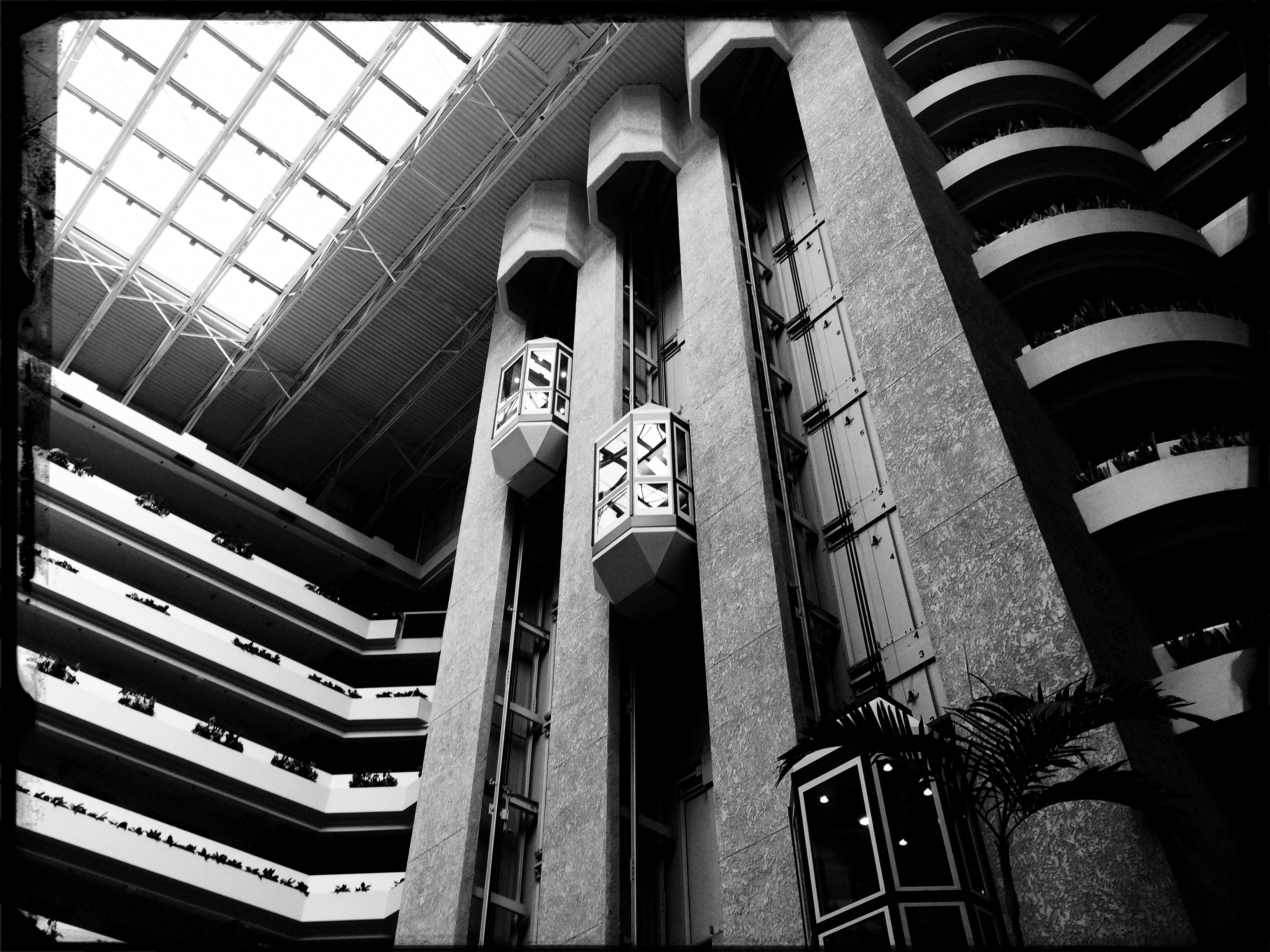
The photo at left was taken in a vast hotel atrium which has a lot going for it in terms of scope and sweep, but which loses some punch in its natural colors. There is also a bit too much visible detail in the shot for a really dramatic effect. Processing the color with some additional grain and grit, losing some detail in shadow, and amping the overall contrast help to boost the potential in the architecture to produce the shot you see at the top of this post. Mere documentation of some subjects can produce pretty but flaccid photos. Selectively re-prioritizing some tones and textures can create drama, and additional opportunity for engagement, in your images.
25, 50, T, B
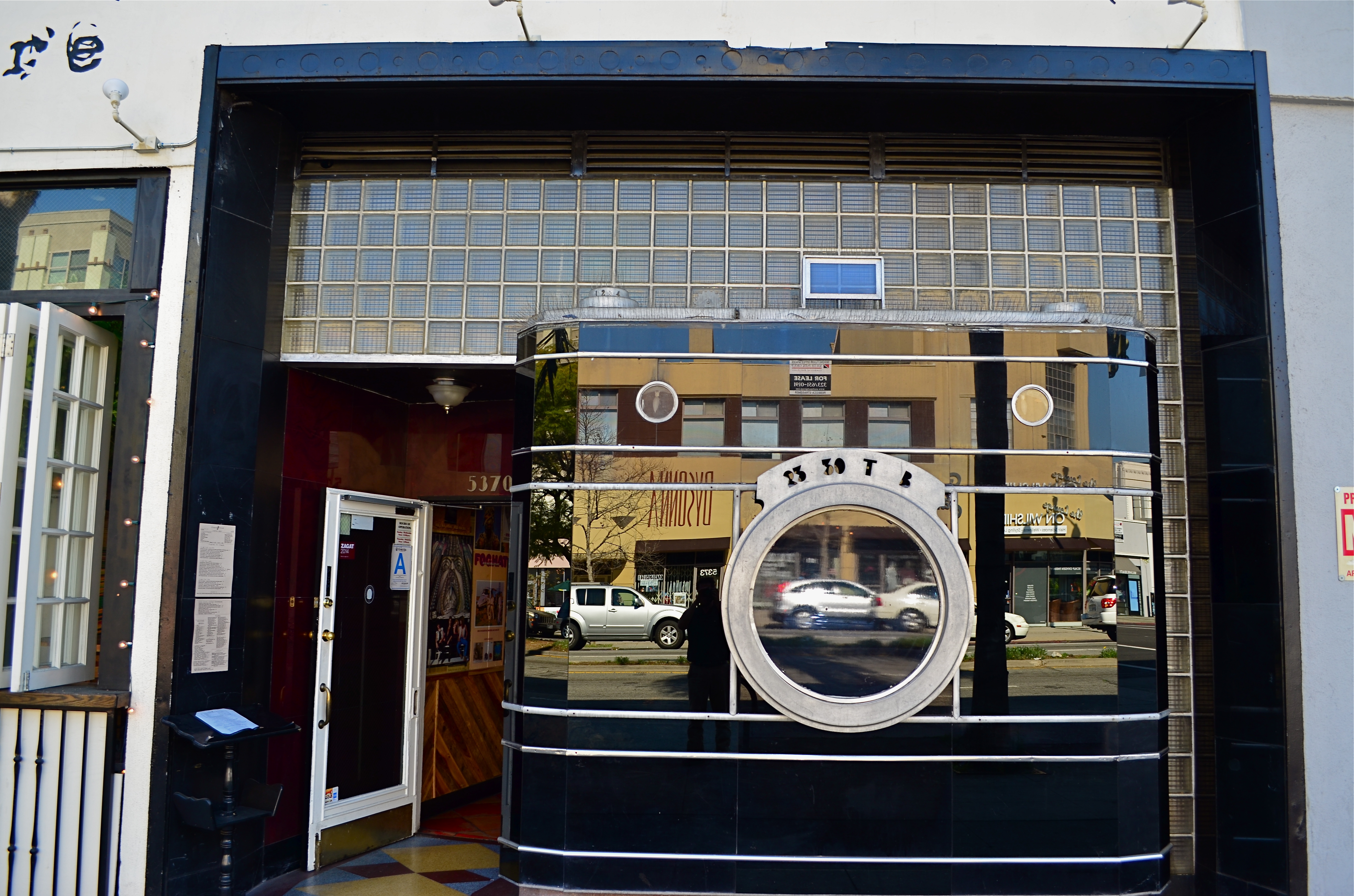
The remaining facade from Los Angeles’ historic Darkroom camera shop at 5370 Wilshire Boulevard.
By MICHAEL PERKINS
THERE IS A PART OF WILSHIRE BOULEVARD IN LOS ANGELES that I have been using for a photographic hunting ground for over ten years, mostly on foot, and always in search of the numerous Art Deco remnants that remain in the details of doors, window framings, neighborhood theatres and public art. Over the years, I have made what I consider to be a pretty thorough search of the stretch between Fairfax and LaBrea for the pieces of that streamlined era between the world wars, and so it was pretty stunning to realize that I had been repeatedly walking within mere feet of one of the grand icons of that time, busily looking to photograph….well, almost anything else.
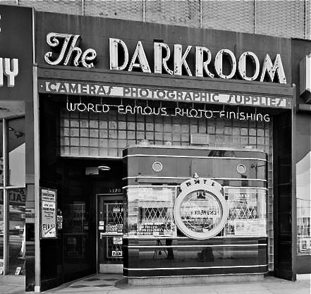
The Darkroom in its Kodachrome days.
A few days ago, I was sizing up a couple framed in the open window of a street cafe when my composition caught just a glimpse of black glass, ribbed by horizontal chrome bands. It took me several ??!?!-type minutes to realize that what I had accidentally included in the frame was the left edge of the most celebrated camera in all of Los Angeles.
Opened in the 1930’s, the Darkroom camera shop stood for decades at 5370 Wilshire as one of the greatest examples of “programmatic architecture”, that cartoony movement that created businesses that incorporated their main product into the very structure of their shops, from the Brown Derby restaurant to the Donut Hole to, well, a camera store with a nine-foot tall recreation of an Argus camera as its front facade.
The surface of the camera is made of the bygone process known as Vitrolite, a shiny, black, opaque mix of vitreous marble and glass, which reflects the myriad colors of Los Angeles street life just as vividly today as it did during the New Deal. The shop’s central window is still the lens of the camera, marked for the shutter speeds of 1/25th and 1/50th of a second, as well as T (time exposure) and B (bulb). A “picture frame” viewfinder and two film transit knobs adorn the top of the camera, which is lodged in a wall of glass block. Over the years, the store’s original sign was removed, and now resides at the Museum of Neon Art in Glendale, California, while the innards of the shop became a series of restaurants with exotic names like Sher-e-Punjab Cuisine and La Boca del Conga Room. Life goes on.
True to the ethos of L.A. fakes, fakes of fakes, and recreations of fake fakes, the faux camera of The Darkroom has been reproduced in Disney theme parks in Paris and Orlando, serving as…what else?….a camera shop for visiting tourists, while the remnants of the original storefront enjoy protection as a Los Angeles historic cultural monument. And, while my finding this little treasure was not quite the discovery of the Holy Grail, it certainly was like finding the production assistant to the stunt double for the stand-in for the Holy Grail.
Hooray for Hollywood.
SHADOWS AS STAGERS
The idea of this image is to highlight what lies beyond the window framing, not the objects in front of it. Lighting should serve that end.
By MICHAEL PERKINS
THOSE WHO ADHERE TO THE CLASSIC “RULE OF THIRDS” system of composition often suggest that you imagine your frame with a nine-space grid super-imposed over it, the better to help you place your subject in the greatest place of visual interest. This place is usually at the intersection of several of these grid lines, and, whether or not you strictly adhere to the “thirds” system, it’s useful to compose your shots purposefully, and the grid does give you a kind of subliminal habit of doing just that.
Sometimes, however, I find that the invisible grid can be rendered briefly visible to become a real part of your composition. That is to say, framing through silhouetted patterns can add a little dimension to an otherwise flat image. Leaving some foreground elements deliberately underlit is kind of a double win, in that it eliminates detail that might read as clutter, and helps hem in the parts of the background items you want to most highlight.
These days, with HDR and other facile post-production fixes multiplying like rabbits on Viagra, the trend has been to recover as much detail from darker elements as possible. However, this effect of everything being magically “lit” at one even level can be a little jarring since it clearly runs counter to the way we truly see. It’s great for novel or fantasy shots, but the good old-fashioned silhouette is the most elemental way to add the perception of depth to a scene as well as steering attention wherever you need it. Shadows can set the stage for certain images in a dramatic fashion.
Cheap. Fast. Easy. Repeat.
THE ROMANCE OF RUIN
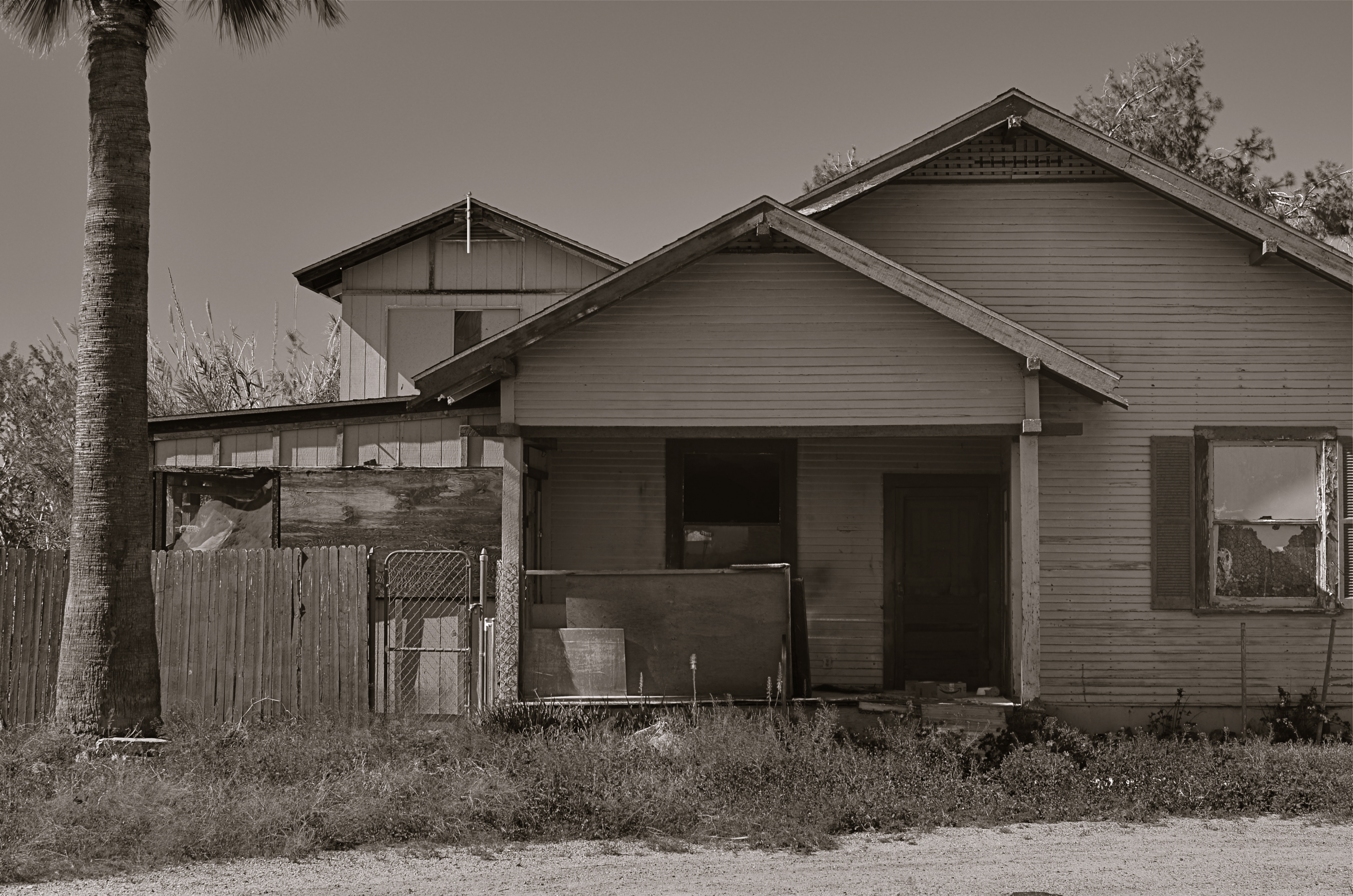
The honeymoon is, indeed, over.
By MICHAEL PERKINS
I TYPICALLY SHY AWAY FROM USING OR CREATING PHOTOGRAPHS as illustrations of work in another medium. Writers don’t try to caption my images, and I don’t presume, for the most part, to imagine visuals for their works. As both photographer and writer, I am sympathetic to the needs and limits of both graphic and written mediums. And still, there are rare times when a combination of events seem to imply a collaboration of sorts between the two means of storytelling. I made such an attempt a while back in these pages, in the grip of nostalgia for railroads, and so here goes with another similar experiment.
 Last week, during a blue mood, I sought out, as I often do, songs by Sinatra, since only Frank does lonely as if he invented the concept, conveying loss with an actor’s gift for universality. I stumbled across a particularly poignant track entitled A Cottage For Sale, which I sometimes can’t listen to, even when I need its quiet, desolate description of a dream gone wrong. So, that song was the first seed in my head.
Seed two came a few days later, when I was shortcutting through one of those strange Phoenix streets where suburban and rural neighborhoods collide with each other, blurring the track of time and making the everyday unreal. I saw the house you see here, a place so soaked in despair that it seemed to cry out for the lyrics of Frank’s song. Again, I’m not trying to provide the illustration for the song, just one man’s variation. So, for what it’s worth:
Is lonely and silent, the shades are all drawn,
And my heart is heavy as I gaze upon
A cottage for sale
Where you planted roses,the weeds seem to say,
“A cottage for sale”.
But when I reach a window, there’s empty space.
But no one is waiting for me any more,
The end of the story is told on the door.
A cottage for sale.
COME EARLY / STAY LATE

Gainey Ranch, Phoenix, 2015. 1/320 sec., f/5.6, ISO 100, 35mm.
By MICHAEL PERKINS
PUBLIC SPACES OFTEN LOSE THEIR POWER AS GRAND DESIGNS once they actually are occupied by the public. If you have ever leafed through books of architectural renderings, the original drawings for squares, plazas, office buildings or other mass gathering places, the elegance of their patterns is apparent in a way that they cease to be, once they are teeming with commuters or customers.
This doesn’t mean that humans “spoil” the art of architecture, however, the overlay of drama and tension created by the presence of huge hordes of people definitely distracts from an appreciation of the beauty that is so clean and clear in a place’s sketch phase. Photographically, people as design objects tend to steal the scene, if you will, making public settings less dramatic in some ways. That’s why I like to make images of such locales when they are essentially empty, since it forces the eye to see design as the dominant story in the picture. I suppose that I’m channeling the great designers and illustrators that influenced me as a young would-be comic book artist. It’s a matter of emphasis. While other kids worked on rendering their superheroes’ muscles and capes correctly, I wanted to draw Metropolis right.
I recently began driving to various mega-resorts in the Phoenix, Arizona area to capture scenes in either early morning or late afternoon. Some are grand in their ambition, and more than a few are plain over-the-top vulgar, but sometimes I find that just working with the buildings and landscaping as a designer might have originally imagined them can be surprising. Taking places which were meant to accommodate large gatherings of people, then extracting said people, forces the eye to align itself with the original designer’s idea without compromise. Try it, and you may also find that coming early or staying late at a public area gives you a different photographic perspective on a site. At any rate, it’s another exercise in re-seeing, or forcing yourself to visualize a familiar thing eccentrically.
THE EYE BACK OF THE LENS
To view your earliest work is to encounter yourself as you would a stranger.
By MICHAEL PERKINS
EVERY YEAR AT THIS TIME, AS I HIT THE RESET BUTTON ON MY LIFE VIA SOME KIND OF BIRTHDAY RITUAL, I pause to wonder, again, whether I’ve really learned anything at all in over fifty years of photography. Surely, by this late date, the habit of shooting constantly should have assured me that I had “arrived” at some place in terms of viewpoint or style, right? And yet, I still feel as if I am just barely inches off the starting line in terms of what there is left to learn, and how much more I need to know about seeing. It’s a great feeling in that it keeps things perpetually fresh, but I often wonder if I’ll ever make it to that mirage I see ever ahead of me.
The aging process, and how that continually remaps your perception, is one of the least pondered areas of criticism as it pertains to photography. And that’s very strange. We track the evolution of technical acuity over a lifetime. We date ourselves in reference to a piece of equipment we acquired, an influential person who crossed our path, or a body of work, but we don’t thoroughly examine how much our photography is being changed completely because the person making the picture is in constant flux. How can we ignore what seems to be the biggest shaper of our vision over time? We don’t even want the same things in an image from one year to the next, so how can we take photos in our maturity anything like those we shot in our youth?
Style is a constantly shifting timeline of approach.
Looking back to my first images, it’s clear that I thought the mere opportunity for a picture plus the act of clicking a shutter would result in a good picture, a kind of “cool view+camera=art” equation. This is to say that, instead of thinking, “I could make a good picture from this”, I was actually thinking, “this would be a good picture.” I know that sounds like hair-splitting of the first order, but the two statements are, in fact, different. The first implies that the camera plus the subject will automatically result in something solid; it’s a snapshot philosophy. The second statement is made by someone who has been frustrated by so many snapshots that he knows he has to step into the process as an active player. That realization can only come with age.
As always, my father’s admonition that art is a process rather than a product emerges as my prime directive. When I look at the pictures made by a twelve-year old me, I can at least see what the little punk was going for, and I can measure whether I’ve gotten any closer to that ideal than he did. The trick is for old me to want it as badly as young me did, and when that happens, I forget how many candles are on the cake, and am just grateful that their light still burns brightly.
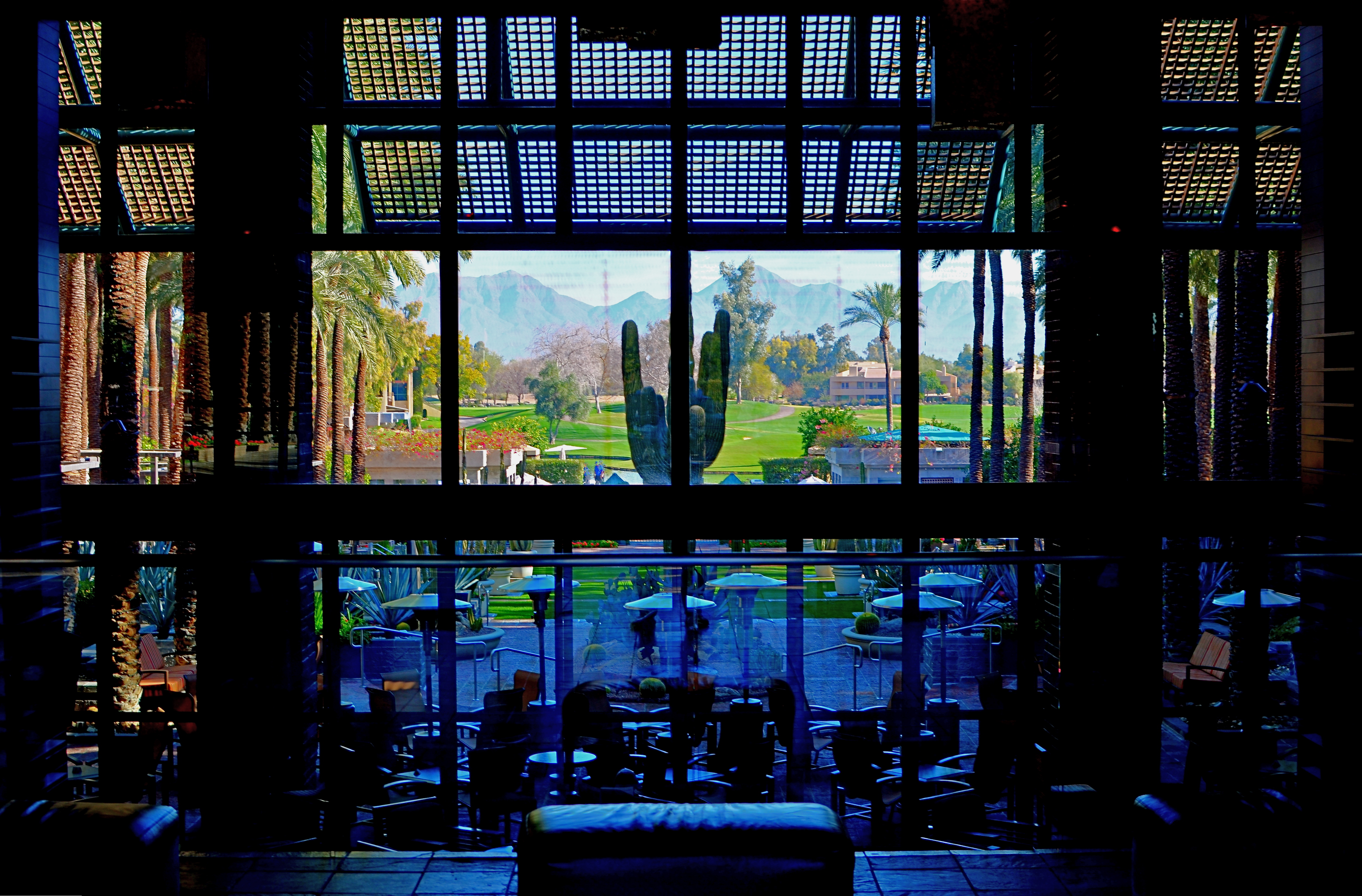
TAKING YOUR TEMPERATURE
By MICHAEL PERKINS
AMERICANS LOVE TO CELEBRATE A WINNER, and they also like to clearly identify who most definitely did not win. We score-keep on everything from fantasy football to number of days on the job without accidental amputations, and we love, love, love to declare someone the champ…in anything. This either/or, winner/loser habit of the western mind, when applied to photography, leads people to argue over which is better…traditional cameras or those imbedded in mobiles, as if such a judgement is possible. Or as if it matters. So, as you rifle through these humble pages, I hope I make it abundantly clear that, from my standpoint, it’s all about the pictures.

Changing the white balance from auto to shade warmed up the colors in this nearly-outdoor shot. 1/25 sec., f/5.6, ISO 800, 35mm.
The principle difference between, say, DSLRs and phone cameras, to me, is one of method, or how they approach the job of making an image. In full-function cameras, the emphasis can be on how to use the device’s controls and settings to set the terms of your picture before the click. In cellphone cameras, it’s all about how you can massage what the camera was able to give you after the fact, be it with in-phone apps or computer software. You simply can’t impose your will on an iPhone camera until after the picture is taken, and that’s an important distinction. Notice that I did not say better/worse, great/horrible. You just have to decide what’s important to you in a given situation.
Take a very simple choice that is available in even basic point-and-shoot “camera-cameras”, like white balance. Your camera has the option of deciding, for you, how colors should register based on the temperature of the light, or you can over-ride that function and customize it to your heart’s delight, something that, at this point in time, cannot be done on a cellphone camera. Even easier, menus reduce all your white balance options to visual icons (sunburst, house in shade, electric light bulb, etc) depending on how warm you want your pictures. You can even tweak for the precise kind of artificial light you’re working with, from incandescent to flourescent.
As an example, in the above shot, the morning light in the hotel lobby was, on automatic white balance, coming off blue, especially in the shadows. The entire effect of the golden period just after sunrise was being subverted by the camera. Easy fix: just dial it up for a shade setting, bump up the exposure a tad (slower shutter, higher ISO), and the warmth came back, but not so deep that everything went bad-suntan-bronze. And, yes, I could have got this shot with an iPhone, but the adjustment would have had to have been made after I got the shot wrong, then searched around for a fix. Again, there’s no good or bad.
You just have take your own temperature and decide what treatment you need.
THE CENTER HOLDS

Do you need either the entire tree or the entire hammock to sell the idea in this picture?
By MICHAEL PERKINS
ONE OF THE MOST FASCINATING PARTS OF THE LEGEND of Henri Cartier-Bresson, the artist who is the world’s model for street photography, is the oft-repeated story that he never cropped a shot over the many decades of his remarkable career. Thus the man who originated the phrase “the decisive moment” to indicate that there was but one ideal instant to capture something perfectly in the camera is also credited with creating flawless on-the-spot compositions, image after image, year after year. Yeah, well….
I love HCB, and I personally can’t find a single one of his images that I could improve upon, no matter where I was to wield my magic scissors. But just as the writer in me believes that great novels aren’t written, but re-written, I believe that many great photo compositions emerge after much additional consideration, long after the shutter snaps. It’s not that one shouldn’t strive to get things as perfect as possible in the moment. In fact, there is overwhelming evidence that many photographers do exactly that, nearly all the time.
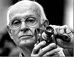
The Maestro.
It’s that “nearly”, however, that describes most photos, something which might be converted to “definitely” in the cropping process. In fact, I am starting to feel that the very first thing to be done with a picture in post-production is to just start paring away, only stopping when the center of the idea has been reached. It’s gut-wrenching, since we usually fall in love with our pictures at first sight (and in their first versions). But even if God decided to make one of us, say Cartier-Bresson, the messenger of his divine eye, he certainly didn’t make that trait as common as, say, green eyes or freckles. For most of us, most of the time, we need to eliminate everything that diverts the eye anywhere but where the main message is. As an example, the hammock image above is the result of cutting away nearly 2/3 of the original photograph.
There are a few times when an image comes full-born out of the camera, all muscle and no fat. However, in the digital age, re-thinking one’s realization of a concept is easier than it’s ever been, and there is no downside to doing so. If there is a narrative ground-zero to your photo, don’t worry. The center will hold.
EATS

You want fries with that? Blythe, California’s Courtesy Coffee Shop. 1/320 sec., f/5.6, ISO 100, 35mm.
By MICHAEL PERKINS
IN HIS WONDERFUL 1960 ROAD JOURNAL, TRAVELS WITH CHARLEY, John Steinbeck, author of The Grapes Of Wrath, Of Mice And Men and other essential American novels, laments the passing of a kind of America in much the same way that a roving photographer might. “I wonder”, he wrote as he motored through one vanishing frontier after another, “why progress looks so much like destruction.” That’s a sentiment that many a shooter has experienced as he pans his viewfinder over the various fading scenes of a constantly changing nation. Steinbeck sang his ode to these vaporized hopes on the printed page. We freeze their vanishings in a box.

Counter Culture: 1/40 sec., f/4.5, ISO 200, 35mm.
However, capturing changes in a rambling big hulk of a country encompasses more than merely mourning the loss of a forest or the paving of a paradise. Photographic testimony needs to be made on the evolution of even the America we feel is vulgar, or ugly, or strange, as well as on the disappearance of the buffalo. There can be a visual poignancy in seeing even our strangest, most misbegotten features dissolving away, and great picture opportunities exist in both the beautiful and the tawdry.
One of the strangest visual cultures that we see cracking and peeling away across the USA is the culture of eating. The last hundred years have seen the first marriage between just taking a meal and deliberately creating architecture that is aimed at marketing that process. Neon signs, giant Big Boys shouldering burgers, garish arrows pointing the way to the drive-through….it’s crude and strange and wonderful, all at the same time, and even more so as its various icons start to fall by the wayside.
The Courtesy Coffee Shop, baking in the desert sun just beyond the Arizona border in Blythe, California, is one such odd rest stop. Its mid-century design, so edgy at the start of space ships and family station wagons, creaks now with age, a museum to cheeseburgers and onion rings of yesteryear. Its waitresses look like refugees from an episode of Alice. It recalls the glory days of flagstone and formica. And they’ve been doing the bottomless coffee cup thing there since the Eisenhower administration.
Steinbeck, were he on the road again today, might not give a jot about the passing of the Courtesy into history, but restaurants can be interesting mile markers on the history trail just as much as mountains and lakes. Besides, when’s the last time a mountain whipped up a Denver omelet for you?
DETAILS, DETAILS
Moody, but still a bit too tidy. Black and white by itself wasn’t enough to create the atmosphere I wanted.
By MICHAEL PERKINS
EVEN THOUGH MOST GREAT PHOTOGRAPHERS PROCLAIM that any “rules” in their medium exist only to be broken, it’s often tough to chuck out regulations that have served you well over a lifetime of work. Once you get used to producing decent images through the repetition of habit, it takes extra nerve to take yourself outside your comfort zone, even if it means adding impact to your shots. You tend not to think of rules as arbitrary or confining, but as structural pillars that keep the roof from falling in.
That’s why it’s a good exercise to force yourself to do something that you feel is a bad fit for your style, lest your approach to everything go from being solid to, well, fossilized. If you hate black and white, make yourself shoot only monochrome for a week. If you feel cramped by square framing, make yourself work exclusively in that compositional format, as if your camera were incapable of landscape or portrait orientations. In my own case, I have to pry my brain away from an instinctual reliance on pinsharp focus, something which part of me fears will lead to chaos in my images. However, as I occasionally force myself to admit, sharp ain’t everything, and there may even be some times when it will kill, or at least dull, a picture.
Sharpness just where it’s needed, and nowhere else.
With post-processing such an instantaneous, cheap, and largely effortless option these days, there really isn’t any reason to not at least try various modes of partial focus just to see where it will lead. Take what you believe will work in terms of the original shot, and experiment with alternate ways of interpreting what you started with.
In the shot at the top of this post, I tried to create mood in a uniquely shaped fish house with monochrome and a dour exposure on a nearly colorless day. Thing is, the image carried too much detail to be effectively atmospheric. The place still looked like a fairly new, fairly spiffy eatery located in an open-air shopping district. I wanted it to look like a worn, weathered joint, a marginal hangout that haunted the wharf that its seafood theme and design suggested. I needed to add more mood and mystery to it, and merely shooting in black & white wasn’t going to get me there, so I ran the shot through an app that created a tilt-shift focus effect, localizing the sharpness to the rooftop sign only and letting the rest of the structure melt into murk.
It shouldn’t be hard to skate around a rule in search of an image that comes closer to what you see in your mind, and yet it can require a leap of faith. Hard to say why trying new things spikes the blood pressure. We’re not heart surgeons, after all, and no one dies if we make a mistake.Anyway, you are never more than one click away from your next best picture.
FRAGMENTS AND SHARDS
By MICHAEL PERKINS
GLASS SURFACES REPRESENT A SERIES OF CHOICES FOR PHOTOGRAPHERS, an endless variety of effects based on the fact that they are both windows and mirrors, bouncing, amplifying or channeling light no less than any other subject in your frame. No two shooters approach the use (or avoidance) of glass as a compositional component in quite the same way. To some, it’s a barrier that they have to get past to present a clear view of their subject. To others, its fragments and shards of angle and light are part of the picture, adding their own commentary or irony.

That’s The Way The Light Benz, 2015. 1/50 sec., f/5.6, ISO 100, 35mm.
I usually judge glass’ value in a photograph by two basic qualifiers: context and structure. First, context: suppose you are focused on something that lies just beyond a storefront window. What visual information is outside the scope of the viewer, say something over your shoulder or across the street, that might provide additional impact or context if reflected in the glass that is in direct view? It goes without saying that all reflections are not equal, so automatically factoring them into your photo may add dimension, or merely clutter things up.
The other qualifier is the structure of the glass itself. How does the glass break up, distort, or re-color light within an enclosure? In the above image, for example, I was fascinated by the complex patterns of glass in an auto showroom, especially in the way it reassigned hues once the sun began to set. I had a lot of golden light fighting for dominance with the darker colors of the lit surfaces within the building, making for a kind of cubist effect. No color was trustworthy or natural , and yet everything could be rendered “as is” and regarded by the eye as “real”. The glass was part of the composition, in this instance, and at this precise moment. Midday or morning light would render a completely different effect, perhaps an unwelcome one.
Great artists from Eugene Atget to Robert Frank have created compelling images using glass as a kind character actor in their shots. It’s an easy way to deepen the impact of your shots. Let the shards and fragments act like tiles to assemble your own mosaics.
LOOK DEEP INTO MY EYES
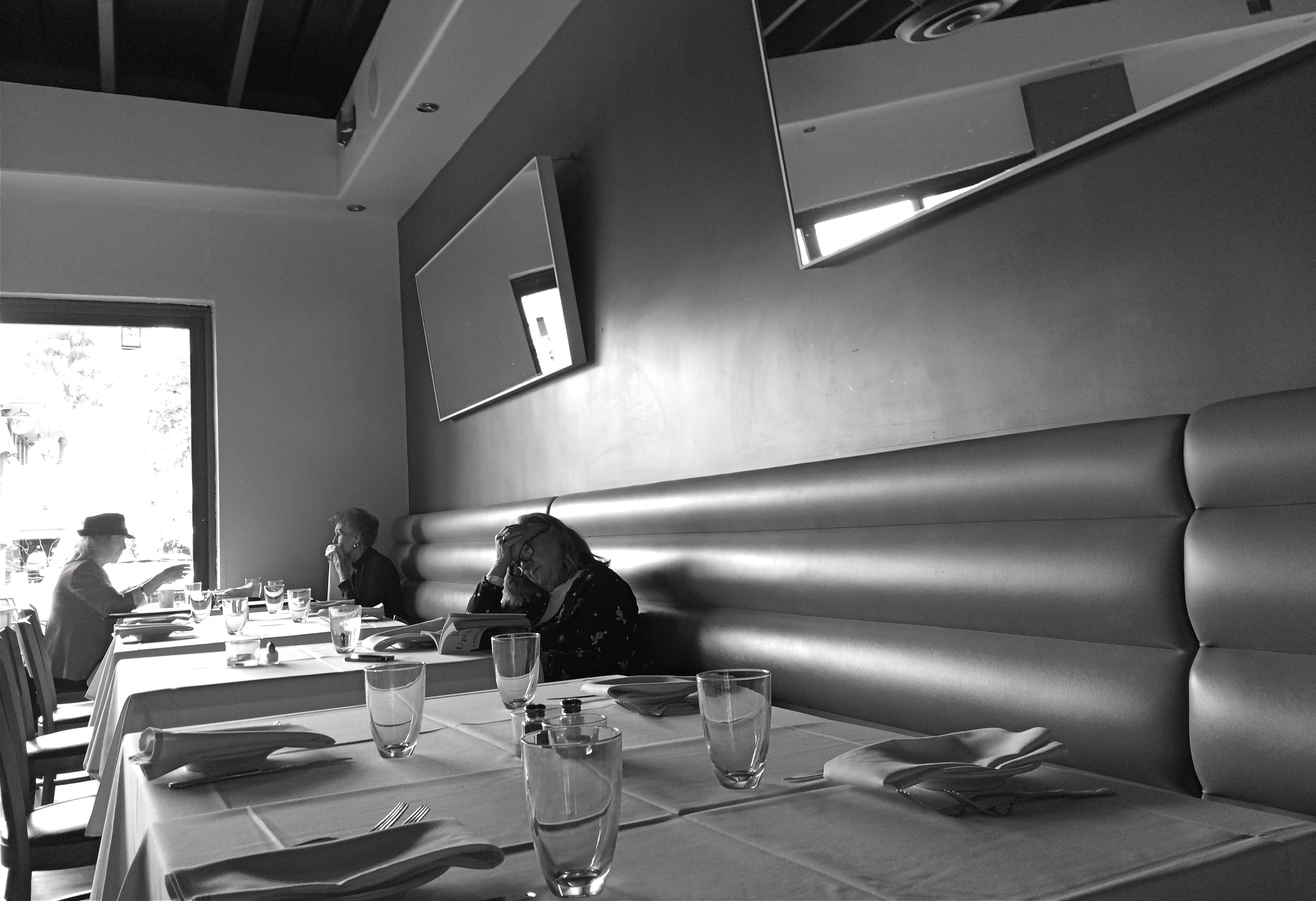
Literature For Lunch, 2016
By MICHAEL PERKINS
3-D PHOTOGRAPHY SEEMS DOOMED TO FOREVER RESIDE ON THE PERIPHERY OF THE MEDIUM AT LARGE, a part of the art that is regarded with mild derision, a card trick, a circus illusion. My own experience in it, from simple stereoscopic point-and-shoots to high-end pro-sumer devices like the Realist or View-Master cameras, has met with a lot of frustration at the unavoidable technical barriers that keep it from being a truly sharable kind of photography. It’s rife with specialized viewers, odd goggles, and cumbrous projection systems. It calls attention to effect to the detriment of content. It is the performing seal of photography.
That said, the learning curve needed to compose for stereo effect is equally valuable for overall “flat” composition, since you must always be mindful of building layers of information from front to back, the better to draw your viewer’s eye deep into your subject. Some will meet this challenge with a simple selective depth of field, as if to say: only pay attention to the stuff that is sharp. The front/back/sides don’t matter…I’ll tell you where to look. Others decide to arrange the front-to-back space all in the same focus, forcing the eye to travel in a straight line. Depends on what you need to say.
DSLRs allow you to elect for the former strategy, while iPhone photography, at least at this point in history, pretty much forces you to adopt the latter. You just don’t have the fine control needed for selective focus in a smartphone, any more than you have a choice shutter speed or how wide you shoot. With few exceptions, the iPhone and its cousins are marvelously adroit point-and-shoots, so your composition options lie chiefly in how you frame things up. Quickly.
This “think fast” mentality works to your benefit in the stealthier parts of street photography. The quicker you click, the harder it is to be detected, which means fewer “hey, what are you doing” issues with reluctant subjects. Even so, you have to be composing consciously if you want to establish a strong line to maximize the illusion of depth. It means deciding where the main drama in a shot resides and composing in reference to it. In the above shot, the woman lost in her John Updike novel is the main interest, but the steep diagonal of the wall leads you to her, then, as a second stage, to the lighter pair of friends in back. Framed in this manner, depth can be accentuated.
There are happy accidents and there are random luck-outs in photography, to be sure, but to create a particular sensation in your pictures, you must craft them. In advance. On purpose.
A FORWARD STEP BACK
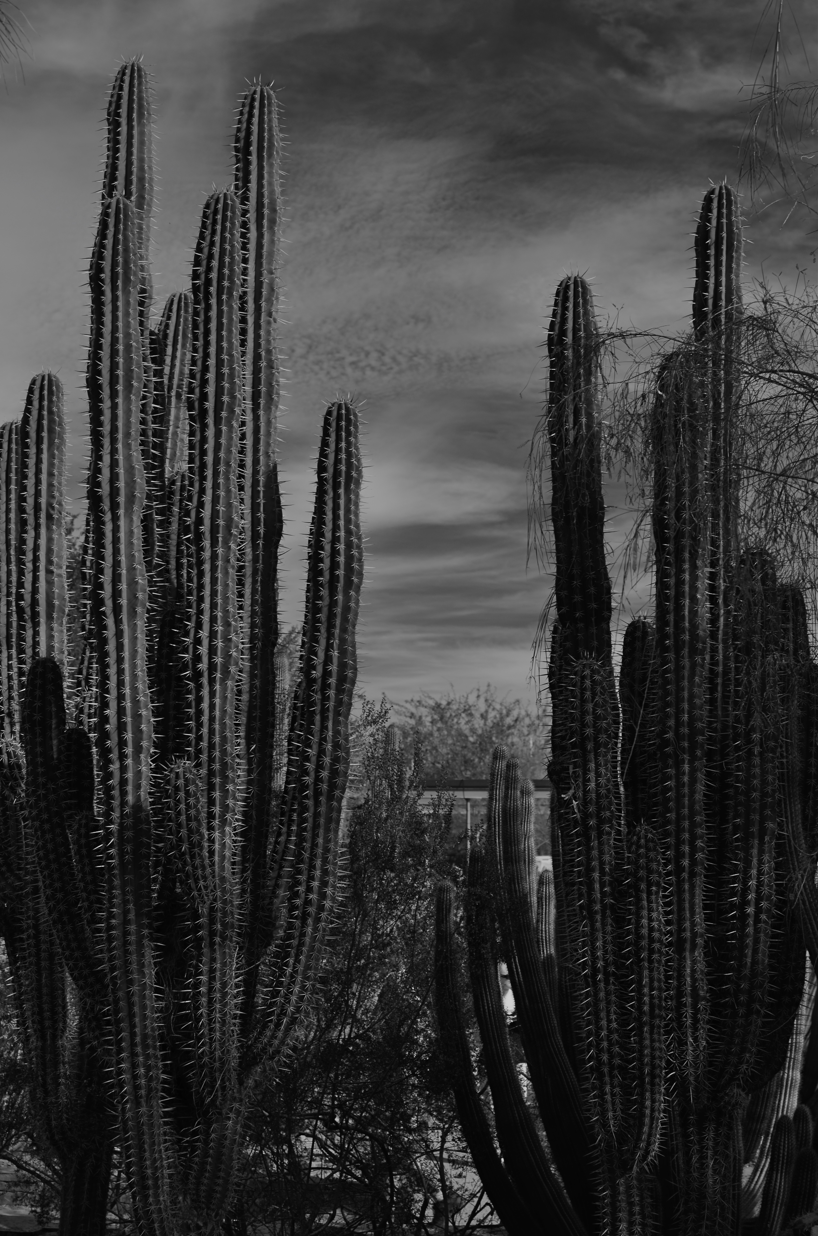
Skies which appear wispy in color can pick up some drama in black & white with the use of a red filter.
By MICHAEL PERKINS
SOME CHOICES IN LIFE ARE BINARY, EITHER YES OR NO. The light switch is either all “on” or all “off”. Photographic choices have never been binary, since there are only a few real rules about how to achieve the image you want and more than a million reasons why those rules have to be jettisoned, because they actually stand in the way of that image.
When digital photography arrived, there was a tendency to assert that everything associated with film photography was as obsolete as a roll of Kodachrome 64. In fact, the further we proceed into the digital age, the more we realize that there are many good practices from the days of emulsions and negatives that have solid application in the age of zeroes and ones. It would be ridiculous to say categorically that every tool of one era must be abandoned in the image-making of the next. Lenses, exposure, lighting basics, and many more elements of film-based creativity have equivalents in digital. None of them are good all the time, and none of them should be ruled out without exception.
The use of filters is one such element. Many film-based photogs worth their salt have used filters as a matter of course, and, despite the amazing in-camera and post-production fixes of the present day, these little bits of accent glass still produce dazzling effects with a minimum of investment, and help shooters maintain a close, hands-on control of their images in the moment. And one of my favorites here in the American southwest, land of endless, often blistering sun, is the red 25 filter.
Used to punch up contrast and accentuate detail for black and white, the red 25 renders even the lightest skies into near blackness, throwing foreground objects into bold relief and making shadows iron sharp. On a day when fluffy clouds seem to blend too much into the sky, the red 25 makes them pop, adding additional textural detail and a near-dimensional feel to your compositions. Additionally, the filter dramatically cuts haze, adding clear, even tones to the darkened skies. Caution here: the red 25 could cost you several stops of light, so adjust your technique accordingly.
Many whose style has developed in the digital age might prefer to shoot in color, then desaturate their shots later, simulating this look purely through software, but I prefer to make my own adjustments to the scene I’m shooting while I am shooting it. I wouldn’t paint a canvas in one place and then fix my choice of colors a week later, hundreds of miles away from my dream sunset. Filters are from a world where you conceive and shoot now. The immediate feedback of digital gives you the part of that equation that was absent in film days, that is, the ability to also fix it, now. Photography can’t afford to cut itself off from its own history by declaring tools from any part of that history obsolete. A forward step, back is often the deftest dance move.
THE VANISHED NORMAL
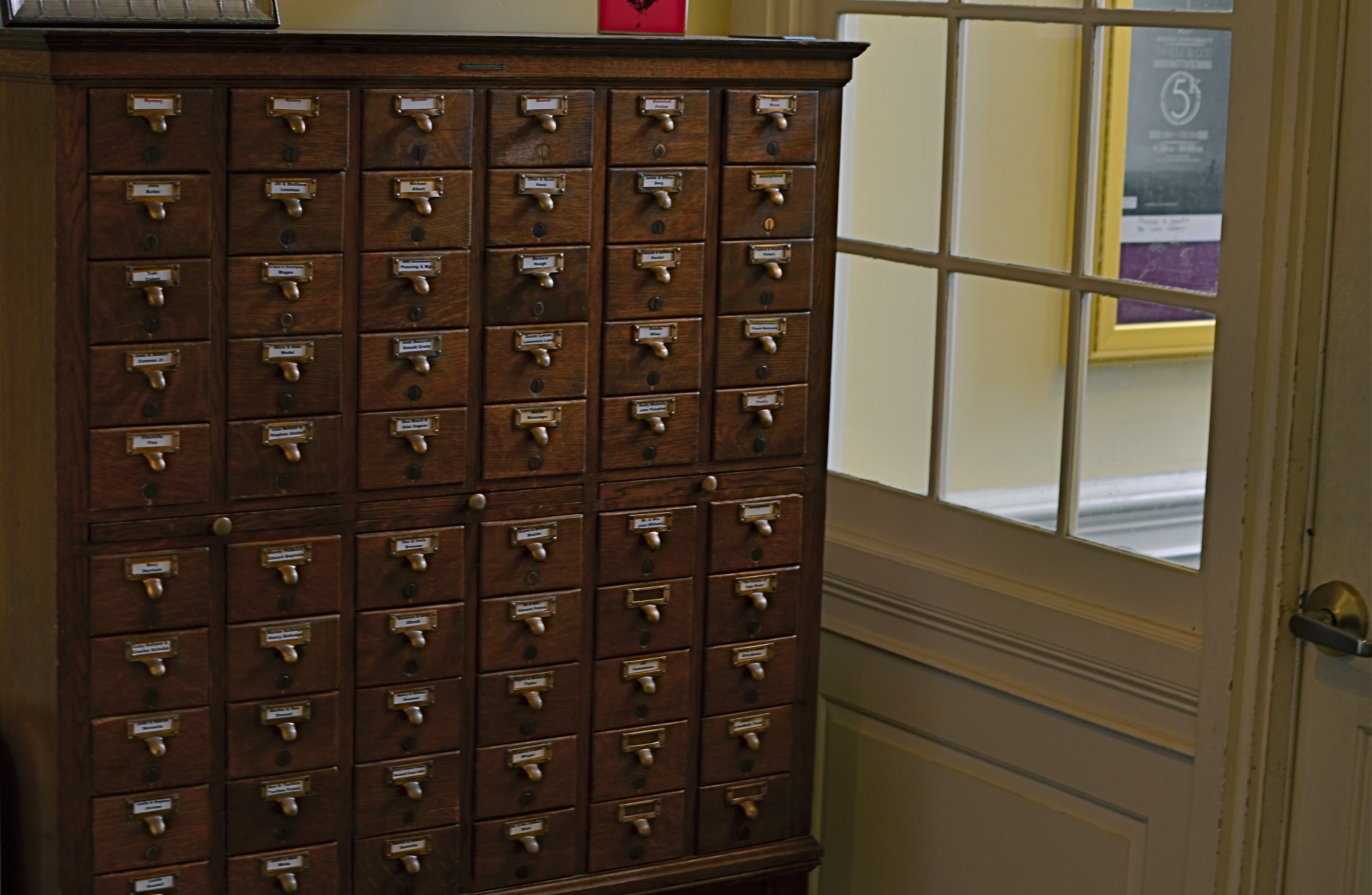
Dewey love card catalogs? Well, we used to. 1/30 sec., f/2.8, ISO 100, 35mm
By MICHAEL PERKINS
THE FUTURE DOESN’T ARRIVE ALL AT ONCE, just as the past doesn’t immediately vanish completely. In terms of technology, that means that eras kinds of smear across each other in a gradual “dissolve”. Consider the dial telephone, which persisted in various outposts for many years after the introduction of touch-tone pads, or, more specifically, Superman’s closet, the phone booth, which stubbornly overstayed its welcome long past the arrival of the cel. The “present” is always a mishmosh of things that have just arrived and things that are going away. They sort of pass each other, like workers at change of shift.
Visually, even the obsolete can be re-purposed.
Photographically, this means that there are always relics of earlier eras that persist past their sell-by date. They provide context to life as part of a kind of ever-flowing visual history. It also means that you need to seize on these relics lest they, and their symbolic power, are lost to you forever. Everything that enjoys a brief moment as an “everyday object” will eventually recede in use to such a degree that younger generations couldn’t even visually identify it or place it in its proper time order (a toaster from 1900 today resembles a Victorian space heater more than it does a kitchen appliance).
Ironically, this is a double win for photographers. You can either shoot an object to conjure up a bygone era, or you can approach it completely without context, as a pure design element. You can produce substantial work either way.
Some of the best still life photography either denies an object its original associations or isolates it so that it is just a compositional component. The thing is to visually re-purpose things whose original purpose is no longer. Photography isn’t really about what things look like. It’s more about what you can make them look like.
UNBOUND BY REALITY
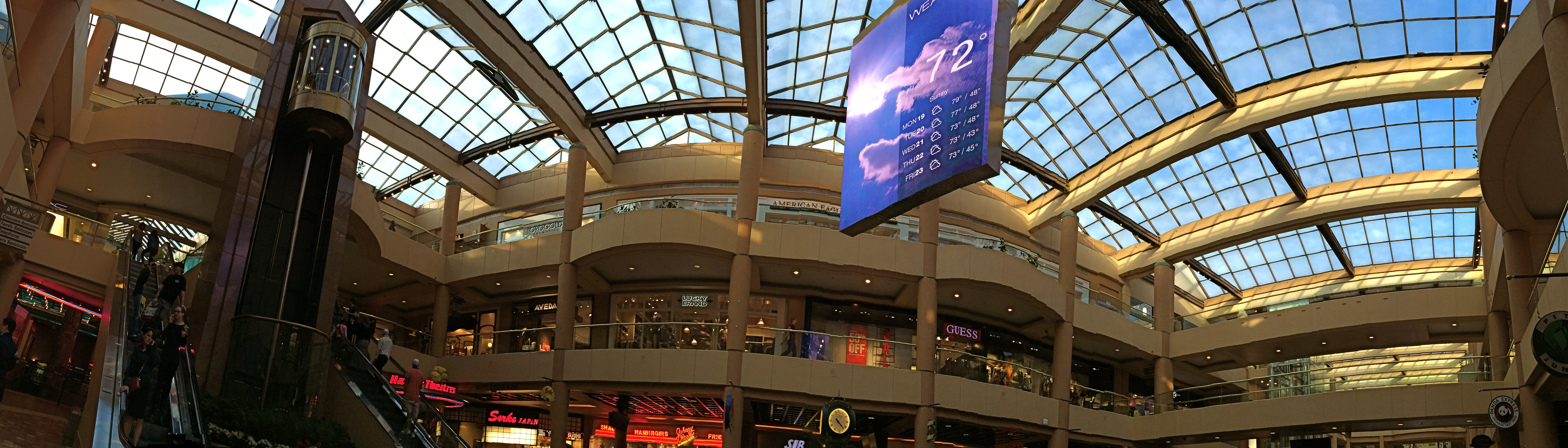
It’s A Mall World, After All: iPhone panoramics make good design tools, but they ain’t about realism.
By MICHAEL PERKINS
PANORAMAS WERE DEVELOPED IN PAINTING, AND LATER IN PHOTOGRAPHY, to alter, not capture, reality. This is one of those man-over-nature struggles that thrilled 19th-century brainiacs. Consider: both mediums are hemmed in by physical limits. The frame can only be so big. The wall can only go so wide. Sadder still, there are limits to the width of human vision, which is why our neck swivels from side to side, giving us the ability to tilt our head attentively when our wives whisper something pertinent to us during the third act of The Barber Of Seville.
So, panos were a fascinating fakery from the start, an attempt to compensate for our limited senses and the cramped confines of the frame, providing no less a warp of reality than a kaleidoscope or 3-d. They were great for showing the broad sweep of the Battle of Gettyburg or the entire breadth of the Coney Island Boardwalk, but the emphasis, historically, was always on closely simulating reality, in that objects were photographed in their natural proportions from left to right and focus was always pinsharp from near objects to the horizon. In other words, “real” phoniness instead of exaggerated phoniness (huh?).
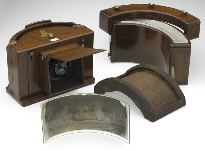
Old school: a panoramic plate camera from the 1800’s.
Now, however, with self-stitching panoramic software in phone cameras, we have a process that actually accentuates unreality, and that can be interesting. Ideally, to take a pano, you must sweep the camera slowly from left to right during the exposure. Now, this would result in a “realistic” perspective, if you could maintain constantly smooth motion and a uniform distance from your subject all the way across, which is impossible unless you’re seated on a dolly and being pushed along a track by four of your friends. So much for reality.
So, what you’re forced to do instead is to twist your body left, remain standing in one place, and be the central pivot point while you pan across yourself until you get all the way to the right. Imagine your body to be a hinge and your arms to be a swinging gate.This creates a crazy amount of spatial distortion not unlike a fisheye effect, and that is my point. Play to that weakness and make it a strength. Leave reality behind and look for patterns, your own abstract designs, in other words, improvements on reality. Panoramas aren’t tools for map-makers. You’re not going to hang your images like tapestries across the east wall of the capitol rotunda. So have some fun doing what reality won’t allow.
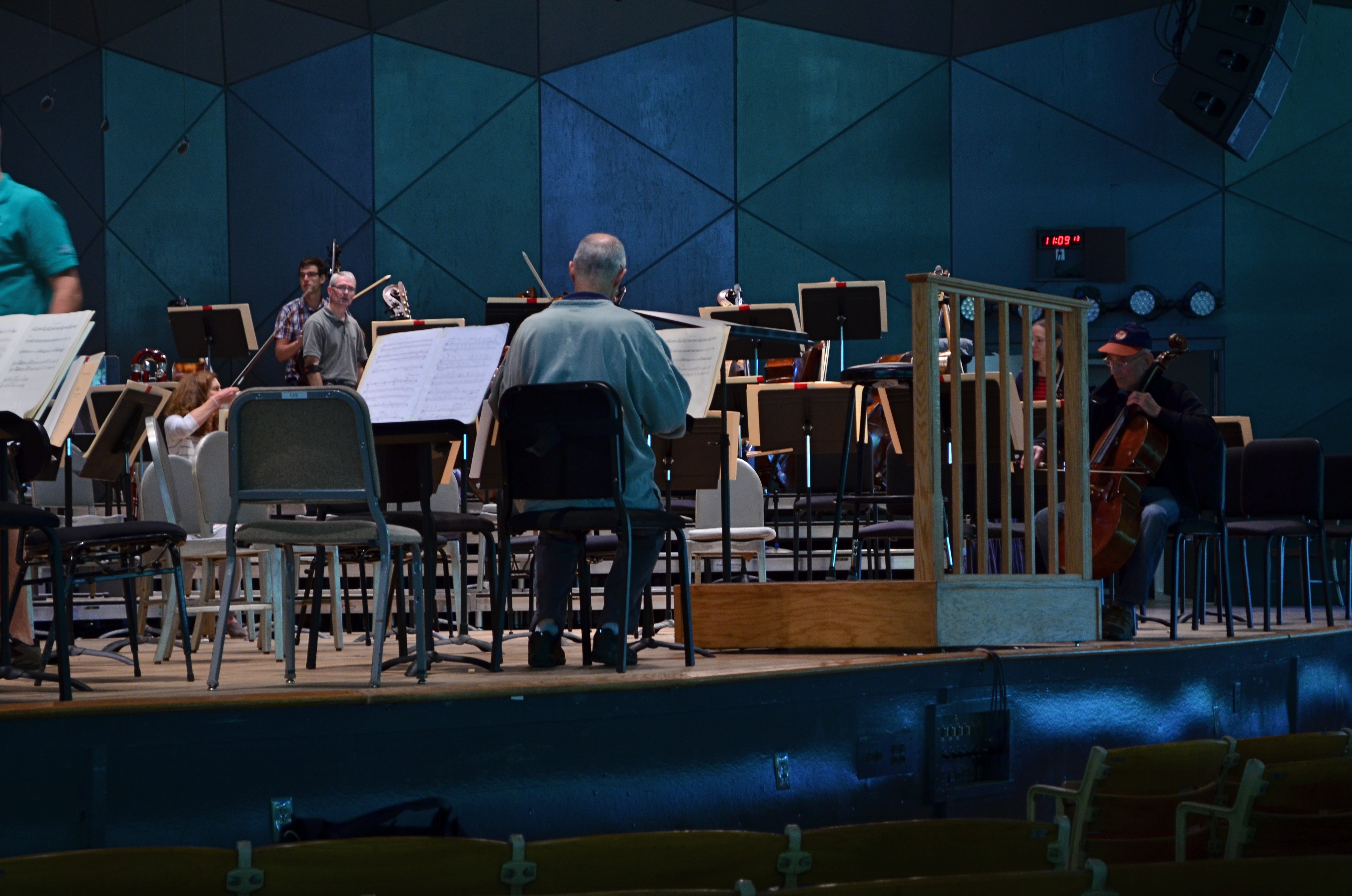
THE REVISION DRAFT
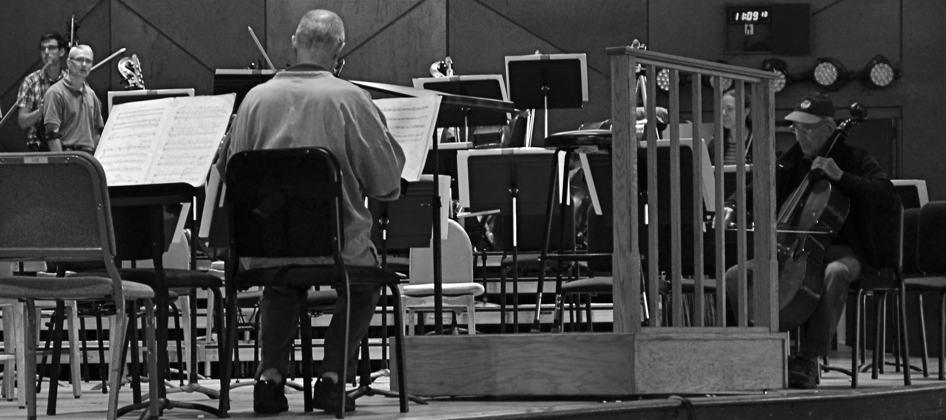
Reducing is remixing: this Tanglewood rehearsal photo was at least 2/3rds bigger in the original, but a severe crop highlights a relationship between these players that the bigger image buried.
By MICHAEL PERKINS
HERE’S A SENTENCE YOU’RE NOT GOING TO HEAR ANYWHERE ELSE THIS WEEK: Being a club DJ can actually give you a fresh viewpoint on your photography.
I’ll let that sink in.
I know what you you’re thinkin’: did he drink six shots or only five? But I’m kind of sober, and rather serious. In a club setting, the mix is often more important than the song, or, more correctly, it allows the song to have an infinite number of alternative lives, depending on what you do with the turntables. Record companies recognized this in the heyday of disco, remixing hit tracks for more thump and bump, longer edits, brass overdubs, etc. As time went on, DJs interspersed their own random elements in the moment to create their own signature blends.
The original.
So what does this have to do with photography? Pretty much everything. In the digital era, post-production software is nearly half of some shooters’ workflow. So much emphasis is placed on what you can fix after the shutter is clicked that, for many, actually planning and taking the picture is the least important part of the process. Let’s lay aside the fact that I personally believe that this can get out of hand…..the point is, by allowing yourself the flexibility to revisit and remix a photo many times over its lifetime means you are not limiting yourself to one interpretation of what you originally created.
However, don’t keep merely to a reprocessing of the exposure or tone elements in the picture, that is, boosting color, adding filters, converting to monochrome. Think of compositional space as a remix element as well. Did you need all the real estate taken up in the original picture? Would that landscape shot work more effectively in portrait or square format? Did you originally include information in the frame that just adds clutter, sending your viewer’s eye wandering around aimlessly? In short, does your first reading of the “idea” of the picture still seem valid?
See the “after” picture at the top of the page and its “before” equivalent to the left. Did the picture gain or lose from the changes?
Another musical musing: George Gershwin personally played Rhapsody In Blue like a snappy jazz piece, not the stately symphonic standard that’s re-created by most modern performers. Does one rendition sound better or worse? Who knows? Who cares? What matters is that the process reveals different traits within the core music with every new mix. Your photographs will benefit in the same way. Just trust yourself to tinker.
