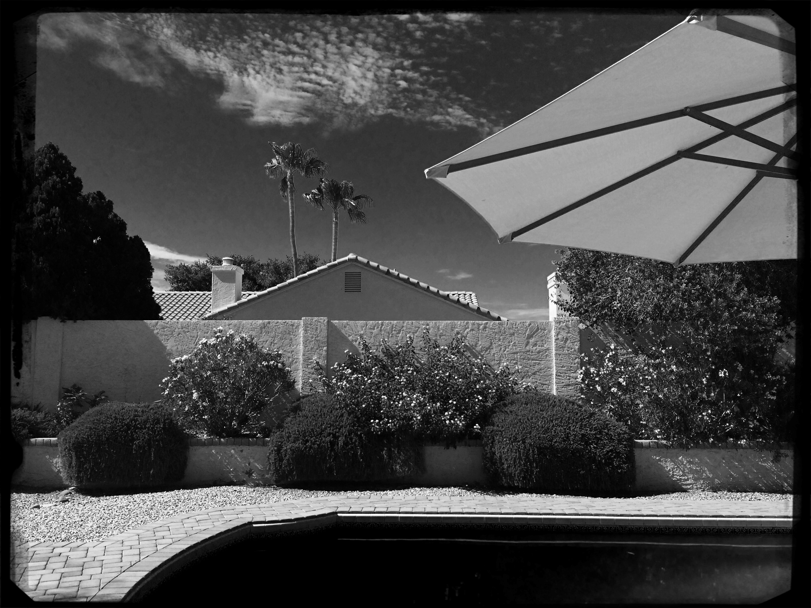
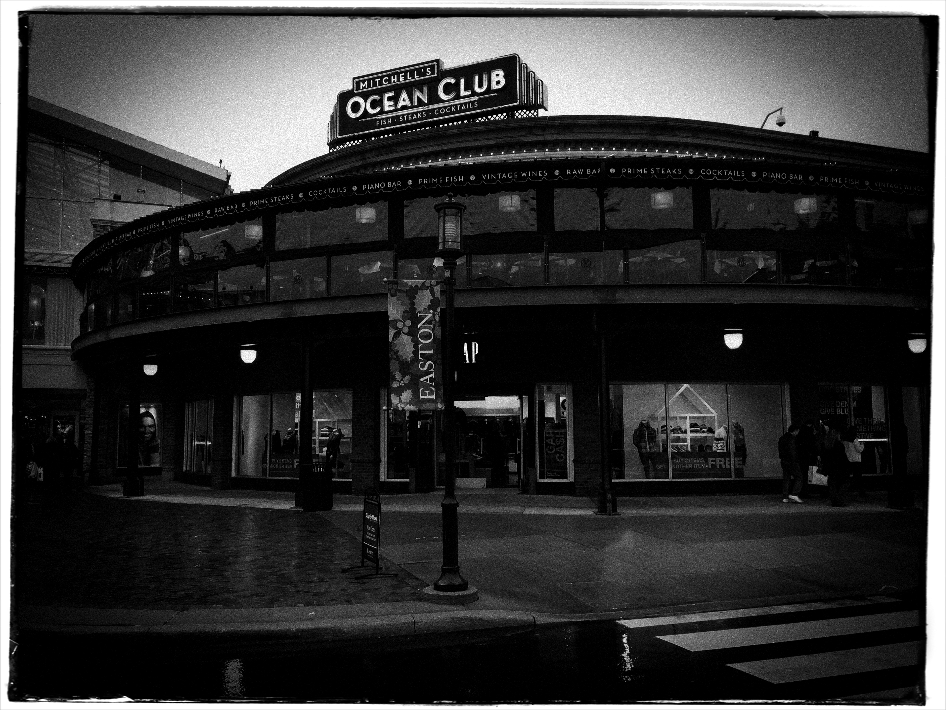
SIMPLEST TERMS

Two colors, and only two colors. Is anything else needed to sell this image?
By MICHAEL PERKINS
ENTIRE BOOKSHELVES OF MATERIAL HAVE BEEN WRITTEN on the mysterious art of composition at it applies to photography. The variations are endless: what to shoot, how much to shoot, how to determine how little to shoot, theories on addition, subtraction, choice of subject, and so on. The only constant is that every compositional inclusion also embodies an exclusion. When you choose one thing, you un-choose everything else.
One such choice is that of color over monochrome, an argument which raged over a large part of the early 20th century, since, for many years, photographers thought they could rely upon black and white, even though an abstraction of reality, to convey a consistent feel, whereas early color films often produced uneven results. Some photographers decided to ban color altogether, to embrace the predictable un-reality of b&w rather than gamble on hues that might not be reproduced or printed with true fidelity, or worse, register as too brassy or garish. Today we seldom choose monochrome over color for the same reasons, but compositions still rise and fall on whether we use color, as well as what kind of color we use.
Sometimes, just as a photograph that’s poorly cropped or loosely composed can be too busy, a color scheme that has too much variety can prove distracting, actually diluting a picture’s impact. Occasionally, I like to see how few distinct colors I can use in an image and still consider it complete, as in the case of the tomatoes above, which makes it case with only red and green values. In this instance, adding extra space around the box holding the tomatoes, or expanding the frame to include other shapes, objects or hues, will do nothing to improve the strength of my composition, so why include them? This is an easy editing choice that occurs in real time in the framing of the shot, and, with the instant feedback afforded by digital, you know immediately if the picture is lacking anything.
The problem with a lot of photography is that we tend to go no further than framing up an “acceptable” picture, one that doesn’t overtly fail. However, the more we practice a mindful approach to composition, the more adept we get at putting just enough, from subject to hue, into the image, and not one item more. This gives our photographs a streamlined communicative power that directs the eye and conveys the story.
TONAL RECALL

Desert still-life, take one. High contrast, simple color scheme.
By MICHAEL PERKINS
IF YOU WANT TO GET ALL MYSTICAL AND OOKY-SPOOKY ABOUT PHOTOGRAPHY, you can almost talk yourself into the idea that pictures kind of force their way past you on the way to their eventual best form. And, yes, I can hear your eyes rolling back in your head at the notion that an image is somehow destined to be created, that it emerges from your process almost despite you, like a rock that is pushed up through the earth by shifting tectonic plates. However, I have taken a handful of such pictures over a lifetime, as, no doubt, have you yourself, pictures that seemed to keep coming forth even beyond your first false steps until they reached their fullest expression.
Gee, is that incense I smell? Ommmmmm….
What I’m fumbling for here is a shared experience, and I do think that every photographer has had a semi-magical instance in which a photo almost taunts you to figure out how to make it work. Even in the best shots, there are moments of aching regret, maybe years down the path, that, had one or more things gone differently in the picture, it might have been eloquent or consequential. I truly believe that this very “so near, yet so far” quality is what keeps us in the hunt. After all, for the hunter, it’s the tiger he hasn’t been able to bag that calls louder than the ones already mounted over the mantel. So with photos. We are always singing the blues about the one that got away.

A monochrome re-mix from months after the original was snapped.
That’s why I’m a big believer in thinking of images as never really finished. They are, at best, preliminary studies for something else, picture that we still need to grow in order to complete. We lay them down, dissect them, re-shoot, re-imagine, and re-edit them. If you bend your thinking around, you can become comfortable with the fact that everything is a dress rehearsal for something that hasn’t arrived yet.
One of the starkest demonstrations of this fact is shots that were originally conceived as color images but which were later re-thought in monochrome. Nothing accentuates or streamlines your choices like shaving your tonal palette to the bare minimum. And, in the same vein, nothing makes you surer (or more unsure) about an image than reducing it to its simplest terms.
I think that, even as we are constantly expanding our arsenal of visual techniques, seeing them as growing, living things, so too we must think of our images as points on an evolutionary line, rather than final product.
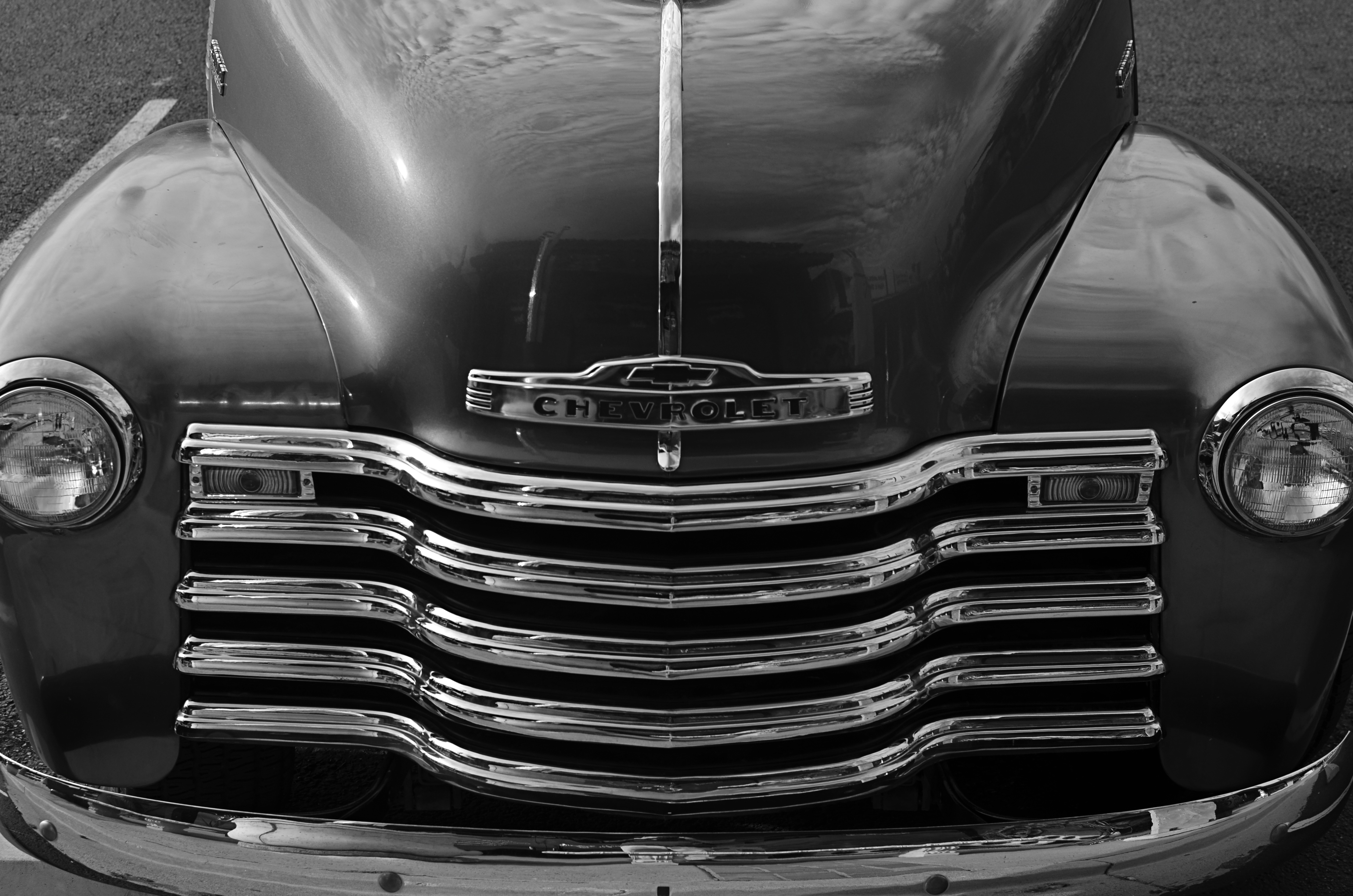
TERMS OF ENGAGEMENT
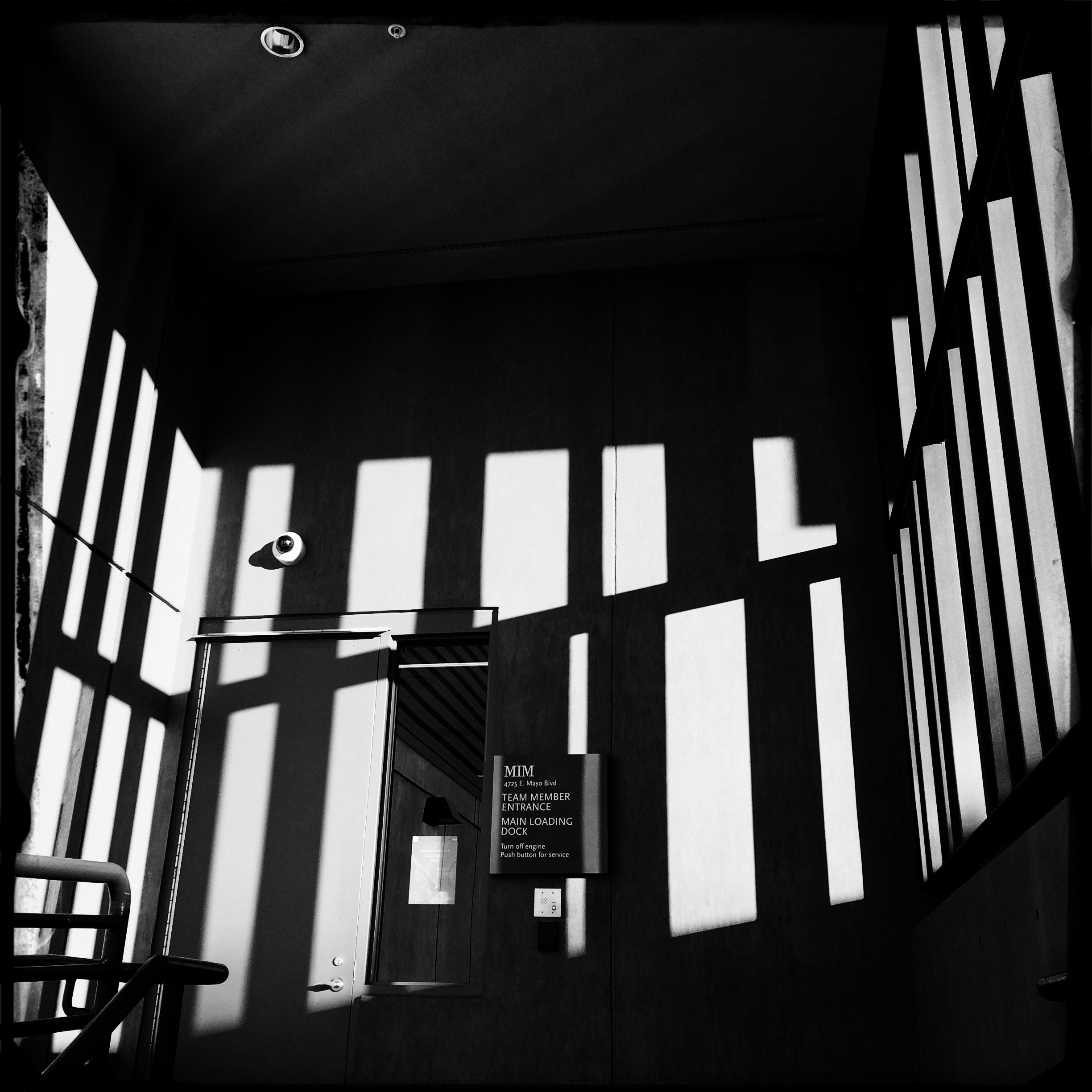
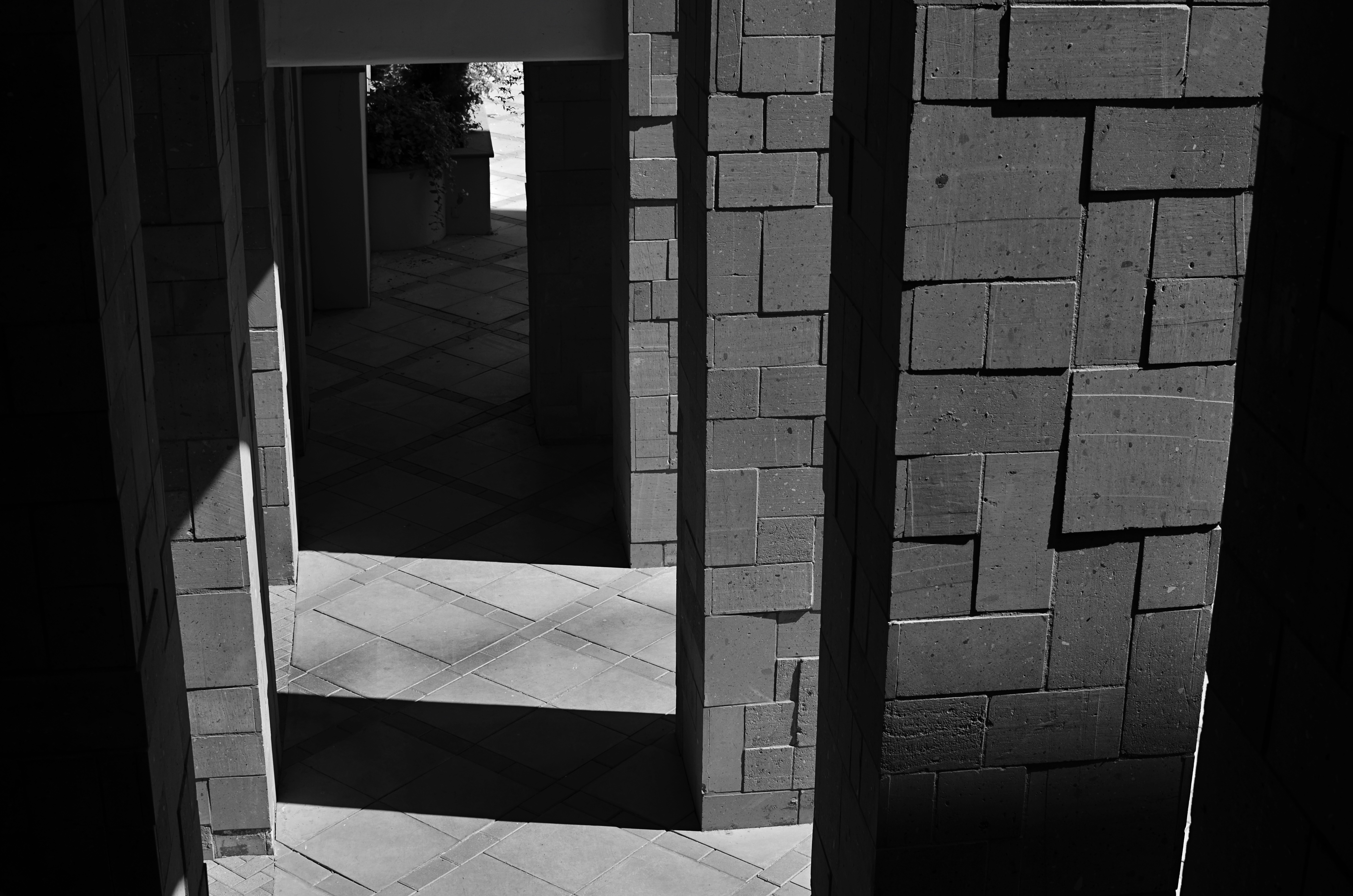
A very soft color cel phone original becomes a stark “box”, suggested solely by a pattern of black and white bands.
By MICHAEL PERKINS
ABSTRACT COMPOSITIONS AREN’T MERELY A DIFFERENT WAY OF PHOTOGRAPHING A SUBJECT: they are, in many cases, the subject itself. Arrangements of shape, shadow and contrast can be powerful enough to carry the weight of a picture all by themselves, or at least be an abbreviated, less-is-more way of suggesting objects or people. And in terms of pure impact, it’s no surprise that photographers who, just a generation ago, might have worked exclusively in color, are making a bold return to black and white. For abstract compositions, it’s often the difference between a whisper and a shout.
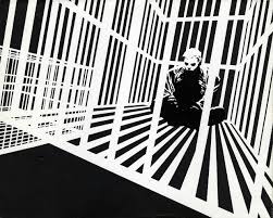
Cartoonist Frank Miller sculpts solid space out of a mix of black and white rays.
I find it interesting that the medium of comics, which has long been defined by its bold, even brutal use of color, is also experiencing a black & white resurgence in recent years, with such masters as Frank Miller (Batman: The Dark Knight Returns) rendering amazing stuff in the most starkly monochromatic terms. Likewise, the army of apps in mobile photography has reminded young shooters of the immediacy, the power of monochrome, allowing them to simulate the grain and grit of classic b&w films from Tri-X to Kodalith, even as a post-production tweak of a color original.
You know in the moment whether you’ve captured a conventional subject that sells the image, or whether some arrangement of forms suggestive of that subject is enough. In the above shot, reducing the mild color tonal patterns of a color original to bare-boned, hard blacks and loud whites creates the feel of a shaded door frame..a solid, dimensional space. The box-like enclosure that envelops the door is all there, but implied, rather than shown. As a color shot, the image is too quiet, too…gentle. In monochrome, it’s harder, but it also communicates faster, without being slowed down by the prettiness of the browns and golds that dominated the initial shot.
There are two ways to perfect a composition; building it up in layers from nothing into a “just-enough” something, or stripping out excess in a crowded mash-up of elements until you arrive at a place where you can’t trim any further without losing the essence of the picture. Black and white isn’t just the absence of color: it’s a deliberate choice, the selection of a specific tool for a specific impact.
THE GENESIS OF REAL
By MICHAEL PERKINS
“(the book is) flawed by meaningless blur, grain, muddy exposure, drunken horizons, and general sloppiness, (showing) a contempt for quality and technique…” –Popular Photography, in its 1958 review of The Americans
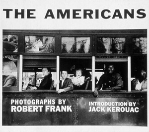 THOSE WORDS OF DISDAIN, designed to consign its subject to the ash heap of history, are now forever attached to the photographic work that, instead of vanishing in disgrace, almost single-handedly re-invented the way the world saw itself through the eye of a camera. For to thumb through Robert Frank’s 1958 collection of road images, The Americans, is to have one’s sense of what is visually important transformed. Forever.
In the mid-1950’s, mass-market photojournalist magazines from Life to Look regularly ran “essays” of images that were arranged and edited to illustrate story text, resulting in features that told readers what to see, which sequence to see it in, and what conclusions to draw from the experience. Editors assiduously guided contract photographers in what shots were required for such assignments, and they had final say on how those pictures were to be presented. Robert Frank, born in 1924 in Switzerland, had, by mid-century, already toiled in these formal gardens at mags that included Harper’s Bazaar and Vogue, and was ready for something else, a something else where instinct took preference over niceties of technique that dominated even fine-art photography.
Making off for months alone in a 1950 Ford and armed only with a 35mm Leica and a modest Guggenheim grant, Frank drove across much of the United States shooting whenever and wherever the spirit moved him. He worked quickly, intrusively, and without regard for the ettiquette of formal photography, showing people, places, and entire sub-cultures that much of the country had either marginalized or forgotten. He wasn’t polite about it. He didn’t ask people to say cheese. He shot through the windshield, directly into streetlights. He didn’t worry about level horizons, under-or-over exposure, the limits of light, or even focal sharpness, so much as he obsessed about capturing crucial moments, unguarded seconds in which beauty, ugliness, importance and banality all collided in a single second. Not even the saintly photojournalists of the New Deal, with their grim portraits of Dust Bowl refugees, had ever captured anything this immediate, this raw.
Frank escaped a baker’s dozen of angry confrontations with his reluctant subjects, even spending a few hours in local jails as he clicked his way across the country. The terms of engagement were not friendly. If America at large didn’t want to see his stories, his targets were equally reluctant to be bugs under Frank’s microscope. When it was all finished, the book found a home with the outlaw publishers at Grove Press, the scrappy upstart that had first published many of the emerging poets of the Beat movement. The traditional photographic world reacted either with a dismissive yawn or a snarling sneer. This wasn’t photography: this was some kind of amateurish assault on form and decency. Sales-wise, The Americans sank like a stone.
Around the edges of the photo colony, however, were fierce apostles of what Frank had seen, along with a slowly growing recognition that he had made a new kind of art emerge from the wreckage of a rapidly vanishing formalism. One of the earliest converts was the King of the Beats Himself, no less than Jack Kerouac, who, in the book’s introduction said Frank had “sucked a sad poem right out of America and onto film.”
Today, when asked about influences, I unhesitatingly recommend The Americans as an essential experience for anyone trying to train himself to see, or report upon, the human condition. Because photography isn’t merely about order, or narration, or even truth. It’s about constantly changing, and re-charging, the conversation. Robert Frank set the modern tone for that conversation, even if he first had to render us all speechless.
DON’T MESS WITH MR. IN-BETWEEN
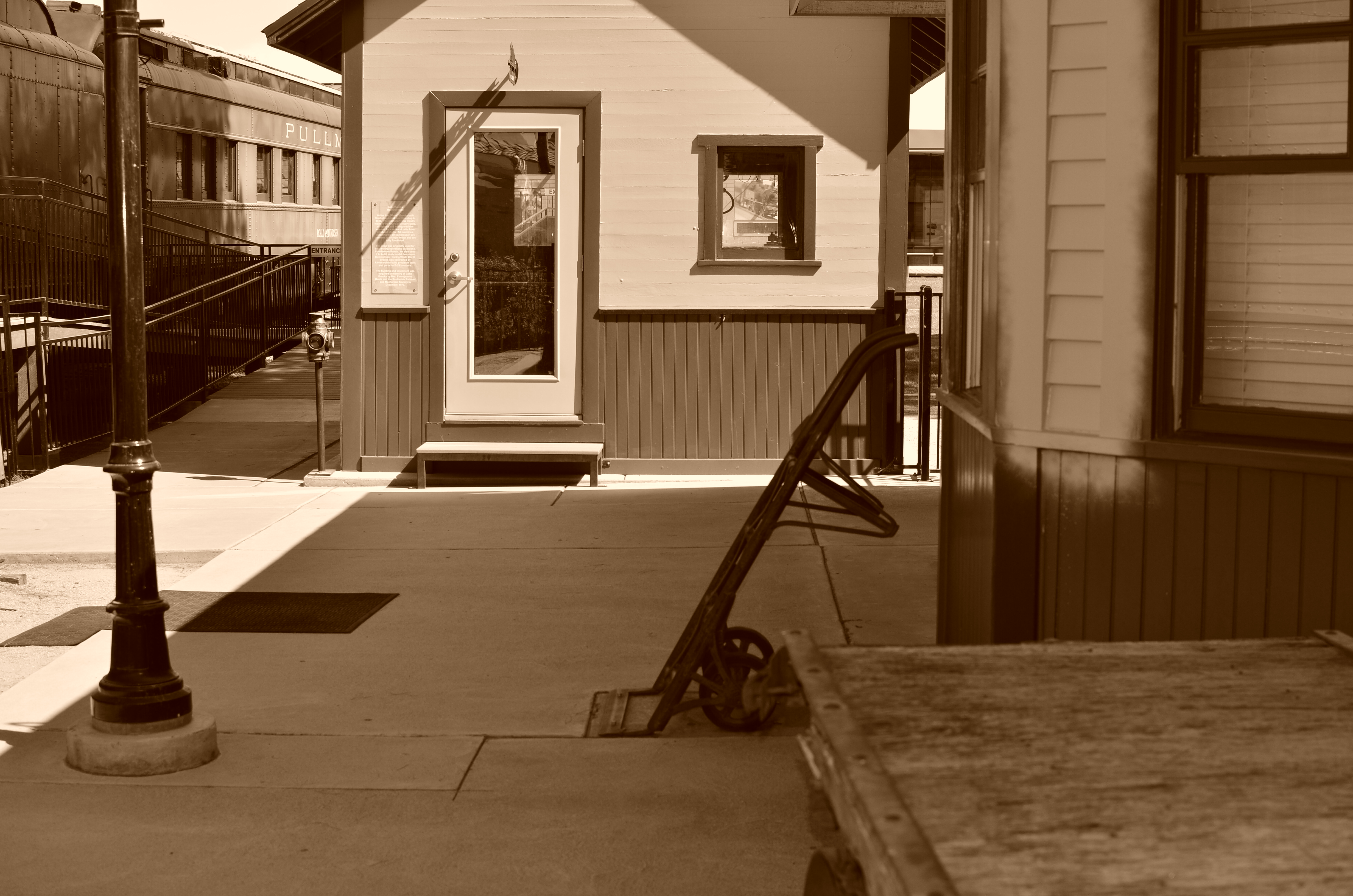
The light on this railroad depot was not as harsh or contrasty as seen here: I merely liked it better that way.
By MICHAEL PERKINS
PHOTOGRAPHY ALWAYS SEEMS TO BE ABOUT TWO THINGS THAT ARE POLAR OPPOSITES. On one hand, we have labored mightily for nearly two hundred years to make our little boxes reproduce as full a representation of the range of tone in nature as possible, to ape the eye to a clinical certainty. On the other hand, we love to distort that reality for specific purposes…..call it abstraction, minimalism, or your own favorite buzz word. We extol the natural look and revere the unnatural in nearly the same breath.
Originally, there wasn’t much in the way of attenuation between light and dark in photographs. Black was blackblackblack and white was whitewhitewhite (yes, I read a lot of e.e. cummings as a child). Better films eventually led to a greater variance in shades and nuances, and pioneering work by Uncle Ansel and other Big Saints produced exhaustive studies on precisely how many shades of grey could be delivered in a carefully crafted photograph. But even as we can now easily produce images with great variances in light and dark, some pictures are still served better by going back to clean, simple boundaries for values.
Hard, high-contrast blacks and whites are killers of texture but they are great modelers of dimension. A cube with stark differences between its light and dark sides takes on the more tangible feel of a solid object occupying space, and that extra degree of dimensionality helps in the success of certain compositions.
The above image was originally far more nuanced than the altered version you see here, but, as a very basic arrangement of shapes in space, I like the picture better without too much midrange value. It helps the faux nostalgia feel of the subject matter as well, even though it might be altogether wrong for a million other subjects. The unscientific answer is, you know it when you see it.
One thing is for sure. Even when we look for the ring of truth in our images, turn out that there’s more than one ring tone. Decide what you need for a specific image. Maximized selection of tools is the most single important part of making a picture.
THE FUTURE’S SO BRIGHT, I GOTTA WEAR SHADES
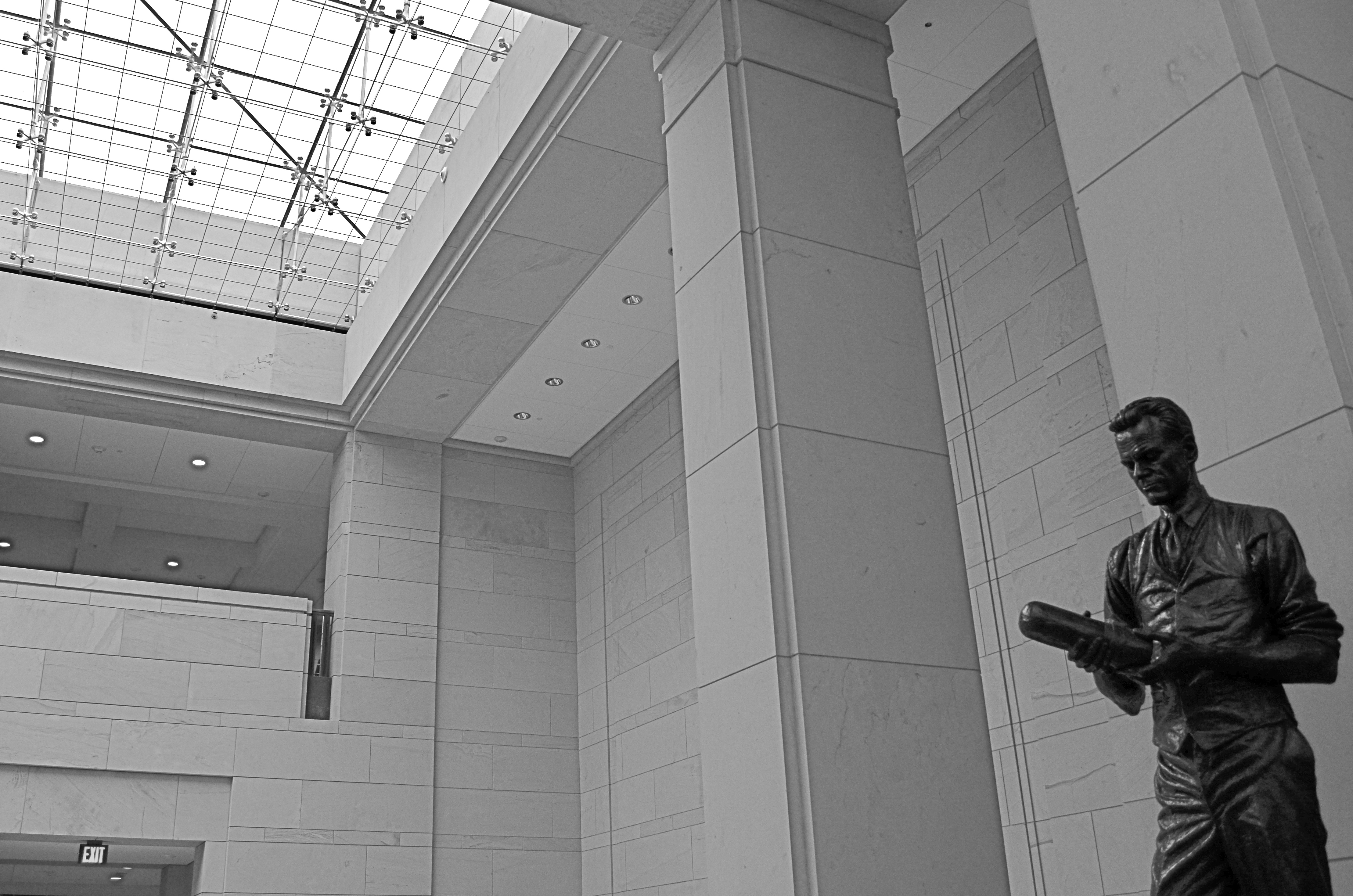
This shot is a snap (sorry) with available light and today’s digital sensors. 1/100 sec., f/5.6, ISO 250, 20mm.
By MICHAEL PERKINS
THERE IS A GLOBAL RACE, ACCELERATING RAPIDLY SINCE THE DAWN OF THE DIGITAL AGE, toward better, faster image sensors in cameras great and small, as we wage the eternal photographic battle against the limits of light. It’s one more reason why this is the best time in the medium’s history to be making pictures.
It’s hard to express what a huge game-changer this is. Film-based photography advanced the science of gathering light in slow fits and starts for more than a century, with even some of the most popular consumer films rated at very slow speeds (Kodachrome) or, if faster, extraordinarily high grain (Tri-X). Suddenly, the world’s shadowy interiors, from stadiums to basements, give up their secrets to even bargain-priced cameras as ISO ratings for sensors climb and noise/grain abatement gets better and better.
The above image, taken inside the U.S. Capitol building in Washington, would have, in film terms, required either a full-open aperture (making a consistent depth of field from front to back tricky), a slow exposure (hard to go handheld when you’re on a tour) or a film rated at 400 or above. Plus luck.
By contrast, in digital, it’s a casual snap. The f/5.6 aperture keeps things sharp from front to back, and the ISO rating of 250 results in noise that’s so low that it’s visually negligible. The statue of television pioneer Philo Farnsworth is dark bronze, and so a little re-contrasting of the image was needed in post-editing to lighten up the deeper details, but again, the noise is so low that it’s really only visible in color. As it happens, I actually like the contrast between the dark statue and the bright room better in monochrome anyway, so everyone wins.
The message here is: push your camera. Given today’s technology, it will give you some amazing things, and the better you understand it the more magic it will produce. We are just on the cusp of a time when we can effectively stow the flash in the closet except in very narrow situations and capture stuff we only used to dream about. Get out there and start swinging for the fences.
YESTERGRUBBING
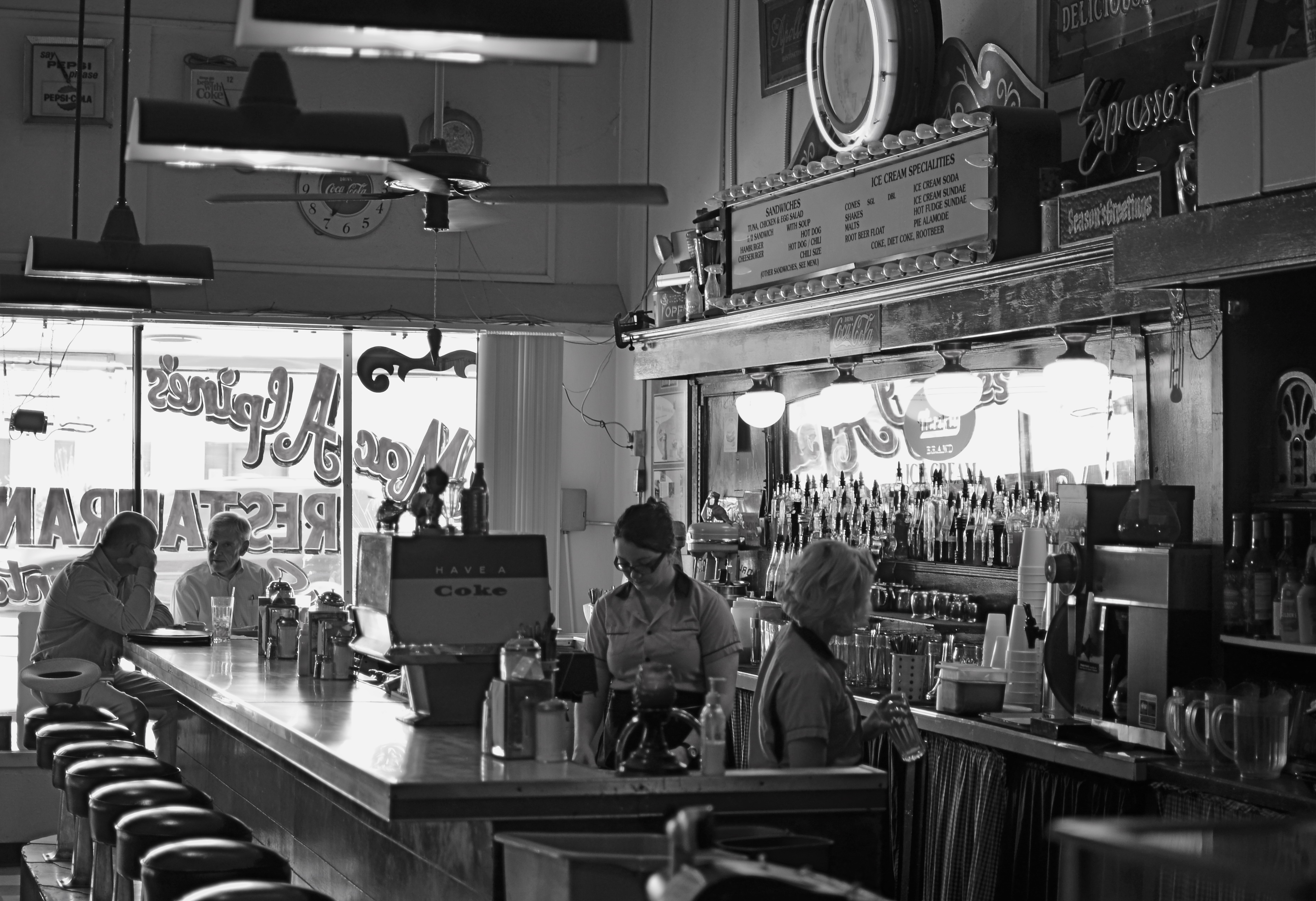
Remember when the heaviest decision of your day was what flavor syrup you wanted in your Coke?
By MICHAEL PERKINS
I ALWAYS SCRATCH MY HEAD WHEN I SEE AN EATERY sporting a sign that boasts “American Cuisine”, and often have to suppress an urge to step inside such joints to ask the proprietor to explain just what that is. If there is one thing about this sprawling broad nation that can’t be conveniently corralled and branded, it’s the act of eating. Riff through a short stack of Instagrams to see the immense variety of foodstuffs that make people say yum. And as for the places where we decide to stoke up….what they look like, how they serve us, how they feel….well, that’s a never-ending task, and joy, for the everyday photographer.
Eating is, of course, more than mere nourishment for the gut; it’s also a repast for the spirit, and, as such, it’s an ongoing human drama, constantly being shuffled and re-shuffled as we mix, mingle, disperse, adjourn and regroup in everything from white linen temples of taste to gutbucket cafes occupying speck of turf on endless highways. It’s odd that there’s been such an explosion of late in the photographing of food per se, when it’s the places where it’s plated up that hold the real stories. It’s all American, and it’s always a new story.
I particularly love to chronicle the diners and dives that are on the verge of winking out of existence, since they possess a very personalized history, especially when compared with the super-chains and cookie-cutter quick stops. I look for restaurants with “specialities of the house”, with furniture that’s so old that nobody on staff can remember when it wasn’t there. Click. I yearn for signage that calls from the dark vault of collective memory. Bring on the Dad’s Root Beer. Click. I relish places where the dominant light comes through grimy windows that give directly out onto the street. Click. I want to see what you can find to eat at the “last chance for food, next 25 mi.” Click. I listen for stories from ladies who still scratch your order down with a stubby pencil and a makeshift pad. Click. Click. Click.
In America, it’s never just “something to eat”. It’s “something to eat” along with all the non-food side dishes mixed in. And, sure, you might find a whiff of such visual adventure in Denny’s #4,658. Hey, it can happen. But some places serve up a smorgasbord of sensory information piping hot and ready to jump into your camera, and that’s the kind of gourmet trip I seek.
ABSOLUTES
This image isn’t “about” anything except what it suggests as pure light and shape. But that’s enough. 1/250 sec., f/5.6, ISO 100, 35mm.
By MICHAEL PERKINS
THE POPULARLY-HELD VIEW OF THE HISTORY OF PHOTOGRAPHY makes the claim that, just as video killed the radio star, camera killed the canvas. This creaky old story generally floats the idea that painters, unable to compete with the impeccable recording machinery of the shutter, collectively abandoned realistic treatment of subjects and plunged the world into abstraction. It’s a great fairy tale, but a fairy tale nonetheless.
There just is no way that artists can be regimented into uniformly making the same sharp left turn at the same tick of the clock, and the idea of every dauber on the planet getting the same memo that read, alright guys, time to cede all realism to those camera jerks, after which they all started painting women with both eyes on the same side of their nose. As Theo Kojak used to say, “nevva happennnned…”
History is a little more, er, complex. Photography did indeed diddle about for decades trying to get its literal basics right, from better lenses to faster film to various schemes for lighting and effects. But it wasn’t really that long before shooters realized that their medium could both record and interpret reality, that there was, in fact, no such simple thing as “real” in the first place. Once we got hip to the fact that the camera was both truth teller and fantasy machine, photographers entered just as many quirky doors as did our painterly brothers, from dadaism to abstraction, surrealism to minimalism. And we evolved from amateurs gathering the family on the front lawn to dreamers without limit.
I love literal storytelling when a situation dictates that approach, but I also love pure, absolute arrangements of shape and light that have no story whatever to tell. As wonderful as a literal capture of subjects can be, I never shy away from making an image just because I can’t readily verbalize what it’s “about”. All of us have photos that say something to us, and, sometimes, that has to be enough. We aren’t always one thing or the other. Art can show absolutes, but it can’t be one.
There is always one more question to ask, one more stone to turn.
UNDER A DARKENING SKY
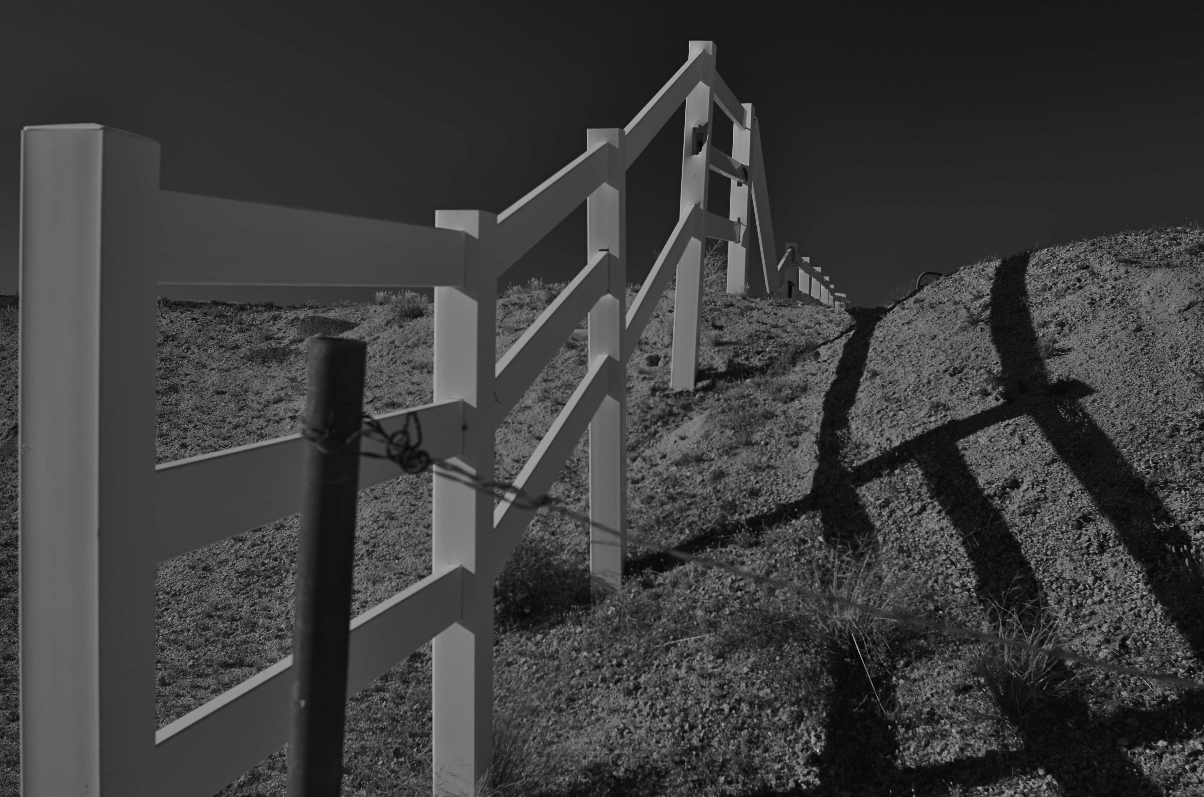
Dark skies, old-school way: a red 25 filter in front of a DSLR.
By MICHAEL PERKINS
SOMEONE HANDIER WITH A SLIDE RULE THAN ME RECENTLY OBSERVED that the raw numerical totals, on photo sharing sites, had shifted in favor of mobile images over those taken with more conventional cameras. In other words, the war was over, and the phones had won, at least in the sheer tonnage of uploaded images. Not sure that I yet regard that assertion as divine revelation, but the fact is that, as mobiles become a bigger component of overall photography, a second shift in technique will also continue, that between conceptualizing and compensation.
Dark skies on a cel phone with the addition of a “red sensitivity” app effect.
By conceptualizing, I mean the system, for traditional photographers of planning their shots before the shutter clicks, choosing settings, pre-editing the composition in the frame, any kind of advance prep. By compensation, I mean the emphasis, with mobiles, on adding filters and fixes after the click, technically learning how to make the most of what you were able to get.
One rather fun element I like to play with at present is the two approaches to high contrast black & white, especially the “black sky” effect which can force foreground objects to pop with greater drama. Shooting out in the Arizona desert for years, I have more frequent use for this effect than I might in more, well normal areas of the country. Traditional approach to this with a DSLR, of course, is the attachment of a red filter. You have to grope around for the right exposure, since you might lose the equivalent of two stops of light, depending on the situation, but it’s a great look. So that’s for us “conceptualizing” folks. See an example up top of the page.
The “compensation” peeps, who might have done their original shot on a phone, in color, is often referred to in apps as “red sensitivity” which adds the dark-sky look as it converts the shot to black and white. Usually you can only tweak the intensity of the effect (sometimes brightness as well), but it delivers a fairly good facsimile of the DSLR’s red filter, albeit with a little black lint kind of texture to the skies that you can usually get rid of with a noise reduction slider in your computer. The results, as you can see off to the left, are fairly acceptable.
If you’re shopping for filters beyond those in your own camera native app, consider adding one that includes red sensitivity. It’s one more “compensation” tool that’s nice to carry in your back pocket.
POCKET PALS
A color shot converted in the app Alt-Photo, using its simulated red filter for super-contrasty monochrome.
By MICHAEL PERKINS
QUICK, DO YOU KNOW WHO MADE THE HAMMER IN YOUR KITCHEN DRAWER? Let’s assume that it’s not a Sears Craftsman, but something you bought on the spot when you just needed, like, a hammer. Yeah, I’ll wait.
Follow-up question: does your off-brand Thor-wacker drive nails any less efficiently than a Sears? Or is it really all in the wrist?
In photography, sometimes tools is just tools. Cellphone apps comprise one of the the most glutted product markets ever, and, while some products do rise to the top and/or international prominence, there are gobs of different players out there to help us solve the same old problems, i.e., composition, exposure, color range, special effects. Those are the basics, and you need not be loyal to any predominant type-A app when, by the time I type the rest of this sentence, forty more guys will have served up their own solution for the exact same need. Go with what works. Add, subtract, adopt, dump, delete, and adore as needed.
Most cel camera apps, toolwise, are closer to a Swiss Army knife than a scalpel, blunt instruments that either apply an effect all-on or all-off. Single click, caveman-level stuff. Still, even the casual cel photog will pack a few of them along to do fundamental fixes on the go, and I recently noticed that I had acquired a decent, basic utility belt of bat-remedies, including, in no particular order:
Negative Me. Just what it says. Converts positive images to negative. Not something you’ll use a lot, but..
Simple DOF. A quick calculator that measures near, far and infinite sharpness based on distance, aperture and lens.
Fused. Instant double exposures, with about ten different blending formulas.
Soft Focus. Sliders for sharpness, brightness, color saturation. Instant glamor for portraits.
Timer Cam. Get in the photo.
Instants. Genuine fake Polaroid borders around your landscape or square images. Because we can’t give up our hipster groove.
AltPhoto. Best simulations of older classic film stocks from Kodachrome to Tri-X, as well as red filter, toy camera and antique effects.
Tilt-Shift Focus. Narrow the sharp areas in your images from a pinpoint to a basketball.
Flickr. Direct link to the mother ship
Pic Stitch. Framing templates for collages of two or more images. Drag and drop simplicity.
Use of these gimcracks ranges from the (yawn) occasional to the (yes!) essential, and your mileage may vary. Thing is, it’s truly a buyer’s (and user’s) market out there. Gather your own gold and click away.
BE THE CAMERA. NOW BE BETTER THAN THAT.
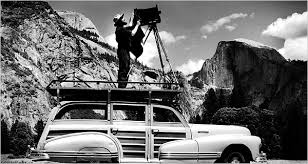
A man, a plan, a woody: Ansel Adams in his element. Yosemite’s Half-Dome is at the right.
By MICHAEL PERKINS
MERELY INVOKING THE NAME OF ANSEL ADAMS is enough to summon forth various hosannas and hallelujahs from anyone from amateur shutterbug to world-renowned photog. He is the saint of saints, the yardstick of yardsticks. He is the photographer was all want to be when (and if) we grow up. His technical prowess is held as the standard for diligence, patience, vision. And yet, even at the moment we revere Adams for his painstaking development of the zone system and his mind-blowing detail, we are still short-changing his greatest achievement.
And it is an achievement that many of us can actually aspire to.
What Ansel Adams did, over a lifetime, was work his equipment way beyond its limits, milking about 2000% out of every lens, camera and film roll, showing us that, to make photographs, we have to constantly reach beyond what we think is possible. Given the slow speed of much of the film stocks and lenses of his era, he, out of the wellspring of his own ingenuity, had to make up the deficit. He had to be smarter, better than his gear. No one piece of equipment could give him everything, so he learned over a lifetime how to anticipate every need. Look at one of many lists he made of things that he might need on a major shoot:
Cameras: One 8 x 10 view camera with 20 film holders and four lenses; 1 Cooke Convertible, 1 ten-inch Wide Field Ektar, 1 nine-inch Dagor, one six and three-quarters-inch Wollensak wide angle. One 7 x 17 special panorama camera with a Protar 13-1/2-inch lens and five holders. One 4 x 5 view camera with six lenses; a twelve-inch Collinear, including an eight-and-a-half Apo Lentar, a nine-and-a-quarter Apo Tessar, 4-inch Wide Field Ektar, Dallmeyer telephoto. One Hasselblad camera outfit with 38, 60, 80, 135, & 200 millimeter lenses. A Koniflex 35 millimeter camera. Two Polaroid cameras. 3 exposure meters (one SEI, two Westons).
Extras: filters for each camera: K1, K2, minus blue, G, X1, A, C5 &B, F, 85B, 85C, light balancing, series 81 and 82. Two tripods: one light, one heavy. Lens brush, stopwatch, level, thermometer, focusing magnifier, focusing cloth, hyperlight strobe portrait outfit, 200 feet of cable, special storage box for film.
Transport: One ancient, eight-passenger Cadillac station wagon with 5 x 9-foot camera platform on top.
However, the magic of Ansel Adams’ work is not in how much equipment he packed. It’s that he knew precisely what tool he needed for every single eventuality. He likewise knew how to tweak gear to its limits and beyond. Most importantly, his exacting command of the elemental science behind photography, which most of us now use with little or no thought, meant that he took complete responsibility for everything he created, from pre-visualization to final print.
And that is what we can actually emulate from the great man, that total approach, that complete immersion. If we use all of ourselves in every picture that we make, we can always be better than our cameras. And, for the sake of our art, we need to be.
IF HUE GO AWAY
By MICHAEL PERKINS
IT SEEMS UNGRACIOUS FOR A PHOTOGRAPHER TO COMPLAIN ABOUT AN OVER-ABUNDANCE OF LIGHT, since that’s basically the currency we trade in. More typically we gripe about not being able to bring enough of the stuff into a shot. I mean, the entire history of the medium is one big let-there-be-more-light prayer. But that’s not to say that light can’t create annoyance when you’re in a place where there is glorious, radiant illumination of….acres of nothing.
I’m not talking about sunlight on endless expanses of starched plain. I refer here to subject matter that is so uninteresting that, even though a bumptious bounty of light is drenching everything in sight, there is nothing to make a photograph of. Nothing that compels, inspires, jars or even registers. I recently made my annual return to a festival that, due to my frequent farming of it over the years, has now bottomed out visually. There is nothing left to say about it, although all that “nothing” is stunningly lit at this time of year.
The light patterns seen here were warm and inviting in color. That’s not what I wanted.
In fact, it’s only by shooting just abstracted shapes, shades and rays, rather than recognizable subjects, that I was able to create any composition even worth staying awake for, and then only by using extremely sharp contrast and eliminating color completely. To me, the only thing more pointless than lousy subject matter is beautiful looking lousy subject matter, saturated in golden hues, but signifying nothing. Kinda the George Hamilton of photos.
So the plan became, simply, to turn my back on the bright balloons, food booths, passing parade of people and spring scenery that, in earlier years, I would have been happy to capture, and instead render arrangements without any narrative meaning, just whatever impact could be seen using light as nearly the lone element. In the above picture, I did relent in keeping the silhouetted couple in the final picture, so that it’s not as “cold” as originally conceived, but otherwise it’s a pretty stark image. Photography without light is impossible, but we also have to refuse to take light “as is” from time to time, to do our best to orchestrate it, much as we would vary shadings with pencil or crayon. We know that the camera loves light, but it’s still our job to tell it where, and how, to look.
MAGICAL ORPHANS
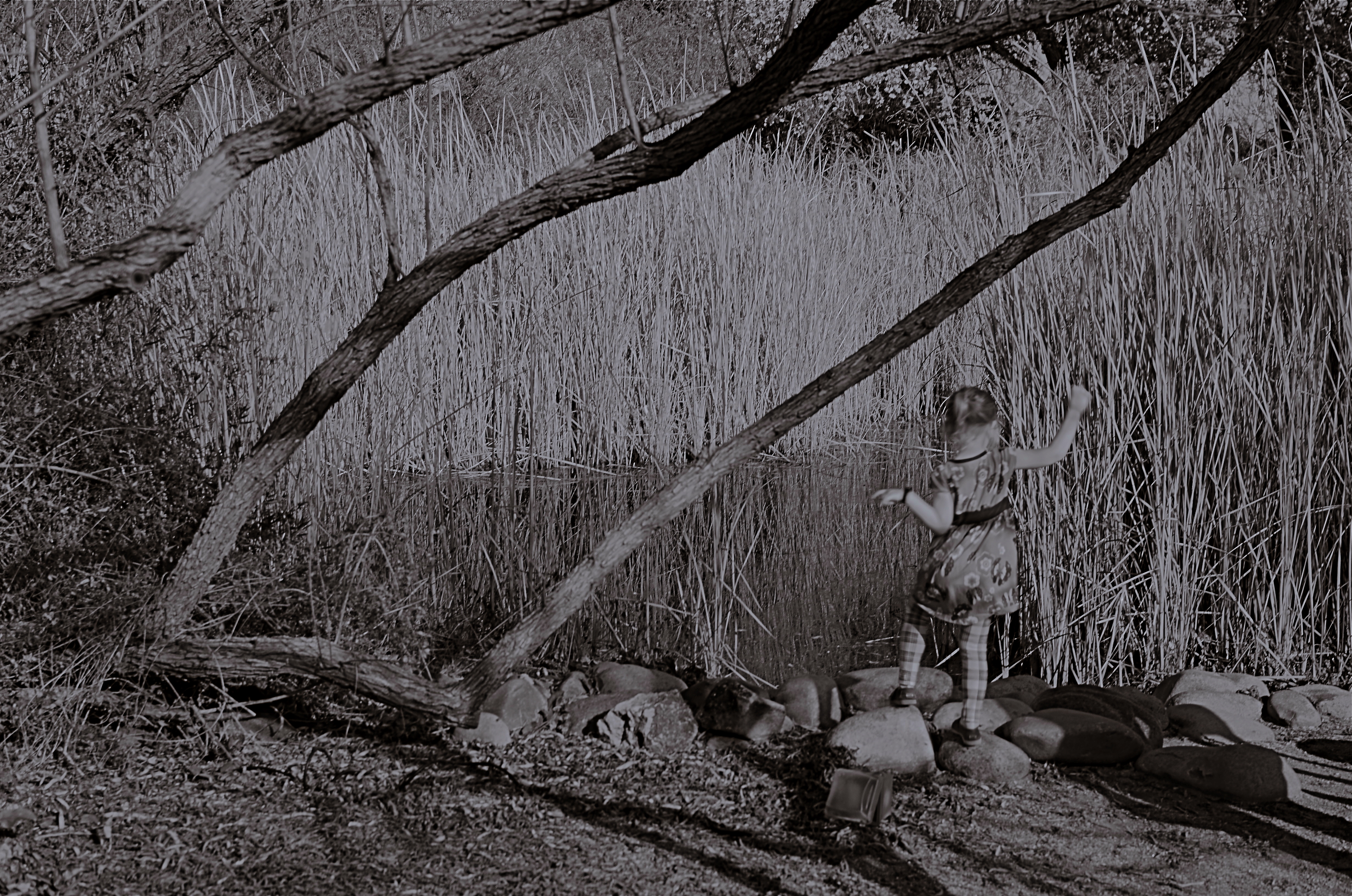
She Of The Reedy River, 2015.
By MICHAEL PERKINS
WE HAVE ALL EXPERIENCED THE SHOCK OF SEEING OURSELVES IN A CERTAIN KIND OF PHOTOGRAPH, a strange combination of framing, light or even history that makes us actually ask, “who is that?? before realizing the truth. Of course we always know, intellectually, that a photo is not an actual visual record of events but an abstraction, and still we find ourselves emotionally shocked when it’s capable of rendering very familiar things as mysteries. That odd gulf between what we know, and what we can get an image to show, is always exciting, and, occasionally, confounding.
Every once in a while, what comes out in a picture is so jarringly distant from what I envisioned that I want to doubt that I was even involved in capturing it. Such photographs are magical orphans, in that they are neither successes nor failures, neither correct or wrong, just…..some other thing. My first reaction to many of these kinds of shots is to toss them into the “reject” pile, as every photo editor before 1960 might have, but there are times when they will not be silenced, and I find myself giving them several additional looks, sometimes unable to make any final decision about them at all.
The above shot was taken on a day when I was really shooting for effect, as I was using both a polarizing filter to cut glare and a red 25 filter to render severe contrast in black and white. The scene was a reedy brook that I had shot plenty of times at Phoenix’ Desert Botanical Garden, but the shot was not planned in any way. As a matter of fact, I made the image in about a moment and a half, trying to snap just the shoreline before a boisterous little girl could get away from her parents and run into the frame. That’s all the forethought that went into it.
With all the extreme filtration up front of the lens, I was shooting slow, at about 1/30 of a second, and, eager to get to the pond, the child was just too fast for me. Not fast enough to be a total blur, but fast enough for my lens to render her softly, strangely. And since every element in a picture talks to every other element, the rendering of the reeds, which was rather murky, added even more strangeness to the little girl, her face forever turned away, her intent or presence destined to remain a secret.
I might like this picture, but I worry that wanting to like it is making me see something in it that isn’t there. Am I trying to wish some special quality into a simple botched shot, acting as a sort of self-indulgent curator in search of “art”?
Can’t tell. Too soon.
Check with me in another five years or so.
DOCUMENTARY OR DRAMA?
Creative use of contrast and texture can amp up interest in a shot that is overly pretty.
By MICHAEL PERKINS
I RECENTLY HEARD AN INTERESTING CRITIQUE OF A DRAMATIC CONTENDER for Best Film in the 2015 Oscar race. The critic in question complained that the film in question (Boyhood) was too realistic, too inclusive of banal, everyday events, and thus devoid of the dynamics that storytellers use to create entertainment. His bottom line: give us reality, sure, but, as the Brits say, with the boring bits left out.
If you’re a photographer, this argument rings resoundingly true. Shooters regularly choose between the factual documentation of a scene and a deliberate abstraction of it for dramatic effect. We all know that, beyond the technical achievement of exposure, some things that are real are also crashingly dull. Either they are subjects that have been photographed into meaninglessness (your Eiffel Towers, your Niagara Fallses) or they possess no storytelling magic when reproduced faithfully. That’s what processing is for, and, in the hands of a reliable narrator, photographs that remix reality can become so compelling that the results transcend reality, giving it additional emotive power.

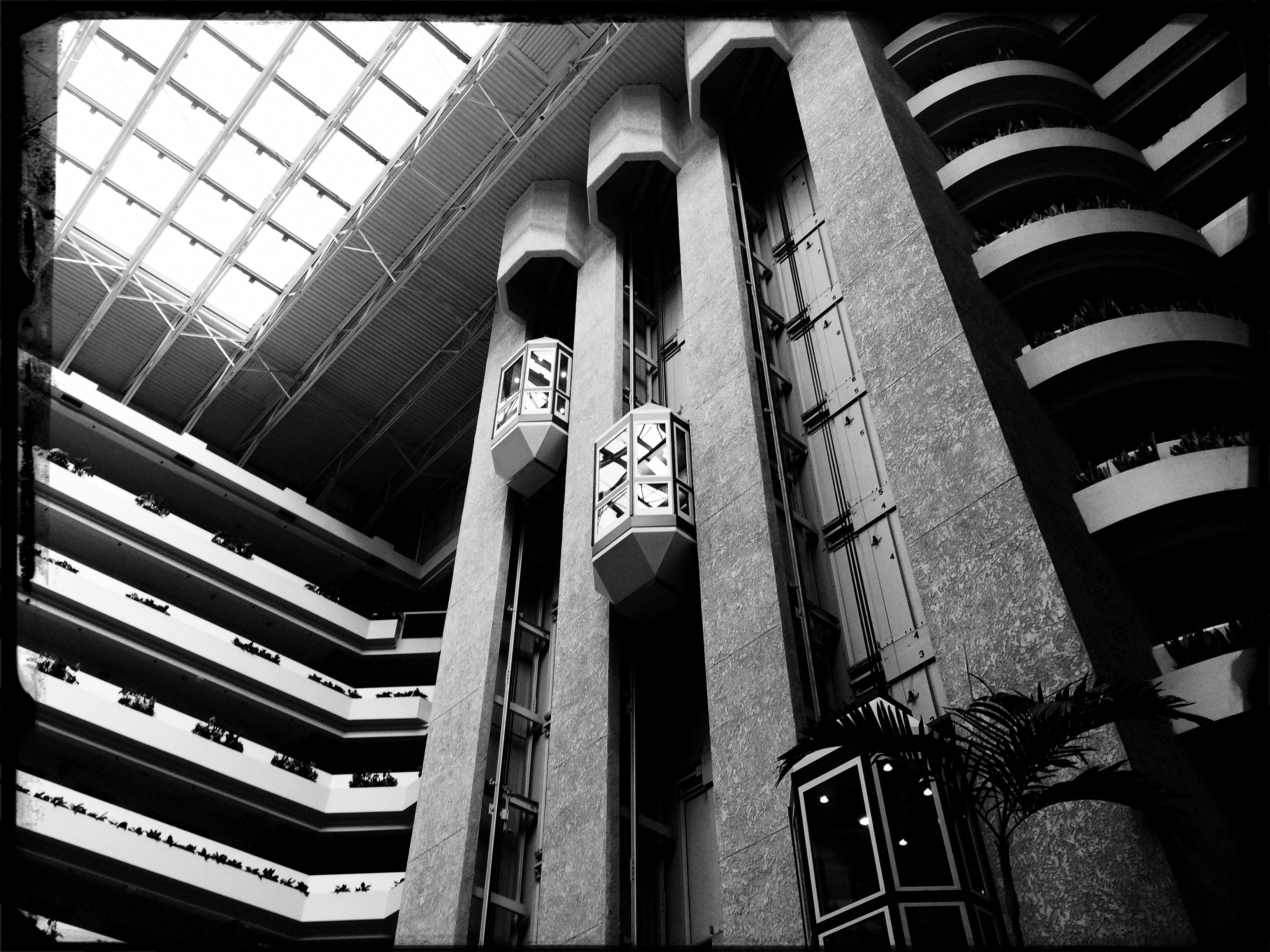
The original. Workable composition, but hampered by its realism.
This is why colors are garish in The Wizard Of Oz, why blurred shots can convey action better than “frozen” shots, and why cropping often delivers a bigger punch and more visual focus than can be seen in busier compositions. Drama is subject matter plus the invented contexts of color, contrast, and texture. It is the reassignment of values. Most importantly, it is a booster shot for subjects whose natural values under-deliver. It is not “cheating”, it is “realizing”, and digital technology offers a photographer more choices, more avenues for interpretation than at any other time in photo history.
The photo at left was taken in a vast hotel atrium which has a lot going for it in terms of scope and sweep, but which loses some punch in its natural colors. There is also a bit too much visible detail in the shot for a really dramatic effect. Processing the color with some additional grain and grit, losing some detail in shadow, and amping the overall contrast help to boost the potential in the architecture to produce the shot you see at the top of this post. Mere documentation of some subjects can produce pretty but flaccid photos. Selectively re-prioritizing some tones and textures can create drama, and additional opportunity for engagement, in your images.
THE ROMANCE OF RUIN
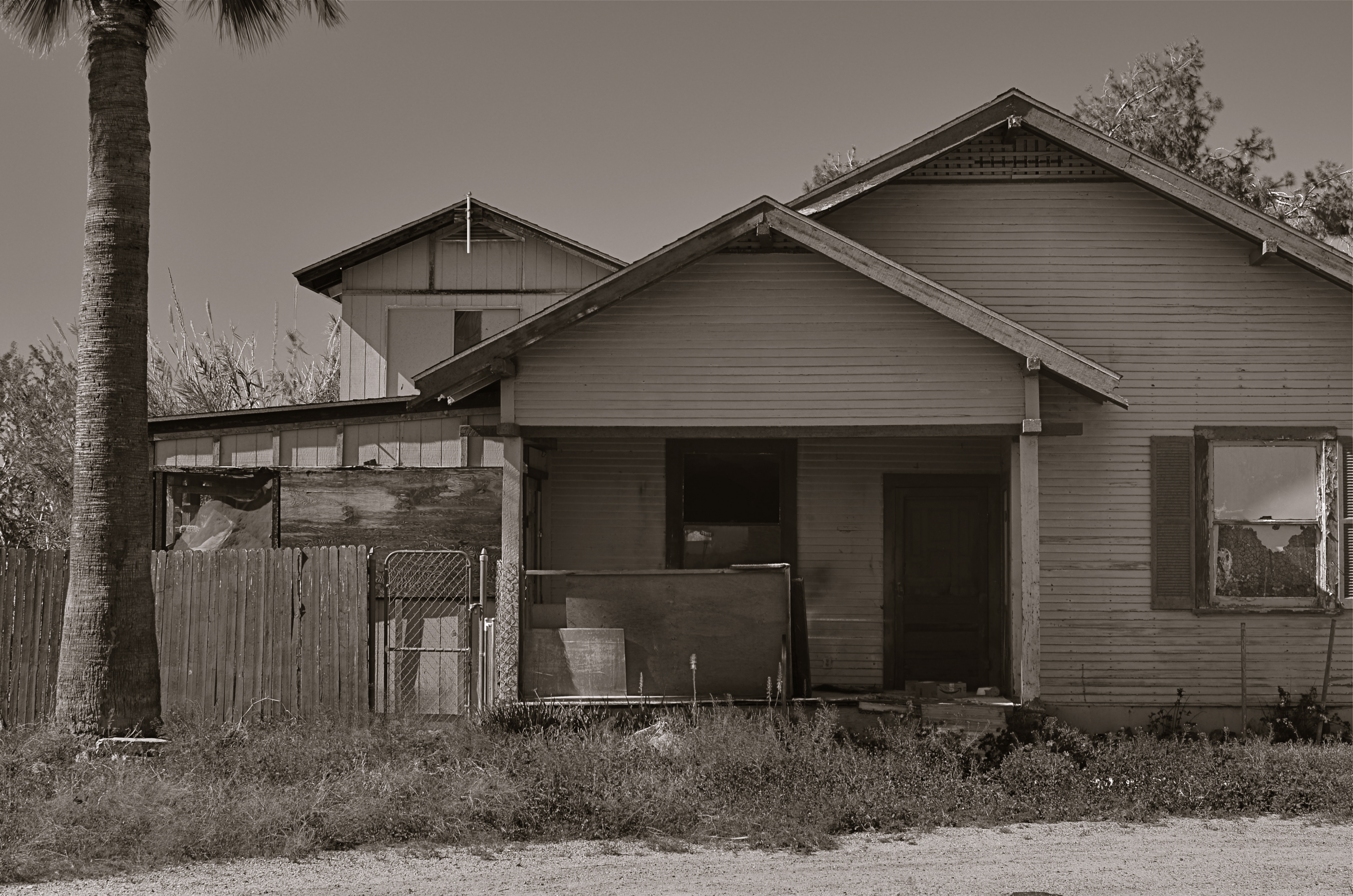
The honeymoon is, indeed, over.
By MICHAEL PERKINS
I TYPICALLY SHY AWAY FROM USING OR CREATING PHOTOGRAPHS as illustrations of work in another medium. Writers don’t try to caption my images, and I don’t presume, for the most part, to imagine visuals for their works. As both photographer and writer, I am sympathetic to the needs and limits of both graphic and written mediums. And still, there are rare times when a combination of events seem to imply a collaboration of sorts between the two means of storytelling. I made such an attempt a while back in these pages, in the grip of nostalgia for railroads, and so here goes with another similar experiment.
 Last week, during a blue mood, I sought out, as I often do, songs by Sinatra, since only Frank does lonely as if he invented the concept, conveying loss with an actor’s gift for universality. I stumbled across a particularly poignant track entitled A Cottage For Sale, which I sometimes can’t listen to, even when I need its quiet, desolate description of a dream gone wrong. So, that song was the first seed in my head.
Seed two came a few days later, when I was shortcutting through one of those strange Phoenix streets where suburban and rural neighborhoods collide with each other, blurring the track of time and making the everyday unreal. I saw the house you see here, a place so soaked in despair that it seemed to cry out for the lyrics of Frank’s song. Again, I’m not trying to provide the illustration for the song, just one man’s variation. So, for what it’s worth:
Is lonely and silent, the shades are all drawn,
And my heart is heavy as I gaze upon
A cottage for sale
Where you planted roses,the weeds seem to say,
“A cottage for sale”.
But when I reach a window, there’s empty space.
But no one is waiting for me any more,
The end of the story is told on the door.
A cottage for sale.
DETAILS, DETAILS
Moody, but still a bit too tidy. Black and white by itself wasn’t enough to create the atmosphere I wanted.
By MICHAEL PERKINS
EVEN THOUGH MOST GREAT PHOTOGRAPHERS PROCLAIM that any “rules” in their medium exist only to be broken, it’s often tough to chuck out regulations that have served you well over a lifetime of work. Once you get used to producing decent images through the repetition of habit, it takes extra nerve to take yourself outside your comfort zone, even if it means adding impact to your shots. You tend not to think of rules as arbitrary or confining, but as structural pillars that keep the roof from falling in.
That’s why it’s a good exercise to force yourself to do something that you feel is a bad fit for your style, lest your approach to everything go from being solid to, well, fossilized. If you hate black and white, make yourself shoot only monochrome for a week. If you feel cramped by square framing, make yourself work exclusively in that compositional format, as if your camera were incapable of landscape or portrait orientations. In my own case, I have to pry my brain away from an instinctual reliance on pinsharp focus, something which part of me fears will lead to chaos in my images. However, as I occasionally force myself to admit, sharp ain’t everything, and there may even be some times when it will kill, or at least dull, a picture.

Sharpness just where it’s needed, and nowhere else.
With post-processing such an instantaneous, cheap, and largely effortless option these days, there really isn’t any reason to not at least try various modes of partial focus just to see where it will lead. Take what you believe will work in terms of the original shot, and experiment with alternate ways of interpreting what you started with.
In the shot at the top of this post, I tried to create mood in a uniquely shaped fish house with monochrome and a dour exposure on a nearly colorless day. Thing is, the image carried too much detail to be effectively atmospheric. The place still looked like a fairly new, fairly spiffy eatery located in an open-air shopping district. I wanted it to look like a worn, weathered joint, a marginal hangout that haunted the wharf that its seafood theme and design suggested. I needed to add more mood and mystery to it, and merely shooting in black & white wasn’t going to get me there, so I ran the shot through an app that created a tilt-shift focus effect, localizing the sharpness to the rooftop sign only and letting the rest of the structure melt into murk.
It shouldn’t be hard to skate around a rule in search of an image that comes closer to what you see in your mind, and yet it can require a leap of faith. Hard to say why trying new things spikes the blood pressure. We’re not heart surgeons, after all, and no one dies if we make a mistake.Anyway, you are never more than one click away from your next best picture.
LOOK DEEP INTO MY EYES
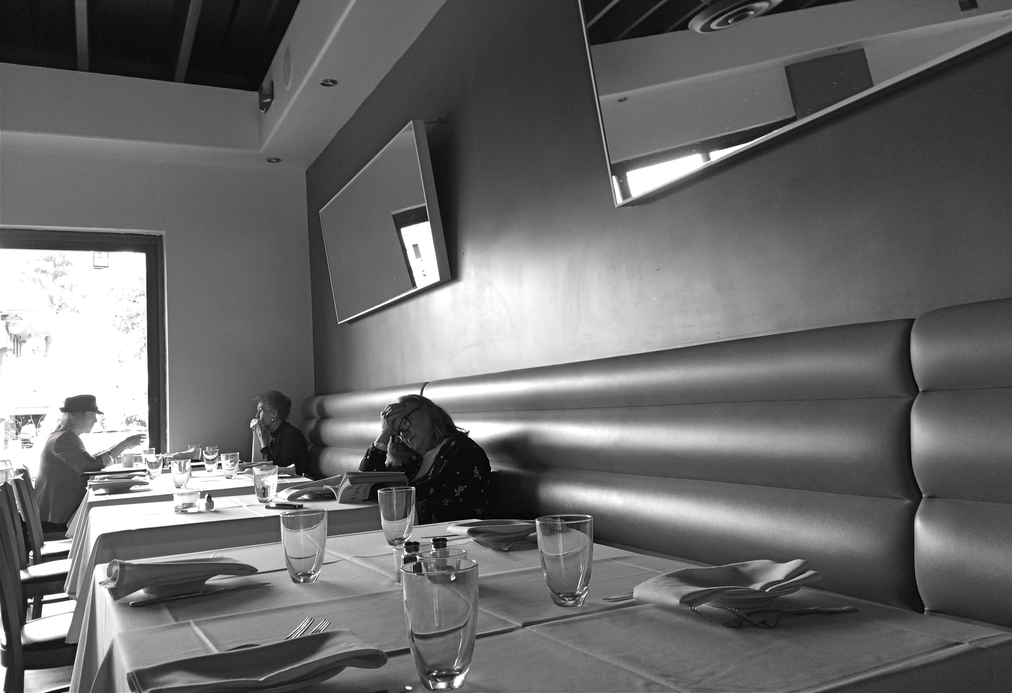
Literature For Lunch, 2016
By MICHAEL PERKINS
3-D PHOTOGRAPHY SEEMS DOOMED TO FOREVER RESIDE ON THE PERIPHERY OF THE MEDIUM AT LARGE, a part of the art that is regarded with mild derision, a card trick, a circus illusion. My own experience in it, from simple stereoscopic point-and-shoots to high-end pro-sumer devices like the Realist or View-Master cameras, has met with a lot of frustration at the unavoidable technical barriers that keep it from being a truly sharable kind of photography. It’s rife with specialized viewers, odd goggles, and cumbrous projection systems. It calls attention to effect to the detriment of content. It is the performing seal of photography.
That said, the learning curve needed to compose for stereo effect is equally valuable for overall “flat” composition, since you must always be mindful of building layers of information from front to back, the better to draw your viewer’s eye deep into your subject. Some will meet this challenge with a simple selective depth of field, as if to say: only pay attention to the stuff that is sharp. The front/back/sides don’t matter…I’ll tell you where to look. Others decide to arrange the front-to-back space all in the same focus, forcing the eye to travel in a straight line. Depends on what you need to say.
DSLRs allow you to elect for the former strategy, while iPhone photography, at least at this point in history, pretty much forces you to adopt the latter. You just don’t have the fine control needed for selective focus in a smartphone, any more than you have a choice shutter speed or how wide you shoot. With few exceptions, the iPhone and its cousins are marvelously adroit point-and-shoots, so your composition options lie chiefly in how you frame things up. Quickly.
This “think fast” mentality works to your benefit in the stealthier parts of street photography. The quicker you click, the harder it is to be detected, which means fewer “hey, what are you doing” issues with reluctant subjects. Even so, you have to be composing consciously if you want to establish a strong line to maximize the illusion of depth. It means deciding where the main drama in a shot resides and composing in reference to it. In the above shot, the woman lost in her John Updike novel is the main interest, but the steep diagonal of the wall leads you to her, then, as a second stage, to the lighter pair of friends in back. Framed in this manner, depth can be accentuated.
There are happy accidents and there are random luck-outs in photography, to be sure, but to create a particular sensation in your pictures, you must craft them. In advance. On purpose.
A FORWARD STEP BACK
Skies which appear wispy in color can pick up some drama in black & white with the use of a red filter.
By MICHAEL PERKINS
SOME CHOICES IN LIFE ARE BINARY, EITHER YES OR NO. The light switch is either all “on” or all “off”. Photographic choices have never been binary, since there are only a few real rules about how to achieve the image you want and more than a million reasons why those rules have to be jettisoned, because they actually stand in the way of that image.
When digital photography arrived, there was a tendency to assert that everything associated with film photography was as obsolete as a roll of Kodachrome 64. In fact, the further we proceed into the digital age, the more we realize that there are many good practices from the days of emulsions and negatives that have solid application in the age of zeroes and ones. It would be ridiculous to say categorically that every tool of one era must be abandoned in the image-making of the next. Lenses, exposure, lighting basics, and many more elements of film-based creativity have equivalents in digital. None of them are good all the time, and none of them should be ruled out without exception.
The use of filters is one such element. Many film-based photogs worth their salt have used filters as a matter of course, and, despite the amazing in-camera and post-production fixes of the present day, these little bits of accent glass still produce dazzling effects with a minimum of investment, and help shooters maintain a close, hands-on control of their images in the moment. And one of my favorites here in the American southwest, land of endless, often blistering sun, is the red 25 filter.
Used to punch up contrast and accentuate detail for black and white, the red 25 renders even the lightest skies into near blackness, throwing foreground objects into bold relief and making shadows iron sharp. On a day when fluffy clouds seem to blend too much into the sky, the red 25 makes them pop, adding additional textural detail and a near-dimensional feel to your compositions. Additionally, the filter dramatically cuts haze, adding clear, even tones to the darkened skies. Caution here: the red 25 could cost you several stops of light, so adjust your technique accordingly.
Many whose style has developed in the digital age might prefer to shoot in color, then desaturate their shots later, simulating this look purely through software, but I prefer to make my own adjustments to the scene I’m shooting while I am shooting it. I wouldn’t paint a canvas in one place and then fix my choice of colors a week later, hundreds of miles away from my dream sunset. Filters are from a world where you conceive and shoot now. The immediate feedback of digital gives you the part of that equation that was absent in film days, that is, the ability to also fix it, now. Photography can’t afford to cut itself off from its own history by declaring tools from any part of that history obsolete. A forward step, back is often the deftest dance move.
LEFTOVERS
Upstairs, Downstairs, 2014. Conceived and planned as a monochrome image.
By MICHAEL PERKINS
FAR BE IT FROM ME TO DO A HATER NUMBER on photographic post-processing. We often pretend that the act of photo manipulation began at the dawn of the pixel age, when, of course, people have been futzing with their images since the first shutter snapped. We love the idea of “straight out of the camera” as an ideal, but it’s just that…an ideal. Eventually, it’s the way processing is executed in a specific instance which either justifies or condemns its use.
With that in mind, I do find that too many of us use faux b&w, or the desaturation of color images, long after they’re snapped, as a kind of last-ditch attempt to save pictures that didn’t have enough force or impact in the first place. Have I resorted to this myself? Oh, well, yeah, maybe. Which means, freaking certainly. Have I managed to “save” many images in this way? Not so much. Usually, I feel like I’m serving leftovers and trying to pawn them off as a fresh meal.
Up In Your Grille, 2015. A mere b&w conversion from color would have flattened out many of this image’s tones.
The further along I lope through life, however,the more I tend to believe that the best way to make a black and white image is to set out to intentionally do just that. An act of planning, pre-visualization, deliberation. It means looking at your subject in terms of how a color object will register over the entire tonal range of greys and whites. Also, texture, as it is accentuated by light, is particularly powerful in monochrome, so that part needs to be planned as well. Exposure, as it’s effected by polarizers or colored filters also must be planned, as values in sky, stone or foliage must be anticipated. And, always, there is the use of contrast as drama, something black and white does to great effect.
You might be able to convert a color shot into an even more appealing b&w shot in your kerputer, but the most direct route, that is, making monochrome in the moment, is still the best, since it gives you so many more options while you’re managing every other aspect of the shot in real time. It all comes down to a major philosophical point about photography, which is that the more control you can wield ahead of the click, especially with today’s shoot-it-check-it-shoot-it-again technology, the better your results will be.

ANTHROPOGRAPHY
Tuning up: a fiddler runs a few practice riffs before a barn dance in Flagstaff, Arizona.
By MICHAEL PERKINS
WRITING CLICHE NUMBER 5,218 STATES THAT YOU SHOULD WRITE about what you know. Mine your own experience. Use your memories and dreams as a kickoff point for the Great American Novel, or, at least, the Okay American E-book. But while the “know-it-do-it” school of technique offers writers a pretty sound foundation for scribblers, photographers need to learn how to leave their native nests and fly into unknown country. The best pictures sometimes are where you, comfortably, aren’t.
Caperin’ up a storm, by golly.
Shooting an event or lifestyle that is completely outside yourself confers an instantaneous objectivity of sorts to your pictures, since you don’t have any direct experience with the things you’re trying to capture. You’re forced to pretty much go instinctive, since you can’t draw on your memory banks. This is certainly true of combat photographers or people dropped down into the middle of fresh disasters, but it also works with anything that’s new to you.
Take square-dancing. No, I mean it. You take square-dancing, as in, I’d rather be covered in honey and hornets than try to master something that defines “socially awkward” for yours truly. I can’t deny that, on the few occasions that I’ve observed this ritual up close, it obviously holds infinite enjoyment for anyone who isn’t, well, me. But being me is the essential problem. I not only possess the requisite two left feet, I am lucky, on some occasions to even be ambulatory if the agenda calls for anything but a rote sequence of left-right-left. Again, I concede that square-dancers seem almost superhumanly happy whenever doing their do-si-doing, and all props to them. Personally, however, I can cause a lot less damage and humiliation for all concerned if I bring a camera to the dance instead of a partner.
Shooting something you don’t particularly fancy yourself is actually something of an advantage for a photographer. It allows you to just dissect the activity’s elements, using the storytelling techniques you do know to show how the whole thing works. You’re using the camera to blow apart an engine and see its working parts independently from each other.
In either writing or shooting, clinging to what you know will keep your approach and your outcomes fairly predictable. But when photography meets anthropology, you can inch toward a little personal growth. You may even say “yes” when someone asks you if you care to dance.
Or you could just continue to maintain your death grip on your camera.
Yeah, let’s go with that.
Share this:
September 25, 2015 | Categories: Americana, Black & White, Candid, Conception, iPhone, Musical Instruments | Tags: Composition, crowds, Entertainment, Music, social commentary | Leave a comment