INSIDE THE IRIS
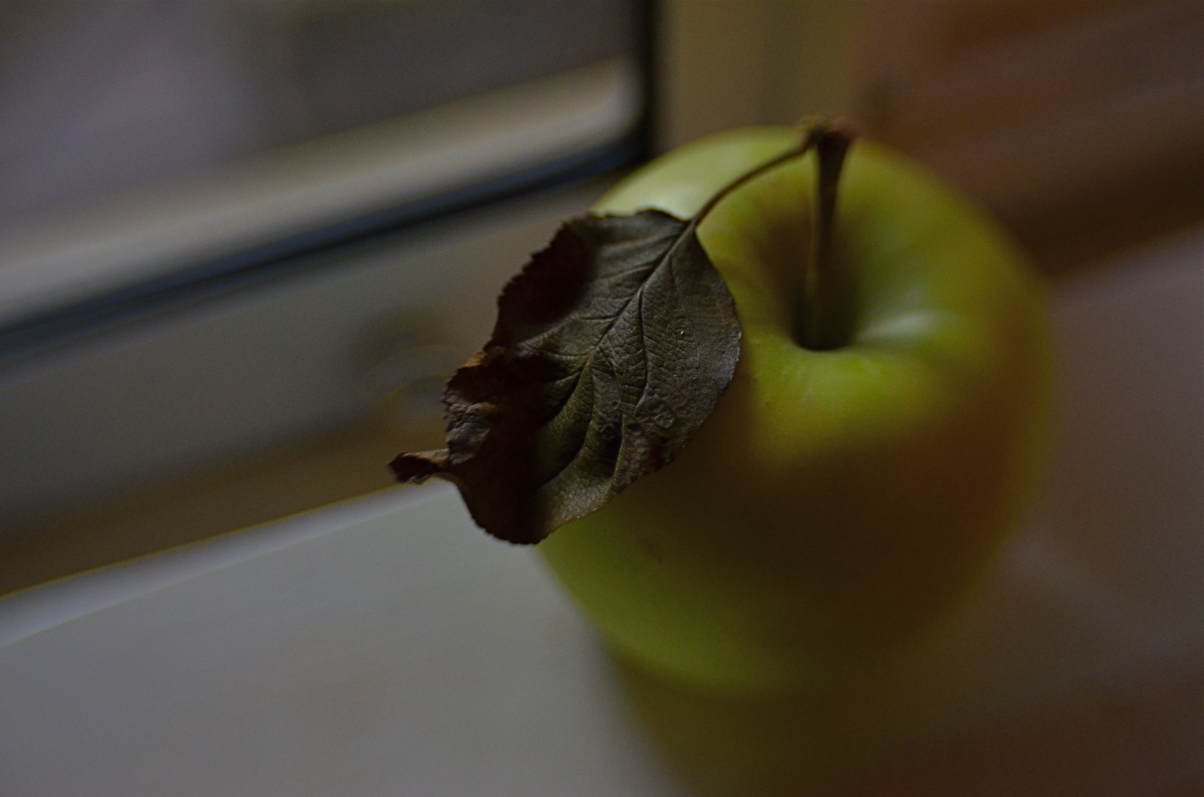
Just an apple. Or is it?
By MICHAEL PERKINS
IN ONE OF HIS EARLIEST SILENT FILMS, legendary director D.W. Griffith, one of the first cinematic pioneers to use tight shots to highlight vital narrative details, drew fire from theatre exhibitors, who objected to his new-fangled “close-up” or “iris” technique. “We have paid for the entire actor”, one wrote, apparently of the opinion that showing only a player’s hand or face, even in the interest of a good story, was somehow short-changing the audience. Griffith knew better, however. He was using his compositional frame to tell his viewers, in no uncertain terms, what was important. Outside the frame was all the other stuff that mattered less. If I show it, you should pay attention.
Photography is not so much about whether a subject is intrinsically important (think of the apple in a still-life) but whether an artist, armed with a camera and an idea, can make it important. At the dawn of the medium, painters pretty much dominated the choices about which images were immortalized as emblematic of the culture. The subject matter often ran to big targets; war, portraits of the elite, historical and religious events. And, indeed, the earliest photographs were “about something”, the “somethings” often being documents of the world’s wonders (pyramids, cathedrals) fads (politicians, authors) and foibles (crime, the occasional disaster). Subjects were selected for their importance as events, as leaves of history worthy of preservation.
In the 20th century the same abstract movements that engulfed painting allowed photography to cast a wider net. Suddenly that apple in the bowl was a worthy, even a vital subject. Light, composition, angle and mood began to weigh as heavily as the thing pictured. We made images not because the objects looked right, but because they looked right when made into a photograph. Pictures went from being about what “is” to being about what could be….evoking, like poetry, music or literature the magics of memory, dream, potentiality, emotion.
This is really the ultimate freedom of not only photography, but of any true art; the ability to confer special status on anything, anywhere. That doesn’t mean that all photographs are now of equal value; far from it. The burden of proof, the making of the argument for a particular subject’s preservation in an image, still rests squarely on the shooter’s shoulders. It’s just not necessary to wait for a natural disaster, a ribbon cutting, or a breathless landscape to make an amazing photograph. The eye is enough. In fact, it’s everything.
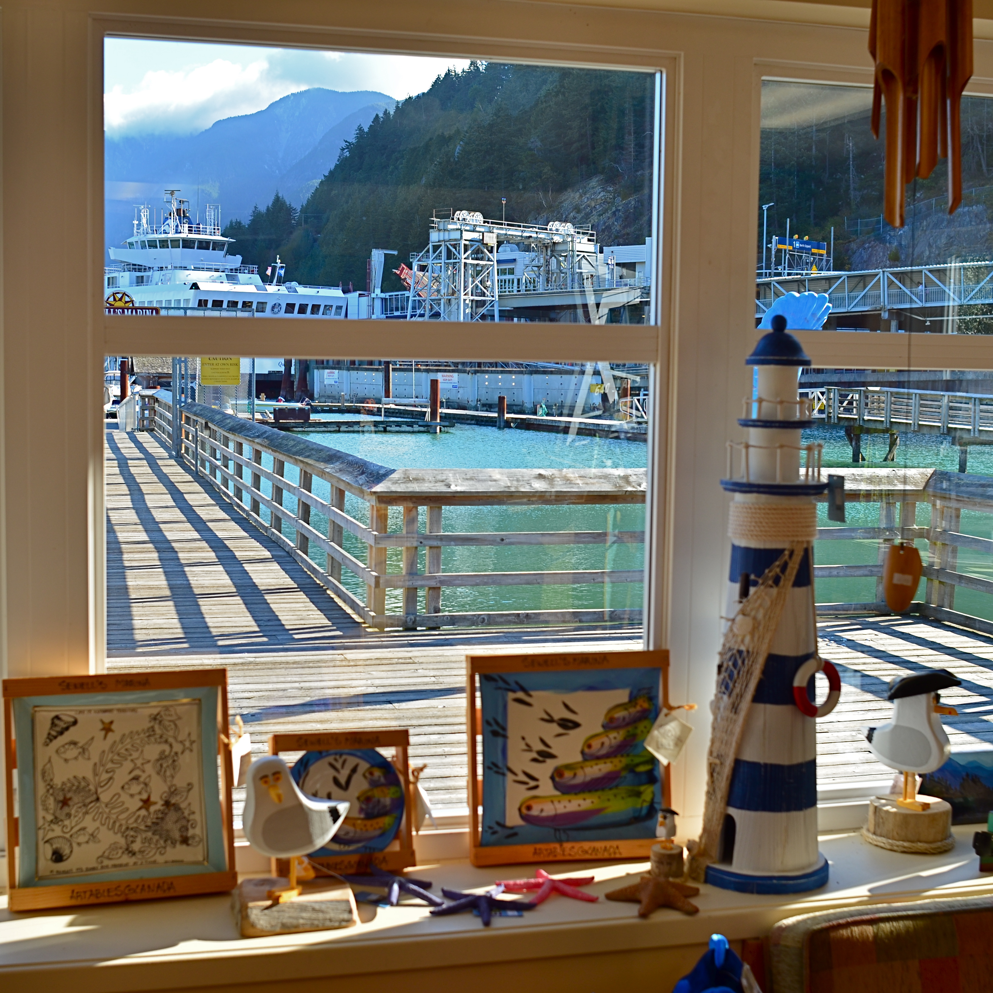
THE COMPOUND ILLUSION
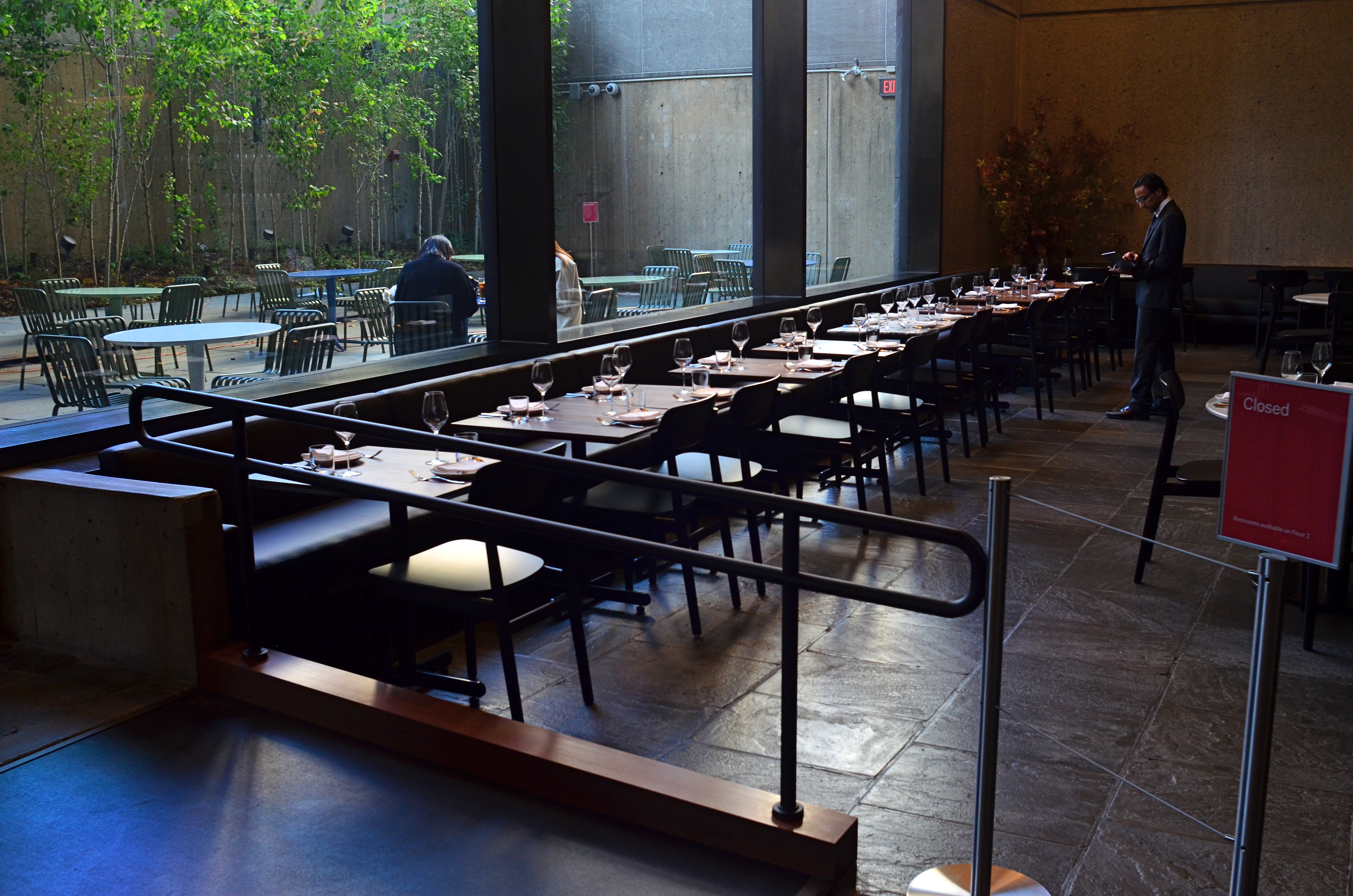
Next Will Be The Soup Course (2016). 1/60 sec., f/8, ISO 400, 24mm.
By MICHAEL PERKINS
ASK THE AVERAGE PERSON FOR A BRIEF COMPARISON BETWEEN PHOTOGRAPHY AND PAINTING, and you may hear the assertion that, ‘well, photographs are real..”, a statement that reveals the fundamental flaw in our thinking about photographs from their earliest beginnings. Simply because a camera measures and records light (perhaps also because it’s a machine), we’ve come to regard its end product as a literal representation of the world. But no serious examination of what artists have done with the photographic image will support that idea. Photographs are no more real than daubs of pigment, and no more reliable in their testimony.
Photographers twist and torture light and shadow to present their version of the world, not its literal translation. If they worked with top hats and wands instead of Leicas, their audiences would accept, with a wink. that a live rabbit was not actually produced out of the hat’s crown, but was, in fact, a feat of misdirection, of persuasion. The camera, on the other hand, gets far more credit for being faithful to the real world than it deserves. As the old saying goes, a photograph is a lie that tells the truth.
Making any kind of image, the photographer has any number of simple techniques available to him to make the inaccurate seem real, most of it achieved in-camera. Take, for example, the attempt, in the above photo, to create as great a sense of depth as is possible in a flat image. First, the use of a wide 24mm lens will optically exaggerate the distance between the front and back of the scene, nearly doubling the sense of space versus that of the actual room. On top of that, the image is composed with the most severe diagonal possible to pull the eye into its already over-accented dimensions.
As a final touch, the shot is taken at the smallest aperture practicable in the available light, insuring uniform sharpness as the eye looks “into” the scene. The result is a three-decker compound illusion……fairly removed from “reality” and yet suggesting itself to it, much as the rabbit seems to have emerged from the hat. Indeed, with the creative manipulation of the photographic process, you might not need, in terms of reality, either the hat or the rabbit to perform your “trick”. But you can certainly show them both in the shot.
Really.
EDITING WITH LIGHT
By MICHAEL PERKINS
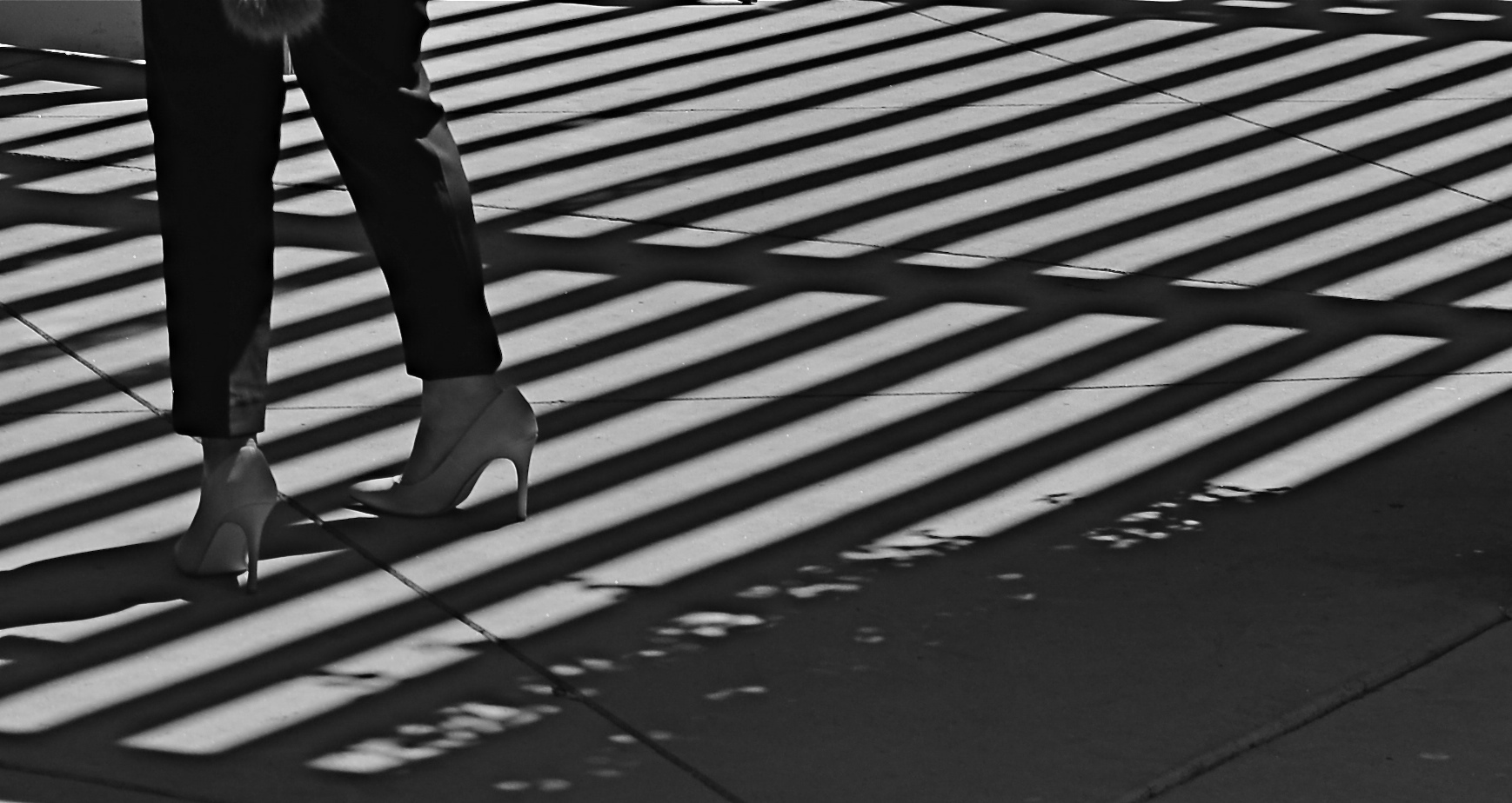
THE ETERNAL TUG OF WAR IN PHOTOGRAPHY SEEMS TO BE the pull between extremes of revelation and concealment. Toggling between the strategies of showing almost everything and showing nearly nothing, most shooters arrive at some negotiated mid-point which describes their own voice as a visual narrator. Shuttling between the two extremes, shooters have to decide how much information is appropriate not only for their overall style, but in each specific shooting situation.
Managing light in the moment, rather than trying to re-balance values after the picture is made, affords the most crucial control you will ever exercise over your subject. We tend, as beginners, to shoot things where there is “enough light”, growing ever more discriminating about the kind of light we prefer as we mature in our approach.
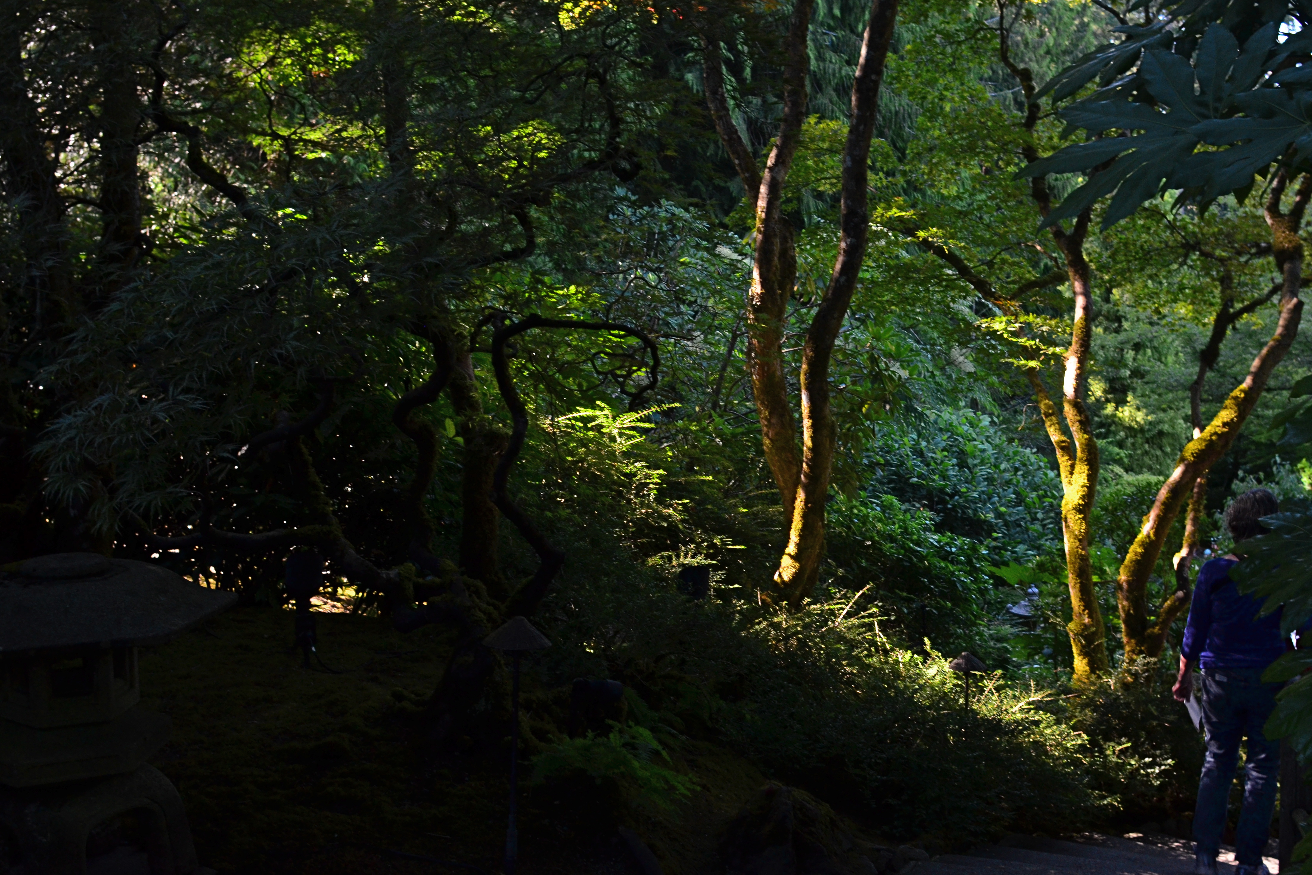
Down Into (2016). 1/40 sec., f/5.6, ISO 500, 24mm.
One of the most fruitful exercises for me has been those rare occasions in which I have had the luxury to remain in one area over a span of several hours, discovering the nuanced variations that prevail from minute to minute in a single setting. Many times, I have begun this process with an initial concept of the “ideal” lighting for a shot, then, through comparison, rejected that in favor of a completely different strategy. It’s strangely thrilling to come home completely satisfied with an image, even though it’s the dead opposite of the way you originally conceived it.
Waiting for the right light may be more time-consuming, but it is the cheapest, easiest, and surest way to control composition. If one particular lighting situation reveals too much in the shot, diluting the impact of your visual message, waiting for shadows to deepen and for bright spots to shift can make your photograph urge the eye more effectively toward the center of your “argument”. In the image seen above, I could not have sold the idea of a gradual walk from high left to lower right without the light actually working as a kind of directional arrow. A fully lit forest might have been lovely, and was, in fact, available to me just an hour earlier. But by the late afternoon, however, the partial dark helped me edit excess information out of the shot, and, in comparing the two approaches, I like the “less” version better.
Part of getting the shot you want is often learning to see, and edit out, the parts you don’t want, a process which is better when you wait for the “best”, rather than the “correct” light for right here, right now.
THE RIGHT PICTURE IN THE RIGHT FRAME
Horseshoe Bay, BC. The standard “post-card” scenic viewpoint.
By MICHAEL PERKINS
COMPOSITION IN PHOTOGRAPHY, FOR MANY OF US, CAN OFTEN INVOLVE NOTHING MORE than finding a thing we want to capture and getting it all in the frame. Click and done. It’s only later that we sometimes realize that we should have, shall we say, shopped around for the best way, from angle to exposure, to get our quarry in frame. Or even look for a better frame.
The same scene as viewed from a shop window, cropped to classic “View-Master” format.
One of the first tricks I learned in travel photography was from the old scenic shooters who created the travel titles for View-Master Reels, who always thought in terms of framing to maximize the image’s 3-d effect. For a start, since they were working in square format, they automatically had less real estate in which to compose. Secondly, they had to shoot in “layers”, since the idea was to have subject matter in multiple planes, for example, overhanging shade tree right at the front, a tourist midway into the shot, and Mount Rushmore at the back. They also learned to position things just inside the frame’s edge, what was called the “stereo window” to accentuate the sensation of looking into the photograph.
Thing is, all of these compositional techniques work exactly the same in a flat image, and can draw the viewer’s eye deeper into a picture, if used creatively. Certainly you can’t go wrong with a great exposure of a beautiful view. But experiment as well with things that force your audience to peer intently into that view. The image at the top is standard post-card, and works well enough. However, in the shot at left, in taking ten seconds to slip inside a gift shop that also looks out on the same view, I’ve tried to show how you can get an atmospheric framing that both accentuates depth and provides a bit more of a sense of destination. It all depends on what you’re looking to do, of course….but it makes sense to develop the habit of asking yourself how many different ways are available to tell the same story.
Editing a solid portfolio of shots can only begin with lots of choices. Hey, you’re there, anyway, so develop the habit of envisioning multiple versions of each picture, and weed out what doesn’t work. Remember again that the only picture that absolutely fails is the one you didn’t try to make.
(LESS THAN) PRIME OPPORTUNITY
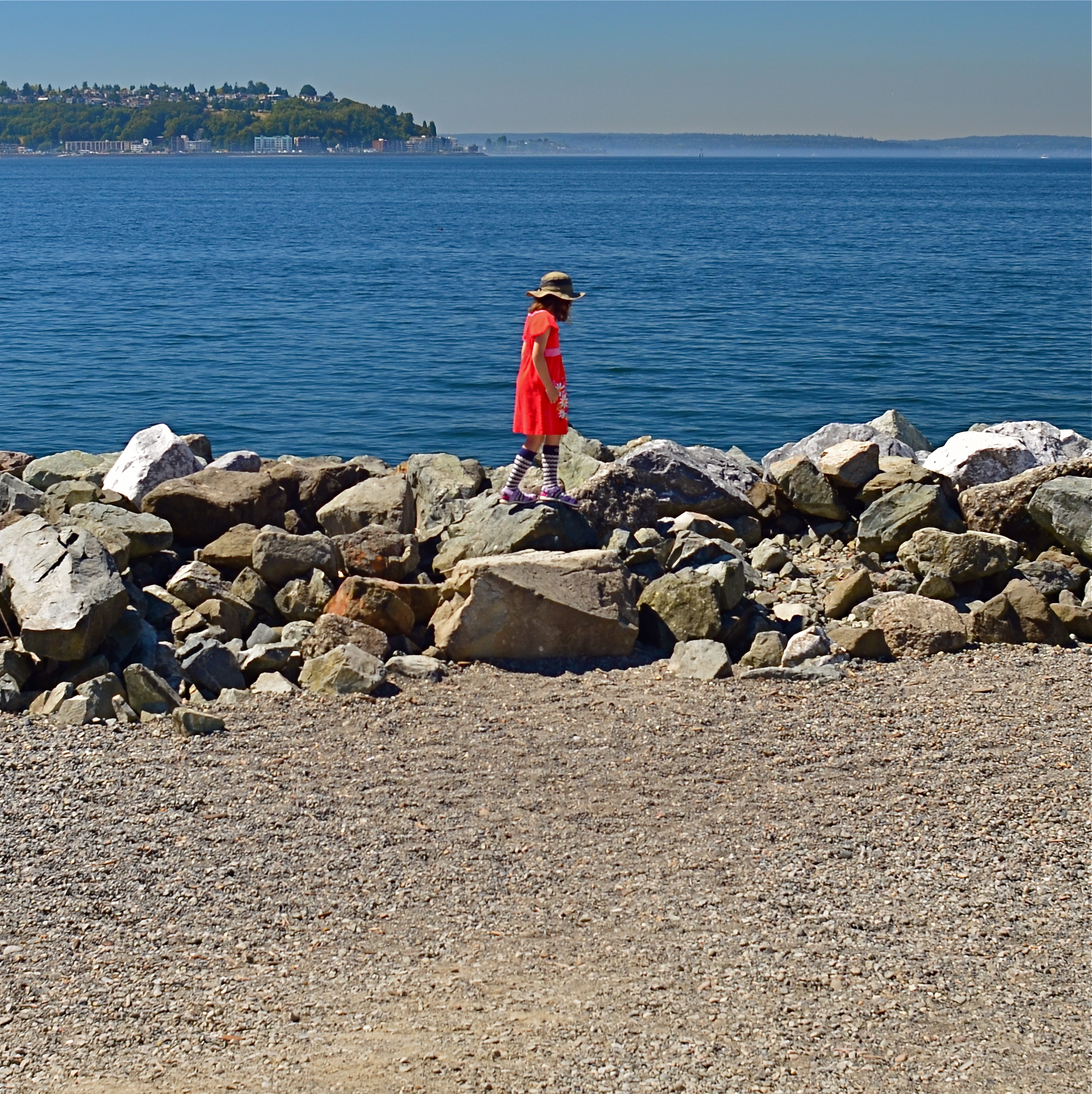
To Susan On The West Coast Waiting (2016). Shot from over 50 feet away with a 24mm wide-angle prime, then cropped nearly 70% from the original frame.
By MICHAEL PERKINS
EVERY DAY-LONG SESSION OF TRAVEL PHOTOGRAPHY dictates its own distinct rules of engagement. You can predict, to some degree, the general trend of the weather of the place where you’ll be staying/playing. You can pre-study the local attractions and map out at least a start-up list of things you might like to shoot. And you can choose, based on all your other prep, the equipment that will work best in the majority of situations, which keeps you from carting around every scrap of gear you own, saving reaction time, and, possibly, your marriage.
All well and good. However, even assuming that you make tremendously efficient choices about what lens you’ll most likely need on walkabout, there will be the occasional shot that is outside the comfort zone of said lens, something that it won’t do readily or easily. In such cases, the lens that would be perfect for that shot is likely forty miles away, back at your hotel. And here’s the place where you can pretty much predict what I advise.
Take the shot anyway.
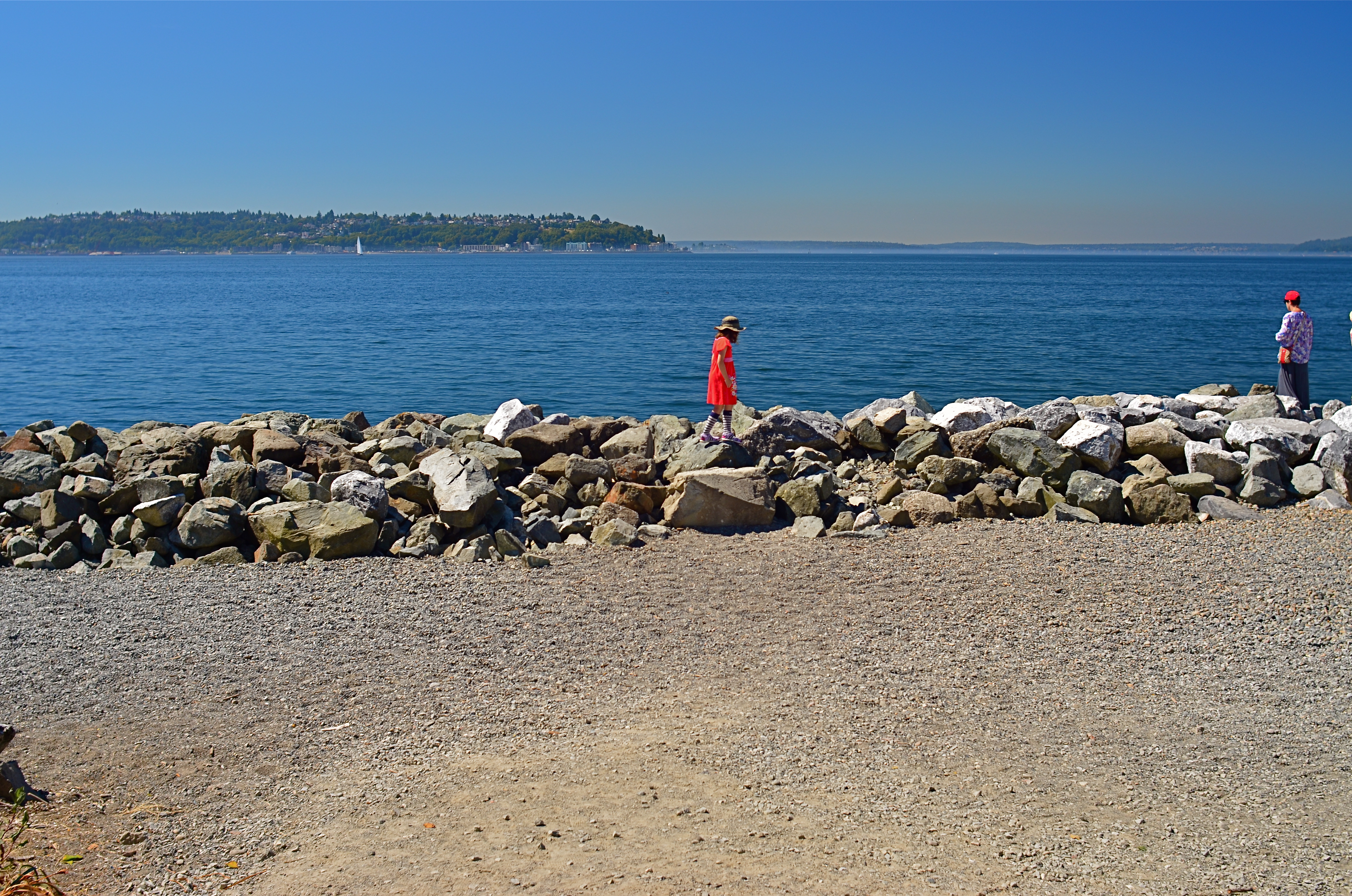
The original composition.
I tend to work with a 24mm prime f/2.8 lens when walking through urban areas. It just captures a wider field within crowded streets, allowing me to grab most vistas without standing in the path of onrushing traffic (a plus) or spending a ton of time re-framing before each shot (a pain). This particular 24 was made in the ’70’s and is both lightning fast and spectacularly sharp, which, being a manual lens, also saves time and prevents mishaps.
24mm, to me, produces a more natural image than the wide end of the more popular 18-55 kit lenses being sold today, since there is less perspective distortion (straight lines remain straight lines). However, since it is a wide-angle, front-to-back distances will appear greater than they are in reality, so that things that are already in the distance seem even more so. And, since it is also a prime, there is no zooming. In the case at left, I wanted the girl’s bonnet, dress and presence on those rocks, but, if I was going to get any picture at all, plenty of other junk that I didn’t need would have to come along for the ride.
You deal with the terms in front of you at the time. Without a zoom, I either had to take the shot, with the idea of later cropping away the excess, or lose it altogether. There are times when you just have to visualize the final composition in your mind and extract it when it’s more convenient. Simply capture what you truly need within a bigger frame of stuff you don’t need, and fix it later. It’s a cornball cliché, but the only shot you are guaranteed not to get is the one you don’t go for. And this is also a good time to remember that it’s always smart to shoot at the biggest file size you can, allowing for plenty of pixel density even in the aftermath of a severe crop.
You can’t pre-plan all the potential pitfalls out of a photo vacation. Can’t be done. Come as close as you can, and trust your eye to help you rescue the outliers down the road.
But take the shot.
DECONSTRUCTING THE CARD
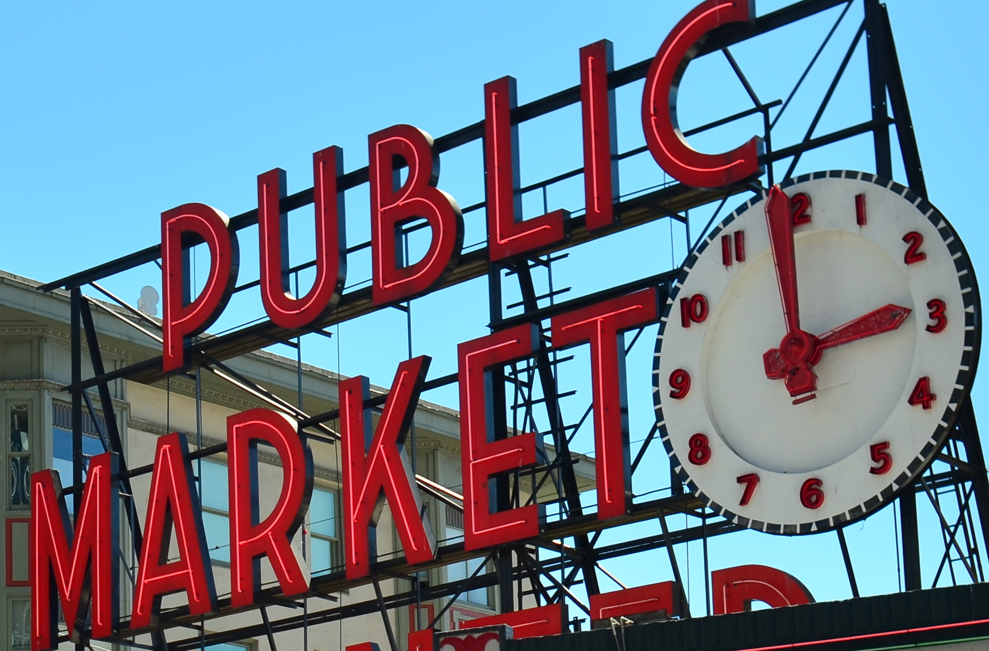
The standard view of Seattle’s Public Market
By MICHAEL PERKINS
WE HAVE ALL PLAYED THE CHILDREN’S GAME OF REPEATING A WORD UNTIL IT BEGINS TO SOUND FOREIGN, OR SILLY, to be drained, in fact, of all real meaning. Context being everything, no less in photography than in any other form of expression, we can often make images that, because they have been so endlessly replicated over the years, become drained of their power, and beg for a re-imagining.
In brief, some things have been photographed so many times that they need to be taken far out of context to rebirth them as vital subject matter.
Look around the next airport souvenir shop you encounter. Look at the paperweights, the tee-shirts, the memorial shot glasses. There, in a moment, you see the symbols of the town you’re visiting (or leaving), reduced to the most hideous kitsch ever created. Lady Liberty. The Space Needle. San Francisco trolleys. You can’t “do” the towns in which these icons hold court unless you visit them and crank off a few snaps. They’re “to do” items, but not “must do”‘s. And every depiction of them is post-card standard, seen from a certain angle and in a certain orientation.
Sadly, many of these sights still could hold the symbolic power they once had, except that few of us are demanding that said power be brought forth. Ironically, we approach totally unknown subjects, things we blithely stumble onto, with the freshest eyes, not knowing the “correct” way to visualize them. We produce instinctual reactions based on how and where we first saw a thing, without the accumulated cultural baggage about how it’s “supposed” to look. We visualize it personally, rather than measuring it against the standard of thousands of other images taken of it.
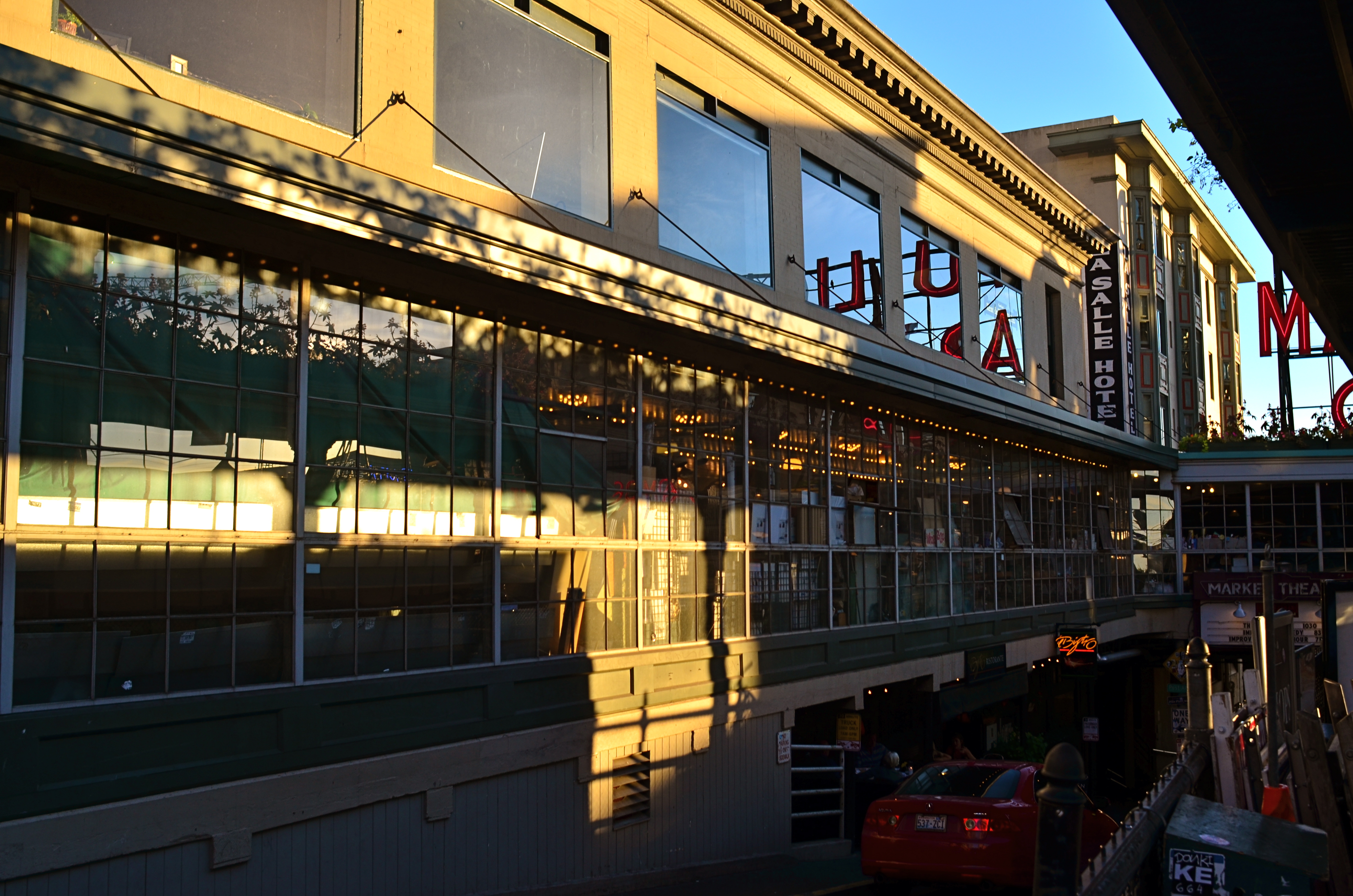
The market sign is still “there” in a sense that is known to the average viewer, but now it really is part of a market “place”.
So how to photograph the over-documented icon? Well, for one thing, the “postcard” view, the one in the travel brochures, must be abandoned completely. Instead of making it a homework assignment to visit a well-known place, why not assume you’ll get one random, fleeting glance at it….through a dirty window, a picket fence, a reflection in a window….and have that be your only chance to photograph it. Instead of trying to get the image “right”, pretend that you have never seen this thing, whether it be a temple or a tower. And imagine, further, that you didn’t even know the thing existed, but that, upon rounding a blind corner, you were suddenly forced to react to it.
As seen at the top of the page, the sign for Seattle’s famed Public Market is often photographed as if it were the market itself, filling the frame of many photos with just its giant red neon letters. In reality, it is a small component in a vital, bustling neighborhood filled with rich visuals. Why not merely suggest the sign as part of a larger tapestry? More importantly, what is your vision?
One great advantage in making new images of old icons is that you know so much of the standard view of the thing that, in abstracting it, you know the viewer will still follow you on the journey….that is, they can make the leap from the literal to the symbolic. It’s like improvising a jazz solo on a well-known melody.
Visualization is the photographer’s most important skill, but occasionally, re-visualization is even more vital…and revitalizing.
BURDEN OF PROOF
Reverse Shadows (2015) Originally conceived in color, later converted to black and white. Luckily, it worked out, but, shooting this image anew, I would execute it in monochrome from start to finish. Every story has its own tonal rules.
By MICHAEL PERKINS
THE WORLD OF PHOTOGRAPHY’S EMBRACE OF COLOR, which now seems instinctual and absolute, is actually a very recent thing. The arrival of color film stock targeted to the amateur market barely reaches back to the 1920’s, and its use in periodicals and advertising didn’t truly begin to outdistance color illustration until well after World War II. Color in so-called “serious” or “art” photography existed on the margins until half-way through the 1960’s, when hues, like every other element of the contemporary scene, gloriously exploded, creating a demand for color from everyone, amateur to pro. The ’60’s was also the first decade in which color film sales among snapshooters surpassed those of black and white.
Today, color indeed seems the default choice for the vast majority of shooters, with the “re-emergence” or “comeback” of black and white listed among each year’s top photo trend predictions. The ability to instantly retro-fit color images as monochrome (either in-camera or in-computer), has allowed nearly anyone to at least dabble in black & white, and the tidal wave of phone apps has made converting a picture to b&w an easy impulse to indulge.
And yet we seem to be constantly surprised that black & white has a purpose beyond momentary nostalgia or a “classic look”. We act as if monochrome is simply the absence of color, even though we see evidence every day that b/w has its own visual vocabulary, its own unique way of helping us convey or dramatize information. Long gone are the days when photographers regarded mono as authentic and color as a garish or vulgar over-statement. And maybe that means that we have to re-acquaint ourselves with b&w as a deliberate choice.
Certainly there has been amazing work created when a color shot was successfully edited as a mono shot, but I think it’s worth teaching one’s self to conceptualize b&w shots from the shot, intentionally as black and white, learning about its tonal relationships and how they add dimension or impact in a way separate from, but not better than, color. Rather than consistently shooting a master in color and then, later, making a mono copy, I think we need to evaluate, and plan, every shot based on what that shot needs.
Sometimes that will mean shooting black and white, period, with no color equivalent. Every photograph carries its own burden of proof. Only by choosing all the elements a picture requires, from color scheme to exposure basics, can we say we are intentionally making our images.
SOFTER AND QUIETER
By MICHAEL PERKINS
THE MEANING OF THE WORD NOISE HAS, IN RECENT YEARS, been expanded beyond its familiar role as an audio term, extending its usage into our visual vocabulary as well. A key shift in photo terminology, as film converted to digital, has been the re-purposing of the word to denote a degradation in quality, with noise replacing grain as the way to describe a less-than-pristine image. Same idea, different wording.
And now, in recent years, I have heard the word used even more widely to denote weaknesses in a composition, describing a picture with too much information or distraction as “noisy”. In a recent post on the blog PhotographyMad.com, you find the following citation:
Often a photo will lack impact because the main subject is so small it becomes lost among the clutter of its surroundings. By cropping tight around the subject you eliminate the background “noise”, ensuring the subject gets the viewer’s undivided attention.
I personally would extend this metaphor to include not only the subject matter within a frame but its color range as well. That means, simply, that too many colors in an image might dilute the effect of a shot as much as the density of its elements, and extends the idea of noise to encompass anything that lessens the communicative power it has for the viewer.

Deflowered (2016). 1/50 sec., f/4, ISO 100, 35mm.
In the above shot, the idea of the composition was to convey the bits of orange peel as some kind of spent or withered flower. I didn’t decide, in advance, to eat an orange in a yellow bowl, but I believe that the same peels in a red bowl might have hardened the look of the shot by calling attention to contrast instead of content. Keeping the entire composition to a two-tone color range (along with a decidedly shallow depth-of-field to reduce the texture detail) rendered it nice and soft. Of course there are a million ways to conceive this image; I just chose this way.
Noise is not merely a technical registration of visual or audio distortion. I think the word has real value if you’re looking to streamline your images. Just think noise=clutter.
Then turn down the volume.
IT’S ALL YOURS
This is not “the” Chrysler Building, but it is “a” Chrysler Building.
By MICHAEL PERKINS
MANY OF THE MOST VALUED ARTIFACTS OF ANCIENT TIMES might not be considered so magnificent if they were not also so rare. The shards of pots found within the burial chambers of the Pharoahs seem remarkable because they are some of the only things that survive the age of their owners. However, were there hundreds, thousands of such sites around the world, these broken bits of pottery might be of less value than the discarded cigarette butts that litter the world’s highways.
Hey, isn’t this blog supposed to be about photography? Well, yeah, give me a little room here.
Photographs are thought to be documents, that is, a literal recording of reality. In fact, almost all of them are interpretations of reality, one person’s individual take on what’s “real”. In the beginning of the medium, pictures were more purely documentary, in that very few people took very few pictures of things unlikely to be photographed by anyone else before they vanished. It would be great to see dozens of different shooters’ interpretation of the battlefield of the Civil War, but, since the medium was not generally in use in the 1860’s, the work of Matthew Brady and his team of field photographers serves as our only record….in fact, as a document.
In the modern day, it is virtually impossible for your photograph of, say, the Empire State Building to be a “document”, since it will never, ever serve as the official or historical record of that structure. Once everyone’s picture is a document, then nobody’s is. You can interpret the building to endless variation, but you have to avoid thinking of the resulting images as “real”, since your own sense of that state defines how you make the picture. The edifice may be public property, but the vision is all yours.
Which brings us back to the Egyptians. Show a chamber filled with burial booty to a 21st-century archaeologist and he’ll exclaim, “let us carefully preserve this living record!”. Show the same room to the average Tut-era housewife and she might say, “get me a broom so I can clear all this junk out of here.” Photographs are your view of “reality”. Only when yours is the only eye on something vanished can it be documentary. Saying that a picture is great because it “looks realistic” is our way of admiring the photographer’s interpretation. That is, we agree with it. But images are more “istic” than they are “real”.
TWO FOR LUNCH
And Then I Told Her… (2016) 1/40 sec., F/5.6, ISO 100, 24mm.
By MICHAEL PERKINS
PHOTOGRAPHS DON’T HAVE TO BE ORGANIZED AROUND SYMMETRY, or even have a discernible “center” to them. However, the eye seems to find comfort in quickly settling on a “starting point” in an image, a place from which to proceed, or to be led to deeper discoveries.Designers for everything from magazine articles to websites toss around terms like visual weight and bottom-up processing to float various theories about how to direct the eye, with each system boasting top efficiency. A balanced pattern near the middle of the picture is thus not necessarily a “must-have”, just a fairly reliable “feels-right”.
By way of demonstration, a photographic center that consists of two people facing each other, talking, is a fairly easy anchor around which to build a straight narrative in an image. As the two heads arc left and right, a rough set of parentheses establish a very basic symmetry, and can help ensure that the middle of the picture engages the eye first. Based on architecture and surroundings, other things in the frame can either enhance or contrast with the symmetry in the middle, and that’s all a matter of taste for the photographer.
Many times a lunch counter or a restaurant gives me the talkers I need, so I tend to be on heightened alert when I enter such places. However, many of the photos I’ve made like this did not originally begin with the two people as the central emphasis: that happened in the cropping process.
In the above image, there actually was enough supportive symmetry from the background so centering the talkers and resizing the photo as a square seemed to be a good overall strategy. Of course, there is no hard and fast rule for these kinds of choices. All than can be said is that, for this picture, in this case, with these elements to work with, centering the conversationalists and placing them at the center of a square made sense. There is an entirely separate case to be made for selective use of the square as a compositional boost, and we’ll deal with than at another time.
Meanwhile, dropping in on two folks for lunch can act as a springboard for a certain kind of picture.
SEPARATE WORLDS
Only As A Last Resort (2016).
By MICHAEL PERKINS
MAYBE IT’S THE TERM ITSELF. MAYBE IT’S HOW WE DEFINE IT. Either way, for photographers, concept of the “still life” is, let’s just say, fluid.
I believe that these static compositions were originally popular for shooters for the same reason that they were preferred by painters. That is, they stayed in one place long enough for both processes to take place. Making photographs was never as time-consuming as picking up a brush, but in the age of the daguerreotype the practice was anything but instantaneous, with low-efficiency media and optical limitations combining to make for looooong exposure times. Thus, the trusty fruit-bowl-and-water-jug arrangement was pretty serviceable. It didn’t get tired or require a bathroom break.
But what, now, is a “still life”? Just a random arrangement of objects slung together to see how light and texture plays off their surfaces? More importantly, what is fair game for a still life beyond the bowl and jug? I tend to think of arrangements of objects as a process that takes place anywhere, with any collection of things, but I personally seek to use them to tell a story of people, albeit without the people present. If you think about museum collections that re-create the world of Lincoln or Roosevelt, for example, the “main subject” is obviously not present. However, the correct juxtaposition of eyeglasses, personal papers, clothing, etc. can begin to conjure them in a subtle way. And that conjuring, to me, is the only appeal of a still life.
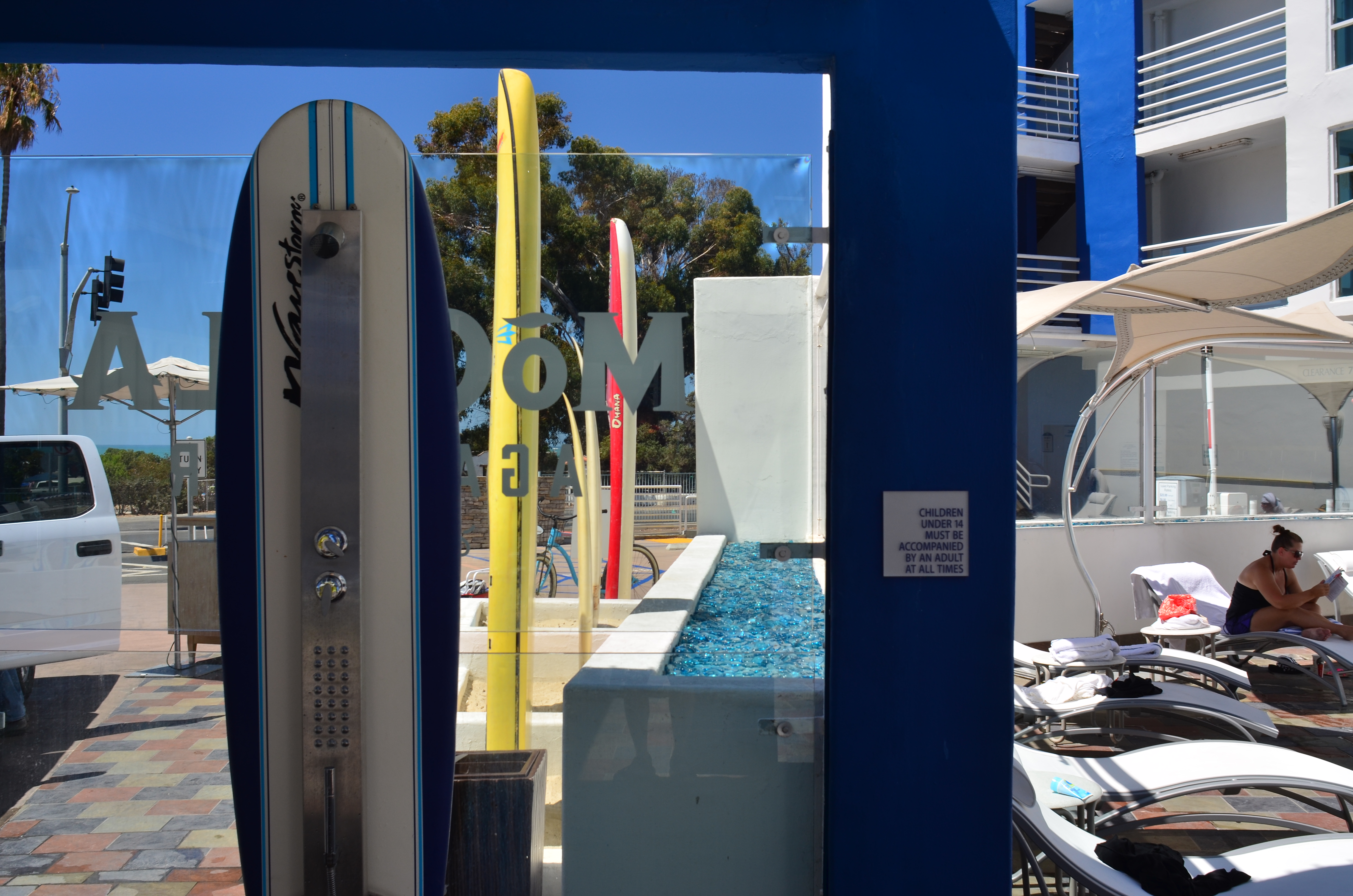
I like to find a natural grouping of things that, without my manipulation or collection, suggest separate worlds, completely contained universes that have their own tools, toys, architecture, and visual vocabulary. In the above montage of angles and things found at a beach resort, I had fun trying to find a way to frame the “experience” of the place, in abstract, showing all its elements without showing actual activities or people (beyond the sunbather at right). The real challenge, for me, is to create associations in the mind of the viewer that supply all the missing detail beyond the surfboards, showers, and sundecks. That, to me, is the real attraction of a still life….or, more accurately, taking a life and rendering it, fairly intact, in a still image.
Hey, it’s not that I don’t like a good bowl of fruit now and then. However, I think that one of photography’s best tricks is the ability to mentally conjure the thing that you don’t show, as if the bowl were to contain just apple cores and banana peels. Sometimes a picture of what has been can be as powerful as freezing an event in progress. But that’s your choice.
Which is another of photography’s best tricks.
COST ANALYSIS
By MICHAEL PERKINS
IT’S SAFE TO SAY THAT, TO DATE, MOST OF THE WRITINGS THAT COMPARE FILM PHOTOGRAPHY TO DIGITAL center on visual or aesthetic criteria. The grain of film, the value range of pixels, the differences in the two types of workflow, the comparative sizes of sensors, and so forth. However, in certain shooting situations, what strikes me as the main advantage of digital is crassly…..monetary.
It’s simply cheaper.
Now, that’s no small thing. Consider that, with film, a very real cost comes attached to every single frame, both masterpiece and miss. Now, try to compute how much film you must consume in order to travel from one end of a learning curve to the other in trying to master a new lens or technique. Simply, every shot on the way to “that’s it!” is a “damn, that’s not it”, and both cost money. Now recall those shoots where the conditions are so strange or variable that the only way to get the right shot is to take lots of wrong ones, and remember as well, that, after clicking off all those frames, you had to wait (with the meter running), until either the processor or your own darkroom skill even told you that you were on the wrong track.
Assume further that you screwed up several rolls of premium Kodachrome before stumbling on the right approach, and that all of those rolls are now firmly in the “loss” column. You re-invest, re-load, and hope you learned your lesson. Ca-ching.
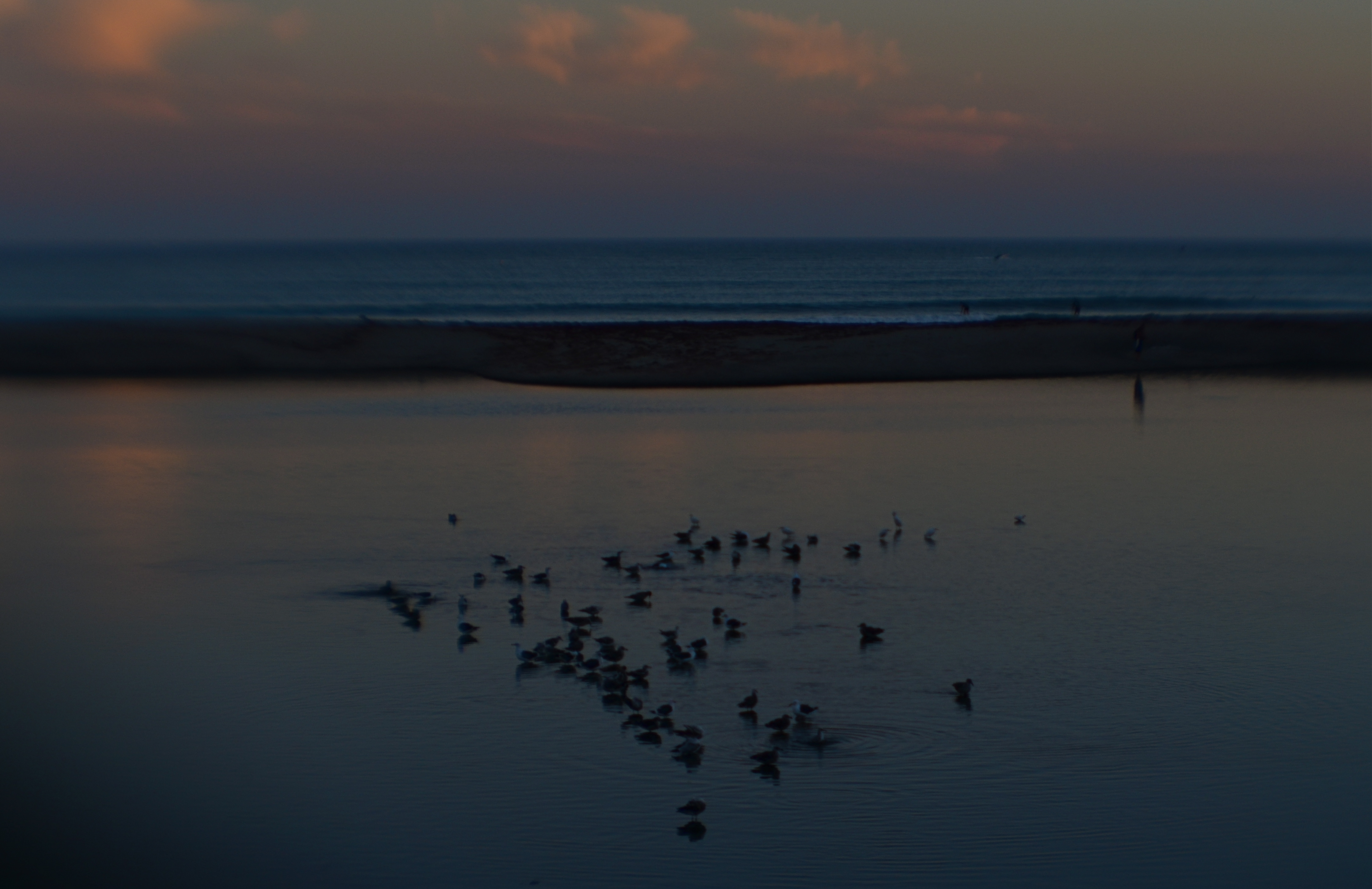
Doheny State Park Beach (2016). Shot at 1/125 sec., f/8, ISO 100, through a plastic 35mm lens.
The shot that you see above demonstrates why shooting in digital speeds up your practice time, at a fraction of the cost of film, while giving you feedback that allows you to adjust, shoot, and adjust again before the conditions in front of you are lost. What you see is a late dusk on a dark lagoon just inland of a stretch of ocean in Point Dana, California, strewn with waves of bathing birds and shifting pools of ripples. The pink of the clouds on the horizon will be gone in a matter of minutes. Also, I’m shooting through a narrow-gauge opening in a chain-link fence, causing dark vignettes on every other shot. Moreover, I’m using a plastic lens, making everything soft even softer, especially at the edges.
So add all these factor together and the emotional curve of the shoot is click-damn-click-whoops-click-click-damn. But, since it’s digital, the bad guesses come back fast, and so does the ability to adjust. Bottom line: I know I will likely walk away with something generally usable.
More importantly, photography no longer has the power to price so many of us out of the practice. That means that more images make it to completion, and, of course, that can also mean a global gallery flooded with mediocrity. Hey, I get that. But I also get a fighting chance at grabbing pictures that used to belong only to the guy who could afford to stand and burn twelve rolls of film.
And hope like hell.
A THING OF THE MOMENT
By MICHAEL PERKINS
CAN YOU TRAIN YOUR EYE TO SEE FASTER? Now, by “seeing”, I mean a process which effectively goes beyond the mere reception of light or visual information, something unique to the process of photography. I’m asking if you can, in effect, train the eye to, if not actually see faster, to more efficiently communicate with the brain and the hand in selecting what is important, so more rapidly apprehend the fleeting moment when a picture must be made.
I’m talking about the gradually learned trick of deciding quicker what you want and when it might be near at hand.
Much has been written about Henri Cartier-Bresson’s idea of “the decisive moment”, the golden instant in which viewpoint, conditions, and subject converge to be especially eloquent….to be, in effect, the only true artistic moment at which a photograph can be taken. Many reject this idea out of hand, saying that there are many potential great opportunities in the space of even a few seconds, and that the lucky among us grab at least one now and then. For those people, it’s not so much “the” moment as “a” moment.
Whatever the nature of the near-perfect shot is, sensing when one is imminent isn’t magic, and it isn’t accidental. It’s also not guaranteed by talent or luck. It has to be the result of experience, more specifically, lots of unsatisfying experience. Because I feel that the pictures you didn’t get are far more instructive than the ones you did, simply because you burn more brain cells on the mysteries of what went wrong than you do on the miracle of getting things right.
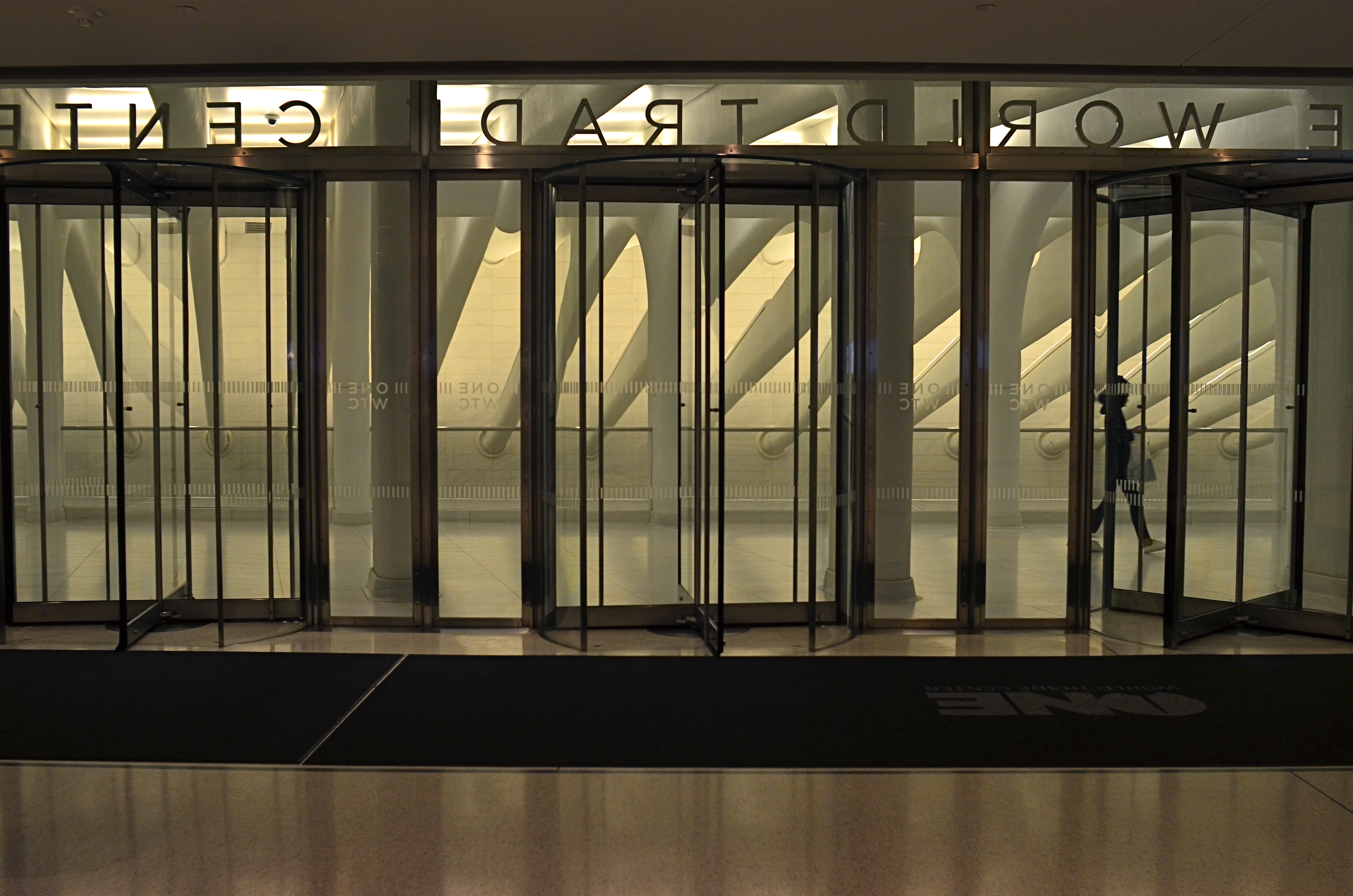
Center Trade World (2016)
This image is neither the result of great advance planning nor of great fortune: it’s somewhere in the middle, but it does record an instant when everything that can work is working. The light, the contrasting tones of white and gray, the framing, the incidental element of the passing tourist….they were all registering in my mind at the precise instant before I snapped the frame.
This does not mean I was totally in charge of the process: far from it. But I knew that something was arriving, something that would be gone in less than a second. Also, the elements that were converging to make the image were also in flux, and, having moved on, would result in something very different if I were to take a second or third crack at the same material.
For a photographer, it’s a little like surfing. You take lots of waves, with the idea that any of them can deliver the ride of your life. But, on any given day, all of them could be duds. However (and this is the part about a trained eye), you can learn to spot the best waves faster and faster, converting more of them to great rides. And making pictures is much the same process. You can’t absolutely analyze what will make a picture work, but you can learn to spot potential quicker, on some level between intentional and accidental.
EXTRACTION
Grape Cooler (2016)
By MICHAEL PERKINS
FOR SOME, UTTERING THE WORD ABSTRACTION ALOUD is like saying bringing up politics at a family get-together, in that it forces people to take sides, or to account for their taste in front of others. And when you tie that scary word to art, specifically photography, people start to forget about making pictures, and begin wondering “what it all means”, or, worse, what an image is “supposed to be about”. We start making photos like regimented school children, all of us coloring the sun the same yellow and always drawing people with eyes in the same part of their face.
Color assignments, as well as light and dark relationships, are all subject to interpretation.
Instead of using the term abstraction to describe the idea of seeing something differently, I prefer the word extraction, as if we are pulling something different out of a subject. And it’s really not that academic. When we abstract/extract something, we are changing the relationship between the object and how we typically view it. Can showing just part of its shape register in our brains differently than viewing the entire thing? If I interpret it in monochrome versus color, can I re-shape the way you look at its positive (light) or negative (dark) space?
In abstracting/extracting, aren’t we really acting like designers, taking the familiar and rendering it unfamiliar to look at how it’s made and how we interact with it? Just as a designer might decide to create a different kind of teapot, can’t we take an existing teapot and change the way it impacts the eye? That’s all extraction is; one more way to shuffle the deck.
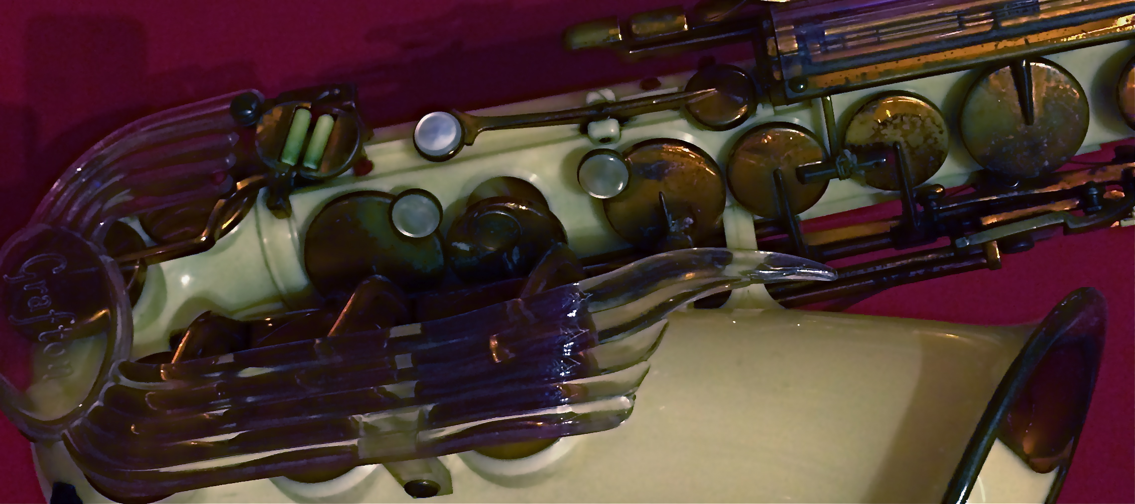
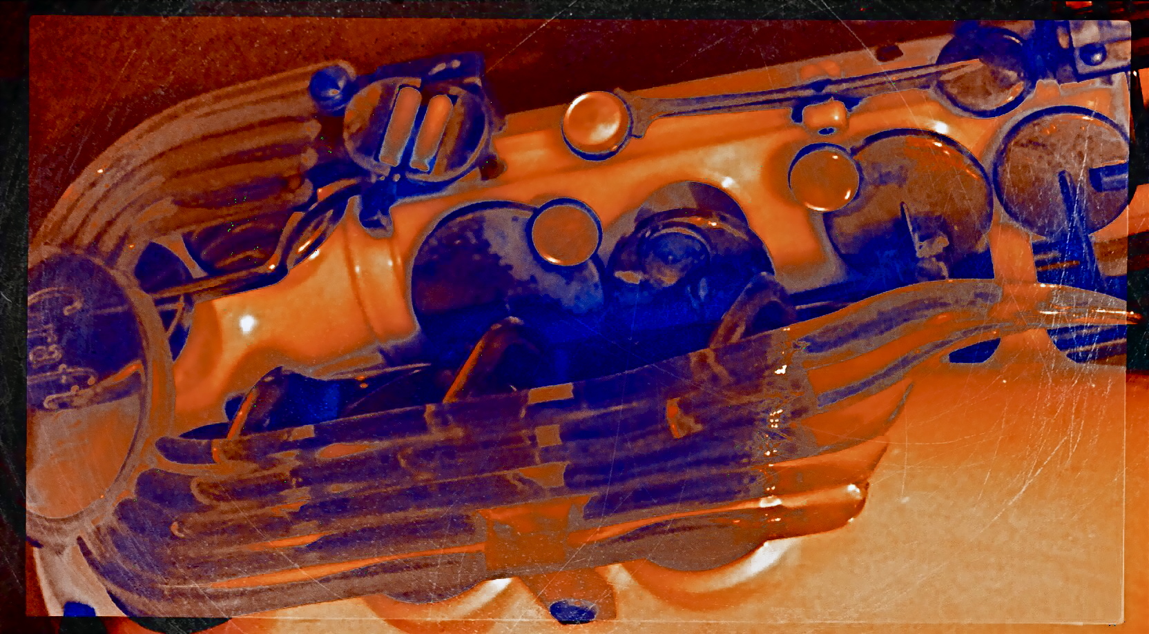
The object at the top of the page, a rare injection-molded plastic saxophone from the 1940’s, had already been “abstracted” by its designer, since we all have a traditional way of visually “knowing” that instrument. That is, it’s supposed to be brass-colored metal, curve in such-and-such a fashion, and feature ornamentation of a set type. Prominently, the designer re-ordered the sax’s features… in plastic, with browns and purples arranged in a fluid, stylized flow of elements. That means, that, as a photographer, I begin with my own set of expectations for the object already substantially challenged. Further, in photographing it, I can rotate the sax, compose it in the frame in an alternate fashion, reassign or intensify its colors, or, as in the small insert(which is a composite of a color negative, a monochrome negative, and a color positive), even change the relationship between surface and shadow.
There is a reason why even the police “abstract” a face into two interpretations, using both head-on and profile views in mug shots. Fact is, when you choose the viewpoint on an object, you change the interpretation of how the eye “learns” it. You extract something fresh from it . That’s the nature of photography, and scary words like “abstract” shouldn’t halt the ongoing conversation about what a picture is…or isn’t.
OH, BABY, BABY, IT’S A WIDE WORLD
By MICHAEL PERKINS
WHEN USING WIDE-ANGLE LENSES, we believe that we are revealing more “reality”. That is, we began to think that a narrower aspect ratio is somehow “hiding” or clipping off visual information, whereas a wide allows us to “see everything”. But once you’ve shot with a wide-angle for a while, you realize that it’s, at best, a trade-off. The lens giveth and the lens taketh away.
Wide-angles do, certainly, increase the view from left to right, but, in so doing, they add their own little quirks, such as softer resolution along the edges, chromatic aberration, barrel distortion (that feeling that straight lines are bending outward at the sides of the frame), and an exaggeration of the distance between the front and back of the shot.
Bearing all this in mind, I feel that, since a pretty wide lens, the 18-55mm, is now included with nearly every DSLR camera kit, it’s important to see wides as both an aid to showing reality and an effective tool for interpreting or altering it. Think of your wides as art glass, as effects lenses, and you open up your mind to how it can not only record, but comment on your subject matter.
Fisheye lenses demonstrate what all wide-angles do: create an unreal look that can be managed and massaged to fit your ends.
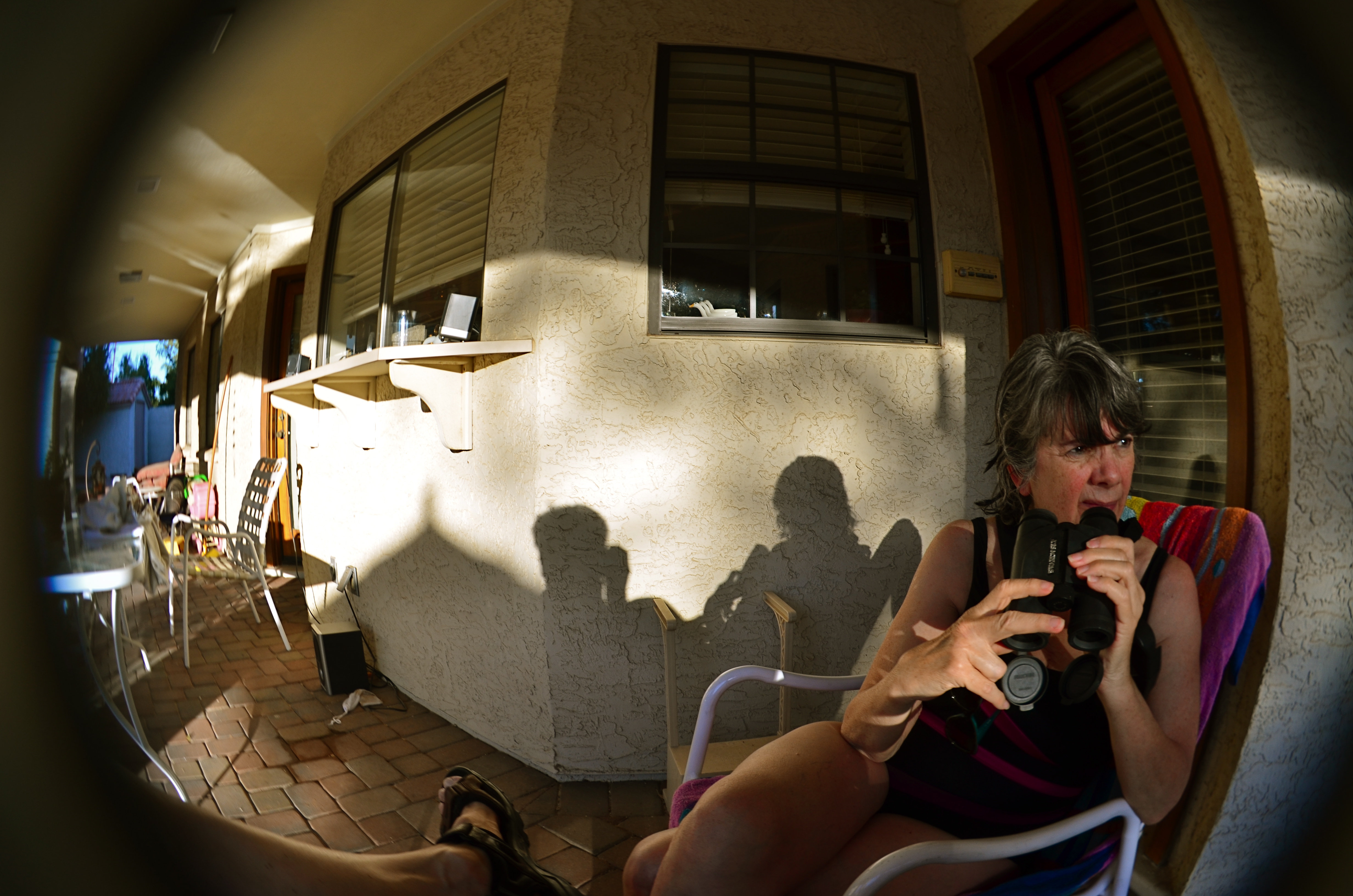
And, let’s take it a step further, as in when wides become ultra-wides, as in the 8 to 12mm range, where the lens becomes a true fisheye. Now we’re consciously aware that we’re using an effects lens, something that is designed specifically for a freakish or distorted look. And now we have to challenge ourselves in a different way.
The standard fisheye shot is a self-contained orb, a separate universe, within which everything radiates distortion outward from the center concentrically, like a kaleidoscope or a paper snowflake. But a fisheye frame can also be composed to combine all the left-right, back-front information of a standard wide-angle (more narrative space) while also playing to the surreal look of something designed to challenge our visual biases of what’s “real”. The effect can also, as in the above image, forcefully direct the viewer’s eye to see along very precise channels. In this picture, the action of the shot begins at the right front, and tracks diagonally backwards to the left year, with the focus softening as you look from “important” to less “important”. The drama in the woman’s face is also abetted by the unnatural dimensions of the image, like one part of a nightmare serving to stage another part.
Wide-angle lenses can conceal and interpret, not just reveal. They allow us to see more from left to right, but there is a lot of wiggle room in how we show it. You have to accept the idea that all optics are distortions of reality to some degree, and make the bias of your particular glass serve your narrative goals.
CUES AND CLUES
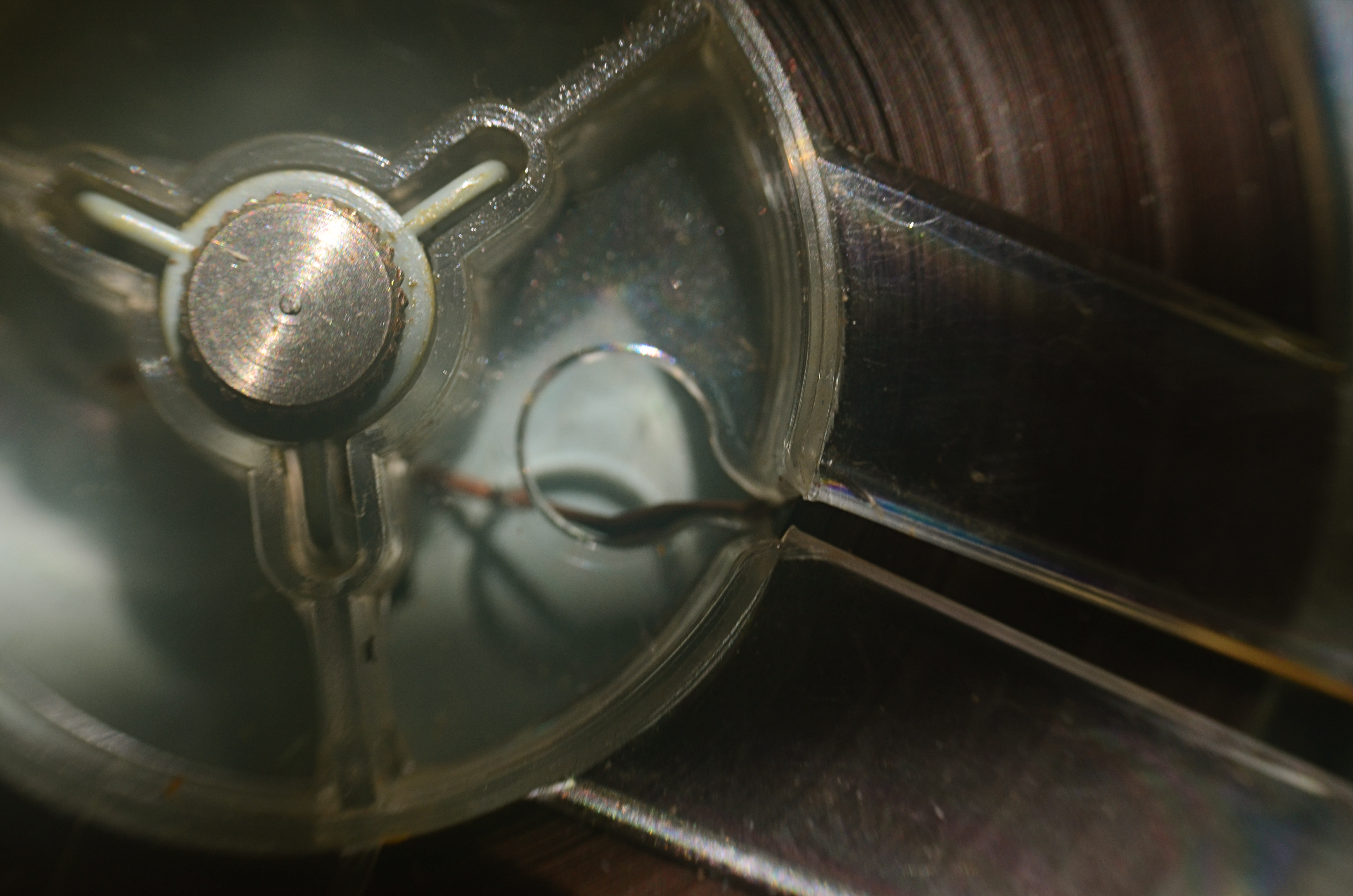
Good Morning, Mr. Phelps (2016). How little of a tape recorder need be shown to convey a sense of that object?
By MICHAEL PERKINS
SAY THE WORD “MINIMALISM” TO SOME PHOTOGRAPHERS, and you conjure visions of stark and spare compositions: random arrangements of light blobs, stray streaks of shadow, or scattered slivers of light, each conveying mood more than content. For some, these images are a kind of “pure” photography, while, for others, they are, to use a nice word, incoherent. Part of us always wants a picture to be, in some way, about something, and the word minimalism is charged, positively or negatively, depending on whether that “narrative thing” happens.
I actually associate minimalism with the formal storytelling process, but doing so with the fewest elements possible. It seems like a natural evolution to me, as I age, to make pictures talk louder with fewer parts. Simple cropping shows you how much more you can bring to an image by taking more of it away, and, with closeups and macro work, the message seems even clearer. Why show an entire machine when a cog carries the same impact? Why show everything when suggesting things, even leaving them out entirely, actually amps up the narrative power of a photograph?
Of course there are times when mere shape and shadow can be beautiful in themselves, and it doesn’t require a lot of windy theorizing to justify or rationalize that. Some things just are visually strong, even if they are non-objective. But minimalism based on our impressions or memory of very real objects, from a pocket watch to a piece of fruit, can allow us to tell a story with suggestions or highlights alone. If something is understood well enough, just showing a selectively framed slice of it, rather than the thing in its entirety, can be subtly effective and is worth exploring.
In the above image, you certainly understand the concept of a tape recorder well enough for me to excise the device’s chassis, controls, even half of its reel mechanism and still leave it “readable” as a tape recorder. You may find, upon looking at the picture, that I could have gone even farther in simplifying the story, and in your own work, you can almost certainly suggest vast ideas while using very small bits of visual information. Knowing the cultural cues and clues that we bring with us to the viewing process tells you how far you can stretch the concept.
FAILING TO SEE THE BIG PICTURE
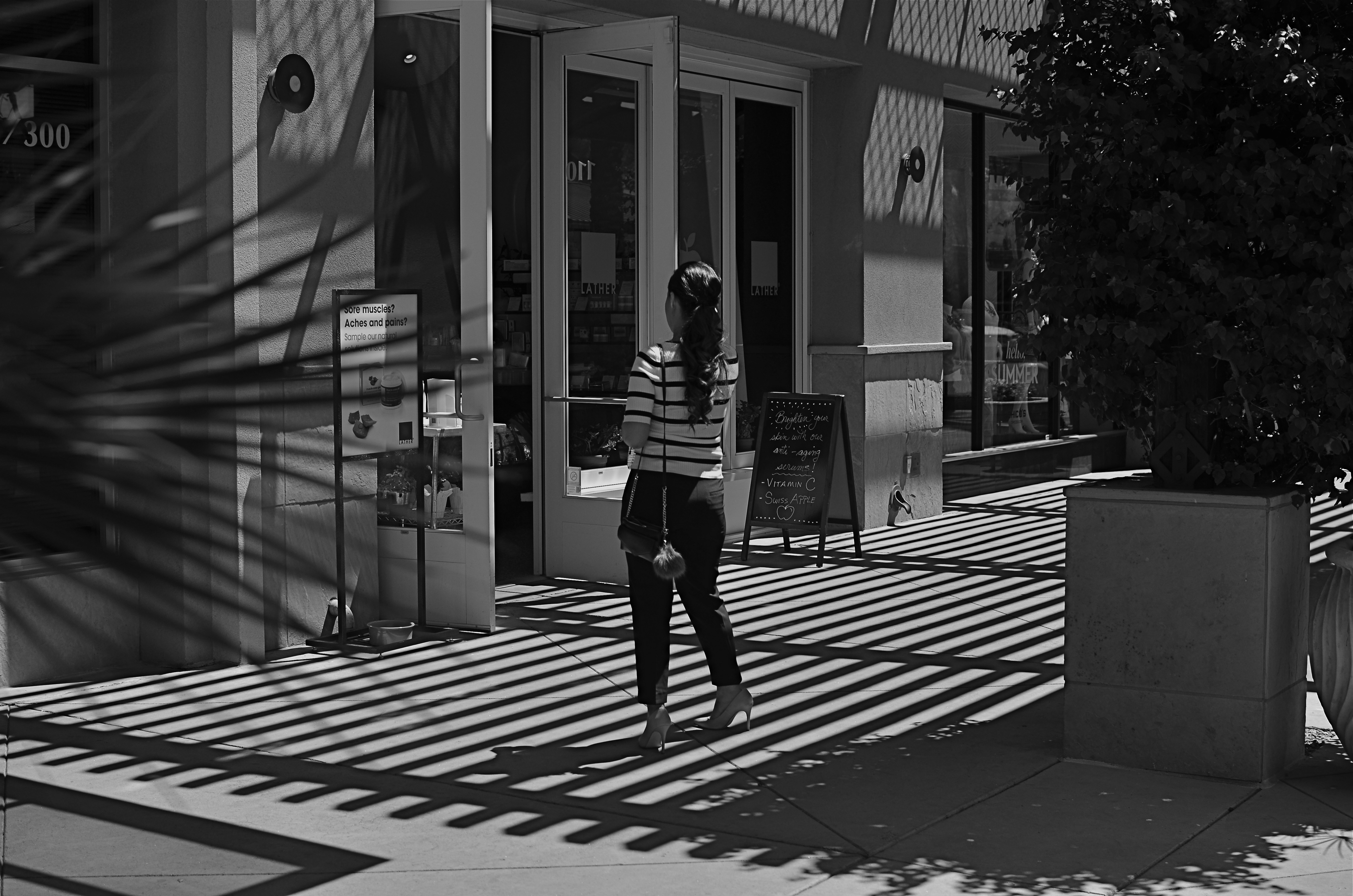
This image lingered in the “maybe” pile for a while. Then I started to see how much of it was expendable (see below).
By MICHAEL PERKINS
IT’S ENTIRELY POSSIBLE THAT MANY A WORKABLE PHOTOGRAPH HAS ONLY BEEN RENDERED SO BECAUSE OF SHEER BOREDOM. Face it: there are bound to be days when nothing fresh is flowing from one’s fingers, when, through lack of anything else to do, you find yourself revisiting shots that you 1) originally ignored, 2) originally rejected, or 3) were totally confounded by. Poring over yester-images can occasionally reveal something salvageable, either through processing or cropping, just as they can more often lead one to want to seal them up behind a wall. Even so, editing is a kind of retro-fitted variation on composition, and sometimes coming back around to a picture that was in conceptual limbo can yield a surprise or two.
I’m not suggesting that, if you stare long enough at an image, a little golden easter egg will routinely emerge from it. No, this is where luck, accident, and willpower usually converge to sometimes produce…..a hot mess, and nothing more. But leaving a picture for a while and returning to it makes you see with the eye of the outsider, and that can potentially prove valuable.
In the above shot, taken a few months go, I had all this wonderful gridded shadow texture presenting itself, shading what was otherwise a very ordinary stretch of sidewalk. A thought emerged that the stripes in the woman’s short might make an interesting contrast with the pattern of the shadows, but, after cranking off a frame or two, I abandoned the idea, just as I abandoned the shot, upon first review.
Several big bites of the scissors later…
Months later, I decided to try to re-frame the shot to create a composition of one force against another…..in this case, the verticality of the lady’s legs against the diagonal slant of the shadows. That meant paring about two-thirds of the image away. Originally I had cropped it to a square with her lower torso at dead center, but there seemed to be no directional flow, so I cropped again, this time to a shorter, wider frame with the woman’s form reduced to the lower half of her legs and re-positioned to the leftward edge of the picture. Creating this imbalance in the composition, which plays to the human habit of reading from left to right along horizontal lines, seemed to give her a sense of leaving the shadows behind her, kind of in her wake if you will. At least a little sense of movement had been introduced.
I felt that now, I had the tug of forces I had been seeking in contrasting her blouse to the opposing grid in the master shot. I’m still not sure whether this image qualifies as having been “rescued”, but it’s a lot less busy, and actually directs the eye in a specific way. It will never be a masterpiece, but with the second sight of latter-day editing, you can at least have a second swipe at making something happen.
THE FLAWED CHILD or the fine art of self-photobombing
By MICHAEL PERKINS
WORKING WITH TIME EXPOSURES IS A LITTLE LIKE THE EXPERIENCE PILOT TRAINEES GET the first time they are aboard a weightlessness simulator. You know that you’re outside the general rules of “reality”, and yet some kind of natural law is still in force. That is, as much fun as it is floating like a feather around the cabin, it still hurts if you slam your head into the ceiling. It’s just that, under normal circumstances, you wouldn’t be close enough to the ceiling to have to think about smacking into it.
Yeah, time exposures are like that.
Most of what we intuitively “know” about photo-making is based on a concept of exposure time that is pretty close to “instantaneous”, so we tend not to plan for what can occur when the shutter is stuck open for extended periods. Even a few seconds can introduce a very different relationship between light and dark, as well as the various non-stationary factors like wind, people, traffic, etc., that can create artifacts as they walk through our work area.
A kind of weird calculus, borne of trial and error, comes into play. For example, we know that cars rolling through a time exposure may be moving too quickly to be seen in the final picture, while their headlights will leave a glowing trail. We know that people walking into the shot at the correct speed can vanish to complete invisibility or register as smeary ghosts. It all has to be measured against how long you need for your camera to be sponging up light, and how standard, onwardly moving reality interacts with that process.
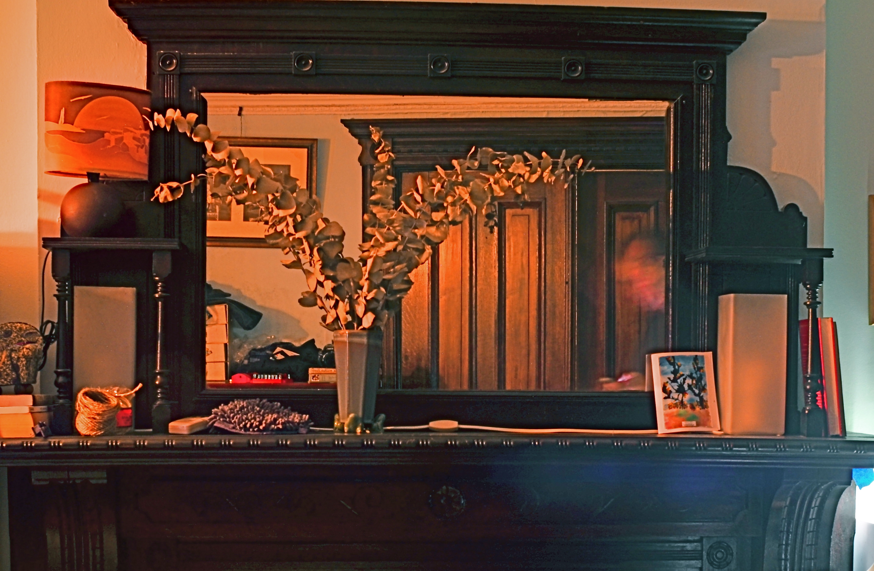
Monu-mantel (2016): A 36-second time exposure with an unscheduled guest appearance (inside the mirror’s right lower frame) by your humble author.
Recently I tried a layered still-life in the darkest room since, well, since darkness, and I knew that I would have to open for a long time. In trying to take a frame that included both a crowded, mirrored mantel in front of me, and the bureau and pictures from behind me that were reflected in the mirror, I balanced my camera on said bureau (you can see it to the left of the vase) and started experimenting with exposure times. Half a dozen or so tries later, I thought I’d nailed the magic number, but, in counting out the time in my head, I got distracted and walked partway into the shot, lingering just long enough to be recorded as the lighter sheen on the right front of the mantle and the facial smear in the right side of the mirror.
Again, we’re back in the weightlessness simulator. Different rules apply here in Oz, Dorothy. So, this picture is forever in the category of How To Get Out Of Your Own Way…..one of those flawed photographic children, that, while not quite flawed enough to merit being sent to military school, will also never be the favored kid, either. Joys of parenthood and all that.
ADDITION BY SUBTRACTION
By MICHAEL PERKINS
PHOTOGRAPHIC COMPOSITION IS A CONSCIOUS PRIORITIZING OF EVERYTHING WITHIN A PICTURE’S FRAME, a ruthless process of demanding that everything inside that square justify its presence there. When we refer to the power of an image, we are really talking about the sumtotal of all the decisions that were made, beforehand, of what to include or lose in that image. Without that deliberate act of selection, the camera merely records everything it’s pointed at. It cannot distinguish between something essential and something extraneous. Only the human eye, synched to the human mind, can provide the camera with that context.
Many of our earliest photographs certainly contain the things we deem important to the picture, but they also tend to include much too much additional information that actually dilutes the impact of what we’re trying to show. In one of my own first photos, taken when I was about twelve, you can see my best friend standing on his porch…absolutely…..along with the entire right side of his house, the yard next door, and a smeary car driving by. Of course, my brain, viewing the result, knew to head right for his bright and smiling face, ignoring everything else that wasn’t important: however, I unfairly expected everyone else, looking at all the auxiliary junk in the frame, to guess at what I wanted them to zero in on.

Heritage, 2016.
Jump forward fifty years or so, to my present reality. I actively edit and re-edit shots before they’re snapped, trying to pare away as much as I can in pictures until only the basic storytelling components remain….that is, until there is nothing to distract the eye from the tale I’m attempting to tell. The above image represents the steps of this process. It began as a picture of a worn kitchen chair in a kitchen, then the upper half of the chair near part of a window in the kitchen, and then, as you see above, only part of the upper slats of the chair with almost no identifiable space around them. That’s because my priorities changed.
At first, I thought the entire kitchen could sell the idea of the worn, battered chair. Then I found myself looking at the sink, the floor, the window, and…oh, yeah, the chair. Less than riveting. So I re-framed for just the top half of the chair, but my eye was still wandering out the window, and there still wasn’t enough visible testimony to the 30,000 meals that the chair had presided over. So I came in tighter, tight enough to read the scratches and discolorations on just a part of the chair’s back rest. They were eloquent enough, all by themselves, to convey what I wanted, without the rest of the chair or anything else in the room to serve as competition. So, in this example, it took me about five trial frames to teach myself where the picture was.
And that’s the point, although I still muff the landing more often than I stick it (and probably always will). To get stronger compositions, you have to ask every element in the picture, “so what do you think you’re doing here?” And anyone who doesn’t have a good answer….off to the principal’s office.

ALL THAT REMAINS
By MICHAEL PERKINS
THE HISTORY OF PHOTOGRAPHY IS ALSO THE HISTORY OF A STRANGELY INTIMATE DANCE WITH DEATH, a fascination with its look, its effects, its ability to transform both man and materials, mood and matter. From the first images of combat in the mid-nineteenth century to today’s Instagram chronicles of turmoil and trauma, we have tried to testify about how the world changes when we, or others like us, pass out of existence. The process is a constant rug-of-war between intimacy and publicity, between the glare of public destruction and the privacy of inner oblivion. And the pictures that result are arguments, quarrels with ourselves, which can never truly be settled.
There seems to have been a shift over the past few decades in how we grieve, or at least in the visual vocabulary of that grief that we choose to put on display. The quiet graveside memorials of eras past seems to have been supplanted by increasingly public vigils. We cry our tears in front of each other now, and the creation of instantaneous, group-generated shrines has become a bizarre kind of performance art, as visible as graffiti, and as personal as each man’s ending. Whether it takes the form of mountains of teddy bears stacked around an accident site or candle-lit collages of mementos offering mute testimony from well-meaning strangers, mourning is now something we experience globally, tribally. John Donne’s 1624 sentiment that “every man’s death diminishes me” seems, in the present day, eerily prescient.
Flags, plaques, praise, prizes. Does all this add up to a life?
I recently drove past an improvised memorial for a deceased high school student. I knew nothing of his life beyond what his friends decided to collect to mark its passing. And so, visually, I was presented with a puzzle. What specific articles can be used to symbolize a life? Conversely, what should be excluded? How does an object that says something for one person presume to speak for he who has been silenced?
I made the shot you see here in as plain and reportorial a fashion as I could, shooting it head-on, in the manner of Walker Evan’s iconic images of signs and posters from the 1930’s. The only interpretive factor here, really, is the light in which I chose to shoot, deciding that sunset would help boost texture in the shot, and, incidentally, serve as a kind of metaphor. Make of that what you will.
Some pictures don’t need people in them to speak loudly for them. Today’s collectively assembled registries of loss are, in themselves, interpretive statements, not unlike paintings, editorials, or eulogies. Acknowledging them in pictures seems less like invasion and more like reportage, since they are clearly designed to be seen, to bear witness. The fact that they are anonymous makes them intriguing. The fact that they are so intensely personal makes them photographically essential.
Share this:
June 26, 2016 | Categories: Americana, Available Light, Composition, Conception, Documentary | Tags: Commentary, editorial photography, photojournalism, popular culture, trends | Leave a comment