(DON’T) WATCH THIS SPACE
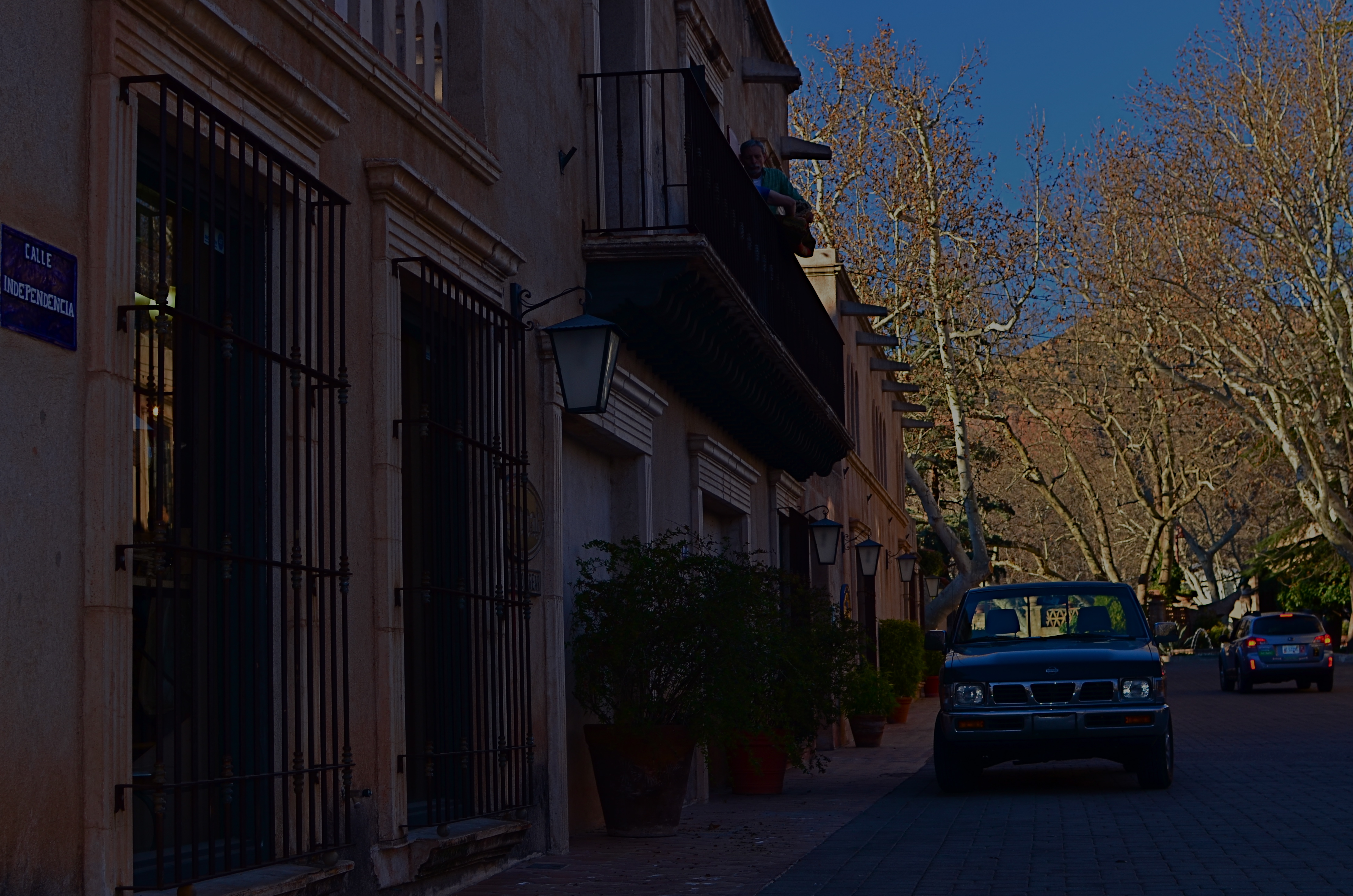
Calle Independencia, 2015.
By MICHAEL PERKINS
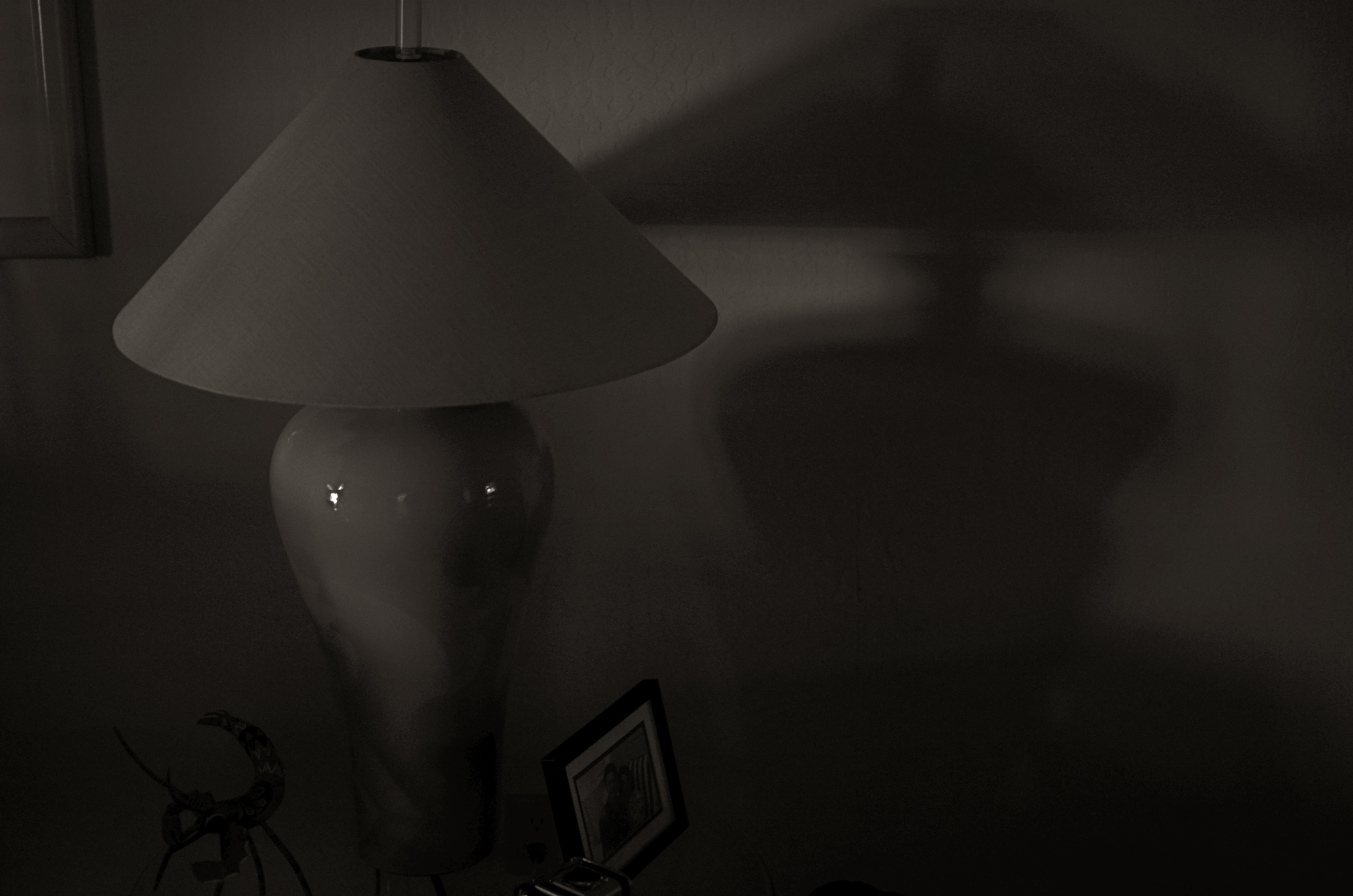
CALL IT “EYE-HERDING”, if you will, the art of channeling the viewer’s attention to specific parts of the photographic frame. It’s the first thing we learn about composition, and we address it with a variety of techniques, from depth-of-field to color manipulation to one of my favorites, the prioritizing of light. Light values in any image do have a hierarchy, from loud to soft, prominent to subordinate. Very few photos with uniform tone across the frame achieve maximum impact. You need to orchestrate and capitalize on contrast, telling your viewers, in effect, don’t watch this space. Watch this other space instead.
In many cases, the best natural ebb and flow of light will be there already, in which case you simply go click, thank the photo gods, and head home for a cold one. In fact, it may be that “ready to eat” quality that lured you to stop and shoot the thing in the first place. In many other cases, you must take the light values you have and make the case for your picture by tweaking them about a bit.
I have written before of the Hollywood fakery known as “day for night”, in which cinematographers played around with either exposure or processing on shots made in daylight to simulate night…a budgetary shortcut which is still used today. It can be done fairly easily with still images as well with a variety of approaches, and sometimes it can help you accentuate a light value that adds better balance to your shots.
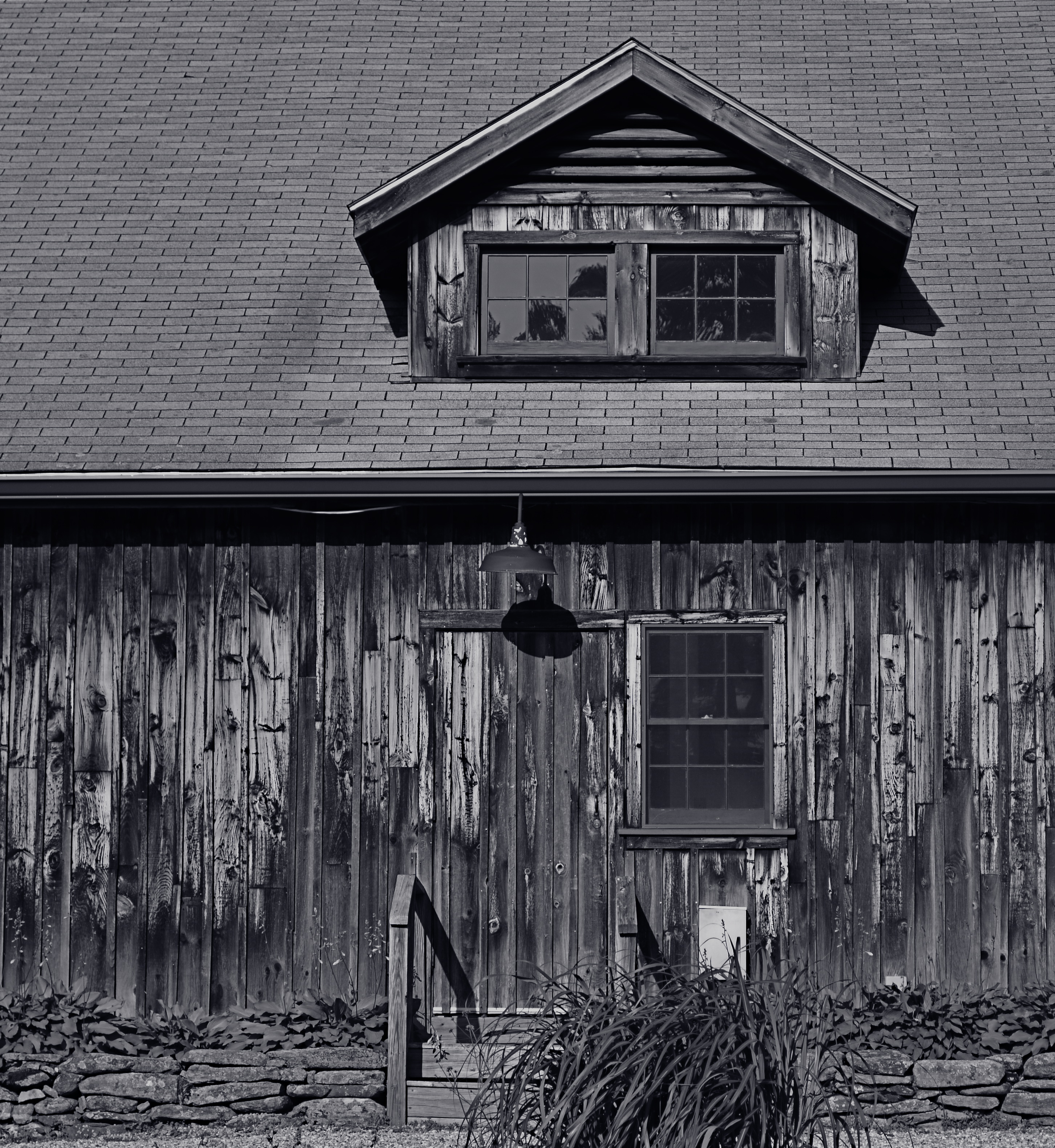
The image at the top of this page was made in late afternoon, with pretty full sun hitting nearly everything in the frame. There was some slightly darker tone to the walls in the street, but nothing as deep as you see here. Thing is, I wanted a sunset “feel” without actually waiting around for sunset, so I deepened the overall color and simulated a lower exposure. As a result, the sky, cliffs and dogwood trees at the far end of the shot got an extra richness, and the shop walls receded into deeper values, thus calling extra attention to the “opening” at the horizon line. The shot also benefits from a strong front-to-back diagonal leading line. I liked the original shot, but with just a small change, I was asking the viewer to look here a little more effectively.
Light is a compositional element no less important than what it illuminates. Change light and you change where people’s eyes enter the picture, as well as where they eventually land.
FREEZING GOODBYE
1/125 sec., f/5.6, ISO 100, 35mm.
By MICHAEL PERKINS
PHOTOGRAPHERS HAVE A CERTAIN LOVE FOR LIVING AT THE EXTREMES, in seeing how far we can stretch the limits of light, or at least our ability to harness it. It’s strange: we have plenty of the stuff available to us during the meat of the day, but it’s where night and day perform a kind of “changing of the guard” where we really like to go stealing those renegade rays of near-dark and almost-bright. We love to go trapping along the seams of light, chronicling the nether territory where night and day get spliced together.
Lately I seem to have been lucky enough to do what I call “chasing” light, standing in deep shadow as the last rays of gold fade just ahead of me. There’s an expectant quality to it, a preciousness. Suddenly it’s undeniable that something unique is dying, that another measure of our mortality is about to be checked off the list, to be irretrievably gone. It’s only the promise of another day that makes this bearable…that, and our small attempts to, if you will, freeze the goodbye.
1/125 sec., f/5.6, ISO 100, 35mm.
The contrast between light and shadow at this time of day is profound, and it’s easy to either blow out the highlights or lose a ton of narrative detail in the darkness, or both. There is also incredible minute-to-minute change in the balance between dark and light, making every frame you take a kind of all-or-nothing proposition. Seconds after you’ve tried a picture, you’re actually now after a completely different picture, and so the wonderful shoot-adjust-reshoot cycle made possible by digital is an even more amazing tool.
There are amazing opportunities for image-making in both pure day and pure night. But treat yourself to the nether world between the two, and freeze a goodbye or two, if you can.
It’s wondrous out here on the borderline.
SWEETER, SHARPER
By MICHAEL PERKINS
AS SOME PHOTOGRAPHERS AGE, THERE IS A STRONG TEMPTATION to do more and more with less and less. For many, this manifests itself as a kind of divestiture, a relinquishing of toys. Maybe it’s just muscle fatigue, but, at some point in a shooter’s life, he or she makes a conscious decision to carry fewer hunks of gear into battle. Your approach to the work gets more complex, and, paradoxically, the mechanical doing of it gets more streamlined.
This is where the idea of a “go to” lens comes from, with photogs deciding that, yes, they can do nearly everything with the same hunk of glass. It becomes a bragging point: I shoot everything with a 24mm prime. I always use a 35. I don’t carry a big bag of stuff around anymore. But here’s the great thing: even a single lens is actually several lenses at once, since its optical properties change dramatically depending on aperture. That’s why, if you’re trying to take more kinds of pictures with fewer lenses, it’s important to do some homework on all the different ways they see.

Everyone has an “go-to” aperture that they use more than any other. For me, it’s f/5.6.
One of the things it’s best to know about your lens is where its “sweet spot”, or optimum sharpness occurs across the aperture range. Turn on your trusty Google machine and you will find more opinions on how to determine this than there are recipes for apple pie, and that’s the tricky part. Optics are a science, to be sure, but they are also somewhat subjective. Translation: if it looks good to you, it’s good. So publishing a table that proves your argument on what “sharp” is to your satisfaction just picks a scab for someone else. You have to get away from the charts and do the field work. Shoot. Look. Compare.
The chart people believe, for example, that the sweet spot for a lens is always two f-stops less light than your maximum wide-open aperture, meaning that, say an f/1.8 prime would hit its sweet spot somewhere around f/3.5. However, on my own 35mm f/1.8, I get the most uniform sharpness, from center to corners, another stop beyond that, so my “go to” aperture on my “go to” lens is more like f/5.6. I know this is true, because I have set up a tripod and shot the same subject from the same distance through the entire range of apertures and visually compared them. You know, the real-world, old-fashioned way….observation.
The better you know every property of your lens, the closer you will get to one that does most of what you want, most of the time. More pictures with fewer toys, with time and labor saved as well.
PRECISION C, FEELING A
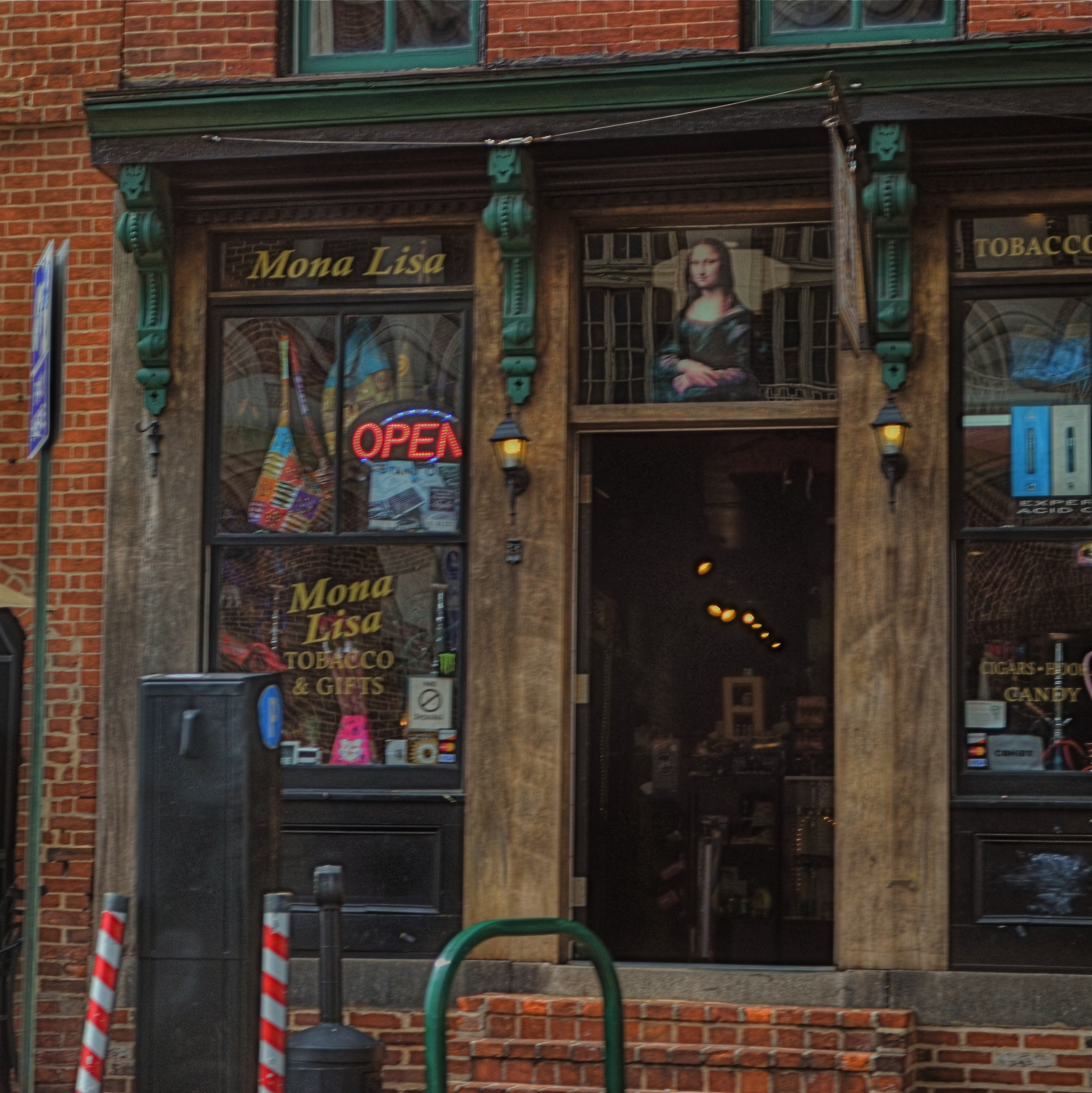
Mona Lisa Smoke Shop, Washington D.C., 2013.
By MICHAEL PERKINS
IF YOU TRAVEL ENOUGH, YOU’LL DISCOVER THAT, OF ALL THE TIMES YOU WANT to take a photograph, there are only a few times in which acceptable picture-making conditions are actually present. For all too many subjects that you experience on the fly, only a small percentage of them allow you the time, light, information or opportunity to do your best. And yet…you do what you must, and trust to instinct and chance for the rest.
Immediately upon arrival in a new town, my mind goes to one task, and one task only: sticking anyone else with the driving, so I can take potshots out the car window as I see fit. I have no need to head the posse or lead the expedition. You be in charge, big man. Get me to the hotel and leave me to make as many attempts as possible to put something worthwhile inside my camera.
Of course, this means that I have to pay at least some attention to how insanely you drive…shortcuts, rapid swerves, jolts and all. And, hey, couldn’t you have lingered a millisecond longer after the light went green, since I was just about to create an immortal piece of street art, instead of the muscular spasm I now have frozen forever on my memory card?
When shooting from a car, there are lots of things that go out the window (sorry), among them composition, exposure, stability, and, most generally, focus. En route to L’Enfant Plaza in Washington D.C. a few years ago, I fell in love with the funky little tobacco shop you see here. The colors, the woodwork, the look of yesteryear, it all spoke to me, and I had to have it. So I shot it at 1/250 sec, more than fast enough to freeze nearly anything in focus, unless by “nearly anything” you mean something that you’re not careening past at the pace of the average Tijuana taxicab. Result? Well, I didn’t wind up with unspeakable blur, but it’s certainly softer than I wanted. Of course, I could have offered an acceptable alibi for the shot, something based on some variant like, “of course, I meant to do that”, that is, until I outed myself in this post, just now.
But we try. Sometimes it’s the fleeting nature of things seen from car windows that make the attempt even more appealing than the potential result. In that instant, it seems like nothing’s more important than trying to take a picture. That picture. I won’t get ’em all. But as long as I live, I hope I never lose that mad, what-the-hell urge to just go for it.
So okay, seeing as this is a photo of a tobacco shop, this is where one of you cashes in the “close, but no cigar” gag line.
Go ahead, I’ll give you that one.
DOCUMENTARY OR DRAMA?
Creative use of contrast and texture can amp up interest in a shot that is overly pretty.
By MICHAEL PERKINS
I RECENTLY HEARD AN INTERESTING CRITIQUE OF A DRAMATIC CONTENDER for Best Film in the 2015 Oscar race. The critic in question complained that the film in question (Boyhood) was too realistic, too inclusive of banal, everyday events, and thus devoid of the dynamics that storytellers use to create entertainment. His bottom line: give us reality, sure, but, as the Brits say, with the boring bits left out.
If you’re a photographer, this argument rings resoundingly true. Shooters regularly choose between the factual documentation of a scene and a deliberate abstraction of it for dramatic effect. We all know that, beyond the technical achievement of exposure, some things that are real are also crashingly dull. Either they are subjects that have been photographed into meaninglessness (your Eiffel Towers, your Niagara Fallses) or they possess no storytelling magic when reproduced faithfully. That’s what processing is for, and, in the hands of a reliable narrator, photographs that remix reality can become so compelling that the results transcend reality, giving it additional emotive power.

The original. Workable composition, but hampered by its realism.
This is why colors are garish in The Wizard Of Oz, why blurred shots can convey action better than “frozen” shots, and why cropping often delivers a bigger punch and more visual focus than can be seen in busier compositions. Drama is subject matter plus the invented contexts of color, contrast, and texture. It is the reassignment of values. Most importantly, it is a booster shot for subjects whose natural values under-deliver. It is not “cheating”, it is “realizing”, and digital technology offers a photographer more choices, more avenues for interpretation than at any other time in photo history.
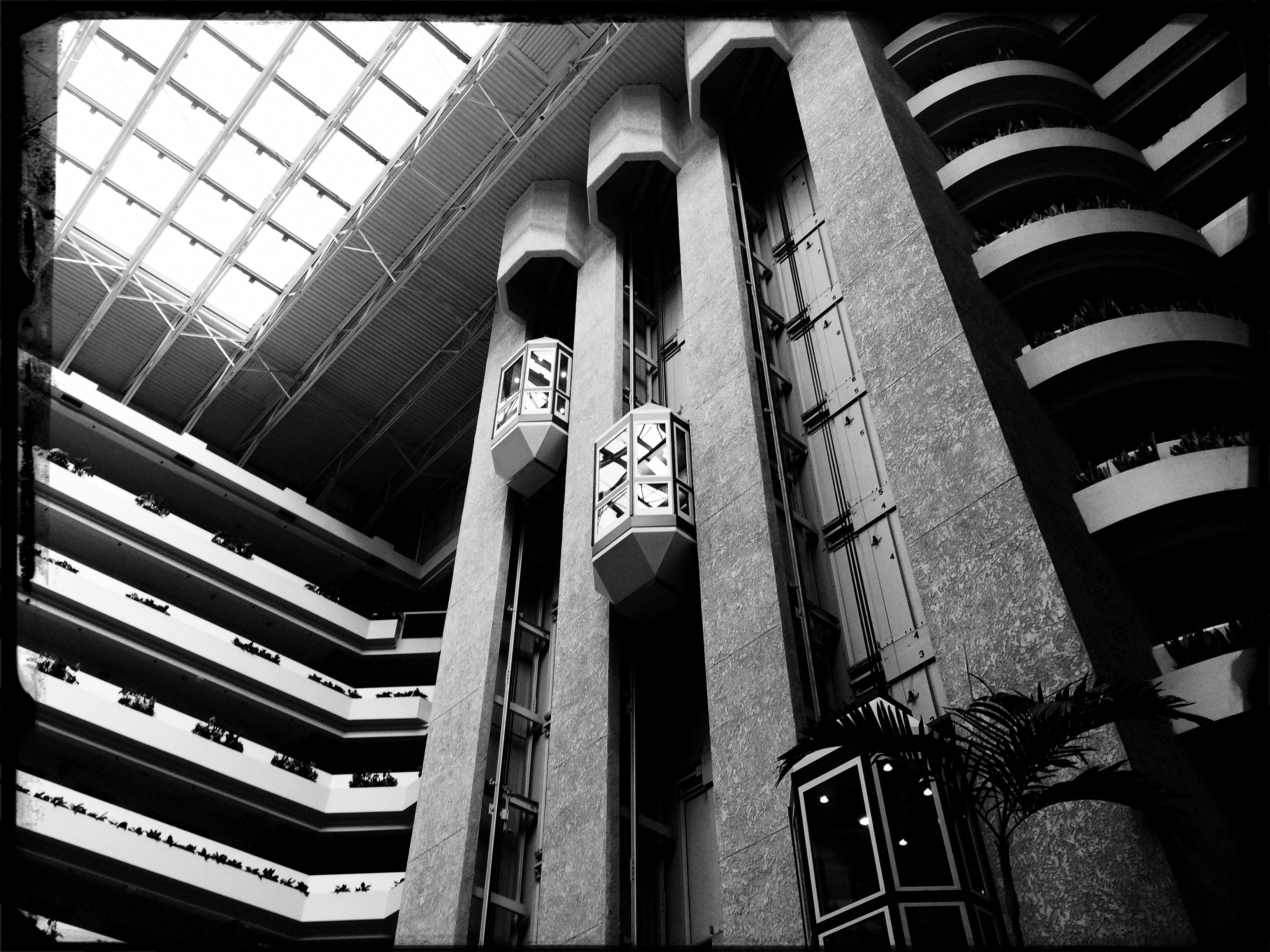
The photo at left was taken in a vast hotel atrium which has a lot going for it in terms of scope and sweep, but which loses some punch in its natural colors. There is also a bit too much visible detail in the shot for a really dramatic effect. Processing the color with some additional grain and grit, losing some detail in shadow, and amping the overall contrast help to boost the potential in the architecture to produce the shot you see at the top of this post. Mere documentation of some subjects can produce pretty but flaccid photos. Selectively re-prioritizing some tones and textures can create drama, and additional opportunity for engagement, in your images.
DETAILS, DETAILS
Moody, but still a bit too tidy. Black and white by itself wasn’t enough to create the atmosphere I wanted.
By MICHAEL PERKINS
EVEN THOUGH MOST GREAT PHOTOGRAPHERS PROCLAIM that any “rules” in their medium exist only to be broken, it’s often tough to chuck out regulations that have served you well over a lifetime of work. Once you get used to producing decent images through the repetition of habit, it takes extra nerve to take yourself outside your comfort zone, even if it means adding impact to your shots. You tend not to think of rules as arbitrary or confining, but as structural pillars that keep the roof from falling in.
That’s why it’s a good exercise to force yourself to do something that you feel is a bad fit for your style, lest your approach to everything go from being solid to, well, fossilized. If you hate black and white, make yourself shoot only monochrome for a week. If you feel cramped by square framing, make yourself work exclusively in that compositional format, as if your camera were incapable of landscape or portrait orientations. In my own case, I have to pry my brain away from an instinctual reliance on pinsharp focus, something which part of me fears will lead to chaos in my images. However, as I occasionally force myself to admit, sharp ain’t everything, and there may even be some times when it will kill, or at least dull, a picture.

Sharpness just where it’s needed, and nowhere else.
With post-processing such an instantaneous, cheap, and largely effortless option these days, there really isn’t any reason to not at least try various modes of partial focus just to see where it will lead. Take what you believe will work in terms of the original shot, and experiment with alternate ways of interpreting what you started with.
In the shot at the top of this post, I tried to create mood in a uniquely shaped fish house with monochrome and a dour exposure on a nearly colorless day. Thing is, the image carried too much detail to be effectively atmospheric. The place still looked like a fairly new, fairly spiffy eatery located in an open-air shopping district. I wanted it to look like a worn, weathered joint, a marginal hangout that haunted the wharf that its seafood theme and design suggested. I needed to add more mood and mystery to it, and merely shooting in black & white wasn’t going to get me there, so I ran the shot through an app that created a tilt-shift focus effect, localizing the sharpness to the rooftop sign only and letting the rest of the structure melt into murk.
It shouldn’t be hard to skate around a rule in search of an image that comes closer to what you see in your mind, and yet it can require a leap of faith. Hard to say why trying new things spikes the blood pressure. We’re not heart surgeons, after all, and no one dies if we make a mistake.Anyway, you are never more than one click away from your next best picture.
LOW-TECH LOW LIGHT

Passion Flower, 2015. Budget macro with magnifying diopters ahead of a 35mm lens. 1/50 sec., f/7.1, ISO 100.
By MICHAEL PERKINS
LIGHT IS THE PRINCIPAL FUEL OF PHOTOGRAPHY, but it needs refinement, just as crude oil needs to be industrially altered before it’s ready for consumer use. It isn’t just enough to record light in its natural form; it has to be corralled, directed, harnessed so that it enhances a photograph in such a way that, ironically, makes it look like you did nothing at all but press the shutter. So, right at the start, making images is a bit of a con job. Good thing is, it’s only dishonorable when you get caught.
Doing macro on the cheap with the use of screw-on magnifying diopters ahead of your regular lens is one of the situations that can create special lighting challenges. There is an incredibly shallow depth of field in these lenses, but if you compensate for it in the camera, by, say, f/8 or higher, you lose light like crazy. Slow down your shutter to compensate, and you’re on a tripod, since the slightest tremor in a hand-held shot looks like 7.8 on the Richter scale. Keep the shorter shutter speed, though, and you’re jacking ISO up, inviting excessive noise. Flood the shot with constant light, and you might alter the color relationships in a naturally lit object, effecting, well, everything that might appeal in a macro shot.
Best thing is, since you’re shooting such a small object, you don’t need all that much of a fix. In the above shot, for example, the garlic bulb was on a counter about two feet from a window which is pretty softened to start with. That gave me the illumination I needed on the top and back of the bulb, but the side facing me was in nearly complete shadow. I just needed the smallest bit of slight light to retrieve some detail and make the light seem to “wrap” around the bulb.
Cheap fix; half a sheet of blank typing paper from my printer’s feed tray, which was right next door. Camera in right hand, paper in left hand, catching just enough window light to bounce back onto the front of the garlic. A few tries to get the light where I wanted it without any flares. The paper’s flat finish gave me even more softening of the already quiet window light, so the result looked reasonably natural.
Again, in photography, we’re shoving light around all the time, acting as if we just walked into perfect conditions by dumb luck. Yeah, it’s fakery, but, as I say, just don’t get caught.
THE CHOICE
Does the structure of your photography protect you, or contain you?
By MICHAEL PERKINS
ANYONE WHO REGULARLY VISITS THESE PAGES already knows that I advocate of doing as much of your photography in as personal and direct a way as possible. While I am completely astonished by the number of convenience items and automatic settings offered to the casual photographer in today’s cameras, I believe that many of these same features can also delay the process by which people take true hands-on control of their image-making. I regard anything that gets in between the shooter and the shutter as a potential distraction, even a drag on one’s evolution.
Tools are not technique. Here are two parallel truths of photography: (1) some people with every gizmo in the toy store take lousy pictures. (2) some people with no technical options whatsoever create pictures that stun the world.
From my view, you can either subscribe to the statement, “I can’t believe what this camera can do!” or to one which says, “I wonder what I can make my camera do for me!” The very controls built into cameras to make things convenient for newcomers are the first things that must be abandoned once you are ready to move beyond newcomer status. At some point, you learn that there is no way any camera can ever contain enough magic buttons to give you uniformly excellent results without your active participation. You simply cannot engineer a device that will always deliver perfection and perpetually protect you from your own human limits.
Innovators never innovate by surrounding themselves with the comfortable and the familiar. For photographers, that means making decisions with your pictures and living with the uneven results in the name of self-improvement. This is a challenge because manufacturers seductively argue that such decisions can be made painlessly by the camera acting alone. But guess what. If you don’t actively care about your photos, no one else will either. There may not be anything technically wrong with your camera’s “choices”. But they are not your choices, and eventually, you will want more. The structure that at first made you feel safe will, in time, start to feel more like a cage.
Tools are not technique.
HAPPY OLD YEAR

2014. Another year spent chasing the light.
By MICHAEL PERKINS
The White Rabbit put on his spectacles. ‘Where shall I begin, please your Majesty?’ he asked. ‘Begin at the beginning,’ the King said gravely, ‘and go on till you come to the end: then stop.’
IN A SIMPLER WORLD, THE KING OF HEARTS, quoted above in Lewis Carroll’s Alice’s Adventures in Wonderland, would be perfectly correct. All things being equal, the beginning would be the best place to begin. But, in photography, as in all of life, we are always coming upon a series of beginnings. Learning an art is like making a lap in Monopoly. Just when we think we are approaching our destination, we pass “Go” again, and find that one man’s finish line is another man’s starting gate. Photography is all about re-defining where we are and where we need to be. We always begin, and we never finish.
As 2014 comes to an intersection (I can’t really say ‘a close’ after all that, can I?), it’s normal to review what might be either constant, or changed, about one’s approach to making pictures. That, after all, is the stated aim of this blog, making The Normal Eye more about journey than destination. And so, all I can do in reviewing the last twelve months of opportunities or accidents is to try to identify the areas of photography that most define me at this particular juncture, and to reflect on the work that best represents those areas. This is not to say I’ve gained mastery, but rather that I’m gaining on it. If my legs hold out, I may get there yet. But don’t count on it.
The number twelve has become, then, the structure for the blog page we launch today, called (how does he think of these things?) 12 for 14. You’ll notice it as the newest gallery tab at the top of the screen. There is nothing magical about the number by itself, but I think forcing myself to edit, then edit again, until the thousands of images taken this year are winnowed down to some kind of essence is a useful, if ego-bruising, exercise. I just wanted to have one picture for each facet of photography that I find essentially important, at least in my own work, so twelve it is.
Light painting, landscape, HDR, mobile, natural light, mixed focus, portraiture, abstract composition, all these and others show up as repeating motifs in what I love in others’ images, and what I seek in my own. They are products of both random opportunity and obsessive design, divine accident and carefully executed planning. Some are narrative, others are “absolute” in that they have no formalized storytelling function. In other words, they are a year in the life of just another person who hopes to harness light, perfect his vision, and occasionally snag something magical.
So here we are at the finish line, er, the starting gate, or….well, on to the next picture. Happy New Year.
FADE TO (ALMOST) BLACK
Sometimes a change in the technical approach to a shot is the only way to freshen an old subject. 1/40 sec., f/1.8, ISO 250, 35mm.
By MICHAEL PERKINS
I KNOW MANY PHOTOGRAPHERS WHO SUBJECT THEMSELVES TO THE DELICIOUS TORTURE, known to authors everywhere,as “publish or perish”, or, in visual terms, the tyranny of shooting something every single day of their lives. There are lots of theories afloat as to whether this artificially imposed discipline speeds one’s development, or somehow pumps their imagination into the bulky heft of an overworked bicep. You must decide, o seekers of truth, what merit any of this has. I myself have tried to maintain this kind of terrifying homework assignment, and during some periods I actually manage it, for a while at least. But there are roadblocks, and one of the chief barriers to doing shot-a-day photography is subject matter, or rather the lack of it.
I’ve shot in this space for years, and therein lies the challenge. 1/40 sec., f/2.2, ISO 250, 35mm.
Let’s face it: even if you live one canyon away from the most breathtaking view on earth or walk the streets of the mightiest metropolis, you will occasionally look upon your immediate environs as a bad rerun of Gilligan’s Island, something you just can’t bear to look at without having a wastebasket handy. Familiarity breeds contempt for some subjects that you’ve visited and re-visited, and so, for me, the only way to re-mix old material is to re-imagine my technical approach to it. This is still a poor substitute for a truly fresh challenge, but it can teach you a lot about interpretation, which has transformed more than a few mundane subjects for me over a lifetime of shuttering (and shuddering).
As an example, a corner of my living room has been one of the most trampled-over crime scenes of my photographic life. The louvered shades which flank my piano can create, over the course of a day, almost any kind of light, allowing me to use the space for quick table-top macros, abstract arrangements of shadows, or still lifes of furnishings. And yet, on rainy /boring days, I still turn to this corner of the house to try something new with the admittedly over-worked material. Lately I have under-exposed compositions in black and white, coming as near a total blackout as I can to try to reduce any objects to fundamental arrangements of light and shadow. In fact, damn near the entire frame is shadow, something which works better in monochrome. Color simply prettifies things too much, inviting the wrong kind of distracted eye wandering in areas of the shot that I don’t think of as essential.
I crank the aperture wide open (or nearly) to keep a narrow depth of field, which renders most of the image pretty soft. I pinch down the window light until there is almost no illumination on anything, and allow the ISO to float around at least 250. I get a filmic, grainy, gauzy look which is really just shapes and light. It’s very minimalistic, but it allows me to milk something fresh out of objects that I’ve really over-photographed. If you believe that context is everything, then taking a new technical approach to an old subject can, in fact, create new context. Fading almost to black is one thing to try when you’re stuck in the house on a rainy day.
Especially if there’s nothing on TV except Gilligan.
ON THE SOFT SIDE

Light can set the mood for an individual object or an entire room. 1/40 sec., f/5.6, ISO 100, 35mm.
By MICHAEL PERKINS
THE WORLD’S FIRST MOVIE STUDIO WAS A TARPAPER SHACK ON A TURNTABLE. Dubbed by Thomas Edison’s techies as “The Black Maria” (as ambulances were grimly named back at the time), the structure rotated to take advantage of wherever sunlight was available in the California sky, thus allowing the film crew to extend its daily shooting schedule by more than half in the era of extremely slow film stocks. Eventually artificial light of sufficient strength was developed for the movies, and actors no longer had to brave motion sickness just to rescue fair damsels. So it goes.
More than a century hence, some photographers actually have to be reminded to use natural light, specifically window light, as a better alternative to studio lights or flash units. Certainly anyone who has shot portraits for a while has already learned that window light is softer and more diffuse than anything you can plug in, thus making it far more flattering to faces (as well as forgiving of , er, flaws). It’s also good to remember that it can lend a warming effect to an entire room, on those occasions where the room itself is a kind of still life subject.
Your window light source can be harsher if the sun is arching over the roof of your building toward the window (east to west), so a window that receives light at a right angle from the crossing sun is better, since it’s already been buffered a bit. This also allows you to expose so that the details outside the window (trees, scenery, etc.) aren’t blown out, assuming that you want them to be prominent in the picture. For inside the window, set your initial exposure for the brightest objects inside the room. If they aren’t white-hot, there is less severe contrast between light and dark objects, and the shot looks more balanced.
I like a look that suggests that just enough light has crept into the room to gently illuminate everything in it from front to back. You’ll have to arrive at your own preferred look, deciding how much, if any, of the light you want to “drop off” to drape selective parts of the frame in shadow. Your vision, your choice. Point is, natural light is so wonderfully workable for a variety of looks that, once you start to develop your use of it, you might reach for artificial light less and less.
Turns out, that Edison guy was pretty clever.
MILE MARKER
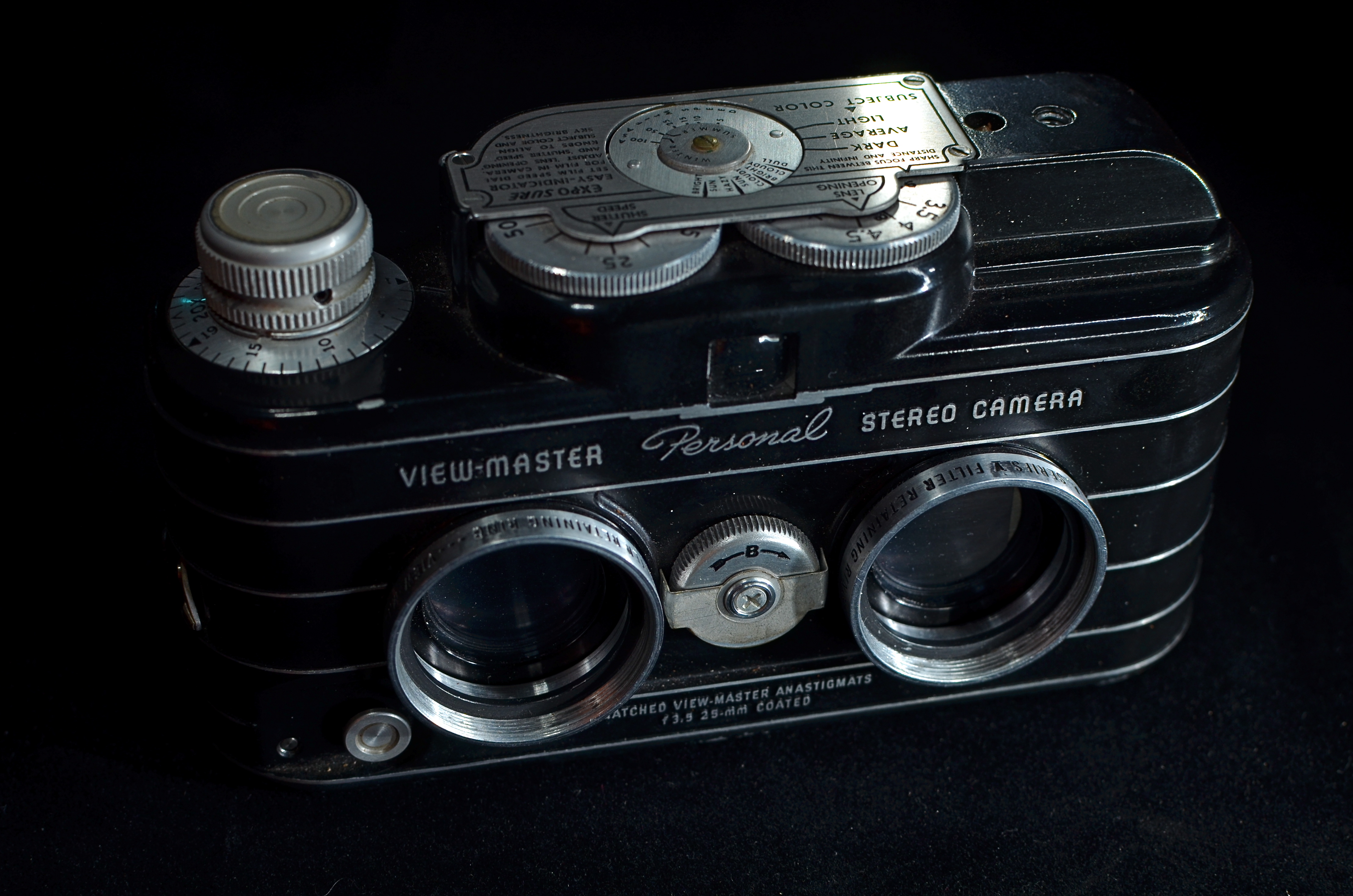
Sawyer’s mid-50’s View-Master Personal Stereo, the only consumer camera able to produce those eye-popping 3-d reels. 15 sec., f/5.6, ISO 100, 35mm.
BY MICHAEL PERKINS
THIS WEEK, THE NORMAL EYE REACHES A LITTLE BASE CAMP OF SORTS, with the welcome arrival of our 1,000th blog follower. A few thoughts before we climb to the next ledge:
I never wanted this forum to be a mere photo diary, a refrigerator on which to tack up my pet pic of the day, because, despite the fact that my photography illustrates the blog, it’s not really about,”look what I did”, so much as it’s about “look at one thing you can try”. It also was never supposed to be a purely technical tutorial, although we do offer a few simple step-by-steps on emerging methods. My thought, then as now, is that there are many, many master technicians in the trade whose command of the pure science is so much stronger than mine, that I’d be better off talking about the part we all understand….the millions of little miracle moments and motivations that shape our visual decisions in the making of images.
Accordingly, your most typical responses to The Normal Eye have been along the lines of “I’ve been there”, or “I came to the same conclusion” or “I never thought of it that way before.” That has sparked dialogue, which was my principal aim in creating TNE in the first place. I use my images to illustrate my ideas because they’re the closest visual equivalent of what’s rattling around in my skull, but not because they’re the ne plus ultra of anything.
From my years as an illustrator, I also love the idea of designing a page, and I try to vary the visual arrangement of the blog to incorporate useful links, historical figures, and, as we go forward, gifs and other tools. I liken it to the front of a newspaper, which, other than the masthead and the familiar type faces, has to be completely new every day. It’s more interesting to make, and, I hope, more fun to read, but it’s still in its infancy.
The most amazing part of this venture has been seeing the numbers change, to realize, day by day, that many of you have chosen, on-purpose, to bring these conversations into your day on a regular basis. I truly appreciate that choice, and am gratified if any of these chicken scratchings have a positive impact, for anyone. Sometimes, online writing is like throwing a pebble down a dark well and listening for at least a splash. Sometimes it’s like waking up to a roomful of birthday presents. So, to everyone who has kept faith or at least sampled The Normal Eye thus far, my sincere thanks. As I’ve stressed before, although solo sermons are often inspiring, this forum only works as a conversation.
Your turn.
PENCIL VS. INK

This iPhone capture is more of a preliminary sketch than a final rendering, since the camera adds too much noise in low light. I’ll return with a Nikon to get this “right”.
By MICHAEL PERKINS
RAISED AS THE SON OF AN ILLUSTRATOR WHO WAS ALSO A PHOTOGRAPHER, I have always been more comfortable with the idea of the photographic image as a work-in-progress rather than as a finished thing. That is, I bring a graphic artist’s approach to any project I do, which is to visualize an idea several different ways before committing myself to the final rendering. Call if sketching, roughing, rehearsing…..whatever…but, both on the page/canvas and the photograph, I see things taking shape over the space of many trial “drafts”. And, just as you don’t just step up and draw a definitive picture, you usually can’t just step up and snap a fully realized photo. I was taught to value process over product, or, if you will, journey over destination.
This belief was embodied in my dad’s advice to lay down as many pencil lines as possible before laying in the ink line. Ink meant commitment. We’re done developing. We’re finished experimenting. Ready to push the button and, for better or worse, live with this thing. Therefore the idea of a sketch pad, or preliminary studies of a subject, eventually led to a refined, official edition. This seems consistent with people like Ansel Adams, who re-imagined some of his negatives more than half a dozen times over decades, each print bearing its own special traits, even though his source material was always the same. Similarly, “studies” in music served as miniature versions of themes later realized in full in symphonies or concertos.
The photo equivalent of a sketch pad, for me in 2014, is the phone camera. It’s easy to carry everywhere, fairly clandestine, and able to generate at least usable images under most conditions. This allows me to quickly knock off a few tries on something that, in some cases, I will later shoot “for real” (or “for good”) with a DSLR, allowing me to use both tools to their respective strengths. The spy-eye-I-can-go-anywhere aspect of iPhones is undeniably convenient, but often as not I have to reject the images I get because, at this point in time, it’s just not possible to exert enough creative control over these cameras to give full voice to everything in my mind. If the phone camera is my sketch pad, my full-function camera is my ink and brush. One conceives, while the other refines and commits.
You write things like this knowing full well that technology will make a monkey out of you at its next possible opportunity, and I actually look forward to the day when I am free of the bulk and baggage of what are, at least now, better cameras overall. But we’re not there yet, and may not be for a while. I still make the distinction between a convenient camera and a “real” camera, and I freely admit that bias. A Porsche is still better than a bicycle, and the first time you’re booked as a pianist into Carnegie Hall, your manager doesn’t insist that they provide you with a state-of-the-art….Casio. It’s a Steinway or the highway.
ABSOLUTES

By MICHAEL PERKINS
“PHOTOGRAPHY DEALS EXCLUSIVELY WITH APPEARANCES” remarked Duane Michals years ago, “but, nothing is what it appears to be.” That’s a remarkably clear summation of the terms under which, with greater regularity, I approach things with my camera. In over fifty years of clicking away, I have never really felt like my work was reportage, or the recording of “reality”, but rather the use of reality like another paint brush or tube of color towards the more general goal of making a picture. What I wind up with certainly “appears” like something, but it’s not really a literal representation of what I saw. It is the thing I pointed the lens at, but, if I am lucky, it’s got some other extra ingredient that was mine alone. Or so I hope.
This idea that appearances are just elements in the making of something personal seems to be borne out on those photo “field trips” where instructors take a small mob of shooters out onto the street, all of them assigned to photograph the same subject or scene. Seldom is there a consistent result as these half dozen noobs frame up a common object, a phenomenon which argues for the notion of photography as interpretation, not just the making of a visual record. Consider: if the machine really were all, every one of the students’ images should look remarkably alike, but they generally don’t. How could they, when the mystery link in every shooter’s work flow has to be the “filter” of his or her own experiences? You show how a thing appears, but it doesn’t match someone else’s sense of what it is. And that’s the divine, civil argument our vision has with everyone else’s, that contrast between my eye and your brain that allows photographs to become art.
I think that it’s possible to worry about whether your photograph “tells a story” to such a degree that you force it to be a literal narrative of something. See this? Here’s the cute little girl walking down the country lane to school with her dog. Here’s the sad old man sitting forlornly on a park bench. You can certainly make images of narrowly defined narratives, but you can also get into the self-conscious habit of trying to bend your images to fit the needs of your audiences, to make things which are easy for them to digest.Kinda like Wonder Bread for the eye.
As photographers, we still sweat the answer to the meaningless question, “what’s that supposed to be?”, as if every exposure must be matched up with someone who will validate it with an approving smile. Thing is, mere approval isn’t true connection….it’s just, let’s say, successful marketing. Make a picture in search of something in yourself, and other seekers will find it as well.
UNDER-PERFORMING
By MICHAEL PERKINS
DURING THE GOLDEN AGE OF SLIDE FILM, I KNEW PLENTY OF PHOTOGRAPHERS who feared the unforgiving quality of the medium. The way that, with the educated guessing involved in many exposures, it was all or nothing. Prints. coming from a negative, could be created and re-created almost endlessly, but reversal film was, with few exceptions, a lot harder to massage. The processed slide was, for most shooters, the end of the argument. You either nailed it or….
Slide shooters became a kind of breed apart, since we had to work harder to coax good results out of our chosen medium. Slide film was, for the most part, a lot slower than daylight print film, so that, on some days, merely framing a shot in shade meant you could reduce your subject to a Dutch painting, mood-wise. A few of us played to that bias as well, deliberately under-lighting shots to boost color or isolate key subjects in the frame….making them “pop.” Others created strange effects by cross-processing, giving the lab instructions that ran counter to the recommended developing for a given film. And a lot of us became self-taught illumination geeks in a desperate attempt to get enough light to the film, causing our families to recoil at the approach of our monstrous flashguns. Their retinas died for our sins.
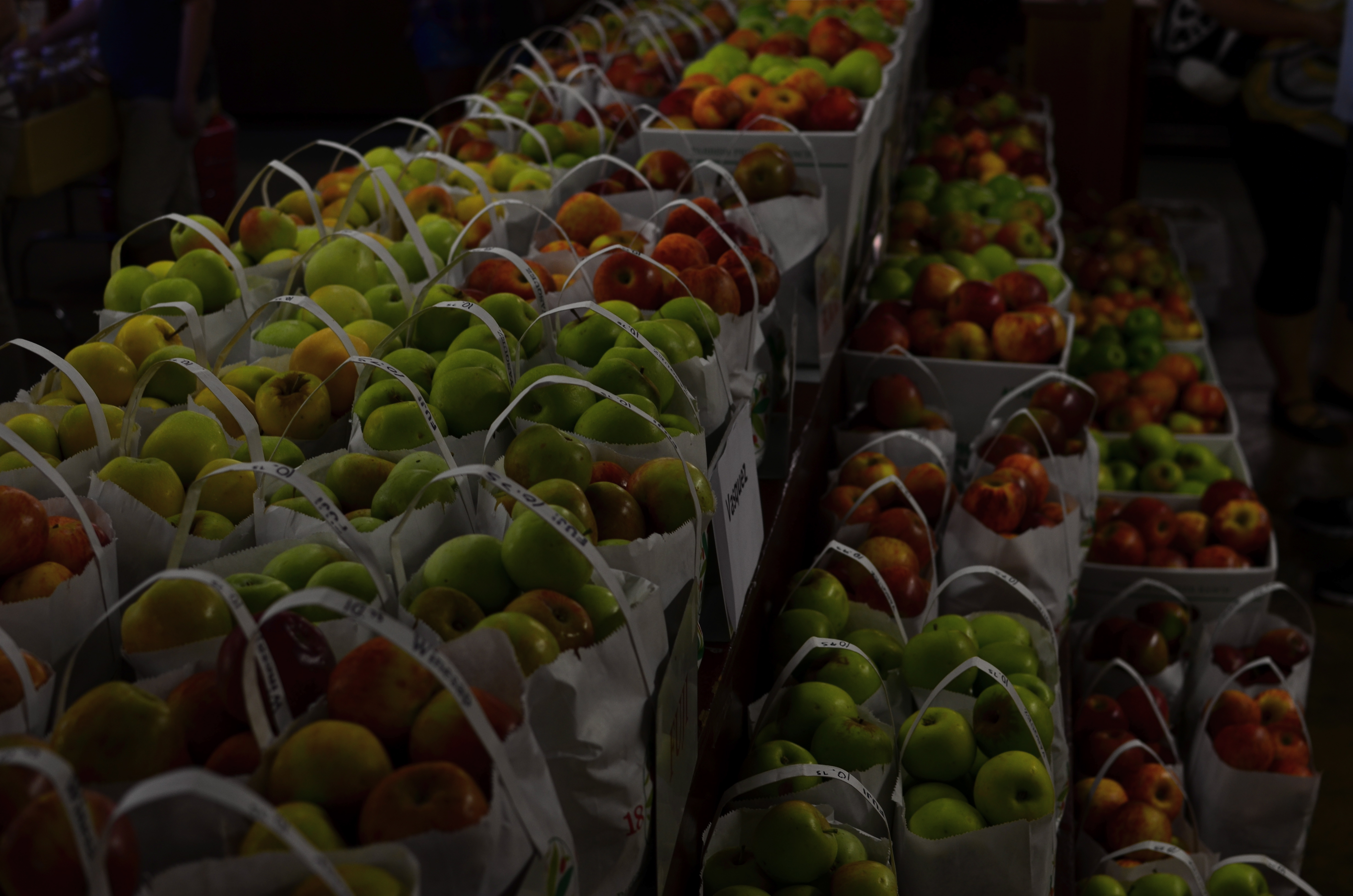
Yield, 2014. 1/30 sec., f/4, ISO 100, 35mm.
Now we’re at a place where the camera is really the film, and that film can be made immediately, accurately responsive to nearly any lighting situation. Digital sensors have all but eliminated the need for spot flashes at all, and, as for rendering mood, if you can visualize it, you can pretty much shoot it. At a recent visit to an apple orchard gift shop (hey, it’s autumn!) I came upon an immense table of green and red apple varieties arranged in ready-to-buy bags. The light in the place was pretty meager to start with, but there was still enough of it to over-crowd the shot with background clutter….jars of jams, counters of candies, jugs of cider, peeps, etc. I wanted the warm colors of the apples to carry the entire image, so I started to think like a slide photographer and deliberately under-exposed the shot. That didn’t mean shutting down the aperture beyond f/4, since the place was fairly dark already, but merely leaving my ISO at its lowest setting, thereby telling the sensor not to suck in any additional light. I didn’t have much depth of field, but the somewhat gauzy quality at the rear and sides actually added to the warm nostalgia of the shot, so I kept it.
Again, digital makes it possible to try a lot of approaches to a task within the space of a few minutes, while the moment is there to be seized. You don’t have to physically consume film, shooting twenty frames with different settings and bearing the cost of processing them all in the hope that “the one” is in there somewhere. Cause and effect are compressed into a shorter, workable space, and success increases. To an old slide man, this is salvation of the first order. Now we manipulate the medium instead of the other way around. Man.
RAMPING UP

The North Face, 2014. 1/250 sec., f/5.6, ISO 100, 24mm.
By MICHAEL PERKINS
IN THE IMAGINARY PHOTOGRAPHY BOOKSHELF OF MY MIND THERE ARE HUNDREDS OF VOLUMES that speak of nothing else except the exquisite light of early morning, the so-called “golden hour” in which a certain rich warmth bathes all. You’ve read endless articles and posts on this as well, so nothing I can cite about the science or aesthetic aspects of it can add much. However, I think that there is a secondary benefit to shooting early in the day, and it speaks to human rhythm, a factor which creates opportunities for imaging every bit as vital as the quality of available light.
Cities and communities don’t jolt awake in one surge: they gently creep into life, with streets gradually taking on the staging that will define that day. The first signs could be the winking on of lights, or the slow, quiet shuffle of the first shift of cleaners, washers, trimmers and delivery workers. First light brings the photographer a special relationship with the world, as he/she has a very private audience with all the gears that will soon whirr and buzz into the overall noise of the day. You are witness to a different heartbeat of life, and the quieter pace informs your shooting choices, seeping into you in small increments like a light morning dew. You are almost literally forced to move slower, to think more deliberately, and that state always makes for better picture making.
Some atmospheres, like libraries or churches, retain this feel throughout the entire day, imposing a mood of silence (or at least contemplation) that is also conducive to a better thought process for photography, but in most settings, as the day wears on, the magic wears off. Early day is a distinctly different day from the one you’ll experience after 9am. It isn’t merely about light, and, once you learn to re-tune your inner radio for it, you can find yourself going back for more.
This is no mere poetic dreaminess. The more nuances you experience as a living, breathing human, the more you have to pour into your photography. Live fuller and you’ll shoot better. That’s why learning about technical things is no guarantee that you’ll ever do anything with a camera beyond a certain clinical “okay-ness”. On the other hand, we see dreamers who are a solid C+ on the tech stuff deliver A++ images because their soul is part of the workflow.
RELIEF OF PAINFUL G.A.S.
Eight years and three cameras ago. 1/125 sec., f/7.1, ISO 100, 13.7mm.
By MICHAEL PERKINS
HE’S YOUR DAD, YOUR UNCLE, YOUR WACKY SITCOM NEIGHBOR: the guy who has every ratchet,widget and wrench in the Sears Craftsman catalogue, yet who is, strangely, incompetent at any task more complex than the replacement of a light bulb. If he could just get that table saw, that router, he could finally tackle that pet project with real zest. But heck, he explains, I don’t have the right extender, the extra power supply, the magical whatsit that just came out this year. In reality, this guy is not a handyman, he’s an actor playing the part of a handyman. He’s Batman with a utility belt big enough to spill over a city block. He’s a gadget addict.
Now, transfer all that imagery from fix-it toys to optical toys, and you can understand the disease that photographers call G.A.S—-Gear Acquisition Syndrome.
There is no vaccine or twelve-step program for some types of shooters for whom the next lens, the up-and-coming accessory will make all the difference, and catapult their photography from mundane to miraculous. And none of us, even the most rigidly discipline, is completely immune to the siren song of the bright and shiny plaything. Sadly, G.A.S. often sidetracks us for months or even years, taking us off the path of practice and hard work with the tools we have as we wait for the toys we want. It doesn’t seem to impress us that people are making extraordinary pictures with cameras that are, basically, crap. Similarly, It doesn’t seem to faze us to know that people lugging around fifty pounds of lens changes and thousands of dollars in Leica-like bodies are often coming home with a portfolio of poop to show for their efforts. G.A.S., once its fever envelops our tiny minds, creates the hallucination that photography is about equipment. Sure, and Mark Twain wrote better after he graduated from notepads to a typewriter.
It’s almost too simple a truth that practice makes perfect, practice with limited lenses and sad little cameras, practice with nothing to focus on but how well we can teach ourselves to see. G.A.S. fogs up our thinking, making photography a destination (oh, once I get that German glass!) instead of a journey (wonder what I can make happen with what I have). It’s magical thinking. The camera becomes a talisman, a magic monkey’s paw, Harry Potter’s wand. Real, serious development is delayed while we wait for machines to appear and deliver us.
Oddly, looking backwards can often help us move forwards. Now, follow me here a moment. Ever go through the ghostly Shoebox of Shoots Past to find that you actually nailed a biggie on the day that you had bad weather, a lousy subject and a disposable $10 camera? Of course you have. But, wait….how could you take a good picture with all the wrong gear? Because something in you knew how to make that picture, with or without the ease and convenience conferred by better equipment. And the more you developed your eye, the more often you could make a picture that good, on purpose, time after time. As an example, the image at left is eight years and three cameras ago for me. I could certainly shoot it better today, but, even with more primitive machinery, I got most of what I wanted with what I had on hand that day. You have pictures just like this. Yes, you do.
I’m not saying that tools aren’t great, but if your shelves are overfilled (and your wallet is over-depleted) due to Gear Acquisition Syndrome, it’s best to ask how much in the way of toys you really need. None of it can take a great picture unless your mind and your eye are on the steering committee. Ansel Adams’ claim that the most important part of a camera was “the twelve inches behind it” is gospel. Get religion and become a believer, o my brothers.
DON’T TAKE THAT TONE WITH ME
By MICHAEL PERKINS
I BELIEVE THAT THE SINGLE BIGGEST REASON FOR THE FAILURE OF A PHOTOGRAPHIC COMPOSITION may all boil down to the same problem. I call it “over-sampling”, or, more simply, the presence of too much visual information in a frame. It can be as simple as including too many trees in a landscape or framing to include crowded sky clutter in an urban scene, but it’s not always how many objects are crowded into an image. It can be something as basic as asking the eye to figure out where to look. And sometimes, the very fact that a picture is in color can diminish its ability to clearly say, here: look here.
Color would have added nothing to this image. In fact, it would have detracted from its impact. 1/400 sec., f/5.6. ISO 100, 55mm.
Great photographs have their own gravitational pull and center. They draw people in and direct their gaze to specific places. This tends to be a single focus, because, the more there is to see in an image, the greater the tendency is in the viewer to wander around in it, to blunt the impact of the picture as the eye looks for a central nexus of interest. In my own experience, I find that the use of color in a photograph is justified by whether it helps keep things simple, creates readable signposts that lead the eye to the principal message of the image. Color, just like the objects in a frame, can explode with a ton of separate messages that defeat the main message, sending the viewer all over the place, trying to decode all that vivid information. Color itself can become clutter.
Sometimes the focus of an image is not an object, i.e., a building or a face, but an overall feel that is more emotionally immediate within a narrow range of blacks and greys. The kind of black and white makes a huge difference as well, and anyone who has spent a lot of time processing monochrome images knows that there is no one true black, no pure, simple white. As to actual shooting procedure, I will be so certain that only B&W will work for a given subject that I make the master shot itself in mono, but, more frequently, I shoot in color first and make a dupe file for comparison. This is another amazing advantage of digital imaging; you simply have more choices.
One of the by-products of color photography‘s adoption into mass culture through magazines and faster films in the mid-20th century was, for many people, a near-total abandonment of monochrome as somehow “limited” compared to those glorious, saturated Kodachromian hues. Thing is, both color and black and white have to be vetted before being used in a photograph. There can’t be a general rule about one being more “lifelike” or “natural”, as if that has anything to do with photography. Tools either justify their use or they don’t. You don’t drive a screw with a hammer.
NORMALEYE GALLERY UPDATE: HOME, HOME ON THE “RANGE”
A two-exposure HDR image with more emphasis on content than processing.
By MICHAEL PERKINS
HISTORY BUFFS WHO HAVE EXHAUSTIVELY RESEARCHED THE HELLISH ANIMOSITY OF THE AMERICAN CIVIL WAR, a conflict which sowed seeds of resentment that bear bitter fruit to this very day, may have some small grasp of the vitriolic divide between those who espouse High Dynamic Range (HDR) photography and those who believe its practitioners are in league with Beelzebub. Pro-HDR factions believe those who resist this magical art should be forced to declare themselves Amish on the spot, while the opposite camp believes that all cameras that shoot HDR should be pulverized and used as landfill in Hades. We’re talking irreconcilable differences here.
When HDR first came to my attention, I welcomed it, as many others did, as a way to get around a long-standing problem in exposure….how to modulate between blackout and whiteout in extremely contrasty situations in which a single exposure would either blow out the sky through the window or bury the corners of an interior in blackness. My first attempts with it were exciting, as I tried to shoot frames bracketed across a three or five shot range of exposures, then smooth out the drastic differences between light and dark in the final image. The idea of using HDR for a sci-fi look or a painterly effect never appealed to me. I was really trying to use it to make my pictures replicate more closely the adjustment between light and dark that the eye makes instantaneously.
Over the last five years, however, as I review images I’ve made with HDR software. First, I use the program less with each passing year, and second, I no longer use it to retrieve “lost” tones in dark or light areas of an image. The program I have used since day one, Photomatix, has two main choices, Detail Enhancement and Tonal Compression, and, at first, I worked almost exclusively with the former. For wood grain, stone texture, botanical detail and cloud contrast, it’s remarkably effective. However, it’s also easy to produce images which are too dark overall, and accentuate noise in the individual images. Overcook it even a little and it looks like a finger painting done with hot lava. It thus actually works against the original “looks more like reality” objective.
On the other hand, producing the blended image in the Tonal Compression mode retains most of the sharp detail you get in Detail Enhancement without the gooey consistency. It has fewer attenuating controls, but as I go along, I find I am using it more because it simply calls less attention to itself. In either mode, I have made a conscious effort to throttle the heck back and under-process as much as I can. I’m just getting sick of shots that announce “hey, here comes an HDR photo!” two blocks ahead of its arrival.
I’m also in the middle of a back-to-basics phase based on getting things right, in-camera, in a single frame, and learning to be more accepting of dark and light patches rather than artificially mixed goose-ups of rebalanced tones. Anyway, as of this posting, I’ve taken down the original selection of images that was in the HDR gallery tab at the top of this page and loaded in a new batch that, while certainly not a “final” word on anything, shows, I think, that I’m still wrestling with the problem of how best to use this technology. Give them a look if you can, and let me know your thoughts on the use of HDR in your own work. We all have to figure out our own way to be home, home on “the range”.
THE EYES (DON’T NECESSARILY) HAVE IT
Reverie, 2014.
By MICHAEL PERKINS
A QUICK GOOGLING OF THE PHOTOGRAPHIC UNIVERSE THESE DAYS will turn up a number of sites dedicated to “faceless portraits”, if there can, strictly speaking, be such a thing (and I believe there can). In a recent post entitled Private, Not Impersonal, I explored the phenomenon in which photographers, absent the features that most easily chronicle their subjects’ personalities, imply them, merely through body language, composition, or lighting. At the time I wrote the post, I was unaware how widespread the practice of faceless portraits had become. In fact, it’s something of a rage. Hmm. The very thought that, even by accident, I could be aligned with something hip, is, by turns, both terrifying and hilarious.
Thing is, photographs, as the famous curator John Szarkowki remarked, both conceal and reveal, and there is nothing about the full depiction of a human face that guarantees that you’re learning or knowing anything about the subject in frame. We are all to practiced at maintaining our respective masks for many portraits to be taken, ha ha, at face value. Cast your eye back through history and you will find dozens of compelling portraits, from Edward Steichen’s silhouettes of Rodin to Annie Leibovitz’ blurred dance photos of Diane Keaton, that preserve some precious element of humanity that a formal, face-on sitting cannot deliver. Call it mystery, for lack of a more precise word.
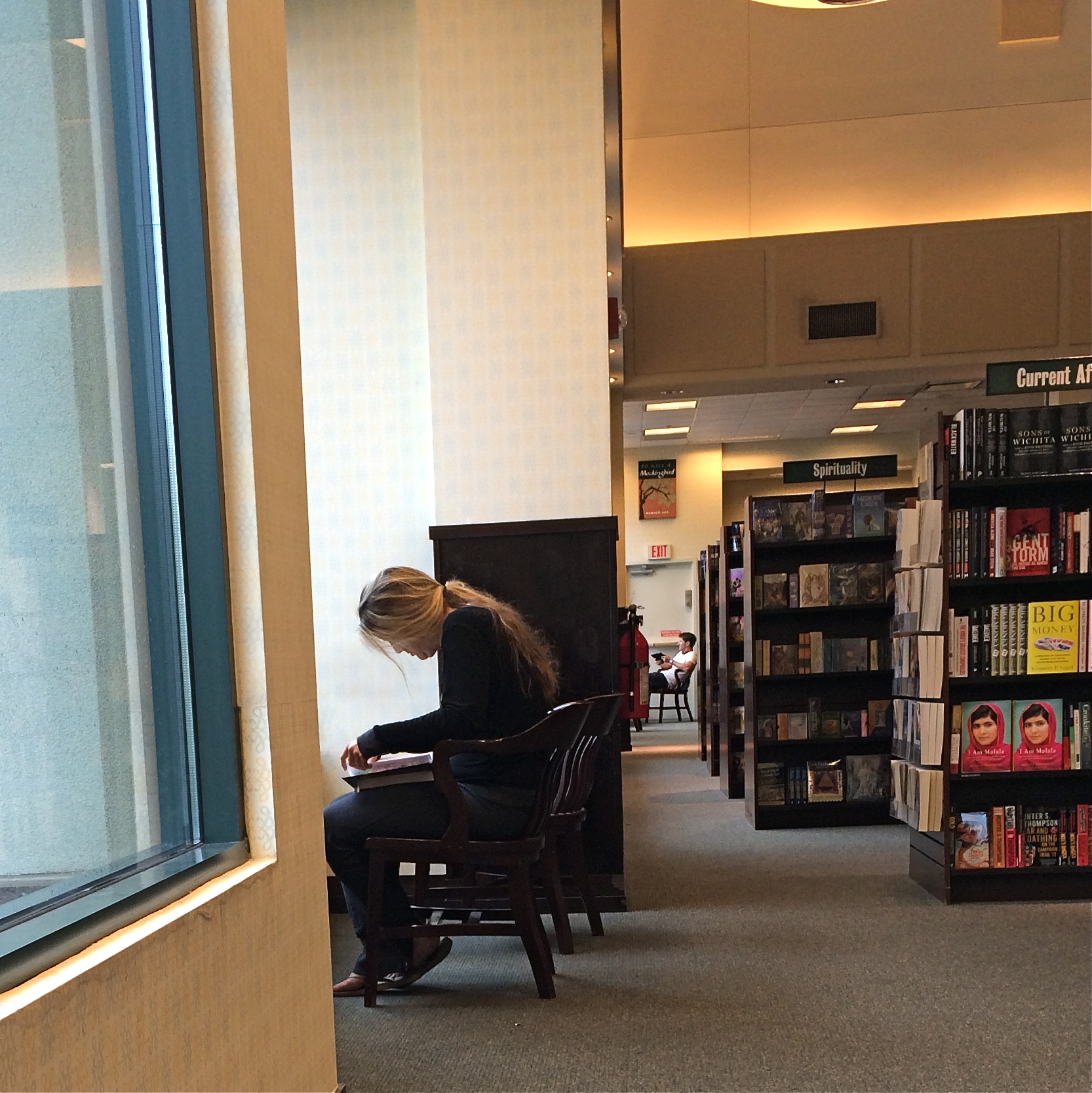
In the above frame, the subject whose face I myself never even saw gave me something wonderfully human, about reading in particular, but about enchantment in general. She is furiously busy discovering another world, a world the rest of us can only guess at, seeping up from her book. Her entire body is an inventory of emotional textures…of relaxation, attentiveness, of both being in the present and so completely someplace else. Framing her to include the negative spaces of the window, the carpet and the wider bookstore isolate her further from us, but not in a negative way. She wants to be apart; she is on a journey.
My “girl with the flaxen hair” was unaware of me, and I shot furtively and quickly to make sure I didn’t break the spell she was under. It was the least I could do in gratitude for a chance to witness her adventure. Looking back, I think she provided more than enough magic without revealing a single fragment of her face. Seeing is selecting, and I had been given all I needed to do both.
Click and be gone.
