INNER SPACE, OUTER MIND
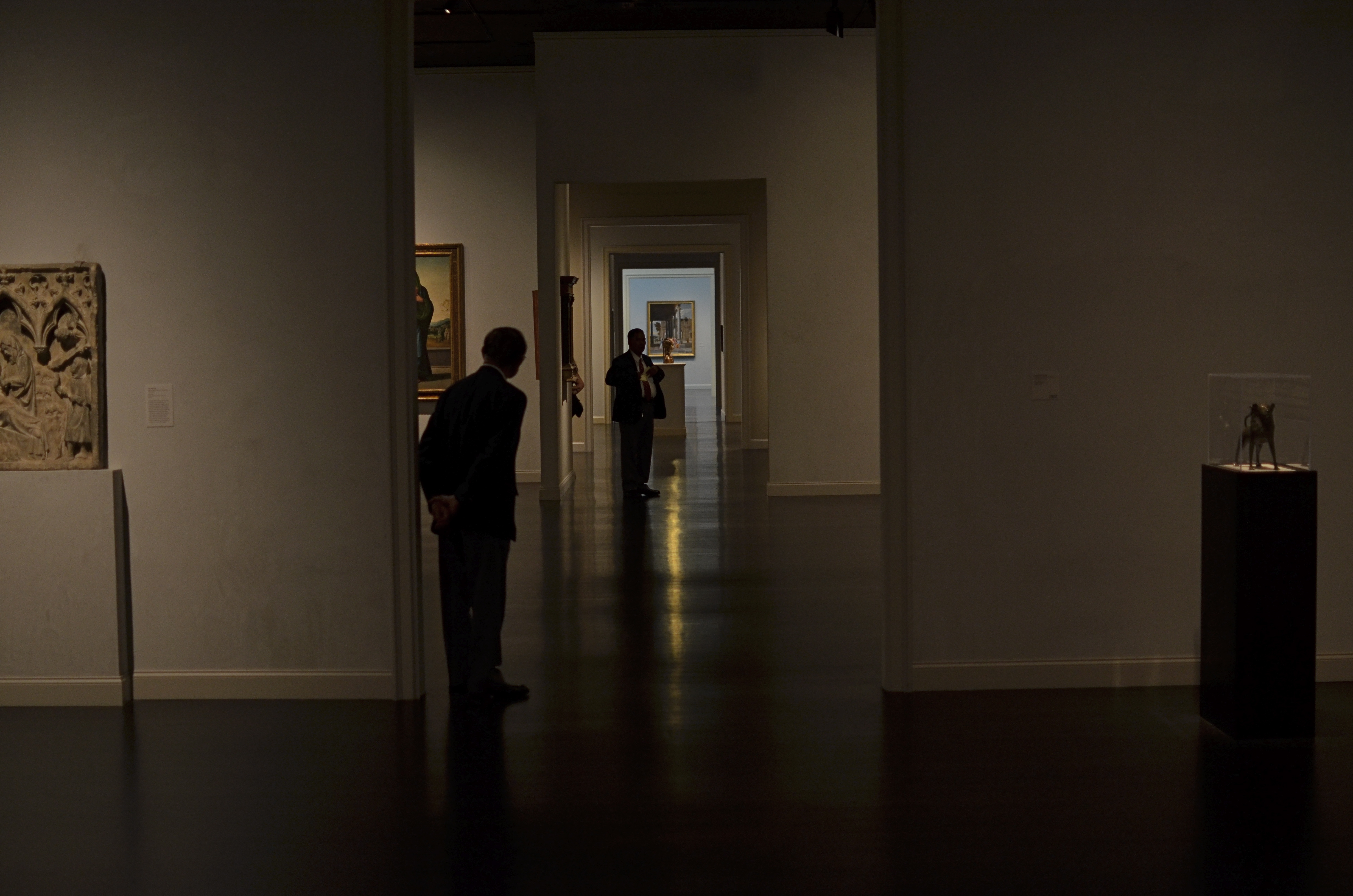
There really was a nice exhibit on display the day I took this at LACMA in Los Angeles. But this arrangement of space was arguing louder for my attention. 1/160 sec., f/1.8, ISO 320, 35mm.
By MICHAEL PERKINS
IF YOU VISIT ENOUGH MUSEUMS IN YOUR LIFETIME, you may decide that at least half of them, seen as arranged space, are more interesting than their contents. It may be country-cousin to that time in your childhood when your parents gave you a big box with a riding toy inside it, and, after a few minutes of excitement, you began sitting in the box. The object inside was, after all, only a fire engine, but a box could be a mine shaft, a Fortress of Solitude, the dining car on the Orient Express, and so on.
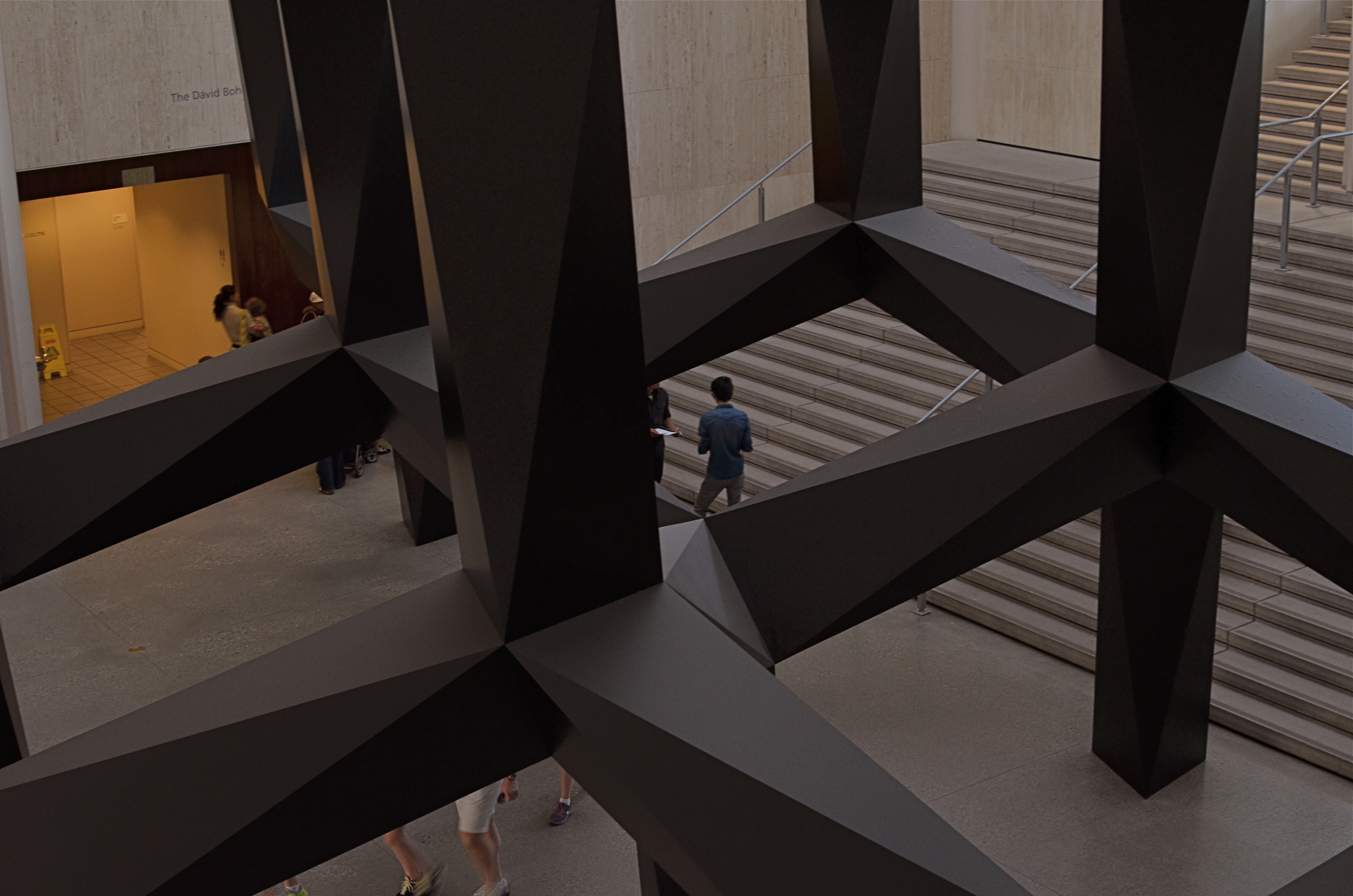
Spaces, divided, bisected, hidden, revealed. Art in itself.
And so with museums.
I truly do try to give lip service to the curated exhibits and loaned shows that cram the floors and line the walls of the various museums I visit. After all, I am, harumph and ahem, a Patron Of The Arts, especially if said museums are hosting cocktail parties and trays of giant prawns in their hallowed halls…I mean, what’s not to like? However, there are times when the endless variations on just a room, a hall, a mode of lighting, or the anticipatory feeling that something wonderful is right around the next corner is, well, a more powerful spell than the stuff they actually booked into the joint.
Spaces are landscapes. Spaces are still lifes. Spaces are color studies. Spaces are stages where people are dynamic props.
Recently spinning back through my travel images of the last few years, I was really surprised how many times I took shots inside museums that are nothing more than attempts to render the atmosphere of the museum, to capture the oxygen and light in the room, to dramatize the distances and spaces between things. It’s very slippery stuff. Great thing you find, also, is that the increased light sensitivity and white balance controls on present-day cameras allow for a really wide range of effects, allowing you to “interpret” the space in different ways, making this somewhat vaporous pursuit even more …vaporous-y.
In the end, you shoot what speaks to you, and these “art containers” sometimes are more eloquent by far than the treasures they present. That is not a dig on contemporary art (or any other kind). It means that an image is where you find it. Staying open to that simple idea provides surprise.
And delight.
follow Michael Perkins on Twitter @mpnormaleye.
THE EASIEST ABSTRACTION
By MICHAEL PERKINS
YOU’VE HEARD THE JOKE ABOUT THE WRITER WHO TAGGED A NOTE TO A FRIEND BY SAYING, “If I’d had more time, I’d have written you a shorter letter”. That line speaks volumes about how we increase the power of communication by leaving things out. Just as great books are not so much written as re-written, so photographs often gain in eloquence when everything but the essence of the message is pared away.
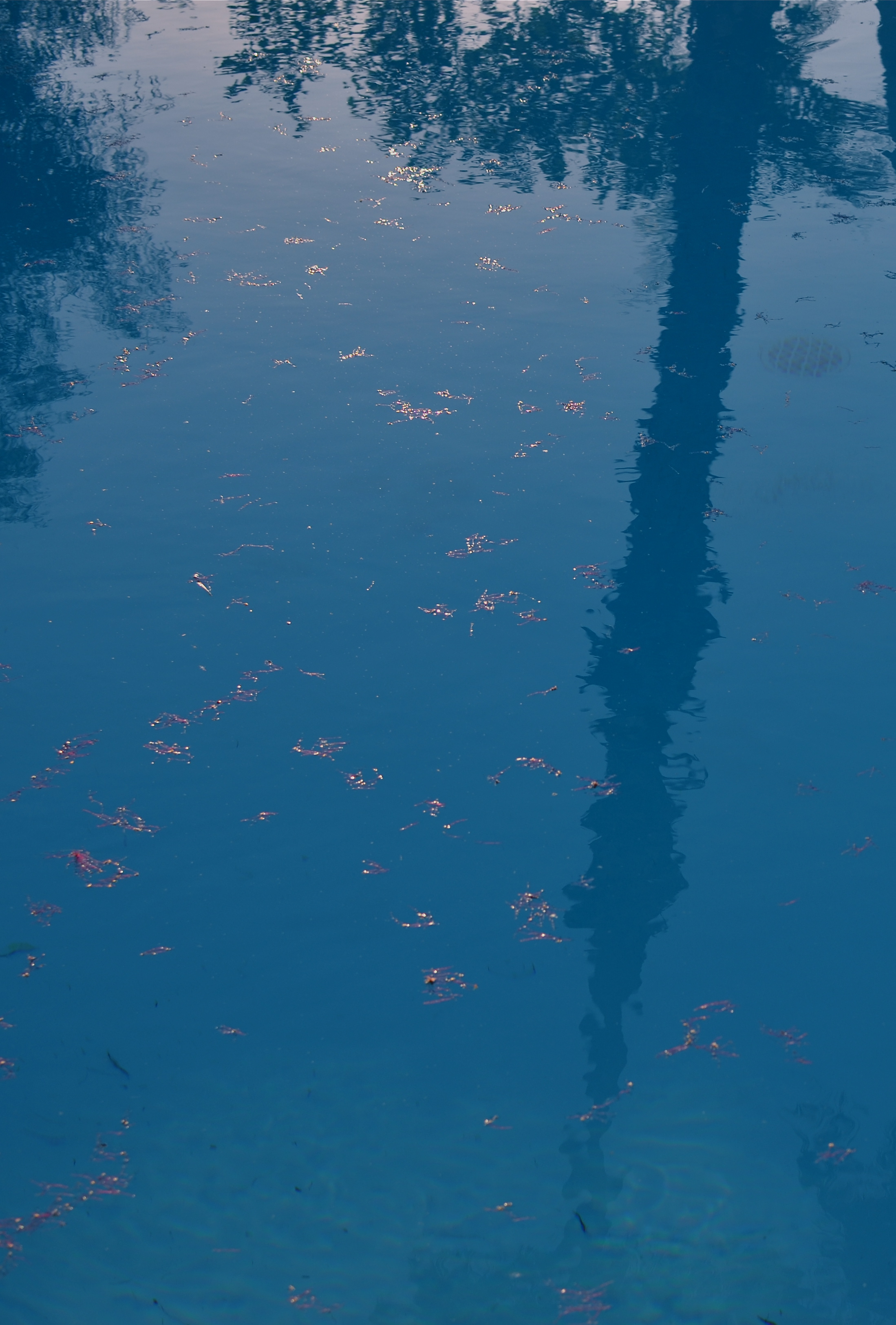
You already know a tree “goes with” this reflection..but is it needed to complete the image? 1/500 sec., f/5.6, ISO 100, 35mm.
It means being your own best editor, and, to do that, you have to be able to hate on your own work a little bit. Tough love and all that. Spare the picture and spoil the image. No sacred cows, just because they are your cows. There is no avoiding the fact that no real art comes about unless you take direct, often brutal action, to overcome the imperfections of a raw first effort. You have to intervene, again and again, in the shaping of your conception.
You can probably infer from all this that I am no fan of automodes, or of any other abdication of responsibility that lets a device, for Pete’s sake, dictate the outcome of image-making.
A few basic truths to keep before you:
Your camera is a machine with an eye attached.
You are an eye with a brain attached.
One of you is supposed to be in charge.
Guess which one.
When we merely snap a scene, freezing an arrangement of whatever we see in frame, we are only making a record. Creativity comes with abstraction, of exploring what is beyond the obvious cause-and-effect. The standard approach to showing things should actually be called the “average” approach. Look, here’s a tree, and, below, here is its shadow. Behold, here’s a scenic object next to the water, and, in the water, a reflection of that object. This simple reproduction of “reality” involves craft, to be sure, but something that falls short of art. Abstracting, adding or taking away something, and actively partnering with the viewer’s imagination take the photograph beyond a mere recording.
And that, boys and girls, is where the “art” part comes in.
Take away even a single obvious element and you change the discussion, for better or worse. Does the tree always have to be accompanied by its shadow? Does the mountain and its reflection always need to be presented as a complete “set”? It’s interesting to take even the “perfect” or “balanced” shots we cherish most and again take the scissors to part of them. Can the picture speak louder if we trim away the obvious? Can the image turn out to be something if it just stops trying to be everything?
The easiest abstractions come from changing small things, and editing can often, oddly, be an act of completion. Pictures taken in the moment are convenient, but too many images are trusted to the ease of leaning on automodes, and almost no photo is fully realized “straight out of the camera.” Believe this if you believe nothing else: nothing truly excellent ever results from putting your imagination in neutral. You have to decide whether you or the machine is the principal picture-taker.
That decision decides everything else.
Follow Michael Perkins on Twitter @mpnormaleye
BLUE ON THIRD AVENUE

The cyanotype option in Nikon’s monochrome posting menu makes this in-camera conversion from color easy. 1/80 sec., f/5.6, ISO 160, 18mm.
By MICHAEL PERKINS
COLOR IS LIKE ANY OTHER COMPONENT IN LIGHT COLLECTION AND ARRANGEMENT, which is, really, what we are doing. Seen as a tool instead of an absolute, it’s easy to see that it’s only appropriate for some photographs. Since the explosion of color imaging for the masses seen in the coming of Kodachrome and other early consumer films in the 1930’s, the average snapper has hardly looked back. Family shots, landscapes, still life arrangements….full color or go home, right?
Well….
Oddly, professional shooters of the early 20th century were reluctant to commit to the new multi-hued media, fearing that, for some novelty-oriented photographers, the message would be the color, instead of the color aiding in the conveying of the message. Even old Ansel Adams once said of magazine editors, that, when in doubt, they “just make it red”, indicating that he thought color could become a gimmick, the same way we often regard 3-d.
In the digital age, by comparison, the color/no color decision is almost always an afterthought. There are no special chemicals, films or paper to invest in before the shutter clicks, and plenty of ways to render a color shot colorless after the fact. And now, even the post-processing steps involved in creating a monochrome image need not include an investment in Photoshop or other software. For the average shooter, monochrome post-processing is in-camera, at the touch of a button. Straight B/W and sepia and even what I call the “third avenue”, the blue duotone or cyanotype, as I’ve used above.Do such quickie options worsen the risk of gimmick-for-gimmick’s sake more than ever? As Governor Palin would say, “you betcha”. Google “over-indulgence”, or just about half of every Instagram ever taken, as evidence.
Hundreds of technical breakthroughs later, it still comes down to the original image itself. If it was conceived properly, color won’t lessen it. If it was a bad idea to start with, monochrome won’t deliver the mood or the tone changes needed to redeem it. Imagine the right image, then select the best way to deliver the message. Having quick fixes in-camera aren’t, initially, a guarantee of anything but the convenient ability to view alternatives. In the photo above, my subject was just too warm, too pretty in natural color. I thought the building itself evoked a certain starkness, a cold, sterile kind of architecture, that cyanotype could deliver far better. The shadows are also a bit more mysteriously rendered.
At bottom, the shot is just a study, since I will be using it to take far more crucial pictures of far more intriguing subjects. But the in-camera fix allows you to analyze on the fly. And, since I got into this racket to shoot pictures, and not to be a chemist, I occasionally like a fast thumbs-up, thumbs-down verdict on something I’ve decided to try in the moment.
Giving yourself the blues can be a good thing.
(follow Michael Perkins on Twitter @ mpnormaleye)
Related articles
- Toning my Cyanotype with Haritaki (altlab2011.wordpress.com)
- Beyond Color (piaffephotos.wordpress.com)
IT’S NOT EASY BEIN’ GREEN

This is the desert? A Phoenix area public park at midday. There is a way around the intense glare. 1/500 sec., f/5.6, ISO 100, 35mm, straight out of the camera.
By MICHAEL PERKINS
FOR YEARS I HAVE BEEN SHOOTING SUBJECTS IN THE URBAN AREAS OF PHOENIX, ARIZONA, trying to convey the twin truths that, yes, there are greenspaces here, and yes, it is possible for a full range of color to be captured, despite the paint-peeling, hard white light that overfills most of our days. Geez, wish I had been shooting here in the days of Kodachrome 25. Slow as that film was, the desert would have provided more than enough illumination to blow it out, given the wrong settings. Now if you folks is new around here, lemme tell you about the brilliant hues of the Valley of the Sun. Yessir, if’n you like beige, dun, brown, sepia or bone, we’ve got it in spades. Green is a little harder to come by, since the light registers it in a kind of sickly, sagebrush flavor….kind of like Crayola’s “green-yellow” (or is it “yellow-green”?) rather than a deep, verdant, top-o-the-mornin’ Galway green.
But you can do workar0unds.
In nearby Scottsdale, hardly renowned for its dazzling urban parks (as opposed to the resort properties, which are jewels), Indian School Park at Hayden and Indian School Roads is a very inviting oasis, built around a curvy, quiet little pond, dozens of mature shade trees that lean out over the water in a lazy fashion, and, on occasion, some decorator white herons. Thing is, it’s also as bright as a steel skillet by about 9am, and surrounded by two of the busiest traffic arteries in town. That means lots of cars in your line of sight for any standard framing. You can defeat that by turning 180 degrees and aiming your shots out over the middle of the pond, but then there is nothing really to look at, so you’re better off shooting along the water’s edge. Luckily, the park is below street level a bit, so if you frame slightly under the horizon line you can crop out the cars, but, with them, the upper third of the trees. Give and take.
There is still a ton of light coming down between the shade trees, however, so if you want any detail in the water or trees at all, you must shoot into shade where you can, and go for a much faster shutter speed….1/500 up to 1/1000 or faster. It’s either that or shoot the whole thing at a small f-stop like f/11 or more. In desert settings you’ve got so much light that you can truly dance near the edge of what would normally be underexposure, and all it will do is boost and deepen the colors that are there. There will still be a few hot spots on projecting roots and such where the light hits, but the beauty of digital is that you can click away and adjust as you go.
It’s not quite like creating greenspace out of nothing, but there are ways to make things plausibly seem to be a representation of real life, and, since this is an interpretive medium, there’s no right or wrong. And the darker-than-normal shadows in this kind of approach add a little warmth and mystery, so there’s that.
It was “yellow-green”, wasn’t it?
Hope that’s not on the final.
(follow Michael Perkins on Twitter @mpnormaleye)
FIND THE OUTLIERS
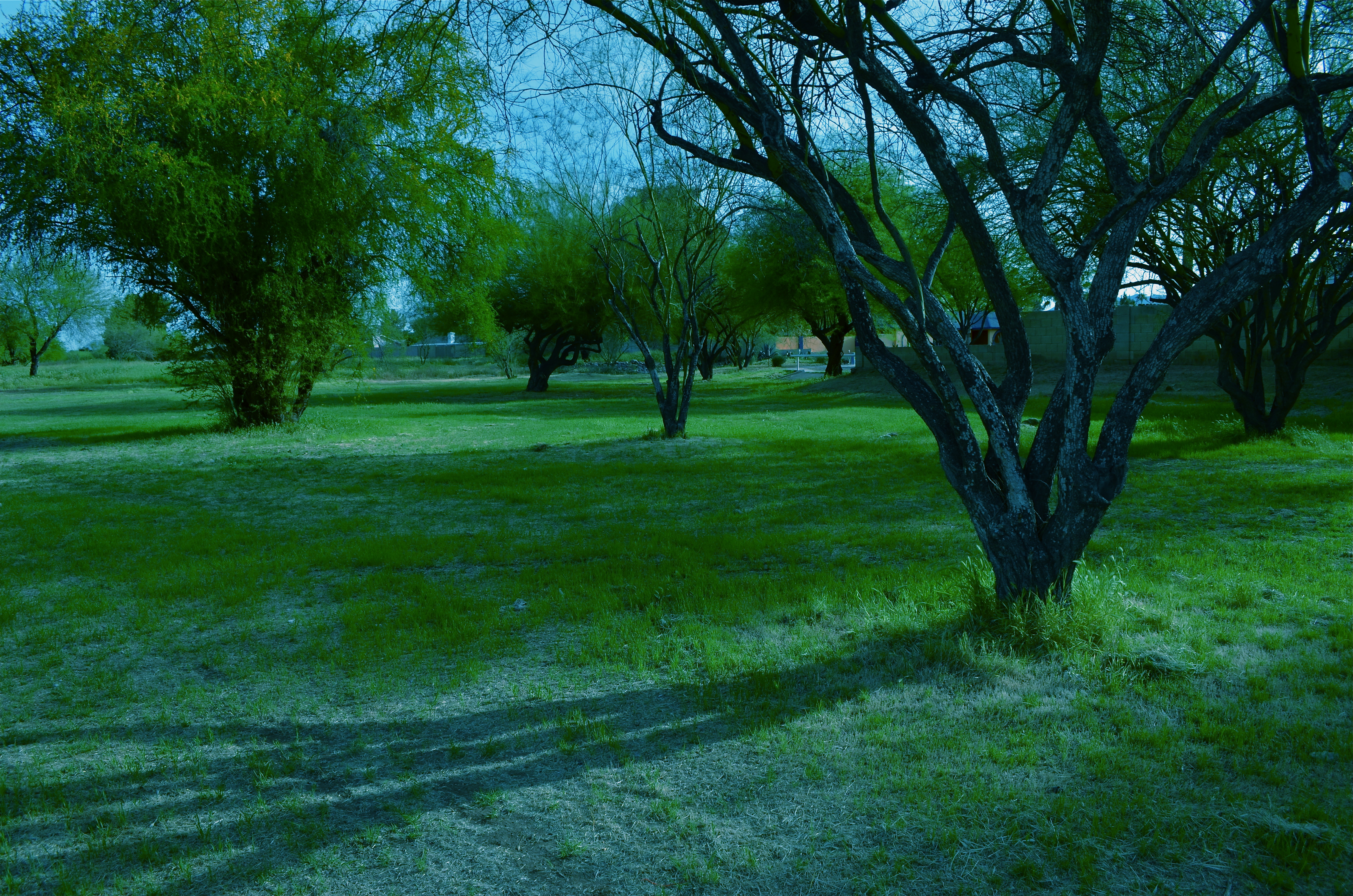
Not the kind of space you’d expect to see in a visually crowded suburban environment. And that’s the point. 1/320 sec., f/8, ISO 100, 18mm.
By MICHAEL PERKINS
EVERY TIME MY WIFE AND I TRAVEL, A STRANGE PHENOMENON OCCURS. We will be standing on the exact same geographic coordinates, pointing separate cameras in generally the same general area. And, invariably when she gets her first look at the pictures I took on that day, I will hear the following:
Where was THAT? I don’t remember seeing that!? Where was I?
Of course, we see differently, as do any two shooters. Some things that are blaring red fire alarms to one of us are invisible, below the radar, to the other. And of course we are both right. And valid. Admittedly, I do seem to come back with more strange, off-to-the-side-of-the road oddities than Marian does, but that may be due more to my wildly spasmodic attention span than any real or rare “vision”. Lots of it comes because I consciously trying to overcome the numbing experience of driving in a car. I have to work harder to take notice of the unconventional when repeatedly tracking back and forth,day after day, down routine driving routes. Familiarity not only breeds contempt, it also fosters artificial blindness. The “outliers” within five miles of your own house should glow like fluorescent paint….but often they seem cloaked by a kind of habit-dulled camo.
Once detected, outliers don’t quite fit within their neighboring context. The last Victorian gingerbread home in a clutch of tract houses. The old local movie theatre reborn as a Baptist church. Or, in a place like Phoenix, Arizona, where urban development is not only unbridled but seemingly random, the rare “undeveloped” lot, crammed between more familiar symbols of sprawl.
The above image is such an outlier. It’s about an acre-and-a-half of wild trees bookended by a firehouse,
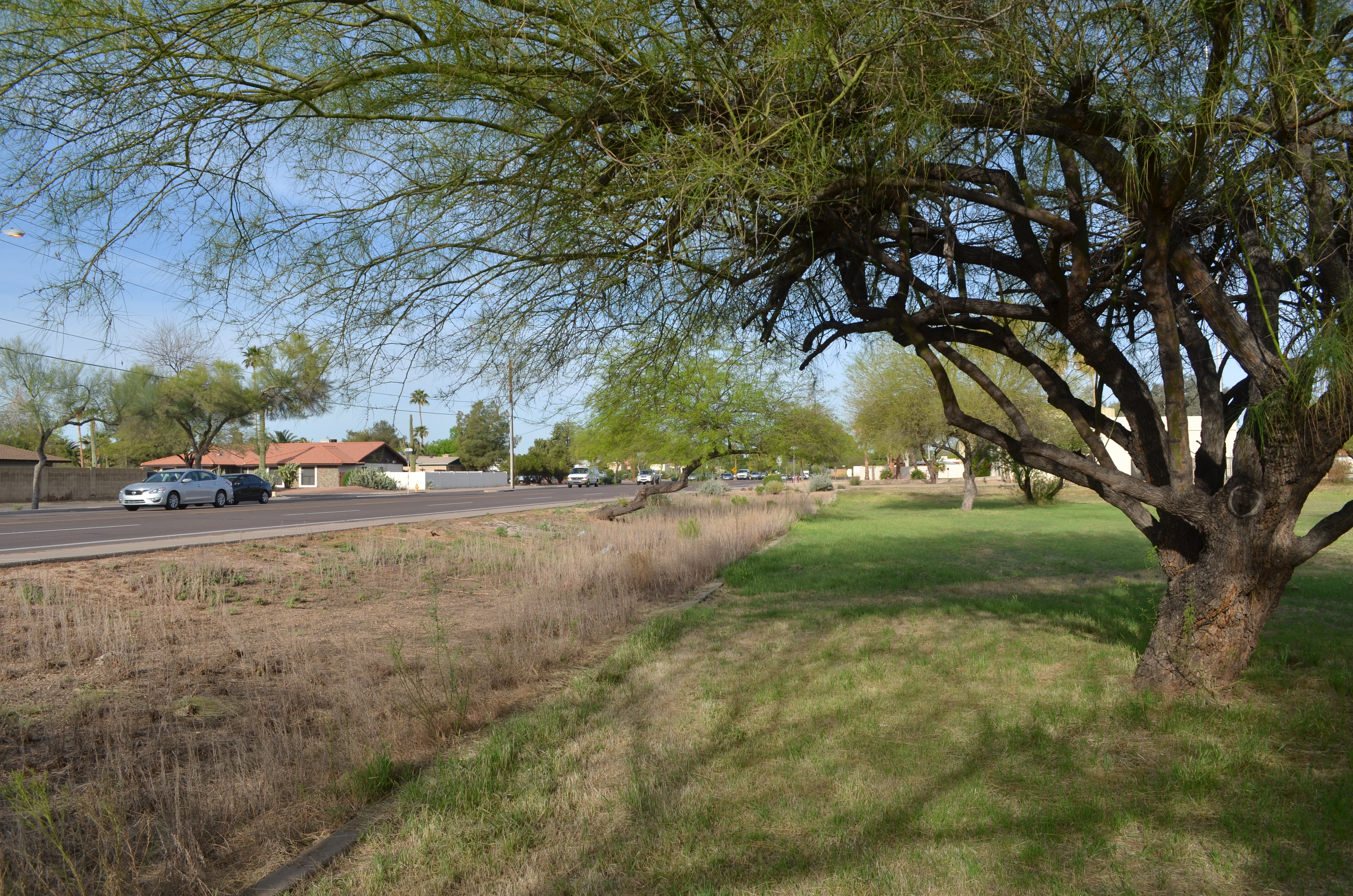
The sprawl-laden neighborhood that surrounds my “enchanted forest” Hey. it”s all about the context.
a row of ranch houses, and a busy four-lane street. Everything else on the block screams “settled turf”, while this strange stretch of twisted trunks looks like it was dropped in from some fairy realm. At least that’s what it says to me.
My first instinct in cases like this is to get out and shoot, attempting, as I go, to place the outlier in its own uncluttered context. Everything else around my “find” must be rendered visually irrelevant, since it adds nothing to the image, and, in fact, can diminish what I’m after. Sometimes I also tweak my own color mix, since natural hues also may not get my idea across.
Even after all this, I often find that there is no real revelation to be had, and I must chalk the entire thing up to practice. Occasionally, I come back with something to show my wife. And I know I have struck gold if the first thing out of her mouth is, “Where is THAT?”
To paraphrase the old proverb, behind every great man is a woman who rightfully asks, “Do you know what you’re doing?”
Sometimes I have an answer….
REWORKING THE UNIVERSE
By MICHAEL PERKINS
CONTEXT, FOR A PHOTOGRAPHER, IS LIKE THE CONDUCTOR’S BATON IN MUSIC, that magic wand that dictates fast and slow, soft and loud, ordering a specific world within a confined space. Since it impossible to show the world entire, all shooters decide what part of it, what story within it, that they will frame. Sounds obvious, but without the mastery of this skill, we fail as storytellers, and the eye that we develop for what to include and exclude is, despite all the tools and toys, the only thing that really makes an artistic performance out of a photograph.
It can also be a helluva lot of fun. With some dumb luck thrown in for good measure.
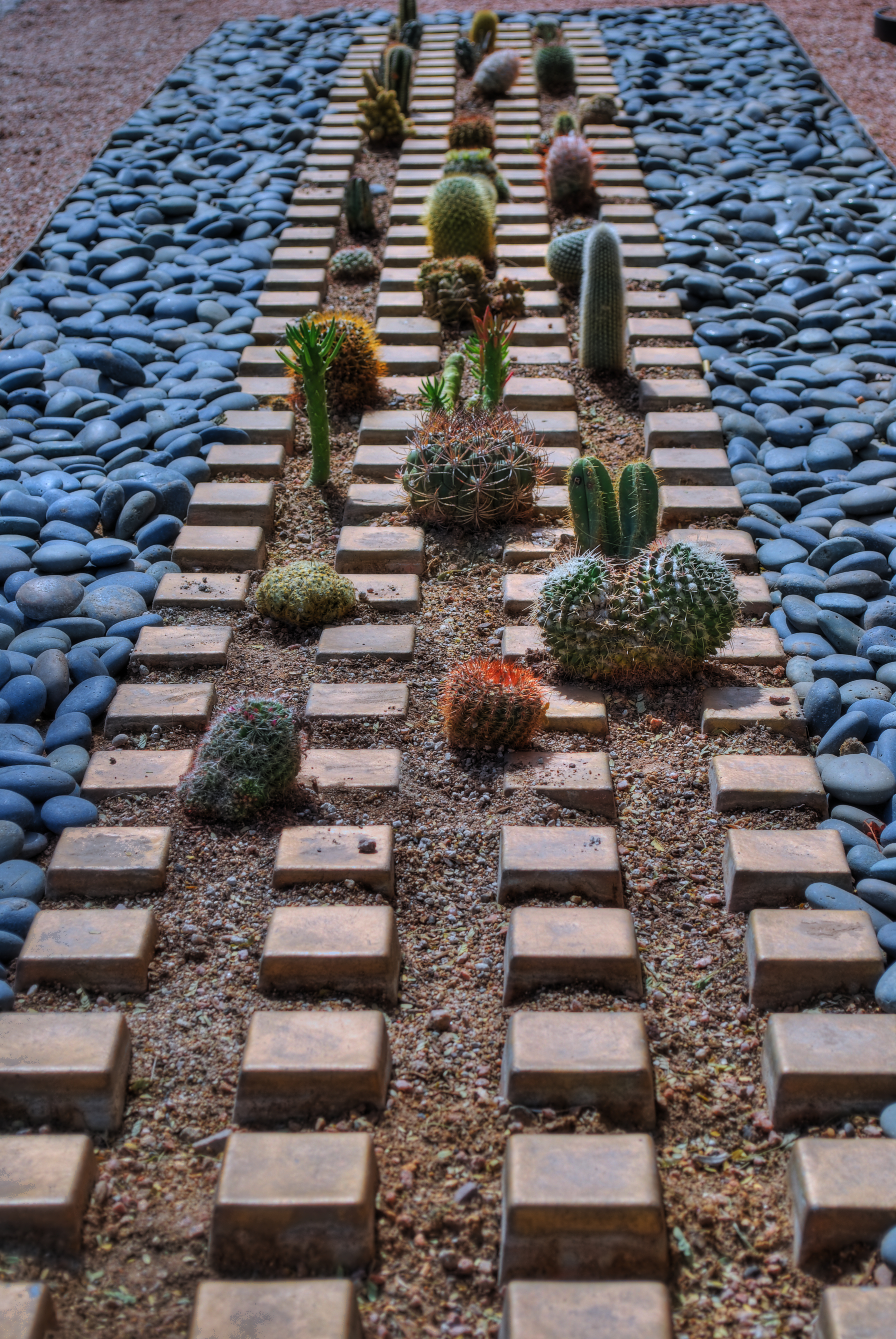
Cactropolis, 2011. A three-exposure HDR blend with a little color and contrast teaking. This whole layout, in reality, is about fifteen feet square, total. Various shutter speeds, f/8, ISO 100, 52mm.
I love opportunities that allow me to disrupt the original visual “place” of objects, to force them to be re-purposed for the viewer. A few years ago, my daily lunch routine involved a short walk across a bustling college campus to my habitual lunch hang, a stroll which took me past one of the school’s busiest crossroads, marked by the intersection of two superwide sidewalks flanked by small patches of landscaping. Since this is Arizona, such short plots of land frequently are not the stuff dreams are made of. We’re talking pink quartz gravel interrupted by the occasional scabby aloe plant or cholla. And that’s what made this one little rectangle, just several feet long on each side, vie for my attention.
An arrangement of several varieties of small cacti has been arranged in rows, regulated by square tiles, grounded in gravel, and bounded by smooth bluish stones. Simple stuff, really, but this was somebody’s deliberate design, a pattern that registered, to my eye, like some kind of fantasy urban streetscape, blocks of tiny, spiny skyscrapers vanishing off toward an unseen horizon….a miniature downtown from Weirdsville, a tabletop diorama from Beetlejuice.
I didn’t really have to compose anything. I was in the framing business. But getting that frame meant getting rid of the surrounding throngs of students, the sidewalks, the buildings, the sky…..anything that seemed outside of the closed world implied by that little rectangle. Changing the context. In fact, I was adding something for everything I was taking away.
So let’s crop this puppy and see what happens.
Now I saw what seemed to be a self-contained world, one in which I was free to imagine what lay “beyond”. I goosed up the hues and texture with HDR processing, but otherwise, what you see is what there was. Maybe it works as pure design. Maybe I conveyed something, but the fact is, we have to make choices as shooters. The only thing that marks us as individuals is what we decide to see, and show.
Like I said…fun….luck….some other somethings…..
(Many Thanks Dept.:The idea for this post was inspired, in part, by a suggestion from my good friend Michael Grivois.)
THE GOLDEN AGE OF JUST OKAY
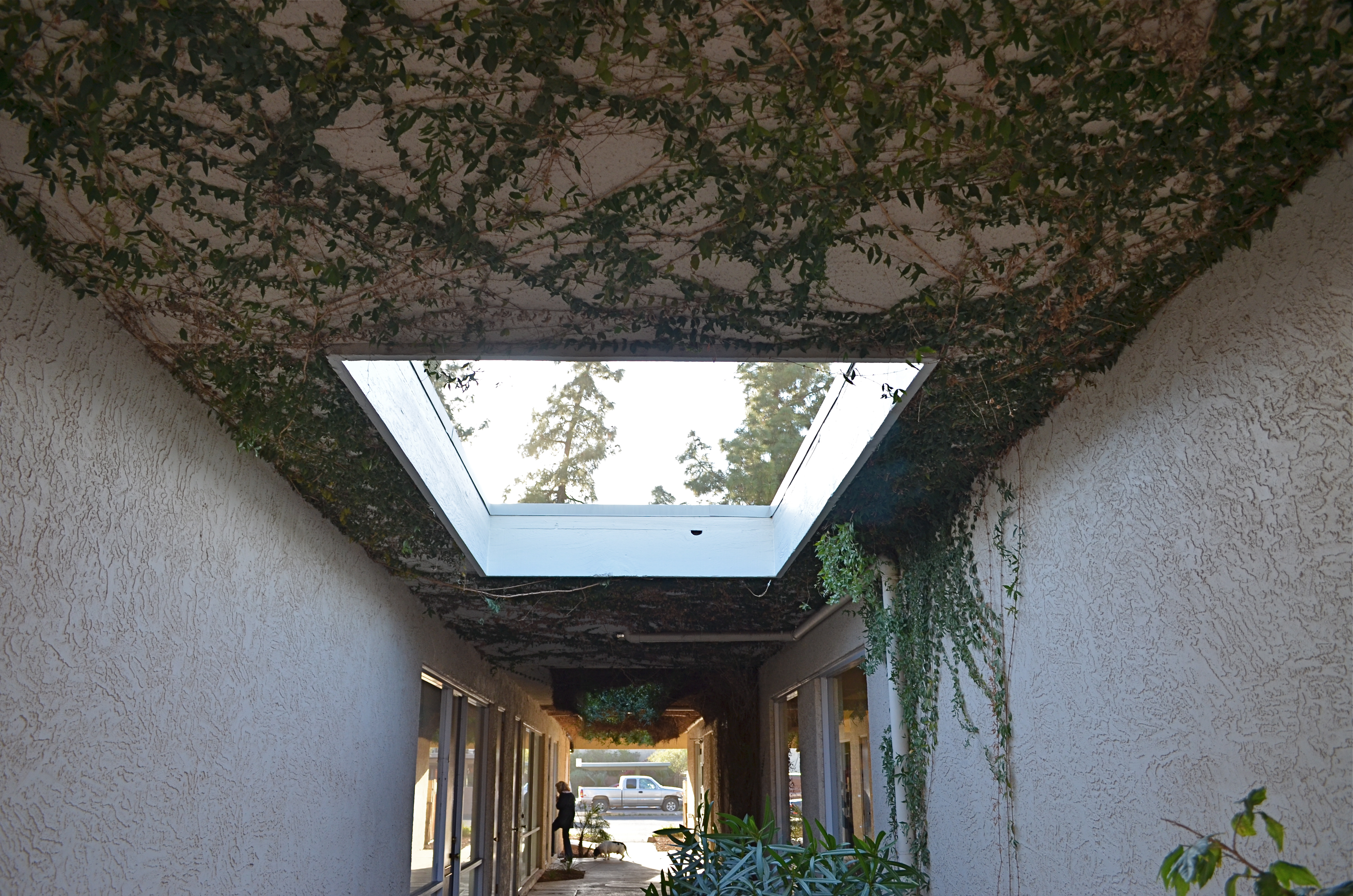
Plenty of mistakes made on this one. Is it a success or a failure? Does it matter? All that’s important is that you, not the camera, is making the picture. Manual mode, 1/100 sec., f/5.6, ISO 100, 18mm.
By MICHAEL PERKINS
WE ALL SAY IT: THERE ARE NO SHORTCUTS TO SUCCESS.
We all say it. None of us believes it. It’s just not, well, American to throw aside our national myths, and the folk tale of the lucky, quick genius who zooms to the head of the line to fame, bounding in front of all the sloggers and suckers, is intoxicating. One blinding inspiration, we tell ourselves, just one great notion, and we can bypass all that “practicing and patience” stuff, the same virtues we feel honor bound to extol in others. In anyone else but me.
Me, I’m taking the shortcut.
So now is about the time when the photography angle of this rant should kick in, right?
Okay, here goes.
As the automode functions of cameras have grown ever more complex, they have made taking a perfectly acceptable picture effortless. Great for immediate gratification. Not so great for the art of photography. Think about it. It has become so fabulously easy to point and get something that isn’t too bad, that we are bypassing the slower, uglier, but eventually more satisfying process that comes with trial, error, recalculation, and risk. We produce more error-free pictures than ever before, but, to do that, we have to hang our own creativity…..the raw, sloppy process of imagineering our own vision…on the wall. We get fat and lazy. And so do our pictures.
Now that I have successfully defended my title as the great Grinch Buzzkill, trying to rid Whoville of good, clean camera fun, let me just ask one more question. Do we want a large mountain of “okay” pictures, taken, to an ever greater degree, by our cameras, or a smaller, more amazing pile of remarkable pictures borne of our own sweat and struggle? Tricky part: there is no right or wrong answer, just a choice to be made based on your own expectations. Turning off the “green zone” of guaranteed effect modes and really educating ourselves as to what is going into the making of our pictures means turning off a snapshot mentality and opting for the unpredictable.
Hey, I’m not suggesting you go all Matthew Brady and lug around forty pounds of wet plates and a covered wagon full of caustic chemicals just to take a birthday picture of Grandma blowing out her candles. But we can probably aspire to more than just the golden age of okay.
We already know how easy it is to take a picture. Now we need to rediscover how hard it can be, and what miracles can spring from our minds when we get our hands dirty and go down the rockier path.
I SEE YOUR FACE BEFORE ME
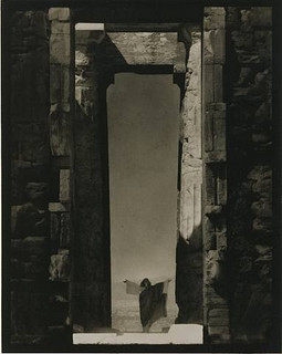
Edward Steichen’s amazing 1921 portrait of dance icon Isadora Duncan beneath a massive arch of the Parthenon in Greece, an image which recently surged to the top of my mind. See a link to a larger view of this shot, below.
By MICHAEL PERKINS
THE IMAGES SIT AT THE BOTTOM OF THE BRAIN, LIKE STONE PILLARS IN THE FOUNDATION OF AN IMMENSE TOWER.The structures erected on top of them, those images we ourselves have fashioned in memory of these foundations, dictate the height and breadth of our own creative edifices. Between these elemental pictures and what we build on top of them, we derive a visual style of our own.
In my own case,many of the pillars that hold up my own house of photography come from a single man.
Edward Steichen is arguably the greatest photographer in history. If that seems like hyperbole, I would humbly suggest that you take a reasonable period of time, say, oh, twenty years or so, just to lightly skim the breadth of his amazing career….from revealing portraits to iconic product shots to nature photography to street journalism and half a dozen other key areas that comprise our collective craft of light writing. His work spans the distance from wet glass plates to color film, from the Edwardian era to the 1960’s, from photography as an insecure imitation of painting to its arrival as a distinct and unique art form in its own right.
At the start of the 20th century, Steichen co-sponsored many of the world’s first formal photographic galleries, and was a major contributor to Camera Work, the first serious magazine dedicated wholly to photography. He ended his career as the creator of the legendary Family Of Man, created in the early 1950’s and still the most celebrated collection of global images ever mounted anywhere on earth. He is, simply, the Moses of photography, towering above many lesser giants whose best work amounts to only a fraction of his own prodigious output.
Which is why I sometimes see fragments of what he saw when I view a subject. I can’t see with his clarity, but through the milky lens of my own vision I sometime detect a flashing speck of what he knew on a much larger scale, decades before. The image at left recently rocketed to my mind’s eye several weeks ago, as I was framing shots inside a large government building in Ohio.In 1921, Steichen journeyed to Greece to use the world’s oldest civilization basically as a prop for portraits of Isadora Duncan, then in the forefront of American avant-garde dance. Framing her at the bottom of an immense arch in the ruins of the Parthenon, he made her appear majestic and minute at the same time, both minimized and deified by the huge proportions in the frame. It is one of the most beautiful compositions I have ever seen, and I urge you to click the Flickr link at the end of this post for a slightly larger view of it. (Also note the link to a great overview of Steichen’s life on Wikipedia.)
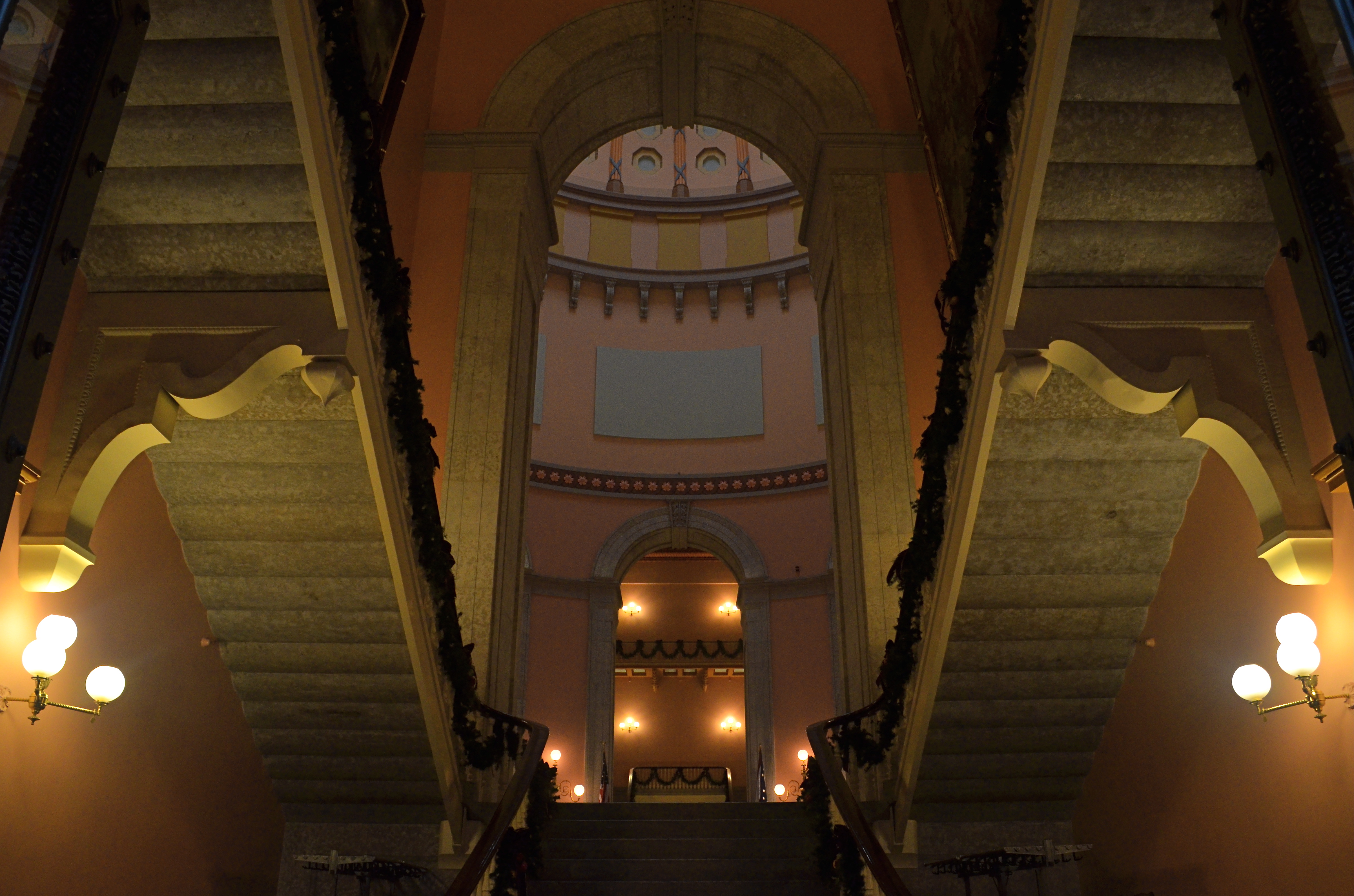
Uplighting creates a moody frame-within-frame feel at the Ohio Statehouse building, in a shot inspired by Edward Steichen’s images of massive arches. 1/30 sec., f/8, ISO 800, 18mm.
In framing a similarly tall arch leading into the rotunda of the Ohio Statehouse in Columbus, I didn’t have a human figure to work with, but I wanted to show the building as a series of major and minor access cavities, in, around, under and through one of its arched entrance to the central lobby. I kept having to back up and step down to get at least a partial view of the rotunda and the arch at the opposite end of the open space included in the frame, which created a kind of left and right bracket for the shot, now flanked by a pair of staircases. Given the overcast sky meekly leaking grey light into the rotunda’s glass cupola, most of the building was shrouded in shadow, so a handheld shot with sufficient depth of field was going to call for jacked-up ISO, and the attendant grungy texture that remains in the darker parts of the shot. But at least I walked away with something.
What kind of something? There is no”object” to the image, no story being told, and sadly, no dancing muse to immortalize. Just an arrangement of color and shape that hit me in some kind of emotional way. That and Steichen, that foundational pillar, calling up to me from the basement:
“Just take the shot.”
Related articles
- The Photograph as a Social Statement (halsmith.wordpress.com)
- Picture Imperfect (andrewsullivan.thedailybeast.com)
- http://www.flickr.com/photos/quelitab/5793648357/lightbox/
- http://en.wikipedia.org/wiki/Edward_Steichen
THE PROSCENIUM
By MICHAEL PERKINS
IT IS THE OLDEST FRAMING DEVICE IN HISTORY. If you’ve ever watched a play on any stage, anywhere in the world, you’ve accepted it as the classic method of visual presentation. The Romans coined the word proscenium, “in front of the scenery”. Between stage left and stage right exists a separate reality, defined and contained in the finite space of the theatre’s forward area. What is included in the frame is everything, the center of the universe of certain characters and events. What’s outside the frame is, indefinite, vague, less real.
Just like photography, right? Or to be accurate, photography is like the proscenium. We, too select a specific world to display. We leave out all the other worlds not pertinent to our message. And we follow information in linear fashion…left to right, right to left. The frame gives us the sensation of “looking in” to something that we are only visiting, just as we only “rent” our viewpoint from our theatre seats.
We learned our linear habit from the descendants of stage arrangement….murals, frescoes, paintings, all working, as our first literate selves would, from left to right. Painters were forced to arrange information inside the frame, to make choices of what that frame would include, and, as the quasi-legitimate children of painting, we inherited that deliberately chosen viewpoint, that decision to show a select world, by arranging visual elements within the frame.
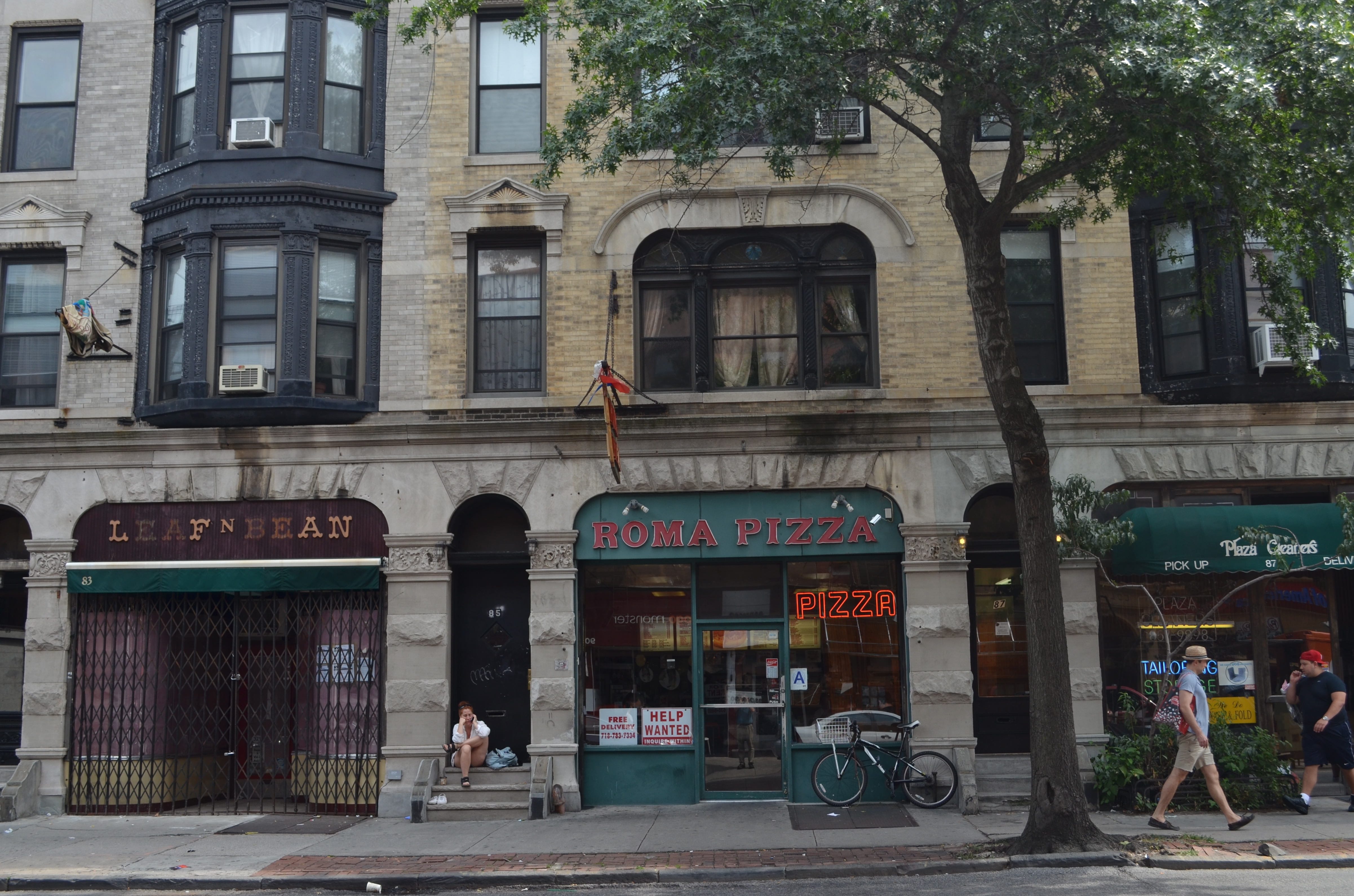
Park Slope, Brooklyn, 2012. Trying to catch as much activity as a street glance, at any given moment, can. 1/320 sec., F/7.1, ISO 100, 24mm.
For some reason, in recent months, I have been abandoning the non-traditional in shooting street scenes and harking back to the proscenium, trying to convey a contained world of simple, direct left-right information. Candid neighborhood shots seem to work well without extra adornment. Just pick your borders and make your capture. It’s a way of admitting that some worlds come complete just as they are. Just wrap the frame around them like a packing crate and serve ’em up.
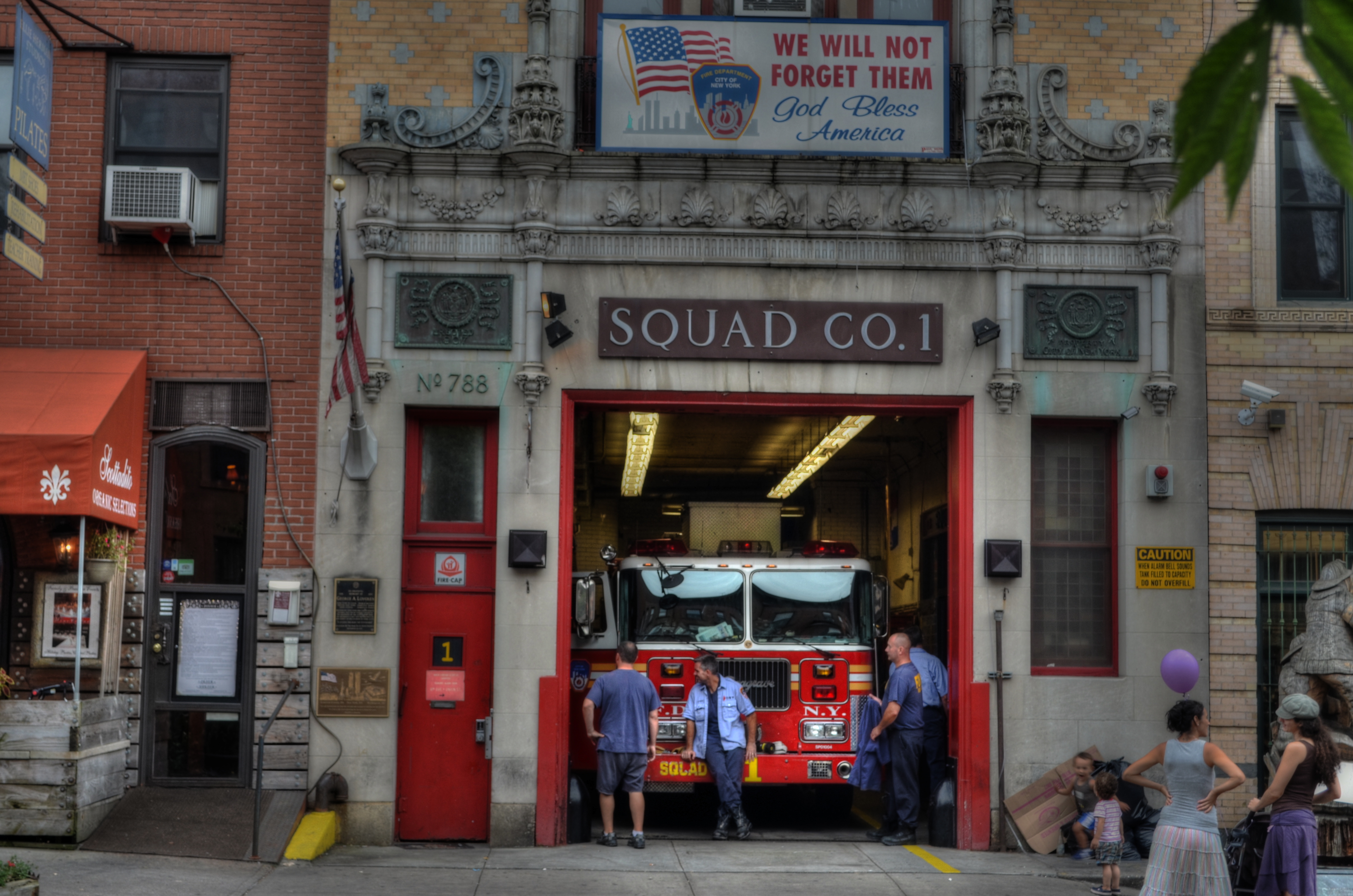
Like a theatre play, some images read best as self-contained, left-to-right “worlds”. A firehouse in Brooklyn, 2012. 1/60 sec., f/6.3, ISO 100, 38mm.
This is not to say that an angled or isometric view can’t portray drama or reality as well as a “stagy” one. Hey, sometimes you want a racing bike and sometimes you want a beach cruiser. Sometimes I don’t mind that the technique for getting a shot is, itself, a little more noticeable. And sometimes I like to pretend that there really isn’t a camera.
That’s theatre. You shouldn’t believe that the well-meaning director of the local production of Oklahoma really conjured a corn field inside a theatre. But you kind of do.
Hey what does Picasso say? “Art is the lie that tells the truth”?
Okay, now I’m making my own head hurt. I’m gonna go lie down.
WHAT COULD BE
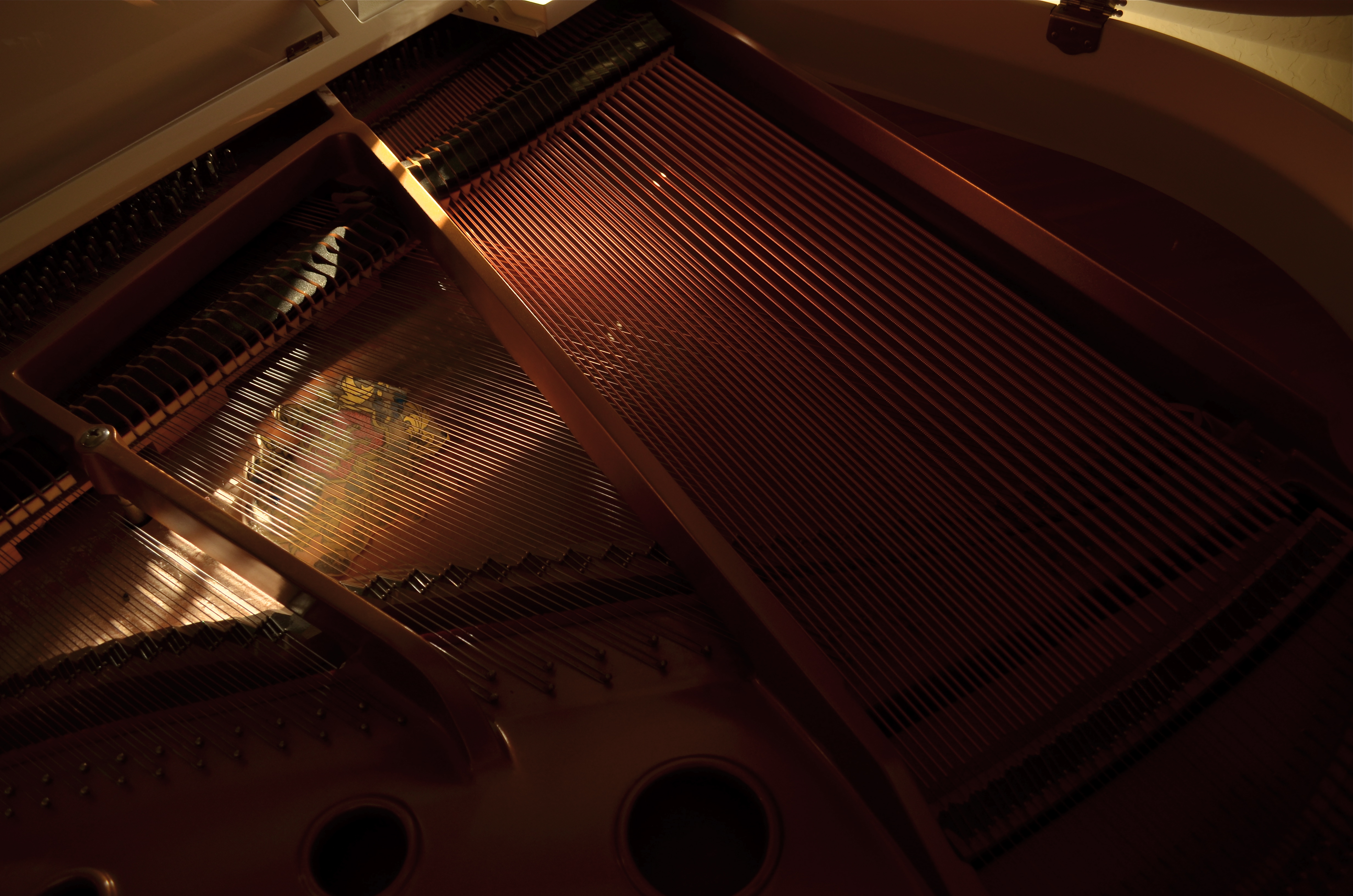
My umpteenth piano picture over a lifetime, but one which at least shows me something I don’t usually see. Available light, straight out of the camera. 1/50 sec., 5/5.6, ISO 100, 18mm.
By MICHAEL PERKINS
THERE ARE ALWAYS CONCEPTS THAT YOU FORCE YOURSELF TO RE-VISIT, almost to the point of obsession. We all have subjects that, as photographers, we just can’t stop turning over in our minds. This reluctance to “just move on” may occur with a place, a person’s face, an arrangement of shapes, a select element of light, but, whatever the source, it gnaws at us. We dream of the next chance to go back and tackle it again. We truly believe that the “right” shot is in there somewhere, just as a statue of an elephant is somewhere inside a slab of marble. As the old joke goes, just chip away anything that doesn’t look like an elephant and there you are (That’s either a really stupid joke or amazing profundity. Depending on which day you ask me, I can take either side. Anyway….).
I have at least one restaurant, a small city park, about a dozen still life projects, and one or two human faces that haunt me in this way. In every case, I get stuck on the idea that, with a moment of inspiration, I’m one click away from the ideal I see in my mind. Only, like a desert mirage, the ideal keeps wiggling and warping into something else. Maybe I’ve already made the best version of that picture already. Maybe there really is nothing more to be done.
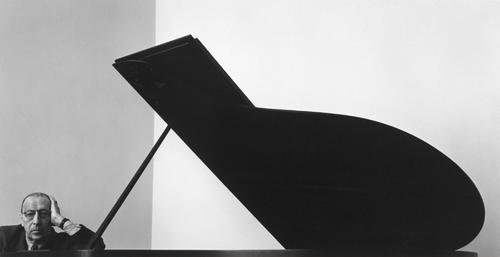
Arnold Newman’s amazing abstract portrait of a piano, “accompanied” by composer Igor Stravinsky. This is a copyrighted image.
As a lifelong musical tinkerer, I’ve always been interested in pianos both as machines that are crafted to do incredibly complicated things, and as a kind of sculpture, a shaper of space and light. Some photographers have used them as incredibly dynamic design elements to remarkably dramatic effect. Arnold Newman’s classic portrait of composer Igor Stravinsky uses only the lid of a concert grand to flank the maestro, but it’s all the piano he needs to tell the story and it’s a wondrous horizontal use of space. Others have created brilliant images using just portions of the keyboard. Do a search of your own and be amazed at the variety of results.
Me, I’m a “guts” kinda guy. Lifting the lid on my first piano to see what made it tick was one of the most thrilling moments of my childhood, and, now, years later, I see the mechanism inside my own baby grand as a way to reflect, capture and shape light. It’s like having a giant Spirograph or a metallic spider web. Lots of ways this could go. In the above image, morning light gave me a big break, as the golden cast of the good, early stuff blended with ambient tones in the harp strings and the inside of the cabinet. While the light falls off sharply at the margins, it makes much of the mechanism fairly glow, and, while I can’t stop tinkering with my lifelong “piano-as-design-object” quest (at least this side of the grave), I think this is a step in the right direction. Where we’re eventually going, who knows?
As usual, I’m just enjoying the ride.
Thoughts?
Related articles
TRAVEL JITTERS
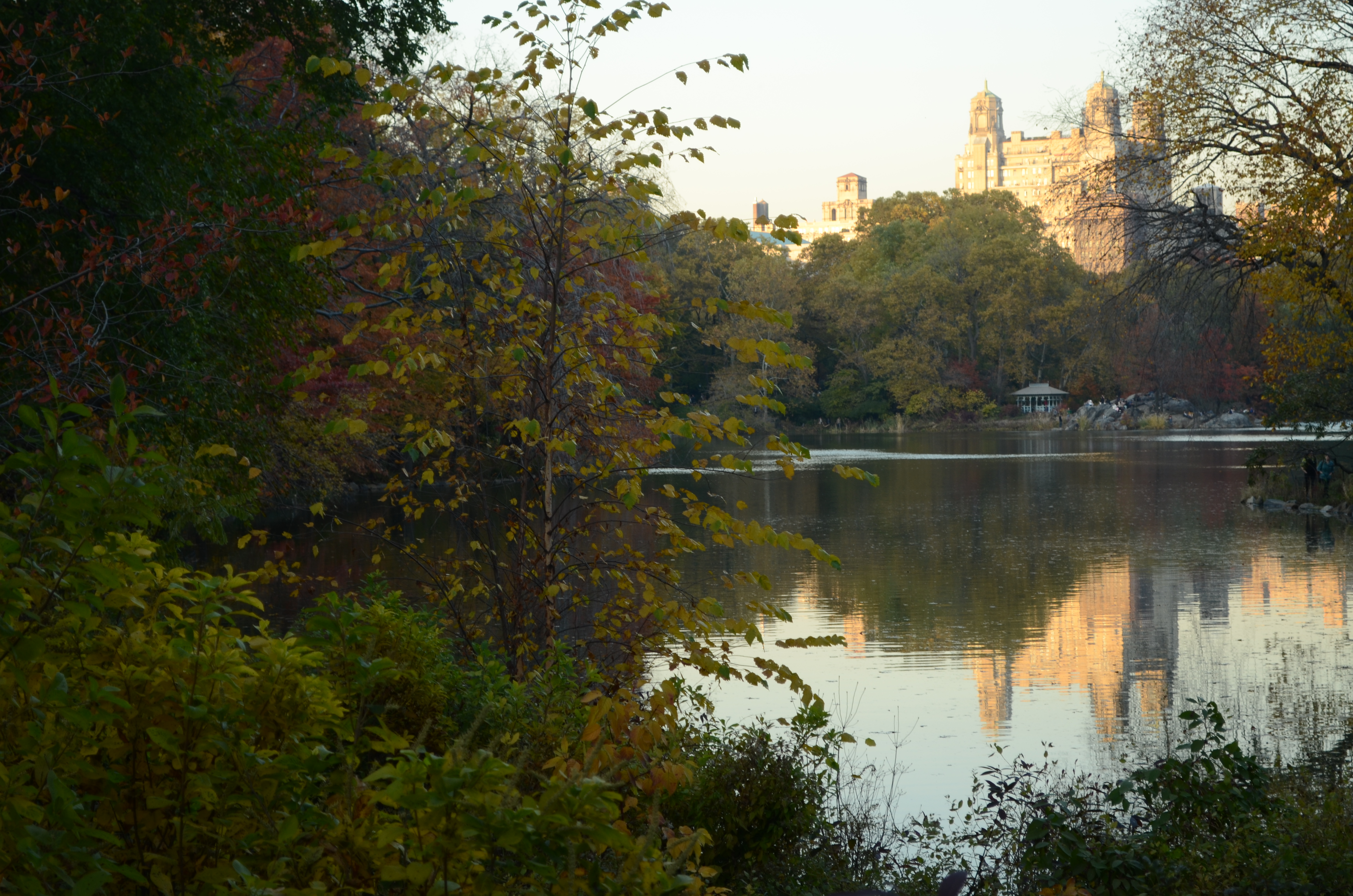
“Autumn in New York, why does it seem so inviting?” A shot inside Central Park, November 2011. 1/60 sec., f/5.6, ISO 160, 50mm.
By MICHAEL PERKINS
IF THERE IS SUCH A THING AS PHOTOGRAPHIC STAGE FRIGHT, it most likely is that vaguely apprehensive feeling that kicks in just before you connect with a potentially powerful subject. And when that subject is really Subject One, i.e., New York City, well, even a pro can be forgiven a few butterflies. They ain’t kidding when they sing, if I can make it there I can make it anywhere. But, of course, the Apple is anything but anywhere…….
Theoretically, if “there are eight million stories in the Naked City”, you’d think a photographer would be just fine selecting any one of them, since there is no one single way of representing the planet’s most diverse urban enclave. And there are over 150 years of amazing image-making to support the idea that every way of taking in this immense subject is fair territory.
And yet.
And yet we are drawn (at least I am) to at least weigh in on the most obvious elements of this broad canvas. The hot button attractions. The “to-do list” locations. No, it isn’t as if the world needs one more picture of Ellis Island or the Brooklyn Bridge, and it isn’t likely that I will be one of the lucky few who will manage to bring anything fresh to these icons of American experience. In fact, the odds are stacked horribly in the opposite direction. It is far safer to predict that every angle or framing I will try will be a precise clone of millions of other visualizations of almost exactly the same quality. Even so, with every new trip to NYC I have to wean myself away from trying to create the ultimate postcard,to focus upon one of the other 7,999,999 stories in the city. Even at this late date, there are stories in the nooks and crannies of the city that are largely undertold. They aren’t as seductive as the obvious choices, but they may afford greater rewards, in that there may be something there that I can claim, that I can personally mine from the rock.
By the time this post is published, I will be taking yet another run at this majestic city and anything additional in the way of stories that I can pry loose from her streets. Right now, staring at this computer, nothing has begun, and everything is possible. That is both exhilarating and terrifying. The way to banish the travel jitters is to get there, and get going. And yes, I will bring back my share of cliches, or attempts at escaping them. But, just like a stowaway on a ship arriving in the New World, something else may smuggle itself on board.
I have to visit my old girlfriend again, even if we wind up agreeing to be just friends.
And, as all photographers (and lovers) do, I hope it will lead to something more serious.
Thoughts?
BEYOND THE THING ITSELF
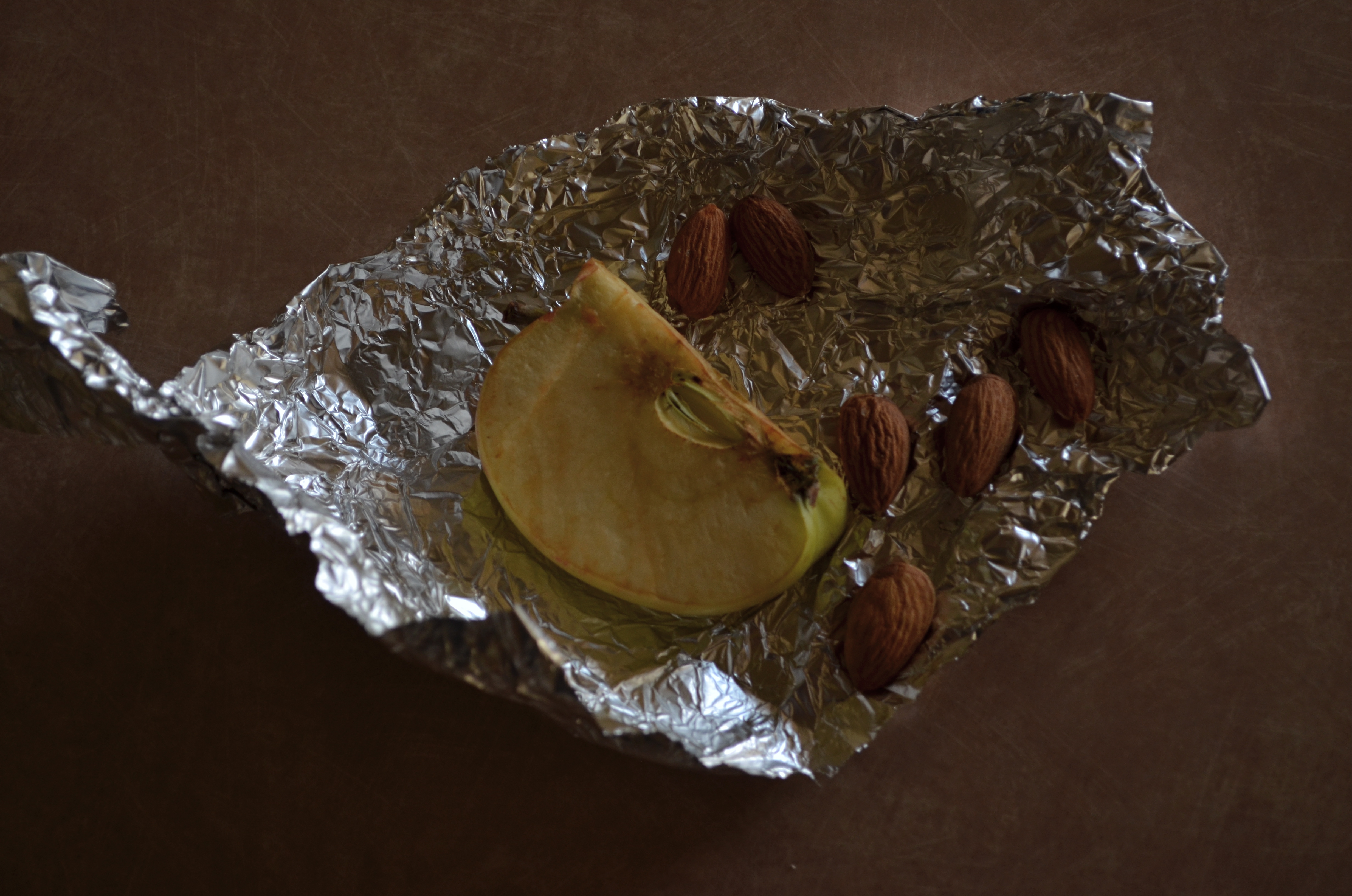
Saved from the trash can, long enough to satisfy my curiosity. 1/50 sec., f/5.3, ISO 200, 40mm.
By MICHAEL PERKINS
YOU NO DOUBT HAVE YOUR OWN “RULES” as to when a humble object becomes a noble one to the camera, that strange transference of energy from ordinary to compelling that allows an image to do more than record the thing itself. A million scattered fragments of daily life have been morphed into, if not art, something more than mundane, and it happens in an altogether mysterious way somewhere between picking it and clicking it. I don’t so much have a list of rules as I do a sequence of instincts. I know when I might have stumbled across something, something that, if poked, prodded or teased out in some way, might give me pleasure on the back end. It’s a little more advanced than a crap shoot and a far cry from science.
With still life subjects, unlike portraits or documentary work. there isn’t an argument about the ethics or “purity” of manipulating the material….rearranging it, changing the emphasis, tweaking the light. In fact, still lifes are the only kinds of pictures where “working it” is the main objective. You know you’re molding the material. You want to see what other qualities or aspects you can reveal by, well, kind of playing with your food. It’s like Richard Dreyfuss shaping mashed potatoes into the Devil’s Tower.
If I have any hard and fast rule about still lifes, it may be to throw out my trash a little slower. I can recall several instances in which I was on my way the garbage can with something, only to save it from oblivion at the last minute, turn it over on a table, and then try to tell myself something new about it from this angle or that. The above image, taken a few months ago, was such a salvage job, and, for reasons only important to myself, I like what resulted. Hey, Rauschenburg glued egg cartons on canvas. This ain’t new.
My wife had packed a quick fruit and nut snack into a piece of aluminum foil, forgot to eat it, and brought it back home in her lunch sack. In cleaning out the sack, I figured she would not want to take it a second day and started to throw it out. Re-wrapped several times, the foil now had a refractive quality which, in conjunction with window light from our patio, seemed to amp up the color of the apple slice and the almonds. Better yet, by playing with the crinkle factor of the foil, I could turn it into a combination reflector pan and bounce card. Five or six shots worth of work, and suddenly the afternoon seemed worthwhile.
I know, nuts.
Fruits and nuts, to be exact. Hey, if we don’t play, how will we learn to work? Get out on the playground. Make the playground.
And inspect your trash as you roll it to the curb.
Hey, you never know.
Thoughts?
A BOX FULL OF ALMOSTS
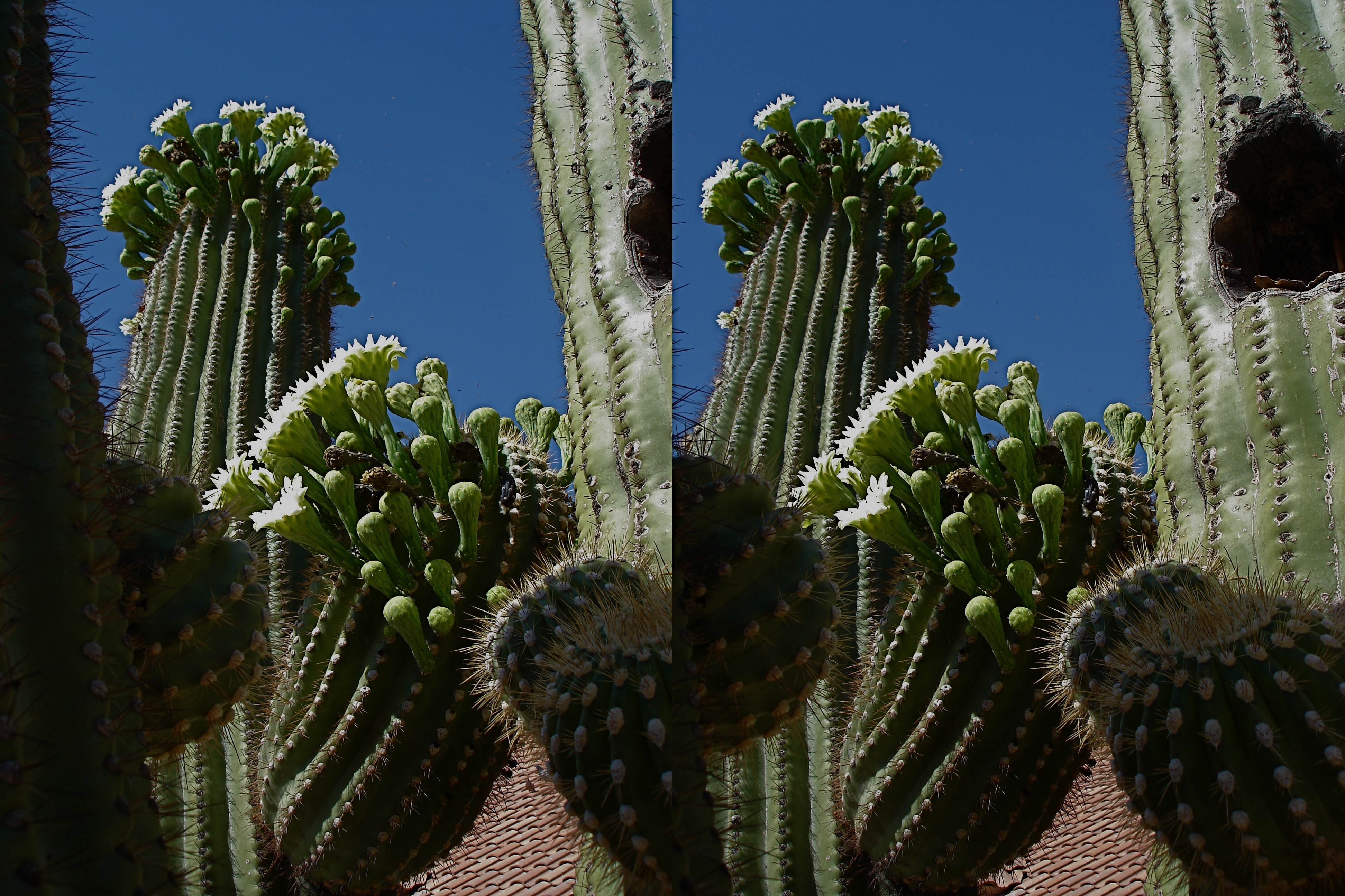

Shooting for 3D (top image) often cost me a lot of composition space, forcing me to frame in a narrow vertical range, but learning to frame my message in those cramped quarters taught me better how to draw the viewer “in deep” when composing flat 2D images.
By MICHAEL PERKINS
I RECENTLY SPENT AN ANGUISHED AFTERNOON sifting through a box of prints that I shot from about 1998 through 2002, a small part of my amateur work overall, but a particularly frustrating batch of images to revisit. Even given the high number of shots of any kind that one has to take to get a small yield of cherished images, the number of “keepers” from this period is remarkably low. It is a large box of almosts, a warehouse of near misses. Still, I felt that I needed to spend some “quality time” (strange phrase) mentally cataloguing everything that went wrong. I could have used a stiff drink.
One reason that the failure rate on these pictures was so high was because the pictures, all of them stereoscopic, were taken with one of the only cameras available for taking such shots at the time. The Argus 3D was an extremely limited film-based point-and-shoot which had been introduced for the sole purpose of producing cheap prints that could be developed by any vendor with conventional processing. The resulting 4×6 prints from the Argus were not the red-green anaglyph shots requiring the infamous cardboard glasses to decipher their overlaid images. but single prints made up of two side-by-side half-frame images in full color, which could later be inserted into an accompanying split-glass viewer that came with the camera.
The 3D effect was, in fact, quite striking, but the modest camera exacted a price for producing this little miracle. Since stereo works more dramatically at longer focal lengths, only shots made at f/11 or f/16 were offered on the Argus, which also had a fixed shutter speed and could not accommodate films rated higher than ASA 100. As for better 3D cameras, most available in the late ’90’s were dusty old relics from the late ’40’s and ’50’s, meaning that any hobbyist interested in stereo photography had to pretty much accept the built-in limitations of the rigs that were available. As a result, I had only basic control over exposure; light flares would invariably create huge streaks on one of the two angled lenses, creating a headache-y “flicker” in the viewing of the final print; and, worst of all, you had to compose every shot in vertical orientation, regardless of subject, in half the width in which you normally worked.
Worse for the artistic aspect of the project, I seem to have been sucked into the vortex that traps most shooters when learning a new technique; that is, I began to shoot for the effect. It seems to have been irrelevant whether I was shooting a bouquet of roses or a pile of debris, so long as I achieved the “eye-poke” gimmick popping out of the edge of the frame. Object (and objectives) became completely sidelined in my attempts to either “wow” the viewer or overcome the strictures of the camera itself. The whole carton of prints from this period seems to be a chronicle of a man who has lost his way and is too stubborn to ask directions. And of the few technically acceptable images in this cluster of shots, fewer still can boast that the stereoscopic element added anything to the overall impact of the subject matter. Can I have that drink now?
A few years later, I would eventually acquire a 1950’s-vintage Sawyer camera (designed to make amateur View-Master slides), which would allow me to control shutter speed, film type, and depth of field. And a few years after that, my stereo shots started to be pictures first, thrill rides second. Grateful as I was for the improved flexibility, however, the Argus’ cramped frame had, indeed, taught me to be pro-active and deliberate in planning my compositions. Learning to shoot inside that cramped visual phone booth meant that, once better cameras gave me back the full frame, I had developed something of an eye for where to put things. Even in 2D, I had become more aware of how to draw the eye into a flat shot.
Today, as I have consigned 3D to an occasional project or two, the lessons learned at the hands of the cruel and fickle Argus serve me in regular photography, since I remain reluctant to trust even more advanced cameras to make artistic decisions for me. Thus, even in the current smorgasbord of optical options, I feel that, in every shot, I am still the dominant voice in the discussion.
That makes all those “almosts” worth while.
Almost.
Bartender? Another round.
Thoughts?
Related articles
BIG STORY, LITTLE STORY
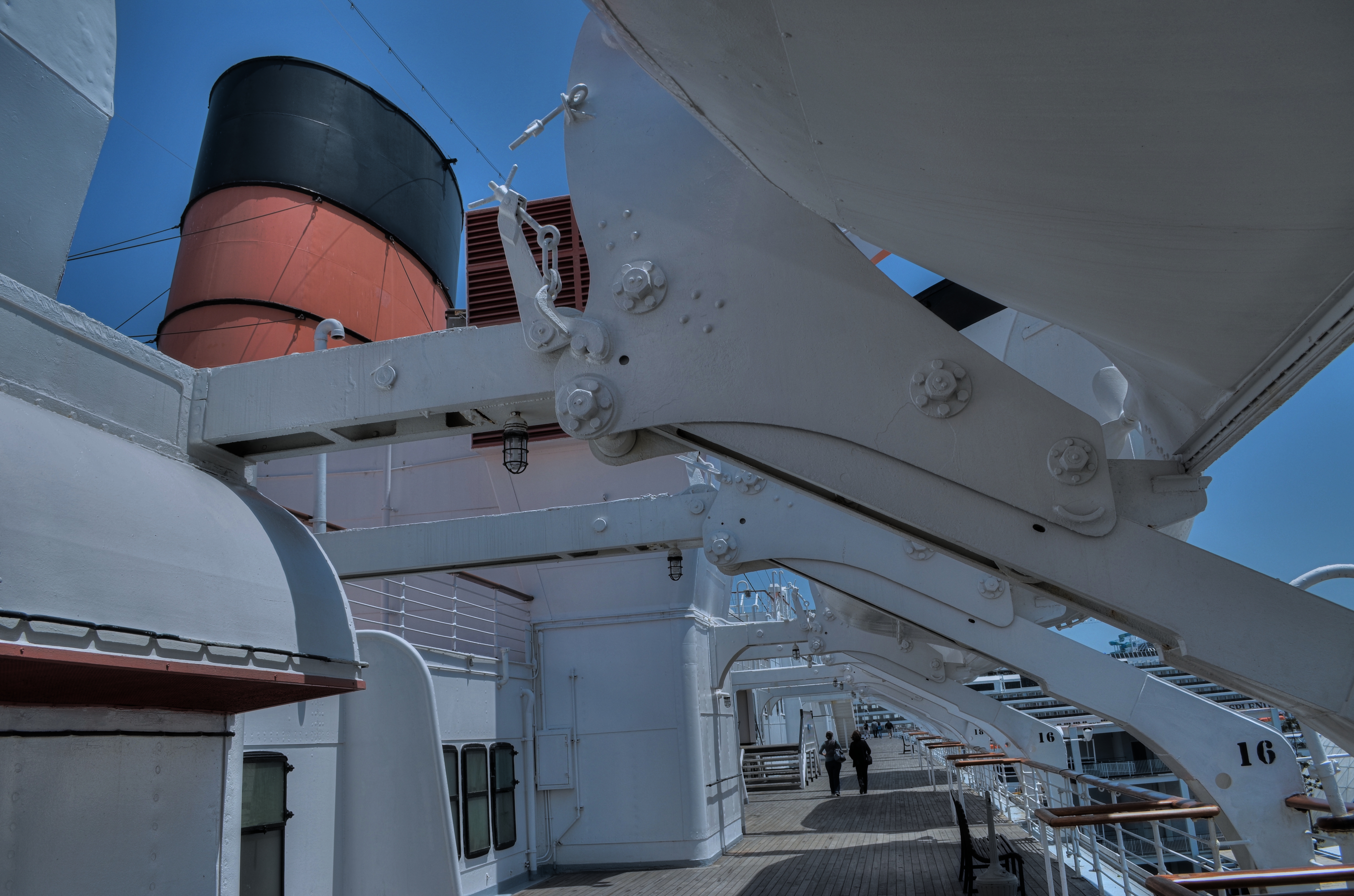
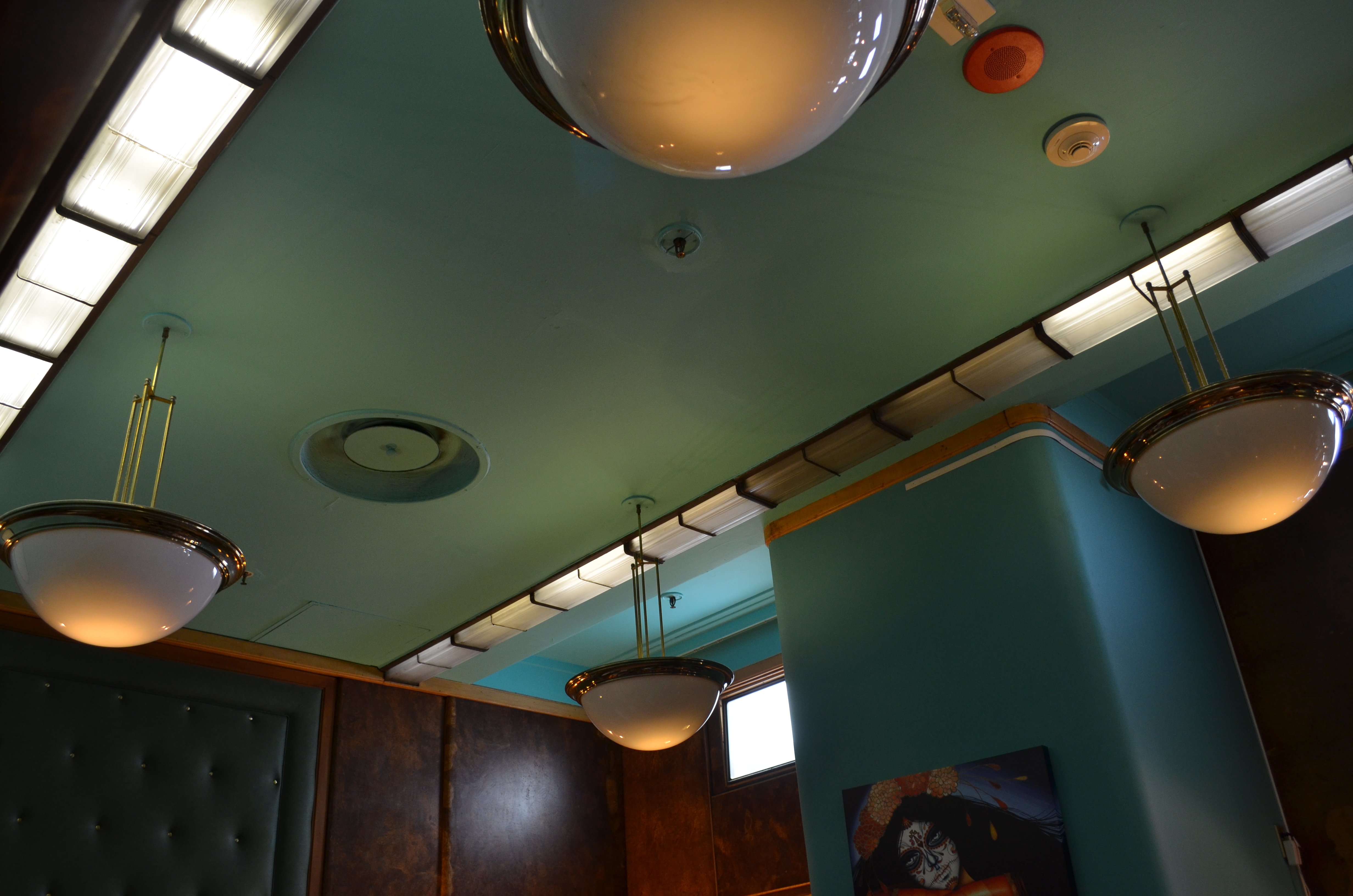
Which image better conveys the romantic era of the Queen Mary, the wide-angle shot along the promenade deck (above), or a detail of lights and fixtures within one of the ship’s shops (below)?
By MICHAEL PERKINS
THE VERY APPEAL THAT ATTRACTS HORDES OF VISITORS to travel destinations around the world, sites that are photographed endlessly by visitors and pilgrims alike, may be the same thing that ensures that most of the resulting images will be startlingly similar, if not numbingly average. After all, if we are all going for the same Kodak moment, few of us will find much new truth to either the left or right of a somewhat mediocre median.
In a general sense, yes, we all have “access” to the Statue of Liberty, the Grand Canyon, Niagara Falls, etc., but it is an access to which we are carefully channeled, herded, and roped by the keepers of these treasures. And if art is a constant search for a new view on a familiar subject, travel attractions provide a tightly guarded keyhole through which only a narrowly proscribed vantage point is visible. The very things we have preserved are in turn protected from us in a way that keeps us from telling our subject’s “big story”, to apprehend a total sense of the tower, temple, cathedral or forest we yearn to re-interpret.
More and more, a visit to a cultural keepsake means settling….for the rooms you’re allowed to see, the areas where the tours go, the parts of the building that have been restored. Beyond that, either be a photographer for National Geographic, or help yourself to a souvenir album in our gift shop, thank you for your interest. Artistically speaking, shooters have more latitude in capturing the stuff nobody cares about; if a locale is neglected or undiscovered, you have a shot at getting the shot. Imagine being Ansel Adams in the Yosemite of the 1920’s, tramping around at will, decades before the installation of comfort stations and guard rails, where his imagination was only limited by where his legs could carry him (and his enormous and unwieldy view camera, I know). Sadly, once a site has been “saved”, or more precisely, monetized, the views, the access, the original feel of its “big story” is buried in theme cafes, commemorative shrines, info counters, and, not insignificantly, competition with every other ambitious shooter, who, like you, wants a crack at whatever essences can still be seen between the trinkets and kiosks.
On a recent visit to the 1930’s luxury liner RMS Queen Mary, in Long Beach, California, I tried with mixed results to get a true sense of scale for this Art Deco leviathan, but its current use as a hotel, tour trek and retail mall has so altered the overall visual flow that in some cases only “small stories” can effectively be told. Steamlined details and period motifs can render a kind of feel for what the QM might have been before its life as a kind of ossified merchandise museum, but, whereas time has not been able to rob the ship’s beauty, commerce certainly nibbles around its edges.
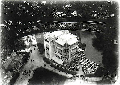
Sometimes you win the game. I recently discovered the above snapshot of the Eiffel Tower, taken in 1900 by the French novelist Emile Zola, where real magic is at work. Instead of clicking off the standard post card view of the site, Zola climbed to the tower’s first floor staircase, then shot straight down to capture an elegant period restaurant situated below the tower’s enormous foundation arches. And although only a small part of the Eiffel is in his final frame, it is contextualized in size and space against the delicate details of tables, chairs, and diners gathered below, glorifying both the tower and the bygone flavor of Paris at the turn of the 20th century.
Perhaps, for a well-recorded destination, the devil (and the delight) is in the details. Maybe we should all be framing tighter, zooming in, looking for the visual punctuation instead of the whole paragraph. Maybe all the “little stories” add up to a sum greater than that of the almighty master shot we originally went after. Despite the obstacles, we must still try to dictate the terms of engagement.
One image at a time.
Thoughts?
“WHAT” IS THE QUESTION
ONE OF THE MOST FREQUENTLY ASKED QUESTIONS of shooters is, “what’s that supposed to be?”, usually asked of any image that is less obvious than a sunset shot of the Eiffel Tower or a souvenir snap of Mount Rushmore. You may have found, in fact, that the number of times that the question is asked is directly proportional to how intensely personal your vision is exercised on a given project. As much as the hidden aspects of life fascinate us, the obvious recording of familiar objects soothe the eye, like a kind of ocular comfort food. The farther you wander in your own direction as a photographer, the greater journey you also ask of your viewers. Sometimes the invitation is taken. Sometimes you must face “the question”.
What’s that supposed to be?
How, actually, in a world shaped by our own subjective experience, an image is “supposed” to be anything is a little baffling. It’s probably safe to say that what we present, as artists is probably supposed to be the view as one’s mind filters it through his or her accumulated life. When we use the camera as a mere recorder, it may make it easier, presenter-to-viewer, to agree on that image’s terms of engagement, but that may or may not reveal what we actually felt about when creating it. If I use the same three colors to render a picture of the American flag as everyone else uses, I may get into fewer arguments about how appropriate the resulting image is, but then, I don’t get to open up the discussion to any other conceptions of that flag. Back in the first days of the environmental movement, the simple use of green on the original, Old-Glory-derived ecology flag suggested an alternative way of being American, of living your life. As I recall, some viewed the design as sacrilegious, while others embraced it as liberating.
Over 150 years after the first photographs were regarded as a threat to the painter’s domain, we are still most at ease with pictures that ape the painting’s method for framing the world. Oddly, it is always outlaws and amateurs that break free of these pictorial chains first; the professionals must protect the turf they have so carefully mapped out for themselves in the mainstream. There remains, then, an ongoing battle over what should or should not be called a “picture”. Abstractions, arranged or perceived patterns, even selected details or drastic re-imaginings of small parts of the so-called “actual” world must always fight for their place at the table alongside the technically accurate mirroring of easily named subjects. We still regard that which is realistic as being the most real, and the most worthy of praise.
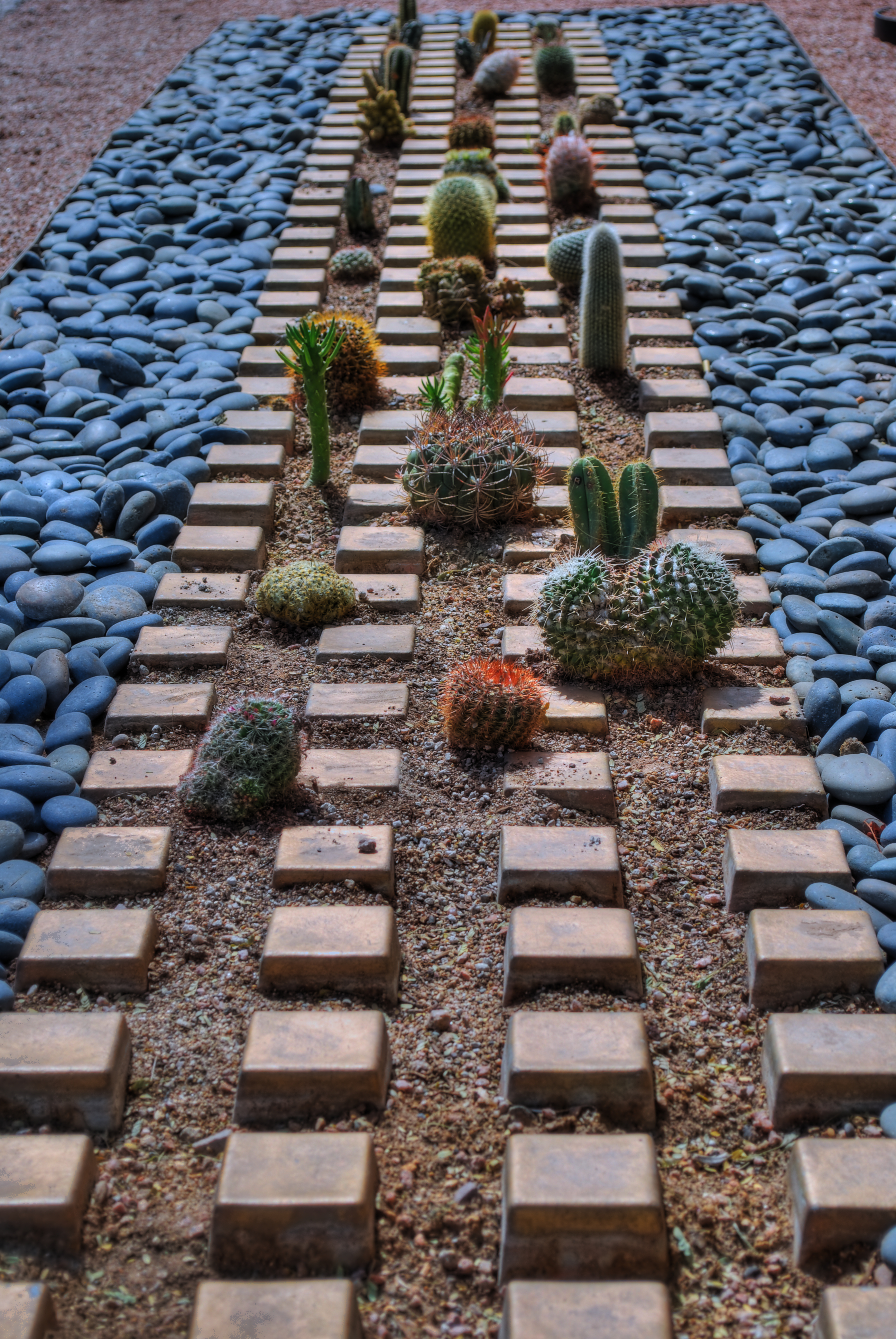
Cactropolis, 2011. Three bracketed shots about a half-stop apart combined into an HDR composite. CLICK TO ENLARGE.
To want to show something for its own sake on our own terms is to move into more personal territory, and hence onto shakier ground for critical evaluation, but occasionally we strike a balance between what people want to see and what we must show. In the above image, I only wanted to focus attention on an arrangement that was a very small and visually ignored accent along a heavily travelled public street. An unsung landscaper’s arrangement of tiles, gravel, paving rock, and succulent plants, was in plain view, and yet, at only a few inches in height, easily missed by the thousands of daily passersby speeding along the street. To me, when framed close to ground level, it resembled a kind of desert cityscape, blocks of abstract skyscrapers, a cactus metropolis, and that’s how I tried to frame and process it. Of course, it us, after all, just a pattern, and anyone who looks at the image can fill in their own blanks with impressions that are just as valid as my kind of toy idea.
The vital point is that no one else’s take on your dream can be wrong, just because it differs with yours. Art is not a science, which is why we don’t become photographers, or as the word implies, “light writers” just by pushing a button.
We become photographers by pushing everyone’s buttons.
What is it “supposed to be”? You tell me, and I’ll tell you.
Thoughts?
THE GLORY OF THE INVISIBLE
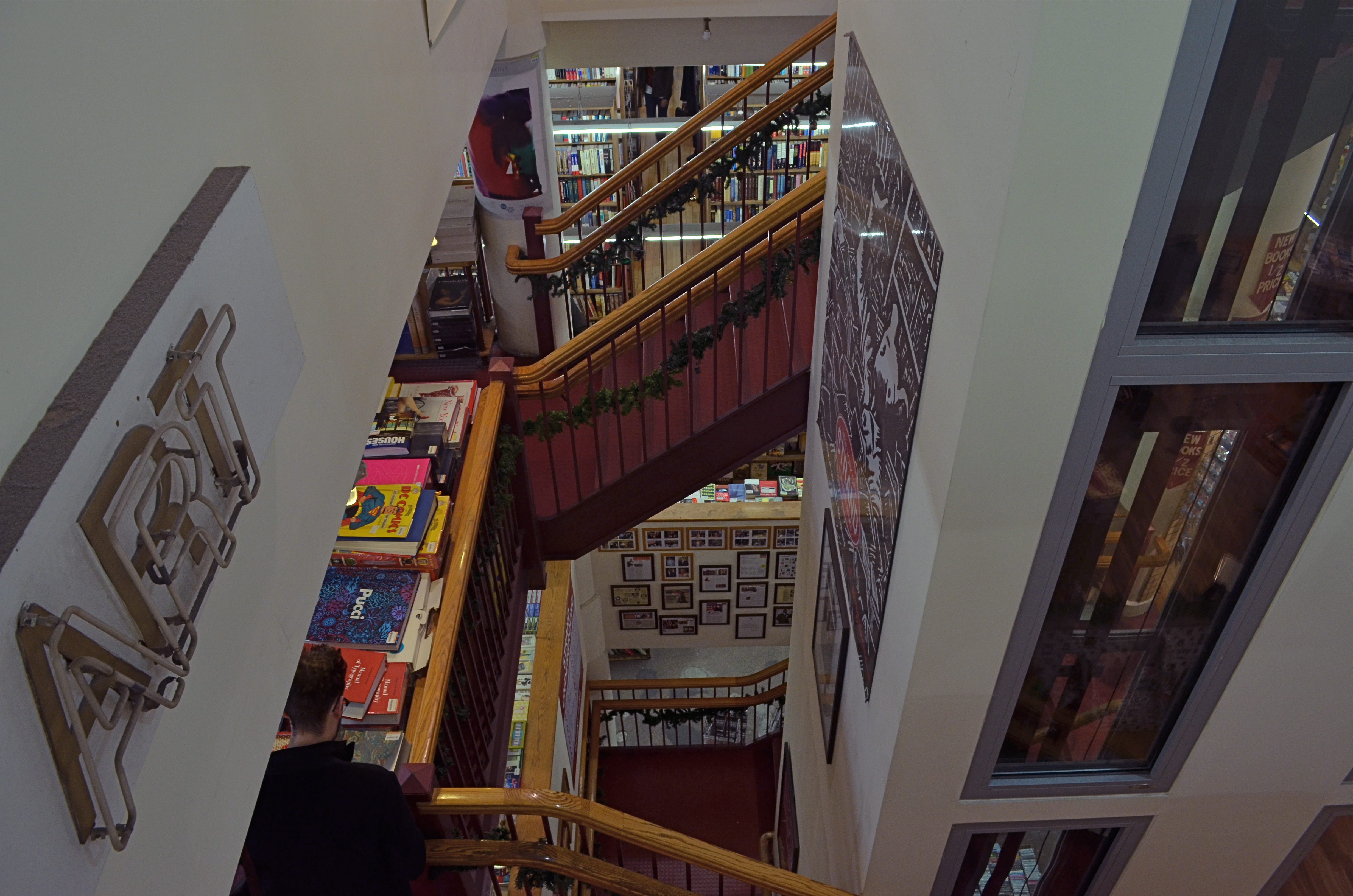
I thought of trying to capture the vastness of Manhattan’s Strand Bookstore in a single wide shot, but finally preferred this view, which suggests the complexity and size of the store’s labyrinthine layout. 1/40 sec., F/7.1, ISO 500 at 18mm.
THE FRAME OF AN IMAGE is the greatest instrument of control in the photographer’s kit bag, more critical than any lens, light or sensor. In deciding what will or won’t be populated inside that space, a shooter decides what a personal, finite universe will consist of. He is creating an “other” world by defining what is worthwhile to view, and he also creates interest and tension by letting the view contemplate what he chose to exclude. What finally lies beyond the frame is always implied by what lies inside it, and it is the glory of the invisible that invites his audiences inside his vision, ironically by asking them to consider what is unseen….in a visual medium.
Each choice of what to “look at” has, inherent in it, a decision on what to pare away. It is thus within the power of the photographer to make a small detail speak for a larger reality, rendering the bigger scene either vitally important or completely irrelevant based on his whim. Often the best rendition of the frame is arrived at only after several alternate realities have been explored or rejected.
Over a lifetime, I have often been reluctant to show less, or to choose tiny stories within larger tapestries. In much pictorial photography, “big” seems to serve as its own end. “More” looks like it should be speaking in a louder voice. However, by opting to keep some items out of the discussion, to, in fact, select a picture rather than merely record it, what is left in the frame may speak more distinctly without the additional noise of visual chatter.
“If I’d had more time”, goes the old joke, “I’d have written you a shorter letter”. Indeed, as I get older, I find it easier to try and define the frame with an editor’s eye, not to limit what is shown, but to enhance it. Sometimes, the entire beach is stunning.But, in other instances,a few grains of sand may more eloquently imply the beach, and so enable us to remember what amazing details combine in our apprehension of the world.
Thoughts?
 thenormaleye