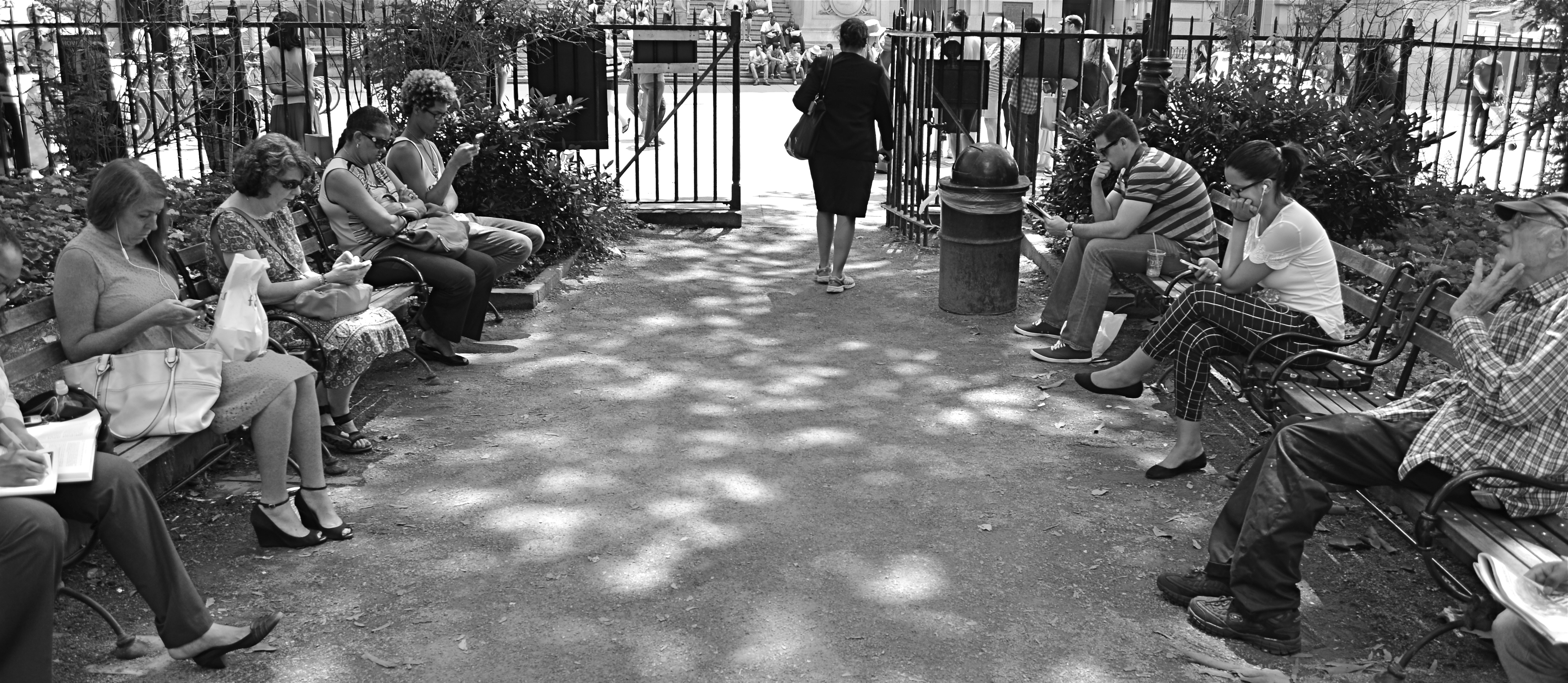
THE THIRD CHANNEL
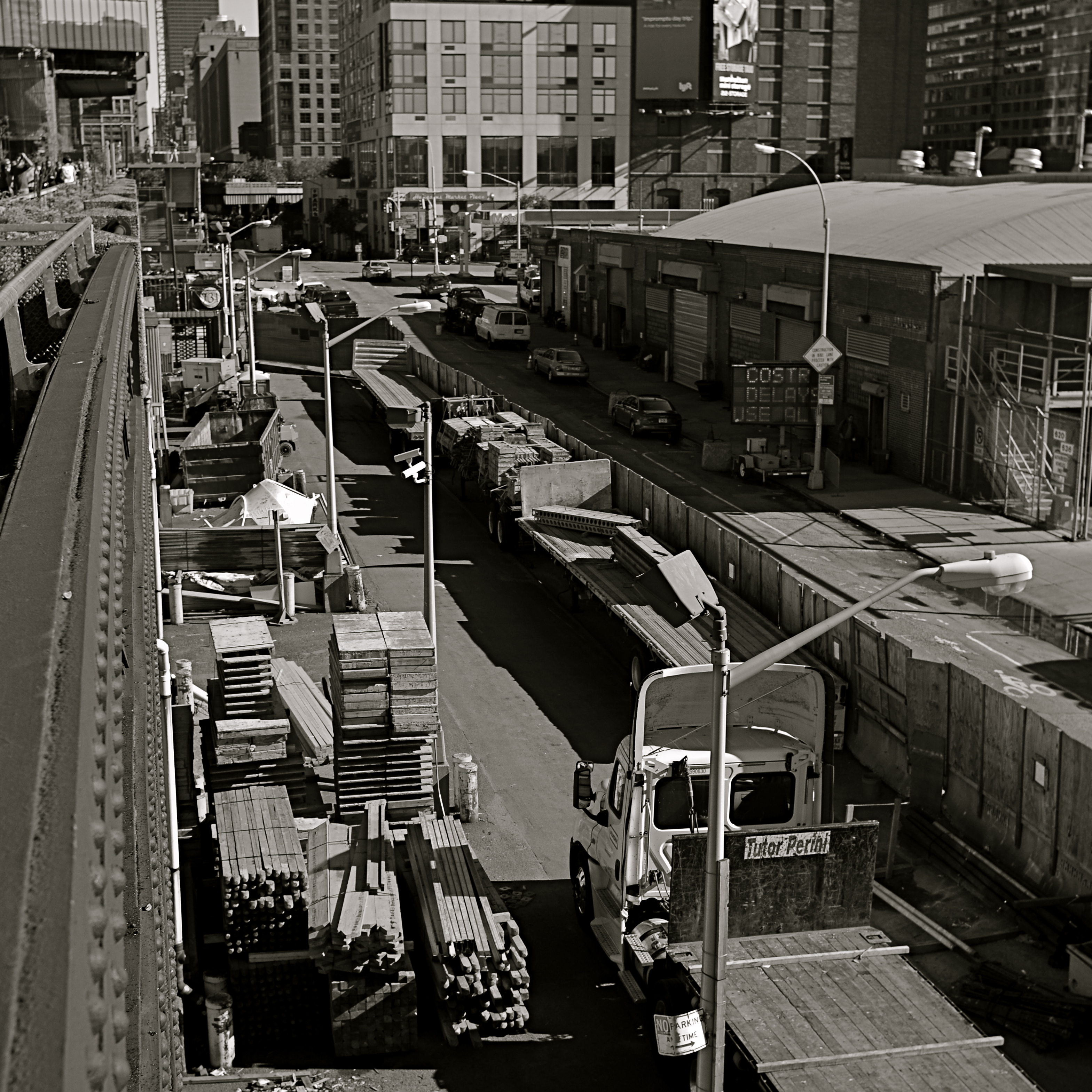
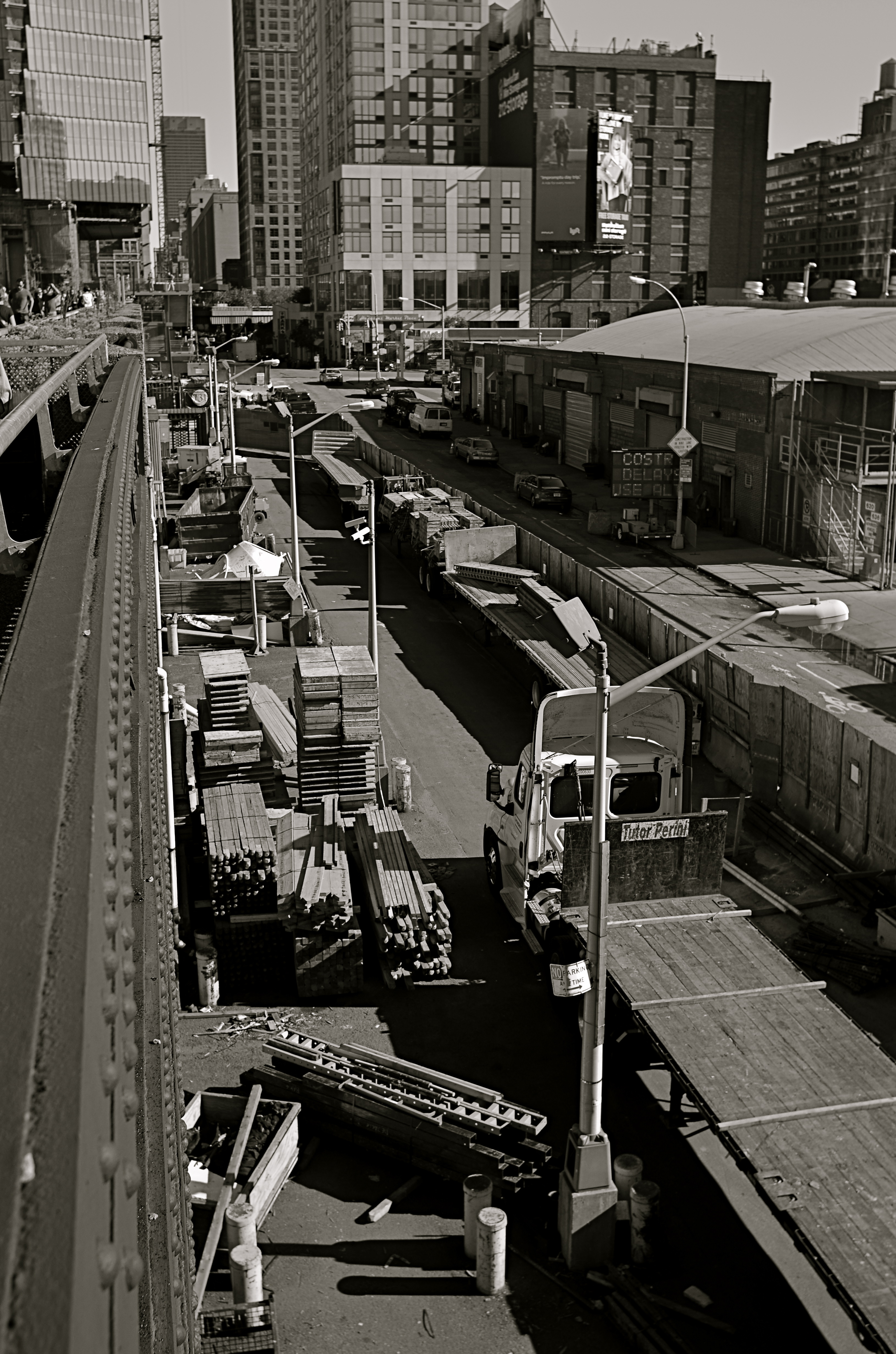
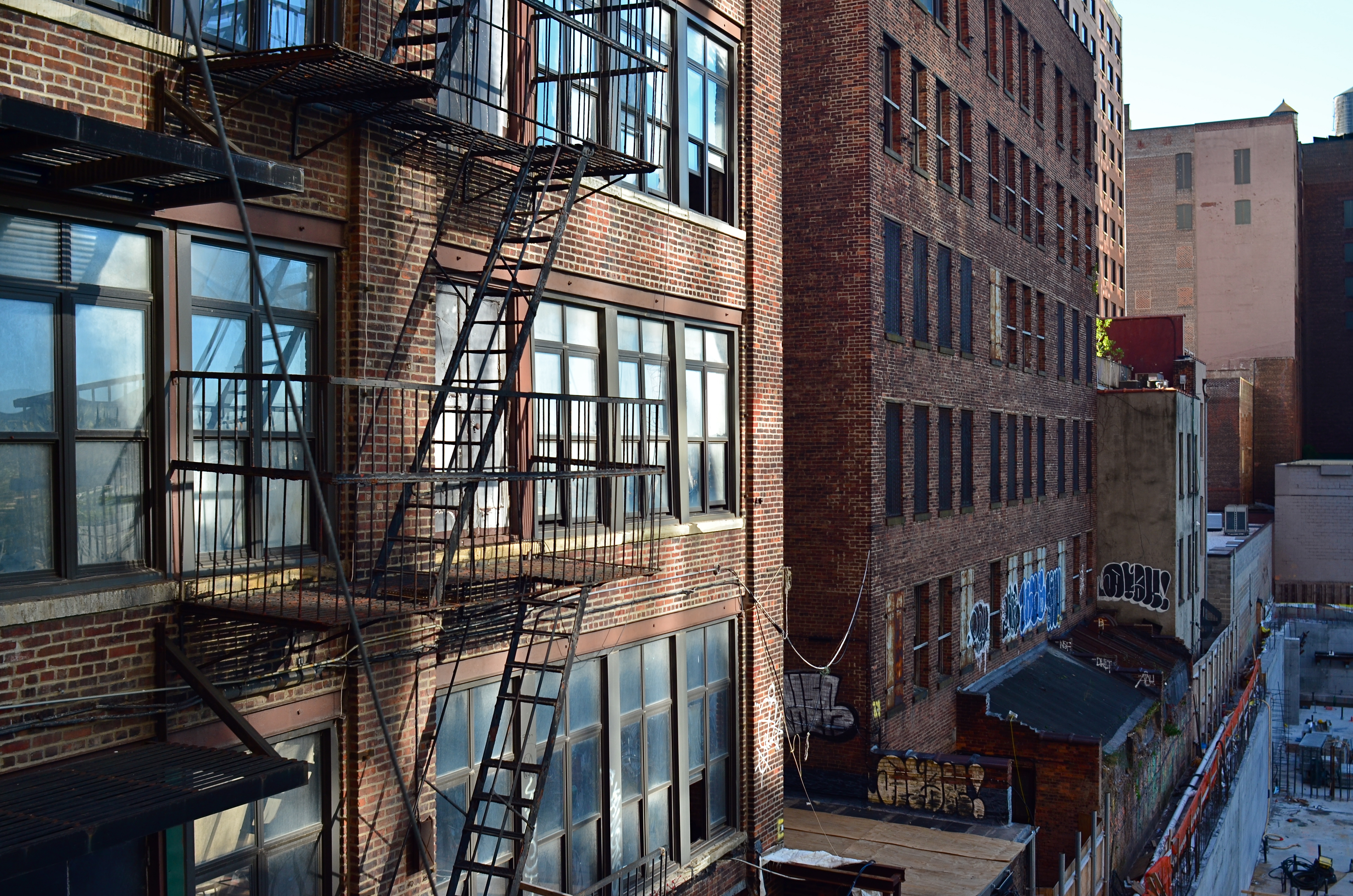
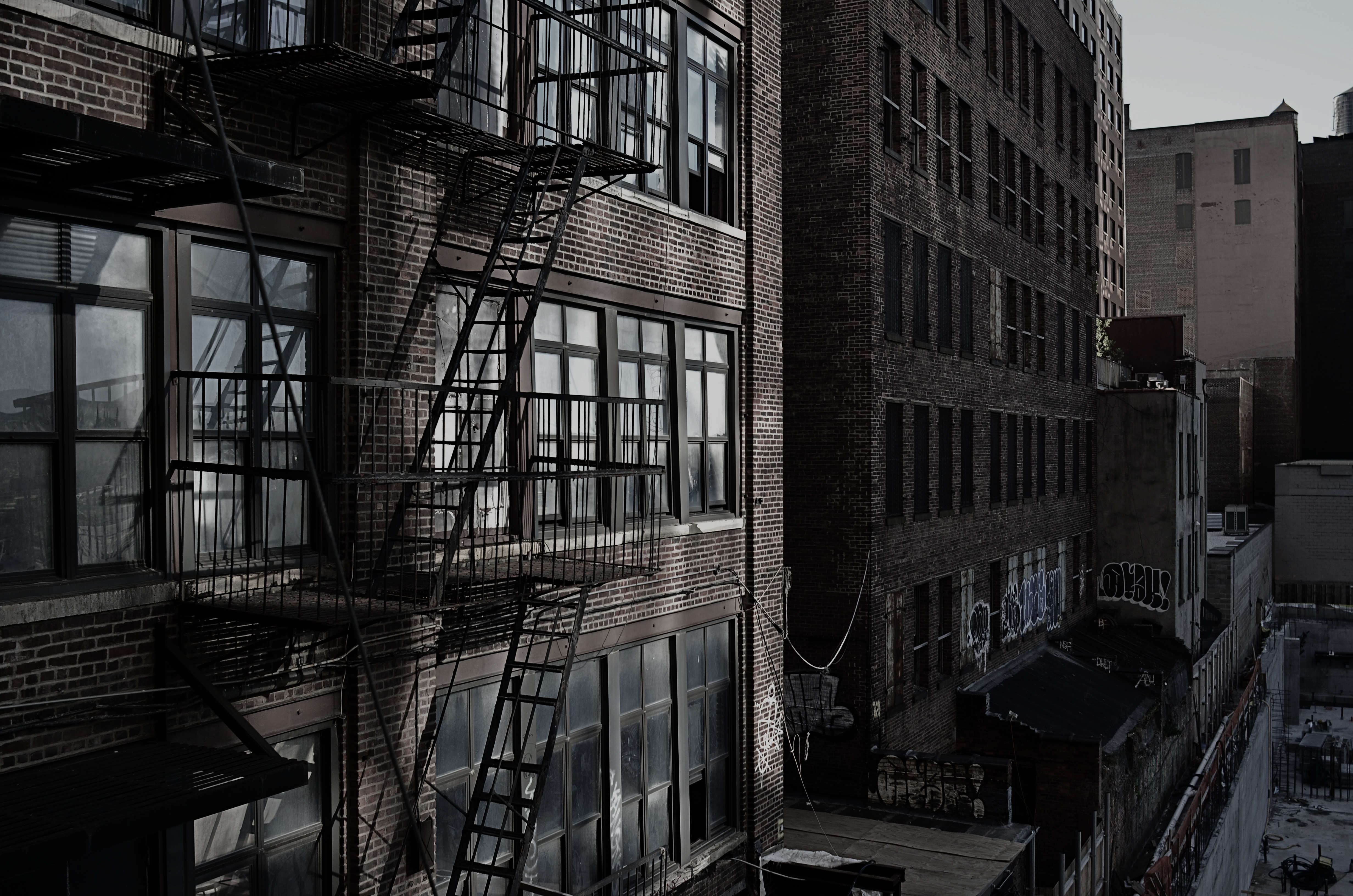
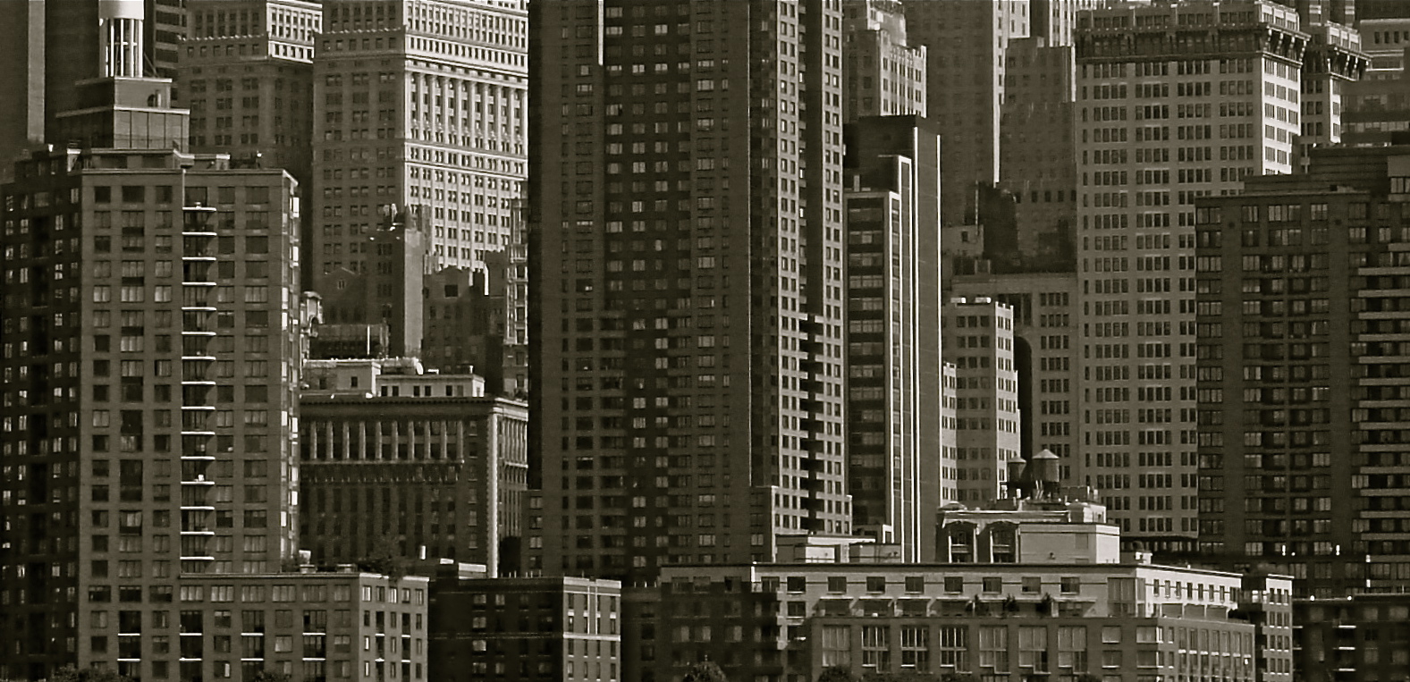
In a square framing, this warehouse district seems self-contained, isolated from the greater city around it.
By MICHAEL PERKINS
OVER THE HISTORY OF PHOTOGRAPHY, OUR CHOICES OF HOW TO PRESENT A PICTURE has changed as well as the means by which we shoot it. Certainly in the film era, sizes and formats shifted from square to landscape to portrait, and those shapes were reflected in the dimensions of the final prints or slides. You know, shoot it wide, print it wide. Somewhere between the waning days of prints and the first waves of pixels, however, the square nearly winked out for a while, and, with it, a particular way of composing a shot. Luckily, it’s back in full force.
In the portrait-oriented original, extra buildings and street space dilute the impact of the cropped square.
It’s had help. Instagram and some retro-film cameras forced the square upon a new generation of shooters, and nearly all phones and phone apps readily offer it as a framing or editing choice. Strangely, manufacturers of DSLRs and other high-end cameras offer no option for shooting in square format, although they all include square cropping in their in-camera re-touch menus. This means that many photographers have to dream square but shoot otherwise, mentally composing the eventual square framing of their subjects in the moment, or even discovering, in edit sessions, that there is a decent square image inside their larger ones just waiting to be let out.
I have recently looked to deliberately edit in favor of the square, since I think that the format forces a kind of compact, centralized story-telling that might be diluted or weakened by wider or longer compositions. Looking at my initial landscape or portrait images, I ask myself if the entire force of the picture could be amped by squaring it off. Sometimes you think a shot calls for one orientation or the other, when the third channel of the square is actually a better tool. Hey, you can’t know everything at the moment of snap.
I do wish that DSLRs would routinely offer the chance to initially shoot in square, just as cheap hipster film cameras and phones already do. Not having every possible tool at your disposal seems wrong, somehow, and, with all the other gimmicks that are offered in higher-end cameras, from fake star twinkles to faux pencil-sketch effects, the inclusion of a third framing orientation just makes sense.
EYE ON THE BALL

The two passersby mar what might have been an ideal composition. If I’d just reshot without them…
By MICHAEL PERKINS
I CAN STILL HEAR MY LITTLE LEAGUE COACH’S VOICE, cured into a coarse hum by too many years of Lucky Strikes, hitting me in the back of my skull as I stood shakily in the batter’s box. If he had told me once, he had told me a thousand times: don’t try to hit every ball that comes across the plate. You swing like a rusty gate, he would tease me, or don’t eat their garbage. The main message, and one that I only intermittently received: wait for your pitch.
On those rare occasions when I didn’t fish wildly in the air for every single thing that sailed in from the mound, I took great encouragement from his voice saying, good eye. Strangely, I had earned praise for essentially doing nothing, but, hey, I’d take it.
Coach sometimes comes to mind when I view the results of some of my hastier photographic decisions.
There is, for photogs, a very real translation of “wait for your pitch”, and it’s more important in the digital era because it’s such an easy rule to adhere to. Simply, you must keep shooting long enough to get the frame you saw in your mind. There can be no, “I’ve already taken a lot of frames”, or “they’re waiting for me to finish up” or “maybe today’s not my day for this shot.” First of all, it’s your picture. If you want it, take it. Secondly, there is no such thing as “a lot of frames”. There is only enough frames. If clicking one more, hell, ten more, will get you your shot, then do it. There is no phantom film counter warning you that you only have four more Kodachrome exposures left.
I am preaching this particular commandment all too loudly today because I am kicking myself for not living up to it recently. In the top frame, I got every element of a quaint old Amtrak ticket window that appealed to me, including the patterned skylight, the bored agent, the square arrangement of the Deco-ish counter space, and the left and right details of an old archway and a marble wall. Everything except the intrusive passersby on the left. They are sadly out-of-sync with the time-feel of the rest of the shot, and, had I not felt that I had nailed the general exposure and feel of the image, I might have waited for them to move out of frame, and gotten everything I wanted.
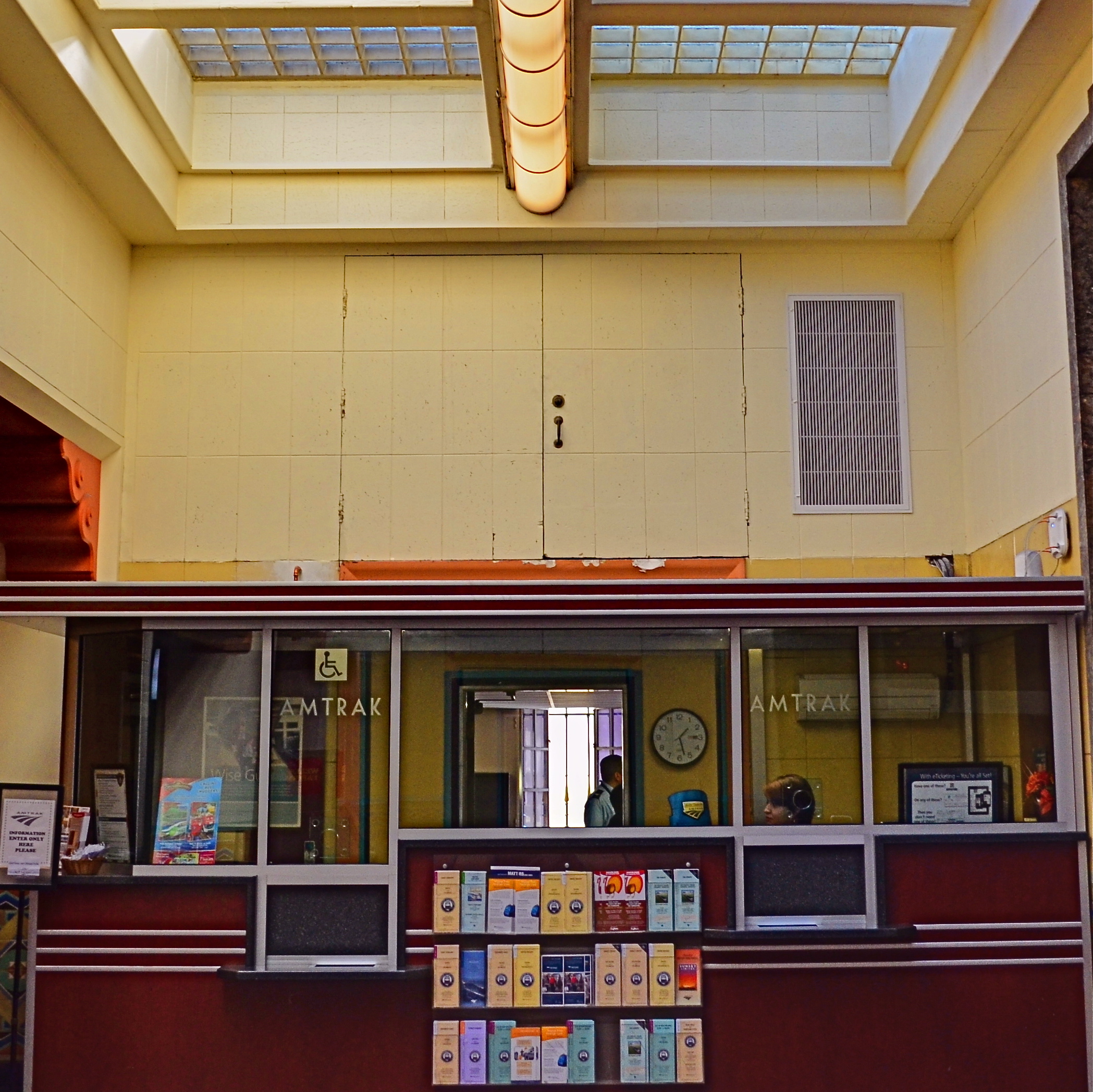
The price of impatience: the “salvaged” version of the above shot.
But I didn’t. I settled for “close enough”, and moved on to the next subject. Later, in post-production, I could certainly crop my squatters out, but at the cost of the overall composition. I now had to make do with what was left. I managed to reframe for another square shot that included nearly all the same elements. But it was “nearly”, not “all”. And “all” is what I could have had if I hadn’t tried to swing at the wrong ball. You can’t make a good shot out of a bad shot, and when an opportunity is gone, there isn’t a piece of software in the world that can make a miracle out of what’s not in your camera.
Wait for your pitch.
A WONDROUS MESS

Too busy? Well, when it comes to seasonal shots, it’s a lot harder to say.
By MICHAEL PERKINS
Consulting the rules of composition before taking a photograph is like consulting the laws of gravity before going for a walk.
Edward Weston
PHOTOGRAPHERS LOVE TO COMPILE LISTS OF LAWS that must be obeyed to ensure the capture of great images. Bookshelves are jammed to fracturing with the collected works of wizards large and small who contend that all of this art stuff is really about craft, or adherence to techniques that are the equivalent of Einstein’s law. And, of course, with every fresh generation, a new slew of shooters come sneering along to deride this starched and stuffy discipline. All that matters, these young turks snigger, is my grand vision.
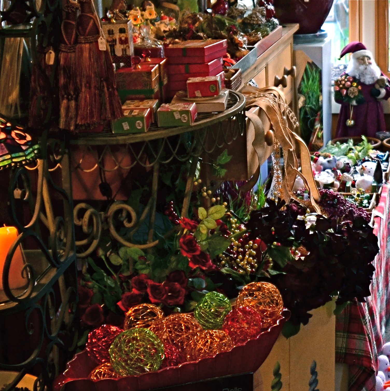
Worlds within worlds: many vast holiday scenes can be “subdivided with cropping.
Let me again re-state the obvious, which is that both viewpoints are correct and/or totally wrong. And since Mr. Weston has introduced the subject of composition, let us consider the special task of seasonal photos, specifically, arrangements of yuletide objects. The classic rule on still-life shots is that less is more, that it’s better to perfectly light and expose three pieces of fruit than whole baskets of the stuff. Meanwhile the festive, instinctual artist concedes that many holiday scenes are mad with detail and crammed with more, more, more…..and that’s okay.
The unique thing about Christmas decor is that in many cases, you not creating the compositions, but merely reacting to someone else’s creations…in nativity scenes, churches, and especially in retail environments. Obviously your local department store doesn’t adhere to the admonition “keep it simple”; quite the opposite. Seasonal trim in most stores is served up not by the spoonful but by the truckload. Anything less than overkill seems skimpy to many yuletide decorators, and so, if you favor basic subject matter, you’re either going to have to mount your own arrangements or selectively zoom and crop the more congested scenes. If, however, you already subscribe to the idea that more is better, then life gets easy fast.
Holidays come layered in much that is intensely personal, and that makes clean compositional judgements about “how much” or “how little” tricky at best. Just get the feelings right and let your regular rules relax into guidelines.
A DIFFERENT BRAND OF DARK
A texturally rich subject, but its natural color is too Disney.
By MICHAEL PERKINS
ONE PHOTOGRAPHER’S LAB ACCIDENT IS, OCCASIONALLY, ANOTHER PHOTOGRAPHER’S EUREKA MOMENT. Take the case of a visual effect that, in the film era, may have originated with an error in darkroom technique, and which is now being sought after by movie directors and amateurs alike as a look that they actively desire. Recent use of this effect ranges from the gritty, muted color and high-contrast of films like Steven Spielberg’s Saving Private Ryan, to lab-less shortcuts in Photoshop and even shorter shortcuts in ready-to-eat iPhone apps. The look is called Bleach Bypass and it’s worth a look for certain moods and subjects.
The term derives its name from one of the steps used in film processing color film in which bleach is used to rinse away silver nitrate. By skipping this step, the silver is retained in the emulsion along with the color dyes. The result is a black-and-white image over a color image…kind of a photo sandwich. The resulting composite is lighter in hue but packs more extreme contrast and graininess in the monochrome values…an intense, “dirty” look.
The same shot with a simulated bleach bypass effect, done in Photomatix.
Now, for those of you that don’t have a traditional darkroom handy, creating a bleach bypass “look” is easy in nearly any basic editing software suite. Check out the basic steps for Photoshop here. In most cases, you duplicate your original shot, desaturate it slightly, and convert the dupe shot to complete monochrome. The mono copy must also be manipulated for ultimate contrast, and the two shots must be layered in software to give you the desired blend. I tend to use Photomatix more often than Photoshop, since I work a lot with various kinds of tone-mapping for HDR, so I processed the “after” shot you see here in that program’s “exposure fusion” tab. However, as I say, lots of programs can do this with virtually no sweat.
Another path: an iPhone image with the AltPhoto app’s Bleach Bypass filter applied.
The third image in this article (at left) was produced with a click and some swipes with the Bleach Bypass simulator in the AltPhoto app, which also mimics the look of antique film stocks from Kodachrome to Tri-X. As with many phone apps, it doesn’t offer much in the way of fine control, but if you do all your shooting and/or retouching in your mobile, it’s a pretty good quickie fix.
Once again, in the digital era, what was once (a) messy and troublesome becomes (b) no fuss, no muss, and therefore, (c) something that will be adopted and used by many, many more shooters. Democracy in technology does not, of course, guarantee equality of results. You just have more tools to serve you when the ideas come.
UNTRUE-TO-LIFE

Go Green: A Flagstaff pine with all the brown values tuned out.
By MICHAEL PERKINS
I VOLUNTEER AT A MUSEUM WHICH SERVES, IN LARGE PART, SCHOOL TOURS. And, in trying to explain the color choices made by varying cultures on the depiction of everything, from flowers to animals, I frequently ask my groups if anyone has ever colored something with a “different” crayon. Not “the wrong color”, just a different crayon, a choice resulting in a purple squirrel or a brown rose. I usually get at least a few “yeses” on the question, and, when I probe further as to what went into their decision, I almost always get one child who says, simply, “I just like it that way.”
At this point, I realize that at least one person in every mob will always be thinking of color as a choice, rather than as a right/wrong answer. In my early school days, teacher often handed out the same mimeographed picture to all thirty of us, expecting all thirty to produce precisely the same results: green grass, blue skies, yellow honeybees. Strangely, we kind of expected the same of ourselves. It was comforting to hand in a “correct” piece of art, something guaranteed to please, a safe shortcut to a gold star.
In photography, we start as witnesses to color, but should never remain slaves to it. The present generation of shooters, born and bred in iPhone Land, know that changing your mind and your thinking on color is just an app away, and why not? The same force that has finally democratized photography worldwide is also legitimizing any and every kind of artistic choice. With billions of uploads each day, uniformity of style is worse than a lifelong gig as a worker ant, and as uninteresting.
Color is as big a determinant in interpretation as any other choice that a photographer makes, and can result in subtle shaping of the mood of your work. The above tree was originally captured in natural color, but I thought the overall design of the tree was served by one tone fewer, so I reworked everything into three values….blue, green, and black. I believe that the central trunk hits with more impact as light and dark shades of emerald, and the conversion of the pine needles to a more severe shade gives me some of the directness of monochrome. Of course, you might reach a completely different conclusion, but we’re beyond right or wrong here, aren’t we?
The mimeograph is dead, and with it, solid notions of color assignment. Fewer rules means fewer obvious signposts, but that’s why there’s more than one crayon in the box, innit?
THE LONG AND SHORT OF IT
This original frame was just, um, all right, and I kept wanting to go back and find something more effective within it.
By MICHAEL PERKINS
THE INTRODUCTION OF THE FIRST PANORAMIC CAMERAS in the 1840’s can be seen as a freeing-up of the camera frame, a way to more accurately depict the entire field of view open to the human eye. And, of course that’s true. However, the first panos were also an early attempt by photographers to deliberately direct and orchestrate not only what you see, but how they want you to see it. Let’s concede that the western mind tends to absorb information in linear fashion. We read from left to right, we scan the horizon, and so forth. So making a photograph that instructs you to interpret horizontally is fairly natural.
So the first panos seem like a fairly modest extension of our visual bias. But think about the fundamental change that represented. Suddenly, photographers were saying, there are no rules except the rules I dictate. I decide what a frame is. I arrange not only the information inside the frame, but the frame itself. By re-shaping the box, I re-shape what you are to think about what’s in the box. That’s revolutionary, and today’s shooters would be wise to be mindful of that wonderful power.
I am fond of making what I will generously call “carved” panoramics, shots that began as standard framings but which I have cropped to force a feel of left-to-right linearity. Unlike standard panoramics, the shots were conceived and made with a very different compositional strategy, not necessarily trying to tell a horizontal story. However, on review, some stories-within-stories contain enough strong information to allow them to stand as new, tighter compositions in which the new instruction to the viewer’s eye is quite different from that in the original.
Change the frame, change the message.
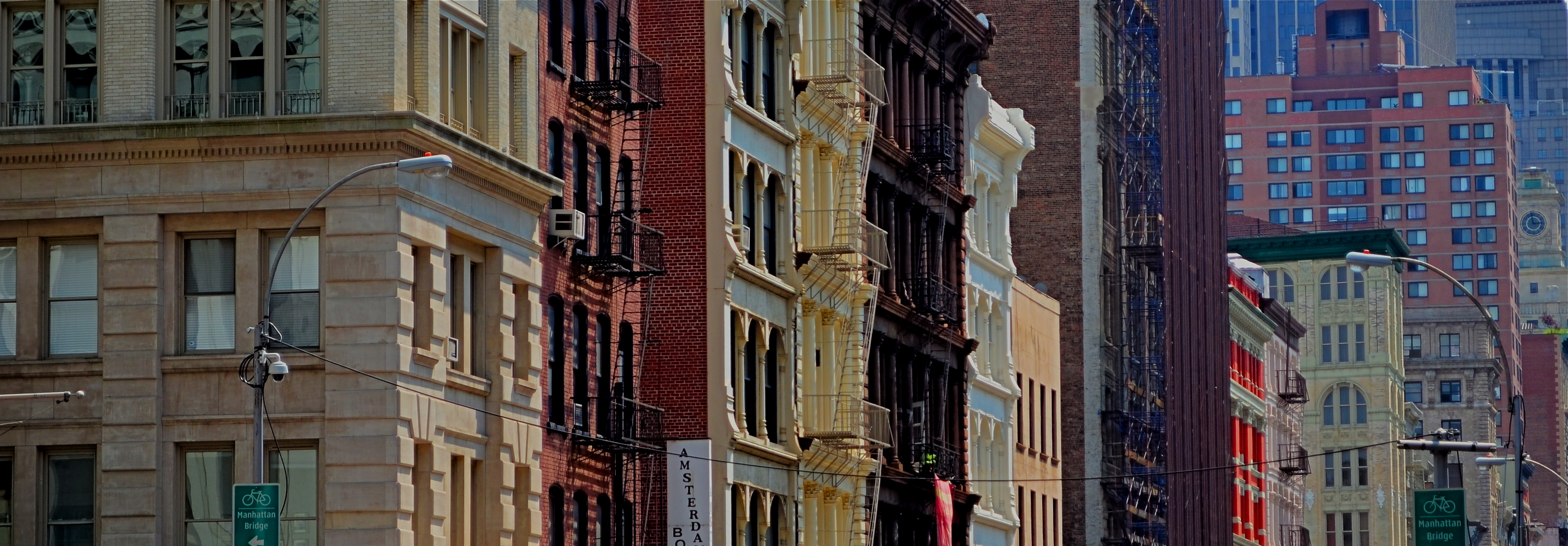
The full shot seen at the top of this page may or may not succeed as a typical “urban jungle” snap, in part because it contains both horizontal and vertical indices that can pull the eye all over the place. Since I wasn’t amazed by the shot itself, I decided to select a horizontal framing from its middle real estate that purposely directed the eye to laterally compare the facades of several different buildings stacked tightly down the street. Full disclosure: I also re-contrasted the shot to make the varying colors pop away from each other.
The result still may not be a world-beater, but the very act of cutting has re-directed the sight lines of the picture. For better or worse, I’ve changed the rules of engagement for the photograph. When such surgeries work, you at least fix the problem of extraneous clutter in your pictures, making them easier to read. Then it’s down to whether it was a good read or a beach read.
Hey, the box can’t fix everything.
THE OTHER TMI

Technical execution here is almost what’s needed, but the concept still needs work. Write the shot off to practice.
By MICHAEL PERKINS
THE WORST SOCIAL FAUX PAS OF OUR TIME may be the dreaded “TMI”, or the sin of sharing Too Much Information, creating awkward moments by regaling our friends with intimate details of our recent colostomies or carnal conquests. Funny thing is, much as we hate having this badge of uncoolness pinned to our chest, we commit its photographic equivalent all the time, and without a trace of shame.
I’m talking about the other TMI, or Too Many Images.
Let’s face it. Social media has encouraged too many of us to use the Web as a surplus warehouse dump for our photographs, many of them as ill-considered as a teenage girl’s hair flip. We’ve entered an endless loop of shoot-upload-repeat which seldom contains a step labeled “edit”. Worse, the vast storage space in our online photo vaults encourage us to share everything we shoot without so much as a backwards glance.
I’m suggesting that we take steps to stop treating the internet like an EPA Superfund site for images. I have tried to maintain a regular schedule of viewing the rearmost pages of my online archives, stuff from five years ago or longer, learning to ruthlessly rip out the shots that time has proven do not work. The goal is to force myself to re-think my original intentions and make every single photograph earn its slot in my overall profile. There are, by my calculation, three main sub-headings that these duds fall under:

The original idea for this shot is fairly strong, but my execution of it left something to be desired. Like execution.
A bad idea, well executed. Okay, you nailed the exposure and worked the gear to a “T”, but the picture has no story. There’s nothing being communicated or shared. Just because it’s sharp and well-lit doesn’t mean it deserves to stand alongside your stronger work.
A good idea, poorly executed. Hey, if you believe so strongly in the concept, go back and do it right. Don’t give yourself a pass on bad technique because it was a noble effort.
An incomplete idea, which means it wasn’t even time to take the picture at all. Maybe you didn’t know how to get your message across, for whatever reason. Or maybe if you got the conception 100% right, it still wasn’t strong enough to jump off the page. The litmus test is, if you wouldn’t want someone’s random search of your stuff to land on this shot instead of your best one, lose it.
Online stats make some of these tortured choices a bit easier, since, when you are looking at low figures on shots that have been available forever, it’s pretty clear that they aren’t lighting up anyone’s world. And as lame as view and fave counts can be, they are at least an initial signal pointer toward sick cows that need to be thinned from the herd. The cure for photographic “TMI” is actually as easy as shooting for long enough to get better. With a wider body of work viewed over time, the strong stuff stands out in bolder contrast to the weaker stuff. And that shows you where to wield the scissors.
SHOOT (AND THINK) BIG

The Nexus Of Resurrection, 2015. Image cropped from 4928 x 3264 pixels to 3550 x 1477, leaving enough density for a printable enlargement.
By MICHAEL PERKINS
BY NOW MOST OF US PROBABLY REALIZE THAT THERE IS NO REAL ADVANTAGE to “budgeting” shots in digital media the way we used to do in film. Harking back to the time of 24-exposure limits on one’s photographic fun, shooters maintained a running total in their heads of shots taken versus shots remaining, a cautious way of allocating frames on the fly, the idea being to finish the film roll and your tour stops at about the same time. Some kept notebooks; some doled out shots on a priority basis (one image of the waterfall, three of the ruins, four of the kids on the rides), and some, I suppose, were tempted to count on their fingers and/or toes. You had to be careful not to run out of frames.
Jump to the digital now, where we realize that, in all but the rarest cases, our shutter finger will crack and fall off before we “run out” of shots on even the most meager memory card. However, I still run into people who believe they are being prudent and providential by taking images at lower resolutions to “save space”, a false economy that is not only needless, but actually limits your options in the later process of editing.
Big files mean image density (lots o’ pixels) and therefore higher resolution. High resolution, in turn, means that you can crop substantial parts of a photo as needed and still have enough density for the image to hang together, even when printed out. Now, if you look at your work solely on a computer screen, protecting the integrity of a cropped image is less crucial, but if you’re lucky enough to create something you want to enlarge and frame, then you should begin with the fattest file you can get.
Review a few of your images that were, let’s say, less than compositionally sublime coming right out of the camera. Look at the pixel count on the same images after they were cropped to your liking. You’ll arrive at your own preference on what minimum resolution you’ll accept from the cropped versions. Thing is, the bigger you start, the more wiggle room you’ll have in editing.
As I say, most people already shoot at the largest file size possible. I merely send along this note to remind us all that we do it because it makes sense, and affords us real flexibility. It’s one of the amazing by-products of digital; we can, generally, shoot as much as we want for as long as we want.
TELL YOU WHAT’S BETTER….
Photo processing should be a surgically precise tool, not a blunt instrument.
By MICHAEL PERKINS
THE AIM OF PHOTOGRAPHIC PROCESSING has shifted drastically in the post-digital age, and not necessarily in a good direction. Those of us old enough to remember mastadons, horse-drawn carriages and analog film were certainly aware that images could be edited or enhanced after the fact, conjuring up, say, memories of airbrush artists smoothing away chicken-pox scars from the shoulders of Miss January. We knew some of the magic happened in the lab.
Likewise, we knew that even the top masters did lots of tweaking in the darkroom prior to publication. The emphasis, however, was largely on perfecting an essentially strong picture, to make a good thing better/great. However, that emphasis is now placed, far too often, on trying to “save” images that were executed poorly in the first place, bringing marginal work up to some kind of baseline par of acceptability. That’s like the difference between polishing a Steinway and repainting a toy piano.
So, here’s my plea to those laboring to rescue their misbegotten babies in editing programs: Don’t repair. Re-shoot.
A good deal of the quick-fix buttons on editing programs should be marked with glowing red asterisks, with the following disclaimer at the bottom of the screen: WARNING: By using this change, you will fix your first proplem and create a different one somewhere else within your photograph. Let’s face it, no corrective action in editing happens in isolation. It must create a ripple effect, major or minor, in the final look of the image.
Use the “straighten” button for your misaligned shots, and they will lose sharpness. Suck out the darker shadows and your picture could lose dynamic range. Oversharpen your pictures and they will look harsh, with an unnatural transition between light and dark values. Reduce the noise in the image and it may appear flat, like pastel paint slathered on blotting paper.
Or here’s a radical notion: do all your thinking and planning before the shutter snaps. Yes, I know, I sound like some old schoolmarm scold, but please, can we at least consider the idea that there are no true shortcuts, that there can be no magical substitute for knowing your gear, developing an eye, and putting in the practice time required to make a photograph?
We once believed that patience was a virtue, that skill and mastery were more important than instant gratification. Know what? All of the greatest photographers still believe those things. And their work shows it.
THE FEEDBACK CURVE
Everything you shoot is reflective of your own view. That’s the good part, and the risky part as well.
By MICHAEL PERKINS
DIGITAL PHOTOGRAPHY, AND THE SPEED, ECONOMY AND EASE IT HAS BROUGHT TO NEARLY EVERYONE, has allowed an incredible acceleration of the learning curve for shooters, a temporal shortcut that has effectively enabled people to master in years what used to take a lifetime (not to say a personal fortune). Without the lag time and cost baked into the film medium, photographers can shoot a lot. Like, a lot.
Problem is, this skyrocketing learning curve for shooting skill has not been accompanied by an accompanying curve in editing skill. As a matter of fact, the two skills are going in opposite directions. And that is a bad, bad thing.
In the film era, there was limited admission to the “photographer’s club” at the pro level, and all pros had some way of winnowing out their weaker work. They had editors, publishers, or some kind of independent eye to separate the wheat from the chaff. Only the best work was printed or displayed. Not everyone made the cut. Some of us had to admit that we didn’t have “it”. There was more to photography than the mere flick of our shutter fingers.
Now enter the digital age, and, with it, the ersatz democracy of the internet age. Suddenly, all of everyone’s photos are equal, or so we have come to think. All images go to the infinite shoebox of the web: the good stuff, the not-so-good stuff, the what-the-hell stuff, all of it. Accounts on Flickr and Instagram allow posters a massive amount of upload space, and there are few, if any strictures on content or quality. But here’s the ugly truth: if all of our photos are special, then none of them are.
You can take most of the formalized schools on photography and sink them in the nearest bog with no damage to any of us, with one singular exception: those tutorials which teach us how to objectively evaluate our own work. Knowing how to wield the scissors on one’s own “babies” is the most important skill in all of photography, because, without that judgement, no amount of technical acumen matters.
If you don’t learn what is good and how close or far you, yourself have come to that mark, then how can anything become exceptional, or excellent? If your work has never had to face real critical heat, there is no incentive for you to change or evolve. This is increasingly important for the millions of self-publishing shooters and scribblers like me who presume to pronounce on what photography is. Just cause we’re in print don’t mean we’re right, or even honest.
Art cannot grow in a vacuum, and so, I say again, if we can’t self-edit, we can’t claim to be photographers, not in any real way. The curve of honest self-evaluation must soar alongside the curve of technical acuity, or the whole thing’s a joke.
THAT’S YOUR QUEUE
By MICHAEL PERKINS
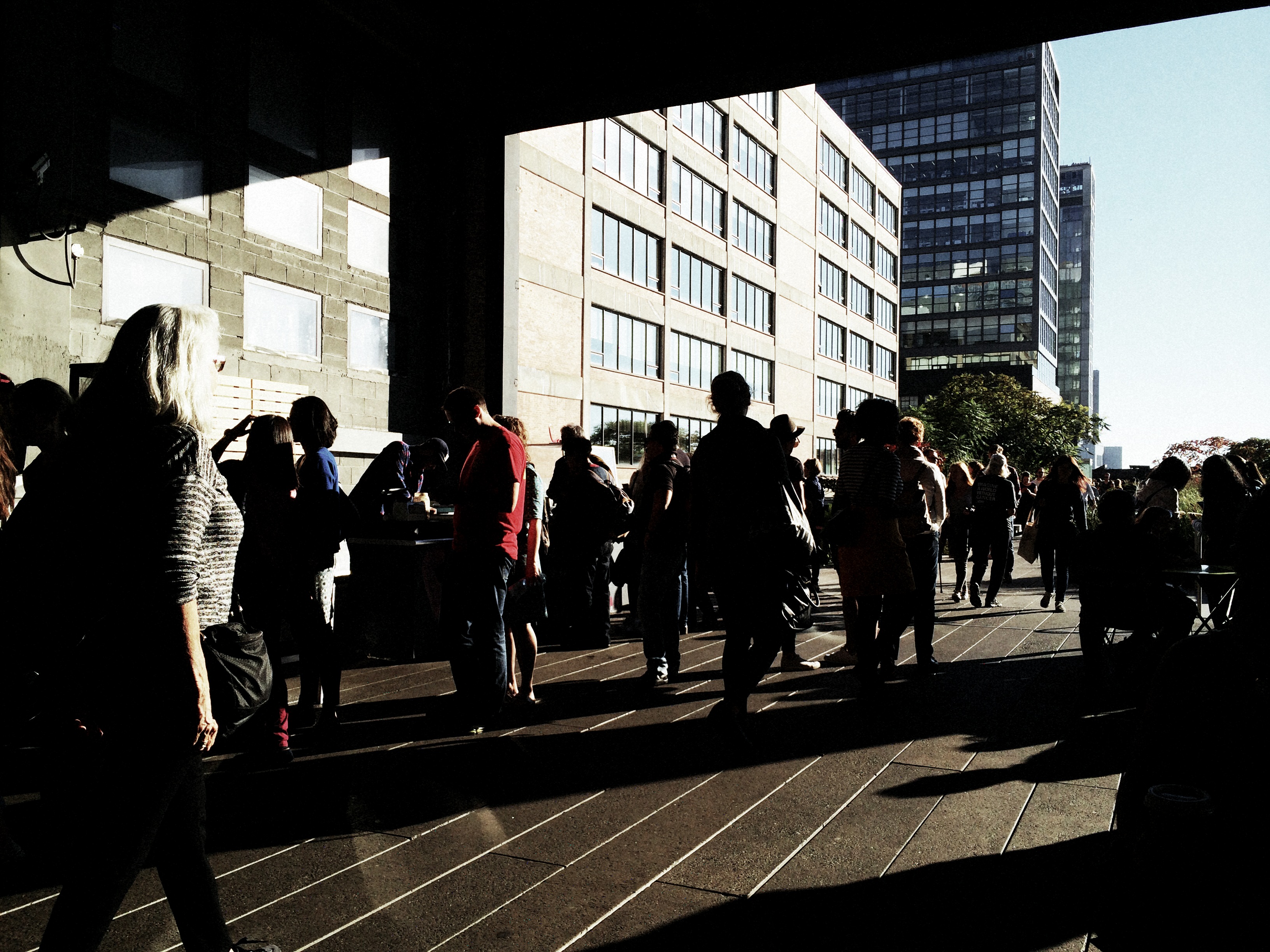
AS CONVENIENT AND SIMPLE AS MANY PANORAMIC APPS AND TECHNIQUES HAVE BECOME OF LATE, there are many ways to accent a wide linear line of photo information within a standard camera frame. With images shot in very large file sizes these days, (even without shooting in RAW), plenty can be cropped from a photograph to produce the illusion of a wide composition with no loss in quality. It’s the pano look without the pano gear, and it’s a pretty interesting way to do exposition on crowds.
I first started noodling with this in an effort to save images that were crammed with too much non-essential information, most of them random streets shots that were a little busy or just lacking a central “point”. One such image was an across-the-street view of the area around the Chinese Theatre in Hollywood. Lots of building detail, lots of wandering tourists, and too much for a coherent story. Lopping off the top two-thirds of the frame gave me just the passing crowd, an ultra-wide illusion which forced the viewer to review the shot the way you’d “read” a panel in a comic strip, from left to right.
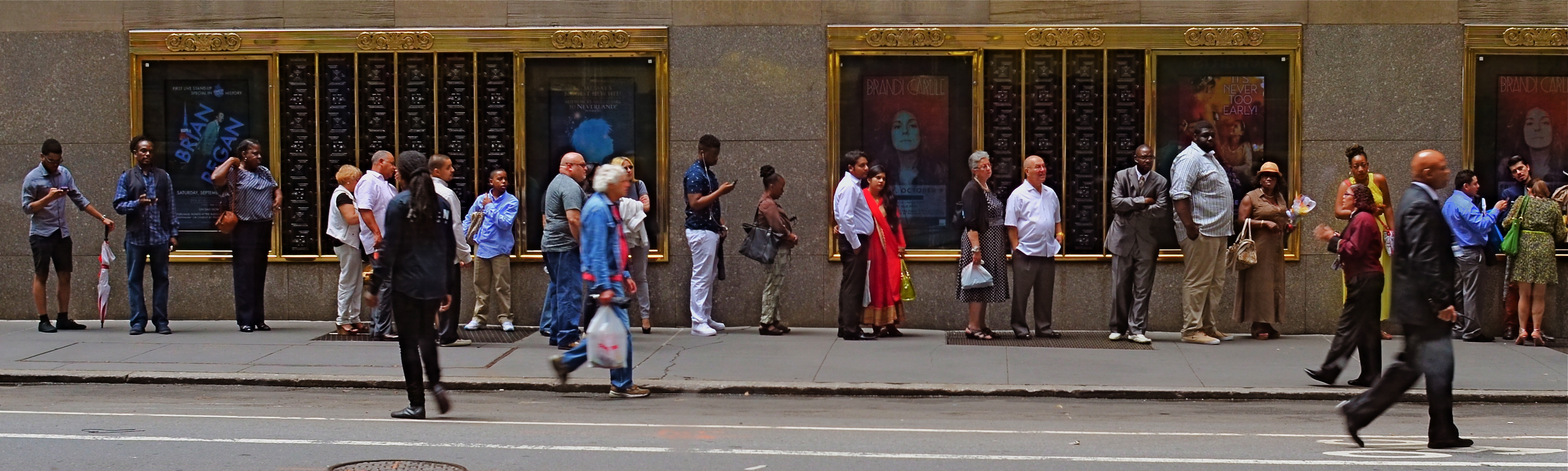
Tickets, Please, New York City, 2015.
Lately, I’ve been looking for a purer version of that crowd, with more space between each person, allowing for a more distinct comparison between individuals. That is, short guy followed by tall woman followed by little kid followed by….you get the idea. Then, last week, I happened upon the ideal situation while shooting randomly through a window that looked out on the 51st street side of New York’s Radio City Music Hall: a long line of folks waiting to pre-purchase event tickets. The space between them and the street rhythm shown by a few out-of-focus passersby was all the composition I needed, so in the editing process I once again aced the top two-thirds of the picture, which had been taken without zoom. A bit of light was lost in shooting through the window, so I added a little color boost and texturizing in Photomatix (not HDR but Tone Compression settings) and there was my pseudo-pano.
It’s a small bit of cropping choreography, but worth trying with your own street shots. As as is the case with many images, you might gain actually strength for your pictures the more ruthlessly you wield the scissors. Some crowd shots benefit by extra context, while others do fine without it. You’ll know what balance you’ll need.
ONE STORY AT A TIME
Capital Capitol, 2015. A re-cropped and post-processed remix of a casual 2007 snapshot.
By MICHAEL PERKINS
BEING A MULTI-TASKER IS NO LONGER A MATTER OF CHOICE. We love to pretend that we’re adept at turning off selective parts of the hurricane of sensory input that comprises the whole of our daily life, but, fact is, we cannnot. You might be able to do as few as three things at a time in this world, but only if you struggle against a constant cacophony of sensations.
Unfortunately, creating art sometimes requires quiet, clarity, the ability to edit out unwanted sights and sounds in order to find a clear path toward a coherent vision. And this impacts photography as well as any other creative enterprise.
The 2007 original, taken from a NYC Circle Line tour boat.
Urban life presents an especially big challenge to this urge to “get clear”, to untangle conflicting stories and draw out clean, direct messages for our images. Major cities are like 24-hour whistle factories, with thousands of things screaming for our attention. Thing is, there just isn’t enough attention to go around. Often, in poring over old projects, we find that a fourth, a third, even half of the information in a picture can be extracted in the editing process and still leave more than enough data to get our point across. And herein lies a problem.
If it’s getting harder and harder to edit in the moment to boil a photograph down to its essence, the editing phase becomes more crucial than ever before. You either get the best picture in the taking or in the remaking. It can be argued that practice helps the photographer learn to quickly ferret out simple stories within a mass of visual noise, and, of course, the more you shoot, the more you learn what not to shoot. But it seems inevitable that editing, and re-editing, will become a bigger part of the overall task of making pictures.
If the weakest of your photographic skills is post-processing, you might strongly consider upping that particular part of your game. The world isn’t slowing down anytime soon. It’s great to know, in an instant, how to make a strong image. But, as my dad always said, that’s why God put erasers on pencils. Editing can be where acceptable pictures buff up into contenders.
A GAME OF INCHES
An okay idea for a picture, but, as it turned out, merely okay. 1/200 sec., f/5.6, ISO 100, 24mm.
By MICHAEL PERKINS
PHOTOGRAPHERS PROGRESS FROM WHAT I CALL SNAPSHOT MENTALITY TO “CONTACT SHEET” MENTALITY as we move from eager beginners to seasoned shooters. Many of the transitional behaviors are familiar: we actually learn what our cameras can do, we begin to pre-visualize shots, we avoid 9 out of the 10 most common errors, etc. However, one of the vestiges of snapshot mentality that lingers a while is the tendency to “settle”, to be, in effect, grateful that our snap resulted in any kind of a shot, then moving too quickly on to the next subject. It’s a little like marrying the first boy that ever asked you out, and it can prevent your hanging around long enough to go beyond getting “a” shot to land “the” shot.
In snapshot mentality, we’re grateful we got anything. Oh, good, it came out. In contact sheet mentality, we look for as many ways to visualize something as possible, like the film guys who shot ten rolls to get three pictures, seeing all their possibilities laid side-by-side on a contact sheet. The film guys stood in the batter’s box long enough to make a home run out one of all those pitched balls. With the snapshot guy, however, it’s make-or-break on a single take. I don’t like the odds. My corollary to the adage always be shooting would be always shoot more.
All of which is to plead with you to please, please over-shoot, especially with dynamic light conditions that can change dramatically from second to second. In the shot at the top, I was contending with speedily rolling overcast, the kind of sun-clouds-sun rotation that happens when a brief rain shower rolls through. My story was simply: it’s early morning and it just rained. This first shot got these basics across, and, if I were thinking like a snapshot photographer, I would have rejoiced that I nailed the composition and quit while I was ahead. However, something told me to wait, and sure enough, a brighter patch of sunshine, just a minute later, gave me a color boost that popped the page much more effectively. Same settings, same composition. The one variable: the patience to play what is, for shooters, a game of inches. A small difference. But a difference, nonetheless.

And that’s what these little blurbs are. Not examples of groundbreaking art, just illustrations of the different ways to approach a problem. Digital shooting is cheap shooting, nearly free most of the time. Shouldn’t we, then, give ourselves at least as many editing choices as film guys who shot rolls of “maybes” at great expense, in search of their “yeses”? Hmm?
THE ABCs OF TMI
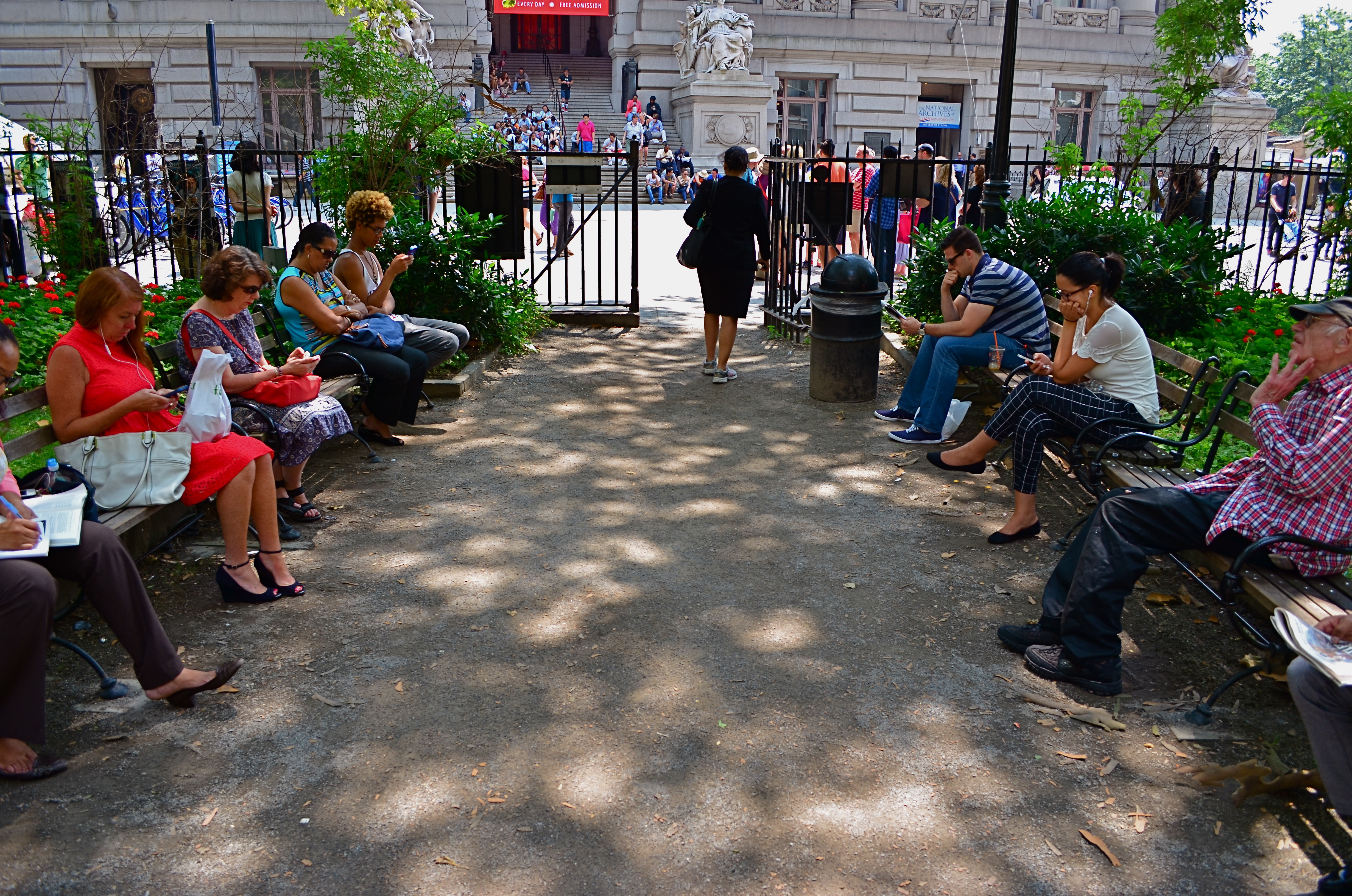
This street shot from a park in lower Manhattan is not ready for prime time, but it might get there with creative cropping.
By MICHAEL PERKINS
FOR ME, ONE OF THE GREATEST ANCILLARY BENEFITS of doing historical research has been the privilege of poring over old files of newspaper and magazine photographs, in many cases viewing original, pre-publication master shots. It’s truly an exercise in reading between the “lines”, those hurried slashes of white grease pencil applied by editors as cropping instructions on shots that were too big, too busy, too slow in getting to the point. In many cases, you realize that, while the photographer may have taken the picture, it was the editor who found the picture.
Of course, no amount of cutting can improve a shot if there is not already a core story hiding within it. You can pare away the skin and seed of an apple, but some apples prove themselves rotten through and through. It’s the same with a photograph. However, if you teach yourself how to spot what, within a frame, is fighting with the central strength of a photo, it becomes obvious where to wield your scissors.
In the master shot image at top, the symmetry of the left and right groups of park visitors is blunted in its effect by the unneeded information along the top and bottom thirds of the frame. The shot is not really about the museum in the distance nor the ground in front of the benches. They just don’t help the flow of the picture, so losing them seems like the easiest way to boost the overall composition.
Now the shot is essentially a wide-angle, and, absent the earlier distractions, a kind of horseshoe curve emerges, tying the two benches together. You might even think of it as an arch shape, with the walking woman at the top acting as a keystone. She now draws attention first to the center, then around the curve, so that getting people to see what I am seeing becomes a lot easier. Finally, there is still a very loud distraction from the color in the shot, so a black-and-white remix keeps the reds and louder colors from “showing off” and lessening the impact of the story. The final result is still no masterpiece, but it does demonstrate that there was a very different picture hiding within the master shot, one that was certainly worth going after.
The “after” version, minus the color and some high-and-low-end visual distractions.
One of the downsides of being an amateur shooter is not reaping the benefit of a ruthless photo editor. However, learning to spot the weaknesses in potentially effective shots can be learned, most importantly the “ruthless” part. If you believe in an image, you won’t shy away from trimming its fingernails a bit to give it a chance to shine.
THE TAKEAWAY

The girl bathed in ceiling light is a nice start, but this picture needs some help to get where it’s going.
By MICHAEL PERKINS
IT IS SAID THAT THE GODDESS ATHENA WAS BORN, FULLY GROWN AND ARMORED, out of the forehead of Zeus. Other than being the only case where a man experienced anything that approached labor pain, the story always reminds me that ideas rarely arrive in their final form, especially in photography. If Athena had a Leica, she probably could have taken perfect shots without needing to compose or plan. We mere mortals are forced to either (a) report to hate-crazed photo editors, or (b) learn how to crop.
Many shots are created in stages, and there’s no shame in the game, since our original conception undergoes many phases from the first spark to something we’d actually hang on a wall. Creation itself is a process, which is why photographers should actually embrace the stages their work will pass through. The more thought that is applied to making an image, the better chance that the best way of doing something will reveal itself. Of course, it can also reveal the fact that there is nothing really to work with, in which case, hey, the bar should be open now, let’s go lick our wounds.
The original shot shown above is not yet a good photograph, but a good beginning for a  photograph. The lady bathed in light seems certainly to have been pre-selected to be the focal point of the picture, but there are way too many competing elements around her, robbing her of the prominence she deserves in the final frame. So let’s get after it.
First, none of the information on the left side of the frame makes it any clearer that she’s alone or that she’s on the second floor of the building. We can make that plain with half the acreage, so snip. Similarly, the guys in shadow to her right aren’t part of the story we are crafting for her. If she’s isolated, let’s make her isolated and be unmistakable about it. She’s “apart” already from the sea of people below her. She’s geographically and physically separated from them, but the extra guys make the argument weaker, so, snip, away they go.
Finally, the entire upper-floor/lower-floor line of sight will be accentuated if we crop for a portrait orientation and move the frame so she is on the upper-right-hand corner of it. It forces the eye to discover the story of the picture vertically, so snip and we’re done.
So, at the end, we did not make any changes via processing, only the old scissors. Taking things away, not adding them on, actually made the picture work better. Fate gave me the girl and the wonderful light she was bathed in, but there was work to do. She didn’t arrive, ready to party, like Athena, but she’s a little closer to goddess status after some adjustment.
THE FLOATING 50

From Lobby To Terrace, 2015. A near 50% crop from the original, seen below at left.
By MICHAEL PERKINS
YOU CANNOT BECOME A GREAT PHOTOGRAPHER WITHOUT BEING YOUR OWN BEST EDITOR, no matter how brilliant or instinctual your shooter’s eye may be. Art is both addition and subtraction, and the image frame is about both inclusion and exclusion. You get your viewers’ attention by knowing what to show. You hold that attention, and burn your images into their minds, by learning what to pare away.
I’ve written several variations on this theme, so the best way to restate it is in the voice of the truly visionary godfather of street photography, Henri Cartier-Bresson. Ironically, this master of in-camera composition (he is reputed never to have cropped a single shot after it was taken) was nonetheless remarkably aware of what most of us must do to improve an image through post-editing:
This recognition, in real life, of a rhythm of surfaces, lines, and values is for me the essence of photography; composition should be a constant of preoccupation, being a simultaneous coalition – an organic coordination of visual elements. We must avoid snapping away, shooting quickly and without thought, overloading ourselves with unnecessary images that clutter our memory and diminish the clarity of the whole.
Insert whatever is French for “Amen” here.

The original. It’s easy to see what needs to be cut out of this one.
I often find that up to 50% of some of my original shots can later be excised without doing any harm to the core of the photograph, and that, in many cases, actually improving them. Does that mean that my original concept was wrong? Not so much, although there are times when that’s absolutely true. The daunting thing is that the 50% floats around. Sometimes you need to cut the fat in the edges: other times the dead center of the shot is flabby. Sometimes the 50 is aggregate, with 25% trimmed from two different areas of the overall composition.
On occasion, as with the above picture (see the original off to the left), the entire bottom half of the shot drags down the top. In the cropped shot, the long lateral line between indoors and outdoors is much more unbroken, making for a more “readable” shot from left to right. The disappearance of the dark furniture at the bottom of the master shot creates no problems, and actually solves a few. Do a disciplined search of the nobler near-misses in your own work and see how many floating 50’s you discover. Freeing your shots of the things that “clutter our memory and diminish the clarity of the whole” is humbling, but it’s also a revelation.
DON’T LIKE, LOOK
Looking at photographs is no less a skill than producing them.
By MICHAEL PERKINS
I RECENTLY OVERHEARD A CONVERSATION BETWEEN TWO YOUNG WOMEN which involved the viewing of one woman’s phone images, which she was sharing with her friend. Perhaps “sharing” is too generous a term, as the review of pictures, rendered with a cross-telephone swipe between each one, took approximately ten seconds, punctuated by the following remarks:
“That’s cool..”
“THAT‘s cool…”
“That one’s REALLY cool…send it to me, willya?”
“Love it…”
“Oh, too cute…”
“Totally cool…”
The present age’s crushing overload of sensory information, including the billions of photographs snapped each day, has turned us into a nation of glimpsers. We sense images only fleetingly as they zoom past our window, each new one obliterating the one which preceded it, each one awaiting its own turn to be eclipsed by something newer, cooler, cuter. While the operative word for those viewing the world’s first photographs might have been: look. Now that word is simply: next.
Whatever, dude. We don’t even care whether someone has examined, considered, or absorbed our photographs, as long as they issue a perfunctory, agreeable grunt of some sort between each one or reflexively (and meaninglessly) twitch a “like” click in the appropriate box. The sheer volume of things to be reviewed, and, God spare us, ruled on in some way has turned us into a race of card shufflers. There, we promise. We’ve processed your output and pronounced most of it passable.
Gee, thanks a lot. Thanks for nothing.
The ability to churn out photographs like potato chips certainly provides more opportunities for more people to produce something great. However, if our view of those scads of potential masterpieces is akin to watching bicycle spokes whiz by, then we cannot meet the photographer’s vision with any appreciative seeing of our own. Certainly, some photographs are not worthy of large audiences, but we also have become lousy audiences for the pictures that do deserve to be lingered over, thought about, treasured.
Do a favor for the people in your lives that take photographs. “Like” them a lot less. Look at them a lot more. There is no rush, except the one in your head. Appreciating beauty, or wonder, or art is not a homework assignment, to be tossed off on the way to the next, new thing. Give the pictures time to talk to you. Give yourself back the ear to hear.
Slow the bloody hell down.
THE CENTER HOLDS

Do you need either the entire tree or the entire hammock to sell the idea in this picture?
By MICHAEL PERKINS
ONE OF THE MOST FASCINATING PARTS OF THE LEGEND of Henri Cartier-Bresson, the artist who is the world’s model for street photography, is the oft-repeated story that he never cropped a shot over the many decades of his remarkable career. Thus the man who originated the phrase “the decisive moment” to indicate that there was but one ideal instant to capture something perfectly in the camera is also credited with creating flawless on-the-spot compositions, image after image, year after year. Yeah, well….
I love HCB, and I personally can’t find a single one of his images that I could improve upon, no matter where I was to wield my magic scissors. But just as the writer in me believes that great novels aren’t written, but re-written, I believe that many great photo compositions emerge after much additional consideration, long after the shutter snaps. It’s not that one shouldn’t strive to get things as perfect as possible in the moment. In fact, there is overwhelming evidence that many photographers do exactly that, nearly all the time.
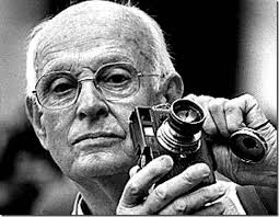
The Maestro.
It’s that “nearly”, however, that describes most photos, something which might be converted to “definitely” in the cropping process. In fact, I am starting to feel that the very first thing to be done with a picture in post-production is to just start paring away, only stopping when the center of the idea has been reached. It’s gut-wrenching, since we usually fall in love with our pictures at first sight (and in their first versions). But even if God decided to make one of us, say Cartier-Bresson, the messenger of his divine eye, he certainly didn’t make that trait as common as, say, green eyes or freckles. For most of us, most of the time, we need to eliminate everything that diverts the eye anywhere but where the main message is. As an example, the hammock image above is the result of cutting away nearly 2/3 of the original photograph.
There are a few times when an image comes full-born out of the camera, all muscle and no fat. However, in the digital age, re-thinking one’s realization of a concept is easier than it’s ever been, and there is no downside to doing so. If there is a narrative ground-zero to your photo, don’t worry. The center will hold.
THE REVISION DRAFT
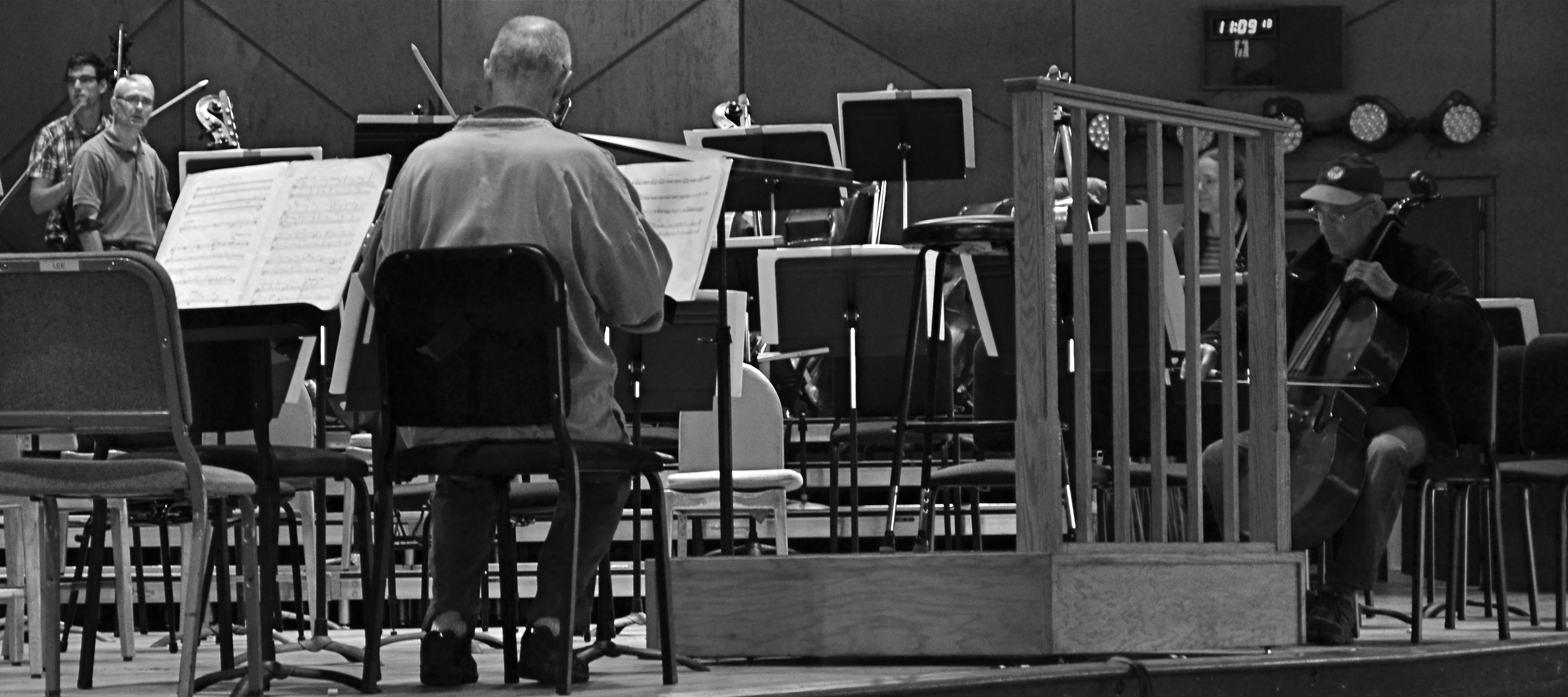
Reducing is remixing: this Tanglewood rehearsal photo was at least 2/3rds bigger in the original, but a severe crop highlights a relationship between these players that the bigger image buried.
By MICHAEL PERKINS
HERE’S A SENTENCE YOU’RE NOT GOING TO HEAR ANYWHERE ELSE THIS WEEK: Being a club DJ can actually give you a fresh viewpoint on your photography.
I’ll let that sink in.
I know what you you’re thinkin’: did he drink six shots or only five? But I’m kind of sober, and rather serious. In a club setting, the mix is often more important than the song, or, more correctly, it allows the song to have an infinite number of alternative lives, depending on what you do with the turntables. Record companies recognized this in the heyday of disco, remixing hit tracks for more thump and bump, longer edits, brass overdubs, etc. As time went on, DJs interspersed their own random elements in the moment to create their own signature blends.
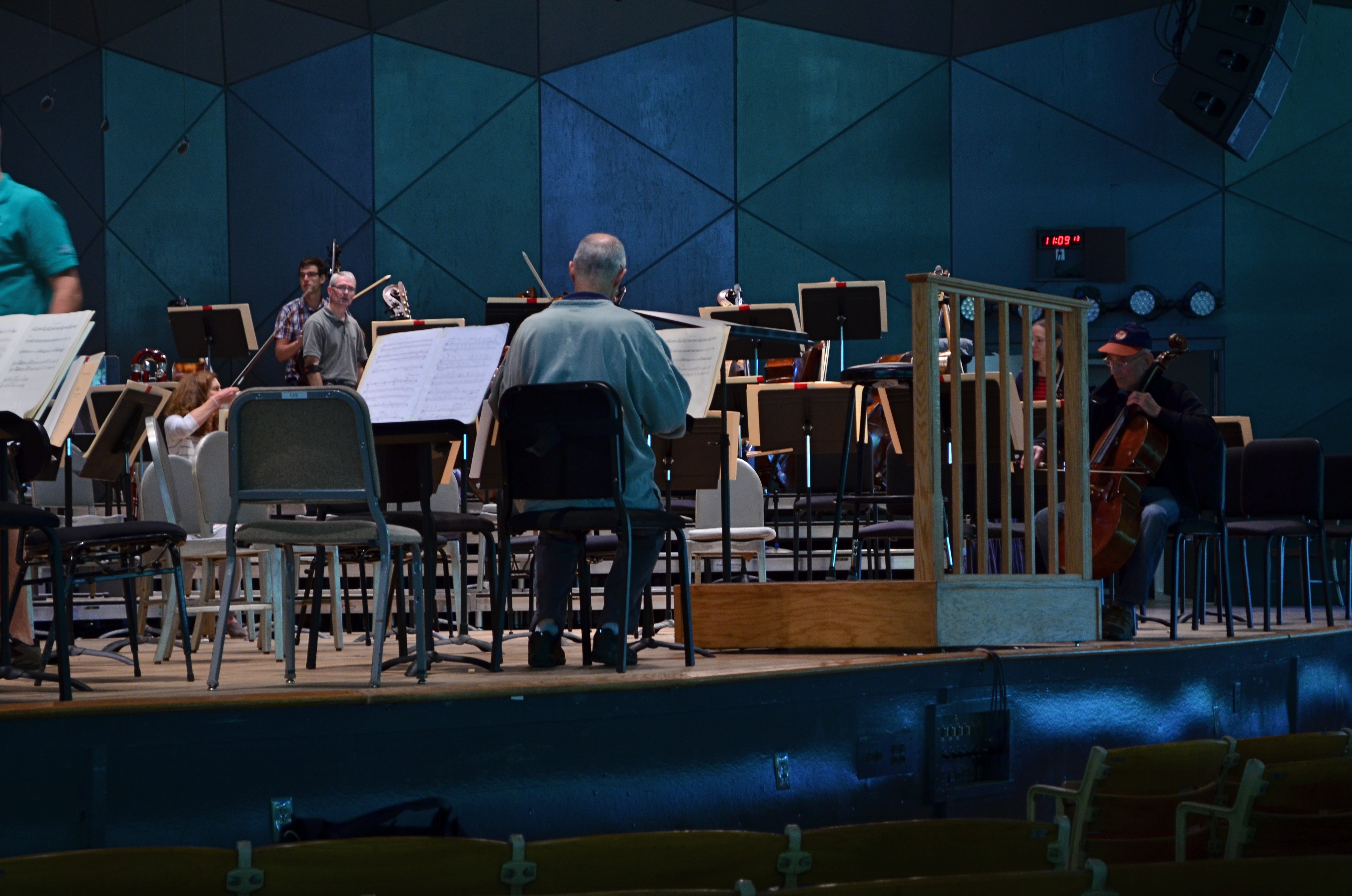
The original.
So what does this have to do with photography? Pretty much everything. In the digital era, post-production software is nearly half of some shooters’ workflow. So much emphasis is placed on what you can fix after the shutter is clicked that, for many, actually planning and taking the picture is the least important part of the process. Let’s lay aside the fact that I personally believe that this can get out of hand…..the point is, by allowing yourself the flexibility to revisit and remix a photo many times over its lifetime means you are not limiting yourself to one interpretation of what you originally created.
However, don’t keep merely to a reprocessing of the exposure or tone elements in the picture, that is, boosting color, adding filters, converting to monochrome. Think of compositional space as a remix element as well. Did you need all the real estate taken up in the original picture? Would that landscape shot work more effectively in portrait or square format? Did you originally include information in the frame that just adds clutter, sending your viewer’s eye wandering around aimlessly? In short, does your first reading of the “idea” of the picture still seem valid?
See the “after” picture at the top of the page and its “before” equivalent to the left. Did the picture gain or lose from the changes?
Another musical musing: George Gershwin personally played Rhapsody In Blue like a snappy jazz piece, not the stately symphonic standard that’s re-created by most modern performers. Does one rendition sound better or worse? Who knows? Who cares? What matters is that the process reveals different traits within the core music with every new mix. Your photographs will benefit in the same way. Just trust yourself to tinker.
ROLL PLAYING
By MICHAEL PERKINS
I RECENTLY CAME ACROSS AN ARTICLE IN WHICH A PHOTOGRAPHER BEMOANED the insane volume of images being shot in the digital era. His point was that, while we used to be tightly disciplined in the “budgeting” of shots back in the days of film (in which we had a fixed limit on our shots of 24 or 36 frames), we crank away an infinite number of shots today in short order, many of them near duplicates of each other, flooding the universe with a torrent of (mostly) bad pictures. Apparently, he posits, it is because we can shoot and re-shoot without fear of failure that we make so many mediocre images.
He takes it further, proposing that, as a means of being more mindful in the making of our photos, that we buy a separate memory card and shoot a total of, say, two “rolls” of pics, or 72 total images, forcing ourselves to keep every image, without deletions or retakes, and live with the results for good or ill. I have all kinds of problems with this romantic but basically ill-conceived stunt.
Our illustrious writer and I live on different sides of the street. He seems to believe that the ability to shoot tons of images leads to less mindful technique. I believe the exact opposite.
Not the hardest shot in the world, but in the film era, I might never have guessed how best to nail it. In digital, I was free to approach the right solution over a series of practice shots.
When you are free, via digital photography, to experiment, to correct your errors on the fly, you suddenly have the ability to save more shots, simply because you can close in on the best method for those shots much faster, and at a fraction of the cost, of film. You collapse a learning curve that used to take decades into the space of a few years. One of the things that used to separate great photographers from average ones was the great shooters’ freedom, usually from a financial standpoint, to take more bad (or evolving) images than the average guys could afford to. Of course, really bad photographers can go for years merely continuing to take more and more lousy shots, but the fact is, in most cases, taking more photos means learning more, and, often, eventually making better pictures.
Apparently, our illustrious writer believes that you can only be photographically self-aware if you are constantly reminded how few total frames you’re going to be able to shoot. I truly appreciate the goal of self-reliant, experience-based photography he wants to promote. But I contend that it’s not that we make too many pictures, but that we keep too many. It’s the skill of editing, that unemotional, ice-cold logic in deciding how few of our pictures are “keepers”, that is needed, not some nostalgic longing for the strictures of film.
Hey, of course we over-share too many near-identical frames of our latest ham sandwich. Of course Instagram is as clogged as a sink trap fulla hair with millions of pictures that should never see the light of day. But that’s not because we can shoot pictures too easily. It’s because we don’t grade our output on a stern enough curve. As it gets easier to shoot, it should get tougher to meet muster.
