MY LITTLE SLICE OF HEAVEN
Away From It All, Brooklyn, N.Y., 2016
By MICHAEL PERKINS
URBAN ENVIRONMENTS ARE MEAT GRINDERS, greedily chomping maws that mulch and mash humans into manageable shapes and sizes, compacting lives into spaces too small for the average burrowing rabbit and crushing a few millions dreams in the process. And the endless flow of stories that result from this struggle, for photographers, show Man trying to steer clear of the maw, or at least salvage a few limbs as he does battle with it.
Life in cities is about small words with big import. Safety. Shelter. Privacy. Relief. Escape. Dreams. Prayers.
Territory.
Photographic sagas in cities begin and end with the demarcation of personal boundaries. Over here, this is mine. Over there, yours. This is how I identify the mineness. With decorations. With ritual. With color, context, property. I live in the city, but I say on what terms. Cross this line and the city ends. And I begin.
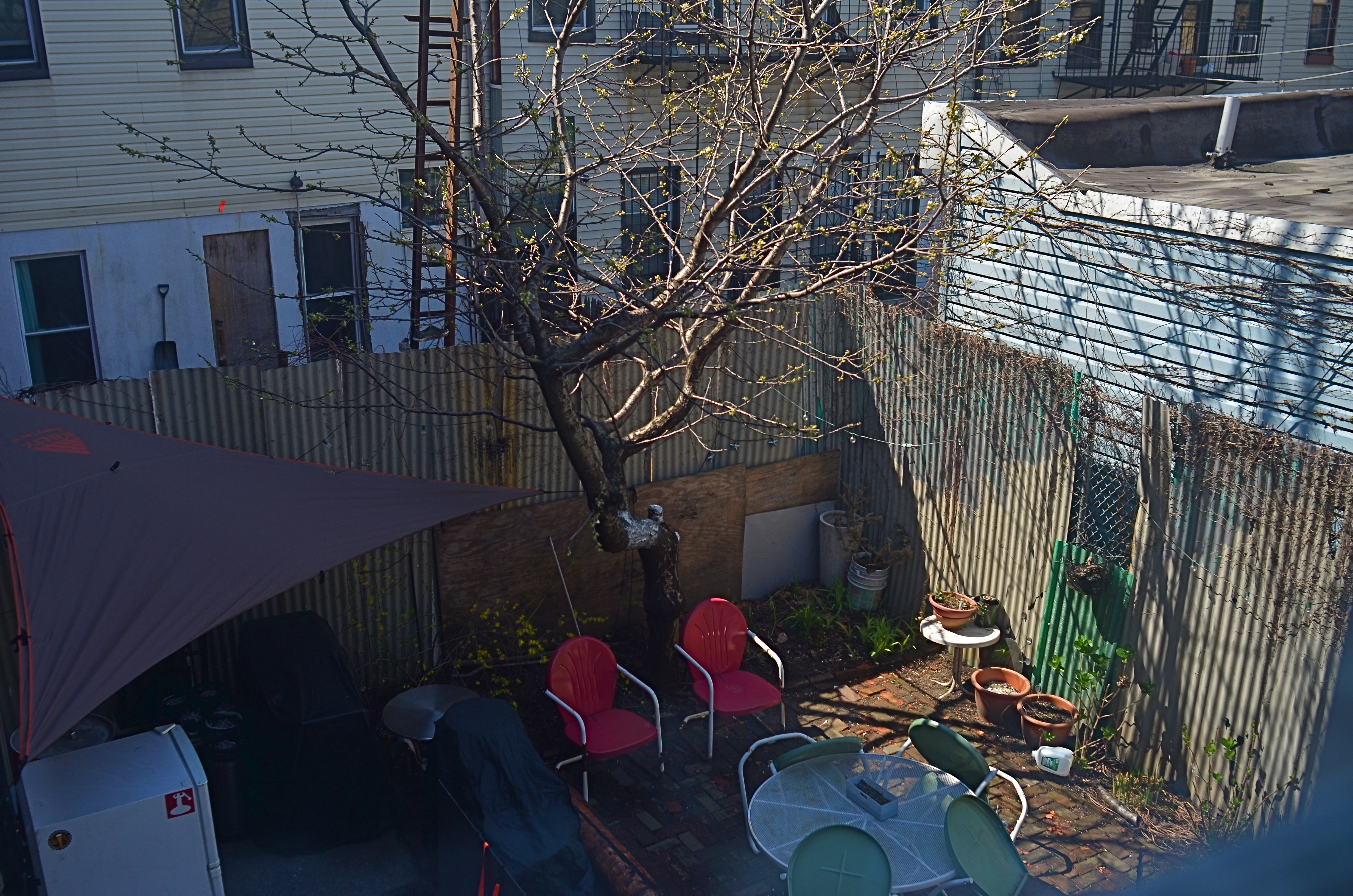
The story of how people in cities define their personal space is a tremendous drama, and, often, a fabulous comedy as well. In the above photo, taken across the endless track of backyard spaces in a Brooklyn neighborhood, space is, obviously, at a premium. But it’s how I fill it that defines me. The little crush of chairs and tables is not so much a patio as it is a healthy exercise in self-delusion.
My little slice of heaven.
Next year, I might get a barbecue.
When the Drifters sang of cities in Carole King’s amazing song, “Up On The Roof”, every city dweller already knew the words. I leave all that rat-race noise down in the street. And every person who walks cities with a camera knows how to identify, and bear witness to, all those little rooves. Or patios. Or pink porchlights.
People need their space, and photographers will always be on hand to show exactly what they came up with.
Just picture it.
A MATTER OF DEGREE
By MICHAEL PERKINS
NIGHT CREATES SUCH A DRASTICALLY DIFFERENT FLAVOR in anyone’s photography that some shooters, romantically attracted to its unique look, have made night-time their exclusive domain. Night is also the toughest time of day to render properly, and a zone wherein one’s interpretation of “reality” varies wildly. From the earliest days of the photographic medium, the hours after sunset were, first and foremost, a technical minefield, filled with pitfalls and perils.
Today, fast lenses and the higher ISO that can be dialed up pretty much at will mean fewer tripod shots, more hand-held shots, and thus a much bigger yield of often stunning night-time images. Even modest cameras are evolving so quickly that it’s getting hard to remember a time when we couldn’t shoot pretty much whatever we desired.
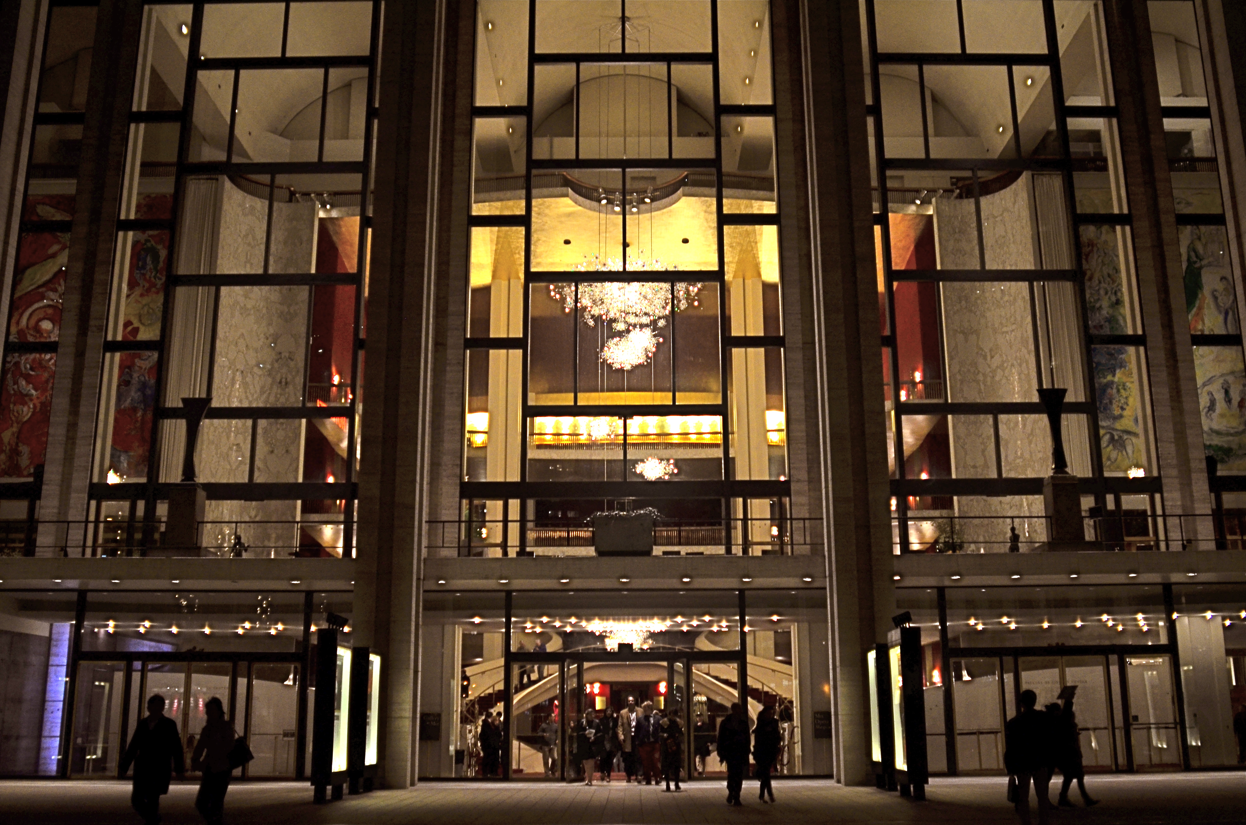
Lincoln Center, 2016
In many night settings, the contrast between bright and dark objects is dramatically multiplied. That means that getting proper exposure still has to be calculated based on widely varying elements within the frame. The night I took this image at New York’s Lincoln Center, I shot the various performance buildings on the “campus” in every compositional combination and setting possible, using a Nikon f/2.8 24mm prime lens. I framed the theatres at right angles to each other, by themselves, juxtaposed with neighboring skyscrapers, with and without the center’s fountain plaza, from medium distances to the lobby, tight distances to the lobby, and so on. In one “almost” calculation, I shot at f/8 and about 1/80 sec. at 1500 ISO, didn’t like how grungy it looked, then cranked the lens wide open to f/2.8, used as slow an exposure as I could execute hand-held (about 1/20 sec.), and backed off the ISO to about 400. That’s the combo you see above.
Normally, an aperture like f/2.8 produces a very shallow depth of field, which is generally bad for distant subjects. However, if you are focused to infinity, and your subject is, say, forty feet away, the image starts to get a little sharper at about twenty feet out, and is pretty sharp by forty. One sharpness caveat: if you use a slow exposure, as I chose to, and you’re also boosting your ISO, the electrical lights in your image will begin to go soft and globby fairly quickly…to “burn in” to some degree. You can see this in my image in the lobby chandelier, which registers as a velvety glow instead of a sharp grouping of individual bulbs. As an alternative, if you have time to experiment, you can amp up the up the ISO a little more, speed up your shutter, and perhaps render the lights a little sharper. This depends greatly on how many wives you have standing nearby, asking, “can we please just walk to the subway now?” It’s also not the only solution possible. Fiddle with it and see what works for you.
Also, if you are lucky enough to be shooting on a tripod, then you can shoot at minimal ISO, an aperture of f/11 or narrower, and as long an exposure as you desire. But the above guidelines are offered for someone shooting hand-held, and in a moderate hurry. I use very fast prime lenses to give me the sharpest focus and the most light latitude possible in the greatest number of situations, assuming that I won’t be allowed to mount a pod, even if I wanted to take one to the theatre (I don’t). So, as always, you have to decide a little ahead of time what you might be shooting, what the reality on the ground will be, and what you’ll need in the way of toys to bring home a goodie. Night is a very different animal, but trying to tame it is surprising and fun.
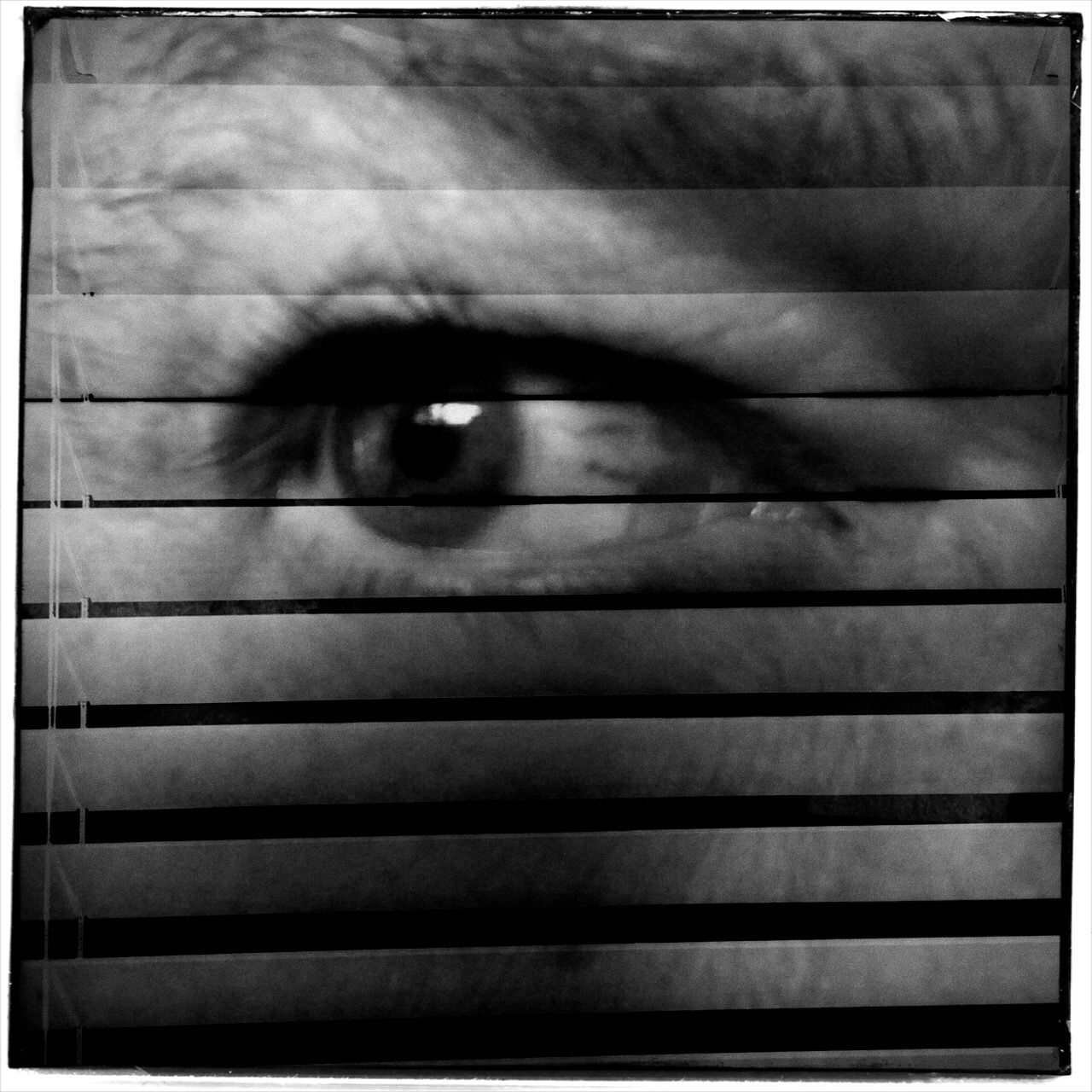
I’M LOOKING THROUGH YOU
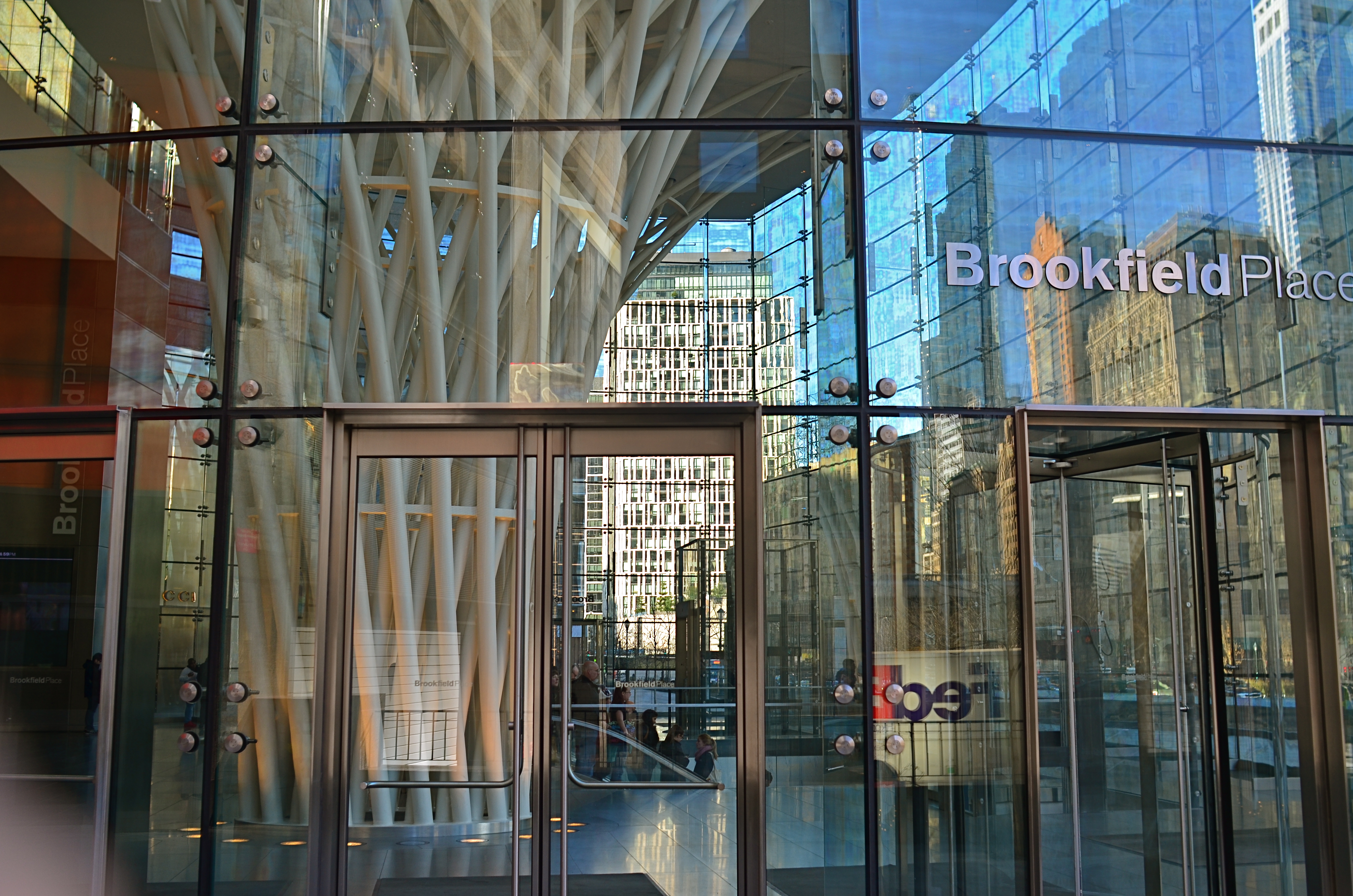
Brookfield Breaklight, 2016.
By MICHAEL PERKINS
ANYONE WHO REGULARLY PHOTOGRAPHS GLASS SURFACES realizes that the process is a kind of shot-to-shot negotiation, depending on how you want the material to react and shape your subject. There is really no absolute “look” for glass, as it has the ability to both aid and block the view of anything it’s around, in front of, or near. Viewed in different conditions and angles, it can speed the impact of an image, or foil it outright.
I love shooting in urban environments, where the use of glass has shifted dramatically in recent decades. Buildings that were 90% brick or masonry just fifty years ago might be predominantly wrapped in glass today, demonstrably tilting the ratios of available light and also changing what I call the “see-through” factor…the amount of atmosphere outside a building can be observed from inside it. This presents opportunities galore of not only what can be shown but also how abstracted glass’ treatment of reflection can serve a composition.
Against the advice of many an online pundit, I keep circular polarizing filters permanently attached to the front of all my lenses so that I can modify reflections and enhance color richness at my whim. These same pundits claim that leaving the filter attached when it’s not “needed” will cost you up to two stops of light and degrade the overall image quality. I reject both these arguments based on my own experience. The filters only produce a true polarizing effect if they are either at the right viewing angle vis-a-vis the overhead sun, or if they are rotated to maximize the filtering effect. If they don’t meet either of these conditions, the filters produce no change whatever.
Even assuming that the filter might be costing you some light, if you’ve been shooting completely on manual for any amount of time, you can quickly compute any adjustments you’ll need without seriously cramping your style. Get yourself a nice fast lens capable of opening to f/1.8 or wider and you can even avoid jacking up your ISO and taking on more image noise. Buy prime lenses (only one focal length), like a 35mm, and you’ll also get better sharpness than a variable focal length lens like an 18-55mm, which are optically more complex and thus generally less crisp.
In the above image, which is a view through a glass vestibule in lower Manhattan, I wanted to incorporate the reflections of buildings behind me, see from side-to-side in the lobby to highlight selected internal features, and see details of the structures across the street from the front of the box, with all color values registering at just about the same degree of strength. A polarizer does this like nothing else. You just rotate the filter until the blend of tones works.
Some pictures are “about” the subject matter, while others are “about” what light does to that subject, according to the photographer’s vision. Polarizers are cheap and effective ways to tell your camera how much light to allow on a particular surface, giving you final say over what version of “reality” you prefer. And that’s where the fun begins.
ESCAPING THE DARKNESS
By MICHAEL PERKINS
TO A PHOTOGRAPHER, THE ENTIRE WORLD IS PRETTY MUCH A “PUBLIC PLACE“, or, more properly, his own personal work space. However, that dreamy viewpoint is not shared by the world at large, and shooters who try to harvest their shots in museums, theatres, office lobbies and other popular gathering points are finding, more and more, that they are about as welcome as a case of shingles unless they are (a) quick (b) unobtrusive and (c) polite to the point of fawning.
It’s not hard to understand why.
First, some of the excess paraphernalia that photogs pack can strike curators and security personnel as hazardous, if not downright dangerous. This view is reflected in the growing number of attractions that have, of late, prohibited the use of selfie sticks. That one I kinda get. Photographers have also taken a hit in the number of places that will permit flash of any kind, and tripods and monopods are nearly always forbidden. The real determinant in why public spaces are less inclined to play ball with photographers, however, is that they simply don’t have to. More patrons than ever rely solely on cel phones, which, in turn, have become more sensitive to low-light situations, making for shorter exposures with fewer add-ons, a technical leap that ensures that everyone will come away with at least some kind of picture. If you need a longer exposure at lower ISO (hence less noise), you still need traditional, higher-end gear, but those numbers are shrinking so much that the gatekeepers can be a lot more restrictive overall.
In many dark spaces I simply can’t find a place to stabilize my camera long enough to take an extended exposure. And, with ‘pods off the table as an option, you’re down to benches, ledges, or other precarious surfaces, and, with them, the paranoid hovering of a mother eagle guarding her eggs to steer foot traffic away from her “nest”. A remote shutter release helps, but the whole project can raise the blood pressure a bit. At least with tripods, passersby can see a set space to steer themselves clear of. A crazy man waving his arms, not so much.
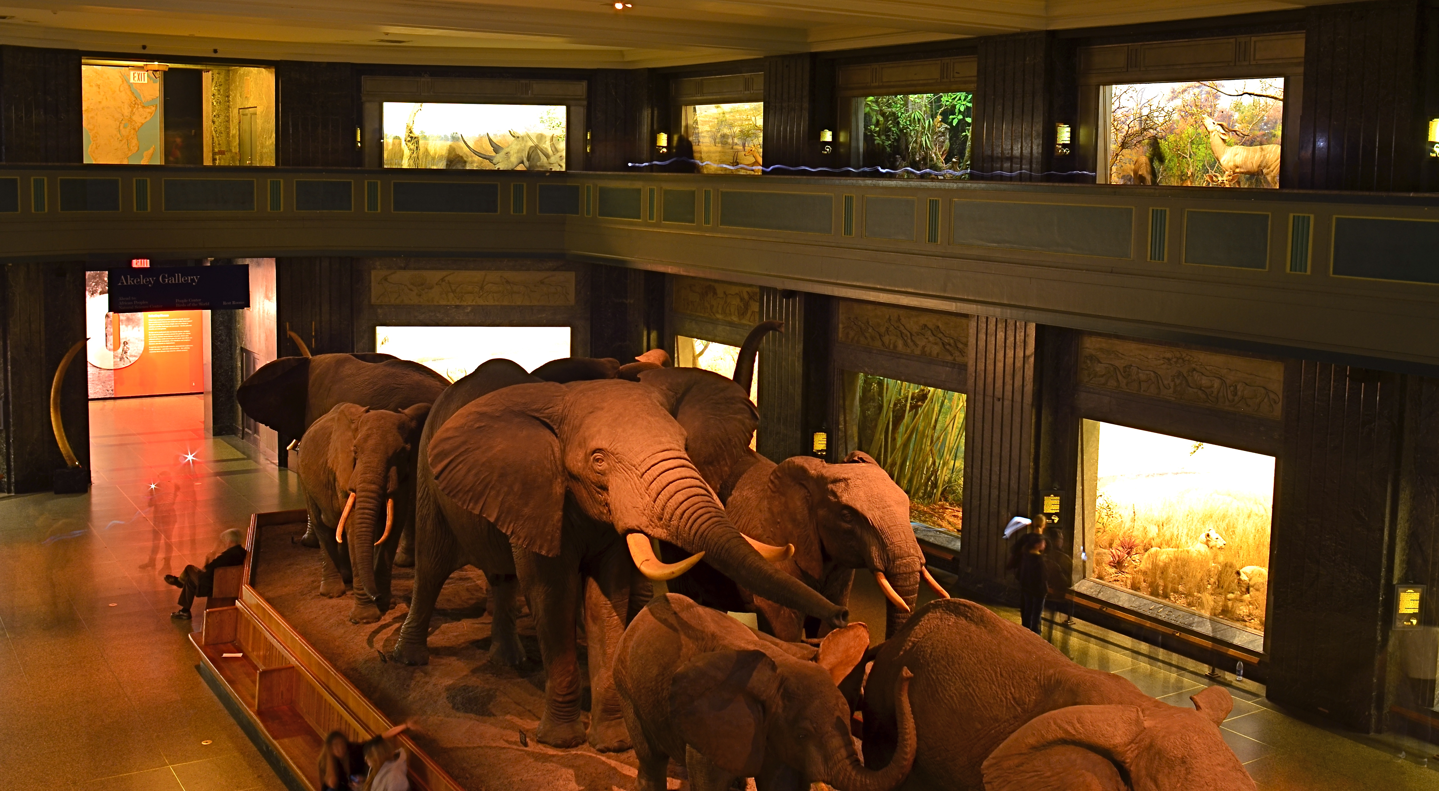
Herd On The Street, 2016. A twenty-five second exposure at f/8, ISO 100, 24mm, from a camera teetering on a museum railing.
The above image was taken in one of the most light-deprived sectors of the New York Museum Of Natural History, with only soft illumination in the side showcases to redeem the pitch-black gloom. No flash would even begin to fill this enormous space, even if it were permitted, and the hall is always crowded, so resting my camera on a narrow rail, twenty-plus feet above the main floor, and going for a long exposure, is the only way for an acceptable degree of detail to emerge from the murk. My wife, who is known for nerves of steel, had to excuse herself and go elsewhere as I was setting up the shot. I couldn’t blame her.
Three or four anxious framings later, I got a workable exposure. As occurs with time exposures, people walking through the scene at a reasonable speed are rendered nearly invisible. The persons near the back of the elephant herd stood still long enough to take a flash snapshot, so their flash burst and some smudgy shadows of their bodies can be seen, as can the trailing LED light that someone else on the upper deck apparently was walking with in the upper right corner. But for this kind of shot, in these modern times, such artifacts are part of the new normal.
INVISIBLE CITIES
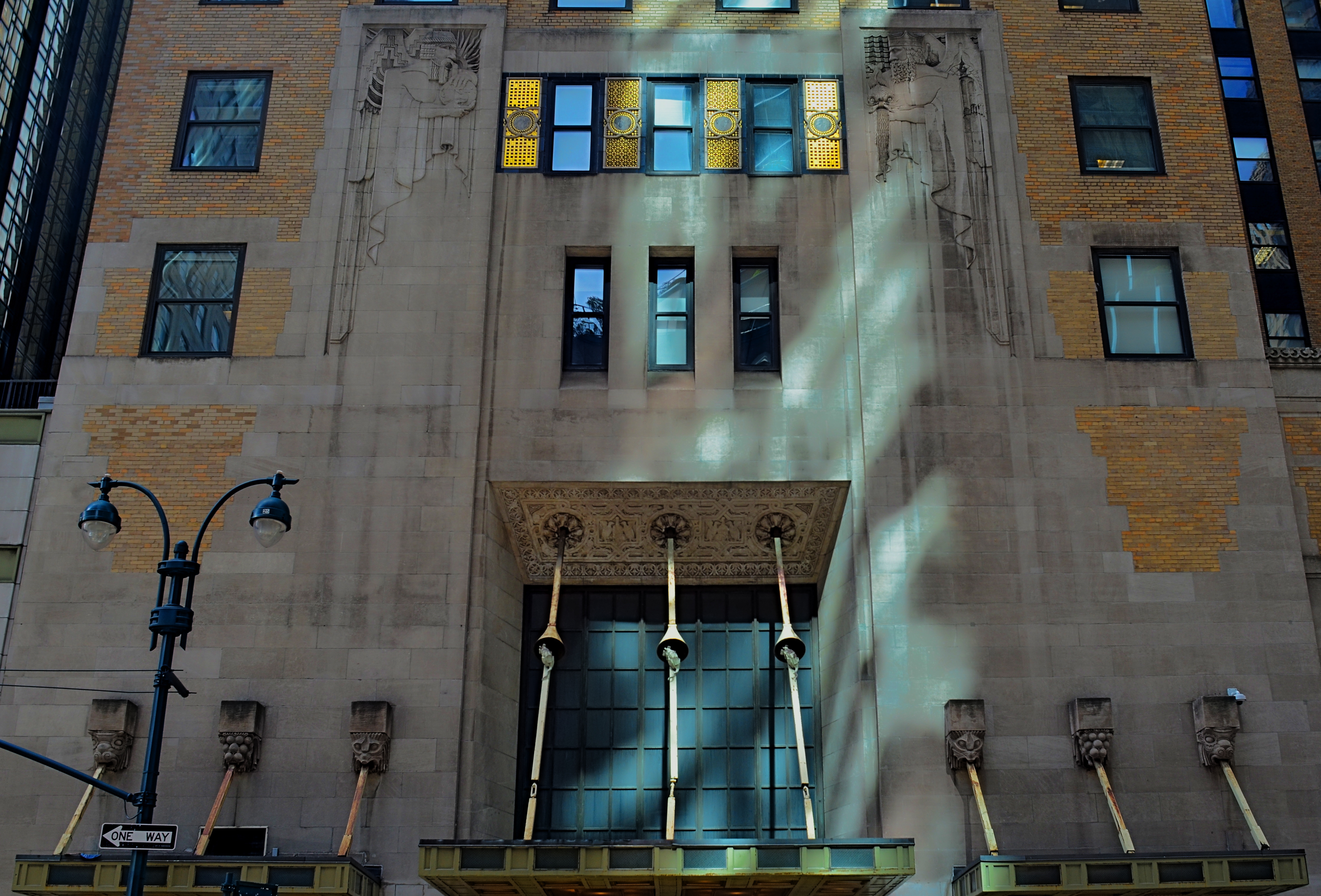
New York is one of the great treasure troves for lovers of Art Deco. This complex, along Lexington Avenue, is literally in the shadow of the Chrysler building.
By MICHAEL PERKINS
THERE IS, IN THE WORLD OF SPORTS, A PSYCHOLOGICAL EDGE known as the “home field advantage”, wherein a team can turn a superior knowledge of its native turf against its visiting opponent. The accuracy of this belief has never been conclusively proven, but it’s interesting to think on whether it applies to photography as well. Do we, for the purposes of making pictures, know our own local bailiwicks better than visitors ever can? Or is it, as I suspect, the dead opposite?
Familiarity may not breed contempt, but, when it comes to our seeing everything in our native surroundings with an artistic eye, it can breed a kind of invisibility, a failing to see something that has long since receded into the back part of our attention, and thus stops registering as something to see anew, or with fresh interpretation. How many buildings on the street we take into the office are still standouts in our mind’s eye? How many objects would we be amazed to learn are actually part of our walk home, and yet “unseen” by us as we mentally drift along that drab journey?
It may be that there is actually a decided “out-of-towner” advantage in visiting a place where you have no pre-conceptions or habitual routes, in approaching things and places in cities as totally new, free of prior associations. I’ve often been asked of an image, “where did you take that?” only to inform the questioner that the building in the picture is a half block from their place of business. The above image was taken on Lexington Avenue in Manhattan, not more than a half block and across the street from the Chrysler building. It is a gorgeous treasure of design cues every bit as symbolic of the golden age of Art Deco as its aluminum clad neighbor, and yet I could hold a contest amongst many New Yorkers as to where or what it is and never have to award the prize money. The Chrysler’s very fame eclipses its neighbors, rendering them less visible.
Perception is at the heart of every visual art, and the most difficult things to re-imagine are the ones which have ceased to strike us as special. And since everyone lives in a city that is at least partly invisible to them, it stands to reason that an outside eye can make its own “something new” out of everyone else’s “something old”. Realize and celebrate your special power as a photographic outlier.
INSTANT VELVET

A portrait straight from my camera, with no prior filtration.
By MICHAEL PERKINS
THERE WERE, IN THE DAYS OF FILM, two main ways to create the velvety glow of uniformly soft focus so prized by portrait subjects. The more expensive route lay in purchasing a dedicated portrait lens that achieved more or less of the effect, depending mainly on aperture. The other, cheaper way was to screw-on a softening filter, making any lens adaptable to the look. Now, in the digital era, those two options have been joined by softening apps for phone cameras and in-camera “filters”, which add the effect after the photograph has been snapped.
That’s the beauty of where we are in the history of photography, where every problem has a half-dozen different solutions, offered at different levels of complexity, ease, and affordability. In the golden days of Hollywood, cinematographers achieved the soft look with some Vaseline smeared over the lens, or by attaching different gauges of gauze to the glass. Both tricks made yesterday’s matinee idols look like today’s ingenues, and now, anyone with a reasonably sophisticated camera can achieve the same success with half the bother.

The same image after the application of Nikon’s in-camera “soft” filter.
I myself prefer to shoot soft focus “live”, that is, in the moment, with either a dedicated lens or a filter, but you aren’t always in the same frame of mind when you shoot something as when you review it later. In-camera processing, while offering less fine control (tweaking pictures that have already been shot), can at least give you another comparative “version” of your image at literally no trouble or cost. With Nikon, you simply select the “Retouch” menu, dial down to “Filters”, select “Soft” and scroll to the image you want to modify. For Canon cameras, go to the “Playback” menu, select “Creative Filters”, scroll to “Soft” and pick your pic. The image at left shows the result of Nikon’s retouch filter, applied to the above picture.
One personal note: I have tried several phone app softeners as post-click fixes, and find that they generally degrade the quality of the original image, almost as if you were viewing the shot through a soup strainer. Your mileage may vary, but for my money, the app versions of soft focus are not ready for prime time yet. Best news is, the soft-focus effect is so popular that eventually all solutions will be generally equal, regardless of platform, since the marketplace always works in favor of the greatest number of people making pictures. Always has, always will.
All things considered, we got it pretty soft.
THE WHEN OF WHIMSY

Yes, We Deliver, 2016. Who ordered the blooms?
By MICHAEL PERKINS
For decades, the legendary Life magazine provided richly illustrated summaries of the week’s events, competing with other photo-laden national weeklies from Look to Fortune, Collier’s to Liberty for the eyeballs of generations of subscribers. The weekly giants perfected the photo-essay, laying out stories on elections, wars, fashions and the arts in serial narrative form from opening headline to closing paragraph. Life has even had a second “life” of sorts, ceasing weekly publication clear back in 1972, but still visible on newsstands to the present day in re-mixed, themed reissues of its iconic image archives.
One of my favorite features in Life over the years was the Miscellany page, tucked just inside the magazine’s back cover, and reserved almost exclusively for whimsy or fun. Freed from the journalistic constraints of the rest of Life, the Miscellany images ended the week on an up note with novelty and warmth providing relief from starker, sterner material. Nearly all of the photos were “human interest” in nature, featuring amusing interactions between people. Lovers. Kids. Day laborers. There was a true “caught in the act” flavor to the shots, and most looked like lucky candids rather than staged or manipulated images.
The feature informed my own brand of street photography, the snap that makes the mind speculate on the story that takes place both before and after the click. Sometimes people figure in my own moments of whimsy. Other times, as in the case of the image up top, an unusual arrangement of elements captures my imagination, making me wonder how these particular things got to this particular place. The idea of a single blooming flowerpot on a cart standing outside a very industrial loading dock caught my eye, as the two things don’t seem, at first glance, to belong to the same world. I almost spent too long thinking about it, too, since, several seconds after I snapped the picture, a worker came into frame and removed the vase, vaporizing my little tableau forever. Snooze you lose.
Miscellany appealed to my child’s sense of how to tell a story in pictures, not by what was shown but by what else is going on. There is a limited “when” for all whimsy, and, as the editors of Life realized so well, a time when one picture on the page is worth a thousand more in the mind.
DEM DARN DONT’S
By MICHAEL PERKINS
THE GLIB REMARK THAT YOU HAVE TO LEARN ALL THE RULES IN LIFE BEFORE YOU CAN BREAK THEM is maddeningly true, at least for me. Early on in my foto-fiddling, I was eager to commit all the world’s accumulated photographic do’s and don’ts to memory, like a biblical scholar nailing scripture passages, and shooting as if to enshrine those stone-written truths in art. I used words like always and never to describe how to make pictures in a given situation. I kept the faith.
And then, when I suddenly didn’t, my stuff stopped being pictures and started being photographs. Absolutes of technique are good starting places but they usually aren’t the best places to stick and stay for life. And at this point in my personal trek (seventh-inning stretch), I feel the shadow of all those do’s and don’ts swirling about like little guardian angels, but I worry first and foremost about what makes a given image work.
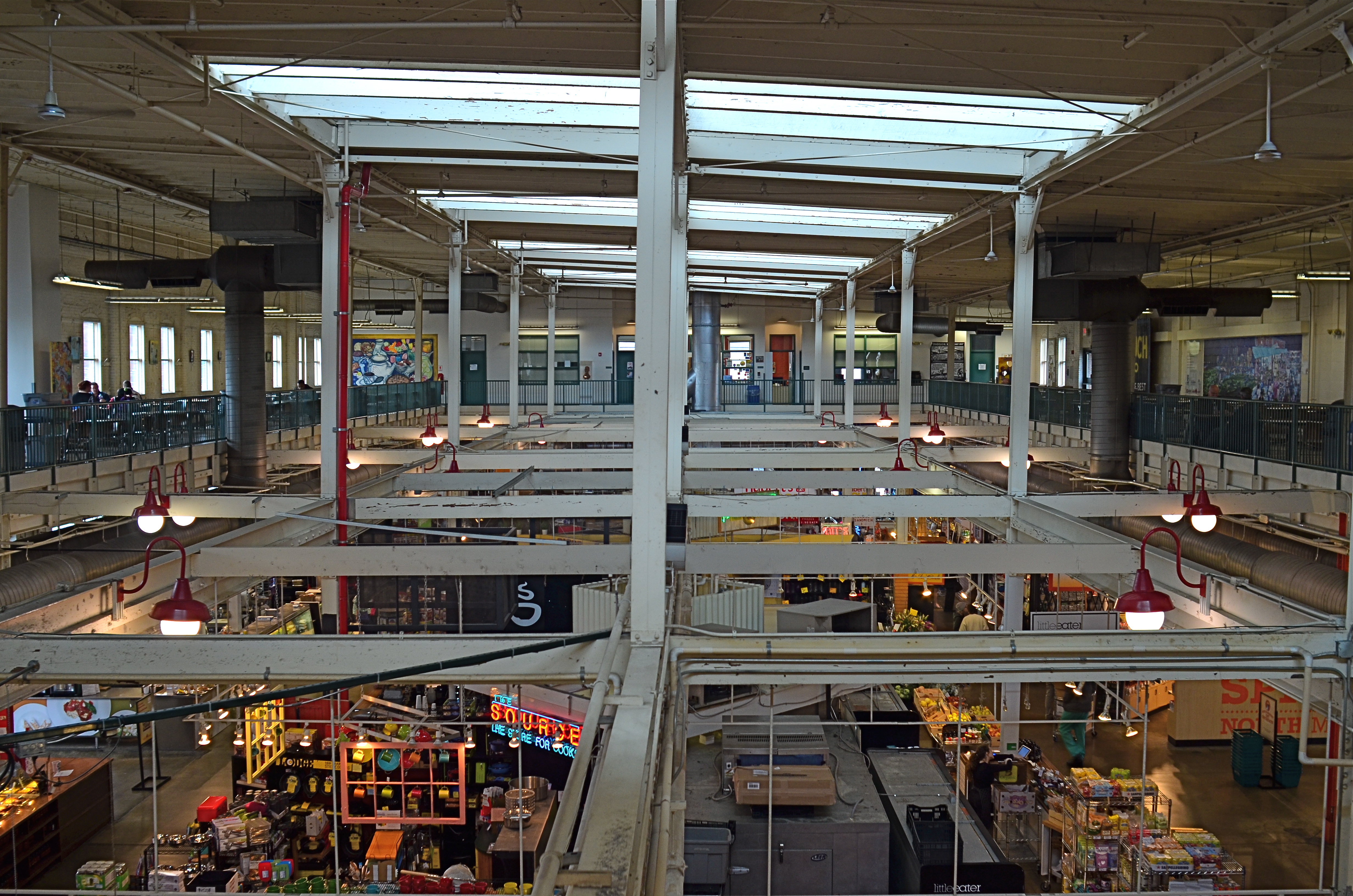
North Market, 2016. Straight out of the camera at 1/40 sec., f/5.6, ISO 200, 24mm.
You no doubt have many pictures you’ve made which you simply like, despite the fact that they flaut, or even fracture, the rules. The above image, shot earlier this week at a multi-floor urban marketplace/eatery, struck me for two reasons. First, because of how many basic rules of “proper” composition it clearly violates; and secondly, just how much I don’t care, because I like what it does. To illustrate my point, I’ve provided citations from an article titled Principles Of Composition to cite specific ways that the photo is, well, wrong.
Have A Strong point of interest. Well, there isn’t any particular one, is there? Lots of conflicting stuff going on, but that’s the natural rhythm of this place. It’s a beehive. One man’s clutter is another man’s full “pulse of life”, and all that.
Don’t place the horizon line, or any strong vertical or horizontal lines, right in the middle of a picture. And make sure the lines aren’t tilted. Okay, well, since there is a distinct difference between the “level-ness” of the crossbeams over the lower floor and the slanted lines of the skylight above, there really isn’t a way to make the entire picture adhere to the same horizontal plane. However, the off-kilter sagginess of the old building actually lends it a little charm , unless I’m just drunk.
Keep compositions simple, avoiding busy backgrounds that distract from your subject. Granted, there are about five different sub-pictures I could have made into separate framings within this larger one, but that would defeat the object of overall bustle and sprawl that I experienced looking out over the entire scene. Sure, some compositions get so busy that they look like a page out of Where’s Waldo?, but certain chaotic scenes, from Grand Central Terminal to Picadilly, actually reward longer, deeper viewing.
Place a subject slightly off-center rather than in the middle of a photo. Yeah, well, that’s where that “strong point of interest” rule might have helped. Sorry.
Do these deviations mean the image was wrong, or wrong for certain circumstances? Every viewer has to call that one as he sees it. Me, I am glad I decided to shoot this scene largely as I found it. It needed to work with natural light, it needed to be shot wide and deep, and it needed to show a lot of dispirate activity. Done done and done. I heard all the rules in my head and chose the road not taken.
Or taken. I forget which.
THIS MUST BE / MIGHT BE THE PLACE
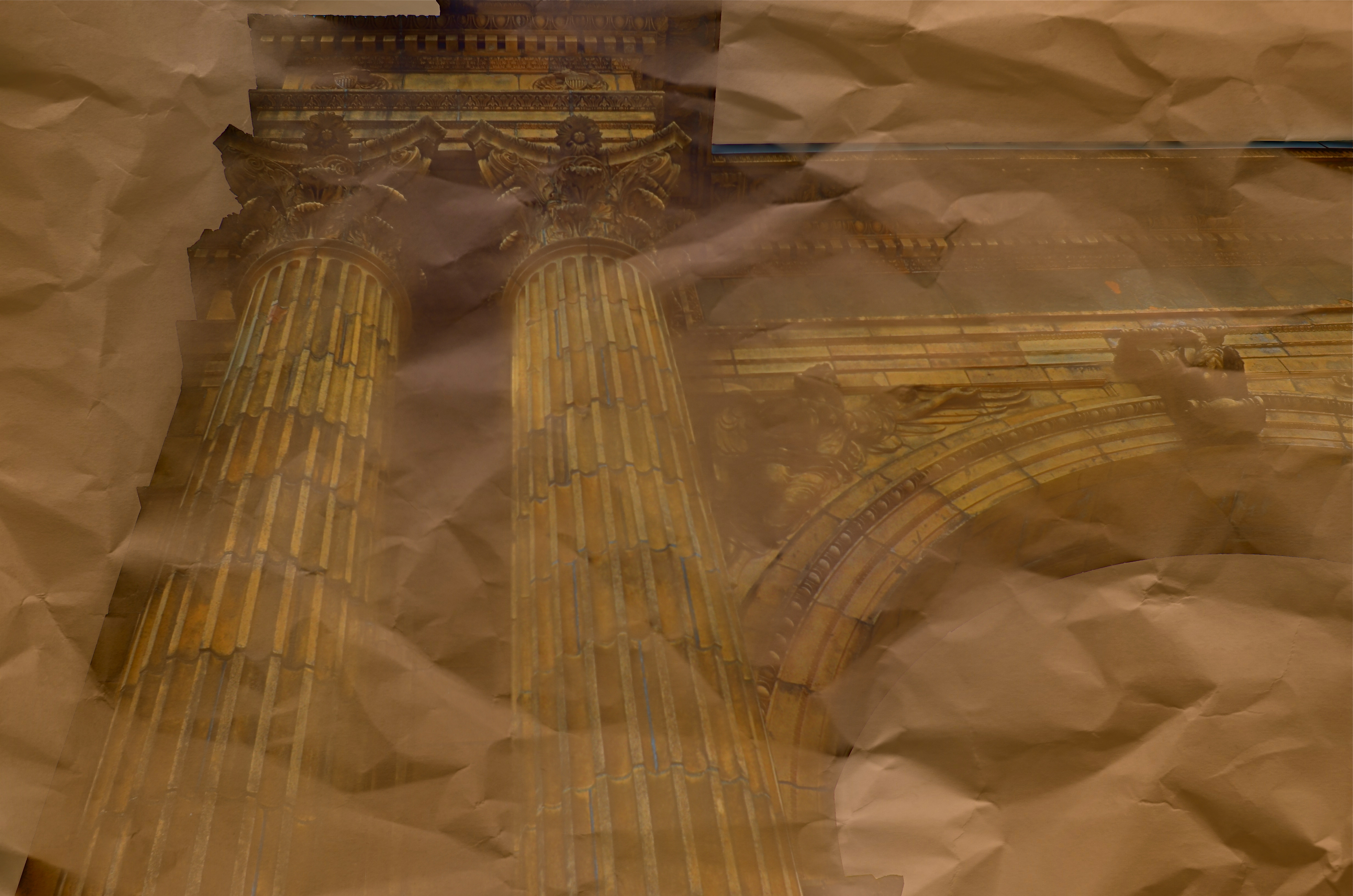
Dream Parchment, 2016.
By MICHAEL PERKINS
URBAN PHOTOGRAPHERS ACT IN MUCH THE SAME WAY AS ARCHAEOLOGISTS in that they must try to supply context for objects, backstories that have been either altered or erased. Cities are collections of things created by humans for specific motives, be it profit, shelter, play, or worship. Often, the visual headstones of these dreams, that is, the buildings, survive beyond the people that called them into being. Photographers have to imply the part of the story that’s crumbled to dust. Like the archaeologist, we try to look at shards and imagine vases, or see an entire temple in a chunk of wall.
During the dreaded “urban renewal” period in the mid-twentieth century, my home town of Columbus, Ohio duplicated the destruction seen in cities across the country in the wanton devastation of neighborhoods, landmarks and linkages in the name of Progress. Today’s urban planners thumb sadly through vast volumes of ill-considered “improvements” wrought upon history from that period, with New York’s Penn Station, Pittsburgh’s Forbes Field, and Columbus’ Union Station surviving today only as misty symbols of fashion gone amok.
In the case of Columbus’ grand old railroad station, there is at least a fragment of the original structure, its beaux-arts entry arch, left standing, serving as either stately souvenir or cautionary tale, depending on your viewpoint. The arch has been moved several times since the demolition of its matching complex, and presently graces the city’s humming new hockey and entertainment district, itself a wondrous blend of new and repurposed architecture. Better late than never.
Thus, the Union arch has, by default, become one of the most photographed objects in town, giving new generations of artists permission to widely interpret it, freed, as it is, of its original context. Amateur archaeologists all, they show it as not only what it is, but also what it was and might have been. It has become abstracted to the point where anyone can project anything onto it, adding their own spin to something whose original purpose has been obliterated by time.
I have taken a few runs at the subject myself over the years, and find that partial views work better than views of the entire arch, which is crowded in with plenty of apartment buildings, parklands and foot traffic, making a straight-on photo of the structure busy and mundane. For the above image, I imagined that I had recovered just an old image of the arch….on a piece of ancient parchment, a map, perhaps an original artist’s rendering. I shot straight up on a cloudy day, rendering the sky empty and white. Then I provided a faux texture to it by taking separate a sepia-toned photo of a crumpled piece of copier paper and fusing the two exposures (the HDR software Photomatix’ “exposure fusion” feature does this easily). Letting the detail of the arch image bleed randomly through the crumpled paper picture created a reasonable illusion of a lost document, and I could easily tweak the blend back and forth until I liked the overall effect.
Cities are treasure hunts for photographers, but not everything we find has to be photographed at, let’s say, face value. Reality, like fantasy, sometimes benefits from a little push.
RUIN AND RESURRECTION
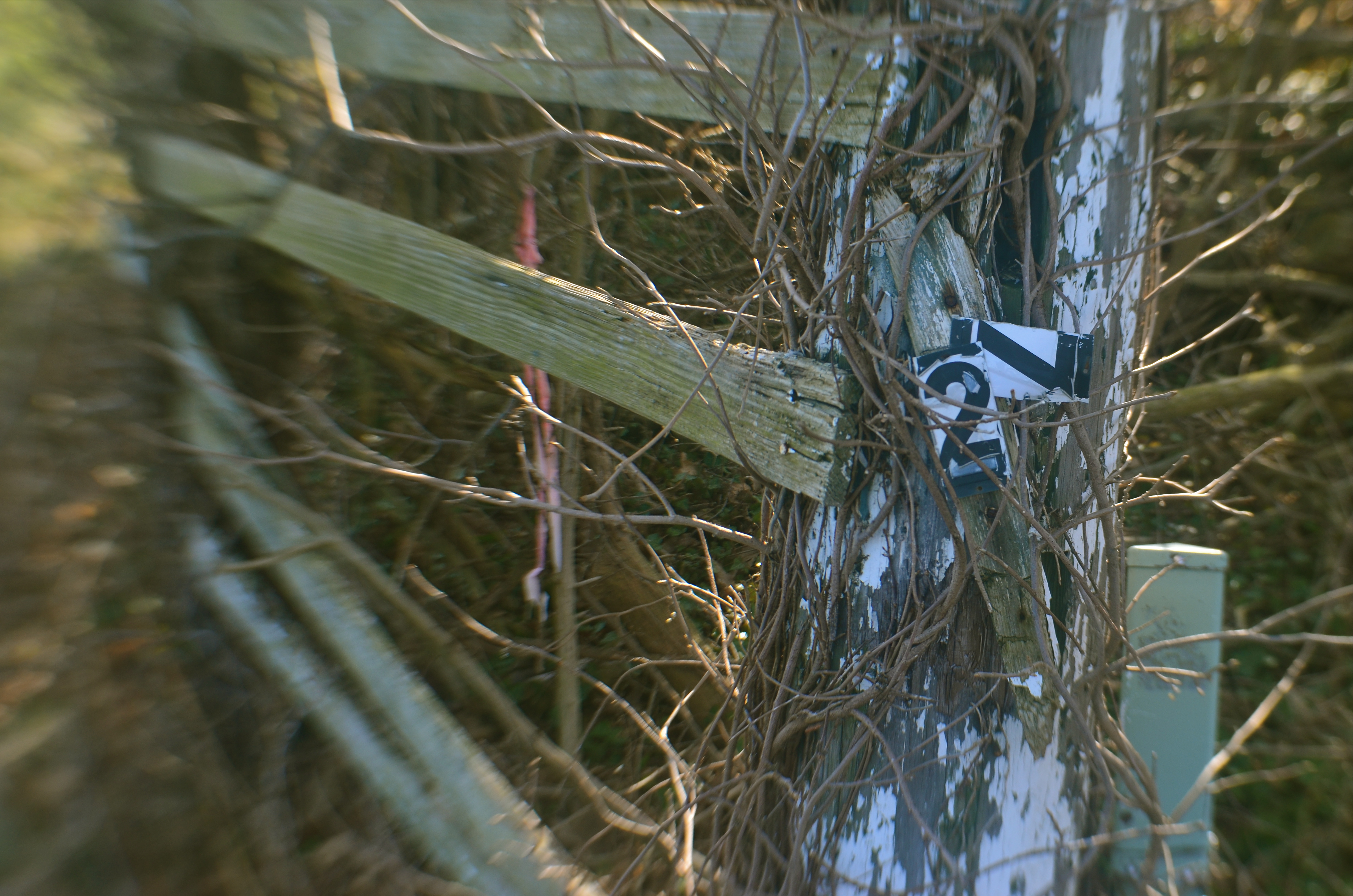
Down The County Line Road, 2016. A fairly obvious study in “ruin” photography. Or is it?
By MICHAEL PERKINS
IN THE BEGINNING, PHOTOGRAPHY WAS MOSTLY ABOUT RECORDING, arresting time in its flight in order to preserve scenes for posterity. And, for its earliest practitioners, that purely technical feat of stopping the clock was enough. We still use the word capture to describe this harvesting of moments. Soon, however, photographs became truly interpretive. That is, they set out to be about something beyond a mere logging of the physical world. In so doing, they passed from documents to statements, with shooters choosing which world view they wanted to present.
I find that, even in the most complex documentary photos, those views seem to collect into two main camps of thought. One kind of image, which may be called the “ruin” category, depicts what we have lost. Abandoned buildings, wrecked cities, damaged lives. “Ruin” campers show the deterioration of things and ask us to assess the loss of dreams. The second general kind of interpretive category, which I’ll call the “resurrection” camp, shows the things that might have experienced ruin but are rebounding, on their way back up. Rez campers show the resiliency of the human spirit, the belief that there will, indeed, be a tomorrow.
Human beings being partisan by instinct, curators, editors, and audiences can, and do, glorify the pictures of one camp while decrying the worthlessness of images from the other camp, in what is really a false choice. Life is never cleanly divided between heaven and hell, and neither should your pictures be.
Photographs that show what we have wasted are no more “authentic” than those that show us recovering from loss. And truly great photographers actually straddle both camps in their best work. But your purpose in a picture must be clear: the image at the top of this page seems to mourn the devastation of an old family farm. However, if I were to pull back to a larger frame, the camera would also show the freshly furrowed fields of a property that is in the process of being re-developed. Ruin or Resurrection? It’s down to approach, and context.
Some days it seems like the best story you can tell is a tragic one, but, at other times, there is nothing more courageously honest than depicting hope. It all depends on what comes to hand. The best plan is not to plan, to be open to whatever the best testimony is, right here, in this picture.
Right now.
THE EYE OF MEMORY
By MICHAEL PERKINS
PHOTOGRAPHY DEALS IN FEELINGS, those inexact sensations of the heart that we try to capture or evoke in our visual messaging. Some subjects, such as war or celebration, convey emotions with such immediacy that we are really only acting as recorders, with the associative power of our minds providing much of the detail. Pictures of loss or celebration, such as the aftermath of a disaster or the birth of a new life, can be fairly simple to convey. What you see is what the thing is. For subtler regions of the brain, however, photos must use, if you will, a different vocabulary.
Newbie photographers are trained, to a a great degree, to seek the sharp image, to master focus as a technical “must”, but, as we vary the kinds of messages we want to convey, we change our attitudes about not only sharpness but most of the other “musts” on the beginner’s list. We learn that we should always do a certain thing….except when we shouldn’t. It’s worth remembering that some of the most compelling photos ever published were, according to someone’s standard, “flawed” in some way.
De-saturated color, soft focus. Items dealing with feelings, especially memory. are better served with less “realism”.
News shooters have long since learned that the emotional immediacy of a picture, along with its raw “news value”, outweighs mere technical precision by a country mile. The rules get bent or broken because, in their most perfect application, they may actually dull the impact of a given image. Thus, many a journalist has a Pulitzer on his wall for a picture that a beginner might regard as “wrong”. And the same goes for any picture we may want to make where an emotion simply must be conjured. Mere visual accuracy can and will be sacrificed to make the picture ring true.
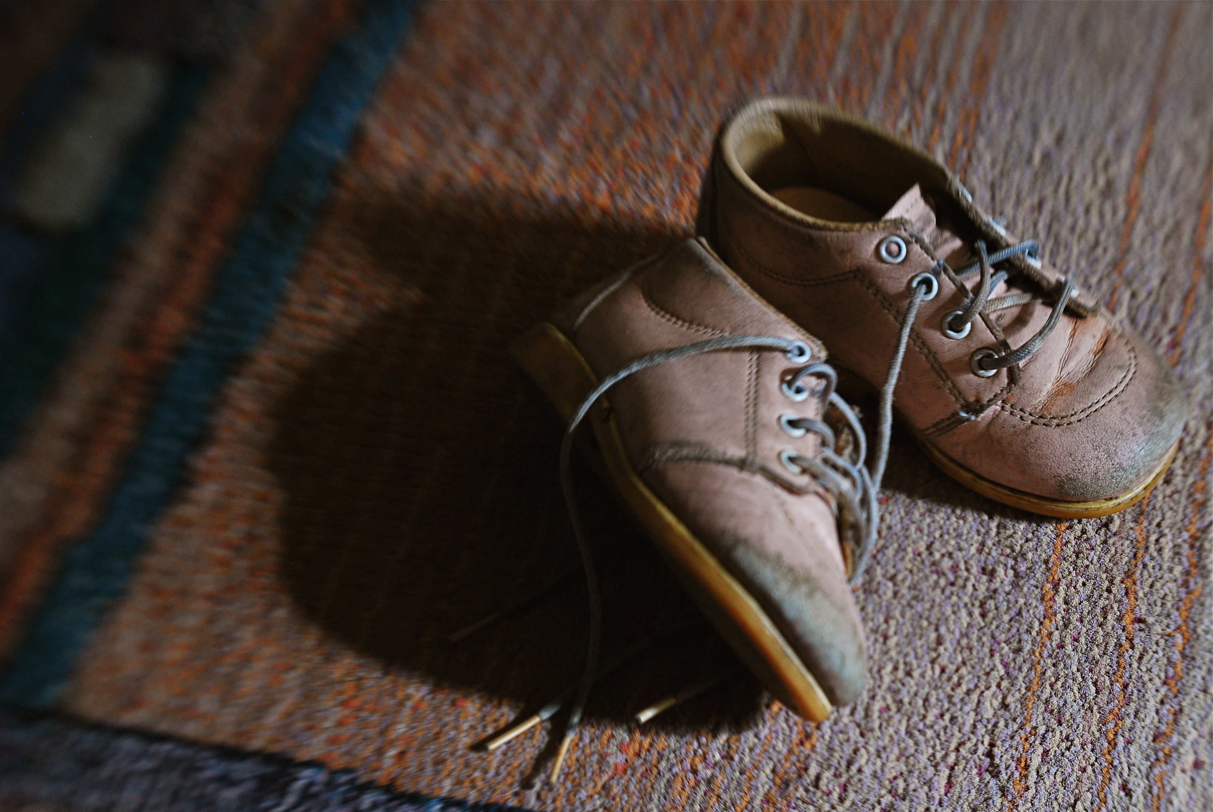
Asa personal example, I find that images that plumb the mysteries of memory often must stray from the arbitrary standards of so-called “realism”. When you work in the realms of recall, nostalgia, regret, or simply fond remembrance, a certain fluid attitude toward the niceties of sharpness and exposure may actually sell the idea better. Memory is day-dreaming, after all, and, in a dream, as Alice found in Wonderland, things look a bit…off. Dimension, delineation, depth…all these properties, and more, morph with the needs of the desired image. “Real” sells some things superbly. Emotion, however, as earlier stated, demands a language of its own.
The baby shoes shown in the image above are shot in uneven sharpness to suggest the gauzy nature of the memories they may evoke. Likewise the color is a bit washed-out, almost pastel, since a full, vibrant range of hues may seem less dreamy, more rooted in reportorial reality…which we don’t want for a picture like this. Rule-breaking ensues simply because nothing, no rule, no standard, is as important as making the picture work. If it doesn’t speak to the viewer, then the fact that it’s technically superb means nothing.
As Mr. Ellington sez, it don’t mean a thing if it ain’t got that swing.
PIECEWORK

When visiting craft studios, make sure you peruse the backstage areas as well.
By MICHAEL PERKINS
NO SELF-RESPECTING TOURIST SPOT IS COMPLETE WITHOUT A STROLL THROUGH the local craft shops, those kitschy little warrens of handmade goods from pottery to stone trinkets. Whether they are called “studios”, “boutiques” or “trading posts” these collections of gypsy creativity are on the main and minor drags of every destination town, and they are occasionally real feasts for the eye…and, in turn, the camera.
The stuff on the tables and counters is usually a riot of color and texture, and thus somewhat low-hanging fruit for photogs. But you can miss out if you limit your framings merely to the finished product, especially if the backstage or work areas, where the magic truly happens, are open or, even better, an active part of the customer experience. Lots of small craft factories, art sites, galleries and festivals incorporate the actual making of their goods into the overall tourist trip, and I often find these staging areas far more interesting than what eventually makes it to the sales floor.
Everyone recalls the corner pizzerias that oriented their kitchens so that the guy flipping the dough was in a display window near the street. It was great passive show biz and the same “backstage” allure still works for handmade jewelry and other crafts. And, while witnessing the literal creation of objects is one kind of storytelling opportunity, a quieter one can occur when you cruise past vacant desks whose tops are cluttered with tools and decorative components. These kind of still-life subjects are ripe with potential, since they show what is about to happen. They’re also displays of someone’s personal work area, their most individual arrangement of space.
Sometimes the best part of a shopping experience is the unpolished part. Pictures are where you find them, and opportunities reveal themselves when you start looking beyond the obvious locations.
SIMPLEST TERMS

Two colors, and only two colors. Is anything else needed to sell this image?
By MICHAEL PERKINS
ENTIRE BOOKSHELVES OF MATERIAL HAVE BEEN WRITTEN on the mysterious art of composition at it applies to photography. The variations are endless: what to shoot, how much to shoot, how to determine how little to shoot, theories on addition, subtraction, choice of subject, and so on. The only constant is that every compositional inclusion also embodies an exclusion. When you choose one thing, you un-choose everything else.
One such choice is that of color over monochrome, an argument which raged over a large part of the early 20th century, since, for many years, photographers thought they could rely upon black and white, even though an abstraction of reality, to convey a consistent feel, whereas early color films often produced uneven results. Some photographers decided to ban color altogether, to embrace the predictable un-reality of b&w rather than gamble on hues that might not be reproduced or printed with true fidelity, or worse, register as too brassy or garish. Today we seldom choose monochrome over color for the same reasons, but compositions still rise and fall on whether we use color, as well as what kind of color we use.
Sometimes, just as a photograph that’s poorly cropped or loosely composed can be too busy, a color scheme that has too much variety can prove distracting, actually diluting a picture’s impact. Occasionally, I like to see how few distinct colors I can use in an image and still consider it complete, as in the case of the tomatoes above, which makes it case with only red and green values. In this instance, adding extra space around the box holding the tomatoes, or expanding the frame to include other shapes, objects or hues, will do nothing to improve the strength of my composition, so why include them? This is an easy editing choice that occurs in real time in the framing of the shot, and, with the instant feedback afforded by digital, you know immediately if the picture is lacking anything.
The problem with a lot of photography is that we tend to go no further than framing up an “acceptable” picture, one that doesn’t overtly fail. However, the more we practice a mindful approach to composition, the more adept we get at putting just enough, from subject to hue, into the image, and not one item more. This gives our photographs a streamlined communicative power that directs the eye and conveys the story.
WITNESS IT, DON’T WORK IT
Don’t draw portrait subjects into your energy. Eavesdrop on theirs.
By MICHAEL PERKINS
CHILDREN AND ANIMALS OPERATE IN WORLDS DIFFERENT ENOUGH FROM OUR OWN that they merit a special viewpoint when being photographed. Composing an image designed to enter into their special realities should facilitate that process, giving the viewer the idea that he has gained entry to their realms. The camera’s eye needs to seem to inhabit their actual living space.
I’ve felt for a long time that the formal K-Mart studio method of making a child’s portrait is stiflingly inadequate for plumbing that young person’s real animating spirit. And as for pets, the sheer daily deluge of animal snaps posted globally are served just as badly from over-formalizing or staging. Intimate insight into the self can’t be achieved by generic backdrops, tired props or balanced flash alone. If anything, such systems push the real child further away from view, leaving only a neutral facade in place of the true human. Personality locks eyes with the lens in unguarded, not choreographed, moments.
I’m not saying that no preparation should go into animal or child pictures. I am suggesting that a “snapshot mentality”, backed by lots of shooting experience, can yield results that are more organic, natural and spontaneous. Shoot in a moment but apply what you have learned over a lifetime.
Even the simple practice of shooting on your subject’s level, rather than shooting like a grownup, i.e., downhill toward your subject, can create a connection between your line of sight and theirs. If your kids and kitties are on the floor, go there. Another simple way to create an intimate feel is to have the child or pet dominate the frame. If there is some other feature of the room, from furniture to other people, that does not rivet your audience’s attention to the main subject, cut it out. Many, many portraits fail by simply being too busy.
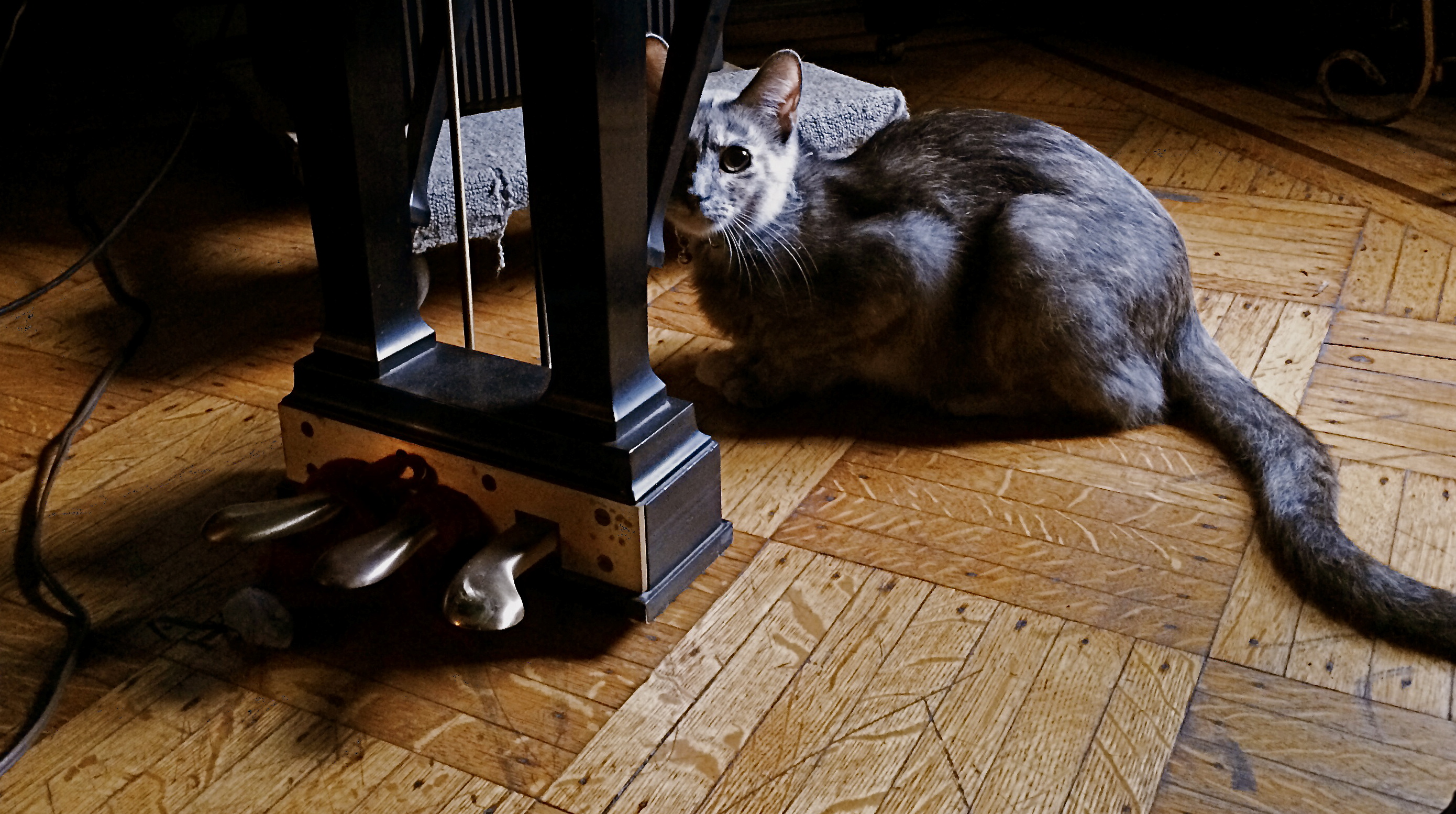
And, finally, catch your dog, cat, boy or girl doing something he’s chosen to do. Don’t assign him to play with a toy, or ask him to stand here, here, or here. Wait like a professional, then shoot fast like a snapshotter. The more invisible you become, the less distraction you provide. Looking at a child or pet enthralled by something is a lot more interesting than watching him watch you. If you do happen to lock eyes during the process, as in the case of the rather suspicious house cat seen above, steal that moment gladly, but don’t try to direct it.
Don’t draw your portrait subjects into your energy. Eavesdrop on theirs. The pictures will flow a lot more naturally, and you won’t have to work half as hard.
DESIGN FOR LIVING
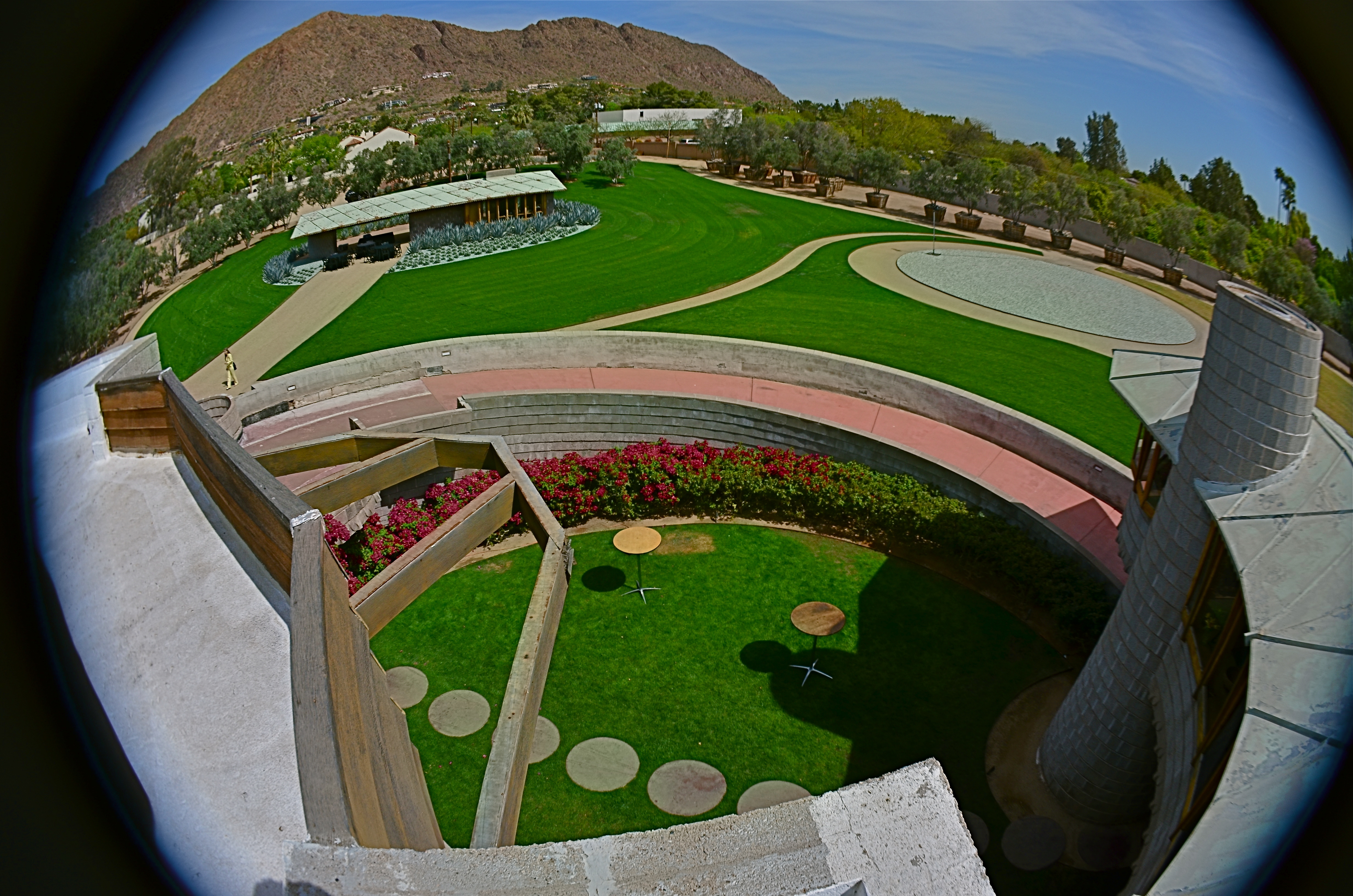
A view into the courtyard of the David Wright House, Frank Lloyd Wright’s gift to his son, built in Phoenix, Arizona in 1950 and now being prepped for complete restoration. The detached guest house and Camelback Mountain are in the distance.
By MICHAEL PERKINS
HIDDEN IN PLAIN SIGHT IT WAS, the final residential design completed by the late Frank Lloyd Wright, mysteriously unsung in every major study of his late work and absent from nearly every retrospective on the cantankerous colossus of twentieth-century architecture. The house, designed for his son David in the Arcadia neighborhood of central Phoenix, Arizona, rose from the desert in 1950 and almost immediately faded from popular view, staying under the radar less than a mile from Camelback Mountain, the sight of which dictated the site of the home, in one of Wright’s most dramatic examples of organic architecture.
And now, just a few years after since daughter-in-law Gladys Wright’s death at the age of 104 and a blink of time since an interim owner first threatened the place with demolition, it is, in 2016, about to sink back from view once more, as the benevolent millionaire who saved it confers with various local factions on the best route to its complete restoration. Tours, which, for the past year have allowed visitors from around the world to walk through what Wright called a solar hemicycle design, his recipe for “how to live in the southwest”, will be suspended. 3-D laser scans will be studied to see where the house’s sixty-five year old foundations need to be fortified and repaired. And, for a time, this remarkably unique dwelling will again be beyond the reach of the camera.
Since The Normal Eye began, we have occasionally mounted photo essay pages featuring singular places, sites too special to be addressed in one or two images. The most recent of these was a tour of author Edith Wharton’s home, The Mount, in Massachusetts. And today, we’ve added a new tab at the top of the blog titled Wright Thinking, with select photos of the David Wright home and its detached guest house, in an attempt to remind people that this hidden treasure does, indeed, survive in the American West.
The essay format seem appropriate because the Wright home is difficult house to convey in just a single photograph, rising from the desert floor in a continuous circular ramp that climbs to the house proper, a 2000 square-foot crescent of rooms mounted on concrete piers and looking north to Camelback Mountain with a window array that presents a view arc of over 200 degrees. Within and without are Wright’s signature components: dramatic furniture design; innovative use of humble materials, from linoleum to concrete; a visionary use of solar energy; and the most Wright of Wright ideas, the organic credo that the site comes first, the house second, and never the other way around.
So thumb through our impromptu Wright family album and visit the house’s wonderful website at www.davidwrighthouse.org to keep apprised of the next sighting of one of the master’s final bows.
A TRICK OF THE LIGHT
By MICHAEL PERKINS
PHOTOGRAPHERS WHO TRACK THE SUN AS IT TRAVELS EAST TO WEST over the vast expanse of the Grand Canyon have made amazing images of the way light changes contours, shadows, even the sensation of depth and scale over the course of a single day. Such hour-by-hour portfolios present pictures which are less about the subject matter and more about how light shapes that subject. And the same tracking exercise is possible in canyons of another sort, the vertical jungles we call cities.
Buildings in urban settings reveal more in pictures than their own particular physical shapes and designs: they also have visual artifacts tattooed onto them from their neighbors, which block, warp and reflect light patterns in their direction. Thus the most architecturally drab tower can become hypnotic when bathed in patterns of shadows shaped by the tower next door. And that means that those seeking abstract images may find that ordinary parts of the city can be rendered extraordinary by light’s odd bounces. Additionally, the fact that many of these light effects are fleeting, visible, in some cases, only for minutes each day, presents both a challenge and an adventure for the photographer.
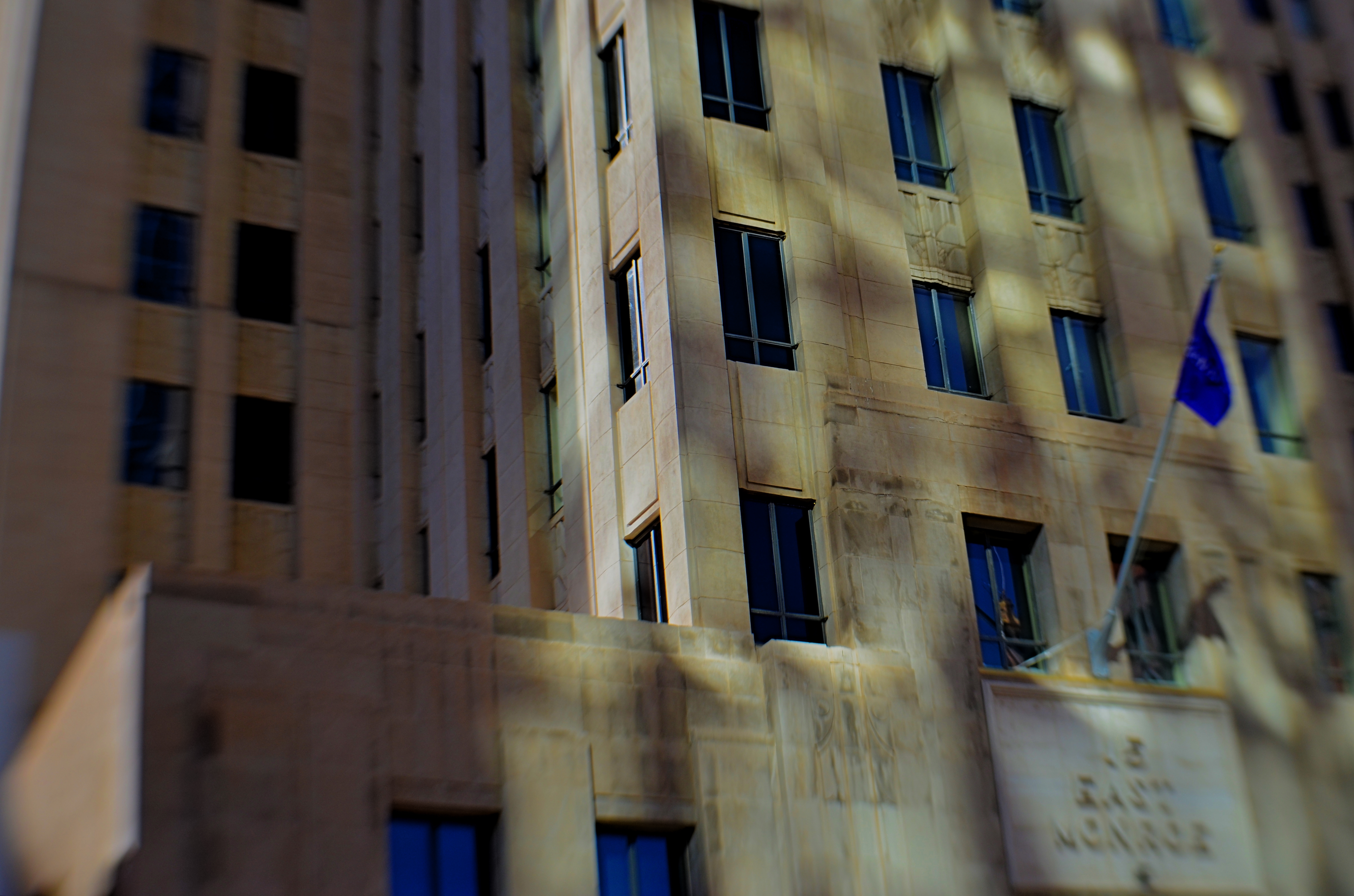
Fifteen East Monroe, 2016.
In the shot above, a gorgeous Art Deco building in downtown Phoenix, Arizona benefits from a light effect that has only been possible for the last forty years of its existence. Erected in the late 1930’s, the northern face of 15 East Monroe Street would not, at its opening, have been dappled with the shadow patterns seen here. No, it took a soul-less glass box from the ’70’s, located across the street, to bounce patterns of reflected light onto the building as you see it here, and only for about two hours a day between late morning and noon.
During that window, 15 East Monroe displays a wonderfully checkered mix of reflected illumination on its golden terra-cotta exterior. I first observed the patterns ten years ago, and have been going back for occasional looks ever since. The trick, in this image, was to keep the texture of the building from looking too sharp, since the effect itself is somewhat dreamy, and works better if the overall photo of the building is also a little soft. I used a selective focus lens (sharp at the middle, softer toward the edges) to give the overall building a gauzy look, and let the picture really be about the light effect, rather than any specific part of the building. Even at this point, I am imagining about a half-dozen other ways to accomplish this, but this image can at least serve as an initial study, a guideline for what may, eventually, be my final word on the subject.
Photography, clinically defined, is the art of writing with light. Sometimes, regardless of the object in our viewfinder, what light does to things is, by itself, enough for an interesting picture. It takes some restraint to let the light be the subject, and to let the picture, in its most basic form, breathe.
MORE TOOLS IN MORE HANDS

Shot one inch away with Lensbaby macro converters, accessories for the company’s 35mm lens, amazingly priced at about $49.95.
By MICHAEL PERKINS
THE CELL PHONE CAMERA’S IMPACT ON PHOTOGRAPHY HAS BEEN SO SUDDEN AND FAR-REACHING that its full impact has yet to be fully measured. Within a decade, the act of making a picture has been democratized to a greater degree than at any other time in the history of the medium. It’s as if, overnight, everyone was given the ability to leap tall buildings in a single bound. Goodbye, Superman, hello, Everyman. The Kodak Brownie’s introduction prior to 1900 gave the average human his first camera. The cell phone is like the Brownie on steroids and four shots of Red Bull.
It’s more than just giving millions of people the ability to take a photo. That part had been done before, dozens of times. However, no other camera before the cell has also obliterated the number one obstacle to picture-making on this scale: cost. The cost of film. The cost of marketing and sharing one’s work quickly, and with uniform quality. The cost of artistry, with support apps allowing people to directly translate their vision into a finished product without investing in gear that, just a few years ago, priced most people out of the creative end of the market.
Most significantly, there is the cost saved in time. Time learning a technique. Time speeding past the birth pains of your creative energy. you know, those darn first 10,000 hours of bad pictures that used to take years of endurance and patience. The learning curve for photography, once a gradually arching line, is now a dramatic, vertical jump into the stratosphere.

A cell-app simulation of the film-based platinum printing process.
These insane leaps in convenience and, for the most part, real technical improvement occur across all digital media, but, in the cel phone, their impact is spread across billions, not mere millions, of users. Simulate a particular film’s appearance? Done. Do high-quality macro or fisheye without a dedicated lens running into the hundreds? Yeah, we can do that. Double-exposures, selective focus, miniature effects, pinhole exposures, even remote auxiliary lighting? Go fish. It’s all there.
And when cells raise the ante, traditional cameras have to up their game just to survive. The shot at the top of this page comes from a pair of Lensbaby macro converters up front of the company’s Sweet 35 optic, a shot that would only have come, a few years ago, from a dedicated macro lens costing upwards of $500. Lensbaby’s version? $49.95. And now, with less than a decade in the effects lens biz for DSLRs, Lensbaby makes macro, fisheye and other effect lenses for cells. A rising tide raises all boats.
I could make a list of the areas where the optics and outputs of cell phones are still behind conventional camera optics, but if this post is ever read more than a year past its publication, the future will make a liar out of me. Besides, that would put me on the same side as the carpers who still claim that film is better, more human, or “warm”, as the vinyl LP hipsters like to say. Your horse is nice, but it can’t outrun my Model T.
Part of photography’s appeal since day one has been the knowledge that, whatever era you live in, it’s a sure bet that some geek is slaving away in a lab somewhere, trying to make your sleek, easy, “latest thing” seem slow, clunky and over with. We’re never done. Which means that we’re always just beginning.
Cool.
LEFT, RIGHT, LEFT
Both of the images in this improvised double-exposure were taken within a space of five minutes. Final processing was finished in ten.
By MICHAEL PERKINS
IN HER BRILLIANT 1979 BEST SELLER DRAWING ON THE RIGHT SIDE OF THE BRAIN, art teacher Betty Edwards, while obviously addressing the creative process chiefly as it regards graphics, also contributed to a better understanding of the same visualization regimen used by photographers. In its clear explanation of the complementary roles of the brain’s hemispheres in making an image, Ms. Edwards demonstrates that photographs can never be just a matter of chiefly left-brained technique or merely the by-product of unfettered, right-brained fancy.
And that’s important to understand as we grow our approach to our craft over time. It’s ridiculous to imagine that we can make compelling images without a certain degree of left-brained mastery, just as you can’t drive a nail if you don’t know how to hold a hammer. But it’s equally crazy to try to take pictures without the right-brained inspiration that sees the potential in a composition or subject even before the left knows how, technically, it can be achieved. One side problem-solves while the other dreams. One hemisphere is an anchor, a foundation: the other is a helium balloon.
When you develop a plan for your next shoot, selecting the lenses and tools you’ll need, scoping out the best locations, it’s all left brain. But, comes the day of the shoot, your right brain might just fall in love with something that wasn’t in the blueprint, something that just must be dealt with now. Fact is, neither side can hold absolute sway. When you are laboring a long time to get a particular picture, you can almost feel the two hemispheres arguing for control. But all that left-right-left toggling isn’t a bad thing, nor should you expect there to be one clear “winner” in the struggle. The pictures that emerge have to be an agreement, or at least a truce between “how do we do this?” and “why should we do this?”.
I have pictures, such as the one up top here, that I call five-minute wonders, so named because they go very quickly from conception to completion. They are like impulse items in the grocery checkout line. I’ll take some of this, a few of these, and one of those, toss them together in a bowl, and see what happens. Sounds very right-brained, right? However, none of these quickie projects would work if I simply don’t know how to make the camera give me what I want. That’s all left brain. The point is, the two factions must at least have a grudging conversation with each other. Right-brained creativity gets all the chicks and the cool clothes: it’s the flashy rock star of the photo universe, a sexy bad boy who just won’t listen to reason. However, Lefty has to take the wheel occasionally or Righty will crash the sports car and we’ll all die horribly.
It’s romantic to believe that all our great photographs come from blindingly brilliant flashes of pure inspiration. That’s where the lomography movement with its cheap plastic cameras and its “don’t think, shoot” mantra comes from. And impulse certainly plays its part. However, anyone who tells you that amazing images come solely from some bottomless wellspring of the soul is only telling you half the truth. Sometimes you can spend the day playing hooky, and some days you gotta stay inside and do your homework.
Left, right, left….
ADVENTURES IN INNER SPACE
By MICHAEL PERKINS
PHOTOGRAPHERS CHOOSE LENSES BASED ON LOTS OF CRITERIA, depending on what kind of “reality” they seek to visualize. In recent years, there has been a solid return to so-called “normal” or prime lenses, glass with focal lengths of 35-85mm which produce a perspective most like human vision, fairly free of the spatial distortion seen in ulta-wide lenses. At the same time, the use of ultra-wides in television and film, even for scenes in which a dramatic viewing angle is not particularly appropriate, is on the rise as well, and the widest consumer-level wides, including various types of fisheye lenses, are becoming sharper and cheaper than ever before.
I mention cinema here because it’s only after the emergence of 1950’s-era wide-screen processes like Panavision and Cinemascope that such lenses began to sell in larger numbers to amateur photographers, becoming an active part of the hobby. By the ’60’s, ultra-wides created stunning mutations of space in films like Stanley Kubrick’s Dr. Strangelove and Orson Welles’ The Trial, but, in such cases, the idea was still to deliberately distort reality for dramatic effect. Today, the most common “kit lens” accompanying a new DSLR is the 18-55mm, which at its widest, can make vertical lines bend inward in a way that is dramatic, but not a true measure of natural distance relationships. And, yes, they allow you to stand closer to your subject and “get it all in frame”, but, at that point, you’re also making a decision about whether your image is to be interpretive of reality, or reflective of it.
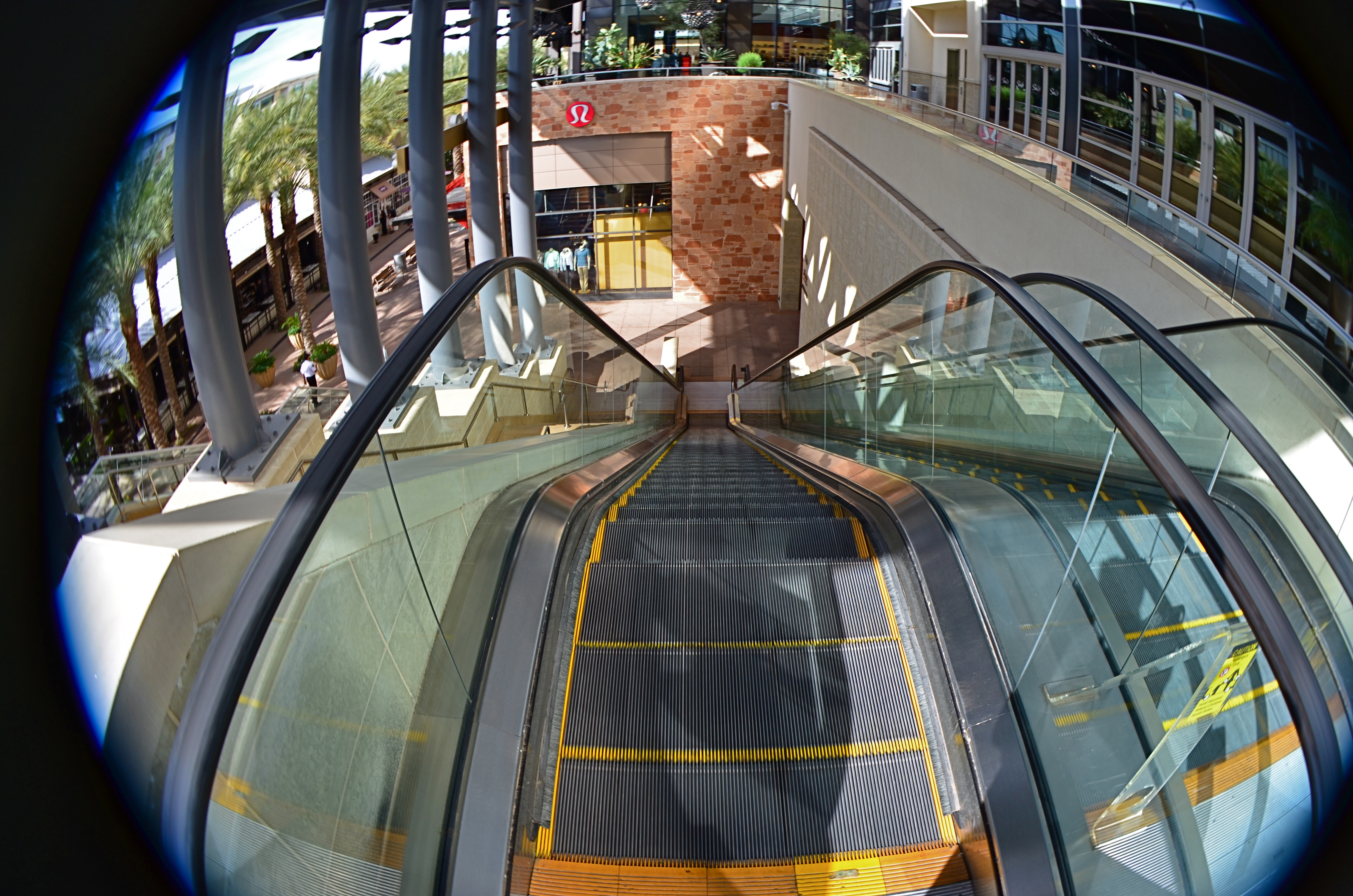
This mall escalator is nowhere near as high as a 13mm fisheye lens makes it appear.
Extreme wides, including fisheyes, can widen to 8 or 9mm, making the bending of lines so severe that the image elements seem to form a circle, with all lines arching sharply toward the center. And depending on what your image’s particular “reality” is to be, the distances of objects from front to back within the frame are also intensely exaggerated. Things which, in a “prime” lens image, appear just ten feet apart, can, in a fisheye shot, seem half a football field from each other. TV and film shooters exploit this big-time. If you’re shooting within a cramped interior and need to balloon its scope to suggest a larger scale, an ultra-wide really opens the place up. Medium-sized studios used in political debates now appear cavernous: ordinary city buildings shot wide for a crime drama take on intimidating height and depth, appearing to occupy entire blocks.
In the above image, if I want to make the viewer a little dizzy and daunted at the top of this rather modest escalator, I must use an ultra-wide to cheat, to trick the eye into concluding that it’s actually standing at the top of a sky-high ski jump. The tricky thing about ultra-wides, however, is that they mutate everything in the frame. And if part of that “everything” includes humans, your subjects can be taffy-twisted into some very alarming dimensions. Anything wider than about 24mm is downright uglifying for portraiture, unless a stylized effect is part of your interpretation. Lenses are not mere recording equipment. Their limits, biases, and faults can be exploited based on whatever kind of world you’re trying to conjure.

UNKNOWN KNOWNS
Everyone is visible, yet no one is known. Faceless crowds serve as shapes and props in a composition.
By MICHAEL PERKINS
WE OFTEN WRITE IN THESE PAGES ABOUT PHOTOGRAPHY’S UNIQUE ABILITY to either reveal or conceal, and how we toggle between these two approaches, given the task at hand. Photographic images were originally recorded by using science to harness light, to increase its ability to illuminate life’s enveloping darkness, just as Edison did with the incandescent bulb. And in their attempt to master a completely new artistic medium, early photographers were constantly pushing that dark/light barrier, devising faster films and flash technology to show detail in the darkest, dimmest corners of life.
And when that battle was won, an amazing thing happened.
Photographers realized that completely escaping the dark also meant running away from mystery, from the subtlety of suggestion, from the unanswered questions residing within their pictures’ shadows. And from the earliest days of the 20th century, they began to selectively take away visual information, just as painters always had, teasing the imagination with what could not be seen.
Friendly chats or shadowy conspiracies? Your choice.
City scenes which feature individual faces in crowds opt for the drama (or boredom) written in the face of the everyday man. Their scowls at the noonday rush. Their worry at the train station. Their motives. But for an urban photographer, sometimes using shadow to swallow up facial details means being free to arrange people as objects, revealing no more about their inner dreams and drives than any other prop in an overall composition. This can be fun to play with, as some of the most unknowable people can reside in images taken in bright, public spaces. We see them, but we can’t know them.
Experimenting with the show it/hide it balance between people and their surroundings takes our photography beyond mere documentation, which is the first part of the journey from taking pictures to making them. Once we move from simple recording into interpretation, all the chains are off, and our images can really begin to breathe.
Share this:
April 16, 2016 | Categories: Available Light, Cities, Commentary, Composition, Conception | Tags: Abstraction, Composition, crowds, Shadows, silhouettes, Street Photography | 2 Comments