ADMISSION
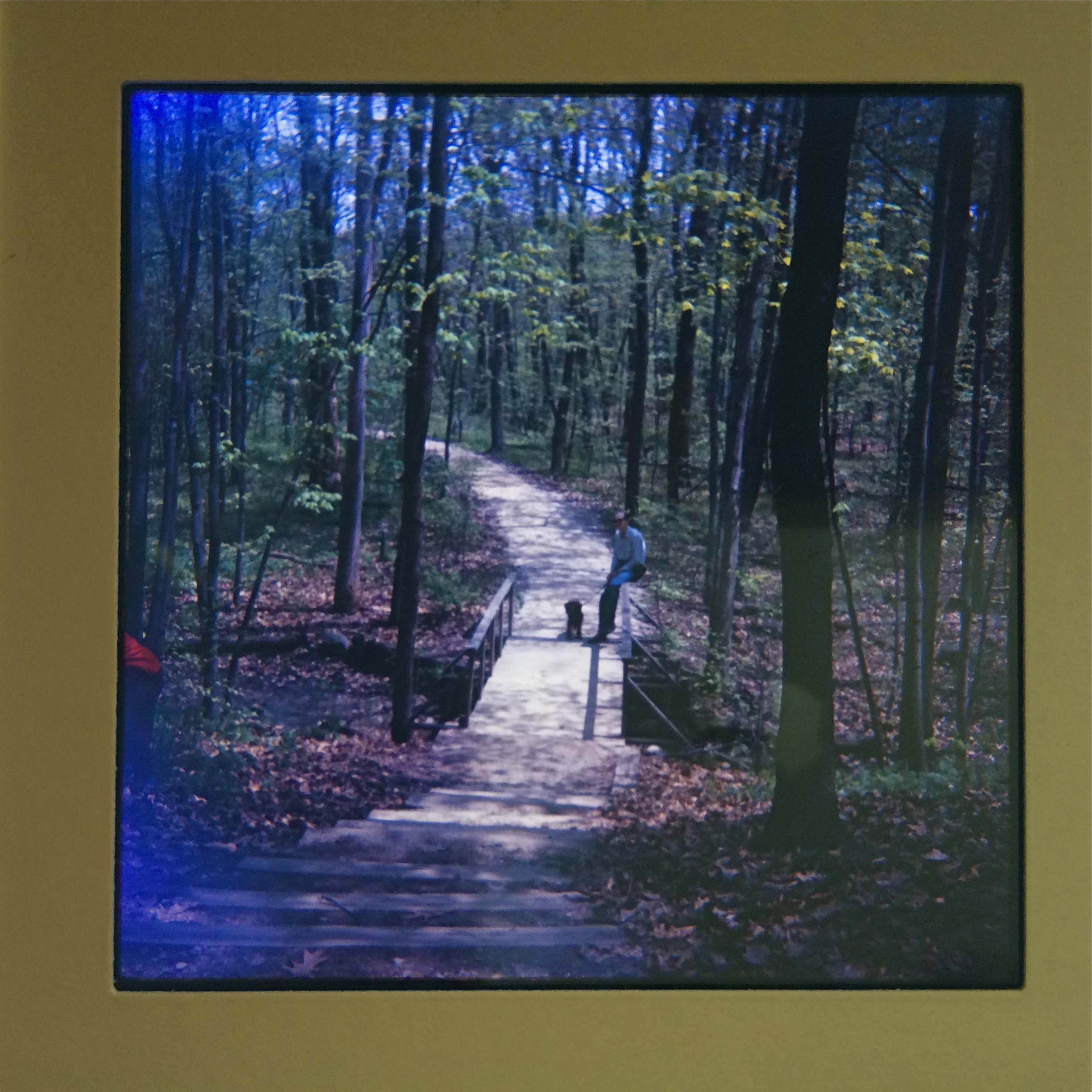
One of my first slides fom 1965. Only after they were processed did I realize they were too big for our family projector.
By MICHAEL PERKINS
I CAN NEVER MARK MY FATHER’S BIRTHDAY (today, April 23) without certifying, once again, that I would not presently be a photographer without his intervention. Note that I used the word intervention, not influence. That’s not to say that, as a boy, I didn’t learn a lot about composition or visualization by watching him tackle a shoot. Far from it. But it was in one simple act of support that he truly kept my first foray in photography from flickering out like so many youthful whims.
And it was done for the cost of a box of oatmeal.
My first camera, a cheap plastic Imperial Mark XII, has been detailed in these pages before. Simply stated, it was okay as a toy, hopelessly inadequate as an optical instrument. At the time I received it as a present (approximately age 13), this reality was lost on me. I was drunk on the thought that I could snap off masterpieces at will, as I supposed Dad did with his Kodak Pony 828. It didn’t take long for me to realize that (a) this, um, modest (pronounced crappy) little box could not deliver what I saw, and (b) changing that was going to mean taking a lot of awful pictures, at substantial cost to a kid budget bordered by redeemed soda bottles and a weekly allowance of $1.
My ignorance was so boundless that I thought that I would simply follow my father into his chosen format, 35mm slides. I loved seeing a blank wall awash with color, and couldn’t wait to claim my own real estate on his Bell & Howell 500 projector. Thing is, I was shooting 620 roll film, so, although the local photo shop faithfully followed my instructions, returning my shots as slides, the images measured (2″ by 2″ square ), unsqueezable into any standard projector. Suddenly, I was stranded. My pictures weren’t prints, and, as slides, couldn’t even be viewed. I felt like a man without a country. Dad’s response: let’s see else we can to do.
Yanking the shade off an old table lamp and unscrewing the bulb, he cut a hole in the bottom of a Mother’s Oats carton wide enough for the shaft of the lamp, connected lamp to box, and re-attached the bulb. Inside the box, he inserted a lining of aluminum foil to maximize the bulb’s meager brightness, then cut a hold in the box lid equivalent to the size of one of my slides. Across the opening, he taped a sheet of mylar, the matte-textured plastic that, as a draftsman, he always had around the house, so that the “hot spot” of the bulb would be diffused across the entire surface of the slide. Power on, mount a slide up top, and presto, a custom-built viewer that allowed me to at least see, if not magnify or project, my images. I was astonished.
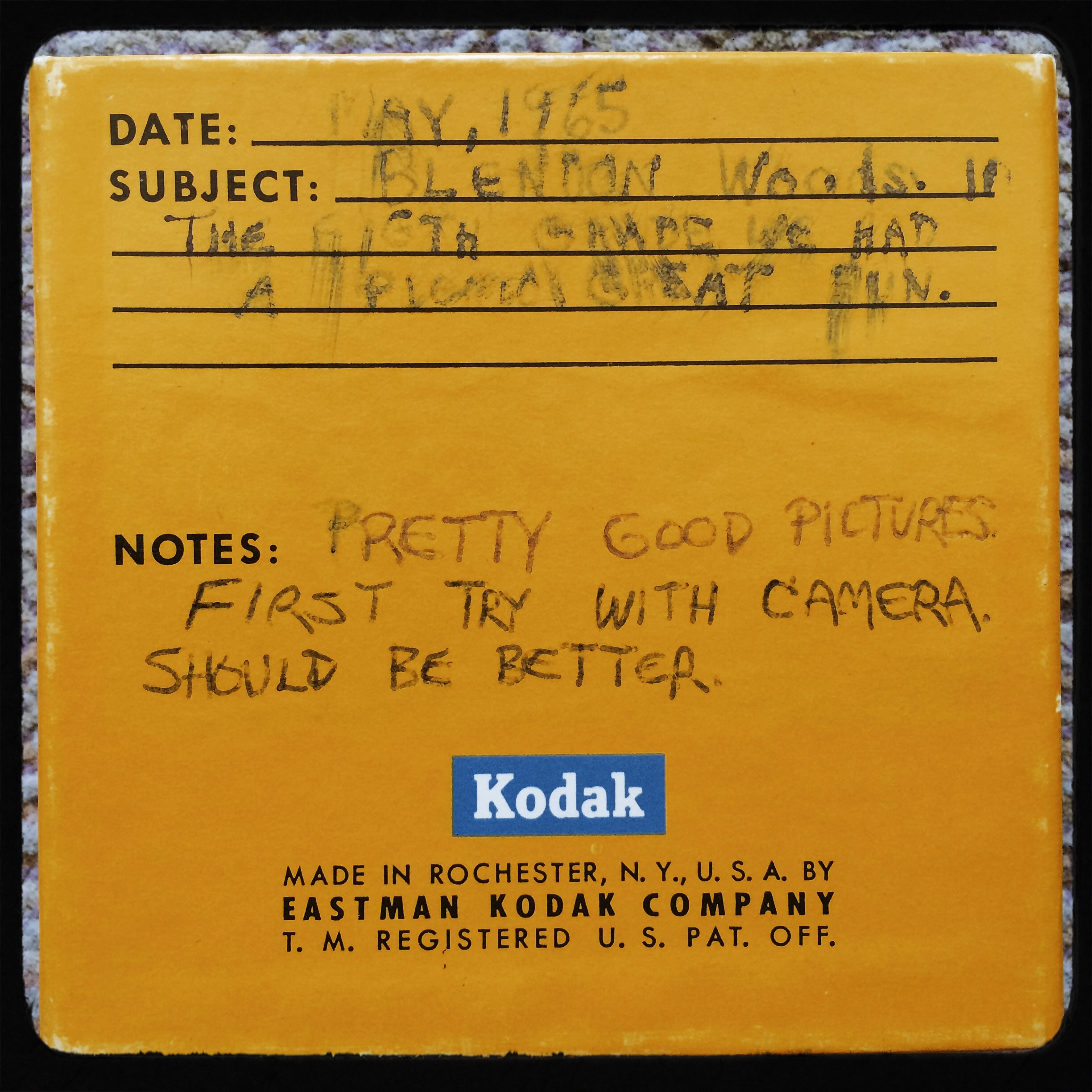
Program notes on my first box of slides, referencing the “great fun” of my eighth-grade picnic at Blendon Woods (sure, sure), and the remark that the pictures “should be better”. Amen, brother.
It wasn’t that he had solved all of my problems: it was that he had legitimized my photographs as something worthy to look at. He had, in fact, granted me admission to “the club”, the elite group of grownups who took their work seriously, and would do anything to enjoy and learn from them. I was no longer a kid whimsically playing with a toy. I was a photographer.
In that simple bit of tinkering, he kept me from abandoning something that had disappointed me, converting my initial frustration back into enthusiasm. It was also a valuable lesson in how to recover from a setback, an admonition: this isn’t the last time you’ll mis-calulate, or fail. But it ain’t fatal. Just keep going.
I did. I have. Fifty years on, my finger’s still on a shutter. And, amazingly, he, at this writing, is still around to repeat that marvelous wisdom.
Just keep going.
CITY OF DREAMS
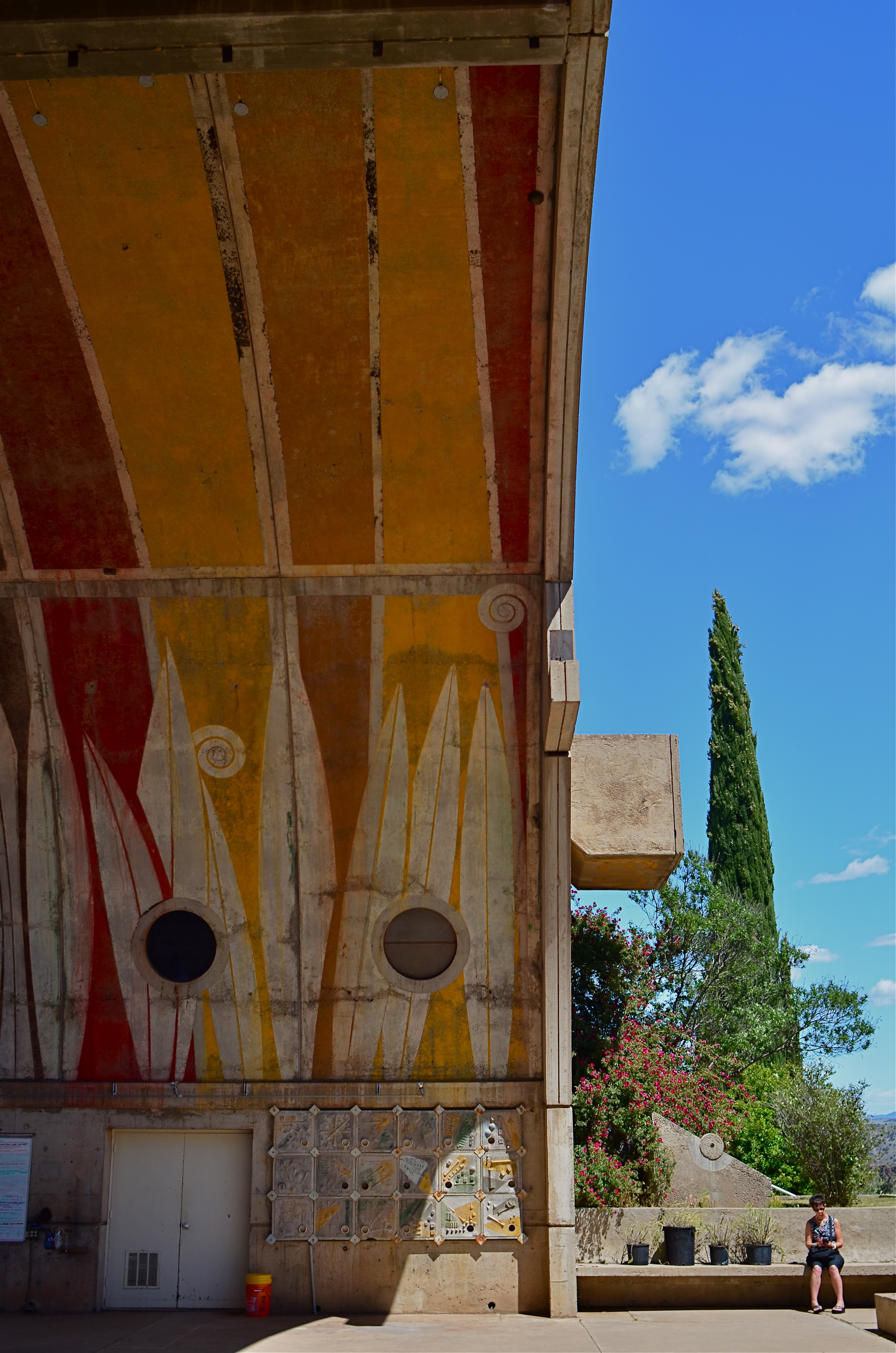
An enormous public amphitheatre arch at Arcosanti, a crumbling “urban laborotory” near Phoenix, Arizona.
By MICHAEL PERKINS
PHOTOGRAPHERS HOVER AROUND URBAN RUIN LIKE MOTHS AROUND A FLAME. It’s just a thing that we do. Not by sifting through the ashes of Babylon, Rome or Athens so much as the demolished details of abandoned malls, stores or gas stations. There is a kind of reverence for those banal or ugly things that had their brief moment at the top of the news, then rolled backwards into rot. Shooters love trying to mine ugliness in search of Higher Truth. But when we do this, we’re only doing half the job.
A country the scope and breath of America enshrines plenty of greed and stupidity in brick and steel, but so do the near-miss dreamers, the visionaries whose grand prophecies might have made our lives better. They leave behind their legacies of litter no less than the rapacious developers, and they deserve to have those failures immortalized by the camera as well.
Touring the fifteen-acre architectural tomb that is Arcosanti, a disintegrating “urban laboratory” sixty-five miles outside of Phoenix, Arizona is to see where Disney turns into Dystopia. The miniature model city, conceived by architect and urban planner Paolo Soleri in the 1970’s is, three years after his death, still uncompleted, baking in the desert sun, its proud dream of responsible urban density and communal harmony a hallowed-out echo. While the rest of us wore our vegetable-dye shirts on the first Earth Day, Soleri dreamt of a society where we built up instead of out, chose spirituality over sprawl, yearned to chuck our planet-killing cars for a tight, efficient village designed to give the planet a chance to take a clean breath.
It didn’t work, and there are more reasons why than there are residents at Arcosanti, where 5,000 people were supposed to co-exist in ecstasy but where, today, fewer than 60 actually dwell. The common buildings, the amphitheatres, the beehive apartments heated by recycled sunshine still function, after a fashion, but they are losing their battle with nature as the rugged basalt mesas in the neighborhood lash them with harsh winds that peel paint, crack concrete, mock the grand vision.
Photographers are reporters, so in our fascination with the ruin of the past, we would do well to document not just the rotted remains of New Valley Mall, but also the places where poets tried to change the narrative.
LESS STILL, MORE LIFE

Good enough to eat or time to get a vase?
By MICHAEL PERKINS
PHOTOGRAPHIC HISTORIANS WILL PROBABLY CRINGE AT MY OVER-SIMPLIFICATION, but I tend to believe that still-life compositions were originally popular to shooters because they solved a technical problem. At the dawn of the imaging art, recording media, from salted paper to glass plates, were so abysmally slow that exposure times stretched, in some cases, to nearly an hour. This meant that subject matter with any kinetic quality, from evolving landscapes to a baby’s face, were rendered poorly compared to inanimate objects. Still lifes were not so much about the beauty and color of fruit and cheese on a plate as they were about practicing…learning how to harness light and deliver a desired effect.
As film and lenses both sped up, a still life could be chosen purely on its aesthetic appeal, but the emphasis was still on generating a “realistic” image…an imitation of life. The 20th century cured both photography and painting of that narrow view, and now a still life, at least to me, offers the chance to transform mundane material, to force the viewer to re-imagine it. You can do this with various processes and approaches, but the main appeal to me is the chance to toss the object out of its native context and allow it to be anything…or nothing.
In the image at left, the home-grown vegetables, seen in their most natural state, actually have become alien to our pre-packaged notions of nutrition. They don’t even look like what arrives at many “organic” markets, much less the estranged end-product from Green Giant or Freshlike. And so we are nearly able to see these vegetables as something else. Weeds? Flowers? Decay? Design? Photographing them in our own way, we are free to assign nearly any quality to them. They might, for example, be suggestive of a floral bouquet, a far cry from the edibles we think we know. Still life compositions can startle when they are less “still” and more “life”, but we have to get away from our subjects and approach them around their blind side.
As always, it’s not what we see, but how.
PRACTICE MAKES…?
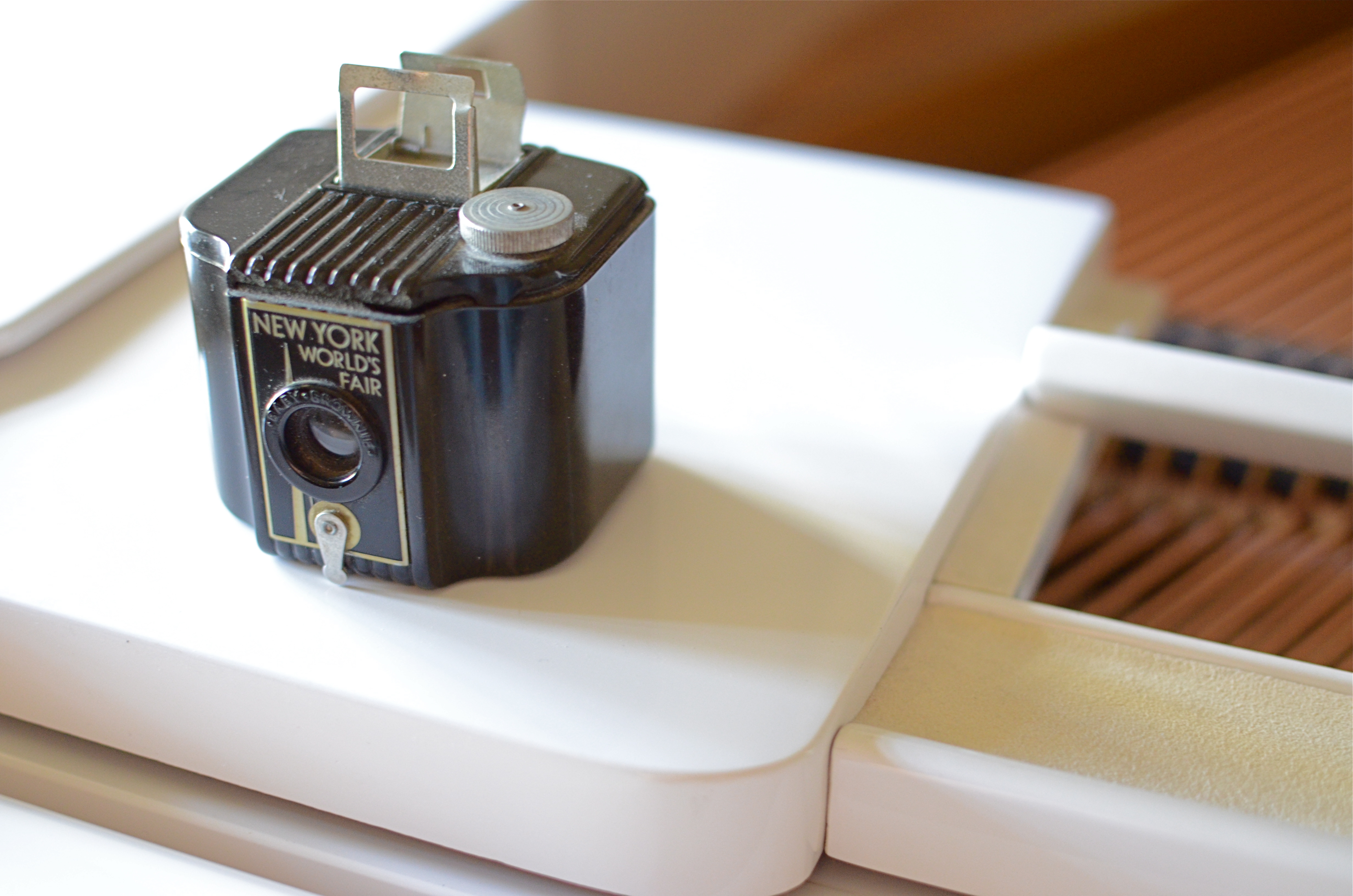
We all start with light and a box. From then on, anything can happen.
By MICHAEL PERKINS
THE BEST SELLER LIST IS THE FASTEST WAY to cement a notion in the public’s mind as indisputable “fact”. We are great at quoting a concept captured in print, then re-quoting the quote, until the “truthfulness” of it becomes plausible. It’s basically a version of the statement, “everybody knows that..” followed by a maxim from whatever hardcover pundit is top in the rotation at a given moment. And it’s about as far from accuracy as you can get.
Ever since pop-psych guru Malcolm Gladwell’s hit book Outliers arrived on shelves a few years back, its main thesis, which is that you need 10,000 hours of practice to become excellent at something, has been trotted out a thousand times to remind everyone to just keep nose to grindstone and, well, practice will make perfect. Gladwell cites Bill Gates’ concentrated stretch of garage tinkering and the Beatles’ months of all-night stands in Hamburg as proof of this fact, and, heck, since it ought to be true, we assume it is.
However, it’s not so true as it is comfortable, and, when it comes to photography, I would never hint that someone could become an excellent artist just by putting in more time shooting than everyone else. If my method is wrong, if I never develop a vision of any kind, or if I merely replicate the same mistakes for the requisite practice period, then I am going to get to my goal older, but not wiser. Time spent, all by itself, is no indication of anything, except time spent. Evolving, constantly learning from negative feedback, and learning how to be your own worst critic are all better uses of the years than just filling out some kind of achievement-based time card.
The perfection of photography is about time, certainly, and you must invest a good deal of it to allow for the mistakes and failures that are inevitable with the acquiring of any skill. But, you must also stir insight, humility, curiosity and daring into the recipe or the end result is just mediocrity. Gladwell’s magical 10,000 hours, a quantity measurement, is only miraculous when coupled with an accompanying quality of work.
There are people who know how to express their soul on their first click of the shutter, just as there are those who slog away for decades and get no closer to imparting anything. It’s how well you learn, not how long you stay in school. It ain’t comforting, but it’s true.
WHEN THE WALL IS ALL
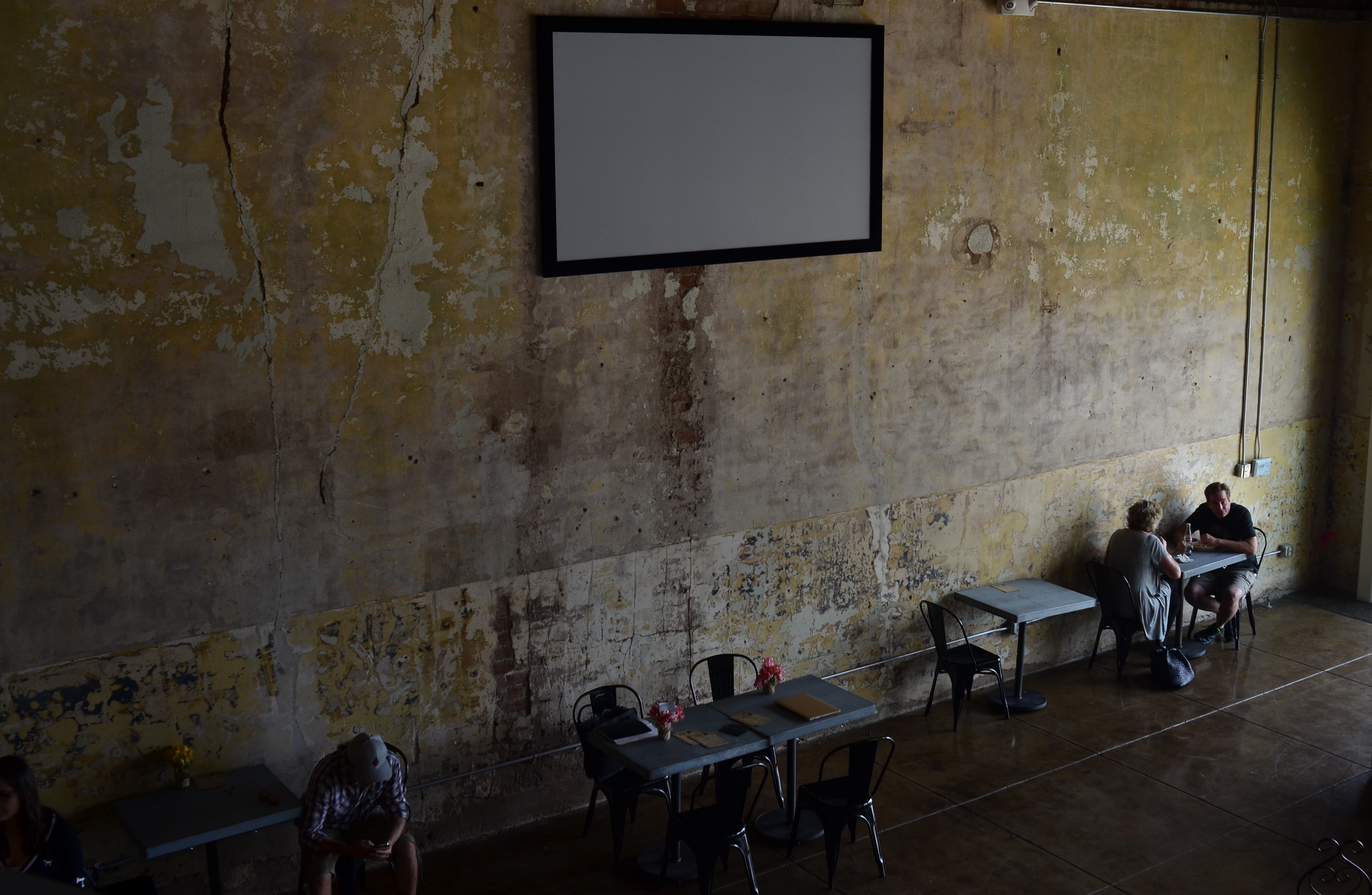
As light “decays” down the wall from right to left, it reveals tiny variances in color.
By MICHAEL PERKINS
COLOR, IN REAL LIFE DOES NOT RESEMBLE SOMETHING FLATLY FILLED IN BY A CRAYON. Light never plays across surfaces in an even, unbroken tone, so, in a photograph, there really is no such thing as a “blue” wall, or a “brown” floor. Both the wall and the floor contain endless varieties and gradations of their general hue, changing inch to inch, atom by atom. Wonderfully, photography has been on a continuous upward curve over time to record these variances with better and better fidelity. As a result, we don’t just shoot tone, we shoot texture.
One way to heighten the registry of those textures, those colors-within-colors along a surface, is to vary the amount of light that hits it at different points. There’s a reason why Rembrandt and other masters of the “Dutch-lit” school used minimal or irregular light to illuminate their subjects. Light playing unevenly over fruit and the human form was simulated in their paintings by pigment colors that shimmered and smoldered: had they painted colors in a flat, uniform tone it would have read as dull as dishwater and Rembrandt and the other little daubed Dutch boys would have had to get day jobs.
In photographs, sometimes texture emits such a powerful visual impact that it’s enough to carry an entire image with little or no other subject matter. In the above picture, watching the window light at the right of the frame decay gradually as it “walks” across the distressed wall actually speaks louder than the solitary couple at the upper-right-hand corner. In such a picture, the wall becomes all, the changing colors highlighting small detail in the concrete and brick.
As usual, I learn a great deal by looking at how other people address this phenomenon. There are so many astounding ways to harness even a small bit of light via photography as it exists right now, and the best thing is, things will only improve from here, for anyone shooting at any level.
THE TAKEAWAY
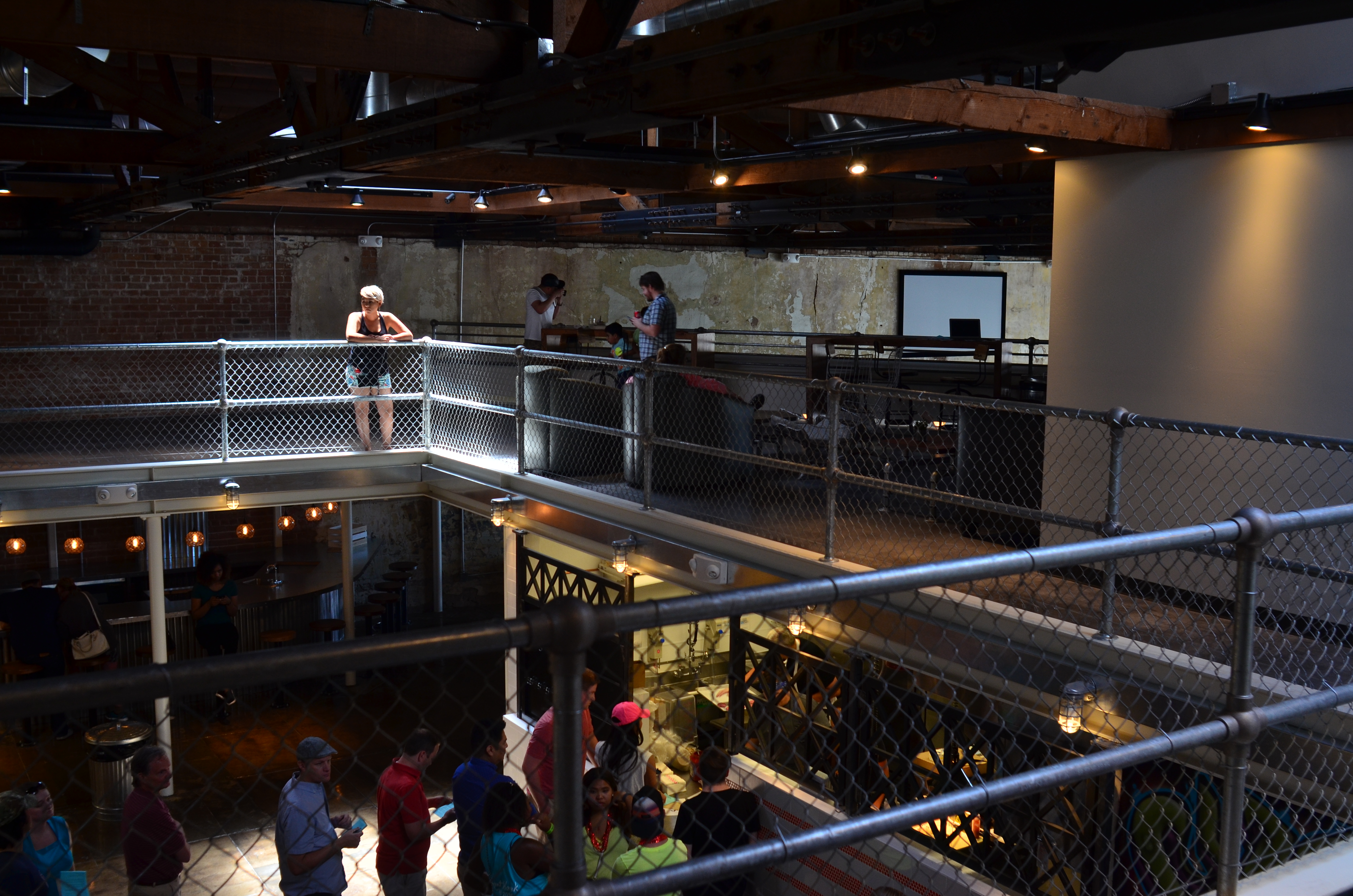
The girl bathed in ceiling light is a nice start, but this picture needs some help to get where it’s going.
By MICHAEL PERKINS
IT IS SAID THAT THE GODDESS ATHENA WAS BORN, FULLY GROWN AND ARMORED, out of the forehead of Zeus. Other than being the only case where a man experienced anything that approached labor pain, the story always reminds me that ideas rarely arrive in their final form, especially in photography. If Athena had a Leica, she probably could have taken perfect shots without needing to compose or plan. We mere mortals are forced to either (a) report to hate-crazed photo editors, or (b) learn how to crop.
Many shots are created in stages, and there’s no shame in the game, since our original conception undergoes many phases from the first spark to something we’d actually hang on a wall. Creation itself is a process, which is why photographers should actually embrace the stages their work will pass through. The more thought that is applied to making an image, the better chance that the best way of doing something will reveal itself. Of course, it can also reveal the fact that there is nothing really to work with, in which case, hey, the bar should be open now, let’s go lick our wounds.
The original shot shown above is not yet a good photograph, but a good beginning for a 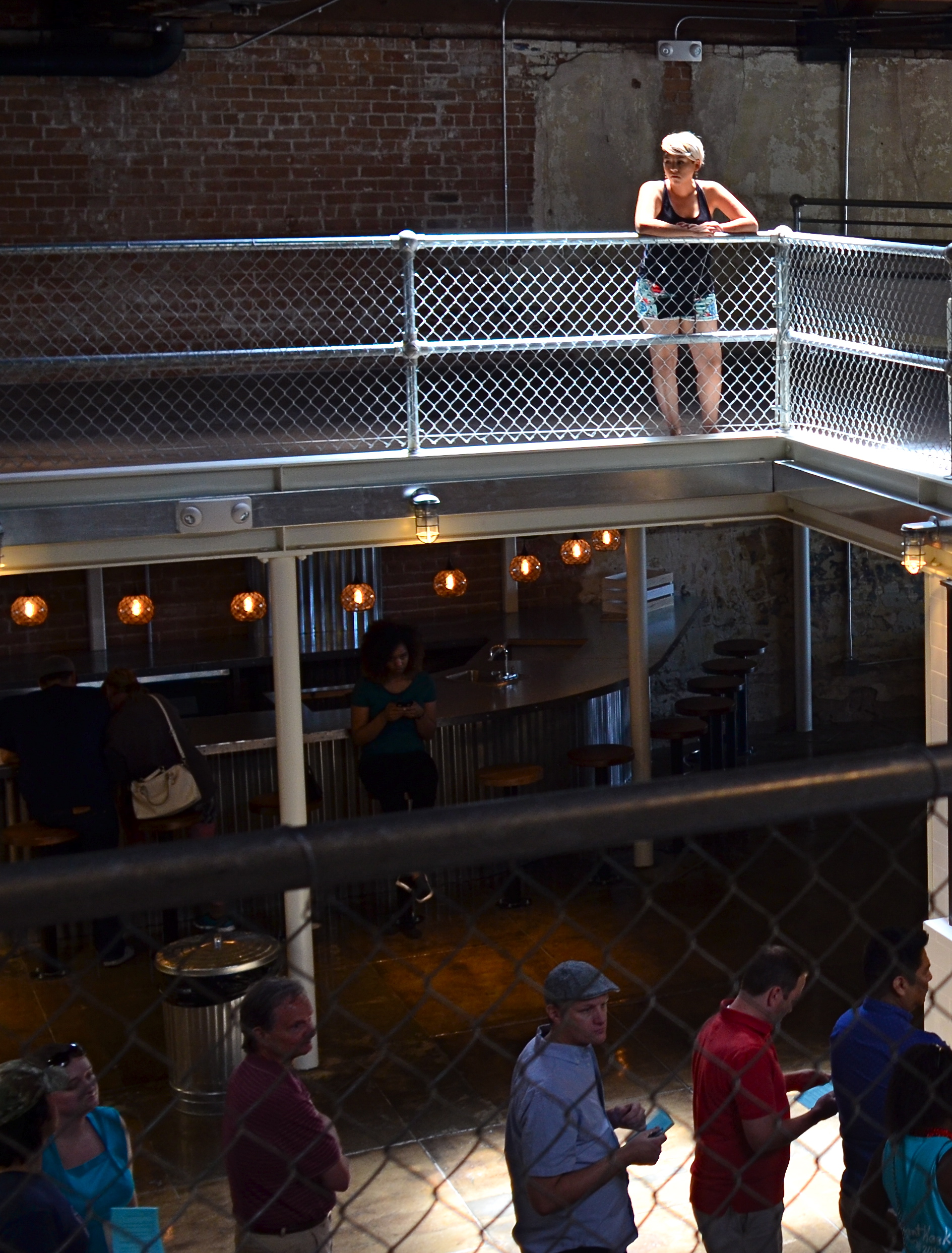 photograph. The lady bathed in light seems certainly to have been pre-selected to be the focal point of the picture, but there are way too many competing elements around her, robbing her of the prominence she deserves in the final frame. So let’s get after it.
First, none of the information on the left side of the frame makes it any clearer that she’s alone or that she’s on the second floor of the building. We can make that plain with half the acreage, so snip. Similarly, the guys in shadow to her right aren’t part of the story we are crafting for her. If she’s isolated, let’s make her isolated and be unmistakable about it. She’s “apart” already from the sea of people below her. She’s geographically and physically separated from them, but the extra guys make the argument weaker, so, snip, away they go.
Finally, the entire upper-floor/lower-floor line of sight will be accentuated if we crop for a portrait orientation and move the frame so she is on the upper-right-hand corner of it. It forces the eye to discover the story of the picture vertically, so snip and we’re done.
So, at the end, we did not make any changes via processing, only the old scissors. Taking things away, not adding them on, actually made the picture work better. Fate gave me the girl and the wonderful light she was bathed in, but there was work to do. She didn’t arrive, ready to party, like Athena, but she’s a little closer to goddess status after some adjustment.
WHOOPS. YAY.
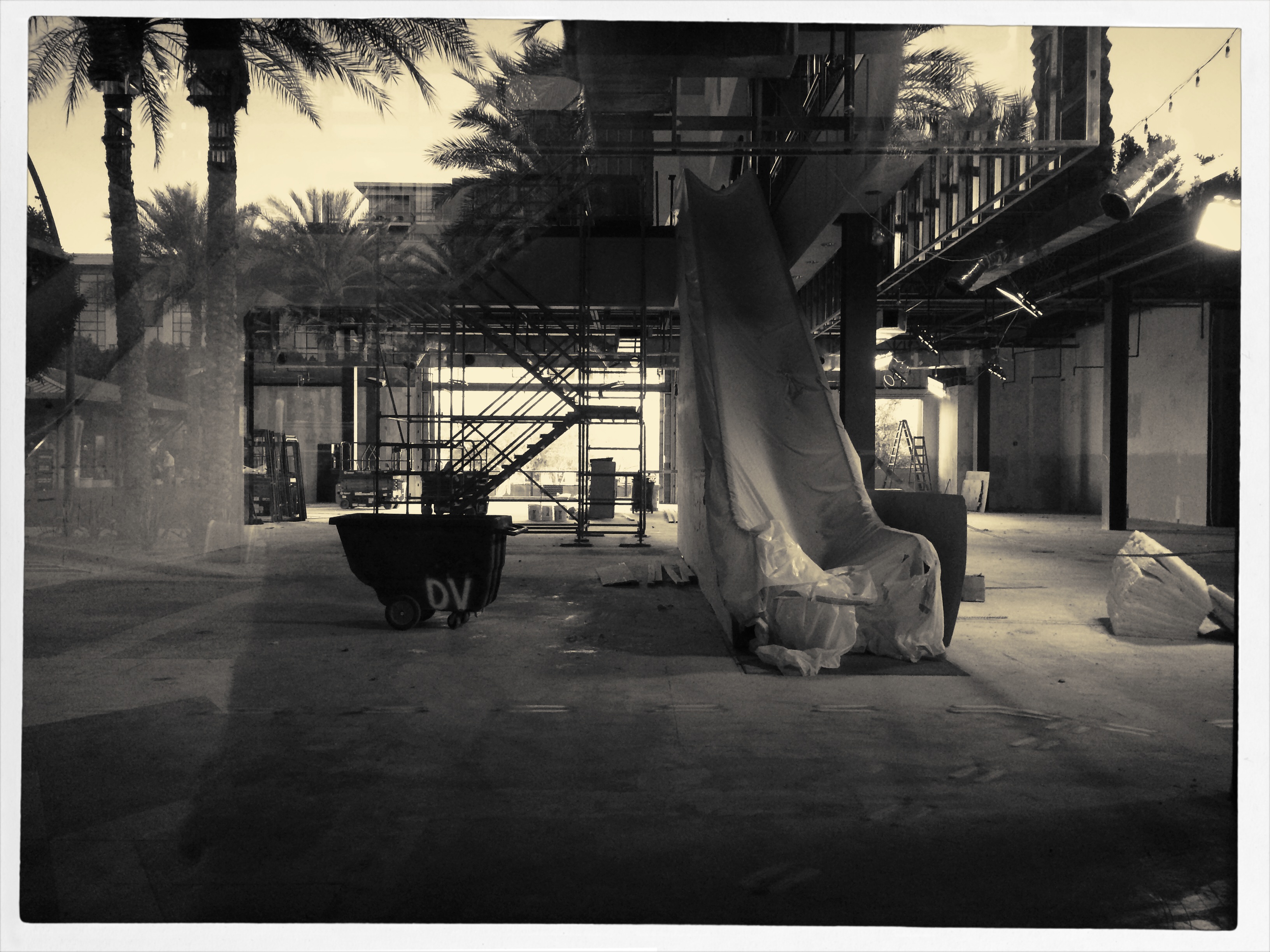
Strike The Set, 2015. A world that never was, and can never be again.
By MICHAEL PERKINS
I HAVE A THEORY THAT “SERENDIPITY” is just “dumb luck” for pretentious people. Somehow it makes our random discoveries and unplanned miracles sound cooler if we attribute them to some grand lining-up of the planets, as if we apes really meant to discover fire. So, fine. Consider this an incident of serendipity, although it’s mainly a case of “I stepped in sugar instead of….” well, you get the idea.
Setting the scene: a suburban mall near me recently closed its enormous bookstore, applying a dark sheet of tint on the building’s huge windows so gawkers couldn’t spy on the joint’s sad makeover as a furniture store. Of course, if you want to make people curious about something, blacking out the windows is a pretty effective tactic, and there are always plenty of people smashing their faces up against the impermeable tint every day to see what a bookstore looks like when it has, you know, no books in it. I am usually first in line for this ritual.
For some reason this week, a small peephole has been opened in the sheeting, allowing one to see the place’s vast, empty floor, its draped escalator, and an iron tangle of scaffolding, as well as a huge infusion of light from an open-work area at the opposite side of the store. It isn’t quite the “ruin porn” that photographers of dead malls love to record just ahead of the wrecking ball, but eerie enough to make me want to shove my phone camera up against the peephole to try to capture it.
Given the very wide-angle of such devices, however, I discovered, after the click, that the lens had also picked up a portion of the window next to the peephole, a portion still covered by tint and capable of reflecting the scene behind me….various buildings and landscaping of the rest of the mall. Even stranger, the “other” reality behind me melded, through the blurred outline of the peephole and variances of light, with the scene inside the store, as if they were all part of one dreamy landscape, a Hollywood set in transition. Giddy at what I had grabbed by accident, I shot a second frame to compose things a bit better, then converted it to monochrome with a filter that simulates a platinum print effect, an effort to eliminate mismatches in color and tone between the two worlds.
Sinatra once said that “the professional is the guy who can do it more than once”, so this image ranks me solidly among the amateurs. But so what. Whoops. Yay.
GOING NEGATIVE
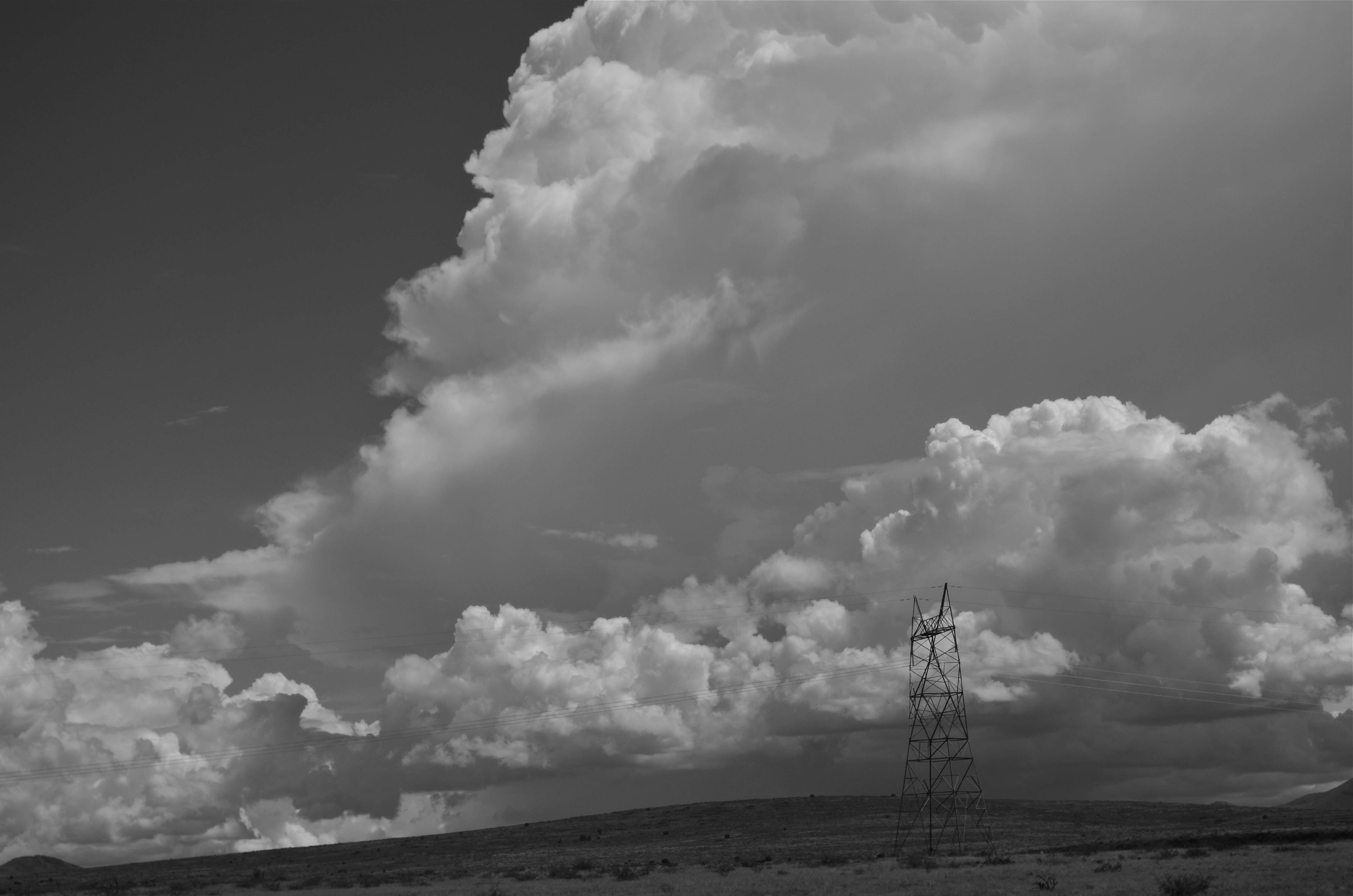
Negative space is your best friend when trying to establish scale.
By MICHAEL PERKINS
I got plenty of nothin’, and nothin’s plenty for me. —Ira Gershwin, Porgy and Bess
I BELIEVE THAT MANY PHOTOGRAPHS ARE IMPROVED BY THE SIMPLEST OF MATH OPERATIONS: addition and subtraction. Look at nearly any image you’ve created that “worked” and you can see that there is not one more thing in the image than there needs to be. Something told you to either supply or eliminate elements in the composition until the impact of the picture was maximized. Realizing the reverse effect is pretty easy as well, although not as much fun. If there is one tree too many or one object too few in the frame, you can sense the imbalance in your near-miss pictures. And man, does that hurt.
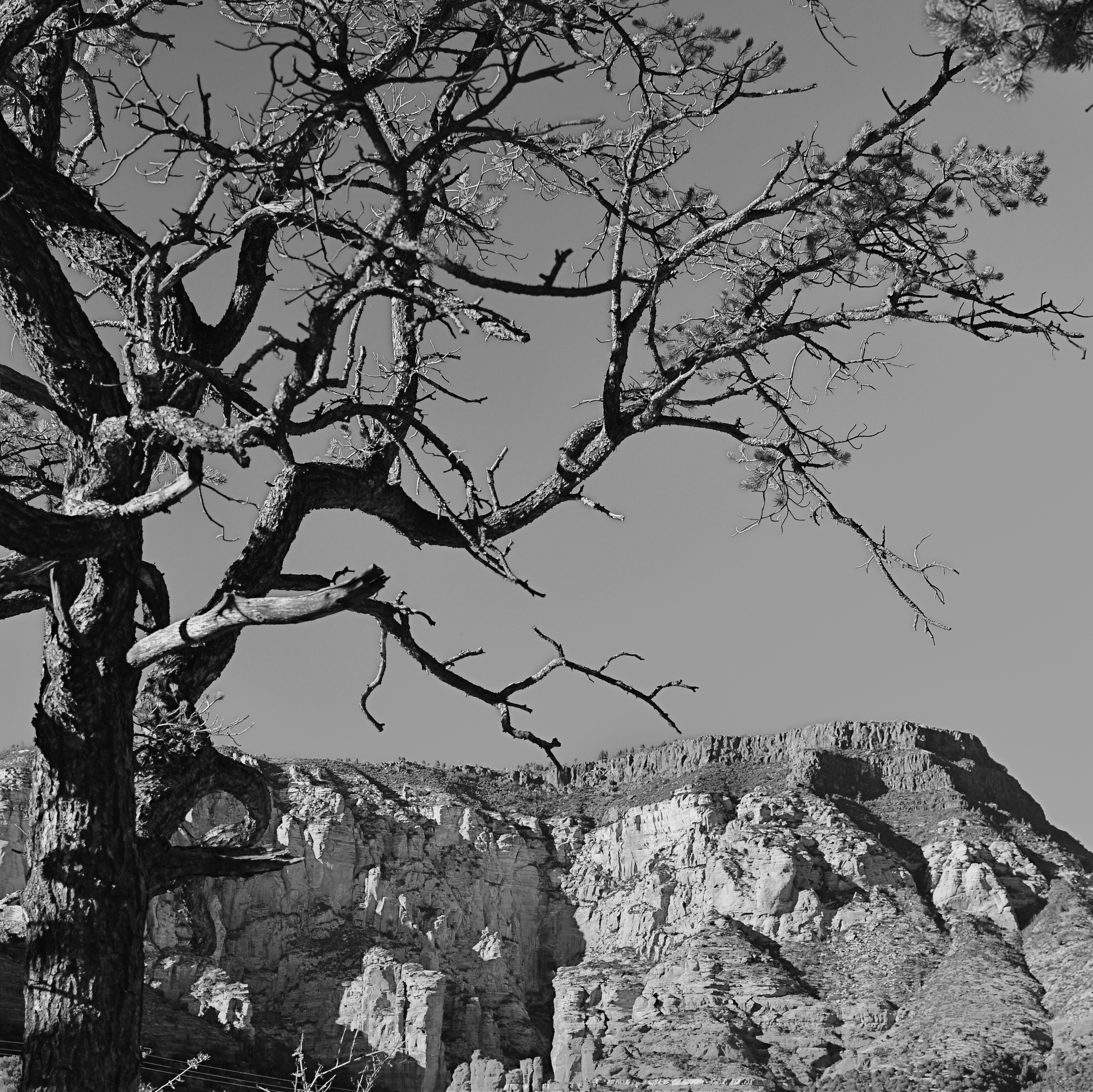 We used to refer to open areas of a picture as “blank” space, and were often talked out of using it at all by various A-B-C composition tutorials that told us that large expanses of sky could kill a good landscape. Today, we refer to this unused real estate as “negative” space, but we are now more inclined to see it as well, a positive thing. The take-home from this is, simply, that no technique should be universally ruled out, or ruled in, for every image. Truth is, there are times when not filling the frame with stuff, or selectively making use of negative space boosts the wattage of what you’re trying to say.
Instead of “negative” space, I prefer the term “secondary space”, since what you’re really doing is mapping your pictures into zones of the things that should be of primary interest and those that should complement those things without competing with them. Landscapes are the easiest way to demonstrate this. In the image at left, I wanted to accentuate the distance between the foreground tree and the background mountain. Framing the two elements to merely overlap gave no sense of space, and, in color, actually made the photo busy and hard to read. There seemed to be no primary object in the frame. Composing so that some sky intervened to the right of the tree and the top of the mountain re-established the sense of distance and kept the textures of both objects from fighting with each other.
Secondary space need not be empty. It can take the form of a texture, be it a body of water, cloud formations, a flooring pattern, or a stone wall. The idea is to use the space to support, but never upstage the primary space. Sometimes what you need to complete an image is nothing. You just have to stick the nothing in the right place.
CHOOSE THE INCONVENIENT
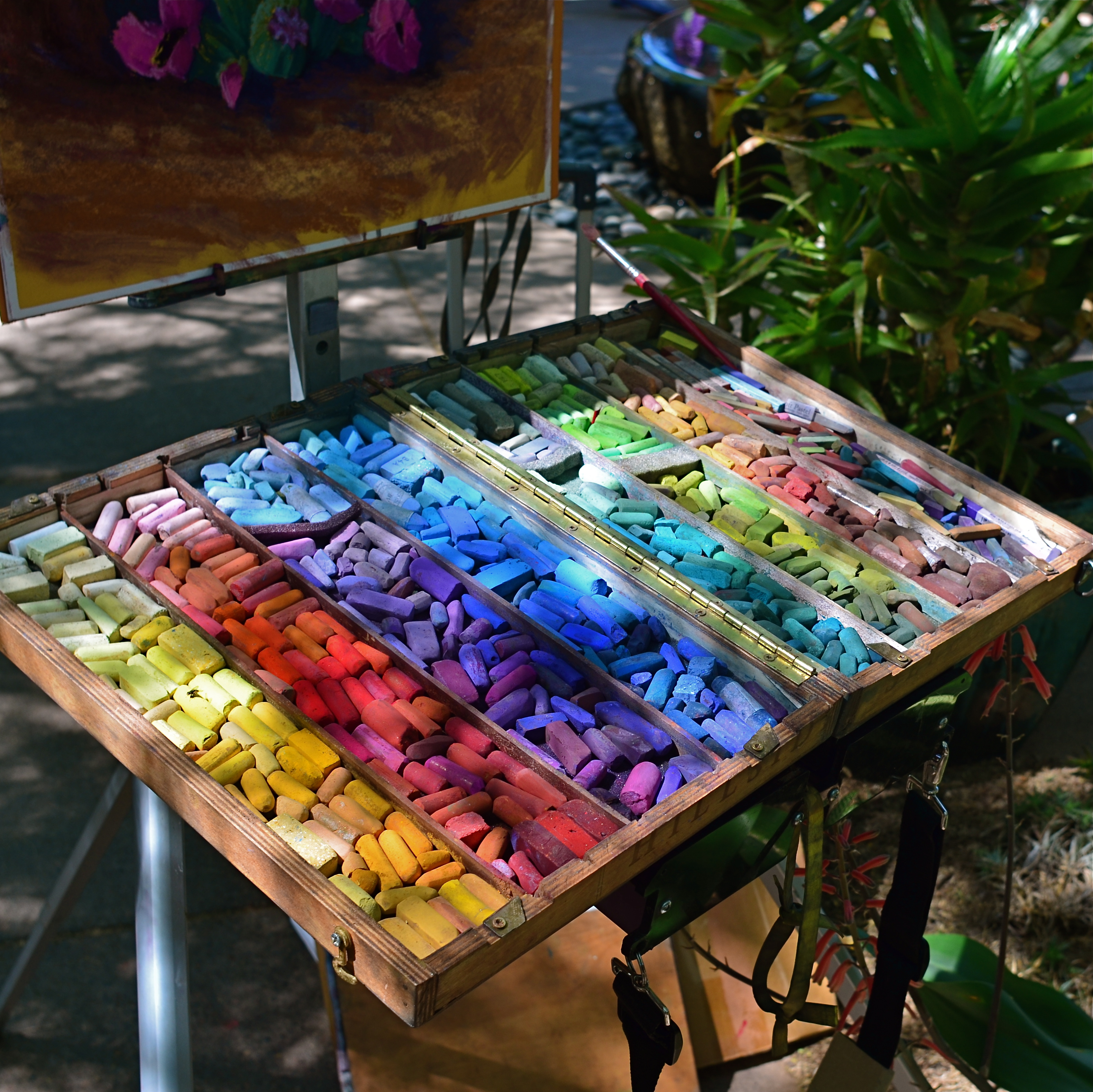
The more of your hand that’s in a picture, the better it will be.
By MICHAEL PERKINS
MARKETING BEING WHAT IT IS, CAMERA MANUFACTURERS HAVE LONG TOLD US THEY ARE DOING ONE THING FOR US when they are actually doing something very different. Since the first furry, day-long exposures of the 1800’s gave us a taste of what an entirely new medium could do in the way of chronicling the world, we have been promised that, over succeeding generations of technical development, taking a picture would get easier. In fact, this is a little inaccurate, as what the wizards have mostly done is to make taking a picture faster.
If this sounds like I’m splitting a sub-atomic-sized hair, hear me out. Many of the refinements in camera design over the last century and a half have, of course, improved the sharpness of lenses, the absorbance quotient of recording media, and enhanced design. However, the lion’s share of reboots have been to require fewer steps in framing and shooting, through increasing auto-delegating of many functions to smarter and smarter cameras. But, what we basically gain by this process is speed. It certainly takes much less time to shoot and get an acceptable result as the years roll by. “Well”, you may well ask, “doesn’t that mean the whole process is also easier?”
Tricky question, as it turns out.
In that you can take technically better images with less effort the further we roll along, then yes, it’s “easier”. But the same speed which is part of the “easy” process also means that we spend less time planning a picture, seeing it in our minds and creating it with deliberate action…cause, you know, the camera will do it. This means that it’s also easy to miss things, to fail to visualize the best way to take a shot versus the most expedient way. Slowing down by adding steps into the creation of a photograph means taking back control, so it is, if you will, “harder”, but, with practice of the total process of photographing, the ease, and even the speed all comes back anyway.
I wanted the name of this blog to contain a subtitle about journeying from taking to making images because that is the trek that most photographers eventually set out on. We begin to wonder what it would be like to be more completely in charge of what kind of pictures we wind up with, even if it’s only to take a series of baby steps. It does take more time to take the process into your own hands. But it’s not that hard. Auto-settings save you time, but they may not save your shot. Choosing the inconvenient isn’t ignoring technology. It’s making it work your will with your pictures.
BACKING OFF, BACKING AWAY
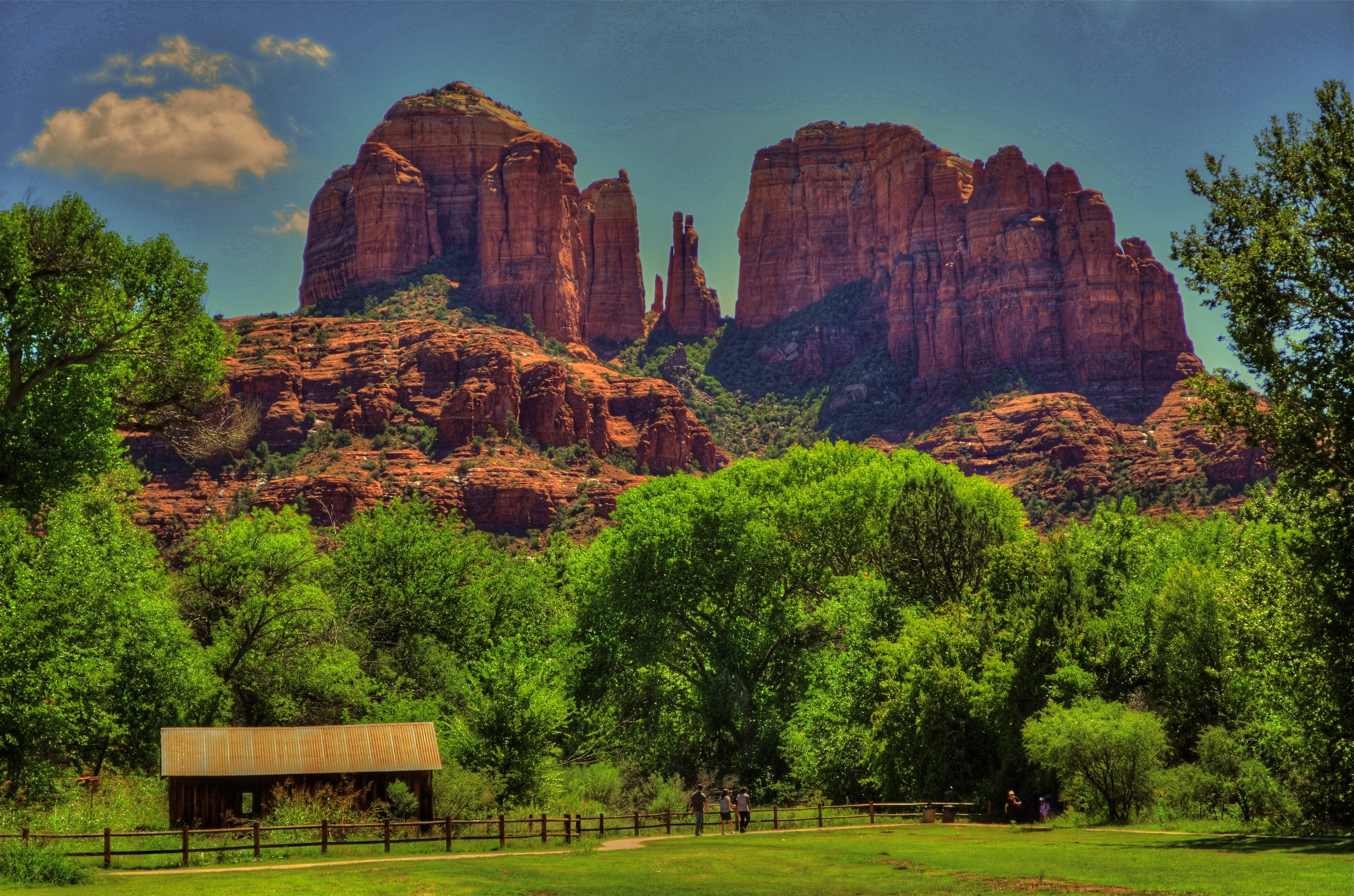
An early case of HDR madness on your humble author’s part. Yeah, nothing in nature looks like this. Ever.
By MICHAEL PERKINS
YOU MAY HAVE HEARD THE JOKE ABOUT THE COUNTRY PARSON WHO WAS IN THE HABIT of writing, in the margins of his sermon script, “Argument weak here. Scream like hell.” If he were a man of the camera instead of a man of the cloth, this instruction might have read, “photograph ineffective here. Over-cook everything.”
Choose your favorite post-editing workflow and chances are that you, or someone like you, have tried to rescue an indifferent image by pouring a few gallons of digital gravy over it, hoping to turn flank steak into filet. And you probably have your own personal folder of shame for the results of such attempts. Mine would fill up a small bookshelf. In the Library of Congress.
One of the hallmarks of the early digital age seems to be an affection for over-saturated color, as if we had had quite enough of natural tones, thank you, and were desperate to return to the earliest days of photographic color, when everything was played on the loud pedal. It’s kind of perverse, but it seems like, as soon as photographers outdistance an old technical barrier, they seem to get nostalgic for it and try to revive it. Why resuscitate daguerreotypes, pinhole cameras, high grain slow films, etc. Irony? Curiosity? Novelty? Who knows?
Whatever the motivation, the result has been a cornucopia of mobile apps that aim for an unnatural distortion of color values (spend ten minutes on Instagram for as many samples as you want) and the lo-fi or lomography movement toward cheap plastic toy cameras that can’t help but deliver hyped up hues (again, Instagram). There are also a number of HDR programs which tend to tempt people beyond their endurance when it comes to electrifying color even in an image’s shadows, making everyday like a day-glo version of your uncle’s golf togs and resulting in some pretty hideous excess (and yet, alas, such was I. See left).
What’s the new normal? Again, can’t tell you. It’s pretty certain, though, that we love cranking the color up to 11, whether it serves the photo or not. Backing off and backing away on the hue-mongous overkill takes real discipline. The amped-up image is fascinating in some kind of moth-to-the-flame way, but eventually it becomes like any other excess, in that it stifles, rather than frees, your art. No effect is so miraculous as to work in every situation. Eventually, it’s about what you’re seeing and saying.
SIMPLIFY, SIMPLIFY
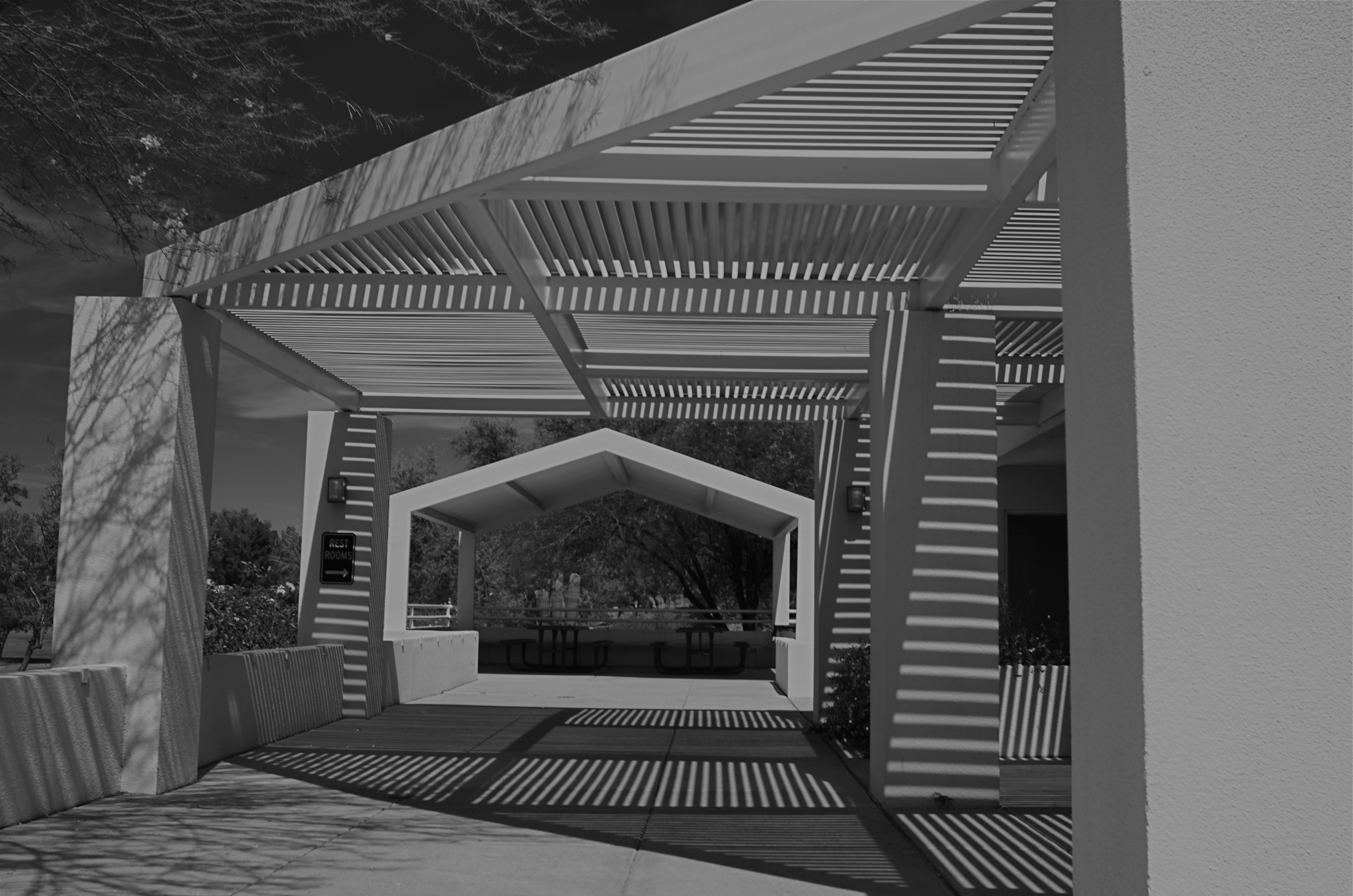
Apertures, 2015
By MICHAEL PERKINS
COLOR PHOTOGRAPHY WAS NOT UNIVERSALLY WELCOMED at its initial introduction, and was even actively avoided for the most part by the likes of Ansel Adams and Edward Weston, who mistrusted the technology of early color reproduction as garish, unnatural. While the amateur world largely lauded color as more “real”, Ansel & co. countered, between clenched teeth, “that ain’t the point”. Their argument: black and white was an artistic interpretation of reality, not a reproduction of it, whereas color was erroneously assumed by the public to be a more accurate record, even though it also suffered from its own biases and excesses. Some of the early masters never really came to be at peace with color, although they shot in it, and did foresee a time when photographers would choose it over b&w not for novelty’s sake, but because of what a particular project demanded.
I sometimes begin planning a shot in color, only to find that it provides too many choices for the eye. That is to say, all tones will register as distinctly different from each other, and this may make for too much information, blocking the clarity of the photo’s design. The result may be beautiful, but it may also diminish the impact of the final picture. In these cases, it’s worthwhile to at least work up a monochrome vision of my shot to see if it communicates more directly.
In a situation like the above pattern of shades and light shafts, color gives you brilliant blues and off-whites for the darks and lights, and a real hodge-podge of hues in all the crannies of the metal grids. However, rather than de-saturate the color to make b&w, I found it better to shoot the master image in black and white, using a red filter and a polarizer to maximize contrast, forcing all the dark and light shades into two hard-line general values. This forces the design to be the primary attention-getter, eliminating the distraction inherent in a full raft of colors. That is, if the deepening composition of gridwork is the main message of the photo, then it makes sense to get the color out of the way of that story and see if it helps.
In the end, Uncle Ansel had it all psyched out:
When I’m ready to make a photograph, I think I quite obviously see in my mind’s eye something that is not literally there in the true meaning of the word. I’m interested in something which is built up from within, rather than just extracted from without.
Yeah, what he said.
UN-BECOMING WALDO
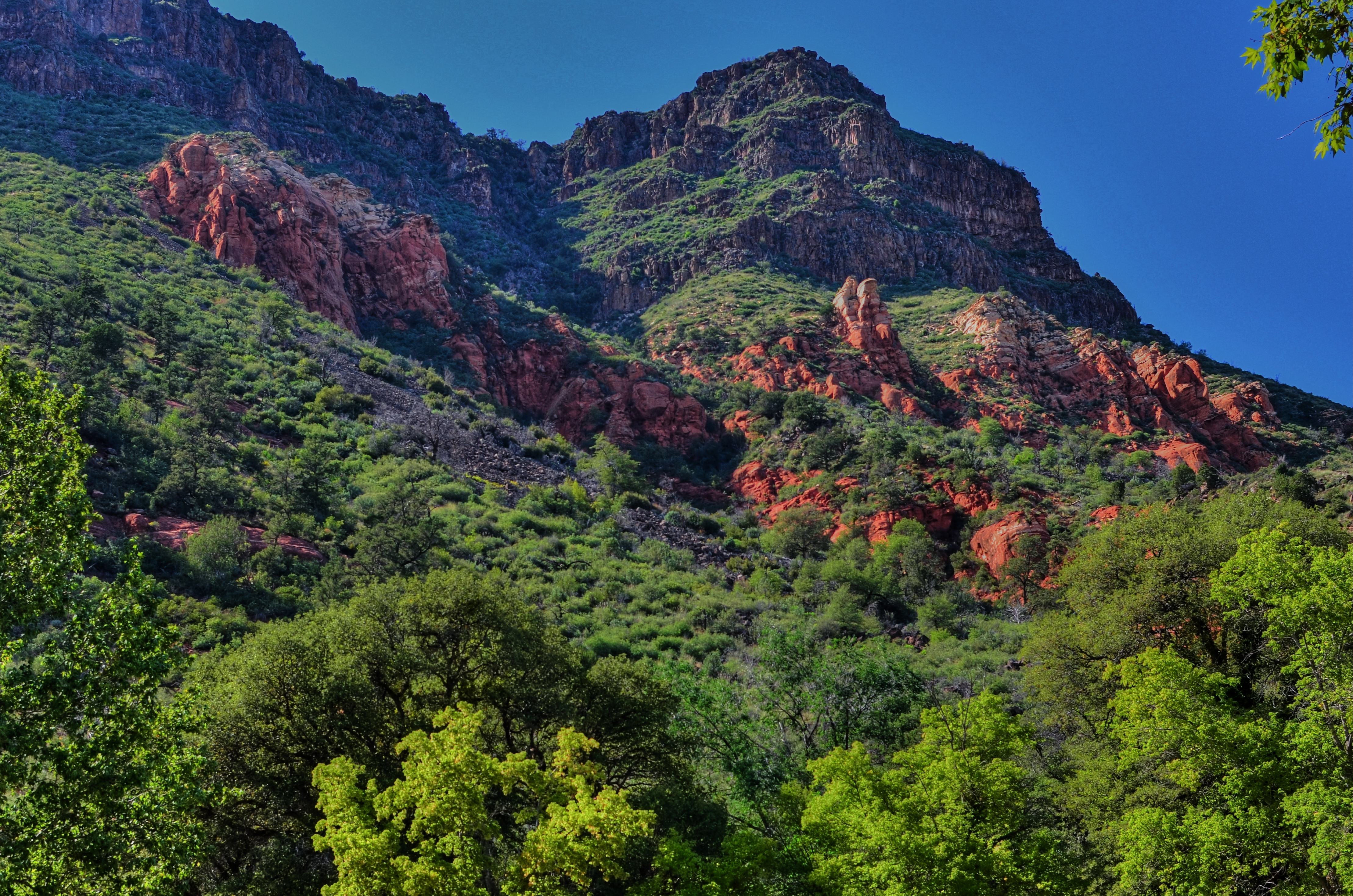
There are many ways this photo could be improved. Sticking my face in front of the mountain isn’t one of them.
By MICHAEL PERKINS
YOU CAN’T SAY IT’S JUST UNCOOL PEOPLE ANYMORE. In recent days (this being April 1st as you read this, and no joke), both the Coachella and Lollapalooza festivals have joined the growing ranks of public attractions that have decided to prohibit the use of the selfie stick, that telescoping extender wand that stretches the human ego beyond all endurance. Now, the only proofs you will have that your wonderful personage graced a certain locale on a certain day will be (1) memory (2) the enjoyment of the moment, at the moment, and (3) all the other standard-issue, stretch-your-arm selfies you intend on inflicting on mass media in much the way that polluters truck their waste loads way out of town to dump them at remote sites.
If you infer that I am less than suicidal at this news, you infer mos’ correctly. Although you are technically taking a photograph when you use one of these annoying fishrods, you are certainly generating nothing of visual value. You are merely creating a disruptive warp in the travel-time continuum, crowbarring yourself into scenes to…what?….render them more relevant, since you decided to drop your divine butt into them like some kind of Where’s Waldo tribute? Suddenly, it’s not look at this beautiful cathedral. It’s now look at me in front of this beautiful cathedral. Instead of isn’t this an inspiring sunset, we get look at how inspired I was by this sunset.
Please.
I suppose, in the desperate cyber-playdate that social media has become, it was inevitable that the standard selfie, already the online equivalent of roadside litter, would have to metastasize into something even more self-absorbed, and so, on the seventh day, they created the stick, and they said, be fruitful and multiply. Only, you see, a line has been crossed. Your love affair with yourself is now prodding me in the butt, blocking my view, and annoying my mother (and believe me, no one wants that). In other words, your favorite social plaything (you) has become anti-social. And boring.
There is an amazing tradition, among photographers great and small, in the self-portrait. But put some study into it, rather than having it be a reflexive tic whenever you become bored with the rest of us. Approach it with some intent, some technique, or at least more forethought than it takes to flex one knuckle of your index finger. Of the loss of all thinks stick-like at concerts, Jacqueline Verdier, CEO of Selfie on a Stick, said the festivals were going too far and that the sticks can be used safely. “I think it’s really doing a bit of disservice to the attendees,” Verdier said. “They’re not going to be able to capture the same memories.”
Yeah, Jackie, true that. And they (and we) can do one helluva lot better in the memory department if we’ll just stretch our brains a bit. So go convert your product to a line of premium backscratchers.
Then you’ll at least be performing a public service.
YOUR FLASH AIN’T NOTHIN’ BUT TRASH
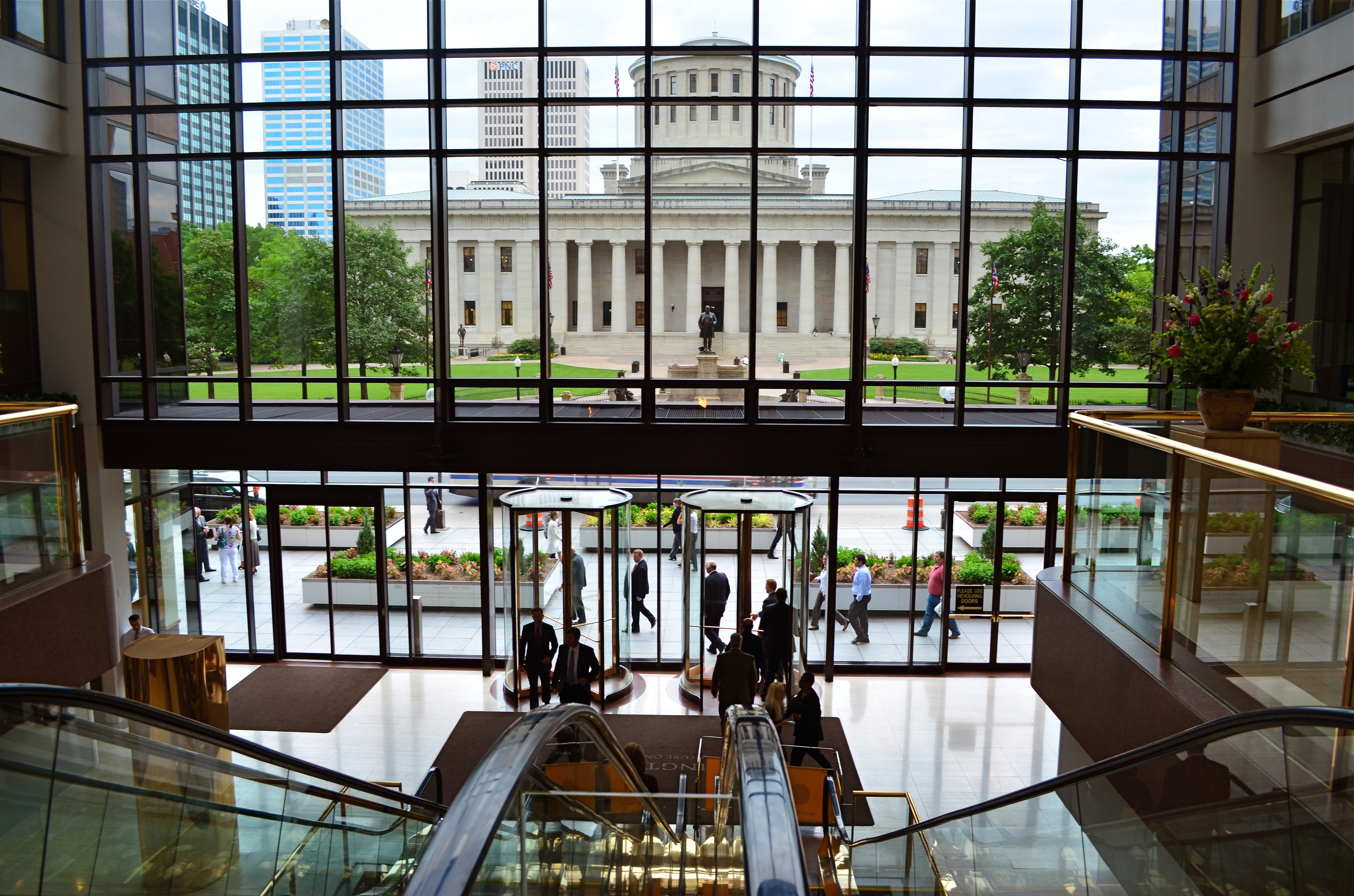
Learning to make the maximum use of light means you can leave your flash off more often. 1/60 f/5.6, ISO 100, 18mm.
By MICHAEL PERKINS
PHOTOGRAPHY HAS NEVER SUCCESSFULLY ADDRESSED ITS BIGGEST, AND MOST LONG-STANDING WEAKNESS, that of providing natural illumination in all shooting situations. Worse, it has generated tons of tweaks and workarounds to compensate for this weakness, instead of solving the central problem. As a result, we have limped our way through nearly two centuries of devices and processes designed to create momentary fake lighting…the lame legacy of flash.
Instead of finding recording media that absorbs and spreads light adequately, from salt paper prints to roll film to pixels, we have invented one torchy crutch after another, each adding expense, bulk and even greater uncertainty to our results. The ignition of aluminum powder may have given way to pop-ups with red-eye protection, but the essential error in our thinking persists. We don’t need better flash: we need cameras good enough for there to be no flash.
Flash is like a bratty kid in a restaurant. He won’t sit up straight, spits his chewed broccoli back into his napkin, splashes water on everyone, talks with his mouth full, and eats his dessert first. And his mother dresses him funny. And yet we can’t rub this punk out, no matter how we try.
Testify: a recent B&H Photo catalogue boasts eight pages of flash equipment, most of it aftermarket gear designed to muffle, bounce,, amplify, soften or re-direct flashes that are too harsh, too faint, too in-line with the “optical axis”, or otherwise inefficient. Many manufacturers of DSLRs practically admit that their on-camera units are too limited for custom lighting, selling you their costly, brand-related off-camera units, cables, transmitters and widgets. Ca-ching. Photographically speaking, this is like telling you that the house on which you just took a 30-year mortgage is really a dump, but the place down the street is divine.
It was decades before film was fast enough to be used in more than a few specific situations, so flash. It’s still too expensive for most people to get lenses that are speedy enough to keep from blasting bleachingly hard light in people’s faces, so flash. And, sadly, many of us still believe that popping that little beast up in a 50,000-seat concert hall will magically help us counter the 300,000 square feet of darkness between us and the stage, so…flash.
Digital image sensors might eventually evolve sufficiently for different parts of them to register light individually, eliminating the need for extra bursts of artificial light, and our own best practices in the use of natural light can all but eliminate the need to pop up the pop-up. But we are farther away than we should be from a flashless world. It’s not that we don’t all know that the way we currently use it is idiotic. But for now, we have to keep promising that bratty kid that if he takes just one more bite of spinach, we’ll get him ice cream. Jeez.
THE FLOATING 50
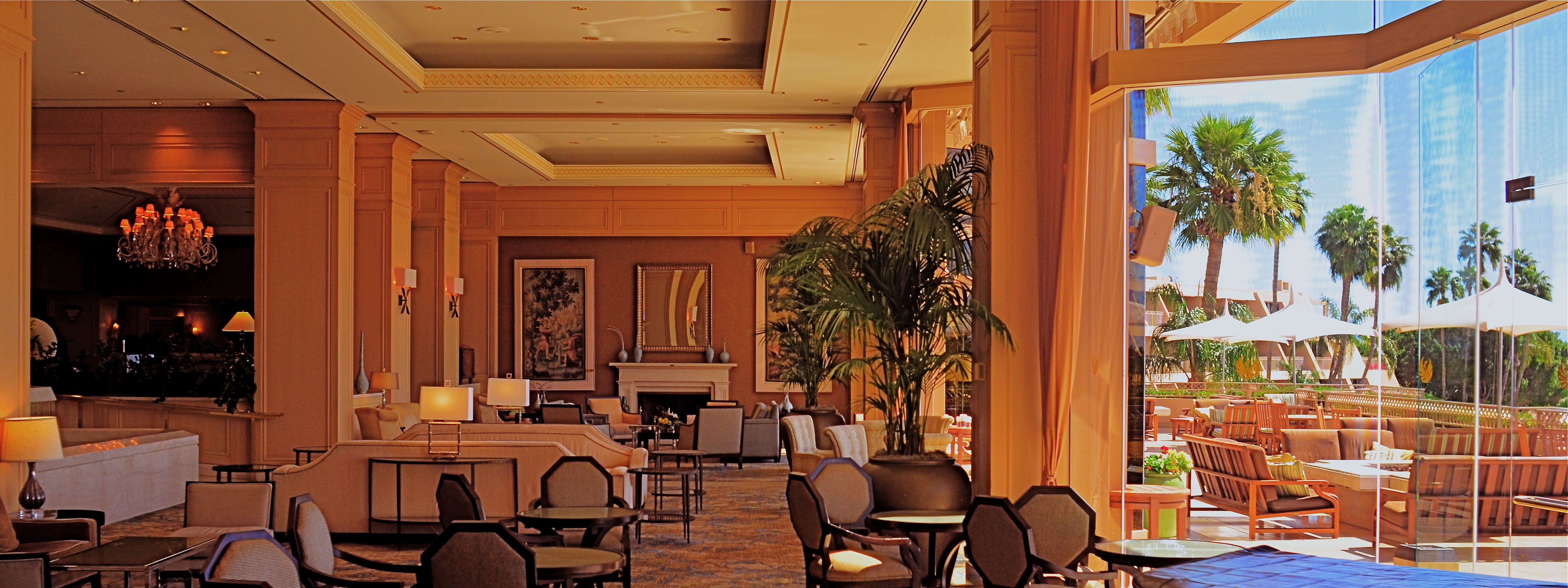
From Lobby To Terrace, 2015. A near 50% crop from the original, seen below at left.
By MICHAEL PERKINS
YOU CANNOT BECOME A GREAT PHOTOGRAPHER WITHOUT BEING YOUR OWN BEST EDITOR, no matter how brilliant or instinctual your shooter’s eye may be. Art is both addition and subtraction, and the image frame is about both inclusion and exclusion. You get your viewers’ attention by knowing what to show. You hold that attention, and burn your images into their minds, by learning what to pare away.
I’ve written several variations on this theme, so the best way to restate it is in the voice of the truly visionary godfather of street photography, Henri Cartier-Bresson. Ironically, this master of in-camera composition (he is reputed never to have cropped a single shot after it was taken) was nonetheless remarkably aware of what most of us must do to improve an image through post-editing:
This recognition, in real life, of a rhythm of surfaces, lines, and values is for me the essence of photography; composition should be a constant of preoccupation, being a simultaneous coalition – an organic coordination of visual elements. We must avoid snapping away, shooting quickly and without thought, overloading ourselves with unnecessary images that clutter our memory and diminish the clarity of the whole.
Insert whatever is French for “Amen” here.
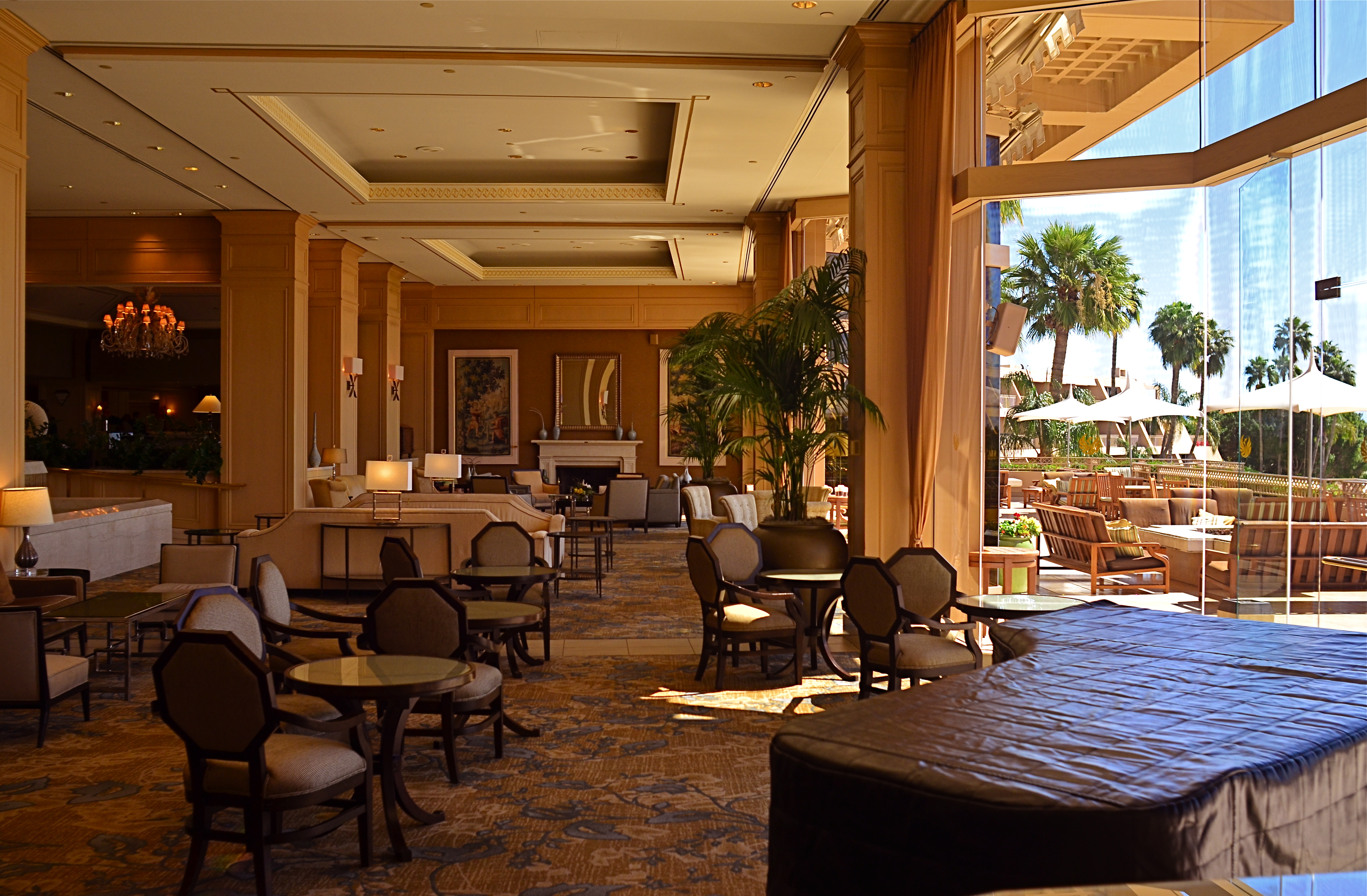
The original. It’s easy to see what needs to be cut out of this one.
I often find that up to 50% of some of my original shots can later be excised without doing any harm to the core of the photograph, and that, in many cases, actually improving them. Does that mean that my original concept was wrong? Not so much, although there are times when that’s absolutely true. The daunting thing is that the 50% floats around. Sometimes you need to cut the fat in the edges: other times the dead center of the shot is flabby. Sometimes the 50 is aggregate, with 25% trimmed from two different areas of the overall composition.
On occasion, as with the above picture (see the original off to the left), the entire bottom half of the shot drags down the top. In the cropped shot, the long lateral line between indoors and outdoors is much more unbroken, making for a more “readable” shot from left to right. The disappearance of the dark furniture at the bottom of the master shot creates no problems, and actually solves a few. Do a disciplined search of the nobler near-misses in your own work and see how many floating 50’s you discover. Freeing your shots of the things that “clutter our memory and diminish the clarity of the whole” is humbling, but it’s also a revelation.
NAIL YOUR FOOT TO THE FLOOR
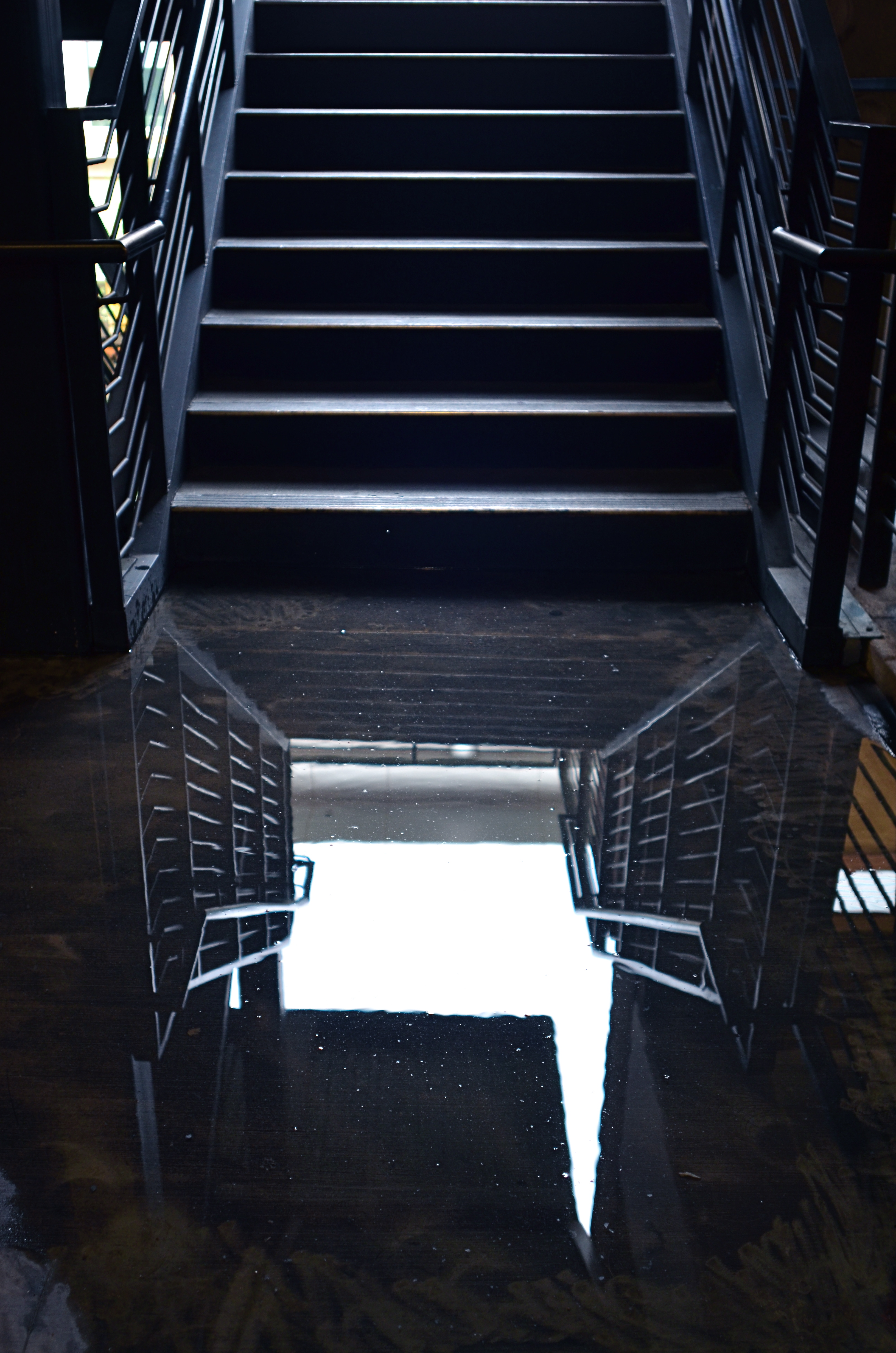
I shot this on a day when I was forcing myself to master a manual f/2.8 lens wide open, and thus shoot all day in only that aperture. That made depth-of-field tricky.
By MICHAEL PERKINS
PHOTOGRAPHY PLACES YOU IN PLENTY OF SITUATIONS WHERE YOU ARE, TO SOME DEGREE, OUT OF CONTROL. From light conditions to the technical limits of your gear to erratic weather, we have all experienced that sinking feeling that accompanies the realization that, to a great extent, we are not in the driver’s seat. Gotta wait til the sun’s up. Gotta wait for the flash to recycle. Gotta cool my heels til these people get out of the frame. Gotta getta bigger bottle of Tums.
So why, given the frequent cases in which we naturally run off the rails, would I recommend that you deliberately hobble yourself, in effect putting barriers in your own way when shooting images? Because, quite simply, failure is a better teacher than success, and you never forget the lessons gained by having to work around a disadvantage. Not only am I encouraging you to flirt with failure, I’m suggesting that there are even perfect days on which to do it…that is, the many days when there is “nothing to shoot”.
It’s really practical, when you think of it. Go out shooting on a day when the subject matter is boring, a day on which you could hardly be expected to bring back a great picture. Then nail your foot to the floor in some way, and bring back a great picture anyway. Pick an aperture and shoot everything with it, without fail (as in the picture at left). Select a shutter speed and make it work for you in every kind of light. Act as if you only have one lens and make every shot for a day with that one hunk of glass. Confine your snaps to the use of a feature or effect you don’t use or understand. Compose every shot from the same distance. The exercise matters less than the discipline. Don’t give yourself a break. Don’t cheat.
In short, shoot stuff you hate and make pictures that don’t matter, except in one respect: you utilized all of your ingenuity in making them. This redeems days that would otherwise be lost, since your shoot-or-die practice sessions make you readier when the shots really do count.
It’s not a lot different from when you were a newbie a primitive camera on which all the settings were fixed and you had zero input beyond framing and clicking. With “doesn’t matter” shooting, you’re just providing the strictures yourself, and maneuvering around all the shortcomings you’ve created. You are, in fact, involving yourself deeper in the creative process. And that’s great. Because someday there will be something to shoot, and when there is, a greater number of your blown photos are already behind you.
BIG LITTLE WORLDS
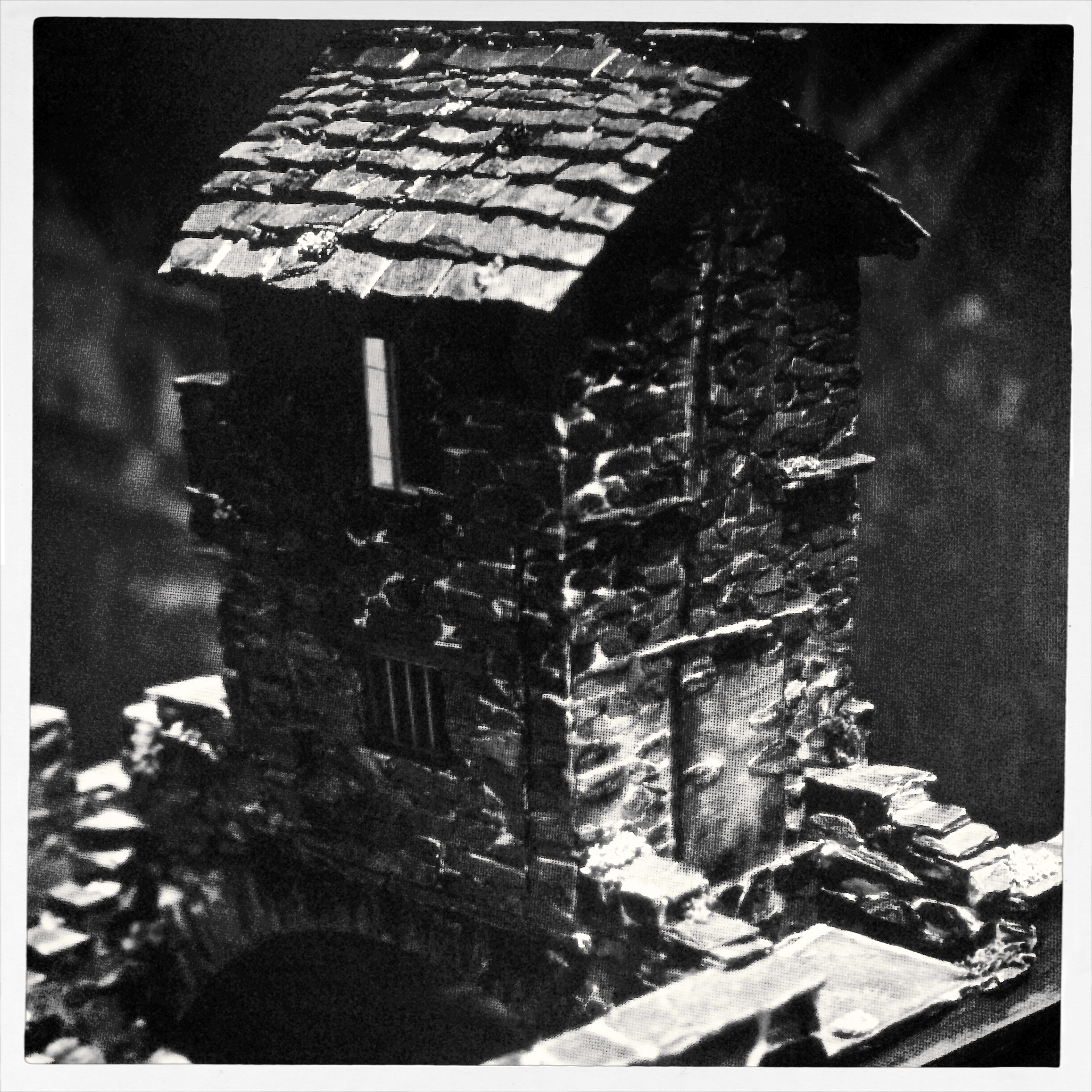
You and Scooby and Shaggy meet us at the old dark house: one of the many great exhibits at Tucson’s Mini-Time Machine Museum of Miniatures.
By MICHAEL PERKINS
EVER SINCE GULLIVER GOT HIMSELF HOG-TIED BY LEGIONS OF LILLIPUTIANS, we have been fascinated with the contrast between the VERY BIG and the VERY..small. The history of photography is pretty peppered with its share of dinky dioramas, miniature models and teensy-weensy mockups and the cool pictures they inspire. On the silver screen, still photography’s stepchild, the motion picture, launched the careers of thousands of miniaturists in its first half century, genius modelers who could create Tokyo on a tabletop, then have a guy in a rubber Godzilla suit reduce it to splinters.
In another vein, kidlings that were 3-D fans also got their tiny on during the decades that the makers of View-Master told fairy tales in stereo, not with animation cels, but with their own separate miniature studios at the company’s HQ in Portland, doing so-close-you-can-touch-it takes on everything from Donald Duck to the Wizard of Oz. And photographically, the idea was always the same: make this look like the real thing.
Oddly, in recent years, there’s been a bit of a double-reverse going on with miniatures with the creation of optics like the Lensbaby, a low-fi version of a tilt-shift lens that throws selective parts of the frame out of focus, allowing you, according to Lensbaby fans, to take a normal street scene and “make it look like a miniature model”. At this point we leave Photography class and walk down the hall to Irony 101, in which we learn that it’s cool to make something real look fake. Seriously.
I always feel like a sneak trying to make a fake thing look real, and now, it seems, I’m off the hook, since it’s not about the fakery but how cool we all agree we are in doing it (okay, I need to think about that one for a bit). In the meantime, consider a visit to one of the world’s most amazing collection of all things small and awesome at the Mini-Time Machine Museum of Miniatures in Tucson, Arizona. This place makes a large impression, one little object at a time. Photograph away to your heart’s content (no flash), and make the fakes look real, or fanciful, if you’re in the cool kids group. Either way, it’s big fun (that was the last one, I swear).
GRADUATING, GRADUALLY
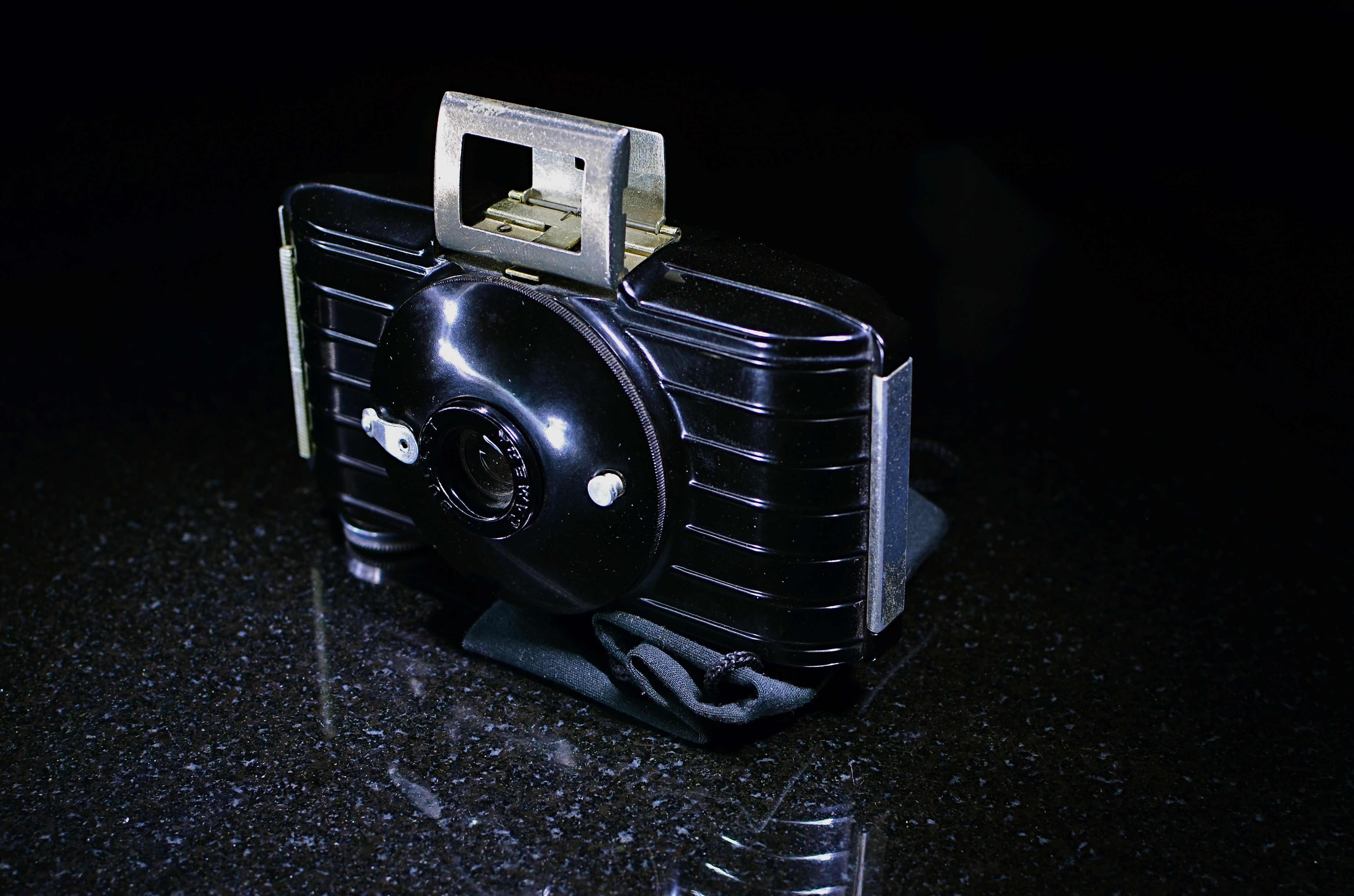 By MICHAEL PERKINS
THE DEVELOPMENTAL NATURE OF PHOTOGRAPHY is not unlike that seen in many other crafts that eventually lead to art. Built in layers at a measured pace over years, the photographer’s eye deepens, broadens, becomes both intellectual and instinctual. It is a process, one that some would argue is never complete, and is similar to the way a sculptor’s grip on the chisel goes from brute strength to brain wave, or the halting young painter, over time, converts brush strokes to master strokes.
However, this process is subverted by contemporary culture’s addiction to things…new things, shiny things, latest things. When photography meets consumerism, acquisition, not mastery, becomes the prime objective. How can you take today’s pictures with yesterday’s camera? This new toy, this fresh gadget, changes everything. Adapt, or die a thousand uncool deaths.
This is flawed thinking, but it sweeps many of us up in the frenzy to constantly replace all our gear, placing our faith in the mechanics, rather than the aesthetics, of making pictures. Advertising is about artificially engineering need. If you can be made to have disdain for your old stuff, the people who make new stuff will never run out of customers. It’s just that simple. Fact is, there are many people who presently own perfectly adequate cameras, and, based on where they are as photographers, they do not need to go to the next big thing, since they have not mastered what they presently use. Here is the truth: changing cameras because you have outgrown your current one is the only time such change makes any artistic sense.
Now, I’m not saying that you should “settle” if your camera is so limited that it’s holding you back. There are some gauzy-eyed fantasists out there that love to rhapsodize on how you can make glorious pictures with crappy cameras, and, while I applaud their enthusiasm, I question their sanity. Romantic notions aside, crap usually begets crap. Get a box adequate to your needs. But make sure that it is also proportionate to your ability and involvement. I have seen more newbies over-purchase monstrous mega-machines that they either under-utilize by 90% or which terrify them so much that they lie rotting in drawers (the cameras, not the customers) after a few months of frustration and failure.
Find the camera that defines what kind of photographer you are right now, and pull every ounce of creativity out of it until you know that you need something else in order to grow. Trying to shoot masterpieces with junk usually doesn’t work, but sinking your hopes into a $2,000 thoroughbred that you’re going to use like a point-and-shoot may actually be worse.
AND FEATURING LINDA ON LENS
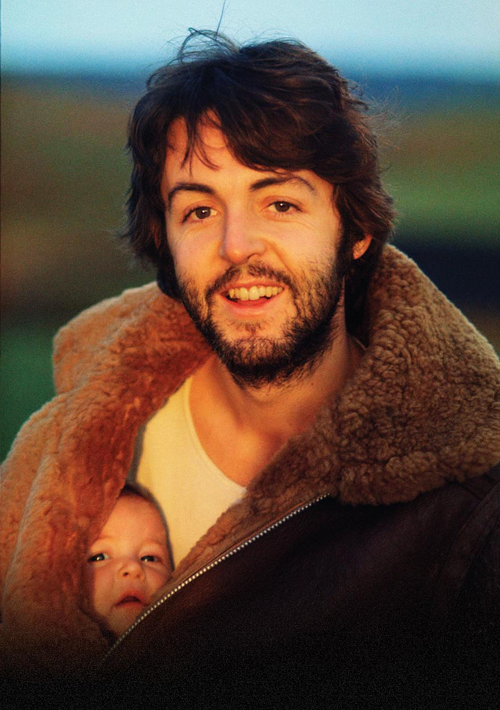
Even if you don’t know her work, you know her work. Linda McCartney’s classic portrait of her husband and a friend made album art history in 1970.
By MICHAEL PERKINS
ONCE LINDA EASTMAN BECAME LINDA McCARTNEY, the world ignorantly chose to define her as rock’n’roll arm candy basking in the reflected sun of her globally famous husband. In fact, however, by the time she chose to rock a family, she had already created a self that would outlast her role as a reluctant musician and perennial target of every wise-ass disk jockey from London to New York. She did it with a remarkable, natural eye for composition and the untrained instinct to know where to click, and when. While her bandmates wielded electric axes to give voice to their muses, Linda wailed with a Hasselblad.
By the time she became a Mrs. Beatle, Linda had already become the first great photographer in rock history, pioneering an intimate, direct style that humanized its bright lights and consigned the formal portraits of the record label’s in-house shooters to the dustbin. It is work that, finally, in recent years, has been allowed to glow as the star trove that it is, eclipsing her much-derided designations as Yoko With A Tambourine, A Pig With Wings, or whatever other lame tag the hacks in the rock press felt like hanging on her. Recent showings of her work in America, Europe, even South Korea continue to celebrate her instinctual knack for showing the human inside the star. And none of it was by the book.
She didn’t ignore the rules; she simply didn’t know they existed. She never had a formal studio, shopping for backgrounds and locales on the fly. She never used flash, ever, believing that it was bulky and off-putting. She attended exactly one class on photography, was told she had talent, and never went back for lesson two. She gave away original negatives of her top shots to friends, finding herself with nothing to sell to publishers except the “shoves”, lesser takes which, somehow, were still better than what everyone else was doing with this crazy longhair music.
What kind of photographer was this? Linda never posed people, forgot to re-calculate the ASA (ISO) settings when switching from color to black and white, sent the magazines blurred concert shots. And despite her never joining the ranks of the camera-ly cultured, the true souls of the Rolling Stones, The Doors, The Yardbirds, Jimi, Janis, Dylan, and, most notably, the Beatles shone forth in her grainy frames. Linda Eastman McCartney captured the dawning genius in them all, before the crank-up of the hype machines, before the twilight of the vultures, before rock careened from the summer of love to the winter of our discontent.
After Paul, the images were family candids, and yet the vision shone forth, most famously in her shot of baby Mary peeking out of her Beatle daddy’s jacket on a morning stroll, the rear-cover photo for the McCartney album in 1970. From that point on, the farm and the fam were everything, the road and the tour bus, not so much. She chose to settle for being Mrs. Paul, the girl who couldn’t sing but who hitched a ride on one of the biggest pop rockets of the ’70s. Decades later, what her eye saw way back then seems inevitable, her work the official chronicle of so many moments that mattered. Linda left us in 1998, but she left us that eye. It is a smiling eye, an innocent one, and one which was magnificently focused on the stuff of dreams.
DISTINCTION WITHOUT A DIFFERENCE
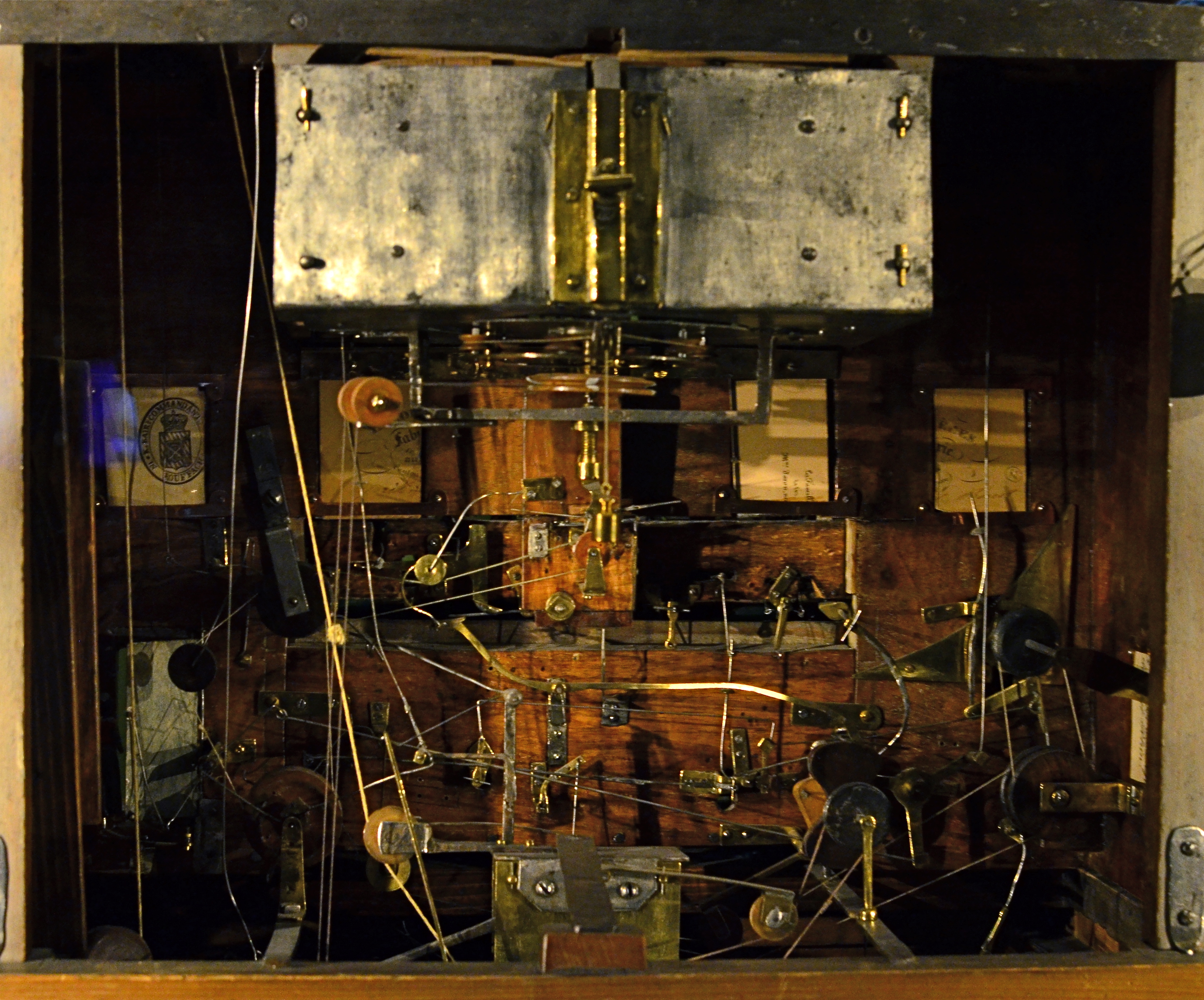
Professional standing doesn’t deliver great photos any more than gadgets and gizmos do.
By MICHAEL PERKINS
PHOTOGRAPHY IS ONLY PARTLY ABOUT A STRING OF TECHNICAL DEVELOPMENTS AND BREAKTHROUGHS. It is also the chronicle of what those advances have done to democratize the art, moving it from the domain of rich tinkerers and elites to an arena in which nearly anyone can participate and compete. From the first box camera to Instagram, it is about breaking down barriers. This is not something that is open to debate. It just is.
That’s why it’s time to re-think the words professional and amateur as they apply to the making of images. This is the kind of topic where everybody tends to throw down passionately on one side or the other, with few straddlers or fence-sitters.
Those shooters whose toil is literally their bread and butter are, understandably, a little resentful of the newbie whose low-fi snap of a trending topic tops a million likes on Twitter, all without said snapper’s having mastered the technical ten commandments of exposure or composition. And those whose work is honest, earnest and sincere, yet formally uncertified, hate being thought of as less Authentic, Genuine, or Real simply because no one has printed their output in the approved channels of accepted craft, be it magazines like Nat Geo or the cover of the New York Times.
Okay, I get it. From your personal perspective, you don’t get no respect. But you know what? Get over yourself.
Do we really need to trot out the names of those who never got paid a penny for their work, mostly because their entire output consisted of inane selfies or dramatic lo-fi still lifes of their latest latte? Is it helpful to point out the people within the “official” photographic brotherhood whose work is lazy or derivative? Nope. It is beyond pointless for the two sides to get into an endless loop of So’s Your Mom.
So let’s go another way.
The words professional and amateur are, increasingly, distinctions without difference, at least as ways to attest to the quality of the end product: the photograph. When you pick up a magazine featuring a compelling image, do you ever, ever ask yourself whether it was taken by someone who got paid for it, or do you, in fact, either react to it or ignore it based on its power, its emotional impact, the curiosity and daring of the shooter? The fact is, photography has, from day one, been moved forward by both hobbyist and expert, and, in today’s world, the only thing that makes a shot “professional” is the talent and passion with which it’s been rendered. Anything else is just jaw music.
IF HUE GO AWAY
By MICHAEL PERKINS
IT SEEMS UNGRACIOUS FOR A PHOTOGRAPHER TO COMPLAIN ABOUT AN OVER-ABUNDANCE OF LIGHT, since that’s basically the currency we trade in. More typically we gripe about not being able to bring enough of the stuff into a shot. I mean, the entire history of the medium is one big let-there-be-more-light prayer. But that’s not to say that light can’t create annoyance when you’re in a place where there is glorious, radiant illumination of….acres of nothing.
I’m not talking about sunlight on endless expanses of starched plain. I refer here to subject matter that is so uninteresting that, even though a bumptious bounty of light is drenching everything in sight, there is nothing to make a photograph of. Nothing that compels, inspires, jars or even registers. I recently made my annual return to a festival that, due to my frequent farming of it over the years, has now bottomed out visually. There is nothing left to say about it, although all that “nothing” is stunningly lit at this time of year.
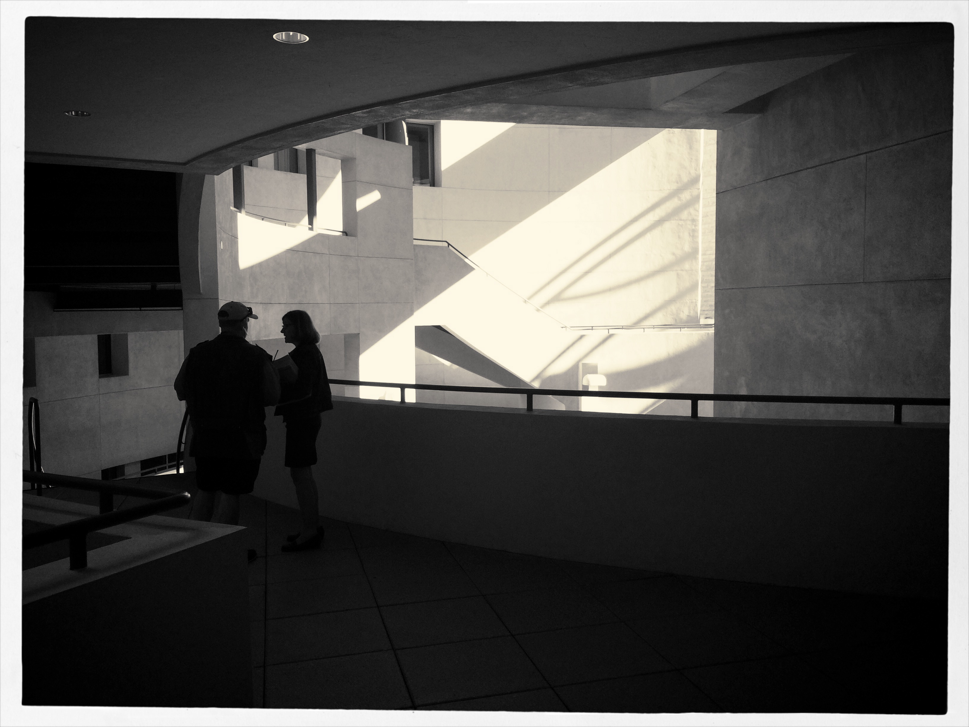
The light patterns seen here were warm and inviting in color. That’s not what I wanted.
In fact, it’s only by shooting just abstracted shapes, shades and rays, rather than recognizable subjects, that I was able to create any composition even worth staying awake for, and then only by using extremely sharp contrast and eliminating color completely. To me, the only thing more pointless than lousy subject matter is beautiful looking lousy subject matter, saturated in golden hues, but signifying nothing. Kinda the George Hamilton of photos.
So the plan became, simply, to turn my back on the bright balloons, food booths, passing parade of people and spring scenery that, in earlier years, I would have been happy to capture, and instead render arrangements without any narrative meaning, just whatever impact could be seen using light as nearly the lone element. In the above picture, I did relent in keeping the silhouetted couple in the final picture, so that it’s not as “cold” as originally conceived, but otherwise it’s a pretty stark image. Photography without light is impossible, but we also have to refuse to take light “as is” from time to time, to do our best to orchestrate it, much as we would vary shadings with pencil or crayon. We know that the camera loves light, but it’s still our job to tell it where, and how, to look.

