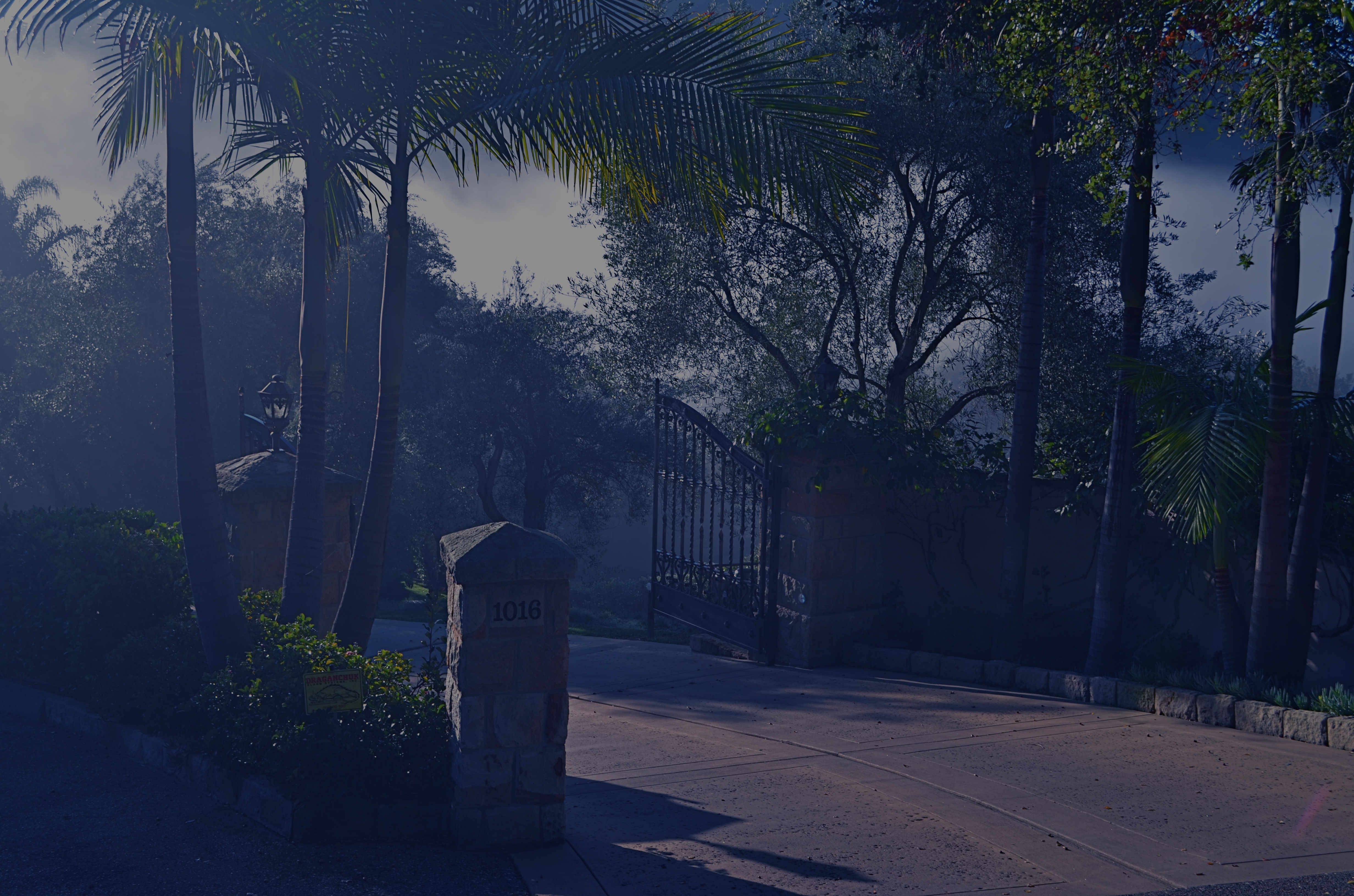
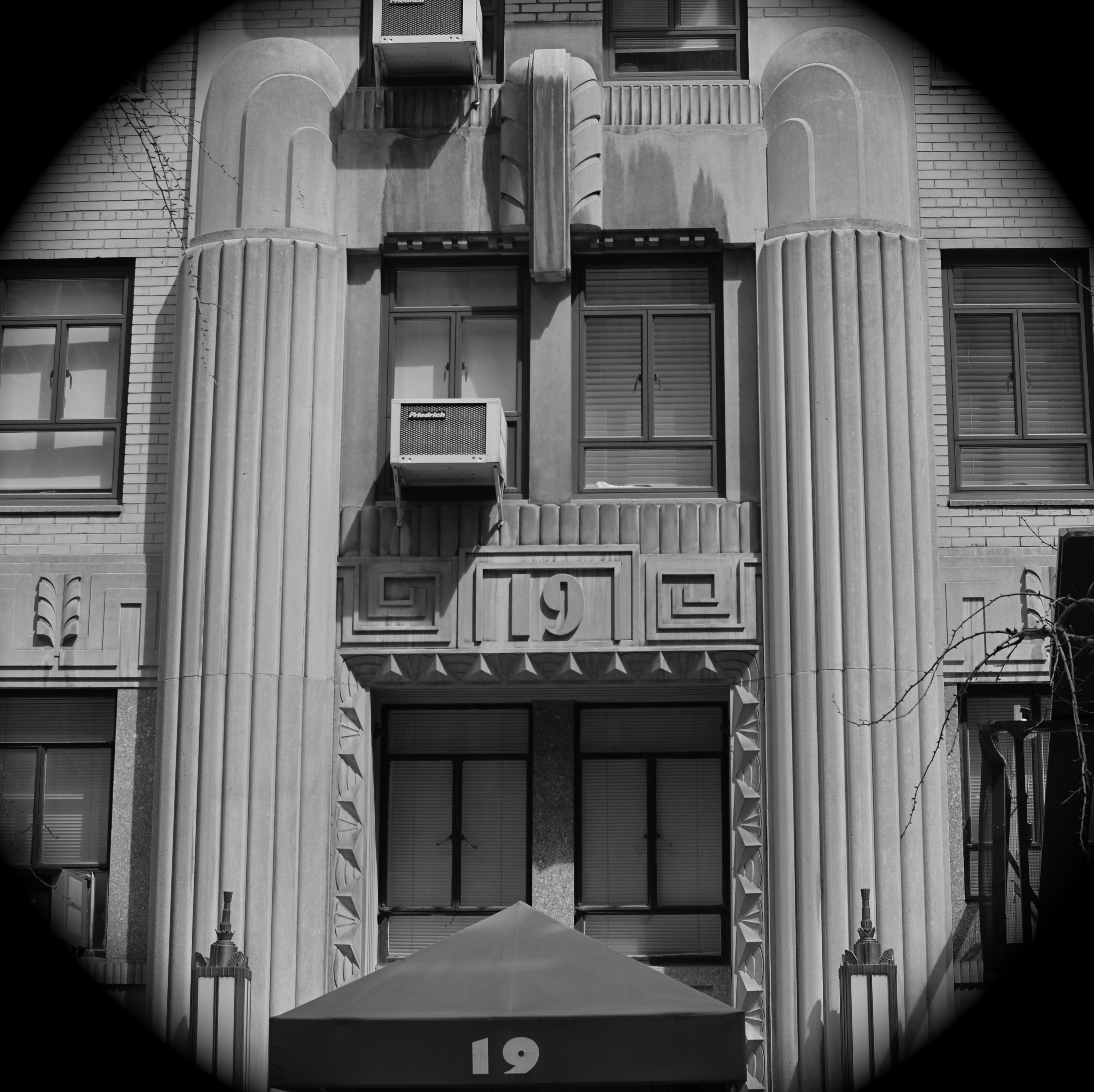
THE ENNOBLING GOLD
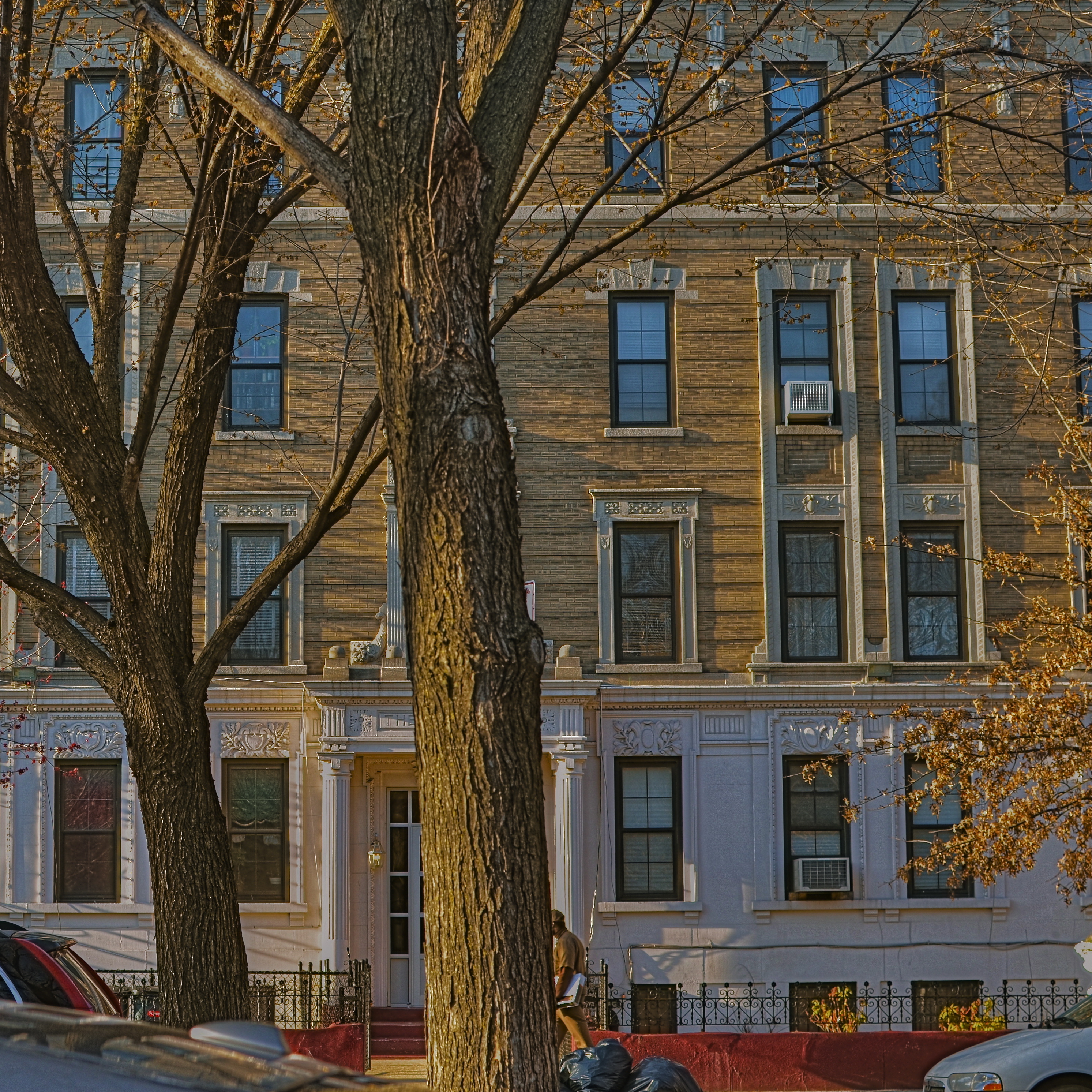
Brooklyn Block, 2014. No, this building isn’t this pretty in “reality”. And that’s the entire point. 1/100 sec., f/5.6, ISO 100, 35mm.
By MICHAEL PERKINS
LIGHT IS THE ULTIMATE MAKE-UP ARTIST, the cosmetic balm that paints warmth, softness, even a kind of forgiveness, or dignity onto the world. Photographers use light in a different way than painters, since a canvas, beginning as a complete blank, allows the dauber to create any kind of light scheme he desires. It’s a very God-like, “let there be light” position the painter finds himself in, whereas the photographer is more or less at light’s mercy, if you will. He has to channel, harness, or manage whatever the situation has provided him with, to wrangle light into an acceptable balance.
No complaints about this, by the way. There’s nothing passive about this process: real decisions are being made, and both painters and photographers are judged by how they temper and combine all the elements they use in their assembly processes. Just because a shooter works with light as he finds it, rather than brushing it into being, doesn’t make him/her any less in charge of the result. It’s just a different way to get there.
Light always has the power to transform objects into, if you will, better versions of themselves. I call it the “ennobling gold”, since I find that the yellow range of light is kindest to a wider range of subjects. Stone or brick, urban crush or rural hush, light produces a calming, charming effect on nearly anything, which is what makes managing light so irresistible to the photographer. He just knows that there is beauty to be extracted when the light is kind. And he can’t wait to grab all he can.
“Light makes photography”, George Eastman famously wrote. “Light makes photography. Embrace light. Admire it. Love it. But, above all, know light. Know it for all you are worth, and you will know the key to photography.”
Yeah, what he said.
THE RIGHT WAGON
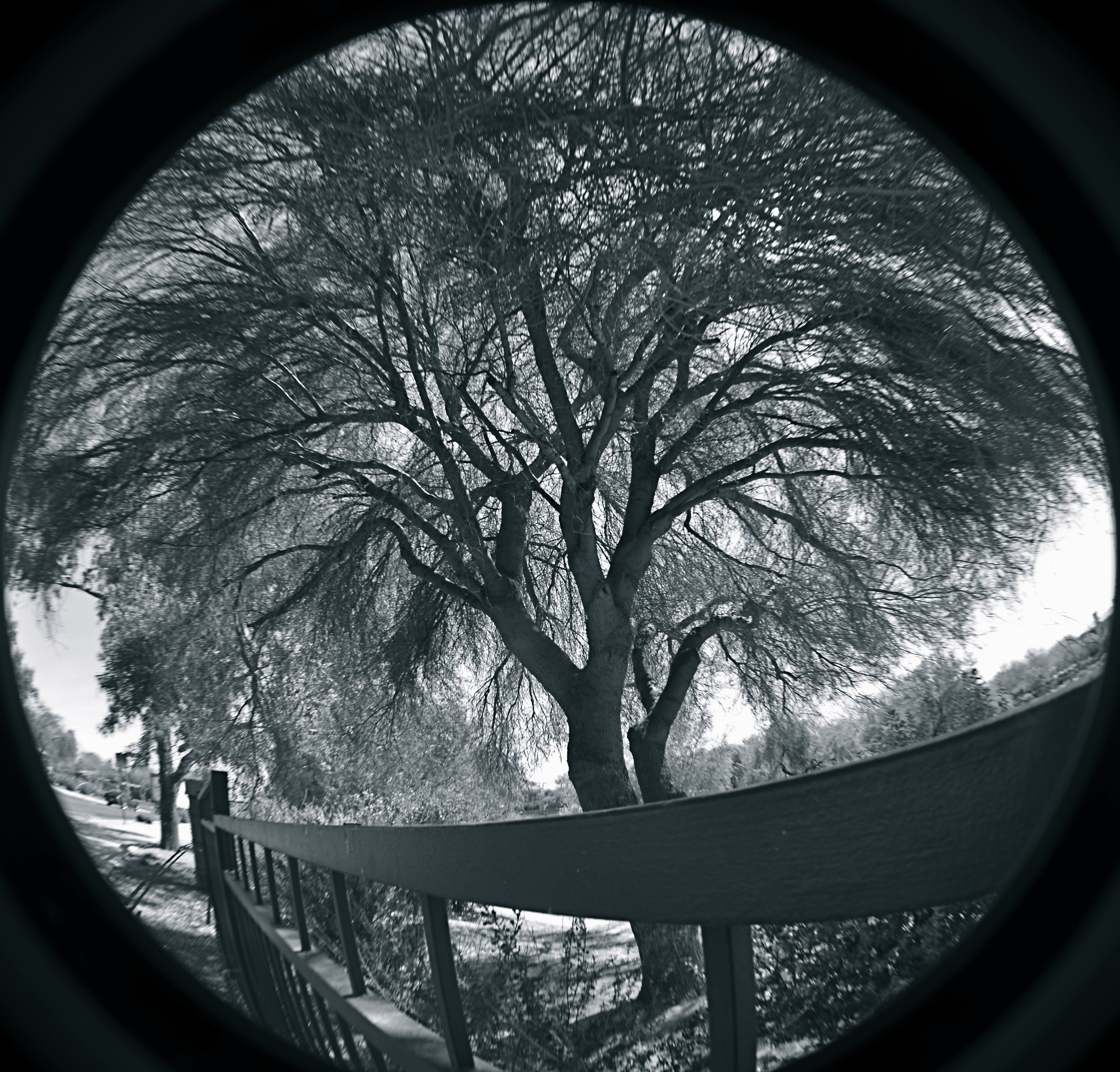
Cheap fisheye adaptors are a mixed bag optically, but they can convey a mood. 1/40 sec., f/11, ISO 100, 18mm.
By MICHAEL PERKINS
I ONCE HEARD AN OLD PHOTOGRAPHER SPEAK OF CREATIVE CHOICES AS “picking the right wagon to haul your goods to market”. By that, he meant that format, film, frame size, lens type or aperture were all just means to an end. If one wouldn’t take your wagon all the way to a finished picture, use another. He had no special sentiment or ironclad loyalty to any one tool, since there was, and is, only one real goal in any of photography: get the image you came to get.
It’s often hard to remember that simple rule, since we tend to associate the success of certain pictures with our pet camera, our sweet spot aperture, our favorite hunk of glass. But there’s also a knack to knowing when a particular tool that is wrong, wrong, wrong for almost anything might, for the project at hand, be just perfect.
I have one such tool, and, on rare occasions, the very properties that make me generally curse it as a cheap chunk of junk can make me praise it as just what the doctor ordered. It’s an Opteka 0.35, a screw-on lens adapter that simulates (to put it kindly) at least the dimensions of a true fisheye, without the enormous layout of dough, or, sadly, the optical precision of a true dedicated lens. It’s fuzzy at the edges, regardless of your aperture. It sprays chromatic shmears all over those edges, and so you can’t even dream of sharpness beyond the third of the image that’s in the dead center of the lens. It was, let’s be honest, a cheap toy bought by a cheap photographer (me) as a shortcut. For 99% of any ulta-wide imaging, it’s akin to taking a picture through a jellyfish bladder.
But.
Mood over reality. 1/125 sec., f/11, ISO 100, 18mm.
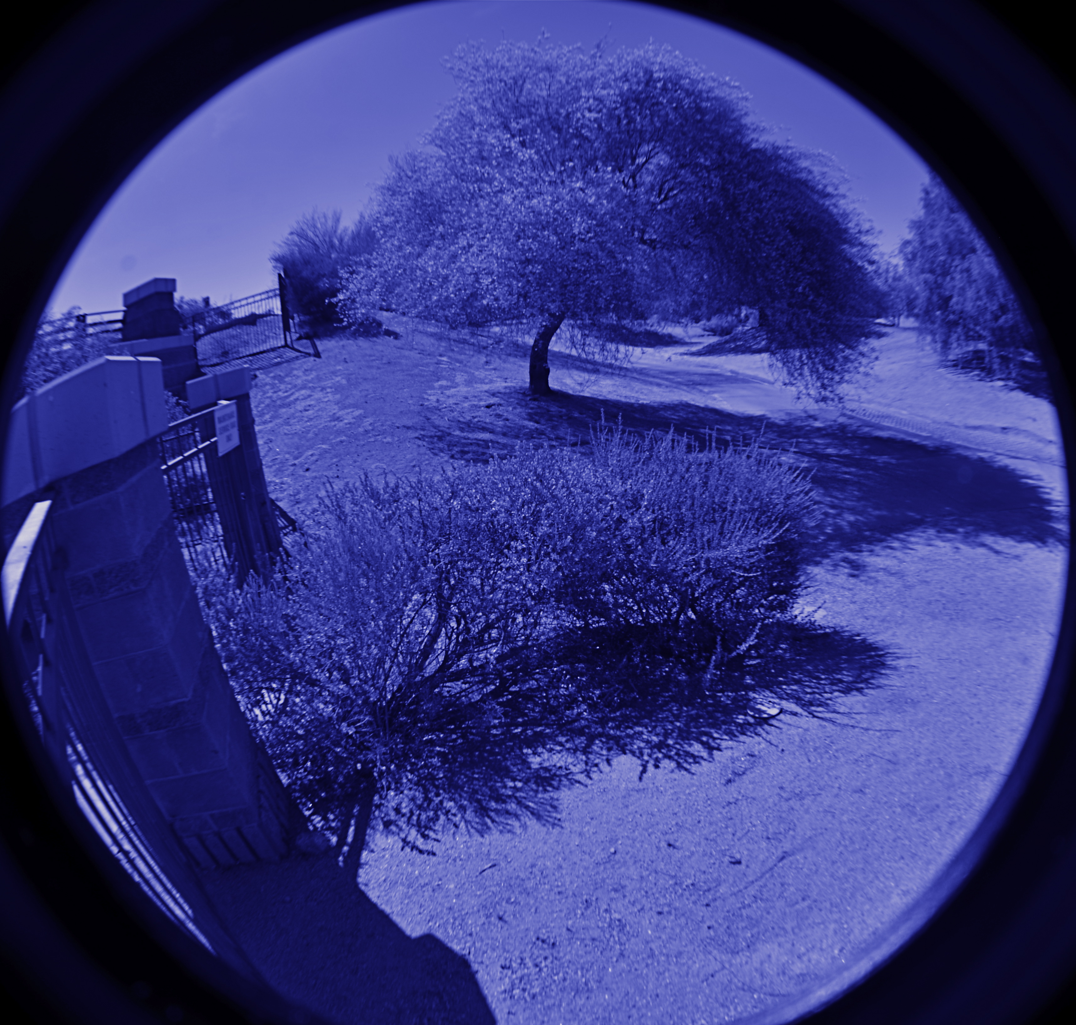
Since the very essence of fisheye photography is as a distortion of reality, the Opteka can be a helping hand toward a fantasy look. Overall sharpness in a fisheye shot can certainly be a desired effect, but, given your subject matter, it need not be a deal breaker.
In the case of some recent monochrome studies of trees I’ve been undertaking, for example, the slightly supernatural effect I’m after isn’t dependent on a “real” look, and running the Opteka in black and white with a little detail boost on the back end gives me the unreal appearance that is right for what I want to convey about the elusive, even magical elements of trees. The attachment is all kinds of wrong for most other kinds of images, but, again, the idea is to get the feel you’re looking for…in that composition, on that day, under those circumstances.
I’ve love to get to the day when one lens will do everything in all instances, but I won’t live that long, and, chances are, neither will you. Meanwhile, I gotta get my goods to market, and for the slightly daft look of magickal trees, the Opteka is my Leica.
For now.
STUPIDLY WISE
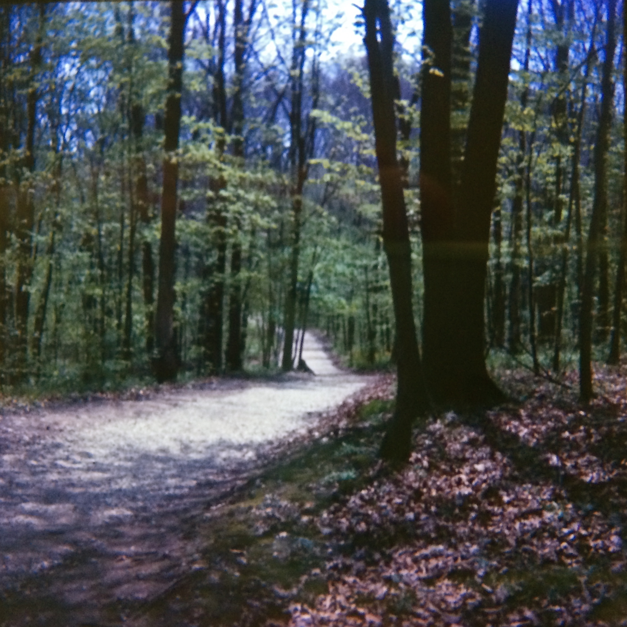
Blendon Woods, Columbus, Ohio, 1966. I usually had to shoot an entire roll of film to even come this close to making a useable shot.
By MICHAEL PERKINS
IGNORANCE, IN PHOTOGRAPHY, CERTAINLY IS NOT BLISS. However, exposure to that selfsame know-nothing-ness can lead to a kind of bliss, since it can eventually lead you to excellence, or at least improvement. Here and now, I am going to tell you that all the photographic tutorials and classes in history cannot teach you one millionth as much as your own rotten pictures. Period.
Trick is, you have to keep your misbegotten photographic children, and keep them close. Love them. Treasure the hidden reservoir of warnings and no-nos they contain and mine that treasure for all it’s worth. Of course, doing this takes real courage, since your first human instinct, understandingly, will be to do a Norman Bates on them: stab them to death in the shower and bury their car in the swamp out back.
But don’t.
I have purposely kept the results of the first five rolls of film I ever shot for over forty years now. They are almost all miserable failures, and I mean that with no aw-shucks false modesty whatever. I am not exaggerating when I tell you that these images are the Fort Knox of ignorance, an ignorance taller than most minor mountain ranges, an ignorance that, if it was used like some garbage to create energy, could light Europe for a year. We’re talking lousy.
But mine was a divine kind of ignorance. At the age of fourteen, I not only knew nothing, I could not even guess at how much nothing I knew. It’s obvious, as you troll through these Kodak-yellow boxes of Ektachrome slides, that I knew nothing of the limits of film, or exposure, or my own cave-dweller-level camera. Indeed, I remember being completely mystified when I got my first look at my slides as they returned from the processor (an agonizing wait of about three days back then), only to find, time after time, that nothing of what I had seen in my mind had made it into the final image. It wasn’t that dark! It wasn’t that color! It wasn’t…..working. And it wasn’t a question of, “what was I thinking?”, since I always had a clear vision of what I thought the picture should be. It was more like, “why didn’t that work?“, which, at that stage of my development, was as easy to answer as, say, “why don’t I have a Batmobile?” or “why can’t I make food out of peat moss?”

Different woods, different life. But you can’t get here without all the mistakes it builds on. 1/400 sec., f/5.6, ISO 100, 35mm.
But holding onto the slides over the years paid off. I gradually learned enough to match up Lousy Slide “A” with Solution”B”, as I learned what to ask of myself and a camera, how to make the box do my bidding, how to build on the foundation of all that failure. And the best thing about keeping all of the fizzles in those old cartons was that I also kept the few slides that actually worked, in spite of a fixed-focus, plastic lens, light-leaky box camera and my own glorious stupidity. Because, since I didn’t know what I could do, I tried everything, and, on a few miraculous occasions, I either guessed right, or God was celebrating Throw A Mortal A Bone Day.
Thing is, I was reaching beyond what I knew, what I could hope to accomplish. Out of that sheer zeal, you can eventually learn to make photographs. But you have to keep growing beyond your cameras. It’s easy when it’s a plastic hunk of garbage, not so easy later on. But you have to keep calling on that nervy, ignorant fourteen-year-old, and giving him the steering wheel. It’s the only way things get better.
You can’t learn from your mistakes until you room with them for a semester or two. And then they can teach you better than anyone or anything you will ever encounter, anywhere.
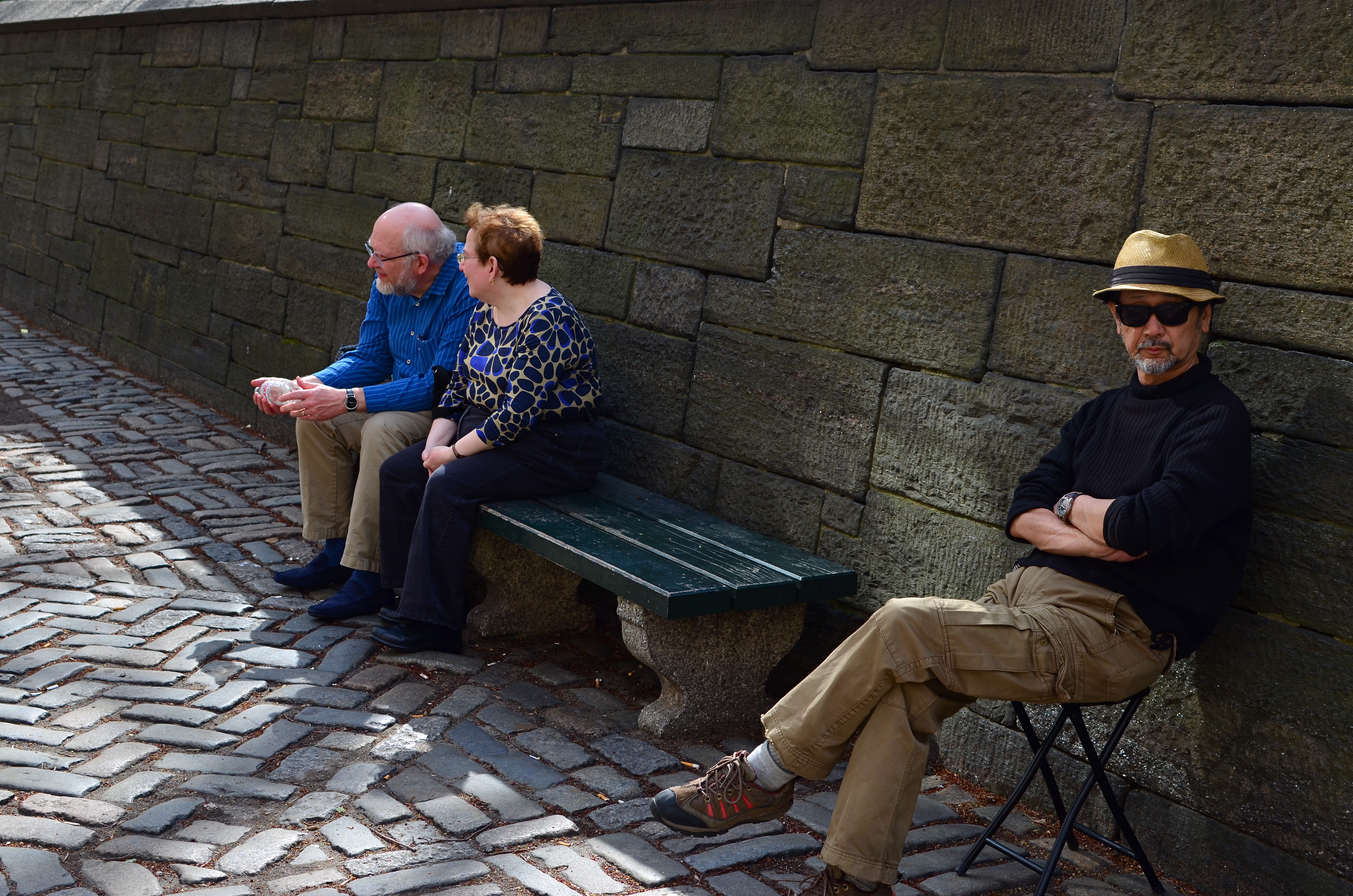
SUBMERGED IN BEING
Cropped and enhanced from a group shot. I could sit this young woman in a studio for a thousand years and not get this expression.
By MICHAEL PERKINS
CANDID PORTRAITURE IS VOLATILE, THE DEAD OPPOSITE OF A FORMAL SITTING, and therefore a little scarier for some photographers. We tell ourselves that we gain more control over the results of a staged portrait, since we are dictating so many terms within it…the setting, the light, the choice of props, etc. However, can’t all that control also drain the life out of our subjects by injecting self-consciousness ? Why do you think there are so many tutorials written about how to put your subjects at ease, encourage them to be themselves, persuade them to unclench their teeth? Getting someone to sit where we tell them, do what we tell them, and yet “act naturally” involves a skill set that many photographers must learn over time, since they have to act as life-coach, father-confessor, camp counselor, and seducer, all at once. Also helps if you hand out lollipops.
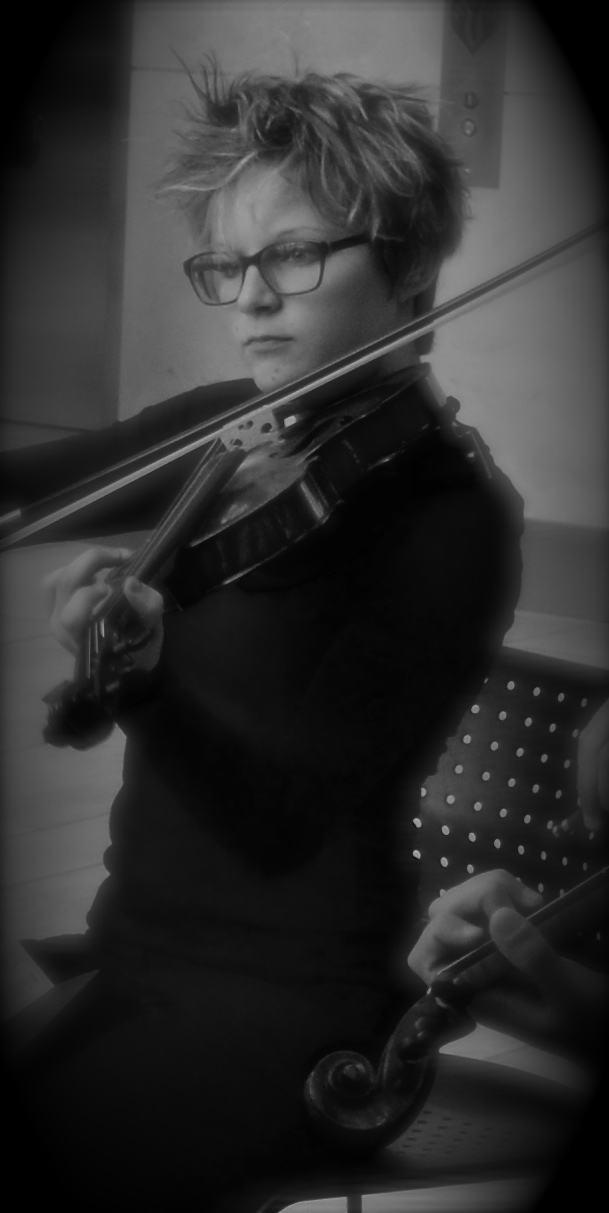
Then again, shooting on the fly with the hope of capturing something essential about a person who is paying you zero attention is also fraught with risk, since you could crank off fifty frames and still go home without that person revealing anything real within the given time-frame. As with most issues photographic, there is no solution that works all of the time. I do find that one particular class of person affords you a slight edge in candid work, and that is performers. Catch a piece of them in the act of playing, singing, dancing, becoming, and you get as close to the heart of their essence that you, as an outsider, are ever going to get. If they are submerged in being, you might be lucky enough to witness something supernatural.
The more people lose themselves in a quest for the perfect sonata, the ultimate tap step, or the big money note, the less they are trying to give you a “version” of themselves, or worse yet, the rendition of themselves that they think plays well for the camera. As for you, candids work like any other kind of street photography. It’s on you to sense the moment as it arrives and grab it. It’s anything but easy, but better, when it works, then sitting someone amidst props and hoping they won’t freeze up on you.
There are two ways to catch magic in a box when it comes to portraits. One is to have a tremendous relationship with the person who is sitting for you, and the other is to be the best spy in the world when plucking an instant from a real life that is playing out in front of you. You have to know which tack to take, and where the best image can be extracted.
ON SECOND THOUGHT…OR THIRD
I really preferred this as the color shot it originally was. Until I didn’t. Changing my mind took seconds.
By MICHAEL PERKINS
ONE OF THE MOST AMAZING BY-PRODUCTS OF DIGITAL PHOTOGRAPHY, a trend still evolving across both amateur and professional ranks, is a kind of tidal return to black-and-white imaging. The sheer volume of processing choices, both in-and-out-of-camera, have made at least dabbling in monochrome all but inevitable for nearly everyone, reversing a global trend toward near exclusive use of color that was decades in the making. At one point, to be sure, we chose black and white out of necessity. Then we embraced color and relegated B&W to the dustbin of history. Now, we elect to use it again, and increasing numbers, simply because everything technical is within our reach, cheaply and easily.
Looking back, it’s amazing how long it took for color to take hold on a mass scale. Following decades of wildly uneven experimentation and dozens of processes from Victorian hand-tinting to the Autochromes of the early 1900’s, stable and affordable color film came to most of us by the end of the 1930’s. However, there was a reluctance, bearing on tantrum, among “serious” photographers to embrace it for several more decades. This article from the Life magazine Library of Photography, a history-tutorial series from the 1970’s, discusses what can only be called photography’s original anti-color bias:
Although publishers and advertisers enhanced their messages with pictures in color during the first few decades of the color era, most influential critics and museum curators persisted in regarding color photographs as “calendar art”. Color, they felt, was, at best, merely decorative, suitable, perhaps, for exotic or picturesque subjects, but a gaudy distraction in any work with “serious” artistic goals.
Of course, for years, color printing and processing was also unwieldy and expensive, scaring away even those few artists who wanted to take it on. Still, can you imagine, today, anyone holding the belief that any kind of processing was a “gaudy distraction” rather than just one more way to envision an image? Color was once seen by serious photographers as an element of the commercial world, therefore somehow..suspect. Fashion and celebrity photography had not yet been seen as legitimate members of the photo family, and their explosive use of color was almost thought of as a carnival effect. Cheap and vulgar.
Of course, once color became truly ubiquitous, sales of monochromatic film plummeted, and, for a time, black-and-white found itself on the bottom bunk, minimized as somehow less than color. In other words, we took the same blinkered blindness and just turned it on its head. Dumb times two.
Jump to today, where you can shoot, process and show images in nearly one continuous flow of energy. There are no daunting learning curves, no prohibitive expenses, no chemically charred fingertips to slow us down, or segregate one kind of photography from all others. What an amazing time to be jumping into this vast ocean of possibilities, when images get a second life, upon second thought.
Or third.
IN STEICHEN’S SHADOW
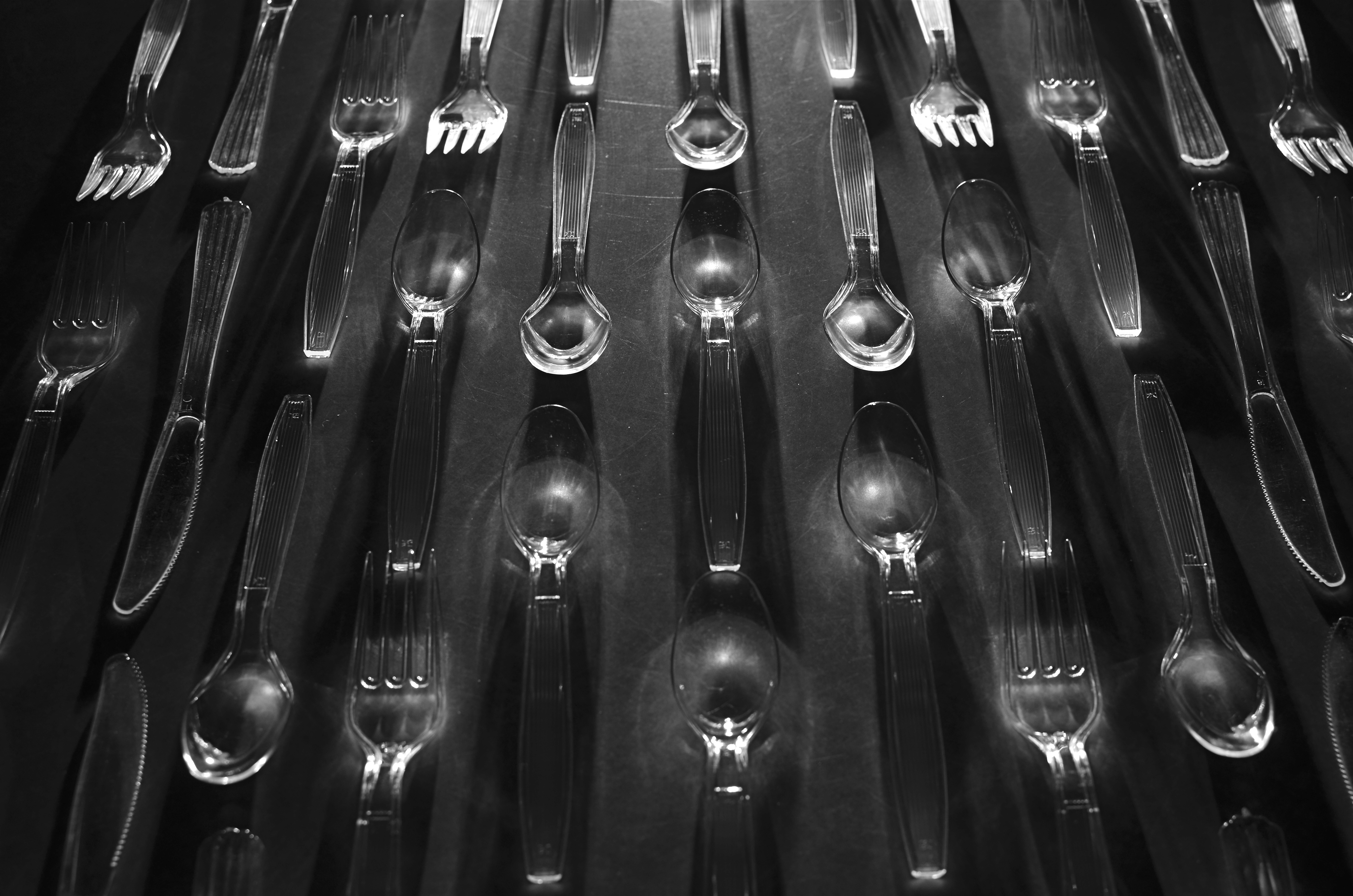
“Le Regiment Plastique”. Shot in a dark room and light-painted from the top edge of the composition. 5 seconds, f/5.6, ISO 100, 35mm.
By MICHAEL PERKINS
I’VE POSTED SEVERAL PIECES HERE ON “LIGHT-PAINTING”, or the practice of manually applying light to selective areas of objects during long exposures in the dark. The ability to “paint” additional colors, highlights and shadows “onto” even the most mundane materials can transform the whole light-to-dark ratio of the familiar and render it in new, if unpredictable ways. It’s kind of random and a lot of hands-on fun.
Some of the greatest transformations of ordinary objects ever seen in photography were obtained by Edward Steichen, arguably the greatest shooter in any style over the entire 20th century. Working for advertising agency J.Walter Thompson in the 1930’s, Steichen managed to romanticize everything from perfume bottles to kitchen matches to cutlery by arranging visually original ballets not only of these everyday items, but, through multiple source lighting, creating geometrically intricate patterns of shadows. His success in morphing the most common elements of our lives into fascinating abstractions remains the final word on this kind of lighting, and it’s fun to use light painting to pay tribute to it.
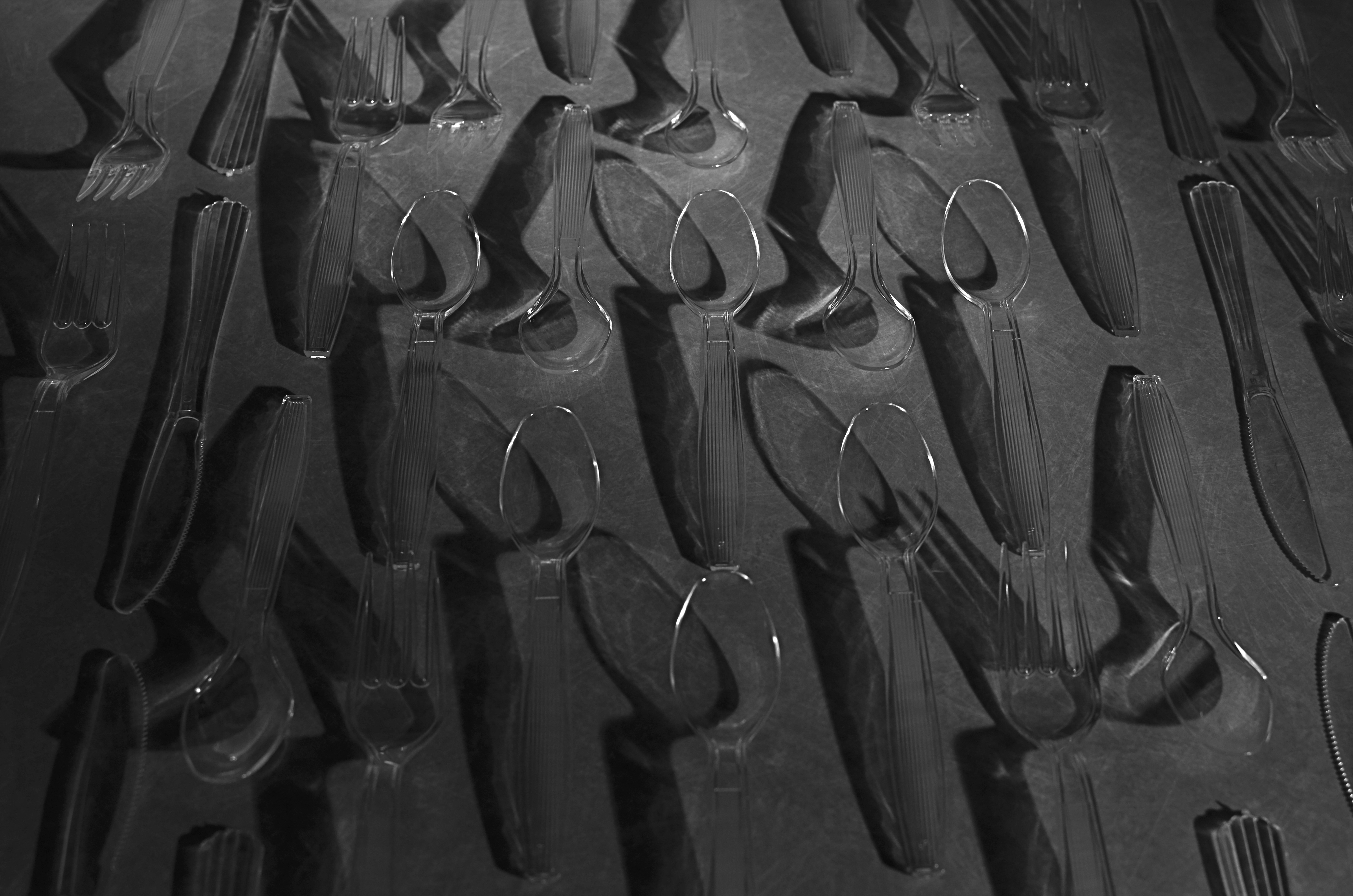
Same composition, but lit diagonally from right bottom. 5 seconds, f/5.6, ISO 100, 35mm.
For my own tabletop arrangement of spoons, knives and forks, seen here, I am using clear plastic cutlery instead of silver (fashions change, alas), but that actually allows any light I paint into the scene to make the utensils fairly glow with clear definition. You can’t really paint onto or across the items, since they will pick up too much hot glare after even a few seconds, but you can light from the edge of the table underneath them, giving them plenty of shadow-casting power without whiting out. I took over 25 frames of this arrangement from various angles, since light painting is all about the randomness of effect achieved with just a few inches’ deviation in approach, and, as with all photography, the more editing choices at the end, the better.
The whole thing is really just an exercise in forced re-imagining, in making yourself consider the objects as visually new. Think of it as a puff of fresh air blowing the cobwebs out of your perception of what you “know”. Emulating even a small part of Steichen’s vast output is like me flapping my wings and trying to become a bald eagle, so let’s call it a tribute.
Or envy embodied in action.
Or both.
AVOIDING THE BURN
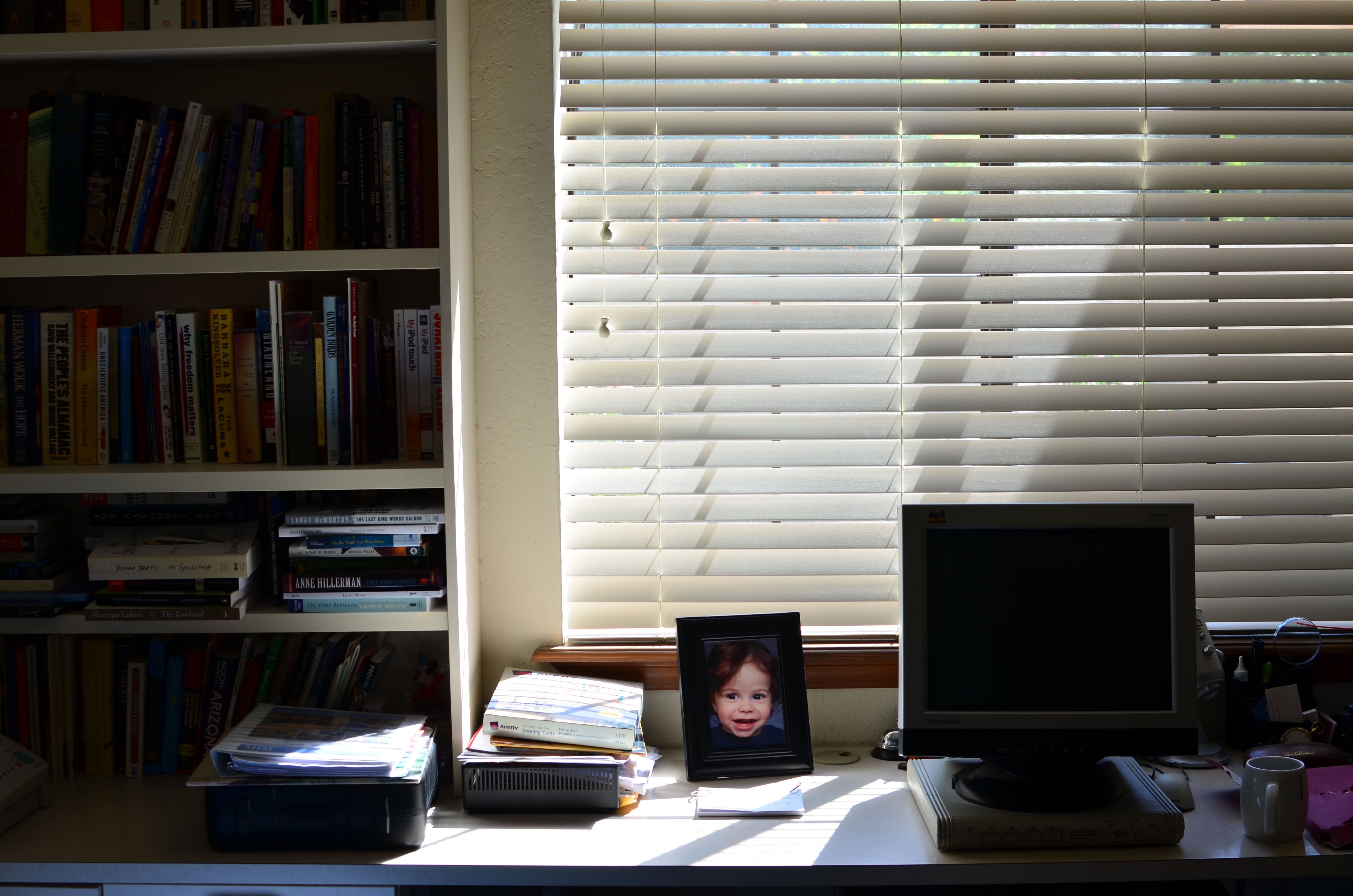 By MICHAEL PERKINS
AS A PHOTOGRAPHER, YOU CAN EMPATHIZE WITH THAT FAMOUS MOTH AND HIS FATAL FASCINATION with a candle flame….especially if you’ve ever flirted too close to the edge of a blowout with window light. You want to gobble up as much of that golden illumination as possible without singeing your image with a complete white-hot loss of detail. Too much of a good thing and all that.
However, a window glowing with light is one of the most irresistible of candies for a shooter, and you can fill up a notebook with attempted end-arounds and tricks to harvest it without getting burned. Here’s one cheap and easy way:
In this first attempt to capture the early morning shadows and scattered rays in my office at 1/100 sec., f/5.6, ISO 100, you’ll see that the window is a little too hot, and that nearly everything ahead of the window is rendered into a silhouette. And that’s a shame, since the picture, to me, should be not only about the window light, but also its role in partially lighting a dark room. I don’t want to make an HDR here, since that will completely over-detail the stuff in the dark and look un-natural. All I really need is a hint of room light, as if a small extra bit of detail has been illuminated by the window, but just that….a small bit.
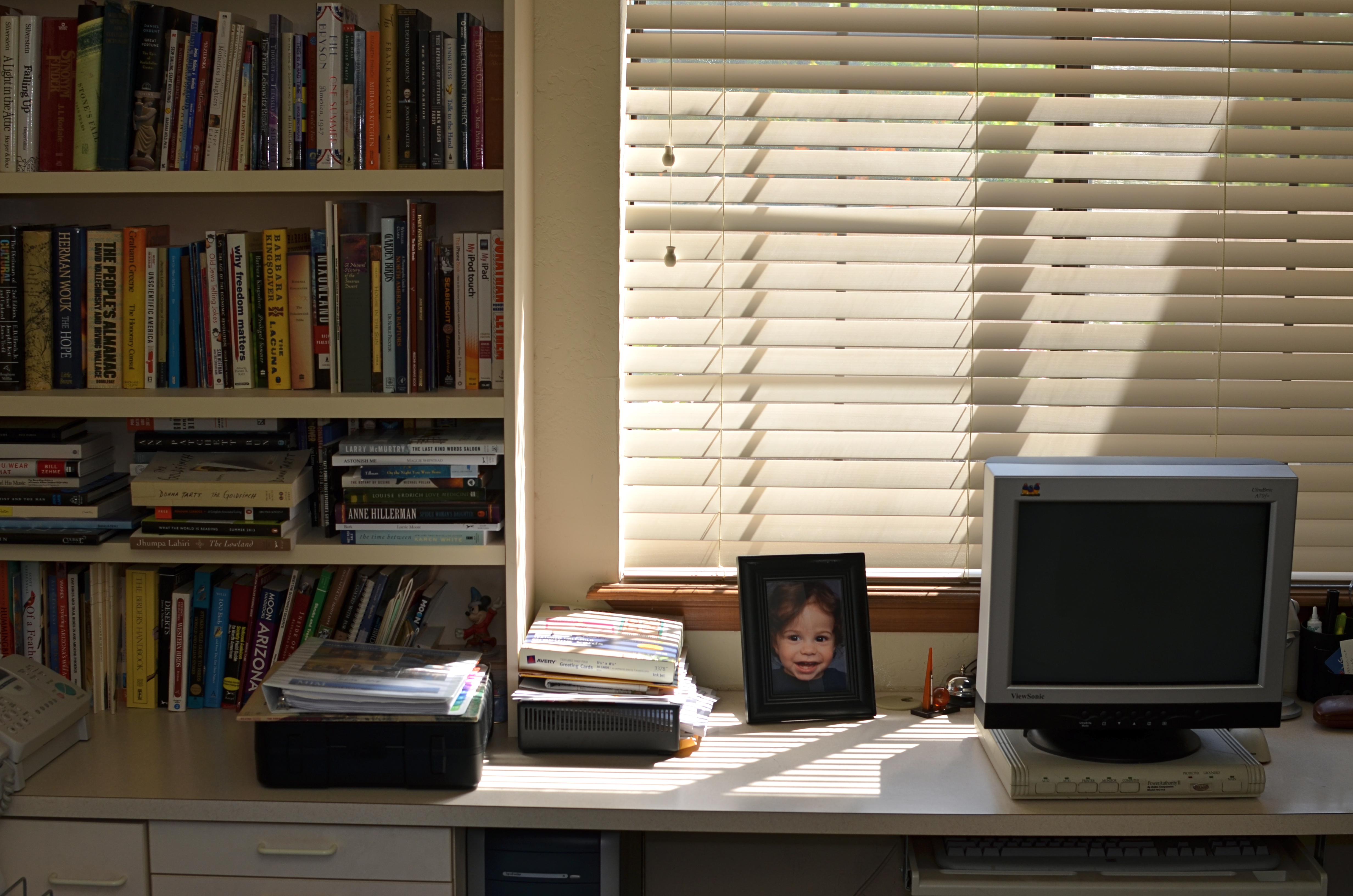
The interior still isn’t floodlit, but now it does seem to “borrow” some detail from the window.
In the second attempt, I have actually halved the shutter speed to 1/200 to underexpose the window, but have also used my on-camera flash with a bounce card to ricochet a little light off the ceiling. I am almost too far away for the flash to be of any real strength, but that’s exactly what I’m looking for: I want just a trace of it to trail down the bookshelf, giving me some really mild color and allowing a few book titles to be readable. The bounce plus the distance has weakened the flash to the point that it plausibly looks as if the illumination is a result of the window light. And since I’ve underexposed the window, even the wee bit of flash hasn’t blown out the slat detail from the blinds.
Overall, this is a cheap and easy fix, happens in-camera, and doesn’t call attention to itself as a technique. There are two kinds of light: the light that is natural and the light that can be made to appear natural. If you can make the two work smoothly together, you can fly close to the flame while avoiding the burn.
THE FULLNESS OF EMPTY

1/125 sec., f/5.6, ISO 100, 35mm.
By MICHAEL PERKINS SCIENCE TELLS US THAT SOME HUSBANDS HEAR THE QUESTION, “DID YOU TAKE THE TRASH OUT?” more often than any other phrase over the course of their married life. If you are an intrepid road warrior, you may hear more of something like “do you know where you’re going?” or “why don’t you just stop and ask for directions?”. If you’re a less than optimum companion, the most frequently heard statement might be along the lines of “and just where have you been?”. For me, at least when I have a camera in my hands, it’s always been “why don’t you ever take pictures of people?”
Why, indeed.
Of course, I contend that, if you were to take a random sample of any 100 of my photographs, there would be a fair representation of the human animal within that swatch of work. Not 85% percent, certainly, but you wouldn’t think you were watching snapshots from I Am Legend. However, I can’t deny that I have always seen stories in empty spaces or building faces, stories that may or may not resonate with everyone. It’s a definite bias, but it’s one of the closest things to a style or a vision that I have.
I think that absent people, as measured in their after-echoes in the places where they have been, speak quite clearly, and I am not alone in this view. Putting a person that I don’t even know into an image, just to demonstrate scope or scale, can be, to me, more dehumanizing than taking a picture without a person in it. My people-less photos don’t strike me as lonely, and I don’t feel that there is anything “missing” in such compositions. I can see these folks even when they are not there, and, if I do my job, so can those who view the results later.
1/50 sec., f/3.5, ISO 650, 18mm.
Are such photographs “sad”, or merely a commentary on the transitory nature of things? Can’t you photograph a house where someone no longer lives and conjure an essence of the energy that once dwelt within those walls? Can’t a grave marker evoke a person as well as a wallet photo of them in happier times? I ask myself these questions, along with other crucial queries like, “what time is the game on?” or, “what do you have to do to get a beer in this place?” Some answers come quicker than others.
I can’t account for what amounts to “sad” or “lonely” when someone else looks at a picture. I try to take responsibility for the pictures I make, but people, while a key part of each photographic decision, sometimes do not need to serve as the decisive visual component in them. The moment will dictate. So, my answer to one of life’s most persistent questions is a polite, “why, dear, I do take pictures of people.”
Just not always.
THINGS ARE LOOKING DOWN

Central Park, April 2014. 1/320 sec., f/5.6, ISO 100, 35mm.
By MICHAEL PERKINS
PHOTOGRAPHY, AND THE HABITS WE FORM IN ITS PRACTICE, BECOME A HUGE MORGUE FILE OF FOLDERS marked “sometimes this works” or “occasionally try this”, tricks or approaches that aren’t good for everything but which have their place, given what we have to work with in the moment.
Compositionally, I find that just changing my vantage point is a kind of mental refresher. Simply standing someplace different forces me to re-consider my subject, especially if it’s a place I can’t normally get to. That means, whenever I can do something easy, like just standing or climbing ten feet higher than ground level, I include it in my shooting scheme, since it always surprises me.
Walk Or Ride, 2014. 1/30 sec., f/2.2, ISO 50, 4.11mm
For one thing, looking straight down on objects changes their depth relationship, since you’re not looking across a horizon but at a perpendicular angle to it. That flattens things and abstracts them as shapes in a frame, at the same time that it’s exposing aspects of them not typically seen. You’ve done a very basic thing, and yet created a really different “face” for the objects. You’re actually forced to visualize them in a different way.
Everyone has been startled by the city shots taken from forty stories above the pavement, but you can really re-orient yourself to subjects at much more modest distances….a footbridge, a step-ladder, a short rooftop, anything to remove yourself from your customary perspective. It’s a little thing, but then we’re in the business of little things, since they sometimes make big pictures.
THE (LATENT) BLUES
A dawn exposure takes on the look of early evening.
By MICHAEL PERKINS
WE HAVE CONTROL OVER NEARLY EVERY PART OF THE PHOTOGRAPHIC PROCESS BUT… ACCESS. We can learn to master aperture, exposure, composition, and many other basics of picture making, but we can’t help the fact that we are typically at our shooting location for one time of day only.
Whatever “right now” may be….morning, afternoon, evening….it usually includes one distinct period in the day: the pier at sunset, the garden at break of dawn. Unless we have arranged to spend an extended stretch of time on a shoot, say, chasing the sun and shadows across a daylong period from one location at the Grand Canyon or some such, we don’t tend to spend all day in one place. That means we get but one aspect of a place…however it’s lit, whoever is standing about, whatever temporal events are native to that time of day.
The original morning exposure.
Many locations that are easily shot by day are either unavailable or technically more complex after sundown. That’s why the so-called “day for night” effect appeals to me. As I had written sometime back, the name comes from the practice Hollywood has used for over a hundred years to save time and ensure even exposure by shooting in daylight and either processing or compensating in the camera to make the scene approximate early night.
In the case of the image you see up top, I have created an illusion of night through the re-contrasting and color re-assignment of a shot that I originally made as a simple daylight exposure. In such cases, the mood of the image is completely changed, since the light cues which tell us whether something is bright or mysterious are deliberately subverted. Light is the single largest determinant of mood, and, when you twist it around, it reconfigures the way you read an image. I call these faux-night remakes “latent blues”, as they generally look the way the sky photographs just after sunset.
This effect is certainly not designed to help me avoid doing true night-time exposures, but it can amplify the effect of images that were essentially solid but in need of a little atmospheric boost. Just because you can’t hang around ’til midnight, you shouldn’t have to do without a little midnight mood.
BEYOND THE “OWIE”
Even if the people in the picture are not drunk, desperate, or dying, it’s still street photography.
By MICHAEL PERKINS
SINCE THE CAMERA IS, FIRST AND FOREMOST, A RECORDING INSTRUMENT, it has always defaulted to the function of a journalist’s device, a reportorial machine for bearing witness to events. Certainly, it was inevitable that newspapers and magazines would, over time, turn to the camera as a way of marking or defining events, of making a visual document of things. And soon, of course, that simple recording process gave way to overt commentary, to an event being imbued with as much personal bias by a photographer as had always been the case with prose writers. It was possible for the camera to have an opinion.
Street photography, which allowed the amateur to stamp his view on what he saw no less than the professional journalist, should, certainly, have developed a judgemental eye toward the tragic, the awful in life. But, as often happens, it has spawned a school of thought in which people who fancy themselves “serious” artists reflect only rotting cities or crying children. This promotes a dishonest view of the world, since, sometimes, as Elton John once wrote, “the boulevard is not that bad.” And that makes our art lopsided. I call it “photographing OWIEs” (Orphans, Winos, Idiots and Eccentrics), and it has become something of a runaway industry.
It’s a popular conceit: only dour poets are “real” poets. Only depressed writers know anything of life. And only photographers who depict abject misery really “get” the human condition. This is flawed thinking, but invariably catches hold in every “authentic” gallery exhibit, every “honest” critical essay, and every other place pretentious humans congregate to celebrate their shared gravitas.
Street photography that reflects hope, or, God spare us, even a modicum of human normalcy should never be discounted or marginalized. Artists are charged with embracing both light and shadow. And certainly, for purely scientific reasons, photographs are impossible without taking both into account.
OH, IT’S HIDEOUS. I LOVE IT.
By MICHAEL PERKINS
THERE MAY BE NO RULES LEFT TO BREAK IN PHOTOGRAPHY, in that everybody is comfortable doing absolutely anything….compositionally, conceptually, technologically…to get the picture they want. Maybe that’s always the way it’s been, seeing as the art of image-making, like the science of breeding apple trees, has always grown faster and stronger through cloning and grafting. Hacks. Improvisations. “Gee-What-If”s.
Shots in the dark.
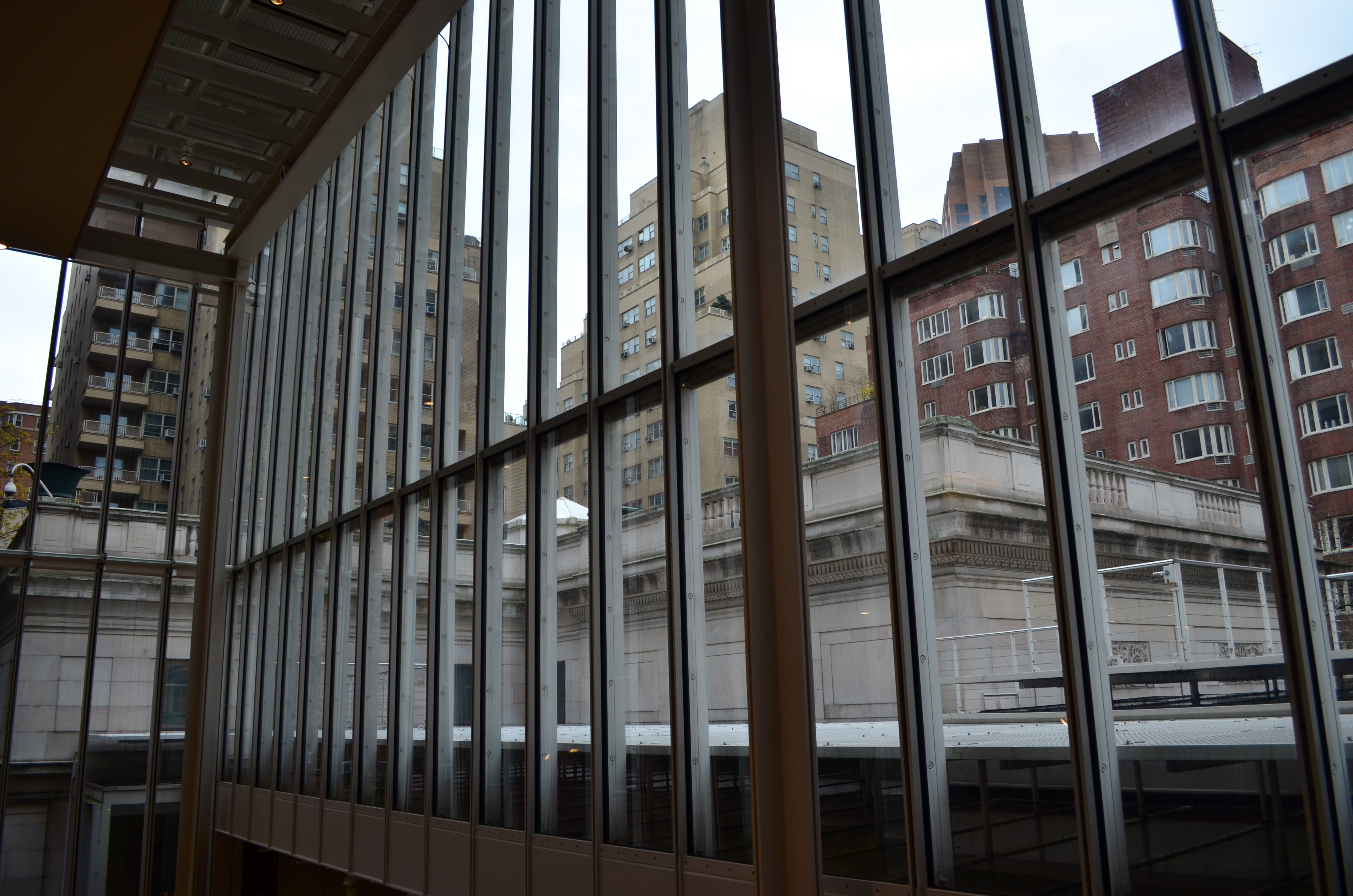
Not a bad starting point, but either too pretty, or not ugly enough…or something.
Recently I walked out into the gigantic atrium that connects all of the original buildings of the Morgan Library complex in NYC to get a good look at the surrounding neighborhood of big-shouldered buildings. I was fascinated by the way my wide-angle lens seemed to line up the horizontal grid lines of the atrium with the receding lines of the towers and boxes down the block. Only one thing bothered me about the result: the color, or rather, the measly quality of it.
A rainy day in Manhattan is perhaps the final word on rainy days. Some colors, like the patented screaming yellow of a New York cab, or the loud neon reds of bodegas, are intensified into a romantic wash when the drops start. This view, however, was just a bland mash of near-color. If the neighborhood was going to look dour anyway, I wanted it to be dour-plus-one. Thing is, I made this, ahem, “artistic” decision after I had already traveled 3,000 miles back home. In the words of Rick Perry, whoops.
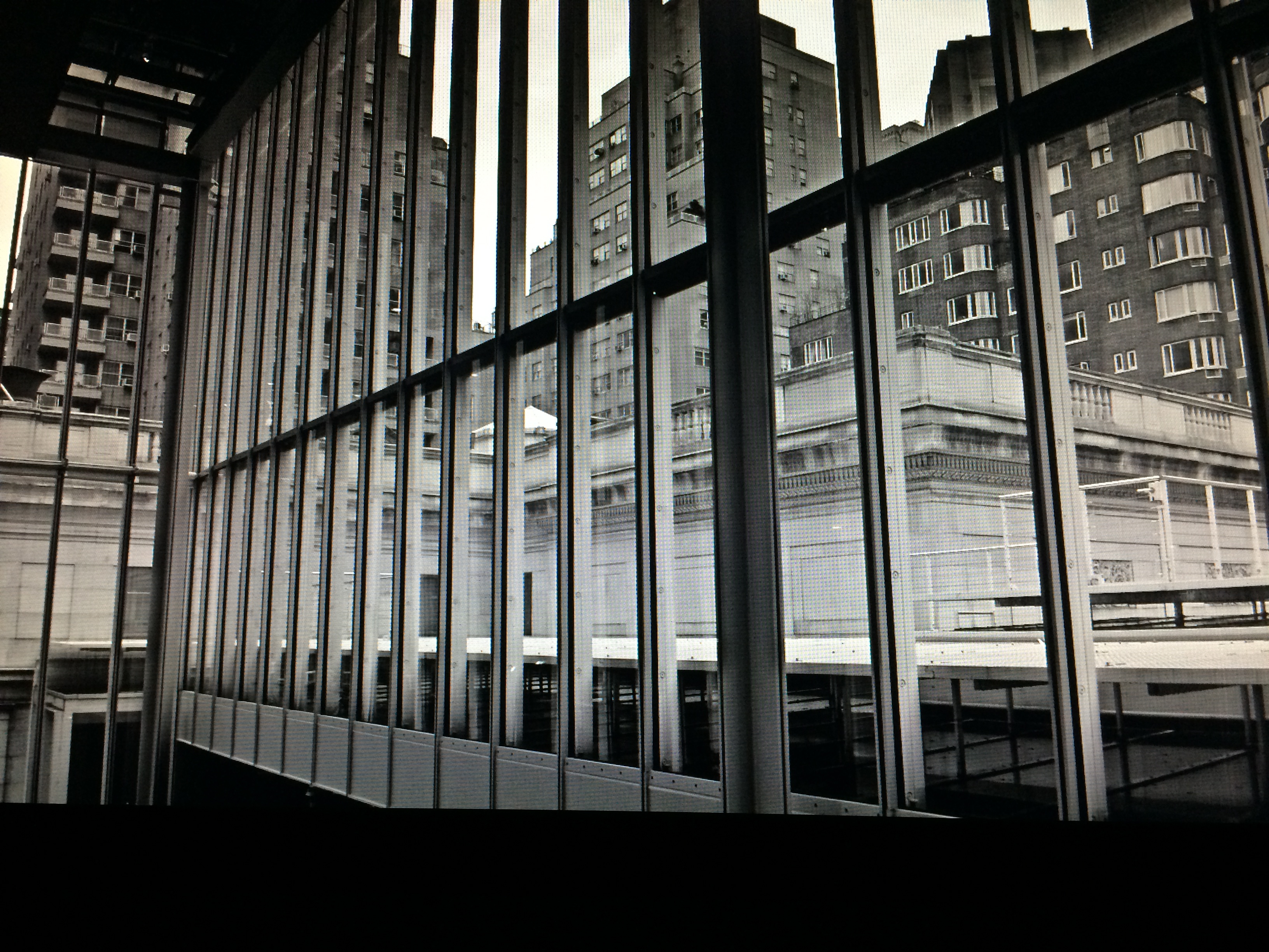
Time to hack my way to freedom. I remembered liking the look of old Agfa AP-X film in a filter on my iPhone, so I filled the screen of my Mac with the bland-o image, shot the screen with the phone, applied the filter, uploaded the result back into the Mac again, and twisted the knobs on the new cheese-grater texture I had gained along the way. At least now it looked like an ugly day….but ugly on my terms. Now I had the kind of rain-soaked grayscale newspaper tones I wanted, and the overall effect helped to better meld the geometry of the atrium and the skyline.
No rules? Sure, there’s still at least one.
Get the shot.
TURN THE PAGE
By MICHAEL PERKINS
I’M VERY ACCUSTOMED TO BEING STOPPED IN MY TRACKS AT A PHOTOGRAPH THAT EVOKES A BYGONE ERA: we’ve all rifled through archives and been astounded by a vintage image that, all by itself, recovers a lost time.
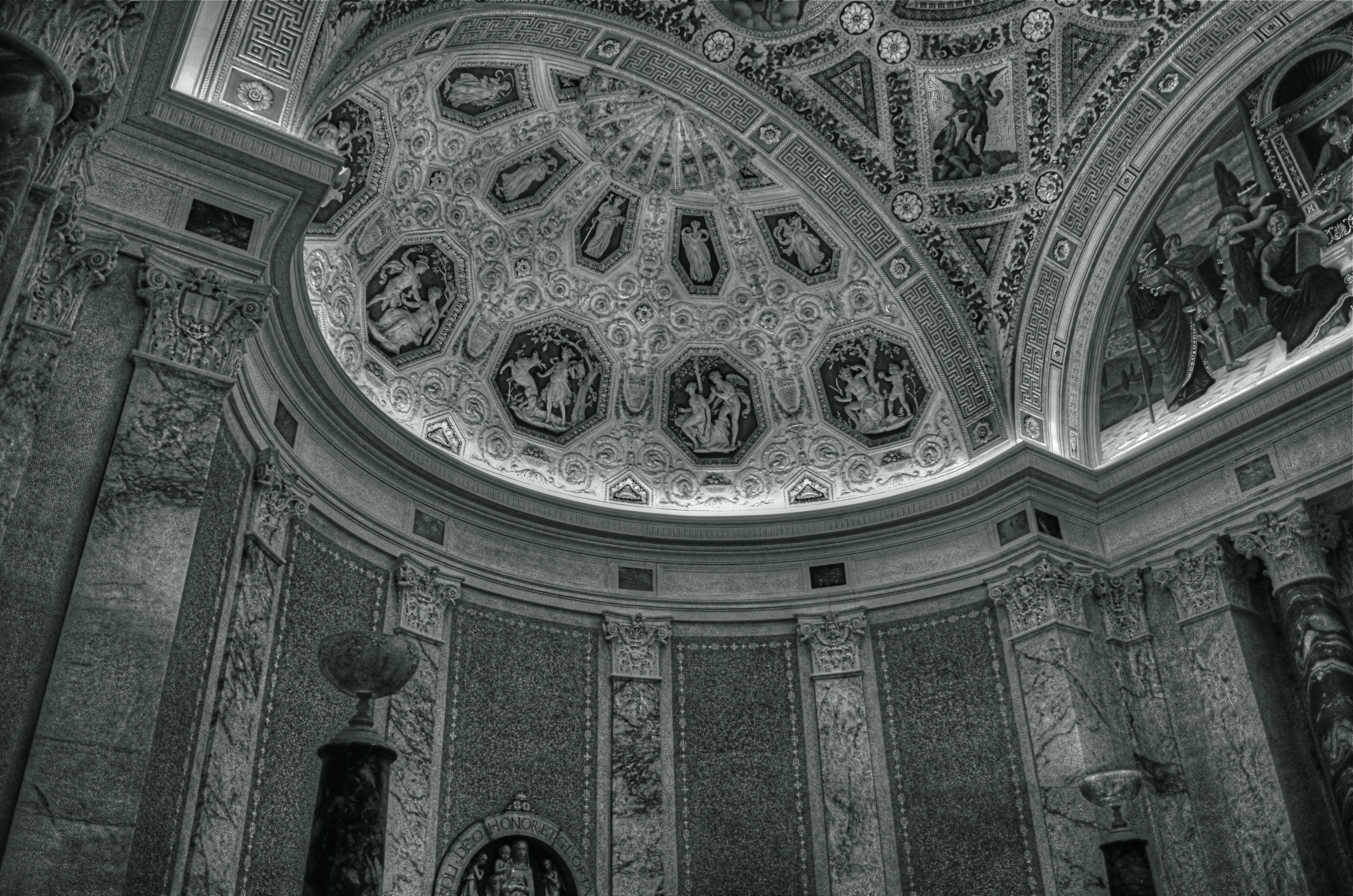
It’s a little more unsettling when you experience that sense of time travel in a photo that you just snapped. That’s what I felt several weeks ago inside the main book trove at the Morgan Library in New York. The library itself is a tumble through the time barrier, recalling a period when robber barons spent millions praising themselves for having made millions. A time of extravagant, even vulgar displays of success, the visual chest-thumping of the Self-Made Man.
The private castles of Morgan, Carnegie, Hearst and other larger-than-life industrialists and bankers now stand as frozen evidence of their energy, ingenuity, and avarice. Most of them have passed into public hands. Many are intact mementos of their creators, available for view by anyone, anywhere. So being able to photograph them is not, in itself, remarkable.
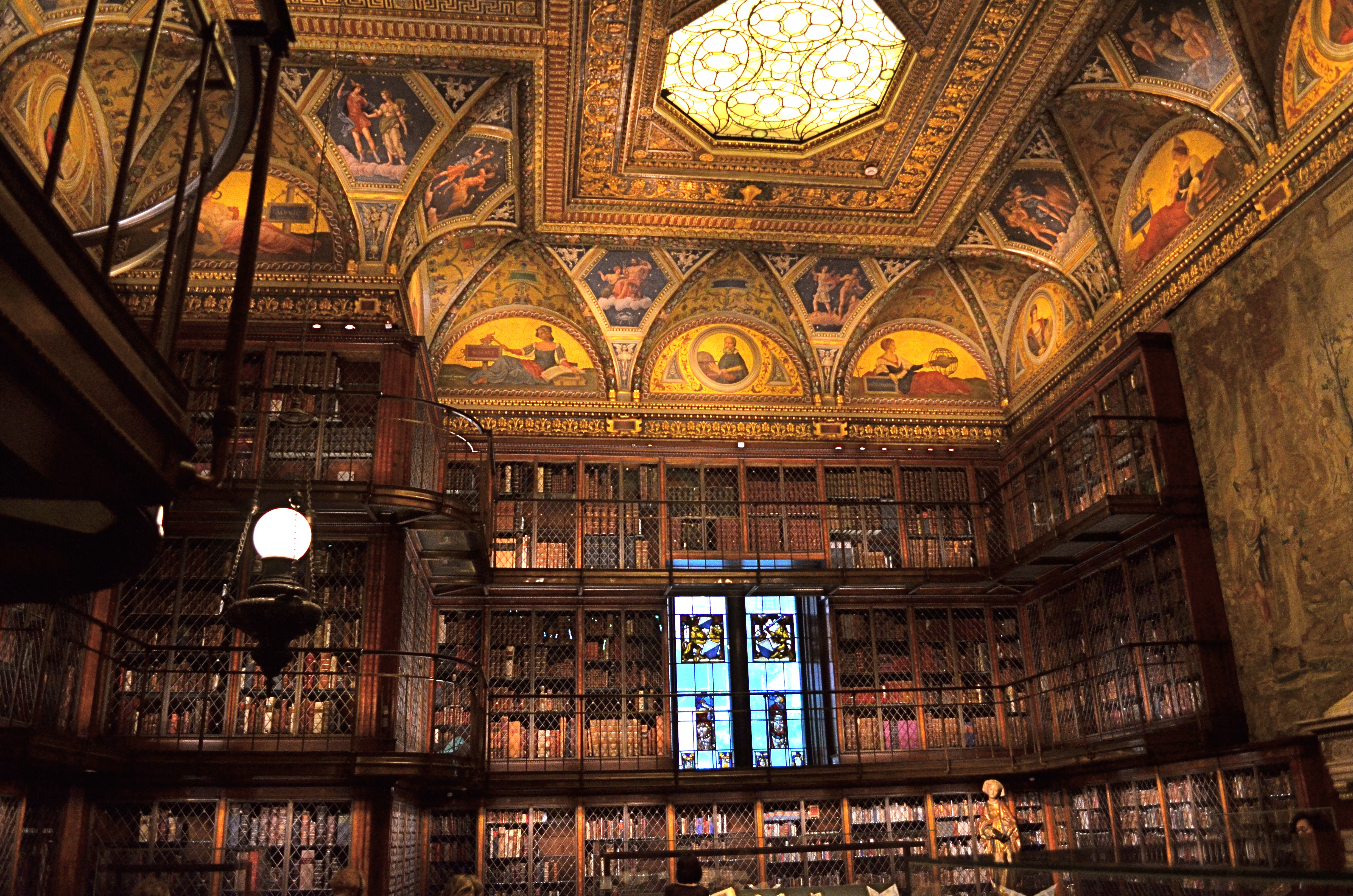
A little light reading for your friendly neighborhood billionaire. Inside the Morgan Library in NYC.
No, it’s my appreciation of the fact that, today,unlike any previous era in photography, it’s possible to take an incredibly detailed, low-light subject like this and accurately render it in a hand-held, non-flash image. This, to a person whose life has spanned several generations of failed attempts at these kinds of subjects, many of them due to technical limits of either cameras, film, or me, is simply amazing. A shot that previously would have required a tripod, long exposures, and a ton of technical tinkering in the darkroom is just there, now, ready for nearly anyone to step up and capture it. Believe me, I don’t dispense a lot of “wows” at my age, over anything. But this kind of freedom, this kind of access, qualifies for one.
This was taken with my basic 18-55mm kit lens, as wide as possible to at least allow me to shoot at f/3.5. I can actually hand-hold fairly steady at even 1/15 sec., but decided to play it safe at 1/40 and boost the ISO to 1000. The skylight and vertical stained-glass panels near the rear are WINOS (“windows in name only”), but that actually might have helped me avoid a blowout and a tougher overall exposure. So, really, thanks for nothing.
On of my favorite Twilight Zone episodes, the one about Burgess Meredith inheriting all the books in the world after a nuclear war, with sufficient leisure to read his life away, was entitled “Time Enough At Last”. For the amazing blessings of the digital age in photography, I would amend that title by one word:
Light Enough…At Last.
FRAMES WITHIN FRAMES

Two people, two towers. Do you visually need anything else in this image?
By MICHAEL PERKINS
PHOTOGRAPHY AND PAINTING STILL HAVE ONE ESSENTIAL ELEMENT IN COMMON: that of the frame, the arbitrary perimeter that describes a special, limited universe of information. Everything within the frame is understood to be essential, special. Everything outside the frame is likewise understood to be irrelevant. If anything else were important, we argue, it would already be in the frame. If it is not in the frame, it does not matter.
This is the rule of engagement for photographers, and, as composers of our images, we wield the most important editor’s scissors in all of art. Through cropping and selecting, we decide what qualifies as the finalists for that frame, which elements we will trust to tell our story. You could make the argument that great pictures are not made, they are re-made, and, over a lifetime, we often rescue or reject images based on what we can exclude from them.
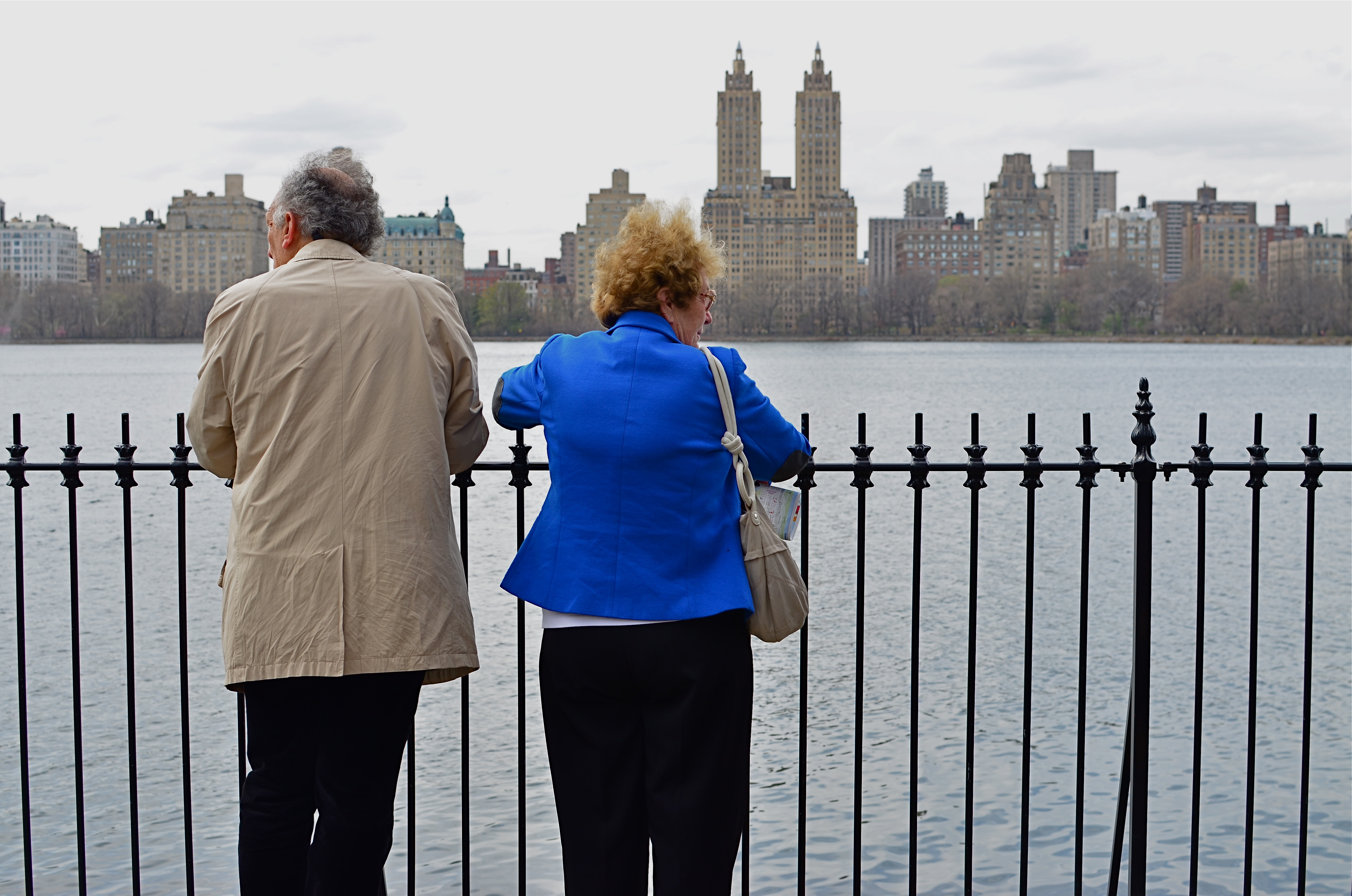
The above image before cropping. See anything here that you can’t live without?
Paring away unneeded information from a photograph allows its true voice to be heard. Things that were minor players in the larger composition are, snip, suddenly promoted to lead actors in the scene. Sometimes, of course, this process reveals that the picture was doomed to start with, since it’s obvious when you are cutting to the essence of, well, junk. Other times, however, we miraculously unveil a rose. Strangely, editing can occasionally become more important that exposure, aperture, or any other basic technical factor.
The edited image at the top of this page occupies less than half the
space of the original, yet, for all that loss, look how much has been gained. We now force a relationship between the two people and the two towers, as well as their relationship with each other. The distraction created by the wider skyline is now gone, and we are free to better direct how the image’s story will be seen and judged. Neither shot is a candidate for a Pulitzer, but we have actually done more by choosing less.
TRI, TRI AGAIN
By MICHAEL PERKINS
WHILE MANY “FILTER” APPS FOR SMARTPHONE CAMERAS MERELY ADD CARNIVAL EFFECTS TO PHOTOS, faking everything from poor processing to light leaks, some really intriguing work has been done by programmers who create “emulsion emulations”. That’s geek-talk for simulating the look and texture of certain old film stocks, making it possible to make a new-old picture freed from the film era’s messy chemicals and wizardly calculations. These instant touch-ups are still limited in scope, but in a real time shooting situation, they do offer you a wide variety of looks that may enable a good shot to graduate to a great one.

Straight out of the camera color original of a Manhattan street scene.
One such emulation, found on the excellent Alt-Photo app for iPhones, gives a great imitation of the look of the world’s most successful black & white film, Kodak’s beloved Tri-X. Introduced in the 1940’s as sheet film purely for professionals at about 200 ASA (ISO), Tri-X was adapted to popular camera sizes like 35mm and 120 in the ’50’s, and was amazingly popular with pros and ams alike, mostly because of what, by Eisenhower-era standards, was its blindingly fast speed. Consider that Kodachrome of the time was rated at a lowly 25 ASA and you can see why newshounds and magazine shooters flocked to Tri-X, as it made it possible to shoot in extremely low light with handheld settings. Fewer tripods and flash meant more mobility and versatility. Home run.
Same shot as above with the Alt-Photo app’s Tri-X filter.
By the 60’s, Tri-X went to 400 ASA, and many labs were able to offer “push” processing to over 3000, expanding its range even farther. As the film became nearly universal, so did its signature grain, a by-product of its light-hungry formula. Today, Tri-X is once again a mostly professional film, and the creators of phone apps are happy to offer a fairly good facsimile of its contrast and grain as a post-processing filter. I have begun to dabble in it for street subjects, particularly ones that appear too warm or welcoming in color. As with any of these effects, the Tri-X look is only right for certain shots. If the image itself is not strong or compelling to begin with, dabbing on the retro won’t bring forth a miracle.
But you knew that.
A SQUARE DEAL
By MICHAEL PERKINS
Symmetry is key with square compositions.
I WAS AT THE MORGAN LIBRARY IN NEW YORK earlier this week, combining a museum tour with a photo shoot, when I came upon an exhibit which featured one of the earliest Kodak consumer prints, with the image contained inside a circle, rather than the rectangular frames most of us remember. It reminded me that the very formatics of picture-making were, for a long time, dictated by the physical dimensions of either camera or film, and that, suddenly, we are free to make photographs of any proportions we choose, anytime, everytime.
It’s really an amazing liberation, and, as an ironic consequence, some photographers are choosing to return to the framing formats that they used to decry as too limiting, subjecting themselves to the extra discipline of staying within a boundary and adjusting their compositional priorities thusly. This has made for a kind of revival of the square image, and there seem to be some distinct advantages to the trend.
Shooting on the square means calling attention to the center of an image, to using symmetry to your advantage, and to paring your composition to its bare essentials. The negative space used in landscape or portrait modes can still work within a square image, but the subject, and your use of it, must be just right. Squaring off means calling immediate attention to your message, and making it all the stronger, since there’s nowhere else for the eye to go.
Andrew Gibson, writing for the website Digital Photography School, explains the visual appeal of the square:
Using the square format encourages the eye to move around the frame in a circle. This is different from the rectangular frame, where the eye is encouraged to move from side to side (landscape format) or up and down (portrait format). The shape of the frame is a major factor.
It’s odd to think of freeing up your photography by voluntarily working within a more restrictive format. And, unlike the old days of square-only shooting, the effect is largely created “after the click”, by re-composing through creative cropping. But the additional mindfulness can really boost the power of your images.
THE POLAROID EFFECT
BY MICHAEL PERKINS
I’VE BEEN TRYING TO FIND A WAY TO DESCRIBE THE COMBINATION OF HOPE AND ANXIETY THAT ATTENDS MY EVERY USE OF A SMARTPHONE CAMERA. Coming, as do many geezers of my era, from a tradition of full-function, hands-on, manual cameras, I have had a tough time embracing these miraculous devices, simply because of the very intuitive results that delight most other people.
But: it’s a little more complicated than my merely being a control freak or a techno-snob.
What’s always perplexing to me is that I feel that the camera is making far too many choices that it “assumes” I will be fine with, even though, in many cases, I am flat-out amazed at how close the camera delivers the very image I had in mind in the first place. It doesn’t exactly make one feel indispensable to the process of picture-making, but that’s a bug inside my own head and I gotta deal with it.

Stealthy and readily at hand: smartphone cameras keep opportunities from being lost.
I think what I’m feeling, most of the time, is what I call the “Polaroid Effect”. To crowd around family or friends just moments after clicking off a memory with the world’s first true instant film cameras, those bulky bricks of the Mad Men era, was to share a collectively held breath: would it work? Did I get it right? Then as now, many “serious” photographers were reluctant to trust a Polaroid over their Leicas or Rolliflexes. Debate raged over the quality of the color, the impermanence of the prints, the limited lenses, the lack of negatives, and so on. Well, said the experts, any idiot can take a picture with this.
Well, that was the point, wasn’t it? And some of us “idiots” learned, eventually, to take good pictures, and moved on to other cameras, other lenses, better pictures, a better eye. But there was that maddening wait to see if you had lucked out with those square little glimpses of life. The uncertainty of trusting this…machine to get your pictures right.
And yet look at the above image. I asked a lot in this frame, with wild amounts of burning hot sunlight, deep shadows, and every kind of contrast in between just begging for the camera to blow it. It didn’t. I’m actually proud of this picture. I can’t dismiss these devices just because they nudge me out of my comfort zone.
Smartphone cameras truly extend your reach. They go where bulkier cameras don’t go, prevent more moments from being lost, and are in a constantly upward curve of technical improvement. People can and do make astounding pictures with them, and I have to remind myself that the ultimate choice…that of what to shoot, can never be taken away just because the camera I’m holding is engineered to protect me from my own mistakes.
TRY A DIFFERENT DOOR
By MICHAEL PERKINS
PUBLIC PLACES, ESPECIALLY RECREATION SPACES, ARE A REAL STUDY IN IMAGE CONTROL. The world’s playgrounds and theme parks are, of course, in the business of razzle-dazzle, and their marquees, grand courts and official entrances are carefully crafted facades designed to delight. For photographers, that usually means we all take the same pictures of the same Magic Gate or Super Coaster or whatever. Great for convenience: not so great for photography.
I’m not saying that it’s impossible to improvise a different way to frame something new in shooting something overly familiar. But I am saying that sneaking around to the service entrance can have its points, too, offering a flavor of things that are a little funkier, a little less polished, a little less ready for prime time. I recall my dad, who, years ago, dreamed of taking the ultimate “real” shots of the circus, trolling around near some of the lesser-traveled entrances and halls, trying to catch the clowns and acrobats either just before or just after their time in the ring. I still pursue that strategy sometimes.

All the fun of the fair, just seen from backstage.
Pacific Park, the amusement center along the boardwalk at the Santa Monica pier, is a predictably colorful, semi-cheesy mix of carny sights and smells. The main foot traffic is straight down the pier to the fishing lookout, but there are alternate ways to get there along the back of the ride and games section. This shot is rather gauzy, as it’s taken through some sun-flecked netting, softening the color (and the appearance of reality) for some gaming areas. I took a lot of standard stuff on this day, but I keep coming back to this frame. It’s not a work of art, by any means, but I like the feeling that I’m not supposed to be there.
Of course, where I’m not supposed to be is, photographically, exactly where I want to be.
You never know when you might spy a clown without his rubber nose.
BREAKING THE BIG RULE
I can’t see this girl’s face. Does it matter? 1/160 sec., f/5.6, ISO 100, 55mm.
By MICHAEL PERKINS
FACES ARE THE PRIMARY REASON THAT PHOTOGRAPHY FIRST “HAPPENED” FOR MOST OF US. Landscapes, the chronicling of history, the measurements of science, the abstract rearrangement of light, no other single subject impacts us on the same visceral level as the human countenance. Its celebrations and tragedies. Its discoveries and secrets. Its timeline of age.
It is in witnessing to faces that we first learn how photography works as an interpretive art. They provide us with the clearest stories, the most direct connection with our emotions and memories. And the standard way to do this is to show the entire face. Both eyes. Nose. Mouth. The works. Right?
But can’t we add both interpretation and a bit of mystery by showing less than a complete face? Would Mona Lisa be more or less intriguing if her eyes were absent from her famous portrait? Would her smile alone convey her mystic quality? Or are her eyes the sole irreplaceable element, and, if so, is her smile superfluous?
Instead of faces as mere remembrances of people, can’t we create something unique in the suggestion of people, of a faint ghost of their total presence” Can’t images convey something beyond a mere record of their features on a certain day and date? Something universal? Something timeless?
It seems that, as soon as we maintain rigidity on a rule….any rule…we are likewise putting a fence around how far we can see. The face is no more sacred than any other visual element we hope to shape.
Let’s not build a cage around it.
IF YOU SEE IT, IT MATTERS
1/320 sec., f/5.6, ISO 100, 35mm.
By MICHAEL PERKINS
TOO MUCH OF THE TIME, WE ARE SHOOTING PHOTOGRAPHS TO NOT ONLY BE SEEN BUT “APPRECIATED“. This can become an emotional and artistic trap, since art is not designed to be juried. We’d all like the world to “get” what we do, but it’s all too easy to bend the arc of what we create until it matches the trajectory of what the world will approve.
Think for a moment about how such a tactic can cripple you as a photographer. I mean, stop you in your tracks.
Consider: many photographers will logically move, over time, from showing the world fairly literally to suggesting a special viewpoint, seeing it in a more abstract fashion. They learn to tell more by showing less, by being selective. This is a perfectly logical part of their development, but as a consequence, some of their pictures will inevitably leave some viewers behind. Suddenly, their images are “arty”, or “intellectual”, or whatever other word can be hurled at them to dismiss what they are doing.
But that’s okay. I’m not saying that you should live your life eating worms and striving to be a tortured genius. I just mean to suggest that your vision belongs to you. It’s validity cannot be diminished, unless you do it yourself. Here’s one of my favorite quotes from Life and Look magazine photographer Elliot Erwitt on this :
To me, photography is an art of observation. It’s about finding something interesting in an ordinary place… I’ve found it has little to do with the things you see and everything to do with the way you see them.
What a great concept. The thing you are shooting is not content. The way you shoot it is. That means viewpoint and personal interpretation must be more important that objects or subjects. If they are not, there’s no way in hell to make photography be about anything but recording. If they are, thought, ah, then, anything’s possible.
Bottom line, if you aren’t true to your vision, it’s a cinch that no one else ever will be, either.
So there.
