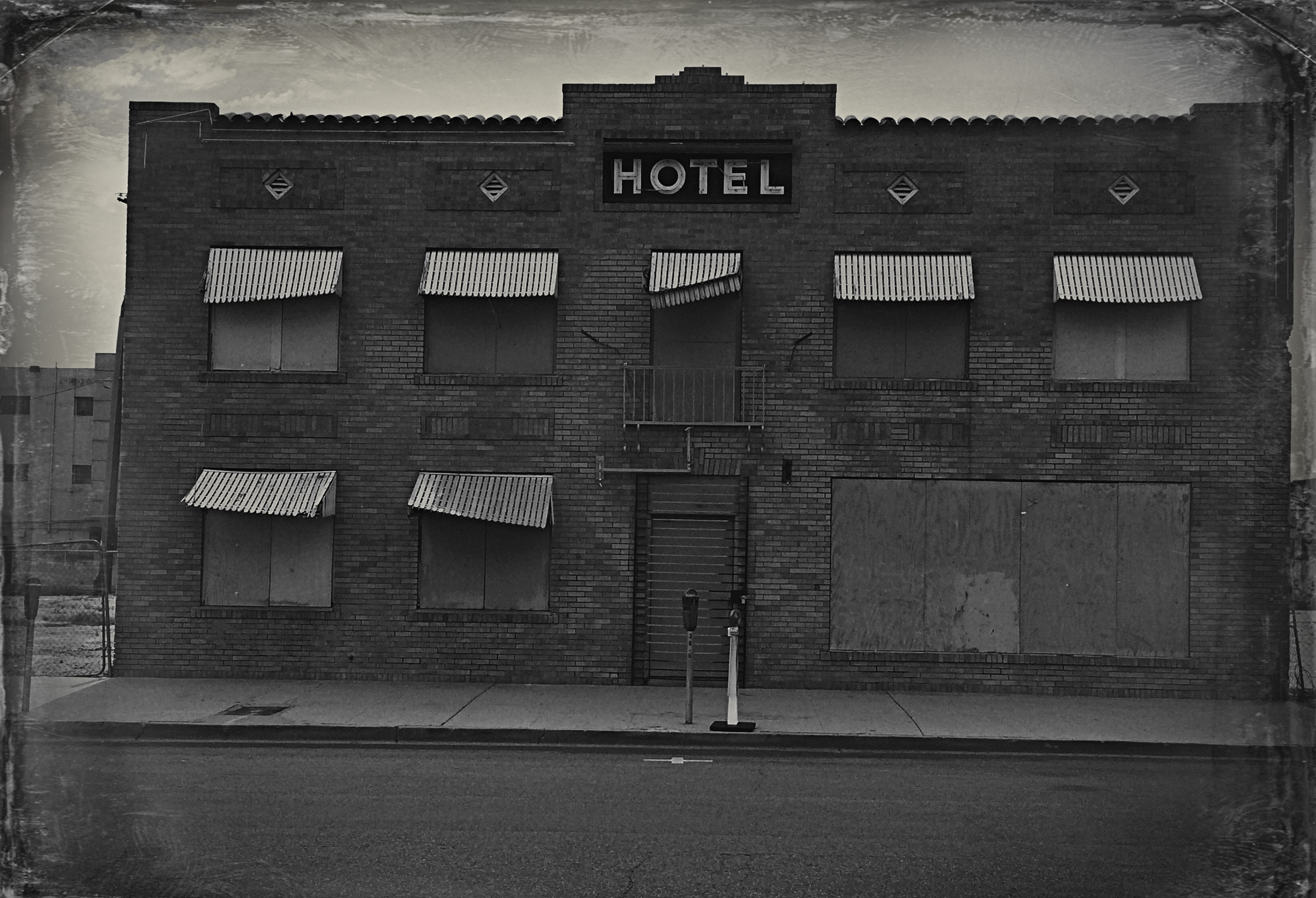
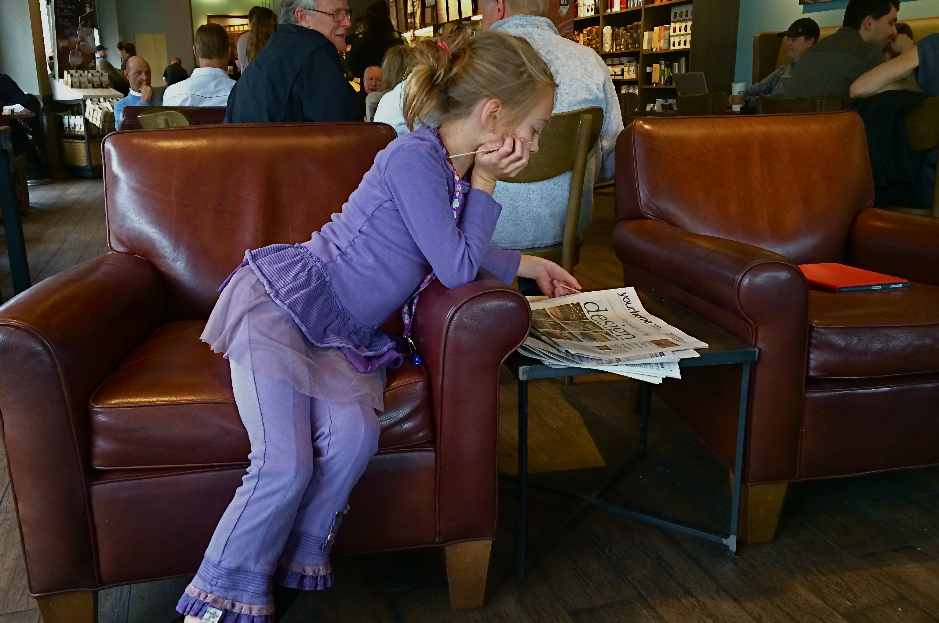
FALL-OFF AS LEAD-IN
By MICHAEL PERKINS
USING “LEADING LINES” TO PULL A VIEWER INTO AN IMAGE IS PRETTY MUCH COMPOSITION 101. It’s one of the best and simplest ways to overcome the flat plane of a photograph, to simulate a feeling of depth by framing the picture so the eye is drawn inward from a point along the edge, usually by use of a bold diagonal taking the eye to an imagined horizon or “vanishing point”. Railroad tracks, staircases, the edge of a long wall, the pews in a church. We all take advantage of this basic trick of engagement.

Bright light into subdued light: a natural way to pull your viewer deeper into the picture. 1/100 sec., f/1.8, ISO 650, 35mm.
One thing that can aid this lead-in effect even more is shooting at night. Artificial lighting schemes on many buildings “tell” the eye what the most important and least important features should be…where the designer wants your eye to go. This means that there is at least one angle on many city scenes where the light goes from intense to muted, a transition you can use to seize and direct attention.
This all gives me another chance to preach my gospel about the value of prime lenses in night shots. Primes like the f/1.8 35mm used for this image are so fast, and recent improvements in noiseless ISO boosts so advanced, that you can shoot handheld in many more situations. That means time to shoot more, check more, edit more, get closer to the shot you imagined. This shot is one of a dozen squeezed off in about a minute. The reduction of implementation time here is almost as valuable as the speed of the lens, and, in some cases, the fall-off of light at night can act as a more dramatic lead-in for your shots.
ALIENATIONS
By MICHAEL PERKINS
THE STRANGEST VISUAL EVIDENCE OF MAN’S PRESENCE ON THE PLANET IS HIS ABILITY TO COMPARTMENTALIZE HIS THINKING, the ability to say, of his living patterns, “over here, cool. Over there, six inches away, ick. You see these kind of yes/no, binary choices everywhere. The glittering, gated community flanked by feral urban decay. The open pasture land that abuts a zoo. And the natural world, trying desperately to be heard above the roar of its near neighbors from our co-called “civilization”.
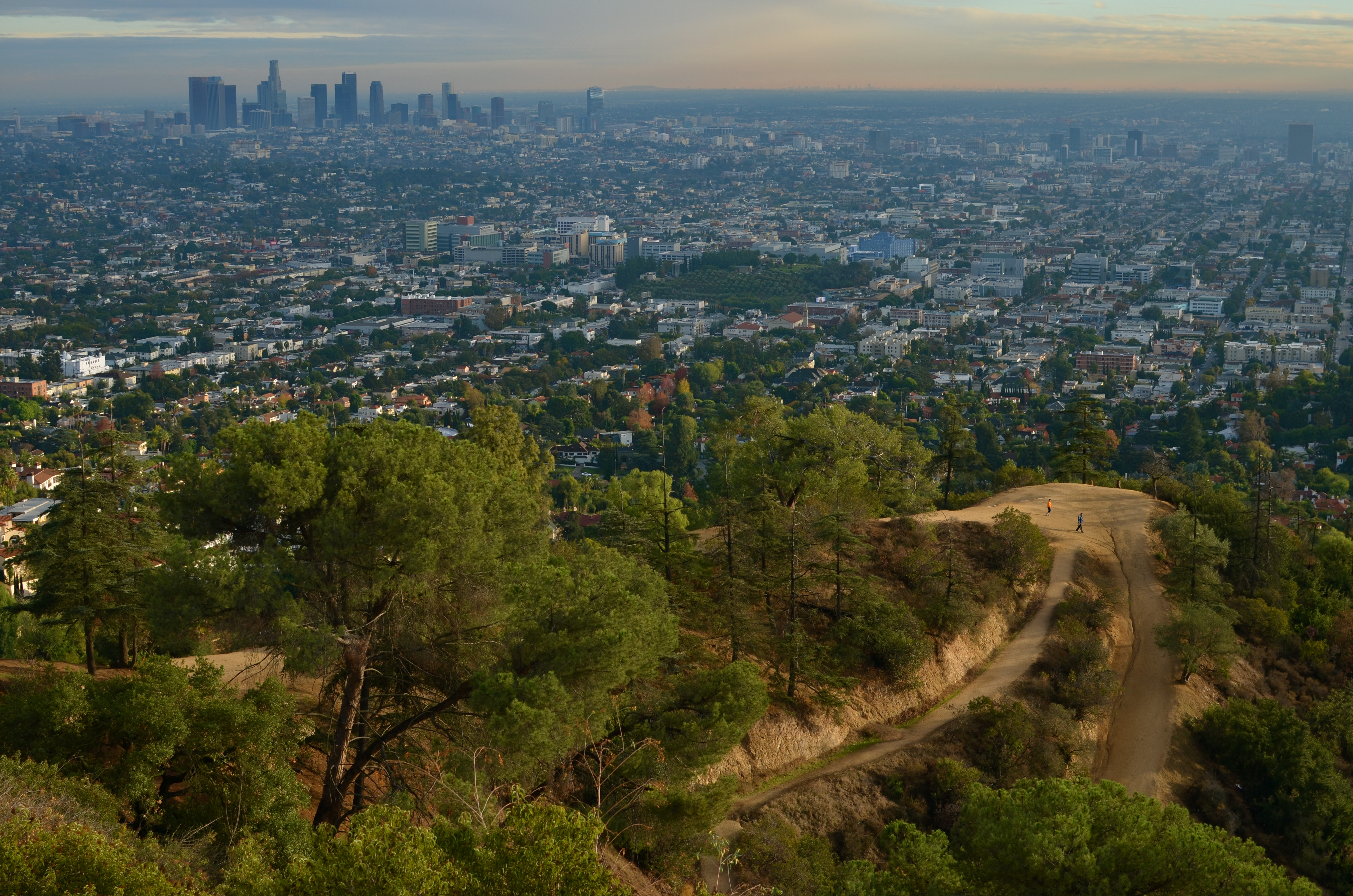
As seen from Griffith Observatory: park running paths and a smog-shrouded L.A. 1/320 sec., f/5.6, ISO 100, 35mm.
I recently re-evaluated this image of the running paths at Los Angeles’ Griffith Park and the nearby uber-grid of the central city. The colors are a bit muted since it was taken on a day of pretty constant rolling overcast, and it really is not a definitive portrait of either the city or the nearby greenspace, but there is a little story to be told in the ability of the two worlds to co-exist.
L.A’s lore is rife with stories of destroyed environments, twisted eco-structure, bulldozed neighborhoods and political hackery advanced at great cost to the poor and the powerless. In the face of that history, the survival of Griffith, a 4,310-acre layout of parks, museums, kiddie zoos, sports courts, and concert venues on the eastern end of the Santa Monica Mountains, is something of a miracle. It’s the lion lying down with the lamb, big-time, a strange and lucky juxtaposition that affords some of the most interesting fodder for photographers anywhere in California. Photogs observe natural pairings in the world, but they also chronicle alienations, urban brothers from different mothers, tales of visual conflicts that, while they can’t be reconciled, are worth noting.
GET THEE TO A LABORATORY

The Visitor Center at Los Angeles’ Getty Museum. 1/1600 sec., f/5.6, ISO 100, 35mm.
by MICHAEL PERKINS
PHOTOGRAPHIC SUBJECT MATTER, ONCE YOU’VE TRAINED YOURSELF TO SPOT IT, is always in ready supply. But, let’s face it: many of these opportunities are one-and-done. No repeats, no returns, no going back for another crack at it. That’s why, once you learn to make pictures out of almost nothing, it’s like being invited to a Carnival Cruise midnight buffet to find something that is truly exploding with possibilities, sites that actually increase in artistic value with repeat visits. I call such places “labs” because they seem to inspire an endless number of new experiments, fresh ways to look at and re-interpret their basic visual data.
My “labs” have usually been outdoor locations, such as Phoenix’ Desert Botanical Gardens or the all-too-obvious Central Park, places where I shoot and re-shoot over the space of many years to test lenses, exposure schemes, techniques, or, in the dim past, different film emulsions. Some places are a mix of interior and exterior and serve purely as arrangements of space, such as the Brooklyn Museum or the Library of Congress, where, regardless of exhibits or displays, the contours and dynamics of light and form are a workshop all in themselves. In fact, some museums are more beautiful than the works they house, as in the case of Guggenheim in NYC and its gorgeous west coast equivalent, The Getty museum in Los Angeles.

No color? No problem. Interior view of the Getty’s visitor center. 1/640 sec., f/5.6. ISO 100, 35mm.
Between the gleaming white, glass-wrapped buildings of this enormous arts campus and its sinuous, sprawling gardens (not to mention its astounding hilltop view), the Getty takes one complete visit just to get yourself visually oriented. Photographically, you will find a million isolated tableaux within its multi-acre layout upon subsequent trips, so there is no end to the opportunities for exploring light, scale, abstraction, and four full seasons of vibrant color. Not a color fan? Fine. The Getty even dazzles in monochrome or muted hues. It’s like Toys ‘R’ Us for photogs.
I truly recommend laying claim to a laboratory of your own, a place that you can never truly be “finished with”. If the place is rich enough in its basic components, your umpteenth trip will be as magical as your first, and you can use that one location as a growth graph for your work. Painters have their muses. Shooter Harry Calahan made a photographic career out of glorifying every aspect of his wife. We all declare our undying love for something.
And it will show in the work.
MINUTE TO MINUTE
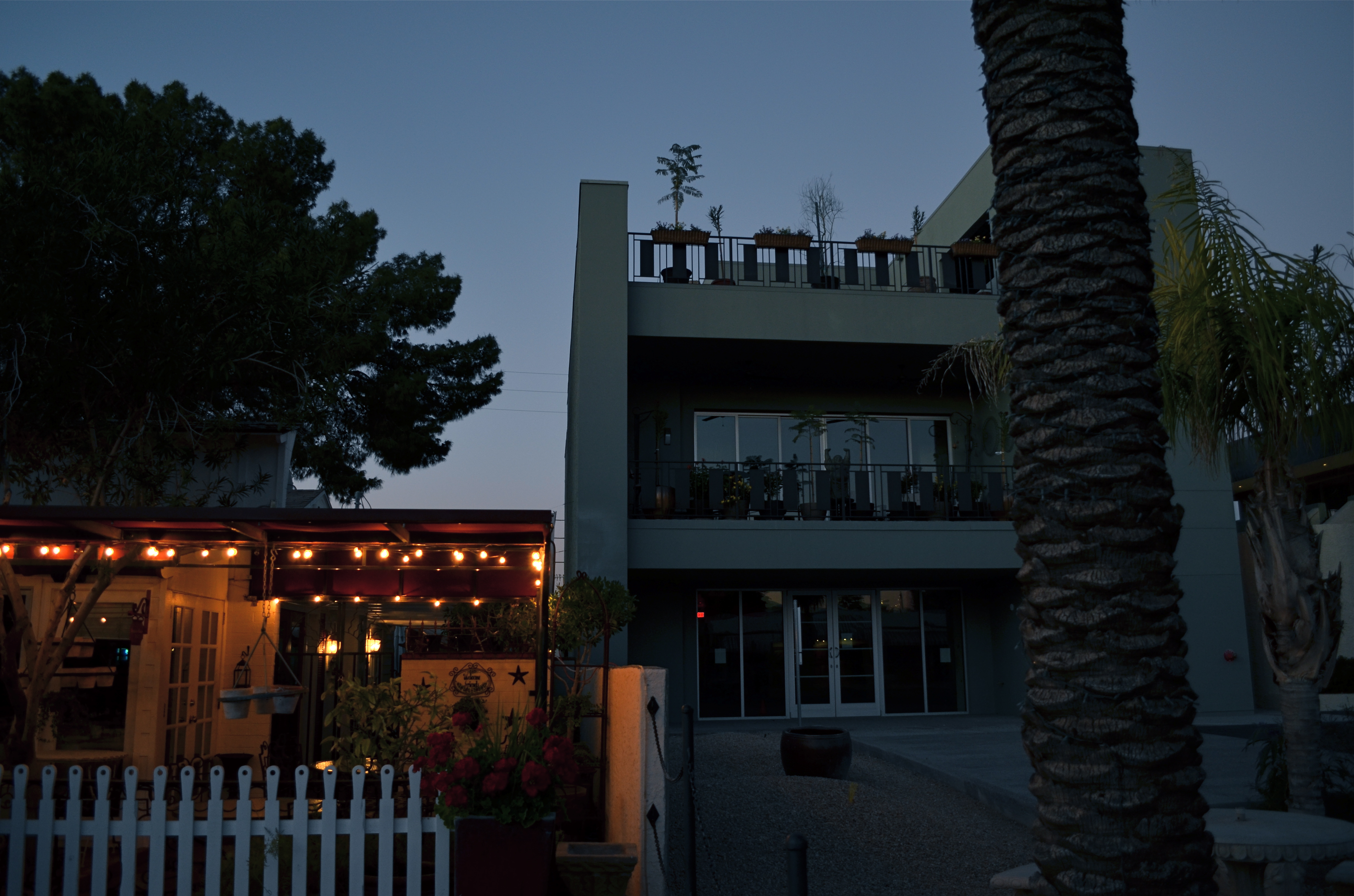
Going, Going: Dusk giveth you gifts, but it taketh them away pretty fast, too. 1/40 sec., f/3.5, ISO 200, 18mm.
By MICHAEL PERKINS
VOLUMES HAVE BEEN WRITTEN ABOUT THE WONDROUS PHENOMENON OF “GOLDEN HOUR“, that miraculous daily window of time between late afternoon and early evening when shadows grow long and colors grow deep and rich. And nearly all authors on the subject, whatever their other comments, reiterate the same advice: stay loose and stay ready.
Golden hour light changes so quickly that anything that you are shooting will be vastly different within a few moments, with its own quirky demands for exposure and contrast. Basic rule: if you’re thinking about making a picture of an effect of atmosphere, do it now. This is especially true if you are on foot, all alone in an area, packing only one camera with one lens. Waiting means losing.
The refraction of light through clouds, the angle of the sun as it speeds toward the horizon, the arrangement between glowing bright and super-dark….all these variables are shifting constantly, and you will lose if you snooze. It’s not a time for meditative patience. It’s a time for reactivity.
I start dusk “walkarounds” when all light still looks relatively normal, if a bit richer. It gives me just a little extra time to get a quick look at shots that may, suddenly, evolve into something. Sometimes, as in the frame above, I will like a very contrasty scene, and have to shoot it whether it’s perfect or not. It will not get better, and will almost certainly get worse. As it is, in this shot, I have already lost some detail in the front of the building on the right, and the lighted garden restaurant on the left is a little warmer than I’d like, but the shot will be completely beyond reach in just a few minutes, so in this case, I’m for squeezing off a few variations on what’s in front of me. I’ve been pleasantly surprised more than once after getting back home.
What’s fun about this particular subject is that one half of the frame looks cold, dead, “closed” if you will, while there is life and energy on the left. No real story beyond that, but that can sometimes be enough. Golden hour will often give you transitory goodies, with its more dramatic colors lending a little more heft to things. I can’t see anything about this scene that would be as intriguing in broad daylight, but here, the hues give you a little magic.
Golden hour is a little like shooting basketballs at Chuck E. Cheese. You have less time than you’d like to be accurate, and you may or may not get enough tickets for a round of Skee-Ball.
But hey.
THE TYRANNY OF, LIKE, LIKING
An image which was nobody’s “fave”, but it made my list. 1/50 sec., f/6.3, ISO 100,18mm.
By MICHAEL PERKINS
MY MOTHER WARNED ME FOR MY ENTIRE BOYHOOD THAT, IF I LIVED MY LIFE TO PLEASE OR GARNER THE APPROVAL OF OTHERS, I would spend it “following a little red wagon”. Now, I can’t paint my generation as being populated by the last of the rugged individualists (after all, we have to live down that whole “flower child” business), but, when it comes to current social networking, it seems like that little wagon is indeed speeding along at light speed, with the rest of us slavishly tailgating it in desperate search of one crucial word:
“like”.
Let me state categorically that I view sites like Instagram with an equal measure of hope and dread, since history has yet to rule on whether its billions of filter-soaked snaps advance photography or mire it in mediocrity. That said, I am certain of one two-part truth:
1. Photography is essential to social networking, and
2. Social networking is not essential to photography.
Simply stated, the hungry maw of social media needs an endless resource of fresh meat, with photos as vital a component as text. To keep this torrent of images rolling in, it bestows little training treats on the millions to motivate them to submit their works and keep the machinery oiled. This is what likes, retweets, and faves have become. A gold star on your spelling paper. A little extra beef on your mess kit tray. Good boy, Fido, here’s your “like”.
But here’s the thing. You cannot grow your personal art if you are bending the arc of it purely toward the goal of popular approval. Art is not about getting “likes”. On the contrary, it’s frequently about garnering “hates”, deaf ears, blind eyes, misunderstanding, antipathy, even shunning or banishment. Art needs to make people uncomfortable, to confound and distress. And, just as it is in leaving our personal comfort zones that we stretch as photographers, we need our audiences to leave theirs. Guess what: they will not do that willingly or happily.
If it does it for you, one more or less “like” will not change that. 1/400 sec., f/5.6, ISO 100, 35mm.
History provides easy evidence of this: cough up the names of your ten favorite “legendary” photographers and chances are that most of them were marginalized, despised, or otherwise shunted away during their best years. There is a reason for this.
“Likes” are seductive, but they are merely quantitative, not qualitative. The raw number of people who numbly click “like” on a photo tells you nothing of what they felt was right, or elegant, or beautiful, or awful in an image. Such little emotional check-offs may stoke our need to be seated at the cool kids’ table, but they do zilch to make us better shooters.
To be a great photographer, you cannot afford the luxury of whether anyone else “gets” what you do. Let’s stop settling for photo sites as popularity contests.
They need you. You do not need them.
FRONT TO BACK
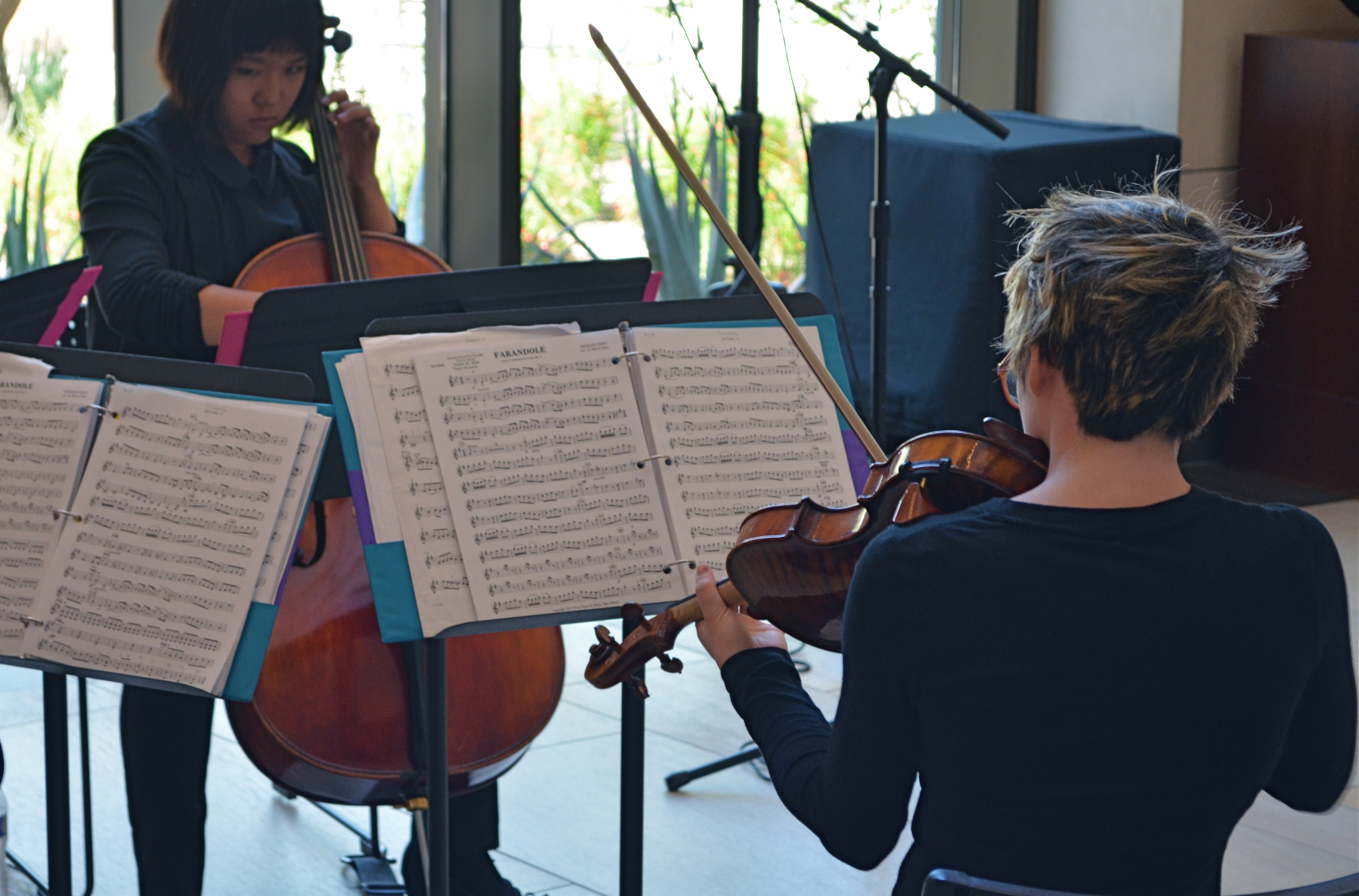
Then Play On: 1/60 sec., f/5.6, ISO 500, 55mm.
By MICHAEL PERKINS
NOT ALL PORTRAITS INVOLVE FACES.
I’ll let that little bit of blasphemy sink in for a moment. After all, the face is supposed to be the key to a persona’s entire identity, and God knows that many a mediocre shot has been saved by a fascinating expression, right? The eyes are the window to the soul, and so on, and so forth, etc., etc.
But is this “face-centric” bias worthy of photographers, who are always re-writing the terms of visual engagement on every conceivable subject? Is there one single way to make a person register in an image? Obviously I don’t believe that, or else I wouldn’t have started this argument, but, beyond my native contrariness, I just am not content with there being a single, approved way of visualizing anything. I’ve seen too much amazing work done from every conceivable standpoint to admit of any limitation, or need for a “rule”, even when it comes to portraiture.
The face is many things, but it’s not the entire body, and even if you capture a shot in which the subject’s face is absent, he or she can be so very present in the feel of the picture. Arms, shoulders, the sinews, the stance, the way a body stands in a frame…all can bear testimony.
I recently stumbled onto an impromptu performance by a young string quartet, and faced the usual problem of not being able to simultaneously do justice to all four members’ faces, to balance the tension and concentration written on all their features in performance. In such situations, you have to make some kind of call: the picture becomes a dynamic tension between the shown and the hidden, just as the music is a push-and-pull between dominant and passive forces. You must decide what will remain unseen, and, sometimes, that’s a face.
As the music evolved, the two ladies seen above were, in different instants, either in charge of, or at the service of, the energy of the moment. For this picture, I saw more strength, more power in the back of the violinist than in the front of the cellist. It was body language, a kind of structural tug between the pair, and I voted for what I could not show fully. As it turned out, the violinist actually has a lovely face, one possessing a stern, disciplined intensity. On another day, her story would have been told very differently.
On this day, however, I was happy to have her turn her back on me.
And turn my own head around a bit.
DON’T SETTLE FOR REALITY
By MICHAEL PERKINS
IN PHOTOGRAPHY, WE FIRST LEARN HOW TO CONTROL LIGHT WHEN THERE IS A PRETTY GOOD SUPPLY OF IT. Our baby-step pictures are usually taken in the middle of the day, where it’s easier to over-expose than under-expose the shot. The sun is out and it’s a constant resource. We may step in and out of a shadow or need to fill a few gaps with flash, but mostly the issue of light is about managing something you have a big bunch of.
Once we venture into night shots, light becomes a precious commodity, like water in the desert. The equation is flipped. Now we’re struggling to get enough illumination to shape a shot, or sometimes just save it. We can shoot in the reduced light that’s on hand, but it takes a little more orchestration. Move into time exposures and the terms of engagement change again, with the ability to play God with the physics of things.
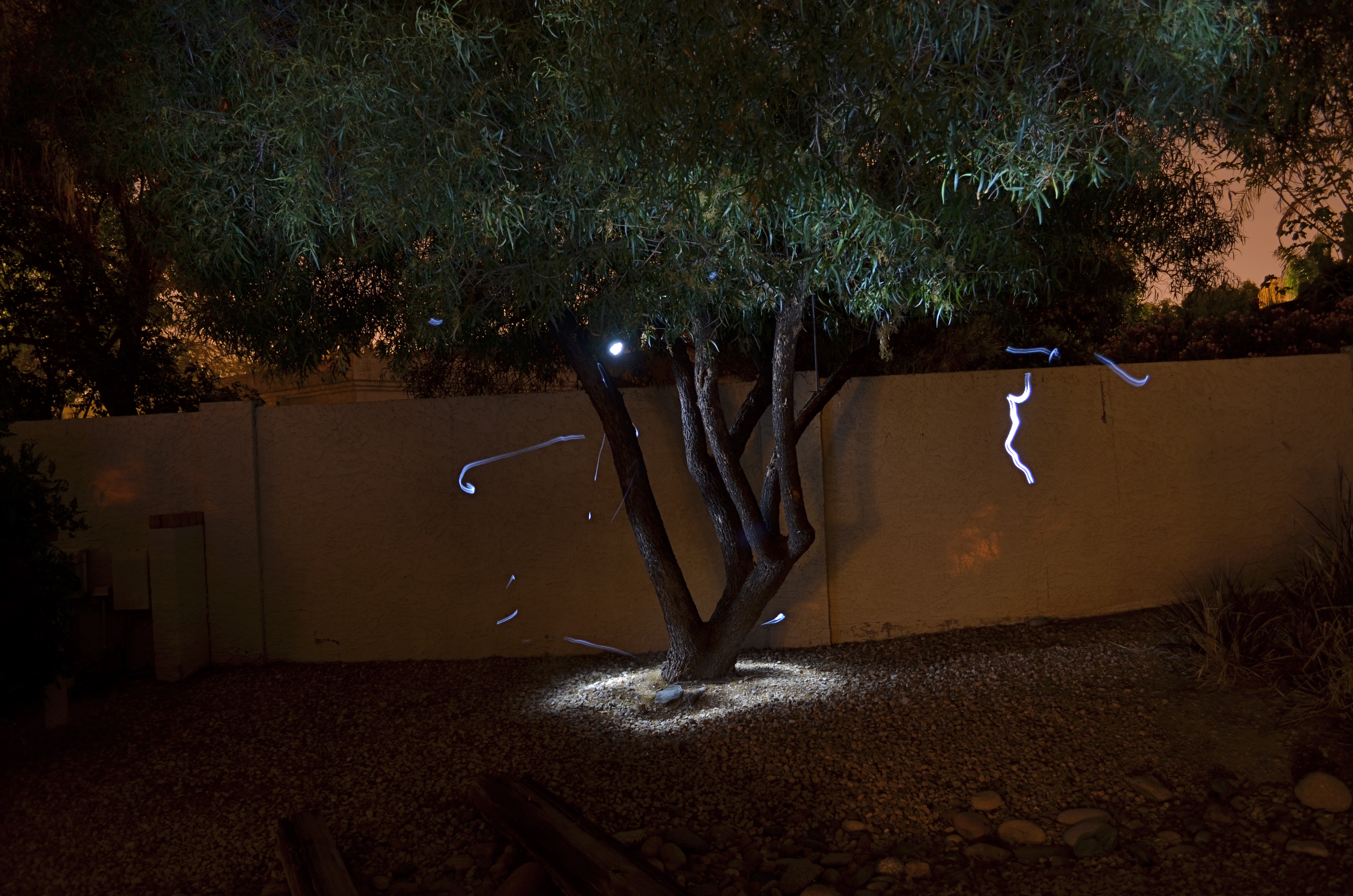
Shot in complete darkness and selectively light-painted with a handheld LED. Exposed for 73 seconds at f/4.5, ISO 100, 18mm. The light streaks are “wrong turns” with my flashlight. Oops.
And then there’s light painting, selective hand illumination during long exposures, where the aim is suddenly beyond the merely real. In fact, light painting is about deliberately manipulating mood and atmosphere, of bringing a magical quality where none exists. It also is the kind of low-light photography with the least predictable results, and the highest possible failure rate. You are constantly in uncharted waters, since no two exposures come out even remotely alike. You’re flying blind with your eyes open.
I have recently begun to head outdoors to re-imagine trees in these artificial, fantasy-flavored “light compositions”, in an effort to lend heft to subjects that, in daylight, would register pretty low on the wow meter. Over the years, I have honed my technique with tabletop light painting in controlled interiors, but if I get one exterior shot in thirty that I can live with, that’s an amazing day, er, night.
I don’t have any wisdom to impart on these shots, since their value is so crazy subjective. You do it until you like it, that’s all. But do yourself a favor sometime and do wade in. You might catch the fever, or you may experience the urge to hurl your tripod over the neighbor’s wall like a javelin of rage.When you don’t have enough light, you’re kind of in free fall.
But even if you don’t stick the landing, it ain’t fatal.
ATTRACTION / DISTRACTION
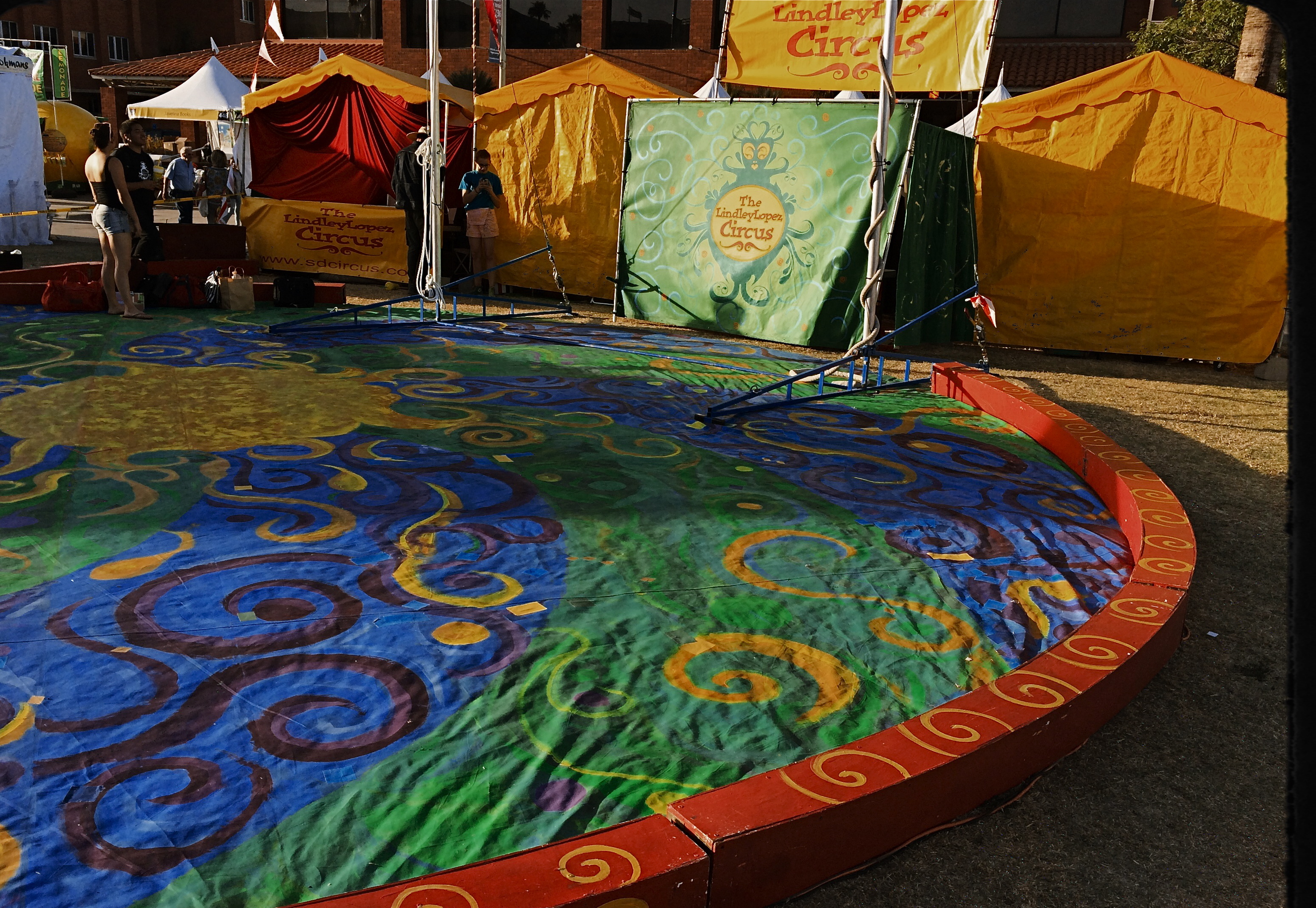
No performers, but the colors say circus time. 1/800 sec., f/2.2, ISO 32, 18mm.
By MICHAEL PERKINS
PHOTOGRAPHERS ARE ADDICTED TO “INVISIBLE” STORYTELLING, to hinting at a context beyond what is actually shown in a given image. Sometimes our eyes arrive at a scene just seconds after something important has happened. Sometimes it’s just moments before. Sometimes we have to use emptiness to suggest how full something just was. And, most importantly, we need to determine if color will be a warm accompaniment to something magical, or an unwanted intruder in a scene where less is more.
Wonderfully, this choice has never been easier. Digital photography affords us the luxury of changing our strategy on the color of a shot from frame to frame in a way that film never could. It also allows us to delay the final choice of what works and what doesn’t, to live with an image for a while, and decide, further down the road, whether something needs to be re-ordered or altered, rendered either neutral or vivid. It is a great time to be a photographer. For those picking up a camera today, it must seem absurd that it was ever any other way. For those of us with a few more rings around the trunk, it can seem like a long promised miracle.
Color can be either addition or distraction to a shot, and usually you know, in an instant, whether to welcome or banish it for best effect. Two recent walk-bys afforded me the chance to see two extreme examples of this process. In the first, seen above, I am minutes too early to take in a small street circus, giving me nothing but the garish tones of the tents and staging areas to suggest the marvels that are to come. I need something beyond the props of people to say “circus” in a big way. Color must carry the message, maybe shouting at the top of its lungs. See what I mean? Easy call.
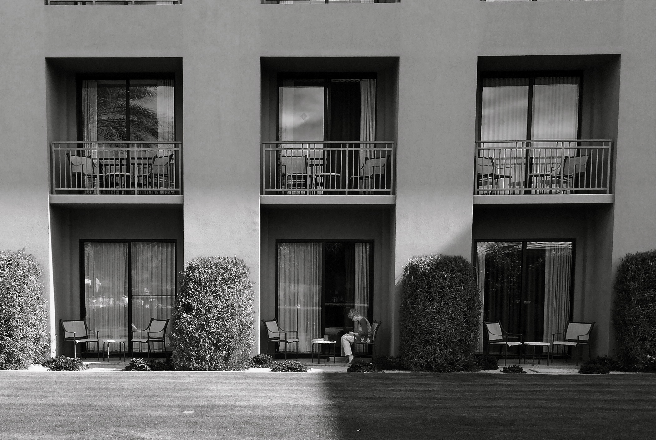
The isolation of the woman in the frame argues against the use of garish color. 1/700 sec., f/2.2, ISO 32, 18mm.
In the second image, which features a lone woman reading against a backdrop of largely featureless, uniform apartment cubes, I am off on an opposite errand. Here, I seem to be wondering why she is alone, who is waiting (or not waiting) for her, what her being in the picture means. The starkness of her isolation will never be served with anything “pretty” in the scene. The original frame, done in color, actually had the drama drained out of it by hues that were too warm. On a whim, I converted it to the look of an old red-sensitive black and white film. It gave me a sharp detailed edge on materials, enhanced contrast on shadows, and a coldness that I thought matched the feel of the image. In audio terms, I might compare it to preferring a punchy mono mix on a rock record to the open, more “airy” quality of stereo.
Dealer’s choice, but I think our photography gains a lot by weighing the color/no color choice a lot more frequently than we did in our film days. The choices are there.The technology could not be easier. Relative to earlier eras, we really do have wings now.
We just need to get used to flapping them more often.
THEY HAD FACES THEN

Happy Shining Houses: Two copies of the same image, balanced in Photomatix’ Tone Compression algorithm.1/1000 sec., f/5.6, ISO 100, 35mm
By MICHAEL PERKINS
ONE OF THE MOST HORRIBLE CONSEQUENCES OF SUBURBAN SPRAWL, beyond the obscene commercial eye pollution, the devastation of open space, and the friendless isolation, is the absolute soulless-ness of the places we inhabit. The nowheres that we live in are everywhere. Wherever you go, there you are. Move three miles and the cycle has repeated. Same Shell stations, same Wal-Marts, same banal patterns.
The title of a classic book on the passing of the star era of Hollywood could also be the story of the end of the great American house: They Had Faces Then.
I believe that the best old houses possess no less a living spirit than the people who live inside them. As a photographer, I seek out mish-mosh neighborhoods, residential blocks that organically grew over decades without a “master plan” or overseeing developer. Phoenix, Arizona is singular because, within its limits, there are, God knows, endless acres of some of the most self-effacing herdblocks created by the errant hand of man, but also some of the best pre-WWII neighborhoods, divine zones where houses were allowed to sprout, erupt, and just happen regardless of architectural period, style, or standard. It is the wild west realized in stucco.
When I find these clutches of houses, I don’t just shoot them, I idealize them, bathing the skies above them in azure Kodachrome warmth, amping up the earth tones of their exteriors, emphasizing their charming symmetries. Out here in the Easy-Bake oven of the desert, that usually means a little post-production tweaking with contrasts and colors, but I work to keep the homes looking as little like fantasies and as much like objects of desire as I can.
One great tool I have found for this is Photmatix, the HDR software program. However, instead of taking multiple exposures and blending them into an HDR, I take one fairly balanced exposure, dupe it, darken one frame, lighten the other, and process the final in the Tone Compression program. It gives you an image that is somewhat better than reality, but without the Game of Thrones fantasy overkill of HDR.
Photography is partly about finding something to shoot, and partly about finding the best way to render what you saw (or what you visualized). And sometimes it’s all about revealing faces.
FAR AWAY, AS CLOSE AS POSSIBLE

“Fake” macro done with a zoom at 300mm. Actual object is about six feet away. 1/160 sec., f/8, ISO 100.
By MICHAEL PERKINS
OVER YOUR LIFETIME AS A PHOTOGRAPHER, IT DOESN’T TAKE A LOT OF EFFORT TO ACCUMULATE A SMALL WAREHOUSE OF SPECIALIZED GLASS. Lens acquisition just may be the crack cocaine of photography, since we all know that the best picture of your life will be taken with the lens you don’t yet own.
We slobber with envy over magazine spreads which lovingly detail the bursting kit bags of the pros, which far too many of them pose for in magazines, at least once. I think it is a kind of passive-agressive attempt to scare most of us other shrimps into abandoning the craft altogether and finding honest work, like breaking into ATMs. I swear, there must be proof that a significant percentage of the second mortgages in the world are traceable to “daddy needs a new fisheye”.
One of the most expensive hunks of glass for many of us will be a dedicated macro lens. Assuming that you don’t buy a third-party bauble made from a child’s kaleidoscope in an emerging nation, the investment can be daunting, especially if macro shots are a small subset of your total output. Forced to choose between a dedicated macro and a decent quality zoom, however, I have sided with the zoom every time, since, in a pinch, it can serve as a decent sub for a macro. Detail is your big factor. You have to decide if you want to count the feathers on a robin’s back, or if you want to be able to see the mites that live in the feathers. If you’re a mite man, then apply for that second mortgage now.
Shot from about five feet out, zoomed to 220mm: 1/80 sec., f/8, ISO 100.
Standing just a few feet from your macro subject and zooming out to, say, 300mm allows you enough magnification to fill your frame. Of course, you should be absent any bloodstream caffeine, since camera shake will become a large part of your life. You could default to a tripod, but since you’re improvising a macro shot, you are probably too close to the object to want to impede foot traffic (or simply waste opportunities) getting set up, so it’s better to experiment with various ways of bracing the camera against your body. And again, cut the caffeine.
Your depth of field will be shallow, which will actually help out, since the bokeh will eliminate distractions around or behind your subject. You will also be far enough from what you’re shooting to keep you from casting a shadow over it with your body. If you want a sharper image, you can go to a smaller aperture, but as you’re completely zoomed out already, you are already down to f/5.6 and its attendant light loss. A smaller aperture means you’ll have to slow your exposure, and that could give your handheld shot the dreaded shakes again. Everything’s a trade-off.
Bottom line: it’s cost-effective to make the lenses you have do everything of which they are each capable than to build a mountain of specialized glass in your closet.
Remember when golf was the expensive hobby? Ah, them wuz the days.
ART VS. ARTIFACT
By MICHAEL PERKINS
PHOTOGRAPHY HAS NOW ARRIVED AT A TRULY STRANGE PLACE. It’s no big bulletin that modern processing and phone apps now allow us to simulate the various visual defects and flaws we used to summarily reject from our images, deliberately including them in our pictures as design elements. Things to be desired.
Features to make the picture better.
????? Let’s take this out of the realm of photography for a moment to see how truly insane it is.
One of the more ridiculous gimmicks of the digital age in audio (which is, let’s face it, free of the scratch and hiss of analog recordings) was to put both these sources of annoyance and noise back into CDs. Hip-hop has been particularly egregious in the inclusion of crackle and scratches into tracks, as if these effects conferred some kind of authenticity on the results. It’s like a guy who gets a chin scar in a woodshop accident, then tells women at bars that he got it in a knife fight. Fake life, fake cred.
Back to photos, where downloadable apps let you slather on filters that simulate photos which appear damaged, ravaged by time, poorly exposed, marred by light leaks, or ruined as the result of faulty film processing. Now, think about this: we have become the first generation of photographers who think it is creative/profound/cute to make our pictures look bad on purpose, to make images that our predecessors would have (rightly) rejected as marred, imperfect, wrong.
Is this photo anything, or did I just keep dress it up in a funny party hat?
I took this image on a cel phone, then processed it through the app Alt Photo to simulate a daguerreotype. I did it mostly as an experiment, but then, in a moment of weakness, I posted it on image sharing sites where, so far, it has garnered over 5,000+ hits. Here is the problem: I can no longer determine whether my essential image has any merit, or whether its popularity is solely due to the effect. That bothers me. I feel that any attention or approval this photo has achieved has happened, well, dishonestly. I get the fun aspect: I enjoyed it, as a novelty, a lark, but the thought of anyone taking it seriously disturbs me. And I am angry at myself for giving into the temptation to put it out there.
Gimmicks aside, photography means something. Making a picture means something. And technical crutches that draw attention from that process are just cheap card tricks. Distractions. What an interesting problem: as a consequence of our technical cleverness, we are now locked in an eternal struggle between art and artifact.
SHARED JOURNEYS
By MICHAEL PERKINS
THERE CAN’T BE A SINGLE PHOTOGRAPHIC ARTIFACT ELOQUENT ENOUGH to speak to all the human experiences of a mass migration, so any attempt of mine or others to sum up the journey of the Irish in even a series of images will be doomed to, if not failure, the absence of many voices. Those who prayed and went unheard. Those who leaped only to vanish into the air. Those who had their souls and stomachs starved to make freedom more than an abstraction. Those who kept faith and those who lost their way.

Rooted: 1/50 sec., f/5, ISO 200, 35mm.
America continues, on this St. Patrick’s Day, to struggle with the issue of who is welcome and who is “the other”, so the trek of the Irish from despised newcomers to an interwoven thread in the national fabric should be seen as a template. See, we should be saying to the newcomers, it can be done. You can arrive to jeers, survive through your tears, thrive in your cheers. Wait and work for justice. Take your place in line, or better yet, insist on a place in line, a voice in the conversation. The country will come around. It always has.
For the Irish, arrival in America begins in a time of gauzy memory and oral histories, then blends into the first era of the photograph and its miraculous power to freeze time. And when all the emerald Budweiser flowing on this day has long since washed away, the Irish diaspora will still echo in the collective images of those who first crossed, those who said an impossible, final farewell to everything in the hope of everything else, and those who stepped before a camera.
In some families the histories are blurred, fragmented. In some attics and scrapbooks, the faces are missing. The recent American love affair with geneology has triggered a search for the phantoms within families, the notes absent from the song, and this has coaxed some of the images out of the shadows. So that’s what she looked like, we say. Oh, you have his eyes. We still have that hat up in the attic. I never knew. I never dreamed.
One thing that can help, in all families, whatever their journeys to this place, is to bear witness with cameras. To save the faces, to fix them in time. To research and uncover. Another is to recall what it felt like to be “the other”, and to extend a hand to those who presently bear that painful label.
So, today, my thanks to the O’Neills, Doodys, McCourts, Sweeneys and others who got me here. Due to the ravages of time, I may not have the luxury of holding your faces in my hand.
But nothing can erase your voices from my heart.
HOW DARE HUE
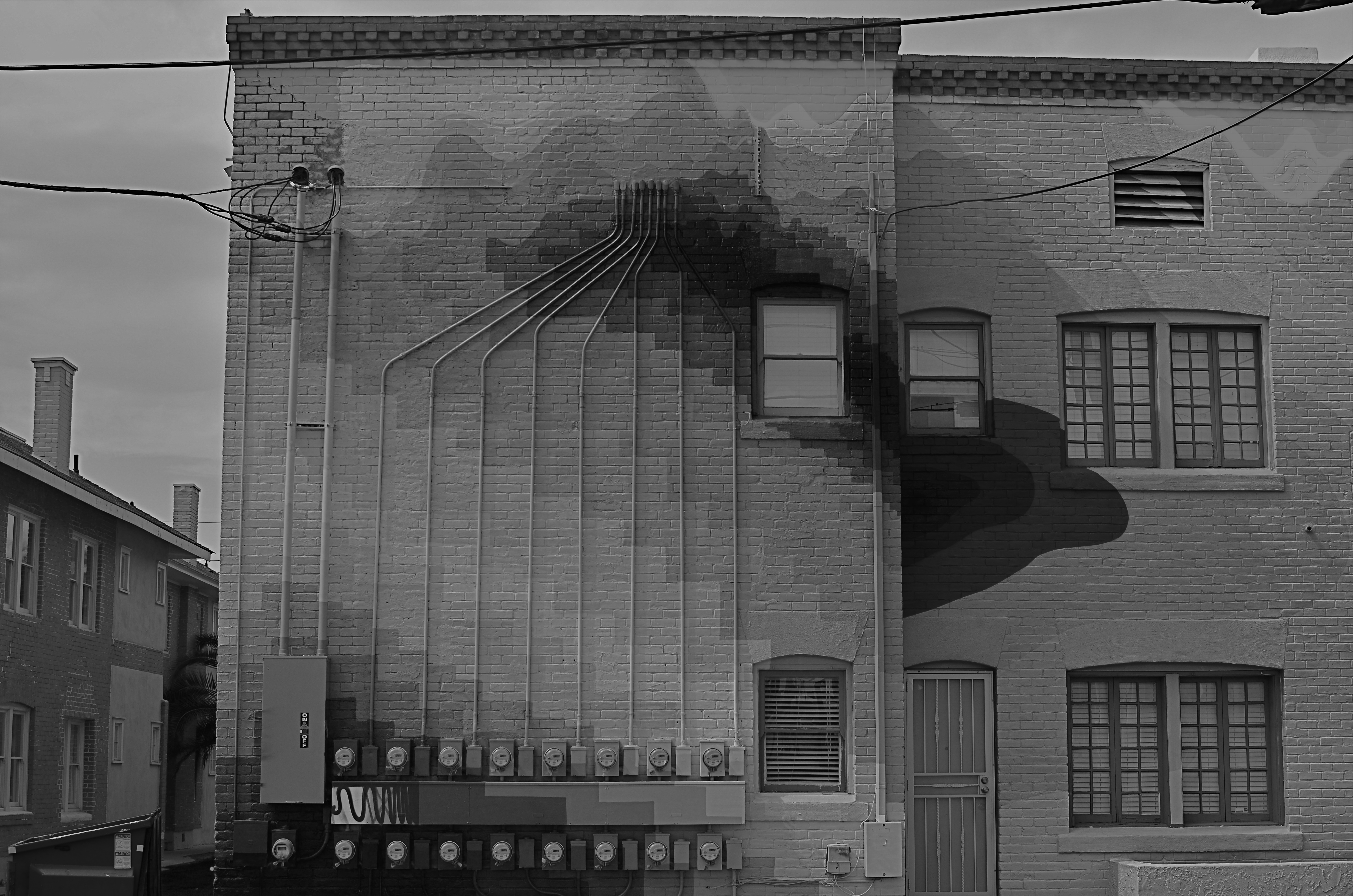
Terminus, 2014. 1/250 sec., f/5.6, ISO 100, 35mm. Desaturated copy.
By MICHAEL PERKINS
IT’S TRULY AMAZING TO CONSIDER THAT, AS RECENTLY AS THE LATE 1940’s, many serious photographers were, at best, indifferent to color, and at worst, antagonistic toward its use in their work. And we’re talking Edward Weston, Ansel Adams and many other big-shoulders guys, who regarded color with the same anxiety that movie producer experienced when silent segued to sound. We’re talking substantial blood pressure issues here.
Part of the problem was that black and white, since it was not a technical representation of the full range of hues in nature, was already assumed to be an interpretation, not a recording, of life. The terms between the artist and the audience were clear: what you are seeing is not real: it is our artistic comment on real. Color was thought, by contrast, to be “merely” real, that is to say limiting, since an apple must always be red and a blueberry must always be blue. In other words, for certain shooters, the party was over.
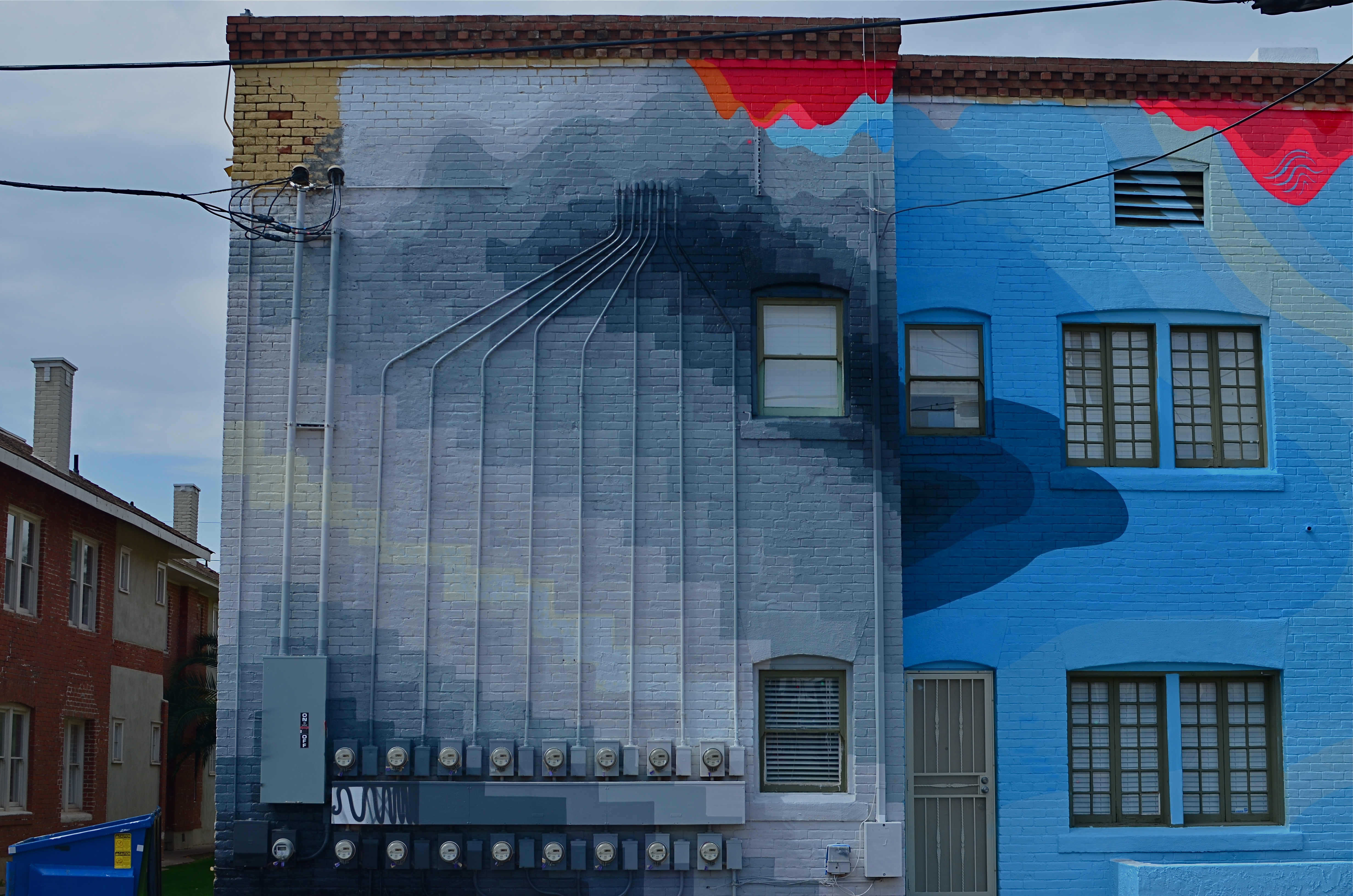
The color original. A little too Peter Max-y.
There were also technical arguments against color, or at least the look of color as seen in the printing processes of the early 20th century. Mass-appeal magazines like Look, Life, and National Geographic had made, in the view of their readers, massive strides in the fidelity of the color they put on newsstands. For Adams, these advances were baby steps, and pathetic ones at that, leading him and others to keep their color assignments to a bare minimum. In Adams’ case in particular, color jobs paid the bills that financed the black and white work he thought to be more important, so, if Kodak came calling, he reluctantly returned their calls. He then castigated his own color work as “aesthetically inconsequential but technically remarkable.”
Look where we are today, making color/not color choices in the moment, without changing films in mid-stream, deciding to convert or de-saturate shots in camera, in post processing, or even further down the road, based on our evolving view of our own work.
There are times when I still prefer monochrome as more “trustworthy” to convey a story with a bit more grit or to focus attention on textures instead of hues. In the above shot, I decided that the spare old building and its spidery network of power meters simply had more impact without the pretty colors from its creative makeover. However, one of my color frames was stronger compositionally than the black and white, so I desaturated it after the fact. Fortunately, I had shot with a polarizing filter, so at least the tonal range survived the transition.
The miracle of now is that we can make such microscopic tweaks in our original intention right on the spot. And that’s good, since, when it comes to color, nothing is ever black and white (sorry).
SOME OF MY BEST FRIENDS ARE (NOT) PHOTOGRAPHERS
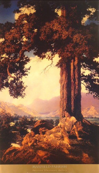
Beyond reality: the mood lighting of magazine illustrator par excellence Maxfield Parrish.
By MICHAEL PERKINS
THERE WAS A BRIEF MOMENT, WHEN PHOTOGRAPHY WAS A NOVELTY, when it was thought to be in some kind of winner-take-all death match with painting. That fake war lasted but a moment, and the two arts have fed (and fed upon) each other to varying degrees ever since. Both painting and photography have passed through phases where they were consciously or unconsciously emulating each other, and I dare say that all photographers have at least a few painter’s genes in their DNA. The two traditions just have too much to offer to live apart.
One of my favorite examples of “light sculpting”, the artistic manipulation of illumination for maximum mood, came to me not from a photographer, but from one of the finest illustrators of the early twentieth century. Maxfield Parrish (1870-1966) began his career as a painter/illustrator for fanciful fiction from Mother Goose to The Arabian Nights. Then, as color processes for periodicals became more sophisticated after 1900, he seamlessly morphed into one of the era’s premier magazine artists, working mostly for ad agencies, and most famously for his series of magnificently warm light fantasies for Edison Mazda light bulbs.
Parrish’s Mazda ads are dazzling arrangements of pastel blues, golden earth tones, dusky oranges, and hot yellows, all punched up to their most electrically fantastic limits. Years before photographers began to write about “golden hours” as the prime source of natural light, Parrish was showing us what nature seldom could, somehow making his inventions seem a genuine part of that nature. The stuff is mesmerizing. See more of his best at: http://www.parrish.artpassions.net/
During a recent trip to the high walking paths that crown Griffith Park in Los Angeles, I saw the trees and hills, at near sunset, form the perfect radiated glow of one of Parrish’s dusks. Timing was crucial: I was almost too late to catch the full effect, as shadows were lengthening and the overhanging tree near my cliffside lookout were beginning to get too shadowy. I hoped tha,t by stepping back just beyond the effective range of my on-board flash, I could fill in the front of the fence, allowing the light to decay and darken as it went back toward the tree. Too close and it would be a total blowout. Too far back, and everything near at hand would be too dark to complement the color of the sky and the hills.

Faux-Parrish with a little help from fill flash. 1/160 sec., f/5.6, ISO 100, 35mm.
After a few quick adjustments, I had popped enough color back into the foreground to make a nice authentic fake. For a moment, I was on one of Parrish’s mountain vistas, lacking only the goddesses and vestal virgins to make the scene complete. You’d think that, this close to Hollywood, you could get Central Casting to send over a few extras. In togas.
Next time.
BALLET OF HORROR
By MICHAEL PERKINS
THERE USED TO BE A MOVEMENT IN FINE ARTS CALLED THE “ASHCAN SCHOOL”, WHICH SOUGHT TO SHOW POWER AND BEAUTY in banal or even repellent urban realities. It posed a question that continues to stoke debate within photography to this day: how much should art engage with things that are horrible? Is the creative act vital when it shows us ugliness? More importantly, is it vital because it shows us these things? And, if we choose to depict beauty to the exclusion of the ugly, is our art somehow less authentic?
The whole matter may come down to whether you see photography as a constructed interpretation of the world, kind of a visual poem, or as a sort of journalism. Of course, the medium has been shown to be wide enough for either approach, and perhaps the best work comes from struggling to straddle both camps. A world of gumdrops and lollipops can be just as pretentious and empty as a world constructed exclusively of the grisly, and I think each image has to be defined or justified as a separate case. That said, finding a ying/yang balance between both views within a single image is rare.
Falling, as I did, under the influence of landscape photographers at a really early age, I have had to learn to search for a kind of rough ballet in things that I find disturbing. I’m not saying that it’s hampered my work: far from it. Look at it another way: as a missionary, you can plant crops and build hospitals for your village, but you still have to address the area’s cholera and dysentery. It’s just a part of its life.
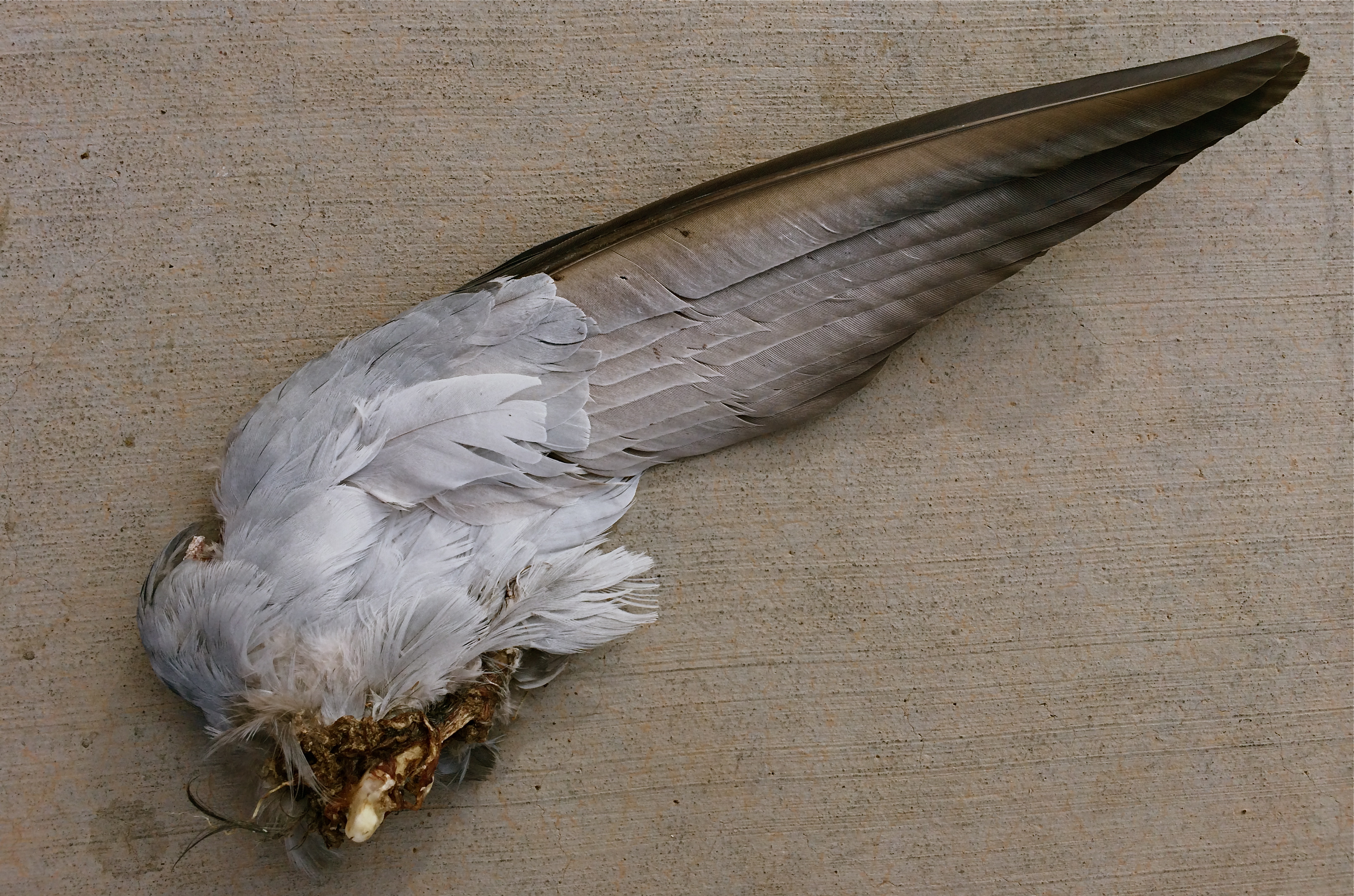
Death On The Wing: 1/900 sec., f/2.2, ISO 32, 4.12mm
The image above was pretty much placed right in my path the other day as I walked to enter an urban drugstore, and, as horrified as I was by the likely origin of this savage souvenir, I had to also acknowledge it as a Darwinian study of beauty and design. The virtually intact nature of the wing, contrasted with the brutal evidence of its detachment from its owner, made for an unusual transition from poetry to chaos within a single image. Many might ask, how could you make that picture? And it’s a hard question to answer. Another question that would be just as difficult to answer: how could I not?
Certainly, I won’t be entering this in Audubon magazine’s annual photo contest: it’s also no one’s idea of cutest kitty or beautiful baby. But it is one of the most unique combinations of sensation I have ever seen, and I did not want to forget it, nightmares and all. Because we live, and take pictures in, the world at large.
Not just the world we want.
DESTROY IT TO SAVE IT
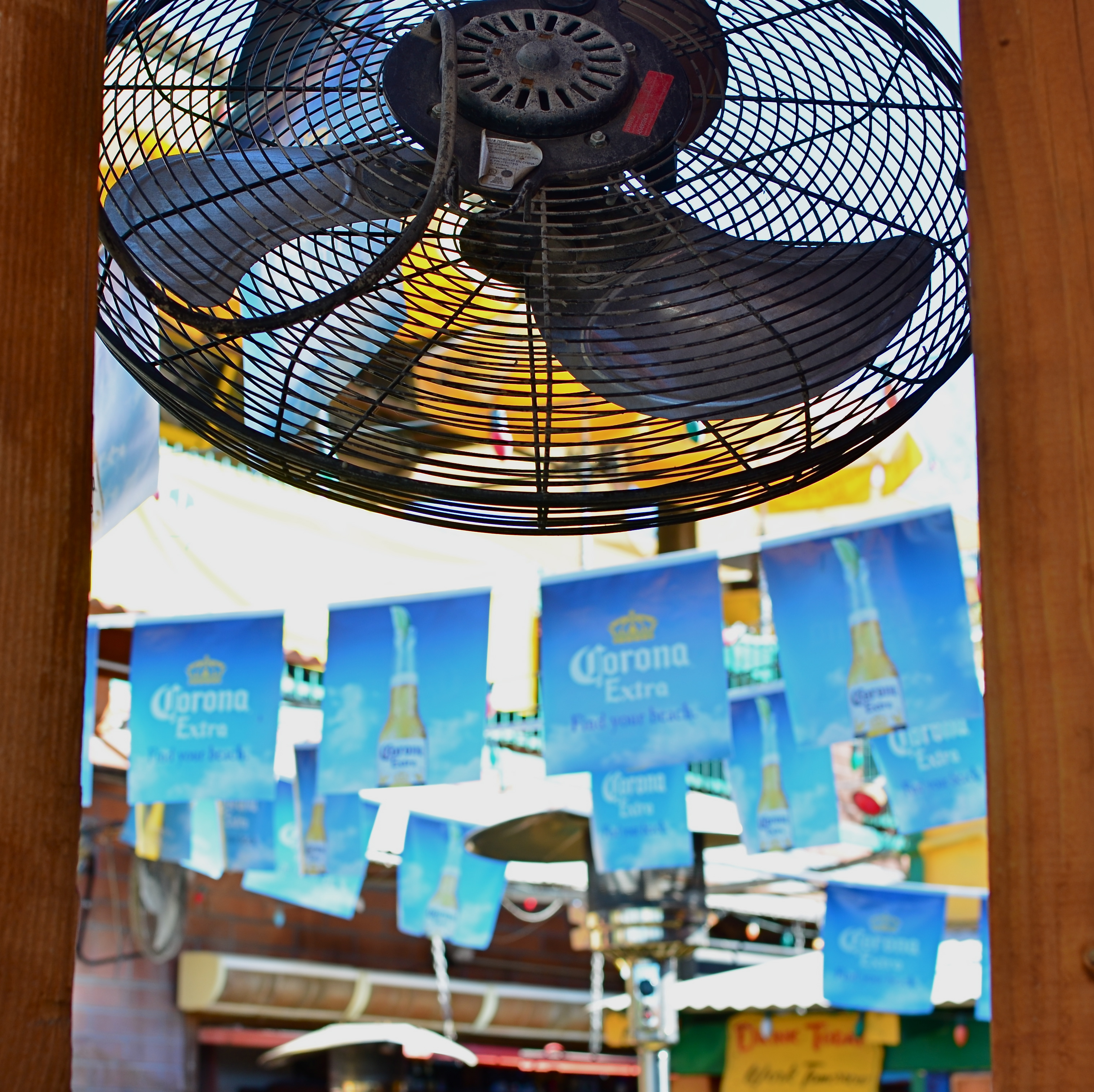
Fan photo: 1/80 sec., ISO 100, 35mm.
By MICHAEL PERKINS
THERE ARE TIMES WHEN THE RAW VISUAL FLOOD OF INTENSE COLOR IS THE MOST INTOXICATING DRUG ON THE PLANET, at least for photographers. Sometimes you are so overcome with what’s possible from a loud riot of hues that you just assume you are going to be able to extract a coherent image from it. It happens the most, I find, with large, sprawling events: festivals, open restaurants, street fairs, carnivals, anywhere your eyeballs just go into overload. Of course there must be a great picture in all this, you promise yourself.
And there may be. But some days you just can’t find it in the sheer “Where’s Waldo”-ness of the moment. Instead, you often wind up with a grand collection of clutter and no obvious clues as to where your viewer should direct his gaze. The technical term for this is “a mess”.
I stepped in a great one the other day. It’s a local college-crowd bar in Scottsdale, Arizona, where 99% of the customers sit outside on makeshift benches, shielded from the desert sun by garish Corona umbrellas, warmed by patio heaters, and flanked by loud pennants, strings of aerial lightbulbs and neon booze ads. The place radiates fun, and, even during the daylight hours before it opens, it just screams party. The pictures should take themselves, right?
Well, maybe it would have been better if they had. As in, “leave me out of it”. As in, “someone get me a machete so I can hack away half of this junk and maybe find an image.” Try as I might, I just could not frame a simple shot: there was just too much stuff to give me a clean win in any frame. In desperation, I shot through a window to make a large cooling fan a foreground feature against some bright pennants, and accidentally did what I should have done first. I set the shot so quickly that the autofocus locked on the fan, blurring everything else in the background into abstract color. It worked. The idea of a party place had survived, but in destroying my original plan as to how to shoot it, I had saved it, sorta.
I have since gone back to the conventional shots I was trying to make, and they are still a vibrant, colorful mess. There are big opportunities in big, colorful scenes where showing “everything in sight” actually works. When it doesn’t, you gotta be satisfied with the little stories. We’re supposed to be interpreters, so let’s interpret already.
POST No. 200: LET’S SEE WHAT HAPPENS
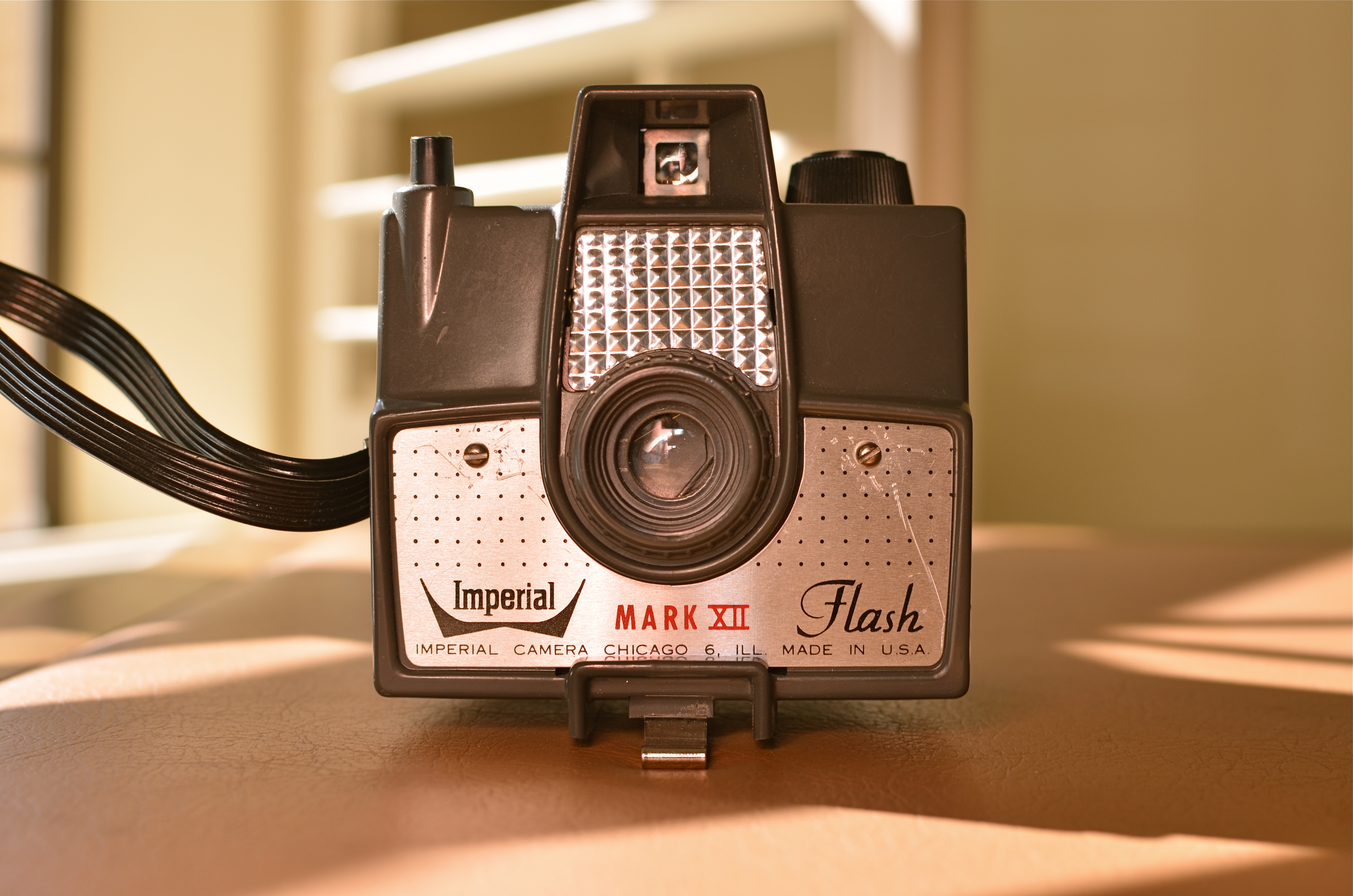
Let There Be (A Way To Catch) Light: The Imperial Mark XII, my first camera. 1/200 sec., f/5.6, ISO 125, 35mm.
By MICHAEL PERKINS
TIME, AT MY LOCATION IN LIFE, NOW PROCEEDS LIKE A CRUISE MISSILE, OR FASTER. Some days the signposts are zipping by so quickly that I seem to be inside a blender going full tilt puree.
I began THE NORMAL EYE as a kind of “let’s see what happens” project in 2012. Back at the starting line, 200 posts ago today, I wondered if I could even get to 200 words. Then a lucky accident occurred. Photography, which, over a lifetime has been an unfailing miracle of discovery for me, willed that passion onto my pages. Maybe it’s the kind of writing that is available to me, to all of us, as a unique feature of the present world. Maybe I had to live this long to become a chronicler for my eye and the soul that stands behind it.
As a broadcaster, I made my living for over thirty years writing advertising copy, news features, presentations, columns and tutorial material, but always for someone else, always to other agendas beyond my own. But, even while I was working for everyone else but myself, photography served as one of the very few constants in my life, and one of its principal sources of joy. Happy problem: I feel like I need another whole life to try to realize what I can now visualize. If I have any regret, it is that I learn everything the hard way, the slow way, experientially. If I could conceptualize the finer points of the art of imaging without running it personally through my own fingers, I would. It would save time, a premium item at any age, but beyond price from where I stand now.
When I first began clicking away as a kid with a kamera, I knew nothing but that I wanted to make pictures. I was divinely unaware of how truly ignorant I was and keen for the fray. My father, being a graphic artist, subscribed to Life magazine when it was still the premier photo newsmagazine in the world, tearing out the images in every issue and organizing them into a morgue file. There was the world in our garage, alphabetized as a ready reference on any subject. Want to know how to draw a giraffe? Look in the G folder.
But something else was happening as well. I was getting a crash course from the leading photographers on the planet as to how to see, how to show what you saw, how to make others see. I had my own version of the twelve apostles in the works of Alfred Eisenstadt, Gordon Parks, Larry Burrows, Richard Avedon, Otto Karsh, Margaret Bourke-White, and a half dozen others. Inside this special Bible I studied chapters and verses from the books of Aperture, F-stop, Exposure, Tri-Pan X, Graphlex. Praise the Lord and pass the polarizing filter.
As photographers, we all know that our favorite picture is the one we haven’t taken yet, since therein lies the potential for everything. I have to approach this blog the same way. Your input and my impatience have both fueled the fun and the fury of THE NORMAL EYE, and I hope to continue the affair as far as it will take us. I can’t focus for infinity, since I don’t know how far away that is. But, with your help, I can definitely manage 200 words at a time.
Thanks for coming here.
“EFFECT” VS. “EFFECTIVE”

Panoramic shots like this are no longer a three-day lab project, but an in-camera click. But what is being said in the picture?
By MICHAEL PERKINS
THERE ISN’T ANYTHING EMPTIER THAN THE PERFECT EXECUTION OF A FLAWED IDEA. And in the present effects-drenched photographic arena, where nearly any texture, color, or conception can be at least technically realized, we need, always, to be making one crucial distinction: separating what we can do from what we should do.
The basic “fixes” which come natively loaded in even the most basic cameras (filters, effects, nostalgic slathers of antique colors) suggest a broad palette of choices for the photographer looking to extend his reach through what is basically an instantaneous short cut. Fine and dandy, so far. Who, after all, wants to labor for hours to augment a shot with a particular look if that effect can be achieved at the touch of a button? Certainly no one gets into photography anymore with the understanding that they will also have to act as a chemist, and creativity need not be the exclusive playground of the scientifically elite. We all agree that the aim of photography always has and always should be the placing of all tools in as many hands as possible, etc., etc.
But waita seccint. Did I say the world tool? ……(will the recorder read that last part back….?……”placing of all tools in as many…”)… yep, tool. Ya see, that word has meaning. It does not mean an end unto itself. A fake fisheye doth not a picture make. Nor doth a quickie panorama app, a cheesy sepia filter, nor (let’s face it) the snotty habit of saying “doth”. These things are supposed to supplement the creative moment, not be a substitute for it. They are aids, not “fixes”.
This comes back to the earlier point. Of course we can simulate,imitate, or re-create certain visual conditions. But what are we actually saying in the picture? Did we use the effect to put a firm period at the end of a strong sentence, or did we use it as a smoke bomb to allow us to exit the stage before the audience gets wise to the fakery?
One of the original objections to photography, as stated by painters, was that we were handing off the actual act of visual artistry to a (gasp!) machine. A little hysterical, to be sure, but a concern is still worth addressing.
There is a soul in that machine, to be sure.
But only if we supply it.
TERMS OF ENGAGEMENT
Images that require little in the way of tweaking are good candidates for mobil phone cams. 1/30 sec., f/2.2, ISO 200, 4mm.
By MICHAEL PERKINS
OVER A HUNDRED YEARS AGO, WHEN EASTMAN KODAK’S AIM WAS TO PUT A CAMERA INTO THE HANDS OF THE AVERAGE EVERYMAN, their slogan, “You press the button, and we do the rest” was meant as an enticement. Not only had Kodak so simplified the processing of taking a snap as to make it irresistible, but they covered everything that happened next, allowing you to ship the camera, film inside, to them, at their cost, have them sweat the processing and printing, and ship back your photos, having also pre-loaded a fresh roll into your camera. You were covered at all ends, and this was a good thing. It was also an immensely successful thing for Kodak, which was, after all, not in the camera business, but in the film business (so shoot lots of it, hint hint).
Today’s camera phones are essentially the Kodak Brownies of the 21st century, with many refinements. Unlike the Brownie, the iPhone can intuit what you need in the way of light and aperture and supply it without troubling you with why or how it happens. Much like the box Kodaks of the Victorian era, today’s cameras are also bent on saving you the hassle of negotiating most decisions and choices. Again, this is a tremendously successful business plan, since it is safe to assume that most people would rather take the picture than think about how to take the picture.
But it is this very convenience that is a kind of strait jacket for photographers who were weaned on Pentaxes, Nikons and Canons, since, for us, the rules of engagement are lopsided. The camera is not meeting us in the middle as a co-creator or partner, but jamming us into a far corner, relegating us to the role of “the guy who hits the shutter”. Giving up all that active control can be freeing for some, but suffocating for others, and it speaks to the love-hate relationships many photogs have with their phones. On the one hand, Holy Hanna, looka these optics and ready-made tricks. On the other hand, you can feel that you’re just riding shotgun instead of steering.
With this in mind, I use an iPhone for the kind of street stuff where the concept or story is almost totally complete in itself, where I would only lose the moment or fiddle needlessly if carrying a more complex camera, or where the presence of a more obvious, “serious” camera would attract too much unwelcome attention. Damn ’em, phone cameras do buy you some invisibility and stealth, which is crazy, since much greater harm has been done by these ubiquitous little snoopercams than by all the “pro” cameras ever manufactured. Go figure.
When you take all the worry out of making a picture, you take all the responsibility and some of the joy out of it, too. My opinion, from my perch in the land of the dinosaurs. Cameras are not artists: they are tools, and when you give up the final say-so in what a picture will eventually be to a device, you get the recording of information, not the documentation of a soul.
NIGHT GALLERY
By MICHAEL PERKINS
I RECENTLY READ AN INTRIGUING STATEMENT ON THE DIFFERENCE BETWEEN PAINTING AND PHOTOGRAPHY to the effect that painters start with nothing, and add information until the image is created, whereas photographers start with total information and work to selectively remove things until their pictures are made. Of course, there are times when both artists borrow the approach of the other, and the practice of “light painting” is one place where photogs can actually wield a kind of brush, beginning in pure darkness and then adding illumination, literally by hand, until a picture, layer by layer, emerges.
Bascially, you’re going down two potential paths with light painting. One is the depiction of fantasy, a custom light creation that is the central subject of the image, rather than an augmentation of something else. Visit the tutorial link below to view some of these visions, as they are truly fascinating (not to mention work-intensive): the flaming fireball dancing across the lake, the geometric noodlings hanging in mid-air, the angel wings growing out of your girlfriend’s back, and so on. The other approach is to amplify the impact of a subject which has either no illumination at night or a lighting scheme that is counter to the mood you’re going for. In this case, your flashlight, LED or light coil is creating the visual reality that you wish existed. It’s “reality-plus”, rather than a complete fantasy. This is the avenue I have tended to favor.
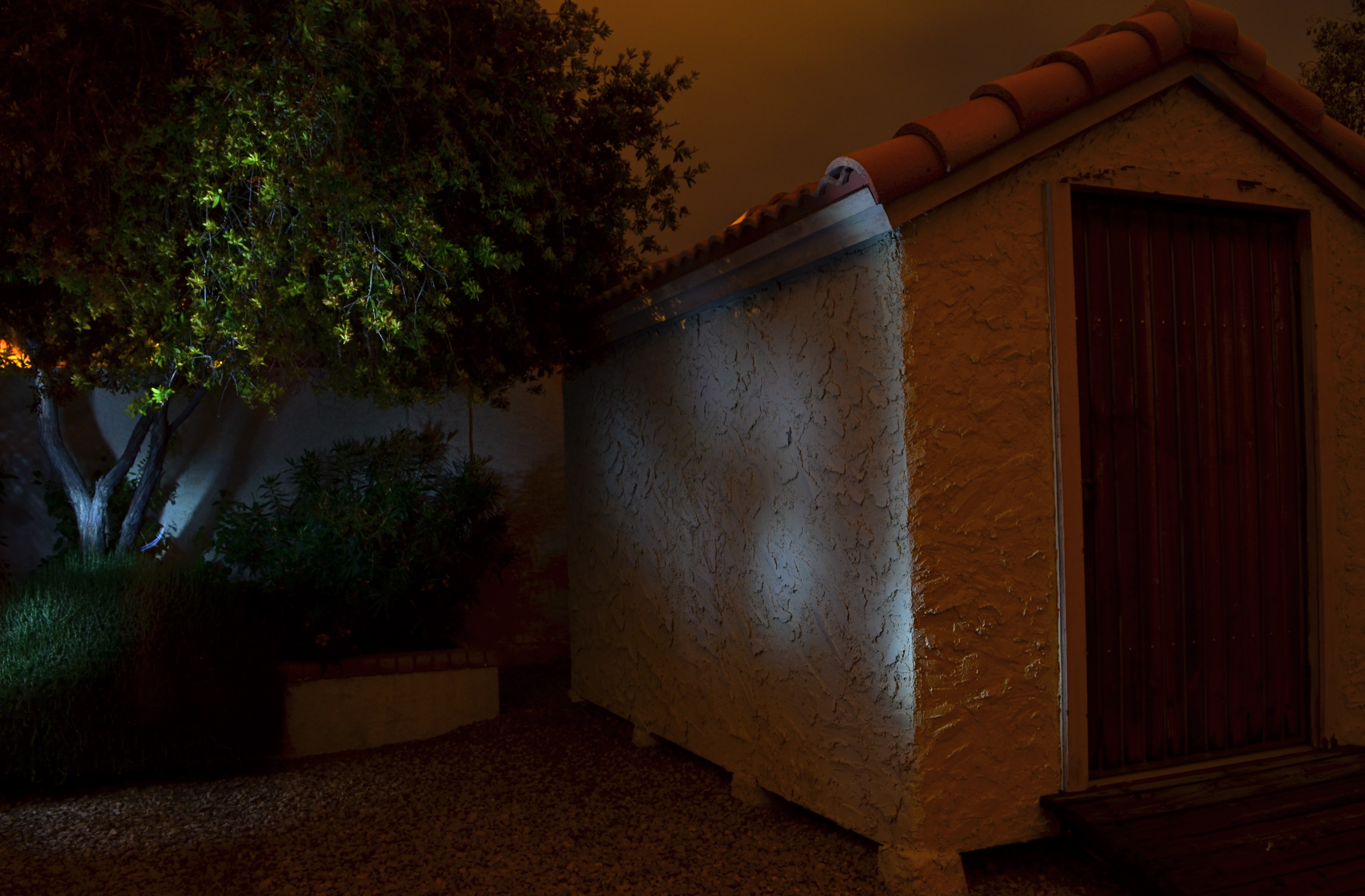
No lighting in the back yard, unless you “paint” it on: 30 sec., f/8, ISO 100, 18mm.
After a year away from light painting, I have started to slink back into it, moving from tabletop arrangements, where control is less of an issue, to exterior locales, which are, frankly, the very definition of trial-and-error.With the camera locked onto its tripod and with a pre-determined exposure and aperture, the responsibility for whether the magic happens is literally in your hands, hands that need real-world training in this technique.
As for lighting: these days, even dollar-store LEDs provide a pretty intense white light in darkness but they don’t throw it very far, and they are also pretty narrowly focused, so, if you want to paint the side of, say, a barn, it’s really hard to do so evenly. Best thing is to avoid the bargain lights: get yourself a powerful torch with a variable focus, something that can shoot both soft and wide. It’ll save you lots of time trying to guess about coverage on larger surfaces. Also, within a single exposure, you can still change off to the pencil-thin lights for special detailing, since, in complete darkness, your shutter will be open long enough for you to switch lights on and off, change position, and touch things up.
The above image was done in a yard with no landscape lighting on hand, other than the light I am applying during a thirty-second exposure. Not a perfect execution, but a quick example of how you can impart night mood to objects that are duller than dishwater in daylight. Lighting is all about setting the terms of view, and hand-painting the light allows you to control that mood, almost as completely as you would with oil, brush or canvas.
More to look at:
