THE LOVE OBJECT
By MICHAEL PERKINS
IN EARLIER OUTINGS, WE HAVE DISCUSSED THE VALUE of knowing how sunlight enters your house at all times of the day. Knowing where bright spots and slatted beams hit the interior of your home in different hours gives you a complete map of “sweet spots” where natural light will temporarily isolate and flatter certain objects, giving you at least several optimized minutes for prime shooting each day.
Keeping this little time-table in your head allows you to move your subjects to those places in the house where, say, the daily 10 a.m. sun shaft through the family room window will give you a predictably golden glow. For me, that location is my living room window, across which the southwestern sun tracks east/west, and the object is my white baby grand piano.
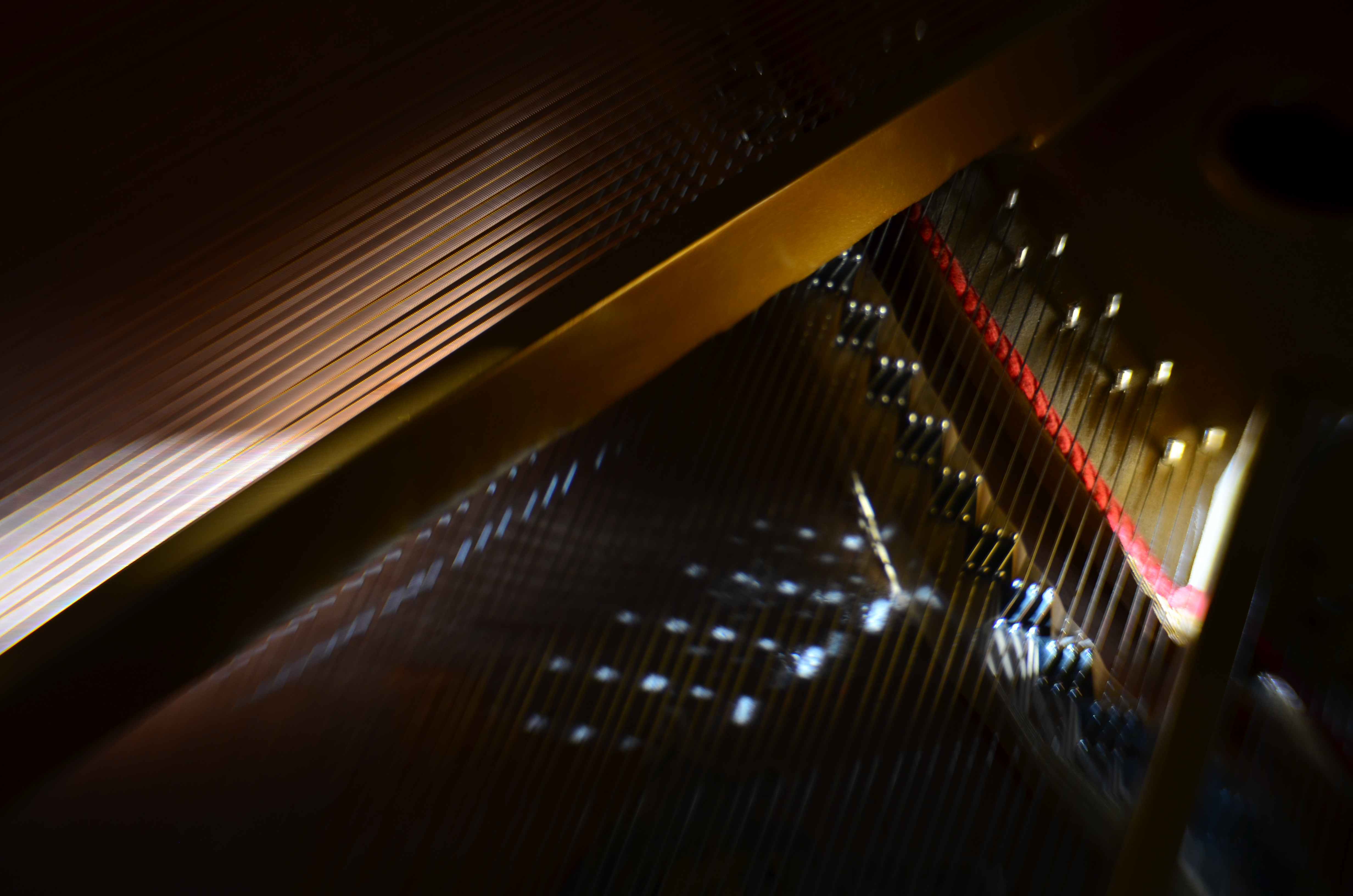
Cordophone Chroma (2017).
Pianos, to me, are divinely complex gadgets, creations of the first great industrial age, their impossibly intricate mechanics offering thousands of possibilities for macro shots, fisheye explosions, abstract compositions, shadow studies, and delicate ballets of reflections as the morning sun dances across harp, strings, and hammers in an endless kaleidoscope of radiance. I have long since tracked how the sun showcases different parts of the piano as the day progresses, and how that corresponds to the instrument’s various sections and subsections.
Hard-wiring that schedule into my skull over the years means I know when a shot will work and when it won’t, making the object more than just something to shoot. It becomes, in effect, an active kind of photo laboratory, a way of teaching and re-teaching myself about the limits of both light and my own abilities. Better still, the innate intricacy of the piano as an object guarantees that I can never really get “done” with the project, or that something that was a mystery in January will become a revelation by June.
What gives this process a special lure to me is my endless effort to exploit natural light to the full, believing, as I do, that nearly every other less organic form of illumination is measurably poorer and less satisfactory than that which comes plentifully, and for free. The house I live in has thus become, over the years, a kind of greenhouse for the management of light, an active farm for harvesting the sun.
A TAIL OF TWO DUCKS
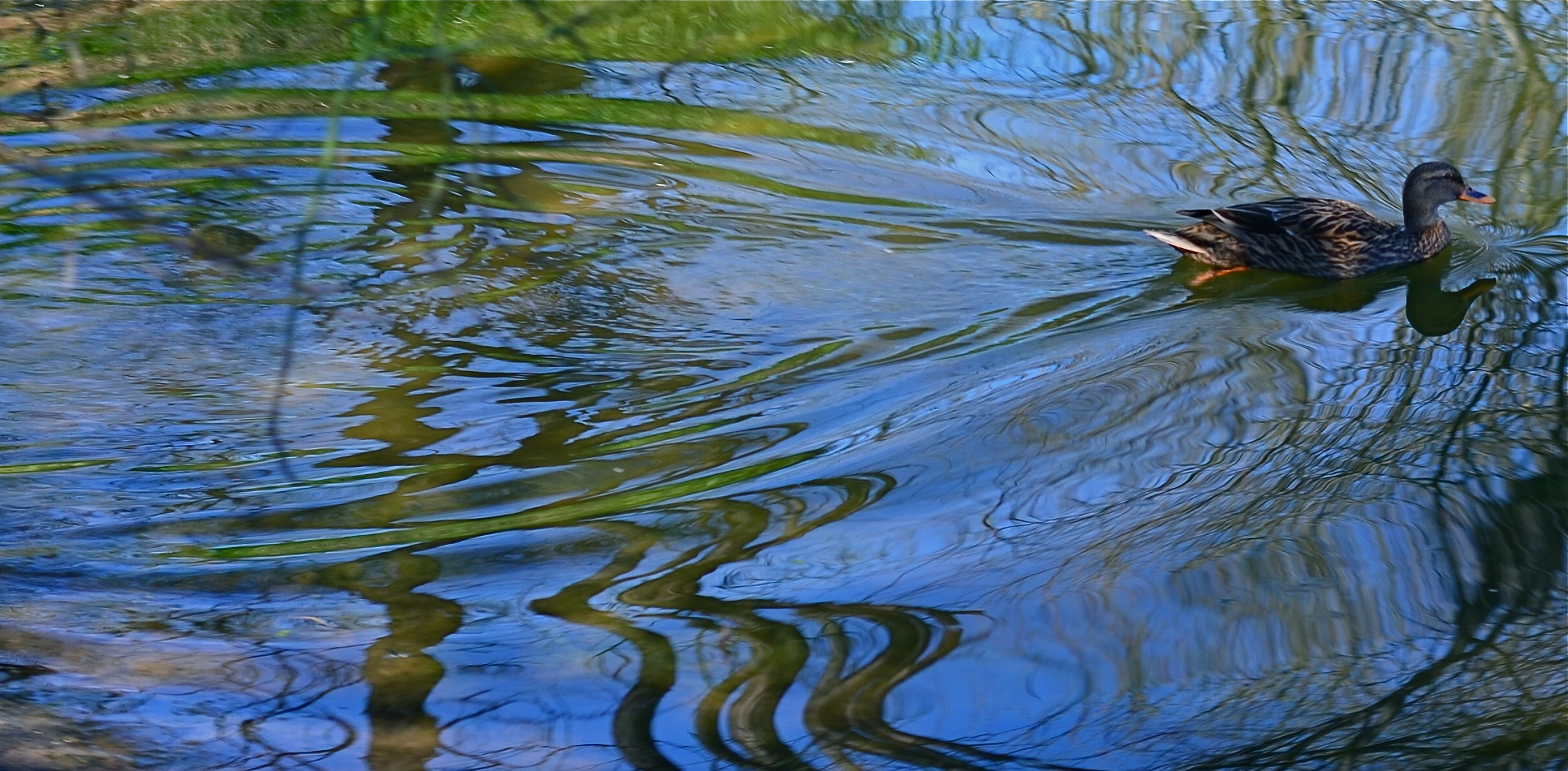
A circular polarizing filter allows you to determine how much reflective glare will be seen on water surfaces.
By MICHAEL PERKINS
PHOTOGRAPHING WATER IS A CONSTANTLY NEW CHALLENGE, since it is either an active surface, a static mirror or a revealing microscope, depending on how light on it is read by your camera. As active surface, its waves, surges and ripples break light up into endless shards. As mirror, it reflects clouds or other features that may or may not even be seen in frame, producing a reverse-angle version of reality. And as revealing microscope, it invites you to peer into its depths, providing a glimpse into a hidden world.
One of the cheapest and most effective toys available to deliver all of these renditions of water is the humble circulating polarizing filter, a quick screw-on available for virtually every kind of lens. Just match up the width of the lens threads with a filter that meets those dimensions and you’re all set. Polarizers serve two main purposes for photographers. The first is the ability to render overly bright skies a deep rich blue, helping all color pop with a little deeper impact. The second is to control the amount of glare you want in photographing water. Both functions are dialed up simply by rotating the filter’s movable outer ring, which is how you control the range of the effects you desire.
Polarizers work best when the sun is nearly directly overhead, or at a 90-degree angle with the front of your lens. In fact, though, even if this algebra is a little off, it will still produce a measurable effect, and having the time to shoot and adjust at the same pool or stream will give you an idea of how much you’ll want to apply to control the transparency of the water’s surface.

Dialing the glare back just a bit allows some features from below the water’s surface to become faintly visible.
In the image at the very top of this page the mallard’s wake creates glorious grooves in a forest pond. The polarizer has been rotated for maximum reflective effect of the sky and the tree growth overhead. Earlier in the same shoot, the squatting duck in the lower photo was shot to give a little mirror effect, but with a slight hint of transparency to allow both clouds and shore rocks to be seen in the same shot. That’s the beauty of polarized light; it can be calibrated in real time, so that you know, ahead of the shutter click, just how much you’ve opted for. As is the case with a lot of traditional photo techniques, the use of filters, decidedly old-school in nature, allows more control than trying to manipulate the same shot in post-production.
One caution: although there are dozens of manufacturers for circular polarizing filters, many of them very reasonable in price, there is some variance in the effectiveness of certain brands. Read a lot of user reviews and get the one that delivers the goods in full. Other than that, the true nature of water in your photos can have as much poetry, or mystery, as your fingers can dial up. Neat.
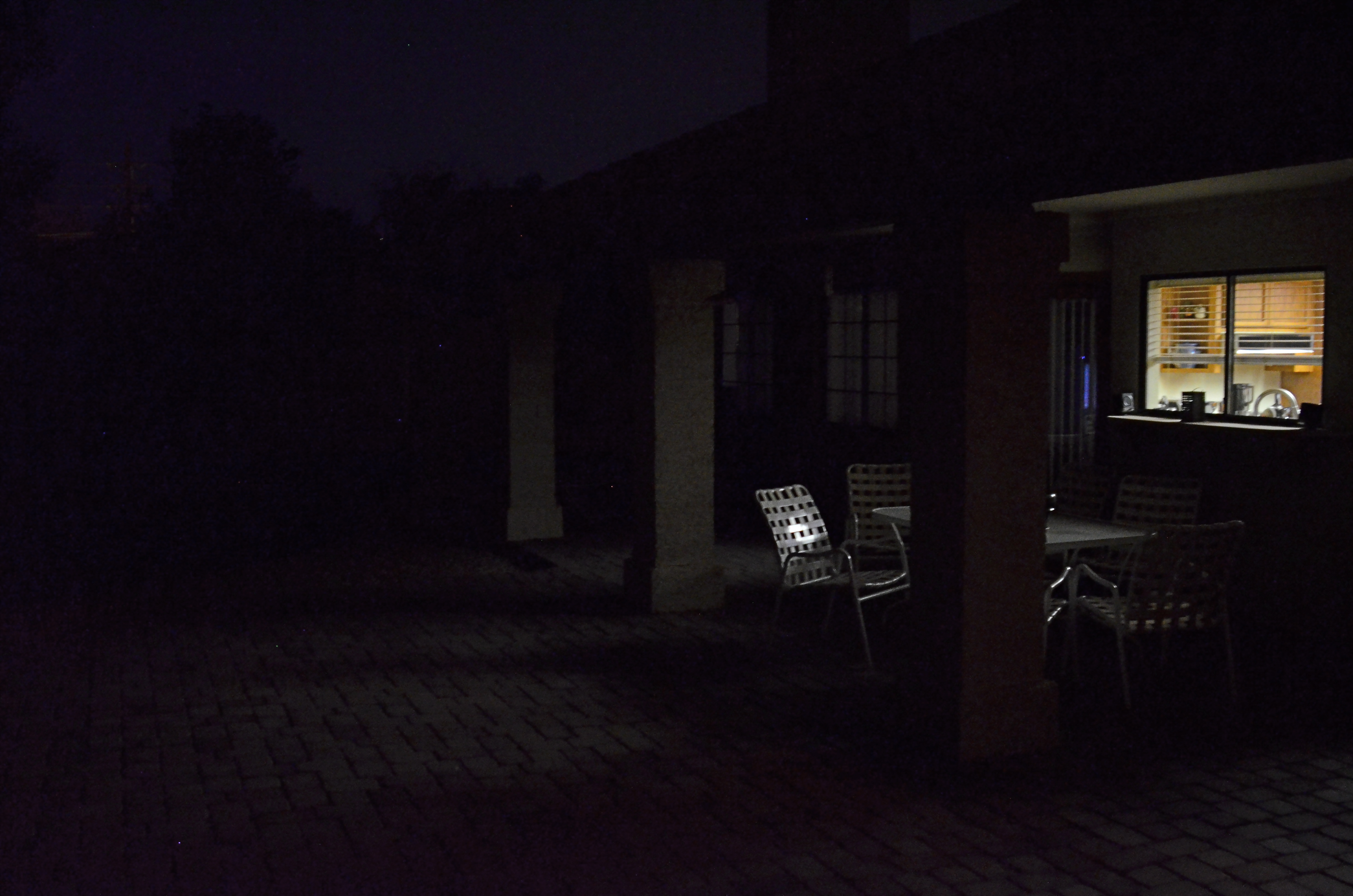
EMBRACING THE DARK, AND OTHER FLAVORS
By MICHAEL PERKINS
THERE IS A WHOLE SEPARATE WING OF THE PHOTOGRAPHIC ESTATE that values dark almost more than light. It’s a photography of near-night, work that suggests only the merest intrusion of illumination into a palette of black. An almost-nothing. A bleary, evanescent glimpse, a suggestion. Minimalism taken to the maximum.
Or, in other words, the dead opposite of the mindset of the majority of photographs made over time.
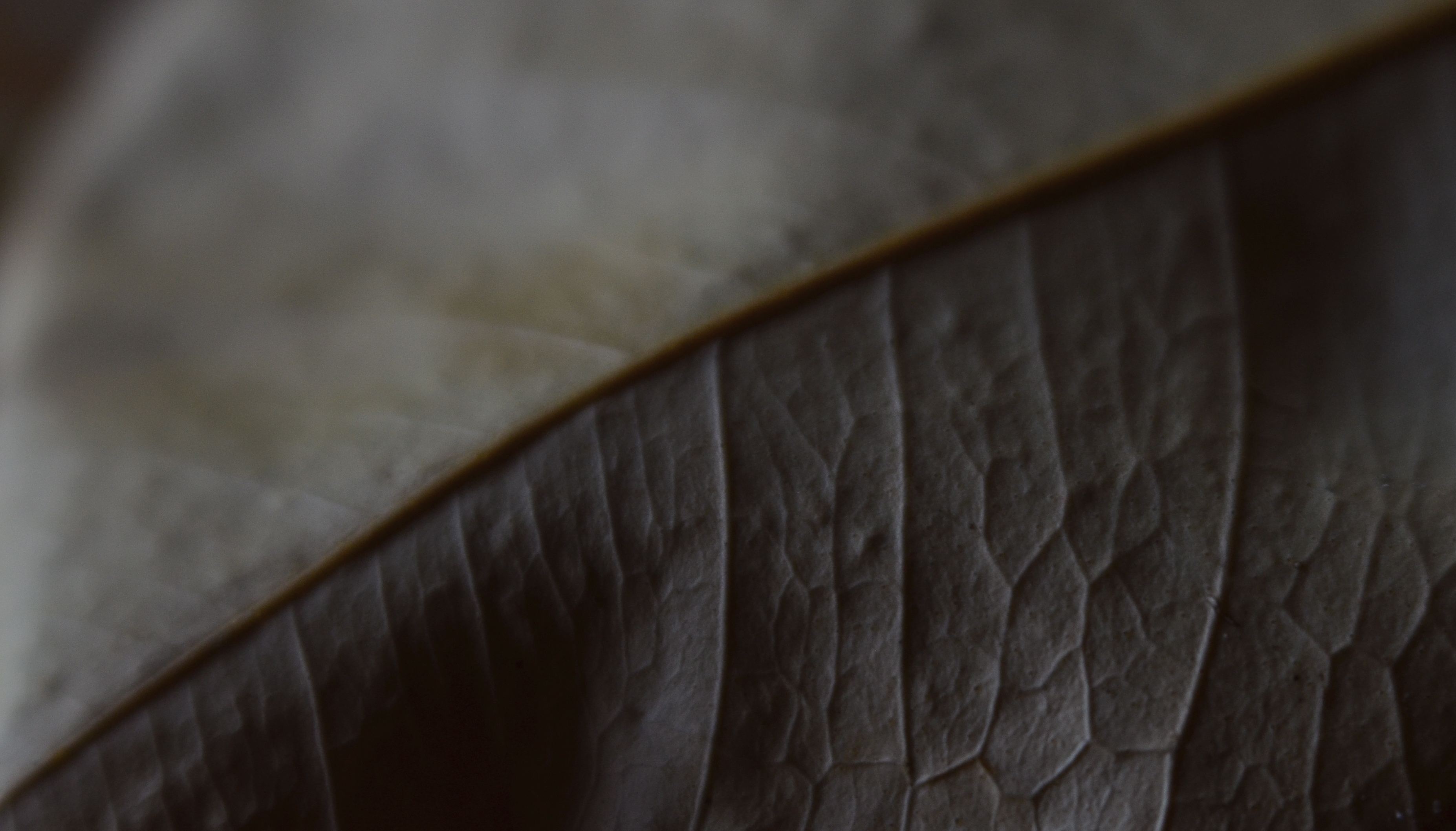
Phytomorphology 3 (2016). I could labor to make this image 100% accurate as to biologic detail, but do I need to?
For most of us, the camera was expected to get better and better at registering accurate detail in less and less light, giving us a reasonably balanced record of color and depth, a kind of realism, or at least documentation. This is the photography of the consumer, who was taught to want pictures in which everything is spelled out, obvious, apparent. Sunny Days, Natural Flesh Tones, Life As We Know It. The advance of the science of recording things with cameras seemed to suggest that well-lit meant well-realized, that we would eliminate murk and shadow in the name of clarity. We decided that those things which dealt in the dark basement of tones were “bad” pictures, defective in some basic way.
The development of art photography has often taken the opposite approach, with some artists going so far as to revive “dead” technologies like daguerrotyping, serigraphing, deliberate under-exposure, even purposeful degrading of the image (dragging negatives over ground glass, dancing on them, soaking them in bodily fluids) to get the look they desire, actually eliminating information from their pictures. Even the recent fad of lomography, which worships faulty cameras and errant processing, is indicative of the “dark” school. It doesn’t have to be in focus. It doesn’t have to be a picture “of” anything. And who made up these rules for composition, anyway?
Photography, as always, will not be reduced to a set of standards. Consumer products still try to steer customers toward predictable images, with most “how tos” listing simple steps for uniform results, or pictures that “look like photographs”. The dark worshippers, by contrast, are asking us to train our eyes to see what is not presented, as well as what is. Alright, they concede, we didn’t show everything. But you can supply the rest.
Finally, the camera remains essentially a mere servant, subject to the whims of its user. We cannot truly mechanize and regulate what comes from the eye or the soul. True art can never remain static, and any kind of creativity that doesn’t frequently threaten to break down into chaos may not be worth the effort.
TRUTH VS. REALITY
By MICHAEL PERKINS
ASKED IN 1974 BY AN INTERVIEWER ABOUT THE LEGACY OF THE ACTOR JAMES CAGNEY, director Orson Welles replied that while Jimmy “broke every rule”, “there’s not a fake moment” in any of his movies. He further explained that the star of Public Enemy, White Heat and Yankee Doodle Dandy worked counter to all the conventions of what was supposed to be “realism”, and yet created roles which were absolutely authentic. Cagney, in effect, bypassed the real and told the truth.
As do many photographers, it turns out.
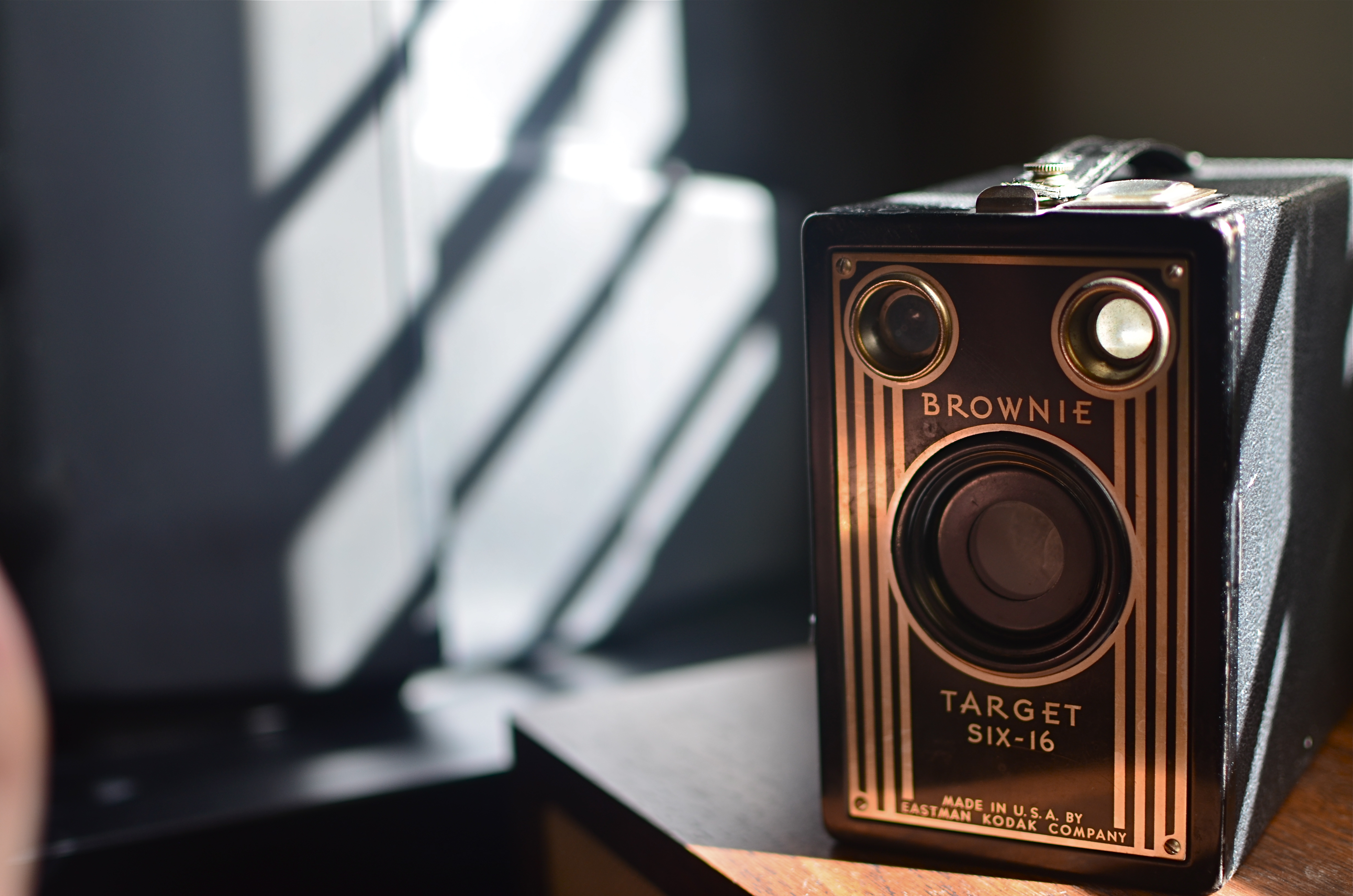
Fake sunlight on the front of this camera courtesy of sunlight bouncing off my hand.
We all have inherited a series of technical skills which were evolved in an attempt to capture the real world faithfully inside a box, and we still fail, at times, to realize that what makes in image genuine to the viewer must often be achieved by ignoring what is “real”. Like Cagney, we break the rules, and, if we are lucky, we make the argument that what we’ve presented ought to be considered the truth, even though the viewer must ignore what he knows in order to believe that. Even when we are not trying to create a so-called special effect, that is, a deliberate trick designed to conspicuously wow the audience, we are pulling off little cheats to make it seem that we played absolutely fair.
The first time we experiment with lighting, we dabble in this trickery, since the idea of lighting an object is to make a good-looking picture, rather than to mimic what happens in natural light. If we are crafty about it, the lie we have put forth seems like it ought to be the truth, and we are praised for how “realistic” a shot appears. The eye likes the look we created, whether it bears any resemblance to the real world or not, just as we applaud a young actor made up to look like an old man, even though we “know” he isn’t typically bald, wrinkled, and bent over a cane.
In the image above, you see a simple example of this. The antique Kodak really does have its back to a sunlit window, and the shadows etched along its body really do come from the slatted shutters upon that window. However, the decorative front of the camera, which would be fun to see, is facing away from the light source. That means that, in reality, it would not glow gold as seen in the final image. And, since reality alone will not give us that radiance, a second light source has to be added from the front.
In this case, it’s the most primitive source available: my left hand, which is ever so slightly visible at the lower left edge of the shot. It’s acting as a crude reflector of the sunlight at right, but is also adding some warmer color as the flesh tones of my skin tint the light with a little gold on its way back to the front of the camera. Result: an unrealistic, yet realistic-seeming shot.
There’s a number of names for this kind of technique: fakery, jiggery-pokery, flimflam, manipulation, etc., etc.
And some simply call it photography.
ISLANDS IN THE SHADOWS
By MICHAEL PERKINS
FIFTY-PLUS YEARS INTO MY LOVE AFFAIR WITH PHOTOGRAPHY, I now regard my earliest concept of a “good picture” as I regard other ideas of my youth….that is, seeing how I viewed the world given the limited scope of my own experience. When I first started making my own pictures, my models were drawn from the pages of the then-dominant photo magazines, like Life, Look, and National Geographic. Thus, for me, “good” photographs served either the reportorial functions of a news assignment or the color-saturated visions of landscape lovers. And that, for me, back then, was more than enough.
Both these kinds of images favored a fairly literal translation from the actual into the photographed: interpretation and abstraction was not anything I gave serious thought to, since I wanted my simple box-camera creations to look like “real photographs”. Art photography certainly existed, but very much at the edges of the culture. Most museums, by the early 1960’s, had still not mounted their own photographic exhibitions. Most popular photography, shaped by a large middle-class consumer culture (think Kodak Instamatic), was candid and personal in nature. Most people wanted Grandma to look like Grandma, unfiltered through any Warholian irony, commentary or experimentation. It was still a compliment for someone to say of your pictures that they “looked like a photograph”.
Would more light, more detail, convey the story any better in this image? 1/10 sec., f/2.8, ISO 2000, 24mm.
Strangely, one of the things that revised my thinking on what was “good” was an increased awareness of the works of some of the first photographers, pioneers who sweated mightily to wrangle the infant media into something like reliable performance. In their work with ever-changing combinations of plates, media, lenses and emulsions, the first photogs’ breakthrough photographs often failed from a purely technical viewpoint, producing irregular patches of light appearing randomly like islands in a sea of shadows.
But what these wizards’ first attempts often achieved, almost by accident, was the first real abstraction in photography: pieces of reality, rather than its totality: hints of the truth which invited speculation, examination. New questions were posed: what was missing, and did it matter if it wasn’t there? Could a photographer, in fact, deliberately extract parts of the “whole” picture, letting the minimum speak for everything that was left out? I gradually began to wander in search of answers to these questions.
There are times when a picture speaks louder the less it says. My original orientation to “good” images, seeing them as the most faithful translation of the literal onto film, expanded gradually to include whatever visual language communicates best in a given picture. Sometimes, in some very key instances, it helps to think like the first practitioners, who discovered, however haphazardly, that mere reality sometimes comes up short.
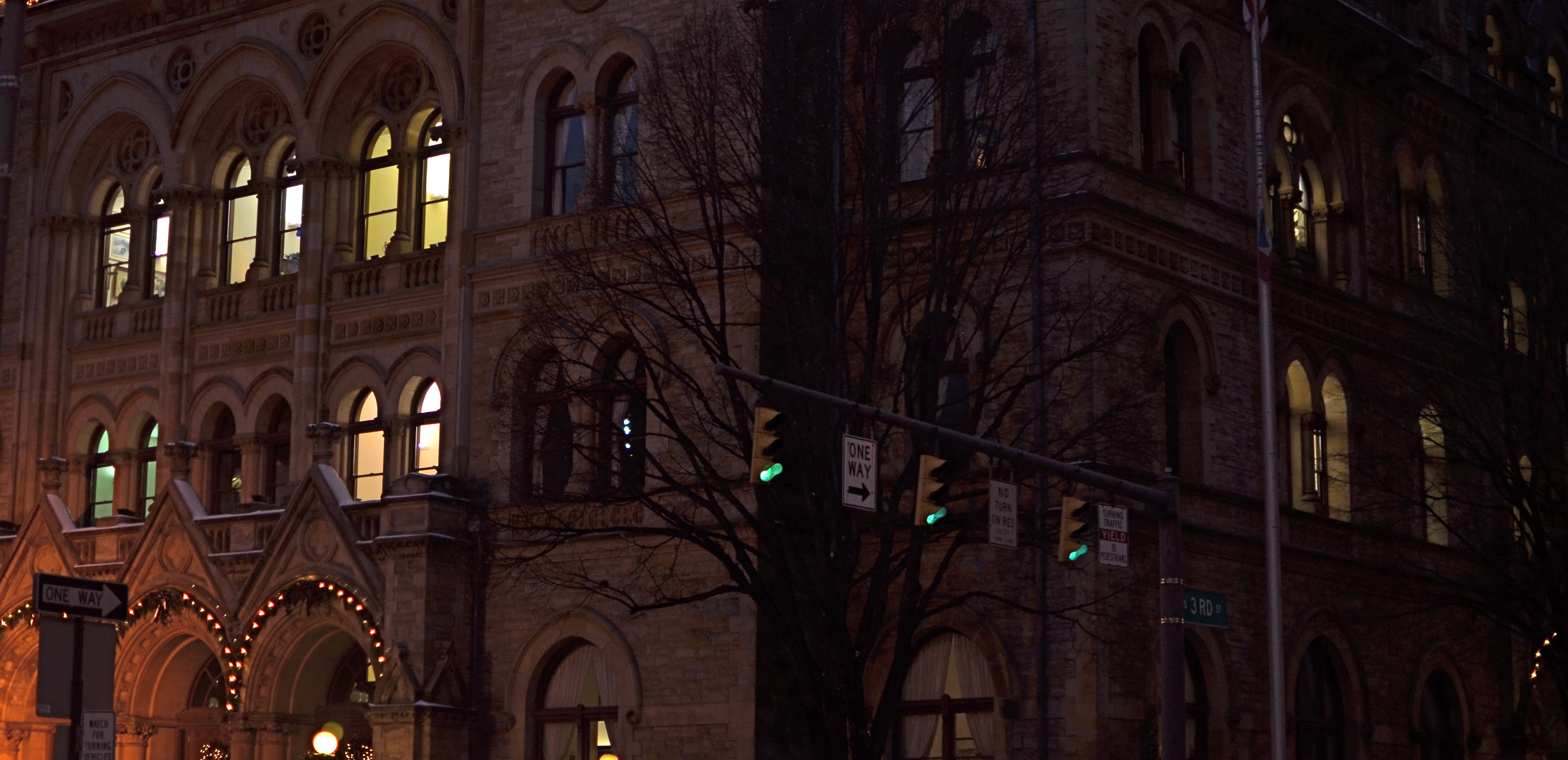
I HOLD HERE IN MY HAND…..
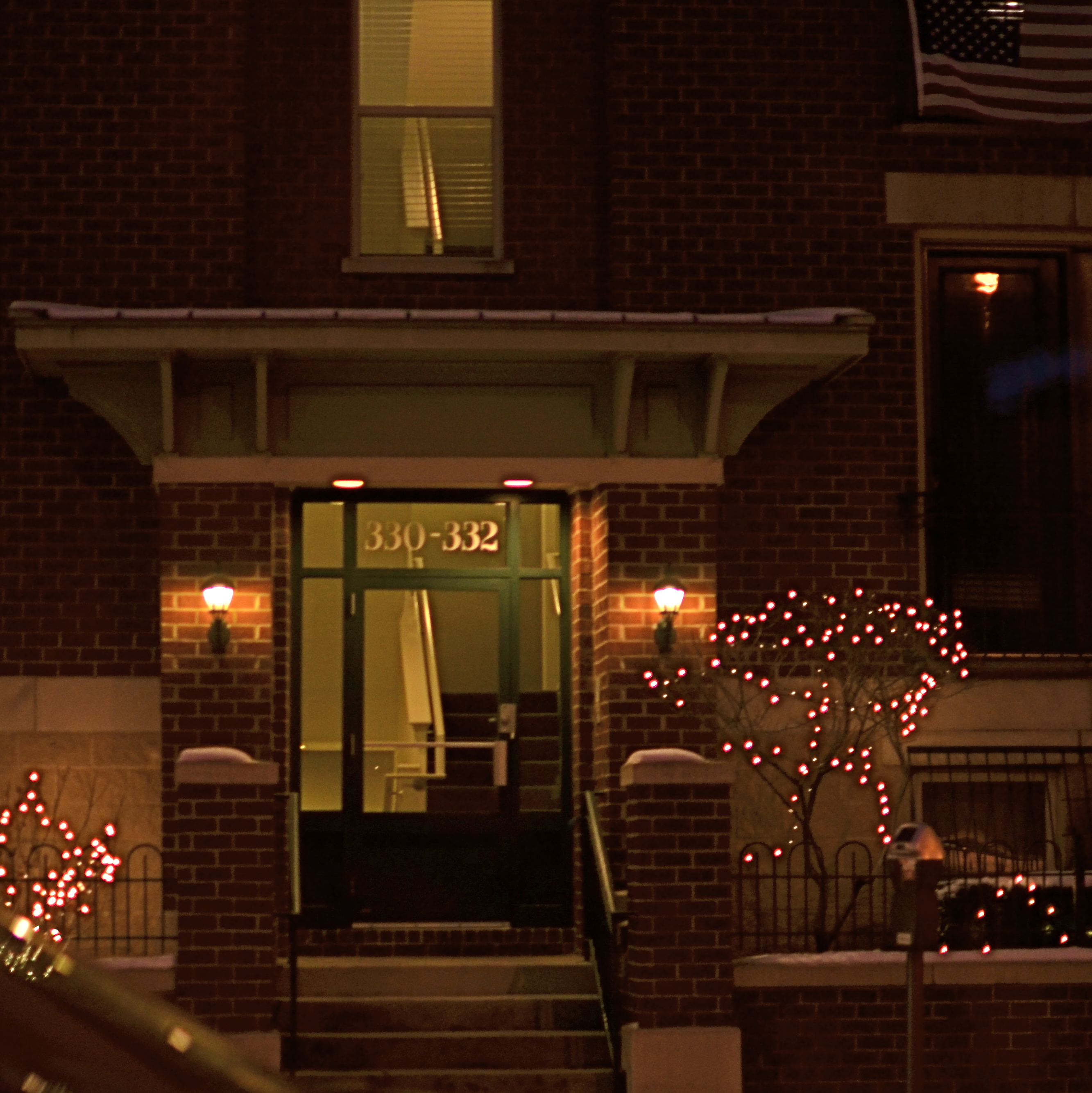
One Flight Up (2013) Handheld night shot, 1/100 sec., f/1.8, ISO 320, 35mm.
By MICHAEL PERKINS
NIGHT SHOTS IN CITIES SEEM TO BE A SIMPLE CHOICE BETWEEN HAND-HELD OR TRIPOD, but those are only the most basic decisions to be made, depending on the texture and mood you’re trying to build into your images. Of those two main choices, many more are opting for hand-held because of convenience and speed, bypassing interference from security people, passers-by, weird weather,etc. And, let’s face it: it’s easier than ever to deliver a readable night photo without the long exposures that used to absolutely necessitate a tripod, especially if you are not worried by the need to either use a wide aperture (thus shallow depth of field) or increased ISO (inviting more digital noise and a decidedly “smudgy” look in the deeper shadows. If you are in the hand-held camp, you’ve got plenty of company.
Tripod people are dedicated, patient, and doomed to travel less lightly, composing longer exposures in darkened conditions and sweating the unwanted artifacts, from wild pixels to smears of people and lights, that will be baked into shots lasting a few seconds or longer. But to rescue a ton of texture and detail from darkened buildings with a minimum of noise, there is no look like a well-modulated time exposure.
The Old Post Office (2013) 1/100 sec., f/1.8, ISO 230, 35mm.
Beyond these two big choices, however, lie the deeper, more subtle reasons we like to shoot cities at night. Some towns flood nearly every important building with light, much of it of the sodium-vapor variety, which is long on orange. And that can mean that a mysterious, brooding quality might be totally unattainable, either three-legged or hand-held, with no way to underexpose or suggest something not absolutely spelled out in neon, in even short exposures.
I personally love to to look for the more neglected sectors of cities, those “London after midnight” kinds of streets where dark means dark. I love to underexpose them a bit as well, ensuring that all the details of the structure are not revealed, all the better to let your mind wander. If my subject has prominently lit windows, I have to tweak and tease to render them in a kind of incandescent amber, but I decide in the moment whether the exterior should be pure black, blue-black, or even amber-black, as if the window light has spilled onto the surrounding textures. And, yes, I might decide that the more ashen, grainy look of high ISO is just what I’m looking for in that moment.
Tripods used to be a do-or-die proposition for night images, but the freedom of hand-held shots carries with it a whole distinct set of decisions, since there is no typical camera, no typical subject, and no typical result. The only thing that truly matters is what you want to see coming out of the camera, be it long shot or short snap.
COMPOSING ON THE RUN
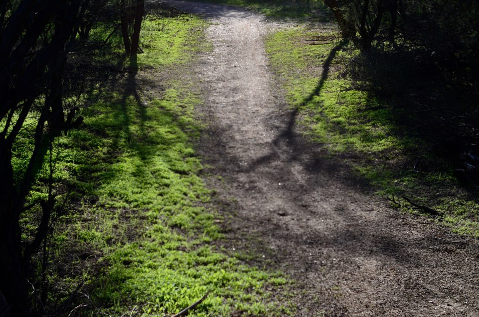
An instinctual snap: sunset light on a forest path. And that’s that….or is it?
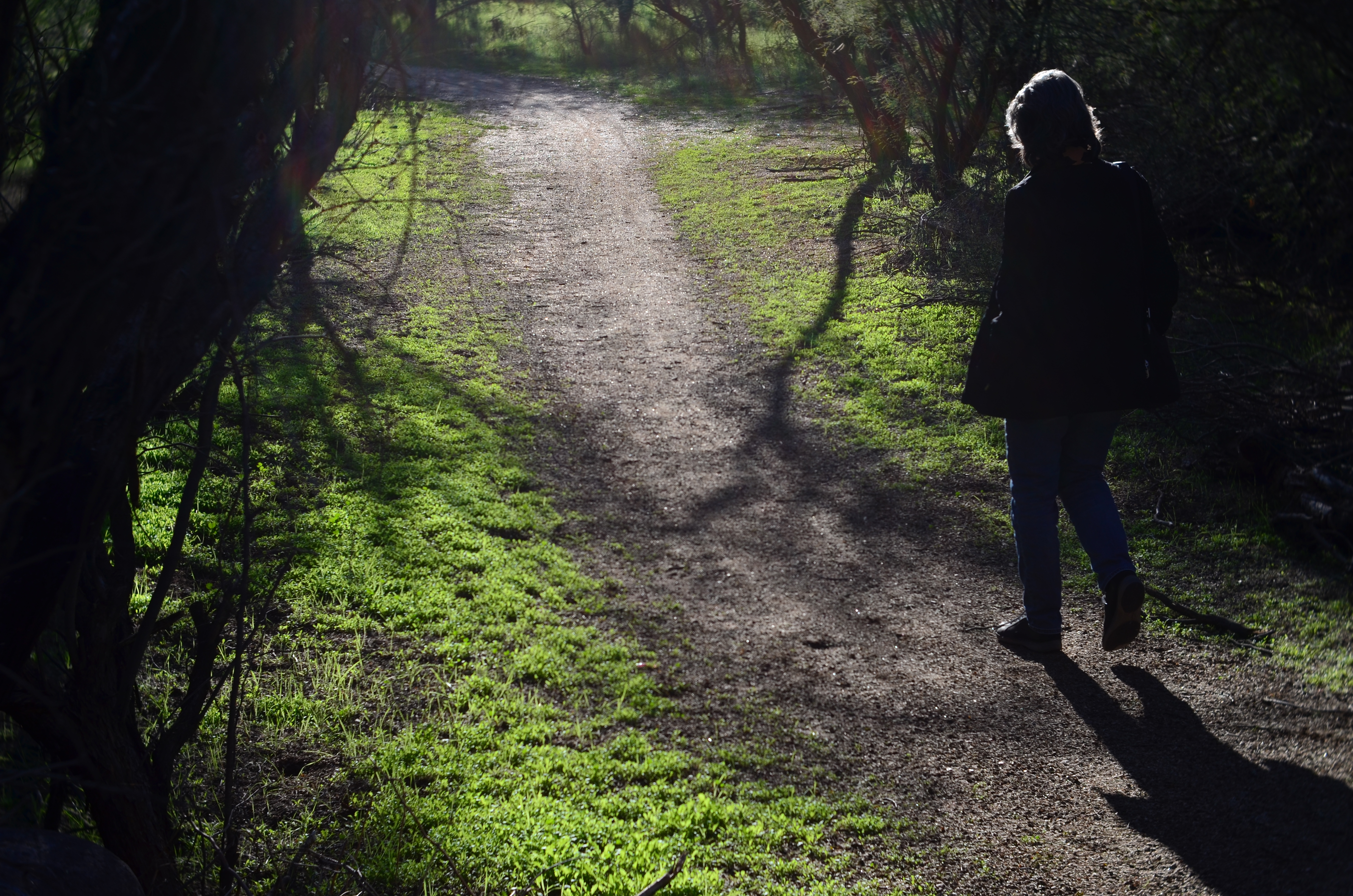
My wife enters the frame a second later.
By MICHAEL PERKINS
LOTS OF OUR BEST PHOTOGRAPHS ARE, EXCUSE THE EXPRESSION, snap judgements. Sometimes a composition simply seems to come fully formed, ready to jump intact into the camera, with no reasonable way to improve on a shot that is 99% pure impulse. Some of these gift moments are so seductive that we may not think to keep shooting beyond what we’ve perceived as the ideal moment. But more shooting may be just what we need.
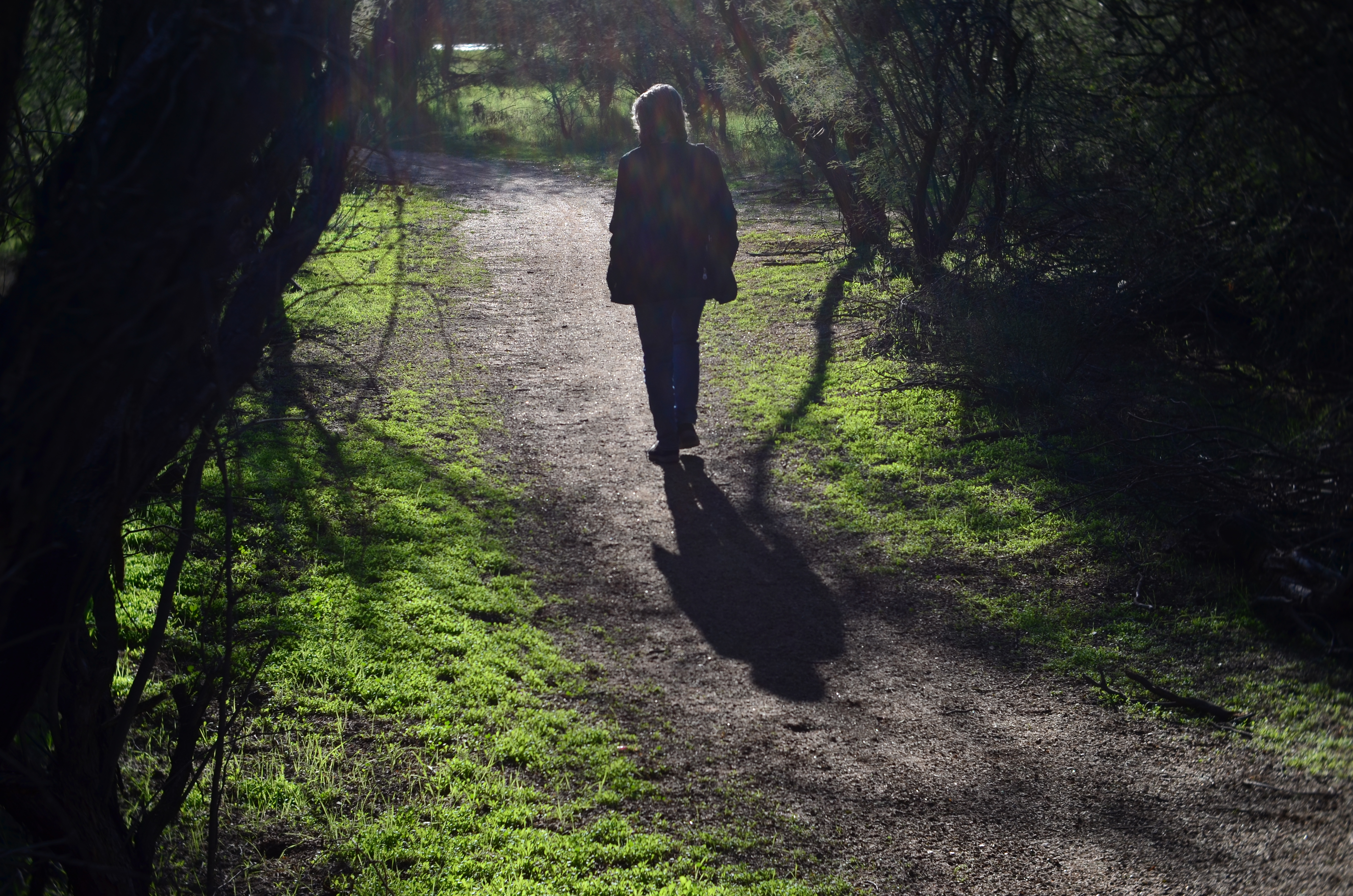
She walks to the upper center of the image..
Images that involve very fast-moving events may only have one key instant where the real storytelling power of the shot comes to a climax, with everything after seen as progressively less dramatic. The second after a baseball is hit: the relaxed smile after the birthday candles are blown out. Think, if you will, of a straight news or journalism image. Every second after the Hindenburg explodes is less and less intense.
But many images can be re-imagined second-by-second, with additional takes offering the photographer vastly different outcomes and choices. In the series shown here, I originally fell in love with the look of sunset on a wooded trail. My first instinct was that the receding path was everything I needed, and I shot the first frame not thinking there would even be a second. My wife, however, decided to walk into the space unexpectedly, and I decided to click additional frames every few seconds as she walked toward the shot’s horizon. She starts off in the lower right corner and walks gently left as she climbs the slight rise in the path, causing her hair to catch a sun flare in the second shot, and placing her in central importance in the composition. By the last shot, however, she is a complete silhouette at the top of the frame, taking her far enough “up” to restore the path to its original prominence with her as a mere accent.
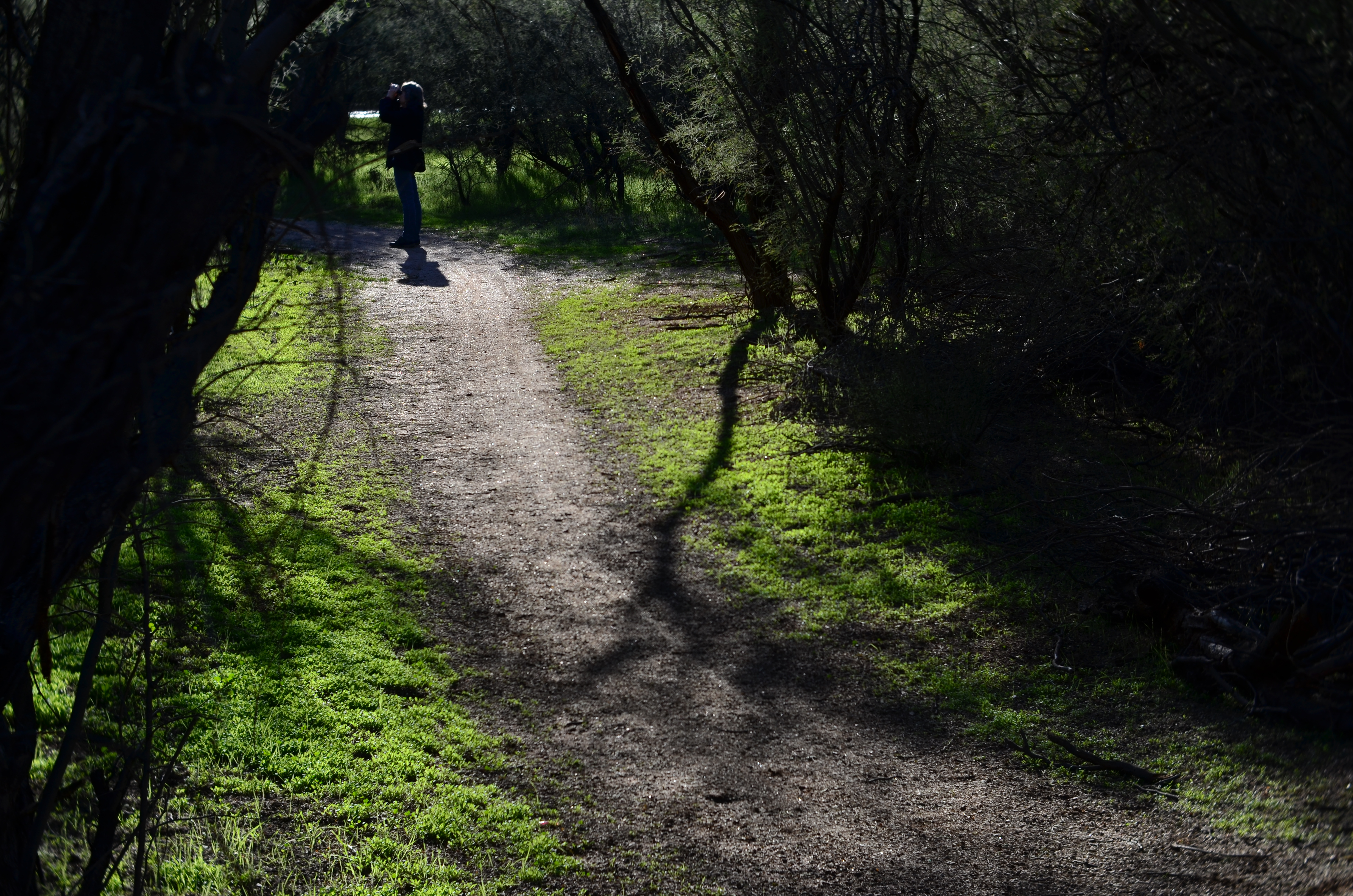
and finally comes to rest as a mere decorative accent/ The trail is now nearly empty once again.
Which shot to take? Anyone’s call, but the point here is that, by continuing to shoot, I had four images to choose from, all with very individualized dynamics, none of which would have been available to me if I’d just decided that my first shot was my best and settled. There will be times when the fullest storytelling power of a photograph is all present right there in your first instinctive snap. When you have time, however, learning to compose on the run can force you to keep re-visualizing your way to lots of other possibilities.
2016: THE YEAR OF SEEING DIFFERENTLY

Isoceles’ Greatest Hits (2016). Our idea of what a photograph “is” must be constantly in play.
By MICHAEL PERKINS
IF YOU SPEND ENOUGH YEARS MAKING PICTURES, you will see, looking back over your shoulder, several visible mile markers indicating when something fundamental changed in how you went about the pursuit of the capture. It can be a simple time line from one camera or lens to the next, or a sequence of shifts in style or emphasis.
For some, it’s the leap from film to digital. For others, the moment when it seemed important to commit anew to monochrome, or the day when one’s work flow took on decidedly new features. For me, it’s always been those events or people who have allowed me to dramatically re-evaluate the process of seeing.
Poring over various things I attempted to do in 2016, I seem to be standing in a niche between how I have traditionally visualized subjects and how I’m aspiring to, marking a more dramatic evolution than I’ve experienced for a while. This change can be simply expressed as a different view of what’s “real” in a picture, brought on by my work with lenses that allowed focus to be more selectively manipulated within an image.
Some of this can be seen in images seen in the new page 20 for 16, clickable at the top of this one. Like other year-end summaries, it tries to cite examples of every type of photograph I attempted over the space of a year, from portraits to still lifes and everything in between. However, unlike most other years, the images have what I might call an evolving view of the role of sharpness; how it features in a composition, how much of it is essential, whether it is even needed at all, given the right conditions.
Some of these explorations in variable sharpness involved embracing a new crop of specialized lenses which either evoke the softer look of vintage glass or allow the shooter to place focus anywhere in the frame, and to any degree desired. However, at least one picture is the product of post-production apps applied to smart phone images, showing, if nothing else, that it’s probably the destination that matters more than the journey. Or not.
As an essential component in all photography, focus is a major determinant in that we think of as a “photograph”, and, in turn, what makes that photograph “real”. However, photography is not merely the recording of the actual but a visualization of the possible. It bridges the gap between tangible and potential. Merely unchaining sharpness, by itself, guarantees nothing in the way of order, and might merely produce chaos. Still, the moment when a particular choice can either enhance or enchant…. that’s we live for; that’s what we reach for.
Thank you again for your kind attention, your advice, and your enthusiasm….and Happy New Year.
TWO SKIES, ONE GOAL

sds
By MICHAEL PERKINS
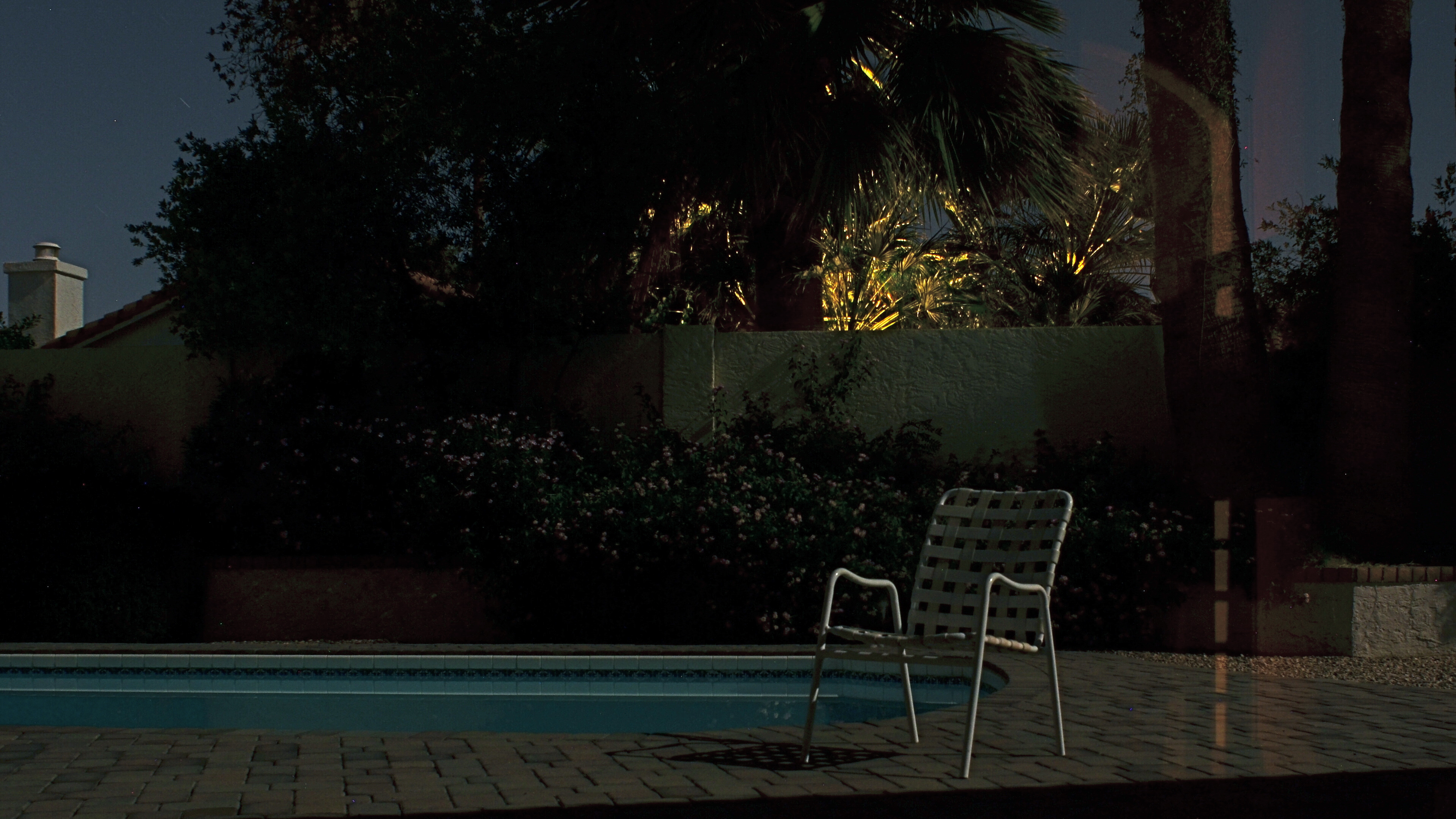
EVERY TIME I HAVE TO MAKE PHOTOGRAPHS ON AN OVERCAST DAY, I actually pray that the weather will deteriorate even further, since a dramatically lousy sky can create better results than an indifferent overcast. Murky weather mutes colors to the texture of bland dishwater, whereas rapidly shifting, strongly contrasty conditions can actually boost colors or create a dimensional effect in which foreground objects “pop” a bit. Keep your rainy days. Give me stormy ones.
Some days an uneven, rolling overcast contains dread darkness on one side and unbroken sun on the other, simulating the effect of a studio in which the subject is floodlit from front but staged against a somber background. This strange combination of natural lighting conditions confers an additional power on even the most mundane objects, and the photographer need do nothing except monitor the changing weather from minute to minute and pick his moment.
I love the architectural features of the Los Angeles County Museum of Art, such as the section of one of the exhibit hall rooves, seen above. However, in fair or even grey weather, it has less impact than when it’s front-lit against a threatening cloud bank, so, on a rotten day, it’s worth checking and re-checking to see if it’s been amped up by “jumping away” from the background clouds. Likewise these palm trees:
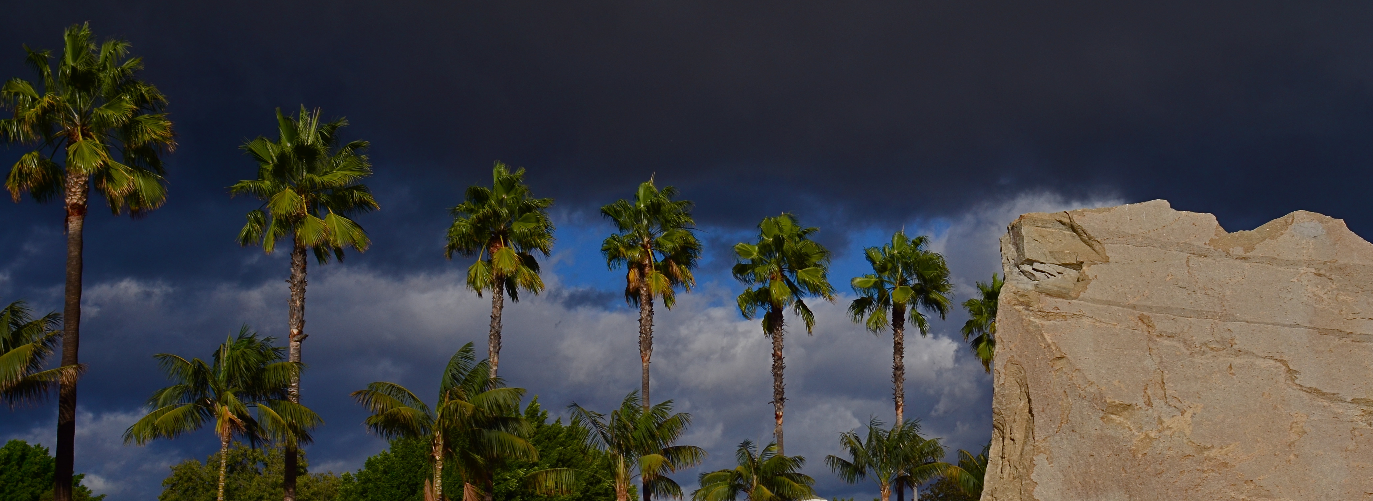
Simply capitalizing on changes in lighting conditions can create more opportunities than all the lenses and gear in the world. Cheap point-and-shoot or luxuriant Leica, it’s all about the light….plentiful, free, and ever-changing. The ability to sculpt strong images from this most basic commodity is the closest thing to a level playing field for every kind of photographer.
CAUSE VS. EFFECT
By MICHAEL PERKINS
“WHETHER THE STONE HITS THE PITCHER OR THE PITCHER HITS THE STONE“, Sancho Panza explains in Man Of La Mancha, “it’s going to be bad for the pitcher”. I love that sentiment, since it explains how blurred, in life, the line really is between cause and effect. Start with the stone or start with the pitcher; the result seems the same, right? In photography, we make a lot of choices about, well, where to stand and point the camera. We also make decisions about whether to focus on cause or effect, and how that changes the kinds of pictures we wish to make.
There are times when amazing stories can be told on both sides of that equation. I often wish that baseball games could be shown in perpetual split-screen mode, since I love both the triumphant look of the batter who’s just connected and the outfielder who knows, in a second, that a rocket is coming his way. In terms of our visual legacy, both cause and effect have produced some of the world’s favorite images, so it’s inevitable that any shooter, pro or amateur, will eventually investigate both ways of recording experience.
By The Light Of The Supermoon (2016): 2:46 exposure time, f/8, ISO 100, 24mm.
This year’s highly-touted “Supermoon” phenomenon seemed like a good opportunity for me to make just such a choice. The global hype machine went into overdrive on the appearance of this brighter/bigger-than-normal orb in the November skies, with the result being a flood tide of photos of, uh, the moon. More precisely, millions of the same exact picture of the moon, with a few outliers framing it behind a palm tree, silhouetting a city skyline, or some other such filigree.
For me, then, the cause of all this hubbub seemed anticlimactic at best, and yet I still felt compelled to do something to mark the occasion. Then I realized that the effect, not the cause, held the possibility of making a picture that interested me. I recalled that I had never had the chance to make a photograph with only moonlight for illumination. My backyard was readable in every fine detail with my naked eye as the moon, which was over my shoulder, lit up the pool, the shrubbery, and our brick patio and walls. I also knew that what looked glowingly bright to me would be rendered as absolute darkness for a handheld camera shot, so out came the tripod.
With time exposures, you can shoot at low ISO, reducing noise to an absolute minimum. You can also shoot at a small aperture for maximum depth-of-field; you just lengthen the exposure time to compensate. That meant that, during the moon’s brightest hour, I would, at f/8, need an exposure of just under three minutes, enough to rescue a lot of detail and even catch some of the remaining deep blue in the sky, which your eye wants to see as simple black.
Fifteen or so tries later, I got what you see here. Not a sign of the moon itself (cause) but plenty of evidence of its presence (effect). The subject matter wasn’t mesmerizing, but the mood registered pretty much the way my eye saw it, which, when you’re working with a limited servo-mechanism like a camera, is pretty much a win.
EDITING WITH LIGHT
By MICHAEL PERKINS
THE ETERNAL TUG OF WAR IN PHOTOGRAPHY SEEMS TO BE the pull between extremes of revelation and concealment. Toggling between the strategies of showing almost everything and showing nearly nothing, most shooters arrive at some negotiated mid-point which describes their own voice as a visual narrator. Shuttling between the two extremes, shooters have to decide how much information is appropriate not only for their overall style, but in each specific shooting situation.
Managing light in the moment, rather than trying to re-balance values after the picture is made, affords the most crucial control you will ever exercise over your subject. We tend, as beginners, to shoot things where there is “enough light”, growing ever more discriminating about the kind of light we prefer as we mature in our approach.
Down Into (2016). 1/40 sec., f/5.6, ISO 500, 24mm.
One of the most fruitful exercises for me has been those rare occasions in which I have had the luxury to remain in one area over a span of several hours, discovering the nuanced variations that prevail from minute to minute in a single setting. Many times, I have begun this process with an initial concept of the “ideal” lighting for a shot, then, through comparison, rejected that in favor of a completely different strategy. It’s strangely thrilling to come home completely satisfied with an image, even though it’s the dead opposite of the way you originally conceived it.
Waiting for the right light may be more time-consuming, but it is the cheapest, easiest, and surest way to control composition. If one particular lighting situation reveals too much in the shot, diluting the impact of your visual message, waiting for shadows to deepen and for bright spots to shift can make your photograph urge the eye more effectively toward the center of your “argument”. In the image seen above, I could not have sold the idea of a gradual walk from high left to lower right without the light actually working as a kind of directional arrow. A fully lit forest might have been lovely, and was, in fact, available to me just an hour earlier. But by the late afternoon, however, the partial dark helped me edit excess information out of the shot, and, in comparing the two approaches, I like the “less” version better.
Part of getting the shot you want is often learning to see, and edit out, the parts you don’t want, a process which is better when you wait for the “best”, rather than the “correct” light for right here, right now.
TWO-WAY GLASS
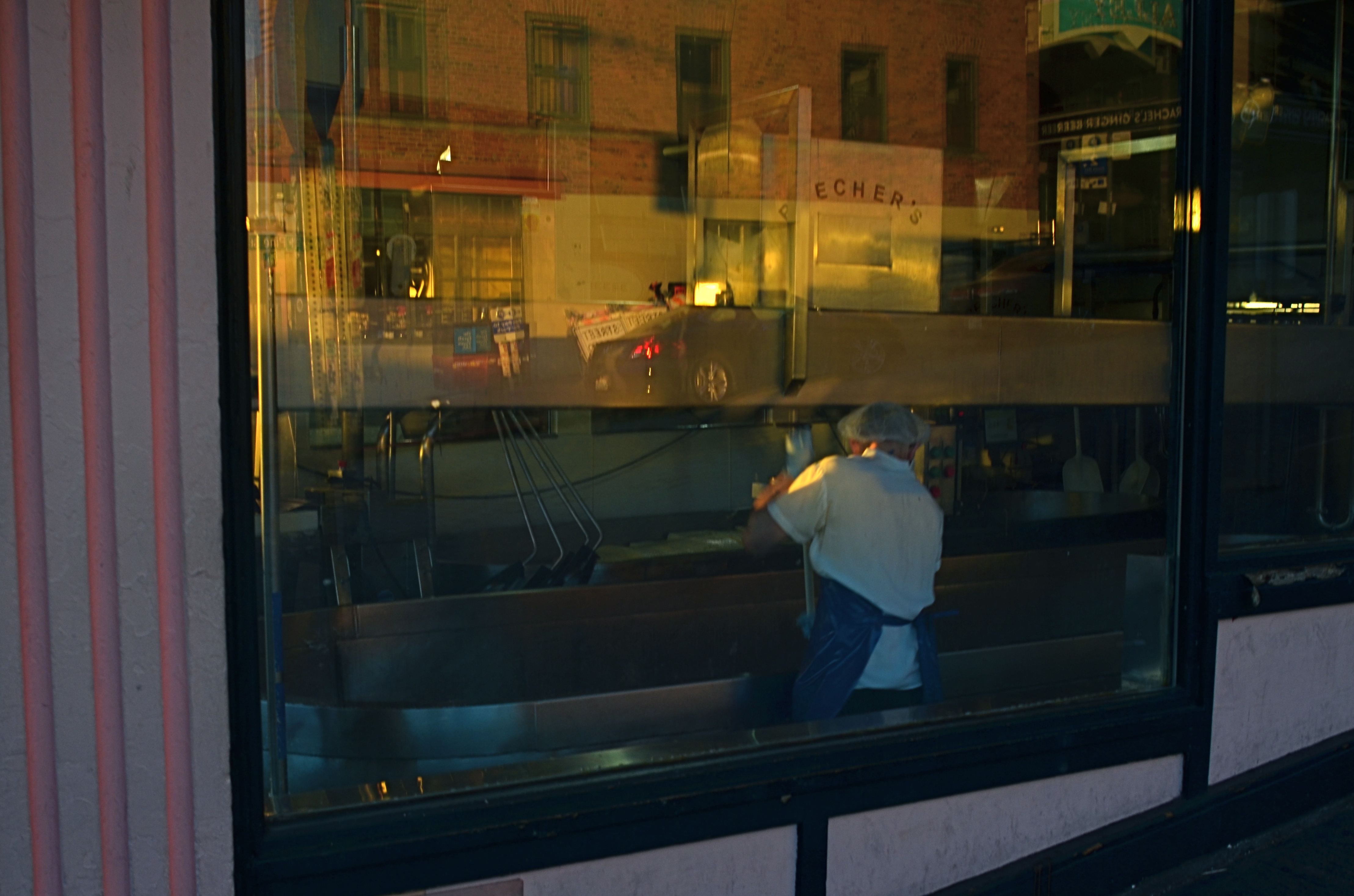
Closing Time (2016)
By MICHAEL PERKINS
IF THE EYES ARE THE WINDOW TO THE SOUL, then certain windows are an eye into contrasting worlds.
Photographers have devised a wide number of approaches when it comes to using windows as visual elements. Many choose to shoot through them with a minimum of glare, as if the glass were not there at all. Others use them as a kind of surreal jigsaw puzzle of reflected info-fragments.
Lee Friedlander’s New York CIty (2011)
To show these two approaches through the eyes of two great photographers, examine first Eugene Atget’s shots of 19th-century Paris storefronts, which mostly concentrated on shopkeeper’s wares and how they were arranged in display windows. Straightforward, simple. Then contrast Lee Friedlander’s 21st-century layered blendings of forward view and backward reflection (seen at left), which suspends the eye between two worlds, leaving the importance of all that mixed data to the viewer’s interpretation.
Much of my own window work falls into the latter category, as I enjoy seeing what’s inside, what’s outside, and what’s over my shoulder, all in the same shot. What’s happening behind the glass can be a bit voyeuristic, almost forbidden, as if we are not fully entitled to enter the reality on the other side of the window. But it’s interesting as well to use the glass surface as a mirror that places the shop in a full neighborhood context, that reminds you that life is flowing past that window, that the area is a living thing.
Thus, in an urban setting, every window is potentially two-way glass. Now, just because this technique serves some people as a narrative or commentary doesn’t make it a commandment. You have to use the language that speaks for you and to your viewer. Whatever kind of engagement serves that relationship best dictates how you should be shooting. I just personally find layered windows a fun sandbox to play in, as it takes the static quality away from a still photo to some degree, as if the image were imbued with at least the illusion of motion.
Sometimes it’s good to conceal more than reveal, and vice versa. The only “must”, for this or any other technique in photography, is to be totally mindful as you’re creating. Choose what you mean to do, and do it with your eyes fully open.
OF TATTOOS AND STENCILS
By MICHAEL PERKINS
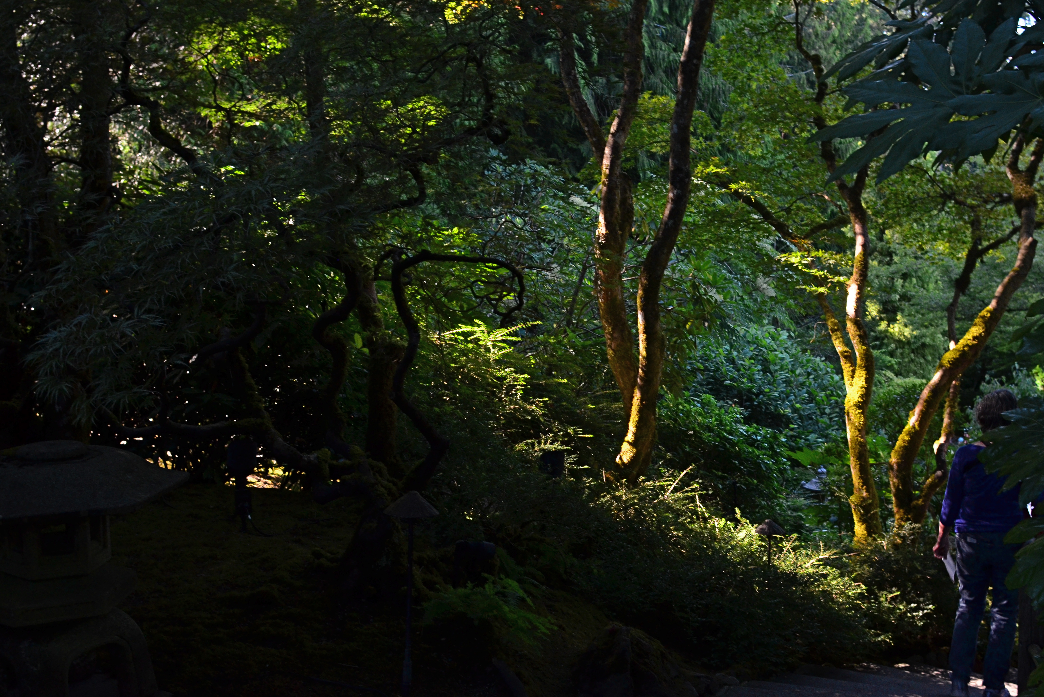
IN CITIES, ONLY A SMALL PORTION OF THE DAY’S NATURAL LIGHT actually makes it all the way to the street unbroken. You can almost think about it like rain, in that it drips, slithers, drains, and channels its way downward through a dense maze of structures and barriers. Along the way, that light is bisected, sliced, stenciled and tattooed by the surfaces it interacts with, stretching shadow patterns, glinting, ricocheting, stretching.
Glass, especially, constantly reshapes light, filtering it into delicate lattice-works and spectral spiderwebs, sifting it through windows, transoms, doors, windshields, storefronts. It reveals and conceals, crawling across buildings like an ever-changing sundial of shapes and schemes. Photographing the same hunk of glass on the hour can be like visiting a dozen different worlds, spread out like fanned playing cards over the course of a single day.
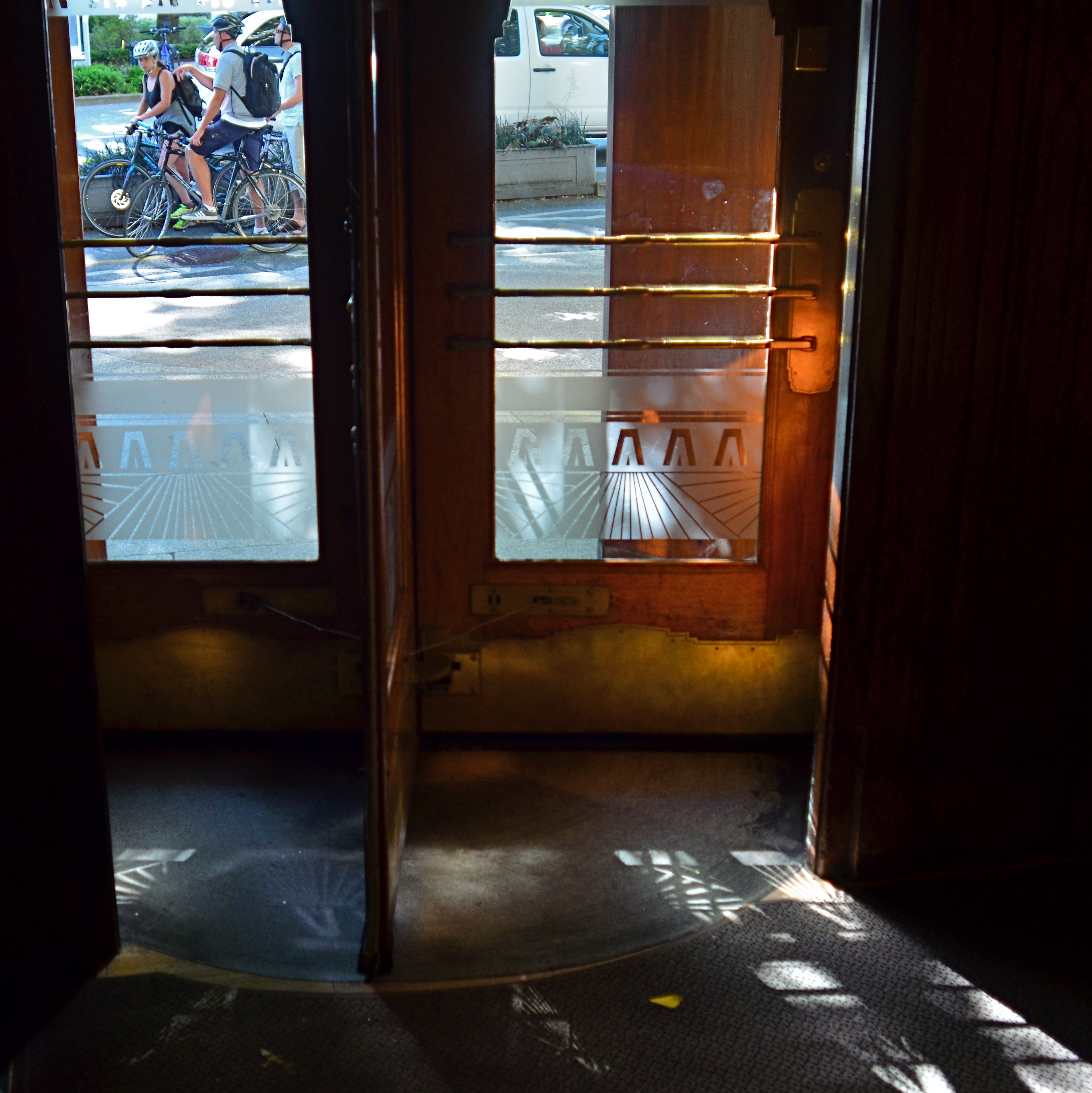
Light illuminates, making it a force that acts upon other objects, but it is almost more marvelous when it, itself, is acted upon, creating an endless choreography and echo of its colors and contours. It’s part of the great interactive ballet of cities, this push and pull between light and darkness. Sometimes you get a nearly kaleidoscopic effect from something very simple, like the etched glass in the revolving door seen above, which stamped a different snowflake of shapes onto the pavement at every turn and swivel.
If you’re given to experiment (or daydreaming), your own tabletop can become a tremendously valuable laboratory on the effect of light. Just grab the simplest object handy, be it an apple or a book, and arc a source of light from one side of it to the other. Imagine yourself a self-propelled sun and watch how easily you can create change in your private solar system. The actual design of such an exercise isn’t crucial, but making yourself mentally slow down, becoming aware of the tiny effects perpetually swimming about you, is invaluable. Photographs rise at the hands of some pretty small phenomena. Magnifying your gaze puts more images within your reach.
OFF-WHITES AND NEAR COLORS

Warmer than reality: A sunset processed through Nikon’s in-camera “shade” white balance setting.
By MICHAEL PERKINS
ONE OF THE MOST GRAPHIC DEMONSTRATIONS OF THE DIFFERENCE BETWEEN YOUR EYE AND A CAMERA’S occurs by accident for most photographers, with variations in the reading of white balance that make the colors in an image look “wrong”. While our own vision looks at everything in the world from light blues to medium greys and instantly converts them all to “white”, the camera makes looks at all those variants and makes what can be called its best guess.
All light has a temperature, not a measure of heat but an index of which colors combine to deliver hues of a certain intensity and range, and white balance helps photographers manage color more effectively. Film shooters, especially those using sophisticated flash technology, eventually develop an instinct as to which kind of light will deliver the hues they seek, but, as the digital era tracks onward, many more of us simply rely on our camera’s auto settings to deliver a white that strikes us as “correct”. And when auto white balance fails to deliver the goods, we can override it and select other settings that compensate for incandescent light, shade, cloudy skies, and so forth. We can also create a completely custom white balance with little fuss. Think Dad looks better with a green face, like the true extra-terrestrial that he is? It’s at your fingertips.

Same scene using Nikon’s fluourescent white balance setting.
The fun starts when you use white balance to depart from what is “real” in the name of interpretation. WB settings are a fast and easy way to create dramatic or surreal effects, and, when you have enough time in a shoot to experiment, you may find that reality can be improved upon, depending on what look you want. In the top image, taken during a long, lingering sunset at sea, I had plenty of time to see what my camera’s custom WB settings might create, so I bypassed standard auto WB, then amped up the reds in the sky by clicking over to a shade setting, resulting in a deep and warm look.
For the second shot of the same scene, I wanted to simulate the look of a sky just after sunset, when the blues of early evening might take over for the vanished sunlight, even providing a little radiance from a pale moon. One click to the setting and you see the result. Now, of course, I’ve just switched from one simulation of reality to another, but playing with WB in a variety of lighting situations can help you tweak your way to fantasy land with no muss or fuss.
Tweaking white balance is basically lying to your camera, telling it that it is not seeing what it think’s it’s seeing but what you want it to think it sees. You’re the grown-up, you’re in charge. “White” is what you say it is. Or isn’t.
THE SECOND PASS

Vancouver’s amazing Marine Building, a Deco freak’s feast, in early morning (flat) light.
By MICHAEL PERKINS
SOME VISUAL SUBJECTS ARE SO RICH IN POTENTIAL that they evolve from a few essential shots to what, for lack of a better term, passes for a photo “essay”. Such extended coverage of buildings, countries and people used to be common in the heyday of the picture magazine, with up to a dozen pages of images strung together with narrative links in the pages of Life, Look and their many imitators. It’s a great format to work in once you discover a worthy candidate. But, in practical terms, it can be a little like working a checklist.
I document a lot of Art Deco architecture, since it embodies history, abstraction, illustration, design, and fantasy, all in one big fat buffet. That means I spend a lot of time dodging passersby on sidewalks and lingering in lobbies long enough to make the security personnel twitchy. Deco is all about the splendor of detail, some of which can only be revealed by patiently moving from door to grille, elevator to stairway, entrance to entrance, and looking for light that will bring that detail into bold relief.
I used the word checklist a while back because you are often working one in your mind, ticking off the various items as you wander around the site. Gotta do the mezzanine. Need a shot of the ceiling. Did I catch those wall sconces? Thing is, we tend to think of those little check marks as meaning, I’m done here. Moving on….when, in terms of what changing light does to these buildings within a short span of time, we should be actually be thinking, okay, I’ve done the preliminary work. Should go back and check this again in a while. Deco, especially, is rife with reliefs and murals made from a wide variety of materials, many of which will register color and shadows very differently at different times of day. You have to think in terms of “Take One, Take Two”, rather than in the snapshot mentality of “nailed it.”
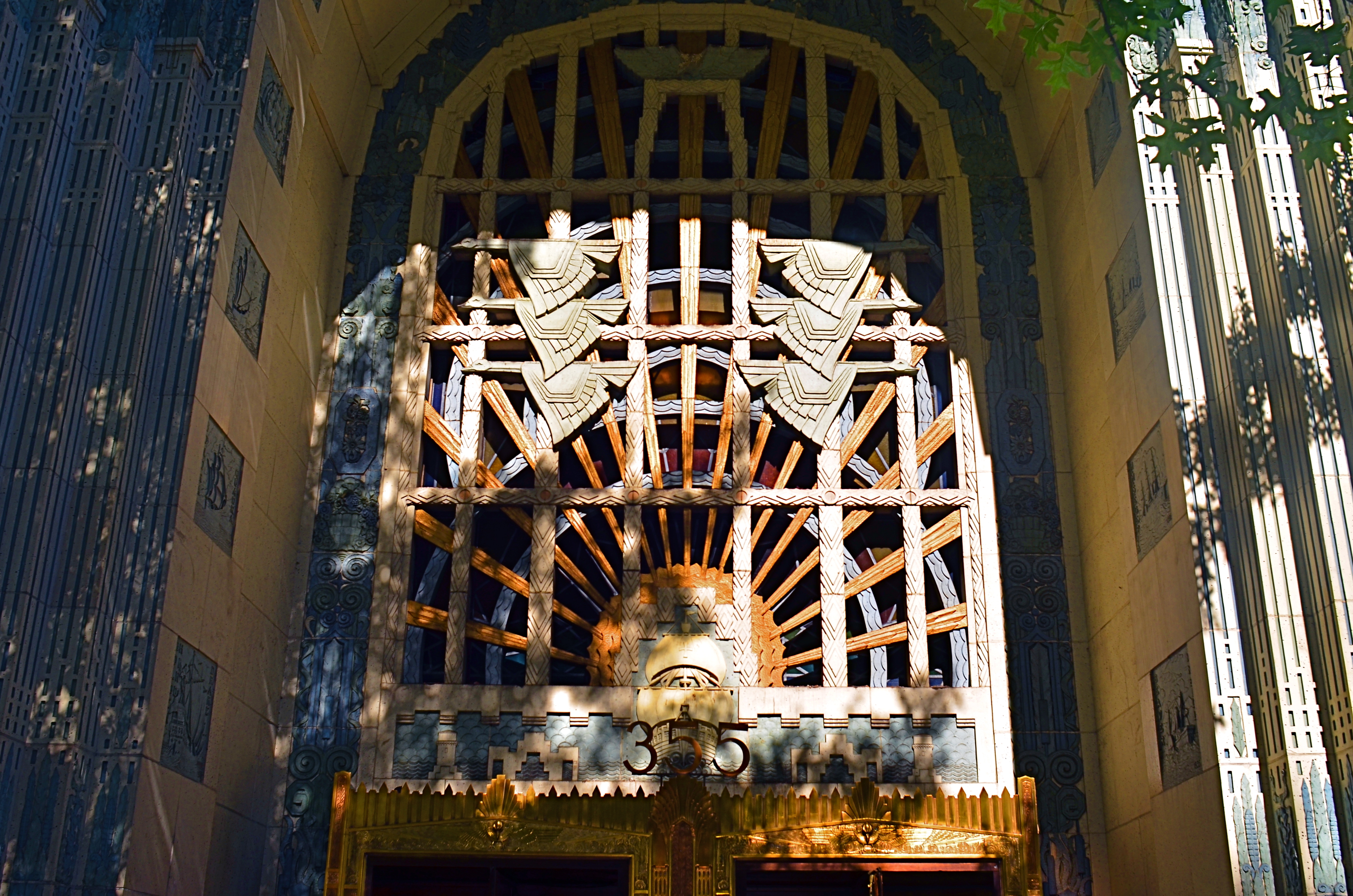
The same entrance just a few minutes later. The sun has climbed in the sky and created dramatic contrasts in all surfaces.
The images you see here, of the entrance to Vancouver’s magnificent Marine Building (read all about it here) were shot just twenty minutes apart. The top shot shows light landing on the door and its surrounding niche fairly flatly, almost sideways. However, within minutes, as seen in the second shot, the sun has climbed high enough in the sky to blast away at the center of the space, throwing the overhang of the arch into deep shadow. This change intensifies the contrast between raised and flat surfaces and makes the exterior terra-cotta (a material in which the colors are baked right in) more vivid. It also is projecting shadows like crazy. Which version is better? Not the point. It’s about editing choices and being reluctant to think that there is one “official” way to shoot something.
I could show similar changes to the lobby, with light softly entering the stained glass over the door, then crashing through it like a golden ray just minutes later. The point is, exposure is time plus light, and, when tackling a large essay-type project, it’s important to do more than one visualization on key elements. It’s the difference between grabbing a souvenir and creating a keepsake.
SOFTER AND QUIETER
By MICHAEL PERKINS
THE MEANING OF THE WORD NOISE HAS, IN RECENT YEARS, been expanded beyond its familiar role as an audio term, extending its usage into our visual vocabulary as well. A key shift in photo terminology, as film converted to digital, has been the re-purposing of the word to denote a degradation in quality, with noise replacing grain as the way to describe a less-than-pristine image. Same idea, different wording.
And now, in recent years, I have heard the word used even more widely to denote weaknesses in a composition, describing a picture with too much information or distraction as “noisy”. In a recent post on the blog PhotographyMad.com, you find the following citation:
Often a photo will lack impact because the main subject is so small it becomes lost among the clutter of its surroundings. By cropping tight around the subject you eliminate the background “noise”, ensuring the subject gets the viewer’s undivided attention.
I personally would extend this metaphor to include not only the subject matter within a frame but its color range as well. That means, simply, that too many colors in an image might dilute the effect of a shot as much as the density of its elements, and extends the idea of noise to encompass anything that lessens the communicative power it has for the viewer.

Deflowered (2016). 1/50 sec., f/4, ISO 100, 35mm.
In the above shot, the idea of the composition was to convey the bits of orange peel as some kind of spent or withered flower. I didn’t decide, in advance, to eat an orange in a yellow bowl, but I believe that the same peels in a red bowl might have hardened the look of the shot by calling attention to contrast instead of content. Keeping the entire composition to a two-tone color range (along with a decidedly shallow depth-of-field to reduce the texture detail) rendered it nice and soft. Of course there are a million ways to conceive this image; I just chose this way.
Noise is not merely a technical registration of visual or audio distortion. I think the word has real value if you’re looking to streamline your images. Just think noise=clutter.
Then turn down the volume.
COST ANALYSIS
By MICHAEL PERKINS
IT’S SAFE TO SAY THAT, TO DATE, MOST OF THE WRITINGS THAT COMPARE FILM PHOTOGRAPHY TO DIGITAL center on visual or aesthetic criteria. The grain of film, the value range of pixels, the differences in the two types of workflow, the comparative sizes of sensors, and so forth. However, in certain shooting situations, what strikes me as the main advantage of digital is crassly…..monetary.
It’s simply cheaper.
Now, that’s no small thing. Consider that, with film, a very real cost comes attached to every single frame, both masterpiece and miss. Now, try to compute how much film you must consume in order to travel from one end of a learning curve to the other in trying to master a new lens or technique. Simply, every shot on the way to “that’s it!” is a “damn, that’s not it”, and both cost money. Now recall those shoots where the conditions are so strange or variable that the only way to get the right shot is to take lots of wrong ones, and remember as well, that, after clicking off all those frames, you had to wait (with the meter running), until either the processor or your own darkroom skill even told you that you were on the wrong track.
Assume further that you screwed up several rolls of premium Kodachrome before stumbling on the right approach, and that all of those rolls are now firmly in the “loss” column. You re-invest, re-load, and hope you learned your lesson. Ca-ching.
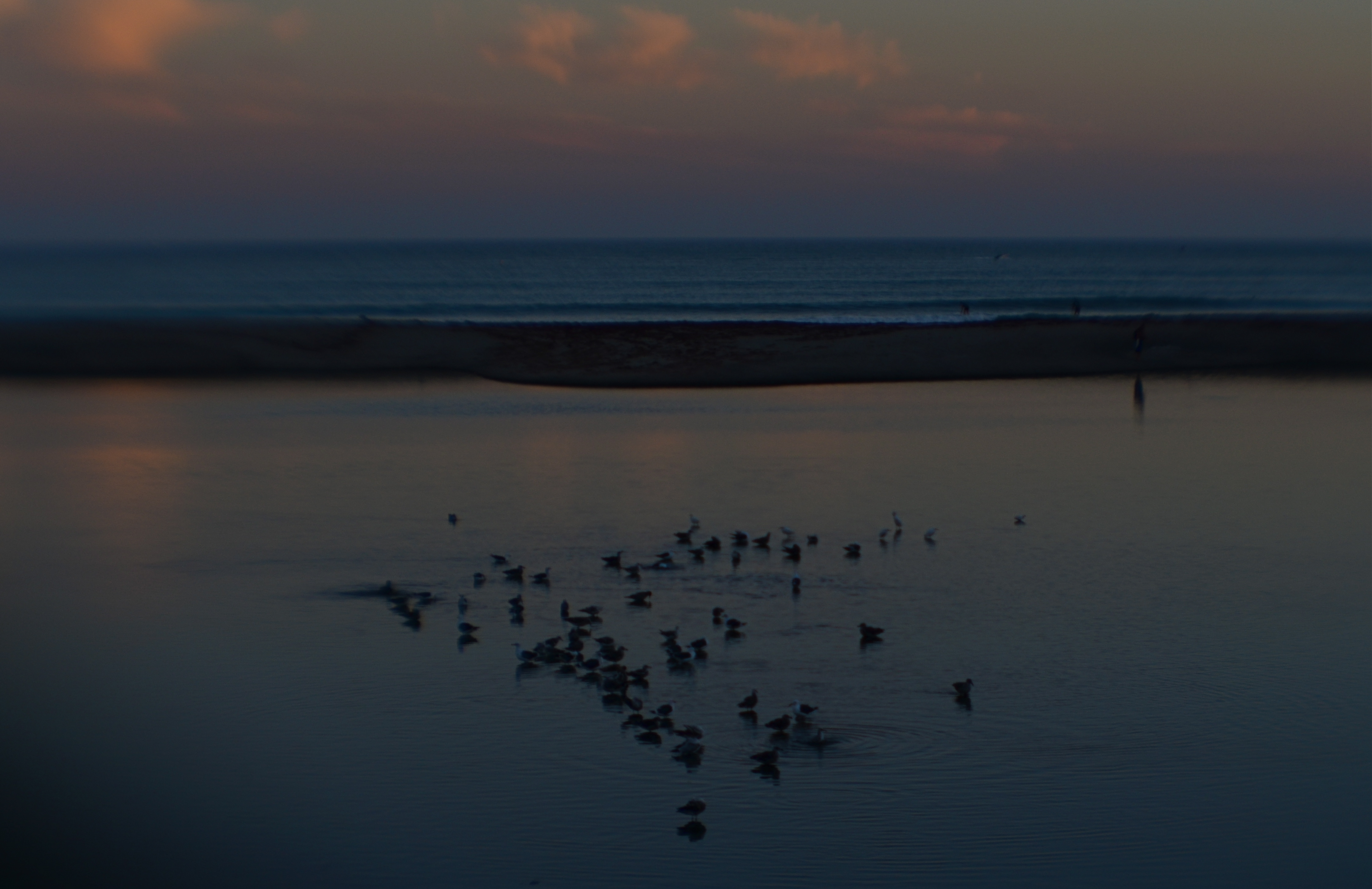
Doheny State Park Beach (2016). Shot at 1/125 sec., f/8, ISO 100, through a plastic 35mm lens.
The shot that you see above demonstrates why shooting in digital speeds up your practice time, at a fraction of the cost of film, while giving you feedback that allows you to adjust, shoot, and adjust again before the conditions in front of you are lost. What you see is a late dusk on a dark lagoon just inland of a stretch of ocean in Point Dana, California, strewn with waves of bathing birds and shifting pools of ripples. The pink of the clouds on the horizon will be gone in a matter of minutes. Also, I’m shooting through a narrow-gauge opening in a chain-link fence, causing dark vignettes on every other shot. Moreover, I’m using a plastic lens, making everything soft even softer, especially at the edges.
So add all these factor together and the emotional curve of the shoot is click-damn-click-whoops-click-click-damn. But, since it’s digital, the bad guesses come back fast, and so does the ability to adjust. Bottom line: I know I will likely walk away with something generally usable.
More importantly, photography no longer has the power to price so many of us out of the practice. That means that more images make it to completion, and, of course, that can also mean a global gallery flooded with mediocrity. Hey, I get that. But I also get a fighting chance at grabbing pictures that used to belong only to the guy who could afford to stand and burn twelve rolls of film.
And hope like hell.
THE EYES HAVE IT
How soft is too soft? Shot with a Lensbaby Sweet 35 optic at 1/30 sec., F/4, ISO 400, 35mm.
By MICHAEL PERKINS
WINDOW TO THE SOUL: that’s the romantic concept of the human eye, both in establishing our emotional bonds with each other and, in photography, revealing something profound in portraiture. The concept is so strong that it is one of the only direct links between painting (the way the world used to record emotional phenomena) and photography, which has either imitated or augmented that art for two full centuries. Lock onto the eyes, we say, and you’ve nailed the essence of the person.
So let’s do a simple comparison experiment. In recent years, I’ve begun to experiment more and more with selective-focus optics such as the Lensbaby family of art lenses. Lensbabies are unabashedly “flawed” in that they are not designed to deliver uniform focus, but, in fact, use the same aberrations that we used to design out of lenses to isolate some subjects in intensely sharp areas ( so-called “sweet spots”) surrounded by gradually increasing softness.
As a great additional feature, this softness can even occur in the same focal plane as a sharply rendered object. That means that object “A”, five feet away from the camera, can be quite blurry, while object “B”, located just inches to the side of “A”, and also five feet from the camera, can register with near-perfect focus. Thus, Lensbaby lenses don’t record “reality”: they interpret mood, creating supremely subjective and personal “reads” on what kind of reality you prefer.
Exact same settings as the prior example, but with a slightly tighter focus of the Lensbaby’s central “sweep spot”.
Art lenses can accentuate what we already know about faces, and specifically, eyes…that is, that they remain vital to the conveyance of the personality in a portrait. In the first sample, Marian’s entire face takes on the general softness of the entire frame, which is taken with a Lensbaby Sweet 35 lens at f/4 but is not sharply focused in the central sweet spot. In the second sample, under the same exposure conditions, there is a conscious effort to sharpen the center of her face, then feather toward softness as you radiate out from there.
The first exposure is big on mood, with Marian serving as just another “still life” object, but it may not succeed as a portrait. The second shot uses ambient softness to keep the overall intimacy of the image, but her face still acts as a very definite anchor. You “experience” the picture first in her features, and then move to the data that is of, let’s say, a lower priority.
Focus is negotiated in many different ways within a photograph, and there is no empirically correct approach to it. However, in portrait work, it’s hard to deny that the eyes have it, whatever “it” may be.
Windows to the soul?
More like main clue to the mystery.
THE SHIFTING VEIL
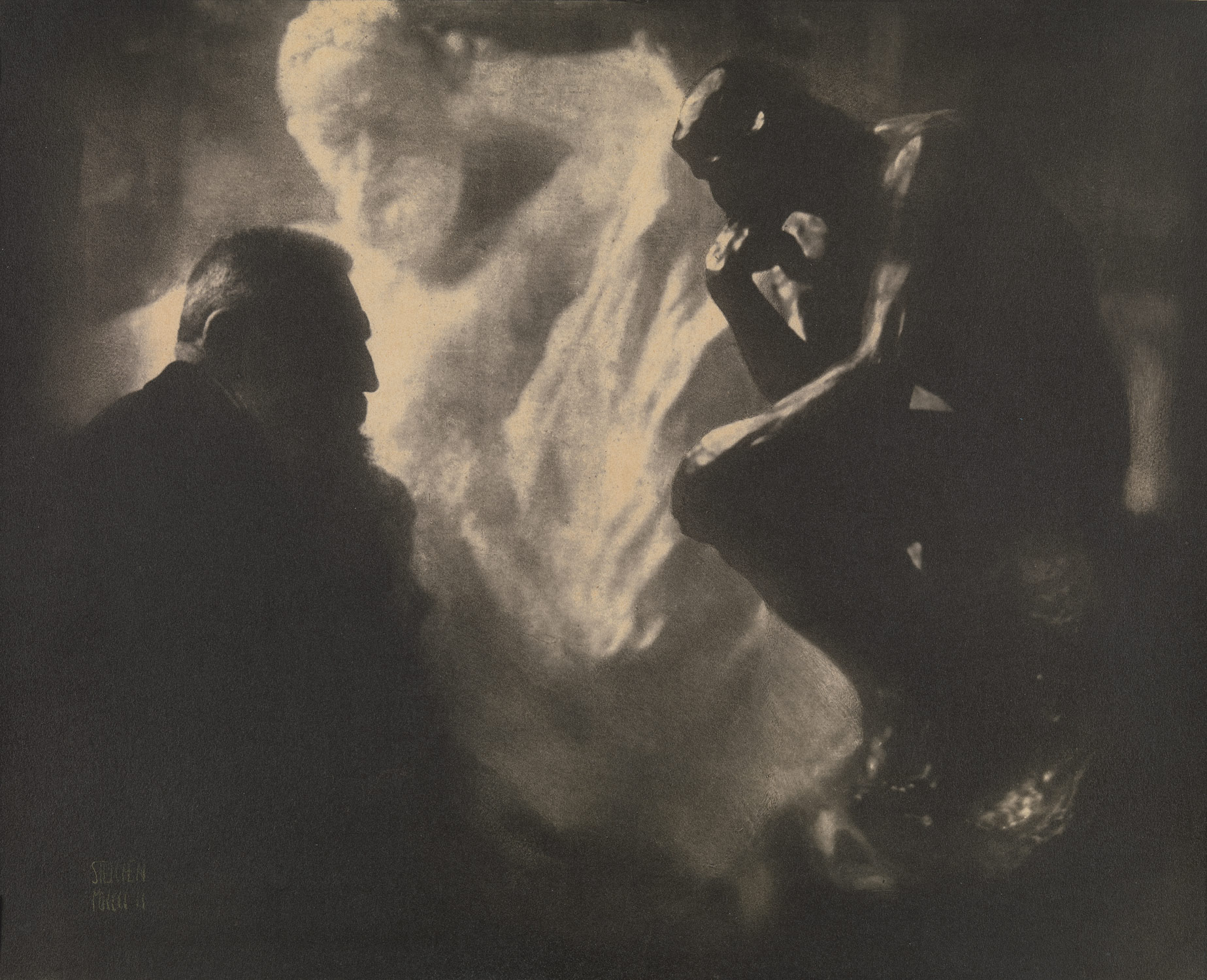
One of Edward Steichen’s amazing portrait studies of the sculptor Auguste Rodin.
By MICHAEL PERKINS
PHOTOGRAPHERS AND MAGICIANS SHARE A COMMON POWER, in that both of them selectively practice the art of concealment. Now you see it, now you don’t. Both the shooter and the shaman, in their own ways, know the importance of the slow reveal, the smooth manipulation of the viewer’s concept of reality. Best of all, they know how to choreograph and stage visual information. Here, they insist. Look here.
In a lifetime of studying portrait photographers, I have been fascinated by the nearly endless variety of approaches used to convey the human personality/soul in a static image. There are the formal studio sittings. There are the street ambushes of the paparazzo. And there are the shadowy, soft, gently suggestive pictures in which the classic representation of a “face” may not occur at all. This is the blending of revelation and mystery, and it is where portraits, at least for me, genuinely aspire to art.
He Decided To Wait (2016). A “self-portrait” in name only. Do we have to be the center of attention?
Some of my favorite images in this area were Edward Steichen’s studies with the sculpture Auguste Rodin, dark, smeary pieces of pure mood in which the great man was reduced to a near silhouette, as if he and his sculptures were forged out of the same raw material. I learn next to nothing of Rodin’s face from these pictures, and yet I learn worlds about his spirit. Steichen reveals as he conceals.
Which gives me an idea.
As I skim through the daily global tsunami of selfies, many of them simple grinning headshots, I see an incredible opportunity to start a completely new dialogue on what constitutes a portrait….or even a face. That opportunity will be squandered if 99% of selfies only look like slightly happier passport photos, rather than a real growth medium for investigating the self, for using the face as a compositional accent, an arranged object within a larger design.
Why selfies? Because the subject is always available. Because the technology of both mobile phones and conventional cameras allows for faster and more far-reaching experimentation. And because re-framing a subject you think you know intimately, merely by shifting where the veil lifts or falls, can be the difference between conceal and reveal.
GALLERYLABS
Watching those who watch.
By MICHAEL PERKINS
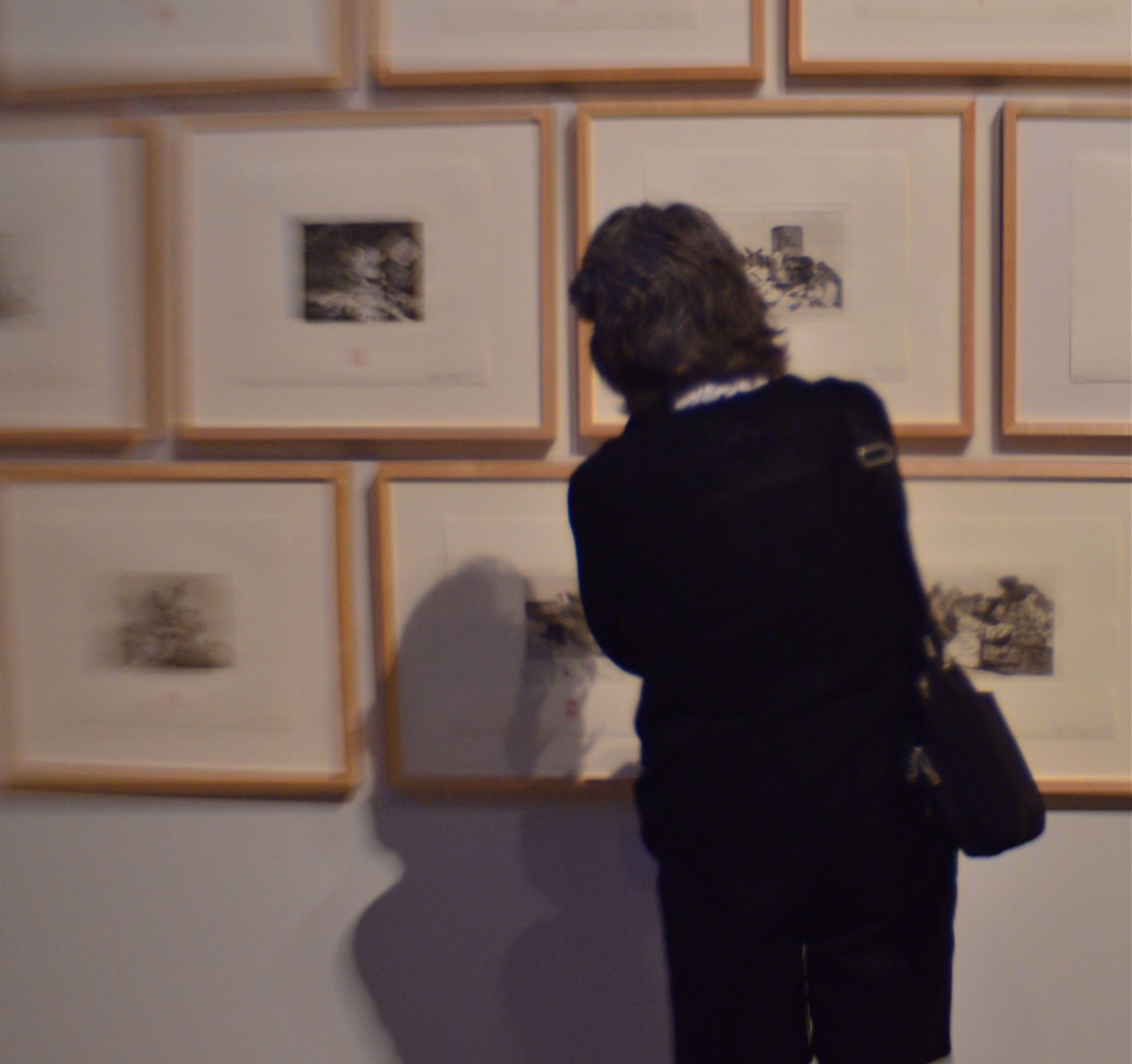
MUSEUMS AND GALLERIES COMPRISE SOME OF THE MOST INTERESTING WORKOUT SPACES for photographers, but for none of the reasons you might suppose. On the most obvious level, certainly,they are repositories of human endeavor, acting basically as big warehouses for things we deem important. But, beyond that, they are also laboratories for every kind of lighting situation, a big ‘ol practice pad for the mastery of lenses and exposure strategies. Sometimes the arrangement of color and shadow in some art houses is so drastically different from room to room that, even if there is nothing of note hanging on the walls, the walls themselves can frame amazing compositional challenges.
There is also a secondary, and fairly endless, source of photographic sketch work to be had in the people who visit public art spaces. The body language of their contemplative study of the artwork is a kind of mute ballet all its own, and no two patterns are alike. Watching the people who watch the art thus becomes a spectator sport of sorts, one which works to the advantage of the candid shooter, since people are more immersed in the paintings and thus a little less aware of themselves as regards the photographer. That leads to what I call “bodily candor”, a more relaxed quality in how they occupy their personal space.
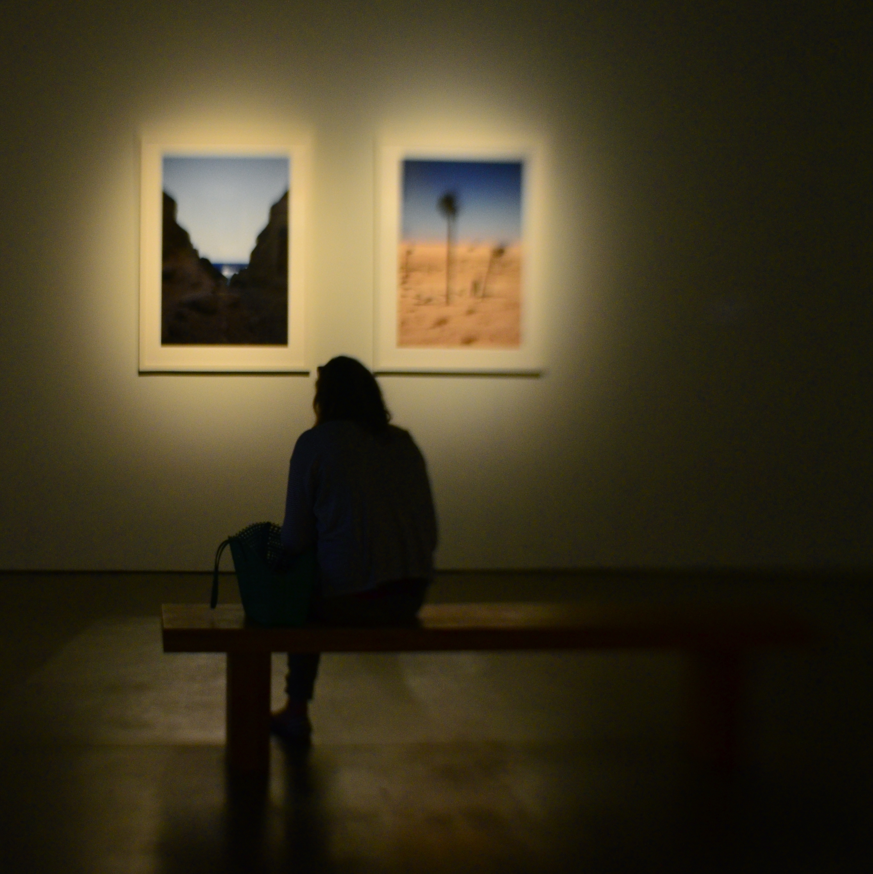
Which is the subject?
Sometimes, as seen in the images in this article, your subject’s physical footprint is enough to express a full sense of the person without a trace of facial detail. In fact, I actually prefer this “no-face” approach, since it forces the viewer to supply some information of his own, making the photographs more interactive.
Try some gallerylab shots the next time you are hostage to a museum tour that was someone else’s idea of a good time. The exhibits themselves may disappoint, but the museum space and the people in it offer pretty consistent material.
