LOOKING FOR AN OPENING
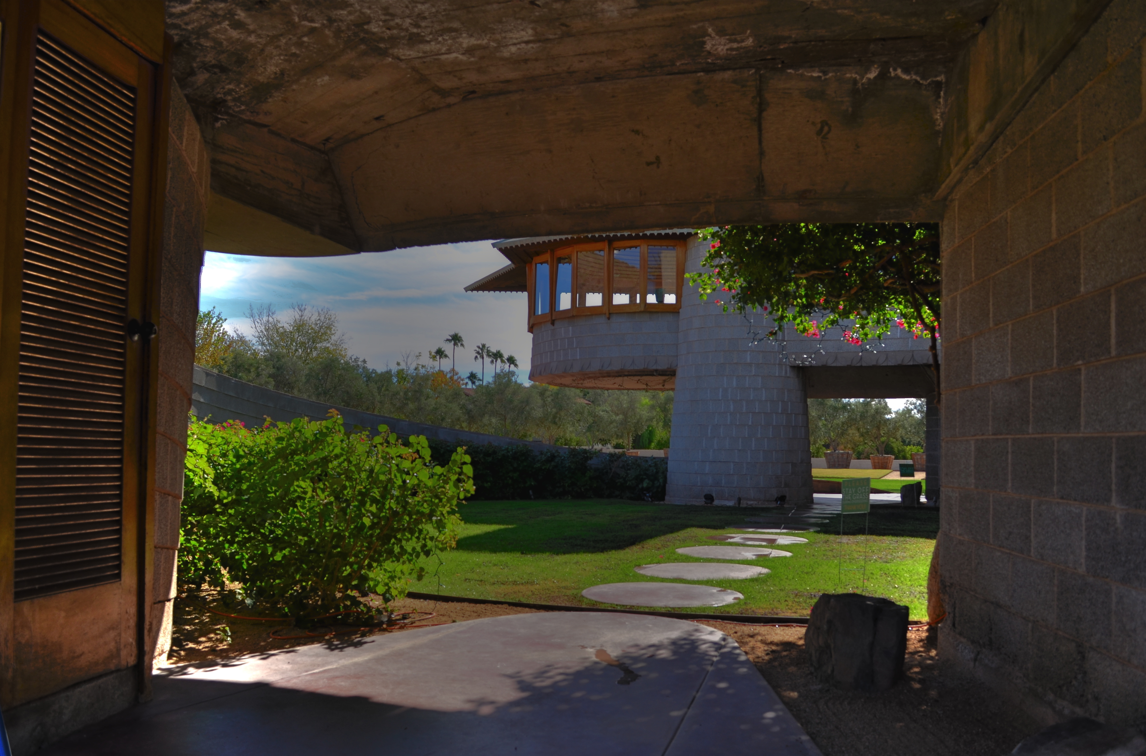
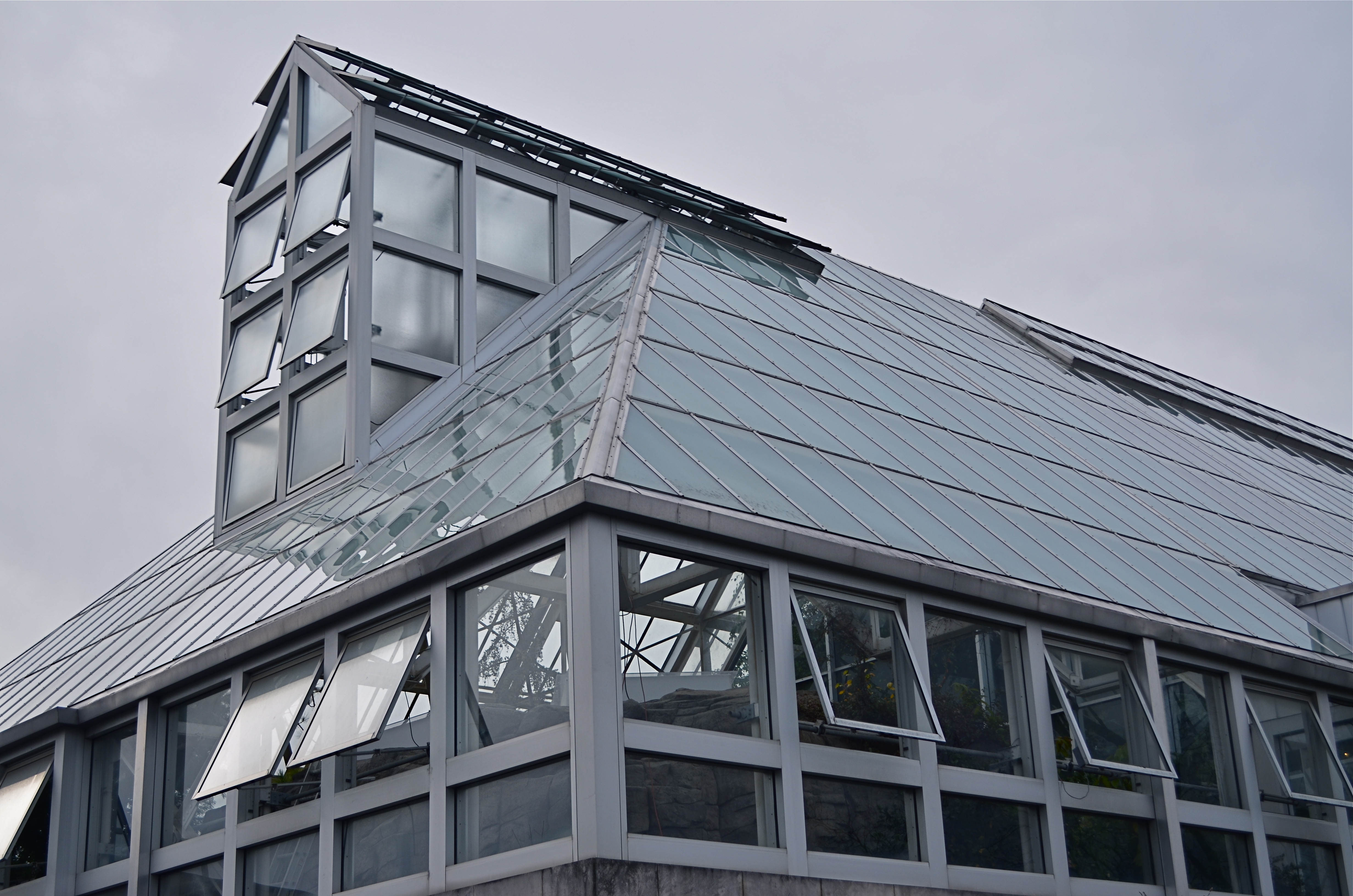
Entering a Frank Lloyd Wright home is like unwrapping a birthday present. The concrete walk ends in a circular ramp that rises to the left and around the David Wright house to create this wonderful open space.
By MICHAEL PERKINS
IF A HOME CAN BE SAID TO BE AN EVENT, then a door is the engraved invitation that bids you to witness that event. When you think about it, a door is the most crucial part of a house’s design, certainly its most deliberately provocative. It advertises and defines what lies within. It’s a grand tease to a mystery, the last barrier before you invade someone’s most personal space. It’s no wonder that entrances to places are among the most photographed objects on the planet. The subject is as inexhaustibly varied as the people who construct these lovely masks.
Doors are the first story tellers in a house.
Frank Lloyd Wright did more than create drama as you entered one of his houses; he actually enlisted you in generating your own wonder. Often the great man made you a little squirmy as you prepared to come inside, compressing door heights and widths to slightly uncomfortable dimensions. Pausing for a moment, you could almost feel like Alice after she ate the wrong cake, as if you might never be able to wriggle through the door frame.
Shortly after this ordeal, however, Wright would let the full dimensions of the inner house open suddenly and dramatically, as he does in the image above, taken at the home that he designed for his son David in Phoenix, Arizona. After ducking your head, you step into a court that has…no ceiling…since it ends in a ramp that both climbs around and supports a house that encircles you, creating an intimate courtyard that is both confined and limitless.
Doors make statements, almost boasts, about the wonder that lies just inches beyond them, and, like all generators of mystery, they are often most interesting when the question is never answered. Doors we never see beyond are often the most intriguing, like a woman behind a veil. When I invade a new neighborhood, my camera’s eye goes to doors before anything else. Sometimes the spaces they conceal don’t live up to the hype, but doors, these stage productions at the front of grand and humble abodes alike, offer something tantalizing to the eye.
9/11/15: THE NEW, NEW COLLUSSUS
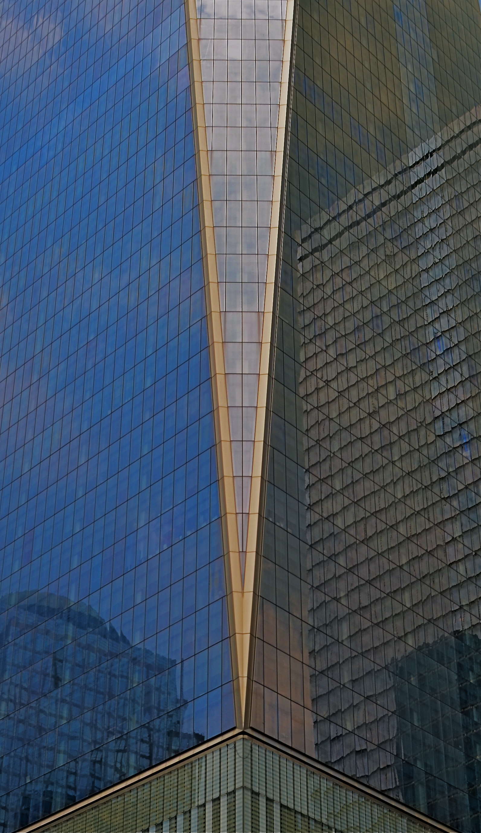
Icoceles, 2015. Up close or far away, the World Trade Center is a show unto itself.
By MICHAEL PERKINS
THE SKYLINE OF NEW YORK CITY, if you think about it a bit, is almost like a bar graph in steel and stone.
Just as higher and lower bars on a business graph chart the successes and failures of a company or stock, so do the vertical surgings above Manhattan island track the ebb and flow of energy, of the life flow of the most amazing metropolis on earth. And for photographers, the Apple’s skyline is always news. Someone is moving up. Someone else is moving down, or over. There’s always a new kid on the block, and that means that the photographic story of New York must be re-imagined yet again.
New York buildings create context for themselves and for the city at large, as the fresh arrivals jostle in and try to mingle with their more historically landed neighbors. That process is always exciting, but the rebirth of the part of lower Manhattan scarred and scorched by the hateful events of 9/11/01 brings more than just a new crop of jutting profiles. It brings one of the most powerful symbols of resurrection in the modern age. To paraphrase the song lyric, America proved, on that most battered of battlegrounds, that, if we could make it there, we could make it anywhere, and the nation at large stood a little taller with the arrival of the new World Trade Center.
Cameras now idealize that which is already miraculous, and WTC One, visible from anywhere in the city, will create its own photographic history, or, rather, make it irresistible for photographers to try to write it themselves. Postcard views, neighborhood contrasts, abstractions, souvenir snaps…all will be the story and none will be the story, at least not the whole story. New York is always ready for her close-up, but the challenge is always, are you good enough to shoot her best side?
Photographers visit New York to size themselves up in their own bar graph of pass/fail/maybe. Like everyone who ever stepped off a Port Authority bus fresh off the farm, they ask themselves: am I good? According to whom? Compared to what? Can I make something last as I create images of a city that not only never sleeps, but never even slows down?
“Autumn in New York. It’s good to live it again….”
REVERSAL OF FORTUNE
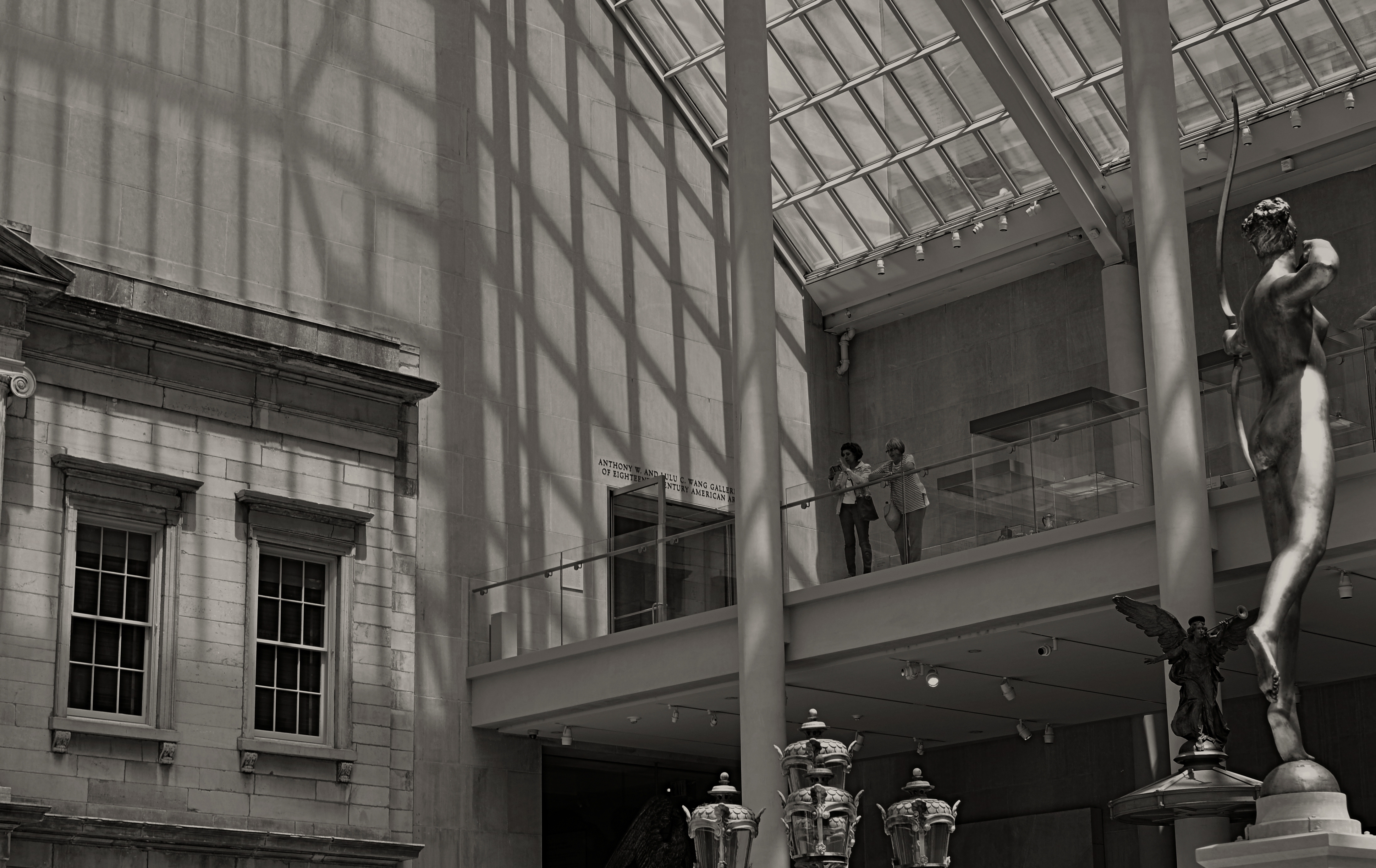
Spaces like this vast sculpture gallery beg to be visualized from as many angles of view as possible, Diana hunts from the right edge of the frame.
By MICHAEL PERKINS
ANYONE WHO HAS EITHER STUDIED OR DABBLED IN CANDID PHOTOGRAPHY has heard Henri-Cartier-Bresson’s term “the decisive moment”, which refers to that heat-lightning instant when the best possible photograph of a situation or sensation can be made. Of course, you don’t have to really believe that there is a single such moment, and many do not. There may be any one of thirty possible frames to be extracted from even the simplest human subjects, but we seem to always be looking for that salient, isolated image that defines it for all time.
Cartier-Bresson’s pursuit of the decisive moment is usually thought of with regard to photographing human activity, but there is also a mindset about photographing places that there can be a “superior” or “best” angle to view them from. That is why landmarks and monuments yield so many pictures that are so much the same. We all shoot the Eiffel Tower the way that everyone else before us has shot it…..because? Well, there’s a great question.
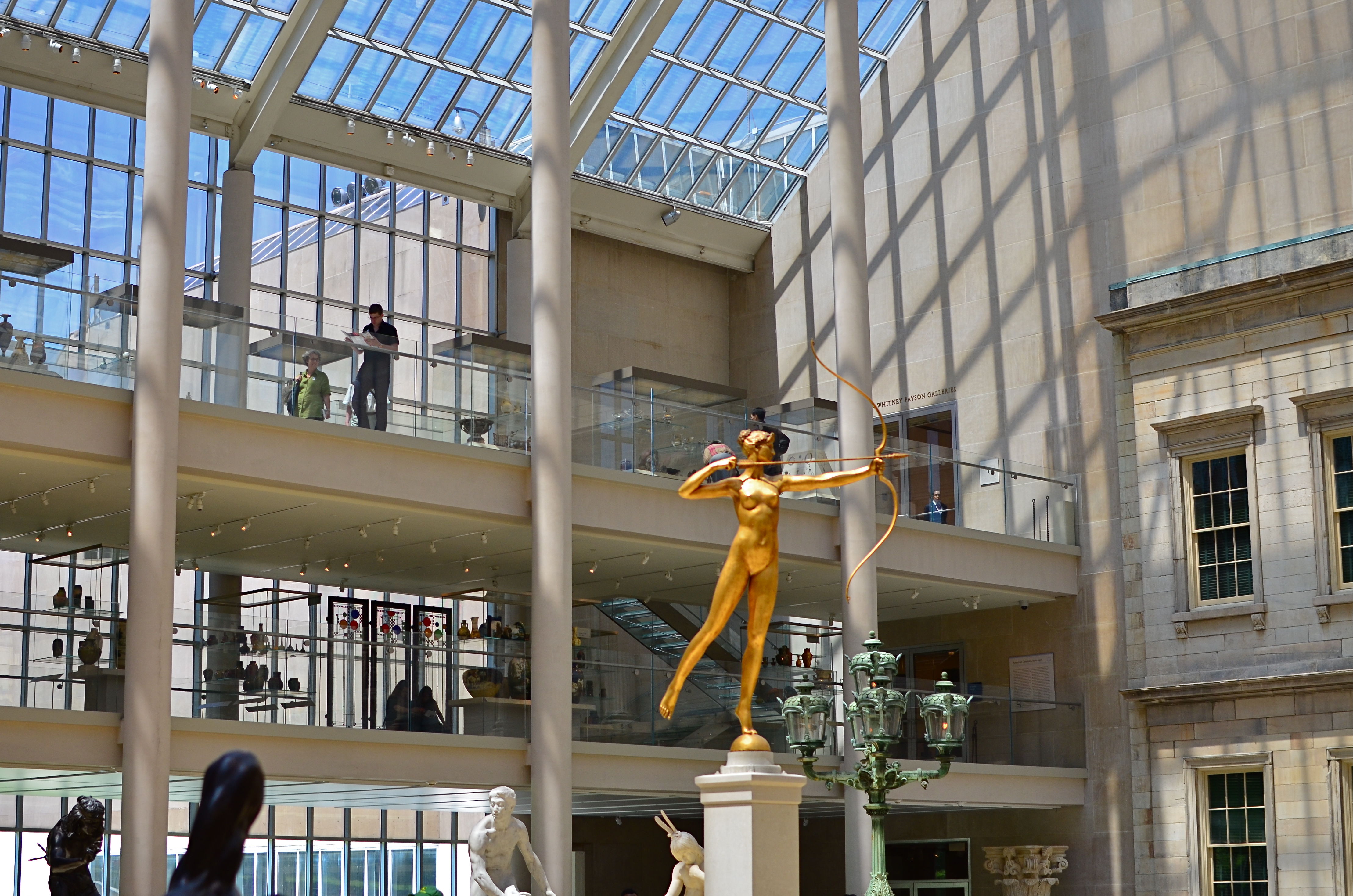
My original, “official” angle on the exact atrium. Diana holds center stage.
Do we think of earlier images of the tower as a standard of some kind that we only certify by imitation? Is our mind eager to catalogue things in their “proper” orientation? Are we only interesting in what things are “supposed” to look like? Ideally, we should be making pictures to authenticate our own visions, not to rubber-stamp those generated before us. And yet, with famous places, it’s often a case of human see, human ape.
We have to teach ourselves to photograph places as if we were the first to ever point a camera at them. It’s not that hard a habit to cultivate, really. Crank yourself around 180 degrees and take the reverse angle. Move six inches to the left and frame the most obvious part of the cathedral, ruins, or palace out of your composition. It might yield nothing, and then again, it might add enough freshness to the image to overcome what I refer to as “tourist fatigue”.
The above image from the sculpture plaza at the Museum of Modern Art in New York is a near reverse of the more conventional view in the smaller color shot at left, which I first featured in the post Put Yourself Out There a while back. In one shot, the Diana statue is center stage. In the other, she is relegated to the edge of the frame, acting as a pointer toward the rest of the photograph’s information. Extra cost in terms of time to get this very different composition? Ten seconds.
It’s not that re-imagining a subject is that hard. It’s that we so seldom question our first imagining of things, often settling for the first, technically successful image we get. And that first image, as we often learn, might only be a dress rehearsal for the real show.
THE FEEDBACK CURVE
Everything you shoot is reflective of your own view. That’s the good part, and the risky part as well.
By MICHAEL PERKINS
DIGITAL PHOTOGRAPHY, AND THE SPEED, ECONOMY AND EASE IT HAS BROUGHT TO NEARLY EVERYONE, has allowed an incredible acceleration of the learning curve for shooters, a temporal shortcut that has effectively enabled people to master in years what used to take a lifetime (not to say a personal fortune). Without the lag time and cost baked into the film medium, photographers can shoot a lot. Like, a lot.
Problem is, this skyrocketing learning curve for shooting skill has not been accompanied by an accompanying curve in editing skill. As a matter of fact, the two skills are going in opposite directions. And that is a bad, bad thing.
In the film era, there was limited admission to the “photographer’s club” at the pro level, and all pros had some way of winnowing out their weaker work. They had editors, publishers, or some kind of independent eye to separate the wheat from the chaff. Only the best work was printed or displayed. Not everyone made the cut. Some of us had to admit that we didn’t have “it”. There was more to photography than the mere flick of our shutter fingers.
Now enter the digital age, and, with it, the ersatz democracy of the internet age. Suddenly, all of everyone’s photos are equal, or so we have come to think. All images go to the infinite shoebox of the web: the good stuff, the not-so-good stuff, the what-the-hell stuff, all of it. Accounts on Flickr and Instagram allow posters a massive amount of upload space, and there are few, if any strictures on content or quality. But here’s the ugly truth: if all of our photos are special, then none of them are.
You can take most of the formalized schools on photography and sink them in the nearest bog with no damage to any of us, with one singular exception: those tutorials which teach us how to objectively evaluate our own work. Knowing how to wield the scissors on one’s own “babies” is the most important skill in all of photography, because, without that judgement, no amount of technical acumen matters.
If you don’t learn what is good and how close or far you, yourself have come to that mark, then how can anything become exceptional, or excellent? If your work has never had to face real critical heat, there is no incentive for you to change or evolve. This is increasingly important for the millions of self-publishing shooters and scribblers like me who presume to pronounce on what photography is. Just cause we’re in print don’t mean we’re right, or even honest.
Art cannot grow in a vacuum, and so, I say again, if we can’t self-edit, we can’t claim to be photographers, not in any real way. The curve of honest self-evaluation must soar alongside the curve of technical acuity, or the whole thing’s a joke.
LESS STILL, MORE LIFE

Good enough to eat or time to get a vase?
By MICHAEL PERKINS
PHOTOGRAPHIC HISTORIANS WILL PROBABLY CRINGE AT MY OVER-SIMPLIFICATION, but I tend to believe that still-life compositions were originally popular to shooters because they solved a technical problem. At the dawn of the imaging art, recording media, from salted paper to glass plates, were so abysmally slow that exposure times stretched, in some cases, to nearly an hour. This meant that subject matter with any kinetic quality, from evolving landscapes to a baby’s face, were rendered poorly compared to inanimate objects. Still lifes were not so much about the beauty and color of fruit and cheese on a plate as they were about practicing…learning how to harness light and deliver a desired effect.
As film and lenses both sped up, a still life could be chosen purely on its aesthetic appeal, but the emphasis was still on generating a “realistic” image…an imitation of life. The 20th century cured both photography and painting of that narrow view, and now a still life, at least to me, offers the chance to transform mundane material, to force the viewer to re-imagine it. You can do this with various processes and approaches, but the main appeal to me is the chance to toss the object out of its native context and allow it to be anything…or nothing.
In the image at left, the home-grown vegetables, seen in their most natural state, actually have become alien to our pre-packaged notions of nutrition. They don’t even look like what arrives at many “organic” markets, much less the estranged end-product from Green Giant or Freshlike. And so we are nearly able to see these vegetables as something else. Weeds? Flowers? Decay? Design? Photographing them in our own way, we are free to assign nearly any quality to them. They might, for example, be suggestive of a floral bouquet, a far cry from the edibles we think we know. Still life compositions can startle when they are less “still” and more “life”, but we have to get away from our subjects and approach them around their blind side.
As always, it’s not what we see, but how.
GOING NEGATIVE
Negative space is your best friend when trying to establish scale.
By MICHAEL PERKINS
I got plenty of nothin’, and nothin’s plenty for me. —Ira Gershwin, Porgy and Bess
I BELIEVE THAT MANY PHOTOGRAPHS ARE IMPROVED BY THE SIMPLEST OF MATH OPERATIONS: addition and subtraction. Look at nearly any image you’ve created that “worked” and you can see that there is not one more thing in the image than there needs to be. Something told you to either supply or eliminate elements in the composition until the impact of the picture was maximized. Realizing the reverse effect is pretty easy as well, although not as much fun. If there is one tree too many or one object too few in the frame, you can sense the imbalance in your near-miss pictures. And man, does that hurt.
 We used to refer to open areas of a picture as “blank” space, and were often talked out of using it at all by various A-B-C composition tutorials that told us that large expanses of sky could kill a good landscape. Today, we refer to this unused real estate as “negative” space, but we are now more inclined to see it as well, a positive thing. The take-home from this is, simply, that no technique should be universally ruled out, or ruled in, for every image. Truth is, there are times when not filling the frame with stuff, or selectively making use of negative space boosts the wattage of what you’re trying to say.
Instead of “negative” space, I prefer the term “secondary space”, since what you’re really doing is mapping your pictures into zones of the things that should be of primary interest and those that should complement those things without competing with them. Landscapes are the easiest way to demonstrate this. In the image at left, I wanted to accentuate the distance between the foreground tree and the background mountain. Framing the two elements to merely overlap gave no sense of space, and, in color, actually made the photo busy and hard to read. There seemed to be no primary object in the frame. Composing so that some sky intervened to the right of the tree and the top of the mountain re-established the sense of distance and kept the textures of both objects from fighting with each other.
Secondary space need not be empty. It can take the form of a texture, be it a body of water, cloud formations, a flooring pattern, or a stone wall. The idea is to use the space to support, but never upstage the primary space. Sometimes what you need to complete an image is nothing. You just have to stick the nothing in the right place.
CHOOSE THE INCONVENIENT

The more of your hand that’s in a picture, the better it will be.
By MICHAEL PERKINS
MARKETING BEING WHAT IT IS, CAMERA MANUFACTURERS HAVE LONG TOLD US THEY ARE DOING ONE THING FOR US when they are actually doing something very different. Since the first furry, day-long exposures of the 1800’s gave us a taste of what an entirely new medium could do in the way of chronicling the world, we have been promised that, over succeeding generations of technical development, taking a picture would get easier. In fact, this is a little inaccurate, as what the wizards have mostly done is to make taking a picture faster.
If this sounds like I’m splitting a sub-atomic-sized hair, hear me out. Many of the refinements in camera design over the last century and a half have, of course, improved the sharpness of lenses, the absorbance quotient of recording media, and enhanced design. However, the lion’s share of reboots have been to require fewer steps in framing and shooting, through increasing auto-delegating of many functions to smarter and smarter cameras. But, what we basically gain by this process is speed. It certainly takes much less time to shoot and get an acceptable result as the years roll by. “Well”, you may well ask, “doesn’t that mean the whole process is also easier?”
Tricky question, as it turns out.
In that you can take technically better images with less effort the further we roll along, then yes, it’s “easier”. But the same speed which is part of the “easy” process also means that we spend less time planning a picture, seeing it in our minds and creating it with deliberate action…cause, you know, the camera will do it. This means that it’s also easy to miss things, to fail to visualize the best way to take a shot versus the most expedient way. Slowing down by adding steps into the creation of a photograph means taking back control, so it is, if you will, “harder”, but, with practice of the total process of photographing, the ease, and even the speed all comes back anyway.
I wanted the name of this blog to contain a subtitle about journeying from taking to making images because that is the trek that most photographers eventually set out on. We begin to wonder what it would be like to be more completely in charge of what kind of pictures we wind up with, even if it’s only to take a series of baby steps. It does take more time to take the process into your own hands. But it’s not that hard. Auto-settings save you time, but they may not save your shot. Choosing the inconvenient isn’t ignoring technology. It’s making it work your will with your pictures.
GRADUATING, GRADUALLY
 By MICHAEL PERKINS
THE DEVELOPMENTAL NATURE OF PHOTOGRAPHY is not unlike that seen in many other crafts that eventually lead to art. Built in layers at a measured pace over years, the photographer’s eye deepens, broadens, becomes both intellectual and instinctual. It is a process, one that some would argue is never complete, and is similar to the way a sculptor’s grip on the chisel goes from brute strength to brain wave, or the halting young painter, over time, converts brush strokes to master strokes.
However, this process is subverted by contemporary culture’s addiction to things…new things, shiny things, latest things. When photography meets consumerism, acquisition, not mastery, becomes the prime objective. How can you take today’s pictures with yesterday’s camera? This new toy, this fresh gadget, changes everything. Adapt, or die a thousand uncool deaths.
This is flawed thinking, but it sweeps many of us up in the frenzy to constantly replace all our gear, placing our faith in the mechanics, rather than the aesthetics, of making pictures. Advertising is about artificially engineering need. If you can be made to have disdain for your old stuff, the people who make new stuff will never run out of customers. It’s just that simple. Fact is, there are many people who presently own perfectly adequate cameras, and, based on where they are as photographers, they do not need to go to the next big thing, since they have not mastered what they presently use. Here is the truth: changing cameras because you have outgrown your current one is the only time such change makes any artistic sense.
Now, I’m not saying that you should “settle” if your camera is so limited that it’s holding you back. There are some gauzy-eyed fantasists out there that love to rhapsodize on how you can make glorious pictures with crappy cameras, and, while I applaud their enthusiasm, I question their sanity. Romantic notions aside, crap usually begets crap. Get a box adequate to your needs. But make sure that it is also proportionate to your ability and involvement. I have seen more newbies over-purchase monstrous mega-machines that they either under-utilize by 90% or which terrify them so much that they lie rotting in drawers (the cameras, not the customers) after a few months of frustration and failure.
Find the camera that defines what kind of photographer you are right now, and pull every ounce of creativity out of it until you know that you need something else in order to grow. Trying to shoot masterpieces with junk usually doesn’t work, but sinking your hopes into a $2,000 thoroughbred that you’re going to use like a point-and-shoot may actually be worse.
SHADOWS AS STAGERS
The idea of this image is to highlight what lies beyond the window framing, not the objects in front of it. Lighting should serve that end.
By MICHAEL PERKINS
THOSE WHO ADHERE TO THE CLASSIC “RULE OF THIRDS” system of composition often suggest that you imagine your frame with a nine-space grid super-imposed over it, the better to help you place your subject in the greatest place of visual interest. This place is usually at the intersection of several of these grid lines, and, whether or not you strictly adhere to the “thirds” system, it’s useful to compose your shots purposefully, and the grid does give you a kind of subliminal habit of doing just that.
Sometimes, however, I find that the invisible grid can be rendered briefly visible to become a real part of your composition. That is to say, framing through silhouetted patterns can add a little dimension to an otherwise flat image. Leaving some foreground elements deliberately underlit is kind of a double win, in that it eliminates detail that might read as clutter, and helps hem in the parts of the background items you want to most highlight.
These days, with HDR and other facile post-production fixes multiplying like rabbits on Viagra, the trend has been to recover as much detail from darker elements as possible. However, this effect of everything being magically “lit” at one even level can be a little jarring since it clearly runs counter to the way we truly see. It’s great for novel or fantasy shots, but the good old-fashioned silhouette is the most elemental way to add the perception of depth to a scene as well as steering attention wherever you need it. Shadows can set the stage for certain images in a dramatic fashion.
Cheap. Fast. Easy. Repeat.
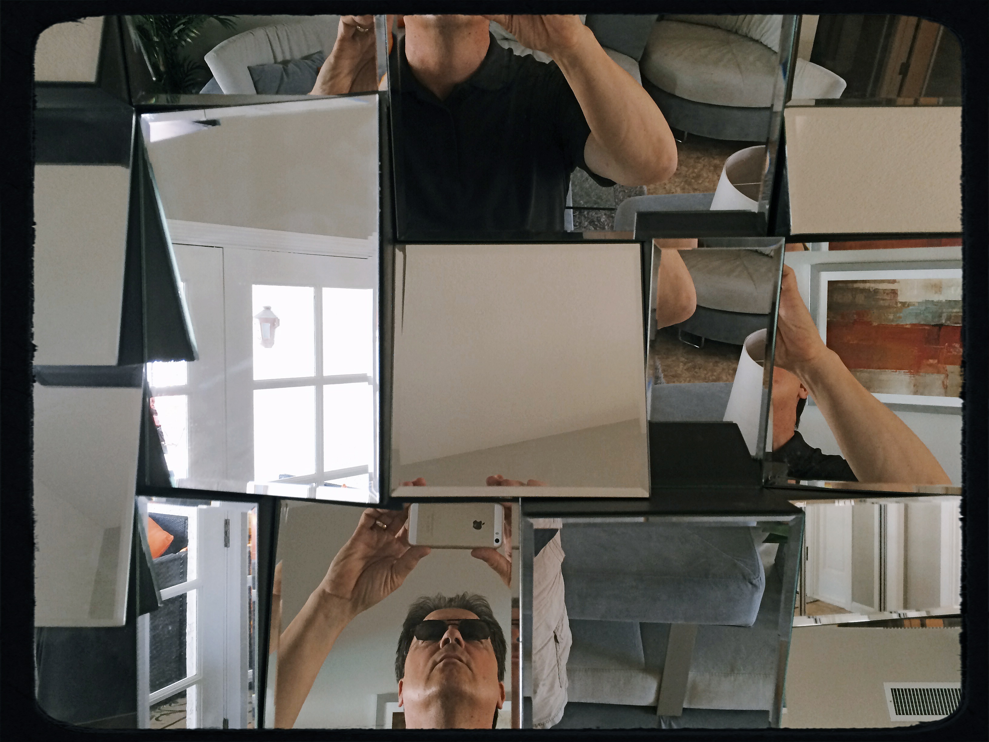
FRAGMENTS AND SHARDS
By MICHAEL PERKINS
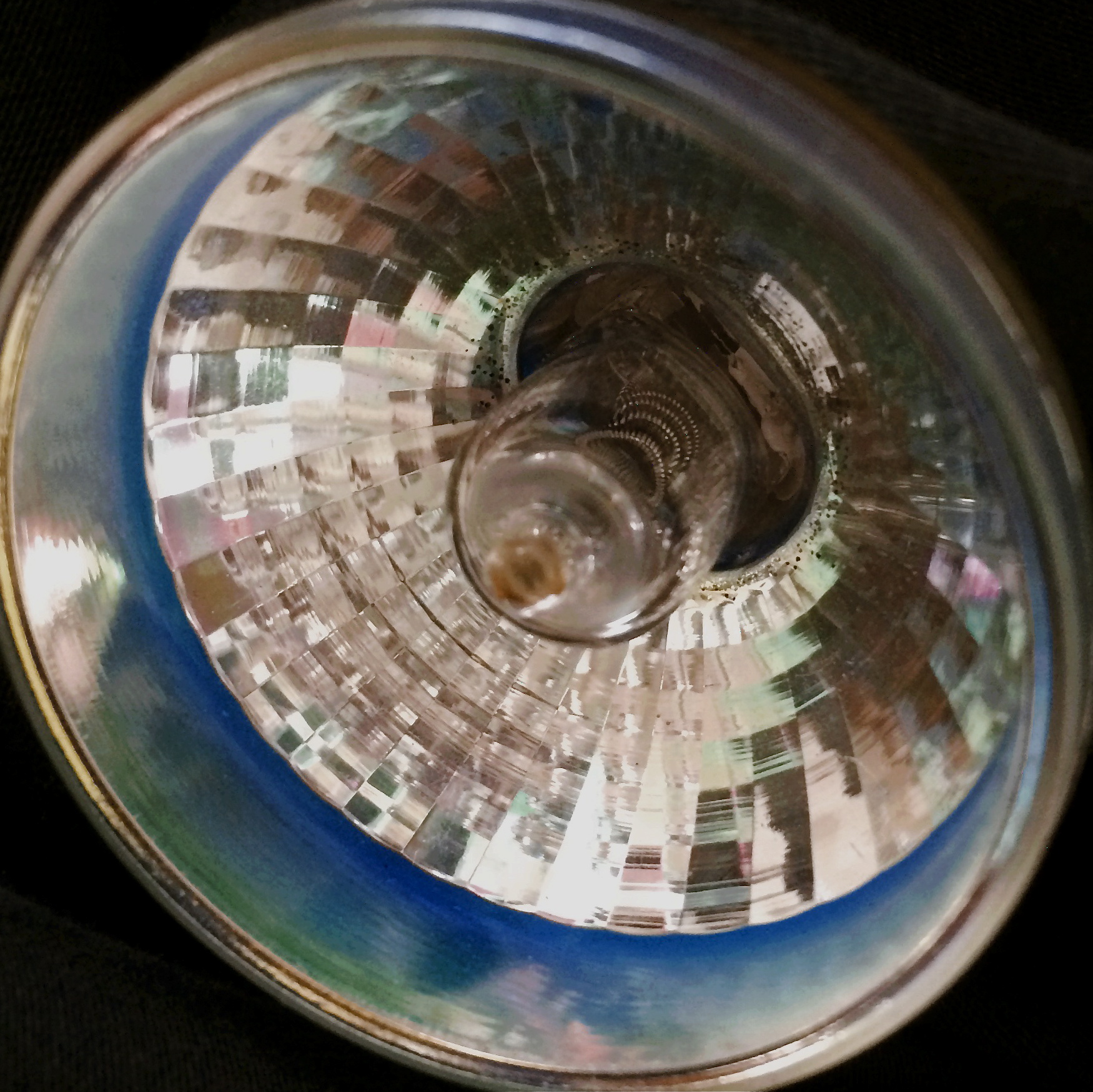
GLASS SURFACES REPRESENT A SERIES OF CHOICES FOR PHOTOGRAPHERS, an endless variety of effects based on the fact that they are both windows and mirrors, bouncing, amplifying or channeling light no less than any other subject in your frame. No two shooters approach the use (or avoidance) of glass as a compositional component in quite the same way. To some, it’s a barrier that they have to get past to present a clear view of their subject. To others, its fragments and shards of angle and light are part of the picture, adding their own commentary or irony.

That’s The Way The Light Benz, 2015. 1/50 sec., f/5.6, ISO 100, 35mm.
I usually judge glass’ value in a photograph by two basic qualifiers: context and structure. First, context: suppose you are focused on something that lies just beyond a storefront window. What visual information is outside the scope of the viewer, say something over your shoulder or across the street, that might provide additional impact or context if reflected in the glass that is in direct view? It goes without saying that all reflections are not equal, so automatically factoring them into your photo may add dimension, or merely clutter things up.
The other qualifier is the structure of the glass itself. How does the glass break up, distort, or re-color light within an enclosure? In the above image, for example, I was fascinated by the complex patterns of glass in an auto showroom, especially in the way it reassigned hues once the sun began to set. I had a lot of golden light fighting for dominance with the darker colors of the lit surfaces within the building, making for a kind of cubist effect. No color was trustworthy or natural , and yet everything could be rendered “as is” and regarded by the eye as “real”. The glass was part of the composition, in this instance, and at this precise moment. Midday or morning light would render a completely different effect, perhaps an unwelcome one.
Great artists from Eugene Atget to Robert Frank have created compelling images using glass as a kind character actor in their shots. It’s an easy way to deepen the impact of your shots. Let the shards and fragments act like tiles to assemble your own mosaics.
THE VANISHED NORMAL

Dewey love card catalogs? Well, we used to. 1/30 sec., f/2.8, ISO 100, 35mm
By MICHAEL PERKINS
THE FUTURE DOESN’T ARRIVE ALL AT ONCE, just as the past doesn’t immediately vanish completely. In terms of technology, that means that eras kinds of smear across each other in a gradual “dissolve”. Consider the dial telephone, which persisted in various outposts for many years after the introduction of touch-tone pads, or, more specifically, Superman’s closet, the phone booth, which stubbornly overstayed its welcome long past the arrival of the cel. The “present” is always a mishmosh of things that have just arrived and things that are going away. They sort of pass each other, like workers at change of shift.
Visually, even the obsolete can be re-purposed.
Photographically, this means that there are always relics of earlier eras that persist past their sell-by date. They provide context to life as part of a kind of ever-flowing visual history. It also means that you need to seize on these relics lest they, and their symbolic power, are lost to you forever. Everything that enjoys a brief moment as an “everyday object” will eventually recede in use to such a degree that younger generations couldn’t even visually identify it or place it in its proper time order (a toaster from 1900 today resembles a Victorian space heater more than it does a kitchen appliance).
Ironically, this is a double win for photographers. You can either shoot an object to conjure up a bygone era, or you can approach it completely without context, as a pure design element. You can produce substantial work either way.
Some of the best still life photography either denies an object its original associations or isolates it so that it is just a compositional component. The thing is to visually re-purpose things whose original purpose is no longer. Photography isn’t really about what things look like. It’s more about what you can make them look like.
YOU’RE GREAT, NOW MOVE, WILLYA?

Marquee Marks, 2015. Do I need people in this to suggest urban life?
By MICHAEL PERKINS
ONE OF MY FAVORITE SONGS FROM THE ’40’s, especially when it emanates from the ruby lips of a smoking blonde in a Jessica Rabbit-type evening gown, conveys its entire message in its title: Told Ya I Love Ya, Now Get Out! The hilarious lyrics speak of a woman who acknowledges that, yeah, you’re an okay guy, but don’t get needy. No strings on me, baby. I’ll call you when I want you, doll. Until then, be a pal and take a powder.
I sometimes think of that song when looking for street images. Yes, I’m aware that the entire sweep of human drama is out there, just ripe for the picking. The highs. The lows. Thrill of victory and agony of de feet. But. I always feel as if I’m cheating the world out of all that emotional sturm und drang if I want to make images without, you know, all them people. It’s not that I’m anti-social. It’s just that compelling stuff is happening out there that occasionally only gets compromised or cluttered with humans in the frame.
Scott Kelby, the world’s biggest-selling author of photographic tutorials, spends about a dozen pages in his recent book Photo Recipes showing how to optimize travel photos by either composing around visitors or just waiting until they go away. I don’t know Scott, but his author pic always looks sunny and welcoming, as if he really loves his fellow man. And if he feels it’s cool to occasionally go far from the madding crowd, who am I to argue? There are also dozens of web how-to’s on how to, well, clean up the streets in your favorite neighborhood. All of these people are also, I am sure, decent and loving individuals.
There is some rationality to all this, apart from my basic Scrooginess. Photographically, some absolutes of abstraction or pure design just achieve their objective without using people as props. Another thing to consider is that people establish the scale of things. If you don’t want that scale, or if showing it limits the power of the image, then why have a guy strolling past the main point of interest just to make the picture “human” or, God help us, “approachable”?
Faces can create amazing stories, imparting the marvelous process of being human to complete scenes in unforgettable ways. And, sometimes, a guy walking through your shot is just a guy walking through your shot. Appreciate him. Accommodate him. And always greet him warmly:
Told ya I love ya. Now get out.
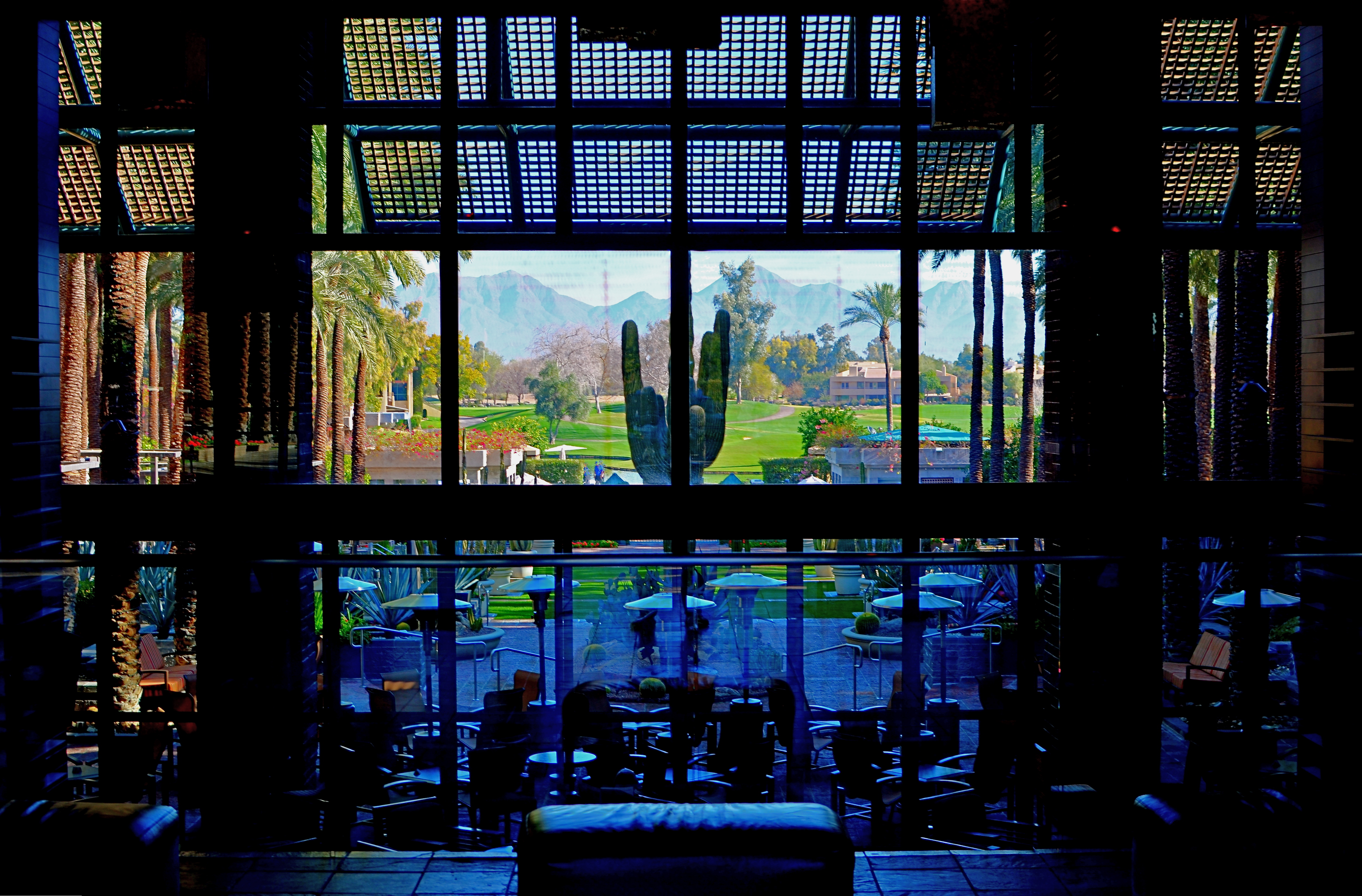
WATERCOLOR DAYS
Franklin Park Conservatory, 2015.
By MICHAEL PERKINS
THE FIRST COLOR PHOTOGRAPHS REALLY…WEREN’T. That is to say, the various recording media, from glass plates to film, were technically incapable of rendering color, leaving entrepreneurial craftsmen (mostly post card artists) to lovingly apply hues with paint and brush. It was the Fred Flintstone version of Photoshop, and, boy howdy, did it sell, regardless of the fact that most flesh tones looked like salmon and most skies looked more eggshell than azure. Until the evolution of a film-based process near the end of the 19th century, these watercolor pastels stood in for the real thing.
Glass Barn, 2014
Winter’s months-long overcasts and grey days can remind a photographer of what it was like to only be able to capture some of the color in a given subject, as the change in light washes the brilliance out of the world, leaving it like a faded t-shirt and creating the impression that color, as well as botany, goes into the hibernational tomb during winter.
Of course, we can boost the hues in the aftermath just like those patient touch-up artists of the 1800’s, but in fact there are things to be learned from rendering tones on the soft pedal. In fact, reduced color is a kind of alternate reality. Capturing it as it actually appears, rather than amping it up to neon rudeness, can actually be a gentle shaper of mood.
Light that seeps through cloud cover is diffused, and shadows, if they survive at all, are faint and soft. The look is really reminiscent of early impressionism, and, when matched up with the correct subject matter, can complement a scene in a way that a more garish spectrum would only ruin.
Just like volume in music, color in photography is meant to speak at different decibel levels depending on the messaging at hand. Winter is a wonderful way to force ourselves to work out of a distinctly different paint box.
EXTENDING THE INVITATION

Sinuous, 2013. The river’s journey takes it, and your eyes, back “into” the picture.
By MICHAEL PERKINS
PHOTOGRAPHY AND PAINTING, DESPITE ENGAGING THEIR AUDIENCES IN VERY DIFFERENT WAYS, have retained one common aim over the centuries, at least when it comes to pictorial or scenic subjects. Both the photo and the canvas arrange their visual information on a two-dimensional surface, and both seek to draw the viewer’s eye into a depth that is largely illusionary. The cameraman and the painter both contrive to create the illusion that the distance from front to back in their works is as real as the distance from side to side.
In terms of simulating depth, some photographs benefit from both shadow and light, which alternatively “model” the information in an image, making it seem to “pop” in some faux-dimensional sense. But the best and simplest trick of composition is what we popularly term the “leading line”, information that trails from the front of the picture and pulls the viewer’s attention to an inevitable destination somewhere deeper back in the scene.
Putting a picture together this way ought to be the most automatic of instincts in the composition of a photograph, but it still is formally taught, as if it were less than obvious. In fact, it just means extending an invitation to someone to join you “in” the photograph.

Minutes Away, 2012. The girders give you a stick-straight diagonal from journey to destination.
Trails, paths, railroad tracks, lines of trees or phone poles….these are all examples of information that can start at one side of a photo and track diagonally to the “back” of the image, making the eye experience a kind of gravity, tugging it toward the place you want their gaze to end up. It is also the easiest way to force attention to a central subject of interest, sort of like inserting a big neon arrow into the frame, glowing with the words over here.
Leading lines are a landscape’s best friend, as well, since the best landscapes are arranged so that the focal point of the story is streamlined and obvious. Anyone who has ever shown too much in a landscape will tell you that what fails in the composition is that it allows the viewer to wander around the place wondering what the point of the picture is. The use of a powerful leading line gives the illusion of depth and corrals the eyes of your audience to the exact spot you need them to be for full effect.
Composition is the most democratic of photographic skills. It’s easy, it’s free, and anyone from a point-and-shooter to a Leica addict can use it effectively. Bottom line: there are great things happening in your pictures. Invite the people inside.
FIVE-DECKER SANDWICH
On This Site Will Rise, 2014. 1/320 sec., f/5.6, ISO 100, 35mm.
By MICHAEL PERKINS
MY PHOTOGRAPHY IS OCCASIONALLY AKIN TO MY GRANDMOTHER’S COOKING METHOD, which produced culinary miracles without a trace of written recipes or cookbooks. Her approach was completely additive; she merely kept throwing things into the pot until it looked “about right”. I was aware of the difference, in her hands, between portions that were labeled “smidges”, “tastes”, “pinches” and even “tads” (as in, “this is a tad too bitter. Give me the salt.) I never questioned her results: I merely scarfed them down and eagerly asked for seconds.
Picture making can also be a matter of adding enough pinches and tads to create just the right mix of factors for the image you need. It’s frequently as instinctual a process as Gram’s, but sometimes you have to analyze what worked by thinking the shot backwards after the fact. In the case of the above image, what you see, although it was shot very quickly, is actually the convergence of several different ingredients, the combination of which would be all wrong for some photos, but which actually served this subject fairly well.
The five-decker sandwich of factors in the shot begins with the building, which is quite intense in color all by itself, yet not quite contrasty enough to suit me in this specific instance. So let’s see all the hoops the camera had to jump through to get this particular image:
First, it was taken during the so-called “golden hour”, just before sunset, in late fall in Arizona. That guarantees at least one boost of the building’s native intensity. The next factor is the camera’s own color settings, which are set to “vibrant.” Level three comes from a polarizing filter, which is juicing the sky from its hazy southwestern “normal” to a deep blue. For the fourth element, I am also adding a second filtering component by shooting through a heavily tinted car window (there’s no other kind in Arizona), which presents here as the gradation of sky from blue at the top of the frame to a near aqua near the bottom. And finally, I am way under-exposing the shot at 1/320, deepening the colors yet one more time.
The fun of this is that it all happens ahead of the click, and keeps your fingers off the Photoshop trigger. Grandma may not have spent any more time laboring over a photo than a quick snap of a box Brownie, but she knew how to take stew meat and morph it into filet. And, as with the making of a picture, you just keep adding stuff until the mixture in the pot looks “about right.”
THE GEOMETRY OF VIEW
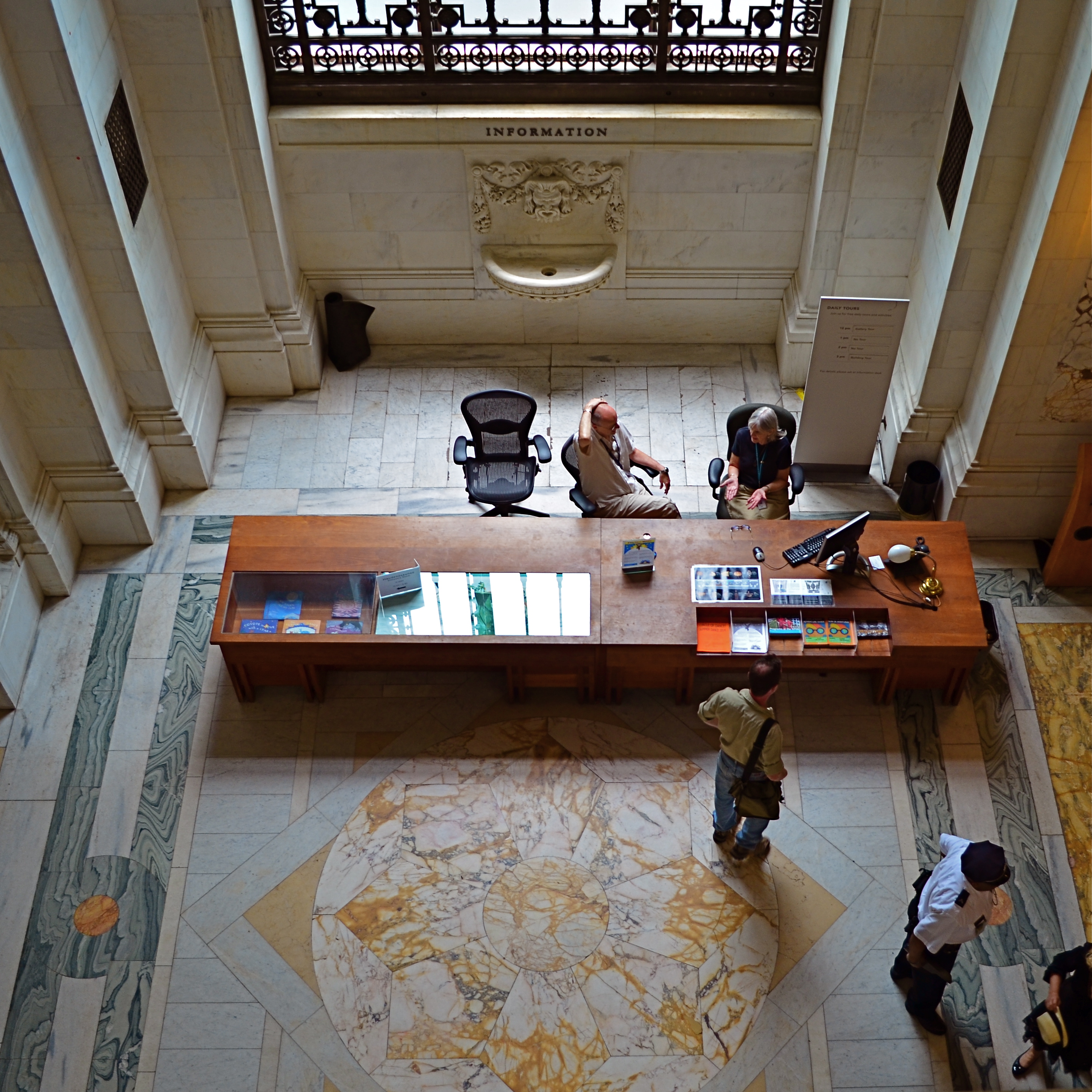
Information, Please, 2014. 1/60 sec., f/3.5, ISO 160, 18mm.
By MICHAEL PERKINS
ONE OF THE BEST WAYS TO APPREHEND THE OVERALL DESIGN OF A SPACE, be it a midtown skyscraper or a suburban cathedral, is to see it the way the designer originally envisioned it; as a logical arrangement of spaces and shapes. Sometimes, viewing the layout of floors, lobbies, or courtyards from the top-down, or “bird’s-eye” view of the original design sketches is especially helpful, since it takes our eye far enough away from a thing to appreciate its overall conception. It’s also not a bad thing for a photographer to do when trying to capture common spaces in a new way. Move your camera, change your view, change the outcome of your images.
The overarching vision for a place can be lost at ground, or “worker bee” level, in the horizontal plane along which we walk and arrange our viewpoint. Processing our understanding of architecture laterally can only take us so far, but it almost seems too simple to suggest that we shift that processing just by changing where we stand. And yet you will invariably learn something compositionally different just by forcing yourself to visualize your subjects from another vantage point.
I’m not suggesting that the only way to shake up your way of seeing big things is to climb to the top floor and look down. Or descend to the basement and look up, for that matter. Sometimes it just means shooting a familiar thing from a fresh angle that effectively renders it unfamiliar, and therefore reinvents it to your eye. It can happen with a different lens, a change in the weather, a different time of day. The important thing is that we always ask ourselves, almost as a reflex, whether we have explored every conceivable way to interpret a given space.
Each fresh view of something re-orders its geometry in some way, and we have to resist the temptation to make much the same photographs of a thing that everyone else with a camera has always done. We’re not in the postcard business, so we’re not supposed to be in the business of assuring people with safe depictions of things, either. Photography is about developing a vision, then ripping it up, taping it back together out-of-order, shredding that, and assembling it anew, again and again. In a visual medium, any other approach will just make us lazy and make our art flat and dull.
THE LADDER

By MICHAEL PERKINS
PHOTOGRAPHIC “MASTER THEORIES” ARE ONLY SLIGHTLY LESS PLENTIFUL than donuts at an AA meeting. I can’t hope to add any fresh shimmer to the bright shiny ideas on picture-making that have already been burnished by time, but I do believe that total photography is very tied to total development as a human being. Sounds like a mountaintop audience with the Maharishi, I know, but I think that, as we limit ourselves as people, so do we limit our ability to effectively interpret or record the world around us. This is not the stuff of master theses, for sure, but when it comes to photography as a way of life, I think all the wisdom you need boils down to a three-rung ladder, arranged thus:
TOP RUNG: LIVE MORE THAN YOU READ. Have direct, personal experiences that truly involve you. Do not vicariously re-live other people’s experiences and call that a life. Get your eyes off the screen, your ears out from under the Dr. Dre Beats, and your hands into the dirt. Learn concepts that call upon you to stretch. Try things that hurt. Taste stuff with strange ingredients. Learn to listen to ideas you think you’ll hate. Certainly, academic learning and secondary experiences have their value. We can’t all trek to Katmandu or scale Everest. But our grasp can certainly exceed what’s on Nickelodeon, a simple truth that brings us to:
MIDDLE RUNG. READ MORE THAN YOU SHOOT. You cannot possibly learn everything about photography by merely going out and doing. You have over two centuries of history, art, philosophy and example to absorb, even if your own style eventually goes rogue. You need influences. You need teachers. The shooters that went before you left wheels for you to roll on. Don’t try to re-invent those wheels; learn to steer by them. And do not limit your reading to photography. You cannot shoot what you cannot appreciate, and you cannot appreciate what you know nothing about. Learn the world, thus earning your right to have a point of view. And, finally, we have:
BOTTOM RUNG: SHOOT MORE THAN YOU THINK YOU NEED TO. Certainly shoot more often than when you “have something to shoot”. Shoot when you’re dry. Shoot when you’re bored. Shoot when you’re wired/angry/amazed/frightened/joyful. Be okay looking like a fool for an idea. Most of all, be willing to take more lousy shots than the next ten guys put together. Think of all those bum images as the thick leaves of Christmas paper swaddling your best pictures. You gotta tear away all the layers to get to your shiny toys.
If these three rungs seem grossly over-simplified to you, try them for about forty years and get back to me. Photography cannot evolve unless we refine the person who clicks the shutter. None of these steps are guaranteed to produce immortal images. But you sure as hell can’t create greatness without them.
THE SHORT AND WINDING ROAD
There is no tradition in photography. There is only now.
By MICHAEL PERKINS
PHOTOGRAPHY USED TO LITERALLY BE A MATTER OF MATH. Formulating formulae for harnessing light, predicting the reactivity of chemicals, calculating the interval between wretched and wonderful processing. And all that math, measured in materials, apprenticeship, and learning curves, was expensive. Mistakes were expensive. The time you invested to learn, fail, re-learn, and re-fail was expensive. All of it was a sustained assault on your wallet. It cost you, really cost you, in terms a math whiz could relate to, to be a photographer.
Now, the immediacy of our raw readiness to make a picture is astounding. Well, let’s amend that. To anyone picking up their first camera in the last thirty years, it’s pretty astounding. For those who began shooting ten years ago, it’s kinda cool. And for those falling in love with photography now, today, it’s……normal. Let’s pull that last thought out in the sunshine where we can get a good look at it:
For those just beginning to dabble in photography, the instantaneous gratification of nearly any conceptual wish is normal. Expected. No big deal. And the price of failure? Nil. Non-existent. Was there ever a time when it was a pain, or an effort just to make a picture, you ask Today’s Youth? Answer: not to my knowledge. I think it and I do it. If I don’t like it, I do it again, and again, faster than you can bolt down a burger on a commuter train. It’s just there, like tap water. How can I not be, why should I not be, absolutely fearless?
To take it further, Today’s Youth can learn more in a few months of shooting than their forebears could glean in years. And at an immeasurably small percentage of the sweat, toil, tears and financial investment. They can take a learning curve of rejected photos and failed concepts that used to be a long and winding road for pa and grandpa and compress it into a short and straight walk to the mailbox. And they are not sentimental, since they will not be spending enough time with any technology of any kind long enough to develop a weepy attachment for it, or for “how things used to be”. DSLR? Four-Thirds? Point and Shoot? Hey, anything that lets them take a picture is a camera. Make it so they can flap their eyelash and capture an image, and they’re in.
For some of us, hemmed in by experience, the limits of our technical savvy, and yes, our emotions, photography can be a somewhat formal experience. But for the many coming behind us, it’s just a reflex. A wink of the eye. Any and everything is an extension of their visual brain. Any and everything leads to a picture.
These new shooters will stop at nothing, will quake at nothing, will be awed by nothing, except ideas. They will be bold, because there is no reason not to be. They will take chances, since that, from their vantage point, is the only logical course. Photography is dead, long live photography.
The great awakening is at hand.
NO ORIGIN
 By MICHAEL PERKINS
WE ALL REMEMBER ONE OF OUR FIRST VIEWS OF THE MICROSCOPIC WORLD, the intricate latticework of an enlarged snowflake crystal, in all its startling elegance. My own initial glimpse came during the projection of a well-worn 16mm film on a cinder-block wall in a small elementary-school science classroom. From that point forward, I could never hear certain words…design, order, mathematics, or, later on, Bach, without also seeing that snowflake in my mind. Funnily enough, the only thing that didn’t conjure up that delicate crystal were the words snow, snowfall, or snowflake. In some way, the enlarged pattern had become something apart unto itself, a separate thing with no origin, no pre-assigned purpose or definition. It was just a pure visual experience, devoid of context, complete and distinct.
I still experience that thrill when using a camera to remove the context from everyday objects, forcing them to be considered free of “backstory” or familiarity. I love it when people react to a photograph of light patterns that just “are”, without bringing to it the need to have the thing explained or placed in any particular setting. The easiest way to do this is through magnification, since many things we consider commonplace are, when isolated and amplified, ripe with details and patterns, that, at normal size, are essentially invisible to us. Another way to do it is to take away the things that the subject is normally seen as part of, or adjacent to. Again, magnification does much of this for us, allowing us to frame a single gear inside a machine or zone in on one connection in larger universes of function.
However this viewpoint is obtained, it can be very freeing because you are suddenly working with little more than the effect of light itself. You arrive at a place where a photographic image needn’t be about anything, where you’re working in simple absolutes of shape and composition. At the same time, you’re also conferring that freedom on your viewers, since they are also released from the prison of literalism. They can admire, even love, a pure composition for no relatable reason, just as we all did with our old stencil kits and Spirographs.
This all takes us full circle to our earliest days, and one of the first experiences any of us had as designers. Remember being told to fold a piece of construction paper in half, then half again, then half again? Recall being invited to randomly cut away chunks from the perimeter of that square, any way we wanted? Remember the wonder of unfolding it to see our cuts mirrored, doubled, cubed into a stunning design?
Remember what the teacher said when we unveiled our masterpieces?
Oh, look, class, she said, you’ve made a snowflake.
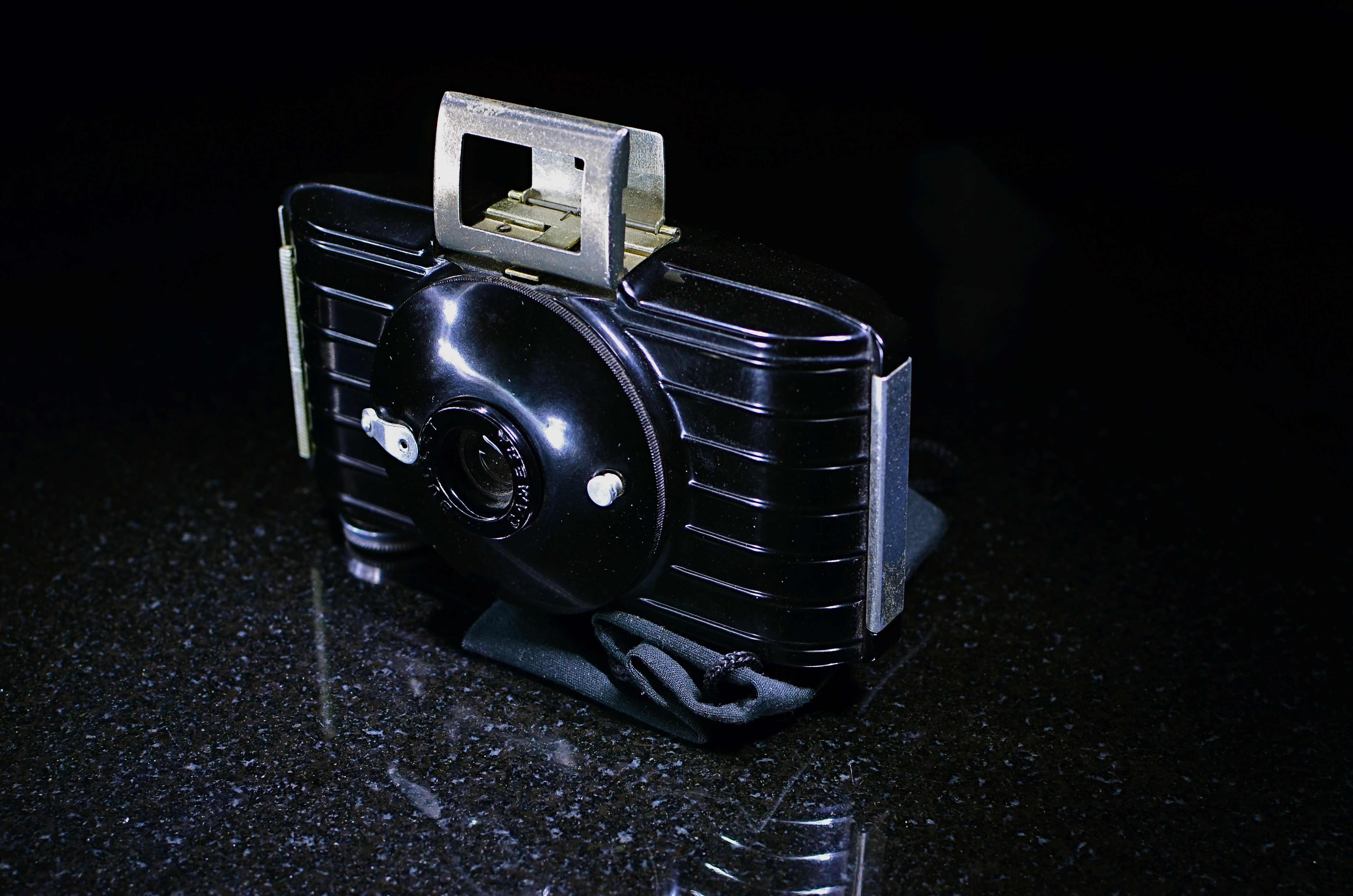
60 SECONDS TO HAPPINESS
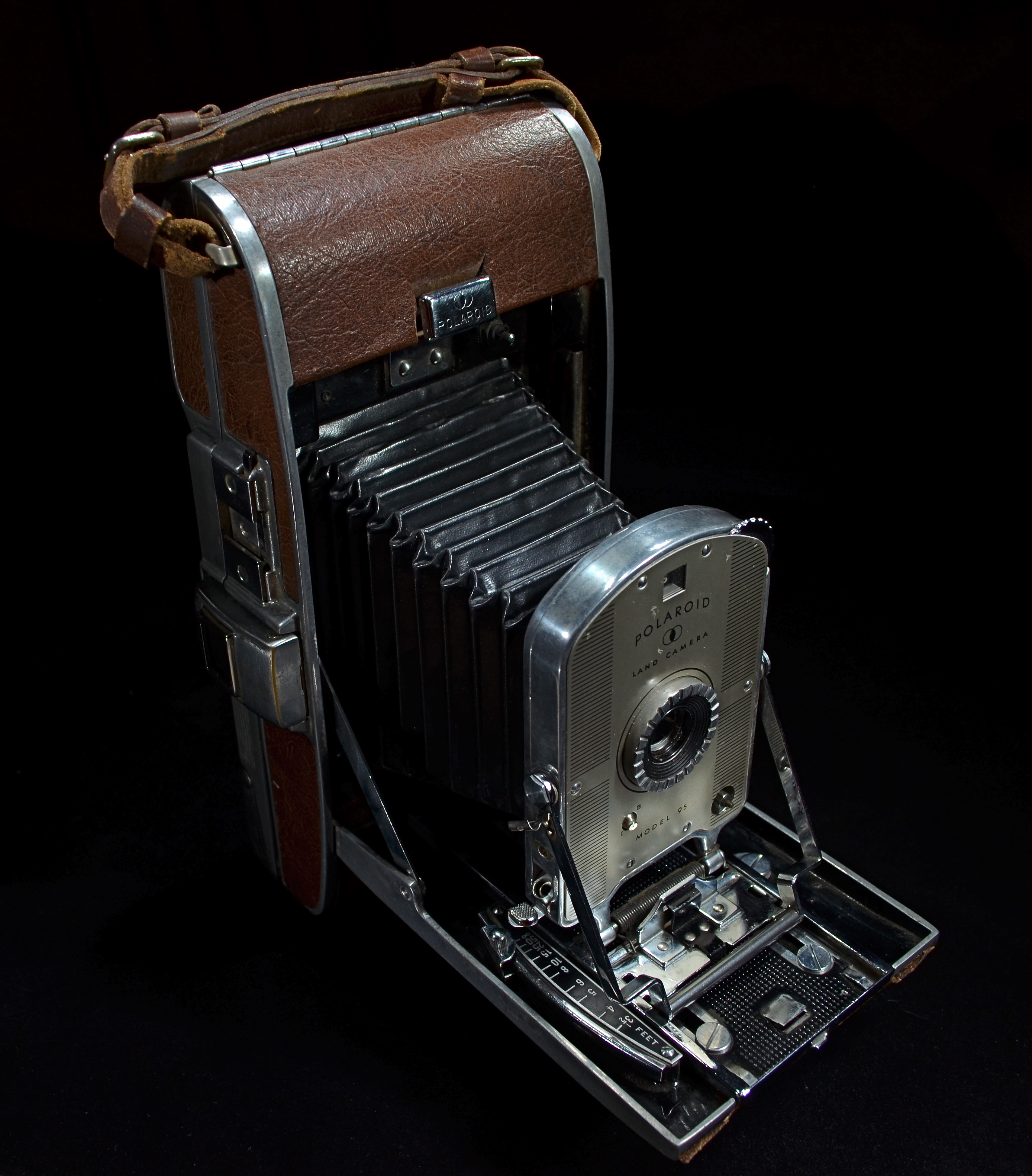
The first of its kind: A model 95 Polaroid Land Camera, circa 1948. Light-painted in darkness for a 15 second exposure at f/5.6, ISO 100, 18mm.
By MICHAEL PERKINS
I REMEMBER, YEARS AGO, HEARING A COMMERCIAL FROM AN OLD RADIO SERIAL IN WHICH THE SPONSOR, Ovaltine, rhapsodized about the show’s latest mail-in “premium”, a genuine Captain Midnight Shake-Up Mug, which, according to the ad copy, was made of “exciting, new PLASTIC!!” It struck me, as a child of the ’50’s, that there actually had been a time when plastic was both exciting and new. The “latest thing” in an age which was bursting with latest things, an unparalleled era of innovation and miracle. Silly Putty. Rocket Ships. Television.
And your photographs….delivered in just one minute.
The introduction of the Polaroid Land Camera, Model 95, in 1948 was one of those “exciting, new plastic” moments. Developed by inventor Edward Land, the device was, amazingly, both camera and portable darkroom. Something mystical began to happen just after you snapped the shutter, an invisible, gremlins-in-the-machine process that accomplished the development of the image right in the camera. Open the back of the thing 60 seconds later, peel away the positive from the negative (a layer of developing gel lay in-between the them) and, sonofagun,you had a picture. Black and White only. Fragile, too, because you immediately had to dab it with a stick of smelly goo designed to keep the picture from browning and fading, a procedure which created the worldwide habit of fanning the picture back and forth to speed up the drying process (sing it with me: shake it like a Polaroid). And then you got ready for company. Lots of it.
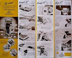
Original Polaroid User’s Flyer. Easy, right?
When you brought a Model 95 (unofficially dubbed the “Speedliner”) to a party, you didn’t just walk in the door. You arrived, surrounded by an aura of fascination and wonder. You found yourself at the center of a curious throng who oohed and ahhed, asked endlessly how the damn thing worked, and remarked that boy, you must be rich. Your arrival was also obvious due to the sheer bulk of the thing. Weighing in at over a pound and measuring 10 x 5 x 8″, it featured a bellows system of focusing. Electronic shutters and compact plastic bodies would come later. The 95 was made of steel and leatherette, and was half the size of a Speed Graphic, the universal “press” cameras seen at news events. Convenient it wasn’t.
But if anything about those optimistic post-war boom years defined “community”, it was the Polaroid, with its ability to stun entire rooms of people to silent awe. The pictures that came out were, somehow, more “our” pictures. We were around for their “birth” like a roomful of attentive midwives. Today, over 75 years after its creation, the Polaroid corporation has been humbled by time, and yet still retains a powerful grip on the human heart. Unlike Kodak, which is now a hollowed out gourd of its former self, Polaroid in 2014 now makes a new line of instant cameras, pumping out pics for the hipsters who shop for irony on the shelves of Urban Outfitters. Eight photos’ worth of film will run you about $29.95 and someone besides Polaroid makes it, but it’s still a gas to gather around when the baby comes out.
So, a toast to all things “new” and “exciting”. But I’ll have to use a regular glass.
For some reason, I can’t seem to locate my Captain Midnight Shake-Up Mug.
