AND NOW WE PAUSE FOR…
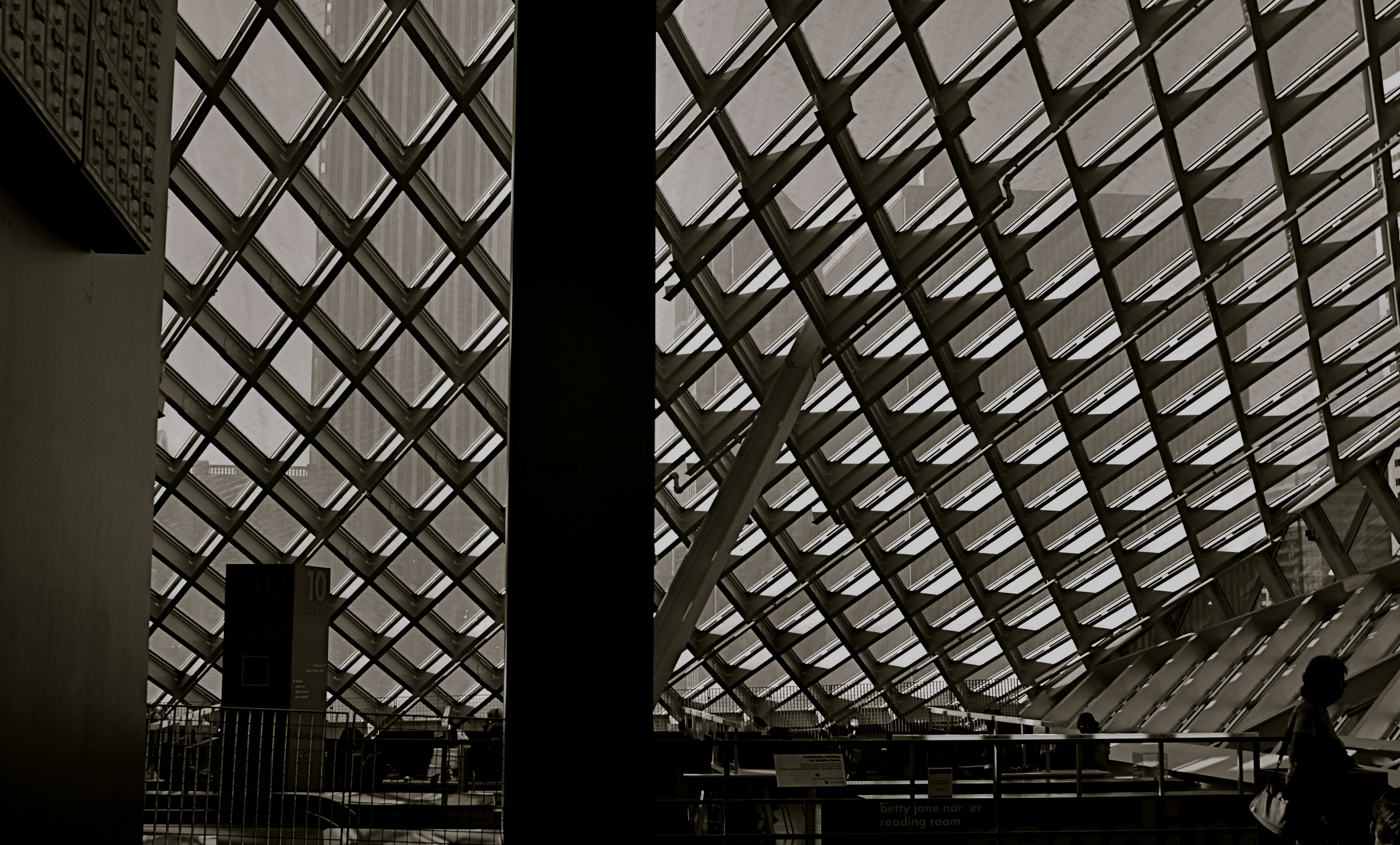
Patterns can gain impact when they are suddenly interrupted.
By MICHAEL PERKINS
A BREAK IN THE ACTION: a word from our sponsor: a coda before the chorus. Intrusions into the predictable rhythms of things can be either annoying or refreshing, depending on how we perceive them.
The right intervals between dots and dashes can drastically change the meaning of a telegram. A well-placed silence between musical notes can generate just the tension required to transform a composition into a masterpiece. And a sudden interruption in visual patterns can add impact to a photograph.
Once the eye detects, as they say on Sesame Street, that one of the things in a picture is not like the others, it pauses, re-evaluating every element in the scene, weighing it for relative value. Breaking an image’s pattern is either an unwelcome invasion or a kind of visual punctuation….again, varying as to the effect. The object violating the uniformity says pause, wait, re–consider, and begins a new conversation about what we’re seeing and what we think about it.
In the above picture, a human silhouette against the massive ceiling grid provides the basic context of scale, and defines the locale (a library) as a space where human activity takes place. The figure thus says how big the place is and what it is for, along with any other ancillary associations touched off in the viewer’s mind. Would the picture “work” without the figure? Certainly. The terms of engagement would just be different, that’s all.
Photographs are not merely pictures of things. They are also sets of instructions (suggestions?) on what to do with all that information. Think of them like roadside signs. It’s indeed helpful to be told, for example, that Sacramento is just another 100 miles away. But it’s just as important to have a big bright arrow telling you to head that–away.
JUMPING OFF THE TOUR
By MICHAEL PERKINS
VISITOR ATTRACTIONS CREATE THEIR OWN KIND OF PECULIAR GRAVITY, in that many of them develop an “official” way to take in their delights, pulling you toward what they believe to be the center of things. From the creation of tourist maps to the arrangement of signs on paths, many famous “places to see” evolve systems for how to “do” parks, recreation areas, even ancient ruins. Some hot spots have even been so obvious as to mount signage right next to the “Kodak moment” view that, of course, you will want to to snap, since everybody does. And from here, folks, you can clearly see the royal castle, the original temple, the stunning mountain vista, etc., etc.
But predictability, or an approved way of seeing a particular thing, is the death of spontaneity, and certainly a danger signal for any kind of creativity. Photography is the visual measure of our subjective experience. It’s supposed to be biased toward our individual way of taking a thing in. Grading our reactions to visual stimuli on the curve, taking us all down the same path of recommended enjoyment, actually obviates the need for a camera. Just freeze the “correct” view on the gift store’s postcard assortment, and, presto, we can all have the same level of enjoyment. Or the same low point of banality.
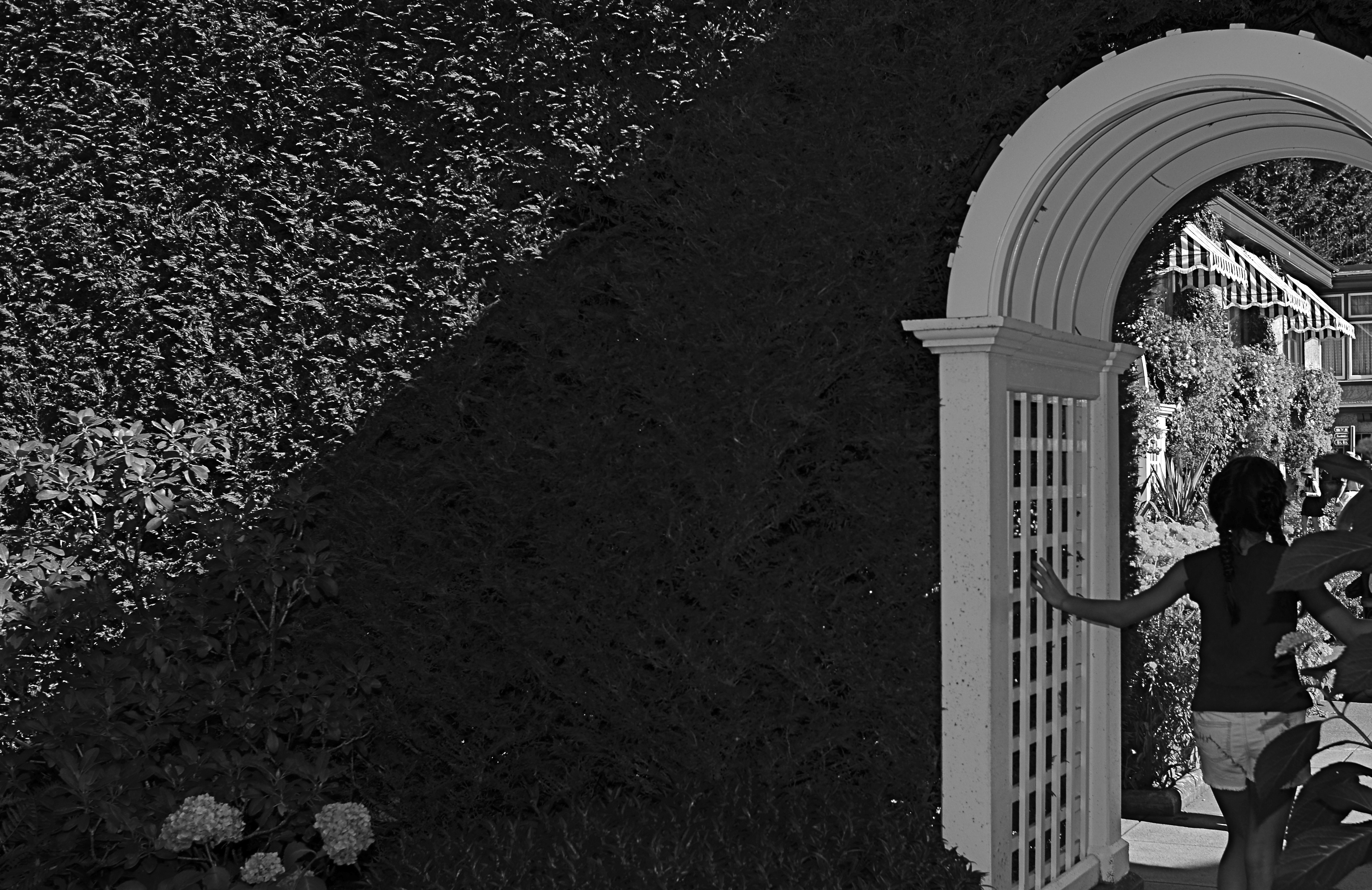
About To Be (2016) 1/200 sec., F/5.6, ISO 100, 24mm.
Recently I visited the amazing Butchart Gardens, a botanical bonanza on the island of Victoria in British Columbia. If ever there was a place where you’d be tempted to tick off “the sights” on a mental checklist, this cornucopia of topiary choreography is it, and you will find it truly tempting not to attempt your “take” on its most photographed features. But an experience is not a triptych, and I found my favorite moments were near the fringes or niches of the property, many of which are as stunning as the most traveled wonders along the approved paths.
To my great surprise, my favorite shot from the tour wasn’t one of the major sites or even a color image, but a quick glimpse of a young girl hesitating in the narrow, arched portal that separated one side of an enormous hedge from the other. She only hesitated for a few seconds before walking into the more traveled courtyard just adjacent, which is, itself, recorded thousands of times a day. But that brief pause was enough. She had become, to me, Alice, dawdling on the edge of a new Wonderland. The arch became all mystery to me, but the picture needed to be simplified to amplify that feeling, relegating the bright hues to secondary status. And while it indeed seems counterintuitive to take a black and white image in the midst of one of the world’s great explosions of color, I gladly chose the mono version once I had the chance to compare it to the original. Some things just work.
One thing that never works is trying to make your personal photographs conform with what the designer of a public place has recommended as the essential features of that place. Your camera is just that….your camera. Shoot with someone else’s eye, and you might as well just frame the brochure.
THE LOVE OBJECT
By MICHAEL PERKINS
IN EARLIER OUTINGS, WE HAVE DISCUSSED THE VALUE of knowing how sunlight enters your house at all times of the day. Knowing where bright spots and slatted beams hit the interior of your home in different hours gives you a complete map of “sweet spots” where natural light will temporarily isolate and flatter certain objects, giving you at least several optimized minutes for prime shooting each day.
Keeping this little time-table in your head allows you to move your subjects to those places in the house where, say, the daily 10 a.m. sun shaft through the family room window will give you a predictably golden glow. For me, that location is my living room window, across which the southwestern sun tracks east/west, and the object is my white baby grand piano.
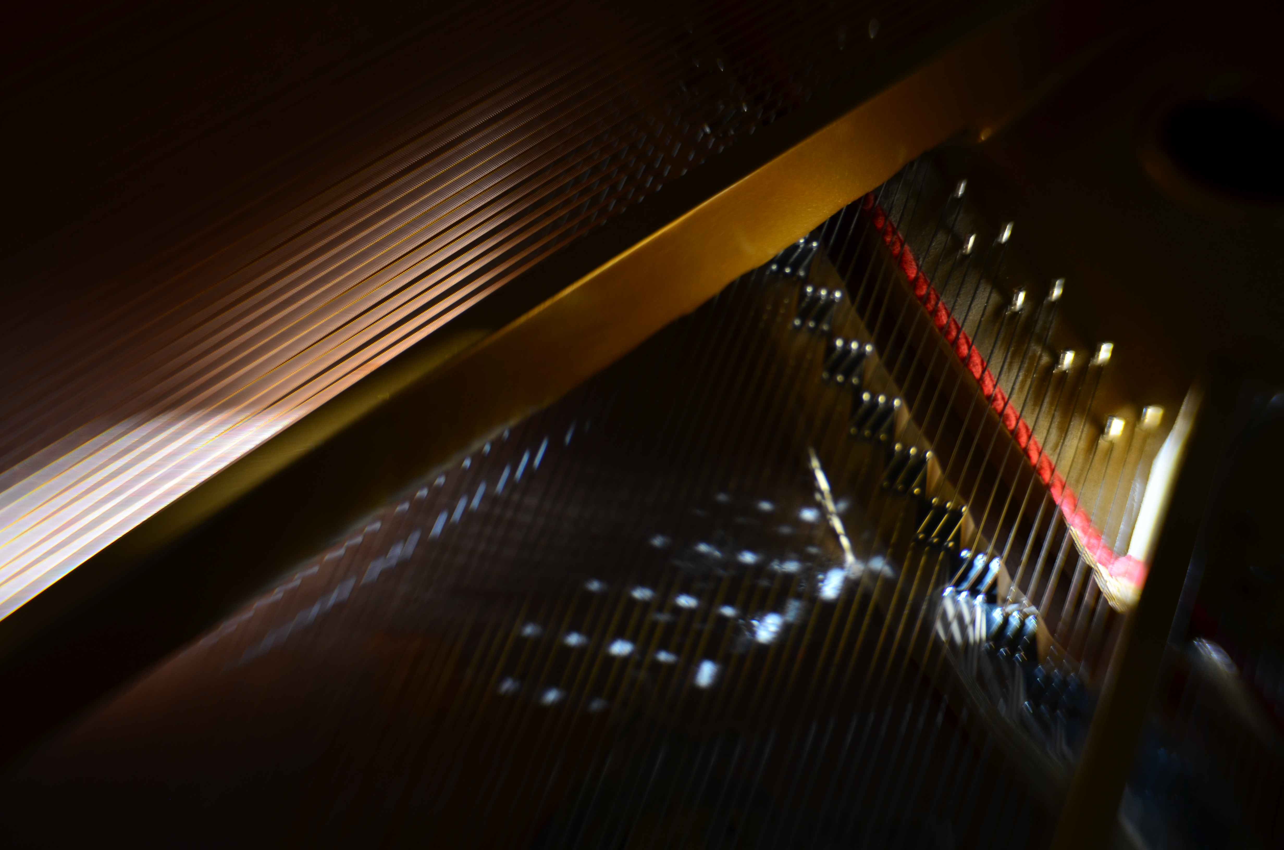
Cordophone Chroma (2017).
Pianos, to me, are divinely complex gadgets, creations of the first great industrial age, their impossibly intricate mechanics offering thousands of possibilities for macro shots, fisheye explosions, abstract compositions, shadow studies, and delicate ballets of reflections as the morning sun dances across harp, strings, and hammers in an endless kaleidoscope of radiance. I have long since tracked how the sun showcases different parts of the piano as the day progresses, and how that corresponds to the instrument’s various sections and subsections.
Hard-wiring that schedule into my skull over the years means I know when a shot will work and when it won’t, making the object more than just something to shoot. It becomes, in effect, an active kind of photo laboratory, a way of teaching and re-teaching myself about the limits of both light and my own abilities. Better still, the innate intricacy of the piano as an object guarantees that I can never really get “done” with the project, or that something that was a mystery in January will become a revelation by June.
What gives this process a special lure to me is my endless effort to exploit natural light to the full, believing, as I do, that nearly every other less organic form of illumination is measurably poorer and less satisfactory than that which comes plentifully, and for free. The house I live in has thus become, over the years, a kind of greenhouse for the management of light, an active farm for harvesting the sun.
BLUR IS THE NEW SHADOW
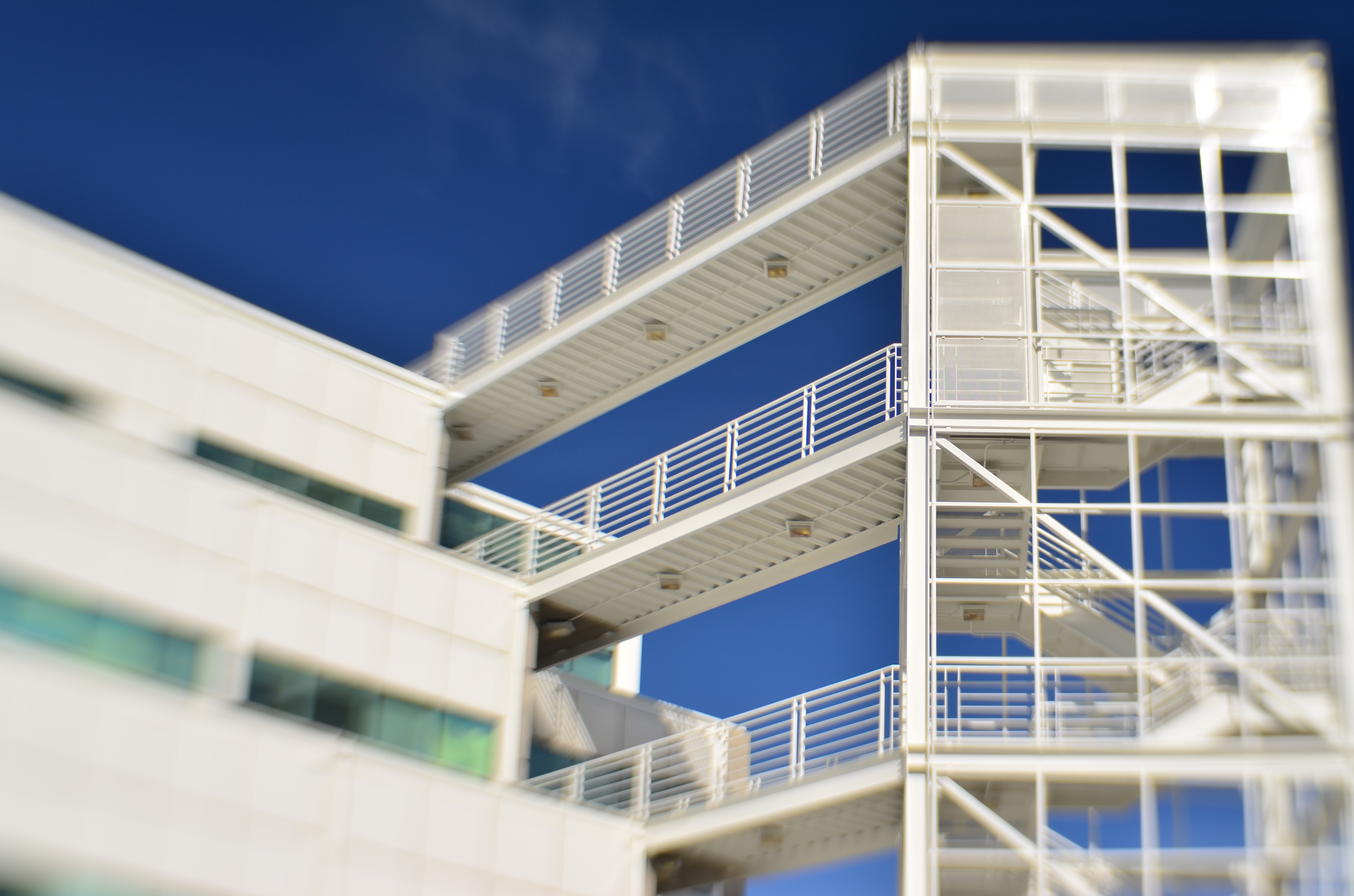
Modern art lenses allow different parts of objects that are all in one focal plane to be selectively blurred.
By MICHAEL PERKINS
I’M INCREASINGLY FASCINATED BY PHOTOGRAPHS THAT SUPPRESS INFORMATION, choosing to selectively conceal details rather than merely delineate everything in the frame in the same exhaustively sharp detail. At the same time, I hate it when this technique is referred to as being “painterly”, as if, after all this time, photos are still striving for the same pedigree that daubers automatically inherit merely by picking up a brush. Photographs are not, and should not try to be, paintings, just as a shoe should not try to pass as a glove. Love the function of the art you have, and leave the mimicry to the mockingbirds.
The “painterly” tag used to be tied mainly to anyone shrouding their images in shadow, as if we were all bucking to be the next Rembrandt or Reubens. And certainly the use of darkness in photography creates a kind of mysterious minimalism, telling more by showing less. We linger over what’s left out of a photo, and the deliberate subtraction of detail simplifies a composition to its barest terms. When there is less to see, you eye goes like a laser to what remains. It’s a big, bright “this way, dummy” arrow pointing toward the heart of the picture.
In the same way, the current wave of photographers are using blur to punch up the impact of images. Any Google search of the phrase “blur my photos” unearths a wellspring of apps that allow any part of any frame to be selectively de-focused, in most cases (as happens with apps) after the picture is taken. Long regarded as the stuff of artifact or accident, blur is now being arranged, managed, and chosen as a tool to remove distracting detail from compositions, or to render them softer and more intimate. In the above image, separate elements of the structure, all of which lie generally in the same focal plane, can be selectively softened so that one can become dominant, while the other is abstracted. This particular shot is done with a Lensbaby Sweet 35 lens, which allows the “sweet spot” of focus to be rotated to any location the shooter desires, although there are many paths to similar results.
Both apps and lenses, which include newly reworked versions of old optics, offer a return to the randomness from which early photographers longed to escape. Lomography, the revival of flawed and cheap cameras from the film era, actually touts blur as a strength, an arty accent much to be desired. To be totally counter-intuitive about it, blur is edgy. Of course, some blur is just another kind of visual noise, and if it’s applied too carelessly or too much, it actually pulls the eye away from the main message of a picture. However, it’s thrilling just to see the sheer breadth of approaches that are suddenly available everywhere, most of them cheap, fast and easy. Blur can “sharpen” a picture just like darkness can “illuminate” one. It’s the new shadow.
TEN NO’s AND A YES
By MICHAEL PERKINS
THERE ARE CERTAINLY MANY MORE PICTURES BEING TAKEN than there are great pictures taken. That’s as it should be. Anything at which you wish to be excellent only comes about once you’ve learned what not to do, and that means lots of errors, lots of images that you feel compelled to destroy almost as quickly as you’ve created them. You must, must, must, take all the bad pictures right alongside the good ones. At first, the garbage will outnumber the groceries.
And then, some day, it doesn’t.
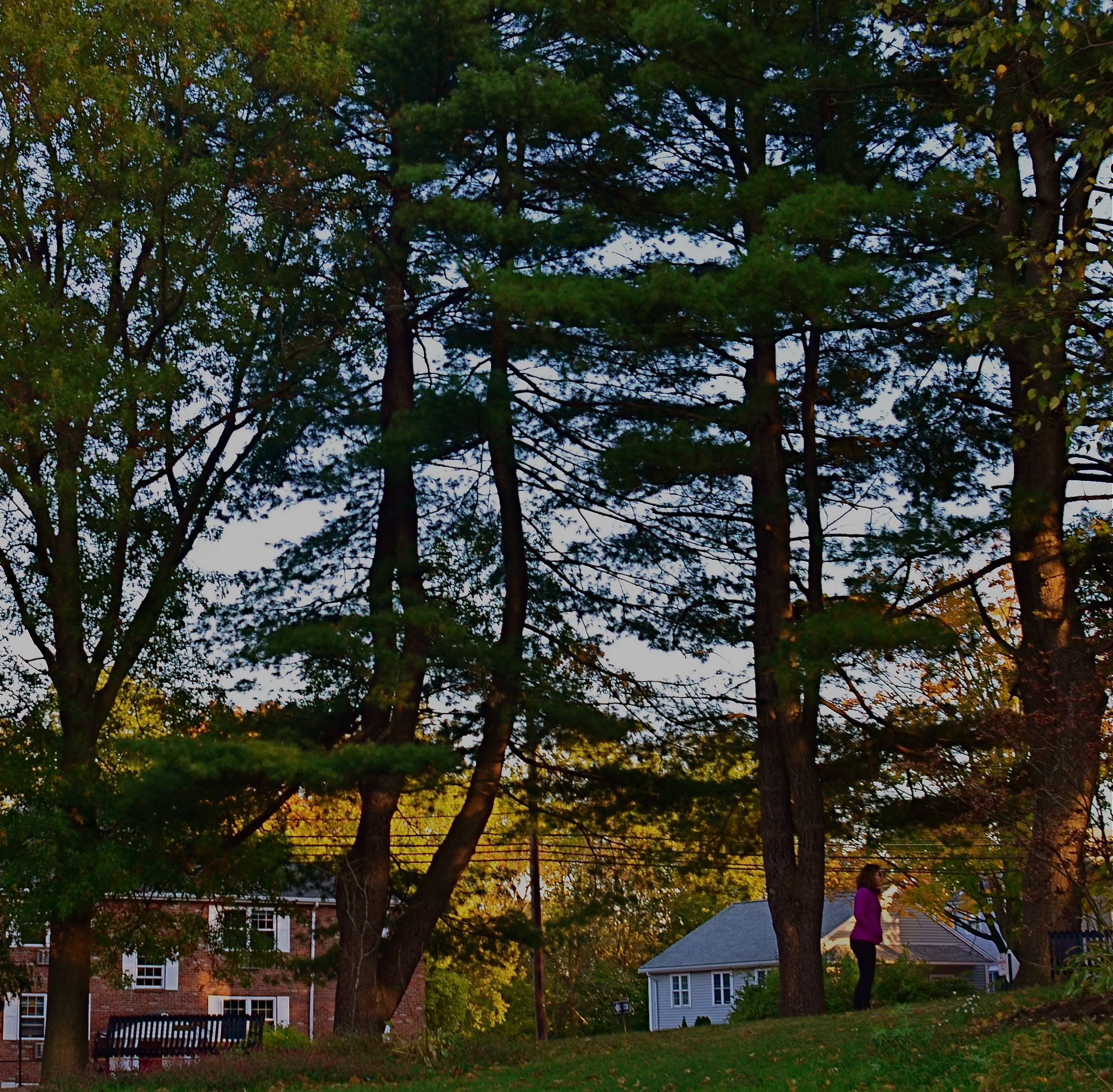
We all have pictures that worked out that we almost didn’t take in the first place.
I am an A.B.S. (Always Be Shooting) shooter. I mean, I make myself at least try to make a picture every….single…day. No excuses, no regrets, no exceptions. Reason? I simply don’t know (and neither do you) where the good pictures are going to come from. For me to give myself permission not to try on a given day means I am risking that one of those potentially golden pictures will never be born. Period period period.
In a way, I often think photo technique guides from years gone by had things backwards. That is, they often made suggestions of great opportunities to take great pictures. You know the list: at a party: on a vacation: to capture special moments with loved ones, etc., etc. However, none of these traditional “how-to” books included a category called “just for the hell of it”, “why not?”, or, in the digital era, “whattya got to lose? You’re shooting for free!” These days, there are virtually no barriers to making as many pictures as you want, quickly, and with more options for control and creativity, both before and after the shutter click. So that old “ideas” list needs to be re-thought.
To my thinking, here’s the one (yes, I said ONE) suggestion for making pictures, the only one that matters:
TAKE THE SHOT ANYWAY.
And to purify your thinking, here’s my larger list, that of the most commonly used excuses not to shoot. You know ’em. You’ve used ’em. And by doing so, you’ve likely blown the chance at a great picture. Or not. You won’t know, because you didn’t TAKE THE SHOT ANYWAY. Here are the excuses, in all their shameful glory:
I haven’t got the right lens/camera/gear. There’s not enough light. I don’t do these kinds of pictures well. I don’t have my “real” camera. There’s nothing to take a picture “of”. Everyone takes a picture of this. I’ll do it later. It probably won’t be any good. There are too many people in the picture. There isn’t enough time.
Train yourself to repeat take the shot anyway, like a mantra, whenever any of these alibis spring into your head. Speed up your learning curve. Court the uncertain. Roll the dice. Harvest order from chaos. Stop waiting for your shot, your perfect day, your ideal opportunity.
Take the shot. Anyway.
TRUTH VS. REALITY
By MICHAEL PERKINS
ASKED IN 1974 BY AN INTERVIEWER ABOUT THE LEGACY OF THE ACTOR JAMES CAGNEY, director Orson Welles replied that while Jimmy “broke every rule”, “there’s not a fake moment” in any of his movies. He further explained that the star of Public Enemy, White Heat and Yankee Doodle Dandy worked counter to all the conventions of what was supposed to be “realism”, and yet created roles which were absolutely authentic. Cagney, in effect, bypassed the real and told the truth.
As do many photographers, it turns out.
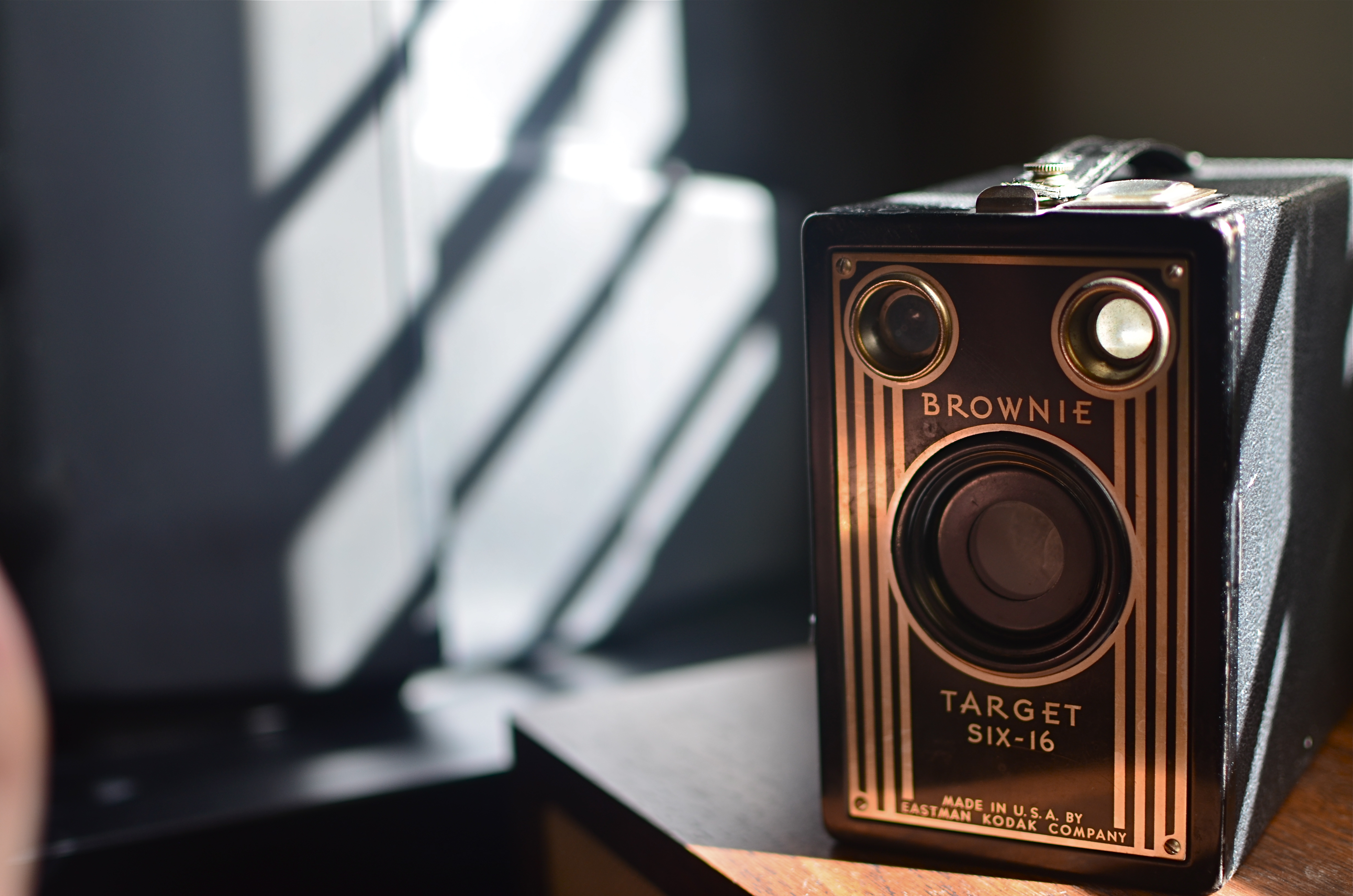
Fake sunlight on the front of this camera courtesy of sunlight bouncing off my hand.
We all have inherited a series of technical skills which were evolved in an attempt to capture the real world faithfully inside a box, and we still fail, at times, to realize that what makes in image genuine to the viewer must often be achieved by ignoring what is “real”. Like Cagney, we break the rules, and, if we are lucky, we make the argument that what we’ve presented ought to be considered the truth, even though the viewer must ignore what he knows in order to believe that. Even when we are not trying to create a so-called special effect, that is, a deliberate trick designed to conspicuously wow the audience, we are pulling off little cheats to make it seem that we played absolutely fair.
The first time we experiment with lighting, we dabble in this trickery, since the idea of lighting an object is to make a good-looking picture, rather than to mimic what happens in natural light. If we are crafty about it, the lie we have put forth seems like it ought to be the truth, and we are praised for how “realistic” a shot appears. The eye likes the look we created, whether it bears any resemblance to the real world or not, just as we applaud a young actor made up to look like an old man, even though we “know” he isn’t typically bald, wrinkled, and bent over a cane.
In the image above, you see a simple example of this. The antique Kodak really does have its back to a sunlit window, and the shadows etched along its body really do come from the slatted shutters upon that window. However, the decorative front of the camera, which would be fun to see, is facing away from the light source. That means that, in reality, it would not glow gold as seen in the final image. And, since reality alone will not give us that radiance, a second light source has to be added from the front.
In this case, it’s the most primitive source available: my left hand, which is ever so slightly visible at the lower left edge of the shot. It’s acting as a crude reflector of the sunlight at right, but is also adding some warmer color as the flesh tones of my skin tint the light with a little gold on its way back to the front of the camera. Result: an unrealistic, yet realistic-seeming shot.
There’s a number of names for this kind of technique: fakery, jiggery-pokery, flimflam, manipulation, etc., etc.
And some simply call it photography.
COMPOSING ON THE RUN
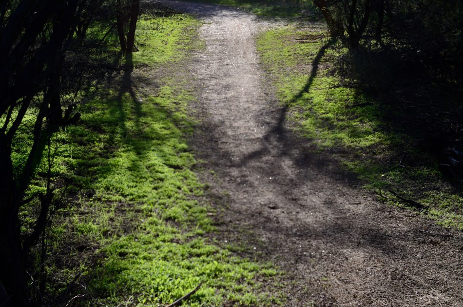
An instinctual snap: sunset light on a forest path. And that’s that….or is it?
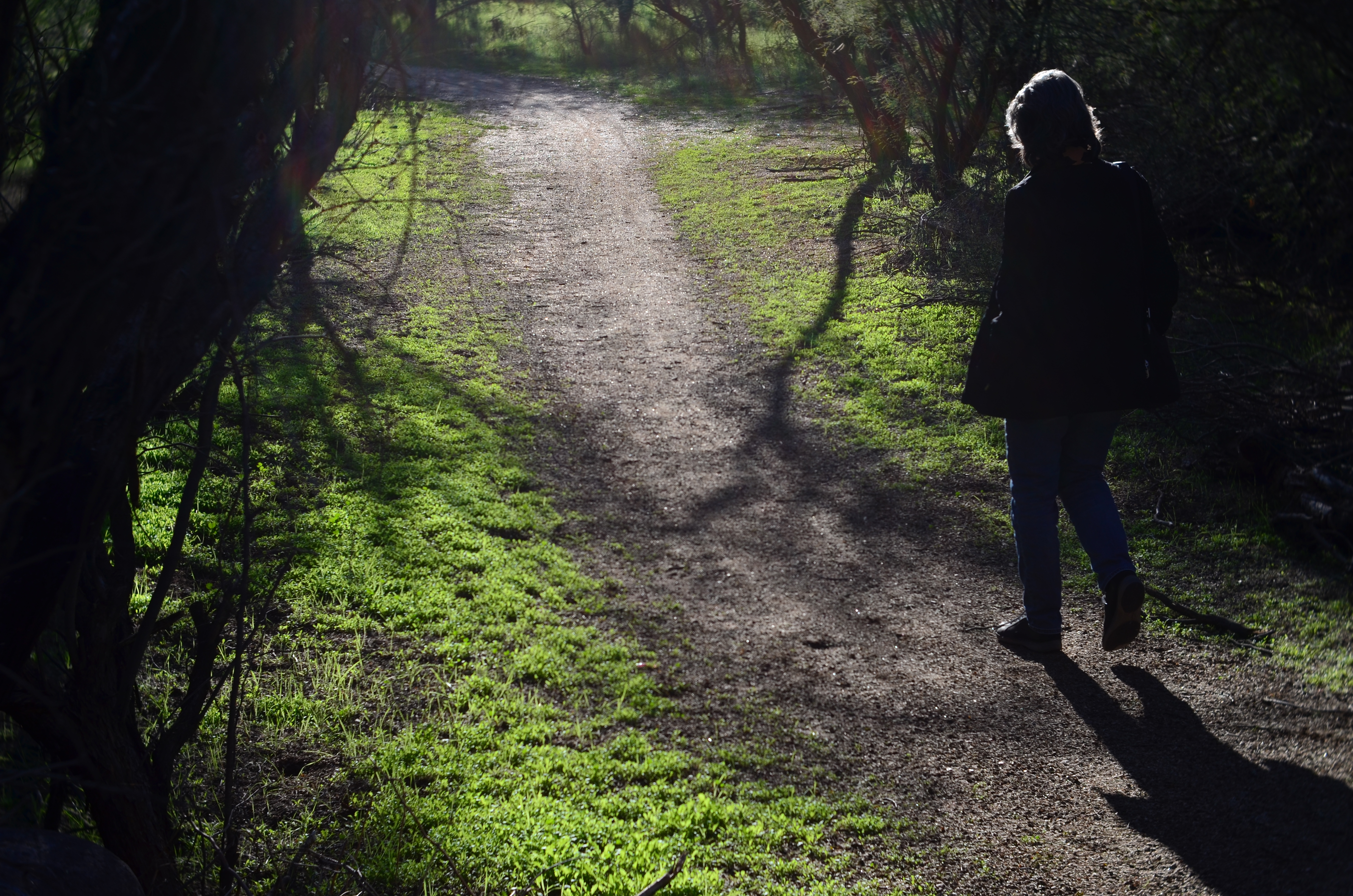
My wife enters the frame a second later.
By MICHAEL PERKINS
LOTS OF OUR BEST PHOTOGRAPHS ARE, EXCUSE THE EXPRESSION, snap judgements. Sometimes a composition simply seems to come fully formed, ready to jump intact into the camera, with no reasonable way to improve on a shot that is 99% pure impulse. Some of these gift moments are so seductive that we may not think to keep shooting beyond what we’ve perceived as the ideal moment. But more shooting may be just what we need.
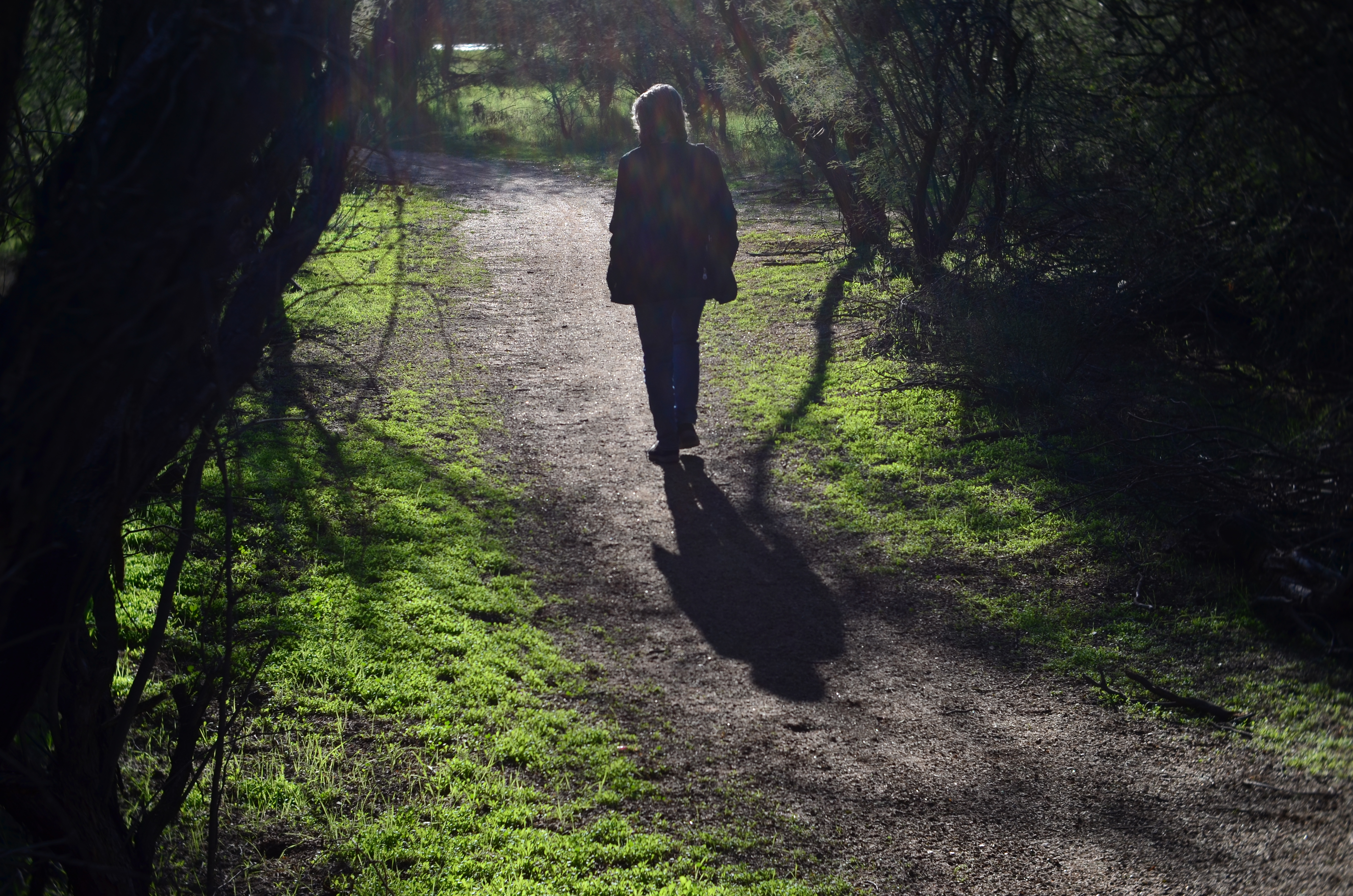
She walks to the upper center of the image..
Images that involve very fast-moving events may only have one key instant where the real storytelling power of the shot comes to a climax, with everything after seen as progressively less dramatic. The second after a baseball is hit: the relaxed smile after the birthday candles are blown out. Think, if you will, of a straight news or journalism image. Every second after the Hindenburg explodes is less and less intense.
But many images can be re-imagined second-by-second, with additional takes offering the photographer vastly different outcomes and choices. In the series shown here, I originally fell in love with the look of sunset on a wooded trail. My first instinct was that the receding path was everything I needed, and I shot the first frame not thinking there would even be a second. My wife, however, decided to walk into the space unexpectedly, and I decided to click additional frames every few seconds as she walked toward the shot’s horizon. She starts off in the lower right corner and walks gently left as she climbs the slight rise in the path, causing her hair to catch a sun flare in the second shot, and placing her in central importance in the composition. By the last shot, however, she is a complete silhouette at the top of the frame, taking her far enough “up” to restore the path to its original prominence with her as a mere accent.
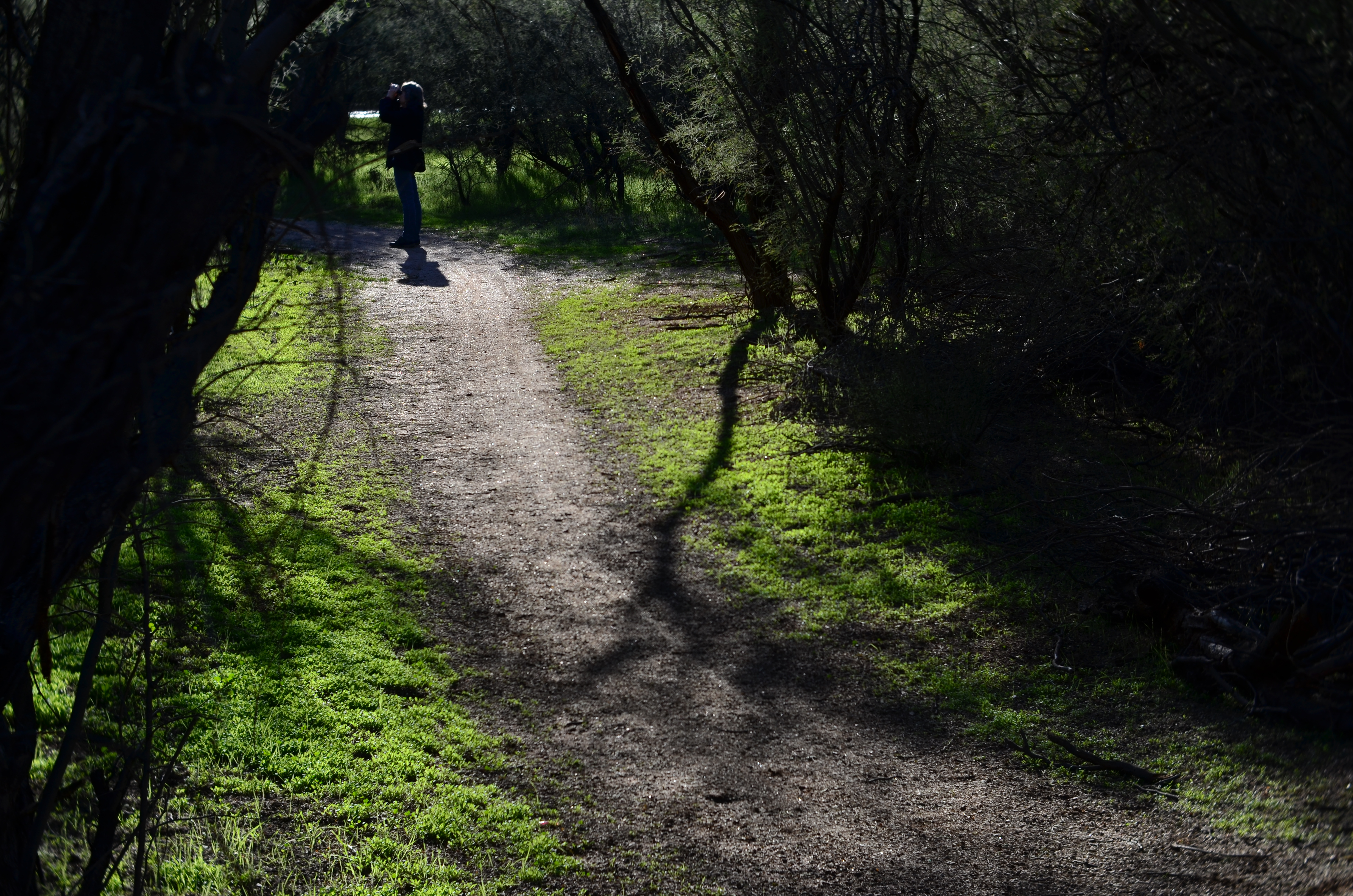
and finally comes to rest as a mere decorative accent/ The trail is now nearly empty once again.
Which shot to take? Anyone’s call, but the point here is that, by continuing to shoot, I had four images to choose from, all with very individualized dynamics, none of which would have been available to me if I’d just decided that my first shot was my best and settled. There will be times when the fullest storytelling power of a photograph is all present right there in your first instinctive snap. When you have time, however, learning to compose on the run can force you to keep re-visualizing your way to lots of other possibilities.
DEFINING SPACE
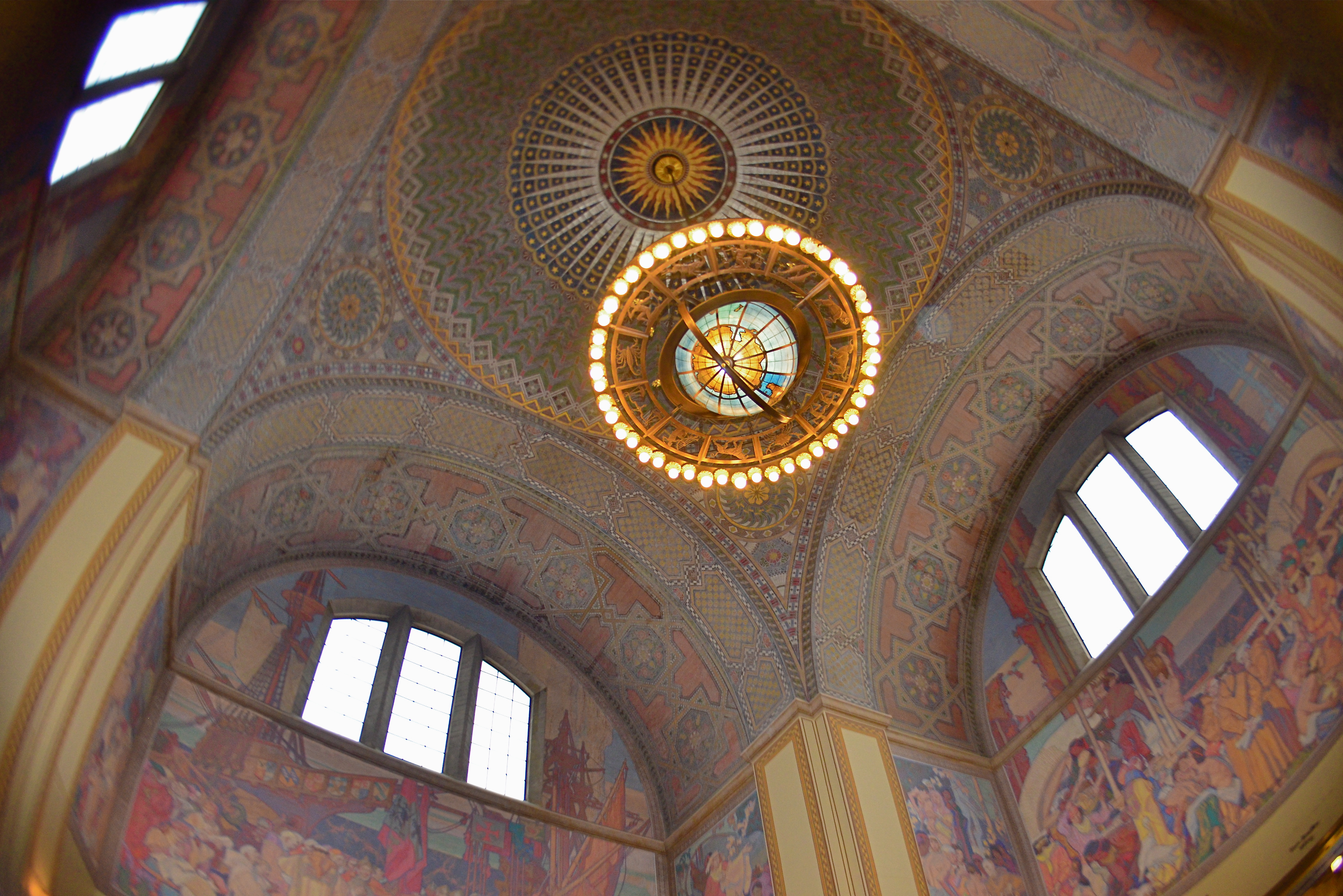
The use of an extreme wide-angle lens, like this fisheye, need not generate the bendy look of “barrel distortion”. It’s all in the composition.
By MICHAEL PERKINS
VISIT ENOUGH TOURIST SITES and you will eventually encounter the challenge of capturing very large objects, trying to squeeze the whole of a cathedral or a canyon into a single frame. Using a wide-angle lens is the first instinct, of course, but since even a 35mm is considered a wide-angle of sorts, there are any number of choices that all have their own pluses and minuses.
The lower the millimeter number, of course, the wider the lens. Simple enough on the surface, but you still have to decide what kind of wide you prefer. Each lens has slightly different coverage and properties, with the “super-wides” adding their own distinctive traits to the space you’re trying to capture. The two main properties you’ll notice most are barrel distortion and dimensional exaggeration, both of which will affect your lens choice for a given shooting situation.
Let’s look at barrel distortion. Lenses wider than about 24mm can make straight walls appear to bend outwards like the sides of a barrel, creating an unreal, and, for some, somewhat claustrophobic appearance most associated with the ultimate width of a fisheye (something around 8mm). The effect is that of a world cramped into the inside of a snow globe, and, depending on what look you’re going for, it can either be marvelous or miserable. It’s marvelous, for example, if you want to suggest tremendous depth in a shot.
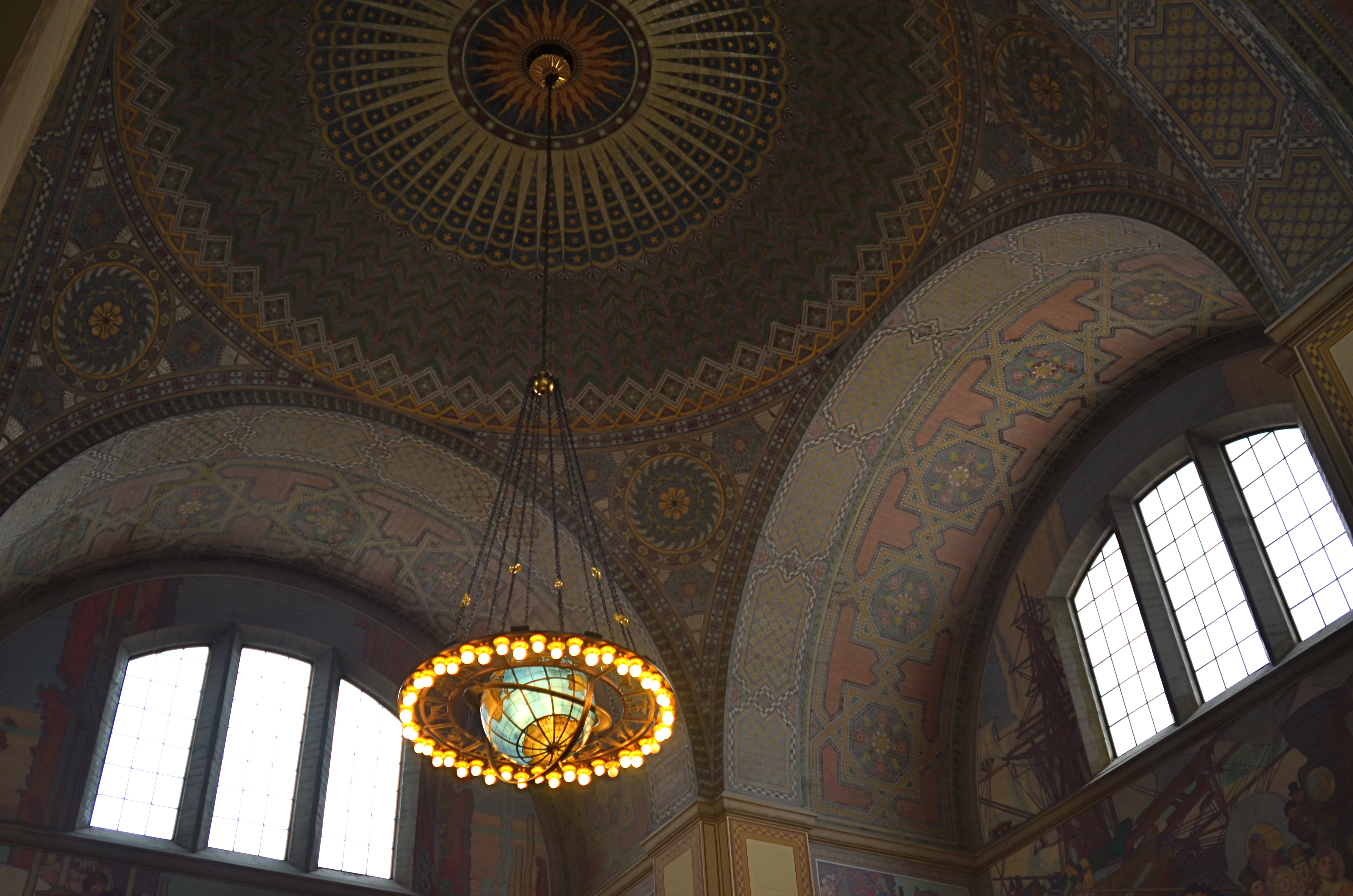
A more modest wide-angle, like this 24mm delivers more conventional dimensions, but not as much coverage.
And that’s dimensional exaggeration, the other key trait of a super-wide, in which the perception of distance from front to back is greatly hyped, making a deep space look even deeper. Shooting a cavernous area like the inside of the rotunda at the Los Angeles Central Library, as seen in the frame at top, you may want to suggest vastness, and a fisheye, such as was used here, does that superbly. All I’ve done to defeat the accompanying barrel distortion is to crop away the original frame edges. Of course, using a more conventional focal length like a 24mm, as seen directly above, shows all dimensions in a much more natural way, but they sacrifice coverage area, revealing less of the ceiling and sides and creating the sensation that the shot is not inclusive of enough information. In the case of both lenses, how you frame and where you stand will produce significant variations on how you render the space.
Photography is about what to fill the frame with, of course, but it also involves some planning as to how technology does that best, based on the tools at hand and what they’re equipped to do.
ARRIVALS
By MICHAEL PERKINS
PHOTOGRAPHERS PROBABLY HAVE TO HAVE AT LEAST SOME IDEA OF WHERE THEY’RE HEADED in pursuit of an image, or else basic issues like, Where To Point The Car or Which Path To Take can’t be settled. And there is, even for the instinctual process of creation, something to be said for a basic plan. However, every photographer has experienced the wonder of finding oneself arrived at a great picture-making opportunity when, in fact, you were headed someplace completely different. It’s in such moments, places where Plan A becomes Plan B, C, or D, that the excitement happens.
After you capture an image that essentially works, your mind naturally comes to take ownership of it, just as if that picture were your original intention. But this seldom occurs. Pictures aren’t like Grab-And-Go sandwiches, and very few are just waiting there, fully formed, until you wander by and imprison them in your box. Our final choices for photographs are often the destination in a ride with many stops along the way. We might have come to do this, but we wound up modifying, even abandoning our first instinct to get this instead.
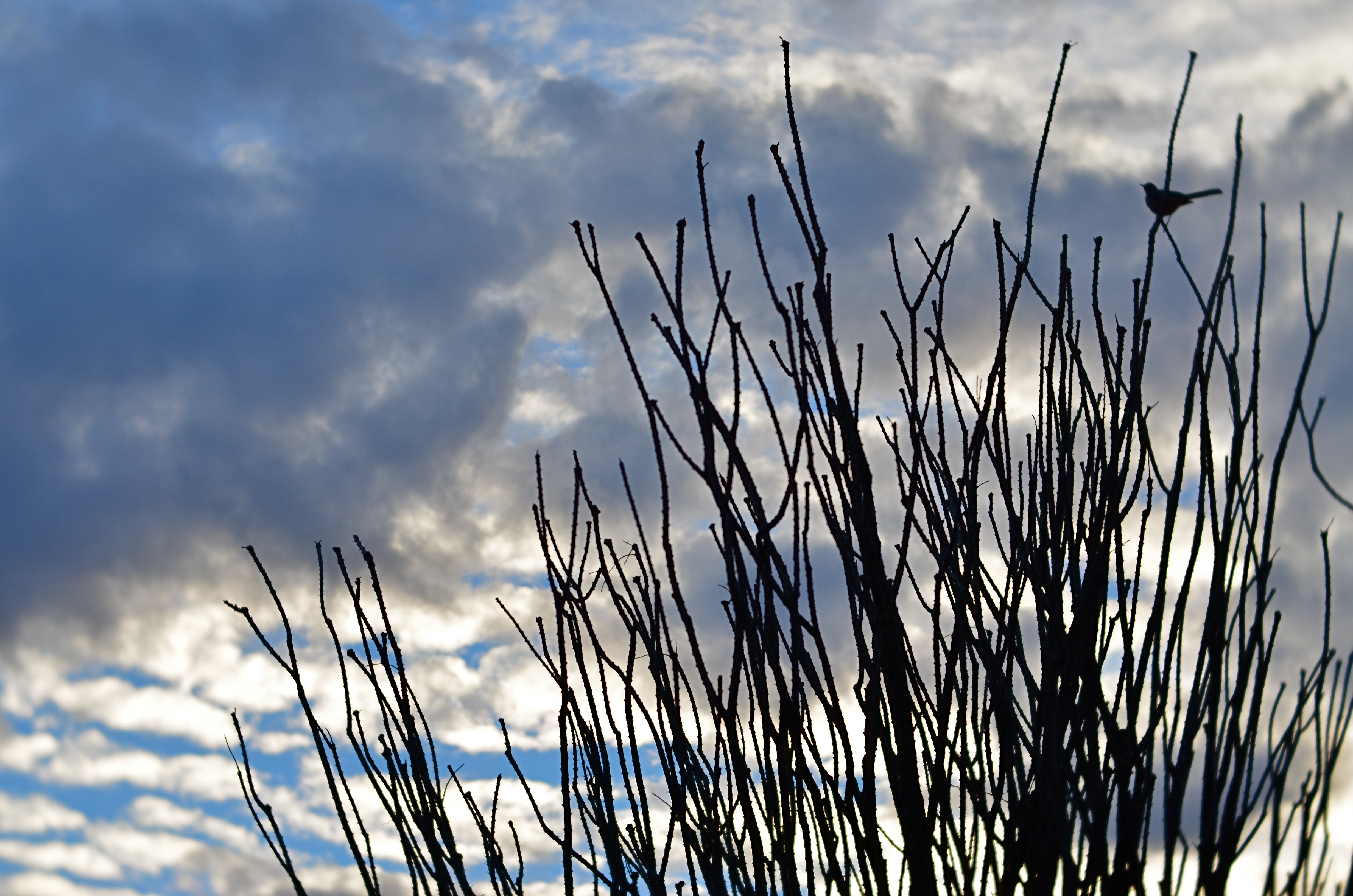
Ocotillo Outpost (2016) 1/640 sec., F/4, ISO 100, 56mm.
The above image is a textbook example of this process. The gorgeous sunset clouds seen here were originally to be the entire composition. The general rule is that skies, by themselves, are usually not sufficiently interesting to be the solo star in a photo, but the light and texture of this particular dusk had convinced me that a minimalist shot might just be possible. However, one of my first framings caught an octotillo shrub in its lower right corner, and that new information sent the picture off in a different direction.
Re-framing to bring the shrub into the entire lower half of the shot and silhouetting it against the sky gave the framing both a sense of scale and depth, and I began to convince myself (moving on to Plan B) that this now two-element picture would be The One. Then a single starling made a landing at the upper right corner of the ocotillo, creating a more obvious initial point of contact for the eye. The viewer would engage the most familiar part of the picture, the bird’s body, then travel leftward to the ocotillo’s jagged tangles, and backwards to the textured sky. Final Plan: C….a three-element image in which the individual parts seemed, at least, to talking with one another.
In the pages of The Normal Eye I keep coming back to this idea of “planned accidents”, or shots that start in one direction and end in another, because the process, once you allow yourself to go with it, can lead to images which, eventually, seem inevitable, as if they never could have been any other way. And those are the ones you keep.
INSIDE THE IRIS
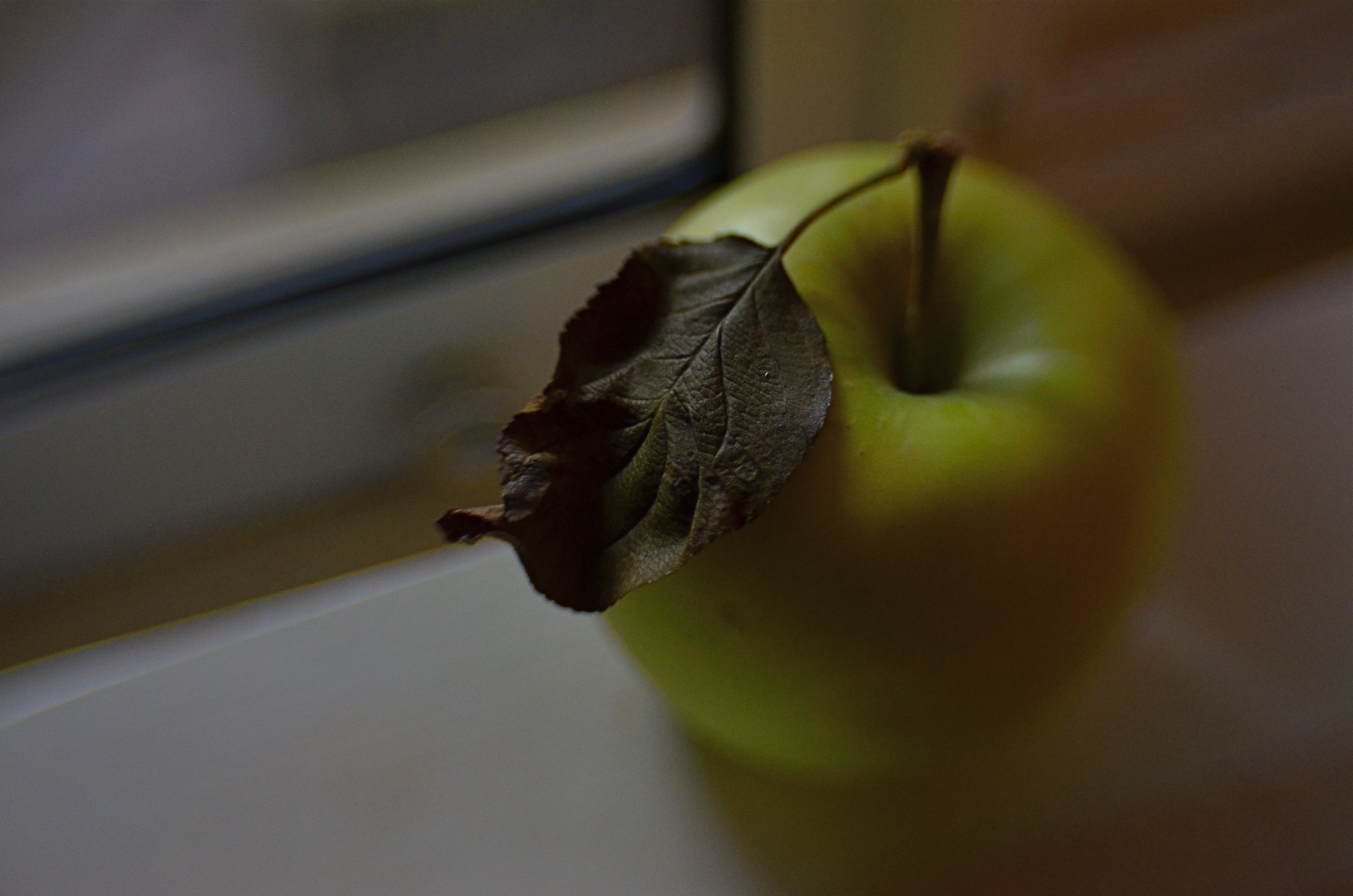
Just an apple. Or is it?
By MICHAEL PERKINS
IN ONE OF HIS EARLIEST SILENT FILMS, legendary director D.W. Griffith, one of the first cinematic pioneers to use tight shots to highlight vital narrative details, drew fire from theatre exhibitors, who objected to his new-fangled “close-up” or “iris” technique. “We have paid for the entire actor”, one wrote, apparently of the opinion that showing only a player’s hand or face, even in the interest of a good story, was somehow short-changing the audience. Griffith knew better, however. He was using his compositional frame to tell his viewers, in no uncertain terms, what was important. Outside the frame was all the other stuff that mattered less. If I show it, you should pay attention.
Photography is not so much about whether a subject is intrinsically important (think of the apple in a still-life) but whether an artist, armed with a camera and an idea, can make it important. At the dawn of the medium, painters pretty much dominated the choices about which images were immortalized as emblematic of the culture. The subject matter often ran to big targets; war, portraits of the elite, historical and religious events. And, indeed, the earliest photographs were “about something”, the “somethings” often being documents of the world’s wonders (pyramids, cathedrals) fads (politicians, authors) and foibles (crime, the occasional disaster). Subjects were selected for their importance as events, as leaves of history worthy of preservation.
In the 20th century the same abstract movements that engulfed painting allowed photography to cast a wider net. Suddenly that apple in the bowl was a worthy, even a vital subject. Light, composition, angle and mood began to weigh as heavily as the thing pictured. We made images not because the objects looked right, but because they looked right when made into a photograph. Pictures went from being about what “is” to being about what could be….evoking, like poetry, music or literature the magics of memory, dream, potentiality, emotion.
This is really the ultimate freedom of not only photography, but of any true art; the ability to confer special status on anything, anywhere. That doesn’t mean that all photographs are now of equal value; far from it. The burden of proof, the making of the argument for a particular subject’s preservation in an image, still rests squarely on the shooter’s shoulders. It’s just not necessary to wait for a natural disaster, a ribbon cutting, or a breathless landscape to make an amazing photograph. The eye is enough. In fact, it’s everything.
THE RIGHT PICTURE IN THE RIGHT FRAME
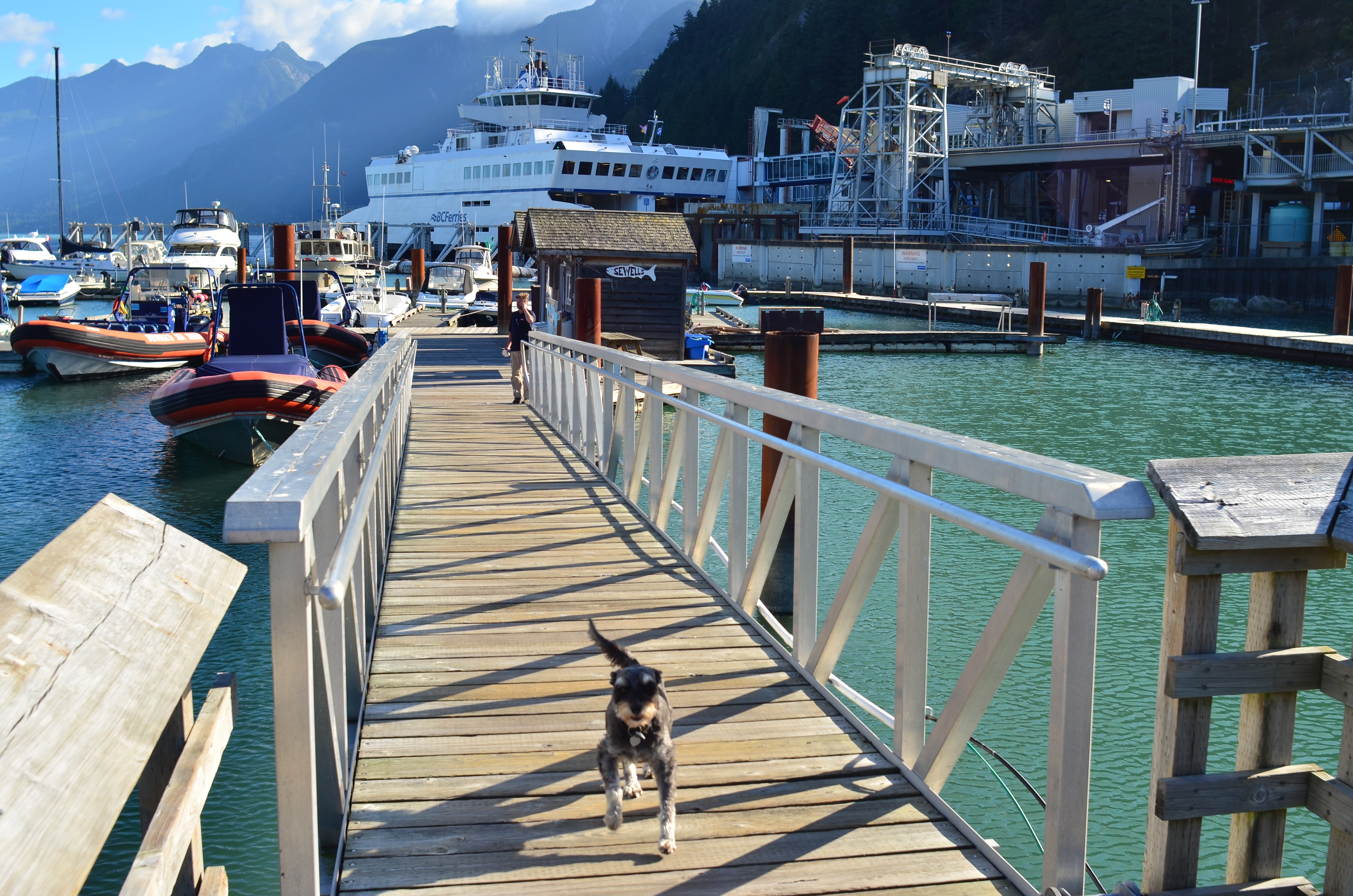
Horseshoe Bay, BC. The standard “post-card” scenic viewpoint.
By MICHAEL PERKINS
COMPOSITION IN PHOTOGRAPHY, FOR MANY OF US, CAN OFTEN INVOLVE NOTHING MORE than finding a thing we want to capture and getting it all in the frame. Click and done. It’s only later that we sometimes realize that we should have, shall we say, shopped around for the best way, from angle to exposure, to get our quarry in frame. Or even look for a better frame.
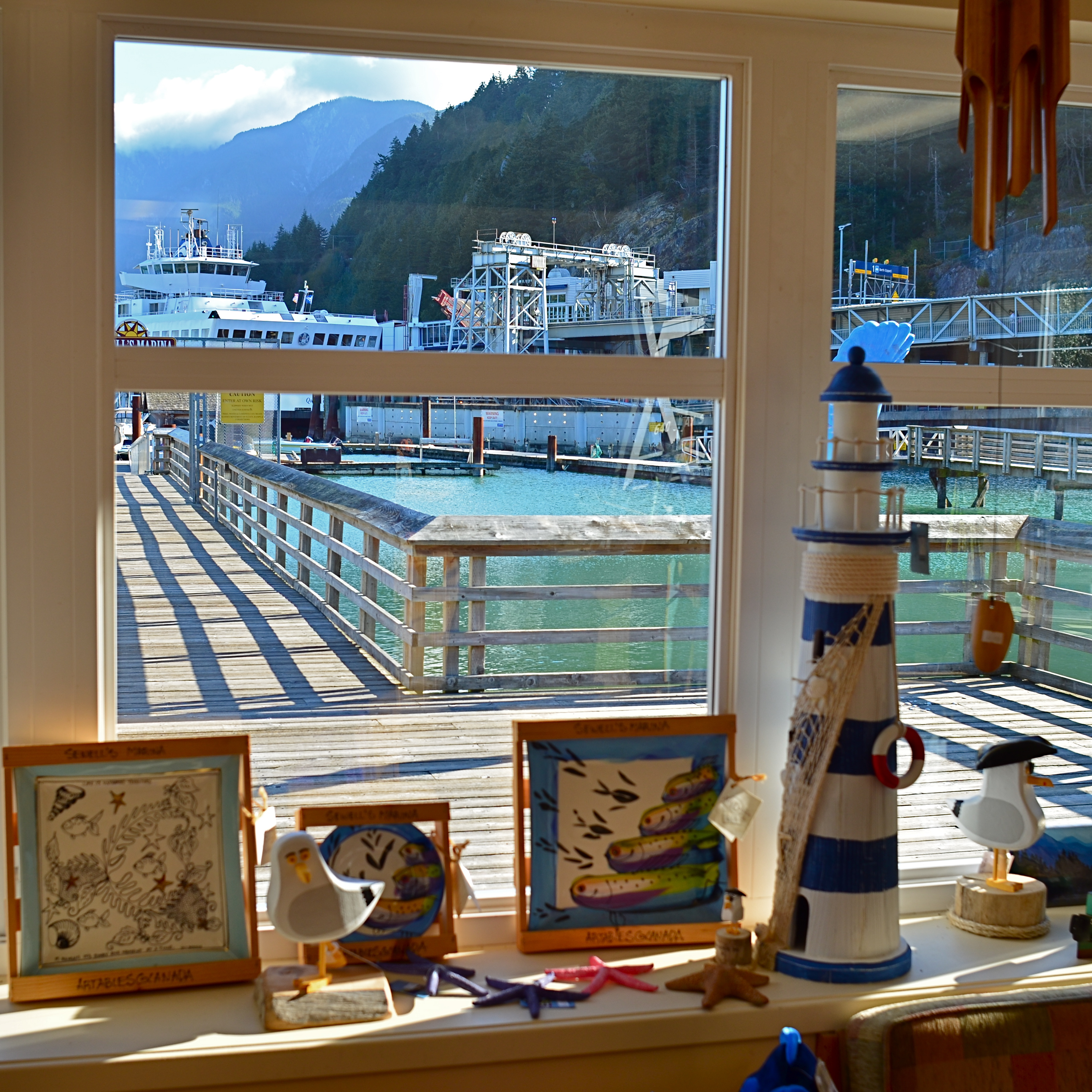
The same scene as viewed from a shop window, cropped to classic “View-Master” format.
One of the first tricks I learned in travel photography was from the old scenic shooters who created the travel titles for View-Master Reels, who always thought in terms of framing to maximize the image’s 3-d effect. For a start, since they were working in square format, they automatically had less real estate in which to compose. Secondly, they had to shoot in “layers”, since the idea was to have subject matter in multiple planes, for example, overhanging shade tree right at the front, a tourist midway into the shot, and Mount Rushmore at the back. They also learned to position things just inside the frame’s edge, what was called the “stereo window” to accentuate the sensation of looking into the photograph.
Thing is, all of these compositional techniques work exactly the same in a flat image, and can draw the viewer’s eye deeper into a picture, if used creatively. Certainly you can’t go wrong with a great exposure of a beautiful view. But experiment as well with things that force your audience to peer intently into that view. The image at the top is standard post-card, and works well enough. However, in the shot at left, in taking ten seconds to slip inside a gift shop that also looks out on the same view, I’ve tried to show how you can get an atmospheric framing that both accentuates depth and provides a bit more of a sense of destination. It all depends on what you’re looking to do, of course….but it makes sense to develop the habit of asking yourself how many different ways are available to tell the same story.
Editing a solid portfolio of shots can only begin with lots of choices. Hey, you’re there, anyway, so develop the habit of envisioning multiple versions of each picture, and weed out what doesn’t work. Remember again that the only picture that absolutely fails is the one you didn’t try to make.
TWO-WAY GLASS
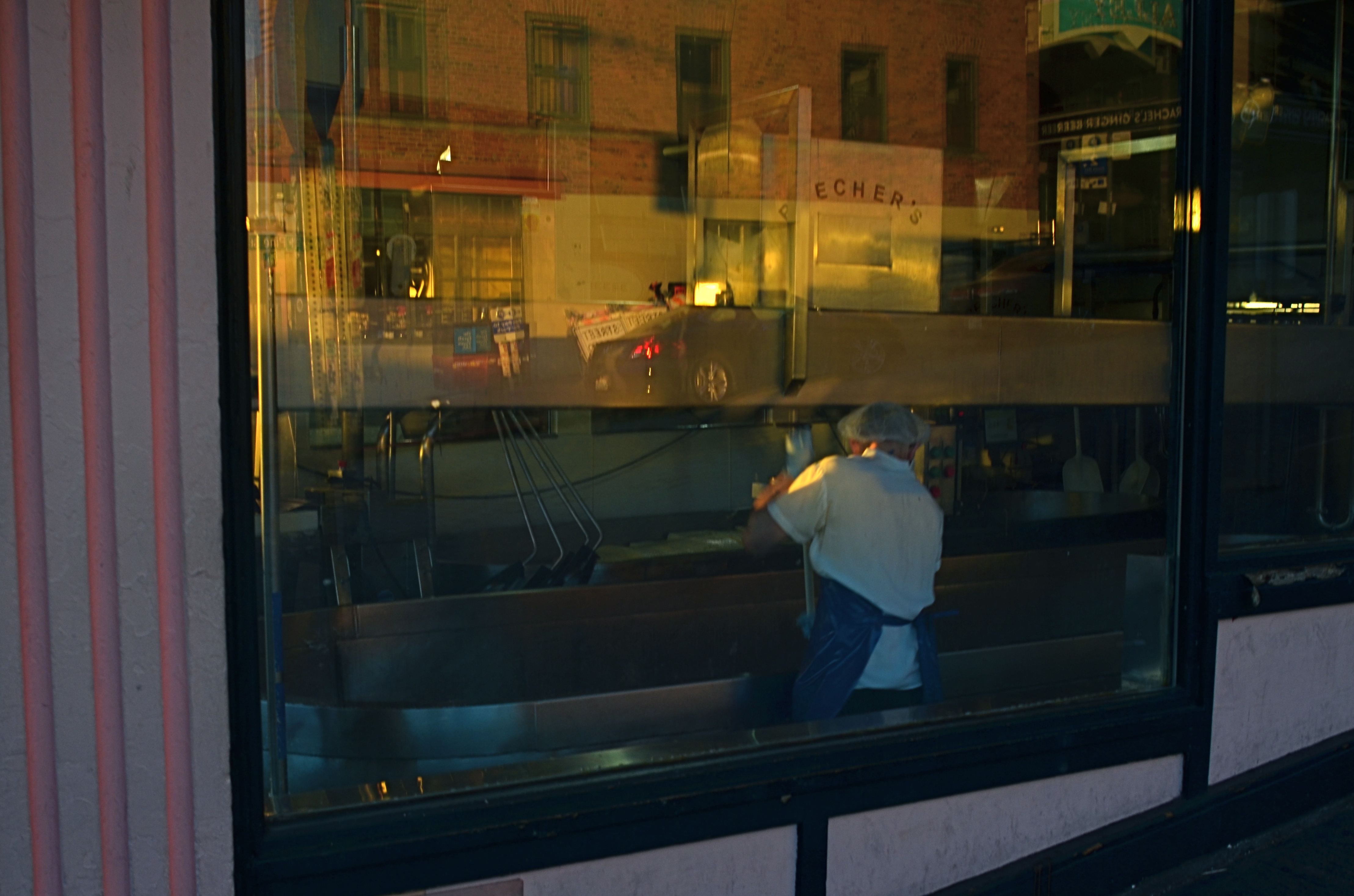
Closing Time (2016)
By MICHAEL PERKINS
IF THE EYES ARE THE WINDOW TO THE SOUL, then certain windows are an eye into contrasting worlds.
Photographers have devised a wide number of approaches when it comes to using windows as visual elements. Many choose to shoot through them with a minimum of glare, as if the glass were not there at all. Others use them as a kind of surreal jigsaw puzzle of reflected info-fragments.
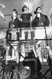
Lee Friedlander’s New York CIty (2011)
To show these two approaches through the eyes of two great photographers, examine first Eugene Atget’s shots of 19th-century Paris storefronts, which mostly concentrated on shopkeeper’s wares and how they were arranged in display windows. Straightforward, simple. Then contrast Lee Friedlander’s 21st-century layered blendings of forward view and backward reflection (seen at left), which suspends the eye between two worlds, leaving the importance of all that mixed data to the viewer’s interpretation.
Much of my own window work falls into the latter category, as I enjoy seeing what’s inside, what’s outside, and what’s over my shoulder, all in the same shot. What’s happening behind the glass can be a bit voyeuristic, almost forbidden, as if we are not fully entitled to enter the reality on the other side of the window. But it’s interesting as well to use the glass surface as a mirror that places the shop in a full neighborhood context, that reminds you that life is flowing past that window, that the area is a living thing.
Thus, in an urban setting, every window is potentially two-way glass. Now, just because this technique serves some people as a narrative or commentary doesn’t make it a commandment. You have to use the language that speaks for you and to your viewer. Whatever kind of engagement serves that relationship best dictates how you should be shooting. I just personally find layered windows a fun sandbox to play in, as it takes the static quality away from a still photo to some degree, as if the image were imbued with at least the illusion of motion.
Sometimes it’s good to conceal more than reveal, and vice versa. The only “must”, for this or any other technique in photography, is to be totally mindful as you’re creating. Choose what you mean to do, and do it with your eyes fully open.
(LESS THAN) PRIME OPPORTUNITY
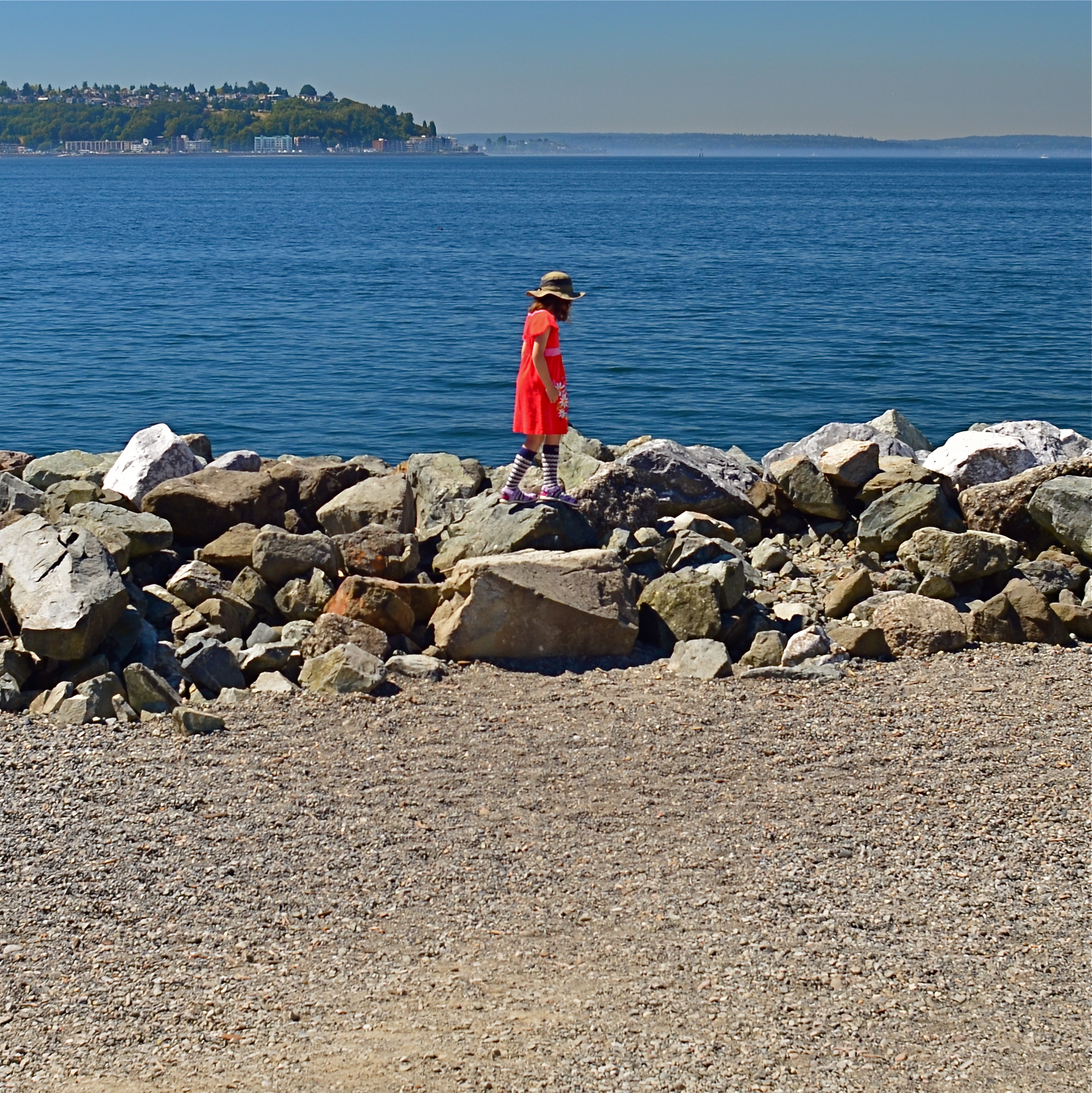
To Susan On The West Coast Waiting (2016). Shot from over 50 feet away with a 24mm wide-angle prime, then cropped nearly 70% from the original frame.
By MICHAEL PERKINS
EVERY DAY-LONG SESSION OF TRAVEL PHOTOGRAPHY dictates its own distinct rules of engagement. You can predict, to some degree, the general trend of the weather of the place where you’ll be staying/playing. You can pre-study the local attractions and map out at least a start-up list of things you might like to shoot. And you can choose, based on all your other prep, the equipment that will work best in the majority of situations, which keeps you from carting around every scrap of gear you own, saving reaction time, and, possibly, your marriage.
All well and good. However, even assuming that you make tremendously efficient choices about what lens you’ll most likely need on walkabout, there will be the occasional shot that is outside the comfort zone of said lens, something that it won’t do readily or easily. In such cases, the lens that would be perfect for that shot is likely forty miles away, back at your hotel. And here’s the place where you can pretty much predict what I advise.
Take the shot anyway.
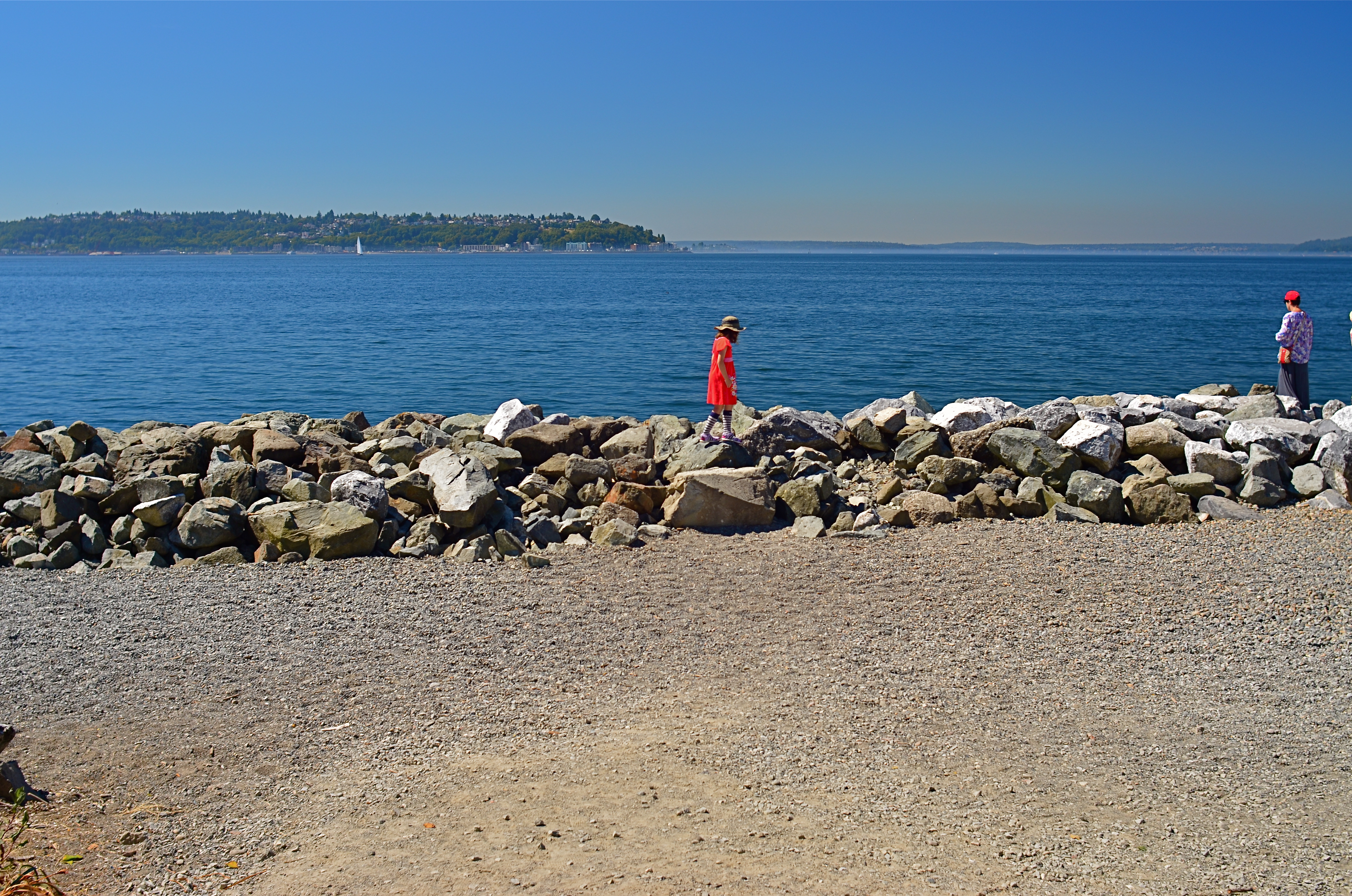
The original composition.
I tend to work with a 24mm prime f/2.8 lens when walking through urban areas. It just captures a wider field within crowded streets, allowing me to grab most vistas without standing in the path of onrushing traffic (a plus) or spending a ton of time re-framing before each shot (a pain). This particular 24 was made in the ’70’s and is both lightning fast and spectacularly sharp, which, being a manual lens, also saves time and prevents mishaps.
24mm, to me, produces a more natural image than the wide end of the more popular 18-55 kit lenses being sold today, since there is less perspective distortion (straight lines remain straight lines). However, since it is a wide-angle, front-to-back distances will appear greater than they are in reality, so that things that are already in the distance seem even more so. And, since it is also a prime, there is no zooming. In the case at left, I wanted the girl’s bonnet, dress and presence on those rocks, but, if I was going to get any picture at all, plenty of other junk that I didn’t need would have to come along for the ride.
You deal with the terms in front of you at the time. Without a zoom, I either had to take the shot, with the idea of later cropping away the excess, or lose it altogether. There are times when you just have to visualize the final composition in your mind and extract it when it’s more convenient. Simply capture what you truly need within a bigger frame of stuff you don’t need, and fix it later. It’s a cornball cliché, but the only shot you are guaranteed not to get is the one you don’t go for. And this is also a good time to remember that it’s always smart to shoot at the biggest file size you can, allowing for plenty of pixel density even in the aftermath of a severe crop.
You can’t pre-plan all the potential pitfalls out of a photo vacation. Can’t be done. Come as close as you can, and trust your eye to help you rescue the outliers down the road.
But take the shot.
SOFTER AND QUIETER
By MICHAEL PERKINS
THE MEANING OF THE WORD NOISE HAS, IN RECENT YEARS, been expanded beyond its familiar role as an audio term, extending its usage into our visual vocabulary as well. A key shift in photo terminology, as film converted to digital, has been the re-purposing of the word to denote a degradation in quality, with noise replacing grain as the way to describe a less-than-pristine image. Same idea, different wording.
And now, in recent years, I have heard the word used even more widely to denote weaknesses in a composition, describing a picture with too much information or distraction as “noisy”. In a recent post on the blog PhotographyMad.com, you find the following citation:
Often a photo will lack impact because the main subject is so small it becomes lost among the clutter of its surroundings. By cropping tight around the subject you eliminate the background “noise”, ensuring the subject gets the viewer’s undivided attention.
I personally would extend this metaphor to include not only the subject matter within a frame but its color range as well. That means, simply, that too many colors in an image might dilute the effect of a shot as much as the density of its elements, and extends the idea of noise to encompass anything that lessens the communicative power it has for the viewer.
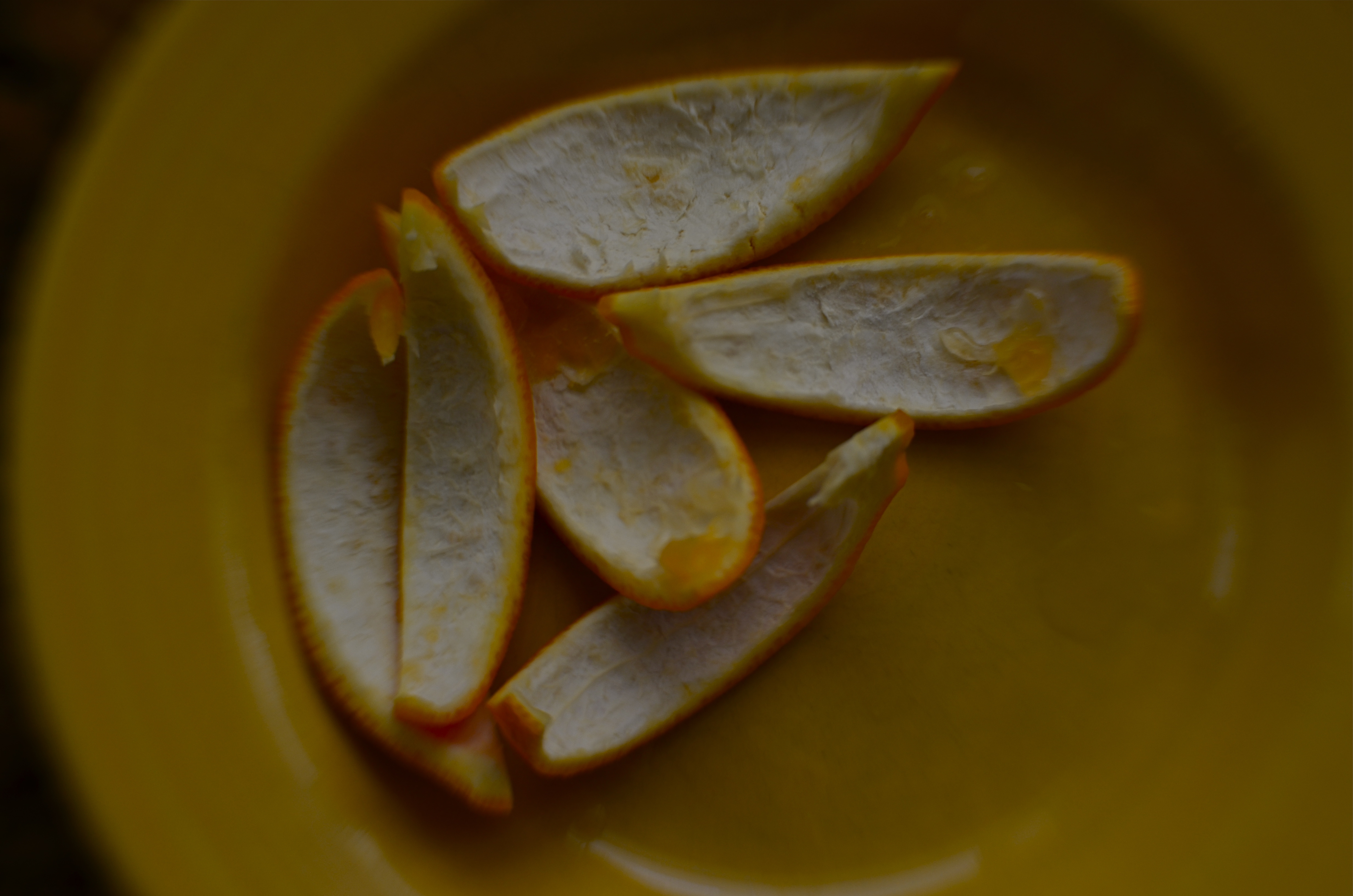
Deflowered (2016). 1/50 sec., f/4, ISO 100, 35mm.
In the above shot, the idea of the composition was to convey the bits of orange peel as some kind of spent or withered flower. I didn’t decide, in advance, to eat an orange in a yellow bowl, but I believe that the same peels in a red bowl might have hardened the look of the shot by calling attention to contrast instead of content. Keeping the entire composition to a two-tone color range (along with a decidedly shallow depth-of-field to reduce the texture detail) rendered it nice and soft. Of course there are a million ways to conceive this image; I just chose this way.
Noise is not merely a technical registration of visual or audio distortion. I think the word has real value if you’re looking to streamline your images. Just think noise=clutter.
Then turn down the volume.
BITE-SIZE BEAUTY
By MICHAEL PERKINS
IN PHOTOGRAPHY, WE OFTEN HAVE THE OPPORTUNITY TO ADMIRE THINGS THAT ARE, STRICTLY SPEAKING, beyond our capabilities. The world is rife with people who master exposure, composition, editing and conceptualization in ways which make us gasp in a mixture of awe and envy. Sometimes, we are so amazed by artists outside our own area of expertise that we emulate their passion and, in doing so, completely remake our own art. Other times, we just glimpse their greatness like a kid peeking inside the tent flap at the circus. We know that something marvelous is going on in there. We also sense that we are not a part of it.
That’s pretty much been my attitude toward landscape work.
Much of it leaves me impressed. Some of it leaves me breathless. All of it leaves me puzzled, since I know that I am missing a part of whatever mystical “something” it is that allows others to capture majesty and wonder in the natural world, their images looking “created” my own looking merely “snapped”.
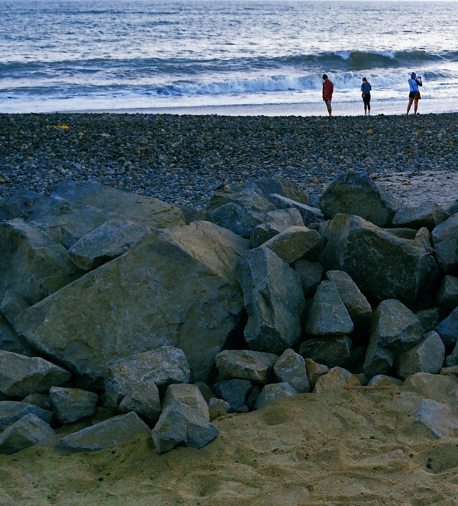
Sometimes the sheer size of nature’s canvas panics my little puppy brain, and I retire to smaller stories.
It’s not the same with urban settings, or with anything that bears the mark of human creativity. I can instinctually find a story or a sweet point of focus in a building, a public square, a cathedral. I can sense the throb of humanity in these places and I can suggest it in pictures. But put me in front of a broad canvas of scenery and I struggle to carve out a coherent composition. What to include? What to cut? What light is best? And what makes this tree more pictorially essential than the other 3,000 I will encounter today?
The masters of the landscape world are magicians to me, crafty wizards who can charm the dense forest into some evocative choreography, summoning shadows and light into delicate interplay in a way that is direct, dramatic. I occasionally score out in the woods, but my failure rate is much higher, and the distance between what I see and what I can deliver much greater. Oddly, it was the work of scenic photographers, not street shooters or journalists, that originally conveyed the excitement of being a photographer to me, although I quickly devolved to portraits, abstractions, 3D, hell, anything to get me back to town, away from all that scary flora and fauna.
Medium or bite-sized natural subjects do better for me than vast vistas, and macro work, with its study of the very structures and patterns of organic things works even better. But I forever harbor a dream of freezing a forest in time in a way that stuns with its serene stillness and simple dignity. I have to keep putting myself out there, hoping that I can bridge the gap between envy and awareness.
Maybe I’ll start at the city park. I hear they have trees there….
TWO FOR LUNCH
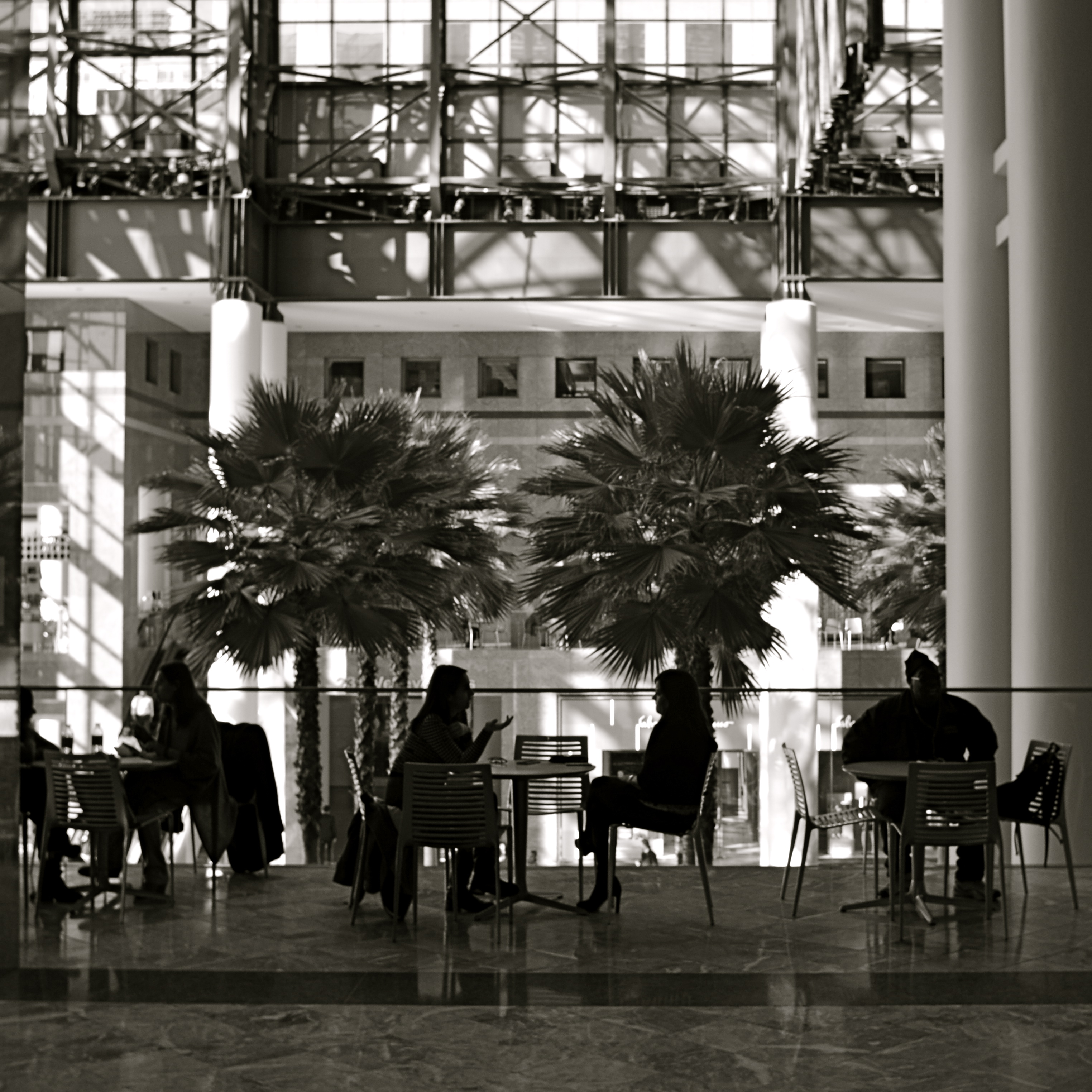
And Then I Told Her… (2016) 1/40 sec., F/5.6, ISO 100, 24mm.
By MICHAEL PERKINS
PHOTOGRAPHS DON’T HAVE TO BE ORGANIZED AROUND SYMMETRY, or even have a discernible “center” to them. However, the eye seems to find comfort in quickly settling on a “starting point” in an image, a place from which to proceed, or to be led to deeper discoveries.Designers for everything from magazine articles to websites toss around terms like visual weight and bottom-up processing to float various theories about how to direct the eye, with each system boasting top efficiency. A balanced pattern near the middle of the picture is thus not necessarily a “must-have”, just a fairly reliable “feels-right”.
By way of demonstration, a photographic center that consists of two people facing each other, talking, is a fairly easy anchor around which to build a straight narrative in an image. As the two heads arc left and right, a rough set of parentheses establish a very basic symmetry, and can help ensure that the middle of the picture engages the eye first. Based on architecture and surroundings, other things in the frame can either enhance or contrast with the symmetry in the middle, and that’s all a matter of taste for the photographer.
Many times a lunch counter or a restaurant gives me the talkers I need, so I tend to be on heightened alert when I enter such places. However, many of the photos I’ve made like this did not originally begin with the two people as the central emphasis: that happened in the cropping process.
In the above image, there actually was enough supportive symmetry from the background so centering the talkers and resizing the photo as a square seemed to be a good overall strategy. Of course, there is no hard and fast rule for these kinds of choices. All than can be said is that, for this picture, in this case, with these elements to work with, centering the conversationalists and placing them at the center of a square made sense. There is an entirely separate case to be made for selective use of the square as a compositional boost, and we’ll deal with than at another time.
Meanwhile, dropping in on two folks for lunch can act as a springboard for a certain kind of picture.
SEPARATE WORLDS
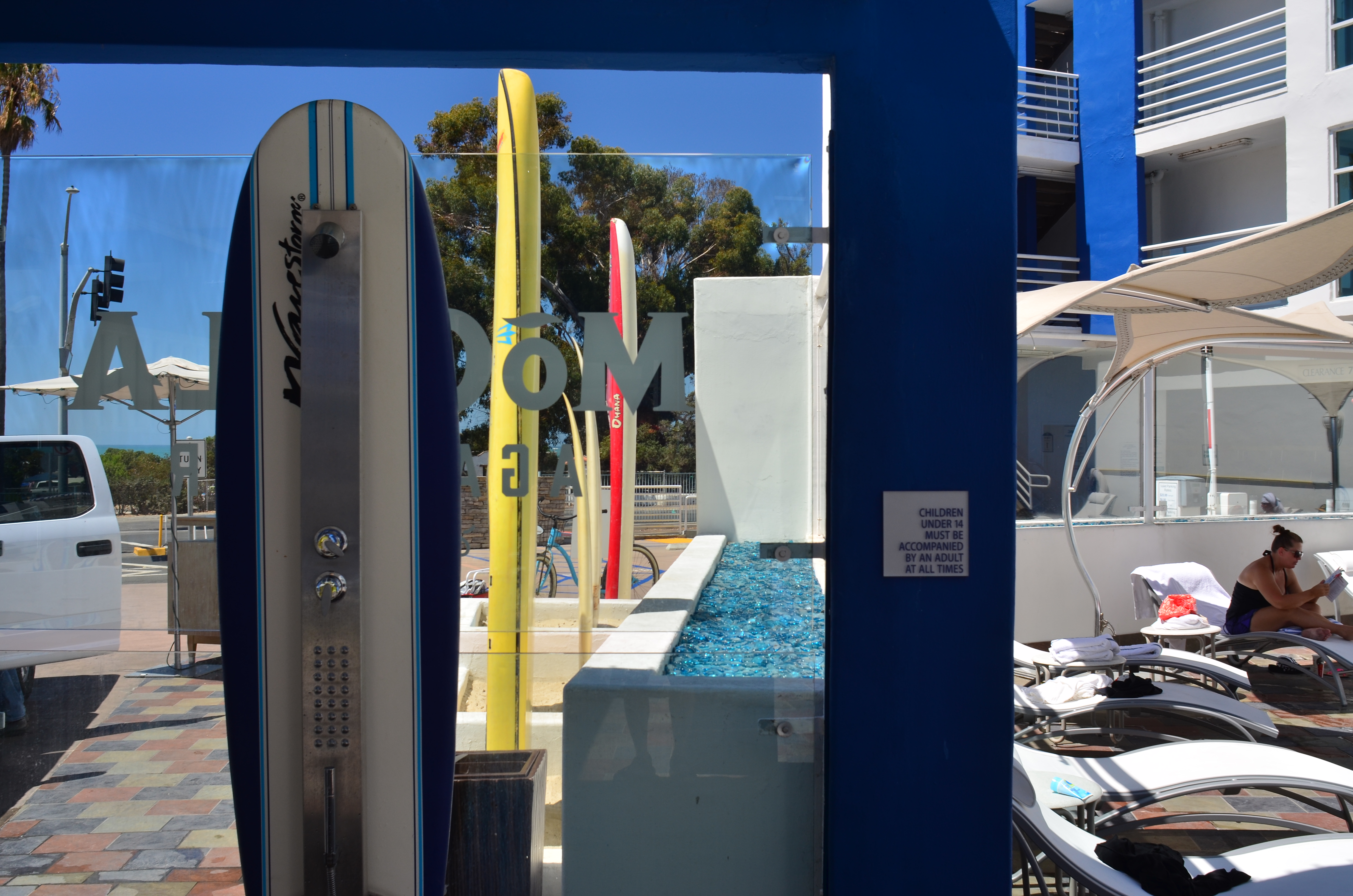
Only As A Last Resort (2016).
By MICHAEL PERKINS
MAYBE IT’S THE TERM ITSELF. MAYBE IT’S HOW WE DEFINE IT. Either way, for photographers, concept of the “still life” is, let’s just say, fluid.
I believe that these static compositions were originally popular for shooters for the same reason that they were preferred by painters. That is, they stayed in one place long enough for both processes to take place. Making photographs was never as time-consuming as picking up a brush, but in the age of the daguerreotype the practice was anything but instantaneous, with low-efficiency media and optical limitations combining to make for looooong exposure times. Thus, the trusty fruit-bowl-and-water-jug arrangement was pretty serviceable. It didn’t get tired or require a bathroom break.
But what, now, is a “still life”? Just a random arrangement of objects slung together to see how light and texture plays off their surfaces? More importantly, what is fair game for a still life beyond the bowl and jug? I tend to think of arrangements of objects as a process that takes place anywhere, with any collection of things, but I personally seek to use them to tell a story of people, albeit without the people present. If you think about museum collections that re-create the world of Lincoln or Roosevelt, for example, the “main subject” is obviously not present. However, the correct juxtaposition of eyeglasses, personal papers, clothing, etc. can begin to conjure them in a subtle way. And that conjuring, to me, is the only appeal of a still life.
I like to find a natural grouping of things that, without my manipulation or collection, suggest separate worlds, completely contained universes that have their own tools, toys, architecture, and visual vocabulary. In the above montage of angles and things found at a beach resort, I had fun trying to find a way to frame the “experience” of the place, in abstract, showing all its elements without showing actual activities or people (beyond the sunbather at right). The real challenge, for me, is to create associations in the mind of the viewer that supply all the missing detail beyond the surfboards, showers, and sundecks. That, to me, is the real attraction of a still life….or, more accurately, taking a life and rendering it, fairly intact, in a still image.
Hey, it’s not that I don’t like a good bowl of fruit now and then. However, I think that one of photography’s best tricks is the ability to mentally conjure the thing that you don’t show, as if the bowl were to contain just apple cores and banana peels. Sometimes a picture of what has been can be as powerful as freezing an event in progress. But that’s your choice.
Which is another of photography’s best tricks.
A THING OF THE MOMENT
By MICHAEL PERKINS
CAN YOU TRAIN YOUR EYE TO SEE FASTER? Now, by “seeing”, I mean a process which effectively goes beyond the mere reception of light or visual information, something unique to the process of photography. I’m asking if you can, in effect, train the eye to, if not actually see faster, to more efficiently communicate with the brain and the hand in selecting what is important, so more rapidly apprehend the fleeting moment when a picture must be made.
I’m talking about the gradually learned trick of deciding quicker what you want and when it might be near at hand.
Much has been written about Henri Cartier-Bresson’s idea of “the decisive moment”, the golden instant in which viewpoint, conditions, and subject converge to be especially eloquent….to be, in effect, the only true artistic moment at which a photograph can be taken. Many reject this idea out of hand, saying that there are many potential great opportunities in the space of even a few seconds, and that the lucky among us grab at least one now and then. For those people, it’s not so much “the” moment as “a” moment.
Whatever the nature of the near-perfect shot is, sensing when one is imminent isn’t magic, and it isn’t accidental. It’s also not guaranteed by talent or luck. It has to be the result of experience, more specifically, lots of unsatisfying experience. Because I feel that the pictures you didn’t get are far more instructive than the ones you did, simply because you burn more brain cells on the mysteries of what went wrong than you do on the miracle of getting things right.
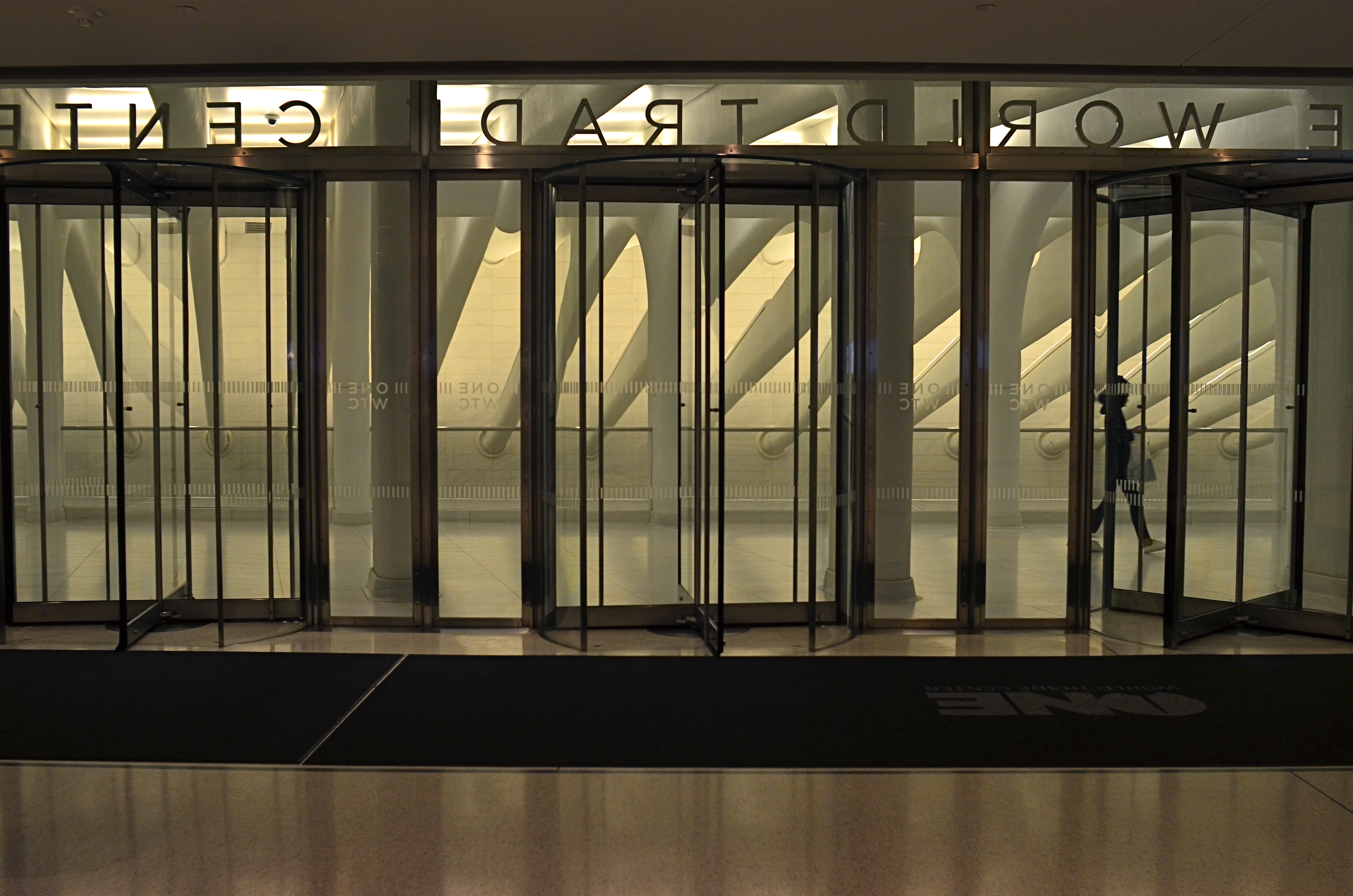
Center Trade World (2016)
This image is neither the result of great advance planning nor of great fortune: it’s somewhere in the middle, but it does record an instant when everything that can work is working. The light, the contrasting tones of white and gray, the framing, the incidental element of the passing tourist….they were all registering in my mind at the precise instant before I snapped the frame.
This does not mean I was totally in charge of the process: far from it. But I knew that something was arriving, something that would be gone in less than a second. Also, the elements that were converging to make the image were also in flux, and, having moved on, would result in something very different if I were to take a second or third crack at the same material.
For a photographer, it’s a little like surfing. You take lots of waves, with the idea that any of them can deliver the ride of your life. But, on any given day, all of them could be duds. However (and this is the part about a trained eye), you can learn to spot the best waves faster and faster, converting more of them to great rides. And making pictures is much the same process. You can’t absolutely analyze what will make a picture work, but you can learn to spot potential quicker, on some level between intentional and accidental.
THE SHIFTING VEIL
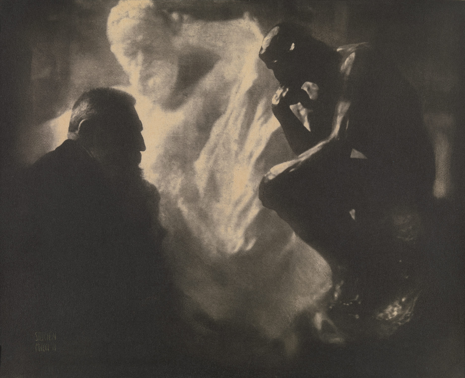
One of Edward Steichen’s amazing portrait studies of the sculptor Auguste Rodin.
By MICHAEL PERKINS
PHOTOGRAPHERS AND MAGICIANS SHARE A COMMON POWER, in that both of them selectively practice the art of concealment. Now you see it, now you don’t. Both the shooter and the shaman, in their own ways, know the importance of the slow reveal, the smooth manipulation of the viewer’s concept of reality. Best of all, they know how to choreograph and stage visual information. Here, they insist. Look here.
In a lifetime of studying portrait photographers, I have been fascinated by the nearly endless variety of approaches used to convey the human personality/soul in a static image. There are the formal studio sittings. There are the street ambushes of the paparazzo. And there are the shadowy, soft, gently suggestive pictures in which the classic representation of a “face” may not occur at all. This is the blending of revelation and mystery, and it is where portraits, at least for me, genuinely aspire to art.
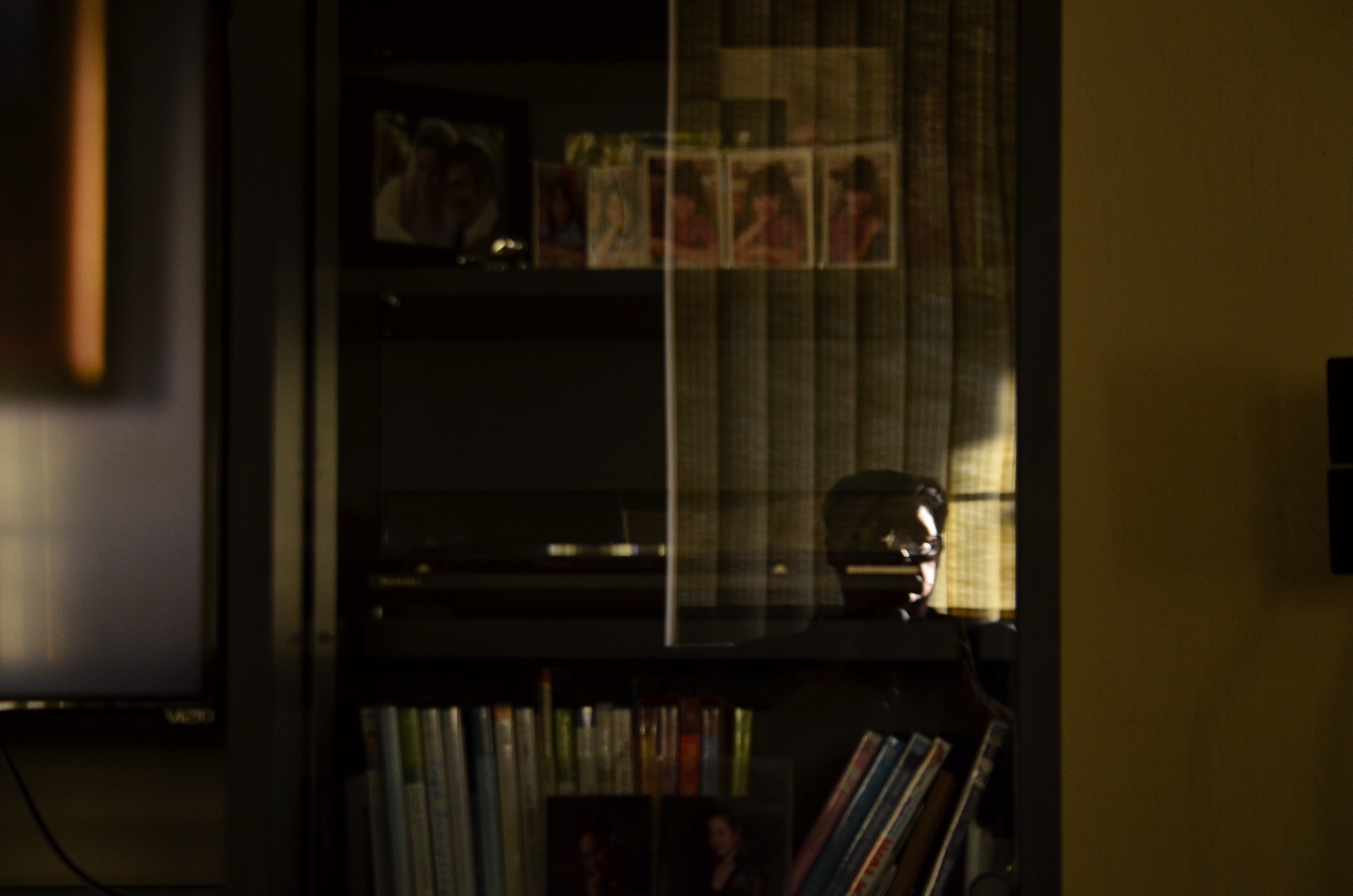
He Decided To Wait (2016). A “self-portrait” in name only. Do we have to be the center of attention?
Some of my favorite images in this area were Edward Steichen’s studies with the sculpture Auguste Rodin, dark, smeary pieces of pure mood in which the great man was reduced to a near silhouette, as if he and his sculptures were forged out of the same raw material. I learn next to nothing of Rodin’s face from these pictures, and yet I learn worlds about his spirit. Steichen reveals as he conceals.
Which gives me an idea.
As I skim through the daily global tsunami of selfies, many of them simple grinning headshots, I see an incredible opportunity to start a completely new dialogue on what constitutes a portrait….or even a face. That opportunity will be squandered if 99% of selfies only look like slightly happier passport photos, rather than a real growth medium for investigating the self, for using the face as a compositional accent, an arranged object within a larger design.
Why selfies? Because the subject is always available. Because the technology of both mobile phones and conventional cameras allows for faster and more far-reaching experimentation. And because re-framing a subject you think you know intimately, merely by shifting where the veil lifts or falls, can be the difference between conceal and reveal.


PERFECT VS RIGHT
By MICHAEL PERKINS
OUR VERY HUMAN DESIRE TO MAKE OUR PHOTOGRAPHY TECHNICALLY FLAWLESS can be observed in the results you can glean from a simple Google search of the words “perfect” and “photos”. Hundreds of tutorials and how-tos pop up on how to get “the perfect portrait”, “the perfect family picture”, “the perfect sunset”, and of course, “the perfect wedding shot”. The message is all too clear; when it comes to making pictures, we desperately want to get it right. But how to get it right…that’s a completely different discussion.
One of my favorite selfies, even though I can’t justify it by any technical standard.
Because if, by “perfect”, we means a seamless blend of accurate exposure, the ideal aperture, and the dream composition, then I think we are barking up a whole forest of wrong trees. Mere technical prowess in photography can certainly be taught, but does obeying all these rules result in a “perfect” picture?
If you stipulate that you can produce a shot that is both precise in technique and soulless and empty, then we should probably find a more reasonable understanding of perfection. Perfect is, to me, a word that should describe the emotional impact of the result, not the capital “S” science that went into its execution. That is, some images are so powerful that we forget to notice their technical shortcomings. And that brings us to the second part of this exercise.
Can a flawed image move us, rouse us to anger, turn us on, help us see and feel? Absolutely, and they do all the time. We may talk perfection, but we are deeply impressed with honesty. Of course, in two hundred years, we still haven’t shaken the mistaken notion that a photograph is “reality”. It is not, and never was, even though it has an optical resemblance to it. It became apparent pretty early in the game that photographs could not only record, but persuade, and, yes, lie. So whatever you shoot, no matter how great you are at setting your settings, is an abstraction. That means it’s already less than perfect, even before you add your own flaws and faults. So the game is already lost. Or, depending on our viewpoint, a lot more interesting.
Go for impact over perfect every time. You can control how much emotional wallop is packed into your pictures just as surely as you can master the technical stuff, and pictures that truly connect on a deep level will kick the keester of a flawless picture every single time. The perfect picture is the one that brings back what you sent it to do. The camera can’t breathe life into a static image. Only a photographer can do that.
Share this:
May 28, 2017 | Categories: Aperture, Focus, P.O.V., Technique | Tags: Commentary, Composition, exposure, process | Leave a comment