GALLERYLABS
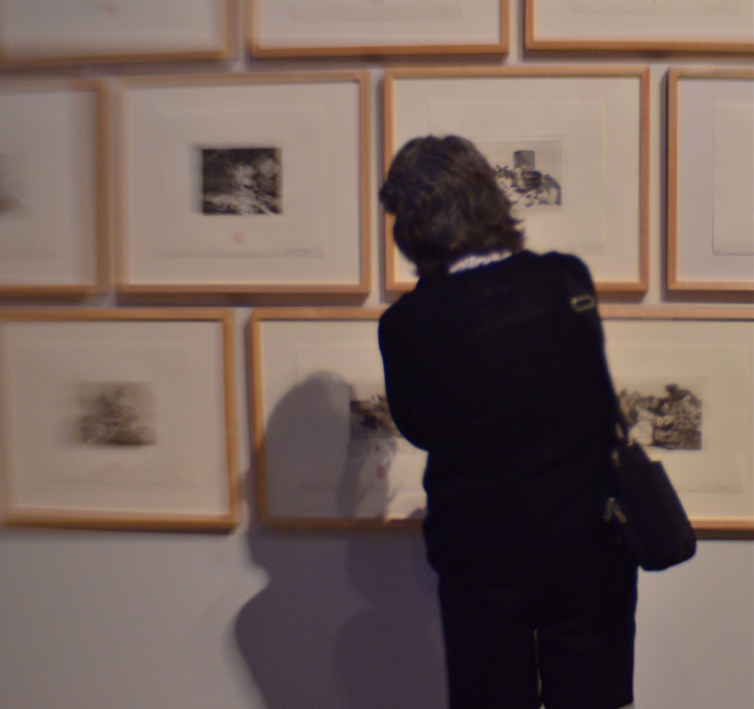
Watching those who watch.
By MICHAEL PERKINS
MUSEUMS AND GALLERIES COMPRISE SOME OF THE MOST INTERESTING WORKOUT SPACES for photographers, but for none of the reasons you might suppose. On the most obvious level, certainly,they are repositories of human endeavor, acting basically as big warehouses for things we deem important. But, beyond that, they are also laboratories for every kind of lighting situation, a big ‘ol practice pad for the mastery of lenses and exposure strategies. Sometimes the arrangement of color and shadow in some art houses is so drastically different from room to room that, even if there is nothing of note hanging on the walls, the walls themselves can frame amazing compositional challenges.
There is also a secondary, and fairly endless, source of photographic sketch work to be had in the people who visit public art spaces. The body language of their contemplative study of the artwork is a kind of mute ballet all its own, and no two patterns are alike. Watching the people who watch the art thus becomes a spectator sport of sorts, one which works to the advantage of the candid shooter, since people are more immersed in the paintings and thus a little less aware of themselves as regards the photographer. That leads to what I call “bodily candor”, a more relaxed quality in how they occupy their personal space.
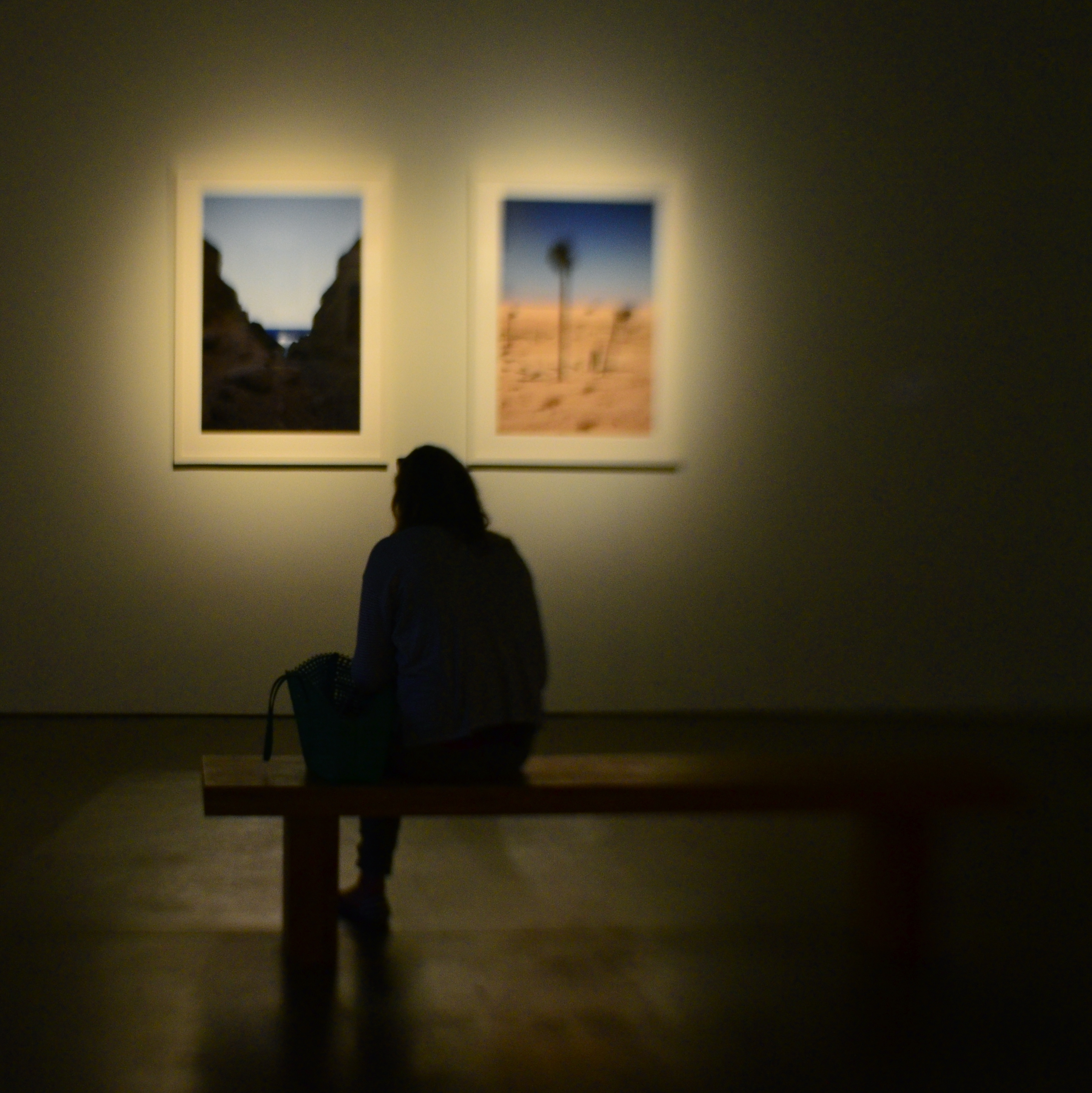
Which is the subject?
Sometimes, as seen in the images in this article, your subject’s physical footprint is enough to express a full sense of the person without a trace of facial detail. In fact, I actually prefer this “no-face” approach, since it forces the viewer to supply some information of his own, making the photographs more interactive.
Try some gallerylab shots the next time you are hostage to a museum tour that was someone else’s idea of a good time. The exhibits themselves may disappoint, but the museum space and the people in it offer pretty consistent material.
CUES AND CLUES
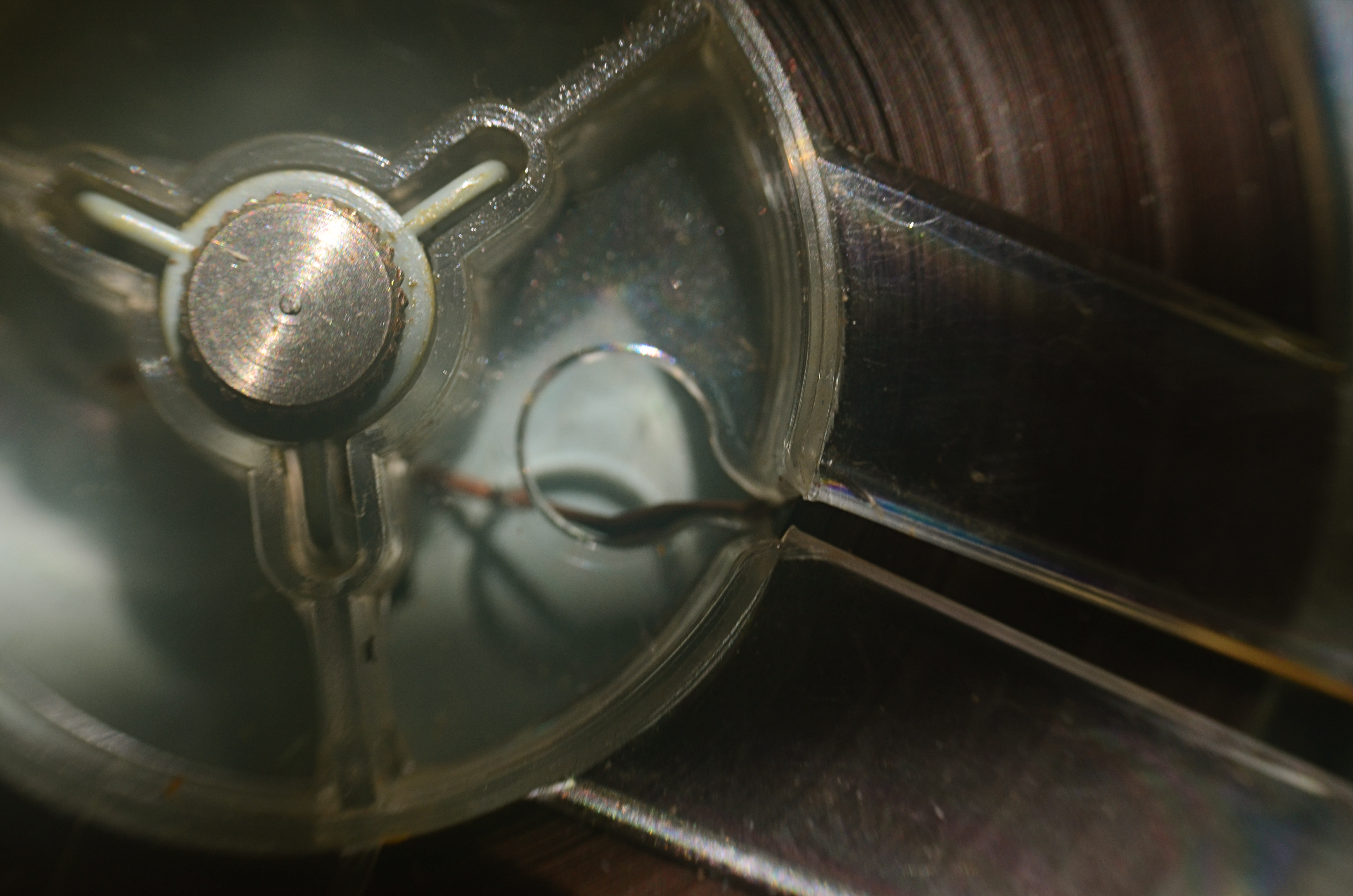
Good Morning, Mr. Phelps (2016). How little of a tape recorder need be shown to convey a sense of that object?
By MICHAEL PERKINS
SAY THE WORD “MINIMALISM” TO SOME PHOTOGRAPHERS, and you conjure visions of stark and spare compositions: random arrangements of light blobs, stray streaks of shadow, or scattered slivers of light, each conveying mood more than content. For some, these images are a kind of “pure” photography, while, for others, they are, to use a nice word, incoherent. Part of us always wants a picture to be, in some way, about something, and the word minimalism is charged, positively or negatively, depending on whether that “narrative thing” happens.
I actually associate minimalism with the formal storytelling process, but doing so with the fewest elements possible. It seems like a natural evolution to me, as I age, to make pictures talk louder with fewer parts. Simple cropping shows you how much more you can bring to an image by taking more of it away, and, with closeups and macro work, the message seems even clearer. Why show an entire machine when a cog carries the same impact? Why show everything when suggesting things, even leaving them out entirely, actually amps up the narrative power of a photograph?
Of course there are times when mere shape and shadow can be beautiful in themselves, and it doesn’t require a lot of windy theorizing to justify or rationalize that. Some things just are visually strong, even if they are non-objective. But minimalism based on our impressions or memory of very real objects, from a pocket watch to a piece of fruit, can allow us to tell a story with suggestions or highlights alone. If something is understood well enough, just showing a selectively framed slice of it, rather than the thing in its entirety, can be subtly effective and is worth exploring.
In the above image, you certainly understand the concept of a tape recorder well enough for me to excise the device’s chassis, controls, even half of its reel mechanism and still leave it “readable” as a tape recorder. You may find, upon looking at the picture, that I could have gone even farther in simplifying the story, and in your own work, you can almost certainly suggest vast ideas while using very small bits of visual information. Knowing the cultural cues and clues that we bring with us to the viewing process tells you how far you can stretch the concept.
ADDITION BY SUBTRACTION
By MICHAEL PERKINS
PHOTOGRAPHIC COMPOSITION IS A CONSCIOUS PRIORITIZING OF EVERYTHING WITHIN A PICTURE’S FRAME, a ruthless process of demanding that everything inside that square justify its presence there. When we refer to the power of an image, we are really talking about the sumtotal of all the decisions that were made, beforehand, of what to include or lose in that image. Without that deliberate act of selection, the camera merely records everything it’s pointed at. It cannot distinguish between something essential and something extraneous. Only the human eye, synched to the human mind, can provide the camera with that context.
Many of our earliest photographs certainly contain the things we deem important to the picture, but they also tend to include much too much additional information that actually dilutes the impact of what we’re trying to show. In one of my own first photos, taken when I was about twelve, you can see my best friend standing on his porch…absolutely…..along with the entire right side of his house, the yard next door, and a smeary car driving by. Of course, my brain, viewing the result, knew to head right for his bright and smiling face, ignoring everything else that wasn’t important: however, I unfairly expected everyone else, looking at all the auxiliary junk in the frame, to guess at what I wanted them to zero in on.
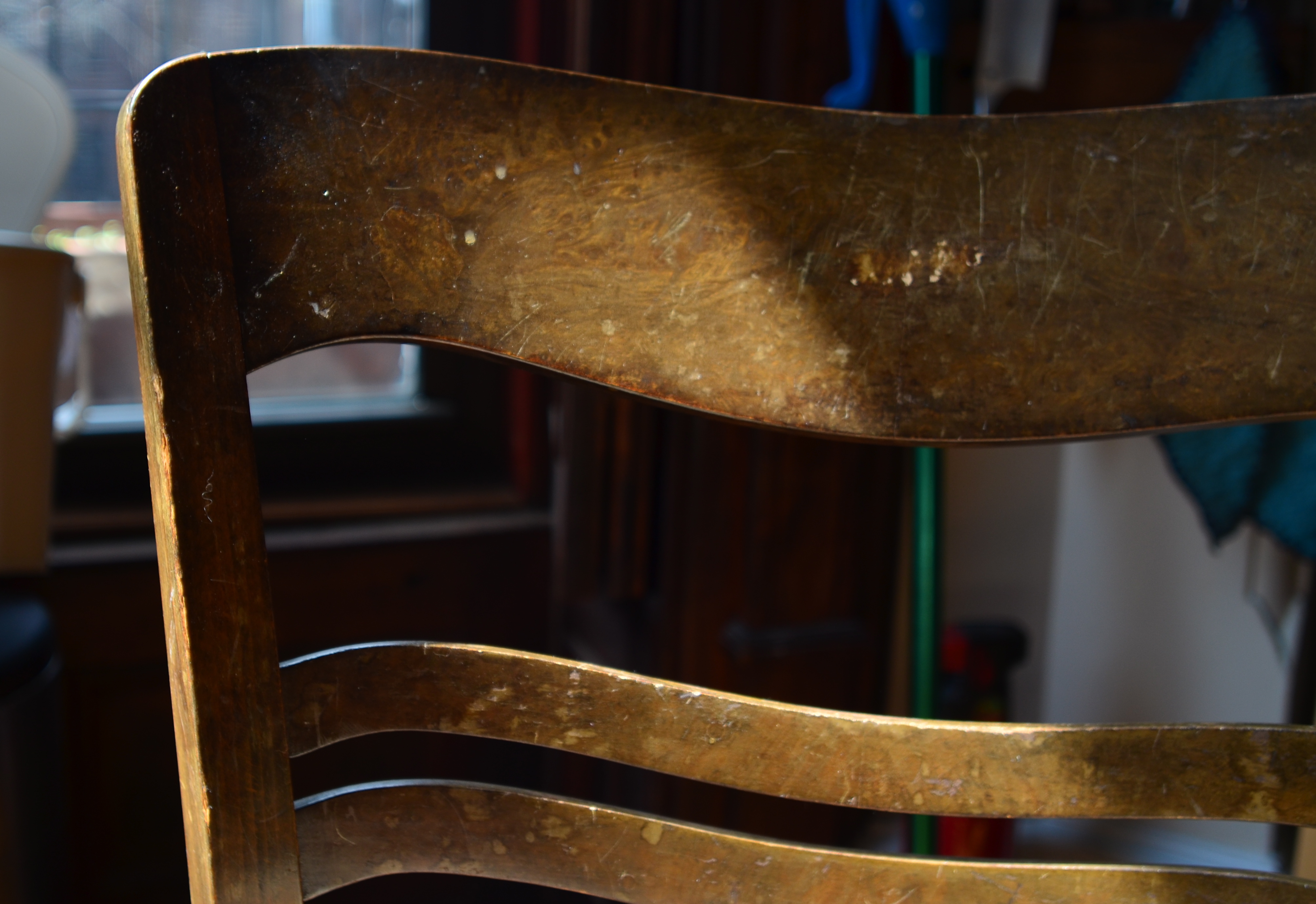
Heritage, 2016.
Jump forward fifty years or so, to my present reality. I actively edit and re-edit shots before they’re snapped, trying to pare away as much as I can in pictures until only the basic storytelling components remain….that is, until there is nothing to distract the eye from the tale I’m attempting to tell. The above image represents the steps of this process. It began as a picture of a worn kitchen chair in a kitchen, then the upper half of the chair near part of a window in the kitchen, and then, as you see above, only part of the upper slats of the chair with almost no identifiable space around them. That’s because my priorities changed.
At first, I thought the entire kitchen could sell the idea of the worn, battered chair. Then I found myself looking at the sink, the floor, the window, and…oh, yeah, the chair. Less than riveting. So I re-framed for just the top half of the chair, but my eye was still wandering out the window, and there still wasn’t enough visible testimony to the 30,000 meals that the chair had presided over. So I came in tighter, tight enough to read the scratches and discolorations on just a part of the chair’s back rest. They were eloquent enough, all by themselves, to convey what I wanted, without the rest of the chair or anything else in the room to serve as competition. So, in this example, it took me about five trial frames to teach myself where the picture was.
And that’s the point, although I still muff the landing more often than I stick it (and probably always will). To get stronger compositions, you have to ask every element in the picture, “so what do you think you’re doing here?” And anyone who doesn’t have a good answer….off to the principal’s office.
STREET PHOTOGRAPHY (LITERALLY)
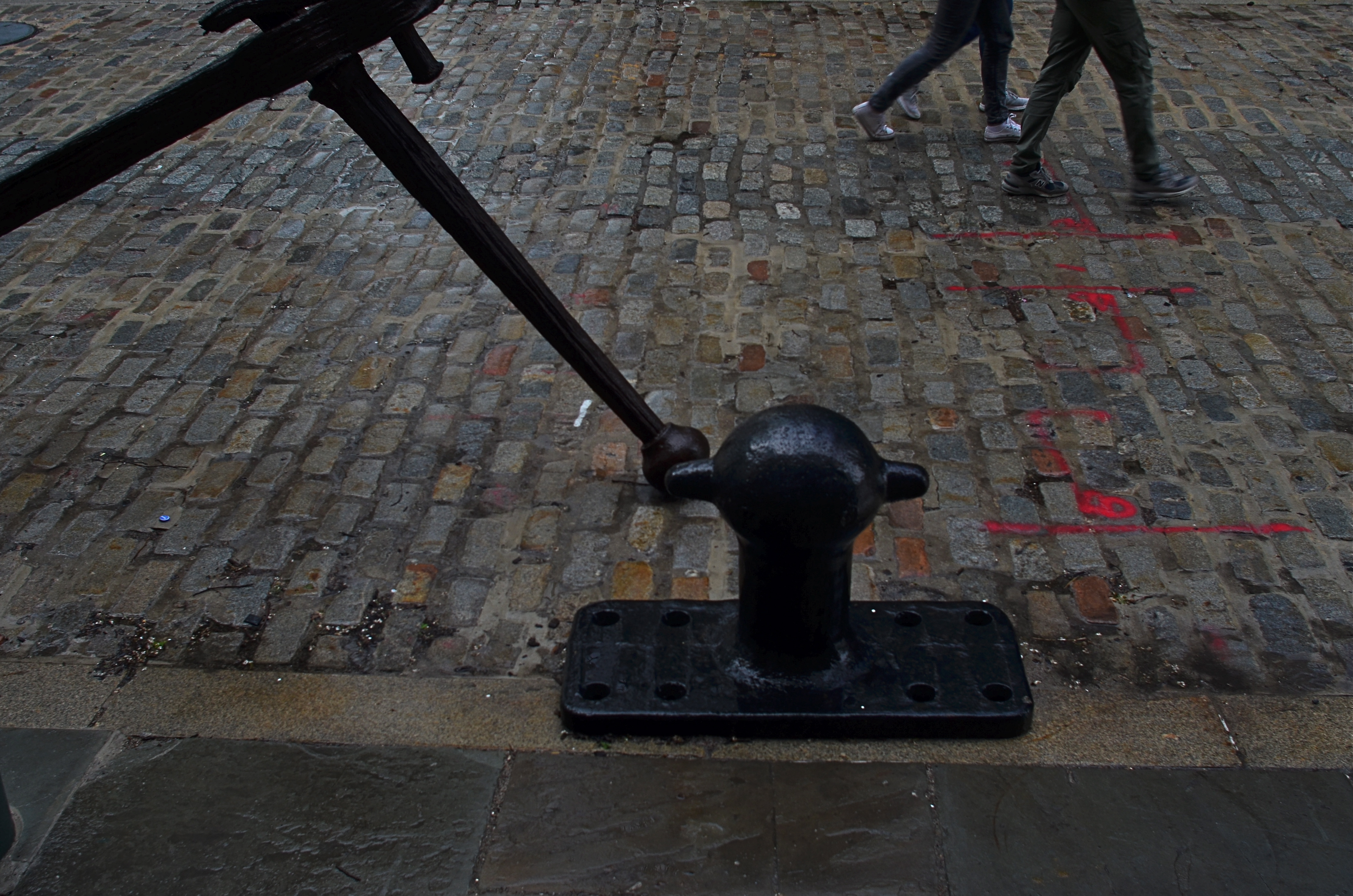
South Street Cobbles, 2016. 1/80 sec., f/5.6, ISO 100, 24mm.
By MICHAEL PERKINS
NEIGHBORHOODS HAVE THEIR OWN VISUAL SIGNATURES, and photographers looking to tap into the energy of streets do well to give their locales a bit of advance study, the better to try to read an area’s particular identity. Sometimes the storytelling potential lies in a single building, even a part of a building. Other times it’s the mix of foot traffic. And, every once in a while, the saga of a street lies in the pavement itself.
New York City’s South Street Seaport district is drenched in local lore, tracing the contours of its alleys and warehouses to the beginnings of Manhattan’s first days as an international shipping destination. From the times of the Dutch’s tall-masted sailing vessels to the present mix of museum and modern retail, the port, on a typical day, offers color, texture, and a feeling of deeply rooted history that is a goldmine for photographers.
Of course, every neighborhood has its off days, and, on my recent trek to the area, a persistent, wind-driven rain had chased all but the hardiest locals off the streets and into the oaky timbers of the port’s quaint shops. Life on the street slowed to a crawl as iron-grey skies robbed the scene of its bolder hues. It was a day to huddle indoors with a good read and a hot cuppa anything. My camera, usually an unfelt burden around my beltline, began to drag like an anchor, stuffed into my woolen jacket to ward off the pelting drizzle, giving me the appearance of someone in sore need of a hip replacement.
Despairing of finding any vital activity along the street, I turned in desperation to the pavement itself, realizing that, in this eastward edge of Manhattan, the texture of the roads abandons the even concrete of most of the island and reverts to the cobbled brick textures of Melville’s time, with many old waterfront fixtures installed at curbside for extra atmosphere. Suddenly I had a little story to tell. The varied mix of firings in the brick, along with the steady rain, delivered the vivid color that was lacking in the area’s shops, allowing me to create an entire frame from just the street itself. Finding that some scale was needed, I sought out an old iron fixture for the left edge of the photo with just the legs and feet of two passing girls to balance out the right side. Suddenly there was enough, just enough of something to make a picture.
Obviously, if the street had been mere wet concrete or blacktop, the impact would have been different, and, were I in a different neighborhood, the street itself might have been unable to compete with the businesses for color or interest. On that morning, however, simple worked best, and my camera, at least for a moment, felt less like an anchor and more like a sailing ship.
THE FLEXIBLE FREEZE
By MICHAEL PERKINS
PHOTOGRAPHERS ACROSS THE LAST TWO CENTURIES HAVE CAPITALIZED ON ONE OF THEIR MEDIUM’S BEST TRICKS, the ability to freeze time, the sensation of carving out micro-seconds of reality and preserving them, like ancient scarabs trapped in amber. The thing known as “now”, with the aid of the camera, became something called “forever”, as things which were, by nature, fleeting were granted a kind of immortality. Events became exhibits, things to be studied or re-lived at our whim.
And yet, even as we extract these frozen moments, we mess around the edge of the illusion a bit, making still pictures also convey a sense of motion. Focus is a prime example of this retro-fitting of technique. No sooner had photography evolved the technical means to render sharp images than shooters began to put a little soft imprecision back into their pictures, by a variety of means: slow shutter speeds, time exposures, manual shaking, delayed flashes, and selective focus. Of all these techniques, at least for me, selective focus has proven to be the hardest to master.
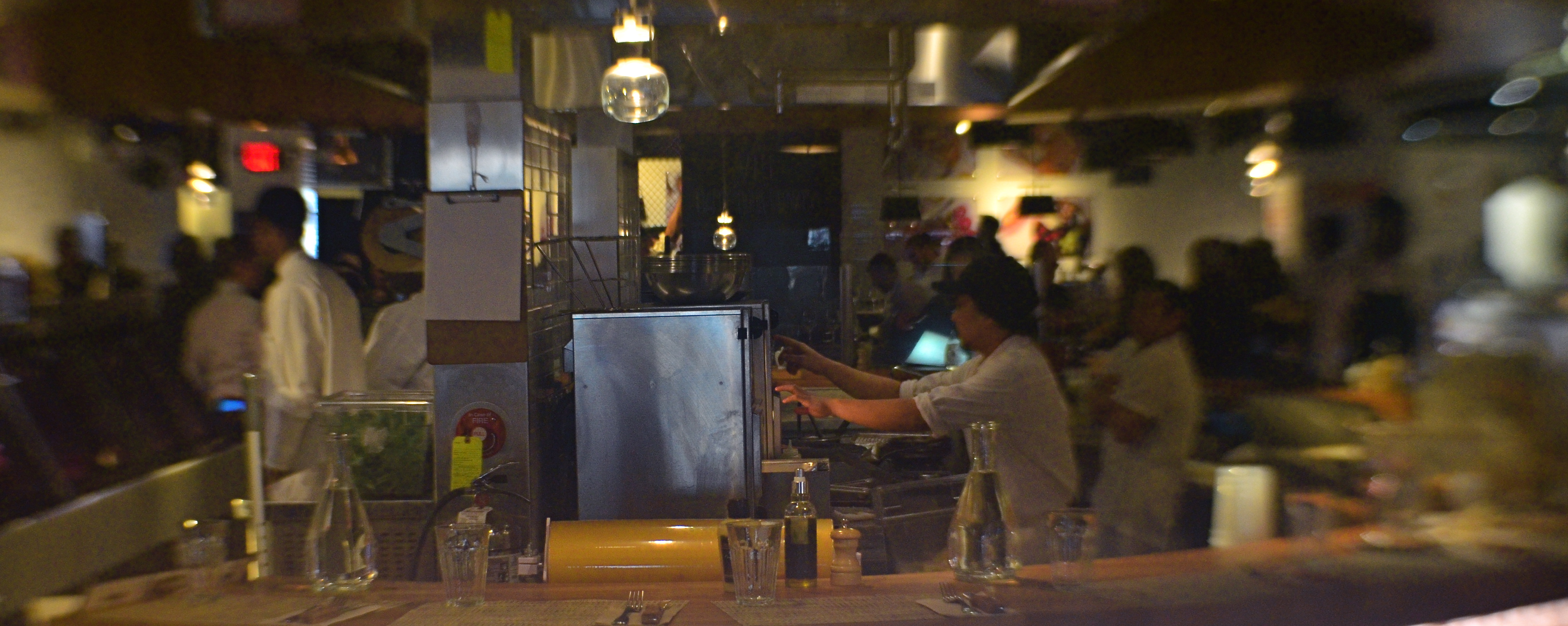
….and two more lattes, 2016, shots on a Lensbaby Composer Pro, which allows a sweet spot of sharp focus to be moved anywhere in the frame the shooter desires.
Changing the messaging of a photographic story by using focus to isolate some elements and downplay others has always called for real practical knowledge of the workings of lenses and how they create focus as an effect. Recently, digital manipulation has allowed shooters to re-order the focal priorities of a shot after it’s taken, and in just the past few years, commercially available specialty lenses have allowed photographers to pre-select where and when focus will occur in an image, using it as interpretively as color or exposure.
I like to use the Lensbaby family of variable-focus lenses for what I call “flexible freeze” situations, times when focus can be massaged to create the illusion of speed. In the above shot, taken in a high-volume cafe, the small center of tight focus fans out to a near streaky quality at the outer edges of the picture. No one person is rendered sharp enough for features to register, or matter. What’s important here is the sensation of a busy lunch rush, which actually would be diminished if everything was in uniform focus.
Sharpness is certainly desirable in most cases for a strict re-creation of literal reality, but photography has never merely been a recording process. Focus can produce useful abstractions or atmospheres in a shot, so long as the effect serves the story. If it doesn’t help the image speak better, even a flexible freeze can quickly become a tiresome gimmick. Matching tools to goals is what good photography does best.
DEM DARN DONT’S
By MICHAEL PERKINS
THE GLIB REMARK THAT YOU HAVE TO LEARN ALL THE RULES IN LIFE BEFORE YOU CAN BREAK THEM is maddeningly true, at least for me. Early on in my foto-fiddling, I was eager to commit all the world’s accumulated photographic do’s and don’ts to memory, like a biblical scholar nailing scripture passages, and shooting as if to enshrine those stone-written truths in art. I used words like always and never to describe how to make pictures in a given situation. I kept the faith.
And then, when I suddenly didn’t, my stuff stopped being pictures and started being photographs. Absolutes of technique are good starting places but they usually aren’t the best places to stick and stay for life. And at this point in my personal trek (seventh-inning stretch), I feel the shadow of all those do’s and don’ts swirling about like little guardian angels, but I worry first and foremost about what makes a given image work.
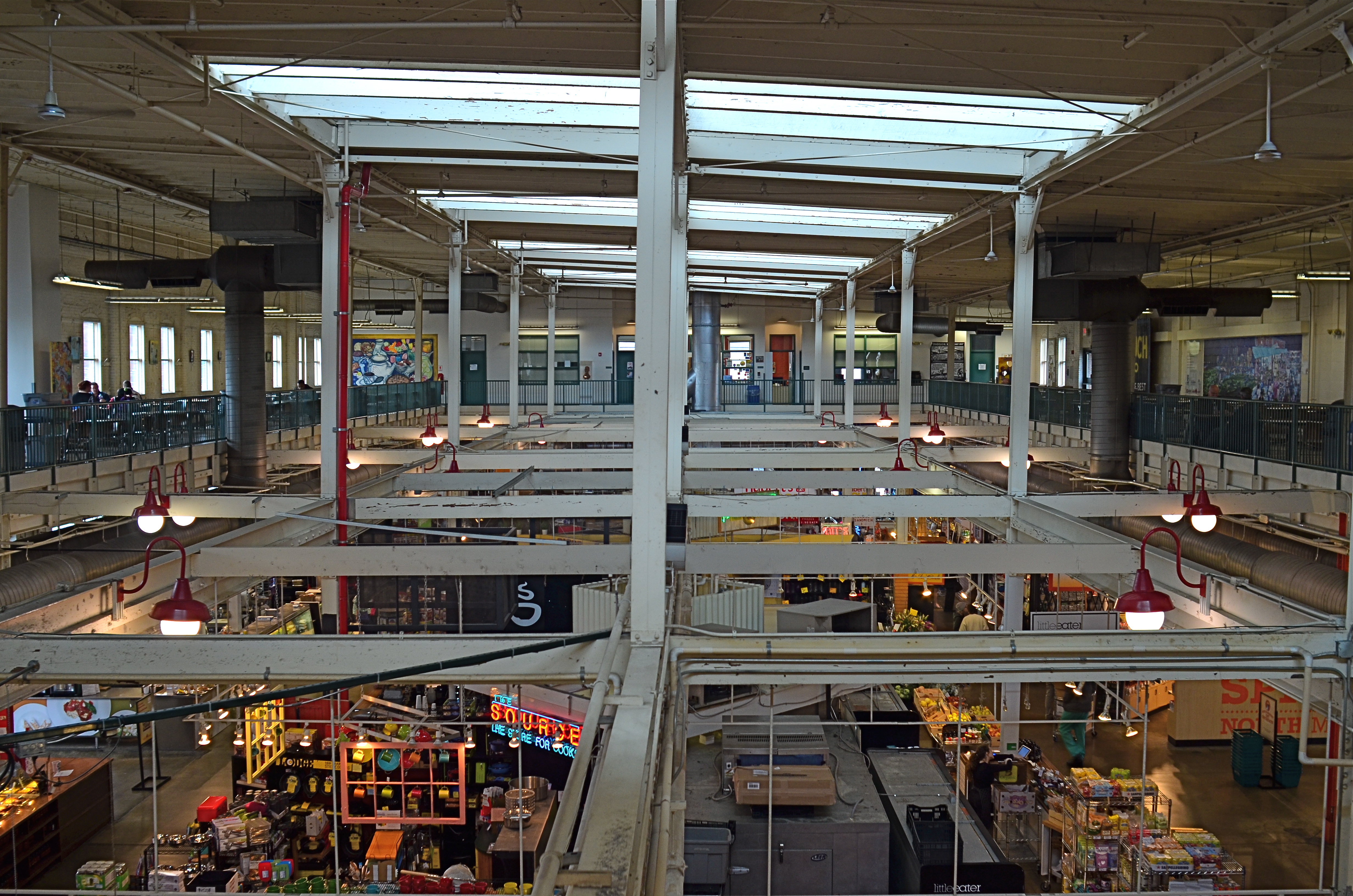
North Market, 2016. Straight out of the camera at 1/40 sec., f/5.6, ISO 200, 24mm.
You no doubt have many pictures you’ve made which you simply like, despite the fact that they flaut, or even fracture, the rules. The above image, shot earlier this week at a multi-floor urban marketplace/eatery, struck me for two reasons. First, because of how many basic rules of “proper” composition it clearly violates; and secondly, just how much I don’t care, because I like what it does. To illustrate my point, I’ve provided citations from an article titled Principles Of Composition to cite specific ways that the photo is, well, wrong.
Have A Strong point of interest. Well, there isn’t any particular one, is there? Lots of conflicting stuff going on, but that’s the natural rhythm of this place. It’s a beehive. One man’s clutter is another man’s full “pulse of life”, and all that.
Don’t place the horizon line, or any strong vertical or horizontal lines, right in the middle of a picture. And make sure the lines aren’t tilted. Okay, well, since there is a distinct difference between the “level-ness” of the crossbeams over the lower floor and the slanted lines of the skylight above, there really isn’t a way to make the entire picture adhere to the same horizontal plane. However, the off-kilter sagginess of the old building actually lends it a little charm , unless I’m just drunk.
Keep compositions simple, avoiding busy backgrounds that distract from your subject. Granted, there are about five different sub-pictures I could have made into separate framings within this larger one, but that would defeat the object of overall bustle and sprawl that I experienced looking out over the entire scene. Sure, some compositions get so busy that they look like a page out of Where’s Waldo?, but certain chaotic scenes, from Grand Central Terminal to Picadilly, actually reward longer, deeper viewing.
Place a subject slightly off-center rather than in the middle of a photo. Yeah, well, that’s where that “strong point of interest” rule might have helped. Sorry.
Do these deviations mean the image was wrong, or wrong for certain circumstances? Every viewer has to call that one as he sees it. Me, I am glad I decided to shoot this scene largely as I found it. It needed to work with natural light, it needed to be shot wide and deep, and it needed to show a lot of dispirate activity. Done done and done. I heard all the rules in my head and chose the road not taken.
Or taken. I forget which.
PIECEWORK

When visiting craft studios, make sure you peruse the backstage areas as well.
By MICHAEL PERKINS
NO SELF-RESPECTING TOURIST SPOT IS COMPLETE WITHOUT A STROLL THROUGH the local craft shops, those kitschy little warrens of handmade goods from pottery to stone trinkets. Whether they are called “studios”, “boutiques” or “trading posts” these collections of gypsy creativity are on the main and minor drags of every destination town, and they are occasionally real feasts for the eye…and, in turn, the camera.
The stuff on the tables and counters is usually a riot of color and texture, and thus somewhat low-hanging fruit for photogs. But you can miss out if you limit your framings merely to the finished product, especially if the backstage or work areas, where the magic truly happens, are open or, even better, an active part of the customer experience. Lots of small craft factories, art sites, galleries and festivals incorporate the actual making of their goods into the overall tourist trip, and I often find these staging areas far more interesting than what eventually makes it to the sales floor.
Everyone recalls the corner pizzerias that oriented their kitchens so that the guy flipping the dough was in a display window near the street. It was great passive show biz and the same “backstage” allure still works for handmade jewelry and other crafts. And, while witnessing the literal creation of objects is one kind of storytelling opportunity, a quieter one can occur when you cruise past vacant desks whose tops are cluttered with tools and decorative components. These kind of still-life subjects are ripe with potential, since they show what is about to happen. They’re also displays of someone’s personal work area, their most individual arrangement of space.
Sometimes the best part of a shopping experience is the unpolished part. Pictures are where you find them, and opportunities reveal themselves when you start looking beyond the obvious locations.
SIMPLEST TERMS
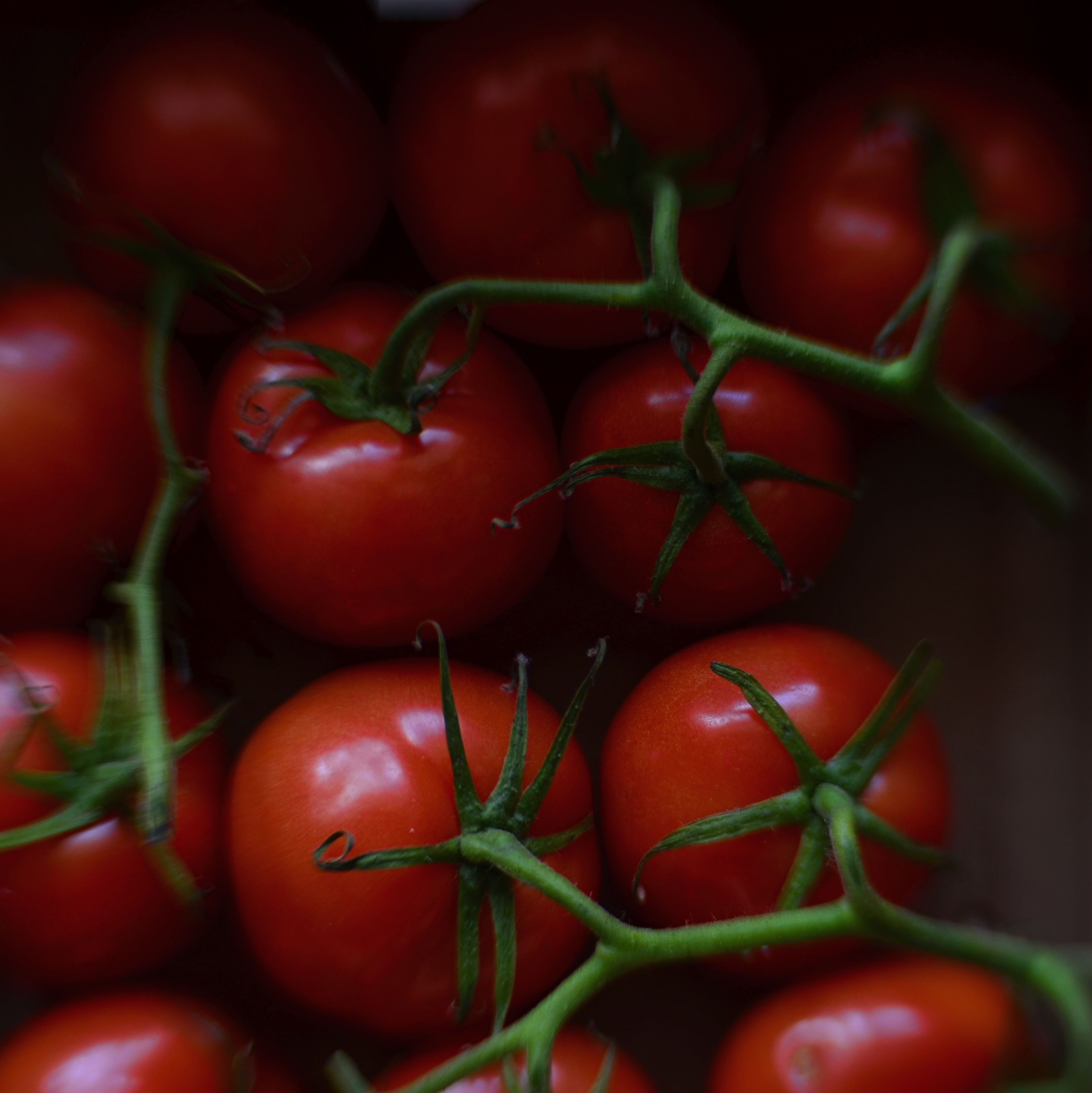
Two colors, and only two colors. Is anything else needed to sell this image?
By MICHAEL PERKINS
ENTIRE BOOKSHELVES OF MATERIAL HAVE BEEN WRITTEN on the mysterious art of composition at it applies to photography. The variations are endless: what to shoot, how much to shoot, how to determine how little to shoot, theories on addition, subtraction, choice of subject, and so on. The only constant is that every compositional inclusion also embodies an exclusion. When you choose one thing, you un-choose everything else.
One such choice is that of color over monochrome, an argument which raged over a large part of the early 20th century, since, for many years, photographers thought they could rely upon black and white, even though an abstraction of reality, to convey a consistent feel, whereas early color films often produced uneven results. Some photographers decided to ban color altogether, to embrace the predictable un-reality of b&w rather than gamble on hues that might not be reproduced or printed with true fidelity, or worse, register as too brassy or garish. Today we seldom choose monochrome over color for the same reasons, but compositions still rise and fall on whether we use color, as well as what kind of color we use.
Sometimes, just as a photograph that’s poorly cropped or loosely composed can be too busy, a color scheme that has too much variety can prove distracting, actually diluting a picture’s impact. Occasionally, I like to see how few distinct colors I can use in an image and still consider it complete, as in the case of the tomatoes above, which makes it case with only red and green values. In this instance, adding extra space around the box holding the tomatoes, or expanding the frame to include other shapes, objects or hues, will do nothing to improve the strength of my composition, so why include them? This is an easy editing choice that occurs in real time in the framing of the shot, and, with the instant feedback afforded by digital, you know immediately if the picture is lacking anything.
The problem with a lot of photography is that we tend to go no further than framing up an “acceptable” picture, one that doesn’t overtly fail. However, the more we practice a mindful approach to composition, the more adept we get at putting just enough, from subject to hue, into the image, and not one item more. This gives our photographs a streamlined communicative power that directs the eye and conveys the story.
IT’S ALL WRONG BUT IT’S ALL RIGHT
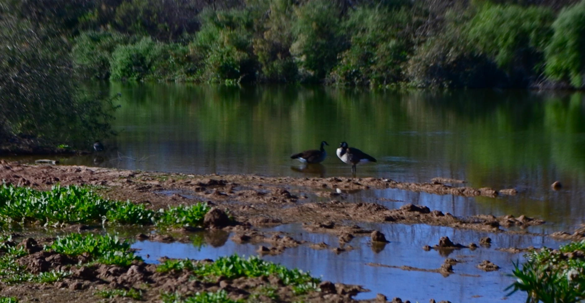
I decided in the moment to go soft with this nature scene. Maybe I overdid it. Maybe it’s okay. Or not.
By MICHAEL PERKINS
ONE OF THE ONLY CONSTANTS OVER THE HISTORY OF PHOTOGRAPHY has been the flood tide of tutorial materials covering every aspect of exposure, composition, and light. The development of the early science of capturing images in the 19th century was accompanied, from the first, by a staggering load of “how to” literature, as the practice moved quickly from the tinkering of rich hobbyists to one of the most democratic of all the art forms. In little more than a generation, photography went from a wizard’s trick to a series of simple steps that nearly anyone could be taught.
In calling these pages the “photoshooter’s journey from taking to making”, we have made, with The Normal Eye, a deliberate choice not to add to the mountainous load of technical instruction that continues to be available in a variety of classroom settings, but to emphasize why we make photographs. This is not to say that we don’t refer to the so-called “rules” that govern the basics of creating an image, but that we believe the motives, the visions behind our attempts are even more important than just checking items off a list of techniques in the name of doing something “right”. There are many technically adept pictures which fail to engage on an emotional or aesthetic level, so the mission of The Normal Eye, then, is to start discussions on the “other stuff”, those indefinable things that make a picture “work” for our hearts and minds.
The idea of what a “good picture” is, has, over time, drifted far and wide, from photographs that mimic reality, to those that distort and fracture it, to images that are both a comment and a comment on a comment. It’s like any other long-term relationship: complicated. Like everyone else, I occasionally produce what I call a “fence-sitter” photo like the one above, which I can both excuse and condemn at the same time.
In raw technical terms, I have obviously violated a key rule with the abject softness of the image…..unless……unless it can be said to work within the context of the other things I was seeking in this subject. I was trying to stretch the envelope on how soft I could make the mix of dark foliage and hazy water in the scene, and, while I may have gone a bit too far, I still like some of what that near-blur contributes to the saturated color and lower exposure, the overall quiet tone I was trying for. Still, as of this moment, I’m still not sure whether this one is a hit or a miss. It might be on the way to something, but I just can’t say.
But that’s what the journey is about. It can’t be confined to mere technical criteria. You have to make the picture speak in your own language.
A CUT BY ANY OTHER NAME….
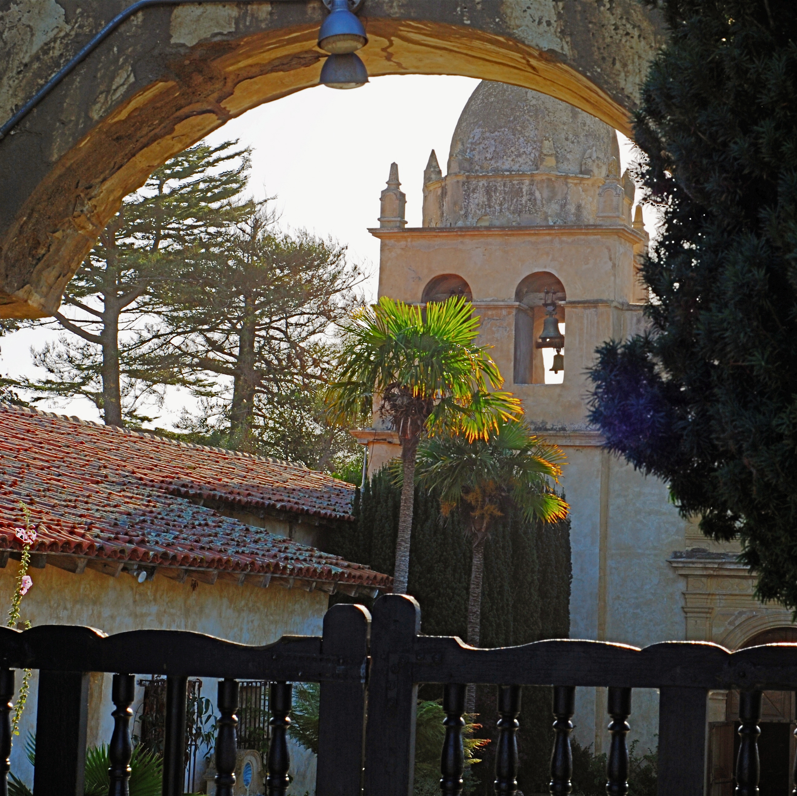
The first framing of this image included too much greenery on the right side, so it was cropped, then repositioned to make a “second” framing from the arched opening in the outer wall.
By MICHAEL PERKINS
THE WONDERFUL THING ABOUT COMPOSITION IN PHOTOGRAPHY is that you always, always, have a backup plan. What you don’t frame correctly in the actual shooting of an image can be corrected in post-editing cropping, the use of “framing” within the composition itself, or even how you finally matte the picture before hanging it on the wall. This is as it should be since many pictures are not so much born as re-imagined.
Once you frame a photo, you’re giving the viewer the first visual cue as to what to regard as important. If I included it, you should notice it. If I excluded it, it’s either to set loose your imagination on why I defined this world within these parameters, or because I, as the narrator, am telling you it just don’t matter. You can even further enhance the effectiveness of the frame by its shape. A rectangle might enforce the reading of information left-to-right, for example, while a square might force the eye toward dead center. The original framing is your own best call to action in a photograph.
And even after you’ve defined the frame, you can still add a second directive within it to hyper-focus attention in a very specific space. The use of arches, building overhangs, edges of windows, cliffs, shadows or other secondary “frames” provides even greater cues to the eye, and also adds an illusion of dimension and depth.
In the above shot, the old stone basilica is obviously the main feature of the image, and so was cropped from a wider original to eliminate distracting foreground shrubbery on the right. However, the arch through which the building is viewed was retained, to act as a “secondary frame” and as a way to illustrate scale. The first frame says what information is important, while the second frame makes sure we get to the heart of the image more efficiently.
Using all framing devices available in an image is like using caps, lower case and italicised letters in the same sentence. Composition is about yelling to get people over to your picture, then whispering, as you gently guide them toward its heart.
BOTH ENDS OF FREEDOM
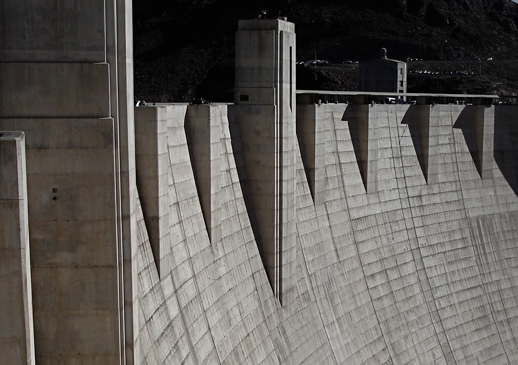
Every camera ever manufactured can make this image, if the right person is behind it. It’s your eye that matters, not your toys.
A camera is a tool for learning how to see without a camera. —Dorothea Lange
By MICHAEL PERKINS
THERE IS A REAL DISCONNECT BETWEEN THE “FIRST CAMERAS” OF A GENERATION AGO and those of people just entering the art of photography today. Of course, individual experiences vary, but, in general, people born between 1950 and 1980 first snapped with devices that were decidedly limited as compared to the nearly limitless abilities of even basic gear today. And that creates a similar gap, across the eras, between what skills are native to one group versus the other.
To take one example, if your first camera, decades ago, was a simple box Brownie, the making of your pictures was pretty hamstrung. You had to purposefully labor to compensate for what your gear wouldn’t do. A deliberate plan had to be followed for every shot, since you couldn’t count on the camera to allow for, or correct, your mistakes. With a device that came hardwired with a single aperture, a shutter button, and not much else, you had to be mindful of a whole array of factors that could result in absolute failure. The idea of artistic “freedom” was sought first in knowledge, then, much later, in better equipment.
But if, on the other hand, you begin your photographic development with a camera that, in the present era, is almost miraculously flexible and responsive, freedom is a given. In a sense, it’s also a restraint of a different kind. That is, with bad gear, you’re a hero if you can wring any little bit of magic out of the process. But with equipment that can almost obey your every command, the old “I left the lens cap on”-type excuses are gone, along with any other reason you may offer for not getting at least average results. Thus the under-equipped and the over-equipped have two different missions: one must deliver despite his camera, while the other strives to deliver despite himself.
The entire gist of The Normal Eye is that I believe that even remarkable cameras (and the world is flooded with them) will betray the unseeing eye that mans them. Likewise, the trained eye will create miracles with anything handy. Our thrust here at TNE is toward teaching yourself the complete basics of photography as if you were actually constrained by limited equipment. At the point at which you’ve fully mastered the art of being better than your camera, then, and only then, is it time to get a new camera. Then learn to out-run that one, and so on.
The promise made by cameras today is the same promise that’s always been made by ever-advancing technology, that of wonderful results with minimum effort. It’s the photo equivalent of “eat whatever you want and still lose weight”. But it’s a false promise; photography only becomes art when we ask things of ourselves that our cameras cannot provide by themselves. Anything else is learning to accommodate mediocrity, a world of “pretty good”.
Which, inevitably, is never really good enough.
ALONE AGAIN, UNNATURALLY
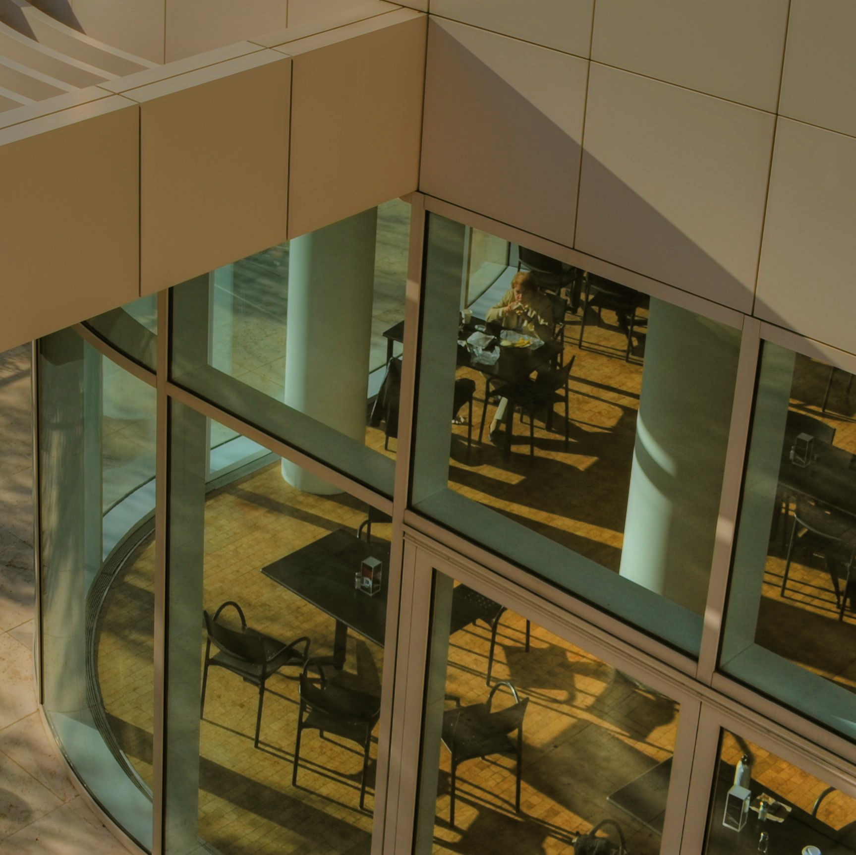
Lunch For One, 2011. Your choices as a photographer will determine if the woman in the cafeteria is alone…or lonely.
By MICHAEL PERKINS
PEOPLE ARE ONE OF THE MOST COMPLICATED ELEMENTS in a photographic composition. Unlike furniture, foliage or flotsam, humans are the one “prop” in an image which convey associations and meanings that render a photo complex, troubling, intriguing. Put a person in your picture and you have changed the terms upon which you engage the audience.
At the very least, you have posed a series of questions which color the viewer’s reaction to your work. What is that person doing there? What does he wish for, or intend? What are his dreams, his goals? Is she merely in the picture, or in some way a commentary on her context within it? You can move things around in the name of composition alone, but move a person and you have started a conversation.
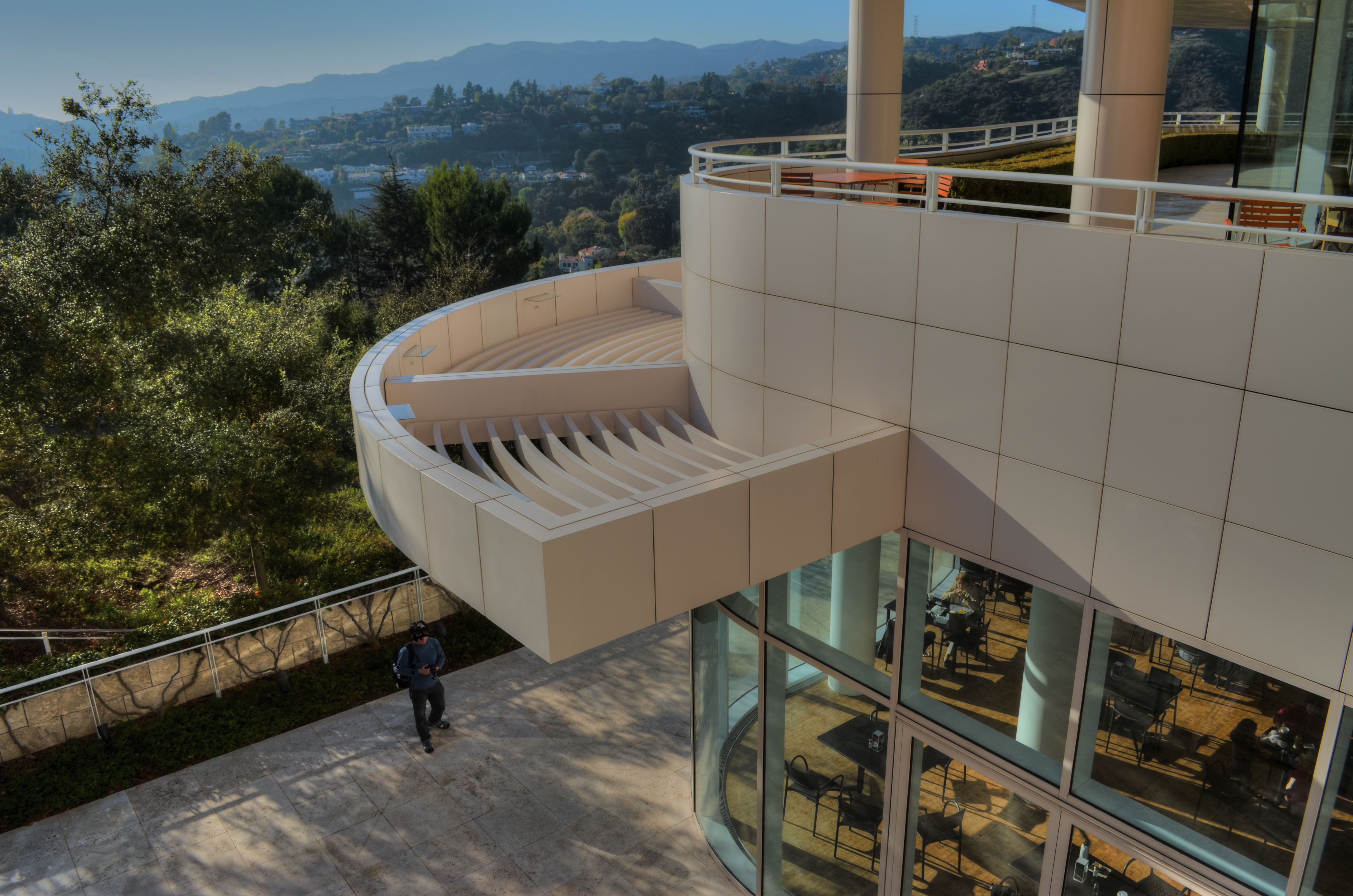
The original framing for the above shot.
The placement of people in a frame creates speculation about the motives and origins of those people before they were in the frame. A man shown standing at the platform at a train station could be eagerly awaiting an arrival, sneaking out of town, or merely wandering around. The mind starts to supply his backstory, if you like, his actions before appearing in the finite world of the frame. Put two people side by side, and you have, according to your viewer’s whim, a rendezvous, a goodbye, a conspiracy, a reunion, a chance meeting. People change the perceived intention of a photograph as a storyboard, either in the original framing or in the cropping afterwards.
The above image is the final crop of what was, originally, a scenic overview, taken at a large campus of museum buildings on a hillside. The image, as first conceived, was an overall “postcard” with the restaurant in only the lower right quarter of the frame. Later, I became aware that a single woman was visible in the cafe. Now, it’s not that she was actually the only person inside, but the photograph could be cropped to make her seem like it, meanwhile accentuating the emptiness in her immediate area.
As a consequence, instead of a lady who is merely alone, the image can make her seem “lonely”. Or perhaps you disagree. The point is that, by changing the human information in the frame (note that, in the original of the cropped shot, there is also a man standing outside the restaurant), we’ve re-drawn its narrative.
What gets left out of a picture, then, sparks speculation by the viewer, based on what has been left in.
LOOKS LIKE IT WORKS
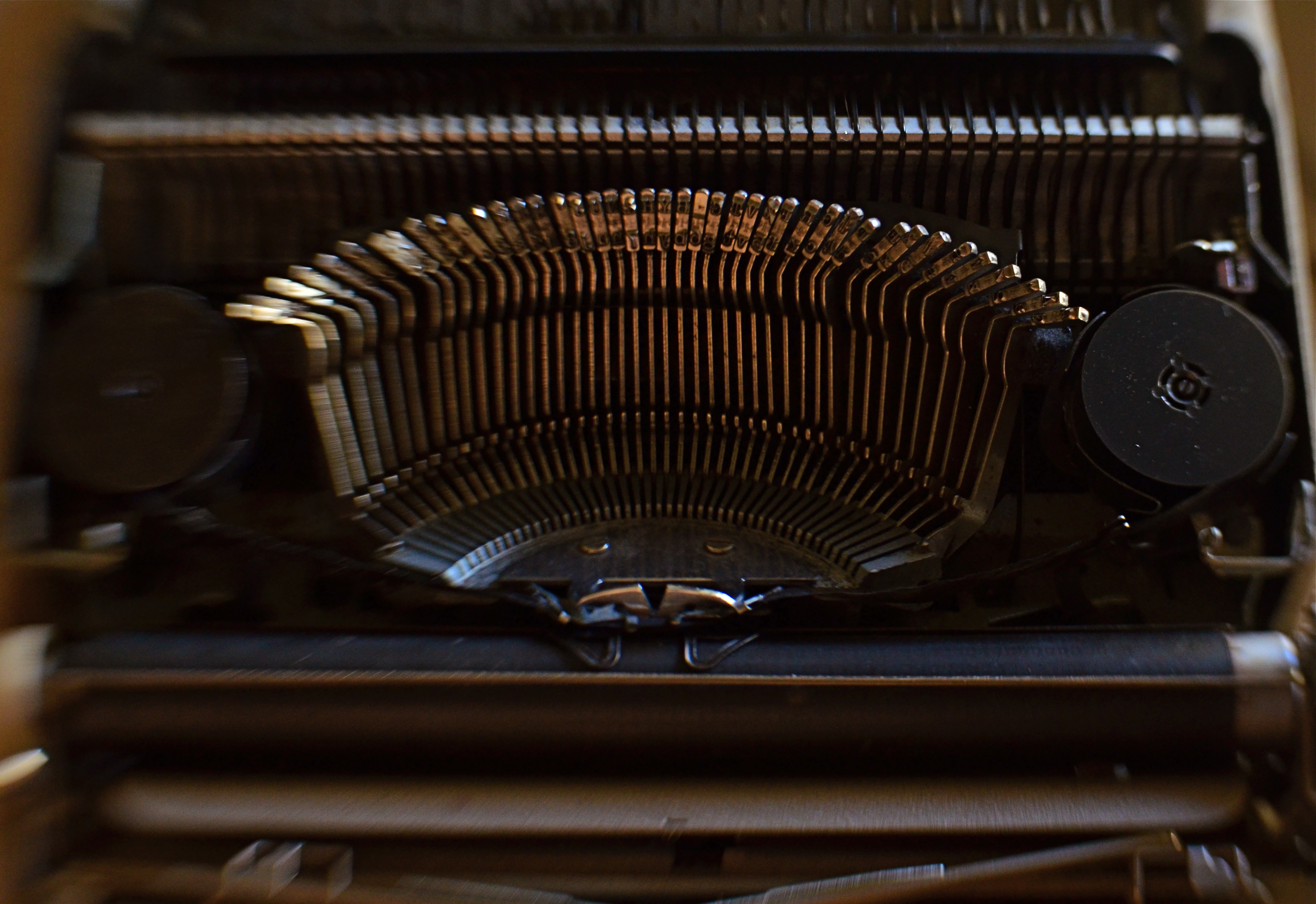
Ghost Writer In Disguise, 2016
By MICHAEL PERKINS
PHOTOGRAPHY OFTEN RE-DEFINES OUR PERCEPTION OF THE FAMILIAR, re-contextualizing everyday objects in ways that force us to see them differently. Nowhere is this more effective than in close-up and macro photography, where we deliberately isolate or magnify details of things so that they lose their typical associations. Indeed, using the camera to cast subjects in unfamiliar ways is one of the most delightful challenges of the art.
Product developers are comfortable with the idea that “form follows function”, that how we use a thing will usually dictate how it must be designed. The shapes and contours of the objects in our world are arrived at only as we tailor the look of a thing to what it does. That’s why we don’t have square wheels. The problem with familiar objects is that, as long as they do what they were designed to do, we think less and less about the elegance of their physical design. Photographers can take things out of this chain of the mundane, and, in showcasing them, force us to see them in purely visual terms. They stop playing the piano, and instead look under the lid at the elegant machine within. They strip off the service panel of the printer and show us the ballet of circuitry underneath.
It’s even easier to do this, and yields more dramatic results, as we begin to re-investigate those things that have almost completely passed from daily use. To our 21st-century eyes, a 1910 stock ticker might as well be an alien spaceship, so far removed is it from typical experience. I recently viewed a permanent wave machine from a beauty parlor of the 1930’s, sitting on a forgotten table at a flea market. It took me two full minutes to figure out what I was even looking at. Did I snap it? You betcha.
The study of bygone function is also a magical mystery tour of design innovation. You start to suss out why the Edisons of the world needed this shape, these materials, arranged in precisely this way, to make these things work. Zooming in for a tighter look, as in the case of the typewriter in the above image, forces a certain viewpoint, creating compositions of absolute shapes, free to be whatever we need them to be. Form becomes our function.
The same transformation can happen when you have seemingly exhausted a familiar subject, or shot away at it until your brain freezes and no new truth seems to be coming forth. Walking away from the project for a while, even a few hours, often reboots your attitude towards it, and the image begins to emerge. As Yogi Berra said, you can observe a lot just by watching.
TERMS OF ENGAGEMENT
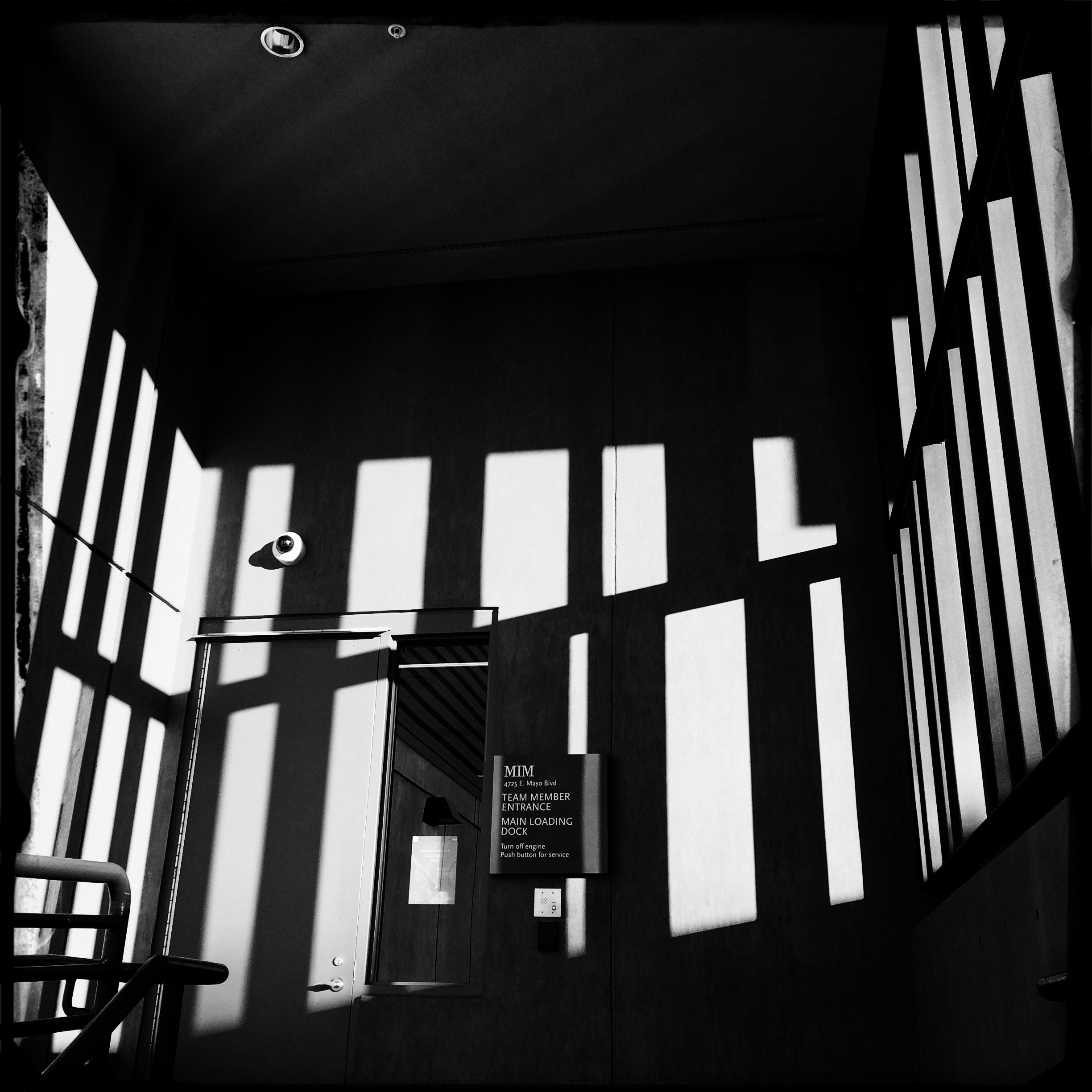
A very soft color cel phone original becomes a stark “box”, suggested solely by a pattern of black and white bands.
By MICHAEL PERKINS
ABSTRACT COMPOSITIONS AREN’T MERELY A DIFFERENT WAY OF PHOTOGRAPHING A SUBJECT: they are, in many cases, the subject itself. Arrangements of shape, shadow and contrast can be powerful enough to carry the weight of a picture all by themselves, or at least be an abbreviated, less-is-more way of suggesting objects or people. And in terms of pure impact, it’s no surprise that photographers who, just a generation ago, might have worked exclusively in color, are making a bold return to black and white. For abstract compositions, it’s often the difference between a whisper and a shout.
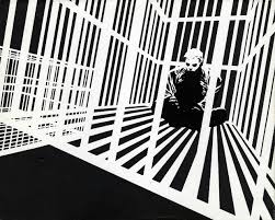
Cartoonist Frank Miller sculpts solid space out of a mix of black and white rays.
I find it interesting that the medium of comics, which has long been defined by its bold, even brutal use of color, is also experiencing a black & white resurgence in recent years, with such masters as Frank Miller (Batman: The Dark Knight Returns) rendering amazing stuff in the most starkly monochromatic terms. Likewise, the army of apps in mobile photography has reminded young shooters of the immediacy, the power of monochrome, allowing them to simulate the grain and grit of classic b&w films from Tri-X to Kodalith, even as a post-production tweak of a color original.
You know in the moment whether you’ve captured a conventional subject that sells the image, or whether some arrangement of forms suggestive of that subject is enough. In the above shot, reducing the mild color tonal patterns of a color original to bare-boned, hard blacks and loud whites creates the feel of a shaded door frame..a solid, dimensional space. The box-like enclosure that envelops the door is all there, but implied, rather than shown. As a color shot, the image is too quiet, too…gentle. In monochrome, it’s harder, but it also communicates faster, without being slowed down by the prettiness of the browns and golds that dominated the initial shot.
There are two ways to perfect a composition; building it up in layers from nothing into a “just-enough” something, or stripping out excess in a crowded mash-up of elements until you arrive at a place where you can’t trim any further without losing the essence of the picture. Black and white isn’t just the absence of color: it’s a deliberate choice, the selection of a specific tool for a specific impact.
LOOKING FOR AN OPENING
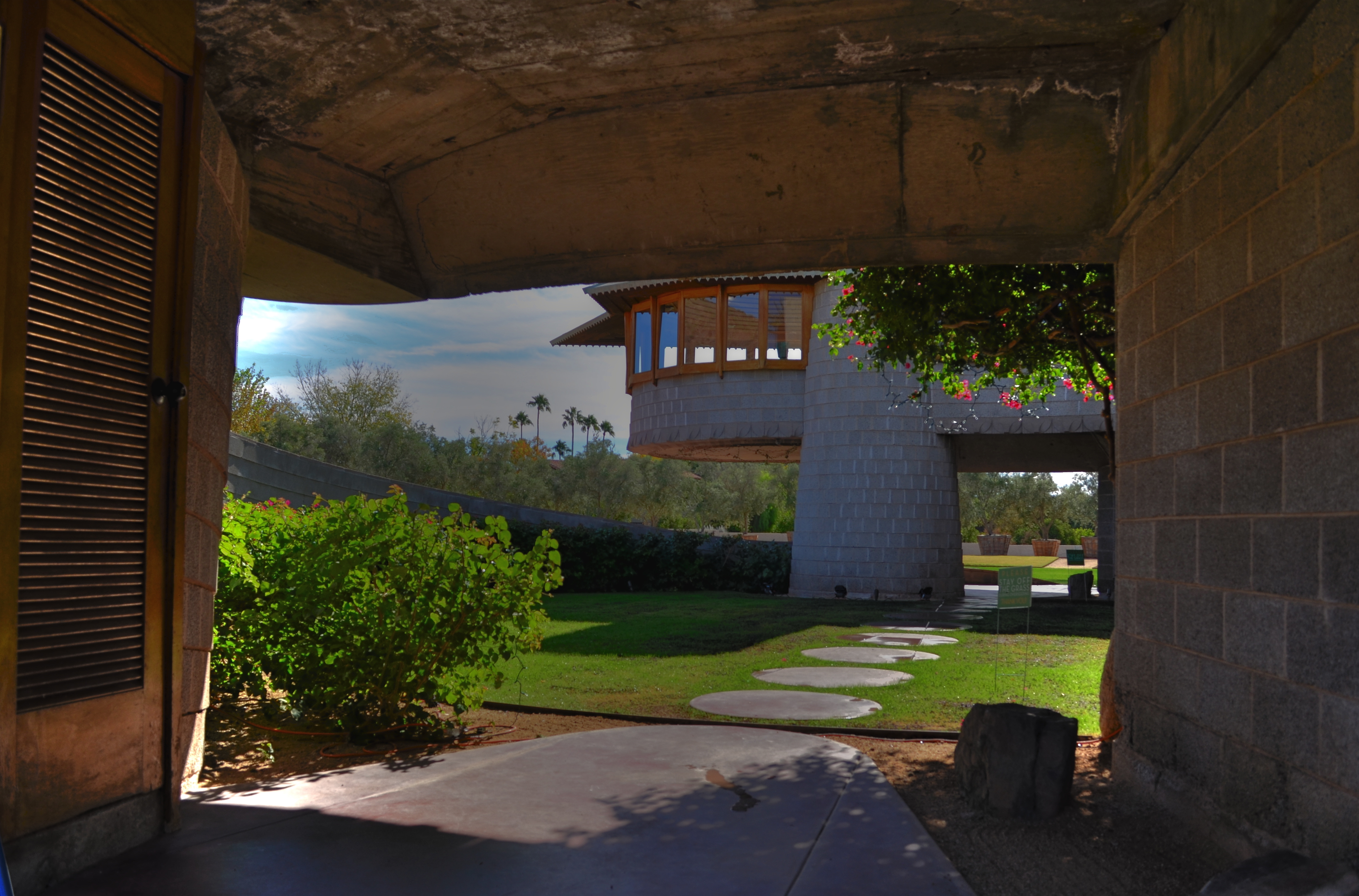
Entering a Frank Lloyd Wright home is like unwrapping a birthday present. The concrete walk ends in a circular ramp that rises to the left and around the David Wright house to create this wonderful open space.
By MICHAEL PERKINS
IF A HOME CAN BE SAID TO BE AN EVENT, then a door is the engraved invitation that bids you to witness that event. When you think about it, a door is the most crucial part of a house’s design, certainly its most deliberately provocative. It advertises and defines what lies within. It’s a grand tease to a mystery, the last barrier before you invade someone’s most personal space. It’s no wonder that entrances to places are among the most photographed objects on the planet. The subject is as inexhaustibly varied as the people who construct these lovely masks.
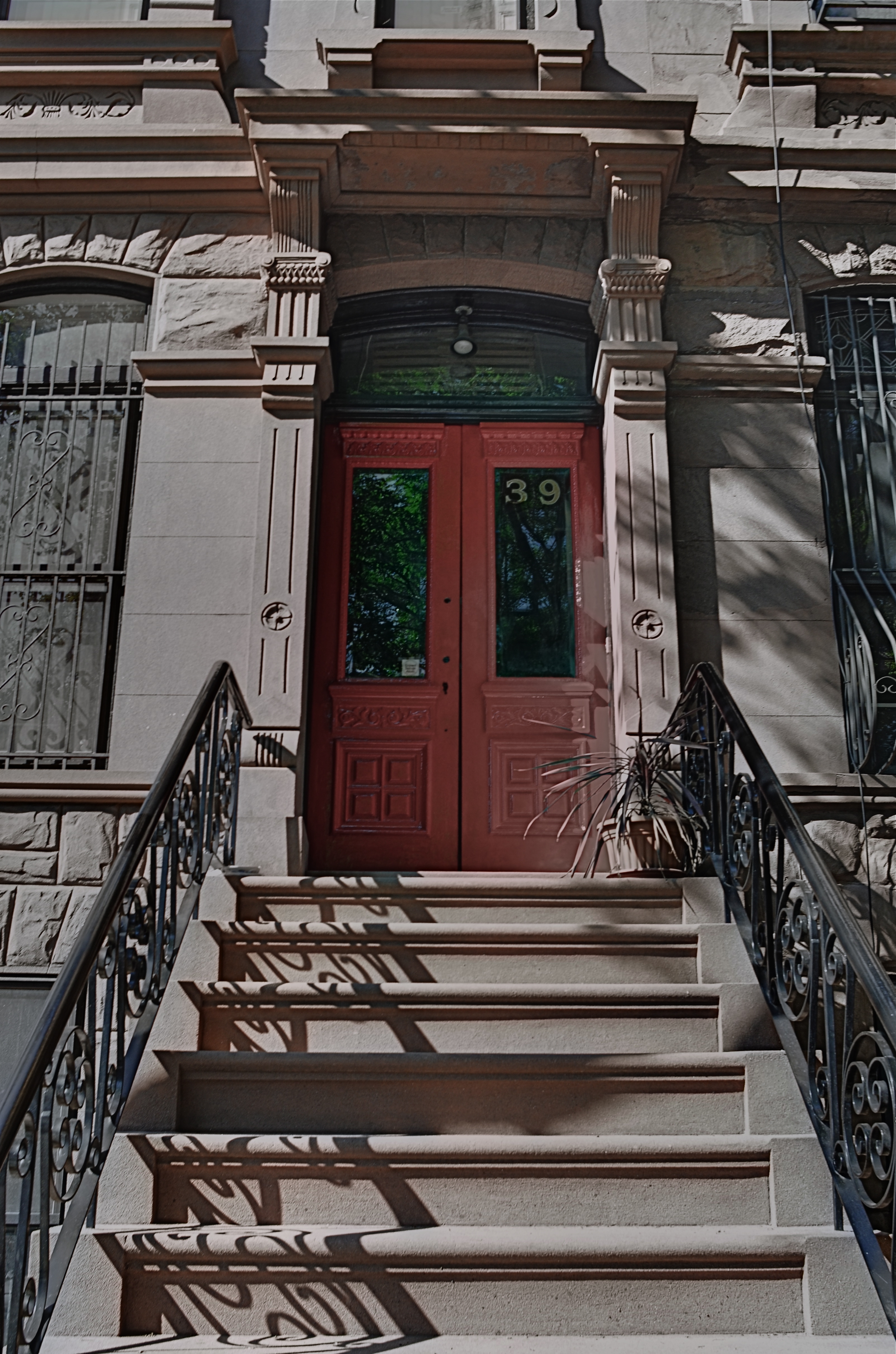
Doors are the first story tellers in a house.
Frank Lloyd Wright did more than create drama as you entered one of his houses; he actually enlisted you in generating your own wonder. Often the great man made you a little squirmy as you prepared to come inside, compressing door heights and widths to slightly uncomfortable dimensions. Pausing for a moment, you could almost feel like Alice after she ate the wrong cake, as if you might never be able to wriggle through the door frame.
Shortly after this ordeal, however, Wright would let the full dimensions of the inner house open suddenly and dramatically, as he does in the image above, taken at the home that he designed for his son David in Phoenix, Arizona. After ducking your head, you step into a court that has…no ceiling…since it ends in a ramp that both climbs around and supports a house that encircles you, creating an intimate courtyard that is both confined and limitless.
Doors make statements, almost boasts, about the wonder that lies just inches beyond them, and, like all generators of mystery, they are often most interesting when the question is never answered. Doors we never see beyond are often the most intriguing, like a woman behind a veil. When I invade a new neighborhood, my camera’s eye goes to doors before anything else. Sometimes the spaces they conceal don’t live up to the hype, but doors, these stage productions at the front of grand and humble abodes alike, offer something tantalizing to the eye.
EYE ON THE BALL
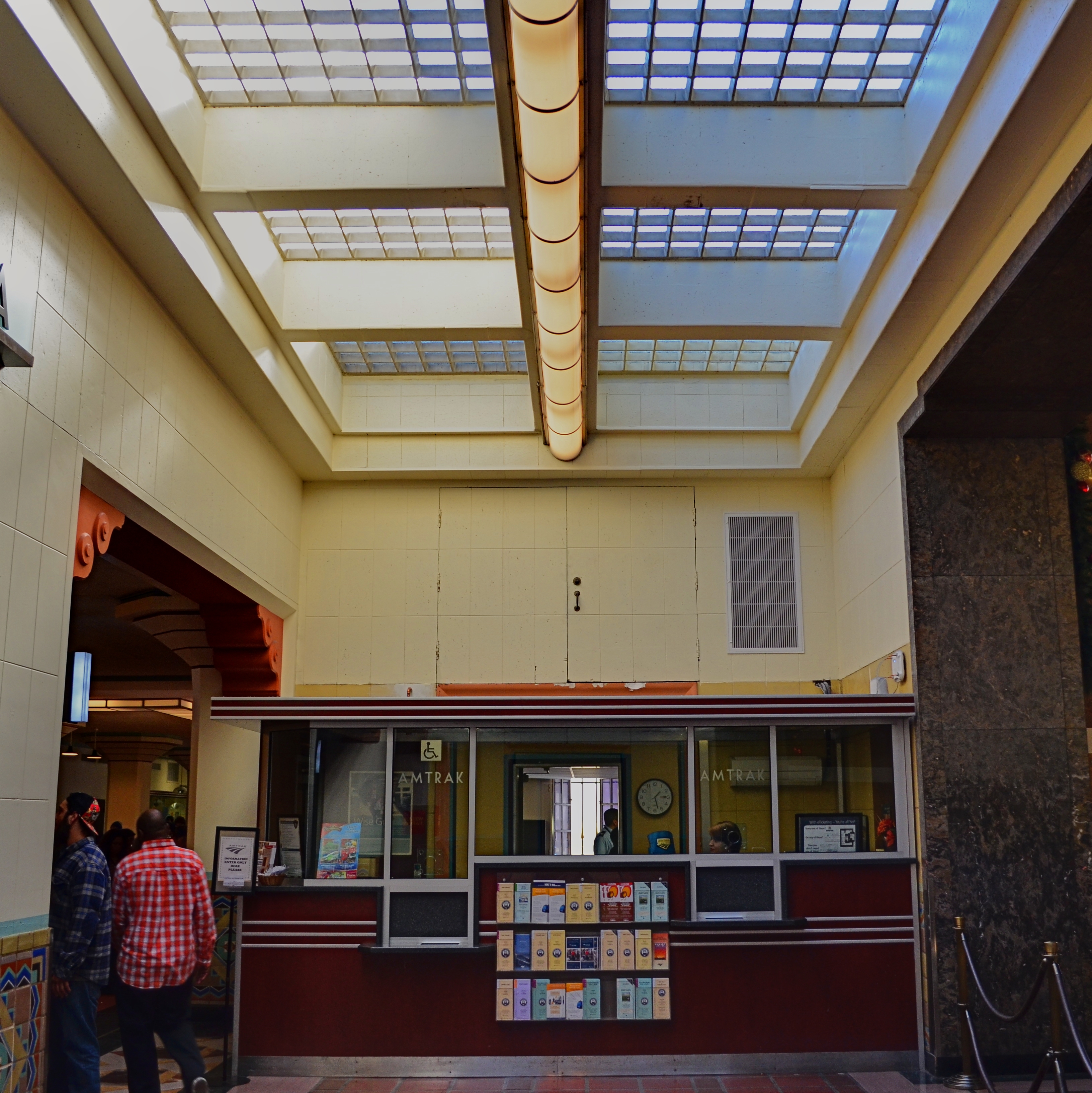
The two passersby mar what might have been an ideal composition. If I’d just reshot without them…
By MICHAEL PERKINS
I CAN STILL HEAR MY LITTLE LEAGUE COACH’S VOICE, cured into a coarse hum by too many years of Lucky Strikes, hitting me in the back of my skull as I stood shakily in the batter’s box. If he had told me once, he had told me a thousand times: don’t try to hit every ball that comes across the plate. You swing like a rusty gate, he would tease me, or don’t eat their garbage. The main message, and one that I only intermittently received: wait for your pitch.
On those rare occasions when I didn’t fish wildly in the air for every single thing that sailed in from the mound, I took great encouragement from his voice saying, good eye. Strangely, I had earned praise for essentially doing nothing, but, hey, I’d take it.
Coach sometimes comes to mind when I view the results of some of my hastier photographic decisions.
There is, for photogs, a very real translation of “wait for your pitch”, and it’s more important in the digital era because it’s such an easy rule to adhere to. Simply, you must keep shooting long enough to get the frame you saw in your mind. There can be no, “I’ve already taken a lot of frames”, or “they’re waiting for me to finish up” or “maybe today’s not my day for this shot.” First of all, it’s your picture. If you want it, take it. Secondly, there is no such thing as “a lot of frames”. There is only enough frames. If clicking one more, hell, ten more, will get you your shot, then do it. There is no phantom film counter warning you that you only have four more Kodachrome exposures left.
I am preaching this particular commandment all too loudly today because I am kicking myself for not living up to it recently. In the top frame, I got every element of a quaint old Amtrak ticket window that appealed to me, including the patterned skylight, the bored agent, the square arrangement of the Deco-ish counter space, and the left and right details of an old archway and a marble wall. Everything except the intrusive passersby on the left. They are sadly out-of-sync with the time-feel of the rest of the shot, and, had I not felt that I had nailed the general exposure and feel of the image, I might have waited for them to move out of frame, and gotten everything I wanted.
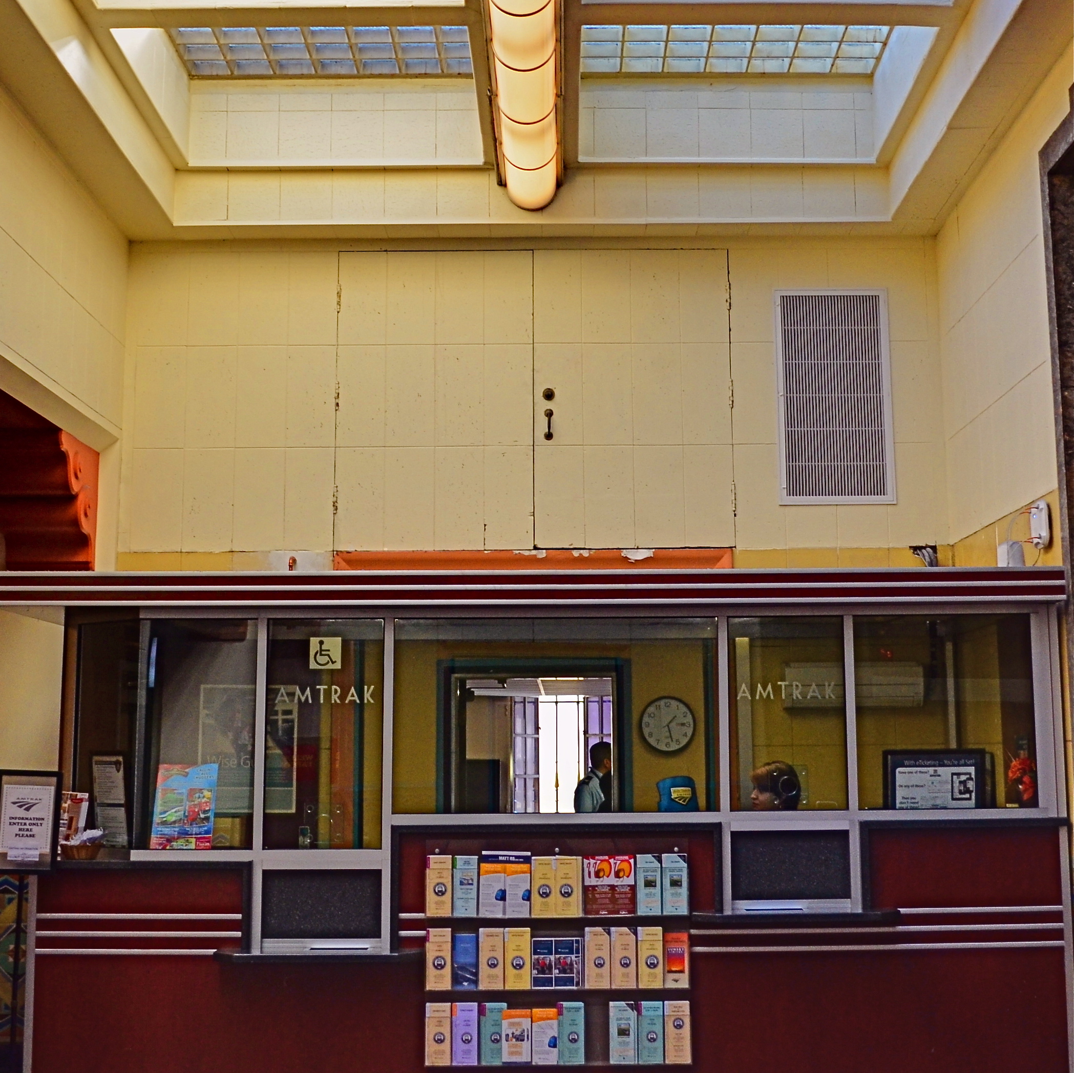
The price of impatience: the “salvaged” version of the above shot.
But I didn’t. I settled for “close enough”, and moved on to the next subject. Later, in post-production, I could certainly crop my squatters out, but at the cost of the overall composition. I now had to make do with what was left. I managed to reframe for another square shot that included nearly all the same elements. But it was “nearly”, not “all”. And “all” is what I could have had if I hadn’t tried to swing at the wrong ball. You can’t make a good shot out of a bad shot, and when an opportunity is gone, there isn’t a piece of software in the world that can make a miracle out of what’s not in your camera.
Wait for your pitch.
A WONDROUS MESS

Too busy? Well, when it comes to seasonal shots, it’s a lot harder to say.
By MICHAEL PERKINS
Consulting the rules of composition before taking a photograph is like consulting the laws of gravity before going for a walk.
Edward Weston
PHOTOGRAPHERS LOVE TO COMPILE LISTS OF LAWS that must be obeyed to ensure the capture of great images. Bookshelves are jammed to fracturing with the collected works of wizards large and small who contend that all of this art stuff is really about craft, or adherence to techniques that are the equivalent of Einstein’s law. And, of course, with every fresh generation, a new slew of shooters come sneering along to deride this starched and stuffy discipline. All that matters, these young turks snigger, is my grand vision.
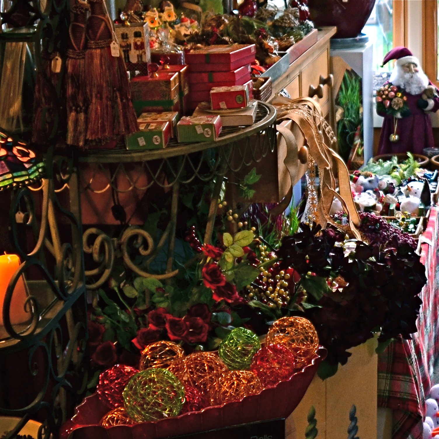
Worlds within worlds: many vast holiday scenes can be “subdivided with cropping.
Let me again re-state the obvious, which is that both viewpoints are correct and/or totally wrong. And since Mr. Weston has introduced the subject of composition, let us consider the special task of seasonal photos, specifically, arrangements of yuletide objects. The classic rule on still-life shots is that less is more, that it’s better to perfectly light and expose three pieces of fruit than whole baskets of the stuff. Meanwhile the festive, instinctual artist concedes that many holiday scenes are mad with detail and crammed with more, more, more…..and that’s okay.
The unique thing about Christmas decor is that in many cases, you not creating the compositions, but merely reacting to someone else’s creations…in nativity scenes, churches, and especially in retail environments. Obviously your local department store doesn’t adhere to the admonition “keep it simple”; quite the opposite. Seasonal trim in most stores is served up not by the spoonful but by the truckload. Anything less than overkill seems skimpy to many yuletide decorators, and so, if you favor basic subject matter, you’re either going to have to mount your own arrangements or selectively zoom and crop the more congested scenes. If, however, you already subscribe to the idea that more is better, then life gets easy fast.
Holidays come layered in much that is intensely personal, and that makes clean compositional judgements about “how much” or “how little” tricky at best. Just get the feelings right and let your regular rules relax into guidelines.
A RACE OF INCHES
By MICHAEL PERKINS
YOU CAN VIEW THE MAIN FUNCTION OF PHOTOGRAPHY AS TWOFOLD, with the deliberate creation of a vision as one path, and the arresting of time in its motion as the other. In the first case, we plan, conceive and execute at our leisure until the image that is behind our eye emerges on the page. In the second, we are hastening to capture and cage something that is in the act of disappearing. In one instance we compose. In the other, we preserve.
Sometimes the two purposes come together in one picture, although you seldom know it until after the image is made. Take the example below. In the moment, I was struck by the light patterns that bounced across the empty space of an event room at the visitor center for the Brooklyn Botanical Gardens. I wanted to do everything I could, exposure-wise, to dramatize the play of light in this special space. In addition to trying to create an image, however, I was also scurrying to keep a special number of factors from vanishing. I was both creating and preserving.
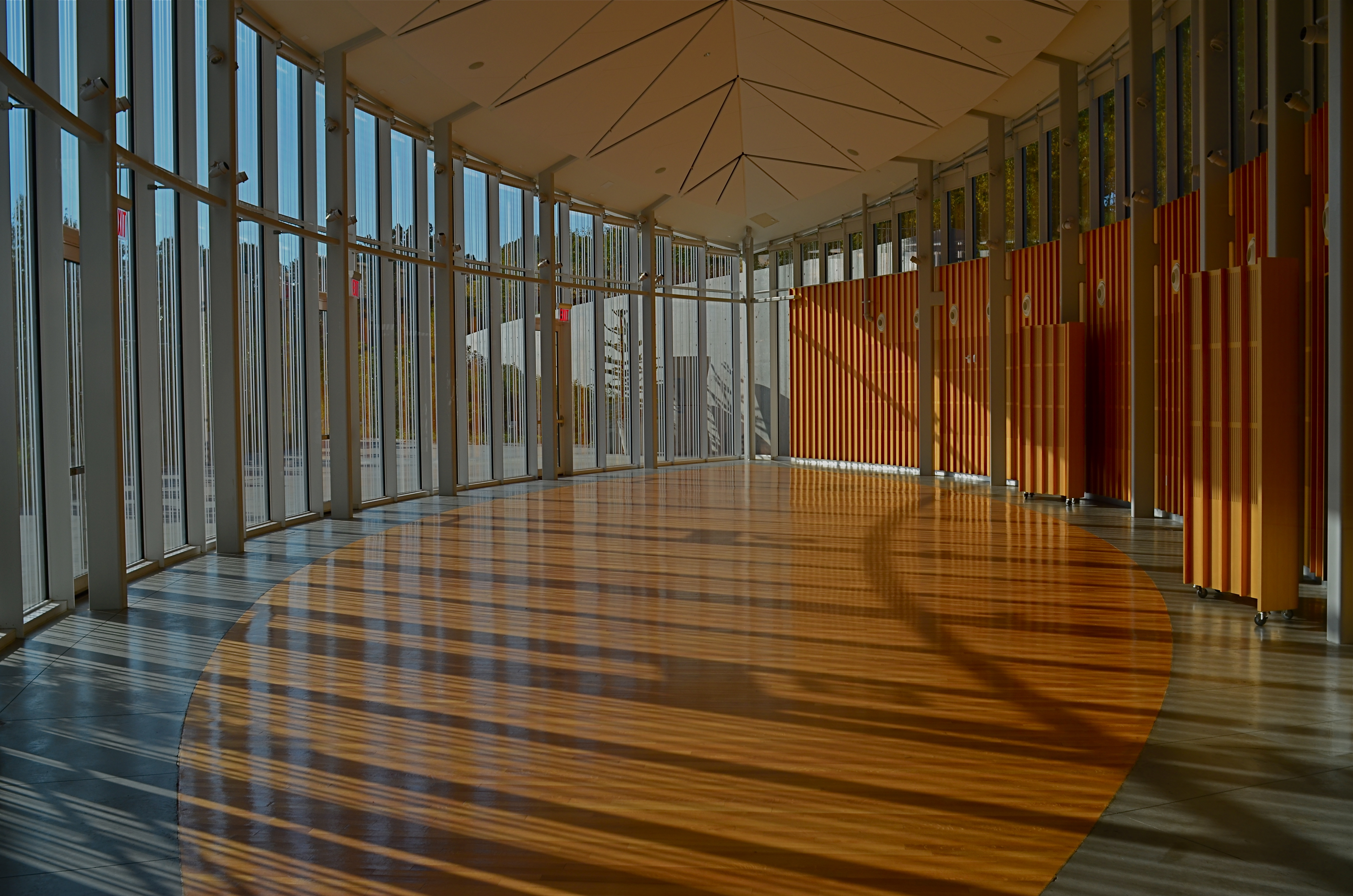
Carpe diem: when the light’s right, be ready to shoot. 1/160 sec., f/5.6, ISO 100, 24mm.
Obviously, the light you see would have had a dramatically different effect had the room been packed with, say, bodies or furniture, so its unobstructed path was one temporary condition. Another fleeting factor was the late afternoon light, which was, in addition to being extremely changeable, also one of the rare moments of pure sun the area had seen during a severely overcast day. It was as if the heavens opened up and angels were singing a song called, “Take The Picture, Already, Dummy”(perhaps you have heard this song yourself). Everything pointed to immediacy.
Full disclosure: getting this shot was not something that stretched me, or demanded exceptional skill. There was not one technically difficult factor in the making of this picture. You yourself have taken pictures like this. They are there and then they’re gone. But, they don’t get collected unless you see how fragile they are, and act in time. It’s not wizardry. It’s just acting on an instinct which, hopefully, gets sharper the longer you are in the game.
I often state one of my only primary commandments for photography as, Always Be Shooting. An important corollary to that rule might be, Always Be Ready To Shoot. Spot the potential in your surroundings quickly. Get used to the fact that many pictures will only dance before you for seconds at a time, flashing like heat lightning, then fading to oblivion. Picture-making is sometimes about casual and careful crafting of an image. And sometimes it’s a race of inches.
And sometimes it’s both.
CASTING
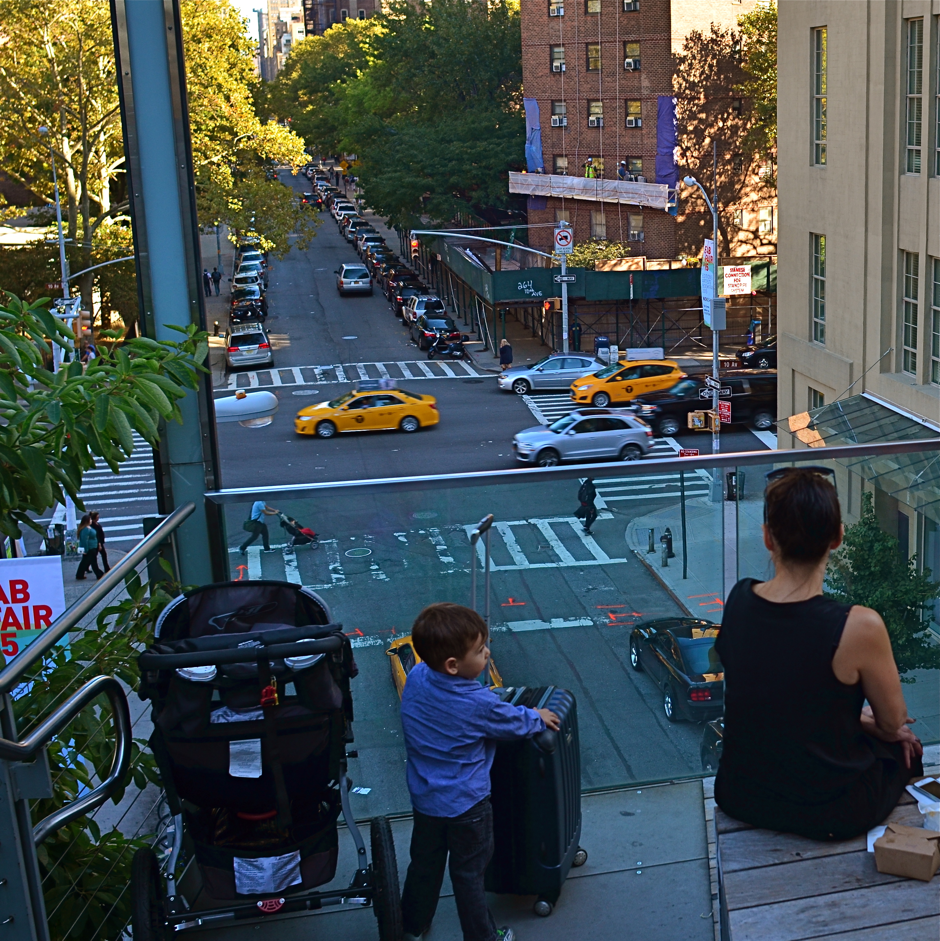
Do the woman and the child constitute a “family” in the narrative of this image?
By MICHAEL PERKINS
MORE COMPOSITIONS IN PHOTOGRAPHY ARE CRAFTED AFTER THE SNAP than naturally spring forward, fully formed, out of the camera. Frame as carefully as you may, you often find that something needs to change to help your image’s story fully emerge. This usually means taking something away, cleaning things up…and that means cropping. I think it’s fair to say that, more often than not, we start with pictures that contain too much and carve out the core picture that deserves to survive, to be pushed to the front.
Sometimes a proportionate tightening is all that a picture needs, so that a large, busy rectangle becomes a streamlined, smaller rectangle. This can clear away extraneous objects like phone poles, wires, extra buildings, any distracting junk that pulls the eye away from the important stuff. But it isn’t always things: it can also be people, surplus bodies which, like extraneous elements of any kind, change the narrative, or keep it from connecting. Think of the picture as a theatrical production and yourself as the casting director. Anyone on the set who doesn’t move the story forward is not playing a part that we need. See the girl at the office for your check, so long.
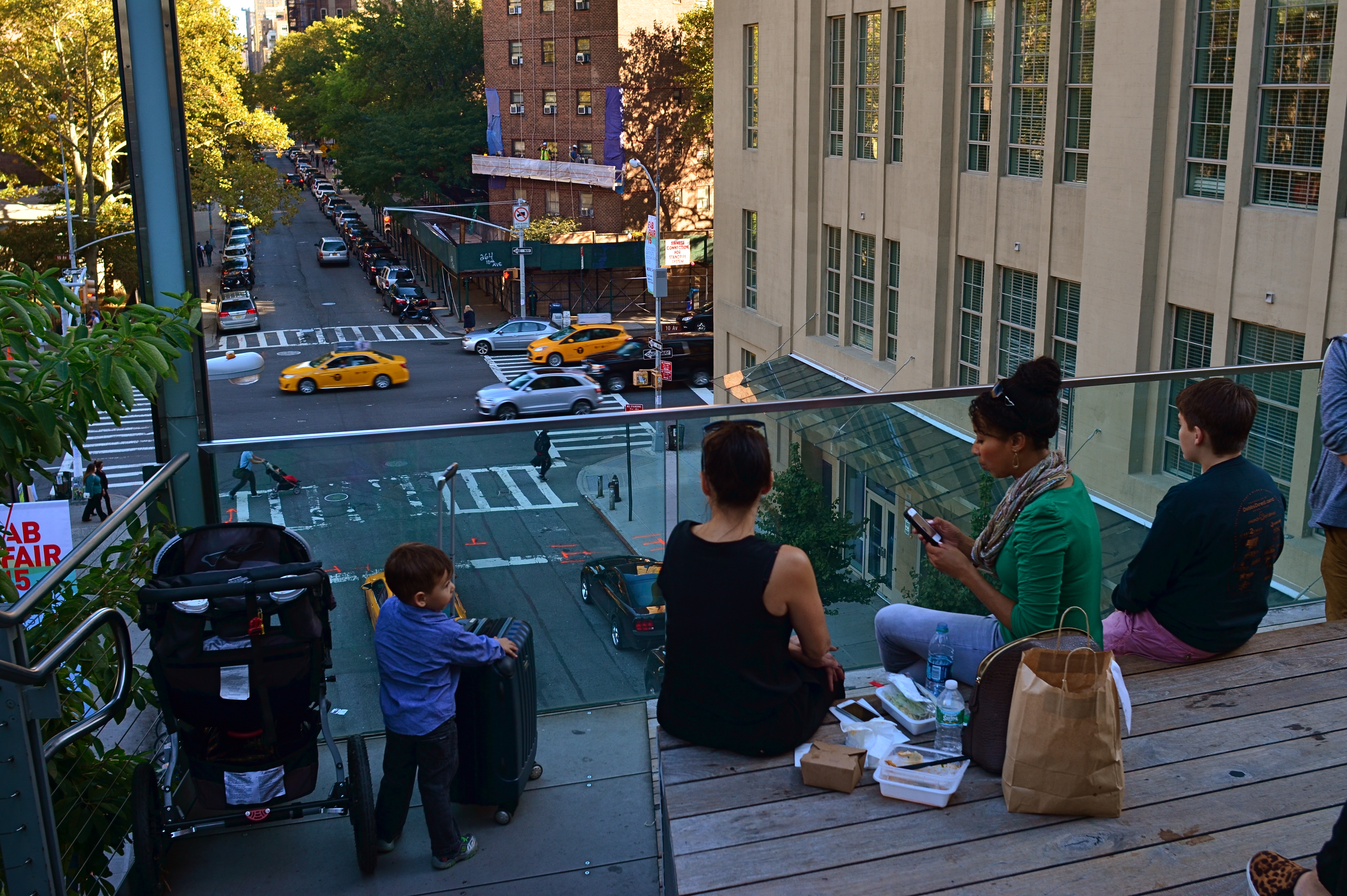
Does the removal of the extra people compromise or complete the photo’s story?
In the picture above, the cropping seems to create the story of a mother and her children taking in the view from New York’s Highline Park onto a city street below. In the original shot, seen at left, she seems less like a mother and more like just another bystander. The crop has suggested a relationship or a role for her. The woman to her right (in the original), unlike the “mother” figure, is not acting as our surrogate, seemingly looking with us at the scene. She is on her cel phone, and therefore registers as more detached than her neighbor, whose face, since it’s invisible to us, could contain anything we want it to. To the right of the cel user, we see additional people who don’t subtract from the picture, but also don’t add anything. They are extras that we, the director, have decided we don’t need to cast.
Also, structurally speaking, the “mother” is arranged so that the diagonal line from the foreground building to her right seems to proceed into the picture from around the area of her right shoulder, so that she sort of anchors the leading line and sends your eye along it to the street below. None of this, mind you, was obvious in the shooting of the original shot, which is not terrible as a composition, only compromised by the inclusion of information that simply doesn’t advance the logic of the picture. I only use it as an example of how I was able to question the “casting” of the original frame and make a conscious decision to cut away things that slowed everything down.
If you can tell a story with two people better than you can with four or five, ask yourself if you really need them. Cropping isn’t an admission that you made a bad photograph. It’s confirmation that your first draft is worth taking to a second one.


UNKNOWN KNOWNS
Everyone is visible, yet no one is known. Faceless crowds serve as shapes and props in a composition.
By MICHAEL PERKINS
WE OFTEN WRITE IN THESE PAGES ABOUT PHOTOGRAPHY’S UNIQUE ABILITY to either reveal or conceal, and how we toggle between these two approaches, given the task at hand. Photographic images were originally recorded by using science to harness light, to increase its ability to illuminate life’s enveloping darkness, just as Edison did with the incandescent bulb. And in their attempt to master a completely new artistic medium, early photographers were constantly pushing that dark/light barrier, devising faster films and flash technology to show detail in the darkest, dimmest corners of life.
And when that battle was won, an amazing thing happened.
Photographers realized that completely escaping the dark also meant running away from mystery, from the subtlety of suggestion, from the unanswered questions residing within their pictures’ shadows. And from the earliest days of the 20th century, they began to selectively take away visual information, just as painters always had, teasing the imagination with what could not be seen.
Friendly chats or shadowy conspiracies? Your choice.
City scenes which feature individual faces in crowds opt for the drama (or boredom) written in the face of the everyday man. Their scowls at the noonday rush. Their worry at the train station. Their motives. But for an urban photographer, sometimes using shadow to swallow up facial details means being free to arrange people as objects, revealing no more about their inner dreams and drives than any other prop in an overall composition. This can be fun to play with, as some of the most unknowable people can reside in images taken in bright, public spaces. We see them, but we can’t know them.
Experimenting with the show it/hide it balance between people and their surroundings takes our photography beyond mere documentation, which is the first part of the journey from taking pictures to making them. Once we move from simple recording into interpretation, all the chains are off, and our images can really begin to breathe.
Share this:
April 16, 2016 | Categories: Available Light, Cities, Commentary, Composition, Conception | Tags: Abstraction, Composition, crowds, Shadows, silhouettes, Street Photography | 2 Comments