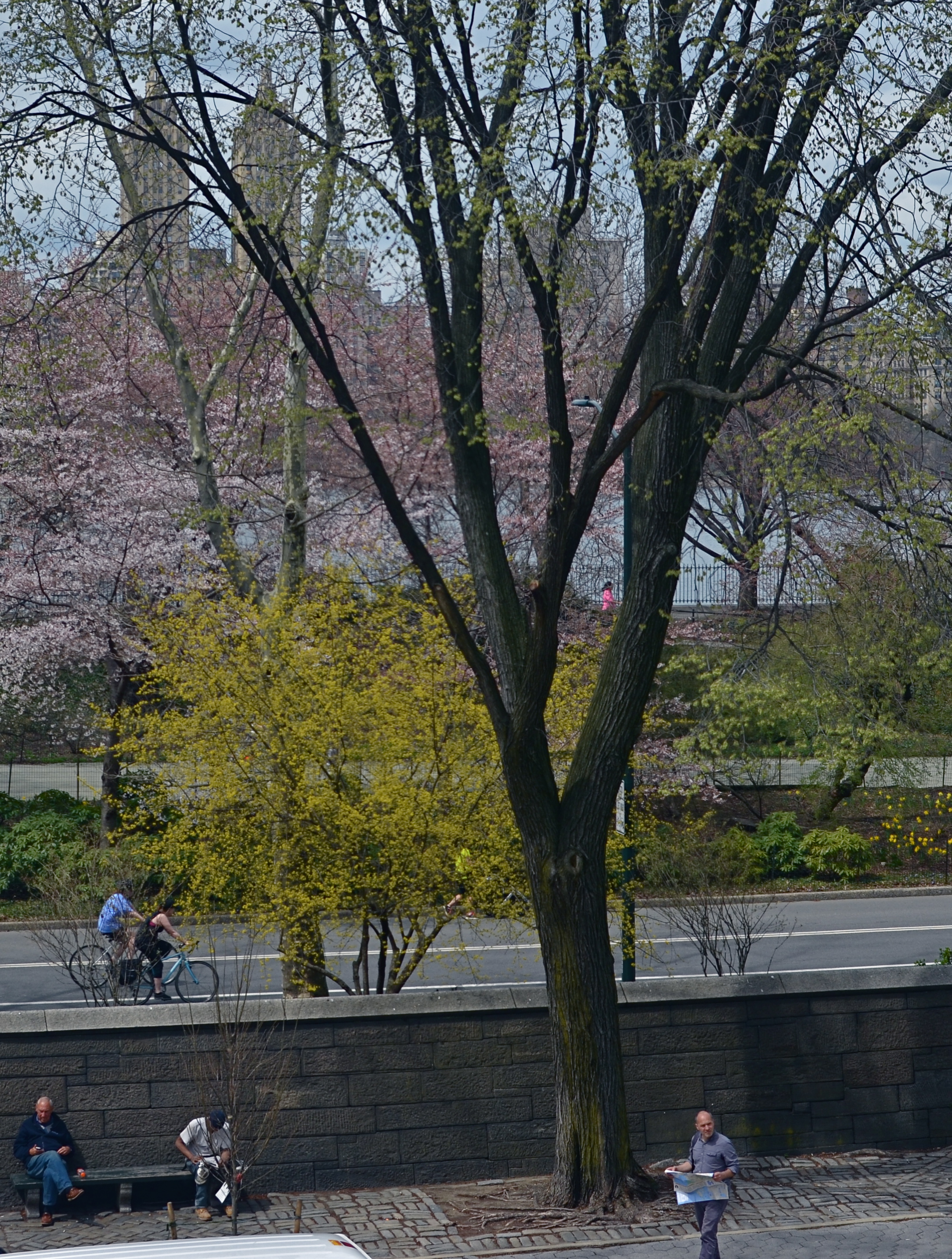
LIGHT DECAY
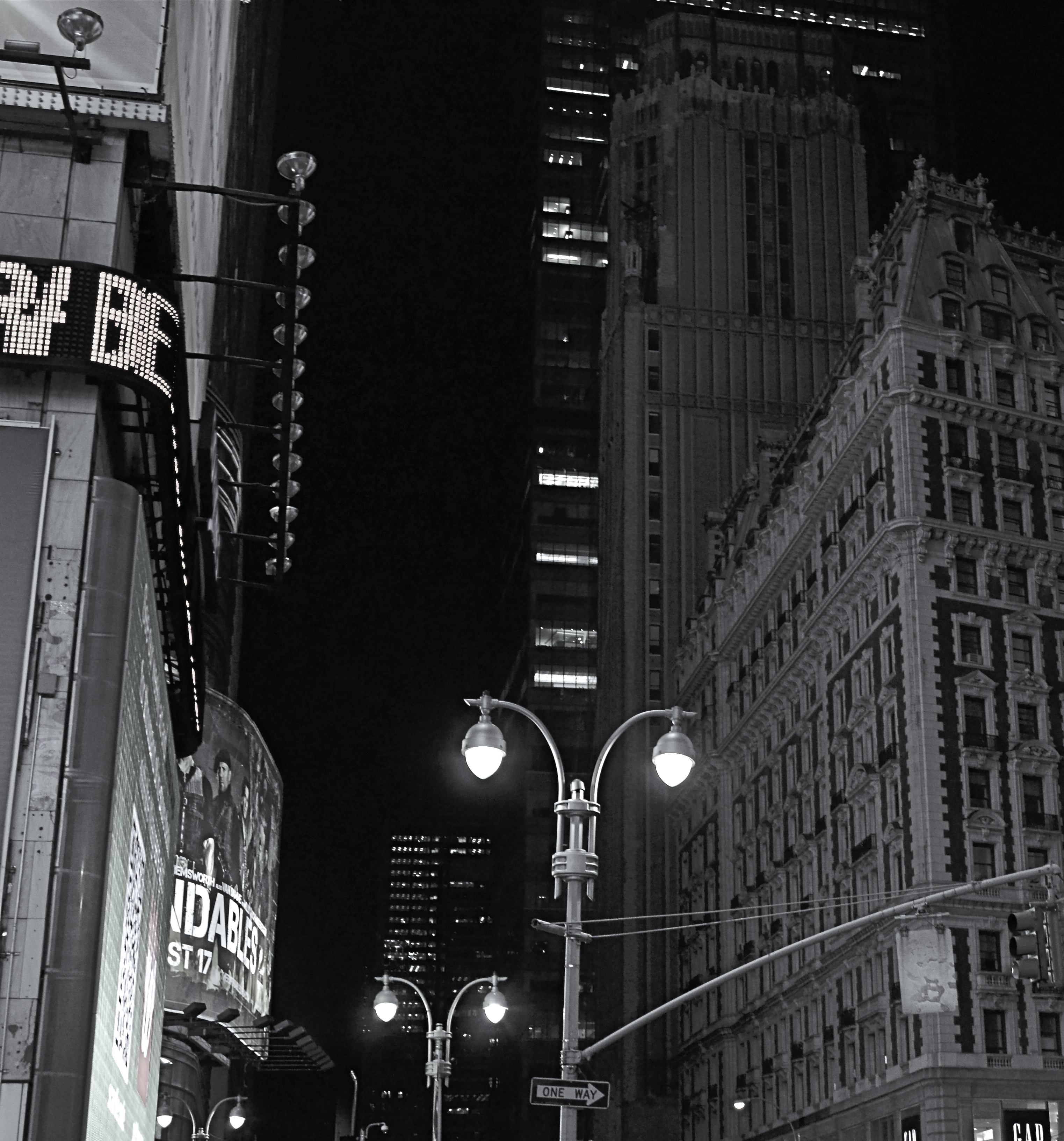
Yeah, it’s “Broadway”, but a little further from the solar flare of its neon overkill.
By MICHAEL PERKINS
WE HAVE PROVEN OURSELVES TO BE A SPECIES THAT HATES TO BE SENT TO BED. Night life being a kind of “second shift” in most of the modern world, we really never lock up our cities for the evening, and that has changed how those cities exist for photographers.
Here’s both the good and bad news: there is plenty of light available after dark in most towns. Good if you want the special mix of neon, tube glow and LED burn that sculpts the contours of most towns post-sundown. Bad if you really want to see cities as special entities defined by shadow, as places where dark is a subtle but aesthetically interesting design element. In many mega-cities, we have really banished the dark, going beyond essential illumination to a bleachingly bright blast of light which renders everything, big and small, in the same insane mutation of color and tone. Again, this is both good and bad, depending on what kind of image you want.
Midtown Manhattan, downtown Atlanta, and anyplace Tokyo are examples of cities that are now a universe away from the partial night available in them just a generation ago. A sense of architectural space beyond the brightest areas of light can only be sensed if you shoot deep and high, framing beyond the most trafficked structures. Sometimes there is a sense of “light decay”, of subtler illumination just a block away or a few stories higher than what’s seen at the busiest intersections. Making images where you can watch the light actually fade and recede adds a little dimension to what would otherwise be a fairly flat feel that overlit streets can generate.
Photography is often a matter of harnessing or collecting extra light when it’s scarce. Turns out that having too much of it is a creative problem in the opposite direction.
MINIMUM SHOW, MAXIMUM SEE

There are only two design elements in this image. Does it really need any more? 1/160 sec., f/4, ISO 100, 24mm.
By MICHAEL PERKINS
LOOK AT THE EARLIEST PHOTOGRAPHIC WORK OF NEARLY ANYONE and you will see a general attempt to frame up a scene and attempt to show, well, everything within range of the camera. It’s a time when we produce our most inclusive panoramas, our most crowded city scenes, our most enormous circus midways. Our pictures may be stories, but, at first, our stories have a bit of a problem getting to the point. We are so inclusive of raw data that every snap of life at the beach becomes a page out of Where’s Waldo? Thus, the very first real talent young photographers show is the ability to trim all that visual fat and get the maximum see for the minimum show.
Of course, when we are mere puppies, it seems counter-intuitive to say that showing less will actually make us see more. Minimalism doesn’t come easily to us, since we are afraid, at first, that we’re leaving something “important” out. Everyone comes to terms with this eventually if they shoot long enough, but we all arrive at the wisdom of it via various journeys. For me, it was my first attempts at still life compositions, which really are the most edited exercises we do. For these kinds of photos, it’s really about knowing what to leave out, or at least when to stop adding. And when a picture works, there is the nagging curiosity as to why….an inquiry which often leads to the conclusion that we used just what we needed, and then stopped.
Sometimes I get a sense of how little I need in a picture while I’m shooting. Many times, though, it comes to me in the editing or cropping process. If I snip something off of a picture and it doesn’t fall apart, I start wondering how much more I can pare away and still say what I’m trying to say. Learning, in recent years, how to compose again for a square frame has really been helpful, too, since it forces you into a pre-determined space limit. You can’t paint any wider than the canvas, if you will. You yourself might find other ways to get to the core balance your story needs. There is no true or single path.
I started the above image in a wide graveyard, then several graves and a tree, then one grave marker and a tree, then just the marker, and finally a portion of the marker. But in what I wound up with, aren’t all the elements I cut away really present for the viewer mentally anyway?
It’s often said, as a generalization, that painters start with nothing and add until they get the picture, while photographers start with everything and strip information away until they see just what they need. I really see a lot of photography that way. Tell the story with as few elements as you can and walk away. Minimum show for maximum see.
Not nearly so counter-intuitive, after all.
NOT WHAT I CAME FOR, BUT…
By MICHAEL PERKINS
ANYONE WHO’S MADE A ROAD TRIP CAN TELL YOU THAT THE DESTINATION IS OFTEN FAR LESS ENJOYABLE THAN THE JOURNEY, a truth that also applies to photography. The best things result from the little surprises at the side of the highway. You’re fixated on your oh-so-holy “plan” and all the wonderful things you’ll see and do in executing it. But photography is an art of opportunity, and to the degree that you embrace that fact, your work will be broader, richer, looser.
This is now a real source of excitement for me. I still go to the trouble of sketching out what I think I’m going to do, but, I’m at least quietly excited to know that, in many cases, the images that will make the keepers pile will happen when I went completely off message. Yes, we are “officially” here today to shoot that big mountain over yonder. But, since the two people I met on the approach path to said mountain are in themselves interesting, the story has now become about them. I may or may not get back to the mountain, and, if I do, I may discover that I really did not have a strong concept in my bagga trix for making anything special out of it, and so it’s nice not to have to write the entire day off to a good walk spoiled.
Specific example: I have written before that I get more usable stuff in the empty spaces and non-exhibit areas of museums than I do from the events within them. This is a great consolation prize these days, especially since an increasingly ardent police state among curators means that no photos can be taken in some pretty key areas. Staying open means that I can at least extract something from the areas no one is supposed to care about.
An average day at the museum, at the end of which this dropped into my lap.
The above image is one such case, since it was literally the final frame I shot on my way out of a museum show. It was irresistible as a pattern piece, caused by a very fleeting moment of sunset light. It would have appealed to me whether I was in a museum or not, but it was the fact that I was willing to go off-script that I got it, no special technical talent or “eye”. Nabbing this shot completely hinged on whether I was willing to go after something I didn’t originally come for. It’s like going to the grocery store for milk, finding they’re out, but discovering that there is also a sale on Bud Light. Things immediately look rosier.
Or at least they will by the third can.
GREAT DAY IN BROOKLYN
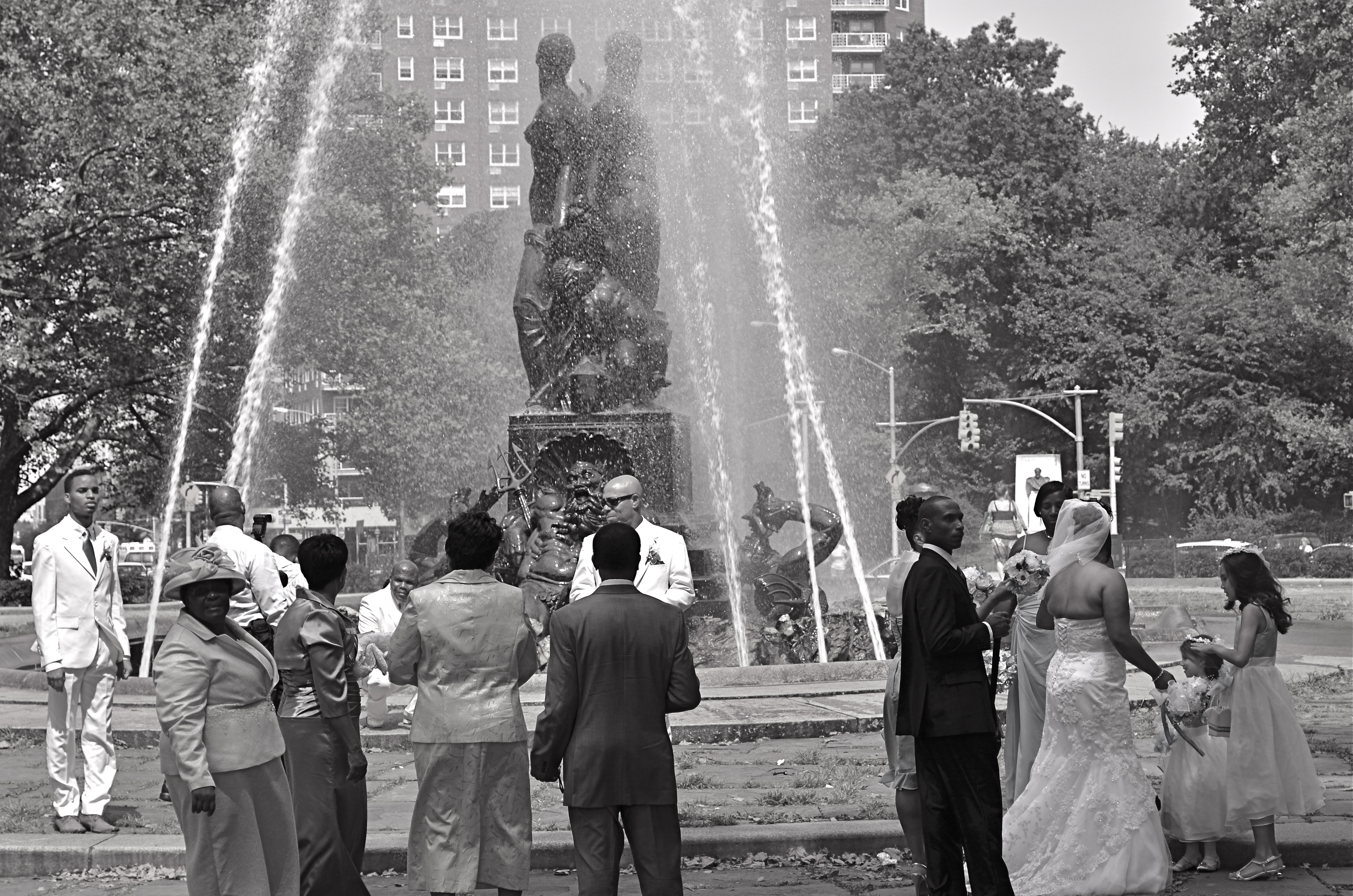
Wedding Party, 2012.
By MICHAEL PERKINS
IT STARTED OFF AS WHAT IS CURRENTLY REFERRED TO AS A FAIL: I was clicking away throughout the park areas in Brooklyn’s Grand Army Plaza, trying to make some kind of epic composition out of the beautiful Bailey Foundation near the war memorial arch. It features several heroic figures standing on the prow of a ship, under which can be seen several mythical denizens of the deep including Neptune himself. It’s a strong piece of sculpture, crowning a plaza that was designed by the great Frederick Law Olmstead, the mastermind behind Manhattan’s Central Park, and I should have been able to do something with it. Something.
Problem with the fountain is the water itself, which, instead of a wonderfully flowing cascade is something between a Jacuzzi shower head and a resort sprinkler system. Its renders the statuary nearly impossible to get in focus, and sends refracted rainbows and hotspots dancing gaily into your lens. Suddenly the impulse of a moment is a day’s work, and, just as I was beginning to check this particular world wonder off my to-do list, in moved the people you see here.
I don’t shoot weddings but the group you see here was, in fact, a shoot of a wedding, something else altogether, since there is a more relaxed dynamic than will ever be present during an actual ceremony. Photographically, rehearsals are more fruitful than actual play performances, and, in that vein, wedding prep holds more pictorial potential, for me, than weddings with a capital W. There is a looser feel, an air of celebration that somehow gets starched out of the final product. Do I stand here? You want me holding the flowers? Shouldn’t the tall people be at the back? Best thing of all, these folks were already taking direction from their “official” photog, so I was the last thing on their mind. There’s no better role at a wedding than that of The Invisible Man.
My glorious fountain had been reduced to a prop, which means the wedding party saw its potential, as I had. The difference is, they gave me what I hadn’t been able to find for myself.
A picture.
SETTING THE CAPTIVES FREE
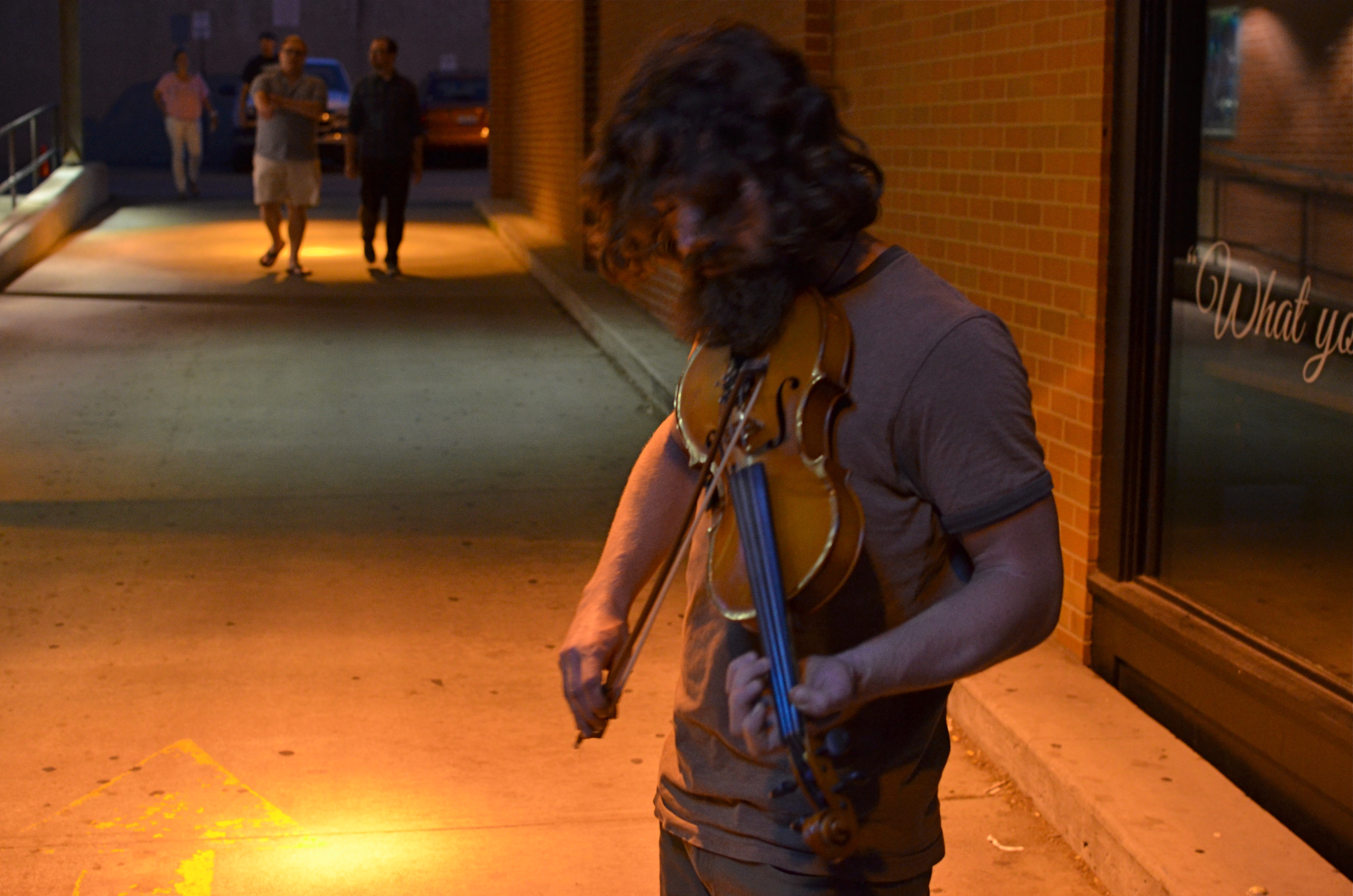
Fiddler, 2014. Too soft? Too dark? True? False? 1/50 sec., f/3.5, ISO 1000, 35mm.
By MICHAEL PERKINS
I’D LIKE TO ERADICATE THE WORD “CAPTURE” FROM MOST PHOTOGRAPHIC CONVERSATIONS. It suggests something stiff or inflexible to me, as if there is only one optimum way to apprehend a moment in an image. Especially in the case of portraits, I don’t think that there can be a single way to render a face, one perfect result that says everything about a person in a scant second of recording. If I didn’t capture something, does that mean my subject “got away” in some way, eluded me, remains hidden? Far from it. I can take thirty exposures of the same face and show you thirty different people. The word has become overused to the point of meaningless.
We are all conditioned to think along certain bias lines to consider a photograph well done or poorly done, and those lines are fairly narrow. We defer to sharpness over softness. We prefer brightly lit to mysteriously dark. We favor naturalistically colored and framed recordings of subjects to interpretations that keep color and composition “codes” fluid, or even reject them outright. It takes a lot of shooting to break out of these strictures, but we need to make this escape if we are to move toward anything approaching a style of our own.
Jerry Schatzberg’s iconic portrait of Bob Dylan from the cover of Blonde On Blonde.
I remember being startled in 1966 when I first saw Jerry Schatzberg’s photograph of Bob Dylan on the cover of the Blonde On Blonde album. How did the editor let this shot through? It’s blurred. It’s a mistake. It doesn’t…..wait, I can’t get that face out of my head. It’s Bob Dylan right now, so right now that he couldn’t be bothered to stand still long enough for a snap. The photo really does (last time I say this) capture something fleeting about the electrical, instantaneous flow of events that Dylan is swept up in. It moves. It breathes. And it’s more significant in view of the fact that there were plenty of pin-sharp frames to choose from in that very same shoot. That means Schatzberg and Dylan picked the softer one on purpose.
There are times when one 10th of a second too slow, one stop too small, is just right for making the magic happen. This is where I would usually mention breaking a few eggs to make an omelette, but for those of you on low-cholesterol diets, let’s just say that n0 rule works all the time, and that there’s more than one way to skin (or capture) a cat.
A PLACE APART
By MICHAEL PERKINS
PHOTOGRAPHERS USUALLY USE FACES AS THE SOLE BAROMETER OF EMOTION. It’s really easy to use a person’s features as the most obvious cues to one’s inner mind. Scowls, smiles, smirks, downcast eyes, sidelong glances,cries of anguish….these are standard tools in depicting someone as either assimilated into the mass of humanity or cast away, separate and alone.
But faces are only one way of showing people as living in a place apart. Symbolically, there is an equally dramatic effect to be achieved by the simple re-contextualizing of that person in space. The arrangement of space near your subject forces the viewer to conclude that he or she is either in harmony with their surroundings or lonely, solitary, sad even, and you do it without showing so much as a raised eyebrow. This is where composition isn’t just a part of the story, but the story itself.
Context is all.
The woman shown here is most likely just walking from point A to point B, with no undercurrent of real tragedy. But once she takes a short cut down an alley, she can be part of a completely different, even imaginary story. Here the two walls isolate her, herding her into a context where she could be lonely, sad, afraid, furtive. She is walking away from us, and that implies a secret. She is “withdrawing” and that implies defeat. She is without a companion, which can symbolize punishment, banishment, exile. From us? From herself? From the world? Once you start to think openly about it, you realize that placing the subject in space lays the foundation for storytelling, a technique that is easy to create, recalibrate, manipulate.
The space around people is a key player in the drama an image can generate. It can mean, well, whatever you need it to mean. People who exist in a place apart become the centerpieces in strong photographs, and the variability of that strength is in your hands.
A LITTLE R/R
By MICHAEL PERKINS
I CAME ACROSS SOME MENTAL BAGGAGE THE OTHER DAY DURING A SHOOT BENEATH AN OLD TRESTLE. The following song by the late Harry Nilsson churned back into my forebrain from a land far away. It wasn’t one of his bigger hits, but it has always struck a chord with me, at least the part of me that likes to make pictures:
When we got married back in 1944
We’d board that Silverliner below Baltimore
Trip to Virginia on a sunny honeymoon
Nobody cares about the railroads anymore
We’d tip the porter for a place of our own
Then send a postcard to your mom and dad back home
Woo-ee, woo-oo-oo-ee, woo-ee
Woo-ee, woo-oo-oo-ee, woo-ee
We had a daughter and you oughtta see her now
She has a boyfriend who looks just like my gal Sal
And when they’re married they won’t need us anymore
They’ll board an aeroplane and fly away from Baltimore
Woo-ee, woo-oo-oo-ee, woo-ee
Nobody cares about the railroads anymore
(lyrics copyright Warner-Chappell Music)
The ghosts are out there. So are the pictures.
All aboard.
7/4/14: A MORE PERFECT UNION

Washington Memorial, 2013. 1/400 sec., f/5.6, ISO 100, 28mm.
By MICHAEL PERKINS
MY FATHER CAN TESTIFY TO MY NATIVE, AND LIFELONG IMPATIENCE. While most kids learned to be told how to “mind”, I had to be taught how to wait. “It’s a process”, he would remark when I fumed about how long something I wanted was taking to come about, “not a product”. I willingly admit that he is much more Zen than I can ever be, infinitely better at the wait-and-see thing. I have developed a little long vision in my later years, but I am still like a lab rat. I keep punching the bar, ’cause I want that bloody biscuit now.
Oddly, photography has taught me a few things about waiting, as has my native optimism about the country of my birth. The Fourth of July is not, however, a day typically spent in quiet contemplation, but in exuberant celebration of how unique our story is in the history of the world. But, for me, Independence Day is for taking measure, walking off the distance on the chain that stretches between What We’ve Done and What We Have Yet To Do. In America, we’re always 3rd and 4, looking for the next first down. We are never, and can never, be finished.
I think I prefer the above image of the Washington Monument, which I took last year during its restoration, to an image of the obelisk without its temporary scaffolding, and it’s because it reminds me that freedom is always being refined, reworked, re-earned. The race goes ever on. Similarly, I love photos of the U.S. Capitol during its construction phase far more than shots of the finished product. The building’s dome teetered between being-ness and nothing-ness all through the Civil War, a visually indelible barometer of the changing fortunes of Washington itself as the battle raged on, often just outside the city limits. Seeing the Washington Monument sheathed in wood carries the same visual weight for me. It’s like we haven’t quite taken it out of the packing crate. There’s a temporary, even endangered quality to the building that should stay with us, at least a little, as we go on with our labors.
America is beautiful. But along the way, the old girl benefits from a nip here and a tuck there. We show we care when we keep trying to make her flawless. When we do that, all the penny fireworks in the world can’t compete with the glow, a torch bright enough to light the world.
It’s a process…not a product.
THE ENVELOPE
By MICHAEL PERKINS
HAVING LIVED IN THE AMERICAN SOUTHWEST FOR OVER FIFTEEN YEARS, I HAVE NEGOTIATED MY OWN TERMS WITH THE BLAZING OVERKILL OF MIDDAY SUNLIGHT, and its resulting impact on photography. If you move to Arizona or New Mexico from calmer climates, you will find yourself quickly constricting into a severe squint from late breakfast to early evening, with your camera likewise shrinking from the sheer overabundance of harsh, white light. If you’re determined to shoot in midday, you will adjust your approach to just about everything in your exposure regimen.
Good news, however: if you prefer to shoot in the so-called “golden hour” just ahead of sunset, you will be rewarded with some of the most picturesque tones you’ve ever had the good luck to work with. As has been exhaustively explained by better minds than mine, sunlight lingers longer in the atmosphere during the pre-sunset period, which, in the southwest, can really last closer to two hours or more. Hues are saturated, warm: shadows are powerful and sharp. And, if that dramatic contrast works to your advantage in color, it really packs a punch in monochrome.
This time of day is what I call “the envelope”, which is to say that objects look completely different in this special light from how they register in any other part of the day, if you can make up your mind as to what to do in a hurry. Changes from minute to minute are fast and stark in their variance. Miss your moment, and you must wait another 24 hours for a re-do.
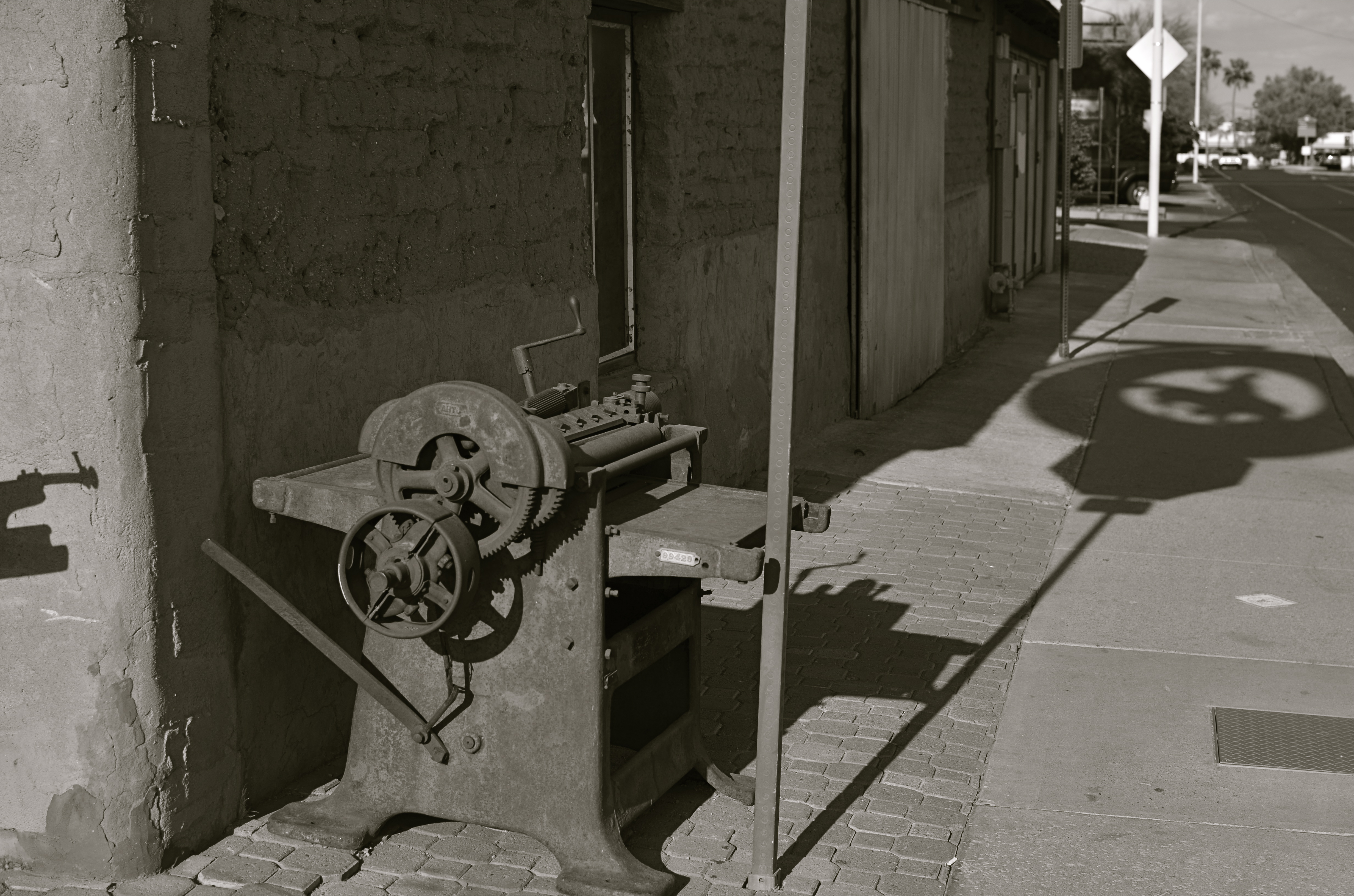
In the west, the best action actually happens after High Noon. Just before sunset in Scottsdale, AZ: 1/500 sec., f/4.5, ISO 100, 35mm.
The long shadow of an unseen sign visible in the above frame lasted about fifteen minutes on the day of the shoot. The sign itself is a metal cutout of a cowboy astride a bucking bronco, the symbol of Scottsdale, Arizona, “the most western town in the USA”. The shadow started as a short patch of black directly in front of the rusted bit of machine gear in the foreground, then elongated to an exaggerated duplicate of the sign, extending halfway down the block and becoming a sharper and more detailed silhouette.
A few minutes later, it grew softer and eventually dissolved as the sun crept closer to the western horizon. There would still be blazing illumination and harsh shadows for some objects, if you went about two stories high or higher, but, generally, sunset was well under way. Caught in time, the shadow became an active design element in the shot, an element strong enough to come through even in black and white.
If you are ever on holiday in the southwest, peek inside “the envelope”. There’s good stuff inside.
INS AND OUTS
By MICHAEL PERKINS
WHEN IT COMES TO DISCUSSIONS ABOUT ART, THE WORD “ABSTRACT” IS PROBABLY THE MOST BATTED-ABOUT LINGUISTIC SHUTTLECOCK OF THE 20TH CENTURY, something we lob at each other across the conversational net as it suits our mood. Whenever we feel we should weigh in on a matter of artistic heft, especially something that doesn’t fit into a conveniently familiar cubbyhole, we drag “abstract” out of the desk drawer, dust it off, and cram it into place somewhere in the argument.
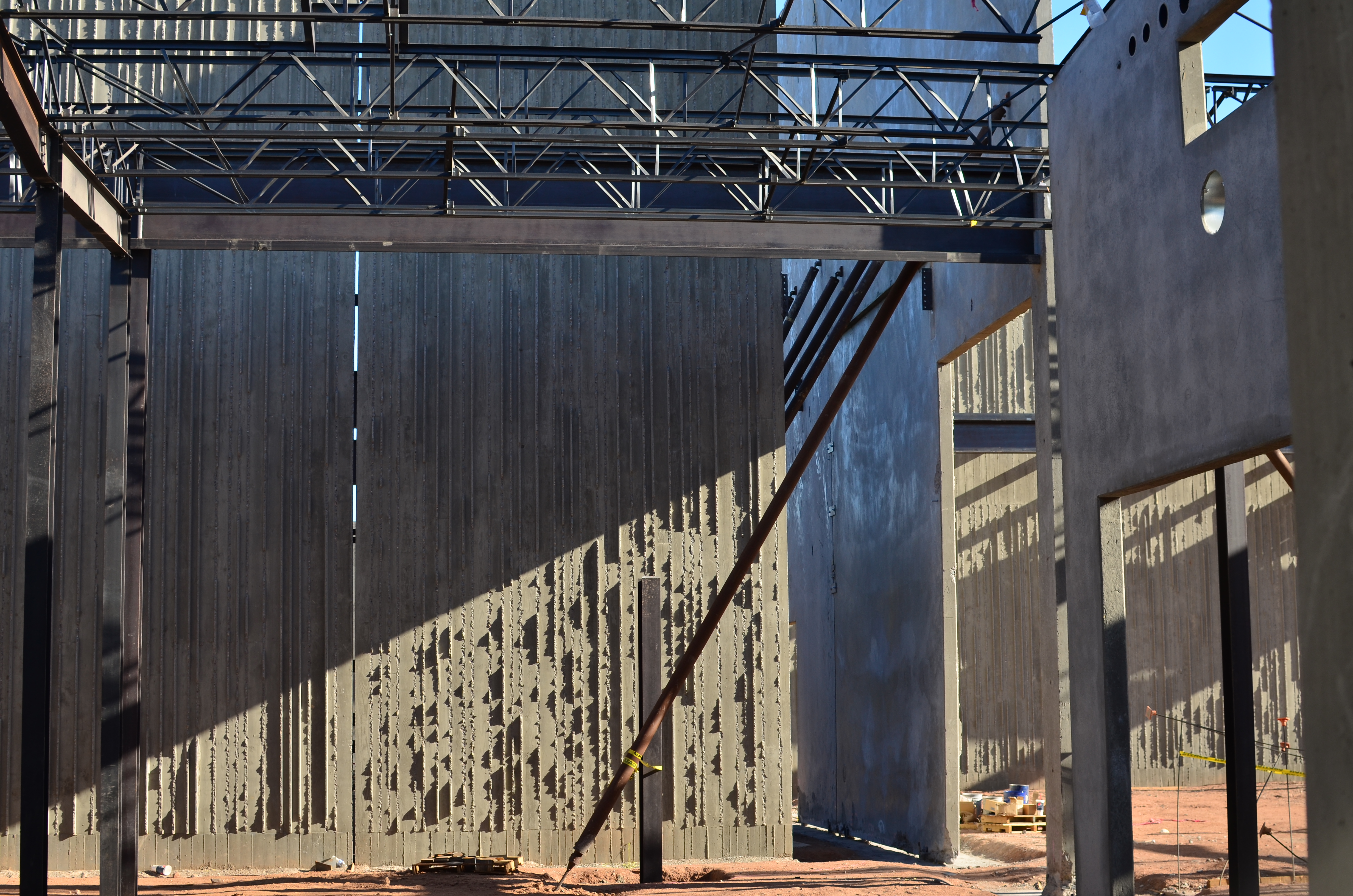
Frames within frames within frames: 1/125 sec., f/5.6, ISO 100, 35mm.
Any talk of architecture, and the photographer’s reaction to it, attracts a lot of stray “abstracts”, since attaching the word seems to settle… something. However, art can never be about settling anything. In fact, it’s about churning things up, starting, rather than resolving, arguments. As pieces of pure design, finished buildings do make a statement of sorts about the architect’s view, at least. But when trolling about town, I am more drawn to incomplete or skeletal frameworks for buildings yet to be. They are simply open to greater interpretation as visual subject matter, since we haven’t, if you like, seen all the architect’s cards yet. The emerging project can, for a time, be anything, depending literally on where you stand or how light shapes the competing angles and contours.
I feel that open or unfinished spaces are really ripe with an infinite number of framings, since a single uncompleted wall gives way so openly to all the other planes and surfaces in the design, a visual diagram that will soon be closed up, sealed off, sequestered from view. And as for the light, there is no place it cannot go, so you can chase the tracking of shadows all day long, as is possible with, say, the Grand Canyon, giving the same composition drastically different flavors in just the space of a few hours.
If the word “abstract” has any meaning at all at this late date, you could say that it speaks to a variation, a reworking of the dimensions of what we consider reality. Beyond that, I need hip waders. However, I believe that emerging buildings represent an opportunity for photographers to add their own vision to the architect’s, however briefly.
Whew. Now let’s all go out get a drink.
SYMBIOSIS OF HORROR
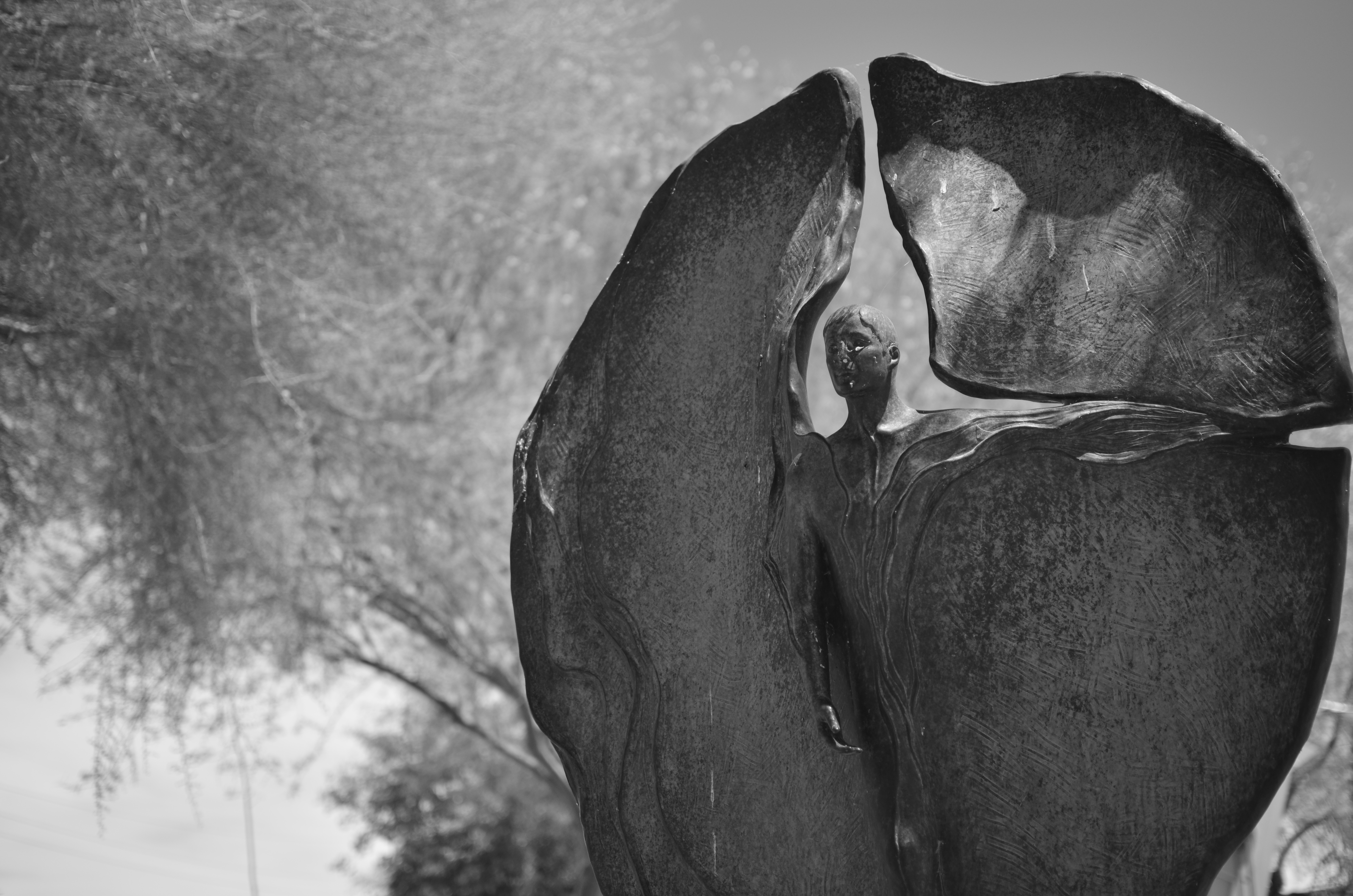
In war, is this an angel of mercy or a wraith of wrath?
By MICHAEL PERKINS
SHARPER MINDS THAN MINE WILL SPEND AN INFINITE AMOUNT OF EFFORT THIS WEEK CATALOGUING THE COSTS OF THE “GREAT WAR“, the world’s first truly global conflict, sparked by the trigger finger of a Serbian nationalist precisely one hundred years ago. These great doctors of thinkology will stack statistics like cordwood (or corpses) in an effort to quantify the losses in men, horses, nations and empires in the wake of the most horrific episode of the early 20th century.
Those figures will be, by turns, staggering/appalling/saddening/maddening. But in the tables of numbers that measure these losses and impacts, one tabulation can never be made: the immeasurable loss to the world of art, and, by extension, photography.
There can be no quantification of art’s impact in our lives, no number that expresses our loss at its winking out. Photography, not even a century old when Archduke Franz Ferdinand was dispatched to history, was pressed into service to document and measure the war and all its hellish impacts. But no one can know how many war photographers might have turned their lenses to beauty, had worldwide horror not arrested their attention. Likewise, no one can know how many Steichens, Adamses, or Bourke-Whites, clothed in doughboy uniforms, were heaped on the pyre as tribute to Mars and all his minions. Most importantly, we cannot know what their potential art, now forever amputated by tragedy, might have meant to millions seeking the solace of vision or the gasp of discovery.
Photography as an art was shaped by the Great War, as were its tools and techniques, from spy cameras to faster films. The war set up a symbiosis of horror between the irresistible message of that inferno and the unblinking eye of our art. We forever charged certain objects as emblems of that conflict, such that an angel now is either a winged Victory, an agent of vengeance, or a mourner for the dead, depending on the photographer’s aims. That giant step in the medium’s evolution matters, no less than the math that shows how many sheaves of wheat were burned on their way to hungry mouths.
Our sense of what constitutes tragedy as a visual message was fired in the damnable forge of the Great War, along with our ideals and beliefs. Nothing proves that art is a life force like an event which threatens to extinguish that life. One hundred years later, we seem not to have learned too much more about how to avoid tumbling into the abyss than we knew in 1914, but, perhaps, as photographers, we have trained our eye to bear better witness to the dice roll that is humanity.
THE UNSEEN GEOMETRY
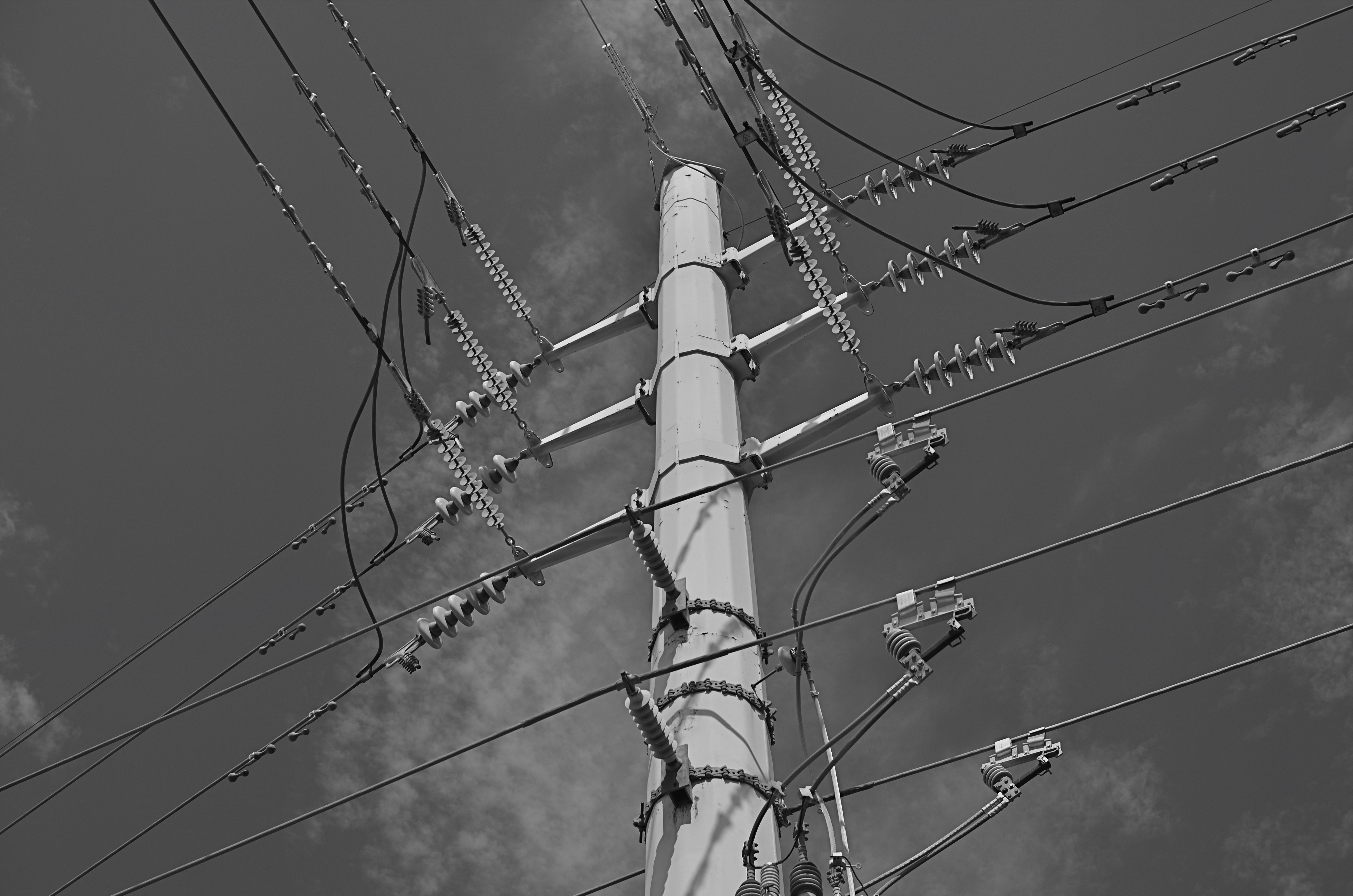
Overhead and out of sight. 1/400 sec., f/5.6, ISO 100, 35mm.
By MICHAEL PERKINS
THERE ARE MANY PHOTO SITES THAT SUGGEST SHOOTS CALLED “WALKABOUTS“, informal outings intended to force photographers to shoot whatever comes to hand with as fresh an eye as possible. Some walkabouts are severe, in that they are confined to the hyper-familiar surroundings of your own local neighborhood; others are about dropping yourself into a completely random location and making images out of either the nothing of the area or the something of what you can train yourself to see.
Walks can startle you or bore you to tears (both on some days), but they will sharpen your approach to picture-making, since what you do is far more important than what you’re pointing to. And the discipline is sound: you can’t hardly miss taking shots of cute cats or July 4 fireworks, but neither will you learn very much that is new. Forcing yourself to abandon flashier or more obvious subjects teaches you to imbue anything with meaning or impact, a skill which is, over a lifetime, beyond price.
One of the things I try to keep in mind is how much of our everyday environment is designed to be “invisible”, or at least harder to see. Urban infrastructure is all around us, but its fixtures and connections tend to be what I call the unseen geometry, networks of service and connectivity to which we simply pay no attention, thus rendering them unseeable even to our photographer’s eye. And yet infrastructure has its own visual grammar, giving up patterns, even poetry when placed into a context of pure design.
The above power tower, located in a neighborhood which, trust me, is not brimming with beauty, gave me the look of an aerial superhighway, given the sheer intricacy of its connective grid. The daylight on the day I was shooting softened and prettied the rig to too great a degree, so I shot it in monochrome and applied a polarizing filter to make the tower pop a little bit from the sky behind it. A little contrast adjustment and a few experimental framing to increase the drama of the capture angle, and I was just about where I wanted to be.
I had to look up beyond eye (and street) level to recognize that something strong, even eloquent was just inches away from me. But that’s what a walkabout is for. Unseen geometry, untold stories.
HOW MUCH IS TOO MUCH?
Lots going on here. Too much?
By MICHAEL PERKINS
THESE DAYS IT SEEMS TO TAKE LESS TIME TO SNAP A PHOTOGRAPH THAN IT DOES TO DECIDE WHETHER IT HAS ANY MERIT. Photography is still largely about momentary judgements, and so it stands to reason that some are more well-conceived than others. There’s a strong temptation to boast that “I meant to do that, of course” when the result is a good one, and to mount an elaborate alibi when the thing crashes and burns, but, even given that very human tendency, some pictures stubbornly linger between keeper and krap, inhabiting a nether region in which you can’t absolutely pronounce them either success or failure.
The image at left is one such. It was part of a day spent in New York’s Central Park, and for most of the shots taken on that session, I can safely determine which ones “worked”. This one, however, continues to defy a clear call either way. Depending on which day I view it, it’s either a slice-of-life capture that shows the density of urban life or a visual mess with about four layers too much glop going on. I wish there were an empirical standard for things like photographs, but…..wait, I really don’t wish that at all. I like the fact that none of us is truly certain what makes a picture resonate. If there were such a standard for excellence, photography could be reduced to a craft, like batik or knitting. But it can never be. The only “mission” for a photographer, however fuzzy, is to convey a feeling. Some viewers will feel like a circuit has been completed between themselves and the artist. But even if they don’t, the quest is worthwhile, and goes ever on.
I have played with this photo endlessly, converting it to monochrome, trying to enhance detail in selective parts of it, faking a tilt-shift focus, and I finally present it here exactly as I shot it. I am gently closer to liking it than at first, but I feel like this one will be a problem child for years to come. Maybe I’m full of farm compost and it is simply a train wreck. Maybe it’s “sincere but just misunderstood”. I’m okay either way. I can accept it for a near miss, since it becomes a reference point for trying the same thing with better success somewhere down the road.
And, if it’s actually good, well, of course, I meant to do that.
THE MOST FROM THE LEAST
Reaching a comfort zone with your equipment means fewer barriers between you and the picture you want to get. 1/80 sec., f/4.5, ISO 100, 18mm.
By MICHAEL PERKINS
PHOTOGRAPHY IS ONLY PARTLY ABOUT TAKING AND VIEWING IMAGES. Truly, one of the most instructive (and humbling) elements of becoming a photographer is listening to the recitation of other photographers’ sins, something for which the internet era is particularly well suited. The web will deliver as many confessions, sermons, warnings and Monday-morning quarterbacks as you can gobble at a sitting, and, for some reason, these tales of creative woe resonate more strongly with me than tales of success. I like to read a good “how I did it” tutorial on a great picture, but I love, love, love to read a lurid “how I totally blew it” post-mortem. Gives me hope that I’m not the only lame-o lumbering around in the darkness.
One of the richest gold fields of confession for shooters are entries about how they got seduced into buying mounds of photographic toys in the hope that the next bit of gear would be the decisive moment that insured greatness. We have all (sing it with me, brothers and sisters!) succumbed to the lure of the lens, the attachment, the bracket, the golden Willy Wonka ticket that would transform us overnight from hack to hero. It might have been the shiny logo on the Nikon. It might have been the seductive curve on the flash unit. Whatever the particular Apple to our private Eden was, we believed it belonged in our kit bags, no less than plasma in a medic’s satchel. And, all too often, it turned out to be about as valuable as water wings on a whale. He who dies with the most toys probably has perished from exhaustion from having to haul them all around from shot to shot, feeding the aftermarket’s bottom line instead of nourishing his art.
My favorite photographers have always been those who have delivered the most from the least: street poet Henri Cartier-Bresson with his simple Leica, news hound Weegee with his Speed Graphic perpetually locked to f/16 and a shutter speed of 1/200. Of course, shooters who use only essential equipment are going to appeal to my working-class bias, since peeling off the green for a treasure house of toys was never in the cards for me, anyway. If I had been the youthful ward of Bruce Wayne, perhaps I would have viewed the whole thing differently, but we are who we are.
I truly believe that the more equipment you have to master, the less possible true mastery of any one part of that mound of gizmos becomes. And as I grow gray, I seem to be trying to do even more and more with less and less. I’m not quite to the point of out-and-out minimalism, but I do proceed under the principle that the feel of the shot outranks every other technical consideration, and some dark patches or soft edges can be sacrificed if my eye’s heart was in the right place.
Of course, I haven’t checked the mail today. The new B&H catalogue might be in there, in which case, cancel my appointments for the rest of the week.
Sigh.
ON THE NOSE (AND OFF)
I had originally shot the organ loft at Columbus, Ohio’s St. Joseph Cathedral in a centered, “straight on” composition. I like this variation a little better. 1/40 sec., f/3.5, ISO 1000, 18mm.
By MICHAEL PERKINS
AMONG THE GROUPS INVITING FLICKR USERS TO POST PHOTOGRAPHS OF A CERTAIN THEME OR TYPE, there is a group called, “This Should Be A Postcard”, apparently composed of images that are so iconically average that they resemble mass-produced tourist views of scenic locales. The name of this group puzzles me. I mean, if you called it, “Perfectly Ordinary, Non-Offensive and Safe Pictures of Over-Visited Places”, people would write you off as a troll, but I’d at least give you points for accuracy. It’s hard to understand why any art would aspire to look like something that is almost deliberately artless.
And still, it is perceived as a compliment to one’s work to be told that it “looks just like a postcard”, and, I swear, when I hear that remark about one of my own images, my first reaction is to wipe said image from the face of the earth, since that phrase means that it is (a)average, (b) unambitious), (c) unimaginative, or (d) a mere act of “recording”. Look, here’s the famous place. It looks just like you expect it to, taken from the angle that you’re accustomed to, lit, composed and executed according to a pre-existing conception of what it’s “supposed” to be. How nice.
And how unlike anything photography is supposed to be about.
This conditioning we all have to render the “official” view of well-known subjects can only lead to mediocrity and risk aversion. After all, a postcard is tasteful, perfect, symmetrical, orderly. And eventually, dull. Thankfully, the infusion of millions of new photographers into the mainstream in recent years holds the potential cure for this bent. The young will simply not hold the same things (or ways to view them) in any particular awe, and so they won’t even want to create a postcard, or anyone else’s version of one. They will shudder at the very thought of being “on the nose”.
I rail against the postcard because, over a lifetime, I have so shamelessly aspired to it, and have only been able to let go of the fantasy after becoming disappointed with myself, then unwilling to keep recycling the same approach to subject matter even one more time. For me, it was a way of gradually growing past the really formalized methods I had as a child. And it’s not magic.Even a slight variation in approach to “big” subjects, as in the above image, can stamp at least a part of yourself onto the results, and so, it’s a good thing to get the official shot out of the way early on in a shoot, then try every other approach you can think of. Chances are, your keeper will be in one of the non-traditional approaches.
Postcards say of a location, wish you were here. Photographs, made by you personally, point to your mind and say, “consider being here.”
RELATIONSHIPS
By MICHAEL PERKINS
DIGITAL PHOTOGRAPHY DOESN’T TRULY MAKE ARTISTIC CHOICES “POSSIBLE”. Those decisions were always available in the medium, albeit at some cost of materials, time and work. You could always get nearly any effect from film, providing you were willing to invest the sweat in wringing it out of the tools at hand. Instead, digital processes make choices easier to act upon, and, for people who have made the transition from a lifetime of film-based analog shooting to digital, the leap to light speed on the trip from desire to result is especially mind-ripping.
This speed of implementation makes real-time differences when considering whether a shot will have its best impact in color or b&w. Even standard DSLRs and compacts have in-camera modes that allow you to immediately shoot and compare alternate versions of a subject, and, with the expanding universe of apps available to the smartphone shooter, you can instantly crank out half a dozen or more readings of the kind of color or the type of monochrome you’re looking for. This is especially important in black & white, where the range of tones and contrast values can make or break a picture.
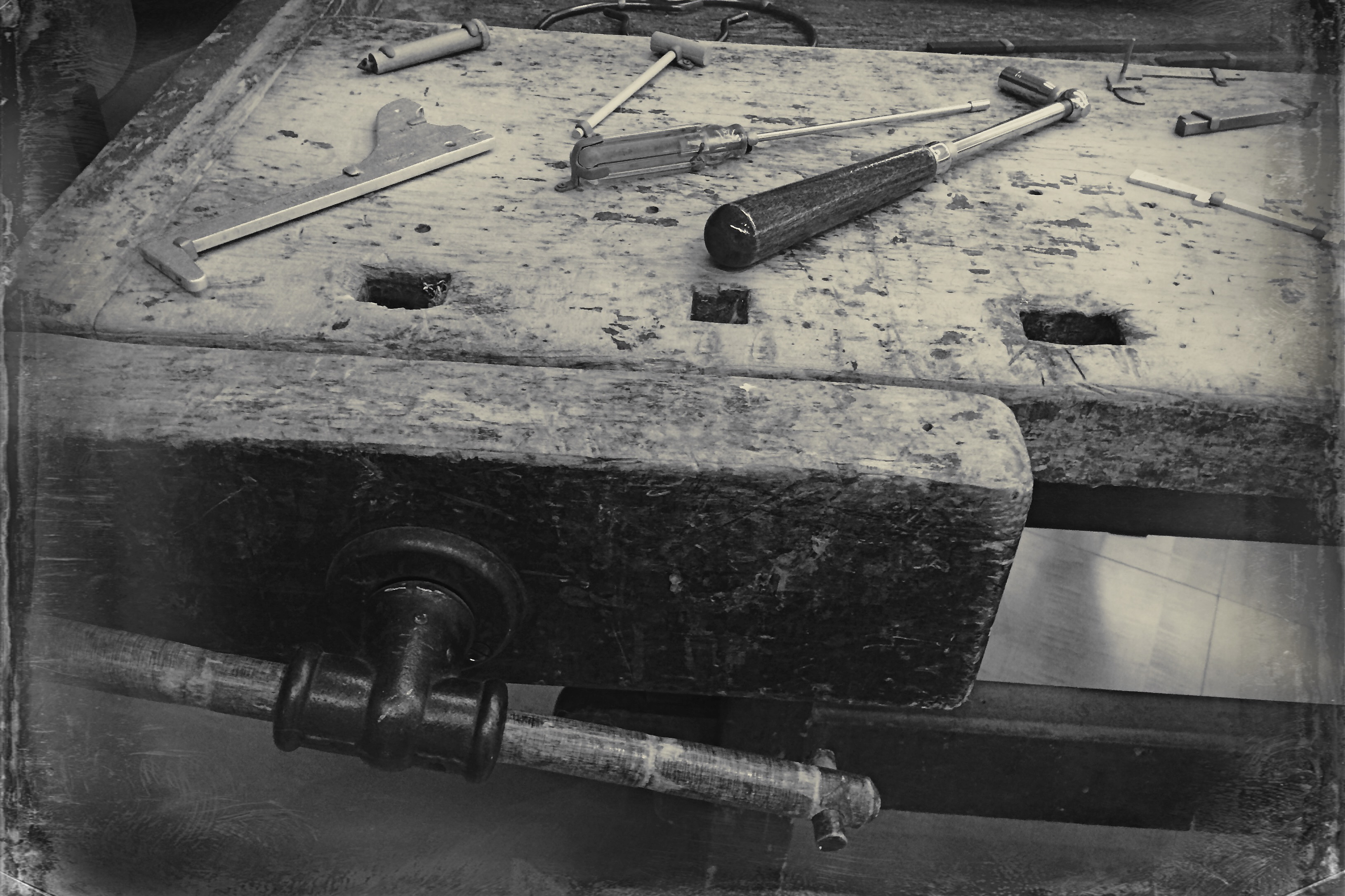
Black and white was the right choice here, but a decision about the kind of black and white was also crucial.
By basically simulating the subtle changes that a film processor could have made in the gradations between the various intensities of either black or white, apps allow you to make incremental judgments of how the values in the image work or don’t work to produce the “statement” you’re looking for. Best thing about this is the best overall thing about digital: how quickly you can act on your impulse, then check, adjust, and act again. The above image lacked impact in the color original. The old workbench simply came off too warm and charming. I was looking for something that matched the grit and wear of the weathered wood, and I was able to shop for about three different grades of monochrome before settling on what you see here. Most days, this is a game of inches.
The sheer number of images that you will be able to salvage while the scene is still in front of you, and the light is still how you want it…. that’s an amazing freedom, and no generation of photographers before ours has enjoyed anything like it before.
The take-home of all this is that you should not only shoot a lot but shoot a lot of variations on what you choose to shoot. And remember, every shot that you “blow” is one shot closer to the higher average of excellent work that will only come after thousands of failures. Best to speed up the clock and get past them while you’re still young.
RESTORING THE INVISIBLE
as[e The Wyandotte Building (1897), Columbus, Ohio’s first true skyscaper, seen here in a three-exposure HDR composite.
PHOTOGRAPHY IS ONE OF THE BEST RESPONSES TO THE DIZZYING SPEED OF CONTEMPORARY EXISTENCE. It is, in fact, because of a photograph’s ability to isolate time, to force our sustained view of fleeting things, that image-making is valuable as a seeing device that counteracts the mad rush of our “real time” lives. Looking into a picture lets us deal with very specific slices of time, to slowly take the measure of things that, although part of our overall sensory experience, are rendered invisible in the blur of our living.
I find that, once a compelling picture has been made of something that is familiar but unnoticed, the ability to see the design and detail of life is restored in the viewing of that thing. Frequently, in making an image of something that we are too busy to notice, the thing takes on a startlingly new aspect. That’s why I so doggedly pursue architectural subjects, in the effort to make us regard how much of our motives and ideals are captured in buildings. They stand as x-rays into our minds, revealing not only what we wanted in creating them, but what we actually created as they were realized.
In writing a book, several years ago, about a prominent midwestern skyscraper*, I was struck by how very personal these objects were…to the magnates who commissioned them, to the architects who brought them forth, and to the people in their native cities who took a kind of ownership of them. In short, the best of them were anything but mere objects of stone and steel. They imparted a personality to their surroundings.
The building pictured here, Columbus, Ohio’s 1897 Wyandotte Building, was designed by Daniel Burnham, the genius architect who spearheaded the birth of the modern steel skeleton skyscraper, heading up Chicago’s “new school” of architecture and overseeing the creation of the famous “White City” exposition of 1893. It is a magnificent montage of his ideals and vision for a burgeoning new kind of American city. As something thousand walk past every day, it is rendered strangely “invisible”, but a photograph can compensate for our haste, allowing us the luxury of contemplation.
As photographers, we can bring a particularly keen kind of witnessing to the buildings that make up our environment, no less than if we were to document the carvings and decorative design on an Egyptian sarcophagus. Architectural photography can help us extract the magic, the aims of a society, and experimenting with various methods for rendering their texture and impact can lead to some of the most powerful imagery created within a camera.
*Leveque: The First Complete Story Of Columbus’ Greatest Skyscraper, Michael A. Perkins, 2004. Available in standard print and Kindle editions through Amazon and other online bookstores.
SYMBOLS (For Father’s Day, 2014)
By MICHAEL PERKINS
PHOTOGRAPHY IS, ALTERNATIVELY, AN ART OF BOTH DOCUMENTATION AND SUGGESTION. It is, of course, one of its essential tasks to record, to mark events, comings, goings, arrivals, and passings. That’s basically a reporter’s function, and one which photographers have served since we first learned to trap light in a box. The other, and arguably more artistic task, is to symbolize, to show all without showing everything. And on this Father’s Day (as on every one), we honor our parents by taking photographs which address both approaches.
For many years, I have taken the obvious path by capturing the latest version of Dad’s face. It’s an ever-changing mosaic of effects, which no photographer/storyteller worth his salt can resist. But in recent years, I also am trying to symbolize my father, to make him stand not only for his own life, but for the miles traveled by all parents. For this task, a face is too specific, since it is so firmly anchored to its own specific myths and legends. To make Dad emblematic, not just as a man but rather as “Man”, I’ve found that abstracting parts of him can work a little better than a simple portrait.
Survivors, 2014. 1/80 sec., f/4, ISO 100, 35mm.
These days, Dad’s hands are speaking to me with particular eloquence. They bear the marks of every struggle and triumph of human endeavor, and their increasing fragility, the etchings on the frail envelope of mortality, are especially poignant to me as I enter my own autumn. I have long since passed the point where I seem to have his hands grafted onto the ends of my own arms, so that, as I make images of him, I am doing a bit of a trending chart on myself as well. In a way, it’s like taking a selfie without actually being in front of the camera.
Hands are the human instruments of deeds, change, endeavor, strength, striving. Surviving. They are the archaeological road map of all one’s choices, all our grand crusades, all our heartbreaking failures and miscalculations. Hands tell the truth.
Dad has a great face, a marvelous mix of strength and compassion, but his hands…..they are human history writ large.
Happy Father’s Day, Boss.
FIGHTING TO FORGET
By MICHAEL PERKINS
STORIES OF “THE LAND THAT TIME FORGOT” COMPRISE ONE OF THE MOST RELIABLE TROPES IN ALL OF FICTION. The romantic notion of stumbling upon places that have been sequestered away from the mad forward crunch of “progress” is flat-out irresistible, since it holds out the hope that we can re-connect with things we have lost, from perspective to innocence. It moves units at the book store. It sells tickets at the box office. And it provides photographers with their most delicate treasures.
Trackside, 2014. 1/250 sec., f/5.6, ISO 100, 35mm.
Whether our lost land is a village in some hidden valley or a hamlet within the vast prairie of middle America, we romanticize the idea that some places can be frozen in amber, protected from us and all that we create. Sadly, finding places that have been allowed to remain at the margins, that have been left alone by developers and magnates, is getting to be a greater rarity than ever before. Small towns can be wholly separate universes, sealed off from the silliness that has engulfed most of us, but just finding one which has been lucky enough to aspire to “forgotten” status is increasingly rare.
That’s why it’s so wonderful when you take the wrong road, and make the right turn.
The above stretch of sunlit houses, parallel to their tiny town’s main railroad spur, shows, in miniature, a place where order is simple but unwavering. Colors are basic. Lines are straight. This is a town where school board meetings are still held at the local Carnegie library, where the town’s single diner’s customers are on a first name basis with each other. A place where the flag is taken down and folded each night outside the courthouse. A village that wears its age like an elder’s furrowed brow with quietude, serenity.
There are plenty of malls, chain burger joints, car dealerships and business plazas within several miles of here. But they are not of here. They keep their distance and mind their manners. The freeway won’t be barreling through here anytime soon. There’s time yet.
Time for one more picture, as simple as I know how to make it.
A memento of a world fighting to forget.
FREE ATMOSPHERE
Panos are not for every kind of visual story. The best thing is, you can make them so quickly, it’s easy to see if it’s merely a gimmick effect or the perfect solution, given what you need to say.
By MICHAEL PERKINS
PANORAMIC APPS FOR MOBILE CAMERAS CONSTITUTE A HUGE STEP FORWARD in convenience and simplicity in taking the kind of sweeping images that used to require keen skills either in film processing or in digital darkroom stitching. The newest versions of these apps are far from flawless, and, like any effect-laden add-on, they can become cheesy gimmicks, or, used to excess, merely boring. That said, there is a time and place for everything.
99% of the impact in a pano comes from the selection of your subject. Supposing a panoramic view to be a specialized way to tell a story, is the story you’re attempting to tell interesting in its own right? Does it benefit from the wider frame? Let’s recall that, as well as including a ton of extra left-and-right information, handheld pano apps create a distorted version of reality. In the earliest days of panoramas, multiple photos of a scene were taken side-by-side, all with the same distance from camera to subject. This was usually accomplished by shooting on a tripod, which was moved and measured with each new portion of what would eventually be a wide composite. At each exposure, the distance of the tripod to, say, the mountain range was essentially constant across the various exposures, rendering the wide picture all in the same plane….an optically accurate representation of the scene.
With handheld panos done in-camera, the shooter and his camera must usually pivot in a large half-circle, just as you might execute a video pan,so that some objects are closer to the lens than others, usually near the center. This guarantees a huge amount of dramatic distortion in at least one part of the image, and frequently more than one. The effect is that you are not just recording a straight left-to-right scene, but creating artificial stretches and warps of everything in your shot. You are not recording a scene that unfolds across a straight left-right horizon, but capturing things that actually encircle you and trying to “flatten them out” so they appear to occur in one unbroken line. By showing objects that may be beside or behind you, you’re kinda making a distortion of an illusion. Huh?
Again, if this is the look you want, that is, if your subject is truly served by this fantasy effect, than click away. You’ll know in a minute if it all made sense, anyhow, and that alone is a remarkable luxury. These days, we can not only get to “yes” faster, we can, more importantly, get rid of all the “no’s” in an instant as well.
