BREAKING THE BOX
The picture shown here was spoiled by tilting the camera sidewise. The whole scene seems to be “running downhill”. Unless you are trying for an unusual effect, hold the camera level. – How To Make Good Pictures, c) 1943 The Eastman Kodak Company
By MICHAEL PERKINS
ONE OF THE CARDINAL RULES OF PHOTOGRAPHIC COMPOSITION IS THE MAINTENANCE OF A PAINTER’S VIEW OF THE WORLD, and it needs to be abandoned as irrelevant to picture-making in the current era. I’m talking about one of the Photography 101 rules we all inherited from the medium’s 19th-century beginnings, which is the unyielding reverence for “the box” as a framing device.
You know the admonition, and can recite it out of a million amateur guides: the parameters of your photo must be a dead parallel line top and bottom and two perfectly perpendicular verticals for the left and right sides. Call it the “out the window” orientation or the painter’s frame, or perhaps the “God’s in his heaven, all’s right with the world” concept of a perfect clockwork universe. Whatever the term, this unbending admonition became common to every amateur book on photographic instruction since forever. Tilting was bad. Bending the frame or composing within an abstracted version of it was really bad. Calling attention to the frame instead of letting it remain invisible was amateurish.
I’ll tell you what’s bad: doing everything the same way, forever, and expecting to grow as a photographer, or as an anything.
Framing in photography sets the visual grammar of an image. It lays out the rules of engagement as much as anything that’s contained within it. It can be an artistic statement all in itself, and needs to be thought of as a deliberate choice, no less than camera settings or subject matter. The square or rectangle is not a mathematical commandment. Like every other element of making images, it needs to justify itself for the picture at hand. What is right for this instance?
Would this image have worked better inside a completely standardized framing?
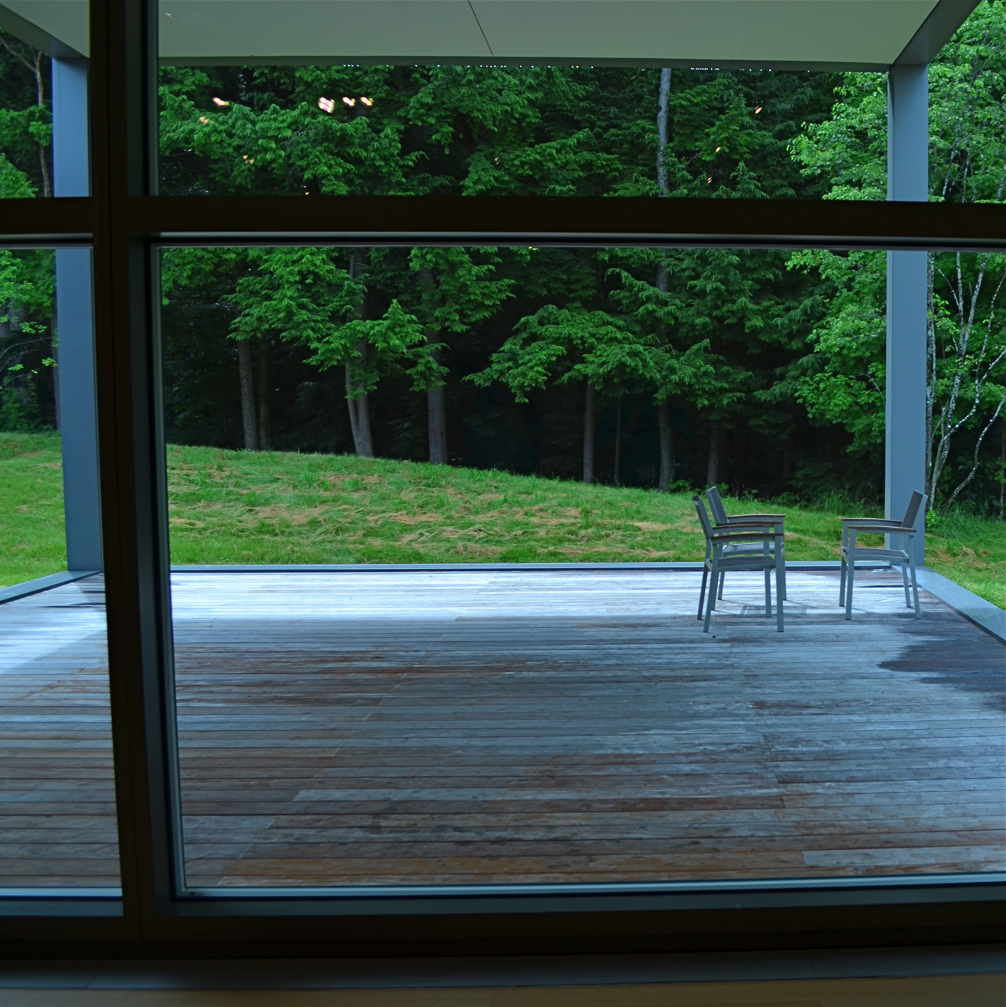
The image seen here is a very calm and unchallenging composition. I liked the small number of elements presented by the stark little porch and the rich but mysterious patch of forest. But in both the shooting and the cropping, I decided to subtly re-jigger the frame to include structural parts of the porch and the window through which I shot the scene, throwing off the perfect geometry of vertical and horizontal, resulting in a look that is a little off-kilter. I tried looking at the shot without any of these parts, and the picture looked too pat, too passive, whereas creating an imperfect square with them gave the photograph just a little edge. Not a slam-you-over-the- head effect, just a slight bit of visual punctuation.
Call it the difference between a colon and semi-colon.
As for the Eastman Kodak Company’s caution that you should maintain the standard frame unless you “are trying for an unusual effect”, well, aren’t you doing that every time you step up to bat?
If not, what’s the point?
ROAD FOOD
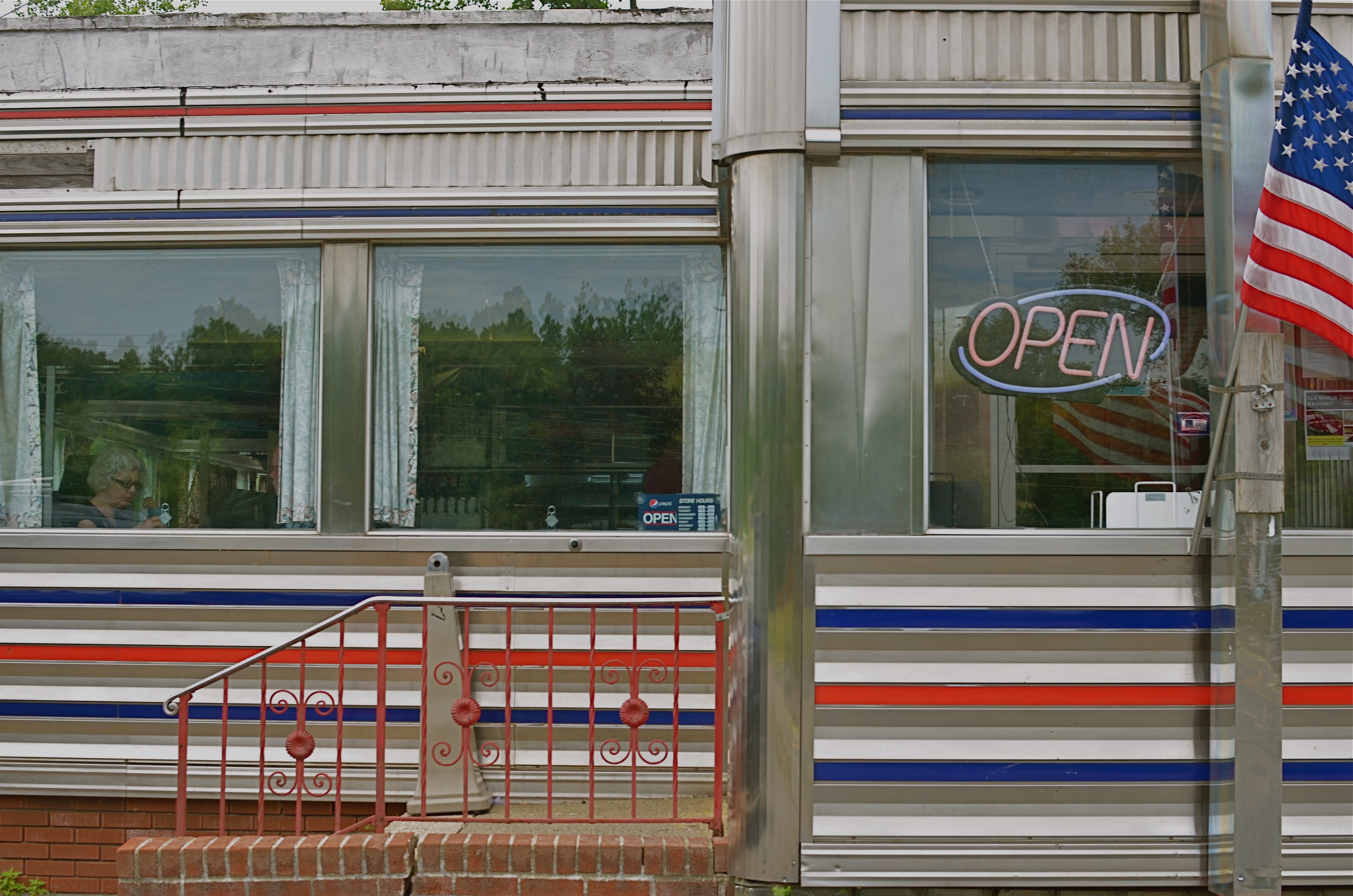
West Taghkanic Diner, Ancram New York, 2014. 1/60 sec., f/5.6, ISO 100, 35mm.
By MICHAEL PERKINS
Truck Driver: Give me some more of this poison you call coffee.
Waitress: I notice you’re on your third cup…
Truck Driver: I like your sugar.
They Drive By Night, Warner Brothers, 1940
AMERICANS CERTAINLY DID NOT INVENT THE IDEA OF STOPPING OFF FOR CHOW “ON THE WAY” TO WHEREVER. The roadside taverns and eateries that dot the globe in the spaces between village and town are the stuff of worldwide legend. Call it the “ye olde inn” tradition. However, in the 20th century, we Yanks did our bit in contributing to the romance of road food. Hey, you’re motoring across the country in your new Ford/Buick/Merrie Oldsmobile anyway, so you need some kind of, let’s call it grub infrastructure, laid out along the route.
Mind you, these won’t be the same restaurants where Grandma and the kids tuck in of a Sunday supper. We leave the linens to the landed gentry: simply paper napkins here, bub. The best “joints” actually resemble trailers more than restaurants, with the menu ranging from non-poisonous to “not bad”, but not much wider. Diners and dives don’t pull down Michelin stars and Zagat raves. But they do shape our traveling, and photographic, experiences. And now that we’re beyond the first great Golden Age of Motoring (maybe the only one, come to think of it), photo-documenting these decaying munch museums is a must.
Hey, doll, any more at home like you?
I love the curvy chrome and Deco streamlining that forms the shell of many joints. I love them even more in their present state of slow disintegration,when the streamlining isn’t too straight, the chrome gives off an apologetic, latter-day patina, and all the angles don’t quite square up. My photographer’s eye likes these temples of makeshift cuisine because they are cheap and cheesy. They’re vulgar and obvious in their blinky, half-dead neon, kitschy colors and over-ripe graphics, and as Sinatra used to sing, that’s America to me. Love it.
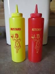
Some of my favorite joints are far more dinosaur than diner, but, when you can squeeze off a frame or two of their fading glory, and amble inside for a five dollar cheeseburger deluxe, heck, boyo, that’s a combo plate you can’t even get at the Ritz. And if I could ever find the dazzling dame who modeled for the drawing of a waitress on the side of all those millions of ketchup squeeze bottles, that would be love at first sight.
Talk about your latter-day Mona Lisa. With fries.
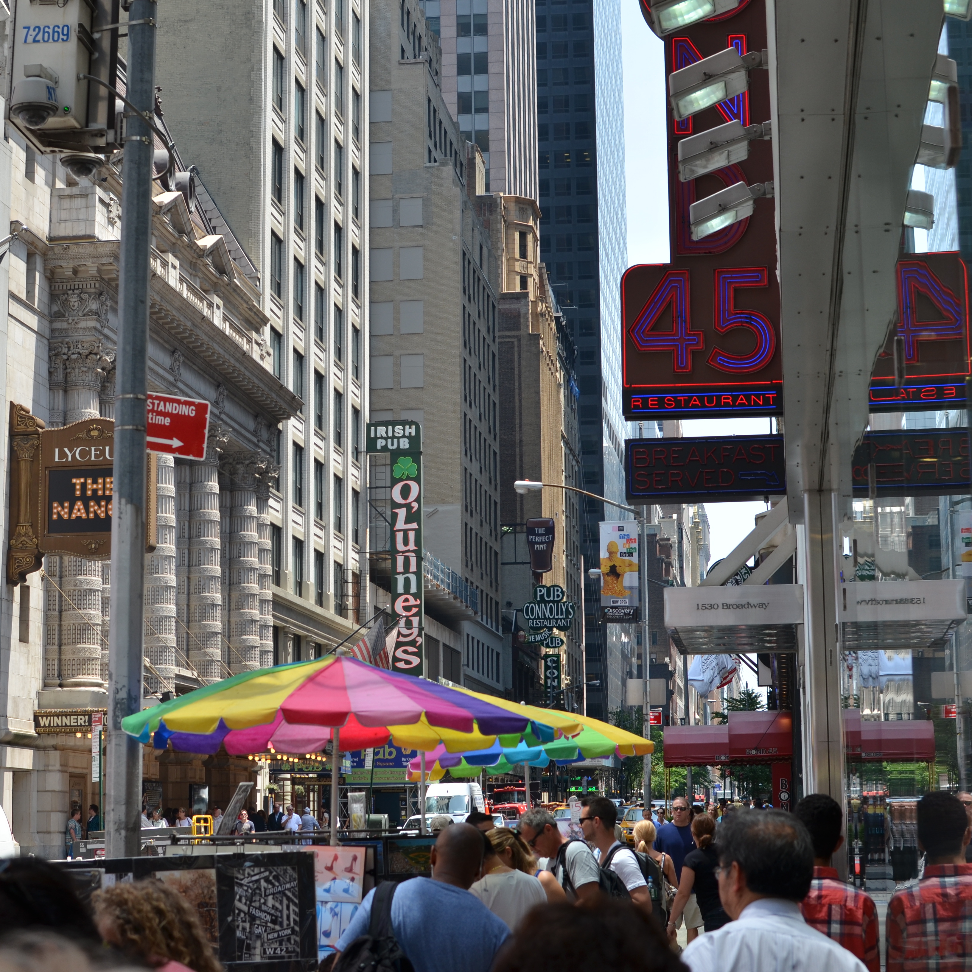
CLEAN-UP ON AISLE FIVE
A post-processed “color compromise” of the image below. 1/320 sec., f/5.6, ISO 100, 35mm.
By MICHAEL PERKINS
TAKE ENOUGH PHOTOGRAPHS AND YOU WILL DEVELOP YOUR OWN SENSE OF “SIMPLICITY”. That is, you will arrive at your own judgement about how basic or complex a composition you need in a given situation. Some photographers are remarkable in their ability to create images that contain a mad amount of visual information. Some busy city scenes or intricate landscapes benefit wonderfully from an explosion of detail. Other shooters render their best stories by reducing elements to a bare minimum. And of course, most of us make pictures somewhere in the vast valley between those approaches.
Before the fiddling ensued.
I’m pretty accustomed to thinking of overly-busy pictures as consisting of a specific kind of “clutter”, usually defined as cramming too many objects or people into a composition. But I occasionally find that color can be a cluttering element, and that some very visually dense photos can be rendered less so by simply turning down hues, rather than rooting them out completely. Recently I’ve been taking some of the pictures that seem a little too “overpopulated” with info and taking them through what a two-step process I call a color compromise (patent not applied for).
First step involves desaturating the picture completely, while also turning the contrast way down, amping up the exposure and damn near banishing any shadows. This almost results in a bleached-out pencil drawing effect and emphasizes detail like crazy. Step two involves the slow re-introduction of color until only selected parts of the image render any hues at all, and making sure that the color that is visible barely, barely registers.
The final image can actually be a clearer “read” for your eyes than either the garish colored original or a complete b&w. Objects will stand out from each other a little more distinctly, and there will be an enhanced sensation of depth. It also suggests a time-travel feel, as if age has baked out the color. A little of this washed-out jeans look goes a long way, however, and this whole exercise is just to see if you can make the picture communicate a little better by allowing it to speak more quietly.
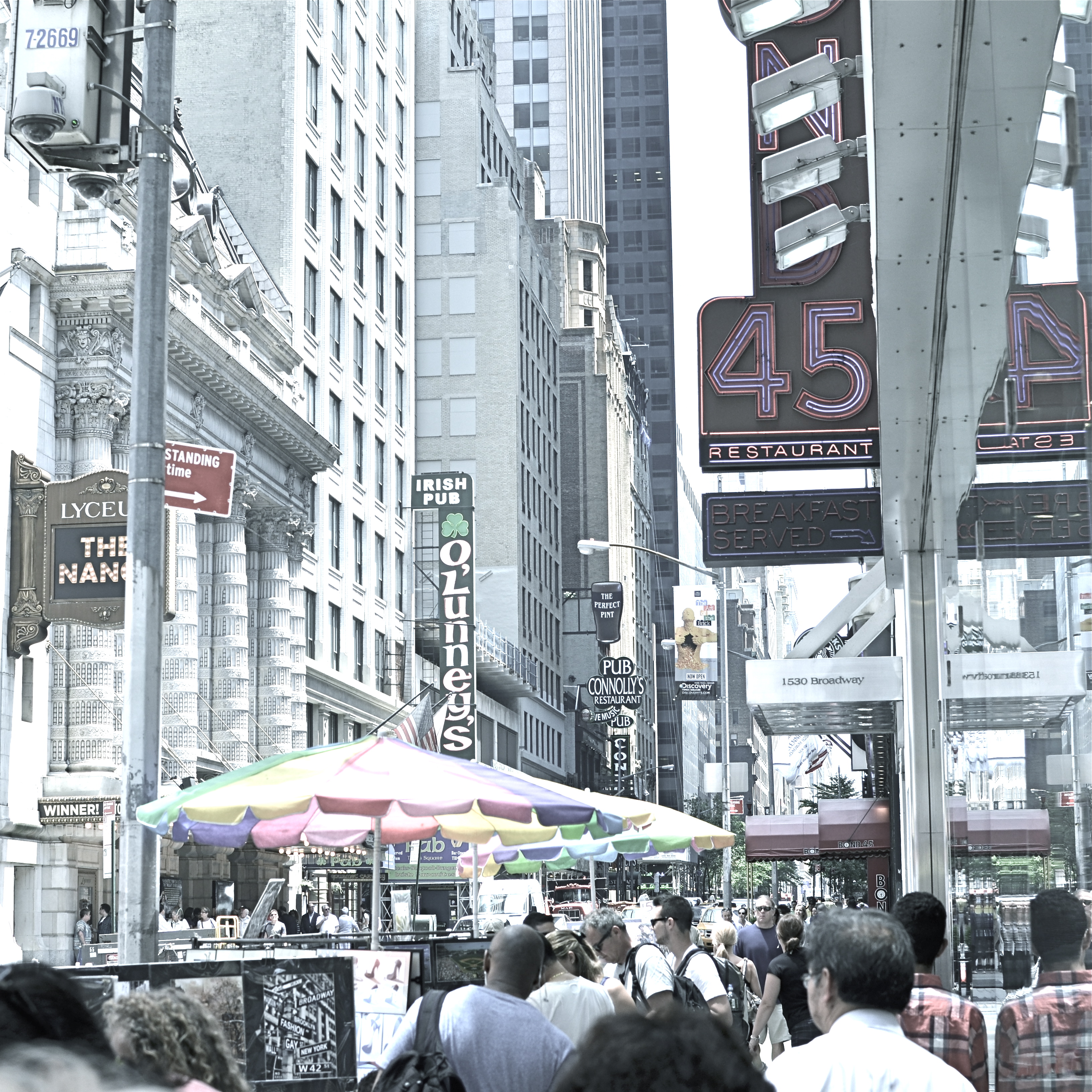
Compare the processed photo at the top, taken in the heart of the visually noisy Broadway district, with its fairly busy color original and see if any of this works for you. I completely stipulate that I may just be bending over backwards to try to salvage a negligible photo. But I do think that color should be a part of the discussion when we fault an image for being cluttered.
REDUCTION OF TERMS
1/320 sec., f/5.6, ISO 100, 35mm.
By MICHAEL PERKINS
To me, photography is an art of observation. It’s about finding something interesting in an ordinary place. I’ve found it has little to do with the things you see, and everything to do with the way you see them. —Elliott Erwitt
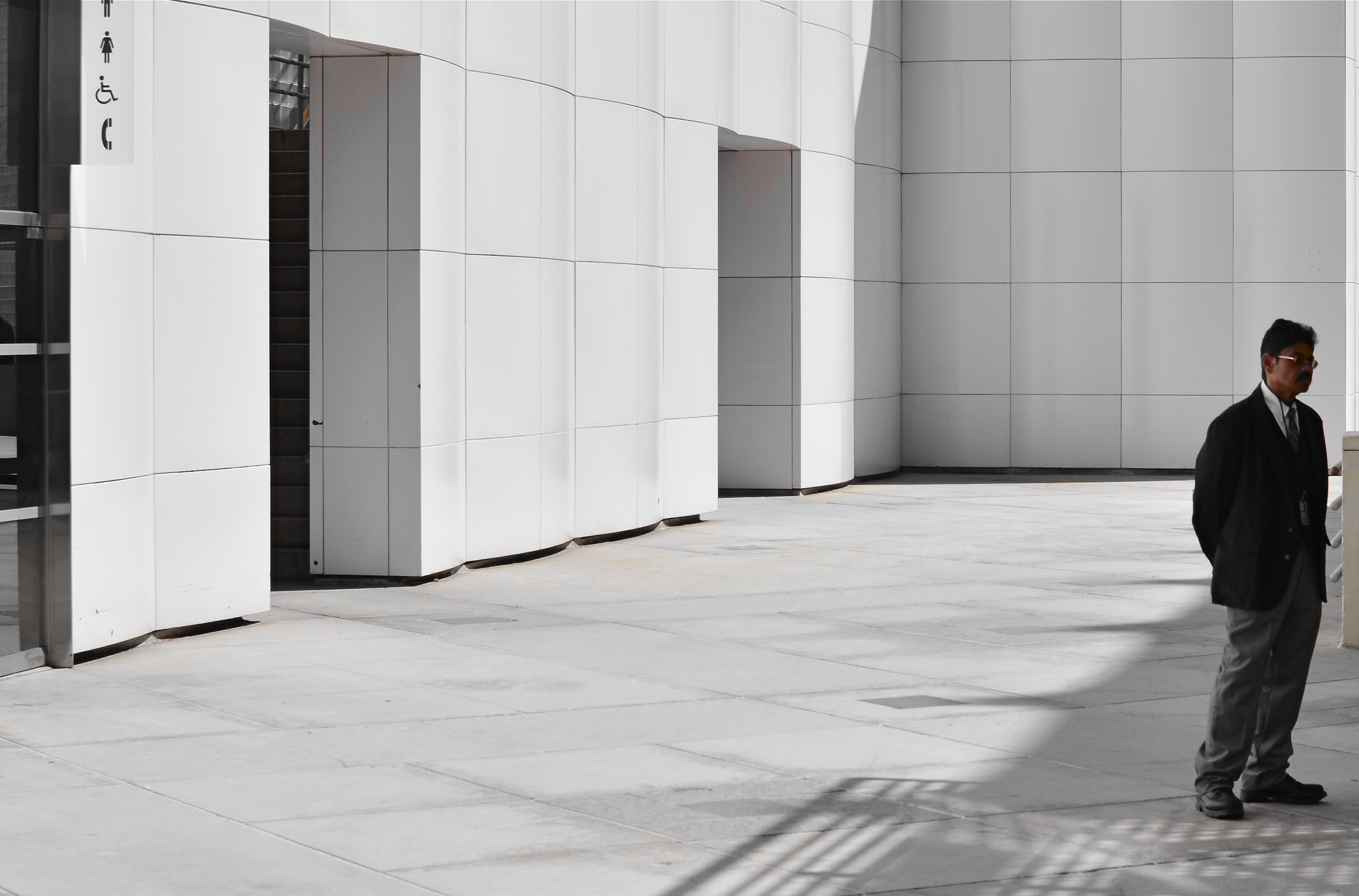
ISOLATION IS A TRULY IRONIC CONDITION OF THE HUMAN ANIMAL. The strange thought that, for most of our lives, we are both awash in a sea of other people and totally alone is one of nature’s most profound paradoxes. Photography shows people in both of these conditions, and shooters must choose what illuminates a person’s story best—-his place among others or his seeming banishment from them. Sometimes both truths are in the same frame, and then you must, as Elliott Erwitt says, alter the way you see in favor of one or the other.
In the case of both of the images posted here, the person who “solely” occupies the frames was originally a stray element within a larger context, with the pictures framed, at first, to include nearby persons or crowds. On further examination, however, one or two compositional elements in each of the pictures convinced me, in both the case of the museum guard and the hurried gallery guest, that they could “hold” the pictures they were in without any other human presence in view, and so I created their isolation, something that was not their natural condition at the time.
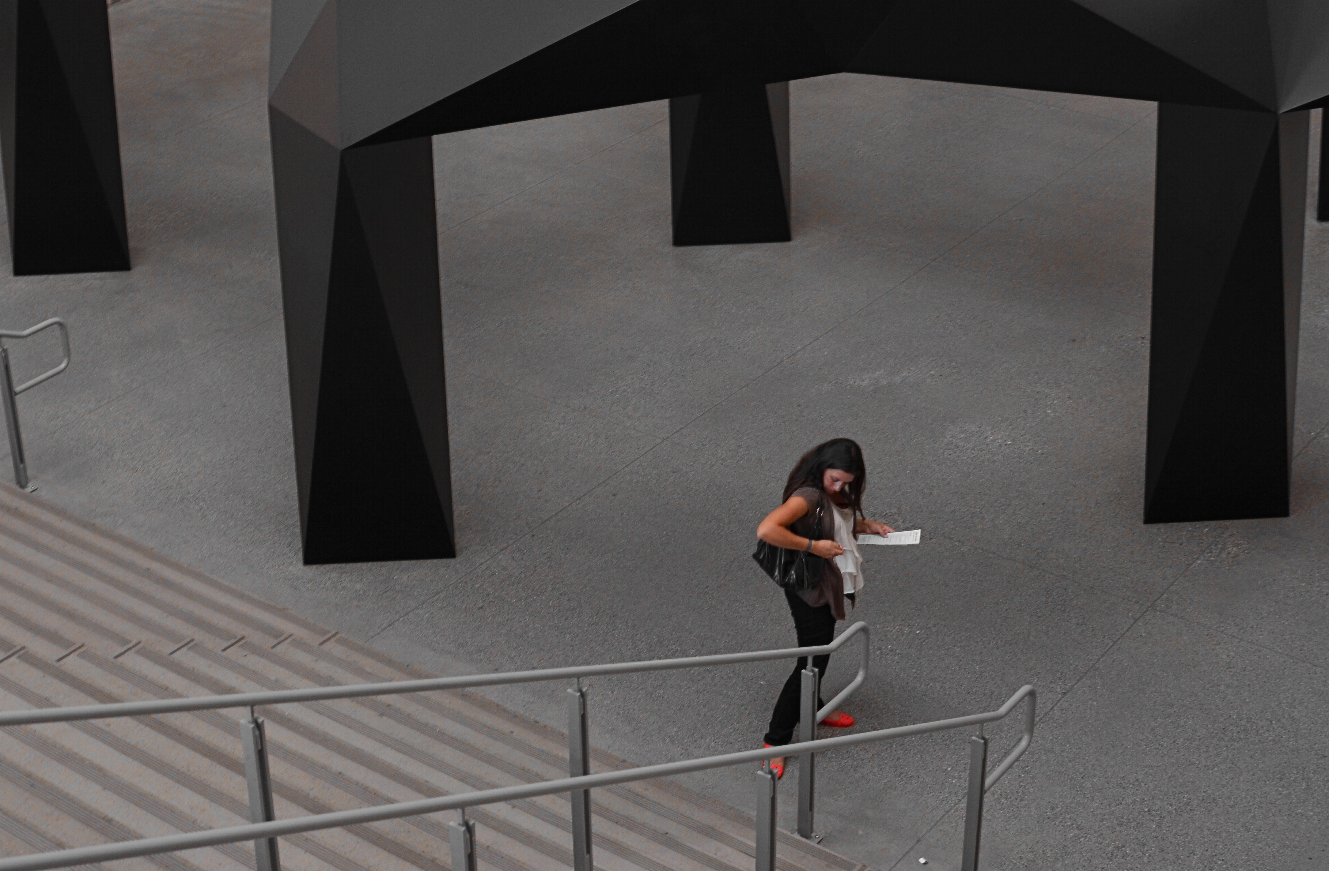
I further “isolated” these two subjects by desaturating everything in the frame except their flesh tones. 1/10 sec., f/5.6, ISO 320, 35mm.
Part of this process is my ongoing curiosity in how far I can go in paring away extra visual information before the story impact of a photograph is amplified to its highest power. I’m sure you have all worked with many original images that are just too balky and talky, that are really “made” in the cropping process. To be sure, sometimes you’re just peeling away the rotten outer parts of an apple to reveal…..a rotten core! Other times, however, you are privileged to peel away just enough petals to render the rose at its best, and, with images of people, that can mean getting rid of almost all the people in the picture you began with.
In both these cases, I liked these people to be shown as if they were in command of small little universes of their own. Does that make the photographs sad? Lonely? Dignified? Tranquil? Yes to all these and anything else you can bring to it, because if cropping is the second part of the picture-making process, then seeing if your instinct “proofs out” with viewers is the final and most crucial part. I’m using every process I can to convey to you what I saw, or what I believe is worth seeing. It’s a collaborative process, and sometimes, I’m sure, I don’t hold up my part of the bargain. And still we press on.
Isolation is more than a human condition or a symptom of our times: it’s a compositional tool, a reduction of the equation of scene-making to its simplest, and hopefully truest, terms.
SET AND SHOOT
Shooting manually means learning to trust that you can capture what you see. 1/160 sec., f/5.6, ISO 100, 18mm.
By MICHAEL PERKINS
AUTOMODES ON CAMERAS ARE SUPPOSED TO AFFORD THE PHOTOGRAPHER AN ENHANCED SENSE OF COMFORT AND SAFETY, since, you know, you’re protected from your very human errors by the camera’s loving, if soulless, oversight. Guess wrong on a shutter speed? The auto has your back. Blow the aperture? Auto is on the case. And you always get acceptable pictures.
That is, if you can put your brain on automode as well.
Okay, that statement makes the top ten list for most arrogant openings in all of Blogdom, 2014. But I stand by it. I don’t think you should get comfortable with your equipment calling the shots. However, getting comfortable with your equipment’s limits and strengths, and gradually relying on your own experience for consistent results through exploitation of that knowledge….now that’s another thing entirely. It’s the difference between driving cross-country on cruise control and knowing, from years of driving, where in the journey your car can shine, if you drive it intelligently.
Photographers call some hunks of glass their “go-to” lenses, since they know they can always get something solid from them in nearly any situation. And while we all tend to wander around aimlessly for years inside Camera Toyland, picking up this lens, that filter, those extenders, we all, if we shoot enough for a long time, settle back into a basic gear setup that is reliable in fair weather or foul.
This is better than using automodes, because we have chosen the setups and systems that most frequently give us good product, and we have picked up enough wisdom and speed from making thousands of pictures with our favorite gear that we can “set and shoot”, that is, calculate and decide just as quickly as most people do with automodes…..and yet we keep the vital link of human input in the creative chain.
Like most, I have my own “go-to” lens and my own “safe bet” settings. But, just as you save time by not trying to invent the wheel every time you step up, you likewise shouldn’t be averse to greasing an old wheel to make it spin more smoothly.
How about that, I also made the top ten list for unwieldy metaphors.
A good day.
THE JOURNEY OF BECOMING
By MICHAEL PERKINS
ONCE MAN LEARNED TO SLICE A PATH THROUGH THE DARK WITH ANY KIND OF LIGHT, a romance with mystery began that photographers carry ever forward. Darkness and light can never be absolute, but duel with each other in a million interim stages at night, one never quite yielding to each other. A flickering lamp, a blazing torch, ten thousand LEDs, a lonely match, all shape the darkness and add the power of interpretation to the shaded side of the day. Photographers can only rejoice at the possibilities.
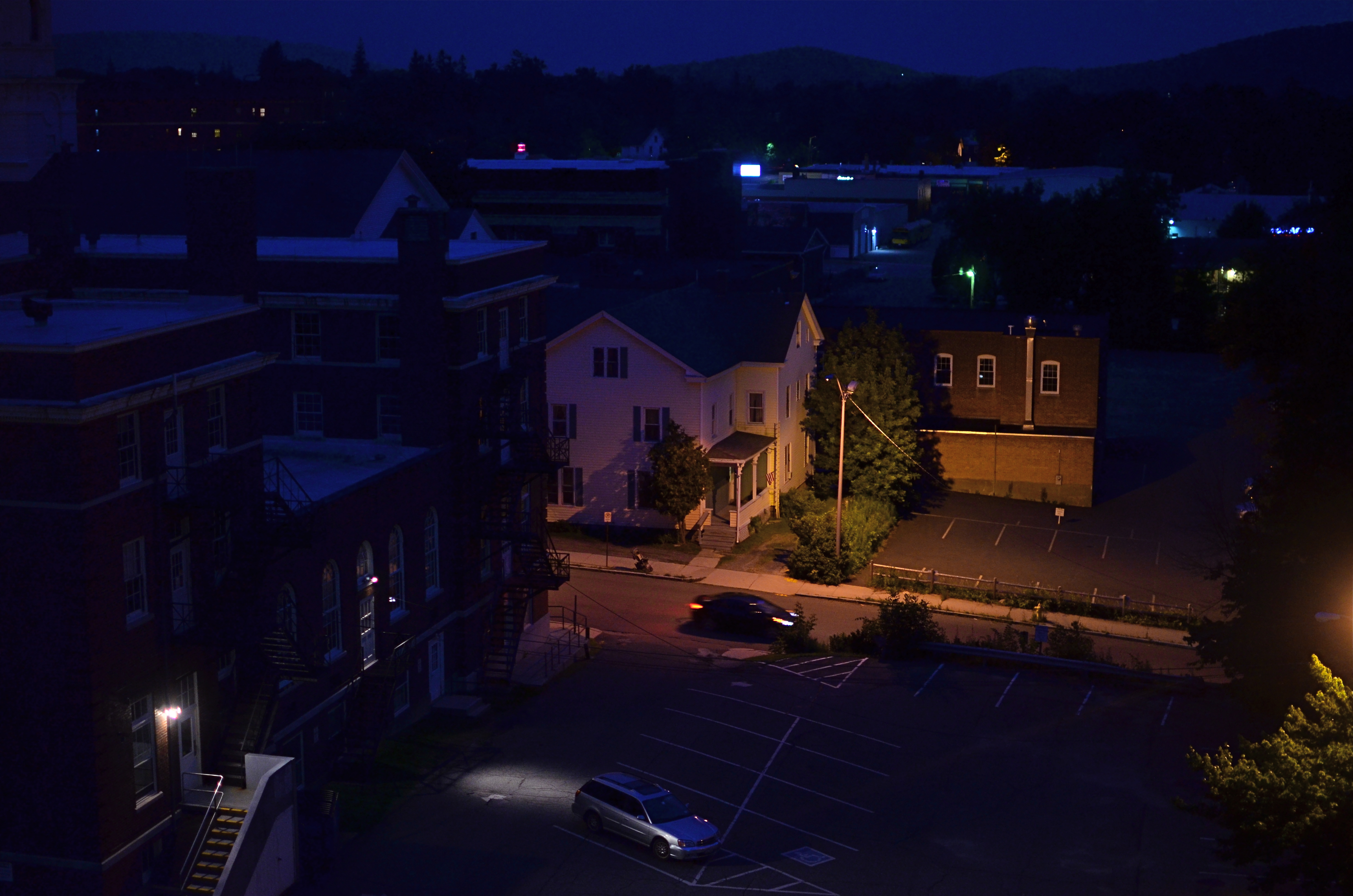
The Late Errand, 2014. 1/40 sec., f/1.8, ISO 640, 35mm.
Spending a recent week in a vacation hotel, I fell into my typical habit of taking shots out the window under every kind of light, since, you know, you only think you understand what a view has to offer until you twist and turn it through variation. You’ve never beheld this scene before, so it’s just too easy to take an impression of it at random, leaving behind all other possibilities. The scene from this particular room, a mix of industrial and residential streets in central Pittsfield, Massachusetts, permits the viewer to see the town in the context of the Berkshire mountains, in which it nestles. Daylight, particularly early morning, renders the town as a charming, warm slice of Americana, not inappropriate in a village that is just a few miles away from the studio of painter Norman Rockwell. However, for me, the area whispered something else entirely after nightfall.
I can only judge the above frame by the combination of light and dark that I saw as I snapped it. Is it significant that the house is largely aglow while the municipal building in front of it is submerged in shadow? Is there anything in the way of mood or story that is conveyed by the lit stairs in the foreground, or the headlamps of the moving or parked cars? If the passing driver is subtracted from the frame, does the feel of the image change completely? Does the subtle outline of the mountains at the horizon lend a particular context?
That’s the point: the picture, any picture of these particular elements can only raise, not answer, questions. Only the viewer can supply the back end of the mystery raised by how it was framed or shot. Some things in the frame are on a journey of becoming, but art is not about supplying solutions, just keeping the conversation going. We’re all on our way somewhere. The camera can only ask, “what happens when we turn down this road?.”
That’s enough.
TAKING FLIGHT ONCE MORE
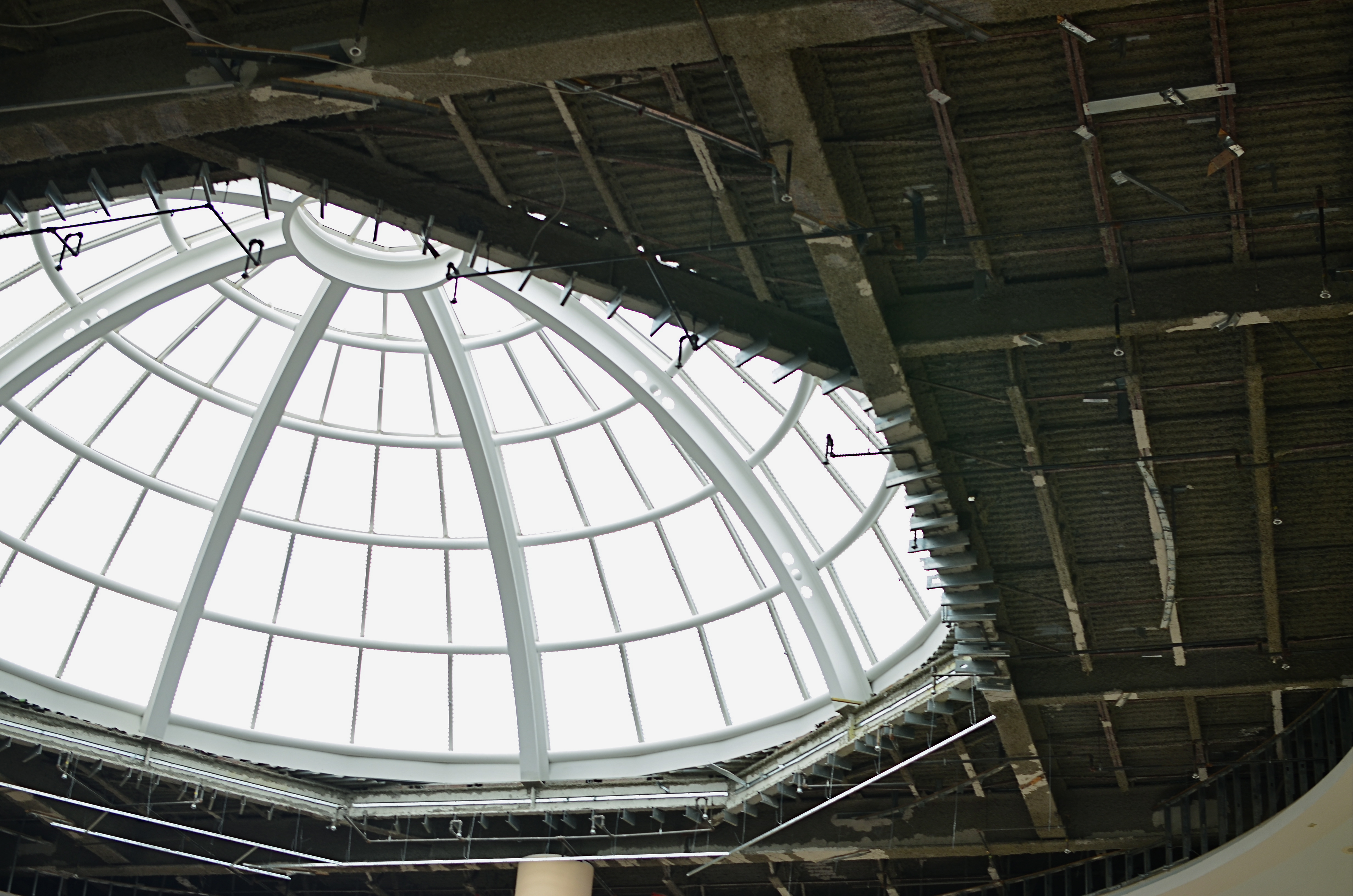
The Aerodrome, 2014. 1/30 sec., f/3.5, ISO 100, 35mm.
By MICHAEL PERKINS
ONE OF THE CHARGES GIVEN TO ALL PHOTOGRAPHERS IS TO MARK THE PASSAGE OF TIME, to chronicle and record, to give testimony to a rapidly vanishing world. Certainly interpretation, fantasy, and other original conceptions are equally important for shooters, but there has been a kind of unspoken responsibility to use the camera to bear witness. This is especially difficult in a world bent on obliterating memory, of dismantling the very sites of history.
Humorist and historian Bill Bryson’s wonderful book, One Summer: America 1927 frames the amazing news stories of its title year around its most singular event, the solo transatlantic flight of Charles A. Lindbergh. A sad coda to the story reveals that nothing whatever remains of Roosevelt Field, the grassy stretch on Long Island from which the Lone Eagle launched himself into immortality, with the exception of a small plaque mounted on the back of an escalator in the mall that bears the field’s name. Last week, hauled along on a shopping trip to the mall with relatives, I made my sad pilgrimage to said plaque, lamenting, as Bryson did, that there is nothing more to photograph of the place where the world changed forever.
Then I got a little gift.
The mall is under extensive renovation as I write this, and much of the first floor ceiling has been stripped back to support beams, electrical systems and structural gridwork. Framed against the bright bargains in the mall shops below, it’s rather ugly, but, seen as a whimsical link to the Air Age, it gave me an idea. All wings of the Roosevelt Field mall feature enormous skylights, and several of them occur smack in the middle of some of the construction areas. Composing a frame with just these two elements, a dark, industrial space and a light, airy radiance, I could almost suggest the inside of a futuristic aerodrome or hangar, a place of bustling energy sweeping up to an exhilarating launch hatch. To get enough detail in this extremely contrasty pairing, and yet not add noise to the darker passages, I stayed at ISO 100, but slowed to 1/30 sec. and a shutter setting of f/3.5. I still had a near-blowout of the skylight, saving just the grid structure, but I was really losing no useful detail I needed beyond blue sky. Easy choice.
Thus, Roosevelt Field, for me, had taken wing again, if only for a moment, in a visual mash-up of Lindbergh, Flash Gordon, Han Solo, and maybe even The Rocketeer. In aviation, the dream’s always been the thing anyway.
And maybe that’s what photography is really for…trapping dreams in a box.
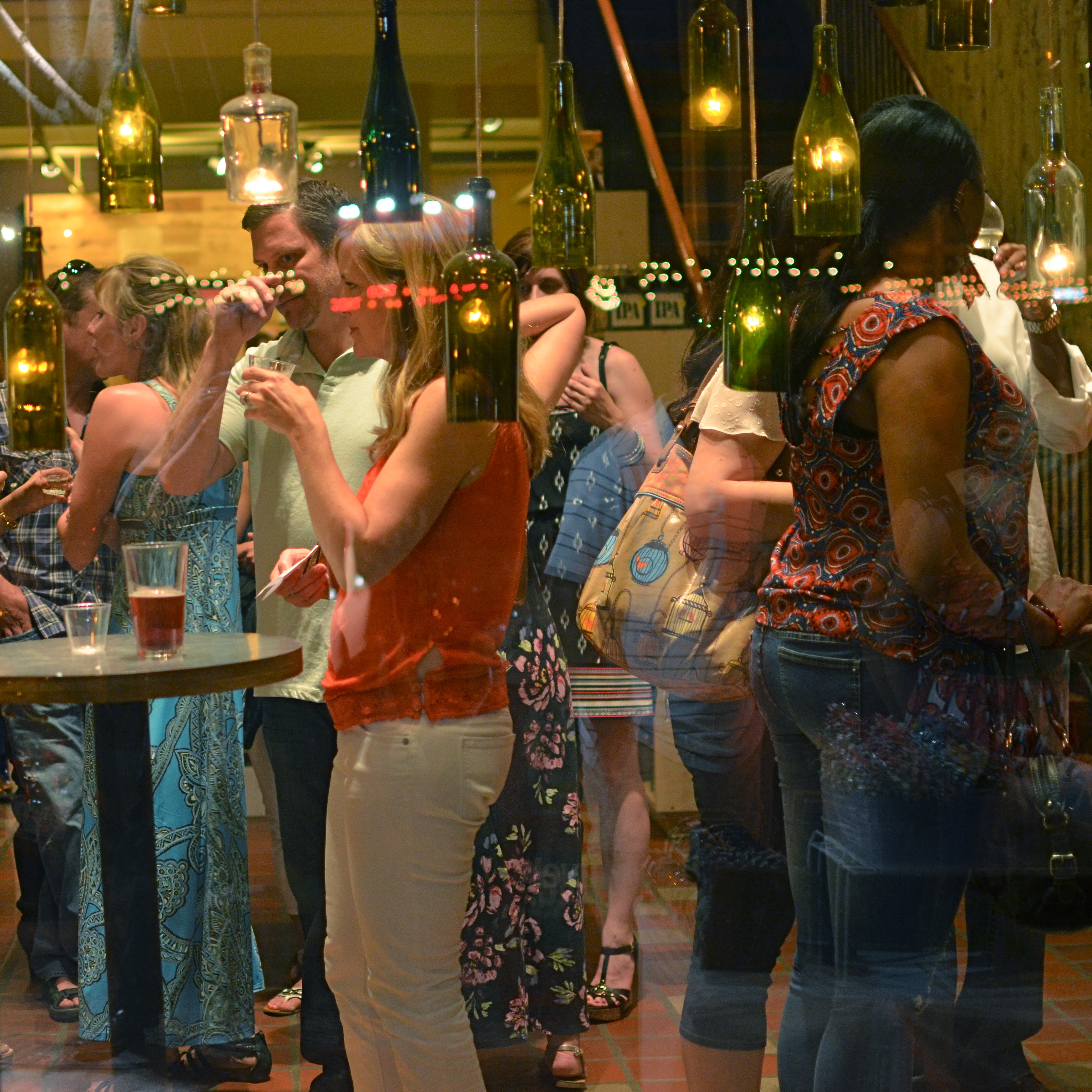
A BIG BOX OF LONELY
Think inside the box. 1/80 sec., f/2.2, ISO 800, 35mm.
By MICHAEL PERKINS
PHOTOGRAPHY CAN GO TWO WAYS ON CONTEXT. It can either seek out surroundings which comment organically on subjects (a lone customer at a largely empty bar, for example) or it can, through composition or editing, artificially create that context (five people in an elevator becomes just two of those people, their locked hands taking up the entire frame). Sometimes, images aren’t about what we see but what we can make someone else seem to see.
Creating your own context isn’t really “cheating” (are we really still using that word?), because you’re not creating a new fact in the photograph, so much as you are slapping a big neon arrow onto said fact and saying, “hey look over here.” Of course, re-contextualizing a shot can lead to deliberate mis-representation of reality in the wrong hands (see propaganda, use of), but, assuming we’re re-directing a viewer’s attention for purely aesthetic reasons (using our powers for good), it can make a single photo speak in vastly different ways depending on where you snip or pare.
In the above situation, I was shooting through the storefront window of a combined art studio and wine bar (yes, I hang with those kind of people), and, given that the neighborhood I was in regularly packed folks in on “gallery hop” nights, the place was pretty jammed. The original full frame showed everything you see here, but also the connecting corridor between the studio and the wine bar which was, although still crowded, a lot less claustrophobic than this edited frame suggests.
And that’s really the point. Urban “hangs” that are so over-attended can give me the feeling of being jammed into a phone booth, like I’m part of some kind of desperately lonely lemming family reunion, so I decided to make that crushed sensation the context of the picture. Cropping down to a square frame improved the balance of the photograph but it also made these people look a little trapped, although oddly indifferent to their condition. The street reflections from the front plane of glass also add to the “boxed in” sensation. It’s a quick way to transform a snap into some kind of commentary, and you can either accept my choice or pass it by. That’s why doing this is fun.
Urban life presents a challenging series of social arrangements, and context in photographs can force a conversation on how that affects us.
ELEMENTARY, MY DEAR NIKON
Let the light decide what makes a photograph. Modem, 2014. 1/30 sec., f/1.8, ISO 800, 35mm.
By MICHAEL PERKINS
PHOTOGRAPHY IS OFTEN DEFINED CLASSICALLY AS “WRITING WITH LIGHT“, but I often wonder if a better definition might be “capitalizing on light opportunities”, since it’s not really what subject matter we shoot but light’s role in shaping it that makes for strong images. We have all seen humble objects transformed, even rendered iconic, based on how a shooter perceives the value of light, then shapes it to his ends. That’s why even simple patterns that consist of little more than light itself can sometimes be enough for a solid photograph.
If you track the history of our art from, say, from the American Civil War through today’s digital domain, you really see a progression from recording to interpreting. If the first generally distributed photographs seen by a mass audience involve, say, the aftermath of Antietam or Gettysburg, and recent images are often composed of simple shapes, then the progression is very easy to track. The essence is this: we began with photography as technology, the answer to a scientific conundrum. How do we stop and fix time in a physical storage device? Once that very basic aim was achieved, photographers went from trying to just get some image (hey, it worked!) to having a greater say in what kind of image they wanted. It was at this point that photography took on the same creative freedom as painting. Brushes, cameras, it doesn’t matter. They are just mediums through which the imagination is channeled.
In interpreting patterns of elementary shapes which appeal on their own merit, photographers are released from the stricture of having to endlessly search for “something to shoot”. Some days there is no magnificent sunrise or eloquent tree readily at hand, but there is always light and its power to refract, scatter, and recombine for effect. It’s often said that photography forced painting into abstraction because it didn’t want to compete with the technically perfect way that the camera could record the world. However, photography also evolved beyond the point where just rendering reality was enough. We moved from being reporters to commentators, if you like. Making that journey in your own work (and at your own pace) is one of the most important step an art, or an artist, can take.
SETTING THE CAPTIVES FREE
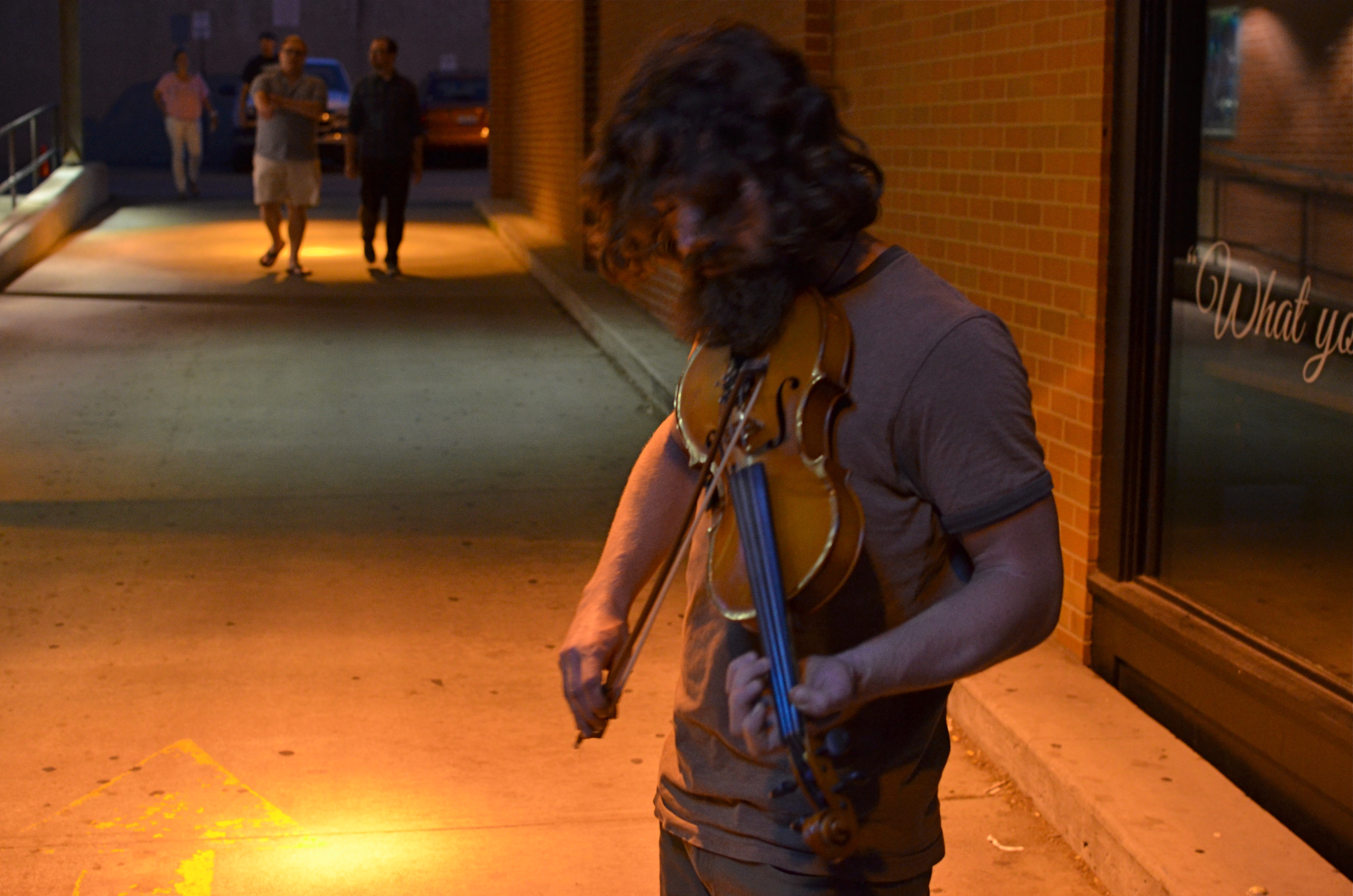
Fiddler, 2014. Too soft? Too dark? True? False? 1/50 sec., f/3.5, ISO 1000, 35mm.
By MICHAEL PERKINS
I’D LIKE TO ERADICATE THE WORD “CAPTURE” FROM MOST PHOTOGRAPHIC CONVERSATIONS. It suggests something stiff or inflexible to me, as if there is only one optimum way to apprehend a moment in an image. Especially in the case of portraits, I don’t think that there can be a single way to render a face, one perfect result that says everything about a person in a scant second of recording. If I didn’t capture something, does that mean my subject “got away” in some way, eluded me, remains hidden? Far from it. I can take thirty exposures of the same face and show you thirty different people. The word has become overused to the point of meaningless.
We are all conditioned to think along certain bias lines to consider a photograph well done or poorly done, and those lines are fairly narrow. We defer to sharpness over softness. We prefer brightly lit to mysteriously dark. We favor naturalistically colored and framed recordings of subjects to interpretations that keep color and composition “codes” fluid, or even reject them outright. It takes a lot of shooting to break out of these strictures, but we need to make this escape if we are to move toward anything approaching a style of our own.
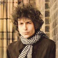
Jerry Schatzberg’s iconic portrait of Bob Dylan from the cover of Blonde On Blonde.
I remember being startled in 1966 when I first saw Jerry Schatzberg’s photograph of Bob Dylan on the cover of the Blonde On Blonde album. How did the editor let this shot through? It’s blurred. It’s a mistake. It doesn’t…..wait, I can’t get that face out of my head. It’s Bob Dylan right now, so right now that he couldn’t be bothered to stand still long enough for a snap. The photo really does (last time I say this) capture something fleeting about the electrical, instantaneous flow of events that Dylan is swept up in. It moves. It breathes. And it’s more significant in view of the fact that there were plenty of pin-sharp frames to choose from in that very same shoot. That means Schatzberg and Dylan picked the softer one on purpose.
There are times when one 10th of a second too slow, one stop too small, is just right for making the magic happen. This is where I would usually mention breaking a few eggs to make an omelette, but for those of you on low-cholesterol diets, let’s just say that n0 rule works all the time, and that there’s more than one way to skin (or capture) a cat.
A PLACE APART
By MICHAEL PERKINS
PHOTOGRAPHERS USUALLY USE FACES AS THE SOLE BAROMETER OF EMOTION. It’s really easy to use a person’s features as the most obvious cues to one’s inner mind. Scowls, smiles, smirks, downcast eyes, sidelong glances,cries of anguish….these are standard tools in depicting someone as either assimilated into the mass of humanity or cast away, separate and alone.
But faces are only one way of showing people as living in a place apart. Symbolically, there is an equally dramatic effect to be achieved by the simple re-contextualizing of that person in space. The arrangement of space near your subject forces the viewer to conclude that he or she is either in harmony with their surroundings or lonely, solitary, sad even, and you do it without showing so much as a raised eyebrow. This is where composition isn’t just a part of the story, but the story itself.
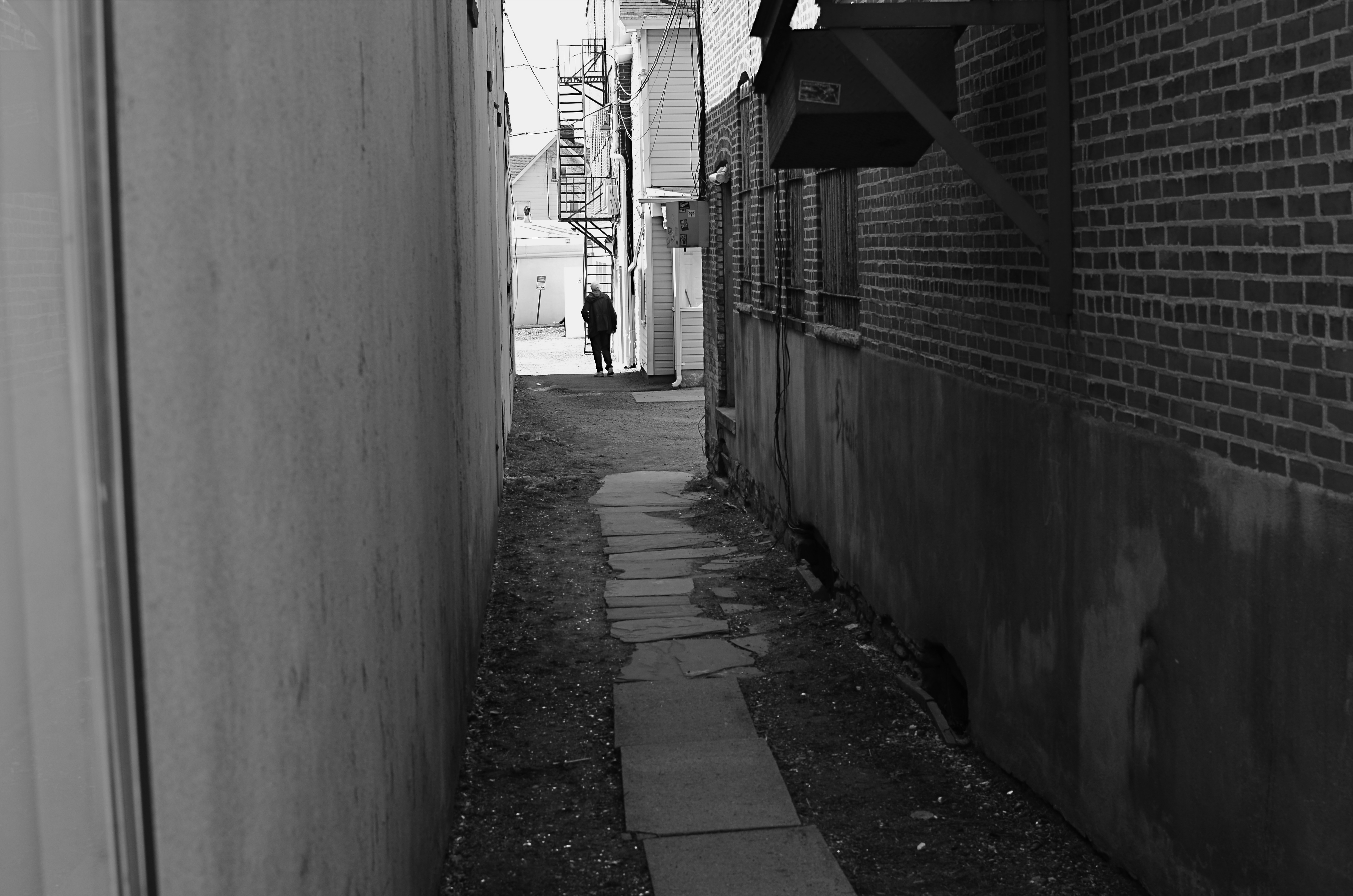
Context is all.
The woman shown here is most likely just walking from point A to point B, with no undercurrent of real tragedy. But once she takes a short cut down an alley, she can be part of a completely different, even imaginary story. Here the two walls isolate her, herding her into a context where she could be lonely, sad, afraid, furtive. She is walking away from us, and that implies a secret. She is “withdrawing” and that implies defeat. She is without a companion, which can symbolize punishment, banishment, exile. From us? From herself? From the world? Once you start to think openly about it, you realize that placing the subject in space lays the foundation for storytelling, a technique that is easy to create, recalibrate, manipulate.
The space around people is a key player in the drama an image can generate. It can mean, well, whatever you need it to mean. People who exist in a place apart become the centerpieces in strong photographs, and the variability of that strength is in your hands.
THE ENVELOPE
By MICHAEL PERKINS
HAVING LIVED IN THE AMERICAN SOUTHWEST FOR OVER FIFTEEN YEARS, I HAVE NEGOTIATED MY OWN TERMS WITH THE BLAZING OVERKILL OF MIDDAY SUNLIGHT, and its resulting impact on photography. If you move to Arizona or New Mexico from calmer climates, you will find yourself quickly constricting into a severe squint from late breakfast to early evening, with your camera likewise shrinking from the sheer overabundance of harsh, white light. If you’re determined to shoot in midday, you will adjust your approach to just about everything in your exposure regimen.
Good news, however: if you prefer to shoot in the so-called “golden hour” just ahead of sunset, you will be rewarded with some of the most picturesque tones you’ve ever had the good luck to work with. As has been exhaustively explained by better minds than mine, sunlight lingers longer in the atmosphere during the pre-sunset period, which, in the southwest, can really last closer to two hours or more. Hues are saturated, warm: shadows are powerful and sharp. And, if that dramatic contrast works to your advantage in color, it really packs a punch in monochrome.
This time of day is what I call “the envelope”, which is to say that objects look completely different in this special light from how they register in any other part of the day, if you can make up your mind as to what to do in a hurry. Changes from minute to minute are fast and stark in their variance. Miss your moment, and you must wait another 24 hours for a re-do.
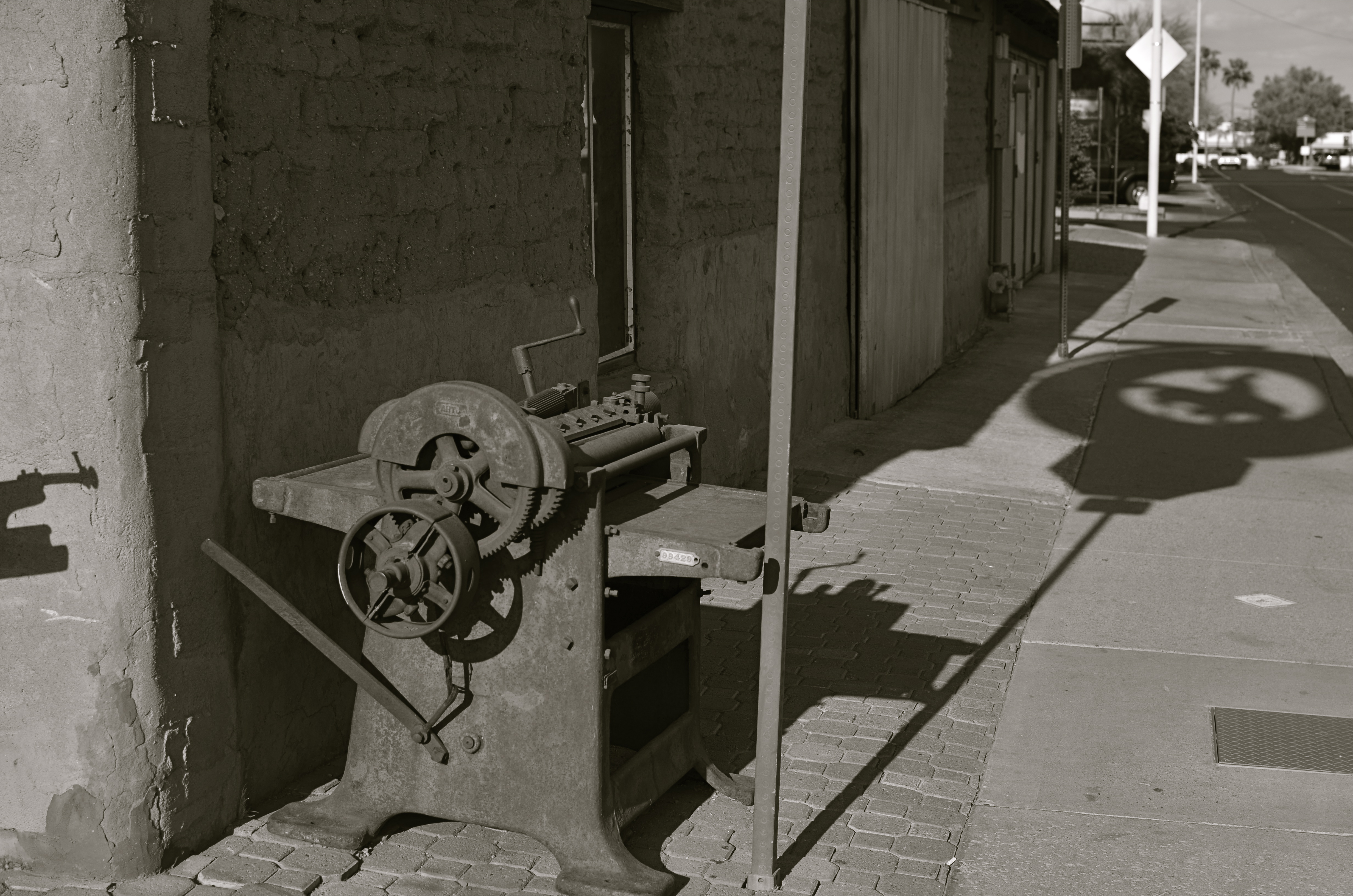
In the west, the best action actually happens after High Noon. Just before sunset in Scottsdale, AZ: 1/500 sec., f/4.5, ISO 100, 35mm.
The long shadow of an unseen sign visible in the above frame lasted about fifteen minutes on the day of the shoot. The sign itself is a metal cutout of a cowboy astride a bucking bronco, the symbol of Scottsdale, Arizona, “the most western town in the USA”. The shadow started as a short patch of black directly in front of the rusted bit of machine gear in the foreground, then elongated to an exaggerated duplicate of the sign, extending halfway down the block and becoming a sharper and more detailed silhouette.
A few minutes later, it grew softer and eventually dissolved as the sun crept closer to the western horizon. There would still be blazing illumination and harsh shadows for some objects, if you went about two stories high or higher, but, generally, sunset was well under way. Caught in time, the shadow became an active design element in the shot, an element strong enough to come through even in black and white.
If you are ever on holiday in the southwest, peek inside “the envelope”. There’s good stuff inside.
SYMBIOSIS OF HORROR
In war, is this an angel of mercy or a wraith of wrath?
By MICHAEL PERKINS
SHARPER MINDS THAN MINE WILL SPEND AN INFINITE AMOUNT OF EFFORT THIS WEEK CATALOGUING THE COSTS OF THE “GREAT WAR“, the world’s first truly global conflict, sparked by the trigger finger of a Serbian nationalist precisely one hundred years ago. These great doctors of thinkology will stack statistics like cordwood (or corpses) in an effort to quantify the losses in men, horses, nations and empires in the wake of the most horrific episode of the early 20th century.
Those figures will be, by turns, staggering/appalling/saddening/maddening. But in the tables of numbers that measure these losses and impacts, one tabulation can never be made: the immeasurable loss to the world of art, and, by extension, photography.
There can be no quantification of art’s impact in our lives, no number that expresses our loss at its winking out. Photography, not even a century old when Archduke Franz Ferdinand was dispatched to history, was pressed into service to document and measure the war and all its hellish impacts. But no one can know how many war photographers might have turned their lenses to beauty, had worldwide horror not arrested their attention. Likewise, no one can know how many Steichens, Adamses, or Bourke-Whites, clothed in doughboy uniforms, were heaped on the pyre as tribute to Mars and all his minions. Most importantly, we cannot know what their potential art, now forever amputated by tragedy, might have meant to millions seeking the solace of vision or the gasp of discovery.
Photography as an art was shaped by the Great War, as were its tools and techniques, from spy cameras to faster films. The war set up a symbiosis of horror between the irresistible message of that inferno and the unblinking eye of our art. We forever charged certain objects as emblems of that conflict, such that an angel now is either a winged Victory, an agent of vengeance, or a mourner for the dead, depending on the photographer’s aims. That giant step in the medium’s evolution matters, no less than the math that shows how many sheaves of wheat were burned on their way to hungry mouths.
Our sense of what constitutes tragedy as a visual message was fired in the damnable forge of the Great War, along with our ideals and beliefs. Nothing proves that art is a life force like an event which threatens to extinguish that life. One hundred years later, we seem not to have learned too much more about how to avoid tumbling into the abyss than we knew in 1914, but, perhaps, as photographers, we have trained our eye to bear better witness to the dice roll that is humanity.
THE UNSEEN GEOMETRY
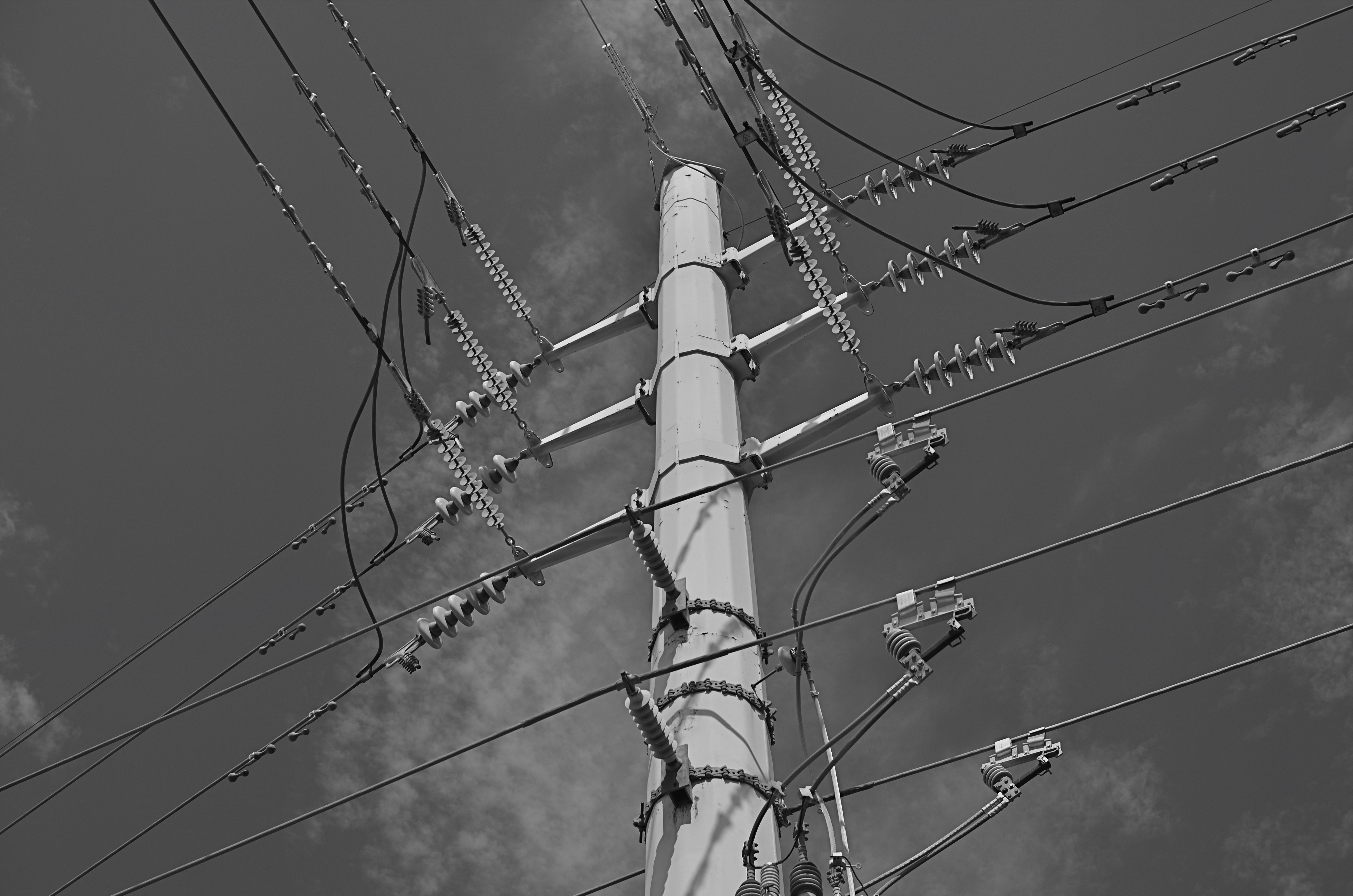
Overhead and out of sight. 1/400 sec., f/5.6, ISO 100, 35mm.
By MICHAEL PERKINS
THERE ARE MANY PHOTO SITES THAT SUGGEST SHOOTS CALLED “WALKABOUTS“, informal outings intended to force photographers to shoot whatever comes to hand with as fresh an eye as possible. Some walkabouts are severe, in that they are confined to the hyper-familiar surroundings of your own local neighborhood; others are about dropping yourself into a completely random location and making images out of either the nothing of the area or the something of what you can train yourself to see.
Walks can startle you or bore you to tears (both on some days), but they will sharpen your approach to picture-making, since what you do is far more important than what you’re pointing to. And the discipline is sound: you can’t hardly miss taking shots of cute cats or July 4 fireworks, but neither will you learn very much that is new. Forcing yourself to abandon flashier or more obvious subjects teaches you to imbue anything with meaning or impact, a skill which is, over a lifetime, beyond price.
One of the things I try to keep in mind is how much of our everyday environment is designed to be “invisible”, or at least harder to see. Urban infrastructure is all around us, but its fixtures and connections tend to be what I call the unseen geometry, networks of service and connectivity to which we simply pay no attention, thus rendering them unseeable even to our photographer’s eye. And yet infrastructure has its own visual grammar, giving up patterns, even poetry when placed into a context of pure design.
The above power tower, located in a neighborhood which, trust me, is not brimming with beauty, gave me the look of an aerial superhighway, given the sheer intricacy of its connective grid. The daylight on the day I was shooting softened and prettied the rig to too great a degree, so I shot it in monochrome and applied a polarizing filter to make the tower pop a little bit from the sky behind it. A little contrast adjustment and a few experimental framing to increase the drama of the capture angle, and I was just about where I wanted to be.
I had to look up beyond eye (and street) level to recognize that something strong, even eloquent was just inches away from me. But that’s what a walkabout is for. Unseen geometry, untold stories.
HOW MUCH IS TOO MUCH?
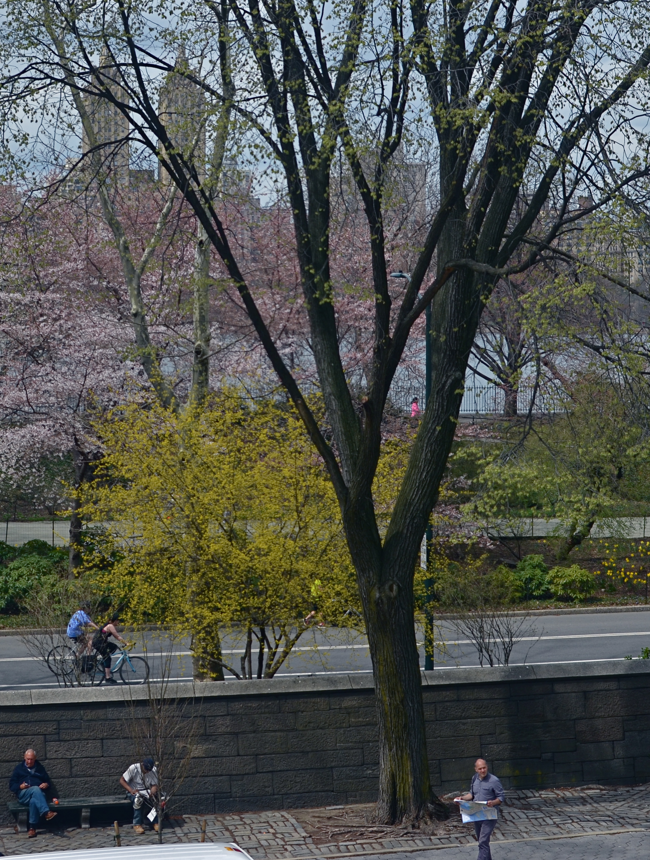
Lots going on here. Too much?
By MICHAEL PERKINS
THESE DAYS IT SEEMS TO TAKE LESS TIME TO SNAP A PHOTOGRAPH THAN IT DOES TO DECIDE WHETHER IT HAS ANY MERIT. Photography is still largely about momentary judgements, and so it stands to reason that some are more well-conceived than others. There’s a strong temptation to boast that “I meant to do that, of course” when the result is a good one, and to mount an elaborate alibi when the thing crashes and burns, but, even given that very human tendency, some pictures stubbornly linger between keeper and krap, inhabiting a nether region in which you can’t absolutely pronounce them either success or failure.
The image at left is one such. It was part of a day spent in New York’s Central Park, and for most of the shots taken on that session, I can safely determine which ones “worked”. This one, however, continues to defy a clear call either way. Depending on which day I view it, it’s either a slice-of-life capture that shows the density of urban life or a visual mess with about four layers too much glop going on. I wish there were an empirical standard for things like photographs, but…..wait, I really don’t wish that at all. I like the fact that none of us is truly certain what makes a picture resonate. If there were such a standard for excellence, photography could be reduced to a craft, like batik or knitting. But it can never be. The only “mission” for a photographer, however fuzzy, is to convey a feeling. Some viewers will feel like a circuit has been completed between themselves and the artist. But even if they don’t, the quest is worthwhile, and goes ever on.
I have played with this photo endlessly, converting it to monochrome, trying to enhance detail in selective parts of it, faking a tilt-shift focus, and I finally present it here exactly as I shot it. I am gently closer to liking it than at first, but I feel like this one will be a problem child for years to come. Maybe I’m full of farm compost and it is simply a train wreck. Maybe it’s “sincere but just misunderstood”. I’m okay either way. I can accept it for a near miss, since it becomes a reference point for trying the same thing with better success somewhere down the road.
And, if it’s actually good, well, of course, I meant to do that.
SYMBOLS (For Father’s Day, 2014)
By MICHAEL PERKINS
PHOTOGRAPHY IS, ALTERNATIVELY, AN ART OF BOTH DOCUMENTATION AND SUGGESTION. It is, of course, one of its essential tasks to record, to mark events, comings, goings, arrivals, and passings. That’s basically a reporter’s function, and one which photographers have served since we first learned to trap light in a box. The other, and arguably more artistic task, is to symbolize, to show all without showing everything. And on this Father’s Day (as on every one), we honor our parents by taking photographs which address both approaches.
For many years, I have taken the obvious path by capturing the latest version of Dad’s face. It’s an ever-changing mosaic of effects, which no photographer/storyteller worth his salt can resist. But in recent years, I also am trying to symbolize my father, to make him stand not only for his own life, but for the miles traveled by all parents. For this task, a face is too specific, since it is so firmly anchored to its own specific myths and legends. To make Dad emblematic, not just as a man but rather as “Man”, I’ve found that abstracting parts of him can work a little better than a simple portrait.
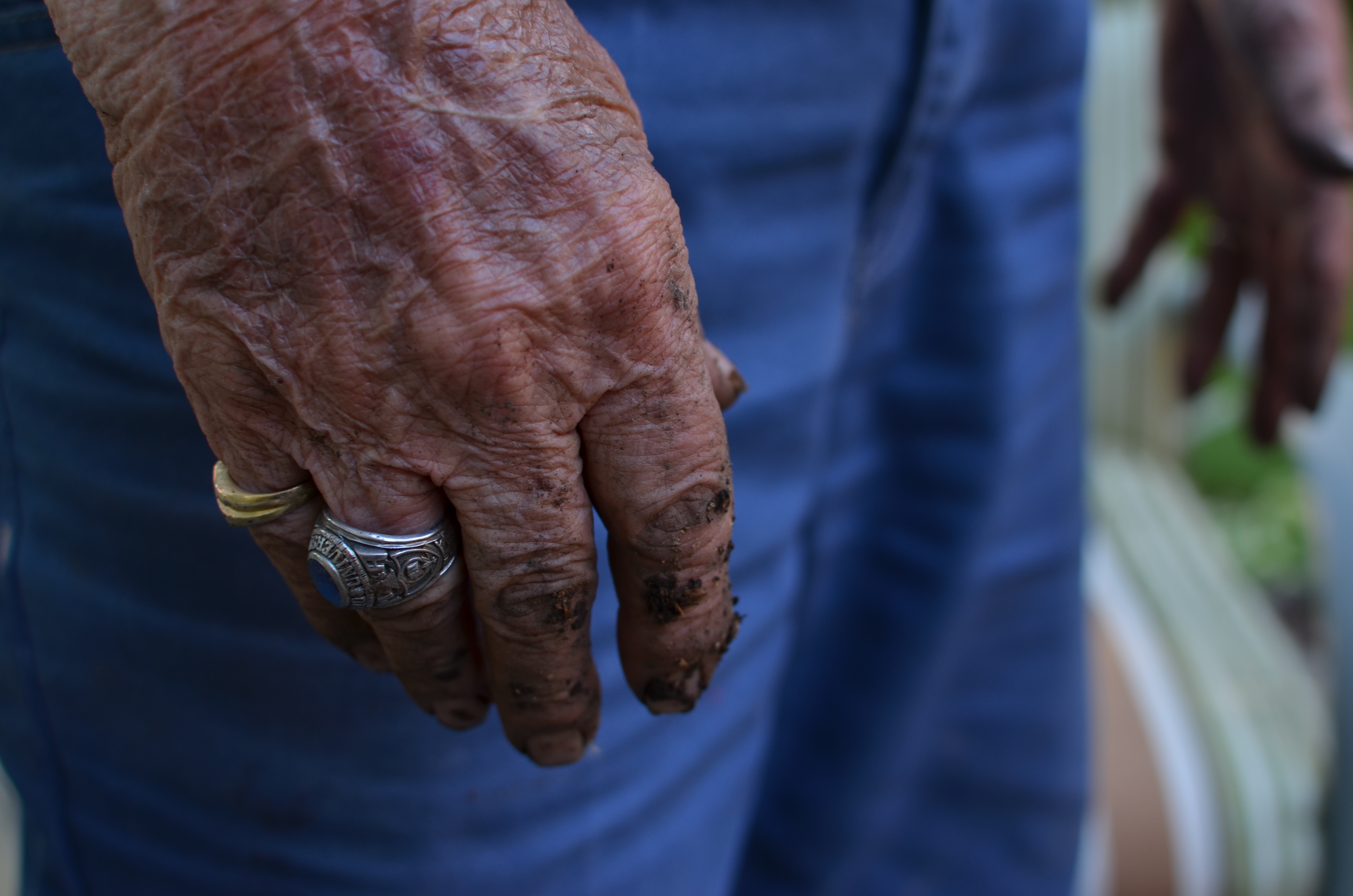
Survivors, 2014. 1/80 sec., f/4, ISO 100, 35mm.
These days, Dad’s hands are speaking to me with particular eloquence. They bear the marks of every struggle and triumph of human endeavor, and their increasing fragility, the etchings on the frail envelope of mortality, are especially poignant to me as I enter my own autumn. I have long since passed the point where I seem to have his hands grafted onto the ends of my own arms, so that, as I make images of him, I am doing a bit of a trending chart on myself as well. In a way, it’s like taking a selfie without actually being in front of the camera.
Hands are the human instruments of deeds, change, endeavor, strength, striving. Surviving. They are the archaeological road map of all one’s choices, all our grand crusades, all our heartbreaking failures and miscalculations. Hands tell the truth.
Dad has a great face, a marvelous mix of strength and compassion, but his hands…..they are human history writ large.
Happy Father’s Day, Boss.
FIGHTING TO FORGET
By MICHAEL PERKINS
STORIES OF “THE LAND THAT TIME FORGOT” COMPRISE ONE OF THE MOST RELIABLE TROPES IN ALL OF FICTION. The romantic notion of stumbling upon places that have been sequestered away from the mad forward crunch of “progress” is flat-out irresistible, since it holds out the hope that we can re-connect with things we have lost, from perspective to innocence. It moves units at the book store. It sells tickets at the box office. And it provides photographers with their most delicate treasures.
Trackside, 2014. 1/250 sec., f/5.6, ISO 100, 35mm.
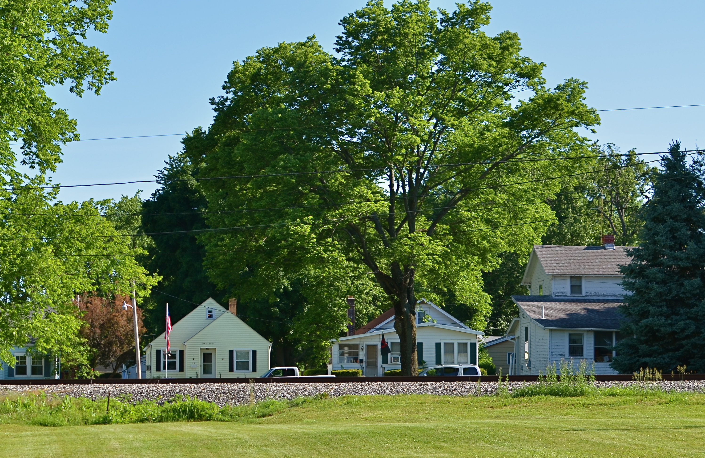
Whether our lost land is a village in some hidden valley or a hamlet within the vast prairie of middle America, we romanticize the idea that some places can be frozen in amber, protected from us and all that we create. Sadly, finding places that have been allowed to remain at the margins, that have been left alone by developers and magnates, is getting to be a greater rarity than ever before. Small towns can be wholly separate universes, sealed off from the silliness that has engulfed most of us, but just finding one which has been lucky enough to aspire to “forgotten” status is increasingly rare.
That’s why it’s so wonderful when you take the wrong road, and make the right turn.
The above stretch of sunlit houses, parallel to their tiny town’s main railroad spur, shows, in miniature, a place where order is simple but unwavering. Colors are basic. Lines are straight. This is a town where school board meetings are still held at the local Carnegie library, where the town’s single diner’s customers are on a first name basis with each other. A place where the flag is taken down and folded each night outside the courthouse. A village that wears its age like an elder’s furrowed brow with quietude, serenity.
There are plenty of malls, chain burger joints, car dealerships and business plazas within several miles of here. But they are not of here. They keep their distance and mind their manners. The freeway won’t be barreling through here anytime soon. There’s time yet.
Time for one more picture, as simple as I know how to make it.
A memento of a world fighting to forget.
IT’S UNNATURAL, NATURALLY
By MICHAEL PERKINS
ONE OF THE MOST FREEING PARTS OF PICTURE MAKING IS RELEASING YOURSELF FROM THE RIGIDITY OF REALITY. Wait. What is he babbling about? Don’t photographers specialize in reality?
Well, yeah, the photographers who work at the DMV, the city jail and immigration do. Also the guy in Wal-mart HR who made your first employee badge. Other than that, everyone is pretty much rendering the world the way they see it right this minute, with more revisions or re-thinks coming tomorrow. And beyond.
Color processing, once the sole domain of the “photo finishers” has now been taken back in-house by pretty much everyone, and, even before you snap the shutter, there are fat stacks of options you can exercise to recast the world in your own image.
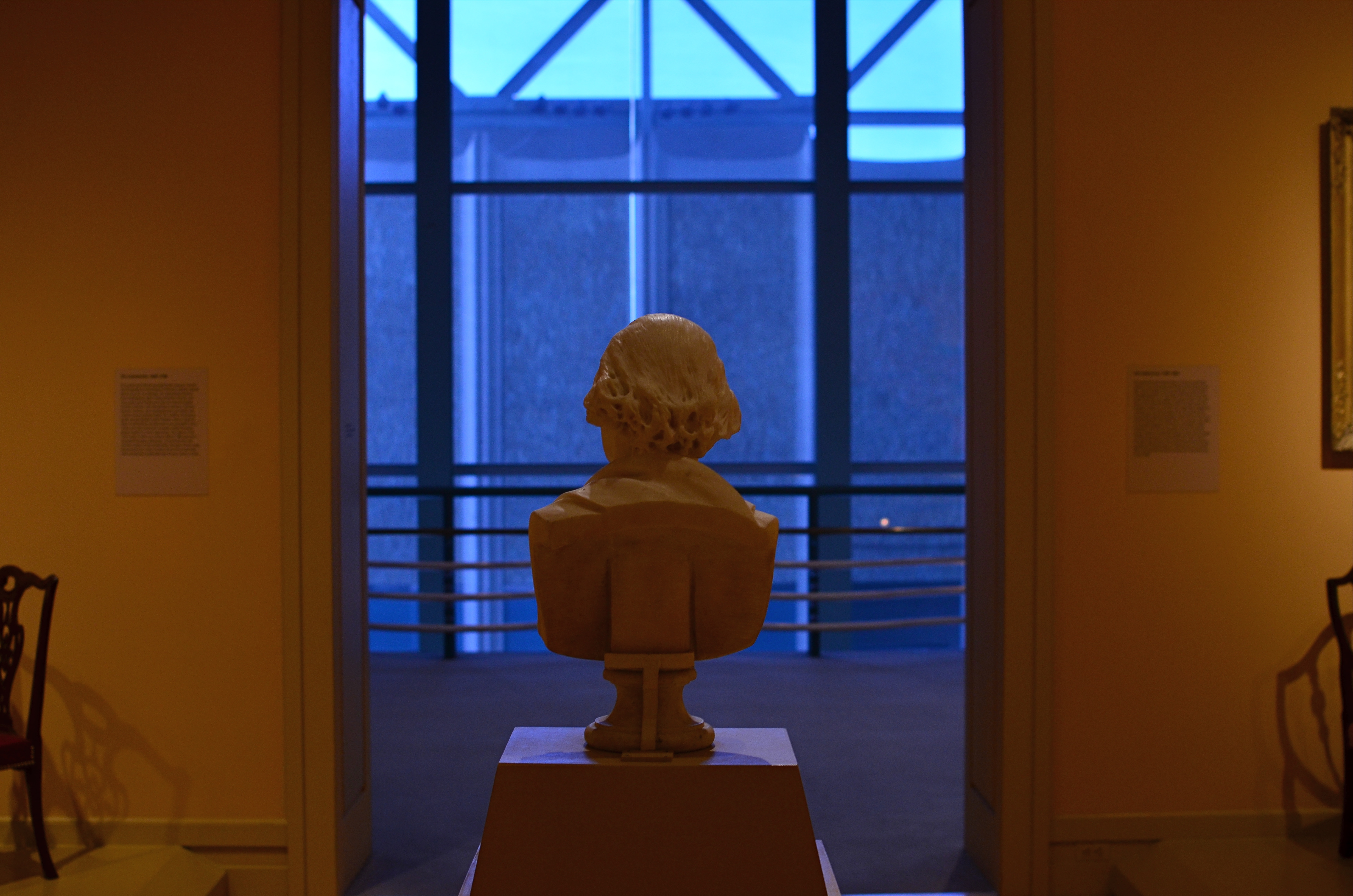
1/60 sec., f/3.5, ISO 320, 35mm. White Balance set for tungsten.
The practice of bracketing shots has made a bit of a comeback since the advent of High Dynamic Range, or HDR processing. You know the drill: shoot any number of shots of the same subject with varying exposure times, then blend them together. But bracketing has been a “best practice” among shooters for decades, especially in the days of film, where you took a variety of exposures of the same scene so you had coverage, or the increased chance that at least one of the frames was The One. Today, it still makes sense to give yourself a series of color choices by the simple act of taking multiple shots with varying white balances. You can already adjust WB to compensate for the color variances of brilliant sun, incandescent bulbs, tube lights, or shade for a more “natural” look. But using white balance settings counter-intuitively, that is, against “nature”, can give your shots a variety of tonal shifts that can be dramatic in their own right.
In the image above, the normal color balance of the gallery entrance would have rendered the bust off-white and the outer vestibule a light grey. Shooting on a tungsten setting when the prevailing light was incandescent gave the interior room a creamy orange look and amped the vestibule into deep blue, setting the two areas sharply off against each other and creating a kind of “end of day” aspect. I shot this scene with about five different white balances and kept the one I liked. Best of all, a comparison of all my choices could be reviewed in a minute and finished by the time the shutter clicked. Holy instant gratification, Batman.
THE MAIN POINT
By MICHAEL PERKINS
MAKING PICTURES, FOR ME, IS LIKE MAKING TAFFY. The only good results I get are from stretching and twisting between two extremes. Push and pull. Yank and compress. Stray and stay. Say everything or speak one single word.
This is all about composition, the editing function of what to put in or leave out. In my head, it’s a constant and perpetually churning debate over what finally resides within the frame. No, that needs something more. No, that’s way too much. Cut it. Add it. I love it, it’s complete chaos. I love it, it’s stark and lonely.
Can’t settle the matter, and maybe that’s the point. How can your eye always do the same kind of seeing? How can your heart or mind ever be satisfied with one type of poem or story? Just can’t, that’s all.
But I do have a kind of mental default setting I return to, to keep my tiny little squirrel brain from exploding.
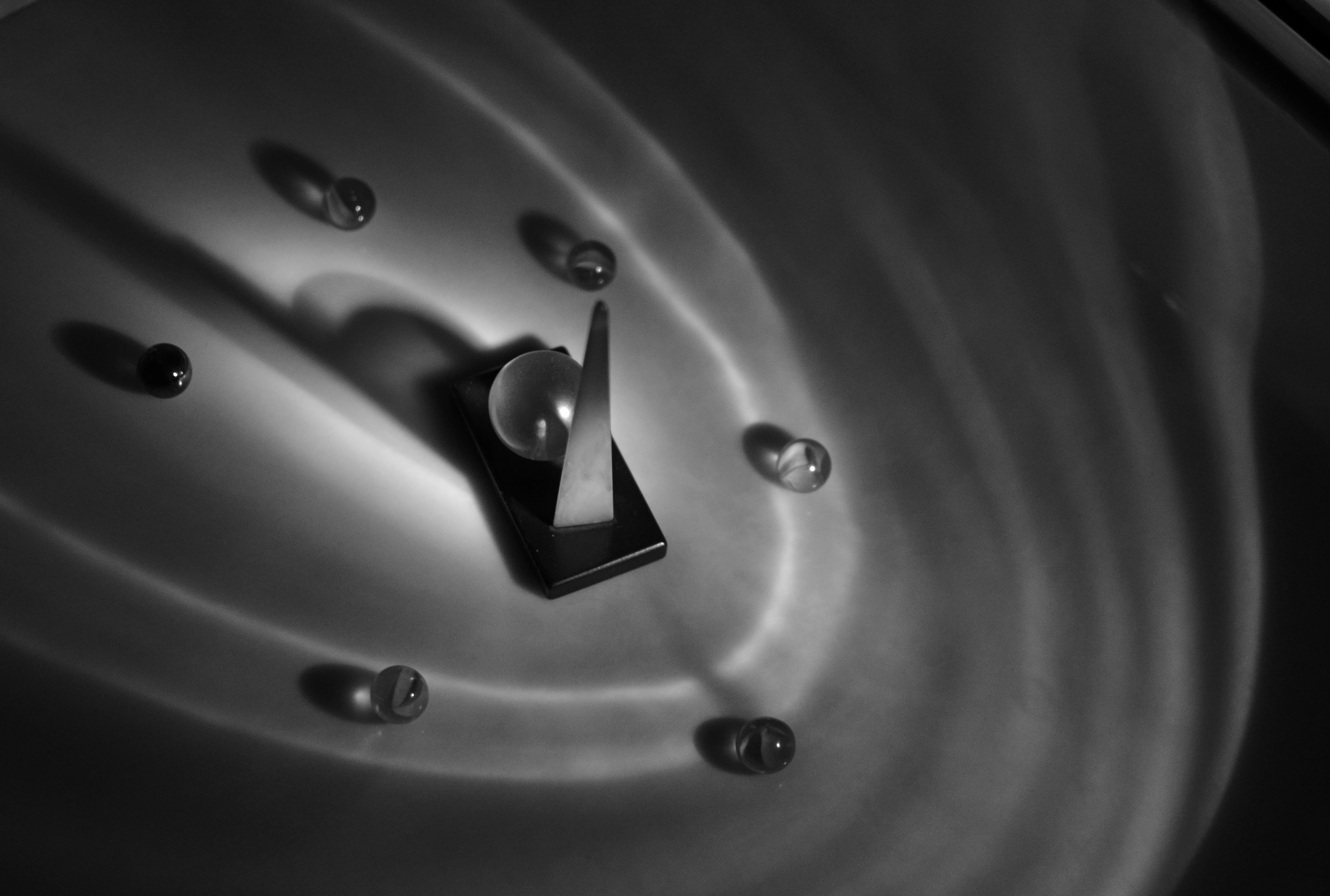
Cat’s Eye Vortex, 2014.1/50 sec., f/2.2, ISO 800, 35mm.
When I need to clean out the pipes, I tend to gravitate to the simplest compositions imaginable, a back-to-basics approach that forces me to see things with the fewest possible elements, then to begin layering little extras back in, hoping I’ll know when to stop. In the case of the above image, I was shooting inside a darkened room with only an old 1939 World’s Fair paperweight for a subject, and holding an ordinary cheap flashlight overhead with one hand as I framed and focused, handheld, with the other hand. I didn’t know what I wanted. It was a fishing expedition, plain and simple. What I soon decided, however, was that, instead of one element, I was actually working with two.
Basic flashlights have no diffusers, and so they project harsh concentric circles as a pattern. Shifting the position of the flashlight seemed to make the paperweight appear to be ringed by eddying waves, orbit trails if you will. Suddenly the mission had changed. I now had something I could use as the center of a little solar system, so, now,for a third element, I needed “satellites” for that realm. Back to the junk drawer for a few cat’s eye marbles. What, you don’t have a bag of marbles in the same drawer with your shaving razor and toothpaste? What kinda weirdo are you?
Shifting the position of the marbles to suggest eccentric orbits, and tilting the light to create the most dramatic shadow ellipses possible gave me what I was looking for….a strange, dreamlike little tabletop galaxy. Snap and done.
Sometimes going back to a place where there are no destinations and no rules help me refocus my eye. Or provides me with the delusion that I’m in charge of some kind of process.
IN STEICHEN’S SHADOW
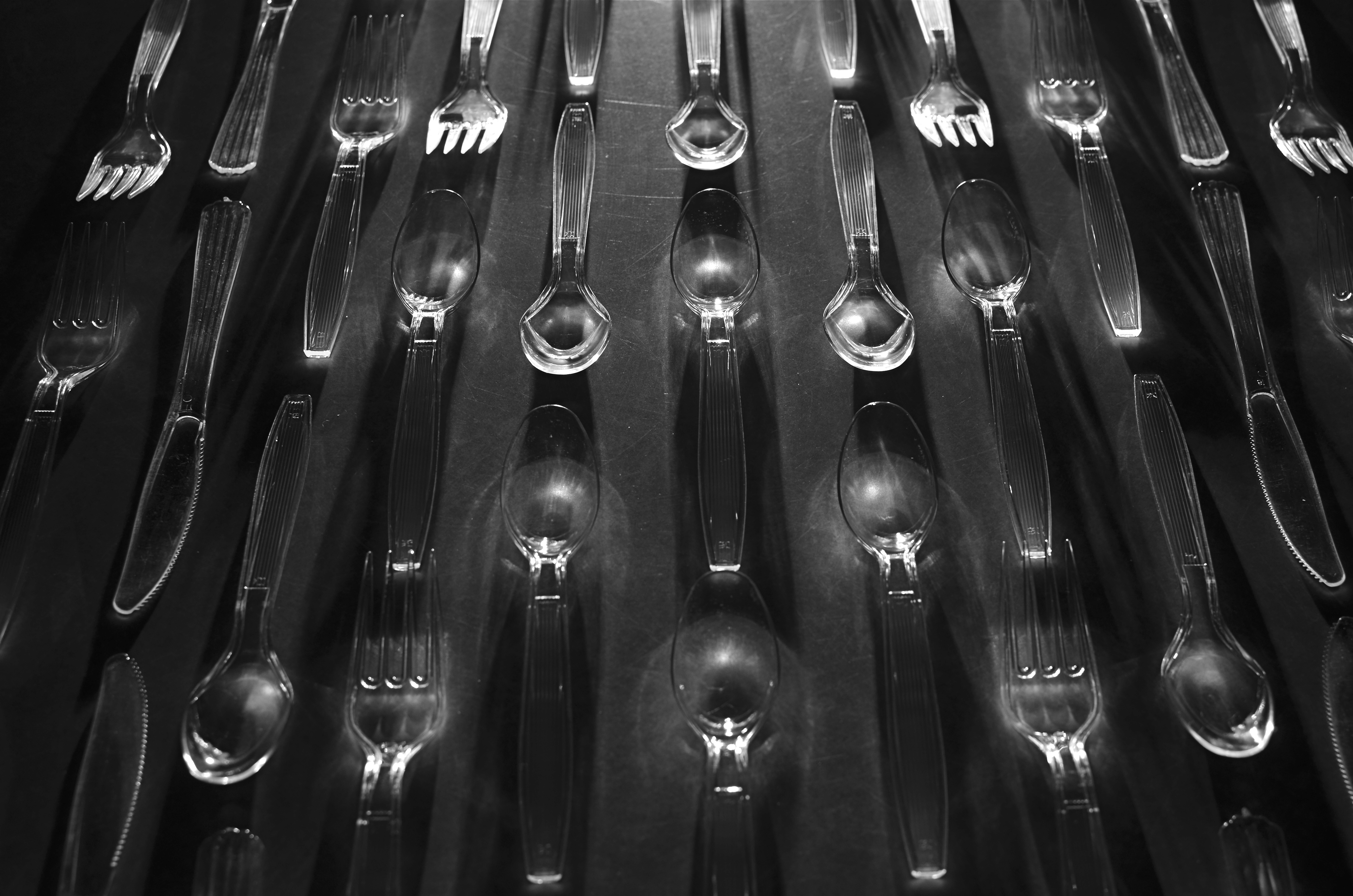
“Le Regiment Plastique”. Shot in a dark room and light-painted from the top edge of the composition. 5 seconds, f/5.6, ISO 100, 35mm.
By MICHAEL PERKINS
I’VE POSTED SEVERAL PIECES HERE ON “LIGHT-PAINTING”, or the practice of manually applying light to selective areas of objects during long exposures in the dark. The ability to “paint” additional colors, highlights and shadows “onto” even the most mundane materials can transform the whole light-to-dark ratio of the familiar and render it in new, if unpredictable ways. It’s kind of random and a lot of hands-on fun.
Some of the greatest transformations of ordinary objects ever seen in photography were obtained by Edward Steichen, arguably the greatest shooter in any style over the entire 20th century. Working for advertising agency J.Walter Thompson in the 1930’s, Steichen managed to romanticize everything from perfume bottles to kitchen matches to cutlery by arranging visually original ballets not only of these everyday items, but, through multiple source lighting, creating geometrically intricate patterns of shadows. His success in morphing the most common elements of our lives into fascinating abstractions remains the final word on this kind of lighting, and it’s fun to use light painting to pay tribute to it.
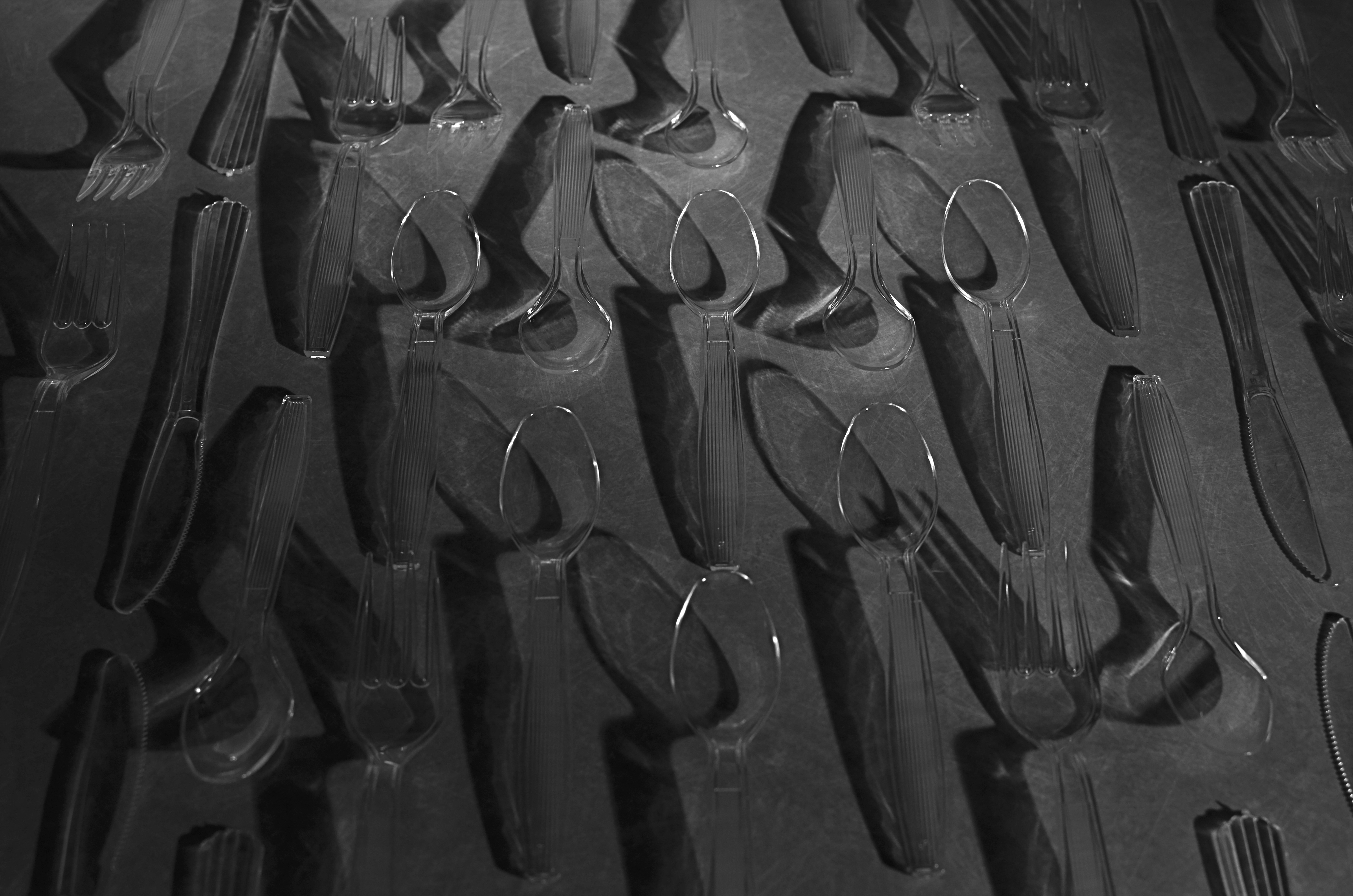
Same composition, but lit diagonally from right bottom. 5 seconds, f/5.6, ISO 100, 35mm.
For my own tabletop arrangement of spoons, knives and forks, seen here, I am using clear plastic cutlery instead of silver (fashions change, alas), but that actually allows any light I paint into the scene to make the utensils fairly glow with clear definition. You can’t really paint onto or across the items, since they will pick up too much hot glare after even a few seconds, but you can light from the edge of the table underneath them, giving them plenty of shadow-casting power without whiting out. I took over 25 frames of this arrangement from various angles, since light painting is all about the randomness of effect achieved with just a few inches’ deviation in approach, and, as with all photography, the more editing choices at the end, the better.
The whole thing is really just an exercise in forced re-imagining, in making yourself consider the objects as visually new. Think of it as a puff of fresh air blowing the cobwebs out of your perception of what you “know”. Emulating even a small part of Steichen’s vast output is like me flapping my wings and trying to become a bald eagle, so let’s call it a tribute.
Or envy embodied in action.
Or both.
