UNTRUE-TO-LIFE
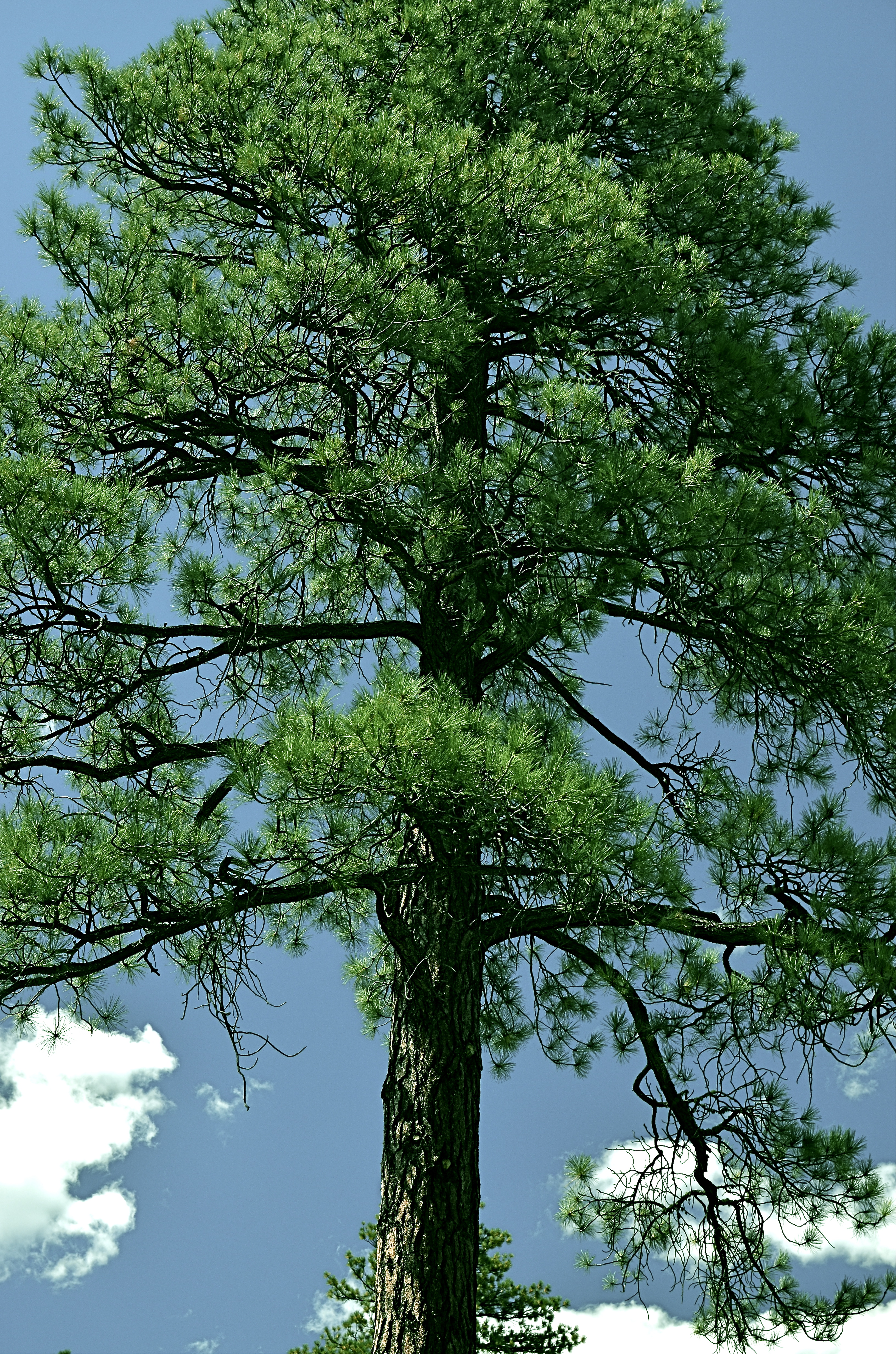
Go Green: A Flagstaff pine with all the brown values tuned out.
By MICHAEL PERKINS
I VOLUNTEER AT A MUSEUM WHICH SERVES, IN LARGE PART, SCHOOL TOURS. And, in trying to explain the color choices made by varying cultures on the depiction of everything, from flowers to animals, I frequently ask my groups if anyone has ever colored something with a “different” crayon. Not “the wrong color”, just a different crayon, a choice resulting in a purple squirrel or a brown rose. I usually get at least a few “yeses” on the question, and, when I probe further as to what went into their decision, I almost always get one child who says, simply, “I just like it that way.”
At this point, I realize that at least one person in every mob will always be thinking of color as a choice, rather than as a right/wrong answer. In my early school days, teacher often handed out the same mimeographed picture to all thirty of us, expecting all thirty to produce precisely the same results: green grass, blue skies, yellow honeybees. Strangely, we kind of expected the same of ourselves. It was comforting to hand in a “correct” piece of art, something guaranteed to please, a safe shortcut to a gold star.
In photography, we start as witnesses to color, but should never remain slaves to it. The present generation of shooters, born and bred in iPhone Land, know that changing your mind and your thinking on color is just an app away, and why not? The same force that has finally democratized photography worldwide is also legitimizing any and every kind of artistic choice. With billions of uploads each day, uniformity of style is worse than a lifelong gig as a worker ant, and as uninteresting.
Color is as big a determinant in interpretation as any other choice that a photographer makes, and can result in subtle shaping of the mood of your work. The above tree was originally captured in natural color, but I thought the overall design of the tree was served by one tone fewer, so I reworked everything into three values….blue, green, and black. I believe that the central trunk hits with more impact as light and dark shades of emerald, and the conversion of the pine needles to a more severe shade gives me some of the directness of monochrome. Of course, you might reach a completely different conclusion, but we’re beyond right or wrong here, aren’t we?
The mimeograph is dead, and with it, solid notions of color assignment. Fewer rules means fewer obvious signposts, but that’s why there’s more than one crayon in the box, innit?
WRITE YOUR OWN STORY
On Stand-By, 2015. 1/25 sec., f/3.5, ISO 100, 35mm.
By MICHAEL PERKINS
THE OLDEST CONSISTENT ROLE OF PHOTOGRAPHY IS AS NARRATIVE, its storytelling ability borrowed from painting but later freed, as painting would also be, from representations of mere reality. Before the beginning of the 20th century, photographs held moments, chronicled events, froze people in time. Over the next hundred tumultuous years, every part of the narrative process for all arts would be challenged, shattered and reassembled several times over. We pretend there are still rules that always apply to what an image says to us, but that is really only sentiment. Some photographs simply are.
What they are is, of course, both fun and infuriating for creator and audience alike. We wonder sometimes what we are supposed to think about a picture. We take comfort in being led a certain way, or in a set sequence. Look here first, then here, then here, and draw such-and-such a conclusion. But just as music need not relate a story in traditional terms (and often does not) the photograph should never merely present reality as a finished arrangement. The answer to the question, “what should I think about this?” can only be, whatever you find, whatever you yourself see.
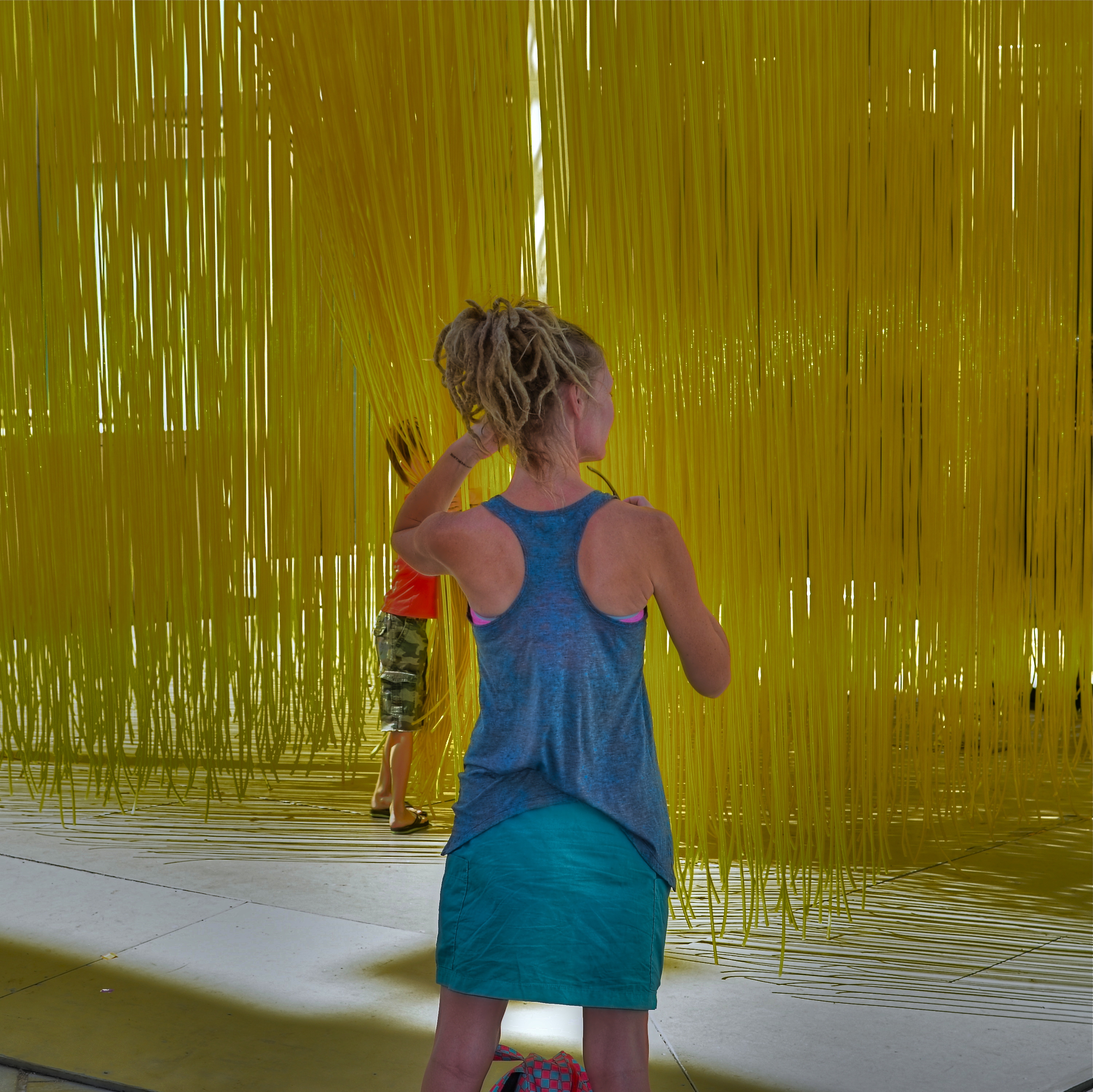
Strands, 2015. 1/200 sec., f/5.6, ISO 100,35mm.
I love having a clear purpose in a picture, especially pictures of people, and it has taken me years to make such images without the benefit of a deliberate road map. To arrange people as merely elements in a scene, then trust someone else to see what I myself cannot even verbalize, has forced me to relax my grip, to be less controlling, to have confidence in instincts that I can’t readily spell out in 25 words or less.
What are these people doing? What does their presence reveal beyond the obvious? Is there anything “obvious” about the picture at all? Just as a still life is not a commentary on fruit or a critique of flowers, some photographed people are not to be used in the service of a story. They can, in the imaginations of viewers, provide much more than that. Photography is most interesting when it’s a conversation. Sometimes that discussion takes place in strange languages.
PUT ‘ER IN REVERSE
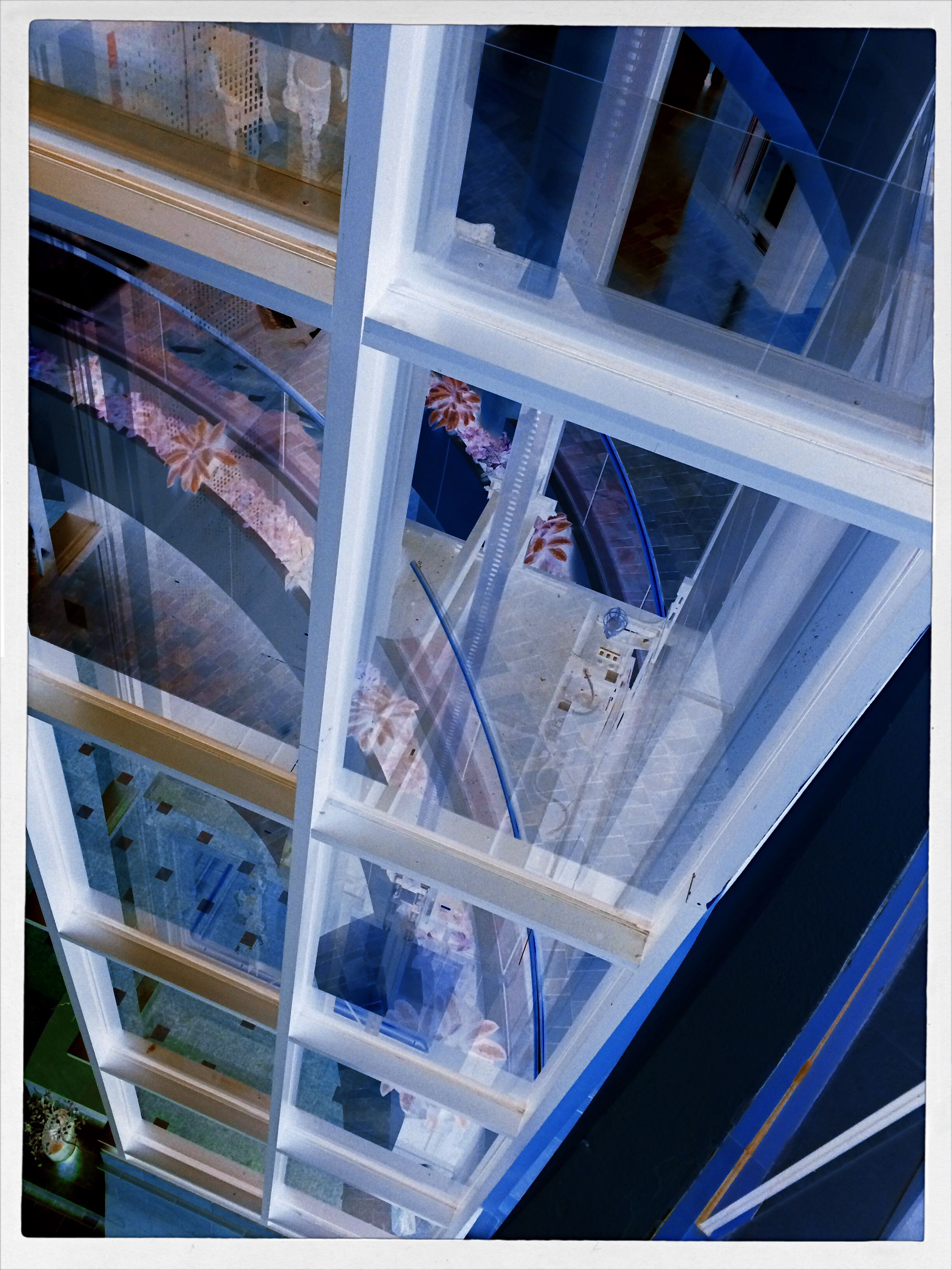
A glass elevator at a shopping mall, converted to a negative, then a fake Technicolor filter in a matters of seconds, via the phone app Negative Me.
By MICHAEL PERKINS
THERE ARE MANY WAYS TO FORCE YOUR AUDIENCE TO SEE THINGS ANEW, to strip away their familiar contexts as everyday objects and create a completely different visual effect. The first, and most obvious form of abstraction we all learned in our cradle, that of rendering a subject in black and white. Some early photographers spent so many years in monochrome, in fact, that they actually regarded early color with suspicion, as is it was somehow less real. The moral of the story is: the photograph demonstrates the world that you dictate, shown strictly on your own terms.
Abstraction also comes about with the use of lenses that distort distances or dimensions, with re-assignment of color (green radishes, anyone?), and by compositions that extract subjects from their natural surroundings. Isolate one gear from a machine and it becomes a different object. Magnify it, light it differently, or show just a small portion of it, and you are taking it beyond its original purpose, and into abstraction. Your viewer is then free to re-interpret how he sees, or thinks, about that thing.
One swift gift of the post-digital world that I find interesting is the ability, through apps, to render a negative of any image with a click or swipe, then modifying it with the same color filters that you might apply to a positive photo. This affords an incredible amount of trial-and-error in a remarkably short space of time, and better yet, you’re out in the world rather than in the lab. Of course, negatives have always been manipulated, often to spectacular effect, but always after it was too late to re-take the original picture. Adjustments could be made, certainly, but the subject matter, by that time, was long gone, and that is half the game.
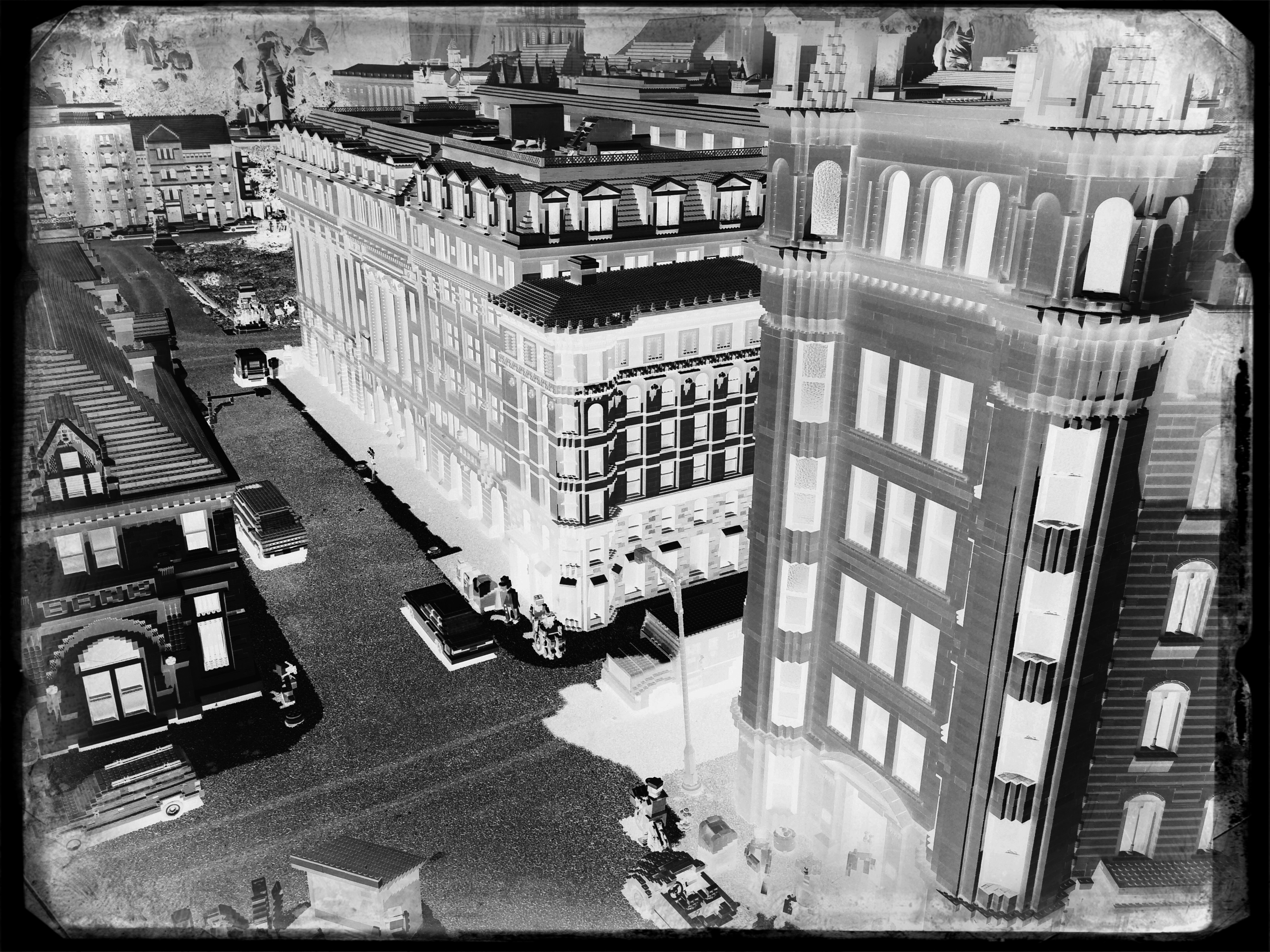
The eerie look of a an aerial reconnaissance photo, here applied to a city model at Legoland.
Reversing the color values in a photograph is no mere novelty. Sometimes a shadow value can create a stunning design when “promoted” to a lead value with a strong color. Sometimes the original range of contrast in the negative can be made more dramatic. And, occasionally, the reversal process renders some translucent or shiny surfaces with an x-ray or ghostly quality. And, of course, as with any effect, it can just register as a stupid novelty. Hey, it’s a gimmick, not a guarantee.
“Going negative”, as they say in the political world, is now an instantaneous process, allowing you the most flexibility for re-takes and multiple “mixes” as you combine the neg with everything from toy camera effects to simulated Technicolor. And while purists might rage that we are draining the medium of its mystery, I respectfully submit that photographers have always opted for fixes that they can make while they are in the field. And now, if you don’t like the direction you’re driving, you can put ‘er in reverse, and go down a different road.
ABSOLUTES
This image isn’t “about” anything except what it suggests as pure light and shape. But that’s enough. 1/250 sec., f/5.6, ISO 100, 35mm.
By MICHAEL PERKINS
THE POPULARLY-HELD VIEW OF THE HISTORY OF PHOTOGRAPHY makes the claim that, just as video killed the radio star, camera killed the canvas. This creaky old story generally floats the idea that painters, unable to compete with the impeccable recording machinery of the shutter, collectively abandoned realistic treatment of subjects and plunged the world into abstraction. It’s a great fairy tale, but a fairy tale nonetheless.
There just is no way that artists can be regimented into uniformly making the same sharp left turn at the same tick of the clock, and the idea of every dauber on the planet getting the same memo that read, alright guys, time to cede all realism to those camera jerks, after which they all started painting women with both eyes on the same side of their nose. As Theo Kojak used to say, “nevva happennnned…”
History is a little more, er, complex. Photography did indeed diddle about for decades trying to get its literal basics right, from better lenses to faster film to various schemes for lighting and effects. But it wasn’t really that long before shooters realized that their medium could both record and interpret reality, that there was, in fact, no such simple thing as “real” in the first place. Once we got hip to the fact that the camera was both truth teller and fantasy machine, photographers entered just as many quirky doors as did our painterly brothers, from dadaism to abstraction, surrealism to minimalism. And we evolved from amateurs gathering the family on the front lawn to dreamers without limit.
I love literal storytelling when a situation dictates that approach, but I also love pure, absolute arrangements of shape and light that have no story whatever to tell. As wonderful as a literal capture of subjects can be, I never shy away from making an image just because I can’t readily verbalize what it’s “about”. All of us have photos that say something to us, and, sometimes, that has to be enough. We aren’t always one thing or the other. Art can show absolutes, but it can’t be one.
There is always one more question to ask, one more stone to turn.
OH, SNAP
When we drift from the things most familiar to us, does our photography diminish or grow?
By MICHAEL PERKINS
MOST OF US ENTER PHOTOGRAPHY WITH THE SAME AIM, that is, to arrest the flight of something precious with the trick effect of having frozen time. Someone or something is passing through our life all too quickly, and we use our cameras to isolate small pieces of those passages like a butterfly inside an amber cube. That means that our first work is our most personal, and, while we may later graduate to more general, more abstract recordings of light, subject, and shape, we all begin by chronicling events of the most intimate nature.
And as we grow into more interpretative, less reportorial imaging, we also grow away from the clear, focused aim of that earlier work. Be it a triptych of a birthday, an anniversary, a wake or a christening, we understand clearly what a snap is for, what it was after. Its purpose and its message are unmistakable, something that cannot always be said for other kinds of photographs. Indeed, looking back on some of our own output at the distance of just a few years, we can actually be at a loss to explain what we were going after in a given photograph, what we were trying to say. This doesn’t happen with the snap. Its subject matter, and the degree to which we correctly captured it, is readily visible.
This may speak to why photographers are often asked why they don’t take “more pictures of people”, or, more specifically, why did you take a picture of this person? Do you know him? No? Then why……..?? It isn’t that a connection between yourself and people who are strangers to you can’t be made in a photograph. It’s that it’s a lot harder to effectively tell that story. it requires less from the camera and more from you.
You need to fill in a lot more blanks in a tale in which fewer elements are pre-provided. You can convey something universal about the human condition with a picture of something outside your own experience, certainly. It’s just that it’s easier to make the link that exists between you, your mother, her birthday, and her surrounding gang of friends than between yourself and someone who is essentially alien to you, or to the rest of us. Of course, on the other side of the ledger, you can also shoot a bajillion pictures of those closest to you, and still manage to convey nothing of their true selves. Mere technical acuity is not intimacy, or vision.
Still, in general terms, the snap deserves a lot more respect than it gets, simply because there is, in these personal images, a near-perfect match alignment of shooter, subject and clarity of purpose. By contrast, when we venture out into the greater world, trying to tell equally effective stories with much less information is hard. Not impossible, but, man, really hard.
VIRTUAL SHOPLIFTING
Thrift shop still-life: a mobile phone close-up of an antique camera flash pan, negatized in post-editing.
By MICHAEL PERKINS
ONE OF THE EMERGING OPPORTUNITIES FOR PHOTOGRAPHERS is the newly accepted way not to look like a photographer, a kind of invisibility based on strange public perceptions. This has only become possible with the arrival of the smartphone, and, although insane logically, it affords a new freedom to street photographers.
It’s simple, if crazy: carry an actual camera inside a phone, just as many millions of others do, and you’re somehow “safe” or trustworthy, not one of predatory, intrusive “professionals” with obvious cameras who are out to trick you, track you, capture your soul in their satanic box. Now, how we explain away the fact that the phone camera is far more stealthy, far more insidious and far more omnipresent than, say, a Canon or Nikon is anybody’s guess. But, dopey or not, this new code is now hard-wired into people’s brains as it regards street work. So little camera=harmless. Big camera=end of the world as we (or over-zealous mall cops)know it. You figure it out.
So, when it comes to grabbing quick snaps in stolen moments, it’s becoming harder not to embrace the crazy and just use a smartphone as your default street tool. I’m not completely there yet, but when I’m surrounded by things that I will either never see again, or have never seen before, it’s tempting to play spy shooter with the little clicker.
Some of the greatest sources of still life material, for example, are the dense shelves of flea markets, antique shops and thrift stores. You don’t want to buy this stuff, since (a) you can’t afford it and (b) the Mrs. will send both it and you to Goodwill, but the occasional odd item might just make a decent abstract bit of design. Camera gear from yesteryear is always an easy sell, and I was ecstatic to do a virtual shoplift on the ancient flash attachment you see above as a fun way of re-purposing an object through selective framing and processing.
It’s frustrating to find more and more places where it’s easier to negotiate a nuclear treaty than get an okay for regular photography, so it’s no shock that more and more inroads are being made for mobile cameras and the access that no one feels like denying them. And they say I’m nuts.
UNKNOWN KNOWNS
1/15 sec., f/1.8, ISO 1000, 35mm.
By MICHAEL PERKINS
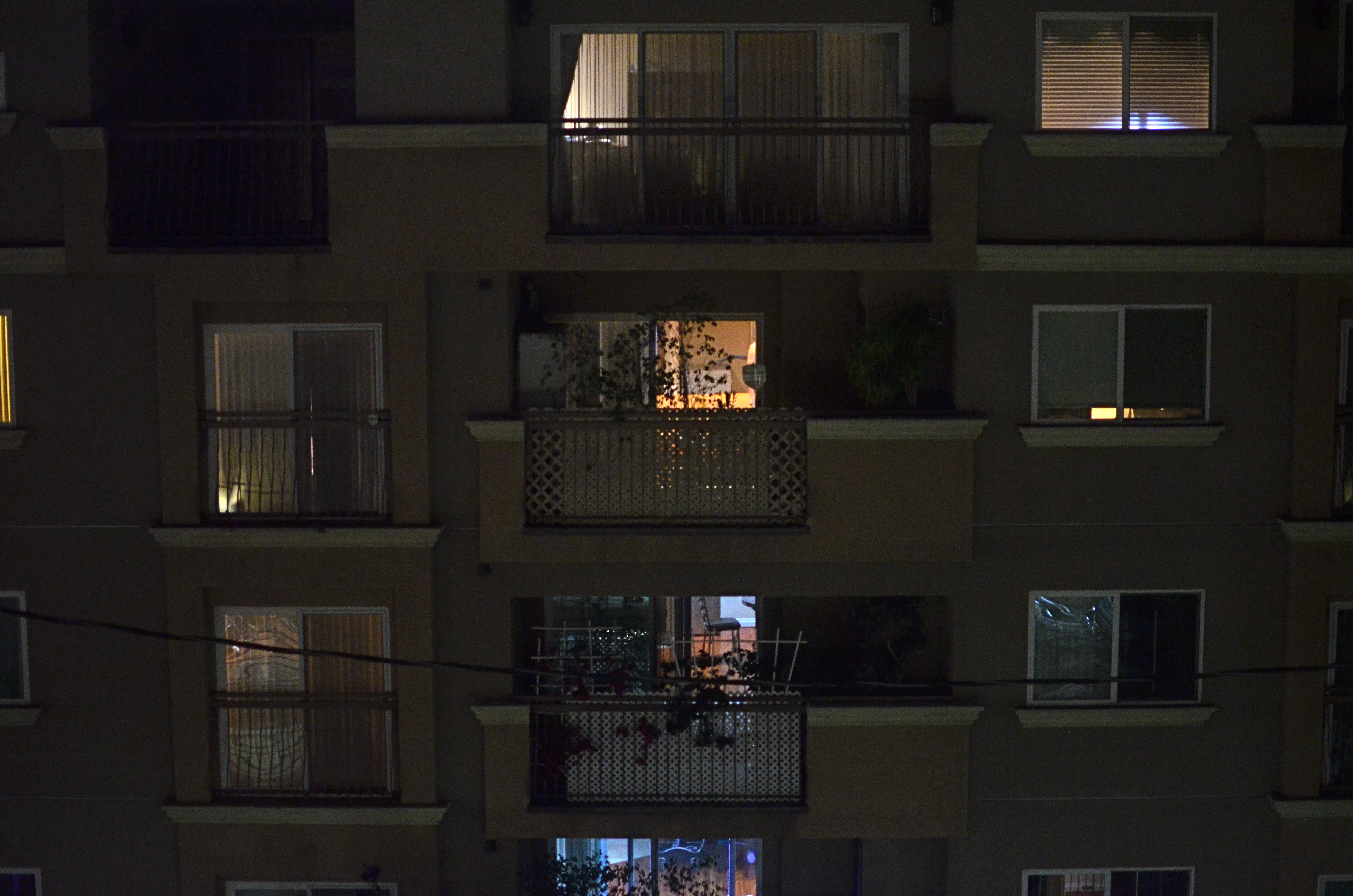
ALFRED HITCHCOCK’S CLASSIC REAR WINDOW IS THE ULTIMATE GUILTY PLEASURE, and not just because the Master of Suspense is at the peak of his edge-of-your-seat powers in the telling of its thrilling murder story. No, the massive, full-sized set of James Stewart’s Manhattan neighborhood, with all its apartment-dwellers’ secrets open to the most casual snoop, is the creepy, giddy candy at the center of this cinematic confection. In making it temporarily okay to be, in effect, peeping toms, Hitchcock is making us complicit in his hero’s unsavory curiosity. All these dramas. All these secrets that we have no right in knowing. And, of course, we can’t look away.
Photographing the intersection of living spaces in city settings is far often more subtle than Hitch’s feat of shaving the back wall off an entire community, and that makes for a lot more mystery, most of us beyond solution. Look too little, and a slab of brick is more like a beehive than a collection of stories. Look too deeply, and the truths you unearth can feel stolen, like an invasion done purely for prurient entertainment. What’s most interesting is to imply much but reveal little, and hitting that balance is tough.
I recently killed off the last fifteen minutes of a generally unproductive night of street shooting by gazing out the window of my nondescript hotel at an equally nondescript apartment building across the way. The last vestiges of dusk offered scant details on the outside wall, and the warm yellow hum of electrical light had already begun to flicker on in the various cubicles. I thought of Rear Window and how you could look at the fully visible doings of people, yet still know virtually nothing of their lives. Here the lighting was random, undefined, with little real information on the life throbbing within the individual spaces….the dead opposite of Hitchcock’s deliberate staging.
I couldn’t see a face, a hand, an activity. All I had was the mere suggestion of human presence. What were they reading, watching, wishing, enduring, enjoying, hating? I couldn’t know and I couldn’t show it, but I could show the mystery itself. I could share, if you will, the sensation of not being able to know. And so I made a photograph of that lack of information.
Some photographs are about things, obvious things that you’re able to freeze in time. Other images are about the idea of something, a kind of unsatisfied anticipation. Both kinds of pictures have their own narrative code, and learning how to manage these special languages is great practice for the idea, and the mind back of it.
TEMPORARILY ACTUAL
It’s the truth. It’s actual. Everything is satisfactual. –lyrics from the Oscar-winning song Zip-A-Dee-Doo-Dah
By MICHAEL PERKINS
PHOTOGRAPHY WAS ERRONEOUSLY BILLED, EARLY IN ITS DEVELOPMENT, as a mere recording of reality. This was, of course, an attempt to characterize the picture-making process as more bloodless, less artistic than painting, which was an interpretation of the world. What early haters of the camera failed to realize, of course, was that photographers were just as selective in their depiction of life as painters, since their medium too, was an interpretation…..of isolated moments, of preferred angles, of temporary actuality.
If you look at individual frames within a strip of motion picture film, it becomes perfectly clear that each still image is a self-contained world, with no way to intuit what has come before a given moment nor what will come next. Thus, no one frame is “reality” but a select sample of it. In daily photography, our choice of angle, approach, and especially light can allow us to create an infinite number of “realities” that only exist in the precise moment in which we see and freeze them.
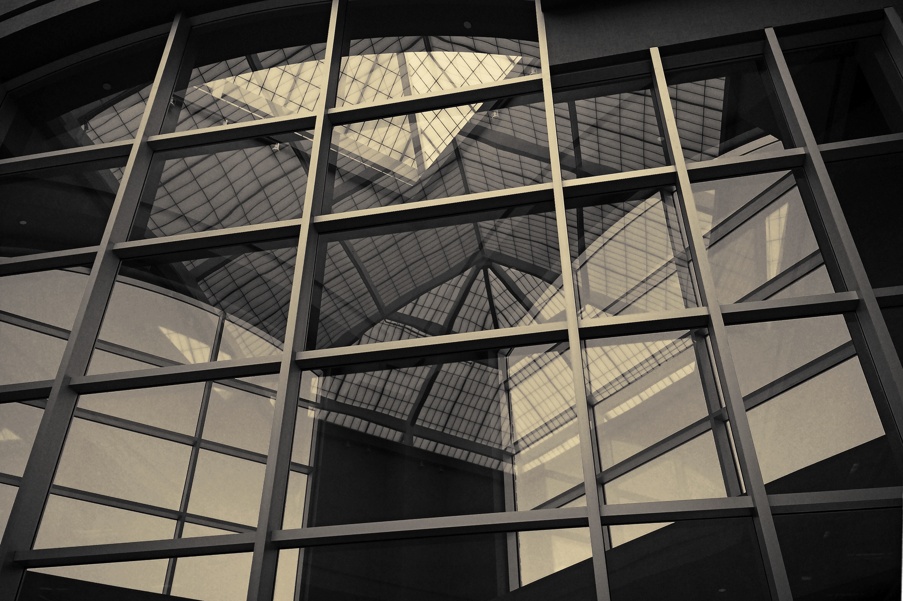
Let’s look specifically at light. As it’s jumbled in multiple reflections, light is particularly precious to the photographer’s eye, since a captured image may recall an effect that even people within inches of the shooter could not see. In the above photo, for example, this mosaic of reflections inside the vestibule of a high-ceilinged building was visible from several specific positions in the foyer. Move yourself three feet either way, however, and this pattern could not be seen at all. In other words, this photographic “reality” came briefly into existence under the most controlled conditions, then was gone.
John Szarkowski, the legendary director of photography for the New York Museum of Modern Art, dedicates an entire section of his essential book The Photographer’s Eye to what he calls “Vantage Point” and its importance to a mastery of the medium. “Pictures (can) reveal not only the clarity but the obscurity of things…and these mysterious and evasive images can also, in their own terms, seem ordered and meaningful.”
Photography is about viewing all of reality and extracting little jewels from within it.
That’s not mere recording.
That’s creation.
CITY OF DREAMS
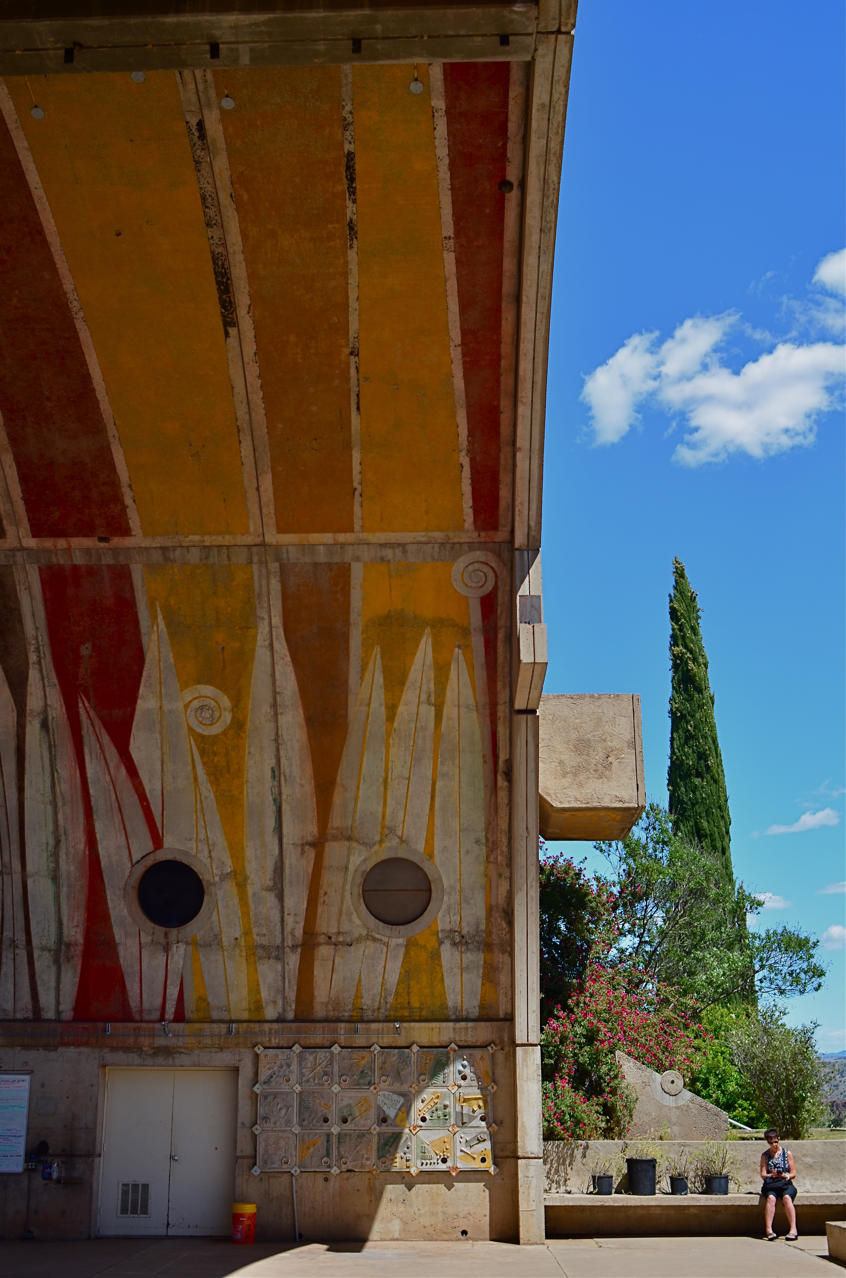
An enormous public amphitheatre arch at Arcosanti, a crumbling “urban laborotory” near Phoenix, Arizona.
By MICHAEL PERKINS
PHOTOGRAPHERS HOVER AROUND URBAN RUIN LIKE MOTHS AROUND A FLAME. It’s just a thing that we do. Not by sifting through the ashes of Babylon, Rome or Athens so much as the demolished details of abandoned malls, stores or gas stations. There is a kind of reverence for those banal or ugly things that had their brief moment at the top of the news, then rolled backwards into rot. Shooters love trying to mine ugliness in search of Higher Truth. But when we do this, we’re only doing half the job.
A country the scope and breath of America enshrines plenty of greed and stupidity in brick and steel, but so do the near-miss dreamers, the visionaries whose grand prophecies might have made our lives better. They leave behind their legacies of litter no less than the rapacious developers, and they deserve to have those failures immortalized by the camera as well.
Touring the fifteen-acre architectural tomb that is Arcosanti, a disintegrating “urban laboratory” sixty-five miles outside of Phoenix, Arizona is to see where Disney turns into Dystopia. The miniature model city, conceived by architect and urban planner Paolo Soleri in the 1970’s is, three years after his death, still uncompleted, baking in the desert sun, its proud dream of responsible urban density and communal harmony a hallowed-out echo. While the rest of us wore our vegetable-dye shirts on the first Earth Day, Soleri dreamt of a society where we built up instead of out, chose spirituality over sprawl, yearned to chuck our planet-killing cars for a tight, efficient village designed to give the planet a chance to take a clean breath.
It didn’t work, and there are more reasons why than there are residents at Arcosanti, where 5,000 people were supposed to co-exist in ecstasy but where, today, fewer than 60 actually dwell. The common buildings, the amphitheatres, the beehive apartments heated by recycled sunshine still function, after a fashion, but they are losing their battle with nature as the rugged basalt mesas in the neighborhood lash them with harsh winds that peel paint, crack concrete, mock the grand vision.
Photographers are reporters, so in our fascination with the ruin of the past, we would do well to document not just the rotted remains of New Valley Mall, but also the places where poets tried to change the narrative.
IF HUE GO AWAY
By MICHAEL PERKINS
IT SEEMS UNGRACIOUS FOR A PHOTOGRAPHER TO COMPLAIN ABOUT AN OVER-ABUNDANCE OF LIGHT, since that’s basically the currency we trade in. More typically we gripe about not being able to bring enough of the stuff into a shot. I mean, the entire history of the medium is one big let-there-be-more-light prayer. But that’s not to say that light can’t create annoyance when you’re in a place where there is glorious, radiant illumination of….acres of nothing.
I’m not talking about sunlight on endless expanses of starched plain. I refer here to subject matter that is so uninteresting that, even though a bumptious bounty of light is drenching everything in sight, there is nothing to make a photograph of. Nothing that compels, inspires, jars or even registers. I recently made my annual return to a festival that, due to my frequent farming of it over the years, has now bottomed out visually. There is nothing left to say about it, although all that “nothing” is stunningly lit at this time of year.
The light patterns seen here were warm and inviting in color. That’s not what I wanted.
In fact, it’s only by shooting just abstracted shapes, shades and rays, rather than recognizable subjects, that I was able to create any composition even worth staying awake for, and then only by using extremely sharp contrast and eliminating color completely. To me, the only thing more pointless than lousy subject matter is beautiful looking lousy subject matter, saturated in golden hues, but signifying nothing. Kinda the George Hamilton of photos.
So the plan became, simply, to turn my back on the bright balloons, food booths, passing parade of people and spring scenery that, in earlier years, I would have been happy to capture, and instead render arrangements without any narrative meaning, just whatever impact could be seen using light as nearly the lone element. In the above picture, I did relent in keeping the silhouetted couple in the final picture, so that it’s not as “cold” as originally conceived, but otherwise it’s a pretty stark image. Photography without light is impossible, but we also have to refuse to take light “as is” from time to time, to do our best to orchestrate it, much as we would vary shadings with pencil or crayon. We know that the camera loves light, but it’s still our job to tell it where, and how, to look.
MAGICAL ORPHANS
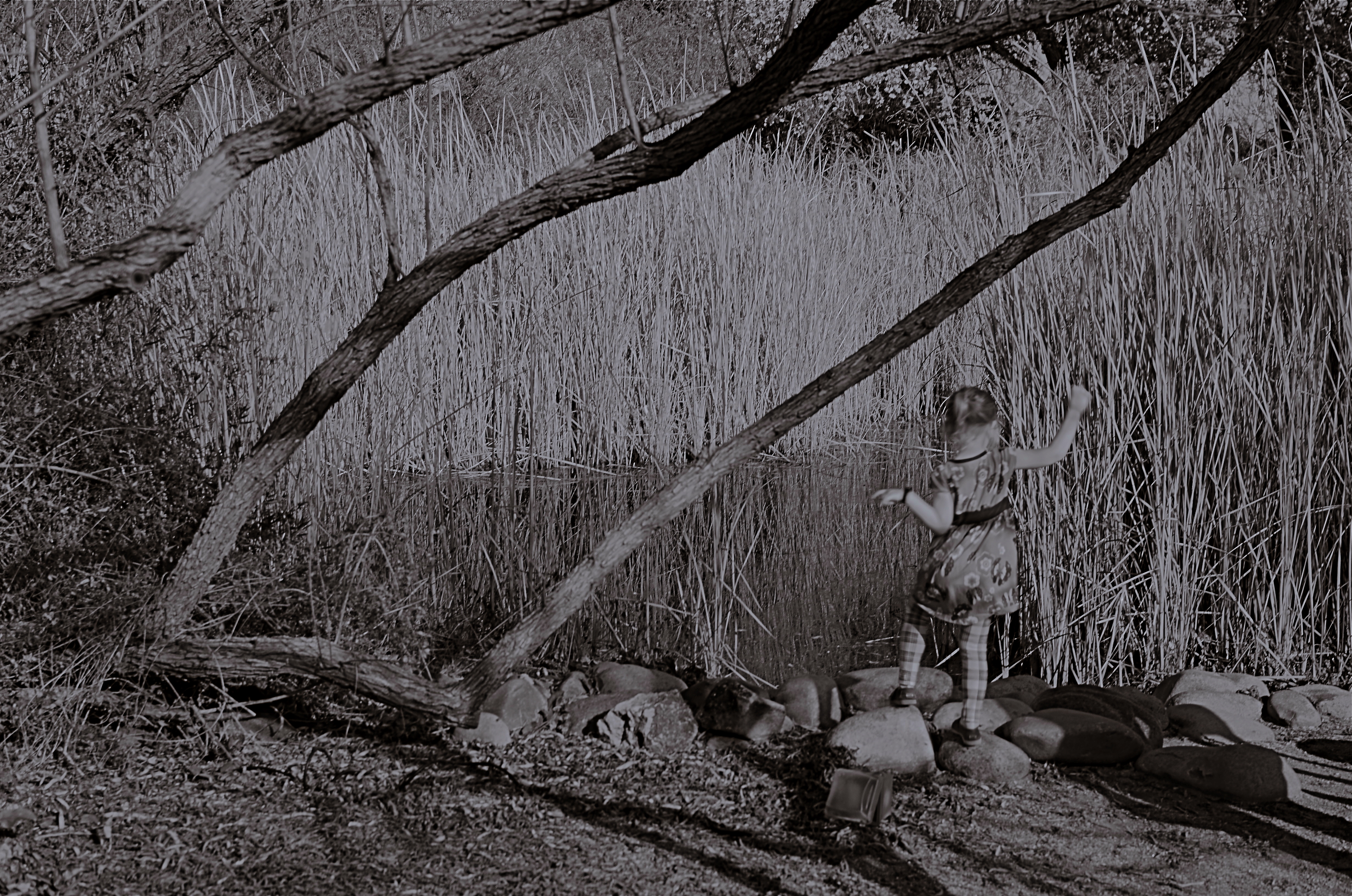
She Of The Reedy River, 2015.
By MICHAEL PERKINS
WE HAVE ALL EXPERIENCED THE SHOCK OF SEEING OURSELVES IN A CERTAIN KIND OF PHOTOGRAPH, a strange combination of framing, light or even history that makes us actually ask, “who is that?? before realizing the truth. Of course we always know, intellectually, that a photo is not an actual visual record of events but an abstraction, and still we find ourselves emotionally shocked when it’s capable of rendering very familiar things as mysteries. That odd gulf between what we know, and what we can get an image to show, is always exciting, and, occasionally, confounding.
Every once in a while, what comes out in a picture is so jarringly distant from what I envisioned that I want to doubt that I was even involved in capturing it. Such photographs are magical orphans, in that they are neither successes nor failures, neither correct or wrong, just…..some other thing. My first reaction to many of these kinds of shots is to toss them into the “reject” pile, as every photo editor before 1960 might have, but there are times when they will not be silenced, and I find myself giving them several additional looks, sometimes unable to make any final decision about them at all.
The above shot was taken on a day when I was really shooting for effect, as I was using both a polarizing filter to cut glare and a red 25 filter to render severe contrast in black and white. The scene was a reedy brook that I had shot plenty of times at Phoenix’ Desert Botanical Garden, but the shot was not planned in any way. As a matter of fact, I made the image in about a moment and a half, trying to snap just the shoreline before a boisterous little girl could get away from her parents and run into the frame. That’s all the forethought that went into it.
With all the extreme filtration up front of the lens, I was shooting slow, at about 1/30 of a second, and, eager to get to the pond, the child was just too fast for me. Not fast enough to be a total blur, but fast enough for my lens to render her softly, strangely. And since every element in a picture talks to every other element, the rendering of the reeds, which was rather murky, added even more strangeness to the little girl, her face forever turned away, her intent or presence destined to remain a secret.
I might like this picture, but I worry that wanting to like it is making me see something in it that isn’t there. Am I trying to wish some special quality into a simple botched shot, acting as a sort of self-indulgent curator in search of “art”?
Can’t tell. Too soon.
Check with me in another five years or so.
MORE THAN FOOD
Pre-open, 2015.
By MICHAEL PERKINS
YOU COULD ARGUE ALL DAY ABOUT WHETHER PUBLIC SPACES POSSESS MORE VISUAL POTENTIAL when they are full or when they are dead empty, and, depending on your photographic approach, both arguments would be correct. In other words, instead of a hard-and-fast truth, you have multiple truths, depending on which space is shot by which photographer under such-and-such circumstances. Hey, if ya want a vague premise, I’m your boy.

Plaza Cafe, 2015.
Plazas, train platforms, museums, places of worship, restaurants, sports arenas…..all the places where people convene in big mobs have all produced stunning images taken when said places contain no people at all. After hours, before opening, last call, snow days…there are endless reasons why people don’t go to places, and the unfilled space created by their absence is a separate kind of compositional challenge.
I have stated in previous posts on this forum that, for me, museums are tremendous sources of negative space, and yet positive possibilities,when devoid of crowds. Maybe it’s when people are about to be somewhere, when something is nearly ready to happen, that public places possess a certain, well, suspense. Whatever the phenomenon, I feel it, and will always squeeze off a few shots while the moment lasts.
Similarly, eateries are both potentially joyful and potentially lonely, and that kind of uncertainty excites me as a photographer. But you may be on the opposite side of the discussion. I can certainly understand that some would see a bunch of empty tables and chairs as depressing, unmistakably desolate. But I think it depends on the photograph, and I think it always will. There are many images of two people seated together at a cafe who are, sadly, miles apart due to their estrangement, and there are an equal number of pics of a hall just before celebrants from a wedding stream in. As with so much in photography, feeling comes both from what you did and didn’t show.
DOCUMENTARY OR DRAMA?
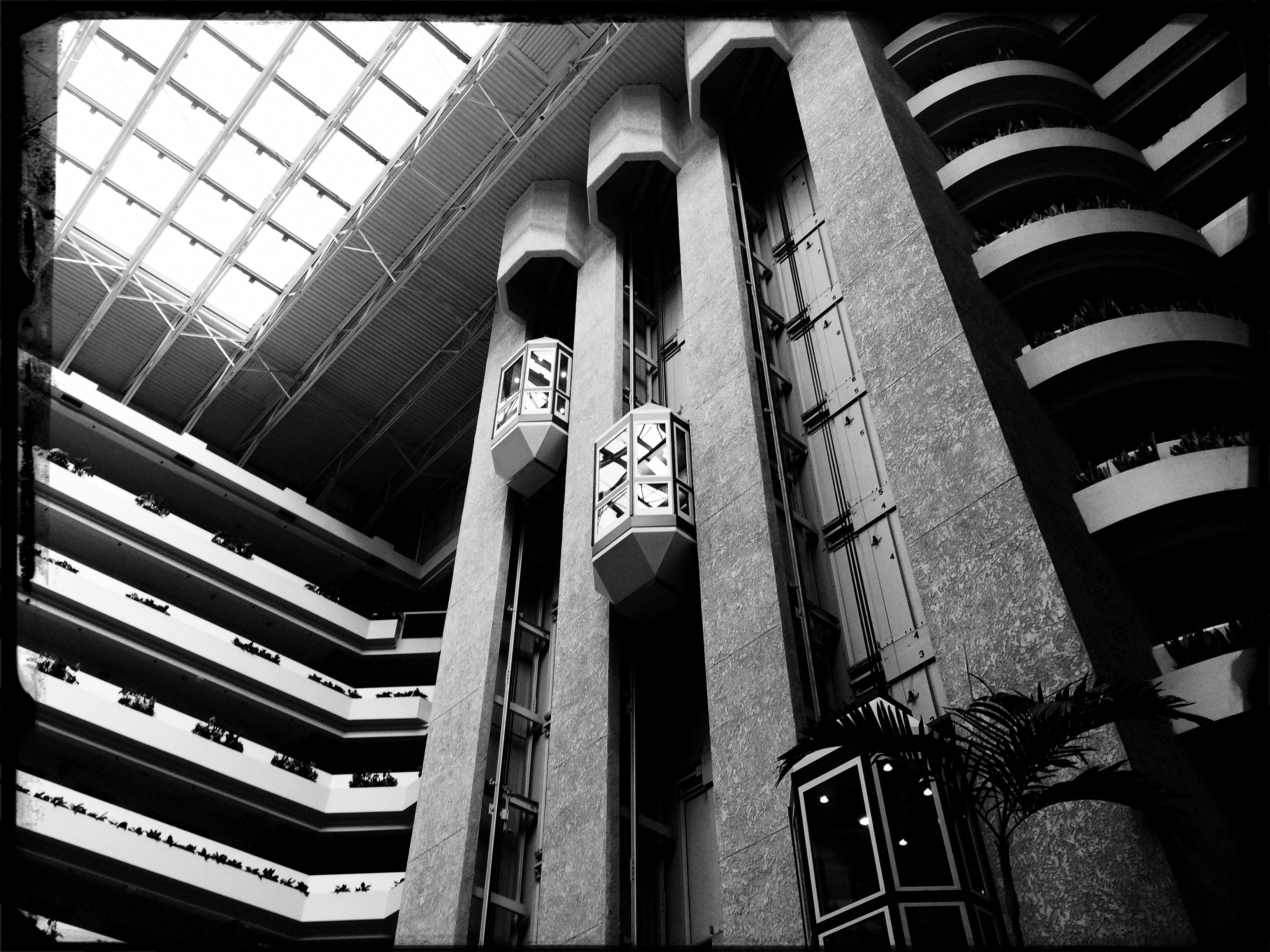
Creative use of contrast and texture can amp up interest in a shot that is overly pretty.
By MICHAEL PERKINS
I RECENTLY HEARD AN INTERESTING CRITIQUE OF A DRAMATIC CONTENDER for Best Film in the 2015 Oscar race. The critic in question complained that the film in question (Boyhood) was too realistic, too inclusive of banal, everyday events, and thus devoid of the dynamics that storytellers use to create entertainment. His bottom line: give us reality, sure, but, as the Brits say, with the boring bits left out.
If you’re a photographer, this argument rings resoundingly true. Shooters regularly choose between the factual documentation of a scene and a deliberate abstraction of it for dramatic effect. We all know that, beyond the technical achievement of exposure, some things that are real are also crashingly dull. Either they are subjects that have been photographed into meaninglessness (your Eiffel Towers, your Niagara Fallses) or they possess no storytelling magic when reproduced faithfully. That’s what processing is for, and, in the hands of a reliable narrator, photographs that remix reality can become so compelling that the results transcend reality, giving it additional emotive power.
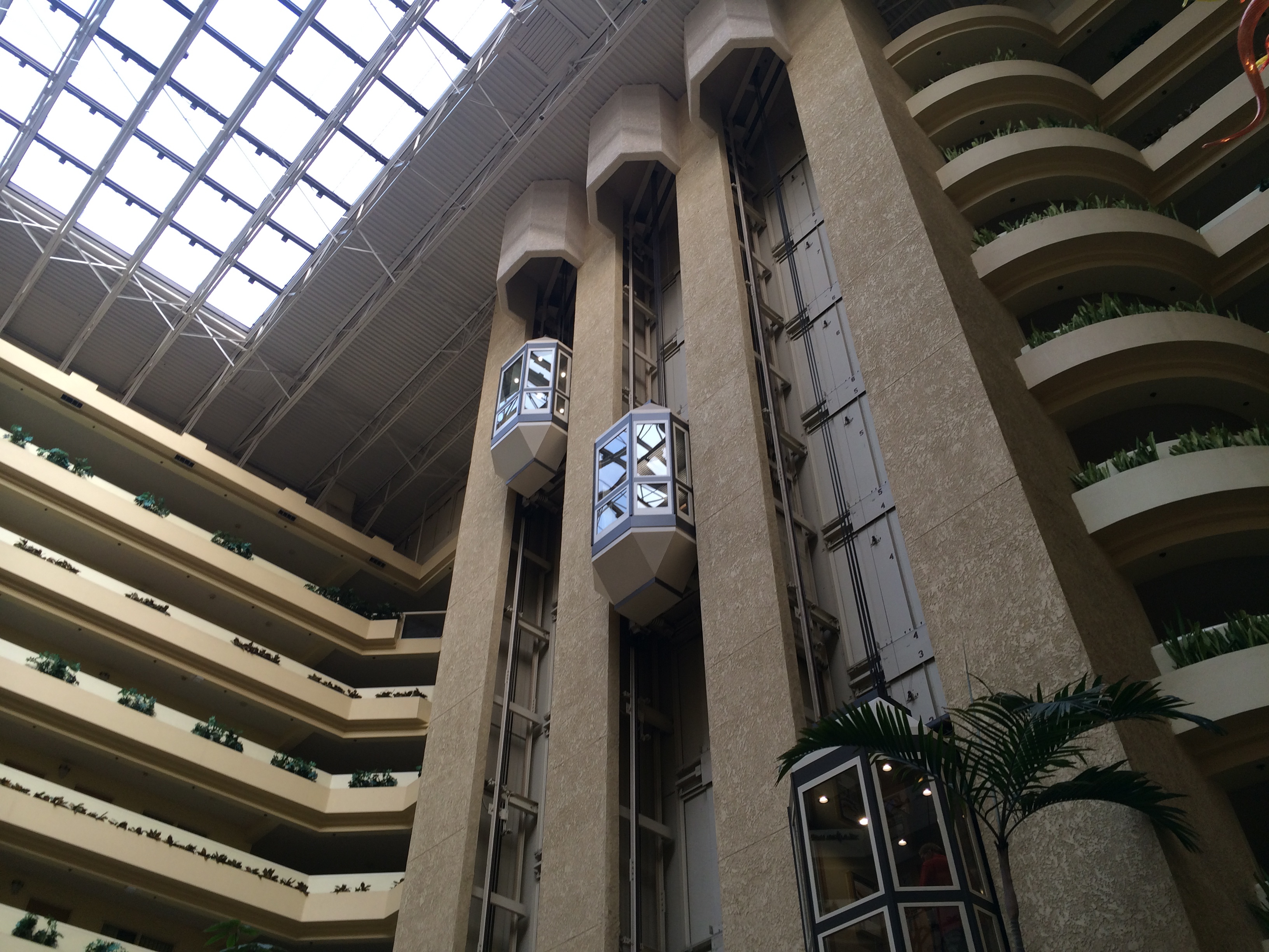
The original. Workable composition, but hampered by its realism.
This is why colors are garish in The Wizard Of Oz, why blurred shots can convey action better than “frozen” shots, and why cropping often delivers a bigger punch and more visual focus than can be seen in busier compositions. Drama is subject matter plus the invented contexts of color, contrast, and texture. It is the reassignment of values. Most importantly, it is a booster shot for subjects whose natural values under-deliver. It is not “cheating”, it is “realizing”, and digital technology offers a photographer more choices, more avenues for interpretation than at any other time in photo history.
The photo at left was taken in a vast hotel atrium which has a lot going for it in terms of scope and sweep, but which loses some punch in its natural colors. There is also a bit too much visible detail in the shot for a really dramatic effect. Processing the color with some additional grain and grit, losing some detail in shadow, and amping the overall contrast help to boost the potential in the architecture to produce the shot you see at the top of this post. Mere documentation of some subjects can produce pretty but flaccid photos. Selectively re-prioritizing some tones and textures can create drama, and additional opportunity for engagement, in your images.
DETAILS, DETAILS
Moody, but still a bit too tidy. Black and white by itself wasn’t enough to create the atmosphere I wanted.
By MICHAEL PERKINS
EVEN THOUGH MOST GREAT PHOTOGRAPHERS PROCLAIM that any “rules” in their medium exist only to be broken, it’s often tough to chuck out regulations that have served you well over a lifetime of work. Once you get used to producing decent images through the repetition of habit, it takes extra nerve to take yourself outside your comfort zone, even if it means adding impact to your shots. You tend not to think of rules as arbitrary or confining, but as structural pillars that keep the roof from falling in.
That’s why it’s a good exercise to force yourself to do something that you feel is a bad fit for your style, lest your approach to everything go from being solid to, well, fossilized. If you hate black and white, make yourself shoot only monochrome for a week. If you feel cramped by square framing, make yourself work exclusively in that compositional format, as if your camera were incapable of landscape or portrait orientations. In my own case, I have to pry my brain away from an instinctual reliance on pinsharp focus, something which part of me fears will lead to chaos in my images. However, as I occasionally force myself to admit, sharp ain’t everything, and there may even be some times when it will kill, or at least dull, a picture.
Sharpness just where it’s needed, and nowhere else.
With post-processing such an instantaneous, cheap, and largely effortless option these days, there really isn’t any reason to not at least try various modes of partial focus just to see where it will lead. Take what you believe will work in terms of the original shot, and experiment with alternate ways of interpreting what you started with.
In the shot at the top of this post, I tried to create mood in a uniquely shaped fish house with monochrome and a dour exposure on a nearly colorless day. Thing is, the image carried too much detail to be effectively atmospheric. The place still looked like a fairly new, fairly spiffy eatery located in an open-air shopping district. I wanted it to look like a worn, weathered joint, a marginal hangout that haunted the wharf that its seafood theme and design suggested. I needed to add more mood and mystery to it, and merely shooting in black & white wasn’t going to get me there, so I ran the shot through an app that created a tilt-shift focus effect, localizing the sharpness to the rooftop sign only and letting the rest of the structure melt into murk.
It shouldn’t be hard to skate around a rule in search of an image that comes closer to what you see in your mind, and yet it can require a leap of faith. Hard to say why trying new things spikes the blood pressure. We’re not heart surgeons, after all, and no one dies if we make a mistake.Anyway, you are never more than one click away from your next best picture.
FRAGMENTS AND SHARDS
By MICHAEL PERKINS
GLASS SURFACES REPRESENT A SERIES OF CHOICES FOR PHOTOGRAPHERS, an endless variety of effects based on the fact that they are both windows and mirrors, bouncing, amplifying or channeling light no less than any other subject in your frame. No two shooters approach the use (or avoidance) of glass as a compositional component in quite the same way. To some, it’s a barrier that they have to get past to present a clear view of their subject. To others, its fragments and shards of angle and light are part of the picture, adding their own commentary or irony.
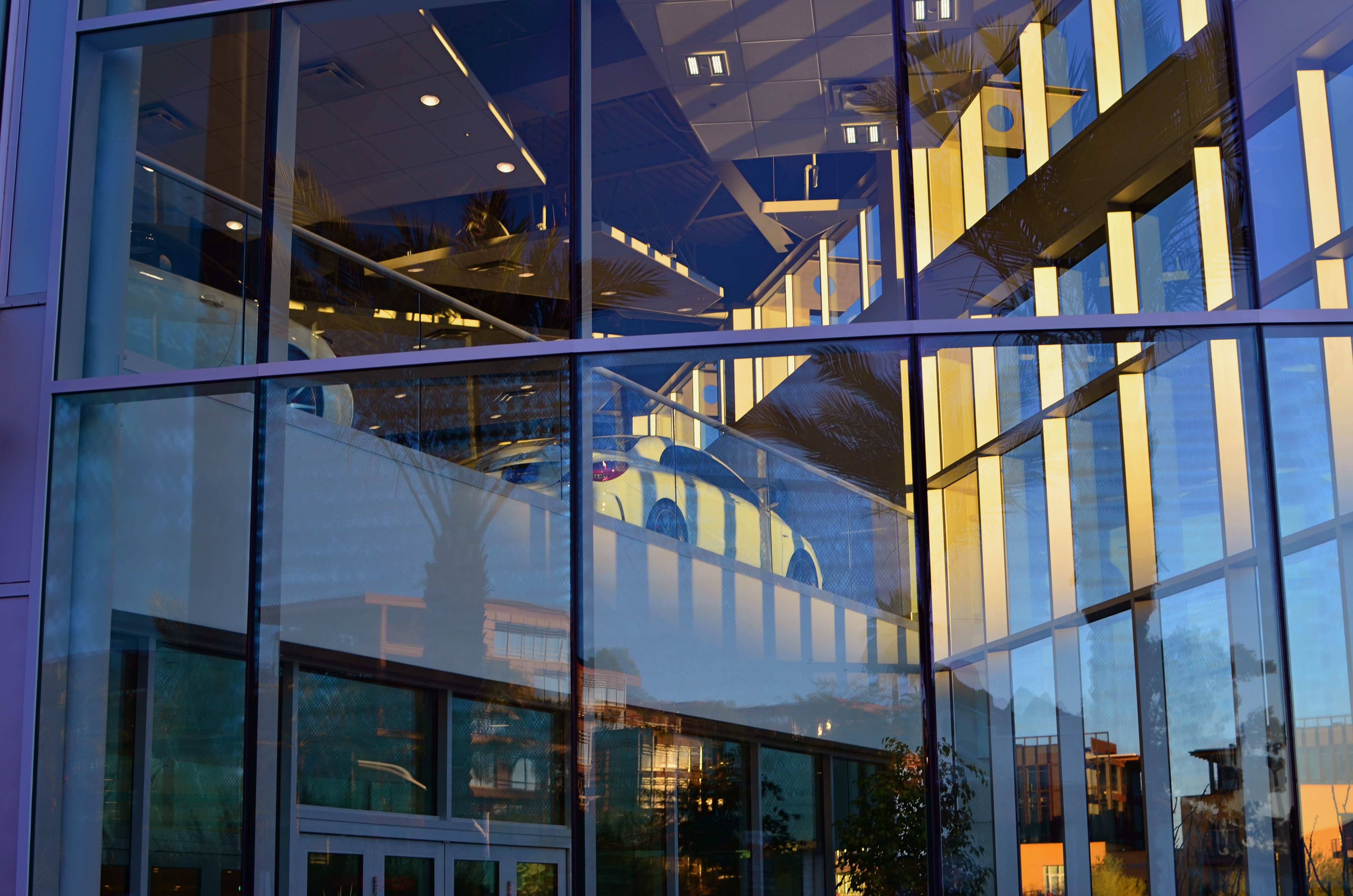
That’s The Way The Light Benz, 2015. 1/50 sec., f/5.6, ISO 100, 35mm.
I usually judge glass’ value in a photograph by two basic qualifiers: context and structure. First, context: suppose you are focused on something that lies just beyond a storefront window. What visual information is outside the scope of the viewer, say something over your shoulder or across the street, that might provide additional impact or context if reflected in the glass that is in direct view? It goes without saying that all reflections are not equal, so automatically factoring them into your photo may add dimension, or merely clutter things up.
The other qualifier is the structure of the glass itself. How does the glass break up, distort, or re-color light within an enclosure? In the above image, for example, I was fascinated by the complex patterns of glass in an auto showroom, especially in the way it reassigned hues once the sun began to set. I had a lot of golden light fighting for dominance with the darker colors of the lit surfaces within the building, making for a kind of cubist effect. No color was trustworthy or natural , and yet everything could be rendered “as is” and regarded by the eye as “real”. The glass was part of the composition, in this instance, and at this precise moment. Midday or morning light would render a completely different effect, perhaps an unwelcome one.
Great artists from Eugene Atget to Robert Frank have created compelling images using glass as a kind character actor in their shots. It’s an easy way to deepen the impact of your shots. Let the shards and fragments act like tiles to assemble your own mosaics.
THE VANISHED NORMAL

Dewey love card catalogs? Well, we used to. 1/30 sec., f/2.8, ISO 100, 35mm
By MICHAEL PERKINS
THE FUTURE DOESN’T ARRIVE ALL AT ONCE, just as the past doesn’t immediately vanish completely. In terms of technology, that means that eras kinds of smear across each other in a gradual “dissolve”. Consider the dial telephone, which persisted in various outposts for many years after the introduction of touch-tone pads, or, more specifically, Superman’s closet, the phone booth, which stubbornly overstayed its welcome long past the arrival of the cel. The “present” is always a mishmosh of things that have just arrived and things that are going away. They sort of pass each other, like workers at change of shift.
Visually, even the obsolete can be re-purposed.
Photographically, this means that there are always relics of earlier eras that persist past their sell-by date. They provide context to life as part of a kind of ever-flowing visual history. It also means that you need to seize on these relics lest they, and their symbolic power, are lost to you forever. Everything that enjoys a brief moment as an “everyday object” will eventually recede in use to such a degree that younger generations couldn’t even visually identify it or place it in its proper time order (a toaster from 1900 today resembles a Victorian space heater more than it does a kitchen appliance).
Ironically, this is a double win for photographers. You can either shoot an object to conjure up a bygone era, or you can approach it completely without context, as a pure design element. You can produce substantial work either way.
Some of the best still life photography either denies an object its original associations or isolates it so that it is just a compositional component. The thing is to visually re-purpose things whose original purpose is no longer. Photography isn’t really about what things look like. It’s more about what you can make them look like.
YOU’RE GREAT, NOW MOVE, WILLYA?
Marquee Marks, 2015. Do I need people in this to suggest urban life?
By MICHAEL PERKINS
ONE OF MY FAVORITE SONGS FROM THE ’40’s, especially when it emanates from the ruby lips of a smoking blonde in a Jessica Rabbit-type evening gown, conveys its entire message in its title: Told Ya I Love Ya, Now Get Out! The hilarious lyrics speak of a woman who acknowledges that, yeah, you’re an okay guy, but don’t get needy. No strings on me, baby. I’ll call you when I want you, doll. Until then, be a pal and take a powder.
I sometimes think of that song when looking for street images. Yes, I’m aware that the entire sweep of human drama is out there, just ripe for the picking. The highs. The lows. Thrill of victory and agony of de feet. But. I always feel as if I’m cheating the world out of all that emotional sturm und drang if I want to make images without, you know, all them people. It’s not that I’m anti-social. It’s just that compelling stuff is happening out there that occasionally only gets compromised or cluttered with humans in the frame.
Scott Kelby, the world’s biggest-selling author of photographic tutorials, spends about a dozen pages in his recent book Photo Recipes showing how to optimize travel photos by either composing around visitors or just waiting until they go away. I don’t know Scott, but his author pic always looks sunny and welcoming, as if he really loves his fellow man. And if he feels it’s cool to occasionally go far from the madding crowd, who am I to argue? There are also dozens of web how-to’s on how to, well, clean up the streets in your favorite neighborhood. All of these people are also, I am sure, decent and loving individuals.
There is some rationality to all this, apart from my basic Scrooginess. Photographically, some absolutes of abstraction or pure design just achieve their objective without using people as props. Another thing to consider is that people establish the scale of things. If you don’t want that scale, or if showing it limits the power of the image, then why have a guy strolling past the main point of interest just to make the picture “human” or, God help us, “approachable”?
Faces can create amazing stories, imparting the marvelous process of being human to complete scenes in unforgettable ways. And, sometimes, a guy walking through your shot is just a guy walking through your shot. Appreciate him. Accommodate him. And always greet him warmly:
Told ya I love ya. Now get out.
THE DAY THE UNIVERSE CHANGED
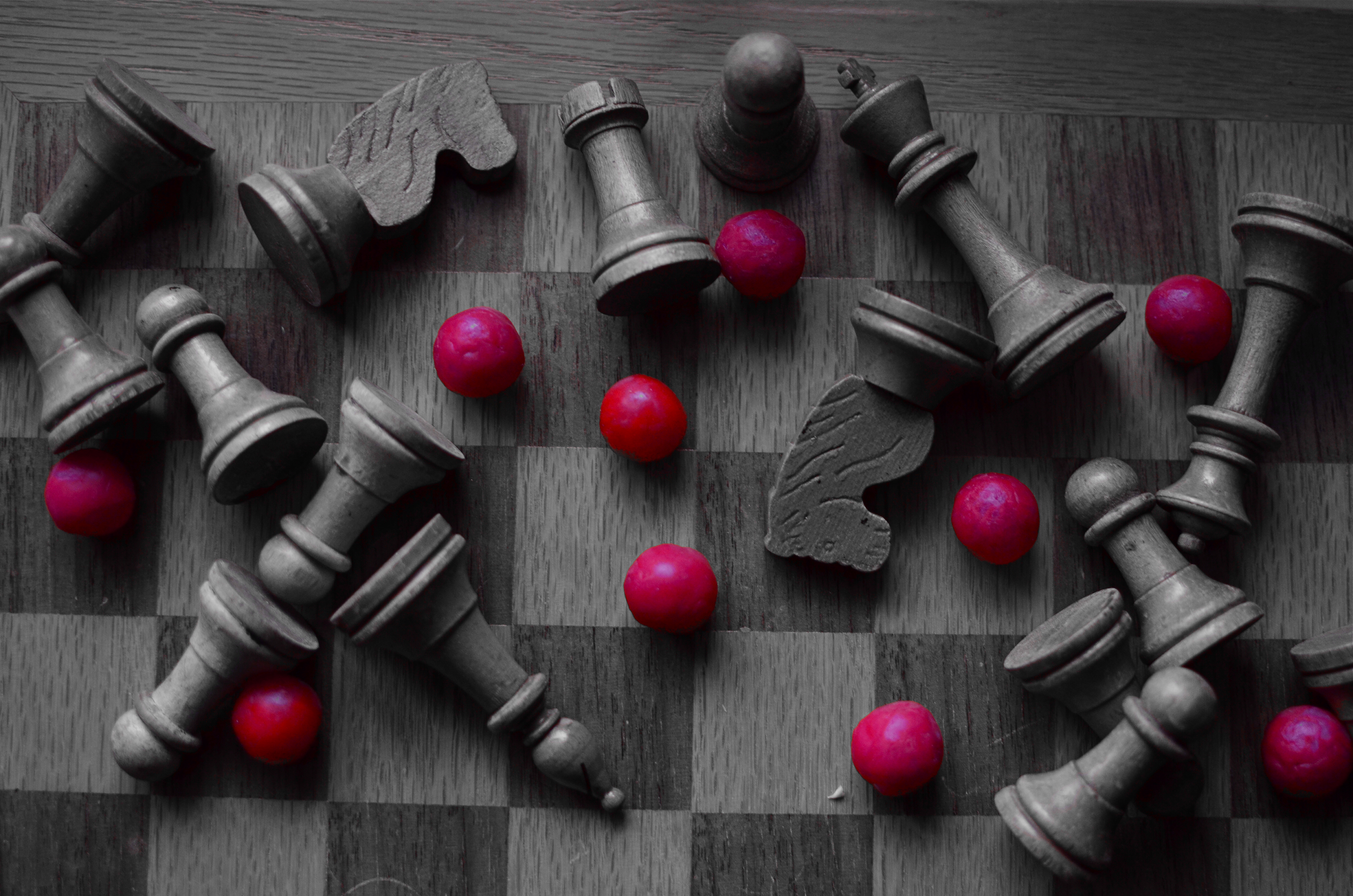
Outgunned, 2015. 1/30 sec., f/2.8, ISO 400, 35mm. Copy of color original desaturated with Nikon’s “selective color” in-camera touch-up option.
By MICHAEL PERKINS
IT WAS NEARLY A GENERATION AGO that Professor James Burke was the most admired media “explainer” of history and culture on both sides of the Atlantic, largely as a result of video adaptations of his hit books Connections and The Day The Universe Changed. Burke, trained at Jesus College in Oxford, was spectacularly talented at showing the interlocking linkages of events and human development, demonstrating the way they meshed together to act endlessly upon history, like gears locked in one large rotation. The result for viewers on PBS and the BBC was better than an ah, ha moment. It was more like an of course moment. Oh, yes, I see now. Of course.
In Universe especially, he examined the specific moments when everything we “knew” was altered forever. For example, we all “knew” the earth was flat, until we knew the exact opposite. We all “knew” that the sun rotated around the Earth, right up until that belief was turned on its ear. Our ideas of truth have always been like Phoenix birds, flaming out of existence only to rise, reconfigured, out of their own ashes. Burke sifted the ashes and set our imaginations ablaze.
As photographers, we have amazing opportunities to depict these transformative moments. In the 1800’s, the nation’s industrial sprawl across the continent was frozen in time with photo essays on the dams, highways, railroads and settlements that were rendering one reality moot while promising another. In the early 1900’s we made images of the shift between eras as the horrors of World War One rendered the Victorian world, along with our innocence, obsolete.
I love exploring these instants of transformation by way of still-life compositions that represent change, the juncture of was and will be. Like the above arrangement, in which some kind of abstract artillery seems to have un-horsed the quaint army of a chess set, I am interested in staging worlds that are about to go out of fashion. Sometimes it takes the form of a loving portrait of bygone technology, such as a preciously irrelevant old camera. Other times you have to create a miniature of the universe you are about to warp out of shape. Either way, it makes for an amazing exercise in re-visualizing the familiar, and reminds us, as Professor Burke did so well, that truth is both more, and less, than we know.
HAPPY OLD YEAR

2014. Another year spent chasing the light.
By MICHAEL PERKINS
The White Rabbit put on his spectacles. ‘Where shall I begin, please your Majesty?’ he asked. ‘Begin at the beginning,’ the King said gravely, ‘and go on till you come to the end: then stop.’
IN A SIMPLER WORLD, THE KING OF HEARTS, quoted above in Lewis Carroll’s Alice’s Adventures in Wonderland, would be perfectly correct. All things being equal, the beginning would be the best place to begin. But, in photography, as in all of life, we are always coming upon a series of beginnings. Learning an art is like making a lap in Monopoly. Just when we think we are approaching our destination, we pass “Go” again, and find that one man’s finish line is another man’s starting gate. Photography is all about re-defining where we are and where we need to be. We always begin, and we never finish.
As 2014 comes to an intersection (I can’t really say ‘a close’ after all that, can I?), it’s normal to review what might be either constant, or changed, about one’s approach to making pictures. That, after all, is the stated aim of this blog, making The Normal Eye more about journey than destination. And so, all I can do in reviewing the last twelve months of opportunities or accidents is to try to identify the areas of photography that most define me at this particular juncture, and to reflect on the work that best represents those areas. This is not to say I’ve gained mastery, but rather that I’m gaining on it. If my legs hold out, I may get there yet. But don’t count on it.
The number twelve has become, then, the structure for the blog page we launch today, called (how does he think of these things?) 12 for 14. You’ll notice it as the newest gallery tab at the top of the screen. There is nothing magical about the number by itself, but I think forcing myself to edit, then edit again, until the thousands of images taken this year are winnowed down to some kind of essence is a useful, if ego-bruising, exercise. I just wanted to have one picture for each facet of photography that I find essentially important, at least in my own work, so twelve it is.
Light painting, landscape, HDR, mobile, natural light, mixed focus, portraiture, abstract composition, all these and others show up as repeating motifs in what I love in others’ images, and what I seek in my own. They are products of both random opportunity and obsessive design, divine accident and carefully executed planning. Some are narrative, others are “absolute” in that they have no formalized storytelling function. In other words, they are a year in the life of just another person who hopes to harness light, perfect his vision, and occasionally snag something magical.
So here we are at the finish line, er, the starting gate, or….well, on to the next picture. Happy New Year.
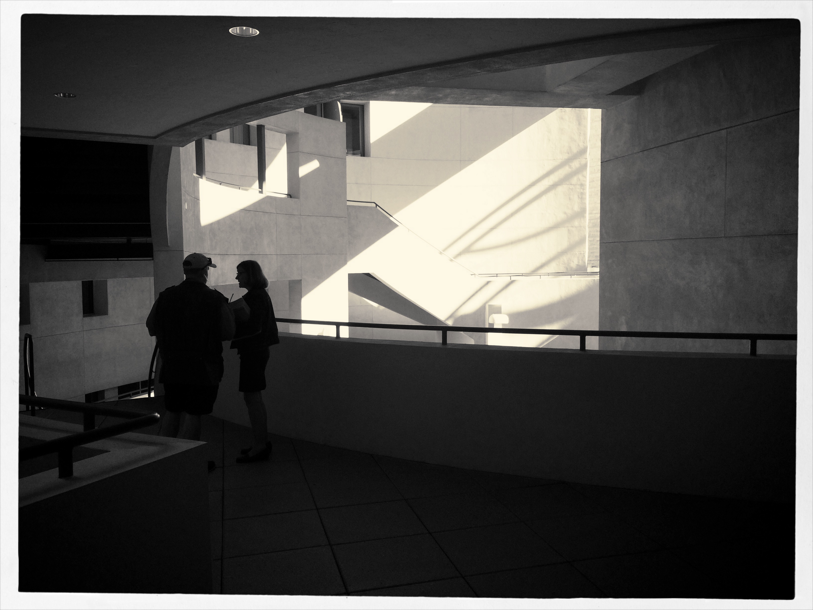
PRESERVING THE PERCEPTION

Your memory tells you that this space is more like a “library” than a “drug store”, unless you live in a much nicer neighborhood than mine.
By MICHAEL PERKINS
THERE IS AN OLD ADVERTISING MAXIM that the first person to introduce a product to market becomes the “face” of all versions of that product forever, no matter who else enters as a competitor. Under this thinking, all soda generically becomes a Coke; all facial tissues are Kleenexes: and no matter who made your office copier, you use it to make…Xeroxes. The first way we encounter something often becomes the way we “see” it, maybe forever.
Photography is shorthand for what takes much longer to explain verbally, and sometimes the first way we visually present something “sticks” in our head, becoming the default image that “means” that thing. Architecture seems to send that signal with certain businesses, certainly. When I give you Doric columns and gargoyles, you are a lot likelier to think courthouse than doghouse. If I show you panes of reflective glass, large open spaces and stark light fixtures, you might sift through your memory for art gallery sooner than you would for hardware store. It’s just the mind’s convenient filing system for quickly identifying previous files, and it can be a great tool for your photography as well.
As a shooter, you can sell the idea of a type of space based on what your viewer expects it to look like, and that could mean that you shoot an understated or even tightly composed, partial view of it, secure in the knowledge that people’s collective memory will provide any missing data. Being sensitive to what the universally accepted icons of a thing are means you can abbreviate or abstract its presentation without worrying about losing impact.
Photography can be at its most effective when you can say more and more with less and less. You just have to know how much to pare away and still preserve the perception.
