SIGNATURES
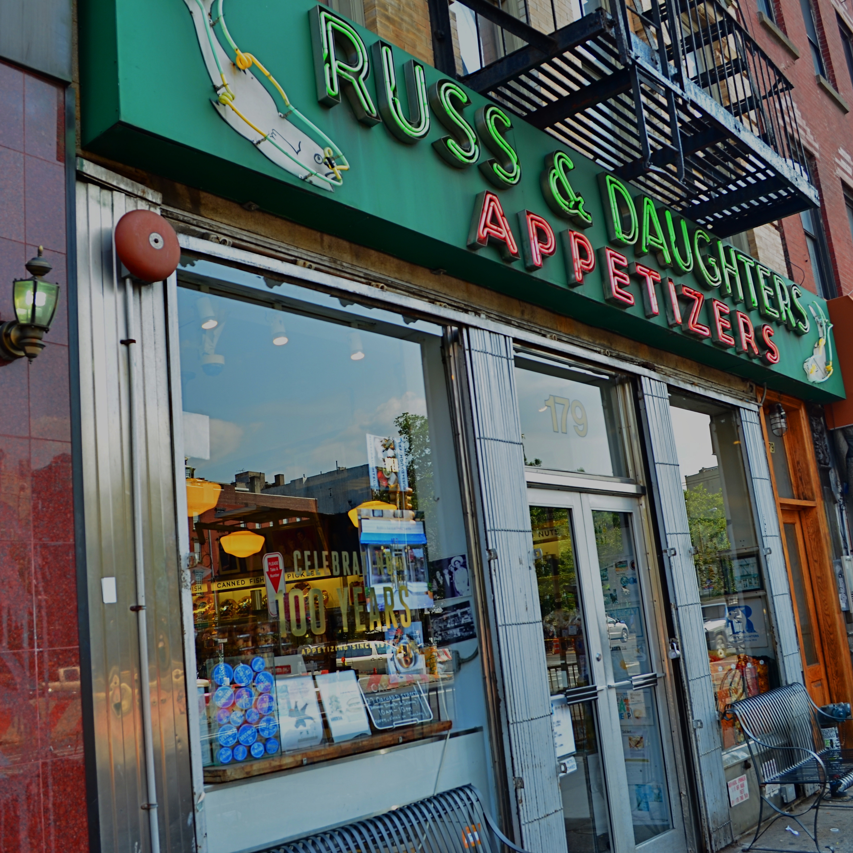
Signs of the times.
By MICHAEL PERKINS
SOME OF THE MOST UNIQUE CASUALTIES OF SO-CALLED URBAN PROGRESS, key parts of a city’s visual signature, are the everyday signs associated with local businesses, from the red neon over your local bar to the hand-painted address on your favorite eatery. Naturally, photographers have a big stake in the obliteration of any feature of the changing urban landscape, and there is a growing movement to treasure signage as symbols of identity in neighborhoods that are increasingly in danger of being genericized by fast-food and mega-retail chains.
Graphic designer Molly Woodward deserves a lot of credit for the attention now being paid to urban signage, and her website on what she calls vernacular typography contains essays and samples that illustrate what is being lost in town after town. Cities like New York that experience a faster-than-average turnover in area retail see signs for locally owned businesses vanish more frequently. And while it’s normal for mom-and-pop ventures to wink in and out of existence all the time, the chance for entire blocks to be graphically drenched in a candy coating of Starbucks logos is greater in major metropolitan areas.
Woodward’s web archive is rich in photographs of these disappearing urban signatures, and there is certainly a rich vein of source material for any enterprising city photographer. Signs help anchor neighborhoods, acting as mile markers, landmarks, and a more human scale of commerce. They remind us where we are, what our streets are all about. They mark where we grew up, what we wanted to be. The boundaries of our bailiwick. They are personal transactions. Meet me under the clock near the Chinese laundry. See you at 5 near the giant neon cheeseburger.
Shooting signs is an act of reportage; it’s correspondent work. And it’s no less important than photographing the ruins of an ancient cathedral or a portal on the Great Wall, since it’s a kind of archaeology. Many thanks to the Molly Woodwards of the world as they hold back the tide against a mindless homogenization of our streets. And thanks in turn to those who pick up her vibe and click away at the Acmes and Ajaxes in their own towns, often just steps ahead of the wrecking ball.
INSIDE OUT
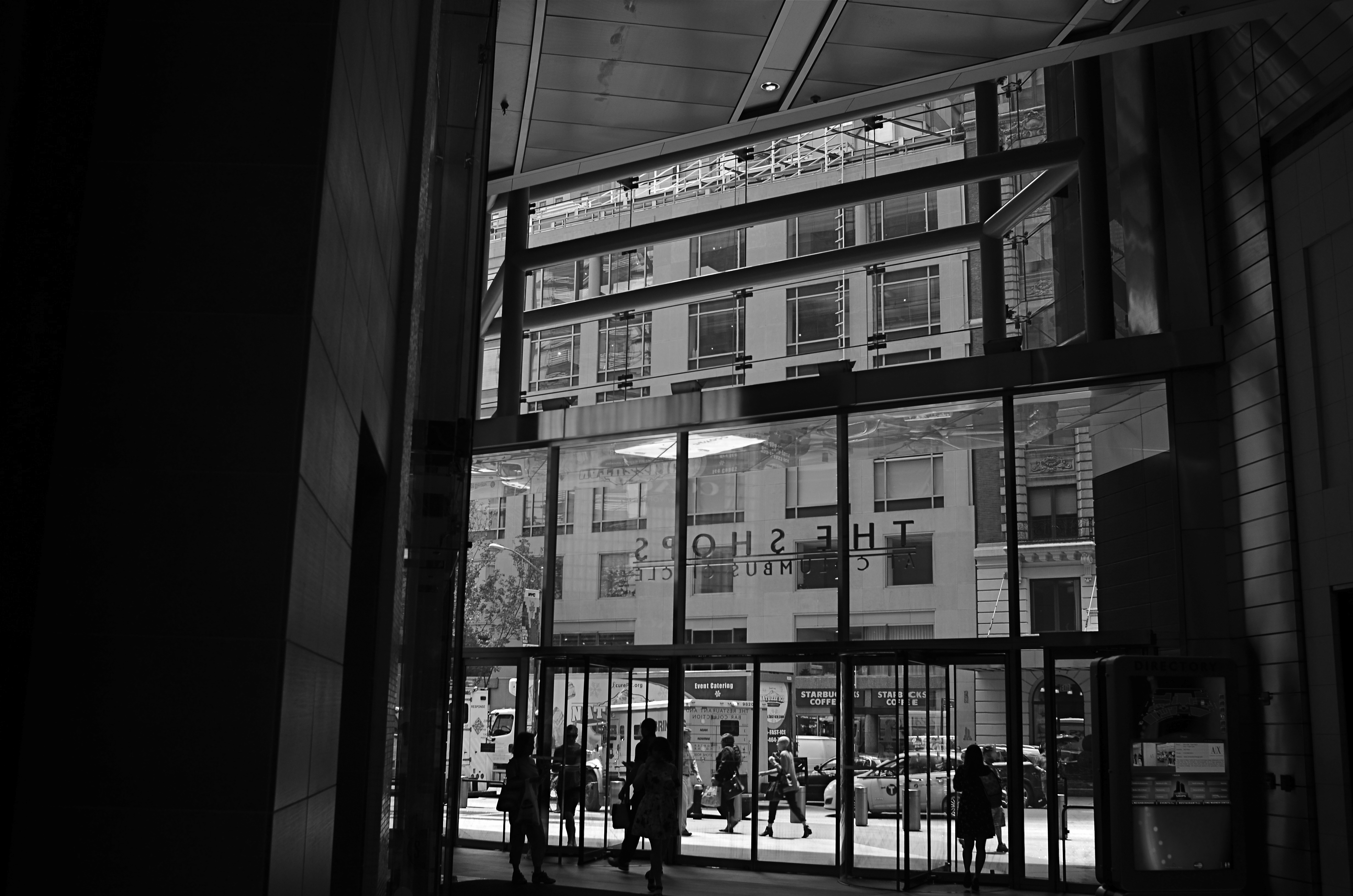
Almost among them: views that selectively depict the life of the street can present unique contexts.
By MICHAEL PERKINS
CITIES ARE A CONTINUOUS POST-GRADUATE COURSE IN THE MILLIONS OF DIFFERENT WAYS TO SEE. They not only afford an endless array of things to visualize, but offer up just as many vantage points or angles to frame, select, show, or conceal them. It’s just as much about how you shoot something as what you selected to shoot.
My favorite images in urban environments are essentially stolen glances. Brief shards of light arrowing past a subway car window. Slanted slashes of sun crawling up an alley wall. And, more recently, views of the street that hide as much as they reveal, teasing winks of the city in all its rhythm as viewed from the inside out.
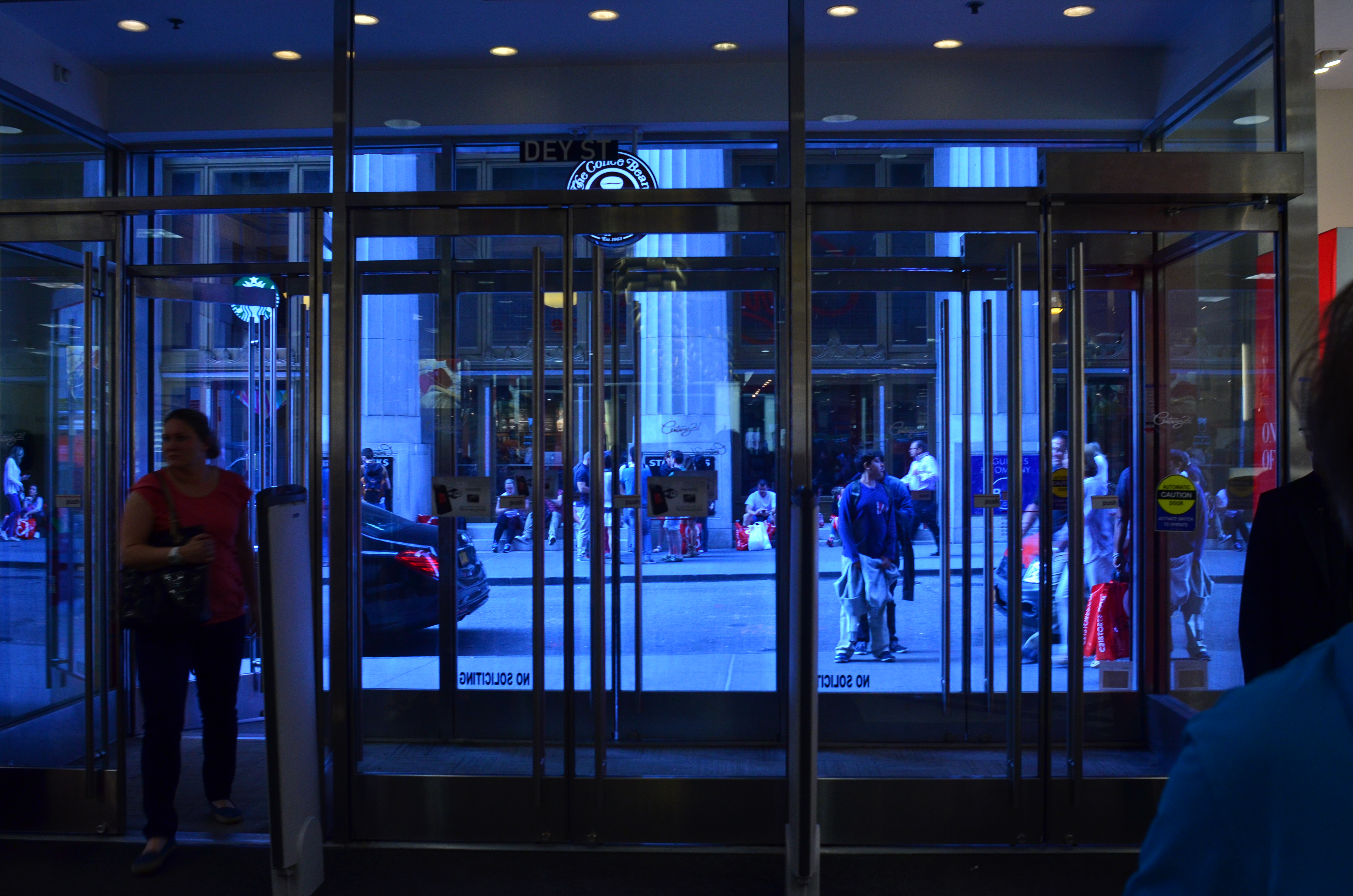
It might be the tension, or the anticipation of a scene that is not, but is just about to be, cracked fully open. People pass by framed by windows, distorted by warps and reflections, amputated and edited by panels, shadows, partially eclipsed by walls. It’s a visual striptease. Now you see life, now you don’t, now, here it comes again. Sometimes standing just inside the entrance of a building can feel like viewing life at a distance, as anonymously as you might watch surveillance video on a giant screen or a movie in a dark theater.
Photography is one part content and one part context. We have all been surprised when someone standing right next to us points a camera in the same general direction that we do and comes away with a completely different kind of image. That surprise is the shock-reminder of our very individual way of framing and selecting information, and cities offer a remarkable laboratory for sampling all of those variances.
Inside looking out or outside looking in, the view is the thing.
THE PUSH AND THE PULL
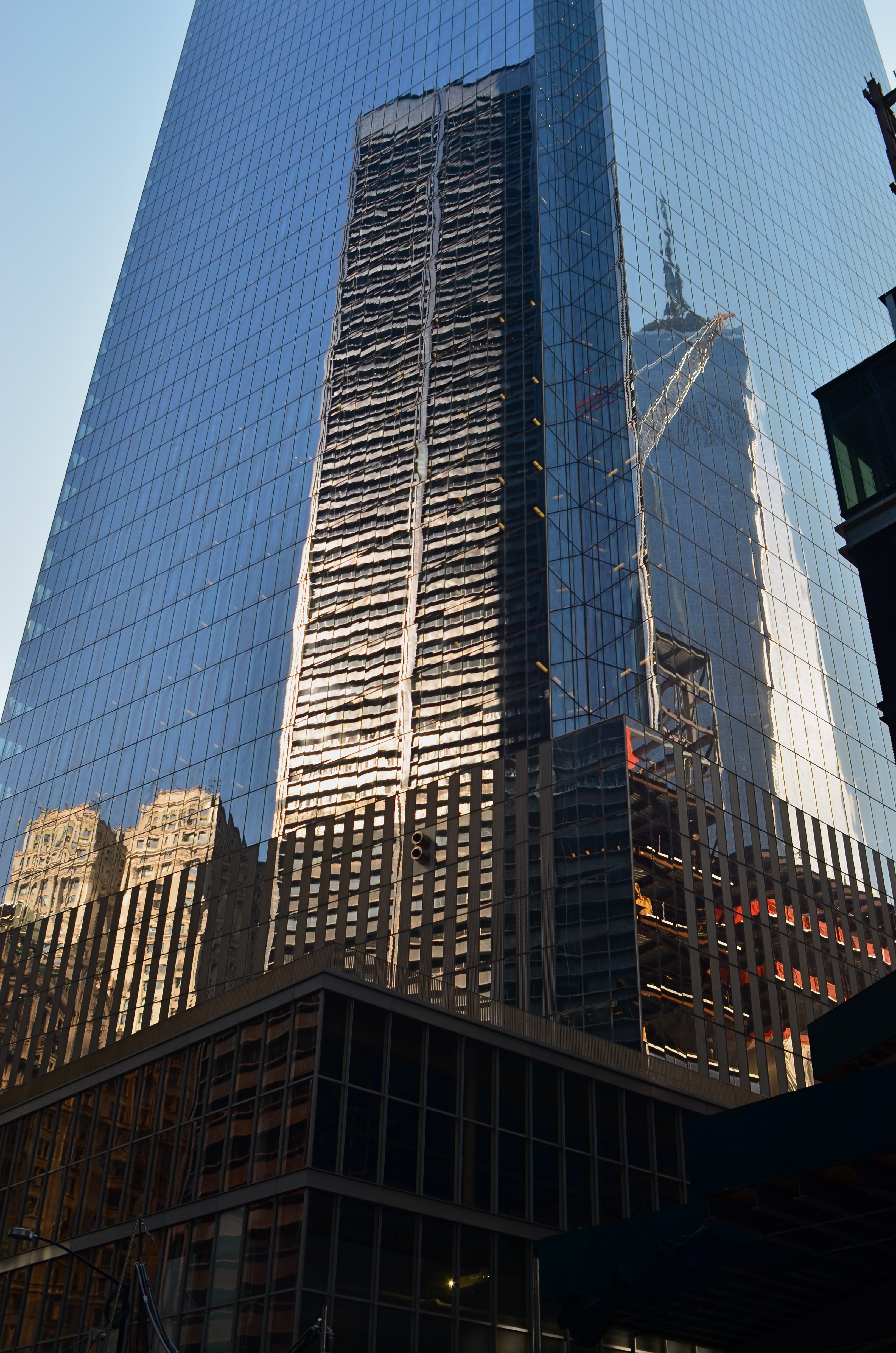
NYC: pictures of impressions of visions of dreams.
By MICHAEL PERKINS
NEW YORK CITY IS A VERY IRONIC CANVAS. Artists who set brush upon that canvas may think they are attempting to depict something outside themselves, but what they show actually reveals very personal things. There are more stories than all the storytellers in the world can ever hope to render…in paint, in print, or through the lens of a camera, and while some of us entertain the notion that we are adding this commentary objectively, that, plainly, is impossible.
From handheld luggage to emotional baggage, everyone brings something to New York, layering their own dreams and dreads onto the multi-story sandwich of human experience that makes it the world’s most unique social laboratory. Hard as it is on the artistic ego, one can’t make the statement that defines the city. Wiser minds from Walt Whitman to Langston Hughes to Bob Dylan have tried, and they have all contributed their versions….wonderful versions. But the story can never be completed. New York won’t be contained by mere words and images. It is, like the song says, a state of mind.
Still, trying to scale the mountain can be fun. So, with this post, The Normal Eye has added a new gallery tab at the top of the page to share a few recent takes on my own ongoing love affair with the Apple. The title, I’ll Take Manhattan, is hardly original, but it is easy to remember. I have done essays on NYC before, but, this time out, I strove to focus as much on the rhythm of people as on the staggering scope of the skyline. New York is, finally, its people, that perpetually fresh infusion of rigor, rage, talent and terror that adds ever-new coats of paint to the neighborhoods, and this batch of pictures tries, in 2015, to show the town as it is used, by its daily caretakers. The push. The pull. The gamut of sensations from sky to gutter.
So have a look if you will and weigh these impressions against those you’ve discovered through others or developed within yourself. Taking on a photographic task that can never be finished is either frustrating or freeing, depending on your artistic viewpoint. In the meantime, what a ride.
RETURN OF THE POD PEOPLE
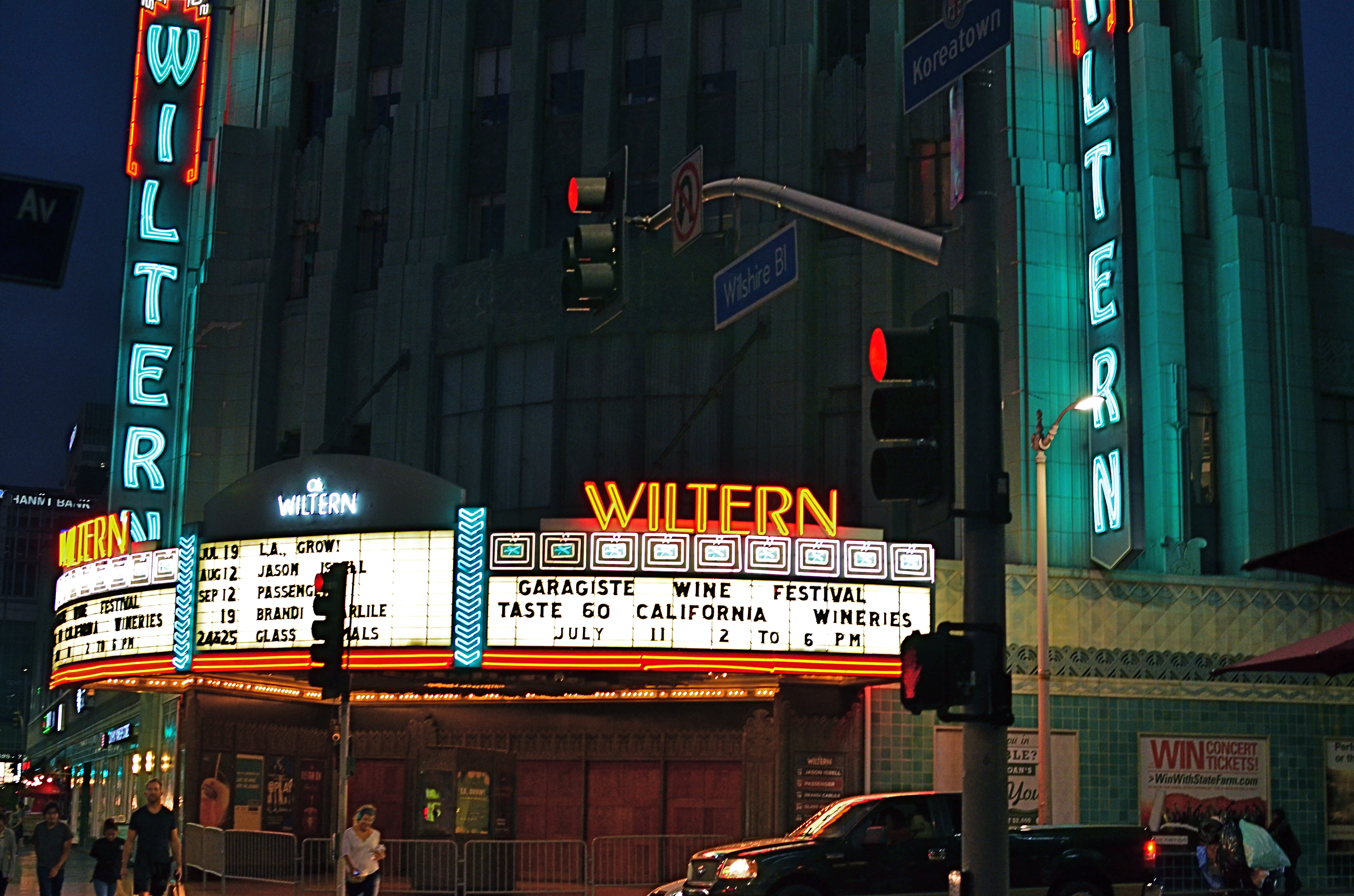
Wiltern On Wilshire, 2015. At f/3.5 and an ISO of 1000, this is an acceptably sharp hand-held exposure. Want the lights to be sharper? Might have to go tripod.
By MICHAEL PERKINS
I HAVE OCCASIONALLY SOUNDED WHAT, I ADMIT, IS A PREMATURE FUNERAL DIRGE for the lowly tripod, that balky, bulky, creaky throwback to the 19th century that continues to linger as an occasional, if fading, tool of the 21st. Part of this stems from the pure aggravation involved in trucking the things around, getting them locked and level, and praying that nothing from a stiff wind to an enraged gopher to a power-tripping mall cop will intervene to undo the entire rickety works. Hey, I’m not a hater, just a very reluctant fan.
One of the reasons I’ve mostly weaned myself from the pod is the ever-evolving speed of lenses and sensors in the digital era. This means scenes with less and less light can be captured with greater sharpness in short, hand-held exposures, albeit with a little more visual noise or grain. You can now shoot on a dark street at night, if your lens opens wide enough to keep your ISO as low as possible and if you can maintain a rock-steady grip on your camera at shutter speeds around 1/20 or so. And, for many cases, the results from this setup will be quite satisfactory.
However, we ain’t just about being satisfied, are we, mmmm?
Problem with a wide exposure and bright highlights (like the theatre marquee in the above shot) is that those elements will burn in and become diffuse, even in fast exposures, especially since your ISO setting is instructing your sensor to suck light like a maniac. As a result, instead of being sharp pinpoints of light, they will often turn soft and globby. If you can live with that, then go in peace and sin no more, my son.
However, if you really need to get those lights as sharp as you see them with your own eye, you might try doing a longer exposure at a smaller aperture, and that can mean dragging the pod down from the attic and doing it old-school. Good news is that you can now crank your ISO back down to minimum, so, yay, no noise atall, atall. You also might pick up some more contrast and detail within bright objects, like the horizontal lines on the above marquee. Bad news is, duh, you’re using a tripod. Hey, is that a mall cop I see running over here?
UNKNOWN KNOWNS
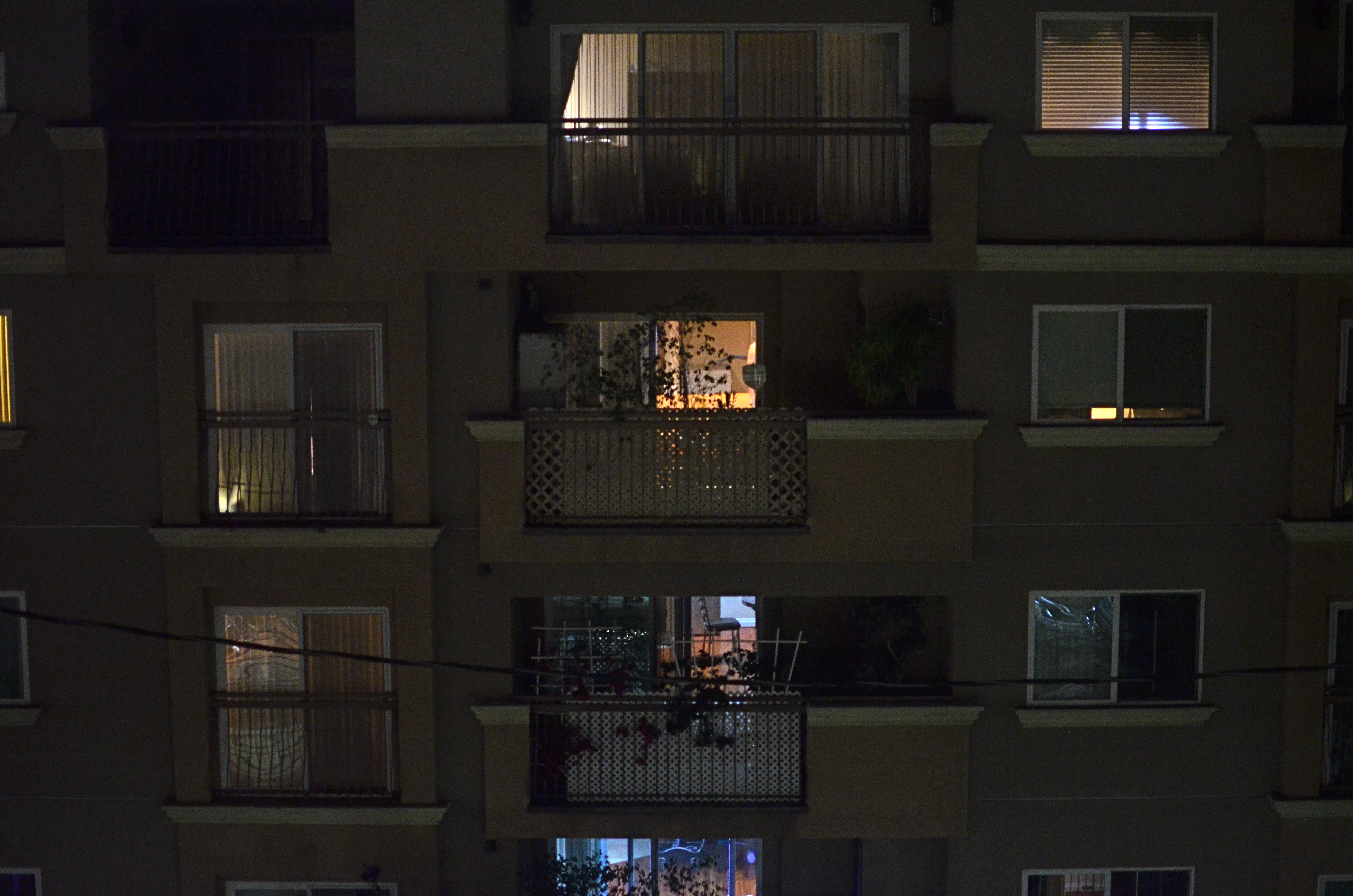
1/15 sec., f/1.8, ISO 1000, 35mm.
By MICHAEL PERKINS
ALFRED HITCHCOCK’S CLASSIC REAR WINDOW IS THE ULTIMATE GUILTY PLEASURE, and not just because the Master of Suspense is at the peak of his edge-of-your-seat powers in the telling of its thrilling murder story. No, the massive, full-sized set of James Stewart’s Manhattan neighborhood, with all its apartment-dwellers’ secrets open to the most casual snoop, is the creepy, giddy candy at the center of this cinematic confection. In making it temporarily okay to be, in effect, peeping toms, Hitchcock is making us complicit in his hero’s unsavory curiosity. All these dramas. All these secrets that we have no right in knowing. And, of course, we can’t look away.
Photographing the intersection of living spaces in city settings is far often more subtle than Hitch’s feat of shaving the back wall off an entire community, and that makes for a lot more mystery, most of us beyond solution. Look too little, and a slab of brick is more like a beehive than a collection of stories. Look too deeply, and the truths you unearth can feel stolen, like an invasion done purely for prurient entertainment. What’s most interesting is to imply much but reveal little, and hitting that balance is tough.
I recently killed off the last fifteen minutes of a generally unproductive night of street shooting by gazing out the window of my nondescript hotel at an equally nondescript apartment building across the way. The last vestiges of dusk offered scant details on the outside wall, and the warm yellow hum of electrical light had already begun to flicker on in the various cubicles. I thought of Rear Window and how you could look at the fully visible doings of people, yet still know virtually nothing of their lives. Here the lighting was random, undefined, with little real information on the life throbbing within the individual spaces….the dead opposite of Hitchcock’s deliberate staging.
I couldn’t see a face, a hand, an activity. All I had was the mere suggestion of human presence. What were they reading, watching, wishing, enduring, enjoying, hating? I couldn’t know and I couldn’t show it, but I could show the mystery itself. I could share, if you will, the sensation of not being able to know. And so I made a photograph of that lack of information.
Some photographs are about things, obvious things that you’re able to freeze in time. Other images are about the idea of something, a kind of unsatisfied anticipation. Both kinds of pictures have their own narrative code, and learning how to manage these special languages is great practice for the idea, and the mind back of it.
I’LL JUST HAVE A LIGHT SANDWICH
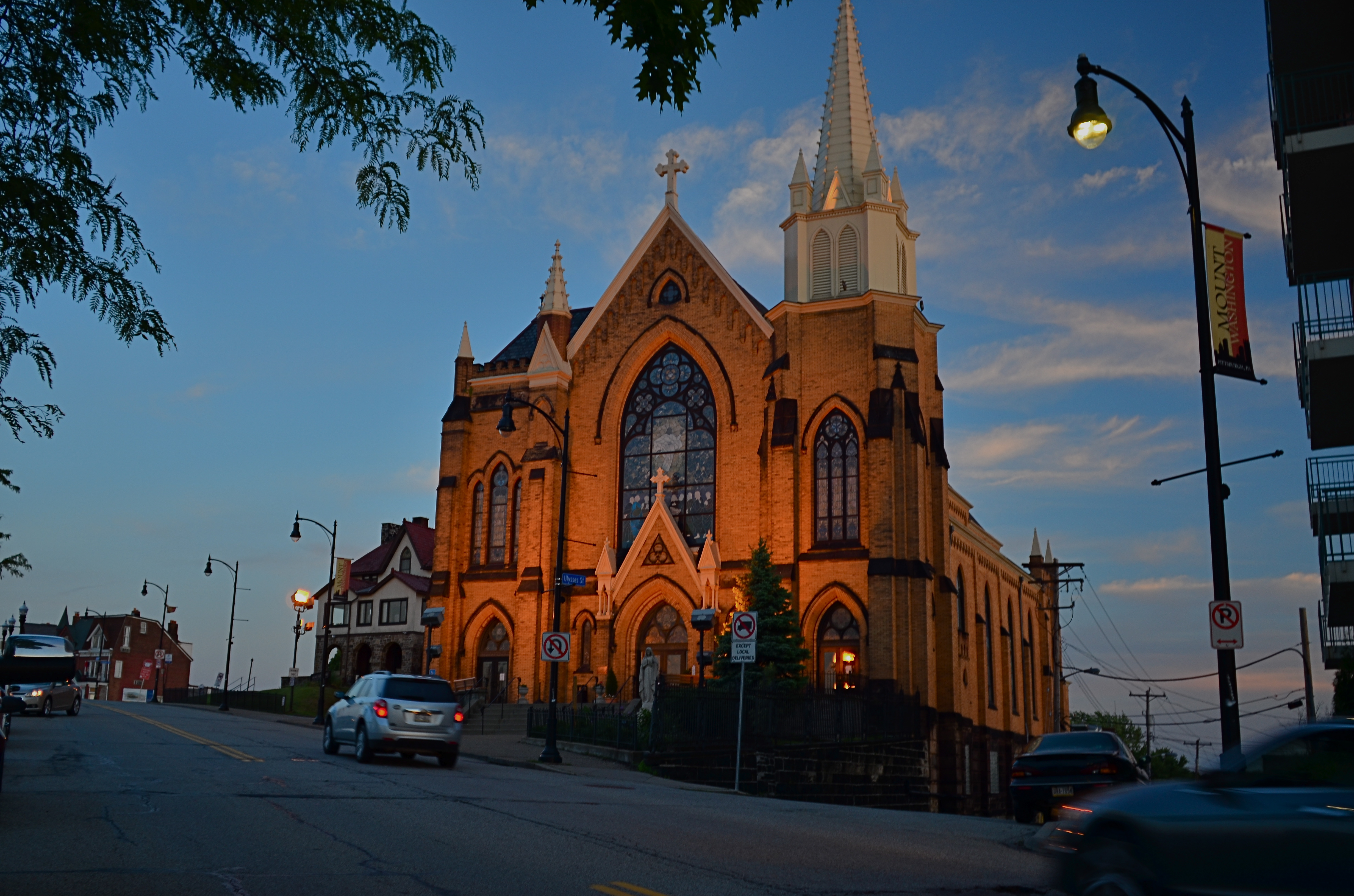
Learning to dissect your “happy accidents” might allow you to start doing better stuff on purpose.
By MICHAEL PERKINS
SOMETIMES FACING OUR OWN PHOTOGRAPHIC WORK is less like dredging up memory and more like staring into the face of a complete stranger. Even seconds after the shutter snaps, a real distance widens between what we did in the moment and what we hold in our hands. Who did this? What were we thinking? Why did this work (or, in many cases, not work)?
Shooting quickly on the street worsens this feeling of alienation. We might not have even been so mindful of all the factors at work in a picture while it was being made, which makes learning from both the duds and the keepers that much more difficult. Learning to completely deconstruct a shot is, therefore, one of the most valuable skills for any photographer. It’s not always an easy thing.
In the above shot, there are a number of contributing factors at work, not all of them in play for any other single shot taken on the afternoon I made it. For starters, I was lucky enough to be about 200 feet above average terrain, so the golden light of early dusk is hitting the face of the church pretty hard, as well as adding to the deepening blue of the sky. Secondly, I am shooting with my camera set on “vivid”, building even more saturation into the shot. At the same time, I am shooting through a polarizing filter, which, while not working fully at this late hour of the day, is also deepening the sky. Finally, the church, which is already glowing from the sunset light, is also being floodlit with sodium lamps, amping up the orange tones and contrasting even harder against the sky.
The effect is a kind of “light sandwich” four layers deep, a combo that only works for this particular shot. One or two shots later in the same sequence, these same conditions rendered the colors over-rich and pretty unreal in appearance. Sadly, I can’t even take credit for having deliberately planned the shot in this way, since, if I had, I probably would have chosen a slightly faster shutter speed and avoided the softness in the passing cars. Still, as I dissect it after the fact, it’s good practice to be able to do a post-Sherlock to see exactly what happened, in case I ever do want to manipulate a photo in this general way.
Ot I could just say, “cool” and move on.
And, sure, I’ve done that too.
HEADSTONES
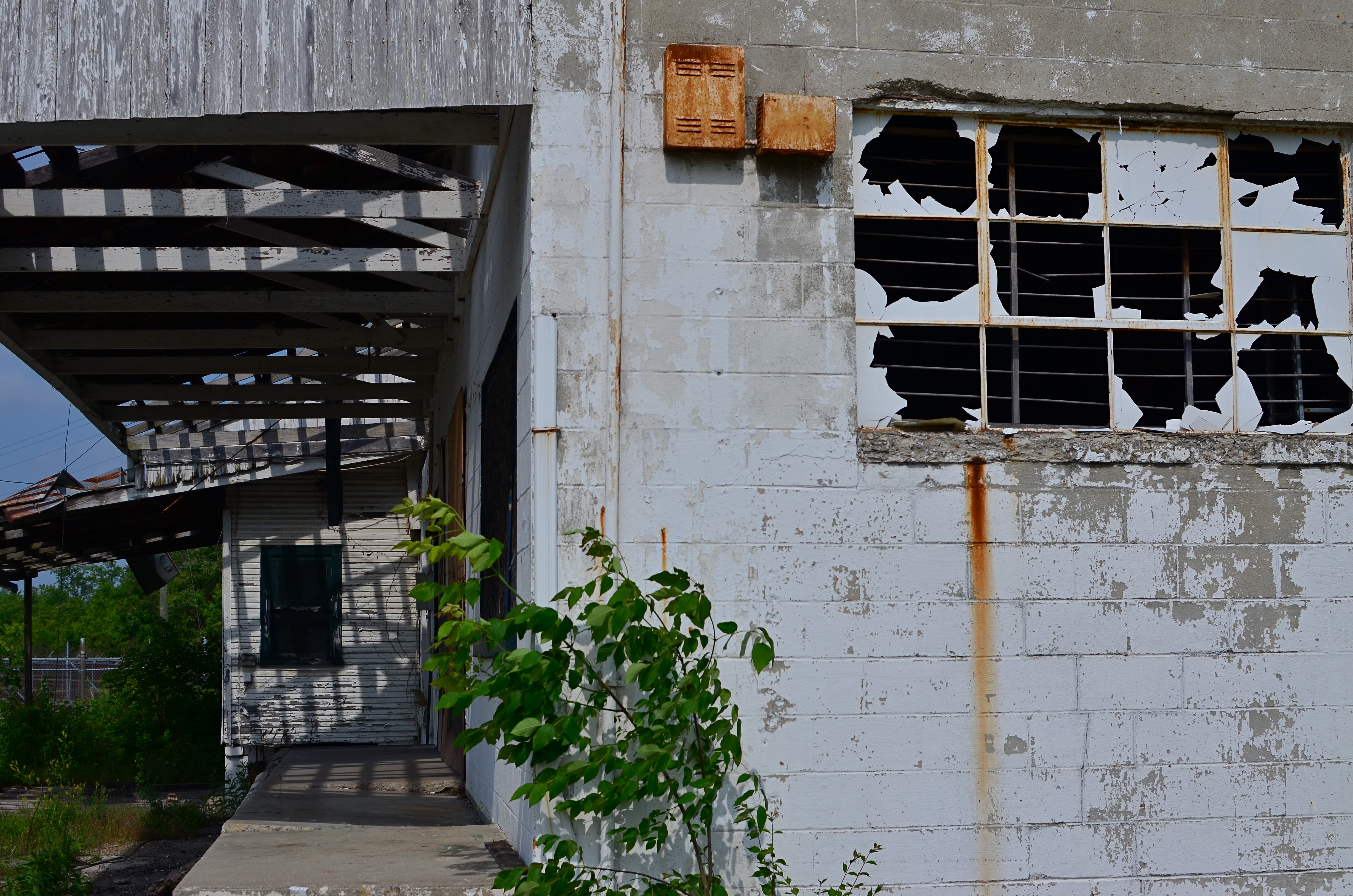
This hulk was once someone’s idea of progress and prosperity.
By MICHAEL PERKINS
IF ARCHITECTURAL PROJECTS, AT THEIR BIRTHS, REPRESENT A KIND OF FAITH, then the demise of buildings likewise signals a sort of death, a loss of belief, an admission of failure. Our new societies break ground on developments in one generation only to see them wither to silence in the next, a cycle of boom and bust that somehow has become the rhythm of modern life.
Viewing the ruins that result from all our once-bright industrial dreams through the lens of a camera creates a peculiar kind of commentary, less specific but more emotionally immediate than a written editorial or essay. The first uses of photography as chronicles of urban life were largely neutral, merely recording city vistas, monuments, cathedrals, scenic wonders. It took the aftermath of World War One and the Great Depression to infuse architectural photos with the sting of commentary, as if the photographer was asking, what have we done? What is all this for?
In the 1930’s, there was a quick segue from the New Deal’s programs for documenting relief programs to a new breed of socially activist shooters like Walker Evans and Margaret Bourke-White, who showed us both the human and architectural faces of despair. Suddenly closed businesses, shabby tenements, and collapsed infrastructures became testimony on what we were doing wrong, of the horrific gap between our dreams and our deeds.
In every town across America, photographers continue to search for the headstones of our lost hopes, the factories, foundries, and dashed ventures that define who we hoped to be, and how things went wrong. It’s not a photography of hopelessness, however, but a dutiful reminder that actions have consequences, for good or ill. Turning our eyes, and lenses, to the stories left behind by the earlier versions of ourselves is a way of measuring, of keeping score on what kind of world we desire. The headstones bear clear inscriptions. Deciphering them is the soul of photography.
SURVEYING THE SURFACE WORLD
By MICHAEL PERKINS
COLOR, IN A PHOTOGRAPH, IS OFTEN THOUGHT OF IN OVER-SIMPLIFIED TERMS, as if there were one even tone to every part of everything we capture, what I call the “paint roller” school of thought. One of the reasons color was so long in development in the film era was because it had to become accurate at measuring the myriad inconsistencies in the hues of objects. Consider the wide range of pinks, reds, even blues in the contours of a single human face. There is no “flesh” color outside of a box of Crayolas, and color photography has evolved over time to deliver the real, if tricky, inch-to-inch changes in the tone of every kind of surface.
Skin or wood, plastic or metal, color changes frequently over the surface of an object, and good photographers learn how to get stunning effects through application of that principle. One subject which can deliver dramatic results with little effort is the urban building, primarily the metal urban building. Many of the metals used in construction are actually alloys, and so they already contain color elements of their constituent ingredients.
Metal alloys produce wide color variations under the right lighting conditions. 1/50 sec., f/5.6, ISO 100-24mm.
I try to shoot alloys in fairly indirect light, as this amps up the shimmer and gloss of their surfaces in a way straight-on lighting tends to bleach out or subdue. I also set my camera for whatever “vivid” color setting it allows, since more color information means more clear reproduction of the subtle changes in tone from, say, one end of a section of metal to the other. In post-production, I will often play with contrast and temperature to enhance whatever I want to present in the image’s overall color mood.
Metal can run the gamut from grey to blue to green to pure white, and learning how to place those shades where you want them can add dimension to your photos.
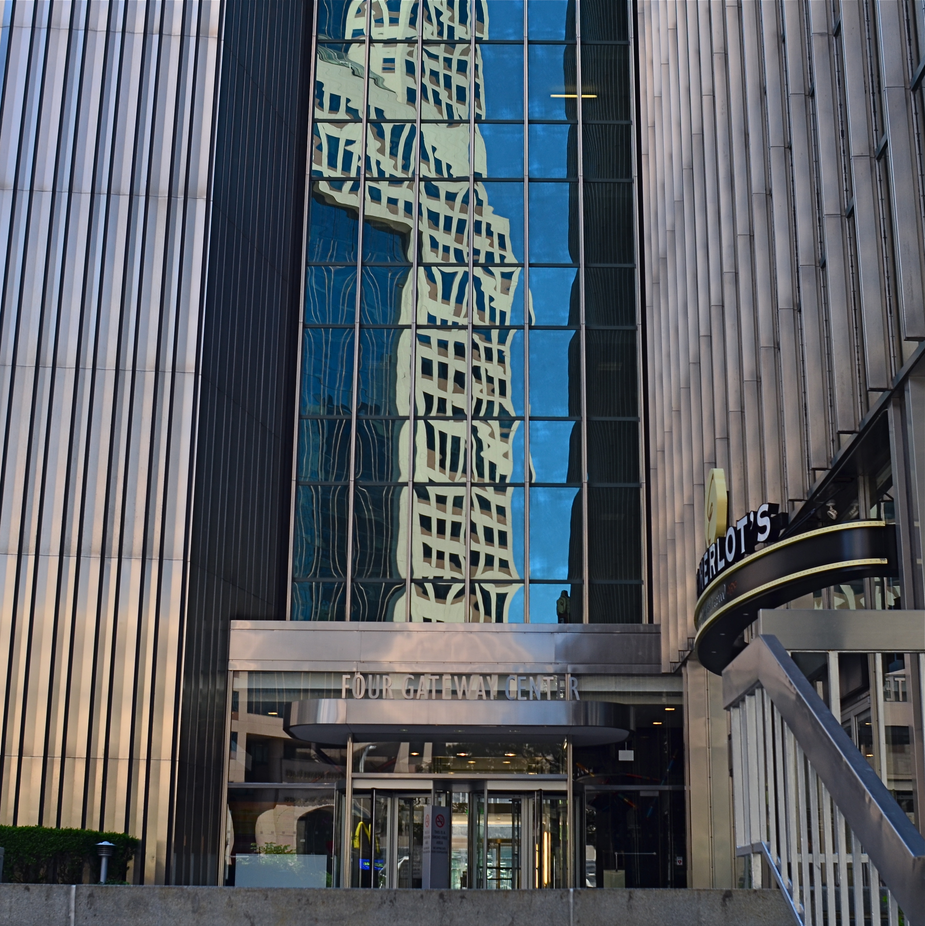
THE OPPOSITE OF OBVIOUS
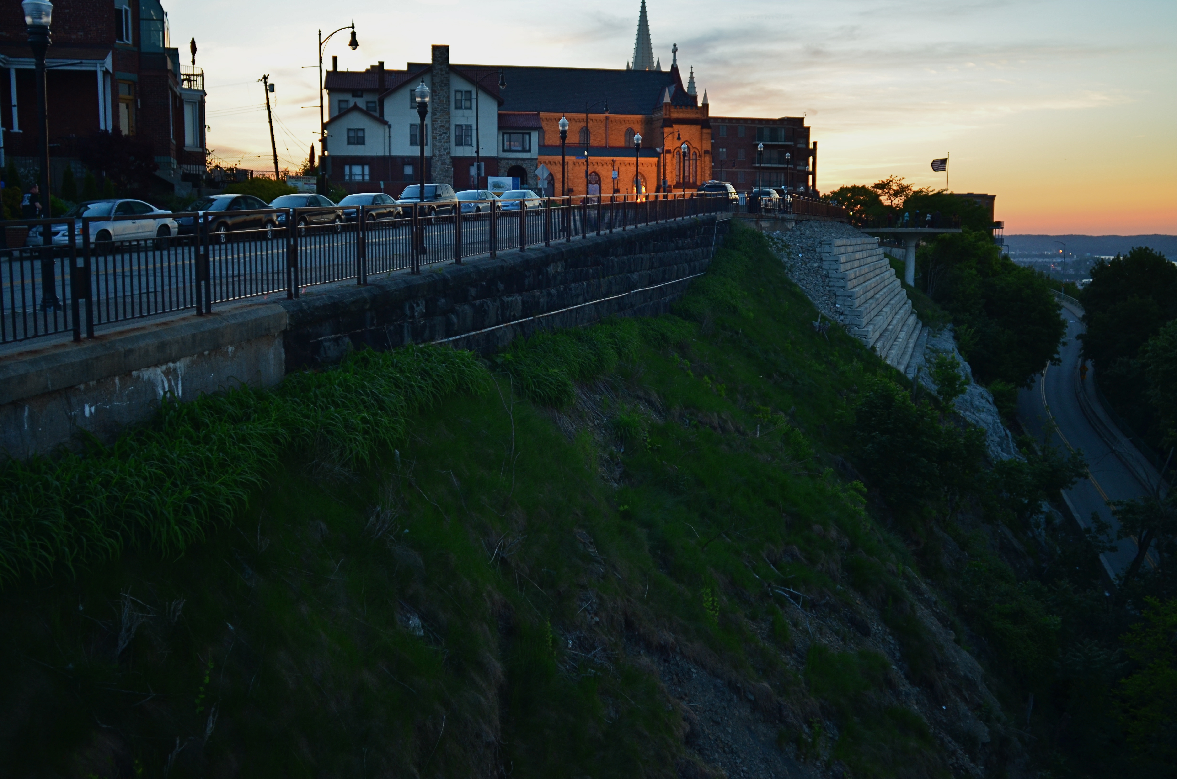
Mount Washington, the urban district that sits on a bluff overlooking downtown Pittsburgh, Pennsylvania. 1/60 sec., f/1.8. ISO 250, 24mm.
By MICHAEL PERKINS
IT GOES BY MANY NAMES: THE MONEY SHOT, THE GOLDEN ANGLE, THE POSTCARD VIEW. Travel enough and you will snap one. The all-roads-lead-to-this-picture, must-shoot frame that defines a town or city. Rattle off the names from Eiffel to Empire State. Drawn like moths to flame, we make the same treks that millions before us have made to capture the classic destination, the local Mecca. Do we truly believe that we, the 400,000,000th visitor to the special site, will capture something that someone else missed? Well, yes, we do. For all the other tourists, it’s just a Kodak moment, but once we focus our lens, boy, it’ll be a moment for the ages. Or not.
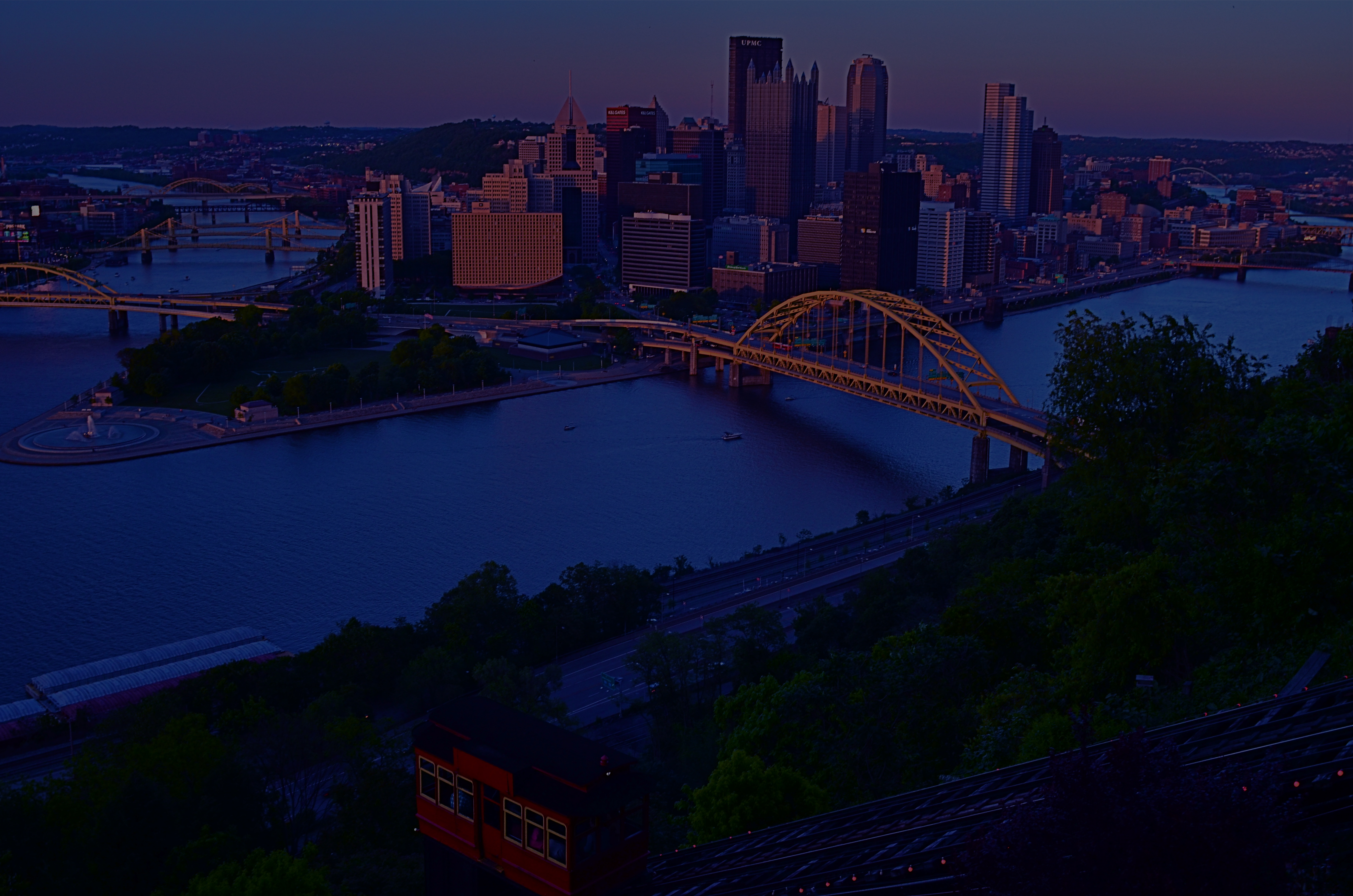
The standard souvenir view of downtown Pittsburgh from the top of Mt. Washington.
But I also believe in the value of the dead opposite of the obvious shot, the image taken 180 degrees away from the holy object we all think we must shoot. The hiding-over-my-shoulder treasure that no one came to take, but which might just qualify as a treasure hidden in plain sight. What’s across the alley from the Alamo? What’s a half a block to the left of Notre Dame? Or, in the case of Pittsburgh, Pennsylvania, what happens when you deliberately turn away from the most desired view in the city?
The iconic downward vista of the Steel City, at precisely the point where the Allegheny and Monongahela Rivers blend at the town’s terminus to form the Ohio, is chiefly shot from atop Mount Washington, a district reached via the romantic, cable-driven incline service that has trucked commuters up the Mount and down for over a century. Add the souvie shop and the walk-out view platforms at the top, and it’s one of the most obvious cases of here, take this picture in all of American tourism.
But the Mount, an old urban neighborhood unto itself, is like a flatland city dropped on top of a lumpy cliff, its streets rising and falling like a stone roller coaster. The sheer suddenness of its drop-offs and the skyward pitches of its roofs lends a zany angularity, its tiered vistas contrasted by the glass and steel of contemporary Pittsburgh just below. Think Rio with Czechs and Germans.
There’s something of a religious pilgrimage quality to taking your shot at a popular attraction, but it takes mere minutes to scout around beyond the crowds to what lies immediately beyond. The opposite of obvious is often a synonym for discovery.
EMPTY TABLES
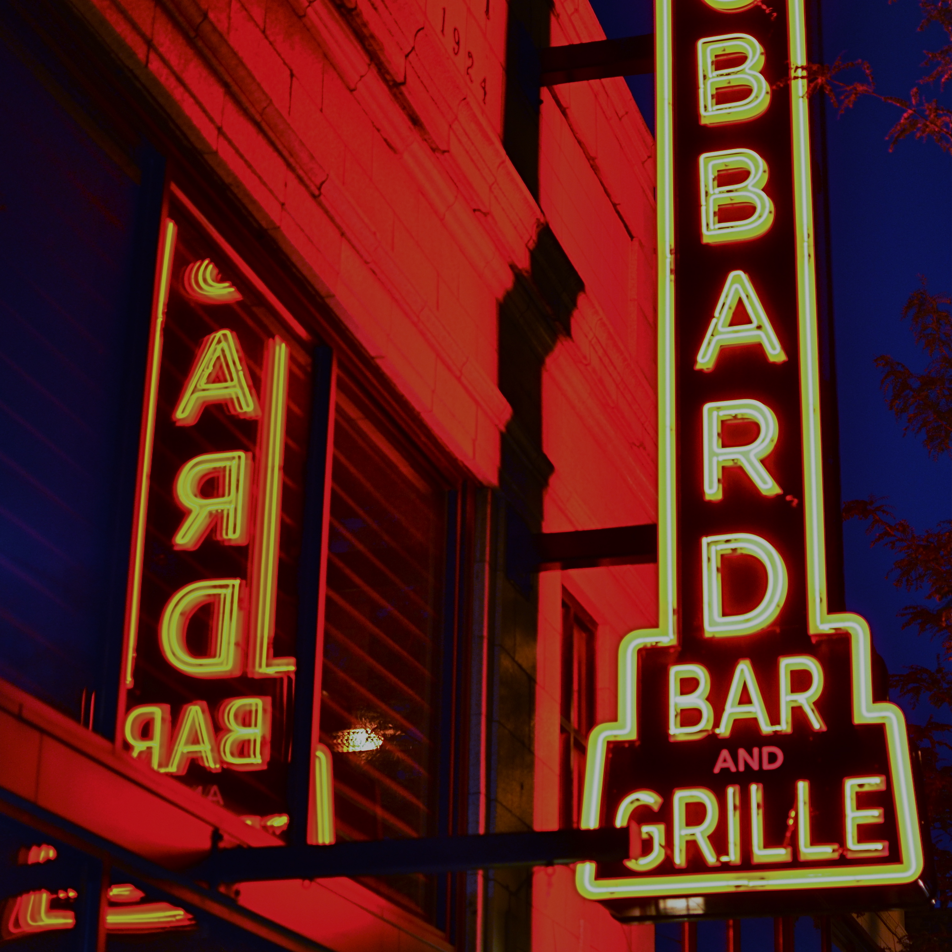
“Each place I go….only the lonely go….”
By MICHAEL PERKINS
FEW OF US CAN CHANNEL FRANK SINATRA’S VOCAL ACUMEN, but we can all relate to the urban movies that he started running in the projection rooms of our minds. For most of his career, The Voice was a very visual actor, shaping sound into virtual landscapes of lonely towns, broken-hearted guys wandering the waterfront, and blue mornings where the sun rises on you and ….nobody else. Frank could smile, swagger, strut and swing, for sure, but he was the original king of desolate all-nighters, our tour guide to the dark center of the soul.
He was also, not coincidentally, a pretty good amateur photographer.
I tend to see restaurants, bars, and city streets in general through the filter of Sinatra’s urban myths. Tables covered with upturned chairs. The bartender giving the counter one more weary wipedown. Dim neon staining rain-soaked brick streets. Curling blue-grey wisps of cigarette smoke. And shadows that cover the forgotten in inky cloaks of protection. Give me eight bars of “One For My Baby” and I’m searching for at least one bar that looks like the last act in a Mamet play.
It becomes a kind of ongoing assignment for photographers. Find the place that strikes the mood. Show “lonely”. Depict “Over”. Do a portrait called “Broken-hearted Loser.” There are a million variations, and yet we all recognize a slice of every one. Like Frank, we’ve all been asked by the host if he can call us a cab. Like Frank, we’ve all wondered, sure, pal, but where do I go now?
It’s not often a pretty picture. But, with luck, it’s sometimes a pretty good picture.
URBAN MIX
Competing architectural styles establish a natural rhythm of conflict in major cities.
By MICHAEL PERKINS
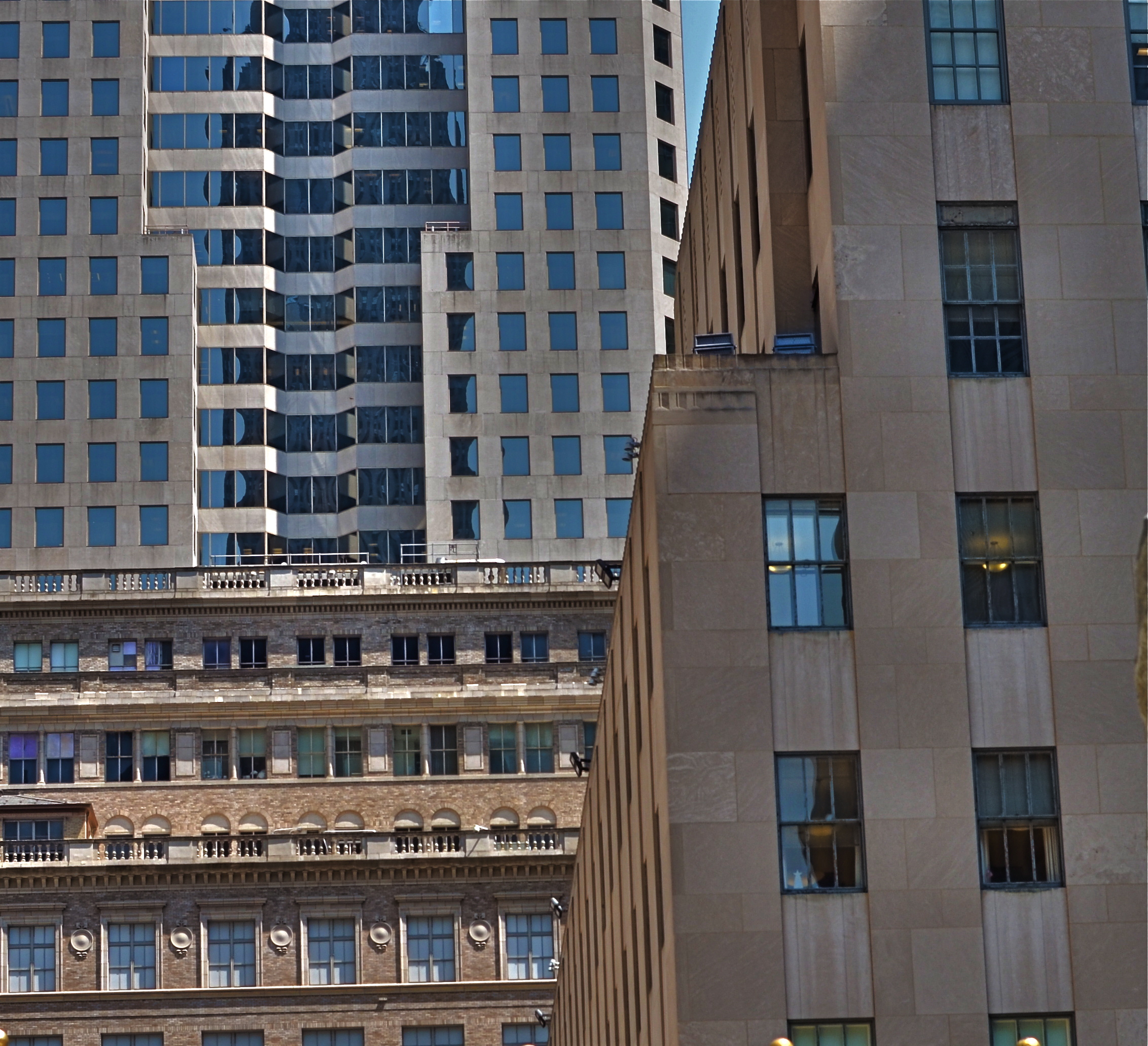
EACH MAJOR URBAN CENTER HAS ITS PHOTOGRAPHIC SUPERSTARS, those destination attractions that are documented to death by shooters great and small. Name the city and you can rattle off the names of the usual suspects. The landmarks. The legends. The here’s-proof-that-I-was-there vacation pictures. Meanwhile, the rest of the buildings within our super-cities, that is the majority of the remaining structures on most streets everywhere, remain under-photographed and, largely, unknown.
Part of the problem is our photographic viewpoint, which apes our human viewpoint. As drivers or pedestrians, we necessarily focus most our attention at events topping out at just about two stories above street level. This means we will almost certainly n0t see the mashup of architectural styles just outside our peripheral range. We don’t follow the visual line of buildings all the way up, either because we are walking, or because we don’t want to look like some out-of-town rube. But there is real drama in the collision of all those unseen details, and, if you’re interested in showing the city as an abstract design, some real opportunities.
I find that shooting toward the intersection of parts of three or more buildings amplifies the contrast between design eras, with doric columns and oak clusters crashing into International style glass boxes, overlayed with Art Deco zigzags. I shoot them with standard lenses instead of zooms to preserve the intensity of color and contrast, then create the final frame I want in the cropping. Zooms also tend to flatten things out, making buildings that are actually hundreds of feet from each other appear to be in single flat plane. Regular lenses keep the size and distance relationships relatively intact.
Importantly, I don’t shoot entrances, emblems, signage, anything that would specifically identify any one building, and I steer away from places that are recognizable in a touristy way. I’m not really interested in these buildings in their familiar context, but as part of a larger pattern, so I don’t want to “name” things in the image since it will draw away interest from other elements.
The city is a concrete (sorry) thing, but it is also a rich puzzle of design that offers almost infinite variety for the photographer. Best thing is, these compositions are just inches away from where you were bored to death, just a second ago.
WATERCOLOR DAYS
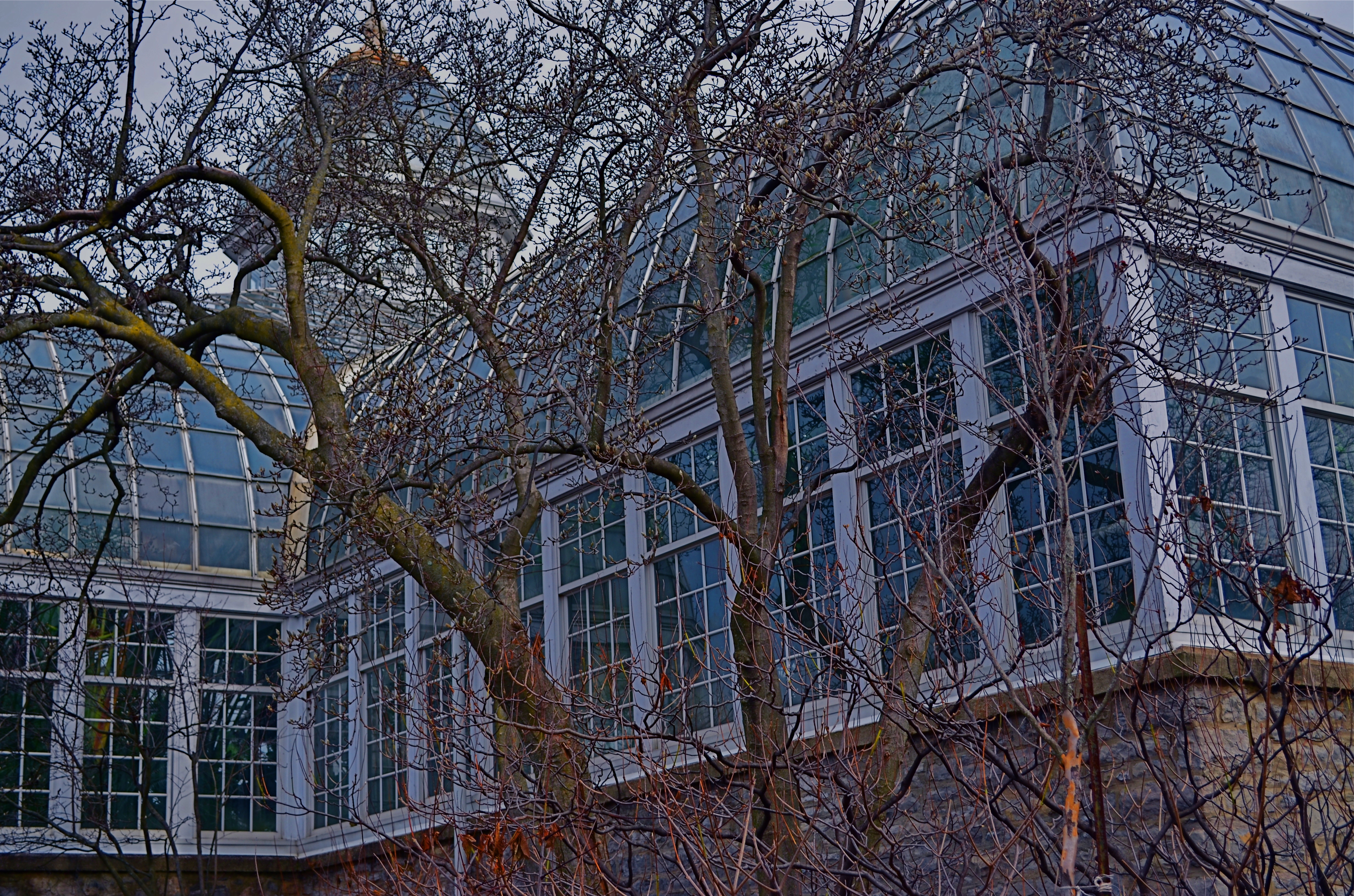
Franklin Park Conservatory, 2015.
By MICHAEL PERKINS
THE FIRST COLOR PHOTOGRAPHS REALLY…WEREN’T. That is to say, the various recording media, from glass plates to film, were technically incapable of rendering color, leaving entrepreneurial craftsmen (mostly post card artists) to lovingly apply hues with paint and brush. It was the Fred Flintstone version of Photoshop, and, boy howdy, did it sell, regardless of the fact that most flesh tones looked like salmon and most skies looked more eggshell than azure. Until the evolution of a film-based process near the end of the 19th century, these watercolor pastels stood in for the real thing.
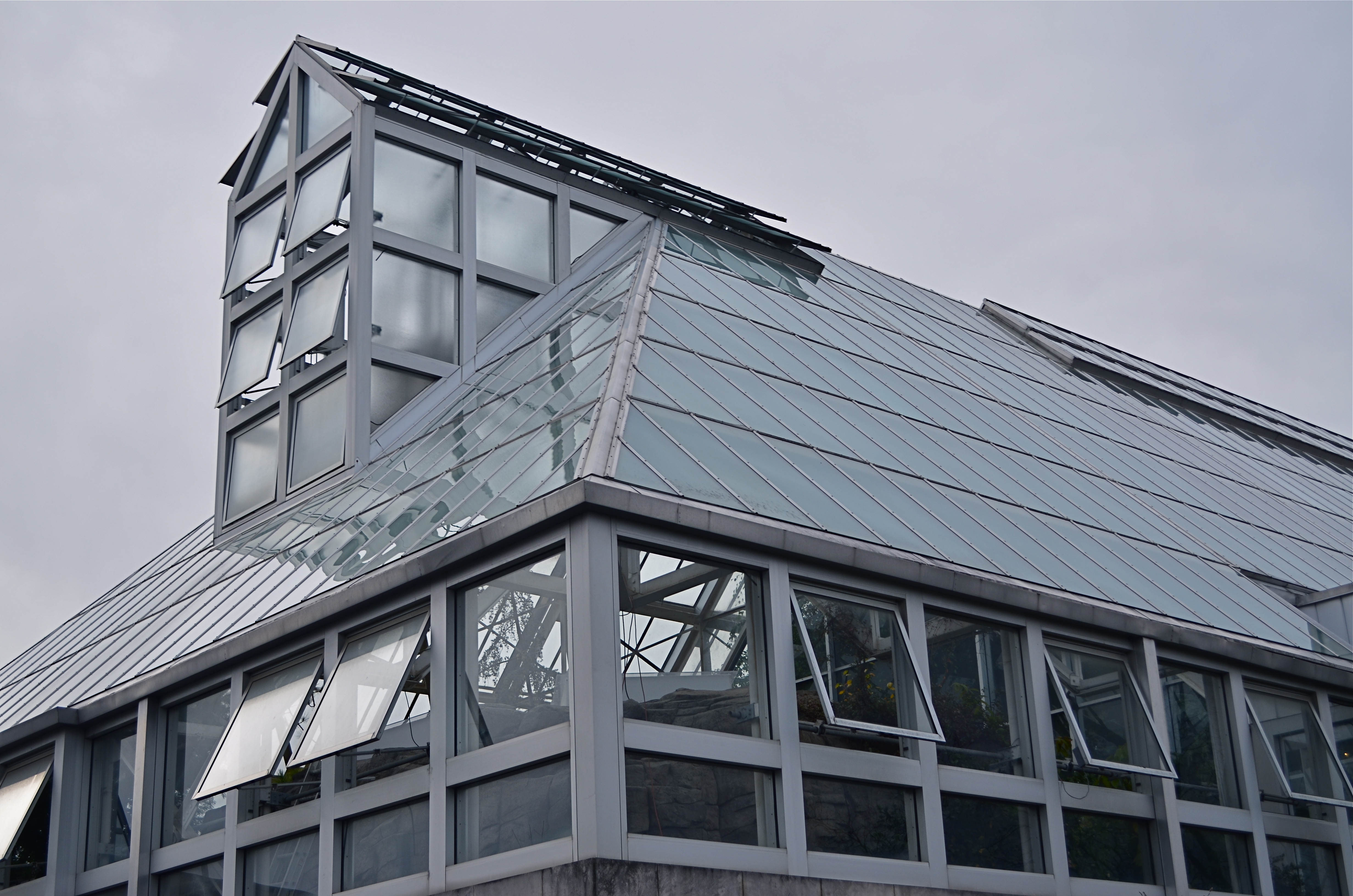
Glass Barn, 2014
Winter’s months-long overcasts and grey days can remind a photographer of what it was like to only be able to capture some of the color in a given subject, as the change in light washes the brilliance out of the world, leaving it like a faded t-shirt and creating the impression that color, as well as botany, goes into the hibernational tomb during winter.
Of course, we can boost the hues in the aftermath just like those patient touch-up artists of the 1800’s, but in fact there are things to be learned from rendering tones on the soft pedal. In fact, reduced color is a kind of alternate reality. Capturing it as it actually appears, rather than amping it up to neon rudeness, can actually be a gentle shaper of mood.
Light that seeps through cloud cover is diffused, and shadows, if they survive at all, are faint and soft. The look is really reminiscent of early impressionism, and, when matched up with the correct subject matter, can complement a scene in a way that a more garish spectrum would only ruin.
Just like volume in music, color in photography is meant to speak at different decibel levels depending on the messaging at hand. Winter is a wonderful way to force ourselves to work out of a distinctly different paint box.
TESTIMONY
By MICHAEL PERKINS
PHOTOGRAPHY WAS IN ITS INFANCY WHEN IT WAS FIRST PRESSED INTO SERVICE as a reportorial tool, a way of bearing witness to wars, disasters, and the passing parade of human folly and fashion. Since that time, at least a part of its role has been as a means of editorial commentary, a light shone on crisis, crime, or social ills. The great urban reformer Jacob Riis used it to chronicle the horrific gulf between poor and rich in the legendary photo essay How The Other Half Lives. Arthur Rothstein, Dorothea Lange and Lewis Hine, among many others, turned their cameras on the desperate need and changing landscape of America’s Great Depression. And now is the time for another great awakening in photography. It’s time to show where our cities need to go next.
America’s infrastructure is at a crossroads. And that means that photographers are, as well.
Politics aside, the rotting state of our urban infrastructures is an emergency crying out for the visual testimony that photographers brought so eloquently to bear on poverty and war in ages past. The magnifying glass needs to be turned on the neglect that is rapidly turning America’s urban glory into rust and ruin. And no one can tell this story better than the camera.
We can fine-tune all the arguments about how to act, what to fund, and how to proceed. That’s all open to interpretation and policy. But the camera reveals the truths that are beyond abstraction and opinion. The underpinnings of one of the world’s great nations are rapidly dissolving into exposed rebar and pie-crust pavement. If part of photography’s mission is to report the news, then the decline of our infrastructure is one of the most neglected stories in the world’s visual portfolio. Photographers can entice the mind into action, and have done so for nearly two centuries. They have peeled back the protective cover of politeness to reveal mankind at its worst, and things have changed because of it. Agencies have been formed. Action has been accelerated. Lives have been changed. Jobs have been created.
It didn’t used to be an “extra credit” question on the exam of life just to maintain what amazing things we have. Photographers are citizens, and citizens move the world. Not political parties. Not kings or emperors. History is created from the ground up, and the camera is one of the most potent storytelling tools used in shaping that history. The story of why our world is being allowed to disintegrate is one well worth telling. Capturing it in our boxes just might be a way to shake up the conversation.
Again.
WHAT SIZE STORY?
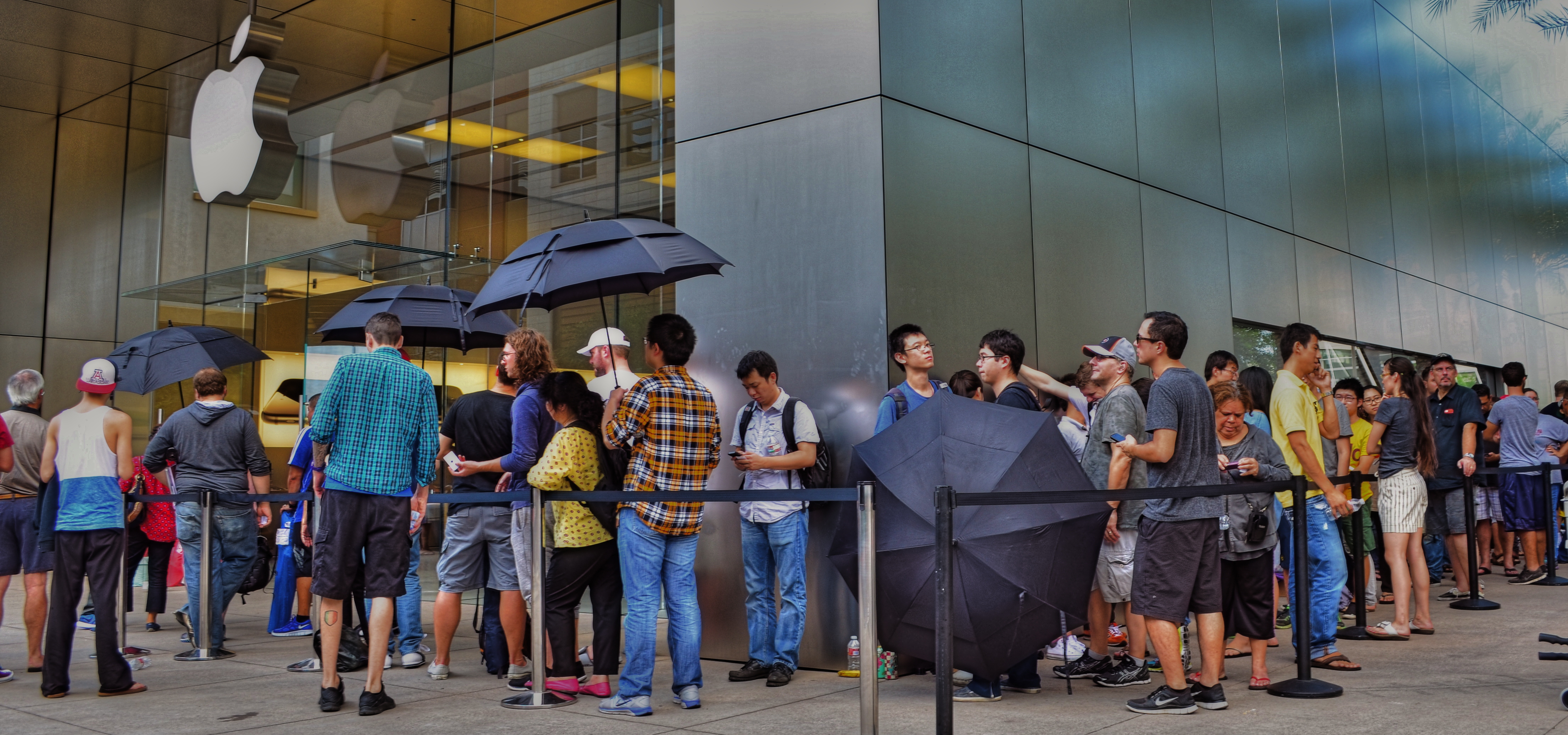
iPhone 6 debut at Apple Store in Scottsdale, Arizona, September 19, 2014. Sometimes the story is “the crowd…”
By MICHAEL PERKINS
IN THE EARLY 1950’s, AS TELEVISION FIRST BLINKED INTO LIFE ACROSS AMERICA, storytelling in film began to divide into two very clearly defined camps. In theatres, desperate to retain some of the rats who were deserting their sinking ships to bathe in cathode rays at home, movie studios went for stories that were too big to be contained by the little screen, and almost too big for theatres. You remember the wider-than-thou days of Cinemascope, VistaVision, Todd-Ao, Cinerama and Super-Panavision, as well as the red-green cardboard glasses of 3-D’s first big surge, and the eye-poking wonders of House Of Wax, Creature From The Black Lagoon and Bwana Devil. Theatres were Smell-O-Vision, True Stereophonic Reproduction and bright choruses of Let’s Go Out To The Lobby sung by dancing hot dogs and gaily tripping soda cups. Theatres was Big.
The other stories, the TV stories, were small, intimate, personal, compact enough to cram into our 9-inch Philcos. Tight two-shots of actors’ heads and cardboard sets in live studios. It was Playhouse 90 and Sylvania Theatre and The Hallmark Hall Of Fame. Minus the 3,000 Roman extras and chariot races, we got Marty, Requiem For A Heavyweight, and On The Waterfront. Little stories of “nobodies” with big impact. Life, zoomed in.
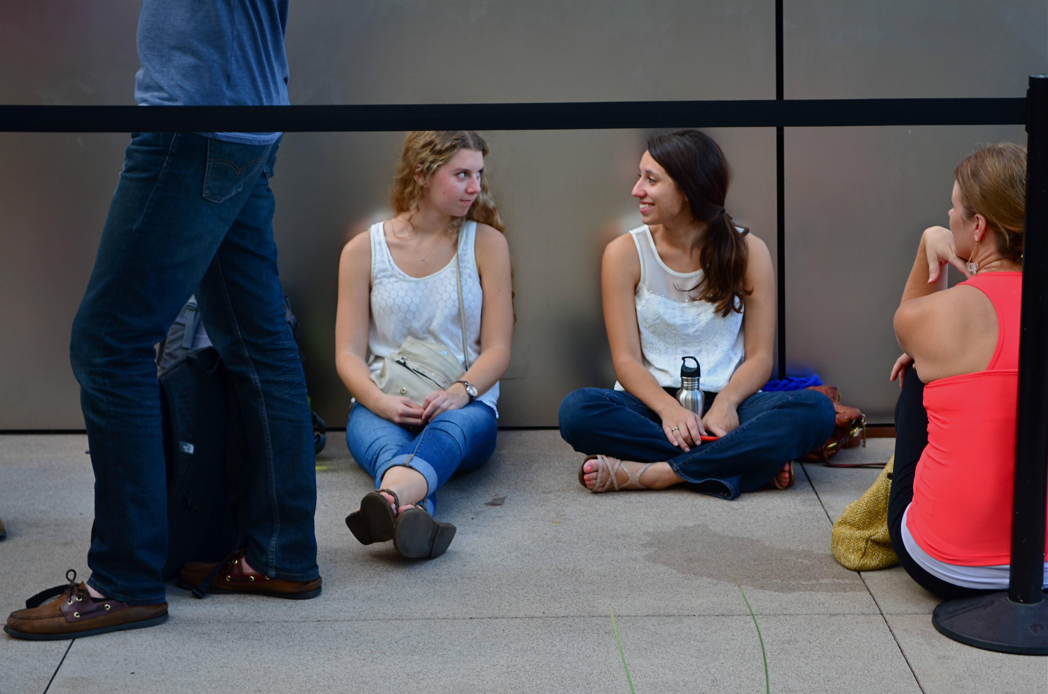
…but, within that crowd, there are “little” stories.
For photographers, pro or no, many stories can be told either in wide-angle or tight shot. Overall effect or personal impact. You can write your own book on whether the entire building ablaze is more compelling than the little girl on the sidewalk hoping her dog got out all right. Immense loads of dead trees have been expended to explore, in print, where the framing should happen in a story to produce shock, awe or a quick smile. I like to shoot everything every way I can think of, especially if the event readily presents more than one angle to me.
The release of the new iPhone 6, which dropped worldwide today, is a big story, of course, but it consists of a lot of little ones strung together. Walk the line of the faithful waiting to show their golden Wonka ticket to gain admission to the Church of Steve and you see a cross-section of humankind represented in the ranks. Big things do that to us; rallies, riots, parties, flashmobs, funerals….the big story happens once a lot of little stories cluster in to comprise it.
Simply pick the story you like.
Remember, just like the phone, they come in two sizes.
LIGHT DECAY
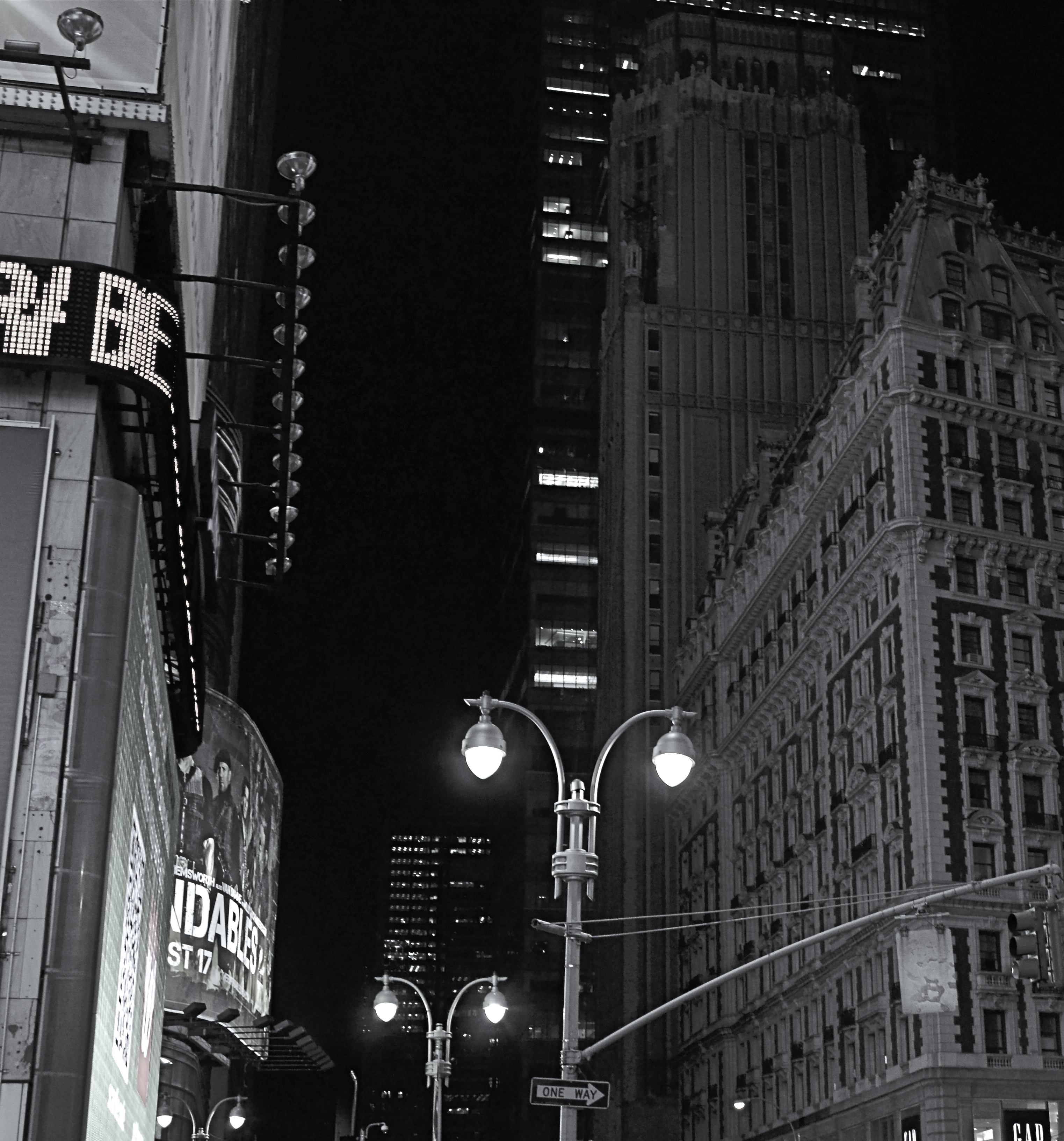
Yeah, it’s “Broadway”, but a little further from the solar flare of its neon overkill.
By MICHAEL PERKINS
WE HAVE PROVEN OURSELVES TO BE A SPECIES THAT HATES TO BE SENT TO BED. Night life being a kind of “second shift” in most of the modern world, we really never lock up our cities for the evening, and that has changed how those cities exist for photographers.
Here’s both the good and bad news: there is plenty of light available after dark in most towns. Good if you want the special mix of neon, tube glow and LED burn that sculpts the contours of most towns post-sundown. Bad if you really want to see cities as special entities defined by shadow, as places where dark is a subtle but aesthetically interesting design element. In many mega-cities, we have really banished the dark, going beyond essential illumination to a bleachingly bright blast of light which renders everything, big and small, in the same insane mutation of color and tone. Again, this is both good and bad, depending on what kind of image you want.
Midtown Manhattan, downtown Atlanta, and anyplace Tokyo are examples of cities that are now a universe away from the partial night available in them just a generation ago. A sense of architectural space beyond the brightest areas of light can only be sensed if you shoot deep and high, framing beyond the most trafficked structures. Sometimes there is a sense of “light decay”, of subtler illumination just a block away or a few stories higher than what’s seen at the busiest intersections. Making images where you can watch the light actually fade and recede adds a little dimension to what would otherwise be a fairly flat feel that overlit streets can generate.
Photography is often a matter of harnessing or collecting extra light when it’s scarce. Turns out that having too much of it is a creative problem in the opposite direction.
INS AND OUTS
By MICHAEL PERKINS
WHEN IT COMES TO DISCUSSIONS ABOUT ART, THE WORD “ABSTRACT” IS PROBABLY THE MOST BATTED-ABOUT LINGUISTIC SHUTTLECOCK OF THE 20TH CENTURY, something we lob at each other across the conversational net as it suits our mood. Whenever we feel we should weigh in on a matter of artistic heft, especially something that doesn’t fit into a conveniently familiar cubbyhole, we drag “abstract” out of the desk drawer, dust it off, and cram it into place somewhere in the argument.
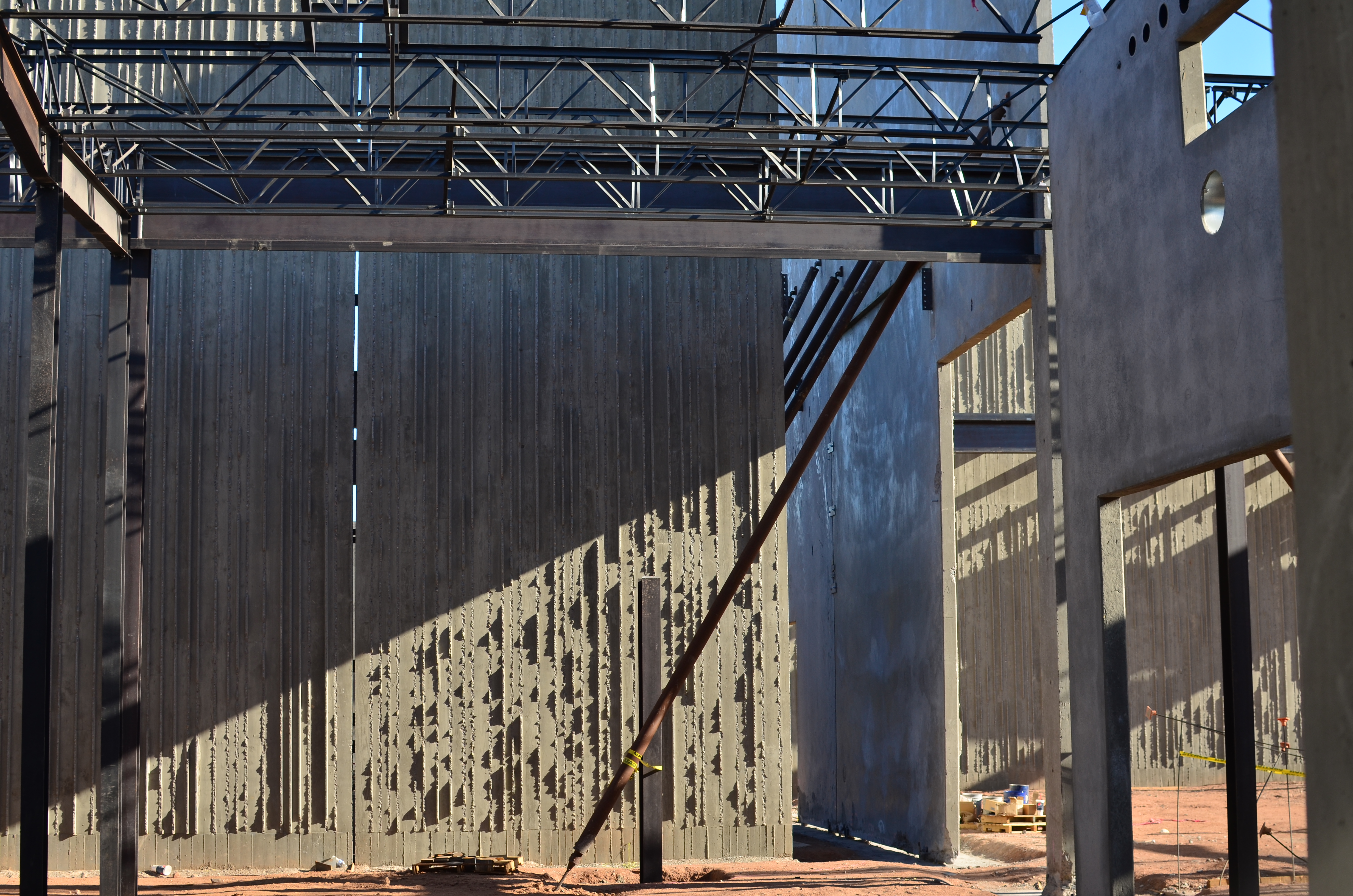
Frames within frames within frames: 1/125 sec., f/5.6, ISO 100, 35mm.
Any talk of architecture, and the photographer’s reaction to it, attracts a lot of stray “abstracts”, since attaching the word seems to settle… something. However, art can never be about settling anything. In fact, it’s about churning things up, starting, rather than resolving, arguments. As pieces of pure design, finished buildings do make a statement of sorts about the architect’s view, at least. But when trolling about town, I am more drawn to incomplete or skeletal frameworks for buildings yet to be. They are simply open to greater interpretation as visual subject matter, since we haven’t, if you like, seen all the architect’s cards yet. The emerging project can, for a time, be anything, depending literally on where you stand or how light shapes the competing angles and contours.
I feel that open or unfinished spaces are really ripe with an infinite number of framings, since a single uncompleted wall gives way so openly to all the other planes and surfaces in the design, a visual diagram that will soon be closed up, sealed off, sequestered from view. And as for the light, there is no place it cannot go, so you can chase the tracking of shadows all day long, as is possible with, say, the Grand Canyon, giving the same composition drastically different flavors in just the space of a few hours.
If the word “abstract” has any meaning at all at this late date, you could say that it speaks to a variation, a reworking of the dimensions of what we consider reality. Beyond that, I need hip waders. However, I believe that emerging buildings represent an opportunity for photographers to add their own vision to the architect’s, however briefly.
Whew. Now let’s all go out get a drink.
RESTORING THE INVISIBLE
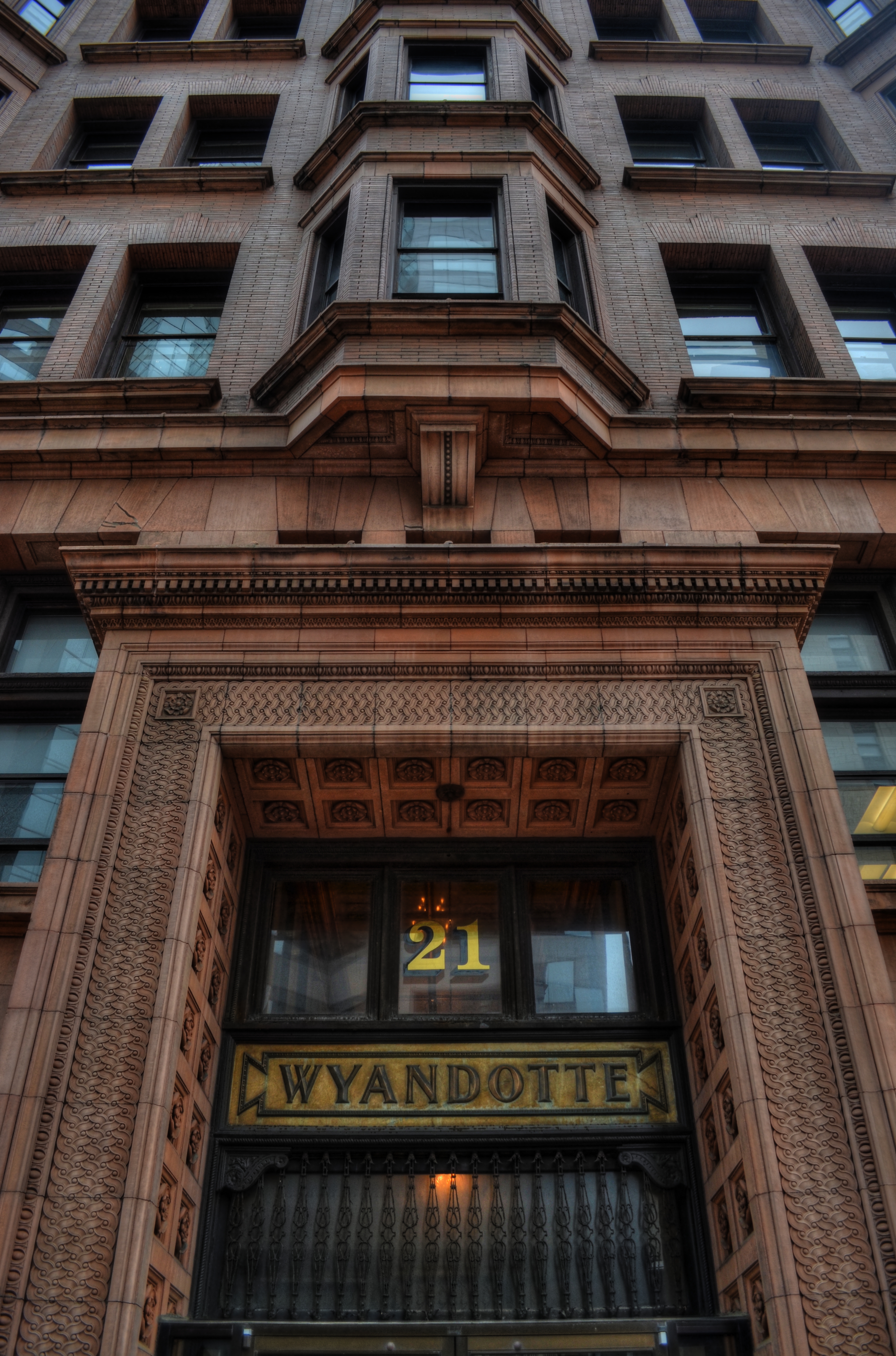
as[e The Wyandotte Building (1897), Columbus, Ohio’s first true skyscaper, seen here in a three-exposure HDR composite.
PHOTOGRAPHY IS ONE OF THE BEST RESPONSES TO THE DIZZYING SPEED OF CONTEMPORARY EXISTENCE. It is, in fact, because of a photograph’s ability to isolate time, to force our sustained view of fleeting things, that image-making is valuable as a seeing device that counteracts the mad rush of our “real time” lives. Looking into a picture lets us deal with very specific slices of time, to slowly take the measure of things that, although part of our overall sensory experience, are rendered invisible in the blur of our living.
I find that, once a compelling picture has been made of something that is familiar but unnoticed, the ability to see the design and detail of life is restored in the viewing of that thing. Frequently, in making an image of something that we are too busy to notice, the thing takes on a startlingly new aspect. That’s why I so doggedly pursue architectural subjects, in the effort to make us regard how much of our motives and ideals are captured in buildings. They stand as x-rays into our minds, revealing not only what we wanted in creating them, but what we actually created as they were realized.
In writing a book, several years ago, about a prominent midwestern skyscraper*, I was struck by how very personal these objects were…to the magnates who commissioned them, to the architects who brought them forth, and to the people in their native cities who took a kind of ownership of them. In short, the best of them were anything but mere objects of stone and steel. They imparted a personality to their surroundings.
The building pictured here, Columbus, Ohio’s 1897 Wyandotte Building, was designed by Daniel Burnham, the genius architect who spearheaded the birth of the modern steel skeleton skyscraper, heading up Chicago’s “new school” of architecture and overseeing the creation of the famous “White City” exposition of 1893. It is a magnificent montage of his ideals and vision for a burgeoning new kind of American city. As something thousand walk past every day, it is rendered strangely “invisible”, but a photograph can compensate for our haste, allowing us the luxury of contemplation.
As photographers, we can bring a particularly keen kind of witnessing to the buildings that make up our environment, no less than if we were to document the carvings and decorative design on an Egyptian sarcophagus. Architectural photography can help us extract the magic, the aims of a society, and experimenting with various methods for rendering their texture and impact can lead to some of the most powerful imagery created within a camera.
*Leveque: The First Complete Story Of Columbus’ Greatest Skyscraper, Michael A. Perkins, 2004. Available in standard print and Kindle editions through Amazon and other online bookstores.
SCULPTING WITH SHADOWS
By MICHAEL PERKINS
Brassai‘s world came to light at night.
ONE OF THE MIRACLES OF CONTEMPORARY PHOTOGRAPHY is how wonderfully oblivious we can afford to be to many of the mechanics of taking a picture. Whereas, in an earlier era, technical steps 1, 2, 3, 4 ,5, and 6 had to be completed before we could even hit the shutter button, we now routinely hop from “1” to “snap” with no thought of the process in between.
In short, we don’t have to sweat the small stuff, a truth that I was reminded of this week when imitating one of photographer’s earliest masters of night photography, Gyula Halasz, or “Brassai”, a nickname which refers to his hometown in Romania. Starting around 1924, Brassai visually made love to the streets of Paris after dark with the primitive cameras of the early 20th century, sculpting shape from shadow with a patiently laborious process of time exposures and creating ghostly, wonderful chronicles of a vanished world. He evolved over decades into one of the most strikingly romantic street artists of all time, and was one of the first photographers to have a show of his work mounted at New York’s MOMA.
Recently, the amazing photo website UTATA (www.utata.org), a workshop exchange for what it calls “tribal photography”, gave its visitors a chance to take their shot at an homage to half a dozen legendary visual stylists. The assignment asked Utata members to take images in the style of their favorite on the list, Brassai being mine.
In an age of limited lenses and horrifically slow films, Brassai’s exposure times were long and hard to calculate. One of his best tricks was lighting up a cigarette as he opened his lens, then timing the exposure by how long it took for the cig to burn down. He even used butts of different lengths and widths to vary his effect. Denizens of the city’s nightlife, walking through his long shots, often registered as ghosts or blurs, adding to the eerie result in photos of fogbound, rain-soaked cobblestone streets. I set out on my “homage” with a tripod in tow, ready to likewise go for a long exposure. Had my subject been less well-lit, I would have needed to do just that, but, as it turned out, a prime 35mm lens open to f/1.8 and set to an ISO of 500 allowed me to shoot handheld in 1/60 of a second, cranking off ten frames in a fraction of the time Brassai would have needed to make one. I felt grateful and guilty at the same time, until I realized that a purely technical advantage was all I had on the old wizard.
“Faux Brassai”, 2013. Far easier technically, far harder artistically. 1/60 sec., f/1.8, ISO 500, 35mm.
Brassai has shot so many of the iconic images that we have all inherited over the gulf of time that one small list from one small writer cannot contain half of them. I ask you instead to click the video link at the end of this post, and learn of, and from, this man.
Many technical land mines have been removed from our paths over photography’s lifetime, but the principal obstacle remains…the distance between head, hand, and heart. We still need to feel more than record, to interpret, more than just capture.
All other refinements are just tools toward that end.
THANKS TO OUR NEW FOLLOWERS! LOOK FOR THEM AT:
http://www.en.gravatar.com/icetlanture
http://www.en.gravatar.com/aperendu
Related articles
- Wonderful Photos of New York in 1957 by Brassaï (vintag.es)
SPLIT INFINITIVES
Consignment Shop, Manhattan. 1/80 sec., f/5.6, ISO 100, 35mm.
By MICHAEL PERKINS
IF YOU’RE OLD ENOUGH TO REMEMBER WHEN USE OF THE WORD “AIN’T” LABELED YOU AS A GRAMMATICAL LOWBROW, you may also recall the snooty disdain reserved for a verbal construction called the split infinitive. A simple infinitive involved following the preposition “to” with an action verb, such as “go”. To split the infinitive, the writer or speaker inserts an adverb between the two words for an extra boost of emphasis. Thus, in the most famous split infinitive ever, Gene Roddenberry invited Star Trek viewers
to boldly go where no man has gone before.
Nice, right? A little extra drama. A slight bending of the rules that delivers the goods.
Photography has a formal “grammar” about composition that also begs for a kind of “split infinitive”. Strictly speaking, compositions are supposed to be simple, clean, uncluttered. A perfect line of visual data from top to bottom, left to right. A picture frame, if you will, an organized way of seeing.
Attractive yes, even desirable, but a must? Nope. Life itself, as we observe it everyday, is far from a series of perfect frames. Lines of sight get broken, fragmented, blocked. Nature and light conspire to take that flawless composition and crash it, refract it, photobomb it until it resembles, well, life. And yet we often try to take pictures that show the very opposite of the sloppy, imprecise nature of things.
We try for “perfection” instead of perfect concepts.
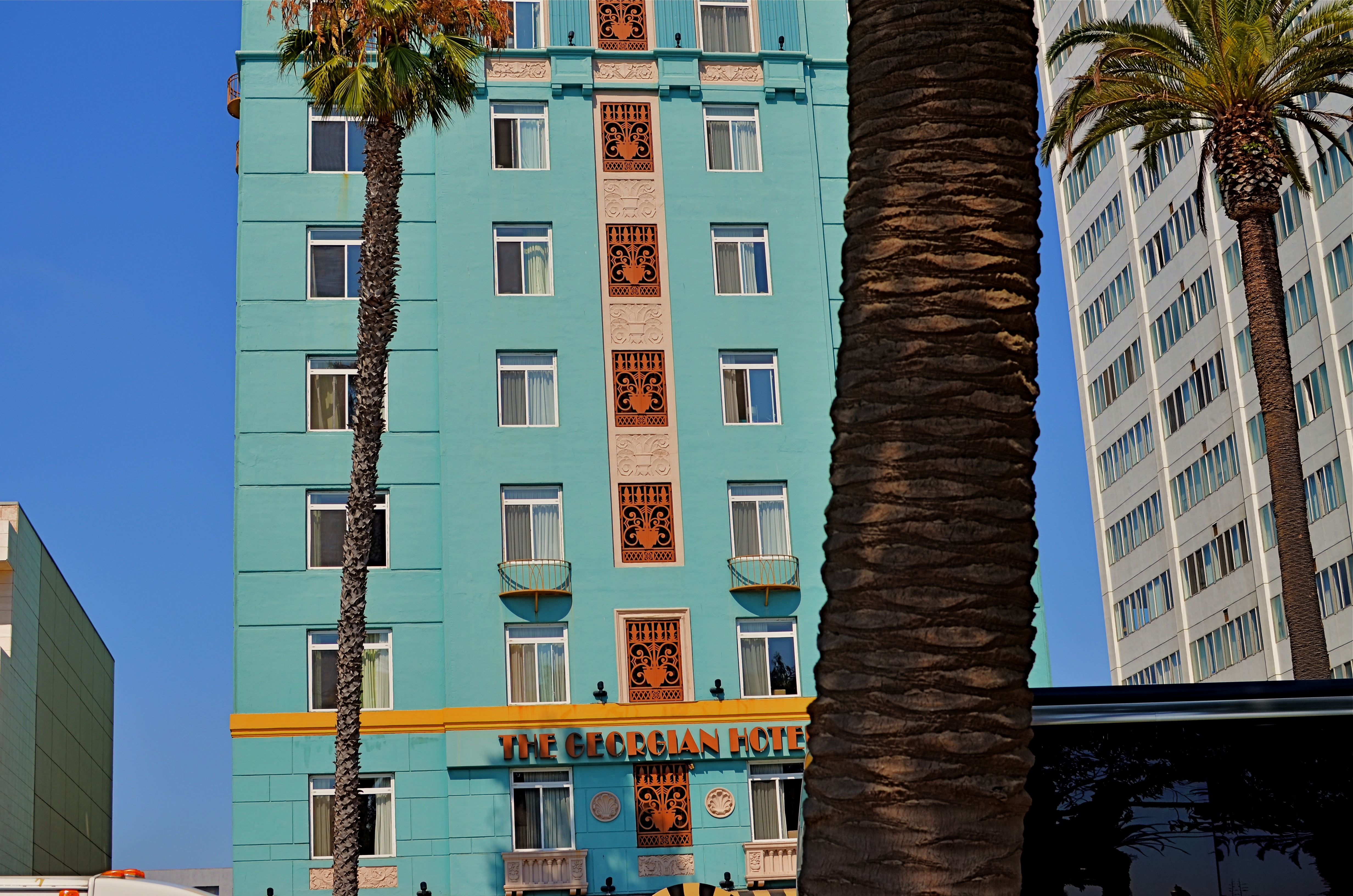
Georgian Hotel, Santa Monica, CA. 1/60 sec., f/5.6, ISO 100, 35mm.
Reviewing images for the last several years, I find that I am taking more compositions on their own terms, with light poles, weird reflections, broken planes of view and shadows all becoming more welcome in my final photos. I still labor to get a clean look when I can. But I also make peace with elements that used to doom a photo to the dustbin.
Street scenes especially can better reflect the visual chaos of busy cities if everything isn’t “just right”. It’s really hard (at least in my case) to tear out the mental hardwiring of a lifetime and take a picture that may be more abstract or cubist than I ever thought I could allow myself to be. Maybe it’s a function of aging, but things seem to be relaxing in my approach. Don’t get me wrong. I’m still Alpha Male enough to want to bring everything in a frame under my unswerving control. I just don’t get blood pressure when circumstances force me to unclench my iron fist once in a while.
It’s a process.
To see, yes, but, in allowing my visual infinitives to be occasionally split, it means learning to differently see.
Follow Michael Perkins on Twitter @mpnormaleye.
Welcome to our newest followers. Check out their mad genius at:
CORNERING
Tackle a big subject in parts, and thus re-frame its context. A blend of two bracketed exposures with varied shutter speeds, both f/5.6, ISO 100, 55mm.
By MICHAEL PERKINS
PHOTOGRAPHERS ALL HATE THE TASK OF SHOOTING OVERLY FAMILIAR SUBJECTS. The famous. The iconic. The must-stop, we’ll-be-getting-off-the-bus-for-ten-minutes “sights” that decorate every postcard rack, every gift store shelf, in their respective cities. The Tower, the Ruins, the Once-Mighty Palace, the Legendary Cathedral. Things that have more pictures taken of them by breakfast than you’ll have taken of you in three lifetimes. Scadrillions of snaps, many of them composed for the “classic” orientation, an automatic attempt to live up to the “postcard” shot. It’s dull, but not because there is no fresh drama or grandeur left in a particular locale. It’s dull because we deliberately frame up the subject in almost the same way that is expected of us.
There must be a reason we all fall for this.
Maybe we want everyone back home to like our pictures, to recognize and connect with something that is easy, a pre-sold concept. No tricky exposures, no “arty” approaches. Here’s the Eiffel Tower, Uncle Herb, just like you expected to see it.
Yeah, well…
On a recent walking shoot around D.C.’s National Mall, snapping monument upon monument, I was starting to go snowblind with all the gleaming white marble and bleached alabaster, the perfection of our love affair with our own history. After a few miles of continuous hurrahs for us and everything we stand for, I perversely looked for something flawed….a crack in the sidewalk, a chipped tooth on a presidential bust, something to bring forth at least a little story.
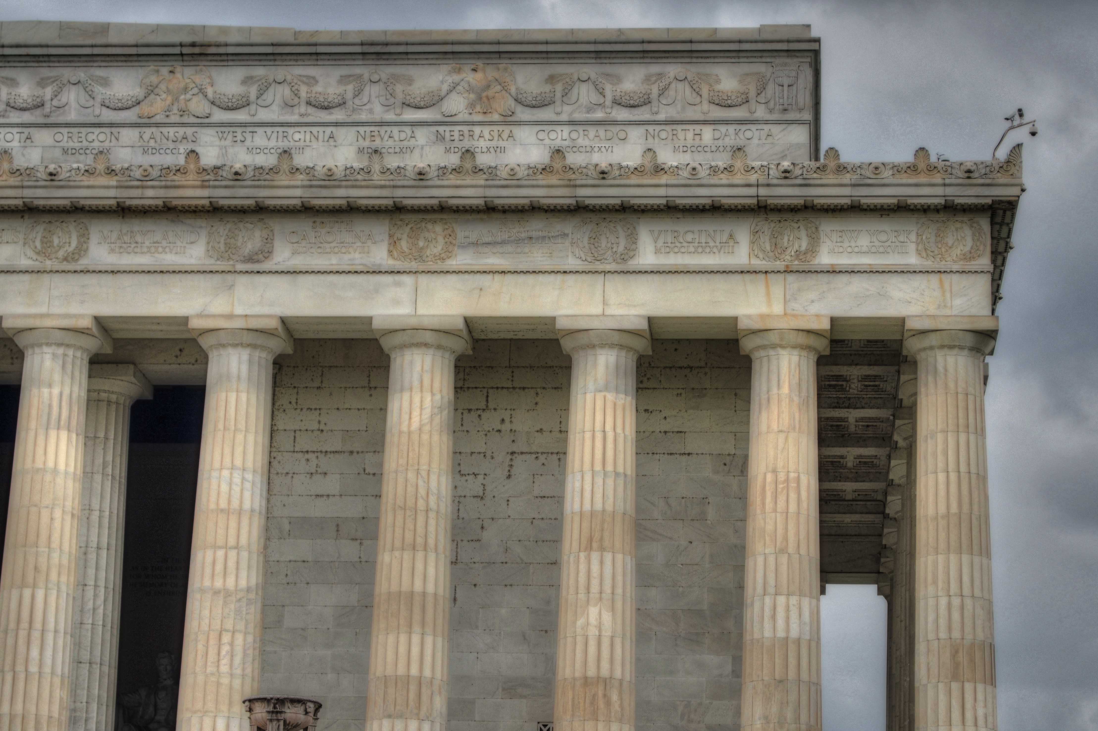
Then I defaulted to an old strategy, and one which at least shakes up the senses. Photograph parts of buildings instead of the full-on official portrait of them. Pick a fragment, a set of light values, a selection of details that render the thing new, if only slightly. Take the revered and venerated thing out of its display case and remove its normal context.
The Lincoln Memorial proved a good choice. The basic shot of the front looked like just a box with pillars. A very, very white box. But shooting a bracket of three exposures of just the upper right corner of the roof , then blending them in an exposure fusion program, revealed two things: the irregular aging and texture of the stone, and the very human bit of history inscribed along the crown: the names of the states, with the years they came into the union below them. All at once something seemed unified, poetic about Abraham Lincoln sitting inside not a temple to himself, but a collection of the states and passions he stitched back together, repaired and restored into a Union.
The building had come back alive for me.
And I didn’t even have to shoot the entire thing.
follow Michael Perkins on Twitter @mpnormaleye.
