A WONDROUS MESS

Too busy? Well, when it comes to seasonal shots, it’s a lot harder to say.
By MICHAEL PERKINS
Consulting the rules of composition before taking a photograph is like consulting the laws of gravity before going for a walk.
Edward Weston
PHOTOGRAPHERS LOVE TO COMPILE LISTS OF LAWS that must be obeyed to ensure the capture of great images. Bookshelves are jammed to fracturing with the collected works of wizards large and small who contend that all of this art stuff is really about craft, or adherence to techniques that are the equivalent of Einstein’s law. And, of course, with every fresh generation, a new slew of shooters come sneering along to deride this starched and stuffy discipline. All that matters, these young turks snigger, is my grand vision.

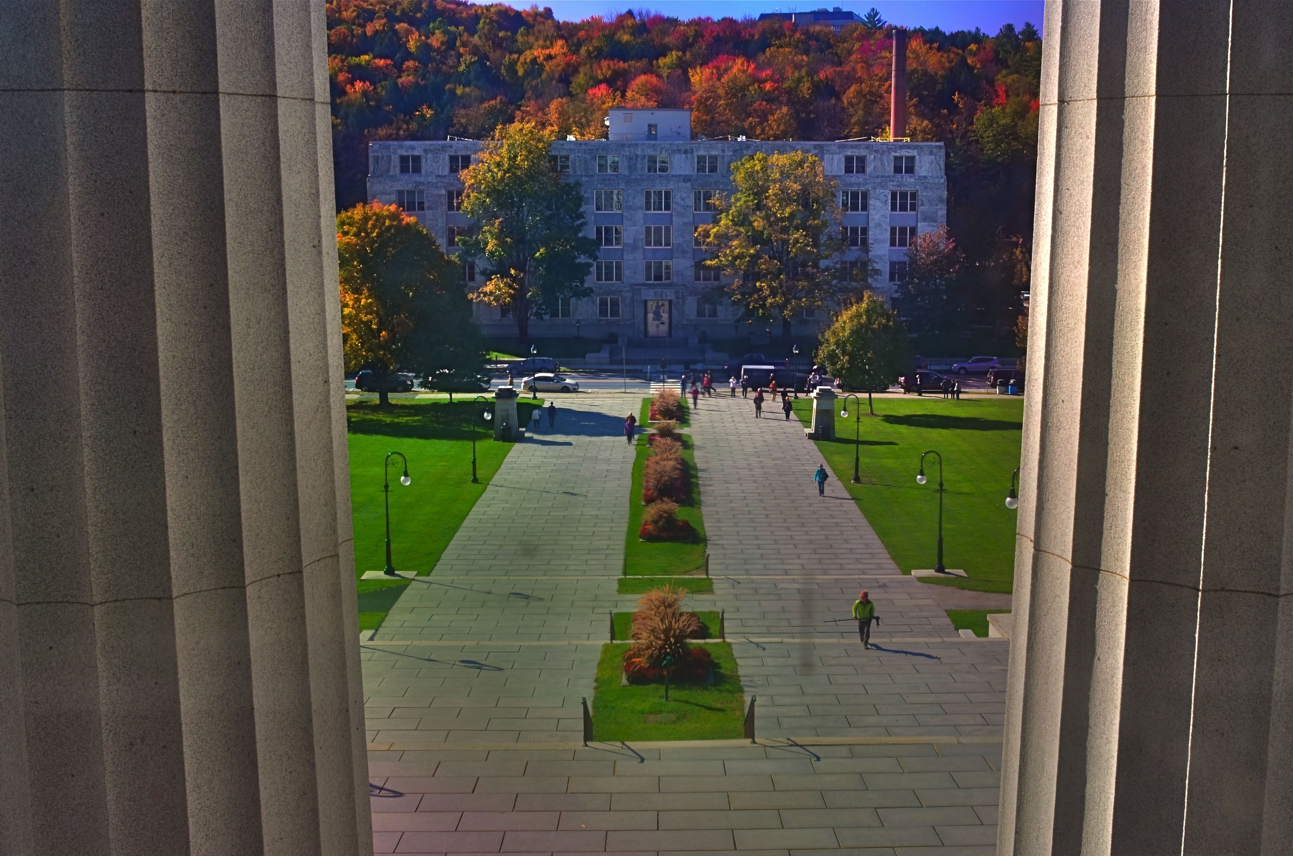
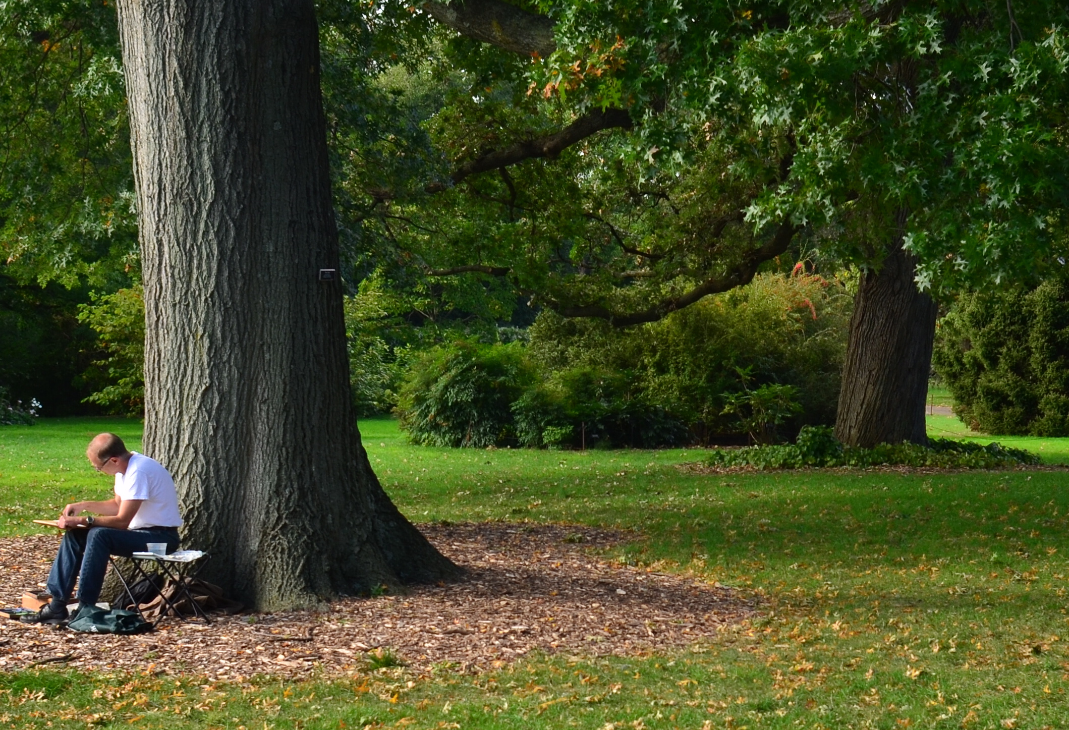
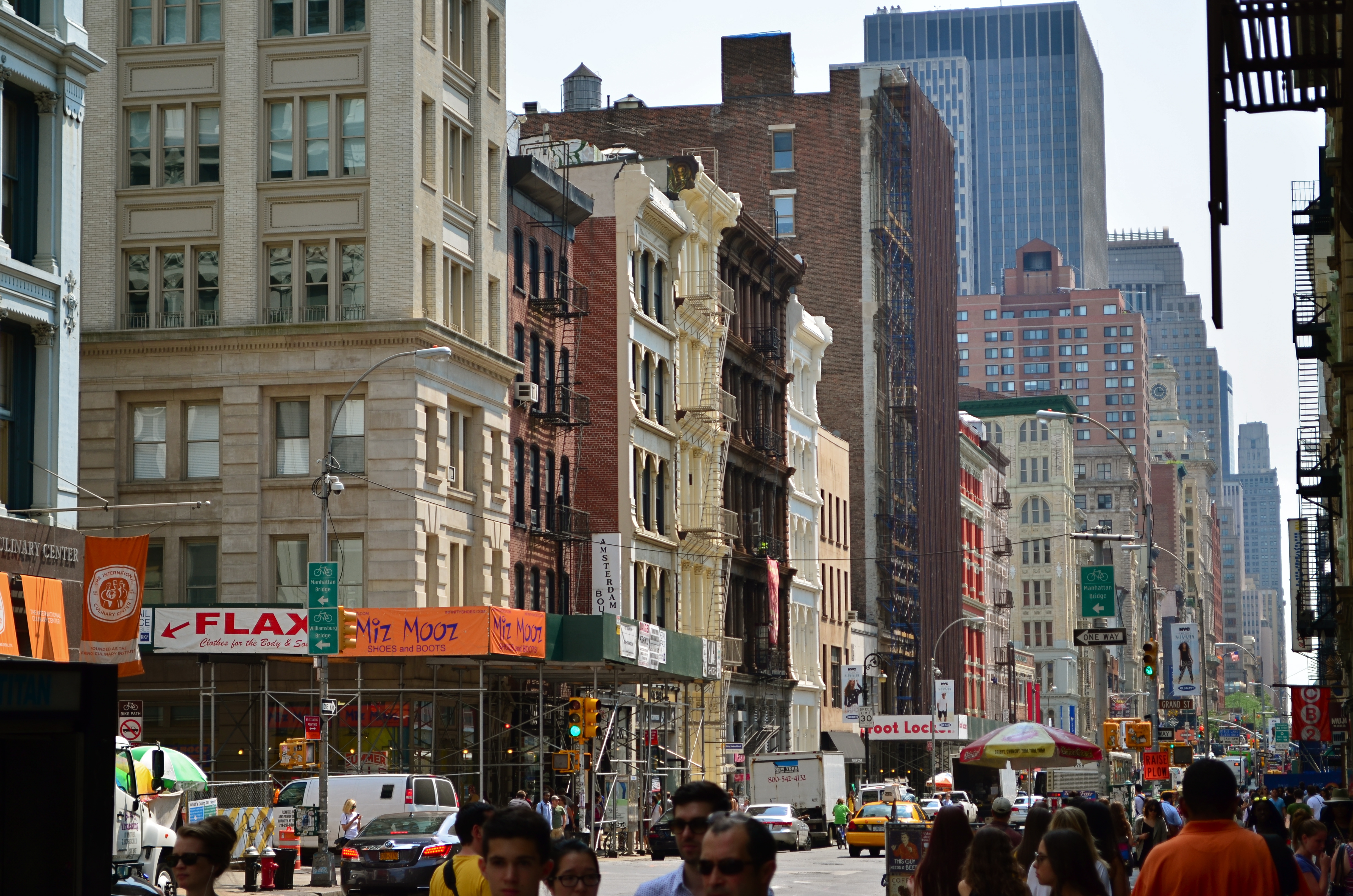
Worlds within worlds: many vast holiday scenes can be “subdivided with cropping.
Let me again re-state the obvious, which is that both viewpoints are correct and/or totally wrong. And since Mr. Weston has introduced the subject of composition, let us consider the special task of seasonal photos, specifically, arrangements of yuletide objects. The classic rule on still-life shots is that less is more, that it’s better to perfectly light and expose three pieces of fruit than whole baskets of the stuff. Meanwhile the festive, instinctual artist concedes that many holiday scenes are mad with detail and crammed with more, more, more…..and that’s okay.
The unique thing about Christmas decor is that in many cases, you not creating the compositions, but merely reacting to someone else’s creations…in nativity scenes, churches, and especially in retail environments. Obviously your local department store doesn’t adhere to the admonition “keep it simple”; quite the opposite. Seasonal trim in most stores is served up not by the spoonful but by the truckload. Anything less than overkill seems skimpy to many yuletide decorators, and so, if you favor basic subject matter, you’re either going to have to mount your own arrangements or selectively zoom and crop the more congested scenes. If, however, you already subscribe to the idea that more is better, then life gets easy fast.
Holidays come layered in much that is intensely personal, and that makes clean compositional judgements about “how much” or “how little” tricky at best. Just get the feelings right and let your regular rules relax into guidelines.
A RACE OF INCHES
By MICHAEL PERKINS
YOU CAN VIEW THE MAIN FUNCTION OF PHOTOGRAPHY AS TWOFOLD, with the deliberate creation of a vision as one path, and the arresting of time in its motion as the other. In the first case, we plan, conceive and execute at our leisure until the image that is behind our eye emerges on the page. In the second, we are hastening to capture and cage something that is in the act of disappearing. In one instance we compose. In the other, we preserve.
Sometimes the two purposes come together in one picture, although you seldom know it until after the image is made. Take the example below. In the moment, I was struck by the light patterns that bounced across the empty space of an event room at the visitor center for the Brooklyn Botanical Gardens. I wanted to do everything I could, exposure-wise, to dramatize the play of light in this special space. In addition to trying to create an image, however, I was also scurrying to keep a special number of factors from vanishing. I was both creating and preserving.
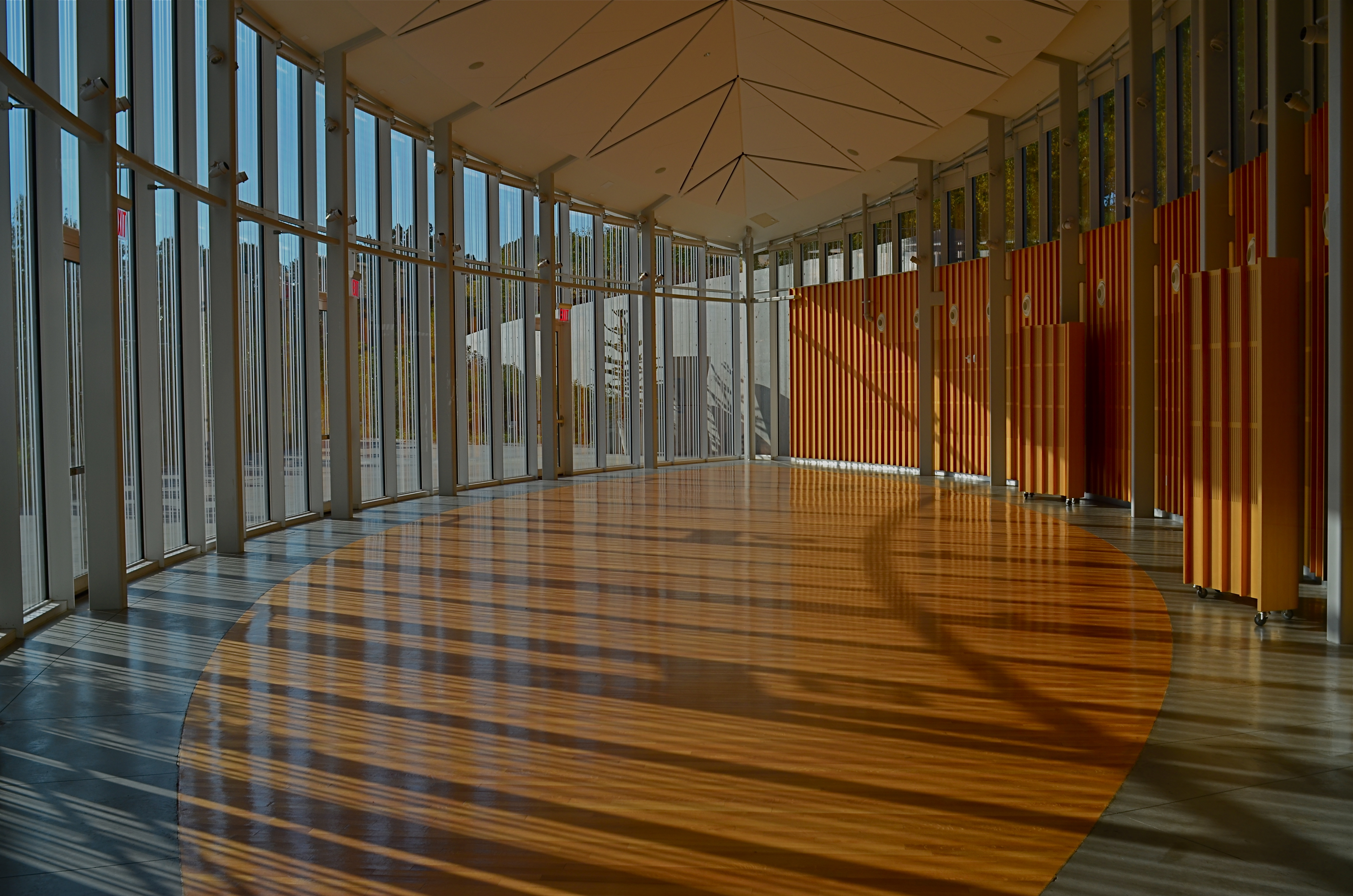
Carpe diem: when the light’s right, be ready to shoot. 1/160 sec., f/5.6, ISO 100, 24mm.
Obviously, the light you see would have had a dramatically different effect had the room been packed with, say, bodies or furniture, so its unobstructed path was one temporary condition. Another fleeting factor was the late afternoon light, which was, in addition to being extremely changeable, also one of the rare moments of pure sun the area had seen during a severely overcast day. It was as if the heavens opened up and angels were singing a song called, “Take The Picture, Already, Dummy”(perhaps you have heard this song yourself). Everything pointed to immediacy.
Full disclosure: getting this shot was not something that stretched me, or demanded exceptional skill. There was not one technically difficult factor in the making of this picture. You yourself have taken pictures like this. They are there and then they’re gone. But, they don’t get collected unless you see how fragile they are, and act in time. It’s not wizardry. It’s just acting on an instinct which, hopefully, gets sharper the longer you are in the game.
I often state one of my only primary commandments for photography as, Always Be Shooting. An important corollary to that rule might be, Always Be Ready To Shoot. Spot the potential in your surroundings quickly. Get used to the fact that many pictures will only dance before you for seconds at a time, flashing like heat lightning, then fading to oblivion. Picture-making is sometimes about casual and careful crafting of an image. And sometimes it’s a race of inches.
And sometimes it’s both.
CASTING
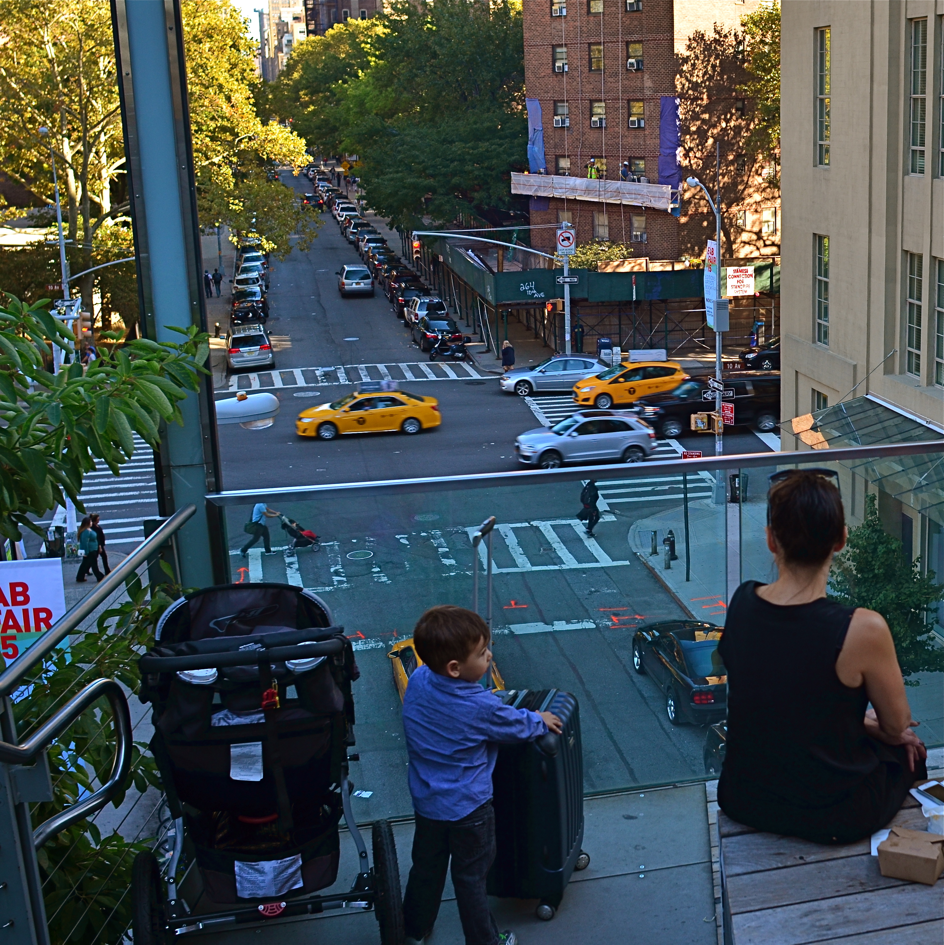
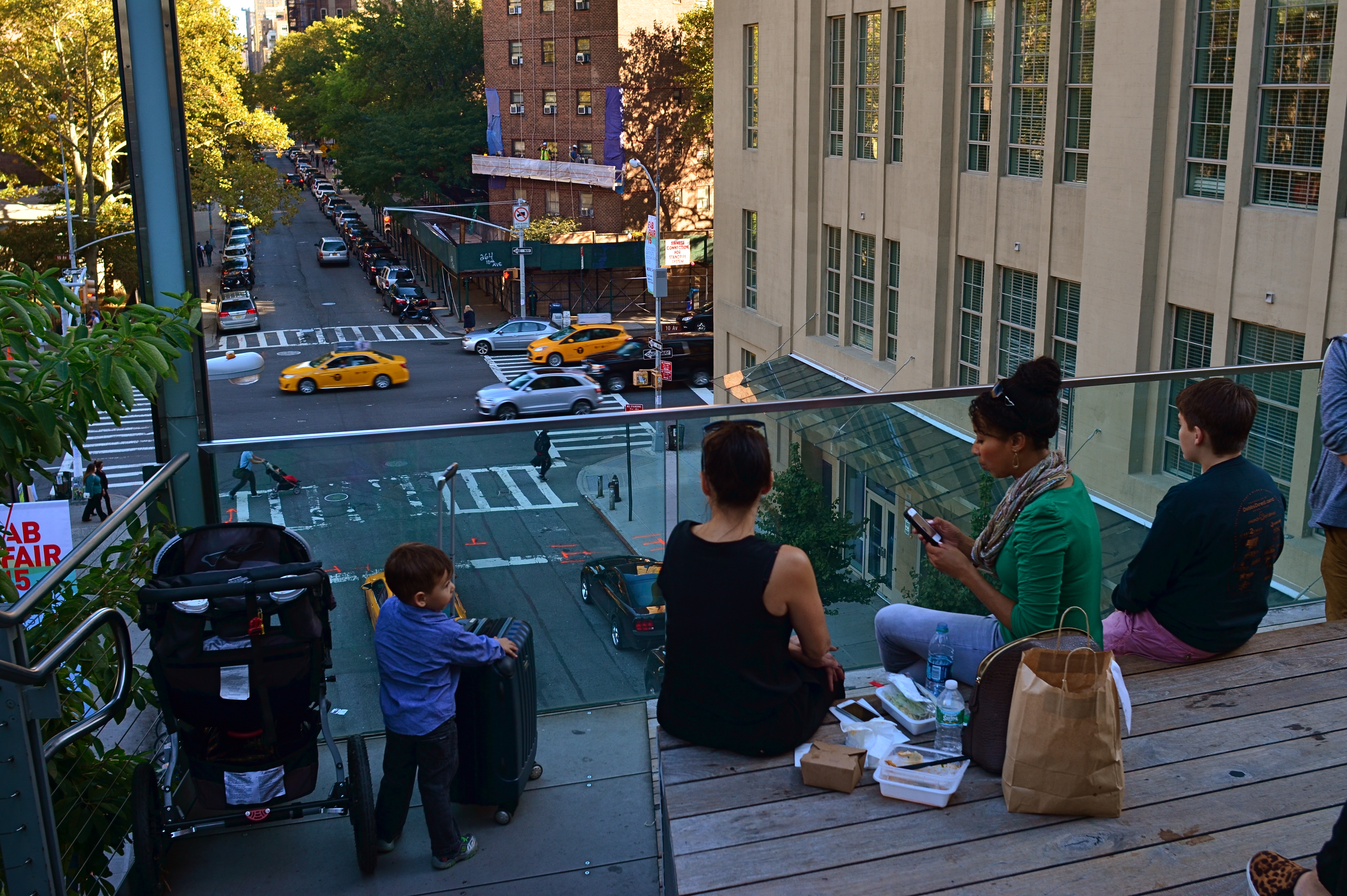
Do the woman and the child constitute a “family” in the narrative of this image?
By MICHAEL PERKINS
MORE COMPOSITIONS IN PHOTOGRAPHY ARE CRAFTED AFTER THE SNAP than naturally spring forward, fully formed, out of the camera. Frame as carefully as you may, you often find that something needs to change to help your image’s story fully emerge. This usually means taking something away, cleaning things up…and that means cropping. I think it’s fair to say that, more often than not, we start with pictures that contain too much and carve out the core picture that deserves to survive, to be pushed to the front.
Sometimes a proportionate tightening is all that a picture needs, so that a large, busy rectangle becomes a streamlined, smaller rectangle. This can clear away extraneous objects like phone poles, wires, extra buildings, any distracting junk that pulls the eye away from the important stuff. But it isn’t always things: it can also be people, surplus bodies which, like extraneous elements of any kind, change the narrative, or keep it from connecting. Think of the picture as a theatrical production and yourself as the casting director. Anyone on the set who doesn’t move the story forward is not playing a part that we need. See the girl at the office for your check, so long.
Does the removal of the extra people compromise or complete the photo’s story?
In the picture above, the cropping seems to create the story of a mother and her children taking in the view from New York’s Highline Park onto a city street below. In the original shot, seen at left, she seems less like a mother and more like just another bystander. The crop has suggested a relationship or a role for her. The woman to her right (in the original), unlike the “mother” figure, is not acting as our surrogate, seemingly looking with us at the scene. She is on her cel phone, and therefore registers as more detached than her neighbor, whose face, since it’s invisible to us, could contain anything we want it to. To the right of the cel user, we see additional people who don’t subtract from the picture, but also don’t add anything. They are extras that we, the director, have decided we don’t need to cast.
Also, structurally speaking, the “mother” is arranged so that the diagonal line from the foreground building to her right seems to proceed into the picture from around the area of her right shoulder, so that she sort of anchors the leading line and sends your eye along it to the street below. None of this, mind you, was obvious in the shooting of the original shot, which is not terrible as a composition, only compromised by the inclusion of information that simply doesn’t advance the logic of the picture. I only use it as an example of how I was able to question the “casting” of the original frame and make a conscious decision to cut away things that slowed everything down.
If you can tell a story with two people better than you can with four or five, ask yourself if you really need them. Cropping isn’t an admission that you made a bad photograph. It’s confirmation that your first draft is worth taking to a second one.
IMPRECISE BUT TRUE
What makes an image work for you? Could it be explained in words? Or isn’t that what the image is for? 1/60 sec., f/4, ISO 400, 35mm.
By MICHAEL PERKINS
AN ELOQUENTLY DETAILED ANALYSIS OF A POWERFUL PHOTOGRAPH, which I read in a recent edition of the New York Times, convinced me anew that, apart from a few compositional basics, no one really knows what makes an image “work”. Beginners love to sing the praises of the Rule Of Thirds as a guideline for composition, and, likewise, critics rhapsodize about Golden Ratios as a way to dissect how powerful elements occupy space in great photos. But the dirty little secret about composition is that there is no dirty little secret, no Laws of Gravity or Relativity that, if consistently obeyed, will yield consistent excellence.
This doesn’t mean that we can’t emotionally identify which pictures have power, as well as those that merely lie there. It merely means that there may never be adequate verbal artillery to reduce those feelings to a law, a handbook, or a credo. We arrive with our cameras at places where there may, or may not be, a picture. Our eye tells us that something important can be extracted, isolated, amplified, re-contextualized. Beyond that, it’s a matter of fate and luck.
Of course, the more we experience what works, the better we are at seeing it in the raw and extracting better and better examples of it. However, every ride of the bucking bronco is distinctly different from all the others. Photography has certain mechanical techniques that can be mastered, certainly, but we can’t learn emotional impact in a class. We can only pour something out into the camera from what is already inside us.
Try to imagine walking up to a chalkboard and reducing your favorite photograph to a series of shorthand symbols reminiscent of a mathematician’s equation. Could anything be more bloodless, more clinical? Critics and analysts sometimes come from the ranks of doers, but many of the very best doers resist the temptation to dissect their art as if it were a lab frog. Henri Cartier-Bresson, the acknowledged Moses of street photography, once recalled that it was seeing another shooter’s best work that made him say, “Damn It!”, grab his camera, and head outside, obsessed with making something of his own that could incite such a reaction.
Photographers seize instinct and emotion in the raw and forge them into a kind of sense-fired steel. Frame a picture with that steel and it will speak a thousand times louder than any mere dissertation.
ON THE LEVEL
With the amount of repair time it took to straighten and resharpen this shot, I could have made ten pictures that were done correctly in-camera.
By MICHAEL PERKINS
IT’S NOW QUITE EASY TO HAVE YOUR CAMERA OR EDITING SOFTWARE correct for things you should have done before the image was made. Most of the times, these fixes cure more than curse, some of them genuinely helping a shooter extend his skills or fine-tune his control. However, in the case of one of the most common post-pic fixes, the “straighten” slider, you’re potentially messing with picture quality, to fix a problem that, quite honestly, shouldn’t have existed in the first place.
Consult every, and I mean every basic camera tutorial going back a hundred years or more. Many timely tips in such books have vanished or evolved over time, but the simple admonition to keep your shot level has remained unchanged since the dawn of photo time. So why do cameras and software even offer straightening as an option?
If you take the cynical view, the existence of this fix suggests that camera manufacturers assume that enough people will routinely take crooked pictures that, of course, they need something to tilt their images back to normal. Because, if that’s not true, then why does the fix even exist?
Here’s the critical point about straightening: it does not maintain sharpness like simply cropping a photo to a smaller size does. To restore your image to a rectangular shape after you’ve rotated it left or right to level it, your camera (or software; both do it the same way) must trim part of the picture and resize it, producing a lower total number of pixels in the “corrected” photo but within the same space as the original one. And there’s just no way to do that without degrading the sharpness.
Some straightenings, if conservative, may not fuzz up your photo as much as some more extreme adjustments. The above image was shot literally on the run during a tour, but it needed just slight adjustment, and so retained most of its sharpness after I ran it though a second editing program. However, you really have to love a shot to go to those extremes to save it.
Thing is, you can bypass this entire problem simply by shooting a level picture. Now, I won’t bore you with a list of just how many really easy ways there are to ensure this. But since sharpness makes at least the top five list of things that most people want from a picture, why not take a pass on all the post-mortem fixes by doing one of the simplest possible things in photography more often?
CHOCK-A-BLOCK
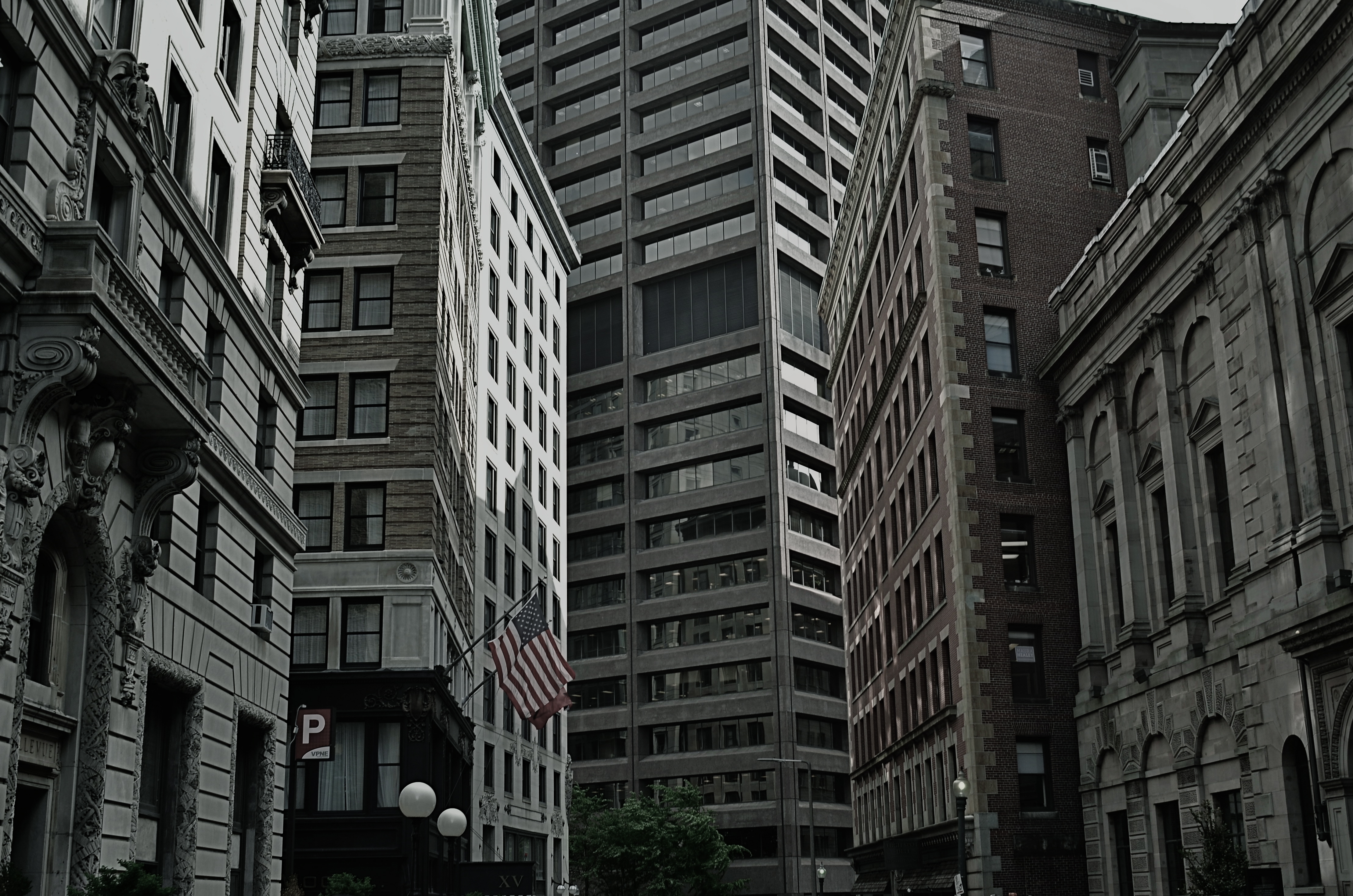
Yes, you could find a more frustrating job than making city maps for Boston streets. But you’d have to look hard….
By MICHAEL PERKINS
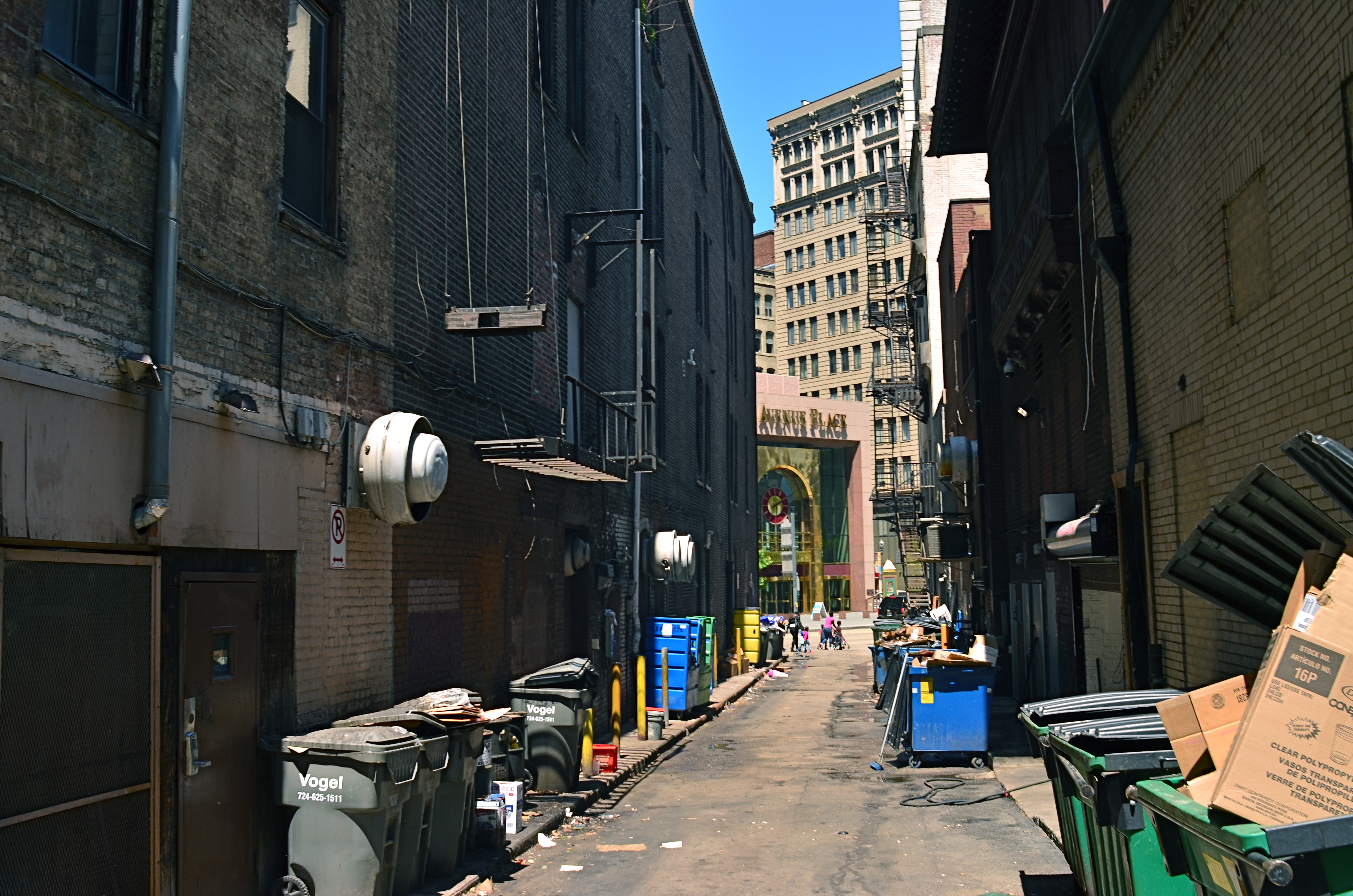
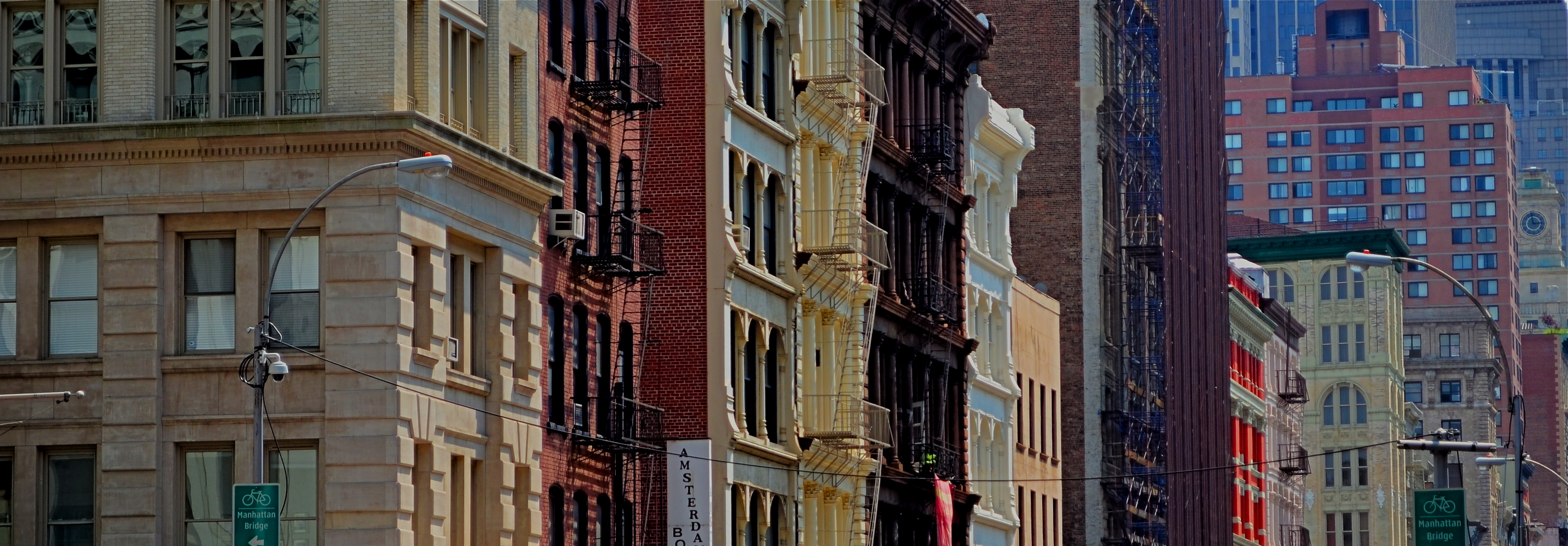
WHEN WE THINK OF URBAN BLOCKS, IT’S NATURAL TO THINK of those blocks as regular rectangles, well-regulated, even streets that run at direct parallels or hard right angles to each other. And while there certainly are cities with such mathematically uniform grids, some of the most interesting cities in the world don’t conform to this dreamy ideal in any way. And that means opportunities for photographers.
We’ve all seen street scenes in which the left and right sides of the road vanish directly toward the horizons, like staring down the middle of a railroad bed. But for the sake of dramatic urban images, it’s more fun to seek out the twisty mutants of city design; the s-and-z curves, the sudden zigzags, the trapezoids and triangles which signify confusion to cabbies and pedestrians but which mean good times for photogs. Let’s face it; snapping pictures of orderly things gets old fast. The very nature that makes us idealize “rightness” also makes us want to photograph “wrongness.”
That’s why I love to shoot in towns where the city was laid out with all the logic of the Mad Hatter on speed, those streets that seem barely coherent enough to admit the successful conduct of trade. Cities where locals and visitors alike curse the names of the urban planners, if there ever had been planners, if there ever had been a plan. A grand collision of avenues and alleys that looks like a kid whose teeth are crowding together in a greedy orthodontist’s dream fantasy. In such cities, including Manhattan, Pittsburgh, San Francisco, Boston and many others, “order” is a relative term. There are precious few neat streets vanishing back to infinity, politely lined by cooperative structures queueing up parallel to the curb. And that’s my kind of living, breathing… chaos.
As a mild example, consider the Boston street shown above, on which nearly every building seems slightly askew from every other building, sitting on foundations that jut out at every conceivable angle and plane. It’s a grand, glorious mess, and a much more interesting way to show the contrasting styles that have sprouted in the neighborhood over the centuries. It’s reality that looks like an optical illusion, and I can’t get enough of it.
A straight line may be the shortest distance between two points, but it’s also the least interesting. Go find cities that make no sense, God bless ’em.
WAIT FOR IT….
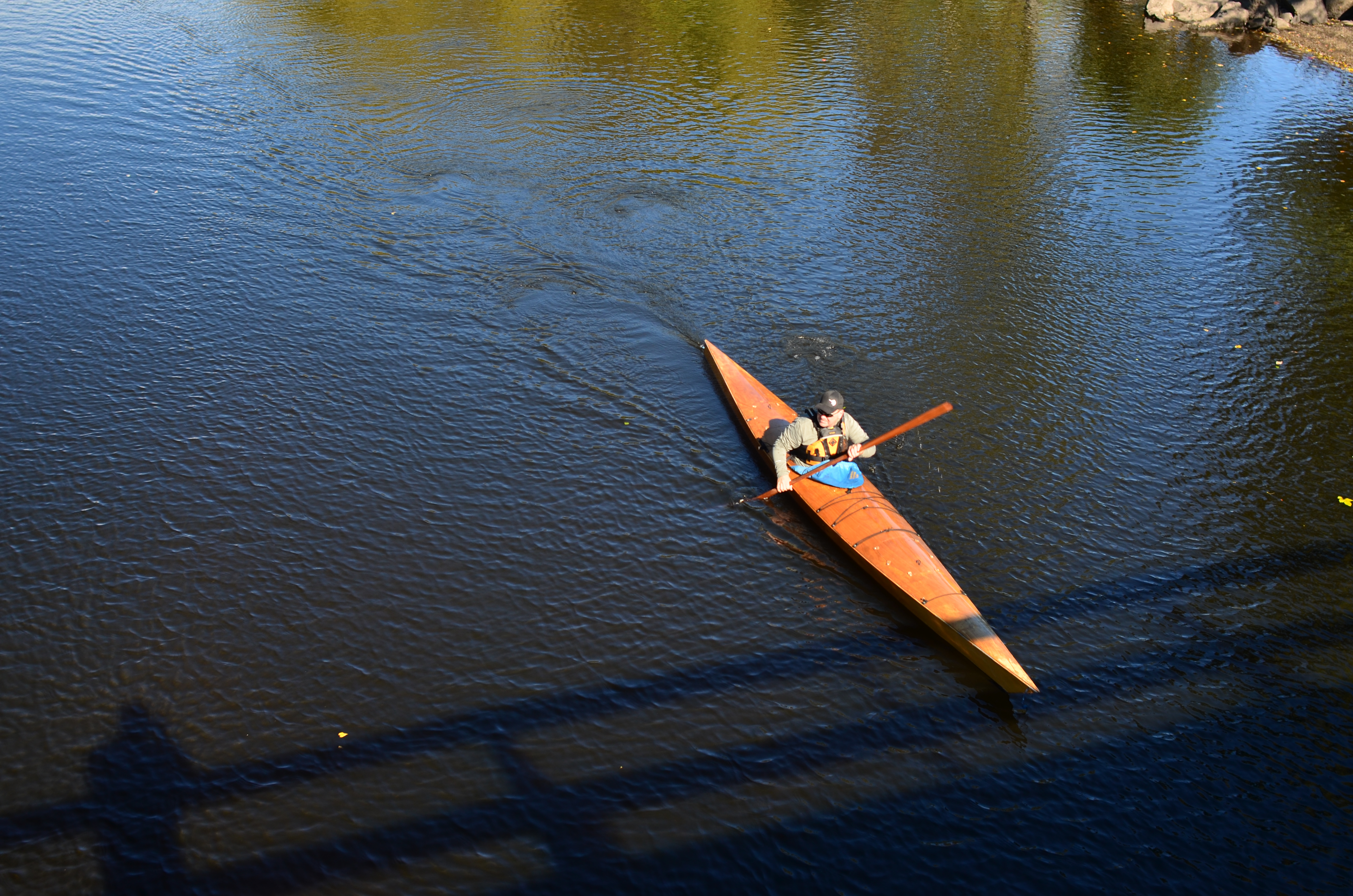
A decent start..and yet..
By MICHAEL PERKINS
ONE OF THE GREATEST PERKS IN DIGITAL PHOTOGRAPHY is making it easy and affordable to squeeze off as many shots on a given occasion as was only possible, in films days, for well-financed pros. The history of photojournalism is rife with stories of shooters who shot four, five, even six rolls of film to produce four magazine illustrations….a yield ratio that made put those same shots insanely beyond the budget of John Q. Viewfinder. Simply put, many of us just could not afford to shoot enough bad frames to get to the good ones.
That’s all in the past now. if we update our thinking.
We still have a tendency, when shooting a subject, to stop too soon, that is, as soon as an acceptable image emerges. Give many of us 60% of what we were going for, and we tend to stand down, move on, and live with a result that we may later see as a compromise. That’s old thinking based on our years of “I only have ten shots left”, and the idea of budgeting a finite commodity, like film frames. It’s important now, however, to actually develop the habit of over-shooting, of covering our targets from as many conceptual approaches as possible. Close shot. Medium shot. Reverse angle. Looking down from above. A few tries shooting at the “wrong” shutter speed or aperture. In other words, don’t settle too soon.

Closer to the mark..and yet..
I had a great subject in a recent walk across a small footbridge as a kayaker began a slow trek that would eventually take him toward me, underneath my stance atop the bridge, and then back into brilliant sunlight. He was taking his time, so that I could take mine, and I began by thinking that the shot I wanted was the easiest one, as he approached me head on. However, something told me that his relationship to the light would change dramatically as he crossed under the bridge, and it did.
As he emerged from beneath the span, I shot him in a straight overhead, and then came the money shot, as the kayak seemed to divide the water into rich, detailed ripples on the right side of the boat, and shining sparkles on the other side. Hardly a world-beating shot, but far more dramatic than the one I originally thought I wanted. Had I decided to accept the first frame, the third one would never have been captured. It certainly was no great technical struggle to take the final picture, nor were the extra few seconds a major strain. Simply, the deciding factor was to want the picture, and to wait long enough for it to come to me. It was worth it:
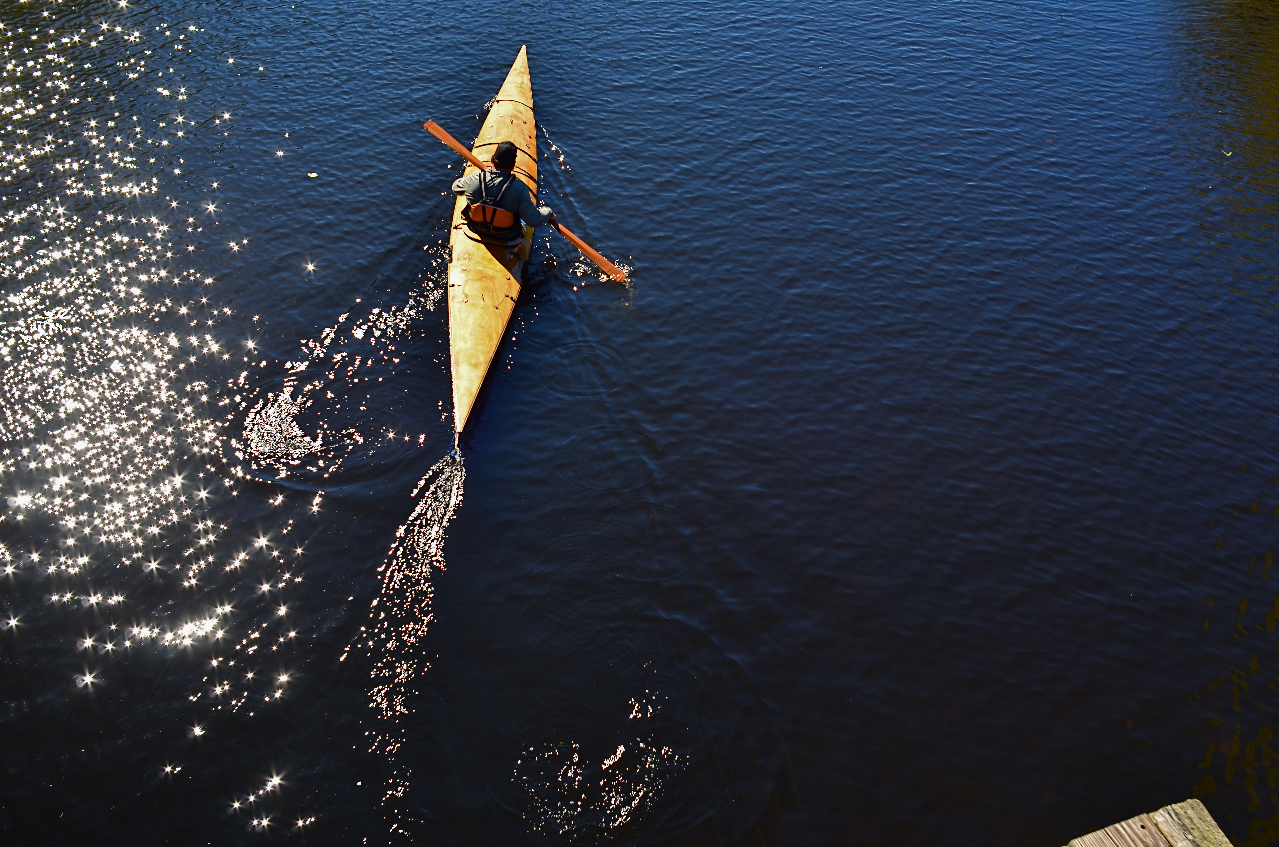
The keeper.
If you must err, err on the side of taking too many shots of something. It’s a lot easier to trim away the excess than to mourn over the miracles that never got born.
SEE DICK THINK.
Slow yourself down by shooting someone who is slowing himself down.
By MICHAEL PERKINS
FORGET BLOWN EXPOSURES, SHAKY SNAPSHOTS, AND FLASH-SATURATED BLIZZARDS. The hardest thing to avoid in the taking of a picture is winding up with a picture full of other people taking a picture. Hey, democracy in art, power to the people, give every man a voice, yada yada. But how has it become so nearly impossible to keep other photographers from leaning in, crossing through, camping out or just plain clogging up every composition you attempt?
And is this really what I’m irritated about?
Maybe it’s that we can all take so many pictures without hesitation, or, in many cases, without forethought or planning, that the exercise seems to have lost some of its allure as a deliberate act of feeling/thinking/conceiving. Or as T.S. Elliot said, it’s not sad that we die, but that we die so dreamlessly. It’s enough to make you seek out things that, as a photographer, will actually force you to slow down, consider, contemplate.
And one solution may lie in the depiction of other people who are, in fact, taking their time, creating slowly, measuring out their enjoyment in spoonfuls rather than buckets. I was recently struck by this in a visit to the beautiful Brooklyn Botanical Gardens on a slow weekday muted by overcast. There were only a few dozen people in the entire place, but a significant number of those on hand were painters and sketch artists. Suddenly I had before me wonderful examples of a process which demanded that things go slowly, that required the gradual evolution of an idea. An anti-snapshot, if you will. And that in turn slowed me down, and helped me again make that transition from taking pictures to making them.
Picturing the act of thought, the deep, layered adding and subtracting of conceptual consequence, is one of the most rewarding things in street photography. Seeing someone hatch an idea, rather than smash it open like a monkey with a cocoanut does more than lower the blood pressure. It is a refresher course in how to restore your own gradual creativity.
STAKES IN THE GROUND
We Seemed To Be The Entire World, 2015. 1/60 sec., f/5.6, ISO 100, 35mm.
By MICHAEL PERKINS
NO DOUBT YOU KNOW WHAT IT FEELS LIKE TO SEE A PICTURE IN YOUR MIND that, for some reason, doesn’t make it into the camera.
It’s maddening. That fumbling few inches between success and failure that cannot always even be sensed during the taking of an image, but which, somehow, is as wide as a river gorge once the picture comes out. Dammit, you saw it. More importantly, you felt it. But something in perhaps a technically perfect photograph fails to engage, and the thing just can’t close the sale.
Going further with the metaphor of salesmanship for a moment, there are pictures which, in a manner of speaking, don’t “ask for the order”. They don’t effectively say, here is the main point of interest. Look here, then there. The best photos are triptychs in that they have a sense of inevitable direction. Your eye senses where to travel with the frame.
In the above forest scene, I nearly failed to provide that impetus because, in my first few shots, I was overly centered on getting the contrasty elements of the picture from fighting each other. Some trees came out like silhouettes. Some parts of the forest floor were way too bright. Somewhere along the line, I had decided that the picture was about solving those purely technical problems. Check those items off, I thought, and you’d have a real nice nature scene, or so it seemed at the time. Only one lucky thing intervened to change my mind and save the picture.
This comes under my general belief that most of the things you need to fix a composition are mere inches away from where you’re already standing. In this case, I moved a bit to the left of several trees and two small children swung into view, both of them representing a dynamic dollop of color in an overly bland palette of shades. Suddenly the picture was about these kids stealing away, inhabiting a quiet, separate world, their size dwarfed by the pines while giving measurable scale to the entire woods. They had found a complete reality away from everyone, and it would be easy to show that. Cropping to have them enter the frame at the bottom left corner helped direct the eye where I needed it to go first. Start here, and then look beyond.
It’s helpful to regularly dissect the pictures that almost had enough story to sell themselves. What stakes could I have pounded into the ground to mark the outline of the idea? Where did I fail to lay out the territory of the story?
It’s all about getting that image from your mind into the camera. That’s everything. That is, ever and always, the problem to be solved.
MODEL CITIZENS

Cities can suggest any place, any time, even within your most familiar neighborhoods.
By MICHAEL PERKINS
THE ROLE OF THE URBAN PHOTOGRAPHER IS TO REKINDLE OUR RELATIONSHIP to our cities, to ignite a romance that might have gone cold or fizzled out. We grow up inside the buildings and streets of our respective towns one day at a time, and, while familiarity doesn’t always breed contempt, the slow, steady drip of repetitive sequence can engender a kind of numb blindness, in that we see less and less of the places we inhabit. Their streets and sights become merely up, down, in, out, north side or east side, and their beauty and detail dissolve away before the regular hum of our lives.
An outside eye, usually trained on a camera, is a jolt of recognition, as if our city changed from a comfy bathrobe into a cocktail dress. We even greet images of our cities with cries of “where’s THAT????”, as if we never saw these things before. The selective view of our streets through a camera, controlling framing, context, color and focus, enchants us anew. If the photog does his job properly, the magic is real: we truly are in new territory, right in our own backyards.
A city with iconic landmarks, those visual logos that act as absolute identifiers of location, actually are easier for the urban photographer, since their super-fame means that many other remarkable places have gone under-documented. Neighborhoods are always rising and falling, as the Little Italys fade and the Chinatowns ascend. Yesterday’s neglected ghetto becomes today’s hip gallery destination. Photographers can truly rock us out of the lethargy of daily routine and reveal the metropolis’s forgotten children in not only aesthetic but journalistic ways, reminding us of problems that need remedy, lives that plead for rescue.
The photographer in the city is an interpretive artist. His mantra: hey, townies, you ain’t seen nothin’ yet.
THE PLACES THEY LIVED
“I want to marry a lighthouse keeper…” 1/125 sec., f/3.5, ISO 100, 24mm.
By MICHAEL PERKINS
PHOTOGRAPHERS INSTINCTIVELY SEEK OUT VARIATION. We spend so much time looking at so much of the world that a lot of it starts to sort itself into file folders of things, patterns, or places, pre-sorting our pictures into this or that category. Sunsets: see Nature. Famous Buildings: a sub-set of Travel. And so on, until we are fairly starved for some visual novelty to shock us out of our slumber and spur us on to new ways of seeing.
One of the things that settles most readily into sameness is the human dwelling. Most of us live in some kind of basic four-walls, bedroom-kitchen-bath sequence, making our living spaces fairly predictable as subject matter. By way of awe and admiration, the real geniuses of, magazine illustration, to me, have always been the “house beautiful” photographers, since they must spend year after year making Mr.& Mrs. J.D. Gotmore’s McMansions seem unique and bold. That said, there is something about nearly everyone’s castle that might be distinctive, even revelatory, about the people who live within. It’s all in your approach.
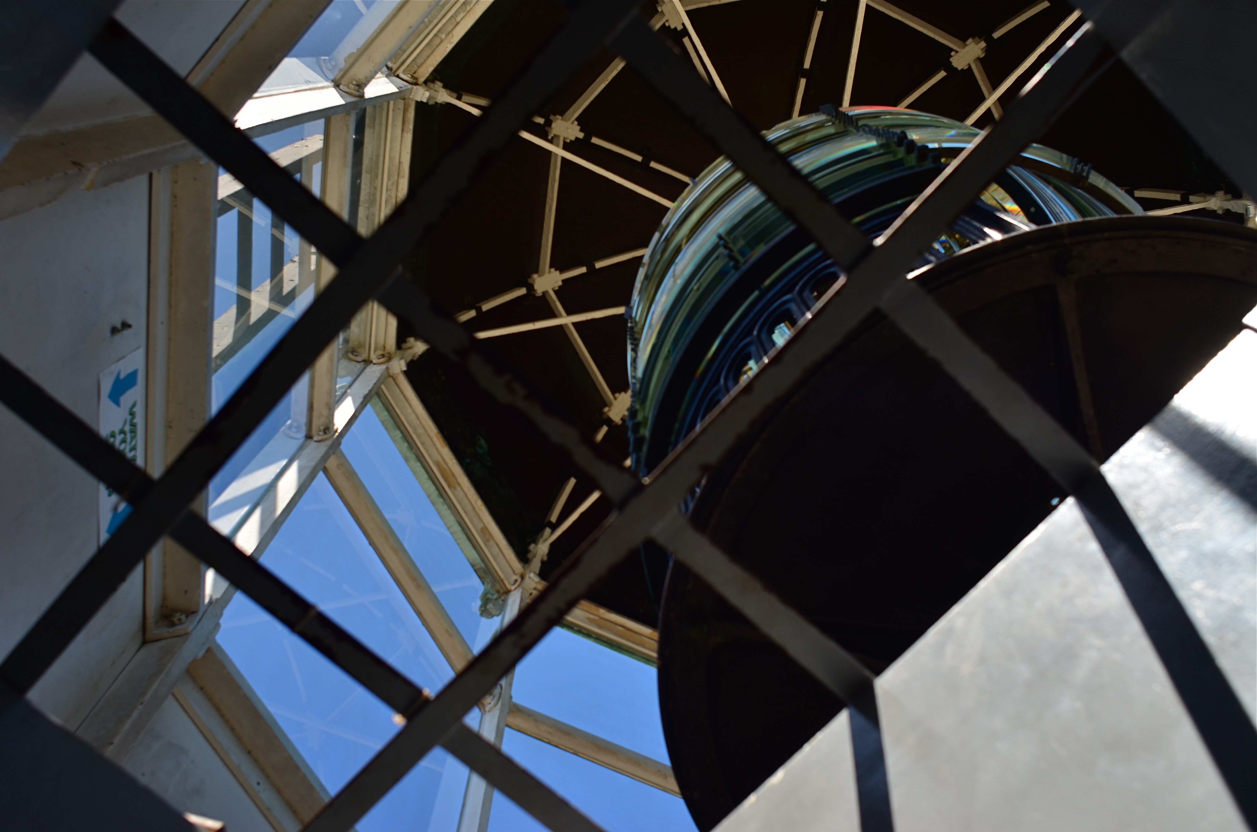
I love to explore the places where people are forced to improvise living spaces either near or as part of their work, places that usually exist in stark isolation as compared to the crush of crowded urban centers. In the above image, I was allowed to climb to a small viewing angle of the beacon room atop a coastal lighthouse in San Diego, and, perhaps because I was limited to a shooting stance below the surface of the room’s floor, the resulting photo further exaggerated the confined, angular working space, which sits above living areas further down the house’s twisty central staircase.
These areas pose more questions than they answer. What is it like to have this building be your entire world for long stretches of time? What kind of person can do this work? What is the center of this unusual story? The blurring of boundaries between working and living areas is among the most novel material a photographer can tackle, since it contains one of the things he craves most….mystery.
WHERE THE RUBBER MEETS THE ROAD
Convergences, 2015. A through-the-window iPhone quickie. Grainy, noisy, fun.
By MICHAEL PERKINS
MY WIFE AND I HAVE REACHED A REASONABLE DIVISION OF LABOR as regards road trips, with her taking on the nation’s freeways like an original cast member of The Road Warrior and me decoding various navigational vectors, from AAA maps to iPhones, as well as uber-producing the in-car tune mix. Everybody to their strengths and all that. This arrangement also frees me up to pursue the mythical goal of Immortal Photograph I Shot Out A Car Window, which will also be the title of my Pulitzer Prize acceptance speech.
Any day now.
Most of these potential world-beater images have been attempted through the front windshield, where it is at least a little easier to control blur, even glass reflection. Additionally, the majority of them, more and more, are done on mobile phones, which is not the greatest for resolution, but gives you that nice exaggeration on dimensions and depth that comes with a default wide-angle lens, which, in some cases, shoots broader vistas than even the kit lens on your “real” camera.
If you find yourself doing the same thing, you have no doubt noticed that you must get really, really close to your subject before even mountains look like molehills, as the lens dramatically stretches the front-to-back distances. You might also practice a bit to avoid having 10,000 shots that feature your dashboard and that somewhat embarassing Deadhead sticker you slapped on the windshield in 1985.
So, to recap: Shoot looking forward. Use a mobile for that nice cheap arty widescreen look. Frame so your dash-mounted hula girl is not included in your vistas (okay, she does set off that volcano nicely..). And wait until you’re almost on top of (or directly underneath) the object of your affection.
And keep an ear out for important travel inquries from your partner, such as: “are you gonna play this entire Smiths CD?”
Sorry, my dear. Joan Baez coming right up.
POINTERS
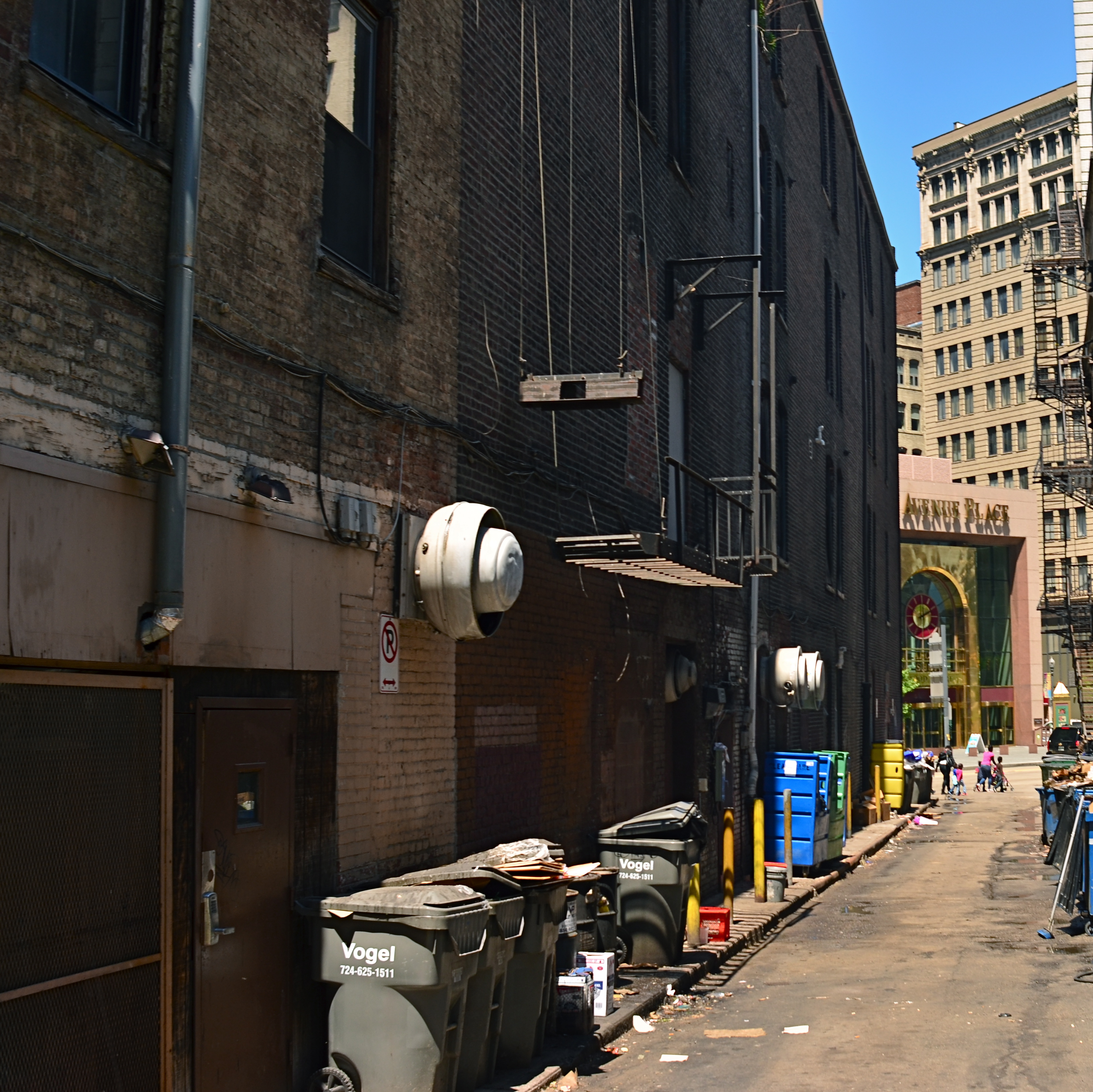
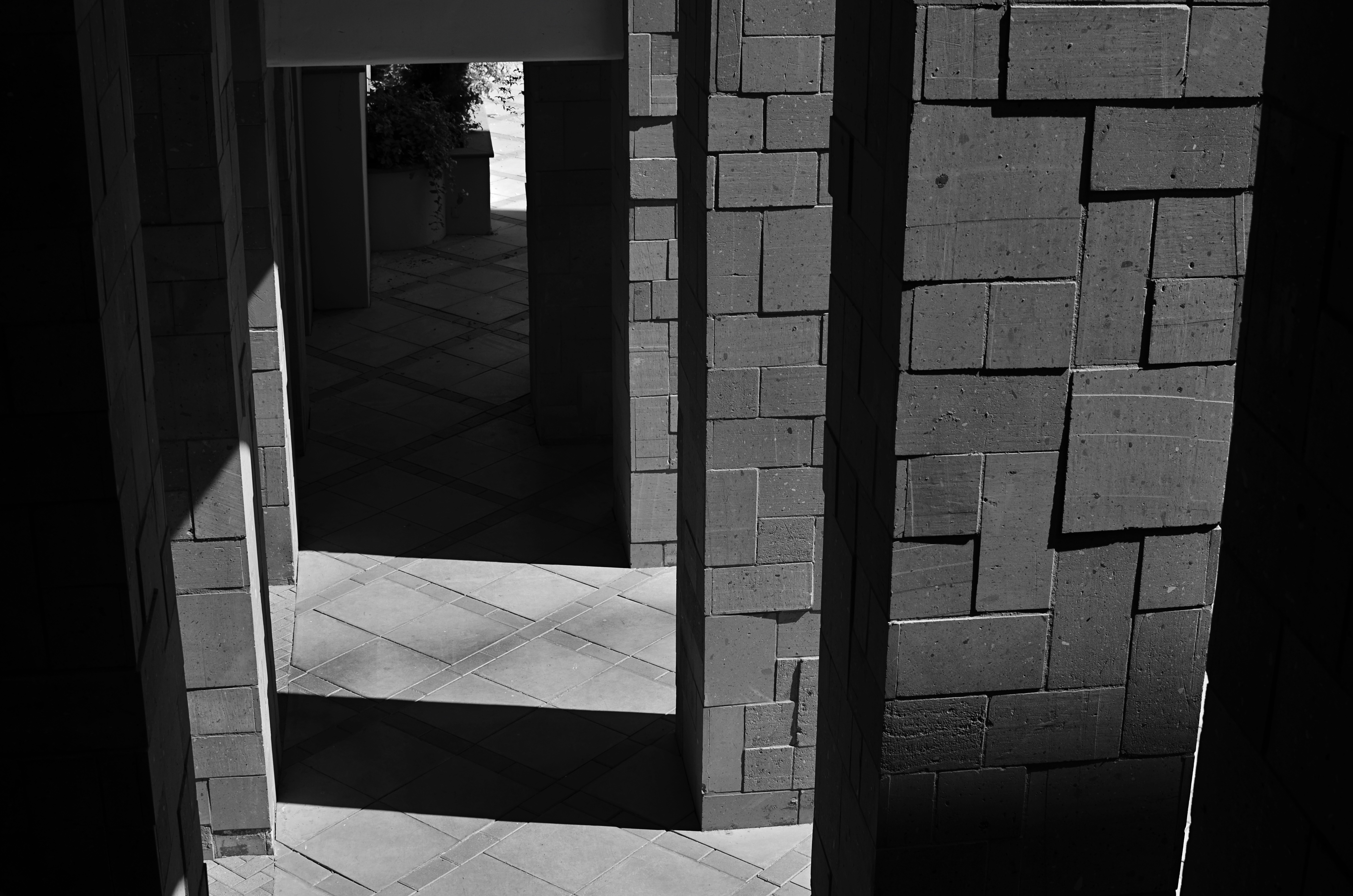
A traditional wide-angle approach to the suggestion of depth.
By MICHAEL PERKINS
WE ALL WENT THROUGH THAT OLD PERSPECTIVE EXERCISE IN ART 101. You know, the one where we draw the train tracks trailing away to an imaginary horizon, compressing the distance between the tracks as they “recede” to suggest depth, or a simulation of the way our eyes perceive it. It’s a lesson that dances somewhere back in our lizard brain whenever we compose a shot to suggest three dimensions on a flat plane (film or sensor) that only possesses two. Ongoing challenge, etc., etc.
In composing a photograph, it’s pretty easy to decide which factors in the picture actually aid that illusion, creating a big fat neon arrow to the thing we’re want to draw attention to. And some ways are better than others at selling that idea. One of the strong myths about these kinds of shots is that you need a wide-angle to make the argument for depth. Of course, that’s like a lot of “rules” in photography. It’s always true, except in those cases when it’s kinda…not.
In the top image, shot with a 24mm lens, the building at the back of the shot is lit better than the two alley walls that lead to it….a basic no-brainer of a composition. Moving left or right a bit can put the major emphasis on one wall or the other to be the arrow pointing to that object, or you can make the shot even more compact, although no less effective, in the cropping process.
Instead of two leading lines heading for the building at the back, let’s try just one.
Of the two walls, the rows of trash cans and receding lines of windows on the left seem, at least to me, to lead more powerfully to the back building than the right, where detail is darker and objects that could act as a leading line are a little more angled and compressed. Just for kicks, I cropped the shot to a square you see just above, reframing the back building as the end of a straight, single diagonal along the left wall, making the instruction to the eye a lot more streamlined.
It’s not that the fuller frame is “wrong” per se, but I always believe that inside many shots just might be a better shot waiting to get out. Some photographs are full-born in-camera, while others emerge during what I call the “on second thought” phase.
Now to try this idea out at a railroad crossing….
WRITE YOUR OWN STORY
On Stand-By, 2015. 1/25 sec., f/3.5, ISO 100, 35mm.
By MICHAEL PERKINS
THE OLDEST CONSISTENT ROLE OF PHOTOGRAPHY IS AS NARRATIVE, its storytelling ability borrowed from painting but later freed, as painting would also be, from representations of mere reality. Before the beginning of the 20th century, photographs held moments, chronicled events, froze people in time. Over the next hundred tumultuous years, every part of the narrative process for all arts would be challenged, shattered and reassembled several times over. We pretend there are still rules that always apply to what an image says to us, but that is really only sentiment. Some photographs simply are.
What they are is, of course, both fun and infuriating for creator and audience alike. We wonder sometimes what we are supposed to think about a picture. We take comfort in being led a certain way, or in a set sequence. Look here first, then here, then here, and draw such-and-such a conclusion. But just as music need not relate a story in traditional terms (and often does not) the photograph should never merely present reality as a finished arrangement. The answer to the question, “what should I think about this?” can only be, whatever you find, whatever you yourself see.
Strands, 2015. 1/200 sec., f/5.6, ISO 100,35mm.
I love having a clear purpose in a picture, especially pictures of people, and it has taken me years to make such images without the benefit of a deliberate road map. To arrange people as merely elements in a scene, then trust someone else to see what I myself cannot even verbalize, has forced me to relax my grip, to be less controlling, to have confidence in instincts that I can’t readily spell out in 25 words or less.
What are these people doing? What does their presence reveal beyond the obvious? Is there anything “obvious” about the picture at all? Just as a still life is not a commentary on fruit or a critique of flowers, some photographed people are not to be used in the service of a story. They can, in the imaginations of viewers, provide much more than that. Photography is most interesting when it’s a conversation. Sometimes that discussion takes place in strange languages.
WITHOUT A LEG TO STAND ON
A tripod night exposure that could have been a contender, had I truly been prepared.
By MICHAEL PERKINS
SHOOTING ON A TRIPOD IS OFTEN RECOMMENDED as the way to afford yourself the most stability in a long exposure. After all, few of us are robotic enough to hold a camera stock-still for anything below a third of a second, so it’s a no-brainer to park your camera on something that’s too inhuman to flinch. You can also take amazing stuff hand-held on shorter night exposures, so long as you (a) have a lens that will shoot around f/1.8 or wider and (b) you can live with the noise a higher ISO will engender.
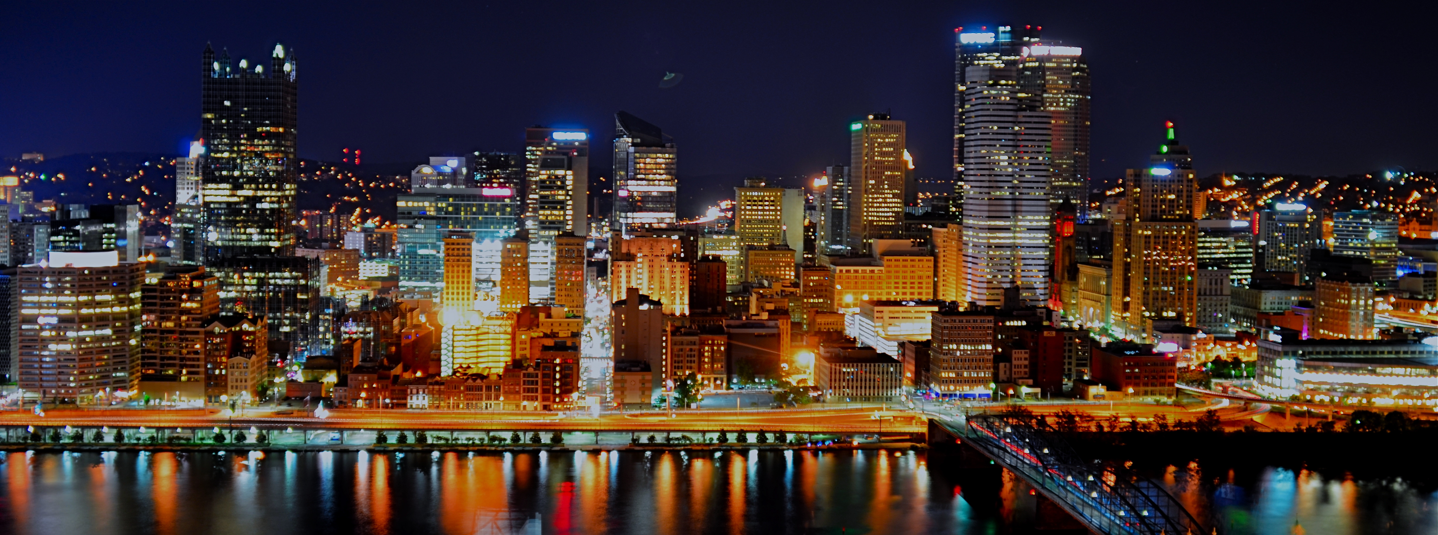
So, yeah, tripods have their place, but they are not the only determinants in the success of a night-time shoot. And those other x-factors can severely compromise your results. There is the stability of the tripod itself, which isn’t a big sweat if you shelled out $900 for a carbon-fiber Gitzo Pan/Tilt GK, but might generate heartburn if you got something closer to a set of metallic popsicle sticks for $29 at Office Max. The shot above was taken using my own modest (cheap) rig atop Mount Washington across from downtown Pittsburgh, and a few of the healthier gusts threatened to take it and me on a quick lap around the riverfront. Some people buy sandbags. Some believe in the power of prayer. Your choice.
Another x-factor for ‘pod shots is the actual weather you’re shooting in, which will, let’s say, shape your enthusiasm for staying out long enough to get the perfect shot. The smaller your aperture, the longer the exposure. The more long exposures you take, the longer you, yourself, are “exposed”…to snow, sleet, and all that other stuff that mailmen laugh at. Again, referencing the above image, I was contending with freezing drizzle and a windbreaker that was way too thin for heroics. Did I cut my session short? i confess that I did.
I could also mention the nagging catcalls of the other people in my party, who wanted me to, in their profound words, “just take the damned picture” so they could partake of (a)a warm bar, (b) a cold beer, (c) a hot waitress. Result: a less than perfect capture of a fairly good skyline. A little over-exposed, washing out the color. A little mushy, since the selfsame over-exposure allowed the building lights to burn in, rendering them glow-y instead of pin sharp. I was able to fix some of the color deficiencies later, but this is not a “greatest hits” image by any stretch.
Tripods can be lifesavers, but you must learn to maximize their effectiveness just like any other piece of camera equipment. If you’re going to go to a buncha trouble to get a shot, the final result should reflect all that effort, quality-wise.
ABSOLUTES
This image isn’t “about” anything except what it suggests as pure light and shape. But that’s enough. 1/250 sec., f/5.6, ISO 100, 35mm.
By MICHAEL PERKINS
THE POPULARLY-HELD VIEW OF THE HISTORY OF PHOTOGRAPHY makes the claim that, just as video killed the radio star, camera killed the canvas. This creaky old story generally floats the idea that painters, unable to compete with the impeccable recording machinery of the shutter, collectively abandoned realistic treatment of subjects and plunged the world into abstraction. It’s a great fairy tale, but a fairy tale nonetheless.
There just is no way that artists can be regimented into uniformly making the same sharp left turn at the same tick of the clock, and the idea of every dauber on the planet getting the same memo that read, alright guys, time to cede all realism to those camera jerks, after which they all started painting women with both eyes on the same side of their nose. As Theo Kojak used to say, “nevva happennnned…”
History is a little more, er, complex. Photography did indeed diddle about for decades trying to get its literal basics right, from better lenses to faster film to various schemes for lighting and effects. But it wasn’t really that long before shooters realized that their medium could both record and interpret reality, that there was, in fact, no such simple thing as “real” in the first place. Once we got hip to the fact that the camera was both truth teller and fantasy machine, photographers entered just as many quirky doors as did our painterly brothers, from dadaism to abstraction, surrealism to minimalism. And we evolved from amateurs gathering the family on the front lawn to dreamers without limit.
I love literal storytelling when a situation dictates that approach, but I also love pure, absolute arrangements of shape and light that have no story whatever to tell. As wonderful as a literal capture of subjects can be, I never shy away from making an image just because I can’t readily verbalize what it’s “about”. All of us have photos that say something to us, and, sometimes, that has to be enough. We aren’t always one thing or the other. Art can show absolutes, but it can’t be one.
There is always one more question to ask, one more stone to turn.
THE SINGLE BULLET THEORY
Many of your own best pictures are single-take, all-or-nothing shots. There’s a reason for that.
By MICHAEL PERKINS
Okay, Wang, I think that’s enough pictures of the parking lot. —Rodney Dangerfield, Caddyshack
IF YOU WERE TO EXPRESS TODAY’S PHOTOGRAPHIC FREEDOM IN TERMS OF FIREPOWER, it would be fair to say that many of us have come to shoot in a somewhat scatter-shot fashion, like someone sweeping a machine gun. Indeed, digital allows us to overshoot everything to such a degree that doing so becomes our default action, because why would you take one picture of your child digging into birthday cake when fifty will do just as well?
Some over-shooting is really what pro photogs used to call “coverage” and is actually beneficial for particularly hard subjects. Awe-inspiring sunsets. A stag at bay. The fiery burst from a Hawaiian volcano. Such subjects actually warrant a just-one-more approach to make sure you’ve thought through every possible take on something that can be interpreted in a variety of ways, or which may be vanishing presently. But that’s a lot different from cranking off four dozen clicks of the visitor’s center at Wally World.
Shoot things reactively.
Shooting better isn’t always assured by merely shooting more. Instead of the machine gun technique, we might actually improve our eye, as well as our ability to strategize a shot, by limiting how many total tries we make at capturing an image. My point is that there are different “budgets” for different subject matter, and that blowing out tons of takes is not a guarantee that Ze Beeg Keeper is lurking there somewhere in the herd.
So put aside the photographic spray-down technique from time to time and opt for the single bullet theory. For you film veterans, this actually should be easy, since you remember what it was like to have to budget a finite number of frames, depending on how many rolls you packed in. Try giving yourself five frames max to capture something you care about, then three, then one. Then go an entire day taking a single crack at things and evaluate the results.
If you’ve ever spent the entire day with a single focal length lens, or fought severe time constraints, or shot only on manual, you’re already accustomed to taking a beat, getting your thinking right, and then shooting. That’s all single-take photography is; an exercise in deliberation, or in mindfulness, if you dig guru-speak. Try it on your own stuff, and, better yet, use the web to view the work of others doing the same thing. Seek out subjects that offer limited access. Shoot before your walk light goes on at an intersection. Frame out a window. Pretend an impatient car-full of relatives is waiting for you with murder in their hearts. Part of the evolution of our photography is learning how to do more with less.
That’s not only convenient, in terms of editing. It’s the very soul of artistry.
THE THIRD WAVE
By MICHAEL PERKINS
I’VE BEEN DRENCHED IN A VIRTUAL TIDAL WAVE over the last few days, visiting one of those torrential storms of discontent that can only exist on the internet, churning furiously, forever, no resolution, no winner. I don’t know when it began; I only know that, six months, a year, or a decade from now, if I return for more, the storm will still be raging, the two forces inexhaustible in their contempt for each other.
In one corner will be the photographers who believe that equipment has no determination in whether you make great pictures. In the other corner will be those who believe that you absolutely need good gear to make good images. The invective hurled by each combatant at the other is more virulent than venom, more everlasting than a family feud, more primal than the struggle between good and evil.
If you dig bloodsport, enter the maelstrom at the shallow end by Googling phrases like “Leicas are not the greatest cameras” or “your camera doesn’t matter” and then jump behind a barricade. Do more provocative searches like “hipsters are ruining photography” or “don’t think, just shoot” at your peril.

Waikiki Beach, 2009. I’d love to tell you what I did right with this picture, but I honestly don’t remember. 1/500 sec., f/5.6, ISO 140, 60mm.
As with many other truth quests in photography, this one shows strong evidence for both of the waves in the surge. Certainly a great piece of equipment cannot confer its greatness upon you, or your work. And, from the other side, sometimes a camera’s limitations places limits, or at least austere challenges, upon even superbly talented people. And, so, to my mind, there is a third, more consistently true wave: sometimes there is a magic that makes it to the final frame that is mysterious, in that you don’t know how much of the picture you took, how much the camera took, or just how ready the cosmos was to serve that picture up to you. See image above, which I can no longer take either credit or blame for.
Yeah, that’s a little Zen high priest in tone, but look over your own work, especially things you did five or more years ago, where it’s now difficult to recall the exact circumstances of the success of a given image. Pull out the pictures that could be correctly captioned “I don’t know how I got that shot”, “I guess I just went for broke”, or “don’t ask me why that worked out..” There will be more pictures that fall between the extremes, that are neither “thank God I had my cool camera” nor “thank God I was able to make that image despite my limited gear.” That middle ground is the place where miracles thrive, or die on the vine. That strange intersection of truth , far beyond the lands of my-side/your-side heat, is where lies the real light.
THE LONG AND SHORT OF IT
This original frame was just, um, all right, and I kept wanting to go back and find something more effective within it.
By MICHAEL PERKINS
THE INTRODUCTION OF THE FIRST PANORAMIC CAMERAS in the 1840’s can be seen as a freeing-up of the camera frame, a way to more accurately depict the entire field of view open to the human eye. And, of course that’s true. However, the first panos were also an early attempt by photographers to deliberately direct and orchestrate not only what you see, but how they want you to see it. Let’s concede that the western mind tends to absorb information in linear fashion. We read from left to right, we scan the horizon, and so forth. So making a photograph that instructs you to interpret horizontally is fairly natural.
So the first panos seem like a fairly modest extension of our visual bias. But think about the fundamental change that represented. Suddenly, photographers were saying, there are no rules except the rules I dictate. I decide what a frame is. I arrange not only the information inside the frame, but the frame itself. By re-shaping the box, I re-shape what you are to think about what’s in the box. That’s revolutionary, and today’s shooters would be wise to be mindful of that wonderful power.
I am fond of making what I will generously call “carved” panoramics, shots that began as standard framings but which I have cropped to force a feel of left-to-right linearity. Unlike standard panoramics, the shots were conceived and made with a very different compositional strategy, not necessarily trying to tell a horizontal story. However, on review, some stories-within-stories contain enough strong information to allow them to stand as new, tighter compositions in which the new instruction to the viewer’s eye is quite different from that in the original.
Change the frame, change the message.
The full shot seen at the top of this page may or may not succeed as a typical “urban jungle” snap, in part because it contains both horizontal and vertical indices that can pull the eye all over the place. Since I wasn’t amazed by the shot itself, I decided to select a horizontal framing from its middle real estate that purposely directed the eye to laterally compare the facades of several different buildings stacked tightly down the street. Full disclosure: I also re-contrasted the shot to make the varying colors pop away from each other.
The result still may not be a world-beater, but the very act of cutting has re-directed the sight lines of the picture. For better or worse, I’ve changed the rules of engagement for the photograph. When such surgeries work, you at least fix the problem of extraneous clutter in your pictures, making them easier to read. Then it’s down to whether it was a good read or a beach read.
Hey, the box can’t fix everything.

AN OPEN LETTER TO PATIENT WIVES
“…..should I stay, or should I go?….”
By MICHAEL PERKINS
T.S. ELIOT ONCE ASKED, POIGNANTLY, ‘WHAT IS THE SOUND OF ONE HAND CLAPPING?‘ as if there could be no lonelier thing in this weary world. However, had he been a photographer, he might also have mused about the sound of one wife sighing, as her husband assures her that “I just need one more shot“, or “you can all go ahead, I’ll meet you at the gift shop.” Such assurances would be enough to send Mrs. Eliot’s one hand clapping T.S. soundly about the ears.
We really do hear the steam escaping from our wives’ ears as we mutter about whether we need a prime lens or a wide-angle for our next masterpiece. We understand that it’s not much fun watching your beloved stare at a pile of junk in a dark alley, pondering whether it all makes a profound statement about the state of the world. We get the fact that you might prefer that we answer your question about whether your mother should come and live with us, rather than mumble, “if I close down to f/11 to get past that glare, I’m gonna lose two stops of light…”
In short, we know what a colossal pain it is to be with someone who constantly hauls around a mad gaggle of gears, gauges, geegaws and gadgets. We even realize that you might have a hard time remembering the last time you saw us walking around on only two legs…..you know, without the tripod.
We stipulate that, sometimes, a hunk of rock is just a hunk of rock, not a canvas on which to mount our genius, just as “a little light reading” to the rest of the world might mean a beach thriller by Robert Crais, not the flash attachment section of the B&H Video catalog. We even admit that it’s a little catty of us to stare across the room at a restaurant and make our one contribution to the table’s conversation with, “look at that stupid guy. He’s not even framing up his shot!”
Yes, ladies, we need to not so much “get a life” as to get a slightly larger, wider one. So, thank you for reminding us that, if we fall off this mountain by stepping back for the perfect composition, we might make orphan our children. Thank you for occasionally filling us in on certain details of said children’s lives, such as their proper names, birthdays, distinguishing features, etc. Thank you for not wincing when we name the family dog Steiglitz. Thank you for not leaving us for dead when we use the foil cover from your best picnic casserole for a makeshift bounce reflector.
Mostly, as in the above scene, we humbly thank you for not seizing the opportunity to dump us and our dratted gear in the nearest abyss.
And then taking a picture of it.
And then laughing, hysterically.
Share this:
August 12, 2015 | Categories: Composition, Criticism, Hobbies, Humor, Philosophy, Viewpoint | Tags: Commentary, editorial, Essay, Humor, Philosophy, Satire | Leave a comment