OPEN ALL NIGHT
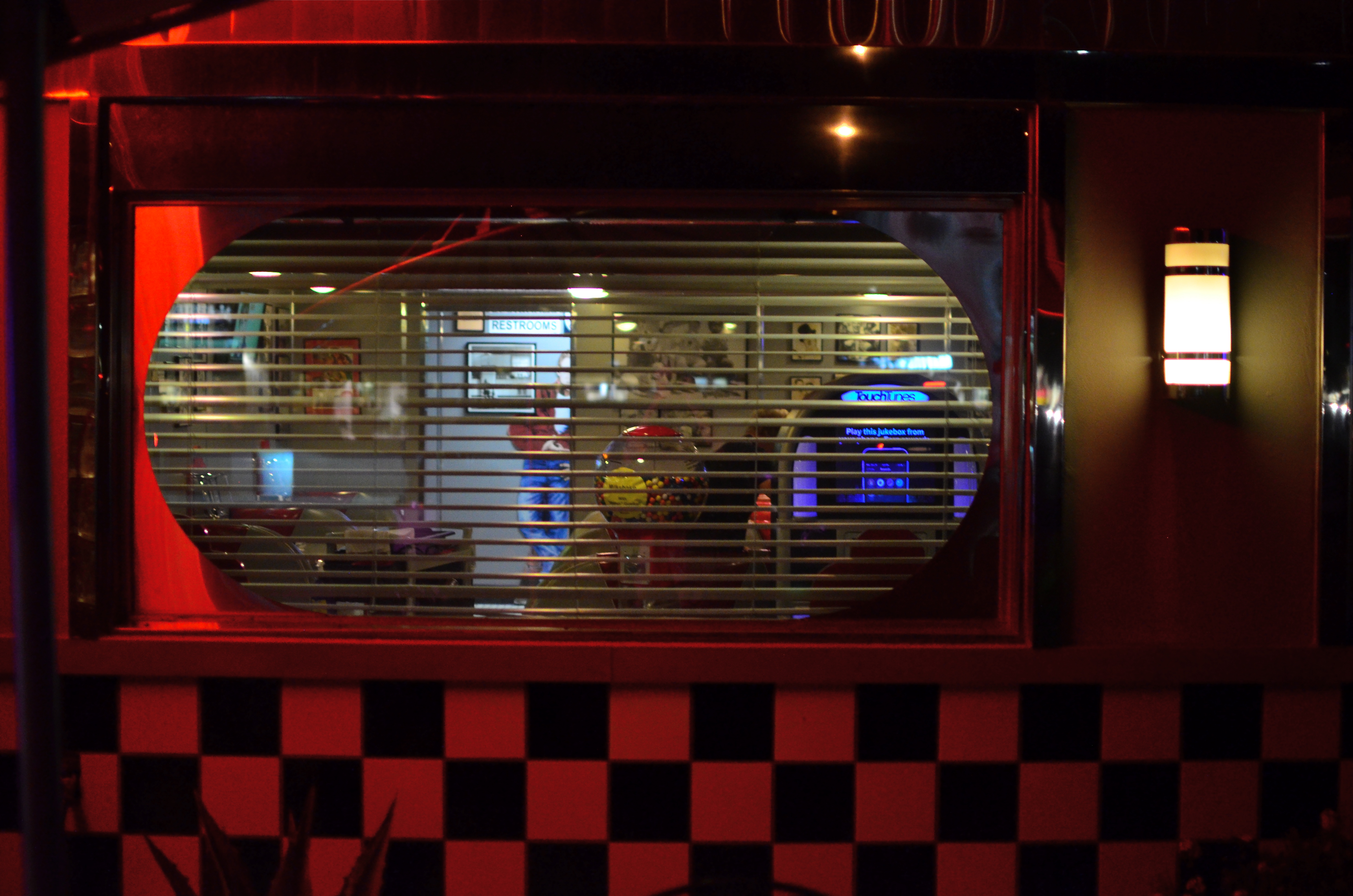
Diner-Vision, 2015.
By MICHAEL PERKINS
WHICHEVER SHIFT YOU WORK, YOU ARE FOREVER A STRANGER TO THOSE who work the other side of the workday. And while the majority of us generally fit into the standard 9 to 5 job template, millions of us have our body clocks regularly flipped upside down, our days cloaked in darkness, our brains awake while the city at large sleeps. That means that at any moment, half of us have little comprehension of how the other half lives. There’s a story in that.
And stories need pictures.
Pictorially speaking there has always been a bit of a black market mindset about the night-time, a nether world for some, a regular hangout for others. And with good reason: photography, in its infancy, had to ply its trade largely in sunlight, avoiding scenes which required either too much time, too much prep, or too much patience with slow recording media. But now we live in a very different world, armed with digital computers that look suspiciously(!) like cameras, but which react to light with an efficiency unseen in the entire history of photography.
Capturing the night is no longer a rare technical achievement, and we are really only at the front end of a steadily rising curve of technical enhancement in the area of light sensitivity, with no end in sight. Finally, darkness is something that uniquely colors and reveals reality instead of cloaking it in mystery. There is no longer an end to the shooting day. The image above is by no means an exceptional one, shot with a prime lens open to f/1.8 and a sensor that can deliver manageably low noise even at ISO 1250. More importantly, it is a handheld snap, shot at 1/30 sec…..all but unthinkable just a dozen years ago.
The new golden age of night photography is already apprehended by the youngest generation of shooters, since many of them can’t recall a time when it was a barrier to their expression. And, for those of us longer of tooth and grayer of beard, there is the sensation of being free to wander into areas which used to be sealed off to us. Sun up, sun down, it’s always time to take a picture.
Suddenly your eye is like a great downtown deli.
We’re open all night folks. We never close.
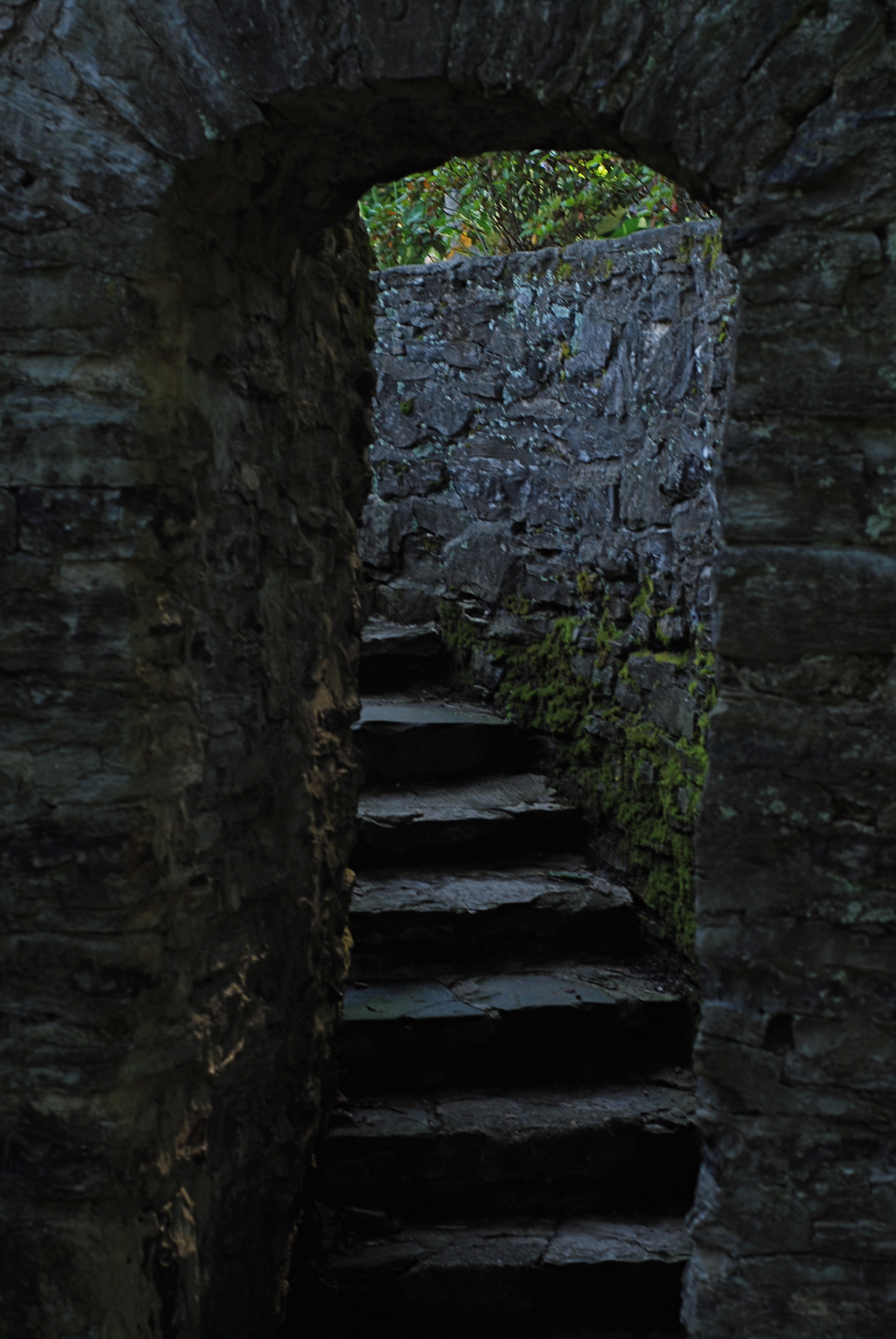
REVERSAL OF FORTUNE
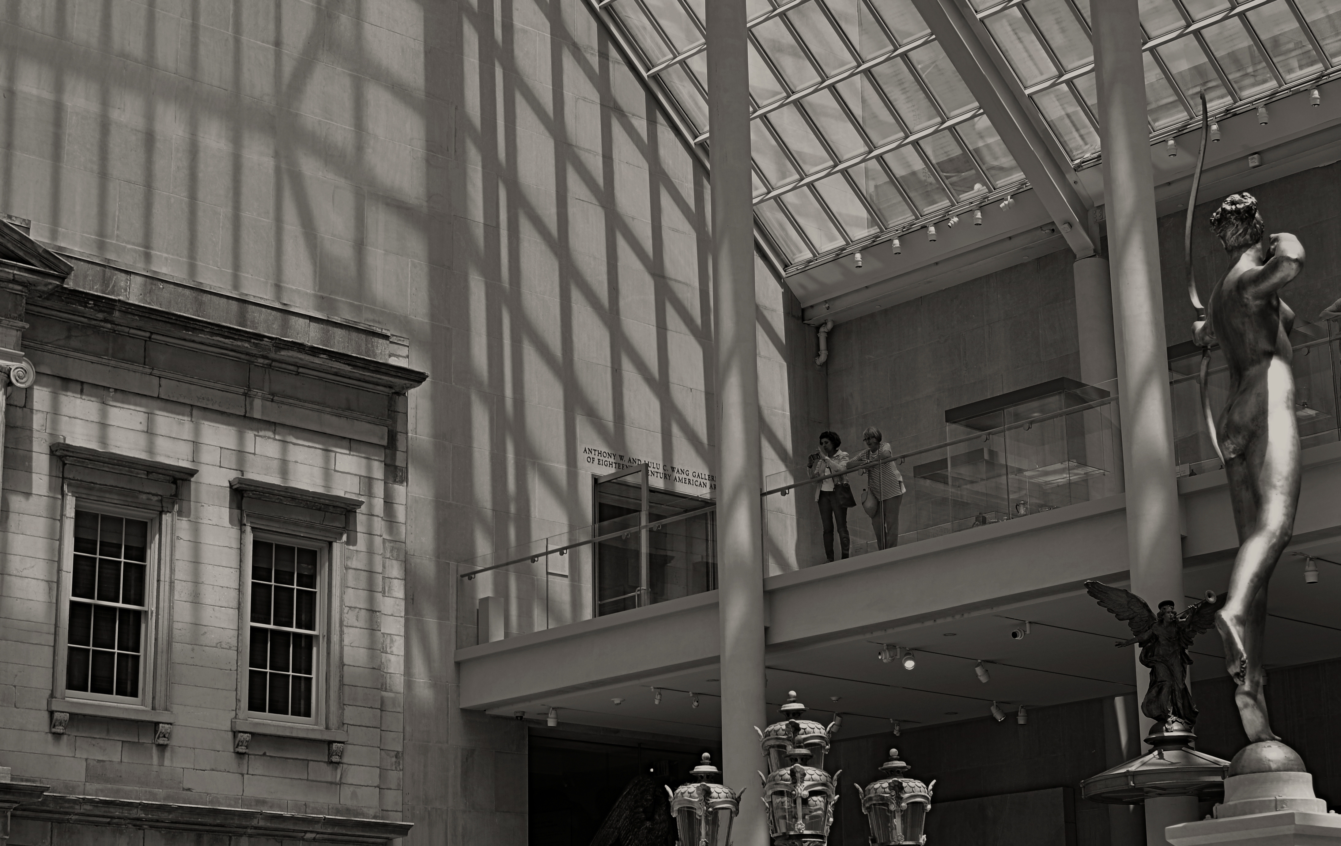
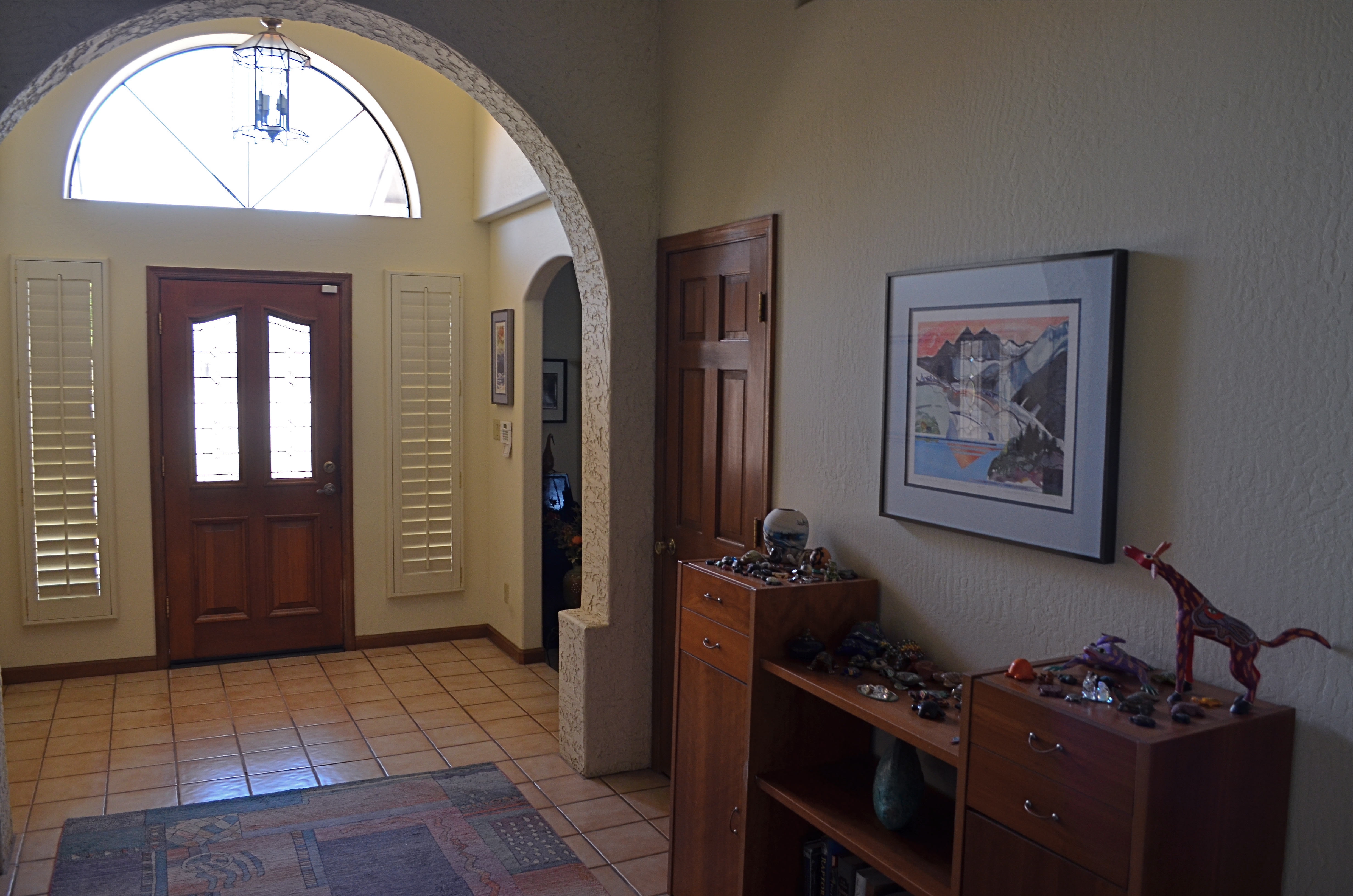
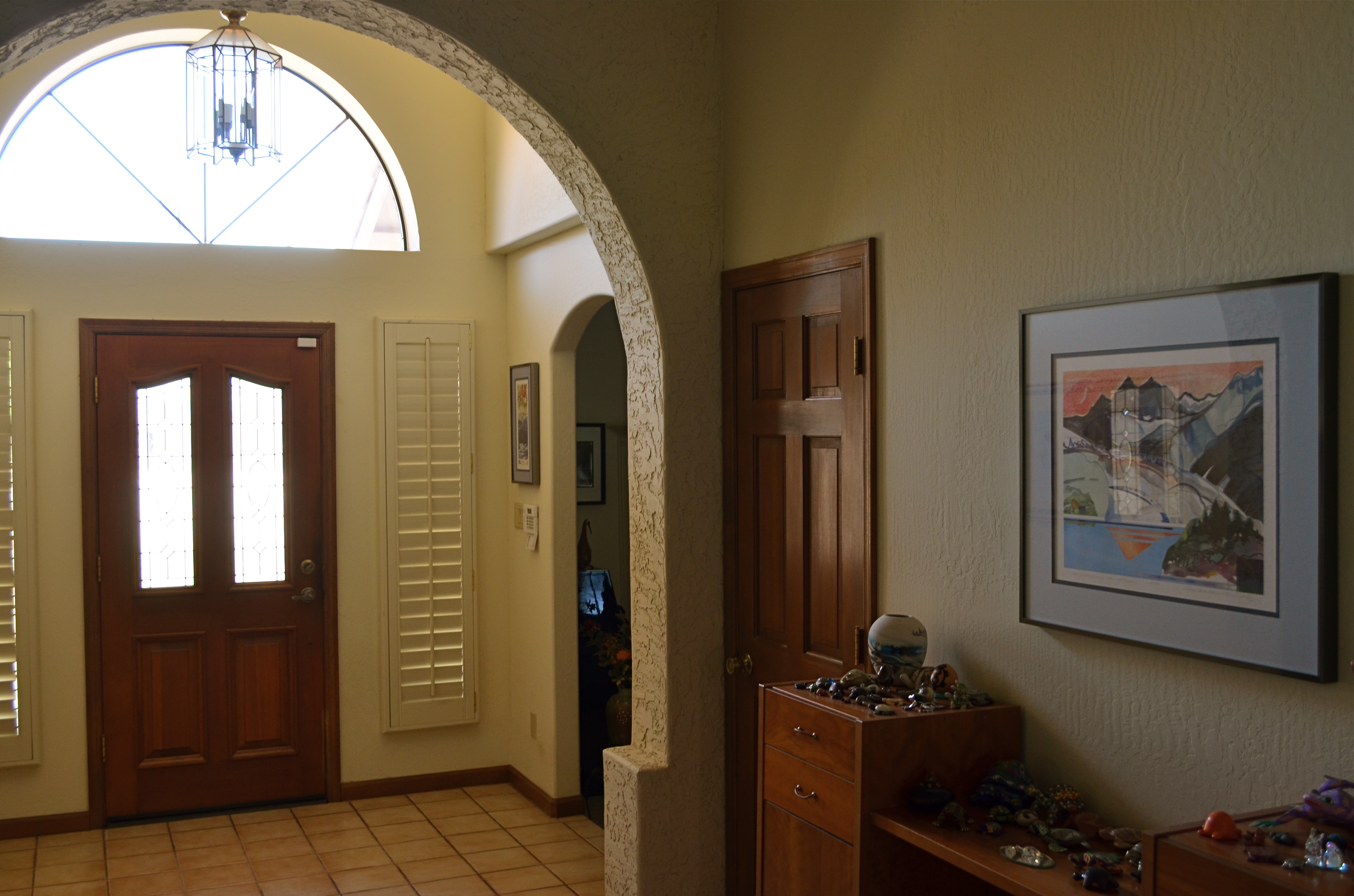
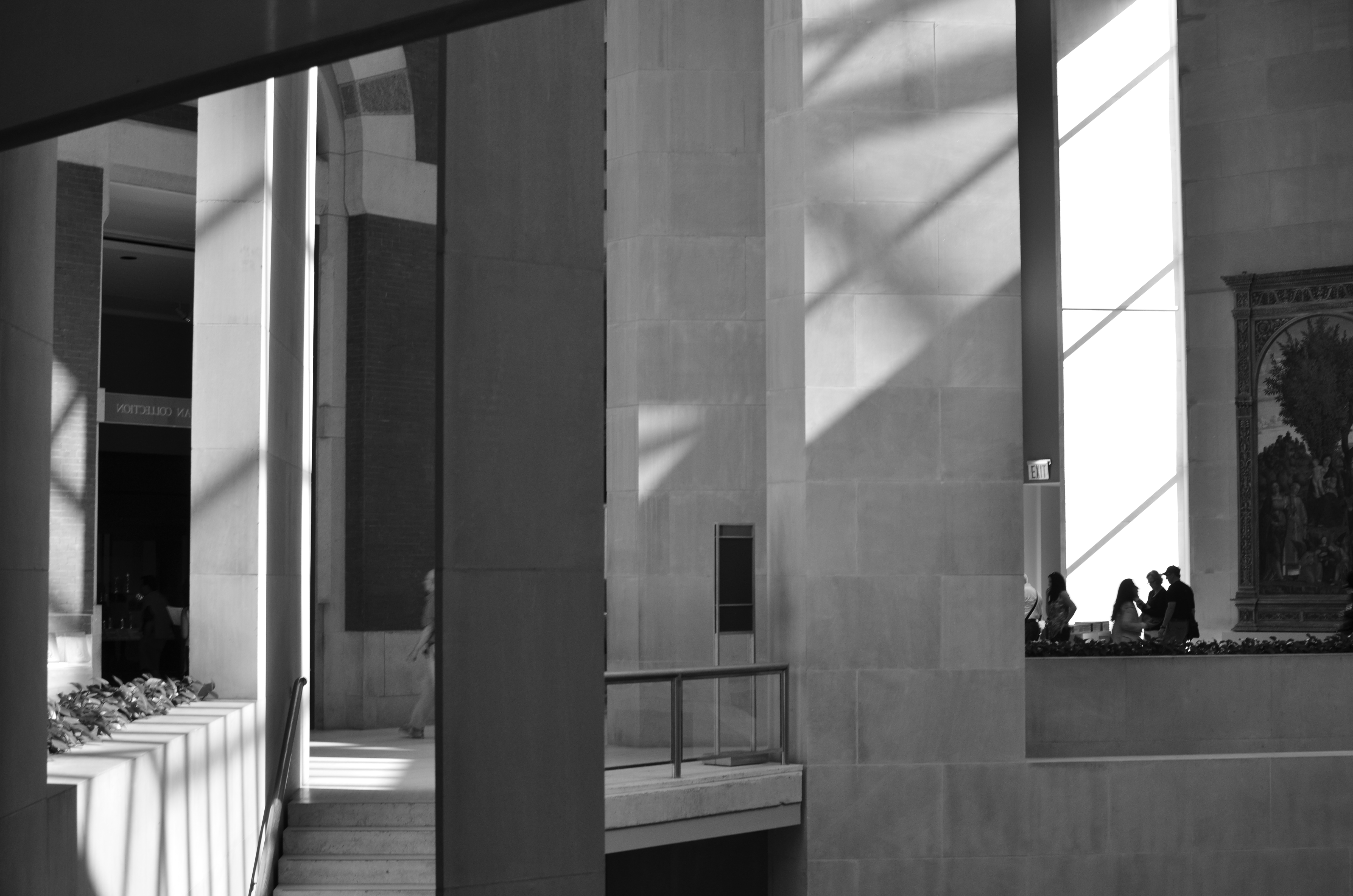
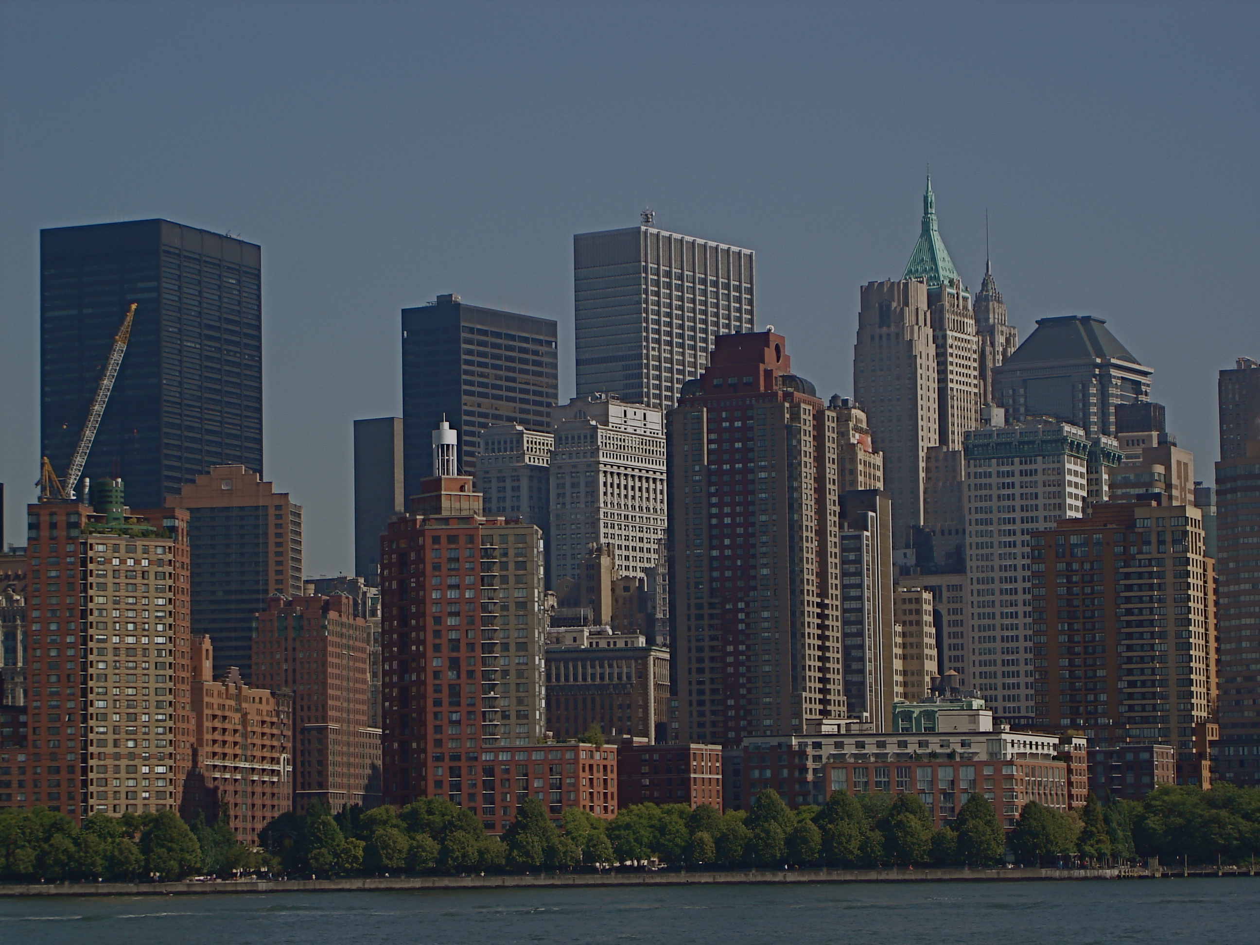
Spaces like this vast sculpture gallery beg to be visualized from as many angles of view as possible, Diana hunts from the right edge of the frame.
By MICHAEL PERKINS
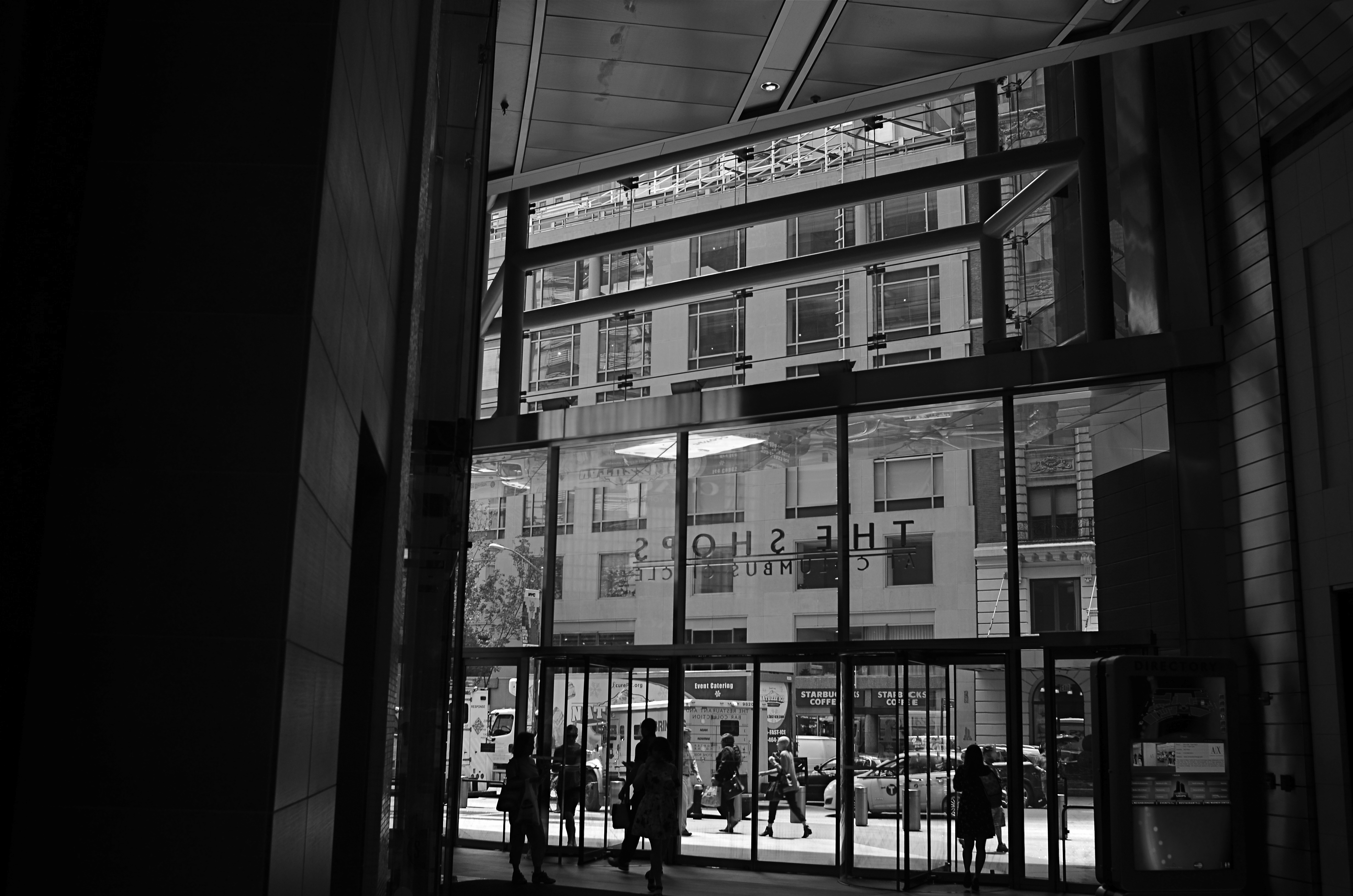
ANYONE WHO HAS EITHER STUDIED OR DABBLED IN CANDID PHOTOGRAPHY has heard Henri-Cartier-Bresson’s term “the decisive moment”, which refers to that heat-lightning instant when the best possible photograph of a situation or sensation can be made. Of course, you don’t have to really believe that there is a single such moment, and many do not. There may be any one of thirty possible frames to be extracted from even the simplest human subjects, but we seem to always be looking for that salient, isolated image that defines it for all time.
Cartier-Bresson’s pursuit of the decisive moment is usually thought of with regard to photographing human activity, but there is also a mindset about photographing places that there can be a “superior” or “best” angle to view them from. That is why landmarks and monuments yield so many pictures that are so much the same. We all shoot the Eiffel Tower the way that everyone else before us has shot it…..because? Well, there’s a great question.
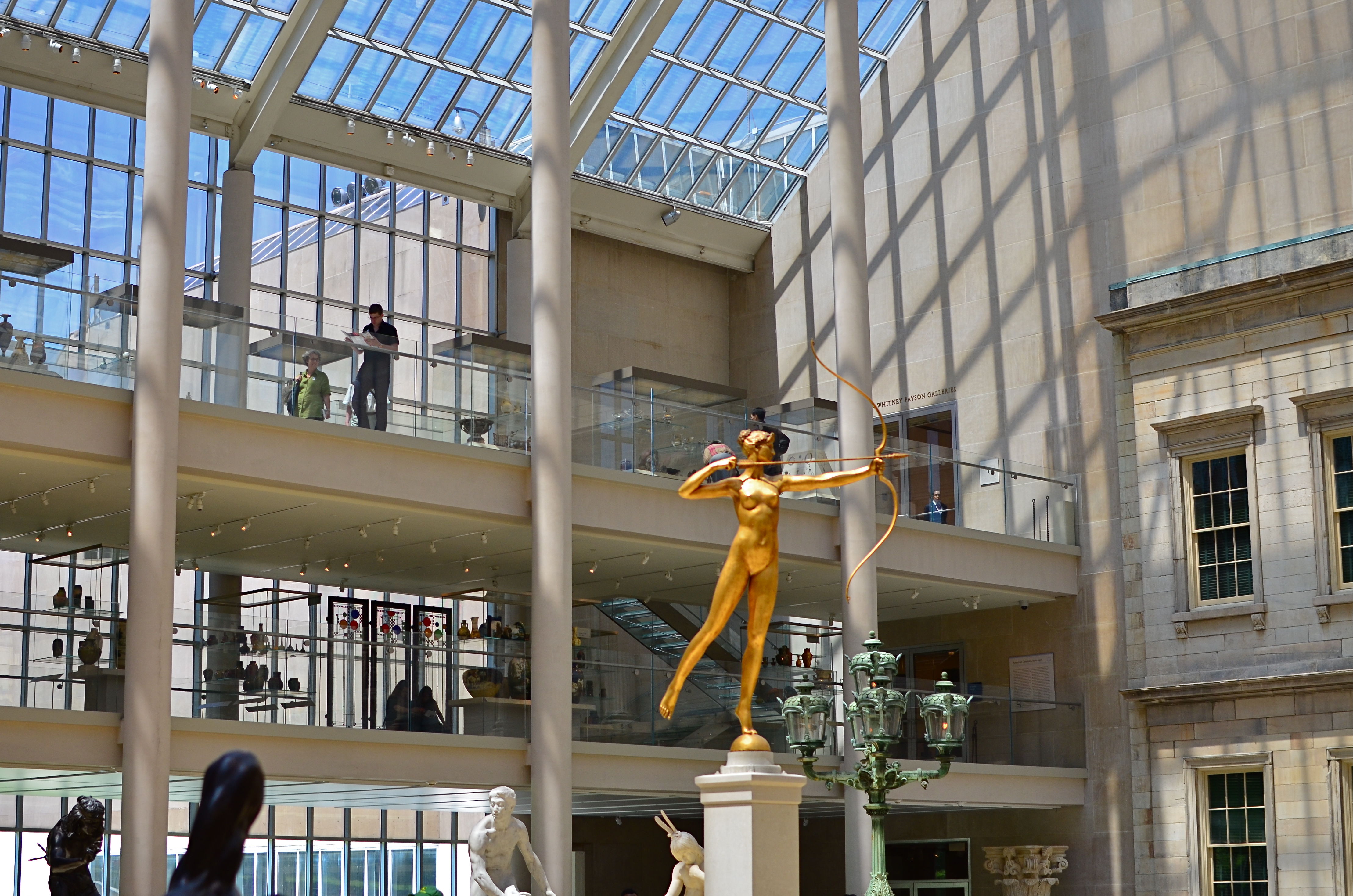
My original, “official” angle on the exact atrium. Diana holds center stage.
Do we think of earlier images of the tower as a standard of some kind that we only certify by imitation? Is our mind eager to catalogue things in their “proper” orientation? Are we only interesting in what things are “supposed” to look like? Ideally, we should be making pictures to authenticate our own visions, not to rubber-stamp those generated before us. And yet, with famous places, it’s often a case of human see, human ape.
We have to teach ourselves to photograph places as if we were the first to ever point a camera at them. It’s not that hard a habit to cultivate, really. Crank yourself around 180 degrees and take the reverse angle. Move six inches to the left and frame the most obvious part of the cathedral, ruins, or palace out of your composition. It might yield nothing, and then again, it might add enough freshness to the image to overcome what I refer to as “tourist fatigue”.
The above image from the sculpture plaza at the Museum of Modern Art in New York is a near reverse of the more conventional view in the smaller color shot at left, which I first featured in the post Put Yourself Out There a while back. In one shot, the Diana statue is center stage. In the other, she is relegated to the edge of the frame, acting as a pointer toward the rest of the photograph’s information. Extra cost in terms of time to get this very different composition? Ten seconds.
It’s not that re-imagining a subject is that hard. It’s that we so seldom question our first imagining of things, often settling for the first, technically successful image we get. And that first image, as we often learn, might only be a dress rehearsal for the real show.
THE OTHER TMI
Technical execution here is almost what’s needed, but the concept still needs work. Write the shot off to practice.
By MICHAEL PERKINS
THE WORST SOCIAL FAUX PAS OF OUR TIME may be the dreaded “TMI”, or the sin of sharing Too Much Information, creating awkward moments by regaling our friends with intimate details of our recent colostomies or carnal conquests. Funny thing is, much as we hate having this badge of uncoolness pinned to our chest, we commit its photographic equivalent all the time, and without a trace of shame.
I’m talking about the other TMI, or Too Many Images.
Let’s face it. Social media has encouraged too many of us to use the Web as a surplus warehouse dump for our photographs, many of them as ill-considered as a teenage girl’s hair flip. We’ve entered an endless loop of shoot-upload-repeat which seldom contains a step labeled “edit”. Worse, the vast storage space in our online photo vaults encourage us to share everything we shoot without so much as a backwards glance.
I’m suggesting that we take steps to stop treating the internet like an EPA Superfund site for images. I have tried to maintain a regular schedule of viewing the rearmost pages of my online archives, stuff from five years ago or longer, learning to ruthlessly rip out the shots that time has proven do not work. The goal is to force myself to re-think my original intentions and make every single photograph earn its slot in my overall profile. There are, by my calculation, three main sub-headings that these duds fall under:
The original idea for this shot is fairly strong, but my execution of it left something to be desired. Like execution.
A bad idea, well executed. Okay, you nailed the exposure and worked the gear to a “T”, but the picture has no story. There’s nothing being communicated or shared. Just because it’s sharp and well-lit doesn’t mean it deserves to stand alongside your stronger work.
A good idea, poorly executed. Hey, if you believe so strongly in the concept, go back and do it right. Don’t give yourself a pass on bad technique because it was a noble effort.
An incomplete idea, which means it wasn’t even time to take the picture at all. Maybe you didn’t know how to get your message across, for whatever reason. Or maybe if you got the conception 100% right, it still wasn’t strong enough to jump off the page. The litmus test is, if you wouldn’t want someone’s random search of your stuff to land on this shot instead of your best one, lose it.
Online stats make some of these tortured choices a bit easier, since, when you are looking at low figures on shots that have been available forever, it’s pretty clear that they aren’t lighting up anyone’s world. And as lame as view and fave counts can be, they are at least an initial signal pointer toward sick cows that need to be thinned from the herd. The cure for photographic “TMI” is actually as easy as shooting for long enough to get better. With a wider body of work viewed over time, the strong stuff stands out in bolder contrast to the weaker stuff. And that shows you where to wield the scissors.
PARAMETERS
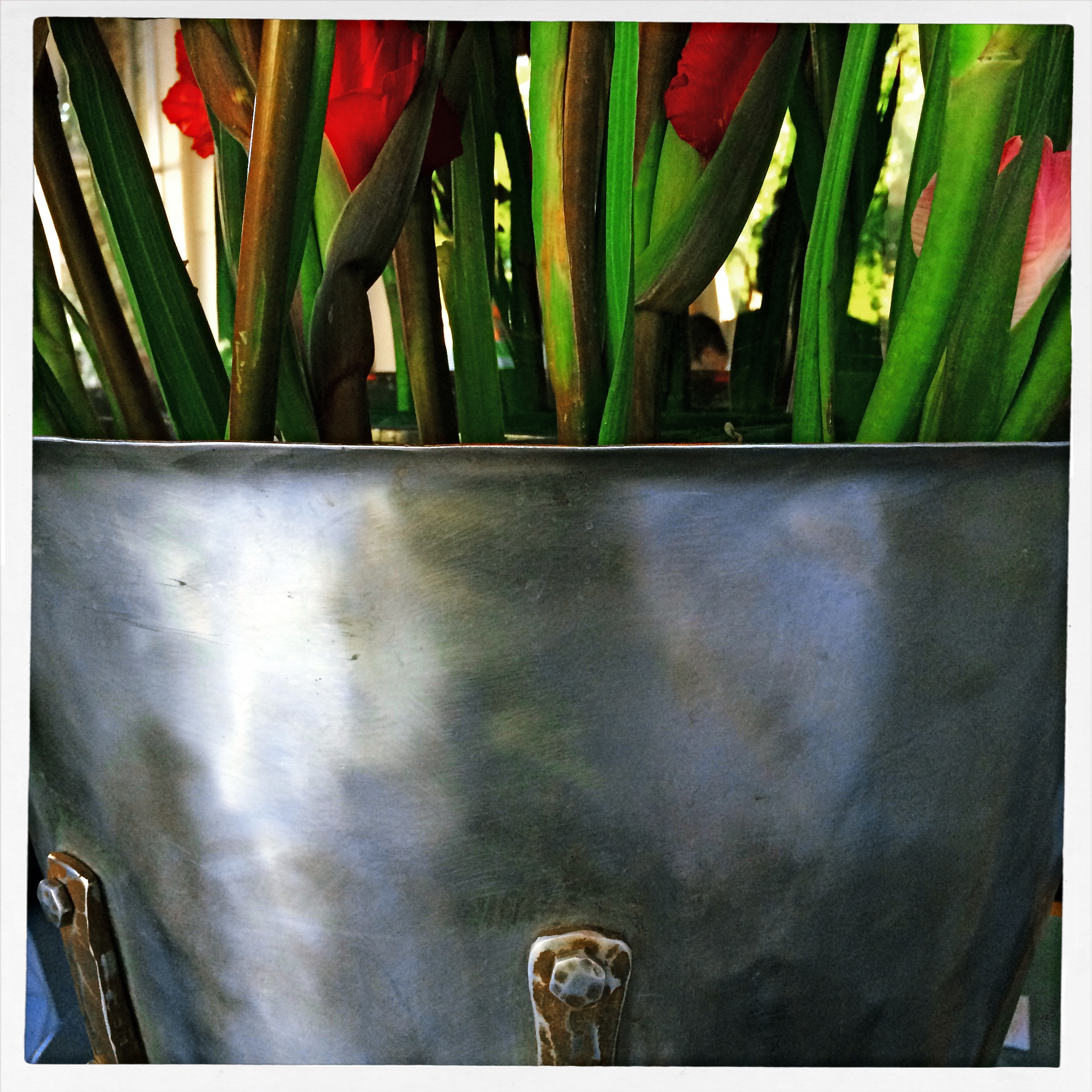
By MICHAEL PERKINS
A PHOTOGRAPHER’S IMPACT IS ONLY PARTIALLY CREATED BY WHAT HE CHOOSES TO RECORD. That is, whatever his subject, be it banal or magnificent, his choice of what to shoot is only, at best, half of what makes or breaks his picture.
The other half of the miracle comes not from mastery of light, aperture, gear or conditions. It is in the frame, and what he includes or excludes from it. Landscape mode, portrait mode, big crop or little crop, the frame is the final determinant of how well the image argues for itself. The legendary director of photography for the New York Museum Of Modern Art, John Szarkowksi, expresses this idea for all time in his wonderful book The Photographer’s Eye:
To quote out of context is the essence of the photographer’s craft. The photograph’s edge defines content. The photographer edits the meanings and patterns of the world through an imaginary frame. This frame is the beginning of his picture’s geometry.
Consider, for a moment, the most vital, most inspiring images you’ve ever seen. Now imagine them cropped two inches wider, four inches to the left, five inches higher. The visual terms of engagement would be completely re-ordered. And what would be the result? Would you draw different conclusions, make different assumptions, experience a diminished ( or enhanced) sense of mystery?
The frame, and the choices the photographer makes in its design, is more decisive in the success of a picture than any other single factor. Technically imperfect photos become world-beaters every day simply because the frame is eloquent. And it also follows that a well-crafted bit of exposure can be dulled or blunted by a frame that is carelessly drawn.
The above image represents a choice, the drawing of a visual boundary. The top of the flowers and the objects surrounding the bucket aren’t missing because I shot too close, they’re deliberately excised because I made a deliberate decision that they didn’t add anything to the story I was trying to tell. You can disagree about whether I made the correct choice, but the making of that choice was as important (actually more important) than the subject itself.
Photographs have visual parameters, since we can’t make images big enough to include all of our experience. There are limits on the dimensions of what we show, and intelligent use of those boundaries can transform our work in marvelous ways.
WITH THESE HANDS
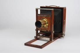
The Gundlach-Korona View Camera (1879-1930), about as opposite from “portable” or “convenient” as you get.
By MICHAEL PERKINS
EVERY ONCE IN A WHILE, AS A PHOTOGRAPHER, I NEED TO RENEW MY SENSES OF GRATITUDE AND HUMILITY, and I refresh both by leafing through a hefty tome called View Camera Technique, a 300-plus page collection of graphs, diagrams and tables on what still stands as the most technically immersive photographic instrument of all time. I use the word immersive because all of the view’s operations must be mastered through personal, direct calculation of a horde of formulae. Nothing is automatic. Results can only be wrung out of the device by the most exacting calculations. The guaranteed given of the view camera: there will be math on the final.
The aforementioned gratitude and humility come from the fact that I am free of the Pythagorean calculus that it took for earlier shooters to master their medium, and the knowledge that I will never apprehend even half of the raw science needed to summon images forth from these simply built, but technically unforgiving cameras. However, along with a hugh whew of relief comes just a slight pang of regret, since the camera has gone the way of many other tools that used to be in a direct, cause-and-effect relationship with the human hand.
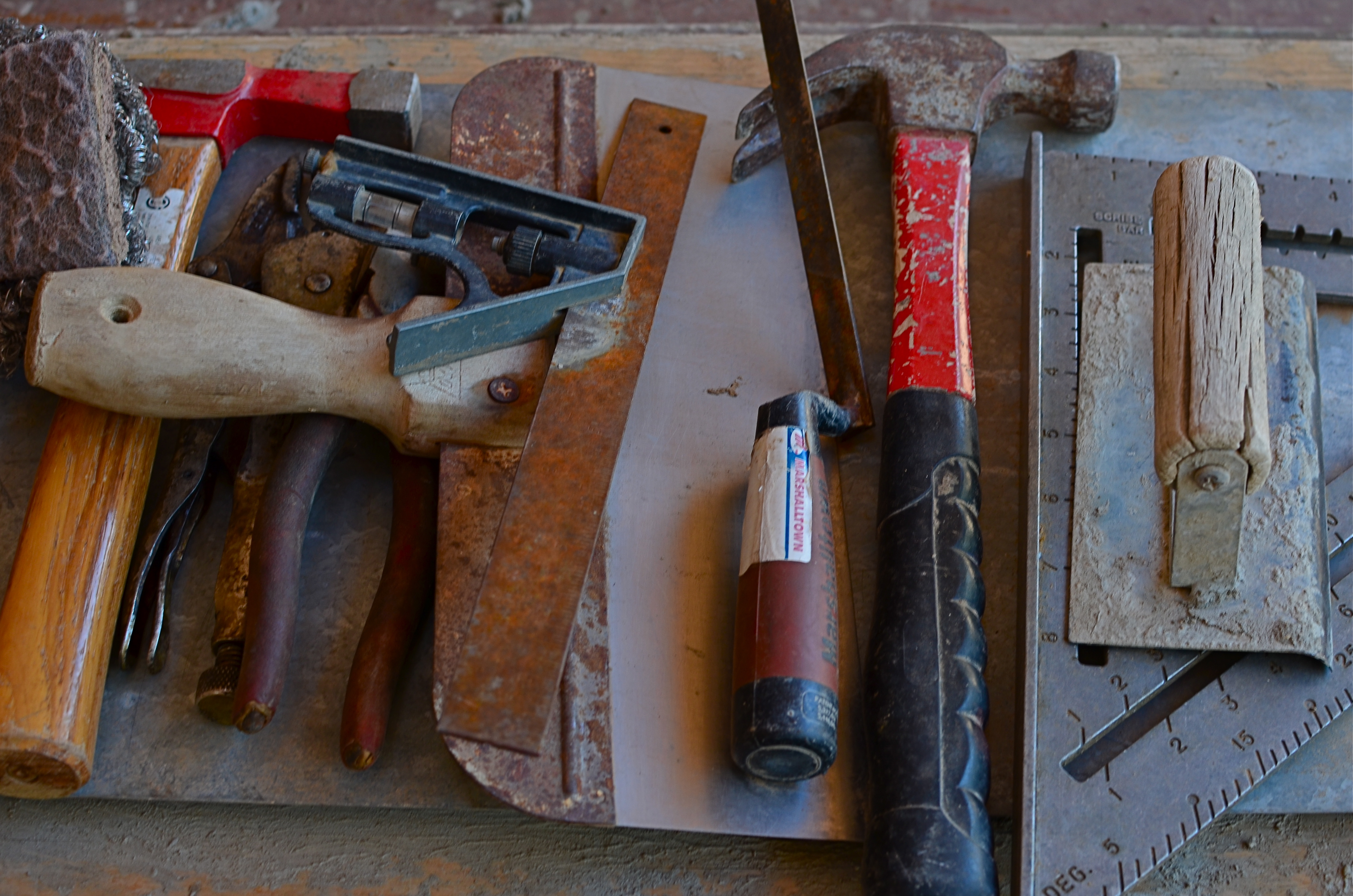
Once, all of life was hands-on.
As a kind of strangely timed stream-of-consciousness, my most recent review of View Camera Technique was followed, just a day later, by a visit to a local art foundry, a unique marriage of state-of-the-art kilns and caveman-simple hand tools, many of which were arranged on work benches near the visitors’ center, looking very much as if the past 500 years had not occurred. The marvel of hand tools is that, visually, they put us right back into an age when the world only yielded a working life to the direct, simple transmission of human force and will to a physical object. The use of a hammer is an unambiguous and impeccably clear transaction. You either drove the nail or you don’t. As Yoda said, there is no try.
Cameras no longer require us to wrestle directly with them to extract a photograph by real exertion, and that should give us, as shooters, an appreciation for those remaining implements which still do convey simple, A-B energy from hand to tool. Such objects remain powerful symbols for action, for creation, and for our urge to personally shape our world. And there must still be a great many pictures that we can summon forth to celebrate that relationship.
INSIDE OUT
Almost among them: views that selectively depict the life of the street can present unique contexts.
By MICHAEL PERKINS
CITIES ARE A CONTINUOUS POST-GRADUATE COURSE IN THE MILLIONS OF DIFFERENT WAYS TO SEE. They not only afford an endless array of things to visualize, but offer up just as many vantage points or angles to frame, select, show, or conceal them. It’s just as much about how you shoot something as what you selected to shoot.
My favorite images in urban environments are essentially stolen glances. Brief shards of light arrowing past a subway car window. Slanted slashes of sun crawling up an alley wall. And, more recently, views of the street that hide as much as they reveal, teasing winks of the city in all its rhythm as viewed from the inside out.
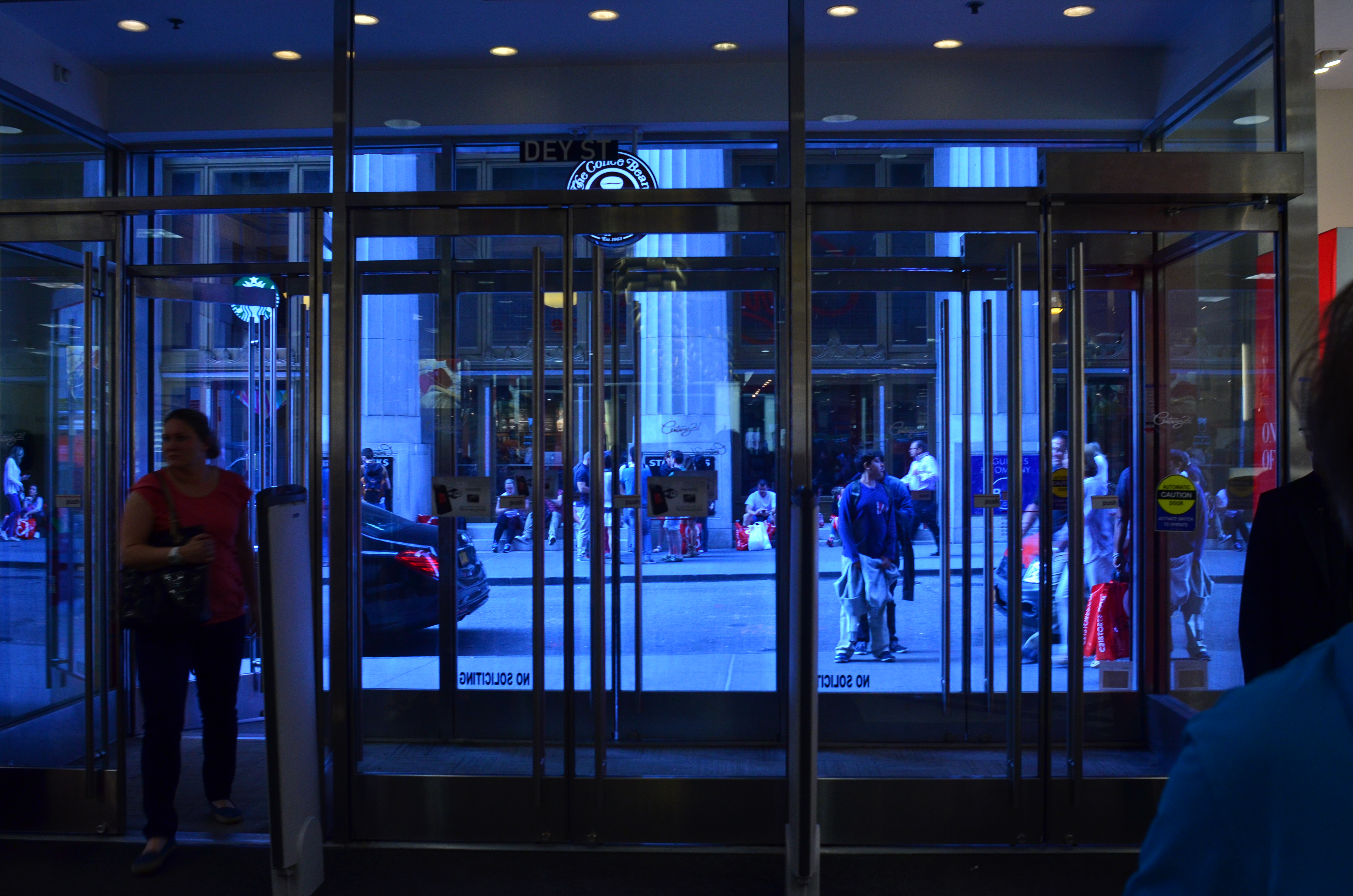
It might be the tension, or the anticipation of a scene that is not, but is just about to be, cracked fully open. People pass by framed by windows, distorted by warps and reflections, amputated and edited by panels, shadows, partially eclipsed by walls. It’s a visual striptease. Now you see life, now you don’t, now, here it comes again. Sometimes standing just inside the entrance of a building can feel like viewing life at a distance, as anonymously as you might watch surveillance video on a giant screen or a movie in a dark theater.
Photography is one part content and one part context. We have all been surprised when someone standing right next to us points a camera in the same general direction that we do and comes away with a completely different kind of image. That surprise is the shock-reminder of our very individual way of framing and selecting information, and cities offer a remarkable laboratory for sampling all of those variances.
Inside looking out or outside looking in, the view is the thing.
SHOOT (AND THINK) BIG
The Nexus Of Resurrection, 2015. Image cropped from 4928 x 3264 pixels to 3550 x 1477, leaving enough density for a printable enlargement.
By MICHAEL PERKINS
BY NOW MOST OF US PROBABLY REALIZE THAT THERE IS NO REAL ADVANTAGE to “budgeting” shots in digital media the way we used to do in film. Harking back to the time of 24-exposure limits on one’s photographic fun, shooters maintained a running total in their heads of shots taken versus shots remaining, a cautious way of allocating frames on the fly, the idea being to finish the film roll and your tour stops at about the same time. Some kept notebooks; some doled out shots on a priority basis (one image of the waterfall, three of the ruins, four of the kids on the rides), and some, I suppose, were tempted to count on their fingers and/or toes. You had to be careful not to run out of frames.
Jump to the digital now, where we realize that, in all but the rarest cases, our shutter finger will crack and fall off before we “run out” of shots on even the most meager memory card. However, I still run into people who believe they are being prudent and providential by taking images at lower resolutions to “save space”, a false economy that is not only needless, but actually limits your options in the later process of editing.
Big files mean image density (lots o’ pixels) and therefore higher resolution. High resolution, in turn, means that you can crop substantial parts of a photo as needed and still have enough density for the image to hang together, even when printed out. Now, if you look at your work solely on a computer screen, protecting the integrity of a cropped image is less crucial, but if you’re lucky enough to create something you want to enlarge and frame, then you should begin with the fattest file you can get.
Review a few of your images that were, let’s say, less than compositionally sublime coming right out of the camera. Look at the pixel count on the same images after they were cropped to your liking. You’ll arrive at your own preference on what minimum resolution you’ll accept from the cropped versions. Thing is, the bigger you start, the more wiggle room you’ll have in editing.
As I say, most people already shoot at the largest file size possible. I merely send along this note to remind us all that we do it because it makes sense, and affords us real flexibility. It’s one of the amazing by-products of digital; we can, generally, shoot as much as we want for as long as we want.
UNKNOWN KNOWNS
1/15 sec., f/1.8, ISO 1000, 35mm.
By MICHAEL PERKINS
ALFRED HITCHCOCK’S CLASSIC REAR WINDOW IS THE ULTIMATE GUILTY PLEASURE, and not just because the Master of Suspense is at the peak of his edge-of-your-seat powers in the telling of its thrilling murder story. No, the massive, full-sized set of James Stewart’s Manhattan neighborhood, with all its apartment-dwellers’ secrets open to the most casual snoop, is the creepy, giddy candy at the center of this cinematic confection. In making it temporarily okay to be, in effect, peeping toms, Hitchcock is making us complicit in his hero’s unsavory curiosity. All these dramas. All these secrets that we have no right in knowing. And, of course, we can’t look away.
Photographing the intersection of living spaces in city settings is far often more subtle than Hitch’s feat of shaving the back wall off an entire community, and that makes for a lot more mystery, most of us beyond solution. Look too little, and a slab of brick is more like a beehive than a collection of stories. Look too deeply, and the truths you unearth can feel stolen, like an invasion done purely for prurient entertainment. What’s most interesting is to imply much but reveal little, and hitting that balance is tough.
I recently killed off the last fifteen minutes of a generally unproductive night of street shooting by gazing out the window of my nondescript hotel at an equally nondescript apartment building across the way. The last vestiges of dusk offered scant details on the outside wall, and the warm yellow hum of electrical light had already begun to flicker on in the various cubicles. I thought of Rear Window and how you could look at the fully visible doings of people, yet still know virtually nothing of their lives. Here the lighting was random, undefined, with little real information on the life throbbing within the individual spaces….the dead opposite of Hitchcock’s deliberate staging.
I couldn’t see a face, a hand, an activity. All I had was the mere suggestion of human presence. What were they reading, watching, wishing, enduring, enjoying, hating? I couldn’t know and I couldn’t show it, but I could show the mystery itself. I could share, if you will, the sensation of not being able to know. And so I made a photograph of that lack of information.
Some photographs are about things, obvious things that you’re able to freeze in time. Other images are about the idea of something, a kind of unsatisfied anticipation. Both kinds of pictures have their own narrative code, and learning how to manage these special languages is great practice for the idea, and the mind back of it.
NOT AS ULTRA
At its widest (18mm) setting, an 18-55 lens exaggerates front-to-back distances and slightly distorts the shapes of objects.
By MICHAEL PERKINS
SINCE THE 1990’s, THE MOST COMMON BASIC HUNK OF PHOTOGRAPHIC GLASS for new DSLRs has been the 18-55mm wide-angle, dubbed the “kit lens”. It allows beginners to move from landscape-friendly wides to moderate zooms without switching lenses. Depending on how much a given shooter experiments, the kit can allow for a lot of nuanced compositional options between the lens’ range.
If you find yourself shooting at the widest angle most of the time, then you are really using an effects lens, since, at 18mm, the lens is more than wide enough to distort angles and distances in ways that, while dramatic, don’t reflect the way your eyes actually see. This makes for expansive vistas in crowded urban streets and a little extra elbow room for mountain views, but is substantially more exaggerated than focal ranges from 35-50mm, which produce proportions more like human eyesight. However, the focal length you eventually choose has to be dictated by what you care to create; there can’t be any yardstick than that, all people’s opinions off to the side.
The same scene, taken from the same location at 24mm. Still plenty wide but displaying more normal space and perspective.
I have found a personal sweet spot by going a tad narrower, back to 24mm, and I also work with a dedicated prime lens that will only work at that exact focal length. By trimming back from 18mm, I find the distances from front to back in an image are a little more natural to my eye, and that I still have a yard of room from side to side without ushering in that Batman-type bending of perspective.
For comparison, I have re-shot subjects that I’d photographed at 18mm and found, at 24, no loss in impact. In the images in this post you can see the difference in how the two settings frame up. The composition in the 24 is a little tighter, but, if that’s not wide enough for you, you can simply step back a bit and there’s the same composition you saw in the 18, albeit with a little more normal proportion.
The most important thing with a variable focal length lens is to give yourself the flexibility of being able to get good results all through the focal range, simply to avoid getting too comfortable, i.e., sliding into a rut from always doing everything in the same way. Putting yourself into unfamiliar territory is always a good route to growth, and playing with your gear long enough to know everything it has to give you is the best way to periodically refresh your enjoyment.
When Grandma serves broccoli, you don’t gotta eat and pound-and-a-half of it, but heck, try it. You might like it.
NOTHING MEANS EVERYTHING
On days when you have nothing to shoot, trying to turn that “nothing” into something can be productive. 1/20 sec., f/5.6, ISO 250, 35mm.
By MICHAEL PERKINS
SOME OF YOUR MOST FORWARD-THINKING DEVELOPMENT AS A PHOTOGRAPHER CAN OFTEN OCCUR on days when you’ve planned exactly…nothing. You may have noticed that you produce an occasional masterpiece in situations where there was “nothing to shoot” or you “didn’t have anywhere special to go.” Phrases like I was just wandering around are sometimes used by people describing how their favorite images wound up inside the camera.
What I’m saying is that, if making something out of nothing is the classic definition of creativity, go find yourself some nothing.. and shoot it.
There’s a strange paradox at play here. When you are photographing something that truly “matters”, your concentration is on the subject, not your technique, almost as if the thing will record itself if you just faithfully point the camera. Kids’ birthday parties or a view of El Capitan come “ready to eat” in a way, and you don’t fester about doing anything bold on your side of the equation. The task becomes, basically, not to screw up….hardly a recipe for excellence. When the subject matter is incomplete, however, or, more importantly, meaningless to you, the work is much harder and more mindful. Say what?
The emphasis shifts to how do I make something out of this, which whips you into a more deliberately creative mode. Suddenly there are things to overcome, from lighting to lousy composition. There are things to improve, since the subject isn’t supplying its own drama or beauty and needs you to shape it. It’s strange. The things that matter most can cause you to take the most lax approach to recording them, while the junk you shot just because it was there can get your juices going.
More importantly, since the “meaningless” is generally unknown to you, you don’t bring any biases to it. You don’t have a usual or traditional way of seeing it (you don’t care about it, remember?) , so you don’t fall into lazy habits or a usual way of photographing it. Its newness makes you innovate, makes you work harder to (here comes the chorus) make something out of nothing.
It’s when you have the most organic, most open attitude toward what you’re shooting that you feel relaxed enough to experiment, which speeds up your learning curve and deepens your involvement. And that means better pictures, since you take yourself, as well as the camera, off automode.
THAT’S YOUR QUEUE
By MICHAEL PERKINS
AS CONVENIENT AND SIMPLE AS MANY PANORAMIC APPS AND TECHNIQUES HAVE BECOME OF LATE, there are many ways to accent a wide linear line of photo information within a standard camera frame. With images shot in very large file sizes these days, (even without shooting in RAW), plenty can be cropped from a photograph to produce the illusion of a wide composition with no loss in quality. It’s the pano look without the pano gear, and it’s a pretty interesting way to do exposition on crowds.
I first started noodling with this in an effort to save images that were crammed with too much non-essential information, most of them random streets shots that were a little busy or just lacking a central “point”. One such image was an across-the-street view of the area around the Chinese Theatre in Hollywood. Lots of building detail, lots of wandering tourists, and too much for a coherent story. Lopping off the top two-thirds of the frame gave me just the passing crowd, an ultra-wide illusion which forced the viewer to review the shot the way you’d “read” a panel in a comic strip, from left to right.
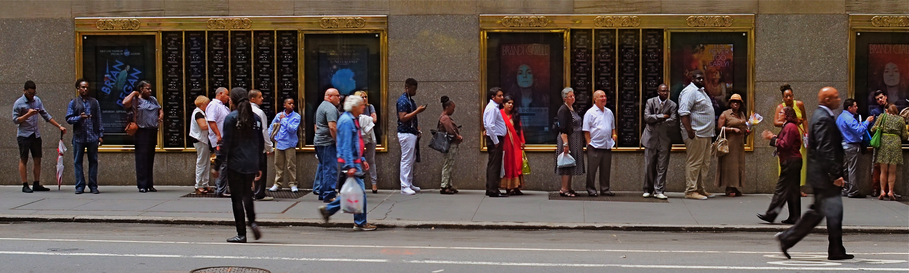
Tickets, Please, New York City, 2015.
Lately, I’ve been looking for a purer version of that crowd, with more space between each person, allowing for a more distinct comparison between individuals. That is, short guy followed by tall woman followed by little kid followed by….you get the idea. Then, last week, I happened upon the ideal situation while shooting randomly through a window that looked out on the 51st street side of New York’s Radio City Music Hall: a long line of folks waiting to pre-purchase event tickets. The space between them and the street rhythm shown by a few out-of-focus passersby was all the composition I needed, so in the editing process I once again aced the top two-thirds of the picture, which had been taken without zoom. A bit of light was lost in shooting through the window, so I added a little color boost and texturizing in Photomatix (not HDR but Tone Compression settings) and there was my pseudo-pano.
It’s a small bit of cropping choreography, but worth trying with your own street shots. As as is the case with many images, you might gain actually strength for your pictures the more ruthlessly you wield the scissors. Some crowd shots benefit by extra context, while others do fine without it. You’ll know what balance you’ll need.
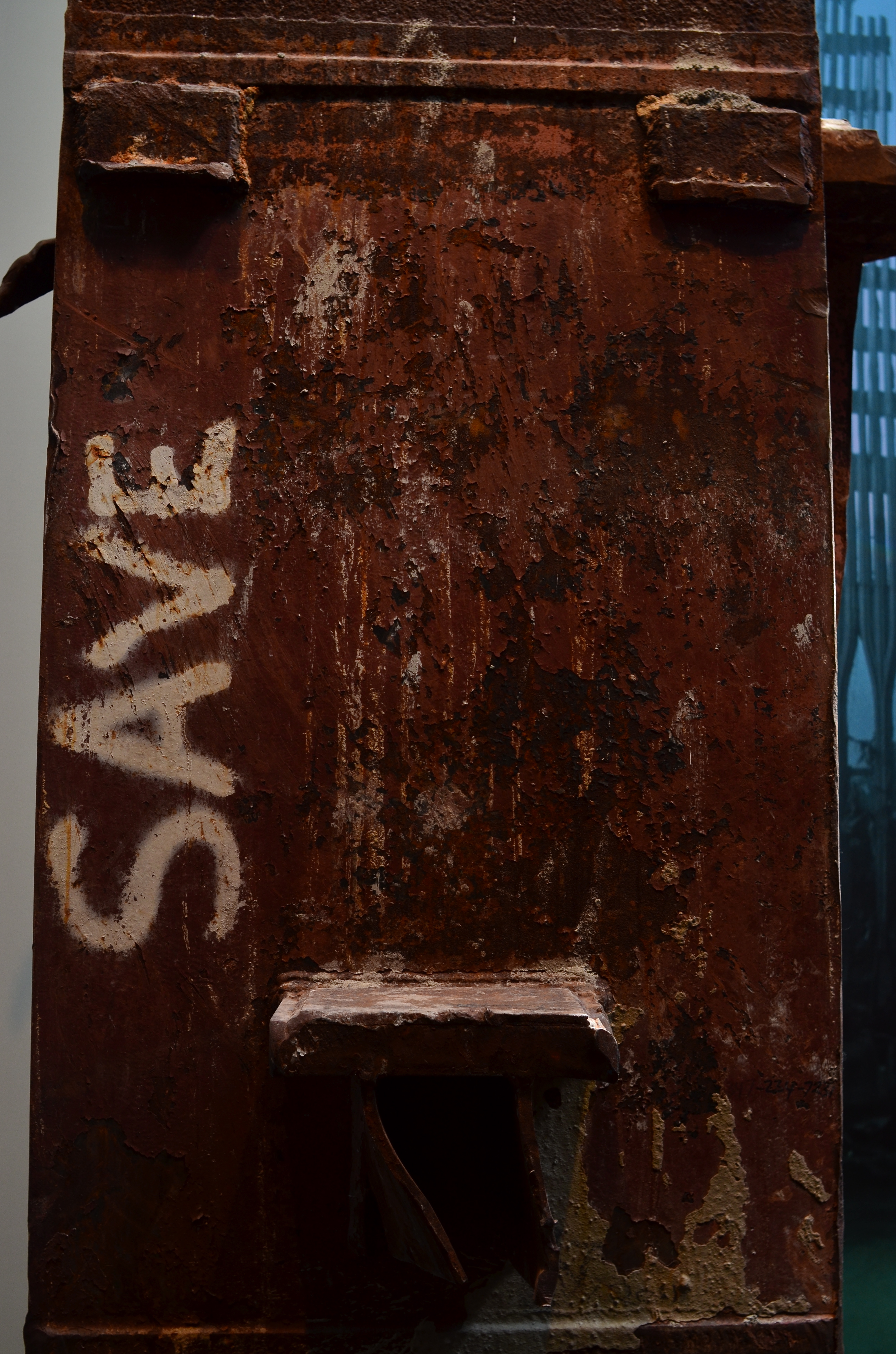
THE LOOK OF SILENCE
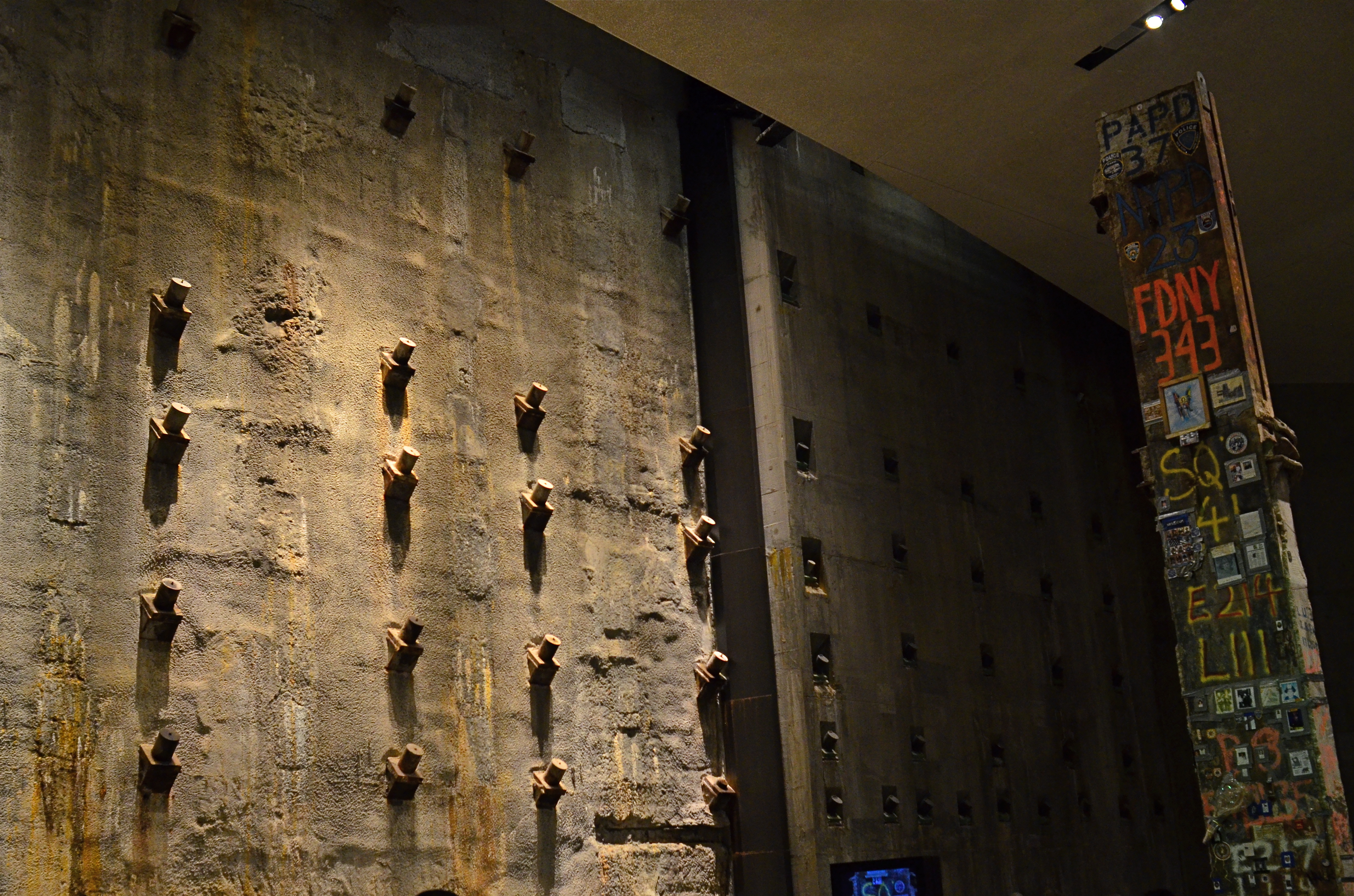
Slurry Wall And Hero’s Girder, 2015. The 9/11 Memorial Museum in New York is a cathedral of grim silence.
By MICHAEL PERKINS
AS THE MOST PHOTO-DOCUMENTED EVENT IN HUMAN HISTORY, the attacks of September 11, 2001 have spawned images that can never be unseen. Images that tear at you, slam you in the back of the head, wring tears and rage from you, stun you mute.
As the keeper and curator of many of the most powerful of these images, the 9/11 Memorial Museum in lower Manhattan has achieved a tough but fair balance of emotion and academia. Given the staggering number of people whose personal stake in this space covers every human motive and perspective, the making of this part-exhibit-part-shrine may have been one of the most thankless jobs imaginable.
And yet the job has been done, with eloquence and a spare, stark restraint that is poetic. Visiting the museum is no easy task. As Shakespeare said, if you have tears to shed, prepare to shed them now. But visit you should, and, yes, there is something that a camera can capture there without being crass or irreverent. The designers have seen to it.
 Firstly, they have guaranteed that the main central exhibits of debris, personal documents, voice messages and news video are completely off-limits to any kind of photography. Walk in there, and you’ll know why. Those who accidentally caught this epic horror in the moment of its occurrence will never be equaled or surpassed by anyone taking a casual snap on a smartphone anyway, and trying to do so would be like setting off sparklers at a requiem mass.
No, the real photographic opportunities are in the dark, cavernous spaces under the surface of the street, dim caves that make you feel as if you yourself, are, for a moment, trapped, running out of light and time. The enormous foundation known as the slurry wall, which, in surviving the titanic forces of the towers’ collapse, kept the Hudson River from flooding all of lower Manhattan. The rusted girder that, like a day-glo-autographed tombstone, bears the signature of every working company of first responders that slaved away at Ground Zero, first as rescuers, next as salvagers, always as heroes.
It is here, in the quiet arrangement of these incredibly scaled spaces, that the 9/11 Memorial Museum becomes more spiritual than any hour you will ever pass in church. It is in these dark, harrowing parts of the hall that you fully sense what a slender thread we all hang from, and understand that light and darkness struggle for the same real estate, now as then.
TECHNIQUE OR STYLE?
Technique can’t produce a great picture all by itself. But neither can style. Frustratin’, ainnit?
By MICHAEL PERKINS
YEARS OF WRITING DAILY HUMOR MATERIAL FOR OTHERS IN THE RADIO RACKET taught me that comedians fall into two general camps: those who say funny things and those who say things funny. Depending on how you rate writing, your own independence, or even your career longevity, you may opt to be in the first group, flawlessly executing pre-written material, or the second, where the manner in which you put things across allows you to get laughs reading the phone book.
I make this distinction between technique (the gag reciter) and style (the ability to imbue anything with comedy) because photographers must face the exact same choices. Technique helps us deliver the goods with technical precision, to master steps and procedures to correctly execute, say, a time exposure. Style is the ability to stamp our vision on nearly anything we see; it’s not about technical mastery, but internal development. Two different paths. Very different approaches to making pictures.
Obviously, great shooters can’t put their foot exclusively in either camp. Without technique, your work has no level standards or parameters. Lighting, exposure, composition….they all require skills that are as basic as a driver’s-ed class. However, if you merely learn how to do stuff, without having a guiding principle of how to harness those skills, your work will be devoid of a certain soul. Adept but not adorable. This is a trap I frequently find myself falling into, as my shots are a little technique heavy. Result: images that are scientifically sound but maybe a trifle soul-starved. Yeah, I could make this picture, but why did I?
On the style side, of course, you need fancy, whimsy, guts, and, yes, guesswork to produce a masterpiece. However, with an overabundance of unchanneled creativity, your work can become chaotic. Your narrative ability may not be up to the speed of your “vision”, or you may simply lack the wizardry to capture what your eye is seeing. Photographers are, more than anything else, storytellers. If they fail in either grammar or imagination, the whole thing is noise.
Like comics, photographers are both technicians and artists. Even the most seasoned among us needs a touch o’ the geek and a touch of the poet. Anything else is low comedy.
THE OPPOSITE OF OBVIOUS
Mount Washington, the urban district that sits on a bluff overlooking downtown Pittsburgh, Pennsylvania. 1/60 sec., f/1.8. ISO 250, 24mm.
By MICHAEL PERKINS
IT GOES BY MANY NAMES: THE MONEY SHOT, THE GOLDEN ANGLE, THE POSTCARD VIEW. Travel enough and you will snap one. The all-roads-lead-to-this-picture, must-shoot frame that defines a town or city. Rattle off the names from Eiffel to Empire State. Drawn like moths to flame, we make the same treks that millions before us have made to capture the classic destination, the local Mecca. Do we truly believe that we, the 400,000,000th visitor to the special site, will capture something that someone else missed? Well, yes, we do. For all the other tourists, it’s just a Kodak moment, but once we focus our lens, boy, it’ll be a moment for the ages. Or not.
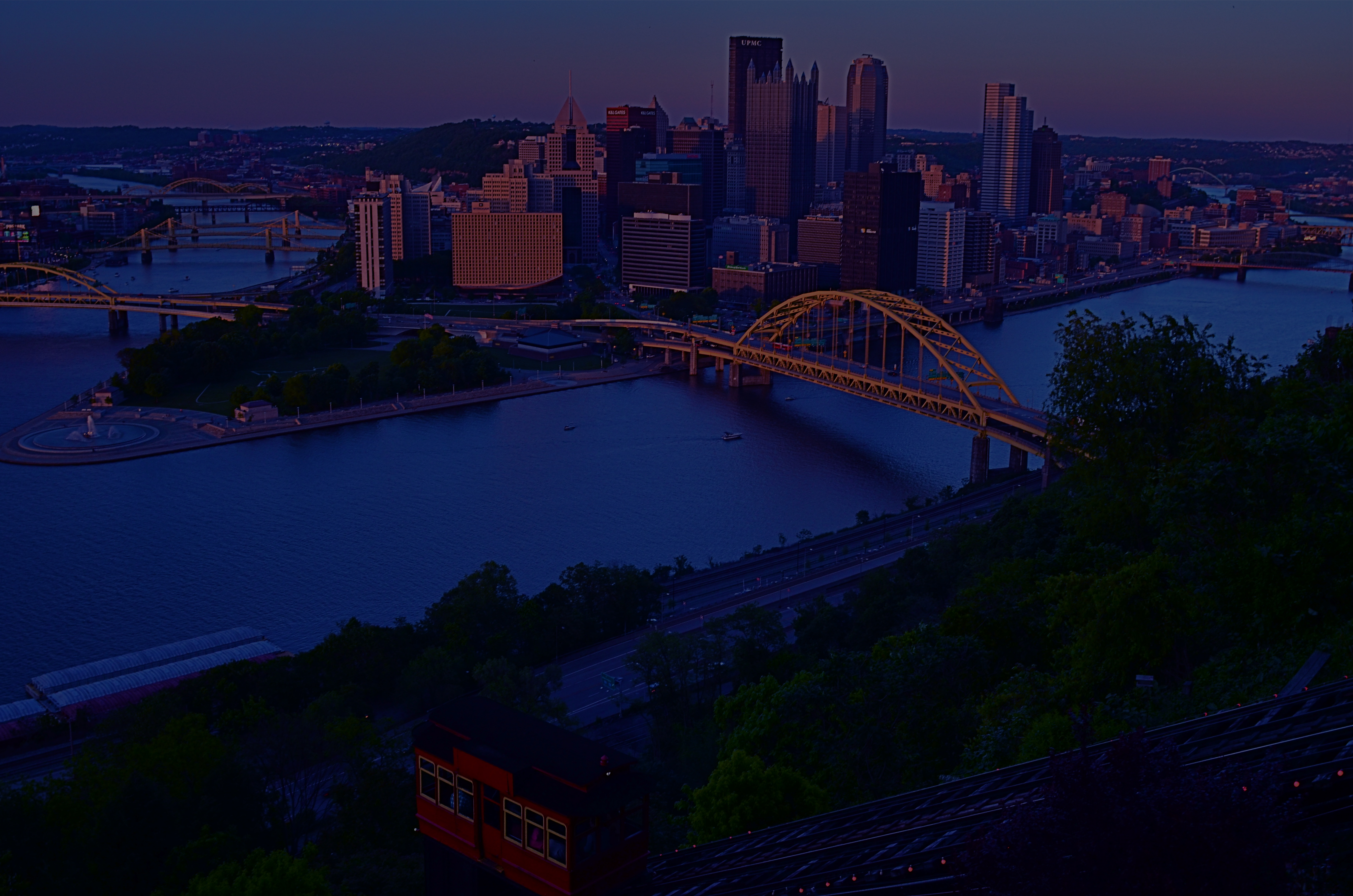
The standard souvenir view of downtown Pittsburgh from the top of Mt. Washington.
But I also believe in the value of the dead opposite of the obvious shot, the image taken 180 degrees away from the holy object we all think we must shoot. The hiding-over-my-shoulder treasure that no one came to take, but which might just qualify as a treasure hidden in plain sight. What’s across the alley from the Alamo? What’s a half a block to the left of Notre Dame? Or, in the case of Pittsburgh, Pennsylvania, what happens when you deliberately turn away from the most desired view in the city?
The iconic downward vista of the Steel City, at precisely the point where the Allegheny and Monongahela Rivers blend at the town’s terminus to form the Ohio, is chiefly shot from atop Mount Washington, a district reached via the romantic, cable-driven incline service that has trucked commuters up the Mount and down for over a century. Add the souvie shop and the walk-out view platforms at the top, and it’s one of the most obvious cases of here, take this picture in all of American tourism.
But the Mount, an old urban neighborhood unto itself, is like a flatland city dropped on top of a lumpy cliff, its streets rising and falling like a stone roller coaster. The sheer suddenness of its drop-offs and the skyward pitches of its roofs lends a zany angularity, its tiered vistas contrasted by the glass and steel of contemporary Pittsburgh just below. Think Rio with Czechs and Germans.
There’s something of a religious pilgrimage quality to taking your shot at a popular attraction, but it takes mere minutes to scout around beyond the crowds to what lies immediately beyond. The opposite of obvious is often a synonym for discovery.
LAST ONES OUT
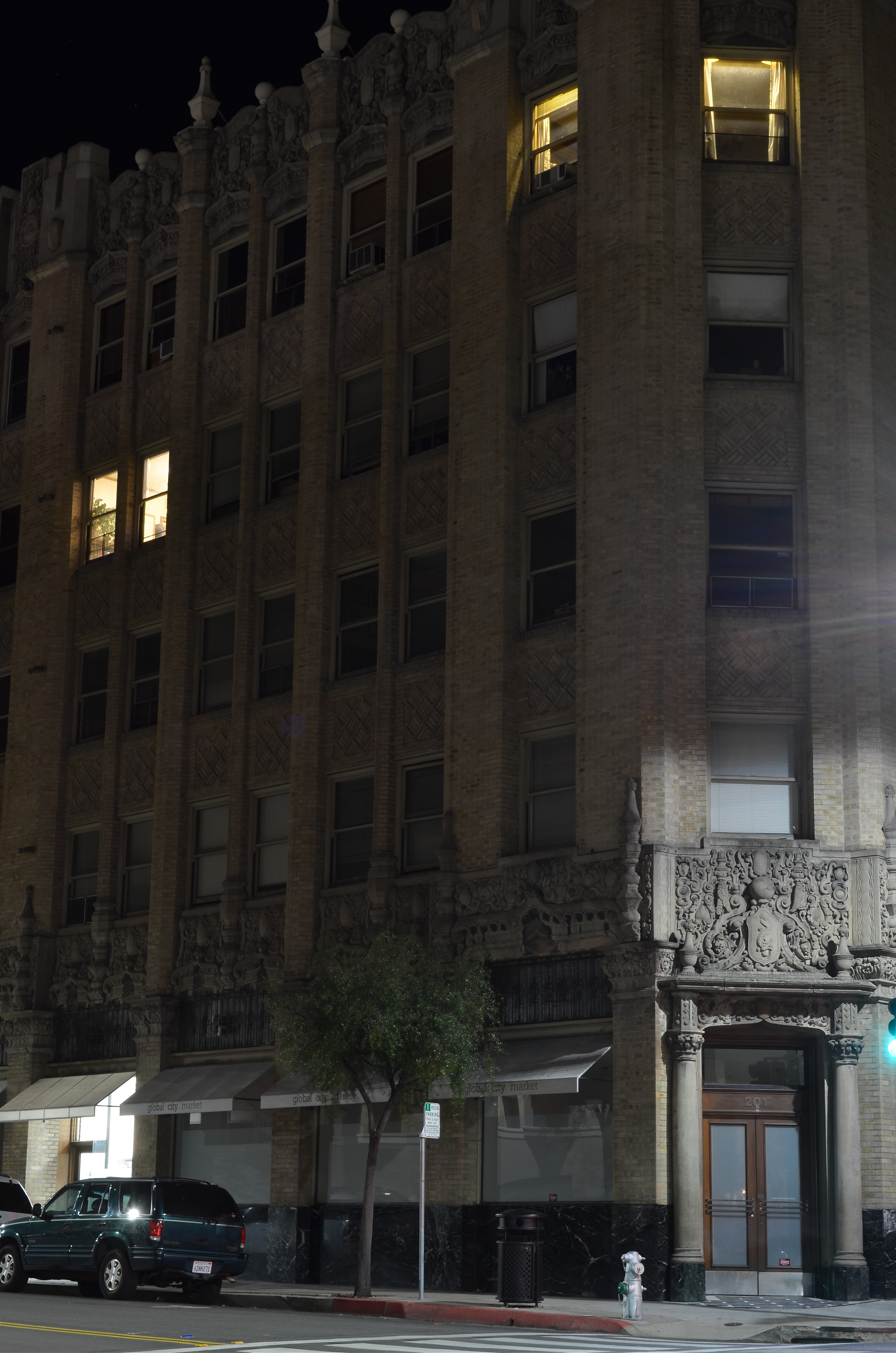
“Yes, I’d like a medium pepperoni sent over to..”
By MICHAEL PERKINS
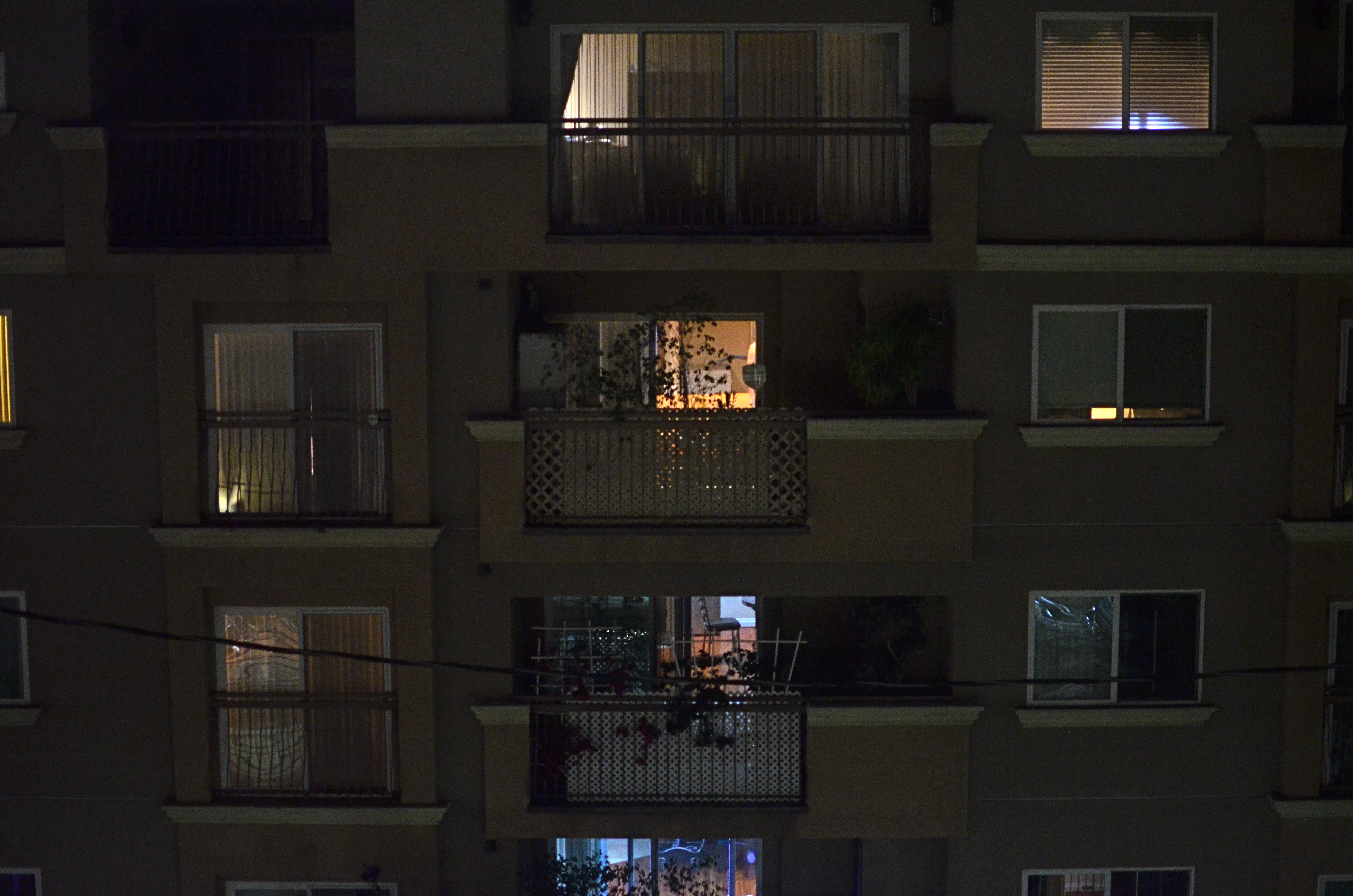
CITIES NEVER COMPLETELY CLOSE. We prefer to think of the urban workday as a uniform morning-to-afternoon stretch, but in truth, our concrete forests always harbor legions of people at the margins of those arbitrary time boundaries. Someone has to take out the trash, hunker over the overdue report, or merely cringe at the thought of going home to whomever. I never took a nighttime photo of a city building that was completely dark unless it was in the aftermath of a sudden power cut. There are always the little twinkles of activity, the randomly lit windows, here and there, that remain.
And each window is a story.
Mind you, the story may not ever be revealed in full. We seldom know who’s burning the midnight oil, just as we can’t but guess about their motives, dreams, or dreads. But the light created by their presence is enough to shape images with a little mystery, and that is at the soul of urban photography. In the daytime, everything is evenly lit, and the “after hours” people are rendered invisible. After dark, however, their special qualities shine forth, shaping the mood and character of the most mundane building. Or image.
Some lights are on because other lights are on. If Man “A” is staying at his desk way past dinner, then the lights at Diner “B” must remain on as well, ’cause Daddy needs him a sandwich, and yes, just one more cup of coffee. We don’t see those connections, but we know they, and many others, are there, keeping the lights on, keeping the human drama going. A second look at the city after hours allows us to document part of that drama, and, as is usual in photography, that glimpse may be all we need to whip up a little whimsy.
URBAN MIX
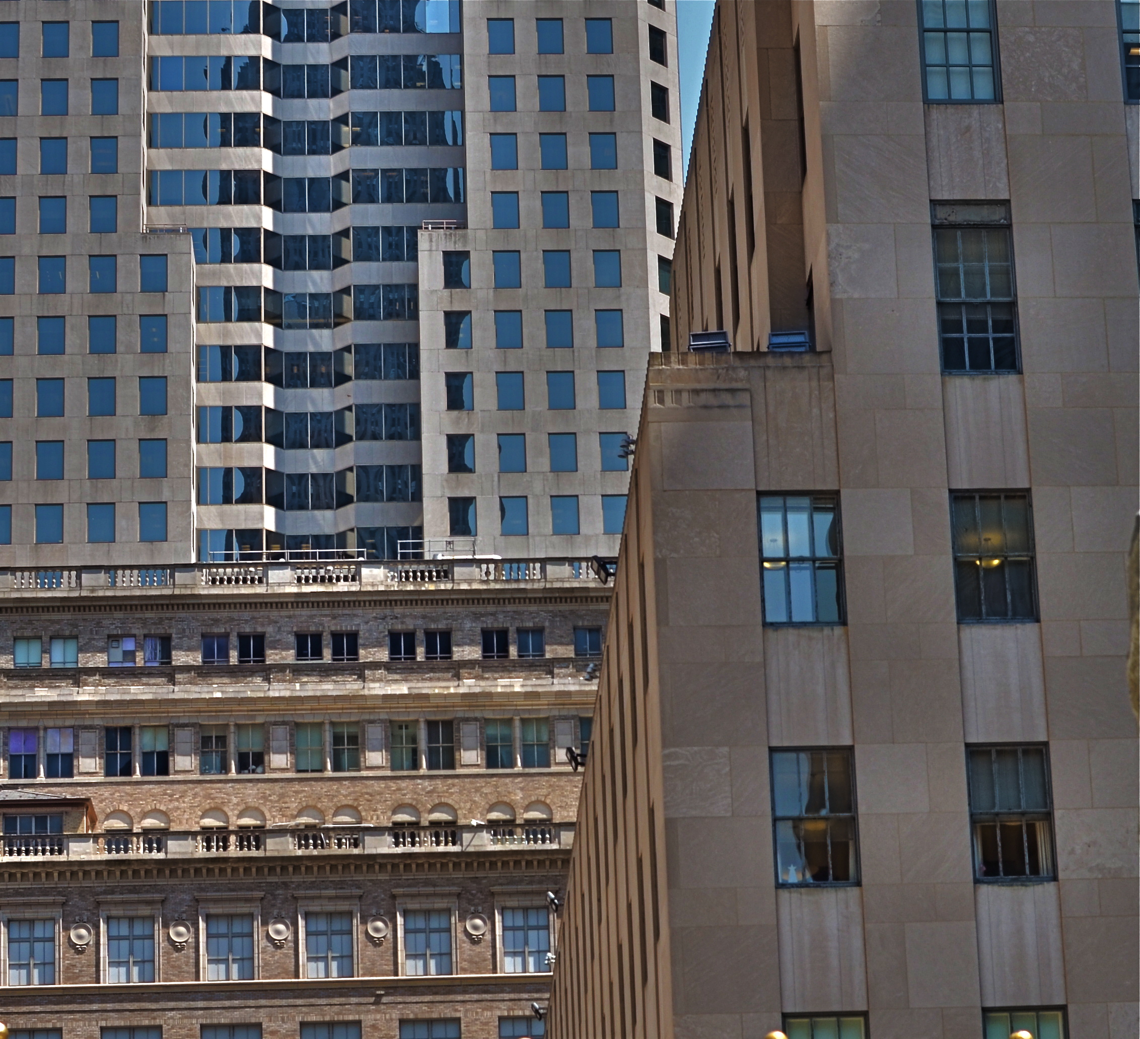
Competing architectural styles establish a natural rhythm of conflict in major cities.
By MICHAEL PERKINS
EACH MAJOR URBAN CENTER HAS ITS PHOTOGRAPHIC SUPERSTARS, those destination attractions that are documented to death by shooters great and small. Name the city and you can rattle off the names of the usual suspects. The landmarks. The legends. The here’s-proof-that-I-was-there vacation pictures. Meanwhile, the rest of the buildings within our super-cities, that is the majority of the remaining structures on most streets everywhere, remain under-photographed and, largely, unknown.
Part of the problem is our photographic viewpoint, which apes our human viewpoint. As drivers or pedestrians, we necessarily focus most our attention at events topping out at just about two stories above street level. This means we will almost certainly n0t see the mashup of architectural styles just outside our peripheral range. We don’t follow the visual line of buildings all the way up, either because we are walking, or because we don’t want to look like some out-of-town rube. But there is real drama in the collision of all those unseen details, and, if you’re interested in showing the city as an abstract design, some real opportunities.
I find that shooting toward the intersection of parts of three or more buildings amplifies the contrast between design eras, with doric columns and oak clusters crashing into International style glass boxes, overlayed with Art Deco zigzags. I shoot them with standard lenses instead of zooms to preserve the intensity of color and contrast, then create the final frame I want in the cropping. Zooms also tend to flatten things out, making buildings that are actually hundreds of feet from each other appear to be in single flat plane. Regular lenses keep the size and distance relationships relatively intact.
Importantly, I don’t shoot entrances, emblems, signage, anything that would specifically identify any one building, and I steer away from places that are recognizable in a touristy way. I’m not really interested in these buildings in their familiar context, but as part of a larger pattern, so I don’t want to “name” things in the image since it will draw away interest from other elements.
The city is a concrete (sorry) thing, but it is also a rich puzzle of design that offers almost infinite variety for the photographer. Best thing is, these compositions are just inches away from where you were bored to death, just a second ago.
ONE STORY AT A TIME
Capital Capitol, 2015. A re-cropped and post-processed remix of a casual 2007 snapshot.
By MICHAEL PERKINS
BEING A MULTI-TASKER IS NO LONGER A MATTER OF CHOICE. We love to pretend that we’re adept at turning off selective parts of the hurricane of sensory input that comprises the whole of our daily life, but, fact is, we cannnot. You might be able to do as few as three things at a time in this world, but only if you struggle against a constant cacophony of sensations.
Unfortunately, creating art sometimes requires quiet, clarity, the ability to edit out unwanted sights and sounds in order to find a clear path toward a coherent vision. And this impacts photography as well as any other creative enterprise.
The 2007 original, taken from a NYC Circle Line tour boat.
Urban life presents an especially big challenge to this urge to “get clear”, to untangle conflicting stories and draw out clean, direct messages for our images. Major cities are like 24-hour whistle factories, with thousands of things screaming for our attention. Thing is, there just isn’t enough attention to go around. Often, in poring over old projects, we find that a fourth, a third, even half of the information in a picture can be extracted in the editing process and still leave more than enough data to get our point across. And herein lies a problem.
If it’s getting harder and harder to edit in the moment to boil a photograph down to its essence, the editing phase becomes more crucial than ever before. You either get the best picture in the taking or in the remaking. It can be argued that practice helps the photographer learn to quickly ferret out simple stories within a mass of visual noise, and, of course, the more you shoot, the more you learn what not to shoot. But it seems inevitable that editing, and re-editing, will become a bigger part of the overall task of making pictures.
If the weakest of your photographic skills is post-processing, you might strongly consider upping that particular part of your game. The world isn’t slowing down anytime soon. It’s great to know, in an instant, how to make a strong image. But, as my dad always said, that’s why God put erasers on pencils. Editing can be where acceptable pictures buff up into contenders.
BE THE CAMERA. NOW BE BETTER THAN THAT.
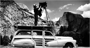
A man, a plan, a woody: Ansel Adams in his element. Yosemite’s Half-Dome is at the right.
By MICHAEL PERKINS
MERELY INVOKING THE NAME OF ANSEL ADAMS is enough to summon forth various hosannas and hallelujahs from anyone from amateur shutterbug to world-renowned photog. He is the saint of saints, the yardstick of yardsticks. He is the photographer was all want to be when (and if) we grow up. His technical prowess is held as the standard for diligence, patience, vision. And yet, even at the moment we revere Adams for his painstaking development of the zone system and his mind-blowing detail, we are still short-changing his greatest achievement.
And it is an achievement that many of us can actually aspire to.
What Ansel Adams did, over a lifetime, was work his equipment way beyond its limits, milking about 2000% out of every lens, camera and film roll, showing us that, to make photographs, we have to constantly reach beyond what we think is possible. Given the slow speed of much of the film stocks and lenses of his era, he, out of the wellspring of his own ingenuity, had to make up the deficit. He had to be smarter, better than his gear. No one piece of equipment could give him everything, so he learned over a lifetime how to anticipate every need. Look at one of many lists he made of things that he might need on a major shoot:
Cameras: One 8 x 10 view camera with 20 film holders and four lenses; 1 Cooke Convertible, 1 ten-inch Wide Field Ektar, 1 nine-inch Dagor, one six and three-quarters-inch Wollensak wide angle. One 7 x 17 special panorama camera with a Protar 13-1/2-inch lens and five holders. One 4 x 5 view camera with six lenses; a twelve-inch Collinear, including an eight-and-a-half Apo Lentar, a nine-and-a-quarter Apo Tessar, 4-inch Wide Field Ektar, Dallmeyer telephoto. One Hasselblad camera outfit with 38, 60, 80, 135, & 200 millimeter lenses. A Koniflex 35 millimeter camera. Two Polaroid cameras. 3 exposure meters (one SEI, two Westons).
Extras: filters for each camera: K1, K2, minus blue, G, X1, A, C5 &B, F, 85B, 85C, light balancing, series 81 and 82. Two tripods: one light, one heavy. Lens brush, stopwatch, level, thermometer, focusing magnifier, focusing cloth, hyperlight strobe portrait outfit, 200 feet of cable, special storage box for film.
Transport: One ancient, eight-passenger Cadillac station wagon with 5 x 9-foot camera platform on top.
However, the magic of Ansel Adams’ work is not in how much equipment he packed. It’s that he knew precisely what tool he needed for every single eventuality. He likewise knew how to tweak gear to its limits and beyond. Most importantly, his exacting command of the elemental science behind photography, which most of us now use with little or no thought, meant that he took complete responsibility for everything he created, from pre-visualization to final print.
And that is what we can actually emulate from the great man, that total approach, that complete immersion. If we use all of ourselves in every picture that we make, we can always be better than our cameras. And, for the sake of our art, we need to be.
FINDING AN OPENING

Walking briskly down a city street with wildly varying light conditions, you might not want to stop to fully calculate manual exposure before every shot. In such cases, Aperture Priority may be good fit.
By MICHAEL PERKINS
I KNOW THAT I APPROACH THE IDEA OF SHOOTING ON MANUAL with what must strike some as evangelistic zeal. We’re talking full-on-John-The-Baptist-mad-prophet mode. I do so because I believe that, the further you can go toward overseeing every single facet of your picture taking, that is, the less you delegate to a machine that can’t think, the better. Generally. Most of the time. Almost always.
Except sometimes.
Aperture Priority, the mode that I most agree with after pure manual, can be very valuable in specific conditions, for very specific reasons. In AP (Av for Canon folks), you dial in the aperture you want for everything you’re about to shoot, depending on what depth-of-field you want as a constant. Then it’s the camera’s job to work around you, adjusting the shutter speed to more or less guarantee a proper exposure. Let me interject here that there are millions of great photographers who nearly live on the AP setting, and, like any other strategy, you have to decide whether it will deliver the goods as you define them.
If you are “running and gunning”, that is, shooting a lot of frames quickly, where your light conditions, shot-to-shot, will be changing a great deal, Aperture Priority might keep you from tearing out your hair by eliminating the extra time you’d spend custom-calculating shutter speed in full manual mode. Fashion, news and sports situations are obviously instances where you need to be fully mindful of your composition, cases in which those extra fragments of “figgerin'” time in between clicks might make you miss an opportunity. And no one will have to tell you when you’re in such a situation.
Conversely, if you are shooting more or less at leisure, with time to strategize in-between shots, or with uniform light conditions from one frame to the next, then full manual may work for you. I have shot in manual for so many years that, in all but the most hectic conditions (cattle stampede or worse), I’m fast enough to get what I want even with calculation time factored in. But it doesn’t matter what works for me, does it, since I won’t be taking your pictures (pause here to thank your lucky stars). If you need one less task to hassle with, and AP gives you that one extra smidge of comfort, mazel tov.
One other thing to note about Aperture Priority: it’s not foolproof. Change your central focal spot to different objects within the same composition (say from a tree to the rock next to the tree) snap several frames, and the exposure could be vastly different on each image. Could that happen when you’re on manual? Certainly. You can, of course, fiddle with exposure compensation on AP, essentially overruling the camera, but, to take the time for all that, you’re really not saving much more time than shooting manual anyway. See what you can live with and go.
This blog is a forum, not the Ten Commandments, so I never want to profess that my way is the only way, whether it’s taking photographs or deciding what toppings should go on pizzas. Although, let’s face it, people who put pineapple on them….that’s just warped, am I right?
A GAME OF INCHES
An okay idea for a picture, but, as it turned out, merely okay. 1/200 sec., f/5.6, ISO 100, 24mm.
By MICHAEL PERKINS
PHOTOGRAPHERS PROGRESS FROM WHAT I CALL SNAPSHOT MENTALITY TO “CONTACT SHEET” MENTALITY as we move from eager beginners to seasoned shooters. Many of the transitional behaviors are familiar: we actually learn what our cameras can do, we begin to pre-visualize shots, we avoid 9 out of the 10 most common errors, etc. However, one of the vestiges of snapshot mentality that lingers a while is the tendency to “settle”, to be, in effect, grateful that our snap resulted in any kind of a shot, then moving too quickly on to the next subject. It’s a little like marrying the first boy that ever asked you out, and it can prevent your hanging around long enough to go beyond getting “a” shot to land “the” shot.
In snapshot mentality, we’re grateful we got anything. Oh, good, it came out. In contact sheet mentality, we look for as many ways to visualize something as possible, like the film guys who shot ten rolls to get three pictures, seeing all their possibilities laid side-by-side on a contact sheet. The film guys stood in the batter’s box long enough to make a home run out one of all those pitched balls. With the snapshot guy, however, it’s make-or-break on a single take. I don’t like the odds. My corollary to the adage always be shooting would be always shoot more.
All of which is to plead with you to please, please over-shoot, especially with dynamic light conditions that can change dramatically from second to second. In the shot at the top, I was contending with speedily rolling overcast, the kind of sun-clouds-sun rotation that happens when a brief rain shower rolls through. My story was simply: it’s early morning and it just rained. This first shot got these basics across, and, if I were thinking like a snapshot photographer, I would have rejoiced that I nailed the composition and quit while I was ahead. However, something told me to wait, and sure enough, a brighter patch of sunshine, just a minute later, gave me a color boost that popped the page much more effectively. Same settings, same composition. The one variable: the patience to play what is, for shooters, a game of inches. A small difference. But a difference, nonetheless.
And that’s what these little blurbs are. Not examples of groundbreaking art, just illustrations of the different ways to approach a problem. Digital shooting is cheap shooting, nearly free most of the time. Shouldn’t we, then, give ourselves at least as many editing choices as film guys who shot rolls of “maybes” at great expense, in search of their “yeses”? Hmm?
