THE TAKEAWAY
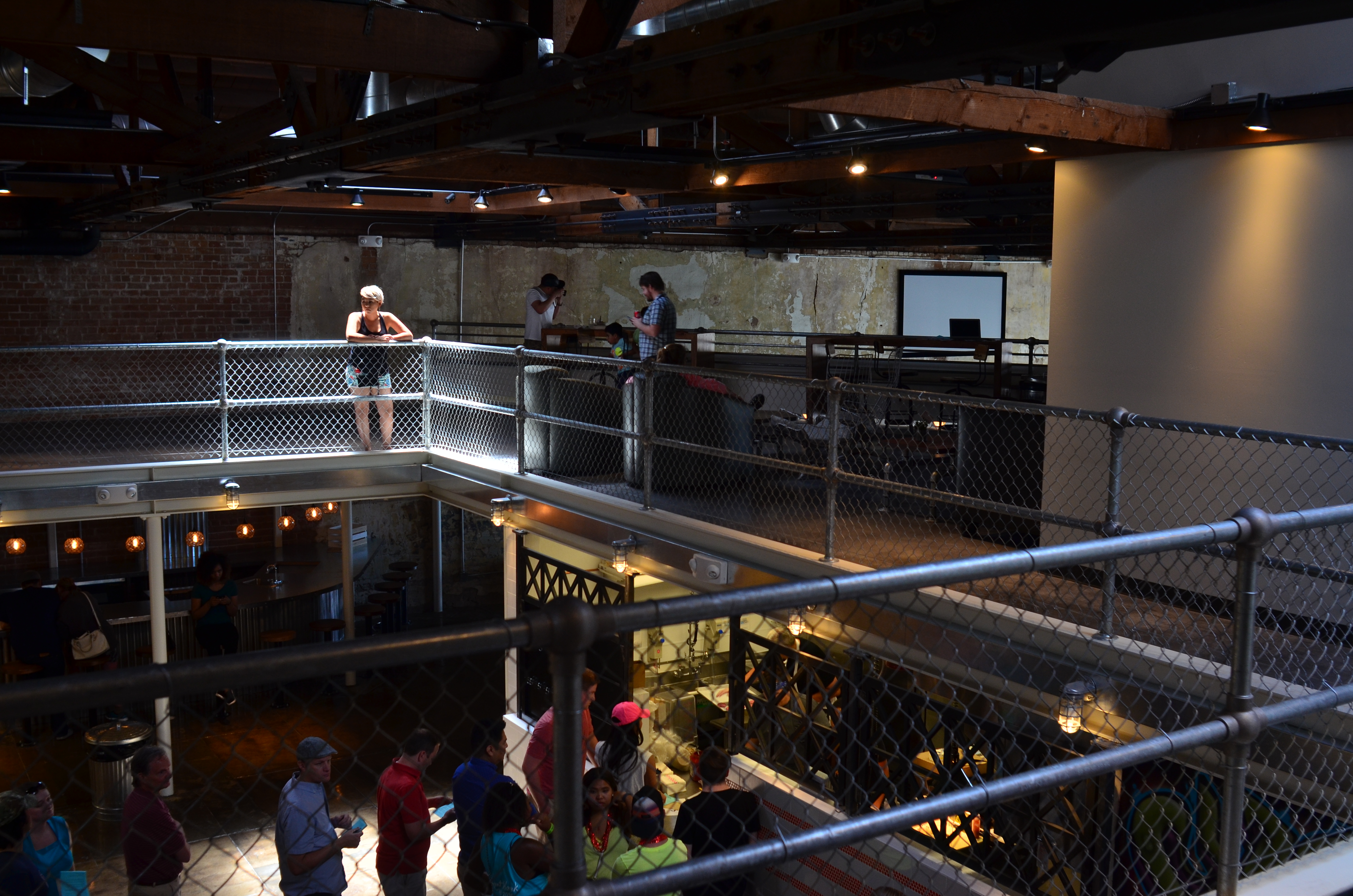
The girl bathed in ceiling light is a nice start, but this picture needs some help to get where it’s going.
By MICHAEL PERKINS
IT IS SAID THAT THE GODDESS ATHENA WAS BORN, FULLY GROWN AND ARMORED, out of the forehead of Zeus. Other than being the only case where a man experienced anything that approached labor pain, the story always reminds me that ideas rarely arrive in their final form, especially in photography. If Athena had a Leica, she probably could have taken perfect shots without needing to compose or plan. We mere mortals are forced to either (a) report to hate-crazed photo editors, or (b) learn how to crop.
Many shots are created in stages, and there’s no shame in the game, since our original conception undergoes many phases from the first spark to something we’d actually hang on a wall. Creation itself is a process, which is why photographers should actually embrace the stages their work will pass through. The more thought that is applied to making an image, the better chance that the best way of doing something will reveal itself. Of course, it can also reveal the fact that there is nothing really to work with, in which case, hey, the bar should be open now, let’s go lick our wounds.
The original shot shown above is not yet a good photograph, but a good beginning for a 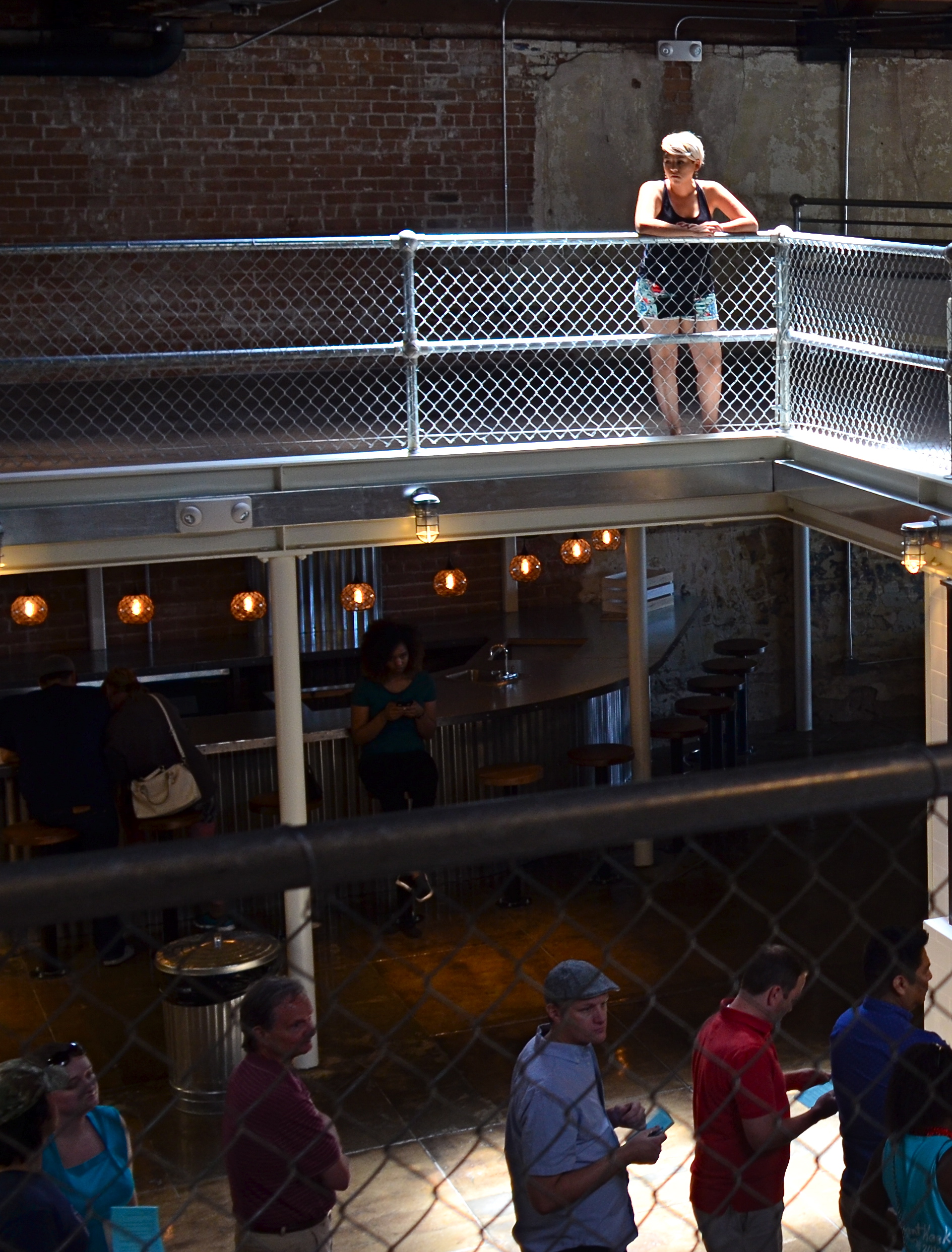 photograph. The lady bathed in light seems certainly to have been pre-selected to be the focal point of the picture, but there are way too many competing elements around her, robbing her of the prominence she deserves in the final frame. So let’s get after it.
First, none of the information on the left side of the frame makes it any clearer that she’s alone or that she’s on the second floor of the building. We can make that plain with half the acreage, so snip. Similarly, the guys in shadow to her right aren’t part of the story we are crafting for her. If she’s isolated, let’s make her isolated and be unmistakable about it. She’s “apart” already from the sea of people below her. She’s geographically and physically separated from them, but the extra guys make the argument weaker, so, snip, away they go.
Finally, the entire upper-floor/lower-floor line of sight will be accentuated if we crop for a portrait orientation and move the frame so she is on the upper-right-hand corner of it. It forces the eye to discover the story of the picture vertically, so snip and we’re done.
So, at the end, we did not make any changes via processing, only the old scissors. Taking things away, not adding them on, actually made the picture work better. Fate gave me the girl and the wonderful light she was bathed in, but there was work to do. She didn’t arrive, ready to party, like Athena, but she’s a little closer to goddess status after some adjustment.
WHOOPS. YAY.
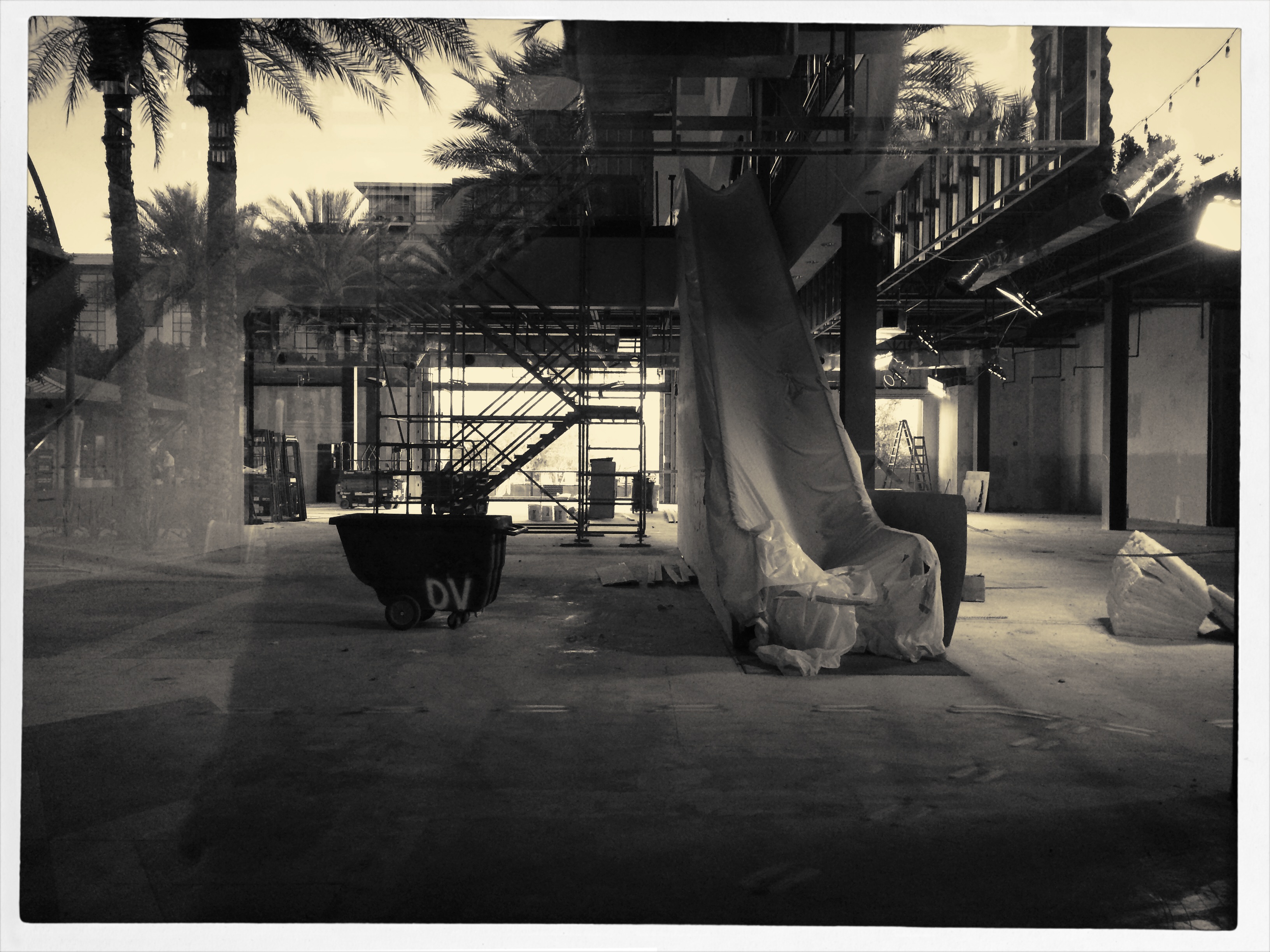
Strike The Set, 2015. A world that never was, and can never be again.
By MICHAEL PERKINS
I HAVE A THEORY THAT “SERENDIPITY” is just “dumb luck” for pretentious people. Somehow it makes our random discoveries and unplanned miracles sound cooler if we attribute them to some grand lining-up of the planets, as if we apes really meant to discover fire. So, fine. Consider this an incident of serendipity, although it’s mainly a case of “I stepped in sugar instead of….” well, you get the idea.
Setting the scene: a suburban mall near me recently closed its enormous bookstore, applying a dark sheet of tint on the building’s huge windows so gawkers couldn’t spy on the joint’s sad makeover as a furniture store. Of course, if you want to make people curious about something, blacking out the windows is a pretty effective tactic, and there are always plenty of people smashing their faces up against the impermeable tint every day to see what a bookstore looks like when it has, you know, no books in it. I am usually first in line for this ritual.
For some reason this week, a small peephole has been opened in the sheeting, allowing one to see the place’s vast, empty floor, its draped escalator, and an iron tangle of scaffolding, as well as a huge infusion of light from an open-work area at the opposite side of the store. It isn’t quite the “ruin porn” that photographers of dead malls love to record just ahead of the wrecking ball, but eerie enough to make me want to shove my phone camera up against the peephole to try to capture it.
Given the very wide-angle of such devices, however, I discovered, after the click, that the lens had also picked up a portion of the window next to the peephole, a portion still covered by tint and capable of reflecting the scene behind me….various buildings and landscaping of the rest of the mall. Even stranger, the “other” reality behind me melded, through the blurred outline of the peephole and variances of light, with the scene inside the store, as if they were all part of one dreamy landscape, a Hollywood set in transition. Giddy at what I had grabbed by accident, I shot a second frame to compose things a bit better, then converted it to monochrome with a filter that simulates a platinum print effect, an effort to eliminate mismatches in color and tone between the two worlds.
Sinatra once said that “the professional is the guy who can do it more than once”, so this image ranks me solidly among the amateurs. But so what. Whoops. Yay.
GOING NEGATIVE
Negative space is your best friend when trying to establish scale.
By MICHAEL PERKINS
I got plenty of nothin’, and nothin’s plenty for me. —Ira Gershwin, Porgy and Bess
I BELIEVE THAT MANY PHOTOGRAPHS ARE IMPROVED BY THE SIMPLEST OF MATH OPERATIONS: addition and subtraction. Look at nearly any image you’ve created that “worked” and you can see that there is not one more thing in the image than there needs to be. Something told you to either supply or eliminate elements in the composition until the impact of the picture was maximized. Realizing the reverse effect is pretty easy as well, although not as much fun. If there is one tree too many or one object too few in the frame, you can sense the imbalance in your near-miss pictures. And man, does that hurt.
 We used to refer to open areas of a picture as “blank” space, and were often talked out of using it at all by various A-B-C composition tutorials that told us that large expanses of sky could kill a good landscape. Today, we refer to this unused real estate as “negative” space, but we are now more inclined to see it as well, a positive thing. The take-home from this is, simply, that no technique should be universally ruled out, or ruled in, for every image. Truth is, there are times when not filling the frame with stuff, or selectively making use of negative space boosts the wattage of what you’re trying to say.
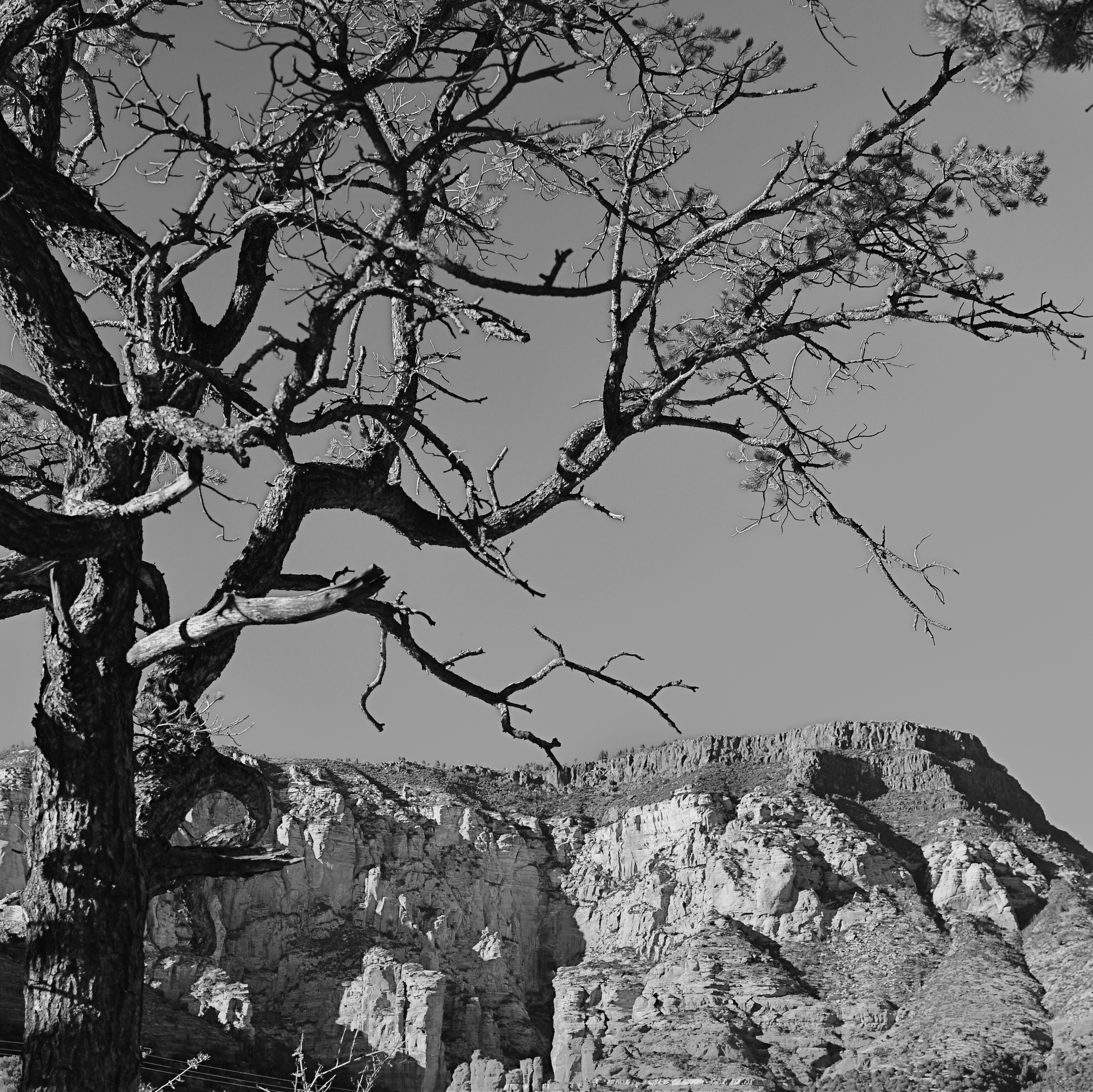
Instead of “negative” space, I prefer the term “secondary space”, since what you’re really doing is mapping your pictures into zones of the things that should be of primary interest and those that should complement those things without competing with them. Landscapes are the easiest way to demonstrate this. In the image at left, I wanted to accentuate the distance between the foreground tree and the background mountain. Framing the two elements to merely overlap gave no sense of space, and, in color, actually made the photo busy and hard to read. There seemed to be no primary object in the frame. Composing so that some sky intervened to the right of the tree and the top of the mountain re-established the sense of distance and kept the textures of both objects from fighting with each other.
Secondary space need not be empty. It can take the form of a texture, be it a body of water, cloud formations, a flooring pattern, or a stone wall. The idea is to use the space to support, but never upstage the primary space. Sometimes what you need to complete an image is nothing. You just have to stick the nothing in the right place.
SQUARE STORIES
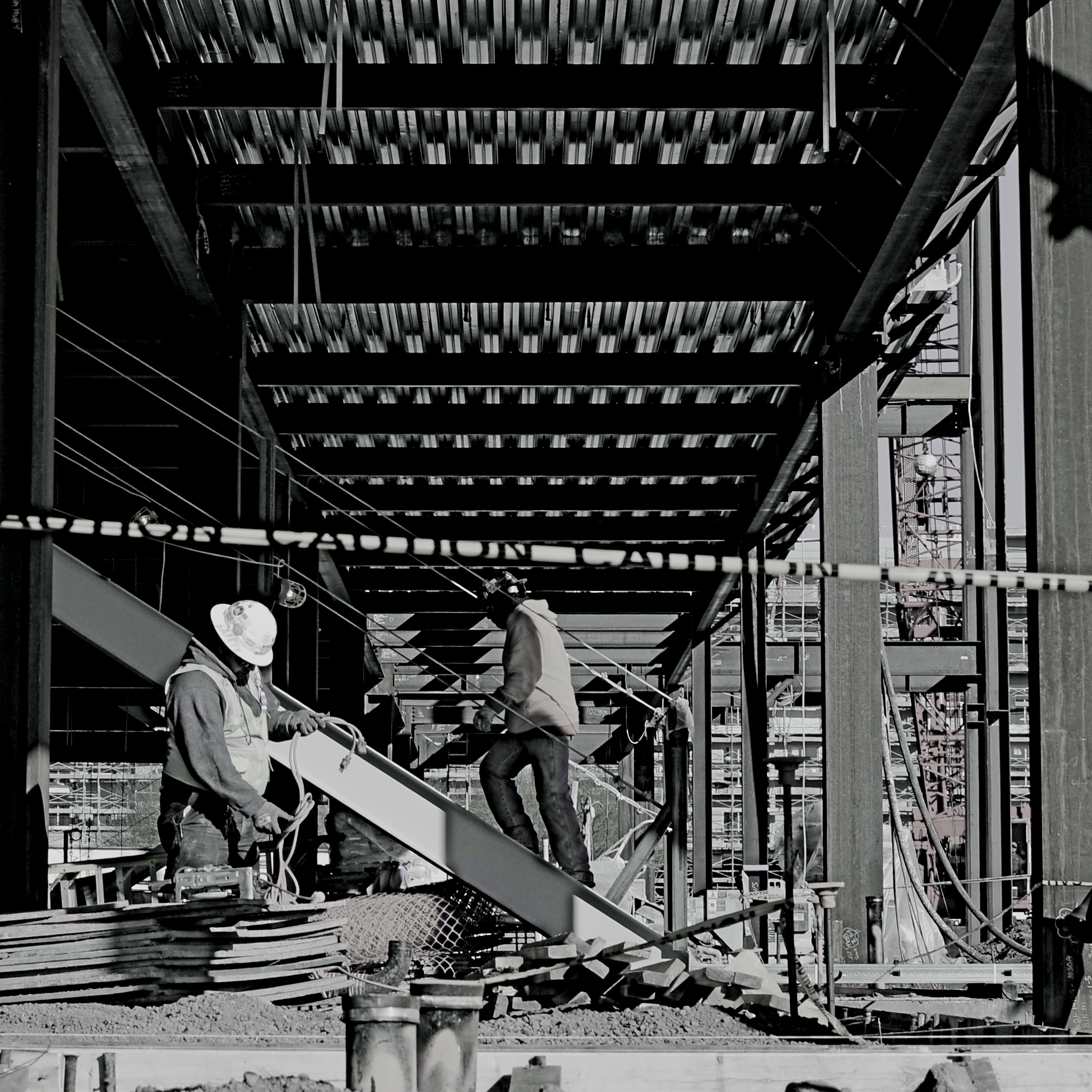
Overhang, 2015.
By MICHAEL PERKINS
BETTER PHOTO HISTORIANS THAN ME WOULD BE ABLE to pinpoint the precise moment in time when the landscape-sized image first eclipsed the square image for most photo shooters. I’d tackle the search myself, but it’s late, and I’m about a martini and a half too far into relax mode, so there it is. But, regardless of the exact instant it first began to wane, the square is back, and bigger than ever, its refreshed use as a distinct mode of composition greeted like a revelation, rather than a return. Cool beans.
The unilateral quadrangle (I get wordy when I drink) managed to barely survive on the periphery of photography, even as the square-centric Polaroid print nearly wobbled out of existence, then came back, as hipsters in the lo-fi movement revived the use of instant print cameras. Then cel phones began offering a pre-selectable square setting for their cameras, and that became a thing. But the biggest boost for the square’s comeback came with a thing called Instagram. You may have heard about this quaint little app. I understand the developers made a few bucks on it.
Still, we are pretty universally conditioned to envision pictures in either “landscape” or (flip this up on its side) “portrait” modes, so much so that director Wes Anderson garnered as much press for his use of the old anamorphic aspect ratio in The Grand Budapest Hotel as he did for the movie’s content. Strangely, the square-format photograph is, upon its return, a bit of a retro novelty.
Composing a shot in roughly 1/3 less space than a landscape frame is a challenge, simply because we have fallen out of the habit for a few decades, but it does have a certain elegance. Lately, I have tried to use the square to effectively tell stories that I traditionally saw in vast or wide scenarios. Construction projects are one such case, in that they seem to call for wide angles and far reaching vistas, what we might call scope. The above image is my attempt to express most of what goes into a building project in what some would call cramped quarters. The main story elements, that is, the action, the range of tone, the compositional depth, are all present, but confined within the quadrangle. Of course, with a DSLR, I can’t start with a square, but I can envision where in the shot the best square is, and crop to it in post-processing.
Composing for a given dimension is a discipline, and, as such, it is valuable as a practice tool, since photographers should always be visualizing every possible way to get their story told. The square may be a prison. But it also may be an answer. The end result is what matters most.
PRECISION C, FEELING A
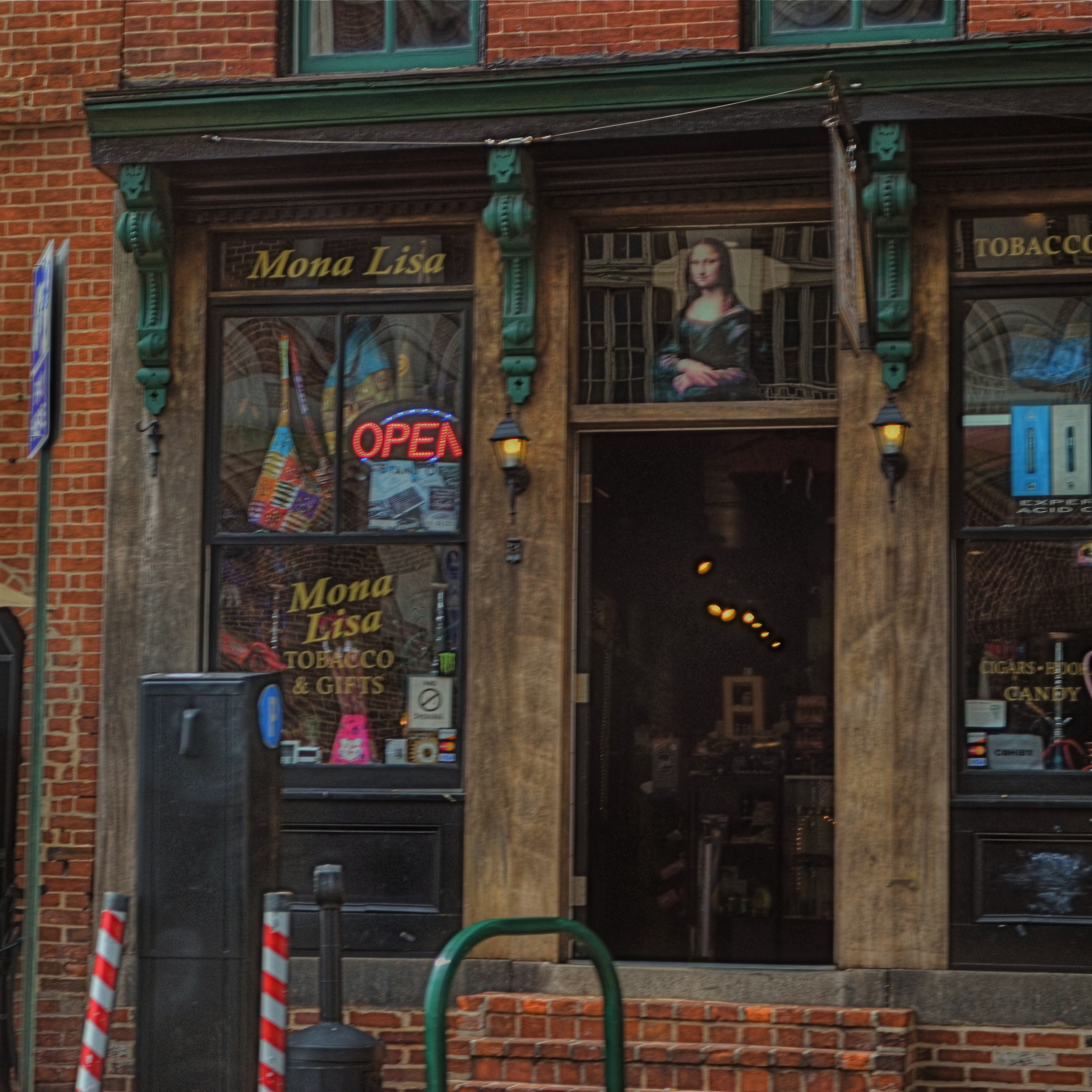
Mona Lisa Smoke Shop, Washington D.C., 2013.
By MICHAEL PERKINS
IF YOU TRAVEL ENOUGH, YOU’LL DISCOVER THAT, OF ALL THE TIMES YOU WANT to take a photograph, there are only a few times in which acceptable picture-making conditions are actually present. For all too many subjects that you experience on the fly, only a small percentage of them allow you the time, light, information or opportunity to do your best. And yet…you do what you must, and trust to instinct and chance for the rest.
Immediately upon arrival in a new town, my mind goes to one task, and one task only: sticking anyone else with the driving, so I can take potshots out the car window as I see fit. I have no need to head the posse or lead the expedition. You be in charge, big man. Get me to the hotel and leave me to make as many attempts as possible to put something worthwhile inside my camera.
Of course, this means that I have to pay at least some attention to how insanely you drive…shortcuts, rapid swerves, jolts and all. And, hey, couldn’t you have lingered a millisecond longer after the light went green, since I was just about to create an immortal piece of street art, instead of the muscular spasm I now have frozen forever on my memory card?
When shooting from a car, there are lots of things that go out the window (sorry), among them composition, exposure, stability, and, most generally, focus. En route to L’Enfant Plaza in Washington D.C. a few years ago, I fell in love with the funky little tobacco shop you see here. The colors, the woodwork, the look of yesteryear, it all spoke to me, and I had to have it. So I shot it at 1/250 sec, more than fast enough to freeze nearly anything in focus, unless by “nearly anything” you mean something that you’re not careening past at the pace of the average Tijuana taxicab. Result? Well, I didn’t wind up with unspeakable blur, but it’s certainly softer than I wanted. Of course, I could have offered an acceptable alibi for the shot, something based on some variant like, “of course, I meant to do that”, that is, until I outed myself in this post, just now.
But we try. Sometimes it’s the fleeting nature of things seen from car windows that make the attempt even more appealing than the potential result. In that instant, it seems like nothing’s more important than trying to take a picture. That picture. I won’t get ’em all. But as long as I live, I hope I never lose that mad, what-the-hell urge to just go for it.
So okay, seeing as this is a photo of a tobacco shop, this is where one of you cashes in the “close, but no cigar” gag line.
Go ahead, I’ll give you that one.
THE OOOOH FACTOR
By MICHAEL PERKINS
YOU LONG TO HEAR IT. The audible gasp, the sustained, breathless, collective “oooooh”  from the crowd when the house lights are doused and the holiday tree glows into life in the darkened room. It’s a sonic sample of the extra dimension of emotional engagement that occurs at this time of year, imbuing your photographs with additional firepower. Call it wonder, magic, enchantment, or what you will, but it is there, in greater supply during the season, a tangible thing amidst the bustle and the endless lists of errands.
Children are the best barometers of this heightened awareness, since so many of their experiences are first-time experiences. Regular routines become magically unpredictable. Ordinary things take on the golden warmth of tradition. People that are normally on looser orbits circle closer to them for a time. Time expands and contracts. And their faces register it all, from confusion to anticipation. Reading the wonder in a child’s face is truly easy pickings at times like this, but I’m a big believer in catching them while they live their lives, not queueing up for rehearsed smiles or official sittings. Those are important, but the real Santa stuff, the magic fairy dust, gets into the camera when you eavesdrop on something organic.
The wonderful thing is, it’s not big feat to keep a kid distracted during the holidays. They are in a constant state of sensory overload, and so extremely unaware of you that all you have to do is keep it that way. Get reactions to, not re-creations of, their joy. Be a witness, not a choreographer. Stealth is your best friend for seasonal images, and it’s never easier to pull off, so bask a bit in your anonymity.
And, to further feed your own wonder, stay aware of how fleeting all of it is. You are chronicling things that can never, in this exact way, be again. That is, you’re at the very core of why you took photography up in the first place, a way to reboot your enthusiasm.
And it that’s not magic, then I will never know what is…..
MILE MARKER
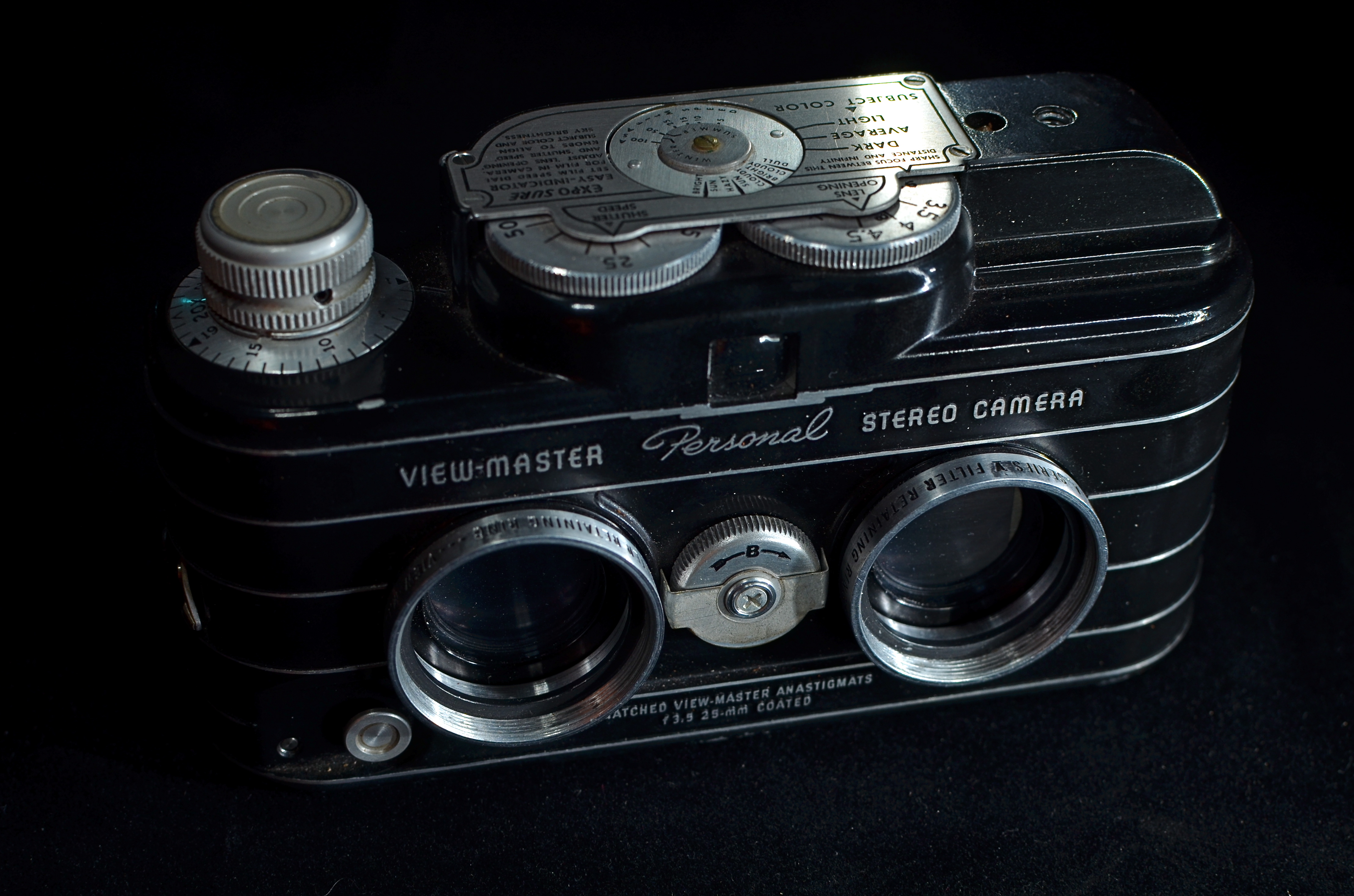
Sawyer’s mid-50’s View-Master Personal Stereo, the only consumer camera able to produce those eye-popping 3-d reels. 15 sec., f/5.6, ISO 100, 35mm.
BY MICHAEL PERKINS
THIS WEEK, THE NORMAL EYE REACHES A LITTLE BASE CAMP OF SORTS, with the welcome arrival of our 1,000th blog follower. A few thoughts before we climb to the next ledge:
I never wanted this forum to be a mere photo diary, a refrigerator on which to tack up my pet pic of the day, because, despite the fact that my photography illustrates the blog, it’s not really about,”look what I did”, so much as it’s about “look at one thing you can try”. It also was never supposed to be a purely technical tutorial, although we do offer a few simple step-by-steps on emerging methods. My thought, then as now, is that there are many, many master technicians in the trade whose command of the pure science is so much stronger than mine, that I’d be better off talking about the part we all understand….the millions of little miracle moments and motivations that shape our visual decisions in the making of images.
Accordingly, your most typical responses to The Normal Eye have been along the lines of “I’ve been there”, or “I came to the same conclusion” or “I never thought of it that way before.” That has sparked dialogue, which was my principal aim in creating TNE in the first place. I use my images to illustrate my ideas because they’re the closest visual equivalent of what’s rattling around in my skull, but not because they’re the ne plus ultra of anything.
From my years as an illustrator, I also love the idea of designing a page, and I try to vary the visual arrangement of the blog to incorporate useful links, historical figures, and, as we go forward, gifs and other tools. I liken it to the front of a newspaper, which, other than the masthead and the familiar type faces, has to be completely new every day. It’s more interesting to make, and, I hope, more fun to read, but it’s still in its infancy.
The most amazing part of this venture has been seeing the numbers change, to realize, day by day, that many of you have chosen, on-purpose, to bring these conversations into your day on a regular basis. I truly appreciate that choice, and am gratified if any of these chicken scratchings have a positive impact, for anyone. Sometimes, online writing is like throwing a pebble down a dark well and listening for at least a splash. Sometimes it’s like waking up to a roomful of birthday presents. So, to everyone who has kept faith or at least sampled The Normal Eye thus far, my sincere thanks. As I’ve stressed before, although solo sermons are often inspiring, this forum only works as a conversation.
Your turn.
THE GEOMETRY OF VIEW
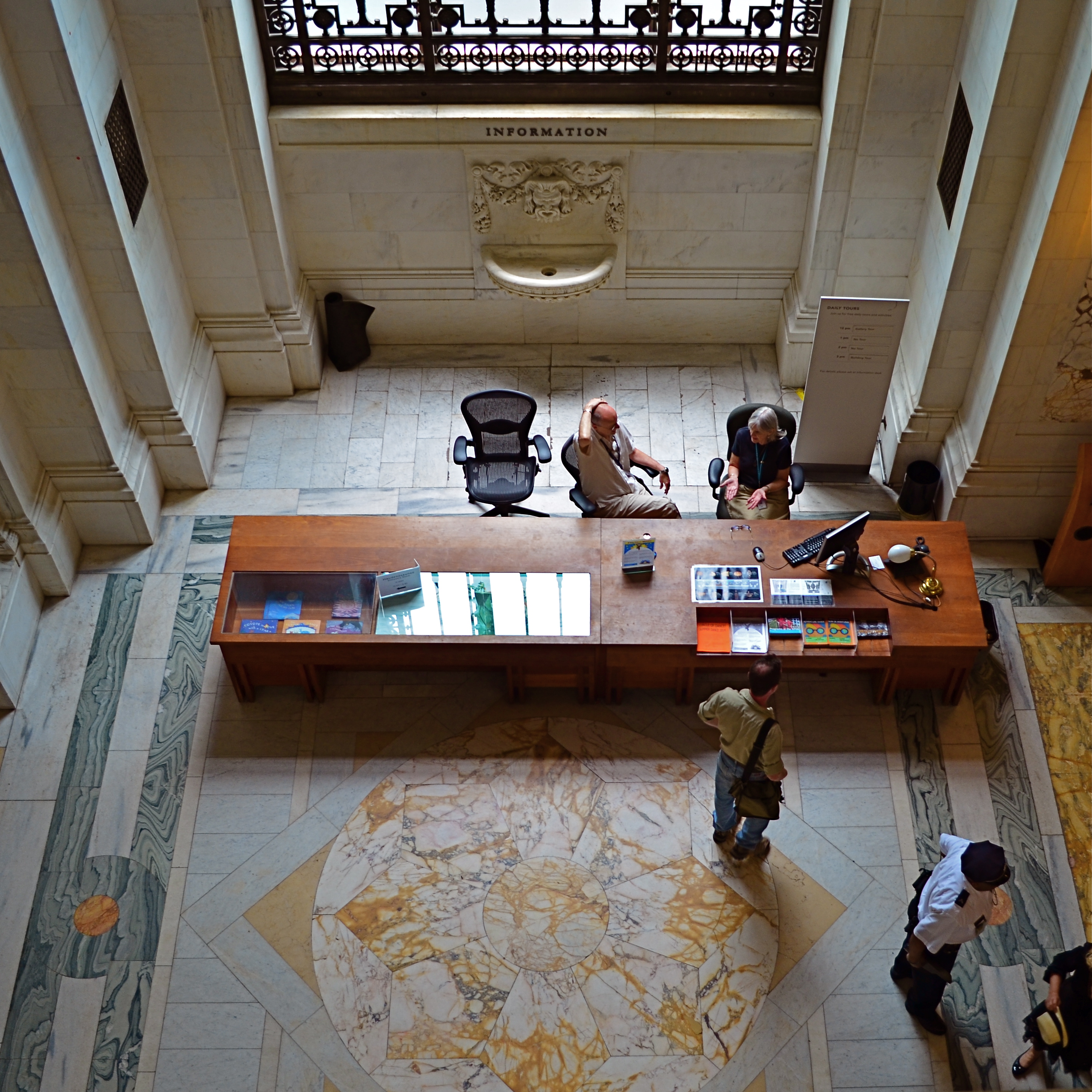
Information, Please, 2014. 1/60 sec., f/3.5, ISO 160, 18mm.
By MICHAEL PERKINS
ONE OF THE BEST WAYS TO APPREHEND THE OVERALL DESIGN OF A SPACE, be it a midtown skyscraper or a suburban cathedral, is to see it the way the designer originally envisioned it; as a logical arrangement of spaces and shapes. Sometimes, viewing the layout of floors, lobbies, or courtyards from the top-down, or “bird’s-eye” view of the original design sketches is especially helpful, since it takes our eye far enough away from a thing to appreciate its overall conception. It’s also not a bad thing for a photographer to do when trying to capture common spaces in a new way. Move your camera, change your view, change the outcome of your images.
The overarching vision for a place can be lost at ground, or “worker bee” level, in the horizontal plane along which we walk and arrange our viewpoint. Processing our understanding of architecture laterally can only take us so far, but it almost seems too simple to suggest that we shift that processing just by changing where we stand. And yet you will invariably learn something compositionally different just by forcing yourself to visualize your subjects from another vantage point.
I’m not suggesting that the only way to shake up your way of seeing big things is to climb to the top floor and look down. Or descend to the basement and look up, for that matter. Sometimes it just means shooting a familiar thing from a fresh angle that effectively renders it unfamiliar, and therefore reinvents it to your eye. It can happen with a different lens, a change in the weather, a different time of day. The important thing is that we always ask ourselves, almost as a reflex, whether we have explored every conceivable way to interpret a given space.
Each fresh view of something re-orders its geometry in some way, and we have to resist the temptation to make much the same photographs of a thing that everyone else with a camera has always done. We’re not in the postcard business, so we’re not supposed to be in the business of assuring people with safe depictions of things, either. Photography is about developing a vision, then ripping it up, taping it back together out-of-order, shredding that, and assembling it anew, again and again. In a visual medium, any other approach will just make us lazy and make our art flat and dull.
WHEN TEXTURE IS THE TALE
By MICHAEL PERKINS
THOSE WHO BELIEVE THAT SUBJECT MATTER IS KING IN PHOTOGRAPHY ARE FACED OFF in an endless tennis match with those who believe that only impressions, not subjects, are the heart of the art. Go away for fifty or sixty years and they are still volleying: WAP! a photograph without an objective is a waste of time! WAP! who needs an object to tell a story? Emotional impact is everything! And so on. Pick your side, pick your battle, the argument isn’t going anywhere.
Thing is, my assertion is that you don’t actually have to choose a side. Just let the assignment at hand dictate whether subject or interpretation is your objective. There are times when the object itself provides the story, from a venerable cathedral to an eloquently silent forest. And there are times when mere color, light patterns, or texture are more than enough to tell your tale.

Set Your Face Like Flint, 2014. Shot wide at 18mm, cropped to square format. 1/100 sec., f/5.6, ISO 100.
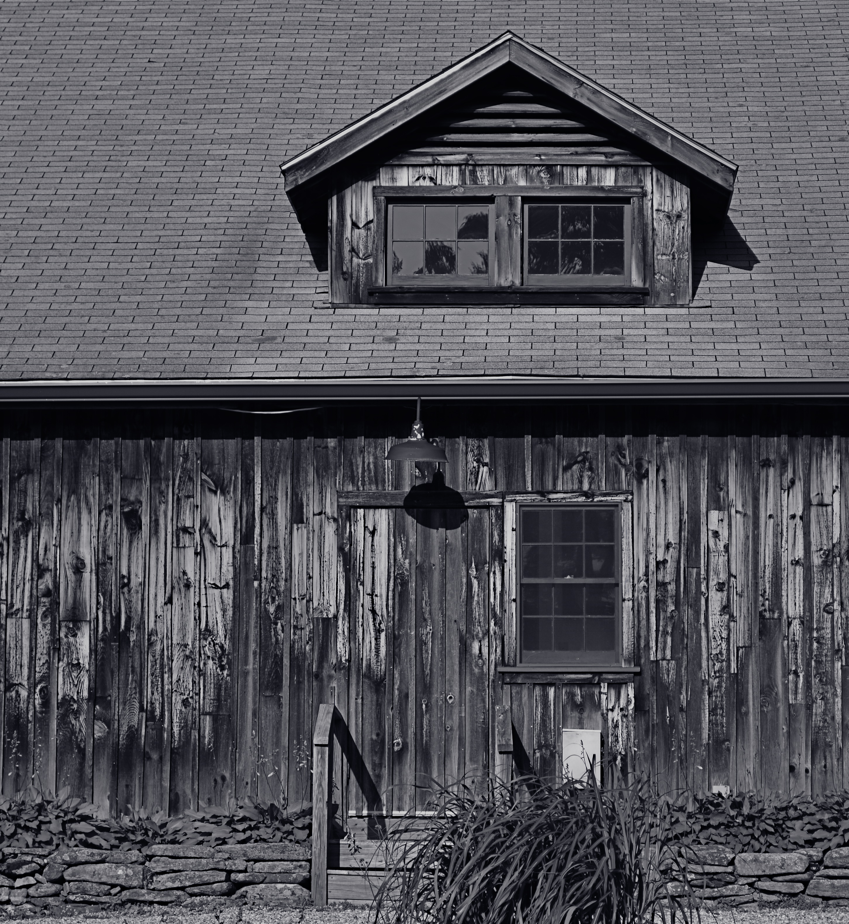
I find, for example, that texture is one of my best friends when it comes to conveying a number of important things. The passage and impact of time. The feel and contour of materials, as well as the endless combinations and patterns they achieve through aging and weathering. A way to completely redefine an object by getting close enough to value its component parts instead of viewing it as a whole. This is especially true as I try to refine my approach to images of buildings. I find that breaking the overall structure into smaller, more manageable sections helps to amplify texture, to make it louder and prouder than it might be if a larger scene just included the entire building among other visual elements. Change the distance from your story and you change the story itself.
This Massachusetts barn has tons of character whether seen near or far, but if I frame it to eliminate anything but the raw feel of the wood, it demands attention in a completely different way. It asks for re-evaluation.Contrast the rough-sawn wood with the hard red of the windows,and, again, you’ve boosted the effect of the coarser texture. Opposing textures create a kind of rudimentary tug-of-war in a picture, and the more stark the contrasts, the more dramatic the impact.
Traditional, subject-driven story telling will dictate that you show the entire barn, maybe with surrounding trees and a rolling hill or two. Abstracting it a little in terms of color, distance and texture just tell the story in a distinct way. Your camera, your choice.
RELIEF OF PAINFUL G.A.S.
Eight years and three cameras ago. 1/125 sec., f/7.1, ISO 100, 13.7mm.
By MICHAEL PERKINS
HE’S YOUR DAD, YOUR UNCLE, YOUR WACKY SITCOM NEIGHBOR: the guy who has every ratchet,widget and wrench in the Sears Craftsman catalogue, yet who is, strangely, incompetent at any task more complex than the replacement of a light bulb. If he could just get that table saw, that router, he could finally tackle that pet project with real zest. But heck, he explains, I don’t have the right extender, the extra power supply, the magical whatsit that just came out this year. In reality, this guy is not a handyman, he’s an actor playing the part of a handyman. He’s Batman with a utility belt big enough to spill over a city block. He’s a gadget addict.
Now, transfer all that imagery from fix-it toys to optical toys, and you can understand the disease that photographers call G.A.S—-Gear Acquisition Syndrome.
There is no vaccine or twelve-step program for some types of shooters for whom the next lens, the up-and-coming accessory will make all the difference, and catapult their photography from mundane to miraculous. And none of us, even the most rigidly discipline, is completely immune to the siren song of the bright and shiny plaything. Sadly, G.A.S. often sidetracks us for months or even years, taking us off the path of practice and hard work with the tools we have as we wait for the toys we want. It doesn’t seem to impress us that people are making extraordinary pictures with cameras that are, basically, crap. Similarly, It doesn’t seem to faze us to know that people lugging around fifty pounds of lens changes and thousands of dollars in Leica-like bodies are often coming home with a portfolio of poop to show for their efforts. G.A.S., once its fever envelops our tiny minds, creates the hallucination that photography is about equipment. Sure, and Mark Twain wrote better after he graduated from notepads to a typewriter.
It’s almost too simple a truth that practice makes perfect, practice with limited lenses and sad little cameras, practice with nothing to focus on but how well we can teach ourselves to see. G.A.S. fogs up our thinking, making photography a destination (oh, once I get that German glass!) instead of a journey (wonder what I can make happen with what I have). It’s magical thinking. The camera becomes a talisman, a magic monkey’s paw, Harry Potter’s wand. Real, serious development is delayed while we wait for machines to appear and deliver us.
Oddly, looking backwards can often help us move forwards. Now, follow me here a moment. Ever go through the ghostly Shoebox of Shoots Past to find that you actually nailed a biggie on the day that you had bad weather, a lousy subject and a disposable $10 camera? Of course you have. But, wait….how could you take a good picture with all the wrong gear? Because something in you knew how to make that picture, with or without the ease and convenience conferred by better equipment. And the more you developed your eye, the more often you could make a picture that good, on purpose, time after time. As an example, the image at left is eight years and three cameras ago for me. I could certainly shoot it better today, but, even with more primitive machinery, I got most of what I wanted with what I had on hand that day. You have pictures just like this. Yes, you do.
I’m not saying that tools aren’t great, but if your shelves are overfilled (and your wallet is over-depleted) due to Gear Acquisition Syndrome, it’s best to ask how much in the way of toys you really need. None of it can take a great picture unless your mind and your eye are on the steering committee. Ansel Adams’ claim that the most important part of a camera was “the twelve inches behind it” is gospel. Get religion and become a believer, o my brothers.
DON’T TAKE THAT TONE WITH ME
By MICHAEL PERKINS
I BELIEVE THAT THE SINGLE BIGGEST REASON FOR THE FAILURE OF A PHOTOGRAPHIC COMPOSITION may all boil down to the same problem. I call it “over-sampling”, or, more simply, the presence of too much visual information in a frame. It can be as simple as including too many trees in a landscape or framing to include crowded sky clutter in an urban scene, but it’s not always how many objects are crowded into an image. It can be something as basic as asking the eye to figure out where to look. And sometimes, the very fact that a picture is in color can diminish its ability to clearly say, here: look here.
Color would have added nothing to this image. In fact, it would have detracted from its impact. 1/400 sec., f/5.6. ISO 100, 55mm.
Great photographs have their own gravitational pull and center. They draw people in and direct their gaze to specific places. This tends to be a single focus, because, the more there is to see in an image, the greater the tendency is in the viewer to wander around in it, to blunt the impact of the picture as the eye looks for a central nexus of interest. In my own experience, I find that the use of color in a photograph is justified by whether it helps keep things simple, creates readable signposts that lead the eye to the principal message of the image. Color, just like the objects in a frame, can explode with a ton of separate messages that defeat the main message, sending the viewer all over the place, trying to decode all that vivid information. Color itself can become clutter.
Sometimes the focus of an image is not an object, i.e., a building or a face, but an overall feel that is more emotionally immediate within a narrow range of blacks and greys. The kind of black and white makes a huge difference as well, and anyone who has spent a lot of time processing monochrome images knows that there is no one true black, no pure, simple white. As to actual shooting procedure, I will be so certain that only B&W will work for a given subject that I make the master shot itself in mono, but, more frequently, I shoot in color first and make a dupe file for comparison. This is another amazing advantage of digital imaging; you simply have more choices.
One of the by-products of color photography‘s adoption into mass culture through magazines and faster films in the mid-20th century was, for many people, a near-total abandonment of monochrome as somehow “limited” compared to those glorious, saturated Kodachromian hues. Thing is, both color and black and white have to be vetted before being used in a photograph. There can’t be a general rule about one being more “lifelike” or “natural”, as if that has anything to do with photography. Tools either justify their use or they don’t. You don’t drive a screw with a hammer.
THE EYES (DON’T NECESSARILY) HAVE IT
Reverie, 2014.
By MICHAEL PERKINS
A QUICK GOOGLING OF THE PHOTOGRAPHIC UNIVERSE THESE DAYS will turn up a number of sites dedicated to “faceless portraits”, if there can, strictly speaking, be such a thing (and I believe there can). In a recent post entitled Private, Not Impersonal, I explored the phenomenon in which photographers, absent the features that most easily chronicle their subjects’ personalities, imply them, merely through body language, composition, or lighting. At the time I wrote the post, I was unaware how widespread the practice of faceless portraits had become. In fact, it’s something of a rage. Hmm. The very thought that, even by accident, I could be aligned with something hip, is, by turns, both terrifying and hilarious.
Thing is, photographs, as the famous curator John Szarkowki remarked, both conceal and reveal, and there is nothing about the full depiction of a human face that guarantees that you’re learning or knowing anything about the subject in frame. We are all to practiced at maintaining our respective masks for many portraits to be taken, ha ha, at face value. Cast your eye back through history and you will find dozens of compelling portraits, from Edward Steichen’s silhouettes of Rodin to Annie Leibovitz’ blurred dance photos of Diane Keaton, that preserve some precious element of humanity that a formal, face-on sitting cannot deliver. Call it mystery, for lack of a more precise word.
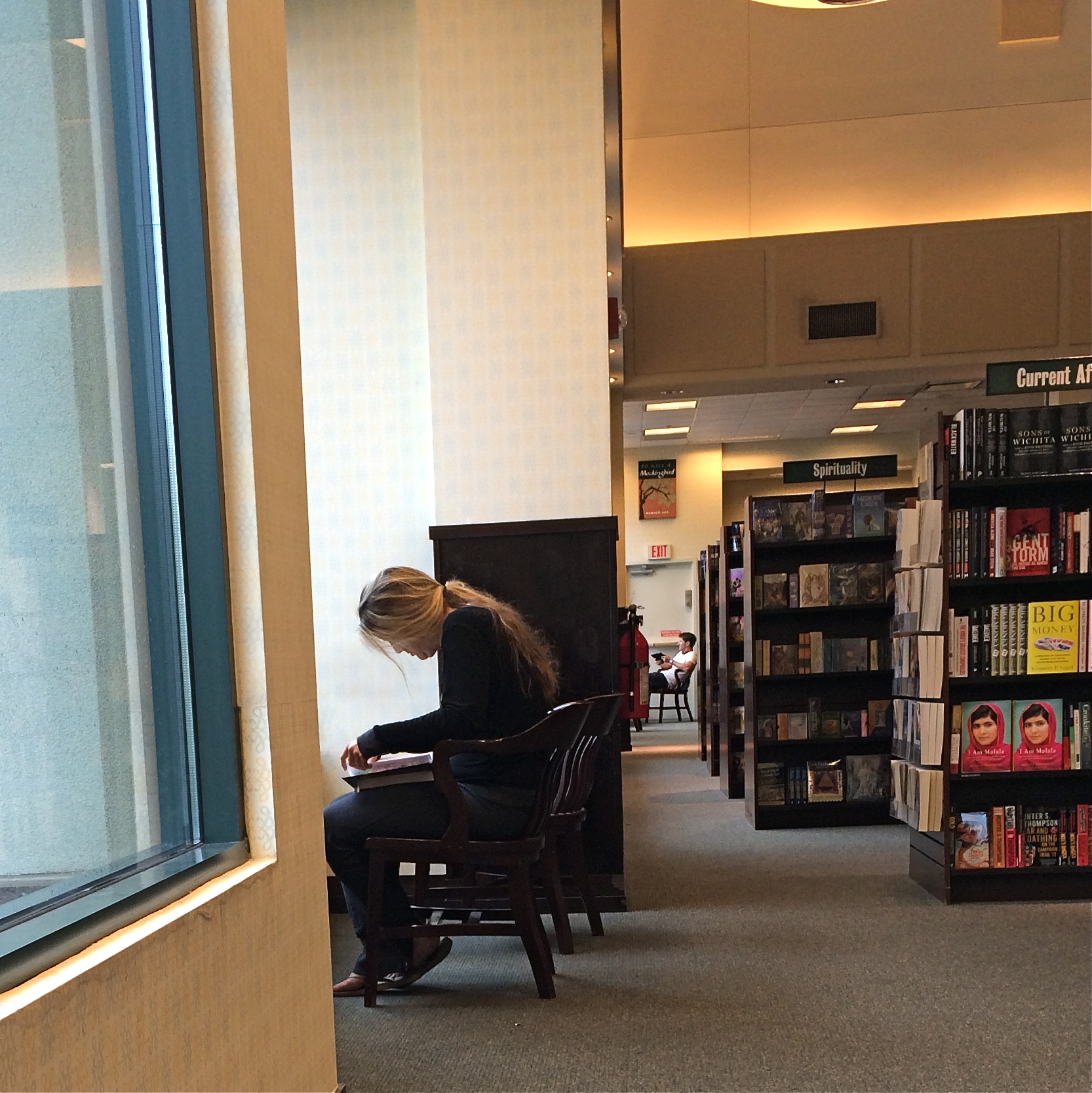
In the above frame, the subject whose face I myself never even saw gave me something wonderfully human, about reading in particular, but about enchantment in general. She is furiously busy discovering another world, a world the rest of us can only guess at, seeping up from her book. Her entire body is an inventory of emotional textures…of relaxation, attentiveness, of both being in the present and so completely someplace else. Framing her to include the negative spaces of the window, the carpet and the wider bookstore isolate her further from us, but not in a negative way. She wants to be apart; she is on a journey.
My “girl with the flaxen hair” was unaware of me, and I shot furtively and quickly to make sure I didn’t break the spell she was under. It was the least I could do in gratitude for a chance to witness her adventure. Looking back, I think she provided more than enough magic without revealing a single fragment of her face. Seeing is selecting, and I had been given all I needed to do both.
Click and be gone.
GO OUT AND COME BACK IN AGAIN
Thought the cute kid would be what this picture was “about”. Guess I was wrong.
By MICHAEL PERKINS
SEPARATING ONE’S IMAGES INTO “HIT” AND “MISS” PILES is always painful, since it’s kind of like telling some of your kids that they will be power hitters in Little League while their siblings should take up…well, macrame. But self-editing, over time, is nearly as important as shooting, and the mindfulness of asking “what was I thinking” is the useful corollary to “what do I want to do next?” That don’t make it smart any less, but at least you understand the pain.
Usually I hurl photos into the “miss” box for purely technical reasons, which means that I should have known what to do and just blew it upon execution. I’m more exacting nowadays, because present-era camera make it tougher to absolutely boot a shot, although I have striven to stay ahead of the curve and make lousy pictures even in the face of rapidly advancing technology. People who think they’ve idiot-proofed their gear have never met this idiot, I boast. It’s a point of pride.
Cropping the image got to the main impact point lurking within.
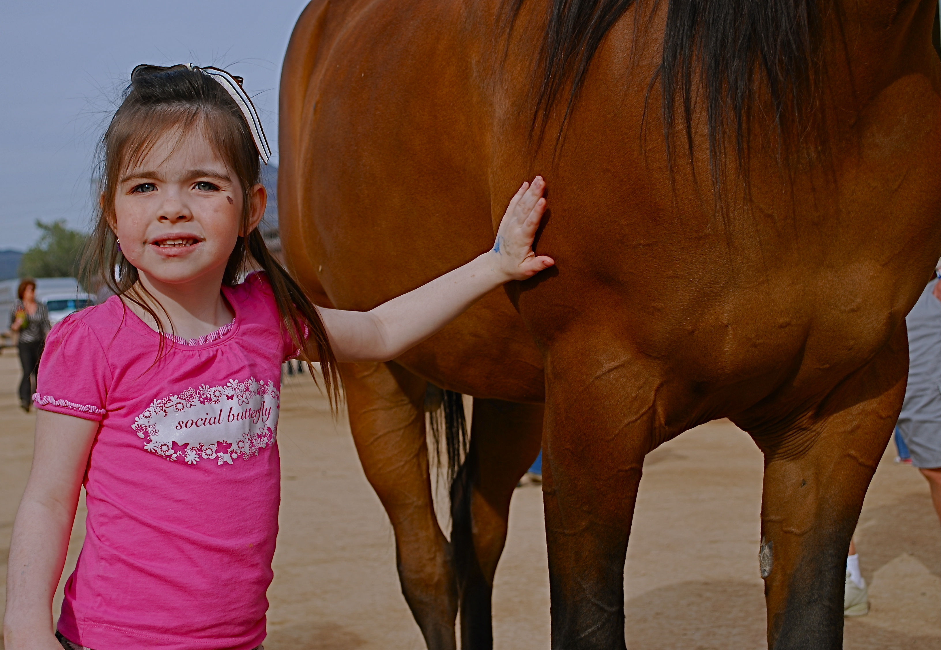
Occasionally, though, you review a shot that was okay exposure-wise, but completely got the narrative wrong. Sometimes you can recompose the shot and redress this problem, and sometimes you’re just sealed out of the airlock with no oxygen. That’s the breaks. In the original image at the top of this page is a candid of a little girl next to a horse that I thought would be charming. Cute kid, nice horsie, you get the picture. Problem is, I never really captured her essence in any of the photos I shot (trust me) and I framed so tight that I was only showing the horse’s body. First verdict on this one: thanks for playing our game, sorry to see you go, here are some lovely parting gifts.
However, as a rainy day project, the photo suddenly presented a different way for me to go. It wasn’t that I had shown too little of the horse; it was that I had shown too much of both the horse and the child. The central part of the image, taken by itself, had a narrative power that the larger frame lacked. To crop so that just a part of the girl’s small arm connected with the strong, muscular torso of the horse magnified his power by contrasting it with her fragility. I wasn’t losing the horse’s face, since it hadn’t been in the original, and losing the girl’s face actually improved the impact of the image by reducing her to an abstraction, to a symbol of innocence, gentleness, but above all, contact. We could deduce that the horse and the girl were friends. We didn’t need to see it reflected in their features.
Sometimes an image we are ready to reject is hiding a more concentrated fragment that saves the entire thing, if we are unafraid to pare away what we once saw as “essential”. It’s the go-out-and-come-back-in-again school of thought. It’s at least a seeing exercise, and you gotta flex them eye and brain muscles at every opportunity.
SAME SHIFT, DIFFERENT DAY
By MICHAEL PERKINS
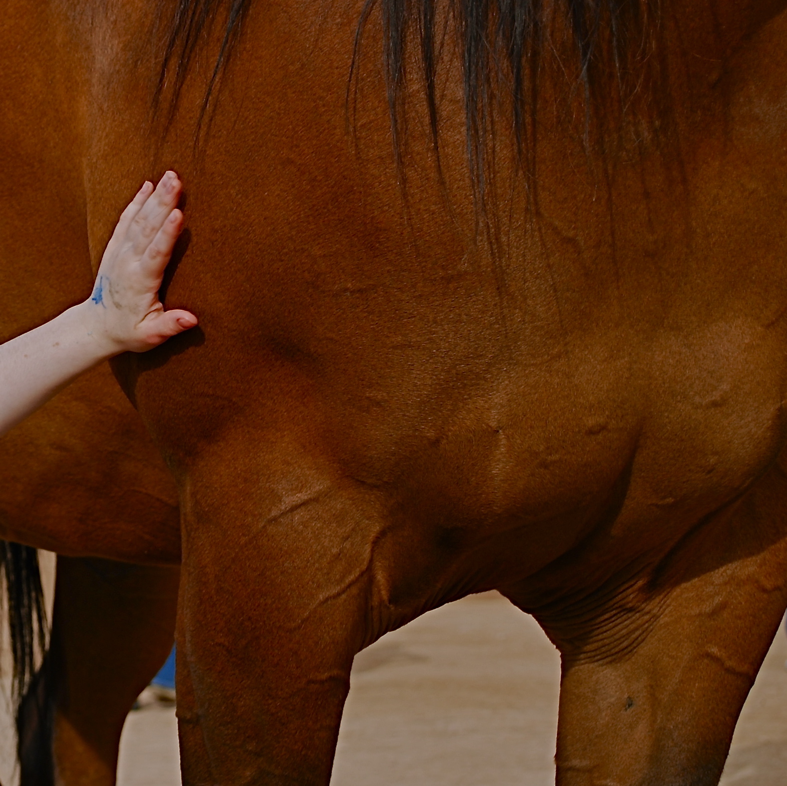
PHOTOGRAPHS OF PERFORMANCES ARE PERHAPS MY FAVORITE STUDIES OF THE HUMAN FACE. None of the self-conscious artifice or hesitant reticence of the standard portrait shoot are present when a player, be it a violinist or pianist, is fully inside the trance of creation. Call it rapture, call it focus, but something almost holy illuminates the features when people sing or play. All the awareness of their face as a mask melts away, as all mental energy surges to the task at hand. Their faces become some other thing, and I can’t resist trying to preserve that.
I recently had a chance to shoot two performances at the same part of the same museum about
Shot with a 35mm prime lens and cropped. 1/50 sec., f/3.5, ISO 250, 35mm.
ten weeks apart. The first set of images were like walking barefoot through roses; everything worked. The second occasion, just a few days ago, was, by comparison, work, and frustrating work at that. The time of day for both sessions was the same, with mid-morning light entering the hall through cream-color curtains and softening everything to an appealing haze. My distance from the stage was also nearly the same on both days. What created the difference in my results, then, was my choice of lens, pure and simple. All of my “luck” came because the first lens was perfect for the task. All of my muttered oaths at the second occasion were due to how wrong my choice had been.
In the first case, exemplified by the mariachi band in the image at right, I used a 35mm prime, which
is simple, sharp and fast enough, at f/1.8 on the wide-open end, to give me enough light in nearly any situation. In the more recent shoot, I used a 300mm zoom, about the most opposite approach you could try. The lens cannot get any wider open than f/4.5, and shuts down all the way to f/5.6 when fully zoomed in, so, right off the bat, you’re starving yourself for light, especially in a room where most of it is behind the performers. I decided to try the 300 out of pure perverse curiosity, and from a sense of “what can I lose?”, which is a blessing, since, when the results don’t matter, you can try something, just to see what happens.
Well, I saw.
The light reduction with the 300 was more severe than I’d anticipated. Oh, sure, I could get really tight framings on the performers, but I was going to have to either slow my shutter speed to under 1/60 or jack the ISO up to undesirably high noise level, or, as it turns out, both. The contrast between light and dark was the first thing to take the hit, as tone registered in a muddy middle range with the zoom versus the sharply defined values I had gotten with the 35.
Same time of day, same room, but using a 300mm zoom. Haze added. 1/60 sec., f/5, ISO 1000, 180mm.
Then there was the overall softness of the 300, due largely to the small amount of camera shake on my part, which, in a zoom, is magnified several times over. In both cases, I got usable images, but whereas with the 35mm prime I had a kind of embarrassment of riches, the object with the zoom shoot was to salvage something and slave away like mad to do so.
I could easily have taken wider framed shots with the 35 (since it can’t zoom), then cropped them for tightness later, as I had on the first day. Instead, I got a lot of really tight shots of musicians that needed serious intervention to make them acceptable. But I want to emphasize that this is what experimentation is for. You put your hand on the hot stove, yell “OWWW!” and refrain from touching the hot stove in future. At the end of the second shoot, I had lost no money, no business, and very little time. That’s education on the cheap.
I don’t mind wearing the dunce cap every once in a while, if I know that, eventually, I’m going to end up in a fedora.
EAT ALL YOU TAKE
By MICHAEL PERKINS
IF YOU’VE EVER RELIED ON UNCLE SAM FOR YOUR THREE SQUARES A DAY (thanks for your service), you know that, at least in the military, waste is worse than gluttony. Got a man-sized appetite? Great. Go back for seconds. Or thirds. But the taxpayers paid for that creamed chipped beef on toast, so if you put it on your plate, you’d better also put it down your gullet. Take All You Want, but Eat All You Take.
Same with composing a street photo. God knows that often you’re up to your armpits in sensory overload. Bright lights, big city, busy intersections, a visual smorgasbord (don’t write posts when you’re hungry!) of input. Sure, you can stick it all in your image, but, in the same way that a shavetail recruit shoves mashed potatoes and ham and ice cream sky-high on his tray….you’d better eat it all. Just showing a chaotic jumble of elements is not “reportage”, nor is it particularly inspiring. You’re on the street to tell a story. If your story is merely “gee, it’s really crowded here today”, you probably need to hone your narrative skills, and it might be smart to start carving stuff out of the composition to, let us say, let it breathe a little.
Shoot all you want. Use all you shoot.
Hollywood Boulevard is a place where absurd levels of street theatre are as normal as fire hydrants and stop lights. It’s in a perpetual state of over-the-top, so much so that it’s damned near impossible, amidst the mimes, acrobats, dancers and show biz mutants, for anyone to draw more than a distracted nanosecond of attention to themselves. Taking photos of this non-stop ballet of weird between jaded tourists and frantic performers can easily become the visual equivalent of the buck private’s overloaded dinner tray. A mess, with all the gravies, juices and seasonings of the city running together.
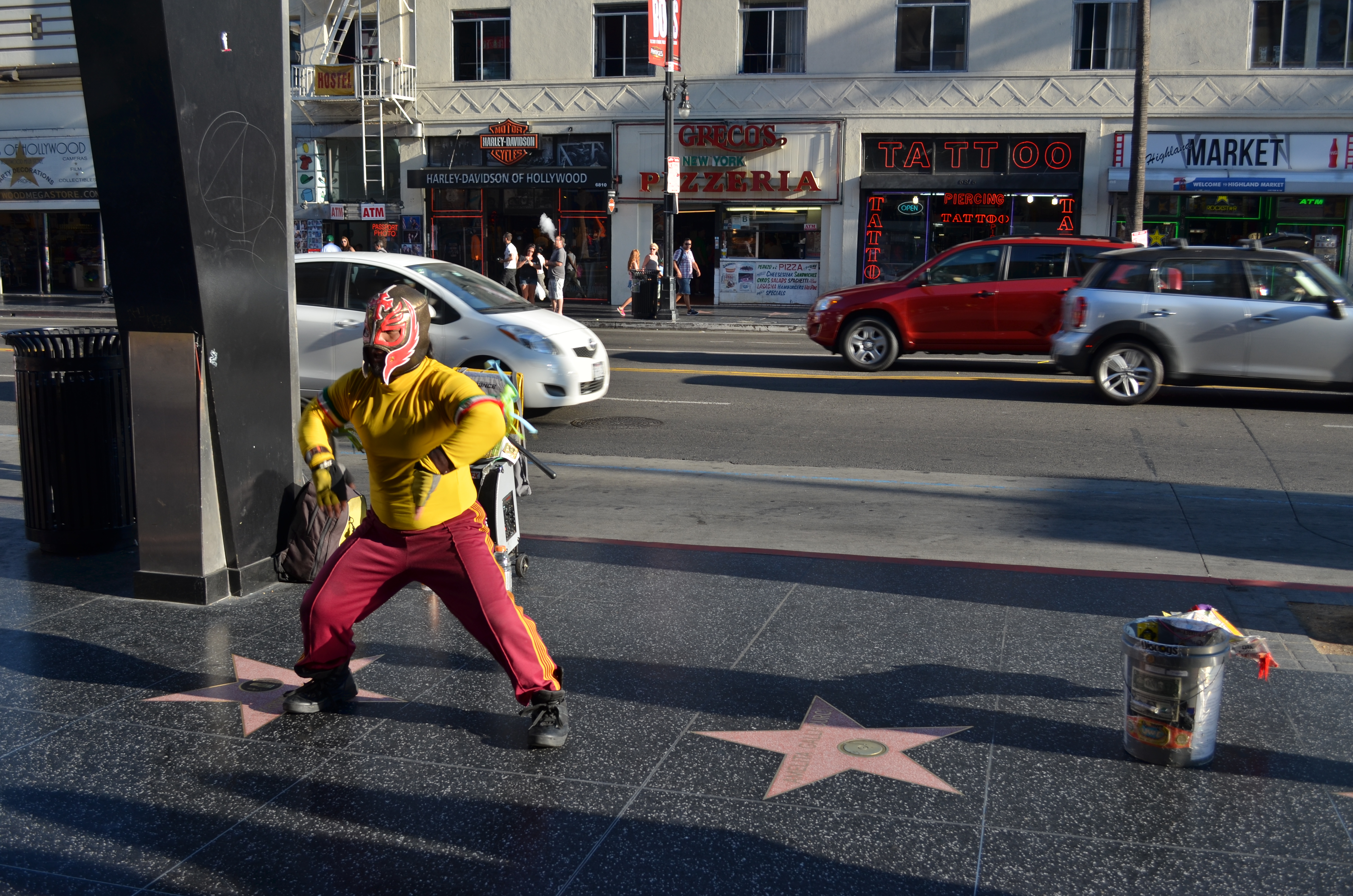
Hollywood Swinging, freestyle: 1/125 sec., f/5.6, ISO 100, 24mm.
Or you could try the dead opposite. One Sunday afternoon near sunset, I was lucky enough to see this wondrous fellow, creating his own mix of lucha libre and hip-hop in front of his own sad little stereo, working in isolation just across the street from the most heavily trafficked sites in that part of Hollywood. After shooting a few frames that showed him from several angles, I decided that his performance was story enough, all by itself. I didn’t need to show the thrilled reaction of passersby, or frame the shot to include popular destinations like the Chinese theatre or the teeming souvenir shops that scream so loudly up and down the block. Simply, including all that other glitter and glitz would have robbed our friend of his moment in the sun. I just liked him better as king of the block.
Full disclosure: had I not committed a lifetime of over-crowding flubs in my own images, I probably wouldn’t have felt compelled to write this post at all. But part of this enterprise is taking my lumps when I go off the rails, and doing penance is the first step to healing, blah blah blah…
Which is all to say, some photos need side dishes. Sometimes, however, you just want the meat and potatoes.
Again, never write when you’re hungry.
BREAKING THE BOX
The picture shown here was spoiled by tilting the camera sidewise. The whole scene seems to be “running downhill”. Unless you are trying for an unusual effect, hold the camera level. – How To Make Good Pictures, c) 1943 The Eastman Kodak Company
By MICHAEL PERKINS
ONE OF THE CARDINAL RULES OF PHOTOGRAPHIC COMPOSITION IS THE MAINTENANCE OF A PAINTER’S VIEW OF THE WORLD, and it needs to be abandoned as irrelevant to picture-making in the current era. I’m talking about one of the Photography 101 rules we all inherited from the medium’s 19th-century beginnings, which is the unyielding reverence for “the box” as a framing device.
You know the admonition, and can recite it out of a million amateur guides: the parameters of your photo must be a dead parallel line top and bottom and two perfectly perpendicular verticals for the left and right sides. Call it the “out the window” orientation or the painter’s frame, or perhaps the “God’s in his heaven, all’s right with the world” concept of a perfect clockwork universe. Whatever the term, this unbending admonition became common to every amateur book on photographic instruction since forever. Tilting was bad. Bending the frame or composing within an abstracted version of it was really bad. Calling attention to the frame instead of letting it remain invisible was amateurish.
I’ll tell you what’s bad: doing everything the same way, forever, and expecting to grow as a photographer, or as an anything.
Framing in photography sets the visual grammar of an image. It lays out the rules of engagement as much as anything that’s contained within it. It can be an artistic statement all in itself, and needs to be thought of as a deliberate choice, no less than camera settings or subject matter. The square or rectangle is not a mathematical commandment. Like every other element of making images, it needs to justify itself for the picture at hand. What is right for this instance?
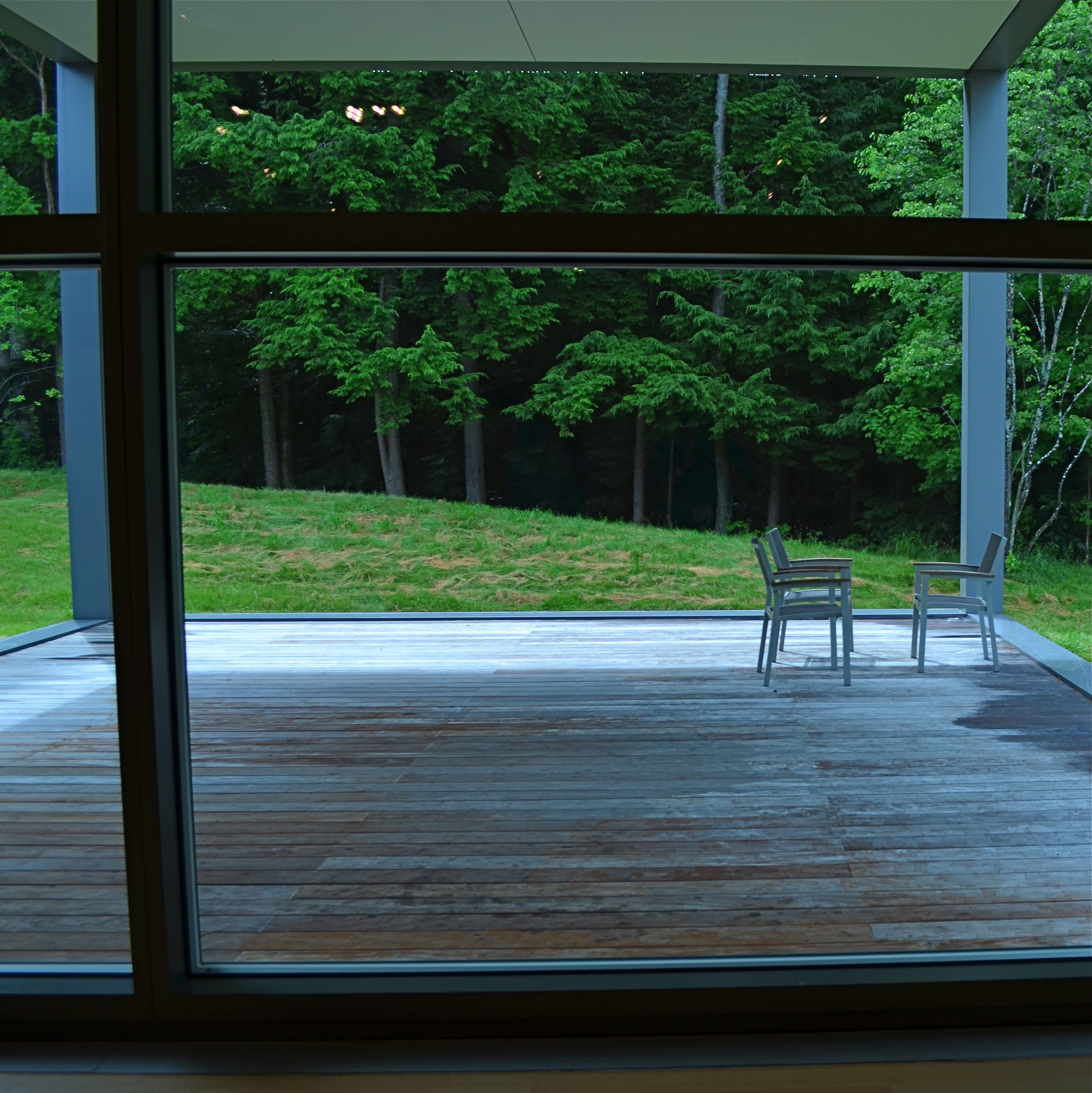
Would this image have worked better inside a completely standardized framing?
The image seen here is a very calm and unchallenging composition. I liked the small number of elements presented by the stark little porch and the rich but mysterious patch of forest. But in both the shooting and the cropping, I decided to subtly re-jigger the frame to include structural parts of the porch and the window through which I shot the scene, throwing off the perfect geometry of vertical and horizontal, resulting in a look that is a little off-kilter. I tried looking at the shot without any of these parts, and the picture looked too pat, too passive, whereas creating an imperfect square with them gave the photograph just a little edge. Not a slam-you-over-the- head effect, just a slight bit of visual punctuation.
Call it the difference between a colon and semi-colon.
As for the Eastman Kodak Company’s caution that you should maintain the standard frame unless you “are trying for an unusual effect”, well, aren’t you doing that every time you step up to bat?
If not, what’s the point?
ANATOMY OF A BOTCH

This murky mess is barely tolerable in monochrome. 1/25 sec., f/3.5, ISO 1250, 18mm.
By MICHAEL PERKINS
THERE SHOULD BE A MIRROR-IMAGE, “NEGATIVE” COOKBOOK FOR EVERY REGULAR ONE PUBLISHED, since there are recipes for inedible failures, just as surely as there are ones for gustatory delights. It might be genuinely instructive to read an article called How To Turn A Would-Be Apple Pie Into A Shapeless Heap Of Glop or You, Too Can Make Barbecue Ribs Look Like The Aftermath Of A Cremation. So too, in photography, I believe I could easily pen an essay called How To Take Pictures That Make It Seem That You Never Touched A Camera Before.
In fact…..
In recent days, I’ve been giving myself an extra welt or two with the flagellation belt in horrified reaction to a shoot that I just flat-out blew.It was a walk through a classic hotel lobby, a real “someday” destination for myself that I finally got to visit and wanted eagerly to photograph. Thing is, none of that desire made it into the frames. Nor did any sense of drama, art, composition, or the basics of even seeing. It’s rare that you crank off as many shots as I did on a subject and wind up with a big steaming pile of nothing to show for it, but in this case, I seem to have been all thumbs, including ten extra ones where my toes should be.
So, if I were to write a negative recipe for a shoot, it would certainly contain a few vital tips:
First, make sure you know nothing about the subject you’re shooting. I mean, why would you waste your valuable time learning about the layout or history of a place when you can just aimlessly wander around and whale away? Maybe you’ll get lucky. Yeah, that’s what makes great photographs, luck.
Enjoy the delightful surprise of discovering that there is less light inside your location than inside the fourth basement of a coal mine. Feel free to lean upon your camera to supply what you don’t have, i.e., a tripod or a brain. Crank up the ISO and make sure that you get something on the sensor, even if it’s goo and grit. And shoot near any windows you have, since blowouts look so artsy contrasted with pitch blackness.
Resist the urge to have any plan or blueprint for your shooting. Hey, you’re an artist. The brilliance will just flow as you sweep your camera around. Be spontaneous. Or clueless. Or maybe you can’t tell the difference.
Stir vigorously and for an insane length of time with a photo processing program, trying to manipulate your way to a useful image. You won’t get there, but life is a journey, right? Even when you’re hopelessly lost in a deep dark forest.
************************
You could say that I’m being too Catholic about this, and I would counter that I’m not being Catholic enough.
Until I do penance.
Gotta go back someday and do it right.
And make something that really cooks.
A BIG BOX OF LONELY
Think inside the box. 1/80 sec., f/2.2, ISO 800, 35mm.
By MICHAEL PERKINS
PHOTOGRAPHY CAN GO TWO WAYS ON CONTEXT. It can either seek out surroundings which comment organically on subjects (a lone customer at a largely empty bar, for example) or it can, through composition or editing, artificially create that context (five people in an elevator becomes just two of those people, their locked hands taking up the entire frame). Sometimes, images aren’t about what we see but what we can make someone else seem to see.
Creating your own context isn’t really “cheating” (are we really still using that word?), because you’re not creating a new fact in the photograph, so much as you are slapping a big neon arrow onto said fact and saying, “hey look over here.” Of course, re-contextualizing a shot can lead to deliberate mis-representation of reality in the wrong hands (see propaganda, use of), but, assuming we’re re-directing a viewer’s attention for purely aesthetic reasons (using our powers for good), it can make a single photo speak in vastly different ways depending on where you snip or pare.
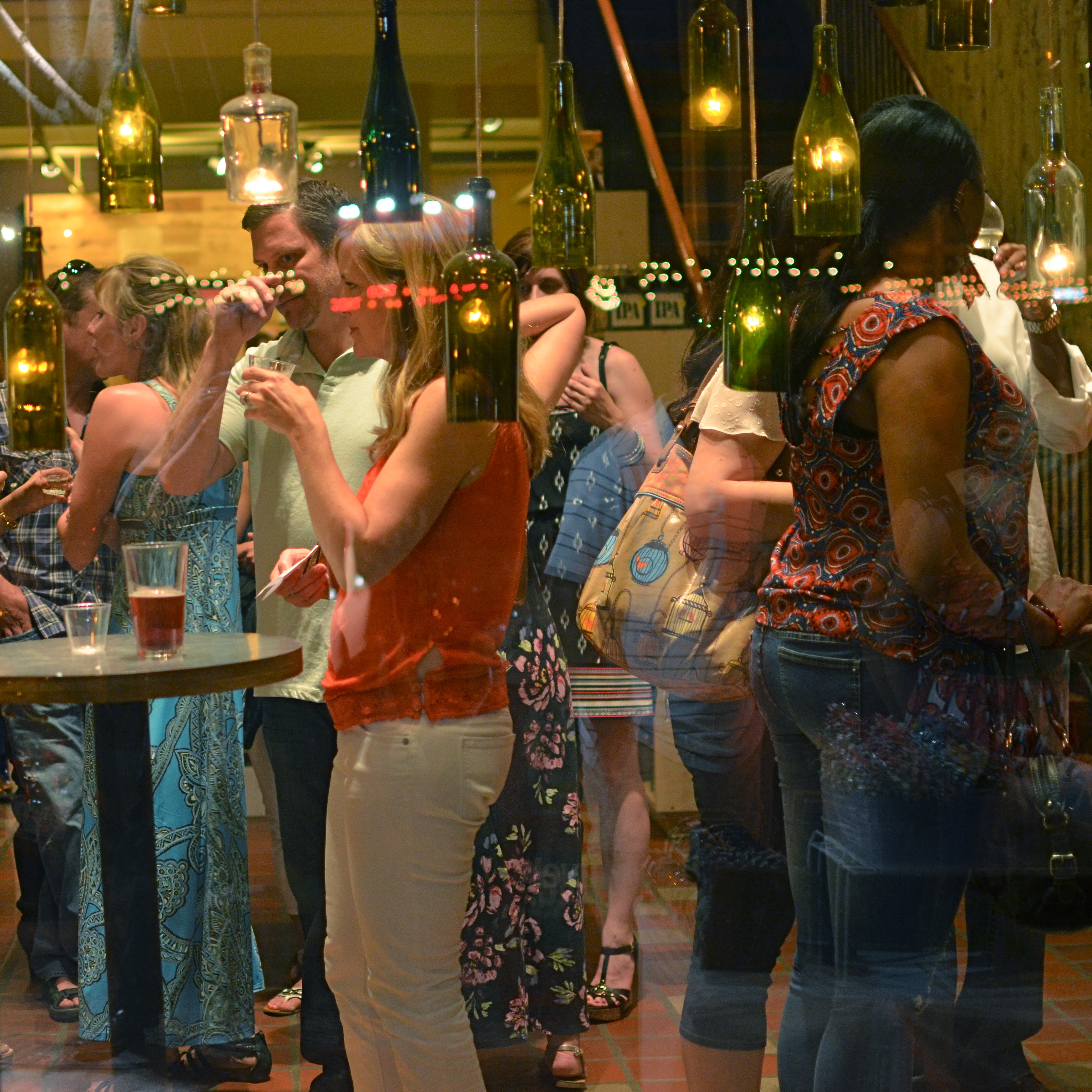
In the above situation, I was shooting through the storefront window of a combined art studio and wine bar (yes, I hang with those kind of people), and, given that the neighborhood I was in regularly packed folks in on “gallery hop” nights, the place was pretty jammed. The original full frame showed everything you see here, but also the connecting corridor between the studio and the wine bar which was, although still crowded, a lot less claustrophobic than this edited frame suggests.
And that’s really the point. Urban “hangs” that are so over-attended can give me the feeling of being jammed into a phone booth, like I’m part of some kind of desperately lonely lemming family reunion, so I decided to make that crushed sensation the context of the picture. Cropping down to a square frame improved the balance of the photograph but it also made these people look a little trapped, although oddly indifferent to their condition. The street reflections from the front plane of glass also add to the “boxed in” sensation. It’s a quick way to transform a snap into some kind of commentary, and you can either accept my choice or pass it by. That’s why doing this is fun.
Urban life presents a challenging series of social arrangements, and context in photographs can force a conversation on how that affects us.
MINIMUM SHOW, MAXIMUM SEE

There are only two design elements in this image. Does it really need any more? 1/160 sec., f/4, ISO 100, 24mm.
By MICHAEL PERKINS
LOOK AT THE EARLIEST PHOTOGRAPHIC WORK OF NEARLY ANYONE and you will see a general attempt to frame up a scene and attempt to show, well, everything within range of the camera. It’s a time when we produce our most inclusive panoramas, our most crowded city scenes, our most enormous circus midways. Our pictures may be stories, but, at first, our stories have a bit of a problem getting to the point. We are so inclusive of raw data that every snap of life at the beach becomes a page out of Where’s Waldo? Thus, the very first real talent young photographers show is the ability to trim all that visual fat and get the maximum see for the minimum show.
Of course, when we are mere puppies, it seems counter-intuitive to say that showing less will actually make us see more. Minimalism doesn’t come easily to us, since we are afraid, at first, that we’re leaving something “important” out. Everyone comes to terms with this eventually if they shoot long enough, but we all arrive at the wisdom of it via various journeys. For me, it was my first attempts at still life compositions, which really are the most edited exercises we do. For these kinds of photos, it’s really about knowing what to leave out, or at least when to stop adding. And when a picture works, there is the nagging curiosity as to why….an inquiry which often leads to the conclusion that we used just what we needed, and then stopped.
Sometimes I get a sense of how little I need in a picture while I’m shooting. Many times, though, it comes to me in the editing or cropping process. If I snip something off of a picture and it doesn’t fall apart, I start wondering how much more I can pare away and still say what I’m trying to say. Learning, in recent years, how to compose again for a square frame has really been helpful, too, since it forces you into a pre-determined space limit. You can’t paint any wider than the canvas, if you will. You yourself might find other ways to get to the core balance your story needs. There is no true or single path.
I started the above image in a wide graveyard, then several graves and a tree, then one grave marker and a tree, then just the marker, and finally a portion of the marker. But in what I wound up with, aren’t all the elements I cut away really present for the viewer mentally anyway?
It’s often said, as a generalization, that painters start with nothing and add until they get the picture, while photographers start with everything and strip information away until they see just what they need. I really see a lot of photography that way. Tell the story with as few elements as you can and walk away. Minimum show for maximum see.
Not nearly so counter-intuitive, after all.
A PLACE APART
By MICHAEL PERKINS
PHOTOGRAPHERS USUALLY USE FACES AS THE SOLE BAROMETER OF EMOTION. It’s really easy to use a person’s features as the most obvious cues to one’s inner mind. Scowls, smiles, smirks, downcast eyes, sidelong glances,cries of anguish….these are standard tools in depicting someone as either assimilated into the mass of humanity or cast away, separate and alone.
But faces are only one way of showing people as living in a place apart. Symbolically, there is an equally dramatic effect to be achieved by the simple re-contextualizing of that person in space. The arrangement of space near your subject forces the viewer to conclude that he or she is either in harmony with their surroundings or lonely, solitary, sad even, and you do it without showing so much as a raised eyebrow. This is where composition isn’t just a part of the story, but the story itself.
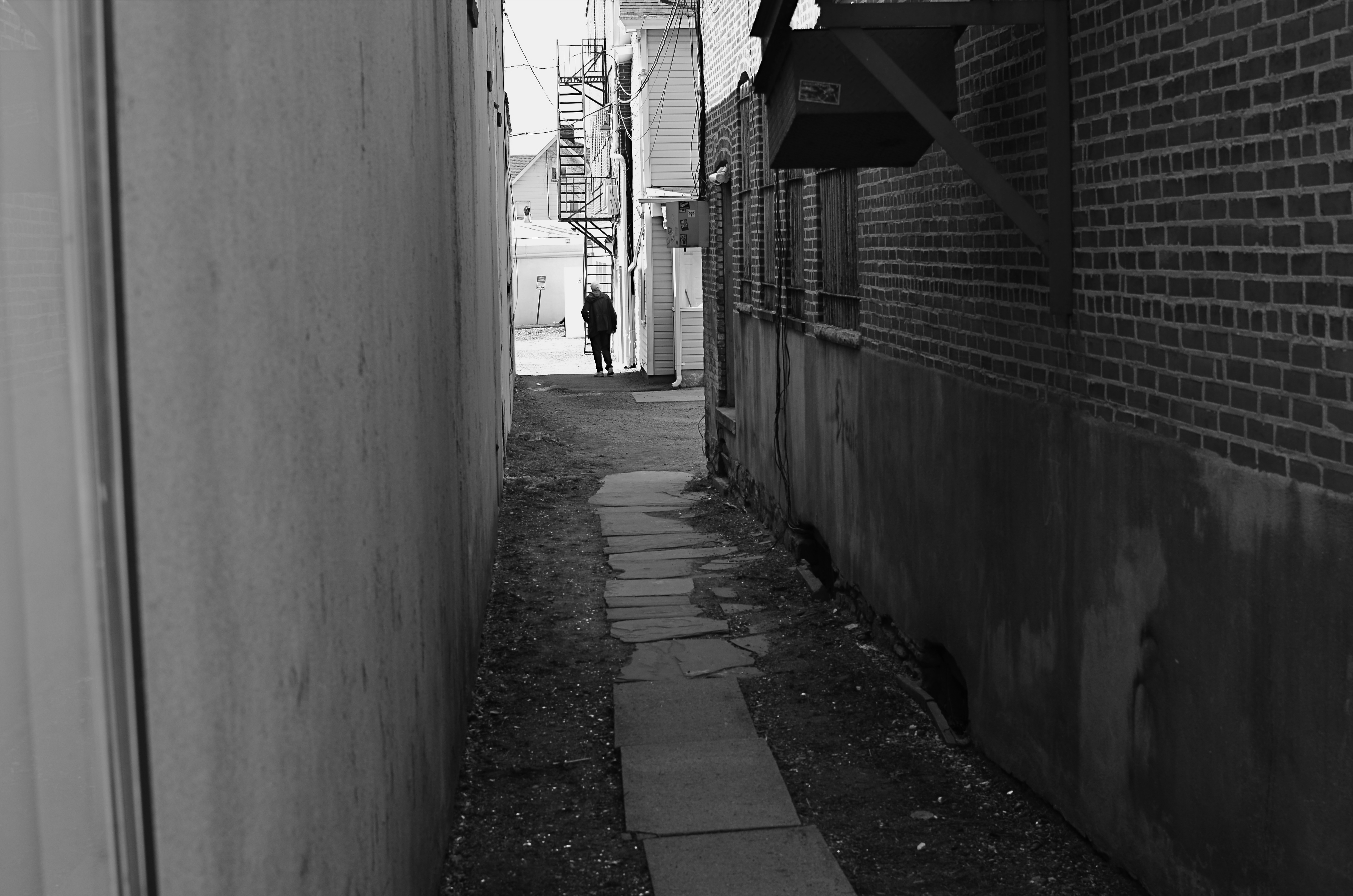
Context is all.
The woman shown here is most likely just walking from point A to point B, with no undercurrent of real tragedy. But once she takes a short cut down an alley, she can be part of a completely different, even imaginary story. Here the two walls isolate her, herding her into a context where she could be lonely, sad, afraid, furtive. She is walking away from us, and that implies a secret. She is “withdrawing” and that implies defeat. She is without a companion, which can symbolize punishment, banishment, exile. From us? From herself? From the world? Once you start to think openly about it, you realize that placing the subject in space lays the foundation for storytelling, a technique that is easy to create, recalibrate, manipulate.
The space around people is a key player in the drama an image can generate. It can mean, well, whatever you need it to mean. People who exist in a place apart become the centerpieces in strong photographs, and the variability of that strength is in your hands.
